Fixed Income
According to BCA Research’s US Bond Strategy service, investment grade corporate bonds are quite expensive. Starting with a simple examination of the average investment grade index OAS, the team observes that the spread has widened somewhat off its pre-…

Executive Summary Spreads Near 2017-19 Average
Spreads Near 2017-19 Average
Spreads Near 2017-19 Average
The main indicators that determine corporate bond performance are valuation, the cyclical/monetary environment and corporate balance sheet health. US corporate bond valuation is quite expensive. Spreads are off their post-COVID lows, but consistent with the 2017-19 average. The flat 2-year/10-year Treasury curve indicates that the cyclical/monetary backdrop is relatively poor. What’s more, the yield curve could easily invert within the next few months as the Fed tightens. This would send an even more negative signal for corporate bond returns. Corporate balance sheets are currently in excellent shape, but their health will deteriorate within the next 12 months as profit growth slows and interest rates rise. Relative valuation favors high-yield over investment grade corporates, and high-yield has a track record of outperformance during periods of restrictive monetary conditions and strong corporate balance sheets. Bottom Line: Investors should cyclically reduce exposure to US corporate bonds while retaining a preference for high-yield over investment grade. We recommend downgrading investment grade corporates from neutral (3 out of 5) to underweight (2 out of 5) and high-yield corporates from overweight (4 out of 5) to neutral (3 out of 5). Feature Chart 1A Rapid Recovery
A Rapid Recovery
A Rapid Recovery
US corporate bonds have had a very good run since the March 2020 peak in spreads. Investment grade corporates outperformed a duration-matched position in US Treasuries by 23% during the first 12 months of the recovery, the best 12-month excess return since 2010 (Chart 1). That same period also saw an extremely rapid re-normalization of credit spreads. It took just 11 months for the investment grade corporate index option-adjusted spread (OAS) to reach 90 bps following its March 2020 peak, and the index delivered an annualized excess return of 26% during that period. In contrast, it took 109 months for the index OAS to reach 90 bps following the 2008 recession and corporates only beat duration-matched Treasuries by an annualized 4% during that time (Table 1). Table 1US Investment Grade Corporate Bond Returns From Spread Peak Until 90 BPs
Turning Defensive On US Corporate Bonds
Turning Defensive On US Corporate Bonds
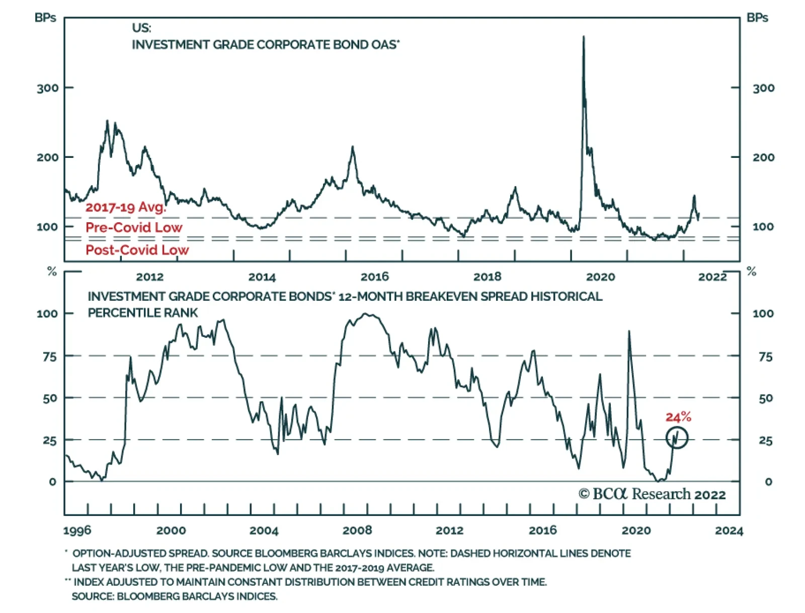
The outlook for US corporate bond returns looks much different today. Spreads are tighter and the Fed is rapidly removing policy accommodation. Against this backdrop, we decided last week to cyclically reduce our corporate bond exposure.1 Specifically, we recommended downgrading investment grade corporates from neutral (3 out of 5) to underweight (2 out of 5) and high-yield corporates from overweight (4 out of 5) to neutral (3 out of 5) within US bond portfolios. This Special Report discusses the rationale for our recent decision. First, we examine trends in the main indicators that determine corporate bond performance. These indicators fall into three categories: (i) valuation, (ii) cyclical/monetary indicators and (iii) balance sheet health. We then discuss the outlook for the relative performance of high-yield versus investment grade corporates. Valuation Starting with a simple examination of the average investment grade index OAS, we see that the spread has widened somewhat off its pre- and post-pandemic lows, but remains close to the average level seen between 2017 and 2019 (Chart 2). The index OAS is a reasonable gauge of value relative to recent history, but for a longer historical perspective we should adjust the index to account for its changing average credit rating and duration. To do this, we first re-weight the index to maintain a constant distribution between the different credit rating buckets. Next, we control for the index’s changing duration by calculating a 12-month breakeven spread. The 12-month breakeven spread is the spread widening that must occur during the next 12 months for the corporate index to perform in line with a duration-matched position in Treasuries. It can be approximated by dividing the index OAS by average index duration. Finally, Chart 3 presents the 12-month breakeven spread as a percentile rank since 1995. It shows that, after controlling for credit rating and duration, the investment grade corporate index has only been more expensive than current levels 24% of the time since 1995. Notice that the spread bounced off the 0% line in late-2021, indicating that it had reached all-time expensive levels. Chart 2Spreads Near 2017-19 Average
Spreads Near 2017-19 Average
Spreads Near 2017-19 Average
Chart 3Investment Grade Valuation
Investment Grade Valuation
Investment Grade Valuation
All in all, we can conclude that investment grade corporate bonds are quite expensive. Spreads aren’t so low that they would justify an underweight allocation in a supportive cyclical/monetary environment. But they are tight enough that it makes sense to proceed cautiously in a neutral or negative cyclical/monetary environment, like the one we are in today. Cyclical/Monetary Indicators The slope of the yield curve is the key variable we use to assess the current state of the cyclical/monetary environment. A very flat or inverted yield curve signals a relatively restrictive monetary policy backdrop, and we have shown that such a backdrop tends to coincide with poor excess corporate bond returns. Conversely, we have found that corporate bonds perform best early in the economic recovery when the yield curve is very steep. This steep yield curve signals that monetary conditions are highly accommodative, and thus supportive of credit spread tightening. Today, the yield curve is sending a somewhat confusing message. The 2-year/10-year Treasury slope briefly inverted last week, and it remains flat at 22 bps. Meanwhile, the 3-month/10-year Treasury slope is very steep, up above 200 bps (Chart 4)! Chart 4Conflicting Signals From The Yield Curve
Conflicting Signals From The Yield Curve
Conflicting Signals From The Yield Curve
We discussed how to interpret the signals from different yield curve segments in a recent Special Report.2 We found that the 2-year/10-year Treasury slope sends the most useful signal for corporate bond excess returns, and we therefore view current cyclical/monetary conditions as negative for corporate bonds. In Table 2 we split each of the past six economic cycles into phases based on the 2-year/10-year Treasury slope. We define Phase 1 of the cycle as the period from the end of the prior recession until the 2-year/10-year slope breaks below 50 bps. Phase 2 of the cycle encompasses the time when the slope is between 0 bps and 50 bps. Phase 3 of the cycle spans from when the yield curve inverts until the start of the next recession. Table 2US Corporate Bond Performance In Different Phases Of The Cycle
Turning Defensive On US Corporate Bonds
Turning Defensive On US Corporate Bonds
The table shows annualized excess returns for both investment grade and high-yield corporate bonds in each of the three phases, and those returns exhibit a clear pattern. Returns are best in Phase 1 when the yield curve is steep. They take a step down in Phase 2 when the slope is between 0 bps and 50 bps, though they usually stay positive. Negative returns are most likely in Phase 3, after the yield curve inverts. Chart 5Limited Room For Curve Steepening
Limited Room For Curve Steepening
Limited Room For Curve Steepening
With the 2-year/10-year Treasury slope at 22 bps, we are firmly in Phase 2 of the cycle. However, we could easily see the 2-year/10-year slope invert within the next few months while a breakout above 50 bps seems less likely. In fact, there are only two ways in which the 2-year/10-year Treasury slope can steepen further from current levels. First, the market could bid up its expectation of the long-run neutral fed funds rate, pushing long-dated bond yields higher. Second, expectations for the pace of near-term Fed tightening could diminish, pulling short-dated yields down. At the long-end, the 5-year/5-year forward Treasury yield is already above survey estimates of the long-run neutral rate (Chart 5). At the front-end, the market is discounting a rapid pace of 272 bps of tightening during the next 12 months (Chart 5, bottom panel), but that pace has limited room to fall given current extremely high inflation readings. Turning back to a comparison of the signals from the 2-year/10-year slope and 3-month/10-year slope, it is worth pointing out that the 3-month/10-year slope is influenced by yield movements at the very front-end of the curve. Meanwhile, the 2-year/10-year slope is purely a function of rate expectations beyond the next two years. As a result, we can view the 3-month/10-year slope as sending a timelier signal about Fed rate hikes and cuts, while the 2-year/10-year slope gives a better reading of how the market views the ultimate economic impact of Fed actions. For example, the 3-month/10-year Treasury slope inverted in 2019 just before the Fed started cutting rates (Chart 6A). The 2-year/10-year slope, however, only briefly dipped below zero. The message from the market was that the Fed would cut rates, but those cuts would be sufficient to sustain the economic recovery. As a result, corporate bonds performed well during this period, consistent with the message from the 2-year/10-year slope. Another interesting example occurred in early 2000 (Chart 6B). This time, the 2-year/10-year Treasury slope inverted while the 3-month/10-year slope remained steep. In this case, the 3-month/10-year slope was telling us that Fed rate hikes would continue, while the 2-year/10-year slope was telling us that those hikes would eventually kill the economic recovery. Once again, corporate bonds took their cues from the 2-year/10-year Treasury slope and performed poorly during this period. Chart 6AStrong Performance In 2019
Strong Performance In 2019
Strong Performance In 2019
Chart 6BPoor Performance In 2000
Poor Performance In 2000
Poor Performance In 2000
Obviously, the current situation looks more like 2000 than 2019, but with the 2-year/10-year slope still positive there remains scope for positive excess corporate bond returns in the near-term. That said, with high odds of 2-year/10-year curve inversion within the next few months and spreads at relatively tight levels, it makes sense to scale back exposure today in advance of the worst phase of the cycle. Balance Sheet Health The final factor we consider is the health of nonfinancial corporate sector balance sheets, and in fact, this is currently the lone bright spot for corporate bond investors. Our Corporate Health Monitor (CHM), a composite indicator of six key balance sheet ratios, is deep in “improving health” territory (Chart 7). This positive signal is driven by exceptionally high Interest Coverage (Chart 7, panel 2) and Free Cash Flow-To-Debt that is just off its highs (Chart 7, panel 3). Return On Capital is up sharply since 2020 but has not recovered its previous peak (Chart 7, bottom panel). Chart 7Balance Sheets Are In Great Shape
Balance Sheets Are In Great Shape
Balance Sheets Are In Great Shape
While corporate balance sheets are in excellent shape right now, their health will certainly deteriorate going forward as profit growth comes down off its highs and interest rates rise. The only question is whether this deterioration will happen slowly or quickly. Turning to history, two relevant periods stand out (Chart 8). First is the mid-1990s when investment grade corporate bond excess returns peaked in July 1997, 16 months before our CHM moved into “deteriorating health” territory. Conversely, the CHM sent a negative signal before the excess return peak in 2007. But even then, investment grade corporates only outperformed Treasuries by an annualized 0.8% between when the 2-year/10-year slope fell below 50 bps in 2005 and when the CHM moved above zero in 2006. In other words, investors didn’t sacrifice much return by heeding the yield curve’s signal even when the CHM was deep in “improving health” territory. Chart 8Cyclical Corporate Bond Performance
Cyclical Corporate Bond Performance
Cyclical Corporate Bond Performance
Investment Conclusions In summary, we view corporate bond valuations as expensive, and the flat 2-year/10-year Treasury slope suggests that the economic recovery is in its mid-to-late stages. Corporate balance sheets are currently in excellent shape, but they will deteriorate going forward as profit growth slows and interest rates rise. The above three factors suggest that corporate bonds could continue to outperform duration-matched Treasuries in the near-term. However, with spreads already at tight levels, we likely aren’t sacrificing much in the way of excess returns by turning cyclically defensive today. This move also ensures that we will not be invested when the credit cycle eventually turns and corporate bond spreads move significantly wider. Retain A Preference For High-Yield Versus Investment Grade While we recommend downgrading allocations for both investment grade (from neutral to underweight) and high-yield (from overweight to neutral), we think investors should still retain a preference for high-yield corporates over investment grade. To see why, let’s return to the 2005-06 period we looked at in the previous section. The yield curve dipped below 50 bps in 2005 when the CHM was still deep in “improving health” territory, and while investment grade corporate bond returns were low during the time between the signal from the yield curve and the signal from the CHM, junk excess returns were very strong (Chart 9). This makes some sense intuitively. Higher-rated investment grade corporates responded negatively to the Federal Reserve’s removal of monetary policy accommodation, but lower-rated junk spreads stayed well bid because actual default risk was benign. It wasn’t until after the CHM rose above zero that junk bonds started to underperform. In terms of present-day valuations, much like for investment grade, junk spreads are up off their 2021 lows. However, they remain close to their pre-pandemic trough (Chart 10). We also note that the differential between high-yield and investment grade spreads was much tighter in 2006-07. Given the similarities between that period and today, we wouldn’t be surprised to see junk spreads compress further relative to investment grade. Chart 9The Bullish Case For Junk
The Bullish Case For Junk
The Bullish Case For Junk
Chart 10High-Yield Valuation
High-Yield Valuation
High-Yield Valuation
Another way to approach high-yield bond valuation is through the lens of our Default-Adjusted Spread. The Default-Adjusted Spread is the difference between the junk index OAS and 12-month default losses, and we have shown that it has a strong correlation with excess returns (Table 3). Specifically, a Default-Adjusted Spread above 100 bps usually coincides with positive excess junk returns versus Treasuries, and higher spreads tend to coincide with higher returns. Table 3The Default-Adjusted Spread & High-Yield Excess Returns
Turning Defensive On US Corporate Bonds
Turning Defensive On US Corporate Bonds
To estimate the Default-Adjusted Spread for the next 12 months we need assumptions for the default and recovery rates (Chart 11). To do this, we model the 12-month speculative grade default rate as a function of gross nonfinancial corporate leverage – total debt over pre-tax profits – and lagged C&I lending standards. We then model the 12-month recovery rate based on the default rate itself. Chart 11Default And Recovery Rate Models
Default And Recovery Rate Models
Default And Recovery Rate Models
Corporate pre-tax profit growth was exceptionally strong during the past 12 months, and we expect it to slow significantly going forward. Profit growth can be modeled as a function of nominal GDP growth and unit labor costs (Chart 12). If we assume that nominal GDP growth comes in at 7.3% this year (the Fed’s median 2.8% real GDP estimate plus 4.5% inflation) and that unit labor cost growth rises to 6%, then profit growth will fall to 0.5% during the next 12 months. If we assume that corporate debt growth remains close to its current level (Chart 12, bottom panel), then we calculate that gross leverage will rise to 6.5 during the next 12 months. Chart 12Profit Growth Will Slow Significantly
Profit Growth Will Slow Significantly
Profit Growth Will Slow Significantly
Table 4 shows the output from our default and recovery rate models under the base case assumption described above. It also shows results for an optimistic case where leverage is 6.0 and a pessimistic case where it is 7.0. The Default-Adjusted Spread is fairly low in the base and pessimistic cases, but it is comfortably above the key 100 bps threshold in all three scenarios. This suggests that junk bonds should deliver positive excess returns versus duration-matched Treasuries during the next 12 months. Table 4Default-Adjusted Spread Scenarios
Turning Defensive On US Corporate Bonds
Turning Defensive On US Corporate Bonds
Ryan Swift US Bond Strategist rswift@bcaresearch.com Footnotes 1 Please see US Bond Strategy Portfolio Allocation Summary, “The Beginning Of The End”, dated April 5, 2022. 2 Please see US Bond Strategy / US Investment Strategy / US Equity Strategy Special Report, “The Yield Curve As An Indicator”, dated March 29, 2022. Treasury Index Returns Spread Product Returns Recommended Portfolio Specification
Turning Defensive On US Corporate Bonds
Turning Defensive On US Corporate Bonds
Other Recommendations
Turning Defensive On US Corporate Bonds
Turning Defensive On US Corporate Bonds
According to BCA Research’s European Investment Strategy service, German yields can rise above 2% without causing a public finance crisis in Italy. How high can yields rise in the Eurozone before Italy experiences meaningful funding stresses? The team…
Executive Summary From Net Borrower To Net Lenders
From Net Borrower To Net Lenders
From Net Borrower To Net Lenders
Yields are rising across Europe. Peripheral spreads are unlikely to experience the same violent widening as last decade. Europe now has a buyer of last resort. Italy and Spain have moved from current account deficit to current account surplus nations. However, Italy and Spain are not conducting the kind of structural reforms necessary to cause public debt-to-GDP ratios to fall back below the Maastricht Treaty criteria. Nonetheless, based on our stress tests, Italian and Spanish yields can rise significantly more before debt-servicing costs become a major problem in these nations. Economic activity, not Spanish or Italian public finances, is the true constraint on European yields. Bottom Line: German yields can rise above 2% without causing a public finance crisis in Italy and Spain. To reach this level, however, nominal growth in Europe must remain robust. As a result, any pullback in yields caused by oversold conditions in the bond market will be temporary. Year-to-date, German 10-year yields have risen more than 80bps, while spreads have widened in the periphery. This has supercharged the interest rate moves: Italian BTP yields and Spanish Bono yields are up nearly 120bps and 110bps, respectively. As a result, Italian government bonds now offer a 2.4% yield, a level not experienced durably since the first half of 2019. Meanwhile, Spanish yields are close to 1.7%—their highest levels since 2017. Investors are increasingly concerned by the damage levied by higher yields in Southern Europe. Since 2018, Italian public debt has risen by 32% of GDP to 170% of GDP, and Spanish public debt has risen by 28% of GDP to 138% of GDP. These higher debt burdens beg the following question: How high can European yields rise before a new sovereign debt crisis engulfs the Eurozone? Private sector financial balances and the balance of payments in the periphery are now very different from what they were between 2008 and 2012. As a result, the odds of a similar crisis are much lower than last decade, which should allow German yields to rise further in the coming years. Italy and Spain have moved on from experiencing an EM-style balance of payment crisis with explosive debt market dynamics. They are now stuck in a Japanese scenario of excess private sector savings and low economic growth. “This Time Is Different” These might be the four most dangerous words in finance, but understanding the differences between the present situation and the sovereign debt crisis is essential to assessing the impact of higher yields on Italian and Spanish public finances. Chart 1From Net Borrower To Net Lenders
From Net Borrower To Net Lenders
From Net Borrower To Net Lenders
The most important transformation in the Southern European economies is the rise in private sector savings. From 1999 to 2013, Italy’s private sector financial balance averaged 2.2% of GDP. Constant government deficits resulted in a significant national dissaving, forcing the country to borrow from abroad as expressed by a current account deficit that lasted from 2000 to 2013 (Chart 1, top panel). At the present moment, Italy’s current account is in a surplus equal to 3.5% of GDP, as private savings stand at 13% of GDP, up from 5% before COVID-19. The change is even more dramatic in Spain. The Spanish private sector financial balance was in a large deficit from 1999 to 2008, which averaged 5.6% of GDP and reached a nadir of 11.3% of GDP in 2007. As a result, Spain relied on foreign lending between 1980 and 2012, with a current account deficit that averaged 3% of GDP over that period (Chart 1, second panel). The switch from the status of foreign borrower to the status of surplus nation is fundamental. A country where excess private savings are so abundant they can finance large public deficits and still generate current account surpluses will experience more limited pressure on borrowing costs than a country that needs to borrow from abroad. Japan is a perfect example. Elevated public borrowing ends up being a vehicle to absorb private sector excess savings and does not constitute profligacy. Despite higher debt loads, Italy’s public finances seem more sustainable than those of Spain. The International Monetary Fund’s (IMF) October 2021 Fiscal Monitor forecast shows the Italian primary budget balance, both on an absolute basis and on a cyclically-adjusted basis, moving from -6% and -2.9% of GDP, respectively, closer to zero by 2026 (Chart 2). In Spain, primary budget balances, both on an absolute basis and on a cyclically-adjusted basis, are anticipated to improve from -8.9% and -3.4% of GDP, respectively, to -2.5% of GDP by 2026. Despite these deficits, the IMF also expects public debt to decrease by 10% of GDP to 146% in Italy and to remain flat at 120% of GDP in Spain (Chart 3). Importantly, in both cases, the upward pressure on public debt will be limited over the next five years because private savings are already high and unlikely to rise further. Chart 2Public Deficits Will Narrow Further
Public Deficits Will Narrow Further
Public Deficits Will Narrow Further
Chart 3Debt Will Stay High, So Will Private Savings
Debt Will Stay High, So Will Private Savings
Debt Will Stay High, So Will Private Savings
The role of the European Central Bank (ECB) as a backstop also contributes to creating a different environment than the one that prevailed prior to the “whatever it takes” era. Before Mario Draghi’s landmark July 2012 speech, there was no explicit buyer of last resort in the European sovereign debt market. Now, there is one, and its presence limits how rapidly private sector buyers might lose confidence in a country’s bond market and how far spreads can widen, even if the central bank buying has its own limit. In fact, Draghi’s forward guidance calmed the markets and caused a 250bps and 280bps collapse in Italian and Spanish 10-year yields before the ECB had even purchased a single BTP or Bono. The role of the ECB as a buyer of last resort remains crucial going forward. Yields in Italy and Spain are still 480bps and 600bps below their 2011-2012 peaks at a time when investors anticipate an end to the PEPP and APP purchases. Importantly, these spreads are narrower, even though the APP and the PEPP have purchased far more German and French sovereign bonds than Italian and Spanish bonds (Chart 4). As long as the ECB continues to emphasize that it maintains its optionality to support Italian and Spanish bond markets, even as its asset purchases end, peripheral spreads will not move back above 300bps, especially since Euroscepticism is not the risk it once was (Chart 5). Chart 4Germany and France, Not Spain and Italy, Dominated PEPP Buying
Stress Testing Italian And Spanish Yields
Stress Testing Italian And Spanish Yields
Chart 5Euroscepticism on the Wane
Euroscepticism on the Wane
Euroscepticism on the Wane
Bottom Line: As illustrated by the evolution of their current account balances, peripheral Eurozone economies have moved from deep savings deficits to a state of surplus savings. This makes them less vulnerable to the funding crises that prompted the European sovereign debt crisis. Moreover, the Eurozone now has a buyer of last resort for sovereign bonds: the post-Draghi ECB. Its presence, not its continued buying, creates the necessary insurance to limit buying strikes by the private sector, which also curtails how far Italian or Spanish spreads can widen. Long-Term Problems Abound In the long term, Italy and Spain will only be able to curtail government debt-to-GDP ratios meaningfully if trend growth recovers. This means more reforms are needed to boost productivity and labor participation rates (Chart 6). Chart 6Reforms, Not Austerity, Will Bring Debt Down Below Maastricht Levels
Stress Testing Italian And Spanish Yields
Stress Testing Italian And Spanish Yields
Chart 7Competitiveness Problems In The Periphery
Competitiveness Problems In The Periphery
Competitiveness Problems In The Periphery
For now, the picture remains bleak. Spain emerged out of the sovereign debt crisis with strong reform zeal. The Mariano Rajoy government reformed pensions and the labor market, which prompted a significant decline in unit labor costs compared to the Euro Area average. The pace of reforms has slowed, however, and the Pedro Sánchez government has eroded some of its predecessor’s efforts. As a result, since 2018, Spanish unit labor costs have increased once again relative to the rest of the Eurozone (Chart 7). Italy never implemented significant reforms, because it has long been beset by political paralysis. Unit labor costs are not outstripping the rest of the Eurozone, but productivity continues to lag. Economic growth in Italy and Spain will remain tepid in the coming years, which will prevent any meaningful decline in debt. The poor trend in relative competitiveness and productivity of the past few years is unlikely to be undone. Work by the OECD shows that prior to the pandemic, Spain and Italy had shifted away from being among the leading reformers in Europe. Instead, this role now falls to France, Greece, Austria, and Germany (Chart 8), which confirms last week’s analysis that France’s reform effort remains serious, even if it is less ambitious than what transpired over the past five years. As a consequence of slow growth, investment in Spain and Italy will trail behind the rest of the Eurozone. Thus, private sector savings will remain elevated and private nonfinancial sector debt loads are unlikely to increase meaningfully (Chart 9). As a result, the public sector will continue to absorb the private sector’s excess savings, which means that the debt-to-GDP ratio could sustain more upside pressure than what either the IMF or the OECD anticipate. Chart 8Italy And Spain As Reform Laggards
Stress Testing Italian And Spanish Yields
Stress Testing Italian And Spanish Yields
Chart 9Private Debt Is Not The Problem
Private Debt Is Not The Problem
Private Debt Is Not The Problem
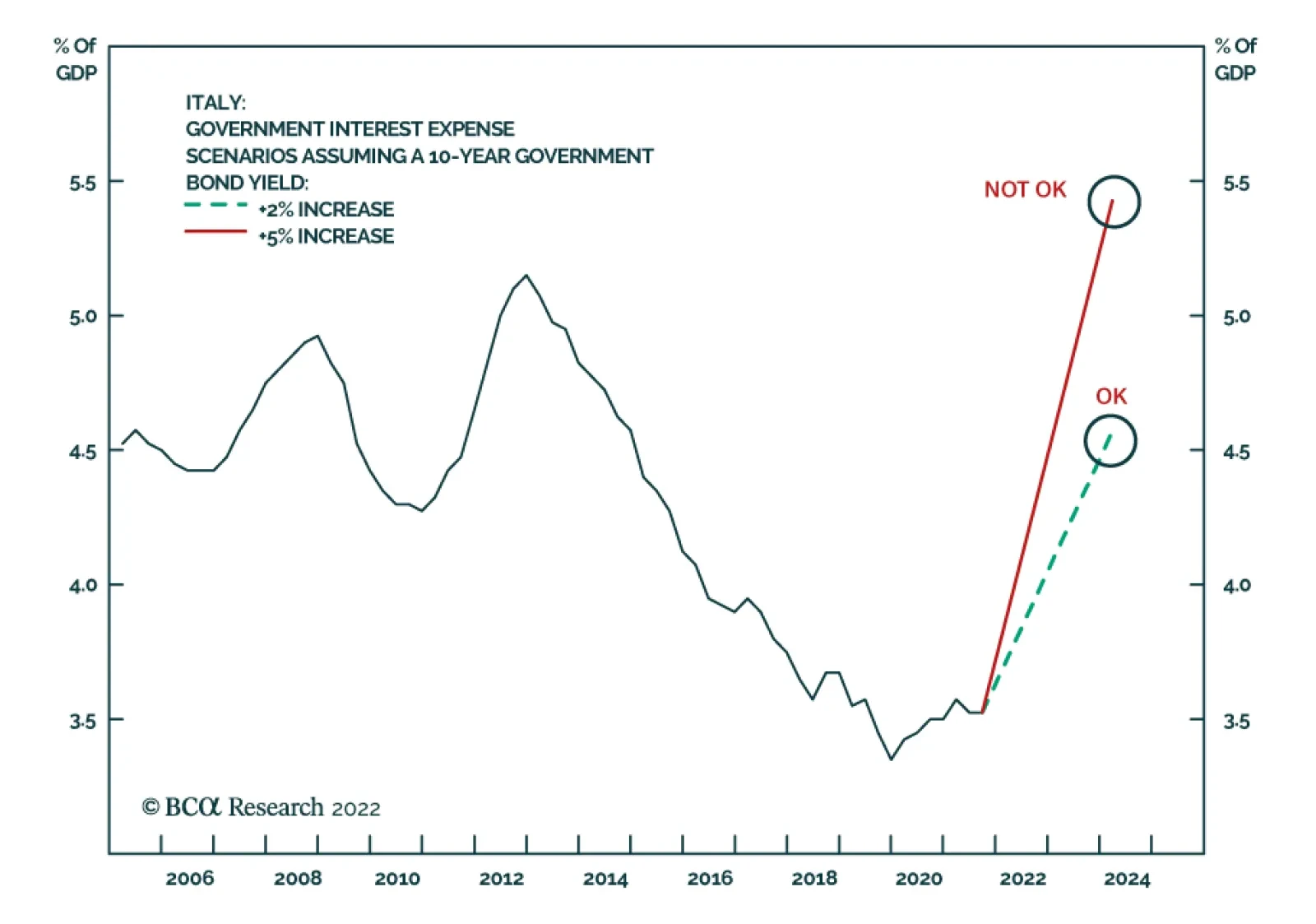
These dynamics bear a striking resemblance to what happened in Japan. They also imply that Italy and Spain will remain a drag on European growth for years to come, as long as the fundamental reasons behind the private sector’s elevated savings rate are not addressed. Bottom Line: Italian and Spanish public debt-to-GDP ratios will continue to deteriorate as reform efforts are too tepid to lift durably trend GDP growth. Their private sectors will continue to save more than they invest, which, in turn, will push government debt higher. The Italian and Spanish economies will remain a drag on European growth for the foreseeable future. Stress Test Scenarios How high can yields rise in the Eurozone before Italy and Spain experience meaningful funding stresses? We explore two scenarios: one in which 10-year yields rise by an additional 2%, and a very aggressive scenario in which they rise a whopping 5%, bringing Italian and Spanish borrowing costs in the vicinity of the European debt crisis of 2011-2012. To conduct this experiment, we use a simple approach of regressing debt-service payments as a share of GDP on the level of yields. Modeling debt payments in euros was another alternative, but yield levels are also affected by the evolution of nominal GDP. As a result, using this approach considers both the numerator and the denominator of the debt-service payment modeling. Chart 10Private Debt Is Not The Problem
Private Debt Is Not The Problem
Private Debt Is Not The Problem
Under the first scenario, Italian 10-year yields would rise to 4.4% from 2.4% today. This is still well below the 7.5% yield recorded in late 2011. In this context, government debt servicing would reach 4.5% of GDP, which is comparable to the average that prevailed prior to the Euro Area crisis (Chart 10). This suggests that Italian yields slightly above 4% are still somewhat manageable, albeit far from ideal. Under the second scenario, 10-year BTP yields would rise to 7.4% from 2.4% today. This is comparable to the level of yields observed at the apex of the European sovereign debt crisis, but it assumes that this yield level would remain in place for a year. As a result of the higher debt load today compared to a decade ago, the resulting debt-servicing costs have reached 5.4% of GDP, which is higher than those between 2012 and 2013 (Chart 10). This scenario is clearly unsustainable and suggests that yields of this magnitude would cripple the Italian government. Moving to Spain, the dynamics are slightly different. Spain’s refinancing schedule is more front-loaded than that of Italy. As a result, using the yields on 10-year Bonos as an independent variable in our regression approach does not explain well the evolution of Spanish debt-servicing costs. Instead, a simple regression model using both 3-year and 10-year yields does a much better job, because it reflects the heavier rollover of Spanish debt. Chart 11Stress Testing Spanish Public Finances
Stress Testing Spanish Public Finances
Stress Testing Spanish Public Finances
In the first scenario, 3-year yields would rise by 1% to 1.7% and 10-year yields would increase from 2% to 3.7%, well below the 7% yields that prevailed in 2012. As a result, the Spanish government’s debt-servicing costs would be expected to rise to 2.8% of GDP, which is well below the levels that prevailed at the apex of the European debt crisis, but still above the level that existed in the first decade following the introduction of the euro (Chart 11). While far from ideal, this level is easily manageable for the Spanish government and is comparable to the Eurozone average prior to 2008. In the second scenario, 3-year yields are assumed to rise 2.5% to 3.2% and 10-year yields to increase an extra 5% to 6.7%, still slightly shy of the 7% yields from 2012. In this scenario, debt servicing costs are expected to jump above 3.5% of GDP (Chart 11) and are unsustainable unless nominal GDP growth remains above 7% and the primary budget balance improves to zero. As a result, an increase in Bono yields toward 7% is far too high for the Spanish government to withstand. We acknowledge that, although it points to an upper bound in yields, the second scenario is highly unlikely for several reasons. First, a 500bps increase in 10-year yields would far exceed the roughly 350bps rise experienced during the sovereign debt crisis of the previous decade. More importantly, many factors have changed since then: Spain and Italy’s shift from borrowing nations to surplus savings nations, the role of the ECB as buyer of last resort, greater support for the euro across all the Eurozone nations, and greater unity among EU countries as exemplified by the NextGenerationEU (NGEU) program. The first scenario would be painful but manageable for both Italy and Spain. It suggests that peripheral yields may rise meaningfully in the coming years, especially if nominal GDP growth remains higher than it was last decade when fiscal austerity was Europe’s mantra. However, fiscal austerity was self-defeating because, the more orthodox countries tried to be, the worse their growth was, making debt arithmetic unmanageable (Chart 12). Chart 12Counterproductive Austerity
Stress Testing Italian And Spanish Yields
Stress Testing Italian And Spanish Yields
We can go one step further. Even if Italian and Spanish spreads widen another 100bps from this point on and settle between 200bps and 300bps above German yields, European public finances can withstand German yields rising to 2%. This seems surprising, but we cannot forget the context. German yields cannot reach those levels in a vacuum. If they increase that much, it is because nominal growth is strong, which makes debt arithmetic more manageable in the European periphery. Statistically, the relationship between Spanish debt servicing costs and German yields is negative, while the link between Italian debt servicing costs and German yields is statistically low, underscoring the role of growth. However, if German yields were to rise as Europe’s nominal GDP growth settled back to last decade’s range, then Italian and Spanish debt would implode. This is a far-fetched scenario; even the recent ECB’s pivot reflects stronger nominal activity. This does not mean that German yields will rise above 2% in the next five years, but rather it highlights that economic activity, not the peripheral nations’ public finances, is the true constraint on European yields. Bottom Line: The ECB’s role as a buyer of last resort, the shift to savings surpluses in Italy and Spain, as well as the greater European unity and lower Euroscepticism prevalent across the continent limit how far spreads can rise in the periphery. In this context, Spain and Italy can withstand higher yields than those of the last decade, since these higher borrowing costs reflect stronger nominal economic activity. Ultimately, the true constraint on German yields is not the finances of Southern Europe, but rather the state of economic growth in the Eurozone. Conclusions Related Report European Investment StrategyThe Lasting Bond Bear Market European yields continue to have significant upside, as we expect European growth to remain stronger than it was last decade even if Italy and Spain will continue to lag behind the rest of Europe. As we observed two weeks ago, Europe is no longer burdened by untimely fiscal austerity. Furthermore, the efforts to decrease the energy dependence on Russia and modernize the European economy will continue to support capex and aggregate demand. The upper band on German yields seems to be around 2%, assuming that Italian and Spanish spreads rise 100bps to 150bps over the coming years. Even the banking sector in the periphery can withstand significant upside in bond yields. BTPs and Bonos represent 11% and 6.8% of the Spanish and Italian financial sectors’ balance sheet, respectively (Chart 13). This is much higher than the role of OATs and Bunds in the French and German financial sectors, but Spanish and Italian banks have much lower NPLs and enjoy much more robust Tier-1 capital ratios than they did a decade ago (Chart 14). As a result, the doom-loop that plagued those economies ten years ago is not as pronounced. In fact, bank lending rates in Italy and Spain are now lower than they are in Germany, which contrasts greatly with the previous decade (Chart 14, bottom panel). Chart 13Exposure To The Home Country
Exposure To The Home Country
Exposure To The Home Country
Chart 14Improved Bank Health In The Periphery
Improved Bank Health In The Periphery
Improved Bank Health In The Periphery
Bottom Line: Bonds around the world and in Europe are massively oversold and are due for a countertrend rally. This pullback in yields, however, will be transitory. Higher trend nominal GDP growth around the world and in Europe indicates that yields have much further to rise over the next five years. Mathieu Savary, Chief European Strategist Mathieu@bcaresearch.com Tactical Recommendations Cyclical Recommendations Structural Recommendations
Executive Summary To understand the economy and the market we must think of them as non-linear systems which experience sudden phase-shifts. The pandemic introduced phase-shifts in our lives, which led to phase-shifts in our goods demand, which led to phase-shifts in monthly core inflation. As our lives phase-shift back to normality, goods demand will phase-shift back to low growth, and monthly core inflation prints will phase-shift from ‘high phase’ to ‘low phase’. With the 12-month core US inflation rate likely to peak by June at the latest, the long bond yield is likely to peak at some point in April/May, justifying a cyclical overweight position in T-bonds. Go overweight healthcare and biotech versus resources and financials. The leadership of the equity market will once more flip from short-duration sectors to long-duration sectors. Fractal trading watchlist additions: JPY/CHF, non-life insurance versus homebuilders, US homebuilders (XHB), cotton versus platinum, healthcare versus resources, and biotech versus resources.
The Bond Yield Turns About 2-3 Months Before Core Inflation
The Bond Yield Turns About 2-3 Months Before Core Inflation
Bottom Line: With the 12-month core US inflation rate likely to peak by June at the latest, the long bond yield is likely to peak at some point in April/May, and the leadership of the equity market will flip back to long-duration sectors such as healthcare and biotech. Feature Inflation is a non-linear system, meaning that you cannot just dial it up or down gradually like the volume on your music system. Instead of gradual changes, non-linear systems suddenly phase-shift from quiet to loud, from cold to hot, from solid to liquid, or from stability to instability (Box I-1). Box 1: A Classic Non-Linear System – A Brick On An Elastic Band To experience the sudden phase-shift in a non-linear system, attach an elastic band to a brick and try pulling it across a table. As you start to pull, the brick doesn’t move because of the friction with the table. But as you increase your pull there comes a tipping point, at which the brick does move and the friction simultaneously decreases, self-reinforcing the brick’s acceleration. Meanwhile, your pull on the elastic continues to increase as you react with a time-lag. The result is that this non-linear system suddenly phase-shifts from stability – the brick doesn’t move – to instability – the brick hits you in the face! Try as hard as you might, it is impossible to pull the brick across the table smoothly. In this non-linear system, the choice is either stability or instability. Back in 2017, in Mission Impossible: 2% Inflation – An Update, I posed a crucial question: “Given that price stability could phase-shift to instability, when should we worry about it?” I answered that “the risk remains low until the next severe downturn – when policymakers may be forced into desperate measures for a desperate situation.” The words proved prescient. Three years later, the desperate situation was a global pandemic, and the desperate measures were economic shutdowns combined with fiscal stimuluses of unprecedented scope and size. A Phase-Shift In Our Lives Produced A Phase-Shift In Inflation Developed economy inflation has just experienced a stark non-linearity. Since 2007, the US core month-on-month inflation rate remained consistently below 3.5 percent.1 Then came the pandemic’s shutdowns combined with policymakers’ massive response, and month-on-month inflation didn’t just rise to above 3.5 percent, it phase-shifted to well over 6 percent. Developed economy inflation has just experienced a stark non-linearity. The remarkable fact is that since 2007, there have been over a hundred monthly core inflation prints below 4 percent, and nine prints above 6 percent, but just one solitary print between 4 and 6 percent! In other words, monthly core inflation shows the classic hallmark of a non-linear system. It can be cold or hot, but not warm (Chart I-1). Chart I-1Monthly Core Inflation Shows The Classic Hallmark Of A Non-Linear System
Monthly Core Inflation Shows The Classic Hallmark Of A Non-Linear System
Monthly Core Inflation Shows The Classic Hallmark Of A Non-Linear System
So, what caused the phase-shift in core inflation? The simple answer is a phase-shift in durable goods spending, which itself was caused by the pandemic’s shutdown of services combined with massive fiscal stimulus. Again, this is supported by a remarkable fact. Since 2007, the monthly increase in US (real) spending on durables remained consistently below 3.5 percent. Then came the pandemic’s shutdowns and stimulus checks, and the growth in durables demand didn’t just rise to above 3.5 percent, it phase-shifted to well over 8 percent. In other words, the growth in durable goods demand also shows the classic hallmark of a non-linear system. It can be cold or hot, but not warm (Chart I-2). Chart I-2Goods Demand Shows The Classic Hallmark Of A Non-Linear System
Goods Demand Shows The Classic Hallmark Of A Non-Linear System
Goods Demand Shows The Classic Hallmark Of A Non-Linear System
The connection between the phase-shifts in goods demand and the phase-shifts in core inflation is staring us in the face – because the three separate phase-shifts in inflation have each been associated with a preceding or contemporaneous phase-shift in goods demand, which themselves have been associated with the separate waves of the pandemic (Chart I-3). Chart I-3Phase-Shifts In Core Inflation Have Been Associated With Phase-Shifts In Goods Demand
Phase-Shifts In Core Inflation Have Been Associated With Phase-Shifts In Goods Demand
Phase-Shifts In Core Inflation Have Been Associated With Phase-Shifts In Goods Demand
Pulling all of this together, the pandemic introduced phase-shifts in our lives – lockdown or freedom. Which led to phase-shifts in our goods demand – above 8 percent or below 3.5 percent. Which led to phase-shifts in monthly core inflation – above 6 percent or below 4 percent. The key question is, what happens next? Bond Yields Are Close To A Peak As we learn to live with the pandemic, and assuming no imminent ‘super variant’ of the virus, our lives are phase-shifting back to a semblance of normality. Which means that our spending on goods is phase-shifting back to low growth. If anything, the recent overspend on goods implies an imminent corrective underspend. At the same time, it will be difficult to compensate a phase-shift down on goods spending with a phase-shift up on services spending. This is because the consumption of services is constrained by time and biology. There is a limit to how often you can eat out, go to the theatre, or even go on vacation. The upshot is that monthly core inflation prints are likely to phase-shift from ‘high phase’ to ‘low phase’ – even if the monthly headline inflation prints are kept up longer by the commodity price spikes that result from the Ukraine crisis. Monthly core inflation prints are likely to phase-shift from ‘high phase’ to ‘low phase’. Meanwhile central banks and markets focus on the 12-month core inflation rate – which, as an arithmetic identity, is the sum of the last twelve month-on-month inflation rates.2 To establish the 12-month core inflation rate, the crucial question is: how many of the last twelve month-on-month inflation prints will be high phase versus low phase? As just discussed, the new month-on-month core inflation prints are likely to phase-shift to low phase. At the same time, the historic high phase prints will disappear from the last twelve month window. Specifically, by June 2022, the three high phase prints of April, May, and June 2021 – 10 percent, 9 percent, and 10 percent respectively – will no longer be included in the 12-month core inflation rate, with the arithmetic impact of pulling it down sharply (Chart I-4). Chart I-4The High Phase Monthly Inflation Prints Of April, May, And June 2021 Will Disappear From The 12-Month Core US Inflation Rate, Thereby Pulling It Down.
The High Phase Monthly Inflation Prints Of April, May, And June 2021 Will Disappear From The 12-Month Core US Inflation Rate, Thereby Pulling It Down.
The High Phase Monthly Inflation Prints Of April, May, And June 2021 Will Disappear From The 12-Month Core US Inflation Rate, Thereby Pulling It Down.
Clearly, the bond market anticipates some of this ‘base effect’ on 12-month inflation. This explains why turning points in the bond yield have led by 2-3 months the turning points in the 12-month core inflation rate (Chart I-5). With the 12-month core inflation rate likely to peak by June at the latest, this suggests that – absent some new shock – the long bond yield is likely to peak at some point in April/May. Reinforcing our cyclical overweight position in T-bonds. Chart I-5The Bond Yield Turns About 2-3 Months Before Core Inflation
The Bond Yield Turns About 2-3 Months Before Core Inflation
The Bond Yield Turns About 2-3 Months Before Core Inflation
This also carries important implications for equity investors. Rising bond yields favour short-duration equity sectors such as resources and financials versus long-duration equity sectors such as healthcare and biotech. And vice-versa. Indeed, the recent performance of resources versus healthcare and financials versus healthcare is indistinguishable from the bond yield (Chart I-6 and Chart I-7). Chart I-6The Performance of Resources Versus Healthcare Is Indistinguishable From The Bond Yield
The Performance of Resources Versus Healthcare Is Indistinguishable From The Bond Yield
The Performance of Resources Versus Healthcare Is Indistinguishable From The Bond Yield
Chart I-7The Performance of Financials Versus Healthcare Is Indistinguishable From The Bond Yield
The Performance of Financials Versus Healthcare Is Indistinguishable From The Bond Yield
The Performance of Financials Versus Healthcare Is Indistinguishable From The Bond Yield
With bond yields likely to peak soon, the leadership of the equity market will once more flip from short-duration sectors to long-duration sectors. Go overweight healthcare and biotech versus resources and financials. Fractal Trading Watchlist Reinforcing the fundamental analysis in the previous section, the 130-day outperformance of resources versus healthcare and biotech has reached the point of fractal fragility that has marked previous trend exhaustions, suggesting that the recent outperformance of resources is nearing an end. Also new on our watchlist is a commodity pair, cotton versus platinum, whose strong outperformance is vulnerable to reversal. And US homebuilders (XHB), whose recent underperformance is at a potential turning point. There are two new trade recommendations. First, the massive outperformance of world non-life insurance versus homebuilders is at the point of fractal fragility that has consistently marked previous turning points (Chart I-8). Hence, go short non-life insurance versus homebuilders, setting a profit target and symmetrical stop-loss at 14 percent. Second, the strong underperformance of the Japanese yen is also at the point of fractal fragility that has marked several previous turning points (Chart I-9). Accordingly, go long JPY/CHF, setting a profit target and symmetrical stop-loss at 4 percent. Please note that our full watchlist of 19 investments that are experiencing or approaching turning points is now available on our website: cpt.bcaresearch.com Chart I-8The Massive Outperformance Of Non-Life Insurance Is Vulnerable To Reversal
The Massive Outperformance Of Non-Life Insurance Is Vulnerable To Reversal
The Massive Outperformance Of Non-Life Insurance Is Vulnerable To Reversal
Chart I-9Go Long JPY/CHF
Go Long JPY/CHF
Go Long JPY/CHF
The Outperformance Of Resources Versus Healthcare Is Vulnerable To Reversal
The Outperformance Of Resources Versus Healthcare Is Vulnerable To Reversal
The Outperformance Of Resources Versus Healthcare Is Vulnerable To Reversal
The Outperformance Of Resources Versus Biotech Is Vulnerable To Reversal
The Outperformance Of Resources Versus Biotech Is Vulnerable To Reversal
The Outperformance Of Resources Versus Biotech Is Vulnerable To Reversal
Cotton’s Outperformance Is Vulnerable To Reversal
Cotton's Outperformance Is Vulnerable To Reversal
Cotton's Outperformance Is Vulnerable To Reversal
US Homebuilders’ Underperformance Is At A Potential Turning Point
US Homebuilders' Underperformance Is At A Potential Turning Point
US Homebuilders' Underperformance Is At A Potential Turning Point
Dhaval Joshi Chief Strategist dhaval@bcaresearch.com Footnotes 1 Annualized month-on-month inflation rate. 2 Strictly speaking, the 12-month inflation rate is the geometric product of the last 12 month-on-month inflation rates. Chart I-1The Strong Trend In The 18-Month-Out US Interest Rate Future Is Fragile
The Strong Trend In The 18-Month-Out US Interest Rate Future Is Fragile
The Strong Trend In The 18-Month-Out US Interest Rate Future Is Fragile
Chart I-2The Strong Trend In The 3 Year T-Bond Is Fragile
The Strong Trend In The 3 Year T-Bond Is Fragile
The Strong Trend In The 3 Year T-Bond Is Fragile
Chart I-3AUD/KRW Is Vulnerable To Reversal
AUD/KRW Is Vulnerable To Reversal
AUD/KRW Is Vulnerable To Reversal
Chart I-4Canada Versus Japan Is Vulnerable To Reversal
Canada Versus Japan Is Vulnerable To Reversal
Canada Versus Japan Is Vulnerable To Reversal
Chart I-5Canada's TSX-60's Outperformance Might Be Over
Canada's TSX-60's Outperformance Might Be Over
Canada's TSX-60's Outperformance Might Be Over
Chart I-6US Healthcare Providers Vs. Software Approaching A Reversal
US Healthcare Providers Vs. Software Approaching A Reversal
US Healthcare Providers Vs. Software Approaching A Reversal
Chart I-7The Euro's Underperformance Could Be Approaching a Resistance Level
The Euro's Underperformance Could Be Approaching a Resistance Level
The Euro's Underperformance Could Be Approaching a Resistance Level
Chart I-8A Potential Switching Point From Tobacco Into Cannabis
A Potential Switching Point From Tobacco Into Cannabis
A Potential Switching Point From Tobacco Into Cannabis
Chart I-9Bitcoin's 65-Day Fractal Support Is Holding For Now
Bitcoin's 65-Day Fractal Support Is Holding For Now
Bitcoin's 65-Day Fractal Support Is Holding For Now
Chart I-10Biotech Approaching A Major Buy
Biotech Approaching A Major Buy
Biotech Approaching A Major Buy
Chart I-11CAD/SEK Reversal Has Started
CAD/SEK Reversal Has Started
CAD/SEK Reversal Has Started
Chart I-12Financials Versus Industrials Is Reversing
Financials Versus Industrials Is Reversing
Financials Versus Industrials Is Reversing
Chart I-13Norway's Outperformance Could End
Norway's Outperformance Could End
Norway's Outperformance Could End
Chart I-14Greece's Brief Outperformance Has Ended
Greece's Brief Outperformance Has Ended
Greece's Brief Outperformance Has Ended
Chart I-15BRL/NZD At A Resistance Point
BRL/NZD At A Resistance Point
BRL/NZD At A Resistance Point
Chart I-16The Outperformance Of Resources Versus Healthcare Is Vulnerable To Reversal
The Outperformance Of Resources Versus Healthcare Is Vulnerable To Reversal
The Outperformance Of Resources Versus Healthcare Is Vulnerable To Reversal
Chart I-17The Outperformance Of Resources Versus Biotech Is Vulnerable To Reversal
The Outperformance Of Resources Versus Biotech Is Vulnerable To Reversal
The Outperformance Of Resources Versus Biotech Is Vulnerable To Reversal
Chart I-18Cotton's Outperformance Is Vulnerable To Reversal
Cotton's Outperformance Is Vulnerable To Reversal
Cotton's Outperformance Is Vulnerable To Reversal
Chart I-19US Homebuilders' Underperformance Is At A Potential Turning Point
US Homebuilders' Underperformance Is At A Potential Turning Point
US Homebuilders' Underperformance Is At A Potential Turning Point
Fractal Trading System Fractal Trades
Fat-Tailed Inflation Signals A Peak In Bond Yields
Fat-Tailed Inflation Signals A Peak In Bond Yields
Fat-Tailed Inflation Signals A Peak In Bond Yields
Fat-Tailed Inflation Signals A Peak In Bond Yields
6-Month Recommendations Structural Recommendations Closed Fractal Trades Indicators To Watch - Bond Yields Chart II-1Indicators To Watch - Bond Yields - Euro Area
Indicators To Watch - Bond Yields - Euro Area
Indicators To Watch - Bond Yields - Euro Area
Chart II-2Indicators To Watch - Bond Yields - Europe Ex Euro Area
Indicators To Watch - Bond Yields - Europe Ex Euro Area
Indicators To Watch - Bond Yields - Europe Ex Euro Area
Chart II-3Indicators To Watch - Bond Yields - Asia
Indicators To Watch - Bond Yields - Asia
Indicators To Watch - Bond Yields - Asia
Chart II-4Indicators To Watch - Bond Yields - Other Developed
Indicators To Watch - Bond Yields - Other Developed
Indicators To Watch - Bond Yields - Other Developed
Indicators To Watch - Interest Rate Expectations Chart II-5Indicators To Watch - Interest Rate Expectations
Indicators To Watch - Interest Rate Expectations
Indicators To Watch - Interest Rate Expectations
Chart II-6Indicators To Watch - Interest Rate Expectations
Indicators To Watch - Interest Rate Expectations
Indicators To Watch - Interest Rate Expectations
Chart II-7Indicators To Watch - Interest Rate Expectations
Indicators To Watch - Interest Rate Expectations
Indicators To Watch - Interest Rate Expectations
Chart II-8Indicators To Watch - Interest Rate Expectations
Indicators To Watch - Interest Rate Expectations
Indicators To Watch - Interest Rate Expectations
According to BCA Research’s US Bond Strategy service, current spread levels offer a good opportunity to reduce corporate bond exposure. Corporate spreads have rallied to within striking distance of their pre-COVID lows at the same time as the yield curve…
Our Global Fixed Income strategists’ Global Duration Indicator is comprised of three elements: BCA Research’s Global Leading Economic Indicator, the Global Leading Economic Indicator’s diffusion index, and economic expectations indices from the ZEW. The…
Highlights Chart 1Reduce Credit Exposure
Reduce Credit Exposure
Reduce Credit Exposure
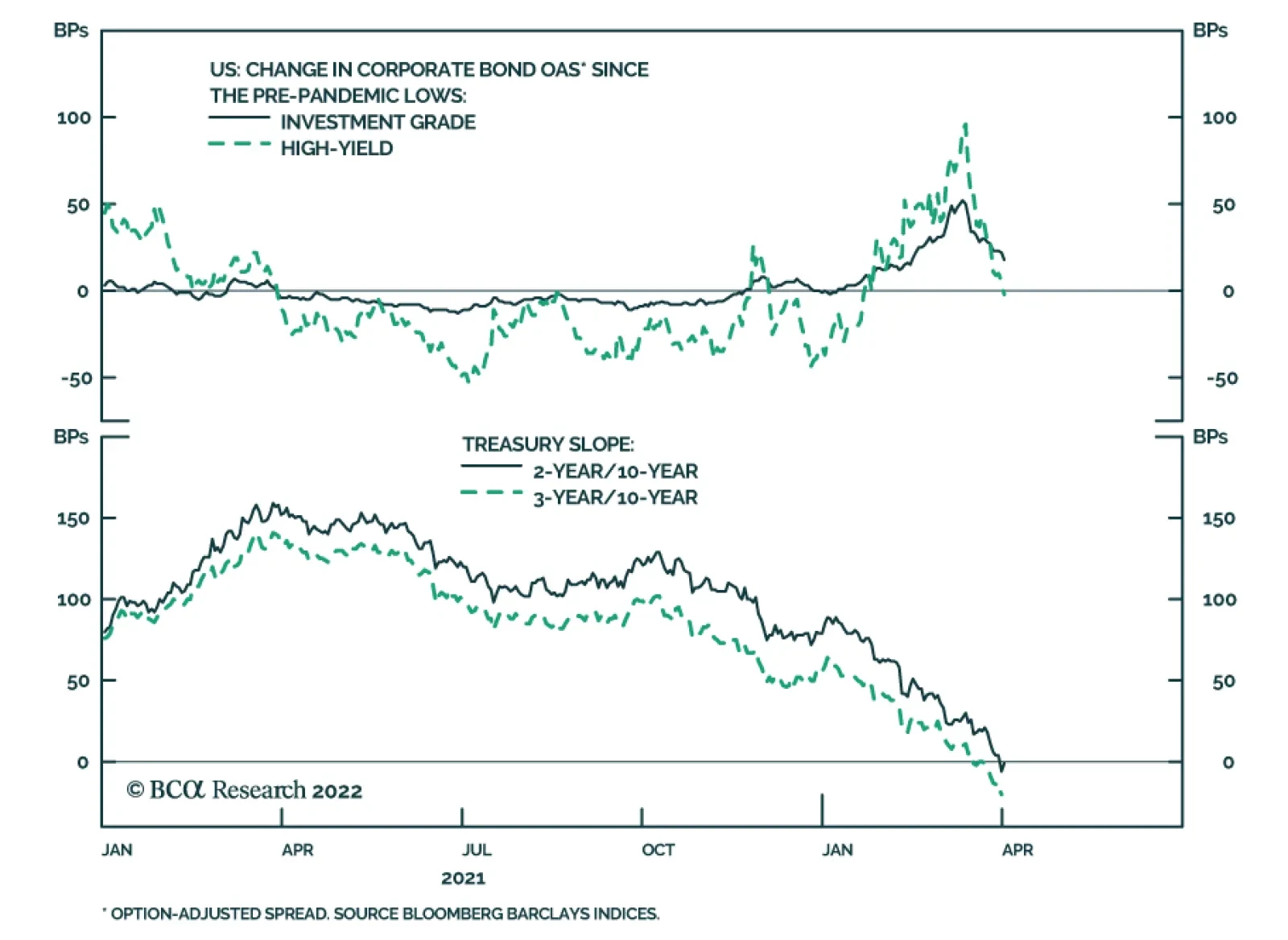
Corporate bond spreads staged a nice rally during the past month. The average index spread for investment grade corporates is only 22 bps above its pre-COVID low and 33 bps above last year’s trough. The average High-Yield index spread is 5 bps above its pre-COVID low and 49 bps above last year’s trough (Chart 1). This rally occurred even as inflation data continued to surprise to the upside and employment data confirmed that the US labor market is extremely tight. With the economic data justifying the Fed’s hawkish pivot, the Treasury curve has flattened dramatically, and both the 2-year/10-year and 3-year/10-year slopes are now inverted (Chart 1, bottom panel). An inverted yield curve is a reliable late-cycle indicator, and we think current spread levels offer a good opportunity to reduce corporate bond exposure. This week, we downgrade investment grade corporates from neutral (3 out of 5) to underweight (2 out of 5) and high-yield corporates from overweight (4 out of 5) to neutral (3 out of 5), placing the proceeds into Treasuries. We also downgrade our recommended allocations EM Sovereigns (see page 8) and TIPS (see page 11), upgrade our recommended allocation to CMBS (see page 13) and adjust our recommended yield curve positioning (see page 10). Feature Table 1Recommended Portfolio Specification
The Beginning Of The End
The Beginning Of The End
Table 2Fixed Income Sector Performance
The Beginning Of The End
The Beginning Of The End
Investment Grade: Underweight Chart 2Investment Grade Market Overview
Investment Grade Market Overview
Investment Grade Market Overview
Investment grade corporate bonds outperformed the duration-equivalent Treasury index by 86 basis points in March, bringing year-to-date excess returns up to -154 bps. Our quality-adjusted 12-month breakeven spread shifted down to its 21st percentile since 1995 (Chart 2). As noted on the first page of this report, corporate spreads have rallied to within striking distance of their pre-COVID lows at the same time as the yield curve has become inverted beyond the 2-year maturity. We showed in last week’s report that an inversion of the 2-year/10-year Treasury slope is not necessarily a harbinger of imminent recession, but it does typically coincide with very low (and often negative) excess corporate bond returns.1 The combination of reasonably tight spreads and an inverted yield curve causes us to recommend downgrading investment grade corporate bond allocations from neutral (3 out of 5) to underweight (2 out of 5). It’s important to note that corporate balance sheets remain healthy (bottom panel) and we see no indication that a recession or default cycle will unfold during the next 6-12 months. That said, we must acknowledge that an inverted yield curve signals that the economic recovery is entering its late stages. Economic growth will be slower going forward and corporate spreads are unlikely to tighten much, especially from current depressed levels. Against this backdrop it makes sense to be more cautious on credit, sacrificing small positive excess returns in the near-term to ensure that we aren’t invested when the next downturn hits. Table 3ACorporate Sector Relative Valuation And Recommended Allocation*
The Beginning Of The End
The Beginning Of The End
Table 3BCorporate Sector Risk Vs. Reward*
The Beginning Of The End
The Beginning Of The End
High-Yield: Neutral Chart 3High-Yield Market Overview
High-Yield Market Overview
High-Yield Market Overview
High-Yield outperformed the duration-equivalent Treasury index by 119 basis points in March, bringing year-to-date excess returns up to -96 bps. The 12-month spread-implied default rate – the default rate that is priced into the junk index assuming a 40% recovery rate on defaulted debt and an excess spread of 100 bps – shifted down to 3.7% (Chart 3). An inverted yield curve sends the same negative signal for high-yield excess returns as it does for investment grade. However, high-yield valuation is currently more attractive. The option-adjusted spread differential between Ba-rated bonds and Baa-rated bonds remains elevated at 86 bps, 41 bps above its pre-COVID low (panel 3). It is also likely that economic growth will remain sufficiently strong for defaults to come in below the spread-implied threshold of 3.7% during the next 12 months (bottom panel). The greater attractiveness of high-yield valuations relative to investment grade causes us to maintain a higher allocation to the sector, even as we downgrade our portfolio’s overall credit risk exposure. We therefore recommend a neutral (3 out of 5) allocation to high-yield corporates. MBS: Underweight Chart 4MBS Market Overview
MBS Market Overview
MBS Market Overview
Mortgage-Backed Securities underperformed the duration-equivalent Treasury index by 14 basis points in March, dragging year-to-date excess returns down to -74 bps. The zero-volatility spread for conventional 30-year agency MBS tightened 3 bps on the month as a 4 bps tightening of the option-adjusted spread (OAS) was partially offset by a 1 bp increase in the compensation for prepayment risk (option cost) (Chart 4). We wrote in a recent report that MBS’ poor performance in 2021 was attributable to an option cost that was too low relative to the pace of mortgage refinancings, noting that the MBA Refinance Index was slow to fall in 2021 despite the back-up in yields.2 This valuation picture is starting to change. The option cost is now up to 40 bps, its highest level since 2016, and refi activity is slowing as the Fed lifts rates. At 28 bps, the index OAS remains unattractive. However, the elevated option cost raises the possibility that the OAS may be over-estimating the pace of mortgage refinancings for the first time in a while. If these trends continue, it may soon make sense to increase exposure to agency MBS. Emerging Market Bonds (USD): Underweight Chart 5Emerging Markets Overview
Emerging Markets Overview
Emerging Markets Overview
Emerging Market bonds underperformed the duration-equivalent Treasury index by 23 basis points in March, dragging year-to-date excess returns down to -505 bps. EM Sovereigns outperformed the Treasury benchmark by 40 bps on the month, bringing year-to-date excess returns up to -609 bps. The EM Corporate & Quasi-Sovereign Index underperformed by 62 bps, dragging year-to-date excess returns down to -439 bps. The EM Sovereign Index underperformed the duration-equivalent US corporate bond index by 7 bps in March. This comes on the heels of a sharp underperformance in February that was driven by Russian bonds which have since been removed from the index. Russian bonds have also been purged from the EM Corporate & Quasi-Sovereign Index, and this index underperformed duration-matched US corporates by 11 bps in March (Chart 5). The yield differential between EM sovereigns and duration-matched US corporates remains negative. As such, we downgrade our recommended allocation to EM sovereigns from underweight (2 out of 5) to maximum underweight (1 out of 5). In sharp contrast, the EM Corporate & Quasi-Sovereign Index continuous to offer a significant yield advantage (panel 4). We retain our neutral (3 out of 5) recommendation for EM Corporates & Quasi-Sovereigns. Municipal Bonds: Overweight Chart 6Municipal Market Overview
Municipal Market Overview
Municipal Market Overview
Municipal bonds outperformed the duration-equivalent Treasury index by 5 basis points in March, bringing year-to-date excess returns up to -122 bps (before adjusting for the tax advantage). While the war in Ukraine has introduced a great deal of uncertainty into the economic outlook, the municipal bond sector should be better placed than most to deal with the fallout. Trailing 4-quarter net state & local government savings are incredibly high (Chart 6) and 2021’s federal spending splurge will continue to support state & local government coffers for some time. On the valuation front, munis have cheapened up relative to both Treasuries and corporates during the past two months. The 10-year Aaa Muni / Treasury yield ratio is currently at 94%, up significantly from its 2021 trough of 55%. The yield ratios between 12-17 year munis and duration-matched corporate bonds are also up significantly off their lows (panel 2). We reiterate our overweight allocation to municipal bonds within US fixed income portfolios, and we continue to have a strong preference for long-maturity munis. The yield ratio between 17-year+ General Obligation Municipal bonds and duration-matched corporates is 93%. The same measure for 17-year+ Revenue bonds stands at 101%, meaning that Revenue bonds carry a before-tax yield advantage versus duration-matched corporates. Treasury Curve: Buy 5-Year Bullet Versus 2/10 Barbell Chart 7Treasury Yield Curve Overview
Treasury Yield Curve Overview
Treasury Yield Curve Overview
The Treasury curve’s bear-flattening trend continued through March. The 2-year/10-year Treasury slope flattened 35 bps on the month and the 5-year/30-year Treasury slope flattened 44 bps. These slopes are now both inverted, sitting at -6 bps and -12 bps respectively. In last week’s report we noted the unusually wide divergence between very flat slopes at the long end of the yield curve and very steep slopes at the front end.3 For example, the 5-year/10-year Treasury slope is -18 bps but the 3-month/5-year slope is 204 bps. This divergence is happening because the market has moved quickly to price-in a rapid near-term pace of rate hikes that will end in roughly one year. However, so far, the Fed has only delivered 25 bps of those hikes and this is holding down the very front-end of the curve. The oddly shaped curve presents us with an excellent trading opportunity. Specifically, we recommend buying the 5-year Treasury note versus a duration-matched barbell consisting of the 2-year and 10-year notes. This trade looks attractive on our model (Chart 7) and will profit if the rate hike cycle moves more slowly than what is currently priced in the market but lasts longer, as is our expectation. By entering our new 5-year bullet over 2-year/10-year barbell trade we also close our previous 2-year bullet over cash/10-year barbell trade at a loss. We continue to recommend a position long the 20-year bullet versus a duration-matched 10/30 barbell as an attractive carry trade. TIPS: Underweight Chart 8TIPS Market Overview
TIPS Market Overview
TIPS Market Overview
TIPS outperformed the duration-equivalent nominal Treasury index by 143 basis points in March, bringing year-to-date excess returns up to +271 bps. The 10-year TIPS breakeven inflation rate rose 22 bps on the month and the 5-year/5-year forward TIPS breakeven inflation rate rose 21 bps. Since last May we have been recommending that clients maintain a neutral allocation to TIPS versus nominal Treasuries at the long end of the curve and an underweight allocation to TIPS at the front end. This recommendation was premised on the view that the breakeven curve would steepen as falling inflation put downward pressure on short-maturity TIPS breakevens and long-dated breakevens remained at levels close to the Fed’s target. Recently, the 10-year TIPS breakeven inflation rate has shot up to levels well above the Fed’s 2.3%-2.5% target range (Chart 8) and our TIPS Breakeven Valuation Indictor has shifted into “expensive” territory (panel 2). Further, while inflation has remained high for longer than we expected, it still seems more likely than not that it will roll over between now and the end of the year as pandemic fears fade and consumers shift their spending patterns away from goods and toward services. As such, we think investors should take this opportunity to further reduce exposure to TIPS versus nominal Treasuries at both the short and long ends of the curve. That is, within our overall underweight allocation to TIPS we continue to recommend positioning in breakeven curve steepeners and in real yield curve flatteners. We also continue to recommend an outright short position in 2-year TIPS. ABS: Overweight Chart 9ABS Market Overview
ABS Market Overview
ABS Market Overview
Asset-Backed Securities underperformed the duration-equivalent Treasury index by 26 basis points in March, dragging year-to-date excess returns down to -31 bps. Aaa-rated ABS underperformed by 21 bps on the month, dragging year-to-date excess returns down to -27 bps. Non-Aaa ABS underperformed by 49 bps on the month, dragging year-to-date excess returns down to -51 bps. During the past two years, substantial federal government support for household incomes has caused US households to build up an extremely large buffer of excess savings. During this period, many households have used their windfalls to pay down consumer debt and credit card debt levels have fallen to well below pre-COVID levels (Chart 9). Though consumer credit growth has rebounded, debt levels are still low. This indicates that the collateral quality backing consumer ABS remains exceptionally strong. This also indicates that while surging gasoline prices will weigh on consumer activity in the coming months, household balance sheets are starting from such a good place that we don’t expect a meaningful increase in consumer credit delinquencies. Investors should remain overweight consumer ABS and should take advantage of the high quality of household balance sheets by moving down the quality spectrum, favoring non-Aaa rated securities over Aaa-rated ones. Non-Agency CMBS: Overweight Chart 10CMBS Market Overview
CMBS Market Overview
CMBS Market Overview
Non-Agency Commercial Mortgage-Backed Securities outperformed the duration-equivalent Treasury index by 20 basis points in March, bringing year-to-date excess returns up to -78 bps. Aaa Non-Agency CMBS outperformed Treasuries by 25 bps on the month, bringing year-to-date excess returns up to -67 bps. Non-Aaa Non-Agency CMBS underperformed by 5 bps on the month, dragging year-to-date excess returns down to -110 bps. CMBS spreads remain wide compared to other similarly risky spread products. Further, commercial real estate (CRE) lending standards have recently shifted into “net easing” territory and demand for CRE loans is strengthening (Chart 10). In light of today’s downgrade of corporate credit, non-agency CMBS look like an attractive alternative to add some spread to a portfolio. Increase exposure from neutral (3 out of 5) to overweight (4 out of 5). Agency CMBS: Overweight Agency CMBS underperformed the duration-equivalent Treasury index by 17 basis points in March, dragging year-to-date excess returns down to -39 bps. The average index option-adjusted spread widened 5 bps on the month. It currently sits at 48 bps, not that far from its average pre-COVID level (bottom panel). Agency CMBS spreads also continue to look attractive compared to other similarly risky spread products. Stay overweight. Appendix A: The Golden Rule Of Bond Investing We follow a two-step process to formulate recommendations for bond portfolio duration. First, we determine the change in the federal funds rate that is priced into the yield curve for the next 12 months. Second, we decide – based on our assessments of the economy and Fed policy – whether the change in the fed funds rate will exceed or fall short of what is priced into the curve. Most of the time, a correct answer to this question leads to the appropriate duration call. We call this framework the Golden Rule Of Bond Investing, and we demonstrated its effectiveness in the US Bond Strategy Special Report, “The Golden Rule Of Bond Investing”, dated July 24, 2018. Chart 11 illustrates the Golden Rule’s track record by showing that the Bloomberg Barclays Treasury Master Index tends to outperform cash when rate hikes fall short of 12-month expectations, and vice-versa. At present, the market is priced for 255 basis points of rate hikes during the next 12 months. Chart 11The Golden Rule's Track Record
The Golden Rule's Track Record
The Golden Rule's Track Record
We can also use our Golden Rule framework to make 12-month total return and excess return forecasts for the Bloomberg Barclays Treasury index under different scenarios for the fed funds rate. Excess returns are relative to the Bloomberg Barclays Cash index. To forecast total returns we first calculate the 12-month fed funds rate surprise in each scenario by comparing the assumed change in the fed funds rate to the current value of our 12-month discounter. This rate hike surprise is then mapped to an expected change in the Treasury index yield using a regression based on the historical relationship between those two variables. Finally, we apply the expected change in index yield to the current characteristics (yield, duration and convexity) of the Treasury index to estimate total returns on a 12-month horizon. The below tables present those results, along with excess returns for a front-loaded and a back-loaded rate hike scenario. Excess returns are calculated by subtracting assumed cash returns in each scenario from our total return projections.
The Beginning Of The End
The Beginning Of The End
Appendix B: Butterfly Strategy Valuations The following tables present the current read-outs from our butterfly spread models. We use these models to identify opportunities to take duration-neutral positions across the Treasury curve. The following two Special Reports explain the models in more detail: US Bond Strategy Special Report, “Bullets, Barbells And Butterflies”, dated July 25, 2017, available at usbs.bcaresearch.com US Bond Strategy Special Report, “More Bullets, Barbells And Butterflies”, dated May 15, 2018, available at usbs.bcaresearch.com Table 4 shows the raw residuals from each model. A positive value indicates that the bullet is cheap relative to the duration-matched barbell. A negative value indicates that the barbell is cheap relative to the bullet. Table 4Butterfly Strategy Valuation: Raw Residuals In Basis Points (As Of March 31, 2022)
The Beginning Of The End
The Beginning Of The End
Table 5 scales the raw residuals in Table 4 by their historical means and standard deviations. This facilitates comparison between the different butterfly spreads. Table 5Butterfly Strategy Valuation: Standardized Residuals (As Of March 31, 2022)
The Beginning Of The End
The Beginning Of The End
Table 6 flips the models on their heads. It shows the change in the slope between the two barbell maturities that must be realized during the next six months to make returns between the bullet and barbell equal. For example, a reading of -55 bps in the 5 over 2/10 cell means that we would expect the 5-year to outperform the 2/10 if the 2/10 slope flattens by less than 55 bps during the next six months. Otherwise, we would expect the 2/10 barbell to outperform the 5-year bullet. Table 6Discounted Slope Change During Next 6 Months (BPs)
The Beginning Of The End
The Beginning Of The End
Appendix C: Excess Return Bond Map The Excess Return Bond Map is used to assess the relative risk/reward trade-off between different sectors of the US bond market. It is a purely computational exercise and does not impose any macroeconomic view. The Map’s vertical axis shows 12-month expected excess returns. These are proxied by each sector’s option-adjusted spread. Sectors plotting further toward the top of the Map have higher expected returns and vice-versa. Our novel risk measure called the “Risk Of Losing 100 bps” is shown on the Map’s horizontal axis. To calculate it, we first compute the spread widening required on a 12-month horizon for each sector to lose 100 bps or more relative to a duration-matched position in Treasury securities. Then, we divide that amount of spread widening by each sector’s historical spread volatility. The end result is the number of standard deviations of 12-month spread widening required for each sector to lose 100 bps or more versus a position in Treasuries. Lower risk sectors plot further to the right of the Map, and higher risk sectors plot further to the left. Chart 12Excess Return Bond Map (As Of March 31, 2022)
The Beginning Of The End
The Beginning Of The End
Ryan Swift US Bond Strategist rswift@bcaresearch.com Footnotes 1 Please see US Bond Strategy / US Investment Strategy / US Equity Strategy Special Report, “The Yield Curve As An Indicator”, dated March 29, 2022. 2 Please see US Bond Strategy Weekly Report, “The Omicron Impact”, dated November 30, 2021. 3 Please see US Bond Strategy / US Investment Strategy / US Equity Strategy Special Report, “The Yield Curve As An Indicator”, dated March 29, 2022. Recommended Portfolio Specification
The Beginning Of The End
The Beginning Of The End
Other Recommendations
The Beginning Of The End
The Beginning Of The End
Treasury Index Returns Spread Product Returns
Executive Summary Our recommended model bond portfolio outperformed its custom index by a robust +48bps in Q1/2022 – an impressive performance given the significant uncertainties stemming from the Ukraine war, surging commodity prices and hawkish central banks. This outperformance came entirely from the rates side of the portfolio (+52bps) as global government bond yields surged, driven by a large underweight to US Treasuries. The credit side of the portfolio was largely unchanged versus the benchmark (-4bps). Looking ahead, we see global bond yields as being more rangebound over the next six months. A lot of rate hikes in 2022 are already discounted (most notably in the US) and global inflation is likely to decelerate in Q2 & Q3. As the global monetary tightening cycle evolves, positioning more defensively in global credit, rather than duration management, will provide the better opportunity to generate alpha in bond portfolios. GFIS Model Bond Portfolio Recommended Positioning For The Next Six Months
GFIS Model Bond Portfolio Q1/2022 Review & Outlook: Trading The Consolidation Phase
GFIS Model Bond Portfolio Q1/2022 Review & Outlook: Trading The Consolidation Phase
Bottom Line: In our model bond portfolio, we are downgrading US investment grade corporates to underweight, and reducing high-yield exposure in the US and Europe to neutral. We are also reducing inflation-linked bond allocations in the US and euro area to underweight versus nominals. Feature The first three months were horrific for global bond markets. The Bloomberg Global Aggregate index delivered a total return of -6.2%, the second worst quarter since 1990. No sector, from government bonds to corporate debt to emerging market spread product, was immune to the pressures from soaring energy prices, war-driven uncertainty and hawkish central bankers belated responding to the worst bout of global inflation since the 1970s. Related Report Global Fixed Income StrategyOur Model Bond Portfolio Strategy To Begin 2022: Choosing Our Battles Wisely That toxic cocktail for bond returns may lose some potency in the coming months if a de-escalation of the Ukraine tensions can be reached. However, the bigger drivers of bond market volatility – high global inflation and the monetary tightening necessary to combat it – are more likely to linger for longer than expected. Government bond yields are unlikely to fall much in this environment. Increasingly, global credit spreads, especially for corporate debt in the US, will face intensifying widening pressure as central banks rapidly dial back pandemic-era monetary accommodation, led by the US Federal Reserve. With that in mind, we present our quarterly review of the BCA Research Global Fixed Income Strategy (GFIS) model bond portfolio for the first quarter of 2022. We also present our recommended positioning for the portfolio for the next six months, as well as portfolio return expectations for our base case and alternative investment scenarios. As a reminder to existing readers (and to new clients), the model portfolio is a part of our service that complements the usual macro analysis of global fixed income markets. The portfolio is how we communicate our opinion on the relative attractiveness between government bond and spread product sectors. We do this by applying actual percentage weightings to each of our recommendations within a fully invested hypothetical bond portfolio. Q1/2022 Model Bond Portfolio Performance: Regional Allocation Drives Outperformance Chart 1Q1/2022 Performance: Big Gains From Rising Bond Yields
Q1/2022 Performance: Big Gains From Rising Bond Yields
Q1/2022 Performance: Big Gains From Rising Bond Yields
The total return for the GFIS model portfolio (hedged into US dollars) in the third quarter was -4.6%, outperforming the custom benchmark index by +48bps (Chart 1).1 In terms of the specific breakdown between the government bond and spread product allocations in our model portfolio, the former generated +52bps of outperformance versus our custom benchmark index while the latter underperformed by -4bps. In an extremely negative quarter for fixed income both in terms of the breadth and depth of losses, our regional allocation choices helped us continue generating outperformance after we transitioned to a neutral overall portfolio duration stance in mid-February. Throughout the quarter, we maintained a significant underweight on US Treasuries in the portfolio, even after we tactically upgraded our duration tilt. We expected US government debt to still underperform that of other developed markets, even in an environment where the rise in global bond yields was due for a breather. Our rationale worked – admittedly helped by the inflationary shock of the Russian invasion of Ukraine - with the US Treasury part of our portfolio generating a whopping +63bps of outperformance (Table 1). Table 1GFIS Model Bond Portfolio Q1/2022 Overall Return Attribution
GFIS Model Bond Portfolio Q1/2022 Review & Outlook: Trading The Consolidation Phase
GFIS Model Bond Portfolio Q1/2022 Review & Outlook: Trading The Consolidation Phase
Meanwhile, our biggest government bond overweights were in Europe, a market we expected to perform defensively in a portfolio context. We were obviously caught offside on this call as energy prices and inflation expectations in Europe surged in response to the Ukraine conflict. In total, our portfolio lost -30bps in active return terms in euro area government bonds, with the losses spread evenly between the core and periphery. We did staunch the bleeding somewhat by reducing our allocation to the periphery in the last two weeks of the quarter and using the proceeds to fund an increased allocation to European investment grade corporates. The European corporate index spread has tightened -23bps since that switch. Turning to the credit side of the portfolio, the most successful position was our underweight tilt on emerging market (EM) USD-denominated corporates (+10bps) and sovereigns (+9bps) during a catastrophic quarter for EM risky assets driven by the conflict as well as weakness in the Chinese economy. We sustained losses from our overweight on US CMBS (-11bps) which was broadly offset by gains from our underweight on US MBS (+10bps). Lastly, while we were hurt by the sell-off in euro area high-yield (-13bps), where we were overweight to start 2022, we did scale back some of that exposure towards the end of the quarter when markets started to discount the risk of a “worst case” scenario of direct NATO intervention in Ukraine. The bar charts showing the total and relative returns for each individual government bond market and spread product sector in our model portfolio are presented in Charts 2 & 3. Chart 2GFIS Model Bond Portfolio Q1/2022 Government Bond Performance Attribution
GFIS Model Bond Portfolio Q1/2022 Review & Outlook: Trading The Consolidation Phase
GFIS Model Bond Portfolio Q1/2022 Review & Outlook: Trading The Consolidation Phase
Chart 3GFIS Model Bond Portfolio Q1/2022 Spread Product Performance Attribution By Sector
GFIS Model Bond Portfolio Q1/2022 Review & Outlook: Trading The Consolidation Phase
GFIS Model Bond Portfolio Q1/2022 Review & Outlook: Trading The Consolidation Phase
Biggest Outperformers: Underweight US Treasuries with a maturity greater than 10 years (+23bps) Underweight UK Gilts with a maturity greater than 10 years (+14bps) Underweight US treasuries with a maturity between 3 and 5 years (+12bps) Biggest Underperformers: Overweight euro area high-yield corporates (-13bps) Overweight US CMBS (-11bps) Overweight Spanish Bonos (-5bps) Chart 4 presents the ranked benchmark index returns of the individual countries and spread product sectors in the GFIS model bond portfolio for Q1/2022. Returns are hedged into US dollars (we do not take active currency risk in this portfolio) and adjusted to reflect duration differences between each country/sector and the overall custom benchmark index for the model portfolio. We have also color coded the bars in each chart to reflect our recommended investment stance for each market during Q1 (red for underweight, dark green for overweight, gray for neutral). Chart 4Ranking The Winners & Losers From The GFIS Model Bond Portfolio Universe In Q1/2022
GFIS Model Bond Portfolio Q1/2022 Review & Outlook: Trading The Consolidation Phase
GFIS Model Bond Portfolio Q1/2022 Review & Outlook: Trading The Consolidation Phase
Ideally, we would look to see more green bars on the left side of the chart where market returns are highest, and more red bars on the right side of the chart were returns are lowest. That pattern largely held true in Q1/2022, especially at the tail ends of the chart. During a quarter where all the major asset classes in our portfolio lost money on a hedged and duration-matched basis, we outperformed by selectively underweighting the worst performers. Notably, we were underweight UK Gilts (-1280bps) and EM Sovereigns (-1103bps) on the extreme right side of the chart. We were also underweight US Treasuries (-531bps) which, despite being in the middle of Chart 4, contributed hugely to our portfolio outperformance due to their large market cap weighting in the benchmark index. Broadly, this means that, except for Europe and Australia, our highest conviction calls worked in our favor during the quarter. Bottom Line: Our model bond portfolio outperformed its benchmark index in the third quarter of the year by +48bps – a positive result coming largely from underweight positions in US Treasuries, UK Gilts, and EM credit. Changes To Our Model Bond Portfolio Allocations The uncertainty stemming from the Russia/Ukraine conflict led us to temporarily neutralize many of the recommended exposures in the model bond portfolio. We not only moved to neutral on overall portfolio duration, we also neutralized individual country yield curve tilts and inflation-linked bond allocations. While the situation remains fluid, the worst-case scenarios of the conflict expanding beyond the borders of Ukraine appear to have been avoided. This leads us to reconsider where to once again take active risks on the rates side of the portfolio. Chart 5Our Duration Indicator Calling For Slowing Global Yield Momentum
Our Duration Indicator Calling For Slowing Global Yield Momentum
Our Duration Indicator Calling For Slowing Global Yield Momentum
Duration On overall portfolio duration, we are maintaining a neutral (“at benchmark”) stance in the portfolio. Our Global Duration Indicator is currently signaling that the strong upward momentum of global bond yields should fade over the next few months (Chart 5). Slowing global growth expectations – a trend that was already in place prior to the Ukraine conflict - are the major reason why our Duration Indicator has turned lower. The war-fueled surge in energy prices has helped push global bond yields higher through rising inflation breakevens, which also prompted central banks – most notably the Fed and the Bank of England (BoE)- to signal a need for a faster pace of interest rate hikes in 2022 despite softening growth momentum. Looking ahead, that strong link between oil prices and bond yields will not be broken until there is some sort of de-escalation of the Ukraine conflict, which does not appear imminent. This supports a near-term neutral overall duration stance. Yield Curve Allocations In terms of yield curve exposure, we see some opportunities to adjust allocations (Chart 6). US curves have inverted and UK curves are flirting with inversion as markets are pricing in more Fed/BoE tightening, while curves in Germany and France have bear-steepened with longer-term inflation expectations going up faster than shorter-term interest rate expectations. In the US and UK, the yield curve flattening also reflects the “front loading” of Fed/BoE rate hike expectations. Overnight index swap (OIS) curves are pricing in 190bps of rate hikes in the US, and 134bps in the UK, by the end of 2022. This is followed quickly by rate cuts discounted in H2/2023 and 2024 in both countries. We see it as more likely that both central banks will deliver fewer hikes than discounted in 2022 and but will push rates to higher levels than priced by the end of 2024. That leads us to add a mild steepening bias into our US and UK government bond allocations in the model bond portfolio. We offset that by inserting a flattening bias in the German and French yield curve allocations to keep the overall portfolio duration at 7.5 years, matching that of the custom benchmark index (Chart 7). Chart 6Curve Flattening In The US & UK Is Overdone
Curve Flattening In The US & UK Is Overdone
Curve Flattening In The US & UK Is Overdone
Chart 7Overall Portfolio Duration: Stay Neutral
Overall Portfolio Duration: Stay Neutral
Overall Portfolio Duration: Stay Neutral
Chart 8No Change To Our Country Allocations To Begin Q2/22
No Change To Our Country Allocations To Begin Q2/22
No Change To Our Country Allocations To Begin Q2/22
Country Allocations Turning to our country allocations, we see no need to make major changes right now (Chart 8). We still prefer to maintain an underweight stance on countries that are more likely to see multiple central bank rate hikes in 2022 (the US, UK, Canada) versus those that are less likely (Germany, France, Japan, Australia). We are also staying neutral on Italian and Spanish government bonds with the ECB set to taper the pace of its asset purchases in Q2. Less ECB buying raises the risk that higher yields will be required to entice private sector buyers to buy Italian and Spanish debt with a smaller central bank backstop. Inflation-Linked Bonds Our Comprehensive Breakeven Inflation (CBI) indicators assess the potential for a significant move in 10-year breakeven inflation rates, based on deviations from variables that typically correlate with breakevens like oil prices or survey-based measures of inflation expectations. At the moment, none of the CBIs for the eight countries in our model bond portfolio are below zero (Chart 9), which would be a signal that breakevens are too low and can move higher. Chart 9Inflation-Linked Bond Exposure: Reduce Europe & The US, Increase Canada
GFIS Model Bond Portfolio Q1/2022 Review & Outlook: Trading The Consolidation Phase
GFIS Model Bond Portfolio Q1/2022 Review & Outlook: Trading The Consolidation Phase
Canada has the lowest CBI, and last week, we added a tactical trade to go long 10-year Canadian inflation breakevens. We will add that position to our model bond portfolio this week, moving the Canadian “linkers” allocation to overweight versus nominal Canadian government bonds (within an overall underweight allocation to Canada in the model bond portfolio). On the other side of our CBI rankings are countries where the CBIs are well above zero and breakevens are more stretched: Germany, Italy, France and the US. We are currently neutral inflation-linked bonds in those four countries, but strictly as a hedge against the war-fueled risks of further increases in oil prices. Now, however, 10-year breakevens have widened to levels that already factor in more expensive oil, even with oil prices struggling to break out to new highs. As a result, we are downgrading the allocation to linkers in Germany, Italy, France and the US to underweight within the model bond portfolio (Chart 10). Corporate Bonds The most meaningful changes we are making to our model bond portfolio, and in our strategic investment recommendations, are to our corporate bond allocations: We are downgrading US investment grade corporate bond exposure from neutral to underweight (2 out of 5) We are downgrading US high-yield corporate bond exposure from overweight to neutral (3 out of 5) We are also downgrading euro area high-yield exposure from overweight to neutral (3 out of 5) Credit spreads across the developed market and EM space have fully unwound the surge seen after Russia invaded Ukraine on February 24 (Chart 11). We had turned more cautious on global spread product exposure in early March because of the war-fueled shock to energy prices and investor sentiment. We viewed this as a bigger issue for European and EM credit, with Europe heavily reliant on Russian energy supplies and EM market liquidity impacted by bans on trading of Russian assets. We therefore reduced exposures to European high-yield and EM hard currency debt in the model bond portfolio. Chart 10Our Inflation-Linked Bond Country Allocations
Our Inflation-Linked Bond Country Allocations
Our Inflation-Linked Bond Country Allocations
Now, while markets have become more sanguine about the prospects of a long war that can more directly draw in Western forces, a bigger threat to financial market stability has emerged – more aggressive tightening of global monetary policy led by the Fed. Chart 11Global Credit Spreads Have Returned To Pre-Invasion Levels
Global Credit Spreads Have Returned To Pre-Invasion Levels
Global Credit Spreads Have Returned To Pre-Invasion Levels
Chart 12Global Monetary Backdrop Turning More Negative For Credit
Global Monetary Backdrop Turning More Negative For Credit
Global Monetary Backdrop Turning More Negative For Credit
Already, the move away from quantitative easing by the Fed, ECB and BoE has led to a negative impulse for global credit returns (Chart 12). Excess returns for the Bloomberg Global Corporate and High-Yield indices are now essentially flat on a year-over-year basis, and the riskiest credit tiers of both indices are seeing the greater spread widening (bottom panel). Another indicator of tightening monetary policy, the flat US Treasury curve, is also signaling a poor environment for US credit market returns. Our colleagues at our sister service, BCA Research US Bond Strategy, have noted that when the 2-year/10-year US Treasury curve flattens below +25bps, the odds of US investment grade credit outperforming duration-matched Treasuries decline sharply. Dating back to 1973, the average excess return (over Treasuries) for the Bloomberg US investment grade index over the twelve months after the 2/10 curve flattens below +25bps is -0.56%. The 2/10 US Treasury curve is now inverted at -3bps, even with the Fed having only delivered a single +25bp rate hike so far in the current cycle. This is a highly unusual occurrence, as the Treasury curve typically inverts after the Fed has delivered multiple rate hikes in a tightening cycle. Bond investors are clearly “front-running” the Fed in discounting aggressive rate hikes in 2022 in response to US inflation near 8%. We think the Fed will deliver fewer hikes than markets are discounting this year, but will do more in 2023 and 2024. Yet the message from the now-inverted yield curve, and what it means for corporate bond performance, is too powerful to ignore. This underpins our decision to downgrade our recommended allocation to US investment grade to underweight. We do not, however, see a need to move the allocations for other corporate bond markets as aggressively. The credit spread widening seen so far in 2022 in the US and Europe – a trend that was already in place before the start of the Ukraine war – has restored more value to European corporate spreads compared to US equivalents. That can be seen when looking at our preferred measure of spread valuations, 12-month breakeven spreads.2 The historical percentile ranking of the 12-month breakeven spread is 63% for euro area investment grade and a much lower 23% for US investment grade (Chart 13). The absolute level of the euro area ranking justifies maintaining an overweight stance on euro area investment grade, both in absolute terms and relative to US investment grade. A smaller gap exists for high-yield, where the euro area 12-month breakeven spread percentile ranking is 50% versus 33% in the US. Those lower percentile rankings justify no higher than a neutral allocation to high-yield on either side of the Atlantic. On the surface, maintaining a higher allocation to US high-yield over US investment grade does appear counter-intuitive in an environment where the US Treasury curve is inverted and investors are growing increasingly worried that the Fed will need to engineer a major growth slowdown to cool inflation. However, that same high inflation helps to maintain a fast enough pace of nominal economic growth to limit the default risk for riskier borrowers. Moody’s estimates that the default rate for high-yield corporates will reach 3.1% in the US and 2.6% in Europe by year-end. Using those estimates, we can calculate a default-adjusted spread, or the current high-yield spread minus one-year-ahead expected default losses. That spread is currently 134bps in the US and 206bps in Europe, both well above the low end of the long-run range and closer to the long-run average (Chart 14). Those are levels that are consistent with a neutral allocation to high-yield in both regions, as current spreads offer a decent cushion in an environment of relatively low default risk. Chart 13More Attractive Spread Levels In Europe Vs. US
More Attractive Spread Levels In Europe Vs. US
More Attractive Spread Levels In Europe Vs. US
Chart 14Low Default Risk Helps Support High-Yield Valuations
Low Default Risk Helps Support High-Yield Valuations
Low Default Risk Helps Support High-Yield Valuations
Chart 15Persistent Headwinds To EM Credit Performance
Persistent Headwinds To EM Credit Performance
Persistent Headwinds To EM Credit Performance
Emerging Markets Finally, we continue to see more reasons to be cautious on EM USD-denominated credit, given the lack of support from typical fundamental drivers (Chart 15). Weak Chinese growth, slowing commodity price momentum (on a year-over-year basis), and a firm US dollar are all factors that weigh on EM economic growth and the ability to service hard-currency debt. We are maintaining an underweight allocation to EM USD-denominated sovereign and corporate debt in our model bond portfolio. Indications that China is ready to introduce more fiscal and monetary stimulus, and/or if the Fed’s messaging turned less hawkish – and less US dollar bullish – would be the signals necessary for us to consider an EM upgrade. Summing It All Up The full list of our recommended portfolio allocations after making all of the above changes can be seen in Table 2. The changes leave the portfolio with the following high-level characteristics: Table 2GFIS Model Bond Portfolio Recommended Positioning For The Next Six Months
GFIS Model Bond Portfolio Q1/2022 Review & Outlook: Trading The Consolidation Phase
GFIS Model Bond Portfolio Q1/2022 Review & Outlook: Trading The Consolidation Phase
Chart 16Overall Portfolio Allocation: Underweight Spread Product Vs Governments
GFIS Model Bond Portfolio Q1/2022 Review & Outlook: Trading The Consolidation Phase
GFIS Model Bond Portfolio Q1/2022 Review & Outlook: Trading The Consolidation Phase
the overall duration exposure remains at-benchmark (i.e. neutral) the portfolio has now flipped to an underweight stance on the exposure of spread product to government bonds, equal to four percentage points of the portfolio (Chart 16) the tracking error of the portfolio, or its expected volatility in excess of that of the benchmark, is 80bps – a level similar to that before the changes were made and still well below our self-imposed 100bps tracking error limit (Chart 17) the portfolio now has a yield below that of the custom benchmark index, equal to 2.51% (Chart 18). Chart 17Overall Portfolio Risk: Moderate
Overall Portfolio Risk: Moderate
Overall Portfolio Risk: Moderate
Chart 18Overall Portfolio Yield: Below-Benchmark
Overall Portfolio Yield: Below-Benchmark
Overall Portfolio Yield: Below-Benchmark
The changes leave the portfolio much more exposed to a widening of global credit spreads than a rise in government bond yields – a desired outcome with bond yields already discounting a lot of tightening but credit spreads still at historically tight levels. Bottom Line: As the global monetary tightening cycle evolves, positioning more defensively in global credit, rather than duration management, will provide the better opportunity to generate alpha in bond portfolios. We are expressing that by cutting the exposure to corporate bonds in our model bond portfolio. Portfolio Scenario Analysis For The Next Six Months After making all the specific changes to our model portfolio weightings, which can be seen in the tables on pages 23-25, we now turn to our regular quarterly scenario analysis to determine the return expectations for the portfolio for the next six months. On the credit side of the portfolio, we use risk-factor-based regression models to forecast future yield changes for global spread product sectors as a function of four major factors - the VIX, oil prices, the US dollar and the fed funds rate (Table 3A). For the government bond side of the portfolio, we avoid using regression models and instead use a yield-beta driven framework, taking forecasts for changes in US Treasury yields and translating those in changes in non-US bond yields by applying a historical yield beta (Table 3B). Table 3AFactor Regressions Used To Estimate Spread Product Yield Changes
GFIS Model Bond Portfolio Q1/2022 Review & Outlook: Trading The Consolidation Phase
GFIS Model Bond Portfolio Q1/2022 Review & Outlook: Trading The Consolidation Phase
Table 3BEstimated Government Bond Yield Betas To US Treasuries
GFIS Model Bond Portfolio Q1/2022 Review & Outlook: Trading The Consolidation Phase
GFIS Model Bond Portfolio Q1/2022 Review & Outlook: Trading The Consolidation Phase
For our scenario analysis over the next six months, we use a base case scenario plus two alternate “tail risk” scenarios. In the current environment, our scenarios center around developments in the Ukraine/Russia conflict and the impacts on uncertainty and commodity-fueled inflation. Base Case There is no further escalation of the Ukraine/Russia conflict, possibly resulting in a temporary ceasefire. Oil prices pull back on a lower war risk premium, helping lower inflation expectations. Global realized inflation peaks during Q2/2022, alongside some moderation of global growth in lagged response to high energy prices. Within that slower pace of global growth, the US outperforms Europe while Chinese growth remains weak because of COVID lockdowns (although that will eventually lead to more stimulus from Chinese policymakers). The Fed delivers 100bps of rate hikes by July, starting with a 50bp increase at the May meeting, before pausing at the September meeting in response to slowing US inflation and growth. There is a mild bear flattening of the US Treasury curve, but yields remain broadly unchanged over the full six month scenario period with the Fed not hiking by more than currently discounted. The Brent oil price retreats by -10%, the US dollar modestly appreciates by 2%, the VIX stays close to current levels at 20 and the fed funds rate reaches 1.5%. Escalation Scenario The is no reduction in Ukraine war tensions, with increased Russian aggression resulting in greater NATO military involvement. The risk premium in oil prices increases, delaying the expected peak in global inflation until the second half of 2022. Inflation expectations remain elevated. Global growth weakens more than in the base case scenario because of higher energy prices, but with US growth still outperforming Europe. China’s economy remains weighed down by COVID lockdowns and an inadequate fiscal/monetary/credit policy response. The Fed is forced to be more aggressive because of high inflation expectations, delivering 150bps of hikes by September. The US Treasury curve bear-flattens, but with Treasury yields rising across the curve through wider TIPS breakevens and greater-than-expected rate hikes keeping real yields stable. The Brent oil price rises +25%, the VIX index climbs to 30, the US dollar appreciates by +5% thanks to slowing global growth and a more aggressive move by the Fed to push the funds rate to 2%. De-Escalation Scenario There is a full and lasting ceasefire between Russia and Ukraine. The war risk premium in oil prices collapses, allowing global inflation to peak in Q2 and then decline rapidly. Global growth sentiment improves because of lower energy prices and diminished worries about a wider world war. European growth outperforms US growth (relative to expectations) as European natural gas prices decline. China responds faster than expected to the latest COVID wave with more aggressive policy stimulus. Lower inflation allows the Fed to be more patient on rate hikes, delivering only 75bps of hikes by July before pausing. The Treasury curve moderately bull-steepens, although the absolute decline in nominal Treasury yields is fairly small as lower TIPS breakevens are partially offset by higher real yields (as growth sentiment improves). The Brent oil price falls -20%, the VIX index drifts down to 18, and the US dollar depreciates by -3% as global growth improves and the Fed pushes the funds rate to a less-than-expected 1.25% by July. The excess return scenarios for the model bond portfolio, using the above inputs in our simple quantitative return forecast framework, are shown in Table 4A. The US Treasury yield assumptions are shown in Table 4B. For the more visually inclined, we present charts showing the model inputs and Treasury yield projections in Chart 19 and Chart 20, respectively. Table 4AGFIS Model Bond Portfolio Scenario Analysis For The Next Six Months
GFIS Model Bond Portfolio Q1/2022 Review & Outlook: Trading The Consolidation Phase
GFIS Model Bond Portfolio Q1/2022 Review & Outlook: Trading The Consolidation Phase
Table 4BUS Treasury Yield Assumptions For The 6-Month Forward Scenario Analysis
GFIS Model Bond Portfolio Q1/2022 Review & Outlook: Trading The Consolidation Phase
GFIS Model Bond Portfolio Q1/2022 Review & Outlook: Trading The Consolidation Phase
Chart 19Risk Factor Assumptions For The Scenario Analysis
Risk Factor Assumptions For The Scenario Analysis
Risk Factor Assumptions For The Scenario Analysis
Chart 20US Treasury Yield Assumptions For The Scenario Analysis
US Treasury Yield Assumptions For The Scenario Analysis
US Treasury Yield Assumptions For The Scenario Analysis
Given our neutral overall portfolio duration stance, and the mild changes in nominal bond yields implied by our forecasts, it should not be surprising that the rates side of the portfolio is expected to not contribute any excess return in Q2 and Q3. However, Fed rate hikes – which push up yields on spread product in the forecasting regressions – result in negative credit returns in all scenarios (especially in the cases where the VIX is expected to rise). Thus, the return on the credit side of the model portfolio, where we are now underweight credit risk, will be the main driver of performance, delivering a range of excess return outcomes between +29bps and +53bps. Bottom Line: The next six months will be about locking in the significant gains in our model bond portfolio performance from rising bond yields, and transitioning to outperforming via wider credit spreads in US investment grade and EM hard currency debt. Robert Robis, CFA Chief Fixed Income Strategist rrobis@bcaresearch.com Shakti Sharma Senior Analyst ShaktiS@bcaresearch.com Footnotes 1 The GFIS model bond portfolio custom benchmark index is the Bloomberg Barclays Global Aggregate Index, but with allocations to global high-yield corporate debt replacing very high-quality spread product (i.e. AA-rated). We believe this to be more indicative of the typical internal benchmark used by global multi-sector fixed income managers. 2 12-month breakeven spreads compare the option-adjusted spread (OAS) of a credit market or sector to its duration, using Bloomberg bond index data. The breakeven spread is the amount of spread widening that must occur over a one-year horizon to make the total return of a credit instrument equal to that of duration-matched risk-free government debt. GFIS Model Bond Portfolio Recommended Positioning Active Duration Contribution: GFIS Recommended Portfolio Vs. Custom Performance Benchmark
GFIS Model Bond Portfolio Q1/2022 Review & Outlook: Trading The Consolidation Phase
GFIS Model Bond Portfolio Q1/2022 Review & Outlook: Trading The Consolidation Phase
The GFIS Recommended Portfolio Vs. The Custom Benchmark Index Global Fixed Income - Strategic Recommendations* Cyclical Recommendations (6-18 Months)
GFIS Model Bond Portfolio Q1/2022 Review & Outlook: Trading The Consolidation Phase
GFIS Model Bond Portfolio Q1/2022 Review & Outlook: Trading The Consolidation Phase
Executive Summary Equities Are Still Attractive Versus Bonds
Equities Are Still Attractive Versus Bonds
Equities Are Still Attractive Versus Bonds
Macroeconomic Outlook: Global growth will reaccelerate in the second half of this year provided a ceasefire in Ukraine is reached. Inflation will temporarily come down as the dislocations caused by the war and the pandemic subside, before moving up again in late 2023. Equities: Maintain a modest overweight in stocks over a 12-month horizon, favoring non-US equities, small caps, and value stocks. Look to turn more defensive in the second half of 2023 in advance of another wave of inflation. Fixed income: The neutral rate of interest in the US is around 3.5%-to-4%, which is substantially higher than the consensus view. Bond yields will move sideways this year but will rise over the long haul. Overweight Germany, France, Japan, and Australia while underweighting the US and the UK in a global bond portfolio. Credit: Corporate debt will outperform high-quality government bonds over the next 12 months. Favor HY over IG and Europe over the US. Spreads will widen again in late 2023. Currencies: As a countercyclical currency, the US dollar will weaken later this year, with EUR/USD rising to 1.18. We are upgrading our view on the yen from bearish to neutral due to improved valuations. The CNY will strengthen as the Chinese authorities take steps to boost domestic demand. Commodities: Oil prices will dip in the second half of 2022 as the geopolitical premium in crude declines and more OPEC supply comes to market. However, oil and other commodity prices will start moving higher by mid-2023. Bottom Line: The cyclical bull market in stocks that began in 2009 is running long in the tooth, but the combination of faster global growth later this year and a temporary lull in inflation should pave the way for one final hurrah for equities. Dear Client, Instead of our regular report this week, we are sending you our Quarterly Strategy Outlook, where we explore the major trends that are set to drive financial markets in the rest of 2022 and beyond. Next week, please join me for a webcast on Monday, April 11 at 9:00 AM EDT (2:00 PM BST, 3:00 PM CEST, 9:00 PM HKT) where I will discuss the outlook. Best regards, Peter Berezin, Chief Global Strategist P.S. You can now follow me on LinkedIn and Twitter. I. Overview We continue to recommend overweighting global equities over a 12-month horizon. However, we see downside risks to stocks both in the near term (next 3 months) and long term (2-to-5 years). In the near term, stocks will weaken anew if Russia’s stated intentions to scale back operations in Ukraine turn out to be a ruse. There is also a risk that China will need to temporarily shutter large parts of its economy to combat the spread of the highly contagious BA.2 Omicron variant. While stocks could suffer a period of indigestion in response to monetary tightening by the Fed and a number of other central banks, we doubt that rates will rise enough over the next 12 months to undermine the global economy. This reflects our view that the neutral rate of interest in the US and most other countries is higher than widely believed. If the neutral rate ends up being between 3.5% and 4% in the US, as we expect, the odds are low that the Fed will induce a recession by raising rates to 2.75%, as the latest dot plot implies (Chart 1). Chart 1The Market Sees The Fed Raising Rates To Around 3% And Then Backing Off
2022 Second Quarter Strategy Outlook – The New Neutral
2022 Second Quarter Strategy Outlook – The New Neutral
The downside of a higher neutral rate is that eventually, investors will need to value stocks using a higher real discount rate. How fast markets mark up their estimate of neutral depends on the trajectory of inflation. We were warning about inflation before it was cool to warn about inflation (see, for example, our January 2021 report, Stagflation in a Few Months?; or our February 2021 report, 1970s-Style Inflation: Yes, It Could Happen Again). Our view has been that inflation will follow a “two steps up, one step down” pattern. We are currently near the top of those two steps: US inflation will temporarily decline in the second half of this year, as goods inflation drops but service inflation is slow to rise. The decline in inflation will provide some breathing room for the Fed, allowing it to raise rates by no more than what markets are already discounting over the next 12 months. Unfortunately, the respite in inflation will not last long. By the end of 2023, inflation will start to pick up again, forcing the Fed to resume hiking rates in 2024. This second round of Fed tightening is not priced by the markets, and so when it happens, it could be quite disruptive for stocks and other risk assets. Investors should overweight equities on a 12-month horizon but look to turn more defensive in the second half of 2023. II. The Global Economy War and Pestilence Are Near-Term Risks BCA’s geopolitical team, led by Matt Gertken, was ringing the alarm bell about Ukraine well before Russia’s invasion. Recent indications from Russia that it will scale back operations in Ukraine could pave the way for a ceasefire; or they could turn out to be a ruse, giving Russia time to restock supply lines and fortify its army in advance of a new summertime campaign against Kyiv. It is too early to tell, but either way, our geopolitical team expects more fighting in the near term. The West is not keen to give Putin an easy off-ramp, and even if it were, it is doubtful he would take it. The only way that Putin can salvage his legacy among his fan base in Russia is to decisively win the war in order to ensure Ukraine’s military neutrality. For his part, Zelensky cannot simply agree to Russia’s pre-war demands that Ukraine demilitarize and swear off joining NATO unless Russian forces first withdraw. To give in to such demands without any concrete security guarantees would raise the question of why Ukraine fought the war to begin with. The Impact of the Ukraine War on the Global Economy The direct effect of the war on the global economy is likely to be small. Together, Russia and Ukraine account for 3.5% of global GDP in PPP terms and 1.9% in dollar terms. Exports to Russia and Ukraine amount to only 0.2% of G7 GDP (Chart 2). Most corporations have little direct exposure to Russia, although there are a few notable exceptions (Chart 3). Chart 2Little Direct Trade Exposure To Russia And Ukraine
2022 Second Quarter Strategy Outlook – The New Neutral
2022 Second Quarter Strategy Outlook – The New Neutral
In contrast to the direct effects, the indirect effects have the potential to be sizable. Russia is the world’s second largest oil producer, accounting for 12% of annual global output (Chart 4). It is the world’s top exporter of natural gas. About half of European natural gas imports come from Russia. Russia is also a significant producer of nickel, copper, aluminum, steel, and palladium. Chart 3Only A Handful Of Firms Have Significant Sales Exposure To Russia
2022 Second Quarter Strategy Outlook – The New Neutral
2022 Second Quarter Strategy Outlook – The New Neutral
Chart 4Russia is The World's Second Largest Oil Producer
Russia is The World's Second Largest Oil Producer
Russia is The World's Second Largest Oil Producer
Russia and Ukraine are major agricultural producers. Together, they account for a quarter of global wheat exports, with much of it going to the Middle East and North Africa (Chart 5). They are also significant producers of potatoes, corn, sugar beets, and seed oils. In addition, Russia produces two-thirds of all ammonium nitrate, the main source of nitrogen-based fertilizers. Largely as a result of higher commodity prices and other supply disruptions, the OECD estimates that the war could shave about 1% off of global growth this year, with Europe taking the brunt of the hit (Chart 6). At present, the futures curves for most commodities are highly backwardated (Chart 7). While one cannot look to the futures as unbiased predictors of where spot prices are heading, it is fair to say that commodity markets are discounting some easing in prices over the next two years. If that does not occur, global growth could weaken more than the OECD expects. Chart 5Developing Economies Buy The Bulk Of Russian And Ukrainian Wheat
2022 Second Quarter Strategy Outlook – The New Neutral
2022 Second Quarter Strategy Outlook – The New Neutral
Chart 6The War In Ukraine Could Shave One Percentage Point Off Of Global Growth
2022 Second Quarter Strategy Outlook – The New Neutral
2022 Second Quarter Strategy Outlook – The New Neutral
Chart 7Futures Curves For Most Commodities Are Backwardated
2022 Second Quarter Strategy Outlook – The New Neutral
2022 Second Quarter Strategy Outlook – The New Neutral
Another Covid Wave Two years after “two weeks to flatten the curve,” the world continues to underappreciate the power of exponential growth. Suppose that it takes five days for someone with Covid to infect someone else. If everyone with Covid infects an average of six people, the cumulative number of Covid cases would rise from 1,000 to 10 million in around four weeks. Suppose you could cut the number of new infections in half to three per person. In that case, it would take about six weeks for 10 million people to be infected. In other words, mitigation measures that cut the infection rate by half would only extend how long it takes for 10 million people to be infected by two weeks. That’s not a lot. The point is that any infection rate above one will generate an explosive rise in cases. In the pre-Omicron days, keeping the infection rate below one was difficult, but not impossible for countries with the means and motivation to do so. As the virus has become more contagious, however, keeping it at bay has grown more difficult. The latest strain of Omicron, BA.2, appears to be 40% more contagious than the original Omicron strain, which itself was about 4-times more contagious than Delta. BA.2 is quickly spreading around the world. The number of cases has spiked across much of Europe, parts of Asia, and has begun to rise in North America (Chart 8). In China, the authorities have locked down Shanghai, home to 25 million people. Chart 8Covid Cases Are On The Rise Again
2022 Second Quarter Strategy Outlook – The New Neutral
2022 Second Quarter Strategy Outlook – The New Neutral
The success that China has had in suppressing the virus has left its population with little natural immunity; and given the questionable efficacy of its vaccines, with little artificial immunity as well. Moreover, as is the case in Hong Kong, a large share of mainland China’s elderly population remains completely unvaccinated. Chart 9New Covid Drugs Are Set To Hit The Market
2022 Second Quarter Strategy Outlook – The New Neutral
2022 Second Quarter Strategy Outlook – The New Neutral
This presents the Chinese authorities with a difficult dilemma: Impose severe lockdowns over much of the population, or let the virus run rampant. As the logic of exponential change described above suggests, there is not much of a middle ground. Our guess is that the Chinese government will choose the former option. China has already signed a deal to commercialize Pfizer’s Paxlovid. The drug is highly effective at preventing hospitalization if taken within five days from the onset of symptoms. Fortunately, Paxlovid production is starting to ramp up (Chart 9). China will probably wait until it has sufficient supply of the drug before relaxing its zero-Covid policy. While beneficial to growth later this year, this strategy could have a negative near-term impact on activity, as the authorities continue to play whack-a-mole with Covid. Chart 10Inflation Is Running High, Especially In The US
Inflation Is Running High, Especially In The US
Inflation Is Running High, Especially In The US
Central Banks in a Bind Standard economic theory says that central banks should adjust interest rates in response to permanent shocks, while ignoring transitory ones. This is especially true if the shock in question emanates from the supply side of the economy. After all, higher rates cool aggregate demand; they do not raise aggregate supply. The lone exception to this rule is when a supply shock threatens to dislodge long-term inflation expectations. If long-term inflation expectations become unanchored, what began as a transitory shock could morph into a semi-permanent one. The problem for central banks is that the dislocations caused by the Ukraine war are coming at a time when inflation is already running high. Headline CPI inflation reached 7.9% in the US in February, while core CPI inflation clocked in at 6.4%. Trimmed-mean inflation has increased in most economies (Chart 10). Fortunately, while short-term inflation expectations have moved up, long-term expectations have been more stable. Expected US inflation 5-to-10 years out in the University of Michigan survey stood at 3.0% in March, down a notch from 3.1% in January, and broadly in line with the average reading between 2010 and 2015 (Chart 11). Survey-based measures of long-term inflation expectations are even more subdued in the euro area and Japan (Chart 12). Market-based inflation expectations have risen, although this partly reflects higher oil prices. Even then, the widely-watched 5-year, 5-year forward TIPS inflation breakeven rate remains near the bottom of the Fed’s comfort range of 2.3%-to-2.5% (Chart 13).1 Chart 11Long-Term Inflation Expectations Remain Contained In The US...
Long-Term Inflation Expectations Remain Contained In The US...
Long-Term Inflation Expectations Remain Contained In The US...
Chart 12... And In The Euro Area And Japan
... And In The Euro Area And Japan
... And In The Euro Area And Japan
Chart 13The Market's Long-Term Inflation Expectations Are Near The Bottom Of The Fed's Comfort Zone
The Market's Long-Term Inflation Expectations Are Near The Bottom Of The Fed's Comfort Zone
The Market's Long-Term Inflation Expectations Are Near The Bottom Of The Fed's Comfort Zone
Goods versus Services Inflation Most of the increase in consumer prices has been concentrated in goods rather than services (Chart 14). This is rather unusual in that goods prices usually fall over time; but in the context of the pandemic, it is entirely understandable. Chart 14Goods Prices Have Been A Major Driver Of Overall Inflation
2022 Second Quarter Strategy Outlook – The New Neutral
2022 Second Quarter Strategy Outlook – The New Neutral
The pandemic caused spending to shift from services to goods (Chart 15). This occurred at the same time as the supply of goods was being adversely affected by various pandemic-disruptions, most notably the semiconductor shortage that is still curtailing automobile production. Chart 15AGoods Inflation Should Fade As Consumption Shifts Back Towards Services (I)
Goods Inflation Should Fade Goods Inflation Should Fade As Consumption Shifts Back Towards Services (I)
Goods Inflation Should Fade Goods Inflation Should Fade As Consumption Shifts Back Towards Services (I)
Chart 15BGoods Inflation Should Fade As Consumption Shifts Back Towards Services (II)
Goods Inflation Should Fade Goods Inflation Should Fade As Consumption Shifts Back Towards Services (II)
Goods Inflation Should Fade Goods Inflation Should Fade As Consumption Shifts Back Towards Services (II)
Looking out, the composition of consumer spending will shift back towards services. Supply chain bottlenecks should also abate, especially if the situation in Ukraine stabilizes. It is worth noting that the number of ships on anchor off the coast of Los Angeles and Long Beach has already fallen by half (Chart 16). The supplier delivery components of both the manufacturing and nonmanufacturing ISM indices have also come off their highs (Chart 17). Even used car prices appear to have finally peaked (Chart 18). Chart 16Shipping Delays Are Abating
Shipping Delays Are Abating
Shipping Delays Are Abating
Chart 17Delivery Times Are Slowly Coming Down
Delivery Times Are Slowly Coming Down
Delivery Times Are Slowly Coming Down
Chart 18Used Car Prices May Have Finally Peaked
Used Car Prices May Have Finally Peaked
Used Car Prices May Have Finally Peaked
On the Lookout for a Wage-Price Spiral Could rising services inflation offset any decline in goods inflation this year? It is possible, but for that to happen, wage growth would have to accelerate further. For now, much of the acceleration in US wage growth has occurred at the bottom end of the income distribution (Chart 19). It is easy to see why. Chart 20 shows that low-paid workers have not returned to the labor market to the same degree as higher-paid workers. However, now that extended unemployment benefits have lapsed and savings deposits are being drawn down, the incentive to resume work will strengthen. Chart 19Wage Growth Has Picked Up, But Mostly At The Bottom End Of The Income Distribution
Wage Growth Has Picked Up, But Mostly At The Bottom End Of The Income Distribution
Wage Growth Has Picked Up, But Mostly At The Bottom End Of The Income Distribution
Chart 20More Low-Wage Employees Should Return To Work
More Low-Wage Employees Should Return To Work
More Low-Wage Employees Should Return To Work
Chart 21More Workers Will Return To Their Jobs Once The Pandemic Ends
More Workers Will Return To Their Jobs Once The Pandemic Ends
More Workers Will Return To Their Jobs Once The Pandemic Ends
The end of the pandemic should allow more workers to remain at their jobs. In January, during the height of the Omicron wave, 8.75 million US workers (5% of the total workforce) were absent from work due to the virus (Chart 21). How High Will Interest Rates Eventually Rise? If goods inflation comes down swiftly later this year, and services inflation is slow to rise, then overall inflation will decline. This should allow the Fed to pause tightening in early 2023. Whether the Fed will remain on hold beyond then depends on where the neutral rate of interest resides. Chart 22The Yield Curve Inverted in Mid-2019 But Growth Accelerated
The Yield Curve Inverted in Mid-2019 But Growth Accelerated
The Yield Curve Inverted in Mid-2019 But Growth Accelerated
The neutral rate, or equilibrium rate as it is sometimes called, is the interest rate consistent with full employment and stable inflation. If the Fed pauses hiking before interest rates have reached neutral, the economy will eventually overheat, forcing the Fed to resume hiking. In contrast, if the Fed inadvertently raises rates above neutral, unemployment will start rising, requiring the Fed to cut rates. Markets are clearly worried about the latter scenario. The 2/10 yield curve inverted earlier this week. With the term premium much lower than in the past, an inversion in the yield curve is not the powerful harbinger of recession that it once was. After all, the 2/10 curve inverted in August 2019 and the economy actually strengthened over the subsequent six months before the pandemic came along (Chart 22). Nevertheless, an inverted yield curve is consistent with markets expectations that the Fed will raise rates above neutral. That is always a dangerous undertaking. Raising rates above neutral would likely push up the unemployment rate. There has never been a case in the post-war era where the 3-month moving average of the unemployment rate has risen by more than 30 basis points without a recession occurring (Chart 23). Chart 23When Unemployment Starts Rising, It Usually Keeps Rising
When Unemployment Starts Rising, It Usually Keeps Rising
When Unemployment Starts Rising, It Usually Keeps Rising
As discussed in the Feature Section below, the neutral rate of interest is probably between 3.5% and 4% in the US. This is good news in the short term because it lowers the odds that the Fed will raise rates above neutral during the next 12 months. It is bad news in the long run because it means that the Fed will find itself even more behind the curve than it is now, making a recession almost inevitable. The Feature Section builds on our report from two weeks ago. Readers familiar with that report should feel free to skip ahead to the next section. III. Feature: A Higher Neutral Rate Conceptually, the neutral rate is the interest rate that equates the amount of investment a country wants to undertake at full employment with the amount of savings that it has at its disposal.2 Anything that reduces savings or increases investment would raise the neutral rate (Chart 24). Chart 24The Savings-Investment Balance Determines The Neutral Rate Of Interest
2022 Second Quarter Strategy Outlook – The New Neutral
2022 Second Quarter Strategy Outlook – The New Neutral
A number of factors are likely to lower desired savings in the US over the next few years: Households will spend down their accumulated pandemic savings. US households are sitting on $2.3 trillion (10% of GDP) in excess savings, the result of both decreased spending on services during the pandemic and the receipt of generous government transfer payments (Chart 25). Household wealth has soared since the start of the pandemic (Chart 26). Conservatively assuming that households spend three cents of every additional dollar in wealth, the resulting wealth effect could boost consumption by 4% of GDP. Chart 25Plenty Of Pent-Up Demand
Plenty Of Pent-Up Demand
Plenty Of Pent-Up Demand
Chart 26Net Worth Has Soared Since The Pandemic
Net Worth Has Soared Since The Pandemic
Net Worth Has Soared Since The Pandemic
The household deleveraging cycle has ended (Chart 27). Household balance sheets are in good shape. After falling during the initial stages of the pandemic, consumer credit has begun to rebound. For the first time since the housing boom, mortgage equity withdrawals are rising. Banks are easing lending standards on consumer loans across the board. Chart 27US Household Deleveraging Pressures Have Abated
US Household Deleveraging Pressures Have Abated
US Household Deleveraging Pressures Have Abated
Chart 28Baby Boomers Have Amassed A Lot Of Wealth
2022 Second Quarter Strategy Outlook – The New Neutral
2022 Second Quarter Strategy Outlook – The New Neutral
Baby boomers are retiring. They hold over half of US household wealth, considerably more than younger generations (Chart 28). As baby boomers transition from being savers to dissavers, national savings will decline. Government budget deficits will stay elevated. Fiscal deficits subtract from national savings. While the US budget deficit will come down over the next few years, the IMF estimates that the structural budget deficit will still average 4.9% of GDP between 2022 and 2026 compared to 2.0% of GDP between 2014 and 2019 (Chart 29).Chart 29Fiscal Policy: Tighter But Not Tight
2022 Second Quarter Strategy Outlook – The New Neutral
2022 Second Quarter Strategy Outlook – The New Neutral
On the investment front: The deceleration in trend GDP growth, which depressed investment spending, has largely run its course.3 According to the Congressional Budget Office, real potential GDP growth fell from over 3% in the early 1980s to about 1.9% today. The CBO expects potential growth to edge down only slightly to 1.7% over the next few decades (Chart 30). After moving broadly sideways for two decades, core capital goods orders – a leading indicator for capital spending – have broken out to the upside (Chart 31). Capex intention surveys remain upbeat (Chart 32). The average age of the nonresidential capital stock currently stands at 16.3 years, the highest since 1965 (Chart 33). Chart 30Much Of The Deceleration In Potential Growth Has Already Happened
Much Of The Deceleration In Potential Growth Has Already Happened
Much Of The Deceleration In Potential Growth Has Already Happened
Chart 31Positive Signs For Capex (I)
Positive Signs For Capex (I)
Positive Signs For Capex (I)
Chart 32Positive Signs For Capex (II)
Positive Signs For Capex (II)
Positive Signs For Capex (II)
Chart 33An Aging Capital Stock
An Aging Capital Stock
An Aging Capital Stock
Similar to nonresidential investment, the US has been underinvesting in residential real estate (Chart 34). The average age of the housing stock has risen to a 71-year high of 31 years. The homeowner vacancy rate has plunged to the lowest level on record. The number of newly finished homes for sale is half of what it was prior to the pandemic. Chart 34US Housing Is In Short Supply
US Housing Is In Short Supply
US Housing Is In Short Supply
The New ESG: Energy Security and Guns The war in Ukraine will put further upward pressure on the neutral rate, especially outside of the United States. After staging a plodding recovery following the euro debt crisis, European capital spending received a sizable boost from the launch of the NextGenerationEU Recovery Fund (Chart 35). As Mathieu Savary points out in his latest must-read report on Europe, capital spending will rise further in the years ahead as European governments accelerate efforts to make their economies less reliant on Russian energy. Germany has already announced plans to construct three new LNG terminals. The push to build out Europe’s energy infrastructure is coming at a time when businesses are looking to ramp up capital spending. As in the US, Europe’s capital stock has aged rapidly over the past decade (Chart 36). Chart 35European Capex Should Recover
European Capex Should Recover
European Capex Should Recover
Chart 36European Machines Need More Than Just An Oil Change
European Machines Need More Than Just An Oil Change
European Machines Need More Than Just An Oil Change
Chart 37The War In Ukraine Calls For More Spending Across Europe
The War In Ukraine Calls For More Spending Across Europe
The War In Ukraine Calls For More Spending Across Europe
Meanwhile, European governments are trying to ease the burden from rising energy costs. For example, France has introduced a rebate on fuel. It is part of a EUR 20 billion package aimed at cutting heating and electricity bills. European military spending will rise. Military spending currently amounts to 1.5% of GDP, well below NATO’s threshold of 2% (Chart 37). Germany has announced that it will spend EUR 100 billion more on defense. European governments will also need to boost spending to accommodate Ukrainian refugees. The UN estimates that four million refugees have left Ukraine, with the vast majority settling in the EU. A Smaller Chinese Current Account Surplus? The difference between what a country saves and invests equals its current account balance. Historically, China has been a major exporter of savings, which has helped depress interest rates abroad. While China’s current account surplus has declined as a share of its own GDP, it has remained very large as a share of global ex-China GDP, reflecting China’s growing weight in the global economy (Chart 38). Many analysts assume that China will double down on efforts to boost exports in order to offset the drag from falling property investment. However, there is a major geopolitical snag with that thesis: A country that runs a current account surplus must, by definition, accumulate assets from the rest of the world. As the freezing of Russia’s foreign exchange reserves demonstrates, that is a risky proposition for a country such as China. Rather than increasing its current account surplus, China may seek to bolster its economy by raising domestic demand. This could be achieved by either boosting domestic infrastructure spending or raising household consumption. Notably, China’s credit impulse appears to have bottomed and is set to increase in the second half of the year. This is good news not just for Chinese growth but growth abroad (Chart 39). Chart 38Will China Be A Source Of Excess Savings?
Will China Be A Source Of Excess Savings?
Will China Be A Source Of Excess Savings?
Chart 39China's Credit Impulse Appears To Have Bottomed
China's Credit Impulse Appears To Have Bottomed
China's Credit Impulse Appears To Have Bottomed
The IMF’s latest projections foresee China’s current account surplus falling by more than half between 2021 and 2026 as a share of global ex-China GDP. If this were to happen, the neutral rate in China and elsewhere would rise. IV. Financial Markets A. Portfolio Strategy Chart 40The Markets Wobbled And Then Recovered After The Beginning Of The Last Four Fed Rate Cycles
The Markets Wobbled And Then Recovered After The Beginning Of The Last Four Fed Rate Cycles
The Markets Wobbled And Then Recovered After The Beginning Of The Last Four Fed Rate Cycles
As noted in the overview, if the neutral rate turns out to be higher than currently perceived, the Fed is unlikely to induce a recession by raising rates over the next 12 months. That is good news for equities. A look back at the past four Fed tightening cycles shows that stocks often wobble when the Fed starts hiking rates, but then usually rise as long as rates do not move into restrictive territory (Chart 40). Unfortunately, a higher neutral rate also means that investors will eventually need to value stocks using a higher discount rate. It also means that any decline in inflation this year will not last. The US economy will probably start to overheat again in the second half of 2023. This will set the stage for a second, and more painful, tightening cycle in 2024. Admittedly, there is a lot of uncertainty over our “two steps up, one step down” forecast for inflation. It is certainly possible that the “one step down” phase does not last long and that the resurgence in inflation we are expecting in the second half of next year occurs earlier. It is also possible that investors will react negatively to rising rates, even if the economy is ultimately able to withstand them. As such, only a modest overweight to equities is justified over the next 12 months, with risks tilted to the downside in the near term. More conservative asset allocators should consider moving to a neutral stance on equities already, as my colleague Garry Evans advised clients to do in his latest Global Asset Allocation Quarterly Portfolio Outlook. B. Fixed Income Stay Underweight Duration Over a 2-to-5 Year Horizon Our recommendation to maintain below-benchmark duration in fixed-income portfolios panned out since the publication of our Annual Outlook in December, with the US 10-year Treasury yield rising from 1.43% to 2.38%. We continue to expect bond yields in the US to rise over the long haul. Conceptually, the yield on a government bond equals the expected path of policy rates over the duration of the bond plus a term premium. The term premium is the difference between the return investors can expect from buying a long-term bond that pays a fixed interest rate, and the return from rolling over a short-term bill. The term premium has been negative in recent years. Investors have been willing to sacrifice return to own long-term bonds because bond prices usually rise when the odds of a recession go up. The fact that monthly stock returns and changes in bond yields have been positively correlated since 2001 underscores the benefits that investors have received from owning long-term bonds as a hedge against unfavorable economic news (Chart 41). However, now that inflation has emerged as an increasingly important macroeconomic risk, the correlation between stock returns and changes in bond yields could turn negative again. Unlike weak economic growth, which is bad for only stocks, high inflation is bad for both bonds and stocks. Chart 41Correlation Between Stock Returns And Bond Yields Could Turn Negative
Correlation Between Stock Returns And Bond Yields Could Turn Negative
Correlation Between Stock Returns And Bond Yields Could Turn Negative
If bond yields start to rise whenever stock prices fall, the incentive to own long-term bonds will decline. This will cause the term premium to increase. Assuming the term premium rises to about 0.5%, and a neutral rate of 3.5%-to-4%, the long-term fair value for the 10-year US Treasury yield is 4%-to-4.5%. This is well above the 5-year/5-year forward yield of 2.20%. Move from Underweight to Neutral Duration Over a 12-Month Horizon Below benchmark duration positions usually do well when the Fed hikes rates by more than expected over the subsequent 12 months (Chart 42). Chart 42The Golden Rule Of Bond Investing
The Golden Rule Of Bond Investing
The Golden Rule Of Bond Investing
Given our view that US inflation will temporarily decline later this year, the Fed will probably not need to raise rates over the next 12 months by more than the 249 basis points that markets are already discounting. Thus, while a below-benchmark duration position is advisable over a 2-to-5-year time frame, it could struggle over a horizon of less than 12 months. Our end-2022 target range for the US 10-year Treasury yield is 2.25%-to-2.5%. Chart 43Bond Sentiment And Positioning Are Bearish
Bond Sentiment And Positioning Are Bearish
Bond Sentiment And Positioning Are Bearish
Supporting our decision to move to a neutral benchmark duration stance over a 12-month horizon is that investor positioning and sentiment are both bond bearish (Chart 43). From a contrarian point of view, this is supportive of bonds. Global Bond Allocation BCA’s global fixed-income strategists recommend overweighting German, French, Australian, and Japanese government bonds, while underweighting those of the US and the UK. They are neutral on Italy and Spain given that the ECB is set to slow the pace of bond buying. The neutral rate of interest has risen in the euro area, partly on the back of more expansionary fiscal policy across the region. In absolute terms, however, the neutral rate in the euro area is still quite low, and possibly negative. Unlike in the US, where inflation has risen to uncomfortably high levels, much of Europe would benefit from higher inflation expectations, as this would depress real rates across the region, giving growth a boost. This implies that the ECB is unlikely to raise rates much over the next two years. As with the euro area, Japan would benefit from lower real rates. The Bank of Japan’s yield curve control policy has been put to the test in recent weeks. To its credit, the BoJ has stuck to its guns, buying bonds in unlimited quantities to prevent yields from rising. We expect the BoJ to stay the course. Unlike in the euro area and Japan, inflation expectations are quite elevated in the UK and wage growth is rising quickly there. This justifies an underweight stance on UK gilts. Although job vacancies in Australia have climbed to record levels, wage growth is still not strong enough from the RBA’s point of view to justify rapid rate hikes. As a result, BCA’s global fixed-income strategists remain overweight Australian bonds. Finally, our fixed-income strategists are underweight Canadian bonds but are contemplating upgrading them given that markets have already priced in 238 basis points in tightening over the next 12 months. Unlike in the US, high levels of consumer debt will also limit the Bank of Canada’s ability to raise rates. Modest Upside in High-Yield Corporate Bonds Credit spreads have narrowed in recent days but remain above where they were prior to Russia’s invasion of Ukraine. Since the start of the year, US investment-grade bonds have underperformed duration-matched Treasurys by 154 basis points, while high-yield bonds have underperformed by 96 basis points (Chart 44). The outperformance of high-yield relative to investment-grade debt can be explained by the fact that the former has more exposure to the energy sector, which has benefited from rising oil prices. Looking out, falling inflation and a rebound in global growth later this year should provide a modestly supportive backdrop for corporate credit. High-yield spreads are still pricing in a default rate of 3.8% over the next 12 months (Chart 45). This is well above the trailing 12-month default rate of 1.3%. Our fixed-income strategists continue to prefer US high-yield over US investment-grade. Chart 44Spreads Have Narrowed Over The Past Two Weeks But Remain Above Pre-War Levels
Spreads Have Narrowed Over The Past Two Weeks But Remain Above Pre-War Levels
Spreads Have Narrowed Over The Past Two Weeks But Remain Above Pre-War Levels
Chart 45Spread-Implied Default Rate Is Too High
2022 Second Quarter Strategy Outlook – The New Neutral
2022 Second Quarter Strategy Outlook – The New Neutral
European credit is attractively priced and should benefit from any stabilization in the situation in Ukraine. Our fixed-income strategists prefer both European high-yield and investment-grade bonds over their US counterparts. As with equities, the bull market in corporate credit will end in late 2023 as the Fed is forced to resume raising rates in 2024 in the face of an overheated economy. C. Currencies Chart 46Widening Interest Rate Differentials Have Supported The Dollar
Widening Interest Rate Differentials Have Supported The Dollar
Widening Interest Rate Differentials Have Supported The Dollar
The US Dollar Will Weaken Starting in the Second Half of 2022 Since bottoming last May, the US dollar has been trending higher. While the dollar could strengthen further in the near term if the war in Ukraine escalates, the fundamental backdrop supporting the greenback is starting to fray. If US inflation comes down later this year, the Fed is unlikely to raise rates by more than what markets are already discounting over the next 12 months. Thus, widening rate differentials will no longer support the dollar (Chart 46). The dollar is a countercyclical currency: It usually weakens when global growth is strengthening and strengthens when global growth is weakening (Chart 47). The dollar tends to be particularly vulnerable when growth expectations are rising more outside the US than in the US (Chart 48). Chart 47The Dollar Is A Countercyclical Currency
The Dollar Is A Countercyclical Currency
The Dollar Is A Countercyclical Currency
Chart 48Better Growth Prospects Abroad Will Weigh On The US Dollar
Better Growth Prospects Abroad Will Weigh On The US Dollar
Better Growth Prospects Abroad Will Weigh On The US Dollar
Global growth should rebound in the second half of the year once the pandemic finally ends and the situation in Ukraine stabilizes. Growth is especially likely to recover in Europe. This will support the euro, a dovish ECB notwithstanding. Chester Ntonifor, BCA’s Foreign Exchange Strategist, expects EUR/USD to end the year at 1.18. The Dollar is Overvalued The dollar’s ascent has left it overvalued by more than 20% on a Purchasing Power Parity (PPP) basis (Chart 49). The PPP exchange rate equalizes the price of a representative basket of goods and services between the US and other economies. PPP deviations from fair value have done a reasonably good job of predicting dollar movements over the long run (Chart 50). Chart 49USD Remains Overvalued
2022 Second Quarter Strategy Outlook – The New Neutral
2022 Second Quarter Strategy Outlook – The New Neutral
Chart 50Valuations Matter For FX Long-Term Returns
Valuations Matter For FX Long-Term Returns
Valuations Matter For FX Long-Term Returns
Reflecting the dollar’s overvaluation, the US trade deficit has widened sharply (Chart 51). Excluding energy exports, the US trade deficit as a share of GDP is now the largest on record. Equity inflows have helped finance America’s burgeoning current account deficit (Chart 52). However, these inflows have ebbed significantly as foreign investors have lost their infatuation with US tech stocks. Chart 51The US Trade Deficit Has Widened
The US Trade Deficit Has Widened
The US Trade Deficit Has Widened
Chart 52Net Inflows Into US Equities Have Dried Up
Net Inflows Into US Equities Have Dried Up
Net Inflows Into US Equities Have Dried Up
Dollar positioning remains stretched on the long side (Chart 53). That is not necessarily an obstacle in the short run, given that the dollar tends to be a momentum currency, but it does suggest that the greenback could weaken over a 12-month horizon as more dollar bulls jump ship. The Yen: Cheaper but Few Catalysts for a Bounce The trade-weighted yen has depreciated by 6.4% since the start of the year. The yen is 31% undervalued relative to the dollar on a PPP basis (Chart 54). In a nod to these improved valuations, we are upgrading our 12-month and long-term view on the yen from bearish to neutral. Chart 53Still A Lot of Dollar Bulls
Still A Lot of Dollar Bulls
Still A Lot of Dollar Bulls
Chart 54The Yen Has Gotten Cheaper
The Yen Has Gotten Cheaper
The Yen Has Gotten Cheaper
While the yen is unlikely to weaken much from current levels, it is unlikely to strengthen. As noted above, the Bank of Japan has no incentive to abandon its yield curve control strategy. Yes, the recent rapid decline in the yen is a shock to the economy, but it is a “good” shock in the sense that it could finally jolt inflation expectations towards the BoJ’s target of 2%. If inflation expectations rise, real rates would fall, which would be bearish for the currency. Favor the RMB and other EM Currencies The Chinese RMB has been resilient so far this year, rising slightly against the dollar, even as the greenback has rallied against most other currencies. Real rates are much higher in China than in the US, and this has supported the RMB (Chart 55). Chart 55Higher Real Rates In China Have Supported The RMB
Higher Real Rates In China Have Supported The RMB
Higher Real Rates In China Have Supported The RMB
Chart 56The RMB Is Undervalued Based On PPP
The RMB Is Undervalued Based On PPP
The RMB Is Undervalued Based On PPP
Despite the RMB’s strength, it is still undervalued by 10.5% relative to its PPP exchange rate (Chart 56). While productivity growth has slowed in China, it remains higher than in most other countries. The real exchange rates of countries that benefit from fast productivity growth typically appreciates over time. China holds about half of its foreign exchange reserves in US dollars, a number that has not changed much since 2012 (Chart 57). We expect China to diversify away from dollars over the coming years. Moreover, as discussed earlier in the report, the incentive for China to run large current account surpluses may fade, which will result in slower reserve accumulation. Both factors could curb the demand for dollars in international markets. Chart 57Half Of Chinese FX Reserves Are Held In USD Assets
2022 Second Quarter Strategy Outlook – The New Neutral
2022 Second Quarter Strategy Outlook – The New Neutral
A resilient RMB will provide a tailwind for other EM currencies. Many EM central banks began to raise rates well before their developed market counterparts. In Brazil, for example, the policy rate has risen to 11.75% from 2% last April. With inflation in EMs likely to come down later this year as pandemic and war-related dislocations subside, real policy rates will rise, giving EM currencies a boost. D. Commodities Longer-Term Bullish Thesis on Commodities Remains Intact BCA’s commodity team, led by Bob Ryan, expects crude prices to fall in the second half of the year, before moving higher again in 2023. Their forecast is for Brent to dip to $88/bbl by end-2022, which is below the current futures price of $97/bbl. Chart 58Dearth Of Oil Capex Will Put A Floor Under Oil Prices
2022 Second Quarter Strategy Outlook – The New Neutral
2022 Second Quarter Strategy Outlook – The New Neutral
The risk to their end-2022 forecast is tilted to the upside. The relationship between the Saudis and the US has become increasingly strained. This could hamper efforts to bring more oil to market. Hopes that Iranian crude will reach global markets could also be dashed if, as BCA’s geopolitical strategists expect, the US-Iran nuclear deal falls through. A cut-off of Russian oil could also cause prices to rise. While Urals crude is being sold at a heavy discount of $30/bbl to Brent (compared to a discount of around $2/bbl prior to the invasion), it is still leaving the country. In fact, Russian oil production actually rose in March over February. An escalation of the war would make it more difficult for Russia to divert enough oil to China, India, and other countries in order to evade Western sanctions. Looking beyond this year, Bob and his team see upside to oil prices. They expect Brent to finish 2023 at $96/bbl, above the futures price of $89/bbl. Years of underinvestment in crude oil production have led to tight supply conditions (Chart 58). Proven global oil reserves increased by only 6% between 2010 and 2020, having risen by 26% over the preceding decade. Stay Positive on Metals As with oil, there has been little investment in mining capacity in recent years. While a weaker property market in China will weigh on metals prices, this will be partly offset by increased infrastructure spending. The shift towards green energy will also boost metals prices. The typical electric vehicle requires about four times as much copper as a typical gasoline-powered vehicle. Huge amounts of copper will also be necessary to expand electrical grids. Favor Gold Over Cryptos After breaking above $2,000/oz, the price of gold has retreated to $1,926/oz. In the near term, gold prices will be swayed by geopolitical developments. Longer term, real rates will dictate the direction of gold prices. Chart 59 shows that there is a very strong correlation between the price of gold and TIPS yields. If we are correct that the neutral rate of interest is 3.5%-to-4% in the US, real bond yields will eventually need to rise from current levels. Gold prices are quite expensive by historic standards, which represents a long-term risk (Chart 60). Chart 59Strong Correlation Between Real Rates And Gold
Strong Correlation Between Real Rates And Gold
Strong Correlation Between Real Rates And Gold
Chart 60Gold Is Quite Pricey From A Historical Perspective
Gold Is Quite Pricey From A Historical Perspective
Gold Is Quite Pricey From A Historical Perspective
That said, we expect the bulk of the increase in real bond yields to occur only after mid-2023. As mentioned earlier, the Fed will probably not have to deliver more tightening that what markets are already discounting over the next 12 months. Thus, gold prices are unlikely to fall much in the near term. In any case, we continue to regard gold as a safer play than cryptocurrencies. As we discussed in Who Pays for Cryptos?, the long-term outlook for cryptocurrencies remains daunting. Many of the most hyped blockchain applications, from DeFi to NFTs, will turn out to be duds. Concerns that cryptocurrencies are harming the environment, contributing to crime, and enriching a small group of early investors at the expense of everyone else will lead to increased regulatory scrutiny. Our long-term target for Bitcoin is $5,000. E. Equities Equities Are Still Attractively Priced Relative to Bonds Corporate earnings are highly correlated with the state of the business cycle (Chart 61). A recovery in global growth later this year will bolster revenue, while easing supply-chain pressures should help contain costs in the face of rising wages. It is worth noting that despite all the shocks to the global economy, EPS estimates in the US and abroad have actually risen this year (Chart 62). Chart 61The Business Cycle Drives Earnings
The Business Cycle Drives Earnings
The Business Cycle Drives Earnings
Chart 62Global EPS Estimates Have Held Up Reasonably Well
2022 Second Quarter Strategy Outlook – The New Neutral
2022 Second Quarter Strategy Outlook – The New Neutral
Chart 63Equities Are Still Attractive Versus Bonds
Equities Are Still Attractive Versus Bonds
Equities Are Still Attractive Versus Bonds
As Doug Peta, BCA’s Chief US Strategist has pointed out, the bar for positive earnings surprises for Q1 is quite low: According to Refinitiv/IBES, S&P 500 earnings are expected to fall by 4.5% in Q1 over Q4 levels. Global equities currently trade at 18-times forward earnings. Relative to real bond yields, stocks continue to look reasonably cheap (Chart 63). Even in the US, where valuations are more stretched, the earnings yield on stocks exceeds the real bond yield by 570 basis points. At the peak of the market in 2000, the gap between earnings yields and real bond yields was close to zero. Favor Non-US Markets, Small Caps, and Value Valuations are especially attractive outside the US. Non-US equities trade at 13.7-times forward earnings. Emerging markets trade at a forward P/E of only 12.1. Correspondingly, the gap between earnings yields and real bond yields is about 200 basis points higher outside the US. In general, non-US markets fare best in a setting of accelerating growth and a weakening dollar – precisely the sort of environment we expect to prevail in the second half of the year (Chart 64). US small caps also perform best when growth is strengthening and the dollar is weakening (Chart 65). In contrast to the period between 2003 and 2020, small caps now trade at a discount to their large cap brethren. The S&P 600 currently trades at 14.4-times forward earnings compared to 19.7-times for the S&P 500, despite the fact that small cap earnings are projected to grow more quickly both over the next 12-months and over the long haul (Chart 66). Chart 64A Weaker Dollar And Stronger Global Economy Are Tailwinds For Non-US Stocks
A Weaker Dollar And Stronger Global Economy Are Tailwinds For Non-US Stocks
A Weaker Dollar And Stronger Global Economy Are Tailwinds For Non-US Stocks
Chart 65US Small Caps Usually Fare Well When The Economy Is Strengthening And The Dollar Is Weakening
US Small Caps Usually Fare Well When The Economy Is Strengthening And The Dollar Is Weakening
US Small Caps Usually Fare Well When The Economy Is Strengthening And The Dollar Is Weakening
Globally, growth stocks have outperformed value stocks by 60% since 2017. However, only one-tenth of that outperformance has come from faster earnings growth (Chart 67). This has left value trading nearly two standard deviations cheap relative to growth. Chart 66Small Caps Look Attractive Relative To Large Caps
Small Caps Look Attractive Relative To Large Caps
Small Caps Look Attractive Relative To Large Caps
Chart 67Value Remains Cheap
Value Remains Cheap
Value Remains Cheap
Chart 68Higher Yields Tend To Flatter Bank Stocks And Usually Weigh On Tech
Higher Yields Tend To Flatter Bank Stocks And Usually Weigh On Tech
Higher Yields Tend To Flatter Bank Stocks And Usually Weigh On Tech
Tech stocks are overrepresented in growth indices, while banks are overrepresented in value indices. US banks have held up relatively well since the start of the year but have not gained as much as one would have expected based on the significant increase in bond yields (Chart 68). With the deleveraging cycle in the US coming to an end, US banks sport both attractive valuations and the potential for better-than-expected earnings growth. European banks should also recover as the situation in Ukraine stabilizes. They trade at only 7.9-times forward earnings and 0.6-times book. On the flipside, structurally higher bond yields will weigh on tech shares. Moreover, as we discussed in our recent report entitled The Disruptor Delusion, a cooling in pandemic-related tech spending, increasing market saturation, and concerns about Big Tech’s excessive power will all hurt tech returns. Peter Berezin Chief Global Strategist peterb@bcaresearch.com Footnotes 1 The Federal Reserve targets an average inflation rate of 2% for the personal consumption expenditures (PCE) index. The TIPS breakeven is based on the CPI index. Due to compositional differences between the two indices, CPI inflation has historically averaged 30-to-50 basis points higher than PCE inflation. This is why the Fed effectively targets a CPI inflation rate of about 2.3%-to-2.5%. 2 These savings can either by generated domestically or imported from abroad via a current account deficit. 3 Theoretically, there is a close relationship between trend growth and the equilibrium investment-to-GDP ratio. For example, if real trend growth is 3% and the capital stock-to-GDP ratio is 200%, a country would need to invest 6% of GDP net of depreciation to maintain the existing capital stock-to-GDP ratio. In contrast, if trend growth were to fall to 2%, the country would only need to invest 4% of GDP. Global Investment Strategy View Matrix
2022 Second Quarter Strategy Outlook – The New Neutral
2022 Second Quarter Strategy Outlook – The New Neutral
Special Trade Recommendations Current MacroQuant Model Scores
2022 Second Quarter Strategy Outlook – The New Neutral
2022 Second Quarter Strategy Outlook – The New Neutral