Fixed Income

Listen to a short summary of this report. Executive Summary Tighter Financial Conditions May Affect Growth
Tighter Financial Conditions May Affect Growth
Tighter Financial Conditions May Affect Growth
It is still possible that equities can outperform bonds over the next 12 months, but the risks to this are rising. Inflation may surprise further to the upside, amid rising commodity prices, pushing the Fed to tighten aggressively. Tighter financial conditions augur badly for growth (see Chart). We cut our recommendation for global equities to neutral and increase our allocation to cash. We continue to prefer the lower-beta US stock market over the euro zone and Emerging Markets. We are overweight defensive and structural growth sectors: Healthcare, Consumer Staples, IT and Industrials. Government bond yields have limited upside from here to year-end. We are neutral duration. US high-yield bonds are attractive: They are pricing in a big rise in defaults this year, which we see as unlikely. Recommendation Changes
Quarterly Portfolio Outlook: Too Much Uncertainty To Ignore – Turn More Cautious
Quarterly Portfolio Outlook: Too Much Uncertainty To Ignore – Turn More Cautious
Bottom Line: Rising uncertainty warrants a more defensive stance. Prudent investors should have only a benchmark weight in equities, and look for other hedges against downside risk. Overview Recommended Allocation
Quarterly Portfolio Outlook: Too Much Uncertainty To Ignore – Turn More Cautious
Quarterly Portfolio Outlook: Too Much Uncertainty To Ignore – Turn More Cautious
Rather like Arnold Toynbee’s definition of history, markets in the past few months have been hit by “just one damned thing after another”. But, despite war in Ukraine, big upward surprises to inflation, and a swift aggressive turn by the Fed, global equities are only 6% off their all-time high. It is still possible that equities may outperform bonds over the next 12 months and that the global economy will avoid recession (Chart 1). But the risks to this are rising. We recommend, therefore, that prudent investors reduce their equity holdings to benchmark weight and generally have somewhat defensive portfolio positioning. We put the money raised from going neutral on equities into cash, not bonds. What are the risks? Inflation could surprise further to the upside. Inflation has spread beyond a few pandemic-related items to goods where prices are usually sticky (Chart 2). There are now clear signs that price rises are feeding through to wage increases in the US, UK and Canada – though not yet in the euro area, Japan or Australia (Chart 3). The supply response that we expected to see emerge later this year may be delayed because of Covid lockdowns in China and disruptions in supply from Russia and Ukraine (Chart 4). Consensus forecasts for US core PCE inflation see it coming down to 2.5% by next year. The risk is that it could exceed that. The Fed has got way behind the curve. In retrospect, it should have raised rates last summer – and it now understands its error. Its first hike this cycle came only when the economy had already overheated (Chart 5). The Fed may, therefore, be tempted to get rates up very quickly – something the futures market is now pricing in, since it implies that the year-end Fed Funds Rate will be 2.5%. An aggressive Fed cycle – propelled by inflation fears – is not a good environment for risk assets. Chart 1Can Stocks Keep On Outperforming Bonds?
Can Stocks Keep On Outperforming Bonds?
Can Stocks Keep On Outperforming Bonds?
Chart 2Even Sticky Prices Are Now Rising
Even Sticky Prices Are Now Rising
Even Sticky Prices Are Now Rising
Chart 3Price Rises Feeding Through To Wages In Some Regions
Price Rises Feeding Through To Wages In Some Regions
Price Rises Feeding Through To Wages In Some Regions
Chart 4Supply Chains Remain Disrupted
Supply Chains Remain Disrupted
Supply Chains Remain Disrupted
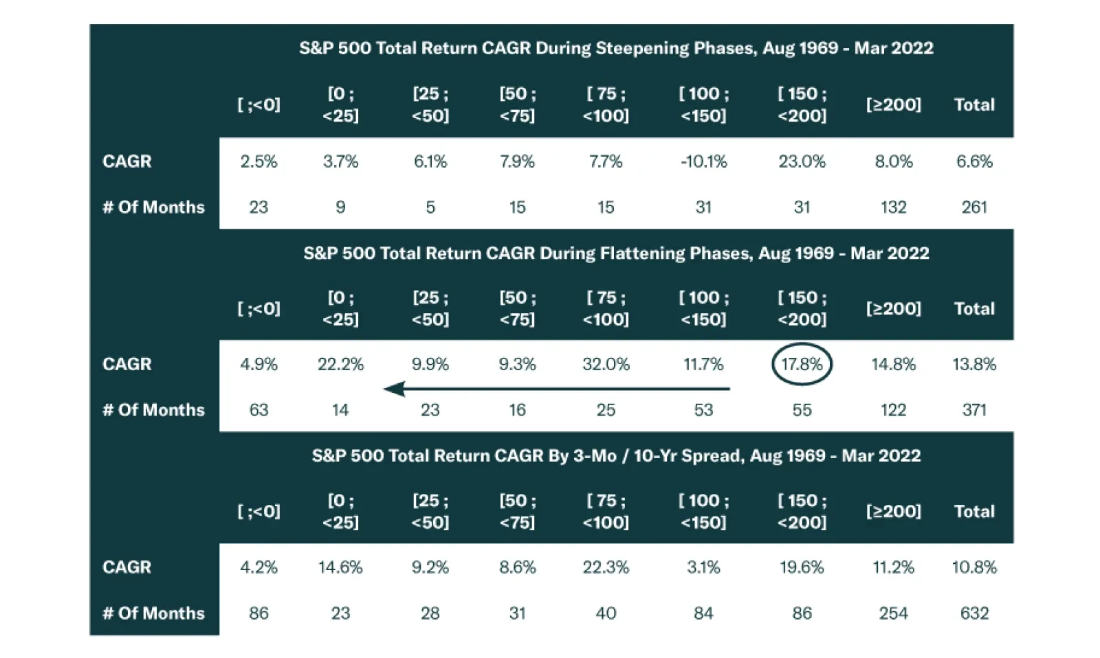
Financial conditions had already tightened before the Fed hiked because of higher long-term rates, widening credit spreads, and a strengthening dollar. The Goldman Sachs Financial Conditions Index points to the ISM Manufacturing Index falling below 50 later this year (Chart 6). That is the level that historically has been the dividing line between stocks outperforming bonds year-over-year (Chart 7). In particular, the sharp rise in long-term rates (the US 10-year Treasury yield has risen by 110 BPs, and the German yield by 93 BPs over the past seven months) could start to put some pressure on housing markets (Chart 8). Chart 5The Fed Hiked Too Late
Quarterly Portfolio Outlook: Too Much Uncertainty To Ignore – Turn More Cautious
Quarterly Portfolio Outlook: Too Much Uncertainty To Ignore – Turn More Cautious
Chart 6Tighter Financial Conditions May Affect Growth
Tighter Financial Conditions May Affect Growth
Tighter Financial Conditions May Affect Growth
Chart 7Will PMIs Fall Below 50?
Will PMIs Fall Below 50?
Will PMIs Fall Below 50?
Chart 8Rising Rates Might Dampen The Housing Market
Rising Rates Might Dampen The Housing Market
Rising Rates Might Dampen The Housing Market
The war in Ukraine is unlikely to be a risk in itself. BCA Research’s geopolitical strategists think it very improbable that the conflict will spill beyond the borders of Ukraine – though there remains tail risk of a mistake. But the war is having a big impact on energy prices, especially electricity prices in Europe (Chart 9). The oil price could remain high while Russian oil, which used to be consumed in Europe, is diverted elsewhere. Our Commodity & Energy Strategy service expects that increased supply from OPEC members will bring Brent crude down to around $90 a barrel by year-end. But, as our Client Question on page 14 details, that calculation relies on many assumptions, and the risk is that the oil price stays high. A doubling of the oil price year-on-year (which currently equates to $120/barrel) has historically often been followed by recession (Chart 10). Chart 9Europe's Electricity Prices Have Soared
Europe's Electricity Prices Have Soared
Europe's Electricity Prices Have Soared
Chart 10Oil Price Is Close To The Risk Level
Oil Price Is Close To The Risk Level
Oil Price Is Close To The Risk Level
China has been easing fiscal and monetary policy. But it is questionable how effective its stimulus will be this time. Confidence in the real estate market remains damaged. And the pick-up in credit growth has been limited to local government bond issuance; there is little sign that the private sector has appetite to borrow (Chart 11). Already some of these risks are affecting economic data. Consumer confidence has collapsed, presumably because of the rising cost of living (Chart 12). Although US activity indicators such as the manufacturing ISM remain elevated (see Chart 6 above), data in Europe is showing notable weakness (Chart 13). Chart 11China's Stimulus Not Helping The Private Sector
China's Stimulus Not Helping The Private Sector
China's Stimulus Not Helping The Private Sector
Chart 12Consumer Confidence Has Been Hit
Consumer Confidence Has Been Hit
Consumer Confidence Has Been Hit
The yield curve is also getting close to signaling recession. There has been much debate of late about which yield curve to use, with Fed Chair Jerome Powell arguing for the 3-month/3-month 18-month forward curve, rather than the more usual 2/10 year or 3 month/10 year curves (Chart 14). The 2/10 is close to inverting, while the others are still a long way away. All measures of the yield curve have historically given reliable recession signals; the difference is simply a matter of timing, with the 2/10 giving the longest lead time.1 If the Fed ends up tightening as much as it intends, all the yield curves will likely invert within the next year or so. Chart 13European Data Starting To Weaken
European Data Starting To Weaken
European Data Starting To Weaken
Chart 14It Depends On Which Yield Curve You Look At
It Depends On Which Yield Curve You Look At
It Depends On Which Yield Curve You Look At
And, despite all these warning signals, forecasts for economic and earnings growth have not been revised down much. Economists still expect 3.4-3.5% real GDP growth in the US and euro zone this year, well above trend (Chart 15). And, despite the drop in GDP forecasts, earnings forecasts have actually been revised up since the start of the year, with analysts now expecting 9.6% EPS growth in the US and 8.2% in the euro zone (Chart 16). Chart 15GDP Growth Is Still Expected To Be Above Trend...
GDP Growth Is Still Expected To Be Above Trend...
GDP Growth Is Still Expected To Be Above Trend...
Chart 16...And Earnings Have Not Been Revised Down At All
...And Earnings Have Not Been Revised Down At All
...And Earnings Have Not Been Revised Down At All
This all seems too much uncertainty for most asset allocators to want to stay fully risk-on. There are valid arguments that equities and other risk assets can continue to perform (which we outline in the following section, Risks To Our View). But the risks have shifted enough since the start of the year that a more defensive stance is now warranted. Garry Evans, Senior Vice President Global Asset Allocation garry@bcaresearch.com Risks To Our View Chart 17Fed Feedback Loop Back In Action?
Quarterly Portfolio Outlook: Too Much Uncertainty To Ignore – Turn More Cautious
Quarterly Portfolio Outlook: Too Much Uncertainty To Ignore – Turn More Cautious
Since our main scenario is somewhat cautious – and sentiment towards risk assets pretty pessimistic – we need to consider what could cause upside surprises to the economy and market. The most likely would be if the Fed were to turn more dovish. But the main trigger for this would be if the stock market fell sharply or growth showed clear signs of slowing – which would obviously be negative for stocks first. This scenario could produce the sort of Fed feedback loop we saw in 2015-17, when tightening financial conditions caused the Fed to ease back on rate hikes (Chart 17). More benign would be a gradual easing of inflation over the summer which would mean that the Fed could eventually hike a little less than the market currently expects. The economy may also not be as vulnerable to higher energy prices and higher rates as we fear. Food and energy are now a much smaller part of the consumption basket than they were in the 1970s (Chart 18). Rates may have a limited impact on the housing market, given the low inventory of new houses, strong household formation, and the fact that, in the US at least, some 90% of mortgages are 30-year fixed rate. Consumers continue to hold large amounts of excess savings – more than $2 trillion in the US alone. This should keep retail sales growth strong, though there might be some shift from spending on goods to spending on services as Covid fears recede (Chart 19). Chart 18Consumers Are Less Sensitive To Food And Energy Prices...
Consumers Are Less Sensitive To Food And Energy Prices...
Consumers Are Less Sensitive To Food And Energy Prices...
Chart 19...And So May Keep On Spending
...And So May Keep On Spending
...And So May Keep On Spending
Other upside risks include: A ceasefire and settlement in Ukraine (unlikely soon, since Russia will not withdraw without taking over Crimea and the Donbass, something Ukraine could not accept); more aggressive stimulus in China (possible, but only if Chinese growth weakened much further); and a sharp fall in the oil price caused by new supply coming onto the market from Saudi Arabia and North American shale fields, and possibly also Iran and Venezuela. What Our Clients Are Asking What Is The Risk Of Stagflation? Chart 20The Combination Of High Inflation And High Unemployment Was The Key Problem In The 1970s
Quarterly Portfolio Outlook: Too Much Uncertainty To Ignore – Turn More Cautious
Quarterly Portfolio Outlook: Too Much Uncertainty To Ignore – Turn More Cautious
Several clients have asked about the risk of stagflation, and how the current episode compares to the 1970s. We can begin by dispelling some myths about the 1970s. There is a notion that this was a decade of poor growth for the US. That is simply not true. Real GDP grew by a solid 3.3% annual rate during the 1970s, higher than in any post-WW2 decade other than the 1990s and the 1960s (Chart 20, panel 1). The underlying problem during the 1970s was the combination of high inflation and a poor labor market. Despite solid growth, the unemployment rate kept grinding higher as inflation was increasing, never dropping below 4.5% even at the peaks of the expansions (Chart 20, panel 2). This situation went against the commonly held belief that it was not possible for both these variables to remain high at the same time for an extended period. With the economy plagued by both high inflation and high unemployment, the Fed faced a difficult dilemma: Keep interest rates too high and the already weak labor market would worsen; keep interest rates too low and inflation would spiral out of control. Throughout the decade, the Fed chose the latter option, causing inflation expectations to become unmoored. Chart 21Demographic Shocks And The Structure Of The Labor Force Led To A Weak Labor Market
Quarterly Portfolio Outlook: Too Much Uncertainty To Ignore – Turn More Cautious
Quarterly Portfolio Outlook: Too Much Uncertainty To Ignore – Turn More Cautious
Why was there so much slack in the labor market? Demographics were one of the main culprits. The entrance of baby boomers into the workforce dramatically increased the pool of workers. At the same time, prime-age female participation rose at the fastest pace on record, adding additional supply to the labor force (Chart 21, panel 1). The structure of the labor market also played a key role. Almost a third of employees belonged to a union and most of their salaries were indexed to inflation (Chart 21, panels 2 & 3). This made for a rigid labor market where neither employment nor wages could adjust properly to the economic cycle. True, the oil shocks of 1974 and 1979 exacerbated inflationary pressures. But what made inflation truly pernicious during the 1970s was the inability of the Fed to fight it without compromising its employment mandate. Today the economic picture is very different. Union membership stands at only 10% and cost of living adjustments have essentially disappeared. There is also no labor supply shock on the horizon comparable to the baby boomers or women entering the labor force. This makes the calculus for the Fed easy. With its employment mandate already met, it will simply keep raising rates until inflation is back under control. As a result, the risk that it keeps policy too easy and unleashes further inflationary pressures is relatively low over the next 12 months. How Will The War In Ukraine Affect The World Economy? Chart 22The Ukrainian War Has Impacted The Global Economy
Quarterly Portfolio Outlook: Too Much Uncertainty To Ignore – Turn More Cautious
Quarterly Portfolio Outlook: Too Much Uncertainty To Ignore – Turn More Cautious
Global growth, monetary policy, and employment were projected to return to pre-pandemic trends in 2023. In January, the IMF projected global growth of 4.4% in 2022, but now it is poised to cut its forecast due to the war in Ukraine. According to OECD estimates, global economic growth could be 1% lower than what was previously predicted (Chart 22, panel 1). The conflict is putting fresh strain on overstretched global supply chains, causing the price of many commodities to surge. Russia and Ukraine are relatively small in terms of economic output (together they comprise only 1.9% of global GDP in US dollar terms). But they are very big producers and exporters of energy, metals, and key food items. Russia, for example, produces 12% of global oil, one-third of palladium, and (with Belarus) 40% of potash (used in fertilizers). Ukraine is also a major producer of auto parts, such as wire harnesses. Some European car manufacturers have had to idle factories due to a lack of components. Global central banks have been increasing interest rates to battle inflation. But higher energy and food prices will require additional rate hikes to ensure price stability. The war in Ukraine could push up world inflation by around 2.5% this year, according to the OECD. Developing economies are in a particularly tight spot, being hit with high inflation in food and basic commodities. Their consumer price indices are very sensitive to these items. Russia and Ukraine are the main global exporters of several agricultural items (for example, they together account for a quarter of global wheat exports) which could cause global food insecurity to increase (Chart 22, panel 2). International sanctions on Russia create a risk for foreign companies with operations there. Withdrawal could have a meaningful effect on earnings. Most multinationals have only limited exposure to Russia, but a small number of prominent names make more than 5% of global revenues from the country (Chart 22, panel 3). Chart 23AOPEC Is Able To Cover Supply Shortages...
OPEC Is Able To Cover Supply Shortages...
OPEC Is Able To Cover Supply Shortages...
Chart 23B...Unlike Other Countries...
...Unlike Other Countries...
...Unlike Other Countries...
Chart 23CTo Restore A Balanced But Tight Market
To Restore A Balanced But Tight Market
To Restore A Balanced But Tight Market
What Is The Risk That The Oil Price Stays High? Our Commodity & Energy strategists see 1.3mm b/d of supply from OPEC coming onto the market beginning in May. Because of this, they expect the price of Brent crude to fall back, to average $93 per barrel this year and next. OPEC core producers fear that low inventories and an oil price above $100 per barrel will lead to demand destruction. They will therefore aim to bring prices down. They have enough spare capacity (approximately 3.2mm b/d) to cover physical deficits in global markets (Chart 23A). However, the risk to this view is tilted to the upside. The key question is whether OPEC producers will in fact ramp up production. The OPEC meeting held on March 2, 2022 noted that current market volaility is a function of geopolitical developments and does not reflect changes in market fundamentals: This could imply a reluctance to increase production as quickly as we expect. Saudi Arabia’s interest in exploiting yuan-settled oil trades with China adds an element of uncertainty. With OPEC’s intention to increase production in question, and Russian oil sanctioned and unlikely to be rerouted easily and quickly, there remains little alternative supply: Countries such as Iraq and Venezuela are unlikely to make up for supply deficits (Chart 23B). The US-Iran talks also add downside uncertainty to our price outlook. Our commodity strategists have recently ended their forecast of a return of 1-1.3mm b/d of Iranian oil (Chart 23C). A no-deal scenario is likely to lead to an escalation in tensions and volatility, warranting higher oil prices in the short term. Nevertheless, there remains the possibility that the US administration will be keen on striking a deal with Iran to reduce the risk of a global oil supply shock. This would, in turn, reduce the risk of military conflict, at least in the short-term, and remove some risk premium from oil prices. It might also lead to further increases in production from the Gulf states to prevent Iran from stealing market share, putting further downward pressure on the oil price. Chart 24Is It Time To Favor EMU Equities?
Is It Time To Favor EMU Equities?
Is It Time To Favor EMU Equities?
When Will Euro Area Stocks Rebound? Chinese policy makers have sounded more aggressive of late in terms of supporting the Chinese economy and stock market, especially property and tech shares. This is a positive development for euro area equities given the region’s strong reliance on the Chinese economy (Chart 24, panel 1). Euro area equities have been in a structural downtrend relative to US equities, but have historically staged occasional counter-trend rallies (Chart 24, panel 2). It’s possible that stocks in this region may stage another short-term rebound at some point because they are technically oversold, and valuation is extremely cheap (Chart 24, panel 3). Investors with a longer-term investment horizon, however, should remain underweight euro area stocks until there are more signs that the region is out of its stagflation state. As we argue in the Global Equities section on page 18, the key factor to watch over the next 9-12 months is profitability. Global earnings growth will slow significantly this year in response to higher input costs and lower revenue growth. As a net importer of energy and industrial metals, euro area earnings growth will continue to slow more than in the US (Chart 24, panel 4). In addition, in times of high uncertainty, we prefer to shelter in less volatile markets. The euro area has a much higher beta than the US (Chart 24, panel 5). Bottom Line: While there could be an opportunity to overweight euro area stocks versus the US tactically, long-term investors should continue to favor the US. Global Economy Chart 25Global Growth Remains Robust...
Global Growth Remains Robust...
Global Growth Remains Robust...
Overview: Global growth has been strong. But this has triggered a surge in inflation, which is pushing central banks to tighten policy more quickly than was expected even three months ago. At the same time, higher prices – and falling real wages – have started to hurt consumer confidence. This raises the risk of stagflation, particularly if disruptions caused by the war in Ukraine push commodity prices up further. A recession is still unlikely over the next 12-18 months, but the risk of one has clearly risen. US economic growth has remained robust, led by consumption and capex. GDP growth in Q4 was 5.6% QoQ annualized. The ISMs remain strong, with manufacturing at 58.5 and services 58.9 (Chart 25, panel 2). However, there are some early signs of slowdown. The Atlanta Fed Nowcast points to only 0.9% annualized growth in Q1. The effect of higher inflation (with headline CPI at 7.9% YoY) might hurt consumer confidence, since average hourly earnings growth lags behind inflation at only 5.1%. Higher rates could also dampen the housing market. With the average mortgage rate rising to 4.5%, from 3.3% at the end of last year, there are signs of a slowdown in house sales (which fell 9.5% YoY in January). Euro Area: Growth remains decent, with Q4 GDP 4.6% QoQ annualized, and robust PMIs (manufacturing at 57.0 and services at 54.8). However, wage growth lags that in the US (negotiated wages rose only 1.5% YoY in Q4), and the impact of a sharp jump in energy prices (exacerbated by the war in Ukraine) could dent consumption. Recent data have deteriorated noticeably: Consumer confidence collapsed to -18.7 in March, and the March ZEW survey (Chart 26, panel 1) fell to -38.7 (from +48.6 in February). With weak underlying growth, and core CPI inflation a relatively modest 2.7%, the ECB will not need to rush to raise rates. Chart 26...But Higher Inflation Is Starting To Damage Confidence
...But Higher Inflation Is Starting To Damage Confidence
...But Higher Inflation Is Starting To Damage Confidence
Japan: Economic growth remains rather anemic. Manufacturing is supported by exports (which rose by 19.1% YoY in January), helping the manufacturing PMI to stay in positive territory at 53.2. But wage growth remains stagnant (0.9% YoY) and the rise in oil prices has pushed up headline inflation to 0.9%, leading to a weakening of consumer sentiment. The services PMI is a weak 48.7. There are hopes that this year’s shunto wage round will lead to strong wage rises (the government is lobbying businesses to raise wages by 3%) but this seems unlikely. With inflation ex food and energy languishing at -1.9% (even if that is distorted by cuts in mobile phone charges), there seems little need for the Bank of Japan to tighten policy. Emerging Markets: Chinese economic indicators remain depressed (Chart 26, panel 3), even though global demand for manufactured goods means exports are rising 16.4% YoY. The authorities have been easing policy, which has led to a mild uptick in credit growth. But there are questions on how effective stimulus will be, since the housing market has been damaged by the problems at Evergrande and other developers, and because China seems to be sticking to its zero-Covid policy. Some other EMs will be helped by the rise in commodity prices: South Africa, for example, saw 4.9% annualized GDP growth in Q4. But many developed countries were forced to raise rates sharply last year because of inflation and this may slow growth in 2022. Brazil’s policy rate, for example, has risen to 11.75% from 2% last April, and that has dampened activity: Brazilian industrial production is falling 7.2% YoY, and retail sales are -1.9% YoY. Interest Rates: Recorded inflation and inflation expectations (Chart 26, panel 4) have risen sharply everywhere. Slowing demand for manufactured goods and a supply-side response should allow monthly inflation to peak over the next few months – although the risks remain to the upside if commodity prices continue to rise. The surge in inflation has pushed up long-term rates, with the US 10-year Treasury yield rising by 82 BPs year-to-date and that in Germany by 73 BPs. However, the market is now pricing in very aggressive tightening by central banks through year-end: 214 BPs of further hikes by the Fed, and even 75 BPs by the ECB. The probability is that neither will do quite that much, and therefore the upside for long-term government bond yields is probably capped around its current level for the next 6-9 months. Global Equities Chart 27Watch Earnings Revisions Closely
Watch Earnings Revisions Closely
Watch Earnings Revisions Closely
Watch Earnings Closely: Global equities suffered a loss of 4% in Q1/2022 despite strong earnings growth. Except for the Utilities sector, all other sectors have positive 12-month trailing and forward earnings growth. Consequently, overall equity valuation, based on forward PE, is no longer stretched (Chart 27). Going forward, however, the macro backdrop of rising inflation and a slowing economy does not bode well for earnings growth, with the profit margin in developed markets already at a historical high. Rising input costs from both materials and wages will put downward pressure on profit margins while revenue growth slows. BCA Research’s global earnings model suggests that earnings growth will slow significantly this year. As such, we downgrade equities to neutral from overweight at the asset class level (see Overview section on page 2). Within equities, we maintain our already cautious country allocation, which served us well in both 2021 and Q1/22. The out-of-consensus overweight on the US and underweight on the euro area panned out well in Q1 2022, as the US outperformed the euro area by 5.9%. After the more defensive adjustment between the UK and Canada in the March Monthly Update, our country allocation portfolio has been well positioned, with overweights in the US and UK, underweights in the euro area, Canada and emerging markets excluding China, while neutral Australia, Japan, and China. In line with the shift of our structural view on industrial commodities, we upgrade the Materials sector to neutral from underweight at the expense of Real Estate and Communication Services. After these adjustments and the added defensive tilt that we took in the February Monthly Update, our global sector portfolio has a tilt towards defensive and structural growth by being overweight Tech, Industrials, Healthcare and Consumer Staples, underweight Consumer Discretionary, Utilities, and Communication Services, while neutral Materials, Financials, Energy and Real Estate. Chart 28Sector Adjustments
Quarterly Portfolio Outlook: Too Much Uncertainty To Ignore – Turn More Cautious
Quarterly Portfolio Outlook: Too Much Uncertainty To Ignore – Turn More Cautious
Sector Allocation: Upgrade Materials To Neutral, Downgrade Real Estate to Neutral, Downgrade Communication Services to Underweight. Russia’s war on Ukraine is a watershed moment for industrial metals. It has altered the dynamics of the metals market which used to be dominated by Chinese demand. We had a structural underweight in the Materials sector because China was undergoing a deleveraging process. Now the Russian-Ukrainian war has demonstrated how dangerous it is for Europe to rely on Russia for energy supply and how important it is for Europe to have a strong military defense system. Rebuilding Europe’s defense will compete with energy diversification initiatives to boost demand for metals. Such a structural shift no longer warrants an underweight in Materials (Chart 28, panel 1). In addition, relative valuation in the Materials sector is as low as it was in the early 2000s, right before the multi-year upcycle in Materials’ relative performance (Chart 28, panel 2). Why not go overweight then? The concern is that the sector is technically overbought due to the sharp rises in metal price. Covid lockdowns in China have disrupted the supply chain in metals, and the Russian-Ukrainian war has further intensified the rise in metals prices due to extremely low inventories. We will watch closely for a better entry point to upgrade this sector to overweight. To finance this upgrade, we downgrade Real Estate to neutral from overweight, and Communication Services to underweight from neutral. Both downgrades are driven by a deteriorating relative earnings growth outlook as shown in Chart 28, panels 4 and 5. Rising mortgage rates do not bode well for the Real Estate sector. “Reopening from Covid lockdowns” reduces the “work from home” tailwind for the Communication Services sector, where relative valuation is also stretched. Government Bonds Chart 29WILL INFLATION COME DOWN IN 2022?
WILL INFLATION COME DOWN IN 2022?
WILL INFLATION COME DOWN IN 2022?
Maintain At-Benchmark Duration. The first quarter of 2022 had seen a steady rise in global bond yields even before the Russian-Ukrainian war, in response to a higher inflation outlook. The negative shock to bond yields from the war was quickly reversed and bond yields continued to march higher as the supply shortage in the commodity complex further pushed up commodity prices and inflation expectations. The US 10-year TIPS breakeven inflation rate has risen above the 2.3-2.5% range that is consistent with the Fed’s 2% PCE target. However, the 5-year/5-year forward breakeven inflation rate, the measure that the Fed pays more attention to, is only slightly above 2.3% (Chart 29, panel 2). The base case of BCA Research’s Fixed Income Strategists is that inflation will moderate in the coming months so that there should be limited upside for bond yields. We already upgraded duration to at-benchmark from below-benchmark, and government bonds to neutral from underweight within the bond asset class in the March Portfolio Update. These are still appropriate going forward with the US 10-year Treasury yield currently standing at 2.33%. Inflation-linked bonds are not cheap anymore. We maintain a neutral stance to hedge against the tail risk of a further rise in inflation. Corporate Bonds Chart 30Continue To Favor High-Yield Credit
Continue To Favor High-Yield Credit
Continue To Favor High-Yield Credit
Since the beginning of the year, investment-grade bonds have underperformed duration-matched Treasurys by 191 basis points, while high-yield bonds have underperformed duration-marched Treasurys by 173 basis points. Even with spreads widening, we continue to underweight investment-grade credits within the fixed-income category. Spreads currently do not offer enough value to warrant a neutral shift. Moreover, investment-grade corporate bonds have been performing poorly compared to high-yield corporate bonds (Chart 30, panel 1). But shouldn’t one expect lower-rated bonds to perform worse in bear markets, and better in bull markets? Our US Bond Service believes that one explanation for the poor performance of investment-grade compared to high-yield bonds is that the industry composition of the two categories is quite different. High-yield has a large concentration in the Energy sector while investment-grade bonds have a larger weighting in Financials. And with the recent surge in oil prices, it’s possible that the strong performance of Energy credits is the reason behind that return divergence. We continue to overweight high-yield bonds, as there is likely to be no material increase in corporate default risk. The market currently implies that defaults will rise to 3.7% during the next 12 months, from 1.2% over the past 12 months (Chart 30, panel 2). That seems too high. What about European credit? The ECB’S hawkish turn and then the Ukranian crisis made yields almost double this year. The spreads for both investment-grade and high-yield corporate bonds have been widening since the beginning of the year (Chart 30, panel 3). Their valuations seem to offer an attractive entry point but investors should be cautious as spreads could continue to widen in response to the negative news from the Ukranian crisis. Commodities Chart 31Risks To Oil Price Are To The Upside
Quarterly Portfolio Outlook: Too Much Uncertainty To Ignore – Turn More Cautious
Quarterly Portfolio Outlook: Too Much Uncertainty To Ignore – Turn More Cautious
Energy (Overweight): Oil prices surged to $120 – the highest level since 2013 – in the aftermath of Russia’s invasion of Ukraine, pricing in sanctions against the nation’s oil producers and an estimated 3-5 mm b/d of supply disruptions (Chart 31, panel 1). While the actual hit to Russian production might end up being lower, Russia accounts for over 10% of global production, almost half of which is exported (Chart 31, panel 2). The price shock was slightly offset by a marginal demand weakness from China amid another outbreak of Covid-19. However, uncertainty regarding how quickly core OPEC producers will ramp up production to fill supply shortages – as well as the breakdown in the US-Iranian talks – continue to keep oil prices jittery. Our Commodity & Energy strategists see 1.3mm b/d of increased supply from OPEC coming onto the market beginning in May. This should bring the price of Brent crude down to average $93 per barrel this year and next. The risks to this view however remain tilted to the upside. For more details, see What Our Clients Are Asking on page 14. Industrial Metals (Neutral): Russia is a major player in the metals market, providing more than a third of the world’s palladium output; it is also the third biggest producer of nickel (Chart 31, panel 3). The prices of those metals, as well as the broad industrial metals complex, have shot up following the invasion: Industrial metals had the largest weekly price change since 1990 in the week following the invasion. The outlook for industrial metals prices is tilted to the upside. Inventories for some of the industrial metals required for the energy transition are low. Moreover, if China implements significant stimulus – and supply remains tight – prices are likely to stay elevated. Precious Metals (Neutral): Gold prices reacted in line with the moves in US real rates over the first quarter of this year, initially relatively flat, before rising in the past few weeks as real rates came down. The upward move in gold prices was further amplified by Russia’s invasion of Ukraine, which pushed the bullion’s price close to $2040, just shy of its all-time high in late 2020. This comes as no surprise: The metal is known (despite its volatility) for its safe-haven and inflation-hedging characteristics. We maintain our neutral exposure to gold. Real rates should start to rise as inflation pressures abate in the second half of the year. Gold is also somewhat expensively valued, with the price in inflation-adjusted terms close to its record high (Chart 31, panel 4). Currencies Chart 32Don't Turn Bearish On The Dollar Yet
Don't Turn Bearish On The Dollar Yet
Don't Turn Bearish On The Dollar Yet
US Dollar: The DXY index has risen by 2.3% this quarter. We are maintaining our neutral stance on the US dollar. While the dollar is expensive by more than 20% according to purchasing power parity (PPP), positive momentum continues to be too strong to take an outright bearish position (Chart 32, panels 1 and 2). We will look to downgrade the dollar to underweight when momentum starts to weaken and when there is clear evidence that the Fed will have to back off from its tightening path. Japanese Yen: With stock markets rebounding and expectations of interest-rate hikes rising in the US, the yen has fallen by more than 18% since the beginning of the year. Still, we reiterate the overweight that we placed at the beginning of March. The yen should act as a hedge if global stock markets sell off anew. Moreover, we believe there is now limited upside for US yields, given that there are now more than 250 basis points of Fed hikes priced over the next 12 months. This should put a cap on USDJPY, as this cross is closely tied to the relative expectations of tightening between the US and Japan (Chart 32, panel 3). Canadian Dollar: We are currently underweight the Canadian dollar. Our Commodity and Energy Strategists believe that oil should come down to around $90/barrel by the end of the year. Additionally, the BoC won’t be able to follow along with the Fed in its tightening cycle, given that household debt is much higher in Canada than in the US. Both developments should put downward pressure on the CAD over the next 12 months. Alternatives Chart 33Prepare To Turn To Defensive Alternatives
Prepare To Turn To Defensive Alternatives
Prepare To Turn To Defensive Alternatives
Return Enhancers: We previously suggested that private equity tends to outperform other alternative assets in the early years of expansions as it benefits from cheaper financing opportunities and attractive entry valuations. This view has been correct: Following the large drawdown in Q1 2020 due to Covid, PE returns have significantly outperformed those of hedge funds (Chart 33, panel 1). However, financing conditions are tightening and could weigh down on economic activity and PE returns going forward (Chart 33, panel 2). Preliminary results for Q3 2021 show PE funds returning only around 6% compared to an average quarterly return of 10% since the beginning of the pandemic. Given the time it takes to move allocations in the illiquid space, investors should prepare to pare back exposure from PE, and look for more defensive alternative assets, such as macro hedge funds. Inflation Hedges: We have been of the view that inflation will follow a “two steps up, one step down” trajectory: More likely than not, we are near the top of those two steps. Accordingly, we were positioned to favor real estate over commodities; real estate tends to outperform when inflation is more subdued (close to 2%-3%). Inflation, globally, however has turned out to be stickier than expected and recent economic and political developments have propelled another surge in commodity prices. Scarce inventories, lingering inflation, and a potential significant Chinese stimulus imply, at least in the short-term, that commodity prices have room to run (Chart 33, panel 3). Volatility Dampeners: Timberland and Farmland remain our long-time favorite assets within this bucket. We have previously shown that both assets outperform other traditional and alternative assets during recessions and equity bear markets. Farmland particularly continues to offer an attractive yield of approximately 2.8% (Chart 33, panel 4). Footnotes 1 Please see BCA Research Special Report, "The Yield Curve As An Indicator," for a detailed analysis of this. Recommended Asset Allocation Model Portfolio (USD Terms)
Highlights There is no evidence of a decline in US corporate credit or bank lending spreads over the past few decades, meaning that any excess savings effect structurally depressing interest rates is occurring in the Treasury market. We note the possible mechanisms of action for excess savings to lower government bond yields, by lowering the current policy rate, expectations for the policy rate in the future, or the term premium on long-maturity bonds. To investigate the impact that excess savings may be having on bond yields, we define historical periods of abnormal yields based on the gap between long-maturity Treasury yields and the potential rate of economic growth. This reflects our view that potential growth is the equilibrium interest rate under normal economic conditions. Since 1960, there have been three major episodes when the difference between bond yields and economic growth was large and persistent, but the first two seem to be easily explained by the stance of US monetary policy rather than by a savings/investment imbalance. The excess savings story better fits the facts after 2000. We do find evidence that a global savings glut lowered bond yields during the early-2000s, and it may have even modestly contributed to the excessive household credit demand that ultimately caused the global financial crisis. But as a deviation from equilibrium, the effect of the global savings glut was relatively insignificant compared to what has prevailed over the past decade. Excess savings did certainly play a role in lowering long-term investor expectations for the Federal funds rate during the last economic cycle, but it did so for cyclical reasons that spanned several years rather than as a result of demographic effects or other structural factors unrelated to the business cycle. That is an important distinction, as long-term investor expectations for the Fed funds rate remained low in the second half of the last economic expansion despite a reduction in savings and significantly stronger growth. The historical impact of FOMC meetings on the structural decline in long-maturity US Treasury yields strongly implies that fixed-income investors have been guided by the Fed to expect a lower average Fed funds rate. It is our view that the Fed has a backward-looking neutral rate outlook, informed by an incomplete understanding of the economic circumstances of the latter half of the last expansion. A low neutral rate narrative has become entrenched in the minds of investors and the Fed itself, and we regard this as the primary factor anchoring yields at the long-end of the maturity spectrum. This phenomenon is only likely to dissipate once short-term interest rates rise and a recession does not materialize. While the nearer-term outlook more likely favors a neutral or at best modestly short duration stance within a fixed-income portfolio, investors should remain structurally short duration in response to a potentially rapid shift in long-term interest rate expectations from the Fed and fixed-income investors over the coming few years. Feature Chart II-110-Year US Treasury Yields Are The Lowest Relative To Headline Inflation In Over 60 Years
10-Year US Treasury Yields Are The Lowest Relative To Headline Inflation In Over 60 Years
10-Year US Treasury Yields Are The Lowest Relative To Headline Inflation In Over 60 Years
For many investors, one of the most striking features of the pandemic, especially over the past year, is how low US long-maturity government bond yields have remained in the face of the highest headline consumer price inflation in four decades (Chart II-1). To many investors, this has provided even further evidence of a structural “excess savings” effect that has kept interest rates well below the prevailing rate of economic activity. The theory of secular stagnation, revived by Larry Summers in late 2013, is a related concept, but many investors believe that interest rates will remain low even in a world in which the US economy is growing at or even above its trend. The fundamental basis for this view is the idea that over the longer term, the real rate of interest is determined by the balance (or imbalance) between desired savings and investment, and that advanced economies have and will continue to experience excess savings – defined as a chronically high level of desired savings relative to the investment opportunities available. According to this view, in order for the actual level of savings to equal investment, interest rates must fall. Chart II-2Do Excess Savings Explain This Gap? (Spoiler: No)
Do Excess Savings Explain This Gap? (Spoiler: No)
Do Excess Savings Explain This Gap? (Spoiler: No)
This report challenges the view that excess savings are mostly responsible for the current level of long-term bond yields in the US. We agree that excess savings have played a role in explaining changes in long-term bond yields at different points over the past 20 years; we also agree that it is normal for interest rates in advanced economies to trend down over time in response to a demographically-driven decline in potential growth. But our goal is not to explain the downtrend in interest rates over time. Instead, we aim to explain the gap between the level of long-term bond yields today and the prevailing rate of economic activity, or consensus forecasts of the trend rate of growth (Chart II-2). We do not believe that this gap is economically justified, nor do we believe that it is driven by excess savings. We conclude that the Fed’s backward-looking neutral rate outlook is the primary factor anchoring US Treasury yields at the long-end of the maturity spectrum. This is only likely to change once short-term interest rates rise and a recession does not materialize; it suggests that investors should remain structurally short duration in response to a potentially rapid shift in long-term interest rate expectations from the Fed and fixed-income investors over the coming few years. Excess Savings And Interest Rates: Defining A “Mechanism Of Action” Households, businesses, and governments can directly purchase debt securities in capital markets, but they do not typically provide loans directly to borrowers. Direct lending usually occurs through the banking system, which means that excess savings would only lower interest rates in the economy through one of the following ways: By lowering the Fed funds rate By lowering long-maturity government bond yields relative to the Fed funds rate, by reducing either the term premium or investors’ expectations for the average Fed funds rate in the future By lowering corporate bond yields relative to duration-matched government bond yields By lowering lending rates on bank loans relative to banks’ cost of borrowing Charts II-3-II-5 highlight that there is no evidence of a structural decline in corporate credit spreads or bank lending rates relative to the Fed funds rate, so we can rule out this effect as a mechanism of action for excess savings to have structurally lowered interest rates. Chart II-6 highlights that interest paid on bank deposits lags the Fed funds rate, so we can also rule out the idea that excess deposits force the Fed to keep the effective Fed funds rate low. Chart II-3No Evidence Of A Structural Decline In Corporate Credit Spreads…
No Evidence Of A Structural Decline In Corporate Credit Spreads...
No Evidence Of A Structural Decline In Corporate Credit Spreads...
Chart II-4…Or Auto Loan Rate Spreads…
...Or Auto Loan Rates Spreads...
...Or Auto Loan Rates Spreads...
Chart II-5…Or Personal Loan Rate Spreads…
...Or Personal Loan Rate Spreads...
...Or Personal Loan Rate Spreads...
Chart II-6...Or Bank Deposit Rate Spreads
...Or Bank Deposit Rate Spreads
...Or Bank Deposit Rate Spreads
This means that if excess savings are depressing interest rates in the US, that the effect is truly occurring in the Treasury market. As noted, this could occur by lowering the current policy rate, expectations for the policy rate in the future, or the term premium on long-maturity bonds. Related Report The Bank Credit AnalystR-star, And The Structural Risk To Stocks All of these effects are certainly possible. Keynes’ paradox of thrift highlights that excess savings can manifest itself as a chronic shortfall in aggregate demand, which would persistently lower the Fed funds rate as the Fed responds to a long period of high unemployment. This could also lower the term premium on long-maturity bond yields in a scenario in which the Fed repeatedly engages in asset purchases to help stabilize aggregate demand. As well, domestic excess savings could lower the term premium on long-maturity bond yields, as aging savers directly purchase government securities as part of their retirement portfolios. Finally, foreign capital inflows could also cause this effect, especially if they originate from countries with chronic current account surpluses that use an increase in US dollar reserves to purchase long-maturity US government securities. Table II-1 summarizes these possible mechanisms of action for excess savings to lower US government bond yields. With these mechanisms in mind, we review the past 60 years to identify periods of “abnormal” bond yields, with the goal of understanding whether excess savings appear to explain major gaps. Table II-1Possible Mechanisms Of Action For Excess Savings To Lower Long-Term Government Bond Yields
April 2022
April 2022
Identifying Periods Of “Abnormal” Long-Maturity Bond Yields Chart II-7There Have Been Three Distinct Periods Of Abnormal Long-Maturity Bond Yields
There Have Been Three Distinct Periods Of Abnormal Long-Maturity Bond Yields
There Have Been Three Distinct Periods Of Abnormal Long-Maturity Bond Yields
Chart II-7 shows the difference between nominal 10-year US Treasury yields and nominal potential GDP growth. Panel 2 shows an alternative version of this series using the ten-year median annualized quarterly growth rate of nominal GDP in lieu of estimates of potential growth, which highlights a generally similar relationship. This approach to defining “abnormal” long-maturity bond yields reflects our view that the potential rate of economic growth is the equilibrium interest rate under normal economic conditions. To see why, given that GDP also effectively represents gross domestic income, an interest rate that is persistently below the potential growth rate of the economy would create a strong incentive to borrow on the part of households and especially firms. Chart II-7 makes it clear that the relationship has been mean-reverting over time, but that there have been three major episodes when the difference between bond yields and economic growth was large and persistent. The first episode occurred from 1960 to the late 1970s, and saw government bond yields average well below the prevailing rate of economic growth. We do not see this period as having been caused by an excess of desired savings relative to investment. As we discussed in our November Special Report,1 this gap represented a period of persistently easy monetary policy which contributed to excessive aggregate demand and a structural rise in inflation. The second major episode is also easily explained, as it occurred in response to the first. Following a decade of high inflation, Fed chair Paul Volcker raised interest rates aggressively beginning in 1979 to combat inflationary expectations, which led to a two-decade period of generally tight monetary policy. Like the first period, this was not caused by an imbalance between desired savings and investment. The third episode has prevailed since the late-1990s, and has seen a negative yield/growth gap on average – albeit one that has been smaller than what occurred in the 1960s and 1970s. From 2000 to 2007, the gap was generally negative, although it turned positive by the end of the economic cycle. It was modestly negative on average from 2008 to 2010, and only became persistently negative starting in 2011. The gap fell to a new low during the COVID-19 pandemic, and remains wider today than at any point during the last economic recovery. It is these post-2000 periods of a persistently negative yield/growth gap that should be closely investigated for evidence of an excess savings effect. The Global Savings Glut As noted, prior to 2000, the yield/growth gap in the US seems clearly explained by the Fed’s monetary policy stance, not by an excess savings effect. So the question is whether there is any evidence of excess savings having caused this negative gap since 2000. In our view, the answer is yes, but the effect was relatively small compared to what prevails today. We do find evidence of a global savings glut during the early-2000s. Chart II-8 highlights that the private and external sector savings/investment balances in China and emerging markets more generally were persistently positive during the 2000s. Chart II-9 highlights that multiple estimates of the term premium declined around that time – especially during Greenspan’s “conundrum” period of between 2004 and 2005. Chart II-8There Was A Global Savings Glut Prior To The Global Financial Crisis
There Was A Global Savings Glut Prior To The Global Financial Crisis
There Was A Global Savings Glut Prior To The Global Financial Crisis
Chart II-9The Global Savings Glut Does Seem To Have Lowered The Term Premium On US 10-Year Treasurys
The Global Savings Glut Does Seem To Have Lowered The Term Premium On US 10-Year Treasurys
The Global Savings Glut Does Seem To Have Lowered The Term Premium On US 10-Year Treasurys
Chart II-10 breaks down the components of the 10-year yield into the 5-year yield and the 5-year/5-year forward yield, and highlights that the negative correlation between the two components lasted for only one year. Overall, the 10-year Treasury yield was lower than potential growth for roughly two years as a result of the global savings glut effect. Chart II-10Still, The Global Savings Glut Effect Did Not Last Long And Was Not Especially Large In Magnitude
Still, The Global Savings Glut Effect Did Not Last Long And Was Not Especially Large In Magnitude
Still, The Global Savings Glut Effect Did Not Last Long And Was Not Especially Large In Magnitude
This was a significant event, and it may even have modestly contributed to the excessive household credit demand that ultimately caused the global financial crisis. But as a deviation from equilibrium, it was relatively insignificant compared to what has prevailed over the past decade. Excess Savings And US Household Deleveraging Chart II-11Most Of The Post-2007 Decline In 10-Year Yields Is Attributable To Lower Long-Term Fed Funds Rate Expectations
Most Of The Post-2007 Decline In 10-Year Yields Is Attributable To Lower Long-Term Fed Funds Rate Expectations
Most Of The Post-2007 Decline In 10-Year Yields Is Attributable To Lower Long-Term Fed Funds Rate Expectations
Chart II-11 highlights that, relative to June 2007 levels, the vast majority of the cumulative decline in the 10-year Treasury yield has occurred because of a decline in implied long-term expectations for the Fed funds rate, rather than a major decline in the term premium. The chart also shows that almost all the decline in implied long-term interest rate expectations since 2007 occurred during the 2008/2009 recession. This normally occurs during a recession as investors price in a low average Fed funds rate at the short end of the curve; the anomaly is that these expectations remained permanently low even as the economy recovered and as the Fed raised interest rates from 2015 to 2018. To us, Chart II-11 also underscores that the Fed’s asset purchases are not the main culprit behind low long-maturity bond yields today, given that the decline in long-term expectations for the Fed funds rate persisted even as the Fed stopped purchasing assets in 2014. It is not difficult to see why investors lowered their long-term Fed funds rate expectations in the immediate aftermath of the global financial crisis, even as economic recovery took hold. Chart II-12 highlights that the “balance sheet” nature of the 2008/2009 recession unleashed the longest period of US household deleveraging in the post-WWII period, and Chart II-13 highlights that this occurred despite extremely low interest rates – and in contrast to other countries like Canada that did not experience the same loss in household net worth. Chart II-12Household Deleveraging Did Lower The Neutral Rate For Several Years Following The Global Financial Crisis
Household Deleveraging Did Lower The Neutral Rate For Several Years Following The Global Financial Crisis
Household Deleveraging Did Lower The Neutral Rate For Several Years Following The Global Financial Crisis
Chart II-13The US Balance Sheet Recession Structurally Impaired Credit Demand For Several Years After 2008
The US Balance Sheet Recession Structurally Impaired Credit Demand For Several Years After 2008
The US Balance Sheet Recession Structurally Impaired Credit Demand For Several Years After 2008
Given that interest rates represent the price of borrowing, it is entirely unsurprising that a US balance sheet recession led to a persistent period in which credit growth was essentially unresponsive to interest rates, as households struggled to rebuild wealth lost during the recession and were unable to, or uninterested in, releveraging. This is another way of saying that the neutral rate of interest fell during that period, which we agree did occur. It is also accurate to characterize the US as having experienced a sharp increase in desired savings over that period, as highlighted by the explosion in the US private sector financial balance in the initial years of the last economic recovery (Chart II-14). Chart II-14Excess Savings Surged After 2008, But Eventually Normalized. Long-Term Rate Expectations Ignored The Normalization.
Excess Savings Surged After 2008, But Eventually Normalized. Long-Term Rate Expectations Ignored The Normalization.
Excess Savings Surged After 2008, But Eventually Normalized. Long-Term Rate Expectations Ignored The Normalization.
So excess savings did certainly play a role in lowering long-term investor expectations for the Federal funds rate during the last economic cycle, but it did so because of cyclical reasons that spanned several years rather than because of demographic effects or other structural factors unrelated to the business cycle. That is an important distinction, because while Chart II-14 shows that this excess savings effect eventually waned in importance, long-term investor expectations for the Fed funds rate remained low in the second half of the last economic expansion. Chart II-15Growth Was Historically Weak Last Cycle, But Only Because Of The First Few Years Of The Expansion
April 2022
April 2022
Chart II-15 highlights that the cumulative annualized growth in real per capita GDP during the last economic cycle was significantly below that of the average of previous expansions, but this was only the case because of the very slow growth period between 2008 and 2014. Per capita growth during the latter half of the expansion was comparable to that of previous expansions, and this occurred while the Fed was raising interest rates. And yet, investors only modestly raised their long-term interest rate expectations during that period. In our view, it is this fact that holds the key to understanding why investors’ long-term rate expectations are still low today. An Alternative Explanation For Today’s Extremely Low Long-Maturity Bond Yields Chart II-16Fixed-Income Investors Have Been Guided By The Fed To Expect A Low Average Fed Funds Rate
Fixed-Income Investors Have Been Guided By The Fed To Expect A Low Average Fed Funds Rate
Fixed-Income Investors Have Been Guided By The Fed To Expect A Low Average Fed Funds Rate
Chart II-16 highlights that, since 1990, all of the structural decline in US 10-year Treasury yields has occurred within a three-day window on either side of FOMC meetings. This strongly suggests that fixed-income investors have been guided by the Fed to expect a low average Fed funds rate, which is consistent with how similar 5-year/5-year forward US Treasury yields are in relation to published FOMC and market participant estimates of the average longer-run Fed funds rate (as shown in Chart II-2). This raises the important question of why the Fed did not revise up its expectation for the neutral rate during or following the second half of the last economic expansion, when growth was much stronger than during the first half. In our view, one of the clearest articulations of the Federal Reserve’s understanding of the neutral rate of interest was presented in a 2015 speech by Lael Brainard at the Stanford Institute for Economic Policy Research. Brainard noted the following: “The neutral rate of interest is not directly observable, but we can back out an estimate of the neutral rate by relying on the observation that output should grow faster relative to potential growth the lower the federal funds rate is relative to the nominal neutral rate. In today’s circumstances, the fact that the US economy is growing at a pace only modestly above potential while core inflation remains restrained suggests that the nominal neutral rate may not be far above the nominal federal funds rate, even now. In fact, various econometric estimates of the level of the neutral rate, or similar concepts, are consistent with the low levels suggested by this simple heuristic approach.”2 Chart II-17The Fed, Wrongly, Sees The 2019 Experience As Having Confirmed A Low Neutral Rate...
The Fed, Wrongly, Sees The 2019 Experience As Having Confirmed A Low Neutral Rate...
The Fed, Wrongly, Sees The 2019 Experience As Having Confirmed A Low Neutral Rate...
Given how the Fed determines the neutral rate is, two factors explain why the Fed’s estimates of the neutral rate have not increased (and, in fact, fell modestly in March). First, core inflation remained below 2% from 2015-2019, despite the fact that the economy was clearly growing at an above-trend pace during this period in the face of Fed rate hikes. We have noted in previous reports the role that the 2014 collapse in oil prices had on household inflation expectations. The latter were already vulnerable to a disinflationary shock, given how negative the output gap had been in the first half of the expansion.3 We do not think that the decline in inflation expectations that occurred following the 2014 collapse in oil prices reflects a low neutral rate, but rather we believe that the Fed saw this as a conundrum that supported the expectation of a low average Fed funds rate. The second event explaining the Fed’s persistently low long-term rate expectations is the fact that the Fed was forced to cut interest rates in 2019, which we believe it saw as confirmation that the stance of monetary policy had become either meaningfully less easy or openly tight. From the Fed’s point of view, this perspective was also supported by recessionary indicators, such as the inversion of the 2-10 yield curve (Chart II-17), and popular (but now discontinued) econometric estimates of the real neutral rate of interest, such as those calculated by the Laubach-Williams model (panel 3). Chart II-18...Without Appreciating The Damaging Impact The China-US Trade War Had On Global Activity
...Without Appreciating The Damaging Impact The China-US Trade War Had On Global Activity
...Without Appreciating The Damaging Impact The China-US Trade War Had On Global Activity
However, this view entirely ignores the fact that the US and global economies were negatively impacted in 2018 and 2019 by a politically-motivated nonmonetary shock to aggregate demand: the China-US trade war, which also impacted or targeted several major advanced economies. Chart II-18 highlights that global trade uncertainty exploded during this period, which severely damaged business confidence around the world and caused a slowdown in global industrial production. Tighter Chinese policy also likely contributed to the slowdown in global activity, but the bottom line is that factors other than US monetary policy contributed to economic weakness during this period, and that it is incorrect to infer from the 2018/2019 experience that interest rates rose to or exceeded the neutral rate of interest. In short, it is our view that the Fed has simply become backward-looking in how it perceives the neutral rate of interest; it has not yet observed a period when the Fed funds rate has risen to its estimate of neutral but is unambiguously still easy. Fixed-income investors, having demonstrably anchored their own assessments to those of the Fed over the past 30 years, have had no basis to come to a meaningfully different conclusion. We believe that the Fed’s backward-looking low neutral rate outlook has now become entrenched in the minds of investors and the Fed itself, and is the primary factor anchoring yields at the long-end of the maturity spectrum. This will probably only change once short-term interest rates rise and a recession does not materialize. As a final point, we clearly acknowledge that private savings increased massively during the pandemic. Investors who are inclined to see excess savings as the primary driver of low bond yields will point to this fact. But this was a forced increase in savings, rather than a desired one. The rise in household sector savings occurred mostly because of a substantial reduction in services spending, as pandemic restrictions and forced changes in behavior prevented the consumption of many services. The household savings rate has already returned to its pre-pandemic level in the US, and 5-year/5-year forward Treasury yields have risen to a higher point than they were prior to the onset of the COVID-19 pandemic. US households are likely to deploy a portion of their enormous stock of excess savings, as the pandemic continues to recede in importance, which is one of the main reasons to expect that the US economy will not succumb to a recession over the coming 12-18 months – and why investors and the Fed may soon be presented with evidence that warrants an increase in their long-term interest rate expectations. Investment Conclusions There are two important investment implications of the view that the Fed’s backward-looking neutral rate projection is the primary factor anchoring yields at the long end of the maturity spectrum. As we noted in Section 1 of our report, the first implication is that investors will likely be faced with a recession scare as the 2-10 yield curve durably inverts and as rate sensitive sectors of the economy, such as housing, inevitably slow in response to the extremely sharp rise in mortgage rates that has occurred over the past three months. We believe that it is ultimately the level of interest rates that matters for economic activity, rather than the change in interest rates. Large changes over short periods of time, however, create a degree of uncertainty about the trajectory of rates that temporarily impacts economic activity. This underscores that investors should not maintain an aggressively overweight stance toward global equities in a multi-asset portfolio, as it is likely that concerns about corporate profits will increase significantly at some point this year. The second investment implication is that US long-maturity bond yields could increase to much higher levels over the coming 12-24 months than many investors expect, in a scenario in which pandemic-driven price pressure dissipates, real wages recover, and no major politically-driven nonmonetary policy shocks emerge. We acknowledge that long-term interest rate expectations are unlikely to change until hard evidence of the economy’s capacity to tolerate interest rates above the Fed’s implied current estimate of the neutral rate emerges. This is a case, however, when we believe that investors should heed the now-famous words of Rüdiger Dornbusch: “In economics, things take longer to happen than you think they will, and then they happen faster than you thought they could.” As such, while the nearer-term outlook more likely favors a neutral or at best modestly short duration stance within a fixed-income portfolio, investors should remain structurally short duration in response to a potentially rapid shift in long-term interest rate expectations from the Fed and fixed-income investors over the coming few years. Jonathan LaBerge, CFA Vice President The Bank Credit Analyst Footnotes 1 Please see The Bank Credit Analyst "Gauging The Risk Of Stagflation," dated October 29, 2021, available at bca.bcaresearch.com 2 Lael Brainard, Normalizing Monetary Policy When The Neutral Rate Is Low, December 2015 3 Please see The Bank Credit Analyst "The Modern-Day Phillips Curve, Future Inflation, And What To Do About It," dated December 18, 2020, available at bca.bcaresearch.com
The Yield Curve & Equity Returns
…
Executive Summary Refreshing Our Tactical Trade List
A Post-Invasion Reassessment Of Our Tactical Trade Recommendations
A Post-Invasion Reassessment Of Our Tactical Trade Recommendations
Our current list of tactical trade recommendations centers around two broad themes that predate the Ukraine conflict – rising global inflation expectations and relatively stronger upward pressure on US interest rates. Both themes have been strengthened by the spillovers from the war in Eastern Europe, most notably the link between soaring commodity prices and rising inflation. We still see value in holding our recommended cross-country spread trades that will benefit from continued US bond underperformance (short US Treasuries versus government bonds in Germany, Canada and New Zealand, all at the 10-year maturity). We also maintain our bias to lean against the yield curve flattening trend in the US, but we now prefer to do it solely via our existing SOFR futures calendar spread position. Finding attractively valued inflation breakeven spread trades is more difficult after the latest oil-fueled run-up in developed market inflation expectations. Canadian breakevens, however, stand out as having the greatest upside potential according to our Comprehensive Breakeven Indicators. Bottom Line: Remain in US-Germany, US-Canada an US-New Zealand 10-year government bond yield spread widening trades. Maintain our recommended position in the US SOFR futures curve (long Dec/22 futures, short Dec/24 futures). Add a new inflation-linked bond trade, going long 10-year Canadian breakevens. Feature One month has passed since Russia invaded Ukraine, and investors are still struggling to sort out the financial market implications. Equity markets in the US and Europe have recovered the losses incurred immediately after the conflict began. Equity market volatility has also fallen back to pre-invasion levels according to the VIX index (and its European counterpart, the VStoxx index). That decline in equity volatility has also coincided with a narrowing of corporate credit spreads in both the US and Europe, with the former now fully back to pre-invasion levels. Yet while credit spread volatility has calmed down, government bond yield volatility remains elevated thanks to rising commodity prices putting upward pressure on expectations for inflation and monetary policy (Chart 1). Chart 1Global Bond Yields Are Above Pre-Invasion Levels
Global Bond Yields Are Above Pre-Invasion Levels
Global Bond Yields Are Above Pre-Invasion Levels
Table 1Refreshing Our Tactical Trade List
A Post-Invasion Reassessment Of Our Tactical Trade Recommendations
A Post-Invasion Reassessment Of Our Tactical Trade Recommendations
We have already made some “wartime” adjustments to our global bond market cyclical recommendations, with those changes reflected in our model bond portfolio. This week, we review our shorter-term tactical trade recommendations. Our current list of tactical trades revolves around two broad themes that predate the Ukraine conflict – rising global inflation expectations and relatively stronger cyclical upward pressure on US interest rates. Both themes have been strengthened by the spillovers from the war in Eastern Europe, most notably the link between soaring commodity prices and rising inflation. We continue to see the value in holding on to most of our existing tactical trades, with only a couple of adjustments to be made to our US yield curve and global inflation-linked bond positions (Table 1). US Yield Curve Tactical Trades: Shift Focus To SOFR Steepeners We have recommended trades that lean against the aggressive flattening of the US Treasury curve discounted in forward rates since late 2021. Our view has been that markets were discounting too rapid a pace of Fed rate increases in 2022. With the Fed likely delivering fewer hikes than expected, Treasury curve steepening trades would benefit as the spot Treasury curve would flatten by less than implied by the forwards. Related Report Global Fixed Income StrategyFive Reasons To Tactically Increase US Duration Exposure Now Needless to say, that view has not panned out as we anticipated. The spread between 10-year and 2-year US Treasury yields now sits at a mere +13bps, down from +104bps when we initiated our 2-year/10-year steepener trade last November. The forwards now discount an inversion of that curve starting in June of this year, which would be an extraordinary outcome by historical standards. Typically, the US Treasury curve inverts only after the Fed has delivered an extended monetary tightening cycle that delivers multiple rate hikes over at least a 1-2 year period (Chart 2). Today, the curve has nearly inverted with the Fed having only delivered only a single 25bp rate increase earlier this month. Chart 2The UST Curve Is Unusually Flat Right Now
The UST Curve Is Unusually Flat Right Now
The UST Curve Is Unusually Flat Right Now
Of course, the Fed’s reaction function in the current cycle is different compared to the past. The Fed now follows an average inflation targeting framework that tolerates temporary inflation overshoots after periods when US inflation ran below the Fed’s 2% target. Now, however, the Fed has no choice but to respond to surging US inflation, which has been accelerating since September and is now at levels last seen in 1982. Chart 3Our SOFR Trade Is Similar To Our UST Curve Trade
Our SOFR Trade Is Similar To Our UST Curve Trade
Our SOFR Trade Is Similar To Our UST Curve Trade
We still see the market pricing in too much Fed tightening this year and too few rate hikes in 2023/24. The US overnight index swap (OIS) curve now discounts 218bps of rate hikes in 2022, but 44bps of rate cuts between June 2023 and December 2024. We think a more likely scenario is the Fed doing less than discounted this year, as US inflation should show some deceleration in the latter half of 2022, but then continuing to raise rates in 2023 into 2024. We have expressed this view more specifically through an additional tactical trade that was initiated last month, going long the December 2022 3-month SOFR futures contract versus shorting the December 2024 3-month SOFR futures contract. This new trade is essentially a calendar spread trade between two futures contracts, but with a return profile that has looked quite similar to our 2-year/10-year US Treasury curve flattening trade (Chart 3). Having two tactical trades that are highly correlated, and which both are driven by the same theme of the Fed doing less this year and more over the next two years, is inefficient. We see the SOFR calendar spread trade as a more precise expression of our Fed policy view compared to the 2-year/10-year Treasury curve steepener. In addition, the SOFR trade now offers slightly better value after it has lagged the performance of the Treasury curve trade over the past couple of weeks. Thus, we are keeping this trade in our Tactical Overlay portfolio (see the table on page 15), while closing out our 2-year/10-year steepener at a loss of -92bps.1 Cross-Country Spread Trades: Keeping Betting On Relatively Higher US Yields In our Tactical Overlay portfolio, we currently have three recommended cross-country government bond spread trades that all have one thing in common – a sale of 10-year US Treasuries. The long side of the three trades are different (Germany, New Zealand and Canada), but the logic underlying all three trades is the same. The Fed will deliver more rate hikes than the central banks in the other countries. 10-year US Treasury-German Bund spread Chart 4UST-Bund Spread Is Too Low
UST-Bund Spread Is Too Low
UST-Bund Spread Is Too Low
Expecting a wider US Treasury-German Bund spread remains our highest conviction view in G-10 government bond markets. This is a trade we have described as a more efficient way to position for rising US bond yields than a pure below-benchmark US duration stance. We have maintained that recommendation in both our model bond portfolio and our Tactical Overlay portfolio. For the latter, that trade was implemented using 10-year bond futures in both markets and is up 3.9% since initiation back in October 2021. The case for expecting even more Treasury-Bund spread widening remains strong, for several reasons: Underlying inflation remains higher in the US, particularly when looking at domestic sources of inflation like wages and service sector prices. Europe, which relies more heavily on Russia for its energy supplies than the US, is more at risk of a negative growth shock from the Ukraine conflict. Our fundamental model of the 10-year Treasury-Bund spread shows that the current level of the spread (+197bps) is about one full standard deviation below fair value, which itself is rising due to stronger US economic growth, faster US inflation and a more aggressive path for monetary tightening from the Fed relative to the ECB (Chart 4). The spread between our 24-month discounters in the US and Europe, which measure the amount of rate hikes priced into OIS curves for the two regions over the next two years, has proven to be good leading indicator of the 10-year Treasury-Bund spread. That discounter spread is currently at 99bps, levels last seen when the 10-year Treasury-Bund spread climbed to the 250-300bps range in 2017/18 (Chart 5). With the relative forward curves now discounting a slight narrowing of the US-German 10-year spread over the next year, betting on a wider spread does not suffer from negative carry. We are maintaining this trade in our Tactical Overlay portfolio with great conviction. 10-year US Treasury-Canada government bond spread We entered another cross-country spread trade involving a US Treasury short position earlier this month, in this case versus 10-year Canadian government bonds. This trade is a bet on relative monetary policy moves between the Fed and the Bank of Canada (BoC). Like the Fed, the BoC is facing a problem of high inflation and tight labor markets. Canadian core CPI inflation hit a 19-year high of 3.9% in January, while the Canadian unemployment rate is at a 3-year low of 5.5%. The US is facing even higher inflation and even lower unemployment, but one major difference between the two nations is the degree of household sector debt loads. Canada’s household debt/income ratio now stands at 180%, 55 percentage points higher than the equivalent US ratio, thanks to greater residential mortgage borrowing in Canada (Chart 6). Chart 5Stay Positioned For More UST-Bund Spread Widening
Stay Positioned For More UST-Bund Spread Widening
Stay Positioned For More UST-Bund Spread Widening
The Canadian OIS curve is now discounting a peak policy rate of 3.1% in 2023, which is at the high end of the BoC’s estimated 1.75-2.75% range for the neutral policy rate. Chart 6The BoC Will Have Trouble Matching Fed Hawkishness
The BoC Will Have Trouble Matching Fed Hawkishness
The BoC Will Have Trouble Matching Fed Hawkishness
Elevated household debt will limit the BoC’s ability to lift rates that high, as this would trigger a major retrenchment of housing demand and a significant cooling of house prices. While the US is also facing issues with robust housing demand and high house prices, this is less of a factor that would limit Fed tightening relative to the BoC because US household balance sheets are not as levered as their Canadian counterparts. We are keeping our short US/long Canada spread trade (implemented using bond futures) in our Tactical Overlay portfolio, with the BoC unlikely to keep pace with the expected Fed rate increases over the next year (Chart 7). Chart 7Stay Positioned For A Narrower Canada-US Spread
Stay Positioned For A Narrower Canada-US Spread
Stay Positioned For A Narrower Canada-US Spread
10-year US Treasury-New Zealand government bond spread The third cross-country trade in our Tactical Overlay is 10-year New Zealand-US spread widening trade. Chart 8A Big Gap In NZ-US Relative Interest Rate Expectations
A Big Gap In NZ-US Relative Interest Rate Expectations
A Big Gap In NZ-US Relative Interest Rate Expectations
Like the Germany and Canada spread trades, we expect the Fed to deliver more rate hikes than the Reserve Bank of New Zealand (RBNZ) which should push up US Treasury yields versus New Zealand equivalents. In the case of this trade, however, interest rate expectations in New Zealand are far more aggressive. Chart 9Stay Positioned For NZ-US Spread Tightening
Stay Positioned For NZ-US Spread Tightening
Stay Positioned For NZ-US Spread Tightening
The RBNZ has already lifted its Official Cash Rate (OCR) by 75bps since starting the tightening cycle in mid-2021. The New Zealand OIS curve is now discounting an additional 253bps of rate hikes in this cycle, eventually reaching a peak OCR of 3.5% in June 2023. This would put the OCR into slightly restrictive territory based on the range of neutral rate estimates from the RBNZ’s various quantitative models (Chart 8). This contrasts to the pricing in the US OIS curve that places the peak in the fed funds rate at 2.8% next year before falling back to the low end of the FOMC’s 2.0-3.0% range of neutral estimates in 2024. Both the US and New Zealand are suffering from similarly high rates of inflation, with New Zealand headline inflation reaching 5.9% in the last available data from Q4/2021. However, while markets are already pricing in restrictive monetary settings in New Zealand, markets are yet to price in a similarly restrictive move in the fed funds rate. We continue to see scope for a narrowing of the New Zealand-US 10-year bond yield spread over at least the next six months. There has already been meaningful compression of the 2-year yield spread as US rate expectations have converged towards New Zealand levels (Chart 9) – we expect the 10-year spread to follow suit. Inflation Breakeven Trades: Swap Canada For Australia We currently have one inflation-linked bond (ILB) trade in our Tactical Overlay portfolio, betting on higher inflation breakevens in Australia. We initiated this trade last October, largely based on the signal from our suite of Comprehensive Breakeven Indicators (CBI) for the major developed economy ILB markets. The CBIs contain three components: the deviation from fair value from our 10-year breakeven spread models, the distance between realized headline inflation and the central bank target, and the gap between the 10-year breakeven and survey-based measures of longer-term inflation expectations. Those three measures are standardized and aggregated to form the CBI. Countries with lower CBIs have more upside potential for breakevens, and their ILBs should be favored over those from nations with higher CBIs. Chart 10Breaking Down Our Comprehensive Breakeven Inflation Indicators
A Post-Invasion Reassessment Of Our Tactical Trade Recommendations
A Post-Invasion Reassessment Of Our Tactical Trade Recommendations
Chart 11Favor Canadian Inflation-Linked Bonds Vs. Australia
Favor Canadian Inflation-Linked Bonds Vs. Australia
Favor Canadian Inflation-Linked Bonds Vs. Australia
Given the latest run-up in global inflation breakevens on the back of soaring oil prices, there are now no countries in our CBI universe that have a negative CBI (Chart 10). Canada has the lowest CBI, and thus the highest upside potential for breakeven spread widening. We are taking a modest profit of +40bps in our Australian breakeven trade, as we are approaching the self-imposed six-month holding period limit on our tactical trades and our Australian CBI is not indicating major upside for Australian breakevens.2 Based on the message from our indicators, we see a better case for entering a new tactical spread widening position in 10-year Canadian ILBs. A comparison of the CBIs between Canada and Australia shows that the Canadian 10-year inflation breakeven is well below our model-implied fair value, which incorporates both oil prices and currency levels (Chart 11). This contrasts to the Australian breakeven which is now well above fair value. A similar divergence appears when comparing breakeven spreads to survey-based measures of inflation expectations, with Canadian breakevens looking too “undervalued” compared to Australia. While realized headline inflation is above the respective central bank targets, especially in Canada, the valuation cushion makes the ILBs of the latter the better bargain of the two. The details of our new Canadian 10-year breakeven trade, where we go long the cash ILB and sell 10-year Canadian bond futures against it, are shown in our Tactical Overlay table on page 15. Robert Robis, CFA Chief Fixed Income Strategist rrobis@bcaresearch.com Footnotes 1 The Treasury curve trade is actually a “butterfly” trade, where we have included an allocation to US 3-month Treasury bills (cash) to make the curve steepener duration-neutral. Thus, the trade is more specifically a position where we are long a 2-year US Treasury bullet and short a cash/10-year US Treasury barbell with a duration equal to that of the 2-year. 2 We have recently discovered an error in our how we have calculated the returns on the 10-year Australian futures leg of our Australian 10-year inflation breakeven widening trade. The final total return for our trade shown in the Tactical Overlay table on page 15 corrects for our error, and fortunately shows a significantly higher return than we have published in past reports. GFIS Model Bond Portfolio Recommended Positioning Active Duration Contribution: GFIS Recommended Portfolio Vs. Custom Performance Benchmark
A Post-Invasion Reassessment Of Our Tactical Trade Recommendations
A Post-Invasion Reassessment Of Our Tactical Trade Recommendations
The GFIS Recommended Portfolio Vs. The Custom Benchmark Index Global Fixed Income - Strategic Recommendations* Cyclical Recommendations (6-18 Months)
A Post-Invasion Reassessment Of Our Tactical Trade Recommendations
A Post-Invasion Reassessment Of Our Tactical Trade Recommendations
Tactical Overlay Trades
Executive Summary An inverted yield curve is a reliable recession indicator. Inversions of the 3-month/10-year Treasury slope and the 3-month/3-month, 18-months forward slope both provide more timely recession signals than inversion of the 2-year/10-year Treasury slope. An inverted yield curve is a reliable equity bear market indicator. Even when it’s not signaling a recession, the yield curve’s movements offer some insight into equity returns as stocks have consistently performed better while it is flattening than they have when it is steepening. The 2-year/10-year Treasury slope embeds useful information for corporate bond excess returns. Corporates perform best when the slope is very steep and worst when it is very flat and/or inverted. Treasury securities generally outperform cash when the yield curve is either very steep or inverted. The one exception is the early-1980s when the Fed continued to tighten aggressively even after an inversion of the yield curve. Different Slopes Are Sending Different Signals
Different Slopes Are Sending Different Signals
Different Slopes Are Sending Different Signals
Bottom Line: The overall message from the yield curve is that, while the economic recovery is no longer in its early stages, it is premature to talk about a recession. On a 6-to-12 month investment horizon, investors should overweight equities in multi-asset portfolios. Within US bond portfolios, investors should maintain a neutral allocation to investment grade corporate bonds and keep portfolio duration close to benchmark. Feature It’s a well-known maxim in macro-finance that an inverted yield curve signals a recession. While that adage embeds a lot of truth, it is also sufficiently vague that it raises more questions than it answers. How far in advance does an inverted yield curve signal a recession? What specific yield curve segment sends the most helpful signal? And most importantly, does the yield curve tell us anything useful about the future performance of financial assets? These sorts of questions are particularly relevant today as we observe some sections of the yield curve approaching inversion while others make new highs (Chart 1). Chart 1Different Slopes Are Sending Different Signals
Different Slopes Are Sending Different Signals
Different Slopes Are Sending Different Signals
This Special Report explains how to think about the slope of the US Treasury curve as an indicator for the economy and financial markets. We first examine the yield curve’s empirical track record as a recession indicator. We then consider what the slope of the yield curve tells us about future equity, corporate bond and Treasury returns. The analysis presented in this report focuses on three different measures of the yield curve slope: The 2-year/10-year Treasury slope, the 3-month/10-year Treasury slope and the spread between the 3-month T-bill rate and the 3-month T-bill rate, 18 months forward. That last spread measure is less commonly cited, but Fed research has shown it to be a reliable predictor of recession.1 It was also recently highlighted by Fed Chair Jerome Powell.2 In the remainder of this report we will refer to the 3-month/3-month, 18-month forward spread as the “Fed Slope”. The Yield Curve & Recession Recession forecasting is a tricky business. It is often not so much a question of identifying “good” and “bad” recession indicators, but a question of balancing lead time and reliability. Recession indicators derived from financial market prices tend to offer greater advance warning of recession but also provide more false signals. On the flipside, indicators derived from macroeconomic data tend to give less lead time but with fewer false signals. Typically, the most useful recession indicators involve some combination of financial market and economic data. For example, a 2018 report from our US Investment Strategy service showed that a useful recession indicator can be created by combining the 3-month/10-year Treasury slope and the Conference Board’s Leading Economic Indicator.3 The Treasury slope’s reputation as an excellent recession indicator is justified because, despite it being derived from volatile financial market data, an inversion of the yield curve provides a very reliable recession signal. The 2-year/10-year Treasury slope has inverted in advance of 7 of the past 8 recessions and has not sent a false signal.4 The 3-month/10-year Treasury slope has done even better, calling 8 out of the past 8 recessions without a false signal. The Fed Slope, meanwhile, has also called 8 out of the past 8 recessions, but it sent one false signal in September 1998. There is room to quibble about the usefulness of the yield curve as a recession indicator in terms of lead time. The 2-year/10-year Treasury slope has, on average, inverted 15.9 months before the start of the next recession (Table 1). This inversion has always occurred before the first Fed rate cut of the cycle, and in all but one instance (1973-75), before the peak in the S&P 500. Table 1Lead Times For Yield Curve Segments, Equity Bear Markets And Fed Rate Cuts
The Yield Curve As An Indicator
The Yield Curve As An Indicator
But while some advance warning is good, the 2-year/10-year slope probably gives too much lead time. For example, the 2-year/10-year slope inverted a full 24 months before the 2007-09 recession, but it would have been unwise to act on that information since the S&P 500 didn’t peak for another 22 months! The historical record shows that the 3-month/10-year Treasury curve and the Fed Slope offer more useful signals than the 2-year/10-year curve. On average, these curves provide less lead time than the 2-year/10-year slope but still generally provide advance warning of recession and stock market peaks. The recession signal from the 3-month/10-year slope has only missed the peak in the S&P 500 twice. The signal from the Fed Slope has only missed the stock market’s peak once, but it also sent one false signal. Synthesizing all this information, we conclude that the 3-month/10-year Treasury curve and the Fed Slope are both highly reliable recession indicators that typically provide more than enough advance warning for equity investors to adjust their positions. The main value of the 2-year/10-year Treasury curve is that its inversion warns that we may soon get a timelier signal from the 3-month/10-year Treasury slope and the Fed Slope. Looking at the present situation, the 2-year/10-year Treasury slope has flattened dramatically during the past few months, but at 18 bps it remains un-inverted. Meanwhile, the 3-month/10-year Treasury slope and the Fed Slope are both elevated at 195 bps and 255 bps, respectively. We can conclude from this that recession warnings are premature. We will become more concerned about an upcoming recession when the 3-month/10-year slope and the Fed Slope approach inversion. The Yield Curve & Equity Returns Identifying a recession and demarcating its beginning and ending dates may seem like a trivial exercise that has little practical import. Celebrated mutual fund manager Peter Lynch has repeatedly offered the opinion that any time an equity investor spends thinking about the economy is wasted time. We beg to differ. Equity bear markets reliably coincide with recessions (Chart 2) – since the late 1960s, only one recession has occurred without a bear market (the first leg of the Volcker double dip from January to July 1980) and only one bear market has occurred without a recession (October 1987’s Black Monday bear market) – and an asset allocator who reduced equity exposure upon receiving advance notice of recessions would have been in a position to generate significant alpha. Chart 2Recessions And Bear Markets Tend To Coincide
Recessions And Bear Markets Tend To Coincide
Recessions And Bear Markets Tend To Coincide
The relationship between equity returns and the business cycle is not happenstance – variation in stock prices correlates closely with variation in corporate earnings and corporate earnings growth is a function of the business cycle. Equity prices, P, are simply the product of earnings per share, E, and the multiple investors are willing to pay for them, P/E: P = E x (P/E). If we hold somewhat fickle P/E multiples constant, stock prices will rise and fall with earnings. Given that earnings rarely decline outside of recessions (Chart 3), investors can expect equities to rise during expansions and decline during recessions. Chart 3Earnings Grow In Expansions And Fall In Recessions Earnings Declines Outside Of Recessions Are Rare
Earnings Grow In Expansions And Fall In Recessions Earnings Declines Outside Of Recessions Are Rare
Earnings Grow In Expansions And Fall In Recessions Earnings Declines Outside Of Recessions Are Rare
Digging a little more deeply into the empirical record since consensus S&P 500 earnings estimates began to be compiled reinforces the earnings/returns link. With the exception of the first leg of the Volcker double dip recession in 1980, forward four-quarter earnings estimates have fallen in every recession and have contracted in the aggregate at an annualized 16% rate (Table 2). Multiples have expanded at a hearty 9% clip from the beginning to the end of recessions but have always declined, sometimes sharply, during them. Conversely, earnings estimates always grow heartily during expansions, while multiples tend to observe a fairly tight range. Multiples and stocks move ahead of the business cycle, consistently troughing before the end of a recession, but the 20-percentage-point expansion/recession disparity in annualized returns testifies to the yield curve’s utility as an investment leading indicator. Table 2When Earnings Fall, So Do Stocks
The Yield Curve As An Indicator
The Yield Curve As An Indicator
The yield curve’s usefulness as a predictor of equity returns goes beyond recession signaling. Over the last half-century, the yield curve has tended to steepen and flatten in distinct phases. Defining a phase as a move of at least 200 basis points (bps) between the 3-month/10-year curve slope’s peak and trough, we count ten steepenings and nine flattenings since August 1969 (Chart 4). Chart 450 Years Of Steepening And Flattening
50 Years Of Steepening And Flattening
50 Years Of Steepening And Flattening
After segmenting performance by slope increments in steepening (Table 3, top panel) and flattening (Table 3, middle panel) phases, we find a clear distinction. S&P 500 total returns tend to be much stronger when the yield curve is in a flattening phase than when it is steepening. In general, a steeper curve is better than a flatter (or inverted) one for equity returns but flattening dominates steepening in every segment but the current one (150-200 bps). The cheery news for investors concerned about an inverted yield curve’s effect on stocks is that the upcoming flattening increments between now and inversion have historically been favorable. Though we are tactically neutral equities, we recommend overweighting them in multi-asset portfolios over a cyclical 6-to-12 month timeframe. Table 3Stocks Like A Flattening Yield Curve
The Yield Curve As An Indicator
The Yield Curve As An Indicator
The Yield Curve & Corporate Bond Returns This section of the report considers investment grade corporate bond returns in excess of a duration-matched position in US Treasuries and whether the slope of the Treasury curve can help us predict their magnitude. First, it’s important to point out that there is a lot of overlap between excess corporate bond returns and equity returns, but it is not complete (Chart 5). Corporates certainly tend to underperform duration-matched Treasuries during recessions and equity bear markets, but there have also been significant bouts of underperformance that fall outside of those periods. For example, corporate bond returns peaked well before equity returns in the late-1990s and corporates also underwent a severe selloff in 2014-15. Chart 5Investment Grade (IG) Corporate Bond Returns By Starting Slope Level And Trend
Investment Grade (IG) Corporate Bond Returns By Starting Slope Level And Trend
Investment Grade (IG) Corporate Bond Returns By Starting Slope Level And Trend
That said, Table 4 shows that, as is the case with stocks, a strategy of reducing corporate bond exposure during recessions will profit over time. Corporate bonds have underperformed Treasuries by a cumulative 3.1% (annualized) during recessions since 1979 and have outperformed by 1.2% (annualized) in non-recessionary periods. Table 4Corporate Bond Performance In And Out Of Recessions
The Yield Curve As An Indicator
The Yield Curve As An Indicator
The results in Table 4 suggest that investors should remain overweight corporate bonds versus Treasuries at least until the 3-month/10-year Treasury slope inverts. However, we think investors can perform even better if they pay attention to early warning signs from the 2-year/10-year Treasury slope. Table 5 shows historic 12-month corporate bond excess returns given different starting points for the 2-year/10-year slope. The starting points are also split depending on whether the 2-year/10-year slope was in a steepening or flattening trend at the time. Table 512-Month Investment Grade (IG) Corporate Bond Returns By Starting Slope Level And Trend
The Yield Curve As An Indicator
The Yield Curve As An Indicator
The results presented in Table 5 show that the level of the slope matters much more than whether the curve is in a steepening or flattening trend. They also show that, in general, excess returns tend to be much higher when the slope is steep than when it is flat. We also see that the odds of corporate bonds outperforming duration-matched Treasuries on a 12-month horizon decline markedly for periods when the 2-year/10-year slope starts below 25 bps. At present, the 2-year/10-year Treasury slope is 18 bps, just below the 25-bps cutoff. Though we take this negative signal from the yield curve seriously, we also anticipate that peaking inflation will prevent the Fed from raising rates by 245 bps during the next 12 months, the pace that is currently discounted in the yield curve. If this view pans out it will likely lead to some modest 2/10 curve steepening and a relief rally in corporate spreads. To square the difference between the current negative message from the yield curve and our more optimistic macro view, we recommend a neutral allocation to investment grade corporate bonds within US fixed income portfolios. Though we will likely downgrade our recommended allocation if the 2-year/10-year slope continues to flatten and approaches inversion. The Yield Curve & Treasury Returns This section of the report considers US Treasury index returns in excess of a position in cash, a metric designed to proxy for the returns earned by varying a US bond portfolio’s average duration. Treasury outperformance of cash indicates that long duration positions are profiting while Treasury underperformance of cash indicates that short duration positions are in the green. The historical relationship between Treasury returns and the slope of the yield curve is heavily influenced by the early-1980s period when the Fed plunged the economy into a double-dip recession to contain spiraling inflation. Chart 6 shows that this early-1980s episode is the only one where Treasuries sold off steeply even after all three of our yield curves had inverted. Chart 6A Repeat Of The Early 1980s Episode Remains Unlikely
A Repeat Of The Early 1980s Episode Remains Unlikely
A Repeat Of The Early 1980s Episode Remains Unlikely
In fact, if we look at the history of 12-month Treasury returns going back to 1973 split by the starting point for the slope (Tables 6A, 6B & 6C), we see that returns are worst after the curve is inverted and best when the curve is very steep. Table 6A12-Month Treasury Excess Returns* Given Different Starting Points For 2-Year / 10-Year Slope Since 1973
The Yield Curve As An Indicator
The Yield Curve As An Indicator
Table 6B12-Month Treasury Excess Returns* Given Different Starting Points For 3-Month / 10-Year Slope Since 1973
The Yield Curve As An Indicator
The Yield Curve As An Indicator
Table 6C12-Month Treasury Excess Returns* Given Different Starting Points For the Fed Slope** Since 1973
The Yield Curve As An Indicator
The Yield Curve As An Indicator
However, that picture changes if we start our historical sample in 1985 to exclude the early-1980s episode. Now, we see that Treasury returns tend to be high when the yield curve is very steep and when it is inverted (Tables 7A, 7B & 7C). The worst 12-month periods for Treasury returns are when the 2-year/10-year slope is between 75 bps and 100 bps, when the 3-month/10-year slope is between 50 bps and 75 bps and when the Fed Curve is between 0 bps and 25 bps. If we apply today’s situation to the post-1985 results shown in Tables 7A, 7B & 7C, we would conclude that the outlook for Treasury returns is very positive. The 3-month/10-year slope and Fed Curve are very steep, and the 2-year/10-year slope is in the 0 bps to 25 bps range. Of course, that message from the 2-year/10-year slope flips if viewed in the context of the post-1973 data shown in Table 6A. Table 7A12-Month Treasury Excess Returns* Given Different Starting Points For 2-Year / 10-Year Slope Since 1985
The Yield Curve As An Indicator
The Yield Curve As An Indicator
Table 7B12-Month Treasury Excess Returns* Given Different Starting Points For 3-Month / 10-Year Slope Since 1985
The Yield Curve As An Indicator
The Yield Curve As An Indicator
Table 7C12-Month Treasury Excess Returns* Given Different Starting Points For the Fed Slope** Since 1985
The Yield Curve As An Indicator
The Yield Curve As An Indicator
Our assessment is that the risk of a repeat of the early-1980s episode is still relatively small. Yes, inflation is extremely high, but it is likely to moderate naturally as we gain more distance from the pandemic. In that environment, the Fed will not feel the need to continue tightening aggressively even after all three segments of the yield curve have inverted. As such, we are inclined to view the message from the yield curve as positive for Treasury returns on a 12-month horizon, and we continue to advocate keeping average bond portfolio duration “at benchmark”. Ryan Swift US Bond Strategist rswift@bcaresearch.com Doug Peta, CFA Chief US Investment Strategist dougp@bcaresearch.com Footnotes 1 https://www.federalreserve.gov/econres/notes/feds-notes/dont-fear-the-yield-curve-20180628.htm 2 https://www.bloomberg.com/news/articles/2022-03-21/powell-says-look-at-short-term-yield-curve-for-recession-risk?sref=Ij5V3tFi 3 Please see US Investment Strategy Special Report, “How Much Longer Can The Bull Market Last?”, dated August 13, 2018. 4 We define an instance of “inversion” as a yield curve slope below zero for two consecutive months. Treasury Index Returns Spread Product Returns
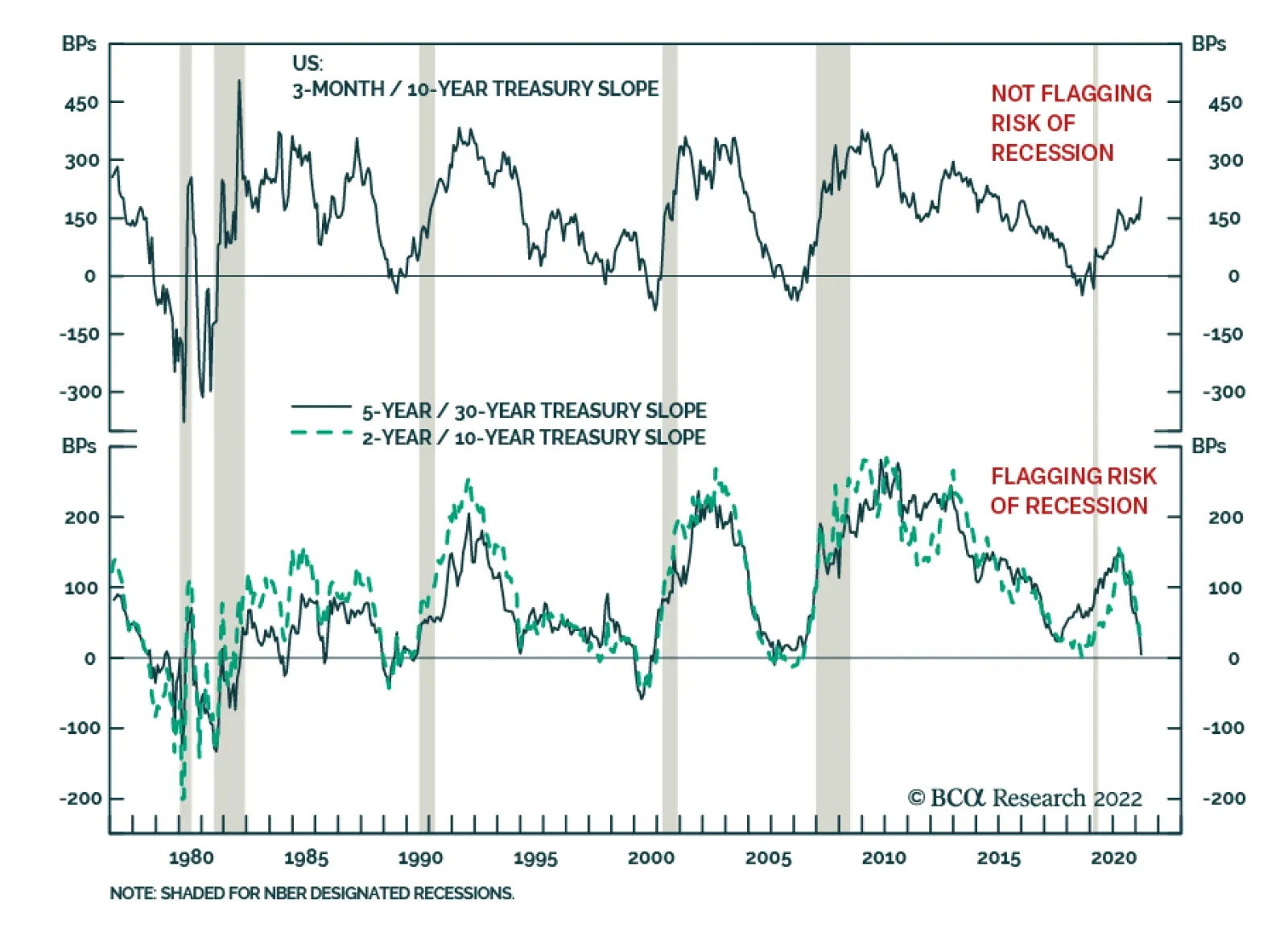
On Monday, the gap between the five- and 30-year yield on US government bond dipped into negative territory for the first time since 2006, adding to fears that the US economy is heading towards a recession. Some other parts of the Treasury curve are already…
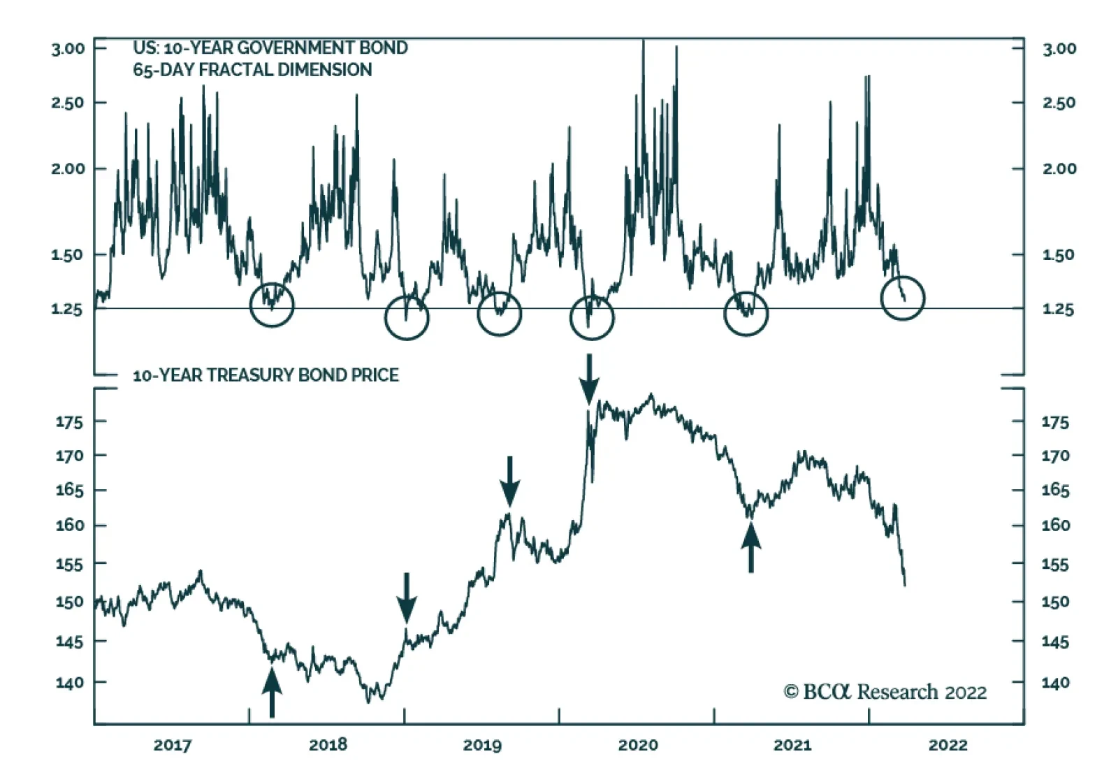
Following the sharp increase in 10-year Treasury yields – up 113 bps since early December – the signal from several of our bond market indicators is that the selloff in US Treasurys is losing steam. In our European Investment strategists’ most recent…
Executive Summary Expansion In European Defense
Expanding Military Spending
Expanding Military Spending
European yields have significant upside on a structural basis. European government spending will remain generous, which will boost domestic demand; meanwhile, lower global excess savings will lift the neutral rate of interest and structurally higher inflation will boost term premia. A short-term pullback in yields is nonetheless likely; however, it will not short-circuit the trend toward higher yields on a long-term basis. CYCLICAL INCEPTION DATE RETURN SINCE INCEPTION (%) COMMENT EQUITIES Favor European Aerospace & Defense Over European Benchmark 3/28/2022 Favor European Aerospace & Defense Over Other Industrials 3/28/2022 Bottom Line: Investors should maintain a below-benchmark duration in their European fixed-income portfolios. Higher yields driven by robust domestic demand and strong capex also boost the appeal of industrial, materials, and financials sectors. Aerospace and defense stocks are particularly appealing. The economic impact of the war in Ukraine continues to drive the day-to-day fluctuations of the market; however, investors cannot ignore the long-term trends in the economy and markets. The direction of bond yields over the coming years is paramount among those questions. Does the recent rise in yields only reflect the current inflationary shock caused by both supply-chain impairments and commodity inflation—that is, is it finite? Or does that rise mirror structural forces and therefore have much further to run? We lean toward yields having more upside over the coming years, propelled higher by structural forces. As a result, we continue to recommend investors structurally overweight sectors that benefit from a rising yield environment, such as financials and industrials, while also favoring value over growth stocks. The defense sector is particularly attractive. Three Structural Forces Behind Higher Yields The current supply-chain disruptions and inflation crises have played a critical role in lifting European yields. However, a broader set of factors underpins our bearish bond view—namely, the lack of fiscal discipline accentuated by the consequences of the Ukrainian war, the likely move higher in the neutral rate of interest generated by lower savings, and the long-term uptrend in inflation. Profligate Governments Chart 1
The Lasting Bond Bear Market
The Lasting Bond Bear Market
Larger government deficits will contribute to higher European yields. Europe is not as fiscally conservative as it was before the COVID-19 crisis. Establishment politicians must fend off pressures caused by voters attracted to populist parties willing to spend more. Consequently, IMF estimates published prior to the Ukrainian war already tabulated that, for the next five years, Europe’s average structurally-adjusted budget deficit would be 2.4% of GDP wider than it was last decade (Chart 1). Chart 2Expanding Military Spending
Expanding Military Spending
Expanding Military Spending
The Ukrainian crisis is also prompting a fiscal response that will last many years. Europe does not want to stand still in the face of the Russian threat. Today, Western Europe’s military spending amounts to 1.5% of GDP, or €170 billion. This is below NATO’s threshold of 2% of GDP. Rebuilding military capacity will take large investments. Thus, European nations are likely to move toward that target and even go beyond. Conservatively, if we assume that military spending hits 2% of GDP by the end of the decade, it will rise above €300 billion (Chart 2). Weaning Europe off Russian energy will also prevent a significant fiscal retrenchment. This effort will take two dimensions. The first initiative will be to build infrastructures to receive more LNG from the rest of the world to limit Russian intake. Constructing regasification and storage facilities as well as re-directing pipeline networks be costly and require additional CAPEX over the coming years. The second initiative will be to double-up on green initiatives to decrease the need for fossil fuel. The NGEU funds are already tackling this strategic goal. Nonetheless, the more than €100 billion reserved for renewable energy and energy preservation initiatives was only designed to kick-start hitting the EU’s CO2 emission target for 2050. Accelerating this process not only helps cutting the dependence on Russian energy, but it is also popular with voters. The path of least resistance is to invest in that sphere and to increase such investment beyond the current sums from the NGEU program. The last fiscal push is likely to be more temporary. The UN estimates that four million refugees have left Ukraine, with the vast majority settling in the EU. Accommodating that many individuals will be costly and will add to government spending across the region. Even if mostly transitory, this spending will have an important impact on activity. Larger fiscal deficits push yields higher for two reasons. Greater sovereign issuance that does not reflect a negative shock to the private sector will need to offer higher rates of returns to attract investors. Moreover, greater government spending will boost aggregate demand, which increases money demand. As a result, the price of money will be higher than otherwise, which means that interest rates will rise—as will yields. Decreasing Global Excess Savings Decreasing global excess savings will put upward pressure on the global neutral rate of interest, a phenomenon Peter Berezin recently discussed in BCA’s Global Investment Strategy service. This process will be visible in Europe as well. The US will play an important role in the process of lifting global neutral rates because the dollar remains the foundation of the global financial system. Compared to last decade, the main drag on US savings is that household deleveraging is over. As households decreased their debt load following the global financial crisis, a large absorber of global savings vanished, putting downward pressure on the price of those savings. Today, US households enjoy strong net worth equal to 620% of GDP and have resumed accumulating debt (Chart 3). Consequently, the downward trend in US total private nonfinancial debt loads has ended. The US capex cycle is likely to experience a boost as well. As Peter highlighted, the US capital stock is ageing (Chart 4). Moreover, the past five years have witnessed three events that underscore the fragility of global supply-chains: a disruptive Sino-US trade war, a pandemic, and now a military conflict. This realization is causing firms to move from a “just-in-time” approach to managing supply-chains to a “just-in-case” one. The process of building redundancies and localized supply chains will add to capex for many years, pushing up ex-ante investments relative to savings, and thus, interest rates. Chart 3US Households Are Done Deleveraging
US Households Are Done Deleveraging
US Households Are Done Deleveraging
Chart 4An Ageing US Capital Stock
An Ageing US Capital Stock
An Ageing US Capital Stock
China’s current account surplus is also likely to decline. For the past two decades, China has been one of the largest providers of savings to the global economy. This is a result of an annual current account surplus that first averaged $150 billion per year from 2000 to 2010 and then $180 billion from 2010 to 2020, and now stands at $316 billion. Looking ahead, China wants to use fiscal policy more aggressively to support demand, which often boosts imports without increasing exports. Also, more domestically-oriented supply chains around the world will limit the growth of Chinese exports. This combination will compress Chinese excess savings, which will place upward pressure on the global neutral rate of interest. Europe is not immune to declining savings. Over the past ten years, the Euro Area current account surplus has averaged €253 billion. Germany’s current account surplus stood at 7.4% of GDP before the pandemic. Those excess savings depressed global rates in general and European ones especially (Chart 5). As in the US, Europe’s capital stock is ageing and needs some upgrade (Chart 6). Moreover, greater government spending boosts aggregate demand. Because investment is a form of derived demand, stronger overall spending promotes capex to a greater extent. Thus, Europe’s public infrastructure push will lift private capex and curtail regional excess savings beyond the original drag from wider fiscal deficits. Additionally, the European population is getting older and will have to tap into their excess savings as they retire. This process will further diminish Europe’s current account surplus, that is, its excess savings. Chart 5Excess Savings Cap Relative Yields
Excess Savings Cap Relative Yields
Excess Savings Cap Relative Yields
Chart 6An Ageing European Capital Stock Too
An Ageing European Capital Stock Too
An Ageing European Capital Stock Too
Structurally Higher Inflation BCA believes that the current inflation surge is temporary and mostly reflects a mismatch between demand and supply. However, we also anticipate that, once this inflation climax dissipates, inflation will settle at a level higher than that prior to COVID-19 and will trend higher for the remainder of this decade. Labor markets will tighten going forward because policy rates remain well below neutral interest rates. Output gaps will close because of robust government spending and capex. This will keep wage growth elevated in the US and reanimate moribund salary gains in the Eurozone (Chart 7). This process, especially when combined with less efficient global supply chains and lower excess savings (which may also be thought of as deficient demand), will maintain inflation at a higher level than in the past two decades. Higher inflation will lift yields for two main reasons. First, investors will require both greater long-term inflation compensation and higher policy rates than in the past. Second, higher inflation often generates greater economic volatility and policy uncertainty, which means that today’s minimal term premia will increase over time (Chart 8). Together, these forces will create a lasting upward drift in yields. Chart 7European Wages Will Eventually Revive
European Wages Will Eventually Revive
European Wages Will Eventually Revive
Chart 8Term Premia Won't Stay This Low
Term Premia Won't Stay This Low
Term Premia Won't Stay This Low
Bottom Line: European yields will sport a structural uptrend for the remainder of the decade. Three forces support this assertion. First, European government spending will remain generous, supported by infrastructure and military spending. Second, global excess savings will recede as US consumer deleveraging ends, global capex rises, and the Chinese current account surplus narrows. Europe will mimic this process in response to an ageing population, greater government spending, and capex. Finally, inflation is on a structural uptrend, which will warrant higher term premia across the world. Not A Riskless View There are two main risks to this view, one in the near-term and one more structural. The near-term risk is the most pertinent for investors right now. Global yields may have embarked on a structural upward path, but a temporary pullback is becoming likely. As Chart 9 highlights, the expected twelve-month change in the US policy rate is at the upper limit of its range of the past three decades. Historically, when the discounter attains such a lofty level, a retrenchment in Treasury yields ensues, since investors have already discounted a significant degree of tightening. The same is true in Europe, where the ECB discounter is also consistent with a temporary pullback in German 10-year yields (Chart 10). Chart 9Discounters Point To A Treasury Rally...
Discounters Point To A Treasury Rally...
Discounters Point To A Treasury Rally...
Chart 10... And A Bund Rally
... And A Bund Rally
... And A Bund Rally
Chart 11A Mixed Message
A Mixed Message
A Mixed Message
Investor positioning confirms the increasing tactical odds of a yield correction. The BCA Composite Technical Indicator for bonds is massively oversold, which often anticipates a bond rally (Chart 11). This echoes the signals from the JP Morgan surveys that highlight the very low portfolio duration of the bank’s clients. However, the BCA Bond Valuation Index suggests that bonds remain expensive. Together, these divergent messages point toward a temporary bond rally, not a permanent one. The longer-term risk is regularly highlighted by Dhaval Joshi in BCA’s Counterpoint service. Dhaval often shows that the stock of global real estate assets has hit $300 trillion or 330% of global GDP. Real estate is a highly levered asset class and global cap rates have collapsed with global bond yields. With little valuation cushion, real estate prices could become very vulnerable to higher yields. Nevertheless, real estate is also a real asset that produces an inflation hedge. Moreover, rental income follows global household income, and stronger aggregate demand will likely lift median household income especially in an environment in which globalization has reached its apex and populism remains a constant threat. Bottom Line: Global investor positioning has become stretched; therefore, a near-term pullback in yield is very likely, especially as central bank expectations have become aggressive. Nonetheless, a bond rally is unlikely to be durable in an environment in which bonds are expensive and in which growth and inflation will remain more robust than they were last decade. A greater long-term risk stems from expensive global real estate markets. However, real estate is sensitive to global economic activity and inflation, which should allow this asset class ultimately to weather higher yields. Investment Conclusions An environment in which yields rise will inflict additional damage on global bond portfolios. This is especially true in inflation-adjusted terms, since real yields stand at a paltry -0.76% in the US and -2.5% in Germany. Hence, we continue to recommend investors maintain a structural below-benchmark duration bias in their portfolios. Nonetheless, investors with enough flexibility in their investment mandate should take advantage of the expected near-term pullback in yields. Those without this flexibility should use the pullback as an opportunity to shorten their portfolio duration. Higher yields will also prevent strong multiple expansion from taking place; hence, the broad stock market will also offer paltry long-term real returns. Another implication of rising yields, especially if they reflect stronger growth and rising neutral interest rates, is to underweight growth stocks relative to value stocks (Chart 12). Growth stocks are expensive and very vulnerable to the pull on discount rates that follows rising risk-free rates. Meanwhile, stronger economic activity driven by infrastructure spending and capex will help the bottom line of industrial and material firms. Financials will also benefit. Higher yields help this sector and robust capex also boosts loan growth, which will generate a significant tailwind for banking revenues. Hence, rising yields will boost the attractiveness of banks, especially after they have become significantly cheaper because of the Ukrainian war (Chart 13). Chart 12Favor Value Over Growth
Favor Value Over Growth
Favor Value Over Growth
Chart 13Bank Remain Attractive
Bank Remain Attractive
Bank Remain Attractive
Related Report European Investment StrategyFallout From Ukraine Finally, four weeks ago, we highlighted that defense stocks were particularly appealing in today’s context. The re-armament of Europe in response to secular tensions with Russia is an obvious tailwind for this sector. However, it is not the only one. A long-term theme of BCA’s Geopolitical Strategy service is the expanding multipolarity of the world. The end of an era dominated by a single hegemon (the US) causes a rise in geopolitical instability and tensions. The resulting increase in conflict will invite a pickup in global military spending. Chart 14Defense Will Outshine The Rest
Defense Will Outshine The Rest
Defense Will Outshine The Rest
European defense and aerospace stocks are expensive, with a forward P/E ratio approaching the top-end of their range relative to the broad market and other industrials. However, their relative earnings are also depressed following the collapse in airplane sales caused by the pandemic. Our bet on the sector is that its earnings will outperform the broad market as well as other industrials because of the global trend toward military buildup. As relative earnings recover their pandemic-induced swoon, so will relative equity prices (Chart 14). Bottom Line: Higher yields warrant a structural below-benchmark duration in European fixed-income portfolios, even if a near-term yield pullback is likely. As a corollary, value stocks will outperform growth stocks while industrials, materials, and financials will also beat a broad market whose long-term real returns will be poor. Within the industrial complex, aerospace and defense equities are particularly appealing because a global military buildup will boost their earnings prospects durably. Mathieu Savary, Chief European Strategist Mathieu@bcaresearch.com Tactical Recommendations Cyclical Recommendations Structural Recommendations Closed Trades
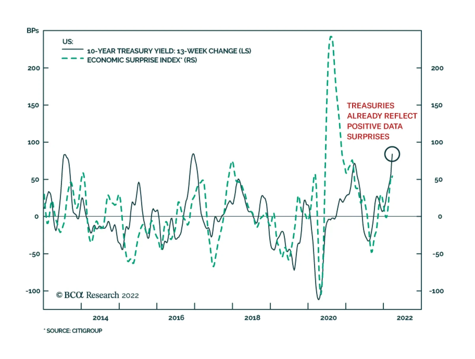
Despite the potential drag on economic growth from soaring commodity prices, US economic data has generally been strong recently. Flash PMIs for March, regional Fed surveys, and jobless claims for March all generated positive surprises and indicate that US…
Due to travel commitments, there will be no Counterpoint report next week. Instead, we will send you a timely update and analysis of the Ukraine Crisis written by my colleague Matt Gertken, BCA Chief Geopolitical Strategist. Executive Summary The tight connection between the oil price and inflation expectations is intuitive, appealing… and wrong. The inflation market is tiny, and its principle function is not to predict inflation per se, but to serve as a hedging investment in an inflation scare, such as that which follows an oil price spike. Hence, we should treat inflation expectations and the real bond yield that is derived from them with extreme care – especially after an oil price spike, which will give the illusion that the real bond yield is lower than it really is. In the near term, the Ukraine crisis has added to already elevated fears about inflation, which will pressure both bonds and stocks. However, looking beyond the next few months, the Ukraine crisis triggered supply shock will cause demand destruction, while central banks also choke demand, and the recent massive displacement of demand into goods, and its associated inflationary impulse, reverses. The 12-month asset allocation conclusion is to overweight stocks and bonds, and to underweight TIPS and commodities. Fractal trading watchlist: The sell-off in some T-bonds is approaching capitulation. The Tight Relationship Between The Oil Price And Inflation Expectations Is Intuitive, Appealing... And Wrong
The Tight Relationship Between The Oil Price And Inflation Expectations Is Intuitive,Appealing... And Wrong
The Tight Relationship Between The Oil Price And Inflation Expectations Is Intuitive,Appealing... And Wrong
Bottom Line: In the near term, an inflationary impulse will dominate, but on a 12-month horizon, a disinflationary impulse will dominate. Feature In his seminal work Thinking Fast And Slow, Nobel Laureate psychologist Daniel Kahneman presented the bat-and-ball puzzle. A bat and ball cost $1.10. The bat costs one dollar more than the ball. How much does the ball cost? “A number came to your mind. The number, of course, is 10: 10 cents. The distinctive mark of this easy puzzle is that it evokes an answer that is intuitive, appealing, and wrong. Do the math, and you will see. If the ball costs 10 cents, then the total cost will be $1.20 (10 cents for the ball and $1.10 for the bat), not $1.10. The correct answer is 5 cents. It is safe to assume that the intuitive answer also came to the mind of those who ended up with the correct number – they somehow managed to resist the intuition.” Kahneman’s crucial finding is that many people are prone to place too much faith in an intuitive answer, an intuitive answer that they could have rejected with a small investment of effort. The Connection Between The Oil Price and Inflation Expectations Is Intuitive, Appealing… And Wrong Today, the financial markets are presenting their very own bat-and-ball puzzle. The surging price of crude oil is driving up the market expectation for inflation over the next ten years (Chart I-1). This tight relationship is intuitive and appealing, because we associate a high oil price with a high inflation rate. But the intuitive and appealing relationship is wrong, and it requires just a small investment of effort to prove the fallacy. Chart I-1The Tight Relationship Between The Oil Price And Inflation Expectations Is Intuitive, Appealing... And Wrong
The Tight Relationship Between The Oil Price And Inflation Expectations Is Intuitive, Appealing... And Wrong
The Tight Relationship Between The Oil Price And Inflation Expectations Is Intuitive, Appealing... And Wrong
Inflation over the next ten years equals the price in ten years’ time divided by the current price. So, to the extent that there is any relationship between the current price and expected inflation, dividing by a higher price today means a lower prospective inflation rate. Empirically, the last fifty years of evidence confirms this very clear inverse relationship (Chart I-2). Chart I-2A High Oil Price Means Lower Subsequent Inflation
A High Oil Price Means Lower Subsequent Inflation
A High Oil Price Means Lower Subsequent Inflation
This raises an obvious question: while many people accept the intuitive (wrong) relationship between the oil price and expected inflation, how can the market make such a glaring error? The answer is that the inflation market is relatively tiny, and that its principle function is not to predict inflation per se, but to serve as a hedging investment in an inflation scare. Compared to the $25 trillion T-bond market, the Treasury Inflation Protected Securities (TIPS) market is worth just $1.5 trillion, slightly more than the market capitalisation of Tesla. Just as we do not expect Tesla to represent the view of the entire stock market, we should not expect TIPS to represent the view of the entire bond market. A high oil price means lower subsequent inflation. A recent paper by The Oxford Institute For Energy Studies explains: “the tight relationship between the oil price and inflation expectations defies not only the thesis of economics, but the norms of statistics as well, with a correlation that has reached 90 percent over the last ten years and a corresponding r-squared of 82 percent (Chart I-3 and Chart I-4). The root cause of this phenomenon should probably be searched for in the behaviour of another large group of market participants, the systematic portfolio allocators, and factor investors.”1 Chart I-3Inflation Expectations Are Just A Mathematical Function Of The Oil Price...
Inflation Expectations Are Just A Mathematical Function Of The Oil Price...
Inflation Expectations Are Just A Mathematical Function Of The Oil Price...
Chart I-4...Therefore 'The Real Bond Yield' Is Just A Mathematical Function Of The Oil Price
...Therefore 'The Real Bond Yield' Is Just A Mathematical Function Of The Oil Price
...Therefore 'The Real Bond Yield' Is Just A Mathematical Function Of The Oil Price
So, here’s the explanation for the intuitive, appealing, but wrong connection between the oil price and inflation expectations. In the inflation scare that a surging oil price unleashes, the two main asset-classes – bonds and equities – are vulnerable to sharp losses, leaving TIPS as one of the very few assets that can provide a genuine hedge against inflation. But given that bonds and equities dwarf the $1.5 trillion TIPS (and other inflation) markets, the inflation hedger quickly becomes the dominant force in this tiny market. This large volume of hedging demand chasing limited supply drives down the real yields on TIPS to artificial lows, both in absolute terms and relative to T-bond yields. And as the difference between nominal and real yields defines the ‘market’s expected inflation’, it explains the surge in expected inflation. Be Careful How You Use ‘The Real Bond Yield’ It is an unfortunate reality that we often close the stable door after the horse has bolted, meaning that we react after, rather than before, the event. In financial market terms, this means that we demand inflation protection after, rather than before, it happens, and end up overpaying for it. A high oil price unleashes a massive hedging demand for the tiny TIPS market, driving down the real TIPS yield versus the nominal T-bond yield. To repeat, a high oil price unleashes a massive hedging demand for the tiny TIPS market, driving down the real TIPS yield versus the nominal T-bond yield. The upshot is that the performance of TIPS versus T-bonds is nothing more than a play on the oil price (Chart I-5). Chart I-5The Performance Of TIPS Versus T-Bonds Is Just A Play On The Oil Price
The Performance Of TIPS Versus T-Bonds Is Just A Play On The Oil Price
The Performance Of TIPS Versus T-Bonds Is Just A Play On The Oil Price
A bigger message is that we should interpret the oft-quoted ‘real bond yield’ with extreme care. The real bond yield is nothing more than the nominal bond yield less a mathematical function of the oil price. So, when the oil price is high, it will give the illusion that the real bond yield is low. The danger is that if we value equities against the real bond yield when the oil price is high – such as through 2011-14 or now – equities will appear cheaper than they really are (Chart I-6). Chart I-6When The Oil Price Is High, 'The Real Bond Yield' Will Appear Lower Than It Really Is
When The Oil Price Is High, 'The Real Bond Yield' Will Appear Lower Than It Really Is
When The Oil Price Is High, 'The Real Bond Yield' Will Appear Lower Than It Really Is
In The Case Against A ‘Super Bubble’ (And The Case For) we explained the much better way to value equities is versus the product of the nominal bond price and current profits. This valuation approach perfectly explains the US stock market’s evolution both over the long term (Chart I-7) and the short term. Specifically, over the past year, the dominant driver of the US stock market has been the 30-year T-bond price (Chart I-8). Chart I-7The US Stock Market = Profits Times The 30-Year T-Bond Price (Long-Term Chart)
The US Stock Market = Profits Times The 30-Year T-Bond Price (Long-Term Chart)
The US Stock Market = Profits Times The 30-Year T-Bond Price (Long-Term Chart)
Chart I-8The US Stock Market = Profits Times The 30-Year T-Bond Price (Short-Term Chart)
The US Stock Market = Profits Times The 30-Year T-Bond Price (Short-Term Chart)
The US Stock Market = Profits Times The 30-Year T-Bond Price (Short-Term Chart)
12-Month Asset Allocation Conclusion The current inflation scare comes not from an aggregate demand shock, but from a massive displacement of demand (into goods) followed by the more recent supply shock for energy and food triggered by the Ukraine crisis. In response, central banks are trying to douse the inflation in the only way they can – by choking aggregate demand. Hence, there is a dangerous mismatch between the malady and the remedy. In the near term, the Ukraine crisis has added to already elevated fears about inflation – and this will pressure both bonds and stocks. However, looking beyond the next few months, the near-term inflationary impulse will unleash a disinflationary response from three sources. First, a supply shock means higher prices without stronger demand, which causes an inevitable demand destruction that then pulls down prices. Second, central banks are explicitly trying to pull down prices – or at least price inflation – by choking demand. And third, the massive displacement of demand into goods, and its associated inflationary impulse, is reversing. On a 12-month horizon, the disinflationary impulse will outweigh the inflationary impulse. Therefore, on a 12-month horizon, the disinflationary impulse will outweigh the inflationary impulse. The asset allocation conclusion is to overweight stocks and bonds, and to underweight TIPS and commodities. Is The Bond Sell-Off Close To Capitulation? Finally, several clients have asked if the recent sell-off in bonds is close to capitulation, based on the fragility of its fractal structures. The answer is yes, but only for the shorter maturity T-bonds. Specifically, the 5-year T-bond has reached the point of fragility on its composite 130-day/260-day fractal structure that marked the bottom of the sell-off in 2018, as well as the top of the rally in 2020 (Chart I-9). Chart I-9The Sell-Off In Shorter-Dated T-Bonds Is Close To Capitulation
The Sell-Off In Shorter-Dated T-Bonds Is Close To Capitulation
The Sell-Off In Shorter-Dated T-Bonds Is Close To Capitulation
Accordingly, this week’s trade recommendation is to buy the 5-year T-bond, setting the profit target and symmetrical stop-loss at 4 percent, and with a maximum holding period of 1 year. Please note that our full fractal trading watchlist is now available on our website: cpt.bcaresearch.com Dhaval Joshi Chief Strategist dhaval@bcaresearch.com Footnotes 1 https://www.oxfordenergy.org/wpcms/wp-content/uploads/2021/08/Is-the-Oil-Price-Inflation-Relationship-Transitory.pdf Chart 1The Strong Trend In The 18-Month-Out US Interest Rate Future Is Fragile
The Strong Trend In The 18-Month-Out US Interest Rate Future Is Fragile
The Strong Trend In The 18-Month-Out US Interest Rate Future Is Fragile
Chart 2The Strong Trend In The 3 Year T-Bond Is Fragile
The Strong Trend In The 3 Year T-Bond Is Fragile
The Strong Trend In The 3 Year T-Bond Is Fragile
Chart 3AUD/KRW Is Vulnerable To Reversal
AUD/KRW Is Vulnerable To Reversal
AUD/KRW Is Vulnerable To Reversal
Chart 4Canada Versus Japan Is Vulnerable To Reversal
Canada Versus Japan Is Vulnerable To Reversal
Canada Versus Japan Is Vulnerable To Reversal
Chart 5Canada's TSX-60's Outperformance Might Be Over
Canada's TSX-60's Outperformance Might Be Over
Canada's TSX-60's Outperformance Might Be Over
Chart 6US Healthcare Vs. Software Approaching A Reversal
US Healthcare Vs. Software Approaching A Reversal
US Healthcare Vs. Software Approaching A Reversal
Chart 7The Euro’s Underperformance Could Be Approaching a Resistance Level
The Euro's Underperformance Could Be Approaching a Resistance Level
The Euro's Underperformance Could Be Approaching a Resistance Level
Chart 8A Potential Switching Point From Tobacco Into Cannabis
A Potential Switching Point From Tobacco Into Cannabis
A Potential Switching Point From Tobacco Into Cannabis
Chart 9Bitcoin's 65-Day Fractal Support Is Holding For Now
Bitcoin's 65-Day Fractal Support Is Holding For Now
Bitcoin's 65-Day Fractal Support Is Holding For Now
Chart 10Biotech Approaching A Major Buy
Biotech Approaching A Major Buy
Biotech Approaching A Major Buy
Chart 11CAD/SEK Reversal Has Started
CAD/SEK Reversal Has Started
CAD/SEK Reversal Has Started
Chart 12Financials Versus Industrials Is Reversing
Financials Versus Industrials Is Reversing
Financials Versus Industrials Is Reversing
Chart 13Norway's Outperformance Could End
Norway's Outperformance Could End
Norway's Outperformance Could End
Chart 14Greece's Brief Outperformance Has Ended
Greece's Brief Outperformance Has Ended
Greece's Brief Outperformance Has Ended
Chart 15BRL/NZD At A Resistance Point
BRL/NZD At A Resistance Point
BRL/NZD At A Resistance Point
Fractal Trading System Fractal Trades
Solved: The Mystery Of The Oil Price And Inflation Expectations
Solved: The Mystery Of The Oil Price And Inflation Expectations
Solved: The Mystery Of The Oil Price And Inflation Expectations
Solved: The Mystery Of The Oil Price And Inflation Expectations
6-Month Recommendations Structural Recommendations Closed Fractal Trades Indicators To Watch - Bond Yields Chart II-1Indicators To Watch - Bond Yields - Euro Area
Indicators To Watch - Bond Yields - Euro Area
Indicators To Watch - Bond Yields - Euro Area
Chart II-2Indicators To Watch - Bond Yields - Europe Ex Euro Area
Indicators To Watch - Bond Yields - Europe Ex Euro Area
Indicators To Watch - Bond Yields - Europe Ex Euro Area
Chart II-3Indicators To Watch - Bond Yields - Asia
Indicators To Watch - Bond Yields - Asia
Indicators To Watch - Bond Yields - Asia
Chart II-4Indicators To Watch - Bond Yields - Other Developed
Indicators To Watch - Bond Yields - Other Developed
Indicators To Watch - Bond Yields - Other Developed
Indicators To Watch - Interest Rate Expectations Chart II-5Indicators To Watch - Interest Rate Expectations
Indicators To Watch - Interest Rate Expectations
Indicators To Watch - Interest Rate Expectations
Chart II-6Indicators To Watch - Interest Rate Expectations
Indicators To Watch - Interest Rate Expectations
Indicators To Watch - Interest Rate Expectations
Chart II-7Indicators To Watch - Interest Rate Expectations
Indicators To Watch - Interest Rate Expectations
Indicators To Watch - Interest Rate Expectations
Chart II-8Indicators To Watch - Interest Rate Expectations
Indicators To Watch - Interest Rate Expectations
Indicators To Watch - Interest Rate Expectations