Fixed Income

Highlights The Russian invasion of Ukraine is a geopolitical incident that is likely to be limited in scope. A wholesale energy cutoff to Europe is the chief risk to global economic activity, but the sanction response from the US and EU does not point to this outcome. This implies that a large geopolitical risk premium may linger over the very near term, but that equities and other risk assets will ultimately recover. We continue to expect above-trend growth and above-target inflation in the US and other developed economies this year. Q1 growth in the US is likely to be closer to 4% after removing the effect of changing inventories, and incoming information still points to the view that the pandemic will continue to recede in importance over the coming several months. Given the magnitude of the rise in consumer prices in the US and other developed economies, above-trend growth also underpins the significantly hawkish monetary policy shift that has recently occurred. There are legitimate arguments in favor of a very aggressive pace of Fed tightening. Still, our view is that seven rate hikes from the Fed over the coming 12 months is likely too aggressive: A peak in headline inflation over the coming months will help restrain longer-term household inflation expectations, the surge in wage growth continues to reflect pandemic-driven labor market distortions that could unwind, and a significant further flattening of the yield curve – despite likely being a false signal of a recession – would probably cause a temporary period of tighter financial conditions that the Fed would respond to. We believe it is likely that the Fed will initially seek to raise interest rates at a pace that is in line with current market pricing, but that it will likely slow the pace at some point beyond the next 3-4 months. As such, we expect that the Fed will ultimately end up raising interest rates 5 or 6 times over the coming year, less than investors currently expect. The case for aggressive ECB hikes was weak even before Russia’s invasion of Ukraine. European core inflation is nowhere near as strong as it is in the US, and nominal output in the euro area has not yet recovered to its pre-pandemic trend (in heavy contrast to the US). Russia’s invasion has caused a disruption of natural gas flows that will keep European gas prices at elevated levels, and aggressive tightening in response risks repeating the mistakes the ECB made in 2008 and 2011 when it raised rates in the face of an ultimately deflationary supply shock. On a 6-12 month time horizon, we are only likely to recommend downgrading global stocks once 5-year/5-year forward US Treasury yields break above 2.5%, barring a more severe shock to global economic activity from the Ukrainian crisis than currently appears likely. On Russia’s Invasion Of Ukraine Yesterday, BCA Research published a Special Alert in response to Russia’s invasion of Ukraine.1 In the report, we outlined Russia’s motivation for invading, and noted that it will not withdraw troops until it has changed the government and seized key territories – such as coastal regions to ensure the long-term ability to blockade the country. Crucially, we noted that while the US and EU will levy sweeping sanctions against Russia, that the EU would not halt Russian energy exports. We regard the decision to maintain Russia’s access to the SWIFT system as consistent with that view. Given this, we believe that the Russian invasion of Ukraine is a geopolitical incident that is likely to be limited in scope. A wholesale energy cutoff to Europe is the chief risk to global economic activity, but the sanction response from the US and EU does not point to this outcome. This implies that a large geopolitical risk premium may linger over the very near term, but that growth, inflation, and monetary policy will ultimately return as the drivers of equities and other risk assets over the coming weeks and months. Beyond Ukraine: Growth, Inflation, And Monetary Policy In The DM World Chart I-1Recent US Data Has Looked Smoewhat Stagflationary
Recent US Data Has Looked Smoewhat Stagflationary
Recent US Data Has Looked Smoewhat Stagflationary
BCA Research presented three possible growth and inflation scenarios for this year in our 2022 Annual Outlook report. Our base case scenario, to which we assigned 60% odds, was one of above-trend growth and above-target inflation. We assigned 30% odds to a “stagflation-lite” scenario of above-target inflation with below-trend growth, and a 10% chance of a recession. Since we published our Annual Outlook, we raised the odds of the second, stagflation-lite scenario – mostly due to the impact that the Omicron variant of COVID-19 could have on the Chinese supply chain. But until recently, US economic data was also looking somewhat stagflationary: US real GDP only grew at a 2.3% annualized basis in Q3, and the strong Q4 number was mostly boosted by inventories. Real goods spending has slowed over the past few months without a major increase in services spending, and US auto production continues to be restrained by semiconductor shortages (Chart I-1). Supply-side constraints on production and spending have occurred against the backdrop of a significant acceleration in US consumer prices, the combination of which seemingly points more to the second growth and inflation scenario that we outlined, rather than our base case. However, our view is that above-trend growth in the US and other developed economies remains the most likely outcome this year, even given ongoing supply-side constraints and Russia’s invasion of Ukraine. In addition to the sizeable amount of excess savings that have been accumulated during the pandemic and the enormous increase in household net worth that has occurred over the past two years, two other factors point to above-trend DM growth. In the US, following the release of the January retail sales report, the Atlanta Fed GDPNow model is forecasting below-trend growth for Q1, but with a -2.3% contribution from the change in private inventories. Chart I-2 highlights that the Atlanta Fed’s model is projecting 3.6% annualized growth in Q1 of final sales of domestic product, a measure of GDP that excludes the effect of changing inventories (whose contribution to growth averages to zero over time). This would be above the trend rate of real GDP growth, and would represent an acceleration relative to the past few quarters. Beyond the next few months, the other factor pointing to above-trend growth is the indication that the pandemic will indeed continue to recede in importance over the course of the year, in line with what we laid out in our Annual Outlook. Chart I-3 highlights that the Omicron-driven surge in hospitalizations in G7 countries has been short-lived, and Chart I-4 highlights that deliveries of Pfizer’s anti-viral treatment Paxlovid, while still in their early stages, have begun. Chart I-2Q1 US Economic Growth Likely To Be Above-Trend
Q1 US Economic Growth Likely To Be Above-Trend
Q1 US Economic Growth Likely To Be Above-Trend
Chart I-3Hospitalizations Are Falling Sharply
Hospitalizations Are Falling Sharply
Hospitalizations Are Falling Sharply
In a recent study, Paxlovid was found to have an 89% efficacy in preventing COVID hospitalizations and deaths, with less serious adverse events or discontinuations than the placebo group.2 Its high effectiveness against all SARS-CoV-2 variants suggests that its increased deployment over the course of the year should significantly reduce the impact of COVID-19 on the medical system as well as lower the fear of the disease amongst consumers, even as new variants of the virus emerge and spread around the world. Consequently, it is likely that the output gap in advanced economies will turn positive this year despite ongoing supply-side constraints unless Russian energy exports to the EU are ceased, triggered either by a European boycott or a Russian embargo. Prior to Russia’s invasion, consensus growth expectations implied above-trend growth for this year (Chart I-5), which we see as consistent with the base case growth and inflation view that we presented in our Annual Outlook if Russian energy exports continue. However, given the magnitude of the rise in consumer prices in the US and other developed economies, above-trend growth also underpins the significantly hawkish monetary policy shift that has occurred over the past 2 months. Chart I-5We Agree With Consensus Expectations For Growth This Year
We Agree With Consensus Expectations For Growth This Year
We Agree With Consensus Expectations For Growth This Year
Chart I-4US Paxlovid Deliveries Are Creeping Higher
US Paxlovid Deliveries Are Creeping Higher
US Paxlovid Deliveries Are Creeping Higher
The Case For, And Against, Aggressive Fed Tightening Just since the beginning of the year, investors have moved to price in an additional 100 basis points of rate hikes from the Fed (Chart I-6). Earlier this month, comments by St. Louis Fed President James Bullard signaling his desire for a full percentage point of interest rate hikes by July had a sizeable effect on US Treasury yields, with market participants still pricing in meaningful odds of a 50 basis point rate hike in March despite recent pushback from key Fed officials and Russia’s invasion of Ukraine. Chart I-6The Monetary Policy Outlook Has Shifted Rapidly In A Hawkish Direction
The Monetary Policy Outlook Has Shifted Rapidly In A Hawkish Direction
The Monetary Policy Outlook Has Shifted Rapidly In A Hawkish Direction
Last year, The Bank Credit Analyst service warned on several occasions that a return to maximum employment was likely to occur faster than investors expected, and that a hawkish shift from the Fed was probable. We noted in our July report that the cumulative odds of a rate hike by some point in Q2 2022 were close to 40%,3 and in our September Special Report we reinforced the view that a mid-2022 rate hike was likely.4 Still, even relative to our (then) comparatively hawkish expectations, the monetary policy outlook has shifted very aggressively towards more and earlier rate hikes. This shift has partially occurred due to the labor market dynamics that we projected last year, but also due to a significant broadening of inflation over the past four months. Chart I-7 highlights that the 6-month rate of change in US core CPI excluding cars and COVID-impacted services was not meaningfully different in October than it was in the latter half of late-2019, in heavy contrast to overall headline and core inflation. However, over the past four months this measure has accelerated by 175 basis points, highlighting that inflationary pressures are becoming broader – and that an earlier and more forceful response from the Fed may be warranted. Chart I-7US Inflation Has Broadened, And Quickly So
US Inflation Has Broadened, And Quickly So
US Inflation Has Broadened, And Quickly So
Does the broadening in US inflationary pressure that has occurred over the past few months justify the seven rate hikes currently expected by investors over the coming year? We present the detailed case for and against that view below, and conclude that seven rate hikes over the coming 12 months is likely too aggressive. The Case For Aggressive Tightening The most prominent argument in favor of aggressive Fed rate hikes is not just to slow the pace of inflation, but to address the fact that broadening inflationary pressures risk unanchoring inflation expectations. As we discussed in our January 2021 Special Report,5 inflation is determined not just by the output gap, but as well by inflation expectations. Economic slack, changes in imported goods prices, and idiosyncratic shocks all cause core inflation to cyclically fluctuate, but those fluctuations are relative to a level that is determined by inflation expectations – not the Fed’s inflation target. It is only if inflation expectations are consistent with the Fed’s target that actual inflation will equal that target, abstracting from the business cycle and other distorting events. A deeply negative output gap for several years following the global financial crisis caused inflation expectations to be vulnerable to shocks, and the collapse in oil prices in 2014 served as a large enough surprise that expectations unanchored to the downside. This event ultimately motivated the Fed’s introduction of its average inflation targeting policy, but Chart I-8 highlights that inflation expectations are no longer chronically low and that they may unanchor to the upside without meaningfully tighter monetary policy. A temporary period of higher food prices stemming from Russia’s invasion of Ukraine also raises the risk of unanchored inflation expectations among households. The second argument in favor of aggressive Fed rate hikes is that the unemployment rate has essentially fallen back to its pre-pandemic level, and median wage growth has already risen to its strongest level in 20 years (Chart I-9). Given that a large amount of excess savings and a very significant wealth effect are likely to continue to support aggregate demand, the inference is that overall wage growth may accelerate significantly further as the unemployment rate continues to fall. Chart I-8Inflation Expectations Are No Longer Depressed
Inflation Expectations Are No Longer Depressed
Inflation Expectations Are No Longer Depressed
Chart I-9Wage Growth Has Risen Very Significantly
Wage Growth Has Risen Very Significantly
Wage Growth Has Risen Very Significantly
The third argument in favor of rapid tightening is that the natural/neutral rate of interest is likely higher than both investors and the Federal reserve believe, meaning that monetary policy is even easier today than is generally recognized. We have written about this issue at length: in March 2020 we explained why the most cited measure of “R-star” was wrong,6 and noted in our April 2021 Special Report why we no longer believe that a gap between interest rates and trend rates of economic growth are justified. This perspective also suggests that investors should look past the quasi-recessionary signal currently being flagged by the 2/10 yield curve, as curve inversion is likely to be a false signal of a recession – as it was in 2019 (see Box I-1). BOX I-1 The Sino-US Trade War, The Yield Curve, And The COVID-19 Pandemic The US yield curve has historically provided a highly reliable signal of the likelihood of a recession. Investors have taken an inverted yield curve as a sign that short-term interest rates have risen to a level that is not likely to be sustained over the longer term, meaning that monetary policy has become tight. An inverted yield curve has indeed preceded several US recessions, although its track record at predicting contractions globally has been less reliable. While it is a counterfactual assertion, we believe that the yield curve provided a false signal when it inverted in 2019. Clearly the inversion did not predict the COVID-19 pandemic; the question is whether the US would have experienced a recession had the pandemic not occurred. In our view, the evidence does not point to that conclusion. Charts I-B1 and I-B2 highlight that the yield curve responded to an economic slowdown that was mostly caused by the Sino-US trade war, as well as an ongoing slowdown in Chinese credit growth and economic activity. It does not appear to have occurred due to interest rates having risen to a level that would be unsustainable absent these non-monetary shocks. Chart I-B1The Yield Curve Inverted Well After The Trade War Hit…
March 2022
March 2022
Chart I-B2…And The Economy Started Improving After The Inversion
March 2022
March 2022
In addition, the signal from the yield curve lagged that of the equity market: Chart I-B1 highlights that the US equity market fell just shy of 20% eleven months before the yield curve inverted. In fact, stock prices were rising sharply just prior to the emergence of the pandemic in response to expectations of monetary easing and the Phase I US trade deal, and the US Markit manufacturing and services PMIs were also turning up. None of these signs point to the likelihood of a contraction in US output had the COVID-19 pandemic not emerged. The key point for investors is that an inversion of the yield curve, were it to occur over the coming 12-18 months, would not necessarily signal a recession unless it were coupled with a major non-monetary shock. It would, however, be significant from a strategy standpoint, as the Fed would likely take it as a sign of tightening financial conditions. The Case Against Aggressive Fed Action Chart I-10Inflation Expectations Have Risen, But Are Not Out Of Control
Inflation Expectations Have Risen, But Are Not Out Of Control
Inflation Expectations Have Risen, But Are Not Out Of Control
There are several counterpoints to the arguments noted above, as well as a few additional reasons to suggest that 7 rate hikes over the coming year is too aggressive. First, on the issue of inflation expectations, while it is true that expectations are no longer chronically low, longer-term expectations have not yet exceeded their pre-global financial crisis (GFC) range (Chart I-10). In addition, despite the temporary spike in energy and food prices stemming from Russia’s invasion of Ukraine, headline inflation is likely to peak at some point over the coming months, which will act to restrain longer-term household inflation expectations. Importantly, inflation is likely to peak even without any Fed tightening. A comparison of the recent pace of advance in both headline and core CPI suggests that the former has up to 200 basis points of downside if crude oil prices remain at $100/bbl. Our Commodity & Energy Strategy team expects that Russia’s invasion of Ukraine will prompt increased production from core OPEC producers to reduce the elevated risk premium and allow refiners to boost inventories. We now expect Brent oil to average $85/bbl in the second half of 2022, implying eventual deflation from energy prices and a slowdown in the pace of advance in headline CPI over the coming months – potentially below that of core. That would represent a very significant easing in headline inflation relative to current levels, and we do not expect that long-term household expectations for inflation would rise much further in such a scenario. The easing in the prices paid component of the ISM manufacturing index also points to an imminent peak in headline inflation and, by extension, household inflation expectations (Chart I-11). Second, while it is true that overall wage growth has recently accelerated quite significantly, it is still the case that this is being driven by the lowest-paid workers. Chart I-12 highlights that 1st and 2nd quartile wage growth are between 0.4-1.2% higher than they were prior to the pandemic, but that 3rd and 4th quartile wage growth is either the same or lower. Chart I-12Lower-Pay Wage Inflation Is Due To The Pandemic...
Lower-Pay Wage Inflation Is Due To The Pandemic...
Lower-Pay Wage Inflation Is Due To The Pandemic...
Chart I-11The Prices Paid Components Of Manufacturing PMIs Also Points To Lower Headline Inflation
The Prices Paid Components Of Manufacturing PMIs Also Points To Lower Headline Inflation
The Prices Paid Components Of Manufacturing PMIs Also Points To Lower Headline Inflation
This surge in wages for low-paid workers largely reflects pandemic-driven labor market distortions, rather than excess demand. Chart I-13 highlights that real US services spending remains close to 5% below its pre-pandemic trend, and Table I-1 highlights that the leisure & hospitality industry now accounts for the vast majority of the jobs gap relative to pre-pandemic levels. Chart I-14 also highlights that while the leisure & hospitality jobs gap is smaller in red states than in blue states (which may be disproportionately affected by lost services jobs in central business districts due to work-from-home policies), it is still larger today that it was during the depths of the 2008/2009 recession. Chart I-13...Not Excessive Services Demand
...Not Excessive Services Demand
...Not Excessive Services Demand
The key takeaway from Table I-1 and Charts I-13 and I-14 is that rising 1st and 2nd quartile wage growth is being caused by labor scarcity in low paying industries, which we attribute to the fact that working conditions in these jobs became more difficult during the pandemic and the fact that many of these positions involve close contact with customers. And clearly, raising interest rates will not hasten the return of leisure & hospitality workers to the labor market. Table I-1Leisure & Hospitality And Education Now Make Up Almost All Of The US Jobs Gap
March 2022
March 2022
Chart I-14The Leisure & Hospitality Employment Gap Does Not Seem Related To Work-From-Home Trends
The Leisure & Hospitality Employment Gap Does Not Seem Related To Work-From-Home Trends
The Leisure & Hospitality Employment Gap Does Not Seem Related To Work-From-Home Trends
Third, even though we think the natural/neutral rate of interest is higher than both investors and the Federal reserve believe and that the yield curve provided a false signal of a recession in 2019, a significant further flattening of the yield curve would probably cause a tightening in financial conditions, at least for a time. The Fed is unlikely to be dissuaded from raising rates due to a valuation-driven decline in equity prices, but it is likely to respond to market-based signals of a material slowdown in economic activity – even if those signals ultimately prove to be false. The yield curve is an important reflection of how far bond investors believe the economic cycle has progressed (Chart I-15), and an increase in short-term interest rates at the pace that investors are currently expecting would flatten the 2/10 yield curve very close to (or into) negative territory. It seems likely that a rapid flattening in the curve would precipitate a growth scare in financial markets for a time, leading to falling equity prices (due to concerns about earnings, not just valuation), a rising US dollar, and a widening in corporate credit spreads. Chart I-15For The Fed, The Yield Curve Is An Important Market Indicator Of A Recession
For The Fed, The Yield Curve Is An Important Market Indicator Of A Recession
For The Fed, The Yield Curve Is An Important Market Indicator Of A Recession
To conclude on this point, the Fed will feel that it is justified in hiking rates aggressively while inflation is well above its target levels and the unemployment rate is low and falling, but it is likely to change this assessment if financial markets begin to behave in a way that signals a rising risk of a significant slowdown in jobs growth. That would lead to a tactical period of weakness for risky asset prices, but it would ultimately be cyclically positive if the Fed revises its pace of tightening to a rate that is slower than investors currently expect. Our View Netting out the arguments presented above, the Fed may initially seek to raise interest rates at a pace that is in line with current market pricing, but it will likely slow that pace at some point beyond the next 3-4 months. As such, we expect that the Fed will ultimately end up raising interest rates 5 or 6 times over the coming year, less than investors currently expect. Our view also has important implications for the euro area interest rate outlook, given the significantly weaker case for aggressive ECB action that existed even before Russia’s invasion of Ukraine. A Flimsy Case For Aggressive ECB Rate Hikes, Even Before Russia’s Invasion Chart I-16The European Inflation Situation Is Not As Bad As In The US
The European Inflation Situation Is Not As Bad As In The US
The European Inflation Situation Is Not As Bad As In The US
At the early-February ECB meeting, President Christine Lagarde signaled a more hawkish outlook for euro area monetary policy than investors had been expecting. Since the beginning of the year, the OIS market has moved to price-in roughly 70 bps of hikes over the coming 12 months, German 2-year bund yields have risen 20 basis points, and 10-year yields have risen back into positive territory. Italian and Greek 10-year yield spreads (relative to Bunds) have risen by 35 and 90 basis points, respectively. From our perspective, investors are pricing a too-aggressive path for the ECB policy rate, and we would probably characterize an ECB decision to raise rates in line with current market expectations as a policy mistake. As highlighted in a recent report by my colleague Mathieu Savary, BCA’s Chief European Strategist, several arguments support this view. First, Chart I-16 highlights that euro area core inflation is running at a considerably slower rate than headline inflation or core inflation in the US, and that our core inflation diffusion index for the euro area has peaked. It is true that core inflation is much higher in Germany than in other key euro area economies, and it is also true that aggregate euro area core inflation is above the ECB’s 2% target. But high German core inflation is seemingly driven by particularly acute passthrough effects from high natural gas prices, and recent IMF research underscores that over half of the increase in German manufacturing price inflation has occurred due to supply shocks rather than demand (Chart I-17). Chart I-18 shows that expectations for euro area inflation and actual wage growth do not, in any way, suggest that the ECB’s 2% target is under threat, underscoring that aggressive tightening over the coming several months risks repeating the mistakes the ECB made in 2008 and 2011 when it tightened policy in the face of an ultimately deflationary supply shock. Chart I-17German Core Inflation Is Being Disproportionately Driven By Supply Shocks
March 2022
March 2022
The second argument is that nominal output in the euro area has not yet recovered to its pre-pandemic trend, in heavy contrast to the US (Chart I-19). This is particularly true for Italy and Spain, and reflects the nature of the euro area fiscal response to the COVID-19 pandemic. Chart I-20 highlights that the cumulative growth in euro area disposable income has been lower than what would have been expected absent the pandemic, unlike what occurred in the US and Canada – two countries that provided sizeable direct transfers to households as part of their fiscal response. Chart I-19Key Euro Area Economies Have Recovered Far Less Than The US Has
Key Euro Area Economies Have Recovered Far Less Than The US Has
Key Euro Area Economies Have Recovered Far Less Than The US Has
Chart I-18Euro Area Inflation Expectations And Wage Growth Do Not Signal The ECB's Inflation Target Is Under Threat
Euro Area Inflation Expectations And Wage Growth Do Not Signal The ECB's Inflation Target Is Under Threat
Euro Area Inflation Expectations And Wage Growth Do Not Signal The ECB's Inflation Target Is Under Threat
Third, Russia’s invasion has caused a disruption of natural gas flows via Ukraine that will keep European gas prices at elevated levels even beyond the winter period, which will have a negative impact on the euro area economy. Chart I-21 highlights that European natural gas prices are now seven times as high as they were at the beginning of 2021. Unlike the prior rise in European natural gas prices, which was somewhat related to global demand for goods, the post-invasion surge is a pure supply shock – echoing our point about the ECB’s previous policy mistakes. Chart I-20Euro Area Disposable Income Is Lower Than Its Pre-Pandemic Trend, In Contrast To The US
March 2022
March 2022
Chart I-21Russia's Invasion of Ukraine Has Created A Pure Natural Gas Supply Shock
Russia's Invasion of Ukraine Has Created A Pure Natural Gas Supply Shock
Russia's Invasion of Ukraine Has Created A Pure Natural Gas Supply Shock
The fact that Italy’s nominal economic recovery has been comparatively weak has helped explain the rise in its 10-year government bond yield relative to 10-year German Bunds. Allowing for a further economic recovery in those countries before raising rates would let the ECB ultimately increase rates further down the road – and thus exit more cleanly from negative policy rates in Europe. Our European Strategy Team continues to expect that the ECB is on track to raise interest rates only once in Q4 2022, to be then followed by more aggressive hikes in 2023. Investment Conclusions For fixed-income investors, the investment implications of policy rates moving higher over the coming year at a pace that is less rapid than currently expected would normally imply that an at or above-benchmark duration stance is warranted. However, Chart I-22 highlights that there is still upside for 10-year US Treasury yields even in a scenario where the Fed raises rates at a pace of 100 basis points per year. As such, we continue to recommend that investors remain short duration on a 6-12 month time horizon, although we agree with BCA’s fixed-income team’s recommendation to tactically raise duration to neutral given the potential for the European energy crisis to worsen further and the fact that 10-year US Treasury yields do not have as much upside on a cyclical basis as they did when we published our Annual Outlook.7 For equities, we do not find the case for a tactical downgrade to be compelling at current levels, given that global stocks have already fallen 10% from their mid-November highs. Over the near term, we expect the continued underperformance of euro area equities, be we doubt that the negative economic impact of higher natural gas and oil prices would persist beyond a 0-3 month time horizon. On a 6-12 month time horizon, our expectation that monetary policy will tighten at a less aggressive pace than investors expect suggests that the earnings risk to global stocks is not substantial, underscoring that a meaningful contraction in equity multiples would likely be required for stocks to register negative 12-month returns from current levels. In the US, business surveys suggest that sales growth is set to slow to a still-healthy level, and that profit margins are likely to be flat over the coming year (Chart I-23). This is in line with the view that we presented in our Annual Outlook, namely that US earnings growth in 2022 would be driven mainly by top-line growth. Chart I-22Investors Should Still Be Cyclically Short Duration
Investors Should Still Be Cyclically Short Duration
Investors Should Still Be Cyclically Short Duration
Chart I-23Surveys Imply Strong Revenue Growth And Flat Margins, And Thus Positive Earnings Growth
Surveys Imply Strong Revenue Growth And Flat Margins, And Thus Positive Earnings Growth
Surveys Imply Strong Revenue Growth And Flat Margins, And Thus Positive Earnings Growth
Chart I-24Still No Sign That The Secular Stagnation Narrative Is Under Attach. That Is Good For Stocks.
Still No Sign That The Secular Stagnation Narrative Is Under Attach. That Is Good For Stocks.
Still No Sign That The Secular Stagnation Narrative Is Under Attach. That Is Good For Stocks.
Similarly, the risk of a serious interest rate-driven contraction in equity multiples over the coming year does not appear to be elevated. Investors are far more inclined to use long-maturity bond yields to discount future cash flows than short-term interest rates, and we have noted that the rise in long-maturity bond yields is necessarily self-limiting unless investor expectations about the natural/neutral rate of interest change. Chart I-24 highlights that despite an extremely rapid shift in monetary policy outlook amid the highest US headline inflation in 40 years, 5-year/5-year forward US Treasury yields remain only fractionally above 2%. This underscores that fixed-income investors will need to see evidence that a progressively higher Fed funds rate is not disrupting economic activity before they are likely to abandon the secular stagnation narrative. While the equity risk premium will remain elevated over the near term due to the situation in Ukraine, the bond market’s continued belief in secular stagnation will likely support equity multiples – at least for the remainder of the year. As such, we recommend that investors position in favor of the following over the coming 6-12 months: Overweight equities versus long-maturity government bonds Overweight value versus growth stocks Short duration within a fixed-income portfolio, with a neutral tactical overlay Overweight speculative-grade corporate bonds with a credit portfolio Overweight non-resource cyclicals versus defensives and small caps versus large Short the US dollar versus major currencies Jonathan LaBerge, CFA Vice President The Bank Credit Analyst February 25, 2022 Next Report: March 31, 2022 II. Canada: How High Can Rates Rise? The buildup of excessive household debt in Canada over the past two decades has occurred because of outsized demand for housing, not because of the impact of constrained housing supply on house prices. Outsized demand for housing has occurred because interest rates have been persistently too low, pointing to the need for the Bank of Canada to tighten monetary policy in order to prevent even further leveraging. The burden of Canada’s household sector debt may exceed its pre-pandemic level next year given current market expectations for the path of rate hikes. This implies that the prior peak in the Canadian policy rate (1.75%) likely reflects a high-end estimate of the neutral rate of interest in Canada. Regulatory changes have occurred in recognition of Canada’s extreme levels of household debt. Although a massive decline in Canadian house prices would cause a very severe recession, it would not likely precipitate a Lehman-style collapse of the Canadian financial system. Over the next twelve months, investors should position favorably toward CAD-USD. As the Canadian policy rate approaches our estimate of the neutral rate, a short CAD position and an overweight stance towards long-maturity Canadian bonds versus US Treasurys will likely be warranted. Within a global equity portfolio, exposure to relatively high-yielding Canadian banks should not be reduced until hard evidence of a significant slowdown in the housing market emerges. The outlook for monetary policy in advanced economies has shifted rapidly in a hawkish direction over the past few months. While we believe that the Fed and other central banks will end up raising interest rates this year fewer times than investors currently expect, it is clear that monetary policy will tighten in the DM world over the coming 12-18 months. This has raised the question of how high policy rates may rise before monetary policy begins to restrict economic activity. Some investors have specifically focused this question on countries like Canada, which has a highly indebted household sector and has seen house prices rise at a 7% average annual pace for the past 20 years. In this report, we explore the root cause of Canada’s extreme household debt and argue against the constrained housing supply view. Instead, we conclude that persistently low interest rates have fueled excessive housing demand and that the prior peak in the Canadian policy rate (1.75%) probably reflects a high-end estimate of the neutral rate of interest in Canada – in contrast with that of the US. Finally, we note that the regulatory changes that have occurred in recognition of the risk from excessive household debt suggest that a massive decline in Canadian house prices would not likely precipitate a Lehman-style collapse of the Canadian financial system – it would, however, clearly cause a severe recession. Over the next twelve months, investors should position favorably toward CAD-USD. As the Canadian policy rate approaches our estimate of the neutral rate, a short CAD position and an overweight stance towards long-maturity Canadian bonds versus US Treasurys will likely be warranted. Within a global equity portfolio, exposure to relatively high-yielding Canadian banks should not be reduced until hard evidence of a significant slowdown in the housing market emerges. The Root Cause Of Canada’s Extreme Household Debt Chart II-1Canadian Households Are Massively Indebted
Canadian Households Are Massively Indebted
Canadian Households Are Massively Indebted
Relative to disposable income, Canadian household debt has risen substantially over the past two decades. Chart II-1 highlights that Canada’s household debt to disposable income ratio has risen by 180% since 2000, and is currently over 50 percentage points higher than that in the US, even when nonfinancial noncorporate debt is included in the latter.8 Rising Canadian household indebtedness is a problem that is well known to investors, policymakers, regulators, banks, and consumers themselves. Organizations such as the IMF have repeatedly warned that excess household debt poses a potential economic stability risk. In the years prior to the pandemic, policymakers have responded with a series of macroprudential measures designed to limit speculation and foreign ownership in the housing market and to reduce the incremental risk to the economy posed by new borrowers. When asked why Canadian households have leveraged themselves so significantly over the past 20 years, most market commentators in Canada point to insufficient housing supply as the main driver of excessive house prices. Given normal ongoing demand for housing, they argue, persistent supply-side pressure on housing prices will naturally lead to a rising stock of debt relative to income. According to this narrative, the solution to Canada’s housing crisis is centered squarely on incentives to build more homes. Raising interest rates to cool mortgage demand will simply exacerbate the housing affordability problem, while simultaneously discouraging additional residential investment needed to decrease home prices structurally. Chart II-2The Supply Of Non-Apartment Dwellings Has Indeed Declined Over Time...
The Supply Of Non-Apartment Dwellings Has Indeed Declined Over Time...
The Supply Of Non-Apartment Dwellings Has Indeed Declined Over Time...
We hold a different perspective. We do agree that there are some limitations on the supply side that likely are unduly boosting prices of certain dwelling types. For example, the Greenbelt that surrounds Ontario’s Golden Horseshoe region - a permanently protected area of land - has likely constrained some housing activity, and Chart II-2 highlights that single detached, semi-detached, and row/townhouses have fallen significantly as a share of overall housing completions. Apartments and other dwellings now account for a clear majority of new housing construction in Canada. However, there is a great deal of evidence positioned against the view that supply-side factors are the primary cause of outsized housing inflation and, by extension, a massive increase in Canadian household debt to GDP: Based on real residential investment, the pace of housing construction in Canada has not fallen relative to GDP or the population. Chart II-3 highlights that, compared with the US, residential investment has trended higher over the past 20 years. Based on Canadian housing completion data, Chart II-4 highlights that the number of completions has generally kept pace with half of the change in Canada’s population, a ratio that is easily consistent with two or more people per household. In addition, the chart highlights that the periods when houses were completed at a below-average rate relative to population growth have not been the same as when Canadian household debt has increased relative to disposable income. Chart II-3...But Overall Real Residential Investment Has Kept Pace With Canada's GDP And Population
...But Overall Real Residential Investment Has Kept Pace With Canada's GDP And Population
...But Overall Real Residential Investment Has Kept Pace With Canada's GDP And Population
Chart II-4Housing Supply Has Not Been The Main Driver Of Rising Canadian Indebtedness
Housing Supply Has Not Been The Main Driver Of Rising Canadian Indebtedness
Housing Supply Has Not Been The Main Driver Of Rising Canadian Indebtedness
Chart II-5Prices For All Canadian Property Types Have Surged Over The Past Two Decades
Prices For All Canadian Property Types Have Surged Over The Past Two Decades
Prices For All Canadian Property Types Have Surged Over The Past Two Decades
If the rise in Canadian household indebtedness has been caused by the increasing scarcity of single-detached, semi-detached, and row/townhouses, then we would expect to see a persistent and growing divergence between overall Canadian house prices and those of apartment/condominiums. Chart II-5 highlights that this is not the case: while apartment/condo prices have at times grown at a slower rate than overall home prices over the past 15 years (as in the period from 2011 to 2016), they have also at times grown at a faster rate. The chart clearly highlights that the Canadian housing market is driven by a common factor, and that average house price gains have not been significantly different across property types over time. Similarly, if a scarcity of housing supply was the main driver of rising house prices and household debt, we would not expect to see a significant increase in the homeownership rate. Chart II-6 highlights that the Canadian homeownership rate did rise substantially from the mid-1990s to 2016 (the last available datapoint). While it is not clear what the sustainable or “equilibrium” homeownership rate is, it is notable that the most recent datapoint was not significantly lower than the peak rate reached in the US following that country’s massive housing bubble. Finally, Chart II-7 reiterates a point we made in our June 2021 Special Report: in several economies (including Canada), interest rates have remained well below levels that macroeconomic theory would traditionally consider to be in equilibrium over the past two decades. This has occurred alongside significant household sector leveraging. Chart II-7Too-Low Interest Rates Have Fueled Rising Household Indebtedness In Canada (And Other DM Economies)
Too-Low Interest Rates Have Fueled Rising Household Indebtedness In Canada (And Other DM Economies)
Too-Low Interest Rates Have Fueled Rising Household Indebtedness In Canada (And Other DM Economies)
Chart II-6The Canadian Homeownership Rate Has Risen Significantly, Pointing To Excess Housing Demand
March 2022
March 2022
These factors strongly point to rising household debt levels as being driven by demand-side rather than supply-side factors – demand that has been fueled by persistently low interest rates. How High Can The Bank Of Canada Raise Interest Rates? Over the next 12 months, investors expect the Bank of Canada (BoC) to raise interest rates by 180 basis points, in line with the Fed (Chart II-8). Over the longer term, the BoC believes that interest rates will average between 1.75% and 2.75%. In the US, the 2/10 yield curve has flattened significantly in response to the Fed’s hawkish shift, and neither the explosion in headline consumer price inflation nor the Fed’s about face have significantly raised the market’s longer-term expectations for interest rates (which are even below the Fed’s estimates). In Canada, investors expect essentially the same long-term interest rate outlook, as evidenced by 5-year / 5-year forward government bond yields (Chart II-9). Chart II-8Investors Expect A Similar Magnitude Of Tightening In Canada And The US Over The Next Year...
Investors Expect A Similar Magnitude Of Tightening In Canada And The US Over The Next Year...
Investors Expect A Similar Magnitude Of Tightening In Canada And The US Over The Next Year...
Chart II-9...And A Similar Average Interest Rate Over The Longer Term
...And A Similar Average Interest Rate Over The Longer Term
...And A Similar Average Interest Rate Over The Longer Term
As in the case in the US, the hawkish shift among major central banks has left investors asking how high the BoC can raise interest rates, and what implications that might have for Canadian assets – especially the CAD and long-maturity Canadian government bonds. In our view, the best way for investors to assess the impact of rising interest rates on the private sector – especially a highly indebted one – is to project the impact that an increase in interest rates will have on the debt service ratio (DSR). The burden of servicing debt, rather than the stock of debt relative to income, is the right way to measure the impact of shifting monetary policy because it considers the combined effect of changes in leverage, income, and interest rates. The primary drawback of debt service ratio analysis is that the question of sustainability must be answered empirically. In countries experiencing an ever-rising debt service ratio, it can be difficult for investors to judge where the breaking point will be. Cross-country comparisons may sometimes be helpful in this respect, but Chart II-10 highlights that BIS estimates for household debt service ratios vary widely even among advanced economies. However, in Canada, the 2017-2019 tightening cycle provides a useful framework. As we anticipated in a 2017 Special Report,9 the rise in Canadian interest rates during that period caused the household debt service ratio to exceed the level reached in 2007, which contributed to a collapse in Canadian house price appreciation to its lowest level since the global financial crisis (Chart II-11). The decline in house prices during this period was also caused by the introduction of new macroprudential measures (particularly the introduction of a minimum qualifying rate for mortgages, more commonly referred to as a mortgage “stress test” rule), but the impact of higher interest rates was likely significant. Chart II-11The Last Tightening Cycle In Canada Contributed Significantly To A Major Slowdown In Canadian House Prices
The Last Tightening Cycle In Canada Contributed Significantly To A Major Slowdown In Canadian House Prices
The Last Tightening Cycle In Canada Contributed Significantly To A Major Slowdown In Canadian House Prices
Chart II-10Private Sector Debt Service Ratios Vary Significantly Across DM Countries
Private Sector Debt Service Ratios Vary Significantly Across DM Countries
Private Sector Debt Service Ratios Vary Significantly Across DM Countries
Chart II-11 highlights that the Canadian household debt service ratio collapsed during the pandemic, which seems to suggest that the Bank of Canada has ample room to raise interest rates. However, the decline in the DSR occurred not only because of falling interest rates, but also because of the significant excess savings amassed as a result of the pandemic. As in the US, excess savings in Canada were the result of reduced spending on services and the generation of significant excess income from government transfers (see Chart I-20 from Section 1 of this month’s report). These fiscal transfers will eventually disappear, implying that the Canadian household DSR is artificially low. Chart II-12 shows our estimate of the evolution of the overall Canadian household sector DSR based on the following assumptions: Mortgage rates rise in line with market expectations for the change in the policy rate Government transfers fall back to their pre-pandemic trend Disposable income growth ex-transfers grows in line with consensus expectations for nominal GDP growth The overall debt-to-disposable income ratio, using our estimate for total disposable income, remains flat. The chart highlights that the Canadian household sector DSR may exceed its pre-pandemic level next year, and that a 1.75% policy rate is the threshold at which the DSR will hit a new high. The implication of our projection is that the re-acceleration in household sector debt that has occurred during the pandemic, shown in Chart II-13, will again contribute to a significant slowdown in the Canadian housing market as the BoC begins to raise interest rates as in 2018/2019. It also implies that the prior peak in the Canadian policy rate probably reflects a high-end estimate of the neutral rate of interest in Canada. Chart II-12Market Expectations For The Canadian Policy Rate Imply A Record High Debt Burden
Market Expectations For The Canadian Policy Rate Imply A Record High Debt Burden
Market Expectations For The Canadian Policy Rate Imply A Record High Debt Burden
Chart II-13Canadian Household Loan Growth Has Reaccelerated During The Pandemic
Canadian Household Loan Growth Has Reaccelerated During The Pandemic
Canadian Household Loan Growth Has Reaccelerated During The Pandemic
As we discuss below, this is likely to lead to significant implications for CAD-USD and an allocation to long-maturity Canadian government bonds, once investors begin to upwardly revise their expectations for the US neutral rate. Extreme Household Debt And Canadian Financial Stability The question of financial stability is often posed by investors when discussing Canada’s extreme household debt burden. Some investors view the US subprime financial crisis as the likely template for the Canadian economy, given the fact that the US credit bubble also focused on the housing market. Despite our pessimistic assessment of the capacity of the Canadian economy to tolerate higher interest rates (unlike the US today), we do not share the view that the Canadian financial system faces a potential insolvency risk, like the US banking system did in 2008. We see two potential arguments in favor of the instability view. The first is related to the sheer concentration of debt in Canada relative to other countries. Chart II-14 highlights that the median debt-to-income ratio of indebted Canadian households is currently the second highest in the world (after Norway) among the 29 countries that the OECD tracks. This concentration measure has worsened considerably since we published our 2017 Special Report. The combination of a very high average level of debt and extremely high leverage among those who are indebted suggests that Canadian banks may be exposed to significant credit losses in the event of a serious housing market crash. Chart II-14The Degree Of Concentration In Canadian Household Debt Is A Potential Financial Stability Risk
March 2022
March 2022
Chart II-15A Decline In The CMHC's Footprint In The Mortgage Insurance Market Is Also Concerning
A Decline In The CMHC's Footprint In The Mortgage Insurance Market Is Also Concerning
A Decline In The CMHC's Footprint In The Mortgage Insurance Market Is Also Concerning
The second argument relates to the declining share of mortgages insured by the Canada Mortgage and Housing Corporation (CMHC). The CMHC is a Crown corporation that provides mortgage-default insurance to Canadian banks. Banks must purchase such insurance when a borrower’s loan-to-value ratio exceeds 80%. The CMHC has seen increased competition from two private mortgage insurers, and Chart II-15 highlights that the number of mortgages with CHMC insurance has been steadily falling over time. In order for the CMHC to be able to reduce systemic risk during a crisis, it must be present enough in the mortgage market to be able to replace private insurers in the event of a shock that causes them to leave the market. In effect, the CMHC should be able to act as a ballast to prevent a sharp tightening in Canadian mortgage lending standards and credit provision, which could occur if banks find themselves unable to purchase mortgage insurance to cover borrowers with relatively small down payments. In this respect, the reduced footprint of the CMHC is concerning. However, these risks have to be weighed against two key structural changes that legitimately lower the systemic risk facing the Canadian banking system (or lower the impact of a major adverse housing event). The first of these changes is the introduction of the minimum qualifying rate for mortgages in Canada (the mortgage stress test), which we regard as one of the most important macroprudential policies that Canada has enacted to reduce the systemic risk of rising household debt. The stress test rules – which apply to all borrowers – force mortgage borrowers to pass the CMHC’s gross debt and total debt service ratio thresholds under the assumption of higher interest rates than borrowers will actually pay: either the contracted mortgage rate plus 2 percentage points, or 5.65% – whichever is higher. Given prevailing mortgage rates in Canada, this effectively means that new borrowers will not exceed the CMHC’s debt service thresholds until the Bank of Canada’s policy rate exceeds 2.5%. That is positive from a financial stability perspective, although it does not rule out the slowdown in household spending that we would expect if the aggregate household debt service ratio hits a new high next year in response to BoC tightening. The second important risk-reducing structural change is a significant improvement in Canadian bank capital levels. Chart II-16 highlights that Tier 1 capital has risen significantly relative to risk-weighted assets for Canadian depository institutions, and is now on par with US levels (in contrast to a typically lower level over the past decade). The IMF stress tested Canadian banks in 2019, when capital levels were lower than they are today. They found that most Canadian banks would run down conservation capital buffers in the adverse economic scenario that they modeled, subjecting them to dividend restrictions for a period of time following the adverse event. However, Canadian banks would not breach their minimum capital requirements in the scenario modeled by the IMF, which involved a 40% decline in house prices and a 2% cumulative decline in Canadian real GDP over a two year period – which is essentially what occurred in the US and Canada in 2008 and 2009 (Chart II-17). Chart II-16Canadian Bank Capital Appears Sufficient To Weather A Storm
Canadian Bank Capital Appears Sufficient To Weather A Storm
Canadian Bank Capital Appears Sufficient To Weather A Storm
Chart II-17The IMF's Stress Tests Modeled A Repeat Of The 2008/2009 Crisis
The IMF's Stress Tests Modeled A Repeat Of The 2008/2009 Crisis
The IMF's Stress Tests Modeled A Repeat Of The 2008/2009 Crisis
To conclude on the question of financial stability, it is clear that the magnitude and concentration of household debt implies that the impact of a serious housing market crash on the Canadian economy would be severe. But the fact that regulatory changes have occurred in recognition of this risk suggests that although a massive decline in Canadian house prices would cause a very severe recession, it would not likely precipitate a Lehman-style collapse of the Canadian financial system. Investment Conclusions Three conclusions emerge from our report. First, when considering the total experience of the past two decades, it is clear that the buildup of excessive household debt in Canada has occurred because of outsized demand for housing, not because of the impact of constrained housing supply on house prices. Outsized demand for housing has occurred because interest rates have been persistently below what traditional monetary policy rules such as the Taylor Rule would prescribe, pointing to the need for the Bank of Canada to tighten monetary policy in order to prevent even further leveraging. While US interest rates were also below what the Taylor Rule would have suggested for several years following the global financial crisis, the US household sector did not leverage itself significantly during that period because of the multi-year impact of the 2008/2009 financial crisis on US household balance sheets (Chart II-18). Canadian households did not suffer the same type of balance sheet impairment, and yet the Bank of Canada wrongly imported hyper-accommodative US monetary policy in an attempt to prevent a significant further increase in the exchange rate (which was still persistently strong for several years following the crisis). Through its actions, the Bank of Canada succeeded in staving off “Dutch Disease”, but at the cost of fueling a substantial housing and credit market bubble. Second, the fact that the Bank of Canada is likely to struggle to raise interest rates above 1.75% implies that a sizeable divergence may emerge between Canadian and US monetary policy over the coming few years if we are correct in our view that the US neutral rate is higher than the Fed currently expects. While such a divergence is not likely to occur over the coming year, Chart II-19 highlights that a 125 basis point policy rate spread – consistent with a nominal neutral rate of 1.75% in Canada and 3% in the US – last occurred in the mid-to-late 1990s, when CAD-USD ultimately declined to 0.65. Chart II-18The Bank Of Canada Staved Off "Dutch Disease", At The Cost Of Fueling A Major Housing And Credit Bubble
The Bank Of Canada Staved Off "Dutch Disease", At The Cost Of Fueling A Major Housing And Credit Bubble
The Bank Of Canada Staved Off "Dutch Disease", At The Cost Of Fueling A Major Housing And Credit Bubble
Chart II-19Some Potentially Large Downside For CAD If US Neutral Rate Expectations Move Higher
Some Potentially Large Downside For CAD If US Neutral Rate Expectations Move Higher
Some Potentially Large Downside For CAD If US Neutral Rate Expectations Move Higher
Over the coming year, we expect Canadian dollar strength rather than weakness: we are generally bearish toward the US dollar on the expectation of above-trend global growth, and our fundamental intermediate-term model suggests that CAD should strengthen. Thus, while it is too early to short the Canadian dollar, we would be inclined to turn bearish in response to rising long-term US interest rate expectations. We would draw similar conclusions for Canadian government bonds: investors should raise exposure to long-dated Canadian government bonds versus similar maturity US Treasurys as the Bank of Canada raises its policy rate toward our estimate of the neutral rate. Chart II-20Relative ROE Justifies A Valuation Premium For Canadian Banks
Relative ROE Justifies A Valuation Premium For Canadian Banks
Relative ROE Justifies A Valuation Premium For Canadian Banks
Finally, the improvements that have been made over the past several years to dampen the impact of a housing market crash on the Canadian financial system suggests that exposure to Canadian banks should not be reduced until hard evidence of a significant slowdown in the housing market emerges. Chart II-20 highlights that the valuation premium of Canadian banks appears to be supported by a sizeable ROE advantage relative to global banks. Panel 2 highlights how composite relative valuation indicator for Canadian banks suggests that they have been persistently expensive for some time, but not extremely so. Canadian banks would certainly underperform their global peers should the adverse scenario modeled by the IMF’s 2019 stress test of the banking system to occur, especially if it implied that Canadian banks would be forced to restrict dividends for a time to bolster capital adequacy. However, we would advise investors against shorting relatively high-yielding Canadian banks as Canadian interest rates rise, until they see clear signs of Canada-specific slowdown in housing demand in response to higher rates. Jonathan LaBerge, CFA Vice President The Bank Credit Analyst Gabriel Di Lullo Research Associate III. Indicators And Reference Charts BCA’s equity indicators highlight that the “easy” money from expectations of an eventual end to the pandemic have already been made. Our valuation, and sentiment indicators remain very extended, highlighting that investors should expect positive but relatively modest returns from stocks over the coming 6-12 months. Our technical indicator has declined from extremely overbought levels in response to January’s US equity sell-off and Russia’s invasion of Ukraine, but it has not yet reached oversold territory. Still, we believe that the equity market’s reaction to rising bond yields is overdone, especially for value stocks. Forward equity earnings are pricing in a substantial further rise in earnings per share. Net earnings revisions and net positive earnings surprises have rolled over, but from extremely elevated levels and there is no meaningful sign yet of a decline in the level of forward earnings. Bottom-up analyst earning expectations remain too high, but stocks are still likely to be supported by robust revenue growth over the coming year. Within a global equity portfolio, we continue to recommend that investors position for the underperformance of financial assets that are negatively correlated with long-maturity government bond yields (such as growth stocks). The 10-Year Treasury Yield has broken convincingly above its 200-day moving average following the Fed’s hawkish shift, but remains below the fair value implied by our bond valuation index and the FOMC-implied fair value in a March 2022 rate hike scenario. We continue to expect that long-maturity bond yields will move higher over the coming year. Commodity prices remain elevated, and our composite technical indicator highlights that they remain overbought. An eventual slowdown in US goods spending, coupled with eventual supply-chain normalization, could weigh on commodity prices at some point over the coming 6-12 months. We are more comfortable with a bullish view towards industrial metals in the latter half of 2022. US and global LEIs have rolled over from very elevated levels. Our global LEI diffusion index has declined very significantly, but this likely reflects the outsized impact of a few emerging market countries. Still-strong leading and coincident indicators underscore that the global demand for goods is robust, and that output gaps are negative in many advanced economies because of very weak services spending. The latter will recover significantly at some point over the coming year, as the severity of the pandemic wanes. EQUITIES: Chart III-1US Equity Indicators
US Equity Indicators
US Equity Indicators
Chart III-2Willingness To Pay For Risk
Willingness To Pay For Risk
Willingness To Pay For Risk
Chart III-3US Equity Sentiment Indicators
US Equity Sentiment Indicators
US Equity Sentiment Indicators
Chart III-4US Stock Market Breadth
US Stock Market Breadth
US Stock Market Breadth
Chart III-5US Stock Market Valuation
US Stock Market Valuation
US Stock Market Valuation
Chart III-6US Earnings
US Earnings
US Earnings
Chart III-7Global Stock Market And Earnings: Relative Performance
Global Stock Market And Earnings: Relative Performance
Global Stock Market And Earnings: Relative Performance
Chart III-8Global Stock Market And Earnings: Relative Performance
Global Stock Market And Earnings: Relative Performance
Global Stock Market And Earnings: Relative Performance
FIXED INCOME: Chart III-9US Treasurys And Valuations
US Treasurys And Valuations
US Treasurys And Valuations
Chart III-10Yield Curve Slopes
Yield Curve Slopes
Yield Curve Slopes
Chart III-11Selected US Bond Yields
Selected US Bond Yields
Selected US Bond Yields
Chart III-1210-Year Treasury Yield Components
10-Year Treasury Yield Components
10-Year Treasury Yield Components
Chart III-13US Corporate Bonds And Health Monitor
US Corporate Bonds And Health Monitor
US Corporate Bonds And Health Monitor
Chart III-14Global Bonds: Developed Markets
Global Bonds: Developed Markets
Global Bonds: Developed Markets
Chart III-15Global Bonds: Emerging Markets
Global Bonds: Emerging Markets
Global Bonds: Emerging Markets
CURRENCIES: Chart III-16US Dollar And PPP
US Dollar And PPP
US Dollar And PPP
Chart III-17US Dollar And Indicator
US Dollar And Indicator
US Dollar And Indicator
Chart III-18US Dollar Fundamentals
US Dollar Fundamentals
US Dollar Fundamentals
Chart III-19Japanese Yen Technicals
Japanese Yen Technicals
Japanese Yen Technicals
Chart III-20Euro Technicals
Euro Technicals
Euro Technicals
Chart III-21Euro/Yen Technicals
Euro/Yen Technicals
Euro/Yen Technicals
Chart III-22Euro/Pound Technicals
Euro/Pound Technicals
Euro/Pound Technicals
COMMODITIES: Chart III-23Broad Commodity Indicators
Broad Commodity Indicators
Broad Commodity Indicators
Chart III-24Commodity Prices
Commodity Prices
Commodity Prices
Chart III-25Commodity Prices
Commodity Prices
Commodity Prices
Chart III-26Commodity Sentiment
Commodity Sentiment
Commodity Sentiment
Chart III-27Speculative Positioning
Speculative Positioning
Speculative Positioning
ECONOMY: Chart III-28US And Global Macro Backdrop
US And Global Macro Backdrop
US And Global Macro Backdrop
Chart III-29US Macro Snapshot
US Macro Snapshot
US Macro Snapshot
Chart III-30US Growth Outlook
US Growth Outlook
US Growth Outlook
Chart III-31US Cyclical Spending
US Cyclical Spending
US Cyclical Spending
Chart III-32US Labor Market
US Labor Market
US Labor Market
Chart III-33US Consumption
US Consumption
US Consumption
Chart III-34US Housing
US Housing
US Housing
Chart III-35US Debt And Deleveraging
US Debt And Deleveraging
US Debt And Deleveraging
Chart III-36US Financial Conditions
US Financial Conditions
US Financial Conditions
Chart III-37Global Economic Snapshot: Europe
Global Economic Snapshot: Europe
Global Economic Snapshot: Europe
Chart III-38Global Economic Snapshot: China
Global Economic Snapshot: China
Global Economic Snapshot: China
Jonathan LaBerge, CFA Vice President The Bank Credit Analyst Footnotes 1 Please see BCA Special Alert "Russia Takes Ukraine: What Next?," dated February 24, 2022, available at bca.bcaresearch.com 2 Jennifer Hammond et al. “Oral Nirmatrelvir for High-Risk, Nonhospitalized Adults with Covid-19.” The New England Journal of Medicine, February 16, 2022. 3 Please see The Bank Credit Analyst "July 2021," dated June 24, 2021, available at bca.bcaresearch.com 4 Please see The Bank Credit Analyst "The Return To Maximum Employment: It May Be Faster Than You Think," dated August 26, 2021, available at bca.bcaresearch.com 5 Please see The Bank Credit Analyst "The Modern-Day Phillips Curve, Future Inflation, And What To Do About It," dated December 18, 2020, available at bca.bcaresearch.com 6 Please see Global Investment Strategy "Revisiting The Neutral Rate Of Interest: A Contrarian View In A Time Of Crisis," dated March 20, 2020, available at gis.bcaresearch.com 7 BCA Webcast Positioning For A Rate Hike Cycle, February 15, 2022. 8 For an explanation of why we add US nonfinancial noncorporate debt to the numerator of the US household sector debt to disposable income ratio when comparing Canada to the US, please see: “Reconciling Canadian-U.S. measures of household disposable income and household debt: Update”. 9 Please see Global Investment Strategy "Canada: A (Probably) Happy Moment In An Otherwise Sad Story," dated July 14, 2017, available at gis.bcaresearch.com
Executive Summary From Nixon-Mao To Putin-Xi
From Nixon-Mao To Putin-Xi
From Nixon-Mao To Putin-Xi
The geopolitical “big picture” of Russia’s invasion of Ukraine is the deepening of the Russo-Chinese strategic partnership. While Russia’s economic and military constraints did not prohibit military action in Ukraine, they are still relevant. Most likely they will prevent a broader war with NATO or a total energy embargo of Europe. Still, volatility will persist in the near term as saber-rattling, aftershocks, and spillover incidents will occur this year. Russo-Chinese relations are well grounded. Russia needs investment capital and resource sales, while China needs overland supply routes and supply security. Both seek to undermine the US in a new game of Great Power competition that will prevent global politics and globalization from normalizing. Tactically we remain defensive but buying opportunities are emerging. We maintain a cyclically constructive view. Favor equity markets of US allies and partners that are geopolitically secure. Trade Recommendation Inception Date Return Long Gold (Strategic) 2019-12-06 32.7% Bottom Line: Tactically investors should remain defensive but cyclically they should look favorably on cheap, geopolitically secure equity markets like those of Australia, Canada, and Mexico. Feature To understand the Russian invasion of Ukraine and the likely consequences, investors need to consider three factors: 1. Why Russia’s constraints did not prohibit war and how constraints must always be measured against political will. 2. Why Russia’s constraints will grow more relevant going forward, as the costs of occupation and sanctions take hold, the economy weakens, and sociopolitical pressures build. 3. Why the struggle of the Great Powers will drive a Russo-Chinese alliance, whose competition with the US-led alliance will further destabilize global trade and investment. Russia’s Geopolitical Will Perhaps the gravest national security threat that Russia can face, according to Russian history, is a western military power based in the Ukraine. Time and again Russia has staged dramatic national efforts at great cost of blood and treasure to defeat western forces that try to encroach on this broad, flat road to Moscow. Putin has been in power for 22 years and his national strategy is well-defined: he aims to resurrect Russian primacy within the former Soviet Union, carve out a regional sphere of influence, and reduce American military threats in Russia’s periphery. He has long aimed to prevent Ukraine from becoming a western defense partner. Chart 1Russia Structured For Conflict
From Nixon-Mao To Putin-Xi
From Nixon-Mao To Putin-Xi
While Moscow faced material limitations to military action in Ukraine, these were not prohibitive, as we have argued. Consider the following constraints and their mitigating factors: Costs of war: The first mistake lay in assuming that Russia was not willing to engage in war. Russia had already invaded Ukraine in 2014 and before that Georgia in 2008. The modern Russian economy is structured for conflict: it is heavily militarized (Chart 1). Military spending accounts for 4.3% of GDP, comparable to the United States, also known for waging gratuitous wars and preemptive invasions. Financial burdens: The second mistake was to think that Moscow would avoid conflict for fear of the collapse of the ruble or financial markets. Since Putin rose to power in 2000, the ruble has depreciated by 48% against the dollar and the benchmark stock index has fallen by 57% against EMs. Each new crackdown on domestic or foreign enemies has led to a new round of depreciation and yet Putin remains undeterred from his long-term strategy (Chart 2). Chart 2Putin Doesn't Eschew Conflict For Sake Of Ruble Or Stocks
Putin Doesn't Eschew Conflict For Sake Of Ruble Or Stocks
Putin Doesn't Eschew Conflict For Sake Of Ruble Or Stocks
Economic health: Putin’s foreign policy is not constrained by the desire to make the Russian economy more open, complex, advanced, or productive. While China long practiced a foreign policy of lying low, so as to focus on generating wealth that could later be converted into strategic power (which it is doing now), Russia pursued a hawkish foreign policy for the past twenty years despite the blowback on the economy. Russia is still an undiversified petro-state and total factor productivity is approaching zero (Chart 3). Chart 3Putin Doesn't Eschew Conflict For Sake Of Productivity
Putin Doesn't Eschew Conflict For Sake Of Productivity
Putin Doesn't Eschew Conflict For Sake Of Productivity
Chart 4Putin Doesn’t Eschew Conflict For Fear Of Sanctions
From Nixon-Mao To Putin-Xi
From Nixon-Mao To Putin-Xi
Western sanctions: Western sanctions never provided a powerful argument against Russian intervention into Ukraine. Russia knew all along that if it invaded Ukraine, the West would impose a new round of sanctions, as it has done periodically since 2014. The 2014 oil crash had a much greater impact on Russia than the sanctions. Of course, Russia’s overall economic competitiveness is suffering, although it is capable of gaining market share in exporting raw materials, especially as it depreciates its currency (Chart 4). Chart 5Putin Doesn't Eschew Conflict For Sake Of Popular Opinion
Putin Doesn't Eschew Conflict For Sake Of Popular Opinion
Putin Doesn't Eschew Conflict For Sake Of Popular Opinion
Public opinion: Surely the average Russian is not interested in Ukraine and hence Putin lacks popular support for a new war? True. But Putin has a strong record of using foreign military adventures as a means of propping up domestic support. Of course, opinion polls, which confirm this pattern, are manipulated and massaged (Chart 5). Nevertheless Russians like all people are highly likely to side with their own country in a military confrontation with foreign countries, at least in the short run. Over the long haul, the public will come to rue the war. Moscow believes that it can manage the domestic fallout when that time comes because it has done so since 2014. We doubt it but that is a question for a later time. Investors also need to consider Putin’s position if he did not stage ever-escalating confrontations with the West. Russia is an autocracy with a weak economy – it cannot win over the hearts and minds of its neighboring nations in a fair, voluntary competition with the West, the EU, and NATO. Russia’s neighbors are made up of formerly repressed Soviet ethnic minorities who now have a chance at national self-determination. But to secure their nationhood, they need economic and military support, and if they receive that support, then they inherently threaten Russia and help the US keep Russia strategically contained. Russia traditionally fights against this risk. Bottom Line: Investors and the media focused on the obstacles to Russian military intervention without analyzing whether there was sufficient political will to surmount the hurdles. Constraints Eroded None of the above suggests that Putin can do whatever he wants. Economic and military constraints are significant. However, constraints erode over time – and they may not be effective when needed. Europe did not promise to cancel all energy trade if Russia invaded: Exports make up 27% of Russian GDP, and 51% of exports go to advanced economies, especially European. Russia is less exposed to trade than the EU but more exposed than the US or even China (Chart 6). However, Russia trades in essential goods, natural resources, and the Europeans cannot afford to cut off their own energy supply. When Russia first invaded Ukraine in 2014, the Germans responded by building the Nord Stream pipeline, basically increasing energy cooperation. Russia concluded that Europeans, not bound to defend Ukraine by any treaty, would continue to import energy in the event of a conflict limited to Ukraine. Chart 6Putin Limits Conflict For Sake Of EU Energy Trade
From Nixon-Mao To Putin-Xi
From Nixon-Mao To Putin-Xi
Chart 7Putin Limits Conflict For Sake Of Chinese Trade
From Nixon-Mao To Putin-Xi
From Nixon-Mao To Putin-Xi
Russia substitutes China for Europe: As trade with the West declines, Russia is shifting toward the Far East, especially China (Chart 7). China is unlikely to reduce any trade and investment for the sake of Ukraine – it desperately needs the resources and the import-security that strong relations with Russia can provide. It cannot replace Europe – but Russia does not expect to lose the European energy trade entirely. (Over time, of course, the EU/China shift to renewables will undermine Russia’s economy and capabilities.) Ukraine is right next door: Aside from active military personnel, the US advantage over Iraq in 2002-03 was greater than the Russian advantage over Ukraine in 2022 (Chart 8). And yet the US got sucked into a quagmire and ultimately suffered political unrest at home. However, Ukraine is not Afghanistan or Iraq. Russia wagers that it can seize strategic territory, including Kiev, without paying the full price that the Soviets paid in Afghanistan and the US paid in Afghanistan and Iraq. This is a very risky gamble. But the point is that the bar to invading Ukraine was lower than that of other recent invasions – it is not on the opposite side of the world. Chart 8Putin Limits Conflict For Fear Of Military Overreach
From Nixon-Mao To Putin-Xi
From Nixon-Mao To Putin-Xi
Chart 9Putin Limits Conflict For Fear Of Military Weakness
From Nixon-Mao To Putin-Xi
From Nixon-Mao To Putin-Xi
NATO faces mutually assured destruction: NATO’s conventional military weight far surpasses Russia’s. For example, Russia, with its Eurasian Union, does not have enough air superiority to engage in offensive initiatives against Europe, even assuming that the United States is not involved. Even if we assume that China joins Russia in a full-fledged military alliance under the Shanghai Cooperation Organization (SCO), NATO’s military budget is more than twice as large (Chart 9). However, this military constraint is not operable in the case of Ukraine, which is not a NATO member. Indeed, Russia’s aggression toward Ukraine stems from its fear that Ukraine will become a real or de facto member of NATO. It is the fear of NATO that prompted Russia to attack rather than deterring it, precisely because Ukraine was not a member but wanted to join. Bottom Line: Russia’s constraints did not prohibit military action because several of them had eroded over time. NATO was so threatening as to provoke rather than deter military action. Going forward, Russia’s economic and military constraints will prevent it from expanding the war beyond Ukraine. Isn’t Russia Overreaching? Yes, Russia is overreaching – the military balances highlighted in Charts 8 and 9 above should make that plain. The Ukrainian insurgency will be fierce and Russia will pay steep costs in occupation and economic sanctions. These will vitiate the economy and popular support for Putin’s regime over the long run. Chart 10The West Is Politically Divided And Vulnerable
From Nixon-Mao To Putin-Xi
From Nixon-Mao To Putin-Xi
The West is also vulnerable, however, which has given rise to a fiscal and commodity cycle that helps to explain why Putin staged his risky invasion at this juncture in time: The US and West are politically divided. Western elites see themselves as surrounded by radical parties that threaten to throw them out and overturn the entire political establishment. Their tenuous grip on power is clear from the thin majorities they hold in their legislatures (Chart 10). Nowhere is this clearer than in the United States, where Democrats cannot spare a single seat in the Senate, five in the House of Representatives, in this fall’s midterm elections, yet are facing much bigger losses. Russia believes that its hawkish foreign policy can keep the democracies divided. Elites are turning to populist spending: Governments have adopted liberal fiscal policies in the wake of the global financial crisis and the pandemic. They are trying to grow their way out of populist unrest, debt, and various strategic challenges, from supply chains to cyber security to research and development (Chart 11). China is also part of this process, despite its mixed economic policies. The result is greater demand for commodities, which benefits Russia. Elites are turning to climate change to justify public spending: Governments, particularly in Europe and China, are using fears of climate change to increase their political legitimacy and launch a new government “moonshot” that justifies more robust public investment and pump-priming. The long-term trend toward renewable energy is fundamentally threatening to Russia, although in the short term it makes Russian natural gas and metals all the more necessary. Germany especially envisions natural gas as the fossil-fuel bridge to a green future as it has turned against both nuclear power and coal (Chart 12). Russian aggression will provoke a rethink in some countries but Germany, as a manufacturing economy, is unlikely to abandon its goals for green industrial innovation. Chart 11Politically Vulnerable States Need Fiscal Stimulus
Politically Vulnerable States Need Fiscal Stimulus
Politically Vulnerable States Need Fiscal Stimulus
Chart 12The West Reluctant To Abandon Climate Goals
From Nixon-Mao To Putin-Xi
From Nixon-Mao To Putin-Xi
Proactive fiscal and climate policy motivate new capex and commodity cycle: The West’s attempt to revive big government and strategic spending will require vast resource inputs – resources that Russia can sell at higher prices. The new commodity cycle gives Russia maximum leverage over Europe, especially Germany, at this point in time (Chart 13). Later, as inflation and fiscal fatigue halt this cycle, Russia will lose leverage. Chart 13Commodity Cycle Gives Russia Advantage (For Now)
Commodity Cycle Gives Russia Advantage (For Now)
Commodity Cycle Gives Russia Advantage (For Now)
Meanwhile Russia’s economic and hence strategic power will subside over time. Russia’s potential GDP growth has fallen since the Great Recession as productivity growth slows and the labor force shrinks (Chart 14). Chart 14Future Will Not Yield Strategic Opportunities For Russia
Future Will Not Yield Strategic Opportunities For Russia
Future Will Not Yield Strategic Opportunities For Russia
Chart 15Younger Russians Not Calling The Shots (But Will Someday)
From Nixon-Mao To Putin-Xi
From Nixon-Mao To Putin-Xi
In short, the Kremlin has chosen the path of economic austerity and military aggression as a means of maintaining political legitimacy and achieving national security objectives. Western divisions, de-carbonization, the commodity cycle, and Russia’s bleak economic outlook indicated that 2022 was the opportunity to achieve a pressing national security objective, rather than some future date when Russia will be less capable relative to its opponents. In the worst-case scenario – not our base case – the invasion of Ukraine will trigger an escalation of European sanctions that will lead to Russia cutting off Europe’s energy and producing a global energy price shock. And yet that outcome would upset US and European politics in Russia’s favor, while Putin would maintain absolute control at home in a society that is already used to economic austerity and that benefits from high commodity prices. Note that Putin’s strategy will not last forever. Ukraine will mark another case of Russian strategic overreach that will generate a social and political backlash in coming years. While Putin has sufficient support among older, more Soviet-minded Russians for his Ukraine adventure, he lacks support among the younger and middle-aged cohorts who will have to live with the negative economic consequences (Chart 15). The entire former Soviet Union is vulnerable to social unrest and revolution in the coming decade and Russia is no exception. The Russo-Chinese Geopolitical Realignment Chart 16From Nixon-Mao To Putin-Xi
From Nixon-Mao To Putin-Xi
From Nixon-Mao To Putin-Xi
From a broader, geopolitical point of view, Russia’s invasion of Ukraine drives another nail into the coffin of the post-Cold War system and hyper-globalization. Russia is further divorcing itself from the western economy, with even the linchpin European energy trade falling victim to renewables and diversification. The US and its allies are imposing export controls on critical technologies such as semiconductors against Russia to cripple any attempts at modernization. The US is already restricting China’s access to semiconductors and from now on is locked into a campaign to try to enforce these export controls via secondary sanctions, giving rise to proxy battles in countries that Russia and China use to circumvent the sanctions. Russia will be forced to link its austere, militarized, resource-driven economy to the Chinese economy. Hence a major new geopolitical realignment is taking place between the US, Russia, and China, on the order of previous realignments since World War II. When the Sino-Soviet communist bloc first arose it threatened to overwhelm the US in economic heft and dominate Eurasia. This communist threat drove the US to undertake vast expeditionary wars, such as in South Korea and Vietnam. These were too costly, so the US sought economic engagement with China in 1972, which isolated the Soviet Union and ultimately helped bring about its demise. Yet China’s economic boom predictably translated into a strategic rise that began to threaten US preeminence, especially since the Great Recession. Today Russia and China have no option other than to cooperate in the face of the US’s increasingly frantic attempts to preserve its global status – and China’s economic growth and technological potential makes this alliance formidable (Chart 16). In short, the last vestiges of the “Nixon-Mao” moment are fading and the “Putin-Xi” alignment is already well-established. Russia cannot accept vassalage to China but it can make many compromises for the sake of strategic security. Their economies are much more complimentary today than they were at the time of the Sino-Soviet split. And Russia’s austere economy will not collapse as long as it retains some energy trade with Europe throughout the pivot to China. In turn the US will attempt to exploit Russian and Chinese regional aggression as a basis for a revitalization of its alliances. But Europe will dampen US enthusiasm by preserving economic engagement with Russia and China. The EU is increasingly an independent geopolitical actor and a neutral one at that. This environment of multipolarity – or Great Power Struggle – will define the coming decades. It will ensure not only periodic shocks, like the Ukraine war, but also a steady undercurrent of growing government involvement in the global economy in pursuit of supply security, energy security, and national security. Competition for security is not stabilizing but destabilizing. Hyper-globalization has given way to hypo-globalization, as regional geopolitical blocs take the place of what once promised to be a highly efficient and thoroughly interconnected global economy. Investment Takeaways Tactically, Geopolitical Strategy believes it is too soon to go long emerging markets. Russia is at war, China is reverting to autocracy, and Brazil is still on the path to debt crisis. Multiples have compressed sharply but the bad news is not fully priced (Chart 17). The dollar is likely to be resilient as the Fed hikes rates and a major European war rages. Europe’s geopolitical and energy insecurity will weigh on investment appetite and corporate earnings. American equities are likely to outperform in the short run. Chart 17Investors Should Not Bet On Russian And European Equities In This Context
Investors Should Not Bet On Russian And European Equities In This Context
Investors Should Not Bet On Russian And European Equities In This Context
Chart 18Investors Find Value, Minimize Risk In Geopolitically Secure Equity Markets
Investors Find Value, Minimize Risk In Geopolitically Secure Equity Markets
Investors Find Value, Minimize Risk In Geopolitically Secure Equity Markets
Cyclically, global equities outside the US, and pro-cyclical assets offer better value, as long as the war in Ukraine remains contained, a Europe-wide energy shock is averted, and China’s policy easing secures its economic recovery. While European equities will snap back, Europe still faces structural challenges and eastern European emerging markets face a permanent increase in geopolitical risk due to Russian geopolitical decline and aggression. Investors should seek markets that are both cheap and geopolitically secure – namely Australia, Canada, and Mexico (Chart 18). We are also bullish on India over the long run. Matt Gertken Chief Geopolitical Strategist mattg@bcaresearch.com Strategic Themes Open Tactical Positions (0-6 Months) Open Cyclical Recommendations (6-18 Months)
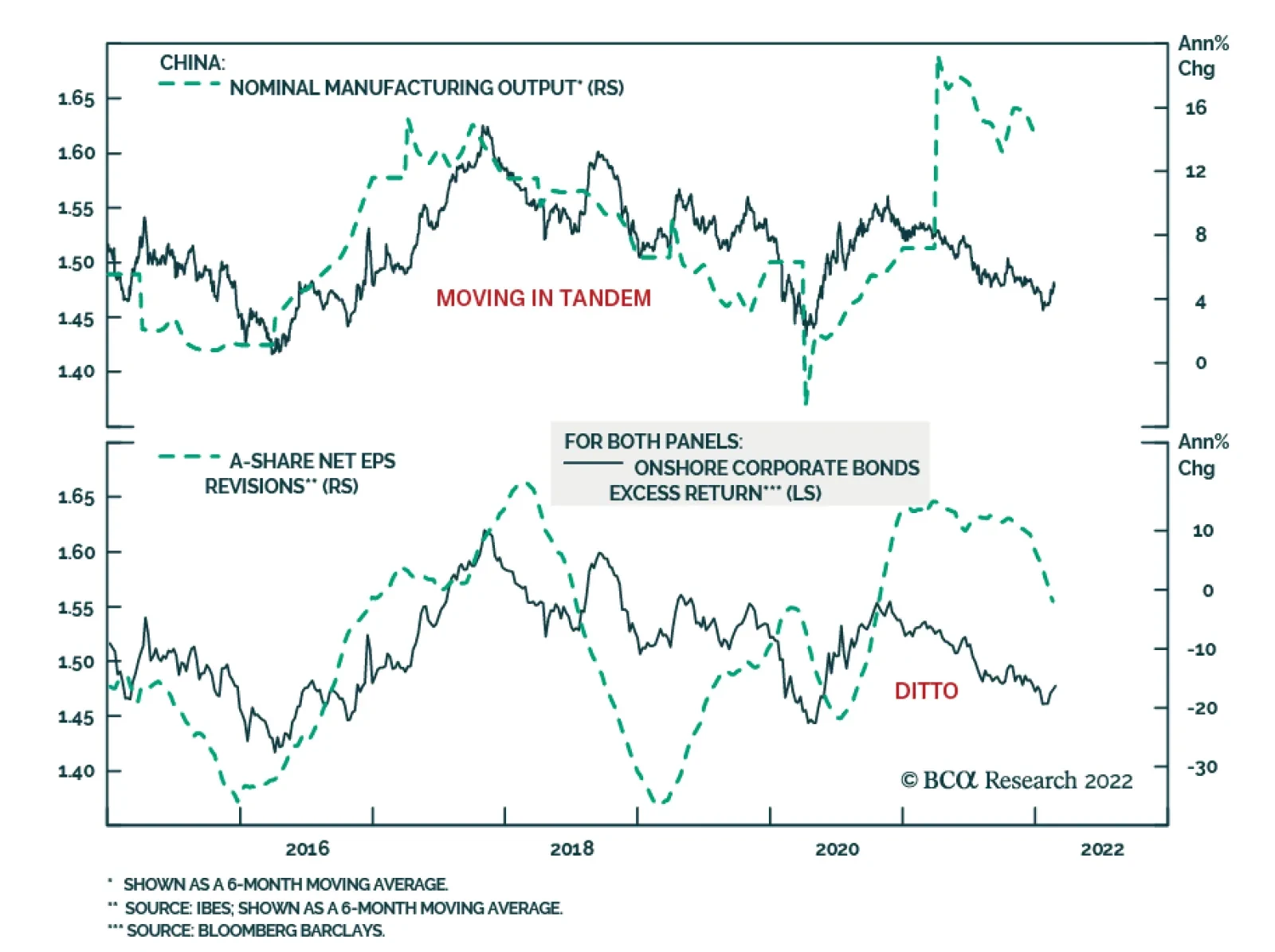
BCA Research’s Emerging Markets Strategy service concludes that fixed-income investors should continue to favor Chinese government bonds over corporate bonds. The proper measure of corporate bond performance is excess return over similar government bonds…
Executive Summary The Excess Return Of Corporate Bonds Is Driven By Corporate Profits
The Excess Return Of Corporate Bonds Is Driven By Corporate Profits
The Excess Return Of Corporate Bonds Is Driven By Corporate Profits
Given that a sustainable business cycle acceleration in China is unlikely in the short term, onshore government bond yields will likely drop further. In the long run, odds are that Chinese government bond yields will drop below US Treasury yields. For domestic asset allocators, we continue to recommend overweighting government bonds over stocks for now. The excess return of corporate bonds is driven by the corporate profit cycle. On a volatility-adjusted basis, the total return on equities exceeds the excess return on corporate bonds during periods when economic growth is accelerating and underperforms during deceleration phases. Bottom Line: Given our view that a meaningful growth recovery in China will only be a theme for the second half of this year, onshore asset allocators should continue favoring corporate credit over stocks and government bonds over corporate bonds. The bear market in Chinese offshore corporate credit might be in its late stages but it is not yet over. Feature In this report we (1) elaborate on our outlook for Chinese government and corporate bonds and (2) offer a framework for understanding how asset allocation for fixed-income (government and corporate bonds) and multi-asset portfolios (comprised of fixed-income plus equities) should be implemented. Domestic Government Bonds Chart 1Chinese Bond Yields Have Bucked The Global Trend
Chinese Bond Yields Have Bucked The Global Trend
Chinese Bond Yields Have Bucked The Global Trend
The risk-reward profile of Chinese domestic government bonds remains attractive. Chinese government bond yields have been declining, bucking the global trend of surging government bond yields (Chart 1, top panel). Odds are that Chinese bond yields will drop further, both cyclically and structurally: In contrast with the Americas and Europe, China’s consumer price inflation has remained subdued. Its core, trimmed mean and headline inflation rates have remained low (Chart 2). The ongoing growth slump will cap core inflation in China at around 1%, allowing monetary authorities to lower interest rates further. Real bond yields in China remain well above those in the majority of DM (Chart 1, bottom panel). Hence, risk-free bonds in China offer value. As to the Chinese stimulus and business cycle, the recent pickup in Chinese credit numbers has been entirely due to local government bond issuance. After excluding local government bonds, credit growth and its impulse have not improved (Chart 3). While infrastructure spending will pick up in the coming months (given large special bond issuance), sentiment among consumers and private companies remains downbeat and local government budgets are severely impaired by the collapse in revenues from land sales. Hence, it will take some time before a boost in infrastructure activity lifts broader business and consumer sentiment such that a sustainable economic recovery can take hold. Chart 2Chinese Consumer Price Inflation Is Subdued
Chinese Consumer Price Inflation Is Subdued
Chinese Consumer Price Inflation Is Subdued
Chart 3Recent Credit Improvement Is Entirely Due to Local Government Bond Issuance
Recent Credit Improvement Is EntirelyDue to Local Government Bond Issuance
Recent Credit Improvement Is EntirelyDue to Local Government Bond Issuance
The special bond quota for Q1 stands at RMB 1.46 trillion and is equivalent to 28% of local government aggregate quarterly revenue. Even though the special bond issuance in Q1 is massive, it will be largely offset by the drop in local governments’ land sales revenue. The latter is shrinking and makes up more than 40% of local government aggregate revenues. In brief, strong headwinds from the property market in the form of shrinking land sales might counteract the increase from front-loaded special bond issuance in Q1 2022. As to real estate construction, funding for property developers is down dramatically from a year ago (Chart 4). In the absence of financing, real estate developers will shrink construction volumes in the months ahead. Chart 5Debt Service Burden For Chinese Enterprises And Households Is High
Debt Service Burden For Chinese Enterprises And Household Is High
Debt Service Burden For Chinese Enterprises And Household Is High
Chart 4Property Completions Will Roll Over
Property Completions Will Roll Over
Property Completions Will Roll Over
Structurally, high enterprise and household debt levels in China amid slumping incomes mean that borrowing costs should drop to facilitate debt servicing. BIS estimates that debt service costs for the private sector (enterprises and households) in China are 21% of disposable income, much higher than in many other economies (Chart 5). Finally, China’s large and persistent current account surpluses mean that the nation is a major international creditor rather than a debtor. Thus, China does not need to offer high yields to attract foreign capital. Structurally speaking, foreign fixed-income inflows into Chinese domestic bonds will likely continue. Chart 6Credit Cycle And Government Bond Yields
Credit Cycle And Government Bond Yields
Credit Cycle And Government Bond Yields
Bottom Line: Bond yields will likely drop further as a sustainable business cycle acceleration in China is unlikely in the short term. Chart 6 illustrates that the total social financing impulse leads bond yields by nine months and a cyclical bottom in yields will probably occur a few months from now. In the long run, Chinese government bonds yields will likely drop below US Treasury yields. Onshore Corporate Bonds The proper measure of corporate bond performance is excess return over similar government bonds (herein excess return). The basis for using excess return instead of total return for corporate bonds is because investors can attain government bond return by purchasing them outright. Essentially, investors prefer corporate bonds over government bonds because of credit spreads. Hence, a corporate bond performance assessment – whether in absolute terms or relative to other asset classes – should be based on excess return. In China, the excess return on onshore corporate bonds1 usually moves in tandem with the business cycle and government bond yields. In particular: The excess return of corporate bonds is positive during periods of growth acceleration and negative during slowdowns (Chart 7, top panel). The middle panel of Chart 7 illustrates that the excess return of corporate bonds correlates with analysts’ net EPS revisions for onshore listed companies. This confirms the above point that corporate bonds correlate with the profit/business cycle. Significantly, even though industrial profit growth is not yet negative (Chart 8, top panel), earnings in commodity-user industries have crashed (Chart 8, bottom panel). This explains the negative excess return for onshore corporate bonds in the past 12 months. Chart 7The Excess Return Of Corporate Bonds Is Driven By Corporate Profits
The Excess Return Of Corporate Bonds Is Driven By Corporate Profits
The Excess Return Of Corporate Bonds Is Driven By Corporate Profits
Chart 8Corporate Profit Cycle: Mind The Divergence
Corporate Profit Cycle: Mind The Divergency
Corporate Profit Cycle: Mind The Divergency
Furthermore, the excess return of corporate bonds declines and rises with interest rate expectations (Chart 7, bottom panel). As the outlook for corporate profits remains sour, fixed-income investors should continue to favor government bonds over corporate bonds. Now, how do corporate bonds perform versus stocks? What drives their relative performance? To compare stock performance to corporate bond excess return, one should adjust for volatility. In other words, share prices are much more volatile than the excess return on corporate bonds. Hence, during risk-on periods equities always outperform corporate bonds and vice versa. Chart 9The Performance of Stocks over Corporate Bonds is Very Pro-Cyclical
The Performance of Stocks over Corporate Bonds is Very Pro-Cyclical
The Performance of Stocks over Corporate Bonds is Very Pro-Cyclical
Chart 9 demonstrates that even on a volatility-adjusted basis, the total return on equities exceeds the excess return on corporate bonds during periods when economic growth is accelerating and underperforms during deceleration phases. In short, the performance of stocks over corporate bonds is very pro-cyclical. Bottom Line: The excess return of corporate bonds is driven by corporate revenue and profits rather than by interest rate expectations. Getting China’s business cycle right is critical to the allocation between government and corporate bonds in fixed-income portfolios and to the allocation between corporate bonds and equities in multi-asset portfolios. Given our view that a meaningful growth recovery in China will only be a theme in the second half of this year, onshore asset allocators should continue favoring corporate bonds over stocks and government bonds over corporate credit. Offshore Corporate Bonds What drives the excess return of Chinese USD corporate bonds in absolute terms as well as versus Chinese non-TMT investable stocks2 and onshore corporate bonds? Given that the offshore corporate bond universe is dominated by property developers, their excess return correlates with perceived risks to the mainland property market in general and the financial health of property developers in particular (Chart 10, top panel). Property developers are very overleveraged, their sales are shrinking and their financing has dried up. Yet, authorities are compelling them to complete construction of their pre-sold housing. Property developers will therefore continue to experience financial distress. Odds are that bond prices of corporate developers – both investment grade and high yield - will continue falling (Chart 10, middle and bottom panels). Chart 11Investable Stocks Vs. Offshore Corporate Credit: Volatility-Adjusted Performance
Investable Stocks Vs. Offshore Coporate Credit: Volatility-Adjusted Performance
Investable Stocks Vs. Offshore Coporate Credit: Volatility-Adjusted Performance
Chart 10A Massive Bear Market In Offshore Corporate Bonds
A Massive Bear Market In Offshore Corporate Bonds
A Massive Bear Market In Offshore Corporate Bonds
On a volatility-adjusted basis, non-TMT investable stocks outpace the excess return of offshore corporate bonds during periods of growth improvement and underperform during growth slowdowns (Chart 11, top panel). The same pattern holds true when it comes to the performance of offshore corporate bond versus the aggregate MSCI Investable equity index (including TMT stocks) (Chart 11, bottom panel). The credit cycle leads the business cycle and, thereby, it leads these financial market trends. Bottom Line: The bear market in Chinese offshore corporate credit might be in its late stages but it is not yet over. Chinese offshore corporate bonds will continue underperforming EM corporate bonds as well as Chinese onshore corporate bonds. Investment Recommendations Investors often read market signals across asset classes to gauge which market moves will persist and which ones will be short-lived. In this regard, we have two observations for Chinese onshore markets: Chart 12Moving In Tandem
Moving In Tandem
Moving In Tandem
The sustainability of an equity rally is higher when it is confirmed by rising excess returns of corporate bonds and rising government bond yields (Chart 12). Presently, there is no strong signal to switch from government bonds to either corporate bonds or stocks. Unfortunately, the yield curve in China does not correlate with its business cycle and, hence, cannot be used as a tool in macro analysis. Our key investment conclusions are: For fixed-income investors, we continue to recommend receiving 10-year swap rates in China and for dedicated EM local currency bond managers to remain overweight China. The renminbi has been firm versus the US dollar despite a considerable narrowing in the interest rate differential between China and the US. In the long run, the real interest rate differential between China and the US will drive the exchange rate, and it will favor the RMB. While US real bond yields might rise relative to Chinese bond yields in the coming months, triggering a period of yuan softness, it will prove to be transitory. The basis is that the Federal Reserve is very sensitive to asset prices. As US share prices decline and corporate spreads widen, the central bank will eventually turn dovish and will lag behind the inflation curve. When a central bank falls behind the inflation curve, real rates stay low and its currency depreciates. Chart 13China’s Stock-to-Bond Ratio
China"s Stock-to-Bond Ratio
China"s Stock-to-Bond Ratio
For domestic asset allocators, we continue to recommend favoring government bonds over stocks (Chart 13). Within fixed-income portfolios, investors should overweight government bonds over corporate bonds. Finally, corporate bonds will fare better than equities in the near term. In a few months there will be an opportunity to shift these positions. More aggressive stimulus from authorities and aggressive property market relaxation measures will create conditions for an improvement in domestic demand. Finally, the risk-reward profile for offshore USD corporate bonds remains unattractive. Chinese offshore corporate credit will continue underperforming EM USD corporate credit as well as Chinese onshore corporate bonds. Arthur Budaghyan Chief Emerging Markets Strategist arthurb@bcaresearch.com Footnotes 1 Due to the lack of excess return data from the index provider (Bloomberg Barclays onshore bond indexes), we calculated the excess return on onshore corporate bonds as the ratio of the total return on the corporate bond index divided by the total return on the government bond index. This measure is not ideal as it does not account for duration mismatches between the corporate and government bond indexes. However, the key conclusions of this report will hold true for the duration-adjusted excess return not least because this framework is valid for financial markets in the US and Europe. 2 The reason to compare it to non-TMT (technology, media and telecommunication, i.e., Chinese tech and internet stocks) is that offshore corporate bond issuers are largely old economy industries.
Executive Summary US biotech is trading at its greatest discount to the market. Ever. Much of biotech’s underperformance is due to transient factors: specifically, the sell-off in long-duration bonds; the focus on delivering a Covid vaccine; regulatory concerns; a drought in M&A; and a flood of IPOs. Overweight US biotech versus US big-tech, both tactically and structurally. Long-only investors with a time horizon of at least 2 years should go outright long biotech, especially US biotech. If, as we expect, the 30-year T-bond (price) continues to rally, then long-duration sectors and stock markets will resume their outperformance versus shorter-duration sectors and stock markets. Fractal trading watchlist: We focus on biotech, and add US banks versus consumer services, Norway versus China, Greece versus euro area, and BRL/NZD. US Biotech Is Trading At Its Greatest Discount To The Market. Ever
US Biotech Is Trading At Its Greatest Discount To The Market. Ever
US Biotech Is Trading At Its Greatest Discount To The Market. Ever
Bottom Line: Every now and then comes a rare opportunity to buy a deeply unloved asset at a bargain basement price. We believe that now provides such an opportunity for the beaten-down biotech sector – especially the US biotech sector which is trading at its greatest discount to the market. Ever. Feature Every now and then comes a rare opportunity to buy a deeply unloved asset at a bargain basement price. We believe that now provides such an opportunity for the beaten-down biotech sector – especially the US biotech sector which is trading at its greatest discount to the market. Ever. But before we go into the specifics of biotech, let’s quickly discuss the recent action in the broader market. The Past Year Has Been All About ‘Duration’ A good way to think of any investment is to compress all its cashflows into one future ‘lump-sum payment.’ The length of time to this lump-sum payment is the investment’s ‘duration.’ And the present value of the investment is just the discounted value of this lump-sum payment, where the discount factor will depend on the required return on the investment combined with its duration.1 It follows that, all else being equal, the present value of a long-duration stock must rise and fall in line with the present value of an equally long-duration bond – because their discount factors move in lockstep. And, as we have been banging on in recent weeks, this simple observation is all you need to explain market action over the past year. For the 30-year T-bond, 2.4-2.5 percent is an important resistance level. Given that long-duration indexes such as the Nasdaq, S&P 500 and MSCI Growth have the same duration as the 30-year T-bond, they have been tracking the 30-year T-bond price one-for-one (Chart I-1 and Chart I-2). Hence, when the long-duration bond rallied, these stock markets outperformed shorter-duration indexes such as the FTSE100 and MSCI Value; and when the long-duration bond sold off, they underperformed. Chart I-1The Nasdaq Has Been Tracking The 30-Year T-Bond Price One-For-One
The Nasdaq Has Been Tracking The 30-Year T-Bond Price One-For-One
The Nasdaq Has Been Tracking The 30-Year T-Bond Price One-For-One
Chart I-2MSCI Growth Has Been Tracking The 30-Year T-Bond Price One-For-One
MSCI Growth Has Been Tracking The 30-Year T-Bond Price One-For-One
MSCI Growth Has Been Tracking The 30-Year T-Bond Price One-For-One
The Russian invasion of Ukraine has catalysed a retreat in the 30-year T-bond yield from a ‘line in the sand’ at 2.4-2.5 percent, which we have previously highlighted as an important resistance level. If, as we argued in A Massive Economic Imbalance, Staring Us In The Face, the 30-year T-bond (price) continues to rally, then long-duration sectors and stock markets will resume their outperformance versus shorter-duration sectors and stock markets. US Biotech Is Trading At Its Greatest Discount To The Market. Ever Over the longer term, the bigger driver of the stock price will not be the discount factor on the future lump-sum payment; the bigger driver will be the size of the lump-sum payment itself. For any company, industry, or stock market, this expected lump-sum payment will evolve in line with current profits multiplied by a ‘structural growth multiple.’ It turns out that while current profits are updated every quarter, the structural growth multiple does not change much from quarter to quarter, year to year, or even decade to decade. Yet occasionally, it can phase-shift violently downwards when an event, or realisation, shatters the market’s lofty hopes for structural growth. Occasionally, an event or realisation shatters the market’s lofty hopes for structural growth. For example, after the dot com bubble burst it became clear that the sky-high hopes for non-US tech companies were just pie in the sky. The result was that their structural growth multiple halved, which weighed down non-US tech stocks for the subsequent 10 years (Chart I-3). Chart I-3After The Dot Com Bust, The Structural Growth Multiple For Non-US Tech Collapsed
After The Dot Com Bust, The Structural Growth Multiple For Non-US Tech Collapsed
After The Dot Com Bust, The Structural Growth Multiple For Non-US Tech Collapsed
More recently, the realisation that Facebook – or Meta Platforms as it is now known – is losing subscribers was the gestalt moment that shattered hopes for its structural growth. Note that while its 2022 profits are down slightly, the Meta share price has collapsed, indicating a big hit to the structural growth multiple (Chart I-4). Chart I-4Facebook's Structural Growth Multiple Has Collapsed
Facebook's Structural Growth Multiple Has Collapsed
Facebook's Structural Growth Multiple Has Collapsed
Conversely, there are rare occasions when a phase-shift down in a structural growth multiple is unwarranted or has gone too far. Right now, a case in point is the biotech sector, especially the US biotech sector. Relative to the relationship of the 2010s decade, US biotech’s structural growth multiple has halved (Chart I-5). The result is that US biotech is trading at the greatest valuation discount to the market (-20 percent). Ever. It is also trading at its greatest valuation discount to the broader tech sector (-35 percent). Ever (Chart I-6 and Chart I-7). Chart I-5US Biotech's Structural Growth Multiple Has Halved, But Is Such A Massive De-Rating Justified?
US Biotech's Structural Growth Multiple Has Halved, But Is Such A Massive De-Rating Justified?
US Biotech's Structural Growth Multiple Has Halved, But Is Such A Massive De-Rating Justified?
Chart I-6US Biotech Is Trading At Its Greatest Ever Discount To The Market...
US Biotech Is Trading At Its Greatest Ever Discount To The Market...
US Biotech Is Trading At Its Greatest Ever Discount To The Market...
Chart I-7...And Its Greatest Ever Discount To Big-Tech
...And Its Greatest Ever Discount To Big-Tech
...And Its Greatest Ever Discount To Big-Tech
Another way of putting it is that in the post-pandemic era, while the structural growth multiple for the broader tech sector is largely unchanged, the structural growth multiple for biotech has collapsed by 40 percent (Charts I-8, I-11). Begging the question, is such a massive structural de-rating justified? Chart I-8US Tech's Structural Growth Multiple ##br##Is Unchanged...
US Tech's Structural Growth Multiple Is Unchanged...
US Tech's Structural Growth Multiple Is Unchanged...
Chart I-9...But US Biotech's Structural Growth Multiple Has Collapsed
...But US Biotech's Structural Growth Multiple Has Collapsed
...But US Biotech's Structural Growth Multiple Has Collapsed
Chart I-10Global Tech's Structural Growth Multiple##br## Is Unchanged...
Global Tech's Structural Growth Multiple Is Unchanged...
Global Tech's Structural Growth Multiple Is Unchanged...
Chart I-11...But Global Biotech's Structural Growth Multiple Has Collapsed
...But Global Biotech's Structural Growth Multiple Has Collapsed
...But Global Biotech's Structural Growth Multiple Has Collapsed
Much Of Biotech’s Underperformance Is Due To Transient Factors We have identified five culprits for biotech’s recent underperformance, but they are largely transient: The sell-off in long-duration bonds: Ironically, though the market has downgraded biotech’s structural growth, it has still behaved like a long-duration sector that has tracked the sell-off in the 30-year T-bond. Hence, if the long-duration bond rallies, it will boost biotech stocks. The focus on delivering a Covid vaccine: While biotech was developing a Covid vaccine, investors became enamoured with the sector, but once the vaccine was delivered, investors fell out of love with the sector. Yet there is more to biotech than a provider of vaccines, and as we show in the final section, the sell-off has gone too far. Regulatory concerns: In the US there has been some concern about the dilution of a biotech company’s intellectual property (IP) rights – known as March-In-Rights – if government funding or research has contributed to an innovation. In practice though, the sophistication of most innovations means that IP would remain with the innovator. There has also been concern about drug pricing reform, but as is normal in any negotiation, the opening extreme position is likely to get watered down. A drought in M&A: The focus on Covid, plus the uncertainty around regulation, has led to a drought in the M&A activity that is usually the mechanism to crystallize value. Still, for long-term investors, value is value, whether it is crystallized or not. Furthermore, the drought in M&A cannot last forever. A flood of IPOs: The more than 100 biotech IPOs in 2021 was double the usual rate, creating an oversupply and indigestion for specialist investors in the sector. But given the poor performance of the sector, the IPO flood is likely to recede through 2022-23 in a self-correction. So, we come back to the question: is it right to price a structural growth outlook for biotech worse than the overall market and much worse than for big-tech? If anything, it is big-tech that faces the much greater existential risk in the form of Web 3.0 – which will remove big-tech’s current ownership of the internet, thereby wiping out its very lucrative business model. Look out for our upcoming Special Report on this major theme. To repeat, the market is valuing US biotech at a record 40 percent discount to big-tech, and at its most unloved versus the broad market, when most of the headwinds it faces are transient. All of which leads to two investment conclusions. The market is valuing US biotech at a record 40 percent discount to big-tech, and at its most unloved versus the broad market. Overweight US biotech versus US big-tech, both tactically and structurally. Long-only investors with a time horizon of at least 2 years should go outright long biotech, especially US biotech. Fractal Trading Watchlist This week’s analysis focusses on our main theme, biotech, and we add US banks versus consumer services, Norway versus China, Greece versus euro area, and BRL/NZD. Reinforcing the arguments in the preceding sections, US biotech is deeply oversold versus broader tech, reaching a point of fractal fragility that signalled several significant turning-points through the past two decades (Chart I-12). Accordingly, this week’s recommended trade is to go long US biotech versus US tech, setting the profit target and symmetrical stop-loss at 17.5 percent. Chart I-12US Biotech Is Deeply Oversold Versus Broader Tech
US Biotech Is Deeply Oversold Versus Broader Tech
US Biotech Is Deeply Oversold Versus Broader Tech
US Banks Are At Risk Of Reversal
US Banks Are At Risk Of Reversal
US Banks Are At Risk Of Reversal
Norway's Outperformance Could End
Norway's Outperformance Could End
Norway's Outperformance Could End
Greece's Snapback At A Resistance Point
Greece's Snapback At A Resistance Point
Greece's Snapback At A Resistance Point
BRL/NZD At A Resistance Point
BRL/NZD At A Resistance Point
BRL/NZD At A Resistance Point
Dhaval Joshi Chief Strategist dhaval@bcaresearch.com Footnotes 1 Defined fully, the duration of an investment is the weighted-average of the times of its cashflows, in which the weights are the present values of the cashflows. Fractal Trading System Fractal Trades
Time To Buy Biotech
Time To Buy Biotech
Time To Buy Biotech
Time To Buy Biotech
6-Month Recommendations Structural Recommendations Closed Fractal Trades Indicators To Watch - Bond Yields Chart II-1Indicators To Watch - Bond Yields ##br##- Euro Area
Indicators To Watch - Bond Yields - Euro Area
Indicators To Watch - Bond Yields - Euro Area
Chart II-2Indicators To Watch - Bond Yields ##br##- Europe Ex Euro Area
Indicators To Watch - Bond Yields - Europe Ex Euro Area
Indicators To Watch - Bond Yields - Europe Ex Euro Area
Chart II-3Indicators To Watch - Bond Yields ##br##- Asia
Indicators To Watch - Bond Yields - Asia
Indicators To Watch - Bond Yields - Asia
Chart II-4Indicators To Watch - Bond Yields ##br##- Other Developed
Indicators To Watch - Bond Yields - Other Developed
Indicators To Watch - Bond Yields - Other Developed
Indicators To Watch - Interest Rate Expectations Chart II-5Indicators To Watch - Interest Rate Expectations
Indicators To Watch - Interest Rate Expectations
Indicators To Watch - Interest Rate Expectations
Chart II-6Indicators To Watch - Interest Rate Expectations
Indicators To Watch - Interest Rate Expectations
Indicators To Watch - Interest Rate Expectations
Chart II-7Indicators To Watch - Interest Rate Expectations
Indicators To Watch - Interest Rate Expectations
Indicators To Watch - Interest Rate Expectations
Chart II-8Indicators To Watch - Interest Rate Expectations
Indicators To Watch - Interest Rate Expectations
Indicators To Watch - Interest Rate Expectations
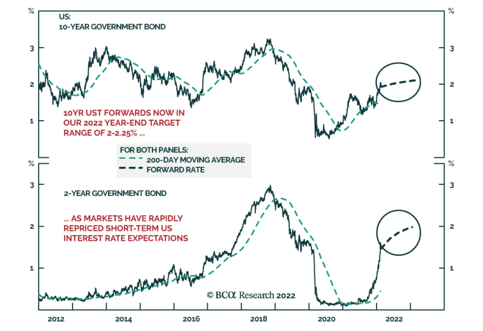
According to BCA Research’s Global Fixed Income Strategy and US Bond Strategy services, the surge in US Treasury yields looks overdone in the near-term. In the near term, there are several good reasons to expect the recent big run-up in US bond…
Executive Summary US Treasury yields have surged in response to high US inflation and Fed tightening expectations. However, the move looks overdone in the near-term. Too many Fed hikes are now discounted for 2022, US realized inflation should soon peak, inflation expectations have stabilized, financial conditions have started to tighten, and positioning in the Treasury market is now quite short. These factors will act to stabilize Treasury yields over the next few months, even with the cyclical backdrop remaining bond bearish. Markets Think The Fed Will Hike More Sooner And Less Later – The Opposite Is More Likely
Markets Think The Fed Will Hike More Sooner And Less Later - The Opposite Is More Likely
Markets Think The Fed Will Hike More Sooner And Less Later - The Opposite Is More Likely
Recommendation Inception Level Inception Date Long Dec 2022/Short Dec 2024 3-Month SOFR Future 0.25 Feb 22/22 New Trade: Go long the December 2022 US SOFR interest rate futures contract versus shorting the December 2024 SOFR contract. The former discounts too many Fed hikes for this year and the latter discounts too few hikes over the next three years. Bottom Line: US Treasury yields now discount the maximum likely hawkish scenario for Fed rate hikes in 2022, with risks all pointing in the direction of the Fed delivering less than expected. Upgrade US duration exposure to neutral from below-benchmark on a tactical basis. Feature Chart 1A Near-Term Overshoot For UST Yields
Five Reasons To Tactically Increase US Duration Exposure Now
Five Reasons To Tactically Increase US Duration Exposure Now
During the BCA Research US Bond Strategy quarterly webcast last week, we announced a shift in our recommended US duration stance, moving from below-benchmark to neutral. This move was more tactical (i.e. shorter-term) in nature, as we still strongly believe that bond markets are underestimating the eventual peak for US bond yields over the next couple of years. In the near term, however, we see several good reasons to expect the recent big run-up in US bond yields to pause, warranting a more neutral tactical duration exposure (Chart 1). We discuss those reasons – and the implications for both US duration strategy - in this report published jointly by BCA Research’s US Bond Strategy and Global Fixed Income Strategy services. Reason #1: Too Many Fed Rate Hikes Are Now Discounted For 2022 The US overnight index swap (OIS) curve currently discounts 146bps of Fed rate hikes by the end of 2022. This is a big change from the start of the year when only 77bps of hikes were priced (Chart 2). The OIS curve repricing now puts the path of the funds rate for this year well above the last set of FOMC interest rate projections published at the December 2021 Fed meeting. In other words, the market has already moved to discount a big upward shift in the FOMC “dots” for 2022, and even for 2023, at next month’s FOMC meeting. Chart 2Markets Think The Fed Will Hike More Sooner And Less Later - The Opposite Is More Likely
Markets Think The Fed Will Hike More Sooner And Less Later - The Opposite Is More Likely
Markets Think The Fed Will Hike More Sooner And Less Later - The Opposite Is More Likely
We think a more likely outcome for 2022 is that the Fed lifts rates four or five times, not six or even seven times as some Wall Street investment banks are forecasting. We set out the reasons why we think the Fed will go less than expected in the rest of this report. At a minimum, there is virtually no chance that the Fed will provide guidance to markets that is more hawkish than current market pricing, which would push bond yields even higher in the near term. Reason #2: US Inflation Will Soon Peak The relentless string of upside surprises on US inflation has been the main reason the bond market has moved so rapidly on pricing in more Fed rate hikes. The story is about to change, however, as US inflation should peak sometime in the next few months and begin to rapidly decelerate toward levels much closer to, but still well above, the Fed’s 2% inflation target. Already, the intense global inflation pressures from commodities and traded goods prices over the past year has started to lose potency. The annual growth rate of the CRB Raw Industrials index has eased from a peak of 45% in June to 18%, in line with slowing growth momentum of global manufacturing activity (Chart 3, top panel). The softening of input price pressures is evident in business survey measures like the ISM Manufacturing Prices Paid index, which typically leads US headline CPI inflation by six months and has fallen by 16 points since the peak in June (middle panel). Chart 3Global Inflation Pressures Easing
Global Inflation Pressures Easing
Global Inflation Pressures Easing
The global supply chain disruptions that have caused inventory shortages in products ranging from new cars to semiconductors also appear to be easing. Supplier delivery times are shortening according to the ISM Manufacturing and Non-Manufacturing surveys (bottom panel). Combined with other indications of the loosening of supply chain logjams, like lower shipping costs, the influence of supply disruptions on inflation should diminish, on the margin. Energy prices should also soon contribute to disinflationary momentum (Chart 4). BCA Research’s Commodity & Energy Strategy service is forecasting the Brent oil price to reach $76/bbl at the end of 2022 and $80/bbl at the end of the 2023. That represents a significant decline from the current $95/bbl price that reflects a large risk premium for the potential oil market supply disruptions in response to a Russian invasion of Ukraine. A war-driven spike in oil prices does risk extending the current period of high US (and global) inflation. However, it should be noted that the annual growth in oil prices has been decelerating even as oil prices have been rising recently, showing the power of base effect comparisons that should lead to a lower contribution to overall inflation from energy prices over the next 6-12 months. Chart 4Oil Prices Will Soon Turn Disinflationary
Oil Prices Will Soon Turn Disinflationary
Oil Prices Will Soon Turn Disinflationary
Chart 5A Changing Mix Of US Consumer Spending Will Lower Overall Inflation
A Changing Mix Of US Consumer Spending Will Lower Overall Inflation
A Changing Mix Of US Consumer Spending Will Lower Overall Inflation
Looking beyond the commodity space, a shifting mix of US consumer spending should also help push overall US inflation lower. US core CPI inflation hit a 34-year high of 6.0% in January, fueled by 11.7% growth in core goods inflation (Chart 5). We anticipate that overall core inflation will slow to levels more consistent with the trends seen in more domestically focused sectors like core services and shelter, where inflation is running around 4%. US consumers have started to shift their spending patterns away from goods, which was running well above its pre-pandemic trend, back toward services, which was running below its pre-pandemic trend (Chart 6). This will help narrow the gap between goods and services inflation, particularly as easing supply chain disruptions help dampen goods inflation. Chart 6Goods Inflation Should Soon Peak
Goods Inflation Should Soon Peak
Goods Inflation Should Soon Peak
Chart 7There Are Still Pockets Of Available US Labor Market Supply
There Are Still Pockets Of Available US Labor Market Supply
There Are Still Pockets Of Available US Labor Market Supply
Chart 8US Wage Growth Should Soon Begin To Moderate
US Wage Growth Should Soon Begin To Moderate
US Wage Growth Should Soon Begin To Moderate
There is also the potential for some of the pressures stemming from the tight US labor market to become a bit less inflationary in the coming months. While the overall US unemployment rate of 4% is well within the range of full employment NAIRU estimates produced by the FOMC, there are notable differences across employment categories suggesting that there are still sizeable pockets of labor supply. For example, the unemployment rate for managerial and professional workers is a tiny 2.3%, while the unemployment rate for services workers was a more elevated 6.7% (Chart 7, top panel). There are also noteworthy differences in US labor market trends when sorted by wage growth. Employment in industries with lower wages – predominantly in services – has not returned to the pre-pandemic peak, unlike employment in higher wage cohorts (middle panel).1 As the US economy puts the Omicron variant in the rearview mirror, service industries most impacted by pandemic restrictions should see an increase in labor supply as workers return to the labor force. This will help close the one percentage point gap between the labor force participation rate for prime-aged workers (aged 25-54) and its pre-pandemic peak (bottom panel). This will also help to mitigate the current upturn in service sector wage growth, which reached 5.2% at the end of 2021 according to the US Employment Cost Index (Chart 8). When US inflation finally peaks in the next few months – most notably for goods prices and service sector wages – the Fed will be under less pressure to hike rates as aggressively as discounted in current bond market pricing. Reason #3: US Inflation Expectations Have Stabilized Chart 9TIPS Breakevens Are Not Telling The Fed To Be More Aggressive
TIPS Breakevens Are Not Telling The Fed To Be More Aggressive
TIPS Breakevens Are Not Telling The Fed To Be More Aggressive
The Fed always pays a lot of attention to inflation expectations, particularly market-based measures like TIPS breakevens, to assess if its monetary policy stance is appropriate. The current message from breakevens is that the Fed does not have to turn even more hawkish than expected to bring inflation back down to levels consistent with the Fed’s 2% target. The 10-year TIPS breakeven is currently 2.4%, down from a peak of 2.8% and within the 2.3-2.5% range that we deem consistent with the Fed’s inflation target. Inflation expectations are even more subdued on a forward basis, with the 5-year TIPS breakeven, 5-years forward now down to 1.95% (Chart 9). Shorter term TIPS breakevens remain elevated, with the 2-year breakeven at 3.7%. We continue to favor positioning for a narrower 2-year TIPS breakeven spread – realized inflation will soon peak and the New York Fed’s Consumer Expectations survey shows that household inflation expectations for the next three years have already fallen significantly (bottom panel). Lower inflation expectations, both market-based and survey-based, suggest that the Fed can be cautious on the pace of rate hikes after liftoff next month. Reason #4: US Financial Conditions Are Tightening Alongside Cooling US Growth Momentum We have long described the link between financial markets and the Fed’s policy stance as “The Fed Policy Loop.” In this framework, the markets act as a regulator on Fed hawkishness (Chart 10). If the Fed comes across as overly hawkish, risk assets will sell off (lower equity prices, wider corporate credit spreads), the US dollar will appreciate, the US Treasury curve will flatten and market volatility measures like the VIX index will increase. All of those trends act to tighten US financial conditions, threatening a growth slowdown that will force the Fed to back off from its previous hawkish bias. Chart 10The Fed Policy Loop
Five Reasons To Tactically Increase US Duration Exposure Now
Five Reasons To Tactically Increase US Duration Exposure Now
Financial conditions have indeed tightened as markets have priced in more Fed rate hikes in 2022 (Chart 11). Since the start of the year, the S&P 500 is down 9% year-to-date, US investment grade corporate spreads have widened 26bps, the 2-year/10-year US Treasury curve has flattened by 34bps and the VIX index has increased 11 pts. In absolute terms, US financial conditions remain highly stimulative and the risk asset selloff so far poses little threat to US economic growth. However, if the Fed were to deliver all of the rate hikes in 2022 that are currently discounted in the US OIS curve, the market selloff would deepen as investors began to worry about a Fed-engineered economic slowdown. This would lead to a more significant tightening of financial conditions, representing an even bigger risk to US growth. The Fed cannot risk appearing too hawkish too soon, with US growth momentum already showing signs of slowing (Chart 12). The Conference Board US leading economic indicator has stopped accelerating and may be peaking, US business confidence is softening and consumer confidence is very depressed according to the University of Michigan survey. Importantly, high inflation is cited as the main reason for weak consumer confidence, as wage increases have not matched price increases. If realized inflation falls, as we expect, this could actually provide a boost to consumer confidence as households would feel an improvement in real incomes and spending power – a development that could eventually lead to more Fed rate hikes in 2023 if consumer spending improves, especially if inflation stays above the Fed’s 2% target. Chart 11Fed Hawkishness Has Already Tightened Financial Conditions
Fed Hawkishness Has Already Tightened Financial Conditions
Fed Hawkishness Has Already Tightened Financial Conditions
Chart 12Not The Best Time For The Fed To Be More Aggressive
Not The Best Time For The Fed To Be More Aggressive
Not The Best Time For The Fed To Be More Aggressive
For now, however, the risk of a preemptive tightening of financial conditions will ensure that the Fed delivers fewer rate hikes than the market expects this year. Reason #5: Treasury Market Positioning Is Now Very Short Chart 13Reliable Bond Indicators Calling For A Pause In The UST Selloff
Reliable Bond Indicators Calling For A Pause In The UST Selloff
Reliable Bond Indicators Calling For A Pause In The UST Selloff
The final reason to increase US duration exposure now is that Treasury market positioning has become quite short and has become a headwind to higher bond yields and lower bond prices. The JP Morgan fixed income client duration survey shows that bond investors are running duration exposures well below benchmark (Chart 13). Speculators are also running significant short positions in longer-maturity US Treasury futures. This suggests limited selling power in the event of more bond bearish news and increased scope for short-covering in the event of risk-off event – like a shooting war in Ukraine – or surprisingly negative US economic data. On that front, the Citigroup US data surprise index, which is typically highly correlated to the momentum of US Treasury yields, has dipped a bit recently but remains at neutral levels (top panel). A similar measure of neutrality is sent by some of our preferred cyclical bond indicators like the ratio of the CRB raw industrials index to the price of gold – the 10-year yield is now in line with that ratio, which appears to be peaking (middle panel). Investment Conclusions Given the five reasons outlined in this report – too many Fed hikes are now discounted for 2022, US realized inflation should soon peak, inflation expectations have stabilized, financial conditions have started to tighten, and positioning in the Treasury market is now quite short – we decided last week to upgrade our recommended US portfolio duration to neutral from below-benchmark. However, this move is only for a tactical investment horizon. We still see the cyclical backdrop as bond bearish, as Treasury yields do not yet reflect how high US interest rates will rise in the upcoming tightening cycle. The 5-year Treasury yield, 5-years forward is currently at 2.0%. This lies at the low end of the range of estimates of the longer-run neutral fed funds rate (Chart 14) from the New York Fed’s survey of bond market participants (2%) and the median FOMC longer-run interest rate projection from the Fed dots (2.5%). We see the Fed having to lift rates faster than markets expect in 2023 and 2024. US inflation this year is expected to settle at a level above the Fed’s 2% target before picking up again next year alongside renewed tightening of labor market conditions once the remaining supply of excess labor is fully absorbed. Chart 14The Cyclical UST Bear Market Is Not Over Yet
The Cyclical UST Bear Market Is Not Over Yet
The Cyclical UST Bear Market Is Not Over Yet
Chart 15Go Long The Dec/22 SOFR Contract Vs. The Dec/24 Contract
Go Long The Dec/22 SOFR Contract Vs. The Dec/24 Contract
Go Long The Dec/22 SOFR Contract Vs. The Dec/24 Contract
As a way to position for the Fed doing fewer rate hikes than expected in 2022, but more hikes than expected in 2023/24, we are entering a new trade this week – going long the December 2022 3-month SOFR US interest rate futures contract versus a short position in the December 2024 3-month SOFR contract. The implied interest rate spread on those two contracts has tightened to 25bps (Chart 15). We expect that trend to reverse, however, with the spread increasing as markets eventually move to price out rate hikes in 2022 and price in much more Fed tightening in 2023 and 2024. We will discuss the implications of the shift in our US duration stance for our views on non-US bond markets in next week’s Global Fixed Income Strategy report. Our initial conclusion is that our country allocation recommendations for government bonds will remain unchanged – underweighting the US, UK, and Canada; overweighting core Europe, peripheral Europe, Japan and Australia – but we will also increase duration exposure within most (if not all) countries. As in the US, we also see markets pricing in too many rate hikes in the UK and Canada for 2022 but too few rate hikes over the next two years. On the other hand, markets are pricing in too many rate cumulative hikes over the next 2-3 years in Europe, Australia and Japan (Table 1). Table 1Markets Have Pulled Forward Rate Hikes Everywhere
Five Reasons To Tactically Increase US Duration Exposure Now
Five Reasons To Tactically Increase US Duration Exposure Now
Robert Robis, CFA Chief Fixed Income Strategist rrobis@bcaresearch.com Footnotes 1 The definitions for the wage cohorts can be found in the footnote of Chart 7. Cyclical Recommendations (6-18 Months)
Five Reasons To Tactically Increase US Duration Exposure Now
Five Reasons To Tactically Increase US Duration Exposure Now
Tactical Overlay Trades
Executive Summary The Market Thinks The Fed Will Be Unable To Raise Rates Much Above 2%
The Market Thinks The Fed Will Be Unable To Raise Rates Much Above 2%
The Market Thinks The Fed Will Be Unable To Raise Rates Much Above 2%
The Fed tightening cycle is likely to proceed in two stages. In the first stage, which is now well anticipated, the Fed will seek to restore its credibility by raising rates to 2% – the lower bound of what it regards as “neutral” – by early next year. The decline in goods inflation over the next 12 months, facilitated by the easing of supply-chain bottlenecks, will allow the Fed to take a break from tightening for most of 2023. Unfortunately, the respite from rate hikes will not last. The neutral rate of interest is around 3%-to-4%, significantly higher than what either the Fed or investors believe. A wage-price spiral will intensify starting in late 2023, setting the stage for the second, and more painful, round of tightening. Trade Inception Level Initiation Date Stop Loss Long June 2023 3-month SOFR futures contract (SFRM3) / December 2024 (SFRZ4) -8 bps Feb 17/2022 -30 bps New Trade: Go short the December 2024 3-month SOFR futures contract versus the June 2023 contract. Investors expect the fed funds rate to be somewhat higher in mid-2023 than at end-2024. They are wrong about that. Bottom Line: The market has priced in the first stage of the Fed’s tightening cycle, which suggests that bond yields will stabilize over the next few quarters. However, the market has not priced in the second stage. Once it starts to do so, the bull market in equities will end. Investors should remain bullish on stocks for now but look to reduce equity exposure by the middle of 2023. Dear Client, Instead of our regular report next week, we will be sending you a Special Report written by Matt Gertken, BCA Research’s Chief Geopolitical Strategist, discussing Russia’s geopolitical outlook over the long run. I hope you will find it insightful. Best regards, Peter Berezin Chief Global Strategist Who’s the Boss? Who sets interest rates: The economy or the Fed? The answer is both. In the short run, the Fed has complete control over interest rates. In the long run, however, the economy calls the shots. If the Fed sets rates too high, unemployment will rise, forcing the Fed to cut rates. If the Fed sets rates too low, the opposite will happen. Chart 1The Fed's Estimate Of The Neutral Rate Is Still Quite Low By Historical Standards
The Fed's Estimate Of The Neutral Rate Is Still Quite Low By Historical Standards
The Fed's Estimate Of The Neutral Rate Is Still Quite Low By Historical Standards
Thus, over the long haul, it all boils down to where the neutral rate of interest – the interest rate consistent with full employment and stable inflation – happens to be. In the latest Summary of Economic Projections, released on December 15th, 9 out of 17 FOMC participants penciled in 2.5% as their estimate of the appropriate “longer run” level of the federal funds rate. Six participants thought the neutral rate was lower than 2.5%, while two participants thought it was higher (both put down 3%). Back in 2012, when the Fed began publishing its dot plot, the median FOMC participant thought the neutral rate was 4.25%. Investors have revised up their estimate of the neutral rate over the past two months. But at 2.09%, the 5-year/5-year forward bond yield – a widely-used proxy for the neutral rate – is still exceptionally low by historic standards (Chart 1). Desired Savings and Investment Determine the Neutral Rate Chart 2The Savings-Investment Balance Determines The Neutral Rate Of Interest
A Two-Stage Fed Tightening Cycle
A Two-Stage Fed Tightening Cycle
One can think of the neutral rate as the interest rate that equates aggregate demand with aggregate supply at full employment. If interest rates are above neutral, the economy will suffer from inadequate demand; if interest rates are below neutral, the economy will overheat. As Box 1 explains, the difference between aggregate demand and aggregate supply can be expressed as the difference between how much investment an economy needs to undertake and the savings it has at its disposal. Savings can be generated domestically by deferring consumption or imported from abroad via a current account deficit. Anything that reduces savings or raises investment will lead to a higher neutral rate of interest (Chart 2). With this little bit of theory under our belts, let us consider the forces shaping savings and investment in the United States. Desired Savings Are Falling in the US There are at least six reasons to expect desired savings to trend lower in the US over the coming years: Households will spend down their accumulated pandemic savings. US households are sitting on $2.3 trillion (10% of GDP) in excess savings, the result of both decreased spending on services during the pandemic and generous government transfer payments (Chart 3). While some of that money will remain sequestered in bank deposits, much of it will eventually be spent. Household wealth has soared. Personal net worth has risen by 128% of GDP since the start of the pandemic, the largest two-year increase on record (Chart 4). Conservatively assuming that households will spend three cents of every additional dollar in wealth, the resulting wealth effect could boost consumption by 3.8% of GDP. Chart 3Plenty Of Pent-Up Demand
Plenty Of Pent-Up Demand
Plenty Of Pent-Up Demand
Chart 4Net Worth Has Soared
Net Worth Has Soared
Net Worth Has Soared
The household deleveraging cycle is over (Chart 5). Household balance sheets are in good shape. After falling during the initial stages of the pandemic, consumer credit has begun to rebound. Banks are easing lending standards on consumer loans across the board. Corporate profit margins are peaking. As a share of GDP, corporate profits are near record-high levels (Chart 6). Despite a tight labor market, wage growth has failed to keep up with inflation over the past two years. Real wages should recover over time. To the extent that households spend more of their income than businesses, a rising labor share should translate into lower overall savings. Chart 5US Household Deleveraging Pressures Have Abated
US Household Deleveraging Pressures Have Abated
US Household Deleveraging Pressures Have Abated
Chart 6Corporate Profits Are Near Record Highs... But Wage Growth Has Failed To Keep Up
Corporate Profits Are Near Record Highs... But Wage Growth Has Failed To Keep Up
Corporate Profits Are Near Record Highs... But Wage Growth Has Failed To Keep Up
Baby boomers are retiring. Baby boomers are leaving the labor force en masse. They hold over half of US household wealth, considerably more than younger generations (Chart 7). As baby boomers transition from net savers to net dissavers, national savings will decline. Government budget deficits will stay elevated. Fiscal deficits subtract from national savings. While the US budget deficit will come down over the next few years, the IMF estimates that the structural budget deficit will still average 4.9% of GDP between 2022 and 2026 compared to 2.0% of GDP between 2014 and 2019 (Chart 8). Chart 7Baby Boomers Have Amassed A Lot Of Wealth
A Two-Stage Fed Tightening Cycle
A Two-Stage Fed Tightening Cycle
Chart 8Fiscal Policy: Tighter But Not Tight
A Two-Stage Fed Tightening Cycle
A Two-Stage Fed Tightening Cycle
Investment Will Not Decline to Offset the Reduction in Savings A favorite talking point among those who espouse the secular stagnation thesis is that slower trend growth will curb investment demand, leading to an ever-larger savings glut. There are a number of problems with this argument. For one thing, most of the decline in US potential GDP growth has already occurred, implying less need for incremental cuts to investment spending in the future. According to the Congressional Budget Office, real potential GDP growth fell from over 3% in the early 1980s to about 1.9% today, mainly due to slower labor force growth. The CBO expects potential growth to edge down to 1.7% over the next few decades (Chart 9). Moreover, US investment spending has been weaker over the past two decades than one would have expected based on the evolution of trend GDP growth. As a consequence, the average age of both the residential and nonresidential capital stock has risen to the highest level in over 50 years (Chart 10). Chart 9Most Of The Deceleration In US Potential Real GDP Growth Has Already Taken Place
Most Of The Deceleration In US Potential Real GDP Growth Has Already Taken Place
Most Of The Deceleration In US Potential Real GDP Growth Has Already Taken Place
Chart 10The Aging Capital Stock
The Aging Capital Stock
The Aging Capital Stock
As the labor market continues to tighten, firms will devote greater efforts to automating production. Already, core capital goods orders have broken out to the upside (Chart 11). On the housing front, the NAHB reported this week that despite rising mortgage rates, foot traffic and prospective sales remain at exceptionally strong levels (Chart 12). Building permits also surprised on the upside. Chart 11The Outlook For US Capex Is Bright
The Outlook For US Capex Is Bright
The Outlook For US Capex Is Bright
Chart 12Homebuilder Confidence Remains Strong
Homebuilder Confidence Remains Strong
Homebuilder Confidence Remains Strong
Overseas Appetite for US Assets May Wane A larger current account deficit would allow the US to spend more than it earns without the need for higher interest rates to incentivize additional domestic savings. The problem is that the US current account deficit is already quite large, having averaged 3.1% of GDP over the past four quarters. Furthermore, as a result of the accumulation of past current account deficits, external US liabilities now exceed assets by 69% of GDP (Chart 13). It is far from clear that foreigners will want to maintain the current pace of US asset purchases, let alone increase them from current levels. Chart 13The US Has Become Increasingly Indebted To The Rest Of The World
The US Has Become Increasingly Indebted To The Rest Of The World
The US Has Become Increasingly Indebted To The Rest Of The World
The Two-Stage Path to Neutral Chart 14The Market Thinks The Fed Will Be Unable To Raise Rates Much Above 2%
The Market Thinks The Fed Will Be Unable To Raise Rates Much Above 2%
The Market Thinks The Fed Will Be Unable To Raise Rates Much Above 2%
Investors expect the Fed to raise rates seven times by early next year and then stop hiking (and perhaps even start cutting!) in late 2023 and beyond (Chart 14). However, if we are correct that the neutral rate of interest is higher than widely believed, the Fed will eventually need to lift rates to a higher level than what is currently being discounted. It is impossible to be certain what this level is, but a reasonable estimate is somewhere in the range of 3%-to-4%. This is about 100-to-200 basis points above current market pricing. The path to the “new neutral” will not follow a straight line. As we have argued in the past, inflation is likely to evolve in a “two steps up, one step down” fashion. We are presently at the top of those two steps. Inflation will decline over the next 12 months as goods inflation falls sharply and services inflation rises only modestly, before starting to move up again in the second half of 2023. Falling Goods Inflation in 2022 Chart 15Goods Inflation Should Fade
Goods Inflation Should Fade
Goods Inflation Should Fade
Chart 15 shows that the current inflationary episode has been driven by rising goods prices, particularly durable goods. This is highly unusual since goods prices, adjusting for quality improvements, usually trend sideways-to-down over time. As economies continue to reopen, the composition of consumer spending will shift from goods to services. At the same time, supply bottlenecks should abate. The combination of slowing demand and increasing supply will cause goods inflation to tumble. Investors are underestimating the extent to which goods inflation could recede over the remainder of the year as pandemic-related distortions subside. For example, used vehicle prices have jumped by over 50% during the past 18 months (Chart 16). Assuming automobile chip availability improves, we estimate that vehicle-related prices will go from adding 1.6 percentage points to headline inflation at present to subtracting 0.9 points by the end of the year – a swing of 2.5 percentage points (Chart 17). Chart 16AVehicle, Food, And Energy Prices Could All Retreat From Extended Levels (I)
Vehicle, Food, And Energy Prices Could All Retreat From Extended Levels (I)
Vehicle, Food, And Energy Prices Could All Retreat From Extended Levels (I)
Chart 16BVehicle, Food, And Energy Prices Could All Retreat From Extended Levels (II)
Vehicle, Food, And Energy Prices Could All Retreat From Extended Levels (II)
Vehicle, Food, And Energy Prices Could All Retreat From Extended Levels (II)
Chart 17Even If Underlying Core Inflation Does Not Change, Inflation Will Fall This Year As Goods Prices Come Back Down To Earth
A Two-Stage Fed Tightening Cycle
A Two-Stage Fed Tightening Cycle
Along the same lines, we estimate that energy inflation will go from raising inflation by 1.7 points at present to lowering inflation by 0.3 points by the end of the year. This is based on the WTI forward curve, which sees oil prices retreating to $80/bbl by the end of 2022 from $91/bbl today. A normalization in food prices should also help keep a lid on goods inflation. Service Inflation Will Rise Only Modestly in 2022 Could rising service inflation offset the decline in goods inflation this year? It is possible, but we would bet against it. While certain components of the CPI services basket, such as rents, will continue to trend higher, a major increase in service inflation is unlikely unless wages rise more briskly. As Chart 18 underscores, the bulk of recent wage growth has occurred at the bottom end of the income distribution. That is not especially surprising. Whereas employment among medium-and-high wage workers has returned to pre-pandemic levels, employment among low-wage workers is still 6% below where it was in early 2020 (Chart 19). Chart 18The Bulk Of Recent Wage Growth Has Occurred At The Bottom End Of The Income Distribution
The Bulk Of Recent Wage Growth Has Occurred At The Bottom End Of The Income Distribution
The Bulk Of Recent Wage Growth Has Occurred At The Bottom End Of The Income Distribution
Chart 19Employment Among Low-Wage Workers Still Lagging
Employment Among Low-Wage Workers Still Lagging
Employment Among Low-Wage Workers Still Lagging
Chart 20Workers Are Starting To Return To Their Jobs Following The Omicron Wave
Workers Are Starting To Return To Their Jobs Following The Omicron Wave
Workers Are Starting To Return To Their Jobs Following The Omicron Wave
Looking out, labor participation among lower-paid workers will recover now that enhanced unemployment benefits have expired. A decline in the number of life-threatening Covid cases should also help bring back many lower-paid service workers. According to the Census Bureau’s Household Pulse Survey, a record 8.7 million employees were absent from work in the middle of January either because they were sick or looking after someone with Covid symptoms. Consistent with declining case counts, February data show that fewer employees have been absent from work (Chart 20). Predicting Wage-Price Spirals: The Role of Expectations A classic wage-price spiral is one where self-fulfilling expectations of rising prices prompt workers to demand higher wages. Rising wages, in turn, force firms to lift prices in order to protect profit margins, thus validating workers’ expectations of higher prices. For the time being, such a relentless feedback loop has yet to emerge. Market-based measures of long-term inflation expectations have actually fallen since October and remain below the Fed’s comfort zone (Chart 21). Survey-based measures have moved up, but not by much (Chart 22). To the extent that US households are reluctant to buy a new vehicle, it is because they expect prices to decline (Chart 23). Chart 21Market-Based Expectations Remain Below The Fed's Comfort Zone
Market-Based Expectations Remain Below The Fed's Comfort Zone
Market-Based Expectations Remain Below The Fed's Comfort Zone
Chart 22Survey-Based Measures Of Long-Term Inflation Expectations Have Ticked Up, But Not By Much
Survey-Based Measures Of Long-Term Inflation Expectations Have Ticked Up, But Not By Much
Survey-Based Measures Of Long-Term Inflation Expectations Have Ticked Up, But Not By Much
Still, if it turns out that the neutral rate of interest is higher than widely believed, then monetary policy must also be more stimulative than widely believed. This raises the odds that, at some point, the economy will overheat and a wage-price spiral will develop. It is impossible to definitively say when that point will arrive. Inflationary processes tend to be highly non-linear: The labor market can tighten for a long time without this having much impact on inflation, only for inflation to surge once the unemployment rate has fallen below a critical threshold. The Sixties as a Template for Today? The sudden jump in inflation in the 1960s offers an interesting example. The unemployment rate in the US fell to NAIRU in 1962. However, it was not until 1966, when the unemployment rate had already fallen nearly two percentage points below NAIRU, that inflation finally took off. Within the span of ten months, both wage growth and inflation more than doubled. US inflation would end up finishing the decade at 6%, setting the stage for the stagflationary 1970s (Chart 24). Chart 23The Expectation of Lower Prices Is Keeping Many People From Buying A Car
The Expectation of Lower Prices Is Keeping Many People From Buying A Car
The Expectation of Lower Prices Is Keeping Many People From Buying A Car
Chart 24Inflation Started Accelerating Quickly Only When Unemployment Reached Very Low Levels In The 1960s
Inflation Started Accelerating Quickly Only When Unemployment Reached Very Low Levels In The 1960s
Inflation Started Accelerating Quickly Only When Unemployment Reached Very Low Levels In The 1960s
Our guess is that we are closer to 1964 than 1966, implying that the US economy may still need to overheat for another one or two years before a true wage-price spiral emerges. When the second wave of inflation does begin, however, investors will find themselves in a world of pain. Stay overweight stocks for now but look to reduce equity exposure by the middle of next year. This Week’s Trade Idea Given our expectation that inflation will come down sharply in 2022 before beginning to rise again in late 2023 and into 2024, we recommend shorting the December 2024 3-month SOFR futures contract versus the June 2023 contract. Current market pricing provides an attractive entry point for the trade, with the implied interest rate for the June 2023 contract 8 bps higher than that of the December 2024 contract. We expect the interest rate spread to eventually widen substantially in favor of higher rates (lower futures contract prices) in 2024. Box 1The Neutral Rate Through The Lens Of The Savings-Investment Balance
A Two-Stage Fed Tightening Cycle
A Two-Stage Fed Tightening Cycle
Peter Berezin Chief Global Strategist peterb@bcaresearch.com Global Investment Strategy View Matrix
A Two-Stage Fed Tightening Cycle
A Two-Stage Fed Tightening Cycle
Special Trade Recommendations Current MacroQuant Model Scores
A Two-Stage Fed Tightening Cycle
A Two-Stage Fed Tightening Cycle
Executive Summary The ultimate inflation anchor is unit labor costs. If relative price shocks cause employees to demand higher wages from their employers, and if they are granted wage increases above and beyond their productivity advances, inflation will become broad-based and persistent. US unit labor costs have been rising rapidly, which indicates that US inflation is becoming pervasive and entrenched (Chart of the week). The Fed is facing an acute dilemma that it has not encountered in the last 35 years or so: It either needs to slow growth materially to contain inflation or allow inflation to proliferate. The Fed will make a dovish pivot only after financial conditions tighten substantially, i.e., if the S&P 500 falls by 20% or more (from its peak) and credit spreads widen much more from the current levels. Rapid Rises In Unit Labor Costs Entail High Inflation
Rapid Rises In Unit Labor Costs Entail High Inflation
Rapid Rises In Unit Labor Costs Entail High Inflation
Bottom Line: The Fed and equity markets are on a collision course: The Fed will not make a dovish pivot until markets sell off and markets cannot rally unless the Fed backs off. Feature In a report we published a year ago titled Riding A Tiger, we stated that “the enormous size of US stimulus and overflow of liquidity is creating a thrill akin to riding a tiger… Riding a tiger is fun. The hitch is that no one can safely get off a tiger. Similarly, US authorities are currently enjoying the exuberance from stimulus, but they will not be able to safely and smoothly dismount.” We also contended that “in any system where an explosive money/credit boom persists, the outcome will be one or a combination of the following: inflation, asset bubbles or capital misallocation… Odds are that the US will experience asset bubbles and inflation in the real economy.” Riding a tiger was indeed fun but now it is time for US policymakers to dismount. Yet, exiting the era of super easy monetary and fiscal policies will not be without costs and considerable financial market turbulence. Are the Fed and financial markets heading into a collision in the fog of inflation? Transitory Versus Persistent Inflation Chart 1US Inflation Is Broad Based, As Evidenced By Median And Trimmed-Mean CPIs
US Inflation Is Broad Based, As Evidenced By Median And Trimmed-Mean CPIs
US Inflation Is Broad Based, As Evidenced By Median And Trimmed-Mean CPIs
US inflation has become broad-based.1 Not only is core CPI surging but also trimmed-mean, median and sticky core consumer price inflation have risen substantially (Chart 1). Median and trimmed-mean price indexes would not be rocketing if inflation was limited to select goods or services. Particularly, the aforementioned measures exclude components with extreme price changes. What might have started as a narrow-based relative price shock has evolved into broad-based genuine inflation. The key to the transition from one-off inflation spikes to persistent genuine inflation is wages, more specifically unit labor costs. Unit labor cost are calculated as nominal wages divided by productivity (the latter is output per hour per employee). As long as unit labor costs are not rising considerably, sharp price increases in several types of goods do not entail genuine inflation and central banks should not tighten aggressively. However, when unit labor costs are escalating, odds are that higher inflation could become entrenched and persistent. The importance of wages stems from the fact that labor compensation makes up the largest share of costs for the majority of industries. Consequently, rising unit labor costs squeeze profit margins. When this transpires, businesses try to pass on rising costs to customers. Provided that robust wage growth propels consumer demand, companies often succeed in raising their prices. Chart 2US Wages Are Rising Rapidly
US Wages Are Rising Rapidly
US Wages Are Rising Rapidly
In turn, inflation erodes the purchasing power of wages, and employees demand substantial pay raises. When revenues are strong, employers typically accommodate employees’ claims for higher compensation, and a wage-price spiral emerges. These dynamics are presently unfolding in the US. US wage growth has reached multi-decade highs of 4.5-5.5% (Chart 2). Plus, the high and climbing quit rate points to further wage acceleration (Chart 3). As US productivity cannot rise as fast as the current wage growth of 4.5-5.5% (Chart 4), the ratio of wages to productivity (unit labor costs) is escalating. Unit labor costs are rising faster than they have in the past 38-40 years. Historically, an acceleration in unit labor costs has often heralded higher inflation (Chart 5). Chart 3US Wages Will Continue Accelerating
US Wages Will Continue Accelerating
US Wages Will Continue Accelerating
Chart 4Wage Growth Is Outpacing Productivity Gains
Wage Growth Is Outpacing Productivity Gains
Wage Growth Is Outpacing Productivity Gains
Chart 5Rapid Rises In Unit Labor Costs Entail High Inflation
Rapid Rises In Unit Labor Costs Entail High Inflation
Rapid Rises In Unit Labor Costs Entail High Inflation
The only period when US core inflation fell despite rising unit labor costs was during the second half of the 1990s (Chart 5). During this period, EM currency devaluations from China to Mexico and then to Asia unleashed the deflation tsunami in goods prices. US imports prices from Asia collapsed allowing US inflation to drift lower despite rising unit labor costs. The current backdrop is different: US import prices from Asia, including China, are rising (Chart 6). Importantly, US wage growth is presently below headline and core CPI, i.e., real wages are contracting (Chart 7). Provided US employees have experienced a decline in their purchasing power in the past 12 months, they are keen to secure substantial pay raises in the coming months. Chart 6Unlike The Late 1990s, US Import Prices From Asia Are Rising
Unlike The Late 1990s, US Import Prices From Asia Are Rising
Unlike The Late 1990s, US Import Prices From Asia Are Rising
Chart 7US Real Wages Are Shrinking
US Real Wages Are Shrinking
US Real Wages Are Shrinking
Employers facing strong demand cannot afford an employee exodus. Businesses will raise salaries and hike selling prices to preserve their profit margins, thereby giving rise to a wage-price spiral. Bottom Line: The ultimate inflation anchor is unit labor costs. This is why wages, more specifically unit labor costs, are the most important variable to monitor. If relative price shocks lead employees to demand higher wages from their employers, and if they are granted wage increases above and beyond their productivity advances, inflation will become broad-based and persistent. The Fed’s Dilemma When inflation becomes pervasive and entrenched, as it is now in the US, the only way to bring it down is to slow the economy. Unless demand decelerates meaningfully, US inflation will not go away because it has already spilled over into consumer and business expectations. Even though US headline and core CPI will likely drop in the coming months, core inflation will remain well above the Fed’s target of 2% (Chart 1 above). To maintain its credibility, the Fed should hike rates continually despite the potential rollover in headline and core CPI measures. Chart 8High Probability Of US Core Inflation Exceeding 4% In The Next 12 Months
High Probability Of US Core Inflation Exceeding 4% In The Next 12 Months
High Probability Of US Core Inflation Exceeding 4% In The Next 12 Months
My colleague, Jonathan Laberge, Managing Editor of the Bank Credit Analyst, has quantitatively estimated that there is a almost 100% probability that in next 12 months core PCE inflation will be above 3%, and a 70% probability that it will be above 4% (Chart 8). All this means that if the Federal Reserve is serious about bringing core inflation closer to 2%, it will have to slow down the economy meaningfully. In short, the Fed cannot both achieve decent growth and bring inflation down to its 2% target in the next 1-2 years. The Fed seemed omnipotent over the past 35 years because inflation was falling or was very low. That allowed US monetary authorities during financial crises/deflationary shocks to cut rates aggressively and flood the system with liquidity. That playbook worked well in a disinflation context and the US central bank has prevented protracted debt deflation. When inflation – rather than deflation – is the problem, authorities can do little without slowing growth. In short, an inflation redux has made US policymakers’ jobs much more difficult. If the Fed tightens too much, the economy will slump. If policymakers drag their feet and do not raise interest rates rapidly and significantly, inflation will hover well above its target and inflation expectations will escalate with negative ramifications for the economy (more on this below). Bottom Line: The Fed is facing an acute dilemma. The Fed will not publicly acknowledge it, but financial markets are gradually waking up to the new reality that the era of an omnipotent Fed might be over, at least for a period of time. Why Not Allow Inflation To Proliferate? Why should authorities tighten policy and slow growth to reduce inflation? Why can’t the US operate with inflation in a range of 3.5-5%? First, there is no guarantee that core inflation will stabilize at 3.5-5% and not rise further. When higher consumer and business inflation expectations set in, they are not easily dislodged. Second, persistent inflation can damage growth itself. High price volatility increases business uncertainty as producers cannot properly plan their costs and selling prices. Higher uncertainty leads companies to abandon expansion projects and new investments. Consequently, economic growth, employment and ultimately productivity suffer. Lower productivity growth creates fertile ground for inflation to thrive. This can lead to stagflation whereby growth slows but inflation remains high. Finally, from a political perspective, inflation can be more damaging to a government’s popularity than modestly high unemployment. For example, if the unemployment rate is at 6-7%, there would be some unhappy voters, but the majority of the population would be employed and their real purchasing power would be rising. Hence, the majority of voters might be content about the incumbent government’s policies. In an inflation scenario, however, everyone would be unhappy because inflation erodes the purchasing power of household income and wealth. The point is that moderately high unemployment affects a few families who do not have jobs while inflation affects everyone. US politicians and policymakers have forgotten the perils of inflation because rapidly rising prices have not been a problem for decades. Therefore, they have erred on the side of helicopter money assuming that deflationary pressures and higher unemployment are worse than inflation. They have forgotten that inflation is not only worse for the wider population but that it could cause growth to slump resulting in stagflation: a combination of high inflation and high unemployment. Inflation has already become a political problem in the US. With income growth lagging behind inflation, household purchasing power has declined, which has fueled dissatisfaction with the current government. Biden’s popularity has tanked in the past nine months along with the rise of inflation. If inflation is not quelled by this fall, chances are that the Democrats will lose Congress to the Republicans in the midterm elections. Further, if high inflation persists in the next two years, odds of a Republican candidate winning the 2024 presidential elections will be considerable. Recognizing this, the Biden administration will not oppose the Fed’s hawkish policy for now. While we are sympathetic to the view that the Fed will ultimately not raise rates too aggressively, they have no reason not to hike and cannot afford to appear dovish at the current juncture. Even as headline and core inflation measures start falling (which is very likely in the months ahead), the Fed has no excuse to turn dovish. The rationale is that the US core inflation rate, while dropping from 5.5-6%, will still be well above the central bank’s target of 2%. In our opinion, the Fed will make a dovish pivot only after financial conditions tighten substantially, i.e., if the S&P 500 falls by 20% or more (from its peak) and credit spreads widen much more from current levels. Bottom Line: Until panic selling occurs in the equity and credit markets or the economy is materially weaker, the Fed will hike interest rates at every meeting and will start quantitative tightening soon. Thus, US bond yields and the US dollar have more upside for the time being. Overall, the Fed and equity markets are on a collision course: the Fed will not make a dovish pivot until markets sell off and markets cannot rally unless the Fed backs off. Implications For Financial Markets Chart 9Second Half Of The 1960s: The S&P 500 And US Bond Yields Became Negatively Correlated
Second Half Of The 1960s: The S&P 500 And US Bond Yields Became Negatively Correlated
Second Half Of The 1960s: The S&P 500 And US Bond Yields Became Negatively Correlated
As long as the Fed maintains its hawkish bias (which is very likely in the coming months), US bond yields will rise and/or the yield curve will flatten, the greenback will be firm, and stocks will struggle. The current environment will be more reminiscent of what occurred in the late 1960s than any other period of the past 40 years. In the second half of the 1960s, when US core CPI spiked, US share prices became negatively correlated with US bond yields (Chart 9). We discussed this topic at great length in a report from a year ago. Hawkish monetary policy amid the inflation overshoot means that the Fed appears to be credible, and this stance is positive for the US dollar. As soon as the Fed makes a dovish pivot however, the US dollar will tank. The basis is that by turning dovish earlier than warranted, odds are that inflation would remain well above its target, i.e., the Fed would fall behind the inflation curve. When a central bank is behind the inflation curve, the currency depreciates. Our US Equity Capitulation Indicator has fallen quite a bit but has not yet reached its 2018, 2016, 2011 and 2010 lows (Chart 10). We believe the macro backdrop is poor enough to justify a pullback on par with those selloffs (17-20% from the peak). In such an environment, EM stocks will outperform DM only if the US dollar weakens (Chart 11). Chart 10More Downside In The S&P 500?
More Downside in The S&P 500?
More Downside in The S&P 500?
Chart 11EM Relative Equity Performance Moves With The US Dollar
EM Relative Equity Performance Moves With The US Dollar
EM Relative Equity Performance Moves With The US Dollar
Chart 12Will The Current Episode Play Out Like Q4 2018?
Will The Current Episode Play Out Like Q4 2018?
Will The Current Episode Play Out Like Q4 2018?
Alternatively, we might be witnessing a replay of Q4 2018 when the S&P 500 sold off hard led by tech stocks, but having underperformed earlier that year EM outperformed (Chart 12). While such a scenario is quite possible, we need to downgrade our view on the US dollar in order to upgrade EM stocks from underweight. We are not ready to do so because we believe the Fed’s hawkish bias will for now support the greenback. On the whole, we continue to recommend underweight allocations to EM equities and credit markets within their respective global portfolios. Absolute-return investors should stay cautious on EM risk assets. Arthur Budaghyan Chief Emerging Markets Strategist arthurb@bcaresearch.com Footnotes 1 Please note this is the view of Emerging Markets Strategy team and does not reflect the view of other BCA services. Equities Recommendations Currencies, Credit And Fixed-Income Recommendations
Executive Summary Bull Markets In Malaysian Stocks Are Fully Dependent On Profit Growth
Bull Markets In Malaysian Stocks Are Fully Dependent On Profit Growth
Bull Markets In Malaysian Stocks Are Fully Dependent On Profit Growth
The conditions for a major rally/outperformance in Malaysian equities are absent. Profits have been the primary driver of Malaysian equity prices historically, and the corporate earnings outlook is mediocre. Domestic demand is facing headwinds from tightening fiscal policy as well as from impaired credit channels. Muted wage growth and deflating house prices are sapping consumer confidence. This will dent domestic demand going forward. This backdrop is bullish for bonds. Malaysian bonds offer value, as real bond yields are among the highest in Emerging Asia. The yield curve is far too steep given the growth and inflation outlook. The Malaysian ringgit is cheap and has limited downside. Bottom Line: We recommend equity investors implement a neutral stance toward Malaysia in overall EM and Emerging Asian equity portfolios. Absolute return investors should avoid this bourse for now. Fixed-income investors, on the other hand, should stay overweight Malaysia in both EM domestic (local currency) and sovereign credit portfolios. In the rate markets, investors should continue receiving 10-year swap rates or bet on yield curve flattening. Feature Chart 1Malaysian Equity Underperformance May Be Late, But It’s Not Yet Time To Overweight
Malaysian Equity Underperformance May Be Late, But It's Not Yet Time To Overweight
Malaysian Equity Underperformance May Be Late, But It's Not Yet Time To Overweight
Malaysian stocks are still in search of a stable bottom in absolute terms. Relative to their EM and Emerging Asian counterparts however, a bottom has been forming over the past year (Chart 1). So, could Malaysia’s prolonged underperformance be coming to an end? Our analysis suggests caution. The underlying reasons behind this market’s substantial and protracted underperformance – dwindling earnings both in absolute terms and relative to its peers – are yet to show any signs of a reversal. While cheap, the ringgit is also negatively impacted by the meager corporate profits generated by Malaysian firms. Investors would do well to stay neutral on this bourse for now in EM and Emerging Asian equity portfolios. Fixed income investors, however, should continue to stay overweight Malaysia in both EM domestic (local currency) and sovereign credit portfolios. Also, Malaysia’s yield curve is too steep and offers value given the sluggish cyclical growth outlook. It’s All About Profits Chart 2 shows that the bull and bear markets in Malaysian stocks have been all about the rise and fall in earnings per share (EPS). Stock multiples, the other possible driver of the equity prices, have been remarkably flat over the past two decades, with only brief periods of fluctuations around the GFC and COVID-19 pandemic. The same can be said about Malaysia’s relative performance vis-à-vis EM and Emerging Asian stocks. The trajectory of the relative stock performance was set by the relative earnings (Chart 3). Chart 3Malaysia’s Relative Performance Is Also Dictated By Relative Corporate Profits
Malaysia's Relative Performance Is Also Dictated By Relative Corporate Profits
Malaysia's Relative Performance Is Also Dictated By Relative Corporate Profits
Chart 2Bull Markets In Malaysian Stocks Are Fully Dependent On Profit Growth
Bull Markets In Malaysian Stocks Are Fully Dependent On Profit Growth
Bull Markets In Malaysian Stocks Are Fully Dependent On Profit Growth
Thus, it is reasonable to expect that for this bourse to usher in a new bull market in absolute terms, Malaysian firms need to grow their earnings sustainably. And in order to outperform the rest of the EM stocks, Malaysian earnings need to grow at a faster clip than their peers. The question therefore is, are there signs of profit recovery in Malaysian companies in absolute and relative terms? The short answer is no. Bottom-up analysts do not expect any change in the downward trend in Malaysia’s relative profits over the coming 12 months. This outlook is corroborated by our macro analysis, as is outlined below. Sluggish Growth Malaysian profits are languishing in large part because of subdued topline growth. While profit margins are returning to pre-pandemic levels – thanks to cost cutting – subdued sales are causing the corporate profits to stay low. Chart 4Malaysian Domestic Demand Is Subdued
Malaysian Domestic Demand Is Subdued
Malaysian Domestic Demand Is Subdued
Malaysian gross output as of Q4 last year was barely at pre-pandemic levels. The weak recovery is most evident in the dismal level of capital investments. Gross fixed capital formations – in both real and nominal terms – are still a good 15% below their pre-pandemic levels (Chart 4, top two panels). Apathy among businesses in ramping up productive capacity indicates a lack of confidence in consumer demand going forward. Consumption is indeed weak: Unit sales for passenger vehicles continue to be sluggish, and commercial vehicle sales are not faring any better. Consumer sentiment has ticked down in the latest survey indicating retail sales might decelerate (Chart 4, bottom two panels) Consistently, industrial production in consumer goods-related industries is struggling to surpass previous highs, even though strong export demand has provided a fillip to sales. In more domestic-oriented industries such as construction goods, the weakness is palpable (Chart 5). Meanwhile, unemployment rates have fallen marginally, but are still higher than they were before the pandemic. As a result, wages remain subdued. The resulting weak household income is contributing to depressed consumption. With mediocre household income growth, demand for houses has also slowed meaningfully. This is reflected in dwindling property unit sales. The advent of the pandemic and the resulting loss of household income have further aggravated the situation. In fact, prices of certain types of dwelling units, such as semi-detached houses and high-rise apartments, are deflating outright (Chart 6, top panel). Falling house prices weigh on consumer sentiment and discourage future consumption. Chart 6Contracting House Prices Is Hurting Real Estate Sector And Denting Consumer Confidence
Contracting House Prices Is Hurting Real Estate Sector And Denting Consumer Confidence
Contracting House Prices Is Hurting Real Estate Sector And Denting Consumer Confidence
Chart 5Weak Domestic Demand Is A Headwind To Industrial Production
Weak Domestic Demand Is A Headwind To Industrial Production
Weak Domestic Demand Is A Headwind To Industrial Production
What’s more, the housing sector does not expect an early recovery in sales and prices either. This is evident in the very depressed level of new construction starts (Chart 6, bottom panel). As such, this sector is likely to remain a drag on Malaysia’s post-pandemic recovery. Fiscal And Credit Headwinds Going forward, the recovery will face other headwinds worth noting. One of them is a restrictive fiscal policy. This is because the “statutory debt” ceiling of the government – at 60% of GDP – has already been reached (Chart 7, top panel). This ceiling for statutory debts was fixed by lawmakers as part of a stimulus bill (COVID-19 Act) passed in 2020; and leaves little room for additional fiscal stimulus. Indeed, the IMF estimates that the ‘fiscal thrust’ this year will be negative at 2% of GDP (Chart 7, bottom panel). The country’s credit channel is also compromised. The reason is that Malaysian banks are still saddled with unresolved NPLs. These NPLs are a legacy of a very rapid expansion of bank loans following the GFC. In just five years (2009 -2014), bank credit doubled in nominal terms to 1500 billion ringgit or from 95% of GDP to 125% (Chart 8, top panel). Such fast deployment of credit was bound to cause significant misallocation of capital. And yet banks were averse to recognize impaired loans in any good measure. In fact, during the years of rapid credit growth, banks were recognizing ever fewer amounts in absolute terms as impaired loans. They were also setting aside ever lower amounts as loan loss provisions (Chart 8, second panel). Chart 7Fiscal Policy Will Stay Constrained As Statutory Debt Has Hit The Ceiling
Fiscal Policy Will Stay Constrained As Statutory Debt Has Hit The Ceiling
Fiscal Policy Will Stay Constrained As Statutory Debt Has Hit The Ceiling
Chart 8Both Demand And Supply Of Bank Credit In Malaysia Remains Compromised
Both Demand And Supply Of Bank Credit In Malaysia Remains Compromised
Both Demand And Supply Of Bank Credit In Malaysia Remains Compromised
While bad debt recognition and provisions have risen modestly over the past year, Malaysia’s reported NPL ratio remained under 1.5% of loans (Chart 8, third panel). Loan loss provisions have been equally meager. This indicates that banks’ balance sheets are far from clean. In reality, Malaysian borrowers never went through any deleveraging process following their last credit binge. The bank credit-to-GDP ratio remains at around the same level as it was in 2015 (125% of GDP). By comparison, during Malaysia’s previous deleveraging phase, bank credit was shed from 150% of GDP to 90% (1998 - 2008). Borrowers already saddled with large amounts of debt are much less likely to borrow more to invest and/or consume. This is therefore going to cap credit demand. Chart 9Banks Are Piling Up On Government Securities By Shunning Loans
Banks Are Piling Up On Government Securities By Shunning Loans
Banks Are Piling Up On Government Securities By Shunning Loans
As for banks, an increase in impaired loans makes them reticent to engage in further lending. Instead, they seek to accumulate safer assets such as government bonds. In fact, this is what Malaysian banks have been doing. They have ramped up their holdings of government securities materially since 2015 at the expense of loans and advances (Chart 9, top panel). After the pandemic-related slowdown in the economy, banks’ loan books are now probably more encumbered with impaired loans. As such, banks are even less likely to ramp up their loan books in any major way. That will be yet another headwind to economic recovery (Chart 9, bottom panel). Value In Fixed Income The headwinds to growth do not entail a bullish outlook for Malaysian equities. The outlook for Malaysian local currency bonds, however, is promising. A tightening fiscal policy amid weak domestic demand and subdued inflation is a bullish cocktail for domestic bonds. There is a good chance that Malaysian bond yields will roll over. At a minimum, they will rise less than most other EM countries or US Treasuries. Notably, Malaysia offers one of the highest real yields (nominal yield adjusted for core inflation) in Emerging Asia (Chart 10, top panel). Given the country’s mediocre growth outlook, odds are high that Malaysian local bonds will outperform their EM / Emerging Asian peers (Chart 10, bottom panel). Chart 10Malaysian Bonds Offer One Of The Best Values In Emerging Aisa
Malaysian Bonds Offer One Of The Best Values In Emerging Asia
Malaysian Bonds Offer One Of The Best Values In Emerging Asia
Chart 11Steep Yield Curve Indicate Value In Bond Space; But Spell Trouble For Bank Stocks
Steep Yield Curve Indicate Value In Bond Space; But Spell Trouble For Bank Stocks
Steep Yield Curve Indicate Value In Bond Space; But Spell Trouble For Bank Stocks
The Malaysian swap curve is also far too steep given the country’s macro backdrop. Going forward, the 10-year/1-year swap curve is set to flatten from its decade-steep level of 130 basis points (Chart 11, top panel). That means investors should continue receiving 10-year swap rates. On a related note, a fall in bond yields will not augur well for Malaysian stocks in general, and bank stocks in particular. The middle panel of Chart 11 shows that bank stocks struggle in absolute terms whenever bond yields decline. Incidentally, at 38% of total, banks are by far the largest sector in the MSCI Malaysia Index. And in recent months bank stocks have been propelling the Malaysian market (Chart 11, bottom panel). Should the bourse begin to miss the tailwind from rising bond yields, Malaysian equity performance will be hobbled. Finally, investors should stay overweight in Malaysian sovereign credit. The country’s orthodox fiscal policy has accorded a defensive nature to this market. As such, periods of global risk-off witness Malaysian sovereign spreads fall relative to their EM counterparts, as they did in 2015 and again in 2020. In the months ahead, rising US inflation and a slowdown in Chinese property markets could cause another such period. That will lead Malaysian sovereign US dollar bonds to continue outperforming their EM peers. What’s With The Ringgit? Chart 12Malaysia Has Not Been Able To Benefit From A Cheap Currency
Malaysia Has Not Been Able To Benefit From A Cheap Currency
Malaysia Has Not Been Able To Benefit From A Cheap Currency
The Malaysian currency is cheap, both in nominal and real terms (Chart 12, top panel). As such, it will likely be one of the most resilient currencies in EM this year. That said, the ringgit has been cheap for a while now (since 2015), and yet the Malaysian economy does not seem to have benefitted much all these years. The inability to take advantage of a cheap currency points to a fundamental malaise in the Malaysian economy: Loss of manufacturing competitiveness, as explained in our previous report on Malaysia. Perhaps equally worryingly, the country has not been able to attract much in the way of capital inflows. What this implies is that global investors did not find Malaysian assets attractive enough despite the benefits of a significantly cheaper currency (Chart 12, bottom panel). A major reason investors have not found the country attractive is because the return on capital on Malaysian assets has continued to deteriorate relative to the rest of the world. The upshot of the above is that, should Malaysian firms be able to improve their profits going forward, Malaysian stocks’ relative performance would get a boost from both higher relative earnings and a stronger currency. However, given the sluggish business cycle outlook as explained above, a sustainable rally in Malaysian stocks or currency is not imminent. Investment Conclusions Chart 13Malaysian Relative Stock Valuations Are On The Cheaper Side
Malaysian Relative Stock Valuations Are On The Cheaper Side
Malaysian Relative Stock Valuations Are On The Cheaper Side
Equities: Malaysian stocks have cheapened. Both in terms of P/E ratio and P/book ratio, they are at the lower end of the spectrum relative to their EM counterparts (Chart 13). Yet, given the mediocre growth outlook, we recommend that dedicated EM and Emerging Asian equity portfolios stay neutral on this market for now. Absolute return investors should stay on the sidelines in view of the worsening risk outlook in global markets, and wait for a better entry point later in the year. For local asset allocators in Malaysia, it is too early to overweight stocks relative to bonds over a cyclical horizon. Even though the equity risk premium in general has been much higher since the advent of the pandemic, stocks have struggled to outperform bonds in a total return basis over the past two years. That will likely be the case for several more months given the country’s growth outlook and rising global risks. Fixed Income: Malaysian domestic bonds will outperform their overall EM / Emerging Asian peers. So will Malaysian sovereign credit. Fixed income investors should overweight them in their respective EM / Emerging Asian portfolios. In the rate markets, investors should continue receiving 10-year swap rates. Finally, Malaysian yield curves are set to flatten. Investors should position for a narrowing of the 10-year/1-year yield curve, which is at a decade-high level of 180 basis points. Rajeeb Pramanik Senior EM Strategist rajeeb.pramanik@bcaresearch.com