Fixed Income
BCA Research’s US Bond Strategy service recommends that investors remain overweight spread product versus Treasuries in US bond portfolios. Spreads will tighten back down to their recent lows giving investors an opportunity to reduce exposure sometime next…

Highlights Fed: Until more is learned about the omicron variant, our base case view remains that the Fed will lift rates later than what is currently priced in the market. We think a September or December 2022 liftoff date is reasonable. Treasuries: Our main Treasury curve investment recommendations: below-benchmark portfolio duration and 2/10 curve steepeners, are not that sensitive to the timing of Fed liftoff. Both positions should be profitable whether the first rate hike occurs in June 2022 or December 2022. Corporates: Investors should remain overweight spread product versus Treasuries in US bond portfolios, maintaining a preference for high-yield corporates over investment grade. The recent bout of spread widening caused by expectations of more restrictive monetary policy and news about the omicron variant will reverse in the coming months. MBS: Agency MBS are unattractive relative to other US spread products, and current MBS valuations may understate the future pace of mortgage refi activity. Remain underweight Agency MBS within US bond portfolios. Feature Chart 1Curve Flattening Is Overdone
Curve Flattening Is Overdone
Curve Flattening Is Overdone
Up until Friday, the bear-flattening of the Treasury curve was a well-established trend, one that even accelerated early last week before revelations about the new omicron COVID variant sent yields sharply lower (Chart 1). Large swings in expectations about the timing of Fed liftoff have been responsible for the recent volatility in Treasury yields. Back in September, the market was priced for no rate hikes at all until 2023. Just two months later we find the fed fund futures market pricing Fed liftoff in July 2022 with 75% odds of three rate hikes before the end of next year (Chart 2A). At one point early last week the market was priced for Fed liftoff in June 2022, with 32% chance of liftoff in March 2022 (Chart 2B). Chart 2ALiftoff Expectations: H2 2022
Liftoff Expectations: H2 2022
Liftoff Expectations: H2 2022
Chart 2BLiftoff Expectations: H1 2022
Liftoff Expectations: H1 2022
Liftoff Expectations: H1 2022
Pre-Omicron Market Moves June and March liftoff dates came into play early last week because of mounting evidence that the Fed is considering accelerating the pace of its asset purchase tapering. As it stands now, the current pace of tapering gets net asset purchases to zero by June of next year. Given the Fed’s stated preference for lifting rates only after tapering is finished, the current pace means that Fed liftoff is only possible in H2 2022 or later. However, if the pace of tapering is increased it would make earlier liftoff dates possible. It was speculation about an announcement of accelerated tapering at the December FOMC meeting that caused the market to bring June and March 2022 liftoff dates into play last week. Speculation about an accelerated taper really got going after an interview by San Francisco Fed President Mary Daly. Daly is widely regarded as one of the most dovish members of the FOMC, and indeed in last week’s report we highlighted her November 16th speech that called for patience in the face of high inflation.1 But last week, Daly said in an interview that “if things continue to do what they’ve been doing, then I would completely support an accelerated pace of tapering.”2 With one of the most dovish FOMC members seemingly on board, we see a good chance that the committee will announce an accelerated taper at the next meeting. As of today, we’d put the odds of an accelerated taper announcement in December at 50%, with still one more CPI report and one more employment report that will tip the scales in one direction or the other before the Fed meets. An accelerated taper doesn’t necessarily mean that the Fed will move toward earlier rate hikes, it simply gives the committee the option to hike sooner if inflation remains stubbornly high. In fact, we’ve been expecting a later liftoff date (December 2022) on the view that inflationary pressures will wane between now and the middle of next year. We continue to think that a September 2022 or December 2022 liftoff date is the most likely outcome, as we expect that falling inflation during the next six months will allow the Fed to focus more on the employment side of its mandate. However, if inflation doesn’t fall as we expect, then the Fed may move more quickly. The Impact Of The Omicron Variant Chart 3Households Have Ample Savings
Households Have Ample Savings
Households Have Ample Savings
Friday’s revelation that a new COVID variant (the omicron variant) has been identified sent yields lower and caused the market to push out its liftoff expectations. As of today, available evidence suggests that the omicron variant will out-compete the delta variant and quickly become the world’s dominant COVID strain. There is some evidence to suggest that current vaccines will offer less protection against omicron. However, it is still unknown whether the omicron variant causes more (or less) severe illness than prior strains. Even in a severe scenario where the new strain leads to the re-imposition of lockdown measures, we are puzzled by Friday’s bond market moves. The market seems to be saying that a prolonged pandemic will be deflationary and lead to a later Fed liftoff date. We aren’t so sure that’s the case. US households continue to enjoy a large buffer of accumulated savings compared to the pre-COVID trend (Chart 3) and they have ample room to increase consumer debt (Chart 3, bottom panel). This suggests that aggregate demand will stay well supported next year, even in the face of greater pandemic concerns. The re-imposition of lockdown measures, however, will hamper the supply side of the economy and prolong the economy’s issues with supply chain bottlenecks and labor shortages. It will also prevent consumers from shifting demand away from over-heating goods sectors and towards services. All of this will only keep inflation higher for longer, a development that could actually encourage the Fed to act more quickly. Bottom Line: Until more is learned about the omicron variant, our base case view remains that the Fed will lift rates later than what is currently priced in the market. We think a September or December 2022 liftoff date is reasonable. However, if inflation refuses to fall during the next 3-6 months there is a risk that the Fed will be tempted to move earlier. The Treasury Market Implications Of Earlier Liftoff Tables 1A – 1C show expected 12-month returns for different Treasury maturities. Each table assumes that the market moves to fully price-in a specific expected path for the fed funds rate during the 12-month investment horizon.
Chart
Chart
Chart
The scenario presented in Table 1A assumes that the Fed starts to lift rates in June 2022. It then proceeds with rate increases at a pace of 100 bps per year before the fed funds rate levels-off at 2.08%, 8 bps above the lower-end of a 2.0% - 2.25% target range.3 The scenarios presented in Tables 1B and 1C use the same rate hike pace and terminal rate as in Table 1A. However, we vary the expected liftoff dates. Table 1B assumes that liftoff occurs at the September 2022 FOMC meeting and Table 1C assumes that liftoff occurs at the December 2022 FOMC meeting. The first big conclusion we draw is that expected Treasury returns are negative for most maturities in all three scenarios. This justifies sticking with below-benchmark portfolio duration. Second, expected returns are better at the short-end of the curve (2yr) than at the long-end (10yr) in all three scenarios. This justifies sticking with our recommended 2/10 yield curve steepener. Specifically, we advise clients to buy the 2-year note versus a duration-matched barbell consisting of cash and the 10-year note. Finally, the 20-year bond continues to offer greater expected returns than the 10-year and 30-year maturities. We view this as an attractive carry trade opportunity and advise clients to buy the 20-year bond versus a duration-matched barbell consisting of the 10-year note and 30-year bond. Bottom Line: Our main Treasury curve investment recommendations: below-benchmark portfolio duration and 2/10 curve steepeners, are not that sensitive to the timing of Fed liftoff. Both positions should be profitable whether the first rate hike occurs in June 2022 or December 2022. Corporate Spreads: Just A Tremor, Not The Big One Chart 4IG Spreads Troughed In September
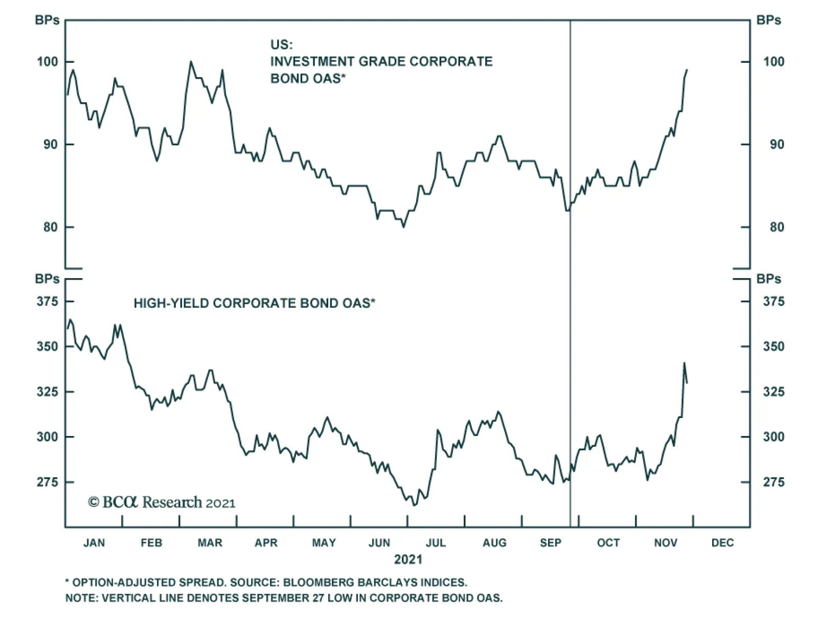
IG Spreads Troughed In September
IG Spreads Troughed In September
Corporate bond spreads had already been widening before Friday’s news sent them even higher (Chart 4). Prior to Friday, the most likely reason for spread widening was a concern about a quicker pace of Fed tightening. As we highlighted in last week’s report, corporate balance sheet health is sublime and all signs point to default risk remaining low for some time.4 In fact, up until Friday, investment grade corporates were performing worse than high-yield as spreads widened. This suggests that the widening had more to do with perceptions of monetary accommodation than with perceptions of default risk. Then, on Friday, spreads widened sharply and high-yield underperformed investment grade. This is consistent with the market pricing-in an increase in expected default risk due to the emergence of the omicron variant. Our view is that the recent bout of spread widening will reverse in the near-term. Spreads will tighten back down to their recent lows giving investors an opportunity to reduce exposure sometime next year. We posit three possible scenarios: In the first scenario, the omicron COVID variant turns out to be less economically impactful than the recent delta strain. In this case, the recent spike in default expectations will reverse and inflation will moderate during the next six months as pandemic fears recede. In this scenario, the Fed will be able to wait until September or December 2022 – when its “maximum employment” target will be met – before lifting rates. Spreads will tighten on expectations of more accommodative monetary policy. Chart 5Pace Of Curve Flattening Will Moderate
Pace Of Curve Flattening Will Moderate
Pace Of Curve Flattening Will Moderate
In the second scenario, the omicron COVID variant turns out to be inflationary. US consumer demand is not curbed significantly, but supply chains remain under pressure and labor shortages persist. This will encourage the Fed to move more quickly, possibly lifting rates as early as June. However, even this scenario would only see the 3-year/10-year Treasury slope dip below 50 bps in March of next year (Chart 5). Our prior research has shown that excess corporate bond returns tend to be strong when the 3-year/10-year Treasury slope is above 50 bps, as this suggests a highly accommodative monetary environment.5 We would likely see another period of spread tightening between now and March, even in this worst-case scenario for corporate spreads. The final possible scenario is one where the omicron COVID variant turns out to be deflationary. Growth and inflation both slow and the Fed significantly delays tightening, possibly into 2023. Given the robust health of corporate balance sheets, this scenario would be excellent for corporate bond returns. The deflationary shock would have to be very severe, much worse than the delta wave, to push the default rate meaningfully higher. Further, a shift toward more accommodative Fed policy would lengthen the runway for strong corporate bond returns. That is, it would be some time before the 3-year/10-year slope dips below 50 bps. Bottom Line: Investors should remain overweight spread product versus Treasuries in US bond portfolios, maintaining a preference for high-yield corporates over investment grade. The recent bout of spread widening caused by expectations of more restrictive monetary policy and news about the omicron variant will reverse in the coming months. Investors will be able to reduce cyclical corporate bond exposure at more attractive levels sometime next year. Stay Negative On Agency MBS We have been recommending an underweight allocation to Agency MBS in US bond portfolios for quite some time, and that is not likely to change anytime soon. Since the March 23rd 2020 peak in credit spreads, conventional 30-year Agency MBS have outperformed a duration-matched position in Treasuries by 0.59% while Aaa and Aa-rated corporate bonds have outperformed by 16% and 15%, respectively (Chart 6). MBS performance has been particularly poor since the spring. A big reason why is that MBS spreads did not adequately compensate investors for the magnitude of mortgage refinancings. Chart 7 shows that the compensation for prepayment risk embedded in MBS spreads (the option cost) plunged in mid-2020 as interest rates were cut to zero and mortgage refis spiked. In fact, the option cost embedded in MBS spreads was the lowest it had been in several years (Chart 7, panel 2), signaling that the market was priced for a big drop in refi activity. However, that big drop in refi activity never materialized. The MBA Refinance Index has remained elevated in 2021 (Chart 7, bottom panel), despite the back-up in bond yields. Chart 6MBS Returns Have Lagged Corporates
MBS Returns Have Lagged Corporates
MBS Returns Have Lagged Corporates
Chart 7Option Cost Must Rise
Option Cost Must Rise
Option Cost Must Rise
An increase in cash-out refinancings is a big reason for the stickiness in refi activity this year. Home prices have been on a tear and households have an increasing incentive to tap the equity in their homes (Chart 8). Freddie Mac recently noted an increase in both the share of refinancings that are for “cash-out” and the aggregate dollars of equity that borrowers are extracting from their homes.6 They also noted, however, that the amount of equity extraction as a percent of property values has trended down. This suggests that this trend toward cash-out refinancings is not yet exhausted. In fact, we expect refi activity will remain elevated during the next 6-12 months, even as bond yields move modestly higher. Chart 8Households Can Tap Their Home Equity
Households Can Tap Their Home Equity
Households Can Tap Their Home Equity
Against this back-drop, our sense is that the compensation for prepayment risk embedded in MBS spreads remains too low. But, even if we assume that the MBS option cost is exactly right, it still wouldn’t make Agency MBS look attractive compared to alternative investments. The option-adjusted spread (OAS) offered by conventional 30-year Agency MBS is below the OAS offered by Aaa and Aa-rated corporate bonds (Chart 9). It is only slightly above the OAS offered by Agency CMBS and Aaa-rated consumer ABS. Chart 9OAS Differentials
OAS Differentials
OAS Differentials
Bottom Line: Agency MBS are unattractive relative to other US spread products, and current MBS valuations may understate the future pace of mortgage refi activity. Remain underweight Agency MBS within US bond portfolios. Ryan Swift US Bond Strategist rswift@bcaresearch.com Footnotes 1 Please see US Bond Strategy Weekly Report, “The Fed’s Inflation Problem”, dated November 23, 2021. 2 https://news.yahoo.com/san-francisco-fed-mary-daly-certainly-see-a-case-for-speeding-up-taper-142328227.html 3 The effective fed funds rate currently trades 8 bps above the lower-end of its target range, and we assume that this will continue to be the case. 4 Please see US Bond Strategy Weekly Report, “The Fed’s Inflation Problem”, dated November 23, 2021. 5 Please see US Bond Strategy Weekly Report, “Expected Returns In Corporate Bonds”, dated September 21, 2021. 6 http://www.freddiemac.com/research/insight/20211029_refinance_trends.page Recommended Portfolio Specification Other Recommendations Treasury Index Returns Spread Product Returns
Feature Over the past months, we have seen a potent bout of volatility in developed government bond markets, as investors have tried to assess the “lift-off” dates for central bank hiking cycles and the speed and cumulative degree of eventual monetary tightening. Record inflation prints have also created a communication challenge for central banks, with investors demanding more certainty in relation to the preconditions that need to be met in the data for central banks to raise rates. Adding to the uncertainty are the new frameworks adopted by the US Federal Reserve and the European Central Bank (ECB) that allow for overshoots of the 2% inflation target to make up for historical undershoots. However, it remains to be seen how committed policymakers will be to these new frameworks. Even the historically dovish European Central Bank has been forced to talk down market pricing, with overnight swap markets eyeing a rate hike as early as next year. Across the English Channel, the Bank Of England, which initially baffled investors by failing to deliver a rate hike during its November meeting, now appears to have embarked on a new path, with Governor Andrew Bailey calling into question the very efficacy of forward guidance itself and possibly returning to making decisions on a meeting-by-meeting basis. Chief Economist Huw Pill has recently talked about “training” people to “think the right way about monetary policy,” but it remains to be seen if market participants will be receptive students. In any case, it is clear that the uniformly dovish period of extraordinary monetary accommodation induced by the pandemic is at an end. To navigate the uncertainty as central banks shift gears toward tighter policy on the margin, we are introducing revised versions of our BCA European Central Bank monitors this week. These indicators use economic and financial market data to gauge whether the current stance of monetary policy lines up with current conditions. Our revisions focus on making the monitors more dynamic and responsive to shifts in central bank reaction functions. Overall, the message from our new monitors is clear—rebounding growth and inflation data mean that all our indicators are moving in a direction more consistent with tighter policy even after Friday's market action (Chart 1). In the following sections of this report, we cover in greater detail the methodological changes to our indicators, followed by region-level assessments of the five new monitors introduced in this report for the Euro Area, UK, Sweden, Norway, and Switzerland. Chart 1The New BCA European Central Bank Monitors
The New BCA European Central Bank Monitors
The New BCA European Central Bank Monitors
What’s New? We have made three major improvements to our central bank monitors: First, the sub-components—economic growth, inflation, and financial conditions—are no longer calculated as a simple average of their constituent data series. Instead, each data series is now weighted according to the degree that it moves in conjunction with other data series over a 60-month rolling window. In other words, data series that are highly correlated with other series receive a greater weight. There are two benefits to this approach: (i) it makes the monitors more dynamic and (ii) it adjusts for changes in correlations over time. Second, the weights of each of the three sub-components in the overall monitor are now determined so as to minimize the sum of squared residuals (SSR) of a regression of the 12-month change in policy rate (the dependent variable) with the readings from our monitors (the independent variable). We have imposed two constraints: each sub-component must have a minimum weight of 15% and may not weigh more than 70%. More importantly, the weights are now re-calculated every 60 months. In doing so, there is no assumption that central bankers’ reaction function is constant over time, and it avoids look-ahead bias. There is also the natural question of how to optimize the weights of our sub-components when policy rates remain flat for extended periods at, or near, the Zero Lower Bound (ZLB). While we did consider calculating a different set of weights targeting the annual change in assets held by the Central Bank during ZLB periods, we eschewed this approach for two reasons: these periods are neither frequent nor sufficiently prolonged to provide an appropriate sample. As a result, the weights currently applied to the monitors are based on the 60 months preceding policy rates reaching the Zero Lower Bound. Table 1 shows the weights currently being used for each monitor. Table 1European Central Bank Monitors' Weights
A Tour Of The New BCA European Central Bank Monitors
A Tour Of The New BCA European Central Bank Monitors
Third, all of the data series included in our monitors are now standardized over 60-month rolling time horizons. Like the changes made to the weight calculation above, it ensures the monitor does not rely too heavily on either past or future data. Although central banks’ mandates do not change often—if at all—their reaction functions do. Take inflation, for instance. Our monitors should not factor in the level of price changes experienced in the 1970s as a benchmark to determine whether a central bank should be more or less accommodative based on what inflation is today. We also took this opportunity to make changes to the data series included in the monitors, with a focus on including higher-frequency series to improve the timeliness of the indicator. All in all, clients should note that these improvements do not change the interpretation of the monitors. A rising trend is still consistent with fundamentals that would have caused central banks to tighten in the past and vice versa. ECB Monitor: Stay Put Chart 2Euro Area: ECB Monitor
Euro Area: ECB Monitor
Euro Area: ECB Monitor
Our European Central Bank (ECB) Monitor is currently in positive territory, suggesting that the ECB should be removing accommodation (Chart 2). However, the ECB did not sound any more hawkish at the close of its last meeting held at the beginning of the month. The latest surge of COVID-19 cases in Europe and subsequent governments’ responses will weigh on economic growth and give reason to the ECB not to rush into a new tightening cycle. It will also be interesting to see how the renewed energy crisis affects President Christine Lagarde's stance on the transitory aspects of inflation. The components of our ECB Monitor are consistent with these two forces (Chart 2, panel 2). Strong economic data prints have been losing steam this year, which weighed on the economic growth component. Nonetheless, this indicator now tries to move back up. Meanwhile, the inflation component is surging, driven by both the rapid acceleration in European realized inflation and CPI swaps. We have argued that energy, taxes, and base effects account for the bulk of the price increases in the Euro Area, and that, as such, the ECB was correct in looking past them. Market participants do not agree with the ECB. The Euro Overnight Index Average (EONIA) curve is now pricing 15bps of tightening by the end of 2022 (Chart 2, bottom panel), which is unlikely to happen considering the ECB’s dovish communication and its adoption of AIT. In this context, we lean against the EONIA pricing and expect the ECB to increase rates in 2024, at the earliest. We also continue to recommend an overweight stance on European government bonds within global fixed income portfolios. BoE Monitor: Tightening On The Way Chart 3UK: BoE Monitor
UK: BoE Monitor
UK: BoE Monitor
Our Bank of England (BoE) monitor has continued its sharp rebound into positive territory since its trough in 2020 (Chart 3). While the BoE’s communication has been questionable, the Bank has done nothing to reverse its recent hawkish turn. This makes sense given economic data that is showing signs of an overheating economy. Consumer price inflation came in at 4.2% year-over-year in October, a ten-year high. And as we discussed in a recent BCA Research Global Fixed Income Strategy report, there are signs that rising inflation is having a dampening effect on consumer confidence, imperiling growth in 2022. Turning to the individual components of our BoE monitor, we see broad-based pressure to tighten policy, with all three components in solidly positive territory and rising quickly (Chart 3, middle panel). Inflationary pressures are being driven not only by strong CPI prints, but also by rising input prices and inflation expectations that are becoming unmoored from the BoE’s target. Meanwhile, capacity utilization scores from the BoE’s Agents’ Summary are at the highest level since 2007, creating scope for further inflation down the road. Growth is ebullient as well, with both manufacturing and services PMIs significantly above the 50 advance/decline line. Rising house prices and consumer lending are creating stability risks captured in the financial subcomponent of the monitor. Market anticipations for tightening over the next year have continued to increase, notwithstanding the muddled messaging from the BoE, with 111bps of tightening expected over the coming year (Chart 3, bottom panel). With the BoE set to be one of the more hawkish developed market central banks in 2022, we are comfortable maintaining an underweight stance on Gilts within global government bond portfolios. Riksbank Monitor: On Hold, But Not For Long Chart 4Sweden: Riksbank Monitor
Sweden: Riksbank Monitor
Sweden: Riksbank Monitor
Our Riksbank Monitor is now close to neutral, after reaching all-time highs earlier this year (Chart 4). For now, the Riksbank seems content to continue to hold the repo rate at 0%, while expanding the size of its balance sheet. Taking a closer look at the breakdown in the Riksbank Monitor, we can see that the earlier surge was mostly driven by the financial conditions component, which is still solidly in positive territory (Chart 4, panel 2). The inflation component confirms that inflation is still not a concern for the Riksbank. In fact, core CPI stands at 1.82% annually, below the 2% target and far from what other developed economies are currently experiencing. We expect the ongoing robust economic recovery to continue lifting the economic growth component, which, at some point in the future, should place more pressure on the Riksbank to remove accommodation. Market participants have only started pricing in some rate hikes from the Riksbank recently (Chart 4, bottom panel). Still, we view this 35bps of expected tightening as too modest relative to the actual pressure on the Riksbank to tighten policy. The positive outlook for the Swedish economy,1 as well as rising house prices and household indebtedness, will force the Riksbank to tighten policy before the ECB—all of which may happen sooner if inflation starts to accelerate. Consequently, Swedish sovereign debt does not appear as an attractive underweight candidate in global government bond portfolios. Norges Bank Monitor: More Hikes To Come Chart 5Norway: Norges Bank Monitor
Norway: Norges Bank Monitor
Norway: Norges Bank Monitor
Our Norges Bank Monitor is well into positive territory and continues to increase, signaling pressure for tighter policy (Chart 5). In September, the Norges Bank became the first of the G10 central banks to deliver a rate hike, which it paired with forward guidance suggesting hikes at its coming December, January, and March meetings. We believe such an outcome is supported by the data, which show pressure to tighten on a growth and inflation basis (Chart 5, middle panel). The growth subcomponent of our indicator has been driven by rebounding business and consumer sentiment. Meanwhile, inflationary pressures have been driven by rising capacity utilization and producer prices, which grew at an unbelievable 60.8% year-over-year in October, the highest annual growth rate that has ever been recorded for the series. The reading from the financial subcomponent is more neutral, hovering above the zero level. This slight decline this year may largely be explained by slowing house price growth and falling debt service ratios. However, the NOK remains undervalued on a PPP-basis, which, at the margin, creates pressure on the Norges Bank to tighten. Overnight index swap curves are currently discounting 136bps of tightening in Norway over the coming year. We believe this is a realistic outcome, given the Norges Bank’s uniquely hawkish reaction function and pressures to tighten, which are not likely to dissipate any time soon. We remain bearish on Norwegian government debt. SNB Monitor: Still About The Swiss Franc Chart 6Switzerland: SNB Monitor
Switzerland: SNB Monitor
Switzerland: SNB Monitor
Our Swiss National Bank (SNB) Monitor has decreased somewhat after peaking earlier this year, but remains solidly in positive territory, which suggests that the SNB should remove accommodation (Chart 6). This is unlikely to happen anytime soon. At the Central Bank leadership’s annual meeting with the Swiss government last month, the SNB emphasized the need to maintain accommodative monetary policy. In so doing, it kept policy rate and interest on sight deposits at the SNB at −0.75%, while remaining willing to intervene in the foreign exchange market as necessary, in order to counter upward pressure on the Swiss franc. After all, the currency remains the main determinant of Swiss monetary conditions. Therefore, the SNB will continue to try to cap the upside in the CHF vis-à-vis the EUR, because it considers the Swiss franc "highly valued". Meanwhile, inflation does not seem to be an imminent concern for the SNB. Headline inflation and core inflation stand at 1.25% and 0.58%, respectively. All three components of our SNB Monitor appear to send the same message at the moment (Chart 6, panel 2). Markets largely seem to believe the SNB’s unwillingness to tighten monetary policy (Chart 6, bottom panel). Only 16 bps of tightening are priced over the next 12 months, and 54bps over the next 24 months. We maintain our neutral stance on Swiss bonds within global portfolios, given low liquidity. Jeremie Peloso, Associate Editor JeremieP@bcaresearch.com Shakti Sharma Senior Analyst ShaktiS@bcaresearch.com Footnotes 1 Please see BCA Research European Income Strategy Report, "Take A Chance On Sweden", dated May 3, 2021, available at eis.bcareseach.com.
Highlights There are a few consistencies with the dollar breakout. Global growth is peaking and the risk of a significant slowdown early next year has risen. As a momentum currency, further gains in the DXY remain very high in the near term. We are shifting our near-term target to 98 (previously 95). That said, the dollar is now close to pricing a global recession, which seems improbable given easy monetary settings and ample fiscal stimulus. High inflation is not a US-centric phenomenon but a global problem. This means that monetary policy in the US cannot sustainably diverge from other central banks. Correspondingly, low US TIPS yields do not confirm the breakout in the dollar. Even if the US 10-year Treasury yield rises towards 2.5%, real interest rates will remain very low compared to history and other G10 economies. While global growth will slow next year, we expect that it will remain robust. And if it rotates from the US to other countries, the dollar will have a very sharp reversal. Our strategy is to stick with trades at the crosses rather than outright dollar bets. These include long AUD/NZD, long CHF/NZD, long EUR/GBP and long a petrocurrency basket versus the euro. Once the majority of our technical indicators start to flag a reversal, we would be sellers of the DXY and buyers of EUR/USD. Feature Chart I-1The Dollar Diverges From Real Rates
The Dollar Diverges From Real Rates
The Dollar Diverges From Real Rates
After spending most of this year range bound between 89 and 94, the DXY index has broken out. The narrative has been centered around rising US inflation, which will trigger much faster interest rate increases from the Fed. This is consistent with recent economic data, where US inflation has indeed blown out, and is also rising at the fastest pace among G10 countries. What has been inconsistent is that US TIPS yields remain very low, and have diverged from the broad dollar trend (Chart I-1). One of the key structural drivers of currencies is real interest rate differentials. If the Fed does move ahead of the inflation curve and aggressively hikes interest rates, then US TIPS yields will rise and catch up with the dollar. Otherwise, the recent rise in the greenback could represent a capitulation phase that will quickly reverse should the inflationary mania subside. Consistencies With The Dollar Rise The market is now pricing in that the Fed will raise interest rates much faster, compared to earlier this year. According to the overnight index swap (OIS) curve, the Fed is now expected to lift rates at least twice by December 2022, compared to earlier this year (Chart I-2). Meanwhile, market pricing is even more aggressive when looking at the December 2022 Eurodollar contract, relative to either the Euribor contract (European equivalent) or Tibor (Japanese equivalent). The market suggests that compared to earlier this year, a 63bps spread difference is now warranted between US and European interest rates, while an 80bps difference is appropriate vis-à-vis Japanese rates. This shift perfectly explains the move in the dollar over the last few weeks (Chart I-3). Chart I-2Markets Now Expect A More Hawkish Fed
Markets Now Expect A More Hawkish Fed
Markets Now Expect A More Hawkish Fed
Chart I-3A Key Driver Of The Dollar Rally
A Key Driver Of The Dollar Rally
A Key Driver Of The Dollar Rally
These market moves have been consistent with economic developments. Upside economic surprises in the US have dominated other G10 economies and supported the dollar (Chart I-4). The slowdown in China has been another hiccup in the global growth story. While global export growth has remained relatively resilient, the narrative is that the slowdown in Chinese demand is metastasizing into a genuine slump that will impact commodity import demand and hurt procyclical currencies liked the AUD (Chart I-5). Chart I-4Positive Economic Surprises Have Supported A Strong USD
Positive Economic Surprises Have Supported A Strong USD
Positive Economic Surprises Have Supported A Strong USD
Chart I-5A Slowing China Has Hurt Currencies Like The AUD
A Slowing China Has Hurt Currencies Like The AUD
A Slowing China Has Hurt Currencies Like The AUD
The slowdown is not unique to China. With new Covid-19 infections surging in various European countries, ex-US economic data is likely to remain underwhelming early next year. Within this context, the US economy remains relatively immune. Exports explain only 10% of US GDP. The IMF projects that the US is one of the first countries to close its output gap (Chart I-6). This will support a tighter monetary stance in the US, compared to other G10 countries.
Chart I-6
Contradictions With The Dollar Rally There are a few contradictions with the dollar rally. First, the Fed is already lagging the US inflation curve. Various DM and EM central banks have calibrated monetary policy higher in response to rising inflation (Chart I-7). While the Fed might accelerate the pace of tapering asset purchases, other central banks in developed economies have already ended QE and are raising rates. At some point, relative monetary policies would matter for currencies, as has historically been the case. Since the start of the year, market pricing for higher rates according to the OIS curve has been lifted for most G10 countries (Table 1). Yet the dollar has rallied, while other currencies have collapsed (Chart I-8). Chart I-7Many Central Banks Are Already Hiking Interest Rates
Many Central Banks Are Already Hiking Interest Rates
Many Central Banks Are Already Hiking Interest Rates
Chart I-
Chart I-8Will The Fed Hike As Much As Is Priced By The Dollar?
Will The Fed Hike As Much As Is Priced By The Dollar?
Will The Fed Hike As Much As Is Priced By The Dollar?
Second, part of that rally has been driven by speculative inflows, and not by underlying economic fundamentals. Net speculative positions in the US dollar are near levels that have usually signaled that the trade is becoming much crowded (Chart I-9). As we highlighted in Chart 1, this has occurred amidst very low nominal and real interest rates. But more importantly, as a reserve currency, the dollar enjoys the priviledge of being the safe-haven asset of choice. It is quite plausible that one of the key drivers of the rally has also been hedging by fund managers for an equity market correction (Chart I-10). Chart I-9Speculators Are Nearing Exhaustion ##br##Levels
Speculators Are Nearing Exhaustion Levels
Speculators Are Nearing Exhaustion Levels
Chart I-10Long Dollar Is Being Used To Hedge Bullish Equity Bets
Long Dollar Is Being Used To Hedge Bullish Equity Bets
Long Dollar Is Being Used To Hedge Bullish Equity Bets
Third, inflation could indeed prove to be transitory. Our sister publication, the Commodity & Energy Strategy, suggests that metals and oil prices will remain well bid in the near term. Inflation however is about rates of change. Natural gas prices rose 100% this year while oil prices rose 60%. Market expectations are that these prices will roll over (Chart I-11). The Baltic Dry Index, a proxy for shipping costs and supply bottlenecks, initially rose 300% and is now down 53% from its peak. A middle ground where prices remain well bid but do not generate the same inflationary impulse next year seems most plausible. This will ease all market expectations for central bank hawkishness, but could sound the death knell for the dollar that has quickly moved to price in the current market narrative. Chart I-11Some' Inflation Will Be Transitory
Some' Inflation Will Be Transitory
Some' Inflation Will Be Transitory
Fourth, a strong US dollar hurts US growth. According to the Fed’s own estimates, a 10% rise in the dollar reduces US growth by 0.5% in the subsequent four quarters and 1.2% over two years. Meanwhile, a strong US dollar will certainly alleviate pressure on the Fed to fight inflation. A Counterpoint View To The Market Narrative Covid-19 will be with us for a while. As such, the volatility of growth forecasts around infection waves will subside. The remarkable thing is that despite fears of a global growth slowdown, there is a pretty robust expectation that the US will fare poorly relative to other developed markets in terms of growth next year. Countries such as Canada, New Zealand, the UK, and Japan are seeing a bottoming in growth momentum relative to the US (Chart I-12). For some, this is occurring at the same time as their local central banks are becoming more orthodox about monetary policy. As we have argued earlier, this is clear real-time evidence that the Fed will lag the inflation curve. Chart I-12AA Global Growth Rebound Outside The US
A Global Growth Rebound Outside The US
A Global Growth Rebound Outside The US
Chart I-12BA Global Growth Rebound Outside The US
A Global Growth Rebound Outside The US
A Global Growth Rebound Outside The US
One key signpost is China. It has tightened policy amidst very low inflation, and the traditional relationship between real rates and the RMB is working like a charm as the currency appreciates in trade-weighted terms. In a nutshell, currency markets tend to reconverge with real interest rate differentials over time. This will eventually be the case with the dollar (Chart I-13). Chart I-13Real Interest Rates Eventually Matter For Currencies
Real Interest Rates Eventually Matter For Currencies
Real Interest Rates Eventually Matter For Currencies
Finally, China might marginally ease policy to sustain growth. In our view, China could stand pat since nominal bond yields are falling and exports are robust suggesting overall financing conditions are not a problem. But if this is a primate cause for fuelling long dollar bets, that will eventually hurt EM demand, China could also shift. This will be bullish for the dollar in the near term (it will require a riot point for China to shift), but bearish the dollar over a cyclical investment horizon, as commodity economies bottom. Investment Strategy Chart I-14Current Dollar Strength Is Pricing In A Manufacturing Recession
Current Dollar Strength Is Pricing In A Manufacturing Recession
Current Dollar Strength Is Pricing In A Manufacturing Recession
In the current environment, the DXY could hit 98. This will be consistent with a blowout in our capitulation index, as well an exhaustion of dollar bulls. That said, the dollar is now close to pricing a global manufacturing recession, which seems improbable given easy monetary settings and ample fiscal stimulus in most DM economies (Chart I-14). Our strategy is to stick with trades at the crosses rather than outright dollar bets. These include long AUD/NZD, long CHF/NZD, long EUR/GBP and long a petrocurrency basket versus the euro. Once the majority of our technical indicators start to flag a reversal, we would be sellers of the DXY and buyers of EUR/USD. Finally, our agnostic trading model continues to suggest short dollar positions (Chart I-15). Admittedly, it is the valuation component driving the calibration, rather than sentiment or appreciation for the investment shift in the macro narrative. In our portfolio, we will sit on the sidelines until most of our intermediate-term indicators stage a reversal. Chart I-15AOur Model Is Short The Dollar, But Stand Aside For Now
Our Model Is Short The Dollar, But Stand Aside For Now
Our Model Is Short The Dollar, But Stand Aside For Now
Chart I-15BOur Model Is Short The Dollar, But Stand Aside For Now
Our Model Is Short The Dollar, But Stand Aside For Now
Our Model Is Short The Dollar, But Stand Aside For Now
Chester Ntonifor Foreign Exchange Strategist chestern@bcaresearch.com Trades & Forecasts Strategic View Cyclical Holdings (6-18 months) Tactical Holdings (0-6 months) Limit Orders Forecast Summary
According to BCA Research’s US Bond Strategy service, investors should stay overweight spread product in US bond portfolios. Gross corporate leverage has plunged during the past few quarters. This drop explains why there have been so few corporate defaults…
Highlights Fed: The Fed is embroiled in a debate about whether to move more quickly toward rate hikes. Our expectation is that the Fed will remain relatively dovish unless 5-year/5-year forward inflation expectations show signs of breaking out. We continue to expect liftoff in December 2022. TIPS: We recommend a neutral allocation to long-maturity (10-year+) TIPS versus nominal Treasuries and an underweight allocation to short-maturity TIPS versus nominal Treasuries. Investors should short 2-year TIPS outright, enter 2/10 inflation curve steepeners and 2/10 real (TIPS) curve flatteners. Corporate Bonds: The amount of debt relative to equity on corporate balance sheets is the lowest it has been in several years. We expect that corporate balance sheet health will start to deteriorate next year as capital spending and debt issuance ramp up. However, it will be some time before balance sheet health threatens higher defaults or wider corporate spreads. Stay overweight spread product in US bond portfolios. Should The Fed Take Out Some Insurance? Inflation has arrived much earlier in the cycle than usual and it has put the Fed in a tough spot. The so-called Misery Index – the sum of the unemployment and inflation rates – has moved in the wrong direction this year (Chart 1), and there is increasing disagreement about how the Fed should respond. Chart 1A Setback For The Fed
A Setback For The Fed
A Setback For The Fed
The Case For Buying Insurance On the one hand, some people – both inside and outside the FOMC – are calling for the Fed to move more quickly toward tightening. One notable external voice is the former Chair of the Council of Economic Advisers Jason Furman who just published a report calling for the Fed to speed up the pace of tapering so that it can prepare markets for rate hikes starting in the first half of 2022.1 Such a policy shift would significantly impact bond markets, which are currently priced for Fed liftoff to occur at the July 2022 FOMC meeting and for 69 bps of rate hikes in total by the end of 2022 (Chart 2). This equates to 100% odds of two 25 basis point rate hikes in 2022, with a 92% chance of a third. Chart 22022 Rate Expectations
2022 Rate Expectations
2022 Rate Expectations
Furman makes the point that the Fed has already achieved its new Flexible Average Inflation Target (FAIT). The PCE deflator has averaged more than 2% annual growth since the target was adopted in August 2020 and even since just before the pandemic (Chart 3). Inflation has still averaged only 1.7% annual growth during the post-Great Financial Crisis period, but FOMC participants have generally focused on shorter look-back periods when discussing the FAIT framework. Chart 3The Fed's Flexible Average Inflation Target In Action
The Fed's Flexible Average Inflation Target In Action
The Fed's Flexible Average Inflation Target In Action
In addition to its FAIT framework, the Fed has articulated a three-pronged test for when it will lift rates. The Fed has promised to only lift rates once (i) PCE inflation is above 2%, (ii) PCE inflation is expected to remain above 2% for some time and (iii) labor market conditions have reached levels consistent with “maximum employment”. Furman argues that the Fed should abandon this three-pronged liftoff test on the grounds that it leaves no room for assessing how far inflation is from its goal. For example, Furman says that if we take the Fed’s guidance literally then “it would not lift rates in the face of a 10 percent inflation rate if the unemployment rate was even 0.2 percentage points above its full employment level.” Chart 4Short-term Inflation Expectations
Short-term Inflation Expectations
Short-term Inflation Expectations
Effectively, Furman is arguing for the Fed to take out some insurance against the risk of long-lasting inflationary pressures. Inflation is high right now. It may come back down naturally, but it may not. Furman argues that it makes sense for the Fed to marginally tighten policy in the meantime to lessen the risk of falling behind the curve and having to play catch-up. Fed Governor Christopher Waller seems to agree with most of Furman’s arguments. Waller also argued for speeding up the pace of tapering in a recent speech, and while he didn’t go so far as to say that the Fed should abandon its maximum employment test for liftoff, he implied that his personal definition of “maximum employment” could be achieved very soon.2 Waller said that after “adjusting for early retirements, we are only 2 million jobs short of where we were in February 2020”. This would suggest that just four more months of +500k employment gains, like we saw in October, would be enough for Waller to argue for rate increases. In his speech, Waller also mentioned the risk he sees from rising inflation expectations. He specifically pointed to elevated readings from the 5-year TIPS breakeven inflation rate, the New York Fed Survey of Consumers’ 3-year expectation, and the University of Michigan Survey’s 1-year expectation (Chart 4). Waller cautioned that: [I]f these measures were to continue moving upward, I would become concerned that expectations would lead households to demand higher wages to compensate for expected inflation, which could raise inflation in the near term and keep it elevated for some time. This possibility is a risk to the inflation outlook that I’m watching carefully. The Case Against Insurance San Francisco Fed President Mary Daly sits on the other side of the argument. She argued against the Fed taking preemptive action to tame inflation in a recent speech.3 Her main argument is that rate hikes would do little to lower inflation in the near-term and may end up harming the economy down the road: Chart 5Long-term Inflation Expectations
Long-term Inflation Expectations
Long-term Inflation Expectations
Monetary policy is a blunt tool that acts with a considerable lag. So, raising rates today would do little to increase production, fix supply chains, or stop consumers from spending more on goods than on services. But it would curb demand 12 to 18 months from now. Should current high inflation readings and worker shortages turn out to be COVID-related and transitory, higher interest rates would bridle growth, slow recovery in the labor market and unnecessarily sideline millions of workers. Like Waller, Daly also pointed to possible risks from rising inflation expectations. If the high readings on inflation last long enough, they could seep into our psychology and change our expectations about future inflation. Households would then expect prices to keep rising and ask for higher wages to offset that. Businesses, of course, would pass those increases on to consumers in the form of higher prices, causing workers to ask for even higher wages. And on it would go, in a vicious wage-price spiral that would end well for no one. However, unlike Waller, Daly said that “there is little evidence” that such an expectations-driven spiral is starting to take hold. To make her point, Daly stressed that long-term inflation expectations remain well-anchored near levels consistent with the Fed’s target. This is certainly true. Five-to-ten year ahead inflation expectations, whether from survey responses or derived from TIPS prices, have been remarkably stable during inflation’s recent surge (Chart 5). This would seem to suggest that people generally believe that current high inflation will fade over time, and that the Fed’s medium-term inflation target is not at risk. The BCA View Our sense is that there are a number of FOMC participants in both the hawkish and dovish camps. But for the time being, the fact that 5-year/5-year forward inflation expectations remain well-anchored tips the scale in favor of the doves. As a result, the Fed will watch the incoming data as it tapers asset purchases between now and June. If 5-year/5-year forward inflation expectations remain stable during that period, the Fed will wait until its “maximum employment” goal is met before lifting rates. However, if the 5-year/5-year forward TIPS breakeven inflation rate rises above 2.5%, the doves will capitulate and abandon the “maximum employment” liftoff target. The committee will move quickly toward tightening to stave off the sort of wage/price spiral described by both Waller and Daly. Our own view is that realized inflation will trend lower between now and next June. This will prevent 5-year/5-year forward inflation expectations from rising and will push down shorter-dated inflation expectations. As a result, the Fed will wait until its “maximum employment” target is met before lifting rates. We continue to think the first rate hike is most likely to occur at the December 2022 FOMC meeting, slightly later than what is currently priced in the market. On Inflation And TIPS Valuation We continue to recommend a neutral allocation to long-maturity (10-year+) TIPS versus nominal Treasuries. While there is a risk that a lengthy period of high inflation will eventually lead to a break-out in long-maturity TIPS breakeven inflation rates, that risk must be weighed against the fact that our TIPS Breakeven Valuation Indicator shows that the 10-year TIPS breakeven inflation rate is too high relative to different measures of underlying inflation (Chart 6). Chart 6TIPS Are Expensive Relative To Nominals
TIPS Are Expensive Relative To Nominals
TIPS Are Expensive Relative To Nominals
Our TIPS Breakeven Valuation Indicator has a strong track record, with readings between -1 and -0.5 usually coinciding with a subsequent drop in the 10-year TIPS breakeven inflation rate (Table 1). Table 1TIPS Valuation Indicator Track Record
The Fed’s Inflation Problem
The Fed’s Inflation Problem
Moreover, we continue to think that inflation is very likely to trend down during the next 6-12 months. The most important driver of today’s high inflation rate has been a remarkable surge in core goods inflation, from near 0% prior to the pandemic to 8.5% today (Chart 7). This jump in core goods prices is explained by a shift in the composition of consumer spending away from services and toward goods (Chart 8). This shift started during the worst of the pandemic when spending on services was not an option. Households diverted their spending toward goods at a time when COVID prevented factories from running at full capacity. Chart 7Goods Inflation
Goods Inflation
Goods Inflation
Chart 8Consumer Spending: Goods v. Services
Consumer Spending: Goods v. Services
Consumer Spending: Goods v. Services
Our sense is that as the impact of the pandemic fades, we will see the composition of spending shift back toward services and firms will also be able to increase capacity. The result will be a drop in core goods inflation during the next 6-12 months, one that is significant enough to send the overall inflation rate lower. In fact, there are already signs that inflation is close to peaking. The Baltic Dry Index – an index that measures the cost of transporting raw materials – has plunged (Chart 9), and other measures of the price of shipping containers are starting to top out (Chart 9, bottom 2 panels). All of these indicators tracked inflation’s recent rise and are now signaling an easing of bottlenecks in the goods supply chain. The upshot from an investment perspective is that falling inflation will keep a lid on long-maturity TIPS breakeven inflation rates during the next 6-12 months. It will also send short-maturity TIPS breakeven inflation rates lower, and we recommend an underweight allocation to TIPS versus nominal Treasuries at the front-end of the curve. The top panel of Chart 10 shows that the 2-year TIPS breakeven inflation rate has greatly exceeded the Fed’s target range. In contrast, the 10-year TIPS breakeven inflation rate is only slightly above target. If we assume a base case scenario where both rates trend toward the middle of the Fed’s target range during the next 12 months, and a base case scenario for nominal yields consistent with the Fed lifting rates in December 2022 and then hiking at a pace of 100 bps per year until reaching a 2.08% terminal rate (Chart 10, bottom panel), we see that the 2-year real yield has a lot of upside during the next 12 months (Chart 10, panel 2). This is true both in absolute terms and relative to the 10-year real yield. Chart 9Peak Shipping Costs
Peak Shipping Costs
Peak Shipping Costs
Chart 10The Upside In Real Yields
The Upside In Real Yields
The Upside In Real Yields
As a result, our view that inflationary pressures will ease during the next 6-12 months leads to the following investment recommendations: Short 2-year TIPS outright Enter 2/10 TIPS breakeven inflation curve steepeners Enter 2/10 real (TIPS) yield curve flatteners Corporate Balance Sheets Are In Great Shape Gross corporate leverage – the ratio of total corporate debt to pre-tax profits – has plunged during the past few quarters. This indicator is the backbone of our macro default rate model and, as such, its drop explains why there have been so few corporate defaults this year.4 Digging beneath the surface, we see that a great deal of leverage’s decline is explained by soaring profit growth, but a sharp drop in debt growth is also partly to blame (Chart 11). If we broaden our scope of corporate balance sheet indicators, the evidence further points to the fact that balance sheets are in great shape. Our Corporate Health Monitor – a composite indicator consisting of six different balance sheet metrics – is deep in “improving health” territory, aided by extremely high readings from the Free Cash Flow-to-Total Debt and Interest Coverage ratios (Chart 12). Chart 11Gross Leverage Is Falling
Gross Leverage Is Falling
Gross Leverage Is Falling
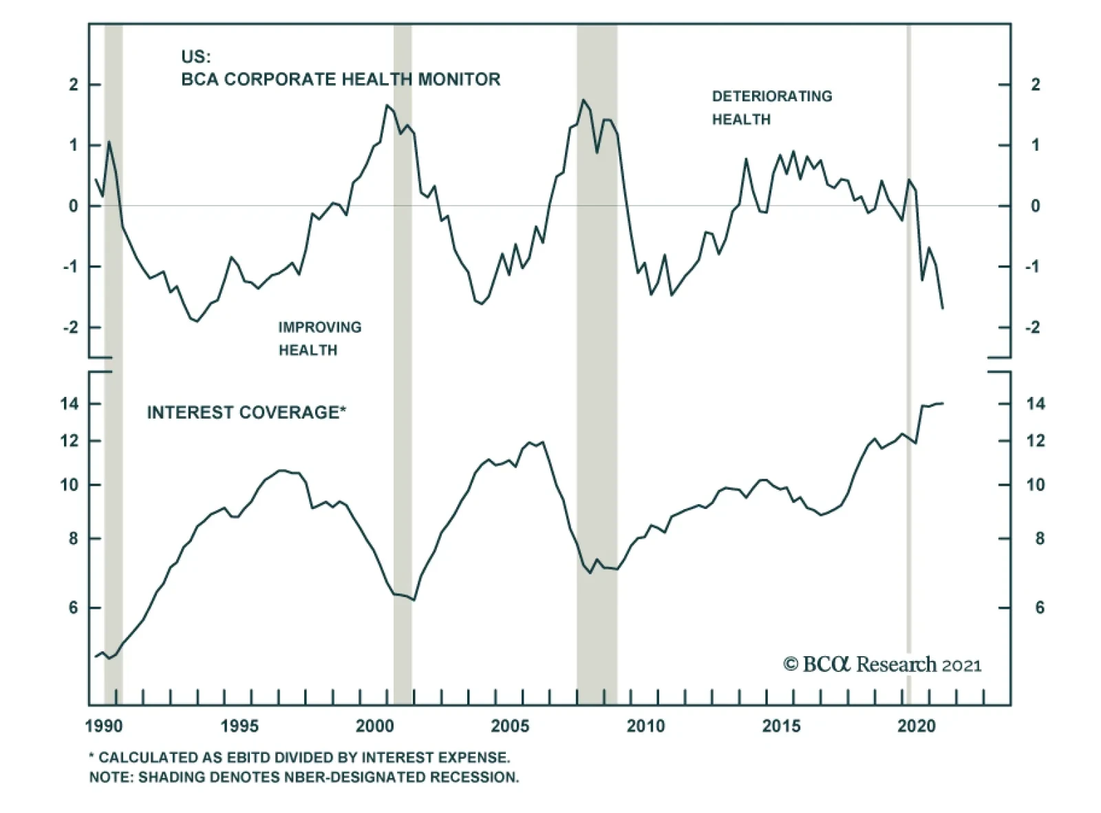
Chart 12Corporate Health Monitor
Corporate Health Monitor
Corporate Health Monitor
One thing that seems certain is that corporate profits will not continue to grow by more than 50%, as they did during the past four quarters. As such, we hesitate to make too big a deal out of balance sheet ratios that are directly tied to profit growth. However, even if we look at different measures of the amount of debt versus equity on corporate balance sheets, we arrive at the same conclusion that balance sheets are extremely healthy. The top panel of Chart 13 shows the ratio between total corporate debt and the market value of equity. This ratio is at its all-time low, but one could argue that it is being inappropriately flattered by elevated stock valuations. If we look at the ratio of total debt-to-net worth, where net worth is the difference between assets and liabilities with real estate assets valued at market value and non-real estate assets valued at replacement value, we also see a significant improvement and the lowest ratio since 2010 (Chart 13, panel 2). Finally, we also find the lowest ratio of debt-to-net worth since 2013 even if we value all non-financial corporate assets at historical cost (Chart 13, bottom panel). In other words, the message is clear. Corporate balance sheets have repaired themselves considerably since the pandemic and leverage ratios are the lowest they’ve been in years. This fact has not gone unnoticed by ratings agencies who’ve announced far more upgrades than downgrades so far this year (Chart 14). Chart 13Leverage Ratios
Leverage Ratios
Leverage Ratios
Chart 14Upgrades Much Higher Than Downgrades
Upgrades Much Higher Than Downgrades
Upgrades Much Higher Than Downgrades
What about the path forward for balance sheets? Our view is that balance sheet health will stop improving at the margin, but that it still has a long way to go before it poses a risk for defaults or corporate bond spreads. The recent spike in profit growth will recede in the coming quarters. This sort of large jump in profits following a recession is fairly typical, but it also tends to be short-lived (Chart 11, panel 2). Further, while corporate debt growth probably won’t surge next year it is likely that it will start to increase. At present, slow corporate debt growth is explained by the fact that company earnings have far outpaced capital investment requirements (Chart 15). This is partly because earnings have been strong and partly because capex requirements have been low. This is about to change. Inventory-to-sales ratios are near record lows and we have already seen a jump in core durable goods orders. All of this points to a capex resurgence in 2022 that will be partially financed by rising corporate debt. Chart 15Debt Growth Will Rise In 2022
Debt Growth Will Rise In 2022
Debt Growth Will Rise In 2022
Bottom Line: The amount of debt relative to equity on corporate balance sheets is the lowest it has been in several years. We expect that corporate balance sheet health will start to deteriorate next year as capital spending and debt issuance ramp up. However, it will be some time before balance sheet health threatens higher defaults or wider corporate spreads. Stay overweight spread product in US bond portfolios. Ryan Swift US Bond Strategist rswift@bcaresearch.com Footnotes 1 https://www.piie.com/sites/default/files/documents/furman-2021-11-17.pdf 2 https://www.federalreserve.gov/newsevents/speech/waller20211119a.htm 3 https://www.frbsf.org/our-district/press/presidents-speeches/mary-c-daly/2021/november/policymaking-in-a-time-of-uncertainty/ 4 For more details on our Default Rate Model please see US Bond Strategy Weekly Report, “The Post-FOMC Credit Environment”, dated June 29, 2021. Recommended Portfolio Specification Other Recommendations Treasury Index Returns Spread Product Returns
Highlights Expectations for monetary policy in Australia have turned aggressively hawkish over the past month, with markets now discounting multiple rate hikes next year. This pricing defies guidance from the Reserve Bank of Australia (RBA), which calls for no rate hikes until 2024. An update of our RBA Checklist shows that while there is a growing case for the RBA to tighten, there are still enough lingering uncertainties about the trajectory for growth (specifically, Chinese import demand) and inflation (specifically, wage growth) for the RBA to credibly remain on the sidelines next year. Fade the aggressive 2022 rate hike profile discounted in Australian interest rate markets by staying overweight Australian government bonds in global bond portfolios. Also position for a steeper yield curve (that should also benefit Australian bank stocks) and wider breakevens on Australian inflation-linked bonds. The Australian dollar offers compelling medium-term value, but play that through positions on the crosses (long AUD/NZD & AUD/CHF) with the RBA/Fed policy gap keeping a lid on AUD/USD in the near term. Feature With inflation surging across the world, investors have become hyper-sensitive to any potentially hawkish turn by central banks that have used ultra-accommodative monetary policy to fight the economic shock of the COVID-19 pandemic. Rapidly shifting interest rate expectations have triggered bouts of bond and currency volatility in countries like the UK, Canada and New Zealand over the past several months – with perhaps the biggest shock seen in Australia. Australian government bonds had enjoyed an impressive period of outperformance versus developed market peers between March and September of 2021. All that changed in late October (Chart 1), when the RBA effectively abandoned its yield curve control policy that anchored shorter-maturity bond yields with asset purchases, triggering a spike in Australian yields (the yield on the April 2024 government bond that was targeted by the RBA jumped +80bps in a single week). Interest rate expectations have rapidly been repriced higher to the point where there are now nearly four rate hikes in 2022 discounted in the Australian overnight index swap (OIS) curve – even with the RBA still formally saying that it does not expect to lift rates until 2024 (Chart 2). Chart 1The RBA Will Likely Disappoint Market Expectations
The RBA Will Likely Disappoint Market Expectations
The RBA Will Likely Disappoint Market Expectations
Chart 2A Very Aggressive Term Structure For Aussie Interest Rates
A Very Aggressive Term Structure For Aussie Interest Rates
A Very Aggressive Term Structure For Aussie Interest Rates
In this Special Report, we revisit our RBA Checklist, originally introduced in January of this year, to determine if the time is indeed right to expect tighter monetary policy in Australia next year, which has implications for not only the Australian bond market but also the Australian dollar. While much of the checklist is flashing a need for the RBA to begin lifting rates, there are still enough lingering uncertainties on the outlook for inflation, the labor market and export demand to keep the central bank on hold in 2022. Checking In On Our RBA Checklist Chart 3Tentative Signs Of A Rebound In Aussie Economic Activity
Tentative Signs Of A Rebound In Aussie Economic Activity
Tentative Signs Of A Rebound In Aussie Economic Activity
Before the recent Australian bond market turbulence, the potent policy mix from the RBA since the start of the pandemic – cutting the Cash Rate to 0.1%, with aggressive quantitative easing (QE) and yield curve control, all reinforced with very dovish forward guidance – helped cap market pricing for interest rate hikes. A sharp outbreak of the Delta Variant earlier this year, leading to severe economic restrictions in Australia’s major cities, also helped anchor bond yields Down Under on a relative basis compared with other countries. As RBA Governor Philip Lowe noted in his speech following the November 2 RBA policy meeting, “At the outset of the pandemic, economic policy, including monetary policy, set out to build a bridge to the other side. That other side is now clearly in sight. As [pandemic] restrictions are eased, spending is expected to pick up relatively quickly as people seek a return to a more normal way of life.” At the same time, Lowe stated that “the latest data and forecasts do not warrant an increase in the Cash Rate in 2022.” Thus, any attempt to begin unwinding RBA policy accommodation would require clear evidence that the impacts of the pandemic on economic growth, and also on inflation and financial stability, were evolving such that emergency policy settings were no longer required. On the growth front, there are already signs of recovery looking at reliable cyclical indicators like the manufacturing and services PMIs, which have rebounded by 6.2 points and 8.9 points, respectively, from the August lows (Chart 3). Yet while inflation expectations have remained fairly stable – the 5-year/5-year Australia CPI swap rate has stayed in a 2.2-2.5% range throughout 2021, despite the Delta outbreak – our RBA Monitor has rolled over, led by the economic growth components. This suggests there may be some diminished pressure for tighter monetary policy in Australia. To get a clearer picture on the outlook for Australian monetary policy over the next year, it is a good time to revisit our RBA Checklist - the most important things to monitor to determine when the RBA could be expected to turn more hawkish. We compiled the Checklist back in January, and the elements are still relevant today. 1. The COVID-19 vaccination process goes quickly and smoothly (✓) We are placing a checkmark next to this part of our RBA Checklist. After a very slow start earlier in 2021, Australia has executed a successful vaccination campaign with 71% of the population now fully vaccinated (Chart 4). More importantly, the number of daily new infections is rolling over rapidly, and hospitalization rates remain low. This is allowing economic restrictions to be lifted quickly. Chart 4The Beginning Of The End Of Australia's 2021 COVID Crisis
The Beginning Of The End Of Australia's 2021 COVID Crisis
The Beginning Of The End Of Australia's 2021 COVID Crisis
2. Private sector demand accelerates as the impulse from COVID fiscal stimulus fades (✓?) We are tentatively giving a checkmark for this component of the Checklist, but with a question mark given some of the cross-currents visible on the consumer spending side. Real consumer spending rebounded sharply in the first half of 2021 (Chart 5). However, the Delta lockdowns weighed on consumer confidence and demand in Q3, with retail sales contracting on a year-over-year basis (both in nominal and inflation-adjusted terms). Furthermore, much of the spending boom was fueled by Australian households running down the high savings accumulated during the 2020 COVID lockdowns. The household savings rate fell from a peak of 22% in Q2 2020 to 10% in Q2 2021, the last data point available, while real disposable income growth actually fell by -2.6% on a year-over-year basis in Q2. We expect the next few consumer confidence prints to improve sharply as economic restrictions are lifted, with consumer spending following suit. This would lead us to remove the question mark next to this item of the RBA Checklist. Already, business confidence is rebounding with the NAB survey bouncing 6 points in October (Chart 6), which should translate into increased capital spending and hiring activity by Australian companies that have maintained profitability during the pandemic (top panel). Chart 5Australia's Economy Holding Up Well Despite COVID Wave
Australia's Economy Holding Up Well Despite COVID Wave
Australia's Economy Holding Up Well Despite COVID Wave
Chart 6Resilient Business Confidence Will Support Employment
Resilient Business Confidence Will Support Employment
Resilient Business Confidence Will Support Employment
3. Inflation, both realized and expected, returns to the RBA’s 2-3% target (✓?)
Chart 7
We are giving another tentative checkmark with a question mark for this entry in the RBA Checklist, given that wage growth remains modest despite high realized inflation. Australian headline CPI inflation, on a year-over-year basis, was 3.8% in Q2/2021 and 3.0% in Q3/2021, above the top of the 2-3% RBA target. Much of that inflation has come from the Transport sector, which includes the prices of both car fuel and new car prices, which contributed 1.1% to inflation in Q3 (Chart 7). The former is impacted by high oil prices and the latter is influenced by the global supply chain disruption and shortage of semiconductors used in cars. Beyond those sectors, there was a modest pickup in inflation across much of the consumption basket. Underlying inflation was more subdued but did pick up over the same Q2/Q3 period. Annual growth in the trimmed mean CPI accelerated from 1.6% in Q2 to 2.1% in Q3 - returning to the bottom half of the RBA’s target range for the first time since Q4/2015 (Chart 8). The latest RBA projections call for underlying inflation to stay in the lower half of the inflation target range in 2022 (2.25%) and 2023 (2.5%), although this is conditional on a steady tightening of the Australian labor market. The RBA is forecasting the unemployment rate, which was at 5.2% in October, to fall to 4.25% by the end of 2022 and 4% by the end of 2023. The RBA expects a tighter labor market to eventually boost wage growth to a pace consistent with underlying inflation staying within the RBA target band – which would then augur for tighter monetary policy. The central bank has repeatedly stated that annual growth in the Wage Cost Index, its most preferred measure of Australian wages, has historically been in the 3-4% range when underlying inflation was consistently between 2-3%. The Wage Cost Index grew by only 2.2% on a year-over-year basis in Q3, so still well below the pace that would convince the RBA that underlying inflation would stay within the target. This argues for a wait-and-see approach. Chart 8Wage Uncertainty Preventing A Hawkish RBA Turn
Wage Uncertainty Preventing A Hawkish RBA Turn
Wage Uncertainty Preventing A Hawkish RBA Turn
Chart 9A Rising Participation Rate Will Cushion Tightening In The Labor Market
A Rising Participation Rate Will Cushion Tightening In The Labor Market
A Rising Participation Rate Will Cushion Tightening In The Labor Market
RBA Governor Lowe has noted that there is still ample spare capacity in labor markets that opened up because of COVID lockdowns, which will prevent a more rapid decline in the unemployment rate even with labor demand still quite strong. On that note – the Australian labor force participation rate fell from a 2021 high of 66.3% in March of this year to 64.7% in October, a 1.6 percentage point decline that provides a buffer to absorb the strong labor demand in Australia (Chart 9). Given that Australian inflation and wages are reported less frequently (quarterly) than employment data (monthly), it is a challenge for the RBA to quickly assess to true state of inflationary pressure in the Australian economy. We see the inflation data as being far more important than labor market developments in assessing the RBA’s next move. The RBA will likely want to a few more Wage Cost Index and CPI prints before signaling any move to hike rates sooner than currently projected. The RBA will not have a complete reading on wages for the first half of 2022 until August, when the Q2/2022 Wage Cost Index is released. Thus, it would not be until well into the latter half of 2022 before any shift in hawkish messaging could plausibly occur, at the earliest, even if CPI inflation were to surprise to the upside over the same period. The RBA will need to see price inflation confirmed by wage inflation before changing its stance. In a nutshell, robust inflation prints out of Australia will need to be reinforced by strong wage data, for the RBA to move the dial closer to market expectations for interest rate hikes. 4. House price inflation is accelerating (✓) We are placing a checkmark next to this piece of our Checklist. Given Australia’s past history with periods of surging home values, signs that housing markets are overheating could prompt the RBA to consider tightening monetary policy sooner than expected. On that front, there is plenty of evidence to give the RBA anxiety. Median house prices grew at a 16.8% year-over-year rate in Q2, the fastest pace since 2003, and now appear very expensive relative to median incomes (Chart 10). Chart 10House Price Appreciation Could Moderate
House Price Appreciation Could Moderate
House Price Appreciation Could Moderate
High prices may eventually begin to turn away buyers, as the “good time to buy a home” component of the Melbourne/Westpac consumer confidence survey has fallen sharply (bottom panel). Some of that decline may also be due to the Delta wave, as the growth rate of new building approvals has also slowed alongside rising COVID cases (top panel). The RBA will likely want to see a few post-Delta prints on Australian house prices and housing demand to determine the true underlying trends. But given the extreme readings on overall house prices, the housing market is a legitimate reason for the RBA to turn more hawkish. 5. Export demand, particularly from China, is strong (x) We are NOT placing a checkmark next to this item of our RBA Checklist. A booming external environment could lead the RBA to feel more comfortable signaling rate hikes. So far, that has been the case via a rising terms of trade, which has positive implications for the valuation of the Australian dollar, as we discuss below. But on the volume front - which is critical for the growth outlook, and RBA policy decisions, given the importance of the export sector to the Australian economy - there is reason for caution. First, the Chinese economy continues to slow down. The Chinese credit impulse, one of the key gauges of momentum in domestic activity peaked in October last year and has been rolling over since. Historically, this has been a bad omen for Aussie exports in general, as well as the performance of the AUD (Chart 11). Almost 40% of Australian exports go to China. This suggests that exports of both coal and iron ore are particularly susceptible to a further slowdown in Chinese construction activity. That said, the slowdown in China has probably passed the “maximum deceleration” phase and the odds are that, going forward, both monetary and fiscal policy will be marginally eased. This will help cushion the Australian dollar and bond yields from undershooting below current levels. Chinese bond yields have already declined, reflecting an easing in domestic financial conditions. With the Chinese bond market becoming more and more liberalized, it has become a good proxy for monetary conditions. As such, the trend in Chinese bond yields has tended to lead Chinese imports. As Chinese going concerns finance working capital requirements at lower rates, this could help stabilize import volumes (Chart 12). Chart 11A Slowdown In China Is A Risk For The AUD
A Slowdown In China Is A Risk For The AUD
A Slowdown In China Is A Risk For The AUD
Chart 12Easing Financial Conditions In China
Easing Financial Conditions In China
Easing Financial Conditions In China
Political tensions between Australia and China remain a key point of contention for higher Aussie terms of trade and an improving basic balance. However, many Australian exports are fungible and have been redirected to other countries. For example, despite China’s ban on Australian coal imports, Aussie export volumes and terms of trade remain robust, leading to a sharp improvement in Australia’s external accounts (Chart 13). This is because Australian exports to Japan, India, and South Korea have picked up as China has redirected imports of coal from Australia to other countries. Commodity prices remain resilient, but could face downside in the coming months. This is especially the case for Australian export prices, which have outperformed that of other commodity-producing nations, leading to the sharp improvement in the terms of trade (Chart 14). Part of the story has been a supply-side shock. But Australia is also relatively competitive in supplying the types of raw materials that China needs and wants such as higher-grade iron ore, which is more expensive, pollutes less, and is in high demand. Similarly, Australia is one of the largest exporters of liquefied natural gas, of which prices have been soaring in recent months amidst a global push to clean the planet. Chart 13An Improving Basic Balance Supports The AUD
An Improving Basic Balance Supports The AUD
An Improving Basic Balance Supports The AUD
Chart 14Australian Terms Of Trade Are Robust
Australian Terms Of Trade Are Robust
Australian Terms Of Trade Are Robust
Historically, the terms of trade has been one of the best explanatory variables for the AUD. That said, our model suggests that even a 15%-20% decline in forward prices will still keep the AUD undervalued relative to levels implied by terms of trade (Chart 15). While Australian export prices have overtaken their 2011 highs, the AUD remains around 35% below 2011 levels. On a longer-term basis, Australia’s terms-of-trade improvement is likely to continue. First, a boom in global infrastructure spending is likely to keep the prices of the commodities Australia exports well bid. This includes both copper and iron ore. Second, China’s clean energy policy shift away from coal and towards natural gas will buffet LNG export volumes (Chart 16). Given that reducing - if not outright eliminating - pollution is a long-term strategic goal in China, this will provide a multi-year tailwind for both cleaner ore and LNG import volumes. Chart 15A Drop In Commodities Is Well Discounted By The AUD
A Drop In Commodities Is Well Discounted By The AUD
A Drop In Commodities Is Well Discounted By The AUD
Chart 16
In a nutshell, Australia sports the best improvement in both trade and current account balances in the G10 over the last few years (Chart 17). Significant investment in resource projects over the last decade are now bearing fruit, easing the external funding requirement. This has ended the 35-year-long deficit in the current account. A rising current account naturally increases the demand for the Australian dollar, even in the absence of RBA rate hikes. This argues for short-term caution, but a longer-term bullish view on the Aussie. Chart 17External Funding Will Face Competition From Domestic Savings
External Funding Will Face Competition From Domestic Savings
External Funding Will Face Competition From Domestic Savings
Investment Implications A check of our RBA Checklist shows that the argument in favor of tighter monetary policy is becoming more compelling. However, the uncertainties over Australian wages and Chinese growth – both critical for the RBA’s next move - will not be resolved until the second half of 2022, so RBA tightening is not likely until the first half of 2023 at the earliest. There are a number of ways that investors can position for continued RBA dovishness in 2022. Fixed Income Bond investors should overweight Australian government bonds in global portfolios, as the RBA will not match the policy tightening expected in the US, Canada or the UK. Those overweights should be concentrated versus the US, given the lower yield beta of Australian government bonds versus US Treasuries (Chart 18). For dedicated Australian bond investors, maintain a below-benchmark duration stance as longer-maturity yields have more room to rise as the economy continues to recover from the Delta wave. In addition, favor inflation-linked debt over nominal bonds, as both survey-based inflation expectations and the fair value from our 10-year breakeven spread model are rising. Wider breakevens pushing up longer-term yields, and a dovish RBA capping shorter-maturity bond yields, both point to a bearish steepening of the government bond yield curve over the next 6-12 months (Chart 19). Chart 18Remain Overweight Aussie Bonds...
Remain Overweight Aussie Bonds...
Remain Overweight Aussie Bonds...
Chart 19...And Position For A Steeper Yield Curve
...And Position For A Steeper Yield Curve
...And Position For A Steeper Yield Curve
Currency A lot of pessimism is already embedded in the Aussie dollar, making it a potent candidate for a powerful mean-reversion rally. One catalyst will be a continued reversal in COVID-19 infection rates. The second is valuation. The Aussie is at fair value on a PPP basis, but remains very cheap on a terms-of-trade basis. Historically, terms of trade have had much better explanatory power for the direction of the Aussie, compared to relative real interest rates or fluctuations from purchasing power parity. Even accounting for falling commodity prices, the valuation margin of safety makes the AUD a good bet over a cyclical horizon, though in the very near-term, it is fraught with risks. We have a limit-buy on AUD/USD at 70 cents, which could be a capitulation level. On the upside, if the Aussie closes its undervaluation gap vis-à-vis terms of trade as it has done historically, this will lift AUD/USD towards 85 cents and beyond. Finally, sentiment on the Aussie is very depressed. Extreme short positioning suggests a dearth of buyers and the potential for a short covering rally (Chart 20). On the crosses, we are already long AUD/NZD, but AUD/CHF and AUD/CAD should also be winners in any Aussie short squeeze. Chart 20Lots Of Shorts In The Aussie
Lots Of Shorts In The Aussie
Lots Of Shorts In The Aussie
Equities 37% of the MSCI Australia index is financials, while 16% is materials. Therefore, a call on the Australian equity market is a call on banks and resources. On the resource front, Australian producers will benefit from a pickup in natural gas exports and a shift away from coal. Therefore, the strategy will be to overweight Australian LNG producers in a resource portfolio. On banks, a relatively dovish RBA will keep the Australian yield curve steep. Meanwhile, banks have still underperformed the improvement in the interest rate term structure. A bottoming economy will also benefit banks, as investors start to price in the prospect for interest rate hikes beyond 2023 (Chart 21). Chart 21A Steeper Yield Curve Will Benefit Banks
A Steeper Yield Curve Will Benefit Banks
A Steeper Yield Curve Will Benefit Banks
Robert Robis, CFA Chief Fixed Income Strategist rrobis@bcaresearch.com Chester Ntonifor Foreign Exchange Strategist chestern@bcaresearch.com Recommendations Duration Regional Allocation Spread Product Tactical Trades GFIS Model Bond Portfolio Recommended Positioning Active Duration Contribution: GFIS Recommended Portfolio Vs. Custom Performance Benchmark
Image
The GFIS Recommended Portfolio Vs. The Custom Benchmark Index
Highlights On a 2-3 year horizon, stay overweight the US stock market, in absolute terms and relative to the non-US stock market… …and stay overweight the US dollar. A good model for the US stock market is the 30-year T-bond price multiplied by US profits. A good model for the non-US stock market is the 2-year T-bond price multiplied by non-US profits. A major long-term risk to the US stock market comes from the blockchain, which is set to return the ownership and control of our data and digital content back to us – from Facebook, Google, and the other tech behemoths that currently control, manipulate, and monetise it… …but this risk is only likely to manifest itself on a 5-10 year horizon. Fractal analysis: The Israeli shekel is overbought. Feature Chart of the WeekThe US Stock Market = The 30-Year T-Bond Multiplied By US Profits
The US Stock Market = The 30-Year T-Bond Multiplied By US Profits
The US Stock Market = The 30-Year T-Bond Multiplied By US Profits
Fears that inflation will stay stubbornly high have lit a fuse under short-dated bond yields. But further along the curve, longer-dated bonds have remained an oasis of relative calm. Indeed, the 30-year T-bond yield stands 50 bps lower today than it stood in March. Given that long-duration bonds underpin the valuation of long-duration stocks, the relative calm of the 30-year bond yield explains the relative calm of the stock market in the face of higher short-term bond yields. The corollary is that substantially higher 30-year yields would threaten that calm. Inflation Will Crash Back To Earth In 2022 The relative calm of the 30-year bond yield is telling central banks: go ahead and hike rates if you want. You’ll just have to slash them again and, on average, keep them lower than you would if you didn’t hike them so soon. Rate hikes work by choking aggregate demand, but aggregate demand doesn’t need choking. Aggregate demand is barely on its pre-pandemic trend in the US, and remains far below its pre-pandemic trend in other major economies, such as the UK, Germany, and France. The pre-pandemic trend is important because it is our best estimate of potential supply. On this best estimate, aggregate demand is still below potential supply (Chart I-2). Chart I-2The 30-Year T-Bond Yield Sees That Aggregate Demand Is Fragile
The 30-Year T-Bond Yield Sees That Aggregate Demand Is Fragile
The 30-Year T-Bond Yield Sees That Aggregate Demand Is Fragile
If aggregate demand is below potential supply, then what can explain the recent surge in inflation? The answer is the massive and unprecedented displacement of demand from services to goods, combined with modern manufacturing processes unable to meet even a 5 percent excess demand, let alone the 26 percent excess demand for durables recently experienced in the US (Chart I-3). Chart I-3The Booming Demand For Goods Is Crashing Back To Earth While Services Remain In Shortfall
The Booming Demand For Goods Is Crashing Back To Earth While Services Remain In Shortfall
The Booming Demand For Goods Is Crashing Back To Earth While Services Remain In Shortfall
Yet as we highlighted last week in The Global Demand Shortfall Of 2022, the recent booming demand for goods is crashing back to earth while the demand for some services will remain structurally below the pre-pandemic trend. Combined with a tsunami of supply that will hit the global economy with a lag, inflation is also likely to crash back to earth by late 2022. The US Stock Market = The 30-Year T-Bond Multiplied By US Profits An important characteristic of any investment is its duration. If all an investment’s cashflows were converted into one ‘lump-sum’ cashflow, then the duration of the investment quantifies how far into the future that lump-sum cashflow would be. For a bond, the duration also equals the percentage change in its price for every 1 percent change in its yield.1 Interestingly, the durations of the US stock market and the 30-year T-bond are very similar, at around 25 years. Therefore, all else being equal, the US stock market should track the 30-year T-bond price. Of course, all else is not equal. The 30-year T-bond has fixed cashflows, whereas the stock market has cashflows that track profits. Allowing for this key difference, the US stock market should track: (The 30-year T-bond price) multiplied by (US profits) multiplied by (a constant) In which the constant connects current profits to the theoretical lump-sum payment 25 years ahead, thereby quantifying the structural growth of profits. But to the extent that the constant does not change, we can ignore it. Simplistic as this model appears, it does provide an excellent explanation for the US stock market’s evolution through the past 40 years (Chart of the Week and Chart I-4) – with deviations from the ‘fair-value’ giving a good gauge of the market’s over- or under-valuation. Chart I-4The US Stock Market = The 30-Year T-Bond Multiplied By US Profits
The US Stock Market = The 30-Year T-Bond Multiplied By US Profits
The US Stock Market = The 30-Year T-Bond Multiplied By US Profits
Looking ahead, there are three ways in which the structural bull market could end: If the overvaluation (deviation from fair-value) became so extreme that a substantial decline in price was required to re-converge with the 30-year T-bond price multiplied by profits. If the 30-year T-bond price could no longer rise to counter a substantial decline in profits. If the constant that links current profits to future profits phase-shifted down, implying that the growth rate of US stock market profits had phase-shifted down – as happened for non-US stock market profits after the dot com bust (Chart I-5). Going through each of these, the US stock market’s current overvaluation of around 10 percent is not so extreme as to be a structural impediment. Chart I-5The Valuation Of The Non-US Stock Market Phase-Shifted Down
The Valuation Of The Non-US Stock Market Phase-Shifted Down
The Valuation Of The Non-US Stock Market Phase-Shifted Down
Meanwhile, the 30-year T-bond yield has scope to decline by at least 150 bps, equating to a 40 percent counterweight to a decline in profits. Hence, this is not a structural impediment either, but will become one once the 30-year T-bond yield reaches 0.5 percent in the next deflationary shock. As for a phase-shift down in profit growth, this is a genuine long-term risk. The main risk comes from the blockchain and its threat to the pseudo-monopoly status that the US tech behemoths have in owning, controlling, manipulating, and monetising our data and the digital content that we create. The blockchain is set to return that ownership and control back to us, to the detriment of Facebook, Google, and the other behemoths of the US stock market. However, this is a long-term risk, likely to manifest itself on a 5-10 year horizon. We conclude that on a 2-3 year horizon, investors should own the US stock market. The Non-US Stock Market = The 2-Year T-Bond Multiplied By Non-US Profits We can extend the preceding analysis to the non-US stock market, with two differences. First, the non-US stock market has a much shorter duration given its much lower exposure to growing cashflows. A higher weighting to financials – which underperform when long yields are falling – further lowers the effective duration to just 2 years (empirically). Second, and obviously, the non-US stock market depends on non-US profits (Chart I-6). Chart I-6The Non-US Stock Market = The 2-Year T-Bond Multiplied By Non-US Profits
The Non-US Stock Market = The 2-Year T-Bond Multiplied By Non-US Profits
The Non-US Stock Market = The 2-Year T-Bond Multiplied By Non-US Profits
It follows that the non-US stock market tracks: (The 2-year T-bond price) multiplied by (non-US profits) We can now decompose the post dot com performance of the US and non-US stock markets into their underlying structural components. The US stock market has received a massive tailwind: a 60 percent increase in the 30-year T-bond price plus a 200 percent increase in profits (Chart I-7). While the non-US stock market has received a lesser tailwind: a 10 percent increase in the 2-year T-bond price plus a 60 percent increase in profits (Chart I-8).2 Chart I-7The US Stock Market Has A Powerful Tailwind...
The US Stock Market Has A Powerful Tailwind...
The US Stock Market Has A Powerful Tailwind...
Chart I-8...The Non-US Stock Market Has A Weak Tailwind
...The Non-US Stock Market Has A Weak Tailwind
...The Non-US Stock Market Has A Weak Tailwind
Therefore, over the past two decades, the non-US stock market has been hampered by its low duration and by its profits that are fossilised, both metaphorically and literally. Metaphorically fossilised, because the non-US stock market is over-exposed to industries that are in structural decline such as financials and basic resources. And literally fossilised, because it is also over-exposed to the dying fossil fuel industry. Looking ahead, there are three ways that non-US stocks could outperform US stocks: If the relative valuation (deviation from respective fair-values) became extreme in favour of non-US stocks. If the 2-year T-bond price outperformed the 30-year T-bond price – effectively meaning that the 30-year T-bond price would have to fall far given that the 2-year T-bond is like cash. If non-US profits outperformed US profits. Going through each of these: both the US and non-US stock markets appear similarly overvalued versus their respective fair-values; the 30-year T-bond is unlikely to fall far given that it would destabilise the global financial system; and fossilised non-US profits are unlikely to outperform those in the US in the next few years. We conclude that on a 2-3 year horizon, investors should stay overweight the US stock market relative to the non-US stock market. One final consideration is the US dollar. Successive deflationary shocks – the 2008 GFC, the 2015 EM recession, and the 2020 pandemic – have taken the greenback to new highs as capital flows have flooded into US T-bonds (Chart I-9). It follows that the ultimate high in the dollar will coincide with the ultimate low in the 30-year T-bond yield. Chart I-9Successive Deflationary Shocks Take The Dollar To New Highs
Successive Deflationary Shocks Take The Dollar To New Highs
Successive Deflationary Shocks Take The Dollar To New Highs
Stay structurally overweight the US dollar. The Israeli Shekel Is Overbought In this week’s fractal analysis, we note that the strong recent rally in ILS/GBP has reached the point of maximum fragility on its 130-day fractal structure that has signalled several previous reversals (Chart I-10). Chart I-10The Israeli Shekel Is Overbought
The Israeli Shekel Is Overbought
The Israeli Shekel Is Overbought
On this basis, a recommended trade would be short ILS/GBP, setting a profit target and symmetrical stop-loss at 4.2 percent. Dhaval Joshi Chief Strategist dhaval@bcaresearch.com Footnotes 1 Defined fully, the duration of an investment is the weighted average of the times of its cashflows, in which the weights are the present values of the cashflows. 2 From January 1, 2005. Fractal Trading System Fractal Trades 6-Month Recommendations Structural Recommendations Closed Fractal Trades Indicators To Watch - Bond Yields Chart II-1Indicators To Watch - Bond Yields ##br##- Euro Area
Indicators To Watch - Bond Yields - Euro Area
Indicators To Watch - Bond Yields - Euro Area
Chart II-2Indicators To Watch - Bond Yields ##br##- Europe Ex Euro Area
Indicators To Watch - Bond Yields - Europe Ex Euro Area
Indicators To Watch - Bond Yields - Europe Ex Euro Area
Chart II-3Indicators To Watch - Bond Yields ##br##- Asia
Indicators To Watch - Bond Yields - Asia
Indicators To Watch - Bond Yields - Asia
Chart II-4Indicators To Watch - Bond Yields ##br##- Other Developed
Indicators To Watch - Bond Yields - Other Developed
Indicators To Watch - Bond Yields - Other Developed
Indicators To Watch - Interest Rate Expectations Chart II-5Indicators To Watch - Interest Rate Expectations
Indicators To Watch - Interest Rate Expectations
Indicators To Watch - Interest Rate Expectations
Chart II-6Indicators To Watch - Interest Rate Expectations
Indicators To Watch - Interest Rate Expectations
Indicators To Watch - Interest Rate Expectations
Chart II-7Indicators To Watch - Interest Rate Expectations
Indicators To Watch - Interest Rate Expectations
Indicators To Watch - Interest Rate Expectations
Chart II-8Indicators To Watch - Interest Rate Expectations
Indicators To Watch - Interest Rate Expectations
Indicators To Watch - Interest Rate Expectations
Dear Client, The next two BCA Research Global Fixed Income Strategy reports will be jointly published with other BCA services, which will impact the publishing dates. Our next report will be a joint Special Report on Australia, published with our colleagues at Foreign Exchange Strategy, which you will receive this Friday, November 19. The following report will be a joint Special Report published with European Investment Strategy, which you will receive on November 29. -Rob Robis Highlights High realized inflation rates are pushing up longer-term inflation expectations toward all-time highs, while also weighing on consumer confidence, in the US and the UK. The inflation overshoot has not been as severe in the euro area, but consumer confidence appears to be rolling over there too. Over the next year, central banks will have to manage around the communications challenges posed by a rise in inflation that is perceived to be more supply-driven than demand-driven and, hence, beyond the full control of monetary policy. Public opinion surveys are showing eroding satisfaction with the Fed and Bank of England, while similar surveys in the euro area show public trust in the ECB remains strong despite higher euro area inflation. We continue to favor overweights in euro area government bonds (both core and periphery) versus US Treasuries and UK Gilts, given the far greater likelihood of multiple rate hikes in the UK and US in 2022/23, compared to the euro area, in order to restore central bank credibility. Feature Rapidly accelerating inflation has become front-page news around the world. It is also increasingly becoming a political issue and not just an economic one. After the release of the October US consumer price index (CPI) report, where headline inflation came in at a 30-year high of 6.2%, US President Joe Biden had to issue a formal White House statement acknowledging that inflation “hurts Americans’ pocketbooks, and reversing this trend is a top priority for me.” Biden also pulled off the neat trick of both committing to, and subtly challenging, the Fed’s independence when he noted that “I want to reemphasize my commitment to the independence of the Federal Reserve to monitor inflation, and take necessary steps to combat it.” The Great Inflation Of 2021 (and 2022?) has raised a new risk for both politicians and investors. As long as the high inflation persists, and for as long as central banks seem unwilling or unable to respond to try and bring down inflation with tighter monetary policy, consumer confidence will be negatively impacted – even if job growth remains reasonably healthy. Confidence & Inflation: A Matter Of Trust Chart of the WeekHigh Inflation Weighing On Consumer Confidence
High Inflation Weighing On Consumer Confidence
High Inflation Weighing On Consumer Confidence
The preliminary read on US consumer confidence for November from the University of Michigan survey showed sentiment hitting a ten-year low, largely on worries about the impact of rising inflation on household spending power. This effect of high inflation eroding consumer confidence is not just a US phenomenon (Chart of the Week). UK consumer sentiment is also falling due to what has been described as “a potential cost of living crisis” by consumer research firm GfK. In the euro area, however, consumer sentiment is still relatively elevated, but is starting to roll over as headline inflation reaches a 13-year high of 4.1% in October. From the point of view of financial markets, surging inflation is still expected to be a short-lived phenomenon, although conviction on that view is starting to wane. Market-based inflation expectations curves for the US, UK and euro area are all currently inverted, with shorter-maturity expectations above longer-maturity ones (Chart 2). Yet the upward momentum of those measures across all maturity points is showing little sign of ebbing, especially in the US. The 2-year TIPS breakeven rate now sits at a 16-year high of 3.51%, the 5-year breakeven is at an all-time high of 3.22%, while the 10-year breakeven of 2.77% is now just a single basis point below its all-time high reached in 2005. The story is similar in the UK, where RPI swap rates for the 2-year, 5-year and 10-year maturities are 5.3%, 4.8% and 4.3%, respectively – all hovering near all-time highs (as are breakevens on index-linked Gilts). Euro area inflation expectations are not so historically elevated, and the inflation curve is not as inverted, but the 2-year euro CPI swap rate is still at a 15-year high of 2.4% compared to a 9-year high of 2.0% - right at the ECB’s inflation target - for the 10-year CPI swap rate. In the US, the survey-based measures of inflation expectations are telling a similar story. The New York Fed’s Consumer Survey shows that median 3-year expectations are now at 4.2% with 1-year expectations even higher at 5.7% (Chart 3). Meanwhile, the early November read on inflation expectations from the University of Michigan survey showed that 1-year-ahead expectations climbed to a 13-year high of 4.9%, while the longer-term 5-10 year inflation expectations were unchanged from the October reading of 2.9%. Chart 2Rising Inflation Expectations, Both Short- & Long-Term
Rising Inflation Expectations, Both Short- & Long-Term
Rising Inflation Expectations, Both Short- & Long-Term
Chart 3A Broad-Based Surge In US Inflation
A Broad-Based Surge In US Inflation
A Broad-Based Surge In US Inflation
The latter figure may provide some comfort to the Fed, with surging shorter-term expectations not fully leaking through into longer-term expectations. However, the longer the inflation upturn persists, the more likely it will be that US consumers begin to factor in a higher rate of longer-term inflation, just as TIPS traders are doing. After all, the Michigan 5-10 year measure has still climbed by 0.7 percentage points from the pre-COVID low. Even more worrying from the Fed’s perspective is that inflation expectations are rising for essentially all Americans. The New York Fed Consumer Survey shows that 3-year-ahead inflation expectations are rising across all levels of education (Chart 4) and income cohorts (Chart 5). Chart 4US Inflation Expectations Are Rising For All Education Levels...
US Inflation Expectations Are Rising For All Education Levels...
US Inflation Expectations Are Rising For All Education Levels...
Chart 5...And Income Levels
...And Income Levels
...And Income Levels
The New York Fed also compiles a measure of consumer inflation uncertainty (bottom panels of both charts on page 5). Survey participants are asked to provide probabilities of inflation falling within certain ranges, with the gap between the top and bottom quartiles of those expected inflation outcomes representing the “uncertainty” over future US inflation. Perhaps unsurprisingly, the dispersion of inflation forecasts is typically much wider for those earning lower incomes and with less education. Yet even highly educated, high earning Americans are reporting wider gaps in possible inflation outcomes, in sharp contrast to the pre-COVID years where their expectations were low and stable. Americans Are Having Second Thoughts About The Fed Any way you cut it – TIPS breakevens or survey-based measures - US inflation uncertainty and volatility have increased. This appears to be starting to erode public confidence with the Fed. Along with its consumer confidence surveys, the University of Michigan also publishes a periodic survey of Confidence In Financial Institutions like commercial banks, asset managers and, most importantly, the Fed. The last survey was just conducted for the September/October 2021 period and showed that 43% of respondents reported a loss of confidence in the Fed compared to five years ago (Chart 6). That is up from 36% reporting a loss of confidence in the last such survey conducted in 2019, and is approaching the +50% levels seen in 2008 (the Financial Crisis) and in 2011 (the Taper Tantrum) – episodes where the Fed had difficulty maintaining economic and financial stability.
Chart 6
The University of Michigan also noted that reported consumer confidence was much lower for those claiming to have less confidence in the Fed, and vice versa (Chart 7).
Chart 7
Taken at face value, this survey shows that the Great Inflation of 2021 has shaken the public’s faith in the Fed’s ability to maintain economic stability. Combined with the message from the New York Fed Consumer Survey on the growing instability of American inflation expectations, this shows that the Fed may be facing an uphill climb to restore some of the credibility it has lost this year. Much like all aspects of American life these days, political partisanship must be factored in the analysis of US confidence data. The regular monthly University of Michigan sentiment survey for November noted that various measures of US confidence were consistently higher for respondents who reported to be Democrats compared to Republicans since President Biden took office (Chart 8). This is a mirror image of the years under President Trump (pre-pandemic), where Republicans consistently reported greater optimism than Democrats.
Chart 8
Chart 9Americans Can Agree On One Thing - High Inflation Is Bad
Americans Can Agree On One Thing - High Inflation Is Bad
Americans Can Agree On One Thing - High Inflation Is Bad
The University of Michigan Confidence in Financial Institutions survey also noted that less trust in the Fed was reported more frequently by Republicans (67%) than Democrats (27%) in 2021, the first year under Biden. This compares to 2017, the first year of the Trump Administration, where more Democrats (41%) reported less trust with the Fed compared to Republicans (30%). The Michigan survey described this “partisan identification” as being a “significant correlate of consumer assessments of the Federal Reserve, treating the Fed as part of the administration rather than an independent body.” Consumer confidence among reported Democrats has been falling since April of this year, although there is still room to catch up to the complete collapse of sentiment seen among Republican consumers (Chart 9, top panel). High US inflation is hitting everyone hard. The surge in inflation expectations is overwhelming income expectations for the next year, according to the New York Fed Consumer Survey (middle panel). High realized inflation has also eroded real spending power, with real average hourly earnings having contracted in year-over-year terms since April of this year (bottom panel). Even with that fall in real income growth perceptions, the plunge in the University of Michigan US consumer confidence has not been matched by other measures like the Conference Board US consumer confidence index, which remains well above pandemic era lows. Even more importantly, US consumer spending has held up well, with nominal retail sales expanding by +1.7% in October following a +0.8% gain in September. Some of those increases were due to rising prices, but were still significantly above inflation in both months, suggesting a solid pace of real consumer spending (the headline US CPI index rose +0.9% and +0.4% in October and September, respectively). For the Fed, the case is building to begin preparing Americans for higher interest rates in 2022. This is true both from an economic perspective – the US economy is likely to continue growing above trend next year, further tightening the US labor market – and in response to the high inflation that has caused some damage to the Fed’s credibility. What About The UK And Euro Area? Looking across the Atlantic, survey-based measures of inflation expectations have also climbed steadily higher (Chart 10). The YouGov/Citigroup survey of UK consumer inflation expectations is now at 4.4% for the 1-year-ahead measure and 3.7% for the longer-run 5-10 year ahead measure, both well above the BoE’s 2% inflation target. The European Commission surveys show a rapidly rising share of European Union businesses and consumers expect higher prices in the coming months. Yet while inflation expectations are rising in both the UK and Europe, only the UK shows the sort of deterioration in central bank confidence that is evident in the US. 48% of Europeans expressed confidence in the ECB, according to the Eurobarometer public opinion surveys – the highest share since 2007 and well above the 36% level seen after the Global Financial Crisis and European Debt Crisis (Chart 11). Some of that improvement in perceptions of the ECB mirrors better sentiment over the euro currency itself, as evidenced by that fact that both Germans and Italians now express similar levels of ECB confidence. Chart 10High Inflation Is Also A Problem Outside The US
High Inflation Is Also A Problem Outside The US
High Inflation Is Also A Problem Outside The US
Chart 11Europeans Have Not Lost Confidence In The ECB
Europeans Have Not Lost Confidence In The ECB
Europeans Have Not Lost Confidence In The ECB
High levels of public trust in the ECB play an important role in anchoring European inflation expectations. The ECB introduced its own Consumer Expectations Survey as a pilot project last year, and the latest reading from October 2021 shows that 1-year-ahead inflation expectations are now at 3% and 3-year-ahead expectations are at 2%. Both measures were at 2% a year earlier, and have generally stayed close to ECB’s 2% inflation target since the survey began. Chart 12High Inflation Is Worsening Public Satisfaction With The BoE
High Inflation Is Worsening Public Satisfaction With The BoE
High Inflation Is Worsening Public Satisfaction With The BoE
A recent research report from the Bank of Finland concluded that European consumers who have high trust in the ECB adjust their medium-term inflation expectations more slowly than those with low trust. The high public confidence in the ECB seen in the Eurobarometer surveys, combined with the stability of medium-term inflation expectations (both survey-based and market-based) around the ECB’s 2% target – even with realized euro area inflation now at 3.4% - fits with the conclusions of that report. We read this as a sign that the ECB is not under the same growing pressure to tighten policy in the face of rising inflation as the Fed, which is facing an erosion of public confidence that is showing up in steadily rising inflation expectations. In the UK, the Bank of England (BoE) is facing a situation more akin to that of the Fed. The BoE’s Inflation Attitudes Survey has been showing a steady erosion of UK consumers reporting satisfaction with how the BoE has been setting policy to fight inflation (Chart 12). The “net satisfied” index fell to +18% in the last survey published in September – similarly low levels of BoE satisfaction coincided with major spikes in longer-term UK inflation expectations in 2008 and 2011 (bottom panel). Our conclusion from the UK consumer surveys, along with measures of inflation expectations that are well above the BoE medium-term target, is similar to that in the US. The UK public is losing faith in the BoE’s ability, or willingness, to tackle the high inflation “problem” – even if much of the inflation is caused by high energy prices and global supply chain disruptions that are beyond the immediate control of monetary policy. The BoE will likely need to follow through on the rate hikes markets expect in 2022 to help restore public trust and credibility, even if realized inflation slows from current elevated levels. This is especially true after the debacle of the November 4 BoE meeting where a widely-signaled rate hike did not occur. If the BoE continues to delay the start of tightening while inflation expectations are accelerating, this will only put more pressure on the central bank to tighten faster, and by more than expected, in a bid to stabilize inflation expectations. Investment Conclusions Chart 13Favor European Government Bonds Over US & UK Equivalents
Favor European Government Bonds Over US & UK Equivalents
Favor European Government Bonds Over US & UK Equivalents
Our read of the various surveys shows that public trust in central banks has deteriorated in the US and UK, but not in Europe, because of surging inflation in 2021. This compounds the existing trends of tightening labor markets and accelerating wage growth in the US and UK that are more traditional reasons to tighten monetary policy. We continue to favor strategic overweights in euro area government bonds (both core and periphery) versus US Treasuries and UK Gilts, given the far greater likelihood of multiple rate hikes in the UK and US in 2022/23 in order to restore public trust in the Fed and BoE (Chart 13). The ECB can continue to be patient on responding to higher euro area inflation, given more stable euro area inflation expectations and with limited evidence that higher realized inflation is boosting European wage growth. Robert Robis, CFA Chief Fixed Income Strategist rrobis@bcaresearch.com Recommendations Duration Regional Allocation Spread Product Tactical Trades GFIS Model Bond Portfolio Recommended Positioning Active Duration Contribution: GFIS Recommended Portfolio Vs. Custom Performance Benchmark
Image
The GFIS Recommended Portfolio Vs. The Custom Benchmark Index
Dear Client, This week, the US Bond Strategy service is hosting its Quarterly Webcast (November 16 at 10:00 AM EST, 15:00 PM GMT, 16:00 PM CET and November 17 at 9:00 HKT, 11:00 AEST). In addition, we are sending this Quarterly Chartpack that provides a recap of our key recommendations and some charts related to those recommendations and other areas of interest for US bond investors. Please tune in to the Webcast and browse the Chartpack at your leisure, and do let us know if you have any questions or other feedback. To view the Quarterly Chartpack PDF please click here. Best regards, Ryan Swift, US Bond Strategist