Fixed Income

Highlights Fed: Chair Powell’s remarks after the November FOMC meeting suggest that the Fed will not panic and move quickly toward tightening in the face of high inflation. Rather, the Fed will stay the course and will only lift rates once its “maximum employment” liftoff trigger is met. We continue to expect Fed liftoff in December 2022. Nominal Treasuries: We project that Treasury securities will still deliver negative total returns, even if Fed liftoff is delayed until December 2022. Investors can protect returns by favoring the 2-year note (long 2yr over cash/10yr barbell) and 20-year bond (long 20yr over 10yr/30yr barbell). TIPS: Investors should short 2-year TIPS outright in anticipation of falling short-dated inflation expectations during the next 12 months. The Taper Is Done, Now Onto Liftoff The Fed announced a tapering of its asset purchases last week and the details of the tapering plan were consistent with what had already been signaled to the public. The Fed will purchase $70 billion of Treasuries this month (compared to $80 billion in October) and $35 billion of agency MBS (down from $40 billion in October). It will then reduce monthly Treasury and MBS purchases by $10 billion and $5 billion each month, respectively, until it reaches net zero asset purchases by June of next year (Chart 2). The Fed didn’t give specific guidance on what will happen with the balance sheet after June, but it’s highly likely that it will follow the pattern of the last tightening cycle and keep the balance sheet flat for a long time, until the fed funds rate is well above the zero bound. The Fed also gave itself the option to increase or decrease the pace of purchases if such changes are warranted by the economic outlook, but it would take a major shock to knock the Fed off its pre-set course. Chart 1The Market's Liftoff Expectations
The Market's Liftoff Expectations
The Market's Liftoff Expectations
Chart 2Net Purchases Will Reach Zero By June
Net Purchases Will Reach Zero By June
Net Purchases Will Reach Zero By June
With the tapering announcement out of the way, the Fed can now turn to the more important question of when to start lifting interest rates. Jay Powell made it clear at last week’s press conference that the committee hasn’t yet formally taken up the issue, but that didn’t stop reporters from pressing the Chairman to provide more details about when the Fed will hike. None of that should be too surprising. There’s intense market interest and a great deal of uncertainty about the timing of Fed liftoff. Two months ago, markets were pricing-in no rate hikes at all in 2022. Now, markets are looking for Fed liftoff at the September 2022 FOMC meeting and are discounting a 90% chance of 2 rate hikes by the end of next year (Chart 1). The Fed’s Thinking On Liftoff So, what did we learn from last week’s FOMC Statement and press conference about how the Fed is thinking about the liftoff date? First, we know from previous comments that the Fed would prefer to reduce net asset purchases to zero before it starts lifting rates. This means that the July 2022 FOMC meeting is the first “live meeting” where a rate hike could possibly occur, and the fed funds futures market is already pricing-in a 74% chance that liftoff will occur at that meeting (Chart 1). We aren’t so sure. In fact, we don’t see the Fed lifting rates until December 2022, and Chair Powell’s comments about inflation at last week’s press conference only increased our confidence in that view. On inflation, Powell echoed comments by Fed Governor Randal Quarles that we flagged in a recent report.1 Both Powell and Quarles put less emphasis on the length of time that inflation remains above the Fed’s target and more emphasis on the causes of that inflation and whether it’s appropriate for the Fed to lean against it. Here’s Powell from last week (emphasis added): Supply constraints have been larger and longer lasting than anticipated. Nonetheless, it remains the case that the drivers of higher inflation have been predominantly connected to dislocations caused by the pandemic, specifically the effects on supply and demand from the shutdown, the uneven reopening, and the ongoing effects of the virus itself. Our tools cannot ease supply constraints. Like most forecasters, we continue to believe that our dynamic economy will adjust to the supply and demand imbalances, and that as it does, inflation will decline to levels much closer to our 2 percent longer-run goal. Of course, it is very difficult to predict the persistence of supply constraints or their effects on inflation. Global supply chains are complex; they will return to normal function, but the timing of that is highly uncertain.2 Essentially, Powell is pointing out that it would be a mistake for the Fed to tighten policy to bring down inflation only to find out that the economy’s natural supply side response was about to do so anyways. The Fed would have dragged down aggregate demand for no reason. So what would cause the Fed to lift rates? We see two potential triggers. The first liftoff trigger would be an assessment by the FOMC that the labor market has reached “maximum employment”. This is the liftoff condition that the Fed has officially set for itself. The second liftoff trigger would be an uncomfortable increase in long-dated inflation expectations. A spike in long-dated inflation expectations would be worrying enough that the Fed would abandon its “maximum employment” goal and tighten earlier. The “Maximum Employment” Trigger Chart 3How Far From "Maximum Employment"?
How Far From "Maximum Employment"?
How Far From "Maximum Employment"?
The concept of “maximum employment” brings a whole host of other issues along with it. How will the Fed know if the labor market is at “maximum employment”? We’ve discussed this topic at length ourselves and have come to a few helpful conclusions.3 First, we can infer from the most recent Summary of Economic Projections that the Fed views an unemployment rate of 3.8% as roughly consistent with “maximum employment”. It is therefore highly unlikely that the Fed will even consider declaring victory on its employment goal until the unemployment rate is in the vicinity of 3.8%, down from its current 4.6% (Chart 3). Second, there are good reasons to believe that the aging of the US population and the recent sharp increase in retirements will prevent the labor force participation rate from re-gaining its pre-pandemic level. However, FOMC participants seem to agree that the prime-age (25-54) labor force participation rate should be close to its February 2020 level for the “maximum employment” condition to be satisfied (Chart 3, bottom panel). Chair Powell even specifically referenced the prime-age participation rate at last week’s press conference.
Chart 4
We think a declaration of “maximum employment” will only occur once the unemployment rate is near 3.8% and the prime-age (25-54) labor force participation rate is near its February 2020 level of 82.9%, up from its current 81.7%. It’s unlikely that these conditions will be met in time for a July 2022 rate hike. The Appendix to this report updates our scenarios for the average monthly nonfarm payroll growth that is required to reach different combinations of the unemployment and participation rates by specific future dates. Our scenarios use the overall participation rate (not the prime-age one), but we think the scenarios derived from the New York Fed’s Surveys of Market Participants and Primary Dealers come close to capturing reasonable conditions for “maximum employment”. Based on those scenarios, we calculate that average monthly nonfarm payroll growth of 602k to 733k is required to reach “maximum employment” by June 2022. Conversely, average monthly payroll growth of only 379k to 455k is required to reach “maximum employment” by December 2022. We see the latter as easily achievable and the former as more of a stretch. On the topic of employment growth, it’s worth noting that both monthly nonfarm payroll growth and the prime-age labor force participation rate were dragged down by the spread of the Delta variant during the past few months (Chart 4). With new COVID cases falling, we should see stronger payroll growth and a higher prime-age part rate in the months ahead. Relatedly, falling COVID cases will also help alleviate some the constraints on labor supply as workers grow less fearful of the virus and more confident about re-entering the labor force. This will not only push prime-age participation higher, but it will also take some of the sting out of wage growth. Wage growth has been extremely high recently as the number of job openings has far outpaced the number of new hires (Chart 5). Fading COVID fears should increase the pace of hiring and slow wage growth. This will give the Fed even more confidence that it should stay the course. Chart 5Peak Wage Growth?
Peak Wage Growth?
Peak Wage Growth?
The Inflation Expectations Trigger Chart 6Inflation Expectations Are Well-Anchored
Inflation Expectations Are Well-Anchored
Inflation Expectations Are Well-Anchored
We noted above that the Fed would abandon its “maximum employment” liftoff condition if long-dated inflation expectations rose to uncomfortably high levels. Specifically, we like to track the 5-year/5-year forward TIPS breakeven inflation rate relative to a target range of 2.3% to 2.5% (Chart 6). As long as the 5-year/5-year breakeven rate stays within that range or below, the Fed will be guided by its “maximum employment” goal. However, if that rate were to break above 2.5% for a significant period of time, the Fed would be sufficiently worried about an expectations-driven inflationary spiral that it would abandon its “maximum employment” trigger and bring forward the liftoff date. We don’t expect to see a breakout above 2.5% in the 5-year/5-year forward TIPS breakeven inflation rate anytime soon. The rate has stayed well contained throughout the past few months even as inflation skyrocketed. It would be strange for it to suddenly spike after inflation has already peaked.4 Bottom Line: Chair Powell’s remarks after the November FOMC meeting suggest that the Fed will not panic and move quickly toward tightening in the face of high inflation. Rather, the Fed will stay the course and will only lift rates once its “maximum employment” liftoff trigger is met. We continue to expect Fed liftoff in December 2022. Treasury Market Positioning For A December 2022 Liftoff To determine how we should position within the Treasury market, we translate our above views on the timing of Fed liftoff into fair value estimates for different segments of the Treasury curve. Specifically, we assume a scenario where the Fed starts hiking in December 2022 and then lifts rates at a pace of 100 bps per year until reaching a terminal rate of 2.08%. That 2.08% terminal rate is based on an expected target range of 2%-2.25% that is inferred from responses to the New York Fed’s Surveys of Market Participants and Primary Dealers. We assume that the effective fed funds rate will trade 8 bps above the lower-bound of its target range, as it does currently. Table 1 shows expected 12-month total returns for each Treasury maturity, assuming the market moves to fully price-in our expected funds rate path during the next year. Table 1Projected 12-Month Treasury Returns: Dec 2022 Liftoff/100 Bps Per Year Pace/2.08% Terminal Rate
A Rate Hike Next Summer? Don’t Count On It.
A Rate Hike Next Summer? Don’t Count On It.
The first observation that jumps out is that, except for the 2-year and 20-year maturities, expected Treasury returns are negative across the board. This justifies sticking with our recommended below-benchmark portfolio duration stance. Second, our expectation that liftoff will be delayed relative to current market expectations gives the 2-year note slightly better expected returns, particularly relative to the 10-year note. As a result, we advise investors to hold 2/10 yield curve steepeners. Specifically, investors should go long the 2-year note versus a duration-matched barbell consisting of the 10-year note and cash. Third, the 20-year bond looks to be priced cheaply on the curve. It offers expected 12-month returns of +79 bps while the 10-year note and 30-year bond are both projected to lose money. We recommend taking advantage of this situation by going long the 20-year bond versus a duration-matched barbell consisting of the 10-year note and 30-year bond. This proposed trade offers positive carry of 20 bps (Chart 7). Further, the 10/20 slope is stuck in the middle of where it was on the 2015 and 2004 liftoff dates (Chart 7, panel 2). The 20/30 slope, meanwhile, is inverted and well below where it was on the 2015 and 2004 liftoff dates (Chart 7, bottom panel). Our 20 over 10/30 trade will profit as the 20/30 slope re-steepens, even if the 10/20 slope doesn’t move that much. Chart 7Buy 20s Versus 10s30s
Buy 20s Versus 10s30s
Buy 20s Versus 10s30s
It could be argued that our recommend trades are all predicated on a fed funds rate scenario that embeds too low of a terminal rate. In fact, the median projection of FOMC participants would place the terminal rate closer to 2.5% than to 2%. If we alter our scenario by increasing the terminal rate assumption from 2.08% to 2.58%, it only improves the outlook for our recommended positions (Table 2). Table 2Projected 12-Month Treasury Returns: Dec 2022 Liftoff/100 Bps Per Year Pace/2.58% Terminal Rate
A Rate Hike Next Summer? Don’t Count On It.
A Rate Hike Next Summer? Don’t Count On It.
In the new scenario, expected Treasury returns are more negative – especially at the long-end. However, the 2-year note is still expected to earn a small profit. Our 20 over 10/30 trade performs slightly worse in this second scenario compared to the first one (+1.79% versus +1.95%), but it is still expected to make money. TIPS Chart 8A Lot Of Upside In Short-Maturity Real Yields
A Lot Of Upside In Short-Maturity Real Yields
A Lot Of Upside In Short-Maturity Real Yields
We have one final government bond recommendation based on our expectation that Fed liftoff will be delayed until December 2022. That trade is to go short 2-year TIPS. Alternatively, investors could enter 2/10 inflation curve steepeners or 2/10 real yield curve flatteners. Our base case economic outlook is that supply side constraints (both in global supply chains and in the labor market) will loosen during the next 12 months. This will push down short-dated inflation expectations while long-dated inflation expectations stay relatively close to the Fed’s target. If we assume that both the 2-year and 10-year TIPS breakeven inflation rates trend towards the middle of the Fed’s 2.3% to 2.5% target range during the next 12 months and that the nominal 2-year and 10-year yields follow the paths predicted by the fair value scenario presented in Table 1, then we see that the 2-year real yield has a lot of upside (Chart 8). This is true both in absolute terms and relative to the 10-year real yield. We advise investors to short 2-year TIPS outright. Alternatively, 2/10 inflation curve steepeners or 2/10 real yield curve flatteners will also perform well during the next 12 months. Bottom Line: We suggest four different ways that bond investors can profit from the Fed delaying liftoff until December 2022. Investors should keep portfolio duration low, enter 2/10 nominal curve steepeners, buy the 20-year T-bond versus a 10/30 barbell and short 2-year TIPS. Appendix: How Far From “Maximum Employment” And Fed Liftoff? Chart A1Defining “Maximum Employment”
Defining "Maximum Employment"
Defining "Maximum Employment"
The Federal Reserve has promised that the funds rate will stay pinned at zero until the labor market returns to “maximum employment”. The Fed has not provided explicit guidance on the definition of “maximum employment”, but we deduce that “maximum employment” means that the Fed wants to see the U3 unemployment rate within a range consistent with its estimates of the natural rate of unemployment, currently 3.5% to 4.5%, and that it wants to see a significant increase in the labor force participation rate (Chart A1). Alternatively, we can infer definitions of “maximum employment” from the New York Fed’s Surveys of Primary Dealers and Market Participants. These surveys ask respondents what they think the unemployment and labor force participation rates will be at the time of Fed liftoff. Currently, the median respondent from the Survey of Market Participants expects an unemployment rate of 3.5% and a participation rate of 63%. The median respondent from the Survey of Primary Dealers expects an unemployment rate of 3.7% and a participation rate of 62.7%. Tables A1-A4 present the average monthly nonfarm payroll growth required to reach different combinations of unemployment rate and participation rate by specific future dates. For example, if we use the definition of “maximum employment” from the Survey of Market Participants, then we need to see average monthly nonfarm payroll growth of +455k in order to hit “maximum employment” by the end of 2022.
Image
Image
Image
Image
Chart A2 presents recent monthly nonfarm payroll growth along with target levels based on the Survey of Market Participants’ definition of “maximum employment”. This chart is to help us track progress toward specific liftoff dates. For example, if monthly nonfarm payroll growth prints +400k per month going forward, we would expect Fed liftoff between December 2022 and June 2023. Chart A2Tracking Toward Fed Liftoff
Tracking Toward Fed Liftoff
Tracking Toward Fed Liftoff
We will continue to track these charts and tables in the coming months, and will publish updates after the release of each monthly employment report. Ryan Swift US Bond Strategist rswift@bcaresearch.com Footnotes 1 Please see US Bond Strategy Weekly Report, “The Best & Worst Spots On The Yield Curve”, dated October 26, 2021. 2 https://www.federalreserve.gov/mediacenter/files/FOMCpresconf20211103.pdf 3 Please see US Bond Strategy Weekly Report, “2022 Will Be All About Inflation”, dated September 14, 2021. 4 For more details on our inflation outlook please see US Bond Strategy Weekly Report, “Right Price, Wrong Reason”, dated October 19, 2021. Recommended Portfolio Specification Other Recommendations Treasury Index Returns Spread Product Returns
Global sovereign bond markets face two opposing forces. On the one hand, expectations that central banks will be forced to dial up hawkish responses to inflationary pressures is a source of upside to bond yields. On the other hand, concerns that global growth…
Highlights Supply-side pressures should abate over the coming months as semiconductor availability improves, transportation bottlenecks ease, energy prices recede, and more workers enter the labor force. The respite from inflation will be temporary, however. The combination of easy fiscal and monetary policies will cause unemployment to fall below its equilibrium level in the US, and eventually, in most major economies. Unlike in the late 1990s, when rising wages were counterbalanced by robust productivity gains, most of the recent rebound in US productivity growth will prove to be illusory. US inflation will follow a “two steps up, one step down” trajectory. We are currently at the top of those two steps, but rising unit labor costs will eventually drive inflation higher. Rather than fretting that the Federal Reserve will keep rates too low for too long, investors are worried that the Fed will tighten too much. This is a key reason why the 20-year/30-year Treasury slope has inverted. Such an inversion does not make sense to us. Hence, we are initiating a trade going long the 20-year bond versus the 30-year bond. Go short the 10-year Gilt on any break below 0.85%. UK real bond yields are amongst the lowest in the world. The Bank of England will eventually have to turn more hawkish, which will support the beleaguered pound. Structurally higher bond yields will benefit value stocks. Banks stand to gain from rising bond yields while tech could suffer. The eventual re-emergence of supply-side pressures will catalyze more investment spending. This will bolster industrial stocks. The Supply Side Matters, Again Savings glut, secular stagnation; call it what you will, but for the better part of two decades, the global economy has faced a chronic shortfall of aggregate demand. Times are changing, however. The predominant problem these days is not a lack of spending; it is a lack of production. Unlike during the Global Financial Crisis – when worries about moral hazard complicated efforts to bail out homeowners and banks – the victims of the pandemic elicited sympathy. As a result, governments in developed economies rolled out a slew of measures to support workers and businesses. Thanks to bountiful fiscal transfers, households in the US have accrued $2.2 trillion in income since the start of the pandemic, about $1.2 trillion more than one would have expected based on the pre-pandemic trend (Chart 1). With many services unavailable, consumers diverted spending towards manufactured goods. At first, sellers were able to dip into their inventories to meet rising demand. By early this year, however, inventories had been depleted (Chart 2). Shortages began to pop up across much of the global supply chain. Chart 1Stimulus-Supported Income Growth Boosted Goods Consumption
Stimulus-Supported Income Growth Boosted Goods Consumption
Stimulus-Supported Income Growth Boosted Goods Consumption
Chart 2The Pandemic Depleted Inventories
The Pandemic Depleted Inventories
The Pandemic Depleted Inventories
While today’s empty warehouses can be largely attributed to surging demand for goods, supply-side disruptions have also played an important role. Four disruptions stand out: 1) semiconductor shortages; 2) transportation bottlenecks; 3) inadequate energy supplies; and 4) reduced labor force participation. Let us examine all four in turn. Semiconductor Shortages Chart 3Car Prices Have Jumped
Car Prices Have Jumped
Car Prices Have Jumped
The global supply chain was not equipped to handle the dislocations caused by the pandemic. The combination of just-in-time inventory systems and far-flung supplier networks ensured that bottlenecks in one part of the global economy quickly filtered down to other parts of the economy. Few industries are as important as semiconductors. The auto sector has felt the brunt of the chip shortage. Both new and used vehicle prices have soared as dealer lots have emptied out (Chart 3). The drop in vehicle spending alone shaved 2.4 percentage points off US real GDP growth in the third quarter. Semiconductor makers have ramped up production to meet growing demand. The US Census Bureau’s Quarterly Survey of Plant Capacity Utilization showed that semiconductor plants operated an average of 73 hours per week in the first half of this year, up from around 45-to-50 hours prior to the pandemic (Chart 4). Chip production in Northeast Asia has rebounded (Chart 5). Southeast Asian production dropped in August due to Covid lockdowns, with semiconductor exports falling by over a third in Malaysia and Vietnam. Fortunately, since then, a decline in Covid cases and rising vaccination rates have spurred a recovery throughout the region. Chart 4Chipmakers Are Working Overtime
Chipmakers Are Working Overtime
Chipmakers Are Working Overtime
Chart 5Semiconductor Production Has Accelerated In Northeast Asia
Semiconductor Production Has Accelerated In Northeast Asia
Semiconductor Production Has Accelerated In Northeast Asia
Chart 6Memory Chip Prices Are Declining
Memory Chip Prices Are Declining
Memory Chip Prices Are Declining
Commentary from semiconductor companies and automakers suggest that the chip shortage will ease over the coming months. In an auspicious sign, US auto sales jumped to 13.1 million in October from 12.3 million in September. Memory chip prices are also falling (Chart 6). Nevertheless, the overall chip market is unlikely to return to balance until 2023. Transportation Bottlenecks Unlike semiconductors and high-end electronics, which usually arrive by air, bulkier items such as furniture, sporting goods, and housing appliances typically arrive by sea. Port congestion, insufficient warehouse capacity, and a lack of truck chassis on which to place containers have all contributed to transportation bottlenecks. Chart 7Transportation Bottlenecks: Past The Worst?
Transportation Bottlenecks: Past The Worst?
Transportation Bottlenecks: Past The Worst?
As with the semiconductor shortage, we are probably past the worst point in the shipping crisis. Drewry’s composite World Container Index has edged down 11% from its highs, although it is still up more than three-fold from mid-2020 levels (Chart 7). The easing in container shipping costs follows a dramatic 47% decline in the Baltic Dry Index since early October. The number of ships waiting to unload cargo off the coast of Los Angeles and Long Beach remains near record highs (Chart 8). Port congestion should ease over the next few months. US port throughput usually falls starting in the late fall and remains weak during the winter months, bottoming shortly after the Chinese New Year. If throughput remains elevated near current levels this year, this should be enough to clear much of the backlog. Looking further out, shipping costs could face additional downward pressure. Chart 9 shows that the number of container ships on order has risen to a 10-year high; these new ships will be delivered over the next two years. Chart 8Port Congestion Should Ease Over The Coming Months
Port Congestion Should Ease Over The Coming Months
Port Congestion Should Ease Over The Coming Months
Chart 9Shipbuilders Are Busy
Shipbuilders Are Busy
Shipbuilders Are Busy
Inadequate Energy Supplies After a torrid rally since the start of the year, energy prices have come off their highs. The price of Brent oil has dipped 6% from its October peak. US natural gas prices have retreated 11%. Natural gas prices in Europe have fallen 37%.
Chart 10
The biggest move has been in coal prices, which have dropped 36% over the past two weeks alone. Futures curves are pricing in further declines in key energy prices (Chart 10). BCA’s Commodity and Energy Strategy service expects energy prices to soften over the next 12 months, but not as much as markets are discounting. Their latest forecast calls for the price of Brent crude to average $81/bbl in 2021Q4, $80/bbl in 2022 (versus market expectations of $77/bbl), and $81/bbl in 2023 (versus market expectations of $71/bbl). As we discussed a few weeks ago, years of underinvestment have led to tight supply conditions across the entire energy complex (Chart 11). Proven global oil reserves increased by only 6% between 2010 and 2020, having risen by 26% over the preceding decade. Gas reserves followed a similar trajectory, increasing by only 5% between 2010 and 2020 compared to 30% over the prior ten years (Chart 12).
Chart 11
Chart 12
With little spare capacity, energy markets have become increasingly vulnerable to shocks. A cold snap across the Northern Hemisphere this spring depleted natural gas supplies, while a lack of wind reduced energy production by European wind farms. Increased gas imports from Russia could have mitigated the problem, but the dispute over the Nord Stream 2 pipeline prevented that from happening. The pipeline is popular with German voters (Chart 13). BCA’s geopolitical team expects it to be approved, a welcome development given that La Niña is highly likely to lead to colder-than-normal temperatures across northern Europe this winter.
Chart 13
China has also restarted 170 coal mines and will probably begin re-importing Australian coal. Beijing is also allowing utilities to charge higher prices, which should help stave off bankruptcies across the sector. These measures should help mitigate China’s energy crisis. Chart 14US Rig Count Has Risen From Low Levels
US Rig Count Has Risen From Low Levels
US Rig Count Has Risen From Low Levels
A bit more oil production will also help. The US rig count, while still far below its 2014 highs, has doubled since last year (Chart 14). BCA’s commodity strategists expect output in the Lower 48 states to average 9.5mm b/d in 2022 and 10mm b/d in 2023, versus 2021 production levels of 9.0mm b/d. Nevertheless, shale producers are a lot more disciplined these days. Debt reduction and cash flow generation are now the top priorities. This implies that fairly high oil prices may be necessary to catalyze additional investment in the industry. Reduced Labor Force Participation Despite the rapid economic recovery, US employment remains 5 million below its pre-pandemic peak. One would not know this from the survey data, however. A record 51% of small businesses expressed difficulty finding qualified workers in the October NFIB survey. The share of households reporting that jobs are plentiful versus hard-to-get has returned to its 2000 highs. Both the quits rate and the job openings rate are well above their pre-pandemic levels (Chart 15). A wave of early retirement accounts for some of the apparent labor market tightness. About 1.3 million more workers have retired since the pandemic began than one would have expected based on demographic trends. Yet, there is more to the story than that. The labor force participation rate for workers aged 25-to-54 has not fully recovered; the employment-to-population ratio for that age cohort is still 2.5 percentage points below pre-pandemic levels (Chart 16).
Chart 15
Chart 16Labor Force Participation Has Room To Rise
Labor Force Participation Has Room To Rise
Labor Force Participation Has Room To Rise
There is considerable uncertainty about how many workers will re-enter the labor force over the coming months. On the one hand, the expiration of enhanced unemployment benefits could prod more workers into the job market. Diminished anxiety about the virus should help. While the number has fallen by half, there are still 2.5 million people not working due to concerns about getting or spreading Covid-19 (Chart 17). According to Boston College’s Center for Retirement Research, the retirement rate rose more for older lower-income workers than higher-income workers (Chart 18). Some of these retirees may decide to re-enter the labor force. Chart 17Less Anxiety About The Coronavirus Should Increase Labor Supply
Poorer Older Workers Were More Likely To Retire Last Year
Poorer Older Workers Were More Likely To Retire Last Year
Chart 18
On the other hand, the imposition of vaccine mandates could reduce labor supply. About 100 million US workers are currently subject to the mandates. According to the Census Household Pulse Survey, about 8 million of them are unvaccinated and attest that “they will definitely not get the vaccine.” Perhaps the biggest question mark is over whether the pandemic will lead to permanent changes in peoples’ perspectives on the optimal work/life balance. High burnout rates (especially in the health care sector), a reluctance to restart the daily commute to the office, and the desire to spend more time with family have all contributed to what some commentators have dubbed The Great Resignation. Ultimately, the deciding factor may be wages. Wage growth accelerated during the late 1990s as the labor market tightened (Chart 19). This drew a lot of people – especially less-skilled workers – into the labor force. Recently, wage growth has exploded at the bottom end of the income distribution, and our guess is that this will entice more people to seek employment (Chart 20). Chart 19Wage Growth Accelerated During The Late 1990s As The Labor Market Tightened
Wage Growth Accelerated During The Late 1990s As The Labor Market Tightened
Wage Growth Accelerated During The Late 1990s As The Labor Market Tightened
Chart 20Wages At The Bottom End Of The Income Distribution Are Rising Briskly
Wages At The Bottom End Of The Income Distribution Are Rising Briskly
Wages At The Bottom End Of The Income Distribution Are Rising Briskly
Will Higher Productivity Growth Mitigate Supply-Side Pressures? The late 1990s saw a resurgence in productivity growth. This helped restrain unit labor costs in the face of rising wages.
Chart 21
While US productivity did jump during the pandemic, we are sceptical of claims that this can be attributed to efficiency gains from digitalization and work-from-home practices. A recent study of 10,000 skilled professionals at a major IT company revealed that work-from-home policies decreased productivity by 8%-to-19%, mainly because people ended up working longer. It is telling that productivity outside of the US generally declined during the pandemic (Chart 21). This suggests that last year’s productivity gains stemmed mainly from increased operating leverage, a common feature of post-recession US recoveries (Chart 22). Supporting this view is the fact that productivity growth slowed from 4.3% in Q1 to 2.4% in Q2 on a quarter-over-quarter annualized basis. Productivity declined by 5% in Q3, leading to an 8.3% increase in unit labor costs. Chart 22US Productivity Tends To Jump After Recessions
US Productivity Tends To Jump After Recessions
US Productivity Tends To Jump After Recessions
Chart 23Capital Goods Orders Have Soared
Capital Goods Orders Have Soared
Capital Goods Orders Have Soared
The only saving grace is that core capital goods orders have soared (Chart 23). This should translate into increased business capital spending next year and higher productivity down the road. Investment Implications Supply-side pressures should abate over the coming months as semiconductor availability improves, transportation bottlenecks ease, energy prices recede, and more workers enter the labor force. The respite from inflation will be temporary, however. The combination of easy fiscal and monetary policies will cause unemployment to fall below its equilibrium level in the US, and eventually, in most major economies. This is consistent with our “two steps up, one step down” projection for US inflation. We are probably near the top of those two steps at present. This implies that the next move for inflation is to the downside, even if the longer-term trend is still to the upside. The US 10-year Treasury yield should stabilize at around 1.8% in the first half of 2022, before moving higher later in the year. As we discussed last week, markets are understating the true level of the neutral rate of interest. Rather than fretting that the Federal Reserve will keep rates too low for too long, investors are worried that the Fed will tighten too much. This is a key reason why the 20-year/30-year Treasury slope has inverted (Chart 24). Such an inversion does not make sense to us. Hence, as of this week, we are initiating a trade going long the 20-year bond versus the 30-year bond. We would also go short the 10-year Gilt on any break below 0.85%. The Bank of England’s “surprising hold” knocked the yield down 14 basis points to 0.93%. UK real bond yields are amongst the lowest in the world (Chart 25). Growth is strong and will remain buoyant as Brexit headwinds fade. The BoE will eventually have to turn more hawkish, which will support the beleaguered pound. Chart 24Go Long US 20-Year Bonds Versus 30-Year Bonds
Go Long US 20-Year Bonds Versus 30-Year Bonds
Go Long US 20-Year Bonds Versus 30-Year Bonds
Chart 25UK Real Bond Yields Are Amongst The Lowest In The World
UK Real Bond Yields Are Amongst The Lowest In The World
UK Real Bond Yields Are Amongst The Lowest In The World
Structurally higher bond yields will benefit value stocks. Chart 26 shows that there has been a close correlation between the US 30-year Treasury yield and the relative performance of global value versus growth stocks. Banks stand to gain from rising bond yields while tech could suffer (Chart 27). Chart 26Higher Bonds Yields Favor Value Stocks
Higher Bonds Yields Favor Value Stocks
Higher Bonds Yields Favor Value Stocks
Chart 27
The re-emergence of supply-side pressures could affect companies in a variety of unexpected ways. For example, Facebook and Google both rely heavily on revenue from advertising. But what is the point of trying to boost demand for your product if you already cannot produce enough of it? Companies such as Hershey and Kimberly-Clark are already cutting ad spending in response to supply-chain bottlenecks. Finally, tight supply conditions will catalyze more investment spending. This will benefit industrial stocks. Peter Berezin Chief Global Strategist pberezin@bcaresearch.com Global Investment Strategy View Matrix
Chart 28
Special Trade Recommendations
The Supply Side Strikes Back
The Supply Side Strikes Back
Current MacroQuant Model Scores
Chart 29
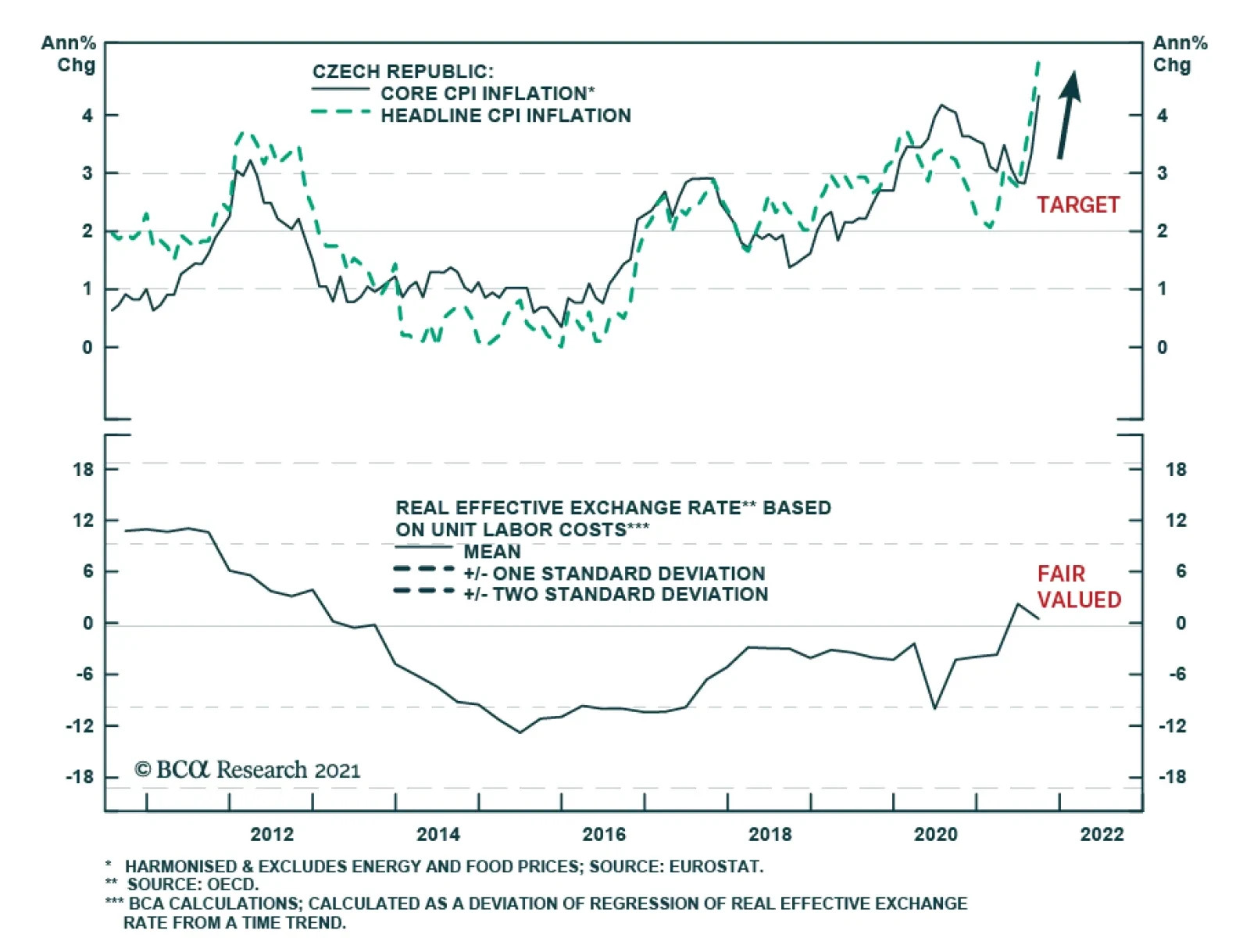
The Czech National Bank surprised markets with a massive 125 basis point rate hike on Thursday – significantly above the anticipated 75 bp increase. The central bank’s sharp move – which follows a 75 bp hike in September and is the fourth consecutive rate…
The Bank of England kept policy unchanged at its meeting on Thursday. The Monetary Policy Committee voted by a majority of 6-3 to maintain UK bond purchases and a majority of 7-2 to keep the Bank Rate at 0.1%. Governor Bailey borrowed a page from Jerome…
BCA Research’s Global Fixed Income Strategy service downgraded strategic (6-18 months) exposure to inflation-linked bonds (vs nominals) to underweight in Germany, France, and Italy. The surge in global inflation this year has helped boost the performance…
Over the past couple of weeks, global sovereign bond markets and currencies have been sending conflicting signals. Bond markets have brought forward their rate hike expectations. Two rate hikes are now expected by mid-2022 in Canada, three in the UK, and four…
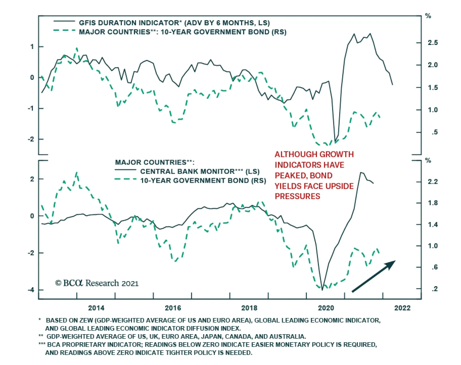
Highlights Duration & Country Allocation: Global bond yields have been driven by growth and inflation expectations over the past year, but shifting policy expectations are now the more important driver. Tighter monetary policies will pressure global bond yields higher over the next 6-12 months, but not equally. Stay underweight countries where tapering and rate hikes are more likely (the US, the UK, Canada, New Zealand) relative to countries where policymakers will move much more slowly (euro area, Australia, Japan). Inflation-Linked Bonds: An update of our Comprehensive Breakeven Indicators shows limited scope for a further widening of breakeven inflation rates between nominal and index-linked government bonds in most developed economies, most notably in Europe. Downgrade strategic (6-18 months) exposure to inflation-linked bonds (vs nominals) to underweight in Germany, France and Italy. Feature Chart of the WeekGlobal Bond Yield Drivers: Inflation Now, Labor Later
Global Bond Yield Drivers: Inflation Now, Labor Later
Global Bond Yield Drivers: Inflation Now, Labor Later
“Actually, we talked about inflation, inflation, inflation. That has been a topic that has occupied a lot of our time and a lot of our debates.” – ECB President Christine Lagarde Are you tired of talking about inflation? Central bankers likely are. The only problem is that is the job of monetary policymakers to worry about inflation – and the appropriate policy response – when it is rising as fast as been the case in 2021. The current global inflation surge, on the back of supply squeezes for both durable goods and commodity prices, will ease to some degree in 2022. This does not mean, however, that global bond yields have seen their cyclical peak. The driver of higher yields is already starting to transition from high inflation to tightening labor markets and rising wage costs – more enduring sources of potential inflation that will require monetary tightening in many, but not all, countries (Chart of the Week). This week, we discuss the implications of this shift to more policy-driven yields for the country allocation decisions in a government bond portfolio, for both nominal and inflation-linked debt. Shorter-Term Bond Yields Awaken, Longer-Term Yields Take Notice October represented a shift in the relative performance of developed economy government bond markets compared to the previous three months, most notably at the extremes (Chart 2). UK Gilts were the largest underperformer in Q3, down 1.8% versus the Bloomberg Global Treasury index (in USD-hedged terms, duration-matched to the benchmark), while Spain (+0.7%), Australia (+0.4%) and Italy (+0.3%) were the outperformers. In October, that script was flipped with Gilts being the best performer (+2.3%), Australia being the worst performer (-4.2%) and Spain (-0.6%) and Italy (-1.5%) reversing the Q3 gains.
Chart 2
Those particular swings in relative performance were a result of shifting market views on policy changes in those countries. The UK Gilt rally was largely contained to a single day, and focused at the long-end of the Gilt curve after the Conservative government announced a smaller-than-expected budget deficit on October 26 - with much less issuance of longer-maturity bonds – which triggered a huge -22bps decline in 30-year Gilt yields. The Australian bond selloff was a triggered by a rapid market reassessment of the next move in monetary policy for the Reserve Bank of Australia (RBA) after an upside surprise on Q3 inflation data. Italian and Spanish debt also sold off on the back of growing fears that even the European Central Bank (ECB) would be forced to tighten policy in response to higher inflation. The backup in Australian and European yields ran counter to the latest policy guidance of from the RBA and ECB, indicating speculation of a bond-bearish hawkish policy shift. In countries where policymakers have been more explicit about the need for monetary tightening, like Canada and New Zealand, government bonds performed poorly in both Q3 and October. While US Treasury returns were “flattish” in both Q3 (0.1%) and October (0.1%), the 2-year Treasury yield doubled from 0.27% to 0.52% during October as the market pulled forward the timing and pace of Fed rate hikes starting next year (Chart 3). Shifting views on monetary policy have not only impacted the relative performance of bond markets, but also the shapes of yield curves. The bigger increases seen in shorter-maturity bond yields have resulted in a fairly synchronized global move towards curve flattening (Chart 4). This would not be unusual during an actual monetary policy tightening cycle involving rate hikes. However, within the developed economies, only Norway and New Zealand have seen an actual rate hike. In other words, yield curves have been flattening on the anticipation of a rate hiking cycle – but one that is expected to be relative mild. Chart 3A Bond-Bearish Repricing Of Global Rate Expectations
A Bond-Bearish Repricing Of Global Rate Expectations
A Bond-Bearish Repricing Of Global Rate Expectations
Chart 4Some Violent Repricing Of Policy Expectations
Some Violent Repricing Of Policy Expectations
Some Violent Repricing Of Policy Expectations
Forward interest rates in Overnight Index Swap (OIS) curves are discounting higher rates in 2022 and 2023 across most countries, but with stable rates in 2024 (Chart 5). Yet the cumulative amounts of tightening are very modest, especially when compared to inflation (both realized and expected). Only in New Zealand are policy rates expected to go above 2% by 2023, with the US OIS curve discounting the Fed lifting policy rates to just 1.4%. In the UK, markets are discounting 123bps of hikes by the end of 2022 and a rate cut in 2024 – market pricing that strongly suggests that the Bank of England will make a “policy error” by tightening too much, too quickly, over the next year. Chart 5Markets Still Think Central Banks Will Not Have To Hike Much
Markets Still Think Central Banks Will Not Have To Hike Much
Markets Still Think Central Banks Will Not Have To Hike Much
After the October repricing of rate expectations, and reshaping of yield curves, we see a few conclusions – and investment opportunities – that stand out: US Treasuries With the Fed set to begin tapering asset purchases, the market discussion has moved on to the timing and pace of the post-taper rate hike cycle. The US OIS curve is discounting two Fed hikes in the second half of 2022, starting shortly after the likely end of the Fed taper in June. That timing and pace for 2022 is a bit more aggressive than we are expecting, but a rapidly tightening US labor market and rising wage growth could force the Fed to at least match the market pricing for hikes next year. On that note – the US Employment Cost Index in Q3 rose +1.3%, the fastest quarterly pace since 2001, and +3.7% on a year-over-year basis, the highest since 2004. The greater medium-term risk for the Treasury market is that the Fed starts to signal a need to go higher and faster than the market expects in 2023 and even into 2024. US Treasury yields remain well below levels implied by growth indicators like the ISM index. Thus, there is upside potential as the Fed tightens because of persistent above-trend growth and falling unemployment over the next couple of years (Chart 6). Chart 6Stay Below-Benchmark On US Duration Exposure
Stay Below-Benchmark On US Duration Exposure
Stay Below-Benchmark On US Duration Exposure
We continue to recommend a below-benchmark duration strategic stance for dedicated US bond investors, based on our expectation that US bond yields will climb higher over the next 12-18 months. However, our more preferred way to play this for global investors is as a spread trade versus euro area bond yields – specifically, selling 10-year US Treasury versus 10-year German bunds (Chart 7). Chart 7Position For UST Underperformance Vs. Europe
Position For UST Underperformance Vs. Europe
Position For UST Underperformance Vs. Europe
While headline inflation in the euro area has rapidly converged to the pace of US inflation over the past few months, this is overwhelmingly due to surging European energy costs. The pace of underlying inflation, as proxied by measures like the Cleveland Fed trimmed mean CPI and the euro area trimmed mean CPI constructed by our colleagues at BCA Research European Investment Strategy, has diverged sharply with the latter barely above 0%. The ECB will not follow the Fed into a rate hiking cycle next year, which will push US government yields higher versus European equivalents. Australia Government Bonds Chart 8Fade The RBA 'Rate Shock' In Australia
Fade The RBA 'Rate Shock' In Australia
Fade The RBA 'Rate Shock' In Australia
The RBA fought back against the sharp repricing of Australian interest rate expectations earlier this week by signaling that no rate hikes are expected until 2023. This is a modest change from the previous forward guidance of 2024 liftoff, but a surprisingly dovish message for markets that had rapidly moved to price in rate hikes next year after the big upside surprise on Q3/2021 Australian inflation With underlying trimmed mean inflation now having crept back into the RBA’s 2-3% target range, although just barely at 2.1%, the RBA would be justified in removing some degree of monetary accommodation. The central bank has already been doing so, on the margin, with some earlier tapering of the pace of asset purchases and last week’s decision to formally abandon its yield control target on shorter-dated government bond yields. Per the RBA’s current forward guidance, however, a move to actual rate hikes would require more evidence of tighter labor markets and faster wage growth – and thus, a more sustainable move to the 2-3% inflation target - that is not yet evident in measures like the Wage Cost Index (Chart 8). We plan on doing a deeper dive into Australia for next week’s report, where we’ll more formally evaluate our strategic view on Australian bond markets. For now, we remain comfortable with our overweight stance on Australian government bonds, as the RBA is still projected to be one of the less hawkish central banks in 2022. UK Gilts
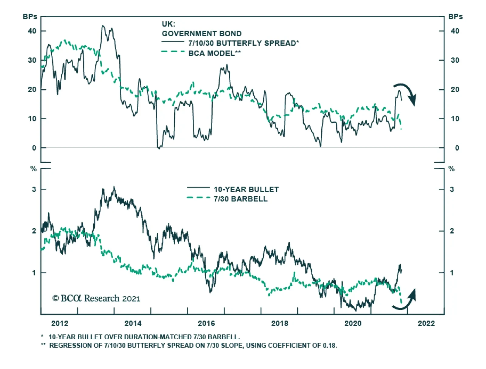
Chart 9
The sharp rally in longer-dated UK Gilts seen at the end of October was due to a downside surprise in the expected size of the UK budget deficit next year, and the amount of Gilt issuance that will be needed to finance it. The UK Debt Management Office (DMO) said it planned to issue 194.8 billion pounds ($267.5 billion) of bonds in the current 2021/22 financial year, 57.8 billion pounds less than its previous remit back in March. The pre-budget market expectation was for a far smaller reduction of 33.8 billion pounds. The cut in issuance was most pronounced for longer-dated Gilts, -35% lower than the March budget issuance projection (Chart 9). With longer-maturity Gilts always in high demand from longer-term UK institutional investors, a major “supply shock” of reduced issuance can temporarily boost bond prices and lower yields. This is especially true in the UK where more aggressive rate hike expectations, and more defensive bond market positioning after the August/September selloff, left Gilts vulnerable to a short squeeze. The most important medium-term drivers of Gilt yields are still expectations of growth, inflation and future policy rates. There was very little change in shorter-dated Gilt yields or UK OIS forward rates after last week’s budget announcement – all the price action was the long end of the Gilt yield curve, resulting in an overall bull flattening. As we discussed in last week’s report, we expect the next move in the shape of the Gilt curve will be towards a steeper curve, likely bond-bearishly as long-term yields are still priced too low relative to how high UK policy rates will eventually have to climb in the upcoming BoE hiking cycle. The post-budget flattening has made the valuation of longer-maturity Gilt curve steepeners far more attractive, according to our UK butterfly spread valuation model (Table 1). Table 1UK Butterfly Spread Valuations From Our Curve Models
Transitioning From Inflation To Policy As The Driver Of Bond Yields
Transitioning From Inflation To Policy As The Driver Of Bond Yields
Chart 10A New UK Tactical Trade: Long 10yr Bullet Vs. 7/30 Barbell
A New UK Tactical Trade: Long 10yr Bullet Vs. 7/30 Barbell
A New UK Tactical Trade: Long 10yr Bullet Vs. 7/30 Barbell
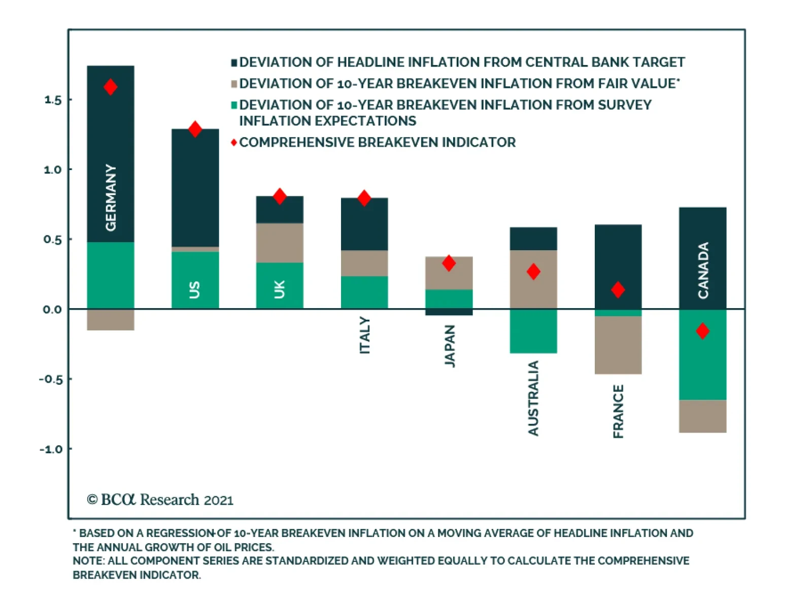
The trade that stands out as most attractive is to go long the 10-year Gilt bullet versus selling a 7-year/30-year Gilt curve barbell – a butterfly spread that was last priced this attractively in 2013 (Chart 10). We are adding this as a new recommended trade in our Tactical Overlay portfolio, the details of which (specific bonds and weightings for each leg of the trade) can be found on page 17. Bottom Line: Tighter monetary policies will pressure global bond yields higher over the next 6-12 months, but not equally. Stay underweight countries where tapering and rate hikes are more likely (the US, the UK, Canada, New Zealand) relative to countries where policymakers will move much more slowly (euro area, Australia, Japan). Global Breakevens: How Much More Upside? The surge in global inflation this year has helped boost the performance of inflation-linked government bonds versus nominal equivalents. Yet current breakeven inflation rates have reached levels not seen in some time. Last week, the 10-year US TIPS breakeven hit a 15-year high of 2.7%, the 10-year German breakeven reached a 9-year high of 2.1%, while the 10-year UK breakeven climbed to 4.2% - the highest level since 1996 (!). With market-based inflation expectations reaching such historically high levels, how much more can breakevens widen – especially with central banks incrementally moving towards tighter monetary policies? To answer that question, we turn to our Comprehensive Breakeven Indicators (CBIs). The CBIs measure the upside/downside potential for breakevens for the US, Germany, France, Italy, Japan, the UK, Canada and Australia. The CBIs incorporate the following three measures: The residuals from our 10-year breakeven inflation spread fair value models, as a measure of valuation. The spread between 10-year breakevens and survey-based measures of inflation expectations, as a measure of the inflation risk premium embedded in breakevens The gap between headline inflation and the central bank inflation target, as an indication of the existing inflation backdrop and of future monetary policy moves in response to an inflation trend that can help to reverse that trend. Each of the three measures is standardized and added together to produce a single CBI. A higher reading on CBI suggests less potential for additional increases in breakevens, and vice versa. The latest readings from our CBIs are shown in Chart 11. The red diamonds for each country are the actual CBI, while the stacked bars show the individual CBI components. The highest CBI readings are in Germany and the US, while the lowest are in Canada and France. Importantly, no country has a CBI significantly below zero, indicative of the more limited upside potential for breakevens after the big run-up since mid-2020.
Chart 11
As a way to assess the usefulness of the CBIs as an indicator of the future breakeven moves, we constructed a simple backtest. We looked at how 10-year breakevens performed in the twelve months after the CBI hit certain thresholds (Chart 12). The backtest results show that the CBIs work as intended, signaling reversals of existing trends once the CBIs climb above +0.5 or below -0.5. The average (mean) size of the breakeven reversal gets larger as the CBI moves further to extremes.
Chart 12
Based on the latest reading from the CBIs, we are making significant changes to the recommended allocations (Chart 13) to inflation-linked bonds (ILBs) in our model bond portfolio on pages 14-15: Chart 13No Overweights In Our Revised Allocations To Global Linkers
No Overweights In Our Revised Allocations To Global Linkers
No Overweights In Our Revised Allocations To Global Linkers
Downgrading ILBs to underweight (versus nominal government bonds) in Germany, France, Italy & Spain from the current overweight allocation. The backtested CBI history for those countries suggests breakevens are more likely to fall over the next twelve months. Furthermore, realized euro area inflation is more likely to fall in 2022, given the lack of underlying euro area inflation described earlier in this report. Downgrade Japan ILBs to neutral from overweight. While the CBI is not at a stretched level, realized Japanese core inflation has struggled to stay in positive territory – even in the current environment of soaring commodity and durable goods prices. Upgrade ILBs in Canada and Australia to neutral from underweight. The former has a CBI that is still below zero, while the latter benefits from the lack of RBA hawkishness compared to other central banks. We are maintaining our other ILB allocations in the UK (underweight vs. nominals) and the US (neutral vs. nominals). In the UK, stretched breakevens are at risk from the hawkish turn by the BoE, which is a clear response to the higher UK inflation expectations. While the US CBI is at a high level, we see better value in playing for narrowing TIPS breakevens at shorter maturity points that are even more exposed to a likely slowing of commodity fueled inflation in 2022 than longer maturity TIPS breakevens. In other words, we see a steeper US breakeven curve, but a flatter real yield curve as the Fed tightens. Bottom Line: An update of our Comprehensive Breakeven Indicators shows limited scope for a further widening of breakeven inflation rates between nominal and index-linked government bonds in most developed economies, most notably in Europe. Robert Robis, CFA Chief Fixed Income Strategist rrobis@bcaresearch.co Recommendations Duration Regional Allocation Spread Product Tactical Trades GFIS Model Bond Portfolio Recommended Positioning Active Duration Contribution: GFIS Recommended Portfolio Vs. Custom Performance Benchmark
Image
The GFIS Recommended Portfolio Vs. The Custom Benchmark Index
BCA Research’s US Bond Strategy service recommends investors shift out of 2/10 flatteners and into steepeners. The 2/5/10 butterfly spread has risen a lot during the past few weeks and it now looks extremely high, both in absolute terms and relative to…
Highlights Chart 1Buy The 2-Year, Sell The 10-Year
Buy The 2-Year, Sell The 10-Year
Buy The 2-Year, Sell The 10-Year
Treasury yields have been volatile of late, but the biggest move has been a flattening of the yield curve led by a sell-off at the front-end. Our recommended yield curve positioning (short the 5-year bullet / long a duration-matched 2/10 barbell) was well suited to profit from this move but has now run its course. The solid lines in the bottom panel of Chart 1 show the paths discounted in the forward curve for the 2-year and 10-year yields. The dashed lines show the fair value paths for each yield in a scenario where the Fed starts hiking in December 2022 and proceeds at a pace of 100 bps per year until reaching a 2.08% terminal rate. We can see that the 2-year yield looks a bit too high relative to fair value and the 10-year looks too low. Taken together, our fair value estimates show that the 2/10 Treasury slope should flatten during the next 12 months, but not by as much as is currently discounted in the forward curve (Chart 1, top panel). Investors should maintain below-benchmark portfolio duration but should shift out of 2/10 flatteners and into steepeners. Specifically, we close our prior yield curve trade and open a new one: Long the 2-year note, short a duration-matched barbell consisting of cash and the 10-year note. Feature Table 1Recommended Portfolio Specification
Curve Flatteners Are Too Expensive
Curve Flatteners Are Too Expensive
Table 2Fixed Income Sector Performance
Curve Flatteners Are Too Expensive
Curve Flatteners Are Too Expensive
Investment Grade: Neutral Chart 2Investment Grade Market Overview
Investment Grade Market Overview
Investment Grade Market Overview
Investment grade corporate bonds performed in line with the duration-equivalent Treasury index in October, leaving year-to-date excess returns unchanged at +193 bps (Chart 2). The combination of above-trend economic growth and accommodative monetary policy continues to support positive excess returns for spread product versus Treasuries. The recent flattening of the yield curve is a strong reminder that the window of outperformance for corporate bonds will eventually close, but the curve will need to be a lot flatter before we start to worry. Specifically, we are targeting a level of 50 bps for the 3-year/10-year Treasury slope as a level where we will turn more cautious on spread product relative to Treasuries. This slope currently sits at 80 bps and the pace of flattening should moderate during the next few months. A recent report presented the results of a scenario analysis for investment grade corporate bond returns during the next 12 months.1 We concluded that investment grade corporate bond total returns will be close to zero or negative during the next 12 months and that excess returns versus duration-matched Treasuries are capped at 85 bps. With that in mind, we advise investors to seek out higher returns in junk bonds, municipal bonds and USD-denominated Emerging Market sovereign and corporate bonds. We also recommend favoring long-maturity corporate bonds and those corporate sectors with elevated Duration-Times-Spread.2
Chart
Chart
High-Yield: Overweight Chart 3High-Yield Market Overview
High-Yield Market Overview
High-Yield Market Overview
High-Yield outperformed the duration-equivalent Treasury index by 14 basis points in October, bringing year-to-date excess returns up to +572 bps. A recent report looked at the default expectations that are currently priced into the junk index and considered whether they are likely to be met.3 If we demand an excess spread of 100 bps and assume a 40% recovery rate on defaulted debt, then the High-Yield index embeds an expected default rate of 3.1% (Chart 3). Using a model of the 12-month trailing speculative grade default rate that is based on gross corporate leverage (pre-tax profits over total debt) and C&I lending standards, we estimate that the 12-month default rate will fall between 2.3% and 2.8%, below what the market currently discounts. Notably, the corporate default rate is tracking at an annualized rate of roughly 1.6% through the first nine months of the year, well below the estimate generated by our model. Another recent report considered different plausible scenarios for junk bond returns during the next 12 months.4 We concluded that junk bond total returns will fall into a range of -0.29% to +1.80% during the next 12 months and that excess returns versus duration-matched Treasuries will be between +0.94% and +1.84%. MBS: Underweight Chart 4MBS Market Overview
MBS Market Overview
MBS Market Overview
Mortgage-Backed Securities underperformed the duration-equivalent Treasury index by 1 basis point in October, dragging year-to-date excess returns down to -44 bps. The nominal spread between conventional 30-year MBS and equivalent-duration Treasuries tightened 16 bps in October. The spread looks tight relative to levels seen during the past year and relative to the pace of mortgage refinancings (Chart 4). The conventional 30-year MBS option-adjusted spread (OAS) tightened 3 bps in October to reach 29 bps (panel 3). This is only just above the 28 bps offered by Aaa-rated consumer ABS but below the 54 bps offered by Aa-rated corporate bonds and the 30 bps offered by Agency CMBS. In a recent report we looked at MBS performance and valuation across the coupon stack.5 We noted that the higher convexity of high-coupon MBS makes them likely to outperform lower-coupon MBS in a rising yield environment. Higher coupon MBS also have greater OAS than lower coupons. This makes the high-coupon MBS more likely to outperform in a flat bond yield environment as well. Given our view that bond yields will be higher in 6-12 months, we recommend favoring high coupons (4%, 4.5%) over low coupons (2%, 2.5%, 3%) within an overall underweight allocation to Agency MBS. Government-Related: Neutral Chart 5Government-Related Market Overview
Government-Related Market Overview
Government-Related Market Overview
The Government-Related index performed in-line with the duration-equivalent Treasury index in October, leaving year-to-date excess returns unchanged at 68 bps. Sovereign debt outperformed duration-equivalent Treasuries by 23 basis points October, bringing year-to-date excess returns up to -65 bps. Foreign Agencies underperformed the Treasury benchmark by 5 bps on the month, dragging year-to-date excess returns down to +44 bps. Local Authority bonds outperformed by 16 bps in October, bringing year-to-date excess returns up to +423 bps. Domestic Agency bonds underperformed by 15 bps, dragging year-to-date excess returns down to +9 bps. Supranationals underperformed by 11 bps, dragging year-to-date excess returns down to +16 bps. The investment grade Emerging Market Sovereign bond index outperformed the equivalent-duration US corporate bond index by 35 bps in October. The Emerging Market Corporate & Quasi-Sovereign index delivered 8 bps of outperformance versus duration-matched US corporates (Chart 5). Despite this outperformance, both indexes continue to offer significant yield advantages versus US corporate bonds with the same credit rating and duration. We continue to recommend overweighting USD-denominated EM sovereigns and corporates versus investment grade US corporates with the same credit rating and duration.6 Within EM sovereigns, attractive countries include: Russia, Mexico, Indonesia, Saudi Arabia, UAE and Qatar. Municipal Bonds: Overweight Chart 6Municipal Market Overview
Municipal Market Overview
Municipal Market Overview
Municipal bonds outperformed the duration-equivalent Treasury index by 48 basis points in October, bringing year-to-date excess returns up to +341 bps (before adjusting for the tax advantage). The economic and policy back-drop remains favorable for municipal bond performance. Trailing 4-quarter net state & local government savings are incredibly high (Chart 6) and individual tax hikes will only increase the attractiveness of tax-exempt munis if they are included in the upcoming reconciliation bill. Last week’s report showed that the average duration of municipal bond indexes has fallen significantly during the past few decades, a trend that has implications for how we should perceive municipal bond valuation.7 Specifically, the trend makes municipal bonds more attractive relative to both Treasury securities and investment grade corporates. Long-maturity municipal bonds are especially compelling. We calculate that 17-year+ maturity General Obligation Munis offer a before-tax yield pick-up relative to credit rating and duration-matched corporate credit. The same goes for 17-year+ Revenue bonds. High-yield muni spreads are reasonably attractive relative to high-yield corporates (panel 4), but we recommend only a neutral allocation to high-yield munis versus high-yield corporates. The deep negative convexity of high-yield munis makes them susceptible to extension risk if bond yields rise. Treasury Curve: Buy 2-Year Bullet Versus Cash/10 Barbell Chart 7Treasury Yield Curve Overview
Treasury Yield Curve Overview
Treasury Yield Curve Overview
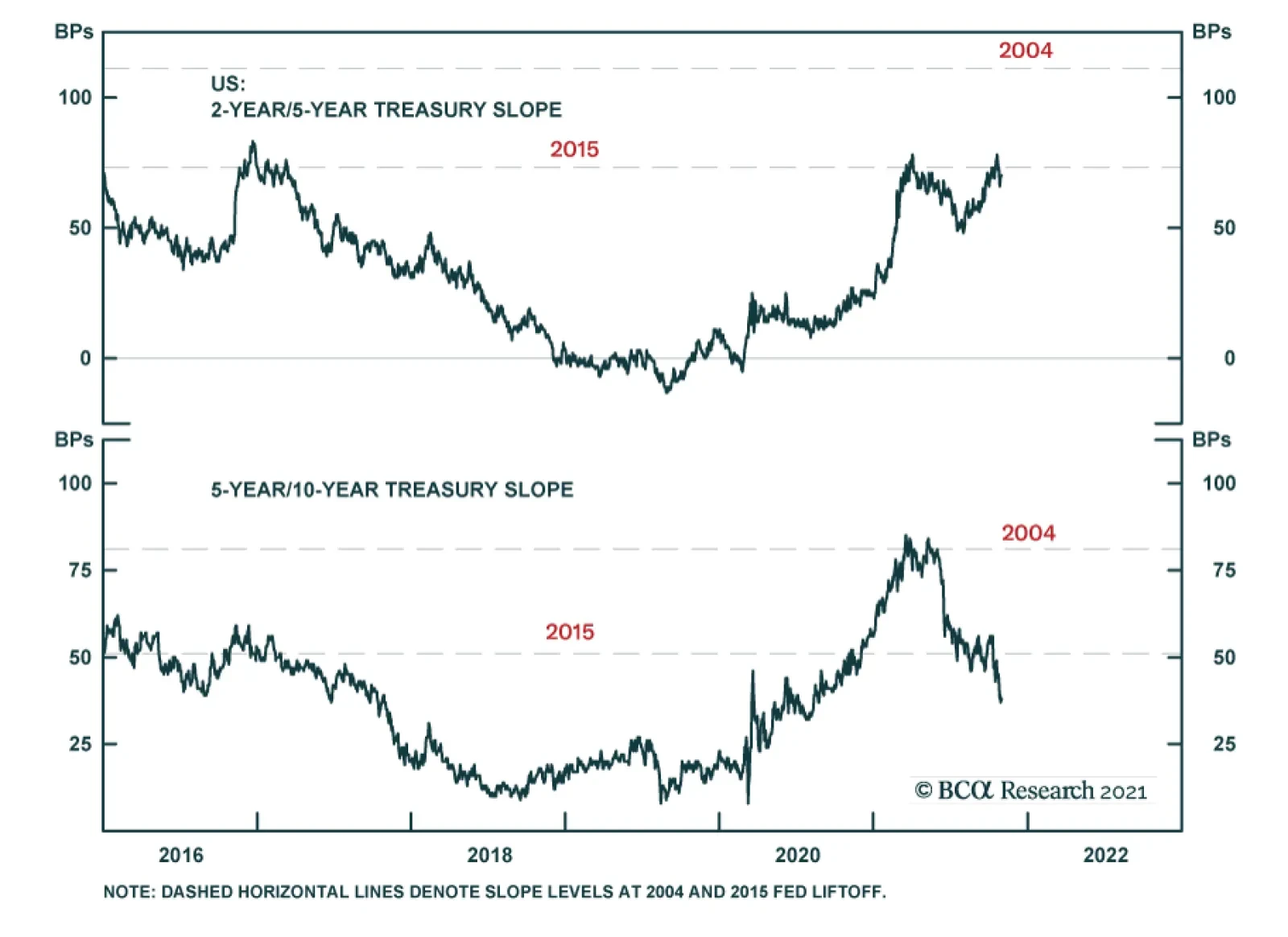
The Treasury curve bear-flattened dramatically in October. The 2-year/10-year Treasury slope flattened 17 bps to end the month at 107 bps. The 5-year/30-year slope flattened 35 bps to end the month at 75 bps. As is mentioned on the first page of this report, the large flattening of the yield curve has led us to take profits on our prior 2/10 flattener (short 5-year bullet versus 2/10 barbell) and to initiate a 2/10 curve steepener (long 2-year bullet versus cash/10 barbell). We also noted on the front page that we still expect the 2/10 slope to flatten during the next 12 months, just not by as much as what is currently priced into the forward curve. The 2/5/10 butterfly spread has risen a lot during the past few weeks and it now looks extremely high, both in absolute terms and relative to our fair value model (Chart 7). The 2/5/10 butterfly spread can rise because of either 2/5 steepening or 5/10 flattening. We contend that the current elevated 2/5/10 butterfly is mostly the result of a 5/10 slope that is too flat, not a 2/5 slope that is too steep. The bottom two panels of Chart 7 show the 2/5 and 5/10 slopes along with dashed lines indicating where those slopes were on prior Fed liftoff dates in 2015 and 2004. We see that the 2/5 slope is not unusually steep compared to those prior liftoff dates, but the 5/10 slope is unusually flat. For this reason, we want long exposure to the 2-year note and short exposure to the 10-year note between now and Fed liftoff in late-2022. The best way to achieve this exposure is to buy the 2-year note and short a duration-matched barbell consisting of the 10-year note and cash. TIPS: Neutral Chart 8TIPS Market Overview
TIPS Market Overview
TIPS Market Overview
TIPS outperformed the duration-equivalent nominal Treasury index by 106 basis points in October, bringing year-to-date excess returns up to +740 bps. The 10-year TIPS breakeven inflation rate rose 15 bps on the month and the 5-year/5-year forward TIPS breakeven inflation rate fell 10 bps. At 2.54%, the 10-year TIPS breakeven inflation rate is now slightly above the 2.3% to 2.5% range that is consistent with inflation expectations being well-anchored around the Fed’s target (Chart 8). Meanwhile, at 2.14%, the 5-year/5-year forward TIPS breakeven inflation rate has dipped below the Fed’s target range (panel 3). The divergence between 10-year and 5-year/5-year breakeven rates underscores the flatness of the inflation curve (bottom panel). Near-term inflation expectations are extremely high, but they decline sharply further out the curve. Our view is that inflationary pressures will wane during the next 6-12 months and this will lead to a steep decline in short-maturity TIPS breakeven inflation rates.8 Breakeven rates at the long-end should remain relatively close to the Fed’s target range. We recommend positioning for this outcome by entering inflation curve steepeners or real yield curve (aka TIPS curve) flatteners. We also advise entering an outright short position in 2-year TIPS. The 2-year TIPS yield has a lot of room to rise as the cost of 2-year inflation compensation falls and the 2-year nominal yield remains close to its fair value. ABS: Overweight Chart 9ABS Market Overview
ABS Market Overview
ABS Market Overview
Asset-Backed Securities underperformed the duration-equivalent Treasury index by 7 basis points in October, dragging year-to-date excess returns down to +35 bps. Aaa-rated ABS underperformed by 8 bps on the month, dragging year-to-date excess returns down to +25 bps. Non-Aaa ABS underperformed by 5 bps, dragging year-to-date excess returns down to +93 bps. The stimulus from last year’s CARES Act led to a significant increase in household savings when individual checks were mailed in April 2020. That excess savings has still not been spent and the most recent round of stimulus checks has only added to the stockpile (Chart 9). The extraordinarily large stock of household savings means that the collateral quality of consumer ABS is also extraordinarily high. Indeed, many households have been using their windfalls to pay down consumer debt (bottom panel). Investors should remain overweight consumer ABS and should also take advantage of the high quality of household balance sheets by moving down the quality spectrum. Non-Agency CMBS: Neutral Chart 10CMBS Market Overview
CMBS Market Overview
CMBS Market Overview
Non-Agency Commercial Mortgage-Backed Securities outperformed the duration-equivalent Treasury index by 1 basis point in October, bringing year-to-date excess returns up to +196 bps. Aaa Non-Agency CMBS underperformed Treasuries by 3 bps in October, dragging year-to-date excess returns down to +93 bps. Non-Aaa Non-Agency CMBS outperformed Treasuries by 17 bps, bringing year-to-date excess returns up to +543 bps (Chart 10). Though returns have been strong and spreads remain attractive, particularly for lower-rated CMBS, we continue to recommend only a neutral allocation to the sector because of the structurally challenging environment for commercial real estate. Agency CMBS: Overweight Agency CMBS outperformed the duration-equivalent Treasury index by 12 basis points in October, bringing year-to-date excess returns up to +105 bps. The average index option-adjusted spread tightened 3 bps on the month. It currently sits at 30 bps (bottom panel). Though Agency CMBS spreads have recovered to well below their pre-COVID levels, they still look attractive compared to other similarly risky spread products. Stay overweight. Appendix A: Butterfly Strategy Valuations The following tables present the current read-outs from our butterfly spread models. We use these models to identify opportunities to take duration-neutral positions across the Treasury curve. The following two Special Reports explain the models in more detail: US Bond Strategy Special Report, “Bullets, Barbells And Butterflies”, dated July 25, 2017, available at usbs.bcaresearch.com US Bond Strategy Special Report, “More Bullets, Barbells And Butterflies”, dated May 15, 2018, available at usbs.bcaresearch.com Table 4 shows the raw residuals from each model. A positive value indicates that the bullet is cheap relative to the duration-matched barbell. A negative value indicates that the barbell is cheap relative to the bullet. Table 4Butterfly Strategy Valuation: Raw Residuals In Basis Points (As Of October 29th, 2021)
Curve Flatteners Are Too Expensive
Curve Flatteners Are Too Expensive
Table 5 scales the raw residuals in Table 4 by their historical means and standard deviations. This facilitates comparison between the different butterfly spreads. Table 5Butterfly Strategy Valuation: Standardized Residuals (As Of October 29th, 2021)
Curve Flatteners Are Too Expensive
Curve Flatteners Are Too Expensive
Table 6 flips the models on their heads. It shows the change in the slope between the two barbell maturities that must be realized during the next six months to make returns between the bullet and barbell equal. For example, a reading of -60 bps in the 5 over 2/10 cell means that we would expect the 5-year to outperform the 2/10 if the 2/10 flattens by less than 60 bps during the next six months. Otherwise, we would expect the 2/10 barbell to outperform the 5-year bullet. Table 6Discounted Slope Change During Next 6 Months (BPs)
Curve Flatteners Are Too Expensive
Curve Flatteners Are Too Expensive
Appendix B: Excess Return Bond Map The Excess Return Bond Map is used to assess the relative risk/reward trade-off between different sectors of the US bond market. It is a purely computational exercise and does not impose any macroeconomic view. The Map’s vertical axis shows 12-month expected excess returns. These are proxied by each sector’s option-adjusted spread. Sectors plotting further toward the top of the Map have higher expected returns and vice-versa. Our novel risk measure called the “Risk Of Losing 100 bps” is shown on the Map’s horizontal axis. To calculate it, we first compute the spread widening required on a 12-month horizon for each sector to lose 100 bps or more relative to a duration-matched position in Treasury securities. Then, we divide that amount of spread widening by each sector’s historical spread volatility. The end result is the number of standard deviations of 12-month spread widening required for each sector to lose 100 bps or more versus a position in Treasuries. Lower risk sectors plot further to the right of the Map, and higher risk sectors plot further to the left.
Chart 11
Ryan Swift US Bond Strategist rswift@bcaresearch.com Footnotes 1 Please see US Bond Strategy Weekly Report, “Expected Returns In Corporate Bonds”, dated September 21, 2021. 2 Please see US Bond Strategy Weekly Report, “The Collapsing Credit Risk Premium”, dated July 20, 2021. 3 Please see US Bond Strategy Weekly Report, “The Post-FOMC Credit Environment”, dated June 29, 2021. 4 Please see US Bond Strategy Weekly Report, “Expected Returns In Corporate Bonds”, dated September 21, 2021. 5 Please see US Bond Strategy Weekly Report, “A New Conundrum”, dated April 20, 2021. 6 For more details please see US Bond Strategy Weekly Report, “Damage Assessment”, dated September 28, 2021. 7 Please see US Bond Strategy Weekly Report, “The Best & Worst Spots On The Yield Curve”, dated October 26, 2021. 8 Please see US Bond Strategy Weekly Report, “Right Price, Wrong Reason”, dated October 19, 2021.