Fixed Income

Image
The markets were deluged by a lot of information in late October. Several central banks made surprise moves towards tightening (the Bank of Canada, for example, ended asset purchases, and the Reserve Bank of Australia effectively abandoned its yield-curve control). Inflation continued to surprise on the upside (headline CPI in the US is now 5.4% year-on-year). But, at the same time, there were signs of faltering growth with, for example, US real GDP growth in Q3 coming in at only 2.0% quarter-on-quarter annualized, compared to 6.7% in Q2. This caused a flattening of the yield curve in many countries, as markets priced in faster monetary tightening but lower long-term growth (Chart 1). Nonetheless, equities shrugged off the barrage of news, with the S&P500 ending the month at a new high. All this highlights what we discussed in our latest Quarterly: That the second year of a bull market is often tricky, resulting in lower (but still positive) returns from equities and higher volatility. For risk assets to continue to outperform, our view of a Goldilocks environment needs to be “just right”: The economy must not be too hot or too cold. We think it will be – and so stay overweight equities versus bonds. But investors should be aware of the risks on either side. How too hot? Inflation is broadening out (at least in the US, UK, Australia and Canada, though not in the euro zone and Japan) and is no longer limited to items which saw unusually strong demand during the pandemic but where supply is constrained (Chart 2). Chart 1What Is The Message Of Flattening Yield Curves?
What Is The Message Of Flattening Yield Curves?
What Is The Message Of Flattening Yield Curves?
Chart 2Inflation Is Broadening Out In The US
Inflation Is Broadening Out In The US
Inflation Is Broadening Out In The US
There is a risk that this turns into a wage-price spiral as employees, amid a tight labor market, push for higher wages to offset rising prices. We find that wages tend to follow prices with a lag of 6-12 months (Chart 3). The Atlanta Fed Wage Tracker (good for gauging underlying wage pressures since it looks only at employees who have been in a job for 12 months or more) is already at 3.5% and looks set to rise further. On the back of these inflationary moves, the market has significantly pulled forward the date of central bank tightening. Futures now imply that the Fed will raise rates in both July and December next year (Chart 4) and that other major developed central banks will also raise multiple times over the next 14 months (Table 1). Breakeven inflation rates have also risen substantially (Chart 5). Chart 3Wages Tend To Rise After Prices Rise
Wages Tend To Rise After Prices Rise
Wages Tend To Rise After Prices Rise
Chart 4Will The Fed Really Hike This Soon?
Will The Fed Really Hike This Soon?
Will The Fed Really Hike This Soon?
Table 1Futures Implied Path Of Rate Hikes
Monthly Portfolio Update: The Risks To Goldilocks
Monthly Portfolio Update: The Risks To Goldilocks
Chart 5Breakevens Suggest Higher Inflation
Breakevens Suggest Higher Inflation
Breakevens Suggest Higher Inflation
We think these moves are a little excessive. There are several reasons why inflation might cool next year. Companies are rushing to increase capacity to unblock supply bottlenecks. For example, semiconductor production has already begun to increase, bringing down DRAM prices over the past few months (Chart 6). Another big contributor to broad-based inflation has been a 126% increase in container shipping costs since the start of the year (Chart 7). But currently the number of container ships on order is at a 10-year high; these new ships will be delivered over the next two years. Such deflationary forces should pull down core inflation next year (though we stick to our longstanding view that for multiple structural reasons – demographics, the end of globalization, central bank dovishness, the transition away from fossil fuels – inflation will trend up over the next five years). Chart 6DRAM Prices Falling As Production Ramps Up
DRAM Prices Falling As Production Ramps Up
DRAM Prices Falling As Production Ramps Up
Chart 7All Those Ships On Order Should Bring Down Shipping Costs
All Those Ships On Order Should Bring Down Shipping Costs
All Those Ships On Order Should Bring Down Shipping Costs
The Fed, therefore, will not be in a rush to raise rates. It does not see the labor market as anywhere close to “maximum employment” – it has not defined what it means by this, but we would see it as a 3.8% unemployment rate (the median FOMC dot for the equilibrium unemployment rate) and the prime-age participation rate back to its 2019 level (Chart 8). We continue to expect the first rate hike only in December next year. The Fed will feel the need to override its employment criterion only if long-term inflation expectations become unanchored – but the 5-year 5-year forward breakeven rate is only at 2.3%, within the Fed’s effective CPI target range of 2.3-2.5% (Chart 5). We remain comfortable with our view of only a moderate rise in long-term rates, with the US 10-year Treasury yield at 1.7% by end-2021, and reaching 2-2.25% at the time of the first Fed rate hike. It is also worth emphasizing that even a fairly sharp rise in long-term rates has historically almost always coincided with strong equity performance (Chart 9 and Table 2). This has again been evident in the past 12 months: When rates rose between August 2020 and March 2021, and then from July 2021, equities performed strongly. Chart 8We Are Not Back To "Maximum Employment"
We Are Not Back To "Maximum Employment"
We Are Not Back To "Maximum Employment"
Chart 9Rising Rates Are Usually Accompanied By A Rising Stock Market
Rising Rates Are Usually Accompanied By A Rising Stock Market
Rising Rates Are Usually Accompanied By A Rising Stock Market
Table 2Episodes Of Rising Long-Term Rates Since 1990
Monthly Portfolio Update: The Risks To Goldilocks
Monthly Portfolio Update: The Risks To Goldilocks
But could the economy get too cold? We would discount the weak US GDP reading: It was mostly due to production shortages, especially in autos, which pushed down consumption on durable goods by 26% QoQ annualized, and by some softness in spending on services due to the delta Covid variant, the impact of which is now fading. US growth should continue to be supported by a combination of the $2.5 trillion of excess household savings, strong capex as companies boost their production capacity, and a further 5% of GDP in fiscal stimulus that should be passed by Congress by year-end. Similar conditions apply in other developed economies. Chart 10Real Estate Is A Big Part Of Chinese GDP
Real Estate Is A Big Part Of Chinese GDP
Real Estate Is A Big Part Of Chinese GDP
We see three principal risks to this positive outlook: A new strain of Covid-19 that proves resistant to current vaccines – unlikely but not impossible. Our geopolitical strategists worry about Iran, which may have a nuclear bomb ready by December, prompting Israel to bomb the country. Iran would likely react by hampering oil supplies, even blocking the Strait of Hormuz, through which 25% of global oil flows. Chinese growth has been slowing and the impact from the problems at Evergrande is still unclear. Real estate is a major part of the Chinese economy, with residential investment comprising 10% of GDP (Chart 10) and, broadly defined to include construction and building materials, real estate overall perhaps as much as one-third. Our China strategists don’t expect the government to launch a major stimulus which would bail out the industry, since it is happy with the way that property-related lending has been shrinking in recent years (Chart 11). We expect the slowdown in Chinese credit growth to bottom out over the coming few months, but economic activity may have further to slow (Chart 12), and there is a risk that the authorities are unable to control the fallout from the property market. Chart 11Chinese Authorities Are Happy To See Slowing Property Lending
Chinese Authorities Are Happy To See Slowing Property Lending
Chinese Authorities Are Happy To See Slowing Property Lending
Chart 12When Will Credit Growth Bottom?
When Will Credit Growth Bottom?
When Will Credit Growth Bottom?
Fixed Income: Given the macro environment described above, we remain underweight bonds and short duration. If we assume 1) a Fed liftoff in December 2022, 2) 100 basis points of rate hikes over the following year, and 3) a terminal Fed Funds Rate of 2.08% (the median forecast from the New York Fed’s Survey of Market Participants), 10-year US Treasurys will return -0.2% over the next 12 months, and 2-year Treasurys +0.3%.1 TIPs have overshot fair value and, although we remain neutral since they a tail-risk hedge against high inflation over the next five years, we would especially avoid 2-year TIPS which look very overvalued. We see some pockets of selective value in lower-quality high-yield bonds, specifically US Ba- and Caa-rated issues, which are still trading at breakeven spreads around the 35th historical percentile, whereas higher-rated bonds look very expensive (Chart 13). For US tax-paying investors, municipal bonds look particularly attractive at the moment, with general-obligation (GO) munis trading at a duration-matched yield higher than Treasurys even before tax considerations (Chart 14). Our US bond strategists have recently gone maximum overweight.
Chart 13
Chart 14Muni Bonds Are A Steal
Muni Bonds Are A Steal
Muni Bonds Are A Steal
Equities: We retain our longstanding preference for US equities over other Developed Markets. US equities have outperformed this year, irrespective of whether rates were rising or falling, or how US growth was surprising relative to the rest of the world, emphasizing the much stronger fundamentals of the US market (Chart 15). Analysts’ forecasts for the next few quarters look quite cautious, and so earnings surprises can push US stock prices up further (Chart 16). We reiterate the neutral on China but underweight on Emerging Markets ex-China that we initiated in our latest Quarterly. Our sector overweights are a mixture of cyclicals (Industrials), rising-interest-rate plays (Financials), and defensives (Heath Care). Chart 15US Equites Outperformed This Year Whatever Happened
US Equites Outperformed This Year Whatever Happened
US Equites Outperformed This Year Whatever Happened
Chart 16Analysts Are Pessimistic About The Next Couple Of Quarters
Analysts Are Pessimistic About The Next Couple Of Quarters
Analysts Are Pessimistic About The Next Couple Of Quarters
Currencies: We continue to expect the US dollar to be stuck in its trading range and so stay neutral. Recent moves in prospective relative monetary policy bring us to change two of our currency recommendations. We close our underweight on the Australian dollar. The recent rise in Australian inflation (with both trimmed mean and 10-year breakevens now above 2% – Chart 17) has brought forward the timing of the first rate hike and should push up relative real rates (Chart 18). We lower our recommendation on the Japanese yen from overweight to neutral. The Bank of Japan will not raise rates any time soon, even when other central banks are tightening. This will push real-rate differentials against the yen (Chart 18, panel 2). Chart 17Australian Inflation Is Picking Up
Australian Inflation Is Picking Up
Australian Inflation Is Picking Up
Chart 18Real Rates Moving In Favor Of The AUD And Against The JPY
Real Rates Moving In Favor Of The AUD And Against The JPY
Real Rates Moving In Favor Of The AUD And Against The JPY
Chart 19Chinese-Related Metals' Prices Are Falling
Chinese-Related Metals' Prices Are Falling
Chinese-Related Metals' Prices Are Falling
Commodities: We remain cautious on those industrial metals which are most sensitive to slowing Chinese growth and its weakening property market. The fall in iron ore prices since July is now being followed by aluminum. However, metals which are increasingly driven by investment in alternative energy, notably copper, are likely to hold up better (Chart 19). We are underweight the equity Materials sector and neutral on the commodities asset class. The Brent crude oil price has broadly reached our energy strategists’ forecasts of $80/bbl on average in 2022 and $81 in 2023 (Chart 20). Although the forward curve is lower than this, with December-22 Brent at only $75/bbl, it is a misapprehension to characterize this as the market forecasting that the oil price will fall. Backwardation (where futures prices are lower than spot) is the usual state of affairs for structural reasons (for example, producers hedging production forward). The market typically moves to contango only when the oil price has fallen sharply and reserves are high (Chart 21). We remain neutral on the equities Energy sector. Chart 20Brent Has Reached Our 2022 And 2023 Forecast Level
Brent Has Reached Our 2022 And 2023 Forecast Level
Brent Has Reached Our 2022 And 2023 Forecast Level
Chart 21Lower Oil Futures Don't Mean Oil Price Is Forecast To Fall
Lower Oil Futures Don't Mean Oil Price Is Forecast To Fall
Lower Oil Futures Don't Mean Oil Price Is Forecast To Fall
Garry Evans, Senior Vice President Global Asset Allocation garry@bcaresearch.com GAA Asset Allocation
Highlights The market pricing of the ECB is too aggressive. More so than in the US, temporary factors explain the European inflation surge. Energy, taxes, and base effects account for the bulk of the price increases. In contrast to supply shortages, European labor shortages are small and slack will limit wage growth. Despite the lack of near-term inflation risks, European growth prospects are significantly stronger than last decade. As a result, European inflation will settle at a higher level than in the 2010s and will increase durably in the second half of the 2020s. The inflation curve will steepen, as will the yield curve. Banks will continue to outperform, especially compared to the insurance sector. A tactical opportunity to buy European high-yield corporates has emerged. In France, Macron remains the favorite for the 2022 presidential election. Feature Last week’s ECB meeting did nothing to curb the impression among traders that the ECB will start removing monetary accommodation in 2022. The implied policy rate stands at -0.25% one year from now and -0.08% in two years. Meanwhile, Italian 10-year spreads over Germany have increased to 127bps, their highest level since November 2020. This market action rests on the perception that inflationary pressures in the Euro Area are durable. While this line of reasoning may have credence in the US, it is weaker across the Atlantic where the economy shows fewer signs of genuine inflationary pressure. Moreover, the deterioration in peripheral financial conditions further limits the ability of the ECB to withdraw accommodation without a financial accident. Meanwhile, the NGEU program has created a climate where the likelihood of a premature and excessive fiscal tightening is low. Thus, the weak European growth of the past decade will not be repeated. When considering these inflationary and fiscal views, it becomes apparent that the European yield curve has room to steepen further. Consequently, European banks remain attractive and should be bought on dips, especially relative to insurance companies. The EONIA Curve Is Too Aggressive The sudden increase in interest rate hikes priced in the EONIA curve is a consequence of the rapid acceleration in European realized inflation and CPI swaps. Neither are durable. Headline HICP has surged to 4.1% and core CPI towers at 2.1%, their highest reading in 13 and 19 years, respectively. These surges are the reflection of transitory factors: Chart 1The Energy Path-Through
The Energy Path-Through
The Energy Path-Through
Energy prices are lifting HICP and are sipping through to core CPI. Inflation for electricity, gas, and fuel has reached 14.7% and the energy CPI is at 23.5%. Both are moving in line with headline and core CPI (Chart 1). Now that Brent oil and natural gas have increased four and twenty folds since Q2 2020, respectively, their ability to contribute as much to overall inflation has decreased because they are unlikely to appreciate as much again. While oil prices may rise again here, European natural gas will decline meaningfully in the coming months. Tax increases are another important driver of core CPI. Core inflation with constant taxes stand at 1.37%, which is 0.67% below core CPI. In other words, while core CPI is high by the standard of the past decade, once we adjust for tax increases, it stands at normal levels (Chart 2). Base-effects are another dominant ingredient of the surge in European core CPI. The annualized two-year rate of change of the Eurozone’s core CPI stands at 1.11%, which is within the norm of the past seven years and below the rates experienced prior to 2014. In comparison, the annualized two-year core inflation in the US is 2.87%, well outside the range of the past decade (Chart 3). Chart 2Death And Taxes
Death And Taxes
Death And Taxes
Chart 3Controlling For The Base Effect
Controlling For The Base Effect
Controlling For The Base Effect
Inflation remains narrowly based. The Euro Area trimmed-mean CPI stands at 0.22%, or 1.82% below core CPI. Meanwhile, in the US, trimmed-mean CPI has reached 3.5% or 0.5% below core CPI (Chart 4). These figures confirm that the Eurozone inflation increase is more muted and narrower than that of the US. Wages are not experiencing any meaningful shock so far. Negotiated wages are growing at a 1.7% annual rate; meanwhile, the Atlanta Fed Wage Tracker is expanding at 3.6% and is rising even more steadily for low-skill jobs (Chart 5). Chart 4Much More Narrow Than In The US
Much More Narrow Than In The US
Much More Narrow Than In The US
Chart 5Limited Wage Pressures
Limited Wage Pressures
Limited Wage Pressures
Continental Europe’s more limited inflationary pressures compared to the US are a consequence of policy decisions during the crisis. The Euro Area fiscal stimulus in 2020 and 2021 amounted to 11% of 2019 GDP, but output declined by 15% in Q2 2020 and suffered a second dip in Q1 2021. Meanwhile, US fiscal packages amounted to 25% of 2019 GDP, while GDP declined by 10% in Q2 2020. Consequently, the Eurozone’s output gap is -4.1% of GDP, while that of the US has essentially closed. The contrasting nature of the stimuli accentuated the different outcomes created by their respective size. In Europe, governmental support focused on keeping people at work, which left aggregate supply unchanged. In the US, public programs allowed jobs to disappear, but they placed money directly in the pockets of consumers, which caused aggregate demand to rise relative to aggregate supply. In this context, a wage-price spiral is unlikely to develop in Europe as long as the energy crisis does not continue through 2022.
Chart 6
First, the labor shortage problems are less acute in the Eurozone than in the US or the UK. Chart 6 highlights the factors limiting production in various industries. In the industrial sector, the “labor shortages” category has grown, but pale compared to the role of “material and equipment shortages” as a problem. In the services sector, the “weak demand” and “other” categories are greater obstacles to production than the “labor” factor, which remains at Q1 2020 levels (Chart 6, middle panel). Only in the construction sector are “labor shortages” the chief problem, but they still hurt production less than “insufficient demand” did in February 2021, when real estate prices were already strong (Chart 6, bottom panel). Second, labor market slack remains comparable to 2011 levels, when the ECB erroneously increased interest rates to fight energy-driven inflation (Chart 7). Additionally, the rise in persons available to work but not currently seeking employment represent 75% of the increase in labor market slack since Q4 2019. At the crisis peak in Q2 2020, this category accounted for 105% of the increase in labor market slack. This suggests that, as the vaccination campaign continues to progress across the continent; as households use up their savings; and as government supports ebb across Europe, a large share of those who are a part of the labor market slack will start looking for jobs again, which will increase the supply of workers and limit wage pressures. If traders are overly worried about realized inflation remaining high in Europe, they are also over-emphasizing some CPI swap measures that trade above 2%. CPI swaps only tell one part of the inflation expectations story, because they are one and the same as energy prices. Elevated energy prices sap spending power in the rest of the economy, if other inflation expectation measures remain well anchored; thus, rising energy inflation rarely translates into broad-based pricing pressure. For now, our Common Inflation Expectation measure for the Eurozone, based on the New York Fed’s method for the US, is still toward the low-end of its distribution, even though it includes CPI swaps (Chart 8). This confirms that the energy crisis remains a relative-price shock and that it is unlikely to lead to a generalized inflation outburst in the Euro Area.
Chart 7
Chart 8Different Inflation Expectations
Different Inflation Expectations
Different Inflation Expectations
Bottom Line: Markets expect a first 10bps ECB rate hike by June 2022 and the deposit rate to be 25bps higher by September 2023. However, unlike in the US, there are few signs that European inflation reflects anything more than higher energy prices, rising taxes, and base effects. Moreover, the stories in the press of labor shortages are exaggerated, while broad-based inflation expectations are not unmoored. In this context, we lean against the EONIA pricing and expect the ECB to increase rates in 2024, at the earliest. Fiscal Policy Unlike Last Decade The 2010s were a lost decade for Europe. GDP only overtook its 2008 peak in 2015. Today, GDP is recovering much faster from the recession than it did twelve years ago, and it is unlikely to relapse as it did back then. Chart 9A Lost Decade
A Lost Decade
A Lost Decade
The European economic underperformance last decade was rooted in fiscal policy. As the top panel of Chart 9 highlights, the fiscal thrust during the GFC was minimal, at 1.3% of GDP, and was rapidly followed by a negative fiscal thrust. Moreover, the ECB unduly tightened policy in 2011 and left peripheral spreads fester at elevated levels between 2011 and 2014. This combination substantially hurt demand, especially in the European periphery. Capex proved particularly vulnerable. It is derived demand and therefore adds considerable variance to GDP. Faced with strong policy headwinds, its share of GDP plunged for most of the decade, which greatly contributed to the European economic malaise (Chart 9, bottom panel). According to the IMF, the Eurozone fiscal thrust will not exert the same drag as it did last decade; hence, capex is also unlikely to repeat its mediocre performance. Instead, the poorer Eastern and Central European economies as well as the weaker peripheral nations will receive a significant fillip from the NGEU program (Chart 10). When the NGEU grants and loans as well as the EU’s Multiannual Financial Framework funds are aggregated together, the EU will provide EUR1.9 trillion funding (adjusted for inflation) to member states over the next five years (Table 1). These sums will prevent any meaningful fiscal retrenchment from taking place.
Chart 10
Table 1Bigger Spending
To Hike Or Not To Hike?
To Hike Or Not To Hike?
The NGEU funds will be particularly supportive for capex. The Recovery and Resilience Facility (RRF), which will be the main instrument to deliver funds across Europe, is heavily weighted toward green transition, reskilling, and digital transformation (Chart 11, top panel). Practically, this spending focuses on electrical, power, water, and broadband infrastructures, as well as renovation and modernization projects (Chart 11, bottom panel). This reinforces the notion that capex is unlikely to follow the same trajectory it did last decade.
Chart 11
The implication of more accommodative fiscal policy and more robust capex is that the European output gap will close much faster than it did after the GFC. Hence, even if we expect the current inflation spike to pass next year, inflation will ultimately settle higher than it did last decade. Moreover, in the second half of the 2020s, European inflation will trend higher as full employment will be achieved. Bottom Line: The Euro Area is unlikely to experience another lost decade like the previous one. European trend growth remains low, but fiscal policy will not be as tight. Consequently, capex will not be as depressed, especially because the NGEU grants will greatly incentivize investments in certain sectors of the economy. As a result, the output gap will close much faster than it did in the 2010s. Moreover, once the current pandemic-driven inflation surge passes, CPI will settle at a higher level than it did last decade and will trend higher durably in the second half of the 2020s. Investment Implications Three main conclusions can be derived from our expectation on European inflation and growth dynamics over the coming decade. First, the inflation yield curve will steepen meaningfully. Today, near-term CPI swaps are lifted by energy markets and 2-year CPI swaps are 20bps above 20-year CPI swaps (Chart 12). From 2012 to 2020, 20-year CPI swaps stood between 30 bps and 150 bps above short maturity ones. Second, a steeper inflation curve, along with greater inflation risk toward the end of the decade will cause the European term premium to normalize from its -1.21% level. This will allow German 10-year yields to rise and the European yield curve to steepen (Chart 13). Chart 12Long-Term Inflation Expectations Have Upside
Long-Term Inflation Expectations Have Upside
Long-Term Inflation Expectations Have Upside
Chart 13A Steeper German Yield Curve
A Steeper German Yield Curve
A Steeper German Yield Curve
Third, higher German yields and a steeper curve will greatly benefit European banks (Chart 14, top panel). This pattern will be especially evident against insurance firms, which have massively outperformed deposit-taking institutions over the past seven years as yields fell (Chart 14, bottom panel). Additionally, banks’ balance sheets have become more robust than they once were and NPLs are unlikely to rise meaningfully as a result of government guarantees and easy fiscal policy (Chart 15). Investors should go long bank/short insurance on a cyclical basis. Chart 14Long Bank / Short Insurance
Long Bank / Short Insurance
Long Bank / Short Insurance
Chart 15Imporving Balance Sheets
Imporving Balance Sheets
Imporving Balance Sheets
A Tactical Buying Opportunity In European High-Yield Corporate Bond Market Chart 16Tactical Buying Opportunity
Tactical Buying Opportunity
Tactical Buying Opportunity
The 40 basis points widening in European high-yield spreads has created a tactical buying opportunity. Inflation fears spurred by rising energy prices and by input prices are the likely culprit behind the recent spread widening (Chart 16). Although US junk spreads have already narrowed significantly, European high-yield corporate bond spreads are still 40 bps wider than at the beginning of September. The 12-month breakeven spread, which measures the degree of spread widening required over a 12-month period for corporate bond returns to break even with a duration-matched position in government bond securities, now ranks at its 20th percentile, from 10th (Chart 16, second panel). Spreads will narrow back to near post-crisis lows before year-end on both an absolute and breakeven basis: First, monetary and fiscal policy remain very accommodative. Importantly, Spain and Italy will receive large shares of the NGEU funds until 2026. Second, growth will remain above trend despite recent inflation worries. Third, the European default rate is still falling, leaving the worst of the default cycle behind (Chart 16, third panel). Finally, our bottom-up Corporate Health Monitor signals improving corporate health, which historically coincides with narrowing spreads (Chart 16, bottom panel). Bottom Line: The recent widening in European high-yield spreads represents a short window of opportunity to buy the dip. Beyond this timeframe, a more cautious approach toward European credit is appropriate, as the ECB will become less active in the bond market. A French Update
Chart 17
Last month, French President Emmanuel Macron unveiled a EUR30 billion investment plan aimed at supporting and fostering industrial and tech “champions of the future.” This new plan comes on top of the EUR100 billion recovery package that was announced in September 2020 to face the pandemic. While these investments will be made across many sectors of the French economy, the focus will be the French tech and energy sectors (Chart 17, top panel). This announcement comes six months before the next presidential election and amid the emergence of Eric Zemmour as a potential far-right candidate. However, Zemmour’s candidacy is unlikely to alter our expectation that Macron will be re-elected in 2022. Recent polls that include Zemmour as a potential candidate in the first-round show that he is appealing to Marine Le Pen’s voter base (Chart 17, bottom panel). Meanwhile, former Prime Minister Edouard Philippe—who would have made a formidable opponent to Macron had he decided to run—announced the creation of his own party with the objective of supporting Macron’s re-election campaign. Chart 18Recent Developments Support These Trades
Recent Developments Support These Trades
Recent Developments Support These Trades
These political developments come as the French health and economic picture keeps improving. Although the vaccination pace has slowed in France, 68% of the population is fully vaccinated and 76% of the population has received at least one dose. Thus, the healthcare system continues to weather well recent COVID waves. Moreover, business confidence remains robust and reached its highest reading since July 2007, despite supply issues holding back production. The French jobs market is also recovering, with the unemployment rate expected to fall to 7.6% in Q3 from 8% in Q2. The introduction of a new investment plan, the emergence of a far-right candidate and Edouard Philippe’s newfound support, and the COVID-19 and economic developments bode well for President Macron’s chances at re-election. This implies additional French reforms over the next five years that aim to suppress unit labor costs and to make French exports more competitive vis-à-vis their main competitor, Germany. As a result, investors should overweight French industrial stocks relative to German ones (Chart 18, top panel). Meantime, additional investment in the French tech is bullish for a sector that is inexpensive relative to its European peers. Overweight French tech equities relative to European ones (Chart 18, panel 2 and 3). Mathieu Savary, Chief European Strategist Mathieu@bcaresearch.com Jeremie Peloso, Associate Editor JeremieP@bcaresearch.com Tactical Recommendations
To Hike Or Not To Hike?
To Hike Or Not To Hike?
Cyclical Recommendations
To Hike Or Not To Hike?
To Hike Or Not To Hike?
Structural Recommendations
To Hike Or Not To Hike?
To Hike Or Not To Hike?
Closed Trades
Image
Currency Performance Fixed Income Performance Equity Performance
Highlights The circumstances of the pandemic improved in October, but data highlighting the economic consequences of the Delta wave grew more severe. US economic activity slowed meaningfully in the third quarter, driven by lower car sales and a slowdown in services spending. The imminent vaccination of school-aged children, and signs that services activity and spending are increasing, will likely raise labor force participation, boost education employment, and hasten the return of real services spending back to pre-pandemic levels. Investors have the right bond view, but the wrong reason. Investors believe that the Fed will be forced to raise interest rates earlier than it currently expects to prevent an out-of-control rise in prices, whereas it will likely do so because of a quicker return to maximum employment. Bond yields are likely to move higher over the coming year, but this will be driven by real yields, not inflation expectations. Once the Fed begins to raise interest rates, investors should be on the lookout for signs that market expectations for the real natural rate of interest, or “R-star,” are rising. The Fed’s terminal rate projection is well below nominal potential GDP growth, and a gap between these two measures no longer makes sense. Stocks are likely to generate mid-single digit returns next year, which will beat the returns offered by bonds and cash. But stocks will generate much lower returns compared with those enjoyed by investors over the past year. A benign rise in long-maturity bond yields argues for the outperformance of value versus growth stocks over the coming year. Cyclical stocks are now becoming stretched versus defensives on an equally-weighted basis; stay overweight for now, but a downgrade to neutral may be in the cards at some point next year. Feature Chart I-1The Waning Impact Of Delta
The Waning Impact Of Delta
The Waning Impact Of Delta
Over the past month, the focus of investors has shifted from day-to-day developments to the consequences of the Delta wave of the pandemic. Chart I-1 highlights that, while an estimate of the COVID-19 reproduction rates in advanced economies has recently inched higher, it remains below one and hospitalizations continue to trend lower in most major economies. UK hospitalizations have increased over the course of the month, but remain at a level that is a quarter of their January peak – despite an elevated pace of confirmed cases. In the US, both these cases and hospitalizations continue to fall, trends that are likely to be reinforced by the vaccination of children over the coming weeks. A 50-60% vaccination rate for school-aged children would increase the US vaccination rate by 4-5 percentage points. Vaccinating all children at this rate would increase the total vaccination rate by 7-8 percentage points. In combination with a meaningful level of natural immunity, the vaccination of children is likely to bring the US very close to, if not above, the non-accelerating hospitalization rate of immunity (or “NAHRI”).1 The Delta Hangover While the circumstances of the pandemic improved in October, the economic consequences grew more severe. US economic activity slowed meaningfully in the third quarter, as highlighted by yesterday’s advance release. Chart I-2 highlights that durable goods spending subtracted almost three percentage points from Q3 growth, and that most other components of GDP contributed less to growth in Q3 than in Q2.
Chart I-2
The significant slowdown in Q3 growth is disappointing, but several factors point toward the conclusion that it is not likely to be sustained: Chart I-3Services PMIs Are Pointing To A Stronger Q4
Services PMIs Are Pointing To A Stronger Q4
Services PMIs Are Pointing To A Stronger Q4
The Delta wave very likely impacted services spending, which we have highlighted is likely to drive overall consumption over the coming year. Given the ongoing impact of semiconductor shortages on the availability of new cars, it is not surprising that a slowdown in services spending resulted in a significant slowdown in overall growth. After having declined significantly in Q3, Chart I-3 highlights that the US, UK, French, and Japanese October flash services PMI rose anew, underscoring that recent services weakness have been closely linked to the Delta variant of COVID-19 (whose impact is now waning). Chart I-3 also highlights that the US services PMI is currently at a level that has been historically consistent with solid real PCE growth. Finally, while it is true that manufacturing PMIs are being supported by supplier deliveries components, the October output component of the US Markit manufacturing index remained in expansionary territory, as was the case in Germany, Japan, and the UK (despite month-over-month declines in these components). Chart I-4 highlights that Q3’s real GDP reading was highly anomalous relative to the pace of jobs growth in the quarter, based on the relationship between the two since the global financial crisis. In quarters in which real GDP growth was 1% or less than implied by the trendline shown in Chart I-4, real GDP accelerated in the subsequent quarter 80% of the time. In conjunction with a pickup in services activity in October, this suggests that growth will be meaningfully stronger in Q4.
Chart I-4
Chart I-5Global Growth Is Peaking, But A Major Downturn Is Unlikely
Global Growth Is Peaking, But A Major Downturn Is Unlikely
Global Growth Is Peaking, But A Major Downturn Is Unlikely
Chart I-5 shows our global Nowcast indicator, alongside our global LEI. Our Nowcast indicator is a high-frequency measure of economic activity that is designed to predict global industrial production. The chart shows that both the Nowcast and global LEI are declining, but that this decline is occurring from an extremely elevated level. The global economy is at an inflection point in terms of the pace of growth, but Chart I-5 still points to above-trend growth – and certainly not a major cyclical downturn. The expectation of a slowdown in growth in Q3 has significantly raised concerns about a possible return to 1970s-style stagflation in the minds of many investors. We address this topic in depth in this month’s Special Report, and conclude that, while investors cannot rule out the possibility of stagflation, there are important differences that point toward a stagflationary outcome over the coming 6-24 months as a risk, not a likely event. We note in our report that the risk of stagflation can be monitored in real time by tracking the Misery Index, which is the sum of headline PCE inflation and the unemployment rate. Currently, the Misery Index is elevated relative to the average of the past 30 years, but it is meaningfully lower than it was during the latter half of the 1970s. This also underscores that true stagflation is only likely to occur if the unemployment rate rises, which means that the economic and financial market outlook over the coming year is strongly tied to the pace of jobs growth (even more so than usual). Table I-1 presents an industry breakdown of the jobs gap relative to pre-pandemic levels, sorted by industries with the largest gap. The table highlights that leisure and hospitality, government, and education and health services jobs continue to account for two-thirds of the five million jobs gap, with the latter two largely reflecting the same effect: 60% of the government jobs gap is accounted for by state and local government education-related employment.
Chart I-
Chart I-6Leisure And Hospitality Employment Tracks The Hotel Occupancy Rate
Leisure And Hospitality Employment Tracks The Hotel Occupancy Rate
Leisure And Hospitality Employment Tracks The Hotel Occupancy Rate
US education employment has been impacted by school and classroom closures, which we noted above are likely to end once school-aged children are vaccinated against the disease. Chart I-6 highlights that leisure and hospitality employment is clearly predicted by the US hotel occupancy rate, which wobbled over the past few months as a result of the Delta wave of the pandemic. Correspondingly, monthly growth in leisure and hospitality employment slowed in August and September. Taken together, the imminent vaccination of school-aged children and signs that services activity and spending are increasing will likely raise labor force participation, boost education employment, and hasten the return of real services spending back to pre-pandemic levels. The Bond Market Outlook Chart I-7The Market Now Agrees With Us About The Timing Of Fed Rate Hikes...
The Market Now Agrees With Us About The Timing Of Fed Rate Hikes...
The Market Now Agrees With Us About The Timing Of Fed Rate Hikes...
A continued normalization of the labor market over the coming 6-12 months argues in favor of Fed rate hikes next year, which is a view that we have maintained for several months. Recently, investors have come to agree with us, by moving forward their expectations for the Fed funds rate (Chart I-7). However, Chart I-8 highlights that investors have the right view for the wrong reason. The chart highlights that US government bond yields have risen entirely due to inflation expectations and that real yields have fallen. This means that investors believe that the Fed will be forced to raise interest rates earlier than it currently expects to prevent an out-of-control rise in prices, whereas we believe that they will do so because of a return to maximum employment. The implication for investors is that bond yields are still likely to rise over the coming year, but that higher yields are likely to occur alongside falling inflation expectations. This trend underscores that common hedges against inflation, such as precious metals and the relative performance of TIPS, are likely to underperform over the coming year. We have noted in previous reports that the fair value for long-maturity government bond yields implied by the Fed’s interest rate projections is not likely threatening for equity multiples, and certainly not for economic activity. A September 2022 rate hike, coupled with a pace of three hikes per year and a 2.5% terminal Fed funds rate, implies that 10-year Treasury yields will rise to 2.15% over the coming year, which would be only modestly higher than the level that prevailed prior to the pandemic (Chart I-9). Chart I-8...But For The Wrong Reason
...But For The Wrong Reason
...But For The Wrong Reason
Chart I-9Higher Bond Yields Are Unlikely To Be Restrictive Next Year
Higher Bond Yields Are Unlikely To Be Restrictive Next Year
Higher Bond Yields Are Unlikely To Be Restrictive Next Year
However, once the Fed begins to raise interest rates, investors should be on the lookout for signs that market expectations for the real natural rate of interest, or “R-star,” are rising. The Fed’s terminal rate projection is well below nominal potential GDP growth, and, while a gap between these two measures made sense in the years following the global financial crisis, this no longer appears to be the case. Chart I-10 highlights that real household mortgage liabilities began to contract sharply in 2006, and did not turn positive on a year-over-year basis until the end of 2016. It is likely that R-star was falling or weak during this period, but the correlation between the two series clearly shifted in the latter phase of the last economic cycle. Chart I-11 emphasizes this point by highlighting that the household debt service ratio is now the lowest it has been since the 1970s, underscoring the capacity that US consumers have to withstand higher interest rates. Chart I-10R-star Fell Post-GFC, For A Time
R-star Fell Post-GFC, For A Time
R-star Fell Post-GFC, For A Time
Chart I-11Today, US Households Have A Lot Of Capacity To Tolerate Higher Rates
Today, US Households Have A Lot Of Capacity To Tolerate Higher Rates
Today, US Households Have A Lot Of Capacity To Tolerate Higher Rates
We doubt that investor expectations for the terminal rate will rise significantly before the Fed begins to normalize monetary policy, but it may happen. In addition, the Fed may begin raising interest rates next year as soon as late in the summer or early in the fall, which would locate the liftoff date within our 6-12 month investment time horizon. As such, our base case view is that a rise in interest rates over the coming year will not be threatening to the equity market, but this view may change at some point next year. Equities: Expect Modest Returns In 2022 A benign increase in long-maturity bond yields in 2022 suggests that equity multiples will neither contribute to, nor subtract from, equity returns. As such, return expectations for equities should be centered around expected earnings growth.
Chart I-
Table I-2 presents consensus estimates for nominal GDP growth, S&P 500 revenue growth, and earnings growth for 2022. The table highlights that expectations for revenue growth estimates appear to be reasonable, given that bottom-up analysts continue to expect an expansion in profit margins next year. Chart I-12 highlights that margins have already risen back above their pre-pandemic high, and that this is true for both tech and ex-tech sectors. Chart I-12US Profit Margins Have Already Risen To Record Levels
US Profit Margins Have Already Risen To Record Levels
US Profit Margins Have Already Risen To Record Levels
We doubt that further increases in profit margins will be sustained next year. It is possible that margins will actually decline – a view that was recently espoused by our US Equity Strategy service.2 Risks to profit margins underscore that stocks are likely to generate mid-single digit returns next year, which will beat the returns offered by bonds and cash. But stocks will generate much lower returns compared with those enjoyed by investors over the past year. Within the equity market, we remain of the view that even a benign rise in long-maturity bond yields argues for the outperformance of value versus growth stocks over the coming year. Chart I-13 highlights that the rolling one-year correlation between relative global growth versus value stock prices and the US 10-year Treasury yield has become increasingly negative over time, which bodes well for value. We also continue to recommend that investors favor small over large caps and cyclicals over defensives, although cyclical stocks are now becoming stretched versus defensives on an equally-weighted basis as they are closing in on their 2018 highs (Chart I-14). We think it is too early to position against cyclicals, but a downgrade to neutral may be in the cards at some point next year. Chart I-13Growth Will Underperform Value If Long-Maturity Bond Yields Rise
Growth Will Underperform Value If Long-Maturity Bond Yields Rise
Growth Will Underperform Value If Long-Maturity Bond Yields Rise
Chart I-14Cyclicals Are Starting To Look Stretched Versus Defensives
Cyclicals Are Starting To Look Stretched Versus Defensives
Cyclicals Are Starting To Look Stretched Versus Defensives
Investment Conclusions Next month’s report will feature BCA’s 2022 outlook, as well as a transcript of our recently held annual discussion with Mr. X and his daughter Ms. X (who joined his family office a couple of years ago). Our annual outlook will provide a detailed walkthrough of our views for the upcoming year, as well as answers to sobering questions raised by Mr. X and Ms. X about the longer-term outlook. For now, we recommend that investors stick with a pro-cyclical view, favoring the following assets: Global stocks over bonds A short-duration position within a government bond portfolio Speculative-grade corporate bonds within a credit portfolio Global ex-US stocks vs US, focused on DM ex-US Global value versus growth stocks Cyclicals versus defensives, and small versus large caps Major currencies versus the US dollar Jonathan LaBerge, CFA Vice President The Bank Credit Analyst October 29, 2021 Next Report: November 30, 2021 II. Gauging The Risk Of Stagflation In this report we examine the risk of stagflation by comparing the current environment to that of the late-1960s and 1970s. Today, investors cannot rule out the possibility of a stagflationary outcome, for four reasons: long-term household inflation expectations have risen significantly over the past year; fiscal policy has been expansionary; monetary policy will remain expansionary at the Fed’s projected terminal Fed funds rate; and component shortages and price increases linked to energy market and supply chain disruptions may persist or worsen over the coming year. However, the strong demand-pull inflationary dynamics that existed in the late-1960s were mostly absent in the lead-up to the pandemic, supply-chain issues are in part due to strong goods demand and supply disruptions that will eventually dissipate, and economic agents do not expect severe price pressures to persist beyond the pandemic. On balance, this points to a stagflationary outcome over the coming 6-24 months as a risk, but not a likely event. Investors should use the Misery Index, which is the sum of the unemployment rate and headline PCE inflation, as a real-time stagflation indicator. The Misery Index underscores that the US economy is unlikely to experience true stagflation unless the unemployment rate rises. A portfolio of the US dollar, the Swiss Franc, and industrial commodities may serve as a useful hedge for investors who are concerned about absolute return prospects in a world in which long-maturity bond yields are rising and risks of stagflationary dynamics are present. Chart II-1The Misery Index Reflects The Risk Of Stagflation
The Misery Index Reflects The Risk Of Stagflation
The Misery Index Reflects The Risk Of Stagflation
Over the past several weeks, concerns about a possible return to 1970s-style stagflation have re-emerged significantly in the minds of many investors. These investors have pointed toward similarities between the current environment and that of the 1970s, including shortages limiting output, a snarled global trade and logistical system, and rising energy prices. Chart II-1 highlights that the US “Misery Index” – the sum of the unemployment rate and headline PCE inflation – rose again over the past several months to high single-digit territory, after having fallen dramatically from April 2020 to February of this year. Panel 2 of Chart II-1 highlights that last year's rise in the Misery Index was driven almost entirely by the unemployment rate, whereas the current level is due to a combination of a modestly elevated unemployment rate and a pronounced acceleration in inflation. The headline PCE deflator has risen above 4%, a level that has not been reached since 1991 during the First Gulf War. In this report, we examine the risk of stagflation by comparing the current environment to that of the late 1960s and 1970s. We conclude that while investors cannot rule out the possibility of a stagflationary outcome, there are important differences that point toward a stagflation outcome over the coming 6-24 months as a risk, not a likely event. We conclude by highlighting assets that may produce absolute returns in a world in which long-maturity bond yields are rising and risks of stagflationary dynamics are present. Revisiting The 1960s And 70s Chart II-2The 1960s Laid The Groundwork For Elevated Inflation
The 1960s Laid The Groundwork For Elevated Inflation
The 1960s Laid The Groundwork For Elevated Inflation
The first step in judging the risk of a return to 1970s-style stagflation is to review, in a detailed way, what caused those conditions. Investors are well aware of the role that two separate energy price shocks played in raising prices and damaging output during this period, but they are less cognizant of the impact that a persistent period of above-trend output and significant labor market tightness had in setting up the conditions for sharply higher inflation. This focus of investors on energy prices partially reflects the fact that the Misery Index increased most visibly in the 1970s and that policymakers in the 1960s may not have realized how extensively economic output was running above its potential. With the benefit of hindsight, Chart II-2 illustrates the extent to which inflationary pressures built up in the 1960s, well before the first oil price shock in 1973. The chart shows that the unemployment rate was below NAIRU – the non-accelerating inflation rate of unemployment – for 70% of the time during the 1960s, and that inflation had already responded to this in the latter half of the decade. Annual headline PCE inflation was running just shy of 5% at the onset of the 1970 recession; it fell to 3% in the aftermath of the recession, but had already begun to reaccelerate in the first half of 1973. Following the 1973/1974 recession, inflation did decelerate significantly, falling from 11-12% to 5% in headline terms, and from 10% to 6% in core terms. But the pace of price appreciation did not fall below 5-6% in the second half of the 1970s, despite a significant and sustained rise in the unemployment rate above its natural rate. The 1975 to 1978 period is especially important for investors to understand, because it is arguably the clearest period of true stagflation in the 1970s. The fact that the Misery Index rose sharply during two major oil price shocks is not particularly surprising in and of itself, given the direct impact of energy prices on headline consumer prices; it is the fact that the index remained so elevated between these shocks, the result of persistently high inflation in the face of significant labor market slack, that is most relevant to investors. There are two reasons that both inflation and unemployment remained high during this period. First, labor market slack was sizeable during these years because the US economy was more energy-intensive in the 1970s than it is today. Chart II-3 highlights that goods-producing employment lagged overall employment growth from late 1973 to late 1977, underscoring that the rise in oil prices significantly impacted jobs growth in energy-intensive industries.
Chart II-3
Second, it is clear that the combination of demand-pull inflation in the late 1960s and the predominantly cost-push inflation of the 1970s led to expectations of persistent inflation among households and firms. The original Phillips Curve, as formulated by New Zealand economist William Phillips in the late 1950s, described a negative relationship between the unemployment rate and the pace of wage growth. Given the close correlation between wage and overall price growth at the time, the Phillips Curve was soon extended and generalized to describe an inverse relationship between labor market slack and overall price inflation. But the experience of the 1970s highlighted that inflation expectations are also an important determinant of inflation, a realization that gave birth to the expectations-augmented (i.e. “modern-day”) Phillips Curve (more on this below). The Stagflation Era Versus Today
Chart II-
Table II-1 presents a stagflation “threat matrix,” representing the Bank Credit Analyst service’s assessment of the various factors that could potentially contribute to a stagflationary environment today, relative to what occurred in the 1960s and 1970s. While we acknowledge that there are some similarities today to what occurred five decades ago, the most threatening factors have been present for a shorter period of time and appear to have a smaller magnitude than what occurred during the stagflationary era. In addition, key factors, such as the visibility available to policymakers and investors about household inflation expectations and the potential output of the economy, would appear to reduce significantly the risk of a stagflationary outcome today. We discuss each of the factors presented in Table II-1 below: Fiscal & Monetary Policy Chart II-4Government Spending Last Cycle Looked Nothing Like The 1960s
Government Spending Last Cycle Looked Nothing Like The 1960s
Government Spending Last Cycle Looked Nothing Like The 1960s
The persistently tight labor market that contributed to the inflationary buildup in the 1960s occurred as a result of easy fiscal and monetary policy. Chart II-4 highlights that the contribution to real GDP growth from government expenditure and investment was very elevated in the 1960s. Chart II-5 shows that a positive output gap in the late 1960s and the first half of the 1970s is well explained by the fact that 10-year US government bond yields were persistently below nominal GDP growth. The relationship between the stance of monetary policy and the output gap only meaningfully diverged in the latter half of the 1970s, during the true stagflationary era that we noted above. Chart II-5Easy Monetary Policy Juiced Aggregate Demand In The 60s And Early 70s
Easy Monetary Policy Juiced Aggregate Demand In The 60s And Early 70s
Easy Monetary Policy Juiced Aggregate Demand In The 60s And Early 70s
Chart II-6Monetary Policy Today Is Extremely Easy
Monetary Policy Today Is Extremely Easy
Monetary Policy Today Is Extremely Easy
Today, it is clear that the stance of fiscal policy has recently been extraordinarily easy, and 10-year US government bond yields have remained well below nominal GDP growth for the better part of the last decade. Relative to estimates of potential nominal GDP growth, 10-year Treasury yields are the lowest they have been since the 1970s (Chart II-6). Ostensibly, this supports concerns that policy might contribute to a stagflationary outcome. These concerns were raised by Larry Summers in March, when he described the Biden administration’s fiscal policy as the “least responsible” that the US has experienced in four decades and warned of the potential inflationary consequences of overheating the economy.3 But there are two important counterpoints to these concerns. First, easy fiscal policy this cycle has followed a period during the last economic cycle in which government spending contributed to the most sustained drag on economic activity since the 1950s. Unlike the 1960s, the unemployment rate has been below NAIRU for only a third of the time over the past decade. In addition, Chart II-7 highlights that fiscal thrust will turn to fiscal drag next year, underscoring the temporary nature of the massive burst in fiscal spending that has occurred in response to the pandemic. Under normal circumstances, the fiscal drag implied by Chart II-7 would substantially raise the risks of a recession next year, but we have noted in previous reports that a significant amount of excess savings remain to support spending and employment. The net impact of these two factors results in a reasonable expectation that the US economy will return to maximum employment next year, but this is a far cry from the 1960s when the unemployment rate was below its natural rate for 70% of the decade.
Chart II-7
Based on conventional measures, US monetary policy has been easy for a decade, but easy monetary policy did not begin to contribute positively to a rise in household sector credit growth last cycle until 2014/2015. This underscores that the natural rate of interest (“R-star”) did fall during the early phase of the last economic expansion. However, we argued in an April report that R-star was likely rising in the latter half of the last expansion,4 and we believe that the terminal Fed funds rate is likely higher than what the Fed is currently projecting, barring any additional negative policy shocks. Thus, while we do not believe that the duration of easy monetary policy over the past decade has laid the groundwork for a major rise in prices, it is now clearly positively contributing to aggregate demand and does risk a future overshoot in prices if long maturity bond yields remain well below the pace of economic growth for a sustained period of time. The Impact Of Shortages Chart II-8Gasoline Shortages Plagued The US Economy In The 1970s
Gasoline Shortages Plagued The US Economy In The 1970s
Gasoline Shortages Plagued The US Economy In The 1970s
Gasoline shortages occurred during the oil shocks of the 1970s and are a key similarity that some investors point toward when comparing the situation today with the stagflationary era. Chart II-8 highlights that the annual growth in real personal consumption expenditures on energy goods and services fell into negative territory on six occasions in the 1970s, although it was most pronounced during the two oil price shocks and their resulting recessions. Today, the impact of shortages appears to be broader than what occurred in the 1970s, but less impactful and not likely to be as long-lasting. Chart II-9 highlights that the OPEC oil embargo of 1973 raised the global oil bill by 2.4% of global GDP and permanently raised the price of oil. The global oil bill will only be fractionally above its pre-pandemic level in 2022, with oil prices at $80/bbl, and, while it is true that US gasoline prices have risen significantly, they are not higher than they were from 2011-2014 (Chart II-10). Chart II-9$80/bbl Oil Is Not Onerous
$80/bbl Oil Is Not Onerous
$80/bbl Oil Is Not Onerous
Chart II-10US Gasoline Prices Are High, But They Have Been Higher
US Gasoline Prices Are High, But They Have Been Higher
US Gasoline Prices Are High, But They Have Been Higher
It is certainly true that global shipping costs have skyrocketed and that this is contributing to the increase in US consumer prices. We estimate, however, that this increase in shipping costs as a share of GDP is no more than a quarter of the impact of the 1973 increase in oil prices, without the attendant negative effects on US goods-producing employment that occurred in the 1970s. If anything, surging shipping costs create an incentive to re-shore manufacturing production, which would contribute positively to US goods-producing employment. We also do not expect the rise in shipping costs to be meaningfully permanent, i.e., shipping costs may ultimately settle at a higher level than they were in late-2019, but at a much lower level than what prevails today. Chart II-11A Tight Labor Market Is Causing Wage Growth To Pick Up
A Tight Labor Market Is Causing Wage Growth To Pick Up
A Tight Labor Market Is Causing Wage Growth To Pick Up
Semiconductor and labor shortages would appear to represent a more salient threat of stagflation in the US, as the domestic production of motor vehicles cannot occur without key inputs and a tight labor market is already contributing to an acceleration in wage growth (Chart II-11). As we noted in Section 1 of our report, auto production significantly impacted growth in the third quarter. However, Chart II-12 highlights that, for now, the breadth of impact of these shortages appears to be limited: the production component of the ISM manufacturing index remains in expansionary territory, industrial production of durable manufacturing excluding motor vehicles and parts has not broken down, and both housing starts and building permits remain above pre-pandemic levels despite this year’s downtrend in permits. Chart II-12Shortages Do Not Yet Seem To Be Broad-Based
Shortages Do Not Yet Seem To Be Broad-Based
Shortages Do Not Yet Seem To Be Broad-Based
A physical shortage of components is a less relevant factor for the services side of the economy, which appears to have re-accelerated meaningfully in October. The services sector is more considerably impacted by shortages in the labor market, which seem to be linked to a still-low labor force participation rate. We noted in our September report that the decline in the participation rate has significantly overshot what would be implied by the ongoing pace of retirements. Chart II-13 highlights that this has occurred not just because of a significant retirement effect, but also because of the shadow labor force (people who want a job but are not currently looking for work) and family responsibilities. We expect that the recent expiry of expanded unemployment insurance benefits, a steady rise in the immunity of the US population, an abating Delta wave of COVID-19, and a likely upcoming reduction in school/classroom closures once the Pfizer/BioNTech vaccine is approved for school-age children will likely ease the labor shortage issue over the coming several months.
Chart II-13
Output Gap Uncertainty It remains a debate among economists why policymakers maintained such easy monetary policy in the 1960s and 1970s, but Chart II-14 highlights that uncertainty about the size of the output gap may have contributed to too-low interest rates. The chart shows the unemployment rate compared with today's estimate of NAIRU, alongside a simple proxy for policymakers’ real time estimate of the natural rate of employment: the cumulative average unemployment rate in the post-war environment. To the extent that policymakers used past averages of the unemployment rate as their guide for NAIRU, Chart II-14 highlights how they may have underestimated the degree to which output was running above its potential level in the 1960s, and would not have even concluded that output was above potential in the early 1970s. Chart II-14Policymakers Overestimated Labor Market Slack In The 60s And 70s
Policymakers Overestimated Labor Market Slack In The 60s And 70s
Policymakers Overestimated Labor Market Slack In The 60s And 70s
Chart II-15Policymakers Know That NAIRU Is Likely At Or Below 4%
Policymakers Know That NAIRU Is Likely At Or Below 4%
Policymakers Know That NAIRU Is Likely At Or Below 4%
Today, the environment is quite different, because the acceleration in wage growth at the tail end of the last expansion gives policymakers and investors a good estimate of where NAIRU is. Chart II-15 highlights that wage growth accelerated in 2018/2019 in response to a sub-4% unemployment rate, which is consistent with both the Fed’s NAIRU estimate of 3.5-4.5% and Fed Vice Chair Richard Clarida’s expressed view that a 3.8% unemployment rate likely constitutes maximum employment (barring any issues with the breadth and inclusivity of the labor market recovery). It is possible that the pandemic has structurally lowered potential output, which could mean that policymakers may no longer rely on the wage growth / unemployment relationship that existed in the latter phase of the last expansion. However, we do not find any credible arguments that would support the notion of a structurally lower level of potential output: the pandemic is likely to end at some point in the not-too-distant future, the negative impact of working-from-home policies on office properties and employment in central business districts is not sizeable,5 and productivity may have permanently increased in some industries because of the likely stickiness of a hybrid work culture. The Behavior Of Inflation Expectations Chart II-16Rising Long-Term Expectations Have Merely Normalized (For Now)
Rising Long-Term Expectations Have Merely Normalized (For Now)
Rising Long-Term Expectations Have Merely Normalized (For Now)
One parallel to the argument that policymakers may have underestimated the degree of labor market tightness in the 1960s and early 1970s is the fact that they did not yet understand that inflation expectations are an important determinant of actual inflation, nor were they able to monitor them even if they did. Most credible surveys of inflation expectations began in the 1980s, and policymakers in the 1960s and 1970s were guided by the original Phillips Curve that solely related inflation to unemployment. Today, policymakers have the experience of the stagflationary episode to serve as a warning not to allow inflation expectations to get out of control, and both policymakers and investors have reliable measures of inflation expectations for households and market-participants. Chart II-16 highlights that households expect significant inflation over the coming year, but also expect prices over the longer term to rise at a pace that is almost exactly in line with their average from 2000-2014. The Rudd Controversy: (Adaptive) Inflation Expectations Do Matter One potential criticism of the idea that inflation expectations are signaling a low risk of higher future inflation has emerged through arguments made by Jeremy Rudd, a Federal Reserve economist. In a recent paper, Rudd questioned the view that households’ and firms’ expectations of future inflation are a key determinant of actual inflation; he suggested instead that relatively stable inflation since the mid-1990s might reflect a situation in which inflation simply does not enter workers’ employment decisions and expectations are irrelevant. Rudd’s paper was primarily addressed to policymakers who view inflation dynamics in a highly quantitative light. A full response to the paper would be mostly academic and thus not especially relevant to investors; however, we would like to highlight three points related to the Rudd piece that we feel are important.6 First, we disagree with Rudd’s argument that the trend in inflation has not responded to changes in economic conditions since the mid-1990s. Chart II-17 highlights that while the magnitude of the relationship has shifted, the trend in inflation relative to a measure of long-term expectations based on prior actual inflation has mimicked that of the output gap. The fact that inflation was (ironically) too high during the early phase of the last economic cycle provides some support for Rudd’s inflation responsiveness view, although we would still point toward the Fed’s strong record of maintaining low and stable inflation, its active communication with the public in the years following the global financial crisis, and the fact that a recovery began and the output gap began to (slowly) close as the best explanation for the avoidance of deflation during that period. Second, we agree with Rudd’s point that regime shifts in inflation’s responsiveness to economic conditions can occur, and that adaptive measures of inflation expectations, and even surveys of inflation, may not capture such a shift in real time. Chart II-18 shows that the 2014-2016 period was a good example of this, when adaptive expectations as well as household survey measures of long-term inflation expectations both lagged the actual decline in inflation that was caused by a collapse in the price of oil. Chart II-17The Trend In Inflation Continues To Respond To Economic Conditions
The Trend In Inflation Continues To Respond To Economic Conditions
The Trend In Inflation Continues To Respond To Economic Conditions
Chart II-18Surveyed Inflation Expectations Can Lag, But This Time They Led
Surveyed Inflation Expectations Can Lag, But This Time They Led
Surveyed Inflation Expectations Can Lag, But This Time They Led
But Chart II-18 also shows that long-term household survey measures of inflation led the rise in actual inflation (and thus our adaptive expectations measure) last year, underscoring that these measures are likely more reliable indicators today of whether a major regime shift is occurring. As noted above, long-term expectations have risen significantly relative to what prevailed prior to the pandemic, but this has merely raised expectations from extraordinarily depressed levels back to the average that prevailed prior to (and immediately after) the global financial crisis. Therefore, household expectations are not yet at dangerous levels. Chart II-19Unit Labor Costs Modestly Lead Inflation, But Are Far From Extreme
Unit Labor Costs Modestly Lead Inflation, But Are Far From Extreme
Unit Labor Costs Modestly Lead Inflation, But Are Far From Extreme
Third, one of the core observations in Rudd’s paper is that unit labor cost (ULC) growth leads the trend in inflation, which he argued was evidence against the idea that expectations of future inflation are a key determinant of actual inflation. Chart II-19 highlights that Rudd is correct that ULC growth modestly leads inflation (especially core inflation), but we disagree with his conclusion that it argues against the importance of expectations. As we noted in Section 2 of our January 2021 Bank Credit Analyst,7 one crucial aspect of the expectations-augmented, or “modern-day” Phillips Curve is that, if inflation expectations are largely formed based on the experience of past inflation, then inflation is ultimately determined by three dimensions of the output gap: whether it is rising or falling, whether it is above or below zero, and how long it has been above or below zero. Our view is that ULC growth is fundamentally linked to slack in the labor market, which is directly incorporated in output gap measures. As we noted above, investors currently have a good estimate of the magnitude of the output/employment gap, meaning that it is possible to track the inflationary consequences of prevailing aggregate demand. As a final point about ULC growth, Chart II-19 highlights that while the five-year CAGR of unit labor costs is currently running at its strongest pace since the global financial crisis, investors should note that it remains well below the levels that prevailed in the late-1960s when persistently above-potential output laid the groundwork for a massive inflationary overshoot. Conclusions And Investment Strategy Our review of the 1960s and 1970s highlights that stagflation is a phenomenon in which supply-side shocks raise prices of key inputs to production, which lowers output and raises unemployment. Energy price shocks in the 1970s occurred after a long period of policy-driven above-trend growth in the 1960s, meaning that both demand-pull and cost-push inflation contributed to stagflation in the 1970s. Today, investors cannot rule out the possibility of a stagflationary outcome, for four reasons: long-term household inflation expectations have risen significantly over the past year; fiscal policy has been very expansionary; monetary policy will remain expansionary at the Fed’s projected terminal Fed funds rate; and component shortages and price increases linked to energy market and supply chain disruptions may persist or worsen over the coming year. Chart II-20It Is Not Stagflation If The Unemployment Rate Continues To Fall
It Is Not Stagflation If The Unemployment Rate Continues To Fall
It Is Not Stagflation If The Unemployment Rate Continues To Fall
However, the strong demand-pull inflationary dynamics that existed in the late-1960s were mostly absent in the lead-up to the pandemic, supply-chain issues are in part the result of strong goods demand and disruptions that are clearly linked to the pandemic (and thus will eventually dissipate), and long-term inflation expectations are behaving differently than short-term expectations, signaling that economic agents do not expect severe price pressures to persist beyond the pandemic. Policymakers also have more visibility about the magnitude of economic / labor market slack than they did during the stagflationary era and better tools to track inflation expectations. On balance, this points to a stagflationary outcome over the coming 6-24 months as a risk, but not as a likely event. Using the Misery Index as real-time stagflation indicator, investors should note that the US economy is not likely experiencing true stagflation unless the unemployment rate rises. Chart II-20 highlights that there is no evidence yet of a contraction in goods-producing or service-producing jobs. Even if goods-producing employment slows meaningfully over the coming few months as a result of component shortages, the unemployment rate is still likely to fall if services spending normalizes, as it would imply that the gap in services-producing employment, which is currently 20% of the level of pre-pandemic goods-producing employment, will continue to close. Investors have been focused on the issue of stagflation because its occurrence would imply a sharply negative correlation between stock prices and bond yields. This is not our base case view, but we have highlighted that months with negative returns from both stocks and long-maturity bonds tend to be associated with periods of monetary policy tightening (or in anticipation of such periods). As we discussed in Section 1 of our report, we do expect the Fed to raise interest rates next year. We do not see a rise in bond yields to levels implied by the Fed’s interest rates projections as being seriously threatening to economic activity, corporate earnings growth, or equity multiples. But the adjustment to higher long-maturity bond yields may unnerve equity investors for a time, implying temporary periods of a negative stock price / bond yield correlation. Table II-2 highlights that, since 1980, commodities, the US dollar, and the Swiss franc have typically earned positive returns during non-recessionary months in which stock and long-maturity bond returns are negative. While the dollar is not likely to perform well in a stagflationary scenario, Chart II-21 highlights that CHF-USD and industrial commodities performed quite well in the late-1970s. As such, a portfolio of these three assets might serve as a useful hedge for investors who are concerned about absolute return prospects in a world in which long-maturity bond yields are rising and risks of stagflationary dynamics are present.
Chart II-
Chart II-21The Swiss Franc and Raw Industrials Did Well During The Stagflationary Era
The Swiss Franc and Raw Industrials Did Well During The Stagflationary Era
The Swiss Franc and Raw Industrials Did Well During The Stagflationary Era
Jonathan LaBerge, CFA Vice President The Bank Credit Analyst III. Indicators And Reference Charts BCA’s equity indicators highlight that the “easy” money from expectations of an eventual end to the pandemic have already been made. Our technical, valuation, and sentiment indicators remain very extended, highlighting that investors should expect positive but modest returns from stocks over the coming 6-12 months. Our monetary indicator has retreated below the boom/bust line, although this mostly reflects the use of producer prices to deflate money growth. In nominal terms, the supply of money continues to grow. Still, the retreat in the indicator over the past year highlights that the monetary policy stance is likely to shift in a tighter direction over the coming year. Forward equity earnings are pricing in a substantial further rise in earnings per share. Net earnings revisions and net positive earnings surprises appear to have peaked, but there is not yet any meaningful sign of waning forward earnings. Bottom-up analyst earning expectations remain too high, but stocks are likely to be supported by robust revenue growth over the coming year. Within a global equity portfolio, we would continue to recommend that investors position for the underperformance of financial assets that are negatively correlated with long-maturity government bond yield. The US 10-Year Treasury yield remains above its 200-day moving average after failing to break meaningfully below it. 10-Year Treasury Yields remain below the fair value implied by a late-2022 rate hike scenario, underscoring that a move higher over the coming year is likely. However, most of the recent move higher in government bond yields has occurred due to rising inflation expectations, whereas the increase in yields over the coming year will likely occur in real terms. Commodity prices remain elevated, and our composite technical indicator highlights that they are still overbought. An eventual slowdown in US goods spending, coupled with eventual supply-chain normalization and the absence of a significant reflationary impulse from Chinese policy, may weigh on commodity prices at some point over the coming 6-12 months. US and global LEIs remain very elevated but have started to roll over. Our global LEI diffusion index has declined very significantly, but this likely reflects the outsized impact of a few emerging market countries (whose vaccination progress is still lagging). Still-strong leading and coincident indicators underscore that the global demand for goods is robust, and that output is below pre-pandemic levels in most economies because of very weak services spending. The latter will recover significantly at some point over the coming year, as social distancing and other pandemic control measures disappear. EQUITIES: Chart III-1US Equity Indicators
US Equity Indicators
US Equity Indicators
Chart III-2Willingness To Pay For Risk
Willingness To Pay For Risk
Willingness To Pay For Risk
Chart III-3US Equity Sentiment Indicators
US Equity Sentiment Indicators
US Equity Sentiment Indicators
Chart III-4US Stock Market Breadth
US Stock Market Breadth
US Stock Market Breadth
Chart III-5US Stock Market Valuation
US Stock Market Valuation
US Stock Market Valuation
Chart III-6US Earnings
US Earnings
US Earnings
Chart III-7Global Stock Market And Earnings: Relative Performance
Global Stock Market And Earnings: Relative Performance
Global Stock Market And Earnings: Relative Performance
Chart III-8Global Stock Market And Earnings: Relative Performance
Global Stock Market And Earnings: Relative Performance
Global Stock Market And Earnings: Relative Performance
FIXED INCOME: Chart III-9US Treasurys And Valuations
US Treasurys And Valuations
US Treasurys And Valuations
Chart III-10Yield Curve Slopes
Yield Curve Slopes
Yield Curve Slopes
Chart III-11Selected US Bond Yields
Selected US Bond Yields
Selected US Bond Yields
Chart III-1210-Year Treasury Yield Components
10-Year Treasury Yield Components
10-Year Treasury Yield Components
Chart III-13US Corporate Bonds And Health Monitor
US Corporate Bonds And Health Monitor
US Corporate Bonds And Health Monitor
Chart III-14Global Bonds: Developed Markets
Global Bonds: Developed Markets
Global Bonds: Developed Markets
Chart III-15Global Bonds: Emerging Markets
Global Bonds: Emerging Markets
Global Bonds: Emerging Markets
CURRENCIES: Chart III-16US Dollar And PPP
US Dollar And PPP
US Dollar And PPP
Chart III-17US Dollar And Indicator
US Dollar And Indicator
US Dollar And Indicator
Chart III-18US Dollar Fundamentals
US Dollar Fundamentals
US Dollar Fundamentals
Chart III-19Japanese Yen Technicals
Japanese Yen Technicals
Japanese Yen Technicals
Chart III-20Euro Technicals
Euro Technicals
Euro Technicals
Chart III-21Euro/Yen Technicals
Euro/Yen Technicals
Euro/Yen Technicals
Chart III-22Euro/Pound Technicals
Euro/Pound Technicals
Euro/Pound Technicals
COMMODITIES: Chart III-23Broad Commodity Indicators
Broad Commodity Indicators
Broad Commodity Indicators
Chart III-24Commodity Prices
Commodity Prices
Commodity Prices
Chart III-25Commodity Prices
Commodity Prices
Commodity Prices
Chart III-26Commodity Sentiment
Commodity Sentiment
Commodity Sentiment
Chart III-27Speculative Positioning
Speculative Positioning
Speculative Positioning
ECONOMY: Chart III-28US And Global Macro Backdrop
US And Global Macro Backdrop
US And Global Macro Backdrop
Chart III-29US Macro Snapshot
US Macro Snapshot
US Macro Snapshot
Chart III-30US Growth Outlook
US Growth Outlook
US Growth Outlook
Chart III-31US Cyclical Spending
US Cyclical Spending
US Cyclical Spending
Chart III-32US Labor Market
US Labor Market
US Labor Market
Chart III-33US Consumption
US Consumption
US Consumption
Chart III-34US Housing
US Housing
US Housing
Chart III-35US Debt And Deleveraging
US Debt And Deleveraging
US Debt And Deleveraging
Chart III-36US Financial Conditions
US Financial Conditions
US Financial Conditions
Chart III-37Global Economic Snapshot: Europe
Global Economic Snapshot: Europe
Global Economic Snapshot: Europe
Chart III-38Global Economic Snapshot: China
Global Economic Snapshot: China
Global Economic Snapshot: China
Jonathan LaBerge, CFA Vice President The Bank Credit Analyst Footnotes 1 Please see Section 1 of the September 2021 Bank Credit Analyst for a detailed discussion of the US immunity level. 2 Please see US Equity Strategy "Marginally Worse," dated October 11, 2021, available at uses.bcaresearch.com 3 “Summers Sees ‘Least Responsible’ Fiscal Policy in 40 Years,” Bloomberg News, March 20, 2021. 4 Please see The Bank Credit Analyst “R-star, And The Structural Risk To Stocks,” dated March 31, 2021, available at bca.bcaresearch.com 5 Please see The Bank Credit Analyst “Work From Home “Stickiness” And The Outlook For Monetary Policy,” dated June 24, 2021, available at bca.bcaresearch.com 6 Rudd, Jeremy B. (2021). “Why Do We Think That Inflation Expectations Matter for Inflation? (And Should We?),” Finance and Economics Discussion Series 2021-062. Washington: Board of Governors of the Federal Reserve System. 7 Please see The Bank Credit Analyst “The Modern-Day Phillips Curve, Future Inflation, And What To Do About It,” dated December 18, 2021, available at bca.bcaresearch.com EQUITIES:FIXED INCOME:CURRENCIES:COMMODITIES:ECONOMY:
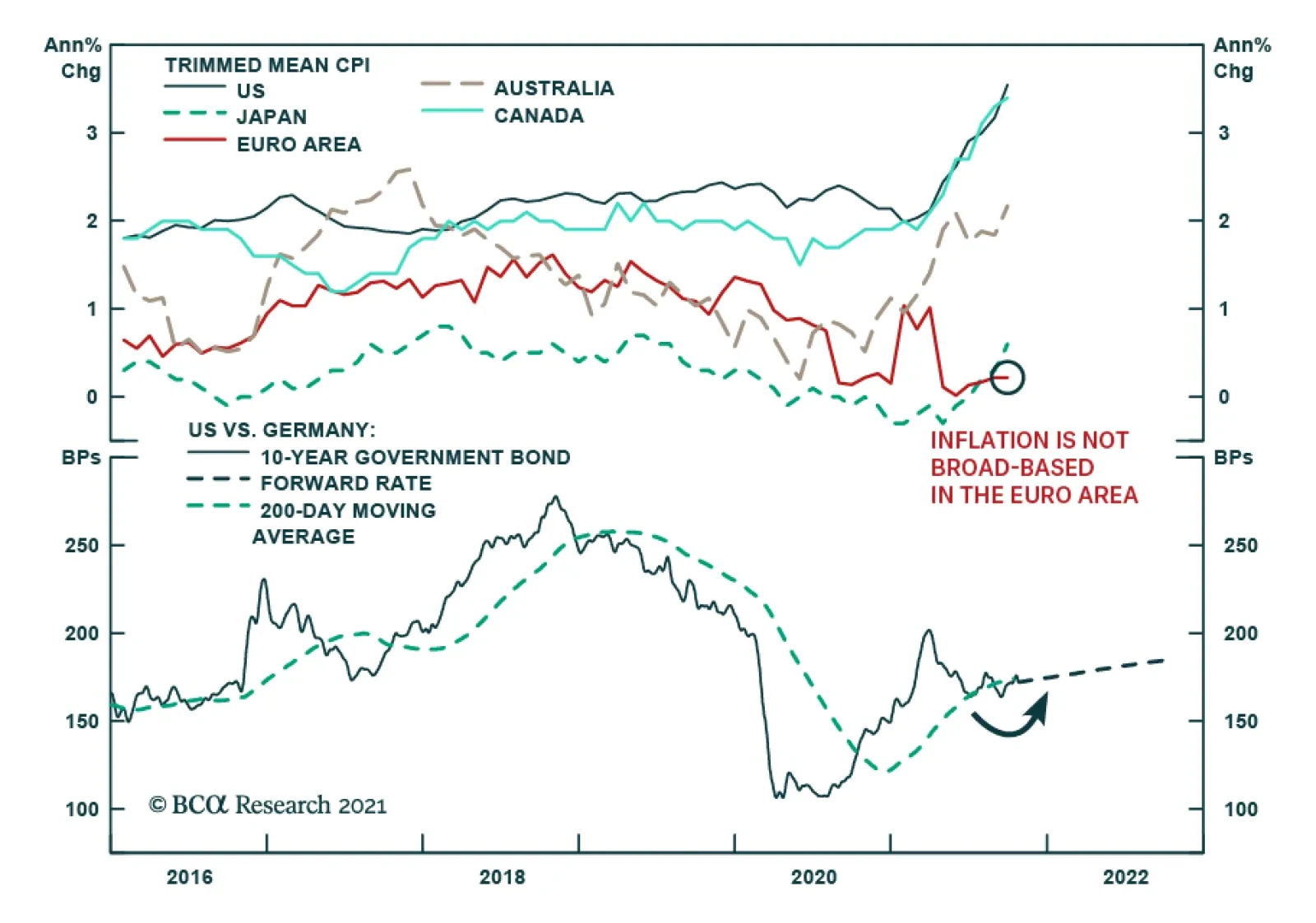
The ECB stuck to a dovish tone on Thursday and pushed back slightly against expectations that inflationary pressures will force the central bank to tighten next year. Instead, the central bank announced it would continue its Pandemic Emergency Purchase…
In lieu of next week’s report, I will be presenting the quarterly Counterpoint webcast titled ‘Where Is The Groupthink Wrong? (Part 2)’. I do hope you can join. Highlights If a continued surge in the oil price – or other commodity or goods prices – started driving up the 30-year T-bond yield, the markets and the economy would feel the pain. We reiterate that the pain point at which the Fed would be forced to volte-face is only around 30 bps away on the 30-year T-bond, equal to a yield of around 2.4-2.5 percent. That would be a great buying opportunity for bonds. Given the proximity of this pain point, it is too late to short bonds, or for equity investors to rotate into value and cyclical equity sectors. That tactical opportunity has almost played out. On a 6-month and longer horizon, equity investors should prefer long-duration defensive sectors such as healthcare. Chinese long-duration bond yields are on a structural downtrend. Fractal analysis: The Korean won is oversold. Feature Many people have noticed the suspicious proximity of oil price surges to subsequent economic downturns – most recently, the 1999-2000 trebling of crude and the subsequent 2000-01 downturn, and the 2007-2008 trebling of crude and the subsequent 2008-09 global recession. Begging the question, should we be concerned about the trebling of the crude oil price since March 2020? Of course, we know that the root cause of both the 2000-01 downturn and the 2008-09 recession was not the oil price surge that preceded them. As their names make crystal clear, the 2001-01 downturn was the dot com bust and the 2008-09 recession was the global financial crisis. And yet, and yet… while the oil price surge was not the culprit, it was certainly the accessory to both murders, by driving up the bond yield and tipping an already fragile market and economy over the brink. Today, could oil become the accessory to another murder? (Chart I-1) Chart I-1AOil Was The Accessory To The Murder In 2008...
Oil Was The Accessory To The Murder In 2008...
Oil Was The Accessory To The Murder In 2008...
Chart I-1B...Could It Become The Accessory To Another Murder?
...Could It Become The Accessory To Another Murder?
...Could It Become The Accessory To Another Murder?
Oil Is The Accessory To Many Murders Turn the clock back to the 1970s, and it might seem more straightforward that the recession of 1974 was the direct result of the oil shock that preceded it. Yet even in this case, we can argue that oil was the accessory, rather than the true culprit of that murder. It is correct that the specific timing, magnitude, and nature of OPEC supply cutbacks were closely related to geopolitical events – especially the US support for Israel in the Arab-Israeli war of October 1973. Yet as neat and popular as this explanation is, it ignores a bigger economic story: the collapse in August 1971 of the Bretton Woods ‘pseudo gold standard’, which severed the fixed link between the US dollar and quantities of commodities. To maintain the real value of oil, the OPEC countries were raising the price of crude oil well before October 1973. Meaning that while geopolitical events may have influenced the precise timing and magnitude of price hikes, OPEC countries were just ‘staying even’ with the collapsing real value of the US dollar, in which oil was priced. Seen in this light, the true culprit of the recession was the collapse of the Bretton Woods system, and the oil price surge through 1973-74 was just the accessory to the murder (Chart I-2). Chart I-2In 1973-74, OPEC Was Just 'Staying Even' With A Collapsing Real Value Of The Dollar
In 1973-74, OPEC Was Just 'Staying Even' With A Collapsing Real Value Of The Dollar
In 1973-74, OPEC Was Just 'Staying Even' With A Collapsing Real Value Of The Dollar
A quarter of a century later in 1999, the oil price again trebled within a short time span – and by the turn of the millennium, the ensuing inflationary fears had pushed up the 10-year T-bond yield from 4.5 percent to almost 7 percent (Chart I-3). With stocks already looking expensive versus bonds, it was this increase in the bond yield – rather than a decline in the equity earnings yield – that inflated the equity bubble to its bursting point in early 2000 (Chart I-4). Chart I-3In 1999, As Oil Surged, So Did The Bond Yield...
In 1999, As Oil Surged, So Did The Bond Yield...
In 1999, As Oil Surged, So Did The Bond Yield...
Chart I-4...Making Expensive Equities Even More Expensive
...Making Expensive Equities Even More Expensive
...Making Expensive Equities Even More Expensive
To repeat, for the broader equity market, the last stage of the bubble was not so much that stocks became more expensive in absolute terms (the earnings yield was just moving sideways). Rather, stock valuations worsened markedly relative to sharply higher bond yields. Seen in this light, the oil price surge through 1999 was once again the accessory to the murder. Eight years later in 2007-08, the oil price once again trebled with Brent crude reaching an all-time high of $146 per barrel in July 2008. Again, the inflationary fears forced the 10-year T-bond yield to increase, from 3.25 percent to 4.25 percent during the early summer of 2008 (Chart I-5) – even though the Federal Reserve was slashing the Fed funds rate in the face of an escalating financial crisis (Chart I-6). Chart I-5In 2008, As Oil Surged, So Did The Bond Yield...
In 2008, As Oil Surged, So Did The Bond Yield...
In 2008, As Oil Surged, So Did The Bond Yield...
Chart I-6...Even Though The Fed Was Slashing Rates In The Face Of A Financial Crisis
...Even Though The Fed Was Slashing Rates In The Face Of A Financial Crisis
...Even Though The Fed Was Slashing Rates In The Face Of A Financial Crisis
Suffice to say, driving up bond yields in the summer of 2008 – in the face of the Fed’s aggressive rate cuts and a global financial system teetering on the brink – was not the smartest thing that the bond market could do. On the other hand, neither could it override its Pavlovian fears of the oil price trebling. Seen in this light, the oil price surge through 2007-08 was once again the accessory to the murder. Inflationary Fears May Once Again Lead To Murder Fast forward to today, and the danger of the recent trebling of the oil price comes not from the oil price per se. Instead, just as in 2000 and 2008, the danger comes from its potential to drive up bond yields, which can tip more systemically important economic and financial fragilities over the brink. One such fragility is the extreme sensitivity of highly-valued growth stocks to the 30-year T-bond yield, as explained in The Fed’s ‘Pain Point’ Is Only 30 Basis Points Away. On this note, one encouragement is that while shorter duration yields have risen sharply through October, the much more important 30-year T-bond yield has just gone sideways. A much bigger systemic fragility lies in the $300 trillion global real estate market, as explained in The Real Risk Is Real Estate (Part 2). Specifically, the global real estate market has undergone an unprecedented ten-year boom in which prices have doubled in every corner of the world. Over the same period, rents have risen by just 30 percent, which has depressed the global rental yield to an all-time low of 2.5 percent. Structurally depressed rental yields are justified by structurally depressed 30-year bond yields. Therefore, any sustained rise in 30-year bond yields risks undermining the foundations of the $300 trillion global real estate market (Chart I-7). Chart I-7Structurally Depressed Rental Yields Are Justified By Structurally Depressed 30-Year Bond Yields
Structurally Depressed Rental Yields Are Justified By Structurally Depressed 30-Year Bond Yields
Structurally Depressed Rental Yields Are Justified By Structurally Depressed 30-Year Bond Yields
Nowhere is this truer than in China, where prime real estate yields in the major cities are at a paltry 1 percent. In this context, the recent woes of real estate developer Evergrande are just the ‘canary in the coalmine’ warning of an extremely fragile Chinese real estate sector. This will put downward pressure on China’s long-duration bond yields. As my colleague, BCA China strategist, Jing Sima, points out, “Chinese long-duration bond yields are on a structural downtrend…yields are likely to move structurally to a lower bound.” But it is not just in China. Real estate is at record high valuations everywhere and contingent on no major rise in long-duration bond yields. In the US, there is a tight relationship between the (inverted) 30-year bond yield and mortgage applications for home purchase (Chart I-8), and a tight relationship between mortgage applications for home purchase and building permits (Chart I-9). Thereby, higher bond yields threaten not only real estate prices. They also threaten the act of building itself, an important swing factor in economic activity. Chart I-8The Bond Yield Drives Mortgage Applications...
The Bond Yield Drives Mortgage Applications...
The Bond Yield Drives Mortgage Applications...
Chart I-9...And Mortgage Applications Drive Building Permits
...And Mortgage Applications Drive Building Permits
...And Mortgage Applications Drive Building Permits
To repeat, focus on the 30-year T-bond yield – as this is the most significant driver for both growth stock valuations, and for real estate valuations and activity. To repeat also, the 30-year T-bond yield has been generally well-behaved over the past few months. But if a continued surge in the oil price – or other commodity or goods prices – started driving up the 30-year T-bond yield, the markets and the economy would feel pain. And at some point, this pain would force the Fed to volte-face. We reiterate that this pain point is only around 30 bps away, equal to a yield on 30-year T-bond of around 2.4-2.5 percent – a level that would be a great buying opportunity for bonds. Given the proximity of this pain point, it is too late to short bonds or for equity investors to rotate into value and cyclical equity sectors. That tactical opportunity has almost played out. On a 6-month and longer horizon, equity investors should prefer long-duration defensive sectors such as healthcare. The Korean Won Is Oversold Finally, in this week’s fractal analysis, we note that the Korean won is oversold – specifically versus the Chinese yuan on the 130-day fractal structure of that cross (Chart I-10). Chart I-10The Korean Won Is Oversold
The Korean Won Is Oversold
The Korean Won Is Oversold
Given that previous instances of such fragility have reliably indicated trend changes, this week’s recommended trade is long KRW/CNY, setting the profit target and symmetrical stop-loss at 2 percent. Dhaval Joshi Chief Strategist dhaval@bcaresearch.com Fractal Trading System Fractal Trades 6-Month Recommendations Structural Recommendations Closed Fractal Trades Indicators To Watch - Bond Yields Chart II-1Indicators To Watch - Bond Yields ##br##- Euro Area
Indicators To Watch - Bond Yields - Euro Area
Indicators To Watch - Bond Yields - Euro Area
Chart II-2Indicators To Watch - Bond Yields ##br##- Europe Ex Euro Area
Indicators To Watch - Bond Yields - Europe Ex Euro Area
Indicators To Watch - Bond Yields - Europe Ex Euro Area
Chart II-3Indicators To Watch - Bond Yields ##br##- Asia
Indicators To Watch - Bond Yields - Asia
Indicators To Watch - Bond Yields - Asia
Chart II-4Indicators To Watch - Bond Yields ##br##- Other Developed
Indicators To Watch - Bond Yields - Other Developed
Indicators To Watch - Bond Yields - Other Developed
Indicators To Watch - Interest Rate Expectations Chart II-5Indicators To Watch - Interest Rate Expectations
Indicators To Watch - Interest Rate Expectations
Indicators To Watch - Interest Rate Expectations
Chart II-6Indicators To Watch - Interest Rate Expectations
Indicators To Watch - Interest Rate Expectations
Indicators To Watch - Interest Rate Expectations
Chart II-7Indicators To Watch - Interest Rate Expectations
Indicators To Watch - Interest Rate Expectations
Indicators To Watch - Interest Rate Expectations
Chart II-8Indicators To Watch - Interest Rate Expectations
Indicators To Watch - Interest Rate Expectations
Indicators To Watch - Interest Rate Expectations
Highlights Bank of Canada: Rising inflation, high capacity utilization, and monetary policy constraints will force the Bank of Canada to taper further and move up the timing of its first rate hike to H1/2022. Stay underweight Canadian government bonds in global government bond portfolios. Also, upgrade Canadian real return bonds to neutral within the underweight allocation to better reflect the mixed signals from our suite of Canadian inflation breakeven indicators. Bank of England: Markets have aggressively shifted UK interest rate expectations, with a rate hike now expected before year-end. We expect that outcome to occur, but the vote will be close. Stay underweight UK Gilts in global bond portfolios. Maintain a curve steepening bias that would win if a hike is delayed to 2022 or, counterintuitively, even if the Bank of England does indeed hike in November or December - longer-term UK yields are still too low relative to the likely peak in Bank Rate. Feature Chart of the WeekAn Inflation Shock For Bond Yields
An Inflation Shock For Bond Yields
An Inflation Shock For Bond Yields
Steadily climbing inflation expectations, fueled by rising energy prices and persistent supply-chain disruptions, remain a thorn in the side of global bond markets. 10-year US TIPS breakevens have climbed to a 15-year high of 2.7%, while breakevens on 10-year German inflation-linked bonds are at a 9-year high of 2%. Rising inflation expectations are keeping upward pressure on nominal bond yields in the major developed economies, as markets start to slowly reprice the pace and timing of future interest rate increases (Chart of the Week). Market expectations on interest rates, however, can adjust much more quickly when policymakers change their tune. We have already seen that recently in smaller countries like Norway and New Zealand. Rate hikes delivered by the Norges Bank and Reserve Bank of New Zealand over the past month - which were telegraphed well in advance by the central banks – were a negative shock that pushed up bond yields in those countries. The next central bank “liftoff” within the developed economies is expected to occur in the UK and Canada, according to pricing in overnight index swap (OIS) curves (Table 1). In this report, we consider the outlook for monetary policy and government bond yields in both countries, which represent two of our highest conviction underweight recommendations. Table 1Markets Are Pulling Forward Rate Hikes
UK & Canada: Next Up For A Rate Hike?
UK & Canada: Next Up For A Rate Hike?
Canada: Watch For A Bond Bearish Policy Shift In Canada, given the economic backdrop and policy constraints, we believe the Bank of Canada (BoC) will have to deliver on the hawkish market-implied path for interest rates, which calls for an initial rate hike to occur in Q2/2022 – much sooner than the central bank’s current messaging on liftoff. Chart 2ACanadian Inflation Not Looking So "Transitory" Anymore
Canadian Inflation Not Looking So 'Transitory' Anymore
Canadian Inflation Not Looking So 'Transitory' Anymore
First on the BoC’s mind is inflation. Canadian CPI inflation came in at 4.4% year-over-year in September, blowing through analyst expectations and hitting an 18-year high (Charts 2A and 2B). The CPI-trim, a measure of core inflation which strips out extreme price movements, hit 3.4% year-over-year, the highest reading since 1991. All eight major components of the CPI rose on a yearly basis. On an annualized monthly basis, the energy-driven Transportation aggregate declined and less volatile components like Shelter (+1.1%) and Clothing (+0.7%) led the pack in terms of their contribution to the overall figure.
Chart 2
The data show that inflationary pressures are clearly broadening out in the Great White North, no longer constrained to “transitory” sectors. The effect of this inflationary pressure is also starting to make its mark on consumer and business sentiment. Chart 3Rising Inflation Expectations Are Hurting Canadian Consumer Sentiment
Rising Inflation Expectations Are Hurting Canadian Consumer Sentiment
Rising Inflation Expectations Are Hurting Canadian Consumer Sentiment
According to the BoC Survey of Consumer Expectations, the 1-year-ahead forecast of inflation reached a series high of 3.7% in Q3/2021 (Chart 3). While longer-term inflation expectations are more subdued, that doesn’t mean that inflation is not a worry for the Canadian consumer. With inflation expected to run much higher than expected wage growth (+2%) over the next year, consumers expect a decline in their real purchasing power. Correspondingly, consumer confidence is taking a hit—the Bloomberg/Nanos consumer sentiment index has fallen 7.3 points since the July peak. Canadian businesses are much more upbeat. The overall summary indicator from the BoC’s Business Outlook Survey for Q3/2021 climbed to the highest level in the 18-year history of the series (Chart 4). Firms reported continued expectations of strong demand, but with capacity constraints starting to weigh on sales - a quarter of firms surveyed reporting that a lack of capacity and skills will have a negative impact on sales over the next twelve months. In response, more companies are planning on increasing capital expenditure and hiring over the next year (Chart 4, middle panel). More than half of firms surveyed by the BoC indicated that investment spending will be higher over the next two years compared to typical pre-pandemic levels. Chart 4Canadian Businesses Are Brushing Up Against Capacity Constraints
Canadian Businesses Are Brushing Up Against Capacity Constraints
Canadian Businesses Are Brushing Up Against Capacity Constraints
However, hiring plans will likely face difficulty, given the large share of firms (64%), reporting more intense labor shortages (Chart 4, bottom panel). A net 50% of respondents now expect wage growth to accelerate over the coming year, driven by a need to attract and retain workers amid strong labor demand. With regards to inflation, the BoC Business Outlook Survey measures the share of respondents that expect inflation over the next two years to fall within four different ranges—below 1%, between 1% and 2%, between 2% and 3%, and above 3% (Chart 5). We can “back out” a point estimate of expected inflation for Canadian firms by assigning a specific level to each of these ranges – 0.5, 1.5%, 2.5%, and 3.5%, respectively – and using the shares of respondents to calculate a weighted average expected inflation rate for the next two years.1 Based on this estimate, Canadian business inflation expectations have bounced rapidly since the 2020 trough and are now at all-time highs. The BoC has already begun to respond to the normalization of the economy and rising inflationary pressures indicated by its business survey by tapering the pace of its bond buying program. The Bank is now targeting weekly bond purchases of C$2bn, down from C$5bn at the start of the program and with another reduction expected at this week’s policy meeting (Chart 6). The size of the balance sheet has also fallen in absolute terms, driven by the Bank drawing down its holdings of treasury bills to virtually zero while also ending pandemic emergency liquidity programs. Chart 5Putting A Number To Canadian Business Inflation Expectations
Putting a Number To Canadian Business Inflation Expectations
Putting a Number To Canadian Business Inflation Expectations
Chart 6The BoC Is Moving Towards Normalizing Policy
The BoC Is Moving Towards Normalizing Policy
The BoC Is Moving Towards Normalizing Policy
The BoC now owns a massive 36.5% of Canadian government bonds outstanding – a share acquired in a very short time for this pandemic-era stimulus program. Thus, tapering now is not only necessary from a forward guidance perspective, signaling an eventual shift to less accommodative monetary policy and rate hikes, but also to ensure liquidity in the Canadian sovereign bond market. The remaining BoC tapering will be fairly quick, setting up the more important shift to the timing of the first rate increase. The Canadian OIS curve is currently pricing in BoC liftoff in April 2022, ahead of the BoC’s current guidance of a likely rate hike in the second half of the year (Chart 7). Given the developments on the inflation front, we are inclined to side with the market’s assessment of an earlier hike.
Chart 7
In the longer run, rates might even be able to rise further than discounted in swap curves. The real policy rate, calculated as the policy rate minus the BoC’s CPI-trim measure, is negative and a significant distance from the New York Fed’s Q2/2020 estimate of the natural real rate of interest (R-star) for Canada of 1.4%. Admittedly, those estimates have not been updated by the New York Fed for over a year, given the uncertainties over trend growth and output gap measurement created by the pandemic shock. The BoC’s own estimates for the neutral nominal policy interest rate - last updated in April 2021 and therefore inclusive of any structural impacts of the pandemic on potential growth - range from 1.75% to 2.75%.2 The OIS forward curve expects the BoC to only lift rates to 2% in the next hiking cycle, barely in the lower end of the BoC’s neutral range of estimates. After subtracting the mid-point of the BoC’s 1-3% inflation target, presumably a level of inflation consistent with a neutral policy rate, the BoC’s implied real policy rate range is -0.25% to +0.75%. The current level of the real policy rate is near the bottom of that range. Thus, real rates, and the real bond yields that track them over time, have room to rise if the BoC begins to hike rates at a faster pace, and to a higher level, than the market expects. We see this as a likely outcome given the extent of the Canadian inflation overshoot and the robust optimism evident in Canadian business sentiment, thus justifying our current negative view on Canadian government bonds. To think about this mix of rising inflation expectations and increased BoC hawkishness down the road, and its implication for the Canadian inflation-linked bond market, we turn to our Canadian comprehensive breakeven indicator (Chart 8). This indicator combines three measures, on an equal-weighted and standardized basis, to determine the upside potential for 10-year inflation breakevens: the distance from fair value based on our models, the spread between headline inflation and the midpoint of the BoC’s 1-3% target inflation, and the gap between market-based and survey-based measures of inflation expectations. Going forward, we will be using the Canadian Business Outlook Survey measure of inflation expectations, introduced in Chart 5, for this indicator. Chart 8Upgrade Canadian Inflation-Linked Bonds To Neutral
Upgrade Canadian Inflation-Linked Bonds To Neutral
Upgrade Canadian Inflation-Linked Bonds To Neutral
Two out of three measures point towards Canadian breakevens having further upside. Firstly, they are cheap under our fair value model, where the rise in breakevens has lagged the yearly growth in oil prices. Secondly, breakevens are a long distance away from the survey-based business inflation expectations. However, both forces are more than counteracted with Canadian headline inflation nearly two standard deviations from the BoC’s target, which indicates that the central bank must step in to address high realized inflation. Given these diverging signals on the upside potential for breakevens, we see a neutral allocation to Canadian linkers as more appropriate for the time being Bottom Line: Rising inflation, high capacity utilization, and monetary policy constraints will force the Bank of Canada to taper further and move up the timing of its first rate hike to H1/2022. Stay underweight Canadian government bonds in global government bond portfolios. Also, upgrade Canadian real return bonds to neutral within the underweight allocation to better reflect the mixed signals from our suite of Canadian inflation breakeven indicators. Will The BoE Actually Hike By December? Chart 9UK Gilts Have Been Hammered By BoE Hawkishness
UK Gilts Have Been Hammered By BoE Hawkishness
UK Gilts Have Been Hammered By BoE Hawkishness
We downgraded our recommended stance on UK government bonds to underweight on August 11 and, since then, Gilts have severely underperformed their developed market peers (Chart 9).3 We had anticipated that the Bank of England (BoE) would be forced to shift their policy guidance in a less dovish direction because of rising UK inflation expectations. Yet we have been surprised by how quickly the BoE has shifted to an open discussion about the potential for imminent interest rate hikes. The BoE’s new chief economist, Huw Pill, commented in the Financial Times last week that UK inflation will likely hit, or even exceed, 5% by early next year, and that the November 4 Monetary Policy Committee (MPC) was “live” with regards to a potential rate hike.4 This followed BoE Governor Andrew Bailey’s comment that the Bank “will have to act” to contain rising inflation expectations. Mixed signals on economic momentum are not making the BoE’s decisions any easier. The preliminary October Markit PMIs ticked higher for both manufacturing and services, but remain below the peak seen last May. At the same time, UK consumer confidence has fallen since August, thanks in part to rapidly rising inflation that has reduced the perceived real buying power of UK consumers. High Inflation Might Last Longer Chart 10Why The BoE Is More Worried About Inflation
Why The BoE Is More Worried About Inflation
Why The BoE Is More Worried About Inflation
The BoE’s last set of economic forecasts, published in August, called for headline inflation to temporarily climb to 4% by year-end, before gradually returning to the central bank’s 2% target level in 2022. Yet the BoE’s newfound nervousness over inflation is well-founded, for a number of reasons (Chart 10): The domestic economic recovery has led to a robust labor market, with job vacancies relative to unemployment fully recovering to pre-COVID levels. The 3-month moving average of wage growth remains elevated at 6.9%, although the BoE believes some of that increase could be due to compositional issues related to the pandemic. The BoE is projecting that the UK output gap is narrowing rapidly and would be fully closed in the second half of 2022. This suggests growing underlying inflation pressures were already in place before the latest boost to inflation from global supply-chain disruptions. UK energy costs are soaring, particularly for natural gas which remains the main source for UK electricity production. UK natural gas inventories are the lowest within Europe, yet the supply response from major providers has been slow to develop – most notably, Russia, which is seeking regulatory approval to begin shipping gas through the Nord Stream 2 pipeline. While natural gas prices have stopped rising, for now, inadequate supplies during an expected cold UK winter could keep the upward pressure on UK inflation from energy. UK house price inflation remains well supported, even with the recent expiration of the stamp duty reductions initiated as a form of pandemic economic stimulus. According to the Royal Institution of Chartered Surveyors (RICS), the ratio of UK home sales to inventories is still quite elevated (bottom panel). Given a still-favorable demand/supply balance, and low borrowing costs, UK house price inflation will likely not cool as much as the BoE would prefer to see. Stay Defensive On UK Rates Exposure The combination of rising UK inflation and increasingly hawkish BoE comments has resulted in a rapid upward repricing of UK interest rate expectations over the past few months (Chart 11). Markets now expect the BoE to raise Bank Rate to 1%, from the current 0.1%, by late 2022. More interesting is what is discounted after that. The OIS curve is pricing in no additional rate increases in 2023 and a rate cut in 2024. In other words, the market now believes that the BoE is about to embark on a policy mistake with rate hikes that will need to be quickly reversed. Chart 11Markets Are Pricing In A BoE Policy Error
Markets Are Pricing In A BoE Policy Error
Markets Are Pricing In A BoE Policy Error
We think there is a risk of a more aggressive-than-expected BoE tightening cycle. The surge in UK inflation expectations is not trivial nor “transitory”. Looking at survey-based measures of expectations like the YouGov/Citigroup survey, or market-based measures like CPI swaps, inflation is expected to reach at least 4% both in the short-term and over the longer-run (Chart 12). If Bank Rate were to peak at a mere 1%, as indicated in the OIS curve, that would still leave UK real interest rates in deeply negative territory even if there was a pullback in inflation expectations. We expect the votes on whether to hike rates at either the November or December MPC meetings to be close. There will be a new Monetary Policy Report published for the November 4 meeting, which will include a new set of economic and inflation forecasts that will give the BoE a platform to signal, or deliver, a rate hike. In the end, we think that the senior leadership on the MPC has already revealed too much of its hawkish hand, and a rate hike will occur by year-end. Looking beyond liftoff into 2022, we still see markets pricing in too shallow a path for Bank Rate over the next couple of years, leaving us comfortable to maintain our underweight stance on UK Gilts. With regards to positioning along the Gilt yield curve, however, we see the potential for more curve steepening even if after the BoE begins to lift rates. The implied path for UK real interest rates, taken as the gap between the UK OIS forwards and CPI swap forwards, shows that markets expect the BoE to keep policy rates well below expected inflation for well into the next decade (Chart 13). At the same time, the wide current gap between the actual real policy rate (Bank Rate minus headline inflation) and the New York Fed’s most recent estimate of the UK neutral real rate (r-star) suggests that the Gilt curve is far too flat (bottom panel). Chart 12The BoE Cannot Ignore This
The BoE Cannot Ignore This
The BoE Cannot Ignore This
Perversely, this creates a situation where the UK curve steepeners can be an attractive near-term hedge to an underweight stance on UK Gilts.
Chart 13
If the BoE does not deliver on the strongly hinted rate hike in November or December, the Gilt curve can steepen as shorter-maturity Gilt yields fall but longer-dated yields remain boosted by high inflation expectations.However, if the BoE does hike and more tightening is signaled, longer-term yields will likely rise more than shorter-term yields as the market prices in a higher future trajectory for policy rates. Bottom Line: Stay underweight UK Gilts in global bond portfolios, but maintain a curve steepening bias that would win if a hike is delayed to 2022 or, counterintuitively, even if the Bank of England does indeed hike in November or December - longer-term UK yields are still too low relative to the likely peak in Bank Rate. Robert Robis, CFA Chief Fixed Income Strategist rrobis@bcaresearch.com Shakti Sharma Senior Analyst ShaktiS@bcaresearch.com Ray Park, CFA Research Analyst ray@bcaresearch.com Footnotes 1 For this calculation, we exclude firms that did not provide a response to the BoC Business Outlook Survey. 2 The Bank of Canada’s Staff Analytical Note on neutral rate estimation can be found here: https://www.bankofcanada.ca/2021/04/staff-analytical-note-2021-6/ 3 Please see BCA Research Global Fixed Income Strategy and European Investment Strategy Report, "The UK Leads The Way", dated August 11, 2021, available at gfis.bcaresearch.com. 4https://www.ft.com/content/bce7b1c5-0272-480f-8630-85c477e7d69 Recommendations Duration Regional Allocation Spread Product Tactical Trades GFIS Model Bond Portfolio Recommended Positioning Active Duration Contribution: GFIS Recommended Portfolio Vs. Custom Performance Benchmark
Image
The GFIS Recommended Portfolio Vs. The Custom Benchmark Index
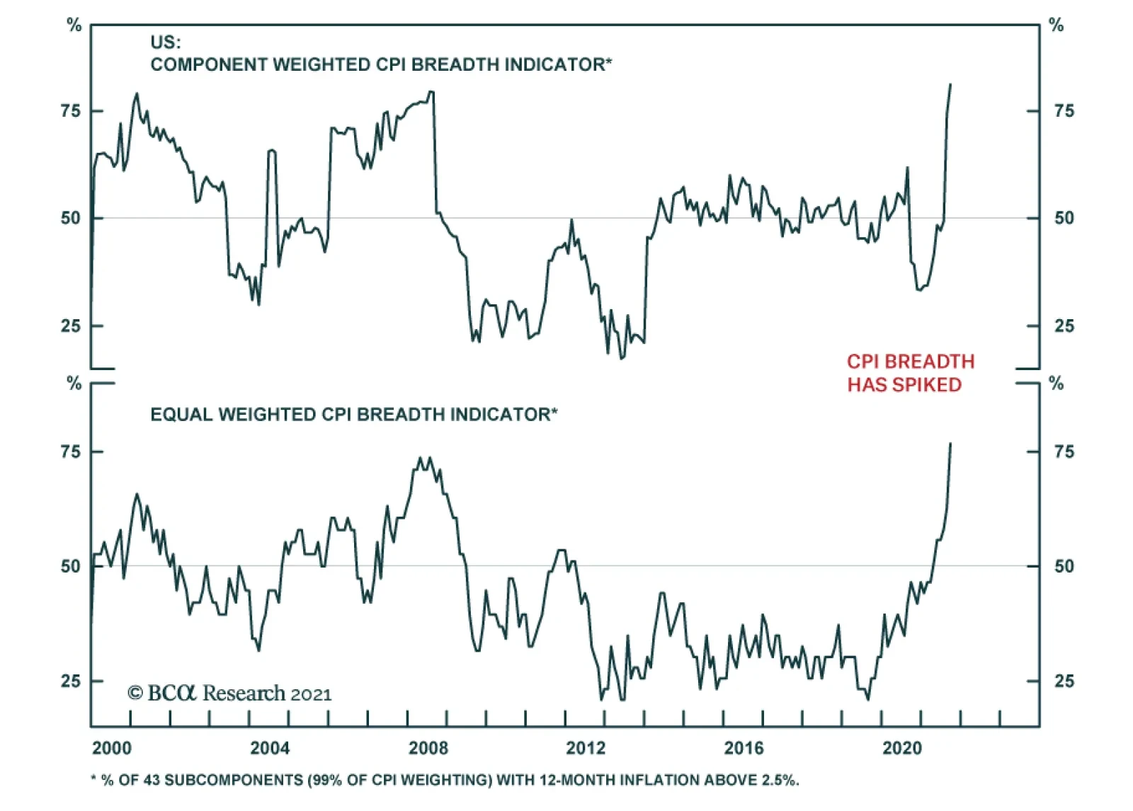
BCA Research’s US Bond Strategy service still views December 2022 as the most likely liftoff date. The team is monitoring five factors to see if their forecast needs to be revised. 1. The Unemployment Rate: The Fed has officially pledged through its…
Highlights Treasuries: Bond investors should maintain below-benchmark portfolio duration and continue to short the 5-year note versus a duration-matched 2/10 barbell. For those investors who want to take an outright long position in US Treasuries, the 2-year Treasury note looks like the best security to choose. Municipal Bonds: This week we upgrade our recommended allocation to municipal bonds from overweight (4 out of 5) to maximum overweight (5 out of 5). Investors who can take advantage of the muni tax exemption should favor municipal bonds over Treasuries and over corporate bonds with the same credit rating and duration. In particular, we recommend that investors focus on long-maturity municipal bonds. Fed: Given our view that inflation will fall during the next 12 months, we still view December 2022 as the most likely liftoff date. However, we will continue to monitor our Five Factors For Fed Liftoff to see if our forecast needs to be revised. Feature
Chart 1
Our call for a bear-flattening of the US Treasury curve has worked out well during the past few weeks. Long-maturity Treasury yields have almost risen back to their March highs, and the short-end of the curve has also participated in the recent bout of selling (Chart 1). In light of these moves, it makes sense to re-evaluate our nominal Treasury curve positioning. First, we consider whether, at current yield levels, it still makes sense to run below-benchmark portfolio duration. Second, we consider whether our current recommended yield curve trade (short the 5-year note versus a duration-matched 2/10 barbell) remains the best way to extract returns from changes in the yield curve’s shape. The next section of this report answers these questions by looking at forecasted returns for different Treasury maturities across a variety of plausible economic and monetary policy scenarios. Later in the report we look at municipal bond valuation and provide a quick update on last week’s Fedspeak. Forecasting Treasury Returns
Chart 2
Three sources of Treasury bond return need to be considered when creating a forecast. Income Return: The return earned from the bond’s coupon payments. Rolldown Return: The return that a bond accrues simply by moving closer to its maturity date in an unchanged yield curve environment. Capital Gains/Losses: The return earned by a bond due to changes in the level and slope of the yield curve. We like to combine the income and rolldown return into one measure called “carry”. The carry can be thought of as the return an investor will earn in a specific bond if the yield curve remains unchanged throughout the investment horizon. Though carry is not the be all and end all of bond returns, it can be illuminating to look at the yield curve in terms of carry instead of the typical yield-to-maturity. Chart 2 shows the usual par coupon yield curve alongside the 12-month carry for each Treasury security. At present, the steepness of the 3-7 year part of the curve means that bonds of those maturities benefit a lot from rolldown. In fact, we see that a 7-year Treasury note will earn more than a 10-year Treasury note during the next 12 months if the curve remains unchanged. After calculating carry, the next step is to calculate capital gains/losses for each bond. To do this, we create some possible scenarios for future changes in the fed funds rate and assume that the yield curve moves to fully price-in that funds rate path over the course of a 12-month investment horizon.1 Next, we calculate the capital gains/losses for each bond based on the new shape of the yield curve in each scenario. Tables 1A-1D show the results from four different scenarios where the Fed starts to lift rates in December 2022. We then assume that the Fed will lift rates at a pace of 75-100 bps per year and that the funds rate will level-off at a terminal rate of either 2.08% or 2.58%. The 2.08% terminal rate corresponds to the median estimate of the long-run neutral fed funds rate from the New York Fed’s Survey of Market Participants. The 2.58% terminal rate corresponds to the median forecast from the Fed’s Summary of Economic Projections.2
Chart
Chart
Chart
Chart
The scenario shown in Table 1B is the closest to our base case. In this scenario, some short-maturity bonds deliver positive returns, but returns are negative for the 5-year maturity and beyond. Also, the 5-year note delivers the worst total return of all the maturities we examine. Unsurprisingly, expected returns for the longer maturities drop significantly if we raise our terminal rate assumption to 2.58% (Tables 1C & 1D). Therefore, any call to short the 5-year note versus the long-end relies on an assumption that the market will trade as though the terminal rate is closer to 2% than to 2.5% during the next 12 months. This is in line with our expectation. Finally, we observe that slowing our pace assumption from 100 bps per year to 75 bps raises expected returns across the board, but the 5-year still performs worse than the other maturities (Table 1A). Due to our expectation that inflation will fall during the next 12 months, a December 2022 liftoff remains our base case.3 However, the market has recently moved to price-in an earlier start to rate hikes. As of last Friday’s close, the fed funds futures curve was priced for liftoff in September 2022 and for a total of 49 bps of tightening by the end of 2022 (Chart 3). Chart 3Market Priced For September 2022 Liftoff
Market Priced For September 2022 Liftoff
Market Priced For September 2022 Liftoff
Tables 2A-2D incorporate these recent market moves into our forecast by looking at the same scenarios as in Tables 1A-1D but assuming a September 2022 liftoff instead of December. The results are not all that different. Expected returns are worse across the board, but the 5-year still looks like the worst spot on the curve unless the market starts to price-in a higher terminal rate.
Chart
Chart
Chart
Chart
Investment Conclusions Most of the scenarios we examined had negative expected returns for most maturities. We therefore still think it makes sense to keep portfolio duration low. Further, in every scenario the best expected returns can be found in the shorter maturities. In fact, the 2-year Treasury note offers positive returns in every scenario we examined. An outright long position in the 2-year Treasury note looks like a decent trade for investors forced to hold bonds. As for the yield curve, our results suggest that we should continue with our current positioning: short the 5-year note versus a duration-matched 2/10 barbell. The 5-year note performs worst in every scenario that assumes a 2.08% terminal rate. While it’s conceivable that investors will eventually push their terminal rate expectations higher, we think this is more likely to occur once the Fed has already lifted rates a few times. Bottom Line: Bond investors should maintain below-benchmark portfolio duration and continue to short the 5-year note versus a duration-matched 2/10 barbell. For those investors who want to take an outright long position in US Treasuries, the 2-year Treasury note looks like the best security to choose. The Duration Drift In Municipal Bond Valuations One under-discussed aspect of municipal bonds is that the securities tend to pay higher coupons than other bonds. That is, the bonds will often be issued with coupon rates well above prevailing yields. Investors therefore must pay a higher price to purchase the bonds, but they receive more return in the form of coupon payments. This feature of municipal bonds has important implications for how we should value them. For example, while the average maturity of the Municipal Bond index is much higher than the average maturity of the Treasury index, the muni index’s higher coupon rate makes its average duration significantly lower (Chart 4). This means that any valuation measure that compares a municipal bond’s yield with the yield of another bond with the same maturity will be unflattering for the muni. Chart 4Munis Pay High Coupons, Have Low Durations
Munis Pay High Coupons, Have Low Durations
Munis Pay High Coupons, Have Low Durations
Further, since Treasury securities and corporate bonds tend to issue at par, the coupon rates paid by those securities have fallen alongside yields during the past few decades. Meanwhile, municipal bond coupons have been relatively stable (Chart 4, panel 3). This means that, over time, municipal bond durations have fallen significantly compared to the durations of other US bond sectors. A fair valuation measure would compare municipal bond yields with equivalent-duration Treasury yields and that is exactly what we’ve done. Chart 5A shows the spread between General Obligation (GO) muni bond yields and equivalent-duration Treasury yields. Chart 5B shows the spreads expressed as percentile ranks. For example, a percentile rank of 50% means that the spread is at its historical median, a percentile rank of 10% means the spread has only been tighter 10% of the time. Chart 5AGO Muni/Treasury Spreads I
GO Muni/Treasury Spreads I
GO Muni/Treasury Spreads I
Chart 5BGO Muni/Treasury Spreads II
GO Muni/Treasury Spreads II
GO Muni/Treasury Spreads II
The first thing that jumps out from our analysis is that municipal bonds are not that expensive. Shorter-maturity spreads were tighter than current levels as recently as 2019/20 and the long-maturity (17-year+) spread is positive, despite the muni tax exemption. In terms of percentile rank, spreads for all GO maturity buckets are only just below the historical median. However, spreads traded much tighter prior to the 2008 financial crisis and it may not be reasonable to expect munis to return to those tight mid-2000 valuations. Charts 6A and 6B repeat the exercise from Charts 5A and 5B but for Revenue bonds instead of GOs. The message is similar. Muni valuations are not that stretched compared to history, and investors can earn a before-tax spread pick-up in munis versus Treasuries if they focus on the long maturities. Chart 6ARevenue Muni/Treasury Spreads I
Revenue Muni/Treasury Spreads I
Revenue Muni/Treasury Spreads I
Chart 6BRevenue Muni/Treasury Spreads II
Revenue Muni/Treasury Spreads II
Revenue Muni/Treasury Spreads II
In fact, municipal bonds offer a before-tax yield advantage versus Treasuries for Revenue bonds beyond the 12-year maturity point and for GO bonds beyond the 17-year maturity point. Further, the breakeven tax rate for 12-17 year GOs versus Treasuries is a mere 1% and the breakeven tax rate for 8-12 year Revenue bonds is only 8%. Investors facing a tax rate above the breakeven rate will earn an after-tax yield pick-up in munis versus duration-matched Treasuries (Table 3). Table 3Muni/Treasury And Muni/Credit Yield Ratios
The Best & Worst Spots On The Yield Curve
The Best & Worst Spots On The Yield Curve
Of course, municipal bonds also carry a small credit risk premium relative to duration-matched Treasuries. The GO and Revenue indexes have average credit ratings of Aa1/Aa2 and Aa3/A1, respectively, compared to a Aaa rating for US Treasuries. But we can control for credit risk as well by comparing municipal bonds to the US Credit Index and matching both the duration and credit rating. Even this comparison looks favorable for municipal bonds. Once again, long-maturity munis offer a before-tax yield advantage compared to credit rating and duration-matched US Credit. Meanwhile, breakeven tax rates for other maturities are low enough to attract most investors. Bottom Line: This week we upgrade our recommended allocation to municipal bonds from overweight (4 out of 5) to maximum overweight (5 out of 5). Investors who can take advantage of the muni tax exemption should favor municipal bonds over Treasuries and over corporate bonds with the same credit rating and duration. In particular, we recommend that investors focus on long-maturity municipal bonds, noting that the relatively low duration of these bonds makes them attractive relative to other bonds with similar risk profiles. Five Fed Factors A lot of Fedspeak hit the tape last week. Of particular interest were an interview with Chair Jay Powell on Friday and speeches by Fed Governors Randy Quarles and Chris Waller on Wednesday and Tuesday. One takeaway from their remarks is that a tapering announcement at the next FOMC meeting is very likely, with net asset purchases expected to hit zero by the middle of next year. The market, however, seems to have already taken the taper announcement on board. The more interesting aspects of the speeches were the discussions about how the Fed will decide when to lift rates and how elevated inflation readings may or may not influence that decision. We’ve noted in prior reports that five factors will determine when the Fed finally decides to lift rates, and last week’s comments gave us confidence that we’re on the right track. We run through our Five Factors For Fed Liftoff below, with some additional comments on why each factor is important (Table 4). Table 4Five Factors For Fed Liftoff
The Best & Worst Spots On The Yield Curve
The Best & Worst Spots On The Yield Curve
1. The Unemployment Rate The Fed has officially pledged through its forward guidance not to lift rates until “maximum employment” is reached. While the exact definition of “maximum employment” can be debated, there is widespread agreement that it includes an unemployment rate below its current adjusted level of 4.9%.4 More specifically, we inferred from the September Summary of Economic Projections that most FOMC participants view an unemployment rate of around 3.8% as consistent with “maximum employment” (Chart 7).5 Chart 7Defining "Maximum Employment"
Defining "Maximum Employment"
Defining "Maximum Employment"
We expect that the Fed will refrain from lifting rates until the unemployment rate reaches 3.8%. 2. Labor Force Participation We explored the debate about labor force participation in a recent report.6 In short, there are some policymakers who believe that “maximum employment” cannot be achieved until the labor force participation rate has returned to pre-COVID levels. There are others, however, who think that an aging population and the recent uptick in retirements make such a return impossible. Randy Quarles, for example: I expect that as conditions normalize, [the labor force participation rate] will pick up, but it is unlikely to return to its February 2020 level. One reason is that a disproportionate number of older workers responded to the initial shock of the COVID event by retiring, which may be an area where participation and employment struggle to retrace lost ground.7 In his speech, Governor Waller also mentioned “2 million jobs” that will be lost forever due to retirements.8 While many policymakers cite increased retirements as a reason why the overall labor force participation rate will remain permanently lower, there is much broader agreement that a reasonable definition of “maximum employment” should include the prime-age (25-54) labor force participation rate being much closer to its February 2020 level (Chart 7, bottom panel). We think the Fed will refrain from lifting rates until the prime-age (25-54) labor force participation rate is close to its February 2020 level. 3. Wage Growth Accelerating wages are a tried-and-true signal that the labor market is running hot. While wage growth is rising quickly right now (Chart 8), there is a strong sense that this is due to pandemic-related labor supply shortages and that wage growth will moderate as pandemic fears (and labor shortages) wane. Chart 8Wage Growth
Wage Growth
Wage Growth
What will be more important is what wage growth looks like when the unemployment rate is close to the Fed’s target of 3.8%. At that point, accelerating wages will give the Fed a strong signal that a 3.8% unemployment rate really does constitute “maximum employment”. 4. Non-Transitory Inflation Of our five factors, this is admittedly the most difficult to pin down. However, Governor Quarles did a good job of explaining non-transitory inflation in last week’s speech: The fundamental dilemma that we face at the Fed now is this: Demand, augmented by unprecedented fiscal stimulus, has been outstripping a temporarily disrupted supply, leading to high inflation. But the fundamental productive capacity of our economy as it existed just before COVID – and, thus, the ability to satisfy that demand without inflation – remains largely as it was, constraining demand now, to bring it into line with a transiently interrupted supply, would be premature. Essentially, Quarles is saying that the Fed does not want to respond to a pandemic-related supply shock by lifting rates and curtailing aggregate demand. The Fed only wants to tighten policy if it sees an increase in broad-based inflationary pressures that will not be contained naturally by a return to more normal aggregate supply conditions. Accelerating wages would be one signal of such broad-based inflationary pressures, as would be measures of core inflation excluding those sectors that have been most impacted by the pandemic supply disruptions (Chart 9). Lastly, we could also look at indicators of inflation’s breadth across its different components, which have recently spiked to concerning levels (Chart 10). Chart 9Non-Covid Inflation
Non-Covid Inflation
Non-Covid Inflation
Chart 10CPI Breadth Has Spiked
CPI Breadth Has Spiked
CPI Breadth Has Spiked
5. Inflation Expectations Inflation expectations are also critical to monitor. While all Fed participants seem to agree that inflation will fall during the next year, there is also widespread agreement that if high inflation causes inflation expectations to rise to uncomfortably high levels, then the Fed will be forced to act. Chris Waller: A critical aspect of our new framework is to allow inflation to run above our 2 percent target (so that it averages 2 percent), but we should do this only if inflation expectations are consistent with our 2 percent target. If inflation expectations become unanchored, the credibility of our inflation target is at risk, and we likely would need to take action to re-anchor expectations at our 2 percent target. At present, inflation expectations remain well-anchored near levels consistent with the Fed’s target (Chart 11). In particular, we like to track the 5-year/5-year forward TIPS breakeven inflation rate targeting a range of 2.3% to 2.5% as consistent with the Fed’s target. Incidentally, Governor Waller also flagged TIPS breakeven inflation rates as his “preferred” measure of inflation expectations in last week’s speech. Chart 11Inflation Expectations Remain Well-Anchored
Inflation Expectations Remain Well-Anchored
Inflation Expectations Remain Well-Anchored
The Fed will move much more quickly toward rate hikes if the 5-year/5-year forward TIPS breakeven inflation rate moves above 2.5%. Bottom Line: Given our view that inflation will fall during the next 12 months, we still view December 2022 as the most likely liftoff date. However, we will continue to monitor our Five Factors For Fed Liftoff to see if our forecast needs to be revised. Ryan Swift US Bond Strategist rswift@bcaresearch.com Footnotes 1 All of our scenarios use a 12-month investment horizon and assume a term premium of 0 bps. 2 In both cases we assume that the fed funds rate trades 8 bps above its lower-bound, as is currently the case. 3 Please see US Bond Strategy Weekly Report, “Right Price, Wrong Reason”, dated October 19, 2021. 4 We adjust the unemployment rate for distortions in the number of people employed but absent from work. Please see US Bond Strategy Weekly Report, “Overreaction”, dated July 13, 2021 for further details. 5 Please see US Bond Strategy Weekly Report, “Damage Assessment”, dated September 28, 2021. 6 Please see US Bond Strategy Weekly Report, “2022 Will Be All About Inflation”, dated September 14, 2021. 7 https://www.federalreserve.gov/newsevents/speech/quarles20211020a.htm 8 https://www.federalreserve.gov/newsevents/speech/waller20211019a.htm Recommended Portfolio Specification Other Recommendations Treasury Index Returns Spread Product Returns
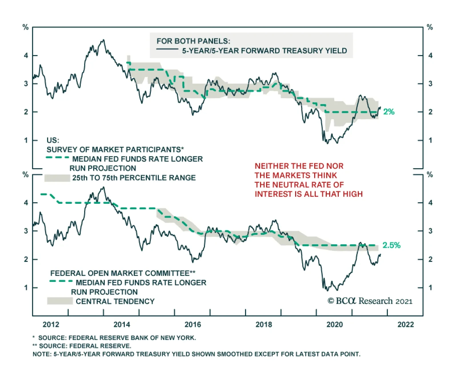
BCA Research’s Global Investment Strategy service argues that the next step for inflation is likely down, even though the longer-term trend is to the upside. The path to structurally higher inflation is likely to be a bumpy one. The team has generally…
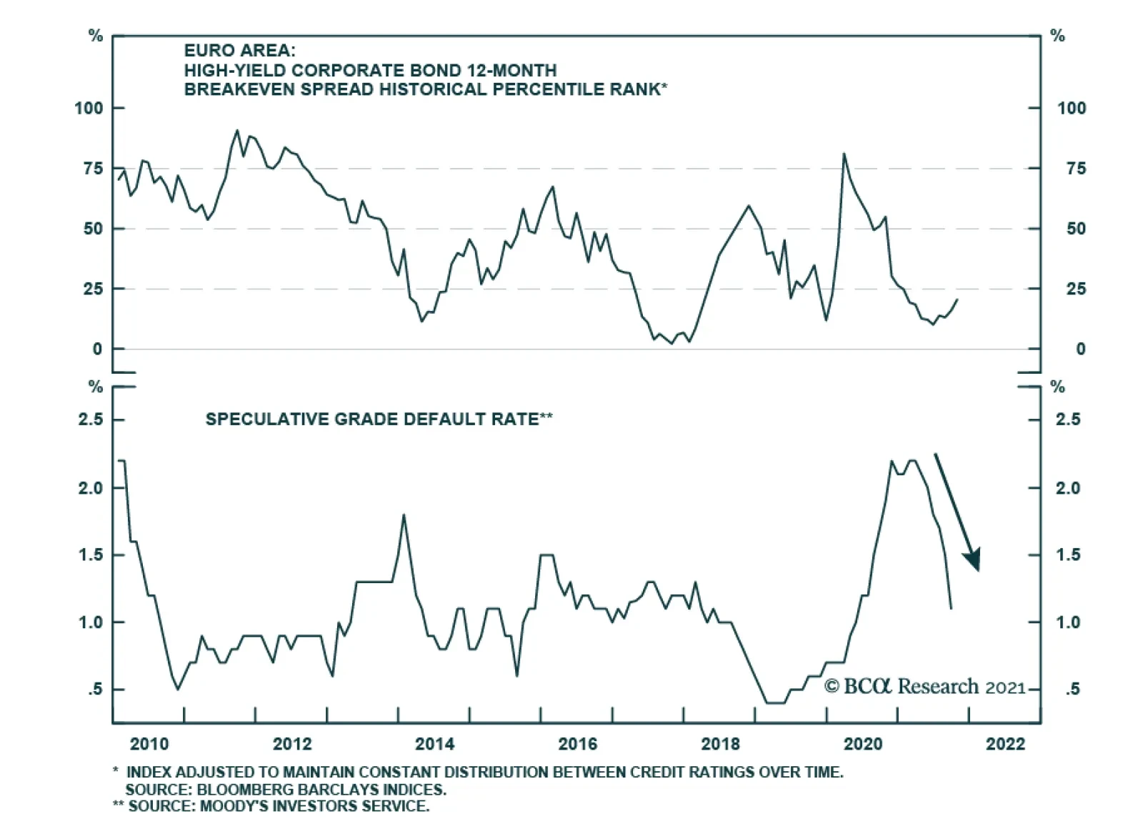
European high-yield corporate bond spreads have been widening over the past four weeks, likely because of inflation fears spurred by rising energy prices and input prices. Our 12-month breakeven spread metric, which measures the amount of spread widening…