Fixed Income
According to BCA Research’s China Investment Strategy service, the Chinese yield curve will likely flatten with long-term government bond yields dropping more than short-term rates in next six to nine months. The long-end of the yield curve will likely…

Dear Client, Owing to BCA’s Annual Investment Conference next week, there will be no report on Wednesday, October 20. We will return to our regular publication schedule on Wednesday, October 27. Please note that there will be a China Outlook panel discussion at 9 AM on Thursday, October 21. We hope you will join us for the event. Best regards, Jing Sima China Strategist Highlights In the next six to nine months, the long-end of the yield curve will likely drop as investors start to price in weaker-than-expected economic growth amid measured stimulus. China’s 10-year government bond yields are set to structurally shift to a lower bound as domestic demand decelerates along with the nation’s total population. Policymakers will favor lower borrowing costs to reduce stress due to high debt levels among companies, central and local governments, and households. National savings are not a constraint for a country to lower domestic bond yields. China will continue to open domestic financial markets to global investors. The country’s large foreign exchange reserves limit the risk to its internal markets from extreme volatility in foreign fund flows. Feature In the past two decades policy rates in advanced economies have been brought close to zero and bond yields have dropped to extremely low levels. The yields on China’s government bonds, however, have remained well above their peers in advanced economies and in neighboring countries (Chart 1). Chart 1China's Government Bond Yields Far Above Other Major Economies
China's Government Bond Yields Far Above Other Major Economies
China's Government Bond Yields Far Above Other Major Economies
Moreover, despite China’s growth slowing from double to mid-single digits, yields on China’s 10-year government bonds have remained at around 2006 levels. China’s working-age population continues to decline and its total population is estimated to start falling in the next five years. China’s demographic headwinds, combined with high leverage in the private sector at around 220% of GDP, will cap the upside in yields. In this report we share our views on China’s short rates and long-term bond yields on a cyclical basis (next six to nine months) and in the next five years. The Cyclical Outlook The yield curve will likely flatten with China’s long-term government bond yields dropping more than short-term rates in next six to nine months. This will occur in the expectation of a further growth slowdown in at least the next two quarters. Meanwhile, the downside is limited on the short-end of the curve, given it is more sensitive to the PBoC’s guidance and monetary authorities will ease policy only gradually. Stimulus in the next two quarters may also disappoint. Credit growth will bottom in Q4 this year, but the rebound will be modest. Stronger issuance in local government bonds in the next two quarters will be offset by sluggish bank loan impulse. Chinese policymakers will refrain from using stimulus for the property market as a counter-cyclical policy tool to revive the economy. Restrictions will be maintained on bank lending to the real estate sector including mortgages and these controls will limit the rebound in credit expansion. Furthermore, infrastructure investment will improve modestly in the next two quarters, but local governments remain under pressure to deleverage, which will limit their incentive and capacity to spend. Chart 2Stimulus In 2018/19 Was Very Measured
Stimulus In 2018/19 Was Very Measured
Stimulus In 2018/19 Was Very Measured
We maintain our view that the current policy backdrop is shaping up to resemble that of H2 2018 and 2019. At that time, even though the central bank maintained an accommodative monetary policy stance and kept liquidity conditions ample, the size of the stimulus was measured and the economy was lackluster (Chart 2). Recent liquidity injections by the PBoC through open market operations should not be viewed as monetary easing because they represent the bank’s efforts to keep policy rates steady, at best (Chart 3). The central bank provided the interbank system with substantial financing to avoid liquidity crunches following the May 2019 Baoshang Bank takeover and the November 2020 Yongcheng Coal company debt default (Chart 4). In both cases, 10-year bond yields did not fall by as much as short rates, reflecting investors’ expectations that the liquidity injections and resulting drop in short rates were not long-lasting. Chart 3Recent PBoC Liquidity Injections Intended To Keep Policy Rates Steady
Recent PBoC Liquidity Injections Intended To Keep Policy Rates Steady
Recent PBoC Liquidity Injections Intended To Keep Policy Rates Steady
Chart 4APBoC Also Injected Liquidity After Previous High-Profile Defaults
PBoC Also Injected Liquidity After Previous High-Profile Defaults
PBoC Also Injected Liquidity After Previous High-Profile Defaults
Chart 4BPBoC Also Injected Liquidity After Previous High-Profile Defaults
PBoC Also Injected Liquidity After Previous High-Profile Defaults
PBoC Also Injected Liquidity After Previous High-Profile Defaults
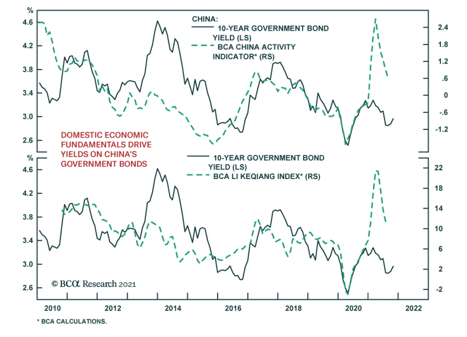
Our view on China’s bond yields will not change with the liftoff of US Fed policy rates, even if the Fed hikes rates earlier and by more than anticipated. The Fed’s policy has little bearing on China’s long-dated yields, which are driven by domestic business cycles and monetary policy (Chart 5). Concerning the exchange rate, we believe that the RMB will modestly depreciate in the next six to nine months, given that the China-US nominal and real interest rate differentials will narrow (Chart 6). While some depreciation in the currency is modestly reflationary for China’s exporters, it will not be enough to offset weaknesses in domestic demand. Chart 5Domestic Economic Fundamentals Drive Yields On China's Government Bonds
Domestic Economic Fundamentals Drive Yields On China's Government Bonds
Domestic Economic Fundamentals Drive Yields On China's Government Bonds
Chart 6China-US Rate Differentials Are Set To Narrow
China-US Rate Differentials Are Set To Narrow
China-US Rate Differentials Are Set To Narrow
Chart 7Pipeline Inflationary Pressures in China Remain Elevated
Pipeline Inflationary Pressures in China Remain Elevated
Pipeline Inflationary Pressures in China Remain Elevated
Inflation remains a risk to our cyclical view on the 10-year bond yield. While the economy is weakening, pipeline inflationary pressures remain elevated (Chart 7). We do not foresee that the PBoC will change its modestly dovish policy stance because of inflationary pressures stemming from supply-side bottlenecks. However, supply constraints will not abate soon and consequently, pipeline inflationary pressures and producer price inflation may not subside in the next six months. Thus, fixed-income investors may start to price in higher inflation, which could prevent long-duration bond yields from declining by much. Bottom Line: In the coming months, the long-end of the yield curve will likely drop as investors start to price in weaker-than-expected economic growth and very measured stimulus. The short-end of the curve will have limited downside potential because there is only a slim chance of aggressive monetary easing. Bond Yields Are On A Structural Downtrend Bond yields in China will likely downshift in the next three to five years. Our secular outlook for government bond yields is based on the country’s demographic trends, inflation, productivity growth and debt levels. While China’s long-term bond yields have persistently averaged below nominal GDP growth, in the past decade the gap has significantly narrowed as economic growth slowed while yields remained within a tight range (Chart 8). This contrasts with other manufacturing and export-oriented Asian economies where interest rates have moved to a lower range in proportion with economic growth rates (Chart 9). Chart 8China's Economic Growth Has Downshifted But Yields Have Not...
China's Economic Growth Has Downshifted But Yields Have Not...
China's Economic Growth Has Downshifted But Yields Have Not...
Chart 9...In Contrast With Other Asian Manufacturing-Based Economies
...In Contrast With Other Asian Manufacturing-Based Economies
...In Contrast With Other Asian Manufacturing-Based Economies
China’s long-dated bond yields will also downshift in the next three to five years given the nation’s declining long-term potential output growth, based on the following: Chart 10Wages Have Risen In China
Wages Have Risen In China
Wages Have Risen In China
A shrinking workforce can be inflationary due to higher labor costs and we expect Chinese workers’ compensation will continue to increase in the next five years (Chart 10). However, wage inflation will likely be offset by labor productivity, which has remained robust. The nation’s unit-labor cost (ULC), measured by the wages paid for each employee to produce one unit of output, has been flat to slightly down in the past decade despite strong wage growth (Chart 11). Similarly, ULC has sagged in Japan and is muted in South Korea (countries with shrinking labor forces) due to fast-growing labor productivity. This contrasts with the US, where ULC has risen even though the labor force has expanded in the past 10 years (Chart 12) China’s labor productivity will not likely undergo a significant decline in the next five years, particularly if China successfully maintains the manufacturing sector’s share in its aggregate economy, because productivity growth in this sector is usually higher than in others. Chart 11ULC Has Been Relatively Flat
ULC Has Been Relatively Flat
ULC Has Been Relatively Flat
Chart 12ULC Muted In Asian Economies Compared With US
ULC Muted In Asian Economies Compared With US
ULC Muted In Asian Economies Compared With US
Meanwhile, China’s total population will shrink within the next five years, which will likely bring powerful disinflationary forces that will more than offset price increases created by labor shortages. Disinflation will cap the upside in interest rates/bond yields. Chart 13Japan's Household Consumption Share Fell Sharply When Total Population Started Shrinking
Japan's Household Consumption Share Fell Sharply When Total Population Started Shrinking
Japan's Household Consumption Share Fell Sharply When Total Population Started Shrinking
A shrinking total population can significantly reduce demand, as evidenced in Japan in the past two decades. Japan’s working-age population started falling in the early 1990s, but the country’s household consumption share in GDP fell sharply after its total population peaked in 2010 and the urban population growth started contracting (Chart 13). In other words, Japan’s rapidly falling demand more than offset a muted increase in wage growth. China’s housing demand may have already peaked and the decline will gather speed in the next five years (Chart 14). Long-term growth in household consumption moves in tandem with housing and, therefore, will also downshift in the coming years (Chart 15). In the next five years or longer, China’s de-carbonization efforts will require shutting down production of many old economy enterprises. Policymakers may keep low interest rates to accommodate such a transformation. Furthermore, amid the geopolitical confrontation with the US, Beijing will need lower interest rates to support the manufacturing sector and to undertake an industrial upgrade. Chart 14China's Demand For Housing Is On A Structural Downshift...
China's Demand For Housing Is On A Structural Downshift...
China's Demand For Housing Is On A Structural Downshift...
Chart 15...Along With Consumption
...Along With Consumption
...Along With Consumption
The main risk to our view is that China’s total factor productivity1 growth could accelerate to more than offset a declining total population. This would boost real per capita income and result in higher potential growth in the economy. In this scenario, long-duration bond yields could climb. However, total factor productivity growth will need to outpace the rate of a shrinking labor pool and capital formation to prop up growth in the aggregate economy (Chart 16A and 16B). This is a daunting mission that Japan and South Korea, where productivity growth has been on par with China, have failed to accomplish. Chart 16AChina's Neighbors Have Not Accelerated Their Productivity Gains To Structurally Boost Economic Growth
China's Neighbors Have Not Accelerated Their Productivity Gains To Structurally Boost Economic Growth
China's Neighbors Have Not Accelerated Their Productivity Gains To Structurally Boost Economic Growth
Chart 16BChina's Neighbors Have Not Accelerated Their Productivity Gains To Structurally Boost Economic Growth
China's Neighbors Have Not Accelerated Their Productivity Gains To Structurally Boost Economic Growth
China's Neighbors Have Not Accelerated Their Productivity Gains To Structurally Boost Economic Growth
Chart 17China Cannot Drastically Improve Its Productivity Growth In The Next Five Years
China’s Interest Rates: Will They Join The Race To Zero?
China’s Interest Rates: Will They Join The Race To Zero?
It is unrealistic to expect that China will drastically improve its productivity growth. Productivity level is much higher now than it was 10-20 years ago when China’s manufacturing sector accounted for more than 40% of GDP (Chart 17). Even though China’s manufacturing share in the economy will stabilize and even increase from the current 27% of the economy, it cannot boost the sector drastically, particularly because its export market share cannot expand much further due to rising geopolitical tensions. In short, sectors of the economy where productivity gains have been most rapid – manufacturing sector including exports that drove China’s productivity in the past 20 years - cannot fully offset the deceleration in other growth drivers going forward. The service sector will grow, but it is much more difficult to achieve fast productivity gains in the service sector. All in all, productivity and economic growth will moderate as China’s growth model shifts from capital-intensive infrastructure and real estate to services. Bottom Line: In the next five years, China’s 10-year government bond yields are more likely to structurally move to a lower bound as final demand falls along with the nation’s total population. Savings, Debt And Interest Rates China’s national savings rate is one of the highest in the world, but it will drop as the population ages. Thus, some economists may argue that a structural decline in the national savings rate will lead to higher interest rates in the long run. Chart 18Lower Savings Rates Do Not Necessarily Herald Higher Interest Rates
Lower Savings Rates Do Not Necessarily Herald Higher Interest Rates
Lower Savings Rates Do Not Necessarily Herald Higher Interest Rates
However, there is no empirical evidence that national savings drive interest rates. There has not been an inverse relationship between national savings rates and government bond yields in either Japan or the US, as illustrated in the middle and bottom panels of Chart 18. There are more periods of positive rather than negative correlation between savings rates and bond yields. Note that China’s national savings rate and its interest rates also are not inversely related; a rising saving rate does not lead to lower interest rates and vice versa (Chart 18, top panel). This empirical evidence is in line with special reports published by BCA’s Emerging Markets Strategy that concluded the following: Banks cannot and do not lend out or intermediate national or households “savings.” In an economy with banks, one does not need to save in the form of a deposit in a bank in order for a bank to lend money to another entity. In any economy, new money originates by commercial banks “out of thin air” when they lend to or buy assets from non-banks. Hence, there is little relationship between national savings (flow concept in economics) and money supply growth (a flow variable too) (Chart 19). The term “savings” in macroeconomics denotes an increase in the economy’s capital stock, not deposits at banks. China’s banking system has an enormous amount of deposits, created by the banks “out of thin air” and not from households’ savings. The above factors explain why Japan’s government bond yields and national savings rate have been falling since 1990 (Chart 18 on Page 12, bottom panel). A lack of demand for borrowing was not why bond yields fell. A reason why China’s bond yields will likely be in a secular decline is that commercial banks will purchase government and corporate bonds en masse as they have done in the past 10 years (Chart 20). To do so, commercial banks will not use existing deposits, but rather they will create new deposits/money “out of thin air.” Chart 19There Is Little Relationship Between National Savings And Money Growth
There Is Little Relationship Between National Savings And Money Growth
There Is Little Relationship Between National Savings And Money Growth
Chart 20China's Commercial Banks Will Continue To Purchase Government And Corporate Bonds
China's Commercial Banks Will Continue To Purchase Government And Corporate Bonds
China's Commercial Banks Will Continue To Purchase Government And Corporate Bonds
The same is true for the banks’ purchases of corporate bonds. In China, commercial banks own about 75% of government (including local government) bonds and 20% of onshore corporate bonds. To avoid a spike in bond yields, Chinese regulators could relax the limitations on commercial banks to purchase government and corporate bonds. The upshot will be a lack of crowding out and no upward pressure on bond yields despite a large bond issuance. Chart 21China's Debt-To-GDP Ratio And Service Costs Have More Than Doubled In The Past 10 Years
China's Debt-To-GDP Ratio And Service Costs Have More Than Doubled In The Past 10 Years
China's Debt-To-GDP Ratio And Service Costs Have More Than Doubled In The Past 10 Years
What are the implications of high indebtedness on interest rates? China’s domestic debt-to-GDP ratio has jumped from 120% of GDP in 2008 to 260% (Chart 21, top panel). This includes local currency borrowing by/debt of government, enterprises and households. Critically, the debt-service ratio2 for enterprises and households has more than doubled from 10% of disposable income in 2008 to over 20% (Chart 21, bottom panel). China cannot afford much higher interest rates because enterprises and households will struggle and will not be able to service their debts. Mortgage rates in China are at around 5.5%, the one-year prime lending rate for companies is 3.85% and onshore corporate bond yields are 3.7%. These are not particularly low borrowing costs given both high indebtedness and the outlook for structurally slower economic growth. Onshore borrowing costs may be brought down further in the years ahead to rule out debt distress among households, enterprises and local governments. Since 2015 and prior to the pandemic, China’s debt-service ratio has been mostly flat despite a rising debt-to-GDP ratio.3 This has been achieved through declining interest rates. In the next five years policymakers will likely maintain a stable debt-to-GDP ratio. Hence, lower bond yields are all but inevitable to decrease the debt-servicing burden. In addition, China’s “common prosperity” policy means larger government spending/deficits. However, to cap the government debt-to-GDP ratio, bond yields should be kept down. This is another reason why China’s will opt for lower interest rates/bond yields. Bottom Line: The high level of debt among local governments, companies and households means that borrowing costs in China will be reduced in the years ahead. National savings are not a constraint in any country for commercial banks to expand credit and/or to buy bonds. China will encourage its banks to buy government and corporate bonds to trim yields amid continuous heavy bond issuance. Will China’s Financial Opening Continue? In the current environment which geopolitical tensions are rising between China and the West, many global investors are concerned whether China will impose tighter capital controls and even seize foreign assets. Despite these challenges, China has continued to make progress opening its domestic markets. The nation seems to be sticking to its key policy goals of attracting foreign capital and internationalizing the RMB; both aspects require open access and repatriation of foreign capital. In addition, the share of foreign holdings in onshore securities is very low and thus, poses limited risk to China’s onshore financial markets during global economic or geopolitical crises. China’s current exposure to foreign capital flows is much smaller than its Asian neighbors during the 1997 Asian Financial Crisis, as well as Russia during the geopolitical standoff in 2014-2016 following the capture of Crimea.4 Despite years of easing access to financial markets, foreign ownership (mostly concentrated in government bonds) remains at only around 3-4% of China’s entire onshore bond market. Furthermore, unlike other Asian economies in 1997-98, China has large foreign exchange reserves to buffer shocks from foreign fund flows. In recent years its capital control mechanism has also been successful in preventing implicit capital outflows and stabilizing the RMB exchange rate. We expect Chinese policymakers to feel confident in continuing their financial opening because they have the capability and sufficient funds to safeguard the economy against retrenchments by global investors. Bottom Line: China will continue to open its domestic financial markets, albeit gradually, to global investors. The country’s domestic financial markets have limited exposure to the extreme volatility of foreign capital flows. Investment Conclusions Chart 22The RMB Still Has Upside Structurally, But Will Modestly Depreciate On A Cyclical Basis
The RMB Still Has Upside Structurally, But Will Modestly Depreciate On A Cyclical Basis
The RMB Still Has Upside Structurally, But Will Modestly Depreciate On A Cyclical Basis
We are constructive on China’s government bonds, both cyclically and structurally. In the next six to nine months, the yield curve will likely flatten, with long-duration bond yields dropping faster than the short-end. China’s 10-year government bond yield will structurally shift to a lower range in the next five years, driven by the impact of falling population on domestic demand, and the country’s rising debt levels and debt-servicing costs. Although the RMB still has upside structural potential, in the next 6 to 12 months the currency will likely modestly depreciate against the US dollar (Chart 22). Jing Sima China Strategist jings@bcaresearch.com Qingyun Xu, CFA Associate Editor qingyunx@bcaresearch.com Footnotes 1Total Factor Productivity (TFP) is a measure of productive efficiency, determining how much output can be produced from a certain amount of inputs. 2Defined by BIS as the ratio of interest payments plus amortizations to income. 3Despite a rising debt load, debt-servicing costs were contained due to (1) LGFV debt swap as new provincial government bonds had lower yields than LGFV bonds and (2) a large decline in the prime lending rate and mortgage rates. 4Foreign investors held more than 40% of local currency bonds in Indonesia, and over 20% in Malaysia. Foreign ownership accounted for 26% of Russia’s local currency bonds in 2014. Market/Sector Recommendations Cyclical Investment Stance
US corporate bond spreads have been widening recently and have underperformed duration-matched Treasuries so far in October. Notably, these moves are occurring against a backdrop of rising Treasury yields – marking a break in the typically negative…
Highlights Spread Product: Investors should stay overweight spread product versus Treasuries for now (with a preference for high-yield corporates over investment grade). But recent shifts in the yield/spread correlation suggest that the credit cycle is getting a bit long in the tooth. We will be quick to recommend a reduction in spread product exposure once the monetary tightening cycle is more advanced and the 3-year/10-year Treasury slope flattens to below 50 bps. We expect this could occur in the first half of 2022. Labor Market & Fed: September’s employment report likely doesn’t alter the Fed’s timeline. The Fed is still on track to announce a tapering of its asset purchases next month and we expect employment growth will be sufficiently strong for the Fed to start hiking rates in December 2022. The Treasury curve will bear-flatten as that outcome is priced in. Duration: Investors should maintain below-benchmark portfolio duration with an expectation that the 10-year Treasury yield will reach a range of 2%-2.25% by the time of Fed liftoff in December 2022. Feature Chart 1A December Debt Ceiling Debate
A December Debt Ceiling Debate
A December Debt Ceiling Debate
The creditors of the United States government can breathe a little easier, at least for a couple of months, as Congress reached an agreement last week to punt debt ceiling negotiations until December. T-bills maturing this month reacted sharply to price-out the risk of technical default, though December bill yields have already started to push higher in anticipation of more turmoil (Chart 1). Of course, the political incentives to lift the debt ceiling will be the same in December as they are today, and Congress will ultimately act to avert economic disaster.1 Financial markets seem to realize this, and Treasury note and bond yields have been unphased by the drama. Instead, Treasury yields have moved higher in recent weeks alongside other indicators of optimism surrounding economic reflation and re-opening (Chart 2). However, there is one troubling signal from financial markets that warrants further investigation. Corporate bonds (both investment grade and high-yield) have underperformed duration-matched Treasuries so far in October, even as Treasury yields have moved higher (Chart 3). Typically, Treasury yields and corporate bond spreads are negatively correlated – spreads tighten as Treasury yields rise, and vice-versa – so it is notable when the correlation flips. Chart 2The Reflation Trade Is Back
The Reflation Trade Is Back
The Reflation Trade Is Back
Chart 3Bad Times For Bonds
Bad Times For Bonds
Bad Times For Bonds
The next section of this report explores the economic drivers of the yield/spread correlation and considers whether the flip to a positive yield/spread correlation signals anything about future corporate bond performance. An Examination Of The Yield/Spread Correlation The simple economic explanation for the negative yield/spread correlation is that an improved economic outlook leads to both a better environment for credit risk (i.e. tighter corporate bond spreads) and the expectation that higher interest rates will be needed to cool the economy in the future (i.e. higher Treasury yields). With that in mind, when spreads and yields both rise at the same time it usually means that the Fed is “over-tightening”. That is, tightening monetary policy so much that the near-term credit environment is deteriorating. This could be because the Fed is making a policy mistake – tightening into an economic slowdown – or because inflation is high enough that the Fed is deliberately slowing growth in an effort to bring down prices. A Technical Examination Looking at the history of monthly changes in Treasury index yields and High-Yield index spreads since 1994, we see that it is quite unusual for yields and spreads to both rise in the same month (Chart 4). In fact, monthly yield and spread changes are negatively correlated 65% of the time and have only risen together in 15% of the months since 1994. Chart 4Monthly Junk Spread Changes Versus Monthly Treasury Yield Changes Since 1994
An Early Warning Sign For Spreads
An Early Warning Sign For Spreads
Second, we observe in Chart 4 that almost all months of large spread widening or tightening occur against the back-drop of a negative yield/spread correlation. This shouldn’t be too surprising. The worst months for corporate bond performance occur during economic recessions when the Fed is cutting interest rates. Conversely, the best months for corporate bond performance occur just after the recession-peak in spreads when the Fed has finished cutting rates and the economic recovery is starting up. Tables 1A and 1B delve deeper into the return numbers. Table 1A shows average High-Yield excess returns over different investment horizons following a signal from the yield/spread correlation. For example, the second row shows that after a month when both Treasury yields and junk spreads rise, high-yield bonds deliver average excess returns of 24 bps during the following 3 months, 116 bps during the following 6 months and 75 bps during the following 12 months. Table 1B provides even more detail by showing 90% confidence intervals for each number. Table 1AAverage High-Yield Excess Returns After A Signal From Yield/Spread Correlation
An Early Warning Sign For Spreads
An Early Warning Sign For Spreads
Table 1BHigh-Yield Excess Returns After A Signal From Yield/Spread Correlation: 90% Confidence Intervals
An Early Warning Sign For Spreads
An Early Warning Sign For Spreads
We draw two conclusions from this analysis. First, a month when spreads widen and yields fall sends the worst signal for near-term (3-month) corporate bond performance, though a month where both yields and spreads rise is a close second. Second, and most relevant for the current market, a month when yields and spreads rise together sends the worst signal for junk bond performance over the following 12 months. In fact, it is the only signal where the 90% confidence interval shows the chance of negative excess returns during the following 12 months. This second conclusion aligns with our intuition. A period of both rising Treasury yields and junk spreads likely signals that the market is pricing-in some move toward a tighter monetary policy stance, though not a severe enough move to send long-maturity Treasury yields down. This is most likely to occur in the very early stages of a monetary tightening cycle, when monetary conditions are still accommodative but recent shifts in Fed policy suggest that they will become more restrictive down the road. A Historical Examination A look back through history confirms our analysis of when yields and spreads tend to rise concurrently. The solid line in the third panel of Chart 5 shows the number of months when both junk spreads and Treasury yields rose out of the most recent trailing 12-month period. The dashed line shows the same measure over the trailing 3-month period, multiplied by 4 to put it on the same scale as the solid line. A spike in these lines indicates that Treasury yields and junk spreads were rising at the same time. Chart 5Rising Yields And Spreads Is A Warning Signal For Monetary Tightening
Rising Yields And Spreads Is A Warning Signal For Monetary Tightening
Rising Yields And Spreads Is A Warning Signal For Monetary Tightening
We identify four relevant historical periods. First, yields and spreads rose concurrently during the 1999/2000 Fed tightening cycle. Specifically, yields and spreads rose together in the early stages of the tightening cycle, then spreads continued to widen as yields fell during the 2001 recession. Second, our indicator showed a couple blips higher during the 2004/06 tightening cycle, though corporate bond returns were solid during this period, at least until after the tightening cycle ended and the recession began. Third, the 2013 taper tantrum coincided with a temporary increase in both yields and spreads as investors worried that the Fed was moving too quickly toward rate hikes. Fourth, yields and spreads both moved higher in 2015 as the Fed was heading toward a December 2015 rate hike against a back-drop of slowing economic growth. Turning to today, we view the recent jump in our indicator as similar to the jump seen during the 2013 taper tantrum. Not only is the Fed once again about to taper asset purchases, but the tapering of asset purchases suggests that the Fed’s next move will be a rate hike at some point down the road. We view this as an early warning sign for corporate bond spreads. While the monetary environment remains supportive for positive corporate bond returns for now, this may not be true by this time next year when the Fed is that much closer to liftoff. Bottom Line: Investors should stay overweight spread product versus Treasuries for now (with a preference for high-yield corporates over investment grade). But recent shifts in the yield/spread correlation suggest that the credit cycle is getting a bit long in the tooth. We will be quick to recommend a reduction in spread product exposure once the monetary tightening cycle is more advanced and the 3-year/10-year Treasury slope flattens to below 50 bps. We expect this could occur in the first half of 2022. Labor Market Update: Still On Track For November Taper And December 2022 Liftoff Chart 6Employment Growth Slowed in September
Employment Growth Slowed in September
Employment Growth Slowed in September
September’s employment report delivered a disappointing headline number, with nonfarm payrolls growing only 194 thousand on the month compared to a consensus estimate of 500k (Chart 6). The details of the report were slightly better: August’s nonfarm payroll growth number was revised higher, our measure of the unemployment rate adjusted for distortions in the number of people employed but absent from work fell from 5.5% to 4.9% (Chart A1) and average hourly earnings rose at an annualized monthly rate of 7.7% (Chart 6, bottom panel). Expect A November Taper For bond investors, the most pressing question is whether the report is bad enough to delay the Fed’s tapering announcement past November. We doubt it. The Fed’s test for when to taper asset purchases, that it gave itself last December, is “substantial further progress” back to pre-COVID levels of employment. Since December 2020, total nonfarm payroll employment is 50% of the way back to its February 2020 level (Chart 7) and there are several good reasons to believe that employment growth will be much stronger in October and November. First, the delta wave of COVID cases clearly weighed on employment growth in September, much like it did in August. The Leisure & Hospitality sector only added 74 thousand jobs in September, compared to an average monthly pace of 349 thousand jobs between February and July of this year before the delta wave struck. With a shortfall of almost 1.6 million Leisure & Hospitality jobs compared to pre-COVID levels (Table 2), job growth in this sector will bounce back sharply during the next few months now that new COVID cases are receding (Chart 8). Chart 7"Substantial Further Progress" Has Been Made
"Substantial Further Progress" Has Been Made
"Substantial Further Progress" Has Been Made
Chart 8Delta Wave Has Crested
Delta Wave Has Crested
Delta Wave Has Crested
Second, the last column of Table 2 shows that the government sector accounted for net job loss of 123 thousand in September. This negative number was driven by state & local government education jobs and is almost certainly a statistical artifact. According to the Bureau of Labor Statistics’ release notes: Recent employment changes [in state & local government education] are challenging to interpret, as pandemic-related staffing fluctuations in public and private education have distorted the normal seasonal hiring and layoff patterns. Table 2Employment By Industry
An Early Warning Sign For Spreads
An Early Warning Sign For Spreads
Expect December 2022 Liftoff As for what this labor market report means for when the Fed will start lifting rates, we believe that we are still on track for liftoff in December 2022. The Appendix to this report updates our scenarios that show the average monthly nonfarm payroll growth that is required to reach different combinations of the unemployment and labor force participation rates by specific future dates. If we use the median assumption from the New York Fed’s Survey of Market Participants that the Fed will lift rates when the unemployment rate is 3.5% and the participation rate is 63%, we calculate that average monthly nonfarm payroll growth of +453k is required to reach those targets by the end of 2022. We see that threshold as eminently achievable.2 Bottom Line: September’s employment report likely doesn’t alter the Fed’s timeline. The Fed is still on track to announce a tapering of its asset purchases next month and we expect employment growth will be sufficiently strong for the Fed to start hiking rates in December 2022. Investors should maintain below-benchmark portfolio duration and hold Treasury curve flatteners in anticipation of that outcome. Ryan Swift US Bond Strategist rswift@bcaresearch.com Appendix: How Far From “Maximum Employment” And Fed Liftoff? Chart A1Defining “Maximum Employment”
Defining "Maximum Employment"
Defining "Maximum Employment"
The Federal Reserve has promised that the funds rate will stay pinned at zero until the labor market returns to “maximum employment”. The Fed has not provided explicit guidance on the definition of “maximum employment”, but we deduce that “maximum employment” means that the Fed wants to see the U3 unemployment rate within a range consistent with its estimates of the natural rate of unemployment, currently 3.5% to 4.5%, and that it wants to see a significant increase in the labor force participation rate (Chart A1). Alternatively, we can infer definitions of “maximum employment” from the New York Fed’s Surveys of Primary Dealers and Market Participants. These surveys ask respondents what they think the unemployment and labor force participation rates will be at the time of Fed liftoff. Currently, the median respondent from the Survey of Market Participants expects an unemployment rate of 3.5% and a participation rate of 63%. The median respondent from the Survey of Primary Dealers expects an unemployment rate of 3.8% and a participation rate of 62.8%. Tables A1-A4 present the average monthly nonfarm payroll growth required to reach different combinations of unemployment rate and participation rate by specific future dates. For example, if we use the definition of “maximum employment” from the Survey of Market Participants, then we need to see average monthly nonfarm payroll growth of +453k in order to hit “maximum employment” by the end of 2022. Table A1Average Monthly Nonfarm Payroll Growth Required For The Unemployment Rate To Reach 4.5% By The Given Date
An Early Warning Sign For Spreads
An Early Warning Sign For Spreads
Table A2Average Monthly Nonfarm Payroll Growth Required For The Unemployment Rate To Reach 4% By The Given Date
An Early Warning Sign For Spreads
An Early Warning Sign For Spreads
Table A3Average Monthly Nonfarm Payroll Growth Required For The Unemployment Rate To Reach 3.5% By The Given Date
An Early Warning Sign For Spreads
An Early Warning Sign For Spreads
Table A4Average Monthly Nonfarm Payroll Growth Required To Reach “Maximum Employment” As Defined By Survey Respondents
An Early Warning Sign For Spreads
An Early Warning Sign For Spreads
Chart A2 presents recent monthly nonfarm payroll growth along with target levels based on the Survey of Market Participants’ definition of “maximum employment”. This chart is to help us track progress toward specific liftoff dates. For example, if monthly nonfarm payroll growth prints +400k per month going forward, we would expect Fed liftoff between December 2022 and June 2023. We will continue to track these charts and tables in the coming months, and will publish updates after the release of each monthly employment report. Chart A2Tracking Toward Fed Liftoff
Tracking Toward Fed Liftoff
Tracking Toward Fed Liftoff
Footnotes 1 For more details on the politics of the debt ceiling please see US Political Strategy Weekly Report, “The House Ways And Means Tax Plan”, dated September 15, 2021. 2 For a discussion about what unemployment and participation rate targets to use in this analysis please see US Bond Strategy Weekly Report, “2022 Will Be All About Inflation”, dated September 14, 2021. Recommended Portfolio Specification Other Recommendations Treasury Index Returns Spread Product Returns
Highlights Equity valuations are extremely stretched versus bonds, so there is little wiggle room for bonds to sell off before pulling down large tracts of the stock market. We estimate that bond yields can rise by no more than 30 bps, before the Fed is forced to talk them back down again. Starting from an earnings yield that is extreme versus its history, we should prudently assume that the prospective long-term real return from equities will be far below the current earnings yield of 4.6 percent, and closer to zero, even if not actually negative. In capitalist economies, gluts may or may not lead to shortages; but shortages always lead to gluts. In other words, the current inflation is sowing the seeds of its own destruction. Hence, we reiterate our structural recommendation to overweight US T-bonds versus US TIPS. Fractal analysis: Cotton, and Polish equities. Feature Chart of the WeekTech Stocks Have Been Tracking The 30-Year T-Bond Price One-For-One
Tech Stocks Have Been Tracking The 30-Year T-Bond Price One-For-One
Tech Stocks Have Been Tracking The 30-Year T-Bond Price One-For-One
Equity valuations are extremely stretched versus bonds. The upshot is that there is little wiggle room for bonds to sell off before pulling down large tracts of the stock market. This is not just an abstract hypothesis – it is an empirical fact, as recent market action is making painfully clear. Since February, the global tech sector has tracked the 30-year T-bond price almost one-for-one. The near perfect fit proves that the tech (and broader growth stock) rally has been entirely premised on the bond market rally. Hence, on the three occasions that bonds have sold off sharply – including in the last couple of weeks – tech stocks have sold off sharply too (Chart of the Week). Put simply, the performance of the tech sector is being driven by the change in its valuation, and the change in its valuation is being driven by the change in the bond yield (Chart I-2). Chart I-2Tech Stock Valuations Are Being Driven By The Bond Yield
Tech Stock Valuations Are Being Driven By The Bond Yield
Tech Stock Valuations Are Being Driven By The Bond Yield
Of course, stock prices are also premised on earnings. So, given enough time, rising earnings can make valuations less stretched, adding more wiggle room for bonds to sell off. The trouble is that a change in earnings happens much more gradually than can a change in valuation – a 10 percent rise in earnings can take a year, whereas a 10 percent fall in valuation can happen in a week. Bond Yields Remain The Dominant Driver Of The Stock Market For the next few months at least, the movement in bond yields will remain the dominant driver of the most stretched parts of the stock market and, by extension, the overall market itself. This is especially true for the growth-heavy S&P 500 which, since March, has been tracking the 30-year T-bond price one-for-one (Chart I-3). Chart I-3The S&P 500 Has Also Been Tracking The 30-Year T-Bond Price One-For-One
The S&P 500 Has Also Been Tracking The 30-Year T-Bond Price One-For-One
The S&P 500 Has Also Been Tracking The 30-Year T-Bond Price One-For-One
The key question for investors is, what is the upper limit to bond yields before stock market damage causes the Federal Reserve to talk them down again? To answer this question, our working assumption is that a 15 percent drawdown in growth stocks would damage the growth-heavy S&P 500 enough – and thereby worsen ‘financial conditions’ enough – for the Fed to change its tone. Based on this year’s very tight relationship between tech stocks and the 30-year T-bond yield, a 15 percent drawdown would occur if the 30-year T-bond yield increased to 2.4 percent from 2.1 percent today (Chart I-4). Chart I-4The Fed's 'Pain Point' Is Only 30 Basis Points Away
The Fed's 'Pain Point' Is Only 30 Basis Points Away
The Fed's 'Pain Point' Is Only 30 Basis Points Away
This confirms our view that the resistance level to long-duration bond yields is around 30 bps above current levels, equivalent to around 1.8 percent on the 10-year T-bond yield. More About The ‘Negative Equity Risk Premium’ Our recent report The Equity Risk Premium Turns Negative For The First Time Since 2002 caused quite a stir. So, let’s elaborate and clarify the arguments we made about the equity risk premium (ERP) – the estimated excess return that stocks will deliver over bonds over a long investment horizon, such as 10 years. Many investors estimate the ERP by taking the stock market’s earnings yield – currently 4.6 percent in the US1 – and subtracting the real 10-year bond yield – currently -0.9 percent on US Treasury Inflation Protected Securities (TIPS). At first glance, this presents a very generous ERP of 5.5 percent. So, equities are attractively valued versus bonds, right? Wrong. The glaring error is that the earnings yield estimates the stock market’s prospective return only if the earnings yield starts and ends at the same level. If it does not, then the prospective return could be very different to the earnings yield. For example, imagine that the stock market was trading at a bubble price-to-earnings multiple of 100, meaning an earnings yield of 1 percent. Clearly, from such a bubble valuation, nobody would expect the market to return 1 percent. Instead, as the bubble burst, and valuations normalised, the prospective return would be deeply negative. It follows that when, as now, the earnings yield is extreme versus its history, we must build in some prudent normalisation to estimate the prospective return. The question is, how? One approach is to use history to inform us of the likely normalisation. Chart I-5 does this using the ‘best-fit’ relationship between the earnings yield at each point through 1990-2011 and subsequent 10-year real return from each starting point. Using the best-fit for this specific episode, the current earnings yield of 4.6 percent implies a prospective 10-year real return not of 4.6 percent, but of -1.1 percent. Chart I-5Based On History, The Current Earnings Yield Implies A Prospective 10-Year Real Return Much Less Than 4.6 Percent
Based On History, The Current Earnings Yield Implies A Prospective 10-year Real Return Much Less Than 4.6 Percent
Based On History, The Current Earnings Yield Implies A Prospective 10-year Real Return Much Less Than 4.6 Percent
Yet this best-fit approach meets a common reproach – that the best-fit for this specific episode is massively distorted by the dot com bubble peak and the global financial crisis (GFC) trough occurring (by coincidence) almost 10 years apart. We can counter this reproach in two ways. First, the best-fit relationship is much better than the raw earnings yield even for undistorted 10-year periods such as 1995-2005 or 2011-2021. Better still, we can change the prospective return from 10 years to 7 years and thereby remove the dot com bubble peak to GFC trough distortion. Chart I-6 shows that this 7-year best-fit relationship also works much better than the raw earnings yield. Chart I-6Based On History, The Current Earnings Yield Implies A Prospective 7-Year Real Return Much Less Than 4.6 Percent
Based On History, The Current Earnings Yield Implies A Prospective 7-year Real Return Much Less Than 4.6 Percent
Based On History, The Current Earnings Yield Implies A Prospective 7-year Real Return Much Less Than 4.6 Percent
Admittedly, the best-fit comes from just one episode in history, and there is no certainty that the 10-year and 7-year relationships that applied during that one episode should apply through 2021-31 and 2021-28 respectively. Nevertheless, starting from an earnings yield that is extreme versus its history, as is the case now, we should prudently assume that the prospective long-term real return from equities will be far below 4.6 percent, and closer to zero, even if not actually negative. Will The ‘Real’ Real Yield Please Stand Up Measuring the ERP also requires an estimate of the prospective real return on bonds. This part should be easy because the yield on the US 10-year TIPS – currently -0.9 percent – is the guaranteed 10-year real return of buying and holding that investment. It is derived by taking the yield on the 10-year T-bond – currently 1.5 percent – and subtracting the market’s expected rate of inflation over the next 10 years – currently 2.4 percent. But the equivalent real return on the much larger conventional bond market could be quite different. In this case, it will be the 10-year T-bond yield minus the actual rate of inflation over the next 10 years. To the extent that the actual rate of inflation turns out less than the expected rate of 2.4 percent, the real return on the T-bond will turn out higher than that on the TIPS. In fact, this has consistently turned out to be the case. The market has consistently overestimated the inflation rate over the subsequent 10 years, meaning that the real return on T-bonds has been around 1 percent higher than that on TIPS (Chart I-7). Chart I-7Will The 'Real' Real Yield Please Stand Up
Will The 'Real' Real Yield Please Stand Up
Will The 'Real' Real Yield Please Stand Up
Yet given the current surge in inflation, and no end in sight for supply chain disruptions and bottlenecks, is it plausible that the next ten years’ rate of inflation will be lower than 2.4 percent? The answer is yes. Because, as my colleague Peter Berezin points out: in capitalist economies, gluts may or may not lead to shortages; but shortages always lead to gluts. And gluts always cause prices to collapse. In other words, the current inflation is sowing the seeds of its own destruction. Hence, we reiterate our structural recommendation to overweight US T-bonds versus US TIPS. The Cotton Is Stretched, And So Are Polish Equities Talking of shortages, cotton now adds to the list of commodities in which supply bottlenecks have raised prices to extremes. Cotton prices have reached a 10-year high due to weather conditions in the US (the world’s biggest cotton producer) combined with shipping disruptions. However, with cotton now exhibiting extreme fragility on its combined 130/260-day fractal structure, there is a high likelihood of a price reversal in the coming months when the shortage turns into a glut (Chart I-8). Chart I-8The Cotton Is Stretched
The Cotton Is Stretched
The Cotton Is Stretched
Meanwhile, the bank-heavy Polish equity market has surged on the back of the spectacular outperformance of its banks sector. This strong uptrend has now reached the point of fragility on its 130-day fractal structure that has indicated several previous reversals (Chart I-9). Chart I-9Poland's Outperformance Is Stretched
Poland's Outperformance Is Stretched
Poland's Outperformance Is Stretched
Accordingly, this week’s recommended trade is to underweight the Warsaw General Index versus the Eurostoxx 600, setting a profit target and symmetrical stop-loss at 6 percent. Dhaval Joshi Chief Strategist dhaval@bcaresearch.com Footnotes 1 Based on the 12-month forward earnings yield. Fractal Trading System Fractal Trades 6-Month Recommendations Structural And Thematic Recommendations Closed Fractal Trades Indicators To Watch - Bond Yields Chart II-1Indicators To Watch - Bond Yields ##br##- Euro Area
Indicators To Watch - Bond Yields - Euro Area
Indicators To Watch - Bond Yields - Euro Area
Chart II-2Indicators To Watch - Bond Yields ##br##- Europe Ex Euro Area
Indicators To Watch - Bond Yields - Europe Ex Euro Area
Indicators To Watch - Bond Yields - Europe Ex Euro Area
Chart II-3Indicators To Watch - Bond Yields ##br##- Asia
Indicators To Watch - Bond Yields - Asia
Indicators To Watch - Bond Yields - Asia
Chart II-4Indicators To Watch - Bond Yields ##br##- Other Developed
Indicators To Watch - Bond Yields - Other Developed
Indicators To Watch - Bond Yields - Other Developed
Indicators To Watch - Interest Rate Expectations Chart II-5Indicators To Watch ##br##- Interest Rate Expectations
Indicators To Watch - Interest Rate Expectations
Indicators To Watch - Interest Rate Expectations
Chart II-7Indicators To Watch ##br##- Interest Rate Expectations
Indicators To Watch - Interest Rate Expectations
Indicators To Watch - Interest Rate Expectations
Chart II-6Indicators To Watch ##br##- Interest Rate Expectations
Indicators To Watch - Interest Rate Expectations
Indicators To Watch - Interest Rate Expectations
Chart II-8Indicators To Watch ##br##- Interest Rate Expectations
Indicators To Watch - Interest Rate Expectations
Indicators To Watch - Interest Rate Expectations
Highlights Q3/2021 Performance Breakdown: Our recommended model bond portfolio outperformed the custom benchmark index by +8bps during the third quarter of the year. Winners & Losers: The government bond side of the portfolio outperformed by +4bps, led by the timely downgrade of UK Gilts to underweight in early August. Spread product allocations outperformed by +4bps, coming entirely from the overweights to high-yield in the US and Europe. Portfolio Positioning For The Next Six Months: We are maintaining an overall below-benchmark portfolio duration exposure, concentrated in the US and UK. We expect global growth will rebound from the Delta variant and supply chain disruptions will keep inflation elevated for longer, both of which will push global bond yields higher as central banks – led by Fed – turn less dovish. We are maintaining a moderate overweight to global spread product versus government debt, concentrated on an overweight to US high-yield where valuations still look the least stretched compared to corporate debt in other countries. Feature Global bond markets have had a lot of sources of uncertainty to digest over the past few months. Renewed COVID fears due to the spread of the Delta variant, slowing global growth momentum, supply chain disruptions leading to surging realized inflation, the ongoing US fiscal policy debate in D.C., concerns over Chinese corporate debt and the increasingly hawkish monetary policy signals sent by global central banks, most notably the Fed. The net result of these narratives has been some major swings in government bond market performance during the third quarter of 2021. The benchmark 10-year government bond yield in the US started the quarter at 1.48%, fell to an intraday low of 1.12% on August 4, then soared higher to end the quarter back at 1.50%. Even bigger moves were seen in other countries, with the 10-year UK Gilt yield doubling from its Q3 low of 0.48% on August 4 while the 10-year German bund yield is now 30bps above its low for the quarter. Despite this yield volatility, however, spreads for riskier credit market assets like US high-yield have remained generally well behaved. With that in mind, we present our quarterly review of the BCA Research Global Fixed Income Strategy (GFIS) model bond portfolio during Q3/2021. We also present our recommended positioning for the portfolio for the next six months (Table 1), as well as portfolio return expectations for our base case and alternative investment scenarios. We anticipate that bond investor uncertainty will switch from concerns about global growth to worries that stubbornly elevated inflation will elicit bond-bearish monetary policy responses from central banks. Table 1GFIS Model Bond Portfolio Recommended Positioning For The Next Six Months
GFIS Model Bond Portfolio Q3/2021 Performance Review & Current Allocations: Fading A Growth Scare
GFIS Model Bond Portfolio Q3/2021 Performance Review & Current Allocations: Fading A Growth Scare
As a reminder to existing readers (and to new clients), the model portfolio is a part of our service that complements the usual macro analysis of global fixed income markets. The portfolio is how we communicate our opinion on the relative attractiveness between government bond and spread product sectors. We do this by applying actual percentage weightings to each of our recommendations within a fully invested hypothetical bond portfolio. Q3/2021 Model Bond Portfolio Performance: Positive Returns In An Uncertain Environment Chart 1Q3/2021 Performance: Riding The Duration Roller Coaster
Q3/2021 Performance: Riding The Duration Roller Coaster
Q3/2021 Performance: Riding The Duration Roller Coaster
The total return for the GFIS model portfolio (hedged into US dollars) in the third quarter was +0.21%, slightly outperforming the custom benchmark index by +8bps (Chart 1).1 In terms of the specific breakdown between the government bond and spread product allocations in our model portfolio, the former generated +4bps of outperformance versus our custom benchmark index while the latter also outperformed by +4bps. Those small positive excess returns should be considered a victory, given the huge yield swings within the quarter, particularly for government bonds. We maintained a significant underweight position to US Treasuries in the portfolio during Q3, given our view that markets were underestimating the risks that the US economy would weather the summer Delta storm. As Treasury yields declined steadily during July and August, so did the relative performance of our model bond portfolio. The government bond portion of the portfolio was underperforming the benchmark by as much as -30bps before global bond yields bottomed out in early August. In the end, there was only a slight underperformance (-2bps) from the US Treasury portion of the portfolio during the quarter (Table 2). Table 2GFIS Model Bond Portfolio Q3/2021 Overall Return Attribution
GFIS Model Bond Portfolio Q3/2021 Performance Review & Current Allocations: Fading A Growth Scare
GFIS Model Bond Portfolio Q3/2021 Performance Review & Current Allocations: Fading A Growth Scare
Our biggest government bond overweights have been concentrated in the euro area. There, the sum of active returns during Q3 from our government bond allocations was +3bps, although that came entirely from above-benchmark allocations to inflation-linked bonds in Germany, France and Italy. We did make one major shift in our government bond allocations during the quarter, and it was both timely and successful. We downgraded our recommended UK Gilt exposure to underweight on August 11.2 We observed that the Bank of England (BoE) was starting to prepare the markets for less accommodative monetary policy, with the UK economy holding up well as its Delta variant surge was losing momentum. The BoE rhetoric has proven to be even more hawkish than we anticipated, hinting at a possible rate hike before the end of 2021, leading Gilts to be the worst performing government bond market in our model portfolio universe during the quarter. The result: our UK underweight contributed +4bps to the portfolio performance during the quarter. Turning to the credit side of the portfolio, the most successful positions were our overweight tilts on high-yield in the US (+3bps) and euro area (+1bps). All other exposures contributed little to returns, an unsurprising development given our neutral allocations to investment grade corporates in the US, UK and euro area, as well as for USD-denominated EM corporates. The bar charts showing the total and relative returns for each individual government bond market and spread product sector are presented in Charts 2 & 3. Chart 2GFIS Model Bond Portfolio Q3/2021 Government Bond Performance Attribution
GFIS Model Bond Portfolio Q3/2021 Performance Review & Current Allocations: Fading A Growth Scare
GFIS Model Bond Portfolio Q3/2021 Performance Review & Current Allocations: Fading A Growth Scare
Chart 3GFIS Model Bond Portfolio Q3/2021 Spread Product Performance Attribution By Sector
GFIS Model Bond Portfolio Q3/2021 Performance Review & Current Allocations: Fading A Growth Scare
GFIS Model Bond Portfolio Q3/2021 Performance Review & Current Allocations: Fading A Growth Scare
Biggest Outperformers: Overweight UK Gilts with a maturity greater than 10-years (+4bps) Overweight Italian inflation-linked bonds (+2bps) Overweight US high-yield: Ba-rated (+2bps) and B-rated (+1bps) Biggest Underperformers: Underweight US Treasuries with a maturity greater than 10-years (-2bps) Overweight Japanese Government Bonds in longer maturity buckets: 7-10 years (-1bps) and greater than 10-years (-1bps) Overweight UK inflation-linked bonds (-1bps) Chart 4 presents the ranked benchmark index returns of the individual countries and spread product sectors in the GFIS model bond portfolio for Q3/2021. Returns are hedged into US dollars (we do not take active currency risk in this portfolio) and adjusted to reflect duration differences between each country/sector and the overall custom benchmark index for the model portfolio. We have also color coded the bars in each chart to reflect our recommended investment stance for each market during Q3 (red for underweight, dark green for overweight, gray for neutral). Chart 4Ranking The Winners & Losers From The GFIS Model Bond Portfolio Universe In Q3/2021
GFIS Model Bond Portfolio Q3/2021 Performance Review & Current Allocations: Fading A Growth Scare
GFIS Model Bond Portfolio Q3/2021 Performance Review & Current Allocations: Fading A Growth Scare
Ideally, we would look to see more green bars on the left side of the chart where market returns are highest, and more red bars on the right side of the chart were returns are lowest. As can be seen in the chart, the bars look very close to that ideal for Q3/2021. Among the markets that represent our overweights, the most notably positive returns came from all euro area government bonds (a combined +136bps) and euro area corporates (a combined +20bps from investment grade and high-yield). Returns within our recommended underweight positions were even more notable: UK Gilts (-302bps), New Zealand government bonds (-103bps), EM USD-denominated sovereigns (-85bps), and Canadian government bonds (-45bps). Bottom Line: Our model bond portfolio slightly outperformed its benchmark index in the third quarter of the year by +8bps – a moderately positive result coming equally from underweight positions in government bonds and overweight allocations to spread product. Future Drivers Of Portfolio Returns Chart 5Negative Real Yields: The Biggest Mispricing In Global Bond Markets
Negative Real Yields: The Biggest Mispricing In Global Bond Markets
Negative Real Yields: The Biggest Mispricing In Global Bond Markets
Looking ahead, the performance of the model bond portfolio will continue to be driven primarily by our below-benchmark overall duration tilt – focused on our underweight stance on US Treasuries – and our overweight stance on high-yield corporates. Our most favored cyclical indicators for global bond yields are still, in aggregate, signaling more upside potential over at least the next six months, although the nature of the signal is changing (Chart 5). While our Global Duration Indicator, comprised of leading economic indicators and measures of future economic sentiment, has peaked, the overall level of 10-year bond yields within the major developed markets remains well below levels implied by the Indicator (top panel). That is most clearly evident when looking at the large gap between deeply negative real bond yields and the still-elevated level of the global manufacturing PMI, which typically leads real yields by around six months (second panel). We continue to view this gap between real yields and growth as the biggest mispricing in global bond markets – one that will eventually be rectified by the incremental reduction in monetary accommodation that is signaled by our Global Central Bank Monitor (bottom panel). The combined message from our Central Bank Monitor, Duration Indicator and the manufacturing PMI is that global bond yields are still too low, suggesting a below-benchmark overall portfolio duration stance remains appropriate. With regards to country allocation within the government bond side of our model portfolio, we continue to overweight countries where central banks are less likely to begin normalizing pandemic-era monetary policy quickly (Germany, France, Italy, Spain, Japan, Australia), while underweighting countries where normalization is expected to begin within the next 6-12 months (the US, UK and Canada). We have the highest conviction on the US and UK underweights, with a curve-flattening bias for both markets relative to the rest of the major developed markets (Chart 6). The bond-friendly (and risk asset-friendly) impact of global quantitative easing programs is fading, on the margin, with the annual growth rate of central bank balance sheets having already slowed sharply (Chart 7). The pace of tapering, and any subsequent rate hikes, will differ by country and support our government bond country allocations in the model portfolio. Chart 6Expect More Relative Curve Flattening In The US & UK
Expect More Relative Curve Flattening In The US & UK
Expect More Relative Curve Flattening In The US & UK
Chart 7The 'Great Global Taper' Has Begun
The 'Great Global Taper' Has Begun
The 'Great Global Taper' Has Begun
Chart 8Less Scope For Wider Global Inflation Breakevens
Less Scope For Wider Global Inflation Breakevens
Less Scope For Wider Global Inflation Breakevens
We expect the Fed to taper its pace of bond purchases over the first half of 2022, setting up a first Fed rate hike late next year. The Bank of Canada and the BoE will be the other developed market central banks that will both end QE and lift rates before the Fed does the same. On the other hand, the ECB, Bank of Japan and the Reserve Bank of Australia will maintain a more relatively dovish stance in 2022, with very modest tapering (at worst) and no rate hikes. Turning to inflation-linked bonds, we are maintaining an overall neutral allocation given the competing forces of rising global inflation and rich valuations. Our Comprehensive Breakeven Indicators combine three measures to determine the upside potential for 10-year inflation breakevens: the distance from fair value based on our models, the spread between headline inflation and central bank target inflation, and the gap between market-based and survey-based measures of inflation expectations. Those indicators suggest that the most attractive markets to position for further upside potential for breakevens are Italy, France, Canada and Japan (Chart 8). On the back of this, we are maintaining our overweight allocations to inflation-linked bonds in the euro area and Japan in our model portfolio, while staying neutral on US TIPS. Chart 9Fading Support For Credit Markets From Global QE In 2022
Fading Support For Credit Markets From Global QE In 2022
Fading Support For Credit Markets From Global QE In 2022
Moving our attention to the credit side of our model portfolio, a moderate overweight stance on overall global corporates (focused on high-yield) versus governments remains appropriate. However, the slowing trend in developed market central bank balance sheets is flashing a warning sign for the future performance of global spread product. The annual growth rate of the combined balance sheets of the Fed, ECB, Bank of Japan and Bank of England has been an excellent leading indicator (by about twelve months) of the annual excess returns of both global investment grade and high-yield corporates during the “QE Era” since the 2008 financial crisis (Chart 9). That growth rate peaked back in February of this year, suggesting a peak of global corporate bond outperformance around February 2022, particularly for high-yield versus government bonds and investment grade (top two panels). At the same time, our preferred measure of the attractiveness of credit spreads - the historical percentile ranking of 12-month breakeven spreads – shows that lower-rated high-yield credit tiers in the US and euro area offer spreads that are relatively high versus their own history compared to other credit sectors in our model bond portfolio universe (Chart 10). Using this metric, investment grade corporate spreads look much more fully valued, particularly in the US. Chart 10Lower-Rated High-Yield & EM Sovereigns Offer Relatively Attractive Spreads
GFIS Model Bond Portfolio Q3/2021 Performance Review & Current Allocations: Fading A Growth Scare
GFIS Model Bond Portfolio Q3/2021 Performance Review & Current Allocations: Fading A Growth Scare
Given sharply reduced default risks in the US and Europe, with strong nominal growth supporting corporate revenues alongside low borrowing rates, the fundamental backdrop for riskier high-yield corporates is still positive. Thus, we are maintaining our overweights to high-yield bonds in both the US and euro area, while sticking with only a neutral stance on investment grade corporates in the US, euro area and the UK. We do anticipate starting to reduce that exposure in the model portfolio sometime in early months of 2022, however, based on the ominous leading signal from the growth of central bank balance sheets – and what that means about the future path for global monetary policy and risk asset performance. Within the euro area, we are maintaining overweights to Italian and Spanish government bonds given the likelihood that the monetary policy backdrop will remain supportive (Chart 11). We expect the ECB to be one of the most accommodative central banks within our model portfolio universe in 2022. At worst, the ECB could deliver a modest reduction of total asset purchases, but with no rate hikes. Chart 11A Relatively Dovish ECB Will Be Positive For European Credit
A Relatively Dovish ECB Will Be Positive For European Credit
A Relatively Dovish ECB Will Be Positive For European Credit
Chart 12EM Headwinds: A Firmer USD, China Tightening & Global QE Tapering
EM Headwinds: A Firmer USD, China Tightening & Global QE Tapering
EM Headwinds: A Firmer USD, China Tightening & Global QE Tapering
Finally, we are sticking with a cautious stance on emerging market (EM) spread product in our model bond portfolio. Slowing Chinese economic growth, a firming US dollar, rate hikes across EM in response to high inflation, and the coming turn in the Fed policy cycle are all headwinds to the relative performance of EM USD-denominated corporates and sovereigns (Chart 12). We are sticking with our overall modestly underweight stance on EM USD-denominated credit. However, rebounding global growth and some potential policy stimulus in China could prompt us to consider an upgrade in the coming months. Summing it all up, our overall allocations and risks in our model portfolio leading into Q4/2021 look like this: An overall below-benchmark stance on global duration, equal to -0.75 years versus the custom index (Chart 13). A moderate overweight stance on global spread product versus government debt, equal to five percentage points of the portfolio (Chart 14). This overweight comes almost entirely from allocations to US and euro area high-yield corporates. The tracking error of the portfolio, or its expected volatility versus that of the benchmark index, is relatively low at 55bps (Chart 15). This fits with our desire to maintain only a moderate level of absolute portfolio risk, while focusing exposures more on relative tilts between countries and credit sectors. Chart 13Overall Portfolio Duration: Stay Below Benchmark
GFIS Model Bond Portfolio Q3/2021 Performance Review & Current Allocations: Fading A Growth Scare
GFIS Model Bond Portfolio Q3/2021 Performance Review & Current Allocations: Fading A Growth Scare
Chart 14Overall Portfolio Allocation: Small Spread Product Overweight
GFIS Model Bond Portfolio Q3/2021 Performance Review & Current Allocations: Fading A Growth Scare
GFIS Model Bond Portfolio Q3/2021 Performance Review & Current Allocations: Fading A Growth Scare
The yield of the portfolio is now slightly higher than that of the benchmark, with a small “positive carry” of 16bps (Chart 16). Chart 15Overall Portfolio Risk: Moderate
Overall Portfolio Risk: Moderate
Overall Portfolio Risk: Moderate
Chart 16Overall Portfolio Yield: Small Positive Carry Vs. Benchmark
Overall Portfolio Yield: Small Positive Carry Vs. Benchmark
Overall Portfolio Yield: Small Positive Carry Vs. Benchmark
Scenario Analysis & Return Forecasts We now turn to scenario analysis to determine the return expectations for the portfolio for the next six months. On the credit side of the portfolio, we use risk-factor-based regression models to forecast future yield changes for global spread product sectors as a function of four major factors - the VIX, oil prices, the US dollar and the fed funds rate (Table 2A). For the government bond side of the portfolio, we avoid using regression models and instead use a yield-beta driven framework, taking forecasts for changes in US Treasury yields and translating those in changes in non-US bond yields by applying a historical yield beta (Table 2B). For our scenario analysis over the next six months, we use a base case scenario plus two alternate “tail risk” scenarios. Table 2AFactor Regressions Used To Estimate Spread Product Yield Changes
GFIS Model Bond Portfolio Q3/2021 Performance Review & Current Allocations: Fading A Growth Scare
GFIS Model Bond Portfolio Q3/2021 Performance Review & Current Allocations: Fading A Growth Scare
Table 2BEstimated Government Bond Yield Betas To US Treasuries
GFIS Model Bond Portfolio Q3/2021 Performance Review & Current Allocations: Fading A Growth Scare
GFIS Model Bond Portfolio Q3/2021 Performance Review & Current Allocations: Fading A Growth Scare
We see global growth momentum, the stickiness of supply-driven inflation pressures and the Fed monetary policy outlook as the three most important factors for fixed income markets over the next six months, thus our scenarios are defined along those lines. Base case Global growth rebounds from the dip seen during July and August as fears over the spread of the Delta variant subside. Unemployment rates across the developed economies continue to decline on the back of ongoing demand/supply imbalances in labor markets. China is a relative growth laggard, but this will trigger fresh macro stimulus measures (credit, monetary, perhaps fiscal) from policymakers concerned about missing growth targets. Global supply chain disruptions will remain stubbornly persistent, keeping upward pressure on realized inflation rates in most countries even as commodity price momentum cools a bit on a rate of change basis. Most developed market central banks will move to dial back pandemic monetary policy stimulus to varying degrees, most notably the Fed and the Bank of England. The Fed will begin tapering its asset purchases around the turn of the year, to be completed during Q4/2021 thus setting the stage for a Fed rate hike in December. In this scenario, we expect the US Treasury curve to see some initial mild bear-steepening alongside moderately wider longer-term TIPS breakevens, before entering a more typical cyclical bear-flattening as the Fed begins tapering and rate hike expectations get pulled forward. The net result over the next six months: the entire US Treasury curve shifts higher in roughly parallel fashion, with the 10-year reaching 1.70% by next March. The VIX drifts a bit lower from the current 21 to 18, the US dollar is flattish (faster global growth offsets more USD-favorable real yield differentials versus other developed markets), the Brent oil price goes up +5% on the back of stronger global demand, and the fed funds target rate is unchanged at 0-0.25%. Upside growth & inflation surprise Global growth accelerates amid sharply diminished COVID risks and rallying stock and credit markets that loosen financial conditions. Consumer & business confidence recover smartly, as do hiring and capex. Global inflation rates accelerate from current elevated levels, but less from supply squeezes and more from fundamental pressures and faster wage growth. China loosens macro policies, but developed market central banks shift in an even more hawkish direction. The Fed signals a rapid 2022 taper and a funds rate liftoff well before year-end. In this scenario, real bond yields drift higher globally, but inflation breakevens stay elevated with the earlier surge in realized inflation proving not to be “transitory”. The US Treasury curve shifts much higher than in our base case, led by the 5-year maturity with bear-flattening beyond that point. The 10-year US Treasury yield climbs to 1.90% by the end of Q1/2022. The VIX moves higher to 25, the US dollar falls -3% (faster global growth offsetting a relatively modest increase in US/non-US real yield differentials), the Brent oil price goes up +10% and the fed funds target range is unchanged at 0-0.25%. Downside growth & inflation surprise Global growth loses additional momentum as consumer and business confidence stay muted. Supply/demand mismatches in labor markets remain unresolved, leading to a slower pace of employment growth. China does not signal adequate stimulus to offset its slowdown, while a weakened Biden administration implements a much smaller-than-expected US fiscal stimulus. Supply chain disruptions persist, keeping inflation elevated even as growth slows (stagflation). Developed market central banks, stuck between slowing growth and elevated inflation, are unable to ease in response to slower growth. The Fed chooses a slower drawn-out taper with liftoff delayed to 2023. Diminished economic optimism leads to a pullback in global equity values, lower government bond yields and wider global credit spreads. The US Treasury curve bull flattens as longer-maturity yields fall, with the 10-year yield moving back down to 1.25% alongside lower inflation breakevens. The VIX rises to 30, the safe-haven US dollar rises +5%, the Brent oil price falls -10% and the fed funds target range stays at 0-0.25%. The inputs into the scenario analysis are shown in Chart 17 (for the USD, VIX, oil and the fed funds rate), while the US Treasury yield scenarios are in Chart 18. The excess return scenarios for the model bond portfolio, using the above inputs in our simple quantitative return forecast framework, are shown in Table 3A (the scenarios for the changes in US Treasury yields are shown in Table 3B). Chart 17Risk Factor Assumptions For The Scenario Analysis
Risk Factor Assumptions For The Scenario Analysis
Risk Factor Assumptions For The Scenario Analysis
Chart 18US Treasury Yield Assumptions For The Scenario Analysis
US Treasury Yield Assumptions For The Scenario Analysis
US Treasury Yield Assumptions For The Scenario Analysis
Table 3AGFIS Model Bond Portfolio Scenario Analysis For The Next Six Months
GFIS Model Bond Portfolio Q3/2021 Performance Review & Current Allocations: Fading A Growth Scare
GFIS Model Bond Portfolio Q3/2021 Performance Review & Current Allocations: Fading A Growth Scare
Table 3BUS Treasury Yield Assumptions For The 6-Month Forward Scenario Analysis
GFIS Model Bond Portfolio Q3/2021 Performance Review & Current Allocations: Fading A Growth Scare
GFIS Model Bond Portfolio Q3/2021 Performance Review & Current Allocations: Fading A Growth Scare
The model bond portfolio is expected to deliver a positive excess return over the next six months of +60bps in the base case scenario and +57bps in the optimistic growth scenario, but is projected to underperform by -26bps in the pessimistic growth scenario. Bottom Line: We are maintaining an overall below-benchmark portfolio duration exposure, concentrated in the US and UK. We expect global growth will rebound from the Delta variant and supply chain disruptions will keep inflation elevated for longer, both of which will push global bond yields higher as central banks – led by Fed – turn less dovish. We are maintaining a moderate overweight to global spread product versus government debt, concentrated on an overweight to US high-yield where valuations still look the least stretched compared to corporate debt in other countries. Robert Robis, CFA Chief Fixed Income Strategist rrobis@bcaresearch.com Ray Park, CFA Research Analyst ray@bcaresearch.com Footnotes 1 The GFIS model bond portfolio custom benchmark index is the Bloomberg Barclays Global Aggregate Index, but with allocations to global high-yield corporate debt replacing very high-quality spread product (i.e. AA-rated). We believe this to be more indicative of the typical internal benchmark used by global multi-sector fixed income managers. 2 Please see BCA Research Global Fixed Income Strategy/ European Investment Strategy Weekly Report, "The UK Leads The Way", dated August 11, 2021, available at gfis.bcaresearch.com. The GFIS Recommended Portfolio Vs. The Custom Benchmark Index
GFIS Model Bond Portfolio Q3/2021 Performance Review & Current Allocations: Fading A Growth Scare
GFIS Model Bond Portfolio Q3/2021 Performance Review & Current Allocations: Fading A Growth Scare
Global Fixed Income - Strategic Recommendations* Duration Regional Allocation Spread Product Tactical Trades Yields & Returns Global Bond Yields Historical Returns
According to BCA Research’s US Bond Strategy service, the Treasury curve will bear-flatten as markets price in the expectation that the Fed will launch a new rate hike cycle in December 2022. Bond yields rose notably in September, with the bulk of the move…
Highlights Chart 1Bond Yields Still Track The "Re-Opening" Trade
Bond Yields Still Track The "Re-Opening" Trade
Bond Yields Still Track The "Re-Opening" Trade
Bond yields rose notably in September, with the bulk of the move coming in the days after the Fed teased an upcoming tapering of its asset purchases and revealed slightly hawkish revisions to its interest rate projections. Interestingly, some of the details of the bond market move don’t mesh nicely with the mildly hawkish policy surprise that the Fed delivered. For example, the Treasury curve steepened on the month and long-maturity TIPS breakeven inflation rates rose. Our sense is that September’s market moves were less driven by the Fed and more by a revival of the reflation (or re-opening) trade from earlier this year. The daily new US COVID case count ticked down and, while overall S&P 500 returns were negative on the month, a basket of equities designed to profit from the end of the pandemic soundly beat a basket of “COVID winners” (Chart 1). With the delta COVID wave receding, we remain confident that economic growth will be sufficiently strong for the Fed to launch a new rate hike cycle in December 2022. The Treasury curve will bear-flatten as that outcome gets priced in. Feature Table 1Recommended Portfolio Specification
A Bout Of Reflation
A Bout Of Reflation
Table 2Fixed Income Sector Performance
A Bout Of Reflation
A Bout Of Reflation
Investment Grade: Neutral Chart 2Investment Grade Market Overview
Investment Grade Market Overview
Investment Grade Market Overview
Investment grade corporate bonds outperformed the duration-equivalent Treasury index by 26 basis points in September, bringing year-to-date excess returns up to +193 bps. The combination of above-trend economic growth and accommodative monetary policy supports continued positive excess returns for spread product versus Treasuries. At 99 bps, the 3-year/10-year Treasury slope remains steep. This is a strong signal that monetary conditions are accommodative. But despite the positive macro back-drop, investment grade valuations are extremely tight (Chart 2). A recent report presented the results of a scenario analysis for investment grade corporate bond returns during the next 12 months.1 We concluded that investment grade corporate bond total returns will be close to zero or negative during the next 12 months and that excess returns versus duration-matched Treasuries are capped at 85 bps. With that in mind, we advise investors to seek out higher returns in junk bonds, municipal bonds and USD-denominated Emerging Market sovereign and corporate bonds. We also recommend favoring long-maturity corporate bonds and those corporate sectors with elevated Duration-Times-Spread.2 Table 3ACorporate Sector Relative Valuation And Recommended Allocation*
A Bout Of Reflation
A Bout Of Reflation
Table 3BCorporate Sector Risk Vs. Reward*
A Bout Of Reflation
A Bout Of Reflation
High-Yield: Overweight Chart 3High-Yield Market Overview
High-Yield Market Overview
High-Yield Market Overview
High-Yield outperformed the duration-equivalent Treasury index by 53 basis points in September, bringing year-to-date excess returns up to 558 bps. A recent report looked at the default expectations that are currently priced into the junk index and considered whether they are likely to be met.3 If we demand an excess spread of 100 bps and assume a 40% recovery rate on defaulted debt, then the High-Yield index embeds an expected default rate of 3.2% (Chart 3). Using a model of the 12-month trailing speculative grade default rate that is based on gross corporate leverage (pre-tax profits over total debt) and C&I lending standards, we estimate that the 12-month default rate will fall to between 2.3% and 2.8%, below what the market currently discounts. Notably, the corporate default rate is tracking at an annualized rate of roughly 1.7% through the first eight months of the year, well below the estimate generated by our macro model. Another recent report considered different plausible scenarios for junk bond returns during the next 12 months.4 We concluded that junk bond total returns will fall into a range of -0.29% to +1.80% during the next 12 months and that excess returns versus duration-matched Treasuries will be between +0.94% and +1.84%. MBS: Underweight Chart 4MBS Market Overview
MBS Market Overview
MBS Market Overview
Mortgage-Backed Securities outperformed the duration-equivalent Treasury index by 24 basis points in September, bringing year-to-date excess returns up to -43 bps. The nominal spread between conventional 30-year MBS and equivalent-duration Treasuries tightened 19 bps in September. The spread is wide compared to recent history, but it remains tight compared to the recent pace of mortgage refinancings (Chart 4). The conventional 30-year MBS option-adjusted spread (OAS) tightened 6 bps in September to reach 31 bps (panel 3). This is above the 22 bps offered by Aaa-rated consumer ABS but below the 52 bps offered by Aa-rated corporate bonds and the 33 bps offered by Agency CMBS. In a recent report we looked at MBS performance and valuation across the coupon stack.5 We noted that the higher convexity of high-coupon MBS makes them likely to outperform lower-coupon MBS in a rising yield environment. Higher coupon MBS also have greater OAS than lower coupons. This makes the high-coupon MBS more likely to outperform in a flat bond yield environment as well. Given our view that bond yields will be higher in 6-12 months, we recommend favoring high coupons (4%, 4.5%) over low coupons (2%, 2.5%, 3%) within an overall underweight allocation to Agency MBS. Government-Related: Neutral Chart 5Government-Related Market Overview
Government-Related Market Overview
Government-Related Market Overview
The Government-Related index underperformed the duration-equivalent Treasury index by 15 basis points in September, dragging year-to-date excess returns down to +69 bps (Chart 5). Sovereign debt underperformed duration-equivalent Treasuries by 95 bps in September, dragging year-to-date excess returns down to -87 bps. Foreign Agencies outperformed the Treasury benchmark by 5 bps on the month, bringing year-to-date excess returns up to +49 bps. Local Authority bonds outperformed by 24 bps in September, bringing year-to-date excess returns up to +406 bps. Domestic Agency bonds underperformed by 7 bps, dragging year-to-date excess returns down to +24 bps. Supranationals underperformed by 4 bps, dragging year-to-date excess returns down to +27 bps. Last week’s report looked at performance and valuation trends for Emerging Market sovereign and corporate bonds relative to US corporates.6 The recent underperformance of EM bonds versus US corporates has led to attractive relative valuations in the sector. We see investment grade EM sovereign and corporate bonds both outperforming investment grade US corporates during the next 12 months. The outperformance will be the result of better starting valuations and an acceleration of EM growth in 2022. The bonds of Colombia, Russia, Mexico, Indonesia, Saudi Arabia, UAE and Qatar look particularly attractive within the USD-denominated EM sovereign space. Municipal Bonds: Overweight Chart 6Municipal Market Overview
Municipal Market Overview
Municipal Market Overview
Municipal bonds outperformed the duration-equivalent Treasury index by 29 basis points in September, bringing year-to-date excess returns up to +292 bps (before adjusting for the tax advantage). The economic and policy back-drop remains favorable for municipal bond performance. Trailing 4-quarter net state & local government savings were already positive through the end of Q1 2021 and they received another significant boost in Q2 as funds from the American Rescue Plan were doled out (Chart 6). With state & local government balance sheets in such good shape, we are comfortable moving down in quality within municipal bonds. A move down in quality is especially compelling because of tight Aaa muni valuations relative to Treasuries (top panel). Valuation is more compelling in the lower investment grade credit tiers, especially at the long-end of the curve.7 Both General Obligation (GO) and Revenue munis in the 12-17 year maturity bucket offer a before-tax yield pick-up versus corporate bonds with the same credit rating and duration (panel 2). Finally, high-yield muni spreads are reasonably attractive relative to high-yield corporates, offering a breakeven tax rate of 25% (panel 4). But despite the attractive spread, we recommend only a neutral allocation to high-yield munis versus high-yield corporates as the deep negative convexity of high-yield munis makes them susceptible to extension risk if bond yields rise. Treasury Curve: Buy 2/10 Barbell Versus 5-Year Bullet Chart 7Treasury Yield Curve Overview
Treasury Yield Curve Overview
Treasury Yield Curve Overview
The Treasury curve bear-steepened in September, with yields moving sharply higher – especially in the 5-10 year maturity space. The 2-year/10-year Treasury slope steepened 14 bps to end the month at 124 bps. The 5-year/30-year slope flattened 5 bps to end the month at 110 bps. We expect bond yields to be higher in 6-12 months, but we also anticipate that the next significant move higher in bond yields will coincide with curve flattening, not steepening. At 2.08%, the 5-year/5-year forward Treasury yield is already within our target fair value range of 2% - 2.25%. In a recent report, we demonstrated that yield curve steepening only occurs when either the Fed is cutting rates or the 5-year/5-year forward yield rises.8 This means that the 2/10 Treasury curve is more likely to flatten than steepen during the next 6-12 months, even as bond yields move higher. Similarly, we observe that the overnight index swap (OIS) curve is priced for the fed funds rate to be 0.30% in one year’s time and 1.62% in five years (Chart 7). The latter rate has 131 bps of upside if it converges all the way back to its 2018 high, but this pales in comparison to the 256 bps of upside in the 12-month forward rate. The yield curve will flatten as the 12-month forward OIS rate converges with the 5-year forward rate (panel 3). Investors should position in yield curve flatteners on a 6-12 month horizon. Specifically, we recommend shorting the 5-year bullet versus a duration-matched 2/10 barbell. TIPS: Neutral Chart 8TIPS Market Overview
TIPS Market Overview
TIPS Market Overview
TIPS outperformed the duration-equivalent nominal Treasury index by 47 basis points in September, bringing year-to-date excess returns up to +627 bps. The 10-year TIPS breakeven inflation rate rose 3 bps on the month, while the 5-year/5-year forward TIPS breakeven inflation rate rose 5 bps. At 2.41%, the 10-year TIPS breakeven inflation rate is near the middle of the 2.3% to 2.5% range that is consistent with inflation expectations being well anchored around the Fed’s target (Chart 8). Meanwhile, at 2.26%, the 5-year/5-year forward TIPS breakeven inflation rate is only just below target (panel 3). With long-dated inflation expectations close to the Fed’s target levels, we see limited upside on a 6-12 month horizon. We also see the cost of short-maturity inflation protection falling during the next few months as realized inflation moderates from its extremely high level. This will lead to a steepening of the inflation curve (bottom panel). We recommend that investors position for a steeper 2/10 inflation curve, or alternatively for a flatter 2/10 real Treasury curve. We noted in last week’s report that the combination of nominal curve flattening and inflation curve steepening will lead to a large flattening of the 2/10 real curve during the next 6-12 months.9The 2-year TIPS yield, in particular, has a lot of upside. ABS: Overweight Chart 9ABS Market Overview
ABS Market Overview
ABS Market Overview
Asset-Backed Securities outperformed the duration-equivalent nominal Treasury index by 3 basis points in September, bringing year-to-date excess returns up to +43 bps. Aaa-rated ABS outperformed by 2 bps on the month, bringing year-to-date excess returns up to +32 bps. Non-Aaa ABS outperformed by 7 bps, bringing year-to-date excess returns up to +99 bps. The stimulus from last year’s CARES Act led to a significant increase in household savings when individual checks were mailed in April 2020. That excess savings has still not been spent and the most recent round of stimulus checks has only added to the stockpile (Chart 9). The extraordinarily large stock of household savings means that the collateral quality of consumer ABS is also extraordinarily high. Indeed, many households have been using their windfalls to pay down consumer debt (bottom panel). Investors should remain overweight consumer ABS and should also take advantage of the high quality of household balance sheets by moving down the quality spectrum. Non-Agency CMBS: Neutral Chart 10CMBS Market Overview
CMBS Market Overview
CMBS Market Overview
Non-Agency Commercial Mortgage-Backed Securities outperformed the duration-equivalent Treasury index by 2 basis points in September, bringing year-to-date excess returns up to +195 bps. Aaa Non-Agency CMBS outperformed Treasuries by 4 bps in September, bringing year-to-date excess returns up to +96 bps. Non-Aaa Non-Agency CMBS underperformed Treasuries by 4 bps on the month, dragging year-to-date excess returns down to +525 bps (Chart 10). Though returns have been strong and spreads remain attractive, particularly for lower-rated CMBS, we continue to recommend only a neutral allocation to the sector because of the structurally challenging environment for commercial real estate. Agency CMBS: Overweight Agency CMBS outperformed the duration-equivalent Treasury index by 3 basis points in September, bringing year-to-date excess returns up to +94 bps. The average index option-adjusted spread tightened 1 bp on the month. It currently sits at 33 bps (bottom panel). Though Agency CMBS spreads have recovered to well below pre-COVID levels, they still look attractive compared to other similarly risky spread products. Stay overweight. Ryan Swift US Bond Strategist rswift@bcaresearch.com Appendix A: Butterfly Strategy Valuations The following tables present the current read-outs from our butterfly spread models. We use these models to identify opportunities to take duration-neutral positions across the Treasury curve. The following two Special Reports explain the models in more detail: US Bond Strategy Special Report, “Bullets, Barbells And Butterflies”, dated July 25, 2017, available at usbs.bcaresearch.com US Bond Strategy Special Report, “More Bullets, Barbells And Butterflies”, dated May 15, 2018, available at usbs.bcaresearch.com Table 4 shows the raw residuals from each model. A positive value indicates that the bullet is cheap relative to the duration-matched barbell. A negative value indicates that the barbell is cheap relative to the bullet. Table 4Butterfly Strategy Valuation: Raw Residuals In Basis Points (As Of September 30th, 2021)
A Bout Of Reflation
A Bout Of Reflation
Table 5 scales the raw residuals in Table 4 by their historical means and standard deviations. This facilitates comparison between the different butterfly spreads. Table 5Butterfly Strategy Valuation: Standardized Residuals (As Of September 30th, 2021)
A Bout Of Reflation
A Bout Of Reflation
Table 6 flips the models on their heads. It shows the change in the slope between the two barbell maturities that must be realized during the next six months to make returns between the bullet and barbell equal. For example, a reading of -17 bps in the 5 over 2/10 cell means that we would expect the 5-year to outperform the 2/10 if the 2/10 flattens by less than 17 bps during the next six months. Otherwise, we would expect the 2/10 barbell to outperform the 5-year bullet. Table 6Discounted Slope Change During Next 6 Months (BPs)
A Bout Of Reflation
A Bout Of Reflation
Appendix B: Excess Return Bond Map The Excess Return Bond Map is used to assess the relative risk/reward trade-off between different sectors of the US bond market. It is a purely computational exercise and does not impose any macroeconomic view. The Map’s vertical axis shows 12-month expected excess returns. These are proxied by each sector’s option-adjusted spread. Sectors plotting further toward the top of the Map have higher expected returns and vice-versa. Our novel risk measure called the “Risk Of Losing 100 bps” is shown on the Map’s horizontal axis. To calculate it, we first compute the spread widening required on a 12-month horizon for each sector to lose 100 bps or more relative to a duration-matched position in Treasury securities. Then, we divide that amount of spread widening by each sector’s historical spread volatility. The end result is the number of standard deviations of 12-month spread widening required for each sector to lose 100 bps or more versus a position in Treasuries. Lower risk sectors plot further to the right of the Map, and higher risk sectors plot further to the left. Chart 11Excess Return Bond Map (As Of September 30th, 2021)
A Bout Of Reflation
A Bout Of Reflation
Footnotes 1 Please see US Bond Strategy Weekly Report, “Expected Returns In Corporate Bonds”, dated September 21, 2021. 2 Please see US Bond Strategy Weekly Report, “The Collapsing Credit Risk Premium”, dated July 20, 2021. 3 Please see US Bond Strategy Weekly Report, “The Post-FOMC Credit Environment”, dated June 29, 2021. 4 Please see US Bond Strategy Weekly Report, “Expected Returns In Corporate Bonds”, dated September 21, 2021. 5 Please see US Bond Strategy Weekly Report, “A New Conundrum”, dated April 20, 2021. 6 Please see US Bond Strategy Weekly Report, “Damage Assessment”, dated September 28, 2021. 7 Please see US Bond Strategy Weekly Report, “The Collapsing Credit Risk Premium”, dated July 20, 2021. 8 Please see US Bond Strategy / Global Fixed Income Strategy Weekly Report, “A Bump On The Road To Recovery”, dated July 27, 2021. 9 Please see US Bond Strategy Weekly Report, “Damage Assessment”, dated September 28, 2021.
Dear Client, We are sending you our Strategy Outlook today, where we outline our thoughts on the macro landscape and the direction of financial markets for the rest of 2021 and beyond. Next week, please join me for a webcast on Thursday, October 7 at 10:00 AM EDT (3:00 PM BST, 4:00 PM CEST, 10:00 PM HKT) where I will discuss the outlook. Best regards, Peter Berezin, Chief Global Strategist Highlights Macroeconomic Outlook: Global growth has peaked, but at very high levels. Progress on the vaccination campaign, along with continued accommodative monetary and fiscal policies, should keep recession risks at bay for the foreseeable future. Global Asset Allocation: Remain overweight stocks. While the risk-reward profile for equities is not as appealing as it was last year, the TINA theme (“There Is No Alternative” to equities) will continue to resonate with investors. Equities: Favor cyclicals, small caps, value stocks, and non-US equities. Long EM is an attractive contrarian play. Fixed Income: Maintain slightly below average interest-rate duration exposure. The US 10-year Treasury yield will rise to 1.8% by the first half of next year. Spread product will continue to outperform high-quality government bonds. Currencies: The US dollar will resume its weakening trend as growth momentum rotates from the US to the rest of the world. The Canadian dollar will be the best performing DM currency during the remainder of the year. Commodities: Oil prices will remain firm, bucking market expectations of a decline. Metals may be at the cusp of a new supercycle. I. Macroeconomic Outlook Global Growth To Remain Above Trend Global growth has peaked, but at very high levels. According to Bloomberg consensus estimates, real GDP in the G7 rose by 6.0% in Q3, down from 6.8% in Q2 (Table 1). G7 growth is expected to soften to 4.9% in Q4, mainly reflecting somewhat softer growth in Europe following a blistering third quarter which saw real GDP expand by more than 9% in the UK and the euro area. Table 1Global Growth Will Remain Above Trend Well Into Next Year
2021 Fourth Quarter Strategy Outlook: TINA’s Siren Song
2021 Fourth Quarter Strategy Outlook: TINA’s Siren Song
Not all countries have reached peak growth. Japan is projected to see faster growth in Q4, with GDP rising by 3.8% compared to 1.6% in Q3. Canadian growth should pick up from 4.5% in Q3 to 5.8% in Q4. Australia’s economy is projected to grow by 7.4% in Q4 after having contracted by 10.7% in Q3. Chinese growth is expected to accelerate to 5.9% in Q4 from 2.6% in Q3. Across almost all the major economies, growth should remain at an above-trend pace in 2022. G7 growth is expected to hit 4.1%, well above the trend rate of 1.4%. Usually when growth peaks, investors start to worry that a recession is around the corner. Given that growth is coming down from exceptionally high levels, this is not a major risk at the moment. Most Countries Are Easing Lockdown Restrictions Ten months after the first Covid vaccines became publicly available, 3.5 billion people, or 45% of the world’s population, have received at least one shot (Chart 1). At this point, most people in developed economies who want a vaccine have been able to receive one. Chart 1Nearly Half Of The World's Population Has Received At Least One Covid Vaccine Shot
2021 Fourth Quarter Strategy Outlook: TINA’s Siren Song
2021 Fourth Quarter Strategy Outlook: TINA’s Siren Song
While vaccine availability in many emerging markets remains a problem, the situation is improving rapidly. India is currently vaccinating 7.5 million people per day. Over 45% of Indians have had at least one shot, something that would have seemed unfathomable just a few months ago. New medications are on the way. Just today, Merck announced a breakthrough pill that lowers the risk of hospitalization from Covid by 50%. Globally, the number of new daily cases has fallen from over 650,000 in August to 450,000 today. Lower case counts, along with increased vaccinations, have allowed most countries to loosen lockdown measures. Goldman’s Effective Lockdown Index has eased to the lowest level since the start of the pandemic (Chart 2). Chart 2Covid Restrictions Are Easing In Many Places
2021 Fourth Quarter Strategy Outlook: TINA’s Siren Song
2021 Fourth Quarter Strategy Outlook: TINA’s Siren Song
Monetary Policy: The Slow March To Neutral As the pandemic recedes from view, central banks are starting to dial back monetary support. Last week, Norway became the first major developed economy to hike rates. New Zealand, having already ended QE, may raise rates before the end of the year. Other central banks are looking to normalize policy. The Bank of Canada has cut its asset purchases in half. The Reserve Bank of Australia has begun tapering asset purchases. The Swedish Riksbank has indicated that it will end asset purchases this year. The Fed will formally announce the tapering of asset purchases in November, while the Bank of England’s latest round of QE expansion will expire in December. The ECB, Swiss National Bank, and Bank of Japan remain firmly in the dovish camp. That said, the ECB has cracked open the exit door ever so slightly by announcing that it will stop buying assets through the Pandemic Emergency Purchase Programme in March (The ECB will continue to buy bonds under the existing Asset Purchase Programme, however). Taper Tantrum Redux? The prospect of Fed tapering has stoked worries of a replay of the 2013 Taper Tantrum. We think such worries are overstated. For one thing, tapering is not the same thing as tightening. The Fed will still be adding to the size of its balance sheet; it will simply be doing so at a diminished pace. Thus, tapering implies a slower pace of easing rather than outright tightening, a subtle but important distinction. Tapering could be regarded as tightening if, as in 2013, the very act of tapering sends a signal to investors that rate hikes are forthcoming. However, in the years following the Taper Tantrum, the Fed has gone out of its way to delink balance sheet policy from interest rate policy, stressing that the two are substitutes not complements. The Fed is unlikely to start hiking rates until late 2022 or early 2023. It will probably take another year or two beyond then for interest rates to rise into restrictive territory, and even longer for the lagged effects of monetary policy to work their way through to the economy. There is an old saying: “Expansions don’t die of old age. They get murdered by the Fed.” The Fed will probably kill the expansion. However, the deed is unlikely to be committed until 2024 at the earliest, giving the bull market in stocks further scope to continue. Fiscal Policy: Tighter But Not Tight On the fiscal side, the IMF expects the aggregate cyclically-adjusted primary budget deficit in advanced economies to decline from 7.7% of GDP in 2021 to 3.7% of GDP in 2022, implying a negative fiscal impulse of 4% of GDP. Normally, such a negative fiscal impulse would weigh heavily on growth. However, since this fiscal tightening is set to occur against a backdrop of continued strong private domestic demand growth, the economic fallout should be limited. The absolute stance of fiscal policy also matters. While budget deficits will decline over the next few years, the IMF expects deficits to be larger in the post-pandemic period than they were before the pandemic (Chart 3). Chart 3Fiscal Policy: Tighter But Not Tight
2021 Fourth Quarter Strategy Outlook: TINA’s Siren Song
2021 Fourth Quarter Strategy Outlook: TINA’s Siren Song
If anything, the IMF’s projections understate the likely size of future budget deficits as they do not incorporate any fiscal measures that have yet to be signed into law. These include the proposed $550 billion US infrastructure bill, an election-season stimulus package in Japan, and increased investment spending by what is likely to be a center-left coalition government in Germany. Chart 4Plenty Of Pent-Up Demand
2021 Fourth Quarter Strategy Outlook: TINA’s Siren Song
2021 Fourth Quarter Strategy Outlook: TINA’s Siren Song
Perhaps one of the most important, and largely overlooked, consequences of the pandemic is that the bond vigilantes have been banished into exile. Governments ran record budget deficits last year and bond yields fell anyway. Post-pandemic fiscal policy is likely to end up being structurally more expansionary than it was following the Global Financial Crisis. Plenty Of Dry Powder It should also be noted that not all the stimulus funds that have been disbursed have made their way into the economy. US households are currently sitting on $2.4 trillion in excess savings, equivalent to about 15% of annual consumption (Chart 4). About half of these excess savings stem from decreased spending on services during the pandemic. The other half stem from increased transfer payments – stimulus checks, unemployment insurance benefits, and the like. Some investors have expressed concern that these savings will remain idle. Among other things, they note that a record high share of households in the University of Michigan survey think that this is a bad time to be purchasing big-ticket items (Chart 5). Chart 5Consumers Are Deferring Purchases Of Big-Ticket Items In Anticipation Of Lower Prices
Consumers Are Deferring Purchases Of Big-Ticket Items In Anticipation Of Lower Prices
Consumers Are Deferring Purchases Of Big-Ticket Items In Anticipation Of Lower Prices
Chart 6Improving Consumer Confidence Will Buoy Consumption
Improving Consumer Confidence Will Buoy Consumption
Improving Consumer Confidence Will Buoy Consumption
We would downplay these concerns. A review of the evidence from the original CARES act suggests that households spent about 40% of the stimulus checks within three months of receiving them. That is a reasonably high number considering that precautionary savings typically rise during times of economic uncertainty. Despite the improvements in the economy, consumer confidence remains below pre-pandemic levels. There is a strong correlation between consumer confidence and household consumption (Chart 6). As confidence continues to recover, household spending should hold up well. As far as the reluctance to buy big-ticket items is concerned, we would paint this in a positive light. When households are asked why they are not in a rush to buy, say, a new automobile, they answer, quite rationally, that they expect prices to fall and availability to improve. Concerns over job security are far down on the list. In this sense, the market mechanism is doing what it is supposed to do: Supplying goods to those who are willing to pay up in order to get them immediately, while giving those with a bit more patience the opportunity to buy them later at a lower price. Chart 7Firms Will Need To Maintain High Production To Replenish Inventories
Firms Will Need To Maintain High Production To Replenish Inventories
Firms Will Need To Maintain High Production To Replenish Inventories
From a macro perspective, this means that demand for durable goods is unlikely to fall off a cliff anytime soon. There is enough pent-up demand around to ensure production stays buoyant well into next year. This is especially the case for autos, where nearly half of US shoppers have decided to defer purchases. And with inventory levels at record lows, firms will need to produce more than they sell (Chart 7). It is difficult to see growth slowing dramatically in such an environment. Pandemic-Induced Inflation Spike Should Fade The willingness of households to postpone spending until supply has had a chance to catch up to demand should help mitigate inflationary pressures. It would be much worse if households thought that today’s high consumer goods prices presaged even higher prices down the road. Such a dynamic could easily unmoor inflation expectations, forcing the Fed into action. Despite the recent spike in inflation, household long-term inflation expectations have not increased that much. Inflation expectations 5-to-10 years out in the University of Michigan survey ticked up to 3% in September. While this is above the average level of 2.5% in 2017-2019, it is broadly within the range of expectations that prevailed between 1997 and 2014 (Chart 8). Chart 8Long-Term Inflation Expectations Have Risen But Remain At Historically Low Levels
Long-Term Inflation Expectations Have Risen But Remain At Historically Low Levels
Long-Term Inflation Expectations Have Risen But Remain At Historically Low Levels
Chart 9Wages At The Bottom End Of The Distribution Are Rising Briskly
Wages At The Bottom End Of The Distribution Are Rising Briskly
Wages At The Bottom End Of The Distribution Are Rising Briskly
Chart 10Strong Wage Growth In The Leisure And Hospitality Sector
2021 Fourth Quarter Strategy Outlook: TINA’s Siren Song
2021 Fourth Quarter Strategy Outlook: TINA’s Siren Song
Wages have risen briskly at the bottom end of the income distribution (Chart 9). The jump in wage growth in the leisure and hospitality sector – where workers have been given the unenviable task of enforcing mask mandates and other requirements – has been particularly pronounced (Chart 10). However, wage growth for high-skilled salaried employees has been flat-to-down. As a consequence, overall wage growth, as measured by the Atlanta Fed Wage Tracker, has moved sideways. Rising CPI inflation remains contained to only a few categories. Median CPI inflation registered 2.4% in August, below where it was in late 2019. Excluding vehicle prices, the level of the core CPI remains below its pre-pandemic trend line (Chart 11). Chart 11Unwinding Of "Base Effects" Core Inflation With And Without Autos
Unwinding Of "Base Effects" Core Inflation With And Without Autos
Unwinding Of "Base Effects" Core Inflation With And Without Autos
Recent indications suggest that used car prices have peaked (Chart 12). Memory prices are trending lower, suggesting that the worst of the semiconductor shortage may be behind us (Chart 13). The Drewry World Container Index also inched lower this week for the first time in five months. Chart 12Used Car Prices Have Peaked
Used Car Prices Have Peaked
Used Car Prices Have Peaked
Chart 13Memory Chip Prices Are Edging Lower
Memory Chip Prices Are Edging Lower
Memory Chip Prices Are Edging Lower
In capitalist economies, gluts may or may not lead to shortages; but shortages always lead to gluts. II. Feature: The Real Risk From China’s Property Market Chart 14The Demographic Turning Point In Japan And China
The Demographic Turning Point In Japan And China
The Demographic Turning Point In Japan And China
Lehman Moment Or Japan Moment? The turmoil surrounding Evergrande, one of China’s largest property developer, has sparked fears that China is experiencing its own “Lehman moment”. Such worries are misplaced. The Chinese government has enough control over the domestic financial system to keep systemic risks in check. The more appropriate analogy is not with Lehman, but with Japan. The Japanese property bubble burst in the early 1990s, sending the country into a prolonged deflationary funk. As was the case in Japan three decades ago, Chinese property prices are very high in relation to incomes. Moreover, as was the case in Japan, China’s working-age population has peaked, which is likely to translate into lower demand for housing down the road (Chart 14). As it is, studies using night light data suggest that 20% of apartments are sitting vacant. Similar to Japan, debt has fueled China’s housing boom. Chinese property developers are amongst the most leveraged in the world (Chart 15). Households have also been borrowing aggressively: Mortgage debt has risen from around 15% of GDP in 2010 to 35% of GDP (Chart 16). Chart 15Rising Leverage Ratios In China's Real Estate Sector
Rising Leverage Ratios In China's Real Estate Sector
Rising Leverage Ratios In China's Real Estate Sector
Chart 16Mortgage Debt Has Been On The Rise In China
Mortgage Debt Has Been On The Rise In China
Mortgage Debt Has Been On The Rise In China
Differences With Japan Despite the clear parallels between Japan in the early 1990s and China today, there are a number of key differences. First, Japan was already an advanced economy in the early 1990s. Today, labor productivity in China is still 40% of what it is in neighbouring South Korea (and 25% of what it is in the US). As productivity in China continues to rise, GDP will increase, even if the number of workers continues to shrink. As Chart 17 shows, China would need to grow by at least 6% per year over the next decade for output-per-worker to converge to South Korean levels by the middle of the century. It is easier to reduce leverage when incomes are growing quickly. Second, while real estate investment in China is still too high for what the country needs, it has been falling as a share of GDP since 2014 (Chart 18). This is not obvious from the monthly fixed asset investment data that investors track because this data counts land purchases as investment. Chart 17China: A Lot Of Catch-Up Potential
China: A Lot Of Catch-Up Potential
China: A Lot Of Catch-Up Potential
Chart 18Chinese Real Estate Construction Peaked Years Ago
Chinese Real Estate Construction Peaked Years Ago
Chinese Real Estate Construction Peaked Years Ago
Property developers have been buying land and holding on to it in anticipation that it will appreciate in value. This carry trade will end, but the impact on the real economy may be limited if, as is likely, the assets of bankrupt property developers end up being shuffled into quasi state-owned entities, allowing existing housing projects to continue. After all, if the goal of the government is to make housing more affordable, stopping construction would be precisely the wrong thing to do. Third, China has learned from Japan’s policy mistakes, especially when it comes to the appropriate role for government stimulus in the economy. Japan’s biggest mistake in the 1990s was not that it failed to listen to western experts, but that it listened to them too much. The whole narrative about how Japan could have revived its economy through “structural reforms” never made any sense. Japan’s problem was not one of poor resource allocation; it was one of inadequate demand: The property sector collapsed, leaving a big hole in GDP that needed to be filled. Shutting down “zombie companies” arguably made things worse, not better. Chinese Stimulus On The Way Standard debt sustainability equations imply that paradoxically, a country with a high debt-to-GDP ratio can run a larger primary budget deficit than a country with a low debt-to-GDP ratio, while still achieving a stable debt-to-GDP ratio over time.1 In China’s case, bond yields are well below nominal GDP growth, which gives the government significant fiscal leeway (Chart 19). The Ministry of Finance has expressed its intention to ramp up fiscal spending by increasing local government bond issuance. As of the end of August, local governments had used up only 50% of their annual debt issuance quota, compared to 77% at the same time last year and 93% in 2019. Increased bond issuance will allow local governments to trim their reliance on land sales to finance spending. For its part, the PBOC cut bank reserve requirements in July. In the past, cuts in reserve requirements have been a reliable predictor of faster credit growth (Chart 20). With credit growth back to its 2018 lows, there is little need for further actions to reduce lending. Chart 19Chinese Bond Yields Are Well Below Nominal GDP Growth
Chinese Bond Yields Are Well Below Nominal GDP Growth
Chinese Bond Yields Are Well Below Nominal GDP Growth
Chart 20A Positive Sign For Credit Growth In China
A Positive Sign For Credit Growth In China
A Positive Sign For Credit Growth In China
Chart 21China Suffers From High Levels Of Inequality
2021 Fourth Quarter Strategy Outlook: TINA’s Siren Song
2021 Fourth Quarter Strategy Outlook: TINA’s Siren Song
Rebalancing The Chinese Economy Over the long haul, China will need to encourage consumer spending in order to allow for the continued contraction of the construction industry without depressing overall employment. At 38% of GDP, China’s consumption share is one of the lowest in the world. A weak social safety net has forced Chinese households to maintain high levels of precautionary savings. Rampant inequality has shifted income towards richer households which tend to save more than the poor (Chart 21). Sky-high home prices only amplified the need to save more to buy a flat. All this has depressed overall consumption. For all its faults, President Xi’s “common prosperity” campaign could help redress all three of these problems, ultimately creating a stronger and more balanced economy. In summary, while China does represent a risk to the global economy, the threat at the moment is not severe enough to warrant turning bearish on equities and other risk assets. III. Financial Markets A. Portfolio Strategy Above-Trend Global Growth Will Support Equities Investors often express skepticism about the benefits of using macroeconomics as an input into their investment process. Charts 22 and 23 should dispel such doubts. The charts show that the business cycle is by far the most important driver of equity returns over medium-term horizons of 6-to-18 months. Chart 22The Business Cycle Drives Cyclical Swings In Stocks (I)
The Business Cycle Drives Cyclical Swings In Stocks (I)
The Business Cycle Drives Cyclical Swings In Stocks (I)
Chart 23AThe Business Cycle Drives Cyclical Swings In Stocks (II)
The Business Cycle Drives Cyclical Swings In Stocks (II)
The Business Cycle Drives Cyclical Swings In Stocks (II)
Chart 23BThe Business Cycle Drives Cyclical Swings In Stocks (II)
The Business Cycle Drives Cyclical Swings In Stocks (II)
The Business Cycle Drives Cyclical Swings In Stocks (II)
For the most part, the change in the value of the stock market is closely correlated with the level of economic growth. As noted earlier, global growth is peaking but at very high levels. This suggests that stock returns will be reasonably strong over the next 12 months, although not as strong as they were over the preceding 12 months. Higher Bond Yields Unlikely To Undermine The Stock Market Treasury yields have moved up since the conclusion of the FOMC meeting on September 22nd. The market narrative of a “hawkish surprise” does not make much sense to us. The yield curve usually flattens after a central bank delivers a hawkish surprise. That is what happened following the June FOMC meeting. This time around, the 2-10 curve has steepened by 13 basis points. Our sense is that the rise in bond yields mainly reflects the lagged effect from the decline in Covid cases, along with the realization that the pandemic-induced rise in inflation may be a bit stickier than previously believed. Equities often suffer some indigestion when bond yields rise. However, history suggests that as long as yields do not increase enough to imperil the economy, stocks usually end up recovering and reaching new highs (Table 2). Table 2As Long As Bond Yields Don’t Rise Into Restrictive Territory, Stocks Will Recover
2021 Fourth Quarter Strategy Outlook: TINA’s Siren Song
2021 Fourth Quarter Strategy Outlook: TINA’s Siren Song
The 10-year Treasury yield has already risen halfway to our 2022H1 target of 1.8%. Any further upward move is likely to be more gradual than what has transpired over the past few weeks. As such, we expect the pressure on stocks to diminish. The fact that bearish sentiment in the AAII survey reached a one-year high this week suggests we may be nearing a bottom in stocks. Ultimately, TINA’s siren song will be impossible to resist. What Is The True ERP? While equity valuations are not cheap, they are not at extreme levels either. The MSCI All-Country World Index currently trades at 18-times forward earnings. Unlike in most years, analysts have been revising up earnings estimates this year, both in the US and abroad (Chart 24). This suggests the currently quoted forward PE ratios are not excessively optimistic. Chart 24Analysts Increased Earnings Estimates This Year
Analysts Increased Earnings Estimates This Year
Analysts Increased Earnings Estimates This Year
Chart 25The Global Equity Risk Premium Is Elevated
The Global Equity Risk Premium Is Elevated
The Global Equity Risk Premium Is Elevated
Relative to bonds, stocks still trade at a healthy discount. The forward earnings yield for the MSCI All-Country World index is 640 basis points above the global real bond yield (Chart 25). Even in the US, where valuations are more stretched, the implied equity risk premium (ERP) stands at 580 basis points. Amazingly, this is exactly where the US ERP stood in May 2008. The equity risk premium, as measured by the gap between the earnings yield and the real bond yield, will overstate the magnitude to which stocks are expected to outperform bonds if the PE ratio ends up falling over time. Nevertheless, for stocks to underperform bonds, PE multiples would need to fall by an implausibly large amount. For example, suppose US companies manage to grow real EPS by a modest 2.5% per year over the next decade. The US dividend yield is 1.3%. Assuming dividends rise in line with earnings, investors would receive a real total return of 3.8%. The 10-year TIPS yield is -0.9%. Thus, the US PE multiple would need to shrink by an average of 4.7% (3.8% plus 0.9%) per year over the next 10 years for stocks to underperform bonds on a real total return basis. This would take the US forward PE multiple down to 13. It is not unfathomable that the US PE multiple would fall this much. However, as a baseline scenario, it is too pessimistic. A more plausible baseline forecast would be a terminal PE multiple of 18. That would be consistent with a “true” ERP of 3%. B. Equity Sectors, Regions, And Styles Favor Cyclicals, Value Stocks, And Small Caps As one might expect, cyclical equity sectors tend to outperform defensives in strong growth environments (Chart 26). The pandemic has exposed a shortage of industrial capacity across a wide range of industries from semiconductors to automobiles. US capital goods shipments have lagged orders for 18 straight months (Chart 27). Industrial stocks stand to benefit from increased capital spending. Materials and energy stocks will gain from strong commodity prices and a weaker US dollar (Chart 28). Chart 26Strong Growth Favors Cyclicals
Strong Growth Favors Cyclicals
Strong Growth Favors Cyclicals
Chart 27US Capital Goods Shipments Have Lagged Orders
US Capital Goods Shipments Have Lagged Orders
US Capital Goods Shipments Have Lagged Orders
Chart 28Materials And Energy Stocks Will Gain From Strong Commodity Prices And A Weaker US Dollar
Materials And Energy Stocks Will Gain From Strong Commodity Prices And A Weaker US Dollar
Materials And Energy Stocks Will Gain From Strong Commodity Prices And A Weaker US Dollar
Like cyclicals, value stocks do best during periods when global growth is strong and the US dollar is weak (Chart 29). Rising bond yields should help bank shares, which are heavily overrepresented in value indices (Chart 30). In contrast, tech shares, which are overrepresented in growth indices, usually struggle in rising yield environments. Value stocks are also cheap – three standard deviations cheap based on a simple composite valuation measure that compares price-to-earnings, price-to-book, and dividend yields (Chart 31). Chart 29Value Stocks Typically Do Well When The Dollar Is Depreciating
Value Stocks Typically Do Well When The Dollar Is Depreciating
Value Stocks Typically Do Well When The Dollar Is Depreciating
Chart 30Higher Yields Are A Boon For Banks And A Bane For Tech
2021 Fourth Quarter Strategy Outlook: TINA’s Siren Song
2021 Fourth Quarter Strategy Outlook: TINA’s Siren Song
Chart 31Value Is Cheap
Value Is Cheap
Value Is Cheap
Financials and industrials are overrepresented in US small caps indices, while tech and communication services are underrepresented (Table 3). Thus, it is not surprising that small caps usually outperform their large cap peers when growth is strong, the dollar is weakening, and bond yields are rising (Chart 32). Table 3Financials And Industrials Have A Larger Weight In US Small Caps
2021 Fourth Quarter Strategy Outlook: TINA’s Siren Song
2021 Fourth Quarter Strategy Outlook: TINA’s Siren Song
Like value stocks, small caps are reasonably priced. The S&P 600 small cap index trades at 16-times forward earnings, compared to 17-times for the S&P 400 mid cap index and 21-times for the S&P 500 (Chart 33). Small cap earnings are also expected to grow by 30% over the next 12 months, easily beating mid caps (19%) and large caps (15%). BCA’s relative valuation indicator suggests that, compared to large caps, small caps are now as cheap as they were in the late 1990s (Chart 34). Chart 32US Small Caps Tend To Outperform When Growth Is Strong, The Dollar Is Weakening, And Bond Yields Are Rising
2021 Fourth Quarter Strategy Outlook: TINA’s Siren Song
2021 Fourth Quarter Strategy Outlook: TINA’s Siren Song
Chart 33US Small Caps Are Not Expensive
US Small Caps Are Not Expensive
US Small Caps Are Not Expensive
Chart 34US Small Caps Are Attractive Relative To Large Caps
US Small Caps Are Attractive Relative To Large Caps
US Small Caps Are Attractive Relative To Large Caps
Regional Equity Allocation: Better Prospects Outside The US Stock markets outside the US have more of a cyclical/value tilt (Table 4). Hence, they tend to fare best when global growth is strong and the dollar is weakening (Chart 35). Table 4Cyclicals Are Overrepresented Outside The US
2021 Fourth Quarter Strategy Outlook: TINA’s Siren Song
2021 Fourth Quarter Strategy Outlook: TINA’s Siren Song
Chart 35Strong Growth And A Weaker Dollar Is Good For Non-US Stocks
2021 Fourth Quarter Strategy Outlook: TINA’s Siren Song
2021 Fourth Quarter Strategy Outlook: TINA’s Siren Song
Probable tax changes could hurt the relative performance of US stocks. BCA’s geopolitical strategists expect the Democrats to raise the corporate tax rate from 21% to about 26%. Additional tax hikes are likely to apply to overseas earnings, something that will disproportionately affect tech companies. Non-US stocks are reasonably priced, trading at a forward PE ratio of 15. EM equities are especially cheap. They currently trade at a forward PE ratio of 13 (Chart 36). The EM discount to the global index is as large now as it was during the late 1990s. Chart 36AEM Equities Are Trading At A Large Discount (I)
2021 Fourth Quarter Strategy Outlook: TINA’s Siren Song
2021 Fourth Quarter Strategy Outlook: TINA’s Siren Song
Chart 36BEM Equities Are Trading At A Large Discount (II)
2021 Fourth Quarter Strategy Outlook: TINA’s Siren Song
2021 Fourth Quarter Strategy Outlook: TINA’s Siren Song
After a blistering period of rapid earnings growth during the 2000s, EM EPS has been trending sideways during the past decade (Chart 37). However, the combination of increased global capital spending and rising commodity prices should buoy EM profits in the years ahead. Improved performance from EM banks should also help. Chinese banks are trading at 4.2-times forward earnings, 0.5-times book, and sport a dividend yield of over 6% (Chart 38). Such valuations discount too much bad news. Chart 37AEM Earnings Have Moved Sideways Since 2011 After Blazing Higher Over The Preceding Decade(I)
2021 Fourth Quarter Strategy Outlook: TINA’s Siren Song
2021 Fourth Quarter Strategy Outlook: TINA’s Siren Song
Chart 37BEM Earnings Have Moved Sideways Since 2011 After Blazing Higher Over The Preceding Decade (II)
2021 Fourth Quarter Strategy Outlook: TINA’s Siren Song
2021 Fourth Quarter Strategy Outlook: TINA’s Siren Song
Chart 38Chinese Banks: A Lot Of Bad News Is Discounted
Chinese Banks: A Lot Of Bad News Is Discounted
Chinese Banks: A Lot Of Bad News Is Discounted
Chart 39Chinese Tech Stocks Underperformed Their Global Peers This Year
Chinese Tech Stocks Underperformed Their Global Peers This Year
Chinese Tech Stocks Underperformed Their Global Peers This Year
Outlook For Chinese Tech Stocks The regulatory crackdown on Chinese tech companies has weighed on the sector. Chinese tech stocks have underperformed their global tech peers by 46% since February (Chart 39). Chinese tech is 44% of the China investable index and 15% of the MSCI EM index. Thus, the outlook for Chinese stocks is relevant not just for China-focused investors, but for EM investors more broadly (especially those who invest in index products). The current crackdown bears some resemblance to the one in 2018, which saw Tencent lose $20 billion in market capitalization in a single day. Like other Chinese tech names, Tencent shares quickly recovered from that incident. Contrary to popular perception, the Chinese government has not launched an indiscriminate attack on tech companies. If anything, heightened geopolitical tensions have made it more important than ever for China to buttress its tech sector. Rather, what the government has done is restrain companies that it either perceives as working against the national interest (i.e., addictive video game makers and expensive after-school tutoring companies) or that have too much sway over the public. Private tech companies in sectors such as semiconductors or clean energy continue to receive government support. A plausible outcome is that China’s leading consumer-oriented internet companies will go out of their way to pledge allegiance to the Communist Party. If that were to happen, the Chinese government may allow them to operate normally, cognizant of the fact that it is easier to monitor a few large internet companies than many small ones. While such an outcome is far from assured, current valuations offer enough cushion to prospective investors. As we go to press, Alibaba is trading at 15.9-times 2021 earnings, Baidu is trading at 17.1-times earnings, and Tencent is trading at 27.1-times earnings. In comparison, the NASDAQ Composite trades at 31.9-times 2021 earnings. C. Fixed Income Why Are Bond Yields So Low Even Though Inflation Is So High? While global bond yields have moved higher in recent days, they remain well below pre-pandemic levels. Investors are understandably puzzled about how today’s high inflation rates can coexist with such low bond yields. Two explanations stand out: First, despite the recent uptick in inflation expectations, investors still believe inflation will come down and stay down (Chart 40). In fact, the 5-year/5-year forward TIPS breakeven inflation rate is below the Fed’s comfort zone, suggesting that investors expect inflation to ultimately undershoot the Fed’s target. Chart 40AInvestors Expect Inflation To Fall Rapidly From Current Levels (I)
2021 Fourth Quarter Strategy Outlook: TINA’s Siren Song
2021 Fourth Quarter Strategy Outlook: TINA’s Siren Song
Chart 40BInvestors Expect Inflation To Fall Rapidly From Current Levels (II)
Investors Expect Inflation To Fall Rapidly From Current Levels
Investors Expect Inflation To Fall Rapidly From Current Levels
Chart 41The Market Thinks The Fed Will Raise Rates Only To 2%
The Market Thinks The Fed Will Raise Rates Only To 2%
The Market Thinks The Fed Will Raise Rates Only To 2%
Second, and related to the point above, investors believe that the neutral rate of interest is very low. According to the New York Fed’s survey of market participants, investors think that the Fed will not be able to raise rates above 2% during the forthcoming tightening cycle (Chart 41). This is even lower than the terminal rate of 2.5% that the Fed foresees. When the Federal Reserve first introduced the dot plot back in 2012, it believed the neutral rate was 4.25%. If the neutral rate really is this low, then monetary policy is not as hyperstimulative as is often asserted. In that case, a 10-year yield of 1.5% would be entirely appropriate given that it will take a few years for rates just to reach 2%. Indeed, an even lower yield could be justified on the grounds that there is a high probability that the economy will be hit by an adverse shock over the next decade, requiring a return to zero rates and more QE. Maintain Below-Benchmark Duration Our view is that the neutral rate is higher than most market participants believe. The end of the household deleveraging cycle in the US, structurally looser fiscal policy, and the exodus of well-paid baby boomers from the labor market will all deplete national savings, pushing up the neutral rate of interest in the process. If a central bank underestimates the neutral rate, it is liable to keep interest rates too low for too long. This could cause inflation to rise more than anticipated, putting further upward pressure on bond yields. It will take some time for the market’s view to converge to our view (provided we are correct, of course!). Investors have bought into the secular stagnation thesis hook, line, and sinker. Thus, they will require plenty of evidence that the Fed can raise rates without strangling the economy. We expect the US 10-year yield to move to 1.8% by early next year, warranting a moderately below-benchmark duration stance. US Treasuries have a higher beta than most other government bond markets (Chart 42). Treasury yields tend to rise more when global bond yields are moving higher and vice versa. Given our expectation that global growth will remain solidly above trend over the next 12 months, fixed-income investors should underweight high-beta bond markets such as the US and Canada, while overweighting the euro area and Japan. Chart 42US Treasuries Have A Higher Beta Than Most Other Government Bond Markets
US Treasuries Have A Higher Beta Than Most Other Government Bond Markets
US Treasuries Have A Higher Beta Than Most Other Government Bond Markets
Chart 43High-Yield Spreads Are Pricing In A Default Rate Of More Than 3%
High-Yield Spreads Are Pricing In A Default Rate Of More Than 3%
High-Yield Spreads Are Pricing In A Default Rate Of More Than 3%
Corporate Bonds: Favor High Yield Over Investment Grade BCA’s bond strategists see more upside for high-yield bonds than for investment grade. While high-yield spreads are quite tight, they are still pricing in a default rate of 3.15% (Chart 43). This is more than their fair-value default estimate of 2.3%-to-2.8%. It is also above the year-to-date realized default rate of 1.8%. Our bond team also sees USD-denominated EM corporate bonds as being attractively priced relative to domestic US investment-grade corporate bonds with the same duration and credit rating. D. Currencies And Commodities Fade Recent Dollar Strength The US dollar is a countercyclical currency, meaning that it tends to move in the opposite direction of the global business cycle (Chart 44). The US dollar has strengthened in recent weeks, spurred on by a more cautious tone to markets (the VIX is around 22, up from 16 in late August). As risk sentiment improves, the dollar will weaken. The composition of global growth also matters. Growth momentum is rotating from the US to the rest of the world. The dollar usually struggles when this happens (Chart 45). Chart 44The Dollar Is A Countercyclical Currency
The Dollar Is A Countercyclical Currency
The Dollar Is A Countercyclical Currency
Chart 45Growth Momentum Is Shifting Outside The US, Which Should Weigh On The Dollar
Growth Momentum Is Shifting Outside The US, Which Should Weigh On The Dollar
Growth Momentum Is Shifting Outside The US, Which Should Weigh On The Dollar
Despite the uptick in US yields, short-term real rate differentials are heavily skewed against the dollar (Chart 46). The US trade deficit has surged over the past 16 months (Chart 47). Equity inflows have been financing the trade deficit, but these could tail off if US stocks start to lag their overseas peers. Chart 46Short-Term Real Rates Remain Skewed Against The Dollar
Short-Term Real Rates Remain Skewed Against The Dollar
Short-Term Real Rates Remain Skewed Against The Dollar
Chart 47Widening Trade Deficit Is Dollar Bearish
Widening Trade Deficit Is Dollar Bearish
Widening Trade Deficit Is Dollar Bearish
The US dollar remains pricey relative to its Purchasing Power Parity (PPP) measure of fair value (Chart 48). Speculators are also net long the dollar, making the dollar vulnerable to a positioning reversal (Chart 49). Chart 48The Dollar Is Expensive Based On PPP
The Dollar Is Expensive Based On PPP
The Dollar Is Expensive Based On PPP
Chart 49Long Dollar Is Becoming A Crowded Trade
2021 Fourth Quarter Strategy Outlook: TINA’s Siren Song
2021 Fourth Quarter Strategy Outlook: TINA’s Siren Song
Buy The Loonie Our favorite developed market currency going into the fourth quarter is the Canadian dollar. Unlike in most other major economies, Canadian growth has yet to peak. The Bank of Canada has been ahead of most other central banks in winding down QE and laying the groundwork for rate hikes. Chart 50Oil Prices To Remain Firm
Oil Prices To Remain Firm
Oil Prices To Remain Firm
Firm oil prices should also help the loonie. One can be bullish on oil without expecting oil prices to rise very much. The oil curve is heavily backwardated (Chart 50). It suggests that the price of Brent will fall from $79 to $67 per barrel between now and the end of 2023. BCA’s commodity strategists expect the price of Brent crude to average $75 and $80 per barrel in 2022 and 2023, respectively, with WTI trading $2-$4/bbl lower. The RMB Will Hold Its Ground We doubt that China will weaken the RMB in order to stimulate the economy. China’s export sector is already operating at peak capacity. A weaker currency would do little to boost output. Geopolitical concerns will also keep the yuan from depreciating. The trade relationship between China and the US remains frosty. A weaker yuan would only make matters worse. Perhaps more importantly, China wants the RMB to be a global reserve currency. Weakening the RMB would run counter to that goal. A New Supercycle In Metals? China consumes over half the world’s industrial metals. Thus, fluctuations in the Chinese economy tend to drive metals prices. There is a very strong correlation between the Chinese credit impulse and industrial metals prices (Chart 51). If Chinese credit growth picks up over the coming months, this should support metals. Aside from iron ore, it is quite striking that most metals prices have remained firm this year even as China has cut back imports (Chart 52). Copper prices are up 45% year-over-year despite the fact that Chinese imports of copper are down 40% during this period. Chart 51A Pickup In Chinese Credit Will Bode Well For Metals
2021 Fourth Quarter Strategy Outlook: TINA’s Siren Song
2021 Fourth Quarter Strategy Outlook: TINA’s Siren Song
Chart 52China Cut Back On Imports Of Commodities This Year
China Cut Back On Imports Of Commodities This Year
China Cut Back On Imports Of Commodities This Year
As in the early 2000s, the combination of a multi-year period of underinvestment in new mining capacity and new sources of demand could set the stage for an extended bull market in the metals complex. The shift to electric vehicles will boost demand for many metals. The typical electric vehicle uses four times as much copper as a typical gasoline-powered vehicle. Many pundits argue that because Chinese growth is slowing, China will not need as much commodities as in the past. However, this argument ignores the fact that China is slowing from a very high base. As Chart 53 shows, China consumes five times as much industrial metals as it did in the 2000s. In absolute volume terms, China’s incremental annual increase in metal consumption is twice what it was in the 2000s. Thus, Chinese demand is likely to support the commodity market for years to come. Gold Facing Crosswinds Gold prices tend to correlate closely with real interest rates (Chart 54). This is not surprising since the real yield can be regarded as the “opportunity cost” of holding a yield-less asset such as gold. Chart 53Chinese Consumption Of Commodities Ballooned Over The Past Three Decades
Chinese Consumption Of Commodities Ballooned Over The Past Three Decades
Chinese Consumption Of Commodities Ballooned Over The Past Three Decades
Chart 54Gold Prices Tend To Correlate Closely With Real Interest Rates
Gold Prices Tend To Correlate Closely With Real Interest Rates
Gold Prices Tend To Correlate Closely With Real Interest Rates
What is somewhat surprising is that gold prices have dipped more than one would have expected based on the evolution of real yields. The US 10-year TIPS yield is only slightly higher than where it was in early August 2020, when the price of gold reached $2,067 per ounce. Although it is difficult to be certain, the shift in investor interest from gold to cryptos has probably depressed gold prices. Both gold and cryptos are seen as “fiat money hedges”. Our expectation is that tighter regulation will imperil the cryptocurrency market, causing some funds to flow back into gold. Nevertheless, with real yields likely to edge higher over the coming years, the upside for gold prices is limited. Peter Berezin Chief Global Strategist pberezin@bcaresearch.com Footnotes 1 The steady-state debt-to-GDP ratio can be expressed as p/(r-g), where r is the interest rate, g is trend GDP growth, and p is the primary (i.e., non-interest) budget balance. Thus, for example, if the government wanted to achieve a stable debt-to-GDP ratio of 50% and r-g is -2%, it would need to run a primary budget deficit of 0.5*0.02=1% of GDP. However, if the government targeted a stable debt-to-GDP ratio of 200%, it could run a primary budget deficit of 2*0.02=4% of GDP. See Box 1 in our February 22, 2019 report for a derivation of this debt sustainability equation. Global Investment Strategy View Matrix
2021 Fourth Quarter Strategy Outlook: TINA’s Siren Song
2021 Fourth Quarter Strategy Outlook: TINA’s Siren Song
Special Trade Recommendations
2021 Fourth Quarter Strategy Outlook: TINA’s Siren Song
2021 Fourth Quarter Strategy Outlook: TINA’s Siren Song
Current MacroQuant Model Scores
2021 Fourth Quarter Strategy Outlook: TINA’s Siren Song
2021 Fourth Quarter Strategy Outlook: TINA’s Siren Song
Highlights Recommended Allocation
Quarterly Portfolio Outlook: Stay Bullish But Verify
Quarterly Portfolio Outlook: Stay Bullish But Verify
The global economy will continue to grow at an above-trend rate over the next 12 months and central banks will remove accommodation only slowly.But the second year of a bull market is often tricky: Growth slows after its initial rebound, and monetary policy starts to be tightened, amid rising inflation.Equities are likely to outperform bonds over the next 12 months, driven by improving earnings, but at a slower pace than over the past year and with higher volatility.We continue to recommend only a cautiously optimistic stance on equities, with an overweight in US equities, and underweight in Europe. Our sector overweights are a mix of cyclicals (Industrials), plays on higher rates (Financials), and selective defensives (Health Care).China is likely to announce a stimulus to cushion the impact from Evergrande, which might push up oversold Chinese stocks. We close our underweight on Chinese equities, but raise them only to neutral as the real estate sector looks vulnerable. That could be bad news for commodities and the rest of Emerging Markets, which we cut to underweight.The Fed is likely to announce tapering this quarter, and raise rates in December 2022. This is likely to push up 10-year Treasury yields to 2-2.25% by then, and so we remain underweight duration.Investment-grade credit is expensive, but B-rated high-yield bonds still look attractive as defaults continue to decline. EM corporate debt is riskier post-Evergrande, but higher-rated sovereign dollar debt offers a good spread pickup.OverviewThe second year of a bull market is often tricky. Growth starts to slow after its initial rebound, and central banks move towards tightening policy. This does not signal the end of the bull market, but equity returns in Year 2 are typically lacklustre (Table 1).That is exactly the situation markets face now. Growth has been surprising on the downside, and inflation on the upside over the past few months (Chart 1). Table 1Year 2 Of Bull Markets Often Has Only Weak Returns
Quarterly Portfolio Outlook: Stay Bullish But Verify
Quarterly Portfolio Outlook: Stay Bullish But Verify
Chart 1Growth Surprising On The Downside, Inflation On The Upside
Growth Surprising On The Downside, Inflation On The Upside
Growth Surprising On The Downside, Inflation On The Upside
Our basic investment stance remains that the global economy will continue to grow at an above-trend rate over the next 12 months (as the consensus forecasts – Chart 2), and that central banks will remove accommodation only slowly. We can see no signs of a recession on the 18-to-24-month horizon and, as Chart 3 shows, equities almost always outperform bonds except during and in the run-up to recessions. Chart 2But Growth Will Continue To Be Above Trend
But Growth Will Continue To Be Above Trend
But Growth Will Continue To Be Above Trend
Chart 3Equities Outpeform Bonds Except Around Recessions
Equities Outpeform Bonds Except Around Recessions
Equities Outpeform Bonds Except Around Recessions
This justifies a moderately pro-risk stance, with overweights in equities and (selectively) credit, and a big underweight in government bonds. But the risks to this sanguine view are rising, and the next few months could be choppy. Stay bullish, but keep a close eye on what could go wrong.The slowdown in growth is largely because manufacturing boomed last year and now simply the pace of growth is decelerating. Manufacturing PMIs are (mostly) still above 50, but have fallen from their peaks (Chart 4). Supply-chain bottlenecks have also dented production. And consumers will spend less on durables and more on services, as lockdowns are eased.We have emphasized that the $2.5 trillion of excess savings in the US will boost spending over coming quarters. But enhanced unemployment benefits have now ended and most of the savings left are with richer households who have a lower propensity to spend (see page 9 for more on this). Covid also remains a risk: Cases are stickily high in some countries and consumers are still not 100% confident about going out to dine and for entertainment (Chart 5). Chart 4PMIs Falling But Mostly Still Above 50
PMIs Falling But Mostly Still Above 50
PMIs Falling But Mostly Still Above 50
Chart 5Consumers Still A Bit Wary About Going Out
Consumers Still A Bit Wary About Going Out
Consumers Still A Bit Wary About Going Out
China is an increasing risk to growth. Its economy has been slowing all year as a result of monetary tightening (Chart 6) and this may be exacerbated by the fallout from Evergrande. The Chinese authorities are likely to announce a stimulus package to offset the slowdown (which is why we are neutralizing our underweight on Chinese equities). But the stimulus will probably be only moderate and targeted, and they will not allow a renewed boom in real estate (as we explain on page 11), which has been a significant driver of Chinese growth in recent years (Chart 7). This could hurt the economies of Emerging Markets and other commodity producers, which depend on Chinese demand. Chart 6China Has Been Slowing All Year
China Has Been Slowing All Year
China Has Been Slowing All Year
Chart 7Real Estate Has Been A Big Driver Of Chinese Growth
Real Estate Has Been A Big Driver Of Chinese Growth
Real Estate Has Been A Big Driver Of Chinese Growth
At the same time that growth is slowing, inflation is proving a little stickier and broader-based than was expected. Measures of underlying inflation pressure, such as trimmed-mean CPIs, suggest that it is no longer only pandemic-related prices that are rising in the US and some other countries (Chart 8). Rising shipping charges (container rates are up 228% this year) are pushing up the cost of imported goods. And the first signs are emerging that labor shortages, especially in restaurants and shops, are causing wage rises (Chart 9). Chart 8Inflation Is Broadening Out In Some Countries
Inflation Is Broadening Out In Some Countries
Inflation Is Broadening Out In Some Countries
Chart 9The First Signs Of Wage Rises?
The First Signs Of Wage Rises?
The First Signs Of Wage Rises?
Unsurprisingly, then, central banks are starting to wind down their asset purchases and even raise rates. Norges Bank was the first developed central bank to hike this cycle in September. New Zealand may follow in Q4. And the Fed has pretty clearly signaled that it, too, will announce tapering before year-end. And this is not to mention Emerging Market central banks, many of which have had to raise rates sharply in the face of soaring inflation (Chart 10).A shrinking of excess liquidity is another common phenomenon of the second stage of expansions, as monetary policy starts to be tightened and liquidity is directed more towards the real economy and less towards speculation. This, too, often caps the upside for risk assets, though it doesn’t usually cause them to collapse (Chart 11). Chart 10EM Central Banks Raising Rates Sharply
EM Central Banks Raising Rates Sharply
EM Central Banks Raising Rates Sharply
Chart 11Excess Liquidity Is Drying Up
Excess Liquidity Is Drying Up
Excess Liquidity Is Drying Up
Table 2Who Will Raise Rates When?
Quarterly Portfolio Outlook: Stay Bullish But Verify
Quarterly Portfolio Outlook: Stay Bullish But Verify
While there are many factors that might cause market jitters over the coming months, the underlying picture is that robust growth is likely to continue and central banks will remain cautious about tightening too quickly. Excess savings will propel consumption, companies will need to increase capex to fulfill that demand, and the impact of fiscal stimulus is still coming through (Chart 12). The big central banks won’t raise rates for some time: The Fed perhaps in late-2022, but the ECB and the Bank of Japan not over the forecast horizon (Table 2). Decent growth and easy policy remains a positive backdrop for risk assets over the 12-month horizon. Chart 12Fiscal Stimulus Is Still Coming Through
Quarterly Portfolio Outlook: Stay Bullish But Verify
Quarterly Portfolio Outlook: Stay Bullish But Verify
Garry Evans, Senior Vice PresidentChief Global Asset Allocation Strategistgarry@bcaresearch.comWhat Our Clients Are AskingHow Worried Should We Be About Inflation?Since the beginning of the year, we have argued that the current period of high inflation will be transitory. The market has adopted this view, with 5-year/5-year forward inflation expectations remaining at 2.2%. Chart 13Growing Signs That Inflation Might Not Be Transitory
Growing Signs That Inflation Might Not Be Transitory
Growing Signs That Inflation Might Not Be Transitory
However, we have grown worried about the possibility that inflation might be stickier at a higher level than we initially expected. Specifically, while it is true that prices of supply-constrained items – such as used cars – have started to ease, there are signs that higher inflation has began to broaden. Core CPI excluding pandemic-related items and cars has started to pick up, with its 6-month rate of change reaching its highest level in more than a decade (Chart 13, panel 1). Meanwhile 42% of the PCE basket grew at an annual rate of more than 5% in July, compared to just 24% in March.Currently, we are watching the behavior of prices in the housing and labor markets to check if our worries are justified. We pay particular attention to these sectors because price pressures in housing and labor can be self-sustaining, giving rise to inflationary spirals if left unchecked.What is happening to inflation in these areas? So far, the signals are mixed. Even though wage growth remains within the historical norm for now, any further advance in wages will take us to a decade high (Chart 13, panel 2). Likewise, annual growth of shelter cost remains low, though its 6-month change suggests that it will soon begin to rise to its pre-pandemic levels (Chart 13, panel 3).Our base case continues to be that high inflation is transitory. That being said, we have positioned our portfolio to hedge for the risk that this view is wrong. We have given an overweight to real estate in our alternatives portfolio and within equities. Will Consumers Really Spend All Those Savings? Chart 14Low-Income Households Did Not Save Much
Quarterly Portfolio Outlook: Stay Bullish But Verify
Quarterly Portfolio Outlook: Stay Bullish But Verify
Generous unemployment benefits and the year-long lockdown have pushed up US excess savings over the past 18 months to an estimated $2.5 trillion, and the household savings ratio to 9.6% (Chart 14, panel 1). The consensus is that these savings will bolster consumer spending and support broad economic growth over the coming quarters. However, this expectation is based on the assumption that all consumers have accumulated savings, whereas the reality is a bit different.Survey results from the US Census Bureau show that households earning under $75,000, which have the highest propensity to consume, have almost entirely spent their first stimulus checks and three-quarters of their second and third checks on expenses and paying off debt. Even for those earning over $75,000, only 50% of those stimulus receipts have gone into savings (Chart 14, panel 2).With the labor market still not back to full employment (albeit mostly because of labor supply issues), enhanced unemployment benefits coming to an end, fears of further Covid variants and lockdowns, and higher inflation, could precautionary savings rise? The years following the Global Financial Crisis suggest that they might: The savings rate rose from 3% at the onset of the GFC to 8% five years after it (Chart 14, panel 3). A similar attitude among consumers this time could put a dent in US growth, given that consumption makes up about 70% of GDP.This raises the risk that consumption might slow over the coming quarters. In our latest Monthly Portfolio Outlook, we highlighted that consumption is shifting away from goods towards services. While value added from manufacturing is only 11% of GDP, the effect on markets might be bigger, since goods producers make up about 40% of US market cap. What Is The Risk Of A Big Upside Surprise In US Employment?The recovery of the labor market remains at the center of investors’ and Fed officials’ attention. The reluctance to return to the workforce mostly reflects overly generous unemployment benefits and fears of getting infected. With the fourth wave of the pandemic showing signs of cresting and benefits expiring, the consensus is that the unemployment gap will soon shrink. We would, however, question whether the labor market can surprise significantly to the upside and recover faster than the market currently implies. A swift recovery would push up bond yields and bring forward the Fed’s liftoff date, which could hurt the outlook for risk assets. Chart 15The Labor Market Could Surprise To The Upside
The Labor Market Could Surprise To The Upside
The Labor Market Could Surprise To The Upside
The number of men not in the labor force but who want a job has fallen back to the pre-pandemic level (Chart 15, panel 1). The sharp decline in this indicator in August coincided with the expiration of unemployment benefits in some Republican states. The overall Federal pandemic benefits program expired in early September. This should push even more people to return to the workforce (Chart 15, panel 2).However, there are still close to 3.5 million women (almost half a million above the pre-pandemic level) who are not in the labor force but would like a job: Some of these are keen to return to the workplace once they deem it safe for their children to get vaccinated and return to school. With governments eager to speed up vaccination rollouts and Pfizer’s recent announcement showing positive results of its Covid vaccine in trials on children under the age of 12, more women should return to the workforce.It is also worth noting that some of the most hard-hit sectors – such as leisure & hospitality – have already recovered over 80% of the jobs lost since February 2020. For sectors yet to reach such a high recovery rate, for example education & health services, returning workers have room to choose from jobs. For every job lost since the onset of the pandemic, there are now 2.1 job openings (Chart 15, panel 3). What Is The Risk Of Contagion From Evergrande?In September, Chinese property developer Evergrande failed to make an interest payment on an overseas bond issue. What would be the consequences for the Chinese and global economy if it went bankrupt? Chart 16Chinese Companies Are Highly Indebted
Chinese Companies Are Highly Indebted
Chinese Companies Are Highly Indebted
Evergrande is big. Its debts are $306 billion, 2% of Chinese GDP. It has yet to build 1 million units that have already been paid for. It employs 200,000 people. And the issue is bigger. For years, investors have worried about China’s corporate debt, which is 160% of GDP (Chart 16). Chinese companies have issued almost $1 trillion of bonds in foreign currencies. The property market plays an outsized role in the economy: It comprises 66% of household wealth (versus 24% in the US); real estate and related industries amount to some 30% of GDP.The government will likely rescue Evergrande. But it faces a dilemma: For years it has been trying to reduce bad debt and stabilize house prices. It cannot bail out Evergrande’s creditors without undermining those efforts.It will probably aid apartment buyers, who have paid upfront for Evergrande properties, and make arrangements for domestic banks to swap their debt for equity or land holdings. But it won’t bail out equity owners or foreign bond holders. It will also not ease real-estate market restrictions, such as the “three red line” rules on property companies’ leverage. Such a package could damage Chinese individuals’ confidence in property, and foreigners willingness to provide capital to the industry.China may also announce a stimulus package to bolster the economy. But local governments are dependent on land sales for around a third of their income (Chart 17). If the property market is weak, the transmission mechanism of stimulus may be damaged. Finally, Chinese housing sales are highly correlated to global commodities prices, which may fall as a result (Chart 18). Chart 17Local Governments Depend On Land Sales
Local Governments Depend On Land Sales
Local Governments Depend On Land Sales
Chart 18A Slowdown In Housing Would Hurt Commodities
A Slowdown In Housing Would Hurt Commodities
A Slowdown In Housing Would Hurt Commodities
BCA Research’s EM and China strategists do not see Evergrande as likely to trigger a systemic crisis or crash, but it will reinforce the chronic credit tightening that has been underway in China.1Is It Time To Overweight Japanese Equities?Japanese equities staged a strong rally in the third quarter, outperforming the MSCI global equity index by about 5% in US dollar total return terms. On an absolute basis, the MSCI Japan price index in USD is near its 1989 historical high, even though the local-currency index is still more than 30% below its 1989 all-time high.We have been underweight Japanese equities in our global equity portfolio since July 2019, mainly due to unfavorable structural forces such as the aging population and chronic deflationary pressures. Japanese equities have tended to stage counter-trend bounces, some of which were quite significant in magnitude (Chart 19, panel 1). We therefore recommend clients move to the sidelines to avoid the potentially short-lived but sharp upside risk, supported by the following two considerations:First, foreign investors play a significant role in the Japanese equity market. The fact that MSCI Japan in USD terms is near its all-time high could trigger more foreign buying, given the positive correlation between the price index and price momentum (Chart 19, panels 3 and 5).Second, Japanese equities are among the cheapest globally, trading at a large discount to the global index. Currently, the discount is larger than its 3-year moving average, making it risky to underweight Japan.So why not overweight Japanese equities?The Japanese equity index is dominated by Industrials. It should benefit from our favorable view on this sector. However, Japan’s machinery and machine tool industries have heavy reliance on Asia, especially China. Orders from China have already rolled over with the Chinese PMI now in contractionary territory. In the meantime, the rolling-over of the US and European PMIs also does not bode well for orders from the other two large regions (Chart 20). Chart 19Upgrade Japanese Equities To Neutral
Upgrade Japanese Equities To Neutral
Upgrade Japanese Equities To Neutral
Chart 20Japan's Heavy External Reliance
Japan's Heavy External Reliance
Japan's Heavy External Reliance
We expect that China will eventually inject stimulus into its economy in a measured fashion such that the negative spillover to Japan and Europe may be limited. That’s why we are also taking profit in our underweight position on China after the recent sharp selloff in the offshore Chinese equity index (see page 18).Global EconomyOverview: The developed world continues to see strong growth, albeit at a slower pace than nine months ago. This is causing a more persistent – and more broad-based – rise in inflation, especially in the US, than was previously expected. However, the Fed is unlikely to raise rates for at least another 12 months, and the ECB and BOJ not on the forecast horizon. The biggest risk to global economic growth is the slowdown in China and now the troubles at Evergrande. We assume that the Chinese government will launch a stimulus to cushion the slowdown, but it may be less effective than the market expects. Chart 21US Growth Has Slowed But Remains Above Trend
US Growth Has Slowed But Remains Above Trend
US Growth Has Slowed But Remains Above Trend
US: Growth has been slowing relative to expectations all year (Chart 21, panel 1). Nonetheless, it is still well above trend. The September Markit PMIs remained high at 60.5 for manufacturing and 54.4 for services. Although consumer confidence has fallen back a little because of the third Covid wave in some southern states, retail sales in August were still up 15% year-on-year and 1.8% (ex autos) month-on-month. Growth seems set to remain above trend, as consumers spend their $2.5 trillion of excess savings, companies increase capex to ease supply-chain bottlenecks, and the government rolls out more fiscal spending. The IMF forecasts 4.9% real GDP growth in 2022, after 7.0% this year. Euro Area growth also remains robust, with the manufacturing and services PMIs at 58.7 and 56.3 respectively in September. Vaccination levels have risen (more quickly than in the US) and, as a consequence, lockdowns and international travel restrictions have been largely eased. Inflation pressures remain more restrained than in the US, with core CPI at only 1.6% (mainly pushed up by pandemic-related shortages) and the trimmed-mean CPI barely above zero. The ECB persuaded the market that its tapering, announced in September, is very dovish, and it is certainly true that – with its new 2% symmetrical inflation target – the ECB is not set to raise rates any time soon. The IMF’s forecasts are for 4.6% real GDP growth this year, and 4.3% next.Japan has generally lagged the recovery in the rest of the world, due to its structural headwinds, but it is now seeing some more robust data. Industrial production is up 12% year-on-year and exports 26%, although the PMIs still remain somewhat depressed at 51.2 for manufacturing and 47.4 for services in September. Japan’s initial slow vaccine rollout has recently accelerated and the percent of double-vaccinated adults now exceeds the US. This suggests that sluggish consumption (with retail sales up only 2% year-on-year) might start to recover. Markets got excited about the prospects for fiscal stimulus ahead of the general election, which has to be held by the end of November. We do not see new LDP leader Fumio Kishida, who is likely to win that election, making any significant change in policy. Chart 22China Is The One Market Where Growth Is Slowing Sharply
China Is The One Market Where Growth Is Slowing Sharply
China Is The One Market Where Growth Is Slowing Sharply
Emerging Markets: China’s slowdown – and the government’s possible reaction to it with a large stimulus – dominate the outlook for Emerging Markets. Both China’s manufacturing and services PMIs are now below 50 (Chart 22, panel 3), and retail sales, industrial production and fixed-asset investment all surprised sharply on the downside last month. We expect an easing of policy, but only a moderate one. Elsewhere in Emerging Markets, central banks continue to struggle with the puzzle of whether they need to raise rates (as Russia, Brazil and Mexico have done) in the face of rising inflation and falling currencies, despite continuing underlying weakness in their economies. Interest Rates: US inflation looks stickier than believed three months ago, with a broadening of inflation away from just pandemic-affected items (see “How Worried Should We Be About Inflation?" on page 8). But inflation expectations are still well under control (Chart 22, panel 4) and so the Fed is likely to begin tapering only in December and not raise rates until end-2022. This will most likely cause a moderate rise in long-term rates with the 10-year US Treasury yield rising to 1.7% by year-end and 2-2.25% by the time of the first Fed rate hike. Inflation elsewhere in developed economies looks more subdued (except in the UK and Canada), and so long-term rates are likely to rise somewhat more slowly there.Global Equities Chart 23Watch Earning Revisions
Watch Earning Revisions
Watch Earning Revisions
Global equities ended the quarter more or less flat after a very strong performance in the first eight months of the year and a volatile September. Earnings growth continued its strong trend from the first half, powered by margin improvement in both the DM and EM universes. Consequently, the forward PE multiple contracted further (Chart 23).Going forward, despite worries about the potential spillover to the global economy and global financial markets from China’s Evergrande fiasco, the “earnings-driven” theme will likely continue. BCA’s global earnings model points to over 40% earnings growth for the next 12 months, and all sectors have positive forward earnings estimates. However, net revisions by analysts seem to be cresting as the global manufacturing PMI has rolled over from a very high level. Even though valuation is less stretched than at the beginning of the year, equities are still expensive by historical standards. In addition, central banks are preparing for an eventual withdrawal of their massive liquidity injections and there is still plenty of uncertainty concerning Covid variants. GAA has been cautiously optimistic so far this year with overweights on equities and cash relative to bonds, and overweight US equities relative to Japan, Europe and China. These positions have panned out well. After adjustments made in April and July, our sector portfolio has been well positioned by overweighting Industrials, Financials, Real Estate and Healthcare, underweighting Materials, Utilities and Consumer Staples, and being neutral on Tech, Consumer Discretionary and Communication Services. We have not made any changes to our sector recommendations this quarter.In accordance with our long-held belief of “taking risk where risk will likely be rewarded the most,” we make the following adjustments to our country allocations: close the underweights in China and Japan and the overweight in the UK; and initiate one new position: Underweight EM-ex-China. Overall, our country portfolio has a defensive tilt with an overweight in the US (defensive) and underweights in the euro area and EM-ex China (cyclical), while being neutral on the UK, Japan, Australia and Canada. Country Allocation: Upgrade MSCI China And Japan, Downgrade UK And EM-ex-China. We have been underweight MSCI China and overweight the UK since April 2021, and underweight Japan since July 2019.The China underweight generated outperformance of 23% and the UK overweight -2%, while the Japanese position produced an outperformance of 7%. Chart 24Favor China vs The Rest of The EM
Favor China vs The Rest of The EM
Favor China vs The Rest of The EM
While the fate of Evergrande Group, China’s second largest property developer, remains uncertain, our view is that the government will come up with a restructuring plan to minimize damaging ripple effects on the Chinese economy. This view is supported by the behavior of the domestic A-share market and also the CNY/USD, which has diverged from the offshore equity market (Chart 24, Panel 5).BCA Research’s house view is that China will now stimulate its economy, but only at a measured pace. This means that further underperformance of MSCI China is likely to be limited relative to the global benchmark, as shown in Chart 24, panel 1. The ongoing deleveraging in the Chinese real estate sector, however, means that activity in the sector will probably slow further, reducing demand for construction materials. This may put a dent on the strength of metal prices, therefore negatively impacting the ex-China EM equity index, as shown in panel 2.Moreover, the relative performance of China vs non-China EM is approaching a very oversold level while the relative valuation measure is at an extreme (Chart 24, panels 3 and 4). As such, we switch our positioning by upgrading Chinese equities to neutral from underweight and downgrade EM ex China to underweight from neutral. This implies an overall underweight to Emerging Markets.We also close the UK overweight to support an upgrade in Japan (see more details on page 13). The UK overweight was largely based on a positive view of the GBP, which has now risen to fair value.Government Bonds Chart 25Watch Inflation In 2022
Watch Inflation in 2022
Watch Inflation in 2022
Maintain Below-Benchmark Duration. Global bond yields ignored the sharp rise in core inflation in Q3. The US 10-year Treasury yield actually declined in the first two months of the quarter in response to the muted inflation readings in non-Covid related segments of the economy. Even with the fast run-up in yields in September, the US 10-year yield finished the quarter at 1.52%, only about 5 bps higher than the level on June 30th (Chart 25).We have advised clients to focus on the jobs market to determine when the Fed will lift the Fed Funds Rate off its zero bound because of the Fed’s emphasis on “maximum employment” as a pre-condition for this. However, the Fed has not clearly defined what “maximum employment” means. According to calculations by our US bond strategists, the US unemployment rate will fall to 3.8%, with a 63% participation rate, by the end of 2022 if job creation averages a reasonably achievable 414,000 per month until then. Our bond strategists think that the Fed will be forced to clarify its definition of “maximum unemployment” over the coming months and, as we get close to it next year, the key indicator to watch will shift back to inflation. If inflation remains high, then the Fed will be quicker to declare that the labor market is at “maximum employment”, and vice versa.Currently, the overnight index swap curve indicates the first rate hike will be in January 2023 with a total rate increase of 123 bps by the end of 2024. BCA Research’s house view is that the Fed will announce its first hike in December 2022 and will hike at a faster pace than what is priced in by the market. This is based on our view that unemployment will likely reach 3.5% by end-2022 with inflation above the Fed’s target. This would suggest that long-term rates will rise too, and so bond investors should remain below benchmark duration.Corporate BondsSince the beginning of the year, investment-grade credit has provided roughly 200 basis points of excess return over duration-matched Treasurys, while high-yield bonds have generated almost 600 basis points. Chart 26Continue to Favor High-Yield Credit
Continue to Favor High-Yield Credit
Continue to Favor High-Yield Credit
We continue to have a neutral allocation to investment-grade credits within the fixed-income category. While supportive monetary policy should generally favor spread product, we believe there is much better value to be found outside investment-grade bonds, since these bonds are currently trading at historically high valuation levels (Chart 26, panel 1).We think valuations look much more attractive in the high-yield space, and as a result remain overweight within the fixed-income category. Our US Bond Strategy service expects the share of defaults in the space to fall to between 2.3% and 2.8% – below the default rate currently priced in by the market (Chart 26, panel 2). Within high yield, we prefer B-rated bonds since they offer the most attractive spread pickup on a risk-adjusted basis.What about EM debt? Currently we are cautious on EM corporate debt. The default of Chinese real estate developer Evergrande is likely to have ripple effects throughout EM credit markets and currencies. There are already signs of considerable strains, with EM corporate spreads starting to rise (Chart 26, panel 3). We recommend that investors focus on EM sovereign issuers such as Mexico, Russia, and Malaysia, given that they provide a significant yield pickup over US bonds with comparable credit ratings, and are less likely to default than their corporate counterparts.CommoditiesEnergy (Overweight): Oil prices are likely to remain close to current levels for the remainder of this year. However, recovering demand – particularly from Emerging Markets – and production discipline by the OPEC 2.0 coalition should support prices over the next two years. Given this backdrop, our Commodity & Energy strategists expect the price of Brent crude to average $75 and $80 per barrel in 2022 and 2023 respectively, with WTI trading $2-$4/bbl lower. Chart 27Limited Upside For Oil And Metals In The Short-Term
Limited Upside For Oil And Metals In The Short-Term
Limited Upside For Oil And Metals In The Short-Term
Industrial Metals (Neutral): Industrial metals’ prices have bifurcated. Those relating to alternative energy, such as copper, nickel and cobalt, continue to rise and are up 30% on average since the beginning of the year. Iron ore on the other hand has taken a colossal hit, falling over 53% from its May high. The knock-on effects of accelerating Chinese production cuts and softening economic activity, as well as Evergrande’s debt woes, will continue to put downward pressure on prices. In the short-term, we do not expect a significant rebound. However, in the longer-term, demand will recover – particularly if China implements significant stimulus – and supply will remain tight, which will help metal prices to recover.Precious Metals (Neutral): Gold prices did not react positively to the decline in US real rates over the past quarter. In fact, gold prices are slightly down, by ~1.5% since the start of July (Chart 27, panel 4). We expect real rates to rise as economic growth and the labor market recover and the Fed turns slightly more hawkish, while inflation moderates as base and pandemic effects abate. Rising real rates are a negative factor for the gold price. Nevertheless, inflation is likely to be a bit stickier than the market is currently pricing in, and we therefore maintain a neutral exposure to gold, since it is a good inflation hedge.CurrenciesUS Dollar Chart 28Do Not Underweight The Dollar Yet
Do Not Underweight The Dollar Yet
Do Not Underweight The Dollar Yet
Since we went from underweight to neutral on the dollar in April, the DXY has risen by only 1%. Our position remains the same for this quarter. On the one hand, momentum – one of the most reliable indicators for cyclical movements in the dollar – has turned firmly positive. Moreover, pain in the Chinese real-estate sector should weight on commodities and emerging markets – a development which historically has been bullish for the USD (Chart 28, panel 1). However, not all is good news for the greenback. Relative growth and inflation trends are starting to rebound in the rest of the world vis-à-vis the US (Chart 28, panel 2). Additionally, speculators are now firmly overweight the USD, and it remains expensive by 11% relative to PPP fair value. We believe that these forces could eventually be strong enough for the dollar bear market to resume. As a result, we are putting the US dollar on downgrade watch. Canadian DollarWe believe that there is upside to the Canadian dollar. Canada’s employment market is recovering faster than in the US, which should prompt the BoC to normalize interest rates before the Fed. Additionally, while many commodities are likely to suffer as China’s real estate market slows, oil should hold up relatively well since its demand is not as dependent on the Chinese economy. As a result, we are upgrading the CAD from neutral to overweight. Australian DollarWe remain underweight the AUD. While it is true that the AUD is now cheap on a PPP basis, weakness in iron ore from a slowing Chinese real-estate market should continue to weigh on the Aussie dollar. Chinese YuanWe are negative on the yuan on a cyclical basis. Interest-rate differentials should start moving against this currency (Chart 28, panel 3). While the Fed is likely to tighten policy as the labor market enters full employment, Chinese authorities will ease monetary policy to avert a full-blown crisis in their real-estate market.Alternatives Chart 29Outlook Remains Favorable For Private Equity And Real Estate
Quarterly Portfolio Outlook: Stay Bullish But Verify
Quarterly Portfolio Outlook: Stay Bullish But Verify
Return Enhancers: With public markets expensive and unlikely to provide investors with more than single-digit returns, the focus has shifted to alternative assets, particularly private equity (PE). Performance continues to be impressive, with an annualized return of 59% in Q4 2020 (Chart 29, panel 1). This supports our previous research that funds raised during recessions and early in expansions tend to outperform those raised late-cycle. Distributions from existing positions should allow limited partners (LPs – the investors who provide capital to PE funds) to commit to newer funds. Data from Preqin shows that more than $610 billion has been raised so far during 2021 (Chart 29, panel 2). We continue to favor Private Equity over Hedge Funds.Inflation Hedges: Last year’s inflationary pressures should moderate over the coming months as base effects and supply chain bottlenecks abate. Given this backdrop, we maintain our positive view on real estate versus commodity futures. Commodity prices have already shot up over the past 18 months and have limited upside from current levels: Energy prices are up by 61% since the beginning of the year, industrial metals 24%, and agriculture 17%. Over the past 15 years, REITs outperformed commodity futures when inflation was between 0% and 3% (Chart 29, panel 3). There are opportunities within the real-estate sector, despite our concerns about weaknesses in some segments of commercial real estate such as prime office property in major cities.Volatility Dampeners: We continue to favor farmland and timberland over structured products, particularly mortgage-backed securities (MBS). Farmland offers attractive yields and should continue to provide the best portfolio protection in the event of any market distress. MBS spreads, on the other hand, while wider than the pre-pandemic level, remain tight compared to the pace of mortgage refinancing (Chart 29, panel 4).Risks To Our ViewOur main scenario is based on a Goldilocks-like view of the world: That growth will be robust, but not so strong as to push up inflation further and cause central banks to turn hawkish. The risks, therefore, are that the environment turns out to be either too hot or too cold. Chart 30A Resurgence Of Covid
A Resurgence Of Covid
A Resurgence Of Covid
What could cause growth to slow? Covid remains the biggest risk. Cases are still high in many countries, and could rise again as people socialize indoors during the colder months (Chart 30). A more virulent strain is not inconceivable. Governments will be reluctant to impose lockdowns again, but consumers might become wary about going out.We have written elsewhere (see page 11) about the risks coming from a China slowdown and the aftermath of the Evergrande affair. A policy mistake is not improbable: The Chinese authorities want to stimulate the economy, but at the same time keep a lid on property prices. That will be a hard balance to achieve. Slower Chinese growth would hurt commodity producers and many Emerging Markets. Other risks to growth include fiscal tightening as employment-support schemes end and countries look to repair their budget positions (Chart 31), consumers building up precautionary savings and not spending their excess cash (see page 9), and problems caused by rising energy prices.Our view remains that the currently high inflation is transitory. But it is proving quite sticky and could remain high for a while. Inflation expectations are well anchored for the moment (Chart 32) but could rise above central banks’ comfort-zones if recorded core inflation in the US, for example, currently 3.6%, stays above 3% for another 12 months. This could bring forward the date of the first Fed rate hike (currently priced in for January 2023), raise long-term rates and, in turn, push up the dollar. A combination of rising US rates and a stronger dollar would have very negative consequences for heavily indebted Emerging Market economies. Chart 31Fiscal Drag
Fiscal Drag
Fiscal Drag
Chart 32Deanchoring Of Inflation Expectations
Deanchoring Of Inflation Expectations
Deanchoring Of Inflation Expectations
Footnotes1 Please see China Investment Strategy Report "The Evergrande Saga Continues," dated September 29, 2021 and Emerging Markets Strategy Report "On Chinese Internet Stocks, Real Estate And Overall EM," dated September 16, 2021, available at https://www.bcaresearch.com/GAA Asset Allocation