Fixed Income

Highlights The global fight against the Delta variant of COVID-19 continued to show progress in the month of September, but not without cost. Growth in services activity slowed meaningfully, which has likely delayed the return to potential output in the US until March of next year (at the earliest). However, even with this revised timeline, maximum employment remains a very possible outcome by next summer, barring a further extension of the pandemic in advanced economies. In this regard, the Fed’s likely decision at its next meeting to taper the rate of its asset purchases makes sense and is consistent with a first rate hike in the second half of 2022. The rise in long-maturity bond yields following this month’s Fed meeting is consistent with the view that 10-year Treasurys are overvalued and that yields will trend higher over the coming year. Fixed-income investors should stay short duration. The degree to which global shipping costs are being driven by the forces of supply versus demand will affect the Fed's criteria for liftoff next year, via changes in goods prices as well as consumer expectations for inflation. In our view, a detailed examination of shipping prices over the past 18 months points to a future pace of inflation that is not dangerously above-target, but does meet the Fed’s liftoff criteria. A mix-shift in consumer spending, away from goods and toward services, is not a threat to economic activity or S&P 500 earnings – so long as the decline in the former is not outsized relative to the rise in the latter. It will, however, disproportionately impact China, and could be the trigger for meaningful further easing by Chinese policymakers. In the interim, a catalyst for EM stocks may remain elusive. We continue to recommend an overweight stance toward value versus growth stocks and global ex-US versus the US, particularly in favor of developed markets ex-US. Investors should remain cyclically overweight stocks versus bonds, although it is possible that both assets will post negative returns for a short period at some point over the coming 12 months in response to higher long-maturity bond yields. Still, we expect both stock prices and the stock-to-bond ratio to be higher a year from today. Feature The global fight against the Delta variant of COVID-19 continued to show progress in the month of September. Chart I-1 highlights that an estimate of the reproduction rate of the disease in developed economies has fallen below one, and the weekly change in hospitalizations in both the US and UK – the two countries at the epicenter of the Delta wave that have not reintroduced widespread COVID-19 control measures – have fallen back into negative territory. In addition, we estimate that approximately 6% of the world’s population received vaccines against COVID-19 in September, with now 45% of the globe having received a first dose and 33% now fully vaccinated. Pfizer’s announcement last week that it has found a “favorable safety profile and robust neutralizing antibody responses” from its vaccine trial in children five to eleven years of age suggests that the FDA may grant emergency use authorization within weeks, which would likely raise the vaccination rate in the US (and ultimately other advanced economies) by at least 5 percentage points in fairly short order. This would also further reduce the impact of school/classroom closures on the labor market, via both an increased participation rate and increased hiring in the education sector. This fight, however, has not been without cost. US jobs growth slowed significantly in August, manufacturing and services PMIs continued to slow in September, and, as Chart I-2 highlights, the normalization in transportation use that was well underway in the first half of the year has clearly inflected in both the US and UK in response to the spread of Delta. Consensus market expectations for Q3 growth have been cut in the US, and to a lesser extent in the euro area, and the Fed reduced its forecast for 2021 real GDP growth from 7% to 5.9% following the September FOMC meeting. Chart I-1The Delta Wave Continues To Abate...
The Delta Wave Continues To Abate...
The Delta Wave Continues To Abate...
Chart I-2...But At A Cost To Economic Activity
...But At A Cost To Economic Activity
...But At A Cost To Economic Activity
The Path Toward Eventually Tighter Monetary Policy It has been surprising to some investors that the Fed has moved forward with their plans to taper the rate of its asset purchases against this backdrop of slowing near-term growth – an event that now seems likely to occur at its next meeting barring a disastrous September payroll report. In our view, this is not especially surprising, given that the Fed has expressed a desire for net purchases to reach zero before they raise interest rates for the first time. Chair Powell noted during last week’s press conference that FOMC participants felt a “gradual tapering process that concludes around the middle of next year is likely to be appropriate”, underscoring that the Fed wants the flexibility to raise interest rates in the second half of next year. The timing of the first Fed rate hike is entirely subject to the evolution of the economic data over the next year, and is not, in any way, calendar-based. But we presented in last month's Special Report why the Fed’s maximum employment criteria may be met as early as next summer,1 and the Fed’s projections for the pace of tapering are consistent with our analysis. Chart I-3Maximum Employment Remains A Very Possible Outcome By Next Summer
Maximum Employment Remains A Very Possible Outcome By Next Summer
Maximum Employment Remains A Very Possible Outcome By Next Summer
The Fed’s most recent Summary of Economic Projections (“SEP”) also seemingly confirmed Fed Vice Chair Richard Clarida’s view that a 3.8% unemployment rate is consistent with maximum employment, barring any issues with the “breadth and inclusivity” of the labor market recovery. We noted in last month’s report that these issues are unlikely in a scenario where jobs growth is sufficiently high to bring down the unemployment rate below 4%. Chart I-3 highlights that both the Fed’s forecast and Bloomberg consensus expectations imply a closed output gap by March, even after factoring in the near-term impact of the Delta variant. Consequently, maximum employment remains a very possible outcome by next summer, barring a further extension of the pandemic in advanced economies. Long-maturity bond yields rose following the Fed meeting, which is also not especially surprising given how low yields have fallen relative to the fair value implied by the Fed’s SEP forecasts even assuming a December 2022 initial rate hike. Chart I-4 highlights that the fair value of the 10-year Treasury yield today is roughly 2% using this approach, rising to 2.15% by next summer. Ironically, the September SEP update modestly lowered the fair value shown in Chart I-4 relative to what would otherwise have been the case, as it implied that the Fed is expecting to raise interest rates at a pace of approximately three hikes per year – rather than the four that prevailed prior to the pandemic. Investors should also note that the fair value for the 10-year yield is nontrivially lower based on market participant and primary dealer estimates of the terminal Fed funds rate (also shown in Chart I-4), although they still imply that long-maturity yields should trend higher over the coming year. Global Trade, Inflation, And The Fed A return to maximum employment will likely signal the onset of monetary policy tightening, as long as the Fed's inflation criteria for liftoff have been met. For now, inflation is signaling a green light for hikes next year, even after excluding the prices of COVID-impacted services and cars (Chart I-5). In fact, more recently, CPI ex-direct COVID effects has been pointing in the “non-transitory” direction, which continues to prompt questions from investors about whether the Fed will be forced to hike earlier than it currently expects for reasons other than a return to maximum employment. Chart I-4US Long-Maturity Bond Yields Are Set To Move Higher Over The Coming Year
US Long-Maturity Bond Yields Are Set To Move Higher Over The Coming Year
US Long-Maturity Bond Yields Are Set To Move Higher Over The Coming Year
Chart I-5For Now, Inflation Is Signaling A Green Light For Hikes Next Year
For Now, Inflation Is Signaling A Green Light For Hikes Next Year
For Now, Inflation Is Signaling A Green Light For Hikes Next Year
At least some portion of the current pace of increase in consumer goods prices is tied to surging import costs, which have run well in-excess of what would be predicted by the relationship with the US dollar (Chart I-6). This, in turn, is being driven by an explosion in shipping costs that has occurred since the onset of the pandemic, which is being driven both by demand and supply-side factors (Chart I-7). Chart I-6US CPI Is Being Affected By Surging Import Prices...
US CPI Is Being Affected By Surging Import Prices...
US CPI Is Being Affected By Surging Import Prices...
Chart I-7...Which Are Being Driven By An Explosion In Shipping Costs
...Which Are Being Driven By An Explosion In Shipping Costs
...Which Are Being Driven By An Explosion In Shipping Costs
The degree to which global shipping costs are being driven by the forces of supply versus demand will affect the Fed's criteria for liftoff next year, via changes in goods prices as well as consumer expectations for inflation. To the extent that demand side factors are mostly responsible, investors should have higher confidence that the recent surge in consumer prices is transitory, because a shift away from above-trend goods spending and toward below-trend services spending is likely over the coming year. If supply-side factors are mostly responsible, then it is conceivable that the global supply chain impact on consumer goods prices will persist for longer than would otherwise be the case, potentially raising the odds of a larger or more sustained rise in inflation expectations. In our view, a detailed examination of shipping prices over the past 18 months points to a mix of both demand and supply effects, even since the beginning of 2021. However, as we highlight below, several facts point toward the view that supply-side factors will be the dominant driver over the coming year, and that they are more likely to exert a disinflationary/deflationary rather than inflationary effect: Chart I-8 breaks down the cumulative change in the overall Freightos Baltic Index by route since December 2019. The chart makes it clear that shipping costs from China/East Asia to the West Coast of the US have risen far more than any other route, underscoring that US demand for goods has been an important part of the rise in shipping costs. Chart I-8US Demand For Goods Is An Important Part Of The Shipping Cost Story
October 2021
October 2021
Chart I-9US Goods Spending Has Clearly Been Boosted By US Fiscal Policy
US Goods Spending Has Clearly Been Boosted By US Fiscal Policy
US Goods Spending Has Clearly Been Boosted By US Fiscal Policy
Chart I-9 shows the level of real US personal consumption expenditures on goods relative to its pre-pandemic trendline, underscoring both that goods spending is currently well-above trend, and that there have been two distinct phases of rising goods spending: from May to October 2020 following the passage of the CARES act, and from January to March 2021 following the December 2020 extension of UI benefits and in anticipation of the passage of the American Rescue Plan. Since March, US real goods spending has trended lower, a pattern that we expect will continue over the coming year. Chart I-10 highlights that while the global supply chain struggled heavily last year in response to surging demand and the lagging effects of labor shortages and factory shutdowns during the earliest phase of the pandemic, there were some signs of supply-side normalization in the first half of 2021. The chart highlights that the number of ships at anchor at the Los Angeles and Long Beach ports declined meaningfully from February to June, and global shipping schedule reliability tentatively improved in March. The chart also shows that shipping costs from China/East Asia to the West Coast of the US continued to rise in Q2 seemingly as a lagged response to the Jan-Mar rise in goods spending, but they were still low at the end of June compared to today’s levels. Chart I-10Supply-Side Factors Seem To Have Driven A Majority Of This Year's Increase In Shipping Costs
Supply-Side Factors Seem To Have Driven A Majority Of This Year's Increase In Shipping Costs
Supply-Side Factors Seem To Have Driven A Majority Of This Year's Increase In Shipping Costs
In Q3, circumstances drastically changed. Shipping costs between China/East Asia to the West Coast of the US rapidly doubled, and the number of ships at anchor at the LA/LB ports exploded well past its peak in early February. This rise in China/US shipping costs since late-June has accounted for nearly 60% of the cumulative rise since the pandemic began, and cannot be attributed to increased demand. Instead, the increase in prices and the surge in port congestion in Q3 appears to have been caused by the one-month closure of the Port of Yantian that began in late-May, in response to an outbreak of COVID-19 in Guangdong province. Yantian is the fourth largest port in the world and exports a sizeable majority of global electronics given its close proximity to Shenzhen, underscoring the impact that its closure likely had on an already bottlenecked logistical system. There are two key points emanating from our analysis of global shipping costs. First, demand has been an important effect driving costs higher, but it does not appear to have driven most of the increase in shipping costs this year. Still, over the coming year, goods demand in advanced economies is likely to wane as consumer spending shifts from goods to services spending, which will help ease clogged global trade channels and lower shipping costs. Second, the (brief) evidence of supply-side normalization in the first half of 2021, when consumer demand was actually strengthening, suggests that the supply-side of the global trade system will turn disinflationary over the coming year if further COVID-related labor market shocks can be avoided. What does this mean for the Fed and the prospect of monetary policy tightening next year? In our view, the combination of a positive output gap, stable but normalized inflation expectations, and disinflation (or outright deflation) in COVID-related goods and services (including import prices) is likely to lead to a pace of inflation that meets the Fed’s liftoff criteria. Chart I-11 highlights that important longer-term inflation expectations measures have recently been well-behaved, despite a surge in actual inflation and shorter-term expectations for inflation. Aided by disinflation/deflation in certain high-profile COVID-related goods and services prices, this argues against meaningful upside risks to inflation. However, the current level of long-term expectations and the fact that the output gap is set to turn positive in the first half of next year argues against the notion that inflation will fall below target outside of COVID-related effects. As such, we continue to expect that the Fed will raise interest rates next year, potentially as early as next summer, driven by the progress towards maximum employment. Spending Shifts And The Equity Market We noted above, and in previous reports, that consumer spending in advanced economies is likely to continue to shift away from goods and toward services over the coming year. This raises the question of whether a contraction in goods spending will weigh disproportionately on the economy and equity earnings, given the close historical correlation between manufacturing activity and the business cycle. Chart I-12 illustrates this risk: in a hypothetical scenario in which real goods spending were to return to the trendline shown in Chart I-9 by March of next year, it would contract on the order of 10% on a year-over-year basis, on par with what occurred last year and vastly in excess of what even normally occurs during a recession. Chart I-11Longer-Term Inflation Expectations Remain Well-Behaved
Longer-Term Inflation Expectations Remain Well-Behaved
Longer-Term Inflation Expectations Remain Well-Behaved
Chart I-12A Contraction In Goods Spending Is Likely Over The Coming Year
A Contraction In Goods Spending Is Likely Over The Coming Year
A Contraction In Goods Spending Is Likely Over The Coming Year
Chart I-12 is a hypothetical scenario and not a forecast, as there is some evidence that consumers are currently deferring durable goods purchases on the expectation that prices will become more favorable. In addition, a positive output gap next year implies that goods spending may settle above its pre-pandemic trendline. Nevertheless, the prospect of a potentially significant slowdown in goods spending has unnerved some investors, even given the prospect of improved services spending. Chart I-13highlights that this fear is understandable given how the US economy normally behaves. The top panel of the chart shows the year-over-year contribution to real GDP growth from real goods and services spending, and the bottom panel shows these contributions in absolute terms to better illustrate their relative magnitudes. The chart makes it clear that goods spending is normally a more forceful driver of economic activity than is the case for services spending, which ostensibly supports concerns that a significant slowdown in the former may be destabilizing for overall activity. Chart I-13Normally, Goods Spending Predominantly Drives Activity. Not This Cycle.
Normally, Goods Spending Predominantly Drives Activity. Not This Cycle.
Normally, Goods Spending Predominantly Drives Activity. Not This Cycle.
However, Chart I-13 also highlights that the magnitude of the recent contribution to growth from services spending has been absolutely unprecedented in the post-WWII economic environment. This is not surprising given the nature of the COVID-19 pandemic, but it is important because it underscores that investors should not rely excessively on typical rules of thumb about how modern economies tend to function over the course of the business cycle. In terms of the impact on overall economic activity, investors should focus on the net impact of goods plus services spending. It is certainly possible that the former will slow at a pace that is not fully compensated by the latter, but our sense is that this is not likely to occur barring a further extension of the pandemic in advanced economies. Chart I-14Over The Past 5 Years, S&P 500 Sales Have Been More Correlated With Services Than Goods Spending
Over The Past 5 Years, S&P 500 Sales Have Been More Correlated With Services Than Goods Spending
Over The Past 5 Years, S&P 500 Sales Have Been More Correlated With Services Than Goods Spending
Chart I-14 presents a similar conclusion for the US equity market. The chart highlights the historical five-year correlation between the quarterly growth of nominal spending and S&P 500 sales per share. The chart shows that S&P 500 revenue was more sensitive to goods versus services spending prior to the 1990s, when the US was more manufacturing-oriented and goods were more likely to be produced domestically than is the case today. Another gap in the correlation emerged following the global financial crisis when the US household sector underwent several years of deleveraging. But over the past five years, Chart I-14 highlights that S&P 500 revenue growth has actually been more strongly correlated with US services spending than goods spending. Some of this increased correlation might reflect technology-related services spending which could suffer in a post-pandemic environment, but the bottom line from Chart I-14 is that there is not much empirical support for the view that US equity fundamentals will be disproportionately impacted by a slowdown in goods spending, so long as services spending rises in lockstep. China: Exacerbating An Underlying Trend Chart I-15China Will Be Disproportionately Affected By Slowing DM Goods Spending
China Will Be Disproportionately Affected By Slowing DM Goods Spending
China Will Be Disproportionately Affected By Slowing DM Goods Spending
China, on the other hand, will be disproportionately affected by slower goods spending in advanced economies, because its exports have disproportionately benefited from the surge in spending on goods over the past year. Chart I-15 highlights that Chinese export volume growth has exploded this year, and that current export growth is running at a pace of 10% in volume terms – significantly higher than has been the case on average over the past decade. Several problems in China have been in the headlines over the past few months: a regulatory crackdown by Chinese authorities on new economy companies, the situation with Evergrande and, more recently, power shortages that have forced factories in several key manufacturing hubs to curtail production as a result of China’s ban on coal imports from Australia (Chart I-16). However, the key point for investors is that these are not truly new risks to China’s growth outlook; rather, they are developments that have the potential to magnify the impact of an already established trend: the ongoing slowdown in China’s economy that has clearly been caused by a decline in its credit impulse (Chart I-17). In turn, China’s decelerating credit impulse has been caused by tighter regulatory and monetary policy. Chart I-16Power Outages: The Latest Negative Headline From China
Power Outages: The Latest Negative Headline From China
Power Outages: The Latest Negative Headline From China
Chart I-17China Is Slowing Because Policymakers Have Tightened
China Is Slowing Because Policymakers Have Tightened
China Is Slowing Because Policymakers Have Tightened
BCA’s China Investment Strategy service has provided a detailed analysis of the ongoing Evergrande saga.2 In short, our view is that the government will likely restructure Evergrande’s debt to prevent the company’s crisis from evolving into a systemic financial risk. As such, Beijing may rescue the stakeholders of Evergrande, but likely not its shareholders. However, in terms of stimulating the broader economy, it is still not clear that Chinese policymakers are willing to engage in more than gradual or piecemeal stimulus, given a higher pain threshold for a slower economy and a lower appetite for leverage. This may change once Chinese export growth slows in response to a shift in DM spending from goods to services, as policymakers will no longer be able to rely on the external sector for support. This potentially offsetting nature of eventual Chinese stimulus and global goods spending underscores both the importance of a normalization in DM services spending as an impulse for global growth, as well as the fact that a catalyst for EM stocks may remain elusive over the tactical horizon. Investment Conclusions In Section 2 of this month’s report, we explain why the performance of US stocks may be flat versus their global peers over a structural time horizon. We also highlighted that US stocks are likely to earn low annualized total returns over the coming 10 years (between 1.8 - 4.7%), which would fall well short of the absolute return goals of many investors. Chart I-18Losses From Both Stocks And Bonds Are Rare, But Are Linked To Higher Rates
Losses From Both Stocks And Bonds Are Rare, But Are Linked To Higher Rates
Losses From Both Stocks And Bonds Are Rare, But Are Linked To Higher Rates
Over the coming 6-12 month time horizon, we continue to recommend an overweight stance towards value vs. growth stocks and global ex-US vs. US, particularly in favor of developed markets ex-US. The relative performance of value vs. growth stocks is likely to benefit from the transition to a post-pandemic state and a rise in long-maturity bond yields, as monetary policy shifts towards the point of tightening. Regional equity trends have been closely correlated with style over the past two years, and the underperformance of growth strongly implies US equity underperformance. From an asset allocation perspective, investors should remain overweight stocks versus bonds over the coming year, although it is possible that both assets will post negative returns for a short period at some point over the coming 12 months. Chart I-18 highlights that outside of the context of recessions, months with negative returns from both stocks and long-maturity bonds are quite rare, but they tend to be associated with periods of monetary policy tightening (or in anticipation of such periods). Fundamentally, we do not see a rise in bond yields to any of the levels shown in Chart I-4 as being threatening to economic growth or necessarily implying lower equity market multiples. But the speed of adjustment in bond yields could unnerve equity investors, and there are open questions as to how far the equity risk premium can fall before T.I.N.A. – “There Is No Alternative” – becomes a less persuasive argument. As such, we would not rule out a brief correction in stocks at some point over the coming several months, but we expect both stock prices and the stock-to-bond ratio to be higher a year from today. Jonathan LaBerge, CFA Vice President The Bank Credit Analyst September 30, 2021 Next Report: October 28, 2021 II. The “Invincible” US Equity Market: The Longer-Term Outlook For US Stocks In Relative And Absolute Terms Since 2008, US equity outperformance versus global ex-US stocks has not been driven by stronger top-line growth. Instead, it has been caused by a narrowly-based increase in profit margins, the accretive impact of share buybacks on the EPS of US growth stocks, and an outsized expansion in equity multiples. To a lesser extent, the dollar has also boosted common currency relative performance. There are significant secular risks to these sources of US equity outperformance over the past 14 years. Elevated tech sector profit margins are likely to lead to increased competition and higher odds of regulatory action, leveraging has reduced the ability of US companies to continue to accrete EPS through changes to capital structure, relative multiples are not justified by relative ROE, and the US dollar is expensive and is likely to fall over a multi-year horizon. In absolute terms, we forecast that US stocks will earn annualized nominal total returns of between 1.8 - 4.7% over the coming decade, assuming 4-5% annual revenue growth, flat profit margins, a constant 2% dividend yield, and a constant equity risk premium. Long-maturity bond yields are below their equilibrium levels and are likely to rise in real terms over time, which will weigh on elevated equity multiples. Over the coming 6-12 months, our view that US 10-Year Treasury yields are likely to rise argues for an underweight stance toward growth versus value stocks. In turn, this implies that US stocks will underperform global stocks, especially versus developed markets ex-US. The risks that we have highlighted to the sources of US outperformance suggest that US stocks may be flat versus their global peers over the long-term, arguing for a neutral strategic allocation. It also suggests that investors should be prepared to accept more volatility in order to reduce the gap between expected and desired returns, and should look towards riskier investments and asset classes (such as real estate and alternative investments) as potential portfolio return enhancements. Chart II-1The US Has Massively Outperformed Other Equity Markets Since The Global Financial Crisis
The US Has Massively Outperformed Other Equity Markets Since The Global Financial Crisis
The US Has Massively Outperformed Other Equity Markets Since The Global Financial Crisis
The US equity market has vastly outperformed its peers since the 2008/2009 global financial crisis. Chart II-1 highlights that an investment in US stocks at the end of 2007 is now worth over 4 times the invested amount, versus approximately 1.6 times for global ex-US stocks (when measured in US dollar terms). The chart also shows that USD-denominated total returns have been roughly the same for developed markets ex-US as they have been for emerging markets, highlighting the exceptional nature of US equities. In this report we provide a deep examination of the sources of US equity performance, their likely sustainability, and what this implies for long-term investor return expectations. US stocks have not outperformed because of stronger top-line (i.e. revenue) growth, and instead have benefitted from a narrowly-based increase in profit margins, active changes to capital structure that have benefitted stockholders, an outsized expansion in equity multiples relative to global stocks, and a structural appreciation in the US dollar. We conclude that there are significant risks to all of these sources of outperformance, and that a neutral strategic allocation to US equities is now likely warranted. We also highlight that, while a strategic overweight stance is still warranted toward stocks versus bonds, investors should no longer count on US stocks to deliver returns that are in line with or above commonly-cited absolute return expectations. This argues for a greater tolerance of volatility, and the pursuit of riskier investments and asset classes (such as real estate and alternative investments) as potential portfolio return enhancements. A Deep Examination Of US Outperformance Since 2008 Breaking down historical total return performance is the first step in judging whether US equities are likely to outperform their global ex-US peers on a structural basis. Below we deconstruct US and global total return performance over the past 14 years into six different components, and analyze the impact of some of these components on a sector-by-sector basis. The six components presented are: Total revenue growth for each equity market, in local currency terms The change in profit margins The impact of changes in capital structure and index composition The change in the trailing P/E ratio The income return from dividends The impact of changes in foreign exchange The sum of the first three factors explains the total growth in earnings per share over the period, and the addition of the fourth factor explains each market’s local currency price return. Income returns are added to explain total return over the period, with the sixth factor then explaining common currency total return performance. The FX effect for US stocks is zero by construction, given that we measure common currency performance in US$ terms. Chart II-2Strong US Returns Have Not Been Due To Strong Top Line Growth
October 2021
October 2021
Chart II-2 presents the annualized absolute impact of these factors for the MSCI US index since 2008. The chart highlights that U.S. stock prices have earned roughly 11% per year in total return terms over the past 14 years, with significant contributions from revenue growth, multiple expansion, margins, and the return from dividends. Interestingly, however, Chart II-3 highlights that US equities have not significantly outperformed on the basis of the first factor, total local currency revenue growth, at least relative to overall global ex-US stocks (see Box II-1 for more details). DM ex-US stocks have experienced very weak revenue growth since 2008, but this has been compensated for by outsized EM revenue growth. It is also notable that US revenue growth has actually underperformed US GDP growth over the period, dispelling the notion that US equity outperformance has been due to strong top-line effects. Chart II-3The US Has Outperformed Due To Margins, Capital Structure, Multiples, And The Dollar
October 2021
October 2021
Box II-1 Proxying The Impact Of Changes In Shares Outstanding We proxy the impact of changes in shares outstanding (and thus the impact of equity dilution / accretion) by dividing each index’s market capitalization by its stock price. This measure is not a perfect proxy, as changes in index composition (such as the addition/deletion of index constituents) will change the index’s market capitalization but not its stock price. We also calculate total revenue for each market by multiplying local currency sales per share by the market cap / stock price ratio, meaning that the total revenue growth figures shown in Chart II-3 should best be viewed as estimates that in some cases reflect index composition effects. However, Chart II-B1 highlights that adjusting the market cap / stock price ratio for the number of firms in the index does not meaningfully change our overall conclusions. This approach would imply a larger dilution effect for DM ex-US than suggested in Chart II-3, and a smaller effect for emerging markets (due to a significant rise in the number of EM index constituents since 2008). In addition, global ex-US revenue growth is modestly lower than US revenue growth when using this approach. But this gap would account for a fraction of US equity outperformance over the period, underscoring that the US has massively outperformed global ex-US stocks due to margin, capital structure, and multiple expansion effects. Chart II-B1The US Has Not Meaningfully Outperformed Due To Revenue Growth, No Matter How You Slice It
October 2021
October 2021
Chart II-3 also highlights that global ex-US stocks have modestly outperformed the US in terms of the fifth factor, the income return from dividends. This has almost offset the negative FX return (the sixth factor) from a net rise in the US dollar over the period. What is clear from the chart is that the second, third, and fourth factors explain almost all of the difference in total return between US and global ex-US stocks since 2008. The US experienced a significant increase in profit margins versus a modest contraction for global ex-US, a modest fillip from changes in capital structure and index composition versus a substantial drag for ex-US stocks, and a sizable rise in equity multiples that has outpaced what has occurred around the globe in response to structurally lower interest rates. Chart II-4US Margin Outperformance Has Been Narrowly-Based
October 2021
October 2021
The significant rise in aggregate US profit margins over the past 14 years has often been attributed to the strong competitiveness of US companies, but Chart II-4 highlights that the aggregate change mostly reflects a narrow sector composition effect. The chart shows the change in US and global ex-US profit margins by level 1 GICS sector since 2008, and underscores that overall profit margins outside of the US have fallen mostly due to lower oil prices. Conversely, in the US, profit margins have substantially risen in only three out of ten sectors: health care, information technology, and communication services. Chart II-5 highlights that global ex-US equity multiples have risen in a majority of sectors since 2008, but not by the same magnitude as what has occurred in the US. De-rating in the resource sector partially explains the gap, but stronger US multiple expansion in the heavily-weighted consumer discretionary, information technology, and communication services sectors appears to explain most of the gap in multiple expansion. Chart II-5Multiples Have Risen Globally, But More So For Broadly-Defined US Tech Stocks
October 2021
October 2021
Finally, Charts II-6 & II-7 highlights that there has been a strong growth versus value dimension to the impact of changes in capital structure and index composition on regional equity performance. The charts show that equity dilution and other changes to index composition have caused a similar drag on the returns from value stocks in the US and outside the US. However, the charts also highlight that the more important effect has been the accretive impact of share buybacks on the EPS of US growth stocks, which has not been matched by growth stocks outside of the US. As noted in Box II-1, part of this gap may be explained by an increase in the number of companies included in the MSCI Emerging Markets index, but Chart II-8 highlights that the global ex-US ratio of market capitalization to stock price has still risen significantly over the past 14 years, in contrast to that of the US even after controlling for the number of index components. Chart II-6There Has Been A Strong Style Dimension…
There Has Been A Strong Style Dimension...
There Has Been A Strong Style Dimension...
Chart II-7…To The Impact Of Changes In Capital Structure And Index Composition
...To The Impact Of Changes In Capital Structure And Index Composition
...To The Impact Of Changes In Capital Structure And Index Composition
Chart II-8The Accretive Impact Of US Growth Stock Buybacks Has Not Been Matched Globally
The Accretive Impact Of US Growth Stock Buybacks Has Not Been Matched Globally
The Accretive Impact Of US Growth Stock Buybacks Has Not Been Matched Globally
The bottom line for investors is that there have been multiple factors contributing to US equity outperformance since 2008, but aggregate top-line growth has not been one of them. Broadly-defined technology companies (including media & entertainment and internet retail firms) have been responsible for nearly all of the relative rise in profit margins and most of the relative expansion in multiples over the past 14 years, and US growth stocks have benefitted from the accretive impact of share buybacks to a larger degree than what has occurred globally. The Relative Secular Return Outlook For US Stocks We present below several structural risks to the continued outperformance of US equities for the factors that have been most responsible for this performance over the past 14 years. In some cases, these risks speak to the potential for US outperformance to end, not necessarily that the US will underperform. But even the cessation of US outperformance along one or more of these factors would be significant, as it would imply a potential inflection point in the most consequential trend in regional equity performance since the 2008/2009 global financial crisis. Profit Margins Chart II-9 presents the 12-month trailing combined profit margin for the US consumer discretionary, information technology, and communication services sector versus that of the remaining sectors. The chart underscores the points made by Chart II-4 in time series form, namely that the net increase in overall US profit margins since 2008 has been narrowly based. Chart II-9The US Profit Margin Expansion Has Been Driven By Broadly-Defined Tech Stocks
The US Profit Margin Expansion Has Been Driven By Broadly-Defined Tech Stocks
The US Profit Margin Expansion Has Been Driven By Broadly-Defined Tech Stocks
Over a 6-12 month time horizon, the clear risk to US profit margins is an end to the COVID-19 pandemic. The profitability of broadly-defined tech stocks has surged during the pandemic, in response to a significant shift toward online goods purchases and elevated spending on tech equipment. A durable end to the pandemic is likely to reverse some of these spending patterns, which will likely weigh on margins for broadly-defined tech stocks. Chart II-10The Regulatory Risks Facing Big Tech Are Real
October 2021
October 2021
Over the longer term, the risk is that extremely elevated profit margins are likely to increase the odds of regulatory action from Washington and invite competition. On the former point, our US Political Strategy service has highlighted that a bipartisan consensus in public opinion holds that Big Tech needs tougher regulation (Chart II-10), and this consensus grew substantially over the controversial 2020 political cycle.3 This regulatory pressure is currently best described as a “slow boil,” as not all surveys show strong majorities in favor of regulation, and Republicans and Democrats disagree on the aims of regulation. But the bottom line is that Big Tech is likely to remain in the hot seat after the various controversies of the pandemic and 2016-2020 elections, just as big banks faced tougher regulation in the wake of the subprime mortgage crisis. This underscores that a “slow boil” may turn into a faster one at some point over the secular horizon, which would very likely weigh on profit margins. Elevated tech sector profit margins makes regulatory action more likely because policymakers will perceive a stronger ability for these firms to weather a “regulatory shock.” On the latter point about competition, it is true that broadly-defined tech stocks follow a “platform” business model that will be difficult to supplant. These companies benefit from powerful network effects that have taken years to accrue, suggesting that they will not be rapidly replaced by competitors. Still, the experience of Microsoft in the years following its meteoric rise in the second half of the 1990s provides a cautionary tale for broadly-defined tech stocks today. In the late-1990s, it was difficult for investors to envision how Microsoft’s near-total product dominance of the PC ecosystem could ever be displaced, but it eventually lost market share due to the rise of mobile devices and their competing operating systems. In addition, Microsoft’s fundamental performance suffered even before the rise of the modern-day smartphone & mobile device market. Chart II-11 highlights the annualized components of Microsoft’s price return from 1999-2007 versus the late-1990s period, which underscores that changes in margins, changes in multiples, and stock price returns may be persistently negative in a scenario in which revenue growth slows (even if revenue growth itself remains positive). Chart II-11Microsoft Offers A Cautionary Tale For Dominant Business Models
October 2021
October 2021
Some of the reversal of Microsoft’s fortunes during this period were self-inflicted, and the firm also suffered from an economy-wide slowdown in tech equipment spending as a result of the 2001 recession that persisted into the early years of the subsequent recovery. But the key point for investors is that company and sector dominance may wane, and the fact that broadly-defined tech sector profit margins are extremely elevated raises the risk that further increases may not materialize. Capital Structure And Index Composition As noted above, the beneficial impact from changes in capital structure and index composition for US equities has occurred due to the accretive impact of share buybacks on the EPS of US growth stocks, which has not been matched by growth stocks outside of the US. In our view, this accretive impact has occurred for two reasons. First, US growth stocks have taken advantage of historically low interest rates and leverage to shift their capital structure to be more debt-focused over the past 14 years. Second, this shift has been aided by the fact that US growth stocks have experienced stronger cash flows than their global peers, which have been used to service higher debt payments. However, Charts II-12 and II-13 suggest that this process may be in its late innings. Chart II-12 highlights that the US nonfinancial corporate sector debt service ratio (DSR) did indeed fall below that of the euro area following the global financial crisis, but that this reversed in 2016. At the onset of the pandemic, the US nonfinancial corporate sector DSR was rising sharply, and was approaching its early-2000 highs. During the pandemic, the corporate sector DSR has continued to rise in both regions, but this almost exclusively reflects a (temporary) decline in operating income, not a surge in corporate sector debt or a rise in interest rates. Not all of the pre-pandemic rise in the US corporate sector DSR was concentrated in broadly-defined tech stocks, but some of it likely was. The key point for investors is that the US nonfinancial corporate sector had a lower capacity to leverage itself relative to companies in the euro area at the onset of the pandemic, which implies a less accretive impact on relative earnings per share in the future. Chart II-13 reinforces this point by highlighting that the uptrend in relative cash flow for US growth stocks, versus global ex-US, appears to have ended in 2015. The uptrend has continued in per share terms, but this appears to be flattered by the impact of buybacks itself. Chart II-12Can The US Continue To Accrete EPS Through Stock Buybacks?
Can The US Continue To Accrete EPS Through Stock Buybacks?
Can The US Continue To Accrete EPS Through Stock Buybacks?
Chart II-13US Growth Companies Are No Longer Generating More Cash Than Their Global Peers
US Growth Companies Are No Longer Generating More Cash Than Their Global Peers
US Growth Companies Are No Longer Generating More Cash Than Their Global Peers
Admittedly, we see no basis to conclude that the persistent earnings dilution that has occurred in emerging markets over the past 14 years will end, or even slow, over the secular horizon. This underscores that emerging markets will need to generate stronger revenue growth to prevent the dilution effect from acting as a continued drag on EM vs. US equity performance, and it is an open question as to whether this will occur. Thus, for now, we have more conviction in the view that capital structure and index composition changes may contribute less to US equity outperformance versus developed markets ex-US over the coming several years. Equity Multiples There are three arguments against the idea that US equity multiples will continue to expand relative to those of global ex-US stocks. First, Chart II-14 highlights a point that we have made in previous Bank Credit Analyst reports, which is that aggressive multiple expansion in the US has now rendered US stocks to be the most dependent on low long-maturity bond yields than at any point since the global financial crisis. Chart II-14US Stocks Are The Most Dependent On Low Bond Yields In Over A Decade
US Stocks Are The Most Dependent On Low Bond Yields In Over A Decade
US Stocks Are The Most Dependent On Low Bond Yields In Over A Decade
Over the coming 6- to 12-months, we strongly doubt that US 10-year Treasury yields will rise outside of the range that would be consistent with the US equity risk premium from 2002 to 2007 (discussed in further detail in the next section). But the chart also shows that this range is now clearly below trend nominal GDP growth, suggesting that higher interest rates on a structural basis may cause outright multiple contraction for US stocks. This is particularly true for growth stocks, which have been responsible for a significant portion of US equity outperformance, given their comparatively long earnings duration. Chart II-15US Multiples Are Not Justified By Higher Return On Equity
US Multiples Are Not Justified By Higher Return On Equity
US Multiples Are Not Justified By Higher Return On Equity
Second, it has been often argued by some investors that a premium is warranted for US stocks given their comparatively high return on equity, but Chart II-15 highlights that this is not the case. The chart shows the relative price-to-book ratio for the US versus global and developed markets ex-US compared with regression-based predicted values based on relative return on equity. The chart clearly highlights that the US price-to-book ratio is meaningfully higher than it should be relative to global stocks, especially when compared to other developed markets. Versus DM ex-US, the only comparable period that saw a relative P/B – relative ROE deviation of this magnitude occurred in the late-1980s, when US stocks were meaningfully less expensive than relative ROE would have suggested. This relationship completely normalized in the years that followed, which would imply a substantial relative multiple contraction for US stocks over the coming several years were the gap shown in Chart II-15 to close. Third, Chart II-16 presents the share of US stock market capitalization accounted for by the largest 10% of stocks by size. The chart highlights that the concentration of US market capitalization has risen to an extreme level that has only been reached in two other cases over the past century. Historically, prior stock market concentration has been associated with future increases in the equity risk premium, underscoring that broadly-defined US tech sector concentration bodes poorly for future returns. Chart II-16The US Stock Market Is Now Extremely Concentrated
The US Stock Market Is Now Extremely Concentrated
The US Stock Market Is Now Extremely Concentrated
The Foreign Exchange Effect As a final point, Chart II-17 illustrates the degree to which US relative performance has meaningfully benefitted from a rise in the US dollar since 2008. The chart highlights that an equity market-weighted dollar index has risen 20% from its late-2007 level, which has boosted US common currency relative performance. The US dollar was arguably modestly undervalued just prior to the 2008/2009 global financial crisis, but Chart II-18 highlights that it is now meaningfully overvalued versus other major currencies. Over a multi-year horizon, this argues against further relative common currency gains for US stocks from the foreign exchange effect. Chart II-17The US Dollar Has Helped US Common Currency Performance...
The US Dollar Has Helped US Common Currency Performance...
The US Dollar Has Helped US Common Currency Performance...
Chart II-18…And Is Now Expensive
October 2021
October 2021
The Absolute Secular Return Outlook For US Stocks Over a secular horizon, the most common method for forecasting equity returns is to predict whether earnings are likely to grow faster or slower than nominal potential GDP growth, and whether equity multiples are likely to rise or fall. For the reasons described above, we have no plausible basis on which to forecast that US profit margins are inclined to rise further over time given how extended they have become. This suggests that a reasonable long-term earnings forecast should be closely linked to one’s forecast for revenue growth. Chart II-19S&P 500 Revenue Is Low Relative To US GDP, And May Rise Over The Next Decade
S&P 500 Revenue Is Low Relative To US GDP, And May Rise Over The Next Decade
S&P 500 Revenue Is Low Relative To US GDP, And May Rise Over The Next Decade
Chart II-19 presents S&P 500 revenue as a percent of nominal GDP, and underscores a fact that we noted above: revenue growth for US equities has underperformed US GDP since the global financial crisis. This undoubtedly has been linked to the fallout from the crisis and other exogenous shocks like the massive decline in energy prices in 2014/2015, which are unlikely to be repeated. Over the next ten years, the US Congressional Budget Office is forecasting nominal potential growth of roughly 4%; allowing for a potential rise in US equity revenue to GDP suggests that investors should expect earnings growth on the order of 4-5% per year over the coming decade, if extremely elevated profit margins are sustained. Chart II-20Multiples Seem To Predict Future Returns Well…
October 2021
October 2021
Unfortunately for equity investors, there are slim odds that US equity multiples will continue to rise or even stay at their current level. Equity valuation has been shown to have nearly zero ability to predict stock returns over a 6-12 month time horizon or even over the following 3-5 years, but 10-year regressions relating current valuations on future 10-year compound returns tend to be highly predictive (Chart II-20). Utilizing this approach, today’s 12-month forward P/E ratio would imply a 10-year future total return of just 2.9% (Chart II-21). That, in turn, would imply a annual drag of 3-4% from multiple contraction over the coming decade, given our 4-5% earnings growth forecast and a historically average dividend yield of roughly 2%. One problem with the method shown in Charts II-20 and II-21 is the fact that the relationship between today’s P/E ratio and 10-year future returns captures more than the impact of potentially mean-reverting multiples. It also includes any correlation between the starting point of valuation and subsequent earnings growth, which is likely to be spurious. This effect turns out to be important: we can see in Chart II-21 that the strong fit of the relationship is influenced by the fact that the global financial crisis occurred roughly 10-years after the equity market bubble of the late-1990s. Chart II-21...But That Depends Heavily On The Tech Bubble / GFC Relationship
...But That Depends Heavily On The Tech Bubble / GFC Relationship
...But That Depends Heavily On The Tech Bubble / GFC Relationship
Astute investors may infer a legitimate causal link between these two events, via too-easy monetary policy. But from the perspective of forecasting, predicting future returns based on prevailing equity multiples confusingly mixes together three effects: the relative timing of business cycles, the impact of changes in interest rates, and the potential mean-reverting nature of the equity risk premium. In order to disentangle these effects for the purposes of forecasting, we present a long-history estimate of the US equity risk premium based on Robert Shiller’s Irrational Exuberance dataset (Chart II-22). We define the equity risk premium as earnings per share (as reported) as a percent of the S&P 500, minus the real long-maturity interest rate. We calculate the real rate by subtracting the BCA adaptive inflation expectations model – essentially an exponentially smoothed version of actual inflation – from the nominal long-term bond yield. Chart II-22The US ERP Seems Normal Based On A Very Long Term History...
The US ERP Seems Normal Based On A Very Long Term History...
The US ERP Seems Normal Based On A Very Long Term History...
The chart highlights that this estimate of the ERP is currently exactly in line with its median value since 1872. Chart II-23 presents essentially the same conclusion, based on data since 1979, using the forward operating P/E ratio for the S&P 500 and the same definition for real bond yields. This implies that, if interest rates were at equilibrium levels, investors would have a reasonable basis to conclude that equity multiples would be unchanged over a secular investment horizon. However, as we have highlighted several times in previous reports, long-maturity government bond yields are likely well below equilibrium levels. Chart II-24 highlights that long-maturity US government bond yields have not been this low relative to trend growth since the late-1970s. Chart II-23...And Based On The Forward Earnings Yield Over The Past Four Decades
...And Based On The Forward Earnings Yield Over The Past Four Decades
...And Based On The Forward Earnings Yield Over The Past Four Decades
Chart II-24Interest Rates Are Well Below Equilibrium, And Are Likely To Rise Over Time
Interest Rates Are Well Below Equilibrium, And Are Likely To Rise Over Time
Interest Rates Are Well Below Equilibrium, And Are Likely To Rise Over Time
We presented in an April report why a gap between interest rates and trend rates of growth was indeed justified for a few years following the global financial crisis, but that a decline in the equilibrium real rate of interest (“r-star”) only appeared to be permanent due to persistent, non-monetary policy shocks to aggregate demand that occurred over the course of the last economic cycle.4 In a scenario where the US output gap turns positive, inflation rises modestly above target, and where permanent damage to the labor market from the pandemic is relatively limited over the coming 6-18 months, it seems reasonable to conclude that the narrative of secular stagnation may ultimately be challenged and that investor expectations for the neutral rate may converge toward trend rates of economic growth. This would weigh on equity multiples, and thus lower equity total returns from the 6-7% implied by our earnings forecast and income return assumption. Chart II-25US Stocks Are Likely To Earn Annual Total Returns Between 1.8-4.7% Over The Next Decade
October 2021
October 2021
Were real long-maturity bond yields to rise by 100-200bps over the coming decade, this would imply annualized total returns of between 1.8 - 4.7% from US stocks, assuming 4-5% annual revenue growth, flat profit margins, a constant 2% dividend yield, and a constant ERP (Chart II-25). While this would beat the returns offered by bonds, implying that investors should still be structurally overweight equities versus fixed-income assets, it would also fall meaningfully short of the average pension fund return objective (Chart II-26), as well as the absolute return goals of many investors. Chart II-26Future Returns From US Stocks Will Greatly Disappoint Investors
Future Returns From US Stocks Will Greatly Disappoint Investors
Future Returns From US Stocks Will Greatly Disappoint Investors
Investment Conclusions Chart II-27Over The Coming Year, Favor Value And Global Ex-US Stocks
Over The Coming Year, Favor Value And Global Ex-US Stocks
Over The Coming Year, Favor Value And Global Ex-US Stocks
Over the coming 6-12 months, our view that 10-year US Treasury yields are likely to rise supports an overweight stance toward value versus growth stocks. Chart II-27 highlights that the underperformance of growth argues for an underweight stance toward US stocks within a global equity portfolio, especially versus developed markets ex-US. Over a longer-term horizon, there are two key investment implications from our research. First, the risks that we have highlighted to the sources of US outperformance over the past 14 years suggests that investors should not bank on a continuation of this trend over the next decade. We have not made the case in this report for the outperformance of global ex-US stocks, merely that the continued outperformance of US stocks now rests on an unreliable foundation. This may suggest that US relative performance will be flat over the structural horizon, arguing for a neutral strategic allocation. But even the cessation of US outperformance would be a significant development, as it would end the most consequential trend in regional equity performance in the post-GFC era. Second, investors should expect meaningfully lower absolute returns from US stocks over the next decade than what they have earned since 2008/2009, barring a continued rise in the already stretched profit margins of broadly-defined tech stocks. A structurally overweight stance is still warranted toward equities versus fixed-income, but even a 100% equity allocation is unlikely to meet investor return expectations in the high single-digits. As a consequence, global investors should be prepared to accept more volatility in order to reduce the gap between expected and desired returns, and should look towards riskier investments and asset classes (such as real estate and alternative investments) as potential portfolio return enhancements. Jonathan LaBerge, CFA Vice President The Bank Credit Analyst III. Indicators And Reference Charts BCA’s equity indicators highlight that the “easy” money from expectations of an eventual end to the pandemic have already been made. Our technical, valuation, and sentiment indicators remain very extended, highlighting that investors should expect positive but modest returns from stocks over the coming 6-12 months. Our monetary indicator has retreated below the boom/bust line, although this mostly reflects the use of producer prices to deflate money growth. In nominal terms, the supply of money continues to grow. Still, the retreat in the indicator highlights that the monetary policy stance is likely to shift in a tighter direction over the coming year. Forward equity earnings are pricing in a substantial further rise in earnings per share, and there is no meaningful sign of waning forward earnings momentum as net revisions and positive earnings surprises remain near record highs. Bottom-up analyst earning expectations are now almost certainly too high, but stocks are likely to be supported by robust revenue growth over the coming year. Within a global equity portfolio, global ex-US equities have underperformed alongside cyclical sectors, banks, and value stocks more generally. On a 12-month time horizon, we would recommend that investors position for the underperformance of financial assets that are negatively correlated with long-maturity government bond yields. The US 10-Year Treasury yield has broken above its 200-day moving average, beginning its recovery after falling sharply since mid-March. After a decline initially caused by waning growth momentum and the impact of the Delta variant of SARS-COV-2, long-maturity bond yields appear to be responding to the interest rate guidance that the Fed has been providing. 10-Year Treasury Yields remain below the fair value implied by a late-2022 rate hike scenario, underscoring that 10-Year Yields are set to trend higher over the coming year. The extreme rise in some commodity prices over the past several months has eased. Lumber prices have almost fully normalized, whereas the pace of advance in industrial metals prices has eased. Global shipping costs have exploded due to supply-side constraints, but are likely to ease over the coming year if further COVID-related labor market shocks can be avoided. US and global LEIs remain very elevated but have started to roll over. Our global LEI diffusion index has declined very significantly, but this likely reflects the outsized impact of a few emerging market countries (whose vaccination progress is still lagging). Still-strong leading and coincident indicators underscore that the global demand for goods is robust, and that output is below pre-pandemic levels in most economies because of very weak services spending. The latter will recover significantly at some point over the coming year, as social distancing and other pandemic control measures disappear. EQUITIES: Chart III-1US Equity Indicators
US Equity Indicators
US Equity Indicators
Chart III-2Willingness To Pay For Risk
Willingness To Pay For Risk
Willingness To Pay For Risk
Chart III-3US Equity Sentiment Indicators
US Equity Sentiment Indicators
US Equity Sentiment Indicators
Chart III-4US Stock Market Breadth
US Stock Market Breadth
US Stock Market Breadth
Chart III-5US Stock Market Valuation
US Stock Market Valuation
US Stock Market Valuation
Chart III-6US Earnings
US Earnings
US Earnings
Chart III-7Global Stock Market And Earnings: Relative Performance
Global Stock Market And Earnings: Relative Performance
Global Stock Market And Earnings: Relative Performance
Chart III-8Global Stock Market And Earnings: Relative Performance
Global Stock Market And Earnings: Relative Performance
Global Stock Market And Earnings: Relative Performance
FIXED INCOME: Chart III-9US Treasurys And Valuations
US Treasurys And Valuations
US Treasurys And Valuations
Chart III-10Yield Curve Slopes
Yield Curve Slopes
Yield Curve Slopes
Chart III-11Selected US Bond Yields
Selected US Bond Yields
Selected US Bond Yields
Chart III-1210-Year Treasury Yield Components
10-Year Treasury Yield Components
10-Year Treasury Yield Components
Chart III-13US Corporate Bonds And Health Monitor
US Corporate Bonds And Health Monitor
US Corporate Bonds And Health Monitor
Chart III-14Global Bonds: Developed Markets
Global Bonds: Developed Markets
Global Bonds: Developed Markets
Chart III-15Global Bonds: Emerging Markets
Global Bonds: Emerging Markets
Global Bonds: Emerging Markets
CURRENCIES: Chart III-16US Dollar And PPP
US Dollar And PPP
US Dollar And PPP
Chart III-17US Dollar And Indicator
US Dollar And Indicator
US Dollar And Indicator
Chart III-18US Dollar Fundamentals
US Dollar Fundamentals
US Dollar Fundamentals
Chart III-19Japanese Yen Technicals
Japanese Yen Technicals
Japanese Yen Technicals
Chart III-20Euro Technicals
Euro Technicals
Euro Technicals
Chart III-21Euro/Yen Technicals
Euro/Yen Technicals
Euro/Yen Technicals
Chart III-22Euro/Pound Technicals
Euro/Pound Technicals
Euro/Pound Technicals
COMMODITIES: Chart III-23Broad Commodity Indicators
Broad Commodity Indicators
Broad Commodity Indicators
Chart III-24Commodity Prices
Commodity Prices
Commodity Prices
Chart III-25Commodity Prices
Commodity Prices
Commodity Prices
Chart III-26Commodity Sentiment
Commodity Sentiment
Commodity Sentiment
Chart III-27Speculative Positioning
Speculative Positioning
Speculative Positioning
ECONOMY: Chart III-28US And Global Macro Backdrop
US And Global Macro Backdrop
US And Global Macro Backdrop
Chart III-29US Macro Snapshot
US Macro Snapshot
US Macro Snapshot
Chart III-30US Growth Outlook
US Growth Outlook
US Growth Outlook
Chart III-31US Cyclical Spending
US Cyclical Spending
US Cyclical Spending
Chart III-32US Labor Market
US Labor Market
US Labor Market
Chart III-33US Consumption
US Consumption
US Consumption
Chart III-34US Housing
US Housing
US Housing
Chart III-35US Debt And Deleveraging
US Debt And Deleveraging
US Debt And Deleveraging
Chart III-36US Financial Conditions
US Financial Conditions
US Financial Conditions
Chart III-37Global Economic Snapshot: Europe
Global Economic Snapshot: Europe
Global Economic Snapshot: Europe
Chart III-38Global Economic Snapshot: China
Global Economic Snapshot: China
Global Economic Snapshot: China
Jonathan LaBerge, CFA Vice President The Bank Credit Analyst Footnotes 1 Please see The Bank Credit Analyst "The Return To Maximum Employment: It May Be Faster Than You Think," dated August 26, 2021, available at bca.bcaresearch.com 2 Please see China Investment Strategy "A Quick Take On Embattled Evergrande," dated September 21, 2021, and China Investment Strategy "The Evergrande Saga Continues," dated September 29, 2021, available at cis.bcaresearch.com 3 Please see US Political Strategy "Forget Biden's Budget," dated June 2, 2021, available at usps.bcaresearch.com 4 Please see The Bank Credit Analyst “R-star, And The Structural Risk To Stocks,” dated March 31, 2021, available at bca.bcaresearch.com
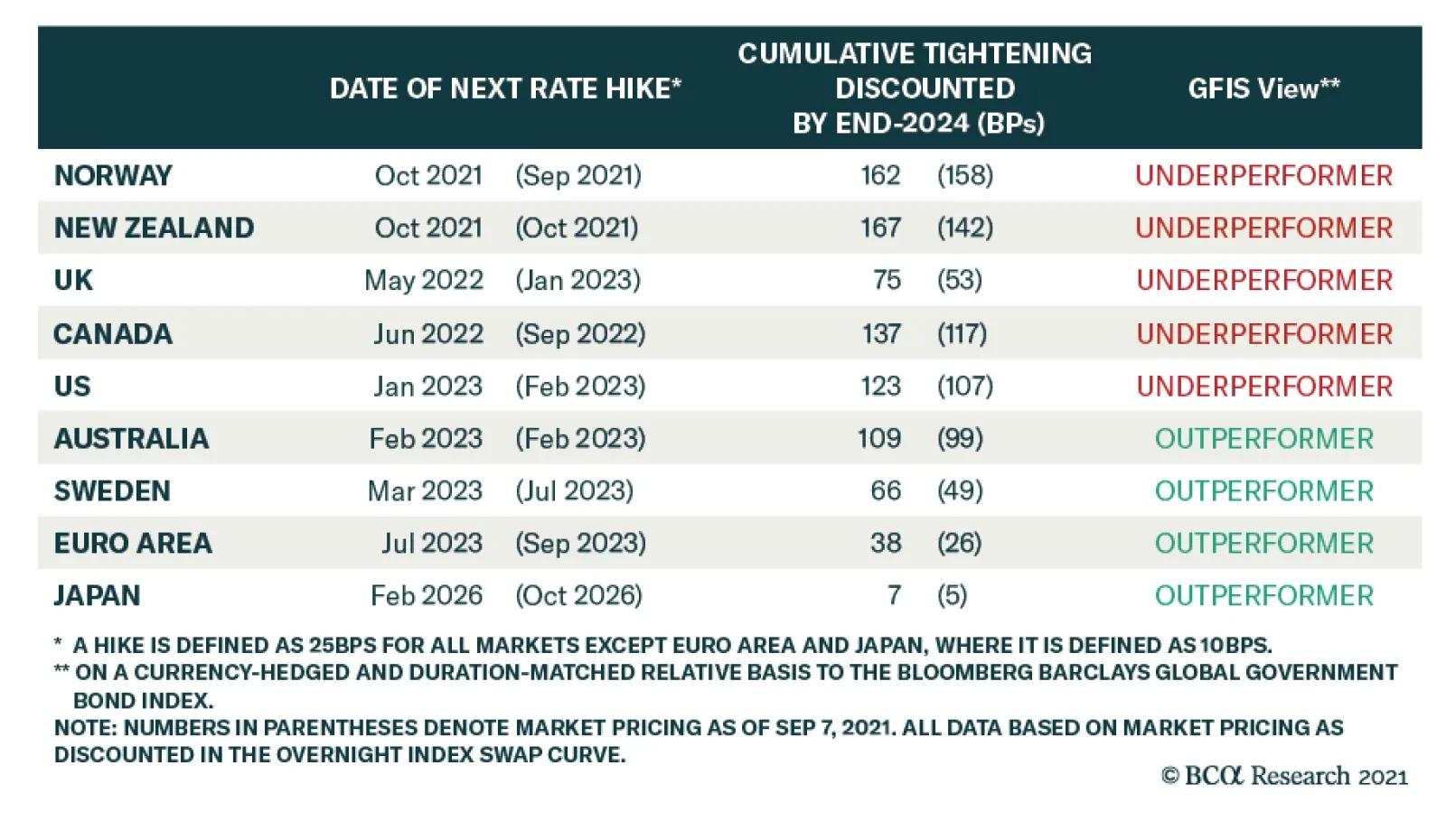
BCA Research’s Global Fixed Income Strategy service recommends investors underweight government bonds where markets are discounting a path for future policy rates over the next two years that is too flat: the US, UK, Canada, and Norway Last week…
The decline in US government bond yields between April and August was largely put down to oversold conditions in the Treasury market and concerns amid signs that economic growth is moderating in the US. The stock market brushed off these…
The sharp selloff in Treasurys over the past week has ignited a debate among BCA Research strategists about whether it is attributed to rising fears about inflation (see Country Focus) or is part of the reopening trade. The simultaneous rally in oil prices,…
Highlights Evergrande has not only crossed regulatory gridlines but also regulators’ bottom lines; the government will use the example of Evergrande to impose discipline on real estate developers. The policy response will likely prioritize domestic homebuyers and suppliers to minimize systemic risks and damage to the real economy. However, a bigger risk stems from the possibility that policymakers overestimate the resilience of the economy and ignore signs of a significant spillover to other segments in the economy. The existing policy restrictions on China’s housing sector will not be reversed; the sector is on a structural downshift and will face risks of further consolidation and profit growth compression. Feature China Evergrande Group continues to stir up the global markets. Last Thursday the company missed a deadline to pay USD $83.5m in bond interest. The firm has now entered a 30-day grace period; it will default if that deadline also passes without payment. Chart 1Roller-Coaster Ride Continues...
Roller-Coaster Ride Continues...
Roller-Coaster Ride Continues...
Evergrande has not remarked on the potential default nor have China’s authorities or state media offered any clues about a potential rescue package. Meanwhile, the PBoC injected large amounts of liquidity into the banking system of late, a clear sign of support for the markets. Evergrande share prices continued their roller-coaster ride (Chart 1). Evergrande’s tumult is indicative of an industry-wide problem. Real estate developers have expanded their businesses and profits through high-debt growth models. China’s policymakers have been trying to crack down on this business practice since 2017 and their clampdown has significantly intensified since August 2020. In this report, we follow up on last week’s Special Alert and share our thoughts on the potential market implications and policy response to the evolving Evergrande situation. The “Three Red Lines” Versus The “Bottom Lines” Evergrande has not only crossed the “three red lines” – three debt metrics China’s authorities laid out a year ago to reduce the housing sector’s leverage – but it has also crossed the bottom lines of policymakers. Therefore, we do not expect the government to lend a financial hand to bail out the corporation and its shareholders. Meanwhile, as discussed in our Special Alert, we expect that there will be some kind of a rescue plan to help onshore homebuyers and suppliers recover their losses. The authorities’ silence in the past three months as investors’ concerns about Evergrande’s debt situation escalated speaks volumes about plans for the overleveraged company. The Evergrande episode is not idiosyncratic; it represents an industry-wide problem linked to the sector’s high-debt growth model. However, Evergrande has become China’s and the world’s most indebted property developer; the “three red lines” policy last year has pushed the company into a severe liquidity crunch. Evergrande not only borrowed heavily to pursue an aggressive expansion strategy (“disorderly expansion of capitals”), but did so as President Xi Jinping famously remarked “houses are for living, not for speculation” in late 2016. Between 2016 and 2020, Evergrande’s total liabilities almost doubled and its stock prices jumped by 460%. Evergrande’s founder was ranked the richest man in China in 2017, building his company’s fortune on excessive leverage. The way that the company accumulated wealth conflicts with the government’s new mantra of building “common prosperity”, a policy shift to reduce income and wealth inequality. Furthermore, Evergrande paid its offshore investors in June this year while it continued to borrow from onshore banks and offload its onshore assets. This move did not bode well for China’s domestic stake- and shareholders, along with policymakers. Chart 2Housing Price Inflation Has Been Subdued Outside Of Top-Tier Cities
Housing Price Inflation Has Been Subdued Outside Of Top-Tier Cities
Housing Price Inflation Has Been Subdued Outside Of Top-Tier Cities
In contrast with policymakers’ silence about the future of Evergrande and its shareholders, the authorities have reportedly urged the company to finish and deliver its housing projects. Evergrande’s projects are mostly in tier-three cities where post-pandemic home price inflation has been subdued compared with top-tier cities (Chart 2). As such, policymakers will be less concerned about fueling home prices in these cities and more willing to work out a plan to finish and deliver those housing projects. Bottom Line: Beijing may rescue the stakeholders of Evergrande rather than its shareholders. Contagion Risks We discussed our baseline scenario for Evergrande’s bankruptcy and restructuring in last week’s Special Alert. Our message has been that the well-telegraphed Evergrande default might not create an imminent systemic crisis or crash in China’s financial markets. However, it will likely reinforce the credit tightening that has been underway in China over the past 12 months. This will delay and weaken the transmission of liquidity easing into the real economy. So far things are not bad enough for policymakers to reflate the economy in any meaningful way. Since the contagion risks from Evergrande’s debt crisis to China’s onshore financial markets seem to be contained, policy easing in the coming months will likely be gradual. Regulators have shown no sign of reversing the existing policy restrictions. Therefore, a bigger risk to China’s financial markets stems from the possibility that policymakers overestimate the resilience of the economy and ignore signs of a spillover to other segments in the economy. Real estate activity and investment in China are set to slow structurally (discussed in the section below). If policymakers allow a disruptive deceleration in the sector's growth while being reluctant to ramp up support in other industries, China’s economic growth could downshift much more than policymakers would like to see. A rapid deceleration in the real economic activity and jitters in the financial markets could reinforce each other and spiral out of control. The facts below explain why risks of an imminent systemic crisis in China’s and global financial markets are limited (Table 1): The exposure of China’s banks to real estate developers is small relative to the banks’ total lending. Although about 40% of total bank loans are property-related, only 6% are in loans to real estate developers. The majority of the 40% is in mortgage loans, construction loans and other loans collateralized by land and property. Evergrande’s outstanding bank debt accounts for less than 0.1% of China’s total onshore loan balances. The company owes about 1% of China’s existing trust loans and 0.04% of domestic bonds. The company has quality assets, as we discussed in last week’s report, that could cover most of its onshore outstanding debt. Widespread mortgage loan defaults are unlikely to happen, even if Evergrande does not strike a debt restructuring deal with the government. Strict housing and home-sale regulations cap the upside and limit the downside in home prices. Moreover, conservative loan-to-value ratio requirements have contributed to China’s low default rates on mortgage loans.1 Evergrande’s overseas liabilities are more significant, with its USD $20 billion bonds accounting for about 10% of China's corporate USD bonds issued by real estate developers. On the other hand, major US financial institutions have minimal direct exposure to China and Hong Kong SAR. Table 1Evergrande Debt, An Overview*
The Evergrande Saga Continues
The Evergrande Saga Continues
Despite limited systemic risks to the financial markets, a lack of government intervention could result in a disruptive bankruptcy of the company, risking substantial ripple effects on other parts of the economy. Evergrande’s accounts payable and bills amount to nearly RMB 700 billion, owed to companies in the upstream and downstream industry supply chains. In addition, Evergrande’s contract liabilities are as high as RMB 170 billion and are associated with the pre-sold but unfinished residential units in more than 200 cities. We think policymakers and Evergrande will ultimately agree on a debt restructuring plan. Evergrande could transfer some of its hard assets to state-owned banks or enterprises and the banks could either extend or restructure Evergrande’s existing loans to help finish and deliver the company’s housing projects. Regardless of how the debt is restructured, a government-led rescue will likely prioritize domestic homebuyers and suppliers. Evergrande shareholders and investors in offshore, USD-denominated corporate bonds will suffer large losses. Bottom Line: Our base case scenario is that the government will restructure Evergrande’s debt to prevent the company’s crisis from evolving into a systemic financial risk. Will Policymakers Reverse Restrictive Housing Policies? Even though China’s monetary and fiscal policies have eased at margin, policy restrictions on the property market remain in place. The bar for regulators to significantly ease or to reverse policy tightening in the real estate industry is much higher than in past cycles. Furthermore, the government’s efforts to contain the sector’s leverage and home price inflation are structural rather than cyclical. Our view is based on the following observations: Chart 3China's Housing Demand Is On A Structural Downshift
China's Housing Demand Is On A Structural Downshift
China's Housing Demand Is On A Structural Downshift
China’s housing demand is on a structural downshift due to China’s falling birthrate and working-age population. The decline in demand will likely accelerate in the next four to five years (Chart 3). Therefore, it is unreasonable to expect that the growth in real estate investment in the coming years will continue growing at the same rate as in the past cycles. The government is determined to improve housing affordability by capping home prices in the coming years while increasing lower-income household wage growth. Previous “big bang” stimulus and soaring home prices have widened rather than narrowed income and wealth inequality. Beijing’s current primary focus is “common prosperity,” which aims to reduce inequality. This overarching policy initiative will prevent policymakers from backtracking on reforms in the property sector. Things are not bad enough for a major shift in policy direction. Demand for housing is down, but from a very elevated level (Chart 4). The growth of home sales is now reverting to its pre-pandemic rate. In a previous report we pointed out that the current policy backdrop resembles that of 2H2018 and 2019, when the stimulus was very measured despite a slowing economy and an escalating trade war with the US. Demand for housing in the first eight months of this year is stronger than in 2018/19, thus policymakers may not feel pressure to loosen restrictions in the housing sector. Chart 4Post-Pandemic Housing Demand Stronger Than 2018/19
Post-Pandemic Housing Demand Stronger Than 2018/19
Post-Pandemic Housing Demand Stronger Than 2018/19
Chart 5Real Estate Investment Relatively Steady Despite Contracting Housing Starts
Real Estate Investment Relatively Steady Despite Contracting Housing Starts
Real Estate Investment Relatively Steady Despite Contracting Housing Starts
Growth in real estate investment has been steady despite contracting housing starts (Chart 5). The government’s deleveraging pressure on the sector since August last year has forced developers to hurry and finish their existing projects (Chart 5, bottom panel). This has helped to reduce developers’ project inventories and discourage them from hoarding land reserves, and the policy intention is unlikely to change (Chart 6). Additionally, the government has prioritized home price stability by capping prices and fine-tuning the supply of land (Chart 7). In other words, housing starts have become less market-driven and weaker readings may reflect regulators’ policy intentions to rein in land supplies.2 Local governments may increase the supply of land when real estate investment softens too fast, but home sales and project completions will have to decelerate more significantly. Chart 6Developers Have Been Rushing To Finish Existing Projects
Developers Have Been Rushing To Finish Existing Projects
Developers Have Been Rushing To Finish Existing Projects
Chart 7Government Prioritizes Home Price Stability By Capping Prices And Fine-Tuning Land Supply
Government Prioritizes Home Price Stability By Capping Prices And Fine-Tuning Land Supply
Government Prioritizes Home Price Stability By Capping Prices And Fine-Tuning Land Supply
Funding constraints will not be removed soon and restrictive policies apply to both developers and banks. Banks need to meet the “two red lines” while developers must bring their leverage ratios below the “three red lines” by end-2023. The “two red lines”, which the PBoC unveiled in January this year, set the upper limit on the portion of household mortgages and real estate loans in banks’ total lending. Despite aggressively scaling back lending to the housing sector, the lending ratio in many banks – including China’s six large banks and various medium-sized banks – still exceeded the upper limit. These banks will have to continue to reduce their property-related lending while the other banks will maintain a lower percentage of loans to the housing sector than in the past. Consequently, binding constraints on developers and banks will continue to weigh on the housing market in the coming years, suggesting that the property market downturn will last longer than in previous cycles. Chinese policymakers are unlikely to have much appetite for more robust construction activity in the current environment with supply-side constraints for both raw materials and energy. More than 10 provinces in China are currently under power rationing and have cut factory production amid electricity supply issues and a push to enforce environmental regulations. We expect supply shortages and production decreases to continue through the winter, limiting the upside potential of the country’s economic activity. Bottom Line: China’s reforms in the property sector are structural and the leadership is much less likely to use housing as counter-cyclical policy support to the economy than in previous cycles. Investment Implications China’s growth and its ever-important property market activity have slowed. Given the policymakers’ higher pain threshold for a slower economy and lower appetite for leverage, policy easing will likely be gradual and piecemeal in the near term. The current monetary, fiscal, and industry policy backdrops resemble China’s response in H2 2018 and early 2019. Chinese stock prices rose briefly in early 2019 on the expectation of a sizable stimulus, but the rally was short-lived (Chart 8). Furthermore, we do not rule out the possibility that policymakers will be overconfident in their capability to stabilize the economy as they balance structural reforms against growth volatility. They may choose to wait until there are signs of a significant spillover to other segments in the economy before backtracking the deleveraging campaign in the property sector and lending more support to the market/economy. In this scenario, the near-term response in the equity market will likely be very negative. China-related asset prices will not stabilize until policymakers decisively and significantly dial-up their reflationary response. Property sector stocks in China’s on- and offshore markets have been beaten down by policy tightening and lately the Evergrande saga (Chart 9). We maintain our view that these stocks have not reached their bottom. The property downturn in China is a structural change and authorities are unlikely to reverse current restrictions on the sector to support the economy. Chart 8Chinese Stock Price Rally In 2019 Was Short-Lived
Chinese Stock Price Rally In 2019 Was Short-Lived
Chinese Stock Price Rally In 2019 Was Short-Lived
Chart 9Chinese Real Estate Stocks Have Not Reached Their Bottom
Chinese Real Estate Stocks Have Not Reached Their Bottom
Chinese Real Estate Stocks Have Not Reached Their Bottom
The real estate sector’s contribution to China’s economic growth is expected to gradually decline in the medium to long term. The industry will be further reformed and consolidated, and more developers will be forced to abandon their high-leverage, high-growth business expansion model. The outlook for the real estate industry’s profit growth will become less certain. Investors will require higher risk premiums for real estate sector stocks, which means that these stocks’ valuations will be further compressed. Jing Sima China Strategist jings@bcaresearch.com Footnotes 1 Chinese homeowners’ down payment ratios on a first property is 30% and 50% on a second property. 2Land auctions were delayed in July and August due to overwhelming demand from developers in the first half of the year. Market/Sector Recommendations Cyclical Investment Stance
Highlights Monetary Policy: Last week’s numerous central bank meetings across the world confirmed that the overall direction for global monetary policy is shifting in a more hawkish direction. The main reason: growing fears that elevated inflation will persist for much longer than expected, even with global growth having lost some momentum. Country Allocation: The relative degrees of central banker hawkishness support our current government bond country allocation strategy. Stay underweight the US, UK, Canada, New Zealand and Norway where markets are discounting a path for future policy rates over the next two years that is too flat. Remain overweight countries where there is less need for a more aggressive tightening response: the euro area (both the core and periphery), Australia, Sweden and Japan. Still The Only Game In Town Last week was a busy one for global bond markets, with no fewer than 14 central banks within both the developed markets (DM) and emerging markets (EM) holding policy meetings. The results were eventful: Within EM, Brazil and Hungary lifted policy rates. Norway followed suit to become the first G-10 central bank to hike during the COVID era. The Fed teed up a formal announcement on tapering asset purchases at the next FOMC meeting in November. The Bank of England (BoE) gave strong hints that rate hikes could come sooner than expected, perhaps even before year-end. Chart of the WeekMonetary Policy Backdrop Turning More Bond-Bearish
Monetary Policy Backdrop Turning More Bond-Bearish
Monetary Policy Backdrop Turning More Bond-Bearish
Global bond yields in the developed markets took notice of the change in central bank guidance, especially from the Fed and BoE. The benchmark 10-year US Treasury yield rose from a pre-FOMC low of 1.30% to an intraday high of 1.57% yesterday – a level last seen late June. Longer-dated yields in the UK also rose significantly, with the 30-year Gilt yield rising from a pre-BoE meeting low of 1.11% to an intraday high of 1.40% yesterday – also the highest level since June. The pull on yields extended to other countries, as well, with 10-year yields in Germany, Canada and Australia climbing to three-month highs. The overall message from all of those policy meetings was one of an incremental shift toward less accommodative policies, even as the pace of global economic growth has slowed in recent months. Policymakers are growing more concerned that higher inflation could linger for longer (Chart of the Week). At the same time, loose policy settings have fueled a boom in asset markets that supports growth through easy financial conditions, but also raises future stability risks that worry the central banks. The number of countries seeing actual rate hikes is growing. Our Global Monetary Policy Tightening Indicator shows that just over one-quarter of G-10 and EM central banks have lifted rates over the past three months (Chart 2). All but one (Norway) are in EM, where policymakers have had to act more mechanistically in response to high inflation, even with softening economic growth momentum. While the slower pace of growth is more visible in EM relative to DM, when looking at cyclical indicators like manufacturing PMIs, inflation rates are simply too high around the world for inflation-targeting central banks to ignore (Chart 3). Chart 2Our Global Monetary Policy Indicator Shows A More Hawkish Turn
Our Global Monetary Policy Indicator Shows A More Hawkish Turn
Our Global Monetary Policy Indicator Shows A More Hawkish Turn
Chart 3Global CBs Growing More Worried About Inflation Risks
Global CBs Growing More Worried About Inflation Risks
Global CBs Growing More Worried About Inflation Risks
Within the major DM countries, there has been a notable shift in interest rate expectations in a more hawkish direction. Interest rate markets are, for the most part, still underestimating the potential for tighter monetary policies over the next couple of years. This is the main reason why we continue to recommend an overall below-benchmark strategic stance on global duration exposure. However, the relative expected pace of rate hikes also informs our views on country allocation. In Table 1, we show expectations for the timing of the next rate hike, as well as the cumulative amount of rate increases to the end of 2024, that are currently discounted in DM overnight index swap (OIS) curves. We present the latest level for both, as well as the reading from earlier this month to see how expectations have changed. Table 1Markets Still Pricing Very Modest Tightening Cycles
Marking-To-Market Our Bond Calls After "Central Bank Week"
Marking-To-Market Our Bond Calls After "Central Bank Week"
The so-called “liftoff date” for the first rate hike has been most notably pulled forward in the UK from January 2023 to May 2022, while other countries have seen more modest shifts in the timing of the next rate increase. More importantly, the discounted pace of rate hikes to end-2024 for all countries shown in the table has increased since early September (including Norway, factoring in last week’s tightening move by the Norges Bank). In our view, the biggest driver of relative government bond market yield movements and returns over the next 6-12 months will be the relative adjustments in the expected pace of rate hikes. On that front, the biggest shift higher in cumulative tightening has occurred in countries where we are more pessimistic on government bond performance on a relative basis to the global benchmark: the US, Canada, the UK and Norway. The smaller increases in the pace of hikes have occurred in our more preferred markets – Australia, Sweden, the euro area, and Japan. Assessing Our Two Biggest Government Bond Underweights: The US & UK For last week’s Fed meeting, a new set of economic and interest rate projections from the FOMC members (“the dots”) were presented (Chart 4). Compared to the forecasts from the June meeting, US real GDP growth expectations for 2021 were revised down (5.9% vs 7.6%) but were boosted for 2022 (3.8% vs 3.3%) and 2023 (2.5% vs 2.4%). A new forecast for 2024 was added, coming in at 2.0%. Importantly, none of those growth forecasts was below the median FOMC estimate of the longer-run real GDP growth rate of 1.8% (top panel). In other words, the Fed is not anticipating below-trend growth anytime in the next three years. Chart 4The Fed’s Rate Projections Look Too Low
Marking-To-Market Our Bond Calls After "Central Bank Week"
Marking-To-Market Our Bond Calls After "Central Bank Week"
The same conclusion goes for the US unemployment rate (second panel), with the median FOMC projection for 2022 (3.8%), 2023 (3.5%) and 2024 (3.5%) all below the median longer-run “full employment” estimate of 4.0%. The forecasts for US inflation (third panel) reflect that persistent low level of unemployment. Headline PCE inflation is expected to end 2021 at 4.2%, to be followed by a somewhat slower pace – but still above the 2% Fed inflation target – in 2022 (2.2%), 2023 (2.2%) and 2024 (2.1%). Yet despite these forecasts that show US growth and inflation exceeding its longer-run estimates for the next few years, the FOMC is projecting a relatively slow upward path for interest rates. The median dot now calls for the Fed to hike the funds rate once in 2022 and three more times in both 2023 and 2024. This would bring the funds rate to 1.75% by the end of 2024 – still 75bps below the Fed’s estimate of the longer-run “neutral” funds rate of 2.5% (bottom panel). That projected path for the funds rate is higher than the June dots, which only called for 75bps of cumulative hikes to the end of 2023. There is a wide divergence of opinions on the future path of rates within the FOMC, but the hawks appear to be winning the internal battle (Chart 5). There is now a 9-9 split of FOMC members who are calling for a rate hike in 2022, compared to a 7-11 split back in June, while the number of those projecting a funds rate above 1% in 2023 rose from 5 to 9. Chart 5A Wide Dispersion Of FOMC Interest Rate Views For 2023/24
A Wide Dispersion Of FOMC Interest Rate Views For 2023/24
A Wide Dispersion Of FOMC Interest Rate Views For 2023/24
One area where there does appear to be a consensus is on the timing and pace of tapering. Fed Chair Powell noted at his post-FOMC press conference that an announcement on the reduction of Fed asset purchases could come as soon as the next FOMC meeting on November 6. Powell also signaled that there was general agreement on the FOMC that the taper should end by mid-2022, barring any economic setbacks. That would likely open the door to a rate hike in the latter half of next year, given the Fed’s longstanding view that lifting the funds rate should only occur after tapering is complete, to avoid sending conflicting signals about the Fed’s policy bias. It is clear that the Fed’s policy guidance has shifted incrementally in a more hawkish direction, and confirms our long-held expectation that tapering would be announced by year-end, with rate hikes to begin in late 2022. This dovetails with our recommended investment positioning in the US Treasury market for the next 12-18 months. Maintain a below-benchmark US duration exposure, with a curve-flattening bias, while staying underweight US Treasuries in global (USD-hedged) fixed income portfolios (Chart 6). Our other high-conviction underweight government bond call is in the UK. The BoE’s recent messaging has turned more hawkish in a very short period of time, justifying our decision to downgrade our recommended UK Gilt exposure to underweight last month.1 The BoE Monetary Policy Committee had already sharply upgraded its inflation forecast for the end of 2021 to just above 4% at the last policy meeting in August. That was categorized as just a temporary surge due to rising energy prices and goods prices elevated by shorter-term global supply chain bottlenecks. At last week’s meeting, however, the MPC noted that +4% UK inflation could persist into Q2 2022 because of the current surge in wholesale natural gas prices that has driven many UK gas suppliers out of business (Chart 7). Chart 6Our Recommended Strategy For US Treasuries
Our Recommended Strategy For US Treasuries
Our Recommended Strategy For US Treasuries
Chart 7BoE Growing More Worried About Inflation
BoE Growing More Worried About Inflation
BoE Growing More Worried About Inflation
Chart 8Our Recommended Strategy For UK Gilts
Our Recommended Strategy For UK Gilts
Our Recommended Strategy For UK Gilts
The official view of the BoE has been like that of other central banks, that much of the current high inflation is supply driven and, hence, will not last. Yet within the MPC, there is clearly some growing nervousness about high realized inflation becoming more embedded in longer-term inflation expectations, which are moving higher. BoE Governor Andrew Bailey has noted in recent speeches that there was a growing case for interest rate hikes because of stubbornly higher inflation. Two members of the MPC even voted last week to reduce the size of the BoE’s QE program that is already set to end in just three months. The markets have begun to heed the more hawkish signals from the BoE. Our 24-month UK discounter, measuring the amount of rate hikes priced into the UK OIS curve, has jumped 24bps since September 7 (Chart 8). Over that same period, UK Gilts have underperformed the Bloomberg Barclays Global Treasury index by 108bps (on a USD-hedged and duration-matched basis). We are sticking with our underweight recommendation on UK Gilts, as there are still too few rate hikes priced into the UK curve relative to the BoE’s guidance and upside inflation risks. What About The BoJ? Same Old, Same Old Chart 9Reasons Why JGBs Will Outperform
Reasons Why JGBs Will Outperform
Reasons Why JGBs Will Outperform
Lost amid the hawkish din from the Fed and BoE meetings last week was the Bank of Japan (BoJ) meeting. The message from policymakers in Tokyo was predictably dovish, as Japan has not seen anything resembling the high inflation that has pushed central bankers elsewhere in a more hawkish direction. Japanese growth has also not seen the same magnitude of recovery from the pandemic shock as the other major developed markets, despite suffering comparable losses during the 2020 recession (Chart 9). One of the main reasons has been that Japan’s vaccine rollouts were much slower than those of other major countries. This forced an extension of emergency lockdowns and other economic restrictions that depressed domestic demand and delayed a return to normal economic activity (second panel). COVID outbreaks even cost Japan the one-time economic windfall from hosting an Olympics, with the Tokyo Games first delayed by a year and then taking place with no fans. Japan has also not suffered any of the higher inflation rates witnessed elsewhere over the past year, despite presumably facing many of the same inflationary forces from global supply chain disruption (third panel). Both headline and core CPI inflation are now in deflation. Governor Haruhiko Kuroda stated last week that it will take longer for Japan to see inflation return back to its 2% target than other developed countries, with the official BoJ forecast calling for that level to be reached by 2023 – a forecast that appears too optimistic. We continue to view Japanese government bonds (JGBs) as a relative safe haven during the period of rising global bond yields that we expect over the next 6-12 months. The BoJ is nowhere close to seeing the conditions necessary to begin exiting its Yield Curve Control and negative interest rate policies, both of which have crushed JGB volatility and kept longer-term bond yields hovering near 0%. We continue to recommend a moderate overweight stance on Japan in global government bond portfolios, particularly on a USD-hedged basis to make the yields more attractive. The Scandinavian Policy Divergence Last week, the Norges Bank raised its benchmark interest rate from 0% to 0.25% (Chart 10), stating that a normalizing economy requires a gradual normalization in monetary policy. The bank’s decision reflects idiosyncratic factors unique to the Norwegian economy, but also some of the same broader themes that are forcing other central banks in a more hawkish direction. As a small economy driven heavily by oil exports, both the Norwegian krone and the price of oil weigh heavily on the policy decisions of the Norges Bank. On that front, the rise in energy prices since the crisis has outpaced the appreciation in the krone (Chart 10, top panel). With this relative weakness in the krone comes higher import price inflation and increased export competitiveness, both of which mean that the Norges Bank must pull forward its path of rate hikes to compensate. As opposed to other G10 central banks, the Norges Bank clearly believes a pre-emptive move on rates is necessary to nip future inflation risk in the bud. The bank expects that increased capacity utilization and wage growth will help push up underlying inflation to approximately 1.9% by the end of 2024, with the ongoing supply chain disruptions creating additional upside risk to that forecast. Like other G10 banks, however, the Norges Bank is concerned about increasing financial imbalances. The Norwegian house price-to-disposable income ratio is now at all-time highs and the Norges Bank expects it to remain elevated to the end of its forecast horizon (Chart 10, bottom panel). With the growth in house prices substantially outpacing income growth during the pandemic, housing market vulnerabilities have increased as households have taken on greater leverage to enter the market. In contrast to the Norges Bank, the other major Scandinavian central bank, Sweden’s Riksbank, has hewed more closely to the prevailing global monetary policy orthodoxy – avoiding pre-emptive policy tightening in order to boost inflation. The central bank chose to hold its repo rate at 0% at last week’s policy meeting, even with a Swedish economy that has recovered the 2020 pandemic losses and is projected to return to pre-COVID growth rates in 2022 (Chart 11). In its decision, the Riksbank mirrored rhetoric from the Fed and ECB, citing that high inflation was driven by rising energy prices and supply logjams, both factors which are expected to subside over the coming year (Chart 11, middle panel). Both headline and core versions of the bank’s favored CPI-F (CPI with Fixed Interest Rate) measure are projected by the Riksbank to remain below target in 2022, reaching 2% only in 2024. Chart 10The Norges Bank Isn't Waiting Around...
The Norges Bank Isn't Waiting Around...
The Norges Bank Isn't Waiting Around...
Chart 11...But The Riksbank Will Remain Patient
...But The Riksbank Will Remain Patient
...But The Riksbank Will Remain Patient
Chart 12The Central Bank Story Will Further Widen The Norway-Sweden Spread
The Central Bank Story Will Further Widen The Norway-Sweden Spread
The Central Bank Story Will Further Widen The Norway-Sweden Spread
The Riksbank is less willing than the Norges Bank to respond to temporarily higher inflation because of the former’s growing reluctance to return to negative nominal interest rates in response to an economic shock. The Riksbank would likely be more comfortable in lifting nominal rates only when real rates were significantly lower than current levels, which requires higher inflation. In contrast to the neighboring Norges Bank, the Riksbank has an additional tool which it can use to express shifts in monetary policy—the size of its balance sheet. The bank forecasts that holdings of securities will remain unchanged in 2022 (Chart 11, bottom panel), implying that purchases, net of redemptions, will be drawn down roughly to zero. However, the bank does believe that the existing stock of purchases will continue to support financial conditions. Chart 12 shows the impact of the Norges Bank’s relatively hawkish reaction function. Despite relatively similar underlying growth and inflation profiles, sovereign debt from Norway has markedly underperformed Swedish counterparts, a dynamic that has been even more obvious since the pandemic. On the currency side, the NOK/SEK cross has recovered much of the losses from 2020, and will likely rally further as Norway-Sweden rate differentials will turn even more favorable for the NOK. Relative to the global benchmark on a currency-hedged and duration-matched basis, Norwegian government debt has underperformed much more than Sweden following the pandemic. We see these tends continuing over the next 6-12 months, with the Norges Bank likely to remain far more hawkish than the Riksbank. Our bias is to favor Swedish sovereign debt over Norwegian government bonds. Robert Robis, CFA Chief Fixed Income Strategist rrobis@bcaresearch.com Shakti Sharma Senior Analyst ShaktiS@bcaresearch.com Ray Park, CFA Research Analyst ray@bcaresearch.com Footnotes 1 Please see BCA Research Global Fixed Income Strategy/European Investment Strategy Report, "The UK Leads The Way", dated August 11, 2021, available at gfis.bcaresearch.com. Recommendations The GFIS Recommended Portfolio Vs. The Custom Benchmark Index
Marking-To-Market Our Bond Calls After "Central Bank Week"
Marking-To-Market Our Bond Calls After "Central Bank Week"
Duration Regional Allocation Spread Product Tactical Trades Yields & Returns Global Bond Yields Historical Returns
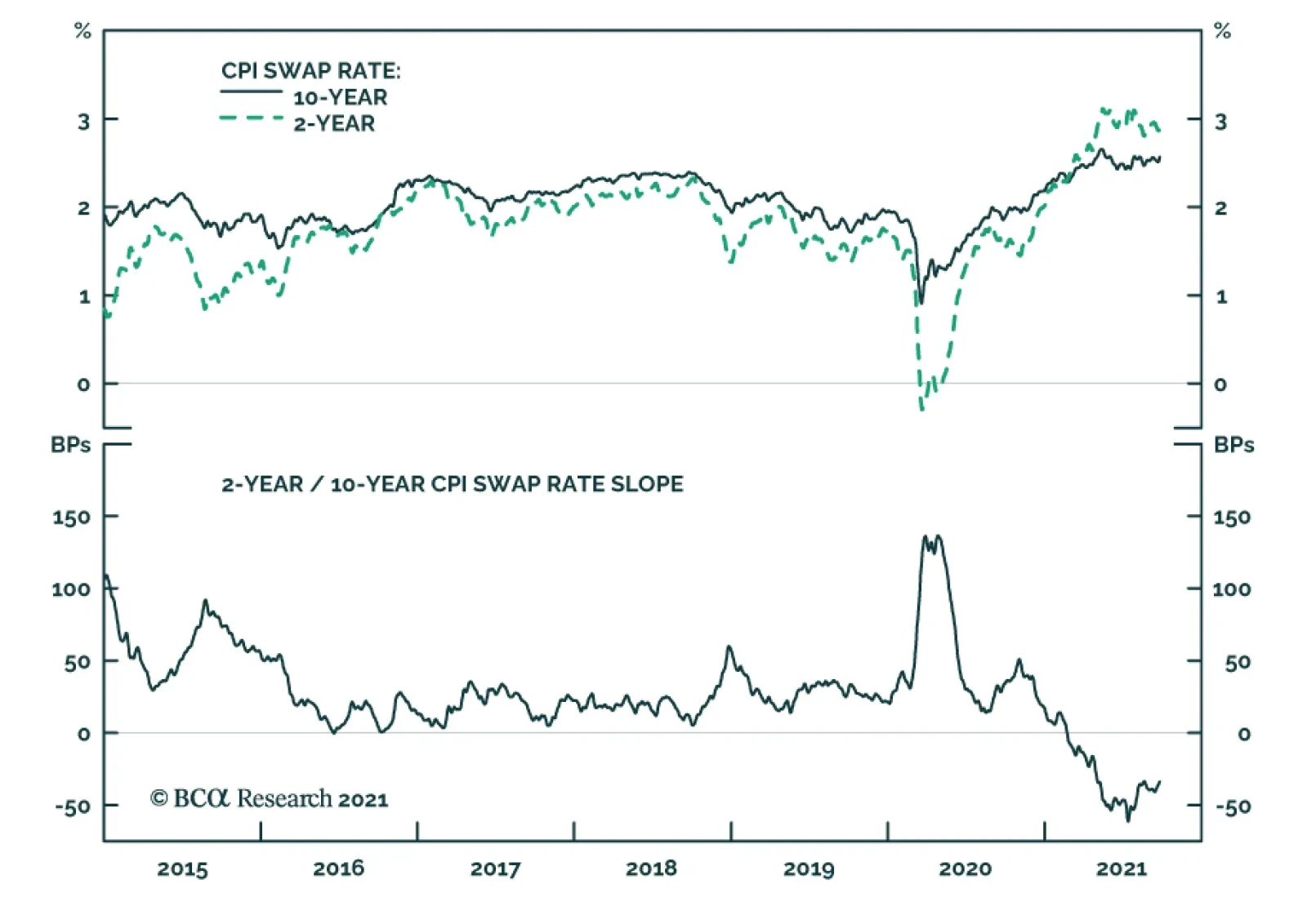
BCA Research’s US Bond Strategy services recommends investors enter 2/10 steepeners on the inflation compensation curve and/or 2/10 flatteners on the real (TIPS) curve. The increase in the 10-year nominal yield since last Wednesday was roughly evenly split…
Highlights Monetary Policy: It’s all but certain that tapering will begin next month and conclude by the middle of next year, but the FOMC is currently split right down the middle on whether it will be appropriate to lift rates in H2 2022. We present five factors to track to decide when the Fed will hike rates. Yield Curve: A bear-flattening of the nominal yield curve remains the most likely scenario for the next 6-12 months. Maintain a position short the 5-year bullet versus a duration-matched 2/10 barbell. TIPS: Investors should enter 2/10 steepeners on the inflation compensation curve and/or 2/10 flatteners on the real (TIPS) curve. The 2-year real yield, in particular, has a lot of upside during the next 6-12 months. EM Bonds: US bond investors should shift some allocation out of expensive US investment grade corporate bonds and into USD-denominated investment grade EM Sovereigns and Corporates where valuation is more compelling. Feature This past week was quite eventful for US bond investors. First, the Fed presented its September update on Wednesday, offering some hints about the timing and pace of asset purchase tapering alongside its updated economic and interest rate forecasts. Then, bonds sold off sharply on Thursday, Friday and Monday with the 10-year Treasury yield rising all the way to 1.49%. The first section of this week’s report looks at what we learned from last week’s FOMC meeting and opines on some monetary policy questions that remain unanswered. The second section updates our views on portfolio duration, the yield curve and TIPS in light of last week’s large market moves. Finally, we conclude with an update on the outlook for USD-denominated Emerging Market bonds. Powell Answers Some Small Questions, Avoids The Big One The Small Questions The start date for asset purchase tapering is the first small question that the Fed answered last week. A new sentence was added to the post-meeting statement saying that “a moderation in the pace of asset purchases may soon be warranted” and, in his press conference, Chair Powell clarified that the purpose of the new language is “to put notice out there that [tapering] could come as soon as the next meeting”. After this statement from the Fed, we expect asset purchase tapering to be announced at the next FOMC meeting on November 3rd. A delay until December is possible if September’s employment report is a massive disappointment, but the bar for delaying tapering beyond November appears high. Chair Powell also shed some light on a second small question related to the Fed’s balance sheet. Specifically, the pace of asset purchase tapering. In his press conference the Chair said that “participants generally view that, so long as the recovery remains on track, a gradual tapering process that concludes around the middle of next year is likely to be appropriate.” The information about the pace of tapering is slightly more interesting than the start date, if only because Fed policymakers have expressed a desire for net purchases to reach zero before the first interest rate increase. The fact that the Fed is planning to reach net zero purchases by the middle of next year suggests that it wants to leave the door open for a possible rate hike in the second half of 2022. This message was confirmed by the Fed’s updated interest rate projections (Chart 1). The projections revealed an even split (9 vs. 9) on the Committee between those that expect at least one 25 basis point rate increase before the end of 2022 and those that do not expect to lift rates next year. It’s also notable that, out of the 9 participants that don’t expect a rate hike in 2022, 8 anticipate lifting rates in 2023. Chart 1Rate Expectations
Rate Expectations
Rate Expectations
Of course, as Chair Powell often points out, the Fed’s interest rate projections are contingent on the future state of the economy and will almost certainly be revised as the outlook evolves. What’s more important from a forecasting perspective is knowing how the Fed will react to different economic conditions. The Big Question With that in mind, we know that the Fed has promised not to lift rates until the labor market reaches “maximum employment”. However, as we noted in a recent report, the Fed hasn’t provided much detail on what “maximum employment” actually means.1 Powell’s comments last week didn’t add much clarity, but we can hunt for clues in the Summary of Economic Projections (SEP). In the SEP, we first notice that 13 FOMC participants expect the unemployment rate to be 3.8% - 3.9% or lower by the end of 2022 (Chart 2A). It is logical to assume that this group includes the 9 participants who expect to lift rates in 2022 and 4 additional ones. We also observe that 17 out of 18 participants anticipate an unemployment rate of 3.8% - 3.9% or lower by the end of 2023 (Chart 2B), exactly matching the number of participants who expect to lift rates by then. We can therefore infer that the Fed views an unemployment rate of roughly 3.8% as consistent with “maximum employment”. That is, FOMC participants tend to have rate hikes penciled into their forecasts once the unemployment rate is below 3.8%. Chart 2AFOMC 2022 Unemployment Rate Projection Distribution
Damage Assessment
Damage Assessment
Chart 2BFOMC 2023 Unemployment Rate Projection Distribution
Damage Assessment
Damage Assessment
The SEP’s inflation forecasts are less illuminating than the unemployment ones. All but 4 participants expect core PCE inflation to be above the Fed’s 2% target at the end of 2022 (Chart 3A) and no FOMC participant is forecasting below-2% core PCE at the end of 2023 (Chart 3B).2 The most we can take away from these forecasts is that 14 FOMC participants expect inflation to be above target in 2022, but five of those participants don’t see the labor market as being tight enough to lift rates by then. Chart 3AFOMC 2022 Core PCE Inflation Rate Projection Distribution
Damage Assessment
Damage Assessment
Chart 3BFOMC 2023 Core PCE Inflation Rate Projection Distribution
Damage Assessment
Damage Assessment
The revelation that FOMC participants view a 3.8% unemployment rate as consistent with “maximum employment” is illuminating, but it doesn’t tell the entire story. We don’t know, for example, what assumptions about labor force participation the different Fed officials are using. Our sense is that the following five criteria will ultimately determine when the Fed starts to lift interest rates: An unemployment rate in the neighborhood of 3.8%. Prime-age (25-54) labor force participation close to its pre-pandemic level (Chart 4, top panel). Accelerating wage growth (Chart 4, bottom 2 panels). Long-dated inflation expectations at or above target levels (Chart 5, top 2 panels). Non-transitory inflation at or above target levels (Chart 5, bottom panel). Bottom Line: The FOMC is currently split right down the middle on whether it will be appropriate to lift rates in 2022, but these forecasts aren’t set in stone and next year’s economic data – particularly the five factors listed above – will determine which group is correct. Chart 4Part Rate & Wage Growth
Part Rate & Wage Growth
Part Rate & Wage Growth
Chart 5Inflation & Inflation Expectations
Inflation & Inflation Expectations
Inflation & Inflation Expectations
Our own view is that the labor market will be sufficiently tight for the Fed to deliver its first rate hike in December 2022, and that rate hikes will proceed more quickly than what is currently priced in the yield curve. US bond investors should maintain below-benchmark portfolio duration. The Fallout In Bond Markets Bonds sold off sharply last Thursday and again yesterday morning. At the time of publication, the 30-year Treasury yield had risen from 1.81% on Wednesday to 2.02% (Chart 6). The 10-year Treasury yield had risen from 1.30% to 1.49% (Chart 6, panel 2). The 5-year yield is up to 0.98% from 0.85% on Wednesday (Chart 6, panel 3), and the 2-year yield is up to 0.28% from 0.24% (Chart 6, panel 4). The yield curve has also steepened since Wednesday, though the 2/10 slope remains well below its March peak (Chart 7). The trend during the past few months has been one of curve steepening out to the 5-year maturity point (Chart 7, panel 2) and flattening beyond that point (Chart 7, bottom 2 panels). Recent market action has led to some steepening beyond the 5-year maturity, but so far that steepening is minor compared to the flattening move we’ve witnessed since the spring. Chart 6Treasury Yield Trends
Treasury Yield Trends
Treasury Yield Trends
Chart 7Treasury Curve Trends
Treasury Curve Trends
Treasury Curve Trends
Nominal Curve We have been recommending a position short the 5-year bullet and long a duration-matched barbell consisting of the 2-year and 10-year notes, and we think this trade will continue to outperform. First, the 5-year/5-year forward Treasury yield is back above 2%, consistent with median estimates of the long-run neutral fed funds rate from the New York Fed’s Surveys of Market Participants (2%) and Primary Dealers (2.25%) (Chart 6, bottom panel). We think it will be difficult for the 5-year/5-year forward yield to rise much above these levels, which makes curve flattening more likely than steepening going forward.3 Second, we updated our work on yield curve scenarios to incorporate recent market action and some new information gleaned from last week’s SEP. In this analysis we estimate fair value levels for different parts of the yield curve as of the end of 2022 based on a scenario for the path of the fed funds rate. For example, if we assume that Fed liftoff occurs in December 2022 and rate hikes proceed at a pace of 75 bps per year (the median pace in the SEP) until the fed funds rate levels-off at 2.08% (consistent with a 2%-2.25% range for the long-run neutral fed funds rate), we calculate that the 2-year yield has 74 bps of upside between now and the end of 2022. This is slightly more than the 65 bps of upside in the 5-year yield and much more than the 37 bps of upside in the 10-year yield (Table 1). Comparing this expected change to what is already discounted in the forward curve, we see that both the 2-year and 10-year yields are expected to exceed their forwards by 6 bps. The 5-year yield is expected to exceed its forward by 16 bps. Table 1Treasury Curve Scenario Analysis
Damage Assessment
Damage Assessment
To us, the message is clear. We want to remain short the 5-year note versus a duration-matched 2/10 barbell. Real & Inflation Curves Chart 8Real & Inflation Curves
Real & Inflation Curves
Real & Inflation Curves
The increase in the 10-year nominal yield since last Wednesday was roughly evenly split between the real and inflation compensation components. Interestingly, inflation drove a greater proportion of the increase at the front-end of the curve, and the 2-year real yield actually fell. We maintain a neutral recommendation on TIPS versus nominal Treasuries, but this week we recommend taking advantage of recent market action by implementing some curve trades across the real and inflation curves. Specifically, we note that the cost of short-maturity inflation compensation remains well above the cost of long-maturity inflation compensation (Chart 8). Going forward, the cost of front-end inflation compensation will fall as inflation moderates from its current extremely high level. Meanwhile, the cost of long-maturity inflation compensation will remain sticky near the Fed’s target levels. This will lead to a steepening of the inflation curve (Chart 8, panel 2). The combination of a steeper inflation curve and a flatter nominal curve will lead to a much flatter real yield curve (Chart 8, bottom 2 panels). The 2-year real yield, in particular, has a lot of upside if inflation moderates, as we expect, and the 2-year nominal yield rises in line with the projections shown in Table 1. Bottom Line: Investors should remain short the 5-year bullet versus a duration-matched 2/10 barbell on the nominal Treasury curve. Investors should also enter 2/10 steepeners on the inflation compensation curve and/or 2/10 flatteners on the real (TIPS) curve. A Quick Update On Emerging Market Bonds The collapse of Chinese real estate behemoth Evergrande dominated headlines for most of the past week, though so far there has been little contagion into USD-denominated credit markets. Unsurprisingly, the spread on Chinese corporate and quasi-sovereign bonds has widened, and there has been some passthrough into both the High-Yield EM USD Corporate & Quasi-Sovereign Index and the High-Yield EM USD Sovereign Index (Chart 9). However, investment grade EM credit spreads have been relatively unaffected by the turmoil, as have US corporate bond spreads (both IG and HY) (Chart 9, bottom 2 panels). While the Evergrande drama – and weakening Chinese economic growth in general – could weigh on USD-denominated EM bond performance in the near-term, we see an excellent buying opportunity in investment grade EM bonds on a 6-12 month horizon. Investment grade EM Sovereigns outperformed credit rating and duration-matched US corporate bonds in the early months of the recovery but have lagged during the past few months (Chart 10). The same is true for the investment grade EM Corporate and Quasi-Sovereign index (Chart 10, panel 3). This is not to say that EM bond performance has been poor – the EM Sovereign index is still up 97 bps versus duration-matched Treasuries on the year – it has simply failed to keep pace with the stellar performance of US corporate bonds. Chart 9No Contagion
No Contagion
No Contagion
Chart 10EM Bonds Versus US Corporates
EM Bonds Versus US Corporates
EM Bonds Versus US Corporates
But that recent stellar performance of US investment grade corporate bonds has left spreads in the sector near historically tight levels. In last week’s report we ran some scenarios for US investment grade corporate bond returns during the next 12 months and concluded that excess returns versus Treasuries are probably capped at 85 bps.4 This makes the current spread advantage in EM Sovereigns (Chart 10, panel 2) and EM Corporates & Quasi-Sovereigns (Chart 10, bottom panel) very compelling. This will be especially true if Emerging Market growth accelerates in 2022 on the back of increased Chinese stimulus and a COVID vaccination campaign that is already picking up steam.5 Bottom Line: US bond investors should shift some allocation out of expensive US investment grade corporate bonds and into USD-denominated investment grade EM Sovereigns and Corporates where valuation is more compelling. Ryan Swift US Bond Strategist rswift@bcaresearch.com Footnotes 1 Please see US Bond Strategy Weekly Report, “2022 Will Be All About Inflation”, dated September 14, 2021. 2 Chart 3B shows that 4 participants expect core PCE inflation of 1.9%-2.0% in 2023, but the SEP also reveals that the minimum forecast for core PCE in 2023 is 2.0%. In other words, all 4 participants in that range are forecasting 2.0%, not 1.9%. 3 For more details on the relationship between our 5-year/5-year forward yield target and the yield curve please see US Bond Strategy Weekly Report, “A Bump On The Road To Recovery”, dated July 27, 2021. 4 Please see US Bond Strategy Weekly Report, “Expected Returns In Corporate Bonds”, dated September 21, 2021. 5 For a recent debate about the outlook for Emerging Market assets please see last Friday’s Webcast: https://www.bcaresearch.com/webcasts/detail/458 Recommended Portfolio Specification Other Recommendations Treasury Index Returns Spread Product Returns
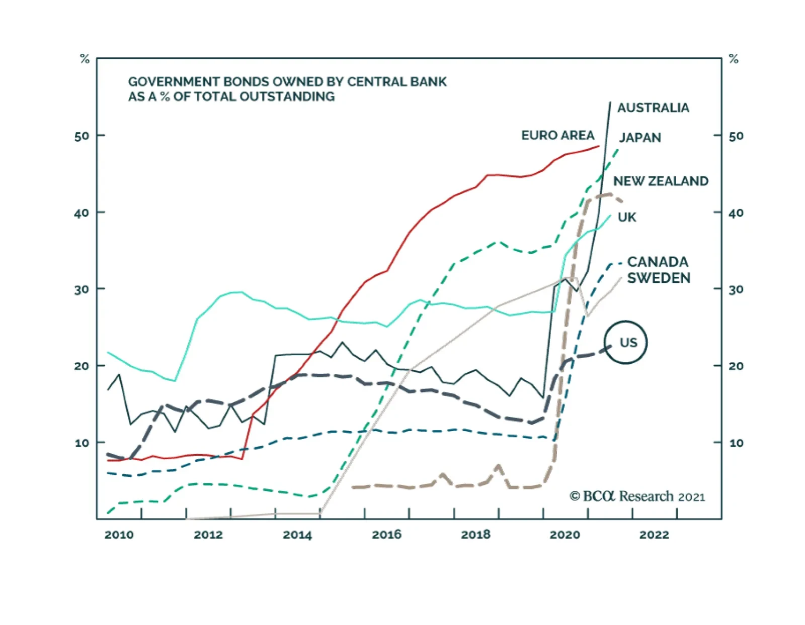
BCA Research’s Foreign Exchange Strategy service expects the Fed’s tapering of asset purchases to be a non-event for the US dollar. While the Fed is still considering tapering asset purchases (and would very likely do so) by year-end, other…
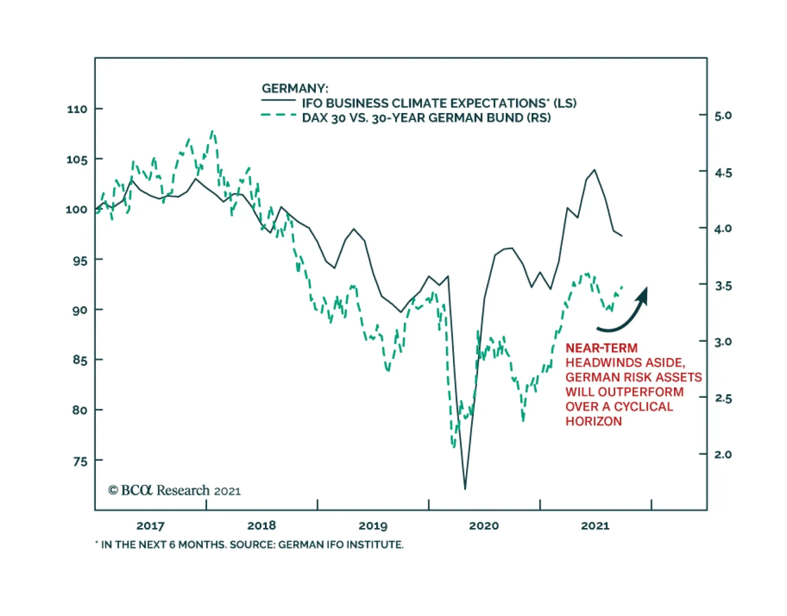
The German IFO’s Business Climate Index softened for the third consecutive month in September, falling to 98.8 from 99.6. The weakness was led by the Current Assessment number which lost 1-point versus expectations of a minor improvement. Meanwhile, the…