Fixed Income

Highlights Global Inflation: Most central banks, led by the Fed, have stuck to the narrative that surging inflation is a temporary phenomenon that will not require an aggressive monetary policy response. However, global supply chain disruptions are lasting for much longer than originally expected, while faster realized global inflation is feeding through into higher longer-term consumer inflation expectations, most notably in the US. This raises the risk that the 2021 inflation pickup will prove to be longer lasting, leading to higher global bond yields. Real Bond Yields: Global bond markets have made a collective bet on the “transitory” inflation narrative by driving yields on government bonds, and even the riskier parts of the corporate credit universe like US and European high-yield, below actual inflation. Markets will have to reprice those negative real bond yields higher if inflation proves to be more persistent than expected - particularly with central banks likely to respond with faster tapering and, in some cases, eventual rate hikes. Feature The month of September has often not been kind to financial markets and September 2021 is already providing many reasons for investors to be nervous. Slowing global growth momentum, uncertainty over the Delta variant, yet another US Debt Ceiling debate in D.C. and worries about excessive Chinese corporate leverage and contagion risks from the looming Evergrande default are all valid reasons for market participants to become more risk averse. On top of that, the monetary policy backdrop is threatening to become less overwhelmingly supportive for markets with the Fed set to begin tapering its asset purchases. Chart of the WeekInflation Expected To Slow But Remain Above Bond Yields
Inflation Expected To Slow But Remain Above Bond Yields
Inflation Expected To Slow But Remain Above Bond Yields
One other source of angst that markets seem less concerned about is inflation. Markets have generally come around to the view of most major central banks, led by the Fed, that the surge in inflation seen this year has been all pandemic related - base effect comparisons to 2020 and temporary supply chain squeezes – and will not last into 2022. Yet we have seen very strong realized global inflation readings in the August data, beyond the point of maximum base effect comparisons versus a year ago, while supply squeezes and soaring shipping costs are showing no signs of slowing as we approach the fourth quarter. Global bond markets have made a collective bet that current high rates of inflation will prove to be temporary. Developed market bond yields are all trading well below actual inflation, as are riskier fixed income asset classes like US and European high-yield (Chart of the Week). While consensus expectations are calling for some rise in government bond yields in 2022, yields are expected to remain below inflation. Those persistent negative real yield expectations remain the biggest source of vulnerability for global bond markets. If inflation turns out to be “less transitory” than expected, nominal bond yields will need to move higher to reprice both real yields and the risk of more hawkish central bank responses to sustained high inflation. A Persistent Inflation Threat From Supply Chain Disruptions Chart 2A Broad-Based Surge In Global Inflation
A Broad-Based Surge In Global Inflation
A Broad-Based Surge In Global Inflation
Our base-case view remains that global inflation will slow in 2022, but not by enough to prevent the major developed market central banks from tapering asset purchases. We expect the Fed to begin buying fewer bonds in January. Central banks that have already begun to slow the pace of quantitative easing (QE) like the Bank of Canada and Bank of England will likely continue to taper as fast, if not even faster, than the Fed. Even the ECB will likely not roll the full amount of the expiring Pandemic Emergency Purchase Program (PEPP) into the existing pre-COVID asset purchase programs, resulting in a mild form of tapering next year. Our view on global inflation has been predicated on an expected shift away from more externally-driven inflation towards more sustainable domestic price pressures stemming from tightening labor markets and the closing of pandemic output gaps (Chart 2). So the mix of inflation in most developed market countries will be more “core” and less “non-core” inflation driven by higher commodity prices and global supply chain disruptions. Yet there is little sign that those non-core inflation pressures are slowing, particular in price gauges most exposed to supply chains like producer price indices (PPI). US PPI inflation climbed to 15-year high of 8.3% on a year-over-year basis in August, while annual growth in the euro area PPI hit 12.1% in July – the fastest pace in the 30-year history of that data series (Chart 3). Surging PPI inflation reflects global price pressures, with import prices expanding at double-digit rates in both the US and Europe. Some of that more externally driven price pressure stems from commodity markets. While the prices for some notable commodities like lumber and iron ore have seen significant retracements from pandemic-era highs over the past several months, more economically sensitive commodities like aluminum and natural gas have all seen very strong price increases (Chart 4). Copper and oil prices are also holding firm, although both are off 2021 highs. Chart 3No Sign Of Slowing Global Inflation At The Producer Level
No Sign Of Slowing Global Inflation At The Producer Level
No Sign Of Slowing Global Inflation At The Producer Level
The price momentum of overall commodity price indices like the CRB Raw Industrials has clearly rolled over, but has held up much better than would be expected given signs of slowing global growth. Chart 4Commodity Markets Still More Inflationary Than Disinflationary
Commodity Markets Still More Inflationary Than Disinflationary
Commodity Markets Still More Inflationary Than Disinflationary
The current depressed level of the China credit impulse, and the flat year-over-year change of the global PMI, would typically be associated with flat commodity prices rather than the current 34% annual growth rate (Chart 5). A lack of sustained upward pressure on the US dollar is likely helping keep commodity prices, which are priced in dollars, more elevated than expected. Even more important, however, are the low inventories for many commodities relative to firm demand (which largely explains the current surge in aluminum and natural gas prices). This mirrors a broader global economic trend towards companies running lower inventories relative to sales, which has been exacerbated by the economic uncertainties of the COVID-19 pandemic. The US overall business inventory-to-sales ratio is now at the lowest level in the history of the series (Chart 6). Chart 5Commodity Price Inflation Peaking, But Not Slowing Much
Commodity Price Inflation Peaking, But Not Slowing Much
Commodity Price Inflation Peaking, But Not Slowing Much
Chart 6Supply Squeezes Are Likely To Persist
Supply Squeezes Are Likely To Persist
Supply Squeezes Are Likely To Persist
Before the pandemic, firms have gotten away with running very lean inventories because of globalized supply chains that allow firms to maintain the minimum amount of inventory to meet demand. Yet “just-in-time” inventory management only works when suppliers can deliver raw materials or finished goods in a timely fashion at low cost. The pandemic has blown up that model, making it much harder to deliver products and materials from critical countries like China. Global shipping costs have exploded higher and are showing no signs of slowing (bottom panel), while supplier delivery times remain well above historical averages according to measures like the US ISM index. Those higher costs are feeding through into overall inflation measures, particularly for the components most exposed to supply chain disruption. In Chart 7, we show a breakdown of the overall CPI inflation data for the US, euro area, UK and Canada. The groupings shown in the chart are based on an analysis done by the Bank of Canada back in August to measure pandemic impacts on Canadian inflation.1 The top panel of the chart shows the contribution to overall inflation for elements most exposed to supply constraints (like autos and durable goods). The second panel of the chart shows the contribution from sectors more exposed to increased demand as economies reopen from pandemic restrictions, like dining at restaurants and travel. The remaining panels of the chart show the contributions from energy prices and all other components not covered in the top three panels. Chart 7Fed's Transitory Narrative At Risk From Lingering Supply Chain Disruption
Fed's Transitory Narrative At Risk From Lingering Supply Chain Disruption
Fed's Transitory Narrative At Risk From Lingering Supply Chain Disruption
Chart 8High US Inflation May Not Prove To Be So Transitory
High US Inflation May Not Prove To Be So Transitory
High US Inflation May Not Prove To Be So Transitory
The conclusion from our chart is that supply disruptions have added more to US and Canadian inflation so far in 2021, while reopening demand has been more meaningful for UK and US inflation. The pickup in euro area inflation has been mostly an energy price story, although reopening demand has started to contribute to the rising trend of overall inflation. The implication from this analysis is that persistent supply chain disruptions could become a bigger issue for future inflation – and monetary policy decisions – in the US and Canada. The acceleration of US realized inflation in 2021 has already begun to broaden out from the most volatile components, according to measures like the Dallas Fed Trimmed Mean PCE (Chart 8). Faster inflation is also feeding through into higher US consumer inflation expectations according to surveys from the New York Fed and the University of Michigan. Those increases are not deemed to be temporary, with longer-term inflation expectations now moving higher. The New York Fed’s survey shows that inflation is expected to be 4% over the next three years, two full percentage points above the Fed’s target, which must be ringing some alarm bells on the FOMC. Chart 9European Consumers Are Waking Up To Higher Inflation
European Consumers Are Waking Up To Higher Inflation
European Consumers Are Waking Up To Higher Inflation
Consumer inflation expectations are also starting to perk up outside the US. The YouGov/Citigroup survey shows an expectation of UK inflation over the next 5-10 years of 3.5%, while the Bank of England/Kantar survey is at 3% over the next five years (Chart 9, top panel). Both are above the Bank of England’s 2% inflation target. The European Commission confidence surveys have shown a sharp increase in the net share of respondents expecting higher inflation in the coming months (bottom panel), while the Bundesbank’s August consumer survey shows that Germans now expect 3.5% inflation over the next 12 months, up from 2% back in March. Bottom Line: Supply chain disruptions are lasting for much longer than originally expected, while faster realized global inflation is feeding through into higher longer-term consumer inflation expectations, most notably in the US. This raises the risk that the 2021 inflation pickup will last much longer than expected and force a bond-bearish repricing of future interest rate expectations. Negative Real Yields – The Achilles Heel For Bond Markets It is clear that supply chain disruptions are having a more lasting effect on global inflation than investors, and policymakers, expected earlier this year. Yet while both market-based and survey-based measures of inflation expectations are moving higher, interest rate markets are still pricing in a very dovish future path for policy rates of the major developed market central banks. For example, our 24-month discounters, which measure the change in interest rates over the next two years discounted in overnight index swap (OIS) curves, show that only 71bps, 61bps and 13bps of rate hikes are expected in the US, UK and euro area, respectively, by September 2023 (Chart 10). This continues a trend that we have highlighted in recent reports – the persistence of negative real interest rate expectations in the developed markets that is also keeping real bond yields in sub-0% territory. In the US, the OIS forward curve shows that the first Fed rate hike is expected in early 2023 with a very slow pace of rate increases over the following 2-3 years (Chart 11). The funds rate is expected to level off at 1.75% and stay there through 2030. At the same time, the CPI swap forward curve has inflation falling steadily over the next couple of years, but leveling off around 2.35% for the rest of the upcoming decade. Combining those two forward projections comes up with an implied path for the real fed funds rate that is persistently negative for the next ten years, “settling” at -0.6% by the end of the decade. Chart 10Bond Markets Exposed To More Hawkish Central Banks
Bond Markets Exposed To More Hawkish Central Banks
Bond Markets Exposed To More Hawkish Central Banks
Chart 11US Real Yields Priced For Extended Fed Dovishness
US Real Yields Priced For Extended Fed Dovishness
US Real Yields Priced For Extended Fed Dovishness
An even more deeply negative real rate path is discounted in the euro area forward curves. The ECB is expected to begin lifting rates in 2023, eventually moving out of negative (nominal) territory in 2026 before climbing to +0.5% by 2030 (Chart 12). Euro area CPI swaps are priced for a fall in inflation back below 2% over the next two years, eventually stabilizing at 1.75% over the latter half of the next decade. The real ECB policy rate is therefore expected to settle at -1.25% by 2030. In the UK, markets are discounting much of what has been seen in the years since the 2008 financial crisis – a Bank of England that does very little with interest rates. The central bank is expected to begin lifting rates in 2023, but only a handful of rate hikes are expected in the following years with Bank Rate only climbing to 1% and settling there for most of the upcoming decade. The UK CPI swap curve is discounting relatively high inflation over the next decade, settling at 3.6% in 2030. Thus, the market is discounting a long-run real Bank of England policy rate of -2.6%. This pricing of negative real policy rates so far into the future goes a long way to explain why longer-term real government bond yields have also been consistently negative in the US, Germany, UK and elsewhere in the developed markets. That can be seen in Charts 11, 12 and 13, where we have added the 10-year inflation-linked (real) bond yield for US TIPS, French OATis and UK index-linked Gilts. In all three cases, the 10-year real yield has “gravitated” towards the realized path of the real policy rate – the nominal rate minus headline CPI inflation – over the past two decades. Chart 12Negative Real Rates Forever In Europe?
Negative Real Rates Forever In Europe?
Negative Real Rates Forever In Europe?
Chart 13BoE Not Expected To Do Much Over The Next Decade
BoE Not Expected To Do Much Over The Next Decade
BoE Not Expected To Do Much Over The Next Decade
Chart 14Nominal Yields Will Move Higher If Negative Real Yields Persist
Nominal Yields Will Move Higher If Negative Real Yields Persist
Nominal Yields Will Move Higher If Negative Real Yields Persist
Persistent low government bond yields, both in nominal and inflation-adjusted terms, have resulted in lower yields across the global fixed income markets as investors have been forced to take on more risk to find acceptable yields. This has resulted in a situation where nominal yields on riskier assets like US high-yield corporate bonds and Italian government debt are trading below prevailing headline inflation rates in the US and Europe (Chart 14). Bond investors would likely only be comfortable accepting such negative real yields on the riskier parts of the fixed income universe if a) inflation was expected to decline, and/or b) real yields on risk-free government bonds were expected to stay negative for longer as central banks stay dovish. In either case, the “bet” made by investors is that the inflation surge seen this year will indeed prove to be transitory, as central banks are forecasting. If that benign outlook proves to be incorrect and inflation stays resilient for longer – potentially because of the risk of lingering supply chain disruptions described earlier in this report - nominal bond yields will have to reprice higher to account for faster realized inflation (and, most likely, rising inflation expectations). This process will start in government bond markets, as global central banks will be forced to respond to stubbornly high inflation by turning more hawkish, first with faster tapering of QE bond buying and, later, with interest rate hikes. We continue to see persistent negative real yields as the biggest source of risk in developed economy bond markets over the next couple of years. Those yields discount a benign path for both inflation and future monetary policy that is looking increasingly less likely – especially with tightening labor markets and rising consumer inflation expectations already forcing central banks, led by the Fed, to move incrementally towards less accommodative policy settings. Bottom Line: Global bond markets have made a collective bet on the “transitory” inflation narrative by driving yields on government bonds, and even the riskier parts of the corporate credit universe like US and European high-yield, below actual inflation. Markets will have to reprice those negative real bond yields higher if inflation proves to be more persistent than expected - particularly with central banks likely to respond with faster tapering and, in some cases, eventual rate hikes. Stay below-benchmark on overall global duration exposure in fixed income portfolios. Robert Robis, CFA Chief Fixed Income Strategist rrobis@bcaresearch.com Footnotes 1 We have attempted to match the groupings shown in the Bank of Canada analysis as much as possible for the other countries, although there are some minor differences based on how each country’s consumer price index sub-indices are defined. Recommendations The GFIS Recommended Portfolio Vs. The Custom Benchmark Index
What If Higher Inflation Is Not Transitory?
What If Higher Inflation Is Not Transitory?
Duration Regional Allocation Spread Product Tactical Trades Yields & Returns Global Bond Yields Historical Returns
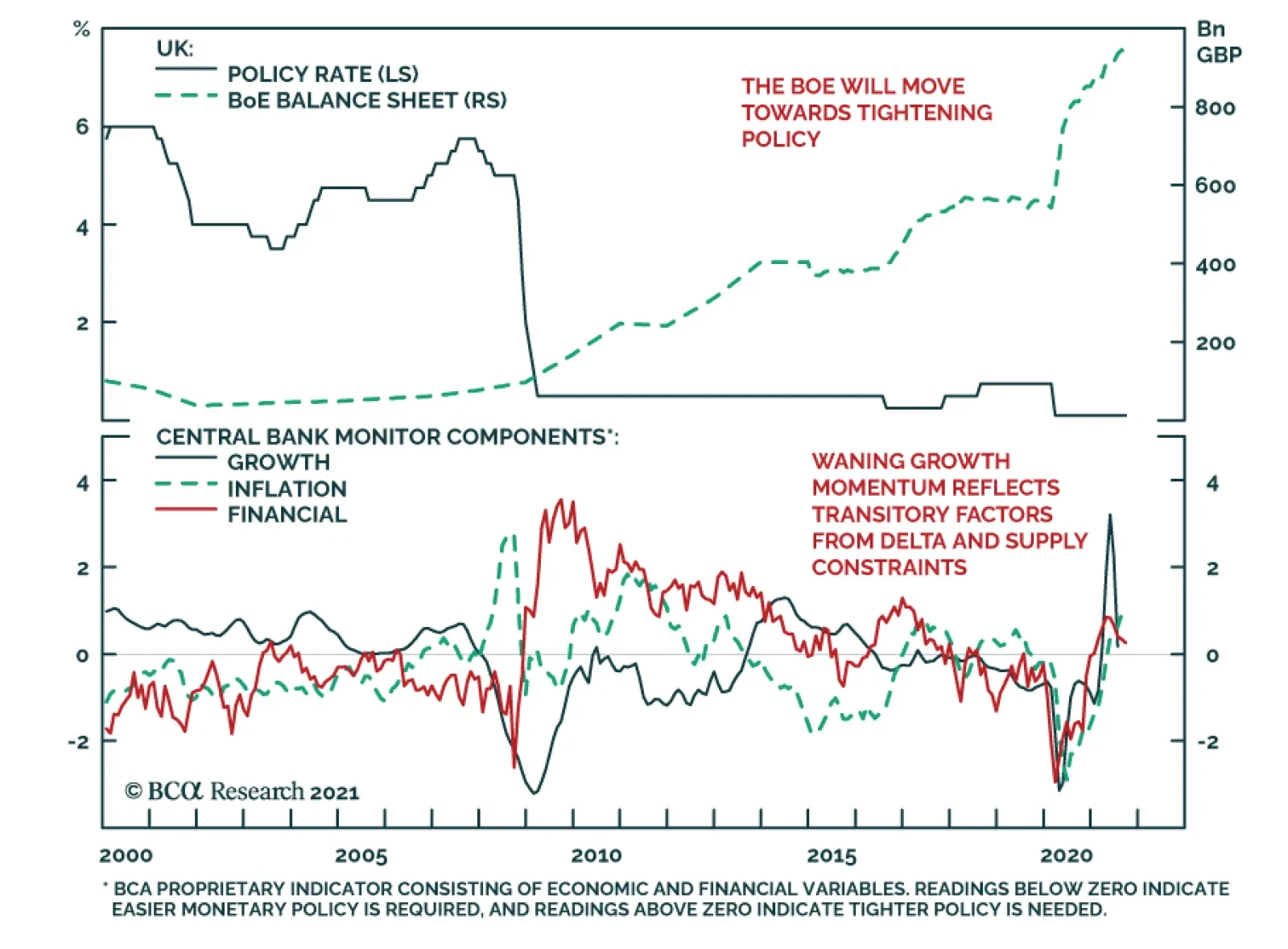
The Bank of England kept policy unchanged at its meeting on Thursday. Instead, it revised down its Q3 growth outlook to 2.1% from last month’s 2.9%. However, it highlighted that this revision largely reflects the dampening effect of supply constraints on…
Highlights Evergrande is just a canary in the coalmine warning of the vulnerability of global real estate, which is now trading on its highest valuation ever. US house prices are now more extended versus rents than at the peak of the credit boom. US bond yields cannot move up very far before severely choking mortgage demand and hence the housing market (not to mention the stock market). We reiterate our structural recommendation to own the US 30-year T-bond, whose ultimate low in yield will come in the next deflationary shock. New structural recommendation: buy the China 30-year government bond Stay structurally long real estate. Even though valuations are high, they will get even higher when 30-year bond yields reach their ultimate low. Fractal analysis: Uranium and Palm Oil. Feature Chart of the WeekThe $300 Trillion Global Real Estate Market Dwarfs The $90 Trillion Global Economy
The $300 Trillion Global Real Estate Market Dwarfs The $90 Trillion Global Economy
The $300 Trillion Global Real Estate Market Dwarfs The $90 Trillion Global Economy
The recent woes of China’s systemically important real estate developer Evergrande confirm the concern we voiced in our October 29, 2020 Special Report: The Real Risk Is Real Estate. To be clear, we do not expect any Evergrande default to topple the global financial dominoes á la 2008. The Chinese government is able and almost certainly willing to prevent its own Lehman moment. A more realistic concern is that the rich valuation of real estate, both in China and globally, is vulnerable to the slightest of shocks, and Evergrande is just a canary in the coalmine. Even A 10 Percent Decline In Chinese House Prices Would Constitute A Major Shock According to global real estate specialist Savills, four of the top six world cities for real estate inflation in 2021 are in China. Through just the first half of the year, prime real estate prices have surged by 14 percent in Shanghai, 13 percent in Hangzhou, 9 percent in Shenzhen, and 8 percent in Guangzhou.1 This surge in Chinese property prices has lifted Chinese valuations to nosebleed levels. Today, prime real estate yields in China’s major cities are barely above 1 percent, just a third of the global average of 3 percent. From such nosebleed valuations, a fire sale of Evergrande’s inventory – as creditors tried to recover debts – could weigh down real estate prices. And the repercussions would extend beyond China’s property sector. Prime real estate yields in China’s major cities are barely above 1 percent, just a third of the global average of 3 percent. Without a social safety net and with limited places to park their money, Chinese savers have for years been encouraged to buy homes, in the widespread belief that property is the safest investment, whose price is only supposed to go up. With the bulk of people’s wealth in property acting as a perceived economic safety net, even a 10 percent decline in house prices would constitute a major shock to the household sector’s hopes and expectations of what property is (Chart I-2). Chart I-2Even A 10 Percent Decline In Chinese House Prices Would Constitute A Major Shock
Even A 10 Percent Decline In Chinese House Prices Would Constitute A Major Shock
Even A 10 Percent Decline In Chinese House Prices Would Constitute A Major Shock
In turn, the ensuing ‘negative wealth effect’ would unleash a major headwind to household spending in the world’s second largest economy. Nosebleed Property Valuations Everywhere The precarious valuation of real estate is not just a Chinese concern. US house prices are now more extended versus rents than at the peak of the credit boom (Chart I-3). Chart I-3US House Prices Are Now More Extended Versus Rents Than At The Peak Of The Credit Boom
US House Prices Are Now More Extended Versus Rents Than At The Peak Of The Credit Boom
US House Prices Are Now More Extended Versus Rents Than At The Peak Of The Credit Boom
Yet the phenomenon extends globally. Through the past ten years, world prime residential prices are up by 70 percent while rents are up by just 25 percent.2 As a mathematical identity, this means that the bulk of the increase in global real estate prices is due to valuation expansion (Chart I-4). Savills confirms this by pointing out that its global prime residential yield has fallen below 3 percent for the first time, and constitutes the lowest global rental yield since the firm began tracking the data in 2005. Chart I-4The Bulk Of The Increase In Global Real Estate Prices Is Due To Valuation Expansion
The Bulk Of The Increase In Global Real Estate Prices Is Due To Valuation Expansion
The Bulk Of The Increase In Global Real Estate Prices Is Due To Valuation Expansion
The culprit for the richest ever valuation of global real estate is the structural collapse in global bond yields. And the culprit for the structural collapse in bond yields is persistently ultra-low policy interest rates combined with trillions of dollars of quantitative easing (Chart I-5). Chart I-5The Culprit For The Richest Ever Valuation Of Global Real Estate Is The Structural Collapse In Global Bond Yields
The Culprit For The Richest Ever Valuation Of Global Real Estate Is The Structural Collapse In Global Bond Yields
The Culprit For The Richest Ever Valuation Of Global Real Estate Is The Structural Collapse In Global Bond Yields
But now, policy makers risk being hoisted by their own petard. The tight relationship between bond yields and real estate yields means that bond yields have very limited scope to rise before pulling the bottom out of the $300 trillion global real estate market. Given that this dwarfs the $90 trillion global economy, even a 10 percent correction amounting to $30 trillion would constitute a devastating negative wealth effect (Chart of the Week). Nosebleed Property Valuations Reinforce The Structural Case For 30-Year Bonds Some people counter that in an inflationary shock, property – as the ultimate real asset – ought to perform well even as bond yields rise. However, when valuations start off in nosebleed territory as now, the initial intense headwind from deflating valuations obliterates the tailwind from inflating incomes. An easy way to understand this intense headwind is through the concept of affordability. In the US the 15-year mortgage rate tracks the 10-year T-bond yield plus a usually consistent spread of around 1 percent. Hence, if the 10-year T-bond yield rose from 1.3 to 2 percent, the mortgage rate would rise from 2.3 to 3 percent, a proportionate increase of 30 percent. For the marginal buyer using an interest-only mortgage, this means that already stretched affordability versus income would worsen by 30 percent.3 Therefore, for the marginal buyer to keep his bid on the property the same, his income would have to inflate by 30 percent. But in an inflationary shock that pushed up the bond yield by 0.7 percent, it is implausible that wages would rise by 30 percent. Let’s say, at a push, that wages rose by 10 percent. To keep affordability and mortgage demand the same, property prices would have to plunge by 20 percent. In fact, earlier this year we saw the extreme vulnerability of US mortgage demand to higher bond yields. When the bond yield collapsed at the start of the pandemic in 2020, the mortgage rate declined more sedately. Hence, in the early stage of bond yield rebound, the US mortgage rate did not increase (Chart I-6). Chart I-6In 2020, The US Mortgage Rate Briefly Decoupled From Its Usual Relationship With The Bond Yield
In 2020, The US Mortgage Rate Briefly Decoupled From Its Usual Relationship With The Bond Yield
In 2020, The US Mortgage Rate Briefly Decoupled From Its Usual Relationship With The Bond Yield
But by early 2021, the mortgage rate had normalised its relationship with the bond yield, so the snap-up in yields earlier this year lifted mortgage rates point for point. The worrying result was that US mortgage applications for house purchases collapsed by one third (Chart I-7). Chart I-7As Bond Yields Rose Earlier This Year, US Mortgage Applications Collapsed By One Third
As Bond Yields Rose Earlier This Year, US Mortgage Applications Collapsed By One Third
As Bond Yields Rose Earlier This Year, US Mortgage Applications Collapsed By One Third
Fortunately, the negative feedback from markets and the economy meant that the snap-up in bond yields was brief. As yields have subsequently fallen back, mortgage demand has stabilised. Yet the crucial lesson is that US bond yields cannot move up very far before severely choking mortgage demand and hence the housing market (not to mention the stock market). To repeat, US house prices are more stretched versus rents than at the peak of the credit boom in 2007. With this precarious dynamic, we reiterate our structural recommendation to own the US 30-year T-bond, whose ultimate low in yield will come in the next deflationary shock. As bond yields rose earlier this year, US mortgage applications collapsed by one third. But today we are adding a new structural recommendation. Given that Chinese real estate valuations are even more precariously balanced than those in the US, and that purchases have been lending-fuelled, Chinese long-dated bonds are an excellent structural investment for those investors who can accept the capital control risks. As a structural holding, buy the China 30-year government bond (Chart I-8). Chart I-8The Ultimate Low In The US And China 30-Year Bond Yield Is Still To Come
The Ultimate Low In The US And China 30-Year Bond Yield Is Still To Come
The Ultimate Low In The US And China 30-Year Bond Yield Is Still To Come
As for the highly-valued real estate asset-class, the paradox is that valuations will reach their ultimate high when 30-year bond yields reach their ultimate low. Until then, stay structurally long real estate. Uranium Is The Latest ‘Meme Theme’ The recent near-vertical ascent in uranium plays have left many investors scratching their heads and wondering: what’s going on? The answer, in large part, is that uranium plays have become the latest ‘meme theme’. On Reddit’s Wall Street Bets forum, the Canadian uranium miner Cameco has become the second most discussed stock, with one post likening the current opportunity to that in Gamestop, the original meme stock. Of course, as in all meme themes, there must be a loose narrative to latch on to. In this case, it is that as a zero carbon-emitting source of energy, uranium demand should rise while supply remains tight. Still, fractal analysis suggests that meme investors have moved prices too far too fast. Elsewhere, fractal analysis suggests that the spectacular rally in palm oil is also susceptible to a reversal. In this case, the rally has been due to supply bottlenecks in Indonesia and Malaysia, which we expect ultimately to ease (Chart I-9) Chart I-9The Spectacular Rally In Palm Oil Is Susceptible To Reversal
The Spectacular Rally In Palm Oil Is Susceptible To Reversal
The Spectacular Rally In Palm Oil Is Susceptible To Reversal
Nevertheless, this week our favoured trade is to short the meme theme rally in uranium plays (Chart I-10). A good expression is to short the UK stock Yellow Cake, setting the profit target and symmetrical stop-loss at 13 percent. Chart I-10Short The Meme Theme Rally In Uranium Plays
Short The Meme Theme Rally In Uranium Plays
Short The Meme Theme Rally In Uranium Plays
Dhaval Joshi Chief Strategist dhaval@bcaresearch.com Footnotes 1 The other two cities in the top six are Los Angeles and Miami. 2 Based on Savills Prime Index: World Cities – Capital Values, and World Cities – Rents and Yields, June 2011 through June 2021. 3 This calculation assumes an interest only mortgage. The increase would be less for a capital repayment mortgage, but it would still be substantial. Fractal Trading System Fractal Trades 6-Month Recommendations Structural Recommendations Closed Fractal Trades Closed Trades Asset Performance Equity Market Performance Indicators To Watch - Bond Yields Chart II-1Indicators To Watch - Bond Yields - Euro Area
Indicators To Watch - Bond Yields - Euro Area
Indicators To Watch - Bond Yields - Euro Area
Chart II-2Indicators To Watch - Bond Yields - Europe Ex Euro Area
Indicators To Watch - Bond Yields - Europe Ex Euro Area
Indicators To Watch - Bond Yields - Europe Ex Euro Area
Chart II-3Indicators To Watch - Bond Yields - Asia
Indicators To Watch - Bond Yields - Asia
Indicators To Watch - Bond Yields - Asia
Chart II-4Indicators To Watch - Bond Yields - Other Developed
Indicators To Watch - Bond Yields - Other Developed
Indicators To Watch - Bond Yields - Other Developed
Indicators To Watch - Interest Rate Expectations Chart II-5Indicators To Watch - Interest Rate Expectations
Indicators To Watch - Interest Rate Expectations
Indicators To Watch - Interest Rate Expectations
Chart II-6Indicators To Watch - Interest Rate Expectations
Indicators To Watch - Interest Rate Expectations
Indicators To Watch - Interest Rate Expectations
Chart II-7Indicators To Watch - Interest Rate Expectations
Indicators To Watch - Interest Rate Expectations
Indicators To Watch - Interest Rate Expectations
Chart II-8Indicators To Watch - Interest Rate Expectations
Indicators To Watch - Interest Rate Expectations
Indicators To Watch - Interest Rate Expectations
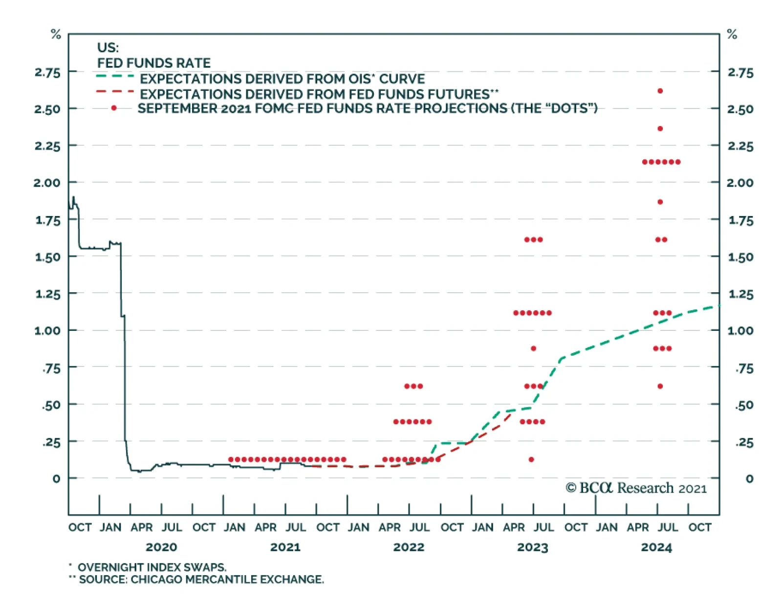
As expected, the FOMC did not make any changes to its policy rate or pace of asset purchases at its meeting on Wednesday. However, the Fed sent a strong signal that tapering is on the horizon. The statement indicated that “if progress continues broadly as…
BCA Research’s US Bond Strategy service expects corporate bonds to outperform Treasuries during the next 6-12 month. However, both excess returns and total returns will take a step down. Two broad factors must be considered when deciding whether to favor…
The performance of global risk assets improved somewhat on Tuesday following Monday’s tumble on the back of concerns about the potential implications of an Evergrande default. Nevertheless, risks remain elevated. A key unknown facing investors going forward…
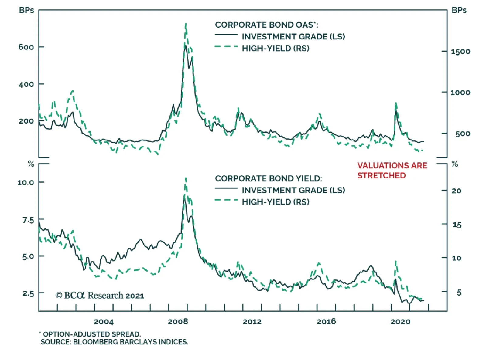
Highlights Investment Grade: Investment grade corporate bond total returns will be close to zero or negative during the next 12 months. The bonds are also likely to outperform duration-matched Treasuries during that period, but excess returns are probably capped at 85 bps. High-Yield: High-yield total returns will fall between -0.29% and +1.80% during the next 12 months, but with a much higher likelihood of being positive than investment grade corporates. Junk will outperform duration-matched Treasuries by between 0.94% and 1.84%, besting the excess returns earned in investment grade. Inflation & The Fed: The Fed will announce asset purchase tapering before the end of this year, and tapering will proceed at a pace that opens the door to a potential rate hike before the end of 2022. Ultimately, whether the Fed lifts rates in 2022 will depend on trends in core CPI excluding COVID-impacted services and autos, along with wage growth and inflation expectations. Feature Chart 1Valuations Are Stretched
Valuations Are Stretched
Valuations Are Stretched
There are two broad factors that must be considered when deciding whether to favor corporate bonds over Treasuries in a US bond portfolio: (i) The cyclical macroeconomic environment and (ii) valuation. The problem is that, as it stands today, these two factors are sending contrasting signals. The cyclical macroeconomic environment is consistent with strong positive excess returns for spread product versus Treasuries. However, corporate bond spreads and yields are extremely low relative to history (Chart 1). We view the slope of the yield curve as the single best indicator of the cyclical macro environment and have shown in prior research that corporate bonds tend to deliver positive excess returns versus Treasuries when the 3-year/10-year Treasury slope is above 50 bps, even when corporate spreads are tight.1 At present, the 3-year/10-year slope sits at 90 bps and our bias will be toward an overweight allocation to corporates until the slope breaks below 50 bps. A flatter yield curve is negative for corporate bond performance because it suggests that monetary conditions are less accommodative. It also makes it more likely that an unforeseen shock will lead to yield curve inversion, a highly reliable recession indicator. While the macro environment is consistent with continued corporate bond outperformance versus Treasuries, valuation suggests that we should anticipate lower returns than usual from corporate bonds. Table 1 shows annualized corporate bond excess returns during each of the past six cycles. Additionally, it splits each cycle into three phases based on the slope of the 3-year/10-year Treasury curve. Phase 1 of the cycle lasts from the end of the prior recession until the slope breaks below 50 bps. Phase 2 encompasses the period when the slope is between 0 bps and 50 bps. Phase 3 lasts from when the yield curve inverts until the start of the next recession. Table 1Corporate Bond Excess Returns In Different Phases Of The Cycle
Expected Returns In Corporate Bonds
Expected Returns In Corporate Bonds
The first conclusion to draw from Table 1 is that excess returns tend to be lower in Phase 2 than in Phase 1 and lower in Phase 3 than in Phase 2. Second, we see that investment grade corporates have returned an annualized 7.55% in excess of duration-matched Treasuries so far this cycle and high-yield corporates have delivered 15.15% of outperformance. These figures are well above even those seen in prior Phase 1 periods. Based on this, an expectation for lower – but still positive – excess corporate bond returns seems like a reasonable base case for the next 6-12 months. Table 2 is identical to Table 1 except that it shows total returns instead of excess returns. We observe that, so far this cycle, junk bond total returns have outpaced prior Phase 1 periods. Investment grade total returns have been slightly lower given the greater exposure to interest rate risk of those securities. Table 2Corporate Bond Total Returns In Different Phases Of The Cycle
Expected Returns In Corporate Bonds
Expected Returns In Corporate Bonds
As noted above, our expectation is that corporate bonds will outperform Treasuries during the next 6-12 months, but that both excess returns and total returns will take a step down. The next section of this report presents a scenario analysis that puts some more specific numbers on the sorts of excess and total corporate bond returns investors might expect to earn during the next year. Corporate Bond Returns: Scenario Analysis Methodology To run our scenario analysis for investment grade corporate bond returns we use the following equations: Excess Return = OAS0 – D0 (dOAS) Total Return = OAS0+ TSY0 – D0 (dOAS+dTSY) Where: Excess Return = The expected corporate index excess return versus duration-matched Treasuries during the next 12 months Total Return = The expected corporate index total return during the next 12 months OAS0 = Today’s average index option-adjusted spread D0 = Today’s average index duration TSY0 = Today’s Treasury yield that matches the duration of the corporate index dOAS = The expected change in the index option-adjusted spread during the next 12 months dTSY = The expected change in the duration-matched Treasury yield during the next 12 months These equations are obviously simplifications. For example, the impact of convexity is ignored. However, Chart 2 shows that our proxies track actual index returns very closely over time, assuming the estimated yield and spread changes are accurate. Chart 2Estimating IG Returns
Estimating IG Returns
Estimating IG Returns
We use similar equations for assessing high-yield corporate returns, with the additional complication that we must include an assumption for default losses. Excess Return= OAS0 – (DR × (1 - RR)) –D0(dOAS) Total Return= OAS0 + TSY0 – (DR × (1 – RR)) –D0 (dOAS + dTSY) In these equations: DR = The expected issuer-weighted default rate for the next 12 months RR = The expected average recovery rate on defaulted debt for the next 12 months Once again, though these equations are relatively simple, they do a good job of capturing actual returns over time (Chart 3). Chart 3Estimating HY Returns
Estimating HY Returns
Estimating HY Returns
Scenarios With the above equations in hand, we can easily make some educated guesses about future yields, spreads and default losses and translate those assumptions into expected return forecasts. Specifically, we test three different scenarios (bullish, neutral and bearish) for corporate spreads, Treasury yields and default losses. For corporate index spreads, both investment grade and high-yield, our bullish scenario assumes that spreads reach the all-time tight levels seen in the mid-1990s. For investment grade bonds this spread level is 58 bps, 27 bps below the current level. For high-yield bonds this spread level is 233 bps, 41 bps below the current level. Our neutral scenario assumes that index spreads remain at their current levels (85 bps for investment grade and 274 bps for junk). Finally, our bearish scenario assumes that spreads widen back to the average levels seen during the 2017-2019 period (112 bps for investment grade and 369 bps for junk), this implies 27 bps of widening for investment grade and 95 bps of widening for junk. Given our view that bond yields will rise as we approach the next Fed tightening cycle, none of our scenarios assume that Treasury yields will fall during the next 12 months. Our bullish Treasury yield scenario assumes that yields stay flat at current levels. Our neutral Treasury yield scenario assumes that yields follow the path implied by current forward rates, and our bearish Treasury yield scenario assumes that yields rise to levels consistent with fair value estimates assuming the market prices-in a December 2022 Fed liftoff followed by 100 bps of rate hikes per year until the fed funds rate levels-off at 2.08%.2 We use the 7-year and 6-year Treasury yields as our inputs for the investment grade and high-yield scenarios, respectively, as those yields most closely match the interest rate component embedded in the corporate indexes. For default losses, our bullish scenario assumes a 1.8% default rate – consistent with the rate at which defaults are tracking so far this year – and a recovery rate of 50%. Our neutral scenario assumes a 3% default rate and a 40% recovery rate. Our bearish scenario assumes a 4% default rate and 30% recovery rate. Investment Grade Results Table 3 shows the results of our scenario analysis for investment grade corporate bond returns. Table 3Investment Grade Corporate Bond Expected Return Scenarios
Expected Returns In Corporate Bonds
Expected Returns In Corporate Bonds
Starting with excess returns, we think it is most likely that spreads remain near current levels, or perhaps widen a bit, during the next 12 months. We think it’s extremely unlikely that spreads will tighten to the levels seen in the mid-1990s because the average duration of the index is much higher today than it was back then. All else equal, it’s generally true that securities with higher duration also have higher OAS. This means we expect investment grade corporate bond excess returns to be between -153 bps and +85 bps during the next 12 months, probably closer to +85 bps. Obviously, this represents a significant step down from the +550 bps earned during the past year. In fact, even the most bullish scenario where spreads tighten back to all-time lows only implies an excess return of +323 bps, well below the recent rate of outperformance. As for total returns, we estimate that a neutral scenario where the index spread holds steady and Treasury yields follow the forward curve will lead to total returns being close to zero during the next 12 months. In fact, our results suggest that it’s highly likely that investment grade corporate bonds will deliver negative total returns during the next 12 months. Yes, the index is expected to deliver a total return of 1.98% if both the index spread and duration-matched Treasury yield remain at their current levels, but an environment where growth is slow enough to keep Treasury yields flat is much more likely to coincide with spread widening than with steady corporate spreads. For some additional historical perspective, the columns labeled “Historical Percentile Rank” show how the returns in each scenario would rank relative to actual returns earned during the past 31 calendar years. For example, even the most bullish total return scenario of 4.36% ranks at the 27th percentile relative to history. This means that it would only be better than 27% of historical 12-month return observations for that index. High-Yield Results Tables 4A, 4B and 4C summarize the results of our high-yield scenario analysis. Table 4A assumes the bullish scenario for default losses, Table 4B assumes the neutral scenario for default losses and Table 4C assumes the bearish scenario for default losses. Table 4AHigh-Yield Corporate Bond Expected Return Scenarios: Bullish Default Loss Scenario*
Expected Returns In Corporate Bonds
Expected Returns In Corporate Bonds
Table 4BHigh-Yield Corporate Bond Expected Return Scenarios: Neutral Default Loss Scenario*
Expected Returns In Corporate Bonds
Expected Returns In Corporate Bonds
Table 4CHigh-Yield Corporate Bond Expected Return Scenarios: Bearish Default Loss Scenario*
Expected Returns In Corporate Bonds
Expected Returns In Corporate Bonds
Looking at excess returns, the first result that jumps out is that even the most bullish scenario leads to an expected 12-month excess return of +3.43%, this would be equivalent to the median return earned during the past 31 calendar years. In our view, it’s more likely that excess returns will be in the +0.94% to +1.84% range during the next 12 months. This is consistent with flat spreads and a range for default losses between our neutral and bullish scenarios. Our sense is that junk bonds are less likely to deliver negative total returns than investment grade bonds. Though even the most bullish scenario puts expected junk total returns at +4.54%, consistent with the 39th percentile relative to history. Investment Implications To summarize, our expectation is that investment grade corporate bond total returns will be close to zero or negative during the next 12 months. The bonds are also likely to outperform duration-matched Treasuries during that period, but excess returns are probably capped at 85 bps. Our best guess places high-yield total returns at between -0.29% and +1.80%, but with a much higher likelihood of earning positive total returns than a position in investment grade. We estimate that excess junk returns will fall between +0.94% and +1.84%, above returns earned in investment grade. In general, the message is that investors should remain overweight corporate bonds versus Treasuries, but should retain a preference for high-yield over investment grade and should expect to earn far lower returns than were earned during the past year. Given low expected returns, investors should also seek out creative ways of adding additional spread to a bond portfolio. We offered some suggestions in a recent report.3 CPI Update And FOMC Preview This week’s FOMC meeting could be significant for bond markets. First off, there is a possibility that the Fed will announce a timeline for tapering its asset purchases. Our sense is that last month’s weak employment report probably delays this announcement, but we still expect it to come before the end of the year. We expect that the actual tapering of purchases will start in January 2022 and that net Fed purchases will reach zero by Q3 of next year. More broadly, we continue to think that the market is already priced for a tapering announcement in 2021. In other words, any information about asset purchases probably won’t move bond yields that much. What will move bond yields is any hint about when the Fed thinks it may want to start lifting rates. Such news could come in the form of revisions to the Fed’s interest rate forecasts, or in any information that the Fed provides about the pace of asset purchase tapering. Because the Fed has indicated a strong preference for having net purchases at zero prior to liftoff, any pace of tapering that gets net purchases to zero by the middle of next year opens the door to a possible rate hike before the end of 2022. Of course, the economic data between now and the end of 2022 will have a lot to say about whether the Fed actually starts to hike. In particular, last week’s report made the case that next year’s inflation data will determine when rate hikes begin.4 With that in mind, last week’s CPI release showed a significant deceleration in core inflation, driven by the COVID-impacted service and auto sectors that had previously caused inflation to spike (Chart 4). Interestingly, core inflation excluding COVID-impacted services and autos jumped on the month (Chart 4, bottom panel). From the Fed’s perspective, it ignored the transitory rise of COVID-impacted service and auto inflation on the way up, it will also be inclined to ignore its descent. What will ultimately matter for monetary policy is whether underlying inflationary pressures start to build throughout 2022. It is therefore much more important for us to focus on trends in core inflation excluding the COVID-impacted services and autos, along with wage growth and inflation expectations. Our view is that underlying inflationary pressures will be strong enough for the Fed to lift rates before the end of 2022. This will, in large part, be due to an acceleration of shelter inflation (Chart 5). Owner’s Equivalent Rent and Rent of Primary Residence inflation have already jumped, and leading indicators of shelter inflation like the unemployment rate (Chart 5, panel 3) and the Apartment Market Tightness Index (Chart 5, bottom panel) are consistent with further acceleration. Chart 4Looking For Underlying Inflation
Looking For Underlying Inflation
Looking For Underlying Inflation
Chart 5Shelter Inflation Will Keep Rising
Shelter Inflation Will Keep Rising
Shelter Inflation Will Keep Rising
Bottom Line: The Fed will announce asset purchase tapering before the end of this year, and tapering will proceed at a pace that opens the door to a potential rate hike before the end of 2022. Ultimately, whether the Fed lifts rates in 2022 will depend on trends in core CPI excluding COVID-impacted services and autos, along with wage growth and inflation expectations. Ryan Swift US Bond Strategist rswift@bcaresearch.com Footnotes 1 Please see US Bond Strategy Weekly Report, “The Post-FOMC Credit Environment”, dated June 29, 2021. 2 Last week’s report provides more detail on this fair value analysis. Please see US Bond Strategy Weekly Report, “2022 Will Be All About Inflation”, dated September 14, 2021. 3 Please see US Bond Strategy Weekly Report, “The Collapsing Credit Risk Premium”, dated July 20, 2021. 4 Please see US Bond Strategy Weekly Report, “2022 Will Be All About Inflation”, dated September 14, 2021. Recommended Portfolio Specification Other Recommendations Treasury Index Returns Spread Product Returns
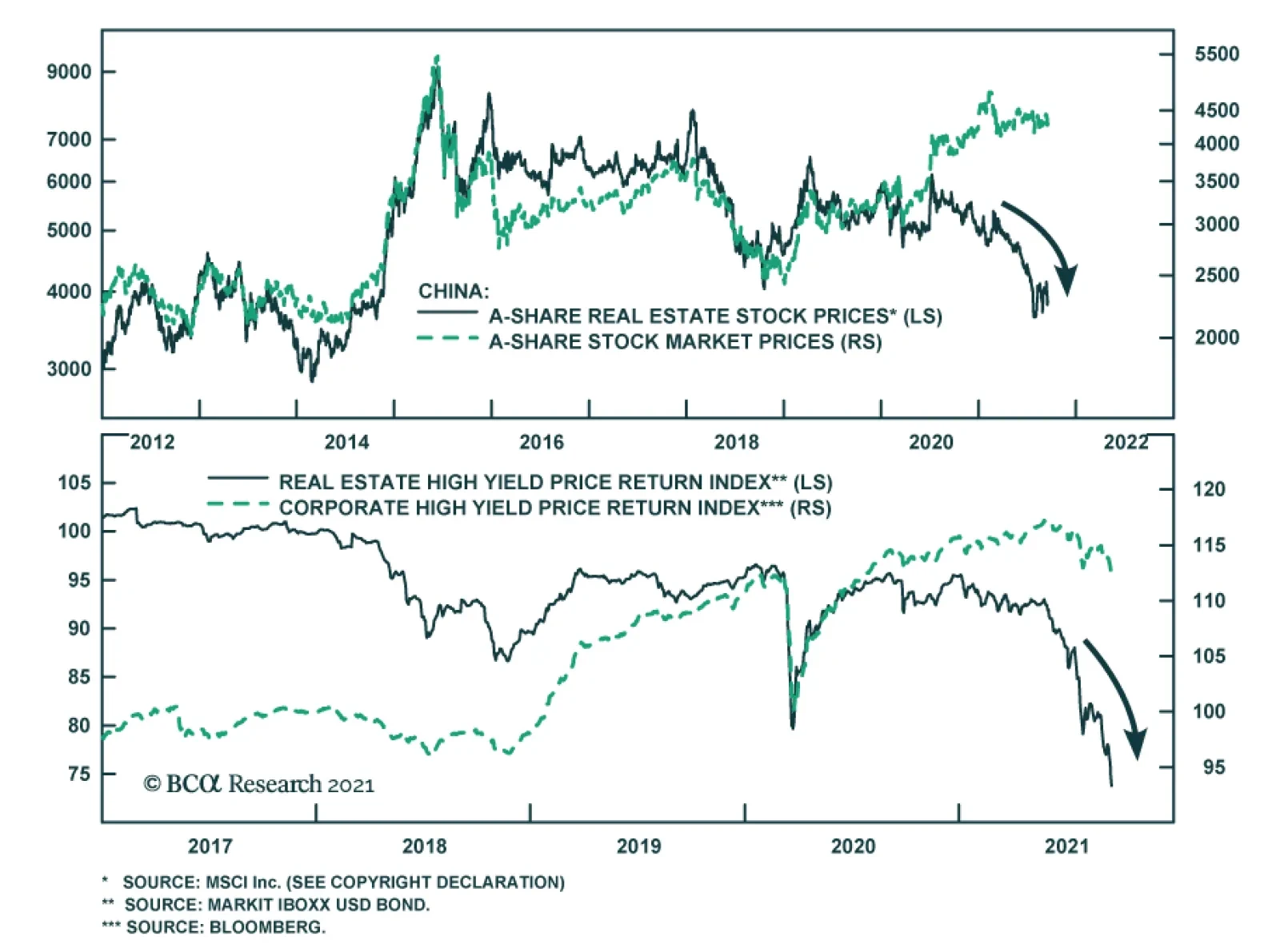
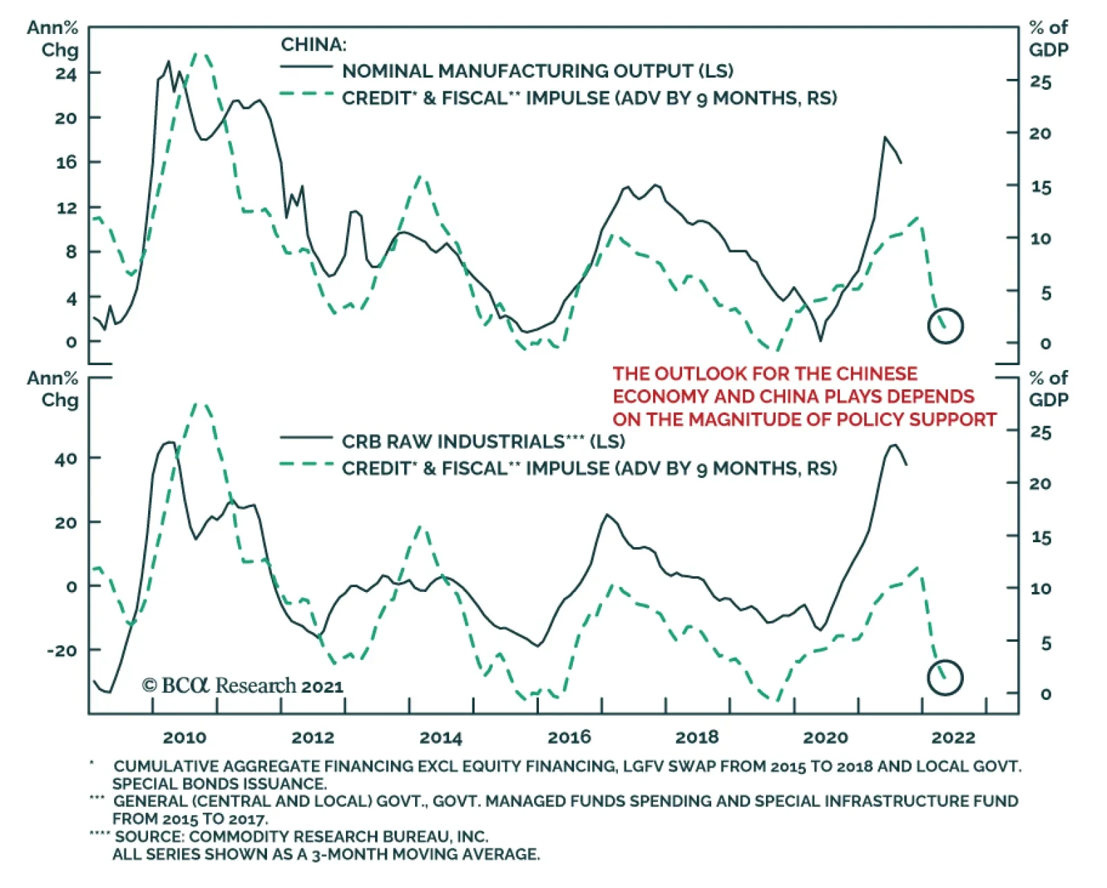
The possibility of Chinese real estate developer Evergrande’s collapse threatens the stability of the country’s economy and financial markets through multiple facets. The company accounts for an outsized share of outstanding high-yield dollar bonds and is…
Highlights Global growth is peaking, but US growth is losing momentum relative to its peers. This has historically been negative for the greenback. Chinese monetary policy is no longer on a tightening path, and might ease going forward. As discounting mechanisms, cyclical currencies should outperform. Our bias is that non-US growth will outperform growth in the US over the next 12-18 months. This will lead to capital reallocation away from the US dollar. While US bond yields could rise towards 2%, real interest rates will remain low compared to history. Our recommendations remain the same: the DXY will struggle to punch above the 94-95 level, but will ultimately touch 80. Feature Chart I-1US Growth Momentum And The Dollar
US Growth Momentum And The Dollar
US Growth Momentum And The Dollar
The DXY index is up for the year, but has twice failed to punch the 94 level. The first leg of the rally from January to March occurred within a context of rising global yields, led by the US. The second leg, starting in June was triggered by a perceived hawkish shift from the Federal Reserve. The common denominator for both legs of the rally was that US growth was outperforming growth in the rest of the world. But that is beginning to change. Bloomberg consensus forecasts show a sharp reversal in US growth momentum, relative to its peers (Chart I-1). Historically, this has put a firm ceiling on the greenback. Cycles And The US Dollar The dollar tends to fare worse early in the cycle when growth is rising but inflation is falling (Chart I-2). Admittedly, inflation prints in some developed markets like the US and Canada have been rather strong. But to the extent that these prints reflect transitory factors, it should allow global central banks to remain accommodative, supporting growth. The remarkable thing about Chart I-1 is that the rotation in growth from the US towards other countries has been broad based. Countries such as Canada, New Zealand, Brazil and Mexico are seeing a bottoming in growth momentum relative to the US (Chart I-3). Chart I-2The Dollar Fares Poorly Early In The Cycle
Why The Ultimate Low In The Dollar Is Nigh
Why The Ultimate Low In The Dollar Is Nigh
Chart I-3A Rotation Of Growth From The US
A Rotation Of Growth From The US
A Rotation Of Growth From The US
This bottoming in growth momentum is occurring at the same time as local central banks are becoming more orthodox about monetary policy. The Reserve Bank of New Zealand has ended quantitative easing. The Bank of Canada has cut asset purchases in half. Brazil, Mexico and Russia, among other emerging market countries are hiking interest rates. While it is true that inflation in some developed and emerging markets like Canada, the UK, Brazil and Russia is perking up, for most developed markets as a whole, inflation is actually surprising to the upside in the US (Chart I-4). China has been tightening policy amidst very low inflation. Currencies tend to be driven by real rates. A growth rotation away from the US, in addition to more orthodox monetary policies outside the US, will be negative for the greenback. Chart I-4US Relative Inflation And The Dollar
US Relative Inflation And The Dollar
US Relative Inflation And The Dollar
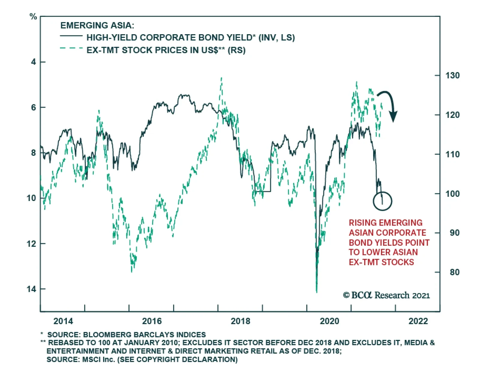
What About Chinese Growth? Chinese growth expectations are still cratering relative to the US. The fiasco around the China Evergrande Group has also led to speculation that this could become a systemic event. For developed market currencies, especially those linked to China like the Australian dollar, this is a market-relevant event. Admittedly, offshore markets have started discounting a bigger depreciation in the RMB (Chart I-5). That said, the RMB has been rather resilient against the dollar suggesting that the risk of this becoming a systemic event is rather low (Chart I-6). Chart I-5The Evergrande Risk Is Not Yet Systemic
The Evergrande Risk Is Not Yet Systemic
The Evergrande Risk Is Not Yet Systemic
Chart I-6Chinese Equities And The RMB Have Decoupled.
Chinese Equities And The RMB Have Decoupled.
Chinese Equities And The RMB Have Decoupled.
We believe currency markets are sending the right signal. For one, the Evergrande debacle is occurring at a time when China is no longer tightening monetary policy. Chart I-7 shows that cyclical currencies in developed markets tend to be coincident with the Chinese credit impulse. As such, any easing in monetary policy will put a bottom in these currencies. Over the years, the Chinese bond market has become more and more liberalized. This two-way risk implies that zombies companies should be allowed to fail while unicorns flourish. It is true that regulatory control has been front and center in the current Chinese equity market malaise. That said, our bias is that liberalization is a reason why portfolio inflows into China continue to accelerate, as the economy moves closer to market-determined prices (Chart I-8). This has supported the RMB, a big weight in the Fed trade-weighted dollar. Chart I-7Chinese Policy And DM Currencies
Chinese Policy And DM Currencies
Chinese Policy And DM Currencies
Chart I-8An Unrelenting Increase In Chinese Inflows
An Unrelenting Increase In Chinese Inflows
An Unrelenting Increase In Chinese Inflows
A lot of EM debt is denominated in US dollars, which could be reprised for default risk. But on this basis, the Fed is ahead of the curve. This was the very reason the Federal Reserve introduced swap lines in 2020 with foreign emerging market central banks and made swapping FX reserves for dollars a permanent facility in its toolkit for monetary policy this year. Non-US domestic authorities have ample ability to decide which entities they allow to fail, and which they bail out from their USD obligations. Cross-currency basis swaps, a proxy for the cost of obtaining dollars offshore, remain well behaved (Chart I-9). Chart I-9No USD Funding Stress So Far In Developed Markets
No USD Funding Stress So Far In Developed Markets
No USD Funding Stress So Far In Developed Markets
For developed market currencies, the implication is that China risks are currently overstated, while any upside surprise has not been meaningfully discounted. Gauging Investor Positioning The dollar tends to be a momentum currency. But at turning points, it pays to be a contrarian. Let’s begin with what is priced in. First, the overnight index swap curve (OIS) suggests that markets expect the Fed to hike interest rates faster than other G10 central banks (Chart I-10). This will not occur in a world where growth is stronger outside the US, and other central banks are well ahead in their tapering of asset purchases, pursuing much more orthodox monetary policy. Chart I-10The Market Remains Bullish On Fed Rate Hikes
The Market Remains Bullish On Fed Rate Hikes
The Market Remains Bullish On Fed Rate Hikes
Chart I-11Speculators Are Bullish On ##br##The Dollar
Speculators Are Bullish On The Dollar
Speculators Are Bullish On The Dollar
Second, at the beginning of this report, we highlighted the fact that the dollar is up this year. Part of the reason has been a pilling in of speculators into long greenback positions (Chart I-11). As a trading rule, it has usually been profitable to wait for net speculative positioning and moving averages to roll over before entering fresh dollar short positions (Chart I-12). On this basis, tactical investors might be a bit early, but its is also the case that the macroeconomic environment is moving against the dollar. Once markets start paying attention to the fact that global growth will rotate from the US, pinning the Fed into a more dovish stance, the dollar will quickly depreciate. Chart I-12A Sentiment Trading Rule Will Wait For The Dollar To Roll Over More Broadly
A Sentiment Trading Rule Will Wait For The Dollar To Roll Over More Broadly
A Sentiment Trading Rule Will Wait For The Dollar To Roll Over More Broadly
Often forgotten is that the dollar has tended to move in long cycles, usually 10 years between bull and bear markets. The US trade deficit (excluding oil) is hitting new fresh highs this year. These deficits need to be financed by foreign purchases of US securities, either by debt issued or equity raised. Investors could demand a discount to keep financing these deficits. Should the Congressional Budget Office estimates of the current trajectory of US deficits hold true, the dollar has about 10-15% downside from current levels (Chart I-13). Chart I-13Balance Of Payments Bode Negatively For The Greenback
Balance Of Payments Bode Negatively For The Greenback
Balance Of Payments Bode Negatively For The Greenback
Our geopolitical strategists assign 80% odds to the passage of a bipartisan infrastructure bill, and 65% odds to the passage of a reconciliation bill. Either way, the US fiscal picture is set to deteriorate at a time when the Fed is comtemplating scaling back Treasury purchases. Interestingly, 10-15% downside in the US dollar is exactly what is needed to realign the currency competitively (Chart I-14). Consumer prices have been rising globally, but this has been especially pronounced in the US. To the extent that we live in a globalized world with flexible exchange rates, this should allow more competitive countries to see an increase in their trade balances. This is exactly what is occurring, with the US trade deficit hitting new lows. Chart I-14The Dollar Is Expensive On A PPP Basis
The Dollar Is Expensive On A PPP Basis
The Dollar Is Expensive On A PPP Basis
Risks To The View Currency forecasts are obviously fraught with risks. The biggest risk to the view is a broad-based equity market correction, that reinvigorates inflows into US safe-haven bonds. We are cognizant that this is a risk worth monitoring. For example, investors are preferring to park cash in US Treasurys over gold, two competing safe-haven assets (Chart I-15). This has usually been positive for the greenback. But it also suggests investors view the Fed is going to be orthodox in monetary settings, tightening policy faster than the market expects. This boils down to a judgment call. The US market is much more vulnerable to rate changes than other markets (Chart I-16). As such, a hawkish shift by the Federal Reserve could significantly tighten financial conditions (through a stock market correction), setting the stage for an ultimate low in the dollar equity outflows. Chart I-15Safe-Haven Dollar Flows Face Technical Resistance
Safe-Haven Dollar Flows Face Technical Resistance
Safe-Haven Dollar Flows Face Technical Resistance
Chart I-16Higher Bond Yields Will Be Negative For The US Market.
Higher Bond Yields Will Be Negative For The US Market.
Higher Bond Yields Will Be Negative For The US Market.
Given this two-way risk, we are reintroducing our long CHF/NZD position that correlates well with currency volatility (Chart I-17). We are also long the yen on this basis. In terms of housekeeping, our long AUD/NZD trade was stopped out for a loss. As we iterated in our Aussie report, a lot of pessimism is embedded in the AUD, making it a potent candidate for a powerful mean-reversion rally. We recommend reinstating this position at current levels (a nudge above our stop loss). Chart I-17Buy CHF/NZD As A Hedge
Buy CHF/NZD As A Hedge
Buy CHF/NZD As A Hedge
Chester Ntonifor Foreign Exchange Strategist chestern@bcaresearch.com Currencies U.S. Dollar Chart II-1USD Technicals 1
USD Technicals 1
USD Technicals 1
Chart II-2USD Technicals 2
USD Technicals 2
USD Technicals 2
Data out of the US this week was strong: PPI continues to accelerate in the US, rising 8.3% year on year in August while CPI also remains strong at 5.3% on the headline print. Pricing pressures remain acute in the US. The empire manufacturing survey surprised to the upside in September. The headline number was 34.2 versus expectations of a 17.9 reading. Admittedly, this was driven by an increase in selling prices. Retail sales were surprisingly strong in August, with the control group rising 2.5% month on month versus expectations of a flat number. The US dollar DXY index was relatively flat this week. The markets are at a crossroads, gauging whether strong US data will maintain momentum or revert to a lower equilibrium. Our bias is towards the latter, but admittedly, there are two-way risks to this view. Report Links: Arbitrating Between Dollar Bulls And Bears - March 19, 2021 The Dollar Bull Case Will Soon Fade - March 5, 2021 Are Rising Bond Yields Bullish For The Dollar? - February 19, 2021 The Euro Chart II-3EUR Technicals 1
EUR Technicals 1
EUR Technicals 1
Chart II-4EUR Technicals 2
EUR Technicals 2
EUR Technicals 2
Euro area data remains robust: Industrial production printed a solid 7.7% year-on-year growth in July. The trade surplus for July rose to €20.7 bn. The euro fell by 0.6% this week. The ECB has engineered a dovish tapering of asset purchases, but it remains the case as the interest rate expectations between the euro area and the US are at bombed out levels. This should support positive euro area surprises. Report Links: Relative Growth, The Euro, And The Loonie - April 16, 2021 The Euro Dance: One Step Back, Two Steps Forward - April 2, 2021 On Japanese Inflation And The Yen - January 29, 2021 The Japanese Yen Chart II-5JPY Technicals 1
JPY Technicals 1
JPY Technicals 1
Chart II-6JPY Technicals 2
JPY Technicals 2
JPY Technicals 2
Recent Japanese data has been on the weak side: Core machinery orders rose 11.1% year on year in July. Exports were strong in August, rising 34% while imports rose 40%. The yen was flat against the dollar this week. Currency volatility is currently depressed, and Japan has been performing poorly economically. To the extent that this is pandemic related, it sets the JPY up for a playable coil spring rebound. Report Links: The Case For Japan - June 11, 2021 The Dollar Bull Case Will Soon Fade - March 5, 2021 On Japanese Inflation And The Yen - January 29, 2021 British Pound Chart II-7GBP Technicals 1
GBP Technicals 1
GBP Technicals 1
Chart II-8GBP Technicals 2
GBP Technicals 2
GBP Technicals 2
UK data remains on the mend: Industrial production came in at 3.8% year on year, above expectations. Average weekly earnings, including bonus payments, are rising 8.3% year on year as of July. Job gains continue. The July report pushed the unemployment rate from 4.7% to 4.6%. CPI and RPI remain rather sticky around the 3-5% level. House prices rose 8% year on year in July. The pound fell by 0.4% this week. The broad trend in the pound will now be dictated by what happens to both the dollar and the euro. The BoE is more hawkish than the Fed and the ECB should support gilt yields and the pound. A slowing in US economic momentum is also bullish for the sterling. Report Links: Why Are UK Interest Rates Still So Low? - March 10, 2021 Portfolio And Model Review - February 5, 2021 Thoughts On The British Pound - December 18, 2020 Australian Dollar Chart II-9AUD Technicals 1
AUD Technicals 1
AUD Technicals 1
Chart II-10AUD Technicals 2
AUD Technicals 2
AUD Technicals 2
Australian data was slated to slow as we expected, and recent numbers highlight this: There were 146K job losses in August. This was well split between part time and full time. NAB business confidence and current conditions moderately improved in August. House price inflation is tracking the global wave, rising 16.8% year on year in Q2. The AUD fell 1% this week. We discussed the AUD at length in our report two weeks ago and believe current weakness is unwarranted. We are reinstating our long AUD/NZD trade this week. Report Links: The Dollar Bull Case Will Soon Fade - March 5, 2021 Portfolio And Model Review - February 5, 2021 Australia: Regime Change For Bond Yields & The Currency? - January 20, 2021 New Zealand Dollar Chart II-11NZD Technicals 1
NZD Technicals 1
NZD Technicals 1
Chart II-12NZD Technicals 2
NZD Technicals 2
NZD Technicals 2
The was scant data out of New Zealand this week: The current account deficit widened in Q2 to -3.3% of GDP. Q2 GDP was an upside surprise but will likely be torpedoed in Q3 by COVID-19. The NZD was down 0.25% this week. We continue to believe the NZD will fare well cyclically, likely touching 75 cents, but our bias remains that hawkish expectations from the RBNZ are already well priced. This will make the kiwi lag other commodity currencies like the Aussie. We are reinstating our long AUD/NZD trade. Report Links: How High Can The Kiwi Rise? - April 30, 2021 Portfolio And Model Review - February 5, 2021 Currencies And The Value-Versus-Growth Debate - July 10, 2020 Canadian Dollar Chart II-13CAD Technicals 1
CAD Technicals 1
CAD Technicals 1
Chart II-14CAD Technicals 2
CAD Technicals 2
CAD Technicals 2
Data out of Canada this week has been robust: The labor report was strong. Hiring came in at 90K, with a favorable tilt towards full-time work. The unemployment rate fell from 7.5% to 7.1%. The CPI report was equally robust. Core CPI was at 3.5% year on year with most measures of the BoC’s underlying gauge inching higher. Housing starts remained strong in August at 260K, a slight dip from July’s 271K. The CAD was up by 0.44% this week. Last week’s currency report was dedicated to the loonie. With strong oil prices, a relatively hawkish central bank, and easing on tightening pressures from China, the loonie should remain well bid. A minority government will also be bullish for the loonie, as we highlighted last week. Report Links: Relative Growth, The Euro, And The Loonie - April 16, 2021 Will The Canadian Recovery Lead Or Lag The Global Cycle? - February 12, 2021 The Outlook For The Canadian Dollar - October 9, 2020 Swiss Franc Chart II-15CHF Technicals 1
CHF Technicals 1
CHF Technicals 1
Chart II-16CHF Technicals 2
CHF Technicals 2
CHF Technicals 2
There was scant data out of Switzerland this week: PPI came in at 4.4% in August, an increase from July. The Swiss franc was down 0.22% this week. We are going long CHF/NZD as a hedge against rising currency volatility. Being long the yen also makes sense in this environment. However, given our view that risk sentiment will stay ebullient, the franc will lag the bounce in other cyclical currencies on a longer-term horizon. Report Links: An Update On The Swiss Franc - April 9, 2021 Portfolio And Model Review - February 5, 2021 The Dollar Conundrum And Protection - November 6, 2020 Norwegian Krone Chart II-17NOK Technicals 1
NOK Technicals 1
NOK Technicals 1
Chart II-18NOK Technicals 2
NOK Technicals 2
NOK Technicals 2
Norwegian data is surprising to the upside: CPI was 3.4% year on year in August, above expectations. PPI rose 50% year on year in August. The trade balance posted a healthy surplus of NOK 42.6bn in August. The NOK was up 0.5% this week. We continue to be bullish Scandinavian currencies as a cyclical play on a lower US dollar. The NOK benefits from bombed-out valuations and a more orthodox central bank. Report Links: The Norwegian Method - June 4, 2021 Portfolio And Model Review - February 5, 2021 Revisiting Our High-Conviction Trades - September 11, 2020 Swedish Krona Chart II-19SEK Technicals 1
SEK Technicals 1
SEK Technicals 1
Chart II-20SEK Technicals 2
SEK Technicals 2
SEK Technicals 2
The most important data from Sweden this week was the CPI report: CPI rose from 1.7% to 2.1% in August. CPIF, the Riksbank’s preferred measure, accelerated to 2.4%. The SEK was flat this week. A bottoming in the Chinese credit impulse will be a positive impact on growth-sensitive Sweden. Meanwhile, this week’s positive CPI report should pare back expectations of more stimulus from the Riksbank. We are short both EUR/SEK and USD/SEK as reflation plays. Report Links: Revisiting Our High-Conviction Trades - September 11, 2020 More On Competitive Devaluations, The CAD And The SEK - May 1, 2020 Sweden Beyond The Pandemic: Poised To Re-leverage - March 19, 2020 Trades & Forecasts Forecast Summary Strategic Holdings Tactical Holdings Limit Orders Closed Trades
BCA Research's Emerging Markets Strategy service expects Evergrande’s partial default to reinforce credit tightening in China. Evergrande will likely default on some of its liabilities but there will be a bailout or roll-over of its other debt. This raises…