Fixed Income
The possibility of Chinese real estate developer Evergrande’s collapse threatens the stability of the country’s economy and financial markets through multiple facets. The company accounts for an outsized share of outstanding high-yield dollar bonds and is…

Highlights Global growth is peaking, but US growth is losing momentum relative to its peers. This has historically been negative for the greenback. Chinese monetary policy is no longer on a tightening path, and might ease going forward. As discounting mechanisms, cyclical currencies should outperform. Our bias is that non-US growth will outperform growth in the US over the next 12-18 months. This will lead to capital reallocation away from the US dollar. While US bond yields could rise towards 2%, real interest rates will remain low compared to history. Our recommendations remain the same: the DXY will struggle to punch above the 94-95 level, but will ultimately touch 80. Feature Chart I-1US Growth Momentum And The Dollar
US Growth Momentum And The Dollar
US Growth Momentum And The Dollar
The DXY index is up for the year, but has twice failed to punch the 94 level. The first leg of the rally from January to March occurred within a context of rising global yields, led by the US. The second leg, starting in June was triggered by a perceived hawkish shift from the Federal Reserve. The common denominator for both legs of the rally was that US growth was outperforming growth in the rest of the world. But that is beginning to change. Bloomberg consensus forecasts show a sharp reversal in US growth momentum, relative to its peers (Chart I-1). Historically, this has put a firm ceiling on the greenback. Cycles And The US Dollar The dollar tends to fare worse early in the cycle when growth is rising but inflation is falling (Chart I-2). Admittedly, inflation prints in some developed markets like the US and Canada have been rather strong. But to the extent that these prints reflect transitory factors, it should allow global central banks to remain accommodative, supporting growth. The remarkable thing about Chart I-1 is that the rotation in growth from the US towards other countries has been broad based. Countries such as Canada, New Zealand, Brazil and Mexico are seeing a bottoming in growth momentum relative to the US (Chart I-3). Chart I-2The Dollar Fares Poorly Early In The Cycle
Why The Ultimate Low In The Dollar Is Nigh
Why The Ultimate Low In The Dollar Is Nigh
Chart I-3A Rotation Of Growth From The US
A Rotation Of Growth From The US
A Rotation Of Growth From The US
This bottoming in growth momentum is occurring at the same time as local central banks are becoming more orthodox about monetary policy. The Reserve Bank of New Zealand has ended quantitative easing. The Bank of Canada has cut asset purchases in half. Brazil, Mexico and Russia, among other emerging market countries are hiking interest rates. While it is true that inflation in some developed and emerging markets like Canada, the UK, Brazil and Russia is perking up, for most developed markets as a whole, inflation is actually surprising to the upside in the US (Chart I-4). China has been tightening policy amidst very low inflation. Currencies tend to be driven by real rates. A growth rotation away from the US, in addition to more orthodox monetary policies outside the US, will be negative for the greenback. Chart I-4US Relative Inflation And The Dollar
US Relative Inflation And The Dollar
US Relative Inflation And The Dollar
What About Chinese Growth? Chinese growth expectations are still cratering relative to the US. The fiasco around the China Evergrande Group has also led to speculation that this could become a systemic event. For developed market currencies, especially those linked to China like the Australian dollar, this is a market-relevant event. Admittedly, offshore markets have started discounting a bigger depreciation in the RMB (Chart I-5). That said, the RMB has been rather resilient against the dollar suggesting that the risk of this becoming a systemic event is rather low (Chart I-6). Chart I-5The Evergrande Risk Is Not Yet Systemic
The Evergrande Risk Is Not Yet Systemic
The Evergrande Risk Is Not Yet Systemic
Chart I-6Chinese Equities And The RMB Have Decoupled.
Chinese Equities And The RMB Have Decoupled.
Chinese Equities And The RMB Have Decoupled.
We believe currency markets are sending the right signal. For one, the Evergrande debacle is occurring at a time when China is no longer tightening monetary policy. Chart I-7 shows that cyclical currencies in developed markets tend to be coincident with the Chinese credit impulse. As such, any easing in monetary policy will put a bottom in these currencies. Over the years, the Chinese bond market has become more and more liberalized. This two-way risk implies that zombies companies should be allowed to fail while unicorns flourish. It is true that regulatory control has been front and center in the current Chinese equity market malaise. That said, our bias is that liberalization is a reason why portfolio inflows into China continue to accelerate, as the economy moves closer to market-determined prices (Chart I-8). This has supported the RMB, a big weight in the Fed trade-weighted dollar. Chart I-7Chinese Policy And DM Currencies
Chinese Policy And DM Currencies
Chinese Policy And DM Currencies
Chart I-8An Unrelenting Increase In Chinese Inflows
An Unrelenting Increase In Chinese Inflows
An Unrelenting Increase In Chinese Inflows
A lot of EM debt is denominated in US dollars, which could be reprised for default risk. But on this basis, the Fed is ahead of the curve. This was the very reason the Federal Reserve introduced swap lines in 2020 with foreign emerging market central banks and made swapping FX reserves for dollars a permanent facility in its toolkit for monetary policy this year. Non-US domestic authorities have ample ability to decide which entities they allow to fail, and which they bail out from their USD obligations. Cross-currency basis swaps, a proxy for the cost of obtaining dollars offshore, remain well behaved (Chart I-9). Chart I-9No USD Funding Stress So Far In Developed Markets
No USD Funding Stress So Far In Developed Markets
No USD Funding Stress So Far In Developed Markets
For developed market currencies, the implication is that China risks are currently overstated, while any upside surprise has not been meaningfully discounted. Gauging Investor Positioning The dollar tends to be a momentum currency. But at turning points, it pays to be a contrarian. Let’s begin with what is priced in. First, the overnight index swap curve (OIS) suggests that markets expect the Fed to hike interest rates faster than other G10 central banks (Chart I-10). This will not occur in a world where growth is stronger outside the US, and other central banks are well ahead in their tapering of asset purchases, pursuing much more orthodox monetary policy. Chart I-10The Market Remains Bullish On Fed Rate Hikes
The Market Remains Bullish On Fed Rate Hikes
The Market Remains Bullish On Fed Rate Hikes
Chart I-11Speculators Are Bullish On ##br##The Dollar
Speculators Are Bullish On The Dollar
Speculators Are Bullish On The Dollar
Second, at the beginning of this report, we highlighted the fact that the dollar is up this year. Part of the reason has been a pilling in of speculators into long greenback positions (Chart I-11). As a trading rule, it has usually been profitable to wait for net speculative positioning and moving averages to roll over before entering fresh dollar short positions (Chart I-12). On this basis, tactical investors might be a bit early, but its is also the case that the macroeconomic environment is moving against the dollar. Once markets start paying attention to the fact that global growth will rotate from the US, pinning the Fed into a more dovish stance, the dollar will quickly depreciate. Chart I-12A Sentiment Trading Rule Will Wait For The Dollar To Roll Over More Broadly
A Sentiment Trading Rule Will Wait For The Dollar To Roll Over More Broadly
A Sentiment Trading Rule Will Wait For The Dollar To Roll Over More Broadly
Often forgotten is that the dollar has tended to move in long cycles, usually 10 years between bull and bear markets. The US trade deficit (excluding oil) is hitting new fresh highs this year. These deficits need to be financed by foreign purchases of US securities, either by debt issued or equity raised. Investors could demand a discount to keep financing these deficits. Should the Congressional Budget Office estimates of the current trajectory of US deficits hold true, the dollar has about 10-15% downside from current levels (Chart I-13). Chart I-13Balance Of Payments Bode Negatively For The Greenback
Balance Of Payments Bode Negatively For The Greenback
Balance Of Payments Bode Negatively For The Greenback
Our geopolitical strategists assign 80% odds to the passage of a bipartisan infrastructure bill, and 65% odds to the passage of a reconciliation bill. Either way, the US fiscal picture is set to deteriorate at a time when the Fed is comtemplating scaling back Treasury purchases. Interestingly, 10-15% downside in the US dollar is exactly what is needed to realign the currency competitively (Chart I-14). Consumer prices have been rising globally, but this has been especially pronounced in the US. To the extent that we live in a globalized world with flexible exchange rates, this should allow more competitive countries to see an increase in their trade balances. This is exactly what is occurring, with the US trade deficit hitting new lows. Chart I-14The Dollar Is Expensive On A PPP Basis
The Dollar Is Expensive On A PPP Basis
The Dollar Is Expensive On A PPP Basis
Risks To The View Currency forecasts are obviously fraught with risks. The biggest risk to the view is a broad-based equity market correction, that reinvigorates inflows into US safe-haven bonds. We are cognizant that this is a risk worth monitoring. For example, investors are preferring to park cash in US Treasurys over gold, two competing safe-haven assets (Chart I-15). This has usually been positive for the greenback. But it also suggests investors view the Fed is going to be orthodox in monetary settings, tightening policy faster than the market expects. This boils down to a judgment call. The US market is much more vulnerable to rate changes than other markets (Chart I-16). As such, a hawkish shift by the Federal Reserve could significantly tighten financial conditions (through a stock market correction), setting the stage for an ultimate low in the dollar equity outflows. Chart I-15Safe-Haven Dollar Flows Face Technical Resistance
Safe-Haven Dollar Flows Face Technical Resistance
Safe-Haven Dollar Flows Face Technical Resistance
Chart I-16Higher Bond Yields Will Be Negative For The US Market.
Higher Bond Yields Will Be Negative For The US Market.
Higher Bond Yields Will Be Negative For The US Market.
Given this two-way risk, we are reintroducing our long CHF/NZD position that correlates well with currency volatility (Chart I-17). We are also long the yen on this basis. In terms of housekeeping, our long AUD/NZD trade was stopped out for a loss. As we iterated in our Aussie report, a lot of pessimism is embedded in the AUD, making it a potent candidate for a powerful mean-reversion rally. We recommend reinstating this position at current levels (a nudge above our stop loss). Chart I-17Buy CHF/NZD As A Hedge
Buy CHF/NZD As A Hedge
Buy CHF/NZD As A Hedge
Chester Ntonifor Foreign Exchange Strategist chestern@bcaresearch.com Currencies U.S. Dollar Chart II-1USD Technicals 1
USD Technicals 1
USD Technicals 1
Chart II-2USD Technicals 2
USD Technicals 2
USD Technicals 2
Data out of the US this week was strong: PPI continues to accelerate in the US, rising 8.3% year on year in August while CPI also remains strong at 5.3% on the headline print. Pricing pressures remain acute in the US. The empire manufacturing survey surprised to the upside in September. The headline number was 34.2 versus expectations of a 17.9 reading. Admittedly, this was driven by an increase in selling prices. Retail sales were surprisingly strong in August, with the control group rising 2.5% month on month versus expectations of a flat number. The US dollar DXY index was relatively flat this week. The markets are at a crossroads, gauging whether strong US data will maintain momentum or revert to a lower equilibrium. Our bias is towards the latter, but admittedly, there are two-way risks to this view. Report Links: Arbitrating Between Dollar Bulls And Bears - March 19, 2021 The Dollar Bull Case Will Soon Fade - March 5, 2021 Are Rising Bond Yields Bullish For The Dollar? - February 19, 2021 The Euro Chart II-3EUR Technicals 1
EUR Technicals 1
EUR Technicals 1
Chart II-4EUR Technicals 2
EUR Technicals 2
EUR Technicals 2
Euro area data remains robust: Industrial production printed a solid 7.7% year-on-year growth in July. The trade surplus for July rose to €20.7 bn. The euro fell by 0.6% this week. The ECB has engineered a dovish tapering of asset purchases, but it remains the case as the interest rate expectations between the euro area and the US are at bombed out levels. This should support positive euro area surprises. Report Links: Relative Growth, The Euro, And The Loonie - April 16, 2021 The Euro Dance: One Step Back, Two Steps Forward - April 2, 2021 On Japanese Inflation And The Yen - January 29, 2021 The Japanese Yen Chart II-5JPY Technicals 1
JPY Technicals 1
JPY Technicals 1
Chart II-6JPY Technicals 2
JPY Technicals 2
JPY Technicals 2
Recent Japanese data has been on the weak side: Core machinery orders rose 11.1% year on year in July. Exports were strong in August, rising 34% while imports rose 40%. The yen was flat against the dollar this week. Currency volatility is currently depressed, and Japan has been performing poorly economically. To the extent that this is pandemic related, it sets the JPY up for a playable coil spring rebound. Report Links: The Case For Japan - June 11, 2021 The Dollar Bull Case Will Soon Fade - March 5, 2021 On Japanese Inflation And The Yen - January 29, 2021 British Pound Chart II-7GBP Technicals 1
GBP Technicals 1
GBP Technicals 1
Chart II-8GBP Technicals 2
GBP Technicals 2
GBP Technicals 2
UK data remains on the mend: Industrial production came in at 3.8% year on year, above expectations. Average weekly earnings, including bonus payments, are rising 8.3% year on year as of July. Job gains continue. The July report pushed the unemployment rate from 4.7% to 4.6%. CPI and RPI remain rather sticky around the 3-5% level. House prices rose 8% year on year in July. The pound fell by 0.4% this week. The broad trend in the pound will now be dictated by what happens to both the dollar and the euro. The BoE is more hawkish than the Fed and the ECB should support gilt yields and the pound. A slowing in US economic momentum is also bullish for the sterling. Report Links: Why Are UK Interest Rates Still So Low? - March 10, 2021 Portfolio And Model Review - February 5, 2021 Thoughts On The British Pound - December 18, 2020 Australian Dollar Chart II-9AUD Technicals 1
AUD Technicals 1
AUD Technicals 1
Chart II-10AUD Technicals 2
AUD Technicals 2
AUD Technicals 2
Australian data was slated to slow as we expected, and recent numbers highlight this: There were 146K job losses in August. This was well split between part time and full time. NAB business confidence and current conditions moderately improved in August. House price inflation is tracking the global wave, rising 16.8% year on year in Q2. The AUD fell 1% this week. We discussed the AUD at length in our report two weeks ago and believe current weakness is unwarranted. We are reinstating our long AUD/NZD trade this week. Report Links: The Dollar Bull Case Will Soon Fade - March 5, 2021 Portfolio And Model Review - February 5, 2021 Australia: Regime Change For Bond Yields & The Currency? - January 20, 2021 New Zealand Dollar Chart II-11NZD Technicals 1
NZD Technicals 1
NZD Technicals 1
Chart II-12NZD Technicals 2
NZD Technicals 2
NZD Technicals 2
The was scant data out of New Zealand this week: The current account deficit widened in Q2 to -3.3% of GDP. Q2 GDP was an upside surprise but will likely be torpedoed in Q3 by COVID-19. The NZD was down 0.25% this week. We continue to believe the NZD will fare well cyclically, likely touching 75 cents, but our bias remains that hawkish expectations from the RBNZ are already well priced. This will make the kiwi lag other commodity currencies like the Aussie. We are reinstating our long AUD/NZD trade. Report Links: How High Can The Kiwi Rise? - April 30, 2021 Portfolio And Model Review - February 5, 2021 Currencies And The Value-Versus-Growth Debate - July 10, 2020 Canadian Dollar Chart II-13CAD Technicals 1
CAD Technicals 1
CAD Technicals 1
Chart II-14CAD Technicals 2
CAD Technicals 2
CAD Technicals 2
Data out of Canada this week has been robust: The labor report was strong. Hiring came in at 90K, with a favorable tilt towards full-time work. The unemployment rate fell from 7.5% to 7.1%. The CPI report was equally robust. Core CPI was at 3.5% year on year with most measures of the BoC’s underlying gauge inching higher. Housing starts remained strong in August at 260K, a slight dip from July’s 271K. The CAD was up by 0.44% this week. Last week’s currency report was dedicated to the loonie. With strong oil prices, a relatively hawkish central bank, and easing on tightening pressures from China, the loonie should remain well bid. A minority government will also be bullish for the loonie, as we highlighted last week. Report Links: Relative Growth, The Euro, And The Loonie - April 16, 2021 Will The Canadian Recovery Lead Or Lag The Global Cycle? - February 12, 2021 The Outlook For The Canadian Dollar - October 9, 2020 Swiss Franc Chart II-15CHF Technicals 1
CHF Technicals 1
CHF Technicals 1
Chart II-16CHF Technicals 2
CHF Technicals 2
CHF Technicals 2
There was scant data out of Switzerland this week: PPI came in at 4.4% in August, an increase from July. The Swiss franc was down 0.22% this week. We are going long CHF/NZD as a hedge against rising currency volatility. Being long the yen also makes sense in this environment. However, given our view that risk sentiment will stay ebullient, the franc will lag the bounce in other cyclical currencies on a longer-term horizon. Report Links: An Update On The Swiss Franc - April 9, 2021 Portfolio And Model Review - February 5, 2021 The Dollar Conundrum And Protection - November 6, 2020 Norwegian Krone Chart II-17NOK Technicals 1
NOK Technicals 1
NOK Technicals 1
Chart II-18NOK Technicals 2
NOK Technicals 2
NOK Technicals 2
Norwegian data is surprising to the upside: CPI was 3.4% year on year in August, above expectations. PPI rose 50% year on year in August. The trade balance posted a healthy surplus of NOK 42.6bn in August. The NOK was up 0.5% this week. We continue to be bullish Scandinavian currencies as a cyclical play on a lower US dollar. The NOK benefits from bombed-out valuations and a more orthodox central bank. Report Links: The Norwegian Method - June 4, 2021 Portfolio And Model Review - February 5, 2021 Revisiting Our High-Conviction Trades - September 11, 2020 Swedish Krona Chart II-19SEK Technicals 1
SEK Technicals 1
SEK Technicals 1
Chart II-20SEK Technicals 2
SEK Technicals 2
SEK Technicals 2
The most important data from Sweden this week was the CPI report: CPI rose from 1.7% to 2.1% in August. CPIF, the Riksbank’s preferred measure, accelerated to 2.4%. The SEK was flat this week. A bottoming in the Chinese credit impulse will be a positive impact on growth-sensitive Sweden. Meanwhile, this week’s positive CPI report should pare back expectations of more stimulus from the Riksbank. We are short both EUR/SEK and USD/SEK as reflation plays. Report Links: Revisiting Our High-Conviction Trades - September 11, 2020 More On Competitive Devaluations, The CAD And The SEK - May 1, 2020 Sweden Beyond The Pandemic: Poised To Re-leverage - March 19, 2020 Trades & Forecasts Forecast Summary Strategic Holdings Tactical Holdings Limit Orders Closed Trades
Several key financial assets are failing to send a strong signal and instead have been in a state of stasis. Abstracting from day-to-day moves, Treasury yields, the LMEX, and EUR/USD have not been on a clear trajectory since the beginning of July. Similarly,…
BCA Research's Emerging Markets Strategy service expects Evergrande’s partial default to reinforce credit tightening in China. Evergrande will likely default on some of its liabilities but there will be a bailout or roll-over of its other debt. This raises…
Please note that next Friday September 24 at 10am EDT, we will host a webcast featuring a debate between my colleague Peter Berezin and me. The topic of debate is whether investors should overweight EM in a global portfolio. Please join us by registering via this link. Highlights Chinese internet companies’ ROE will drop, warranting lower equity valuations. However, their ROE and equity multiples will not fall to the levels of listed state-owned enterprises (SOEs). Evergrande’s partial default on its liabilities will likely reinforce credit tightening that has been underway in China over the past 12 months. EM ex-TMT stocks also remain vulnerable. Continue underweighting EM in global equity and credit portfolios. Feature This is the September issue of Charts That Matter. We begin by addressing the issues concerning Chinese internet companies that have been subject to intense debate among investors. We then present key charts on overall EM and various asset classes along with brief commentary. Are Chinese Internet Stocks Investable? There is an ongoing debate in the investment community as to whether Chinese equities in general and Chinese TMT stocks in particular will remain investable. Our short answer is: they will remain investable but mind their valuations. In our opinion, “investable” means that they will from time to time offer medium- and long-term investment opportunities. Our hunch is that they may do so in the future. Nevertheless, we do not think that Chinese TMT stocks presently offer a good buying opportunity. In fact, their share prices have material downside from current levels. In our recent report and webcast, we identified the primary risks to Chinese platform companies: Higher uncertainty about their business model = a higher equity risk premium. Government regulating their profitability like those of mono- and oligopolies = low multiples. These companies performing their social duties in the form of redistributing profits from shareholders to Chinese peoples. Beijing’s involvement in their management and in the prioritization of national and geopolitical objectives over shareholder interests. Risks of delisting from US stock exchanges. Although these companies will remain investable, investors should bear these risks in mind and give careful consideration to what multiples they pay for such stocks. Going forward, Chinese platform companies’ return on equity will be considerably lower than they have been or what their current multiplies imply. A lower return on equity warrants a lower equity multiple. Chart 1Chinese Growth Stocks Are Not Cheap
Chinese Growth Stocks Are Not Cheap
Chinese Growth Stocks Are Not Cheap
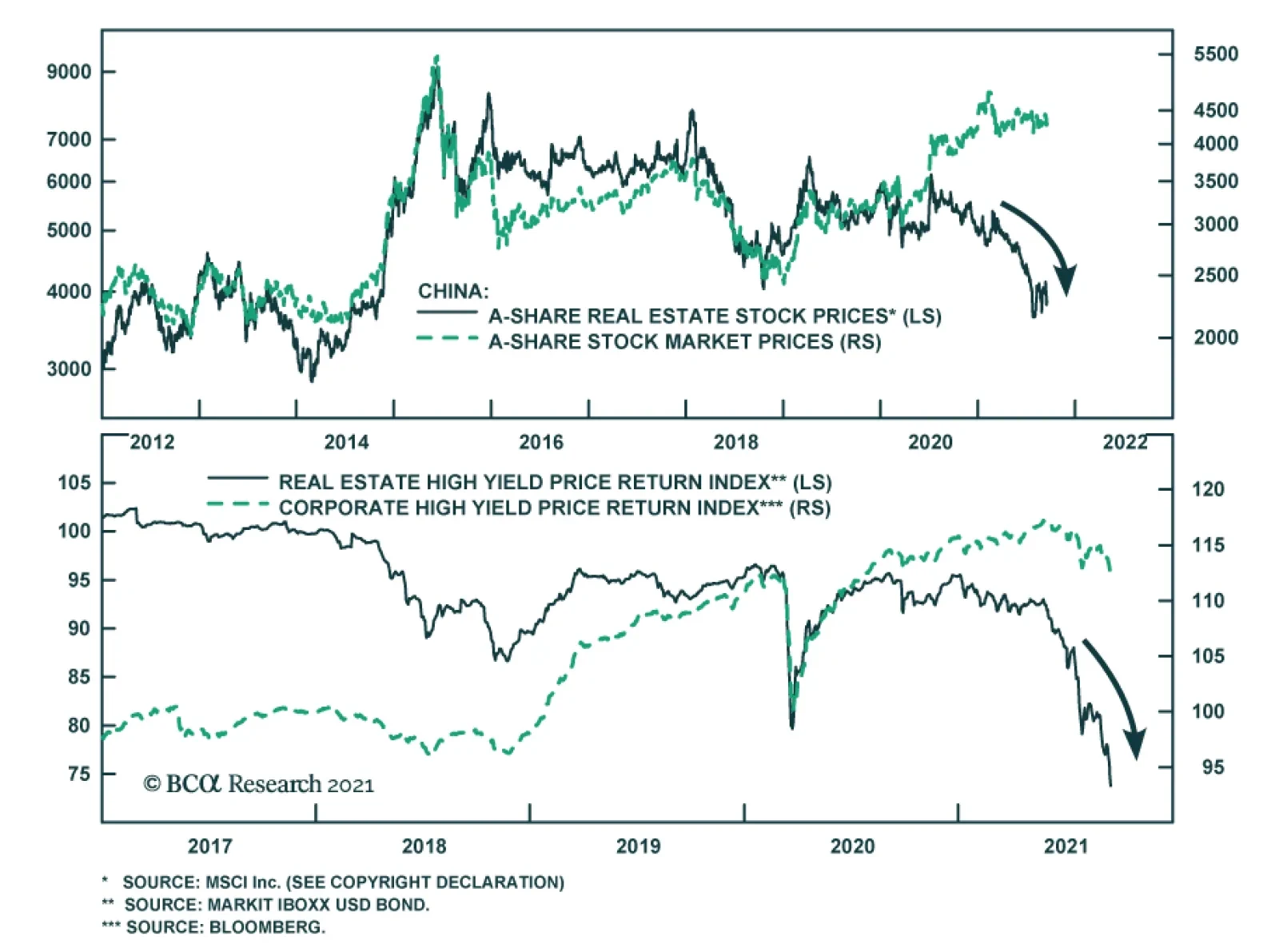
On the whole, the current valuations of Chinese internet stocks are still high. Chart 1 shows trailing and 12-month forward P/E ratios for Chinese MSCI Growth Investable Index at 34 and 31, respectively. A downshifting return on equity and high uncertainty around these businesses herald lower equity valuations to come. Besides, in the case of several companies, there are also political underpinnings of this regulatory crackdown. In the case of Alibaba, a mainland government official has recently noted that Alibaba’s chairman, Jack Ma, has been acquiring media companies across the country, and now owns nearly 30 provincial-level media companies, as well as the South China Morning Post in Hong Kong. Beijing will not tolerate the control of or influence over domestic media from anyone outside the inner leadership circle. In this context, it is probable that Alibaba’s businesses will remain subject to severe regulatory pressures. How much lower should these companies’ multiples drop to become attractive? Meaningfully lower, but not to the level of multiples of listed state-owned enterprises (SOEs). Here are two reasons why these platform companies will not trade at multiples of SOEs in China: First, many existing SOEs operate in cyclical industries – commodities, industrials, autos, and banks – that structurally have low equity multiples. By contrast, platform companies operate in non-cyclical sectors that structurally have lower business cycle volatility and, therefore, should trade at higher equity multiples than cyclical industries. Second, many SOEs often had losses because they operated in non-oligopolistic industries. Faced with intense competition they had to cut prices to support volumes and employment. By contrast, platform companies’ profitability will be suppressed and capped by new government policies, but they will remain profitable because they operate in oligopolistic industries. In short, platform companies’ ROEs will be higher than those of traditional/”old-economy” SOEs. All in all, our bias is that platform companies’ valuation multiples will contract further but will not be as low as Chinese, Russian, or Brazilian SOEs have been. Bottom Line: Investors should be mindful of further de-rating in Chinese TMT/platform company stocks. These stocks are not yet out of woods. On Property Market Clampdown And Evergrande's Default Evergrande will likely default on some of its liabilities but there will be a bailout or roll-over of its other debt. Is the partial default by Evergrande, a very large Chinese property developer, a sign of a bottom in Chinese offshore equity and bond markets or will it produce a full-blown credit crisis in China? This is a valid question because both outcomes are possible: a partial bankruptcy can be a culmination of all existing negatives and can trigger policy stimulus that will produce an economic recovery and a major rally (an example of this is the LTCM crisis in the US in 1998); or a partial bankruptcy can lead to a credit crunch escalation becoming a systemic event. An example of this is Lehman Brothers’ bankruptcy in 2008. We will assign the highest probability to a third scenario: the well-telegraphed Evergrande default might not create a systemic crisis or crash. However, it will likely reinforce chronic credit tightening that has been underway in China over the past 12 months. This is negative for China and EM risk assets. Predicting the trajectory and speed of market adjustments – a crisis (wholesale selloff) versus a regular bear market interrupted by short-term rebounds – is impossible. That said, investors should stay put for now. On another note, during our webcast last week, a client asked whether restrictions on property developers’ leverage will hinder their ability and willingness to build. In turn, limited property supply will likely push up property prices, which is contrary to Beijing’s goals of curbing property price inflation. So, why are authorities pursuing this clampdown on property developers? Chart 2Property Starts And Prices Are Positively Correlated
Property Starts And Prices Are Positively Correlated
Property Starts And Prices Are Positively Correlated
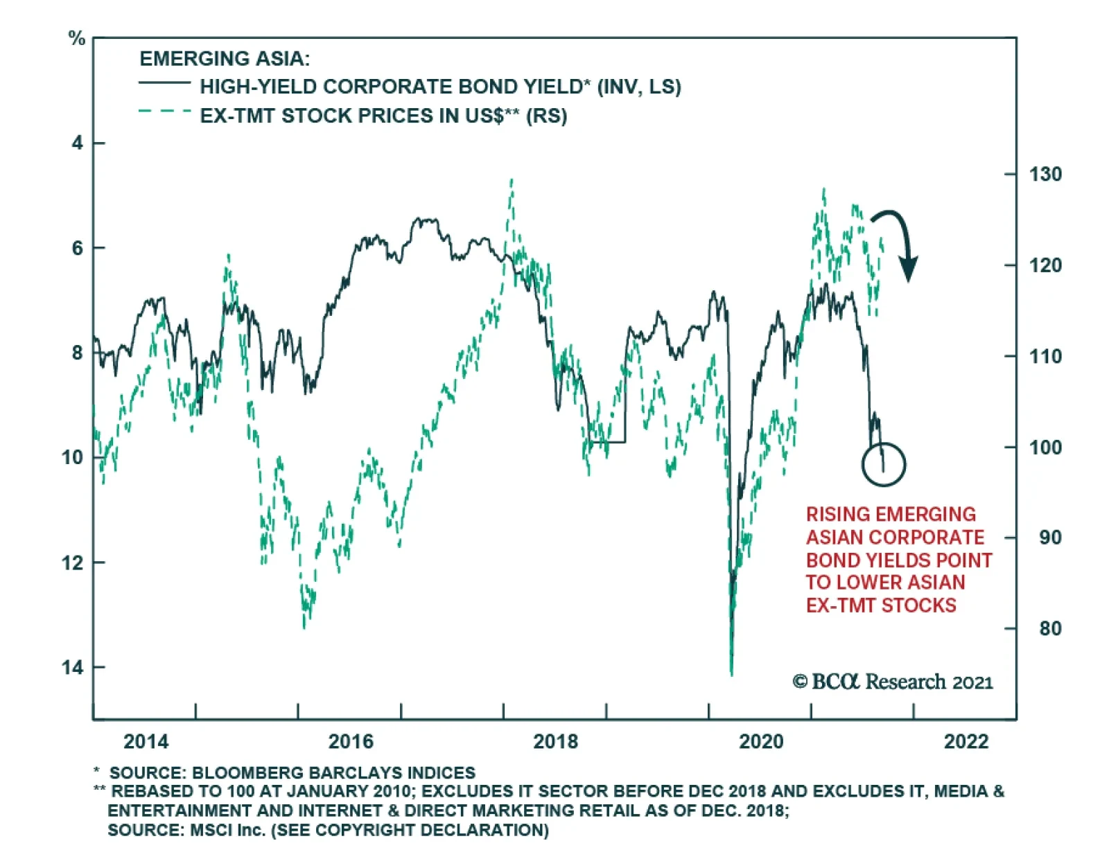
This is a very good question, and we have the following observations. In our view, authorities are clamping down on property developers’ leverage because historically there was a strong positive correlation between property starts and house prices (Chart 2). The basis for this positive correlation is that when property developers start more projects, they raise expectations via aggressive marketing of higher prices in future. As a result, people become more inclined to buy houses. In fact, more supply has not precluded property prices from surging and vice versa, as shown in Chart 2. Provided housing valuations (the house price-to-income ratios) are exceptionally high in China and high-income households have been buying multiple apartments, we can argue that (speculative) expectations for higher prices in the future have often been an important driver of demand. So, authorities are probably hoping to break this speculative cycle where higher prices breed higher prices. Aggressive marketing on the part of property developers – creating an atmosphere of euphoria around new property launches – has been an essential driver for surging house price expectations. Hence, authorities’ reasoning is that curbing property developers’ relentless debt financed expansion activity is essential for both (1) to restrain excessive house prices inflation (a social stability goal) and (2) to reduce risks of a future credit crisis (a financial stability goal). Finally, with many households/investors who own multiple properties (that are vacant rather than rented out), authorities hope that diminished expectations for future house price appreciation will bring some of these vacant properties to the market. If this occurs, the supply of residential properties for sale and rent will not drop dramatically despite lower starts by property developers. It is also critical to assess the implications of the ongoing carnage in Chinese offshore corporate bonds, where the epicenter of the selloff is property companies. The fact that property developers are experiencing a credit crunch and will be forced to deleverage has implications for China’s business cycle and other EM economies. Chart 3 illustrates that the periods of rising emerging Asian USD corporate bond yields (shown inverted on the chart) coincide with lower emerging Asian ex-TMT share prices. The link is as follows: the ongoing credit stress and deleveraging by mainland property developers means less construction and diminished demand for raw materials and industrial goods as well as possibly household white goods. There are thus negative implications not only for emerging Asian non-TMT stocks but also for overall EM. Bottom Line: Property construction in China will continue contracting (Chart 4). This will weigh on raw materials and industrial goods demand in China and beyond it. Chart 3Rising Emerging Asian Corporate Bond Yields Point To Lower Asian ex-TMT Stocks
Rising Emerging Asian Corporate Bond Yields Point To Lower Asian ex-TMT Stocks
Rising Emerging Asian Corporate Bond Yields Point To Lower Asian ex-TMT Stocks
Chart 4Chinese Housing: Sales And Starts Are Contracting
Chinese Housing: Sales And Starts Are Contracting
Chinese Housing: Sales And Starts Are Contracting
Arthur Budaghyan Chief Emerging Markets Strategist arthurb@bcaresearch.com Have EM Stocks Bottomed? Investor sentiment on EM equities has plunged close to its previous lows. However, this is a necessary but not sufficient condition to issue a buy recommendation. Critically, EM narrow money growth points to EPS deceleration in the next nine months. Yet, analysts’ net EPS revisions remain elevated and have not yet dropped to negative levels. Our bias is that EM net EPS revisions will be downgraded in the coming months. From a technical perspective, the EM equity index has failed to break above its 200-day moving average. This is a negative technical signal. Chart 5
Have EM Stocks Bottomed?
Have EM Stocks Bottomed?
Chart 6
Have EM Stocks Bottomed?
Have EM Stocks Bottomed?
Chart 7
Have EM Stocks Bottomed?
Have EM Stocks Bottomed?
Chart 8
Have EM Stocks Bottomed?
Have EM Stocks Bottomed?
EM Underperformance Is Broad-Based Not only have EM TMT stocks massively underperformed their global peers, but also EM ex-TMT stocks have been underperforming their global counterparts. Besides, the EM equal-weighted stock index has failed to break above its previous highs. Failure to break above a resistance line is often a bad omen. Finally, EM ex-TMT share prices correlate with the average of AUD, NZD and CAD, and the latter remains in a corrective phase. Chart 9
EM Underperfomance Is Broad-Based
EM Underperfomance Is Broad-Based
Chart 10
EM Underperfomance Is Broad-Based
EM Underperfomance Is Broad-Based
Chart 11
EM Underperfomance Is Broad-Based
EM Underperfomance Is Broad-Based
Red Flags For EM Periods of rising EM USD corporate bond yields coincide with lower EM share prices. EM corporate USD bond yields are rising (shown inverted below) and we expect more upside. Either US Treasury bond yields will rise and EM corporate spreads will stay broadly constant, or EM credit spreads will widen and US Treasury yields will stay range-bound. Either of these scenarios will produce higher EM corporate bond yields and, thereby, herald lower EM equity prices. Further, a breakdown in platinum prices is also raising a red flag for EM risk assets. Chart 12
Red Flags For EM
Red Flags For EM
Chart 13
Red Flags For EM
Red Flags For EM
Have Chinese And Asian Stocks Hit An Air Pocket? Relative performance of emerging Asian equities versus the global stock index has broken below its previous lows. Technically, this entails a protracted period of underperformance. Neither emerging Asian ex-TMT nor Chinese investable ex-TMT share prices have been able to break above their major resistance lines. Failure to break above a resistance line is often a bad omen. Meantime, Chinese onshore stocks and corporate bonds have not sold off enough so that authorities panic and stimulate aggressively. Chart 14
Have Chinese And Asian Stocks Hit An Air Pocket?
Have Chinese And Asian Stocks Hit An Air Pocket?
Chart 15
Have Chinese And Asian Stocks Hit An Air Pocket?
Have Chinese And Asian Stocks Hit An Air Pocket?
Chart 16
Have Chinese And Asian Stocks Hit An Air Pocket?
Have Chinese And Asian Stocks Hit An Air Pocket?
Chart 17
Have Chinese And Asian Stocks Hit An Air Pocket?
Have Chinese And Asian Stocks Hit An Air Pocket?
The US Dollar As A Litmus Test EM risk assets negatively correlate with the US dollar. The broad trade-weighted US dollar is holding above its 200-day moving average. Plus, investor sentiment on the greenback remains negative. Finally, the US dollar moves inversely with relative performance of global cyclical sectors versus global defensives (the dollar is shown inverted on chart below). The ongoing slowdown in China is bullish for the US dollar because the US economy is the least vulnerable to China’s economy. Overall, we expect the US dollar to continue firming in the coming months. Chart 18
The US Dollar As A Litmus Test
The US Dollar As A Litmus Test
Chart 19
The US Dollar As A Litmus Test
The US Dollar As A Litmus Test
Chart 20
The US Dollar As A Litmus Test
The US Dollar As A Litmus Test
Global Mining Stocks, Commodity Currencies And Commodity Prices The share prices of BHP and Rio Tinto have fallen dramatically in absolute terms. This reflects the plunge in iron ore prices and might also be a harbinger of a broader selloff in industrial metals. Further, the average of AUD, NZD and CAD also signals a correction in the broad commodities price index. Chart 21
Global Mining Stocks, Commodity Currencies And Commodity Prices
Global Mining Stocks, Commodity Currencies And Commodity Prices
Chart 22
Global Mining Stocks, Commodity Currencies And Commodity Prices
Global Mining Stocks, Commodity Currencies And Commodity Prices
Chart 23
Global Mining Stocks, Commodity Currencies And Commodity Prices
Global Mining Stocks, Commodity Currencies And Commodity Prices
Is This Decoupling Sustainable? Industrial metals prices were historically correlated with the Chinese business cycle but have decoupled since early this year. Several commodity prices – like coal, steel and aluminum – have shot up due to production shutdowns as a part of the Chinese government’s decarbonization policies. However, it will be extraordinary if commodity prices continue advancing amid a protracted slowdown in China’s old economy. Chart 24
Is This Decoupling Sustainable?
Is This Decoupling Sustainable?
Chart 25
Is This Decoupling Sustainable?
Is This Decoupling Sustainable?
Chinese Commodity Imports Have Contracted Reflecting a demand slowdown and the government’s willingness to dampen commodity price inflation, China has been shrinking its imports of several commodities. It has also released some of its strategic reserves for oil and certain industrial metals. High commodity prices are hurting profit margins of manufacturing and industrial companies leading them to lower output. Beijing is determined to curb and bring down key commodity prices to lessen the negative impact on overall growth and employment. Chart 26
Chinese Commodity Imports Have Contracted
Chinese Commodity Imports Have Contracted
Chart 27
Chinese Commodity Imports Have Contracted
Chinese Commodity Imports Have Contracted
Chinese Stimulus: How Fast And How Large? In recent months, China has been injecting more liquidity into the banking system. Rising commercial banks’ excess reserves at the PBOC point to a bottom in the credit impulse in Q4 of this year. However, the credit impulse leads the business cycle by about nine months. This implies that the economy will not revive before Q2 next year at best. In fact, the aggregate building floor area started and the installation of electricity transmission lines are already contracting and will continue shrinking till Q2 next year. Chart 28
Chinese Stimulus: How Fast And How Large?
Chinese Stimulus: How Fast And How Large?
Chart 29
Chinese Stimulus: How Fast And How Large?
Chinese Stimulus: How Fast And How Large?
Chart 30
Chinese Stimulus: How Fast And How Large?
Chinese Stimulus: How Fast And How Large?
Chart 31
Chinese Stimulus: How Fast And How Large?
Chinese Stimulus: How Fast And How Large?
An Inflation Dichotomy Between China And The US In China, consumer price inflation remains largely contained. However, in the US core consumer price inflation measures are still rising and are above 2%. An optimal exchange rate adjustment to redistribute inflation pressures from the US into China will require a stronger US dollar and a weaker RMB. Chart 32
An Inflation Dichotomy Between China And The US
An Inflation Dichotomy Between China And The US
Chart 33
An Inflation Dichotomy Between China And The US
An Inflation Dichotomy Between China And The US
Inflation And Monetary Tightening In EM ex-China Core measures of inflation have been rising in many Eastern European and Latin American economies. Their central banks will hike interest rates further. This will hurt their domestic demand at a time when the recovery in these economies has been underwhelming. Monetary and fiscal tightening will offset benefits from reopening as their vaccination rates ameliorate. Chart 34
Inflation And Monetary Tightening In EM ex-China
Inflation And Monetary Tightening In EM ex-China
Chart 35
Inflation And Monetary Tightening In EM ex-China
Inflation And Monetary Tightening In EM ex-China
Chart 36
Inflation And Monetary Tightening In EM ex-China
Inflation And Monetary Tightening In EM ex-China
Chart 37
Inflation And Monetary Tightening In EM ex-China
Inflation And Monetary Tightening In EM ex-China
What Drives EM Credit Markets? We downgraded our allocation to EM credit, currencies and equities from neutral to underweight on March 25, 2021. This strategy remains intact. The outlook for the key drivers of EM credit – EM/China business cycles and EM exchange rates – remains downbeat. In fact, EM credit markets – both investment grade and high-yield – have been underperforming their US counterparts and this trend will persist. Chart 38
What Drives EM Credit Markets?
What Drives EM Credit Markets?
Chart 39
What Drives EM Credit Markets?
What Drives EM Credit Markets?
Chart 40
What Drives EM Credit Markets?
What Drives EM Credit Markets?
Chart 41
What Drives EM Credit Markets?
What Drives EM Credit Markets?
Our Relative Equity Value Strategies We have been recommending investors go long Chinese A shares / short Chinese investable stocks since March 4, 2021 and this strategy has been extremely profitable. The same is true for the short Chinese property developers / long overall index and short Chinese investable value stocks versus global value stocks strategies. Finally, our recommendation to be long global industrials / short global materials has so far been flat but we expect it to play out for the reasons elaborated in the linked report. Chart 42
Our Relative Equity Value Strategies
Our Relative Equity Value Strategies
Chart 43
Our Relative Equity Value Strategies
Our Relative Equity Value Strategies
Chart 44
Our Relative Equity Value Strategies
Our Relative Equity Value Strategies
Chart 45
Our Relative Equity Value Strategies
Our Relative Equity Value Strategies
Retail Equity Mania In Korea And Taiwan The retail mania continues in the Korean and Taiwanese stock markets. Retail investors are the main buyers while foreign investors and domestic institutional investors have been scaling back their exposure. Surging margin loans and equity trading volumes in Korea confirm ongoing equity euphoria. We continue overweighting Korean stocks and are neutral on Taiwanese stocks within an EM equity portfolio. The difference in our strategy is due to the potential geopolitical risks that Taiwan is facing. Chart 46
Retail Equity Mania In Korea And Taiwan
Retail Equity Mania In Korea And Taiwan
Chart 47
Retail Equity Mania In Korea And Taiwan
Retail Equity Mania In Korea And Taiwan
Chart 48
Retail Equity Mania In Korea And Taiwan
Retail Equity Mania In Korea And Taiwan
Chart 49
Retail Equity Mania In Korea And Taiwan
Retail Equity Mania In Korea And Taiwan
The Semi Cycle And Risks To The Absolute Performance Of Korean And Taiwanese Stocks DRAM and NAND prices have rolled over. This is a near-term risk to the absolute performance of Korean tech stocks. However, if global industrial stocks outperform, as we expect, Korean share prices will outperform the EM equity benchmark because the KOSPI is a good proxy play on global industrials within the EM universe. Although global semiconductor shortages remain widespread, the 6-month outlook for Taiwanese technology companies has rolled over too. Chart 50
The Semi Cycle And Risks To The Absolute Performance Of Korean And Taiwanese Stocks
The Semi Cycle And Risks To The Absolute Performance Of Korean And Taiwanese Stocks
Chart 51
The Semi Cycle And Risks To The Absolute Performance Of Korean And Taiwanese Stocks
The Semi Cycle And Risks To The Absolute Performance Of Korean And Taiwanese Stocks
Chart 52
The Semi Cycle And Risks To The Absolute Performance Of Korean And Taiwanese Stocks
The Semi Cycle And Risks To The Absolute Performance Of Korean And Taiwanese Stocks
Chart 53
The Semi Cycle And Risks To The Absolute Performance Of Korean And Taiwanese Stocks
The Semi Cycle And Risks To The Absolute Performance Of Korean And Taiwanese Stocks
Footnotes Equities Recommendations Currencies, Credit And Fixed-Income Recommendations
Highlights Since June, 6 structured recommendations achieved their profit targets: short building and construction (XLB) versus healthcare (XLV); long USD/CAD; long USD/HUF; long Nike versus L’Oréal; short corn versus wheat; and short marine transport versus market. Additionally, short AMC Entertainment expired in profit, while short Australian versus Canadian 30-year bonds expired flat. Within the open trades, 3 are in profit. Against this, 2 structured recommendations hit their stop-losses: short Austria versus Chile; and short lead versus platinum. Additionally, short France versus Japan expired in loss. Within the open trades, 6 are in loss. This results in a ‘win ratio’ at a very pleasing 59 percent. Even more commendably, the 9 unstructured recommendations have all anticipated reversals or exhaustions – most notably for the ZAR, BRL, and stocks versus bonds. Feature Chart of the WeekFractal Fragility Correctly Signalled The Exhaustion Of Stocks Versus Bonds
Fractal Fragility Correctly Signalled The Exhaustion Of Stocks Versus Bonds
Fractal Fragility Correctly Signalled The Exhaustion Of Stocks Versus Bonds
A major advance in our understanding of financial markets is that the Efficient Market Hypothesis (EMH) is only partly true. The market is efficient only when a wide spectrum of investment horizons is setting the price, signified by the market having a rich fractal structure. The market is efficient only when a wide spectrum of investment horizons is setting the price, signified by the market having a rich fractal structure. The eponymous Fractal Market Hypothesis (FMH) teaches us that when the fractal structure becomes extremely fragile, the information and interpretation of longer-term investors is missing from the recent price setting. Meaning that the market has become inefficient. When the longer-term investors do re-enter the price setting process, the question is: will they endorse the most recent trend as a justification of a change in the fundamentals. In which case, the trend will continue. Or will they reject it as an unjustified deviation from a fundamental anchor. In which case, the trend will reverse. In most cases, it is the latter: a rejection and a reversal. As most investors are unaware of the FMH, it gives a competitive advantage to the few investors that use it to signal a potential countertrend reversal. On this basis, we have used it – and continue to use it – to identify countertrend investment opportunities with truly excellent results. Fractal Trade Update This a brief review and update of the 29 short-term trades that we have recommended since our last update on 3rd June 2021, including recommendations that were open on that date. The 29 recommendations have comprised 20 structured trades – which include profit-targets, symmetrical stop-losses, and expiry dates – plus a further 9 recommendations without structured exit points. In summary, 6 structured recommendations achieved their profit targets: short building and construction (XLB) versus healthcare (XLV); long USD/CAD; long USD/HUF; long Nike versus L’Oréal; short corn versus wheat; and short marine transport versus market. Additionally, short AMC Entertainment expired in profit, while short Australian versus Canadian 30-year bonds expired flat. Within the open trades, 3 are in profit. Against this, 2 structured recommendations hit their stop-losses: short Austria versus Chile; and short lead versus platinum. Additionally, short France versus Japan expired in loss. Within the open trades, 6 are in loss. This results in a ‘win ratio’ at a very pleasing 59 percent – counting a win as achieving the profit target, a loss as hitting the (symmetrical) stop-loss, and pro-rata for partial wins and losses. Even more commendably, the 9 unstructured recommendations have all anticipated reversals or exhaustions. The sections below review the structured and unstructured recommendations in chronological order. The 20 Structured Trades 1. 6th May: Short Building and Construction (PKB) vs. Healthcare (XLV) Achieved its profit target of 15 percent. 2. 6th May: Short MSCI France vs. Japan Expired after three months in partial loss but went on to become very profitable – implying that a longer holding period was required (Chart I-2). Chart I-2Short France Versus Japan Became Very Profitable
Short France Versus Japan Became Very Profitable
Short France Versus Japan Became Very Profitable
3. 13th May: Long USD/CAD Achieved its profit target of 3.7 percent and went on to reach a high-water mark of 5.7 percent. 4. 20th May: Long 10-year T-bond vs. TIPS Open, in profit, having reached a high-water mark of 2.7 percent (versus a 3.6 percent target). 5. 3rd June: Short MSCI Austria vs. Chile Hit its stop-loss of 7 percent, albeit after previously reaching a high-water mark of 5.3 percent – implying that the profit target needed to be tighter. 6. 10th June: Short AMC Entertainment Expired at a 4 percent profit, having reached a high-water mark of 65.3 percent (versus a 100 percent target) (Chart I-3). Chart I-3Fractal Analysis Works Very Well For Meme Stocks
Fractal Analysis Works Very Well For Meme Stocks
Fractal Analysis Works Very Well For Meme Stocks
7. 10th June: Long USD/HUF Achieved its 3 percent profit target, before continuing to a high-water mark of 7.6 percent (Chart I-4). Chart I-4HUF/USD Corrected By 7.6 Percent
HUF/USD Corrected By 7.6 Percent
HUF/USD Corrected By 7.6 Percent
8. 17th June: Long Nike vs. L’Oréal Achieved its 9 percent profit target, before continuing to a high-water mark of 31.3 percent (Chart I-5). Chart I-5L’Oréal Underperformed Nike By 31 Percent
L'Oreal Underperformed Nike By 31 Percent
L'Oreal Underperformed Nike By 31 Percent
9. 24th June: Short Corn vs. Wheat Achieved its 12 percent profit target, before continuing to a high-water mark of 38.7 percent (Chart I-6). Chart I-6Corn Underperformed Wheat By 39 Percent
Corn Underperformed Wheat By 39 Percent
Corn Underperformed Wheat By 39 Percent
10. 1st July: Short US REITs vs. Utilities Open, in profit, having reached a high-water mark of 3 percent (versus a 5 percent target). 11. 8th July: Short Marine Transport vs. Market Achieved its profit target of 16.5 percent. 12. 15th July: Short Lead vs. Platinum Hit its stop loss of 6.4 percent. 13. 15th July: Short Australia vs. Canada 30-year T-Bonds Expired flat. 14. 5th August: Short Tin vs. Platinum Open, in loss, albeit having reached a high-water mark of 9.3 percent (versus a 16.5 percent target). 15. 12th August: Long MSCI Hong Kong vs. MSCI World Open, in loss. 16. 12th August: Long New Zealand vs. Netherlands Open, in loss. 17. 19th August: Short India vs. China Open, in loss (Chart I-7). Chart I-7The Outperformance Of India Versus China Is Fractally Fragile
The Outperformance Of India Versus China Is Fractally Fragile
The Outperformance Of India Versus China Is Fractally Fragile
18. 26th August: Short Sugar vs. Soybeans Open, in loss. 19. 2nd September: Short Aluminum vs. Gold Open, in loss (Chart I-8). Chart I-8The Outperformance Of Base Metals Versus Precious Metals Is Fractally Fragile
The Outperformance Of Base Metals Versus Precious Metals Is Fractally Fragile
The Outperformance Of Base Metals Versus Precious Metals Is Fractally Fragile
20. 9th September: Short US Medical Equipment vs. Healthcare Services Open, in profit. The 9 Unstructured Trades 1. 10th June: Short ZAR/USD ZAR/USD subsequently corrected by 12 percent. 2. 24th June: Short Copper Copper’s rally subsequently exhausted. 3. 1st July: Short MSCI ACWI vs. 30-year T-bond The rally in stocks versus bonds has subsequently exhausted (Chart of the Week). 4. 8th July: Short BRL/COP BRL/COP subsequently corrected by 4 percent. 5. 8th July: Short Saudi Tadawul All-Share vs. FTSE Malaysia All Share KLCI The rally in Saudi Arabian equities versus Malaysian equities subsequently exhausted. 6. 12th August: Long NOK/GBP NOK/GBP has subsequently rallied by 3 percent. 7. 26th August: Short Hungary vs. EM Hungary’s outperformance is losing steam. 8. 26th August: Short USD/PLN USD/PLN subsequently corrected by 3 percent. 9. 2nd September: Short Trade Weighted US Dollar Index The dollar rally is meeting near-term resistance. Dhaval Joshi Chief Strategist dhaval@bcaresearch.com Mohamed El Shennawy Research Associate Fractal Trading System Fractal Trades 6-Month Recommendations Structural Recommendations Closed Fractal Trades Closed Trades Asset Performance Equity Market Performance Indicators To Watch - Bond Yields Chart II-1Indicators To Watch - Bond Yields ##br##- Euro Area
Indicators To Watch - Bond Yields - Euro Area
Indicators To Watch - Bond Yields - Euro Area
Chart II-2Indicators To Watch - Bond Yields ##br##- Europe Ex Euro Area
Indicators To Watch - Bond Yields - Europe Ex Euro Area
Indicators To Watch - Bond Yields - Europe Ex Euro Area
Chart II-3Indicators To Watch - Bond Yields ##br##- Asia
Indicators To Watch - Bond Yields - Asia
Indicators To Watch - Bond Yields - Asia
Chart II-4Indicators To Watch - Bond Yields ##br##- Other Developed
Indicators To Watch - Bond Yields - Other Developed
Indicators To Watch - Bond Yields - Other Developed
Indicators To Watch - Interest Rate Expectations Chart II-5Indicators To Watch - Interest Rate Expectations
Indicators To Watch - Interest Rate Expectations
Indicators To Watch - Interest Rate Expectations
Chart II-6Indicators To Watch - Interest Rate Expectations
Indicators To Watch - Interest Rate Expectations
Indicators To Watch - Interest Rate Expectations
Chart II-7Indicators To Watch - Interest Rate Expectations
Indicators To Watch - Interest Rate Expectations
Indicators To Watch - Interest Rate Expectations
Chart II-8Indicators To Watch - Interest Rate Expectations
Indicators To Watch - Interest Rate Expectations
Indicators To Watch - Interest Rate Expectations
Inflationary pressures are likely to keep the Bank of Canada at least as hawkish - if not more hawkish - than the Fed. Headline CPI accelerated to a 18-year high of 4.1% y/y in August. The diffusion index's extremely elevated reading is in line with…
Highlights Fed: The Fed will be forced to clarify its definition of “maximum employment” in 2022, and the path of inflation will ultimately dictate how far the Fed tries to push the labor market. We expect Fed rate hikes to start in December 2022 and that the pace of hikes will proceed more quickly than is currently priced in the yield curve. Duration: Investors should maintain below-benchmark portfolio duration in anticipation of a rate hike cycle starting in December 2022. Yield Curve: Investors should position in Treasury curve flatteners. Specifically, we recommend shorting the 5-year Treasury note versus a duration-matched barbell consisting of the 2-year and 10-year notes. Feature Chart 1Bonds De-Coupled From Inflation In 2021
Bonds De-Coupled From Inflation In 2021
Bonds De-Coupled From Inflation In 2021
One of our themes this year is that US bond investors should pay more attention to the employment data than the inflation data.1 This is because the Fed has successfully convinced markets that it will not lift rates until “maximum employment” is achieved, even if inflation is strong.2 This story has played out during the past few months as bond yields have remained low despite surging prices (Chart 1). Our view is that the muted reaction in bonds is due to the widespread belief that the labor market remains far from “maximum employment” and that rate hikes are therefore a long way off. In this environment, only surprisingly strong employment prints can upset the market’s narrative and send bond yields higher. This playbook for the bond market will continue to function for the next few months. Strong employment data will pull bond yields higher and disappointing employment data will push them down. Inflation prints will be largely irrelevant for the market. But this will change next year. In fact, we see the employment data taking a back seat to the inflation data in the minds of bond investors in 2022. A More Explicit Definition of “Maximum Employment” Must Emerge In 2022 Almost everyone agrees that the US labor market is far from “maximum employment” today, but that will no longer be the case in 2022. The Appendix to this report shows the average monthly nonfarm payroll growth that is required to reach different possible definitions of “maximum employment” by a few specific future dates. For example, we calculate that average monthly nonfarm payroll growth of 414 thousand would cause the unemployment rate to reach 3.8% and the labor force participation rate to reach 63% by the end of 2022. Our sense is that the US economy will be able to add more than 414 thousand jobs per month between now and December 2022. This means that if Fed officials believe that an unemployment rate of 3.8% and a participation rate of 63% meet the definition of “maximum employment”, then they will start to lift interest rates by then. This example sets the scene for what will become next year’s most important monetary policy debate. What constitutes “maximum employment”? Does our example of a 3.8% unemployment rate and a 63% participation rate meet the definition? Or does the Fed have different targets in mind? The Fed will be forced to clarify its position on the topic as the labor market gets closer to reasonable definitions of “maximum employment”. Our sense is that, as of now, there are a range of views on the committee with some FOMC participants taking a more hawkish view of how much slack is left in the labor market and some adopting a more dovish posture. We outline the differences between the hawkish and dovish positions below, but ultimately the path of inflation in 2022 will determine which camp wins out. If inflation remains high next year, then the Fed will be quicker to declare that the labor market is at “maximum employment”, and vice-versa. The Fed’s reliance on the inflation data to settle the argument of what constitutes “maximum employment” will make inflation the most important economic indicator for bond yields in 2022. Labor Market Slack: The Hawkish Case Chart 2The Unemployment Rate Is Falling Fast
The Unemployment Rate Is Falling Fast
The Unemployment Rate Is Falling Fast
The hawkish case for the US labor market reaching “maximum employment” sooner rather than later was outlined nicely last month by our own Bank Credit Analyst.3 First, the Bank Credit Analyst points out that the US labor market was likely beyond “maximum employment” before COVID-19 struck. The implication being that the Fed may move to lift interest rates before the unemployment and participation rates fully recover their pre-pandemic levels. Notice that the unemployment rate (adjusted for the post-COVID surge in people employed but absent from work) was 3.5% in February 2020, well below the Congressional Budget Office’s 4.5% estimate of the natural rate of unemployment (Chart 2).4 Today, the adjusted unemployment rate is 5.5%, not that far above the 3.5%-4.5% range of FOMC participant estimates of the natural rate. If this year’s rate of decline continues, the unemployment rate will hit 4.5% by January 2022 and 3.5% by May 2022. Of course, we know that the Fed takes a broader view of labor market utilization than just the unemployment rate. In particular, we observed sharp declines in labor force participation rates across a wide range of demographic groups when the pandemic struck last year (Chart 3). While the Fed will want to see some improvement in labor force participation, it might be unrealistic to expect the overall labor force participation rate to return to its pre-pandemic level. This is because the aging of the US population imparts a structural downtrend to the participation rate. The dashed line in Chart 4 shows where the participation rate would be if the rate of labor force participation of every individual age cohort remained constant at its February 2020 level. Even in this case, the greater flow of people into the older age groups causes the part rate to fall over time. The message from Chart 4 is that even if the participation rates of every age cohort tracked by the Bureau of Labor Statistics rebound to their February 2020 levels, we would still only expect an overall participation rate of 62.8% by the end of 2022, significantly below the 63.3% seen in February 2020. Chart 3Labor Force Participation By Age Cohort
Labor Force Participation By Age Cohort
Labor Force Participation By Age Cohort
Chart 4The Demographic Downtrend In Participation
The Demographic Downtrend In Participation
The Demographic Downtrend In Participation
On top of the demographic argument, we also notice that the pandemic led to a surge in the number of retired people last year, a number that continues to rise quickly (Chart 5). While we should probably expect some increase in the flow of people coming out of retirement to re-join the labor force as the economy recovers, it’s also logical to assume that there will be at least some hysteresis among the retired population. That is, the longer someone is retired, the less likely they are to re-enter the labor force at all. To the extent that the increase in retired people is sticky, it may be ambitious to expect a full convergence of the 55-year+ part rate back to February 2020 levels (Chart 3, bottom panel). All else equal, this will cause the labor market to reach “maximum employment” more quickly than even our demographic trendline for participation suggests. Chart 5A Surge In Retirees
A Surge In Retirees
A Surge In Retirees
The question of how many FOMC participants agree with the above arguments remains open, but our sense is that there are some who will be eager to declare that “maximum employment” has been achieved before we see a full rebound in the unemployment and participation rates back to pre-COVID levels. For example, Fed Vice-Chair Richard Clarida mentioned the “demographic trend” in labor force participation in his most recent speech.5 Also, Dallas Fed President Robert Kaplan said the following in a recent interview: We’ve had 3 million retirements since February 2020. […] Some of these workers will come back into the workforce, but some of these workers are 55 and older and they’re in reasonably good financial shape and COVID has caused them to re-think whether they really want to re-enter the workforce.6 Labor Market Slack: The Dovish Case There are also good arguments on the side of those who think that an appropriate definition of “maximum employment” involves an unemployment rate closer to 3.5% than 4.5% and a participation rate that does return to pre-COVID levels, and maybe even moves higher. First, a study from the Federal Reserve Bank of Kansas City noted that the bulk of the recent increase in the number of retired people is explained, not by an increase in the number of retirements, but by a reduction in the flow of people from retirement back into the workforce (Chart 6).7 This suggests that pandemic-related health risks are the likely culprit behind the increase in the number of retired people, casting doubt on the idea that the increase in retired people will be sticky. Chart 6Increased Retirees: A Closer Look
2022 Will Be All About Inflation
2022 Will Be All About Inflation
Second, there is a strong case to be made that even the February 2020 labor force participation rate is not high enough to meet the definition of “maximum employment”. If we look at the participation rates for 25-54 year old men and women, we see that both were in strong uptrends prior to the pandemic (Chart 7), and there is every reason to believe that they would have continued to move higher if COVID hadn’t cut the recovery short. Chart 7Part Rates Were Rising Pre-Pandemic
Part Rates Were Rising Pre-Pandemic
Part Rates Were Rising Pre-Pandemic
Consider what some FOMC participants were saying prior to the pandemic: The strong labor market is also encouraging more people in their prime working years – ages 25 to 54 – to rejoin or remain in the labor force, […] So far, we have made up more than half the loss in the Great Recession, which translates to almost 2 million more people in the labor force. But prime age participation could still be higher. - Jerome Powell, November 20198 Whether participation will continue to increase in a tight labor market remains to be seen. But I note that male prime-age participation still remains below levels seen in previous business cycle expansions. - Richard Clarida, November 20199 In a more recent interview, Minneapolis Fed President Neel Kashkari expressed skepticism about the idea that labor force participation is destined to remain in a long-run structural downtrend and said that he’s “not convinced we were actually at maximum employment before the COVID shock hit us.” He also said: Getting [labor force participation] and employment-to-population at least back to where they were before [the pandemic], but not necessarily even declaring victory when we do that. I think that’s a reasonable thing for us to try to achieve.10 Inflation: The Ultimate Argument Settler What the above arguments make clear is that there are good reasons to think that the US labor market will reach some policymakers’ definitions of “maximum employment” perhaps by as early as the middle of next year. However, there are also some policymakers who will adopt a more dovish view of what constitutes “maximum employment”. Ultimately, the path of inflation will determine which camp wins out. This is because the entire concept of “maximum employment” is only meaningful when viewed alongside inflation. If employment is pushed beyond its “maximum”, it definitionally means that labor market tightness is leading to unwanted inflationary pressures. With that in mind, the Fed will increasingly refer to the inflation data next year as it tries to make its definition of “maximum employment” more precise. Crucially, what will matter for the Fed (and for the bond market) is where inflation is next year, not where it is right now. Right now, core inflation is well above the Fed’s price stability target, but it is well known that the recent increase in inflation is concentrated in a few sectors – COVID-impacted services and autos – where prices will decelerate as post-pandemic bottlenecks ease (Chart 8). Just as the Fed ignored surging prices in those sectors this year, it will ignore plunging prices in those sectors next year. What will matter for monetary policy is whether core inflation excluding COVID-impacted services and autos remains contained or rises above levels consistent with the Fed’s target (Chart 8, bottom panel). The Fed will also be inclined to declare that “maximum employment” has been achieved if wage growth is accelerating. Currently, there is some evidence of rising wages but also some major supply bottlenecks in the labor market, as evidenced by the all-time high in job openings (Chart 9). Labor supply constraints should ease next year, but the Fed will be watching closely to see if wage growth moderates in kind or continues to increase. Chart 8Watch CPI (ex. COVID-Impacted Services And Autos) In 2022
Watch CPI (ex. COVID-Impacted Services And Autos) In 2022
Watch CPI (ex. COVID-Impacted Services And Autos) In 2022
Chart 9Watch Wages In 2022
Watch Wages In 2022
Watch Wages In 2022
Finally, the Fed will keep a close eye on inflation expectations next year. In particular, it will monitor the Common Inflation Expectations Index and the 5-year/5-year forward TIPS breakeven inflation rate (Chart 10). If either of these indicators break above levels consistent with the Fed’s 2% inflation target, then policymakers will be more inclined to think that “maximum employment” has been attained. Chart 10Watch Inflation Expectations In 2022
Watch Inflation Expectations In 2022
Watch Inflation Expectations In 2022
Bottom Line: The Fed will be forced to clarify its definition of “maximum employment” in 2022, and the path of inflation will ultimately dictate how far the Fed tries to push the labor market. The key indicators to monitor to decide when the Fed will declare that “maximum employment” has been attained are: core inflation excluding COVID-impacted services and autos, wage growth, inflation expectations and the prime-age (25-54) labor force participation rate (Chart 3, panel 2). Investment Implications For bond markets, the question of when the Fed decides that the labor market has reached “maximum employment” is crucial because it will determine the start of the next rate hike cycle. At present, the overnight index swap curve is priced for Fed liftoff in January 2023 and for a total of 78 bps of rate hikes by the end of 2023 (Chart 11). Chart 11Rate Hike Expectations
Rate Hike Expectations
Rate Hike Expectations
Our expectation is that the Fed will start lifting rates in December 2022 and that rate hikes will proceed more quickly than what is currently priced in the market. The unemployment rate will be close to 3.5% by December 2022 and inflation will be sufficiently above the Fed’s target that policymakers will be inclined to view the labor market as at “maximum employment”. Investors should run below-benchmark duration in US bond portfolios to profit from this outcome. We also recommend that investors position for a flatter yield curve by the end of 2022. Specifically, we recommend shorting the 5-year Treasury note versus a duration-matched barbell consisting of the 2-year and 10-year notes. Table 1A shows fair value estimates for the 2-year, 5-year and 10-year yields as of the end of 2022 assuming the market moves to price-in the following path for the fed funds rate: The first 25 bps rate hike occurs in December 2022 Rate hikes proceed at a pace of 100 bps per year The fed funds rate levels-off at a terminal rate of 2.08%11 Table 1ATreasury Curve Fair Value Estimates: December 2022 Liftoff Scenario
2022 Will Be All About Inflation
2022 Will Be All About Inflation
In that example, the 2-year and 5-year yields both rise by much more than the 10-year yield and both exceed the change that is priced into the forward curve by more than the 10-year yield. Table 1B shows the results from a similar scenario, the only difference is that the liftoff date is pushed back to March 2023. Both the 2-year and 5-year yields also rise by more than the 10-year yield in this scenario, though the delayed liftoff dampens the relative upside in the 2-year yield. Table 1BTreasury Curve Fair Value Estimates: March 2023 Liftoff Scenario
2022 Will Be All About Inflation
2022 Will Be All About Inflation
Bottom Line: Investors should maintain below-benchmark portfolio duration and position in Treasury curve flatteners in anticipation of a rate hike cycle that will start in December 2022. Appendix: How Far From “Maximum Employment” And Fed Liftoff? Chart A1Defining “Maximum Employment”
Defining "Maximum Employment"
Defining "Maximum Employment"
The Federal Reserve has promised that the funds rate will stay pinned at zero until the labor market returns to “maximum employment”. The Fed has not provided explicit guidance on the definition of “maximum employment”, but we deduce that “maximum employment” means that the Fed wants to see the U3 unemployment rate within a range consistent with its estimates of the natural rate of unemployment, currently 3.5% to 4.5%, and that it wants to see a more or less complete recovery of the labor force participation rate back to February 2020 levels (Chart A1). Alternatively, we can infer definitions of “maximum employment” from the New York Fed’s Surveys of Primary Dealers and Market Participants. These surveys ask respondents what they think the unemployment and labor force participation rates will be at the time of Fed liftoff. Currently, the median respondent from the Survey of Market Participants expects an unemployment rate of 3.5% and a participation rate of 63%. The median respondent from the Survey of Primary Dealers expects an unemployment rate of 3.8% and a participation rate of 62.8%. Tables A1-A4 present the average monthly nonfarm payroll growth required to reach different combinations of unemployment rate and participation rate by specific future dates. For example, if we use the definition of “maximum employment” from the Survey of Market Participants, then we need to see average monthly nonfarm payroll growth of +414k in order to hit “maximum employment” by the end of 2022. Table A1Average Monthly Nonfarm Payroll Growth Required For The Unemployment To Reach 4.5% By The Given Date
2022 Will Be All About Inflation
2022 Will Be All About Inflation
Table A2Average Monthly Nonfarm Payroll Growth Required For The Unemployment To Reach 4% By The Given Date
2022 Will Be All About Inflation
2022 Will Be All About Inflation
Table A3Average Monthly Nonfarm Payroll Growth Required For The Unemployment To Reach 3.5% By The Given Date
2022 Will Be All About Inflation
2022 Will Be All About Inflation
Table A4Average Monthly Nonfarm Payroll Growth Required To Reach “Maximum Employment” As Defined By Survey Respondents
2022 Will Be All About Inflation
2022 Will Be All About Inflation
Chart A2 presents recent monthly nonfarm payroll growth along with target levels based on the Survey of Market Participants’ definition of “maximum employment”. This chart is to help us track progress toward specific liftoff dates. For example, if monthly nonfarm payroll growth continues to print at the same level as last month, then we could anticipate a Fed rate hike by June 2022. Chart A2Tracking Toward Fed Liftoff
Tracking Toward Fed Liftoff
Tracking Toward Fed Liftoff
We will continue to track these charts and tables in the coming months, and will publish updates after the release of each monthly employment report. Ryan Swift US Bond Strategist rswift@bcaresearch.com Footnotes 1 Please see US Bond Strategy Weekly Report, “Watch Employment, Not Inflation”, dated June 15, 2021. 2 Specifically, the Fed’s forward guidance states that it will not lift interest rates until (i) inflation is above 2%, (ii) inflation is expected to remain above 2% for some time and (iii) the labor market has reached “maximum employment”. 3 Please see Bank Credit Analyst Special Report, “The Return To Maximum Employment: It May Be Faster Than You Think”, dated August 26, 2021. 4 For details on the adjustment we make to the unemployment rate please see US Bond Strategy Weekly Report, “Overreaction”, dated July 13, 2021. 5 https://www.federalreserve.gov/newsevents/speech/clarida20210804a.htm 6 https://www.bloomberg.com/news/articles/2021-08-09/dallas-fed-president-rob-kaplan-on-the-economy-and-monetary-policy-right-now?sref=Ij5V3tFi 7 https://www.kansascityfed.org/research/economic-bulletin/what-has-driven-the-recent-increase-in-retirements/ 8 https://www.federalreserve.gov/newsevents/speech/powell20191125a.htm 9 https://www.federalreserve.gov/newsevents/speech/clarida20191114a.htm 10 https://www.bloomberg.com/news/articles/2021-08-16/neel-kashkari-on-the-fed-s-quest-to-get-to-full-employment?srnd=oddlots-podcast&sref=Ij5V3tFi 11 We assume a target range of 2% to 2.25% for the terminal fed funds rate. We also assume that the effective fed funds rate trades 8 bps above the lower-end of its target band, as is presently the case. Recommended Portfolio Specification Other Recommendations Treasury Index Returns Spread Product Returns
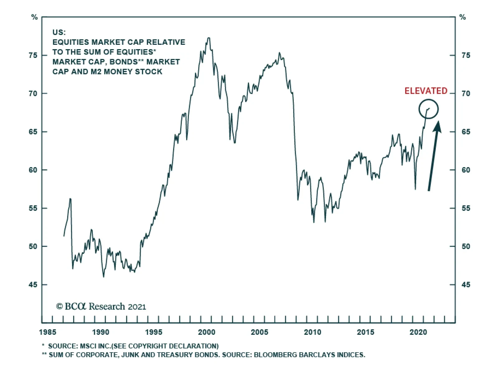
The share of market capitalization of equities within portfolios is elevated by historical standards. The threat now is that this elevated level could trigger a rebalancing of flows away from equities in favor of bonds, especially among institutional…
9 September 2021 at 10:00 EDT Emerging Markets Strategy/Webcast EM/China: See The Forest For The Trees 9 September 2021 at 21:00 EDT Emerging Markets Strategy/Webcast Emerging Asia: See The Forest For The Trees Highlights Structural inflation in India has abated noticeably since the mid-2010s. The cyclical inflation outlook is also benign (Chart 1). As such, the specter of inflation does not pose a material threat to this stock market. Indian stocks’ high valuation is a risk; yet this bourse’s structurally high premium relative to EM will likely continue as India’s earnings growth will stay strong and its volatility low. Investors should stay overweight Indian stocks in an EM equity portfolio, and local currency bonds in an EM domestic bond portfolio. Feature Chart 1India's Cyclical Inflation Outlook Is Benign
Can Inflation Upset The Indian Applecart?
Can Inflation Upset The Indian Applecart?
In a recent Emerging Markets Strategy report we showed that India stands out as the only country in Asia with rather high inflation. Indeed, core CPI in India, at about 6%, is higher than all other major EM and DM countries, save Turkey and Russia. The question is, with the economy re-opening, will Indian inflation rise further and thus derail the rally in Indian equities? Our research indicates that both the structural and cyclical inflation outlook for India remains benign. Our models for headline and core CPI both point to lower inflation in the coming months (Chart 1). As such, inflation is unlikely to pose any major threat to Indian assets in the foreseeable future. Investors should remain overweight Indian stocks in an EM equity portfolio. Fixed-income investors should also continue to overweight Indian local bonds in an EM domestic bond portfolio. Currency traders should favor the rupee versus its EM peers. Inflation Outlook: Structural … The first of the two principal drivers of India’s structural inflation trend is the country’s productivity. The stronger the productivity gains, the more contained has been its structural inflation. The second major driver is broad money supply. The higher the money growth, the steeper have been inflationary pressures – especially during those periods when productivity gains were timid. Top panel of Chart 2 shows that up until the early-2000s, India’s average productivity gains used to be rather low: of the order of 3% annually. That period was also marked by very strong broad money growth: at times, the latter would rise to 20% annually (Chart 2, bottom panel). This growth was due to chronically high fiscal deficits that were monetized, coupled with intermittent surges in bank credit. Chart 2Slower Money Supply Amid Decent Productivity Led To A Structural Decline In Inflation
Can Inflation Upset The Indian Applecart?
Can Inflation Upset The Indian Applecart?
The consequence of persistently low productivity gains amid strong money supply was structurally high inflation, with occasional flare-ups well into double digits (Chart 2). Chart 3Steady Fall In Budget Deficits In Post-GFC Era
Can Inflation Upset The Indian Applecart?
Can Inflation Upset The Indian Applecart?
From the early 2000s, however, that dynamic began to change. A surge in capital spending in infrastructure and other productive capacity propelled India’s productivity trend up by several notches. In the past 15 years, the productivity growth rate has averaged around 6% a year; even though more recently that rate has slowed. In the post-GFC period, both major sources of money creation were stymied. First, successive Indian governments, regardless of political affiliation, adopted a rather tight fiscal policy. They reined in fiscal outlays substantially. Non-interest expenditures of the central government fell from 14% of GDP in 2010 down to 9% by 2019, just before the pandemic (Chart 3, top panel). As a result, during that period, fiscal and primary deficits narrowed significantly: from almost 7% of GDP to 3%, and from almost 4% of GDP to nearly zero, respectively (Chart 3, bottom panel). In addition, a myriad of reasons1 caused commercial bank credit to decelerate materially – from as high as 30% before the GFC to a mere 6% by 2019. The upshot of all this was a secular decline in broad money growth. That eventually led India’s inflationary pressures to decline structurally since the mid-2010s (Chart 2, bottom panel, above). Going forward, those major drivers (both productivity and money growth) will warrant a benign inflation outlook. The country has been continuing its high capital spending for over a decade now (around 30% to 35% of GDP, a rate second only to China). This year, India’s capital spending has already revived. Other corroborating indicators such as imports of capital goods have also recovered robustly. This indicates a new capex cycle is unfolding. Therefore, odds are that the productivity growth rate will stay decent. Prudent fiscal policy, on the other hand, will keep the money growth in check. Chart 4Low Wages Will Help Keep Inflation Subdued
Can Inflation Upset The Indian Applecart?
Can Inflation Upset The Indian Applecart?
Finally, wage pressures in India will also stay muted. In rural areas, both farm and non-farm nominal wages have been growing at a very slow pace; and are now flirting with outright contraction (Chart 4, top panel). Industrial wage expectations have also been tepid over the past several years (Chart 4, bottom panel). The broader picture is unlikely to change in the future as tens of millions of young people continue to join the work force every year. Taken together, these factors point to subdued structural inflation ahead. … And Cyclical The chance that inflation in India will flare up over a cyclical horizon (12 months) is also low: First, one of the major cyclical drivers of inflation in India, the government’s food procurement prices (called Minimum Support Price or MSP) have stayed low for the past several years. The announced MSPs for some of the crops for the 2021-22 agriculture season (July-June) have also shown no marked increase. This will surely help keep the wholesale prices for food in check, which, in turn, will keep a lid on consumer inflation expectations and ultimately on both headline and core consumer inflation (Chart 5). Second, the country’s money growth is also unlikely to witness an immediate, major boom. While the budget deficit has swelled over the past year or so, odds are that the government will revert to the tighter fiscal stance that prevailed over the past decade – as soon as the pandemic is brought under control. Chart 6 shows that government non-interest spending leads core CPI. Reduced expenditure growth will cap inflation. Chart 5Low Food Prices Will Keep A Lid On Inflation Expectations
Can Inflation Upset The Indian Applecart?
Can Inflation Upset The Indian Applecart?
Chart 6Slowing Fiscal Spending Will Cap Core Inflation
Can Inflation Upset The Indian Applecart?
Can Inflation Upset The Indian Applecart?
Chart 7Fuel Price Inflation Is Set To Decelerate
Can Inflation Upset The Indian Applecart?
Can Inflation Upset The Indian Applecart?
The other contributor to money growth, bank credit, is expected to accelerate; but its expansion will not be rapid as banks are still suffering from elevated NPLs. Third, fuel price inflation has likely peaked in India. Last year authorities imposed substantial new taxes on local gasoline and diesel prices, which artificially raised consumer inflation (Chart 7). Since there is little chance of new fuel levies this year and given that crude prices are unlikely to rise much from the current levels (which is EMS’s view), fuel inflation will subside materially next year. And as fuel costs often eventually spill into core inflation, this deceleration will help check the latter as well. Finally, given the massive negative output gap that opened up in the economy during the pandemic-related lockdowns, it will take a while before the economy overheats again. Odds are therefore low that India’s inflation will accelerate much in the coming months. Notably, our cyclical inflation models for both headline and core CPI – built using the drivers discussed above – also vouch for a modest decline in inflation (Chart 1, on page 1). Does Inflation Hurt Stocks? Currently, the Indian economy is not plagued by any major excesses and therefore has no major macro vulnerability. The only potential vulnerability that the economy and stock markets face stem from any possible rise in inflation. Notably, the primary driver of Indian stocks is economic growth and corporate profits. Historically, inflation (CPI) in low- and mid-single digits did not hurt Indian stocks. However, once inflation approached a high-single digit mark (usually 8%), a sell-off in stocks typically occurred. Chart 8 shows that, during India’s high-inflation era (from 1994 to 2013), every time CPI breached the 8% mark (the dotted line in the chart), stocks fell in absolute USD terms, or at the minimum, were weak. Chart 8Indian Stocks Faced Major Headwinds When Headline CPI Approached 8%
Can Inflation Upset The Indian Applecart?
Can Inflation Upset The Indian Applecart?
Chart 9In Recent Years Inflation Has Ceased To Be A Headwind For Indian Stocks
Can Inflation Upset The Indian Applecart?
Can Inflation Upset The Indian Applecart?
Interestingly, the above correlations have changed dramatically since 2014. The top panel of Chart 9 shows that core CPI does not have any steady correlation with stock prices anymore. And core PPI, in fact, has developed a strong positive correlation with stocks (Chart 9, bottom panel) – in complete reversal of the dynamics that prevailed in the previous two decades. The adverse impact of inflation on stock prices is via multiple compression, as rising interest rates lead to equity de-rating. What’s notable is that the multiple compressions do not begin as soon as a rate hike cycle commences. Rather, it takes a meaningful rise in interest rates before it starts to hurt multiples (Chart 10). Given the above, one can expect a material multiple compression only if inflation rises a few notches above the central bank’s target (Chart 11). The odds of that happening now are low. Therefore, policy rates will remain lower for longer, and stock valuations will remain at a higher level than usual. Chart 10Interest Rates Usually Needed To Rise Several Points Before Stock Multiple Compression Began
Can Inflation Upset The Indian Applecart?
Can Inflation Upset The Indian Applecart?
Chart 11India's Inflation Remains Within RBI Target Bands
Can Inflation Upset The Indian Applecart?
Can Inflation Upset The Indian Applecart?
Incidentally, thanks to material rate cuts, real interest rates paid by Indian firms – deflated by both core producer and core consumer prices – have plummeted. Lower real rates benefit the borrowers (i.e., non-financial listed companies) (Chart 12). The bottom line is that, with India’s inflation now being both structurally low (by Indian history) and cyclically tame, it is unlikely to be a cause of any major equity sell-off. Are Indian Equity Valuations Justified? With a trailing P/E of 31, and P/Book of 3.9, there is no doubt that Indian stocks are expensive. Yet, part of the multiple expansion in India, like most other DM countries, has been a direct outcome of a sharply lower policy rate, as discussed above. Incidentally, if one were to look at the cyclically adjusted valuation measures (CAPE), Indian markets appear to be only moderately expensive (Chart 13, top panel). Chart 12Lower Real Rates Boost Firms' Profits And Warrant Higher Stock Prices
Can Inflation Upset The Indian Applecart?
Can Inflation Upset The Indian Applecart?
Chart 13Cyclically-Adjuted P/E Ratio
Can Inflation Upset The Indian Applecart?
Can Inflation Upset The Indian Applecart?
Chart 14Relative Equity Multiples: India vs. EM
Can Inflation Upset The Indian Applecart?
Can Inflation Upset The Indian Applecart?
In terms of relative valuation vis-à-vis the rest of the EM, Indian stocks continue to command a high premium: around 90% in the case of P/E and P/Book multiples. (Chart 14). In terms of cyclically adjusted valuation (CAPE) relative to the EM, India also appears to be quite pricey (Chart 13, bottom panel). The bottom line is that Indian stocks are expensive; and that is a risk to this bourse. A pertinent question here is whether India still merits the structurally high premium that it has enjoyed over the years relative to its peers. Our answer is in the affirmative. One reason this bourse has continued to enjoy a high premium, especially since the mid-2000s, is because the growth of Indian corporate earnings has been superior to those of most other EM countries. But more importantly, the volatility of those earnings has been much lower than its peers. These strong, yet less volatile earnings are what investors have been willing to pay a premium for. Going forward, we see both traits remaining intact. Long-term growth in India will likely stay as one of the highest in the EM world. Earnings volatility is also unlikely to change anytime soon. The reason is, first, lower inflation going forward will entail relatively lower interest rate volatility, and therefore, lower business cycle / earnings volatility. Second, India’s currency volatility will also likely stay lower. Part of the reason is the near absence of foreign investors on government bonds in India. This has precluded India from suffering a major currency sell-off during global risk-off episodes – as few bond investors head for the exit. We discussed this and several other issues related to Indian bond markets and the rupee in much greater detail in our last report on India. Taken together, lower volatility in both local currency earnings and the exchange rate entails lower overall volatility for US dollar-denominated earnings. That will help Indian stocks’ premium to stay elevated beyond any short-term fluctuations. Inflation And The Rupee Chart 15The Rupee Strengthens When Relative Inflation In India Versus US Decelerates
Can Inflation Upset The Indian Applecart?
Can Inflation Upset The Indian Applecart?
The impact of inflation on the rupee is nuanced. It’s not the absolute level of India’s CPI or PPI that affects the rupee-dollar exchange rate; it’s the relative inflation between these two economies that does so. Chart 15 shows that the rupee usually strengthens versus the dollar when inflation in India falls relative to that of US (shown in inverted scale in the chart). These relative inflation dynamics could also provide insight into the exchange rate outlook. Chart 16 shows that the rupee is currently 10% cheaper when measured against what would be its “fair value” (Chart 16, bottom panel). The fair value has been derived from a regression analysis of the exchange rate on the manufacturers’ relative producer prices of the two countries. Investment Recommendations Indian stocks have decisively broken out both in absolute terms and relative to their EM counterparts (Chart 17). Notably, the outperformance is not just due to a sell-off in Chinese TMT stocks. It is even more impressive relative to the ‘mainstream EM’ bourses (i.e., EM excluding China, Taiwan and Korea). Given India’s relatively superior structural and cyclical backdrops, this outperformance should continue for a while (Chart 17, bottom two panels). Investors should stay overweight this bourse in an EM equity portfolio. Chart 16The Indian Rupee Is Now About 10% Below Its Fair Value Versus The US Dollar
Can Inflation Upset The Indian Applecart?
Can Inflation Upset The Indian Applecart?
Chart 17Indian Stocks' Breakout Is Decisive And The Relative Outperformance Is Broad-based
Can Inflation Upset The Indian Applecart?
Can Inflation Upset The Indian Applecart?
Chart 18Higher Carry And A Better Currency Outlook Will Lead To Indian Domestic Bonds' Outperformance
Can Inflation Upset The Indian Applecart?
Can Inflation Upset The Indian Applecart?
The medium-term outlook for the rupee is also positive. The currency is cheap and competitive –an added incentive for both foreign direct investors and portfolio investors. Finally, Indian domestic bonds offer value – both relative to their EM peers and the US treasuries. 10-year government bonds yields, at 6.2%, offer an enticing 480 basis points over similar duration US Treasuries. Given the sanguine rupee and inflation outlooks, Indian bonds will likely continue to outperform EM local bonds (Chart 18). Investors should stay on with our recommendation of overweighting India in an EM local currency bond portfolio. Rajeeb Pramanik Senior EM Strategist rajeeb.pramanik@bcaresearch.com Footnotes 1 The reasons include a surge in bank NPLs, lack of bankable projects, a kind of policy paralysis resulting in delay in various regulatory clearances for capital projects etc.