Fixed Income

Highlights The equity risk premium has turned negative for the first time since 2002. It follows that any significant rise in bond yields will cause risk-asset prices to collapse, quickly flipping any incipient inflationary shock into a deflationary shock. Shorting bonds yielding 2 percent is a ‘widow maker’ trade, as anybody who has tried this with a long list of government bonds has learned to their cost, the most recent being UK gilts. Hence, the next on the list for the ‘widow maker’ is shorting the US 30-year T-bond which is now yielding 2 percent. In fact, the US 30-year T-bond is a must-own structural investment. Fractal analysis: Medical equipment versus healthcare services. Feature Chart of the WeekThe Equity Risk Premium Turns Negative For The First Time Since 2002
The Equity Risk Premium Turns Negative For The First Time Since 2002
The Equity Risk Premium Turns Negative For The First Time Since 2002
Mainstream investments are now priced to deliver negative, zero, or at best, feeble long-term investment returns. Mainstream investments are now priced to deliver negative, zero, or at best, feeble long-term investment returns. For example, the US 10-year Treasury Inflation Protected Security (TIPS) and the UK 10-year index linked gilt are yielding -1.3 percent and -2.8 percent respectively. Meaning that anybody who buys and holds these bonds to redemption is guaranteed a deeply negative 10-year real return. Meanwhile, in nominal yield space, 10-year government bonds yield -0.35 percent in Germany and Switzerland, 0.7 percent in the UK, and 1.3 percent in the US. What about equities? Unlike a bond’s redemption yield, equities do not offer a guaranteed long-term return for buy-and-hold investors. So, some analysts assume that the equity market’s earnings yield is the proxy for this long-term return. According to these analysts, the US equity market’s earnings yield of 4.4 percent means that it will deliver a prospective long-term real return of 4.4 percent per annum. Compared to the 10-year TIPS real yield of -1.3 percent, they argue that this offers an excess return or ‘equity risk premium’ of a comfortable +5.7 percent. Therefore, claim these analysts, equities are reasonably valued, relative to bonds, and in absolute terms. But as we will now demonstrate, this analysis is deeply flawed. The Equity Risk Premium Has Turned Negative The equity market’s earnings yield is a valuation metric, so clearly there is some connection between it and the prospective return delivered by the equity market. Nevertheless, the crucial point to grasp is that: The equity market’s earnings yield does not equal its prospective return. Charts I-2 - I-3 should make this point crystal clear. As you can see, the earnings yield rarely equals the delivered prospective 10-year return, either real or nominal. When the earnings yield is elevated, the prospective return turns out higher. Conversely, when the earnings yield is depressed, as now, the prospective return turns out to be much lower. Chart I-2The Equity Market's Earnings Yield Does NOT Equal Its Prospective Return, Either In Real Terms...
The Equity Market's Earnings Yield Does NOT Equal Its Prospective Return, Either In Real Terms...
The Equity Market's Earnings Yield Does NOT Equal Its Prospective Return, Either In Real Terms...
Chart I-3...Or In Nominal ##br##Terms
...Or In Nominal Terms
...Or In Nominal Terms
Therefore, to take the current earnings yield of 4.4 percent and subtract the real bond yield of -1.3 percent to derive an equity risk premium of +5.7 percent is analytically flawed, just as it is analytically flawed to subtract apples from oranges. To derive the equity risk premium, the correct approach is first to translate the earnings yield into a prospective 10-year return based on the established mathematical relationship between these variables. Chart I-4 does this and shows that, based on a very tight mathematical relationship through the past thirty five years, an earnings yield of 4.4 percent translates into a prospective 10-year nominal return of just 1 percent. Chart I-4We Must Mathematically Map The Earnings Yield Into A Prospective Return...
We Must Mathematically Map The Earnings Yield Into A Prospective Return...
We Must Mathematically Map The Earnings Yield Into A Prospective Return...
Having translated the earnings yield into a prospective 10-year nominal return of 1 percent, we can now make an apples-for-apples comparison with the 10-year T-bond yield of 1.3 percent (Chart I-5). Chart I-5...And Only Then Subtract The Bond Yield
...And Only Then Subtract The Bond Yield
...And Only Then Subtract The Bond Yield
Derived correctly therefore, the equity risk premium has turned negative for the first time since 2002 (Chart of the Week). We deduce that the equity market is very richly valued both in absolute terms and relative to bonds. And crucially, that this rich valuation is contingent on bond yields remaining ultra-low, or going even lower. Shorting Bonds Yielding 2 Percent Is A ‘Widow Maker’ All of which brings us to one of the most pressing questions we get from clients. When a bond is offering a feeble yield, what is the point in owning it? Maybe the best people to answer are the casualties of the now infamous ‘widow maker’ trades. The original widow maker trade was the idea that the yield on the Japanese Government Bond (JGB), at 2 percent, was so feeble that there was no point in owning it. Furthermore, with massive Japanese fiscal stimulus coming down the pike, the ‘no-brainer’ investment strategy was not just to disown the JGBs, but to take an outright short position, as it seemed that the only direction that JGB yields could go was up. In fact, JGB yields did not go up, they continued to trend down. As feeble yields became even feebler, the owners of the short positions got carried out of their careers, feet first. Meanwhile, those investors who owned 30-year JGBs yielding a ‘feeble’ 2 percent in 2013 reaped returns of 75 percent, and even now, are sitting on handsome profits of 55 percent. Some people protest that Japan is an exceptional and isolated case, rather than a template for economies which will not repeat their putative policy-errors. Such protests have always struck us as factually wrong, blinkered, and even prejudiced. Nevertheless, let’s indulge these prejudices with a simple rejoinder – forget Japan, what about Switzerland, or the UK? (Chart I-6) Chart I-6Shorting Bonds Yielding 2 Percent Is A 'Widow Maker'
Shorting Bonds Yielding 2 Percent Is A 'Widow Maker'
Shorting Bonds Yielding 2 Percent Is A 'Widow Maker'
Just like the JGB widow maker, anybody who shorted UK gilts yielding 2 percent is nursing heavy losses. Meanwhile, those investors who owned 30-year UK gilts yielding a ‘feeble’ 2 percent in 2018 reaped returns of 40 percent, and even now are sitting on tidy profits of 30 percent. Just like the JGB widow maker, anybody who shorted UK gilts yielding 2 percent is nursing heavy losses. Bear in mind that a 30-year bond yielding a feeble 2 percent will deliver a cumulative return of more than 80 percent to redemption. And that if the feeble yield becomes even feebler, this return will get front-end loaded, creating widow makers for the short positions and spectacular gains for the long positions, as witnessed in JGBs and UK gilts. The 30-Year T-Bond Is A Must-Own Structural Investment The next candidate for the widow maker is shorting the US 30-year T-bond, which is yielding, you guessed it, 2 percent. Remember that while Japan may not be a great template for the US, the UK certainly is – because the US and UK have very similar economic, financial, political, social, and cultural structures. Until recently therefore, bond yields in the US and UK were moving in near-perfect lockstep (Chart I-7). Chart I-7The Difference Between US And UK Bond Yields Is Just That The UK Has Had One More Deflationary Shock
The Difference Between US And UK Bond Yields Is Just That The UK Has Had One More Deflationary Shock
The Difference Between US And UK Bond Yields Is Just That The UK Has Had One More Deflationary Shock
So, what happened? The one word answer is: Brexit. The recent difference between US and UK bond yields is simply that the UK has had one more deflationary shock than the US. Put the other way around, the US is just one deflationary shock away from a UK level of bond yields – meaning the 30-year yield not at 2 percent, but at 1 percent. But why can’t the next shock be an inflationary shock resulting in much higher yields? The simple answer is that the equity risk premium has turned negative for the first time since 2002. Moreover, as we pointed out in The Road To Inflation Ends At Deflation the extremely rich valuation of $300 trillion of global real estate is also highly contingent on ultra-low bond yields. It follows that any significant rise in bond yields will collapse the value of $500 trillion of risk-assets. In a $90 trillion global economy, this will quickly flip any incipient inflationary shock into a deflationary shock. Any significant rise in bond yields will collapse the value of $500 trillion of risk-assets. We conclude that the US 30-year T-bond is a must-own structural investment. Fractal Analysis Update As hospitals have rushed to clear their backlog of non-pandemic treatments and procedures, medical equipment stock prices have surged. This is particularly true for US medical equipment (ticker IHI) which, since June, is up by 25 percent versus US healthcare services (Iqvia, Veeva, or loosely proxied by ticker XHS). Given that the backlog of treatments will eventually clear, and that the intense rally is now extremely fragile on its 65-day fractal structure (Chart I-8), a recommended countertrend trade is to short US medical equipment versus healthcare services. Set the profit target and symmetrical stop-loss at 8.5 percent. Chart I-8The Intense Rally In Medical Equipment Stocks Has Become Fragile
The Intense Rally In Medical Equipment Stocks Has Become Fragile
The Intense Rally In Medical Equipment Stocks Has Become Fragile
Dhaval Joshi Chief Strategist dhaval@bcaresearch.com Fractal Trading System Fractal Trades 6-Month Recommendations Structural Recommendations Closed Fractal Trades Closed Trades Asset Performance Equity Market Performance Indicators To Watch - Bond Yields Chart II-1Indicators To Watch - Bond Yields ##br##- Euro Area
Indicators To Watch - Bond Yields - Euro Area
Indicators To Watch - Bond Yields - Euro Area
Chart II-2Indicators To Watch - Bond Yields ##br##- Europe Ex Euro Area
Indicators To Watch - Bond Yields - Europe Ex Euro Area
Indicators To Watch - Bond Yields - Europe Ex Euro Area
Chart II-3Indicators To Watch - Bond Yields ##br##- Asia
Indicators To Watch - Bond Yields - Asia
Indicators To Watch - Bond Yields - Asia
Chart II-4Indicators To Watch - Bond Yields ##br##- Other Developed
Indicators To Watch - Bond Yields - Other Developed
Indicators To Watch - Bond Yields - Other Developed
Indicators To Watch - Interest Rate Expectations Chart II-5Indicators To Watch - Interest Rate Expectations
Indicators To Watch - Interest Rate Expectations
Indicators To Watch - Interest Rate Expectations
Chart II-6Indicators To Watch - Interest Rate Expectations
Indicators To Watch - Interest Rate Expectations
Indicators To Watch - Interest Rate Expectations
Chart II-7Indicators To Watch - Interest Rate Expectations
Indicators To Watch - Interest Rate Expectations
Indicators To Watch - Interest Rate Expectations
Chart II-8Indicators To Watch - Interest Rate Expectations
Indicators To Watch - Interest Rate Expectations
Indicators To Watch - Interest Rate Expectations
Highlights Chart 1Employment Growth Will Rebound
Employment Growth Will Rebound
Employment Growth Will Rebound
August’s weak employment growth reflects the surge of Delta variant COVID cases in the United States. This is evidenced by the fact that Leisure & Hospitality sector payrolls held flat in August after having grown by 415k in July and 397k in June (Chart 1). While Delta could still be a drag on employment growth for another month or two, there is mounting evidence that the daily new case count is close to its peak. Leisure & Hospitality employment growth will regain its prior pace as new Delta cases trend down. This will lead to a resumption of strong monthly payroll reports (500k – 1000k) as we head into the new year. For monetary policy, we calculate that average monthly nonfarm payroll growth of 414k will be sufficient for the Fed to start rate hikes before the end of 2022 (bottom panel). We anticipate that this threshold will easily be met. The Treasury curve will bear-flatten as employment growth improves and the market prices-in an earlier start and quicker pace of Fed rate hikes. Investors should maintain below-benchmark portfolio duration and stay short the 5-year Treasury note versus a duration-matched 2/10 barbell. Feature Table 1Recommended Portfolio Specification
The Delta Drag
The Delta Drag
Table 2Fixed Income Sector Performance
The Delta Drag
The Delta Drag
Investment Grade: Neutral Chart 2Investment Grade Market Overview
Investment Grade Market Overview
Investment Grade Market Overview
Investment grade corporate bonds underperformed the duration-equivalent Treasury index by 5 basis points in August, dragging year-to-date excess returns down to +166 bps. The combination of above-trend economic growth and accommodative monetary policy supports continued positive excess returns for spread product versus Treasuries. At 91 bps, the 3-year/10-year Treasury slope remains steep. This is a strong signal that monetary conditions are accommodative. But despite the positive macro back-drop, investment grade valuations are extremely tight (Chart 2). A recent report looked at what different combinations of Treasury slope and corporate spreads have historically signaled for corporate bond excess returns.1 It shows that tight corporate spreads only correlate with negative excess returns once the 3-year/10-year Treasury slope is below 50 bps. Though we retain a positive view of spread product as a whole, better value can be found outside of the investment grade corporate sector. Specifically, we recommend that investors shift into high-yield corporates, municipal bonds and USD-denominated Emerging Market sovereigns and corporates. We also advise investors to favor long-maturity corporate bonds and those corporate sectors with elevated Duration-Times-Spread.2 Table 3ACorporate Sector Relative Valuation And Recommended Allocation*
The Delta Drag
The Delta Drag
Table 3BCorporate Sector Risk Vs. Reward*
The Delta Drag
The Delta Drag
High-Yield: Overweight Chart 3High-Yield Market Overview
High-Yield Market Overview
High-Yield Market Overview
High-Yield outperformed the duration-equivalent Treasury index by 66 basis points in August, bringing year-to-date excess returns up to +502 bps. A recent report looked at the default expectations that are currently priced into the junk index and considered whether they are likely to be met.3 If we demand an excess spread of 100 bps and assume a 40% recovery rate on defaulted debt, then the High-Yield index embeds an expected default rate of 3.0% (Chart 3). Using a model of the 12-month trailing speculative grade default rate that is based on gross corporate leverage (pre-tax profits over total debt) and C&I lending standards, we estimate that the 12-month default rate will fall to between 2.3% and 2.8%, below what the market currently discounts. Notably, the corporate default rate is tracking at an annualized rate of roughly 1.7% through the first seven months of the year, well below the estimate generated by our macro model. Another recent report looked at the incremental spread pick-up investors can earn by moving out of investment grade corporates and into junk.4 It concluded that the extra spread available in high-yield is worth grabbing and that B-rated bonds look particularly attractive in risk-adjusted terms. MBS: Underweight Chart 4MBS Market Overview
MBS Market Overview
MBS Market Overview
Mortgage-Backed Securities underperformed the duration-equivalent Treasury index by 3 basis points in August, dragging year-to-date excess returns down to -67 bps. The nominal spread between conventional 30-year MBS and equivalent-duration Treasuries tightened 4 bps in August. The spread is wide compared to recent history, but it remains tight compared to the pace of mortgage refinancings (Chart 4). The conventional 30-year MBS option-adjusted spread (OAS) widened 2 bps in August (panel 2), and it is now starting to look attractive compared to other similarly risky spread sectors. The conventional 30-year MBS OAS sits at 38 bps, below the 56 bps offered by Aa-rated corporate bonds but above the 20 bps offered by Aaa-rated consumer ABS and the 35 bps offered by Agency CMBS. In a recent report we looked at MBS performance and valuation across the coupon stack.5 We noted that the higher convexity of high-coupon MBS makes them likely to outperform lower-coupon MBS in a rising yield environment. Higher coupon MBS also have greater OAS than lower coupons. This makes the high-coupon MBS more likely to outperform in a flat bond yield environment as well. Given our view that bond yields will be higher in 6-12 months, we recommend favoring high coupons (4%, 4.5%) over low coupons (2%, 2.5%, 3%) within an overall underweight allocation to Agency MBS. Government-Related: Neutral Chart 5Government-Related Market Overview
Government-Related Market Overview
Government-Related Market Overview
The Government-Related index outperformed the duration-equivalent Treasury index by 27 basis points in August, bringing year-to-date excess returns up to +84 bps (Chart 5). Sovereign debt outperformed duration-equivalent Treasuries by 122 bps in August, bringing year-to-date excess returns up to +7 bps. Foreign Agencies outperformed the Treasury benchmark by 8 bps on the month, bringing year-to-date excess returns up to +44 bps. Local Authority bonds outperformed by 9 bps in August, bringing year-to-date excess returns up to +382 bps. Domestic Agency bonds outperformed by 3 bps, bringing year-to-date excess returns up to +30 bps. Supranationals outperformed by 5 bps, bringing year-to-date excess returns up to +31 bps. USD-denominated Emerging Market (EM) Sovereign bonds outperformed US corporates in August and relative valuation between the two sectors is starting to equalize (panel 4). That said, we retain a preference for EM sovereigns over US corporates, particularly the bonds of Russia, Mexico, Saudi Arabia, UAE and Qatar where value remains attractive. A recent report looked at valuation within the investment grade USD-denominated EM corporate space.6 It found that EM corporates are attractively priced relative to US corporate bonds across the entire investment grade credit spectrum. It also found that EM corporates are attractive relative to EM sovereigns within the A and Baa credit tiers. EM sovereigns have the edge in the Aa credit tier. Municipal Bonds: Overweight Chart 6Municipal Market Overview
Municipal Market Overview
Municipal Market Overview
Municipal bonds underperformed the duration-equivalent Treasury index by 9 basis points in August, dragging year-to-date excess returns down to +262 bps (before adjusting for the tax advantage). The economic and policy back-drop remains favorable for municipal bond performance. Trailing 4-quarter net state & local government savings were already positive through the end of Q1 2021 and they received another significant boost in Q2 as funds from the American Rescue Plan were doled out (Chart 6). With state & local government balance sheets in such good shape, we are comfortable moving down in quality within municipal bonds. A move down in quality is especially compelling because of tight Aaa muni valuations relative to Treasuries (top panel). Valuation is more compelling in the lower investment grade credit tiers, especially at the long-end of the curve.7 GO munis in the 12-17 year maturity bucket offer a 5% breakeven tax rate versus corporates with the same credit rating and duration. 12-17 year Revenue munis actually offer a before-tax yield pick-up (panel 2). Finally, high-yield muni spreads are reasonably attractive relative to high-yield corporates, offering a breakeven tax rate of 23% (panel 4). But despite the attractive spread, we recommend only a neutral allocation to high-yield munis versus high-yield corporates as the deep negative convexity of high-yield munis makes them susceptible to extension risk if bond yields rise. Treasury Curve: Buy 2/10 Barbell Versus 5-Year Bullet Chart 7Treasury Yield Curve Overview
Treasury Yield Curve Overview
Treasury Yield Curve Overview
Treasury yields moved higher in August, with the 5-year and 7-year maturities bearing the brunt of the sell-off. The 2-year/10-year Treasury slope steepened 5 bps to end the month at 110 bps. The 5-year/30-year slope flattened 5 bps to end the month at 115 bps. We expect bond yields to be higher in 6-12 months, but we also anticipate that the next significant move higher in bond yields will coincide with curve flattening, not steepening. At 1.93%, the 5-year/5-year forward Treasury yield is not that far below our target fair value range of 2% - 2.25%. In a recent report, we demonstrated that yield curve steepening only occurs when either the Fed is cutting rates or the 5-year/5-year forward yield rises.8 This means that the 2/10 Treasury curve is more likely to flatten than steepen during the next 6-12 months, even as bond yields move higher. Similarly, we observe that the overnight index swap (OIS) curve is priced for the fed funds rate to be 0.21% in one year’s time and 1.47% in five years (Chart 7). The latter rate has 146 bps of upside if it converges all the way back to its 2018 high, but this pales in comparison to the 265 bps of upside in the 12-month forward rate. The yield curve will flatten as the 12-month forward OIS rate converges with the 5-year forward rate (panel 3). Investors should position in yield curve flatteners on a 6-12 month horizon. Specifically, we recommend shorting the 5-year bullet versus a duration-matched 2/10 barbell. TIPS: Neutral Chart 8TIPS Market Overview
TIPS Market Overview
TIPS Market Overview
TIPS performed in line with the duration-equivalent nominal Treasury index in August, leaving year-to-date excess returns unchanged at +578 bps. The 10-year and 5-year/5-year forward TIPS breakeven inflation rates both fell by 7 bps in August. At 2.37%, the 10-year TIPS breakeven inflation rate is near the middle of the 2.3% to 2.5% range that is consistent with inflation expectations being well anchored around the Fed’s target (Chart 8). Meanwhile, at 2.21%, the 5-year/5-year forward TIPS breakeven inflation rate is only just below target (panel 3). With long-dated inflation expectations close to the Fed’s target levels, we see limited upside on a 6-12 month investment horizon. We also see the cost of short-maturity inflation protection falling during the next few months as realized inflation continues to moderate from its current extremely high level. This will lead to some modest steepening of the inflation curve (bottom panel). While the inflation curve has some room to steepen, we don’t see it returning to positive territory. An inverted inflation curve is simply more consistent with the Fed’s Average Inflation Target than a positively sloped one. This is because the Fed’s new framework calls for it to attack its inflation target from above rather than from below. ABS: Overweight Chart 9ABS Market Overview
ABS Market Overview
ABS Market Overview
Asset-Backed Securities outperformed the duration-equivalent Treasury index by 3 basis points in August, bringing year-to-date excess returns up to +40 bps. Aaa-rated ABS outperformed by 2 bps on the month, bringing year-to-date excess returns up to +30 bps. Non-Aaa ABS outperformed by 4 bps, bringing year-to-date excess returns up to +92 bps. The stimulus from last year’s CARES Act led to a significant increase in household savings when individual checks were mailed in April 2020. That excess savings has still not been spent and the most recent round of stimulus checks has only added to the stockpile (Chart 9). The extraordinarily large stock of household savings means that the collateral quality of consumer ABS is also extraordinarily high. Indeed, many households have been using their windfalls to pay down consumer debt (bottom panel). Investors should remain overweight consumer ABS and should also take advantage of the high quality of household balance sheets by moving down the quality spectrum. Non-Agency CMBS: Neutral Chart 10CMBS Market Overview
CMBS Market Overview
CMBS Market Overview
Non-Agency Commercial Mortgage-Backed Securities outperformed the duration-equivalent Treasury index by 6 basis points in August, bringing year-to-date excess returns up to +193 bps. Aaa Non-Agency CMBS outperformed Treasuries by 10 bps in August, bringing year-to-date excess returns up to +92 bps. Non-Aaa Non-Agency CMBS underperformed Treasuries by 9 bps on the month, dragging year-to-date excess returns down to +529 bps (Chart 10). Though returns have been strong and spreads remain attractive, particularly for lower-rated CMBS, we continue to recommend only a neutral allocation to the sector because of the structurally challenging environment for commercial real estate. Agency CMBS: Overweight Agency CMBS outperformed the duration-equivalent Treasury index by 4 basis points in August, bringing year-to-date excess returns up to +91 bps. The average index option-adjusted spread held flat on the month. It currently sits at 35 bps (bottom panel). Though Agency CMBS spreads have recovered to well below pre-COVID levels, they still look attractive compared to other similarly risky spread products. Stay overweight. Ryan Swift US Bond Strategist rswift@bcaresearch.com Appendix A: Butterfly Strategy Valuations The following tables present the current read-outs from our butterfly spread models. We use these models to identify opportunities to take duration-neutral positions across the Treasury curve. The following two Special Reports explain the models in more detail: US Bond Strategy Special Report, “Bullets, Barbells And Butterflies”, dated July 25, 2017, available at usbs.bcaresearch.com US Bond Strategy Special Report, “More Bullets, Barbells And Butterflies”, dated May 15, 2018, available at usbs.bcaresearch.com Table 4 shows the raw residuals from each model. A positive value indicates that the bullet is cheap relative to the duration-matched barbell. A negative value indicates that the barbell is cheap relative to the bullet. Table 4Butterfly Strategy Valuation: Raw Residuals In Basis Points (As Of August 31st, 2021)
The Delta Drag
The Delta Drag
Table 5 scales the raw residuals in Table 4 by their historical means and standard deviations. This facilitates comparison between the different butterfly spreads. Table 5Butterfly Strategy Valuation: Standardized Residuals (As Of August 31st, 2021)
The Delta Drag
The Delta Drag
Table 6 flips the models on their heads. It shows the change in the slope between the two barbell maturities that must be realized during the next six months to make returns between the bullet and barbell equal. For example, a reading of 12 bps in the 5 over 2/10 cell means that we would only expect the 5-year to outperform the 2/10 if the 2/10 slope steepens by more than 12 bps during the next six months. Otherwise, we would expect the 2/10 barbell to outperform the 5-year bullet. Table 6Discounted Slope Change During Next 6 Months (BPs)
The Delta Drag
The Delta Drag
Appendix B: Excess Return Bond Map The Excess Return Bond Map is used to assess the relative risk/reward trade-off between different sectors of the US bond market. It is a purely computational exercise and does not impose any macroeconomic view. The Map’s vertical axis shows 12-month expected excess returns. These are proxied by each sector’s option-adjusted spread. Sectors plotting further toward the top of the Map have higher expected returns and vice-versa. Our novel risk measure called the “Risk Of Losing 100 bps” is shown on the Map’s horizontal axis. To calculate it, we first compute the spread widening required on a 12-month horizon for each sector to lose 100 bps or more relative to a duration-matched position in Treasury securities. Then, we divide that amount of spread widening by each sector’s historical spread volatility. The end result is the number of standard deviations of 12-month spread widening required for each sector to lose 100 bps or more versus a position in Treasuries. Lower risk sectors plot further to the right of the Map, and higher risk sectors plot further to the left. Chart 11Excess Return Bond Map (As Of August 31st, 2021)
The Delta Drag
The Delta Drag
Footnotes 1 Please see US Bond Strategy Weekly Report, “The Post-FOMC Credit Environment”, dated June 29, 2021. 2 For ideas on how to increase the average spread of a US bond portfolio please see US Bond Strategy Weekly Report, “The Collapsing Credit Risk Premium”, dated July 20, 2021. 3 Please see US Bond Strategy Weekly Report, “The Post-FOMC Credit Environment”, dated June 29, 2021. 4 Please see US Bond Strategy Weekly Report, “The Collapsing Credit Risk Premium”, dated July 20, 2021. 5 Please see US Bond Strategy Weekly Report, “A New Conundrum”, dated April 20, 2021. 6 Please see US Bond Strategy Weekly Report, “The Post-FOMC Credit Environment”, dated June 29, 2021. 7 Please see US Bond Strategy Weekly Report, “The Collapsing Credit Risk Premium”, dated July 20, 2021. 8 Please see US Bond Strategy / Global Fixed Income Strategy Weekly Report, “A Bump On The Road To Recovery”, dated July 27, 2021.
Highlights A trio of ECB hawks raised the prospect of an ECB taper. In the past, the current set of economic conditions in the Euro Area would have prompted the ECB to tighten policy. A potential economic deceleration this fall, the transitory nature of the Eurozone’s inflation spike, and the level of inflation expectation in the region limit the ECB’s ability to taper this week. We expect a one-off return to the pre-Q2 2021 level of asset purchases couched in a very dovish forward guidance. Peripheral bonds and European corporate bonds will outperform German and other core European paper. Stay long European curve steepeners, while buying US curve flatteners. Overweight German Bunds versus US Treasury Notes, on a USD-hedged basis. European productivity will remain structurally hampered compared to that of the US. US real bond yields will rise relative to Europe. Feature Last week, a chorus of ECB Governing Council members raised the idea among investors that the central bank may soon begin to taper its asset purchases, which prompted Bund yields to hit -0.35% on Wednesday. Robert Holzmann of Austria, Klaas Knot of the Netherlands, and Jens Weidmann of Germany all suggested that monetary conditions were too accommodative for the Eurozone and that the ECB needed to remedy this problem. The complaints of this hawkish trio reflect the current environment. In August, the Eurozone HICP reached a 3% annual rate while the preliminary estimate for core CPI clicked in at 1.6%. Meanwhile, July PPI rose to 12.1%. Such robust inflation readings are at odds with the low level of interest rates in the Eurozone, where the yields on European IG credit and 10-year Italian BTPs average a paltry 0.45% (Chart 1). Beyond the level of inflation, its broad geographic nature is an additional source of concern. Headline CPI is accelerating across all the bloc’s nations, and it stands above 2% in 82% of the members’ states. Historically, this kind of inflationary backdrop resulted in either higher interest rates or some tapering of asset purchases, especially when economic activity was also improving in the Eurozone (Chart 2). Chart 1A Gap For The Hawks
A Gap For The Hawks
A Gap For The Hawks
Chart 2In The Past, The ECB Would Have Tightened
In The Past, The ECB Would Have Tightened
In The Past, The ECB Would Have Tightened
Will the ECB listen to its most hawkish members and follow its past script? We do not believe that the Governing Council is about to start a sustained period of decreased bond buying, even if a return to the pre-Q2 2021 pace of buying is likely this fall. Thus, a dovish taper is the most likely outcome of this week’s meeting. The ECB’s Three Constraints The outlook for growth, the temporary nature of the current spike in European inflation, and the low-level of Euro Area inflation expectations limit the ECB’s ability to remove monetary accommodation. First, European economic growth is at its apex and will decelerate over the next six months. Currently, domestic activity as approximated by the Services PMI stands at near a 15-year high of almost 60. Moreover, despite the spike in COVD-19 cases linked to the Delta variant, mobility remains very robust. If anything, the decline in cases in Spain and France should lead to further improvement in mobility (Chart 3). Nonetheless, the recent fall in consumer confidence and the recent US experience, which the European economy usually follows, point to a deceleration in the Services PMI. The case for a decline in manufacturing activity is more pronounced. The European manufacturing sector responds strongly to the fluctuation of the global industrial sector. US consumer spending on durable goods is 21% above its pre-pandemic trend and is beginning to weaken as pent-up demand for such products has been satiated and households shift their spending back toward services. Moreover, the Chinese credit cycle, which leads the Eurozone Manufacturing PMI by nine months, indicates a greater deceleration in the coming quarters, because European exports to China will slow (Chart 4, top and middle panels). In response to these two forces, Europe will not diverge from the deterioration in our Global Activity Nowcast (Chart 4, bottom panel). Chart 3So Far, No Delta Impact
So Far, No Delta Impact
So Far, No Delta Impact
Chart 4The Coming Manufacturing Slowdown
The Coming Manufacturing Slowdown
The Coming Manufacturing Slowdown
Chart 5Abnormal Goods Inflation
Abnormal Goods Inflation
Abnormal Goods Inflation
Second, most evidence still suggests that the current inflation increase will be temporary, despite its violence. To begin with, the spike in inflation remains consigned to the goods sectors, while services inflation stands at 1.1%, in line with the experience of the past 10 years (Chart 5). Even within goods prices, the spike in CPI is limited to sectors facing bottlenecks or linked closely to commodity and shipping prices. As Chart 6 illustrates, the categories experiencing abnormal inflation are directly related to higher energy prices, cars, complex machinery, hotels, and fresh food. Meanwhile, underlying inflation as estimated by our trimmed-mean CPI measure is bottoming, but remains at a very low 0.2% annual rate (Chart 7). Chart 6Inflation Remains A Commodity and Bottleneck Story
The ECB Taper Dilemma
The ECB Taper Dilemma
In the same vein, the surge in Selling Price Expectations of the European Commission Business Survey is a function of commodity inflation (Chart 8). In other words, companies feel they can increase their selling prices, because natural resource prices have spiked. However, inflation across many commodities is currently peaking, which suggests that Selling Price Expectations will soon do so as well. Moreover, this process indicates that headline inflation should hit its summit by year end, because Selling Price Expectations are a coincident indicator of inflation (Chart 8, bottom panel). Chart 7Narrow Inflation
Narrow Inflation
Narrow Inflation
Chart 8Rising Selling Prices And Commodities
Rising Selling Prices And Commodities
Rising Selling Prices And Commodities
A wage-inflation spiral also remains far away. Historically, rapidly accelerating wage growth marked periods of elevated inflation. Despite current fears, such a development is not taking place in the Eurozone. For the whole bloc, negotiated wages are growing at a modest 1.7% annual rate (Chart 9). Even in Germany, negotiated wages are only increasing at the same rate. While some labor shortages have been reported, total hours worked remain below the equilibrium level based on the Euro Area demographic profile (Chart 9, bottom panel). Furthermore, the past ten years reveal that labor shortages only caused stronger salary growth with a multi-year delay. Third, the market doubts the credibility of the ECB when it comes to achieving a 2% inflation target. So far, survey-based inflation expectations remain below 2% at all tenors (Chart 10, top panel). The same is true of market-based measures, which are still lower than the levels that prevailed before the sovereign debt crisis of the past decade (Chart 10, bottom panel). Chart 9No Wages/Inflation Spiral
No Wages/Inflation Spiral
No Wages/Inflation Spiral
Chart 10The ECB's Inflation Mandate Is Not Yet Credible
The ECB's Inflation Mandate Is Not Yet Credible
The ECB's Inflation Mandate Is Not Yet Credible
Bottom Line: Risks to growth over the winter, the transitory nature of the recent inflation shock, and inflation expectations that remain significantly below target are constraints limitating the ability of the ECB to announce a true tapering of its asset purchases this Thursday. A Dovish Taper? Considering the current set of conditions prevailing in the Eurozone, we expect the ECB to announce a return to the pace of asset purchases that existed prior to Q2 2021. However, the Governing Council (GC) will go out of its way to issue clear forward guidance that strongly indicates this is not the beginning of a taper campaign. Instead, the GC will hint at the transmutation of a large proportion of the PEPP monthly buying into the PSPP after March 2022. The inflation target change enacted at the conclusion of the ECB’s strategy review in July limits the central bank’s ability to go back to its old rule book and tighten policy at the first hint of inflation. First, the ECB must believe that inflation will overshoot 2% on a durable basis, which will necessitate an upgrade to its long-term inflation forecast above the target. Too many members of the GC do not share this view, which makes it unlikely that inflation forecasts will rise this much this week. Moreover, inflation expectations are also too low to warn of a meaningful change in the behavior of European economic agents, especially if the current spike in inflation proves to be transitory. Another problem for the ECB is the Fed. If the ECB were to announce a durable tapering of its asset purchase this week, it would be doing so ahead of the Fed. The GC fears that this action would put considerable upward pressure on EUR/USD, which would create a grave deflationary tendency in the Eurozone (Chart 11). Despite these shackles, the ECB will also acknowledge that the current emergency pace of asset purchases is no longer warranted. Starting Q2 2021, the ECB increased its average monthly purchase from EUR80 billion in the August 2020 to March 2021 period, to EUR95 billion since April 2021 (Chart 12). However, these increased purchases followed a 0.1% GDP contraction in Q1 in the wake of a spike in COVID-19 cases and deaths, which prompted a large reduction in mobility. Moreover, the larger bond buying also followed large increases in bond yields across the main economies of the continent, a rise which, if it had been left unchecked, would have exacerbated the economic malaise. Chart 11The ECB Fears A Strong Euro
The ECB Fears A Strong Euro
The ECB Fears A Strong Euro
Chart 12Normalizing Purchases
The ECB Taper Dilemma
The ECB Taper Dilemma
None of these factors are still present. The increasing level of vaccination has dulled the economic impact of the third wave of infection. The economy is expanding robustly and, even if it slows in the months ahead, growth will remain well above trend. Crucially, financial conditions are much more generous than in the first half of the year, with a euro that trades 4% below its January peak and with yields in the bloc’s four largest economies 25 to 45 basis points below their spring peaks. Bottom Line: In response to the aforementioned crosscurrents, we anticipate the ECB to announce a return of its monthly asset purchases to the level that prevailed in the August 2020 to March 2021 period. However, the GC will also clearly indicate, as it did last March, that this policy shift is a one-off, and that investors must not anticipate any further curtailment of asset purchases over the next six months. To reinforce this guidance, we expect the ECB’s inflation forecast to show a return of HICP below 2% by the end of 2023. The GC might also hint at the roll-over of the PEPP program into the PSPP after March 2022. Investment Implications An ECB that conducts a dovish taper on Thursday will support our main fixed-income themes in Europe. First, it will remain a tailwind behind an overweight position in peripheral government bonds versus German bonds. The combination of continued purchases of EUR80 billion a month of bonds over the foreseeable future, above-trend growth, and the fiscal risk mutualization from the NGEU and REACT EU programs means that investors can continue to safely pocket the yield premium offered by BTPs and BONOs. Moreover, our geopolitical strategists expect a left-wing coalition to govern Germany after the September 26 election, which will limit the pressures to tighten budgets in the periphery over the coming years. Chart 13European Corporates Remain Attractive
European Corporates Remain Attractive
European Corporates Remain Attractive
Second, continued liquidity injections by the ECB are also consistent with a preference for European corporate credit over government securities, especially in Germany, France, and the Netherlands. European breakeven spreads for IG and high-yield debts are in the 18th and 13th percentile rank, respectively (Chart 13). Easy monetary conditions and above-trend growth will facilitate further yield-seeking behavior in the Eurozone. This process will allow these securities to offer continued excess returns over at least the next six months. Third, we hold on to our box trade of being long Eurozone curve steepeners and long US curve flatteners. In our base case scenario, the Fed will soon indicate the beginning of its tapering campaign and will be on track to raise rates by early 2023, while the ECB will still conduct a very easy monetary policy. In this context, the US yield curve will flatten relative to the European one, driven by a more rapid increase at the short end of the curve. Chart 14Still Favor Bunds Over T-Notes
The ECB Taper Dilemma
The ECB Taper Dilemma
Finally, in a global bond portfolio, it still makes sense to overweight German Bunds (hedged into USD) relative to US Treasury Notes. Bunds display a significantly lower yield beta than their US counterparts, which creates an attractive defensive feature in an environment in which global yields are likely to rise. Moreover, as the model in Chart 14 highlights, the US/German 10-year yield spread is roughly 50bps below an equilibrium estimate based on relative inflation, unemployment and policy rates, and the size of the Fed and ECB balance sheets. US inflation is likely to remain perkier than that of Europe over the coming quarters, and the US unemployment rate will decline faster as well. Additionally, in the unlikely scenario that the Fed declines to taper its purchases this year, but the ECB does, inflation expectations will rise in the US relative to the Euro Area, which will put upward pressure on yield spreads. Bottom Line: A dovish ECB taper, whereby the GC executes a one-off adjustment in asset purchases with an easy forward guidance, will support our overweight in peripheral government bonds relative to bunds, our preference for European corporate credit relative to government paper, our Europe / US box trade, and BCA’s underweight in Treasurys relative to Bunds. Europe’s Productivity Deficit Is Not Over Compared to the US, GDP growth in the Eurozone has been trending lower since the introduction of the euro in 1999. While a weaker demographic profile has hurt Europe, so has slower productivity growth. Going forward, the gap between European and US productivity growth will somewhat narrow compared to last decade, but it will still favor the US. The cross-Atlantic gap in output per hour growth between has a cyclical and a structural component. The cyclical element is set to ebb. Last decade, the Eurozone suffered a double-dip recession, as the European sovereign debt crisis raged. As a result, capex and debt accumulation in Europe lagged that of the US, which hurt demand and, thus, output-per-hour worked (Chart 15, top panel). Going forward, the European debt crisis has been addressed, the ECB has demonstrated its willingness to do “whatever it takes” to support the monetary union and both the European Commission and the German government have thrown their full weight behind the integrity of Europe, even if it means bailing out their profligate southern neighbors. Despite this positive, some structural headwinds will continue to handicap European productivity. Since 2000, total factor productivity in the major Euro Area economies has lagged that of the US (Chart 15, bottom panel). Many factors suggest this will not change: Chart 15Europe’s Productivity Deficit
The ECB Taper Dilemma
The ECB Taper Dilemma
The Eurozone’s big four economies continue to linger well behind the US in terms of ICT investment, which in recent decades has been a crucial driver of productivity. R&D represents a significantly lower share of GDP in the Eurozone than it does in the US (Chart 16). More investment in intangible assets has been linked to higher productivity growth. Additionally, Ortega-Argilés et al. have shown that EU companies do not convert R&D into productivity gains as well as US businesses do, because they generate lower return on investments.1 Confirming this insight, an empirical study using microdata on R&D spending for EU and US firms highlights that both R&D intensity and productivity are lower for EU firms than for their US counterparts.2 For a 10% increase in R&D intensity, US businesses generated a 2.7% increase in productivity, while EU firms enjoyed a much smaller 1% gain. The gap is larger for high-tech companies, where the same rise in R&D intensity produced a 3.3% productivity gain in the US, but only a 1.2% one in the EU. The European economy remains much more fragmented than that of the US, and the greater prevalence of small firms in the Euro Area results in a less efficient use of the human and capital stocks. Finally, the low rate of investments in recent years has caused the European capital stock to age faster than that of the US. An older pool of assets is further away from the technological frontier and thus weighs on TFP and overall labor productivity (Chart 17). Chart 16Lagging European R&D
The ECB Taper Dilemma
The ECB Taper Dilemma
Chart 17The Ageing European Capital Stock
The Ageing European Capital Stock
The Ageing European Capital Stock
Notwithstanding cyclical fluctuations related to the global debt cycle, the Eurozone profit margins and RoEs will not converge meaningfully toward US levels on a structural basis because of this productivity problem. Europe’s lower industry concentration ratios, lower markups, and greater share of output absorbed by wages will only accentuate this problem. Chart 18TIPS Yields Vs Real Bunds
TIPS Yields Vs Real Bunds
TIPS Yields Vs Real Bunds
As a result of the lower trend growth rate caused by lower productivity and its inferior return on invested capital, Europe’s R-Star is unlikely to catch up meaningfully to US levels. Consequently, the gap between US and Germany real rates will remain wide and will drive the increase in US yields relative to those of Germany, as the Fed begins to tighten policy while the ECB stands pat (Chart 18). Bottom Line: Europe’s productivity deficit is not the only consequence of last decade’s sovereign debt crisis. Thus, the Euro Area’s potential GDP growth and return on invested capital will lingers behind those of the US. As a corollary, the Eurozone’s R-star is well below that of the US. Hence, we expect higher real rates to drive the increase in US yields over Germany as the Fed tightens policy ahead of the ECB. Mathieu Savary, Chief European Strategist Mathieu@bcaresearch.com Footnotes 1R. Ortega-Argilés, M. Piva, and M. Vivarelli, “The Transatlantic Productivity Gap: Is R&D the Main Culprit?,” Canadian Journal of Economics 47.4 (2014), pp. 1342-71. 2D. Castellani, M. Piva, T. Schubert, and M. Vivarelli, “The Productivity Impact of R&D Investment: A Comparison between the EU and the US,” IZA Discussion Papers 9937 (2016). Tactical Recommendations
The ECB Taper Dilemma
The ECB Taper Dilemma
Cyclical Recommendations
The ECB Taper Dilemma
The ECB Taper Dilemma
Structural Recommendations
The ECB Taper Dilemma
The ECB Taper Dilemma
Closed Trades
The ECB Taper Dilemma
The ECB Taper Dilemma
Currency Performance Fixed Income Performance Equity Performance
Highlights Jackson Hole: The message from Jackson Hole is that the majority of the FOMC – including Fed Chair Powell - is ready to begin tapering asset purchases before year-end. There is less unanimity within the FOMC over the timing of interest rate increases following the taper. Fed Policy: The Fed is trying to communicate a separation of the balance sheet and interest rate components of its monetary policy, hoping to limit bond volatility stemming from markets pulling forward the timing of rate hikes during the taper. A tightening US labor market will make that separation difficult given the shallow path for interest rates currently discounted in the US yield curve - particularly if the current surge in US inflation proves not to be as transitory as the Fed is expecting. US Treasury Yields: Expect higher Treasury yields over the next 12-18 months as the Fed transitions from talking about tapering to actual tapering and, eventually, to rate hikes starting in H2/2022. A September To Remember? Chart 1The Fed Faces Some Tough Decisions
The Fed Faces Some Tough Decisions
The Fed Faces Some Tough Decisions
The much anticipated Jackson Hole speech from Fed Chair Jerome Powell offered a balanced tone.1 Powell did say that the Fed could begin tapering asset purchases by the end of this year, given the “substantial further progress” on the Fed’s 2% average inflation goal, if the US economy evolved in line with the Fed’s forecasts. However, Powell also noted that rate hikes would not occur without greater improvements in the US labor market, particularly given the Fed’s view that the current surge in US inflation will not prove lasting. Several other Fed officials speaking to the media before Powell’s speech hinted at a much more accelerated timetable, with tapering to begin in September and rate hikes potentially starting as soon as mid-2022. The Fed’s messaging is part of an extended conversation with financial markets to prepare for a withdrawal of pandemic-era policy stimulus from quantitative easing (QE). The FOMC is well aware that valuations on asset prices of all stripes have been boosted by loose monetary settings. Powell’s Jackson Hole comments were more nuanced than those of his FOMC colleagues, but this is no surprise as the words of the Fed Chair carry the greatest weight among investors. The Fed Chair does not want to risk a repeat of the 2013 Taper Tantrum in Treasury yields, or the December 2018 plunge in US equity prices, by sounding unexpectedly hawkish and triggering a market rout that tightens US financial conditions (Chart 1). Our baseline assumption has been that the Fed would signal a tapering at the December FOMC meeting and begin to slow asset purchases in January 2022, leading to an eventual liftoff of the fed funds rate by the end of next year. The comments from Powell and others have raised the risk that the Fed moves a bit faster than our expectations on tapering, and perhaps even for liftoff (Chart 2). This would also be faster than the expectations among bond investors. Chart 2The Fed May Be Set To Move Faster Than Our Expected Timeline
The Fed’s Separation Anxiety
The Fed’s Separation Anxiety
The New York Fed’s Survey of Primary Dealers in July showed that tapering is expected by Q1 of next year but a rate hike was not projected until the latter half of 2023 (Table 1). Current pricing in the US overnight index swap (OIS) forward curve is a bit more hawkish than that, with a full 25bp rate hike discounted by January 2023. Table 1Primary Dealers Expect A Taper, Not Rate Hikes
The Fed’s Separation Anxiety
The Fed’s Separation Anxiety
The Fed’s next move will depend on how the questions regarding the Delta variant, the true state of the US labor market and underlying US inflation momentum are resolved. Dismissing The Delta Threat? There has been a clear hit to US economic confidence from the spread of the variant. The August readings from the University of Michigan consumer sentiment survey, the Philadelphia Fed business outlook survey and the ZEW survey of US growth expectations all showed sharp declines (Chart 3). The August flash estimate of the Markit PMIs fell to 8-month and 4-month lows, respectively, indicating that the pace of US economic activity slowed. Higher frequency data like restaurant reservations and hotel bookings have also dipped in recent weeks, potentially a sign of US consumers turning more cautious on leaving home during the Delta surge. Yet there is some tentative positive news on the spread of the variant. The 7-day moving average of new COVID-19 cases in the US appears to be rolling over (Chart 4). In the more stricken states in the US south like Florida, Texas and Louisiana, the effective reproduction number has fallen below one and cases are clearly peaking, suggesting that the transmission of Delta is slowing. If these trends continue, the full hit to US growth from the variant could prove to be minimal and potentially contained to only August data Chart 3A Hit To US Confidence From The Delta Variant
A Hit To US Confidence From The Delta Variant
A Hit To US Confidence From The Delta Variant
Chart 4Has The US Delta Wave ##br##Peaked?
Has The US Delta Wave Peaked?
Has The US Delta Wave Peaked?
Fed officials have been highlighting Delta as a potential near-term risk to the economy, but some comments made last week suggested only a modest level of concern that would not derail tapering plans. For example: Dallas Fed President Robert Kaplan: “[…] what I'm seeing is, in certain sectors, as you would expect, travel-related, you're seeing weakness in some other sectors but by and large, predominantly, what we're seeing is resilience across the indicators that we look at.”2 Kansas City Fed President Esther George: “[…] by and large, I think, unlike what we experienced last year, people have mechanisms to continue to interact with the economy in a way that we didn't before. And so that gives me some confidence in the outlook that we see, that we could continue to push through this.”3 Atlanta Fed President Raphael Bostic: “What I have seen is some suggestion that things are slowing down, but they are still just slowing from extremely high levels. I have not seen big changes in the underlying dynamic.”4 Even Powell himself noted in his speech that “while the Delta variant presents a near-term risk, the prospects are good for continued progress toward maximum employment.” If the hit to the domestic US economy from Delta proves to be modest and short-lived, the Fed will want to see confirmation of this in the US employment data. Labor market slack overestimated? It is clear from other comments made last week that FOMC officials will be watching the August payrolls report very closely, especially given the perception that the US job market may be a lot tighter than the headline unemployment rate suggests. For example, Fed Governor Christopher Waller noted that “when you adjust the labor force for early retirements, if we get another million [jobs in August] we will recover about 85% of the jobs that were lost and that took almost seven years after the last recession.”5 Kaplan noted that “we do think that the labor market is much tighter than the headline statistics indicate. We've had 3 million retirements since February 2020.” Our colleagues at BCA Research’s The Bank Credit Analyst came to a similar conclusion on labor market tightness in a report published last week.6 They determined that the single largest factor driving the US labor force participation rate lower since the onset of the pandemic has been individuals choosing to retire (Chart 5). Only some of that decline has been related to early retirement decisions made in response to COVID. There has been a structural trend of a falling participation rate, by an average of 0.3 percentage points per year, since 2008 due to demographic factors. The labor force participation rate does not need to fully return to pre-pandemic levels for the Fed to conclude that its maximum employment goal has been reached, after accounting for retirements and other demographic shifts (Chart 6). This fits with the comments from Waller and Kaplan indicating that there has likely been enough labor market improvement to begin tapering asset purchases. Chart 5Most Of The Pandemic Decline In Labor Force Participation Has Occurred Due To Retirement
The Fed’s Separation Anxiety
The Fed’s Separation Anxiety
Chart 6Full Employment Without A Pre-COVID Participation Rate
Full Employment Without A Pre-COVID Participation Rate
Full Employment Without A Pre-COVID Participation Rate
Transitory or persistent inflation? In his Jackson Hole speech, Fed Chair Powell downplayed many of the factors that have driven US headline inflation higher in 2021 as “[…] the product of a relatively narrow group of goods and services that have been directly affected by the pandemic and the reopening of the economy.” He also noted that the current surge in durable goods inflation, which has contributed “about one percentage point to the 12-month measures of headline and core inflation”, was likely to end once current supply chain disruptions fade. Durables would then return to the deflationary trend of the past 25 years and help cool off current overheated US inflation. Chart 7US Inflation Is Not Slowing Down
US Inflation Is Not Slowing Down
US Inflation Is Not Slowing Down
Powell also noted the absence of significant US wage growth as reason not to be overly worried about a sustained period of high inflation. He also highlighted that “there is little reason to think” that ongoing structural disinflationary forces like technology and globalization “have suddenly reversed or abated” and that “it seems more likely that they will continue to weigh on inflation as the pandemic passes into history.” This is the message that the Fed has consistently communicated over the past several months, that high inflation was merely “transitory” and the inevitable result of year-over-year base effect comparisons and temporary supply squeezes. The problem with this interpretation is that we are now well into the summer months of 2021, past the period where base effects would be expected to boost US year-over-year inflation rates (the level of both the CPI and PCE deflator indices fell between January and May 2020 before starting to climb again in June). The July 2021 readings on annual headline and core PCE inflation were 4.2% and 3.6%, respectively, the highest rates seen since 1991 (Chart 7, top panel). The year-over-year increase appears to have been concentrated in a few components, with the Dallas Fed’s trimmed mean PCE 12-month inflation for July only climbing to 2.0%. However, the 6-month annualized measure was a more rapid 2.6% - the fastest such pace in 13 years - suggesting that the momentum of US inflation is both broadening and accelerating on the margin (second panel). Chart 8A Sustainable, Not Transitory, Rise In Global Inflation
A Sustainable, Not Transitory, Rise In Global Inflation
A Sustainable, Not Transitory, Rise In Global Inflation
Powell, like many other developed market central bankers, is making a big bet that the “transitory” inflation narrative will prove to be correct and the current surge in inflation will soon subside. Yet already, global supply chain disruptions have lingered longer than the Fed has been expecting. There are also deeper underlying trends in inflation that are challenging the “transitory” narrative. The NFIB small business survey showed that a net 52% of respondents reported raising selling prices in July, while a net 44% planned future price hikes (third panel), both readings last seen during the days of double-digit US inflation in the late 1970s. US firms are successfully passing on rising input costs to US consumers, which is influencing US consumer inflation expectations. The University of Michigan consumer survey for August showed that US households expect inflation over the next year of 4.6% and over the next 5-10 years of 2.9%, with both series well above pre-pandemic lows (bottom panel). The trends in higher inflation seen in the US, and elsewhere, are not just limited to commodity prices where supply squeezes were most prevalent earlier this year and where price momentum is peaking (Chart 8). A GDP-weighted average of core inflation rates for 14 developed market economies reached 2.50% in June and 2.4% in July, levels last seen in the mid-1990s. Higher core inflation readings are consistent with intensifying price pressures stemming from diminished economic slack. The broad swings in our global core inflation measure correlate strongly with the IMF’s estimate of the output gap for the advanced economies (bottom panel). The current acceleration in global core inflation is entirely consistent with the rapid narrowing of the global output gap projected by the IMF for 2021 and, more importantly, 2022. This suggests that underlying inflation pressures, both within and outside the US, will linger into next year, providing an offset the expected drag on “non-core” inflation from slowing commodity price momentum. Already, lingering supply squeezes and stubbornly high US inflation are causing concern among some FOMC members, as noted in these comments last week: Robert Kaplan: “[…] headline PCE inflation next year, we think is going to be in the neighborhood of 2.5%, and there's risk that could be higher. And so we think some of these supply-demand imbalances for materials, some of them will not moderate, but some of them are going to persist longer than people think.” Esther George: “[…] if you continue to have supply constraints and strong demand, you might expect that those will persist more through this year or longer than we originally anticipated.” Chris Waller: “I do think it’s going to be more persistent than I may have thought back in May.” Chart 9Fed Tapering To Deal With Financial Stability Risks?
Fed Tapering To Deal With Financial Stability Risks?
Fed Tapering To Deal With Financial Stability Risks?
Importantly, the senior FOMC leadership - Powell, Lael Brainard, Richard Clarida – has been sticking with the “transitory” narrative. However, even Clarida noted in a speech in early August that he would consider core PCE inflation at or above 3% at year-end to be “much more than a “moderate” overshoot” of the Fed’s 2% inflation objective.7 In his role as Fed Chair, Powell must speak on behalf of the entire FOMC, even if those views are not necessarily his own. Given the growing chorus of Fed voices expressing concern that US inflation could remain higher for longer, it will be increasingly difficult for Powell to do what he did at Jackson Hole – sound more dovish than the individual FOMC members with regards to inflation risks. What about financial stability risks from QE? Fed officials have been understandably cautious in their comments about how QE (and a 0% funds rate) could be influencing asset prices (Chart 9). However, with equity markets at record highs, corporate bond yields near record lows despite high levels of corporate leverage, and US house prices soaring – the S&P CoreLogic Case-Shiller national index rose 18.6% on a year-over-year basis in June, the fastest pace in its 35-year history - it is difficult not to see the role of the Fed’s easy money policies in boosting risk seeking, yield chasing activities. Stimulative financial conditions are also creating future upside growth risks, with the Conference Board leading economic indicator now reaccelerating (bottom panel). Robert Kaplan, Boston Fed President Eric Rosengren and St. Louis Fed President James Bullard have voiced concerns that QE, particularly the Fed’s buying of agency mortgage-backed securities (MBS), have played a significant role in the current US housing boom. The senior FOMC leadership has avoided any such comments for obvious reasons – imagine the market reaction if Powell expressed concerns about high house prices or equity market valuations. However, for those at the Fed already looking to begin tapering sooner, booming asset prices are an additional reason to vote that way as soon as the September FOMC meeting. Separating Tapering From Rate Hikes It seems clear that the majority of the FOMC is now leaning towards starting to taper before year-end, if US growth and employment maintain recent strength. The common message of Fed officials, from Powell on down, is that enough progress has been made on the Fed’s 2% average inflation target objective to justify tapering. Market-based inflation expectations from the TIPS and CPI swap markets are consistent with that interpretation, with breakevens and forward inflation rates within the 2.3-2.5% range consistent with the Fed’s 2% inflation mandate (Chart 10). Yet while our Fed Monitor continues to flag the need for tighter US monetary policy, only 100bps of rate hikes are discounted in the US OIS curve by the end of 2024 – and only after a first rate hike not expected to occur until January 2023. Despite the common messaging on the start of the taper, the Fed voices were singing a bit less in harmony about the potential timing of the first interest rate hike post-taper. Powell went out of his way to note in his Jackson Hole speech that “the timing and pace of the coming reduction in asset purchases will not be intended to carry a direct signal regarding the timing of interest rate liftoff, for which we have articulated a different and substantially more stringent test.” That test, of course, is when the Fed deems that its maximum employment objective has been reached. Can the Fed continue to successfully separate guidance on balance sheet decisions from guidance on future interest rate moves? Current pricing from US OIS and CPI swap forward curves indicates that the market is discounting negative real policy rates, with the Fed never raising rates above inflation, for the next decade (Chart 11). This goes a long way to explain the persistence of negative real US Treasury yields at a time of elevated inflation readings. Although a decade of negative real interest rates is also consistent with the market believing the equilibrium real interest rate (i.e. r-star) is negative – a view currently expressed by no one on the FOMC. Chart 10Too Few Rate Hikes Discounted In The US OIS Curve
Too Few Rate Hikes Discounted In The US OIS Curve
Too Few Rate Hikes Discounted In The US OIS Curve
Chart 11Markets Believe The Fed Will Never Raise Rates Above Inflation
Markets Believe The Fed Will Never Raise Rates Above Inflation
Markets Believe The Fed Will Never Raise Rates Above Inflation
That persistent pricing of negative real rates make sense when there is modest headline inflation and ample spare capacity in the US economy and labor markets. However, that complacency on future rate hikes will be shaken if the US economy approaches full employment and inflation remains above the Fed’s 2% target – outcomes that we expect to occur by the second half of next year. That will lead to the first fed rate hike of the next cycle in Q4 2022, but only after the taper that we expect to start in either December 2021 or January 2022 is completed in Q3 2022. Bottom Line: A tightening US labor market will make the Fed’s current guidance on the separation of tapering from rate hikes increasingly unconvincing, given the shallow path for interest rates currently discounted in the US yield curve - particularly if the current surge in US inflation proves not to be as transitory as the Fed is expecting. Jackson Hole Investment Conclusion – Expect Higher US Treasury Yields Chart 12Stay Below-Benchmark On US Duration
Stay Below-Benchmark On US Duration
Stay Below-Benchmark On US Duration
With such a modest path for future rate hikes, and bond yields, discounted in US forward interest rate curves, we continue to advocate positioning for higher US Treasury yields on a strategic (6-18 months) basis (Chart 12). We see the benchmark 10-year Treasury yield eventually reaching a peak in the 2-2.25% range by the end of 2022. We recommend maintaining a below-benchmark duration stance in the US, while staying underweight US Treasuries in US and global bond portfolios. There is even a case to be made for a more tactical (i.e. shorter-term) bearish stance on US Treasuries with the US data surprise cycle set to turn towards upside surprises, especially if the negative impact of the Delta variant on confidence and spending begins to wane as case numbers start to decline in the coming weeks. Bottom Line: Expect higher Treasury yields over the next 12-18 months as the Fed transitions from talking about tapering to actual tapering and, eventually, to rate hikes starting in H2/2022. Robert Robis, CFA Chief Fixed Income Strategist rrobis@bcaresearch.com Footnotes 1 A transcript of Powell’s speech can be found here: https://www.federalreserve.gov/newsevents/speech/powell20210827a.htm 2 https://finance.yahoo.com/news/dallas-fed-president-robert-kaplan-yahoo-finance-transcript-august-2021-215700082.html 3 https://finance.yahoo.com/news/kansas-city-fed-president-esther-george-yahoo-finance-transcript-august-2021-113024734.html 4 https://www.reuters.com/business/exclusive-feds-bostic-says-reasonable-begin-bond-buying-taper-october-2021-08-27/ 5 https://finance.yahoo.com/news/fed-gov-waller-strong-august-jobs-report-will-be-green-light-for-taper-202340105.html 6 Please see BCA Research The Bank Credit Analyst September 2021 Section II, “The Return To Maximum Employment: It May Be Faster Than You Think”, available at bca.bcaresearch.com 7 https://www.federalreserve.gov/newsevents/speech/clarida20210804a.htm Recommendations Duration Regional Allocation Spread Product Yields & Returns Global Bond Yields Historical Returns
Highlights We are reviewing our recommendations. We are also introducing recommendation tables to monitor these positions. Overall, our main recommendations have generated alpha and have a positive batting average. Feature The end of the month of August offers an opportunity to review the positions recommended in this publication. We introduce three tables corresponding to three investment horizons—tactical, cyclical, and structural—which summarize our main views. Each table is subdivided by asset class, namely equities, fixed income, and currencies. The tables can be found on page 12 and 13 and will be available at the end of future strategy reports. Tactical Recommendations Short Equity Leaders / Long Laggards This position is down 1.4% since inception. The idea behind this bet was that the easy money in the market had been made, and investors needed to become more discerning, although the big-picture economic backdrop continued to favor a pro-cyclical, pro-risk bias in a portfolio. To achieve this goal, we opted to buy cyclicals sectors that had lagged the broad market and to sell the ones that had already overtaken their pre-COVID highs, in the hope of creating a portfolio hedge. Practically, this meant buying sectors such as Industrials, Banks and Energy, while selling sectors such as Capital goods, Autos and Consumer services (Chart 1). This position has not worked out well as yields fell. Chart 1Leaders vs Laggards
The Road So Far
The Road So Far
UK Mid-Cap And Small-Cap To Outperform This position is up 3.4% since inception. We initially favored the more domestically-oriented mid- and small-cap indices in the UK as a bet on the re-opening trade, following the lead taken by the UK in the global vaccination campaign. A faster re-opening would not only boost the ability of smaller domestic firms to generate cash flows, it would also elevate the pound, which would hurt the profit translation of the multinational dominating the UK large-cap indices. By mid-May, we opted to move small cap back to neutral, as the positive story was well discounted and we expected the GBP to correct, which would help large-cap stocks. Favor European Banks Relative To US Ones This position is up 4.1% since inception. It is mainly a value trade. The European economy has lagged behind that of the US, and European yields remain well below US ones. As a result, European financials have greatly underperformed their US counterparts. However, this performance differential has left European banks trading at an enormous discount relative to their US peers. Hence, as continental European economies were catching up to the US on the vaccination front, we expected European banks to regain some ground. This trade has further to go, as valuation differentials remain excessive, especially since European banks are not as risky as they once were. Underweight / Short Norway As Hedge To Swedish Stocks This position is down 1% since inception. We have a cyclical overweight on the Swedish equity market (see page 9), which is extremely sensitive to the global industrial cycle. Thus, we were concerned by the potential near-term impact of the Chinese credit slowdown on this position. Selling Norway remains an appropriate hedge, because this market massively overweight materials stocks, which are even more exposed to the Chinese credit cycle than industrials are. Positive European Small-Cap Stocks This position is up 0.2% since inception. This was a bet on the economic re-opening taking place in the wake of the accelerating pace of vaccination in Europe. However, the weakness in the Euro since May has caused the large-cap European stocks to perform almost as well as their more-domestically focused counterparts. Neutral Stance On Cyclicals Relative To Defensives Chart 2The Cause Of Our Cautious Tactical Stance
The Cause Of Our Cautious Tactical Stance
The Cause Of Our Cautious Tactical Stance
This trade is up 2.3% since inception. While we like cyclical plays on an eighteen to twenty-four months basis, we became concerned this spring about a tactical pullback. Globally, cyclical stocks had become extremely expensive and overbought relative to defensive sectors (Chart 2). Moreover, the rapid deceleration of the Chinese credit impulse pointed toward a period of negative economic surprises and was historically consistent with a period of underperformance of cyclical names. Now that China is stepping off the brake pedal, this trade is becoming long in the tooth. Neutral Stance On Europe Relative To The Rest of The World This trade is down 0.3% since its inception. This position is a corollary to the neutral view on cyclicals, as European equities possess a high beta. This bet did not pan out; European equities did underperform US stocks, but weaknesses in China and EM undid this benefit. Favoring Industrials Over Materials This trade is up 0.6% since inception. Industrial equities are less exposed to the Chinese credit slowdown than materials, but are more direct beneficiaries of the large infrastructure spending packages being rolled out across advanced economies. Industrials are also a direct bet on a capex recovery, which we expect to intensify over the next two years as companies address supply side issues. The tactical element of this trade may soon dissipate as China’s policy tightening ends, which would warrant booking profits. However, the industrials versus materials theme remains attractive as a cyclical bets on capex. Financials Over Other Cyclicals This trade is down 1.6% since inception. This was another trade aiming to keep some cyclical exposure on the book (long financials), while diminishing the exposure to the Chinese credit slowdown. The fall in yields and the weakness in the euro prevented this trade from working out. We now close this position. Long / Short Basket Based On Combined Mechanical Valuation Indicator This trade is flat since inception. This market-neutral trade uses the methodology developed in our May 31st Special Report in which we introduced our Combined Mechanical Valuation Indicator (CMVI). We bought the most undervalued sectors and sold the most overvalued. We will look to rebalance this portfolio in the coming months. Short Euro Area Energy Stocks / Long UK Energy Stocks Chart 3UK Energy Stocks As A Bargain
UK Energy Stocks As A Bargain
UK Energy Stocks As A Bargain
This trade is up 7.5% since inception. This market neutral trade was fully based on the results from our CMVI (Chart 3). We are taking profits today. Short Consumer Discretionary / Long Telecommunication In Europe This trade is up 10.6% since inception. It is our favored way to express our tactical worries toward cyclical equities and the resulting preference for defensive stocks. Moreover, this trade is attractive from a valuation perspective, as the CMVI gap between discretionary and telecommunication equities is at a record high despite the higher RoE offered by telecom equities (Chart 4). Short Tech / Long Healthcare In Europe This trade is up 9.3% since inception. It is a low-octane version of the short discretionary / long telecommunications position. While it is a short cyclicals / long defensive trade, it does not have the long value / short growth overlay as its higher-octane cousin. However, it is also supported by attractive valuation differentials (Chart 5). Chart 4An Extreme Version Of Short Cyclicals / Long Defensives...
An Extreme Version Of Short Cyclicals / Long Defensives...
An Extreme Version Of Short Cyclicals / Long Defensives...
Chart 5...and A Lower Octane Expression
...and A Lower Octane Expression
...and A Lower Octane Expression
Favor Spain Over France This trade is down 2% since inception. Based on sectoral composition, the Spanish market is more defensive than that of France, which was an appealing characteristic considering our tactical worries for cyclical bets. Moreover, Spanish equities were more attractively priced. However, the Spanish economy has proven less resilient to the Delta variant than that of France. As a result, Spanish financials, which represent a large share of the national benchmark, have suffered. Underweight French Consumer Discretionary Equities Relative To Global Peers This trade is up 0.6% since inception. French discretionary stocks, led by beauty and luxury names, remain attractive structural plays. However, they have become expensive and risk temporarily underperforming their foreign competitors. Buy Swiss Equities / Sell Eurozone Defensive This trade is up 0.5% since inception. Due to their sectoral bias toward consumer staples and healthcare, Swiss equities are extremely defensive. However, they often outperform their Euro Area counterparts when Swiss yields rise relative to those of Germany. We do expect such widening to take place over the coming months. The ECB will continue to expand its balance sheet, which will force the SNB to become increasingly active about putting a floor under EUR/CHF. Historically, these processes boost Swiss stocks relative to Eurozone defensives. Buy European Momentum Stocks / Sell European Growth Stocks Chart 6The Recovery In Momentum Stocks Can Run Further
The Recovery In Momentum Stocks Can Run Further
The Recovery In Momentum Stocks Can Run Further
This trade is up 1.7% since inception. In Europe, momentum stocks are exceptionally oversold relative to growth stocks (Chart 6). As yields stabilize, momentum stocks are well placed to outperform growth equities. Moreover, this trade is a careful attempt to begin to move away from our defensive tactical stance as China backs away from policy tightening. More Value Left In European IG This trade is up 0.9% so far. European IG bonds have low spreads, but their breakeven spreads may narrow further as policy remains extremely accommodative and European growth continues to recover, even in the face of the Delta variant. In this context, we see the modest yield pick-up offered by these products as attractive, especially compared to the meagre yields generated by European safe-haven securities. Despite the modest success of the overall recommendation, the country implication did not work out as well. Overweight Italian And Spanish Bonds In Balance Portfolios This trade is up 0.2% since inception. Italian and Spanish government bonds are expensive in absolute terms, but compare well relative to French, Dutch, or German bonds. In a backdrop in which the ECB continues to purchase these instruments, where the NGEU funds create an embryo of fiscal risk-sharing within the EU and where growth is recovering, risk premia in the European periphery have room to decline further. Buy European Steepeners And US Flatteners As A Box Trade Chart 7Buy European Steepeners and US Flatteners
Buy European Steepeners and US Flatteners
Buy European Steepeners and US Flatteners
This trade is up 63 bps since inception. The ECB will lag behind the Fed, but market pricing already reflects this future. Meanwhile, the terminal policy rate proxy embedded in the EONIA and US OIS curves overstates how high the neutral rate is in the US compared to that of Europe (Chart 7). Thus, as the Fed begins to remove accommodation in the US, the US yield curve should flatten compared to that of Europe. Favor The GBP Over The EUR This trade is up 0.6% since inception. The pound is cheaper than the euro, and the domestic UK economy is well supported by the more advanced re-opening process. This combination will continue to hurt EUR/GBP. Sell EUR/NOK This trade is down 2.6% since inception. The NOK is cheaper than the EUR, and the Norges Bank will lead DM central banks in raising interest rates. Moreover, higher oil prices create a positive term of trade shock in favor of Norway. However, this trade has not worked out so far. Among G-10 currencies, the NOK (along with the SEK) is the most sensitive to the USD’s fluctuations. The rebound in the Greenback since March has therefore hurt this position significantly. Cyclical Recommendations Overweight Stocks Vs Bonds This position is up 7% since inception. European equities follow the global business cycle; while we warned a slowdown would take shape, growth is slated to remain above trend for the foreseeable future. Consequently, while we may adjust tactical positioning to take advantage of these gyrations in growth relative to expectations, our core cyclical view remains to overweight stocks within European balanced portfolios. Overweight Bank Equities Chart 8Euro Area Banks Are Not As Risky Anymore
Euro Area Banks Are Not As Risky Anymore
Euro Area Banks Are Not As Risky Anymore
This position is up 2.4% since inception. We have espoused the near-term decline in yields, but our big picture cyclical view remains that yields have more upside globally. An environment in which yields increase is one in which bank profit margins expand, which will in turn boost the relative return of cheap financial equities. Even though the long-term growth rate of bank cash flows warrants a discount, these firms’ valuations also reflect the perception that they carry elevated risks. However, if European NPLs have greatly improved, capital buffers have expanded significantly (Chart 8), and the ECB is unwilling to precipitate a crisis as it did ten years ago. In this context, the risk premia embedded in European bank valuations have room to decrease, which will boost the relative performance of these equities. Bullish German Equities (Absolute) This position is up 3.9% since inception. German stocks are a direct bet on the global economy, as a result of their heavy weighting in industrials and consumer discretionary stocks. Moreover, the German economy continues to fare well, boosted by a cheap euro and a low policy rate. Finally, we expect German fiscal policy to remain accommodative after the upcoming federal election weakens the power of the CDU. This combination will allow German stocks to generate further upside over the coming years. Favor Swedish Equites Over Eurozone And US Benchmarks Since inception, this position is up 0.9% on its European leg and is up 0.3% on its US leg. Sweden is a particularly appealing market despite its demanding valuations. The Swedish benchmark overweighs industrials and financials, two of our favorite sectors for the coming eighteen months. Moreover, the Swedish corporate sector’s operating metrics are robust, with wide profit margins, elevated RoEs, and comparatively healthy levels of leverage. Finally, the SEK is one of our favored currencies on a twenty-four-month basis, because it has a strong beta to the USD, which BCA expects to depreciate on a cyclical time frame. Buying Sweden versus the Eurozone has worked out, but selling the US market has not, because yields experienced a countertrend decline. Once global yields begin to rise anew and Chinese credit growth begins to recover, Swedish equities should also beat their US peers. Long Swedish Industrials / Short Eurozone And US Industrials Chart 9Favor Swedish Industrials
Favor Swedish Industrials
Favor Swedish Industrials
This position is up 3% on its European leg and 8.5% on its US one. This market neutral position narrows in on the very reason to favor Swedish equities: industrials. As is the case for the overall market, Swedish industrials offer stronger operating metrics than their counterparts in both the Eurozone and the US (Chart 9). Additionally, the early positioning of Sweden in global supply chains adds some operating leverage to these firms, which gives them an advantage in an environment of continued inventory rebuilding, infrastructure spending, and capex plans around the world. Underweight German Bunds Within European Fixed-Income Portfolios German bund yields have declined 15bps since inception. German Bunds suffer from their extremely demanding valuations versus other European fixed-income securities. As long as global and European growth remains above trend, German yields should underperform other European fixed-income assets, even if the ECB stands pat for the foreseeable future (which would force greater spread compression across European markets). Weakness In EUR/USD Creates Long-Term Buying Opportunities Earlier this spring, we expected the dollar to experience a counter-trend bounce as a result of skewed positioning and the potential for a decline in global growth surprises. However, BCA’s cyclical view calls for a weaker USD because of the US balance of payments deficit, the greater tolerance of the Fed for higher inflation, and the overvaluation of the Greenback. Based on these diverging forces, we continue to recommend investors use the current episode of weakness in EUR/USD as an opportunity to garner more exposure to the euro. Short EUR/SEK This position is down 0.6% since inception. The SEK is even more sensitive to the dollar’s gyration than the euro. Moreover, beyond some near-term disappointment in global economic activity, we expect global growth to remain generally robust over the coming eighteen months. This combination will allow the SEK to appreciate versus the EUR, especially when Sweden’s domestic economic activity and asset markets are stronger than that of the Eurozone. Structural Recommendations A Structural Underweight On European Financial Chart 10Too Much Capital
Too Much Capital
Too Much Capital
This long-term position is at odds with our near-term optimism about the sector. However, Europe has an excessively large capital stock, which, relative to GDP, dwarves that of the US or China (Chart 10). This phenomenon hurts rate of returns across the region and will remain a long-term structural handicap for the financial industry. Hence, investors with long investment horizons should use the expected rebound in European financials over the next year or two to diminish further their exposure to that sector. Norwegian Equities Remain Challenged As Long-Term Holdings Norwegian stocks overweight the financials, materials, and energy sectors. While materials face a bright future as electricity becomes an even more important component of the global energy mix, financials and energy face deep structural headwinds. Moreover, the krone faces its own structural challenges (see below). This combination augurs poorly for the long-term rates of return of Norwegian stocks. Overweight French Industrials Relative To German Ones This position is a bet on the continuation of the reform efforts of the French economy. BCA expects Emmanuel Macron to win a second mandate next year, which should result in additional reforms to the French economy. As a result, the French unit labor costs should remain contained relative to those of Germany. This process will help the profit margins of French industrial firms relative to that of their competitors across the Rhine. Overweight French Tech Equities Relative To European Ones French tech stocks will benefit from the greater R&D subsidies and budgets promoted by the French government. The Euro Will Underperform Pro-Cyclical European Currencies The Swedish krona and the British pound are particularly attractive versus the euro on a long-term basis. They benefit not only from their cheaper valuations, but also from the fact that the Riksbank and the Bank of England will tighten policy considerably ahead of the ECB. Additionally, the SEK and the GBP are now both more pro-cyclical than the euro. The Norwegian Krone Faces Structural Challenges The NOK is cheap and may even benefit in the coming month from its historical pro-cyclicality. However, Norway suffers from declining productivity relative to that of its trading partners, which creates a strong long-term handicap for its currency. As a result, long-term investors should withdraw from the NOK. Mathieu Savary, Chief European Strategist Mathieu@bcaresearch.com Tactical Recommendations
The Road So Far
The Road So Far
Cyclical Recommendations
The Road So Far
The Road So Far
Structural Recommendations
The Road So Far
The Road So Far
Currency Performance Fixed Income Performance Equity Performance
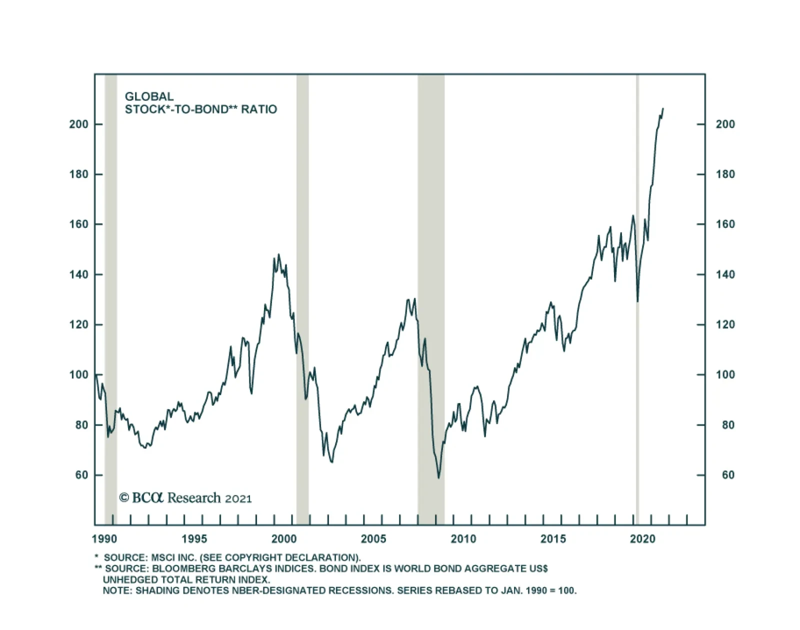
The key decision for asset allocators is always at the asset-class level: Whether equities will outperform bonds or vice versa. Despite the decline in government bond yields since March, the stock/bond ratio - defined most broadly as the total…
Highlights The US dollar’s reserve status will remain intact for the foreseeable future. While this privilege is fraying at the edges, there are no viable alternatives just yet. There is an overarching incentive for any country to hold onto its currency’s power. For the US, it is still well within their ability to keep this “exorbitant privilege.” That said, there will be rolling doubts about the ability of the US to maintain its large currency sphere. This will create tidal waves in the currency’s path, providing plenty of trading opportunities for investors. China is on track to surpass the US in economic size, but it is far from dethroning the US in the military realm. However, it is gradually gaining the ability to deny the US access to its immediate offshore areas and may already be capable of winning a war over nearby islands like Taiwan. Watch the RMB over the next few decades. From a macro and cyclical perspective, the dollar is likely to decline as global growth picks up and the Fed lags market expectations in raising rates. From a geopolitical perspective, however, the backdrop is neutral-to-bullish for the dollar over the next three to five years. Feature Having the world’s reserve currency comes with a few advantages, which any governments would be loath to give up. The most important advantage is the ability to settle one’s balance of payments in one’s own currency. This not only facilitates trade for the reserve nation, it also reinforces the turnover of the reserve currency internationally. The value of this privilege is as much symbolic as economic. This “first mover advantage” or adoption of one’s currency internationally automatically ordains the resident central bank as the world’s bank. The primary advantage here is being able to dictate global financial conditions, expanding and contracting money supply to address domestic and global funding pressures. As compensation for this task, the world provides one with non-negligible seigniorage revenue. Being the world’s central bank also comes with another crucial advantage: being able to choose which international projects will be funded, while using cheaply issued local debt to finance these investments. Of course, any sensible society will earn more on its investments than it pays on the debt issued. There is a geopolitical angle to having the world’s reserve currency. A nation’s currency is widely held because of strategic depth—its ability to secure the people who trade in that currency and the property denominated in it. Deposits and transactions can be monitored, secured, or even halted at the behest of the sovereign. Holding the currency means one can maintain one’s purchasing power, given that it is backed by the most powerful country in the world. As the reserve currency becomes the de facto international medium of exchange, having stood the test of time through various crises, this allows the resident country to alter its purchasing power to achieve both national and international goals. Throughout history, having the world’s reserve currency has been the pursuit of many governments and kingdoms. In the current paradigm, the US enjoys this privilege. But could that change? And if so, how and when? Our goal in this report is threefold. First, why would any country want to maintain reserve status? Second, does the US still possess the apparatus to keep the dollar as a reserve asset over the next decade? And finally, are there any identifiable threats to the US dollar reserve status beyond a ten-year horizon? The Imperative To Maintain Status Quo Global trade is still largely conducted in US dollars. According to the BIS triennial central bank survey, 88.3% of transactions globally were in dollars just before the pandemic, a percentage that has been rather resilient over the last two decades (Chart I-1). It is true that currencies such as the Chinese renminbi have been gaining international acceptance, but displacing a currency that dominates almost 90% of global transactions is a herculean task. Surprisingly, the world has been transacting less often in euros and Japanese yen, currencies that also commanded international appeal in recent history. Chart I-1The US Dollar Still Dominates Global Transactions
Is The Dollar’s Reserve Status Under Threat?
Is The Dollar’s Reserve Status Under Threat?
The big benefit for the US comes from being able to settle its balance of payments in dollars. This not only lowers transaction costs (by lowering exchange rate risk), but it also provides the ability to cheaply borrow in your own currency to pay for imports. Having global trade largely denominated in US dollars also establishes a network of systems that make it much easier to settle trade in that currency. It is remarkable that, despite running a persistent current account deficit, the US dollar has tended to appreciate during crises, a privilege other deficit countries do not enjoy (Chart I-2). Strong network effects make the US dollar the currency of choice during crises. Chart I-2Despite Running A Current Account Deficit, The Dollar Tends To Rise During Crises
Is The Dollar’s Reserve Status Under Threat?
Is The Dollar’s Reserve Status Under Threat?
Chart I-3The US Generates Non-Negligible Seignorage Revenue
The US Generates Non-Negligible Seignorage Revenue
The US Generates Non-Negligible Seignorage Revenue
Being at the center of the global financial architecture comes with an important benefit beyond trade: the ability to dictate financial conditions both domestically and globally. Consider a scenario in which the US and the global economy are facing a downturn. In this scenario, the Federal Reserve can be instrumental in turning the tide: To stimulate the US economy, the Fed lowers interest rates and/or runs a wider fiscal deficit. The central bank helps finance this fiscal deficit by expanding the monetary base (benefitting from seigniorage revenue). As the Fed drops interest rates, the yield curve steepens. Banks use the positive term structure to borrow at the short end of the curve and lend at the longer end. This boosts the US money supply. As firms borrow to invest, this increases demand for imports (machinery, commodities, consumer goods), widening the US current account deficit. US trade is settled in dollars, increasing the international supply of the greenback. To maintain competitiveness, other central banks purchase these dollars from the private sector, in exchange for their local currency. As global USD reserves rise, they can be reinvested back into Treasuries and held in custody at the Fed. In essence, the US can finance its budget deficit through a strong capital account surplus. The seigniorage revenue that the US enjoys by easing both domestic and international financing conditions is about $100 billion a year or roughly 0.5% of GDP (Chart I-3). But the goodwill from being able to dictate both domestic and international financial conditions is far greater. At BCA, one of our favorite measures of global dollar liquidity is the sum of the Fed’s custody holdings together with the US monetary base. Every time this measure has severely contracted in the past, the shortage of dollars has triggered a financial crisis somewhere, typically among other countries running deficits (Chart I-4), a highlight of the importance of the US as a global financier. Chart I-4US Money Supply And Global Liquidity
US Money Supply And Global Liquidity
US Money Supply And Global Liquidity
Chart I-5Despite A Liability Shortfall, US Assets Generate A Net Profit
Despite A Liability Shortfall, US Assets Generate A Net Profit
Despite A Liability Shortfall, US Assets Generate A Net Profit
Beyond seigniorage revenue, the US enjoys another advantage—being able to earn much more on its international investments than it pays on its liabilities. The US generates an excess return of 1% of GDP from its external assets, despite having a net liability shortfall of 67% of GDP (Chart I-5). The ability to issue debt that will be gobbled up by foreigners, and in part use these proceeds to generate a higher overall return on investments made abroad, does indeed constitute an “exorbitant privilege.” In a nutshell, there is a very strong incentive for the US to keep the dollar as the world’s reserve currency. One short-term implication is that the Fed might only taper asset purchases and/or raise interest rates in an environment in which both global and US growth are strong, or it could otherwise trigger a global liquidity crisis. This will be particularly the case given the Delta variant of COVID-19 is still hemorrhaging global economic activity. An Overreach In The Dollar’s Influence There is a political advantage to the US dollar’s reserve status that is often overlooked: transactions conducted in US dollars anywhere in the world fall under US law. In simple terms, if a company in any country buys energy from Iran and the transaction is done in US dollars, the Treasury has powers to sanction the parties involved. Since most companies across the world cannot afford to be locked out of the US financial system, they will tend to comply with US sanctions. Even companies that operate under the umbrella of great powers, such as China and Russia, still tend to adhere to US sanctions, because they do not want to jeopardize their trade with US allies, such as the European Union. Of course, China, Russia, and Iran are actively seeking alternative transaction systems to bypass the dollar and US sanctions. But they do not yet trust each other’s currencies. Chart I-6A Deep And Liquid Pool Of Treasurys
A Deep And Liquid Pool Of Treasurys
A Deep And Liquid Pool Of Treasurys
The euro is the only viable alternative; however, the euro’s share of global transactions has fallen, despite the EU’s solidification as a monetary union over the past decade and despite the unprecedented deterioration of US relations with China and Russia. The EU could do great damage to the USD’s standing if it joined Russia’s and China’s efforts wholeheartedly, but the EU is still a major trading partner of the US and shares many of the same foreign policy aims. It is also chronically short of aggregate demand and runs trade and current account surpluses, depriving trade partners of euro savings or a debt market to recycle those savings (Chart I-6). Historically, having the world’s reserve currency allows the US to conduct international accords that serve both domestic and foreign interests. The Plaza Accord, signed in the 1980s to depreciate the US dollar, served both US interests in rebalancing the deficit and international interests in financing global trade. The 1980s were golden years for Japan and the Asian tigers on the back of a weak USD, allowing entities to borrow in greenbacks and profitably invest in Asian growth. Once the US dollar had depreciated by a fair amount, threatening its store of value, the US engineered the Louvre Accord to stabilize exchange rates. Ultimately, when various Asian bubbles popped, investors thought of nowhere better to flee than to the safety of the US dollar. The same thing happened after the emerging market boom of the 2000s and the eventual bust of the 2010s. Today, the US may not be able to organize an international intervention, if one should be necessary in the coming years. Past experience shows that countries act unilaterally and coordinated interventions lack staying power. Neither Europe nor Japan is in the position today to allow currency appreciation, as they were in the past. And the US has shown itself unable to combat its trading partners’ depreciation, as in the case of China, whose renminbi remains below 2014 levels. The bottom line is that there is nothing to stop the US from attempting to stretch its overreach too far, which would create a backlash that diminishes the dollar’s status. This is especially the case given trust in the US government is quite low by historical standards, which for now points to a lower dollar cyclically (Chart I-7). Chart I-7Trust In The US Government And The Dollar
Is The Dollar’s Reserve Status Under Threat?
Is The Dollar’s Reserve Status Under Threat?
This is not to say that other countries with reserve aspirations can tolerate sustained appreciation. China has recommitted to manufacturing supremacy in its latest five-year plan, as it fears the political consequences of rapid deindustrialization. As such, the renminbi will be periodically capped to maintain competitiveness. Can The US Maintain Status Quo? Chart I-8A Lifespan Of Reserve Currencies
Is The Dollar’s Reserve Status Under Threat?
Is The Dollar’s Reserve Status Under Threat?
Over the last few centuries, reserve currencies have tended to have a lifespan of about 100 years (Chart I-8). The reason is that global wars tend to knock the leading power off its geopolitical pedestal, devaluing its currency and giving rise to a new peace settlement with a new ascendant country whose currency then becomes the basis for international trade. Such was the case for Spain, France, the UK, and the United States in a pattern of war and peace since the sixteenth century. Granting that the US dollar took the baton from sterling in the 1920s and that the post-World War II peace settlement is eroding in the face of escalating geopolitical competition, it is reasonable to ask whether or not the US might lose its grip on this power. To assess this possibility, it is instructive to revisit the anatomy of a reserve currency: Typically, a reserve currency tends to be that of the “greatest” nation. For the same reason, the reserve nation tends to be the wealthiest, which ensures that its currency is a store of value and that it can act as a buyer of last resort during crisis (Chart I-9). This reasoning is straightforward when a global empire is recognizable and unopposed. But in the current context of multipolarity, or great power competition, the paradigm could start to shift. Global trade is slowing globally, but it is accelerating in Asia (Chart I-10). China is a larger trading partner than the US for many emerging markets and is slated to surpass the US economy over the next decade. The renminbi has a long way to go to rival the dollar, but it is gradually rising and its place within the global reserve currency basket is much smaller than its share of global trade or output, implying room for growth (Chart I-11). Chart I-9Wealth And Reserve Currency Status Go Hand-In-Hand
Is The Dollar’s Reserve Status Under Threat?
Is The Dollar’s Reserve Status Under Threat?
Chart I-10Trade In Asia Is Booming
Is The Dollar’s Reserve Status Under Threat?
Is The Dollar’s Reserve Status Under Threat?
Chart I-11Adoption Of The RMB Has Room To Grow
Adoption Of The RMB Has Room To Grow
Adoption Of The RMB Has Room To Grow
To maintain hegemonic power (especially controlling the vital supply routes of prosperity), the reserve nation needs military might above and beyond everyone else. It helps that US military spending remains the biggest in the world, in part financed by US liabilities (Chart I-12). China is far from dethroning the US in the military realm. But it is gradually gaining the ability to deny the US access to its immediate offshore areas and may already be capable of winning a war over nearby islands like Taiwan. Moreover, its naval power is set to grow substantially between now and 2030 (Table I-1). Already, over the past decade, the US stood helplessly by when Russia and China annexed Crimea and the reefs of the South China Sea. It is possible to imagine a series of events that erode US security guarantees in the region, even as the US loses economic primacy. Chart I-12The US Still Maintains Military Might
Is The Dollar’s Reserve Status Under Threat?
Is The Dollar’s Reserve Status Under Threat?
Table I-1China’s Economic And Naval Growth Slated To Reduce American Primacy In Asia Pacific
Is The Dollar’s Reserve Status Under Threat?
Is The Dollar’s Reserve Status Under Threat?
The reserve currency nation needs to run deficits to finance activity in the rest of the world. That requires having deep and liquid capital markets to absorb global savings. There is considerable trust or “goodwill” that makes the US Treasury market the most liquid debt exchange pool in the world. This remains the case today (previously mentioned Chart I-6). Even so, this trend is shifting. The growth in euro- and yen-denominated debt is exploding. This mirrors the gradual shift in the allocation of FX reserves away from dollars into other currencies. If the US began to use the dollar as a geopolitical weapon recklessly, foreign entities may have no other choice but to rally into other currency blocks, including the euro (and perhaps eventually the yuan). This will take years, but it is worth noting that global allocation to FX reserves have fallen from around 80% toward USDs in the 70s to around 60% today (Chart I-13). Chart I-13The Dollar Reserve Status Has Been Ebbing
The Dollar Reserve Status Has Been Ebbing
The Dollar Reserve Status Has Been Ebbing
On the political front, there is some evidence that public opinion on the dollar is fading, although it is far from damning. A Pew survey on the trust in the US government is near decade lows and has tracked the ebb and flow of changes in the dollar (previously shown Chart I-7). Trust in government will probably not get much worse in the coming years, as the pandemic will wane and stimulus will secure the economic recovery, but too much stimulus could conceivably ignite an inflation problem that weighs on trust. True, populism has driven the US government under two administrations into extreme deficit spending. With the pandemic as a catalyst, US deficits have reached WWII levels despite the absence of a war. However, the Biden administration’s $3.5 trillion spending bill will be watered down heavily – and the 2022 midterms will likely restore gridlock in Congress, freezing fiscal policy through at least 2025. In other words, fiscal policy is negative for the dollar in the very near term, but the fiscal outlook is not yet so extravagant as to suggest a loss of reserve currency status. After all, there is some positive news for the US. The US demonstrated its leadership in innovation with the COVID-19 vaccines; it survived its constitutional stress test in the 2020 election; it is now shifting from failed “nation building” abroad to nation building at home; and its companies remain the most innovative and efficient, judging by global equity market capitalization (Chart I-14). China, meanwhile, is facing the most severe test of its political and economic system since it marketized its economy in 1979. Investors should not lose sight of the fact that, since the rise of President Xi Jinping and Russia’s invasion of Ukraine, global policy uncertainty has tended to outpace US policy uncertainty, attracting flows into the dollar (Chart I-15). Given that China and Russia are both pursuing autocratic governments at the expense of the private economy, it would not be surprising to see global policy uncertainty take the lead once again, confirming the decade trend of global flows favoring the US when uncertainty rises. Chart I-14American Primacy Still Clear In Equity Market
American Primacy Still Clear In Equity Market
American Primacy Still Clear In Equity Market
Chart I-15Higher Policy Uncertainty Good For Dollar
Higher Policy Uncertainty Good For Dollar
Higher Policy Uncertainty Good For Dollar
The bottom line is that the US dollar is gradually declining as a share of the global currency reserve basket, just as the US economy and military are gradually declining as a share of global output and defense spending. Yet the US will remain the first or second largest economy and premier military power for a long time, and the dollar still lacks a viable single replacement. A major war or geopolitical crisis is probably necessary to precipitate a major breakdown. The Iranian Revolution and September 11 attacks both had this kind of effect (see 1979 and 2001 in Chart I-13 above). But COVID-19 is less clear. If China and Europe emerge as more stable than the US, then the post-pandemic aftermath will bring more bad news for the dollar. Investment Implications From a geopolitical perspective, the backdrop is neutral for the dollar beyond the next twelve to eighteen months. An escalating conflict with Iran—which is possible in the near term—would echo the early 2000s and weigh on the currency. But a deal with Iran and a strategic pivot to Asia would compound China’s domestic political problems and likely boost the greenback. Chart I-16US Twin Deficits And The Dollar
US Twin Deficits And The Dollar
US Twin Deficits And The Dollar
From a macro and cyclical perspective, however, the view is clearly negative for the dollar. Over the next five years, the U.S. Congressional Budget Office (CBO) estimates that the U.S. budget deficit will shrink and then begin expanding again to -5% of GDP. If one assumes that the current account deficit will widen somewhat, then stabilize, the twin deficits will be pinned at around -10% of GDP. Markets have typically punished the dollar on rising twin deficits (Chart I-16). This suggests near-term pressure on the dollar’s reserve status is to the downside. EM currencies may hold a key to the performance of the dollar. While most EM economies remain hostage to the virus, a coiled-spring rebound cannot be ruled out as populations become vaccinated. China’s Politburo signaled in July that it will no longer tighten monetary and fiscal policy. We would expect policy easing over the next twelve months to ensure the economy is stable in advance of the fall 2022 party congress. If the virus wanes and China’s economy is stimulated, global growth will improve and the dollar will fall. Chester Ntonifor Foreign Exchange Strategist chestern@bcaresearch.com Matt Gertken Geopolitical Strategist mattg@bcaresearch.com
Highlights Confidence vs. Inflation: Global bond yields are lacking direction at the moment. The variant is setting a near-term ceiling on bond yields while the medium-term floor is established by inflation. The inflation pressures – fueled by tightening global labor markets and persistent supply chain disruptions - will linger for much longer than the Delta surge. Investors should position for higher global bond yields, led by the US, on a medium-term basis. Canada: The Canadian economy is performing strongly as the nation is finally reopening after a poor initial vaccine rollout earlier this year. Next month’s federal election will likely result in a re-election of Justin Trudeau’s Liberals and a continuation of expansive fiscal policy. The Bank of Canada is on track to begin interest rate hikes in 2022 with inflation likely to remain higher for longer than the central bank projects. Remain underweight Canadian government bonds within global (USD-hedged) fixed income portfolios. A Tug Of War For Bond Yields Chart of the WeekThe Delta Surge Is Not That Bond Bearish
The Delta Surge Is Not That Bond Bearish
The Delta Surge Is Not That Bond Bearish
Global bond yields are currently trapped in narrow ranges, pulled in opposing directions by two powerful forces. The spread of the Delta variant is raising worries about future economic growth. Yet central banks cannot signal dovish bond-bullish guidance in response because of persistently high inflation and rich financial asset valuations. The result is that real bond yields cannot decline deeper into negative territory because central banks are unable to signal easier future monetary policy. At the same time, inflation expectations cannot fall either because of high realized inflation and overly accommodative monetary settings. With global supply chains still disrupted by the pandemic and labor markets in many major developed countries tightening rapidly, the inflation side of this tug of war on bond yields will remain strong. This leaves the Delta variant as being most important in determining which side wins the war. The variant is proving to be much less deadly (so far) than past COVID waves on an aggregate global basis (Chart of the Week) thanks to vaccinations. However, there are notable differences in economic growth momentum that have opened up between countries where the variant has spread aggressively, especially if economic restrictions have been imposed. The preliminary services PMIs for August showed big monthly declines in the US and UK, where case numbers have surged, and Australia, where half of the population is under some form of lockdown to fight the spread of the variant. Delta-stricken Japan also saw a sharp drop in services activity in August. The services PMIs in Europe, however, dipped very modestly, in line with the subdued spread of the variant in euro area countries. Chart 2No Major Changes On Bond Markets From The Delta Variant
No Major Changes On Bond Markets From The Delta Variant
No Major Changes On Bond Markets From The Delta Variant
While the variant appears to be having a noticeable impact on relative economic growth in the near-term, the relative performance of government bond markets in the developed world is a different story. When looking at the 2021 year-to-date relative returns of the major bond markets versus the Bloomberg Barclays Global Treasury index - in USD-hedged and duration-matched terms - the outperformers have been Germany (and euro area bonds, in general), Japan and Australia while the laggards have been the US, UK and Canada (Chart 2). Over the past month, however, when the global spread of the Delta variant has become front page news, there has been very little change in the relative bond returns outside of a modest pickup in the outperformance of Australia - one of our current overweight recommendations. A big reason why relative returns have remained stagnant is that monetary policy expectations have not changed much in response to the variant. Our 24-month discounters, which measure the amount of interest rate hikes over the next two years currently priced in overnight index swap (OIS) curves, are essentially at the same levels that prevailed in early July in the US, Europe, the UK, Canada, Australia and Japan. With little change in future interest rate expectations between countries, amid stable inflation expectations, there is no impetus driving changes in relative government bond market performance. Other financial markets are also taking the spread of the variant in stride, especially in the US. Forward looking US economic sentiment measures like the University of Michigan consumer expectations index and the Philadelphia Fed Business Outlook survey all showed sharp declines in the preliminary August readings. Yet US equity markets continue to hover near all-time highs, US high-yield spreads remain near pandemic lows and the VIX index is below 20 (Chart 3). Perhaps one reason why risk assets are holding in well despite the worries over the variant is that the news outside the US has been more upbeat. Consumer confidence in Canada and the UK remains solid (Chart 4), with the latter also seeing a huge upside surprise in retail sales volumes in August according to the Confederation of British Industry’s survey of retailers. Even in Australia, with widespread lockdowns, consumer confidence remains well above the 2020 pandemic lows. Chart 3Delta Variant Hitting US Economic (Not Market) Confidence
Delta Variant Hitting US Economic (Not Market) Confidence
Delta Variant Hitting US Economic (Not Market) Confidence
Chart 4Lockdowns Are Bad For Confidence (And Vice Versa)
Lockdowns Are Bad For Confidence (And Vice Versa)
Lockdowns Are Bad For Confidence (And Vice Versa)
Delta developments in China are also turning more positive, with new reported cases now at zero after a surge that began in July. There are even reasons for optimism in the US, where COVID-19 reproduction rates in most of the Southern states – the epicenter of the US Delta surge – have fallen below 1, suggesting a declining pace of transmission of the virus.1 The overall hit to global growth from the Delta variant will likely be modest, leaving the inflation side of the tug of war on global bond yields as the winner, particularly in countries that are seeing a broad-based increase in inflation that will be difficult for central bankers to ignore. In the US, UK, Canada and New Zealand – our least-preferred bond markets within the developed world - both realized consumer price inflation and the growth of house prices are soaring at the same time (Chart 5). Unsurprisingly, the central banks in those four countries have either tapered bond purchases – all the way to zero in the case of the Reserve Bank of New Zealand (RBNZ) – or are preparing the markets for tapering as the US Federal Reserve has been doing in recent weeks. Policymakers in those four countries will be watching to see if the latest uptrend in inflation starts to drive up longer term inflation expectations by enough to warrant a monetary policy response. In the US, the University of Michigan consumer survey shows that one-year-ahead expected inflation has climbed to 4.6%, compared to a more subdued 3.% expected inflation rate over the next five years (Chart 6). In Canada, the Q2/2021 Survey of Consumer Expectations produced by the Bank of Canada (BoC) shows that both one-year and five-year inflation expectations are 3.1% - just above the upper limit of the BoC inflation target range – although the longer-term measure is off the highs seen in 2020 (we discuss Canada in greater detail later in this report) Chart 5Difficult For Central Banks To ##br##Ignore This
Difficult For Central Banks To Ignore This
Difficult For Central Banks To Ignore This
Chart 6Will Short-Term Inflation Expectations Bleed Into The Long-Term?
Will Short-Term Inflation Expectations Bleed Into The Long-Term?
Will Short-Term Inflation Expectations Bleed Into The Long-Term?
Inflation expectations in the UK, according to the YouGov/Citigroup survey, are 3.1% in the short-term (and rising) and a higher 3.4% in the longer term. In New Zealand, the RBNZ’s inflation survey shows both short-term (1-year) and longer-term (5-year) inflation expectations have increased to 3% and 4%, respectively. Chart 7Inflation Expectations Still Moderate In Europe, Japan & Australia
Inflation Expectations Still Moderate In Europe, Japan & Australia
Inflation Expectations Still Moderate In Europe, Japan & Australia
Importantly, market-based expectations extracted from breakevens on 10-year inflation-linked bonds in those four countries are somewhat more subdued than the survey-based expectations measures. This means that central bankers can be patient on moving towards tapering and eventual interest rate hikes until the concerns over the Delta variant have passed. However, lingering global supply chain disruptions, alongside tightening labor markets, represent inflationary risks that will force the Fed, the Bank of England (BoE), the BoC and RBNZ to begin dialing back monetary accommodation over the next year. We still anticipate that the RBNZ will hike rates this fall in response to booming New Zealand house prices, while the Fed will begin tapering its bond buying next January and will start hiking rates in Q4/2022. Both the BoC and BoE will fully taper QE and lift interest rates in 2022, with the BoC likely to move first in the first half of the year. In the euro area, Japan and Australia – where we are currently recommending overweight government bond allocations on a USD-hedged basis – the latest uptrends in both house prices and realized inflation have not translated into overshooting inflation expectations (Chart 7). The ECB, Bank of Japan and Reserve Bank of Australia are not expected to tighten policy in any form (taper or rate hikes) through at least the end of 2022. Net-net, we do not see the spread of the Delta variant as a reason to make changes to our strategic recommended country allocations on global government bonds. Bottom Line: Global inflation pressures – fueled by tightening labor markets and persistent supply chain disruptions - will linger for much longer than the Delta surge. Investors should position for higher global bond yields, led by the US, on a medium-term basis. Also, favor countries where inflation pressures are less entrenched (Europe, Japan and Australia) versus nations with more broad-based inflation visible in both consumer prices and house prices (the US, UK, Canada and New Zealand). Canada: The BoC Is Still On The Path To Tighten Perhaps no country has suffered greater extremes with regards to COVID-19 in 2021 than Canada. A slow vaccine rollout at the start of 2021 placed Canada behind the US and other developed market countries in terms of dialing back pandemic restrictions imposed last year. The low rate of vaccinations allowed a harsh third wave of COVID to take place this past spring, further delaying Canada’s exit from lockdowns. Since then, Canada has flipped the script with a spectacularly rapid vaccination campaign. Two-thirds of the population is now fully inoculated and the country has rapidly emerged from lockdowns, spurring a stronger economy much more resilient to the rapid spread of the Delta strain seen in Canada’s southern neighbor. Our view on Canadian fixed income markets has also evolved alongside pandemic developments over the course of this year. In a Special Report published back in February, we concluded that the BoC would likely need to begin withdrawing the extraordinary monetary easing measures put in place in response to the pandemic sooner than most other developed market central banks.2 This would justify cutting our recommended stance on Canadian government debt from neutral to underweight. The slow initial vaccine rollout delayed that decision until late April, when we pulled the trigger on that downgrade.3 Chart 8The Economic Future Looks Bright In Canada
The Economic Future Looks Bright In Canada
The Economic Future Looks Bright In Canada
At the time, our shift to a bearish stance on Canada rested on several pillars: Better news on the vaccination front, which would give a lift to consumer and business confidence Booming house prices, fueled by negative real interest rates, raising financial stability risks in a country with an already overheated housing market Additional fiscal stimulus announced by the ruling Liberal government, dramatically reducing the fiscal drag that was expected in 2021. Since our downgrade, the BoC has already cut the pace of its quantitative easing (QE) asset purchases in half, after allowing other pandemic emergency liquidity programs to expire earlier in the year. Interest rate markets are now pricing in a full 25bp rate hike in Canada by August 2022, with 115bps of cumulative hikes discounted by the end of 2024. Only Norway and New Zealand are expected to lift rates sooner, and by more, than the BoC within the developed markets universe. Yet that is still a very slow and shallow expected path for Canadian interest rates, given the substantial tailwinds to economic growth in Canada (Chart 8). Canadian consumers have a strong base to support spending. Nominal household disposable income growth remains solid at 9% on a year-over-year basis and the household saving rate is still elevated at 13% after peaking at 27% during the COVID recession in 2020. The BoC’s Q2 Survey of Consumer Expectations noted that 40% of respondents reported that their savings were higher than usual because of pandemic, and that those that did accumulate excess savings planned to spend 35% of those funds over the next two years. This implies that Canadian consumers still hold plenty of cash to spend, and that pent-up demand coming out of lockdowns will support a solid pace of consumption. Moreover, continuously recovering labor market conditions will also contribute to a solid pace of domestic demand. Even though the recovery of employment to date has been uneven across different sectors and worker backgrounds, Canadian firms are reporting robust hiring plans and increased intensity of labor shortages - leading firms to plan for wage increases - according to the BoC’s Q2/2021 Business Outlook Survey. This indicates that the Canadian labor market will likely tighten further over the next 6-12 months, further supporting consumer incomes, confidence and spending. The Business Outlook Survey also reported that overall business sentiment was at the highest level in the history of the series, with a net 36% of firms– just off the record high of 40% in Q1/2021 – reporting stronger capital spending intentions. Thus, business investment catching up after the COVID pause will also help boost overall Canadian economic growth. Importantly, the Delta variant does not pose the same near term risk to growth as is the case in the US and other countries. The number of new COVID cases and related hospitalizations is a fraction of what was seen as recently as the third pandemic wave earlier this year (Chart 9). The rapid pace of vaccinations is clearly providing a buffer to the spread of the variant in Canada, with 74% of Canadians having had at least one vaccine dose and 66% of the population fully vaccinated. While there is solid upward momentum in Canadian growth, the same can be said for Canadian inflation. Headline CPI inflation climbed to 3.7% in July, while core inflation jumped to 2.8% (Chart 10), both the highest pace seen since 2003. Not all of that increase is due to base effect comparisons versus a year ago, as the monthly increases in both headline (+0.6%) and core (+0.4%) were strong. Chart 9Vaccinations Have Made A Huge Difference In Canada
Vaccinations Have Made A Huge Difference In Canada
Vaccinations Have Made A Huge Difference In Canada
Chart 10Canadian Inflation Momentum Is ##br##Not Slowing
Canadian Inflation Momentum Is Not Slowing
Canadian Inflation Momentum Is Not Slowing
As discussed earlier in this report, survey-based measures of Canadian consumer inflation expectations show that this surge in inflation is perceived to be temporary, with shorter-term expectations rising but longer-term expectations slowing. There is a lack of worry in the Canadian inflation-linked bond markets, as well, with breakeven inflation rates hovering near the midpoint of the BoC’s 1-3% inflation target range. This presents a potential problem for the BoC, and the Canadian bond market, if the current surge in inflation does not prove to be temporary. The BoC’s August Monetary Policy Report (MPR) included a detailed breakdown of the contribution to Canadian inflation by spending category (Chart 11). While energy costs were a major driver of the year-over-year increase in inflation, components that were exposed to supply constraints – like motor vehicles and other durable goods – accounted for nearly one-half of the level of year-over-over inflation over the past three months. The CPI elements that were linked to increased demand as the economy reopened from lockdowns – like spending in restaurants – represented a much smaller share of current inflation. Chart 11Lingering Supply Constraints Are A Major Upside Inflation Risk
The Delta Blues
The Delta Blues
Thus, while energy price inflation is likely to cool off somewhat on a year-over-year basis over the next 6-12 months, Canadian inflation could remain surprisingly sticky at levels above the BoC target band if supply disruptions persist for longer. Canadian businesses are already facing higher input costs, and it is inevitable that firms will offer higher wages in order to attract workers while demand keeps rising in a tightening labor market. In the end, all these increased costs will continue to be passed on by firms to consumers, putting upward pressure on Canadian Dollar – especially with both the BoC and IMF projecting Canada’s output gap to steadily narrow and be fully closed in the second half of 2022. Risks from the upcoming federal election Prime Minister Justin Trudeau has called a snap federal election for September 20. The timing of the election seems odd on the surface, given Trudeau’s poor approval ratings and the lingering uncertainties of COVID-19. The Canada Geopolitical Risk Indicator constructed by our colleagues at BCA Research Geopolitical Strategy shows that there is a high level of domestic political risk in Canada, largely due to the underperformance of the Canadian dollar versus improving Canadian economic variables (Chart 12). However, in the current context of the pandemic, with all the associated uncertainty, this high risk is translating in favor of the incumbent Liberal Party, rather than calling for regime change. Chart 12An Interesting Time To Call An Election In Canada
An Interesting Time To Call An Election In Canada
An Interesting Time To Call An Election In Canada
The likely reason is that the COVID crisis was exogenous and polling shows that voters are at least content with ruling party’s handling of the situation. Current polls have the Liberals with a modest lead over the opposition Conservatives (Chart 13). The far-left New Democratic Party (NDP) is in third place, even though its leader has the highest approval rating of the three major party leaders. Chart 13Trudeau Is Taking A Calculated Risk
The Delta Blues
The Delta Blues
Trudeau is taking a gamble with this election to try and retake the parliamentary majority he lost in the 2019 election that resulted in a minority Liberal government. Trudeau has framed the election as a chance to “finish the fight” against COVID-19, and as a referendum on his government’s handling of the pandemic. Yet the broad Liberal party platform is also positioned well, based on Canadian voter preferences. Current opinion polls show that the most important issues among Canadian voters are climate change, health care and housing (Chart 14). COVID-19 itself is actually well down the list, as are government deficits and taxes – issues that the Conservatives are relentlessly focused on. Trudeau has skillfully read the tea leaves and positioned his party well on issues most Canadians care most about, unlike his main opposition party (Table 1). Furthermore, Trudeau has co-opted many of the policy planks of the NDP, allowing the Liberals to gain potential votes from more left-leaning voters. At a time when voters want to reassert the role of government in tackling collective challenges, this is a favorable place to be. Chart 14Canada: Most Important Issues Facing The Country
The Delta Blues
The Delta Blues
Table 1The Liberal Agenda Lines Up With Top Voter Priorities
The Delta Blues
The Delta Blues
The likely election result will be another Liberal victory, with the party expanding its minority and having a legitimate shot at winning a majority. This also means that the Canadian fiscal policy is likely to remain supportive for growth over the next few years. Stay Underweight Canadian Government Debt Given all the positive momentum and upside risks to economic growth, house prices, inflation and government spending, the BoC is likely to continue on its current path towards fully tapering asset purchases and eventually starting to lift interest rates as soon as mid-2022 (Chart 15). This would be faster than the liftoff date currently discounted in the Canadian OIS curve. The pace of rate hikes discounted is also very shallow, and the risks are tilted towards the BoC doing more tightening than the market is expecting over the next couple of years. We continue to recommend a below-benchmark duration stance in Canada, and a strategic underweight allocation to Canada within global government bond portfolios with the BoC likely to be one of the more hawkish developed market central banks over the next 12-18 months (Chart 16). We also advocate positioning for a bearish flattening of the Canadian yield curve given the potential for hawkish surprises from the BoC. Chart 15The BoC's Policy Stance Has Already ##br##Turned
The BoC's Policy Stance Has Already Turned
The BoC's Policy Stance Has Already Turned
Chart 16Stay Cautious On Canadian Government Bond Exposure
Stay Cautious On Canadian Government Bond Exposure
Stay Cautious On Canadian Government Bond Exposure
Bottom Line: The Canadian economy is performing strongly as the nation is finally reopening after a poor initial vaccine rollout earlier this year. Next month’s federal election will likely result in a re-election of Justin Trudeau’s Liberals and a continuation of expansive fiscal policy. The Bank of Canada is on track to begin interest rate hikes in 2022 with inflation likely to remain higher for longer than the central bank projects. Remain underweight Canadian government bonds within global (USD-hedged) fixed income portfolios. Robert Robis, CFA Chief Fixed Income Strategist rrobis@bcaresearch.com Ray Park, CFA Research Analyst ray@bcaresearch.com Footnotes 1 Estimates of the COVID-19 effective reproduction rate in US states, calculated by public health researchers at Harvard and Yale universities, can be found here: https://covidestim.org/ 2 Please see BCA Research Foreign Exchange Strategy and Global Fixed Income Strategy Report, " Will The Canadian Recovery Lead Or Lag The Global Cycle?", dated February 12, 2021, available at gfis.bcaresearch.com. 3 Please see BCA Research Global Fixed Income Strategy Report, "Some Bond Bearish Tales From Both Sides Of The 49th Parallel", dated April 20, 2021, available at gfis.bcaresearch.com. Recommendations The GFIS Recommended Portfolio Vs. The Custom Benchmark Index
The Delta Blues
The Delta Blues
Duration Regional Allocation Spread Product Tactical Trades Yields & Returns Global Bond Yields Historical Returns
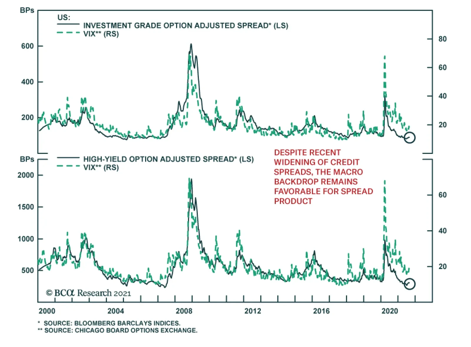
US investment grade and high-yield spreads have been widening since the beginning of July. Widening spreads reflect a broader phenomenon in which other riskier financial assets such as industrial commodities and equities, which had previously ignored the…
Dear Client, I will be on vacation next week. In lieu of our regular report, we will be sending you a Special Report written by my colleagues Chester Ntonifor, BCA Research’s Chief Foreign Exchange Strategist, and Matt Gertken, Chief Geopolitical Strategist. Their report discusses the threat to the dollar’s reserve status over the next decade. This week, Matt published a timely report entitled “Afghanistan? Watch Iran And China,” examining the global macro significance of the US withdrawal from Afghanistan. I trust you will find both reports insightful. Best regards, Peter Berezin, Chief Global Strategist Highlights Over the next 12 months, US inflation will decline fast enough to allow the Federal Reserve to maintain its accommodative monetary stance, but not as fast as investors are expecting. A number of structural forces were becoming inflationary even before the pandemic began. The pandemic will only buttress the tide. Even if the virus is eventually vanquished, the pandemic could prop up inflation by permanently reducing labor supply, hastening the retreat from globalization, and keeping fiscal policy looser than it otherwise would have been. Fixed-income investors should maintain a short duration stance. We expect the US 10-year Treasury yield to rebound to about 1.8% by early next year. Long-term bond yields in the other major economies will also rise, although not as much as in the US. In and of itself, higher inflation is not necessarily bad for equities. What makes higher inflation toxic for stocks is when it forces central banks to raise rates to punitive levels. Fortunately, such an outcome is still a few years away, justifying an overweight equity position for now. Upside Risks To Inflation In our July 23rd report, we argued that investors were asking the wrong question about inflation. Rather than asking whether higher inflation is transitory, they should be asking whether inflation will decline faster or slower than what the market is discounting. Chart 1Investors Expect Inflation To Fall Rapidly From Current Levels
Transitory At First: The Pandemic’s Long-Term Impact On Inflation
Transitory At First: The Pandemic’s Long-Term Impact On Inflation
Chart 1 shows that investors expect inflation to fall rapidly from current levels and to remain subdued thereafter. The widely followed 5-year/5-year forward TIPS breakeven inflation rate currently stands at 2.12%, below the Fed’s comfort zone of 2.3%-to-2.5% (Chart 2).1 Chart 2Below-Target Inflation Expectations And A Low R* Have Restrained Bond Yields
Below-Target Inflation Expectations And A Low R* Have Restrained Bond Yields
Below-Target Inflation Expectations And A Low R* Have Restrained Bond Yields
Downbeat long-term inflation expectations and the market’s perception that the neutral rate of interest is very low are the two main reasons why bond yields are so depressed. QE programs have also dampened yields, although not nearly as much as widely believed. Chart 3Outside Of A Few Pandemic-Related Sectors, The CPI Has Yet To Return To Trend
Outside Of A Few Pandemic-Related Sectors, The CPI Has Yet To Return To Trend
Outside Of A Few Pandemic-Related Sectors, The CPI Has Yet To Return To Trend
In our report, we contended that US inflation would come down fast enough over the next few quarters to allow the Federal Reserve to maintain its accommodative monetary stance, but not as fast as investors are expecting. On the one hand, the evidence clearly shows that most of the recent increase in US inflation has been driven by just a few pandemic-related sectors (Chart 3). On the other hand, high levels of excess household savings, the need for firms to expand capacity and rebuild inventories, and continued policy support will boost output and prices. The Long-Term Inflationary Consequences Of The Pandemic We also argued that a variety of structural forces, including the exodus of baby boomers from the labor market, a retreat from globalization, and increasing social unrest, would drive up inflation over the long haul. A key question is how the pandemic will shape these structural forces going forward. As we discuss below, there are three main overlapping channels through which the pandemic could have a lasting impact on inflation: Labor market scarring: Even if the virus is eventually vanquished, the pandemic could still permanently reduce the labor supply. Widespread worker shortages would fuel inflation. Deglobalization: Globalization has historically been a deflationary force. The pandemic could accelerate the retreat from globalization by prompting firms to bring more production back home, while exacerbating geopolitical tensions. Fiscal policy: Big budget deficits could persist in the post-pandemic period. Debt-saddled governments may turn to inflation to erode their debt burdens. Let us assess these three channels in turn. Channel #1: Labor Market Scarring Despite July’s blockbuster employment report, there are still nearly 4% fewer Americans employed than was the case in January 2020. Yet, US businesses are struggling to hire workers (Chart 4). Nationwide, the job openings rate stands at a record 6.5%, up from 4.5% on the eve of the pandemic (Chart 5). Chart 4US Companies Are Facing A Labor Shortage
US Companies Are Facing A Labor Shortage
US Companies Are Facing A Labor Shortage
Chart 5There Are Plenty Of Jobs Available
There Are Plenty Of Jobs Available
There Are Plenty Of Jobs Available
Generous unemployment benefits, less immigration, and the reluctance of many workers to expose themselves to the virus have all helped to reduce labor supply. A marked shift in the composition of spending has increased the demand for workers in some sectors while reducing demand in other sectors (Chart 6). Since labor is not perfectly fungible across sectors, this has caused overall unemployment to rise. Chart 6Which Sectors Have Gained And Which Have Lost Jobs Since The Pandemic?
Transitory At First: The Pandemic’s Long-Term Impact On Inflation
Transitory At First: The Pandemic’s Long-Term Impact On Inflation
Looking out, labor supply should increase as emergency unemployment benefits expire, immigration picks up, and more people are vaccinated. The mismatch of workers across sectors should also diminish as goods and services spending rebalances. Nevertheless, there is considerable uncertainty over how quickly all this will happen. According to Indeed, an online job posting site, unemployed workers cited having a “financial cushion” as the most popular reason for not looking for a job in July (Chart 7). Given that American households are sitting on $2.4 trillion in excess savings, it may take some time for this cushion to deflate (Chart 8). Chart 7Americans Are Not Desperate To Find Work
Transitory At First: The Pandemic’s Long-Term Impact On Inflation
Transitory At First: The Pandemic’s Long-Term Impact On Inflation
Chart 8A Lot Of Excess Savings
A Lot Of Excess Savings
A Lot Of Excess Savings
Chart 9No Jab, No Job
Transitory At First: The Pandemic’s Long-Term Impact On Inflation
Transitory At First: The Pandemic’s Long-Term Impact On Inflation
Wider vaccine mandates could also impact labor market participation. A host of major companies, ranging from Google to Citigroup, are requiring their employees to be inoculated before returning to the office (Chart 9). The Pentagon has laid out a plan endorsed by President Biden obliging members of the military to get the COVID-19 vaccine. Earlier this week, the Las Vegas Raiders became the first NFL team to require fans to produce proof of vaccination to gain entry to home games. On the one hand, vaccine mandates could encourage more people to get the jab, which should help curb the pandemic and boost employment in the service sector. While the numbers have improved in recent weeks, only 57% of Americans between the ages of 18 and 64 are fully vaccinated (Chart 10). On the other hand, some people might opt for unemployment over a vaccine. According to a recent YouGov poll, about half of all unvaccinated Americans believe that the government is using COVID-19 vaccines to microchip the population (Chart 11). The threat of losing one’s job is unlikely to sway many of them. Chart 10Many Workers Remain Unvaccinated
Transitory At First: The Pandemic’s Long-Term Impact On Inflation
Transitory At First: The Pandemic’s Long-Term Impact On Inflation
Chart 11One In Five Americans Believes The US Government Is Using The Covid-19 Vaccine To Microchip The Population
Transitory At First: The Pandemic’s Long-Term Impact On Inflation
Transitory At First: The Pandemic’s Long-Term Impact On Inflation
Pandemic-induced shifts in work-life preferences could also reduce labor supply. According to Ipsos, a polling firm, most employees would prefer to work remotely at least part of the time, with 25% indicating they do not want to return to their workplace at all (Chart 12). The same poll found that 30% of workers would consider looking for another job if their employer required them to work away from home full time (Chart 13). Chart 12Let’s Chat Around The Water Cooler On Tuesdays And Wednesdays
Transitory At First: The Pandemic’s Long-Term Impact On Inflation
Transitory At First: The Pandemic’s Long-Term Impact On Inflation
Chart 13What Is The Opposite Of A “One Size Fits All” Work Environment?
Transitory At First: The Pandemic’s Long-Term Impact On Inflation
Transitory At First: The Pandemic’s Long-Term Impact On Inflation
Chart 14Number Of Retired People Jumped During The Pandemic
Number Of Retired People Jumped During The Pandemic
Number Of Retired People Jumped During The Pandemic
If remote working boosted productivity, as some have claimed, this would not be such a bad thing. However, it is far from clear that this is the case. A recent University of Chicago study of 10,000 skilled professionals from an Asian IT company revealed that work-from-home policies decreased productivity by 8%-to-19%. Early retirement has also reduced labor supply. The share of retirees in the US population rose by 1.3 percentage points between February 2020 and July 2021, with most of the increase occurring early in the pandemic (Chart 14). Based on pre-pandemic demographic trends, the retirement rate should have risen by only 0.5 percentage points over this period. The good news, as discussed in a recent study by the Kansas City Fed, is that most of the increase in the retirement rate was driven by fewer people transitioning from retirement back into employment. The share of people transitioning from employment to retirement did not change much (Chart 15). This led the authors to conclude that “More retirees may rejoin the workforce as health risks fade, but the retirement share is unlikely to return to a normal level for some time.” Chart 15Increased Retirees: A Closer Look
Transitory At First: The Pandemic’s Long-Term Impact On Inflation
Transitory At First: The Pandemic’s Long-Term Impact On Inflation
Bottom Line: Labor supply will recover as the pandemic recedes. Nevertheless, the available pool of workers will likely be lower in the post-pandemic period than it would have otherwise been. A shortage of workers will prop up wage growth, helping to fuel inflation. Channel #2: Deglobalization Globalization was on the back foot even before the pandemic began. Having steadily increased between 1991 and 2008, the ratio of global trade-to-output was basically flat during the 2010s (Chart 16). Ironically, the pandemic has revived global trade by shifting the composition of spending away from non-tradable services towards tradable goods. This shift in spending is the key reason why shipping costs have soared in recent months (Chart 17). Chart 16Globalization Plateaued Over A Decade Ago
Globalization Plateaued Over A Decade Ago
Globalization Plateaued Over A Decade Ago
Chart 17Shipping Costs Have Soared In Recent Months
Shipping Costs Have Soared In Recent Months
Shipping Costs Have Soared In Recent Months
The rebound in trade will not endure. Already, we are seeing companies moving production back home to establish greater control over their supply chains. The pandemic has exacerbated geopolitical tensions between China and the US. Recriminations about how the pandemic began and what China could have done to stop it will not go away anytime soon. Trade bloomed during Pax Britannica, when Great Britain ruled the waves, and then again during Pax Americana, when the US controlled the commanding heights. As BCA’s geopolitical team has long stressed, the shift to a multi-polar world is likely to restrain globalization.2 Historically, globalization has been a deflationary force. Trade has allowed countries such as the US that consistently run current account deficits to satiate excess demand for goods with imports, thereby forestalling inflation. Trade has also raised productivity by allowing countries to specialize in those areas in which they have a comparative advantage, while providing a mechanism to diffuse technological know-how around the world. Standard trade theory predicts that less-skilled workers in developed economies will suffer a relative decline in wages in response to rising trade with developing countries. A number of studies have documented that this is precisely what happened after China entered the global trading system.3 Poor workers tend to spend more of their paychecks than either rich workers or the owners of capital. To the extent that deglobalization shifts the balance of economic power back towards blue-collar workers in advanced economies, this will raise overall aggregate demand. Against the backdrop of muted productivity growth, inflation could increase as a consequence. Bottom Line: Globalization is deflationary, while deglobalization is inflationary. The pandemic is likely to reinforce the trend towards deglobalization. Channel #3: Fiscal Policy There was once a time when governments trembled in fear of the bond vigilantes. Those days are long gone. After briefly rising to 4% in June 2009, the US 10-year Treasury yield trended lower over the subsequent decade, even though unemployment fell and government debt rose. The pandemic sent the bond vigilantes scurrying for cover. Negative real yields allowed governments to run budget deficits of previously unimagined proportions during the pandemic. Budget deficits will decline over the next few years, but the aversion to deficit spending will not return. Not anytime soon at least. The IMF expects the cyclically-adjusted primary budget deficit in advanced economies to average 2.6% of GDP between 2022 and 2026, up from 1% of GDP in the 2014-19 period (Chart 18). Even that is probably too conservative, since the IMF’s projections do not include pending legislation such as President Biden’s $550 billion infrastructure package and $3.5 trillion reconciliation budget bill. Chart 18Fiscal Policy: Tighter But Not Tight
Transitory At First: The Pandemic’s Long-Term Impact On Inflation
Transitory At First: The Pandemic’s Long-Term Impact On Inflation
If the growth rate of the economy exceeds the interest rate on government debt, then governments with high debt-to-GDP ratios could run larger budget deficits than governments with low ratios, while still achieving a stable debt-to-GDP ratio over time.4 The problem is that these same governments would face an exponential increase in debt-servicing costs if interest rates were to rise above the growth rate of the economy. This is not a risk for any major developed economy at the moment but could become an issue as spare capacity recedes. At that point, central banks could face political pressure to keep rates low, even if their economies are overheating. The result could be higher inflation. Higher inflation, in turn, would boost nominal GDP growth, putting downward pressure on debt-to-GDP ratios. Bottom Line: While budget deficits will come down over the next few years, governments in developed economies will still maintain looser fiscal policies than before the pandemic. High debt levels could incentivize policymakers to permit higher inflation. Investment Conclusions US inflation will decline over the next 12 months, but not as quickly as markets are discounting. A number of structural forces were becoming inflationary even before the pandemic began. The pandemic will only reinforce the inflationary tide. Fixed-income investors should maintain a short duration stance. We expect the US 10-year Treasury yield to rebound to about 1.8% by early next year as the Delta variant wave fades. Long-term bond yields in the other major economies will also rise, although not as much as in the US. In and of itself, higher inflation is not necessarily bad for equities. What makes higher inflation toxic for stocks is when it forces central banks to raise rates to punitive levels. Fortunately, such an outcome is still a few years away, justifying an overweight equity position for now. The second quarter earnings season was a strong one. Back on July 2nd, analysts expected S&P 500 companies to generate about $45 in EPS in Q2. In the end, they generated at least $52. Analysts expect earnings to decline in absolute terms in Q3 and remain below Q2 levels until the second quarter of next year, when they are projected to grow by a meagre 3.5% year-over-year (Table 1). Table 1US Earnings Estimates Have Upside
Transitory At First: The Pandemic’s Long-Term Impact On Inflation
Transitory At First: The Pandemic’s Long-Term Impact On Inflation
Earnings estimates usually drift lower over time (Chart 19). BCA’s US equity strategists think there is scope for earnings estimates for the second half of this year to rise materially from current levels. This should support US stocks. Along the same lines, above-trend global growth and attractive valuations should buoy stock markets outside the US. Chart 19Analysts Have Been Revising Up Earnings Estimates This Year
Analysts Have Been Revising Up Earnings Estimates This Year
Analysts Have Been Revising Up Earnings Estimates This Year
Peter Berezin Chief Global Strategist peterb@bcaresearch.com Footnotes 1 The Federal Reserve targets an average inflation rate of 2% for the personal consumption expenditures (PCE) index. The TIPS breakeven is based on the CPI index. Due to compositional differences between the two indices, CPI inflation has historically averaged 30-to-50 basis points higher than PCE inflation. This is why the Fed effectively targets a CPI inflation rate of about 2.3%-to-2.5%. 2 Please see Geopolitical Strategy Weekly Report “Hypo-Globalization (A GeoRisk Update),” dated July 30, 2021; and Special Report, “The Apex Of Globalization - All Downhill From Here,” dated November 12, 2014. 3 For example, economists Katharine Abraham and Melissa Kearney have estimated that increased competition from Chinese imports cost the US economy 2.65 million jobs between 1999 and 2016, almost double the 1.4 million jobs lost to automation. Similarly, David Autor and his colleagues found that increased trade with China has led to large job losses for blue-collar workers in the US manufacturing sector. 4 The steady-state debt-to-GDP ratio can be expressed as p/(r-g), where r is the interest rate, g is trend GDP growth, and p is the primary (i.e., non-interest) budget balance. Thus, for example, if the government wanted to achieve a stable debt-to-GDP ratio of 50% and r-g is -2%, it would need to run a primary budget deficit of 0.5*0.02=1% of GDP. However, if the government targeted a stable debt-to-GDP ratio of 200%, it could run a primary budget deficit of 2*0.02=4% of GDP. See Box 1 in our February 22, 2019 report for a derivation of this debt sustainability equation. Global Investment Strategy View Matrix
Transitory At First: The Pandemic’s Long-Term Impact On Inflation
Transitory At First: The Pandemic’s Long-Term Impact On Inflation
Special Trade Recommendations
Transitory At First: The Pandemic’s Long-Term Impact On Inflation
Transitory At First: The Pandemic’s Long-Term Impact On Inflation
Current MacroQuant Model Scores
Transitory At First: The Pandemic’s Long-Term Impact On Inflation
Transitory At First: The Pandemic’s Long-Term Impact On Inflation