Fixed Income

Highlights Since 2008, the 10-year T-bond yield has struggled to exceed the earnings yield on technology stocks minus a constant of 2.5 percent. Based on the current technology earnings yield of 3.8 percent, and the 10-year T-bond yield at 1.3 percent, stock markets are on the edge of rationality. But at the limit, the elastic can briefly stretch by around 0.5 percent before it eventually snaps back. Hence, the 10-year T-bond yield could make a brief trip to 1.8 percent before reversing. The labour market participation rate for African Americans dropped sharply in July to 2.3 percent below its pre-pandemic benchmark level. The weakest performing demographic group could set the employment condition for the Fed’s lift-off, making it later than the market is pricing. The next shock will drive down the T-bond yield to its ultimate low, and the stock market’s valuation to its ultimate high. Fractal analysis: NOK/GBP, Hong Kong versus the world, and Netherlands versus New Zealand. Feature Chart of the WeekSince 2008, The 10-Year T-Bond Yield Has Struggled to Exceed the Earnings Yield On Tech (Minus A Constant Of 2.5 Percent)
Since 2008, The 10-Year T-Bond Yield Has Struggled to Exceed the Earnings Yield On Tech (Minus A Constant Of 2.5 Percent)
Since 2008, The 10-Year T-Bond Yield Has Struggled to Exceed the Earnings Yield On Tech (Minus A Constant Of 2.5 Percent)
Since 2008, a remarkable financial relationship has held true. The 10-year T-bond yield has struggled to exceed the earnings yield on technology stocks minus a constant of 2.5 percent. The 10-year T-bond yield has struggled to exceed the earnings yield on technology stocks minus a constant of 2.5 percent. T-bond yield ≤ technology forward earnings yield – 2.5% (Chart I-1). The upshot is that whenever, as now, the yields on tech and other high-flying growth stocks have become depressed – which is to say highly valued – the upper limit to the bond yield has been established not by the economy, but by the financial markets. On the occasions that the bond yield has attempted to breach its stock market-set upper limit, it has unleashed a self-correcting sequence of events. It has pulled up the tech sector earnings yield, which is to say pulled down the tech sector’s valuation and price. Then, to contain and reverse this sharp sell-off, the bond yield has quickly unwound its short-lived spike. Stock Markets Are On The Edge Of Rationality Earlier this year in The Rational Bubble Is Turning Irrational we highlighted that the T-bond yield was at its stock market-set upper limit. And in the subsequent six months, the markets have behaved exactly as predicted. First, tech stocks declined sharply through February-March. Then, bond yields declined sharply through May-July, allowing tech stocks to claw back their declines and then reach new highs. Indeed, since mid-February, the T-bond yield and tech stocks have moved as a near-perfect mirror image (Chart I-2). Chart I-2The T-Bond Yield And Tech Stocks Have Moved As A Near-Perfect Mirror Image
The T-Bond Yield And Tech Stocks Have Moved As A Near-Perfect Mirror Image
The T-Bond Yield And Tech Stocks Have Moved As A Near-Perfect Mirror Image
In the long run, a depressed earnings yield relative to the bond yield – which is to say a high valuation – can normalise as earnings go up. But in the short term, the adjustment must come from either the equity price declining or the bond yield declining. Or some combination of the two. With the tech earnings yield now at 3.8 percent – and assuming the post-GFC 2.5 percent minimum gap still holds true – it would set the upper limit of the 10-year T-bond yield at 1.3 percent, close to where it is trading today. Still, at the limit, the elastic can briefly stretch before it eventually snaps back. Over the last thirteen years, the maximum stretch has been around 0.5 percent. This means that, based on the current earnings yield of the tech sector, the 10-year T-bond yield could make a brief trip to 1.8 percent before reversing. For equity investors, a higher T-bond yield would support the value versus growth trade. But given that it would be a brief trip, the opportunity would not be cyclical (12-month) but merely tactical (3-month), as has been the case over the past ten years. Since 2012, cyclical opportunities to overweight value versus growth have been virtually non-existent, but there have been several good tactical opportunities (Chart I-3 and Chart I-4). Chart I-3Cyclical Opportunities To Overweight Value Versus Growth Have Been Virtually Non-Existent...
Cyclical Opportunities To Overweight Value Versus Growth Have Been Virtually Non-Existent...
Cyclical Opportunities To Overweight Value Versus Growth Have Been Virtually Non-Existent...
Chart I-4...But There Have Been Several Good Tactical Opportunities
...But There Have Been Several Good Tactical Opportunities
...But There Have Been Several Good Tactical Opportunities
We await a fractal signal that T-bonds are overbought to initiate this tactical trade. Stay tuned. The Truth About The Jobs Recovery At first glance, last week’s US employment report appeared strong. The unemployment rate continued its plunge from 14.8 percent in April 2020 to 5.4 percent in July 2021, constituting the fastest jobs recovery of all time. But the first glance doesn’t tell the true story. Unlike in previous recessions, the number of workers put on furlough or ‘temporary layoff’ surged and then plunged as the pandemic let rip and then was brought under control. Hence, to get the true story of the jobs recovery, we must strip out the furloughed workers and focus on the unemployment rate based on those ‘not on temporary layoff’ (Chart I-5). Chart I-5To Get The True Story Of The Jobs Recovery, Focus On Those 'Not On Temporary Layoff'
To Get The True Story Of The Jobs Recovery, Focus On Those 'Not On Temporary Layoff'
To Get The True Story Of The Jobs Recovery, Focus On Those 'Not On Temporary Layoff'
Based on this truer measure of labour market slack, the pace of the current recovery in jobs looks remarkably like the recoveries that followed previous downturns in 1974/75, the early 1980s, the early 1990s, dot com bust, and the GFC. The true story is that the US is little more than a third of the way on the journey to full employment (Chart I-6). Chart I-6The Pace Of The Current Jobs Recovery Looks Remarkably Like Previous Recoveries
The Pace Of The Current Jobs Recovery Looks Remarkably Like Previous Recoveries
The Pace Of The Current Jobs Recovery Looks Remarkably Like Previous Recoveries
This is significant, because unlike in previous recoveries, the Federal Reserve is now explicitly targeting full employment before it lifts the policy interest rate. Furthermore, the employment recovery must be broad and inclusive of minority demographic groups, which adds further conditionality for the Fed. While the market is focussing on the aggregate employment market, it is the weakest performing demographic group that could set the condition for the Fed’s lift-off. On this note, the labour market participation rate for African Americans dropped sharply in July to 2.3 percent below its pre-pandemic benchmark level (Chart I-7). This raises an interesting point. While the market is focussing on the aggregate employment market, it is the weakest performing demographic group that could set the condition for lift-off, if the Fed stays true to its promise of inclusivity. Which would push back lift-off to later than the market is pricing. Chart I-7The Labour Market Participation Rate For African Americans Dropped Sharply In July
The Labour Market Participation Rate For African Americans Dropped Sharply In July
The Labour Market Participation Rate For African Americans Dropped Sharply In July
Shocks Do Not Have A Cycle According to the recovery in jobs then, we are still ‘early cycle.’ Some people argue that early cycle implies that a recession is a distant prospect, that stocks only underperform in a recession, and therefore that the bull market in stocks has further to run. The investment conclusion is right, but the reasoning is wrong, on two counts. First, nobody can predict the precise timing of recessions or shocks. Second, recessions or shocks do not have a ‘cycle.’ Shocks can come in quickfire succession such as the back-to-back GFC in 2008 and the euro debt crisis which started in 2010, or the back-to-back votes for Brexit and Trump in 2016 (Chart I-8). Chart I-8Shocks Do Not Have A Cycle
Shocks Do Not Have A Cycle
Shocks Do Not Have A Cycle
Yet, while we cannot predict the precise timing of shocks, The Shock Theory Of Bond Yields tells us that we can predict their statistical distribution very accurately. The upshot is that in any 5-year period, the probability of (at least) one shock is an extremely high 81 percent, and in any 10-year period, it is a near-certain 96 percent. Given the tight feedback from bond yields to stocks and then back to bond yields, we can say with high conviction that the next shock will drive down the T-bond yield to its ultimate low. This will happen directly from a deflationary shock, or indirectly from an initially inflationary shock that drives up bond yields through the upper limit set by stock valuations. The resulting sharp correction in stocks will then cause bond yields to reverse to the ultimate low. The next shock will drive down the T-bond yield to its ultimate low, and the stock market’s valuation to its ultimate high. In turn, the ultimate low in the T-bond yield will mark the ultimate high in the stock market’s valuation, and the end of the structural bull market in stocks. Until then, long-term investors should own stocks. Fractal Analysis Update This week’s fractal analysis highlights three recent price moves that are at risk of reversal because of fragile fractal structures. First, the recent sell-off in NOK/GBP has become fragile on its 65-day fractal structure implying a likelihood of a countertrend move based on similar recent signals (Chart I-9). Chart I-9NOK/GBP Is Oversold
NOK/GBP Is Oversold
NOK/GBP Is Oversold
Second, the sell-off following China’s aggressive crackdown on its technology and private education sectors has created fragility in Hong Kong’s relative performance on its composite 65-day/130-day fractal dimension. Assuming the worst of the policy crackdown is over, this would imply a countertrend reversal based on similar signals over the past decade. The recommended trade is long Hong Kong versus developed world (MSCI indexes), setting the profit target and symmetrical stop-loss at 4 percent (Chart I-10). Chart I-10Hong Kong Versus The World Is Oversold
Hong Kong Versus The World Is Oversold
Hong Kong Versus The World Is Oversold
Finally, the massive outperformance of tech-heavy Netherlands versus healthcare and utility-heavy New Zealand has reached the limit of fragility on its 260-day fractal structure that signalled major turning points in 2011, 2015, 2016, and 2018 (Chart I-11). Hence the recommended trade is short Netherlands versus New Zealand, setting the profit target and symmetrical stop-loss at 13 percent. Chart I-11Netherlands Versus New Zealand Is Overbought
Netherlands Versus New Zealand Is Overbought
Netherlands Versus New Zealand Is Overbought
Dhaval Joshi Chief Strategist dhaval@bcaresearch.com Fractal Trading System Fractal Trades 6-Month Recommendations Structural Recommendations Closed Fractal Trades Closed Trades Asset Performance Equity Market Performance Indicators To Watch - Bond Yields Chart II-1Indicators To Watch - Bond Yields ##br##- Euro Area
Indicators To Watch - Bond Yields - Euro Area
Indicators To Watch - Bond Yields - Euro Area
Chart II-2Indicators To Watch - Bond Yields ##br##- Europe Ex Euro Area
Indicators To Watch - Bond Yields - Europe Ex Euro Area
Indicators To Watch - Bond Yields - Europe Ex Euro Area
Chart II-3Indicators To Watch - Bond Yields ##br##- Asia
Indicators To Watch - Bond Yields - Asia
Indicators To Watch - Bond Yields - Asia
Chart II-4Indicators To Watch - Bond Yields ##br##- Other Developed
Indicators To Watch - Bond Yields - Other Developed
Indicators To Watch - Bond Yields - Other Developed
Indicators To Watch - Interest Rate Expectations Chart II-5Indicators To Watch - Interest Rate Expectations
Indicators To Watch - Interest Rate Expectations
Indicators To Watch - Interest Rate Expectations
Chart II-6Indicators To Watch - Interest Rate Expectations
Indicators To Watch - Interest Rate Expectations
Indicators To Watch - Interest Rate Expectations
Chart II-7Indicators To Watch - Interest Rate Expectations
Indicators To Watch - Interest Rate Expectations
Indicators To Watch - Interest Rate Expectations
Chart II-8Indicators To Watch - Interest Rate Expectations
Indicators To Watch - Interest Rate Expectations
Indicators To Watch - Interest Rate Expectations
Highlights US Treasuries: US Treasury yields are rising once again, in response to typical drivers – less dovish Fed commentary and upside growth surprises. The spread of the Delta variant in the US represents a potential near-term roadblock to additional yield increases, but the recent slowing of new cases in the UK and Europe is a positive sign that the US can see a similar result and avoid a major economic hit. Stay below-benchmark on US duration exposure. UK: The Bank of England is starting to prepare the markets for less accommodative monetary policy, with the UK economy holding up well as its Delta variant surge is losing momentum. UK Gilt yields are vulnerable to a hawkish repricing with only 48bps of rate hikes discounted by the end of 2024. Stay below-benchmark on UK duration exposure, and downgrade Gilts to underweight in global bond portfolios. A New Turning Point For Global Bond Yields? After seeing steady declines since the peak in late March that took the yield down to an intraday 2021 low of 1.13% last week, the 10-year US Treasury experienced a rebound back to 1.30% in a span of just three days. Yields in typically “high-beta” countries like Canada and Australia also saw significant increases. There were two main triggers for the pickup in US yields. Firstly, a speech from Fed Vice-Chair Richard Clarida was interpreted hawkishly, as he stated that he expects the conditions necessary for the Fed to begin lifting rates would be met by the end of 2022. Secondly, a better-than-expected July employment report confirmed the strength of the US labor market already evident in booming demand indicators like job openings. A third potential cause of the trough in yields can be found outside the US in the increasingly positive news on the spread of the Delta variant coming out of the UK. We would argue that the more relevant turning point for global bond yields in 2021 was not the late March peak in the US, but the mid-May peak in non-US developed market yields. The 10-year UK Gilt yield reached its 2021 apex on May 13, just as the spread of the Delta variant was starting to push UK COVID-19 case numbers sharply higher – despite the high vaccination rate in that country (Chart of the Week). This raised the fears that the “reopening boom” could stall, not only in the UK but other major economies, at a time when global growth momentum was already starting to cool off from the overheated pace in the first half of the year. Chart of the WeekThe "Delta Rally" In Bond Markets Is Fading
The 'Delta Rally' In Bond Markets Is Fading
The 'Delta Rally' In Bond Markets Is Fading
The Delta variant wave continues to wash over the US, although primarily in regions with lower vaccination rates. There was little sign of any impact from the variant in the July US jobs data with just over one million new jobs added (including revisions to prior months) and the unemployment rate falling one-half of a percentage point to 5.4%, the lowest level since March 2020 (Chart 2). However, we will need to see more economic data from July and August to confirm that this latest wave is not having a material impact on the broad US economy beyond the regions with lower vaccination rates. New COVID-19 cases in the UK peaked in mid-July, and are rolling over in continental Europe, with relatively low hospitalization rates – a hopeful sign that the US Delta spread could also soon begin to lose momentum. We continue to believe that steady improvements in the US labor market will be the driver of higher US bond yields over at least the next 6-12 months, as falling unemployment will embolden the Fed to begin tapering asset purchases and, eventually, begin rate hikes towards the end of 2022. The technical backdrop for Treasuries has become less of a headwind to higher yields, with the 10-year yield falling back to its 200-day moving average and speculators closing a lot of short positioning in Treasury futures (Chart 3). If the US can follow the more positive news from across the Atlantic with regards to the spread of the Delta variant, this would remove another impediment to higher US bond yields. Chart 2Steady Progress Towards The Fed's Employment Goals
Steady Progress Towards The Fed's Employment Goals
Steady Progress Towards The Fed's Employment Goals
Bottom Line: US Treasury yields are rising once again, in response to typical drivers – less dovish Fed commentary and upside growth surprises. Chart 3Technical Backdrop Less Of A Headwind To Higher US Yields
Technical Backdrop Less Of A Headwind To Higher US Yields
Technical Backdrop Less Of A Headwind To Higher US Yields
The surge in Delta variant cases represents a potential near-term roadblock to additional yield increases, but the recent slowing of new cases in the UK and Europe may be a positive sign that the US will avoid a major economic hit. Stay below-benchmark on US duration exposure. A Gilt-Bearish Shift In Tone From The Bank Of England Chart 4Pressures Building On The BoE To Dial Back Stimulus
Pressures Building On The BoE To Dial Back Stimulus
Pressures Building On The BoE To Dial Back Stimulus
BCA Research’s Global Fixed Income Strategy has had the UK on “downgrade watch” over the past few months. Improving growth momentum and recovering inflation have raised the risks of a more hawkish turn by the Bank of England (BoE), as evidenced by the elevated reading from our UK Central Bank Monitor (Chart 4). At the same time, the spread of the Delta variant injected a note of caution into an otherwise positive UK economic story. We now think it is time to move from “downgrade watch” to a full downgrade of our current neutral stance on UK Gilts. The BoE left its policy settings unchanged at last week’s policy meeting, but did provide strong indications that some removal of monetary accommodation would soon be necessary. The central bank noted that the UK economy was recovering from the pandemic shock at a faster-than-expected pace. In the August Monetary Policy Report (MPR) also released last week, the BoE maintained its 2021 real GDP growth forecast at 7.25% while slightly raising its 2022 growth estimate to 6%. UK GDP is now projected to fully recover to the pre-COVID level by the end of 2021. More importantly, the projections for the unemployment rate were lowered substantially. The central bank no longer expects much of an impact on unemployment when the UK government’s job-protecting furlough scheme expires in September. The BoE now expects unemployment to peak at 5.1% in Q3/2021 (Chart 5), a big change from the 6% projection in the May MPR, with the central bank noting that job vacancies are already back to pre-pandemic levels. The unemployment rate is projected to reach 4.25% in both 2022 and 2023. Chart 5Major Changes To The BoE's Forecasts
Major Changes To The BoE's Forecasts
Major Changes To The BoE's Forecasts
The BoE baseline forecast now calls for UK headline CPI inflation to see a temporary surge to 4% in Q4/2021 – a significant change from the 2.5% peak in inflation projected in the May MPR - before returning back to close to 2% over the next two years. Yet the minutes of last week’s policy meeting noted that the medium-term risks surrounding inflation were “two-way”, a message that sounds a bit more concerning compared to the benign 2022/23 inflation projections. The BoE is now running the risk of underestimating how long the UK inflation uptrend can persist and force increases in interest rates – perhaps beginning as soon as mid-2022 – given the multiple factors that are pushing up inflation. A modest growth hit from the Delta variant The daily number of new cases has fallen by nearly one-half since the peak on July 20th, according to the Oxford University data (Chart 6). Hospitalizations are also rolling over at a peak that would be one-quarter the size of the January peak. If these trends continue, this latest wave of COVID will not have a lasting negative impact on the economy that would dampen inflation pressures. The modest dip in the UK manufacturing and services PMIs in June and July, when cases were rising, supports this conclusion. Accelerating wage growth UK job vacancies are now higher than the pre-pandemic peak, while the BoE’s Agents’ Survey of companies reports an increasing number of firms reporting recruitment difficulties across a broader range of industries (Chart 7). The job market frictions are similar to the dynamics currently at play in the US, where labor demand is booming but firms have struggled to fill openings because government pandemic support programs have dampened labor market participation. Chart 6The Biggest Threat To The Dovish BoE Stance
The Biggest Threat To The Dovish BoE Stance
The Biggest Threat To The Dovish BoE Stance
Chart 7Good Help Is Hard To Find In The UK
Good Help Is Hard To Find In The UK
Good Help Is Hard To Find In The UK
The BoE noted in the August MPR that its forecasts include the impact of labor market frictions that have temporarily raised the medium-term equilibrium rate of unemployment during the pandemic, resulting in a surge in wage growth. However, this effect is expected to fade as the economy normalizes and government support programs expire. For example, the BoE estimates that the UK government’s job retention “furlough” scheme, which pays a reduced wage to workers who cannot work because of COVID economic restrictions and which expires in September, has acted to dampen measured wage growth over the past year. At the same time, compositional effects, with pandemic job losses being skewed towards lower-paying roles, have had a far greater impact in lifting wage growth. The BoE estimates that the “underlying” pace of wage growth, excluding pandemic effects, is only 3.3% compared to the reported 7.2%, but is expected to rise towards 4.5% in Q3 as the labor market recovers. Yet if the employment frictions do not fade as rapidly as the BoE expects, perhaps due to persistent skills mismatches for existing job openings, then the inflationary pressures emanating from the UK jobs market may cause UK inflation to stay elevated for longer than the BoE is projecting. Continued recovery from the initial COVID shock Chart 8Recovering From The COVID Recession
Recovering From The COVID Recession
Recovering From The COVID Recession
The BoE now expects UK real GDP to return to its pre-pandemic level in Q4 of this year (Chart 8). Much of the recovery in activity seen so far has been in services as pandemic restrictions have been lifted. Looking forward, consumer spending will be boosted by improving growth momentum in employment and incomes, further underpinned by a high levels of household savings accumulated during the pandemic. Business investment is also expected recover, given the robust reading from the BoE Agents’ Survey of investment intentions (bottom panel). The twin engines of consumption and investment will be enough to keep the UK economy growing at an above-trend pace in 2022, even with a modest expected drag from fiscal policy, which should help maintain some of the current cyclical inflationary pressures. Rising house prices UK house prices are experiencing another sharp uptick, with the Nationwide index up 10.3% year-over-year in Q2 (Chart 9). Demand for homes has been boosted by the UK government’s holiday on stamp duty, or housing transaction taxes, which began last year as a form of pandemic economic support. Housing transactions spiked in June as demand surged ahead of the expiry of the stamp duty holiday last month, and some payback is likely in the near-term. Yet UK housing demand has also been supported by the same factors boosting house prices in most developed economies - low interest rates, high household savings available for down payments and the increased need for space for those choosing to work from home. UK house price inflation thus could remain higher for longer than the BoE expects. Chart 9Is This House Price Surge 'Transitory' Or Policy Driven?
Is This House Price Surge 'Transitory' Or Policy Driven?
Is This House Price Surge 'Transitory' Or Policy Driven?
Supply Chain Bottlenecks The BoE noted in the August MPR that overall UK import prices have risen faster than expected, especially with the British pound higher on a year-over-year basis. UK firms have faced rising input costs because of disruption to global supply chains from the pandemic. For example, the annual growth rate of import prices for manufactured components rose by 12.1% in May, a sharp contrast to the -5.4% deflation of consumer goods prices (Chart 10). The BoE projects UK overall import price inflation to turn negative in 2022 and 2023, a big part of its slowing inflation forecast. Some decrease is inevitable as price momentum in oil and other commodities cools from overheated levels seen in 2021. However, supply chain disruptions are a global phenomenon already persisting for longer than expected in other countries and could linger into 2022 if global growth stays above trend - potentially causing UK import price inflation to once again exceed the BoE’s expectations. Summing it all up, the pressure is clearly building on the BoE to dial back the massive monetary easing put in place last year in response to the pandemic. Not only is the economy now recovering far more rapidly than the BoE had been projecting, with inflation set to peak at a higher level, but there are other indications that monetary conditions may now be too loose like accelerating house prices. There are numerous upside risks to the BoE’s benign post-2021 inflation forecasts, especially with the central bank also projecting the UK to have a positive output gap in 2022 and 2023 (Chart 11). Chart 10BoE Betting On Waning Global Supply Bottlenecks
BoE Betting On Waning Global Supply Bottlenecks
BoE Betting On Waning Global Supply Bottlenecks
Markets are not expecting much from the BoE in terms of interest rate increases. While the UK overnight index swap (OIS) curve is now discounting an initial 25bp rate hike in August 2022, only one other 25bp increase is expected by the end of 2024 (Table 1). Chart 11Domestic Price Pressures On The Rise
Domestic Price Pressures On The Rise
Domestic Price Pressures On The Rise
The BoE has not been a very active central bank since the 2008 financial crisis, never raising the Bank Rate above 0.75% over that time, thus the markets now seem conditioned to think that the BoE will continue to do very little in the future. Table 1Markets Expect The BoE To Hike Before The Fed
The UK Leads The Way
The UK Leads The Way
Chart 12Markets Expect Persistent Negative UK Real Rates
The UK Leads The Way
The UK Leads The Way
That is evident when you look at longer-dated OIS rates compared to forward inflation rates from the UK CPI swap curve. The combined message from those markets is that the BoE is expected to maintain deeply negative real interest rates for at least the next decade, a major reason why the UK has persistently negative real bond yields (Chart 12). A lower equilibrium real interest rate (i.e. “r-star”) is consistent with the declining trend in the OECD’s estimate of UK potential real GDP growth over the past 20 years (Chart 13). Yet it is a stretch to think that the neutral UK real interest rate is now negative, especially given how rapidly UK growth and inflation have snapped back from the 2020 COVID recession. UK interest rate markets are highly vulnerable to any hawkish shift by the BoE – and outcome that the current growth and inflation dynamics suggest is increasingly likely over the next 6-12 months. The BoE has already started to process of dialing back monetary accommodation by slowing the pace of asset purchases in its quantitative easing (QE) program (Chart 14). While no decision on additional tapering was made last week, the BoE did dedicate three pages of the August MPR to a detailed discussion on how the future size of the BoE’s balance sheet would likely be reduced if the BoE were to begin raising interest rates. There has also been some political pressure on the UK to dial back QE, with the Chair of the Economic Affairs Committee in the UK House of Lords saying that the BoE was “addicted” to QE last month. BoE Governor Andrew Bailey has previously stated that he viewed QE as a regular part of a central banker’s toolkit, to be used opportunistically during periods of deep economic or financial market stress. That made sense in 2020 during the height of the pandemic, but is no longer the case now. Chart 13UK R-Star Is Still Positive
UK R-Star Is Still Positive
UK R-Star Is Still Positive
We anticipate that the BoE will end the current QE program sometime in the next six months, with an initial 25bp rate hike occurring sometime in mid-2022. Chart 14UK QE: Expect More Tapering
UK QE: Expect More Tapering
UK QE: Expect More Tapering
This would be a faster pace of tapering, with a quicker liftoff, than the Fed, although we expect the Fed to eventually raise rates by more than the BoE in the next interest rate cycle. Investment Conclusions Given our expectation that the BoE is starting to prepare the markets for an unwind of its pandemic policy settings, we come to the following fixed income and currency investment conclusions (Chart 15): Chart 15Summarizing Our UK Fixed Income Recommendations
Summarizing Our UK Fixed Income Recommendations
Summarizing Our UK Fixed Income Recommendations
Chart 16A More Hawkish BoE Would Benefit The Pound
A More Hawkish BoE Would Benefit The Pound
A More Hawkish BoE Would Benefit The Pound
Duration: Maintain a below-benchmark duration stance within dedicated UK bond portfolios, with too few rate hikes discounted Country Allocation: Downgrade UK Gilts to underweight in global bond portfolios Yield Curve: On a tactical (0-6 months) basis, the UK Gilt curve may re-steepen as UK and global growth stays resilient, but a more hawkish BoE will eventually result in a flatter Gilt curve Inflation-Linked: Inflation breakevens on UK index-linked Gilts are already quite elevated and are overvalued on our fair value models, while real yields are at deeply negative levels that are conditioned on a continually dovish BoE – a combination that suggests an underweight stance on UK linkers is appropriate. Corporate Credit: Stay neutral on a tactical basis, as solid UK growth will offset the impact of a shift to a less dovish BoE. Currency: Our currency strategists are positive on the British pound - which is undervalued on their models (Chart 16) - over the medium-term, with the BoE seemingly on a path to begin tightening monetary policy sooner than the ECB and perhaps even the Fed. Robert Robis, CFA Chief Fixed Income Strategist rrobis@bcaresearch.com Recommendations The GFIS Recommended Portfolio Vs. The Custom Benchmark Index
The UK Leads The Way
The UK Leads The Way
Duration Regional Allocation Spread Product Tactical Trades Yields & Returns Global Bond Yields Historical Returns
Highlights Fed: The Fed is preparing markets for a taper announcement in Q4 of this year. But we don’t see asset purchase tapering as a catalyst for higher bond yields. Rather, bond yields will move higher as the employment data continue to come in hot. Job growth will be strong enough to reach the Fed’s definition of maximum employment by the end of 2022, and the fed funds rate will rise more quickly than is implied by current market expectations. Duration: The 10-year Treasury yield will reach a range of 2% to 2.25% by the time the Fed is ready to lift rates, near the end of 2022. Strong employment data will catalyze the next significant jump in bond yields, but this may not happen until Q4 of this year. The spread of the delta COVID variant could limit the pace of hiring during the next month or two, and bond market positioning may need to turn more bullish before yields can rise. Labor Market: After July’s strong employment report, we calculate that average monthly nonfarm payroll growth of 431k is required to reach the Fed’s “maximum employment” liftoff criteria by the end of 2022. Feature Chart 1A Tapering Announcement Is Coming
A Tapering Announcement Is Coming
A Tapering Announcement Is Coming
It’s finally time to talk about tapering. Several Fed governors and regional presidents made media appearances last week, each one presenting a timeline that sets up a tapering announcement before the end of this year. Federal Reserve Governor Christopher Waller: I think you could be ready to do an announcement by September. That depends on what the next two jobs reports do. If they come in as strong as the last one, then I think you have made the progress you need. If they don’t, then I think you are probably going to have to push things back a couple of months.1 St Louis Fed President James Bullard: I don’t think that we need to continue with these purchases now that we’ve got new risks on the horizon and possibly inflation risks on the horizon. […] What I think we should do here is start sooner and go faster and get finished by the end of the first quarter of next year. We don’t really need the purchases anymore.2 Dallas Fed President Robert Kaplan: As long as we continue to make progress in July (jobs) numbers and in August jobs numbers, I think we’d be better off to start adjusting these purchases soon. Doing so gradually, over a time frame of plus or minus about eight months, will help give ourselves as much flexibility as possible to be patient and be flexible on the fed funds rate.3 Fed Governor Lael Brainard presented the most detailed description of what it will take for the Fed to start paring its asset purchases.4 Since December, the Fed’s criteria for tapering has been “substantial further progress” toward its employment and price stability goals. In December, nonfarm payrolls were about 10 million below pre-pandemic levels (Chart 2A). In her speech, which was given prior to the release of July’s jobs report, Brainard noted that if employment grows at the same rate in Q3 as it did in Q2, then “about two-thirds of the outstanding job losses as of December 2020” would be made up by the end of 2021. That figure rose to 71% after July’s strong jobs number (Chart 2B). Chart 2AConditions For Tapering
Conditions For Tapering
Conditions For Tapering
Chart 2BDefining "Substantial Further Progress"
Defining "Substantial Further Progress"
Defining "Substantial Further Progress"
In other words, as long as employment growth stays solid – in the 500k/month range – then the Fed will be well over 50% of the way toward its maximum employment goal by the end of this year. This would certainly count as “substantial further progress”. Our expectation is that Q3 jobs growth will be strong enough for the Fed to make an official taper announcement in Q4, with the actual tapering starting in January 2022.5 There is an outside chance that the Fed will rush to start tapering earlier, but only if long-dated inflation expectations rise to well above the Fed’s target range (Chart 2A, bottom panel). As for market impact, we don’t expect the tapering announcement to move markets all that much. First, we mainly care about asset purchase tapering because it could signal that the Fed intends to move more quickly toward rate hikes (Chart 1). This is the concern that prompted the 2013 taper tantrum. This time around, however, the Fed has tied liftoff to explicit employment and inflation criteria. This forward guidance significantly weakens the signaling power of any tapering announcement. Second, surveys indicate that market participants already anticipate that tapering will start in early-2022 (Tables 1A & 1B). In other words, a Q4 taper announcement shouldn’t be that much of a shock to expectations. Table 1ASurvey Of Market Participants Expected Fed Timeline
Talking About Tapering
Talking About Tapering
Table 1BSurvey Of Primary Dealers Expected Fed Timeline
Talking About Tapering
Talking About Tapering
Interestingly, Fed Vice-Chair Richard Clarida did manage to shock markets with his speech last week, but only because he went further than just a discussion of tapering. Specifically, Clarida articulated his expected timeline for lifting interest rates: Chart 3Median FOMC Forecasts
Median FOMC Forecasts
Median FOMC Forecasts
While, as Chair Powell indicated last week, we are clearly a ways away from considering raising interest rates and this is certainly not something on the radar screen right now, if the outlook for inflation and outlook for unemployment I summarized earlier turn out to be the actual outcomes for inflation and unemployment realized over the forecast horizon, then I believe that these three necessary conditions for raising the target range for the federal funds rate will have been met by year-end 2022.6 What are the economic forecasts that Clarida says would meet the conditions for liftoff by the end of 2022? It turns out that they are very close to the FOMC’s median projections (Chart 3). The Fed’s forecast calls for 3% core PCE inflation in 2021, falling to 2.1% in 2022 and 2023. The Fed also sees the unemployment rate falling to 4.5% by the end of this year, 3.8% by the end of 2022 and 3.5% by the end of 2023. Clarida said that he views this forecast as consistent with overall employment returning to its pre-pandemic levels by the end of 2022. We think Clarida’s expected timeline is reasonable. The Appendix at the end of this report presents different scenarios for when the Fed’s “maximum employment” liftoff condition might be met. We estimate that average monthly nonfarm payroll growth of 431k will get us to maximum employment by the end of 2022, in time for early-2023 liftoff. At least so far, monthly nonfarm payroll growth is tracking well above the 431k threshold. If we compare our (and Clarida’s) forecast to market prices, we conclude that market rate expectations are too low. The overnight index swap curve is priced for Fed liftoff in January 2023 but for not even three 25 basis point rate hikes in total by the end of 2023 (Chart 4). This seems too low if the Fed’s liftoff criteria are in fact met by the end of 2022, as is our expectation. Chart 4Rate Expectations
Rate Expectations
Rate Expectations
Bottom Line: The Fed is preparing markets for a taper announcement in Q4 of this year. But we don’t see asset purchase tapering as a catalyst for higher bond yields. Rather, bond yields will move higher as the employment data continue to come in hot. Job growth will be strong enough to reach the Fed’s definition of maximum employment by the end of 2022, and the fed funds rate will rise more quickly than is implied by current market expectations. Timing The Move Higher In Yields Our expectation for a return to maximum employment by the end of 2022 implies that bond yields will be significantly higher by then. Specifically, we expect that both the 5-year/5-year forward Treasury yield and the 10-year Treasury yield will be in a range between 2% and 2.25% by the time of the first rate hike (Chart 5). The 2% to 2.25% range is consistent with survey estimates of the long-run neutral fed funds rate. But a big question remains over the timing of the next move higher in yields. Are bond yields poised to jump higher immediately? Or will they remain low for the next few months and move up only in 2022? Our sense is that the catalyst for the next significant jump in bond yields will be surprisingly strong employment data. There is widespread consensus that inflation will be close to the Fed’s target (if not higher) by the end of 2022, but recent concerns about labor supply have increased the uncertainty around employment projections. Ultimately, we think that labor supply constraints will ease and that the unemployment rate will catch up to levels implied by different labor demand indicators (Chart 6). However, this may not happen during the next month or two. Chart 5A Target For Long-Dated Yields
A Target For Long-Dated Yields
A Target For Long-Dated Yields
Chart 6Labor Demand Is Strong
Labor Demand Is Strong
Labor Demand Is Strong
The spread of the Delta coronavirus variant has just started to ramp up in the United States (Chart 7). The UK’s experience with the variant shows that vaccination significantly limits the number of hospitalizations and suggests that economic lockdowns can be avoided. However, it took about one month for the UK’s new case count to peak once the variant started spreading. A similar roadmap could lead to hiring delays in the US during the next month or two, at least until the new case count starts to fall and concerns abate. From a market technical perspective, we also note that bond market positioning remains significantly net short and that bond market sentiment is less bullish than is often the case at major inflection points (Chart 8). This is not the ideal technical set-up for a large immediate jump in bond yields. Chart 7Delta Is A Near-Term Risk To Hiring
Delta Is A Near-Term Risk To Hiring
Delta Is A Near-Term Risk To Hiring
Chart 8Positioning & Sentiment
Positioning & Sentiment
Positioning & Sentiment
Bottom Line: The 10-year Treasury yield will reach a range of 2% to 2.25% by the time the Fed is ready to lift rates, near the end of 2022. Strong employment data will catalyze the next significant jump in bond yields, but this may not happen until Q4 of this year. The spread of the delta COVID variant could limit the pace of hiring during the next month or two, and bond market positioning may need to turn more bullish before yields can rise. Appendix: How Far From “Maximum Employment” And Fed Liftoff? Chart A1Defining “Maximum Employment”
Defining "Maximum Employment"
Defining "Maximum Employment"
The Federal Reserve has promised that the funds rate will stay pinned at zero until the labor market returns to “maximum employment”. The Fed has not provided explicit guidance on the definition of “maximum employment”, but we deduce that “maximum employment” means that the Fed wants to see the U3 unemployment rate within a range consistent with its estimates of the natural rate of unemployment, currently 3.5% to 4.5%, and that it wants to see a more or less complete recovery of the labor force participation rate back to February 2020 levels (Chart A1). Alternatively, we can infer definitions of “maximum employment” from the New York Fed’s Surveys of Primary Dealers and Market Participants. These surveys ask respondents what they think the unemployment and labor force participation rates will be at the time of Fed liftoff. Currently, the median respondent from the Survey of Market Participants expects an unemployment rate of 3.5% and a participation rate of 63%. The median respondent from the Survey of Primary Dealers expects an unemployment rate of 3.7% and a participation rate of 63%. Tables A1-A4 present the average monthly nonfarm payroll growth required to reach different combinations of unemployment rate and participation rate by specific future dates. For example, if we use the definition of “maximum employment” from the Survey of Market Participants, then we need to see average monthly nonfarm payroll growth of +431k in order to hit “maximum employment” by the end of 2022. Table A1Average Monthly Nonfarm Payroll Growth Required For The Unemployment To Reach 4.5% By The Given Date
Talking About Tapering
Talking About Tapering
Table A2Average Monthly Nonfarm Payroll Growth Required For The Unemployment To Reach 4% By The Given Date
Talking About Tapering
Talking About Tapering
Table A3Average Monthly Nonfarm Payroll Growth Required For The Unemployment To Reach 3.5% By The Given Date
Talking About Tapering
Talking About Tapering
Table A4Average Monthly Nonfarm Payroll Growth Required To Reach “Maximum Employment” As Defined By Survey Respondents
Talking About Tapering
Talking About Tapering
Chart A2 presents recent monthly nonfarm payroll growth along with target levels based on the Survey of Market Participants’ definition of “maximum employment”. This chart is to help us track progress toward specific liftoff dates. For example, if monthly nonfarm payroll growth continues to print at the same level as last month, then we could anticipate a Fed rate hike by June 2022. Table A2Tracking Toward Fed Liftoff
Tracking Toward Fed Liftoff
Tracking Toward Fed Liftoff
We will continue to track these charts and tables in the coming months, and will publish updates after the release of each monthly employment report. Ryan Swift US Bond Strategist rswift@bcaresearch.com Footnotes 1 https://www.bloomberg.com/news/articles/2021-08-02/waller-says-strong-job-reports-may-warrant-september-taper-call?sref=Ij5V3tFi 2 https://www.stlouisfed.org/from-the-president/video-appearances/2021/bullard-washington-post-inflation-tapering 3 https://www.reuters.com/business/finance/exclusive-feds-kaplan-wants-bond-buying-taper-start-soon-be-gradual-2021-08-04/ 4 https://www.federalreserve.gov/newsevents/speech/brainard20210730a.htm 5 Please see US Bond Strategy / Global Fixed Income Strategy Special Report, “A Central Bank Timeline For The Next Two Years”, dated June 1, 2021. 6 https://www.federalreserve.gov/newsevents/speech/clarida20210804a.htm Recommended Portfolio Specification Other Recommendations Treasury Index Returns Spread Product Returns
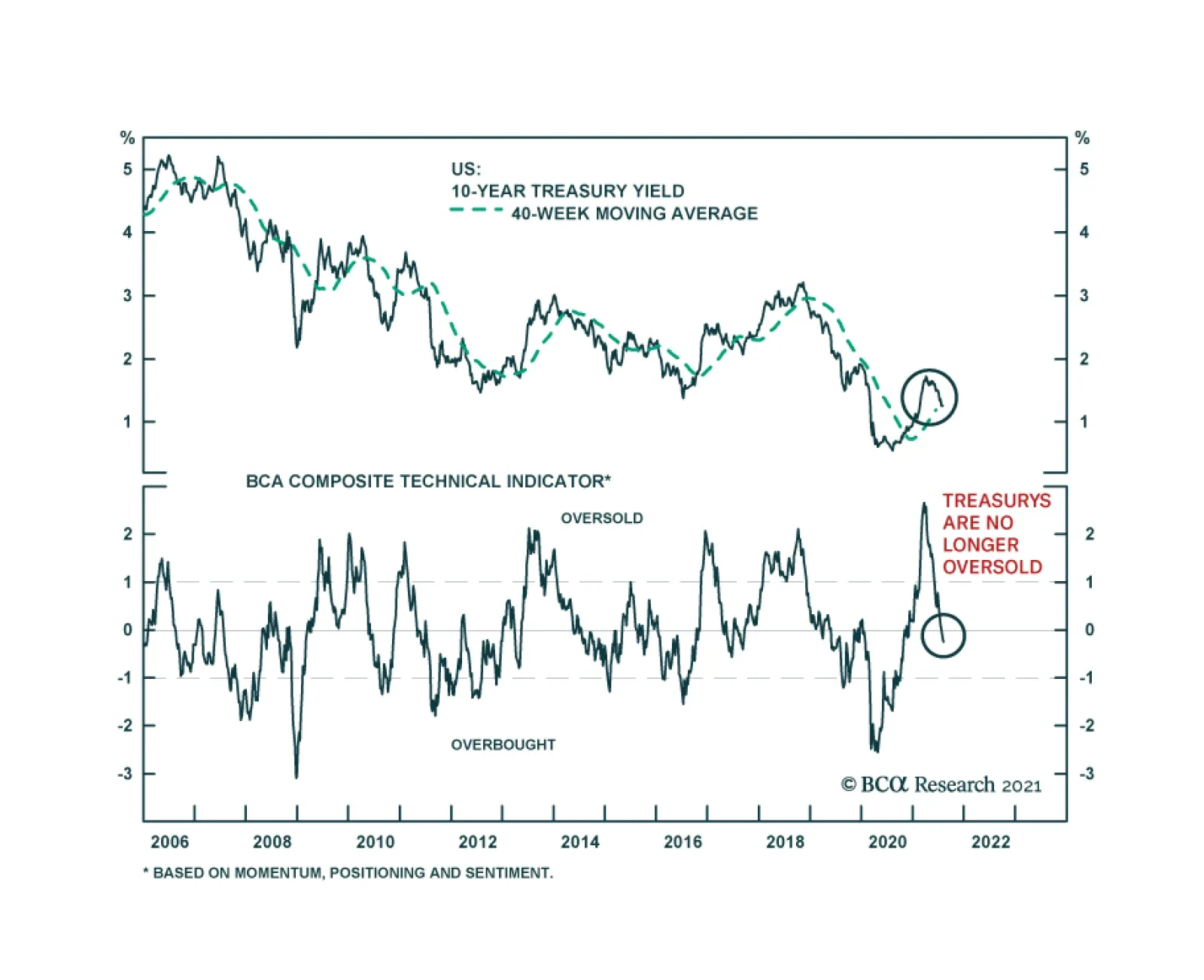
BCA Research’s Treasury Composite Technical Indicator suggests that the rally in US Treasurys is losing steam. Earlier this year, the indicator signaled that the bond selloff had gotten ahead of itself. Indeed, oversold market conditions are among the…
Highlights Investors have grown enamored with online retailers (AMZN), payment processing companies (V, MA, PYPL, SQ), and social media companies (FB, SNAP). All three sectors are likely to experience headwinds over the next 12 months as life returns to normal following the pandemic. Looking further out, market saturation, increased competition, and heightened regulation all pose risks to these sectors. Internet companies in general, and social media firms in particular, will face increased scrutiny not just for their monopolistic practices, but for the mental harm they are causing young people. Just like cigarettes are heavily regulated due to their addictive qualities, the same could happen to social media. We think there is a 50/50 chance that governments will start restricting social media usage only to adults over the age of 18 by the end of the decade, a move that could decimate the sector. Global Growth Will Remain Above Trend Investors are worried about growth again. Globally, the number of Covid cases is on the rise due to the proliferation of the Delta variant (Chart 1). The ISM manufacturing index dropped to 59.5 in July, down from a high of 64.7 in March. Both of China’s manufacturing PMIs have fallen, with the new orders component of the Caixin index dipping below the 50 line. The European PMIs have also come off their highs (Chart 2). Chart 1Number Of Covid Cases On The Rise Globally Due To The Delta Variant
These Three High-Flying Equity Sectors Could Come Crashing Back Down To Earth
These Three High-Flying Equity Sectors Could Come Crashing Back Down To Earth
Chart 2Manufacturing PMIs Are Off Their Highs
Manufacturing PMIs Are Off Their Highs
Manufacturing PMIs Are Off Their Highs
Growth concerns have registered in financial markets (Chart 3). After climbing to 1.74% in March, the US 10-year Treasury yield has fallen back to 1.22%. Cyclical equity sectors have underperformed defensives. Growth-sensitive currencies such as the Swedish krona and the Australian dollar have weakened. We are more upbeat about global growth prospects than the consensus. As the experience of the UK demonstrates, there is little will to impose lockdowns in countries with ample access to vaccines. Strict social distancing restrictions remain a fact of life in countries lacking adequate vaccine supplies. However, the situation should improve later this year as vaccine production increases (Chart 4). Chart 3Financial Markets Trim Growth Expectations
Financial Markets Trim Growth Expectations
Financial Markets Trim Growth Expectations
Chart 4Over 10 Billion Vaccine Doses Will Be Produced This Year
These Three High-Flying Equity Sectors Could Come Crashing Back Down To Earth
These Three High-Flying Equity Sectors Could Come Crashing Back Down To Earth
Households in developed economies are sitting on US$5 trillion in excess savings, half of which reside in the United States (Chart 5). Inventories are at record low levels, which should support production over the coming quarters (Chart 6). Chart 5Households Flush With Excess Savings
Households Flush With Excess Savings
Households Flush With Excess Savings
Chart 6Record Low Inventories Will Provide A Boost To Production
Record Low Inventories Will Provide A Boost To Production
Record Low Inventories Will Provide A Boost To Production
Chinese policy should turn more stimulative, as the recent cut to bank reserve requirements foreshadows. With credit growth back down to 2018 lows, policymakers can afford to give the economy some juice. The 6-month credit impulse has already turned up (Chart 7). From Goods To Services While global growth should remain well above trend for the next 12 months, the composition of that growth will shift in ways that could meaningfully affect equities. As Chart 8 illustrates, aggregate US consumption has returned to its pre-pandemic trend. However, spending on goods is 11% above trend while spending on services is still 6% below trend. Chart 7Chinese Policy Is Turning More Stimulative
Chinese Policy Is Turning More Stimulative
Chinese Policy Is Turning More Stimulative
Chart 8The Divergence Between Goods And Services Spending
The Divergence Between Goods And Services Spending
The Divergence Between Goods And Services Spending
Households typically cut spending on durable goods during recessions, while services serve as the ballast for the economy. The opposite happened during the pandemic. As the global economy recovers, goods spending will slow while services spending will stay robust. This is critical for online retailers such as Amazon, which derive the bulk of their e-commerce revenue from selling goods. Even after its disappointing Q2 earnings report, analysts still expect Amazon to grow e-commerce sales by 17% in 2022 (Chart 9). Such a goal may be difficult to achieve, given that core US retail sales currently stand 13% above their trendline (Chart 10). Chart 9AAnalysts’ Great Expectations May Be Dashed (I)
These Three High-Flying Equity Sectors Could Come Crashing Back Down To Earth
These Three High-Flying Equity Sectors Could Come Crashing Back Down To Earth
Chart 9BAnalysts’ Great Expectations May Be Dashed (II)
These Three High-Flying Equity Sectors Could Come Crashing Back Down To Earth
These Three High-Flying Equity Sectors Could Come Crashing Back Down To Earth
Chart 10AUS Retail Spending Is Well Above Trend (I)
US Retail Spending Is Well Above Trend (I)
US Retail Spending Is Well Above Trend (I)
Chart 10BUS Retail Spending Is Well Above Trend (II)
US Retail Spending Is Well Above Trend (II)
US Retail Spending Is Well Above Trend (II)
Chart 11Screen Time Is Moderating
These Three High-Flying Equity Sectors Could Come Crashing Back Down To Earth
These Three High-Flying Equity Sectors Could Come Crashing Back Down To Earth
If e-commerce spending slows, shares of payment processing companies could disappoint. Likewise, social media companies could suffer as people start going out more often. After spiking during the height of the pandemic, growth in data usage has returned to normal (Chart 11). Long-Term Risks Looking beyond the post-pandemic recovery, all three equity sectors face structural challenges that are not being fully discounted by investors. The first is market saturation. Close to three-quarters of US households have Amazon Prime accounts. Slightly over half have a Netflix account. Nearly 70% have a Facebook account. Google commands 92% of the internet search market. Together, Google and Facebook generate about 60% of all online advertising revenue. Competition is another challenge. Companies such as Amazon, Facebook, and Google dominate their respective markets. As they look for further growth, they will invariably invade each other’s turf. The result might benefit consumers, but it is unlikely to help the bottom line if it means more competitive pressures. Moreover, it is not just competition from within the tech industry that may disrupt incumbent firms. Consider payment processors. Like most other central banks, the Fed is planning to launch its own digital currency. Widely available, free-to-use Central Bank Digital Currencies (CBDCs) could thwart the ability of Visa and MasterCard to skim 2%-to-3% off of every transaction. Regulatory Pressures In recent years, tech companies have faced increased scrutiny over their alleged monopolistic practices. In contrast to Chinese tech firms, which have fallen under the thumb of the authorities, US companies have been able to evade harsh measures. Just last month, a US federal court judge dismissed a case filed by more than 40 state attorneys general arguing that Facebook’s acquisitions of Instagram and WhatsApp had harmed competition. In the past, evidence that companies were setting prices well above marginal costs could be used to build a case for anti-trust enforcement. Such cases are more difficult to argue today because so many online services are given away for free. Nevertheless, governments are likely to become more adept in pursuing regulatory actions. Rather than focusing simply on pricing policies, regulators are increasingly looking at the ways big tech companies use vendor data in the case of Amazon and user data in the case of Facebook and Google to maintain market dominance. Public contempt for tech companies is fueling a political backlash. According to a Gallup poll conducted earlier this year, only 34% of Americans held a favorable view of tech companies such as Amazon, Facebook, and Google, down from 46% in 2019; 45% had an unfavorable opinion, up from 33% in 2019. The shift in public sentiment over the past two years has been entirely driven by Independent and Republican voters, many of whom feel that tech companies are unfairly censoring their opinions (Table 1). The same poll revealed that the majority of Americans – including the majority of Republicans – now favor increased regulation of tech companies. Table 1American Views On Big Tech
These Three High-Flying Equity Sectors Could Come Crashing Back Down To Earth
These Three High-Flying Equity Sectors Could Come Crashing Back Down To Earth
A Drug Worse Than Nicotine? Social media companies are among the most loathed within the tech sector. A Pew Research Center study conducted last year revealed that more than six times as many Americans had a negative opinion of social media as a positive one (Chart 12). The public’s disdain for social media is increasingly going beyond traditional concerns over privacy. As psychologists Jonathan Haidt and Jean Twenge recently argued in the New York Times, there is growing evidence that the pervasive use of social media is harming the mental health of the nation’s youth. The share of students reporting high levels of loneliness has more than doubled in both the US and abroad over the past decade (Chart 13). Chart 12Social Media Increasingly Vilified
These Three High-Flying Equity Sectors Could Come Crashing Back Down To Earth
These Three High-Flying Equity Sectors Could Come Crashing Back Down To Earth
Chart 13Alone In The Crowd
These Three High-Flying Equity Sectors Could Come Crashing Back Down To Earth
These Three High-Flying Equity Sectors Could Come Crashing Back Down To Earth
In 2019, the last year for which comprehensive data is available, nearly a quarter of girls between the ages of 12 and 17 reported experiencing a major depressive episode over the prior year, up from 12% in 2011 (Chart 14). Academic studies have shown that adolescents who use Facebook and Instagram frequently feel greater anxiety and unease than those who do not. Just like cigarettes are heavily regulated due to their addictive qualities, the same could happen to social media. Facebook and most other social media companies already restrict access to those under the age of 13, although enforcement is generally spotty. We assign a 50/50 chance that governments start restricting social media usage only to adults over the age of 18 by the end of the decade, a move that could decimate the sector. Priced For Perfection The seven companies in the three high-flying sectors mentioned in this report trade at 91-times forward earnings compared to the S&P 500’s aggregate multiple of 22. They also trade at an average price-to-sales ratio of 16 compared to 3.2 for the broader market (Chart 15). Chart 14The Rise In Depression Rates Coincided With Increased Social Media Usage
These Three High-Flying Equity Sectors Could Come Crashing Back Down To Earth
These Three High-Flying Equity Sectors Could Come Crashing Back Down To Earth
Chart 15Trading At A High Multiple To Sales
These Three High-Flying Equity Sectors Could Come Crashing Back Down To Earth
These Three High-Flying Equity Sectors Could Come Crashing Back Down To Earth
Such valuations can be justified only if these companies grow earnings-per-share by nearly 30% per year over the next five years, as analysts currently expect (Chart 16). However, as noted above, that may be too high a hurdle to clear. Higher bond yields represent another threat to valuations. Growth stocks are much more sensitive to changes in discount rates than value stocks. Chart 17show that tech stocks have generally outperformed the S&P 500 over the past four years whenever bond yields were falling. We expect bond yields to rebound over the coming months, with the 10-year yield rising to 1.8% by early next year. Tech is likely to lag the market in that environment. Chart 16Long-Term Growth Estimates May Be Too Optimistic For These High-Fliers
These Three High-Flying Equity Sectors Could Come Crashing Back Down To Earth
These Three High-Flying Equity Sectors Could Come Crashing Back Down To Earth
Chart 17Higher Bond Yields Could Hurt Tech Stocks
Higher Bond Yields Could Hurt Tech Stocks
Higher Bond Yields Could Hurt Tech Stocks
Trade Update Our long EM equity trade got stopped out last Tuesday before recouping some of its losses in subsequent days. We continue to expect EM stocks to bounce back later this year. That said, in keeping with this report, we see more upside for “traditional” EM sectors such as banks, industrials, energy, and materials than for EM tech (especially Chinese tech). Peter Berezin Chief Global Strategist pberezin@bcaresearch.com Global Investment Strategy View Matrix
These Three High-Flying Equity Sectors Could Come Crashing Back Down To Earth
These Three High-Flying Equity Sectors Could Come Crashing Back Down To Earth
Special Trade Recommendations
Image
Current MacroQuant Model Scores
These Three High-Flying Equity Sectors Could Come Crashing Back Down To Earth
These Three High-Flying Equity Sectors Could Come Crashing Back Down To Earth
Highlights Advances in tennis, swimming and the high jump came from challenging the ‘best practices’, and finding better ways of doing these things. The pandemic has challenged the best practices on how we should work, do business, and shop, catalysing better ways of doing these things. The productivity boom could be a super-boom because the current disruption is not in just one sector but across the entire economy. A productivity super-boom means that the economy will take longer to reabsorb the unemployed, and that structural inflation will stay depressed. This means that interest rate hikes will be much later and much shallower than the market is pricing. For equity investors, a productivity super-boom plus the market’s overestimation of Fed rate hikes structurally favours growth sectors versus value sectors. Thereby, it also structurally favours the S&P500 versus the Eurostoxx50. Fractal analysis: stocks versus bonds remains fragile, and the rally in tin is very fragile. Feature Chart of the WeekThe Pandemic Has Catalysed A Productivity Boom
The Pandemic Has Catalysed A Productivity Boom
The Pandemic Has Catalysed A Productivity Boom
“I believe that the (Fosbury) flop was a natural style and I was just the first to find it” – Dick Fosbury, on how he revolutionised the high jump Watching the Tokyo Olympics, the flurry of new world records reassures us that human athletic productivity continues to advance. It does so in three ways: better biology, better technology, and better ways of doing the same thing. Better biology comes from advances in nutrition and healthcare – at least, for those that embrace the advances. Better technology means better equipment. For example, more ergonomic bikes, sharkskin-like swimwear that minimises water resistance, and running shoes that re-channel energy back into the legs. Albeit this raises the contentious issue that technological advances are giving some athletes an unfair and unnatural advantage. Case in point, World Athletics (and the Tokyo Olympics) have banned prototype versions of Nike’s Vaporfly running shoe that was used by Eliud Kipchoge to run the first sub-two hour marathon. The banned prototype shoe, containing triple carbon plates inside thick ultra-compressed foam, is claimed to improve running economy by up to four percent. But if technological advances are giving some athletes an advantage, it follows that they must also be giving some firms and economies an advantage. While this is unfair in sporting competition, it is fair in economic competition. An important implication is that firms and economies that embrace disruptive technologies and innovations – such as working from home – are likely to generate superior long-term productivity growth than firms and economies that do not. Productivity Growth Comes From Finding Better Ways Of Doing The Same Thing Yet, looking at the longer-term ‘productivity growth’ in sport, many of the greatest advances have come not from better biology or better technology, but just from finding better ways of doing the same thing. Tennis, swimming, and athletics provide three excellent examples of such innovation. A tennis ball weighs just 50 grams, so anybody can hit a tennis ball hard. The difficult part is hitting the ball hard and landing it within the 78 foot court. In the 1970s, Bjorn Borg revolutionised tennis by hitting with aggressive topspin on both the forehand and backhand as well as the serve. Meaning that rather than having to approach the net as was the ‘best practice’, Borg could win matches from the baseline. All it required was a different way of holding the racket and using his arms (Figure I-1). Figure I-1Challenging The Best Practice In Tennis Boosted Its Productivity
What The Olympics Teaches Us About Productivity Growth
What The Olympics Teaches Us About Productivity Growth
Borg’s revolution has a fascinating backstory. Borg’s father, a table tennis champion, won a tennis racket in a table tennis tournament and gave it to the 9-year old Bjorn. Familiar with table tennis and now armed with a tennis racket, the young Borg’s revolution was to play tennis as if it were table tennis – with its trademark topspin on both wings as well as the serve – albeit on a much bigger ‘table.’ And with a racket that was far too heavy for him that he held with both hands. (He eventually switched to a one-handed forehand but kept his two-handed backhand.) Go back a hundred years, and swimming experienced a similar revolution. Until the 1870s, the best practice for European swimmers was the highly inefficient breaststroke. But in 1873, John Arthur Trudgen emulated the technique used by Native Americans whereby the arms moved in a crawl. Later, the Australian Fred Cavill also emulated the Natives’ flutter kick, and thus made mainstream the front crawl, which has significantly increased swimming speed, or swimming ‘productivity.’ All it required was a different way of moving our arms and legs. But probably the greatest example of athletic innovation came in the 1968 Mexico Olympics, when Dick Fosbury turned the standard high jumping technique on its head – or, more precisely, on its back – to win the gold medal and smash the world record. Prior to the 1968 Games, the best practice high jump technique had been the ‘straddle’ which involved jumping forward, twisting the body to navigate the bar, and then landing on your feet. Fosbury changed all that forever. He jumped backwards off the wrong foot, arched his back over the bar, and landed on his back (Figure I-2). Figure I-2Challenging The Best Practice In The High Jump Boosted Its Productivity
What The Olympics Teaches Us About Productivity Growth
What The Olympics Teaches Us About Productivity Growth
Just like the tennis topspin and swimming’s front crawl, high jump’s ‘Fosbury flop’ has become the mainstream technique in the sport, taking performance and ‘productivity’ literally to new highs. And just like the tennis topspin and swimming’s front crawl, all it required was a different way of using our existing resources – in this case, jumping backwards rather than forwards. Yet in the case of the innovative Fosbury flop, something else also played an important role – a new environment. Until the 1960s, high jumpers cleared the bar and landed on sawdust, sand, or thin mats. Hence, any innovation in high jump techniques was constrained by having to land on your feet. This changed when Fosbury’s high school became one of the first to install deep foam matting for high jump landing. The Fosbury flop could not have been innovated before the introduction of deep foam matting, because jumping backwards and landing on your back depended on the existence of a soft foam mat for a safe landing. The crucial lesson is that a new environment gives us a chance to challenge beliefs on ‘how things should be done’, a chance to discover new ways of doing the same thing differently, and better. To challenge beliefs on how things should be done, what bigger change in the environment can there be than a global pandemic? The Pandemic Has Catalysed Better Ways Of Doing The Same Thing Just like athletic productivity growth, economic productivity growth comes from better biology (which improves both our physical and intellectual capacity), better technology, and finding better ways of doing the same thing. Of these three drivers, the first two are continuous processes but the third, finding better ways of doing the same thing, gets a massive boost from disruptive changes in the environment such as recessions (Chart of the Week and Chart I-2). Chart I-2Productivity Surges After Recessions
Productivity Surges After Recessions
Productivity Surges After Recessions
In this regard, any technology that is required already generally exists, but the recession is the necessary catalyst for its wholesale adoption. For example, the mass manufacturing of autos already existed well before the Great Depression, but the Depression was the catalyst for its wholesale adoption. Likewise, word processors existed well before the dot com bust, but the 2000 recession was what finally killed the office typing pool. In the same way, the technology for online shopping and remote meetings has been around for years, but it is the pandemic that has catalysed its wholesale adoption (Chart I-3). Chart I-3The Pandemic Has Accelerated The Shift To Online
What The Olympics Teaches Us About Productivity Growth
What The Olympics Teaches Us About Productivity Growth
As Fosbury said, he was just the first to find a more natural style of high jumping, yet it required a change of environment to challenge the best practice. Similarly, it has taken a global pandemic for us to challenge the best practice on how we should work, do business, shop, and interact (Chart I-4). Chart I-4The Pandemic Has Accelerated The Shift To Online
What The Olympics Teaches Us About Productivity Growth
What The Olympics Teaches Us About Productivity Growth
It is sub-optimal to work in the office or to shop in-person all the time. It is also sub-optimal to do these things remotely all the time. The optimal way is some hybrid of in-person and remote interactions, which will clearly differ for each person. But the pandemic has given us the opportunity to find this more natural and better way, and thereby to give our productivity a massive boost (Chart I-5). Chart I-5The Pandemic Has Challenged The Best Practice On How To Work
What The Olympics Teaches Us About Productivity Growth
What The Olympics Teaches Us About Productivity Growth
The productivity boom could be a super-boom because the current disruption has forced us all to find better ways of doing things. This differentiates the current episode from previous post-recession periods where transformations were focussed in one sector. For example, the 80s recession reshaped manufacturing, the dot com bust changed the technology sector, and the 2008 recession transformed the financial sector. By comparison, the current transformation is penetrating the entire economy. The Investment Conclusion A productivity super-boom carries two important implications for policymakers. It will take longer for the economy to reabsorb the unemployed, and it will keep structural inflation depressed. This means that interest rate hikes will be much later and much shallower than the market is pricing (Chart I-6 and Chart I-7). Chart I-6Rate Hikes Will Be Later Than The Market Is Pricing
Rate Hikes Will Be Later Than The Market Is Pricing
Rate Hikes Will Be Later Than The Market Is Pricing
Chart I-7Rate Hikes Will Be Shallower Than The Market Is Pricing
Rate Hikes Will Be Shallower Than The Market Is Pricing
Rate Hikes Will Be Shallower Than The Market Is Pricing
The investment conclusion is to buy any of the US interest rate futures that expire from December 2022 out to June 2024. The earlier contracts have the higher probabilities of expiring in profit while the later contracts have the greater potential upside. An alternative expression is to buy the 30-year T-bond, or to go long the 30-year T-bond versus the 30-year German bund. For equity investors, a productivity super-boom plus the market’s overestimation of Fed rate hikes structurally favours growth sectors versus value sectors. Thereby, it also structurally favours the S&P500 versus the Eurostoxx50. Fractal Analysis Update Global stocks versus bonds (MSCI All Country World versus 30-year T-bond) continue to exhibit the fragility on the 260-day fractal structure that started in mid-March. Since then, and consistent with this fragility, global stocks have underperformed bonds by 6 percent (Chart I-8). Chart I-8Stocks Versus Bonds Remains Fractally Fragile
Stocks Versus Bonds Remains Fractally Fragile
Stocks Versus Bonds Remains Fractally Fragile
But fragility on a 260-day fractal structure implies elevated risk of a reversal through at least the following six months. On this basis, our recommendation is to remain, at most, neutral to global stocks versus bonds through the summer. Among recent trades, short corn versus wheat, and short marine transportation versus market achieved their profit targets of 12 percent and 16.5 percent respectively, but short Austria versus Chile, and short lead versus platinum hit their stop-losses of 7 percent and 6.4 percent respectively. The 6-month win ratio stands at a very pleasing 71 percent. This week’s recommended trade is to reinitiate the stopped-out metals pair-trade in a modified expression – short tin versus platinum – given the very fragile 130-day and 260-day fractal structure (Chart I-9). Set the profit target and symmetrical stop-loss at 16.5 percent. Chart I-9Tin Is Fractally Fragile
Tin Is Fractally Fragile
Tin Is Fractally Fragile
Dhaval Joshi Chief Strategist dhaval@bcaresearch.com Fractal Trading System Fractal Trades 6-Month Recommendations Structural Recommendations Closed Fractal Trades Closed Trades Asset Performance Equity Market Performance Indicators To Watch - Bond Yields Chart II-1Indicators To Watch - Bond Yields ##br##- Euro Area
Indicators To Watch - Bond Yields - Euro Area
Indicators To Watch - Bond Yields - Euro Area
Chart II-2Indicators To Watch - Bond Yields ##br##- Europe Ex Euro Area
Indicators To Watch - Bond Yields - Europe Ex Euro Area
Indicators To Watch - Bond Yields - Europe Ex Euro Area
Chart II-3Indicators To Watch - Bond Yields ##br##- Asia
Indicators To Watch - Bond Yields - Asia
Indicators To Watch - Bond Yields - Asia
Chart II-4Indicators To Watch - Bond Yields ##br##- Other Developed
Indicators To Watch - Bond Yields - Other Developed
Indicators To Watch - Bond Yields - Other Developed
Indicators To Watch - Interest Rate Expectations Chart II-5Indicators To Watch - Interest Rate Expectations
Indicators To Watch - Interest Rate Expectations
Indicators To Watch - Interest Rate Expectations
Chart II-6Indicators To Watch - Interest Rate Expectations
Indicators To Watch - Interest Rate Expectations
Indicators To Watch - Interest Rate Expectations
Chart II-7Indicators To Watch - Interest Rate Expectations
Indicators To Watch - Interest Rate Expectations
Indicators To Watch - Interest Rate Expectations
Chart II-8Indicators To Watch - Interest Rate Expectations
Indicators To Watch - Interest Rate Expectations
Indicators To Watch - Interest Rate Expectations
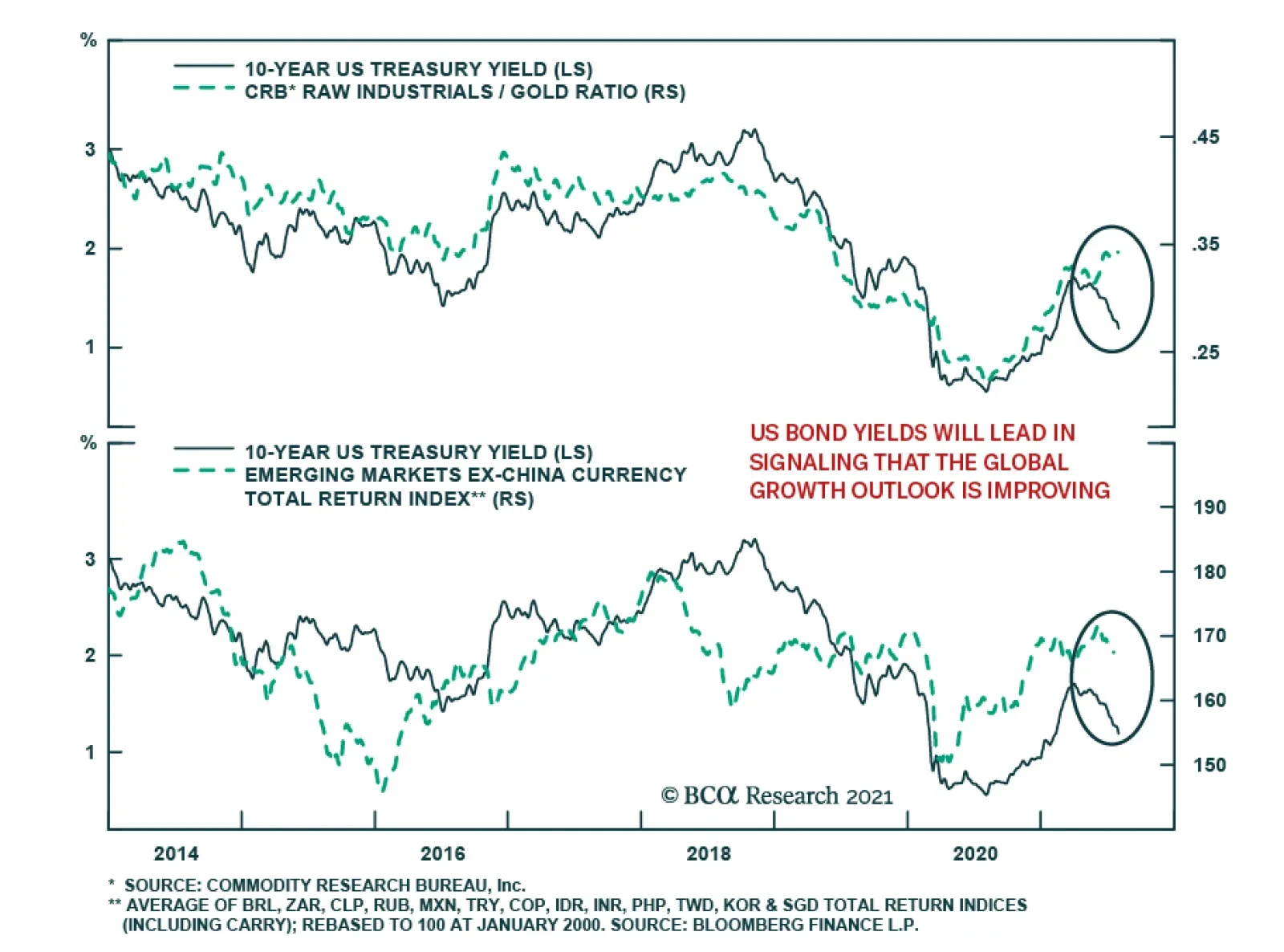
As expected, the US bond rally has coincided with the outperformance of both defensive equity sectors relative to cyclical ones, and growth stocks versus value. However, among growth-sensitive assets, two relationships stand out from their historical…
According to BCA Research’s US Bond Strategy service, investors should position in yield curve flatteners on a 6-12 month horizon. The Treasury curve bull-flattened in July. Bond yields were down across the curve, but by much more at the long end. The…
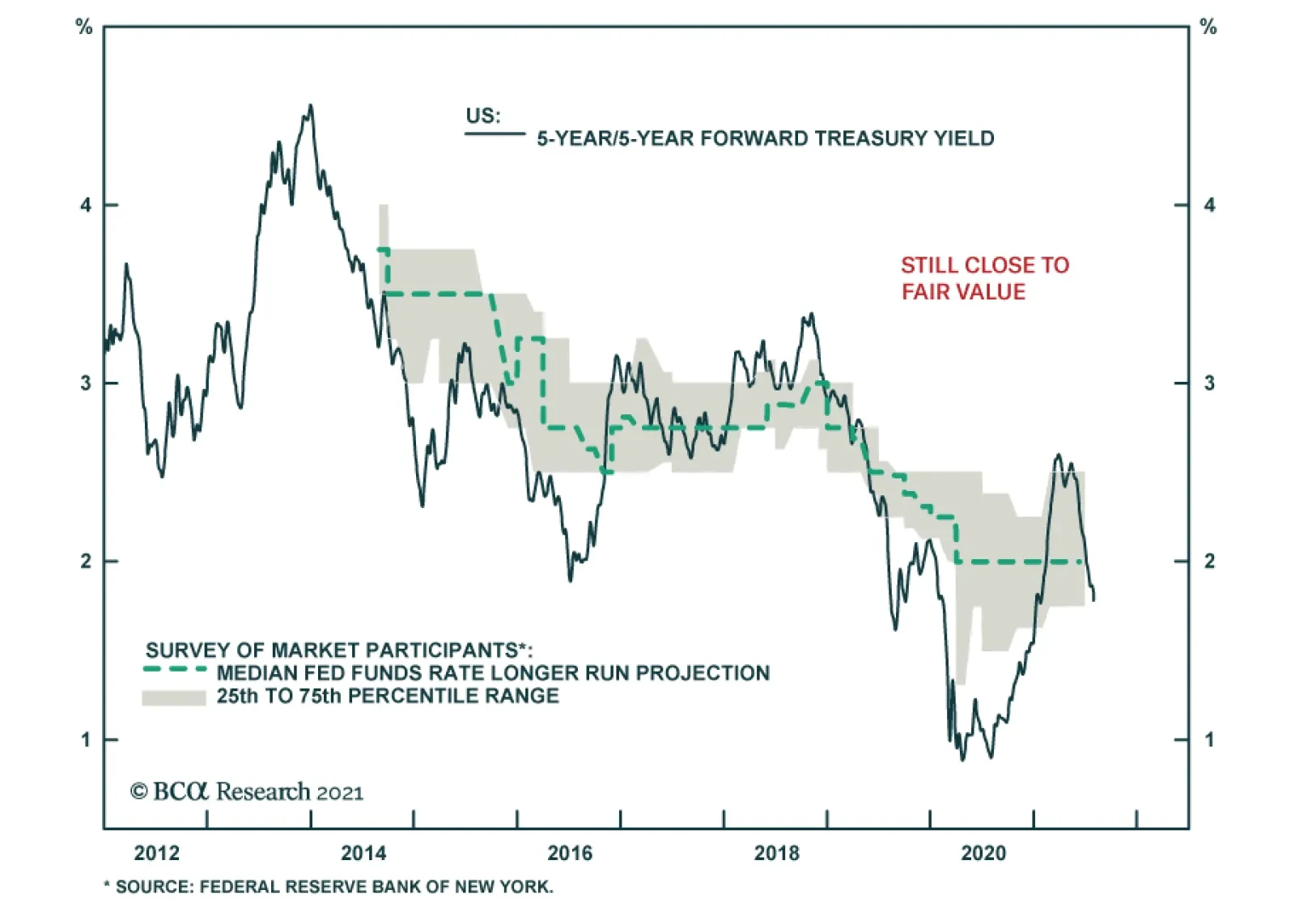
Highlights Chart 1Still Close To Fair Value
Still Close To Fair Value
Still Close To Fair Value
Treasury yields fell significantly in July, particularly at the long end of the curve. We continue to view this move as an overreaction to mediocre economic data that will be reversed this fall when labor supply constraints ease and employment surprises to the upside. It’s important to note, however, that despite the drop in long-dated yields the 5-year/5-year forward Treasury yield remains within the bounds of its 1.75% to 2.5% fair value range (Chart 1). That is, shorter-maturity Treasury yields have much more upside than long-dated yields on a 6-12 month investment horizon. We expect the next big move in bonds to be a bear-flattening of the yield curve as the market prices in a Fed rate hike cycle that we see starting near the end of 2022. Investors should position for that outcome today by keeping portfolio duration low and by entering yield curve flatteners. Feature Table 1Recommended Portfolio Specification
It’s Time For Bear-Flatteners
It’s Time For Bear-Flatteners
Table 2Fixed Income Sector Performance
It’s Time For Bear-Flatteners
It’s Time For Bear-Flatteners
Investment Grade: Neutral Chart 2Investment Grade Market Overview
Investment Grade Market Overview
Investment Grade Market Overview
Investment grade corporate bonds underperformed the duration-equivalent Treasury index by 37 basis points in July, dragging year-to-date excess returns down to +172 bps. The combination of above-trend economic growth and accommodative monetary policy supports continued positive excess returns for spread product versus Treasuries. At 89 bps, the 3-year/10-year Treasury slope remains steep. This is a strong signal that monetary conditions are accommodative. But despite the positive macro back-drop, investment grade valuations are extremely tight (Chart 2). A recent report looked at what different combinations of Treasury slope and corporate spreads have historically signaled about corporate bond excess returns.1 It shows that tight corporate spreads only correlate with negative excess returns once the 3-year/10-year Treasury slope is below 50 bps. Though we retain a positive view of spread product as a whole, better value can be found outside of the investment grade corporate sector. Specifically, we recommend that investors shift into high-yield corporates, municipal bonds and USD-denominated EM sovereigns and corporates. We also advise investors to favor long-maturity corporate bonds and those corporate sectors with elevated Duration-Times-Spread.2 Table 3ACorporate Sector Relative Valuation And Recommended Allocation*
It’s Time For Bear-Flatteners
It’s Time For Bear-Flatteners
Table 3BCorporate Sector Risk Vs. Reward*
It’s Time For Bear-Flatteners
It’s Time For Bear-Flatteners
High-Yield: Overweight Chart 3High-Yield Market Overview
High-Yield Market Overview
High-Yield Market Overview
High-Yield underperformed the duration-equivalent Treasury index by 34 basis points in July, dragging year-to-date excess returns down to +433 bps. A recent report looked at the default expectations that are currently priced into the junk index and considered whether they are likely to be met.3 If we demand an excess spread of 100 bps and assume a 40% recovery rate on defaulted debt, then the High-Yield index embeds an expected default rate of 3.2% (Chart 3). Using a model of the 12-month trailing speculative grade default rate that is based on gross corporate leverage (pre-tax profits over total debt) and C&I lending standards, we estimate that the 12-month default rate will fall to between 2.3% and 2.8%, below what the market currently discounts. Notably, the corporate default rate is tracking at an annualized rate of roughly 1.6% through the first six months of the year, well below the estimate generated by our macro model. Another recent report looked at the incremental spread pick-up investors can earn by moving out of investment grade corporates and into junk.4 It concluded that the extra spread available in high-yield is worth grabbing and that B-rated bonds look particularly attractive in risk-adjusted terms. MBS: Underweight Chart 4MBS Market Overview
MBS Market Overview
MBS Market Overview
Mortgage-Backed Securities underperformed the duration-equivalent Treasury index by 19 basis points in July, dragging year-to-date excess returns down to -64 bps. The nominal spread between conventional 30-year MBS and equivalent-duration Treasuries widened 8 bps in July. The spread is wide compared to recent history, but it remains tight compared to the pace of mortgage refinancings (Chart 4). The conventional 30-year MBS option-adjusted spread (OAS) widened 3 bps in July (panel 3), and it is now starting to look more competitive compared to other similarly risky spread sectors. The conventional 30-year MBS OAS sits at 36 bps, below the 54 bps offered by Aa-rated corporate bonds but above the 20 bps offered by Aaa-rated consumer ABS and the 34 bps offered by Agency CMBS. In a recent report we looked at MBS performance and valuation across the coupon stack.5 We noted that the higher convexity of high-coupon MBS makes them likely to outperform lower-coupon MBS in a rising yield environment. Higher coupon MBS also have greater OAS than lower coupons. This makes the high-coupon MBS more likely to outperform in a flat bond yield environment as well. Given our view that bond yields will be higher in 6-12 months, we recommend favoring high coupons (4%, 4.5%) over low coupons (2%, 2.5%, 3%) within an overall underweight allocation to Agency MBS. Government-Related: Neutral Chart 5Government-Related Market Overview
Government-Related Market Overview
Government-Related Market Overview
The Government-Related Index underperformed the duration-equivalent Treasury index by 34 basis points in July, dragging year-to-date excess returns down to +57 bps (Chart 5). Sovereign debt underperformed duration-equivalent Treasuries by 149 bps in July, dragging year-to-date excess returns down to -113 bps. Foreign Agencies underperformed the Treasury benchmark by 11 bps on the month, dragging year-to-date excess returns down to +35 bps. Local Authority bonds underperformed by 19 bps in July, dragging year-to-date excess returns down to +372 bps. Domestic Agency bonds outperformed by 2 bps, bringing year-to-date excess returns up to +28 bps. Supranationals performed in line with Treasuries in July, year-to-date excess returns held flat at +26 bps. USD-denominated Emerging Market (EM) Sovereign bonds continue to offer an attractive spread pick-up versus investment grade US corporate bonds with the same credit rating and duration. Attractive countries include: Qatar, UAE, Saudi Arabia, Mexico and Russia. A recent report looked at valuation within the investment grade USD-denominated EM corporate space.6 It found that EM corporates are attractively priced relative to US corporate bonds across the entire investment grade credit spectrum. It also found that EM corporates are attractive relative to EM sovereigns within the A and Baa credit tiers. EM sovereigns have the edge in the Aa credit tier. Municipal Bonds: Overweight Chart 6Municipal Market Overview
Municipal Market Overview
Municipal Market Overview
Municipal bonds underperformed the duration-equivalent Treasury index by 37 basis points in July, dragging year-to-date excess returns down to +271 bps (before adjusting for the tax advantage). The economic and policy back-drop is favorable for municipal bond performance. Trailing 4-quarter net state & local government savings were already positive through the end of Q1 2021 and they received another significant boost in Q2 as funds from the American Rescue Plan were doled out (Chart 6). With state & local government balance sheets in such good shape, we are comfortable moving down in quality within municipal bonds. A move down in quality is especially compelling because of tight Aaa muni valuations relative to Treasuries (top panel). Valuation is more compelling in the lower investment grade credit tiers, especially at the long-end of the curve.7 GO munis in the 12-17 year maturity bucket offer a 10% breakeven tax rate versus corporates with the same credit rating and duration. The breakeven tax rate for Revenue munis is just 2% (panel 2). Finally, high-yield muni spreads are reasonably attractive relative to high-yield corporates, offering a breakeven tax rate of 25% (panel 4). But despite the attractive spread, we recommend only a neutral allocation to high-yield munis versus high-yield corporates as the deep negative convexity of high-yield munis makes them susceptible to extension risk if bond yields rise. Treasury Curve: Buy 2/10 Barbell Versus 5-Year Bullet Chart 7Treasury Yield Curve Overview
Treasury Yield Curve Overview
Treasury Yield Curve Overview
The Treasury curve bull-flattened in July. Bond yields were down across the curve, but by much more at the long end. The 2-year/10-year slope flattened 15 bps to end the month at 105 bps. The 5-year/30-year slope steepened 1 bp to end the month at 120 bps. While we expect the recent decline in bond yields to reverse during the next 6-12 months, we do not think this reversal will coincide with a re-steepening of the 2/10 yield curve. We noted on the first page of this report that the 5-year/5-year forward Treasury yield remains close to its fair value range. Last week’s report demonstrated that yield curve steepening only occurs when either the Fed is cutting rates or the 5-year/5-year forward yield rises.8 This means that the 2/10 Treasury curve is more likely to flatten than steepen during the next 6-12 months, even as bond yields move higher. Similarly, we observe that the overnight index swap (OIS) curve is priced for the fed funds rate to be 0.17% in one year’s time and 1.36% in five years (Chart 7). While the latter rate has 157 bps of upside if it converges all the way back to its 2018 high, this pales in comparison to the 269 bps of upside in the 12-month forward rate. The yield curve will flatten as the 12-month forward OIS rate converges with the 5-year forward rate (panel 3). Investors should position in yield curve flatteners on a 6-12 month horizon. Specifically, we recommend shorting the 5-year bullet versus a duration-matched 2/10 barbell. TIPS: Neutral Chart 8TIPS Market Overview
TIPS Market Overview
TIPS Market Overview
TIPS outperformed the duration-equivalent nominal Treasury index by 112 basis points in July, bringing year-to-date excess returns up to +578 bps. The 10-year and 5-year/5-year forward TIPS breakeven inflation rates rose by 9 bps and 8 bps, respectively, on the month. At 2.43%, the 10-year TIPS breakeven inflation rate is near the middle of the 2.3% to 2.5% range that is consistent with inflation expectations being well anchored around the Fed’s target (Chart 8). Meanwhile, at 2.26%, the 5-year/5-year forward TIPS breakeven inflation rate is just below target (panel 3). With long-dated inflation expectations close to the Fed’s target levels, we see limited upside on a 6-12 month investment horizon. We also see the cost of short-maturity inflation protection falling during the next few months as realized inflation moderates from its extremely high level. This will lead to some modest steepening of the inflation curve (bottom panel). While the inflation curve has some room to steepen, we don’t see it returning to positive territory. An inverted inflation curve is simply more consistent with the Fed’s Average Inflation Target than a positively sloped one. This is because the Fed’s new framework calls for it to attack its inflation target from above rather than from below. ABS: Overweight Chart 9ABS Market Overview
ABS Market Overview
ABS Market Overview
Asset-Backed Securities underperformed the duration-equivalent Treasury index by 2 basis points in July, dragging year-to-date excess returns down to +37 bps. Aaa-rated ABS underperformed by 3 bps on the month, dragging year-to-date excess returns down to +28 bps. Non-Aaa ABS outperformed by 4 bps, bringing year-to-date excess returns up to +88 bps. The stimulus from last year’s CARES act led to a significant increase in household savings when individual checks were mailed in April 2020. That excess savings has still not been spent and the most recent round of stimulus checks has only added to the stockpile, pushing the savings rate higher yet again (Chart 9). The extraordinarily large stock of household savings means that the collateral quality of consumer ABS is also extraordinarily high. Indeed, many households have been using their windfalls to pay down consumer debt (bottom panel). Investors should remain overweight consumer ABS and should also take advantage of the high quality of household balance sheets by moving down the quality spectrum. Non-Agency CMBS: Neutral Chart 10CMBS Market Overview
CMBS Market Overview
CMBS Market Overview
Non-Agency Commercial Mortgage-Backed Securities outperformed the duration-equivalent Treasury index by 3 basis points in July, bringing year-to-date excess returns up to +187 bps. Aaa Non-Agency CMBS performed in-line with Treasuries in July, keeping year-to-date excess returns steady at +82 bps. Non-Aaa Non-Agency CMBS outperformed Treasuries by 16 bps on the month, bringing year-to-date excess returns up to +539 bps (Chart 10). Though returns have been strong and spreads remain attractive, particularly for lower-rated CMBS, we continue to recommend only a neutral allocation to the sector because of the structurally challenging environment for commercial real estate. Agency CMBS: Overweight Agency CMBS underperformed the duration-equivalent Treasury index by 28 basis points in July, dragging year-to-date excess returns down to +87 bps. The average index option-adjusted spread widened 5 bps on the month and it currently sits at 34 bps (bottom panel). Though Agency CMBS spreads have recovered to well below pre-COVID levels, they still look attractive compared to other similarly risky spread products. Stay overweight. Appendix A: Butterfly Strategy Valuations The following tables present the current read-outs from our butterfly spread models. We use these models to identify opportunities to take duration-neutral positions across the Treasury curve. The following two Special Reports explain the models in more detail: US Bond Strategy Special Report, “Bullets, Barbells And Butterflies”, dated July 25, 2017, available at usbs.bcaresearch.com US Bond Strategy Special Report, “More Bullets, Barbells And Butterflies”, dated May 15, 2018, available at usbs.bcaresearch.com Table 4 shows the raw residuals from each model. A positive value indicates that the bullet is cheap relative to the duration-matched barbell. A negative value indicates that the barbell is cheap relative to the bullet. Table 4Butterfly Strategy Valuation: Raw Residuals In Basis Points (As Of July 30TH, 2021)
It’s Time For Bear-Flatteners
It’s Time For Bear-Flatteners
Table 5 scales the raw residuals in Table 4 by their historical means and standard deviations. This facilitates comparison between the different butterfly spreads. Table 5Butterfly Strategy Valuation: Standardized Residuals (As Of July 30TH, 2021)
It’s Time For Bear-Flatteners
It’s Time For Bear-Flatteners
Table 6 flips the models on their heads. It shows the change in the slope between the two barbell maturities that must be realized during the next six months to make returns between the bullet and barbell equal. For example, a reading of 26 bps in the 5 over 2/10 cell means that we would only expect the 5-year to outperform the 2/10 if the 2/10 slope steepens by more than 26 bps during the next six months. Otherwise, we would expect the 2/10 barbell to outperform the 5-year bullet. Table 6Discounted Slope Change During Next 6 Months (BPs)
It’s Time For Bear-Flatteners
It’s Time For Bear-Flatteners
Appendix B: Excess Return Bond Map The Excess Return Bond Map is used to assess the relative risk/reward trade-off between different sectors of the US bond market. It is a purely computational exercise and does not impose any macroeconomic view. The Map’s vertical axis shows 12-month expected excess returns. These are proxied by each sector’s option-adjusted spread. Sectors plotting further toward the top of the Map have higher expected returns and vice-versa. Our novel risk measure called the “Risk Of Losing 100 bps” is shown on the Map’s horizontal axis. To calculate it, we first compute the spread widening required on a 12-month horizon for each sector to lose 100 bps or more relative to a duration-matched position in Treasury securities. Then, we divide that amount of spread widening by each sector’s historical spread volatility. The end result is the number of standard deviations of 12-month spread widening required for each sector to lose 100 bps or more versus a position in Treasuries. Lower risk sectors plot further to the right of the Map, and higher risk sectors plot further to the left. Chart 11Excess Return Bond Map (As Of July 30TH, 2021)
It’s Time For Bear-Flatteners
It’s Time For Bear-Flatteners
Ryan Swift US Bond Strategist rswift@bcaresearch.com Footnotes 1 Please see US Bond Strategy Weekly Report, “The Post-FOMC Credit Environment”, dated June 29, 2021. 2 For ideas on how to increase the average spread of a US bond portfolio please see US Bond Strategy Weekly Report, “The Collapsing Credit Risk Premium”, dated July 20, 2021. 3 Please see US Bond Strategy Weekly Report, “The Post-FOMC Credit Environment”, dated June 29, 2021. 4 Please see US Bond Strategy Weekly Report, “The Collapsing Credit Risk Premium”, dated July 20, 2021. 5 Please see US Bond Strategy Weekly Report, “A New Conundrum”, dated April 20, 2021. 6 Please see US Bond Strategy Weekly Report, “The Post-FOMC Credit Environment”, dated June 29, 2021. 7 Please see US Bond Strategy Weekly Report, “The Collapsing Credit Risk Premium”, dated July 20, 2021. 8 Please see US Bond Strategy / Global Fixed Income Strategy Weekly Report, “A Bump On The Road To Recovery”, dated July 27, 2021.
Highlights The countertrend yield rally is near its end. Despite the deteriorating Chinese credit impulse, the outlook for global growth remains robust. An ample global liquidity backdrop, an inventory restocking cycle, and an upbeat capex outlook will increase aggregate demand and global capacity utilization. In this context, safe-haven bonds have sufficiently rallied. German yields will rise too, because the European yield curve will steepen. European banks will benefit from this trend. Investors should buy European momentum stocks and sell growth stocks. Investors should favor industrial equities and Sweden. Feature On April 12 of this year, we warned that a countertrend rally in bonds was increasingly likely. The decline in the Chinese credit impulse and the increasingly oversold state of Treasuries created the perfect conditions to generate disappointments in a lopsided market. As a corollary, we grew worried about our equity positioning, which calls for a large exposure to pro-cyclical stocks. Consequently, we recommended investors hedge this portfolio bias with some defensive bets. On July 20, Treasury yields fell to as low as 1.13%. Did this level mark the end of the Treasury rally? The bulk of the decline is behind us, and investors with a 12- to 18-month investment horizon should resume shortening portfolio duration. In Europe too, German yields are likely to trend higher. As a result, European financials and momentum stocks should generate significant outperformance in the coming quarters. Industrial equities are also set to shine, which will benefit the Swedish market, our favorite. Should I Stay Or Should I Go? The near-term outlook for Treasuries is currently more complex than it was in April, when forces lined up neatly to warn of an imminent pullback in yields. Technical indicators show that the oversold conditions that prevailed this spring have mostly cleared up. In April, the BCA Composite Technical Indicator for Treasuries reached its most oversold level in more than 20 years, which provided a very reliable buy signal (Chart 1). Now that the 10-year yield has reclaimed its 40-week moving average, the technical indicator is back to neutral. Normally, when bonds are in a cyclical bear market, which is BCA’s House View, the indicator rarely dips significantly into overbought territory. Meanwhile, the Marketvane Bullish Sentiment survey stands at 60%, which indicates that bonds are once again favored by many newsletters, traders, and investors. Chinese credit growth continues to send a bond-bullish signal (Chart 2). Slowing credit growth could hurt Chinese capex, which in turn has the potential to slow the demand for capital at the global level. This risk could still decrease global yields. Chart 1Bonds Are Not Oversold Anymore...
Bonds Are Not Oversold Anymore...
Bonds Are Not Oversold Anymore...
Chart 2...But China Still Consistutes A Risk
...But China Still Consistutes A Risk
...But China Still Consistutes A Risk
Chart 3A Synchronous Global Upswing
A Synchronous Global Upswing
A Synchronous Global Upswing
The global economic recovery remains sufficiently broad-based to compensate for the risk of a Chinese slowdown. Our Global Synchronicity Indicator shows that manufacturing PMIs among the world’s major economies are all expanding (Chart 3), which usually elevates yields. This is especially important today, because the far-reaching and generalized nature of the current recovery gives more scope to the global economy to withstand a Chinese economic deceleration. Bottom Line: The variables that called for lower yields in early April are currently sending a mixed message. “Go!” The Global Business Cycle Responds Outside of China’s TSF impulse, most economic variables point toward higher yields. Chart 4Financial Liquidity Lifts The Business Cycle
Financial Liquidity Lifts The Business Cycle
Financial Liquidity Lifts The Business Cycle
Global liquidity conditions remain consistent with higher growth and thus also with rising global interest rates. BCA’s US Financial Liquidity Index still stands near record highs and confirms that the Global Leading Economic Indicator (LEI) will remain at elevated levels (Chart 4). As a result, we expect the current fall in the Global LEI Diffusion Index to be short lived. Any softening in global growth, therefore, will prove to be transitory. Markets are forward looking. The recent decline in yields anticipated the deceleration in the Global LEI. Long-term rates will also increase before the LEI firms anew. Excess money growth tells a similar story. Historically, an expansion of the global money supply in excess of the demand for credit sends a strong signal that global economic activity is well supported by reflationary policies. It forecasts above-trend industrial production growth, robust international trade and rising global export prices. Currently, excess money growth in the US, Eurozone and Japan has overtaken its post-GFC high and is consistent with higher US and German yields (Chart 5). Global capacity utilization also points toward higher yields. Our US Composite Capacity Utilization indicator is back in the neutral zone after a steep decline in 2020. Furthermore, US industrial capacity utilization is currently back above its structural trend. Most importantly, capacity utilization should be evaluated at the global level. Even when slower-growing economies such as the Euro Area and Japan are included, global capacity utilization is improving enough to be consistent with rising yields (Chart 6). Chart 5Excess Money Points To Higher Yields
Excess Money Points To Higher Yields
Excess Money Points To Higher Yields
Chart 6Rising CAPU Lifts Yields
Rising CAPU Lifts Yields
Rising CAPU Lifts Yields
Capacity utilization should climb higher in the coming quarters as the world experiences an inventory re-stocking cycle. The US, with its rich data, provides a good example. The sales-to-inventory ratio is at an extremely elevated level and is climbing very rapidly (Chart 7). Meanwhile, the level of inventories is still 1% below its pre-pandemic peak, while GDP overtook it previous high in the second quarter, and business sales are 11% above their 2018 high. The recent rise in inflation highlights the inability of companies to fulfil demand for their goods and services and, consequently, the need to restock. Hence, we expect companies to increase their inventory spending, which will add to demand and to capacity utilization as the adjustment process takes place. Capex will also lift capacity utilization and put upward pressure on yields. US capex intentions are rising swiftly as firms are unable to meet demand (Chart 8, top panel). Our Japanese Capex Indicator reiterates this message, while the European Commission’s Investment Surveys are also recovering (Chart 8 bottom panels). Historically, capex intentions are an excellent, leading indicator of actual investments, hence, the recent poor capex numbers will not last. Chart 7Restocking Ahead!
Restocking Ahead!
Restocking Ahead!
Chart 8Climbing Capex Intentions Everywhere
Climbing Capex Intentions Everywhere
Climbing Capex Intentions Everywhere
Greater global cash flow growth is also consistent with higher capex. The growth in EBITDA among global companies has bottomed, and it is currently around 14%. Incidentally, this suggests that capex among quoted firms around the world should expand in the second half of the year by a similar amount (Chart 9). Ultimately, robust cash flows finance expansion plans and also send a strong signal to corporate boards that the environment is ripe for investment spending. Already, capital goods orders are strengthening, which confirms the signal from both the capex surveys and profits. This strength portends very strong private capex numbers in the coming quarters and thus, a greater level of demand in the economy (Chart 10). Chart 9Rising Cash Flows Lead To Higher Capex
Rising Cash Flows Lead To Higher Capex
Rising Cash Flows Lead To Higher Capex
Chart 10Strong Global Orders
Strong Global Orders
Strong Global Orders
Public infrastructure plans will create the final boost to global capex. $550 billion of the Biden administration’s infrastructure plan is getting close to bipartisan approval, and the budget reconciliation process might still result in an even bigger package before yearend. In Europe, the EUR800 billion NGEU plan that has been approved by all the EU’s national parliaments also includes large infrastructure spending envelopes to deploy over the coming five years. This context suggests that yields are unlikely to decline much further from current levels, since the oversold conditions that prevailed in March have been purged. Chart 11 shows that specific events are needed to prompt a greater 90-trading day collapse in yields than the one just registered. In 2019 and 2020, the Fed was cutting rates. Today, it is gearing up to raise them. In 2010 and 2011, the European sovereign debt crisis was hurting global growth and creating massive deflationary risks. In 2015, China was mired in deep deflation and devalued the RMB, which exported these negative pressures around the world and lowered yields. By late 2018, the yield curve was moving toward an inversion, which signaled that monetary policy was too tight. Today, none of these conditions are present and, consequently, the odds of a greater decline in yields are low. Chart 11Yields Have Moved Enough
Yields Have Moved Enough
Yields Have Moved Enough
Bottom Line: The broad-based nature of the global recovery will limit the decline in yields. Global liquidity conditions remain extremely accommodative, global capacity utilization is improving, and inventories and capex spending will add to demand in the coming quarters. In this context, the recent decline in yields corrected this spring’s oversold condition in the bond market sufficiently. Investment Implications Bonds Investors with an investment horizon of more than six months should reduce their portfolio duration and remove hedges protecting against higher yields. The low in Treasury yields is likely to stay around 1.1%. The exact timing of the rebound is imprecise, and yields could churn for a brief period and retest their recent lows, but the balance of risks points toward a much greater probability of higher yields in the coming six to twelve months, and a limited probability of significantly lower yields from current levels. In fact, the CRB-to-gold ratio, often shown by BCA’s US bond strategists, clearly favors higher yields (Chart 12). Higher yields are not inconsistent with BCA’s view that the current inflation spike is transitory. TIPS yields are at a record low. As global growth recovers and the Fed moves closer to removing some accommodation, real yields will increase (Chart 13, top panel). Meanwhile, 5-year/5-year forward inflation breakeven rates remain well below the 2.5%-to-3% zone that prevailed prior to 2014, when long-term inflation expectations were still well anchored (Chart 13, bottom panel). The Fed is actively aiming to push this inflation expectation measure higher. Chart 12The CRB/Gold Ratio Points To Higher Yields
The CRB/Gold Ratio Points To Higher Yields
The CRB/Gold Ratio Points To Higher Yields
Chart 13TIPS Yields Will Rise
TIPS Yields Will Rise
TIPS Yields Will Rise
Chart 14The European Yield Curve Will Steepen
The European Yield Curve Will Steepen
The European Yield Curve Will Steepen
German yields have some upside too, even if the ECB will lag well behind the Fed in terms of both ending its QE program and lifting interest rates. The ECB policy rate mostly anchors the short end of the curve, and the large European excess savings warrant lower Bund yields than those of T-Note. However, the nominal and real terminal rates embedded in the German curve remain lower than at the apex of the European sovereign debt crisis and are extremely low compared to the US. As a result, the European yield curve will steepen, which is confirmed by the comparative strength of the earnings revisions of Europe’s cyclical equity sectors (Chart 14). Equities An environment in which yields rise again should favor financials, industrials, and momentum stocks at the expense of growth stocks. In Europe, banks and financials will be the prime beneficiaries of higher yields. Historically, higher German Bund yields are associated with an outperformance of banks relative to the broad market, because a steeper yield curve boosts net interest margins (Chart 15). European banks also have scope for some re-rating. There is little case to significantly upgrade the sectors’ expected long-term profitability significantly, considering that the European economy remains replete with an excessively large capital stock. Nonetheless, at a price-to-book ratio of 0.6 or 55% below that of US banks and 67% below the European broad market, European banks are also priced as risky investments. However, European NPLs have declined significantly, and the public sector support during the pandemic will limit how high NPLs can rise (Chart 16, top panel). Moreover, European banks are much better capitalized than they once were, which further decreases their riskiness (Chart 16). Additionally, the ECB has allowed banks to pay dividends again. Finally, the fiscal risk sharing created by the NGEU funds and continued bond purchases by the ECB will cap the upside for peripheral yield spreads, which will limit the odds of the emergence of the kind of doom-loop that once plagued the European banking system. UK bank stocks look particularly attractive. Chart 15European Banks Have Upside
European Banks Have Upside
European Banks Have Upside
Chart 16Less Risky
Less Risky
Less Risky
The massive underperformance of European momentum stocks relative to growth stocks is also likely to reverse (Chart 17). As Chart 18 shows, momentum stocks currently trade at an exceptionally large discount to both growth stocks and the European broad market. Most importantly, momentum equities tend to outperform growth stocks in the wake of a rise in German yields (Chart 19). This sensitivity to yields is currently accentuated by the sector bias of momentum stocks. Relative to growth stocks, momentum equities greatest overweights are financials, industrials and materials (Table 1), three sectors that thrive on higher interest rates. Meanwhile, their largest relative underweights are consumer staples and healthcare, two sectors with strong defensive characteristics that benefit from lower yields. Chart 17Bomned Out Momentum Stocks...
Bomned Out Momentum Stocks...
Bomned Out Momentum Stocks...
Chart 18...Have Become Very Cheap
...Have Become Very Cheap
...Have Become Very Cheap
Chart 19Momentum Stocks Outperform When Yields Rise
Momentum Stocks Outperform When Yields Rise
Momentum Stocks Outperform When Yields Rise
Table 1Sector Biases: Momentum Vs Growth Stocks
The Ageing Bond Rally
The Ageing Bond Rally
Chart 20The Capex Outlook Favors Industrials
The Capex Outlook Favors Industrials
The Capex Outlook Favors Industrials
Finally, we recommend investors move more aggressively into industrial equities. Industrials are the best-placed sector to benefit from the rise in global capex and the excess money supply growth. As Chart 20 highlights, even if the rate of growth of global capital goods orders decelerates, industrials should outperform the European broad market as long as the rate of growth remains positive. Nonetheless, the sector’s outperformance could moderate because it has become more expensive than the broad market. However, a stronger profitability compensates for this negative. As a corollary, we continue to favor Swedish equities because of their 38% weight in industrials and 27% allocation to financials. Moreover, their superior return on equity and profit margins, as well as the EUR/SEK’s downside potential, add to Sweden’s allure. The largest risk for industrials remains the slowdown in the Chinese credit impulse. However, the upbeat picture for DM capex and inventory growth counters this negative side. We continue to recommend some hedges against this risk. When it comes to our Sweden overweight, we still advise selling Norway, a position that has worked out well. We also still like selling consumer discretionary equities / long European telecoms to protect portfolios against a greater-than-anticipated global slowdown. Bottom Line: Global safe-haven yields are unlikely to decline significantly from current levels. Instead, they will rise meaningfully in the coming quarters, even in Germany. Consequently, investors with an investment horizon greater than six months should curtail their portfolio duration once again. Higher yields will also benefit European bank equities. We also recommend investors buy European momentum stocks and sell growth stocks. Finally, European industrials are set to shine compared to the rest of the European market, which will give a fillip to Swedish stocks, our favored European market. Mathieu Savary, Chief European Strategist Mathieu@bcaresearch.com Currency Performance Currency Performance
The Ageing Bond Rally
The Ageing Bond Rally
Fixed Income Performance Government Bonds
The Ageing Bond Rally
The Ageing Bond Rally
Corporate Bonds
The Ageing Bond Rally
The Ageing Bond Rally
Equity Performance Major Stock Indices
The Ageing Bond Rally
The Ageing Bond Rally
Geographic Performance
The Ageing Bond Rally
The Ageing Bond Rally
Sector Performance
The Ageing Bond Rally
The Ageing Bond Rally