Fixed Income

Highlights The decline in US Treasury yields has once again reduced the appeal of US paper, relative to foreign developed and emerging market bonds. Historically, lower US bond yields relative to other markets has been dollar bearish. The caveat is that if declining yields are due to a flight to safety, the dollar initially benefits due to US bond inflows. The academic research on which yields matter for currencies is mixed. Historically, short rates have mattered more. But with short-term interest rates anchored at zero, there is evidence investors are moving out the curve. Our bias is that looking across the yield curve will provide a more accurate picture of the countries that will benefit from bond inflows. More importantly, it is the sum of portfolio flows that drive a currency. This means equity flows will be important as well. Feature Global bond yields have rolled over, driven by the long end of the curve. The US 10-year yield has fallen from a high of 1.74% at the end of March to 1.29% today. While other bond yields have rolled over, the move has been more pronounced in the US. For example, the spread between the US 10-year Treasury and the 10-year German bund has narrowed from 200bps to 175bps. Given the correlation between relative interest rates – especially in real terms – and the dollar, a rare divergence has opened up in favor of short dollar positions (Chart I-1). A fall in yields can be driven by prospects of either slowing growth, lower inflation expectations, or a combination of the two. In the case of the US and to a certain extent the eurozone, the culprit behind lower yields has been a drop in both the real and the nominal component. This suggests that the markets are worried about central banks becoming too hawkish at the exact moment global growth is set to slow. Across maturities, the US yield curve has thus flattened (Chart I-2). Chart I-1Real Yields And Currencies Have Diverged
Real Yields And Currencies Have Diverged
Real Yields And Currencies Have Diverged
Chart I-2Flattening Yield Curves
Flattening Yield Curves
Flattening Yield Curves
A few questions arise from the setup above. How do you trade the dollar in the current environment? What is the future path for yields, especially relative yields? Should investors focus on a specific maturity as a signal for future currency moves? Finally, are yields the key driver of currencies in the current environment or should investors focus on other factors as well? Explaining Recent Dollar Strength Chart I-3Rising Demand For Hedges
Rising Demand For Hedges
Rising Demand For Hedges
If the decline in rates globally has been led by the US, then why has the dollar remained strong? The first reason is rising safe-haven demand, especially as global growth peaks. Usually, as a counter-cyclical currency, the dollar benefits in a risk-off environment. The latest Treasury International Capital (TIC) data show that foreign inflows into US bonds have been part of the reason for the decline in Treasury yields since March. A reset in equity markets has also been a driver. The DXY index has been very closely correlated with the put-call ratio in the US, and increased demand for hedges, including long dollar positions, have benefited the greenback (Chart I-3). This has been consistent with the outperformance of the more defensive US equity market. The third reason has been a slowdown in relative economic momentum between the G10 and the US. Chart I-4 shows that the Citigroup economic surprise index for the euro area relative to the US remains strong but has rolled over. The story is similar using relative PMIs between the US and the rest of the G10. Relative economic performance has usually tended to dictate currency movements in the near term. Chart I-4Relative Economic Momentum Is Slowing
Relative Economic Momentum Is Slowing
Relative Economic Momentum Is Slowing
Finally, as we highlighted a fortnight ago, the dollar was oversold and due for a tactical bounce. Leveraged funds have been covering their short positions in recent weeks, while speculators are now long the dollar (Chart I-5). Chart I-5Speculators Are Now Long The Dollar
Speculators Are Now Long The Dollar
Speculators Are Now Long The Dollar
Going forward, most of these trends should reverse. While the Delta variant of COVID-19 is raging across countries, hospitalizations are low, and thus the case for renewed lockdowns is weak. Meanwhile, non-US growth should regain the upper hand, especially in countries like Japan where vaccinations are ramping up quite fast. Global yields should also rise, as output gaps close and inflation remains well anchored. The Dollar And Interest Rates: Real Versus Nominal? As Chart 1 highlights, it is important to think about relative rates when looking for the next move in the dollar. The historical evidence is that there is little correlation between the dollar and the absolute level or direction of bond yields. Over the last few decades, global bond yields have collapsed while the dollar has undergone rolling bull and bear markets. Currencies react more to the path of relative real rates than nominal rates. By definition, a currency is the mechanism by which prices are equalized across borders. Rising inflation lowers the purchasing power of a currency, which in turn forces the currency to adjust lower in a globally competitive pricing system. Across the G10, there has been a longstanding relationship between real interest rate differentials and the path of the currency (Chart I-6). Chart I-6Negative Real Rates In The US Across The Curve
Negative Real Rates In The US Across The Curve
Negative Real Rates In The US Across The Curve
Chart I-7The US Sports A Very Negative ##br##Real Yield
Which Rates Matter For Currencies?
Which Rates Matter For Currencies?
Importantly, US real rates, especially at the short end of the curve, are very depressed. In fact, compared to other G10 countries, the US sports one of the worst 2-year real yields (Chart I-7). Based on the historical precedent illustrated in Chart I-6, a significant increase in US real rates is required to allow the dollar to rise on a structural basis. What About Hedged Yields? It is true that hedged yields in the US are positive for foreign investors. For example, hedged 10-year US yields for German bond investors provide 97 bps of pickup. For a Japanese investor, the yield pickup in the US is 96 bps, and for a British investor, it is 73 bps (Chart I-8A, Chart I-8B, Chart I-8C). Chart I-8BUS Hedged Yields For Japanese Investors
US Hedged Yields For Japanese Investors
US Hedged Yields For Japanese Investors
Chart I-8AUS Hedged Yields For Euro Investors
US Hedged Yields For Euro Investors
US Hedged Yields For Euro Investors
Chart I-8CUS Hedged Yields For British Investors
US Hedged Yields For British Investors
US Hedged Yields For British Investors
However, there is little correlation between the hedged yields and currency performance, and for good reason: Under covered interest rate parity, a hedged yield will be an arbitrage opportunity, which should be duly uncovered by efficient markets. This arbitrage window for hedged yields disappears if you extend the maturity of your hedging, as economic theory suggests. For example, hedging a 10-year bond with a 3-month currency forward can lead to massive losses as you roll over these contracts. This is because the cost of hedging in the short term tends to have wild fluctuations. For example, hedging in euros for a German investor buying Treasurys was over 300bps at the end of 2018. This wiped out the positive spread between the two bonds. Many investors do not hedge currency exposure. In fact, the “least regrets” approach of hedging 50% of currency exposure has been quite popular.1 Therefore, focusing on the real yield, rather than the hedged or nominal yield (Chart I-9), has been a far more robust solution in gauging the direction of currencies. By definition, a hedged yield means buying a currency at spot and selling it forward. This should be currency neutral, and especially, arbitrage away the yield differential. Chart I-9Hedged Yields And Currencies: No Correlation
Hedged Yields And Currencies: No Correlation
Hedged Yields And Currencies: No Correlation
Which Bond Yields Matter? The academic evidence suggests that short-term interest rates matter more for currencies, especially when policy is close to the zero bound. According to a BIS paper,2 not only has the FX impact of monetary policy grown significantly in the last few years, but short maturity bonds have had the strongest impact. Moreover, at a lower level of interest rates, the foreign-exchange impact is greater as the adjustment burden falls onto the exchange rate. Looking purely through the lens of the US dollar, our view is more nuanced. Foreign inflows into US long-term Treasurys have been improving tremendously, while flows into T-bills are relapsing (Chart I-10). This suggests longer-term rates have been a bigger driver of inflows into the US, and, more recently, the dollar rally. It is similar to what occurred at beginning of the dollar bull market last decade. Admittedly, the picture shifted over time, with shorter term flows becoming increasingly important as the Fed began to hike interest rates. Taking a step back, bond investors tend to span the duration spectrum, with pension funds investing in bonds many years out. As 1-year and 2-year yield differentials are not meaningfully different across countries (Chart I-11), this curtails the appeal of short-term paper. If inflation differentials are considered, it reduces the appeal of US paper even further. Chart I-10Long-Term Versus Short-Term Flows
Long-Term Versus Short-Term Flows
Long-Term Versus Short-Term Flows
Chart I-11Narrow Gap In Short Term Yields
Narrow Gap In Short Term Yields
Narrow Gap In Short Term Yields
Let’s not forget quantitative easing. If a central bank explicitly targets a bond yield near zero, like in Japan or Australia, that makes it difficult for that same yield tenor to generate positive inflows or send a reliable signal about the economy. This suggests a better method is looking at a spectrum of indicators, including yields at various maturities. Charts I-12 plots the yield differentials across maturities and countries. It shows that currencies have been correlated across the relative yield maturity spectrum. As such, we recommend investors monitor both short- and long-term yields in evaluating currency decisions. Chart I-12AYield Differentials Across Different Maturities
Yield Differentials Across Different Maturities
Yield Differentials Across Different Maturities
Chart I-12BYield Differentials Across Different Maturities
Yield Differentials Across Different Maturities
Yield Differentials Across Different Maturities
Chart I-12CYield Differentials Across Different Maturities
Yield Differentials Across Different Maturities
Yield Differentials Across Different Maturities
Chart I-12DYield Differentials Across Different Maturities
Yield Differentials Across Different Maturities
Yield Differentials Across Different Maturities
Chart I-12EYield Differentials Across Different Maturities
Yield Differentials Across Different Maturities
Yield Differentials Across Different Maturities
Chart I-12FYield Differentials Across Different Maturities
Yield Differentials Across Different Maturities
Yield Differentials Across Different Maturities
Chart I-12GYield Differentials Across Different Maturities
Yield Differentials Across Different Maturities
Yield Differentials Across Different Maturities
Chart I-12HYield Differentials Across Different Maturities
Yield Differentials Across Different Maturities
Yield Differentials Across Different Maturities
Chart I-12IYield Differentials Across Different Maturities
Yield Differentials Across Different Maturities
Yield Differentials Across Different Maturities
Other Asset Classes There are multiple drivers of exchange rates. Bond yields are just one of them. Equity and other flows also matter. It is the sum of portfolio flows that drive a currency. In fact, inflows into US equities and agency bonds have been the bigger drivers of the US dollar this year (Chart I-13). Outside the US, the correlation between interest rates and the currency can be very weak. The Canadian dollar is much more correlated with terms of trade than with real interest rate differentials. Rising oil prices attract inflows into Canadian corporate bonds and equities, which are positive for the currency. The key point is that flows tend to gravitate to capital markets with the highest expected returns. As such, monitoring flows other than government bond purchases is important. We expect that yields will be higher on a cyclical horizon. This will be beneficial for cyclical stocks, especially banks. This will also be beneficial for flows into non-US bourses, that have a higher weighting of cyclical stocks.. In short, the US equity market has become very tech heavy. Rising interest rates will hurt higher duration sectors such as technology and health care. At the margin, this hurts the relative performance of US equities (Chart I-14). Given that equity inflows have been a key driver of the US dollar, this will also hurt at the margin Chart I-13Agency Bonds And Equity Purchases Have Driven US Inflows
Agency Bonds And Equity Purchases Have Driven US Inflows
Agency Bonds And Equity Purchases Have Driven US Inflows
Chart I-14US Valuations Benefit From ##br##Lower Rates
US Valuations Benefit From Lower Rates
US Valuations Benefit From Lower Rates
Concluding Thoughts US real interest rates have deteriorated relative to the rest of the world. As such, it will require a significant rise in US real rates to seriously question a dollar bearish view. Meanwhile, a modest rise in global rates will also be bearish for US stocks compared to non-US bourses. US rates are usually high beta, and so could rise more in an improving growth environment. But relative rates are correlated to relative growth. As such, if non-US growth picks up relative to the US, like the IMF expects, this will provide a modest fillip to non-US yields (Chart I-15). US real rates are also very negative, so the bar to create a genuine dollar rally is very high. Finally, the market still expects the Federal Reserve to lead the hiking cycle. This means that there is still potential for an upside surprise in interest rates outside the US, compared to within (Chart I-16). Chart I-15Relative Bond Yields And Relative Economic Momentum
Relative Bond Yields And Relative Economic Momentum
Relative Bond Yields And Relative Economic Momentum
Chart I-16The Market Is Still Relatively Hawkish On The Fed
The Market Is Still Relatively Hawkish On The Fed
The Market Is Still Relatively Hawkish On The Fed
Housekeeping Our long Scandinavian basket was triggered at our buy point of a -2% pullback from July 9th levels. As such, we are now short EUR/NOK, USD/NOK, EUR/SEK, and USD/SEK. We were also stopped out of our long silver/short gold position for a small loss. We will be looking to reopen this trade in the coming weeks. Chester Ntonifor Foreign Exchange Strategist chestern@bcaresearch.com Footnotes 1 Michenaud, S., and Solnik, B., , “Applying regret theory to investment choices: Currency hedging decisions,” Journal of International Money and Finance 27, 2008, 677-694. 2 Ferrari, Massimo, Kearns, Jonathan and Schrimpf, Andreas, “Monetary policy’s rising FX impact in the era of ultra-low rates,” Bank of International Settlements, April 2017. Currencies U.S. Dollar Chart II-1USD Technicals 1
USD Technicals 1
USD Technicals 1
Chart II-2USD Technicals 2
USD Technicals 2
USD Technicals 2
Data out of the US this week was mixed: June retail sales came in better than expected. The control group rose 1.1% month on month, versus a -1.4% decline in May. For July, the University of Michigan survey showed inflation expectations continue to edge higher, but the sentiment of current conditions and expectations was well below consensus. Inflows into US assets reversed in May, with net outflows of $30.2bn. Existing home sales rose by 1.4% month on month in June to 5.9 million units. The US dollar DXY index rose modestly this week. Technically, the dollar is now approaching overbought territory. Our intermediate-term indicator has broken above 60, speculators are now long the dollar and sentiment on the greenback has turned up at a time when real rates remain negative in the US. This suggests much optimism is in the price. Report Links: Arbitrating Between Dollar Bulls And Bears - March 19, 2021 The Dollar Bull Case Will Soon Fade - March 5, 2021 Are Rising Bond Yields Bullish For The Dollar? - February 19, 2021 The Euro Chart II-3EUR Technicals 1
EUR Technicals 1
EUR Technicals 1
Chart II-4EUR Technicals 2
EUR Technicals 2
EUR Technicals 2
Data out of the eurozone this week was robust: The trade balance came it at €9.4bn for May. Final June CPI was in line with expectations – 1.9% for headline and 0.9% for core. The ECB kept rates unchanged in their July 22 meeting, but added to their framework of forward guidance. The euro fell by 40bps this week. Following Christine Lagarde’s Bloomberg interview last week, the ECB made some policy changes. First, they will allow for an inflation overshoot should this be consistent with longer-term inflation at 2%. They will also likely extend the PEPP beyond the March deadline, so no tapering before then. Finally, interest rates are expected to remain negative as far as the eye can see. This is nudging the euro towards becoming a low-beta currency. Report Links: Relative Growth, The Euro, And The Loonie - April 16, 2021 The Euro Dance: One Step Back, Two Steps Forward - April 2, 2021 On Japanese Inflation And The Yen - January 29, 2021 The Japanese Yen Chart II-5JPY Technicals 1
JPY Technicals 1
JPY Technicals 1
Chart II-6JPY Technicals 2
JPY Technicals 2
JPY Technicals 2
There was some positive news out of Japan this week: Exports rose 48.6% year on year in June. Imports also expanded at a 32.7% year-on-year pace, signaling rising domestic demand momentum. National CPI for June was in line with expectations. The core measure was at 0.2%. Supermarket sales continued to improve in June. The yen was down 0.3% against the dollar this week. The yen is the most shorted developed-market currency, and our intermediate-term indicator is at bombed-out levels. This is occurring at a time when domestic data is on the mend. This is bullish from a contrarian perspective. Report Links: The Case For Japan - June 11, 2021 The Dollar Bull Case Will Soon Fade - March 5, 2021 On Japanese Inflation And The Yen - January 29, 2021 British Pound Chart II-7GBP Technicals 1
GBP Technicals 1
GBP Technicals 1
Chart II-8GBP Technicals 2
GBP Technicals 2
GBP Technicals 2
There was some mixed data out of the UK this week: Rightmove house prices rose 5.7% year on year in July. The CBI survey was softer than expected in July. Total orders fell from 19 to 17, while the component of selling prices and business optimism fell 4 and 5 points respectively. The pound fell by 0.5% against the US dollar this week. Momentum on the pound continues to suggest near-term downside. Our intermediate term indicator is still blasting downward, and speculators are cutting their long positions from very aggressive levels. This suggests continued near-term downside in cable. Report Links: Why Are UK Interest Rates Still So Low? - March 10, 2021 Portfolio And Model Review - February 5, 2021 Thoughts On The British Pound - December 18, 2020 Australian Dollar Chart II-9AUD Technicals 1
AUD Technicals 1
AUD Technicals 1
Chart II-10AUD Technicals 2
AUD Technicals 2
AUD Technicals 2
There was scant data out of Australia this week: NAB business confidence for Q2 fell from 19 to 17. The RBA minutes confirmed that the central bank will stay dovish in the near term. The AUD fell by 0.7% this week against the USD, the worst performing G10 currency. COVID-19 will continue to dictate near-term developments in Australia, with the latest lockdowns having slowed economic activity. Speculators have started shorting the AUD on this basis (in addition to the risk of a decline in metal prices). In the end, if the COVID-19 crisis proves transient, it will create a coiled spring response for the AUD. Report Links: The Dollar Bull Case Will Soon Fade - March 5, 2021 Portfolio And Model Review - February 5, 2021 Australia: Regime Change For Bond Yields & The Currency? - January 20, 2021 New Zealand Dollar Chart II-11NZD Technicals 1
NZD Technicals 1
NZD Technicals 1
Chart II-12NZD Technicals 2
NZD Technicals 2
NZD Technicals 2
The was scant data out of New Zealand this week: Credit card spending rose 6.3% year on year in June. The performance services index rose from 56.1 to 58.6 in June. The NZD was down 23bps versus the US dollar this week. Last week’s rally in the NZD, following the signal that the RBNZ will end QE this week, is fizzling. From a technical standpoint, speculators are neutral the NZD, but our intermediate-term indicator has not yet bottomed out. We are long CHF/NZD, as a reset in global asset prices could increase currency volatility and benefit the pair. Report Links: How High Can The Kiwi Rise? - April 30, 2021 Portfolio And Model Review - February 5, 2021 Currencies And The Value-Versus-Growth Debate - July 10, 2020 Canadian Dollar Chart II-13CAD Technicals 1
CAD Technicals 1
CAD Technicals 1
Chart II-14CAD Technicals 2
CAD Technicals 2
CAD Technicals 2
Data out of Canada this week has been robust: June housing starts came in at 282.1K versus expectations of 270K. Foreigners continued to accumulate Canadian securities in June, to the tune of C$20bn. House prices remain on fire. The Teranet/National Bank index rose 16% year on year in June. The Bloomberg Nanos Confidence index held steady at 66.3. The CAD rose by 0.2% this week, performing better than other G10 currencies. The longer-term outlook for the loonie is clearly positive as the BoC will hike interest rates ahead of the Federal Reserve. Near term, USD/CAD could retest the 1.28 level as our intermediate-term indicator continues to work off overbought conditions. Ultimately, we will be selling this pair between 1.28 and 1.30. Report Links: Relative Growth, The Euro, And The Loonie - April 16, 2021 Will The Canadian Recovery Lead Or Lag The Global Cycle? - February 12, 2021 The Outlook For The Canadian Dollar - October 9, 2020 Swiss Franc Chart II-15CHF Technicals 1
CHF Technicals 1
CHF Technicals 1
Chart II-16CHF Technicals 2
CHF Technicals 2
CHF Technicals 2
There was scant data out of Switzerland this week: Exports fell 3% month on month in June. However, watches continued to sell well, with exports rising 71% year on year. Total sight deposits were unchanged at CHF 712 bn for the week of July 16. The Swiss franc was down 0.2% this week. A rebound in global bond yields is a threat to franc long positions. However, we believe the period of volatility in both economic data and equity markets is not over. As such, the franc will benefit from safe-haven inflows. We are long the CHF/NZD cross on this basis. Report Links: An Update On The Swiss Franc - April 9, 2021 Portfolio And Model Review - February 5, 2021 The Dollar Conundrum And Protection - November 6, 2020 Norwegian Krone Chart II-17NOK Technicals 1
NOK Technicals 1
NOK Technicals 1
Chart II-18NOK Technicals 2
NOK Technicals 2
NOK Technicals 2
Data out of Norway is improving: Industrial confidence came in at 11.3 for Q2, from 8.6 the previous quarter. The NOK was down by 0.5% this week against the dollar. This triggered our limit-buy on Scandinavian currencies at the -2% trigger level we had originally been targeting. As such, we are now short EUR/NOK and USD/NOK. With real yields in Norway much higher than in the US or Europe, portfolio flows should benefit the NOK. Report Links: The Norwegian Method - June 4, 2021 Portfolio And Model Review - February 5, 2021 Revisiting Our High-Conviction Trades - September 11, 2020 Swedish Krona Chart II-19SEK Technicals 1
SEK Technicals 1
SEK Technicals 1
Chart II-20SEK Technicals 2
SEK Technicals 2
SEK Technicals 2
Recent data from Sweden have been somewhat mixed: There is a slight upward revision to the Bloomberg economic forecasts. GDP growth is now expected to be 4% year on year in 2021, from a previous estimate of 3.5%. However, CPI was revised down 10bps to 1.7% this year, and 1.4% next year, considering the disappointing CPI print last week. The SEK was down 20bps this week. The SEK remains one of our most potent plays on a global growth recovery. Historically, the SEK has correlated very well with global growth variables and relative economic growth between Sweden and the rest of the world. This week, our limit-buy on Scandinavian currencies was triggered. As such, we are now short EUR/SEK and USD/SEK. Report Links: Revisiting Our High-Conviction Trades - September 11, 2020 More On Competitive Devaluations, The CAD And The SEK - May 1, 2020 Sweden Beyond The Pandemic: Poised To Re-leverage - March 19, 2020 Trades & Forecasts Forecast Summary Core Portfolio Tactical Trades Limit Orders Closed Trades
Highlights US Treasuries: Peaking global growth expectations and the growing spread of the Delta variant are challenging the “reflation and reopening” narrative that drove bond yields higher in Q1 of this year. Underlying growth, however, is likely to stay above-trend in most developed economies over the next 1-2 years, leading to tighter labor markets, increased domestic inflation pressures, and less dovish central banks - especially in the US. We continue to recommend an overall below-benchmark duration position in global bond portfolios, with an underweight stance on US Treasuries, on a strategic (6-24 month) basis. New Zealand: House prices, inflation, and the overall economic backdrop justify the RBNZ’s recent hawkish shift. However, government bond and interest rate swap markets have not fully priced in how quickly, and how far, the RBNZ can hike during the upcoming tightening cycle. As a play on further RBNZ hawkishness, we are entering a new recommended tactical trade: a 2-year/5-year yield curve flattener in New Zealand government bonds. Feature Dear Client, We will be taking a summer break over the next two weeks to recharge our batteries for what is shaping up to be an eventful time for global financial markets over the remaining months of 2021. Next week, you will be receiving a report written by our Chief US Bond Strategist, Ryan Swift. The following week, there will be no Global Fixed Income Strategy report published. We will return to our normal publishing schedule on Tuesday, August 10. Best Regards, -Rob Robis The World’s Most Important Asset Price We spent much of last week talking with clients (still virtually, sadly) in the US and Europe. In all the meetings, the first - and in some cases, only - topic of discussion was how to interpret the fall in longer-maturity US Treasury yields over the past few months. With the benchmark 10-year US yield hitting the lowest level since February earlier this week, breaching the 1.20% level, the message from the Treasury market will remain very much top of mind for investors - and for us, too - especially with bond yields in other countries also following US yields lower. Chart 1
bca.gfis_wr_2021_07_21_c1
bca.gfis_wr_2021_07_21_c1
The falling trend in US yields can be attributed to a number of factors, some of which are more legitimately bond bullish than others. Investors are increasingly convinced that global growth momentum has peaked, including in the US. While the global manufacturing PMI is still at the highest levels seen over the past decade, our global leading economic indicator (LEI) is rolling over from a very high level (Chart 1). The plunge in the global LEI diffusion index suggests that the dip in the global LEI is broad based across all the countries in the LEI (Chart 1, middle panel). This is not a sign that growth is slowing now, though, given the long lags between the swings in the diffusion index and the LEI, and between the LEI and actual economic growth. Importantly, US leading indicators like the Conference Board LEI are not rolling over and continue to signal that US growth will remain solid over the next 6-12 months. US consumer and business confidence are still upbeat, labor demand remains robust and corporate profits are growing smartly in the Q2 earnings data available so far. US growth will inevitably decelerate from the overheated pace of Q2 that was boosted by the rapid reopening from pandemic restrictions. Yet the US economy will continue to expand at an above-trend pace into 2022 – especially with an extra boost from fiscal stimulus - that is likely to tighten US labor markets and keep the Fed on the path towards bond-bearish tapering and, eventually, rate hikes by the end of next year. The renewed pickup in COVID-19 cases in the US could damage that positive narrative on US economic confidence. The uptick in the Delta variant raises the risk of a new wave of economic restrictions, even with nearly half the US population now fully vaccinated (Chart 2). To date, the latest surge in cases has not resulted in significant surges in hospitalizations and deaths in the US and, more importantly, the UK where the Delta variant has spread far more rapidly. If the hospitalization figures were to accelerate, investors would likely interpret that as a sign that a) vaccine efficacy against the variants is not as robust as for the original strain of the virus; and/or b) the next wave of COVID has arrived before the US could achieve herd immunity. At the moment, there is little political will to impose a new wave of growth-crushing - and bond bullish – economic restrictions in the US, especially with case numbers still low compared to previous waves of the virus amid ample vaccine supplies. Even in New York City, the epicenter of the first wave of the pandemic in the US in 2020 and one of the last major cities to reopen, the mayor said this week that a return to a mask-wearing mandate was not on the table (the city’s preference is to push for more of the unvaccinated to get their jabs to fight the variant). Lower US bond yields also reflect a growing belief that the rise in US inflation will prove to be transitory, as the Fed expects. Headline CPI inflation in the US reached 5.4% in June on a year-over-year basis, but was an even faster 8.8% on a 6-month annualized basis (Chart 3). Soaring US inflation rates have been dismissed by many as simply a function of temporary supply squeezes and favorable base effect comparisons versus the pandemic-fueled price collapses in Q2/2020. Yet the longer the inflation acceleration continues, the more the narrative will shift from “transitory” to “persistent” inflation, especially if inflation also keeps moving higher outside the US as well. Chart 2Delta Variant: Highly Contagious, But Not Lethal
Delta Variant: Highly Contagious, But Not Lethal
Delta Variant: Highly Contagious, But Not Lethal
Investors, and the Fed, will not be able to assess if the US inflation surge is truly a short-lived phenomenon until at least 2-3 more inflation data prints are available. Chart 3Is This 'Transitory' Inflation?
Is This 'Transitory' Inflation?
Is This 'Transitory' Inflation?
This means the “transitory or not” question will linger until the September inflation data is available in mid-October. What will be critical is the mix of US inflation. If more domestically generated inflation rates – rents, wages, etc. – accelerate, that would result in overall US inflation being driven more by stickier core inflation rather than surging non-core inflation fueled by rising commodity prices. That implies a higher floor for headline inflation, and a more bond-bearish challenge to the “transitory” narrative as the Fed would be even more emboldened to begin dialing back monetary accommodation sooner, or faster, than the current forward guidance. Beyond the fundamentals, the Treasury market continues to work off the technically oversold condition that developed in the first quarter of 2021, leading to short-covering that is pushing yields lower. The 10-year Treasury yield became extremely stretched versus the underlying trend in yields, defined by the 200-day moving average, with survey and positioning data showing large short positioning and below-benchmark duration exposures among bond investors (Chart 4). As the factors underpinning the US “reflation trade” in Q1 have come into question in Q2, speculators have covered much of the huge short positioning that built up in the 30-year Treasury, according to the CFTC (bottom panel). However, the JP Morgan survey of client duration positioning still shows a large number of clients are running duration exposures below that of their benchmark, suggesting that real money investors have not yet capitulated even as Treasury yields have moved lower. In a report published back in June, we looked at previous episodes where the 10-year US yield became stretched versus its underlying trend over the past two decades.1 We concluded that it could take until at least August before the 10-year Treasury worked off its oversold condition, defined as the yield returning to its 200-day moving average using daily closing prices, based on the average length of those past episodes. The US 10-year yield is now below its 200-day moving average of 1.28%, but it is still too soon to declare this oversold episode over given the still large underweight duration position visible in the JP Morgan survey. Some reduction in that tilt will be necessary before longer-term Treasury yields can begin to climb again. Summing it all up, the uncertainty over global growth momentum, the Delta variant, and the underlying pace of US inflation will likely keep Treasury yields under some downward pressure, especially with short positioning not yet completely cleaned out. We suspect that it will take a reacceleration of US employment growth before US Treasury yields can begin to move higher once again. That would not begin to be visible until at least the September payrolls data – a month when extended US federal unemployment benefits expire and children return to in-person learning at school, freeing up some of the supply bottlenecks in US labor markets. Our base case scenario is that the current pickup in COVID-19 cases will not derail the US economic recovery from the pandemic. A tightening US labor market and stickier-than-expected US realized inflation will lead the Fed to announce in December a tapering of its asset purchases starting in January 2022. A shift to a less dovish Fed, and eventual rate hikes beginning at the end of 2022 after tapering is complete, will be the driver of the next upleg in US Treasury yields. Looking outside the US, our Central Bank Monitors continue to highlight that developed economy central banks are all under cyclical pressure to begin dialing back the massive monetary accommodation put in place to fight the temporary economic shock of COVID-19 (Chart 5). Yet pricing in Overnight Index Swap (OIS) markets highlight the diverging messages from policymakers. Chart 4USTs Still Working Off Oversold Condition
USTs Still Working Off Oversold Condition
USTs Still Working Off Oversold Condition
Chart 5A Clear Message From Our Central Bank Monitors
The Message From Falling US Bond Yields
The Message From Falling US Bond Yields
A rate hike is now expected before year-end in New Zealand and by July 2022 in Canada (Table 1) “Liftoff” is now expected in January 2023 in the US, Australia and the UK; while rates are expected to remain unchanged until November 2023 in the euro area and February 2024 in Sweden. The bigger future issue for markets, however, is the pace of rate hikes given how little tightening is expected after liftoff. Table 1Bond Markets Are Vulnerable To Hawkish Monetary Policy Shifts
The Message From Falling US Bond Yields
The Message From Falling US Bond Yields
OIS curves are only discounting a handful of rate hikes to occur by the end of 2024 in most countries. Beyond that, 5-year/5-year forward OIS rates – a good proxy for the so-called “terminal rate”, or how high rates will end up in the next tightening cycle – show that markets have downgraded their assessment of how high global interest rates can possibly go. With global growth likely to remain above trend over the next 1-2 years, the current surge in global inflation will likely not be as transitory as the Fed and other central banks expect, leading to a faster pace of monetary tightening than markets are discounting (outside of Europe and Japan) and a renewed move higher, on average, for global bond yields led by US Treasuries. Bottom Line: Peaking global growth expectations and the growing spread of the Delta variant are challenging the “reflation and reopening” narrative that drove bond yields higher in Q1 of this year. Underlying growth, however, is likely to stay above-trend in most developed economies over the next 1-2 years, leading to tighter labor markets, increased domestic inflation pressures, and less dovish central banks - especially in the US. We continue to recommend an overall below-benchmark duration position in global bond portfolios, with an underweight stance on US Treasuries, on a strategic (6-24 month) basis. New Zealand: Primed For Liftoff Recent news from New Zealand has confirmed the market pricing of the Reserve Bank of New Zealand (RBNZ) as one of the most hawkish central banks within the developed economies. We have been of the view that the RBNZ would be among the first to withdraw the monetary accommodation put in place because of the pandemic, and recommended that investors avoid New Zealand sovereign debt in our Special Report on global house prices earlier this year.2 Increasingly, that view is being borne out, with the RBNZ delivering a hawkish surprise last week by announcing an end to the Large-Scale Asset Purchase (LSAP) program by July 23. On the surface, New Zealand’s situation does not appear that different from other higher-yielding bond markets in the developed world such as the US, UK, Australia, and Canada. However, there are a number of factors that make higher interest rates more appropriate for this economy: An unsustainable housing market If nothing else, the RBNZ’s hawkish turn can be attributed to the country’s wildly unsustainable housing market (Chart 6). Nominal house prices have been in an unimpeded accelerating trend since mid-2019, and are now growing at a whopping 28% year-over-year as of June. The anecdotal stories of housing market frothiness in New Zealand are at times unbelievable, like the recent sale of a run-down house in an Auckland suburb, with no bathroom or toilet, for a whopping two million dollars.3 The housing boom has undoubtedly been caused by accommodative monetary policy, with mortgage rates reaching all-time lows during the pandemic. While the RBNZ has implemented macroprudential measures such as increased loan-to-value restrictions on mortgages, it will take a significant pickup in mortgage rates to truly curb the acceleration in house prices. Housing affordability – or, more accurately, unaffordability - has reached a point where a 20% down payment on the median national house price is equal to 223% of the median disposable income, according to the RBNZ (Chart 6, middle panel). A similar measure, the OECD’s house price-to-income ratio, is most elevated in New Zealand among the developed economies. The overheating housing market also poses a major financial stability risk. New Zealand also leads the pack when it comes to the housing exposure of commercial bank balance sheets (Chart 6, bottom panel). With nearly half of commercial bank balance sheets composed of housing loans, New Zealand’s financial system is especially susceptible to a housing downturn. The takeaway is clear - even in the absence of other factors, the housing situation alone would be enough to force the RBNZ to act. Inflation accelerating above target The RBNZ tapering decision came a mere two days before the release of a very strong CPI print for Q2/2021, with consumer prices rising 1.3% during the quarter and 3.3% on a year-over-year basis – the fastest pace since 2011 (Chart 7). The central bank had been expecting some near-term spikes in headline inflation owing to temporary supply shortfalls and high oil prices. However, the RBNZ does not see all inflation as “transitory” and acknowledges that rising capacity pressures and labor shortages could continue to push up inflation going forward Chart 6The RBNZ's Housing Headache
The RBNZ's Housing Headache
The RBNZ's Housing Headache
Chart 7A Broad-Based Spike In NZ Inflation
A Broad-Based Spike In NZ Inflation
A Broad-Based Spike In NZ Inflation
Inflation has also been broad-based, with both tradables and non-tradables inflation running above the upper band of the RBNZ’s 1-3% inflation target. Although the bank does, on net, favor a lower New Zealand dollar (NZD) for the export-driven New Zealand economy, the depreciation in the NZD could push up tradeables inflation further, making urgent action from the RBNZ all the more necessary. Also important are the sources of inflation. The housing basket was responsible for more than a third of the rise in prices in Q2 (Chart 8). With housing affordability now a politically fraught issue creating major headaches for the RBNZ, expect the bank to be extra-sensitive to this sort of inflation. Accelerating food prices also create the risk that the “sticker shock” of rapidly rising costs for everyday spending items pushes up consumer inflation expectations past the RBNZ target range. Chart 8Prices Are Rising For 11 Out Of The 12 Groups In The NZ CPI Basket
The Message From Falling US Bond Yields
The Message From Falling US Bond Yields
Chart 9The RBNZ Is Running Out Of Bonds To Buy
The RBNZ Is Running Out Of Bonds To Buy
The RBNZ Is Running Out Of Bonds To Buy
An asymmetric monetary policy backdrop The monetary policy backdrop in New Zealand also favors a withdrawal of stimulus, on the margin. After only sixteen months of quantitative easing, the RBNZ now owns nearly half of all the sovereign debt outstanding in the country. That is a level of ownership on par with the ECB, which has had a long-running asset purchase program, and far exceeds the shares held by peers such as the Fed and Bank of Canada (Chart 9). Had they not terminated purchases, the RBNZ would have been limited by the simple fact that there is not enough government bond issuance for it to buy up without starting to impair the liquidity of the bond market Looking beyond the end of the LSAP, the central bank may have to push policy rates considerably higher to contain inflation. At only 0.25%, the official cash rate is 165bps below the mean estimate of the neutral rate —the rate at which monetary policy would be neither restrictive or stimulative – derived from the RBNZ’s suite of quantitative models (Chart 10). There is also some uncertainty around this number, with the upper end of the range of estimates as high as 4.5%. This signals that the RBNZ could hike rates quite a bit without choking off the economy. Chart 10The Market Is Pricing In An Extremely Slow RBNZ Hiking Cycle
The Market Is Pricing In An Extremely Slow RBNZ Hiking Cycle
The Market Is Pricing In An Extremely Slow RBNZ Hiking Cycle
In this context, market pricing in the New Zealand OIS curve, which discounts a very slow hiking cycle with the policy rate not expected to reach the median RBNZ neutral rate estimate until 2028, appears overly dovish. A buoyant economic backdrop Lastly, the RBNZ has arguably already satisfied its mandate to support the economic recovery coming out of the pandemic (Chart 11). Real GDP and aggregate employment are both above pre-COVID levels, while business and consumer confidence are continuing the recovery started last year. Yields have picked up across the New Zealand government bond curve, reflecting this improvement in growth and sentiment. Even though some pandemic restrictions remain in place, the vaccination program has shown steady progress and is likely to ramp up further as the government has just acquired a large shipment of the Pfizer vaccine. Looking at the broader picture, there appears to be little remaining justification for the RBNZ to remain as accommodative as it is right now. The economic recovery from the pandemic is largely complete and the upside inflation and financial stability risks are too important to ignore. After such an abrupt end to the RBNZ’s LSAP program, rate hikes are likely just around the corner. Yet with the OIS curve now discounting a full rate hike by October of this year, markets have adjusted to a sooner than expected RBNZ liftoff date. However, we believe that the New Zealand sovereign yield curve has not fully priced in how much the RBNZ - historically one of more active central banks that is not afraid to raise or lower interest rates aggressively - will need to tighten, and how flat the curve will get, once the rate hikes begin. Although the entire New Zealand government bond curve has already flattened somewhat, experience from previous hiking cycles shows that the curve usually continues to flatten well after rate hikes begin, usually reaching zero or inverting slightly by the time the RBNZ is done hiking rates. This is especially true for the yield curve between two and five years, which is the maturity range that is most sensitive to rate hike expectations (Chart 12). Chart 11The NZ Economy Has Recovered For The Most Part
The NZ Economy Has Recovered For The Most Part
The NZ Economy Has Recovered For The Most Part
Chart 12Monetary Policy And The NZ Yield Curve
Monetary Policy And The NZ Yield Curve
Monetary Policy And The NZ Yield Curve
Currently, the 2-year/5-year New Zealand yield curve is 22bps, leaving ample room for the curve the flatten further once the RBNZ begins to hike rates. Meanwhile, implied forward rates are currently priced for a re-steepening of the curve in the short term, making a 2-year/5-year flattener an especially attractive trade in New Zealand with the RBNZ set to tighten. This is also a “cleaner” play on monetary policy expectations over a cyclical horizon than, for example, a 2s/10s flattener where the longer-maturity yield could be boosted by higher inflation expectations (and where some flattening is already discounted in the forwards). Today, we are initiating a new recommended 2-year/5-year curve flattener trade in New Zealand using cash government bonds. This trade involves selling a 2-year bond, and using the proceeds to buy a combination of a 5-year bond and a 3-month treasury bill that has the same duration as the 2-year bond. This makes the trade both duration-neutral and “proceeds-neutral” by fully investing the cash from the sale of the 2-year bond. Details of the trade, including the duration weightings and specific bonds used, can be found in our Tactical Trade Overlay table on page 17. Bottom Line: House prices, inflation, and the overall economic backdrop justify the RBNZ’s hawkish shift. However, government bond and interest rate swap markets have not fully priced in how quickly, and how far, the RBNZ can hike during the upcoming tightening cycle. As a play on further RBNZ hawkishness, we are entering a new recommended tactical trade – a 2-year/5-year yield curve flattener in New Zealand government bonds. Robert Robis, CFA Chief Fixed Income Strategist rrobis@bcaresearch.com Shakti Sharma Senior Analyst ShaktiS@bcaresearch.com Footnotes 1 Please see BCA Research Global Fixed Income Strategy Report, "A Summer Nap For Global Bond Yields", dated June 9, 2021, available at gfis.bcaresearch.com. 2 Please see BCA Research Global Fixed Income Strategy Special Report, "Global House Prices: A New Threat For Policymakers", dated May 28, 2021, available at gfis.bcaresearch.com. 3https://www.theguardian.com/world/2021/jul/15/house-with-no-toilet-sells-for-2m-as-new-zealand-property-market-soars Recommendations The GFIS Recommended Portfolio Vs. The Custom Benchmark Index
The Message From Falling US Bond Yields
The Message From Falling US Bond Yields
Duration Regional Allocation Spread Product Tactical Trades Yields & Returns Global Bond Yields Historical Returns
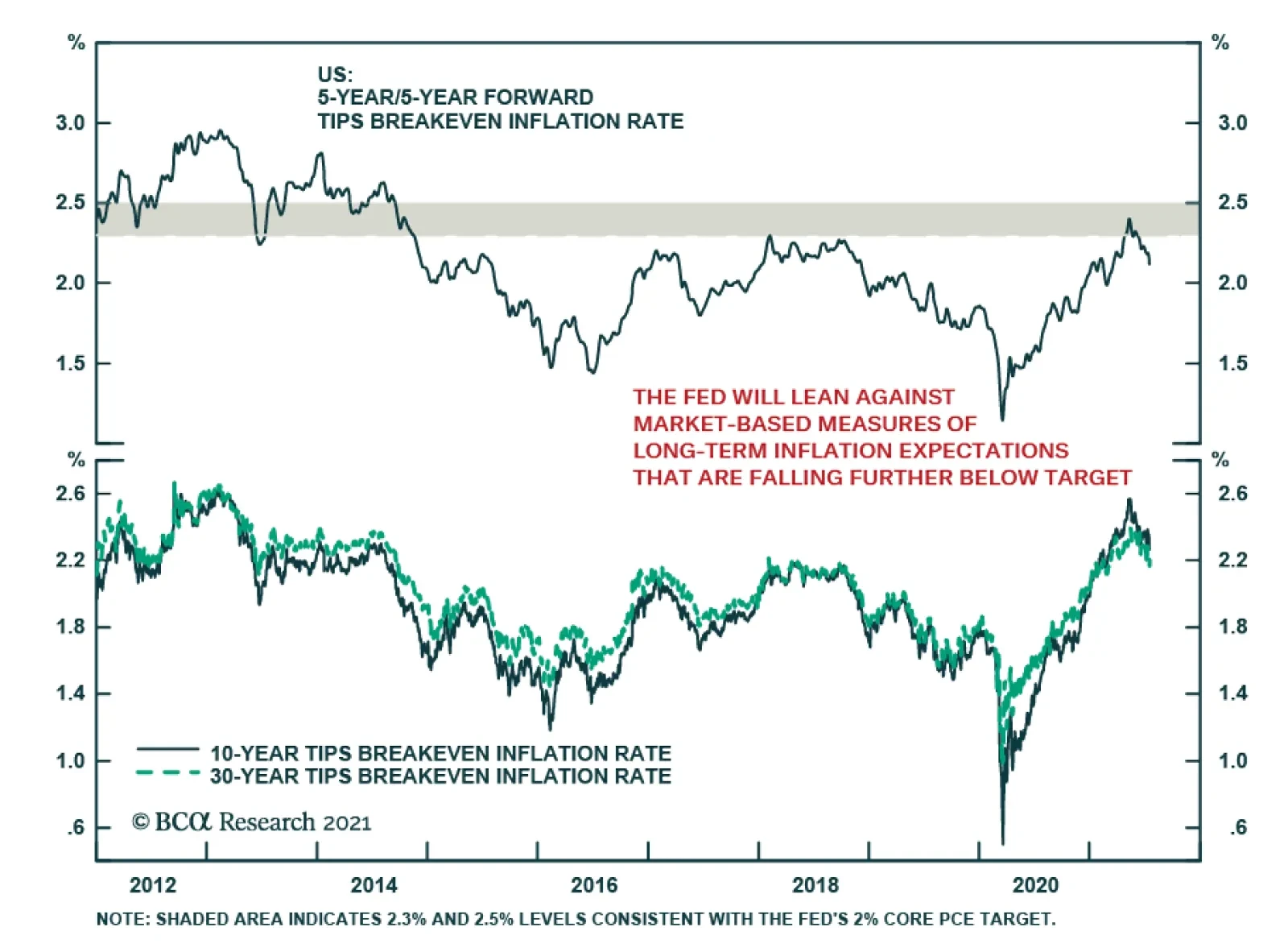
After rising to levels consistent with the Fed’s 2% core PCE target in May and June, the 5-year/5-year forward TIPS breakeven inflation rate has continued to decline, falling further below the Fed’s target zone. On Monday, this market-based measure of…
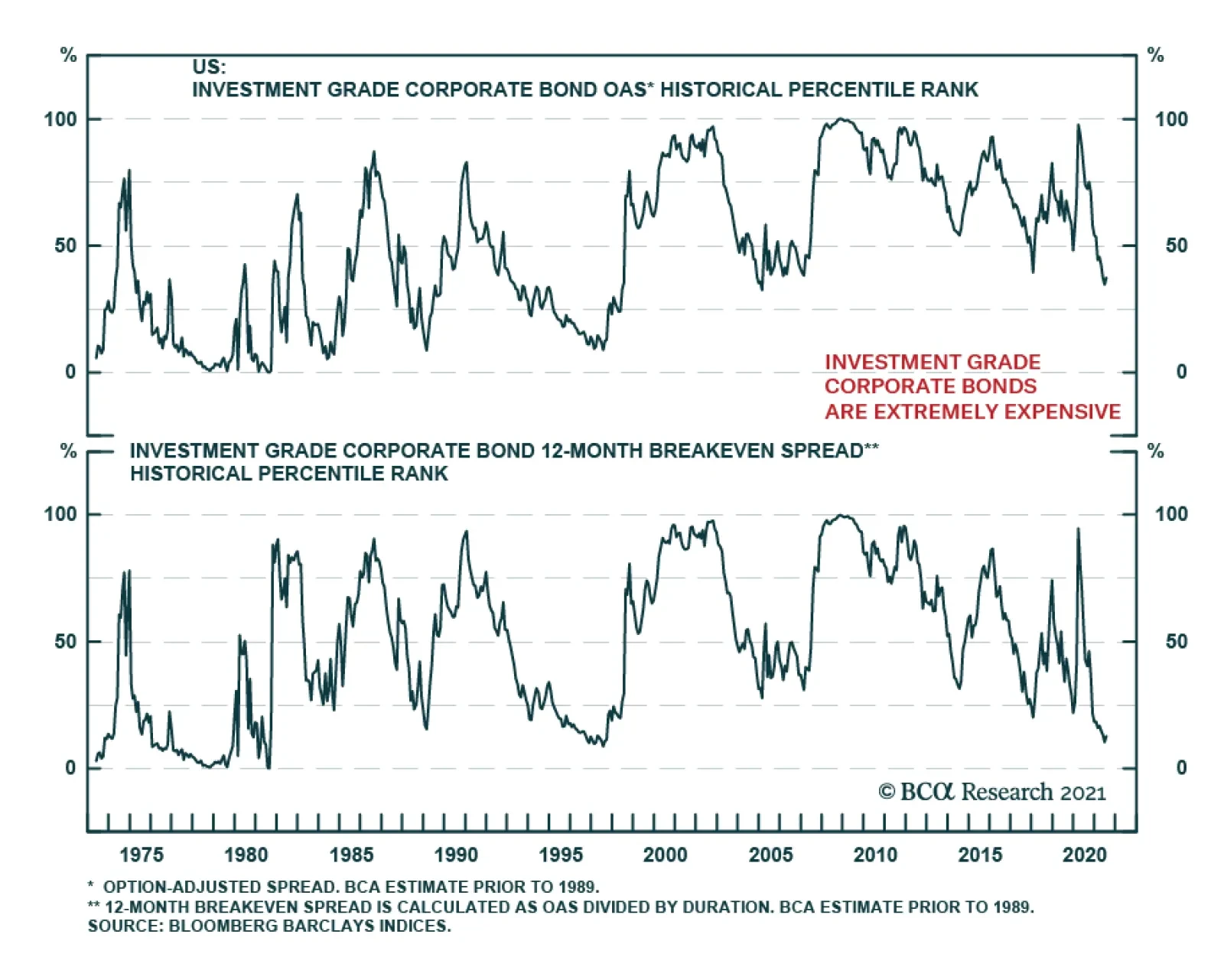
The credit risk premium in US bonds has shrunk considerably during the past 16 months. While BCA Research’s US Bond Strategy service doesn’t foresee a period of significant spread widening any time soon, lower spreads mean lower excess corporate bond returns.…
Highlights Metals prices are likely to suffer in the short term on the back of weakening Chinese demand and fading inflationary pressures. Accordingly, in our most recent Global Asset Allocation (GAA) Quarterly Outlook, we downgraded the AUD to underweight against the greenback. Bond yields, globally, are bound to rise moderately over the course of the coming 12 months. Australian yields, however, are likely to rise slower than those in the US. The RBA has been explicit in communicating what it would take to adjust its policy stance and is likely to lag behind other central banks in DM. We therefore recommend investors favor Australian government bonds in a global bond portfolio. Australian equities, now dominated by Financials rather than the Materials sector, would benefit from a rise in bond yields. However, a weaker AUD and declining metal prices warrant no more than a benchmark exposure to Australian equities within a global equity portfolio. Introduction Recently, clients have often been asking about Australia. The reasons seem clear. With a potential commodities “super-cycle” driven by a shift to renewable energy and electric vehicles (EVs), both the Australian economy and equities should be in a position to benefit. The reality, however, has been much less positive. Particularly the divergence between the core driver of the Australian market, industrial metals, and the performance of both equities and the currency over the past few years has been a concern (Chart 1). Over the past year and a half, Australian equities have underperformed the MSCI ACWI by 12.4% (Chart 2, panel 1). This underperformance was mainly due to the outperformance of the US. However, even against global markets excluding the US, Australian equities did not match the rise in commodity prices – particularly industrial metals (Chart 2, panel 2). Chart 1Despite The Rise In Metals Prices...
Despite The Rise In Metals Prices...
Despite The Rise In Metals Prices...
Chart 2...Australian Equities Have Not Outperformed
...Australian Equities Have Not Outperformed
...Australian Equities Have Not Outperformed
Chart 3Financials Dominate Australian Equities
Financials Dominate Australian Equities
Financials Dominate Australian Equities
The structure of the Australian market has changed over the past few years. The commodities boom and subsequent global liquidity boom over the past two decades have fueled a housing bubble in Australia and an unsustainable rise in household debt. As a result, Australian equities are no longer dominated by metals and mining stocks, but rather by banks (Chart 3). We structured this Special Report in a Q&A format, answering questions we think are most relevant for investors to assess both the short- and long-term outlook for Australia. We aim to provide an overview of the economy and draw some conclusions on how investors should be positioned. Our conclusions are as follows: Over the past year and a half, the Australian economy has shown how complementary actions between fiscal and monetary policy, as well as social restriction measures, can mitigate both economic and human damage. The Reserve Bank of Australia (RBA) will be in no rush to adjust its policy stance until wage growth is back to its 3% target. However, RBA officials risk running the economy hot in the meantime given that measures of employment are back to their pre-pandemic levels. The RBA is not likely to change its policy stance before reaching its wage growth and inflation targets and will probably lag behind other global central banks in tightening. In that case, investors should favor Australian government bonds in a global bond portfolio. Australian banks remain well-funded and in good health. But their excessive exposure to the housing sector puts them at grave risk if home prices collapse. Despite this, there seems to be a feedback loop where a decline in mortgage rates fuels further demand for loans, pushing up home prices. A slowdown in Chinese credit growth and economic activity will hamper commodity demand, weighing down on Australian equities. The longer-term outlook remains compelling for Australian equities and metals as we enter into a new commodities “supercycle” fueled by a transition to renewable and alternative energy. The Australian economy stands to benefit given that the country has high levels of both production and reserves of the minerals needed for this transition. Q: How Does The Economy Look In The Short-Term? A: Australia can be regarded as one of the few countries that successfully navigated the pandemic with a minimal amount of damage, both to its population and economy. With swift measures to limit travel and implement social restrictions, the spread of the outbreak was curtailed to slightly over 30,000 total cases, representing only 0.12% of its population (Chart 4). On the other hand, its vaccination campaign has been much slower (at 38 doses administered per 100 people) than in other DM economies such as the US, UK, France, or Germany with 100, 120, 90, and 102 doses per 100 people, respectively. In the short term, this might not seem particularly damaging to the economy. However, if vaccination rates do not pick up rapidly, Australia’s international travel restrictions (which cannot sustainably be kept in place) will hamper economic growth and become a major drag on the tourism and education sectors (Chart 5, panels 1 & 2). Chart 4Government Policies Contained The Pandemic Outbreak...
Government Policies Contained The Pandemic Outbreak...
Government Policies Contained The Pandemic Outbreak...
Chart 5...At The Expense Of Tourism
...At The Expense Of Tourism
...At The Expense Of Tourism
Ample fiscal support – in the form of wage subsidies and business support through the JobKeeper program – mitigated the shortfall in household incomes (Chart 6). This provided a boost to both consumers and businesses with Q1 GDP growth coming in at 1.8% quarter-on-quarter (7.4% annualized). GDP expectations for the remainder of this year and next show a resilient strong momentum for Australian growth and domestic demand (Chart 7). Chart 6Fiscal Stimulus Supported Employment...
A Deeper Dive Into The Land Down Under
A Deeper Dive Into The Land Down Under
Chart 7...And Overall Growth
...And Overall Growth
...And Overall Growth
Chart 8Labor Market Back To Pre-Pandemic Levels...
Labor Market Back To Pre-Pandemic Levels...
Labor Market Back To Pre-Pandemic Levels...
The labor market recovery has been an excellent example of how fiscal support and lockdown measures complement each other. Most employment indicators have almost recovered or surpassed their pre-pandemic levels: The unemployment rate stands at 4.90%, compared to 5.13%, the underemployment rate is at 7.44%, compared to 8.60%. The total number of those employed is now above its pre-pandemic level, albeit still below the 2018-2019 growth trend (Chart 8). Q: When Will The RBA Shift Its Policy Stance? A: The RBA has been explicit in communicating that changes in its policy stance hinge on Australian wage growth rising sustainably towards 3% – a level last reached in Q1 2013. Even with economic activity mostly restored, wage growth remains low at 1.49% (Chart 9). Our belief is that until that occurs, the RBA will probably maintain its accommodative stance. Our global fixed-income strategists, in a recent report, highlighted their belief that the RBA is likely to be less hawkish than markets currently expect – on both tapering and hiking rates. We agree with that assessment. Comments by RBA Governor Lowe earlier last month back our dovish belief: He stated that “The Board is committed to maintaining highly supportive monetary conditions to support a return to full employment in Australia and inflation consistent with the target…This is unlikely to be until 2024 at the earliest”. Market expectations nevertheless remain much more hawkish – pointing to a first rate hike by mid 2022 and almost 70 basis points of hikes by 2024 (Chart 10). Chart 9...However Wage Growth Remains Muted
...However Wage Growth Remains Muted
...However Wage Growth Remains Muted
Chart 10Market Expects A Hawkish RBA...
Market Expects A Hawkish RBA
Market Expects A Hawkish RBA
Chart 11...And Is Already Pricing That Down The Curve
...And Is Already Pricing That Down The Curve
...And Is Already Pricing That Down The Curve
Chart 12Inflation Remains Well-Below The RBA's Target
Inflation Remains Well-Below The RBA's Target
Inflation Remains Well-Below The RBA's Target
This means that the RBA will probably risk running the economy hot for a while. With total employment back to its pre-pandemic level and other employment indicators closely behind, inflationary pressures, sooner or later, will begin to mount. Higher growth prospects and inflation risks are being discounted further down the curve (Chart 11). The June CPI print is likely to reflect a transitory short-term base effect and the RBA is mostly going to see through that. In the meantime, we would watch other broad inflation indicators to gauge for price pressures. Broader measures such as the trimmed-mean inflation index or median inflation remain subdued at 1.1% and 1.3%, respectively. The 10-year breakeven rate currently stands at 2.1%, within the RBA’s range of 2%-3%, highlighting the market’s belief that long-term inflation remains well under control (Chart 12). Bottom Line: The RBA is likely to maintain its dovish stance for longer than the market expects. A return to sustainable levels of wage growth and inflation will remain the top objectives and it is unlikely that policy will be reversed before they are achieved. Our global fixed-income strategists laid out a checklist of what would make the RBA turn less dovish. So far, only 1 out of 5 items on their list (the recovery in private-sector demand) signals the need for a more hawkish stance. The remaining items signal no imminent pressure on the RBA to adjust policy (Table 1). The RBA is also wary of the currency appreciating if it took a more hawkish stance ahead of other central banks (e.g., the Fed) and is therefore likely to switch policy only after other central banks do so (Chart 13). Accordingly, investors should favor Australian government bonds within a global bond portfolio. Table 1RBA Checklist
A Deeper Dive Into The Land Down Under
A Deeper Dive Into The Land Down Under
Chart 13The RBA Will Be Wary Of A Rising AUD
The RBA Will Be Wary Of A Rising AUD
The RBA Will Be Wary Of A Rising AUD
Q: Are There Signs Of Improvement In The Banking Sector? A: Headline indicators of the health of the Australian banking sector paint a picture of a well-capitalized, highly funded, and profitable industry. Return on equity (ROE) has averaged 12.1% over the past decade. Capital adequacy and Tier 1 capital ratios stand at 14.5% and 18.2%, respectively – much higher than at the start of the Global Financial Crisis (GFC). The ratio of non-performing loans remains low and Australian banks’ reliance on leverage has also decreased (Chart 14). Chart 14Banks Look Healthy...
Banks Look Healthy...
Banks Look Healthy...
Chart 15...But Remain Exposed To The Housing Sector...
...But Remain Exposed To The Housing Sector
...But Remain Exposed To The Housing Sector
However, these indicators mask a major underlying risk. Banks remain heavily exposed to the housing market, with housing loans as high as 62% of banks’ gross outstanding loans and 40% of total assets (Chart 15, panel 1). Over the past decade and a half, banks have lent an average of A$56 of housing-related loans for every A$100 in total loans (Chart 15, panel 2). Chart 16...Which Is Showing No Signs Of Slowing Down
...Which Is Showing No Signs Of Slowing Down
...Which Is Showing No Signs Of Slowing Down
Chart 17Households Remain Heavily Indebted
Households Remain Heavily Indebted
Households Remain Heavily Indebted
With interest rates falling over the past few decades, construction activity has boomed. Consequently, the demand for loans for new homes has been rising, leading home prices higher (Chart 16). This also meant that household debt levels have climbed and currently standing at a staggering 130% of GDP and 180% of disposable income (Chart 17). So what does this mean for banks’ stock prices? The short answer is that absent a bursting of the bubble in house prices, banks should continue to fare well. Interestingly, the long-standing relationship between bond yields and banks’ relative stock price returns – one that works in other financial-heavy markets such as the euro area – did not hold in Australia, at least until recently. In fact, we find that, historically, Australian banks outperformed the broad market when bond yields were falling. This relationship changed post-GFC, most likely when inflation expectations became unanchored and trended lower – reflecting lower commodity prices (Chart 18). Bottom Line: Rising rates, reflecting better growth prospects and higher long-term inflation, should be a tailwind for bank stocks in the short term. Accommodative monetary policy will spur activity in the property market, propping up bank profits. This, however, puts banks at even greater risk when profitability starts to decline, NPLs rise and regulations tighten further. The latter risk is one we would highlight following RBA deputy governor Guy Debelle’s statement that monetary policy will not be used as a tool to curtail housing prices and that there are other tools to address that issue. Chart 18Rising Yields Will Be A Tailwind For Australian Equities
Rising Yields Will Be A Tailwind For Australian Equities
Rising Yields Will Be A Tailwind For Australian Equities
Q: How Does Chinese Policy Impact Australian Growth? A: China's role in global supply chains, as both a producer and consumer, has increased dramatically since the early 2000s. China’s demand for commodities generally and industrial metals in particular has grown over the past two decades from an average of 10% of total global demand to 50% for most metals (Chart 19). Australia stood to benefit, redirecting more and more of its metals’ production away from the rest of the world and towards China. For example, during the same period, the share of Australian iron ore exports to China increased fourfold (Chart 20). Chart 19China Is A Major Consumer Of Metals...
China Is A Major Consumer Of Metals...
China Is A Major Consumer Of Metals...
Chart 20...And This Has Benefited Australia Over The Past Two Decades
...And This Has Benefited Australia Over The Past Two Decades
...And This Has Benefited Australia Over The Past Two Decades
However, this dynamic leaves the Australian economy very exposed to the Chinese business cycle – one that is heavily reliant on policymakers’ decisions on how much liquidity to inject into the economy. After strong credit and fiscal support throughout 2020, the Chinese authorities – wary of excessive leverage in the economy – have begun paring back stimulus which is likely to lead to weaker growth in the second half of the year and put downward pressure on metal demand (Chart 21). Chart 21Weakening Chinese Demand Will Hurt Metals In The Short-Term
Weakening Chinese Demand Will Hurt Metals In The Short-Term
Weakening Chinese Demand Will Hurt Metals In The Short-Term
Heightened political tensions between Australia and China have also played a role. China recently imposed restrictions, including additional tariffs and bans, on Australian imports such as beef, wine, coal, and other goods. Consequently, Australian exports to China slowed. However, the goods not imported by China were absorbed by other economies – Australian export growth did not fall that much. It is unlikely that a new commodity-heavy marginal buyer will emerge in the short-term to replace Chinese demand. The recent rise in commodity prices reflected a return to economic activity, as well as inflationary fears, and supply, shipping, and logistical backlogs. These will ease in the short term, weighing on both the AUD and Australian equities. Q: Can The Shift To Renewable Energy Spur Future Australian Growth? A: The shift to renewable energy and electrification – particularly in the transport sector – will occur sooner rather than later. Some commodity-exporting countries stand to benefit, and Australia is likely to be one. We previously highlighted that modeling longer-term demand is tricky since it relies on assumptions for the emergence of new technologies, metals’ efficiency and recycling rates, and the rate of conversion to renewables. Chart 22The Shift To Renewables Will Require More Resources...
A Deeper Dive Into The Land Down Under
A Deeper Dive Into The Land Down Under
The mechanics of the future demand/supply relationship hinge on the following: Demand will rise during this energy transition period – simply due to the fact that the new clean energy systems require more minerals (such as copper and zinc) than the current traditional hydrocarbon-fueled energy system (Chart 22, panel 1). Electric vehicles (EVs) require about four and a half times more of certain commodities – particularly copper, nickel, and graphite – than conventional vehicles do (Chart 22, panel 2). Supply limitations, on the other hand, are what might propel metal prices even higher and lead the world economy into a new commodities “supercycle”. A study by the Institute for Sustainable Futures has shown that, in the most positive energy transition scenarios, demand for some metals will exceed supply, in terms of both available resources and reserves (Table 2). Table 2...Which Are Likely To Be In Short Supply
A Deeper Dive Into The Land Down Under
A Deeper Dive Into The Land Down Under
For some of those metals, Australia is either among the top producers, or has the largest reserves. For example, Australia produces almost 45% and 12% of the world’s lithium and zinc, and has 22% and 27% of the world’s reserves. Looking at other metals, supply disruptions – particularly in economies where political, social, and environmental influences are an issue – might be the driver of further price rises. For example, Chile has the largest shares of global lithium reserves (~44%), and copper reserves (~23%), while South Africa has the largest share of global manganese reserves (~40%). Bottom Line: The transition to renewable energy is already underway and is likely to intensify. Forecast demand should outstrip supply and Australia stands to benefit given its large share of current production and/or reserves. How much will depend on the pace of renewable energy integration but miners are likely to be long-term winners. Q: What Is The Outlook For The AUD? A: The Global Asset Allocation (GAA) service, in its latest Quarterly Outlook, turned negative on the AUD. The currency has historically had a high positive correlation with commodity prices and industrial metals prices, which in turn are very sensitive to Chinese demand (Chart 23). Given our outlook for metals in the short term (falling demand driven by slowing Chinese activity), we expect some weakening in the AUD over the coming 9-to-12 months (Chart 24). Chart 23The AUD Is Highly Correlated To Metal Prices...
The AUD Is Highly Correlated To Metal Prices...
The AUD Is Highly Correlated To Metal Prices...
Chart 24...Which In Turn Are Highly Correlated To Chinese Activity
...Which In Turn Are Highly Correlated To Chinese Activity
...Which In Turn Are Highly Correlated To Chinese Activity
Additionally, short-term weakness in the economy, caused by further lockdowns as Delta-variant COVID cases rise, is a risk since it might reduce domestic demand. From a valuation perspective, the AUD is slightly below its fair value (Chart 25). However, this on its own does not compel us to remain positive on the currency. We also consider other indicators such as investor positioning – which has reached a decade high, according to Citibank’s FX Positioning Alert Indicator (PAIN) (Chart 26). This indicator suggests that active FX traders hold substantial long positions in the AUD against the USD. Historically, this indicator has provided contrarian signals, with extreme optimism (pessimism) providing useful short (long) signals. Chart 25The AUD Is Close To Fair Value
The AUD Is Close To Fair Value
The AUD Is Close To Fair Value
Chart 26Investors Are Long The AUD
Investors Are Long The AUD
Investors Are Long The AUD
Bottom Line: Short-term weakness in the economy and a reversal in metal prices warrant caution on the currency. While valuations do not signal overbought conditions, investor positioning (a contrarian indicator) does. Q: How Should Equity Investors Be Positioned? A: Our recent Special Report on whether country or sector effects drive equity performance showed that sector composition was relatively important in Australia, given the large difference in sector weightings relative to the global benchmark. Our analysis showed that cumulative Australian sector performance over the past two decades detracted from overall returns (Chart 27). Given that framework, and the relationship between the Australian economy and industrial metals, we find that Australian equity performance relative to the US mirrors the performance of global metal and mining relative to global tech stocks (Chart 28). This underperformance makes sense: Commodity prices have been in a structural downtrend throughout the past decade. Chart 27Country Vs Sector Effect
Country Vs Sector Effect
Country Vs Sector Effect
Chart 28Australia / US = Metals / Tech
Australia / US = Metals / Tech
Australia / US = Metals / Tech
Therefore, given our view of the outlook for metals, we would not want to shun Australian equities. The Global Asset Allocation (GAA) service is currently neutral the Australian market within a global equity portfolio, and underweight the Materials sector over the next 12 months. We believe this positioning makes sense given the slowdown in the Chinese economy and the improbability that another country will emerge as the alternative marginal buyer of commodities. The longer-term outlook is more compelling however, as the shift to decarbonization, renewables, and alternative energy gets underway. Conclusions In the short term metals prices are likely to suffer on the back of weakening Chinese demand (with no immediate substitute as a marginal buyer) as well as fading inflationary fears and an easing of supply/logistical issues. Our analysis shows that sector composition is a larger driver of Australian equity relative performance than country composition. While Australian equities – dominated by Financials – would benefit from a moderate rise in global bond yields, yields will rise more slowly in Australia than in the US and the AUD is likely to weaken. Over the next 12 months, investors should remain neutral on Australian equities within a global equity portfolio. The RBA is likely to lag other central banks in tightening policy. Investors should therefore favor Australian government bonds over other developed economies such as the US and Canada. Amr Hanafy, Senior Analyst Global Asset Allocation amrh@bcaresearch.com
Highlights Spread Product: The credit risk premium has shrunk considerably during the past 16 months. While we don’t foresee a period of significant spread widening any time soon, lower spreads mean lower excess corporate bond returns. We recommend three ways for investors to grab extra spread and increase their excess corporate bond returns: (i) move down in quality, (ii) extend maturity, (iii) favor high-DTS industry groups. Corporate Bond Sectors: High-DTS industry groups like Energy, Communications, Utilities and Basic Industry offer the best risk-adjusted spread pick-up within both investment grade and junk bonds. Consumer Noncyclicals and Transportation also look attractive within high-yield. Municipal Bonds: Investors can increase the average after-tax yield of their bond portfolios without taking greater credit or duration risk by favoring long-maturity tax-exempt municipal bonds (both GO and Revenue). EM Bonds: Investors can increase the average yield of their US bond portfolios by shifting out of investment grade US corporates and into USD-denominated EM Sovereign and Corporate bonds. Feature US bond yields have been on a wild ride since the pandemic struck in March 2020. The 10-year Treasury yield collapsed to 0.52% last year. It then rebounded to a high of 1.74% in March 2021 before falling back to its current 1.21%. But throughout all this volatility in rates markets, the steady outperformance of credit risk has been a constant. For the past 16 months, accommodative monetary policy has spurred a steady flow of investment into spread product, a trade that was amplified by the Fed’s extraordinary intervention in the corporate bond market. On March 23rd 2020, the Fed essentially announced a back-stop of the corporate bond market that gave investors the green light to pile into the sector. Since then, the investment grade corporate bond index has outperformed a duration-matched position in Treasury securities by 24% and the high-yield index has outperformed by 39%. Of course, the result of this consistent flow of funds into spread product has been a collapse in credit spreads. The average spread on the investment grade corporate bond index is only slightly below its post-1973 median, but it is at its tightest level since the mid-1990s (Chart 1). When we adjust for the fact that the index’s average duration has increased significantly since the 1970s, we find that the spread has only been tighter 13% of the time since 1973 (Chart 1, bottom panel). What’s more, this analysis doesn’t control for the fact that the average credit rating of the index has fallen significantly during the past few decades. In short, investment grade corporate bonds are extremely expensive and are quite possibly the most expensive they have ever been in risk-adjusted terms. Chart 1Investment Grade Corporate Bond Valuation
Investment Grade Corporate Bond Valuation
Investment Grade Corporate Bond Valuation
How should bond investors proceed in this environment? Of course, tight credit spreads will cause us to exit our recommended spread product overweight earlier in the cycle than would otherwise be the case. But for the time being, we still see quite a bit of life left in credit markets. We showed in a recent report that corporate bond excess returns tend not to turn negative until the 3/10 Treasury slope is below 50 bps, even during periods when credit spreads are tight.1 At 88 bps, the slope still has a ways to go before breaching that threshold. In the meantime, we advise investors to run high levels of credit risk in their bond portfolios, grabbing attractive risk premiums where they can be found. As for what investors can do to find attractive risk premiums, we have a few suggestions. Move Down In Quality The most obvious way to add spread to a bond portfolio is to move down in quality. Charts 2A-2E show the extra spread that can be picked up by moving down one credit tier at a time. We show both the raw spread pick-up since 1995 and the spread pick-up after adjusting for duration risk (i.e. the 12-month breakeven spread). The additional spread on offer for moving out of Aa-rated bonds and into A-rated bonds is currently 17 bps, very low compared to history (Chart 2A). The extra compensation looks a little better after adjusting for duration risk (Chart 2A, bottom panel), but it is still well below its historical mean. Similarly, investors only earn an additional 38 bps by moving out of A-rated bonds and into Baa-rated bonds (Chart 2B). This is very low compared to history and it looks even worse in duration-adjusted terms (Chart 2B, bottom panel). A move down in quality within the investment grade space may still be worth it, even though the reward for doing so is meager in historical terms. However, investors can get much more bang for their buck by moving out of investment grade entirely and into junk bonds. The additional spread earned in Ba-rated bonds compared to Baa-rated bonds (130 bps) is below its historical average, but it has been much lower in the recent past (Chart 2C). This is also true in duration-adjusted terms (Chart 2C, bottom panel). A move out of Ba-rated bonds and into B-rated bonds looks even better (Chart 2D). Yes, the raw 116 bps spread pick-up in the B-rated index compared to the Ba-rated index is well below its historical mean, but after adjusting for the lower duration of the B-rated index we see that the duration-adjusted spread pick-up in B-rated bonds is above its average historical level (Chart 2D, bottom panel). Finally, we observe that investors earn an extra 159 bps by moving out of the B-rated sector and into the Caa-rated sector (Chart 2E). This is extremely low compared to history, but it looks considerably more appealing in duration-adjusted terms (Chart 2E, bottom panel). All in all, we think it makes sense for investors to grab extra spread by moving down the quality ladder. In particular, investors should favor high-yield bonds over investment grade and focus on the B-rated credit tier where the duration-adjusted spread is most attractive. Chart 2AA Versus Aa
A Versus Aa
A Versus Aa
Chart 2BBaa Versus A
Baa Versus A
Baa Versus A
Chart 2CBa Versus Baa
Ba Versus Baa
Ba Versus Baa
Chart 2DB Versus Ba
B Versus Ba
B Versus Ba
Chart 2ECaa Versus B
Caa Versus B
Caa Versus B
Extend Maturity As an alternative to moving down in quality, investors can also increase the average spread of their credit portfolios by extending maturity within corporate bonds. Compared to history, we find that long maturity investment grade and junk bonds offer above-average compensation relative to their shorter-maturity counterparts (Chart 3A). Of course, implementing this trade means either taking more duration risk in your portfolio or offsetting the increased duration on the credit side by taking less duration risk within your government bond holdings. It’s also worth mentioning that extending maturity within corporate credit is rarely, if ever, an attractive proposition in risk-adjusted terms. The spread per unit of duration for long-maturity corporates is almost always below that of short-maturity corporates (Chart 3B). However, this risk-adjusted spread differential tends to be highest when overall corporate bond spreads are tight. In other words, it is during periods of expensive corporate bond valuations, like today, when it makes most sense to extend maturity within corporate bond portfolios. Chart 3ASpreads: Long Versus Short
Spreads: Long Versus Short
Spreads: Long Versus Short
Chart 3BRisk-Adjusted Spreads: Long Versus Short
Risk-Adjusted Spreads: Long Versus Short
Risk-Adjusted Spreads: Long Versus Short
Favor High-Beta Sectors Finally, investors can chase better returns within the corporate bond space by favoring those industry groups with the highest Duration-Times-Spread (DTS). DTS functions as a rough proxy for corporate bond excess return volatility. In other words, bonds with high (low) DTS tend to perform best during periods of spread tightening (widening) and worst during periods of spread widening (tightening). We can also look at the correlation between DTS and excess returns to get a sense of the excess return earned by taking an extra unit of DTS risk. For example, Chart 4A shows annualized excess returns for the 10 major investment grade industry groups relative to starting DTS for the period that ran from the March 23rd 2020 peak in spreads until the end of last year. The slope of the trendline is 79 bps, meaning that investors earned 79 bps of extra return for taking one extra unit of DTS risk. Notably, this credit risk premium fell to 35 bps per unit of DTS risk this year (Chart 4B), as tighter spreads led to a lower realized credit risk premium. Chart 4AInvestment Grade Credit Risk Premium: March 23 2020 To Dec 31 2020
The Collapsing Credit Risk Premium
The Collapsing Credit Risk Premium
Chart 4BInvestment Grade Credit Risk Premium: Year-To-Date
The Collapsing Credit Risk Premium
The Collapsing Credit Risk Premium
Interestingly, we don’t observe the same declining credit risk premium in high-yield. Investors earned 95 bps per unit of DTS risk between March 23rd 2020 and Dec 31st 2020 (Chart 4C), but they have earned an even greater 98 bps per unit of DTS risk so far this year (Chart 4D). The steeper line is mostly due to the Energy sector that has delivered strong excess returns and that continues to offer an enticing spread in both absolute and risk-adjusted terms. Chart 4CHigh-Yield Credit Risk Premium: March 23 2020 To Dec 31 2020
The Collapsing Credit Risk Premium
The Collapsing Credit Risk Premium
Chart 4DHigh-Yield Credit Risk Premium: Year-To-Date
The Collapsing Credit Risk Premium
The Collapsing Credit Risk Premium
The next section of this report dives into the relative attractiveness of different corporate bond industry groups. For now, we just want to stress that it makes sense for credit investors to increase their spread pick-up by favoring those industry groups with the highest DTS. Bottom Line: The credit risk premium has shrunk considerably during the past 16 months. While we don’t foresee a period of significant spread widening any time soon, lower spreads mean lower excess corporate bond returns. We recommend three ways for investors to grab extra spread and increase their excess corporate bond returns: (i) move down in quality, (ii) extend maturity, (iii) favor high-DTS industry groups. Sector Opportunities The previous section recommended three ways to increase the spread pick-up within a corporate bond portfolio. In this section, we identify sectors that offer attractive spreads in risk-adjusted terms. That is, we are looking for attractive spreads relative to other fixed income sectors with similar duration and credit rating. We specify three opportunities: 1. Corporate Bond Industry Groups Chart 5 plots a measure of risk-adjusted spread for each of the 10 major investment grade corporate bond industry groups relative to that industry group’s DTS. The risk-adjusted spread is the residual from a cross-sectional regression of sector spreads versus average credit rating and duration. The prior section noted that investors should favor high-DTS industry groups within investment grade corporate bonds, and Chart 5 reveals that those high-DTS sectors are also the most attractive in risk-adjusted terms. Energy, Utilities, Basic Industry and Communications all stand out as offering elevated risk-adjusted spreads. While the Transportation and Consumer Cyclical sectors offer low risk-adjusted spreads, the Airlines group within Transportation and the Lodging group within Consumer Cyclicals also stand out as being attractive.2 Chart 5Investment Grade Corporate Sector Valuation
The Collapsing Credit Risk Premium
The Collapsing Credit Risk Premium
Chart 6 shows the results of the same analysis performed on high-yield industry groups. Once again, we see that the high-DTS sectors look best in risk-adjusted terms. Communications, in particular, offers an extraordinarily high risk-adjusted spread that is driven by issuers in the Media: Entertainment and Wirelines sub-sectors. Overall, high-DTS industry groups like Energy, Communications, Utilities and Basic Industry offer the best risk-adjusted spread pick-up within both investment grade and junk bonds. Consumer Noncyclicals and Transportation also look attractive within high-yield. Chart 6High-Yield Corporate Sector Valuation
The Collapsing Credit Risk Premium
The Collapsing Credit Risk Premium
2. Long-Maturity Municipal Bonds Another opportunity to add risk-adjusted spread to a US bond portfolio lies in tax-exempt municipal bonds. In particular, investment grade rated tax-exempt municipal bonds at the long-end of the curve. Chart 7A shows the yield offered by the Bloomberg Barclays Municipal General Obligation (GO) index at different maturity points alongside the US Credit index yield that has the same credit rating and duration. The average credit rating for GO maturity buckets ranges from Aa1/Aa2 to Aa3/A1. Chart 7B translates the yields shown in Chart 7A into breakeven tax rates. That is, it shows the tax rate that would make an investor indifferent between owning the GO muni and the US Credit index. While the breakeven tax rates are quite high at the front-end of the curve, they fall dramatically as maturity is extended. The breakeven tax rate falls to 29% for the 8-12 year maturity bucket, 13% for the 12-17 year bucket and a mere 3% for 17-year+ maturities. In other words, any investor faced with a tax rate above 3% would be better off owning a long-maturity GO muni than a long-maturity US corporate bond. Chart 7AGeneral Obligation Munis Versus US Credit: Yields
The Collapsing Credit Risk Premium
The Collapsing Credit Risk Premium
Chart 7BGeneral Obligation Munis Versus US Credit: Breakeven Tax Rates
The Collapsing Credit Risk Premium
The Collapsing Credit Risk Premium
Charts 8A and 8B show the results of the same analysis performed for Municipal Revenue bonds relative to the US Credit index. All Revenue Muni maturity buckets have an average credit rating of Aa3/A1. We find that Revenue bonds look even more attractive than GO bonds, though once again the attractive yields are found at the long-end of the curve. The negative breakeven tax rate shown for the 22-year+ maturity bucket means that the muni bond actually offers a before-tax yield pick-up compared to the corporate credit. Chart 8ARevenue Munis Versus US Credit: Yields
The Collapsing Credit Risk Premium
The Collapsing Credit Risk Premium
Chart 8BRevenue Munis Versus US Credit: Breakeven Tax Rates
The Collapsing Credit Risk Premium
The Collapsing Credit Risk Premium
USD-denominated Emerging Market Sovereigns and Corporates Chart 9EM Sovereign And Corporate Spreads
The Collapsing Credit Risk Premium
The Collapsing Credit Risk Premium
Finally, as we noted in a recent report,3 USD-denominated Emerging Market (EM) Sovereign and Corporate bonds offer an attractive yield pick-up relative to US corporate credit. Chart 9 shows the spreads of both the EM Sovereign and EM Corporate indexes relative to duration and credit rating matched positions in the US Credit index. First, we observe that both indexes offer a significant yield advantage over the US Credit index across all investment grade credit tiers. Second, we also observe that EM Corporates look much more attractive than Sovereigns within the A and Baa credit tiers, but that Sovereigns have the advantage within the Aa credit tier. The elevated Aa Sovereign spread is the result of USD bonds issued by the UAE and Qatar that offer yields above 2%. Bottom Line: US bond investors can increase the average yield of their portfolios without taking greater credit or duration risk by focusing on high-DTS industry groups (Energy, Communications, Utilities, Basic Industry) within both investment grade and high-yield corporate bond indexes. This can also be achieved by shifting allocation into long-maturity tax-exempt municipal bonds (both GO and Revenue) and USD-denominated EM Sovereign and Corporate debt. Ryan Swift US Bond Strategist rswift@bcaresearch.com Footnotes 1 Please see US Bond Strategy Weekly Report, “The Post-FOMC Credit Environment”, dated June 29, 2021. 2 A version of this chart with all 40 industry groups can be found in our monthly Portfolio Allocation Summary. Please see US Bond Strategy Portfolio Allocation Summary, “On Track For 2022 Liftoff”, dated July 6, 2021. 3 Please see US Bond Strategy Weekly Report, “The Post-FOMC Credit Environment”, dated June 29, 2021. Recommended Portfolio Specification Other Recommendations
The Collapsing Credit Risk Premium
The Collapsing Credit Risk Premium
Treasury Index Returns
The Collapsing Credit Risk Premium
The Collapsing Credit Risk Premium
Spread Product Returns
The Collapsing Credit Risk Premium
The Collapsing Credit Risk Premium
BCA Research’s Global Investment Strategy service concludes that the forces pushing down bond yields will abate, with the US 10-year Treasury yield ultimately rising to 1.8%-to-1.9% by the end of the year. Three major factors account for the recent bout of…
Highlights Yield curves have flattened considerably in the major economies since April. Slowing global growth, the perception that the Fed is turning more hawkish, and technical factors have contributed to flatter yield curves. Looking out, we expect the forces pushing down bond yields to abate, with the US 10-year Treasury yield ultimately rising to 1.8%-to-1.9% by the end of the year. Shrinking output gaps, rebounding inflation expectations, and stepped-up Treasury issuance should all push yields higher. Higher yields will benefit bank shares at the expense of tech stocks. Investors should favor value over growth and non-US equities over their US peers. We are closing our long global energy stocks/short copper miners trade. In its place, we are opening a trade to go long the December 2022 Brent futures contract at a price of $66.50/bbl. Flatter Yield Curves Yield curves have flattened considerably in the major economies since April. The US 10-year yield has fallen to 1.31% (and was down to as low as 1.25% intraday last Thursday) from a recent peak of 1.74% on March 31st. The US 2-year yield has risen 7 bps over this period, which has translated into 50 bps of flattening in the 2/10 yield curve. The German bund curve has flattened by 20 bps, the UK curve by 28 bps, the Canadian curve by 52 bps, and the Australian curve by 57 bps. Even the Japanese yield curve has managed to flatten by 13 bps (Chart 1). Chart 1AYield Curves In The Major Economies Have Flattened Since April (I)
Yield Curves In The Major Economies Have Flattened Since April (I)
Yield Curves In The Major Economies Have Flattened Since April (I)
Chart 1BYield Curves In The Major Economies Have Flattened Since April (II)
Yield Curves In The Major Economies Have Flattened Since April (II)
Yield Curves In The Major Economies Have Flattened Since April (II)
Chart 2US Economic Surprise Index Is Near A Post-Pandemic Low
US Economic Surprise Index Is Near A Post-Pandemic Low
US Economic Surprise Index Is Near A Post-Pandemic Low
Three major factors account for the recent bout of yield-curve flattening: Slowing growth: Decelerating growth is usually accompanied by a flatter yield curve. Chinese growth peaked late last year. US growth peaked around March, with the Citi Economic Surprise Index falling to a post-pandemic low last week (Chart 2). European growth will peak over the course of this summer (Table 1). The emergence of the Delta variant has amplified growth concerns. Table 1Growth Is Peaking, But At A Very High Level
The Message From The Yield Curve
The Message From The Yield Curve
Fears that the Fed is turning more hawkish: About one-third of the flattening in the US yield curve occurred in the two days following the June FOMC meeting. The shift in the median Fed forecast towards a 2023 rate hike was interpreted by many market participants as a signal that the Fed was unwilling to tolerate a prolonged inflation overshoot (Chart 3). As a result, short-term rate expectations moved up while long-term rate expectations declined (Chart 4). Chart 3The Fed Dots Have Shifted Towards An Earlier Rate Hike
The Message From The Yield Curve
The Message From The Yield Curve
Chart 4Markets Saw The June FOMC Meeting As A Turning Point
Markets Saw The June FOMC Meeting As A Turning Point
Markets Saw The June FOMC Meeting As A Turning Point
Chart 5Treasury Cash Balances Are Declining
Treasury Cash Balances Are Declining
Treasury Cash Balances Are Declining
Technical factors: Investors were positioned very bearishly on bonds earlier this year, helping to set the stage for a short-covering rally. Meanwhile, with yet another debt ceiling showdown looming in Congress, the Treasury department began to slash T-bill issuance, drawing on its cash balances at the Fed instead (Chart 5). Treasurys, which were already in short supply due to the Fed’s QE program, became even scarcer. All this happened at a time when seasonal factors normally turn bond bullish (Chart 6). Chart 6Seasonality In Markets
The Message From The Yield Curve
The Message From The Yield Curve
How these three factors evolve over the coming months will dictate the path of bond yields, with important implications for stocks and currencies. Let’s examine each in turn. Global Growth Will Slow, But Remain Firmly Above Trend Chart 7High Vacancies Suggest Strong Demand For Labor
High Vacancies Suggest Strong Demand For Labor
High Vacancies Suggest Strong Demand For Labor
While global growth will continue to decelerate, it will remain well above trend. This is important because ultimately, it is the size of the output gap that determines the timing and magnitude of rate hikes. In the US, the high level of job vacancies suggests that there is no shortage of labor demand (Chart 7). What is missing are willing workers. As we noted in our Third Quarter Strategy Outlook, labor shortages should ease in the fall as expanded unemployment benefits expire, schools reopen, and immigration picks up. The recent rapid decline in initial unemployment claims is consistent with an acceleration in job gains over the coming months (Chart 8). The share of small businesses planning to increase hiring also jumped in June to the highest level in the 48-year history of the NFIB survey (Chart 9). Chart 8Declining Unemployment Claims Point To Further Strong Employment Growth
Declining Unemployment Claims Point To Further Strong Employment Growth
Declining Unemployment Claims Point To Further Strong Employment Growth
Chart 9Small US Businesses Are Keen To Hire
Small US Businesses Are Keen To Hire
Small US Businesses Are Keen To Hire
Delta Risk In the US, 32,000 new Covid cases were reported on Wednesday. This pushed the 7-day average to 25,000, double the level it was the first week of July. According to the CDC, more than 90% of US counties with high case counts had vaccination rates below 40% (Map 1). As is in other countries, the highly contagious Delta variant accounts for the majority of new US infections. Map 1AUS Covid Vaccination Coverage
The Message From The Yield Curve
The Message From The Yield Curve
Map 1BUS Covid Infection Trends
The Message From The Yield Curve
The Message From The Yield Curve
Chart 10Vaccine Makers Are On Track To Produce Over 10 Billion Doses In 2021
The Message From The Yield Curve
The Message From The Yield Curve
The latest Covid wave will slow US economic activity, but probably not by much. The CDC estimates that over 99% of recent US Covid deaths have been among the non-vaccinated population. Vaccinated people have little to fear from the Delta strain and hence, will likely continue to go on with their daily lives. Non-vaccinated people, in most cases, are presumably not very concerned about contracting the virus, so they too will go on with their daily lives. Thus, it is difficult to see how the Delta strain will lead to major behavioral changes. And politically, it will be difficult for governments to legislate lockdowns when everyone who wants a vaccine has been able to receive one. Outside the US, the Delta strain will cause more havoc. Nevertheless, there is a light at the end of the tunnel. Globally, vaccine makers are set to produce over 10 billion doses this year (Chart 10). Many of these vaccines will make their way to emerging economies, which have struggled to obtain adequate supplies. That should help boost EM growth. China Policy Support Chinese retail sales, industrial production, and fixed asset investment all rose faster than expected in June. Yesterday’s solid activity data followed strong trade numbers released earlier this week. Chart 11Chinese Credit Growth Should Stabilize In The Second Half Of The Year
Chinese Credit Growth Should Stabilize In The Second Half Of The Year
Chinese Credit Growth Should Stabilize In The Second Half Of The Year
Chinese policy is turning more stimulative, which should continue to support growth. Effective this Thursday, the PBOC cut its reserve requirement ratio by 0.5 percentage points, releasing about RMB 1 trillion of liquidity into the banking system. It was the first such cut since April 2020. Total social financing, a broad measure of Chinese credit, rose by RMB 3.7 trillion in June, well above consensus estimates of RMB 2.9 trillion. Credit growth has fallen sharply since last October and is currently running near its 2018 lows (Chart 11). Looking out, Chinese credit growth should pick up modestly as local governments issue more debt. As of June, local governments had used only 28% of their annual bond issuance quota, compared with 61% over the same period last year and 65% in 2019. The proceeds from local government bond sales will likely flow into infrastructure spending, which has been tepid in recent years (Chart 12). Increased infrastructure spending will boost metals prices. With that in mind, we are closing our long global energy stocks/short copper miners trade for a gain of 8.5%. In its place, we are opening a trade to go long the December 2022 Brent futures contract at a price of $66.50/bbl. As Chart 13 shows, BCA’s Commodity and Energy service expects oil prices to keep rising in contrast to market expectations of a price decline. Chart 12China: Weak Infrastructure Spending Should Pick Up
China: Weak Infrastructure Spending Should Pick Up
China: Weak Infrastructure Spending Should Pick Up
Chart 13Oil Prices Have Further Upside
Oil Prices Have Further Upside
Oil Prices Have Further Upside
The Fed Will Stay Dovish Chart 14Excluding Pandemic-Affected Sectors, Core CPI Has Not Surged As Much As Headline Measures
Excluding Pandemic-Affected Sectors, Core CPI Has Not Surged As Much As Headline Measures
Excluding Pandemic-Affected Sectors, Core CPI Has Not Surged As Much As Headline Measures
Market participants overreacted to the shift in the Fed’s dot plot. The regional Fed presidents tend to be more hawkish than the Board of Governors. Jay Powell himself probably penciled in one hike for 2023. Lael Brainard, who may end up replacing Powell next year, likely projects no hikes for 2023. Granted, inflation has surged. The CPI rose 5.4% year-over-year in June, above expectations of 4.9%. Core CPI inflation clocked in at 4.5%, surpassing expectations of 4.0%. However, most of the increase in the CPI continues to be driven by a few pandemic-affected sectors. Excluding airfares, hotels, and vehicle prices, the core CPI rose by a modest 2.5% in June. The level of the CPI outside these pandemic-affected sectors is still below trend, suggesting little imminent need for monetary tightening (Chart 14). Many input prices have already rolled over (Chart 15). The price of lumber, which at one point was up 93% from the start of 2021, is now down for the year. Steel prices are well off their highs. So too are memory chip prices. Even used car auction prices are starting to decline (Chart 16). Chart 15Input Prices Have Rolled Over
Input Prices Have Rolled Over
Input Prices Have Rolled Over
Chart 16Used Car Prices Have Probably Peaked
Used Car Prices Have Probably Peaked
Used Car Prices Have Probably Peaked
Chart 17Both The Fed And Market Participants Have Revised Down Their Estimate Of The Neutral Rate Of Interest
Both The Fed And Market Participants Have Revised Down Their Estimate Of The Neutral Rate Of Interest
Both The Fed And Market Participants Have Revised Down Their Estimate Of The Neutral Rate Of Interest
Chart 18Inflation Expectations Have Fallen Back Below The Fed's Target Zone
Inflation Expectations Have Fallen Back Below The Fed's Target Zone
Inflation Expectations Have Fallen Back Below The Fed's Target Zone
Despite the widespread perception that US monetary policy is ultra-accommodative, current policy rates are only two percentage points below both the Fed’s and the market’s estimates of the terminal rate (Chart 17). Given the zero lower bound constraint on nominal policy rates, tightening monetary policy prematurely could be a grave mistake.Market-based inflation expectations are signaling the need for easier, not tighter, monetary policy. After rising earlier this year, the 5-year/5-year forward TIPS breakeven inflation rate has fallen back below the Fed’s comfort zone (Chart 18). It is highly unlikely that the Fed will commence tapering if long-term inflation expectations remain below target. More likely, the Fed will ramp up its dovish rhetoric over the coming months, allowing inflation expectations to recover. This should put some upward pressure on long-term bond yields. Technical Factors Are Turning Less Bond Friendly Chart 19Investors Were Heavily Short Bonds Earlier This Year
Investors Were Heavily Short Bonds Earlier This Year
Investors Were Heavily Short Bonds Earlier This Year
While seasonal factors should remain bond bullish over the remainder of the year, other technical factors are turning less supportive. Investors surveyed by J.P. Morgan increased duration exposure over the past four weeks, after having cut it to the lowest level since 2017 (Chart 19). Traders also cut short positioning on the 30-year bond by two-thirds from record levels. Treasury issuance should normalize by the fall. While the obligatory brinkmanship over the debt ceiling is likely to extend beyond the August 1st deadline, BCA’s chief political strategist Matt Gertken believes that Democrats will ultimately be able to raise the ceiling. Senate Democrats may end up using the reconciliation process to both raise the debt ceiling and pass President Joe Biden’s $3.5 trillion American Jobs and Families Plan with 51 votes along. They are also likely to move forward on passing Biden’s proposed $600 billion in traditional infrastructure, with or without Republican support. The combination of increased Treasury supply and more fiscal spending should translate into higher bond yields. Higher Bond Yields Favor Value Stocks We expect the US 10-year Treasury yield to move back up to 1.8%-to-1.9% by the end of the year. Bond yields in other markets will also rise, but less so than in the US, given the relatively “high beta” status of US Treasurys (Chart 20). In contrast to tech stocks, banks usually outperform when bond yields are rising (Chart 21). The recent pickup in US consumer lending should also help bank shares (Chart 22). Chart 20US Treasuries Have A Higher Beta Than Most Other Government Bond Markets
US Treasuries Have A Higher Beta Than Most Other Government Bond Markets
US Treasuries Have A Higher Beta Than Most Other Government Bond Markets
Chart 21Bank Shares Thrive In A Rising Yield Environment
Bank Shares Thrive In A Rising Yield Environment
Bank Shares Thrive In A Rising Yield Environment
Chart 22Recent Pickup In US Consumer Lending Will Help Bank Shares
Recent Pickup In US Consumer Lending Will Help Bank Shares
Recent Pickup In US Consumer Lending Will Help Bank Shares
Chart 23Outperformance Of Tech Stocks Not Backed By Trend In Earnings Estimates
Outperformance Of Tech Stocks Not Backed By Trend In Earnings Estimates
Outperformance Of Tech Stocks Not Backed By Trend In Earnings Estimates
Chart 24Non-US Stocks And Value Stocks Typically Perform Best When The Dollar Is Falling
Non-US Stocks And Value Stocks Typically Perform Best When The Dollar Is Falling
Non-US Stocks And Value Stocks Typically Perform Best When The Dollar Is Falling
It is worth noting that the outperformance of tech stocks over the past six weeks has not been mirrored in relative upward revisions to earnings estimates (Chart 23). Without the tailwind from relatively fast earnings growth, tech names will lag the market over the remainder of 2021. The US dollar usually weakens when growth momentum rotates from the US to the rest of the world, which is likely to occur in the second half of this year. A dovish Fed will put further downward pressure on the greenback. Non-US stocks and value stocks typically perform best when the dollar is falling (Chart 24). Peter Berezin Chief Global Strategist peterb@bcaresearch.com Global Investment Strategy View Matrix
The Message From The Yield Curve
The Message From The Yield Curve
Special Trade Recommendations
The Message From The Yield Curve
The Message From The Yield Curve
Current MacroQuant Model Scores
The Message From The Yield Curve
The Message From The Yield Curve
In lieu of next week’s report, I will be presenting the quarterly Counterpoint webcast titled ‘Where Is The Groupthink Wrong? And How To Profit From It.’ I do hope you can join. We will then take a summer break, so our next report will come out on August 5. Highlights The quantum theory of finance describes the strange quantum effects of ultra-low inflation, of ultra-low interest rates, and of ultra-low probabilities. The key finding of the quantum theory of finance is that when inflation and interest rates get ultra-low, inflation becomes completely insensitive to monetary policy, while risk-asset valuations become hyper-sensitive to monetary policy. The hyper-sensitivity of $500 trillion of global risk-assets to bond yields means that the ultimate low in the US T-bond yield is still to come. Given the hyper-sensitivity of equity valuations to bond yields and the demand for US assets during bond market rallies, it also means that the structural bull market in equities and the structural bull market in the US dollar are both still intact. Feature Feature ChartNear The Lower Bound In Bond Yields, Potential Losses Are Greater Than Potential Gains
Near The Lower Bound In Bond Yields, Potential Losses Are Greater Than Potential Gains
Near The Lower Bound In Bond Yields, Potential Losses Are Greater Than Potential Gains
When things get ultra-small, the laws of physics undergo a radical shift. Classical physics breaks down, and we must to turn to an alternative theory to explain and predict the physical world. That theory is the quantum theory of physics. In this updated Special Report we propose that, just as there is the quantum theory of physics, there is The Quantum Theory Of Finance. When inflation and interest rates get ultra-low, the laws of economics and finance undergo a radical shift. And we must turn to the alternative theory to explain and predict the economic and financial world. In the physical world, the allowable values of a physical system appear to be continuous, with all values permitted. In fact, the permitted values occur in discrete ‘quanta’. At ultra-small scales, these quantum effects become the dominant driver of physical systems and form the foundation of the quantum theory of physics. Likewise, in the economic and financial world of ultra-low inflation and interest rates, quantum effects become the dominant drivers of the system. These quantum effects take three forms: The quantum effects of ultra-low inflation. The quantum effects of ultra-low interest rates. The quantum effects of ultra-low probabilities. The Quantum Effects Of Ultra-Low Inflation Even though inflation is continuous mathematically, we do not perceive it as such psychologically. Instead we perceive inflation as ‘quantum states’ of either price stability or price instability. A recent IFO paper points out that households’ inflation perceptions are “more in line with the imperfect information view prevailing in social psychology than with the rational actor view assumed in mainstream economics.”1 And in Real-Feel Inflation: Quantitative Estimation of Inflation Perceptions, Michael Ashton confirms that “it would be challenging for a consumer to distinguish 1 percent inflation from 2 percent inflation – that fine of a gradation in perception would be extremely unusual to find.”2 There are several reasons why we perceive inflation imprecisely: We do not recognise quality change and substitution adjustments. We tend to feel inflation asymmetrically, noticing goods whose prices are rising, but noticing less goods whose prices are falling. This is the classic attribution bias: higher prices are inflation, lower prices are “good shopping.” Items whose prices are volatile tend to draw more attention, and give more opportunities for these asymmetries to compound. We notice the price changes of small, frequently purchased items more than the price changes of large infrequently purchased items. We perceive the cost of homeownership as the monthly mortgage payment, and not the imputed cost of owners’ equivalent rent (OER). Yet OER is the largest single item in the US core CPI basket, weighted at 30 percent. The result of these biases is that we perceive inflation intuitively, as a quantum state rather than as a precise number within a continuum. The quantum effects of ultra-low inflation mean that policymakers can take an economy from the state of price instability to the state of price stability, and vice-versa, but they cannot sustainably hit an arbitrary inflation target within the quantum state, such as 2 percent (Chart I-2). Chart I-2Mission Impossible: 2 Percent Inflation
Mission Impossible: 2 Percent Inflation
Mission Impossible: 2 Percent Inflation
The Quantum Effects Of Ultra-Low Interest Rates Policymakers accept that there exists an interest rate, at around -1 percent, below which there would be an exodus of bank deposits. Hence, this marks the lower bound of policy interest rates. When policy interest rates are at, or near, this lower bound, central banks can turn to a second strategy: they can promise to keep the policy rate ultra-low for an extended period. Thereby they can pull down the long bond yield towards the lower bound too. To do this, they must convince the market that their promise is genuine. Enter quantitative easing (QE) which, in the words of the ECB’s former Chief Economist Peter Praet, is nothing more than “a signalling channel which reinforces the credibility of forward guidance on (ultra-low) policy rates.” Once forward guidance plus QE has taken bond yields close to their lower bound, we start to see the quantum effects of ultra-low interest rates. Specifically, the bond investor is left with a highly asymmetric payoff – the bond price can fall much more than it can rise. Witness the performance of Swiss bonds through the past three years. The worst drawdowns have far exceeded the best gains (Feature Chart, Chart I-3 and Chart I-4). Chart I-3Swiss Bonds Offer Small Potential Gains...
Swiss Bonds Offer Small Potential Gains...
Swiss Bonds Offer Small Potential Gains...
Chart I-4...But Big Potential Losses
...But Big Potential Losses
...But Big Potential Losses
This asymmetric payoff is technically known as negative skew and it starts to take effect when bond yields decline to around 2 percent above their lower bound. So, if the lower bound for the 10-year T-bond yield is -0.5 percent, the negative skew in its payoffs would start to take effect at around 1.5 percent. One important implication of the quantum effect of ultra-low interest rates is that the asymmetry of bond payoffs becomes very similar to the asymmetry of equity and other risk-asset payoffs (Chart I-5). This is important because, as we describe in the next section, it is the skew of an asset’s payoff that establishes its absolute and relative riskiness. Chart I-5Equities Can Suffer Bigger Short-Term Losses Than Short-Term Gains (Negative Skew)
Equities Can Suffer Bigger Short-Term Losses Than Short-Term Gains (Negative Skew)
Equities Can Suffer Bigger Short-Term Losses Than Short-Term Gains (Negative Skew)
The Quantum Effects Of Ultra-Low Probabilities We are very bad at comprehending low probabilities. For example, we cannot distinguish a 1 in a 1000 risk from a 1 in a 100 risk, even though the second risk is ten times greater than the first. This is what Daniel Kahneman’s and Amos Tversky’s Nobel prize winning Prospect Theory called the ‘quantal effect’ of ultra-low probabilities. Kahneman and Tversky discovered that our fears and hopes come in quanta rather than in a continuum, with the result that we overweight the tail-events in a payoff distribution. “Because people are limited in their ability to comprehend and evaluate extreme probabilities, highly unlikely events are either ignored or over-weighted.” If the payoff distribution is symmetric, then our overweighting of the positive and negative tails cancels out, meaning there is no impact on the value of the payoff (Figure I-1). However, if the payoff distribution is skewed, then the longer tail dominates our perceived value of the payoff. Figure I-1In A Symmetric Payoff, We Overestimate The Big Gain And the Big Loss Equally, So It Cancels Out
The Quantum Theory Of Finance (Part 2)
The Quantum Theory Of Finance (Part 2)
A lottery payoff has an extreme positive skew. There exists a miniscule chance of winning a fortune. As we overweight this highly unlikely event, we overvalue the lottery ticket relative to its expected payoff (Figure I-2). And this explains the existence of the multi-billion dollar lottery industry. Figure I-2In A Positively-Skewed Payoff (Lottery), We Overestimate The Big Gain, So We Overpay
The Quantum Theory Of Finance (Part 2)
The Quantum Theory Of Finance (Part 2)
Conversely, the payoff from equities has a negative skew. As we overweight the tail-event of losing a lot of money, we undervalue this negatively skewed payoff (Figure I-3). In other words, we demand a higher return from a negatively skewed payoff relative to a symmetrical payoff, such as the payoff from bonds when yields are not ultra-low. And this explains the existence of the so-called ‘equity risk premium.’ Figure I-3In A Negatively-Skewed Payoff (Risk-Assets), We Overestimate The Big Loss, So We Demand A ‘Risk Premium’
The Quantum Theory Of Finance (Part 2)
The Quantum Theory Of Finance (Part 2)
Crucially though, at ultra-low bond yields – when both equity and bond payoffs carry the same negative skew – we no longer demand a higher return from equities versus bonds. As the equity risk premium compresses, the return demanded from equities and other risk-assets collapses to the ultra-low bond yield. Put another way, the valuation of risk-assets soars. The Quantum Theory Of Finance, The Past And The Future The key finding of the quantum theory of finance is this. When inflation and interest rates get ultra-low, inflation becomes completely insensitive to monetary policy, while risk-asset valuations become hyper-sensitive to monetary policy. This is the story of the past decade, and most likely the story of the coming years. For over a decade now, central banks have fixated on hitting their 2 percent inflation targets when the quantum effects of ultra-low inflation make such a target unachievable. In their misguided fixation, the unleashing of trillions of dollars of QE has taken bond yields to unprecedented lows which has driven risk-asset valuations to unprecedented highs, and made them hyper-sensitive to the slightest move in bond yields (Chart I-6 and Chart I-7). Chart I-6Real Estate Prices Have Massively Outperformed Rents
Real Estate Prices Have Massively Outperformed Rents
Real Estate Prices Have Massively Outperformed Rents
Chart I-7Equity Prices Have Massively Outperformed Profits
Equity Prices Have Massively Outperformed Profits
Equity Prices Have Massively Outperformed Profits
Yet to be clear, though policymakers cannot consistently hit the 2 percent inflation target, they could certainly take the economy back to price instability – if they pursued ultra-loose monetary policy combined with ultra-loose fiscal policy aggressively enough for long enough. But if a major economy were to take this road – intentionally or accidentally – the $500 trillion valuation of global risk-assets that is premised on ultra-low inflation and ultra-low interest rates would collapse. As we have previously written, this means that The Road To Inflation Ends At Deflation and the ultimate low in the T-bond yield is still to come. Alternatively, another deflationary shock could take us to this ultimate low in the T-bond yield more directly. Given the hyper-sensitivity of equity valuations to bond yields and the massive portfolio inflows into US assets during shocks, this also means that the structural bull markets in equities and the structural bull market in the US dollar are both still intact. Dhaval Joshi Chief Strategist dhaval@bcaresearch.com Footnotes 1 Please see Households’ Inflation Perceptions and Expectations: Survey Evidence from New Zealand, IFO Working Paper, February 2018 available at https://www.ifo.de/DocDL/wp-2018-255-hayo-neumeier-inflation-perceptions-expectations.pdf 2 Please see Real-Feel Inflation: Quantitative Estimation of Inflation Perceptions by Michael Ashton, National Association for Business Economics available at https://link.springer.com/content/pdf/10.1057/be.2011.35.pdf Fractal Trade Update We are pleased to report that long USD/CAD achieved its 3.7 percent profit target, and short building materials (PKB) versus healthcare (XLV) achieved its 15 percent profit target. Combined with other successes, this lifts the 6-month win ratio to an all-time high of 76 percent, comprising 12.3 winners versus just 3.9 losers. This week, we present two new candidates for countertrend reversal. First, the strong recent rally in Australian 30-year bonds has reached fragility on its 65-day fractal structure. The recommended trade is to short Australian versus Canadian 30-year bonds, setting the profit-target and symmetrical stop-loss at 3.9 percent. Second, the strong recent rally in lead versus platinum has also reached fragility on its 65-day fractal structure. The recommended trade is to short lead versus platinum, setting the profit-target and symmetrical stop-loss at 6.4 percent. Chart I-8Short Australian Vs, Canadian 30-Year Bonds
Short Australian Vs, Canadian 30-Year Bonds
Short Australian Vs, Canadian 30-Year Bonds
Chart I-9Short Lead Vs. Platinum
Short Lead Vs. Platinum
Short Lead Vs. Platinum
Fractal Trading System Fractal Trades 6-Month Recommendations Structural Recommendations Closed Fractal Trades Closed Trades Asset Performance Equity Market Performance Indicators To Watch - Bond Yields Chart II-1Indicators To Watch - Bond Yields - Euro Area
Indicators To Watch - Bond Yields - Euro Area
Indicators To Watch - Bond Yields - Euro Area
Chart II-2Indicators To Watch - Bond Yields - Europe Ex Euro Area
Indicators To Watch - Bond Yields - Europe Ex Euro Area
Indicators To Watch - Bond Yields - Europe Ex Euro Area
Chart II-3Indicators To Watch - Bond Yields - Asia
Indicators To Watch - Bond Yields - Asia
Indicators To Watch - Bond Yields - Asia
Chart II-4Indicators To Watch - Bond Yields - Other Developed
Indicators To Watch - Bond Yields - Other Developed
Indicators To Watch - Bond Yields - Other Developed
Indicators To Watch - Interest Rate Expectations Chart II-5Indicators To Watch - Interest Rate Expectations
Indicators To Watch - Interest Rate Expectations
Indicators To Watch - Interest Rate Expectations
Chart II-6Indicators To Watch - Interest Rate Expectations
Indicators To Watch - Interest Rate Expectations
Indicators To Watch - Interest Rate Expectations
Chart II-7Indicators To Watch - Interest Rate Expectations
Indicators To Watch - Interest Rate Expectations
Indicators To Watch - Interest Rate Expectations
Chart II-8Indicators To Watch - Interest Rate Expectations
Indicators To Watch - Interest Rate Expectations
Indicators To Watch - Interest Rate Expectations
Highlights Global Yields: Falling global bond yields, led by US Treasuries, are an oversized response to some modest cooling of growth momentum. Global growth will remain above-trend over the next year, which will keep global inflation rates elevated and maintain pressure on central banks (outside of Europe and Japan) to withdraw monetary accommodation. Stay below-benchmark on duration exposure, and underweight US Treasuries, in global bond portfolios. ECB Strategy Review: The ECB’s new monetary policy framework is a dovish move, as it gives the central bank the leeway to maintain accommodative policy settings even if euro area inflation temporarily rises above 2%. Maintain overweights to European government bonds, both in the core and the Periphery. Model Portfolio Benchmark: We are formally including inflation-linked bonds (ILBs) in our model bond portfolio custom performance benchmark index. Stay neutral ILBs in the US, overweight ILBs in Europe and Japan, and underweight ILBs in the UK, Canada, and Australia. Letting Some Air Out Of Reflation Trades Chart of the WeekA Bear-Market Correction For Bond Yields
A Bear-Market Correction For Bond Yields
A Bear-Market Correction For Bond Yields
The growth acceleration narrative that drove much of the performance of global financial markets in 2021 has frayed a bit, led by US bond yields. The 10-year US Treasury yield declined to an intraday low of 1.25% last week, but has since recovered to 1.36%. That is well off the 2021 intraday high of 1.78% seen in late March. The yield decline has been concentrated in longer-maturity bonds, resulting in a bullish flattening of the US Treasury yield curve. While the inflation expectations component of yields has drifted lower, the big surprise move has been a fall in US real yields, with the benchmark 10-year TIPS yield falling back to -1% (Chart of the Week). This positive price action in bonds has led to investors questioning their faith in the so-called US Reflation Trade. US small-cap stocks – a proxy for the companies that would benefit as the US economy recovers from the pandemic - have been underperforming large-caps since March. Economically-sensitive commodity prices have lost much of the sharp upward momentum seen earlier this year, with the price of copper peaking in May and lumber futures prices down more than 40% over the past month. Technology-laden growth stocks have been outperforming value stocks since May, as investors have sought the reliable earnings of the US tech giants. Markets are likely getting a bit more jittery about the near-term growth outlook given the global spread of the Delta COVID-19 variant, which raises the risk of a reversal of “reopening momentum”. Yet nominal economic growth in the major developed economies is still projected to be above the pace seen during the pre-pandemic years - when global bond yields were much higher than current levels - until at least the end of 2022, according to Bloomberg consensus forecasts of real GDP growth and headline inflation (Chart 2). This suggests that global bond yields will begin climbing again, led by the US, as persistent above-trend growth limits how much US realized inflation cools after the Q2 spike, which would go a long way towards reestablishing the bond-bearish reflation narrative. Some pullback in US reflation trades was inevitable, given crowded positioning and a growing number of US data releases disappointing versus highly elevated expectations (Chart 3). Yet forward-looking US indicators like the Conference Board leading economic indicator and the Goldman Sachs financial conditions index are still pointing to strong US growth in the second half of 2021. Chart 2Nominal Growth Expected To Remain Above Pre-COVID Pace
Nominal Growth Expected To Remain Above Pre-COVID Pace
Nominal Growth Expected To Remain Above Pre-COVID Pace
Chart 3No Reason To Be Pessimistic On US Growth
No Reason To Be Pessimistic On US Growth
No Reason To Be Pessimistic On US Growth
The reflation narrative has also been challenged by policy tightening in China. Last week, the reserve requirement ratio (RRR) for Chinese banks was cut by 50bps, while the credit data for June showed a stabilization of the credit impulse that has been declining since October (Chart 4). Our China strategists are not convinced that the RRR cut was the start of a full-blown easing cycle, but any additional positive policy surprises from China would help boost global growth expectations and breathe new life into the reflation narrative. For global bond markets, however, the Fed’s next moves remain critical. The FOMC minutes released last week reinforced the message from the June policy meeting, that the Fed has moved incrementally towards starting the process of monetary policy normalization. Lower real US real bond yields are the part of the reflation trade unwind that is most inconsistent with a Fed inching towards QE tapering in 2022 as the US labor market continues to tighten. The fall in US Treasury yields now looks overdone, with the 5-year/5-year forward Treasury yield now below the range of median longer-term fed funds rate forecasts from the New York Fed’s Primary Dealer Survey (Chart 5). Once the overhang of short positioning in the Treasury market is fully worked off, likely in the next month or two, Treasury yields will begin to rise again driven by steady US growth and Fed tightening expectations. Chart 4Is China Moving Towards Fresh Stimulus?
Is China Moving Towards Fresh Stimulus?
Is China Moving Towards Fresh Stimulus?
Chart 5UST Yields Have Fallen Too Far
UST Yields Have Fallen Too Far
UST Yields Have Fallen Too Far
Bottom Line: Falling global bond yields, led by US Treasuries, are an oversized response to some modest cooling of growth momentum. Global growth will remain above-trend over the next year, which will keep global inflation rates elevated and maintain pressure on central banks (outside of Europe and Japan) to withdraw monetary accommodation. Stay below-benchmark on duration exposure, and underweight US Treasuries, in global bond portfolios. The ECB Finds A New Way To Stay Dovish The ECB unveiled the results of its strategic review last week, with some noteworthy tweaks to the policy framework. The central bank shifted to a symmetric inflation target of 2%, a change from the prior goal of aiming for inflation “just below” 2%. While that may seem like a small distinction, it does the give the ECB some leeway in tolerating temporary bouts of inflation above the 2% target. This removes one of the rigidities of the prior framework, where the 2% level was considered to be a ceiling, a breach of which would force the ECB to tighten policy. Of course, the ECB has not had to deal with a +2% inflation rate for some time (Chart 6). The last time euro area headline inflation, core inflation and inflation expectations (using 5-year/5-year forward euro CPI swaps) were all at or above 2% was back in 2012. Today, headline inflation is at 1.9%, while core inflation is a mere 0.9% and inflation expectations are at 1.6%. ECB President Christine Lagarde noted in the press conference announcing the strategy change that policymakers wanted to break out of the current situation where a too-rigid interpretation of the inflation target could result in sustained low longer-run inflation expectations when actual inflation was persistently low. Lagarde noted that the ECB needed room to “act forcefully” if needed when inflation expectations were too low, especially give the constraint of the lower bound on policy rates. Yet with nominal policy rates already in negative territory and the ECB balance sheet now nearly €8 trillion, there is limited scope for any new policy that could be considered sufficiently “forceful”. Our measure of the market-implied path of the real ECB policy rate, derived from the forward rates from overnight index swaps and CPI swaps, shows that the market already expects negative real rates to persist in the euro area well into the next decade (Chart 7). The ECB has had to resort to cutting nominal rates below 0%, as well as embarking on massive bond buying programs and cheap bank funding programs (TLTROs), in order to appear accommodative enough to try, unsuccessfully, to raise inflation expectations back to the 2% target. Chart 6The ECB's Old 'Just Below 2%' Inflation Target Was Not Credible
The ECB's Old 'Just Below 2%' Inflation Target Was Not Credible
The ECB's Old 'Just Below 2%' Inflation Target Was Not Credible
Chart 7Negative ECB Rates Were A Product Of Persistent Sub-2% Inflation
Negative ECB Rates Were A Product Of Persistent Sub-2% Inflation
Negative ECB Rates Were A Product Of Persistent Sub-2% Inflation
The ECB Governing Council realized that it had a credibility problem with its prior one-sided approach to the 2% inflation target, given the persistent undershooting of that level. By moving to allow a tolerance for inflation above 2%, policymakers hope to be perceived as being more flexible – and, thus, more dovish - as even inflation above 2% would not require immediate monetary tightening.This is especially important as the neutral real interest rate (or “r-star”) has likely stopped falling with potential growth in the euro area drifting higher over the past few years, according to the OECD (Chart 8). Euro area r-star should continue to drift higher in the next few years, especially given the potential for faster productivity growth on the back of Next Generation European Union (NGEU) government investments (Chart 9). This opens a window for the ECB to implement an even more accommodative monetary stance without doing anything, by leaving policy rates untouched while the equilibrium interest rate increases. To the extent that inflation also goes up at the same time, that will further depress real interest rates and widen the gap of real rates to r-star. This will help lift euro area inflation expectations closer to the 2% target over time. Chart 8Equilibrium Interest Rates In Europe Have Stopped Falling
Equilibrium Interest Rates In Europe Have Stopped Falling
Equilibrium Interest Rates In Europe Have Stopped Falling
Chart 9NGEU Investments Could Help Boost Potential Growth In Europe
NGEU Investments Could Help Boost Potential Growth In Europe
NGEU Investments Could Help Boost Potential Growth In Europe
In the end, the new ECB framework was a likely compromise between the various Governing Council members, who do not share the same degree of tolerance of higher inflation. For example, it is hard to imagine the Bundesbank being a willing participant to any monetary policy that permits above-target inflation, especially in a year when the German central bank is forecasting domestic inflation to hit a 14-year high of 2.6%. This poses a future communication problem for the ECB, as no guidance was provided about how much of an inflation overshoot above 2% would be tolerated, and for how long. That is likely because there was no agreement yet within the ECB Governing Council on those parameters. The current underlying inflation dynamics in the euro area are still weak, with ample spare capacity in labor markets still dampening wage pressures. Previous episodes of euro area headline inflation climbing above 2% occurred alongside euro area wage growth of at least 3% (Chart 10). With wage growth now slowing to 2.1% after the brief pandemic-fueled spike to 5% in 2020, the euro area needs a sustained period of above-trend growth to absorb spare economic capacity and push up weak domestically-driven inflation. The ECB has given themselves the opening to stay dovish with their new policy framework. Even a forecast of inflation moving above 2% will not necessarily suggest that policy should be tightened in any way, including tapering asset purchases. Our view remains that the Pandemic Emergency Purchase Program (PEPP) will not be allowed to expire without some form of replacement program.1 The ECB simply cannot allow markets to tighten financial conditions through higher bond yields on Italian government bonds or euro area corporate debt, or through a stronger euro – all outcomes that would be likely to unfold if the ECB announced that it was letting the PEPP roll off - with inflation expectations still too low (Chart 11). Chart 10ECB Hawks Do Not Have To Fear An Inflation Overshoot
ECB Hawks Do Not Have To Fear An Inflation Overshoot
ECB Hawks Do Not Have To Fear An Inflation Overshoot
Chart 11The ECB Will Fold The PEPP Into The APP
The ECB Will Fold The PEPP Into The APP
The ECB Will Fold The PEPP Into The APP
We expect the ECB to make an announcement about the future of the PEPP – including the upsizing of the existing Asset Purchase Program (APP) and, potentially, the introduction of more flexibility of the rules governing the APP – at the next ECB meeting on July 22. Some changes to the ECB’s forward guidance, on both rates and future TLTROs, will likely also be unveiled in response to the new policy framework. In the end, the new strategy only confirms what most investors already know – the ECB is going to stay with a highly accommodative monetary policy for a very long time, keeping European interest rates among the lowest in the world for the next several years. Bottom Line: The ECB’s new monetary policy framework is a dovish move, as it gives the central bank the leeway to maintain accommodative policy settings even if euro area inflation temporarily rises above 2%. Maintain overweights to European government bonds, both in the core and the Periphery. Benchmarking Our Inflation-Linked Bond Allocations A little over a year ago, we added inflation-linked bonds (ILBs) to our model bond portfolio.2 At the time, our rationale was that inflation breakevens seemed extraordinarily depressed, far more than was justified by fundamentals, across developed markets. So, to gain exposure to the inevitable rebound in inflation expectations, we made an “opportunistic” addition of ILBs to the portfolio while giving them zero weighting in our model bond portfolio custom performance benchmark. Chart 12Global Inflation Breakevens Have Recovered From The Pandemic Shock
Global Inflation Breakevens Have Recovered From The Pandemic Shock
Global Inflation Breakevens Have Recovered From The Pandemic Shock
Effectively, this constrained us to either a zero or a long-only allocation to ILBs in the portfolio. At the time, such an approach was effective with ILBs extraordinarily cheap in all developed markets. However, with inflation expectations having rebounded and now above pre-pandemic levels across the developed markets, there are grounds for a more nuanced approach (Chart 12). Today, we are formally making inflation-linked bonds part of our custom performance benchmark. With this addition, we can now take positions relative to benchmark, as we do for all other categories included in our portfolio, rather than being restricted to absolute allocations to ILBs. Not only does this approach allow us to take proper short and neutral positions on ILBs, it is also more in line with the practices followed by global fixed income portfolio managers and many of our clients, who maintain a position in ILBs at all times and include them in their own benchmarks when measuring performance. As we have for all the other categories in our Model Bond Portfolio, we are basing the relative size of our allocations off the Bloomberg Barclays Indices. We will now include in our benchmark all the major ILB markets in developed economies – the US, UK, France, Italy, Japan, Germany, Spain, Canada, and Australia (Chart 13). Together, these amount to 98.7% of the $3.8 trillion Bloomberg Barclays World Government Inflation-Linked Index.3 Chart 13World Government Inflation-Linked Bond Index: Market Shares By Country
The Reflationary Backdrop Is Still In Place
The Reflationary Backdrop Is Still In Place
To help inform our ILB allocations, we turn to our Comprehensive Breakeven Indicators (CBIs), which combine three measures to determine the upside potential for 10-year inflation breakevens: the distance from fair value based on our models, the spread between headline inflation and central bank target inflation, and the gap between market-based and survey-based measures of inflation expectations. (Chart 14). These indicators suggest that ILBs are still attractive in Europe and Japan while valuations look stretched in the other developed markets – Australia, US, Canada, and the UK. Globally, we think it is too early to position for falling breakevens even though real yields will play an increasingly important part in the continuing cyclical rise in bond yields. With a neutral global allocation to ILBs in mind, we are adding a neutral US TIPS allocation to our model portfolio, while adding a new small overweight to Japanese ILBs. We are introducing a below-benchmark allocation to the large UK ILB market, while staying completely out of smaller and less liquid Australian and Canadian ILBs. We are maintaining our existing European ILB overweights in Germany, France and Italy where our CBIs show that breakevens have the most upside potential. Even though US breakevens do look stretched on our CBIs, it is impossible, given the sheer size of the US and UK ILB markets, to go underweight on both while maintaining an overall neutral allocation globally. We are more willing to be ILB-bearish in the UK, as we currently have the UK on “downgrade watch” given our view that the Bank of England will withdraw monetary accommodation faster than the markets expect over the next couple of years – an outcome that will likely push up real yields and lower UK breakeven inflation rates. As part of this exercise, we are also rebalancing the market weights and updating durations for the existing categories in our benchmark. After this rebalancing, government bonds in total make up 59% of the benchmark, with ILBs making up 11% of that allocation. The rest goes to spread product, which now makes up 41% of the benchmark, falling a single percentage point from before the rebalancing (Chart 15). Our rebalanced benchmark and allocations can be found on pages 14-15. Chart 14Stay Overweight Euro Area Inflation-Linked Bonds
The Reflationary Backdrop Is Still In Place
The Reflationary Backdrop Is Still In Place
Bottom Line: We are formally including inflation-linked bonds in our GFIS Custom Performance Benchmark. Stay neutral ILBs in the US, overweight ILBs in Europe and Japan, and underweight ILBs in the UK, Canada, and Australia. Chart 15GFIS Custom Performance Benchmark: Rebalanced Allocations
The Reflationary Backdrop Is Still In Place
The Reflationary Backdrop Is Still In Place
Robert Robis, CFA Chief Fixed Income Strategist rrobis@bcaresearch.com Shakti Sharma Senior Analyst ShaktiS@bcaresearch.com Footnotes 1 Please see BCA Research Global Fixed Income Strategy/US Bond Strategy Special Report, "A Central Bank Timeline For The Next Two Years", dated June 1, 2021, available at gfis.bcaresearch.com. 2 Please see BCA Research Global Fixed Income Strategy Weekly Report, "How To Play The Revival Of Global Inflation Expectations", dated June 23, 2020, available at gfis.bcaresearch.com. 3 Bloomberg Ticker: BCIW1A Index. Recommendations The GFIS Recommended Portfolio Vs. The Custom Benchmark Index
The Reflationary Backdrop Is Still In Place
The Reflationary Backdrop Is Still In Place
Duration Regional Allocation Spread Product Tactical Trades Yields & Returns Global Bond Yields Historical Returns