Fixed Income
BCA Research’s US Bond Strategy service expects the 10-year Treasury yield to reach a range of 2% - 2.25% by the end of next year when the Fed is ready to lift rates. The team presents three reasons why the recent drop in Treasury yields is overdone. …

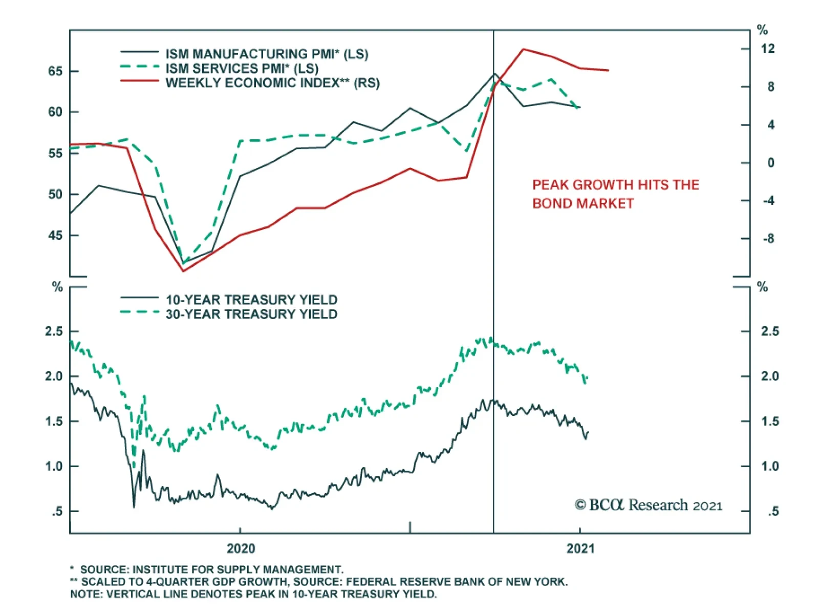
Highlights Duration: The recent decline in Treasury yields is overdone. Economic growth is no longer accelerating, but it hasn’t slowed enough to justify the strength in bonds. Stronger employment data will pressure bond yields higher this fall, once labor supply constraints ebb. Ultimately, we expect the 10-year Treasury yield to reach a range of 2% to 2.25% by the end of 2022 when the Fed is ready to lift rates. Maintain below-benchmark portfolio duration. Employment: The static unemployment rate and sub-50 readings from ISM employment indexes will prove to be short-lived phenomena driven by labor supply constraints. These constraints will vanish in the fall when schools re-open and expanded unemployment benefits lapse. Yield Curve: Remain positioned in yield curve flatteners. We specifically like shorting the 5-year bullet versus a duration-matched 2/10 barbell. We expect that the next significant move in Treasury yields will be a bear-flattening of the curve prompted by strong employment data this fall. Feature Last week was another dramatic one in the bond market. Bond yields fell sharply as doubts emerged about the pace of economic recovery and the economy’s progress back to full employment. The 10-year Treasury yield started the week at 1.44% before hitting an intra-day low of 1.25% on Thursday. It then rebounded somewhat to end the week at 1.36%. One catalyst for the move was Tuesday morning’s ISM Non-Manufacturing report that printed at 60.1, below consensus expectations of 63.5. But in truth, economic momentum had already been slowing for several months before that release. The 10-year Treasury yield peaked at 1.74% on March 31st, right around the same time that the New York Fed’s Weekly Economic Index and both the ISM Manufacturing and Non-Manufacturing indexes leveled-off (Chart 1). Last week simply saw the “slowing growth” narrative pick up steam. One noteworthy feature of last week’s market action is that the Treasury curve flattened as yields fell. While the 10-year yield is now at its lowest since February, the 2-year yield remains higher than it was just prior to the June FOMC meeting (Chart 2). This suggests that part of the drop in long-maturity bond yields is due to a fear that the Fed will over-tighten in the face of slowing growth. This fear likely stems from the Fed’s apparent hawkish pivot at the June FOMC meeting.1 Chart 1"Peak Growth" Hits The Bond Market
"Peak Growth" Hits The Bond Market
"Peak Growth" Hits The Bond Market
Chart 2A Flatter Curve Since March
A Flatter Curve Since March
A Flatter Curve Since March
It’s also worth mentioning that the bulk of last week’s drop in yields was concentrated in long-maturity real yields (Chart 2, bottom 2 panels). TIPS breakeven inflation rates have fallen somewhat since the end of March. But, at 2.3% and 2.23% respectively, the 10-year and 30-year TIPS breakeven inflation rates are not that far below the Fed’s 2.3% - 2.5% target range. Chart 3Bond Rally Not Confirmed By Commodities
Bond Rally Not Confirmed By Commodities
Bond Rally Not Confirmed By Commodities
Finally, many have suggested that “technical factors” are responsible for last week’s bond market strength. That is, factors related to the supply and demand for bonds but unrelated to economic fundamentals conspired to push yields lower. This is a difficult thesis to prove or disprove, but we will point out that the 10-year Treasury yield has diverged significantly from the CRB Raw Industrials / Gold ratio (Chart 3). The 10-year yield and the CRB/Gold ratio tend to track each other very closely but, in contrast to yields, the CRB/Gold ratio has actually increased since March 31st. This lends some credence to the argument that last week’s drop in yields is not purely a reflection of economic weakness, and it could be an overreaction to weaker-than-expected data that was exacerbated by extreme short positioning in the market (Chart 3, bottom panel). Three Reasons Why The Decline In Treasury Yields Is Overdone We do in fact think that the recent decline in Treasury yields is overdone, and we continue to see the 10-year Treasury yield reaching a range of 2% - 2.25% by the end of next year when the Fed is ready to lift rates. We present three reasons why the recent drop in Treasury yields is overdone. First, the bond market is making too much of the “slowing growth” narrative. Yes, it’s certainly true that the economic indicators shown in Chart 1 are no longer accelerating, but in level terms they remain consistent with a robust economic recovery where GDP growth is well above trend. This sort of growth environment is consistent with a falling unemployment rate that will eventually bring Fed rate hikes into play. Bond yields will move higher as this tightening cycle approaches. Second, it is not just the pace of economic growth that matters for bond yields. The output gap matters as well.2 That is, the same rate of economic growth will coincide with higher bond yields when the unemployment rate is 5% than it will when the unemployment rate is 10%. With that in mind, we observe that the output gap has closed significantly during the past year. The prime-age employment-to-population ratio is 77%, up from a 2020 low of 70%. Similarly, capacity utilization is 75%, up from a 2020 low of 64% (Chart 4). Unless we expect economic growth to slow enough for progress on these two fronts to reverse, then we should see significantly higher bond yields this year compared to last year. This makes it difficult to see how Treasury yields can fall much further from current levels. Another way to conceptualize the relationship between the output gap and long-maturity bond yields is to look at how long-dated yields move relative to short-dated yields. Since the Fed moves the funds rate in response to changes in the output gap, we can model the 10-year Treasury yield relative to the fed funds rate and expectations for near-term changes in the fed funds rate to get a sense of how well the output gap explains changes in long-maturity bond yields. Chart 5 presents a simple model of the 10-year Treasury yield relative to the fed funds rate and the 24-month fed funds discounter. It shows that last week’s decline in the 10-year yield caused it to diverge significantly from the model’s fair value. Chart 4The Output Gap Matters
The Output Gap Matters
The Output Gap Matters
Chart 5Long-Maturity Yields Are Too Low
Long-Maturity Yields Are Too Low
Long-Maturity Yields Are Too Low
Third, the Fed’s pledge to keep rates at the zero-lower-bound at least until the labor market reaches “maximum employment” means that the labor market outlook is critical for bond yields. Our view is that the labor market is on the cusp of a rapid recovery that will cause the Fed to lift rates before the end of 2022. However, recent labor market data have been mixed and there is considerable uncertainty in the market about the future pace of employment gains. The next section delves deeper into the outlook for the labor market. Making Sense Of The Employment Data Chart 6ISM Employment Below 50 ...
ISM Employment Below 50 ...
ISM Employment Below 50 ...
Overall, it seems safe to say that the labor market data have been disappointing in recent months. Yes, nonfarm payroll growth has averaged a robust +543k this year, but the minutes of the June FOMC meeting revealed that “some participants” viewed employment gains as “weaker than they had expected”. The recent dips in the employment components of both the ISM Manufacturing and Non-Manufacturing indexes to below the 50 boom/bust line only add to the sense of pessimism about the labor market. Historically, sub-50 readings from the ISM employment indices (particularly from the non-manufacturing ISM) have coincided with slowing employment growth (Chart 6). This time, however, we don’t see the ISM employment indexes staying below 50 for very long. The more demand-focused components of the ISM indexes – production, new orders and backlog of orders – remain elevated (Chart 7). This tells us that demand is strong and that hiring is only weak because of labor supply constraints, a topic we have covered repeatedly in this publication.3 Our view is that by September, once schools re-open and expanded unemployment benefits lapse, we will see a surge in hiring and a jump in the ISM employment components as people are enticed back into the workforce. A clearer picture of the labor market will then emerge, and it will catalyze a jump in bond yields. It’s not just weak ISM employment readings that are giving investors doubts about the labor market. The unemployment rate’s decline has also slowed markedly in recent months (Chart 8). Our adjusted measure of the U3 unemployment rate currently sits at 6.1%, above the headline U3 measure of 5.9% and significantly above the range of 3.5% to 4.5% that the Fed estimates is consistent with full employment. Chart 7... But Demand Indicators Are Elevated
... But Demand Indicators Are Elevated
... But Demand Indicators Are Elevated
Chart 8Slow Progress On Unemployment
Slow Progress On Unemployment
Slow Progress On Unemployment
Chart 9Labor Supply Is The Problem
Labor Supply Is The Problem
Labor Supply Is The Problem
We adjust the U3 unemployment rate to include a number of people that are currently being classified as “employed but absent from work” when they should be classified as “temporarily unemployed”. The number of people describing themselves as “employed but absent from work” jumped sharply in March 2020 and has remained elevated. This is the result of workers that were placed on temporary furlough during the pandemic and who should be counted as unemployed. We make our adjustment by taking the difference between the number of people that are “employed but absent from work for other reasons” each month and a baseline calculated as that month’s average between 2015 and 2019. We then add this excess amount to the number of temporarily unemployed. This gives us adjusted readings for both the U3 unemployment rate and the temporary unemployment rate (Chart 8, top 2 panels). The Appendix of this report updates our scenarios for the average monthly nonfarm payroll growth required to reach “maximum employment” to consider both this new adjustment and June’s employment figures. Technical adjustments aside, the main takeaway for investors is that progress toward “maximum employment” has been relatively slow during the past few months. This is particularly true if we look at the unemployment rate excluding those on temporary furlough (Chart 8, panel 3) and the labor force participation rate (Chart 8, bottom panel). This slow progress toward “maximum employment” is undoubtedly a reason why bond yields remain low. But, once again, we think it’s only a matter of time before labor supply constraints ease and the unemployment rate falls rapidly, catching up to indicators of labor demand that have already surpassed pre-COVID levels (Chart 9). Bottom Line: The recent decline in Treasury yields is overdone. Economic growth is no longer accelerating, but it hasn’t slowed enough to justify the strength in bonds. The labor market also continues to make progress toward maximum employment (and Fed rate hikes) though that progress has slowed during the past few months. We anticipate that stronger employment data will pressure bond yields higher this fall, once labor supply constraints ebb. Ultimately, the economy will reach full employment in time for the Fed to lift rates in 2022. We expect that the 10-year Treasury yield will be in a range of 2% to 2.25% by then. Maintain below-benchmark portfolio duration. A Quick Note On The Yield Curve Chart 105y5y Still Close To Fair Value
5y5y Still Close To Fair Value
5y5y Still Close To Fair Value
While we view the recent drop in the level of bond yields as an overreaction, we are less inclined to view recent curve flattening as temporary. To see why, let’s look at the 5-year/5-year forward Treasury yield relative to survey estimates of the long-run neutral fed funds rate. We like to think of the 5-year/5-year forward Treasury yield as a market proxy for the long-run neutral fed funds rate, so a range of estimates of that rate is a logical fair value target. The 5-year/5-year forward Treasury yield has fallen a lot during the past few weeks. But, at 2%, it is still within the range of neutral rate estimates from the New York Fed’s Survey of Market Participants and only just outside of the same range from the Survey of Primary Dealers (Chart 10). The fact that the 5-year/5-year yield remains relatively close to its fair value range tells us that there is very limited scope for curve steepening. Recent periods of significant curve steepening have tended to coincide with one of the following two developments: The Fed is cutting rates (coincides with a bull-steepening) The 5-year/5-year forward Treasury yield moves into its fair value range after starting out well below it (coincides with a bear-steepening) This second sort of curve steepening occurred during the 2013 taper tantrum, after the 2016 presidential election and again after the 2020 presidential election. It’s conceivable that the yield curve could re-steepen somewhat during the next few months, if the 5-year/5-year forward yield moves back to its prior highs. But we expect the next major move in the Treasury market to be a bear-flattening as the rest of the yield curve catches up to the 5-year/5-year. This is the sort of curve flattening that occurred in 2017 and 2018 when the Fed was lifting rates (Chart 10, bottom 2 panels). A bear-flattening of the yield curve is also the most likely outcome if we start to see significant positive employment surprises later this year, as we anticipate. These employment surprises would bring forward the timing and pace of rate hikes but wouldn’t necessarily cause investors to question their views about the long-run neutral fed funds rate. Bottom Line: Remain positioned in yield curve flatteners. We specifically like shorting the 5-year bullet versus a duration-matched 2/10 barbell. We expect that the next significant move in Treasury yields will be a bear-flattening of the curve prompted by strong employment data this fall. Appendix: How Far From “Maximum Employment” And Fed Liftoff? Chart A1Defining “Maximum Employment”
Defining "Maximum Employment"
Defining "Maximum Employment"
The Federal Reserve has promised that the funds rate will stay pinned at zero until the labor market returns to “maximum employment”. The Fed has not provided explicit guidance on the definition of “maximum employment”, but we deduce that “maximum employment” means that the Fed wants to see the U3 unemployment rate within a range consistent with its estimates of the natural rate of unemployment, currently 3.5% to 4.5%, and that it wants to see a more or less complete recovery of the labor force participation rate back to February 2020 levels (Chart A1). Alternatively, we can infer definitions of “maximum employment” from the New York Fed’s Surveys of Primary Dealers and Market Participants. These surveys ask respondents what they think the unemployment and labor force participation rates will be at the time of Fed liftoff. Currently, the median respondent from the Survey of Market Participants expects an unemployment rate of 3.5% and a participation rate of 63%. The median respondent from the Survey of Primary Dealers expects an unemployment rate of 3.7% and a participation rate of 63%. Tables A1-A4 present the average monthly nonfarm payroll growth required to reach different combinations of unemployment rate and participation rate by specific future dates. For example, if we use the definition of “maximum employment” from the Survey of Market Participants, then we need to see average monthly nonfarm payroll growth of +484k in order to hit “maximum employment” by the end of 2022. Table A1Average Monthly Nonfarm Payroll Growth Required For The Unemployment To Reach 4.5% By The Given Date
Overreaction
Overreaction
Table A2Average Monthly Nonfarm Payroll Growth Required For The Unemployment To Reach 4% By The Given Date
Overreaction
Overreaction
Table A3Average Monthly Nonfarm Payroll Growth Required For The Unemployment To Reach 3.5% By The Given Date
Overreaction
Overreaction
Table A4Average Monthly Nonfarm Payroll Growth Required To Reach “Maximum Employment” As Defined By Survey Respondents
Overreaction
Overreaction
Chart A2 presents recent monthly nonfarm payroll growth along with target levels based on the Survey of Market Participants’ definition of “maximum employment”. This chart helps us track progress toward specific liftoff dates. For example, if monthly nonfarm payroll growth continues to print at the same level as last month, then we could anticipate a Fed rate hike by June 2022. We will continue to track these charts and tables in the coming months, and will publish updates after the release of each monthly employment report. Chart A2Tracking Toward Fed Liftoff
Tracking Toward Fed Liftoff
Tracking Toward Fed Liftoff
Ryan Swift US Bond Strategist rswift@bcaresearch.com Footnotes 1 Please see US Bond Strategy / Global Fixed Income Strategy Weekly Report, “How To Re-Shape The Yield Curve Without Really Trying”, dated June 22, 2021. 2 For a description of the five macro factors that determine bond yields please see US Bond Strategy Weekly Report, “Bond Kitchen”, dated April 9, 2019. 3 Please see US Bond Strategy Weekly Report, “Making Money In Municipal Bonds”, dated April 27, 2021. Fixed Income Sector Performance Recommended Portfolio Specification
Feature Since the end of the first quarter, the decline in Treasury yields has been the most important trend in global financial markets. It has contributed to the return of the outperformance of growth stocks relative to value stocks, the underperformance of Eurozone equities relative to the S&P 500, and the tepid results of cyclicals relative to defensive equities. This decline in yields is a temporary phenomenon, because the global economy continues to re-open and inventory levels remain so low that further restocking is in the cards. The cyclical picture is not without blemish; COVID-19 variants remain a concern. However, if these risks were to materialize into another delayed re-opening, then further reflationary efforts by both monetary and fiscal authorities would buoy financial markets. The greatest near-term worry for the global economy and markets comes from China. The Chinese credit impulse is slowing markedly and fiscal support has yet to come to the rescue. This phenomenon is the main reason why this publication maintains a cautious tactical stance on Eurozone cyclical stocks, even if we believe these sectors have ample scope to outperform over the remainder of the business cycle. As a corollary, we believe that yields will likely remain within range this summer and Eurozone benchmarks will lag behind the US. This week, we review key charts, organized by theme, highlighting some of these key concepts. As an aside, none covers inflation. Even if the balance of evidence suggests that any sharp increase in Eurozone inflation will be temporary, the proof will only become more visible by early 2022. The Opening Is On Track… The pace of vaccination across the major Eurozone economies has picked up meaningfully since the spring. Consequently, the number of doses distributed per capita is rapidly approaching that of the US, even as it still lags behind that of the UK (Chart 1). As a result of this improvement, the stringency of lockdown measures is declining, which is allowing European mobility to recover (Chart 2). While this phenomenon is evident around the world, EM still lag in terms of vaccination rates. However, the Global Health Innovation Center at Duke University expects 10 billion vaccine doses to be produced by the year’s end, which will be enough to inoculate most (if not all) the vulnerable people in the world by early 2022. Consequently, the re-opening of the economy will remain a potent tailwind behind global growth for three or four more quarters. Chart 1Vaccination Progress...
Vaccination Progress...
Vaccination Progress...
Chart 2...Leads To Greater Activity
...Leads To Greater Activity
...Leads To Greater Activity
… But Near-Term Headwinds Remain The re-opening of the global economy will allow growth to stay well above trend for the upcoming 12 months, at least. Global industrial activity could nonetheless decelerate this summer. Input costs have risen. The two most important ones, oil and interest rates, are already consistent with a peak in the US ISM manufacturing and the global PMI (Chart 3). In this context, the decelerating Chinese credit impulse is concerning (Chart 4) because it portends a hit to global trade and industrial activity. The effect of this slowdown should be most evident in the third and fourth quarters of 2021. However, it will be temporary because Beijing only wants credit to grow in line with GDP, rather than an outright deleveraging. Thus, the credit impulse will stabilize before the year’s end, which will allow the positive effect of the global re-opening to be fully experienced once again. Chart 3Rising Input Costs...
Rising Input Costs...
Rising Input Costs...
Chart 4...And China's Credit Slowdown Matter
...And China's Credit Slowdown Matter
...And China's Credit Slowdown Matter
Domestic Tailwind In Europe Despite the extreme sensitivity of the European economy to the global business cycle, Europe should continue to produce positive surprises. The supports to the domestic economy are strong. The NGEU funds means that Europe will suffer one of the smallest fiscal drag among G-10 nations next year. Moreover, the re-opening will support household income and allow the positive effect of the increase in the money supply to buoy consumption (Chart 5). Finally, rising consumer confidence, and the ebbing propensity to save will reinforce the tailwinds behind consumption (Chart 6). Chart 5Europe's Domestic Activity
Europe's Domestic Activity
Europe's Domestic Activity
Chart 6...Will Improve Further
...Will Improve Further
...Will Improve Further
Higher Bond Yields Are Coming… The environment continues to support higher yields. Our BCA Pipeline Inflation Indicator is surging, which historically translates into higher global borrowing costs (Chart 7). Most importantly, our Nominal Cyclical Spending Proxy remains very robust, which normally leads to rising yields (Chart 8). While US inflation expectations at the short end of the curve already fully reflect current inflationary pressures, the 5-year/5-year forward inflation breakeven rates will have additional upside. Moreover, the term premium and real rates remain depressed, and policy normalization will cause these variables to climb higher over time. Chart 7Higher Yields Will Come...
Higher Yields Will Come...
Higher Yields Will Come...
Chart 8...Later This Year
...Later This Year
...Later This Year
… But Not This Summer It could take some time before the bearish backdrop for bonds results in higher bond yields. First, bonds have yet to purge fully their oversold status created by the 125 basis-point surge that took place between August 2020 and March 2021 (Chart 9). This vulnerability is even more salient in an environment in which the Chinese credit impulse is decelerating. As Chart 10 illustrates, a slowing total social financing number reliably leads to bond rallies. While the chart looks dire for bond bears, it must be placed in context, in which global fiscal policy remains accommodative considering the decline in the private sector savings rate and in which Advanced Economies’ capex will stay strong. Thus, instead of betting on a large swoon in yields in the coming quarters, we expect US yields to remain stuck between 1.20% and 1.70% for a few more months before they resume their upward path once the Chinese economy stabilizes. Chart 9But Bonds Are Still Oversold...
But Bonds Are Still Oversold...
But Bonds Are Still Oversold...
Chart 10...And Fundamentals Cap Yields For Now
...And Fundamentals Cap Yields For Now
...And Fundamentals Cap Yields For Now
A Positive Cyclical Backdrop For The Euro The near-term forces suggest that the euro will remain range bound over the summer, between 1.16 and 1.23. EUR/USD is a pro-cyclical pair, and so the near-term lack of upside to global growth will act as a temporary ceiling on this currency. Nonetheless, the 18-month outlook continues to favor the common currency. Investors have shed Eurozone exposure for more than 10 years and are structurally underweight this region (Chart 11). Hence, EUR/USD should benefit from any positive reassessment of the growth path in the Euro Area compared to that of the US. Additionally, the euro benefits from a structural current account surplus compared to the USD, which translates into a positive basic balance of payments (Chart 12). In an environment in which US real interest rates are low in relation to foreign ones and in which the Fed wants to maintain accommodative monetary conditions to achieve maximum employment, the capital account balance is unlikely to come to the rescue of the dollar. In this context, EUR/USD still possesses significant cyclical upside and is likely to move back above 1.30 by the year’s end of 2022. Chart 11Investors Underweight Eurozone Assets...
Investors Underweight Eurozone Assets...
Investors Underweight Eurozone Assets...
Chart 12...And The BoP Favors The Euro
...And The BoP Favors The Euro
...And The BoP Favors The Euro
The Bull Market In Global Stocks Is Not Over The cyclical outlook for equities remains supportive. To begin with, in most years, equities eke out positive returns, as long as a recession is not around the corner; we do not expect a recession anytime soon. Moreover, while the balance of valuation risk and monetary accommodation is not as supportive of stocks as it was last year, it is not pointing to an imminent deep pullback either (Chart 13). The equity risk premium echoes this message. Our ERP measure adjusts for the expected growth rate of earnings as well as the lack of stationarity of the ERP. According to this indicator, equities are not an urgent buy, but they are not at risk of a bear market either (Chart 14). This combination does not prevent corrections, but it suggests that pullbacks of 10% are to be bought. Chart 13Equities Are Not A Screaming Buy...
Equities Are Not A Screaming Buy...
Equities Are Not A Screaming Buy...
Chart 14...Nor A Screaming Sell
...Nor A Screaming Sell
...Nor A Screaming Sell
Europe’s Structural Underperformance Is Intact… Eurozone stocks have been underperforming their US counterparts since the GFC. As Chart 15 highlights, this subpar performance reflects the decline in European EPS relative to US ones. There is very little case to be made for this underperformance to end on a structural basis. Europe remains saddled with an excessive capital stock and ageing assets. This combination is weighing on European profit margins and RoE (Chart 16). To put an end to this structural underperformance, either European firms will have to consolidate within each industry (allowing cuts to the excess capital stock, to increase concentration, and to boost profit margins) or the regulatory burden must rise in the US to curtail rates of returns in relation to European levels. Chart 15Europe's Underperformance...
Europe's Underperformance...
Europe's Underperformance...
Chart 16...Reflects Profitability Problems
...Reflects Profitability Problems
...Reflects Profitability Problems
…But The Window For A Cyclical Outperformance Remains Open Despite a challenging structural backdrop, European equities have a window to outperform US stocks, similar to the outperformance of Japan from 1999 to 2006, which only marked a pause within a prolonged relative bear market. European stocks beat their US counterparts when global yields rise (Chart 17). This is because European benchmarks underweight growth stocks relative to US markets. The effect of higher yields on the relative performance of the Euro Area is not limited to the impact of higher discount rates. Yields rise when global economic activity is above trend. As Chart 18 highlights, robust readings of our Global Growth Indicator correlate with an outperformance of the EPS of value stocks compared to growth equities. Thus, when rates rise, Europe should enjoy both a period of re-rating relative to the US and stronger profits. Chart 17Yields Drive European Stocks...
Yields Drive European Stocks...
Yields Drive European Stocks...
Chart 18...And So Does Global Growth
...And So Does Global Growth
...And So Does Global Growth
Positives For Euro Area Financials Like the broad European market, the financials’ fluctuations are linked to interest rates. Moreover, Euro Area banks also move in line with EUR/USD (Chart 19). As a result, our positive view on both yields and the euro for the next 18 months or so should translate into an outperformance of financials in Europe. Additionally, European banks are inexpensive, embedding not just depressed long-term growth expectations, but also a wide risk premium. Europe’s structural problems mean that investors are correct to expect poor earnings growth from the region’s banks. However, the risk premium is overdone. Eurozone banks are much safer than they were 10 years ago. Banks now sport significantly higher Tier 1 capital adequacy ratios and NPLs have shrunk considerably (Chart 20). Moreover, governmental supports and credit guarantees implemented during the pandemic should limit the upside to NPL in the coming quarters. Finally, the so-called doom-loop that used to bind government and bank solvency together is not as problematic as it once was, because the ECB is a willing buyer of government paper and the NGEU programs create the embryo of fiscal risk sharing that limit these dynamics. As a result, investors should overweight this sector for the next 18 months. Chart 19Financials Have A Window To Shine...
Financials Have A Window To Shine...
Financials Have A Window To Shine...
Chart 20...And Are Less Risky
...And Are Less Risky
...And Are Less Risky
A Tactical Hedge Our worries about the impact on the global economy of the Chinese credit slowdown are likely to prompt some downside in European cyclical equities relative to defensive ones. Moreover, cyclicals are still significantly overbought relative to defensives, while our relative Combined Mechanical Valuation Indicator confirms the near-term threat (Chart 21). A high-octane vehicle to play this tactical underperformance of cyclicals relative to defensives is to buy Euro Area telecom stocks relative to consumer discretionary equities. Not only are the discretionary stocks massively overbought and expensive relative to telecoms (Chart 22), they also offer a lower RoE. This backdrop makes the short discretionary / long telecoms bet a great hedge for portfolios with a pro-cyclical bias over one- to two-year horizons. Chart 21Cyclicals Are Tactically Vulnerable...
Cyclicals Are Tactically Vulnerable...
Cyclicals Are Tactically Vulnerable...
Chart 22...But This Risk Can Be Hedged Away
...But This Risk Can Be Hedged Away
...But This Risk Can Be Hedged Away
Currency Performance Currency Performance
Summer Charts
Summer Charts
Fixed Income Performance Government Bonds
Summer Charts
Summer Charts
Corporate Bonds
Summer Charts
Summer Charts
Equity Performance Major Stock Indices
Summer Charts
Summer Charts
Geographic Performance
Summer Charts
Summer Charts
Sector Performance
Summer Charts
Summer Charts
The spectacular outperformance of global equities versus bonds since the pandemic trough has been accompanied by declining volatility in all asset classes globally. But investors are now close to fully invested in US equities. Sentiment in financial markets…
As economies started to reopen, and long-term bond yields began to rise, global Value stocks outperformed global Growth stocks by almost 20% from November to May. However, over the past couple of months this trend has reversed. Our US Equity Strategists…
Highlights Our sense remains that the dollar is undergoing a countertrend bounce, rather than entering a new bull market. The litmus test for this view is if the DXY fails to break above the 93-94 level that marked the March highs. Stay short USD/JPY. The drop in global bond yields should give this trade a welcome fillip. Short GBP/JPY positions also make sense. We are long CHF/NZD as a play on a potential increase in currency volatility. Look to rebuy a basket of Scandinavian currencies versus the USD and EUR at a trigger point of -2% from today’s levels. Remain long silver both in absolute terms and relative to gold. Our limit buy on EUR/USD was triggered at 1.18. Place tight stops given the potential for the dollar rally to continue for the next few weeks. We also believe the change in the ECB’s framework portends another bullish tailwind for the euro beyond the near term. Feature In our webcast last week, we made the case that the recent FOMC meeting (perceived as hawkish by market participants) has not altered the longer-term downtrend in the US dollar. This week, we are revisiting some of the sentiment and technical indicators that could help gauge how high the dollar can rise in the interim. Our view remains that three fundamental forces will continue to dictate currency market trends into the year end and beyond. First, the Federal Reserve will lag other central banks in raising rates amidst a shift in economic momentum from the US towards the rest of the world. This will boost short-term interest rates outside the US and provide a floor for procyclical currencies. Second, US inflation will prove stickier compared to other countries such as the eurozone or Japan. This will depress real interest rates in the US relative to the rest of the world, and curb bond inflows. And finally, an equity market rotation towards non-US stocks will improve flows into cyclical currencies. The transition could prove volatile in the coming month or so. Equity markets remain overbought, bond yields are falling, PMIs have stopped rising, and cyclical stocks are lagging growth stocks. More widespread infection from the Delta variant of Covid-19 will continue to reprice risk to the downside. As a countercyclical currency, the dollar will be a critical variable to watch. Sentiment and technical indicators make up an important component of our currency framework and are usually good at gauging significant shifts in financial markets. Our sense remains that the dollar is undergoing a countertrend bounce, rather than entering a new bull market. The litmus test for this view is if the DXY fails to break above the 93-94 level that marked the March highs. Momentum Indicators Our momentum indicators suggest that while the dollar is very oversold, the bear market remains very much intact. The dollar advance/decline line is sitting below its 200-day moving average (Chart I-1). Historically, bull markets in the dollar have been characterized by our advance/decline line breaking both above its 200-day and 400-day moving averages. This suggests a rally towards these critical resistance levels is in play but will constitute more of a countertrend bounce. Speculators are only neutral the dollar while, admittedly, leveraged funds are very short (Chart I-2). Historically, whenever the percentage of leveraged funds that are short the dollar has dipped near 40%, a meaningful rally has ensued. There are two important offsets to this. First, as Chart I-1 suggests, the dollar is a momentum currency. As such, during the bull market of the last decade, speculators were either neutral or long the dollar. If indeed the paradigm has shifted to a decade-long bear market, we expect speculators to be either short or neutral. Meanwhile, leveraged funds are a small subset of overall open interest, suggesting they are not the elephant in the room when it comes to dictating dollar movements. Leveraged funds were short the dollar during most of the bull market run last decade. Chart I-1The US Dollar Downtrend Is Intact
The US Dollar Downtrend Is Intact
The US Dollar Downtrend Is Intact
Chart I-2Leveraged Funds Are Short The Dollar
Leveraged Funds Are Short The Dollar
Leveraged Funds Are Short The Dollar
Carry trades are relapsing anew, suggesting the environment may be becoming unfavorable for high-yielding developed and emerging market currencies. The dollar has been negatively correlated with the Deutsche Bank carry ETF, DBV, since investors ultimately dump carry trades and fly to the safety of Treasurys on any market turbulence (Chart I-3). High-beta carry currencies such as the RUB, ZAR, MXN, and BRL have been consolidating recent gains. These currencies are usually good at sniffing out a change in the investment landscape, specifically one becoming precarious for carry trades. Our carry index tends to do well when the yield spread between US Treasuries and the indexes’ constituents’ is low. As such, there is some more adjustment underway, but one of limited amplitude (Chart I-4). Chart I-3The Carry Trade Rally Is Relapsing
The Carry Trade Rally Is Relapsing
The Carry Trade Rally Is Relapsing
Chart I-4Carry Trades Have Hit An Air Pocket
Carry Trades Have Hit An Air Pocket
Carry Trades Have Hit An Air Pocket
Chart I-5Currency Volatility Is Very Low
Currency Volatility Is Very Low
Currency Volatility Is Very Low
Both expected and actual currency volatility are extremely depressed. Whenever currency volatility has been this low, the dollar has staged a meaningful rally. For example, the most significant episodes were the lows of 1996-1997, 2007-2008, and 2014-2015, and early 2020 (Chart I-5). Usually, low currency volatility is a sign of complacency, while higher volatility allows for a more balanced and healthy market rotation. The nature in which currency volatility adjusts higher this time around might be the same playbook as in previous episodes. The Asian crisis of the late 90s set the stage for the dollar bear market of the 2000s. The adjustment higher in the dollar during the Global Financial crisis jumpstarted the bull market the following decade. This time around, the Covid-19 crisis might have commenced a renewed dollar bear market. If this analogy is correct, then we should be selling the dollar on strength rather than buying on weakness. It is important to remember that the policy environment remains bearish for the dollar. These include deeply negative real rates, quantitative easing (which, admittedly, will soon end), generous liquidity swap lines to assuage any dollar funding pressures abroad (Chart I-6), and a global economy on the cusp of a renewed cycle. In our portfolio, we are long CHF/NZD since this cross has historically been a good hedge against rising currency volatility (Chart I-7). So is being short AUD/JPY. Being short the GBP/JPY cross might prove even more profitable, given that the UK has been a pandemic winner this year. Chart I-6The Fed Extended Its Swap Lines
The Fed Extended Its Swap Lines
The Fed Extended Its Swap Lines
Chart I-7Buy CHF/NZD As Insurance
Buy CHF/NZD As Insurance
Buy CHF/NZD As Insurance
Bottom Line: The message from our momentum indicators is that the bounce in the dollar was to be expected. We remain in the camp that believes the rally will be short-lived but are opportunistically playing what could be a more volatile environment. Equity Markets Signals A potential catalyst that could trigger further upside in the dollar is an equity market correction. Both the dollar and equities tend to be inversely correlated (Chart I-8). On this front, a few equity market indicators continue to flag that the rally in the dollar has a bit further to go. Chart I-8The Dollar And Equities Move Opposite Ways
The Dollar And Equities Move Opposite Ways
The Dollar And Equities Move Opposite Ways
Chart I-9Global Industrials Are Relapsing Anew
Global Industrials Are Relapsing Anew
Global Industrials Are Relapsing Anew
The underperformance of cyclical stocks, especially global industrials, suggests equity markets could be entering a more volatile phase (Chart I-9). The dollar tends to strengthen when cyclical stocks are underperforming defensive ones. This is because non-US equity markets have a much higher concentration of cyclical stocks in their bourses. In more general terms, non-US markets are underperforming the US, a clear sign that the marginal dollar is rotating back towards the US (Chart I-10A and I-10B). Technology stocks have also been well bid in recent weeks, on the back of lower bond yields. These are all temporary headwinds for dollar weakness. Chart I-10ANon-US Stock Markets Are Underperforming
Non-US Stock Markets Are Underperforming
Non-US Stock Markets Are Underperforming
Chart I-10BNon-US Stock Markets Are Underperforming
Non-US Stock Markets Are Underperforming
Non-US Stock Markets Are Underperforming
Chart I-11US Relative Earnings Revisions Are High, But Rolling Over
US Relative Earnings Revisions Are High, But Rolling Over
US Relative Earnings Revisions Are High, But Rolling Over
Earnings revisions continue to head higher across most markets, but US profit expectations are still higher compared to other countries (Chart I-11). Non-US bourses will need much higher earnings revisions to stimulate portfolio inflows, and for the dollar bear market to resume. On this front, both the euro area and emerging markets are showing only tentative improvement. The character of any selloff in equity markets will be worth monitoring. Cyclicals and value stocks are at historically bombed-out levels and could start to outperform high-flying stocks on any market reset. Bottom Line: Whether a correction ensues, or the bull market continues, requires a change in equity market leadership from defensives to cyclicals. This is a necessary condition for the dollar bear market to resume. Commodities, Bonds, And The Dollar Commodity and bond prices give important cues about the health of the global economy. For example, rising copper prices and rising yields are a sign that industrial activity is humming, which in turn points to accelerating global growth. As a counter-cyclical currency, the dollar usually weakens in this scenario. Rising gold prices are generally a sign that policy settings remain ultra-accommodative, which also points to a weaker dollar. At the FX strategy service, we tend to focus more on the internal dynamics of commodity and bond markets, which can provide early warning signs. Chart I-12The Copper-To-Gold Ratio Is Consolidating Gains
The Copper-To-Gold Ratio Is Consolidating Gains
The Copper-To-Gold Ratio Is Consolidating Gains
The copper-to-gold ratio is important since it indicates whether the liquidity-to-growth transmission mechanism is working. A rising ratio suggests policy settings are stimulating growth, while a falling ratio is a warning shot that the environment might be becoming deflationary. Correspondingly, this ratio has tended to track the dollar closely (Chart I-12). The copper-to-gold ratio is consolidating at very high levels. This is consistent with a healthy reset, rather than a reversal in the dollar bear market. The gold/silver ratio (GSR) tends to track the US dollar, and its recent price action also appears to be a welcome reset (Chart I-13). Like copper, silver benefits from rising industrial demand, especially in the electronics and renewable energy space. A falling GSR will be a sign that the manufacturing cycle is still humming. We are short the GSR with a target of 50, and a stop-loss at 71. The bond-to-gold ratio has bounced from very oversold levels. Both US Treasurys and gold are safe-haven assets and thus are competing assets. Remarkably, the ratio of the total return in US government bonds-to-gold prices has tracked the dollar pretty well since the end of the Bretton Woods system in the early ‘70s (Chart I-14). Gold has always been considered the perfect anti-fiat asset vis-à-vis the dollar, making the bond-to-gold ratio both a good short-term and long-term sentiment indicator. For now, the bounce in the ratio is not yet worrisome. We have noticed that inflows into US government bonds have risen sharply, while those into gold are falling. This should soon reverse with the fall in US rates, and the correction in gold prices. Chart I-13The Gold-To-Silver Ratio Is Consolidating Losses
The Gold-To-Silver Ratio Is Consolidating Losses
The Gold-To-Silver Ratio Is Consolidating Losses
Chart I-14Competing Assets And The Dollar
Competing Assets And The Dollar
Competing Assets And The Dollar
Bottom Line: The US is ultimately generating the most inflation in the G10, which is dampening real rates, and should curtail investor enthusiasm for gold relative to US Treasurys. The underperformance of Treasurys relative to gold will be a bearish development for the dollar. A Final Word On The Euro The strategic review from the European Central Bank had three key changes. The ECB now has a symmetric 2% inflation target. This is not a game changer, since it brings it in line with other global central banks, including the Bank of Japan. House prices will meaningfully begin to impact monetary policy, as the committee eventually includes owner’s equivalent rent (OER) in the HICP index (the ECB’s preferred inflation measure) for the euro area. This could be a game changer for the ECB’s price objective. Climate change was reiterated as important for price stability. Financial stability was also repeated as an important objective. As FX strategists, the second change was the most important. Shelter constitutes 17.7% of the euro area CPI basket, but it is 32.9% of the US CPI basket (Table I-1). Meanwhile, the shelter component of both the CPI basket in the US and euro area have tracked each other (Chart I-15). Table I-1Euro Area CPI Weights
An Update On Dollar Sentiment And Technical Indicators
An Update On Dollar Sentiment And Technical Indicators
Chart I-15What Will Happen To Eurozone Inflation?
What Will Happen To Eurozone Inflation?
What Will Happen To Eurozone Inflation?
An adjustment in the weight of the shelter component in the euro area will boost the European CPI relative to the US and could trigger a major policy shift from the ECB in the coming years. This will especially be the in case if the current environment generates an inflationary shock. Bottom Line: The ECB will stay very accommodative in the next 1-2 years, but the change in its mandate could portend a bullish tailwind for the euro beyond the near term. Investment Implications We expect the current dollar rebound to be short-lived. As such, our strategy is as follows: Stay long other safe-haven currencies. Our preferred vehicle is the Japanese yen, which sports an attractive real rate relative to the US. Investors can also short GBP/JPY from current levels. Chart I-16The Euro, Yen And Real Rates
The Euro, Yen And Real Rates
The Euro, Yen And Real Rates
Our limit-buy on EUR/USD was triggered at 1.18. Given our expectation that the dollar could rally in the near term, we are setting the stop-loss at the same level. However, the improvement in real rates in the euro area relative to the US could cushion any downside (Chart I-16). We are also long CHF/NZD, as a bet on rising currency volatility. Correspondingly, we are setting a limit buy on Scandinavian currencies relative to the euro and USD at a trigger level of -2%. Both gold and silver benefit from the current environment, but we prefer silver to gold, due to the former’s call option on continued improvement in global growth. We are short the gold/silver ratio from the 68 level. Overall, we expect the dollar to weaken towards the end of the year, as has been the case since the 1970s (Chart I-17). Chart I-17The Yen And Swiss Franc Are Usually Winners In H2
An Update On Dollar Sentiment And Technical Indicators
An Update On Dollar Sentiment And Technical Indicators
Chester Ntonifor Foreign Exchange Strategist chestern@bcaresearch.com Currencies US Dollar USD Technicals 1
USD Technicals 1
USD Technicals 1
USD Technicals 2
USD Technicals 2
USD Technicals 2
The recent data out of the US have been robust: June non-farm payrolls showed an increase of 850K jobs, versus expectations of a 700K increase. The unemployment rate was relatively flat at 5.9% in June. Factory orders came in at 1.7% year-on-year in May, in line with expectations. The US dollar DXY index is relatively flat this week, but with tremendous volatility. It was a relatively quiet week in the US, due to Independence Day, but the key theme remained a drop in US yields, with the 10-year yield moving from a high of near 1.8% this year to 1.3% currently. This move has catalyzed rallies in lower beta currencies, such as the yen and Swiss franc. The FOMC minutes released this week continue to suggest a Fed that will remain very patient in both tapering asset purchases and lifting interest rates. Report Links: Arbitrating Between Dollar Bulls And Bears - March 19, 2021 The Dollar Bull Case Will Soon Fade - March 5, 2021 Are Rising Bond Yields Bullish For The Dollar? - February 19, 2021 The Euro EUR Technicals 1
EUR Technicals 1
EUR Technicals 1
EUR Technicals 2
EUR Technicals 2
EUR Technicals 2
Recent data from the euro area were mixed: The PPI print for May came in at 9.6%, in line with expectations. Both the services and composite PMI were revised higher by 0.3 in June. At 59.2, the composite PMI is the highest in over a decade. ZEW expectations for the euro area fell sharply from 81.3 to 61.2. In Germany, there was a big decline in automotive surveys. The euro was flat this week against the dollar, despite gains overnight. The big news was the change in the ECB’s monetary policy objectives, which we discussed briefly in the front section of this report. The euro rallied on the news of three fundamental drivers in our view – real rate differentials are improving in favor of Europe, the ECB’s consideration for house price inflation could allow its price stability objective to be achieved sooner, and consideration for financial stability will be less favorable for negative interest rates. Report Links: Relative Growth, The Euro, And The Loonie - April 16, 2021 The Euro Dance: One Step Back, Two Steps Forward - April 2, 2021 On Japanese Inflation And The Yen - January 29, 2021 The Yen JPY Technicals 1
JPY Technicals 1
JPY Technicals 1
JPY Technicals 2
JPY Technicals 2
JPY Technicals 2
Recent data from Japan remains subpar, but is improving: Labor cash earnings rose 1.9% in May, in line with expectations. Household spending rose 11.6% in May, in line with expectations. The Eco Watchers Survey for June came in at 47.6 from a May reading of 38.1. The outlook component rose from 47.6 to 52.4. The yen was up by 1.6% against the USD this week, the best performer. We argued a month ago that the yen is the most underappreciated G10 currency today. The catalyst that triggered yen gains were a drop in US real rates, that favored other safe-haven currencies. Going forward, further yen gains should materialize on the back of Japan successfully overcoming the pandemic like its Western counterparts. Report Links: The Case For Japan - June 11, 2021 The Dollar Bull Case Will Soon Fade - March 5, 2021 On Japanese Inflation And The Yen - January 29, 2021 British Pound GBP Technicals 1
GBP Technicals 1
GBP Technicals 1
GBP Technicals 2
GBP Technicals 2
GBP Technicals 2
There was scant data out of the UK this week: The construction PMI rose from 64.2 to 66.3 in June. House prices remain robust, with the RICS house price balance printing an elevated 83% in June. The pound was flat this week against the USD. The new delta variant of the COVID-19 virus is gaining momentum in the UK and will likely erode some of the dividends GBP had priced in from a fast vaccine rollout. As such, short GBP positions may pay off in the near term. Shorting GBP/CHF could be an attractive near-term hedge. Report Links: Why Are UK Interest Rates Still So Low? - March 10, 2021 Portfolio And Model Review - February 5, 2021 Thoughts On The British Pound - December 18, 2020 Australian Dollar AUD Technicals 1
AUD Technicals 1
AUD Technicals 1
AUD Technicals 2
AUD Technicals 2
AUD Technicals 2
There was scant data out of Australia this week: The Melbourne Institute of Inflation survey came it at 3% year on year in June, from 3.3%. The RBA kept interest rates unchanged at 0.1%, reiterating its commitment to stay accommodative until inflation and wages pick up meaningfully. The AUD was down by 0.4% this week against the USD. The RBA is decisively lagging other central banks in communicating less monetary accommodation in the coming years. This will create a coiled spring response for the AUD, because the RBA will have to eventually play catchup as the global economic cycle gains momentum. Report Links: The Dollar Bull Case Will Soon Fade - March 5, 2021 Portfolio And Model Review - February 5, 2021 Australia: Regime Change For Bond Yields & The Currency? - January 20, 2021 New Zealand Dollar NZD Technicals 1
NZD Technicals 1
NZD Technicals 1
NZD Technicals 2
NZD Technicals 2
NZD Technicals 2
The was scant data out of New Zealand this week: ANZ commodity price index rose by 0.8% in June. The NZD was down 0.3% against the dollar this week. Our long CHF/NZD position paid off handsomely in this environment. We recommend holding onto this trade, as a reset in global rates hurts the hawkish pricing in the NZD forward curve. Report Links: How High Can The Kiwi Rise? - April 30, 2021 Portfolio And Model Review - February 5, 2021 Currencies And The Value-Versus-Growth Debate - July 10, 2020 Canadian Dollar CAD Technicals 1
CAD Technicals 1
CAD Technicals 1
CAD Technicals 2
CAD Technicals 2
CAD Technicals 2
Canadian data softened but remained robust: Building permits fell by 14.8% month on month in May. The Markit manufacturing PMI fell from 57 to 56.5 in June. The Canadian trade balance deteriorated from C$0.6bn to a deficit of -C$1.4bn in May. Business Outlook Survey indicator hit the highest level on record. As the Bank of Canada put it, improving business sentiment is broadening. The CAD fell by 0.8% against USD this week. The results of the BoC survey highlight that a reopening phase is categorically bullish for economic activity in general and financial prices. Until recently, the CAD was one of the best performing currencies in the G10. This is a sea change from a country that was previously a laggard in vaccination efforts. CAD should hold up well once the dollar rally fades, but other currency laggards such as SEK and JPY could do even better. Report Links: Relative Growth, The Euro, And The Loonie - April 16, 2021 Will The Canadian Recovery Lead Or Lag The Global Cycle? - February 12, 2021 The Outlook For The Canadian Dollar - October 9, 2020 Swiss Franc CHF Technicals 1
CHF Technicals 1
CHF Technicals 1
CHF Technicals 2
CHF Technicals 2
CHF Technicals 2
The was scant data out of Switzerland this week: The unemployment rate was near unchanged at 3.1% in June, from 3.0%. Total sight deposits were unchanged at CHF 712 bn on the week of July 2. The Swiss franc was up by 1.1% this week against the USD. Falling yields improved the relative appeal of the franc that has bombed out interest rates. The franc is also benefiting from the rising bout of volatility as a safe-haven currency. On this basis, we are long CHF/NZD cross, which performed well this week. Report Links: An Update On The Swiss Franc - April 9, 2021 Portfolio And Model Review - February 5, 2021 The Dollar Conundrum And Protection - November 6, 2020 Norwegian Krone NOK Technicals 1
NOK Technicals 1
NOK Technicals 1
NOK Technicals 2
NOK Technicals 2
NOK Technicals 2
Data out of Norway is improving: The unemployment rate fell from 3.3% to 2.9% in July. Industrial production growth came in at 2.1% year-on-year in May. Mainland GDP rose by 1.8% month on month in May. The NOK was down by 1.8% this week against the dollar, the worst performing G10 currency. The NOK is bearing the brunt of a reset in the US dollar, but our bias is that we are nearing a buy zone. NOK is cheap, would benefit from high oil prices and the economy is on the mend. We are looking to sell EUR/NOK and USD/NOK on further strength. Report Links: The Norwegian Method - June 4, 2021 Portfolio And Model Review - February 5, 2021 Revisiting Our High-Conviction Trades - September 11, 2020 Swedish Krona SEK Technicals 1
SEK Technicals 1
SEK Technicals 1
SEK Technicals 2
SEK Technicals 2
SEK Technicals 2
Recent data from Sweden have been mildly positive: The Swedbank/Silf composite PMI fell from 70.2 to 66.9 in June. Industrial production came in at 24.4% year on year in May, after a rise of 26.4% in April. Household consumption jumped 8.8% year on year in April. The SEK was also up this week against the USD. Bombed-out interest rates in Sweden have also improved the appeal of the franc, given falling global bond yields. Meanwhile, the SEK remains one of the cheapest currencies in our models. Report Links: Revisiting Our High-Conviction Trades - September 11, 2020 More On Competitive Devaluations, The CAD And The SEK - May 1, 2020 Sweden Beyond The Pandemic: Poised To Re-leverage - March 19, 2020 Trades & Forecasts Forecast Summary Core Portfolio Tactical Trades Limit Orders Closed Trades
The growth acceleration narrative that drove much of the performance of global financial markets in 2021 is showing signs of fraying, led by US bond yields. The 10-year US Treasury yield continues to drift lower, hitting an intraday low of 1.25% yesterday.…
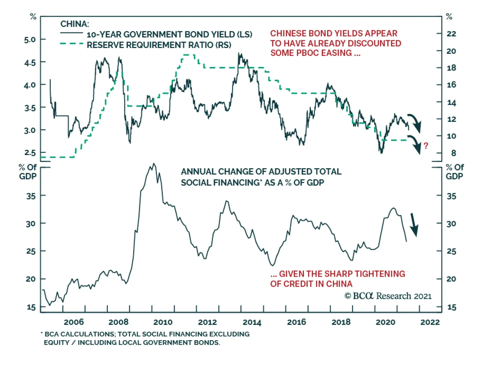
The China State Council meeting on July 7, chaired by Premier Li Keqiang, sent a somewhat ambiguous message on the direction of China’s monetary policy. The press release from the meeting stated that the country will “use monetary policy tools in a timely…

In their Q2/2021 model bond portfolio performance review, BCA Research’s Global Fixed Income Strategy team updated their recommended positioning for the next six months. Firstly, the team changed its US Treasury curve exposure to have more of a flattening…
Highlights Inflation is set to decelerate, job creation has a speed limit, and super-spreaders of new-variant Covid-19 infections will create speed bumps in the economy. This means that in the second half of the year: Bonds will rally. The US dollar will rally. Growth stocks will outperform value stocks. US stocks will outperform non-US stocks. Fractal trade shortlist: Brazilian real, Saudi Tadawul All Share, and Marine Transportation. Feature Chart of the WeekThe 60 Percent Correction In Lumber Shows What Happens When Supply Bottlenecks Ease. Are Used Cars Next?
The 60 Percent Correction In Lumber Shows What Happens When Supply Bottlenecks Ease. Are Used Cars Next?
The 60 Percent Correction In Lumber Shows What Happens When Supply Bottlenecks Ease. Are Used Cars Next?
As Supply Bottlenecks Ease, Inflation Will Cool Since mid-March, US inflation has surged to 5 percent. Yet bond yields have drifted lower, by almost 50 bps in the case of the 30-year T-bond yield, equating to a handsome return of 12 percent. The seeming contradiction between rising inflation and declining bond yields has puzzled some people, but it shouldn’t. In 2009, the same pattern occurred in reverse. Inflation collapsed, culminating in a modern era low of -2 percent in July 2009. Yet while inflation was collapsing, bond yields rose sharply (Chart I-2 and Chart I-3). Chart I-2In 2009, Bond Yields Rose When Year-On-Year Inflation Fell
In 2009, Bond Yields Rose When Year-On-Year Inflation Fell
In 2009, Bond Yields Rose When Year-On-Year Inflation Fell
Chart I-3In 2021, Bond Yields Fell When Year-On-Year Inflation Rose
In 2021, Bond Yields Fell When Year-On-Year Inflation Rose
In 2021, Bond Yields Fell When Year-On-Year Inflation Rose
We can explain this seeming contradiction with an analogy from driving. The inflation rate is like your average speed over the past mile. But the bond market cares much more about your average speed over the next mile, or even over the next 5-10 miles. If you are driving at a constant speed, then your speed over the past mile is a good guide to your future speed. But if you have been driving unusually fast or unusually slowly, there is a more important predictor of your future speed. That important predictor is your acceleration – meaning, what is happening to your speed over successive hundred yards stretches. In the same way, during episodes of unusually low or unusually high inflation, the bond market focusses on the monthly rate of inflation, and specifically the moment that it stops decreasing, as in early-2009, or stops increasing, as in mid-2021. In 2008, after a long sequence of declining monthly rates of inflation that went deep into negative territory, the December 2008 print marked the first substantial increase. Hence, the bond yield also bottomed in December 2008 (Chart I-4), even though annual inflation did not bottom until July 2009. Chart I-4In 2009, Bond Yields Bottomed When Month-On-Month Inflation Bottomed
In 2009, Bond Yields Bottomed When Month-On-Month Inflation Bottomed
In 2009, Bond Yields Bottomed When Month-On-Month Inflation Bottomed
Similarly, in 2020-21, after a six month sequence of increasing monthly rates of inflation, the May 2021 print marked the end of the rising trend. To the extent that this was anticipated, most of the decline in the bond yield has happened since mid-May (Chart I-5). Chart I-5In 2021, Bond Yields Topped When Month-On-Month Inflation Topped
In 2021, Bond Yields Topped When Month-On-Month Inflation Topped
In 2021, Bond Yields Topped When Month-On-Month Inflation Topped
Since mid-May, the 60 percent crash in the lumber price shows what happens when supply bottlenecks ease. Other prices that are being supported by temporary supply constraints – such as used car prices – are likely to suffer the same fate (Chart of the Week). Hence, so long as the coming monthly prints confirm an ongoing deceleration in inflation, the current rally in bonds will stay intact. Jobs: The Hard Work Starts Now Staying on the theme of speed, there is a well-defined speed limit to every post-recession jobs recovery. In A Fed Rate Hike By Early 2023 Is Pie In the Sky, we pointed out the remarkable consistency in the pace of post-recession US jobs recoveries. The last five recessions had different causes, severities, durations and peak unemployment rates. Yet in the recoveries that followed each recession, the unemployment rate declined at a remarkably consistent pace of 0.4-0.5 percent per year (Table I-1). Table I-1After Every Recession, The Pace Of Recovery In The Jobs Market Is Near-Identical
H2 2021: Speed Limits, Speed Bumps, And Super-Spreaders
H2 2021: Speed Limits, Speed Bumps, And Super-Spreaders
Reassuringly at the last FOMC press conference, Jay Powell supported this thesis: Most of the act of sort of going back to one's old job – that's kind of already happened. So, this is a question of people finding a new job. And that's just a process that takes longer. There may be something of a speed limit on it. You've got to find a job where your skills match, you know, what the employer wants. It's got to be in the right area. There's just a lot that goes into the function of finding a job. Powell’s comments lead to two further points: The act of going back to one’s old job for those on ‘temporary layoff’ is relatively straightforward. For job creation, this is the low hanging fruit, most of which has already been picked. Now comes the much harder part – finding jobs for those ‘not on temporary layoff’ whose numbers have barely declined from the peak (Chart I-6). Chart I-6For Job Creation, The Low Hanging Fruit Has Already Been Picked
For Job Creation, The Low Hanging Fruit Has Already Been Picked
For Job Creation, The Low Hanging Fruit Has Already Been Picked
One way of encapsulating this is to observe that the unemployment rate – including those on temporary layoff – has already made 80 percent of the journey from its recession peak to the February 2020 trough, which makes it seem that the jobs recovery is largely done. However, the unemployment rate for those not on temporary layoff has made only 25 percent of the journey (Chart I-7). Moreover, this process is not a straight line, it is a curve. The first quarter of the journey is the easiest, then it gets harder. Chart I-7The Hard Part Is Finding Jobs For Those Unemployed 'Not On Temporary Layoff'
The Hard Part Is Finding Jobs For Those Unemployed 'Not On Temporary Layoff'
The Hard Part Is Finding Jobs For Those Unemployed 'Not On Temporary Layoff'
As we, and Jay Powell, have pointed out, the process to reduce this unemployment rate has a remarkably consistent speed limit of 0.4-0.5 percent per year. Starting at the current rate of 2.5 percent and a target of 1.5 percent, this means full employment will not be reached before the second half of 2023. And even this assumes clear blue skies for the world economy through the next two years, which is a tall order. We conclude that the market pricing of a Fed funds rate lift-off in December 2022 is much too optimistic, making the December 2022 Eurodollar contract a good buy. The End Of Pandemic Restrictions Will Unleash Super-Spreaders On July 19, the UK will remove all its domestic pandemic restrictions – meaning no more facemasks, social distancing, and limits on the size of gatherings. This doesn’t mean that the pandemic is over in the UK. Far from it. The delta variant of the virus is rampant. Rather, with a large portion of the population vaccinated, the government is replacing state-imposed laws and regulations with a libertarian onus on personal responsibility. Given that Covid-19 is not going away, the UK strategy raises a fundamental question. Other than implementing a vaccination program, what role should a government take in containing the virus? In Who’s Right On The Pandemic – Sweden Or Denmark? we revealed two important findings: First, it is a misunderstanding that state-imposed restrictions cause the collapse in social consumption. This is a classic confusion between correlation and causation. The true cause of the recession is that a virulent disease focuses millions of people on self-preservation, shunning crowds and public places. But to the extent that the pandemic also leads to state-imposed restrictions, many people blame the slowdown on these correlated restrictions rather than on the underlying cause – the voluntary change in behaviour. Second, without state-imposed restrictions, the majority will voluntarily change their behaviour to avoid catching and spreading the virus, but a minority will not. When a virus is spreading, this is critical because a tiny minority of so-called ‘super-spreaders’ is responsible for most infections. Put simply, economic growth depends on the behaviour of the majority and in a pandemic the majority will voluntarily reduce their social consumption. This explains why libertarian Sweden and lockdown Denmark suffered similar contractions in their economies (Chart I-8). Chart I-8Libertarian Sweden Has Not Significantly Outperformed Lockdown Denmark...
Libertarian Sweden Has Not Significantly Outperformed Lockdown Denmark...
Libertarian Sweden Has Not Significantly Outperformed Lockdown Denmark...
In contrast, containing the virus depends on restricting the minority of super-spreaders. Which explains why libertarian Sweden suffered a much worse outbreak of the disease than lockdown Denmark (Chart I-9). Chart I-9...But Libertarian Sweden Has Suffered Many More Covid-19 Casualties
...But Libertarian Sweden Has Suffered Many More Covid-19 Casualties
...But Libertarian Sweden Has Suffered Many More Covid-19 Casualties
The worry now is that the end of state-imposed restrictions will unleash super-spreaders and super-spreading events. This will allow the virus to replicate, mutate, and create new variants which are potentially more transmissible and resistant to existing vaccines. Pulling together our three themes for the second half of the year, inflation is set to decelerate, job creation has a natural speed-limit, and super-spreaders of new-variant Covid-19 infections will create speed bumps in the economy. This means that: Bonds will rally. The US dollar will rally. Growth stocks will outperform value stocks. US stocks will outperform non-US stocks Candidates For Countertrend Reversal This week, we present three candidates for countertrend reversal. First, the Brazilian real’s recent surge has hit expected resistance at 65-day fractal fragility. A good way to play a continued reversal is to short BRL/COP (Chart I-10). Chart I-10The Brazilian Real Is Correcting
The Brazilian Real Is Correcting
The Brazilian Real Is Correcting
Second, within emerging markets, the strong rally in the Saudi equity market is vulnerable to a setback, especially versus other markets. A good way to play this is to short the Saudi Tadawul All Share index versus the FTSE Bursa Malaysia KLCI, given that the 260-day fractal structure is at the point of fragility that marked the major top in 2014 (Chart I-11). Chart I-11The Saudi Stock Market Is Vulnerable To A Setback
The Saudi Stock Market Is Vulnerable To A Setback
The Saudi Stock Market Is Vulnerable To A Setback
Finally, coming full circle to short-term supply bottlenecks, one major beneficiary has been the Marine Transportation sector which, since February, has outperformed the world market by 70 percent. As the supply bottlenecks ease, this is vulnerable to correction, especially as the 260-day fractal structure is at the point of fragility that marked the major top in 2007 (Chart I-12). Chart I-12Underweight Marine Transportation
Underweight Marine Transportation
Underweight Marine Transportation
Hence, this week’s recommended trade is to underweight Marine Transportation versus the market, setting the profit target and symmetrical stop-loss at 16.5 percent. Dhaval Joshi Chief Strategist dhaval@bcaresearch.com Fractal Trading System Fractal Trades 6-Month Recommendations Structural Recommendations Closed Fractal Trades Closed Trades Asset Performance Equity Market Performance Indicators To Watch - Bond Yields Chart II-1Indicators To Watch - Bond Yields - Euro Area
Indicators To Watch - Bond Yields - Euro Area
Indicators To Watch - Bond Yields - Euro Area
Chart II-2Indicators To Watch - Bond Yields - Europe Ex Euro Area
Indicators To Watch - Bond Yields - Europe Ex Euro Area
Indicators To Watch - Bond Yields - Europe Ex Euro Area
Chart II-3Indicators To Watch - Bond Yields - Asia
Indicators To Watch - Bond Yields - Asia
Indicators To Watch - Bond Yields - Asia
Chart II-4Indicators To Watch - Bond Yields - Other Developed
Indicators To Watch - Bond Yields - Other Developed
Indicators To Watch - Bond Yields - Other Developed
Indicators To Watch - Interest Rate Expectations Chart II-5Indicators To Watch - Interest Rate Expectations
Indicators To Watch - Interest Rate Expectations
Indicators To Watch - Interest Rate Expectations
Chart II-6Indicators To Watch - Interest Rate Expectations
Indicators To Watch - Interest Rate Expectations
Indicators To Watch - Interest Rate Expectations
Chart II-7Indicators To Watch - Interest Rate Expectations
Indicators To Watch - Interest Rate Expectations
Indicators To Watch - Interest Rate Expectations
Chart II-8Indicators To Watch - Interest Rate Expectations
Indicators To Watch - Interest Rate Expectations
Indicators To Watch - Interest Rate Expectations