Fixed Income

Highlights Spread Product: The macro environment is highly supportive for spread product and it will likely remain supportive for the next 12-18 months, at least until the yield curve flattens to below 50 bps. Remain overweight spread product versus Treasuries in US bond portfolios. High-Yield: High-yield spreads still look fairly valued, or even slightly cheap, compared to our base case outlook for corporate defaults. Investors should continue to favor high-yield over investment grade corporates and maintain an overweight allocation to high-yield in US bond portfolios. EM Corporates: Within the A and Baa credit tiers, US bond investors should favor USD-denominated EM corporates over USD-denominated EM sovereigns and should favor both over US corporate bonds. Within the Aa credit tier, investors should favor USD-denominated EM sovereigns over USD-denominated EM corporates and should favor both over US corporate bonds. Feature Chart 1Fed Meeting Didn't Shock Credit Markets
Fed Meeting Didn't Shock Credit Markets
Fed Meeting Didn't Shock Credit Markets
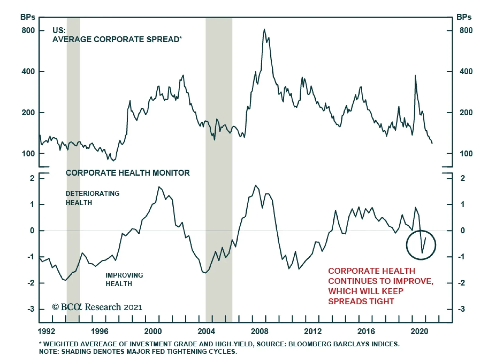
Last week’s report looked at how the June FOMC meeting prompted a massive re-shaping of the Treasury curve.1 It didn’t discuss, however, the impact that June’s meeting had on credit spreads. There’s a simple reason for this. Corporate bond spreads didn’t move very much post-FOMC. In fact, neither investment grade nor high-yield spreads have widened significantly during the past two weeks, despite the Fed’s apparent “hawkish turn” (Chart 1). The VIX jumped briefly above 20 in the days following the Fed meeting but it has since re-discovered its lows (Chart 1, bottom panel). This week’s report considers whether the corporate bond market is too complacent. The first section updates our assessment of where we are in the credit cycle based on two indicators that did see large swings post-Fed. The second section updates our outlook for high-yield defaults and considers whether junk spreads continue to offer adequate compensation. Finally, the third section of this report presents an introductory look at valuation in the USD-denominated Emerging Market (EM) corporate sector. We find that, for the most part, investment grade EM corporates are attractively valued relative to EM sovereigns and US corporates of the same credit rating and duration. Credit Cycle Update Chart 2Credit Cycle Indicators
Credit Cycle Indicators
Credit Cycle Indicators
As we have repeatedly stated in past research, the slope of the yield curve is a very important credit cycle indicator.2 We have documented that spread product tends to outperform duration-matched Treasuries by a wide margin when the yield curve is steep. This outperformance tapers off once the 3-year/10-year Treasury slope falls below 50 bps and it falls off even more when the slope dips below zero.3 With that in mind, it is notable that the Treasury curve flattened dramatically following the June FOMC meeting (Chart 2). At 106 bps, the 3-year/10-year Treasury slope remains well above the 50 bps threshold that would start to get concerning for spread product. However, it’s likely that the yield curve will continue to flatten as we approach a Fed rate hike in 2022. In other words, we expect that monetary conditions will turn sufficiently restrictive for us to reduce our recommended spread product allocation within the next 12-18 months. On the other hand, one positive development for spread product returns is that the 5-year/5-year forward TIPS breakeven inflation rate declined following the June FOMC meeting. In fact, it is now below the 2.3% to 2.5% range that is consistent with the Fed’s inflation target (Chart 2, bottom panel). This is a positive development for spread product because the Fed will strive to ensure that monetary conditions stay accommodative at least until these long-dated inflation expectations are consistent with the 2.3% to 2.5% target. Or put differently, a rebound in long-maturity TIPS breakeven inflation rates back to the target range will slow the near-term pace of curve flattening, giving the credit cycle a small amount of extra running room. In short, the macro environment is highly supportive for spread product and it will likely remain supportive for the next 12-18 months, at least until the yield curve flattens to below 50 bps. Investment Grade Corporates The highly supportive macro environment applies to investment grade corporate bonds, just as it does to all spread sectors. However, investment grade corporates have the problem that valuation is extremely tight. Much like a flat yield curve environment, a tight spread environment tends to coincide with low excess corporate bond returns. However, our research reveals that tight spreads alone are not sufficient for investment grade corporates to underperform duration-matched Treasuries. Table 1 classifies each month since May 1973 based on the investment grade corporate bond spread and the 3/10 Treasury slope. It then shows a 90% confidence interval for corporate bond excess returns during the following 12 months. It shows that, even when the corporate bond spread is below 100 bps (it is 81 bps today), investment grade corporates still tend to outperform duration-matched Treasuries as long as the 3/10 Treasury slope is above 50 bps. Table 1Expected 12-Month Corporate Bond Excess Return* (BPs) Based On OAS And Yield Curve Slope
The Post-FOMC Credit Environment
The Post-FOMC Credit Environment
Bottom Line: The yield curve has started to flatten but it remains very steep, consistent with spread product outperforming duration-matched Treasuries. We remain overweight spread product versus Treasuries but will re-consider this position once the yield curve flattens to below 50 bps. We expect this could happen within the next 12-18 months. We maintain only a neutral allocation to investment grade corporate bonds because of stretched valuations. We see more attractive opportunities in high-yield corporates (see next section), municipal bonds, USD-denominated EM sovereigns and USD-denominated EM corporates (see final section below). High-Yield Default Update We last updated our default rate outlook in March.4 At that time, we concluded that junk spreads offered adequate compensation for expected default losses. Since then, we have received nonfinancial corporate sector profit and debt growth data for the first quarter of 2021, crucial inputs to our macro-based default rate model. Our macro-based model of the 12-month trailing speculative grade default rate is based on nonfinancial corporate sector gross leverage (i.e. pre-tax profits over total debt) and C&I lending standards (Chart 3). Lending standards enter our model with a lag, but we need a forward-looking estimate of gross leverage for our model to generate predictions. Chart 3Macro-Driven Default Rate Model
Macro-Driven Default Rate Model
Macro-Driven Default Rate Model
To estimate gross leverage we first model corporate profit growth based on real GDP (Chart 4) and assume that real GDP grows by 7% over the next four quarters, consistent with the Fed’s median forecast. This gives us a profit growth expectation of roughly 30%. Chart 4Profit & Debt Growth
Profit & Debt Growth
Profit & Debt Growth
We also need an estimate for corporate debt growth. Corporate debt exploded last year, growing 10% in 2020, but it then slowed to an annualized rate of 4% in Q1 2021. We think corporate debt growth will remain slow going forward. The nonfinancial corporate sector financing gap has been negative in each of the past four quarters (Chart 4, bottom panel), meaning that retained earnings have exceeded capital expenditures. In other words, firms have built up a lot of excess capital that can be deployed in place of debt to finance new investment opportunities. Table 2 shows our model’s predicted 12-month default rate based on different assumptions for profit and debt growth. If we assume corporate profit growth of 30% and corporate debt growth between 0% and 8%, then our model predicts that the 12-month default rate will fall from its current 5.5% to a range of 2.3% - 2.8%. Table 2Default Rate Scenarios
The Post-FOMC Credit Environment
The Post-FOMC Credit Environment
Next, we need to consider what sort of expected default rate is priced into the High-Yield index. Our analysis of historical junk spreads and returns suggests that we should require a minimum excess spread of 100 bps in the High-Yield index after subtracting default losses to be confident that junk bonds will outperform Treasuries.5 If we also assume a recovery rate of 40% on defaulted debt, then we calculate that the High-Yield index is fairly priced for a 12-month default rate of 2.9% (Chart 5). That is, junk spreads appear slightly cheap compared to the 2.3% - 2.8% range predicted by our macro model. Finally, it’s worth noting that actual corporate default events have been quite rare in recent months. In the first five months of 2021 we’ve seen between 1 and 3 default events per month. If we extrapolate that trend and assume we see 3 defaults per month going forward, then we calculate that the 12-month trailing default rate will fall to 2.0% by December, before leveling off at 2.2% (Chart 6). In other words, the recent trend has been one of significantly fewer defaults than predicted by our macro model Chart 5Spread-Implied Default Rate
Spread-Implied Default Rate
Spread-Implied Default Rate
Chart 6Recent Default Trends
Recent Default Trends
Recent Default Trends
Bottom Line: High-yield spreads still look fairly valued, or even slightly cheap, compared to our base case outlook for corporate defaults. Investors should continue to favor high-yield over investment grade corporates and maintain an overweight allocation to high-yield in US bond portfolios. An Attractive Opportunity In EM Corporates This week we present an introductory look at the risk/reward opportunity in USD-denominated EM corporate bonds. Specifically, we look at the investment grade Bloomberg Barclays USD-denominated EM Corporate & Quasi-Sovereign index. We compare this index to both the investment grade USD-denominated EM Sovereign index and the US Credit index.6 First, we look at recent performance trends and average index statistics (Table 3). Both the EM Corporate and EM Sovereign indexes have average credit ratings between A and Baa, so we compare their performance to the A-rated and Baa-rated US Credit indexes. We observe a significant option-adjusted spread (OAS) advantage in both the EM indexes, though part of the extra spread offered by the Sovereign index is compensation for its longer duration. The EM Corporate index sticks out as offering an extremely attractive OAS per unit of duration. Table 3Performance Trends & Index Statistics
The Post-FOMC Credit Environment
The Post-FOMC Credit Environment
As for performance, we see that the EM Corporate index experienced less of a drawdown (in excess return terms) during the COVID recession, though it has also returned less than both the EM Sovereign index and the Baa Credit index during the recent upswing. Chart 7Spreads Versus Credit Rating & Duration-Matched US Credit
The Post-FOMC Credit Environment
The Post-FOMC Credit Environment
Next, we look at each individual credit tier of both the EM Corporate & Quasi-Sovereign index and the EM Sovereign index, and we calculate the spread relative to a credit rating and duration-matched position in the US Credit index (Chart 7). In general, we see that both EM indexes offer a spread advantage versus duration-matched US Credit across all credit rating tiers. EM sovereigns look better than EM corporates in the Aa credit tier. This is the result of attractive spreads on the sovereign bonds of UAE and Qatar. However, EM corporates clearly dominate sovereigns in both the A and Baa credit tiers. Finally, we consider the risk/reward trade-off in our EM indexes by using our Excess Return Bond Map. Our Excess Return Bond Map shows the relationship between expected return (on the vertical axis) and risk (on the horizontal axis). In Chart 8A our risk measure is the 12-month spread widening required for each index to lose 100 bps versus a position in duration-matched Treasuries divided by that index’s historical spread volatility. It can be thought of as the number of standard deviations of spread widening required for the index to provide an excess return of -100 bps. A higher value corresponds to less risk, and vice-versa. Chart 8B uses the same risk measurement, only we use the spread widening required to lose 500 bps versus Treasuries to assess the risk of a large drawdown. Both Charts 8A and 8B use OAS as the measure of expected return. Chart 8AExcess Return Bond Map (100 BPs Loss Threshold)
The Post-FOMC Credit Environment
The Post-FOMC Credit Environment
Chart 8BExcess Return Bond Map (500 BPs Loss Threshold)
The Post-FOMC Credit Environment
The Post-FOMC Credit Environment
The first thing that sticks out in Charts 8A & 8B is that Baa-rated EM corporates offer greater expected return and less risk than the EM Sovereign index and the Baa US Credit Index. This is true whether our loss threshold is set at 100 bps or 500 bps. Unfortunately, we do not have sufficient data to split the EM Sovereign index by credit tier in these charts. A-rated EM corporates offer slightly less expected return than the EM Sovereign index but with significantly less risk, they also clearly dominate the A-rated US Credit Index. Aa-rated EM corporates appear to offer a similar risk/reward trade-off as the EM Sovereign index, though we know from Chart 7 that sovereigns have a spread advantage in the Aa credit tier. The bottom line is that USD-denominated EM corporates are attractively valued relative to investment grade US corporate bonds with the same duration and credit rating. EM corporates also look preferable to EM sovereigns in the A and Baa credit tiers. EM sovereigns are more attractive than EM corporates in the Aa credit tier. Within the A and Baa credit tiers, US bond investors should favor USD-denominated EM corporates over USD-denominated EM sovereigns and should favor both over US corporate bonds. Within the Aa credit tier, investors should favor USD-denominated EM sovereigns over USD-denominated EM corporates and should favor both over US corporate bonds. Ryan Swift US Bond Strategist rswift@bcaresearch.com Footnotes 1 Please see US Bond Strategy / Global Fixed Income Strategy Weekly Report, “How To Re-Shape The Yield Curve Without Really Trying”, dated June 22, 2021. 2 Please see US Bond Strategy Weekly Report, “Lower For Longer, Then Faster Than You Think”, dated May 25, 2021. 3 We use the 3-year/10-year Treasury slope in place of the more widely tracked 2-year/10-year slope in our credit cycle research only because using the 3-year/10-year slope allows us to include more historical cycles in our analysis. 4 Please see US Bond Strategy Weekly Report, “That Uneasy Feeling”, dated March 30, 2021. 5 Please see page 33 of the US Bond Strategy Quarterly Chartpack, “Testing The Limits Of Transitory Inflation”, dated May 18, 2021. 6 The US Credit Index consists predominantly of US corporate bonds, but also some non-corporate credit such as: Sovereigns, Foreign Agencies, Domestic Agencies, Local Authority bonds and Supranationals. Fixed Income Sector Performance Recommended Portfolio Specification
Feature Chart 1A Tug-Of-War In The US Treasury Market
A Tug-Of-War In The US Treasury Market
A Tug-Of-War In The US Treasury Market
This week, we are publishing one of our periodic reports, covering global central bank lending standard surveys. Yet given some of the moves seen in US bond markets recently, we felt the need to also provide some additional thoughts, along with that previously scheduled report. The short-term volatility of longer-maturity US Treasury yields since the June 16 FOMC meeting has been a bit extreme, to say the least. The 30-year yield fell from an intraday peak of 2.21% just before the Fed meeting to an intraday low of 1.93% on June 21, a 28bp plunge in a span of just three trading days, but has climbed back to 2.10% as we go to press. Over that same time frame, shorter maturity yields have been relatively more stable. After the 5-year yield rose from 0.78% on 0.93% immediately following the “hawkish” Fed surprise on FOMC Day, the yield has largely held those gains, hitting only a brief intraday low of 0.84% on June 21, and now sits at 0.90%. This price action is consistent with the two opposing forces currently at work in the US Treasury market. Investors are slowly repricing the expected path of Fed policy, pulling forward the liftoff date of the fed funds rate in line with the new “guidance” from the FOMC interest rate forecasts. This is putting upward pressure on the shorter maturity part of the Treasury curve. At the same time, the market continues to work off the deeply oversold condition that had developed in longer-maturity Treasuries, as we discussed in a recent report.1 The sharp volatility of the 30yr yield is consistent with a rapid adjustment of positioning, which had become very short when looking at measures like the CFTC data on 30-year bond futures net positioning (Chart 1). Chart 2Corporate Bond Investors Appear Far Less Worried Than Equity Investors
Corporate Bond Investors Appear Far Less Worried Than Equity Investors
Corporate Bond Investors Appear Far Less Worried Than Equity Investors
Once that overhang of short positioning in longer maturity yields is worked off, the overall Treasury yield curve will begin moving higher again, continuing the cyclical bear market. The next increase in yields, however, will look different than what occurred between August 2020 and March 2021, when rising growth and inflation expectations resulted in a bearish steepening of the Treasury curve. The next move will be led by yields rising more at the front end of the curve, as the Fed begins the long march toward policy normalization. This will result in a bearish flattening of the Treasury curve, which motivated us to introduce a new US yield curve trade last week along with our colleagues at BCA Research US Bond Strategy – going short a 5-year bullet versus going long a duration-matched 2-year/10-year barbell. We have added that trade to our Tactical Overlay portfolio using specific on-the-run Treasury bonds, as can be seen in the table on page 7.2 While yields are jumping around in government bond markets, credit markets remain calm. Corporate bond spreads have been grinding tighter, in line with the steady decline in the VIX index of US equity volatility (Chart 2). Yet investors in other asset classes are exhibiting more cautious optimism. The soaring SKEW index has climbed to an all-time high, suggesting that demand for downside portfolio protection via S&P 500 put options is very robust with the equity index also at an all-time high. However, with the VIX falling, economic growth remaining solid, bank lending standards easing and the Fed not expected to even begin tapering its asset purchases until the start of 2022, the backdrop remains generally positive for US corporate debt versus US Treasuries. Next week, we will be presenting our quarterly review of the Global Fixed Income Strategy model bond portfolio, where we will present our base case and tail risk scenarios for global bond markets over the remaining months of 2021, along with our recommended portfolio positioning. Robert Robis, CFA Chief Fixed Income Strategist rrobis@bcaresearch.com Footnotes 1 Please see BCA Research Global Fixed Income Strategy Report, “A Summer Nap For Global Bond Yields”, dated June 9, 2021, available at gfis.bcaresearch.com. 2 Please see BCA Research US Bond Strategy/Global Fixed Income Strategy Report, “How To Re-Shape The Yield Curve Without Really Trying”, dated June 22, 2021, available at gfis.bcaresearch.com. Recommendations The GFIS Recommended Portfolio Vs. The Custom Benchmark Index
Some Brief Comments On Recent US Bond Market Moves
Some Brief Comments On Recent US Bond Market Moves
Duration Regional Allocation Spread Product Tactical Trades Yields & Returns Global Bond Yields Historical Returns
Despite the Fed backing away from the point of maximum monetary accommodation, threats to the corporate spreads are low. To begin with, even if QE ends this year and interest rates start rising in 2023, the fed funds rate remains far below the neutral rate…
Highlights Euro Area debt loads have increased significantly during the pandemic. Debt loads are not uniform. While Germany and, to a lesser extent, Spain look best, France has a less attractive total debt profile than Italy. Government debt-service ratios are not a problem for Europe. Private sector debt service ratios do not represent an imminent risk, but the French corporate sector is an important source of long-term vulnerability for the region. As a result of this indebtedness, Euro Area bond yields will not rise much and will be capped below 1.5% over this business cycle. For now, Eurozone corporate bonds remain attractive within a European fixed-income portfolio. High-yield bonds are appealing, but investors should avoid the energy sector. Feature Like the US, the Eurozone economy has witnessed a large increase in debt following the COVID-19 crisis. This debt load will have a long legacy that will impact the ability of the European Central Bank to increase interest rates over the coming years. The French corporate sector will be a particularly vulnerable pressure point. Nonetheless, in the short-term, this uptick in indebtedness will not have a major impact on European debt markets. Disparate Debt Loads… Chart 1The Eurozone's Heavy Debt Load
The Eurozone's Heavy Debt Load
The Eurozone's Heavy Debt Load
After a period of decline in the wake of both the GFC and the European debt crisis, total nonfinancial debt rose by 29% of GDP since the COVID-19 pandemic began (Chart 1). While some of this increase reflects a declining GDP, Euro Area Households and Corporations together added EUR609 billion of debt, while governments accumulated over EUR1 trillion more to their borrowings. The aggregate European picture does not impart the more complex reality. While all countries experienced a marked rise in indebtedness, some major economies are in a much more precarious position than others. The Good Among the largest Eurozone economies, Germany sports the most favorable debt profiles and represents the smallest threat to the Eurozone. Compared with the other major Euro Area countries, Spain shows healthier trends, even if its overall debt load remains important. At 202%, Germany’s nonfinancial-debt-to-GDP ratio is still below its all-time high of 211% (Chart 2, top panel). During the crisis, household debt rose by EUR296 billion or 4% of GDP, but it still stands well below the 72% registered at the turn of the millennium. In absolute terms, nonfinancial corporate debt has increased to a record, but it remains 5% below its 2003 high (Chart 2, third panel). Despite a 9% rebound to 70% of GDP, government debt still lies nearly 12% below its 2010 summit (Chart 2, bottom panel). In Spain, total nonfinancial debt rose by 45% of GDP since the pandemic started, but remains 12% below its 2013 all-time high of 301%. However, the private sector’s borrowing is well behaved, and it has only risen to 170% of GDP, well below the 227% level recorded in 2010 (Chart 3, top panel). Both the household and corporate sectors have gone a long way toward improving their debt situation, with borrowing 23% and 33%, respectively, below their crisis peaks (Chart 3, second and third panel). Spain’s problem is government debt. The pandemic forced the public sector to borrow EUR316 billion, which pushed its debt load to 120% of GDP (Chart 3, bottom panel). Chart 2Germany Is The Best Student
Germany Is The Best Student
Germany Is The Best Student
Chart 3Spain's Previous Efforts Have Paid Off
Spain's Previous Efforts Have Paid Off
Spain's Previous Efforts Have Paid Off
The Bad Chart 4Italy Remains Problematic
Italy Remains Problematic
Italy Remains Problematic
Italian debt remains a troublesome spot for the Eurozone, which sheds some light on the higher interest rate commanded by BTPs. Burdened by tepid GDP growth, Italy’s total nonfinancial debt did not decline much in the years between the European debt crisis and the onset of the pandemic. As a result, overall nonfinancial debt jumped to an all-time high of 276% of GDP in response to COVID-19 (Chart 4, top panel). Private sector nonfinancial credit is high by Italian standards, but at 120% of GDP, it is low compared with other major European or G-10 nations. Italian household debt has hit a record high of 45% of GDP, which also compares well to other countries, while corporate debt rose to 76% of GDP, which is also well below historical highs and other nations (Chart 4, second and third panels). Italy’s perennial problem remains the public sector’s debt, which stands at 156% of GDP, the highest reading among major Eurozone nations. The Ugly The major Eurozone country with the worst debt situation is France, and we expect this country to become an increasingly large hurdle on the ability of the ECB to lift rates in the future. Next week, we will devote a Special Report to the French situation. Chart 5France's Debt Binge
France's Debt Binge
France's Debt Binge
France’s nonfinancial debt towers above 350% of GDP, and the private sector nonfinancial debt has also hit an all-time high of 240% of GDP (Chart 5, top panel). No sector is spared. French households have accumulated EUR239 billion of liabilities during the pandemic, which pushed their leverage ratio to an all-time high of nearly 70% of GDP (Chart 5, second panel). Meanwhile, after rising by 21%, nonfinancial corporate credit stands above 170% of GDP (Chart 5, third panel). Finally, at 116% of GDP, public debt may not be as high as in Italy, but it is comparable to that of Spain (Chart 5, bottom panel). Bottom Line: The Eurozone indebtedness has hit a record high, but considering this factor in isolation oversimplifies a complicated picture. Among the major economies, Germany has the cleanest balance sheet, especially in terms of its private sector. Spain continues to sport high leverage, but the private sector remains in much better shape than last decade. Italy has made little progress, but it still looks good compared with France, where both the public and private sector borrowings stand at record highs. … And Debt Servicing Costs With the exception of the French corporate sector, debt-servicing costs do not represent a great risk for Europe. Chart 6Interest Payments Are Not The Government's Problem
Interest Payments Are Not The Government's Problem
Interest Payments Are Not The Government's Problem
When it comes to governments, the picture is particularly benign. As Chart 6 illustrates, debt-servicing costs as a percentage of GDP or tax revenues are extremely low in both France and Germany. While these two variables are higher in Italy and Spain, they remain distant from the levels recorded during the European debt crisis. Beyond their low levels, a very accommodative policy environment limits the risk created by Europe’s public debt servicing costs. The ECB has purchased EUR1.3 trillion of government bonds since April 2020, which added to its already large ownership. Moreover, BCA’s Global Fixed Income Strategy service, as well as this publication, anticipates that the ECB will roll the stock of government paper purchased under the PEPP into the PSPP. Beyond the ECB’s actions, the NGEU funds also create the embryo of fiscal risk sharing in the EU, which limits how far yields (and thus debt servicing costs) will rise in the Italy or Spain. For the private sector, the picture is more nuanced. In Germany, household debt-servicing costs are low, both historically and compared with other nations. Meanwhile, BIS data highlights that the nonfinancial corporate debt services consume a larger share of operating cash flows than at any point over the past 20 years, but they remain low by international standards (Chart 7, top panel). Meanwhile, in Spain and Italy, both the household and nonfinancial corporate sectors sport historically low debt servicing costs (Chart 7, second and third panels), which also compare well to other OECD nations. Once again, France stands out. Its household debt servicing costs are historically elevated, even if they are not particularly demanding at a global level. However, the corporate sector spends a substantial share of its cash flow on debt, both compared with its own history and internationally (Chart 7, bottom panel). Chart 7Debt Servicing Costs Across Europe
Debt Servicing Costs Across Europe
Debt Servicing Costs Across Europe
Bottom Line: Generally, the debt-service picture in Europe does not represent a major threat for now. While risks are particularly well contained on the government front, the French corporate sector creates danger for the private sector. Investment Implications The elevated debt load in the Euro Area, especially in the corporate sector, constitutes a crucial limiting factor for interest rates in Europe over the coming business cycle. Compared with global economies, the Eurozone corporate sector sports elevated debt ratios. As Chart 8 illustrates, the Eurozone’s net debt-to-equity ratio is higher than that of the US across most sectors, and even surpasses that of Canada, another country with a heavily indebted corporate sector, for telecommunication firms and financials. The picture is even worse when looking at the net debt-to-EBITDA ratio. Except for energy and utilities, the Eurozone carries poorer numbers than both the US and Canada (Chart 9). Chart 8Debt-To-Equity Ratio Comparison
A Lot Of Debt
A Lot Of Debt
Chart 9Net Debt-To-EBITDA Comparison
A Lot Of Debt
A Lot Of Debt
The picture for debt service payments is even more damning. Despite the very low European corporate bond rates, Eurozone corporations generally have poorer interest rate coverage ratios than both the US and Canada (Chart 10). This indicates that, unless the subpar European profitability is resolved, significantly higher interest rates will cause significant damage to the European corporate sector. Chart 10Interest Coverage Lags In Europe
A Lot Of Debt
A Lot Of Debt
Chart 11The French Corporate Sector And Dutch Households Will Limit The ECB
A Lot Of Debt
A Lot Of Debt
On this front, the French corporate sector once again stands out as the most likely place for an accident. As the top panel of Chart 11 shows, French firms are positioned especially poorly, with both their debt-to-GDP and debt-servicing costs among the highest in advanced economies. Meanwhile, in the household sectors, only the Netherlands represents a potential risk (Chart 11, bottom panel). The level of corporate debt in the Eurozone and in France in particular suggests that the current level of yields in Canada may represent a cap on European long-term rates. Thus, it will be difficult for German yields to move beyond the 1% to 1.5% zone this cycle. For now, despite the elevated debt loads of the European corporate sector, we continue to overweight corporate bonds within European fixed-income portfolios. The ECB will maintain very accommodative monetary conditions for the next 24 months, at least. Moreover, the European recovery, especially in the service sector, will improve the operating cash flows of the corporate sector, and thus, increase the tolerance of the private sector for higher yields in the near terms. Finally, the strength in the Euro anticipated by BCA’s Foreign Exchange strategists will limit the upside to Eurozone inflation, and thus, to yields in the region. Nonetheless, investors should avoid certain sectors (see next section). Market Focus: How To Play Euro Area High Yield Bonds? Chart 12Valuations Are Getting Expensive
Valuations Are Getting Expensive
Valuations Are Getting Expensive
We have argued that investors should continue to favor investment grade corporate bonds within European fixed-income portfolios over high-yield corporate bonds. Eurozone investment grade credit still offered enough value to delay a move down in quality (Chart 12). However, this value cushion is thinning and spreads are only 10 bps from their 2018 lows. BCA Research’s Global Fixed-Income strategists have recently increased their allocation to Euro Area high-yield to overweight, with a focus on the Ba-rated credit tier, while maintaining a neutral weighting in IG credit. However, European high-yield is also becoming expensive. The yield on the overall index is a meagre 44 bps away from its lows of 2018. Moreover, the breakeven spreads of European junk bonds have only been more expensive 11% of the time since 2000 (Chart 12, bottom panel). Despite these observations, high-yield credit is not a uniform block. Caa-rated debt still offers decent value, with a breakeven spread historical percentile standing at 27%. The stretched level of valuation suggests that investors should become more selective in the high-yield space, in order to avoid the industries with the worst risk profiles. To assess the sectors most at risk of experiencing significant spread widening or default occurrences in the coming quarters, we evaluate how the 10 main high-yield industry groups, as defined by Bloomberg Barclays, perform on the following credit metrics: Risk profile The share of firms rated Caa Growth in value of debt outstanding over the past 10 years Change in net debt-to-EBITDA ratio over the past 10 years Risk Profile Chart 13Risk Profile Of HY Sectors
A Lot Of Debt
A Lot Of Debt
We look at the duration-times-spread (DTS) ratio to determine the risk profile of each sector (Chart 13). The DTS is a simple measure that correlates closely with excess return volatility for corporate bonds. The ratio of an issue’s, or sector’s DTS, to that of the benchmark index is loosely equivalent to the beta of a stock or industry to the equity benchmark. A DTS ratio above 1.0 signals that the sector is cyclical (or “high beta”); a DTS ratio below 1.0 indicates that the sector is defensive (or “low beta”). Cyclical sectors are expected to outperform (underperform) the benchmark when spreads are narrowing (widening), while the opposite is expected of defensive sectors. In Europe, only three sectors sport a high DTS. Within these cyclical sectors, energy clearly stands out as essentially being the one most at risk of underperforming during the next episode of spread widening. Meanwhile, materials, healthcare, and utilities display the lowest DTS ratios and should trade defensively relative to the high-yield benchmark index. Share of Caa-rated debt Chart 14High Share Of Caa-Rated Debt Implies Higher Risk Of Default
A Lot Of Debt
A Lot Of Debt
The bulk of defaults happens in the Caa-rated space and below. Hence, evaluating sector risk starts by assessing the share of Caa-rated (and below) debt sported by each industry (Chart 14). Sectors bearing a larger share of low-rated debt should display higher spreads. Consumer non-cyclicals and healthcare have the highest instance of low-rated debt, 16% and 13% respectively, and yet their spreads do not adequately compensate investors for this threat. The energy sector also stands out: spreads are wide because, despite the low percentage of Caa-rated debt, this sector has amassed considerable debt and has seen a meaningful deterioration in net debt-to-EBITDA (see below). Meanwhile, utilities shine under this metric, as they have not issued debt rated Caa or lower. Debt Growth Chart 15Debt Growth Justify Spread Levels
A Lot Of Debt
A Lot Of Debt
The speed and amount of debt accumulated during economic recoveries are other important determinants of future spread volatility, because the sectors that have rapidly levered-up are more likely to experience defaults. Chart 15 shows that, if we ignore the outlying utilities, then there is a robust positive linear relationship between this metric and spreads. Utilities, energy, and the tech sectors have added the most debt, while debt accumulation in the basic materials and health care sectors has lagged over the past 10 years. Crucially, tech and communications spreads trade below what their debt growth implies. Net Debt-To-EBITDA Chart 16Only Financials Have Improved Their Net Debt-To-EBITDA
A Lot Of Debt
A Lot Of Debt
A rapid debt accumulation is not a concern, as long as earnings are rising more rapidly or at least at the same pace. From this case, we infer that companies are using the new debt issued efficiently, for CAPEX or to pursue projects exceeding their IRR. In this light, wide spreads are justified for the energy, consumer cyclical, and consumer non-cyclical sectors (Chart 16). Conversely, financials have seen improvement. Bottom Line: After surveying Euro area high-yield corporate sectors based on four credit metrics, it appears that the sectors most at risk are energy and consumer non-cyclical. By contrast, basic materials seem to be a good sector in which to hide. Mathieu Savary, Chief European Investment Strategist Mathieu@bcaresearch.com Jeremie Peloso, Associate Editor JeremieP@bcaresearch.com Currency Performance
A Lot Of Debt
A Lot Of Debt
Fixed Income Performance Government Bonds
A Lot Of Debt
A Lot Of Debt
Corporate Bonds
A Lot Of Debt
A Lot Of Debt
Equity Performance Major Stock Indices
A Lot Of Debt
A Lot Of Debt
Geographic Performance
A Lot Of Debt
A Lot Of Debt
Sector Performance
A Lot Of Debt
A Lot Of Debt
Highlights The ongoing transition to a post-pandemic state and fiscal policy are either positive or net-neutral for risky asset prices. Fiscal thrust will turn to fiscal drag over the coming year, but the negative impact this will have on goods spending will likely be offset by a significant improvement in services spending, and thus is not likely to cause a concerning slowdown in overall economic activity. A modestly hawkish shift in the outlook for monetary policy is likely over the coming year, potentially occurring over the late summer or early fall in response to outsized jobs growth. However, such a shift is not likely to become a negative driver for risky asset prices over the coming 6-12 months, barring a major rise in market expectations for the neutral rate of interest. This may very well occur once the Fed begins to raise interest rates, but not likely before. Investors should overweight risky assets within a multi-asset portfolio, and fixed-income investors should maintain a below-benchmark duration position. We continue to favor value over growth on a 6-12 month time horizon, although growth may outperform in the near term. A bias toward value over the coming year supports an overweight stance toward global ex-US equities, and an overall pro-risk stance favors bearish US dollar bets. Feature Three factors continue to drive our global macroeconomic outlook and our cyclical investment recommendations. The first factor is our assessment of the global progress that is being made on the path to a post-pandemic state, and the return to pre-COVID economic conditions; the second is the likely contribution to growth from fiscal policy over the coming year; and the third is the outlook for monetary policy and whether or not monetary conditions will remain stimulative for both economic activity and financial markets. If the world continues to progress meaningfully on the path to a post-pandemic state, and if the impact of fiscal and monetary policy remains in line with market expectations, then we see no reason to alter our recommended investment stance. Equity market returns will be modest over the coming 6 to 12 months in this scenario given how significantly stocks have rebounded from their low last year, but we would still expect stocks to outperform bonds and would generally be pro-cyclically positioned. We present below our assessment of these three factors and their potential to deviate from consensus expectations over the coming year, to determine their likely impact on economic activity and financial markets. The Ongoing Transition To A Post-Pandemic World Chart I-1Enormous Progress Has Been Made In The Fight Against COVID-19
Enormous Progress Has Been Made In The Fight Against COVID-19
Enormous Progress Has Been Made In The Fight Against COVID-19
Chart I-1 highlights that meaningful progress continues to be made in vaccinating the world's population against COVID-19. North America and Europe continue to lead the rest of the world based on the share of people who have received at least one dose, but South America continues to make significant gains, and recent data updates highlight that Asia and Oceania are also making meaningful progress. Africa is the clear laggard in the war against SARS-COV-2 and its variants, but progress there has been delayed, at least in part, by India’s export restrictions of the Oxford-AstraZeneca/COVISHIELD vaccine. This suggests that, while Africa will continue to lag, the share of Africans provided with a first dose of vaccine will begin to rise once India resumes its exports and deliveries to African countries under the COVAX program continue. If variants of the disease were not a source of concern, Chart I-1 would highlight that the full transition to a post-pandemic economy over the next several months would be near certain. However, as evidenced by the recent decision in the UK to postpone the lifting of COVID-19 restrictions by 4 weeks due to the spreading of the Delta variant, the global economy is not entirely out of the woods yet. Encouragingly, the delay in the UK genuinely appears to be temporary. Chart I-2 highlights that while the number of confirmed UK COVID-19 cases has been rising over the past month, the uptick in hospitalizations and fatalities has so far been quite muted. Importantly, the rise in hospitalizations appears to be occurring among those who have not yet been fully vaccinated, underscoring that variants of the disease are only truly concerning if they are vaccine-resistant. The evidence so far is that the Delta variant is more transmissible and may increase the risk of hospitalization, but that two doses of COVID-19 vaccine offer high protection. Of course, vaccines only offer protection if you get them, and evidence of vaccination hesitancy in the US is thus a somewhat worrying sign. Chart I-3 shows that the daily pace of vaccinations in the US has slowed significantly from mid-April levels, resulting in a slower rise in the share of the population that has received at least one dose (second panel). On this metric, the US has recently been outpaced by Canada, and the gap between the UK and the US is now widening. Germany and France are close behind the US and may surpass it soon. Chart I-2The UK Delay In Removing Restrictions Seems Genuinely Temporary
The UK Delay In Removing Restrictions Seems Genuinely Temporary
The UK Delay In Removing Restrictions Seems Genuinely Temporary
Chart I-3Recent Vaccination Progress In The US Has Been Underwhelming
Recent Vaccination Progress In The US Has Been Underwhelming
Recent Vaccination Progress In The US Has Been Underwhelming
Sadly, Chart I-4 highlights that there is a political dimension to vaccine hesitancy in the US. The chart shows that state by state vaccination rates as a share of the population are strongly predicted by the share of the popular vote for Donald Trump in the 2020 US presidential election. Admittedly, part of this relationship may also be capturing an urban/rural divide, with residents in less-dense rural areas (which typically support Republican presidential candidates) perhaps feeling a lower sense of urgency to become vaccinated against the disease. Chart I-4The US Politicization Of Vaccines Raises The Risk From COVID-19 Variants
July 2021
July 2021
But given the clear politicization that has already occurred over some pandemic control measures, such as the wearing of masks, Chart I-4 makes it difficult to avoid the conclusion that the same thing has occurred for vaccines. This is unfortunate, and seemingly raises the risk that the Delta variant may spread widely in red states over the coming several months, potentially delaying economic reopening, or risking the reintroduction of pandemic control measures. However, there are two counterarguments to this concern. First, non-vaccine immunity is probably higher in red than blue states, and CDC data suggest that this effect could be large. While this figure is still preliminary and subject to change (and likely will), the CDC estimates that only 1 out of 4.3 cases of COVID-19 were reported from February 2020 to March 2021. Taken at face value, this implies that there were approximately 115 million infections during that period, compared with under 30 million reported cases. That gap accounts for 25% of the US population, and given that red states were slower to implement pandemic control measures last year and their residents often more resistant to the measures, it stands to reason that a disproportionate share of unreported cases occurred in these states. Second, as noted above, the evidence thus far suggests that the Delta variant is not vaccine resistant, at least for those who are fully vaccinated. This is significant because if Delta were to spread widely in red states over the coming several months, the resulting increase in hospitalizations would likely convince many vaccine hesitant Americans to become vaccinated out of fear and self-interest – two powerfully motivating factors. Thus, the Delta variant may become a problem for the US in the fall, but if that occurs a solution is not far from sight. And, in other developed countries where vaccine hesitancy rates appear to be lower, it would seem that a new, vaccine-resistant variant of the disease would likely be required in order to cause a major disruption in the transition to a post-pandemic state. Such a variant could emerge, but we have seen no evidence thus far that one will before vaccination rates reach levels that would slash the odds of further widespread mutation. Fiscal Policy: Passing The Baton To Services Spending Chart I-5 highlights that US fiscal policy is set to detract from growth over the coming 6-12 months, reflecting the one-off nature of some of the fiscal response to the pandemic. This is true outside of the US as well, as Chart I-6 highlights that the IMF is forecasting a two percentage point increase in the Euro Area’s cyclically-adjusted primary budget balance, representing a significant amount of fiscal drag relative to the past two decades. Chart I-5Fiscal Thrust Will Eventually Turn To Fiscal Drag In The US…
July 2021
July 2021
Should investors be concerned about the impact of fiscal drag on advanced economies over the coming year? In our view, the answer is no. The reason is that much of the fiscal response in the US and Europe has been aimed at supporting income that has been lost due to a drastic reduction in services spending, which will continue to recover over the coming months as the effect of the pandemic continues to ebb. Chart I-7 underscores this point by highlighting the “gap” in US consumer goods and services spending relative to its pre-pandemic trend. The chart highlights that US goods spending is running well above what would be expected, whereas there is a sizeable gap in services spending (which accounts for approximately 70% of US personal consumption expenditures). Goods spending will likely slow as fiscal thrust turns to fiscal drag, but services spending will improve meaningfully – aided not just by a post-pandemic normalization in economic activity, but also by the sizeable amount of excess savings that US households have accumulated over the past year (Chart I-7, panel 2). Chart I-6... And In Europe
... And In Europe
... And In Europe
Chart I-7But Reduced Transfers Will Only Impact Spending On Goods, Not Services
But Reduced Transfers Will Only Impact Spending On Goods, Not Services
But Reduced Transfers Will Only Impact Spending On Goods, Not Services
While some of these savings have already been deployed to pay down debt and some may be permanently saved in anticipation of higher future taxes, the key point for investors is that the negative impact on goods spending from reduced fiscal thrust will be offset by a significant improvement in services spending, and thus is not likely to cause a concerning slowdown in overall economic activity. Monetary Policy: A Modestly Hawkish Shift Is Likely This leaves us with the question of whether or not monetary policy will become a negative driver for risky asset prices over the coming 6-12 months, which is especially relevant following last week’s FOMC meeting. The updated “dot plot” following the meeting shows that 7 of the 18 FOMC participants anticipate a rate hike in 2022, and the majority (13 members) expect at least one rate hike before the end of 2023, raising the median forecast for the Fed funds rate to 0.6% by the end of that year. Chart I-8 highlights that while 10-year Treasury yields remains mostly unchanged following the meeting, yields moved higher at the short-end and middle of the curve. Chart I-8The FOMC Meeting Resulted In Higher Short- And Mid-Term Yields
The FOMC Meeting Resulted In Higher Short- And Mid-Term Yields
The FOMC Meeting Resulted In Higher Short- And Mid-Term Yields
Investor fears that the Fed may shift in a significantly hawkish direction at some point over the next year have been far too focused on inflation, and far too little focused on employment. It is not a coincidence that the Fed’s guidance was updated following the May jobs report, which saw a stronger pace of jobs growth relative to April. Table I-1 updates our US Bond Strategy service’s calculations showing the average monthly nonfarm payroll growth that will be required for the unemployment rate to reach 3.5-4.5% assuming a full recovery in the participation rate, which is the range of the Fed’s NAIRU estimates. May’s payroll growth number of 560k implies that the Fed’s maximum employment criterion will be met sometime between June and September next year, if monthly payroll growth continues at that pace. Table I-1Calculating The Distance To Maximum Employment
July 2021
July 2021
Chart I-9Lighter Restrictions In Blue States Will Push Down The Unemployment Rate
Lighter Restrictions In Blue States Will Push Down The Unemployment Rate
Lighter Restrictions In Blue States Will Push Down The Unemployment Rate
It is currently difficult to assess with great confidence what average payroll growth will prevail over the coming year, but we noted in last month’s report that there were compelling arguments in favor of outsized jobs growth this fall.1 In addition to those points, we note the following: Blue states have generally been slower to reopen their economies, and Chart I-9 highlights that these states have consequently been slower to return to their pre-pandemic unemployment rate. Among blue states, California and New York are the largest by population, and it is notable that both states only lifted most COVID-19 restrictions on June 15 – including the wearing of masks in most settings. This implies that services jobs are likely to grow significantly in these states over the coming few months. Both consensus private forecasts as well as the Fed’s expectation for real GDP growth imply that the output gap will be closed by Q4 of this year (Chart I-10). These expectations appear to be reasonable, given the substantial amount of excess savings that have been accumulated by US households and the fact that monetary policy remains extremely stimulative. When the output gap turned positive during the last economic cycle, the unemployment rate was approximately 4% – well within the Fed’s NAIRU range. Chart I-10 also shows that the Fed’s 7% real GDP growth forecast for this year would put the output gap above its pre-pandemic level, when the unemployment rate stood at 3.5%. In fact, it is possible that annualized Q2 real GDP growth will disappoint current consensus expectations of 10%, due to the scarcity of labor supply (scarcity that will be eased by labor day when supplemental unemployment insurance benefit programs end). Were Q2 GDP to disappoint due to supply-side limitations, it would strengthen the view that job gains will be very strong this fall ceteris paribus, as it would highlight that real output per worker cannot rise meaningfully further in the short-term and that stronger growth later in the year will necessitate very large job gains. Chart I-11 highlights that US air travel and New York City subway ridership have already returned close to 75% and 50% of their pre-pandemic levels, respectively. Based on the trend over the past three months, the chart implies that air travel will return to its pre-pandemic levels by mid-October of this year, and New York City subway ridership by June 2022. This underscores that travel-related services employment will recover significantly in the fall, and that jobs in downtown cores will rebound as office workers progressively return to work. Chart I-10Expectations For Growth This Year Suggest A Rapid Decline In The Unemployment Rate
Expectations For Growth This Year Suggest A Rapid Decline In The Unemployment Rate
Expectations For Growth This Year Suggest A Rapid Decline In The Unemployment Rate
Chart I-11Services Employment Will Recover In The Fall
Services Employment Will Recover In The Fall
Services Employment Will Recover In The Fall
On the latter point, one major outstanding question affecting the outlook for monetary policy is the magnitude of the likely permanent impact of work from home policies on employment in central business districts. Fewer office workers commuting to downtown office locations suggests that some jobs in the leisure & hospitality, retail trade, professional & business services, and other services industries will never return or will be very slow to do so, arguing for a longer return to maximum employment (and the Fed’s liftoff date). We examine this question in depth in Section 2 of this month’s report, and find that the “stickiness” of work from home policies will likely cause permanent central business job losses on the order of 575k (or 0.35% of the February 2020 labor force). While this would be non-trivial, when compared with a pre-pandemic unemployment rate of 3.5%, WFH policies alone are not likely to cause a long-term deviation from the Fed’s maximum employment objective. Outsized jobs growth this fall, at a pace that quickly reduces the unemployment rate, argues for a first Fed rate hike that is even earlier than the market expects. Chart I-12 presents The Bank Credit Analyst service’s current assessment of the cumulative odds of the Fed’s liftoff date by quarter; we believe that it is likely that the Fed will have raised rates by Q3 of next year, and that a rate hike in the first half of 2022 is a possibility. These odds are slightly more aggressive than those presented by our fixed-income strategists in a recent Special Report,2 but are consistent with their view that the Fed will raise interest rates by the end of next year. Chart I-12The Bank Credit Analyst’s Assessment Of The Odds Of The First Rate Hike
July 2021
July 2021
The odds presented in Chart I-12 are also more hawkish than the Fed funds rate path currently implied by the OIS curve, meaning that we expect investors to be somewhat surprised by a shifting monetary policy outlook at some point over the coming year, potentially over the next 3-6 months. Payroll growth during the late summer and early fall will be a major test for the employment outlook, and is the most likely point for a hawkish shift in the market’s view of monetary policy. Is this likely to become a negative driver for risky asset prices over the coming 6-12 months? In our view, the answer is “probably not.” While investors tend to focus heavily on the timing of the first rate hike as monetary policy begins to tighten, the reality is that it is the least relevant factor driving the fair value of 10-year Treasury yields. Investor expectations for the pace of tightening and especially for the terminal Fed funds rate are far more important, and, while it is quite possible that expectations for the neutral rate of interest will eventually rise, it seems unlikely that this will occur before the Fed actually begins to raise interest rates given that most investors accept the secular stagnation narrative and the view that “R-star” is well below trend rates of growth (we disagree).3 Chart I-13 highlights the fair value path of 10-year Treasury yields until the end of next year, assuming a 2.5% terminal Fed funds rate, no term premium, and a rate hike pace of 1% per year. The chart highlights that while government bond yields are set to move higher over the coming 6-12 months, they are likely to remain between 2-2.5%. This would drop the equity risk premium to a post-2008 low (Chart I-14), which would further reduce the attractiveness of stocks relative to bonds. But we doubt that this would be enough of a decline to cause a selloff, and it would still imply a stimulative level of interest rates for households and firms. Chart I-1310-Year Yields Will Rise Over The Coming Year, But Not Sharply
10-Year Yields Will Rise Over The Coming Year, But Not Sharply
10-Year Yields Will Rise Over The Coming Year, But Not Sharply
Chart I-14Rising Yields Will Cause An Unwelcome But Contained Decline In The ERP
Rising Yields Will Cause An Unwelcome But Contained Decline In The ERP
Rising Yields Will Cause An Unwelcome But Contained Decline In The ERP
Investment Conclusions Among the three factors driving our global macroeconomic outlook and our cyclical investment recommendations, continued progress on the path toward a post-pandemic state and fiscal policy remain either positive or mostly neutral for risky assets. A potentially hawkish shift in the outlook for monetary policy this fall remains the chief risk, but we expect the rise in bond yields over the coming year to remain well-contained barring a sea change in investor expectations for the terminal Fed funds rate – which we believe is unlikely to occur before the Fed begins to raise interest rates. Consequently, we continue to recommend that investors should overweight risky assets within a multi-asset portfolio, and that fixed-income investors should maintain a below-benchmark duration position. We expect modest absolute returns from global equities, but even mid-single digit returns are likely to beat those from long-dated government bonds and cash positions. While value stocks may underperform growth stocks over the coming 3-4 months,4 rising bond yields over the coming year will ultimately favor value stocks and will likely weigh on elevated tech sector (and therefore growth stock) valuations (Chart I-15). Chart I-16 highlights that the attractiveness of US value versus growth is meaningfully less compelling for the S&P 500 Citigroup indexes, suggesting that investors should continue to favor MSCI-benchmarked value over growth positions over a 6-12 month time horizon.5 Chart I-15Value Is Extremely Cheap
Value Is Extremely Cheap
Value Is Extremely Cheap
Chart I-16Value Vs. Growth: The Benchmark Matters
Value Vs. Growth: The Benchmark Matters
Value Vs. Growth: The Benchmark Matters
The likely outperformance of value versus growth also has implications for regional allocation within a global equity portfolio. The US is significantly overweight broadly-defined technology relative to global ex-US stocks, and financials – which are overrepresented in value indexes – have already meaningfully outperformed in the US this year compared with their global peers and are now rolling over (Chart I-17). This underscores that investors should favor ex-US stocks over the coming year, skewed in favor of DM ex-US given that China’s credit impulse continues to slow (Chart I-18). Chart I-17Favor Global Ex-US Stocks Over The Coming Year
Favor Global Ex-US Stocks Over The Coming Year
Favor Global Ex-US Stocks Over The Coming Year
Chart I-18Concentrate Global Ex-US Exposure In Developed Markets
Concentrate Global Ex-US Exposure In Developed Markets
Concentrate Global Ex-US Exposure In Developed Markets
Finally, global ex-US stocks also tend to outperform when the US dollar is falling, and we would recommend that investors maintain a short dollar position on a 6-12 month time horizon despite the recent bounce in the greenback. Chart I-19 highlights that the dollar remains strongly negatively correlated with global equity returns, and that the dollar’s performance over the past year has been almost exactly in line with what one would have expected given this relationship. Thus, a bullish view toward global stocks implies both US dollar weakness and global ex-US outperformance over the coming year. Chart I-19A Bullish View Towards Global Stocks Implies A Dollar Bear Market
A Bullish View Towards Global Stocks Implies A Dollar Bear Market
A Bullish View Towards Global Stocks Implies A Dollar Bear Market
Jonathan LaBerge, CFA Vice President The Bank Credit Analyst June 24, 2021 Next Report: July 29, 2021 II. Work From Home “Stickiness” And The Outlook For Monetary Policy Work from home policies, originally designed as emergency measures in the early phase of the COVID-19 pandemic, are likely to be “sticky” in a post-pandemic world. This will negatively impact the labor market in central business districts, via reduced spending on services by office workers. The potential impact of working from home is often cited as an example of what is likely to be a lasting and negative effect on jobs growth, but we find that it is not likely to be a barrier to the labor market returning to the Fed’s assessment of “maximum employment.” The size of the impact depends importantly on whether employee preferences or employer plans for WFH prevail, but our sense is that the latter is more likely. A weaker pace of structures investment in response to elevated office vacancy rates will likely have an even smaller impact on growth than the effect of reduced central business district services employment. The contribution to growth from structures investment has been small over the past few decades, office building construction is a small portion of overall nonresidential structures, and there are compelling arguments that the net stock of office structures will stay flat, rather than decline. Our analysis suggests that job growth over the coming year could be even stronger than the Fed and investors expect, possibly resulting in a first rate hike by the middle of next year. This would be earlier than we currently anticipate, but it underscores that fixed-income investors should remain short duration on a 6-12 month time horizon, and that equity investors should favor value over growth positions beyond the coming 3-4 months. The outlook for US monetary policy over the next 12 to 18 months depends almost entirely on the outlook for employment. Many investors are focused on the potential for elevated inflation to force the Fed to raise interest rates earlier than it currently anticipates, but it is the progress in returning to “maximum employment” that will determine the timing of the first Fed rate hike – and potentially the speed at which interest rates rise once policy begins to tighten. In this report, we estimate the extent to which the “stickiness” of working from home (WFH) policies and practices could leave a lasting negative impact on the US labor market. We noted in last month's report that a large portion of the employment gap relative to pre-pandemic levels can be traced to the leisure & hospitality and professional and business services industries, both of which – along with retail employment – stand to be permanently impaired if the office worker footprint is much lower in a post-COVID world.6 Using employee surveys and a Monte Carlo approach, we present a range of estimates for the permanent impact of WFH policies on the unemployment rate, and separately examine the potential for lower construction of office properties to weigh on growth. We find that the impact of reduced office building construction is likely to be minimal, and that WFH policies may structurally raise the unemployment rate by 0.3 to 0.4%. While non-trivial, when compared with a pre-pandemic unemployment rate of 3.5%, WFH policies alone are not likely to cause a long-term deviation from the Fed’s maximum employment objective. Relative to the Fed’s expectations of a strong, lasting impact on the labor market from the pandemic, this suggests that job growth over the coming year could be even stronger than the Fed and investors expect, possibly resulting in a first rate hike by the middle of next year. This would be earlier than we currently anticipate, but it underscores that fixed-income investors should remain short duration on a 6-12 month time horizon, and that equity investors should favor value over growth positions beyond the coming 3-4 months (a period that may see outperformance of the latter). Quantifying The Labor Market Impact Of The New Normal For Work In a January paper, Barrero, Bloom, and Davis (“BBD”) presented evidence arguing why working from home will “stick.” The authors surveyed 22,500 working-age Americans across several survey “waves” between May and December 2020, and asked about both their preferences and their employer’s plans about working from home after the pandemic. Chart II-1 highlights that the desired amount of paid work from home days (among workers who can work from home) reported by the survey respondents is to approximately 55% of a work week, suggesting that a dramatic reduction in office presence would likely occur if post-pandemic WFH policies were set fully in accordance with worker preferences. Chart II-1Employee Preferences Imply A Dramatic Reduction In Post-COVID Office Presence
July 2021
July 2021
However, Table II-1 highlights that employer plans for work from home policies are meaningfully different than those of employees. The table highlights that employers plan for employees to work from home for roughly 22% of paid days post-pandemic, which essentially translates to one day per week on average.7 BBD noted that CEOs and managers have cited the need to support innovation, employee motivation, and company culture as reasons for employees’ physical presence. Managers believe physical interactions are important for these reasons, but employees need only be on premises for about three to four days a week to achieve this. Table II-1 also shows that employers plan to allow higher-income employees more flexibility in terms of working from home, and less flexibility to employees whose earnings are between $20-50k per year. Table II-1Employer Plans, However, Imply Less Working From Home Than Employees Prefer
July 2021
July 2021
Based on the survey results, BBD forecast that expenditure in major cities such as Manhattan and San Francisco will fall on the order of 5 to 10%. In order to understand the national labor market impact of work from home policies and what implications this may have on monetary policy, we scale up BBD’s calculations using a Monte Carlo approach that incorporates estimate ranges for several factors: The percent of paid days now working from home for office workers The amount of money spent per week by office workers in central business districts (“CBDs”) The number of total jobs in CBDs The percent of CBD jobs in industries likely to be negatively impacted by reduced office worker expenditure The average weekly earnings of affected CBD workers The average share of business revenue not attributable to strictly variable expenses The percent of affected jobs likely to be recovered outside of CBDs Our approach is as follows. First, we calculate the likely reduction in nationwide CBD spending from reduced office worker presence by multiplying the likely percent of paid days now permanently working from home by the number of total jobs in CBDs and the average weekly spending of office workers. This figure is then increased due to the estimated acceleration in net move outs from principal urban centers in 2020 (Chart II-2); we assume a 5% savings rate and an average annual salary of $50k for these resident workers, and assume that all of their spending occurred within CBDs. We also assume that roughly 50% of jobs connected to this spending are recovered. Chart II-2Fewer Residents Will Also Lower Spending In Central Business Districts
July 2021
July 2021
Then, we calculate the gross number of jobs lost in leisure & hospitality, retail trade, and other services by multiplying this estimate of lost spending by an estimate of non-variable costs as a share of revenue for affected industries, and dividing the result by average weekly earnings of affected employees. For affected CBD employees in the administrative and waste services industry, we simply assume that the share of jobs lost matches the percent of paid days now permanently working from home. Finally, we adjust the number of jobs lost by multiplying by 1 minus an assumed “recovery” rate, given that some of the reduction in spending in CBDs will simply be shifted to areas near remote workers’ residences. We assume a slightly lower recovery rate for lost jobs in the administrative and waste services industry. Table II-2 highlights the range of outcomes for each variable used in our simulation, and Charts II-3 and II-4 present the results. The charts highlight that the distribution of outcomes based on employer WFH intensions suggest high odds that nationwide job losses in CBDs due to reduced office worker presence will not exceed 400k. Based on average employee preferences, that number rises to roughly 800-900k. Table II-2The Factors Affecting Permanent Central Business District Job Losses
July 2021
July 2021
Chart II-3The Probability Distribution Of CBD Jobs Lost…
July 2021
July 2021
Chart II-4…Based On Our Monte Carlo Approach
July 2021
July 2021
This raises the question of whether employer plans or employee preferences for WFH arrangements will prevail. Our sense is that it will be closer to the former, given that we noted above that employer WFH plans are the least flexible for employees whose earnings are between $20-50k per year (who are presumably employees who have less ability to influence the policy of firms). Chart II-5 re-presents the projected job losses shown in Chart II-4 as a share of the February 2020 labor force, along with a probability-weighted path that assumes a 75% chance that employer WFH plans will prevail. The chart highlights that WFH arrangements would have the effect of raising the unemployment rate by approximately 0.35%. However, relative to a pre-pandemic starting point of 3.5%, this would raise the unemployment rate to a level that would still be within the Fed’s NAIRU estimates (Chart II-6). Therefore, the “stickiness” of WFH arrangements alone do not seem to be a barrier to the labor market returning to the Fed’s assessment of “maximum employment,” suggesting that the conditions for liftoff may be met earlier than currently anticipated by investors. Chart II-5CBD Job Losses Will Not Be Trivial, But They Will Not Be Enormous
July 2021
July 2021
Chart II-6Sticky WFH Policies Will Not Prevent A Return To Maximum Employment
Sticky WFH Policies Will Not Prevent A Return To Maximum Employment
Sticky WFH Policies Will Not Prevent A Return To Maximum Employment
The Impact Of Lower Office Building Construction A permanently reduced office footprint could also conceivably impact the US economy through reduced nonresidential structures investment, as builders of commercial real estate cease to construct new office towers in response to expectations of a long-lasting glut. However, several points highlight that the negative impact on growth from US office tower construction will be even smaller than the CBD employment impact of reduced office worker presence that we noted above. First, Chart II-7 highlights the overall muted impact that nonresidential building investment has had on real GDP growth by removing the contribution to growth from nonresidential structures and for overall nonresidential investment. The chart clearly highlights that the historically positive contribution to real US output from capital expenditures over the past four decades has come from investment in equipment and intellectual property products, not from structures. Chart II-8 echoes this point, by highlighting that US real investment in nonresidential structures has in fact been flat since the early-1980s, contributing positively and negatively to growth only on a cyclical basis (not on a structural basis). Chart II-7Structures Have Not Contributed Significantly To US Growth For Some Time
Structures Have Not Contributed Significantly To US Growth For Some Time
Structures Have Not Contributed Significantly To US Growth For Some Time
Chart II-8Nonresidential Structures Investment Has Been Flat For Four Decades
Nonresidential Structures Investment Has Been Flat For Four Decades
Nonresidential Structures Investment Has Been Flat For Four Decades
Second, Table II-3 highlights that office properties make up a small portion of investment in private nonresidential structures. In 2019, nominal investment in office structures amounted to $85 billion, compared with $630 billion in overall structures investment, meaning that office properties amounted to just 13% of structures investment. Table II-3Office Structures Investment Is A Small Share Of Total Structures Investment
July 2021
July 2021
Table II-4Conceivably, Vacant Office Properties Could Be Converted To Luxury Residential Units
July 2021
July 2021
Third, it is true that investment is a flow and not a stock variable, meaning that, if the net stock of office buildings were to fall as a result from WFH policies, then the US economy would see a potentially persistently negative rate of growth from nonresidential structures (which would constitute a drag on growth). But if the net stock were instead to remain flat, then gross office property investment should equal the depreciation of those structures. The second column of Table II-3 highlights that current-cost depreciation of office structures was $53 billion in 2019 (versus nominal gross investment of $85 billion). Had office property investment been ~$30 billion lower in 2019, it would have reduced nominal GDP by a mere 14 basis points (resulting in an annual growth rate of 3.84%, rather than 3.98%). Fourth, there is good reason to believe that the net stock of office properties will stay flat, as the economics of converting offices to luxury housing units (whose demand is not substantially affected by factors such as commuting) – either fully or partially into mixed-use buildings – appear to be plausible. Table II-4 highlights that the average annual asking rent for office space per square foot in Manhattan was $73.23 in Q1 2021, and that the recent median listing home price per square foot is roughly $1,400. In a frictionless world where office space could be instantly and effortlessly sold as residential property, existing prices would imply a healthy (gross) rental yield of 5.2%. Thoughts On The Future Of Office Properties Of course, reality is far from frictionless. There are several barriers that will slow office-to-residential conversion as well as construction costs, which will meaningfully lower the net value of existing office real estate in large central business districts such as Manhattan. In a recent article in the Washington Post, Roger K. Lewis, retired architect and Professor Emeritus of Architecture at the University of Maryland, College Park, detailed several of these technical barriers (which we summarize below).8 Office buildings are typically much wider than residential buildings, the latter usually being 60 to 65 feet in width in order to enable windows and natural light in living/dining rooms and bedrooms. This suggests that office-to-residential conversion might require modifying the basic structure of office buildings, including cutting open parts of roof and floor plates on upper building levels to bring natural light into habitable and interior rooms, and other costly structural modifications to address the additional plumbing and infrastructure that will be needed. Lewis noted that floor-to-floor dimensions are typically larger in office buildings, which is beneficial for office-to-residential conversion because increased room heights augments the sense of space and openness, while allowing natural light to penetrate farther into the apartment. It also allows for extra space to place needed additional building infrastructure, such as sprinkler pipes, electrical conduits, light fixtures, and air ducts. But unique apartment layouts are often needed to use available floor space effectively in an office-to-residential conversion, which will increase design costs and raise the risk that nonstandard layouts may result in unforeseen quality-of-living problems that will necessitate additional future construction to correct. Zoning regulations and building code constraints will likely add another layer of costs to office-to-housing conversions, as these rules are written for conventional buildings, meaning that special exceptions or even regulatory changes are likely to be required. So it is clear that the process of converting office space to residential property will be a costly endeavor for office tower owners, which will likely reduce the net present value of these properties relative to pre-pandemic levels. But; this process appears to be feasible and, when faced with the alternative of persistently high vacancy rates and lost revenue, our sense is that office tower owners will choose this route – thus significantly reducing the likelihood that the growth in national gross investment in office properties will fall below the rate of depreciation. In addition, the trend in suburban and CBD office property prices suggests that there are two other possible alternatives to widespread office-to-residential conversion that would also argue against a significant and long-lasting decline in office structures investment. Chart II-9 highlights that the average asking rent has already fallen significantly in most Manhattan submarkets, and Chart II-10 highlights that suburban office prices are accelerating and rising at the strongest pace relative to CBD office prices over the past two decades, possibly in response to increased demand for workspace that is closer to home for many workers who previously commuted to CBDs. Chart II-9Working From The Office Is Getting Cheaper
July 2021
July 2021
Chart II-10Suburban Offices Are Getting More Expensive
Suburban Offices Are Getting More Expensive
Suburban Offices Are Getting More Expensive
Thus, the first alternative outcome to CBD office-to-residential conversion is that an increase in suburban office construction offsets the negative impact of outright reductions in CBD office investment if residential conversions prove to be too costly or too technically challenging. The second alternative is that owners of CBD office properties “clear the market” by dramatically cutting rental rates even further, to alter the cost/benefit calculation for firms planning permissive WFH policies. We doubt that existing rents reflect the extent of vacancies in large cities such as Manhattan, so we would expect further CBD office price declines in this scenario. But if owners of centrally-located office properties face significant conversion costs and a decline in the net present value of these buildings is unavoidable and its magnitude uncertain, owners may choose to cut prices drastically as the simpler solution. Investment Conclusions Holding all else equal, the fact that owners of CBD office properties are likely to experience some permanent decline in the value of these real estate assets is not a positive development for economic activity. But these losses will be experienced by firms, investors, and ultra-high net worth individuals with strong marginal propensities to save, suggesting that the economic impact from this shock will be minimal. And as we highlighted above, a decline in the pace of gross office building investment to the depreciation rate will have a minimal impact on the overall economy. This leaves the likely impact on CBD employment as the main channel by which WFH policies are likely to affect monetary policy. As we noted above and as discussed in Section 1 of our report, the Fed is now focused entirely on the return of the labor market to maximum employment, which we interpret as an unemployment rate within the range of the Fed’s NAIRU estimates (3.5% - 4.5%) and a return to a pre-pandemic labor force participation rate. Chart II-11On A One-Year Time Horizon, Favor Value Over Growth
On A One-Year Time Horizon, Favor Value Over Growth
On A One-Year Time Horizon, Favor Value Over Growth
Our analysis indicates that WFH policies may structurally raise the unemployment rate by 0.3 to 0.4%. While non-trivial, when compared with a pre-pandemic unemployment rate of 3.5%, this suggests that WFH policies alone are not likely to cause a long-term deviation from the Fed’s maximum employment objective. The implication is that job growth over the coming year could be even stronger than the Fed and investors expect, which could mean that the Fed may begin lifting rates by the middle of next year barring a major disruption in the ongoing transition to a post-pandemic world. This is earlier than we currently expect, but the fact that it would also be earlier than what is currently priced into the OIS curve underscores that fixed-income investors should remain short duration on a 6-12 month time horizon. In addition, as noted in Section 1 of our report, while value stocks may underperform growth stocks over the coming 3-4 months,9 rising bond yields over the coming year will ultimately favor value stocks and will likely weigh on elevated tech sector valuations. Chart II-11 highlights that the relative valuation of growth stocks remains above its pre-pandemic starting point (Chart II-11), suggesting that investors should continue to favor MSCI-benchmarked value over growth positions over a 6-12 month time horizon. Finally, as also noted in Section 1 of our report, we do not expect rising bond yields to prevent stock prices from grinding higher over the coming year, unless investor expectations for the terminal fed funds rate move sharply higher – an event that seems unlikely, although not impossible, before monetary policy actually begins to tighten. Jonathan LaBerge, CFA Vice President The Bank Credit Analyst III. Indicators And Reference Charts BCA’s equity indicators highlight that the “easy” money from expectations of an eventual end to the pandemic have already been made. Our technical, valuation, and sentiment indicators are very extended, highlighting that investors should expect positive but more modest returns from stocks over the coming 6-12 months. Our monetary indicator has aggressively retreated from its high last year, reflecting a meaningful recovery in government bond yields since last August. The indicator still remains above the boom/bust line, however, highlighting that monetary policy remains supportive for risky asset prices. Forward equity earnings already price in a complete earnings recovery, but for now there is no meaningful sign of waning forward earnings momentum. Net revisions remain very strong, and positive earnings surprises have risen to their highest levels on record. Within a global equity portfolio, there has been a modest tick down in global ex-US equity performance, driven by a rally in growth stocks (which may persist for a few months). EM stocks had previously dragged down global ex-US performance, and they continue to languish. A bias towards value stocks on a 1-year time horizon means that investors should still favor ex-US stocks over the coming year, skewed in favor of DM ex-US given that China’s credit impulse continues to slow. The US 10-Year Treasury yield has trended modestly lower since mid-March, after having risen to levels that were extremely technically stretched. Despite this pause, our valuation index highlights that bonds are still expensive, and we expect that yields will move higher over the cyclical investment horizon if employment growth in Q3/Q4 implies a faster return to maximum employment than currently projected by the Fed. We expect the rise to be more modest than our valuation index would imply, but we would still recommend a short duration stance within a fixed-income portfolio. The extreme rise in some commodity prices over the past several months is beginning to ease. Lumber prices have fallen close to 50% from their recent high, whereas industrial metals and agricultural prices are down roughly 5% and 17%, respectively. We had previously argued that a breather in commodity prices was likely at some point over the coming several months, and we would expect further declines as supply chains normalize, labor supply recovers, and Chinese demand for metals slows. US and global LEIs remain in a solid uptrend, and global manufacturing PMIs are strong. Our global LEI diffusion index has declined significantly, but this likely reflects the outsized impact of a few emerging market countries (whose vaccination progress is still lagging). Strong leading and coincident indicators underscore that the global demand for goods is robust, and that output is below pre-pandemic levels in most economies because of very weak services spending. The latter will recover significantly later this year, as social distancing and other pandemic control measures disappear. EQUITIES: Chart III-1US Equity Indicators
US Equity Indicators
US Equity Indicators
Chart III-2Willingness To Pay For Risk
Willingness To Pay For Risk
Willingness To Pay For Risk
Chart III-3US Equity Sentiment Indicators
US Equity Sentiment Indicators
US Equity Sentiment Indicators
Chart III-4US Stock Market Breadth
US Stock Market Breadth
US Stock Market Breadth
Chart III-5US Stock Market Valuation
US Stock Market Valuation
US Stock Market Valuation
Chart III-6US Earnings
US Earnings
US Earnings
Chart III-7Global Stock Market And Earnings: Relative Performance
Global Stock Market And Earnings: Relative Performance
Global Stock Market And Earnings: Relative Performance
Chart III-8Global Stock Market And Earnings: Relative Performance
Global Stock Market And Earnings: Relative Performance
Global Stock Market And Earnings: Relative Performance
FIXED INCOME: Chart III-9US Treasurys And Valuations
US Treasurys And Valuations
US Treasurys And Valuations
Chart III-10Yield Curve Slopes
Yield Curve Slopes
Yield Curve Slopes
Chart III-11Selected US Bond Yields
Selected US Bond Yields
Selected US Bond Yields
Chart III-1210-Year Treasury Yield Components
10-Year Treasury Yield Components
10-Year Treasury Yield Components
Chart III-13US Corporate Bonds And Health Monitor
US Corporate Bonds And Health Monitor
US Corporate Bonds And Health Monitor
Chart III-14Global Bonds: Developed Markets
Global Bonds: Developed Markets
Global Bonds: Developed Markets
Chart III-15Global Bonds: Emerging Markets
Global Bonds: Emerging Markets
Global Bonds: Emerging Markets
CURRENCIES: Chart III-16US Dollar And PPP
US Dollar And PPP
US Dollar And PPP
Chart III-17US Dollar And Indicator
US Dollar And Indicator
US Dollar And Indicator
Chart III-18US Dollar Fundamentals
US Dollar Fundamentals
US Dollar Fundamentals
Chart III-19Japanese Yen Technicals
Japanese Yen Technicals
Japanese Yen Technicals
Chart III-20Euro Technicals
Euro Technicals
Euro Technicals
Chart III-21Euro/Yen Technicals
Euro/Yen Technicals
Euro/Yen Technicals
Chart III-22Euro/Pound Technicals
Euro/Pound Technicals
Euro/Pound Technicals
COMMODITIES: Chart III-23Broad Commodity Indicators
Broad Commodity Indicators
Broad Commodity Indicators
Chart III-24Commodity Prices
Commodity Prices
Commodity Prices
Chart III-25Commodity Prices
Commodity Prices
Commodity Prices
Chart III-26Commodity Sentiment
Commodity Sentiment
Commodity Sentiment
Chart III-27Speculative Positioning
Speculative Positioning
Speculative Positioning
ECONOMY: Chart III-28US And Global Macro Backdrop
US And Global Macro Backdrop
US And Global Macro Backdrop
Chart III-29US Macro Snapshot
US Macro Snapshot
US Macro Snapshot
Chart III-30US Growth Outlook
US Growth Outlook
US Growth Outlook
Chart III-31US Cyclical Spending
US Cyclical Spending
US Cyclical Spending
Chart III-32US Labor Market
US Labor Market
US Labor Market
Chart III-33US Consumption
US Consumption
US Consumption
Chart III-34US Housing
US Housing
US Housing
Chart III-35US Debt And Deleveraging
US Debt And Deleveraging
US Debt And Deleveraging
Chart III-36US Financial Conditions
US Financial Conditions
US Financial Conditions
Chart III-37Global Economic Snapshot: Europe
Global Economic Snapshot: Europe
Global Economic Snapshot: Europe
Chart III-38Global Economic Snapshot: China
Global Economic Snapshot: China
Global Economic Snapshot: China
Jonathan LaBerge, CFA Vice President The Bank Credit Analyst Footnotes 1 Please see The Bank Credit Analyst "June 2021," dated May 27, 2021, available at bca.bcaresearch.com 2 Please see US Bond Strategy/Global Fixed Income Strategy Special Report "A Central Bank Timeline For The Next Two Years," dated June 1, 2021, available at usbs.bcaresearch.com 3 Please see The Bank Credit Analyst Special Report "R-star, And The Structural Risk To Stocks," dated March 31, 2021, available at bca.bcaresearch.com 4 Please see US Equity Strategy "Rotate Into Growth Stocks, Be Granular In The Selection Of Cyclicals," dated June 14, 2021, available at uses.bcaresearch.com 5 For a discussion of the differences in value and growth benchmarks, please see Global Asset Allocation Special Report “Value? Growth? It Really Depends!” dated September 19, 2019, available at gaa.bcaresearch.com 6 Please see The Bank Credit Analyst "June 2021," dated May 27, 2021, available at bca.bcaresearch.com 7 Readers should note that the desired share of paid work from home days post-COVID among employees is shown to be lower in Table II-1 than what is implied by Chart II-1 on a weighted-average basis. This is due to the fact that Table II-1 excludes responses from the May 2020 survey wave, because the authors did not ask about employer intensions during that wave. This underscores that the average desired number of paid days working from home declined somewhat over time, and thus argues for the value shown in Table II-1 as the best estimate for employee preferences. 8 Roger K. Lewis, “Following pandemic, converting office buildings into housing may become new ‘normal,’ Washington Post, April 3, 2021. 9 Please see US Equity Strategy "Rotate Into Growth Stocks, Be Granular In The Selection Of Cyclicals," dated June 14, 2021, available at uses.bcaresearch.com
No significant policy announcements were made at the June FOMC meeting, and yet, subsequent yield moves clearly point to it being an important inflection point for the US bond market. This isn’t obvious if you just look at the 10-year nominal Treasury…
Highlights The Indian rupee is about 7% cheaper than its fair value versus the US dollar. Expanding capital expenditures will boost India’s productivity and raise returns on capital. That will attract higher capital inflows, propelling the rupee. India also has a better inflation outlook compared to the US because of the government’s prudent fiscal policy and muted wage pressures. Foreign bond investors should stay overweight India in an EM local currency bond portfolio. Equity investors should upgrade India from neutral to overweight in view of receding pandemic-related disruptions. Feature The outlook for the Indian rupee over the medium term (six months to three years) is positive. In this report we will identify the two primary drivers of the rupee/US dollar exchange rate over this time horizon. The first is the relative purchasing power in the two economies. The second is return on capital; more specifically, relative return on capital in the two countries. Both indicate that the rupee will likely benefit from a tailwind over the next few years. The robust currency outlook also supports our bullish view on Indian local currency bonds versus their EM peers and US Treasuries. In this report, we will explain how this context, and the Indian market’s own idiosyncrasies, warrants favoring Indian bonds in a global fixed-income portfolio. Finally, we are upgrading Indian stocks back to overweight in an EM equity portfolio. Relative Purchasing Power Chart 1The Indian Rupee Is Below Its Fair Value
The Rupee Has A Tailwind, And Bonds Offer Good Value
The Rupee Has A Tailwind, And Bonds Offer Good Value
The concept of “purchasing power parity (PPP)” theorizes that the currency of an economy with higher inflation will adjust lower (i.e., depreciate) relative to the currency of an economy that has lower inflation. The upshot is that the relative inflation dynamics of the two countries could provide insight into their exchange rate outlook. The top panel of Chart 1 shows that the rupee is currently cheap when measured against what would be its “fair value”. The latter has been derived from a regression analysis between the manufacturers’ relative producer prices of the two countries and the exchange rate. Notably, a deviation from the fair value has also been a good predictor of where the nominal exchange rate will head in the years to come. Whenever the rupee appeared cheap relative to its fair value, it tended to appreciate over the next few years. The opposite has also been true. The current deviation from the fair value implies that the rupee could appreciate by 7% in the coming years (Chart 1, bottom panel). A deeper look into the inflation dynamics reveals that almost all significant directional moves in the rupee-dollar exchange rate over the past 25 years can be explained by movements in the relative inflation differential between the two economies. The rupee typically depreciates versus the dollar when Indian inflation is rising relative to that of the US; and appreciates when the relative inflation is falling. The only times they briefly diverged were during or in the immediate aftermath of a crisis, such as the global financial crisis or the COVID-19 pandemic. However, they were quick to return to their long-term correlations. Relative Inflation Outlook Going forward, the relative inflation outlook favors the rupee. This is because the fiscal and monetary policies in India will likely be tighter in India than in the US for the foreseeable future. Incidentally, India’s core inflation has fallen significantly relative to that of the US in the past decade (Chart 2). India’s inflation is driven mainly by two factors. The first is food prices; more specifically, the “minimum support price” that the Indian government pays to the farmers to procure food grains. Since the government is by far the single largest purchaser, the price it pays usually sets the floor in the market. The ebbs and flows of this procurement price have had a telling impact on the country’s inflation over the past few decades (Chart 3, top panel). Chart 2India's Inflation Has Fallen Significantly In The Past Decade
The Rupee Has A Tailwind, And Bonds Offer Good Value
The Rupee Has A Tailwind, And Bonds Offer Good Value
Chart 3Notwithstanding The Temporary Pandemic-Era Surge In Fiscal Spending …
The Rupee Has A Tailwind, And Bonds Offer Good Value
The Rupee Has A Tailwind, And Bonds Offer Good Value
In recent years, however, the authorities have been careful and did not hike the procurement prices over much. That has helped to keep headline CPI in check. Further, the government legislated new farm laws last year, which will usher in private capital in the agriculture sector. This will help improve farm productivity and keep food prices under control1 in the future. Chart 4...Fiscal Policy Has Been Very Prudent Since The GFC
The Rupee Has A Tailwind, And Bonds Offer Good Value
The Rupee Has A Tailwind, And Bonds Offer Good Value
The other driver of Indian inflation is fiscal expenditure. The rise and fall in government spending leads core inflation by about a year (Chart 3, bottom panel). Notably, even though fiscal spending has swelled over the past year to provide relief to a pandemic-stricken economy, this one-off surge is offset by collapse in output and demand. Besides, the odds are high that the government will revert to a tighter stance as soon as the pandemic is brought under control. Indeed, such a fiscal splurge represents a departure rather than a fixture in India’s fiscal policy. Ever since the global financial crisis, successive Indian governments adopted a rather prudent fiscal stance. Chart 4 shows that fiscal spending steadily declined from 17% of GDP in 2009 to 12% by 2019. The conservative stance was implemented by both the previous UPA government and the current NDA government which came to power in 2014. Such a stance not only helped to substantially reduce the country’s fiscal and primary deficits but was also instrumental to the steady decline in inflationary pressures. The wage pressures in the economy are also rather muted. In rural areas, both farm and non-farm wages have been growing at a slow pace and have often remained below consumer inflation for the past six years (Chart 5, top panel). A similar picture is seen in the central banks’ (RBI) industrial outlook surveys. The assessment for salary and remuneration shows a subdued outlook; in fact, the indicator is below zero (Chart 5, bottom panel). This implies that wage pressures in the industrial sector have also been very low since 2017. Going forward, as tens of millions of young people continue to join the work force every year, the broader picture is unlikely to change. Overall, subdued wage pressures will also keep a tab on general inflation in the economy. Relative Return On Capital The other important driver of the rupee versus the dollar over the medium term is the direction of Indian companies’ return on capital relative to those of the US. When the return on capital rises, especially relative to that of the US, foreign capital flows into India in search of higher profits. Those capital inflows help boost the rupee. Chart 6 shows that over the past 25 years the rupee strengthened versus the dollar during those periods when return on assets of Indian non-financial corporates rose. The rupee depreciated when this ratio dropped. Chart 5Inflation Outlook Remains Sanguine As Wage Pressures Are Muted
The Rupee Has A Tailwind, And Bonds Offer Good Value
The Rupee Has A Tailwind, And Bonds Offer Good Value
Chart 6Rupee Strengthens When Relative Return On Capital In India Rises...
The Rupee Has A Tailwind, And Bonds Offer Good Value
The Rupee Has A Tailwind, And Bonds Offer Good Value
The same holds true when Indian firms’ return on assets are compared relative to those of the US. All major moves in rupee strength and weakness largely coincided with the relative rise and fall in return on assets (Chart 6, bottom panel). Chart 7...As Foreign Capital Inflows Into India Boosts The Rupee
The Rupee Has A Tailwind, And Bonds Offer Good Value
The Rupee Has A Tailwind, And Bonds Offer Good Value
Thus, relative profitability clearly has a major influence on the exchange rate. And as alluded to earlier, the link is via capital inflows. The ebbs and flows of capital into India have a very explicit impact on the rupee (Chart 7). Going forward, a pertinent question is in which way will India’s return on capital be headed. Our bias is that, beyond the pandemic-related disruptions, it is heading higher over the medium term. We have the following observations: A sustainable rise in return on capital is highly contingent on productivity gains. And the latter depends on capital investment in new plants, machinery, technology, as well as on infrastructure. Thus, a meaningful and sustained rise in capital expenditures could be a harbinger of higher returns in the future. Firms, on their part, would engage in new capital expenditures once they are sanguine of future demand as well as profits. Notably, both gross and net profits of India’s non-financial sector have rebounded rather strongly. Capital expenditure has recovered in tandem (Chart 8). The latter indicates that companies do not consider profit recovery a fluke and are confident demand will remain upbeat. Corroborating the above, imports of capital goods have skyrocketed. This is also a precursor to higher capex down the road (Chart 9). Chart 8Rebounding Profits Have Encouraged Firms To Resume Capex...
The Rupee Has A Tailwind, And Bonds Offer Good Value
The Rupee Has A Tailwind, And Bonds Offer Good Value
Chart 9...As Evidenced In Accelerating Capital Goods Imports
The Rupee Has A Tailwind, And Bonds Offer Good Value
The Rupee Has A Tailwind, And Bonds Offer Good Value
Chart 10Capital Goods Imports Have Been Rising For The Past Several Years
The Rupee Has A Tailwind, And Bonds Offer Good Value
The Rupee Has A Tailwind, And Bonds Offer Good Value
Markedly, India’s import profile has been encouraging in recent years. The share of capital goods in total imports and non-oil imports have been rising (Chart 10). This indicates that firms have not been averse to capital expenditure. This also shows that unlike in some other EM countries, imported consumer goods did not overwhelm India’s capital goods imports. The last time India saw a surge in capital goods imports was in the 2000s, a period when the country’s capex and profits also surged. That period coincided with a multi-year bull run in the rupee and stocks. The early 2010s, on the other hand, saw a deceleration in capex and capital goods imports – and was followed by a period of sub-par return on capital. Now, the tides are turning again. Finally, the quality of capital inflows has also improved over the past decade. India has been receiving ever higher amounts of FDI compared to portfolio inflows (Chart 11). The former is a much more efficient form of capital and are also more likely to boost capital expenditures enhancing productivity in the economy. Incidentally, India’s real gross fixed capital formation has hovered between 30% and 35% of GDP since 2008 – easily the highest rate globally, save China (Chart 12). Hence, if a new capex cycle ensues, which seems likely, it will happen over and above the base built over the past decades. That should help drive labor productivity and profits up by a notch. Chart 11...Along With Steady Growth In FDI
The Rupee Has A Tailwind, And Bonds Offer Good Value
The Rupee Has A Tailwind, And Bonds Offer Good Value
Chart 12A New Capex Cycle On Top Of The Previous Base Will Boost Productivity
The Rupee Has A Tailwind, And Bonds Offer Good Value
The Rupee Has A Tailwind, And Bonds Offer Good Value
All in all, odds are that Indian productivity will improve going forward, which in turn will boost firms’ profitability metrics. That should help propel the rupee. Bond Bullish The combination of a stable currency, prudent fiscal policy, and a benign inflation outlook make Indian bonds highly desirable to foreign investors. Notably, thanks to some systemic factors, Indian bonds are not as sensitive to bouts of fiscal profligacy and/or inflation in India: Over the past 20 years or so, ten-year bond yields hovered in a rather narrow band of 6%- 9%. A crucial reason for that stability is very limited foreign holdings: only about 2% of Indian government bonds are held by foreign investors. This has reduced yield volatility substantially. In many EM countries, where foreign holdings are much higher, a negative growth shock usually leads to both rising bond yields and a depreciating currency – which perpetuate each other – as foreign investors head for the exit. In the case of India, a negative shock is tempered by falling bond yields, as domestic investors switch from riskier assets to government bonds. Not only are the foreign holdings in India too small to push up yields but the falling yields also encourage them to stay invested. That explains why bond yields in India fell during each of the crises: in 2008-09, 2014-15 and more recently in 2020. A second reason is the existence of captive domestic bond investors: commercial banks. As per the Reserve Bank of India mandate, all banks in India are obligated to hold a certain percentage (currently 18%) of their total deposits in government securities (called Statutory Liquidity Ratio, or SLR). These mandatory holdings have also helped reduce yield volatility. The impact of the above factors can often be seen at play. For one, a surge in India’s fiscal expenditure does not necessarily cause a spike in bond yields. This is because, devoid of any fear of dumping by foreign bond holders, India can and does ramp up government spending when growth is very weak. Those are the times when domestic investors shed riskier assets and move to the safety of government bonds. Hence, we see accelerating fiscal spending coinciding with low and falling bond yields, unlike in many other EM countries (Chart 13, top panel). For a similar reason, a surge in India’s fiscal deficit does not necessarily cause a spike in bond yields either. If anything, widening budget deficits usually coincide with falling bond yields; and shrinking deficits with rising bond yields (Chart 13, bottom panel). The explanation for this apparent anomaly is as follows: periods of stronger growth bring in more fiscal revenues and thus reduce the deficit. But strong growth and rising inflationary pressures also lead to higher interest rate expectations reflected in higher bond yields. The opposite happens when growth slows. Even though fiscal deficit goes up as revenues drop, decelerating inflationary pressures pave the way for lower bond yields. A pertinent question here is, given the idiosyncrasies of Indian bond markets, what then drives Indian bond yields? The simple answer is the business cycle. This is why rising bond yields coincide with stronger bank credit growth and falling yields with weaker credit growth (Chart 14). Chart 13A Surge In Fiscal Spending Or Deficits Doesn't Mean A Spike In Bond Yields
The Rupee Has A Tailwind, And Bonds Offer Good Value
The Rupee Has A Tailwind, And Bonds Offer Good Value
Chart 14The Business Cycle Is The Ultimate Driver Of Indian Bond Yields
The Rupee Has A Tailwind, And Bonds Offer Good Value
The Rupee Has A Tailwind, And Bonds Offer Good Value
What is also notable is that the impact of any spike in consumer and/or producer price inflation on bond yields is not very pronounced (Chart 14, bottom panel). A crucial reason for that is again the SLR. Because of it, regardless of commercial banks’ own inflation expectations, they cannot dump government bonds. That puts a cap on bond yields even when inflation is rising. Besides, a rise in inflation usually coincides with accelerating bank credit and bank deposits. The latter causes higher demand for government bonds from banks (to maintain SLR). That in turn helps keep the bond yield lower than it otherwise would be. Chart 15The Spike In Public Debt Is Temporary, And Bond Investors Are Not Worried
The Rupee Has A Tailwind, And Bonds Offer Good Value
The Rupee Has A Tailwind, And Bonds Offer Good Value
Bottom Line: The absence of foreign investors, the presence of large captive domestic investors and a long-held orthodox fiscal stance have turned the Indian bond market into a different ball game than many other EM local currency bond markets. One takeaway from this idiosyncrasy is that the current steep, but temporary, fiscal deficit should not be a matter of concern for bond investors. For a similar reason, the recent rise in the public debt-to-GDP ratio should have little impact on bond yields (Chart 15). Finally, a moderate rise in inflation is also unlikely to cause Indian bond yields to soar. Investment Conclusions The medium-term outlook for the Indian rupee is positive. It is also quite competitive, especially when compared to the currencies of India’s major competitors vying for multinationals to establish their manufacturing capacity (Chart 16). This means the rupee has some room for nominal appreciation without hurting its competitiveness. Chart 16The Indian Rupee is Quite Competitive
The Rupee Has A Tailwind, And Bonds Offer Good Value
The Rupee Has A Tailwind, And Bonds Offer Good Value
This emphasizes our view that investors should continue to overweight India in an EM fixed-income portfolio. While strong growth and higher US bond yields can drive up Indian government bond yields, the former will also push up the rupee – as detailed in a previous section. The currency returns will offset any possible capital loss owing to rising yields, while a positive carry will boost total returns. Notably, because of the latter, a similar rise in yields (say, 100 basis points) in India and US bonds will have a much less negative impact on total return terms for Indian bonds than in the case of US Treasurys. The long end of the Indian yield curve offers value: the 10-year bond yield is 200 basis points above the policy rate. The spread of India’s 5-year bond over that of the US is an impressive 550 basis points (Chart 17, top panel). Given the sanguine rupee outlook, odds are that Indian government bonds will continue to outpace US treasuries in total return terms – even when Indian growth accelerates and inflation rises modestly (Chart 18). Chart 17Indian Bonds Offer Value Relative To US And EM Counterparts
The Rupee Has A Tailwind, And Bonds Offer Good Value
The Rupee Has A Tailwind, And Bonds Offer Good Value
Chart 18Higher Carry And A Stronger Currency Will Lead To Total Return Outperformance
The Rupee Has A Tailwind, And Bonds Offer Good Value
The Rupee Has A Tailwind, And Bonds Offer Good Value
When compared to the same-duration JP Morgan GBI-EM bond index, India offers a spread of 100 basis points. India has steadily outperformed that index in US dollar total return terms over the past several years (Chart 17, bottom panel). That is unlikely to change in future, thanks to the high carry and a relatively more stable currency. As such, investors should stay on with our recommendation of overweighting India in an EM local currency bond portfolio (Chart 18). Chart 19Go Overweight Indian Stocks In An EM Equity Portfolio
The Rupee Has A Tailwind, And Bonds Offer Good Value
The Rupee Has A Tailwind, And Bonds Offer Good Value
Several factors that make the outlook for the rupee positive also argue for a positive outlook for Indian stocks. Like most other EM currencies, the rupee is pro-cyclical, and it tends to move with Indian share prices. Notably, Indian stocks have broken out of their previous highs (Chart 19). On a separate note, as the number of daily COVID-19 cases in the country have subsided, so have the chances of debilitating lockdowns. As such, economic activity is slated to gather steam. We had tactically downgraded India from overweight to neutral in an EM equity portfolio on April 22 in view of skyrocketing COVID-19 cases and deaths back then. Even though the pandemic situation had deteriorated considerably after our downgrade, share prices have staged a nice rebound to our surprise. It’s time to upgrade this bourse back to overweight (Chart 19, bottom panel). Investors should also stick with our sectoral recommendation of long Indian Banks and short EM banks. As we elaborated in our report on Indian banks, a recovery in the business and capex cycles would be very positive for Indian private sector banks (that make up 90% of the MSCI India Banks index) – given that they have aggressively cleansed their balance sheets of NPLs and have thereby already taken the hit in their earnings. Fixed-income investors should close the trade of receiving 10-year swap rates in India. We had recommended it along with other EM local rates back in April 2020 as a play on lower interest rates in EM. India’s 10-year swap rates have risen by 166 basis points since then. Rajeeb Pramanik Senior EM Strategist rajeeb.pramanik@bcaresearch.com Footnotes 1 For more details see our report India’s Reform Drive: How Momentous (Part 1) dated 19 November 2020.
BCA Research’s Global Fixed Income Strategy & US Bond Strategy services recommend that investors shift out of curve steepeners and into curve flatteners. Some of last week’s dramatic curve flattening should reverse in the near-term. It was, after all,…
Highlights Fed: The Fed’s interest rate projections moved up sharply in June but its verbal forward guidance on interest rates and asset purchases didn’t change in any meaningful way. Investors should ignore the Fed’s dot plot and assess the timing of rate hikes based on when they expect the Fed’s “maximum employment” goal to be met. We expect it will be met in time for Fed liftoff in 2022. Duration: The drop in long-dated yields following last week’s FOMC meeting is overdone. Maintain below-benchmark portfolio duration. TIPS: Long-maturity TIPS breakeven inflation rates have fallen below the Fed’s 2.3% to 2.5% target band. We expect they will quickly move back into that range but doubt they will move above 2.5%. Maintain a neutral allocation to TIPS versus nominal Treasuries. Yield Curve: We are now close enough to Fed liftoff that investors should shift out of curve steepeners and into curve flatteners. Specifically, we recommend shorting the 5-year bullet and buying a duration-matched 2/10 barbell. Feature Chart 1Markets React To The Fed's Hawkish Surprise
Markets React To The Fed's Hawkish Surprise
Markets React To The Fed's Hawkish Surprise
The Fed caused quite a stir in bond markets last week. The 10-year US Treasury yield did a roundtrip from 1.50% before Wednesday’s FOMC meeting up to a peak of 1.58% and then back down to 1.44% by Friday’s close. This, however, wasn’t the most significant bond market move. Shorter-dated Treasury yields increased sharply after the FOMC statement was released and have remained high, resulting in a huge flattening of the curve (Chart 1). Real yields, at both the long and short ends of the curve, also jumped on Wednesday and have not fallen back down. This led to a significant drop in TIPS breakeven inflation rates. In fact, both the 10-year and 5-year/5-year forward TIPS breakeven inflation rates are now below the Fed’s 2.3% - 2.5% target range (Chart 1, bottom panel). What’s really interesting is that this massive re-shaping of both the real and nominal yield curves was prompted by an FOMC meeting where the Fed didn’t make any significant policy announcements and, at least from our perspective, didn’t alter its forward guidance on interest rates or asset purchases in any meaningful way. In this report we will try to disentangle the seeming contradiction between the Fed’s actions and the market’s reaction. The first section looks at what the Fed actually announced at last week’s meeting and considers what that means for the future course of monetary policy. The second section looks at the market’s reaction in more detail to see if it presents any investment opportunities. What The Fed Said Considering the sum total of last week’s Fed communications – the FOMC Statement, the Summary of Economic Projections and Jay Powell’s press conference – we arrive at four takeaways: 1. The Dots Moved In The Fed’s interest rate forecasts shifted noticeably higher compared to where they were in March, a change that likely catalyzed the dramatic move in bond markets. Thirteen out of 18 FOMC participants now expect to lift rates before the end of 2023 (Chart 2A). At the March FOMC meeting only seven participants forecasted rate hikes in 2023 (Chart 2B). On top of that, seven FOMC participants now expect to lift rates before the end of 2022, this is up from four in March. Finally, the median participant’s interest rate forecast went from calling for no rate hikes through the end of 2023 to two. Cahrt 2AMarket And Fed Rate Expectations After The June FOMC Meeting
Market And Fed Rate Expectations After The June FOMC Meeting
Market And Fed Rate Expectations After The June FOMC Meeting
Chart 2BMarket And Fed Rate Expectations Before The June FOMC Meeting
Market And Fed Rate Expectations Before The June FOMC Meeting
Market And Fed Rate Expectations Before The June FOMC Meeting
Rate expectations embedded in the overnight index swap (OIS) market also moved up last week. The OIS curve is now priced for Fed liftoff in December 2022 and for a total of 87 bps of rate hikes by the end of 2023 (Chart 2A). Prior to the FOMC meeting, the OIS curve was priced for Fed liftoff in April 2023 and for a total of 78 bps of rate hikes by the end of 2023 (Chart 2B). It’s important to note that this change in the Fed’s interest rate forecasts occurred without the Fed changing its forward guidance about when it will be appropriate to lift rates. The Fed continues to communicate that it has a three-pronged test for liftoff: 12-month PCE inflation must be above 2% The labor market must be at “maximum employment” The committee must expect that inflation will remain above 2% for some time We asserted back in March that investors should focus on this verbal forward guidance from the Fed and not the dot plot, noting that the Fed’s interest rate forecasts were inconsistent with its own verbal forward guidance.1 The reason for the inconsistency is that Fed participants were trying to err on the side of signaling dovishness to the market. In his March press conference Chair Powell said that the Fed wants to see “actual progress” towards its economic objectives not “forecast[ed] progress”. This bias likely led FOMC participants to place their dots too low, ignoring the strong likelihood that the economy would make rapid progress toward its employment and inflation goals in the coming months. After last week, the Fed’s dots are now more consistent with a reasonable timeline for achieving its policy goals, but our advice remains the same. Investors should ignore the dot plot and focus instead on what the Fed is telling us about when it will lift rates. On that note, we have repeatedly made the case that the three items on the Fed’s liftoff checklist will be met in time for rate hikes to begin next year.2 2. Upside Risks To Inflation Chart 3Upside Risks To Inflation
Upside Risks To Inflation
Upside Risks To Inflation
The second change the Fed made last week was in how it characterized the risks surrounding inflation. The official FOMC Statement continues to describe the recent increase in inflation as “transitory”, but the Summary of Economic Projections revealed a huge increase in the number of participants who view the risks surrounding their inflation forecasts as tilted to the upside (Chart 3). This shouldn’t be too surprising. Inflation has been incredibly strong in recent months with 12-month core CPI and 12-month core PCE rising to 3.80% and 3.06%, respectively. Importantly, however, a change in risk assessment doesn’t portend a change in policy. The Fed’s median forecast sees core PCE inflation falling from 3.4% this year to 2.1% in 2022, and we also agree that inflation has peaked.3 That said, it is interesting to consider how the Fed might respond if consumer prices continue to accelerate. On that question, Chair Powell said last week that the Fed would “be prepared to adjust the stance of monetary policy” if it “saw signs that the path of inflation or longer-term inflation expectations were moving materially and persistently beyond levels consistent with [its] goal.” Our sense is that the Fed would be prepared to bring forward the tapering of its asset purchases in response to stronger-than-expected inflation, but it is extremely unlikely that it would lift rates before its three liftoff criteria are met. In fact, given the Phillips Curve lens through which the Fed views inflation, it is much more likely that any increase in inflation that isn’t matched by a tight labor market will continue to be written off as “transitory”. 3. Tapering Discussions Have Begun Third, Jay Powell revealed in his post-meeting press conference that the Fed has begun discussions about when to start tapering its asset purchases. The Fed’s test for when to start tapering is “substantial further progress” toward its policy goals. This test is much vaguer than the criteria for liftoff, and this gives the Fed more flexibility on when it could announce tapering. For what it’s worth, Powell also said that “the standard of ‘substantial further progress’ is still a ways off.” We don’t view this revelation about tapering discussions as that significant for markets. For one thing, there is already a strong consensus among market participants that tapering will begin in Q1 2022 (Tables 1A & 1B). Given that the Fed has promised to “provide advance notice before announcing any decision to make changes to our purchases”, starting discussions this summer seems consistent with market expectations, as well as our own.4 Table 1ASurvey Of Market Participants Expected Fed Timeline
How To Re-Shape The Yield Curve Without Really Trying
How To Re-Shape The Yield Curve Without Really Trying
Table 1BSurvey Of Primary Dealers Expected Fed Timeline
How To Re-Shape The Yield Curve Without Really Trying
How To Re-Shape The Yield Curve Without Really Trying
It’s also important to note that any announcement of asset purchase tapering wouldn’t tell us much about when the Fed’s three liftoff criteria are likely to be met. In other words, a tapering announcement doesn’t tell us anything about when rate hikes are likely to occur. This means that any tapering announcement will have much less of an impact on financial markets than the 2013 taper tantrum, for example. In 2013, markets interpreted the tapering announcement as a signal that rate hikes were coming sooner than expected. The Fed’s explicit interest rate guidance will prevent that outcome this time around. 4. Operational Tweaks Finally, the Fed raised the interest rate it pays on excess reserves (IOER) from 0.10% to 0.15% and the interest rate on its overnight reverse repo facility (ON RRP) from 0% to 0.05% (Chart 4). We discussed the possibility that the Fed might make these changes in last week’s report.5 In recent months, a surplus of cash in overnight markets caused benchmark interest rates to fall toward the lower-end of the Fed’s 0% - 0.25% target range. Critically for the Fed, the ON RRP facility functioned properly as a firm floor on interest rates. It saw its usage surge (Chart 4, bottom panel) but it prevented interest rates from falling below 0%. The IOER and ON RRP rate increases are probably not necessary if the Fed’s goal is to simply keep overnight interest rates within its target band, but the increases will help push rates up toward the middle of the target range. They may also lead to some decline in ON RRP usage, though that has not occurred just yet. In any event, the surplus of cash in money markets that is applying downward pressure to overnight interest rates will evaporate within the next few months. The Treasury Department expects to hit a cash balance of $450 billion by the end of July and, as long as Congress passes legislation to increase the debt limit this summer, the Treasury’s cash balance will probably not get much below $450 billion (Chart 5). A tapering of the Fed’s asset purchases starting late this year or early next year would also remove surplus cash from money markets. Chart 4IOER And ON RRP Rate Hikes
IOER And ON RRP Rate Hikes
IOER And ON RRP Rate Hikes
Chart 5The Cash Surplus In Money Markets
The Cash Surplus In Money Markets
The Cash Surplus In Money Markets
Bottom Line: The Fed’s interest rate projections moved up sharply in June but its verbal forward guidance on interest rates and asset purchases didn’t change in any meaningful way. Investors should ignore the Fed’s dot plot and assess the timing of rate hikes based on when they expect the Fed’s “maximum employment” goal to be met. We expect it will be met in time for Fed liftoff in 2022. How The Market Reacted As noted at the outset of this report, the bond market didn’t have the same sanguine reaction to the Fed’s communications as we did. It reacted as though the Fed had delivered a massive hawkish surprise. The major bond market moves were as follows: Short-maturity nominal Treasury yields jumped following the FOMC meeting on Wednesday, and those short-dated yields remained at their new higher levels through Thursday and Friday (Table 2A). Table 2AChange In Nominal Yields Following June FOMC Meeting
How To Re-Shape The Yield Curve Without Really Trying
How To Re-Shape The Yield Curve Without Really Trying
Table 2BChange In Real Yields Following June FOMC Meeting
How To Re-Shape The Yield Curve Without Really Trying
How To Re-Shape The Yield Curve Without Really Trying
Table 2CChange In TIPS Breakeven Inflation Rates Following June FOMC Meeting
How To Re-Shape The Yield Curve Without Really Trying
How To Re-Shape The Yield Curve Without Really Trying
The 10-year nominal Treasury yield also increased following the Fed meeting, but then gave back all of that increase and then some on Thursday and Friday (Table 2A). The result is a significant flattening of the nominal Treasury curve, consistent with the market discounting a more hawkish path for monetary policy. Looking at real yields, we see significant increases following Wednesday’s Fed meeting for all maturities (Table 2B). Then, with the exception of the 30-year yield, real yields did not fall back down later in the week. Finally, we see large declines in the cost of inflation compensation at both the short and long ends of the curve (Table 2C). Once again, this is consistent with the market pricing-in a more hawkish Fed that will be less tolerant of an inflation overshoot. In light of these significant yield moves, we consider the investment implications for the level of bond yields, the performance of TIPS versus nominal Treasuries and the slope of the nominal Treasury curve. The Level Of Yields Chart 65y5y Yield Has Upside
5y5y Yield Has Upside
5y5y Yield Has Upside
There were two major developments last week that influence our view on the level of Treasury yields. First, the market is now priced for a more reasonable December 2022 liftoff date and 87 bps of rate hikes by the end of 2023. Second, the 5-year/5-year forward Treasury yield fell sharply. It currently sits at 2.06%, just 6 bps above the median estimate of the long-run neutral fed funds rate from the New York Fed’s Survey of Market Participants and 25 bps below the same measure from the Survey of Primary Dealers (Chart 6). On the one hand, the market-implied path for overnight interest rates looks more in line with reality, though we still see scope for it to move higher. On the other hand, the 5-year/5-year forward Treasury yield now looks too low compared to consensus estimates of the long-run neutral interest rate. We are inclined to think that the market-implied path for rates will either stay where it is or move higher and that the drop in the 5-year/5-year forward yield is overdone. We maintain our recommended below-benchmark portfolio duration stance. TIPS Versus Nominal Treasuries As shown in Chart 1, long-maturity TIPS breakeven inflation rates have fallen back to levels below the Fed’s desired target range. We don’t think TIPS breakeven inflation rates will stay below target for long. The principal goal of the Fed’s new Average Inflation Targeting strategy is to ensure that long-term inflation expectations are well-anchored near target levels. Recent market action seems to imply that the Fed will overtighten and miss its inflation objective from below, but that is highly unlikely. We recently downgraded our recommended TIPS allocation from overweight to neutral because breakevens were threatening to break above the top-end of the Fed’s target band.6 We maintain our neutral 6-12 month allocation, but we do see long-maturity TIPS breakevens moving back into the 2.3% to 2.5% target band relatively quickly. Nimble investors may wish to buy TIPS versus nominal Treasuries as a short-term trade. Nominal Treasury Curve Slope Chart 7A Transition To Curve Flattening
A Transition To Curve Flattening
A Transition To Curve Flattening
We see the potential for some of last week’s dramatic curve flattening to reverse in the near-term. It was, after all, a drop in long-maturity TIPS breakeven inflation rates that was responsible for the curve flattening on Thursday and Friday and, as was already discussed, this drop in the cost of inflation compensation will likely prove fleeting. However, if we look out on a longer 6-12 month time horizon, it is much more likely that the curve will continue to flatten rather than steepen. If we assume that the first rate hike occurs in December 2022, it means that we are roughly 18 months away from the start of a rate hike cycle. In past cycles, 18 months prior to liftoff was pretty close to the inflection point between curve steepening and flattening, whether we look at the 2/10, 5/30 or even 2/5 slope (Chart 7). For this reason, we think it makes more sense to enter curve flatteners at this stage of the cycle than steepeners, even though flatteners tend to have negative carry. We therefore exit our prior curve position – long 5-year bullet / short duration-matched 2/30 barbell – a trade that was designed to be a positive carry hedge against our below-benchmark portfolio duration allocation.7 In its place, we recommend that investors enter a 2/10 curve flattener. Specifically, we recommend shorting the 5-year note and going long a duration-matched 2/10 barbell. This trade offers a negative yield pick-up of 16 bps, but the 2/10 barbell does look somewhat cheap relative to the 5-year on our model (Chart 8). Chart 8Buy 2/10 Barbell, Sell 5-Year Bullet
Buy 2/10 Barbell, Sell 5-Year Bullet
Buy 2/10 Barbell, Sell 5-Year Bullet
We expect to hold this trade for some time, profiting from a bear-flattening of the 2/10 yield curve as we move closer and closer to eventual Fed liftoff. Ryan Swift US Bond Strategist rswift@bcaresearch.com Footnotes 1 Please see US Bond Strategy Weekly Report, “The Fed Looks Backward While Markets Look Forward”, dated March 23, 2021. 2 Please see US Bond Strategy Weekly Report, “Watch Employment, Not Inflation”, dated June 15, 2021. 3 Please see US Bond Strategy Weekly Report, “Entering A New Yield Curve Regime”, dated May 11, 2021. 4 Please see US Bond Strategy/Global Fixed Income Strategy Special Report, “A Central Bank Timeline For The Next Two Years”, dated June 1, 2021. 5 Please see US Bond Strategy Weekly Report, “Watch Employment, Not Inflation”, dated June 15, 2021. 6 Please see US Bond Strategy Portfolio Allocation Summary, “Fed Won’t Catch Inflation Fever”, dated May 4, 2021. 7 Please see US Bond Strategy Weekly Report, “Entering A New Yield Curve Regime”, dated May 11, 2021. Fixed Income Sector Performance Recommended Portfolio Specification
Dear Client, Next week, instead of our regular report, we will be sending you a Special Report from BCA Research’s MacroQuant tactical global asset allocation team. Titled “MacroQuant: A Quantitative Solution For Forecasting Macro-Driven Financial Trends,” this white paper will discuss the purpose, coverage, and methodology of the MacroQuant model. I hope you will find the report insightful. We will be back the following week with the GIS Quarterly Strategy Outlook, where we will explore the major trends that are set to drive financial markets for the rest of 2021 and beyond. We will also be holding a webcast on Thursday, July 8 at 10:00 AM EDT (3:00 PM BST, 4:00 PM CEST, 10:00 PM HKT) to discuss the outlook. Best regards, Peter Berezin Chief Global Strategist Highlights Although the Fed delivered a hawkish surprise on Wednesday, monetary policy is likely to remain highly accommodative for the foreseeable future. We continue to see high US inflation as a long-term risk rather than a short-term problem. Outside of a few industries, wage inflation remains well contained. In those industries suffering from labor shortages, the expiration of emergency unemployment benefits, increased immigration, and the opening up of schools should replenish labor supply. Bottlenecks in the global supply chain are starting to ease. Many key input prices have already rolled over, suggesting that producer price inflation has peaked and is heading down. A slowdown in Chinese credit growth could weigh on metals prices during the summer months, which would further temper inflationary pressures. We are downgrading our view on US TIPS from overweight to neutral. Owning bank shares is a cheaper inflation hedge. Look Who’s Talking The Fed jolted markets on Wednesday after the FOMC signaled it may raise rates twice in 2023. Back in March, the Fed projected no hikes until 2024 (Chart 1). Chart 1Fed Forecasts Converge Toward Market Expectations
Don’t Sweat US Inflation…Just Yet
Don’t Sweat US Inflation…Just Yet
Seven of 18 committee members expected lift-off as early as 2022, up from four in March. Only five participants expected the Fed to start raising rates in 2024 or later, down from 11 previously. The Fed acknowledged recent upward inflation surprises by lifting its forecast of core PCE inflation to 3.4% for 2021 compared with the March projection of 2.4%. These forecast revisions bring the Fed closer to market expectations, although the latter are proving to be a moving target. Going into the FOMC meeting, the OIS curve was pricing in 85 bps of rate tightening by the end of 2023. At present, the market is pricing in about 105 bps of tightening. At his press conference, Chair Powell acknowledged that FOMC members had discussed scaling back asset purchases. “You can think of this meeting as the ‘talking about talking about’ meeting,” he said. A rate hike in 2023 would imply the start of tapering early next year. The key question for investors is whether this week’s FOMC meeting marks the first of many hawkish surprises from the Fed. We do not think it does. As Chair Powell himself noted, the dot-plot is “not a great forecaster of future rate moves,” before adding that “Lift-off is well into the future.” Ultimately, a major monetary tightening cycle would require that inflation remain stubbornly high. As we discuss below, while there are good reasons to think that the US economy will eventually overheat, the current bout of inflation is indeed likely to be “transitory.” This implies that bond yields are unlikely to rise into restrictive territory anytime soon, which should provide continued support to stocks. Inflation: A Long-Term Risk Rather Than A Short-Term Problem Chart 2Globalization Plateaued More Than A Decade Ago
Globalization Plateaued More Than A Decade Ago
Globalization Plateaued More Than A Decade Ago
There are plenty of reasons to worry that US inflation will eventually move persistently higher. As we discussed in a recent report, many of the structural factors that have suppressed inflation over the past 40 years are reversing direction: Globalization is in retreat: The ratio of global trade-to-manufacturing output has been flat for over a decade (Chart 2). Looking out, the ratio could even decline as more companies shift production back home in order to gain greater control over unruly global supply chains. Baby boomers are leaving the labor force en masse. As a group, baby boomers control more than half of US wealth (Chart 3). They will continue to run down their wealth once they retire. However, since they will no longer be working, they will no longer contribute to national output. Continued spending against a backdrop of diminished production could be inflationary. Chart 3Baby Boomers Have Accumulated A Lot Of Wealth
Don’t Sweat US Inflation…Just Yet
Don’t Sweat US Inflation…Just Yet
Despite a pandemic-induced bounce, underlying productivity growth remains disappointing (Chart 4). Slow productivity growth could cause aggregate supply to fall short of aggregate demand. Social stability is in peril, as exemplified by the recent dramatic increase in the US homicide rate. In the past, social instability and higher inflation have gone hand in hand (Chart 5). Chart 4Trend Productivity Growth Has Been Disappointing
Trend Productivity Growth Has Been Disappointing
Trend Productivity Growth Has Been Disappointing
Chart 5Historically, Social Unrest And Higher Inflation Move In Lock-Step
Historically, Social Unrest And Higher Inflation Move In Lock-Step
Historically, Social Unrest And Higher Inflation Move In Lock-Step
Perhaps most importantly, policymakers are aiming to run the economy hot. A tight labor market will lift wage growth (Chart 6). Not only could higher wage growth push up inflation through the usual “cost-push” channel, but by boosting labor’s share of income, a tight labor market could spur aggregate demand. Despite these structural inflationary forces, history suggests that it will take a while – perhaps another two-to-four years – for the US economy to overheat to the point that persistently higher inflation becomes a serious risk. Consider the case of the 1960s. While the labor market reached its full employment level in 1962, it was not until 1966 – when the unemployment rate was a full two percentage points below NAIRU – that inflation finally took off (Chart 7). Chart 6A Tight Labor Market Eventually Bolsters Wages
A Tight Labor Market Eventually Bolsters Wages
A Tight Labor Market Eventually Bolsters Wages
Chart 7Inflation Started Accelerating Quickly Only When Unemployment Reached Very Low Levels In The 1960s
Inflation Started Accelerating Quickly Only When Unemployment Reached Very Low Levels In The 1960s
Inflation Started Accelerating Quickly Only When Unemployment Reached Very Low Levels In The 1960s
In May, 4.4% fewer Americans were employed than in January 2020 (Chart 8). The employment-to-population ratio for prime-aged workers stood at 77.1%, 3.4 percentage points below its pre-pandemic level (Chart 9). Chart 8US Employment Still More Than 4% Below Pre-Pandemic Levels
Don’t Sweat US Inflation…Just Yet
Don’t Sweat US Inflation…Just Yet
Chart 9Prime-Age Employment-To-Population Ratio Remains Below Pre-Pandemic Levels
Prime-Age Employment-To-Population Ratio Remains Below Pre-Pandemic Levels
Prime-Age Employment-To-Population Ratio Remains Below Pre-Pandemic Levels
A Labor Market Puzzle Admittedly, if one were to ask most companies if they were finding it easy to hire suitable workers, one would hear a resounding “no.” According to the National Federation of Independent Business (NFIB), 48% of firms reported difficulty in filling vacant positions in May, the highest share in the 46-year history of the survey (Chart 10). Chart 10US Labor Market Shortages (I)
US Labor Market Shortages (I)
US Labor Market Shortages (I)
Chart 11US Labor Market Shortages (II)
US Labor Market Shortages (II)
US Labor Market Shortages (II)
Nationwide, the job openings rate reached a record high of 6% in April, up from 4.5% in January 2020. The share of workers quitting their jobs voluntarily – a measure of worker confidence – also hit a record of 2.7% (Chart 11). How can we reconcile the apparent tightness in the labor market with the fact that employment is still well below where it was at the outset of the pandemic? Four explanations stand out. First, unemployment benefits remain extremely generous. For most low-wage workers, benefits exceed the pay they received while employed. It is not surprising that labor shortages have been most pronounced in sectors such as leisure and hospitality where average wages are relatively low (Chart 12). The good news for struggling firms is that the disincentive to working will largely evaporate by September when enhanced unemployment benefits expire. Chart 12Labor Scarcity Prevalent In Low-Wage Sectors
Don’t Sweat US Inflation…Just Yet
Don’t Sweat US Inflation…Just Yet
Chart 13School Closures Have Curbed Labor Supply
Don’t Sweat US Inflation…Just Yet
Don’t Sweat US Inflation…Just Yet
Second, lingering fears of the virus and ongoing school closures continue to depress labor force participation. Chart 13 shows that participation rates have recovered less for mothers with young children than for other demographic groups. This problem will also fade away by the fall when schools reopen. Third, the number of foreign workers coming to the US fell dramatically during the pandemic. State Department data show that visas dropped by 88% in the nine months between April and December of last year compared to the same period in 2019 (Chart 14). President Biden revoked President Trump’s visa ban in February, which should pave the way for renewed migration to the US. Chart 14US Migrant Worker Supply Is Depressed
Don’t Sweat US Inflation…Just Yet
Don’t Sweat US Inflation…Just Yet
Chart 15The Pandemic Accelerated Early Retirement
The Pandemic Accelerated Early Retirement
The Pandemic Accelerated Early Retirement
Fourth, about 1.5 million more workers retired during the pandemic than one would have expected based on the pre-pandemic trend (Chart 15). Most of these workers were near retirement age anyway. Thus, there will likely be a decline in new retirements over the next couple of years before the baby boomer exodus described earlier in this report resumes in earnest. Other Input Prices Set To Ease Just as labor shortages in a number of industries will ease later this year, some of the bottlenecks gripping the global supply chain should also diminish. The prices of various key inputs – ranging from lumber, steel, soybeans, corn, to DRAM prices – have rolled over (Chart 16). This suggests that producer price inflation for manufactured goods, which hit a multi-decade high of 13.5% in May – has peaked and is heading lower. Chart 16Input Prices Have Rolled Over
Input Prices Have Rolled Over
Input Prices Have Rolled Over
The jump in prices largely reflected one-off pandemic effects. For example, rental car companies, desperate to raise cash at the start of the pandemic, liquidated part of their fleets. Now that the US economy is reopening, they have found themselves short of vehicles. With fewer rental vehicles hitting the used car market, households flush with cash, and new vehicle production constrained by the global semiconductor shortage, both new and used car prices have soared. Vehicle prices have essentially moved sideways since the mid-1990s (Chart 17). Thus, it is doubtful that the recent surge in prices represents a structural break. More likely, prices will come down as supply increases. According to a recent report from Goldman Sachs, auto production schedules already imply an almost complete return to January output levels in June. Chart 17Vehicle Prices Have Essentially Moved Sideways Since The Mid-1990s
Vehicle Prices Have Essentially Moved Sideways Since The Mid-1990s
Vehicle Prices Have Essentially Moved Sideways Since The Mid-1990s
Chart 18Rebounding Pandemic-Affected Services Prices Are Pushing Up Overall CPI
Don’t Sweat US Inflation…Just Yet
Don’t Sweat US Inflation…Just Yet
As Chart 18 shows, more than half of the increase in consumer prices in April and May can be explained by higher vehicle prices, along with a rebound in pandemic-affected service prices (airfares, hotels, and event admissions). Outside those sectors, the level of the CPI remains below its pre-pandemic trend (Chart 19). Chart 19Unwinding Of "Base Effects"
Unwinding Of "Base Effects"
Unwinding Of "Base Effects"
Chart 20"Supercore" Inflation Measures Remain Well Contained
"Supercore" Inflation Measures Remain Well Contained
"Supercore" Inflation Measures Remain Well Contained
More refined measures of underlying inflation such as the trimmed-mean CPI, median CPI, and sticky price CPI are all running well below their official core CPI counterpart (Chart 20). While certain components of the CPI basket, such as residential rental payments, are likely to exhibit higher inflation in the months ahead, others such as vehicle and food prices will see lower inflation, and perhaps even outright deflation. Slower Chinese Credit Growth Should Temper Commodity Inflation Chart 21Chinese Credit Growth And Metal Prices Move Together
Chinese Credit Growth And Metal Prices Move Together
Chinese Credit Growth And Metal Prices Move Together
Chinese credit growth and base metals prices are strongly correlated (Chart 21). We do not expect the Chinese authorities to embark on a new deleveraging campaign. Credit growth has already fallen back to 11%, which is close to the prior bottom reached in late-2018. Nevertheless, to the extent that changes in Chinese credit growth affect commodity prices with a lag of about six months, metals prices could struggle to maintain altitude over the summer months. China’s plan to release metal reserves into the market could further dampen prices. We remain short the global copper ETF (COPX) relative to the global energy ETF (IXC) in our trade recommendations. The trade is up 18.4% since we initiated on May 27, 2021. We will close this trade if it reaches our profit target of 30%. Bank Shares Are A Better Hedge Against Inflation Than TIPS We have been overweight TIPS in our view matrix. However, with 5-year/5-year forward breakevens trading near pre-pandemic levels, any near-term upside for inflation expectations is limited (Chart 22). As such, we are downgrading TIPS from overweight to neutral in our fixed-income recommendations. Investors looking to hedge inflation risk should consider bank shares. Our baseline view is that the 10-year Treasury yield will rise to about 1.9% by the end of the year. If inflation fails to come down as fast as we anticipate, bond yields would increase even more than that. Chart 23 shows that banks almost always outperform the S&P 500 when bond yields are rising. Chart 22Limited Near-Term Upside For Inflation Expectations
Limited Near-Term Upside For Inflation Expectations
Limited Near-Term Upside For Inflation Expectations
Chart 23Bank Shares Thrive in A Rising Yield Environment
Bank Shares Thrive in A Rising Yield Environment
Bank Shares Thrive in A Rising Yield Environment
Banks are also cheap. US banks trade at 12.2-times forward earnings compared with 21.9-times for the S&P 500. Non-US banks trade at 10-times forward earnings compared to 16.4-times for the MSCI ACW ex-US index. Finally, we like gold as a long-term inflation hedge. We would go long gold in our structural trade recommendations if the price were to fall to $1700/ounce. Peter Berezin Chief Global Strategist pberezin@bcaresearch.com Global Investment Strategy View Matrix
Don’t Sweat US Inflation…Just Yet
Don’t Sweat US Inflation…Just Yet
Special Trade Recommendations
Don’t Sweat US Inflation…Just Yet
Don’t Sweat US Inflation…Just Yet
Current MacroQuant Model Scores
Don’t Sweat US Inflation…Just Yet
Don’t Sweat US Inflation…Just Yet