Fixed Income

Highlights As commodity inflation subsides, so will broader inflation. As broader inflation subsides, so will inflation expectations – because inflation expectations just follow realised inflation. Overweight US T-bonds versus TIPS. Overweight UK gilts versus index-linked gilts. Within equities, sell the reflation trades: specifically, go underweight basic materials and industrials. Underweight commodity currencies, such as the Canadian dollar, South African rand, and Norwegian krone. Fractal trade shortlist: ZAR/USD, HUF/USD, AMC Entertainment. Feature Chart of the WeekThe Inflation Bubble Will Burst
The Inflation Bubble Will Burst
The Inflation Bubble Will Burst
In the past few weeks, most commodity prices have undergone healthy corrections. Relative to recent peaks, the lumber price has plunged by 30 percent, while wheat, iron ore, and DRAM (semiconductor) prices are almost 15 percent lower. The price of copper, together with other industrial metals, is also down, albeit by a more modest 5 percent (Chart I-2). Chart I-2Most Commodity Prices Have Corrected
Most Commodity Prices Have Corrected
Most Commodity Prices Have Corrected
Oil is the only major commodity that has not corrected (yet), but even here, the 1-year inflation rate has plummeted. This is highly significant, as the oil inflation rate feeds straight into the headline CPI inflation rate. Hence, we can say with reasonable conviction that the inflation bubble will soon burst (Chart I-1). What drove the spike in inflation? The answer is that as industries reconfigured for the end of lockdowns, supply bottlenecks in some commodities and services led to understandable surges in their prices. These price surges unleashed fears about inflation, causing investors to pile into inflation hedges. This drove up commodity prices further and more broadly… which added to the inflation fears…which added more fuel to the mania in inflation expectations. And so, the indiscriminate rally in commodities continued. The indiscriminate rally in commodity prices is ending. But supply bottlenecks eventually ease, at which point the price spike corrects – in some cases violently – and the indiscriminate rally in commodity prices ends. This is what we are witnessing now. As commodity inflation subsides, so will broader inflation. And as inflation subsides, so will inflation expectations – because inflation expectations just follow realised inflation. The Markets Are Lousy At Predicting Inflation We now come to a profound question. Why do inflation expectations just follow realised inflation? (Chart I-3) After all, the chances are low that inflation in the future will be the same as it was in the past (Chart I-4). Chart I-3Inflation Expectations Just Follow Realised Inflation
Inflation Expectations Just Follow Realised Inflation
Inflation Expectations Just Follow Realised Inflation
Chart I-4AThe Markets Are Lousy At Predicting Inflation
The Markets Are Lousy At Predicting Inflation
The Markets Are Lousy At Predicting Inflation
Chart I-4BThe Markets Are Lousy At Predicting Inflation
The Markets Are Lousy At Predicting Inflation
The Markets Are Lousy At Predicting Inflation
The answer comes from our insensitivity to changes in low inflation rates. We cannot perceive changes in the broad inflation rate between -1 and 3 percent, a range we just perceive as ‘price stability’. For example, if a loaf of bread costs £1.50 today, most people cannot perceive the difference between it costing £1.44 two years ago (2 percent inflation) or £1.47 pence (1 percent inflation). Quality improvements compound the perception difficulty. If the loaf used to cost £1.47 pence but the ingredients and nutritional quality are 5 percent better today, then the quality-adjusted price has gone down. The inflation rate is -1 percent! Inflation rates within a low range just feel the same to us, so it is impossible to fine-tune our inflation expectations. As inflation rates within a low range just feel the same to us, it is impossible to fine-tune our inflation expectations. Therefore, when asked to quantify our inflation expectation, we just anchor on the latest realised number. Which explains why inflation expectations just follow realised inflation. Unfortunately, central banks persist in thinking of inflation as a linear phenomenon which they can nail to one decimal place, as if the decimal point means something! But, to repeat, we cannot perceive much difference between low rates of inflation. The entire range of low inflation just feels like price stability. Therefore, within this range, our behaviour stays unchanged. And if our behaviour is unchanged, what is the transmission mechanism to fine-tune inflation within the -1 to 3 percent range? In fact, inflation is a non-linear phenomenon, with two phases: price stability and price instability. Hence, policymakers can undoubtedly take an economy from price stability into price instability – and often do, as witnessed recently in Argentina, Venezuela, and Turkey (Chart I-5). Chart I-5The Choice Is Price Stability Or Price Instability
The Choice Is Price Stability Or Price Instability
The Choice Is Price Stability Or Price Instability
But if a major developed economy tried to take the road to price instability, the ensuing collapse in asset prices would unleash a massive deflationary impulse, as we explained in The Road To Inflation Ends At Deflation. Time To Sell The Reflation Trades Our insensitivity to small changes in low inflation rates contrasts with our very finely-tuned sensation of changes in low nominal interest rates. For example, if your UK floating mortgage rate was tied to the Bank of England policy rate, and the Bank hiked the policy rate to 0.25 percent, your monthly mortgage payment would double. Which would really hurt!1 Contrast this with an alternative situation in which the UK inflation rate fell by 0.25 percent from, say, 0.1 percent to -0.15 percent. In this case, the real interest rate would double. Yet you would barely notice it. Proving again that changes in low inflation rates are imperceptible. All of this has important implications for how we should interpret real interest rates. An ex-post (historical) real interest rates is reliable because it is the true historical nominal interest less the true historical inflation rate. However, an ex-ante (expected) real interest rate is unreliable because it is the true prospective nominal interest less the predicted inflation rate. The problem is that the predicted inflation rate will almost certainly turn out to be wrong. Inflation expectations are too high. In short, if commodity inflation is rolling over, then inflation expectations are too high. The upshot is that the ex-ante real interest rate, as priced by Treasury Inflation Protected Securities (TIPS) and UK index-linked gilt yields is too low – at least, relative to nominal yields. Which leads to the following investment conclusions: 1. Overweight US T-bonds versus TIPS. 2. Overweight UK gilts versus index-linked gilts. 3. Within equities, it is time to sell the reflation trades: specifically, go underweight basic materials and industrials – which are just a proxy for inflation expectations (Chart I-6). Chart I-6Basic Materials And Industrials Are Just Tracking Inflation Expectations
CAD/USD Is Just Tracking Inflation Expectations
CAD/USD Is Just Tracking Inflation Expectations
4. Underweight commodity currencies, such as the Canadian dollar, South African rand, and Norwegian krone. In fact, CAD/USD is just a very tight play on inflation expectations. Nothing more, nothing less (Chart I-7). Moreover, the fragile fractal structures for CAD/USD and ZAR/USD confirm that both commodity currencies are vulnerable to correction (Chart I-8). Chart I-7CAD/USD Is Just Tracking Inflation Expectations
Basic Materials And Industrials Are Just Tracking Inflation Expectations
Basic Materials And Industrials Are Just Tracking Inflation Expectations
Chart I-8ZAR/USD Is Vulnerable To Correction
ZAR/USD Is Vulnerable To Correction
ZAR/USD Is Vulnerable To Correction
5. In addition, HUF/USD is also vulnerable to correction given that a sharper rise in Hungarian inflation expectations have already driven up the currency cross (Chart I-9). A recommended trade is to short HUF/USD, setting the profit target and symmetrical stop-loss at 3 percent. Chart I-9HUF/USD Is Vulnerable To Correction
HUF/USD Is Vulnerable To Correction
HUF/USD Is Vulnerable To Correction
Fractal Analysis Of ‘Meme’ Stocks Finally, several clients have asked if the use of fractal analysis can be extended from indexes and asset-classes to individual stocks. The answer is an emphatic yes. Fractal analysis works by identifying when the time horizons of investors setting the investment’s price has become dangerously skewed to short-term horizons. At this point, as longer-term value investors are missing from the price setting process, the price becomes unmoored from the longer-term valuation anchor. Eventually though, when the longer-term investors re-enter the price setting process, the price snaps back towards the valuation anchor. This makes fractal analysis particularly suitable for identifying when ‘meme’ stock rallies – fuelled by aggressive trend-following – are most susceptible to correct. Right now, the recent 700 percent rally in the meme stock, AMC Entertainment, is at such a point of vulnerability (Chart I-10). Chart I-10AMC Entertainment's Aggressive Rally Is At A Point Of Vulnerability
AMC Entertainment's Aggressive Rally Is At A Point Of Vulnerability
AMC Entertainment's Aggressive Rally Is At A Point Of Vulnerability
On this basis, a recommended trade is to short AMC, setting the profit target and symmetrical stop-loss at 100 percent. Dhaval Joshi Chief Strategist dhaval@bcaresearch.com Footnotes 1 In this illustrative example, we assume that the mortgage rate equals the base rate plus 0.1 percent. Hence, if the base rate rose from 0.1 percent to 0.25 percent, the mortgage rate would rise from 0.2 percent to 0.35 percent, a near doubling. Fractal Trading System Fractal Trades 6-Month Recommendations Structural Recommendations Closed Fractal Trades Closed Trades Asset Performance Equity Market Performance Indicators To Watch - Bond Yields Chart II-1Indicators To Watch - Bond Yields ##br##- Euro Area
Indicators To Watch - Bond Yields - Euro Area
Indicators To Watch - Bond Yields - Euro Area
Chart II-2Indicators To Watch - Bond Yields ##br##- Europe Ex Euro Area
Indicators To Watch - Bond Yields - Europe Ex Euro Area
Indicators To Watch - Bond Yields - Europe Ex Euro Area
Chart II-3Indicators To Watch - Bond Yields ##br##- Asia
Indicators To Watch - Bond Yields - Asia
Indicators To Watch - Bond Yields - Asia
Chart II-4Indicators To Watch - Bond Yields ##br##- Other Developed
Indicators To Watch - Bond Yields - Other Developed
Indicators To Watch - Bond Yields - Other Developed
Indicators To Watch - Interest Rate Expectations Chart II-5Indicators To Watch - Interest Rate Expectations
Indicators To Watch - Interest Rate Expectations
Indicators To Watch - Interest Rate Expectations
Chart II-6Indicators To Watch - Interest Rate Expectations
Indicators To Watch - Interest Rate Expectations
Indicators To Watch - Interest Rate Expectations
Chart II-7Indicators To Watch - Interest Rate Expectations
Indicators To Watch - Interest Rate Expectations
Indicators To Watch - Interest Rate Expectations
Chart II-8Indicators To Watch - Interest Rate Expectations
Indicators To Watch - Interest Rate Expectations
Indicators To Watch - Interest Rate Expectations
Highlights Bond Market Performance: Government bonds in the developed economies are currently trapped in ranges, consolidating the sharp upward moves seen in the first quarter of 2021. This is only a pause in the broader cyclical uptrend, however, with central banks under increasing pressure to turn less dovish amid surging inflation and tightening labor markets. Oversold USTs: Technical indicators of yield/price momentum and investor sentiment/positioning suggest that US Treasuries are oversold. Working off this condition can take another 2-3 months, based on an analysis of past oversold episodes. Beyond that, higher yields loom with the Fed starting to prepare the markets for a taper in 2022. Stay underweight Treasuries in global bond portfolios on a cyclical basis. RBA Checklist: Only one of the five components of our “RBA Checklist” – designed to measure the pressures that would force the Reserve Bank of Australia to turn less dovish – is flashing such a signal. We are upgrading our recommended allocation for Australian government bonds to overweight on a tactical (0-6 months) investment horizon. Feature Dear Client, Next week, in lieu of our regularly weekly report, I will be hosting a webcast on Tuesday, June 15 where I will discuss the outlook for global fixed income markets in the second half of 2021. Following that, we will be jointly publishing our bi-annual Global Central Bank Monitor Chartbook with our colleagues at BCA Research Foreign Exchange Strategy on Friday, June 18th. We will return to our regular publishing schedule on Tuesday, June 29th. Best Regards, Rob Robis Chart of the WeekA Tale Of Two Quarters
A Summer Nap For Global Bond Yields
A Summer Nap For Global Bond Yields
The performance of government bond markets in the developed world so far in 2021 has been a tale of two quarters. In Q1, yields were rising steadily on the back of upside surprises in global growth and emerging signs of the biggest inflation upturn seen in nearly a generation. The Bloomberg Barclays Global Treasury index delivered a total return of -2.7% (hedged into US dollars) during the quarter, with no country escaping losses (Chart of the Week). The biggest declines were seen in the UK (-7.5%) the US (-4.3%), with the smallest losses occurring in Japan (-0.3%) and Italy (-0.7%). Chart 2Lower Vol Means High Yielders Outperform Low Yielders
Lower Vol Means High Yielders Outperform Low Yielders
Lower Vol Means High Yielders Outperform Low Yielders
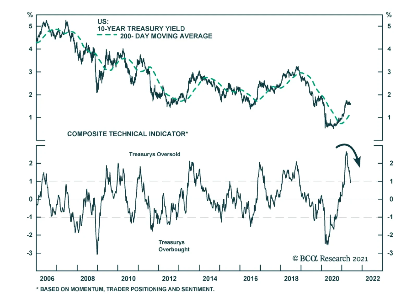
Q2 has been a different story, however. Yields have retreated somewhat from the year-to-date peaks seen at the end of Q1, leading to positive returns so far in Q2 in the UK (+0.8), the US (+1.2%) and Australia (+1.1%). The laggards are the low yielding euro area markets, most notably Italy (-0.7%) and France (-0.9%), that have seen yields move higher on the back of accelerating European growth. The Q2 returns look very much like a carry-driven market, with higher-yielding markets outperforming lower-yielding ones. That trend can persist if the current backdrop of low market volatility persists (Chart 2), although this calm will eventually be broken by a shift towards less dovish monetary policies. Some countries will make that shift at a faster pace than others, leading to relative value opportunities for bond investors in the latter half of 2021. This week, we discuss one such opportunity – Australia versus the US. US Treasuries: Oversold & Trendless – For Now After reaching a 2021 intraday high of 1.77% back on March 30, the benchmark 10-year US Treasury yield has traded in a narrow 15bp range between 1.55% and 1.70%. From a fundamental perspective, US yields are lacking direction because inflation expectations have already made a major upward adjustment to the more inflationary backdrop, but real yields have remained depressed by the continued dovish messaging from the Fed – for now - with regards to the timing of tapering or future rate hikes. From a technical perspective, however, the sideways pattern for US Treasury yields is also consistent for a market that trying to work off an oversold condition. Most of the technical indicators for the US Treasury market that we monitor regularly were at or close to the most bearish/oversold extremes seen since 2000 (Chart 3): Chart 3US Treasuries Are Working Off An Oversold Condition
US Treasuries Are Working Off An Oversold Condition
US Treasuries Are Working Off An Oversold Condition
The 10-year Treasury yield is 39bps above its 200-day moving average, but that gap was as high as 84bps on March 19; The 26-week total return of the 10-year Treasury is -4.7%, after reaching a low of -8.8% on March 19; The JP Morgan client survey of bond managers and traders shows some of the largest underweight duration positioning in the 19-year history of the series; The Market Vane index of sentiment for Treasuries is in the bottom half of the range that has prevailed since 2000; The CFTC data on positioning in 10-year Treasury futures is the only one of our indicators that is not signaling an oversold market, with a small net long position of +3% (scaled by open interest). The overall message of these indicators suggests that price momentum and positioning reached such a bearish extreme by mid-March that some pullback in Treasury yields was inevitable. However, a look back at past periods when Treasuries became heavily oversold since the turn of the century shows that the duration and magnitude of such a pullback is highly variable – anywhere from two months to ten months. The main determining factors are the trends in economic growth and inflation in the US, and the Fed’s expected policy response to both. To show this, we conducted a simple study, updating work we first presented in a 2018 report.1 We looked at “oversold episodes” since 2000, which began when the 10-year Treasury yield was trading at least 50bps above its 200-day moving average. We then defined the end of the oversold episode as simply the point when the 10-year Treasury yield subsequently converged back to its 200-day moving average. We then looked at the length of the episode (in days), and the change in bond yields, for each oversold episode. There were nine such episodes since the year 2000, not counting the current one which has not yet ended. In Table 1, we rank the episodes by the number of days it took to complete each one, based on our simple moving average rule. We also show the change in both the 10-year Treasury yield and its 200-day moving average during each episode, to show how the convergence between the two unfolds. Table 1A Look At Prior Episodes Of An Oversold Treasury Market
A Summer Nap For Global Bond Yields
A Summer Nap For Global Bond Yields
To describe the US economic backdrop during each episode, we looked at the change in the ISM manufacturing index and core PCE inflation during those oversold periods. We also show changes in two important determinants of the level of Treasury yields: inflation expectations using 10-year TIPS breakeven rates, and Fed rate hike expectations using our 12-month Fed discounter which measures the expected change in interest rates - one year ahead - priced into the US overnight index swap (OIS) curve. At the bottom of the table, we show the average for all nine oversold episodes, as well as the averages for the episodes were the ISM was rising and where core PCE inflation was rising. Chart 4US Treasury Market Oversold Episodes: 2003-2007
US Treasury Market Oversold Episodes: 2003-2007
US Treasury Market Oversold Episodes: 2003-2007
There are a few messages gleaned from the results in Table 1: The longest correction of an oversold Treasury market since 2000 took place between February 2018 and December 2018, when 305 days passed before the 10-year yield fell back to its 200-day moving average; The shortest correction was between June 2007 and August 2007, where only 52 days elapsed; Treasury yields typically decline during oversold periods, with two notable exceptions: 2018 and 2013/14, which were also the two longest episodes; During all of the oversold periods, markets reduced the amount of expected Fed tightening by an average of 26bps. However, that was entirely concentrated in four of the nine episodes - including three of the four shortest episodes – and is typically associated with a decline in inflation expectations. Growth momentum appears to be a bigger factor than inflation momentum in determining the length of an oversold episode, with longer episodes typically occurring alongside a rising ISM index, and vice versa. The notable exception was the longest episode in 2018, where the ISM declined by six points, although the bulk of that decline occurred in a single month at the end of the period (November 2018). For the more visually oriented, we present the time series for all the data in Table 1, shaded for the oversold periods, in Chart 4 (for the 2003-2007 period), Chart 5 (2008-2012), Chart 6 (2013-2017) and Chart 7 (2018 to today). We’ve added one additional variable – our Fed Monitor, designed to signal the need for tighter or looser US monetary policy – in the bottom panel of each of those charts. Chart 5US Treasury Market Oversold Episodes: 2008-2012
US Treasury Market Oversold Episodes: 2008-2012
US Treasury Market Oversold Episodes: 2008-2012
Chart 6US Treasury Market Oversold Episodes: 2013-2017
US Treasury Market Oversold Episodes: 2013-2017
US Treasury Market Oversold Episodes: 2013-2017
Chart 7US Treasury Market Oversold Episodes: 2018 To Today
US Treasury Market Oversold Episodes: 2018 To Today
US Treasury Market Oversold Episodes: 2018 To Today
What does this look back tell us about looking ahead? The current episode, at only 105 days old, is still 62 days “younger” than the average oversold period, and 76 days “younger” than the average period where core inflation was rising. This would put the end of the current episode sometime in August. The ISM is essentially unchanged over the current episode so far, making it difficult to draw conclusions based on growth momentum – although the longest episode in 2018 shows that yields can trade sideways for a long time, even in the absence of a big slowing of growth, if the Fed is in a rate hiking cycle. However, the current episode differs dramatically from others in this analysis on two critical fronts. Core inflation has surged 1.6 percentage points since the oversold period began in February, far more than any other episode, while the gap between a rapidly increasing Fed Monitor and a flat 12-month Fed Discounter is also unique among post-2000 oversold periods. In other words, the Treasury market is still vulnerable to a repricing of Fed tightening expectations, especially with positioning and sentiment measures like the Market Vane survey and net futures positioning not yet at fully bearish extremes. Bottom Line: The current oversold condition in the US Treasury market can take another 2-3 months to unwind, based on an analysis of past oversold episodes. Beyond that, higher yields loom with the Fed starting to prepare the markets for a taper in 2022. Stay underweight Treasuries in global bond portfolios on a cyclical basis. RBA Checklist Update: No Case For A Hawkish Turn Yet Australia has been one of the top performing government bond markets within the developed economies, as discussed earlier. This performance has occurred even with strong acceleration of both Australian economic momentum and market-based inflation expectations (Chart 8). Despite our RBA Monitor flashing pressure on the RBA to tighten, and the Australian OIS curve already discounting 48bps of rate hikes over the next two years, Australian bond yields have remained very well behaved during the “calm” second quarter for global fixed income. Chart 8RBA Policies Limiting Rise In Bond Yields
RBA Policies Limiting Rise In Bond Yields
RBA Policies Limiting Rise In Bond Yields
Chart 9RBA Stimulus Takes Many Forms
RBA Stimulus Takes Many Forms
RBA Stimulus Takes Many Forms
The continued dovish messaging from the Reserve Bank of Australia (RBA) is the main reason for the solid Australia bond performance. The central bank is signaling no imminent shift in its combination of 0.1% nominal policy rates, deeply negative real rates, yield curve control on 3-year bonds and quantitative easing on longer-maturity bonds (Chart 9). Other central banks are starting to inch towards reining in the massive monetary accommodation of the past year. Could the RBA be next? In a Special Report published back in January of this year, we outlined a list of variables to watch to determine when the Reserve Bank of Australia (RBA) could be expected to turn less dovish.2 This checklist would also inform our country allocation view on Australian government bonds, which has remained neutral. A quick update on the latest readings from the RBA Checklist shows little pressure on the RBA to begin preparing markets for tighter monetary policy. 1. The vaccination process goes quickly and smoothly We are NOT placing a checkmark next to this part of our RBA Checklist. Australia has weathered COVID-19 far better than most other Western countries in terms of actual cases and deaths, but the vaccine rollout Down Under has been underwhelming. Only 16% of the population has received at least one vaccine jab, while a mere 2% is fully vaccinated. These are numbers that are more comparable to pandemic-ravaged emerging market countries like India and Brazil where access to vaccines is an issue (Chart 10). Chart 10A Slow Vaccine Rollout Down Under
A Summer Nap For Global Bond Yields
A Summer Nap For Global Bond Yields
The slow vaccine rollout is less worrisome in light of the Australian government having secured enough vaccine doses to inoculate the entire population, and with the domestic economy facing limited remaining COVID-19 restrictions. The issue has been distribution and that is now occurring at a quickening pace. Until a much greater share of the population is vaccinated, however, Australia will continue to maintain aggressive COVID-related international travel restrictions – the government just announced that borders will remain shut until mid-2022 - that will be a major drag on the economically-important tourism sector. 2. Private sector demand accelerates alongside fiscal stimulus (✔) We ARE placing a checkmark next to this part of our RBA Checklist. Australia’s fiscal stimulus in response to the pandemic was one of the largest in the developed world. The stimulus was heavily focused on wage subsidies and income support measures like the JobSeeker program, which expired back in March. As the expensive stimulus programs are unwound, it is critical that the domestic economy can stand on its own without support. On that front, the news is good. Australia’s economy grew by 1.8% during Q1/2021, lifting the level of real GDP above the pre-pandemic peak (Chart 11). Both consumer spending and business investment posted solid growth during the quarter, fueled by surging confidence with the NAB business outlook measure hitting a record high in May (bottom panel). As a sign that the domestic economy is benefitting from a return to pre-pandemic habits, Q1 saw a 15% increase in spending in hotels, cafes and restaurants. That strength looked to extend into the Q2, with retail sales rising 1.1% in April, suggesting that Australian domestic demand is enjoying strong upward momentum. Chart 11A Confidence-Led Recovery In Domestic Demand
A Confidence-Led Recovery In Domestic Demand
A Confidence-Led Recovery In Domestic Demand
Chart 12China Is A Drag On Australian Exports
China Is A Drag On Australian Exports
China Is A Drag On Australian Exports
3. China reins in policy stimulus by less than expected We are NOT placing a checkmark next to this part of our RBA Checklist. China is by far Australia’s largest trading partner, so Chinese demand is always an important contributor to Australian economic growth. This is why we included a China element in our RBA Checklist. Specifically, we deemed the outcome that would potentially turn the RBA more hawkish would be Chinese policymakers pulling back monetary and fiscal stimulus by less than expected in 2021 after the big policy support in 2020. The combined fiscal and credit impulse for China has already slowed by 9% of GDP since December 2020, signaling a meaningful cooling of Chinese growth in the latter half of 2021 that should weigh on demand for imports from Australia (Chart 12). However, Chinese import demand has already been severely impacted because of worsening China-Australia political tensions, which has led Beijing to impose restrictions on Australian imports for a variety of products, include coal, wine, beef, barley and cotton. The result is that there has been no growth in Australian total exports to China over the past year – an outcome that was flattered by the surge in iron ore prices - which has weighed on overall Australian export growth. Given this weak starting point for Chinese demand for Australian goods, the sharp reduction in the China stimulus is, on the margin, a factor that will not force the RBA to turn less dovish sooner than expected. 4. Inflation, both realized and expected, returns to the RBA’s 2-3% target We are NOT placing a checkmark next to this part of our RBA Checklist. Australian inflation remains well below the RBA’s 2-3% target range, with the headline CPI and the less volatile trimmed mean CPI both expanding at only a 1.1% annual rate in Q1/2021 (Chart 13). The RBA is forecasting a brief boost to both measures in Q2, before settling back below 2% to the end of 2022. Chart 13No Bond-Bearish RBA Policy Shift Without More Inflation
No Bond-Bearish RBA Policy Shift Without More Inflation
No Bond-Bearish RBA Policy Shift Without More Inflation
Chart 14Diminishing Financial Stability Risks From Housing
Diminishing Financial Stability Risks From Housing
Diminishing Financial Stability Risks From Housing
The RBA’s message on the inflation outlook has been very consistent. A sustainable move of realized inflation back to the 2-3% target range – that would prompt a normalization of monetary policy – cannot occur without a significant tightening of labor markets that drives wage growth back to 3% from the Q1/2021 reading of 1.5%. The RBA currently does not expect that outcome to occur before 2024. The RBA believes that the full employment NAIRU is between 4-4.5%, well below the OECD’s latest estimate of 5.4%. Given the sharp drop in Australian unemployment already seen over the past few quarters, there is the potential for an upside surprise in the wage data that could lead the RBA to change its policy bias. The central bank would need to see a few quarters of such wage surprises, however, before altering its forward guidance on the timing of future rate hikes. 5. House price inflation begins to accelerate We are NOT placing a checkmark next to this part of our RBA Checklist. Given Australia’s past history with periods of surging home values, signs that housing markets were overheating could prompt the RBA to consider tighten monetary policy. The annual growth of median house prices has dipped from +8% in Q1 2020 to +4% in Q4 2020, despite robust housing demand as evidenced by the 40% growth in building approvals. At the same time, housing valuations have become less stretched with the ratio of median home prices to median household incomes falling -9% from the 2017 peak according to data from the OECD (Chart 14). The RBA remains sensitive to the potential financial stability risks from overvalued housing. The latest trends in the house price data, however, suggest that the central bank does not yet to have the use the blunt tool of tighter monetary policy to cool off an overheated housing market. Chart 15Upgrade Australia To Overweight (Vs. USTs)
Upgrade Australia To Overweight (Vs. USTs)
Upgrade Australia To Overweight (Vs. USTs)
In sum, the majority of items in our RBA Checklist are signaling no immediate pressure on the central bank to tighten policy. The first 25bp rate hike is not discounted in the Australian OIS curve until April 2023, a little ahead of RBA guidance but still consistent with a very dovish policy bias. The inflation data, in our view, will be the critical factor that could prompt the markets to pull forward expected monetary tightening, leading to a surge in Australian bond yields. With the RBA already expecting a surge in inflation in the Q2/2020 data, the central bank would likely want to see at least a couple of more quarterly inflation prints – both for the CPI and wage price index - before signaling a more hawkish policy shift. Thus, the RBA will likely stay dovish over the latter half of 2021 Therefore, we are moving to an overweight recommended stance on Australian government bonds on a tactical (0-6 months) basis. In our model bond portfolio on pages 16-17, we are “funding” that shift to an above-benchmark weighting in Australia out of US Treasury exposure. Given our view that the Fed will soon begin to signal a 2022 taper of its asset purchases, relative policy dovishness should lead Australian government bonds to outperform US Treasuries in the latter half of this year. In addition, Australian bonds have a lower yield beta to changes in US Treasury yields, relative to the high beta to changes in non-US developed market yields (Chart 15), making allocations out of the US into Australia attractive from a risk management perspective in a global bond portfolio. Bottom Line: Only one of the five components of our “RBA Checklist” – designed to measure the pressures that would force the Reserve Bank of Australia to turn less dovish – is flashing such a signal. We are upgrading our recommended allocation to Australian government bonds to overweight on a tactical investment horizon. Robert Robis, CFA Chief Fixed Income Strategist rrobis@bcaresearch.com Footnotes 1 See BCA Research Global Fixed Income Strategy Report, "Bond Markets Are Suffering Withdrawal Symptoms", dated March 20, 2018. 2 See BCA Research Global Fixed Income Strategy/Foreign Exchange Strategy Special Report, "Australia: Regime Change For Bond Yields & The Currency?", dated January 20, 2021. Recommendations The GFIS Recommended Portfolio Vs. The Custom Benchmark Index
A Summer Nap For Global Bond Yields
A Summer Nap For Global Bond Yields
Duration Regional Allocation Spread Product Tactical Trades Yields & Returns Global Bond Yields Historical Returns
Highlights Chart 1Tracking Nonfarm Payrolls
Tracking Nonfarm Payrolls
Tracking Nonfarm Payrolls
With 12-month PCE inflation already above the Fed’s 2% target, it is progress toward the Fed’s “maximum employment” goal that will determine both the timing of Fed liftoff and whether bond yields rise or fall. On that note, the bond market is currently priced for Fed liftoff in early 2023. We also calculate that average monthly nonfarm payroll growth of between 378k and 462k is required to meet the Fed’s “maximum employment” goal by the end of 2022, in time for an early-2023 rate hike. It follows from this analysis that any monthly employment print above +462k should be considered bond-bearish and any print below +378k should be considered bond-bullish (Chart 1). In that light, May’s +559k print is bond-bearish, and we anticipate further bond-bearish employment reports in the coming months as COVID fears fade and people return to a labor market that is already awash with demand. Investors should maintain below-benchmark portfolio duration in US bond portfolios and also continue to favor spread product over duration-matched Treasuries. Feature Table 1Recommended Portfolio Specification
It’s All About Employment
It’s All About Employment
Table 2Fixed Income Sector Performance
It’s All About Employment
It’s All About Employment
Investment Grade: Neutral Chart 2Investment Grade Market Overview
Investment Grade Market Overview
Investment Grade Market Overview
Investment grade corporate bonds outperformed the duration-equivalent Treasury index by 47 basis points in May, bringing year-to-date excess returns up to +159 bps. The combination of above-trend economic growth and accommodative monetary policy supports positive excess returns for spread product versus Treasuries. At 142 bps, the 2/10 Treasury slope is very steep and the 5-year/5-year forward TIPS breakeven inflation rate sits at 2.27% - almost, but not quite, within the 2.3% to 2.5% range that the Fed considers “well anchored”.1 The message from these two indicators is that the Fed is not yet ready for monetary conditions to turn restrictive. Despite the positive macro back-drop, investment grade corporate valuations are extremely tight. The investment grade corporate index’s 12-month breakeven spread is almost at its lowest since 1995 (Chart 2). Though we retain a positive view of spread product as a whole, tight valuations cause us to recommend only a neutral allocation to investment grade corporates. We prefer high-yield corporates, municipal bonds and USD-denominated Emerging Market Sovereigns. Last week, the Fed announced that it will wind down its corporate bond portfolio over the coming months. The corporate bond purchase facility has not been operational since December 2020, meaning that the corporate bond market has been functioning without an explicit Fed back-stop for all of 2021. The portfolio itself is also quite small compared to the size of the corporate bond market. As a result, we anticipate no material impact on spreads. Table 3ACorporate Sector Relative Valuation And Recommended Allocation*
It’s All About Employment
It’s All About Employment
Table 3BCorporate Sector Risk Vs. Reward*
It’s All About Employment
It’s All About Employment
High-Yield: Overweight Chart 3High-Yield Market Overview
High-Yield Market Overview
High-Yield Market Overview
High-Yield outperformed the duration-equivalent Treasury index by 8 basis points in May, bringing year-to-date excess returns up to +343 bps. In a recent report, we looked at the default expectations that are currently priced into the junk index and considered whether they are likely to be met.2 If we demand an excess spread of 100 bps and assume a 40% recovery rate on defaulted debt, then the High-Yield index embeds an expected default rate of 3.3% (Chart 3). Using a model of the speculative grade default rate that is based on gross corporate leverage (pre-tax profits over total debt) and C&I lending standards, we can estimate a likely default rate for the next 12 months using assumptions for profit and debt growth. The median FOMC forecast of 6.5% real GDP growth in 2021 is consistent with 31% corporate profit growth. We also assume that last year’s corporate debt binge will moderate in 2021. According to our model, 30% profit growth and 2% debt growth is consistent with a default rate of 3.4%, very close to what is priced into junk spreads. Given that the large amount of fiscal stimulus coming down the pike makes the Fed’s 6.5% real GDP growth forecast look conservative, and the fact that the combination of strong economic growth and accommodative monetary policy could easily cause valuations to overshoot in the near-term, we are inclined to maintain an overweight allocation to High-Yield bonds. MBS: Underweight Chart 4MBS Market Overview
MBS Market Overview
MBS Market Overview
Mortgage-Backed Securities underperformed the duration-equivalent Treasury index by 36 basis points in May, dragging year-to-date excess returns down to -9 bps. The nominal spread between conventional 30-year MBS and equivalent-duration Treasuries widened 7 bps in May. The spread remains wide compared to recent history, but it is still tight compared to the pace of mortgage refinancings (Chart 4). The conventional 30-year MBS option-adjusted spread (OAS) currently sits at 24 bps. This is considerably below the 51 bps offered by Aa-rated corporate bonds and the 27 bps offered by Agency CMBS. It is only slightly more than the 18 bps offered by Aaa-rated consumer ABS. All in all, value in MBS is not appealing compared to other similarly risky sectors. In a recent report, we looked at MBS performance and valuation across the coupon stack.3 We noted that the higher convexity of high-coupon MBS makes them likely to outperform lower-coupon MBS in a rising yield environment. Higher coupon MBS also have greater OAS than lower coupons. This makes the high-coupon MBS more likely to outperform in a flat bond yield environment as well. Given our view that bond yields will be flat-to-higher during the next 6-12 months, we recommend favoring high coupons over low coupons within an overall underweight allocation to Agency MBS. Government-Related: Neutral Chart 5Government-Related Market Overview
Government-Related Market Overview
Government-Related Market Overview
The Government-Related index outperformed the duration-equivalent Treasury index by 15 basis points in May, bringing year-to-date excess returns up to +87 bps (Chart 5). Sovereign debt outperformed duration-equivalent Treasuries by 32 bps in May, bringing year-to-date excess returns up to +53 bps. Foreign Agencies outperformed the Treasury benchmark by 2 bps on the month, bringing year-to-date excess returns up to +37 bps. Local Authority bonds outperformed by 30 bps in May, bringing year-to-date excess returns up to +360 bps. Domestic Agency bonds and Supranationals both outperformed by 8 bps, bringing year-to-date excess returns up to +27 bps and +24 bps, respectively. We recently took a detailed look at USD-denominated Emerging Market (EM) Sovereign valuation.4 We found that, on an equivalent-duration basis, EM Sovereigns offer a spread advantage over investment grade US corporates. Attractive countries include: Qatar, UAE, Saudi Arabia, Indonesia, Mexico, Russia and Colombia. We prefer US corporates over EM Sovereigns in the high-yield space where there is still some value left in US corporate spreads and where the EM space is dominated by distressed credits like Turkey and Argentina. Municipal Bonds: Overweight Chart 6Municipal Market Overview
Municipal Market Overview
Municipal Market Overview
Municipal bonds underperformed the duration-equivalent Treasury index by 21 basis points in May, dragging year-to-date excess returns down to +286 bps (before adjusting for the tax advantage). We took a detailed look at municipal bond performance and valuation in a recent report and came to the following conclusions.5 First, the economic and policy back-drop is favorable for municipal bond performance. The recently enacted American Rescue Plan includes $350 billion of funding for state & local governments, a bailout that comes after state & local government revenues already exceeded expenditures in 2020 (Chart 6). President Biden has also proposed increasing income tax rates. However, there may not be time to pass these tax hikes before the 2022 midterm elections. Second, Aaa-rated municipal bonds look expensive relative to Treasuries (top panel). Muni investors should move down in quality to pick up additional yield. Third, General Obligation (GO) and Revenue munis offer better value than investment grade corporates with the same credit rating and duration, particularly at the long-end of the curve. Revenue munis in the 12-17 year maturity bucket offer a before-tax yield pick-up versus corporates. GO munis offer a breakeven tax rate of just 7% (panel 2). Fourth, taxable munis offer a yield advantage over investment grade corporates that investors should take advantage of (panel 3). Finally, high-yield muni spreads are reasonably attractive relative to high-yield corporates, offering a breakeven tax rate of 22% (panel 4). But despite the attractive spread, we recommend only a neutral allocation to high-yield munis versus high-yield corporates as the deep negative convexity of high-yield munis makes them prone to extension risk if bond yields gap higher. Treasury Curve: Buy 5-Year Bullet Versus 2/30 Barbell Chart 7Treasury Yield Curve Overview
Treasury Yield Curve Overview
Treasury Yield Curve Overview
Treasury yields fell in May, with the 5-10 year part of the curve benefiting the most. The 7-year yield fell 8 bps in May while the 5-year and 10-year yields both fell 7 bps. Yield declines were smaller for shorter (< 5-year) and longer (> 10-year) maturities. The 2/10 Treasury slope flattened 5 bps to end the month at 144 bps. The 5/30 Treasury slope steepened 3 bps to end the month at 147 bps (Chart 7). We recently changed our recommended yield curve position from a 5 over 2/10 butterfly to a 5 over 2/30 butterfly.6 In making the switch we noted that the slope of the Treasury curve has behaved differently since bond yields peaked in early April. Prior to April, the rise in bond yields was concentrated at the very long-end (10-year +) of the curve. During the past two months, the belly of the curve (5-7 years) has seen more volatility. We conclude that we are now close enough to an expected Fed liftoff date that further significant increases in yields will be met with a flatter curve beyond the 5-year maturity point and that the 5-year and 7-year notes are likely to benefit the most if bond yields dip. We also observe an exceptional yield pick-up of +33 bps in the 5-year bullet over a duration-matched 2/30 barbell. Given our view that bond yields will be flat-to-higher during the next 6-12 months, we recommend buying the 5-year bullet over a duration-matched 2/30 barbell to take advantage of the strong positive carry in a flat yield environment, and as a hedge against our below-benchmark portfolio duration stance. TIPS: Neutral Chart 8TIPS Market Overview
TIPS Market Overview
TIPS Market Overview
TIPS outperformed the duration-equivalent nominal Treasury index by 86 basis points in May, bringing year-to-date excess returns up to +484 bps. The 10-year and 5-year/5-year forward TIPS breakeven inflation rates rose 1 bp and 2 bps on the month, respectively. At 2.42%, the 10-year TIPS breakeven inflation rate is near the top-end of the 2.3% to 2.5% range that is consistent with inflation expectations being well anchored around the Fed’s target (Chart 8). Meanwhile, at 2.27%, the 5-year/5-year forward TIPS breakeven inflation rate is just below the target band (panel 3). With long-maturity breakevens already consistent (or close to consistent) with the Fed’s target, they have limited upside going forward. The Fed has so far welcomed rising TIPS breakeven inflation rates, but it will have an increasing incentive to lean against them if they continue to move up. We also think that the market has priced-in an overly aggressive inflation outlook at the front-end of the curve. The 1-year and 2-year CPI swap rates stand at 3.76% and 3.12%, respectively. There is a good chance that these lofty inflation expectations will not be confirmed by the actual data. With all that in mind, investors should maintain a neutral allocation to TIPS versus nominal Treasuries and also a neutral posture towards the inflation curve (panel 4). The inflation curve could steepen somewhat in the near-term if short-maturity inflation expectations moderate, but we expect the curve to remain inverted for a long time yet. An inverted inflation curve is more consistent with the Fed’s Average Inflation Target than a positively sloped one, and it should be considered the natural state of affairs moving forward. ABS: Overweight Chart 9ABS Market Overview
ABS Market Overview
ABS Market Overview
Asset-Backed Securities outperformed the duration-equivalent Treasury index by 13 basis points in May, bringing year-to-date excess returns up to +33 bps. Aaa-rated ABS outperformed by 13 bps on the month, bringing year-to-date excess returns up to +26 bps. Non-Aaa ABS outperformed by 12 bps on the month, bringing year-to-date excess returns up to +70 bps. The stimulus from last year’s CARES act led to a significant increase in household savings when individual checks were mailed in April 2020. This excess savings has still not been spent and, already, the most recent round of stimulus checks is pushing the savings rate higher again (Chart 9). The extraordinarily large stock of household savings means that the collateral quality of consumer ABS is also extraordinarily high. Indeed, many households have been using their windfalls to pay down consumer debt (bottom panel). Investors should remain overweight consumer ABS and should also take advantage of the high quality of household balance sheets by moving down the quality spectrum. Non-Agency CMBS: Neutral Chart 10CMBS Market Overview
CMBS Market Overview
CMBS Market Overview
Non-Agency Commercial Mortgage-Backed Securities outperformed the duration-equivalent Treasury index by 41 basis points in May, bringing year-to-date excess returns up to +163 bps. Aaa Non-Agency CMBS outperformed Treasuries by 27 bps in May, bringing year-to-date excess returns up to +78 bps. Non-Aaa Non-Agency CMBS outperformed by 84 bps, bringing year-to-date excess returns up to +453 bps (Chart 10). Though returns have been strong and spreads remain attractive, particularly for lower-rated CMBS, we continue to recommend only a neutral allocation to the sector because of the structurally challenging environment for commercial real estate. Even with the economic recovery well underway, commercial real estate loan demand continues to weaken and banks are not making lending standards more accommodative (panels 3 & 4). Agency CMBS: Overweight Agency CMBS outperformed the duration-equivalent Treasury index by 37 basis points in May, bringing year-to-date excess returns up to +125 bps. The average index option-adjusted spread tightened 7 bps on the month and it currently sits at 27 bps (bottom panel). Though Agency CMBS spreads have completely recovered their pre-COVID levels, they still look attractive compared to other similarly risky spread products. Stay overweight. Appendix A: Butterfly Strategy Valuations The following tables present the current read-outs from our butterfly spread models. We use these models to identify opportunities to take duration-neutral positions across the Treasury curve. The following two Special Reports explain the models in more detail: US Bond Strategy Special Report, “Bullets, Barbells And Butterflies”, dated July 25, 2017, available at usbs.bcaresearch.com US Bond Strategy Special Report, “More Bullets, Barbells And Butterflies”, dated May 15, 2018, available at usbs.bcaresearch.com Table 4 shows the raw residuals from each model. A positive value indicates that the bullet is cheap relative to the duration-matched barbell. A negative value indicates that the barbell is cheap relative to the bullet. Table 4Butterfly Strategy Valuation: Raw Residuals In Basis Points (As Of May 28TH, 2021)
It’s All About Employment
It’s All About Employment
Table 5 scales the raw residuals in Table 4 by their historical means and standard deviations. This facilitates comparison between the different butterfly spreads. Table 5Butterfly Strategy Valuation: Standardized Residuals (As Of May 28TH, 2021)
It’s All About Employment
It’s All About Employment
Table 6 flips the models on their heads. It shows the change in the slope between the two barbell maturities that must be realized during the next six months to make returns between the bullet and barbell equal. For example, a reading of 57 bps in the 5 over 2/10 cell means that we would only expect the 5-year to outperform the 2/10 if the 2/10 slope steepens by more than 57 bps during the next six months. Otherwise, we would expect the 2/10 barbell to outperform the 5-year bullet. Table 6Discounted Slope Change During Next 6 Months (BPs)
It’s All About Employment
It’s All About Employment
Appendix B: Excess Return Bond Map The Excess Return Bond Map is used to assess the relative risk/reward trade-off between different sectors of the US bond market. It is a purely computational exercise and does not impose any macroeconomic view. The Map’s vertical axis shows 12-month expected excess returns. These are proxied by each sector’s option-adjusted spread. Sectors plotting further toward the top of the Map have higher expected returns and vice-versa. Our novel risk measure called the “Risk Of Losing 100 bps” is shown on the Map’s horizontal axis. To calculate it, we first compute the spread widening required on a 12-month horizon for each sector to lose 100 bps or more relative to a duration-matched position in Treasury securities. Then, we divide that amount of spread widening by each sector’s historical spread volatility. The end result is the number of standard deviations of 12-month spread widening required for each sector to lose 100 bps or more versus a position in Treasuries. Lower risk sectors plot further to the right of the Map, and higher risk sectors plot further to the left. Chart 11Excess Return Bond Map (As Of May 28TH, 2021)
It’s All About Employment
It’s All About Employment
Ryan Swift US Bond Strategist rswift@bcaresearch.com Footnotes 1 For further discussion of how we assess the state of monetary policy vis-à-vis spread product please see US Bond Strategy Weekly Report, “Lower For Longer, Then Faster Than You Think”, dated May 25, 2021. 2 Please see US Bond Strategy Weekly Report, “That Uneasy Feeling”, dated March 30, 2021. 3 Please see US Bond Strategy Weekly Report, “A New Conundrum”, dated April 20, 2021. 4 Please see US Bond Strategy Weekly Report, “Searching For Value In Spread Product”, dated January 26, 2021. 5 Please see US Bond Strategy Weekly Report, “Making Money In Municipal Bonds”, dated April 27, 2021. 6 Please see US Bond Strategy Weekly Report, “Entering A New Yield Curve Regime”, dated May 11, 2021.
The 81-basis point increase in yields in Q1 pushed US 10-year Treasurys deep into oversold territory. This triggered a rally that brought yields down to 1.56% by mid-April. US government bonds have been in stasis since then, with the 10-year yield oscillating…
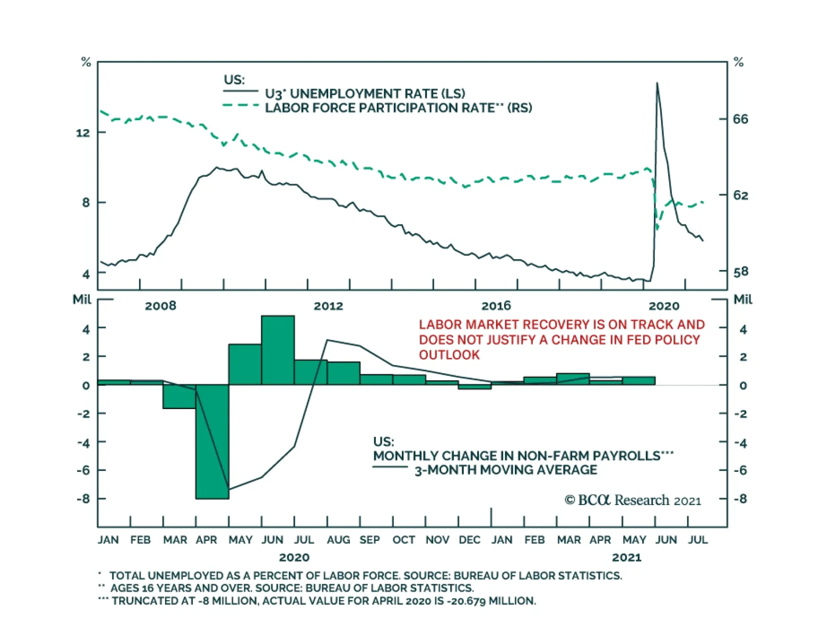
Friday’s US employment report was another miss. Nonfarm payroll employment increased by 559 thousand in May, below the anticipated 675 thousand. Moreover, the labor force participation rate ticked down to 61.6% from 61.7%. Thus, the 0.3 percentage point…
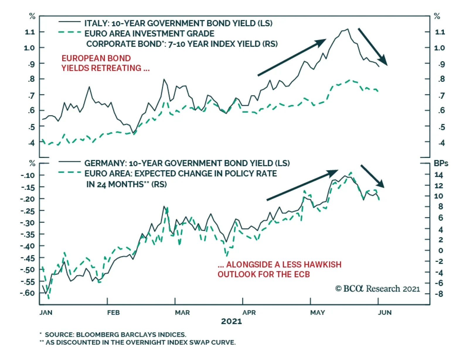
European bond markets have calmed down after a rough couple of months that saw the benchmark 10-year German bund yield rise from a low of -0.39% on March 25 to a high of -0.11% on May 19. Yields on riskier European debt saw even bigger increases over that…
On Friday 4th June, I will be debating my colleague Peter Berezin on the future of cryptocurrencies. I believe that the cryptocurrency asset-class has substantial further price upside, whereas Peter thinks that it is going to zero. So please join us for what will be a lively debate on Friday 4th June at 10am EDT, (3pm BST, 4pm CEST). Dhaval Joshi Feature Chart of the WeekThe Fractal Structure Of Cryptos Had Become Very Fragile
The Fractal Structure Of Cryptos Had Become Very Fragile
The Fractal Structure Of Cryptos Had Become Very Fragile
Today’s report is a brief review and update of the 22 short-term trades that we have recommended through the past three months, and it demonstrates the power of Fractals: The Competitive Advantage In Investing. At the end of the report we also introduce a new trade. Our 22 recommendations have comprised 10 structured trades – which include profit-targets, symmetrical stop-losses, and expiry dates – plus a further 12 recommendations without structured exit points. In summary, three structured recommendations have hit their profit targets: short NOK/PLN +2.6 percent, long European Personal Products versus Autos +15 percent, and long Finland versus Sweden +4.7 percent. Two open trades are in profit, and one is flat. Against this, two structured recommendations hit their stop-losses: short GBP/JPY -2.2 percent, and long New Zealand versus MSCI ACWI -4 percent. Meanwhile, long China versus Netherlands reached its expiry date at a slight loss -1.8 percent. And one open trade is in loss. This results in a ‘win ratio’ at a commendable 55 percent – counting a ‘full win’ as hitting the profit target, a ‘full loss’ as hitting the symmetrical stop-loss, and pro-rata for partial wins and losses. The win ratio at 55 percent is commendable because, in recent months, all financial assets been strongly correlated to the ebb and flow of bond yields and the ‘reflation trade’ – as we highlighted in The Pareto Principle Of Investment. This has made the current environment a difficult one to find genuinely independent investment ideas. Even more commendably, the 12 unstructured recommendations, which included Bitcoin, Ethereum, and several commodities, have all anticipated exhaustions or sharp reversals. The sections below review the structured and unstructured recommendations in chronological order. The 10 Structured Recommendations 1. 18th March: Short NOK/PLN Achieved its +2.6 percent profit target. 2. 25th March: Short GBP/JPY Hit its -2.2 percent stop-loss. 3. 1st April: Long European Personal Products vs. European Autos Achieved its +15 percent profit target. 4. 15th April: Long China vs. Netherlands Expired at -1.8 percent (versus its +5 percent profit target). 5. 15th April: Long Finland vs. Sweden Achieved its +4.7 percent profit target. 6. 22nd April: Long New Zealand vs. MSCI ACWI Hit its -4 percent stop-loss. 7. 6th May: Short Building and Construction (PKB) vs. Healthcare (XLV) In profit, and we expect further upside (Chart I-2). Chart I-2Short Building And Construction Versus Healthcare
Short Building And Construction Versus Healthcare
Short Building And Construction Versus Healthcare
8. 6th May: Short France vs. Japan In loss, but we expect upside. 9. 13th May: Long USD/CAD Flat, but we expect upside. 10. 20th May: Long 10-year T-bond vs. 10-year TIPS In profit, and we expect further upside (Chart I-3). Chart I-3Short Inflation Expectations
Short Inflation Expectations
Short Inflation Expectations
The 12 Unstructured Recommendations 1. 18th March: Stocks vs. Bonds (MSCI ACWI vs. 30-year T-bond) to consolidate As anticipated, global stocks have consolidated versus bonds since mid-March, and we expect the consolidation to continue. 2. 18th March: Long 30-year T-bond Likewise, exactly as anticipated, bond prices have rebounded since mid-March, and we expect the rebound to continue (Chart I-4). Chart I-4Bond Prices To Rebound
Bond Prices To Rebound
Bond Prices To Rebound
3. 25th March: Tactically short Bitcoin Bitcoin subsequently corrected by almost 40 percent, but the correction is mostly done (Chart I-1). 4. 25th March: Tactically short Ethereum Likewise, Ethereum subsequently corrected, but the correction is mostly done. 5. 15th April: Short Taiwan vs. China Taiwan subsequently corrected versus China, but the correction is mostly done. 6. 22nd April: Short PKR/USD As anticipated, PKR/USD corrected in the subsequent month. 7. 6th May: Short Corn vs. Wheat 8. 6th May: Short Timber (Chart I-5) Chart I-5Short Timber
Short Timber
Short Timber
9. 13th May: Short Soybeans 10. 20th May: Short Copper 11. 20th May: Short Tin 12. 27th May: Short Iron Ore As anticipated, all the above commodities have corrected, and in some cases very sharply. But the correction is still underway. New Recommendation Finally, this week’s new recommendation comes from the MSCI world equity index universe. The massive outperformance of Austria versus Chile – in large part due to the different sector compositions of the two markets – is fragile on all fractal dimensions: 65-day, 130-day, and 260-day (Chart I-6). Chart I-6Short Austria Vs. Chile
Short Austria Vs. Chile
Short Austria Vs. Chile
Accordingly, the recommendation is to short Austria versus Chile, setting the profit target and symmetrical stop-loss at 7 percent. Dhaval Joshi Chief Strategist dhaval@bcaresearch.com Fractal Trading System Fractal Trades 6-Month Recommendations Structural Recommendations Closed Fractal Trades Closed Trades Asset Performance Equity Market Performance Indicators To Watch - Bond Yields Chart I-1Indicators To Watch - Bond Yields ##br##- Euro Area
Indicators To Watch - Bond Yields - Euro Area
Indicators To Watch - Bond Yields - Euro Area
Chart I-2Indicators To Watch - Bond Yields ##br##- Europe Ex Euro Area
Indicators To Watch - Bond Yields - Europe Ex Euro Area
Indicators To Watch - Bond Yields - Europe Ex Euro Area
Chart I-3Indicators To Watch - Bond Yields ##br##- Asia
Indicators To Watch - Bond Yields - Asia
Indicators To Watch - Bond Yields - Asia
Chart I-4Indicators To Watch - Bond Yields ##br##- Other Developed
Indicators To Watch - Bond Yields - Other Developed
Indicators To Watch - Bond Yields - Other Developed
Indicators To Watch - Interest Rate Expectations Chart I-5Indicators To Watch - Interest Rate Expectations
Indicators To Watch - Interest Rate Expectations
Indicators To Watch - Interest Rate Expectations
Chart I-6Indicators To Watch - Interest Rate Expectations
Indicators To Watch - Interest Rate Expectations
Indicators To Watch - Interest Rate Expectations
Chart I-7Indicators To Watch - Interest Rate Expectations
Indicators To Watch - Interest Rate Expectations
Indicators To Watch - Interest Rate Expectations
Chart I-8Indicators To Watch - Interest Rate Expectations
Indicators To Watch - Interest Rate Expectations
Indicators To Watch - Interest Rate Expectations
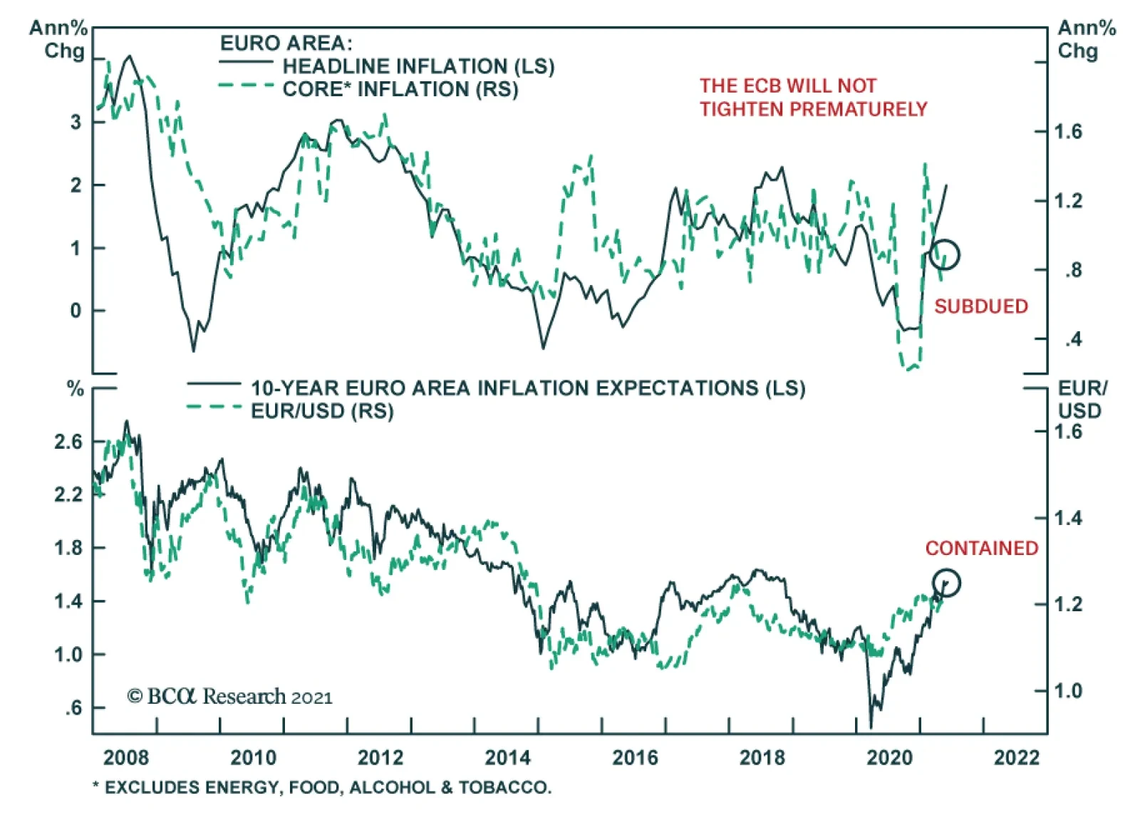
Consumer prices accelerated in the Euro Area in May. The headline consumer price index rose to 2.0% y/y from 1.6% y/y in April. Although the May figure is above the ECB’s target “of below 2%”, the central bank will not hint toward policy tightening on June 10…
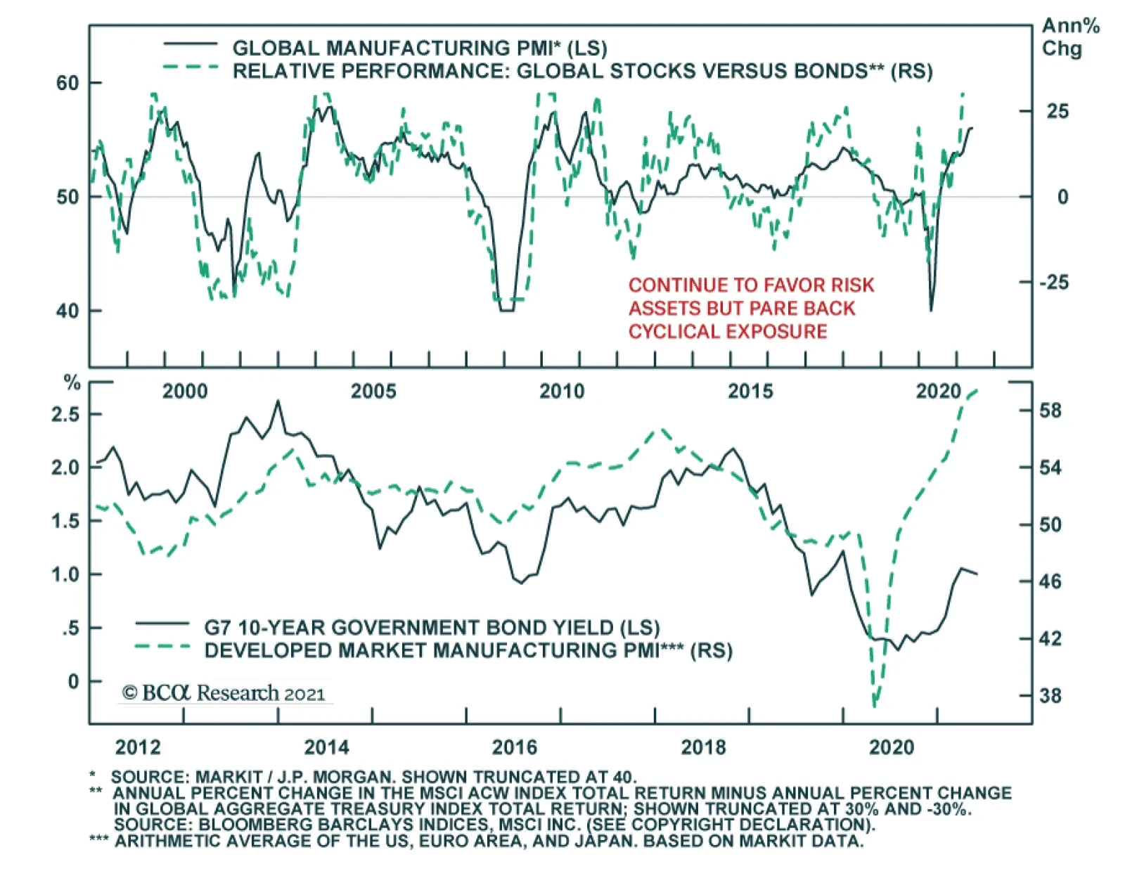
The global manufacturing recovery accelerated in May with the Markit Global Manufacturing PMI inching up to an 11-year high of 56. The stronger headline number partially reflects an increase in the pace of new orders to 57.3 from 56.8, while output and…
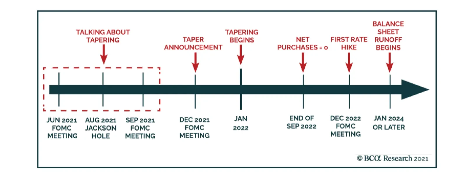
BCA Research’s Global Fixed Income Strategy and US Bond Strategy services conclude that investors should maintain below-benchmark portfolio duration in US fixed income portfolios. According to their anticipated timeline for when the Federal…