Fixed Income

Highlights Important leading indicators of Eurozone activity point to record growth in the coming quarters. Progress on the vaccination front, global pent-up demand, and easing fiscal policy will fuel the Euro Area recovery. Consensus growth expectations for the Eurozone do not reflect this upbeat outlook; hence, European economic surprises will remain firm. Robust economic surprises will help European stocks, especially small-cap ones. They will also allow for a stronger EUR/USD and rising German 10-year yields. The UK economy is strong, and the BoE will be among the first central banks to tighten policy meaningfully. However, investors understand the UK’s strength well. While the cyclical outlook for the pound is bright against both the USD and the EUR, the GBP is vulnerable to some near-term profit taking. Downgrade UK small-cap stocks to neutral on a tactical basis. Feature The case for the Eurozone’s recovery is only growing stronger. However, consensus growth forecasts for the Euro Area remain modest. Faced with this dichotomy, the European economy has ample room to generate positive surprises in the coming months. This process will support European financial assets, small-cap stocks in particular. This contrasts with UK assets, where investors have already embedded generous growth assumptions in response to the country’s rapid pace of vaccination. A tactical downgrade of UK small-cap equities is appropriate. Surprise! Two indicators from outside the Eurozone point to an elevated likelihood that the European economy will generate some exceptionally strong growth numbers over the coming 12 months. First, the Swiss KOF Economic Barometer hit an all-time high in April. The KOF series is an excellent leading indicator of Switzerland’s economic activity, and it currently forecasts record GDP growth and PMIs for that country (Chart 1). This message of strength for Switzerland bodes well for the Eurozone. While the Swiss market is defensive, owing to its heavy exposure to healthcare and consumer staple stocks, the Swiss economy is pro-cyclical. Exports represent 60% of GDP, and exports to the Eurozone account for 40% of this total. Moreover, the growth-sensitive machinery, consumer goods, and chemicals categories account for almost 50% of shipments. Based on these observations, the KOF Economic Barometer forecasting ability unsurprisingly extends beyond Swiss economic variables; it also anticipates positive growth for the Global Manufacturing PMI, the Euro Area Manufacturing PMI, and the Eurozone’s forward earnings (Chart 2). Chart 1Climbing Swiss Peaks
Climbing Swiss Peaks
Climbing Swiss Peaks
Chart 2A Good Sign For The Eurozone
A Good Sign For The Eurozone
A Good Sign For The Eurozone
Second, an aggregation of Swedish economic data confirms the KOF indicator’s message and also calls for record economic activity in Europe. Our Swedish Economic Diffusion Index, which incorporates 14 data series from the Nordic country, points toward a further acceleration in the Euro Area PMIs relative to the US (Chart 3). It is also consistent with a pick-up in the performance of European equities relative to the US. These important indicators of the European economy reflect a variety of forces at play that increasingly point toward stronger growth. Among them, the improvement in the pace of vaccination is crucial to lifting the mood across the continent. As the top panel of Chart 4 illustrates, the number of daily vaccine doses administered across major Euro Area economies is accelerating sharply. While it took three months to inoculate 20% of the population, it only took one month to raise the vaccinated population to nearly 40% (Chart 4, bottom panel). Chart 3Sweden Leads The Eurozone
Sweden Leads The Eurozone
Sweden Leads The Eurozone
Chart 4Accelerating Vaccinations
Accelerating Vaccinations
Accelerating Vaccinations
Euro Area fiscal policy is also moving in a more growth-friendly direction. The Italian Budget announced on April 26 will add EUR248 billion in spending over the next six years. For the moment, Germany has abandoned its debt brake, and, as we wrote three weeks ago, the September election is likely to reify this outcome and further ease fiscal policy in Europe’s biggest economy. Spain is the second largest recipient of the NGEU funds, and it is expected to increase fiscal spending by EUR167 billion over the coming six years. In addition, France has yet to give clear hints about its plan, but next year’s elections are likely to result in further stimulus measures as well. Thus, fiscal easing in Europe will only increase from this point on (Chart 5). Chart 5The Expanding European Stimulus
A Surprising Dance
A Surprising Dance
Accumulated pent-up demand remains another potent fuel for growth in the Euro Area. Unlike in the US, spending on durable goods in the Eurozone has not overtaken its pre-pandemic levels (Chart 6). Furthermore, global inventory-to-sales ratio are low, which hints at a coming inventory restocking cycle. These two trends will benefit Euro Area economic activity. The service sector recovery has more to go. Despite some recent improvements, the Eurozone’s Service PMI remains depressed compared to that of the US (Chart 7, top panel). However, the acceleration in the European vaccination campaign and the continued injection of fiscal support at the same time as the lockdowns ebb should result in a significant catch up in service activity in the Euro Area. Thus, the double-dip recession is on the verge of ending and giving way to a robust GDP expansion (Chart 7, bottom panel). Chart 6Ample European Pent-up Demand
Ample European Pent-up Demand
Ample European Pent-up Demand
Chart 7The Service Sector Recovery Is Paramount
The Service Sector Recovery Is Paramount
The Service Sector Recovery Is Paramount
Even though the recovery in GDP growth will lead to strong positive economic surprises for the Euro Area, consensus growth expectations for the region remain conservative. According to Bloomberg, Eurozone annual GDP growth is expected to reach 12.6% in Q2 because of an extremely strong base effect. However, growth will decelerate suddenly and hit 2.3% in Q3 and 4.3% in Q4. Growth is anticipated to be 4.1% in 2022. These are low thresholds to beat, and thus, economic surprises will remain positive. Chart 8Decomposing The Surprises
Decomposing The Surprises
Decomposing The Surprises
The source of positive economic surprises is likely to be broad-based. If the service sector recaptures some of its previous shine, the Surveys and Business Cycle component and the Labor Market component of the Bloomberg surprises index will improve and remain positive for many months (Chart 8). Moreover, the absorption of pent-up demand will allow the Retail and Wholesale as well the Personal/Household components to remain robust or firm up further. Finally, the strength of the global manufacturing sector and the elevated potential for a global inventory restocking will allow the Industrial component to firm up anew. Bottom Line: The European economy is in a good place to validate the upbeat message from the KOF Economic Barometer or the Swedish Economic Diffusion Index. Since expectations for European economic activity are still limited for the second half of 2021, this strong growth performance will result in positive economic surprises. Investment Implications The heightened odds that Europe will generate significant positive economic surprises for the coming quarters means that investors’ perspective of the Euro Area will gradually improve. While this process will ultimately curtail the ability of Europe to beat expectations, it will also lift Eurozone assets. If our forecast is correct that European economic surprises will largely be positive over the coming 6 to 12 months, then European equities are more likely to generate generous returns than otherwise. Table 1 highlights that positive changes in the Economic Surprise Index (ESI) on a 3-month, 6-month, and 12-month horizon coincide with returns of the Euro Area MSCI equity benchmarks that have positive batting averages of 72%, 70%, and 73%, respectively. Moreover, the average and median returns are significantly higher than when the ESI deteriorates. Table 1Forecasting Strong Surprises Means Forecasting Strong Equity Returns
A Surprising Dance
A Surprising Dance
The signal from the ESI is weaker if we do not make forecasts about its direction. The batting averages of subsequent 3-month and 6-month equity returns following an improving ESI are 63% and 69%, respectively, and the median subsequent returns are higher than if today’s ESI is deteriorating, but not to the same extent as when we make a forecast of the ESI. 12-month returns for the Eurozone MSCI index have a 58% chance of being positive, if the ESI increases over a 12-month window, which is lower than the 63% batting average if the ESI worsens. Moreover, average and median 12-month expected returns are somewhat higher if the ESI has been deteriorating rather than improving over the past 12-month period. European small cap equities will be prime beneficiaries of the coming growth outperformance. From an economic perspective, this makes sense because small-cap stocks are geared more toward domestic growth than large-cap equities, which are dominated by multinationals. Table 2 shows that 3-month, 6-month, and 12-month periods of improvement in the surprise index precede an outperformance of small-cap relative to large-cap stocks over similar windows of time. Thus, the current positive level of the European ESI and its ability to rise further should favor small-cap European equities. Table 2Favor Small-Cap Stocks
A Surprising Dance
A Surprising Dance
Table 3A Bullish Backdrop For EUR/USD
A Surprising Dance
A Surprising Dance
The same exercise shows that the outlook also favors the euro. European economic surprises should continue to outpace the US, because Eurozone growth will catch up to the US, but investors already have much loftier expectations for US activity than for the Euro Area. Table 3 illustrates that periods when the Eurozone’s ESI is greater than that of the US, EUR/USD generates a positive 3-month return 65% of the time, with a median gain of 1.3%. When the US ESI is higher, the EUR/USD depreciates 55% of the time, with a median loss of -0.5%. Chart 9Rising German Yields?
Rising German Yields?
Rising German Yields?
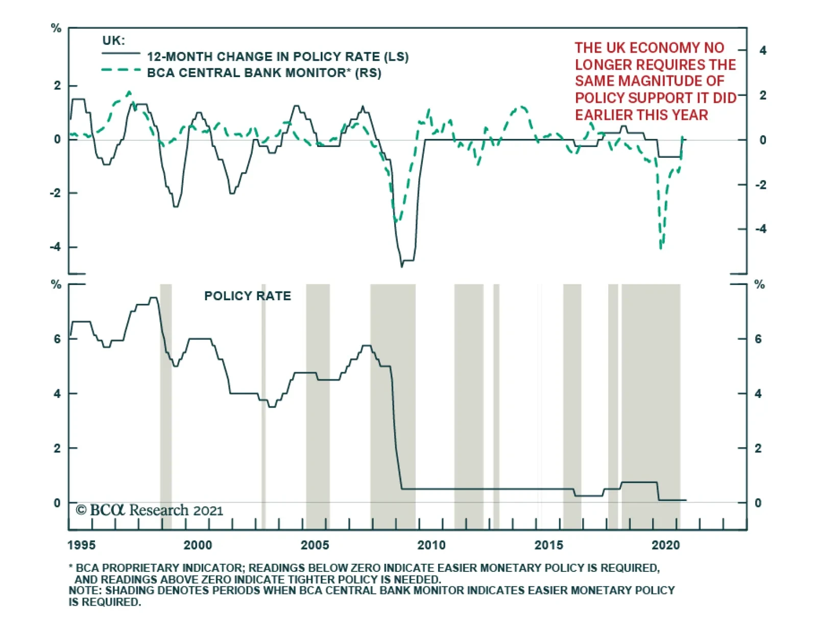
Finally, the potential for stronger European ESI is negative for Bunds. Speeches by various members of the European Central Bank Governing Council indicate that the ECB will tolerate higher yields, if they reflect stronger economic activity. As the European vaccination campaign advances and the fiscal stimulus increases, the need to maintain depressed Bunds yields recedes. Hence, a continuation of positive ESI readings is now more likely to boost these yields. Additionally, the gap between the European ESI and the US one will remain positive, thus, a period of rising German yields relative to the US is more likely (Chart 9). Bottom Line: The ability of the European economy to continue to surprise positively should generate attractive equity returns on the continent. Moreover, this economic backdrop is consistent with an outperformance of small-cap equities, as well as an appreciating EUR/USD. Under these circumstances, Bunds yields should experience more upside. Country Focus: The UK’s Outlook Is Brightening, Unsurprisingly Last week, the Bank of England left the total size of its asset purchase program in place at GBP875 billion, even if the weekly pace of purchases was slowed to GBP3.4 billion from GBP4.4 billion. The BoE also raised its 2021 growth forecast to 7.5%, from 5% in February. The BoE is joining the Bank of Canada as one of the first central banks to taper its asset purchase program. It will also be one of the first central banks to increase interest rates, after the Norges Bank, but ahead of the Fed. In a way, the UK shares many similarities with our recent positive depiction of the Swedish economy. Chart 10Support For Household Net Worth
Support For Household Net Worth
Support For Household Net Worth
The rapid pace of vaccination in the UK allows for a vigorous economic recovery. In all likelihood, the UK economy will have contracted in Q1 2021 because of the severe lockdowns that prevailed then; however, these lockdowns are being eased and economic fundamentals point up. Our Global Fixed Income and Foreign Exchange strategists recently demonstrated that house prices are increasing on the back of rising mortgage approvals and falling household debt-servicing obligations (Chart 10). The robust readings of the RICS House Prices survey only confirm the positive outlook for housing prices. Expanding house prices will elevate consumption. An appreciating housing stock boosts the wealth of households and leads to higher UK consumer confidence. Moreover, business confidence is improving; the rise in capex intentions not only indicates that investments will increase, but is also a precursor to climbing job vacancies (Chart 11). Brighter labor market prospects often result in rising consumption, especially if wages firm up, as we argued seven weeks ago. The current bout of economic strength points to some upside in UK inflation as well. The elevated PMI readings and the rapid increase in construction activity are reliable forecasters of higher CPI prints (Chart 12). However, this not a uniquely British phenomenon, and it remains to be seen how durable this rising inflation will be. Chart 11UK Consumption Will Rise More
UK Consumption Will Rise More
UK Consumption Will Rise More
Chart 12Accelerating UK Inflation
Accelerating UK Inflation
Accelerating UK Inflation
Despite this positive economic outlook, investors should adopt a more cautious tactical stance toward UK markets. The problem for British assets is that investors have understood UK’s vaccination strength so well that they embed much optimism in the price of financial instruments levered to domestic economic activity. In contrast to the Eurozone, Bloomberg consensus forecast anticipate Q2 year-on-year GDP growth of 20.7%, 6.1% for Q3 and 6.5% for Q4. Cable is particularly ripe for some near-term profit taking. Our Intermediate-Term Technical Indicator and the 52-week rate of change of GBP/USD, as well as net speculative positions and sentiment, all point to a correction in that pair (Chart 13). Moreover, the 13-week momentum measure for EUR/GBP shows that the rapid decline in this cross is also overdone. As a result, BCA’s Foreign Exchange strategists closed their short EUR/GBP position to book some gains. It is also time to downgrade British mid- and small-cap stocks from our current overweight stance, at least on a tactical basis. Compared to large-cap UK stocks, small-cap names have moved in a parabolic fashion, and the ratio’s elevated 52-week rate-of-change measure warns of a pullback, especially in light of the deterioration in near-term momentum (Chart 14). The message from technical indicators is particularly concerning, because the forward earnings of small-cap stocks are plunging relative to large cap ones (Chart 15). Additionally, valuation multiples on UK small-cap stocks have vastly outpaced those of their larger counterparts, despite a rapid decline in relative RoE (Chart 16). Chart 13Cable Is Ripe For Some Near-Term Profit Taking
Cable Is Ripe For Some Near-Term Profit Taking
Cable Is Ripe For Some Near-Term Profit Taking
Chart 14UK Small-Cap Stocks Are Technically Vulnerable
UK Small-Cap Stocks Are Technically Vulnerable
UK Small-Cap Stocks Are Technically Vulnerable
Chart 15Deteriorating Profit Performance
Deteriorating Profit Performance
Deteriorating Profit Performance
Chart 16Quite The Valuation Premium
Quite The Valuation Premium
Quite The Valuation Premium
Ultimately, these cautious views are of a short-term nature. BCA’s Foreign Exchange strategists remain upbeat on the pound on a 12- to 24-month basis. Cable continues to trade at a deep discount to our purchasing-power parity estimate, which adjusts for the composition of price indexes in the UK and the US (Chart 17). Moreover, real short rate differentials still favor GBP/USD. The pound also trades at a discount to the euro based on long-term valuation metrics. Most importantly, real interest rates differentials at both the short- and long-end of the curve, as well as the outlook for the evolution of monetary policy in the UK relative to the Euro Area, indicate a significantly lower EUR/GBP (Chart 18). Chart 17Despite Nera-term risks, Cable's Cyclical Underpinning Is Strong
Despite Nera-term risks, Cable's Cyclical Underpinning Is Strong
Despite Nera-term risks, Cable's Cyclical Underpinning Is Strong
Chart 18Lower EUR/GBP Ahead
Lower EUR/GBP Ahead
Lower EUR/GBP Ahead
For small-cap equities, the cyclical picture is more complex. On the one hand, their domestic exposure and a higher pound over the coming 12 to 24 months should help them, unlike the large-cap UK stocks, which derive most of their income from abroad and are negatively affected by a higher GBP. On the other hand, UK small-cap stocks have become so expensive that we need to see how an appreciating pound will boost their earnings relative to large-cap stocks before adjusting our neutral stance. Bottom Line: The strong UK economy will allow the BoE to be one of the first major DM central banks to tighten policy. This will support a further appreciation of the pound against both the dollar and the euro over the coming 12 to 24 months. Nonetheless, the GBP has been overbought on a tactical basis and is vulnerable to a near-term pullback. Similarly, compared to large-cap equities, we are downgrading small-cap UK stocks from overweight to neutral on a tactical basis. Mathieu Savary, Chief European Investment Strategist Mathieu@bcaresearch.com Jeremie Peloso, Associate Editor JeremieP@bcaresearch.com Cyclical Recommendations Structural Recommendations Trades Currency Performance
A Surprising Dance
A Surprising Dance
Fixed Income Performance Government Bonds
A Surprising Dance
A Surprising Dance
Corporate Bonds
A Surprising Dance
A Surprising Dance
Equity Performance Major Stock Indices
A Surprising Dance
A Surprising Dance
Geographic Performance
A Surprising Dance
A Surprising Dance
Sector Performance
A Surprising Dance
A Surprising Dance
Closed Trades
As expected, the Bank of England maintained the bank rate at 0.1% and kept the total target stock of asset purchases unchanged at its Thursday meeting. However, the central bank upgraded its growth outlook and now forecasts GDP to rise 7.25% in 2021 – up from…
US Market moves have been interesting this week. On Tuesday, comments by Treasury Secretary Janet Yellen that “interest rates will have to rise somewhat to make sure that our economy doesn’t overheat” were not taken well by investors. US equities initially…
Highlights Massive slack in the US labour market means that the current uplift in US inflation is highly likely to fade by the end of the year. On a long-term horizon, investors should own US T-bonds. Equity investors should fade the reflation trade… …and rotate into the unloved defensive sectors such as healthcare, consumer staples, and personal products. These sector preferences imply an overweight to developed markets (DM) versus emerging markets (EM). On a 6+ month horizon, overweight US T-bonds versus German bunds. Fractal trade shortlist: France versus Japan; corn versus wheat; timber; and building materials. Feature Chart of the WeekMillions Of People Have Dropped Out Of The US Labour Market
Millions Of People Have Dropped Out Of The US Labour Market
Millions Of People Have Dropped Out Of The US Labour Market
The near 40 percent of Americans not in the labour market is the highest level in 50 years. Moreover, the exodus out of the labour market during the pandemic was on an unprecedented scale in the modern era. This means that we should treat the US unemployment rate with a huge dose of salt, because it does not include the millions of people that have dropped out of the labour market (Chart I-1). Even the headline 14 million plunge in the number of US unemployed is deceptive, because it is almost entirely due to the furloughed workers that have returned to their jobs (Chart I-2). Chart I-2Furloughed Workers Have Returned To Their Jobs...
Furloughed Workers Have Returned To Their Jobs...
Furloughed Workers Have Returned To Their Jobs...
Worryingly, the additional 2 million ‘permanent unemployed’ has barely budged from its pandemic peak and the number of economically inactive stands 5.5 million higher (Chart I-3). Meanwhile, population growth is increasing the potential labour force. In combination, underemployment in the US labour market amounts to around 10 million people. Chart I-3...But The Numbers Of Permanent Unemployed And Inactive Remain Elevated
...But The Numbers Of Permanent Unemployed And Inactive Remain Elevated
...But The Numbers Of Permanent Unemployed And Inactive Remain Elevated
To its credit, the Federal Reserve is acutely aware of this. Last week, Chair Jay Powell pointed out that: “We’re a long way from full employment, payroll jobs are 8.4 million below where they were in February of 2020…these were people who were working in February of 2020. They clearly want to work. So those people, they’re going to need help” Implicit is the Fed’s belief that the massive slack in the US labour market will keep structural inflation depressed. And that the coming increases in inflation will be short-lived. Travel And Hospitality Cannot Move The Inflation Needle Some people argue that pent-up demand for things that we couldn’t do under social restrictions – such as travel and eat out – will unleash a major inflation. The flaw in this argument is that these things account for a tiny part of the inflation basket. For example, airfares are weighted at a negligible 0.6 percent in the US consumer price index (CPI). Eating out at (full service) restaurants is weighted at just 3 percent. So, even if these prices were to surge, they would barely move the overall inflation needle. By far the biggest component in US inflation is rent of shelter, weighted at 33 percent in the CPI and 42 percent in the core CPI. By far the biggest component in US inflation is rent of shelter, weighted at 33 percent in the CPI and 42 percent in the core CPI. The lion’s share of rent of shelter is so-called ‘owner-equivalent rent’, weighted at 24 percent in the CPI and 30 percent in the core CPI.1 Owner-equivalent rent is the hypothetical cost that homeowners incur to consume their own home, obtained by surveying a sample of homeowners. In the US, this hypothetical cost tracks actual rents. So, we can say that the biggest driver of US inflation is rent inflation (Chart I-4). Chart I-4Owner-Equivalent Rent Inflation Tracks Actual Rent Inflation
Owner-Equivalent Rent Inflation Tracks Actual Rent Inflation
Owner-Equivalent Rent Inflation Tracks Actual Rent Inflation
Rent inflation has consistently outperformed the rest of the inflation basket. Hence, to get overall inflation to a persistent 2 percent, rent inflation must get to 3 percent and stay there – meaning a persistent 1.5 percent higher than it is now (Chart I-5). Chart I-5Core Inflation At 2 Percent Requires Rent Inflation At 3 Percent
Core Inflation At 2 Percent Requires Rent Inflation At 3 Percent
Core Inflation At 2 Percent Requires Rent Inflation At 3 Percent
What drives rent inflation? The answer is the permanent unemployment rate. This is because the ability to pay rent relies on the security of having a permanent job. Empirically, a one percent decline in the permanent unemployment rate lifts rent inflation by one percent (Chart I-6). Chart I-6A 1 Percent Decline In The Permanent Unemployment Rate Lifts Rent Inflation By 1 Percent
A 1 Percent Decline In The Permanent Unemployment Rate Lifts Rent Inflation By 1 Percent
A 1 Percent Decline In The Permanent Unemployment Rate Lifts Rent Inflation By 1 Percent
Pulling this together, the US permanent unemployment rate needs to fall by about 1.5 percent for core inflation to reach the Fed’s target persistently. Put another way, most of the additional 2 million permanent unemployed need to find work. Yet history teaches us that this will take a long time. The Post-Pandemic Productivity Boom Will Be Disinflationary When an industry sheds millions of jobs in a recession, it tends to substitute that labour input permanently with a new productivity-boosting technology or strategy. For example, after the Great Depression the smaller craft-based auto producers shut down permanently, while those that had adopted labour-saving mass production survived. The result was a major restructuring of the auto productive structure. Another example was the ‘typing pool’, a ubiquitous feature of office life until the late 1990s. After the dot com bust, the wholesale roll-out of Microsoft Word wiped out these typing jobs. It takes years for excess labour to get fully absorbed into a post-recession economy. Hence, the flip side of a post-recession productivity boom is that displaced workers need to re-skill, or even change career – requiring a long time for the excess labour to get absorbed into the restructured economy. After the dot com bust, it took four years. After the global financial crisis, it took six years (Chart I-7). Chart I-7How Long Does It Take To Absorb The Permanent Unemployed?
How Long Does It Take To Absorb The Permanent Unemployed?
How Long Does It Take To Absorb The Permanent Unemployed?
The post-pandemic experience will be no different. In fact, compared to a common-or-garden recession, the pandemic has accelerated wider-reaching changes to the way that we live, work, and interact. This means that it might take even longer for the economy to attain the central bank’s goal of ‘full employment.’ Again, to its credit, the Federal Reserve is acutely aware of this. As Jay Powell went on to say: “It’s going to be a different economy. We’ve been hearing a lot from companies looking at deploying better technology and perhaps fewer people, including in some of the services industries that have been employing a lot of people. It seems quite likely that a number of the people who had those service sector jobs will struggle to find the same job, and may need time to find work” In summary, elevated permanent unemployment will subdue rent inflation. And subdued rent inflation will constrain overall inflation once the current supply bottlenecks clear. On a long-term horizon, investors should own US T-bonds. Equity investors should fade the reflation trade, and rotate into the unloved defensive sectors such as healthcare, consumer staples, and personal products. These sector preferences imply an overweight to developed markets (DM) versus emerging markets (EM). US And European Inflation Will Converge US and European inflation rates are not measured on an apples-for-apples basis. European inflation excludes the largest component in the US inflation basket – owner-equivalent rent (OER). To repeat, OER is the hypothetical cost that homeowners incur to consume their own home. European statisticians do not like to include any hypothetical item in the inflation basket that does not have a market price. So, euro area inflation includes actual rents, but it excludes OER. On an apples-for-apples comparison, inflation rates in the US and the euro area have been near-identical for many years. This means that US core inflation has a 30 percent higher weighting to an item that has persistently inflated at well above 2 percent. If we strip out OER, then the core inflation rates in the US and the euro area have been near-identical for many years (Chart I-8).2 Chart I-8On An Apples-For-Apples Comparison, Inflation In The US And Euro Area Are Near-Identical
On An Apples-For-Apples Comparison, Inflation In The US And Euro Area Are Near-Identical
On An Apples-For-Apples Comparison, Inflation In The US And Euro Area Are Near-Identical
Alternatively, what if we include OER in euro area inflation? Despite European rent controls, actual rents have persistently outperformed core inflation. Hence, OER would likely outperform by even more. We can infer that including OER would have lifted euro area inflation very close to US inflation (Chart I-9). Chart I-9Omitting Owner-Equivalent Rent Has Depressed Euro Area Inflation
Omitting Owner-Equivalent Rent Has Depressed Euro Area Inflation
Omitting Owner-Equivalent Rent Has Depressed Euro Area Inflation
All of this may sound like a petty academic difference, but this petty academic difference has generated huge economic and political consequences. As OER has boosted inflation in the US versus Europe, US and euro area monetary policy have diverged much more than they should. Which means US and euro area bond yields have diverged much more than they should. Which has structurally weakened the euro. Which has spawned the near $200 billion trade surplus for the euro area versus the US. And all because of a petty academic difference! What happens next? If, as we expect, US shelter inflation remains depressed then the major difference between US and euro area inflation will vanish. Reinforcing this will be a catch-up in euro area growth as the delayed roll-out of vaccinations takes effect. On this basis, a stand-out opportunity on a 6+ month investment horizon is yield convergence between US T-bonds and German bunds. Overweight US T-bonds versus German bunds. Candidates For Countertrend Reversals Corn prices have surged on increased demand from China combined with supply shortages resulting from poor weather in Brazil. This has caused an odd divergence between corn and wheat prices, which is now susceptible to a sharp correction (Chart I-10). Chart I-10The Rally In Corn Versus Wheat Is Vulnerable To Reversal
The Rally In Corn Versus Wheat Is Vulnerable To Reversal
The Rally In Corn Versus Wheat Is Vulnerable To Reversal
Likewise, timber prices have boomed on the back of increased housebuilding demand combined with supply bottlenecks. But as these bottlenecks clear and/or higher bond yields cool demand, the sector is vulnerable to an aggressive reversal given its fragile fractal structure (Chart I-11). Chart I-11Timber Prices Are Vulnerable To Reversal
Timber Prices Are Vulnerable To Reversal
Timber Prices Are Vulnerable To Reversal
To play this, our first recommended trade is to short the Invesco Building and Construction ETF (PKB) versus the Healthcare SPDR (XLV), setting the profit target and symmetrical stop-loss at 15 percent (Chart I-12). Chart I-12Short Building And Construction (PKB) Versus Healthcare (XLV)
Short Building And Construction (PKB) Versus Healthcare (XLV)
Short Building And Construction (PKB) Versus Healthcare (XLV)
Finally, within stock markets, the recent divergence of France versus Japan is highly unusual given that the two markets have near-identical sector compositions. This divergence has taken France versus Japan to the top of its multi-year trading range (Chart I-13). Chart I-13Short France Versus Japan
Short France Versus Japan
Short France Versus Japan
Hence, our second recommended trade is to short France versus Japan (MSCI indexes), setting the profit target and symmetrical stop-loss at 4.8 percent. Dhaval Joshi Chief Strategist dhaval@bcaresearch.com Footnotes 1 The PCE has broadly similar weights as the CPI. 2 We have approximated the removal of OER by removing the whole shelter component. Fractal Trading System Fractal Trades 6-Month Recommendations Structural Recommendations Closed Fractal Trades Closed Trades Asset Performance Equity Market Performance Indicators To Watch - Bond Yields Chart II-1Indicators To Watch - Bond Yields - ##br##Euro Area
Indicators To Watch - Bond Yields - Euro Area
Indicators To Watch - Bond Yields - Euro Area
Chart II-2Indicators To Watch - Bond Yields - ##br##Europe Ex Euro Area
Indicators To Watch - Bond Yields - Europe Ex Euro Area
Indicators To Watch - Bond Yields - Europe Ex Euro Area
Chart II-3Indicators To Watch - Bond Yields - ##br##Asia
Indicators To Watch - Bond Yields - Asia
Indicators To Watch - Bond Yields - Asia
Chart II-4Indicators To Watch - Bond Yields - ##br##Other Developed
Indicators To Watch - Bond Yields - Other Developed
Indicators To Watch - Bond Yields - Other Developed
Indicators To Watch - Interest Rate Expectations Chart II-5Indicators To Watch - Interest Rate Expectations
Indicators To Watch - Interest Rate Expectations
Indicators To Watch - Interest Rate Expectations
Chart II-6Indicators To Watch - Interest Rate Expectations
Indicators To Watch - Interest Rate Expectations
Indicators To Watch - Interest Rate Expectations
Chart II-7Indicators To Watch - Interest Rate Expectations
Indicators To Watch - Interest Rate Expectations
Indicators To Watch - Interest Rate Expectations
Chart II-8Indicators To Watch - Interest Rate Expectations
Indicators To Watch - Interest Rate Expectations
Indicators To Watch - Interest Rate Expectations
Highlights Global Reflation: Commodity prices have exploded higher of late, with surging global growth exacerbating demand/supply imbalances in important industrial commodities like copper and iron ore. These trends are likely to persist over the next 6-12 months, helping keep the inflation expectations component of global bond yields elevated. US Inflation Expectations: Longer-maturity US TIPS breakevens have climbed to the middle of the 2.3-2.5% range that we have long defined as consistent with the Fed’s 2% PCE inflation target. Additional increases in breakevens, fueled by further gains in commodity prices and a rapidly tightening US labor market, raise the risk that the Fed will be forced to shift to a less dovish policy stance sooner than expected. US TIPS: With the “easy money” having been made on US breakeven widening, we are booking profits on our long-held recommended overweight stance on US TIPS versus nominal US Treasuries. We now see a neutral allocation to TIPS as appropriate in the near term. Feature Chart of the WeekA True Global Reflation Trade
A True Global Reflation Trade
A True Global Reflation Trade
Commodity prices have enjoyed a spectacular recovery from the COVID-induced lows of 2020. On a total return basis, the Goldman Sachs Commodity Indices (GSCI) for Industrial Metals, Energy and Agricultural are up a whopping 72%, 164% and 69%, respectively, from the 2020 lows. Surging commodities have been a major part of the global “reflation trade” over the past year, helping fuel spectacular bull markets in global risk assets like equities and corporate credit. The inflation expectations component of government bond yields has also climbed higher as part of the reflation trade. Our GDP-weighted average of major developed market 10-year breakeven rates from inflation-linked bonds now sits at 1.9%, a level last seen in 2014 (Chart of the Week). Nominal global bond yields have remained relatively subdued compared to the rapid increase in breakeven inflation rates, with markets discounting an extended period of negative real central bank policy rates in many countries. That fits with the current forward guidance of policymakers throughout the developed world, who continue to signal that policy rates will remain unchanged over at least the next two years. That guidance will begin to be challenged in the latter half of 2021, however, with policymakers forced to adjust their monetary settings as the COVID-19 pandemic approaches its end date. Already, the Bank of Canada has begun to taper the pace of its bond buying program, with economic growth, and house prices, surprising to upside in Canada. We expect the Fed to do the same by late 2021 or early 2022, as a US economy fueled by post-COVID reopening and big fiscal stimulus results in a smaller output gap and additional inflation pressures from more than just commodities. This shift will not represent a peak in US Treasury yields, but will mark a turning point where rising real yields, rather than higher inflation expectations, become the main driver of bond yields. Boom Times For Commodities Chart 2Commodities Boosting Headline Inflation Before Core Starts Catching UP
Commodities Boosting Headline Inflation Before Core Starts Catching UP
Commodities Boosting Headline Inflation Before Core Starts Catching UP
Surging commodity prices over the past year have helped lift realized inflation rates in most countries, but have also widened the gap between headline and core inflation (Chart 2). This trend has been most visible in the US, where year-over-year headline consumer price index (CPI) inflation reached 2.6% in April but core (excluding food and energy) CPI inflation was only 1.6%. That gap was far more acute in the producer price index (PPI) data, with headline PPI inflation soaring to a 13-year high of 12.0% while core PPI inflation only reached 3.1%. That gap between headline and core inflation rates is a result of the nature of this particular commodity bull market, where the moves have been most extreme in the food and energy components excluded in the core inflation data. For the month of April alone (Chart 3), there were huge moves in food related commodities like corn (+24%), wheat (+18%) and sugar (+15%). Energy related commodities also had a big month, led by robust increases in oil (+10% for West Texas Intermediate) and gasoline (+6%). Chart 3Commodity Surge Accelerated Last Month
From Reflation To Inflation
From Reflation To Inflation
Looking ahead, rapid above-trend economic growth over the next couple of years is likely to push core inflation rates higher. The IMF projects the output gap – which correlates most strongly with core inflation - for the advanced economies to be effectively closed by the end of 2022. This suggests that core inflation should drift higher over the next 12-18 months (Chart 2, bottom panel). This makes the outlook for commodity-driven inflation critical to the overall inflation outlook, as this could result in global headline inflation rates reaching levels not seen since before the 2008 financial crisis. To be sure, the current boom in commodities is different from anything seen over the past several years. Prices for key industrial commodities like copper and iron ore are close to the all-time highs reached during the “early Fed QE” days of 2010-2012 (Chart 4). Lumber prices have gone parabolic (up 5½ times from the 2020 low), as the pandemic-induced exodus to the suburbs has driven massive demand for new homes (and the wood needed to build them) at a time of limited lumber supply. Chart 4A Broad-Based Boom For Commodities
A Broad-Based Boom For Commodities
A Broad-Based Boom For Commodities
Chart 5Demand Surge + Lean Inventories = Higher Prices
Demand Surge + Lean Inventories = Higher Prices
Demand Surge + Lean Inventories = Higher Prices
That combination of surging demand and lean inventories is also evident in industrial metals like copper and aluminum. This has led to increasing levels of backwardation where spot prices rise much faster than futures prices – a sign of the tightness in physical commodity markets (Chart 5). Oil prices have also enjoyed a healthy rally, but still remain well south of the $100-120/bbl range seen during the 2010-2014 bull market. The oil market dynamics are different from some of the important industrial metals, as inventory levels remain relatively high (Chart 6). BCA Research’s Commodity & Energy Strategy service remains cyclically bullish on oil, forecasting a move to $76/bbl on the Brent oil price by the end of 2022. Given the historical strong correlation between oil prices and breakeven rates from global inflation-linked bond (ILB) markets, further increases in energy prices would imply more potential upside for breakevens. However, in many ILB markets - including US TIPS - breakevens already are trading above levels implied by oil prices (more on that later). Looking ahead, the broad-based commodity rally can continue over the latter half of 2021, as accelerating global growth leads to demand for commodities exceeding supply. Many commodity market commentators have even suggested that this move is the start of a new commodity “supercycle” or a multi-year period of rising prices. For that to happen, one of both of two things would need to take place: a) A steady surge of commodity demand that consistently exceeds supply China has been the dominant consumer of industrial commodities, accounting for nearly 60% of global consumption of copper and aluminum and 14% of global oil demand (Chart 7). Thus, it is nearly impossible to have a true commodities supercycle without robust Chinese demand. Chart 6As Oil Works Off Inventory Overhang, Prices Will Rise
As Oil Works Off Inventory Overhang, Prices Will Rise
As Oil Works Off Inventory Overhang, Prices Will Rise
Chart 7China Remains Critical For Commodities
China Remains Critical For Commodities
China Remains Critical For Commodities
Chart 8Diminished Chinese Stimulus A Potential Headwind For Commodities
Diminished Chinese Stimulus A Potential Headwind For Commodities
Diminished Chinese Stimulus A Potential Headwind For Commodities
The IMF projects Chinese real GDP growth to expand from 2.3% in 2020 to 8.4% in 2021 before slowing back to 5.6% in 2022. That deceleration next year is in response to Chinese policymakers reining in the monetary and fiscal stimulus initiated in 2020 to fight the shock of the pandemic. Our measure of the combined credit and fiscal impulse in China – a reliable leading directional indicator of the growth in commodity indices like the CRB index – has already slowed sharply so far in 2021, suggesting reduced stimulus (Chart 8). It is possible that other sources of demand, like “green” investment or the global shift towards electric vehicles, could eventually increase to help offset the reduced pace of Chinese growth and commodity consumption for certain commodities like copper (electric cars use nearly four times as much copper as a car powered by a typical internal combustion engine). Given the sheer size of China’s footprint in global commodity markets, it is unlikely that other sources of commodity demand can accelerate fast enough to meaningfully offset slowing Chinese growth over at least the next 12-18 months. Chart 9Another Big Boost To Commodities From USD Weakness Is Unlikely
Another Big Boost To Commodities From USD Weakness Is Unlikely
Another Big Boost To Commodities From USD Weakness Is Unlikely
b) A sustained depreciation of the US dollar Commodity prices are priced in US dollars, thus periods of commodity price strength often coincide with dollar bear markets. The greenback continues to be pulled in opposing directions by dollar-negative interest rate differentials and dollar-positive growth differentials versus other major developed economies (Chart 9). Those trends are starting to shift at the margin, but in a way that is unclear for the dollar’s future direction. Interest rate differentials have already turned more positive as US bond yields have increased since late 2020 at a faster pace than seen in other countries. This is positive for the dollar, on the margin. At the same time, the recent surge in non-US manufacturing PMIs relative to the US (bottom panel) suggests that growth is starting to catch up somewhat to the rapid pace of US growth as major economies like the UK and Germany begin to loosen pandemic economic restrictions. This is negative for the dollar, on the margin. Looking ahead, our expectation that the Fed will shift its forward guidance on future tapering of asset purchases and interest rate hikes in a less dovish direction later this year raises the risk that the dollar could find a cyclical bottom. As the Fed embarks on the slow path towards withdrawing its pandemic monetary stimulus measures over the next few years, it is highly unlikely that the dollar will weaken enough (if at all) and support a new commodity supercycle. Even without a new supercycle, the cyclical backdrop should remain supportive for more commodity price upside over at least the next six months. Beyond that, the impacts of China credit tightening and Fed tapering will likely lead to some slowing of the relentless upward march of commodity prices … and inflation expectations. Bottom Line: Commodity prices have exploded higher of late, with surging global growth exacerbating demand/supply imbalances in important industrial commodities like copper and iron ore. This is helping fuel a rise in realized inflation rates in many countries like the US, while also keeping global bond yields elevated through rising inflation expectations. These trends are likely to persist over the latter half of 2021, before running into policy headwinds from China and the US. Introducing Our New Comprehensive Breakeven Indicators Inflation breakevens on global ILBs have come a long way from the dark, depressed, disinflationary days during the 2020 COVID recession, fueled by accelerating economic growth and surging commodity prices. 10-year US TIPS breakevens have risen from a low of 0.6% in March 2020 to 2.4% today. German 10-year breakevens have seen a solid increase as well, from 0.2% in March 2020 to 1.4% today. How can we determine how much more upside exists for these moves? To help do this, we have constructed a new measure to assess the scope for future moves in ILB breakevens for the major developed economy ILB markets, which we have dubbed the Comprehensive Breakeven Indicator (CBI). For each country, the CBI consists of the following: The residual from our fair value model for 10-year inflation breakevens The gap between realized headline inflation and the central bank inflation target The gap between 10-year breakevens and survey-based inflation expectations We standardize all three of these variables and add them to form the CBI. The CBI should be interpreted as the “potential strength” of a trend in breakevens. For example, if breakevens are below the model-implied fair value or survey-based measures of inflation, of if actual inflation is below a central bank target, that suggests that there is room for inflation expectations to move higher. To the extent that any of those gaps become closed, this limits how much further breakevens can increase. The residuals from our fair value models are obviously a direct indication of the value of breakevens. The gap between breakevens and survey-based inflation expectations is an indication of the “inflation risk premium” embedded in breakevens and is, thus, also a measure of valuation (assuming survey-based measures represent something closer to the “true” level of inflation expectations among economic agents in any country). The third input into the CBI is not a valuation gauge, but a signal for future monetary policy changes that can impact breakevens. Once actual inflation rises to, or above, central bank targets, this raises the risk of tighter monetary policy that will act to slow economic growth and, eventually, lower inflation expectations. We present the CBIs for the eight countries where we have fair value breakeven models in Chart 10 and Chart 11. We show the CBIs in the top panel of the chart and the standardized inputs into the CBIs in the bottom three panels. We’ve grouped the countries such that those with the highest CBIs (the US, Canada, the UK and Australia) are in Chart 10 while those with the lower CBIs (Germany, France, Italy and Japan) are in Chart 11. Chart 10Less Upside Potential For Breakevens In This Group
Less Upside Potential For Breakevens In This Group
Less Upside Potential For Breakevens In This Group
Chart 11More Upside Potential For Breakevens In This Group
More Upside Potential For Breakevens In This Group
More Upside Potential For Breakevens In This Group
Chart 12European Breakevens Still Offer Some Value
From Reflation To Inflation
From Reflation To Inflation
It is clear from the charts that the countries with the higher CBIs have seen a significant convergence of breakevens to survey-based inflation expectations. This can be interpreted as a reduction of the “disinflation risk premium” in ILB breakevens. Convergence of actual inflation to central bank targets has also boosted the CBI for the US, Canada, Germany and France.1 Looking purely at a snapshot of the latest CBIs, it is clear that euro area breakevens have more potential to rise compared to breakevens in the US, Australia and Canada (Chart 12). We find that the CBIs also correlate well with market expectations of future central bank interest rate moves. We plot the latest reading from the CBIs versus our 24-month central bank discounters, which measure the amount of interest rate hikes or cuts over the next two years priced in overnight index swap curves, in Chart 13. The correlation between the CBIs and discounters is robust, which is sensible as rising inflation – both realized and expected – will lead markets to expect tighter monetary policy in the future. Chart 13Our New Comprehensive Breakeven Indicator Correlates Well With Interest Rate Expectations
From Reflation To Inflation
From Reflation To Inflation
The CBIs suggest that, from a country allocation perspective, bond investors should be reducing exposure to ILBs in the US, UK, Australia and Canada while increasing exposure to ILBs in the euro area and Japan. We already have those views reflected in our strategic investment recommendations, and our model bond portfolio, with two exceptions: Japan, where inflation remains too weak to expect any meaningful increase in breakevens; and the US, where we have had a long-standing overweight to US TIPS that now looks to have significantly less upside. US TIPS: Downgrade To Neutral With regards to our overweight recommendation on US TIPS versus nominal US Treasuries, we have always viewed the 2.3-2.5% range on longer-maturity breakevens as levels consistent with the Fed’s 2% inflation target on headline PCE inflation. With the 10-year TIPS breakeven now at 2.4%, and the 5-year/5-year forward breakeven at 2.3%, our target has been reached (Chart 14). Chart 14US TIPS Breakevens Are Now Consistent With The Fed's Inflation Target
US TIPS Breakevens Are Now Consistent With The Fed's Inflation Target
US TIPS Breakevens Are Now Consistent With The Fed's Inflation Target
Chart 15Downgrade US TIPS To Neutral
Downgrade US TIPS To Neutral
Downgrade US TIPS To Neutral
The Fed has actively been seeking to lift TIPS breakevens as part of its reflationary policies designed to combat the pandemic. Now, with US growth accelerating and realized inflation gaining significant upside momentum, any additional increases in breakevens are more likely to force the Fed to signal a policy shift in a less dovish direction. This is our expectation for the latter half of 2021, where we see the Fed beginning to signal a taper of its asset purchases starting in early 2022. Therefore, combining the signal from our new CBI for the US with actual inflation breakevens reaching our target range, we determine that an overweight stance on US TIPS is no longer appropriate. Thus, we are downgrading our formal strategic stance on TIPS to neutral (3 out of 5) from overweight. We are also removing our “non-benchmark” allocation to TIPS in our model bond portfolio on pages 14-15. The annual excess return for US TIPS appears to be peaking (Chart 15), further enhancing both the message from our US CBI and confirming that a move to a neutral allocation is appropriate. Bottom Line: With the “easy money” having been made on US breakeven widening, we are booking profits on our long-held recommended overweight stance on US TIPS versus nominal US Treasuries. We now see a neutral allocation to TIPS as appropriate in the near term. We are maintaining our overweight stance on euro area inflation-linked bonds, however, where breakevens are still undervalued and the ECB will stay dovish for longer. Robert Robis, CFA Chief Fixed Income Strategist rrobis@bcaresearch.com Footnotes 1 Note that the series in the charts are standard deviations of the actual input series. So a positive reading does not mean that breakevens are above survey-based inflation expectations, for example, but that the gap between the two series is above its mean value. Recommendations The GFIS Recommended Portfolio Vs. The Custom Benchmark Index
From Reflation To Inflation
From Reflation To Inflation
Duration Regional Allocation Spread Product Tactical Trades Yields & Returns Global Bond Yields Historical Returns
Commodity prices have been on a tear recently and evidence of rising inflation continues to pop up. On the surface, rising commodity prices and mounting inflationary pressures are a recipe for higher bond yields. But puzzlingly, this is not what’s occurred.…
Highlights A slower money and credit growth in China will eventually generate disinflationary pressures by weighing on demand for commodities. The PBoC has shifted its inflation anchor and policy framework to target core CPI and the PPI rather than headline CPI. Beijing is scaling back its fiscal supports and cooling the property sector to tackle local government and housing sector debt issues. In the next six to nine months we favor companies and sectors that will benefit from global economic recovery rather than China’s domestic demand. We are long CSI500 relative to China’s A shares. The CSI500 has a larger exposure to the global economy and lower valuation relative to China’s broad onshore market. Feature As a follow up to last week’s report, we look at another topic raised in recent client meetings: whether rapidly rising producer prices in China will morph into a broad-based inflationary risk and how macroeconomic policies will evolve to counter such a risk. Clients who believe that the ongoing producer price inflation is transitory cited China’s low consumer price inflation, and slowing money and credit growth, as leading indicators of budding disinflationary pressures. Advocates of sustained inflation pointed to robust recoveries and demand among advanced economies, extremely accommodative monetary conditions worldwide, massive fiscal stimulus in the US, a weak US dollar, and supply constraints. It remains to be seen what the worldwide pandemic’s impact will be on the balance between global production capacity and aggregate demand. In this report we analyze the PBoC’s inflation target and policy framework, and conclude that while China’s monetary policy has not become more hawkish, policy tightening seems to be taking place on the fiscal front. Is Inflation In China A Risk? It is debatable whether the strong rebound in GDP growth in Q4 last year and in Q1 this year has closed China’s output gap and will lead to widespread inflation. Given data distortions due to low-base effects from the previous year and uncertainty about China’s productivity and labor force growth, any calculation of the output gap will be unreliable. In addition, China’s employment statistics lack cyclicality and cannot be used to gauge inflationary pressure stemming from wage growth and unit labor costs. Chart 1A Rollover In Credit Growth Will Weigh On Chinese Demand For Commodities
A Rollover In Credit Growth Will Weigh On Chinese Demand For Commodities
A Rollover In Credit Growth Will Weigh On Chinese Demand For Commodities
Our cyclical view of inflation is therefore based on the framework that the ongoing moderation in China's money and credit growth will eventually generate disinflationary pressures by weighing on the country’s demand for and price of commodities (Chart 1). Furthermore, behind a resilient PPI, there are suggestions that the strength in China’s economy is still bifurcated. A narrow-based uptrend in the PPI lacks the ground for sustained inflation, and is unlikely to trigger a general tightening in monetary policy. While mounting global prices for raw materials propelled strong upstream PPI, producer prices for consumer goods and core consumer price inflation remain very subdued (Chart 2). The inconsistency in producer prices among various industries highlight the unevenness of the economic recovery and, importantly, persistently muted household consumption (Chart 3). Chart 2A Bifurcated Economic Recovery
A Bifurcated Economic Recovery
A Bifurcated Economic Recovery
Chart 3A Muted Recovery In Household Consumption
A Muted Recovery In Household Consumption
A Muted Recovery In Household Consumption
Chart 4Weak Price Transmission From Upstream To Downstream Industries
Weak Price Transmission From Upstream To Downstream Industries
Weak Price Transmission From Upstream To Downstream Industries
The transmission from upstream industrial PPI to the middle and downstream sectors has also been weak (Chart 4). It is evidenced in the faster growth of manufacturing output volume compared with price increases (Chart 5). This contrasts with the previous inflationary cycles, as well as mining and ferrous metals where surging prices for raw materials have way surpassed recovery in output volume (Chart 6). Given that price changes are more important to corporate profits than volume changes, Chinese middle-to-downstream industries face downward pressure on their profit margins and will likely deliver disappointing profits, despite a strong rebound in production. Chart 5China's Manufacturing Recovery: Stronger Volume Than Prices
China's Manufacturing Recovery: Stronger Volume Than Prices
China's Manufacturing Recovery: Stronger Volume Than Prices
Chart 6China's Upstream Industries: Prices Surged Faster Than Production
China's Upstream Industries: Prices Surged Faster Than Production
China's Upstream Industries: Prices Surged Faster Than Production
Furthermore, PMI input prices, which lead core CPI by about nine months, rolled over in April (Chart 7). While it is too soon to conclude that input prices have peaked, it is implied that upward pressure on core CPI from input prices may start to ease in 2H21. Bottom Line: So far there is no sign that elevated upstream producer prices will create sustainable inflationary pressure on consumer prices. Hence our view is that the PBoC will not respond to a rising PPI by further tightening monetary policy. Chart 7PMI Input Prices Have Rolled Over
PMI Input Prices Have Rolled Over
PMI Input Prices Have Rolled Over
Chart 8Core CPI And PPI Have Been The PBoC's Inflation Targets Since 2015
Core CPI And PPI Have Been The PBoC's Inflation Targets Since 2015
Core CPI And PPI Have Been The PBoC's Inflation Targets Since 2015
The PBoC’s Inflation Target Since 2015, China’s monetary tightening cycles have closely correlated with a combination of the core CPI and PPI instead of headline CPI (Chart 8). The shift to targeting core CPI and PPI occurred despite the central bank’s frequent mention of headline CPI as its inflation target. The reasons for the shift are twofold. First, swings in food and fuel prices have become much larger since 2014, often dominating fluctuations in headline CPI (Chart 9). Secondly, the price swings were often driven by supply-side factors and did not reflect changes in demand. Therefore, monetary policies could do little to mitigate inflationary or deflationary pressures. Furthermore, the PPI seems to play a greater role in the PBoC’s monetary policymaking than the headline and core CPI (Chart 10). The tighter relationship between the de facto policy rate and the PPI is not surprising, given that China’s ex-factory price inflation reflects changes in corporate pricing, profit, and inventory cycles – all are driven by the country’s money supply and credit cycles. Chart 9Large Swings In Food And Energy Prices Distorted Headline CPI In Recent Years
Large Swings In Food And Energy Prices Distorted Headline CPI In Recent Years
Large Swings In Food And Energy Prices Distorted Headline CPI In Recent Years
Chart 10PPI Plays A Greater Role In The PBoC's Monetary Policymaking
PPI Plays A Greater Role In The PBoC's Monetary Policymaking
PPI Plays A Greater Role In The PBoC's Monetary Policymaking
The relationship between the 7-day repo rate - the de jure policy rate - and the PPI has broken down since 2015 (Chart 11). Meanwhile, the 3-month repo rate has maintained a close relationship with the PPI (Chart 10, bottom panel). The change in the relationship is because the PBoC shifted its policy to target interest rates instead of the quantity of money supply since 2015 (Chart 12). Moreover, since 2016 the PBoC has generated monetary policy tightening measures through changes in its Macro Prudential Assessment Framework (MPA) rather than directly through interest rate hikes. Chart 11Relationship Between The 7-Day Repo Rate And The PPI Has Broken Down Since 2015...
Relationship Between The 7-Day Repo Rate And The PPI Has Broken Down Since 2015...
Relationship Between The 7-Day Repo Rate And The PPI Has Broken Down Since 2015...
Chart 12...Due To Monetary Policy Regime Shifted
...Due To Monetary Policy Regime Shifted
...Due To Monetary Policy Regime Shifted
Bottom Line: The PBoC has shifted its inflation anchor and policy framework since 2015. Core CPI and the PPI are now the main inflation targets. A Quiet Fiscal Tightening? Despite a jump in the PPI, the 3-month repo rate fell sharply in the past two months (Chart 10 on page 6, bottom panel). It is possible that the PBoC considers escalating producer prices as transitory and, therefore, intends to keep its overall policy stance unchanged. However, the PBoC’s relaxed policy response towards inflation risk may be explained by Beijing’s quiet tightening on the fiscal front. Chart 13The Central Bank Has Made Little Interbank Liquidity Injections Lately
The Central Bank Has Made Little Interbank Liquidity Injections Lately
The Central Bank Has Made Little Interbank Liquidity Injections Lately
The PBoC can hold its policy rates steady by supplying adequate liquidity to the interbank system through open market operations or by reducing the demand for liquidity. On a net basis, the PBoC has recently injected very little liquidity into the interbank system, implying that banks’ liquidity demand has likely softened (Chart 13). This might be a sign of weakening credit origination. In a previous report we discussed how fiscal stimulus has become a more relevant driver of China’s credit origination since the onset of the 2014/15 economic downcycle. A rising 3-month SHIBOR can be the result of rapid fiscal and quasi-fiscal expansions, which occurred in Q3 last year. A flood of local government bond issuance drained liquidity from commercial banks, which boosted the banks’ needs to borrow money from the interbank system and pushed up interbank rates. Despite higher interest rates, credit growth soared in Q3 as fiscal multiplier provided an imminent and powerful reflationary force to the economy. In contrast, local government bond issuance was down sharply in the first four months of this year, compared with 2019 and 2020. Local governments sold 222.7 billion yuan of special-purpose bonds (SPBs) from January to April, a plunge from 730 billion yuan of debt sold in the same period in 2019 and 1.15 trillion yuan in 2020. The total local government bond issuance in Q1 this year has also been 36% and 44% lower than in Q1 2019 and 2020, respectively. A lack of local governments’ appetite to borrow coupled with a shortage in profitable infrastructure projects might have contributed to the sharp drop in bond issuance this year. Local government financing and spending have been under increased scrutiny this year. Following the State Council Executive Meeting in late March, in which Premier Li Keqiang pledged to reduce government leverage ratio and raise regulatory standards on infrastructure investment, Beijing suspended two high-speed rail projects that were initiated by provincial governments. Messages from Politburo’s meeting last week reinforced our view that policymakers may be scaling back fiscal support while further tightening regulations in the property sector. Both aspects have the potential to cool China’s demand for industrial metals and global industrial material prices (Chart 14 and Chart 15). Chart 14A Slowdown In Chinese Manufacturing Demand Will Have A Greater Impact On Global Industrial Material Prices
A Slowdown In Chinese Manufacturing Demand Will Have A Greater Impact On Global Industrial Material Prices
A Slowdown In Chinese Manufacturing Demand Will Have A Greater Impact On Global Industrial Material Prices
Chart 15Lower Housing Demand In China Will Help To Cool Industrial Metal Prices
Lower Housing Demand In China Will Help To Cool Industrial Metal Prices
Lower Housing Demand In China Will Help To Cool Industrial Metal Prices
We expect the intensity of policy tightening to reach its peak between mid-year to third-quarter 2021. It is unclear at this point whether policymakers are willing to allow local governments to significantly undershoot their SPB quota for this year. Local governments reportedly experienced a shortage in profitable investment projects towards the end of last year, and thus, parked more than 10% of proceeds from 2020 SPB issuance at the central bank. The central government may be taking a wait-and-see attitude this year, and saving more fiscal dry powder for later this year when the economic slowdown becomes more meaningful. Bottom Line: Beijing is pulling back its fiscal supports and cooling the property sector to tackle local government and housing sector debt issues. The deleveraging efforts will curb China’s demand for commodities, and may work to ease inflationary pressure on prices for raw materials. Investment Conclusions The outlook for China’s risk asset prices remains bearish, at least in the next six months. If the credit and fiscal impulse slow enough to depress corporate pricing power, inflation will not be a problem because disinflationary pressures will resurface. However, the growth of corporate profits will disappoint (Chart 16). Beijing may be saving more fiscal dry powder for later this year. Still, SPBs are only a small part of local governments’ financing source for infrastructure projects. Given the central government’s renewed focus on reducing public debt, policymakers are unlikely to unleash fiscal power to significantly boost infrastructure spending or economic growth. In the next six to nine months, we favor companies and sectors that will benefit from global economic recovery rather than China’s domestic demand. With this week's report, we initiate a long position on the CSI500 index, which has a larger exposure to the global market and lower valuation relative to China’s broad onshore market (Chart 17). Chart 16Aggregate Corporate Profit Growth Will Slow Even Though Inflation Is No Longer An Issue
Aggregate Corporate Profit Growth Will Slow Even Though Inflation Is No Longer An Issue
Aggregate Corporate Profit Growth Will Slow Even Though Inflation Is No Longer An Issue
Chart 17Long CSI500/Broad Market
Long CSI500/Broad Market
Long CSI500/Broad Market
Jing Sima China Strategist jings@bcaresearch.com Cyclical Investment Stance Equity Sector Recommendations
BCA Research’s US Bond Strategy service is downgrading TIPS from overweight to neutral. There are two reasons for this downgrade. First, long-maturity breakevens are consistent with the Fed’s target. At 2.43%, the 10-year TIPS breakeven…
Highlights Chart 1Inflation Pressures Building
Inflation Pressures Building
Inflation Pressures Building
As expected, base effects kicked in and pushed 12-month core PCE inflation from 1.37% to 1.83% in March. But a favorable comparison to last year’s depressed price level only explains part of inflation’s jump. Core PCE also rose at an annualized monthly rate of 4.4% in March, one of the highest readings seen during the past few years (Chart 1). Jerome Powell spoke about the Fed’s view of inflation at last week’s FOMC press conference and he reiterated that the Fed views current upward price pressures as transitory, the result of both base effects and temporary bottlenecks resulting from an economic re-opening where demand recovers more quickly than supply. Powell’s message is that the Fed won’t lift rates until the labor market returns to “maximum employment” and it won’t start tapering asset purchases until it sees “substantial further progress” toward that goal. Our view remains that the Fed will see enough improvement in the labor market to start tapering asset purchases in late-2021 or early-2022. It will also begin lifting rates before the end of 2022. As a result, we continue to recommend below-benchmark portfolio duration. Feature Table 1Recommended Portfolio Specification
Fed Won’t Catch Inflation Fever
Fed Won’t Catch Inflation Fever
Table 2Fixed Income Sector Performance
Fed Won’t Catch Inflation Fever
Fed Won’t Catch Inflation Fever
Investment Grade: Neutral Chart 2Investment Grade Market Overview
Investment Grade Market Overview
Investment Grade Market Overview
Investment grade corporate bonds outperformed the duration-equivalent Treasury index by 13 basis points in April, bringing year-to-date excess returns up to +111 bps. The combination of above-trend economic growth and accommodative monetary policy supports positive excess returns for spread product versus Treasuries. At 149 bps, the 2/10 Treasury slope is very steep and the 5-year/5-year forward TIPS breakeven inflation rate sits at 2.26% – almost, but not quite, equal to the lower-end of the 2.3% - 2.5% range that the Fed considers “well anchored”. The message from these two indicators is that the Fed is not yet ready to turn monetary policy more restrictive. Despite the positive macro back-drop, investment grade corporate valuations are extremely tight. The investment grade corporate index’s 12-month breakeven spread is down to its 1st percentile (Chart 2). This means that the breakeven spread has only been tighter 1% of the time since 1995. The same measure shows that Baa-rated bonds have only been more expensive 2% of the time (panel 3). We don’t anticipate material underperformance versus Treasuries, but we see better opportunities outside of the investment grade corporate space. Specifically, we advise investors to favor both tax-exempt and taxable municipal bonds over investment grade corporates with the same credit rating and duration (see page 9). We also prefer USD-denominated Emerging Market Sovereign bonds over investment grade corporates with the same credit rating and duration (see page 8). Finally, the supportive macro environment means we are comfortable adding credit risk to a portfolio. With that in mind, we encourage investors to pick up the additional spread offered by high-yield corporates (see page 6). Table 3ACorporate Sector Relative Valuation And Recommended Allocation*
Fed Won’t Catch Inflation Fever
Fed Won’t Catch Inflation Fever
Table 3BCorporate Sector Risk Vs. Reward*
Fed Won’t Catch Inflation Fever
Fed Won’t Catch Inflation Fever
High-Yield: Overweight Chart 3High-Yield Market Overview
High-Yield Market Overview
High-Yield Market Overview
High-Yield outperformed the duration-equivalent Treasury index by 70 basis points in April, bringing year-to-date excess returns up to +335 bps. In a recent report, we looked at the default expectations that are currently priced into the junk index and considered whether they are likely to be met.1 If we demand an excess spread of 100 bps and assume a 40% recovery rate on defaulted debt, then the High-Yield index embeds an expected default rate of 3.2% (Chart 3). Using a model of the speculative grade default rate that is based on gross corporate leverage (aka pre-tax profits over debt) and C&I lending standards, we can estimate a likely default rate for the next 12 months using assumptions for profit and debt growth. The median FOMC forecast of 6.5% real GDP growth in 2021 is consistent with 31% corporate profit growth. We also assume that last year’s debt binge will be followed by relatively weak corporate debt growth in 2021. According to our model, 30% profit growth and 2% debt growth is consistent with a default rate of 3.4%, very close to what is priced into junk spreads. Given that the large amount of fiscal stimulus coming down the pike makes the Fed’s 6.5% real GDP growth forecast look conservative, and the fact that the combination of strong economic growth and accommodative monetary policy could easily cause valuations to overshoot in the near-term, we are inclined to maintain an overweight allocation to High-Yield bonds. MBS: Underweight Mortgage-Backed Securities outperformed the duration-equivalent Treasury index by 11 basis points in April, bringing year-to-date excess returns up to +26 bps. The nominal spread between conventional 30-year MBS and equivalent-duration Treasuries tightened 5 bps in April. This spread remains wide compared to levels seen during the past few years, but it is still tight compared to the recent pace of mortgage refinancings (Chart 4). The conventional 30-year MBS option-adjusted spread (OAS) currently sits at 11 bps. This is considerably below the 51 bps offered by Aa-rated corporate bonds, the 33 bps offered by Agency CMBS and the 24 bps offered by Aaa-rated consumer ABS. All in all, the value in MBS is not appealing compared to other similarly risky sectors. In a recent report, we looked at recent MBS performance and valuation across the coupon stack.2 We noted that high coupon MBS have delivered strong excess returns versus Treasuries since bond yields troughed last August, while low coupon MBS have lagged (panel 4). This divergence occurred because the higher coupon securities are less negatively convex and thus their durations didn’t extend as much during the back-up in yields. Looking ahead, we recommend favoring 4% and 4.5% coupons and avoiding 2%, 2.5% and 3% coupons. The higher OAS and less negative convexity of those higher coupon securities will cause them to outperform in an environment of flat or rising bond yields. Lower coupon MBS only look poised to outperform in an environment of falling bond yields, which is not our base case. Chart 4MBS Market Overview
MBS Market Overview
MBS Market Overview
Government-Related: Neutral The Government-Related index outperformed the duration-equivalent Treasury index by 6 basis points in April, bringing year-to-date excess returns up to +72 bps (Chart 5). Sovereign debt underperformed duration-equivalent Treasuries by 19 bps in April, dragging year-to-date excess returns down to +21 bps. Foreign Agencies outperformed the Treasury benchmark by 2 bps on the month, bringing year-to-date excess returns up to +34 bps. Local Authority bonds outperformed by 41 bps in April, bringing year-to-date excess returns up to +329 bps. Domestic Agency bonds outperformed by 5 bps, bringing year-to-date excess returns up to +19 bps. Supranationals outperformed by 3 bps, bringing year-to-date excess returns up to +16 bps. We recently took a detailed look at USD-denominated Emerging Market (EM) Sovereign valuation.3 We found that, on an equivalent-duration basis, EM Sovereigns offer a spread advantage over investment grade US corporates. Attractive countries include: Mexico, Russia, Indonesia, Colombia, Saudi Arabia, Qatar and UAE. We prefer US corporates over EM Sovereigns in the high-yield space where there is still some value left in US corporate spreads and where the EM space is dominated by distressed credits like Turkey and Argentina. Chart 5Government-Related Market Overview
Government-Related Market Overview
Government-Related Market Overview
Municipal Bonds: Overweight Chart 6Municipal Market Overview
Municipal Market Overview
Municipal Market Overview
Municipal bonds outperformed the duration-equivalent Treasury index by 17 basis points in April, bringing year-to-date excess returns up to +308 bps (before adjusting for the tax advantage). We took a detailed look at recent municipal bond performance and valuation in last week’s report and came to the following conclusions.4 First, the economic and policy back-drop is favorable for municipal bond performance. The recently passed American Rescue Plan includes $350 billion of funding for state & local governments, a bailout that comes after state & local government revenues already exceeded expenditures in 2020 (Chart 6). President Biden has also proposed increasing income tax rates. Though these increases may not pass before the 2022 midterm, the threat of higher tax rates could increase interest in municipal bonds. Second, Aaa-rated municipal bonds look expensive relative to Treasuries (top panel). Muni investors should move down the quality spectrum to pick up additional yield. Third, General Obligation (GO) and Revenue munis offer better value than investment grade corporates with the same credit rating and duration, particularly at the long-end of the curve. Revenue munis in the 12-17 year maturity bucket offer a before-tax yield pick-up versus corporates, while GO munis offer a breakeven tax rate of just 7% (panel 2). Fourth, taxable munis offer a yield advantage versus investment grade corporates (panel 3), one that investors should take advantage of. Finally, high-yield muni spreads are reasonably attractive relative to high-yield corporates, offering investors a breakeven tax rate of 19% (panel 4). Despite the attractive spread, we only recommend a neutral allocation to high-yield munis versus high-yield corporates since high-yield munis’ deep negative convexity makes the sector prone to extension risk if bond yields should rise. Treasury Curve: Buy 5-Year Bullet Versus 2/10 Barbell Chart 7Treasury Yield Curve Overview
Treasury Yield Curve Overview
Treasury Yield Curve Overview
The Treasury curve bull-flattened in April, even as the economic data continued to surprise on the upside. The 2/10 Treasury slope flattened 9 bps to end the month at 149 bps. The 5/30 slope flattened 5 bps to end the month at 144 bps (Chart 7). As we showed in a recent report, the Treasury curve continues to trade directionally with yields out to the 10-year maturity point.5 Beyond 10 years, the curve has transitioned into a bear-flattening/bull-steepening regime where higher yields coincide with a flatter curve and vice-versa (bottom panel). For now, we are content to stick with our recommended steepener: long the 5-year bullet and short a duration-matched 2/10 barbell. However, we will eventually be close enough to an expected Fed liftoff date that the 5/10 slope will follow the 10/30 slope and transition into a bear-flattening/bull-steepening regime. When that happens, it will make more sense to either position in a steepener at the front-end of the curve (long 3-year bullet / short 2/5 barbell) or a flattener at the long-end of the curve (long 5/30 barbell / short 10-year bullet). We don’t yet see sufficient evidence of 5/10 bear-flattening to shift out of our current recommended position and into these new ones, and so we stay the course for now. TIPS: Overweight Neutral Chart 8TIPS Market Overview
TIPS Market Overview
TIPS Market Overview
TIPS outperformed the duration-equivalent nominal Treasury index by 52 basis points in April, bringing year-to-date excess returns up to +394 bps. The 10-year and 5-year/5-year forward TIPS breakeven inflation rates rose 4 bps and 5 bps on the month, respectively. At 2.43%, the 10-year TIPS breakeven inflation rate is near the top-end of the 2.3% to 2.5% range that is consistent with inflation expectations being well anchored around the Fed’s target (Chart 8). Meanwhile, at 2.26%, the 5-year/5-year forward TIPS breakeven inflation rate is just below the target band (panel 3). This week, we are downgrading our TIPS allocation from overweight to neutral for two reasons. First, as noted above, long-maturity breakevens are consistent with the Fed’s target. The Fed has so far welcomed rising TIPS breakeven inflation rates, but it will have an increasing incentive to lean against them if they continue to move up. Second, TIPS breakevens and CPI swap rates are even higher at the front-end of the curve – the 1-year CPI swap rate is currently 2.93% – and there is a good chance that those lofty expectations will not be confirmed by the realized inflation data. In addition to shifting from overweight to neutral on TIPS versus nominal Treasuries, we also book profits on our inflation curve flattener trade (panel 4) and on our real yield curve steepener (bottom panel). The inflation curve will likely stay inverted, but it will have difficulty flattening further unless short-maturity inflation expectations move even higher. The real yield curve may continue to steepen as bond yields rise, but without additional inflation curve flattening it is better to position for that outcome along the nominal Treasury curve. ABS: Overweight Chart 9ABS Market Overview
ABS Market Overview
ABS Market Overview
Asset-Backed Securities outperformed the duration-equivalent Treasury index by 4 basis points in April, bringing year-to-date excess returns up to +19 bps. Aaa-rated ABS outperformed by 4 bps on the month, bringing year-to-date excess returns up to +13 bps. Non-Aaa ABS outperformed by 2 bps on the month, bringing year-to-date excess returns up to +58 bps. The stimulus from last year’s CARES act led to a significant increase in household savings when individual checks were mailed last April. This excess savings has still not been spent and already the most recent round of stimulus is pushing the savings rate higher again (Chart 9). The large stock of household savings means that the collateral quality of consumer ABS is very high, with many households using their windfalls to pay down debt (bottom panel). Investors should remain overweight consumer ABS and should also take advantage of the high quality of household balance sheets by moving down the quality spectrum. Non-Agency CMBS: Neutral Chart 10CMBS Market Overview
CMBS Market Overview
CMBS Market Overview
Non-Agency Commercial Mortgage-Backed Securities outperformed the duration-equivalent Treasury index by 44 basis points in April, bringing year-to-date excess returns up to +121 bps. Aaa Non-Agency CMBS outperformed Treasuries by 36 bps in April, bringing year-to-date excess returns up to +50 bps. Meanwhile, non-Aaa Non-Agency CMBS outperformed by 70 bps, bringing year-to-date excess returns up to +365 bps (Chart 10). Though returns have been strong and spreads remain attractive, particularly for lower-rated CMBS, we continue to recommend only a neutral allocation to the sector because of the structurally challenging environment for commercial real estate. Even with the economic recovery well underway, commercial real estate loan demand continues to weaken and banks are not making lending standards more accommodative (panels 3 & 4). Agency CMBS: Overweight Agency CMBS outperformed the duration-equivalent Treasury index by 38 basis points in April, bringing year-to-date excess returns up to +87 bps. The average index option-adjusted spread tightened 4 bps on the month and it currently sits at 33 bps (bottom panel). Though Agency CMBS spreads have completely recovered to their pre-COVID levels, they still look attractive compared to other similarly risky spread products. Stay overweight. Appendix A: Butterfly Strategy Valuations The following tables present the current read-outs from our butterfly spread models. We use these models to identify opportunities to take duration-neutral positions across the Treasury curve. The following two Special Reports explain the models in more detail: US Bond Strategy Special Report, “Bullets, Barbells And Butterflies”, dated July 25, 2017, available at usbs.bcaresearch.com US Bond Strategy Special Report, “More Bullets, Barbells And Butterflies”, dated May 15, 2018, available at usbs.bcaresearch.com Table 4 shows the raw residuals from each model. A positive value indicates that the bullet is cheap relative to the duration-matched barbell. A negative value indicates that the barbell is cheap relative to the bullet. Table 4Butterfly Strategy Valuation: Raw Residuals In Basis Points (As Of April 30TH, 2021)
Fed Won’t Catch Inflation Fever
Fed Won’t Catch Inflation Fever
Table 5 scales the raw residuals in Table 4 by their historical means and standard deviations. This facilitates comparison between the different butterfly spreads. Table 5Butterfly Strategy Valuation: Standardized Residuals (As Of April 30TH, 2021)
Fed Won’t Catch Inflation Fever
Fed Won’t Catch Inflation Fever
Table 6 flips the models on their heads. It shows the change in the slope between the two barbell maturities that must be realized during the next six months to make returns between the bullet and barbell equal. For example, a reading of 47 bps in the 5 over 2/10 cell means that we would only expect the 5-year to outperform the 2/10 if the 2/10 slope steepens by more than 47 bps during the next six months. Otherwise, we would expect the 2/10 barbell to outperform the 5-year bullet. Table 6Discounted Slope Change During Next 6 Months (BPs)
Fed Won’t Catch Inflation Fever
Fed Won’t Catch Inflation Fever
Appendix B: Excess Return Bond Map The Excess Return Bond Map is used to assess the relative risk/reward trade-off between different sectors of the US bond market. It is a purely computational exercise and does not impose any macroeconomic view. The Map’s vertical axis shows 12-month expected excess returns. These are proxied by each sector’s option-adjusted spread. Sectors plotting further toward the top of the Map have higher expected returns and vice-versa. Our novel risk measure called the “Risk Of Losing 100 bps” is shown on the Map’s horizontal axis. To calculate it, we first compute the spread widening required on a 12-month horizon for each sector to lose 100 bps or more relative to a duration-matched position in Treasury securities. Then, we divide that amount of spread widening by each sector’s historical spread volatility. The end result is the number of standard deviations of 12-month spread widening required for each sector to lose 100 bps or more versus a position in Treasuries. Lower risk sectors plot further to the right of the Map, and higher risk sectors plot further to the left. Chart 11Excess Return Bond Map (As Of April 30TH, 2021)
Fed Won’t Catch Inflation Fever
Fed Won’t Catch Inflation Fever
Ryan Swift US Bond Strategist rswift@bcaresearch.com Footnotes 1 Please see US Bond Strategy Weekly Report, “That Uneasy Feeling”, dated March 30, 2021. 2 Please see US Bond Strategy Weekly Report, “A New Conundrum”, dated April 20, 2021. 3 Please see US Bond Strategy Weekly Report, “Searching For Value In Spread Product”, dated January 26, 2021. 4 Please see US Bond Strategy Weekly Report, “Making Money In Municipal Bonds”, dated April 27, 2021. 5 Please see US Bond Strategy Weekly Report, “The Fed Looks Backward While Markets Look Forward”, dated March 23, 2021.
Highlights Sweden’s economic recovery is robust and will deepen. Policy is accommodative. Very few advanced economies will benefit as much from the global economic rebound. The labor market will tighten, capacity utilization will increase, and inflation will rise faster than the Riksbank forecasts. On a one- to two-year investment horizon, the SEK is a buy against both the USD and the EUR. Despite their pronounced outperformance, Swedish stocks possess significantly more upside against both Eurozone and US equities over the remainder of the cycle. Swedish industrials will beat their competitors in both these markets. Nonetheless, China’s policy tightening creates a meaningful tactical risk, which selling Norwegian stocks can hedge. Italy’s fiscal plan constitutes a new salvo in Europe’s efforts to avoid last decade’s mistakes. Feature Last week, the Swedish Riksbank did not follow in the footsteps of the Norges Bank. The Swedish central bank acknowledged that the economy is performing better than anticipated and that the housing market is gaining in strength; yet, it refrained from hinting at any forthcoming adjustment to its policy rate or the pace of its asset purchase program. The positive outlook for the Swedish economy will force the Riksbank to tighten policy significantly before the ECB. As a result, we expect the Swedish Krona to outperform the euro and the US dollar. Moreover, investors should continue to overweight Swedish equities due to their large exposure to industrials and financials, even if they have already significantly outperformed the Euro Area. Sweden’s Economic Outlook The Swedish economy will accelerate, which will put pressure on resource utilization and fan inflationary risk in the years ahead. The degree of stimulus supporting Sweden is consequential. Chart 1A Dual Labor Market
A Dual Labor Market
A Dual Labor Market
On the fiscal front, the government support measures that have been announced since the beginning of the COVID-19 crisis currently amount to SEK420bn, or SEK197bn for 2020 (4% of GDP), and SEK223bn for 2021 (4.5% of GDP). Moreover, generous labor market protection and part-time employment schemes meant that the number of employees in permanent employment contracts remained stable during the pandemic (Chart 1). Thus, the bulk of the rise in Swedish unemployment came from workers on fixed-term contracts. Monetary policy remains very accommodative as well. The Riksbank left its repo rate unchanged at 0% through the crisis, but cut its lending rate from 0.75% to 0.1%. More importantly, the Swedish central bank is aggressively injecting liquidity into the economy. It set up a SEK500bn funding-for-lending facility in order to incentivize bank lending to the nonfinancial private sector, and started a SEK700bn QE program, which as of Q1 2021 had purchased SEK380bn securities and which will purchase another SEK120bn in Q2, with covered bonds issued by banks accounting for 70% of it. As a result, the amount of securities held on the Riksbank balance sheet will nearly triple by year end (Chart 2). Chart 2The Riksbank Is Open For Business
Take A Chance On Sweden
Take A Chance On Sweden
Beyond the monetary and fiscal stimulus, many factors point to greater economic strength for Sweden. Despite a slow start to the process, as of last week, nearly 30% of the Swedish population had received at least one vaccine dose, which is broadly in line with vaccination rates prevalent in France or Germany. Crucially, the pace of vaccination is accelerating at a rate of 13% per week. Even if this second derivative slows, more than 70% of the population will have received at least one dose by this summer. Thus, greater mobility is in the cards during the second quarter, which will boost household spending. Chart 3The Wealth Effect
The Wealth Effect
The Wealth Effect
The housing market also favors a pick-up in consumption. The HOX housing price index is growing at a 15% annual rate, its fastest expansion in over 5 years. As a result of the wealth effect, this rapid appreciation is consistent with a swift improvement in the growth rate of household expenditures (Chart 3). Moreover, spending on durable goods now stands 1.3% above its pre-pandemic levels, while spending on non-durables is back to pre-pandemic levels. This context suggests that increased mobility translates into greater spending. The industrial sector remains a particularly bright spot in the Swedish economy. Sweden is extremely sensitive to the global industrial and trade cycle, because exports represent 45% of GDP. Moreover, the highly cyclical intermediate and capital goods comprise 56% of the country’s foreign shipments, which accentuates the beta of the Swedish economy. BCA Research remains optimistic about the global industrial cycle. Sweden will reap a significant dividend. Already the Swedish PMI points to stronger industrial production, and the index’s exports component is roaring ahead (Chart 4). The potential for a greater uptake in consumption, capex, and durable goods spending in the rest of the EU (Sweden’s largest trading partner) bodes well for the Swedish manufacturing sector. Additionally, if the collapse in the US inventory-to-sales ratio is any indication for the rest of the world, a global restocking cycle is forthcoming, which will further boost Swedish industrial activity (Chart 4, bottom panels). Finally, global public infrastructure plans are on the rise, which will also help Sweden. Chart 4Sweden Is well Placed
Sweden Is well Placed
Sweden Is well Placed
Chart 5Brightening Labor Market Prospects
Brightening Labor Market Prospects
Brightening Labor Market Prospects
In this context, the Swedish labor market should tighten significantly in the approaching quarters. Already, job vacancies are rebounding, and redundancy notices have normalized, which matches both the GDP growth surprise in Q1 and the continued rise in the NIER Sweden Economic Tendency Indicator. Furthermore, the employment component of the PMIs stands at 58.9 and is consistent with a sharp improvement in job growth over the coming year (Chart 5). The expected labor market growth will contribute to an increase in capacity utilization, which will place upward pressure on wages and inflation. When the 12-month moving average of US and Eurozone imports rises, so does the Riksbank Resource Utilization Indicator, because global trade has such a pronounced effect on the Swedish economy (Chart 6). Meanwhile, greater resource utilization leads to accelerated inflation, greater labor shortages, and rising unit labor costs (Chart 7). Chart 6CAPU Will Rise
CAPU Will Rise
CAPU Will Rise
Chart 7The Coming Pressure Buildup
The Coming Pressure Buildup
The Coming Pressure Buildup
Bottom Line: As a result of generous stimulus and the global economic recovery, the Swedish economy is set to continue its rebound. Consequently, employment and capacity utilization will improve meaningfully, which will lead to a resurgence of inflation and wages in the coming 24 months. Investment Implications On a 12 to 24 months horizon, we remain positive on the Swedish krona and Swedish equities. Fixed Income And FX Chart 8Three Hikes By 2025
Three Hikes By 2025
Three Hikes By 2025
The backend of the Swedish OIS curve only discounts 75bps of hikes by 2025. This pricing is too modest (Chart 8). The Swedish economy will rebound further as the vaccination campaign advances, and rising house prices and household indebtedness will fan growing long-term risk to financial stability, both of which suggest that the Riksbank will have to change its tack in 2022. The great likelihood that the Fed will start tapering off its asset purchase toward the end this year, that the ECB will follow sometime in 2022, and that the Norges Bank will be increasing interest rates next year will give more leeway to the Swedish central bank. A wider Sweden/Germany 10-year government bond spread is not an appealing vehicle to play a more hawkish Riksbank down the road. This spread hit a 23-year high in March and now rests at 62bps or its 98th percentile since 2000. Moreover, the terminal rate proxy embedded in the German money market curve is currently so low that the spread between Sweden’s and the Eurozone’s terminal rate proxy stands near a record high. Hence, German yields already embed much more pessimism than Swedish ones. Nonetheless, BCA recommends a below benchmark duration exposure within the Swedish fixed-income space, as we do for other government bond markets around the world.1 A bullish bias toward the SEK is a bet on the Riksbank that offers a very appealing risk/reward ratio, according to BCA Research’s Foreign Exchange Strategy strategists.2 The krona is very cheap against both the euro and the US dollar, trading at 9% and 29% discounts to purchasing power parity, respectively. Moreover, the Swedish current account stands at 5.2% of GDP, compared to 2.3% and -3.1% for the Euro Area and the US, creating a natural underpinning under the SEK. Chart 9The SEK Loves Growth
The SEK Loves Growth
The SEK Loves Growth
Over the coming 12 to 24 months, cyclical forces favor selling EUR/SEK and USD/SEK on any strength. The SEK is one of the most cyclical G-10 currencies and has one of the strongest sensitivities to the US dollar. Hence, our positive global economic outlook and our FX strategists negative view on the greenback are synonymous with a weak USD/SEK. These same factors also mean that the krona will appreciate more than the euro, as the negative correlation between EUR/SEK and our Boom/Bust Indicator and global earnings growth illustrate (Chart 9). Equities We also like Swedish equities, but the state of the Swedish economy and the evolution of the Riksbank policy surprise have a limited impact on Swedish equities. The Swedish bourse is mostly about the evolution of the global business cycle. The Swedish benchmark heightened sensitivity to the global business cycle reflects its massive overweight in deep cyclicals, with industrials, financials, consumer discretionary, and materials accounting for 38.4%, 26.1%, 9.7% and 3.7% of the MSCI index respectively, or 78% altogether (Table 1). As a result, BCA’s preference for global cyclicals at the expense of defensives and this publication’s fondness for the recovery laggards like the industrial and financial sectors automatically translate into a favorable bias toward Sweden’s stocks.3 Table 1Mamma Mia! That’s A Lot Of Cyclicals
Take A Chance On Sweden
Take A Chance On Sweden
Valuations offer a more complex picture, but they do not diminish our predilection for Sweden. Swedish equities trade at a discount to US stocks but at a premium to Euro Area ones (Chart 10). However, Swedish stocks offer higher RoEs and profit margins than both the US and the Euro Area, while also sporting lower leverage (Chart 11). Thus, their valuation premium to Euro Area stocks is warranted and their discount to US ones is excessive, especially when rising yields hurt the relative performance of the growth stocks that dominate US indexes. Chart 10Swedish Discounts And Premia
Swedish Discounts And Premia
Swedish Discounts And Premia
Chart 11Profitable Sweden
Profitable Sweden
Profitable Sweden
The outlook for Swedish earnings is appealing, both in absolute and relative terms. The Swedish market’s extreme sensitivity to global economic activity means that Sweden’s EPS increase and beat US profits when the Riksbank Resource Utilization Indicator expands (Chart 12). These relationships are artefacts of the Swedish economy’s pro-cyclicality, which causes capacity utilization to interweave tightly with the global business cycle (Chart 6). Chart 12The Winner Takes It All
The Winner Takes It All
The Winner Takes It All
Chart 13Better Capex Play Than You
Better Capex Play Than You
Better Capex Play Than You
Global capex and infrastructure spending favor Swedish equities compared to Euro Area ones. Over the past thirty years, Sweden’s stocks have outperformed those of the Eurozone when capital goods orders in the advanced economies have expanded (Chart 13). This reflects the Swedish benchmark’s large overweight in industrials, a sector that is the prime beneficiary of global capex. Capital goods orders are recovering well, and their growth rate can climb higher, especially as western multinationals announce capex plans and as governments from the US to Italy intend to ramp up infrastructure spending. Moreover, the large pent-up demand for durable goods in the Eurozone further enhances the potential of industrial firms, and thus, of Swedish equities.4 Chart 14Another Sign Of Pro-Cyclicality
Another Sign Of Pro-Cyclicality
Another Sign Of Pro-Cyclicality
BCA Research’s positive cyclical stance on commodities offers another reason to overweight Sweden’s market relative to that of the US and the Euro Area. Our Commodity and Energy Strategy sister service anticipates significant further upside for natural resources, especially base metals, over the remainder of the business cycle.5 Commodity prices still have room to rally, because demand will grow as the global economy continues to recover and because the supply of natural resources has been constrained by a decade of low investment. As a result, rising metal prices will symptomatize strong economic activity around the world and will incentivize capex in commodity extraction, both of which will boost the revenue of industrial firms. Furthermore, commodity price inflation often corresponds with rising yields, which boosts financials as well. These relationships explain the Swedish stocks’ outperformance of US and Eurozone stocks, when natural resource prices rally, despite the former’s low exposure to materials (Chart 14). At the sector level, the appeal of Swedish industrials relative to those of the Eurozone and the US completes the rationale to favor Swedish equities in a global portfolio. Swedish industrials are just as profitable as US ones and are more so than Euro Area ones, while having significantly lower leverage than either of them (Chart 15). Additionally, for the past two years, the EPS growth of Swedish industrials has bested that of US and Eurozone ones. Yet, their forward P/E ratio trades in line with the US and the Euro Area, while the sell-side’s long-term relative earnings growth estimate is too depressed (Chart 16). The same observations are valid when comparing Swedish industrials to French or German ones. Hence, in the context of a global business cycle upswing, buying Swedish industrials while selling their US and Euro Area competitors is an appealing pair trade, especially since it also involves short USD/SEK and short EUR/SEK bets. Chart 15Attractive Swedish Industrials...
Attractive Swedish Industrials...
Attractive Swedish Industrials...
Chart 16...And Not Expensive
...And Not Expensive
...And Not Expensive
Despite our optimism toward Swedish stocks on a 12 to 24 months basis, investors must hedge a near-term risk. Chinese authorities are aiming to contain financial excesses and trying to restrain credit growth. As we showed four weeks ago, China’s excess reserve ratio is contracting, which points toward a slowdown in the Chinese credit impulse.6 Historically, such a development can hurt global cyclicals, and thus, also Swedish equities. However, BCA Research’s China strategists believe that Beijing will not kill off the Chinese business cycle; thus, the recent disappointment in the Chinese PMI is transitory.7 Chart 17Industrials vs Materials: Europe vs China
Industrials vs Materials: Europe vs China
Industrials vs Materials: Europe vs China
Materials more than industrials will suffer the brunt of a China slowdown, as the re-opening trade and capex cycle among advanced economies will create a buffer for the latter. Indeed, the performance of global industrials relative to materials stocks correlates with the evolution of the spread between the Euro Area and Chinese PMI (Chart 17). Thus, we recommend selling Norwegian equities to hedge the tactical risk inherent in an overweight on Sweden. As Table 1 above shows, Norway overweighs materials and energy (two sectors greatly exposed to China), hence, a temporary pullback in commodity prices should hurt Norwegian stocks more than Swedish ones. Bottom Line: The SEK is an inexpensive and attractive vehicle to bet on both the global business cycle strength and the Swedish economic recovery. Thus, investors should use any rebound in EUR/SEK and USD/SEK to sell these pairs. Moreover, Swedish stocks greatly overweight cyclical sectors, particularly industrials and materials. This sectoral profile renders Swedish equities as attractive bets on the global economy. Additionally, Swedish shares display alluring operating metrics. As a result, we recommend investors go long Swedish industrials relative to those of the US and Euro Area. They should also overweight Swedish equities against the US and the Eurozone. Consequent to some China-related tactical risks, an underweight stance on Norwegian stocks constitutes an attractive hedge to this Swedish exposure. A Few Words On Italy’s National Recovery And Resilience Plan Mario Draghi’s plan to revive the Italian economy, announced last week, is an important marker of Europe’s changing relationship with fiscal policy. Last decade, excessive austerity contributed to subpar growth, ultimately firing up concerns about debt sustainability in many peripheral economies, and fueled risk premia in Italy and Spain. Under the cover of the current crisis, and in the face of the changing political winds in Brussel and Berlin where fiscal rectitude is not the mantra it once was, national European governments are beginning to propose ambitious fiscal stimulus plans. The National Recovery and Resilience program illustrates these dynamics. The EUR248bn plan is a testament to the importance of the NGEU recovery program as well as the REACT EU recovery fund. Through these facilities, the EU will contribute EUR191.5bn to the fiscal plan via grants and loans. Italy will contribute the remainder of the funds. While the total amount disbursed over the next six years corresponds to 14% of Italy’s 2019 GDP, the Draghi government estimates that the program will add 3.2 percentage points to GDP between 2024 and 2026. Importantly, markets are not rebelling. Despite expectations that Italy would continue to run an accommodative fiscal policy, the BTP/Bund spreads remain stable. We can expect this trend of greater stimulus to be mimicked around the EU. Spain is another large recipient of the NGEU program, and it too is likely to increase stimulus beyond what the EU will fund. France will hold an election in May 2022, and President Macron has all the incentives to stimulate the economy between now and then. If, as we wrote last week, Germany shifts to the left in September, then this outcome will be guaranteed. Bottom Line: The Draghi plan is the first salvo of greater fiscal stimulus in the EU. This trend will help Eurozone growth improve relative to the US over the coming few years. Despite a loose fiscal policy, BTPs and other peripheral bonds will continue to outperform on the back of declining risk premia. Mathieu Savary, Chief European Investment Strategist Mathieu@bcaresearch.com Footnotes 1Please see Global Fixed Income Strategy “GFIS Model Bond Portfolio Q1/2021 Performance Review & Current Allocations: Grand Reopening,” dated April 6, 2021, available at gfis.bcaresearch.com 2Please see Foreign Exchange Strategy “2021 Key Views: Tradeable Themes,” dated December 4, 2020, available at fes.bcaresearch.com 3Please see European Investment Strategy “Summer Of ‘21,” dated March 22, 2021, available at eis.bcaresearch.com 4Please see European Investment Strategy “Winds Of Change: Germany Goes Green,” dated April 23, 2021, available at eis.bcaresearch.com 5Please see Commodity & Energy Strategy “Industrial Commodities Super-Cycle Or Bull Market?” dated March 4, 2021, available at ces.bcaresearch.com 6Please see European Investment Strategy “The Euro Dance: One Step Back, Two Steps Forward,” dated March 29, 2021, available at eis.bcaresearch.com 7Please see China Investment Strategy “National People’s Congress Sets Tone For 2021 Growth,” dated March 17, 2021, available at cis.bcaresearch.com Cyclical Recommendations Structural Recommendations Currency Performance
Take A Chance On Sweden
Take A Chance On Sweden
Fixed Income Performance Government Bonds
Take A Chance On Sweden
Take A Chance On Sweden
Corporate Bonds
Take A Chance On Sweden
Take A Chance On Sweden
Equity Performance Major Stock Indices
Take A Chance On Sweden
Take A Chance On Sweden
Geographic Performance
Take A Chance On Sweden
Take A Chance On Sweden
Sector Performance
Take A Chance On Sweden
Take A Chance On Sweden
Closed Trades