Fixed Income
BCA Research’s Emerging Markets Strategy service recently downgraded EM sovereign and corporate credit to underweight relative to US corporate credit over a tactical investment horizon. For EM sovereign issuers, government revenue used to service public…

Highlights On March 25, 2021, we downgraded EM sovereign and corporate credit to underweight relative to US corporate credit. This is a tactical downgrade for the next six months or so. China’s business cycle will be slowing, and the rest of EM will continue experiencing sluggish growth despite a US economic boom. Underwhelming revenue growth among EM borrowers will weigh on EM credit market performance. An impending slowdown in China and the ongoing US economic boom will likely benefit the US dollar and lead to lower commodity prices. This outlook warrants wider EM sovereign and corporate credit spreads. The risk to this view is that US bond/TIPS yields do not rise despite the very robust US economy. In such a case, the US dollar will fail to rally, and EM credit spreads are unlikely to widen. Nevertheless, EM credit markets will still underperform US corporate credit. Feature EM sovereign and corporate US dollar bonds and EM local currency government bonds are two distinct asset classes. They should not be compared. In a past report, we proposed that global asset allocators should consider EM sovereign and corporate USD bonds as part of a global credit portfolio that includes US corporate bonds. EM local currency government bonds are a unique asset class with idiosyncratic features and very low correlation with other assets. They should have their own place in a global diversified portfolio. This report delves into the drivers of EM USD bonds (EM credit markets) and another will focus on EM local currency bonds. What Drives EM USD Bonds? The total return on EM sovereign and corporate USD bonds can be decomposed into two components: (1) return on US Treasurys and (2) excess return from taking credit risk on EM governments and companies. Investors can get exposure to the first component by purchasing US government bonds. Hence, the only reason to invest in EM sovereign and corporate US dollar bonds versus US Treasurys is to earn excess returns by taking on EM credit risk. EM sovereign and corporate credit spreads are driven by borrowers’ ability and willingness to service debt. Doubts about willingness to service debt are rare and standard analysis often focuses on debtors’ ability to pay interest and principal on their debt. Foreign currency debt servicing ability is contingent on: (1) the borrower’s debt burden (i.e. the debt-to-revenue ratio), (2) the borrower’s revenue dynamics, (3) exchange rate fluctuations and (4) interest rates. For foreign currency debt, the exchange rate plays a critical role in determining both the debt burden and the cost of debt servicing. Currency depreciation increases the foreign currency debt burden and debt servicing costs, while currency appreciation has the opposite effect. Importantly, Box 1 below contends that EM USD debtors' creditworthiness is more sensitive to exchange rate dynamics than to US Treasury yields. Box 1 What Is More Imperative For EM FX Debtors: Exchange Rates Or Interest Rates? EM debtors with dollar debt are much more vulnerable to an appreciating dollar than to rising US interest rates. Table 1 illustrates this point using the following hypothetical simulation: we consider a Brazilian debtor with $1,000 in debt with five years remaining to maturity, and a starting point exchange rate of 4 BRL per USD. Table 1A Hypothetical Simulation: FX Debt Burden Is More Sensitive To The Exchange Rate Than Borrowing Costs
A Primer On EM USD Bonds
A Primer On EM USD Bonds
In our example, a 5% depreciation in local currency against the dollar boosts the overall debt burden by 200 BRL (please refer to row 2 of Table 1). This does not include the rise in local currency costs of interest payments. It reflects only the increased burden of the principal. An equivalent rise in debt servicing costs in local currency will require a 100-basis-point increase in US dollar borrowing costs. In other words, US dollar rates should rise by 100 basis points for interest payments to increase by BRL 200 over a five-year period (or $10 USD per year = 40 BRL per year), the time remaining to maturity. This simulation reveals that a 5% dollar appreciation versus the local currency is as painful as a 100 basis-point rise in US dollar rates and is more burdensome if the cost of coupon payments is accounted for. Given the elevated volatility of many EM currencies, there are higher odds of a 5% currency depreciation than a 100 basis-point rise in US bond yields. We therefore infer that EM FX debtors' creditworthiness is more sensitive to exchange rates than to US Treasury yields. Consequently, the trend in EM exchange rates versus the US dollar is much more important for EM credit spreads than fluctuations in US bond yields. As to the currency composition of EM FX debt, about 82% of EM external debt is in US dollar terms. As Chart 1 and 2 demonstrate, EM corporate and sovereign credit spreads correlate more strongly with EM exchange rates than with US bond yields. Chart 1EM Credit Spreads Tightly Correlate With EM Currencies
EM Credit Spreads Tightly Correlate With EM Currencies
EM Credit Spreads Tightly Correlate With EM Currencies
Chart 2EM Credit Spreads Have A Loose Correlation With US Treasury Yields
EM Credit Spreads Have A Loose Correlation With US Treasury Yields
EM Credit Spreads Have A Loose Correlation With US Treasury Yields
Further, in the medium term (up to one year), the debt burden (debt-to-revenue or debt-to-GDP ratio) of firms and countries does not fluctuate much.1 Besides, interest payments do not change much either, especially for debtors with fixed-rate loans. Of the four components listed above, two of them – the debt burden and interest rates – do not change in the medium term. Therefore, the primary focus of EM credit investors in the medium term should be the other two variables - their revenues/economic growth and exchange rate fluctuations. The Outlook For EM Economic Growth… For EM sovereign issuers, government revenue used to service public debt oscillates with its business cycle. So do EM corporate revenues. On a related note, the business cycle analysis that we often present in our strategy reports is pertinent not only for EM equities but also for EM sovereign and corporate credit markets. The broad EM business cycle and EM sovereign and corporate spreads are driven by the following: Chart 3Growth In EM (ex-China, Korea, Taiwan) Is Weaker Than In DM
Growth In EM (ex-China, Korea, Taiwan) Is Weaker Than In DM
Growth In EM (ex-China, Korea, Taiwan) Is Weaker Than In DM
1. Each country’s monetary and fiscal policies as well as the health of the banking system. These drivers remain downbeat at present. As we argued in a recent report, the fiscal thrust will be negative in many EM economies this year. In EM ex-China, last year’s monetary easing was not fully transmitted to the real economy. This is because lending rates remain high (relative to the underlying growth potential of these economies) and banks lack the appetite to originate loans. Chart 3 illustrates that manufacturing PMIs in EM (ex-China, Korea, Taiwan2) are very subdued compared to DM manufacturing PMIs. 2. China’s imports, which are an important driver of the EM business cycle, are set to decelerate considerably. Chart 4 reveals that China’s credit and fiscal spending and broad money impulses foreshadow substantial weakness in Chinese imports. The Middle Kingdom’s credit and fiscal spending impulse signifies a new downturn in construction and traditional infrastructure spending (Chart 5, top panel). Consistently, the broad money impulse is heralding a rollover in raw material prices (Chart 5, bottom panel). Chart 4Chinese Imports Are Set To Slow
Chinese Imports Are Set To Slow
Chinese Imports Are Set To Slow
Chart 5Construction And Raw Materials Are At Risk Due To A Credit Downtrend In China
Construction And Raw Materials Are At Risk Due To A Credit Downtrend In China
Construction And Raw Materials Are At Risk Due To A Credit Downtrend In China
A substantial chunk of the EM corporate USD bond universe is exposed to a slowdown in China’s “old economy”. Chinese property developers’ USD bonds account for 5% of Barclays’ EM corporate and quasi-sovereign bond index. Besides, China’s local government financing vehicles, SOEs and issuers representing the “old economy” also have a large weight (about 21%) in the EM corporate credit benchmark. Finally, EM resource companies (basic materials and energy), in turn, make up 16% of the same index (Chart 6). Chart 6Industry Composition Of Bloomberg Barclays’ EM Corporate And Quasi-Corporate Bond Index
A Primer On EM USD Bonds
A Primer On EM USD Bonds
As a result, China’s total social financing impulse leads EM corporate credit spreads (the latter are shown inverted in the chart) and is presently pointing to widening credit spreads (Chart 7). 3. The US economy is less important to broader EM growth and, hence, to EM credit spreads. US domestic demand historically exhibited a low correlation with EM corporate excess returns (Chart 8). Chart 7China's Credit Cycle Poses Risks To EM Credit Markets
China's Credit Cycle Poses Risks To EM Credit Markets
China's Credit Cycle Poses Risks To EM Credit Markets
Chart 8US Domestic Demand And EM Credit Markets: No Correlation
US Domestic Demand And EM Credit Markets: No Correlation
US Domestic Demand And EM Credit Markets: No Correlation
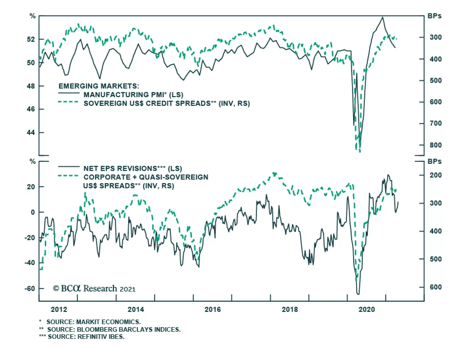
Many EM countries sell more to China than to the US. Exceptions are Mexico and oil producers. US oil demand is still vital to oil prices and, hence, to oil producing countries/companies. The ongoing economic boom in the US will have less boost to EM governments and corporate revenue growth than is generally perceived by the global investment community, except in Mexico and oil producing countries. Bottom Line: China’s business cycle will be slowing, and the rest of EM will continue experiencing very sluggish growth despite the US economic boom. The top panel of Chart 9 suggests that the relapse in EM manufacturing PMI heralds wider sovereign credit spreads. Similarly, declining EM net EPS revisions also point to widening corporate spreads (Chart 9, bottom panel). Chart 9EM Business Cycle Drives EM Credit Spreads
EM Business Cycle Drives EM Credit Spreads
EM Business Cycle Drives EM Credit Spreads
… And Exchange Rates As discussed in Box 1 above, exchange rate fluctuations matter a great deal for debtors’ ability to service their foreign currency liabilities. Given that the overwhelming majority of EM foreign currency debt is denominated in USD, the outlook for EM exchange rates versus the US dollar is critical to EM credit markets. We thus have the following considerations with respect to EM currencies: EM exchange rate changes correlate with their sovereign and corporate credit spreads (Chart 1 above). Currency appreciation makes foreign debt servicing cheaper and reduces credit risk, while currency depreciation has the opposite effects. In turn, EM exchange rate swings correlate more with their own business cycle than with the US’s business cycle. Chart 10 shows that the EM manufacturing PMI explains most swings in EM currencies versus the greenback. Chart 10EM Currencies Oscillate With The EM Business Cycle
EM Currencies Oscillate With The EM Business Cycle
EM Currencies Oscillate With The EM Business Cycle
As the US output gap shrinks, US interest rate expectations, including real rates, will rise. This will boost the value of the greenback over the next several months, especially in relation to currencies of countries where growth will be subdued or weakening. Overall, an impending slowdown in China and the ongoing US economic boom will boost the US dollar versus EM currencies. That, in turn, warrants wider EM sovereign and corporate credit spreads. The risk to this view is that US TIPS yields do not rise despite the very robust economy. In such a case, the US dollar will fail to rally. The lack of EM currency depreciation will in turn cap the upside in EM credit spreads. In such a case, investors will be better off staying positive on EM credit in absolute terms. EM Sovereign Credit: Cross Country Allocation Chart 11 depicts a tool to identify pockets of value among EM sovereign credits. On the X axis, we show a fundamental variable which is the country’s fiscal thrust this year minus its real (core inflation-adjusted) government local currency bond yield. On the Y axis, we plot current sovereign credit spreads for each individual country. A combination of more negative fiscal thrust and higher real government bond yields bodes ill for the outlook for nominal GDP and, hence, debt sustainability. This warrants wider sovereign credit spreads. Besides, a negative fiscal thrust and weak economic growth often produce a weak currency. When both fiscal and monetary policies are tight and cannot be relaxed, the exchange rate could act as a release valve and depreciate. The latter also heralds wider credit spreads. Chart 11 confirms that this reasoning works in reality. Countries like Brazil, Egypt and South Africa – where the fiscal thrusts are the most negative and/or real government bond yields are at their highest – trade at wider sovereign spreads. Chart 11Identifying Pockets Of Value In The EM Credit Space
A Primer On EM USD Bonds
A Primer On EM USD Bonds
By contrast, countries like Poland and the Philippines – where the fiscal thrust is positive and/or real government local currency bond yields are at their lowest – enjoy tight sovereign credit spreads. Based on this diagram, investors should overweight countries in the north-east quadrant (Colombia, Mexico, Chile, South Africa, the Philippines and Egypt) and underweight those in the south-west quadrant (Brazil, Indonesia, Malaysia, Hungary and Poland). On this chart, Turkey is an outlier. At 500 basis points, its sovereign credit spread is wider than is suggested by its fundamental indicator (calculated as the fiscal thrust minus real government bond yield). The basis is that investors and analysts including us, believe that the nation’s low real interest rates are not sustainable and will produce another major downleg in its exchange rate, which will force its real bond yields higher. In brief, Turkey’s sovereign credit spreads will narrow only if authorities hike interest rates dramatically and tighten fiscal policy. Barring these policy adjustments, the lira will continue depreciating and sovereign spreads will widen. Investment Conclusions On March 25, 2021, we downgraded EM sovereign and corporate credit to underweight relative to US corporate credit (Chart 12). This a tactical downgrade for the next six months or so. The rationale is as follows: an economic boom in the US will bolster revenues of US corporates while China will slow and the rest of EM will post weak growth. Such a growth disparity between the US on the one hand and China/EM on the other hand will weigh on the relative performance of EM credit versus US corporate credit. In absolute terms, EM sovereign and corporate credit spreads will widen if US real bond yields rise, producing a rebound in the US dollar. Chinese corporate and quasi-corporate credit spreads have already been widening (Chart 13, top panel). Chart 12Underweight EM Credit Versus US Credit
Underweight EM Credit Versus US Credit
Underweight EM Credit Versus US Credit
Chart 13Has The Rally In Chinese Offshore Credit Market Ended?
Has The Rally In Chinese Offshore Credit Market Ended?
Has The Rally In Chinese Offshore Credit Market Ended?
Chart 14A Couple Of Indicators To Watch For Asia And EM Credit
A Couple Of Indicators To Watch For Asia And EM Credit
A Couple Of Indicators To Watch For Asia And EM Credit
This has largely been due to two factors: (1) credit and regulatory tightening for property developers and the housing market weighing on bond prices of property developers (Chart 13, bottom panel); and (2) central government efforts to introduce credit and fiscal discipline among government-owned borrowers. These policies will persist, causing further repricing of credit risk for Chinese borrowers. In addition, the budding deceleration in China’s “old economy” will undermine the revenue growth of borrowers operating in this part of the economy, generating wider credit spreads. Relative performance of high-yield versus investment-grade credit has always been a coincident indicator for the direction of EM credit spreads. In emerging Asia, relative excess returns of high-yield corporates versus investment-grade ones has been drifting sideways (Chart 14, top panel). In broader EM, relative credit spreads between high-yield and investment-grade corporates are at a critical technical juncture (Chart 14, bottom panel). Presently, none of these indicators are sending a clear signal about the directions of excess returns and credit spreads in both emerging Asia and broader EM. At the moment, our sovereign credit overweights are Mexico, Colombia, Russia, Malaysia, the Philippines and Indonesia. Our underweights are Brazil, South Africa and Peru. This allocation differs slightly from the conclusions we derived from this analysis because we take into account more factors than those presented in Chart 11. Arthur Budaghyan Chief Emerging Markets Strategist arthurb@bcaresearch.com Footnotes 1 Excluding COVID- and GFC-type crises and following stimulus, the debt-to-GDP and debt-to-revenue ratios for the majority of sovereign and corporate borrowers do not change substantially within the space of a year. It is very rare for a company or government to become overindebted within a year or to reduce its debt dramatically within that time frame. The debt burden is a structural variable and it changes gradually over time. 2 Taiwan is referred to Taiwan, Province of China. Equities Recommendations
A Primer On EM USD Bonds
A Primer On EM USD Bonds
Currencies, Credit And Fixed-Income Recommendations
Highlights The US fiscal outlook has deteriorated substantially over the past two decades, as a consequence of the fiscal response to both the global financial crisis and the COVID-19 pandemic. US government debt-to-GDP is now nearly as high as it was at the end of the Second World War, and is projected by the US Congressional Budget Office (CBO) to explode higher over the coming 30 years. Some investors argue that extreme levels of government debt now virtually guarantee that interest rates will remain structurally low, and we test this claim alongside a scenario that limits the projected rise in the primary deficit. We find that US fiscal reform, when it eventually occurs, will likely be negative for health care stocks. We also note that even in a scenario where the US limits the size of its future primary budget deficit, net interest outlays will likely rise to elevated levels compared to history. A comparison with the Canadian experience in the 1990s suggests a structurally negative outlook for the US dollar, from an overvalued starting point. Finally, we note that the US fiscal outlook does not necessarily prevent an increase in interest rates over the coming few years in a scenario where investors raise their expectations for the neutral rate of interest, a possibility that we discussed in last month’s report. This scenario is not our base case view, but it is plausible and should actively be monitored by investors over the coming one to two years. For now, we do not expect that rising interest rates pose a risk to stocks over the coming 6-12 months. Investors should remain cyclically overweight equities within a multi-asset portfolio, and should maintain a below-benchmark level of duration on a risk-adjusted basis. In 2001, US government debt held by the public as a share of GDP stood at 31.5%, after having fallen roughly 16 percentage points from early 1993 levels. Today, as a result of both the global financial crisis and the COVID-19 pandemic, the debt to GDP ratio has risen to a whopping 100%, and is projected to rise meaningfully higher over the coming decades. Feature In this report we review the long-term US fiscal outlook in the wake of the pandemic, with a focus on the implications for interest rates. Some investors argue that extreme levels of government debt now virtually guarantee that interest rates will remain structurally low, and we test this claim alongside a scenario that limits the projected rise in the primary deficit. We find that US fiscal reform, when it eventually occurs, will likely be negative for health care stocks, whose fundamental performance has outstripped that of the broad equity market since the mid-1990s (reflecting pricing power that stands to be curtailed through regulation). We also note that even in a scenario where the US limits the size of its future primary budget deficit, net interest outlays will likely rise to elevated levels compared to history. A comparison with the Canadian experience in the 1990s suggests a structurally negative outlook for the US dollar, from an overvalued starting point. Finally, we note that the US fiscal outlook does not necessarily prevent an increase in interest rates over the coming few years in the hypothetical scenario that we described in last month’s report,1 i.e., an environment where the narrative of secular stagnation is challenged and investor expectations for the neutral rate rise closer to trend rates of economic growth. This scenario is not our base case view, but it is plausible and should actively be monitored by investors over the coming one to two years. For now, investors should remain cyclically overweight equities within a multi-asset portfolio, and should maintain a below-benchmark level of duration on a risk-adjusted basis. Debt Sustainability, And The CBO’s Baseline Projection When analyzing the US fiscal outlook, the Congressional Budget Office’s Long-Term Budget Outlook report is typically the reference point for investors. The report provides annual projections for the budget deficit and the debt-to-GDP ratio for the next three decades, as well as a breakdown of the projected deficit into its primary (i.e., non-interest) and net interest components. Charts II-1 and II-2 present the most recent baseline projections from the CBO, which clearly present a dire long-term outlook. The deficit and debt-to-GDP ratio are projected to be relatively stable over the next decade, but explode higher over the subsequent 20 years. In 2051, the CBO’s baseline projects that the budget deficit will be roughly 13% of GDP, with net interest costs accounting for approximately two-thirds of the deficit. Chart II-1The CBO’s Fiscal Outlook Is Extremely Negative
The CBO's Fiscal Outlook Is Extremely Negative
The CBO's Fiscal Outlook Is Extremely Negative
Chart II-2In 2051, The CBO Projects A 13% Annual Budget Deficit
May 2021
May 2021
In order to understand what is driving the CBO’s dire long-term budget and debt forecast, it is important to review the government debt sustainability equation shown below. The equation highlights that the change in a government’s debt-to-GDP ratio is approximately equal to 1) the primary deficit plus 2) net interest costs as a share of GDP, the latter being defined as the product of last year’s debt-to-GDP ratio and the difference between the average interest rate on the debt and the rate of GDP growth. Δ Debt-To-GDP Ratio ≈ Primary Deficit As A % Of GDP2 + (r-g)*(Prior Period Debt-To-GDP Ratio) Where: r = Average interest rate on government debt and g = Nominal GDP growth The equation highlights that expectations of a persistently rising debt-to-GDP ratio must occur either because of expectations of a persistent primary deficit, or expectations that interest rates will persistently exceed the rate of economic growth (or some combination of the two). This underscores why debt sustainability analysis often focuses on the primary budget balance, as a country’s debt-to-GDP ratio will be stable if no primary deficit exists and interest costs are at or below the prevailing rate of economic growth. Chart II-3 illustrates the source of the CBO’s projected rise in debt-to-GDP beyond 2031, by presenting the two components of the debt sustainability equation alongside the projected annual change in the debt-to-GDP ratio. The chart makes it clear that while the CBO is forecasting a sizeable primary deficit to continue, it is projected to grow at a slower pace than the debt-to-GDP ratio itself. The increasing rate at which the debt-to-GDP ratio is projected to grow in the latter years of the CBO’s forecast period is clearly driven by the interest rate component, meaning that “r” is projected to be greater than “g”. Chart II-4 presents this point directly, by highlighting that the CBO is forecasting the average interest rate on government debt to exceed that of nominal GDP growth in 2038, and to continue to exceed growth (by an increasing amount) thereafter. Chart II-3Decomposing The CBO's Projected Change In The Debt-To-GDP Ratio
Decomposing The CBO's Projected Change In The Debt-To-GDP Ratio
Decomposing The CBO's Projected Change In The Debt-To-GDP Ratio
Chart II-4The CBO's Projections Rest, In Part, On Rates Eventually Exceeding Growth
The CBO's Projections Rest, In Part, On Rates Eventually Exceeding Growth
The CBO's Projections Rest, In Part, On Rates Eventually Exceeding Growth
Three Adjustments To The CBO’s Baseline We make three adjustments to the CBO’s baseline in order to assess how the US fiscal outlook shifts under an interest rate path that is different than that projected by the CBO. First, we adjust the CBO’s projected budget deficit over the coming few years based on deficit forecasts from our US Political Strategy service following the passage of the American Recovery Plan act.3 Chart II-5We Test The Effect Of An Initially Higher, But More Sustainable, Rate Path
We Test The Effect Of An Initially Higher, But More Sustainable, Rate Path
We Test The Effect Of An Initially Higher, But More Sustainable, Rate Path
Next, we adjust the interest component of the total budget deficit based on a new path for short- and long-term interest rates that models a scenario in which the neutral rate of interest rises to, but not above, GDP growth (Chart II-5). In last month’s report we outlined a scenario in which this could feasibly occur,1 and the hypothetical path for interest rates shown in Chart II-5 thus incorporates both the negative budgetary impact of an earlier rise in interest rates and the positive budgetary impact of “r” never rising above “g”. We explicitly exclude any crowding out effect on long-term interest rates, based on the view that term premia are likely to remain muted in a world of low potential economic growth, unless a fiscal crisis appears to be imminent (see Box II-1). Box II-1 Arguing Against The CBO’s Crowding Out Assumption The CBO’s projection that interest rates will ultimately rise above the rate of economic growth rests on the view that increased government spending will absorb savings that would otherwise finance private investment (a “crowding out” effect). We agree that crowding out can occur over the course of the business cycle, especially in a scenario where increased government spending pushes output above its potential (creating a cyclical acceleration in inflation and eventually an increase in interest rates). But the CBO is assuming that high government debt-to-GDP ratios will crowd out private investment on a structural basis, and on this basis we disagree. First, Chart Box II-1 highlights that there is essentially no empirical relationship across countries between a country’s debt-to-GDP ratio and its long-term government bond yield. Japan is a clear outlier in the chart, but including Japan implies that the relationship is negative, not positive. Chart Box II-1There Is No Empirical Relationship Between Debt-To-GDP And Interest Rates
May 2021
May 2021
In addition, given that central banks directly control interest rates at the short-end of the curve, a structural crowding out effect can only manifest itself in the form of an elevated term premium embedded in longer-term government bond yields. Our bet is that term premia are likely to stay low in a world of low falling nominal growth, as evidenced by the experience of the past decade.4 Finally, we model the impact of two changes, beginning in 2031, that would work towards reducing the primary deficit: an increase in average government revenue to 20% of GDP (its peak level reached in 2000), and a slower pace of increase on major health care program spending. Despite the fact that population aging will increase mandatory spending on social security and health care over the coming three decades, the CBO has highlighted that the majority of the increase in spending towards these programs is projected to occur due to rising health care costs per person (Chart II-6). We thus model the impact of medical care cost control by limiting the rise in net mandatory outlays on health care programs between 2021 and 2051 to roughly half of what the CBO baseline projects. This adjustment does not prevent mandatory spending on health care programs from rising, given the strong political challenges involved in limiting spending increases that are caused by an aging population. Chart II-6The US Structural Primary Balance Is Heavily Impacted By Medical Costs
May 2021
May 2021
Charts II-7 and II-8 illustrate how these three adjustments impact the long-term US fiscal outlook. Relative to the CBO’s baseline projections, the American Recovery Plan (ARP) budget deficit forecasts from our US Political Strategy service imply that the debt-to-GDP ratio will be approximately three to four percentage points higher over the very near term, and roughly ten points higher over the long term. Chart II-7Even With Higher Rates, The Fiscal Outlook Is Meaningfully Less Bad…
Even With Higher Rates, The Fiscal Outlook Is Meaningfully Less Bad...
Even With Higher Rates, The Fiscal Outlook Is Meaningfully Less Bad...
Relative to this new baseline, an increase in interest rates to, but not above, the projected rate of nominal economic growth increases the debt-to-GDP ratio by an additional ten percentage points (20 points higher versus the CBO’s baseline) in the middle of the forecast period, but it lowers the debt-to-GDP ratio over the longer run by eliminating the effect of outsized interest rates magnifying a persistent primary deficit. Still, the debt-to-GDP ratio is projected to rise to a whopping 207% of GDP by 2051 in this scenario, with a budget deficit in excess of 10% of GDP. The third adjustment shown in Charts II-7 and II-8 underscores the impact on the US fiscal outlook of actions aimed at reducing the primary deficit. Increases in government revenue and the prevention of rising health care costs per person results in the debt-to-GDP ratio that is 64 percentage points lower in 2051 than in our normalized interest rate scenario. The budget deficit in this scenario still increases to approximately 6% of GDP thirty years from today, but in this case most of the deficit is due to the net interest component rather than the primary deficit, meaning that the debt-to-GDP ratio would be increasing at a much slower rate if interest rates were no higher than the rate of economic growth. Chart II-8 highlights that net interest spending in this scenario would rise to 4.5% of GDP, which would be meaningfully higher than the prior high of roughly 3% in the late 1980s and early 1990s. Chart II-8...With Higher Taxes And Medical Cost Control
...With Higher Taxes And Medical Cost Control
...With Higher Taxes And Medical Cost Control
Chart II-9A Meaningful, But Not Unprecedented, Rise In Net Interest Outlays
A Meaningful, But Not Unprecedented, Rise In Net Interest Outlays
A Meaningful, But Not Unprecedented, Rise In Net Interest Outlays
But that is far from unprecedented or necessarily consistent with a fiscal crisis. Chart II-9 also shows that Canada’s public debt charges rose to 6.5% of GDP in the early 1990s without triggering a public debt crisis. It is true that Canada subsequently embarked on a painful fiscal consolidation program in order to reduce its public debt burden, but this, in part, occurred because of a cyclically-adjusted primary deficit of approximately 3% - twice as large as that projected for the US in 2051 in our adjusted scenario shown in Charts II-7 and II-8. Revenue And Health Care Cost Reform Our third adjustment to the CBO’s long-term budget outlook involved changes to revenue and health care cost control to reduce the US’ projected primary deficit. Are these adjustments achievable? In our view, the answer is yes: As noted above, our scenario modeled these changes taking place a decade from today, which allows for policymakers and stakeholders to have a substantial amount of time to act and adjust to these changes. On the revenue front, we noted above that US government revenue has reached 20% of GDP in the past, in the year 2000. Chart II-10 highlights that while raising taxes will likely reduce US competitiveness, the US maintains a sizeable tax advantage relative to other advanced economies, and that this was true prior to the tax cuts that took place under the Trump administration. On the health care cost front, Chart II-11 highlights that US healthcare expenditure is much larger as a share of GDP than other countries, which was not the case prior to the 1980s. Chart II-12 highlights that this cost difference is entirely due to inpatient (i.e., hospital) and outpatient (i.e., drug) costs. While it is not clear what form it will take, it seems likely that future reforms by policymakers to eliminate rising health care costs per person will occur and can be achieved. Chart II-10The US Government Can Afford To Raise Revenue
The US Government Can Afford To Raise Revenue
The US Government Can Afford To Raise Revenue
Chart II-11The US Spends Much More On Health Care Than Other Countries
The US Spends Much More On Health Care Than Other Countries
The US Spends Much More On Health Care Than Other Countries
Chart II-12The US Significantly Outspends The World On Hospital And Drug Costs
May 2021
May 2021
The key point for investors is not whether these changes should or should not occur, but whether there are any feasible scenarios in which spiraling government debt and interest payments are avoided without the Fed purposely maintaining monetary policy at levels persistently below the rate of economic growth – and thus risking major inflationary pressure. Our analysis above highlights that there are; the question is when policymakers will choose to act and in what form. A potential tipping point may be when US government spending on net interest as a % of GDP exceeds its prior high, which occurs in 2026 in the scenario modeled in Chart II-8. In a scenario where reforms fail to materialize or where financial markets force policymakers to act, a fiscal risk premium could certainly emerge in longer-term government bond yields, which could lead the Fed to maintain lower short-term interest rates than it otherwise would. But this scenario is only likely to emerge after interest rates converge towards rates of economic growth, as US government debt will remain highly serviceable for some time if "r" remains meaningfully lower than "g". Investment Conclusions There are three potential investment implications of our research. First, the fact that rising medical costs have such a significant impact on the CBO’s projections of the primary deficit implies that fiscal reform, when it eventually occurs, will be negative for US health care stocks. Chart II-13 highlights that US health care sector earnings have outperformed broad market earnings since the mid-1990s, and that the sector has consistently delivered an above-average return on equity. This historical performance likely reflects the sector’s pricing power, which stand to be curtailed through regulatory efforts in a world where rising health care costs per person collide with fiscal belt-tightening. Interestingly, Chart II-12 highlighted that US per capita spending on medical goods is not significantly higher than in other developed markets, suggesting that the health care equipment & supplies industry may fare better over a very long term time horizon than overall health care. Second, Charts II-7 and II-8 highlighted that even if the US does raise revenue as a share of GDP and limits excessive growth in medical costs, a primary deficit will still exist and net interest outlays will still rise to elevated levels compared to what has historically been the case. We noted that Canada experienced a higher public debt burden in the 1990s and did not suffer from a fiscal crisis, but Chart II-14 highlights that the fiscal situation did weigh on the Canadian dollar, which progressively traded 10-20% below its PPP-implied fair value level over the course of the 1990s. Thus, the implication is that eventual fiscal reform in the US may be structurally negative for the US dollar, from an overvalued starting point (panels 3 and 4 of Chart II-14). Chart II-13Eventual Fiscal Reform Will Likely Be Negative For Health Care Stocks
Eventual Fiscal Reform Will Likely Be Negative For Health Care Stocks
Eventual Fiscal Reform Will Likely Be Negative For Health Care Stocks
Chart II-14The US Fiscal Outlook, Even With Some Reforms, Is Dollar-Negative
The US Fiscal Outlook, Even With Some Reforms, Is Dollar-Negative
The US Fiscal Outlook, Even With Some Reforms, Is Dollar-Negative
Finally, our scenario analysis highlights that very elevated levels of government debt do not guarantee that interest rates will remain structurally low, especially over the next decade when the US primary deficit is projected to remain relatively stable. For investors focused on forecasting the direction of 10-year Treasury yields from the perspective of valuation, it should be noted that the next decade is the relevant projection period for the Fed funds rate, not what occurs to net interest outlays in the two decades that follow. Over the very long run, it is true that there may ultimately be very strong political pressure on the Fed to keep interest rates below the prevailing rate of economic growth, as policymakers in 2030 will be able to avoid a structural adjustment to the primary deficit of roughly 1.1-1.3% of GDP for every percentage point that average interest rates on government debt are below nominal GDP growth. However, we noted above that this pressure is unlikely to build before the second half of this decade even in a scenario where interest rates rise significantly over the coming few years, and it remains an open questions whether the Fed will acquiesce to this pressure given its strong potential to fuel excess private sector leveraging. Over the coming one to two years, the key conclusion is that the US fiscal outlook is not likely to prevent an increase in interest rates over the coming few years in the hypothetical scenario that we described in last month’s report, i.e., an environment where the narrative of secular stagnation is challenged and investor expectations for the neutral rate rise closer to trend rates of economic growth. This remains a risk to our overweight stance towards risky assets and is not our base case view. But it does highlight the importance of monitoring long-dated rate expectations over the coming year, and argues, on a risk-adjusted basis, for a below-neutral duration stance within a fixed-income portfolio. Jonathan LaBerge, CFA Vice President The Bank Credit Analyst Footnotes 1 Please see The Bank Credit Analyst Special Report "R-star, And The Structural Risk To Stocks," dated March 31, 2021, available at bca.bcaresearch.com 2 Presented in this fashion, a budget deficit (surplus) is recorded with a positive (negative) sign. 3 For more information, please see US Political Strategy report “Biden’s Pittsburgh Speech And Legislative Agenda,” dated April 1, 2021, available at usp.bcaresearch.com 4 Please see “Term premia: models and some stylised facts”, by Cohen, Hördahl, and Xia, BIS Quarterly Review, September 2008.
Highlights Developed economies continue to transition towards a post-pandemic state. Europe has further to go, but it is lagging the US at a constant rate and is thus merely delayed – not on a different path. This ongoing transition is also reflected in the global macro data, which continues to surprise to the upside. Widespread optimism about the outlook for economic activity and earnings over the coming year has led some investors to ask whether an imminent peak in the rate of growth could be a potentially negative inflection point for richly valued risky asset prices. Using our global leading economic indicator as a guide, we find that a peak in growth momentum in and of itself is not likely to be enough of a catalyst for meaningful risky asset underperformance versus government bonds. A sizeable shock to sentiment would likely be required, causing either a very serious growth slowdown, outright fears of recession, or some other event that negatively impacts earnings growth or raises the equity risk premium (“ERP”). We can identify several candidates for such a shock, including the emergence of new, vaccine-resistant variants of COVID-19, the impact of higher taxes on earnings, overtightening in China, and a potentially hawkish shift in monetary policy in the developed world. But none of these risks individually appears to be likely enough to warrant reducing cyclical portfolio exposure. We continue to expect positive absolute single-digit returns from stocks over the coming 6-12 months, and would recommend that investors remain overweight stocks versus bonds in a multi-asset portfolio. We remain overweight global ex-US equities vs. the US, but expect that euro area stocks will have to do the heavy lifting, driven either by the underperformance of global technology stocks or the outperformance of euro area financials. Within a fixed-income portfolio, we recommend a modestly short duration stance, but do so primarily on a risk-adjusted basis. Feature Chart I-1Europe Is Behind The US, But On The Same Path
Europe Is Behind The US, But On The Same Path
Europe Is Behind The US, But On The Same Path
Over the past month, developed economies have continued to transition towards a post-pandemic state. While the number of new confirmed COVID-19 cases remains relatively high on a per capita basis in the US and Europe, there continues to be significant progress on the vaccination front in all Western advanced economies. Europe continues to lag the US and the UK in terms of the share of the population that has received at least one dose of vaccine, but Chart I-1 highlights that the gap has remained constant at approximately six weeks (to the US). Panel 2 of Chart I-1 highlights that the US and UK both experienced either falling or a stable number of new cases once the number of first doses reached current European levels; Israel required significant further gains in the breadth of vaccinations before it altered COVID-19’s transmission dynamics in that country, but this appears to have occurred because of a much higher pace of spread earlier this year. The negative impact on advanced economies from reduced services activity is strongly linked to pandemic control measures (such as stay-at-home orders, curfews, forced business closures, etc). We have argued that, outside of the US, the implementation and removal of these measures is being driven by the impact of the pandemic on the medical system, rather than the sheer number of new cases and deaths. Chart I-2 highlights that, based on this framework, Europe still has further to go – current per capita hospitalizations remain much higher in France and Italy than in the US, UK, or Canada. But the nature of the disease means that hospitalizations begin to fall even if case counts remain relatively stable, and fall rapidly once new cases trend lower. Given the steady gains that European countries are making in providing first vaccine doses to their populations, it seems likely that hospitalizations there will peak sometime in the coming four to six weeks. This underscores that Europe is not on a different path than that of the US, it is simply further behind in the process (and will ultimately catch up). The transition towards a post-pandemic state is also reflected in the global macro data, which continues to positively surprise in all three major economies (Chart I-3). In Europe, the April services PMI rose back above the 50 mark, April consumer confidence surprised to the upside, and February retail sales came in better than expected (Table I-1). In the US, the March services PMI was also very strong, the labor market continued to meaningfully improve, and several measures of inflation surprised to the upside. Chart I-2Euro Area Hospitalizations Remain High, But Will Soon Decline
Euro Area Hospitalizations Remain High, But Will Soon Decline
Euro Area Hospitalizations Remain High, But Will Soon Decline
Chart I-3The Macro Data Continues To Positively Surprise
The Macro Data Continues To Positively Surprise
The Macro Data Continues To Positively Surprise
Table I-1Services PMIs And The Labor Market Continue To Meaningfully Improve
May 2021
May 2021
Chart I-4China's Current Contribution To Global Demand Is Strong
China's Current Contribution To Global Demand Is Strong
China's Current Contribution To Global Demand Is Strong
In China, the recent tick higher in the surprise index likely reflects the recognition of some data series whose release was delayed due to the Chinese New Year, as well as significant base effects (compared with Q1 2020) in many data series recorded in year-over-year terms. On a quarter-over-quarter basis, Chinese economic activity decelerated last quarter to 0.6% from the upwardly revised 3.2% in Q4 2020 – which was below the anticipated 1.4% q/q. Still, Chinese RMB-denominated import growth closely matches (lagging) data on global exports to China (in US$ terms), with the former suggesting that China’s current contribution to global external demand remains strong (Chart I-4). This is also consistent with rising producer prices, which had fallen back into deflationary territory last year (panel 2). Peaking Growth Momentum: Should Investors Be Worried? The continued increase in the number of vaccine doses administered, positive data surprises, and bullish global growth forecasts for this year have understandably led to extremely optimistic investor sentiment. It has also naturally raised the question of “what could go wrong?”, with some investors pointing to an imminent peak in the rate of growth as a potentially negative inflection point for richly valued risky asset prices. Chart I-5 addresses this question by examining 12 episodes of waning growth momentum since 1990, defined as an identifiable peak in our global leading economic indicator. Panel 2 shows the 12-month rate of change in the relative performance of global equities versus a US$-hedged 7-10 year global Treasury index. Chart I-5Is Peaking Growth Momentum A Risk For Stocks?
Is Peaking Growth Momentum A Risk For Stocks?
Is Peaking Growth Momentum A Risk For Stocks?
At first blush, the chart does support the notion that a peak in growth momentum is generally negative for risky asset prices. The subsequent 12-month relative return from stocks versus bonds following a peak in the LEI has been negative in 8 out of the 12 episodes, suggesting that the risks of an equity correction are currently quite elevated. However, there is more to the story than this simple calculation implies (Table I-2). First, two of the twelve episodes saw the global LEI peak in the context of an eventual US recession, so it is not surprising that stocks underperformed bonds in those episodes. Second, out of the six non-recessionary episodes, only two of them involved significant underperformance, in 2002 and in 2015. Table I-2Peak Growth Momentum Is An Insufficient Catalyst For Equity Underperformance
May 2021
May 2021
US equities underperformed in the former case because of the persistently damaging impact of corporate excesses that built up during the dot-com bubble, and predominantly global ex-US equities underperformed bonds in the latter case because of a combination of the significant impact on global CAPEX from the 2014 dollar and oil price shock, as well as a major decline in global bond yields. In the four other non-recessionary examples of equity underperformance, stocks only modestly underperformed bonds, and often this occurred in the context of significant events: surprising Fed hawkishness in 1994, the Asian financial crisis in 1997, a major slowdown in China in 2013, and the combination of a domestically-driven Chinese economic slowdown coupled with the Sino/US trade war in 2017/2018. The key point for investors is that a peak in growth momentum is in and of itself not enough of a catalyst for meaningful risky asset underperformance versus government bonds. A sizeable shock to sentiment would likely be required, causing either a very serious growth slowdown, outright fears of recession, or some other event that negatively impacts earnings growth or raises the equity risk premium (“ERP”). What Else Could Go Wrong? There are four other plausible risks that we can identify to a bullish stance towards risky assets over the coming 6-12 months. We discuss each of these risks below. New COVID-19 Variants Chart I-6 highlights that bottom up analysts expect global earnings per share to be 12% higher than their pre-pandemic level in 12-months’ time. This expectation is driven by extraordinarily easy fiscal and monetary policy, but also the view that vaccination against COVID-19 will allow social distancing policies to end and services activity to fully recover. However, as India is clearly – and tragically – demonstrating at present, the emerging world is lagging in terms of vaccinating its population. India’s per capita case count has soared (Chart I-7), which is surprising given that the country’s COVID-19 infection rate has been significantly below that of more advanced economies over the past year. It is therefore likely that India’s case count explosion is due to new variants of the disease, and periodic outbreaks in less developed countries – as well as vaccine hesitancy in more developed economies – risks the emergence of even newer variants that may be partially or substantially vaccine-resistant. Chart I-6Earnings Expectations Already Price In A Normalization In Services Activity
Earnings Expectations Already Price In A Normalization In Services Activity
Earnings Expectations Already Price In A Normalization In Services Activity
Chart I-7India's COVID-19 Situation Is Tragic, And Concerning
India's COVID-19 Situation Is Tragic, And Concerning
India's COVID-19 Situation Is Tragic, And Concerning
New variants of COVID-19 may prove to be less deadly, but the economic impact of the pandemic has come mainly from its potential to collapse the medical system via high rates of serious illness requiring hospitalization, not strictly from its lethality. As such, potentially new vaccine-resistant variants of the disease resulting in similar or higher rates of hospitalization pose a risk to a bullish economic outlook. Taxation Both corporate and individual tax rates are set to rise in the US over the coming 12-18 months which, at first blush, could certainly qualify as a non-recessionary event that negatively impacts earnings or raises the ERP. Corporate taxes are set to rise first as part of the American Jobs Plan, which our political strategists have argued will probably take the Biden administration most of this year to pass. The plan involves a proposed increase in the domestic corporate income tax rate to 28% from 21%, a higher minimum tax on foreign profits, and a 15% minimum tax on “book income”. In addition, as part of the American Families Plan, Biden is proposing to increase the top marginal income tax rate for households earning $400,000 or more to 39.6% (from 37%), and to substantially increase the capital gains tax rate for those earning $1 million or more from a base rate of 20% to 39.6%. The 3.8% tax on investment income that funds Obamacare would be kept in place, which would bring the total capital gain tax rate to 43.4% for that income group. Peter Berezin, BCA’s Chief Global Strategist, made two points about higher corporate taxes in a recent report.1 First, he noted that the changes would likely result in an 8% decline in forward earnings if passed as currently proposed, but that various tax credits as well as opposition to a 28% corporate tax rate from Democratic Senator Joe Manchin would likely cap the impact at 5%. Second, he argued that the behavior of 12-month forward earnings and the performance of stocks that benefitted the most from President Trump’s corporate tax cuts suggest that very little impact from these changes has been priced in. Peter argued in his report that the effect of strong economic growth will likely offset the negative impact of higher taxes on earnings, and we are inclined to agree. Chart I-8 highlights that a 5% reduction in 12-month forward earnings would reduce the equity risk premium by roughly 20-25 basis points, which would not be disastrous on its own. Still, the fact that these changes have not been priced in means that corporate tax hikes could be a more meaningful driver of lower stock prices if the impact is ultimately larger than we currently expect or if the growth outlook suddenly shifts in a negative direction. In terms of changes to individual taxes, our sense is that the proposed increase in the capital gains tax rate is more significant than the modest proposed change to the top marginal income tax rate for higher-income households. For individuals earning $1 million or more, Chart I-9 highlights that the proposed change to the capital gains rate would bring it to the highest level seen since the late 1970s. Given the rich valuation of equities, it seems inconceivable that such a change would not trigger some short-term selling of equities to lock in long-term gains at lower tax rates. Chart I-8Higher Corporate Taxes Will Only Modestly Reduce the Equity Risk Premium
Higher Corporate Taxes Will Only Modestly Reduce the Equity Risk Premium
Higher Corporate Taxes Will Only Modestly Reduce the Equity Risk Premium
Chart I-9Biden's Capital Gains Tax Proposal Would Lead To Some Selling Of Stocks...
Biden's Capital Gains Tax Proposal Would Lead To Some Selling Of Stocks...
Biden's Capital Gains Tax Proposal Would Lead To Some Selling Of Stocks...
But like upcoming changes to corporate taxes, we see the potential for higher taxes on wealthy individuals as a risk to the equity market and not as a likely driver of stock prices over a cyclical time horizon. First, our political strategists see 50/50 odds that the American Families Plan will be passed this year, meaning that short-term tax avoidance selling may be postponed until 2022. In addition, Chart I-10 highlights that over the longer term, the relationship between the maximum capital gains tax rate and the ERP is weak or nonexistent. The chart highlights that the perception of a positive relationship rests entirely on the second half of the 1970s, when the maximum capital gains tax rate was between 30-40%. However, it seems clear from the chart that the stagflationary environment of that period was responsible for a high ERP, as the capital gains rate fell from 1977 to 1982 without any significant decline in risk premia. It took until the end of the 1982 recession and the beginning of the structural disinflationary period for the equity risk premium to decline, suggesting that there is effectively no relationship between the two (and therefore no reason to believe that higher capital gains taxes will lead to sustained declines in stock market multiples). Chart I-10…But The Effect Would Not Likely Last
May 2021
May 2021
Overtightening In China Chart I-11Leading Indicators Of China's Economy Are Pointing Down, Not Up
Leading Indicators Of China's Economy Are Pointing Down, Not Up
Leading Indicators Of China's Economy Are Pointing Down, Not Up
Even though Chart I-4 highlighted that Chinese import demand is currently strong, we expect China’s growth impulse to weaken in the second half of the year. Chart I-11 highlights that our leading indicator for China’s Li Keqiang index has done a good job of predicting Chinese import growth, and the indicator is now in a clear downtrend. Panel 2 presents the components of the indicator, and shows that all three are trending lower. Monetary conditions are potentially rebounding from extremely weak levels (due to past deflation and a rise in the RMB versus the US dollar and other Asian currencies), but money supply and credit measures are deteriorating. Leading indicators for China’s economy are deteriorating because Chinese policymakers have already tightened liquidity conditions in response to the country’s rebound from the pandemic and following a surge in the credit impulse. The 3-month repo rate returned to pre-pandemic levels in the second half of last year (Chart I-12), and consequently the private sector credit impulse (particularly that of corporate bond issuance) fell despite robust medium-to-long term loan growth. Chart I-12Chinese Interest Rates Have Already Returned To Pre-COVID Levels
Chinese Interest Rates Have Already Returned To Pre-COVID Levels
Chinese Interest Rates Have Already Returned To Pre-COVID Levels
We noted in our January report that China’s credit impulse has consistently followed a 3½-year cycle since 2010, and this year has been no different. This cycle is not exogenous or mystical; it has been caused by the repeated “oversteering” of activity by Chinese policymakers who frequently oscillate between the need to fight deflation and the strong desire to curb additional private sector leveraging. Our base case view is that policymakers will not accidentally overtighten the economy, and that the credit impulse will settle somewhere between late 2019 levels and the peak rate reached in the latter half of last year. But the risk of significant oversteering cannot be ruled out, and will likely remain a downcycle risk for investors for several years to come. A Hawkish Shift In Monetary Policy In Developed Markets Last week the Bank of Canada announced that it would taper its pace of government debt purchases from 4 billion to 3 billion CAD per week. The announcement was noteworthy for many investors, as it suggested that asset purchase reductions could also be announced by the Fed and other major central banks by the end of the second or third quarter. Many investors are sensitive to the tapering question because of what transpired during the “Taper Tantrum” episode of 2013. During an appearance before Congress in late May of that year, then Chair Ben Bernanke stated that the Fed could “step down” the pace of its asset purchases in the next few FOMC meetings if economic conditions continued to improve. The result was that 10-year Treasurys fell roughly 10% in total return terms over the subsequent three-month period. While stocks rallied in response to the growth-positive implications of the move, this occurred from a much higher ERP starting point than exists today. The risk, in the minds of some investors, is that tapering today could thus lead to a correction in stock prices. There are two counterpoints to this view. First, bonds have already sold off meaningfully over the past several months in response to a significant improvement in the economic outlook, and investors already expect the Fed to raise interest rates earlier than it is publicly forecasting. It is thus difficult to see how an announcement of tapering from the Fed would significantly alter the outlook for monetary policy over the coming 6-18 months. Chart I-13Another Taper Tantrum-Like Selloff Would Necessitate Higher Expectations For R-star
Another Taper Tantrum-Like Selloff Would Necessitate Higher Expectations For R-star
Another Taper Tantrum-Like Selloff Would Necessitate Higher Expectations For R-star
Second, it is notable that the “Taper Tantrum” began at yield levels at the front end of the curve that are roughly similar to what prevails today. 5-year/5-year forward bond yields stood at roughly 3% at the beginning of the “Tantrum”, compared with 2.3% today. Chart I-13 highlights how high forward bond yields would need to rise in order to generate another selloff of similar magnitude from 10-year Treasury yields (roughly 3.65%). In our view, a rise to this level over the coming year is essentially impossible without a major shift in investor expectations about the natural rate of interest. We highlighted the risk of such a shift in last month’s report,2 but for now it would likely necessitate hard evidence of little-to-no permanent damage to the labor market from the pandemic. This is not our base case view, but it will be an important possibility to monitor as the decisive end to social distancing and other pandemic control measures draws nearer. Investment Conclusions As noted above, there are several identifiable risks to a bullish outlook for risky assets, but none of these risks individually appear to be likely. Given this, we continue to expect positive absolute single-digit returns from stocks over the coming 6-12 months, and would recommend that investors remain overweight stocks versus bonds in a multi-asset portfolio. We favor value versus growth stocks, cyclical versus defensive sectors, and small versus large cap stocks, although there is more return potential over the coming year in value versus growth than the latter two positions. We also remain short the US dollar over a cyclical time horizon. Within a global equity portfolio, we remain overweight global ex-US equities vs the US, but this position has moved against us over the past two months. Chart I-14 highlights that global ex-US equities have given back all of their October – January gains versus US equities, most of which has occurred since late-February. The chart also highlights that all of this underperformance has been driven by emerging market stocks, as euro area equity performance has been mostly stable year-to-date. Chart I-15 highlights that EM underperformance has occurred both in the broadly-defined tech sector as well as when measured in ex-tech terms. To us, this suggests that EM stocks are responding to the deterioration in leading indicators for the Chinese economy that we noted above, which implies that they are not likely to lead global ex-US equity performance higher over the course of the year barring an imminent shift in Chinese policy. We continue to expect that euro area stocks will have to do the heavy lifting, driven either by the underperformance of global technology stocks or the outperformance of euro area financials – which are extremely cheap relative to US banks and have much further scope for earnings to normalize as the pandemic draws to a close. Chart I-14Emerging Markets Have Caused Global Ex-US Stocks To Underperform
Emerging Markets Have Caused Global Ex-US Stocks To Underperform
Emerging Markets Have Caused Global Ex-US Stocks To Underperform
Chart I-15EM's Underperformance Has Been Broad-Based
EM's Underperformance Has Been Broad-Based
EM's Underperformance Has Been Broad-Based
As a final point, investors should note that we are recommending a modestly short duration stance within a fixed-income portfolio, but that we make this recommendation primarily on a risk-adjusted basis. Chart I-16 highlights that Treasury market excess returns (relative to cash) have historically been driven by whether the Fed funds rate increases by more or less than what is currently priced into the market. Over the past 12 months, the Treasury index has very substantially underperformed cash without a hawkish surprise, and the rate path that is currently implied by the OIS curve is already more hawkish than the Fed is (for now) projecting. On this basis, a neutral duration stance could be justified, but we would still prefer a modestly short duration stance due to the risk of a potential increase in investor expectations for the neutral rate of interest late this year or in early 2022. Chart I-16Policy Rate Surprises Tend To Drive The Duration Call
Policy Rate Surprises Tend To Drive The Duration Call
Policy Rate Surprises Tend To Drive The Duration Call
Jonathan LaBerge, CFA Vice President The Bank Credit Analyst April 29, 2021 Next Report: May 27, 2021 II. In COVID’s Wake: Government Debt And The Path Of Interest Rates The US fiscal outlook has deteriorated substantially over the past two decades, as a consequence of the fiscal response to both the global financial crisis and the COVID-19 pandemic. US government debt-to-GDP is now nearly as high as it was at the end of the Second World War, and is projected by the US Congressional Budget Office (CBO) to explode higher over the coming 30 years. Some investors argue that extreme levels of government debt now virtually guarantee that interest rates will remain structurally low, and we test this claim alongside a scenario that limits the projected rise in the primary deficit. We find that US fiscal reform, when it eventually occurs, will likely be negative for health care stocks. We also note that even in a scenario where the US limits the size of its future primary budget deficit, net interest outlays will likely rise to elevated levels compared to history. A comparison with the Canadian experience in the 1990s suggests a structurally negative outlook for the US dollar, from an overvalued starting point. Finally, we note that the US fiscal outlook does not necessarily prevent an increase in interest rates over the coming few years in a scenario where investors raise their expectations for the neutral rate of interest, a possibility that we discussed in last month’s report. This scenario is not our base case view, but it is plausible and should actively be monitored by investors over the coming one to two years. For now, we do not expect that rising interest rates pose a risk to stocks over the coming 6-12 months. Investors should remain cyclically overweight equities within a multi-asset portfolio, and should maintain a below-benchmark level of duration on a risk-adjusted basis. In 2001, US government debt held by the public as a share of GDP stood at 31.5%, after having fallen roughly 16 percentage points from early 1993 levels. Today, as a result of both the global financial crisis and the COVID-19 pandemic, the debt to GDP ratio has risen to a whopping 100%, and is projected to rise meaningfully higher over the coming decades. In this report we review the long-term US fiscal outlook in the wake of the pandemic, with a focus on the implications for interest rates. Some investors argue that extreme levels of government debt now virtually guarantee that interest rates will remain structurally low, and we test this claim alongside a scenario that limits the projected rise in the primary deficit. We find that US fiscal reform, when it eventually occurs, will likely be negative for health care stocks, whose fundamental performance has outstripped that of the broad equity market since the mid-1990s (reflecting pricing power that stands to be curtailed through regulation). We also note that even in a scenario where the US limits the size of its future primary budget deficit, net interest outlays will likely rise to elevated levels compared to history. A comparison with the Canadian experience in the 1990s suggests a structurally negative outlook for the US dollar, from an overvalued starting point. Finally, we note that the US fiscal outlook does not necessarily prevent an increase in interest rates over the coming few years in the hypothetical scenario that we described in last month’s report,3 i.e., an environment where the narrative of secular stagnation is challenged and investor expectations for the neutral rate rise closer to trend rates of economic growth. This scenario is not our base case view, but it is plausible and should actively be monitored by investors over the coming one to two years. For now, investors should remain cyclically overweight equities within a multi-asset portfolio, and should maintain a below-benchmark level of duration on a risk-adjusted basis. Debt Sustainability, And The CBO’s Baseline Projection When analyzing the US fiscal outlook, the Congressional Budget Office’s Long-Term Budget Outlook report is typically the reference point for investors. The report provides annual projections for the budget deficit and the debt-to-GDP ratio for the next three decades, as well as a breakdown of the projected deficit into its primary (i.e., non-interest) and net interest components. Charts II-1 and II-2 present the most recent baseline projections from the CBO, which clearly present a dire long-term outlook. The deficit and debt-to-GDP ratio are projected to be relatively stable over the next decade, but explode higher over the subsequent 20 years. In 2051, the CBO’s baseline projects that the budget deficit will be roughly 13% of GDP, with net interest costs accounting for approximately two-thirds of the deficit. Chart II-1The CBO’s Fiscal Outlook Is Extremely Negative
The CBO's Fiscal Outlook Is Extremely Negative
The CBO's Fiscal Outlook Is Extremely Negative
Chart II-2In 2051, The CBO Projects A 13% Annual Budget Deficit
May 2021
May 2021
In order to understand what is driving the CBO’s dire long-term budget and debt forecast, it is important to review the government debt sustainability equation shown below. The equation highlights that the change in a government’s debt-to-GDP ratio is approximately equal to 1) the primary deficit plus 2) net interest costs as a share of GDP, the latter being defined as the product of last year’s debt-to-GDP ratio and the difference between the average interest rate on the debt and the rate of GDP growth. Δ Debt-To-GDP Ratio ≈ Primary Deficit As A % Of GDP4 + (r-g)*(Prior Period Debt-To-GDP Ratio) Where: r = Average interest rate on government debt and g = Nominal GDP growth The equation highlights that expectations of a persistently rising debt-to-GDP ratio must occur either because of expectations of a persistent primary deficit, or expectations that interest rates will persistently exceed the rate of economic growth (or some combination of the two). This underscores why debt sustainability analysis often focuses on the primary budget balance, as a country’s debt-to-GDP ratio will be stable if no primary deficit exists and interest costs are at or below the prevailing rate of economic growth. Chart II-3 illustrates the source of the CBO’s projected rise in debt-to-GDP beyond 2031, by presenting the two components of the debt sustainability equation alongside the projected annual change in the debt-to-GDP ratio. The chart makes it clear that while the CBO is forecasting a sizeable primary deficit to continue, it is projected to grow at a slower pace than the debt-to-GDP ratio itself. The increasing rate at which the debt-to-GDP ratio is projected to grow in the latter years of the CBO’s forecast period is clearly driven by the interest rate component, meaning that “r” is projected to be greater than “g”. Chart II-4 presents this point directly, by highlighting that the CBO is forecasting the average interest rate on government debt to exceed that of nominal GDP growth in 2038, and to continue to exceed growth (by an increasing amount) thereafter. Chart II-3Decomposing The CBO's Projected Change In The Debt-To-GDP Ratio
Decomposing The CBO's Projected Change In The Debt-To-GDP Ratio
Decomposing The CBO's Projected Change In The Debt-To-GDP Ratio
Chart II-4The CBO's Projections Rest, In Part, On Rates Eventually Exceeding Growth
The CBO's Projections Rest, In Part, On Rates Eventually Exceeding Growth
The CBO's Projections Rest, In Part, On Rates Eventually Exceeding Growth
Three Adjustments To The CBO’s Baseline We make three adjustments to the CBO’s baseline in order to assess how the US fiscal outlook shifts under an interest rate path that is different than that projected by the CBO. First, we adjust the CBO’s projected budget deficit over the coming few years based on deficit forecasts from our US Political Strategy service following the passage of the American Recovery Plan act.5 Chart II-5We Test The Effect Of An Initially Higher, But More Sustainable, Rate Path
We Test The Effect Of An Initially Higher, But More Sustainable, Rate Path
We Test The Effect Of An Initially Higher, But More Sustainable, Rate Path
Next, we adjust the interest component of the total budget deficit based on a new path for short- and long-term interest rates that models a scenario in which the neutral rate of interest rises to, but not above, GDP growth (Chart II-5). In last month’s report we outlined a scenario in which this could feasibly occur,3 and the hypothetical path for interest rates shown in Chart II-5 thus incorporates both the negative budgetary impact of an earlier rise in interest rates and the positive budgetary impact of “r” never rising above “g”. We explicitly exclude any crowding out effect on long-term interest rates, based on the view that term premia are likely to remain muted in a world of low potential economic growth, unless a fiscal crisis appears to be imminent (see Box II-1). Box II-1 Arguing Against The CBO’s Crowding Out Assumption The CBO’s projection that interest rates will ultimately rise above the rate of economic growth rests on the view that increased government spending will absorb savings that would otherwise finance private investment (a “crowding out” effect). We agree that crowding out can occur over the course of the business cycle, especially in a scenario where increased government spending pushes output above its potential (creating a cyclical acceleration in inflation and eventually an increase in interest rates). But the CBO is assuming that high government debt-to-GDP ratios will crowd out private investment on a structural basis, and on this basis we disagree. First, Chart Box II-1 highlights that there is essentially no empirical relationship across countries between a country’s debt-to-GDP ratio and its long-term government bond yield. Japan is a clear outlier in the chart, but including Japan implies that the relationship is negative, not positive. Chart Box II-1There Is No Empirical Relationship Between Debt-To-GDP And Interest Rates
May 2021
May 2021
In addition, given that central banks directly control interest rates at the short-end of the curve, a structural crowding out effect can only manifest itself in the form of an elevated term premium embedded in longer-term government bond yields. Our bet is that term premia are likely to stay low in a world of low falling nominal growth, as evidenced by the experience of the past decade.6 Finally, we model the impact of two changes, beginning in 2031, that would work towards reducing the primary deficit: an increase in average government revenue to 20% of GDP (its peak level reached in 2000), and a slower pace of increase on major health care program spending. Despite the fact that population aging will increase mandatory spending on social security and health care over the coming three decades, the CBO has highlighted that the majority of the increase in spending towards these programs is projected to occur due to rising health care costs per person (Chart II-6). We thus model the impact of medical care cost control by limiting the rise in net mandatory outlays on health care programs between 2021 and 2051 to roughly half of what the CBO baseline projects. This adjustment does not prevent mandatory spending on health care programs from rising, given the strong political challenges involved in limiting spending increases that are caused by an aging population. Chart II-6The US Structural Primary Balance Is Heavily Impacted By Medical Costs
May 2021
May 2021
Charts II-7 and II-8 illustrate how these three adjustments impact the long-term US fiscal outlook. Relative to the CBO’s baseline projections, the American Recovery Plan (ARP) budget deficit forecasts from our US Political Strategy service imply that the debt-to-GDP ratio will be approximately three to four percentage points higher over the very near term, and roughly ten points higher over the long term. Chart II-7Even With Higher Rates, The Fiscal Outlook Is Meaningfully Less Bad…
Even With Higher Rates, The Fiscal Outlook Is Meaningfully Less Bad...
Even With Higher Rates, The Fiscal Outlook Is Meaningfully Less Bad...
Relative to this new baseline, an increase in interest rates to, but not above, the projected rate of nominal economic growth increases the debt-to-GDP ratio by an additional ten percentage points (20 points higher versus the CBO’s baseline) in the middle of the forecast period, but it lowers the debt-to-GDP ratio over the longer run by eliminating the effect of outsized interest rates magnifying a persistent primary deficit. Still, the debt-to-GDP ratio is projected to rise to a whopping 207% of GDP by 2051 in this scenario, with a budget deficit in excess of 10% of GDP. The third adjustment shown in Charts II-7 and II-8 underscores the impact on the US fiscal outlook of actions aimed at reducing the primary deficit. Increases in government revenue and the prevention of rising health care costs per person results in the debt-to-GDP ratio that is 64 percentage points lower in 2051 than in our normalized interest rate scenario. The budget deficit in this scenario still increases to approximately 6% of GDP thirty years from today, but in this case most of the deficit is due to the net interest component rather than the primary deficit, meaning that the debt-to-GDP ratio would be increasing at a much slower rate if interest rates were no higher than the rate of economic growth. Chart II-8 highlights that net interest spending in this scenario would rise to 4.5% of GDP, which would be meaningfully higher than the prior high of roughly 3% in the late 1980s and early 1990s. Chart II-8...With Higher Taxes And Medical Cost Control
...With Higher Taxes And Medical Cost Control
...With Higher Taxes And Medical Cost Control
Chart II-9A Meaningful, But Not Unprecedented, Rise In Net Interest Outlays
A Meaningful, But Not Unprecedented, Rise In Net Interest Outlays
A Meaningful, But Not Unprecedented, Rise In Net Interest Outlays
But that is far from unprecedented or necessarily consistent with a fiscal crisis. Chart II-9 also shows that Canada’s public debt charges rose to 6.5% of GDP in the early 1990s without triggering a public debt crisis. It is true that Canada subsequently embarked on a painful fiscal consolidation program in order to reduce its public debt burden, but this, in part, occurred because of a cyclically-adjusted primary deficit of approximately 3% - twice as large as that projected for the US in 2051 in our adjusted scenario shown in Charts II-7 and II-8. Revenue And Health Care Cost Reform Our third adjustment to the CBO’s long-term budget outlook involved changes to revenue and health care cost control to reduce the US’ projected primary deficit. Are these adjustments achievable? In our view, the answer is yes: As noted above, our scenario modeled these changes taking place a decade from today, which allows for policymakers and stakeholders to have a substantial amount of time to act and adjust to these changes. On the revenue front, we noted above that US government revenue has reached 20% of GDP in the past, in the year 2000. Chart II-10 highlights that while raising taxes will likely reduce US competitiveness, the US maintains a sizeable tax advantage relative to other advanced economies, and that this was true prior to the tax cuts that took place under the Trump administration. On the health care cost front, Chart II-11 highlights that US healthcare expenditure is much larger as a share of GDP than other countries, which was not the case prior to the 1980s. Chart II-12 highlights that this cost difference is entirely due to inpatient (i.e., hospital) and outpatient (i.e., drug) costs. While it is not clear what form it will take, it seems likely that future reforms by policymakers to eliminate rising health care costs per person will occur and can be achieved. Chart II-10The US Government Can Afford To Raise Revenue
The US Government Can Afford To Raise Revenue
The US Government Can Afford To Raise Revenue
Chart II-11The US Spends Much More On Health Care Than Other Countries
The US Spends Much More On Health Care Than Other Countries
The US Spends Much More On Health Care Than Other Countries
Chart II-12The US Significantly Outspends The World On Hospital And Drug Costs
May 2021
May 2021
The key point for investors is not whether these changes should or should not occur, but whether there are any feasible scenarios in which spiraling government debt and interest payments are avoided without the Fed purposely maintaining monetary policy at levels persistently below the rate of economic growth – and thus risking major inflationary pressure. Our analysis above highlights that there are; the question is when policymakers will choose to act and in what form. A potential tipping point may be when US government spending on net interest as a % of GDP exceeds its prior high, which occurs in 2026 in the scenario modeled in Chart II-8. In a scenario where reforms fail to materialize or where financial markets force policymakers to act, a fiscal risk premium could certainly emerge in longer-term government bond yields, which could lead the Fed to maintain lower short-term interest rates than it otherwise would. But this scenario is only likely to emerge after interest rates converge towards rates of economic growth, as US government debt will remain highly serviceable for some time if "r" remains meaningfully lower than "g". Investment Conclusions There are three potential investment implications of our research. First, the fact that rising medical costs have such a significant impact on the CBO’s projections of the primary deficit implies that fiscal reform, when it eventually occurs, will be negative for US health care stocks. Chart II-13 highlights that US health care sector earnings have outperformed broad market earnings since the mid-1990s, and that the sector has consistently delivered an above-average return on equity. This historical performance likely reflects the sector’s pricing power, which stand to be curtailed through regulatory efforts in a world where rising health care costs per person collide with fiscal belt-tightening. Interestingly, Chart II-12 highlighted that US per capita spending on medical goods is not significantly higher than in other developed markets, suggesting that the health care equipment & supplies industry may fare better over a very long term time horizon than overall health care. Second, Charts II-7 and II-8 highlighted that even if the US does raise revenue as a share of GDP and limits excessive growth in medical costs, a primary deficit will still exist and net interest outlays will still rise to elevated levels compared to what has historically been the case. We noted that Canada experienced a higher public debt burden in the 1990s and did not suffer from a fiscal crisis, but Chart II-14 highlights that the fiscal situation did weigh on the Canadian dollar, which progressively traded 10-20% below its PPP-implied fair value level over the course of the 1990s. Thus, the implication is that eventual fiscal reform in the US may be structurally negative for the US dollar, from an overvalued starting point (panels 3 and 4 of Chart II-14). Chart II-13Eventual Fiscal Reform Will Likely Be Negative For Health Care Stocks
Eventual Fiscal Reform Will Likely Be Negative For Health Care Stocks
Eventual Fiscal Reform Will Likely Be Negative For Health Care Stocks
Chart II-14The US Fiscal Outlook, Even With Some Reforms, Is Dollar-Negative
The US Fiscal Outlook, Even With Some Reforms, Is Dollar-Negative
The US Fiscal Outlook, Even With Some Reforms, Is Dollar-Negative
Finally, our scenario analysis highlights that very elevated levels of government debt do not guarantee that interest rates will remain structurally low, especially over the next decade when the US primary deficit is projected to remain relatively stable. For investors focused on forecasting the direction of 10-year Treasury yields from the perspective of valuation, it should be noted that the next decade is the relevant projection period for the Fed funds rate, not what occurs to net interest outlays in the two decades that follow. Over the very long run, it is true that there may ultimately be very strong political pressure on the Fed to keep interest rates below the prevailing rate of economic growth, as policymakers in 2030 will be able to avoid a structural adjustment to the primary deficit of roughly 1.1-1.3% of GDP for every percentage point that average interest rates on government debt are below nominal GDP growth. However, we noted above that this pressure is unlikely to build before the second half of this decade even in a scenario where interest rates rise significantly over the coming few years, and it remains an open questions whether the Fed will acquiesce to this pressure given its strong potential to fuel excess private sector leveraging. Over the coming one to two years, the key conclusion is that the US fiscal outlook is not likely to prevent an increase in interest rates over the coming few years in the hypothetical scenario that we described in last month’s report, i.e., an environment where the narrative of secular stagnation is challenged and investor expectations for the neutral rate rise closer to trend rates of economic growth. This remains a risk to our overweight stance towards risky assets and is not our base case view. But it does highlight the importance of monitoring long-dated rate expectations over the coming year, and argues, on a risk-adjusted basis, for a below-neutral duration stance within a fixed-income portfolio. Jonathan LaBerge, CFA Vice President The Bank Credit Analyst III. Indicators And Reference Charts BCA’s equity indicators highlight that the “easy” money from expectations of an eventual end to the pandemic have already been made. Our technical, valuation, and sentiment indicators are very extended, highlighting that investors should expect positive but more modest returns from stocks over the coming 6-12 months. Our monetary indicator has aggressively retreated from its high last year, reflecting a meaningful recovery in government bond yields. The indicator remains above the boom/bust line, however, highlighting that monetary policy remains supportive for risky asset prices. Forward equity earnings already price in a complete earnings recovery, but for now there is no meaningful sign of waning forward earnings momentum. Net revisions remain positive, and positive earnings surprises have risen to their strongest levels on record. Within a global equity portfolio, EM stocks have dragged down global ex-US performance, likely in response to deteriorating leading indicators for the Chinese economy. This implies that they are not likely to lead global ex-US equity performance higher over the course of the year barring an imminent shift in Chinese policy. We continue to expect that euro area stocks will have to do the heavy lifting, driven either by the underperformance of global technology stocks or the outperformance of euro area financials – which are extremely cheap relative to US banks and have much further scope for earnings to normalize as the pandemic draws to a close. The US 10-Year Treasury yield has edged lower over the past month, after having risen to levels that were extremely technically stretched. Despite this pause, our valuation index highlights that bonds are still expensive, and that yields could move higher over the cyclical investment horizon. We expect the rise to be more modest than our valuation index would imply, but we would still recommend a modestly short duration stance within a fixed-income portfolio. Commodity prices, particularly copper, lumber, and agricultural commodities, are screaming higher. This reflects bullish cyclical conditions, but also pandemic-induced supply shortages that are likely to wane later this year. Commodity prices are technically extended and sentiment is extremely bullish for most commodities, suggesting that a breather in commodity prices is likely at some point over the coming several months. US and global LEIs remain in a solid uptrend, and global manufacturing PMIs are strong. Our global LEI diffusion index has declined significantly, but this likely reflects the outsized impact of a few emerging market countries (whose vaccination progress is lagging). Strong leading and coincident indicators underscore that the global demand for goods is robust, and that output is below pre-pandemic levels in most economies because of very weak services spending. The latter will recover significantly later this year, as social distancing and other pandemic control measures disappear. EQUITIES: Chart III-1US Equity Indicators
US Equity Indicators
US Equity Indicators
Chart III-2Willingness To Pay For Risk
Willingness To Pay For Risk
Willingness To Pay For Risk
Chart III-3US Equity Sentiment Indicators
US Equity Sentiment Indicators
US Equity Sentiment Indicators
Chart III-4Revealed Preference Indicator
Revealed Preference Indicator
Revealed Preference Indicator
Chart III-5US Stock Market Valuation
US Stock Market Valuation
US Stock Market Valuation
Chart III-6US Earnings
US Earnings
US Earnings
Chart III-7Global Stock Market And Earnings: Relative Performance
Global Stock Market And Earnings: Relative Performance
Global Stock Market And Earnings: Relative Performance
Chart III-8Global Stock Market And Earnings: Relative Performance
Global Stock Market And Earnings: Relative Performance
Global Stock Market And Earnings: Relative Performance
FIXED INCOME: Chart III-9US Treasurys And Valuations
US Treasurys And Valuations
US Treasurys And Valuations
Chart III-10Yield Curve Slopes
Yield Curve Slopes
Yield Curve Slopes
Chart III-11Selected US Bond Yields
Selected US Bond Yields
Selected US Bond Yields
Chart III-1210-Year Treasury Yield Components
10-Year Treasury Yield Components
10-Year Treasury Yield Components
Chart III-13US Corporate Bonds And Health Monitor
US Corporate Bonds And Health Monitor
US Corporate Bonds And Health Monitor
Chart III-14Global Bonds: Developed Markets
Global Bonds: Developed Markets
Global Bonds: Developed Markets
Chart III-15Global Bonds: Emerging Markets
Global Bonds: Emerging Markets
Global Bonds: Emerging Markets
CURRENCIES: Chart III-16US Dollar And PPP
US Dollar And PPP
US Dollar And PPP
Chart III-17US Dollar And Indicator
US Dollar And Indicator
US Dollar And Indicator
Chart III-18US Dollar Fundamentals
US Dollar Fundamentals
US Dollar Fundamentals
Chart III-19Japanese Yen Technicals
Japanese Yen Technicals
Japanese Yen Technicals
Chart III-20Euro Technicals
Euro Technicals
Euro Technicals
Chart III-21Euro/Yen Technicals
Euro/Yen Technicals
Euro/Yen Technicals
Chart III-22Euro/Pound Technicals
Euro/Pound Technicals
Euro/Pound Technicals
COMMODITIES: Chart III-23Broad Commodity Indicators
Broad Commodity Indicators
Broad Commodity Indicators
Chart III-24Commodity Prices
Commodity Prices
Commodity Prices
Chart III-25Commodity Prices
Commodity Prices
Commodity Prices
Chart III-26Commodity Sentiment
Commodity Sentiment
Commodity Sentiment
Chart III-27Speculative Positioning
Speculative Positioning
Speculative Positioning
ECONOMY: Chart III-28US And Global Macro Backdrop
US And Global Macro Backdrop
US And Global Macro Backdrop
Chart III-29US Macro Snapshot
US Macro Snapshot
US Macro Snapshot
Chart III-30US Growth Outlook
US Growth Outlook
US Growth Outlook
Chart III-31US Cyclical Spending
US Cyclical Spending
US Cyclical Spending
Chart III-32US Labor Market
US Labor Market
US Labor Market
Chart III-33US Consumption
US Consumption
US Consumption
Chart III-34US Housing
US Housing
US Housing
Chart III-35US Debt And Deleveraging
US Debt And Deleveraging
US Debt And Deleveraging
Chart III-36US Financial Conditions
US Financial Conditions
US Financial Conditions
Chart III-37Global Economic Snapshot: Europe
Global Economic Snapshot: Europe
Global Economic Snapshot: Europe
Chart III-38Global Economic Snapshot: China
Global Economic Snapshot: China
Global Economic Snapshot: China
Jonathan LaBerge, CFA Vice President The Bank Credit Analyst Footnotes 1 Please see Global Investment Strategy "Taxing Woke Capital," dated April 16, 2021, available at gis.bcaresearch.com 2 Please see The Bank Credit Analyst Special Report "R-star, And The Structural Risk To Stocks," dated March 31, 2021, available at bca.bcaresearch.com 3 Please see The Bank Credit Analyst Special Report "R-star, And The Structural Risk To Stocks," dated March 31, 2021, available at bca.bcaresearch.com 4 Presented in this fashion, a budget deficit (surplus) is recorded with a positive (negative) sign. 5 For more information, please see US Political Strategy report “Biden’s Pittsburgh Speech And Legislative Agenda,” dated April 1, 2021, available at usp.bcaresearch.com 6 Please see “Term premia: models and some stylised facts”, by Cohen, Hördahl, and Xia, BIS Quarterly Review, September 2008.
Highlights Clients countered our opinion that China’s economy has reached its cyclical peak. However, we have already incorporated the supporting facts into our analysis so they will not alter our cyclical outlook for the economy. The favorable external backdrop is a potential downside risk to China’s domestic economy, because the country’s pain threshold for reform is often positively correlated with global growth. We agree that an acceleration in local governments’ special-purpose bond issuance could boost infrastructure investment in the next six months, but we are skeptical about the magnitude of such support. China’s onshore and offshore stock markets remain firmly in a risk-off mode. For now, we recommend investors stay on the sidelines until some of the early indicators turn more bullish. Feature We spent the past week hosting virtual meetings with BCA’s clients in Europe and Asia. We presented our view that China’s economic recovery has likely peaked and escalating risks of a policy overtightening warrant an underweight position on Chinese stocks for the next six months. Most clients shared our concern that policymakers may keep financial and industry regulations more restrictive than the market is currently pricing in, leading to more downside surprises to risk asset prices. Clients also brought up a few opposing views which challenged our analytical framework. In this and next week’s reports we will highlight some of the counterpoints we discussed in these meetings. Interestingly, most of our clients - even ones who are more sanguine about China’s economic outlook - prefer to wait on the sidelines before jumping back into China’s equity market. They foresee sustained volatility in the coming months as the market continues to struggle between digesting high valuations and adjusting expectations for future earnings growth. Has China’s Economic Recovery Reached An Apex? The primary discussion centered around whether the strength in China’s economy has reached a cyclical peak. Q1 GDP points to slower sequential economic momentum from Q4 last year (Chart 1). Some of the high-frequency economic data also indicate that economic activity peaked in Q4 last year (Chart 2). Chart 1Q1 Sequential Growth Was The Slowest In A Decade
Q1 Sequential Growth Was The Slowest In A Decade
Q1 Sequential Growth Was The Slowest In A Decade
Chart 2Has Economic Activity Peaked?
Has Economic Activity Peaked?
Has Economic Activity Peaked?
Chart 3Our Framework Suggests A Slower Growth Momentum Ahead
Our Framework Suggests A Slower Growth Momentum Ahead
Our Framework Suggests A Slower Growth Momentum Ahead
The view fits perfectly into our analytical framework, which has worked well in the past decade. Historically, China’s credit formation has consistently led economic activity by about six to nine months. A turning point in the credit impulse occurred last October, which suggests that economic activity should start to slow in Q2 this year (Chart 3). However, our clients countered with the following arguments, which support a notion that sequential economic growth rate can still trend higher in the next six months: Aggregate demand in Europe and the US continues to improve, while the COVID-19 resurgence in major emerging economies, such as India and Brazil, has forced their production recoveries to pause. Thus, China’s exports will remain robust and should continue to make substantial contributions to the economy (Chart 4). Infrastructure spending could get a meaningful boost when local governments speed up issuing special-purpose bonds (SPB) in Q2 and Q3. Infrastructure investment growth was relatively weak in Q1, probably the result of a slower pace in credit growth and government expenditures (Chart 5). However, a delay in local government SPB issuance in Q1 this year means more support for infrastructure investment in the rest of the year (Chart 6). Chart 4Counterpoint #1: Chinese Exports Will Stay Strong
Counterpoint #1: Chinese Exports Will Stay Strong
Counterpoint #1: Chinese Exports Will Stay Strong
Chart 5Slower Credit Growth Led To A Subdued Q1 Infrastructure Investment Growth
Slower Credit Growth Led To A Subdued Q1 Infrastructure Investment Growth
Slower Credit Growth Led To A Subdued Q1 Infrastructure Investment Growth
Travel restrictions imposed during the Chinese New Year weighed heavily on the service sector in Q1 (Chart 7). If China’s domestic COVID-19 cases remain well controlled, then the trend could reverse and the pent-up demand for service consumption may usher in a significant improvement in Q2 when three major public holidays occur. The service sector accounts for more than half of China’s GDP, therefore, an improvement in this sector should significantly bolster future GDP growth. Chart 6Counterpoint #2: More LG SPBs, More Spending On Infrastructure
Opposing Views From Client Meetings (Part 1)
Opposing Views From Client Meetings (Part 1)
Chart 7Counterpoint #3: Service Sector Activities Will Pick Up
Counterpoint #3: Service Sector Activities Will Pick Up
Counterpoint #3: Service Sector Activities Will Pick Up
Our Analytical Framework The viewpoints expressed by clients have not changed our cyclical view of China’s economy, since our broad analysis of Chinese business cycle already incorporates the main points that clients raised. Additionally, data such as GDP growth figures are coincident and lagging indicators, and do not explain the direction of forward-looking financial markets. The authorities will shift their policy trajectories only if the data significantly deviate from expectations. We view Q1 GDP and underlying data broadly in line with Chinese leadership’s short- and medium-term economic growth targets and, therefore, will not lead to any policy adjustment. Chart 8If Demand For Chinese Exports Stays Strong, Reform Efforts Will Intensify
Opposing Views From Client Meetings (Part 1)
Opposing Views From Client Meetings (Part 1)
To our clients’ point that strong exports ahead will support China’s overall GDP growth, we regard a favorable external backdrop as a potential downside risk to the domestic economy. The willingness of Chinese authorities to pursue painful reforms is often positively correlated with global growth (Chart 8). BCA has written extensively about how China has taken advantage of a stronger export sector by increasing the pace of domestic reforms and in the past has embarked on a multi-year reform plan that weighed on growth. At the beginning of this year, Chinese policymakers were set out to “keep credit growth in line with nominal GDP growth in 2021.” Nonetheless, policymakers’ targets for credit and nominal GDP growth rates could change during the year, contingent on their perception of the broad growth outlook and unemployment. Chart 9Both Credit And Economic Growth Rates Are Moving Targets And Subject To Policy Finetuning
Both Credit And Economic Growth Rates Are Moving Targets And Subject To Policy Finetuning
Both Credit And Economic Growth Rates Are Moving Targets And Subject To Policy Finetuning
Even if policymakers keep the country’s leverage ratio steady in 2021, which is our base case view and assuming China’s nominal GDP grows by 11%, then the credit impulse (measured by the 12-month difference in total social financing as a percentage of GDP) will likely fall to about 28% of GDP, down from 32% of GDP in 2020 (Chart 9). The rate of credit formation increased by 13.6% in the first three months from Q1 last year, above government’s target. We expect a further pullback in credit growth in the rest of the year, to bring the annual pace at or below 12%. Construction capex, which is sensitive to both credit creation and tightening regulations in the housing sector, will likely experience a slowdown. At more than 90% of GDP, China’s economy is mainly driven by domestic demand and a weakening in the domestic economy can more than offset positive contributions from a robust export sector. Infrastructure And Services We expect infrastructure investment will grow by 4-5% this year, which is in line with its rate of expansion in 2020. However, the sequential growth in the sector in Q2 – Q4 this year will be slower than during the same period in 2020 (Chart 10). We agree that a more concentrated issuance of local government SPBs in Q2 and Q3 could help to buttress infrastructure investment. However, SPBs made up only about 15% of overall infrastructure spending in the past three years, so we are dubious that SPBs can provide the crucial support. The rest of the gap for local governments to finance their spending on infrastructure projects will need to be filled through public-private partnerships (PPP) financing, government-managed funds’ (GMFs) revenues, government budgets and bank loans. Note that only non-household medium- and long-term (MLT) bank lending showed a positive impulse so far (Chart 11). While not all of MLT loans are used for infrastructure, they have a positive correlation with investments in infrastructure projects which are generally long term in nature. Chart 10Sequential Growth In Infrastructure Investment Will Be Slower Than In Q2 – Q4 Last Year
Opposing Views From Client Meetings (Part 1)
Opposing Views From Client Meetings (Part 1)
Chart 11MLT Bank Loans Have Been Supportive To Infrastructure Spending...
MLT Bank Loans Have Been Supportive To Infrastructure Spending...
MLT Bank Loans Have Been Supportive To Infrastructure Spending...
On the other hand, the contribution of PPPs to total infrastructure spending has been plunging in recent years due to tighter regulations aimed at controlling increased risks related to local government debt (Chart 12). Depressed revenues from land sales and extended corporate tax cuts this year will also curb the ability of local governments to finance infrastructure projects (Chart 13). Chart 12...But Public-Private Partnerships Have Become Too Small To Fill The Financing Gap
...But Public-Private Partnerships Have Become Too Small To Fill The Financing Gap
...But Public-Private Partnerships Have Become Too Small To Fill The Financing Gap
Chart 13Government-Managed Funds Also Face Headwinds From Falling Land Sales
Government-Managed Funds Also Face Headwinds From Falling Land Sales
Government-Managed Funds Also Face Headwinds From Falling Land Sales
Finally, although the service sector accounts for 54% of China’s GDP (2019 statistic), transport, retail and accommodation, which were hardest hit by COVID-19, accounted for less than 30% of China’s tertiary GDP. This compares with a slightly larger share of tertiary GDP from finance- and housing-related sectors (financial intermediation, leasing & business services, and real estate) –the sectors that have been thriving since the second half of last year when both the equity and housing markets boomed (Chart 14). Nonetheless, it is unreasonable to expect these areas to strengthen even more in an environment where the policy has shifted to contain risks in the financial and housing arenas. The net result to tertiary GDP growth is that the deterioration in finance- and real estate-related segments will likely offset an improvement in transport, retail and accommodation. Chart 14More Than 70% Of China’s Services Sector Is Finance And Real Estate Related
Opposing Views From Client Meetings (Part 1)
Opposing Views From Client Meetings (Part 1)
Investment Conclusions The ultimate question we got from almost every client meeting was: What would make us turn bullish on Chinese stocks in the next 6 to 12 months? Chart 15Changes In Domestic Policy Dominate Chinese Stock Performance
Changes In Domestic Policy Dominate Chinese Stock Performance
Changes In Domestic Policy Dominate Chinese Stock Performance
Since most monthly and quarterly economic data do not provide enough market-moving catalysts, we rely on our assessment of the changes in policy direction, such as interbank liquidity conditions and excess reserves, in addition to overall credit growth (Chart 15). We will also continue to watch for the following signs before upgrading our tactical and cyclical calls from underweight to overweight: Chart 16 shows that cyclical stocks remain depressed relative to defensives in both onshore and offshore markets, underscoring investors’ concerns about China’s economy. A breakout in cyclicals versus defensives would signify a major improvement in investor sentiment towards policy support and economic growth. A technical breakdown in the performance of healthcare and utility stocks relative to investable stocks would be another bullish indicator (Chart 17). These equities have historically led China’s economic activity, core inflation and stock prices by one to three months. A technical breakdown in the relative performance of these sectors would signify that market participants anticipate a meaningful economic upturn in China. Chart 16Waiting For A Telltale Sign...
Waiting For A Telltale Sign...
Waiting For A Telltale Sign...
Chart 17...Before Upgrading Chinese Stocks
...Before Upgrading Chinese Stocks
...Before Upgrading Chinese Stocks
Given that the above mentioned indicators remain firmly in a risk-off mode, we maintain our view that China’s economy has reached its peak, and policy has tightened meaningfully. Our cyclical underweight position on Chinese stocks, in both absolute terms and within a global portfolio, is warranted. Jing Sima China Strategist jings@bcaresearch.com Cyclical Investment Stance Equity Sector Recommendations
BCA Research’s Global Fixed Income Strategy service increased their recommended allocation for euro area high-yield to overweight. Since March of last year, the team has maintained an overweight stance on US high-yield versus European equivalents. That was…
Highlights Duration: Foreign inflows and dollar strength may give us a reason to turn bullish on US bonds at some point in the future, but not yet. For now, investor sentiment toward the dollar is more consistent with rising US bond yields than falling US bond yields. Maintain below-benchmark portfolio duration. Municipal Bonds: The economic and policy back-drop is favorable for municipal bonds, but value is not universally attractive. Investors should favor long maturity General Obligation and Revenue bonds over investment grade corporates with the same credit rating and duration. Investors should also overweight taxable municipal bonds versus investment grade corporate credit. High-Yield Munis are fairly valued relative to High-Yield corporates. Economy: The US economy is currently suffering from a shortage of labor. That is, job openings are unusually high given the current unemployment rate. Feature The recent pullback in US bond yields continues to confound commentators. As we noted in last week’s report, the 10-year Treasury yield’s 8 basis point drop on April 15th occurred on a day when the US economic data surprised to the upside.1 Since then, bond yields have held steady even as the trend toward stronger economic data has persisted. Our explanation for the divergence between bond yields and the economic data is that the yield curve had already discounted a rapid economic recovery and the incoming data are simply confirming that narrative. But many alternative explanations have also been put forth to explain the drop in yields. One of those explanations is that the attractiveness of US bonds to foreign investors has resulted in a wave of foreign buying that has pushed US yields lower. Our view is that foreign interest might become a reason to turn bullish on bonds at some point, but it is not currently a meaningful factor weighing on US yields. Foreign Inflows Are Not To Blame For Falling US Bond Yields Chart 1 illustrates that US bond yields are significantly higher than yields in Germany and Japan (two of the other major developed bond markets), a dynamic that has been in place since 2013. However, US yields have both risen and fallen at different times since 2013, so the fact that they are higher than yields in Germany and Japan is not a sufficient reason to expect that foreign inflows will push US bond yields lower. One potential problem with Chart 1 is that it shows local currency bond yields. That is, if a German investor buys a 10-year US Treasury note today with a plan to sell it in three months, he is exposed to both the risk that the 10-year US yield will rise during the next three months and to the risk that the US dollar will depreciate against the euro. For this reason, many global fixed income investors choose to hedge the currency risk in their portfolios, an action that significantly alters the attractiveness of foreign bonds. The second and third panels of Chart 2 show the yield advantage in the 10-year US Treasury note compared to the 10-year German bund and 10-year JGB, respectively, after hedging all yields into a common currency. We assume a 3-month investment horizon. The message is that US yields are still highly attractive to foreign investors, even after the currency risk is hedged. Chart 1Higher Yields In US Bonds
Higher Yields In US Bonds
Higher Yields In US Bonds
Chart 2Dollar Sentiment Supports Higher Yields
Dollar Sentiment Supports Higher Yields
Dollar Sentiment Supports Higher Yields
In common-currency terms, German investors can pick up an extra 108 bps in the 10-year US Treasury note compared to the 10-year German bund, about the same amount of extra compensation that was available in 2014 and 2003 (Chart 2, panel 2). Japanese investors can pick-up even more extra compensation (115 bps) by moving out of 10-year JGBs and into US Treasuries, though US Treasuries looked even more attractive relative to JGBs in 2014 and 2003 (Chart 2, panel 3). Whether they hedge currency risk or not, there’s no doubt that foreign investors can gain a significant yield pick-up by moving into the US bond market. The more important question, however, is whether these international yield spreads tell us anything about the future direction of US bond yields. To answer that question, we look at two other periods when US yields were very attractive to foreign investors: 2003 and 2014. Hedged US yields were elevated in 2003, but the US dollar was also near the beginning of a multi-year bear market (Chart 2, panel 4) and investor sentiment toward the US dollar was deeply bearish (Chart 2, bottom panel). In that environment, the 10-year US Treasury yield moved higher for several years, despite its attractiveness to foreign investors. The opposite occurred in 2014. US bonds once again offered an attractive yield pick-up to foreign investors, but this time the US dollar was near the beginning of a bull run (Chart 2, panel 4) and investor sentiment was tilted in favor of a stronger dollar (Chart 2, bottom panel). The result is that US bond yields fell, aided by greater foreign demand. Looking at the contrast between 2003 and 2014, it is clear the spread between US yields and foreign yields is much less predictive of future bond moves than the path of the US dollar and investor sentiment toward the dollar. At present, with dollar sentiment deep into bearish territory (Chart 2, bottom panel), it is unlikely that foreign demand is weighing on US bond yields in any meaningful way. Bottom Line: Foreign inflows and dollar strength may give us a reason to turn bullish on US bonds at some point in the future, but not yet. For now, investor sentiment toward the dollar is more consistent with rising US bond yields than falling US bond yields. Maintain below-benchmark portfolio duration. Municipal Bonds: Better Than Credit The performance of municipal bonds since US Treasury yields troughed last August has been truly remarkable (Table 1). The Bloomberg Barclays Municipal Bond Index has returned +2.02% while comparable Treasury and Credit indexes booked losses. The outperformance has extended into Taxable Munis, where returns have been less negative than in Aa-rated Credit, and to High-Yield Munis which have outperformed their corporate counterparts. Table 1Total Returns Since The Bottom In Treasury Yields
Making Money In Municipal Bonds
Making Money In Municipal Bonds
Two main factors are responsible for the outperformance of municipal bonds. First, state & local government tax revenues recovered much more quickly than many anticipated at this time last year. In fact, they have already taken out their pre-COVID highs and are growing at a pace of 5.25% per year (Chart 3). Second, the federal government stepped in and delivered $350 billion of funding (~1.6% of GDP) to state & local governments as part of the recently enacted American Rescue Plan. This support comes on top of the spike in Federal Grants-In-Aid that resulted from the passage of last year’s CARES act (Chart 3, panel 3). It’s certainly true that state & local governments also faced incredibly high expenses last year as they battled the pandemic, yet they still managed to eke out positive net savings in 2020 as a whole (Chart 3, bottom panel). Chart 3S&L Government Balance Sheets Healing Quickly
S&L Government Balance Sheets Healing Quickly
S&L Government Balance Sheets Healing Quickly
The outlook for state & local government balance sheets will continue to brighten as the rapid economic recovery pushes up tax revenues and the American Rescue Plan’s transfers are doled out. This will support municipal bond returns. What’s more, President Biden’s recently announced plan to increase the income tax rate on high income individuals could bolster municipal bond performance. Granted, there is no guarantee that this proposed tax change will occur. The President will include the income tax hike in the American Families Plan, a proposal that will not hit the legislative agenda until 2022 as the government concentrates on passing the infrastructure-focused American Jobs Plan this year. There is a good chance that there won’t be enough time to pass the American Families Plan before the 2022 midterm election, after which the composition of Congress could change. Our US Political Strategy service puts the odds of the American Families Plan passing before the 2022 midterm at 50/50.2 Nevertheless, the mere threat of higher income taxes might be all it takes to drive interest toward tax-exempt municipal bonds. All in all, we see the President’s rhetoric as providing a tailwind to muni returns. Clearly, our view is that the economic landscape is positive for municipal bond performance. But value has deteriorated markedly in some parts of the sector, and investors need to be selective. The rest of this section considers where the most attractive municipal bond opportunities lie. Aaa Munis Versus Treasuries Investors should shy away from Aaa-rated municipal bonds. Aaa-rated Muni / Treasury yield ratios have already collapsed, particularly at the long-end of the curve (Chart 4). As is the case in corporate credit, investors need to move down the quality spectrum to find compelling opportunities. Chart 4Aaa Muni / Treasury Yield Ratios
Aaa Muni / Treasury Yield Ratios
Aaa Muni / Treasury Yield Ratios
Investment Grade Munis Versus Credit Some of those compelling opportunities can be found in lower-rated investment grade municipals, particularly relative to investment grade credit. If we match the credit rating and duration between the Bloomberg Barclays General Obligation (GO) Municipal Index and the Bloomberg Barclays Credit Index, we find that long-maturity GOs look very attractive (Chart 5). Investors facing a tax rate of 2% or higher receive a greater after-tax yield in GO Munis than in Credit at the very long-end of the curve (17+ years to maturity). GO Munis in the 12-17 year maturity bucket also look attractive relative to Credit, with a breakeven tax rate of 10%. The after-tax yield pick-up in GO Munis is less favorable in the belly of the curve. Investors in the 8-12 year maturity bucket face a breakeven tax rate of 28% and those in the 6-8 year maturity bucket face a breakeven tax rate of 39%. Revenue bonds offer better value than GOs. In fact, revenue Munis with maturities above 12 years offer a before-tax yield pick-up compared to Credit with the same credit rating and duration (Chart 6). Even at shorter maturities, the breakeven tax rate for revenue bonds versus Credit is fairly attractive. Investors in the 6-8 year maturity bucket face a breakeven tax rate of 28% and those in the 8-12 year maturity bucket face a breakeven tax rate of 18% Chart 5GO Munis Versus Credit
GO Munis Versus Credit
GO Munis Versus Credit
Chart 6Revenue Munis Versus Credit
Revenue Munis Versus Credit
Revenue Munis Versus Credit
Taxable Munis Chart 7Taxable Muni Spread Versus Credit Rating And Duration Matched Credit
Making Money In Municipal Bonds
Making Money In Municipal Bonds
Even though they won’t benefit from any upcoming changes to the tax code, taxable municipal bonds are an attractively priced alternative to investment grade Credit (Chart 7). After matching the duration and credit rating, the Bloomberg Barclays Taxable Municipal Index offers a yield pick-up of 43 bps versus investment grade Credit. Shorter maturities offer a yield pick-up of 30 bps and longer maturities offer 55 bps. These seem like yield premiums worth grabbing given the favorable economic environment for state & local government balance sheets. High-Yield Munis Chart 8High-Yield Munis Versus Corporates
High-Yield Munis Versus Corporates
High-Yield Munis Versus Corporates
Finally, we look at high-yield municipal bonds and find that they are fairly valued compared to high-yield corporate bonds. The High-Yield Municipal Index offers a yield that is only 88 bps below that of the credit rating and duration matched High-Yield Corporate Index, which is relatively high compared to recent years (Chart 8). That 88 bps yield differential translates to a breakeven tax rate of 21%. That is, any investor facing a tax rate above 21% will get a greater after-tax yield in high-yield Munis than in high-yield corporates. While the yield spread is reasonably attractive, it’s important to note that the High-Yield Municipal Index is extremely negatively convex (Chart 8, bottom panel) and thus prone to extension risk if bond yields rise. This means that the appearance of attractive relative value in high-yield Munis will quickly evaporate as bond yields rise and muni yields start getting compared to a longer-duration benchmark. All in all, we judge value in high-yield Munis to be neutral relative to high-yield corporates. Bottom Line: The economic and policy back-drop is favorable for municipal bonds, but value is not universally attractive. Investors should favor long maturity General Obligation and Revenue bonds over investment grade corporates with the same credit rating and duration. Investors should also overweight taxable municipal bonds versus investment grade corporate credit. High-Yield Munis are fairly valued relative to High-Yield corporates. Economy: The Labor Shortage Won't Last Chart 9Help Wanted!
Help Wanted!
Help Wanted!
An interesting recent economic development has been increased concern about the availability of labor. The Fed’s April 2021 Beige Book noted that “hiring remained a widespread challenge” and the number of small businesses having difficulty filling vacancies has spiked (Chart 9). This seems odd given that the economy is still missing 8.4 million jobs compared to February 2020. So what exactly is going on? The Beveridge Curve – the relationship between job openings and the unemployment rate – is the classic way to track shifts in structural unemployment (Chart 10). Notice that the curve has shifted sharply to the right during the past few months. This confirms the anecdotes from the Beige Book and the NFIB survey. There are, in fact, significantly more available jobs for the same unemployment rate. Chart 10The Beveridge Curve
Making Money In Municipal Bonds
Making Money In Municipal Bonds
If this rightward shift in the Beveridge Curve proves to be permanent, it would mean that the natural rate of unemployment is higher than we thought and that we should expect wage-driven inflationary pressures to emerge earlier in the recovery. However, we suspect that the recent rightward shift in the Beveridge Curve is not permanent and that it will move back toward more normal levels as COVID’s impact subsides. We see two possible reasons for the Beveridge Curve’s rightward shift. First, the combination of expanded unemployment benefits and stimulus checks on offer from the federal government may be discouraging people from going back to work, even as jobs become available. To the extent that this is a factor holding back job growth, it will soon subside. The last of the COVID stimulus checks are currently being delivered and expanded unemployment benefits will expire in September. Second, there are many other COVID-related reasons why people may be reluctant to go back to work. They could fear getting sick or may have increased responsibilities at home due to school or daycare closures. These factors too will eventually subside as the nation reaches herd immunity and slowly returns to normal. An industry breakdown of job openings provides some evidence that the rightward shift in the Beveridge Curve will prove transitory. Chart 11A shows that the ‘Leisure & Hospitality’ and ‘Education & Healthcare’ sectors have the highest rates of job openings, and Chart 11B shows that they have both seen large increases in job openings since the pandemic began. This tells us that the increase in job openings has been concentrated in those sectors most impacted by the pandemic. It stands to reason that the dynamic will reverse as COVID becomes less of a concern. Chart 11AJob Openings Rate By Industry
Making Money In Municipal Bonds
Making Money In Municipal Bonds
Chart 11BChange In Job Openings Rate By Industry
Making Money In Municipal Bonds
Making Money In Municipal Bonds
For bond investors, it’s worth noting that the current labor shortage means that the downward trend in the unemployment rate will not immediately be offset by a rapidly rising labor force participation rate. That is, we could see the unemployment rate reach the Fed’s target range relatively soon, but with a labor force participation rate that is well below pre-COVID levels (Chart 12). Fortunately, the Fed has told us that it wants to see both 3.5% - 4.5% unemployment and a return to pre-COVID participation rates before it will lift interest rates. Chart 12Fed Targets Both The Unemployment Rate And The Part Rate
Fed Targets Both The Unemployment Rate And The Part Rate
Fed Targets Both The Unemployment Rate And The Part Rate
In other words, the Fed also believes that the rightward shift in the Beveridge Curve will be transitory and it will not rush to tighten policy if the labor force participation rate remains low. Our own expectation is that labor shortage issues will be resolved by next year and that the Fed will be comfortable lifting rates before the end of 2022.3 Ryan Swift US Bond Strategist rswift@bcaresearch.com Footnotes 1 Please see US Bond Strategy Weekly Report, “A New Conundrum”, dated April 20, 2021, available at usbs.bcaresearch.com 2 Please see US Political Strategy Weekly Report, “Biden’s Pittsburgh Speech And Legislative Agenda”, dated April 1, 2021, available at usps.bcaresearch.com 3 For more details on our outlook for Fed policy please see US Bond Strategy Weekly Report, “A New Conundrum”, dated April 20, 2021, available at usbs.bcaresearch.com Fixed Income Sector Performance Recommended Portfolio Specification
Highlights The backdrop for global high-yield corporates remains positive, and a rebound in global GDP and earnings will help ease leverage and interest coverage concerns. With improving global growth taking over the reins from central bank liquidity as the primary driver of high-yield returns, we have decided to reassess the sources of value using some of our key indicators for junk bonds in the US and Europe. The US and euro area appear fairly evenly matched on our valuation metrics but euro area high-yield still offers good value on an absolute basis. We are therefore increasing our recommended allocation to overweight, matching our similar stance for US high-yield. Within the euro area, stay up in quality, favoring Ba-rated credit. Retail and consumer products are attractive bounce-back sectors as Europe emerges from lockdowns later this year. Feature Chart of the WeekCentral Bank Liquidity Has Driven High Yield Outperformance
Central Bank Liquidity Has Driven High Yield Outperformance
Central Bank Liquidity Has Driven High Yield Outperformance
The past year has been excellent for global high-yield corporate bonds. Unprecedented monetary and fiscal stimulus in response to the COVID-19 economic shock and market rout helped rapidly lower credit spreads in the final three quarters of 2020. As the vaccine rollout picked up pace and the reopening trade began to dominate earlier this year, high-yield corporates continued to perform well despite defaults hitting a post-2008 high (Chart of the Week). An improving outlook for the global economy is highly supportive for lower-rated corporate debt from a fundamental perspective, even if that same pickup in growth will put pressure on policymakers to dial back monetary accommodation. Already, growth in major central bank balance sheets – a reliable leading indicator of high yield outperformance – is slowing, with corporate spreads approaching historically tight levels. Thus, we feel it is timely to assess valuation metrics in the largest high-yield markets of the US and Europe – and the implications for regional high-yield allocations - as economic growth takes over the reins from central bank liquidity as the primary driver of spread product performance. A Cyclical Reduction In Corporate Credit Risk In its recently published Global Financial Stability Report,1 the IMF noted that the COVID-19 shock has pushed up global nonfinancial corporate leverage, measured as debt relative to GDP, to historical highs (Chart 2). Some of that rise is due to companies ramping up debt issuance over the past year in response to supportive monetary policy and favorable financial market conditions. Yet according to the IMF, about half of the rise in global corporate debt-to-GDP ratios from Q4/2019 to Q3/2020 was attributable to sharply lower output. Now, with economic growth set to stage a strong rebound this year – the IMF is forecasting global real GDP growth of 6.0% in 2021 and 4.4% in 2022 - a rising denominator should result in corporate debt-to-GDP ratios stabilizing or even falling over the next couple of years. This will help maintain a positive backdrop for corporate spread product, even if central banks like the Fed turn less dovish later this year, as we expect Corporate interest coverage, using the Refinitiv Datastream bottom-up aggregates of individual company data, paints a similar cyclical picture (Chart 3). The absolute level of coverage ratios fell sharply in 2020, accelerating pre-pandemic downtrends that had already been in place in both the US and Europe. Since Q4/2019, however, interest expense actually fell very slightly in the US, meaning that of the 1.5 point fall in the interest coverage ratio, 1.3 points can be attributed to declining corporate earnings over that period. The picture was also lopsided in the euro area, with 2.5 points of the 2.8 point decline in interest coverage over that same period attributable to falling profits. Chart 2Rising Leverage Is Not Just A Debt Story
Rising Leverage Is Not Just A Debt Story
Rising Leverage Is Not Just A Debt Story
Chart 3Falling Earnings Are Responsible For The Decline In Interest Coverage
Falling Earnings Are Responsible For The Decline In Interest Coverage
Falling Earnings Are Responsible For The Decline In Interest Coverage
Rapid improvements in economic growth momentum, fueled by reopening economies and increased fiscal stimulus (especially in the US), should lead to a cyclical rebound interest coverage ratios in both the US and Europe in 2021 and 2022. Bottom Line: The backdrop for global high yield corporates remains positive, and a rebound in global GDP and earnings will help ease leverage and interest coverage concerns. A Trans-Atlantic Comparison Of High-Yield Bond Valuations Chart 4Our Relative Overweight On US HY Has Been A Success
Our Relative Overweight On US HY Has Been A Success
Our Relative Overweight On US HY Has Been A Success
Since March of last year, we have maintained a recommended overweight stance on US high-yield versus European equivalents (Chart 4). That was originally a relative central bank play with the Fed including US high-yield in its corporate bond buying program, in contrast to the ECB that was only buying investment grade debt. Our relative regional allocation on high-yield corporates has worked out well, with the US outperforming the euro area by 3.9 percentage points (in excess return terms versus duration-matched government debt) since the pandemic peak in credit spreads last March. Today, with high-yield spreads back near historical tight levels and the momentum of excess returns starting to peak, a forward-looking reevaluation of our US versus Europe high-yield recommendation along value grounds is in order. To conduct our reassessment of value, we look at five key areas: default-adjusted spreads; 12-month breakeven spreads; volatility-adjusted spreads; credit quality curves; and, lastly, the relative carry offered by high-yield corporates in currency-hedged and unhedged terms. Default-Adjusted Spreads As discussed earlier in the report, fiscal and monetary support have helped stave off the worst for high-yield corporates on both sides of the Atlantic, with default rates spiking far less than the amount implied by the collapse in year-over-year GDP growth (Chart 5). Forecasts for 2021 are sanguine—Moody’s expects the trailing 12-month high yield default rate to reach 4.2% in the US and 2.6% in the euro area in 2021, in line with the IMF’s sharp upward revision to growth forecasts for both regions. The outlook for default-adjusted spreads, which look at the index option-adjusted spread (OAS) net of realized default losses, is much more positive in the euro area however, given that they have a much more attractive “starting point”. The realized default-adjusted spread in the euro area was already inching into positive territory last year, as opposed to the deeply negative spread in the US (Chart 6). This alone makes it much more likely that euro area high-yield will deliver a positive return net of default losses. Chart 5The Default Picture Is Expected To Improve
The Default Picture Is Expected To Improve
The Default Picture Is Expected To Improve
Chart 6Euro Area Spreads Are More Attractive On A Default-Adjusted Basis
Euro Area Spreads Are More Attractive On A Default-Adjusted Basis
Euro Area Spreads Are More Attractive On A Default-Adjusted Basis
In addition, the potential range for default-adjusted spreads (combining default rates and recovery rates, see the shaded boxes in the chart) is much narrower in the euro area given the lower post-crisis volatility in default rates in that region, making outcomes in the euro area far less uncertain than in the US. Volatility-Adjusted Spreads Chart 7Falling US Spreads Have Overshot The Level Implied By Equity Volatility
Falling US Spreads Have Overshot The Level Implied By Equity Volatility
Falling US Spreads Have Overshot The Level Implied By Equity Volatility
Another way to evaluate the attractiveness of the level of spreads, and how much further they could fall, is to compare them to standard macro volatility gauges like the US VIX and the European VSTOXX indices. Credit spreads and equity volatility are highly correlated, as both are measures of investor uncertainty that rise during risk-off episodes and vice versa. The ratio of corporate credit spreads to equity volatility, therefore, can signal if spreads appear stretched relative to the broader risk backdrop. The global rally in riskier credit has helped push down volatility-adjusted spreads for both regions, making them expensive relative to the historic mean (Chart 7). However, the divergence between volatility and high-yield spreads is much more pronounced in the US, where the volatility-adjusted spread, currently at all-time lows and 1.8 standard deviations below the mean, appears much less attractive. In contrast, while the euro area measure is still within one standard deviation of the mean and has room to fall further, as it did in 2007. 12-Month Breakeven Spreads To look at valuations in high yield corporates relative to history, we turn to our 12-month breakeven spread metrics. These measure how much spread widening is required over a one-year horizon to eliminate the yield advantage of owning corporate bonds versus a duration-matched position in government debt. We then show those breakeven spreads as a percentile ranking versus its own history, to allow comparisons over periods with differing underlying spread volatility. On this basis, there seems to be a bit more value in US high-yield spreads, with the 12-month breakeven at the 32nd percentile compared to the 18th percentile ranking for European high-yield. Both markets are not cheap on this metric, though, with the lion’s share of cyclical spread compression having already been realized (Chart 8). This additional value in the US is concentrated in the lower-quality tiers, with B-rated US HY looking most attractive (Chart 9). Chart 8US And Euro Area High-Yield Breakeven Spreads
US And Euro Area High-Yield Breakeven Spreads
US And Euro Area High-Yield Breakeven Spreads
Chart 9All Credit Tier Breakeven Valuations Are In the Bottom Half Relative To History
A Comparative Look At High-Yield Valuations In The US And Europe
A Comparative Look At High-Yield Valuations In The US And Europe
Credit Quality Curves To further inform our decision on value across credit tiers in the US and Europe, we look at credit quality curves, which measure the incremental spread pick-up earned from moving down to lower credit tiers. For example, we look at the spread differential between B-rated and Ba-rated high-yield bonds within the US or Europe. When making the comparisons, we adjust the spreads to account for duration differences between credit tier sub-indices and the overall regional high-yield index. This adjusts for slightly lower index durations as we move down in quality.2 Our colleagues at BCA Research US Bond Strategy have pointed out that the spread pickup earned from moving out of US Baa-rated bonds into Ba-rated bonds is elevated compared to typical historical levels.3 Credit quality curves in the euro area tell a similar story (Chart 10). The spread pickup from moving into Ba-rated credit is slightly higher in the euro area on a cross-country basis while there is a more attractive pickup in the US from moving further down in quality. Chart 10US & European HY Credit Quality Curves
US & European HY Credit Quality Curves
US & European HY Credit Quality Curves
Chart 11Euro Area Caa-Rated Spreads Have Room To Fall To Pre-COVID Lows
A Comparative Look At High-Yield Valuations In The US And Europe
A Comparative Look At High-Yield Valuations In The US And Europe
As quality curves have compressed across the board, we can also use the pre-COVID lows in these series as an anchor for how much more narrowing we could see (Chart 11). On that basis, there seems to be a bit more value left in the top two tiers of US high yield while there is more juice left in the euro area Caa-rated minus B-rated spread. The Caa-B spread differential is now quite expensive for the US, sitting -140bps below its pre-COVID low, a reflection of yield-chasing behavior by risk-seeking investors in an easy monetary policy environment. As the Fed begins to take its foot off the monetary accelerator within the next 6-12 months, as we expect, this credit tier is also most vulnerable to a repricing of default risk. Index Yield-To-Maturity Chart 12Junk Index Yields At All Time Lows
Junk Index Yields At All Time Lows
Junk Index Yields At All Time Lows
The hunt for yield by fixed income investors has driven down the index yield on lower-quality credit to all-time lows in both the US and euro area (Chart 12). This dynamic has played out at a time when falling interest rate differentials between the two regions have cut down the cost of hedging US dollar (USD) exposures into euros (or, alternatively, reduced the gain from hedging euro exposures into USD). Importantly, this reduction in the gains/losses from currency hedging allows for a more honest assessment of the relative attractiveness of yields on lower-rated corporates in the US and Europe, reflecting compensation for taking credit risk rather than currency risk. With the backdrop for spread product looking positive, it is worth considering the simple carry over a twelve-month period for holding high-yield debt, in both USD-hedged and unhedged terms (Chart 13). For the overall index and the Ba-rated tier, the US dominates completely, with investors in the euro area better off holding US credit even after paying the currency hedging cost. This dynamic is flipped at the B- and Caa-rated tiers, with euro area credit appearing dominant. Chart 13US Ba-Rated Debt Is Dominant On A Carry Basis
A Comparative Look At High-Yield Valuations In The US And Europe
A Comparative Look At High-Yield Valuations In The US And Europe
An Additional Point On High-Yield Sectors Sector composition will also be an important driver of high-yield returns going forward. In the April 2021 Global Financial Stability report, the IMF noted that global high-yield defaults in 2020 were concentrated in sectors most affected by the pandemic. On a relative basis, the US high-yield index appears more heavily weighted towards those sectors – a picture that becomes even more focused if Energy, which is the largest industry group in US high-yield, is considered as a pandemic-stricken industry (Chart 14). However, the euro area does have a slightly larger tilt towards the hard-hit Retail sector. Chart 14Oil And Gas Was Hardest-Hit In 2020
A Comparative Look At High-Yield Valuations In The US And Europe
A Comparative Look At High-Yield Valuations In The US And Europe
An important implication is that the sectors that suffered the most in 2020 are also the ones most poised for a snapback this year as economies reopen and growth recovers. One way to approach this from a relative valuation perspective is to look at the relative industry-level cross-country spreads between the US and Europe, compared to the change in global defaults by sector from 2019 to 2020 (Chart 15). Chart 15Sectors That Saw Rising Defaults In 2020 Are Poised For A Rebound
A Comparative Look At High-Yield Valuations In The US And Europe
A Comparative Look At High-Yield Valuations In The US And Europe
Sectors that saw a moderate-to-high number of defaults last year, such as Retail and Consumer products, offer higher spreads in the euro area. These will also be the sectors to benefit the most from a consumption rebound as Europe exits lockdowns. On the other hand, US spreads are more attractive than European spreads for the Media and Transportation sectors that saw a big increase in defaults in 2020. Importantly, while the US Energy sector also looks more relatively attractive on that basis, much of a post-COVID recovery has already been priced in, with US high-yield energy spreads below pre-pandemic lows. Investment Conclusions Having looked at our suite of valuation metrics, euro area and US high-yield appear quite evenly matched. On a default and volatility-adjusted basis, spreads in the euro area appear to offer more value while US high-yield largely wins out on a breakeven spread and carry basis. Thus, the case for favoring US high-yield over European equivalents is no longer as compelling as it has been for much of the past twelve months. We are therefore taking profits on our long-held recommended overweight stance on US high-yield versus European high-yield. We are implementing this change by upgrading our strategic euro area high yield allocation to overweight (4 out of 5), which matches our similar overweight recommended tilt for US high-yield (see table on page 15). Within our model bond portfolio, we are “funding” that upgrade by reducing the size of our recommended overweight exposure to core European sovereign debt in Germany and France (see the model bond portfolio tables on pages 13-14). On the margin, this decision also positions us favorably with regards to the consumption driven H2/2021 recovery in euro area economies highlighted by our colleagues at BCA Research European Investment Strategy.4 Within European credit, we recommend staying up in quality, favoring the Ba-rated tier as lower quality tranches do not offer adequate compensation for the increased credit risk. Bottom Line: Rebounding global growth will help maintain a favorable backdrop for global high yield credit. The US and euro area look evenly matched on our valuation metrics, but there is still good value on offer in the euro area on an absolute basis. Increase allocations to euro area high-yield, favoring the Ba-rated credit tier and Retail and Consumer Products industries, in particular. Shakti Sharma Senior Analyst ShaktiS@bcaresearch.com Footnotes 1https://www.imf.org/en/Publications/GFSR/Issues/2021/04/06/global-financial-stability-report-april-2021 2 Please see BCA Research US Bond Strategy Report, "Ba- Rated Bonds Look Best", dated February 9, 2021, available at usbs.bcaresearch.com. 3 Note that this adjustment is made to facilitate more accurate comparisons within the credit tiers of the high-yield universe. No such adjustment is made to the Baa-rated credit spread, which is higher-quality investment grade and therefore not part of the high-yield universe. 4 Please see BCA Research European Investment Strategy Special Report, "A Temporary Decoupling", dated April 5, 2021, available at eis.bcaresearch.com. Recommendations
A Comparative Look At High-Yield Valuations In The US And Europe
A Comparative Look At High-Yield Valuations In The US And Europe
Duration Regional Allocation Spread Product Tactical Trades Yields & Returns Global Bond Yields Historical Returns
Highlights The Greens are likely to win control of Germany’s government in the September 26 federal elections. At least they will be very influential in the new coalition. Germany has achieved may of its long-term geopolitical goals within the EU. There is consensus on dovish monetary and fiscal policy and hawkish environmental policy. The biggest changes will come from the outside. The US and Germany have a more difficult relationship. While they both oppose Russian and Chinese aggression, Germany will resist American aggression. The Christian Democrats have a 65% chance of remaining in government which would limit the Greens’ controversial and ambitious tax agenda. The 35% chance of a left-wing coalition will frontload fiscal stimulus for the sake of recovery. The economy is looking up and a Green-led fiscal easing would supercharge the recovery. However, coalition politics will likely fail to address Germany’s poor demography, deteriorating productivity, and large excess savings. On a cyclical basis, overweight peripheral European bonds relative to bunds; EUR/USD; and Italian and Spanish stocks relative to German stocks. Feature Chart 1Germans Turn To A Young Woman And A Green
Winds Of Change: Germany Goes Green
Winds Of Change: Germany Goes Green
Germany is set to become the first major country to be led by a green party. At very least the German election on September 26 will see an upset in which the ruling party under-performs and the Greens over-perform (Chart 1). At 30%, online betting markets are underrating the odds that Annalena Baerbock will become the first Green chancellor in 2022 – and the first elected chancellor to hail from a third party (Chart 2). The “German question” – the problem of how to unify Germany yet keep peace with the neighbors – lay at the heart of Europe for the past two centuries but today it appears substantially resolved: a peaceful and unified Germany stands at the center of a peaceful and mostly unified Europe. There are a range of risks on the horizon but this positive backdrop should be acknowledged. Chart 2Market Waking Up To Baerbock’s Bid For Chancellorship
Winds Of Change: Germany Goes Green
Winds Of Change: Germany Goes Green
All of the likeliest scenarios for the German election will reinforce the current situation by perpetuating policies that aim for Euro Area solidarity. Even the green shift is already well underway, though a Green-led government would supercharge it. Nevertheless this year’s election is important because it heralds a leftward shift in Germany and will shape fiscal, energy, industrial, and trade policy for at least the coming four years. A left-wing sweep would generate equity market excitement in the short run – a positive fiscal surprise to supercharge the post-pandemic rebound – but over the long run it would bring greater policy uncertainty because it would cause a break with the past and possibly a structural economic shift (Chart 3). The Greens are in favor of substantial increases in taxation and regulation as well as big changes in industrial and energy policy. In the absence of a left-wing sweep, coalition politics will be a muddle and Germany’s existing policies will continue. Chart 3German Policy Uncertainty On The Rise
German Policy Uncertainty On The Rise
German Policy Uncertainty On The Rise
Regardless of what happens within Germany, the geopolitical environment is increasingly dangerous. Germany will try to avoid getting drawn into the US’s great power struggles with Russia and China but it may not have a choice. Germany’s Geopolitics The difficulty of German unification stands at the center of modern European history. Because of the large and productive German-speaking population, unification in 1871 posed a security threat to the neighbors, culminating in the world wars. The peaceful German reunification after the Cold War created the potential for the EU to succeed and establish peace and prosperity on the continent. This arrangement has survived recent challenges. Germany’s relationship with the EU came under threat from the financial crisis, the Arab Spring and immigration influx, Brexit, and President Trump’s trade tariffs. But in the end these events cemented the reality that German and Europe are strengthening their bonds in the face of foreign pressures. Germany achieved what it had long sought – preeminence on the continent – by eschewing a military role, sticking to France economically, and avoiding conflict with Russia. Since Germany has achieved many of its long-sought strategic objectives it has not fallen victim to a nationalist backlash over the past ten years like the US and United Kingdom. However, Germany is not immune to populism or anti-establishment sentiment. The two main political blocs, the Christian Democrats and the Democratic Socialists, have suffered a loss of popular support in recent elections, forcing them into a grand coalition together. Anti-establishment feeling in Germany has moved the electorate to the left, in favor of the Greens. The Greens have risen inexorably over the past decade and have now seized the momentum only five months before an election (Chart 4). Yet the Greens in Germany are basically an establishment political party. They participate in 11 out of 16 state governments and currently hold the top position in Baden-Württemberg, Germany’s third most populous and productive state. From 1998-2005 they participated in government, getting their hands dirty with neoliberal structural reforms and overseas military deployments. Moreover the Greens cannot rule alone but will have to rule within a coalition, which will mediate their more controversial policies. Chart 4Greens Surge, Christian Democrats Falter
Greens Surge, Christian Democrats Falter
Greens Surge, Christian Democrats Falter
Today Germany is in lock step with France and the EU by meeting three key conditions: full monetary accommodation (the German constitutional court’s challenges to the European Central Bank are ineffectual), full fiscal accommodation (Chancellor Angela Merkel agreed to joint debt issuance and loose deficit controls amid the COVID-19 crisis as well as robust green energy policies), and full security accommodation (German rearmament exists within the context of NATO and European security aspirations are undertaken in lock-step with the French). These conditions will not change in the 2021 election even assuming that the Greens take power at the head of a left-wing coalition. Bottom Line: Germany has virtually achieved its grand strategic aims of unifying and ruling Europe. No German government will challenge this situation and every German government will strive to solidify it. The greatest risks to this setup stem from abroad rather than at home. The Return Of The German Question? Germany’s geopolitical position can be summarized by Chart 5, which shows popular views toward different countries and institutions. The Germans look positively upon the EU and global institutions like the United Nations and less so NATO. They look unfavorably upon everything else. They take an unfavorable view toward Russia, but not dramatically so, which shows their lack of interest in conflict with Russia – they do not want to be the battleground or the ramparts of another major European war. They dislike the United States and China even more, and equally. Even if attitudes toward the US have improved since the 2020 election the net unfavorability is telling. Chart 5Germany More Favorable Toward Russia Than US?
Winds Of Change: Germany Goes Green
Winds Of Change: Germany Goes Green
Since the global financial crisis, and especially Russia’s invasion of Ukraine in 2014, Germany has built up its military. This buildup is taking place under the prodding of the United States and in step with NATO allies, who are reacting to Russia’s military action to restore its sphere of influence in the former Soviet space (Chart 6). Germany’s military spending still falls short of NATO’s 2% of GDP target, however. It will not be seen as a threat to its neighbors as long as it remains integrated with France and Europe and geared toward deterring Russia. Chart 6Germany And NATO Increase Military Spending
Winds Of Change: Germany Goes Green
Winds Of Change: Germany Goes Green
Chart 7Watch Russo-German Relations For Cracks In Europe’s Edifice
Winds Of Change: Germany Goes Green
Winds Of Change: Germany Goes Green
Russia’s aggressiveness should continue to drive the Germans and Europeans into each other’s arms. This could change if Putin pursues diplomacy over military coercion, for then he could split Germany from eastern Europe. The possibility is clear from Russia’s and Germany’s current insistence on completing the Nord Stream 2 pipeline despite American and eastern European objections. The pipeline is set to be completed by September, right in time for the elections – in no small part because the Greens oppose it. If the US insists on halting the pipeline then a crisis will erupt with Russia that will humiliate Merkel and the Christian Democrats. But the US may refrain from doing so in the face of Russian military threats (odds are 50/50). The Russian positioning over 100,000 troops on the border with Ukraine this year – and now reportedly ordering them to return to base by May 1 – amounts to a test of Russo-German relations. Putin can easily expand the Russian footprint in Ukraine and tensions will remain elevated at least through the Russian legislative elections in September. Germans would respond to another invasion with sanctions, albeit likely watering down tougher sanctions proposed by the Americans. What would truly change the game would be a Russian conquest of all of Ukraine. This is unlikely – precisely because it would unite Germany, the Europeans, and the Americans solidly against Russia, to its economic loss as well as strategic disadvantage (Chart 7). China’s rise should also keep Germany bound up with Europe. The Germans fear China’s technological and manufacturing advancement, including Chinese involvement in digital infrastructure and networks. The Greens are critical of the way that carbon-heavy Chinese goods undercut the prices of carbon-lite German goods. Baerbock favors carbon adjustment fees, a pretty word for tariffs. However, the Germans want to maintain business with China and are not very afraid of China’s military. Hence there is a risk of a US-German split over the question of China. If Germany should consistently side with Russia and China over US objections then it risks attracting hostile attention from the US as well as from fellow Europeans, who will eventually fear that German power is becoming exorbitant by forming relations with giants outside the EU. But this is not the leading risk today. The US is courting Germany and seeking to renew the trans-Atlantic alliance. Meanwhile Germany needs US support against Russia’s military and China’s trade practices. US-German relations will improve unless the US forces Germany into an outright conflict with the autocratic powers. Bottom Line: The US and Germany have a more difficult relationship now than in the past but they share an interest in deterring Russian aggression and Chinese technological and trade ambitions. Biden’s attempt to confront these powers multilaterally is limited by Germany’s risk-aversion. Scenarios For The 2021 Election There are several realistic scenarios for the German election outcome. Our expectation that the Greens will form a government stems from a series of fundamental factors. Opinion polling has now clearly shifted in favor of our view, with the Greens gaining the momentum with only five months to go. Grouping the political parties into ideological blocs shows that the race is a dead heat. Our bet is that momentum will break in favor of the opposition Greens, which we explain below. Meanwhile the Free Democrats should perform well, stealing votes from the Christian Democrats. The right-wing Alternative für Deutschland (AfD), while not performing well, is persistent enough to poach some votes from the Christian Democrats. These are “lost” votes to the conservatives as none of the parties will join it in a coalition (Chart 8). Chart 8Germany's Median Voters Shifts To the Left
Germany's Median Voters Shifts To the Left
Germany's Median Voters Shifts To the Left
The Christian Democrats bear all the signs of a stale and vulnerable government. They have been in power for 16 years and their performance in state and federal elections has eroded recently, including this year (Table 1). The public is susceptible to the powerful idea that it is time for a change. Chancellor Merkel’s approval rating is still around 60%, but in freefall, and her successful legacy is not enough to save her party, which is showing all the signs of panic: succession issues, indecision, infighting, corruption scandals. The Greens will be “tax-and-spend” lefties but the coalition matters in terms of what can actually be legislated (Table 2).1 Table 1AChristian Democrats Fall, Greens Rise, In Recent State Elections
Winds Of Change: Germany Goes Green
Winds Of Change: Germany Goes Green
Table 1BChristian Democrats Fall, Greens Rise, In Recent State Elections
Winds Of Change: Germany Goes Green
Winds Of Change: Germany Goes Green
Table 2Policy Platforms Of The Green Party
Winds Of Change: Germany Goes Green
Winds Of Change: Germany Goes Green
The fact that Christian Democrats and their Bavarian sister party, the Christian Social Union, saw such a tough race for chancellor candidate is an ill omen. Moreover the party’s elites went for the safe choice of Merkel’s handpicked successor, Armin Laschet, over the more popular Markus Soeder (Chart 9), in a division that will likely haunt the party later this year. Chart 9Christian Democrats And Christian Social Union Divided Ahead Of Election
Winds Of Change: Germany Goes Green
Winds Of Change: Germany Goes Green
Laschet has received a bounce in polls with the nomination but it will be temporary. He has not cut a major figure in any polling prior to now. Chart 10Dissatisfaction Points To Government Change
Winds Of Change: Germany Goes Green
Winds Of Change: Germany Goes Green
He has quarreled openly with Merkel and the coalition over pandemic management. He was not her first choice of successor anyway – that was Annagret Kramp-Karrenbauer, who fell from grace due to controversy over the faintest hint of cooperation with the AfD. There is a manifest problem filling Merkel’s shoes. Even more important than coalition infighting is the fact that Germany, like the rest of the world, has suffered a historic shock to its economy and society. The pandemic and recession were then aggravated by a botched vaccine rollout. General dissatisfaction is high, another negative sign for the incumbent party (Chart 10). Of course, the election is still five months away. The vaccine will make its way around, the economy will reopen, and consumers will look up – see below for the very positive macro upturn that Germany should expect between now and the election. Voters have largely favored strict pandemic measures and Merkel will have long coattails. This Christian Democrats and Christian Social Union have ruled modern Germany for all but 15 years and have not fallen beneath 33% of the popular vote since reunification. The Greens have frequently aroused more energy in opinion polling than at the voting booth. With these points in mind, we offer the following election scenarios with our subjective probabilities: Green-Red-Red Coalition – Greens rule without Christian Democrats – 35% odds. Green-Black Coalition – Greens rule with Christian Democrats – 30% odds. Black-Green Coalition – Christian Democrats rule with Greens – 25% odds. Grand Coalition (Status Quo) – Christian Democrats rule without Greens – 10% odds. Our subjective probabilities are based on the opinion polls and online betting cited above but adjusted for the Greens’ momentum, the Christian Democrats’ internal divisions, the “time for change” factor, and the presence of a historic exogenous economic and social shock. Geopolitical surprises could occur before the election but they would most likely reinforce the Greens, since they have taken a hawkish line against Russia and China. Bottom Line: The Greens are likely to lead the next German government but at very least they will have a powerful influence. Policy Impacts Of Election Scenarios The makeup of the ruling coalition will determine the parameters of new policy. Fiscal policy will change based on the election outcome – both spending and taxes. The Greens will be “tax-and-spend” lefties but the coalition matters in terms of what can actually be legislated.2 The Greens’ idea is to “steer” the rebuilding process through environmental policy. But if the left lacks a strong majority then the Greens’ more controversial and punitive measures will not get through. Transformative policies will weigh heavily on the lower classes (Chart 11). Chart 11Ambitious Climate Policy Will Face Resistance
Winds Of Change: Germany Goes Green
Winds Of Change: Germany Goes Green
The policy dispositions of the various chancellor candidates help to illustrate Germany’s high degree of policy consensus. Table 3 looks at the candidates based on whether they are “hawkish” (active or offensive) or “dovish” (passive or defensive) on a given policy area. What stands out is the agreement among the different candidates despite party differences. Nobody is a fiscal or monetary hawk. Only Baerbock can be classified as a hawk on trade.3 Nobody is a hawk on immigration. Nearly everyone is a hawk on fighting climate change. And attitudes are turning more skeptical of Russia and China, though not outright hawkish. Table 3Policy Consensus Among German Chancellor Candidates
Winds Of Change: Germany Goes Green
Winds Of Change: Germany Goes Green
Germany will not abandon its green initiatives even if the Greens underperform. The current grand coalition pursued a climate package due to popular pressure even with the Greens in opposition. Germans are considerably more pro-environment even than other Europeans (Chart 12). The green shift is also happening across the world. The US is now joining the green race while China is doubling down for its own reasons. See the Appendix for current green targets and measures, which have been updated in the wake of a slew of announcements before Biden’s Earth Day climate summit on April 22-23. Chart 12Germans Care Even More About Environment Than Other Europeans
Winds Of Change: Germany Goes Green
Winds Of Change: Germany Goes Green
Any coalition will raise spending more than taxes since it will be focused on post-COVID economic recovery. There has been a long prelude to Germany’s proactive fiscal shift – it has staying power and is not to be dismissed. A Christian Democratic coalition would try to restore fiscal discipline sooner than otherwise but there is only a 5% chance that it will have the power to do so according to the scenarios given above. The rest of Europe will be motivated to spend aggressively while EU fiscal caps are on hold in 2022, especially if the German government is taking a more dovish turn. Even more than the US and UK, Germany is turning away from the neoliberal Washington Consensus. But Germans are not experiencing any kind of US-style surge of polarization and populism. At least not yet. It may be a risk over the long run, depending on the fate of the Christian Democrats, the AfD, and various internal and external developments. Bottom Line: Germany has a national consensus that consists of dovish monetary, fiscal, trade, and immigration policies and hawkish (pro-green) environmental policy. Germany is turning less dovish on geopolitical conflicts with Russia and China. Given that a coalition government is likely, this consensus is likely to determine actual policy in the wake of this year’s election. A few things are clear regardless of the ruling coalition. First, Germany is seeking domestic demand as a new source of growth, to rebalance its economy and deepen EU integration. Second, Germany is accelerating its green energy drive. Third, Germany cannot accept being in the middle of a new cold war with Russia. Fourth, Germany has an ambivalent policy on China. Germany’s Macro Outlook Even before considering the broader fiscal picture, the outlook for German economic activity over the course of the coming 12 to 24 months was already positive. Our base case scenario for the September election, which foresees a coalition government led by the Green Party, only confirms this optimistic view. However, Germany is still facing significant long-term challenges, and, so far, there has not been a political consensus to address these structural headwinds adequately. The Greens offer some solutions but not all of their proposals are constructive and much will depend on their parliamentary strength. Peering Into The Near-Term… Germany’s economy is set to benefit from the continued recovery of the global business cycle, which is a view at the core of BCA Research’s current outlook.4 Germany remains a trading and manufacturing powerhouse, and thus, it will reap a significant dividend from the continued global manufacturing upswing. Manufacturing and trade amount to 20% and 88% of Germany’s GDP, the highest percentage of any major economy. Alternatively, according to the OECD, foreign demand for German goods accounts for nearly 30% of domestic value added, a share even greater than that for a smaller economy like Korea (Chart 13). Moreover, road vehicles, machinery and other transport equipment, as well as chemicals and related products, account for 53% of Germany’s exports. These products are all particularly sensitive to the global business cycle. They will therefore enhance the performance of the German economy over the next two years. Trade with the rest of Europe constitutes another boost to Germany’s economy going forward. Shipments to the euro area and the rest of the EU account for 34% and 23% of Germany’s exports, or 57% overall. Right now, the lagging economy of Europe is a handicap for Germany; however, Europe has more pent-up demand than the US, and the consumption of durable goods will surge once the vaccination campaign progresses further (Chart 14). This will create a significant boon for Germany, since we expect European consumption to pick up meaningfully over the coming 12 to 18 months.5 Chart 13Germany Depends On Global Trade
Winds Of Change: Germany Goes Green
Winds Of Change: Germany Goes Green
Chart 14Europe Has More Pent-Up Demand Than The US
Europe Has More Pent-Up Demand Than The US
Europe Has More Pent-Up Demand Than The US
Chart 15Vaccination Progress
Vaccination Progress
Vaccination Progress
Domestic forces also point toward a strong Germany economy, not just foreign factors. The pace of vaccination is rapidly accelerating in Germany (Chart 15). The recent announcement of 50 million additional doses purchases for the quarter and up to 1.8 billion more doses over the next two years by the EU points to further improvements. A more broad-based vaccination effort will catalyze underlying tailwinds to consumption. German household income will also progress significantly. The Kurzarbeit program was instrumental in containing the unemployment rate during the crisis, which only peaked at 6.4% from 5% in early 2020. However, the program could not prevent a sharp decline in total hours worked of 7%, since by definition, it forced six million employees to work reduced hours (Chart 16). One of the great benefits of the program is that it prevents a rupture of the link between workers and employers. Thus, the economy suffers less frictional unemployment as activity recovers and household income does not suffer long lasting damage. Meanwhile, the German government is likely to extend the support for households and businesses as a result of the delayed use of the debt-brake. The Greens propose revising the debt brake rather than restoring it in 2022 like the conservatives pledge to do. Chart 16Kurtzarbeit Saved The Day
Kurtzarbeit Saved The Day
Kurtzarbeit Saved The Day
The balance-sheet strength of German households means that they will have the wherewithal to spend these growing incomes. Residential real estate prices are rising at an 8% annual pace, which is pushing the asset-to-disposable income ratio to record highs. Meanwhile, the debt-to-assets ratio, and the level of interest rates are also very low, which means that the burden of serving existing liabilities is minimal (Chart 17). In this context, durable goods spending will accelerate, which will lift overall cyclical spending, even if German households do not spend much of the EUR120 billion in excess savings built up over the past year. As Chart 18 shows, while US durable goods spending has already overtaken its pre-COVID highs, Germany’s continues to linger near its long-term trend. Thus, as the economy re-opens this summer, and income and employment increase, the concurrent surge in consumer confidence will allow for a recovery in cyclical spending. Chart 17Strong Household Balance Sheets
Strong Household Balance Sheets
Strong Household Balance Sheets
Chart 18Germany Too Has More Pent-up Demand Than The US
Germany Too Has More Pent-up Demand Than The US
Germany Too Has More Pent-up Demand Than The US
Chart 19Positive Message From Many Indicators
Positive Message From Many Indicators
Positive Message From Many Indicators
Various economic indicators are already pointing toward the coming German economic boom.Manufacturing orders are strong, and economic sentiment confidence is rising across most sectors. Meanwhile, consumer optimism is forming a trough, and new car registrations are climbing rapidly. Most positively, the stocks of finished goods have collapsed, which suggests that production will be ramped up to fulfill future demand (Chart 19). Bottom Line: The German economy is set to accelerate in the second half of the year and into 2022. As usual, Germany will enjoy a healthy dividend from robust global growth, but the expanding vaccination program, as well durable employee-employer relations, strong household balance sheets, and significant pent-up demand for durable goods will also fuel the domestic economy. Our base case scenario that fiscal policy will remain accommodative in the wake of a political shift to the left in Berlin in September will only supercharge this inevitable recovery. … And The Long-Term In contrast to the bright near-term perspective, the long-term outlook for the German economy remains poor. The policies of any new ruling coalition are unlikely to address the problems of Germany’s poor demography, deteriorating productivity, and large excess savings. There is potential for a productivity boost in the context of a global green energy and high-tech race but for now that remains a matter of speculation. The most obvious issue facing Germany is its ageing population, counterbalanced by its fertility rate of only 1.6. Over the course of the next three decades, Germany’s dependency ratio will surge to 80%, driven by an increase in the elderly dependency ratio of 20% (Chart 20). The working age population is set to decline by 18% by 2050, which will curtail potential GDP growth. The outlook for German productivity growth is also poor. Germany’s productivity growth has been in a long-term decline, falling from 5% in 1975 to less than 1% in 2019. Contrary to commonly-held ideas, from 1999 to 2007, German labor productivity growth has only matched that of France or Spain; since 2008, it has lagged behind these two nations, although it has bested Italy. One crucial reason for Germany’s uninspiring productivity performance is a lack of investment. Some of this reflects the country’s austere fiscal policy. For example, in 2019, Germany’s public investment stood at 2.4% of GDP, which compares poorly to the OECD’s average of 3.8%, or even to that of the US, where public investment stood at 3.6% of GDP. This poor statistic does not even account for the depreciation of the German public capital stock. Since the introduction of the euro, net public investment has averaged 0.03% of GDP. The biggest problem remains at the municipal level. From 2012 to 2019, federal and state level net investment averaged 0.2% of GDP, while municipal net investment subtracted 0.2% of GDP on average. Hopefully, the new government will be able to address this deficiency of the German economy. The Greens are most proactive but they will face obstacles. The bigger problem for German productivity is corporate capex. Corporate investments have been low in this country. Since the introduction of the euro, the contribution of capital intensity to productivity in Germany has equaled that of Italy and has underperformed France and Spain. As a result, the age of the German capital stock is at a record high and stands well above the US or Eurozone average (Chart 21). Chart 20Germany Has Poor Demographics
Germany Has Poor Demographics
Germany Has Poor Demographics
Chart 21Germany's Capital Stock Is Ageing
Germany's Capital Stock Is Ageing
Germany's Capital Stock Is Ageing
The make-up of Germany’s capex aggravates the productivity-handicap. According to a Bundesbank study, the contribution to labor productivity from information and communication technology (ICT) capital spending has averaged 0.05 percentage points annually from 2008 to 2012. On this metric, Germany lagged behind France and the US, but still bested Italy. From 2013 to 2017, the contribution of ICT investment to productivity fell to 0.02 percentage points, still below France and the US, but in line with Italy. Looking at the absolute level of ICT or knowledge-based capital (KBC) investment further highlights Germany’s challenge. In 2016, total investment in ICT equipment, software and database, R&D and intellectual property products, and other KBC assets (which include organizational capital and training) represented less than 8% of GDP. In France, the US, or Sweden, these outlays accounted for 11%, 12%, and 13% of GDP, respectively (Chart 22, top panel). This lack of investment directly hurts Germany’s capacity to innovate. The bottom panel of Chart 22 shows that, for the eight most important categories of ICT patents (accounting for 80% of total ICT patents), Germany remarkably lags behind the US, Japan, Korea, or China. Chart 22Germany Lags In ICT investment
Winds Of Change: Germany Goes Green
Winds Of Change: Germany Goes Green
A major source of Germany’s handicap in ICT and KBC investment comes from small businesses, which have been particularly reluctant to deploy capital. A study by the OECD shows that, between 2010 and 2019, the gap of ICT tools and activities adoption between Germany’s small and large companies deteriorated relative to the OECD average (Chart 23). The lack of venture capital investing probably exacerbates these problems. In 2019, venture capital investing accounted for 0.06% of Germany’s GDP. This is below the level of venture investing in France or the UK (0.08% and 0.1% of GDP, respectively), let alone South Korea, Canada, Israel, or the US (0.16%, 0.2%, 0.4% and 0.65%, respectively). The Greens claim they will create new venture capital funds but their capability in this domain is questionable. Chart 23The Lagging ICT Capabilities Of Small German Businesses
Winds Of Change: Germany Goes Green
Winds Of Change: Germany Goes Green
Since Germany’s productivity growth is likely to remain sub-par compared to rest of the OECD and to lag behind even that of France or the UK, the only way for Germany to protect its competitiveness will be to control costs. This means that Germany cannot allow its recent loss of competitiveness to continue much further (Chart 24). Thus, low productivity growth will limit Germany’s real wages. Chart 24Germany's Competitiveness Is Declining
Germany's Competitiveness Is Declining
Germany's Competitiveness Is Declining
This wage constraint will negatively impact consumption. Beyond a pop over the coming 12 to 24 months, German consumption is likely to remain depressed, as it was in the first decade and a half of the century, following the Hartz IV labor market reforms that also hurt real wages. The Greens for their part aim to boost welfare payments, raise the minimum wage, and reduce enforcement of Hartz IV. Bottom Line: German excess savings will remain wide on a structural basis. Without a meaningful pick-up in capex, German nonfinancial businesses will remain net lenders. Meanwhile, households that were worried about their financial future in a world of low real-wage growth will also continue to save a significant share of their income. Consequently, the excess savings Germany developed since the turn of the millennia are here to stay (Chart 25). In other words, Germany will continue to sport a large current account surplus and exert a deflationary influence on Europe and the rest of the world. The policy prescribed by the various parties contesting the September election will not necessarily result in new laws that will reverse the issues of low capex and low ICT investment. The Greens will worsen the over-regulation of the economy. Barring a policy revolution that succeeds in all its aims (a tall order), we can expect more of the same for Germany – that is, a slowly declining economy. Chart 25Too Much Savings, Not Enough Investments
Too Much Savings, Not Enough Investments
Too Much Savings, Not Enough Investments
Chart 26Germany Scores Well On Renewable Power
Winds Of Change: Germany Goes Green
Winds Of Change: Germany Goes Green
That being said, some bright spots exist. Germany is becoming a leader in renewable energy, and it can capitalize on the broadening of this trend to enlarge its export market (Chart 26). Investment Implications Bond Markets The economic outlook for Germany and the euro area at large is consistent with the underweighting of German bunds within European fixed-income portfolios. Bunds rank among the most expensive bond markets in the world, which will make them extremely vulnerable to positive economic surprise in Europe later this year, especially if Germany’s fiscal policy loosens up further in the wake of the September election (Chart 27). Moreover, easier German fiscal policy should help European peripheral bonds, especially the inexpensive Italian BTPs that the ECB currently buys aggressively. Thus, we continue to overweight BTPs, and add Greek and Portuguese bonds to the list. Chart 27German Bunds Are Expensive
Winds Of Change: Germany Goes Green
Winds Of Change: Germany Goes Green
Chart 28German Yields Already Embed Plenty Pessimism About Europe
German Yields Already Embed Plenty Pessimism About Europe
German Yields Already Embed Plenty Pessimism About Europe
Relative to US Treasurys, the outlook for Bunds is more complex. On the one hand, the ECB will not tighten policy as much as the Fed later this cycle; moreover, European inflation is likely to remain below US levels this year, as well as through the business cycle. On the other hand, Bunds already embed a significantly lower real terminal rate proxy and term premium than Treasury Notes (Chart 28). Netting it all out, BCA Research Global Fixed Income Strategy service believes Bunds should outperform Treasurys this year, because they have a lower beta, which is a valuable feature in a rising yield environment.6 We will closely monitor risks around this view, because it is likely that the European economic recovery will be the catalyst for the next up leg in global yields, in which case German bunds could temporarily underperform. On a structural basis, as long as Germany’s productivity issues are not addressed by Berlin, German Bunds are likely to remain an anchor for global yields. Germany will remain awash in excess savings, which will act as a deflationary anchor, while also limiting the long-term upside for European real rates. Excess savings results in a large current account surplus; thus, Germany will continue to export its savings abroad and act as a containing factor for global yields. The Euro The medium-term outlook points to significant euro upside. Our expectation of a European and German positive growth surprise over the coming 12 months is consistent with an outperformance of the euro. The fact that investors have been moving funds out of the Eurozone and into the US at an almost constant rate for the past 10 years only lends credence to this argument (Chart 29). Our view on Germany’s fiscal policy contributes to the euro’s luster. Greater German budget deficits help European economic activity and curtail risk premia across the Eurozone. This process is doubly positive for the euro. First, lower risk premia in the periphery invite inflows into the euro area, especially since Greek, Portuguese, Italian, or Spanish yields offer better value than alternatives. Second, stronger growth and lower risk premia relieve pressure on the ECB as the sole reflator for the Eurozone. At the margin, this process should boost the extremely depressed terminal rate proxy for Europe and help EUR/USD. Robust global economic activity adds to the euro’s appeal, beyond the positive domestic forces at play in Europe. The dollar is a countercyclical currency; thus, global business cycle upswings coincide with a weak USD, which increases EUR/USD’s appeal. Nonetheless, if the boost to global activity emanates from the US, then the dollar can strengthen. This phenomenon was at play in the first quarter of 2021. However, the global growth leadership is set to move away from the US over the next 12 months, which implies that the normal inverse relationship between the dollar and global growth will reassert itself to the euro’s benefit. The European balance of payments dynamics will consolidate the attraction of the euro. Germany’s and the Eurozone’s current account surplus will remain wide, especially in comparison to the expanding twin deficit plaguing the US. Beyond the next 12 to 24 months, the lack of structural vigor of Germany’s and Europe’s economy is likely to shift the euro into a safe-haven currency, like the yen and the Swiss franc. A strong balance of payments and low interest rates (all symptoms of excess savings) are the defining features of funding currencies, and will be permanent attributes of the euro area if reforms do not address its productivity malaise. The Eurozone’s net international position is already rising and its low inflation will put a structural upward bias to the Euro’s purchasing power parity estimates (Chart 30). Those developments have all been evident in Japan and Switzerland, and will likely extinguish the euro’s pro-cyclicality as time passes. Chart 29Investors Already Underweight European Assets
Investors Already Underweight European Assets
Investors Already Underweight European Assets
Chart 30Upward Bias In The Euro's Fair Value
Upward Bias In The Euro's Fair Value
Upward Bias In The Euro's Fair Value
Chart 31Germany Has Not Outperformed The Rest Of The Eurozone
Germany Has Not Outperformed The Rest Of The Eurozone
Germany Has Not Outperformed The Rest Of The Eurozone
German Equities In absolute terms, the DAX and German equities still possess ample upside over the next 12 to 24 months. BCA Research is assuming a positive stance on equities, and a high beta market like Germany stands to benefit.7 Moreover, the elevated sensitivity to global economic activity of German equities accentuate their appeal. BCA Research likes European stocks, and German ones are no exception.8 The more complex question is how to position German equities within a European stock portfolio. After massively outperforming from 2003 to 2012, German equities have moved in line with the rest of the Eurozone ever since (Chart 31). Moreover, German equities now trade at a discount on all the major valuation metrics relative to the rest of the Eurozone (Chart 31, bottom panel). The global macro forces that dictate the outlook for German equities relative to the rest of the Eurozone are currently sending conflicting messages. On the one hand, German equities normally outperform when commodity prices rally or when the euro appreciates (Chart 32). On the other hand, however, German equities also underperform when global yields rise, or following periods when Chinese excess reserves fall, such as what we are witnessing today. With this lack of clarity from global forces, the answer to Germany’s relative performance question lies within European economic dynamics. Germany is losing competitiveness relative to the rest of the Eurozone (Chart 24 page 22) which suggests that German stocks will benefit less than their peers from a stronger euro in comparison to their performance in the last decade. Moreover, German equities outperform when the German manufacturing PMI increases relative to that of the broad euro area. The gap between the German and euro area manufacturing PMI stands near record highs and is likely to narrow as the rest of the Eurozone catches up. This should have a bearing on the performance of German stocks (Chart 33). Chart 32Mixed Global Backdrop For Germany's Relative Performance
Mixed Global Backdrop For Germany's Relative Performance
Mixed Global Backdrop For Germany's Relative Performance
Chart 33A European Economic Catch-Up Would Hurt German Equities
A European Economic Catch-Up Would Hurt German Equities
A European Economic Catch-Up Would Hurt German Equities
Finally, sectoral dynamics may prove to be the ultimate arbiter. Table 4 highlights the limited difference in sectoral weightings between Germany and the rest of the Eurozone, which helps explain the stability in the relative performance over the past nine years. However, the variance is greater between Germany and specific European nations. In this approach, BCA’s negative stance on growth stocks correlates with an overweight of Germany relative to the Netherlands. Moreover, our positive outlook on financials and bond yields suggests that Germany should underperform Italian and Spanish stocks. Table 4Sectoral Breakdown Across Europe Major Bourses
Winds Of Change: Germany Goes Green
Winds Of Change: Germany Goes Green
Matt Gertken Vice President Geopolitical Strategy mattg@bcaresearch.com Mathieu Savary, Chief European Investment Strategist Mathieu@bcaresearch.com Appendix: Global Climate Policy Commitments
Winds Of Change: Germany Goes Green
Winds Of Change: Germany Goes Green
Winds Of Change: Germany Goes Green
Winds Of Change: Germany Goes Green
Footnotes 1 See Matthew Karnitschnig, "German Conservatives Mired In ‘The Swamp,’" Politico, March 24, 2021, politico.eu. 2 The Greens are interested in a range of taxes, including a carbon tax, a digital services tax, and a financial transactions tax. They are also interested in industrial quotas requiring steel and car makers to sell a certain proportion of carbon-neutral steel and electric vehicles. See an excellent interview with Ms. Baerbock in Ileana Grabitz and Katharina Schuler, "I don’t have to convert the SUV driver in Prenzlauer Berg," Zeit Online, January 2, 2020, zeit.de. 3 See her comments to Zeit Online. 4 Please see BCA Research Global Investment Strategy Strategy Outlook "Second Quarter 2021 Strategy Outlook: Inflation Cometh?", dated March 26, 2021, available at gis.bcareseach.com. 5 Please see BCA Research European Investment Strategy Special Report "A Temporary Decoupling", dated April 5, 2021, available at eis.bcareseach.com. 6 Please see BCA Research Global Fixed Income Strategy Strategy Report "Harder, Better, Faster, Stronger", dated March 16, 2021, available at gfis.bcareseach.com. 7 Please see BCA Research Global Income Strategy Strategy Outlook "Second Quarter 2021 Strategy Outlook: Inflation Cometh?", dated March 26, 2021, available at gis.bcareseach.com. 8 Please see BCA Research European Income Strategy Strategy Report "Time And Attraction", dated April 12, 2021, available at eis.bcareseach.com.
Highlights Surging Covid-19 cases to unprecedented levels have unsettled India’s equity and currency markets. Worryingly, the number of new cases in India might stay exceptionally high for a while due to several potential ongoing super-spreader events. Yet, the country’s medium- and longer-term outlooks remain positive. Asset allocators with less tolerance for volatility may tactically downgrade India to neutral in an EM equity portfolio. Long-term investors should continue overweighting the Indian bourse. Feature New COVID-19 cases in India have skyrocketed in the past few weeks – far surpassing previous peaks. The country now accounts for 40% of daily new cases globally (Charts 1 and 2). This has raised the possibility of fresh lockdowns and, as a result, Indian stocks and the currency have begun to sell off. Chart 1Daily COVID-19 Cases Have Lately Skyrocketed In India …
India Warrants A Tactical Downgrade
India Warrants A Tactical Downgrade
Chart 2… Accounting For 40% Of Global Cases And 20% Of Deaths …
India Warrants A Tactical Downgrade
India Warrants A Tactical Downgrade
We have been overweight India in an EM equity portfolio because of the country’s positive cyclical and structural outlook. Even though our views have not changed, we believe the parabolic surge in COVID-19 cases is likely to cause near-term volatility in Indian equity and currency markets. As such, we recommend that asset allocators who have less tolerance for volatility tactically downgrade Indian equities to neutral for the next couple of months. Below we elaborate the reasons for this near-term downgrade, as well as the reasons for our more upbeat view over the medium to long term. New Cases Might Stay High Chart 3… And Raising The Specter Of Another Stringent Lockdown
India Warrants A Tactical Downgrade
India Warrants A Tactical Downgrade
Being a densely populated country with less than ideal living conditions, the attempts to control the spread of COVID-19 via social distancing measures is extremely difficult in India. Yet, the authorities tried to do exactly that last spring by imposing the most stringent lockdown measures anywhere in the world (Chart 3). The result was a complete collapse in economic activity: year-over-year industrial production fell by a half, and GDP contracted by 22% in the second quarter of 2020 from a year ago. Now facing an unprecedented surge in new cases, markets are apprehensive that even a partial lockdown will scuttle the nascent recovery in the economy. Worryingly, the number of new cases in India might stay exceptionally high for a while. The reason is that there are several potential super-spreader events going on. The country is undergoing state-level elections in five states where the candidates are canvassing in front of gatherings of tens of thousands of people. Currently, there is also a religious congregation taking place where up to three million pilgrims have assembled. Chart 4Should Morbidity And Mortality Rates Rise, A Harsh Lockdown May Become Inevitable
India Warrants A Tactical Downgrade
India Warrants A Tactical Downgrade
The morbidity and mortality rates have not yet risen (Chart 4). This is a key metric and will likely determine the stringency of the authorities’ lockdown measures. Even though the Prime Minister has declared that stern lockdowns would be last-resort measures, the possibility cannot be excluded if hospitalization and mortality rates begin to rise. The following has also added to investor concerns: The fact that equity valuations are much higher now than they were last spring makes the market even more prone to a setback (Chart 5). Indian stocks have benefitted from a record amount of foreign portfolio inflows over the past 12 months – totaling $ 34 billion. The risk is therefore high that some of these flows might reverse in the near term if the threat of renewed lockdowns is realized. That will be a headwind for both stock market and the rupee (Chart 6). Finally, a rising US dollar, and a likely general underperformance of EM stocks over the next several months, will also encourage outflows from India. Chart 5Elevated Valuations Have Added To The Vulnerability Of Indian Stocks
India Warrants A Tactical Downgrade
India Warrants A Tactical Downgrade
Chart 6A Reversal In Foreign Portfolio Inflows Will Cause Both Stocks And The Rupee To Fall
India Warrants A Tactical Downgrade
India Warrants A Tactical Downgrade
Cyclical Outlook Remains Positive Beyond the near-term jitters, India’s cyclical outlook remains positive. The recovery has been solid as indicated by the following metrics: The number of E-way bills issued (a barometer of business activity) as part of the Goods & Services Tax (GST) collection mechanism keeps rising steadily. GST collection itself has also been strong – validating the same message (Chart 7). Manufacturing and Services PMIs printed over 55 in March – indicating robust expansion of activity. Order books of companies, as indicated by both RBI and Dun & Bradstreet surveys, look strong. These indicators herald an improvement in industrial production going forward (Chart 8). Chart 7Underlying Economic Recovery In India Has Been Robust So Far …
India Warrants A Tactical Downgrade
India Warrants A Tactical Downgrade
Chart 8… Supported By Strong Order Books …
India Warrants A Tactical Downgrade
India Warrants A Tactical Downgrade
In short, all of the above points to an ameliorating top lines (sales) for the corporates in the coming months, barring stringent lockdowns. Meanwhile, firms’ profits margins have also recovered meaningfully. An RBI survey of over 2600 companies shows that both gross and net profit margins had risen to above pre-pandemic levels by December 2020 (Chart 9). Given the wide margins, a recovery in sales levels will lead to accelerating profits in the quarters ahead. In a sign that profit re-acceleration is not far off, firms have begun to invest in new plants and machinery. Capital spending had already turned positive during the last quarter of 2020 versus the same period of 2019. Imports of capital goods have also begun to rise – corroborating new capex plans of the firms (Chart 10). Chart 9… And Healthy Profit Margins …
India Warrants A Tactical Downgrade
India Warrants A Tactical Downgrade
Chart 10… Which Have Encouraged Firms To Resume Capital Spending
India Warrants A Tactical Downgrade
India Warrants A Tactical Downgrade
New capital expenditure is undertaken only when firms are confident of strengthening demand. Besides, capex usually comes on the heels of rising profits. Higher capital goods imports and capital spending therefore indicate that the companies are optimistic of both sales and profits going forward. On its part, the central bank has ensured that the liquidity in the banking system remains abundant by engaging in plenty of open market operations. Bank credit growth, at 6.3%, is still low, but appears to have bottomed. Excluding the credit to large corporations – who have in recent years been replacing bank credit by local currency debt issuances – the credit growth rate is 9% (Chart 11). Odds are that beyond the near-term jitters due to rising COVID-19 cases, credit will accelerate in line with recovering economic activity. That will be bullish for bank stocks. Incidentally, banks make up the largest chunk of Indian equity index. Finally, Indian small caps continue to outperform their large cap counterparts (Chart 12). Smaller firms in India are much more vulnerable to a slowdown in growth and tighter credit conditions. The fact that they keep outperforming suggests that investors do not expect a major or lasting impact of the latest pandemic outbreak on the economy. Chart 11Bank Credit Will Rise As The Expansion Continues
India Warrants A Tactical Downgrade
India Warrants A Tactical Downgrade
Chart 12Small Caps Outperformance Suggest Investors Are Sanguine About Growth And Credit Conditions
India Warrants A Tactical Downgrade
India Warrants A Tactical Downgrade
Beyond the cyclical recovery, we are bullish on India’s longer-term outlook as well. The reason for that is India is one of the rare EM countries undertaking meaningful structural reforms. The country’s demographics are also highly favorable. We will elaborate on these and other structural issues in greater detail in our future reports. Investment Conclusions Indian stocks and the currency have entered a period of turbulence as surging COVID-19 cases prompt profit taking/selling. EM equity portfolios with low tolerance for volatility should therefore consider tactically downgrading this bourse to neutral for a couple of months. Absolute return investors (in US$ terms) should also brace for near-term volatility in Indian share prices. Over the medium-to-long term however, Indian stocks will likely outperform their EM peers as well as rally in absolute terms (Chart 13). Indian bank stocks are also suffering from the ongoing volatility. However, given Indian private banks’ higher efficiency and better balance sheets vis-à-vis banks elsewhere in the EM, long-term investors should continue to stick with our recommended trade of long Indian banks/ short EM banks (Chart 14). Chart 13Beyond The Near-Term Volatility, Indian Stocks Will Outperform Their EM Peers …
India Warrants A Tactical Downgrade
India Warrants A Tactical Downgrade
Chart 14… So Will Indian Bank Stocks Vis-à-vis EM Banks
India Warrants A Tactical Downgrade
India Warrants A Tactical Downgrade
Fixed income investors should continue receiving 10-year swap rates in India. With the abundant rainfall, food prices will decline. This will keep inflation under check. The rising COVID-19 cases and a potential lockdown are disinflationary in nature and will push down swap rates. Rajeeb Pramanik Senior EM Strategist rajeeb.pramanik@bcaresearch.com