Fixed Income

Highlights Duration: Treasury yields look fairly valued on several different valuation metrics and the yield curve discounts a much quicker pace of rate hikes than is currently signaled by the Fed’s “dot plot”. However, the economic data continue to beat expectations by a wide margin. This suggests that bond yields could overshoot their fair value in the near term. Maintain below-benchmark portfolio duration. Employment: The US employment boom is just getting started. Total employment is still 8.4 million below pre-pandemic levels, but 37% of missing jobs are from the Leisure & Hospitality sector where demand is about to surge. Fed: The US economy will reach the Fed’s definition of “maximum employment” in 2022. This will cause the Fed to lift rates before the end of 2022, an event that will be preceded by an announcement of asset purchase tapering either late this year or early next year. Feature Chart 1Price Pressures Building
Price Pressures Building
Price Pressures Building
The past two weeks brought us a couple of interesting developments directly related to the Treasury market. First, long-dated Treasury yields declined somewhat, presumably because many investors concluded that the yield curve is already priced for the full extent of future Fed rate hikes. Second, we received further evidence – from March’s +916k employment report, the 12% year-over-year increase in producer prices and continued elevated readings from PMI Prices Paid indexes – that economic activity is recovering more quickly than even the most optimistic forecasters anticipated (Chart 1). These two opposing forces highlight a tension in the current outlook for US Treasury yields. Yields now look fairly valued on several different valuation metrics, a fact that justifies keeping bond portfolio duration close to benchmark. However, cyclical economic indicators are surging, a fact that suggests yields will keep rising in the near-term, causing them to overshoot fair value for a time. This week’s report looks at this tension between valuation indicators and cyclical economic indicators through the lens of our Checklist To Increase Portfolio Duration. While we think there are convincing arguments in favor of both “At Benchmark” and “Below Benchmark” portfolio duration stances on a 6-12 month investment horizon, we are deciding to stick with our recommended “Below Benchmark” stance for now, until the economic data are more in line with market expectations. Checking In With Our Checklist Back in February, following the big jump in bond yields, we unveiled a Checklist of several criteria that would cause us to increase our recommended portfolio duration stance from “Below Benchmark” to “At Benchmark”.1 As is shown in Table 1, the Checklist contains seven items that can be grouped into two categories: Valuation Indicators that compare the level of Treasury yields to some estimate of fair value Cyclical Indicators that look at whether trends in the economic data are consistent with rising or falling bond yields Table 1Checklist For Increasing Duration
Overshoot Territory
Overshoot Territory
Valuation Indicators Chart 2Valuation Indicators
Valuation Indicators
Valuation Indicators
As mentioned above, valuation indicators show that Treasury yields are roughly consistent with fair value, suggesting that a neutral duration stance is appropriate. First, consider the 5-year/5-year forward Treasury yield relative to survey estimates of the long-run neutral fed funds rate (Chart 2). Last week, survey estimates from the New York Fed’s Survey of Market Participants and Survey of Primary Dealers were updated to March, and while there was some upward movement in the estimated long-run neutral rate ranges, the median estimates in both surveys were unchanged from January. The result is that the 5-year/5-year forward Treasury yield remains near the top-end of its survey-derived fair value band (Chart 2, top 2 panels). Second, the same two surveys also ask respondents to forecast what the average fed funds rate will be over the next 10 years. We can derive an estimate of the 10-year term premium by subtracting those forecasts from the 10-year spot Treasury yield (Chart 2, bottom 2 panels). In this case, respondents did raise their average fed funds rate forecasts and our term premium estimates were revised down as a result. While both term premium estimates are now below their 2018 peaks, they remain elevated compared to recent historical averages. Third, we turn to the front-end of the yield curve to look at what sort of Fed rate hike path is priced into the market (Chart 3). We see that the market is currently priced for Fed liftoff in December 2022 and for a total of four 25 basis point rate hikes by the end of 2023. Only a handful of FOMC participants forecasted a similar path at the March Fed meeting. Chart 3Market Priced For December 2022 Liftoff
Market Priced For December 2022 Liftoff
Market Priced For December 2022 Liftoff
We discussed the wide divergence between market expectations and the Fed’s “dot plot” in a recent report.2 Essentially, the divergence boils down to the Fed focusing more on actual economic outcomes while the market takes its cues from economic forecasts. We think there’s good reason for optimism about the economy, and therefore expect that the Fed will revise its interest rate forecasts higher in the coming months as the “hard” economic data improve. However, we should point out that respondents to the New York Fed’s Survey of Primary Dealers and Survey of Market Participants also have much more benign interest rate forecasts than the market, and respondents to those surveys do not share the Fed’s bias toward actual economic outcomes. Table 2 shows that the average respondent to the Survey of Market Participants only sees a 35% chance that the Fed will lift rates before the end of 2022 and the Survey of Primary Dealers displays a similar result. Table 2Odds Of A Fed Rate Hike By End Of Year
Overshoot Territory
Overshoot Territory
The wide gap between rate hike expectations embedded in the yield curve and forecasts from both the FOMC and the New York Fed’s surveys suggests that Treasury yields are at least fairly valued, and perhaps too high. However, the most important question is whether the market’s rate hike expectations look lofty compared to our own forecast. As is explained in the below section (titled “The Employment Boom Is Just Getting Started”), we think that the jobs market will be strong enough for the Fed to lift rates before the end of 2022 and that the market’s anticipated rate hike path looks reasonable. However, even this view is only consistent with a neutral stance toward portfolio duration. Chart 4Higher Inflation Is Priced In
Higher Inflation Is Priced In
Higher Inflation Is Priced In
For our final valuation indicator we focus specifically on the outlook for inflation compared to what is already priced into the forward CPI swap curve (Chart 4). The forward CPI swap curve is priced for headline CPI inflation to rise to 2.7% by May 2022 before falling back down only slightly. In reality, year-over-year headline CPI will probably spike to even higher levels during the next two months but will then recede more quickly. We think it’s reasonable to expect headline CPI inflation to be between 2.4% and 2.5% in 2022, a range consistent with the Fed’s 2% PCE target, but the forward CPI swap curve reveals that this outcome is already priced. All in all, the message from the valuation indicators in our Checklist is that a robust economic recovery is already reflected in market prices. Thus, even with our optimistic economic outlook, Treasury yields look fairly valued, consistent with an “At Benchmark” portfolio duration stance. Cyclical Indicators While valuation indicators perform well over longer time horizons, they are notoriously bad at pinpointing market turning points. It’s for this reason that we augment our Checklist with cyclical economic indicators, specifically high-frequency cyclical economic indicators that correlate tightly with bond yields. First, we look at the ratio between the CRB Raw Industrials commodity price index and gold (Chart 5). The CRB index is a good proxy for global economic growth and gold is inversely correlated with the stance of Federal Reserve policy – gold falls when policy is perceived to be getting more restrictive and rises when policy is perceived to be easing. This ratio has shown little evidence of rolling over and further gains are likely as the economy emerges from the pandemic. We also look at other high-frequency global growth indicators like the relative performance between cyclical and defensive equities and the performance of Emerging Market currencies (Chart 5, panels 2 & 3). The trend of cyclical equity sector outperformance continues while EM currencies have shown some tentative signs of weakness. The US dollar is one particularly important indicator for bond yields. As US yields rise relative to yields in the rest of the world it makes the US bond market a more attractive destination for foreign investors. When US yields are attractive enough, these foreign inflows can stop them from rising. One good indication that US yields are sufficiently high to attract a large amount of foreign interest is when investor sentiment toward the dollar turns bullish. For now, the survey of dollar sentiment we track shows that investors are still bearish on the US dollar (Chart 5, bottom panel). Bearish dollar sentiment supports further increases in bond yields. Chart 5Cyclical Indicators
Cyclical Indicators
Cyclical Indicators
Chart 6Data Surprises Still Positive
Data Surprises Still Positive
Data Surprises Still Positive
Finally, we track the US Economic Surprise Index as an excellent summary indicator of the US data flow relative to market expectations. The index also correlates tightly with changes in bond yields (Chart 6). Though the index has fallen significantly from the absurd highs seen late last year, it is still elevated compared to typical historical levels. In general, bond yields tend to rise when the economic data are beating expectations, as indicated by a positive Surprise Index. All in all, we see that the cyclical indicators in our Checklist are sending a very different signal than the valuation indicators. This suggests a high probability that yields could overshoot fair value in the near term. Bottom Line: Treasury yields look fairly valued on several different valuation metrics and the yield curve discounts a much quicker pace of rate hikes than is currently signaled by the Fed’s “dot plot”. However, the economic data continue to beat expectations by a wide margin. This suggests that bond yields could overshoot their fair value in the near term. Maintain below-benchmark portfolio duration. The Employment Boom Is Just Getting Started Chart 7Defining "Maximum Employment"
Defining "Maximum Employment"
Defining "Maximum Employment"
The Fed has conditioned the first rate hike of the cycle on both (i) 12-month PCE inflation being at or above 2% and (ii) the labor market being at “maximum employment”. As we’ve previously written, we see strong odds that the inflation trigger will be met in time for a 2022 rate hike.3 This week, we assess the likelihood that “maximum employment” will be reached in time for the Fed to lift rates next year. Fed communications have made it clear that the FOMC’s definition of “maximum employment” is equivalent to an environment where the unemployment rate is between 3.5% and 4.5% - the range of FOMC participants’ NAIRU estimates – and the labor force participation rate has made a more-or-less complete recovery to pre-pandemic levels (Chart 7). Following March’s blockbuster employment report, we update our calculations of the average monthly nonfarm payroll growth that must occur to hit “maximum employment” by different future dates (Tables 3A-3C). Table 3AAverage Monthly Nonfarm Payroll Growth Required For The Unemployment Rate To Reach 4.5% By The Given Date
Overshoot Territory
Overshoot Territory
Table 3BAverage Monthly Nonfarm Payroll Growth Required For The Unemployment Rate To Reach 4% By The Given Date
Overshoot Territory
Overshoot Territory
Table 3CAverage Monthly Nonfarm Payroll Growth Required For The Unemployment Rate To Reach 3.5% By The Given Date
Overshoot Territory
Overshoot Territory
For example, to reach the Fed’s definition of “maximum employment” by December 2022, nonfarm payroll growth must average between +410k and +487k per month between now and then. To reach “maximum employment” by the end of this year, payroll growth must average between +701k and +833k over the remaining nine months of 2021. It’s probably unrealistic to expect a return to “maximum employment” by the end of this year, but we do expect at least a couple more monthly payroll reports that are even stronger than last month’s +916k. Our optimism stems from the industry breakdown of the current jobs shortfall. Table 4 shows the change in overall nonfarm payrolls between February 2020 and March 2021. In total, we see that the US economy is missing 8.4 million jobs compared to pre-pandemic. We also see that 3.1 million (or 37%) of those jobs come from the Leisure & Hospitality sector. That sector is predominantly made up of restaurants and bars, two services where demand is about to ramp up significantly as COVID vaccination spreads across the US. A few months in a row of 1 million or more jobs added is highly likely in the near future. Table 4Employment By Industry
Overshoot Territory
Overshoot Territory
Bottom Line: We see the boom in employment as just getting started and we expect that the US economy will reach the Fed’s definition of “maximum employment” in 2022. This will cause the Fed to lift rates before the end of 2022, an event that will be preceded by an announcement of asset purchase tapering either late this year or early next year. Ryan Swift US Bond Strategist rswift@bcaresearch.com Footnotes 1 https://www.bcaresearch.com/webcasts/detail/387 2 Please see US Bond Strategy Weekly Report, “The Fed Looks Backward While Markets Look Forward”, dated March 23, 2021, available at usbs.bcaresearch.com 3 Please see US Bond Strategy Weekly Report, “Limit Rate Risk, Load Up On Credit”, dated March 16, 2021, available at usbs.bcaresearch.com Fixed Income Sector Performance Recommended Portfolio Specification
Highlights Structural headwinds are still too strong to hold a long-term bullish view on Eurozone equities relative to the US. However, the coming two years should be kind to euro area stocks. The relative performance of European stocks compared to that of the US is predominantly a function of yields. BCA foresees higher yields over a 24-month period. Moreover, European equities are exceptionally cheap, which accentuates their appeal as a yield play. Tactical considerations indicate that a modest overweight in European stocks, not an aggressive one, is most appropriate for cyclical investors. European investment grade bonds are appealing in a European fixed-income portfolio. Feature Chart 1Europe's Underperformance Explained
Europe's Underperformance Explained
Europe's Underperformance Explained
Over the past decade, Eurozone equities have massively underperformed US ones. The poor outcome generated by European bourses mimicked the fall in European profits against the US (Chart 1). Considering that the relative performance of euro area stocks stands at an all-time low, should investors begin to bet on Europe? The outlook for yields favors European stocks on a cyclical basis. However, the structural picture suggests that both Europe and the US must experience fundamental changes before European stocks can surpass their US counterparts on a long-term basis. Structural Challenges Remain The case for overweighting European equities on a structural investment horizon (5 to 10 years) remains weak. Only some major changes in the European and US economies can alter the long-term headwinds facing Eurozone stocks. Table 1US Possesses The Favored Sectors
Time And Attraction
Time And Attraction
Sectoral biases partly explain Europe’s inability to match the US’s profit potential. The US market over-represents high-margin and high return-on-equity businesses, such as technology and healthcare, while most Eurozone bourses have significant weightings in the structurally challenged financial, materials, and energy sectors (Table 1). This difference in sector representation also explains the larger buybacks witnessed in US markets compared to euro area ones, which further boosted the US’s relative EPS. Chart 2Japan Never Recovered
Japan Never Recovered
Japan Never Recovered
The performance of Japanese equities over the past three decades provides another cautionary tale for European stocks. Despite a substantial underperformance in the 1990s, Japanese equities never meaningfully recovered in the 2000s and ended up falling further behind the US over the past 12 years (Chart 2). A powerful liquidity trap and a 23% decline in the Japanese population compared to that of the US seriously hampered the ability of Japanese firms to generate stronger relative cash flows. This challenging profit picture meant that no matter how low JGB rates fell in comparison to the US, Japanese multiples never benefited from a significant re-rerating. The Eurozone suffers from similar ills to that of Japan, which warns that the latter constitutes a valid template for European assets. Europe’s population is expected to decline by 16% relative to that of the US over the coming three decades, which will hurt sales and capex in Europe. Moreover, despite low interest rates, private credit demand is weak, which limits the region’s economic vigor. Most concerning, Europe’s capital stock as a share of GDP is substantial, especially in the periphery (Chart 3). Such an observation indicates that there is a high probability that previously misallocated capital is burdening the euro area. This misallocation will continue to hurt economic activity, because it encumbers demand via weak capex and also harms productivity. A DuPont decomposition of RoE reveals how Europe’s economic malaise affects corporate profitability (Chart 4). The Eurozone’s excessively large capital stocks means that its asset turnover is inferior to that of the US, which corroborates the notion that capital is misallocated. Moreover, the euro area’s low profit margins reflect more than its sectoral composition. Greater economic rigidities as well as lower market power and concentration in Europe hurt profitability (even if it limits inequalities compared to the US). Finally, the corporate sector is deleveraging, which is a consequence of a liquidity trap and poor trend growth, causing the ratio of RoE to RoA to decline relative to the US. Chart 3Too Much Capital
Too Much Capital
Too Much Capital
Chart 4DuPont De No Good
DuPont De No Good
DuPont De No Good
To reverse the structural outperformance of US equities relative to the Eurozone, Europe’s secular profitability underperformance must end. We will look for the following factors to stop this decline, which we will explore in further detail over time: European reforms. Europe will remain disadvantaged until its excess capital stock is written off. This process is complex and it will require greater fiscal integration as well as greater reforms to promote competition and to decrease labor market as well as service sector rigidities. More Innovation. Despite a strong patent record in economies such as Germany, Europe lags behind the US in the creation of leading innovative companies. Europe’s industrial and consumer discretionary sectors could prove beneficiaries of the green revolution taking place around the world, but it is still too early to tell. Chart 5Market Power Helps The US
Market Power Helps The US
Market Power Helps The US
An ossification of the US economy. Europe could also begin to outperform, because the US might lose its edge. Economic populism is rife in the US, fueled by growing discontent with economic inequalities. As a result, government involvement in the economy as well as regulatory efforts could increase significantly. While a push to redistribute income toward the middle class would alleviate inequalities, it would hurt profitability and cause US RoE to decline toward European levels (Chart 5). Bottom Line: The secular underperformance of Eurozone equities reflects their inability to generate as much profits as US ones. Beyond sector biases, Europe’s demographic hurdles and its deeper problem with secular stagnation remain its key handicaps. For now, there is no solid case to bet on a major change in these trends, which only European reforms or problems in the US can undo. But A Cyclical Opportunity Exists Despite the challenging structural environment for European equities, the cyclical outlook (24 months) is attractive. Even in Japan, multi-year episodes of outperformance punctuated a decades-long underperformance relative to the US or the MSCI all-country world index. In the case of the Eurozone, this upbeat view rests on BCA Research expectations of higher global yields. The performance of Europe’s equities relative to the US correlates closely with the level of US yields (Chart 6). The sectoral footprint of both bourses is an important driver of this correlation. The US overweighs growth and defensive stocks, which account for 49% and 23% of its capitalization, respectively. Meanwhile, the euro area over-represents value stocks and deep cyclicals, which account for 55% and 26% of its market, respectively. Historically, global value stocks beat growth equities when yields are rising (Chart 7). Chart 6A Yield Story
A Yield Story
A Yield Story
Chart 7What Value Likes
What Value Likes
What Value Likes
The outperformance of value stocks when yields rise is multifaceted. Deep cyclicals, such as industrials, materials, financials and energy, constitute a larger share of value benchmark than growth ones. Consequently, when yields increase because the global business cycle experiences an upswing, the earnings of value stocks accelerate compared to those of growth stocks (Chart 7, bottom panel). The positive impact of yields on the value versus growth split is also more direct. Higher yields, especially if they accompany a steeper yield curve, boost the profitability of financials. Meanwhile, mounting yields increase the discount factor applied to the long-term deferred cash flows that contribute a large proportion of the intrinsic value of growth stocks. Higher yields also support the relative performance of Eurozone stocks via the evolution of the expected growth rates of their long-term earnings. As Chart 8 illustrates, upgrades to sell-side estimates of the long-term growth rate of European EPS relative to the US coincide with a steeper US yield curve slope and rising 5-year/5-year forward Treasury yields. These relationships exist because European economic activity and sectoral representation are more cyclical than that of the US. Eurozone equities look like a particularly cheap bet on higher yields over the coming 18 to 24 months. Sentiment toward European assets remains depressed compared to the US. Even on an equal-weighted basis, the discount of the expected long-term growth rate of euro area EPS relative to the US is exceptionally wide (Chart 9, top panel). True, the sustainable growth rate (SGR) of earnings is a function of the return on equity and the dividend payout ratio. Nonetheless, despite the fact that the euro area low RoE forces the European SGR down, Eurozone stocks embed a long-term growth rate that is 47% too low vis-à-vis the US. Other metrics underscore the cheapness of European equities relative to the US. Our Mechanical Valuation Indicator, which is sector neutral, stands at a 1-sigma discount in favor of the Eurozone (Chart 9, bottom panel). Chart 8EPS Growth and The Yield Structure
EPS Growth and The Yield Structure
EPS Growth and The Yield Structure
Chart 9Europe Is Cheap
Europe Is Cheap
Europe Is Cheap
Ultimately, Europe’s relative expected growth and valuations are particularly depressed, because domestic activity lags behind that of the US by a significant margin. As the vaccination campaign advances and the economy reopens later in the quarter, the Eurozone’s service sector will catch up and the earnings growth discount will dissipate (Chart 10). Moreover, regardless of its recent dynamism, even the European industrial sector has room to catch up to the US. Our Swedish Economic Diffusion Index captures the general strength in Swedish economic activity, which foretells a further increase in both the euro area Manufacturing PMI and equities relative to the US (Chart 11). Chart 10Stronger Services Will Help
Stronger Services Will Help
Stronger Services Will Help
Chart 11Listen To Sweden
Listen To Sweden
Listen To Sweden
Bottom Line: BCA’s expectations that global yields will rise over the coming 24 months are consistent with Eurozone equities outperforming US ones over this period, even if the long-term outlook remains challenging for Europe. European equities are much more pro-cyclical than US ones, which is reified by their sector and value biases. Moreover, euro area equities currently embed a particularly large discount to their US counterpart, which increases their attractiveness as a play on rising bond yields. The Right Entry Point? Strategy and forecasts are two different things. BCA strongly believes that yields will rise over the coming two years; however, a large overweight in Eurozone equities is a risky bet at the current juncture. Instead, we recommend investors opt for a modest overweight. Short-term traders should stay clear of this market for now. The reason for this cautiousness is that yields are very vulnerable to a temporary near-term pullback because: Chart 12A Countertrend Bond Rally?
A Countertrend Bond Rally?
A Countertrend Bond Rally?
Technicals point to a counter-trend bounce in bond prices. Our BCA Composite Technical Indicator is massively oversold, our Composite Sentiment Indicator is extremely depressed, and speculators are aggressively shorting T-Bonds (Chart 12). The recent bond market behavior is puzzling. Despite March’s blockbuster non-farm payroll data and Manufacturing, as well as Services ISM surveys, yields are softening. Not even the announcement of the Biden administration’s $2.3 trillion American Jobs Plan could increase yields in recent weeks. This price action confirms that bonds are oversold and that, until the recent price decline is digested, the threshold to push yields higher has risen meaningfully. Equities are at risk of a pullback. Euphoria is prevalent, which increases the odds of corrective action in equities. Our BCA Equity Capitulation Index stands at a 45-year high (Chart 13) and our US Equity Strategy team’s Risk Appetite Index is at its highest levels since 2007, both of which suggest that complacency is rife. Moreover, the put/call ratio has collapsed to 0.45, which shows the carefree attitude of traders. Yields will decline if stock prices correct. EM equities are underperforming US stocks. EM benchmarks are more sensitive to marginal changes in the global growth outlook. For now, the risk is that growth disappoints lofty expectations. Since 2014, periods of relative weakness in EM bourses precede declines in Treasury yields (Chart 14). Authorities are trying to limit credit growth in China. As we argued two weeks ago, Beijing is aiming to slow credit growth to prevent systemic vulnerabilities from developing. This process is fraught with risks and is likely to result in a deceleration in China’s economy. While Europe and most emerging markets remained mired in a health crisis, China will be a source of temporary downside for global economic activity. The recent announcement that the PBoC asked Chinese banks to limit new loans confirms this assessment. Chart 13Euphoria!
Euphoria!
Euphoria!
Chart 14EM Stocks Are Telling Us Something
EM Stocks Are Telling Us Something
EM Stocks Are Telling Us Something
Bottom Line: For now, investors with a cyclical horizon (two years) should only keep a modest overweight position in Eurozone equities because the near-term outlook for yields points to some temporary downside. Not allocating the full allowable capital budget to Europe will allow investors to upgrade their overweight after the near-term downside in yields has passed. Investors may also consider implementing some hedges. Our foreign exchange strategist recommends a short EUR/JPY position as a form of portfolio protection. Keeping some cash in yen to deploy later in Europe mimics this advice. Short-term traders should stay clear of Europe as long as bond markets have not digested their oversold condition. Market Focus: Investment Grade Corporates and the ECB The ECB’s minutes highlight that investment grade corporate bonds are attractive within European fixed-income portfolios. The recently released ECB minutes revealed that higher real rates do not overly concern the Governing Council, because they reflect an improving global economic outlook and not an eventual policy tightening. Moreover, the GC does not want to give the impression it will engage in yield control, yet the pace of purchases under the Pandemic Emergency Purchase Programme (PEPP) will remain accelerated and flexible until June, at a minimum. The ECB will not derail the supportive environment for economic activity anytime soon. Meanwhile, as we have argued in past reports, fiscal policy in Europe will also stay relaxed for the time being. Thus, the Eurozone’s policy environment remains supportive for credit spreads, especially since the default cycle has been muted. However, do corporate bonds already fully price in this positive backdrop? According to the 12-month breakeven spread, European credit spreads can compress further. The breakeven spread is the amount of spread widening required for corporate bond returns to break even with a duration-matched position in government bond securities over a 12-month horizon. It is approximated by dividing the OAS of a bond (or an index) by its duration. The breakeven spread is then compared to its own history, by observing the percentage of time that it has been lower in the past.1 Chart 15Some Value Left
Some Value Left
Some Value Left
European credit spreads have tightened 160 bps since March last year and are already below their pre-Covid level (Chart 15). However, the 12-month breakeven spread has been tighter 18% of the time since 1999. In other words, higher quality corporate bonds in Europe have room to see further spread compression, since policy will remain relaxed for a long time. This is especially true in the Aa-rated credit tier, where the breakeven spread has been more expensive 35% of the time (not shown). Meanwhile, US breakeven spreads for IG corporate bonds are in their 2nd percentile and policy will tighten sooner than in Europe. Therefore, bond investors with a European-only mandate are not forced to step down the quality ladder as aggressively as those in the US do. Table 2Norway, France And Italy Stand Out
Time And Attraction
Time And Attraction
Table 2 provides the same analysis at the country level. Taking into consideration the average credit rating of each countries’ investment grade bonds, we find that Norwegian, French, and Italian spreads have the most value left. Interestingly, the ECB’s purchases of Italian and French paper is currently deviating widely from its capital keys, which should place downward pressure on credit spreads in these jurisdictions. Bottom Line: There is still value left in European investment grade corporate bonds, unlike in the US, where valuations are extremely expensive and a decrease in quality is warranted. For now, such a move is uncalled for in Europe, especially since the value in its high-yield index is concentrated in its riskiest credit tiers. At the country level, investors should favor Norwegian, French, and Italian investment grade corporate bonds. Mathieu Savary, Chief European Investment Strategist Mathieu@bcaresearch.com Jeremie Peloso, Senior Analyst JeremieP@bcaresearch.com Footnotes 1We find this valuation tool superior to others for two main reasons: (i) using the breakeven spread rather than the average index OAS allows us to control for the changing average duration of the benchmark bond indices; and (ii) the percentile rank is often a better representation of credit spreads than the spread itself. Cyclical Recommendations Structural Recommendations Trades Currency Performance
Time And Attraction
Time And Attraction
Fixed Income Performance Government Bonds
Time And Attraction
Time And Attraction
Corporate Bonds
Time And Attraction
Time And Attraction
Equity Performance Major Stock Indices
Time And Attraction
Time And Attraction
Geographic Performance
Time And Attraction
Time And Attraction
Sector Performance
Time And Attraction
Time And Attraction
Closed Trades
Highlights Private-sector savings exploded during the pandemic, swelling the already large global savings glut. Reluctant to sit on excess cash, households shifted some of their funds into the stock market. With corporate buybacks outpacing new share issuance, stock prices had nowhere to go but up. Falling bond yields further supercharged equity valuations. Despite the run-up in stocks, the global equity risk premium – measured as the forward equity earnings yield minus the real bond yield – still stands at about 6%, similar to where it was in late-2009. Using a simple example, we show why investors should hold more stock than the standard 60/40 rule suggests when bond yields are still this low. While bond yields will rise further over the coming years, it is likely to be a slow process. Investors should remain bullish on stocks over a 12-month horizon, favouring non-US equities over their US peers. Did A Surfeit Of Savings Lead To A Shortage Of Assets? Real interest rates have fallen dramatically since the early 1980s (Chart 1). Economic theory posits that lower real rates discourage savings while encouraging spending. Yet, as Chart 2 shows, with the exception of the late-1990s and the mid-2000s – two periods when spending was buoyed first by the dotcom bubble and then by the housing bubble – the US private sector has run a large financial surplus; that is to say, it has consistently spent less than it earned. Private-sector financial balances in most other economies have followed a similar trend. Chart 1Real Bond Yields Have Been Trending Lower Since The 1980s
Real Bond Yields Have Been Trending Lower Since The 1980s
Real Bond Yields Have Been Trending Lower Since The 1980s
Chart 2The Private Sector Has Been Mostly Running Surpluses
The Private Sector Has Been Mostly Running Surpluses (I)
The Private Sector Has Been Mostly Running Surpluses (I)
Ben Bernanke famously cited chronic private-sector financial surpluses as evidence of a “global savings glut.” The concept of a savings glut is closely related to the concept of demand-side secular stagnation, an idea popularized by Larry Summers prior to his heel-turn towards stimulus skeptic. When the private sector is unable to find enough worthy investment projects to make use of all available savings, the economy will struggle to attain full employment, even in the presence of very low interest rates. The concept of a savings glut is also related to another, less well known, concept: a safe asset shortage. If the private sector earns more than it spends, it must, by definition, accumulate assets. In principle, governments can satiate the demand for safe assets by issuing more bonds. In practice, governments have often been reluctant to run persistently large budget deficits for fear that this could undermine their credibility. Faced with a shortage of safe assets, the private sector has stepped in to fill the void, often with disastrous consequences. Most notably, in the lead-up to the Global Financial Crisis, banks sliced and diced portfolios of risky mortgages with the goal of creating safe assets that could be sold into the market. Most financial crashes occur when investors conclude that the assets they once thought were safe are not so safe after all. This was precisely what happened to mortgage-backed securities during the 2008 mortgage meltdown. The exact same pattern repeated itself two years later when investors finally came around to the seemingly obvious conclusion that Greek government bonds were not as safe as say, German bunds. The Safe Asset Shortage In A Post-Pandemic World This brings us to the present day. After falling from 7% of GDP in 2009 to 3% of GDP in the lead-up to the pandemic, the global private-sector financial balance surged to 11% of GDP in 2020. The IMF expects the global private-sector balance to average 9% of GDP in 2021 before trending lower over the coming years. Arithmetically, the private-sector financial balance must equal the sum of the fiscal deficit and the current account balance.1 By running large budget deficits during the pandemic, governments endowed the private sector with income they otherwise would not have had. This income consisted of transfers (stimulus checks, expanded unemployment benefits, business subsidies, etc.) as well as income generated from direct government spending on goods and services. As of the end of March, we estimate that US households had accumulated about $2.2 trillion (10.5% of GDP) in savings over and above what they would have had in the absence of the pandemic. About 40% of those “excess savings” stemmed from fiscal policy with the remainder reflecting decreased consumption (Chart 3). Chart 3Lower Spending And Higher Income Have Led To Mounting Savings
Savings Gluts, Asset Shortages, And The 60/40 Split
Savings Gluts, Asset Shortages, And The 60/40 Split
Chart 4Government Largesse Boosted Savings And Fattened Bank Deposits
Government Largesse Boosted Savings And Fattened Bank Deposits
Government Largesse Boosted Savings And Fattened Bank Deposits
As the private sector’s financial balance increased, so did its asset holdings. Unlike in normal fiscal expansions where governments fund budget deficits by selling debt to the public, this time around, governments largely sold the debt to central banks. The money that governments received from central banks in return was then pumped into the economy, leading to a surge in bank deposits (Chart 4). The Nature Of Stock Market “Flows” What happened to the money after it reached people’s bank accounts? A popular narrative is that some of it flowed into the stock market. While this description is technically true, it is somewhat misleading in that it conveys the false impression that there was a net inflow of money into stocks. The reality is more nuanced. When I buy some stock, I gain some shares but lose some cash. Conversely, whoever sold me the stock gains some cash and loses some shares. In aggregate, there is no change in either the number of shares or the amount of cash that investors hold. What does change is the value of the shares in relation to the cash that investors hold. My purchase must lift the share price by enough to persuade someone else to part with their shares. If the seller does not want to hold the additional cash, he or she may try to place an order to purchase a different stock that appears more attractively priced. This game of hot potato will only end when the value of the stock market rises by enough that all investors are happy with how much stock they own in relation to how much cash they hold. Rethinking The 60/40 Split The standard investment mantra is that investors should hold 60% of their portfolios in stock and the rest in cash, bonds, and other financial assets. The discussion above casts doubt on this simple rule of thumb. Suppose that Melanie holds $600 in stock and $400 in cash, and that cash earns a real interest rate of 2%. Let us also assume that Melanie requires a 4% equity risk premium. Hence, the equity earnings yield must be 6% (i.e., her $600 in stock must correspond to $36 in earnings).2 Now let us suppose that the central bank cuts the policy rate, so that the real interest rate falls to zero. In order to maintain a 4% equity risk premium, the earnings yield must decline to 4%, which implies that the value of the stock must rise to $900 ($36/0.04=$900). Thus, we have gone from a position where Melanie holds 60% of her portfolio in stock to one where she holds about 69% ($900/$1300) in stock. In other words, even though the equity risk premium did not change at all, the desired ratio of stock-to-cash rose from $600/$400=1.5 to $900/$400=2.25. Let us continue the thought experiment and imagine a scenario where the government sends Melanie and everyone else a stimulus check of $100. Now she has $500 in cash and $900 in stock. If she wants to maintain a stock-to-cash ratio of 2.25, she would need to use some of her cash to buy stock. However, since everyone else is also looking to purchase stock with their stimulus checks, before Melanie has a chance to enter a buy order, she finds that the stock in her portfolio has appreciated to $1125. Since $1125/$500 is equal to 2.25, Melanie cancels her buy order, content with the knowledge that she holds as much stock as she wants. Notice that in this simple example, neither interest rate cuts nor stimulus checks did anything to boost corporate profits. All that happened is that stock prices rose, causing the equity earnings yield to first fall from 6% to 4% after the central bank cut rates, and then fall again from 4% to 3.2% ($36/$1125) after the stimulus checks were sent out. If all of this sounds a bit familiar, it should. The sequence of events described above is precisely what has happened over the past 12 months. And not just to stock prices. As interest rates fell and cash balances swelled, other risky assets such as cryptocurrencies went to the proverbial moon. Is The Party Over? Given that fiscal stimulus has peaked and interest rates cannot be cut any further in the major economies, are stocks set to fall? Not necessarily! The amount of stock that investors choose to hold in relation to their cash balances is a function of animal spirits. While US consumer confidence rebounded in March to the highest level in a year, it still remains well below pre-pandemic levels (Chart 5). The percentage of households in The Conference Board’s survey who expect stock prices to rise over the next 12 months is still around its long-term average (Chart 6). Chart 5Stocks Could Rise Further As Confidence Recovers
Stocks Could Rise Further As Confidence Recovers
Stocks Could Rise Further As Confidence Recovers
Chart 6The Percentage Of Households Who Expect Stock Prices To Rise Over The Next 12 Months Is Still Around Its Long-Term Average
The Percentage Of Households Who Expect Stock Prices To Rise Over The Next 12 Months Is Still Around Its Long-Term Average
The Percentage Of Households Who Expect Stock Prices To Rise Over The Next 12 Months Is Still Around Its Long-Term Average
Fortunately, the US is on target to provide a vaccine shot to everyone who wants one by the end of April.3 As the economy continues to reopen, confidence will rise further. Rising confidence, in turn, may prompt investors to increase their equity holdings. Our US equity strategists expect share buybacks to exceed share issuance over the next 12 months. Thus, the value of equity portfolios will only be able to rise if share prices go up. Outside the US and the UK and a few other smaller economies, the vaccination campaign has gotten off to a rocky start. However, the pace of inoculations is set to accelerate rapidly in the second quarter, which should pave the way to faster global growth. Global equities usually outperform bonds when growth is on the upswing (Chart 7). Chart 7Stocks Usually Outperform Bonds When Economic Growth Is Strong
Stocks Usually Outperform Bonds When Economic Growth Is Strong
Stocks Usually Outperform Bonds When Economic Growth Is Strong
While equity allocations have risen, they are below the level reached in 2000 (Chart 8). Back then, the global equity earnings yield was on par with the real bond yield. Today, the earnings yield is about six percentage points above the bond yield, a similar gap to what prevailed in late-2009 (Chart 9). Chart 8Stock Allocations Have Rebounded, But Remain Below Their 2000 Peak
Stock Allocations Have Rebounded, But Remain Below Their 2000 Peak
Stock Allocations Have Rebounded, But Remain Below Their 2000 Peak
Chart 9The Equity Risk Premium Is At Levels Similar To Late-2009
The Equity Risk Premium Is At Levels Similar To Late-2009
The Equity Risk Premium Is At Levels Similar To Late-2009
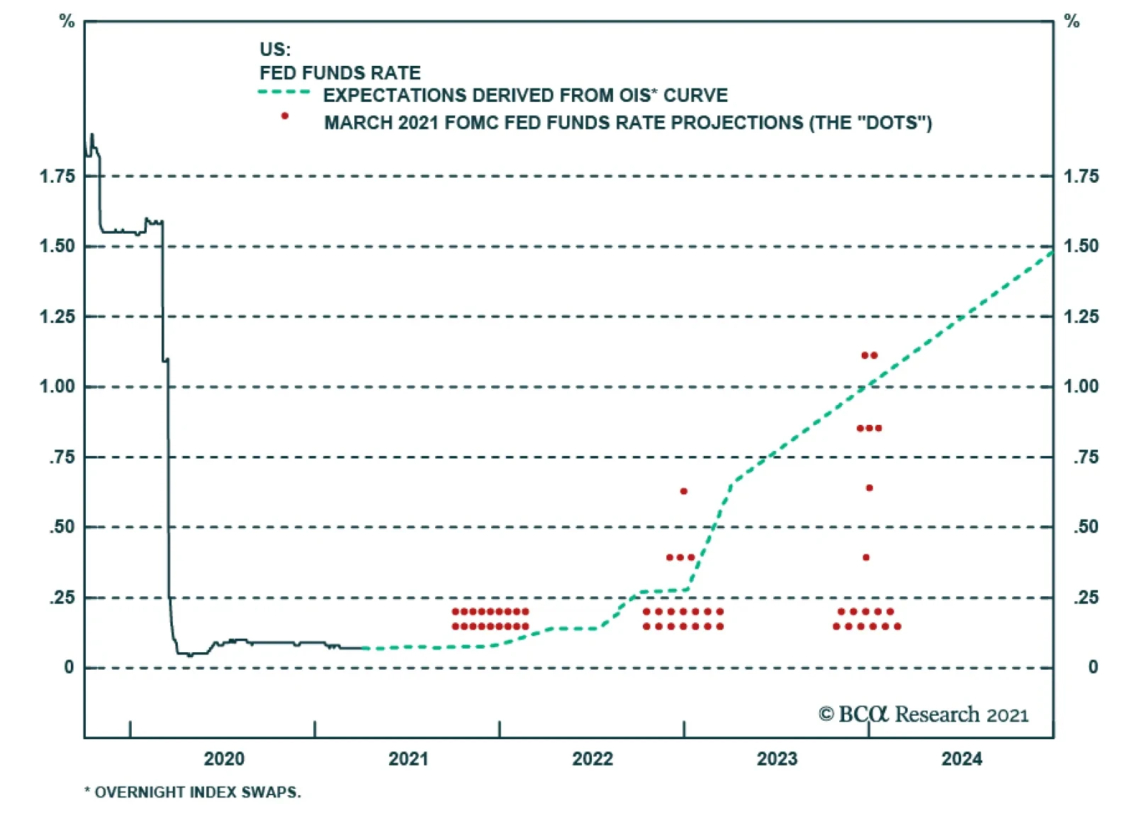
Granted, today’s high equity risk premium largely reflects the exceptionally low level of bond yields. If bond yields were to move up, the equity risk premium would shrink. While we do think that bond yields will rise by more than expected in the long run, the path to higher yields is likely to be a slow one. Rate expectations 2-to-3 years out tend to move closely in line with the 10-year yield (Chart 10). Already, there is a large gap between market expectations and the Fed dots. Whereas the market expects the Fed to start lifting rates late next year, the median Fed “dot” continues to signal no rate hike at least until 2024 (Chart 11). It is unlikely that market expectations will shift towards an even more aggressive path of rate tightening unless the Fed’s dovish rhetoric turns hawkish. As we discussed in our recently published Second Quarter Strategy Outlook, we do not expect this to happen anytime soon. Thus, with monetary policy still very loose, stocks can continue to grind higher. Chart 10Bond Yields Are Unlikely To Rise Much Unless The Market Lifts Its Estimate Of Where The Fed Funds Rate Will Be 2-To-3 Years Out
Bond Yields Are Unlikely To Rise Much Unless The Market Lifts Its Estimate Of Where The Fed Funds Rate Will Be 2-To-3 Years Out
Bond Yields Are Unlikely To Rise Much Unless The Market Lifts Its Estimate Of Where The Fed Funds Rate Will Be 2-To-3 Years Out
Chart 11A Wide Gap Has Opened Up Between Market Expectations And The Fed Dots
A Wide Gap Has Opened Up Between Market Expectations And The Fed Dots
A Wide Gap Has Opened Up Between Market Expectations And The Fed Dots
Regionally, we favour stock markets outside the US. Not only will overseas markets benefit from a rotation in growth from the US to the rest of the world in the second half of this year, but US corporate tax rates are almost certain to rise. We will be exploring the tax issue over the coming weeks. Peter Berezin Chief Global Strategist pberezin@bcaresearch.com Footnotes 1 Just as the private-sector financial balance is the difference between what the private sector earns and spends, the fiscal balance is the difference between what the government earns and spends. If the fiscal balance is negative, the government runs a deficit. If the fiscal balance is positive, the government runs a surplus. Thus, added together, the private-sector financial balance and the fiscal balance simply equals the difference between what the country as a whole earns and spends which, by definition, is equal to the current account balance. One can also see this point by rewriting the equation Y=C+I+G+X-M as (Y-T)-(C+I)=(G-T)+(X-M) where T is tax revenue, Y-T is private-sector earnings, C+I is what the private sector spends on consumption and capital goods, G-T is the fiscal deficit, and X-M is the current account balance, broadly defined to include not only the trade balance but also net income from abroad. 2 The relative attractiveness of stocks can also be inferred by subtracting the real bond yield from the earnings yield on stocks in order to get an implied equity risk premium (ERP). It is necessary to subtract the real bond yield, rather than the nominal bond yield, from the earnings yield because the earnings yield provides an estimate of the real total expected return to shareholders. For further discussion on this, please see Appendix A of the Global Investment Strategy Special Report, “TINA To The Rescue?” dated August 23, 2019. 3 Mia Sato, “The US is about to reach a surprise milestone: too many vaccines, not enough takers,” MIT Technology Review, March 22, 2021. Global Investment Strategy View Matrix
Savings Gluts, Asset Shortages, And The 60/40 Split
Savings Gluts, Asset Shortages, And The 60/40 Split
Special Trade Recommendations
Savings Gluts, Asset Shortages, And The 60/40 Split
Savings Gluts, Asset Shortages, And The 60/40 Split
Current MacroQuant Model Scores
Savings Gluts, Asset Shortages, And The 60/40 Split
Savings Gluts, Asset Shortages, And The 60/40 Split
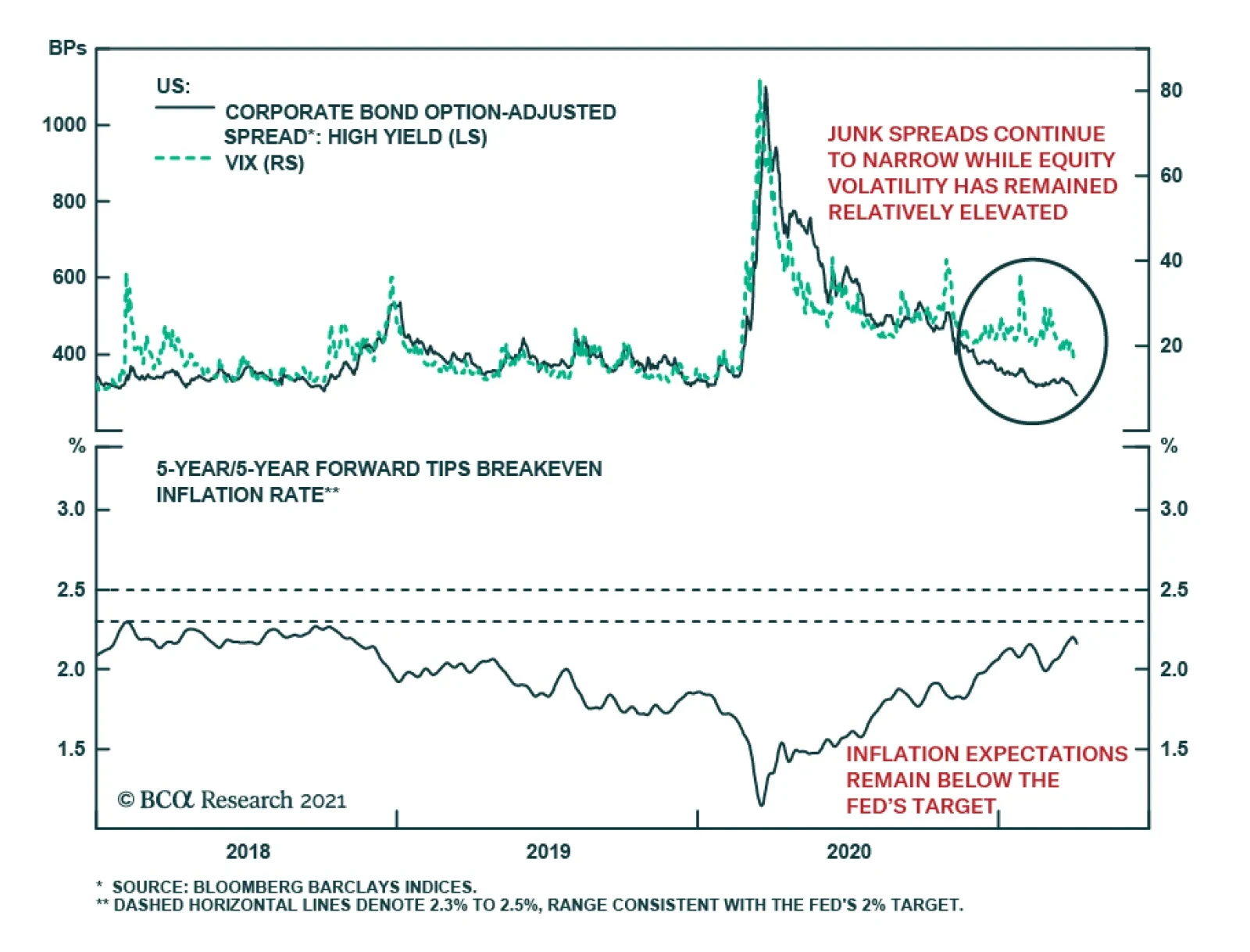
Corporate spreads have sent an upbeat message this year. Junk spreads continue to narrow, and they have recently tightened by the most in over a decade. Meanwhile, equity volatility has remained relatively elevated, which has disrupted the historically strong…
The minutes from the March FOMC meeting, released yesterday, didn’t reveal anything new or shocking about the Federal Reserve’s reaction function. The minutes noted that both the Fed staff and meeting participants revised up their forecasts for real GDP…
Highlights Q1/2021 Performance Breakdown: Our recommended model bond portfolio outperformed the custom benchmark index by +55bps during the first quarter of the year. Winners & Losers: The government bond side of the portfolio outperformed by +68bps, led overwhelmingly by our underweight to US Treasuries (+63bps). Spread product allocations underperformed by -11bps, primarily due to an overweight on UK corporates (-8bps). Portfolio Positioning For The Next Six Months: We are sticking with an overall below-benchmark portfolio duration stance, given accelerating global growth momentum, expanding vaccinations and a highly stimulative fiscal/monetary policy mix. We are maintaining a moderate overweight to global spread product versus government debt, concentrated on an overweight to US high-yield given more stretched valuations in other credit sectors. On the margin, we are making the following changes to the portfolio allocations: downgrading both UK Gilts and UK investment grade corporates to neutral, while cutting the overall allocation to EM USD credit to neutral. Feature The first quarter of 2021 saw a sharp sell-off in global bond markets on the back of rising growth expectations, fueled by US fiscal stimulus and vaccine optimism. The US was near the front of the pack, with 10-year Treasuries having their biggest first quarter sell-off since 1994. Accommodative financial conditions, fueled by a highly stimulative mix of monetary and fiscal policies and improving sentiment, have lit a fire under a global economy set to reopen from pandemic lockdowns. Going forward, we expect US growth to continue leading the way, with implications for the dollar, commodity prices, and the expected path of policy rates. With that in mind, this week we are reviewing the performance of the BCA Research Global Fixed Income Strategy (GFIS) model bond portfolio during the first quarter of 2021. We also present our recommended positioning for the portfolio for the next six months (Table 1), as well as portfolio return expectations for our base case and alternative investment scenarios. Table 1GFIS Model Bond Portfolio Recommended Positioning For The Next Six Months
GFIS Model Bond Portfolio Q1/2021 Performance Review & Current Allocations: Grand Reopening
GFIS Model Bond Portfolio Q1/2021 Performance Review & Current Allocations: Grand Reopening
As a reminder to existing readers (and to new clients), the model portfolio is a part of our service that complements the usual macro analysis of global fixed income markets. The portfolio is how we communicate our opinion on the relative attractiveness between government bond and spread product sectors. We do this by applying actual percentage weightings to each of our recommendations within a fully invested hypothetical bond portfolio. Q1/2021 Model Portfolio Performance Breakdown: Steering Clear Of Duration Chart 1Q1/2021 Performance: Bearish UST Bets Pay Off
Q1/2021 Performance: Bearish UST Bets Pay Off
Q1/2021 Performance: Bearish UST Bets Pay Off
The total return for the GFIS model portfolio (hedged into US dollars) in the first quarter was -1.83%, dramatically outperforming the custom benchmark index by +55bps (Chart 1).1 This follows modest outperformance in 2020 which was driven largely by overweights on spread product initiated after the pandemic shock to markets. In terms of the specific breakdown between the government bond and spread product allocations in our model portfolio, the former generated +68bps of outperformance versus our custom benchmark index while the latter underperformed by -11bps. Our allocations to inflation-linked bonds in the US, Canada and Europe - which were a source of outperformance in 2020 - modestly underperformed this quarter (-2bps) as global real yields finally began to pick up. Our outperformance this quarter was driven overwhelmingly by our decision to go significantly underweight US Treasuries, and to position for a bearish steepening of the Treasury curve, ahead of last November’s US presidential election (Table 2). That resulted in the US Treasury allocation generating a massive +63bps of excess return in Q1/2022 as longer-term US yields surged higher. Table 2GFIS Model Bond Portfolio Q1/2021 Overall Return Attribution
GFIS Model Bond Portfolio Q1/2021 Performance Review & Current Allocations: Grand Reopening
GFIS Model Bond Portfolio Q1/2021 Performance Review & Current Allocations: Grand Reopening
The size of the US underweight was unusually large as we maintained only a neutral exposure to the other “high beta” markets that are typically positively correlated to US yield moves, Canada and Australia. Although the returns for those two government bond markets were very similar to that of US Treasuries in Q1, so the choice to stay neutral even with a bearish directional view on US yields did not impact the overall portfolio performance. Overweights to the more defensive “low beta” markets of Germany, France and Japan contributed a combined +4bps. We did see some losses on nominal government bonds in peripheral Europe (Italy: -0.6bps; Spain: -1.9bps), however, with the narrowing in spreads thrown off by a botched vaccine rollout. In spread product, underperformance came from overweights to UK investment grade corporates (-8bps), US CMBS (-4bps), and EM USD-denominated corporates (-2bps). This was despite the fact that spreads for UK corporates remained flat while US CMBS spreads actually narrowed. These losses were slightly offset by the overweight to lower-rated US high-yield (+3bps) and underweight to US agency MBS (+2bps). Our spread product losses, in total return terms, highlight the importance of considering duration risk when making a call on spread product, especially at a time when sovereign yields are rising and spreads offer little “cushion”. Duration also played a big part in nominal government bond outperformance, with a whopping +43bps of our total +55bps outperformance concentrated in just US Treasuries with a maturity greater than 10 years. In other words, overweighting overall global spread product and underweighting government bonds still generated major portfolio outperformance, even if there was a more mixed bag of returns within that credit overweight. The bar charts showing the total and relative returns for each individual government bond market and spread product sector are presented in Charts 2 & 3. Chart 2GFIS Model Bond Portfolio Q1/2021 Government Bond Performance Attribution
GFIS Model Bond Portfolio Q1/2021 Performance Review & Current Allocations: Grand Reopening
GFIS Model Bond Portfolio Q1/2021 Performance Review & Current Allocations: Grand Reopening
Chart 3GFIS Model Bond Portfolio Q1/2021 Spread Product Performance Attribution By Sector
GFIS Model Bond Portfolio Q1/2021 Performance Review & Current Allocations: Grand Reopening
GFIS Model Bond Portfolio Q1/2021 Performance Review & Current Allocations: Grand Reopening
Biggest Outperformers: Underweight US Treasuries with a maturity greater than 10 years (+43bps), maturity between 7 and 10 years (+11bps), and with a maturity between 5 and 7 years (+7bps) Overweight US high-yield (+3bps) Underweight US agency MBS (+2bps) Overweight Italian inflation-indexed BTPs (+2bps) Biggest Underperformers: Overweight UK investment grade corporates (-8bps) Overweight US agency CMBS (-4bps) Overweight Spanish government bonds (-2bps) Chart 4 presents the ranked benchmark index returns of the individual countries and spread product sectors in the GFIS model bond portfolio for Q1/2021. Returns are hedged into US dollars (we do not take active currency risk in this portfolio) and adjusted to reflect duration differences between each country/sector and the overall custom benchmark index for the model portfolio. We have also color coded the bars in each chart to reflect our recommended investment stance for each market during Q1 (red for underweight, dark green for overweight, gray for neutral). Chart 4Ranking The Winners & Losers From The GFIS Model Bond Portfolio Universe In Q1/2021
GFIS Model Bond Portfolio Q1/2021 Performance Review & Current Allocations: Grand Reopening
GFIS Model Bond Portfolio Q1/2021 Performance Review & Current Allocations: Grand Reopening
Ideally, we would look to see more green bars on the left side of the chart where market returns are highest, and more red bars on the right side of the chart were returns are lowest. On that front, our portfolio allocations performed exceptionally well in Q1. In total return terms, the global bond market sell-off was a disaster for both government bonds and spread product. US high-yield, one of our longer-standing overweights, was the only sector to emerge unscathed, delivering a positive return of +42bps. Within our government bond allocation, the “defensive” markets—Japan (-44bps), Germany, (-261bps) and France (-371bps)—were nevertheless shaken by rising yields. On the other hand, we limited our downside by maintaining a neutral stance on the higher beta markets such as Canada (-406bps), New Zealand (-415bps), and the UK (-1389bps). Gilts sold off especially sharply as the UK outperformed global peers on COVID-19 vaccinations while inflation expectations continued to pick up. Our two underweights, US Treasuries (-426bps) and European high-yield (-426bps), were prescient. The latter market was one we chose to underweight given that spreads didn’t offer nearly enough compensation on a default-adjusted and breakeven basis. Bottom Line: Our model bond portfolio outperformed its benchmark index in the first quarter of the year by +55bps – a positive result driven by our underweight allocation to the US Treasury market and overall below-benchmark global duration stance. Future Drivers Of Portfolio Returns & Scenario Analysis Chart 5More Growth-Driven Upside For Global Yields Ahead
More Growth-Driven Upside For Global Yields Ahead
More Growth-Driven Upside For Global Yields Ahead
Looking ahead, the performance of the model bond portfolio will continue to be driven predominantly by the future moves of global government bond yields, most notably US Treasuries. Our most favored leading indicators for global bond yields continue to signal more upside over at least the next six months (Chart 5). Our Global Duration Indicator, comprised of measures of future economic sentiment and momentum, remains at an elevated level. The ongoing climb in the global manufacturing PMI, which typically leads global real bond yields by around six months, suggests that the recent uptick in real yields can continue into the second half of 2021. We are still maintaining a bias towards bearish yield curve steepening across all the countries in the model bond portfolio. It is still far too soon to see bearish flattening of yield curves given the dovish bias of global central banks, many of which are actively targeting an overshoot of their own inflation targets. The US will be the first central bank to see any bearish flattening pressure, as the market more aggressively pulls forward the liftoff date of the next Fed tightening cycle in response to strong US growth, but that is an outcome we do not expect until well into the second half of 2021. With regards to country allocations within the government bond segment of the model bond portfolio, we continue to focus our maximum underweight on the US, while limiting exposure to the markets that are more sensitive to changes in US interest rates (Chart 6). Those “lower yield beta” markets (Germany, France and Japan) will continue to outperform the higher beta markets (Canada, Australia) over the latter half of 2021. We currently have Canada on “downgrade watch”, as economic momentum is accelerating and the housing bubble looks to be reflating, both of which will make the Bank of Canada turn more hawkish shortly after the Fed does. We are more comfortable keeping Australia at neutral, as Australian inflation is likely to remain too underwhelming for the Reserve Bank of Australia to turn less dovish and risk a surge in the Australian dollar. UK Gilts are a more difficult case, atypically acting like a lower beta market over the past few years. As we discussed in a Special Report published last month, we attribute the declining Gilt yield beta to the rolling shocks the UK has suffered over the past thirteen years – the 2008 global financial crisis, the 2012 euro area debt crisis, Brexit and, now, COVID-19 – that have hamstrung the Bank of England’s ability to try even modest interest rate hikes.2 With the impact of those shocks on UK growth now diminishing, we see the central bank under greater pressure to begin normalizing UK monetary policy over the couple of years. We downgraded our cyclical stance on UK Gilts and UK investment grade corporates to neutral from overweight in that Special Report and, this week, we are making the same reduction in UK weightings in our model bond portfolio (see the portfolio tables on pages 20-21). After that change, the overall duration of the model bond portfolio remains below that of the custom benchmark index, now by -0.75 years (Chart 7). Chart 6Low-Beta Markets Will Continue To Outperform USTs
Low-Beta Markets Will Continue To Outperform USTs
Low-Beta Markets Will Continue To Outperform USTs
Chart 7Overall Portfolio Duration: Stay Below Benchmark
Overall Portfolio Duration: Stay Below Benchmark
Overall Portfolio Duration: Stay Below Benchmark
We continue to see the dovish bias of global central bankers as being conducive to the outperformance of inflation-linked bonds versus nominal government debt (Chart 8). Yes, the “easy money” has been made betting on a recovery of inflation expectations from the bombed-out levels seen after the COVID-19 recession in 2020. However, within the major developed economies with inflation-linked bond markets, 10-year breakevens have already climbed beyond the pre-pandemic levels of early 2020 (Chart 9). The next targets are the previous cyclical highs seen in 2018 (and 2019 for the UK). Chart 8Dovish Central Banks Still Positive For Inflation-Linked Bonds
Dovish Central Banks Still Positive For Inflation-Linked Bonds
Dovish Central Banks Still Positive For Inflation-Linked Bonds
Chart 9Inflation Breakevens Returning To Past Cyclical Peaks
Inflation Breakevens Returning To Past Cyclical Peaks
Inflation Breakevens Returning To Past Cyclical Peaks
Chart 10Still A Supportive Backdrop For Global Corporates
Still A Supportive Backdrop For Global Corporates
Still A Supportive Backdrop For Global Corporates
The 10-year US TIPS breakeven is already past that 2018 peak of 2.18%, and with the Fed showing no sign of concern about US growth and inflation accelerating, the 10-year US breakeven should end up moving into the high end of our expected 2.3-2.5% target range before the Fed begins to turn less dovish. Thus, we are maintaining a core allocation to linkers in the portfolio, focused on US TIPS and inflation-linked bonds in Italy, France and Canada. The same aggressive easing of global monetary policy that has been good for relative inflation-linked bond performance continues to benefit global corporate bonds. The annual rate of growth of the combined balance sheets of the Fed, ECB, Bank of Japan and Bank of England remains an excellent leading indicator of the excess returns of both global investment grade and high-yield corporates over the past decade (Chart 10). With the combined balance sheet now expanding at a 55% pace, corporate bonds are still likely to continue to outperform government debt over the remainder of 2021. Much of that expected return outperformance of corporates will come via carry rather than spread compression, though. Our preferred measure of the attractiveness of credit spreads, the historical percentile ranking of 12-month breakeven spreads, shows that only US high-yield spreads are above the bottom quartile of their history among the credit sectors in our model portfolio (Chart 11). Given the absence of spread cushion in those other markets, we are maintaining an overweight stance on US high-yield in the model bond portfolio – especially versus euro area high-yield where we are underweight - while staying neutral investment grade credit in the US and Europe. Chart 11US High-Yield: The Last Bastion Of Attractive Spreads
GFIS Model Bond Portfolio Q1/2021 Performance Review & Current Allocations: Grand Reopening
GFIS Model Bond Portfolio Q1/2021 Performance Review & Current Allocations: Grand Reopening
Within the euro area, we continue to prefer owning Italian government bonds over investment grade corporates, given the European Central Bank’s more explicit support for the former through quantitative easing (Chart 12). We expect Italian yields and spreads to converge down to Spanish levels, likely within the next 6-12 months, while there is limited downside for euro area investment grade spreads given tight valuations. Chart 12Favor Italian BTPs Over Euro Area IG
Favor Italian BTPs Over Euro Area IG
Favor Italian BTPs Over Euro Area IG
We are not only looking at relative valuation considerations in developed market credit. Emerging market (EM) USD-denominated credit has benefited from a bullish combination of global policy stimulus, a weakening US dollar and rising commodity prices. We have positioned for that in our model portfolio through an overall overweight stance on EM USD credit, but one that favors investment grade corporates over sovereigns. Now, with the Chinese credit impulse likely to slow in the latter half of 2021 as Chinese policymakers look to rein in stimulus, a slower pace of Chinese economic growth represents a risk to EM credit (Chart 13). The same can be said for the US dollar, which is no longer depreciating with US bond yields rising and the markets questioning the Fed’s dovish forward guidance on future rate hikes (Chart 14). A strong US dollar would also be a risk to the commodity price rally that has supported EM financial assets. Chart 13Global Policy Mix Becoming Less Supportive For EM
Global Policy Mix Becoming Less Supportive For EM
Global Policy Mix Becoming Less Supportive For EM
Chart 14A Stronger USD Is A Risk For EM Corporates Vs Sovereigns
A Stronger USD Is A Risk For EM Corporates Vs Sovereigns
A Stronger USD Is A Risk For EM Corporates Vs Sovereigns
Chart 15A Moderate Overweight To Spread Product Vs Government Debt
GFIS Model Bond Portfolio Q1/2021 Performance Review & Current Allocations: Grand Reopening
GFIS Model Bond Portfolio Q1/2021 Performance Review & Current Allocations: Grand Reopening
In response to these growing risks to the bullish EM backdrop, we are downgrading our overall EM USD credit exposure in the model bond portfolio to neutral from overweight. We are maintaining our relative preference for EM investment grade corporates over sovereigns, however, within that overall neutral allocation. Summing it all up, we are sticking with a moderately overweight stance on global spread product versus government debt in the model portfolio, equal to four percentage points (Chart 15). That overweight comes entirely from the US high-yield allocation. After the changes made to our UK and EM positions, the tracking error of the portfolio, or its expected volatility versus that of the benchmark index, is quite low at 41bps (Chart 16). This is an unsurprising outcome given that the current positioning is focused so heavily on the US (Treasury underweight, high-yield overweight), with much of the other positioning close to neutral. That will change as 2021 progresses but, for now, our highest conviction views are in US fixed income. One final point – the relatively concentrated positioning leaves the portfolio “flat carry”, with a yield roughly equal to that of the benchmark index (Chart 17). Chart 16Limited Use Of Portfolio 'Tracking Error'
Limited Use Of Portfolio 'Tracking Error'
Limited Use Of Portfolio 'Tracking Error'
Chart 17Model Portfolio Yield Close To Benchmark
Model Portfolio Yield Close To Benchmark
Model Portfolio Yield Close To Benchmark
Scenario Analysis & Return Forecasts After making the shifts to our model bond portfolio allocations in the UK and EM, we now turn to scenario analysis to determine the return expectations for the portfolio for the next six months. On the credit side of the portfolio, we use risk-factor-based regression models to forecast future yield changes for global spread product sectors as a function of four major factors - the VIX, oil prices, the US dollar and the fed funds rate (Table 2A). For the government bond side of the portfolio, we avoid using regression models and instead use a yield-beta driven framework, taking forecasts for changes in US Treasury yields and translating those in changes in non-US bond yields by applying a historical yield beta (Table 2B). For our scenario analysis over the next six months, we use a base case scenario plus two alternate “tail risk” scenarios, based on the following descriptions and inputs: Table 2AFactor Regressions Used To Estimate Spread Product Yield Changes
GFIS Model Bond Portfolio Q1/2021 Performance Review & Current Allocations: Grand Reopening
GFIS Model Bond Portfolio Q1/2021 Performance Review & Current Allocations: Grand Reopening
Table 2BEstimated Government Bond Yield Betas To US Treasuries
GFIS Model Bond Portfolio Q1/2021 Performance Review & Current Allocations: Grand Reopening
GFIS Model Bond Portfolio Q1/2021 Performance Review & Current Allocations: Grand Reopening
Base case: Ongoing global vaccinations lead to more of the global economy reopening over the summer, with excess savings built up during the pandemic – augmented by ongoing fiscal support – starting to be spent. US economic growth will be most robust out of the major economies, given the additional boost from fiscal stimulus, while China implements actions to slow credit growth and the euro area lags on vaccinations. The Fed stands its ground and maintains no rate hikes until at least 2023, and US TIPS breakevens climb to levels consistent with the Fed’s 2% inflation mandate (2.3-2.5%). The US Treasury curve continues to bear-steepen, with the 10-year US yield rising to 2%. The VIX falls to 15, the US dollar is flat, the Brent oil price rises +5%, and the fed funds rate is unchanged at 0%. Optimistic case: A rapid pace of global vaccinations leads to booming growth led by the US but including a reopening euro area. Chinese policymakers tighten credit by less than expected. Markets begin to pull forward the timing and pace of future central bank interest rate hikes, most notably in the US but also in the other countries like Canada and the UK. Real bond yields continue to climb globally, but inflation breakevens stay elevated. The steepening trend of the US Treasury curve ends, and mild bear flattening begins with the 10-year reaching 2.2% and the 2-year yield climbing to 0.4%. The VIX stays unchanged at 18, the US dollar rises +5%, the Brent oil price climbs +2.5% and the fed funds rate stays unchanged. Pessimistic case: Setbacks on the pandemic, either from struggles with vaccine distribution or a surge in variant cases, lead to a slower pace of global growth momentum. Europe cannot reopen, China tightens credit policy faster than expected, and US households hold onto to excess savings amid lingering virus uncertainty. Diminished economic optimism leads to a pullback in global equity values and wider global credit spreads. The US Treasury curve bull flattens as longer-maturity yields fall in a risk-off move, with the 10-year yield moving back down to 1.5%. The VIX rises to 25, the US dollar falls -2.5% and the fed funds rate stays at 0%. The inputs into the scenario analysis are shown in Chart 18 (for the USD, VIX, oil and the fed funds rate), while the US Treasury yield scenarios are in Chart 19. The excess return scenarios for the model bond portfolio, using the above inputs in our simple quantitative return forecast framework, are shown in Table 3A (the scenarios for the changes in US Treasury yields are shown in Table 3B). Chart 18Risk Factor Assumptions For The Scenario Analysis
Risk Factor Assumptions For The Scenario Analysis
Risk Factor Assumptions For The Scenario Analysis
Chart 19US Treasury Yield Assumptions For The Scenario Analysis
US Treasury Yield Assumptions For The Scenario Analysis
US Treasury Yield Assumptions For The Scenario Analysis
Table 3AGFIS Model Bond Portfolio Scenario Analysis For The Next Six Months
GFIS Model Bond Portfolio Q1/2021 Performance Review & Current Allocations: Grand Reopening
GFIS Model Bond Portfolio Q1/2021 Performance Review & Current Allocations: Grand Reopening
Table 3BUS Treasury Yield Assumptions For The 6-Month Forward Scenario Analysis
GFIS Model Bond Portfolio Q1/2021 Performance Review & Current Allocations: Grand Reopening
GFIS Model Bond Portfolio Q1/2021 Performance Review & Current Allocations: Grand Reopening
The model bond portfolio is expected to deliver an excess return over the next six months of +46bps in the base case and +54bps in the optimistic scenario, but is only projected to underperform by -27bps in the pessimistic scenario. Bottom Line: We are sticking with an overall below-benchmark portfolio duration stance, given accelerating global growth momentum, expanding vaccinations and a highly stimulative fiscal/monetary policy mix. We are maintaining a moderate overweight to global spread product versus government debt, concentrated on an overweight to US high-yield given more stretched valuations in other credit sectors. On the margin, we are making the following changes to the portfolio allocations: downgrading both UK Gilts and UK investment grade corporates to neutral, while cutting the overall allocation to EM USD credit to neutral. Robert Robis, CFA Chief Fixed Income Strategist rrobis@bcaresearch.com Shakti Sharma Research Associate ShaktiS@bcaresearch.com Footnotes 1 The GFIS model bond portfolio custom benchmark index is the Bloomberg Barclays Global Aggregate Index, but with allocations to global high-yield corporate debt replacing very high quality spread product (i.e. AA-rated). We believe this to be more indicative of the typical internal benchmark used by global multi-sector fixed income managers. 2 Please see BCA Research Global Fixed Income Strategy/Foreign Exchange Strategy Special Report, "Why Are UK Interest Rates Still So Low?", dated March 10, 2021, available at gfis.bcaresearch.com. Recommendations The GFIS Recommended Portfolio Vs. The Custom Benchmark Index
GFIS Model Bond Portfolio Q1/2021 Performance Review & Current Allocations: Grand Reopening
GFIS Model Bond Portfolio Q1/2021 Performance Review & Current Allocations: Grand Reopening
Duration Regional Allocation Spread Product Tactical Trades Yields & Returns Global Bond Yields Historical Returns
Highlights Chart 1How Long Until Full Employment?
How Long Until Full Employment?
How Long Until Full Employment?
It’s official. The vaccination roll-out is successfully suppressing the spread of COVID-19 throughout the United States and the associated economic re-opening is leading to a surge in activity. Not only did March’s ISM Manufacturing PMI come in at 64.7, its highest reading since 1983, but the economy also added 916 thousand jobs during the month. Interestingly, the 10-year Treasury yield was relatively stable last week despite the eye-catching economic data. This is likely because the Treasury curve already discounted a significant rebound in economic activity and last week’s data merely confirmed the market’s expectations. At present, the Treasury curve is priced for Fed liftoff in September 2022 and a total of five rate hikes by the end of 2023. By our calculations, the Fed will be ready to lift rates by the end of 2022 if monthly employment growth averages at least 410k between now and then (Chart 1). If payroll growth can somehow stay above 701k per month, then the Fed will hit its “maximum employment” target by the end of this year. While a lot of good news is already priced in the Treasury curve, the greatest near-term risk is that the data continue to beat expectations. Maintain below-benchmark portfolio duration. Feature Table 1Recommended Portfolio Specification
It’s A Boom!
It’s A Boom!
Table 2Fixed Income Sector Performance
It’s A Boom!
It’s A Boom!
Investment Grade: Neutral Chart 2Investment Grade Market Overview
Investment Grade Market Overview
Investment Grade Market Overview
Investment grade corporate bonds outperformed the duration-equivalent Treasury index by 29 basis points in March, bringing year-to-date excess returns up to +98 bps. The combination of above-trend economic growth and accommodative monetary policy supports positive excess returns for spread product versus Treasuries. Though Treasury yields have risen, this does not yet pose a risk for credit spreads. The 5-year/5-year forward TIPS breakeven inflation rate remains below the Fed’s target range of 2.3% to 2.5%. We won’t be concerned about restrictive monetary policy pushing spreads wider until inflation expectations are well-anchored around the Fed’s target. Despite the positive macro back-drop, investment grade corporate valuations are extremely tight. The investment grade corporate index’s 12-month breakeven spread is down to its 2nd percentile (Chart 2). This means that the breakeven spread has only been tighter 2% of the time since 1995. The same measure shows that Baa-rated bonds have also only been more expensive 2% of the time (panel 3). We don’t anticipate material underperformance versus Treasuries, but we see better value outside of the investment grade corporate space.1 Specifically, we advise investors to favor tax-exempt municipal bonds over investment grade corporates with the same credit rating and duration. We also prefer USD-denominated Emerging Market Sovereign bonds over investment grade corporates with the same credit rating and duration. Finally, the supportive macro environment means we are comfortable adding credit risk to a portfolio. With that in mind, we encourage investors to pick up the additional spread offered by high-yield corporates. Table 3ACorporate Sector Relative Valuation And Recommended Allocation*
It’s A Boom!
It’s A Boom!
Table 3BCorporate Sector Risk Vs. Reward*
It’s A Boom!
It’s A Boom!
High-Yield: Overweight Chart 3High-Yield Market Overview
High-Yield Market Overview
High-Yield Market Overview
High-Yield outperformed the duration-equivalent Treasury index by 83 basis points in March, bringing year-to-date excess returns up to +263 bps. In last week’s report we looked at the default expectations that are currently priced into the junk index and considered whether they are likely to be met.2 If we demand an excess spread of 100 bps and assume a 40% recovery rate on defaulted debt, then the High-Yield index embeds an expected default rate of 3.4% (Chart 3). Using a model of the speculative grade default rate that is based on gross corporate leverage (aka pre-tax profits over debt) and C&I lending standards, we can estimate a likely default rate for the next 12 months using assumptions for profit and debt growth. The median FOMC forecast of 6.5% real GDP growth in 2021 is consistent with 31% corporate profit growth. We also assume that last year’s debt binge will be followed by relatively weak corporate debt growth in 2021. According to our model, 30% profit growth and 2% debt growth is consistent with a default rate of 3.4% for the next 12 months, exactly matching what is priced into junk spreads. Given that the Fed’s 6.5% real GDP growth forecast looks conservative given the large amount of fiscal stimulus coming down the pike, and the fact that the combination of strong economic growth and accommodative monetary policy could easily cause valuations to overshoot in the near-term, we are inclined to maintain an overweight allocation to High-Yield bonds. MBS: Underweight Chart 4MBS Market Overview
MBS Market Overview
MBS Market Overview
Mortgage-Backed Securities outperformed the duration-equivalent Treasury index by 17 basis points in March, bringing year-to-date excess returns up to +15 bps. The nominal spread between conventional 30-year MBS and equivalent-duration Treasuries tightened 12 bps in March. This spread remains wide compared to levels seen during the past few years, but it is still tight compared to the recent pace of mortgage refinancings (Chart 4). The MBS option-adjusted spread (OAS) currently sits at 19 bps. This is considerably below the 52 bps offered by Aa-rated corporate bonds, the 38 bps offered by Agency CMBS and the 27 bps offered by Aaa-rated consumer ABS. All in all, the value in MBS is not appealing compared to other similarly risky sectors. The plummeting primary mortgage spread was a key reason for the elevated refi activity seen during the past year. However, the spread has now recovered back to more typical levels (bottom panel). The implication is that further increases in Treasury yields will likely be matched by higher mortgage rates, meaning that mortgage refinancings have probably peaked. The coming drop in refi activity will be positive for MBS returns, but we aren’t yet ready to turn bullish on the sector. First, as mentioned above, value is poor compared to other similarly risky sectors. Second, the gap between the nominal MBS spread and the MBA Refinance Index remains wide (panel 2) and we could still see spreads adjust higher. Government-Related: Neutral Chart 5Government-Related Market Overview
Government-Related Market Overview
Government-Related Market Overview
The Government-Related index outperformed the duration-equivalent Treasury index by 45 basis points in March, bringing year-to-date excess returns up to +66 bps (Chart 5). Sovereign debt outperformed duration-equivalent Treasuries by 157 bps in March, bringing year-to-date excess returns up to +40 bps. Foreign Agencies outperformed the Treasury benchmark by 8 bps on the month, bringing year-to-date excess returns up to +33 bps. Local Authority bonds outperformed by 81 bps in March, bringing year-to-date excess returns up to +286 bps. Domestic Agency bonds underperformed by 2 bps, dragging year-to-date excess returns down to +14 bps. Supranationals outperformed by 7 bps, bringing year-to-date excess returns up to +13 bps. We recently took a detailed look at valuation for USD-denominated Emerging Market (EM) Sovereigns.3 We found that, on an equivalent-duration basis, EM Sovereigns offer a spread advantage over investment grade US corporates. Attractive countries include: Qatar, UAE, Mexico, Russia and Colombia We prefer US corporates over EM Sovereigns in the high-yield space. Ba-rated high-yield US corporates offer a spread advantage over Ba-rated EM Sovereigns and the lower EM credit tiers are dominated by distressed credits like Turkey and Argentina. Municipal Bonds: Overweight Chart 6Municipal Market Overview
Municipal Market Overview
Municipal Market Overview
Municipal bonds outperformed the duration-equivalent Treasury index by 187 basis points in March, bringing year-to-date excess returns up to +291 bps (before adjusting for the tax advantage). Municipal bond spreads have tightened dramatically during the past few months and Aaa-rated Munis now look expensive compared to Treasuries, with the exception of the short-end of the curve (Chart 6). That said, if we match the duration and credit rating between the Bloomberg Barclays Municipal bond indexes and the US Credit index, we find that both General Obligation (GO) and Revenue Munis appear attractive compared to US investment grade Credit, with the possible exception of some short-maturity GO bonds. Revenue Munis offer a before-tax yield pick-up relative to US Credit for maturities above 12 years (bottom panel). Revenue bonds in the 8-12 year maturity bucket offer an after-tax yield pick-up versus Credit for investors with an effective tax rate above 13% (panel 3). Revenue bonds in the 6-8 year maturity bucket offer an after-tax yield pick-up versus Credit for investors with an effective tax rate above 24%. GO Munis with 17+ years to maturity offer an after-tax yield pick-up relative to Credit for investors with an effective tax rate above 1%. This breakeven effective tax rate rises to 6% for the 12-17 year maturity bucket, 23% for the 8-12 year maturity bucket (panel 3) and 32% for the 6-8 year maturity bucket. All in all, municipal bond value has deteriorated markedly in recent months and we downgraded our recommended allocation from “maximum overweight” to “overweight” in January. However, investors should still prefer municipal bonds over investment grade corporate bonds with the same credit rating and duration. Treasury Curve: Buy 5-Year Bullet Versus 2/10 Barbell Chart 7Treasury Yield Curve Overview
Treasury Yield Curve Overview
Treasury Yield Curve Overview
Treasury yields moved up dramatically in March, with the curve steepening out to the 10-year maturity point and flattening thereafter. The 2/10 Treasury slope steepened 28 bps to end the month at 158 bps. The 5/30 slope steepened 7 bps to end the month at 149 bps (Chart 7). As we showed in a recent report, the Treasury curve continues to trade directionally with yields out to the 10-year maturity point.4 Beyond 10 years, the curve has transitioned into a bear flattening/bull steepening regime where higher yields coincide with a flatter curve and vice-versa (bottom panel). For now, we are content to stick with our recommended steepener: long the 5-year bullet and short a duration-matched 2/10 barbell. However, we will eventually be close enough to an expected Fed liftoff date that the 5/10 slope will follow the 10/30 slope and transition into a bear-flattening/bull-steepening regime. When that happens, it will make more sense to either position for a steepener at the front-end of the curve (long 3-year bullet / short 2/5 barbell) or a flattener at the long-end of the curve (long 5/30 barbell / short 10-year bullet). We don’t yet see sufficient evidence of 5/10 bear-flattening to shift out of our current recommended position and into these new ones, and so we stay the course for now. TIPS: Overweight Chart 8TIPS Market Overview
TIPS Market Overview
TIPS Market Overview
TIPS outperformed the duration-equivalent nominal Treasury index by 155 basis points in March, bringing year-to-date excess returns up to +341 bps. The 10-year TIPS breakeven inflation rate rose 22 bps on the month and it currently sits at 2.38%. The 5-year/5-year forward TIPS breakeven inflation rate rose 30 bps in March and it currently sits at 2.15%. Despite last month’s sharp move higher, the 5-year/5-year forward breakeven rate is still below the Fed’s target range of 2.3% to 2.5% (Chart 8). This means that the rising cost of inflation protection is not yet a concern for the Fed, and in fact, the Fed would like to encourage it to rise further still. Our recommended positions in inflation curve flatteners and real curve steepeners continued to perform well last month. The 5/10 TIPS breakeven inflation slope was relatively stable, but the 2/10 CPI swap slope flattened 8 bps (panel 4). The 2/10 real yield curve steepened 31 bps in March to reach 169 bps (bottom panel). An inverted inflation curve has been an unusual occurrence during the past few years, but we think it will be the normal state of affairs going forward. The Fed’s new strategy involves allowing inflation to rise above 2% so that it can attack its inflation target from above rather than from below. This new monetary environment is much more consistent with an inverted inflation curve than an upward sloping one, and we would resist the temptation to put on an inflation curve steepener. ABS: Overweight Chart 9ABS Market Overview
ABS Market Overview
ABS Market Overview
Asset-Backed Securities underperformed the duration-equivalent Treasury index by 4 basis points in March, dragging year-to-date excess returns down to +16 bps. Aaa-rated ABS underperformed by 5 bps on the month, dragging year-to-date excess returns down to +8 bps. Non-Aaa ABS underperformed by 2 bps, dragging year-to-date excess returns down to +56 bps. The stimulus from last year’s CARES act led to a significant increase in household savings when individual checks were mailed last April. This excess savings has still not been spent and now another round of checks is poised to push the savings rate higher again (Chart 9). The large stock of household savings means that the collateral quality of consumer ABS is very high, with many households using their windfall to pay down debt (bottom panel). Investors should remain overweight consumer ABS and take advantage of strong collateral performance by moving down in credit quality. The Treasury department’s decision to let the Term Asset-Backed Loan Facility (TALF) expire at the end of 2020 does not alter our recommendation. Spreads are already well below the borrowing cost that was offered by TALF, and these tight spread levels are justified by strong household balance sheets. Non-Agency CMBS: Neutral Chart 10CMBS Market Overview
CMBS Market Overview
CMBS Market Overview
Non-Agency Commercial Mortgage-Backed Securities underperformed the duration-equivalent Treasury index by 10 basis points in March, dragging year-to-date excess returns down to +77 bps. Aaa Non-Agency CMBS underperformed Treasuries by 23 bps in March, dragging year-to-date excess returns down to +14 bps. Meanwhile, non-Aaa Non-Agency CMBS outperformed by 30 bps, bringing year-to-date excess returns up to +293 bps (Chart 10). We continue to recommend an overweight allocation to Aaa-rated Non-Agency CMBS and an underweight allocation to non-Aaa CMBS. Even with the expiry of TALF, Aaa CMBS spreads are already well below the cost of borrowing through TALF and thus won’t be negatively impacted. Meanwhile, the structurally challenging environment for commercial real estate could lead to problems for lower-rated CMBS (panels 3 & 4). Agency CMBS: Overweight Agency CMBS outperformed the duration-equivalent Treasury index by 10 basis points in March, bringing year-to-date excess returns up to +49 bps. The average index option-adjusted spread tightened 5 bps on the month and it currently sits at 38 bps (bottom panel). Though Agency CMBS spreads have completely recovered back to their pre-COVID lows, they still look attractive compared to other similarly risky spread products. Stay overweight. Appendix A: Butterfly Strategy Valuations The following tables present the current read-outs from our butterfly spread models. We use these models to identify opportunities to take duration-neutral positions across the Treasury curve. The following two Special Reports explain the models in more detail: US Bond Strategy Special Report, “Bullets, Barbells And Butterflies”, dated July 25, 2017, available at usbs.bcaresearch.com US Bond Strategy Special Report, “More Bullets, Barbells And Butterflies”, dated May 15, 2018, available at usbs.bcaresearch.com Table 4 shows the raw residuals from each model. A positive value indicates that the bullet is cheap relative to the duration-matched barbell. A negative value indicates that the barbell is cheap relative to the bullet. Table 4Butterfly Strategy Valuation: Raw Residuals In Basis Points (As Of March 31ST, 2021)
It’s A Boom!
It’s A Boom!
Table 5 scales the raw residuals in Table 4 by their historical means and standard deviations. This facilitates comparison between the different butterfly spreads. Table 5Butterfly Strategy Valuation: Standardized Residuals (As Of March 31ST, 2021)
It’s A Boom!
It’s A Boom!
Table 6 flips the models on their heads. It shows the change in the slope between the two barbell maturities that must be realized during the next six months to make returns between the bullet and barbell equal. For example, a reading of 43 bps in the 5 over 2/10 cell means that we would only expect the 5-year to outperform the 2/10 if the 2/10 slope steepens by more than 43 bps during the next six months. Otherwise, we would expect the 2/10 barbell to outperform the 5-year bullet. Table 6Discounted Slope Change During Next 6 Months (BPs)
It’s A Boom!
It’s A Boom!
Appendix B: Excess Return Bond Map The Excess Return Bond Map is used to assess the relative risk/reward trade-off between different sectors of the US bond market. It is a purely computational exercise and does not impose any macroeconomic view. The Map’s vertical axis shows 12-month expected excess returns. These are proxied by each sector’s option-adjusted spread. Sectors plotting further toward the top of the Map have higher expected returns and vice-versa. Our novel risk measure called the “Risk Of Losing 100 bps” is shown on the Map’s horizontal axis. To calculate it, we first compute the spread widening required on a 12-month horizon for each sector to lose 100 bps or more relative to a duration-matched position in Treasury securities. Then, we divide that amount of spread widening by each sector’s historical spread volatility. The end result is the number of standard deviations of 12-month spread widening required for each sector to lose 100 bps or more versus a position in Treasuries. Lower risk sectors plot further to the right of the Map, and higher risk sectors plot further to the left. Chart 11Excess Return Bond Map (As Of March 31st, 2021)
It’s A Boom!
It’s A Boom!
Footnotes 1 For a look at alternatives to investment grade corporates please see US Bond Strategy Weekly Report, “Searching For Value In Spread Product”, dated January 26, 2021, available at usbs.bcaresearch.com 2 Please see US Bond Strategy Weekly Report, “That Uneasy Feeling”, dated March 30, 2021, available at usbs.bcaresearch.com 3 Please see US Bond Strategy Weekly Report, “Searching For Value In Spread Product”, dated January 26, 2021, available at usbs.bcaresearch.com 4 Please see US Bond Strategy Weekly Report, “The Fed Looks Backward While Markets Look Forward”, dated March 23, 2021, available at usbs.bcaresearch.com Ryan Swift US Bond Strategist rswift@bcaresearch.com Fixed Income Sector Performance
Highlights The Eurozone economy and assets remain beholden to the global manufacturing cycle. This sensitivity reflects the large share of output generated by capex and exports. Yet, the second half of 2021 and first half of 2022 could see euro area growth follow the beat of its own drum. This is a consequence of the unique role of consumption in the COVID-19 recession. European growth will therefore outperform expectations, even if economic momentum slows outside of Europe. Consequently, the euro and Eurozone equities will outperform for the coming 12 to 18 months. Feature For the past 20 years, investors have used a simple rule of thumb to understand European growth and markets. Europe is a derivative of global growth because of its large manufacturing sector and torpid domestic economy. A reductionist approach would even argue that China’s economy is what matters most for Europe. Is this model still valid to analyze Europe? In general, this approach still holds up well. However, the nature of the 2020 COVID-19 recession suggests that the European economy could still accelerate in the second half of the year, despite a small slowdown in the Chinese economy and global manufacturing sector. The Origin Of The Pro-Cyclicality Narrative Investors in European markets have long understood that Eurozone equities outperform when the global manufacturing cycle accelerates. This pro-cyclicality of European stocks is a consequence of their heavy weighting toward cyclical and value stocks, such as industrials, consumer discretionary and financials. Chart 1German/US Spreads: Global Manufacturing Cycle
German/US Spreads: Global Manufacturing Cycle
German/US Spreads: Global Manufacturing Cycle
Historically, European yields have also moved in a very pro-cyclical fashion. Over the past 30 years, periods when German 10-year yields rose relative to that of US Treasury Notes have coincided with an improvement in the global manufacturing sector as approximated by the ISM Manufacturing survey (Chart 1). Investors also understand that the euro is a pro-cyclical currency. Some of this behavior reflects the counter-cyclicality of the US dollar. However, if German yields rise more than US ones when global growth improves and European equities outperform under similar conditions, the euro naturally attracts inflows when the global manufacturing sector strengthens. Chart 2China Is A Key Determinant Of European Activity
China Is A Key Determinant Of European Activity
China Is A Key Determinant Of European Activity
Ultimately, the responsiveness of the euro and European assets to global growth is rooted in the nature of the European economy. Trade and manufacturing account for nearly 40% and 14% of GDP, respectively, compared to 26% and 11% for the US. This economic specialization has made Europe extremely sensitive to the gyrations of the Chinese economy, the largest contributor to fluctuation in the global demand for capital goods. As Chart 2 highlights, European IP and PMI outperform the US when China’s marginal propensity to consume (as approximated by the growth in M1 relative to M2) picks up. Is The Pro-Cyclical Narrative Still Valid? Despite the euro area debt crisis and the slow health and fiscal policy response of European authorities to COVID-19, evidence suggests that the Eurozone’s pro-cyclicality is only increasing. Chart 3Europe Is Becoming More Sensitive To The Rest Of The World Europe Is Becoming More Sensitive To The Rest Of The World
Europe Is Becoming More Sensitive To The Rest Of The World Europe Is Becoming More Sensitive To The Rest Of The World
Europe Is Becoming More Sensitive To The Rest Of The World Europe Is Becoming More Sensitive To The Rest Of The World
A simple statistical analysis confirms this hypothesis. A look at the beta of European GDP growth against the Global PMI reveals that the sensitivity of Eurozone growth and German growth to the Global PMI has steadily increased over the past 20 years (Chart 3, top panel). Moreover, the beta of euro area growth to the global PMI is now higher than that of the US, despite a considerably lower potential GDP growth, which means that a greater proportion of the Eurozone’s GDP growth is affected by globally-driven fluctuations. The bottom panel of Chart 3 shows a more volatile but similar relationship with Chinese economic activity. Correlation analysis confirms that Europe remains very sensitive to global factors. Currently, the rolling correlation of a regression of Eurozone GDP growth versus that of China stands near 0.7, which is comparable to levels that prevailed between 2005 and 2012. The correlation between German and Chinese GDP growth is now higher than at any point during the past two decades. Chart 4The Declining Role Of Consumption
The Declining Role Of Consumption
The Declining Role Of Consumption
The increasing influence of global economic variables on the European economy reflects the evolution of the composition of the Eurozone’s GDP. Over the past 11 years, the share of consumption within GDP has decreased from 57% to 52%. For comparison’s sake, consumption accounts for 71% of US GDP. The two sectors that have taken the primacy away from consumption are capex and net exports, whose combined share has grown from 22% to 26% of GDP (Chart 4). This shift in the composition of GDP echoes the structural forces facing the Eurozone. An ageing population, a banking system focused on rebuilding its balance sheet, and the tackling of the competitiveness problems of peripheral economies have hurt wage growth, consumption and imports. Meanwhile, exports have remained on a stable trend, thanks to both the comparative vigor of the euro area’s trading partners and a cheap euro. Therefore, net exports expanded. Capex benefited from the strength in European exports. A Granger causality test reveals that consumption has little impact on fixed-capital formation in the euro area. However, the same method shows that fluctuations in export growth cause changes in investment. This makes sense. The variance in exports is an important contributor to the variability of Eurozone profits (Chart 5). Thus, rising exports incentivize the European corporate sector to expand its capital stock to fulfill foreign demand. The expanding share of output created by exports and capex along with the role of exports as a driver of capex explains why Europe economic activity is bound to remain so sensitive to the fluctuations in global trade and manufacturing activity. Moreover, the capex/exports interplay even affects consumption. As Chart 6 shows, the growth of euro area personal expenditures often bottoms after the annual rate of change of the new orders of capital goods has troughed, which reflects the role of exports as a driver of European income. Chart 5Profits And Exports
Profits And Exports
Profits And Exports
Chart 6Consumption Doesn't Move In A Vacuum
Consumption Doesn't Move In A Vacuum
Consumption Doesn't Move In A Vacuum
Bottom Line: European economic activity remains a high beta play on global and Chinese growth. The decrease in consumption to the benefit of exports and capex explains why this reality will not change anytime soon. 2021, An Idiosyncratic Year? In 2021, consumption will be the key input to the European economic performance, despite the long-term relationship between European GDP and foreign economic activity. This will allow European growth to narrow some of its gap with the US and the rest of the world in the second half of this year and the first half of 2022, even if the global manufacturing sector comes off its boil soon. The 2020 recession was unique. In a normal recession, capex, real estate investment, spending on durable goods and the manufacturing sector are the main contributors to the decline in GDP. This time, consumption and the service sector generated most of the contraction in output. These two sectors also caused the second dip in GDP following the tightening of lockdown measures across Europe last winter. Once the more recent wave of lockdowns is behind us, consumption will most likely slingshot to higher levels. More than the US, where the economy has been partially open for months now, Europe remains replete with significant pent-up demand. Obviously, fulfilling this demand will require further progress in the European vaccination campaign, something we recently discussed. Chart 7The Money Supply Forecasts A Rapid Recovery
The Money Supply Forecasts A Rapid Recovery
The Money Supply Forecasts A Rapid Recovery
The surge in M1 also points to a sharp rebound in consumption once governments lift the current lockdowns (Chart 7). M1 is a much more reliable predictor of economic activity in Europe than in the US, because disintermediation is not as prevalent in the Eurozone, where banks account for 72% and 88% of corporate and household credit, respectively, compared to 32% and 29% in the US. We cannot dismiss the explosion in the money supply as only a function of the ECB’s actions. European banks are in much better shape today than they were 10 years ago. Non-performing loans have been steadily decreasing. A rise in delinquencies is likely in the coming quarters due to the pandemic; however, the EUR3 trillion in credit guarantees by governments will limit the damages to the private sector’s and banking system’s balance sheets. Moreover, the Tier-1 capital ratio of the banking system ranges between 14% for Spain and 17% for Germany, well above the 10.5% threshold set by Basel-III (Chart 8). In this context, the pick-up in money supply mirrored credit flows. Thus, even if some of that credit reflects precautionary demand, the likelihood is high that a significant proportion of the built-up cash balances will find its way into the economy. Another positive sign for consumption comes from European confidence surveys. Despite tighter lockdown measures, consumer confidence has sharply rebounded, which historically heralds stronger consumption. Moreover, according to the ECB’s loan survey, stronger consumer confidence is causing an improvement in credit demand, which foreshadows a decline in savings intentions, especially now that wage growth is stabilizing (Chart 9). Nonetheless, there is still a risk that the advance in wages peters off. The recent wage agreement reached by Germany’s IG Metall union in North Rhine Westphalia was a paltry 1.3% annual pay raise, and once the Kurzarbeit programs end, the true level of labor market slack will become evident. However, for consumption to grow, all that we need to see now is stable wage growth, even if at a low rate. Chart 8European Banks Are Feeling Better
European Banks Are Feeling Better
European Banks Are Feeling Better
Chart 9Confidence Points To Stronger Consumption
Confidence Points To Stronger Consumption
Confidence Points To Stronger Consumption
Beyond consumption, Europe’s fiscal policy will be positive compared to the US next year. The NGEU plan will add roughly 1% to GDP in both 2021 and 2022. As a result, the Eurozone’s net fiscal drag should be no greater than 1% of GDP next year. This compares to a fiscal thrust of -7% in the US in 2022, even after factoring in the new “American Jobs Act” proposed by the Biden Administration last week, according to our US Political Strategy team. Bottom Line: The revival in European consumption in the second half of 2021 and the first half of 2022 will allow the gap between European and global growth to narrow. This dynamic will be reinforced next year, when the fiscal drag will be lower in Europe than in the US. These forces will create a rare occasion when European growth will improve despite a deceleration (albeit a modest one) in global manufacturing activity. Investment Conclusions The continued sensitivity of the euro area economy to the global industrial and trade cycle indicates that over the long-term, European assets will remain beholden to the gyrations of global growth. In other words, the euro and European stocks will outperform in periods of accelerating global manufacturing activity, as they have done over the past 30 years. The next 12 to 18 month may nonetheless defy this bigger picture, allowing European assets to generate alpha for global investors. Chart 10The Euro Will Like Idiosyncratic European Growth
The Euro Will Like Idiosyncratic European Growth
The Euro Will Like Idiosyncratic European Growth
First, the gap between US and euro area growth will narrow over the coming 12 to 18 months, thus the euro will remain well bid, even if the maximum acceleration in global industrial activity lies behind. As investors re-assess their view of European economic activity and the current period of maximum relative pessimism passes, inflows into the euro area will accelerate and the euro will appreciate (Chart 10). Hence, we continue to see the recent phase of weakness in EUR/USD as transitory. Second, European equities have scope to outperform US ones over that window. Some of that anticipated outperformance reflects our positive stance on the euro. However, a consumption-driven economic bounce will be positive for European financials as well. Such a recovery will let investors ratchet down their estimates of credit losses in the financial system. Moreover, banks are well capitalized, thus the ECB will permit the resumption of dividend payments. Under these circumstances, European banks have scope to outperform US ones temporarily, especially since Eurozone banks trade at a 56% discount to their transatlantic rivals on a price-to-book basis. An outperformance of financials will be key for Europe’s performance. Chart 11German/US Spreads Near Equilibrium?
German/US Spreads Near Equilibrium?
German/US Spreads Near Equilibrium?
Finally, we could enter a period of stability in US/German yield spreads over the coming months. The ECB remains steadfast at limiting the upside in European risk-free rates, as Christine Lagarde reiterated last week. However, BCA’s US bond strategist, Ryan Swift, believes US yields will enter a temporary plateau, as the Federal Reserve will not adjust rates until well after the US economy has reached full employment. Hence, the Fed is unlikely to let the OIS curve bring forward the date of the first hike currently priced in for August 2022 on a durable basis, which also limits the upside to US yields. Thus, looking at core CPI and policy rate differences, US yields have reached a temporary equilibrium relative to Germany (Chart 11). Mathieu Savary, Chief European Investment Strategist Mathieu@bcaresearch.com
Dear client, In addition to this abbreviated weekly report, we are also sending you an in-depth report on the euro, written by my colleague Mathieu Savary. Mathieu argues that the euro could continue to face some downside in the near-term, creating perfect conditions for a buying opportunity below 1.15. We agree with Mathieu’s assessment and are shorting EUR/JPY this week as a tactical trade. Finally, last week, we held a webcast during which I discussed the key themes that will shape the dollar landscape in the coming months. In case you missed it, you can listen to the replay here. Kind regards, Chester Highlights Being long the dollar is now a consensus trade. A new US infrastructure bill will be positive for US growth. However, the new package also increases the probability that inflation will be higher in the US, which will depress relative real rates. Go short EUR/JPY as a tactical trade. Feature Chart I-1Dollar Sentiment Has Been Reset
Dollar Sentiment Has Been Reset
Dollar Sentiment Has Been Reset
The DXY index is fast approaching our 94-95 target and it is an open question whether the rally will stall at these levels, or punch through for new highs this year. Historically, the dollar has tended to move in long cycles, with the latest bull and bear markets lasting about a decade or so. If, as we believe, a dollar bear market did indeed commence in 2020, then the historical evidence is that any bounce will be capped around 4-6%. This was the experience of the 2000s. The defining landscape during the latter stages of the dollar bull market in 2018 and 2019 was deteriorating global growth, with financial conditions which remained relatively too tight. The situation today is extremely easy financial conditions and improving global growth. As such, our bias remains that the landscape is more characteristic of a dollar bear market. Speculators are now long the dollar and our capitulation index is approaching overbought levels (Chart I-1). So while there is scope for the dollar to continue to rise in the near term, the big gains are behind us. US Infrastructure Spending And Bond Yields President Joe Biden’s American Jobs Plan did little to lift US long bond yields. This suggests that most of the improvement to aggregate demand may have already been priced in. The big driver of the US dollar this year has been the improvement in yields, particularly at the long end of the curve. Short yields have remained anchored near zero (Chart I-2). If this improvement in long rates is torpedoed by lack of bi-partisan support for a larger fiscal package, then this will provide less scope for the US dollar to rise. Economically, a large infrastructure package makes sense. The neutral rate of interest in the US is well above the Fed funds target rate. A widening gap suggests underlying financing conditions (short rates) are low relative to the potential growth rate of the economy (long rates). Not surprisingly, this also tends to track the yield curve pretty closely (Chart I-3). This incentivizes banks to lend, and fund these projects. Chart I-2The Move In Rates Has Been On The Long End
The Move In Rates Has Been On The Long End
The Move In Rates Has Been On The Long End
Chart I-3A Steeping Curve Usually Encourages Lending
A Steeping Curve Usually Encourages Lending
A Steeping Curve Usually Encourages Lending
The feedback loop with the dollar could however be negative. First, while the boost to aggregate demand supports US growth in the short term, there will be spillovers to other countries. The net beneficiaries might also be the countries that have the raw materials needed to realize this infrastructure plan. The proposal has a largely “buy American” tilt, but this will also create sharp domestic shortages as the US is not a manufacturing-based economy. An increase in imports will widen the US trade deficit. Second, the returns on infrastructure investments tend to be large in lower-productivity countries. Meanwhile, the increase in US taxes to fund these deficits will lower the return on capital for US assets. This might limit foreign inflows into US capital markets. Third, the US output gap is slated to close faster than in other economies, meaning the increase in aggregate demand will soon become inflationary. This could further depress real rates in the US. There is a longstanding correlation between US relative real rates and the dollar (Chart I-4). Chart I-4The Dollar Moves With Relative Real Rates
The Dollar Moves With Relative Real Rates
The Dollar Moves With Relative Real Rates
Chart I-5The Dollar Is Overvalued
The Dollar Is Overvalued
The Dollar Is Overvalued
Finally, it is important to remember that the starting point for the US dollar is as an expensive currency. According to our PPP models, the dollar is overvalued by over 10% (Chart I-5). This is already manifesting itself in a deteriorating trade balance. It also suggests that should the dollar continue to rise significantly, it will negatively impact US growth. Trading Strategy Amidst Market Uncertainty The near term outlook for the dollar remains bullish. Vaccinations are progressing at the fastest pace in the US and in the UK while the euro area, Canada and Japan are seeing a third wave of infections underway (Chart I-6). New lockdown measures have been implemented in these latter countries, which will further dent their Q2 outlook. While our bias is that these economies eventually benefit as their vaccination program progresses, the dollar remains in a sweet spot for now. Chart I-6AA Third Wave Is Underway
A Third Wave Is Underway
A Third Wave Is Underway
Chart I-6BA Third Wave Is Underway
A Third Wave Is Underway
A Third Wave Is Underway
Chart I-6CA Third Wave Is Underway
A Third Wave Is Underway
A Third Wave Is Underway
One hedge to this scenario is to go short the EUR/JPY cross. First, our Chief European Investment Strategist Mathieu Savary argues that the euro could undershoot to 1.12 in the near term. This suggests that EUR/JPY which faces critical resistance a nudge above 130, will stage a countertrend reversal (Chart I-7). Both EUR/USD and EUR/JPY tend to be positively correlated. Second, European bourses are underperforming those in Japan in common-currency terms. The relative performance of the equity markets have usually moved in lockstep with the currency, but a divergence has opened up (Chart I-8). In fact, given very similar sector compositions across both bourses, this divergence might be down to competitiveness, given the rally in EUR/JPY. Should profits in Europe suffer relative to those in Japan, this will cap EUR/JPY gains (Chart I-9) Chart I-7EUR/JPY Faces Strong Resistance At 130
EUR/JPY Faces Strong Resistance At 130
EUR/JPY Faces Strong Resistance At 130
Chart I-8EUR/JPY Moves With Relative Share Prices
EUR/JPY Moves With Relative Share Prices
EUR/JPY Moves With Relative Share Prices
Chart I-9EUR/JPY And Relative Profits
EUR/JPY And Relative Profits
EUR/JPY And Relative Profits
Finally, monetary policy is more accommodative in Europe than in Japan. Interest rates are lower, and the ECB’s balance sheet is rising more aggressively. This has historically been accompanied by a lower EUR/JPY exchange rate (Chart I-10). Chart I-10EUR/JPY And Relative Monetary Policy
EUR/JPY And Relative Monetary Policy
EUR/JPY And Relative Monetary Policy
We eventually expect EUR/JPY to break higher, but for now, we are opening a short position in this cross as a portfolio hedge. In line with this view, we are tightening stops on all of our trades this week. The dollar could be set for violent moves in the coming weeks. Stay tuned. Chester Ntonifor Foreign Exchange Strategist chestern@bcaresearch.com Trades & Forecasts Forecast Summary Core Portfolio Tactical Trades Limit Orders Closed Trades
Feature The global macro landscape over the next six months or so will be characterized by a booming US economy and decelerating growth in China. Financial markets will move accordingly. US Treasury yields will remain under upward pressure, the US dollar will rebound, commodities prices will experience a setback and EM equities will continue underperforming DM stocks. The upcoming US economic boom is a well-known narrative and does not require much elaboration. China’s slowdown, on the other hand, is a matter of debate among investors and commentators. We have been arguing that macro policy tightening and a resumption of regulatory clampdowns on the financial system and property market are bound to result in a growth deceleration in China. There are already leading indicators that point to an impending growth slowdown: Chart 1China Is Set To Decelerate
China Is Set To Decelerate
China Is Set To Decelerate
The latest datapoint for domestic orders from the PBOC’s survey of 5000 industrial enterprises has relapsed in Q1. It leads A-share companies EPS growth by six months (Chart 1, top panel). The message is that industrial companies’ profit growth will once again slow in H2 2021. The recent setback in Chinese A-shares is evidence that markets are already beginning to price in a profit deceleration in H2. The bottom panel of Chart 1 indicates that banks’ claims on enterprises and households have rolled over and will continue downshifting. This is consistent with easing bank loan approvals and reflects policymakers’ guidance for banks. In Charts 3, 4, 6, 7, 8, 9, 10, 11 and 13 below, we illustrate more indicators and evidence of a forthcoming peak in the Chinese business cycle in general and commodities prices in particular. Weakening growth in China will hurt EM stocks and currencies more than those in DM, as many emerging economies are exposed to industrial commodities that are much more sensitive to demand in China versus trends in the US. Also, many Asian economies export more to China than they do to the US and Europe. Besides, the growth outlook in EM (ex-China, Korea and Taiwan) remains sub-par, especially relative to the US and DM more broadly. The reasons for this are slower vaccination rates and by extension economic reopening, a lack of fiscal stimulus and unhealthy banking systems. Notably, Chart 39 below demonstrates that EM bank stocks are breaking down relative to DM bank stocks. This potential breakdown reflects the state of EM fundamentals relative to those of DM. This week we recommend a new trade: short EM banks / long DM banks. In the US, the feature story will be the brisk pace of its reopening, an economic boom and intensifying inflationary pressures. So long as US bond yields continue rising, the US dollar will be supported. The next downleg in the greenback will occur when inflation rises but the Fed explicitly refuses to tackle it. Odds are that we are several months away from that. Hence, rising US bond yields will prop up the US dollar for now. The rebound in the US dollar and rising US bond yields will weigh on EM fixed income. The bottom panel of Chart 30 below illustrates that EM credit spreads negatively correlate with commodity prices. All in all, EM credit spreads will likely widen. Together with ascending US Treasury yields, this means higher EM sovereign and corporate dollar bond yields. The latter have always been associated with lower EM share prices (Chart 2, top panel). Chart 2Rising Corporate Bond Yields Are A Threat To Stocks
Rising Corporate Bond Yields Are A Threat To Stocks
Rising Corporate Bond Yields Are A Threat To Stocks
Strategy: As a tactical strategy (three to six months), last week we recommended downgrading the allocation to EM within global equity and credit portfolios from neutral to underweight. We also recommended shorting a basket of the following EM currencies versus the US dollar for the next several months: HUF, PLN, PHP, TRY, CLP, ZAR, KRW, BRL and THB. Strategic portfolios should maintain neutral allocations to EM equities, credit, local bonds and currencies. Arthur Budaghyan Chief Emerging Markets Strategist arthurb@bcaresearch.com Chinese Share Prices Point To A Top In Commodities Prices The recent underperformance of Chinese onshore cyclical stocks relative to defensive stocks heralds a slowdown in growth and has historically been a good indicator for raw materials prices. Consistently, the latest pullback in share prices of materials companies included in the MSCI China Investable Index also signals a drop in industrial metals prices. Chart 3Chinese Share Prices Point To A Top In Commodities Prices
Chinese Share Prices Point To A Top In Commodities Prices
Chinese Share Prices Point To A Top In Commodities Prices
Chart 4Chinese Share Prices Point To A Top In Commodities Prices
Chinese Share Prices Point To A Top In Commodities Prices
Chinese Share Prices Point To A Top In Commodities Prices
Commodities: New Secular Bull Market Or A Trading Range? Various Chinese liquidity and money measures have historically led the CRB Raw Materials Price Index and presently signal a relapse in commodities. The 200-year chart showing raw materials (excluding oil and gold) prices in real (inflation-adjusted) terms suggests that commodities prices have not undershot their long-term time-trend (Chart 5). We do not argue for a continuation of a structural bear market in commodities, but a medium-term setback is likely in the next three to six months. Chart 5Commodities: New Secular Bull Market Or A Trading Range?
Commodities: New Secular Bull Market Or A Trading Range?
Commodities: New Secular Bull Market Or A Trading Range?
Chart 6Commodities: New Secular Bull Market Or A Trading Range?
Commodities: New Secular Bull Market Or A Trading Range?
Commodities: New Secular Bull Market Or A Trading Range?
Chart 7Commodities: New Secular Bull Market Or A Trading Range?
Commodities: New Secular Bull Market Or A Trading Range?
Commodities: New Secular Bull Market Or A Trading Range?
EM Share Prices Are Beginning To Price A Profit Slowdown In H2 2021 The rally in EM share prices last year has priced the ongoing profit recovery. However, the apex in Chinese money/credit measures entails an EM profit slowdown in H2 this year (Chart 8). Besides, the considerable pullback in Chinese cyclicals-to-defensive stock prices implies further drawdown in EM share prices. Chart 8EM Share Prices Are Beginning To Price A Profit Slowdown In H2 2021
EM Share Prices Are Beginning To Price A Profit Slowdown In H2 2021
EM Share Prices Are Beginning To Price A Profit Slowdown In H2 2021
Chart 9EM Share Prices Are Beginning To Price A Profit Slowdown In H2 2021
EM Share Prices Are Beginning To Price A Profit Slowdown In H2 2021
EM Share Prices Are Beginning To Price A Profit Slowdown In H2 2021
The Chinese Economy: Shifting Into Low Gear In China, liquidity and money measures portend a peak business cycle. Excluding TMT companies, Chinese investable stocks have failed to break above their trading range of the past ten years. Notably, the slowdown is not limited to the old economy. The Caixin New Economy Index has dropped to its early 2019 level. Chart 10The Chinese Economy: Shifting Into Low Gear
The Chinese Economy: Shifting Into Low Gear
The Chinese Economy: Shifting Into Low Gear
Chart 11The Chinese Economy: Shifting Into Low Gear
The Chinese Economy: Shifting Into Low Gear
The Chinese Economy: Shifting Into Low Gear
Chart 12The Chinese Economy: Shifting Into Low Gear
The Chinese Economy: Shifting Into Low Gear
The Chinese Economy: Shifting Into Low Gear
Chart 13The Chinese Economy: Shifting Into Low Gear
The Chinese Economy: Shifting Into Low Gear
The Chinese Economy: Shifting Into Low Gear
Peak Growth And Equity Sentiment We have been showing Chart 14 for the past several months. The record high sentiment on EM equities in January preceded with an apex in EM share prices in February. This measure of sentiment is not yet low enough to expect a bottom in EM stocks. Chart 15 shows a similar indicator for euro area equities. Will it play out in the euro area as it did with EM? Chart 14Peak Growth And Equity Sentiment
Peak Growth And Equity Sentiment
Peak Growth And Equity Sentiment
Chart 15Peak Growth And Equity Sentiment
Peak Growth And Equity Sentiment
Peak Growth And Equity Sentiment
Booming IPOs And Secondary Issues = Peak Investor Sentiment The numbers of IPOs and secondary issuances have risen to a record high in China and EM. Often, this development is consistent with peak investor sentiment that coincides with some sort of top in share prices. Chart 16Booming IPOs And Secondary Issues = Peak Investor Sentiment
Booming IPOs And Secondary Issues = Peak Investor Sentiment
Booming IPOs And Secondary Issues = Peak Investor Sentiment
Chart 17Booming IPOs And Secondary Issues = Peak Investor Sentiment
Booming IPOs And Secondary Issues = Peak Investor Sentiment
Booming IPOs And Secondary Issues = Peak Investor Sentiment
Chart 18Booming IPOs And Secondary Issues = Peak Investor Sentiment
Booming IPOs And Secondary Issues = Peak Investor Sentiment
Booming IPOs And Secondary Issues = Peak Investor Sentiment
Equity Risk Premium: EM Equities Are Not Cheaper Than European And Japanese Equities Equity earnings yield minus interest rates (a proxy for equity risk premium) in EM is similar to that of the US. Hence, adjusted for local interest rates, EM stocks are not cheap. In fact, European and Japanese stocks are cheaper than EM stocks. Chart 19Equity Risk Premium: EM Equities Are Not Cheaper Than European And Japanese Equities
Equity Risk Premium: EM Equities Are Not Cheaper Than European And Japanese Equities
Equity Risk Premium: EM Equities Are Not Cheaper Than European And Japanese Equities
Chart 20Equity Risk Premium: EM Equities Are Not Cheaper Than European And Japanese Equities
Equity Risk Premium: EM Equities Are Not Cheaper Than European And Japanese Equities
Equity Risk Premium: EM Equities Are Not Cheaper Than European And Japanese Equities
A US Dollar Rebound = EM Setback Both EM equity recent selloffs and relative underperformance versus DM occur alongside US dollar strength. Besides, EM equity relative performance often moves counter to US stocks relative performance against the global benchmark (Chart 23). Finally, emerging Asian stocks’ relative performance versus the global index has hit a major technical resistance. The path of least resistance is, for now, on the downside. Chart 21A US Dollar Rebound = EM Setback
A US Dollar Rebound = EM Setback
A US Dollar Rebound = EM Setback
Chart 22A US Dollar Rebound = EM Setback
A US Dollar Rebound = EM Setback
A US Dollar Rebound = EM Setback
Chart 23A US Dollar Rebound = EM Setback
A US Dollar Rebound = EM Setback
A US Dollar Rebound = EM Setback
Chart 24A US Dollar Rebound = EM Setback
A US Dollar Rebound = EM Setback
A US Dollar Rebound = EM Setback
EM Stocks Have Formed A Medium-Term Top The EM overall equity benchmark (shown in Chart 20) as well as EM ex-TMT stocks, EM (ex-China, Korea and Taiwan) share prices, EM small caps and the EM equal-weighted index have so far failed to break out. The forthcoming slowdown in China, rising US Treasury yields, the US dollar rebound and poor fundamentals in EM (ex-China, Korea and Taiwan) are consistent with these technical patterns and warrant caution for now. Chart 25EM Stocks Have Formed A Medium-Term Top
EM Stocks Have Formed A Medium-Term Top
EM Stocks Have Formed A Medium-Term Top
Chart 26EM Stocks Have Formed A Medium-Term Top
EM Stocks Have Formed A Medium-Term Top
EM Stocks Have Formed A Medium-Term Top
Chart 27EM Stocks Have Formed A Medium-Term Top
EM Stocks Have Formed A Medium-Term Top
EM Stocks Have Formed A Medium-Term Top
Chart 28EM Stocks Have Formed A Medium-Term Top
EM Stocks Have Formed A Medium-Term Top
EM Stocks Have Formed A Medium-Term Top
Rising US Treasury Yields Are A Bad Omen For EM Fixed-Income Investor sentiment on US Treasurys is neutral, as is JP Morgan’s duration survey. Major market moves do not halt when sentiment is neutral but rather persist until sentiment becomes extreme. This and the economic boom and rising inflationary pressures in the US are the basis for higher US bond yields. The latter will push up both EM local currency and US dollar bond yields. In turn, a relapse in commodities prices will lead to a widening EM credit spread. Chart 29Rising US Treasury Yields Are A Bad Omen For EM Fixed-Income
Rising US Treasury Yields Are A Bad Omen For EM Fixed-Income
Rising US Treasury Yields Are A Bad Omen For EM Fixed-Income
The US Dollar Rebound Is In The Making The US dollar will continue its rebound as the US economic growth outpaces others and US yields rise relative to their peers. In turn, a rollover in commodities prices is a harbinger of EM currency weakness. Chart 30The US Dollar Rebound Is In The Making
The US Dollar Rebound Is In The Making
The US Dollar Rebound Is In The Making
Chart 31The US Dollar Rebound Is In The Making
The US Dollar Rebound Is In The Making
The US Dollar Rebound Is In The Making
Chart 32The US Dollar Rebound Is In The Making
The US Dollar Rebound Is In The Making
The US Dollar Rebound Is In The Making
Chart 33The US Dollar Rebound Is In The Making
The US Dollar Rebound Is In The Making
The US Dollar Rebound Is In The Making
A Strong Dollar Will Redistribute Inflation From The US To The Rest Of the World US import prices are rising in US dollar terms but not enough to offset exporters’ currency appreciation of the past 12 months. In fact, export prices in local currency terms have been tame in China and Korea. The greenback might appreciate in the near term to redistribute inflationary pressures from the US to the rest of the world, where the risk remains deflation/disinflation. Chart 34A Strong Dollar Will Redistribute Inflation From The US To The Rest Of the World
A Strong Dollar Will Redistribute Inflation From The US To The Rest Of the World
A Strong Dollar Will Redistribute Inflation From The US To The Rest Of the World
Chart 35A Strong Dollar Will Redistribute Inflation From The US To The Rest Of the World
A Strong Dollar Will Redistribute Inflation From The US To The Rest Of the World
A Strong Dollar Will Redistribute Inflation From The US To The Rest Of the World
EMs’ Poor Fundamentals In recent weeks, Brazil and Russia have hiked their policy rates. However, core consumer price inflation in both countries remains well behaved. Both economies are sluggish. In short, economic growth and inflation did not herald higher policy rates. Higher borrowing costs will jeopardize growth in these and other EM economies. Critically, the breakdown in EM relative to DM bank share prices (Chart 39) is a sign of poor health of EM banks and their inability to finance the economic recovery. Chart 36EMs' Poor Fundamentals
EMs' Poor Fundamentals
EMs' Poor Fundamentals
Chart 37EMs' Poor Fundamentals
EMs' Poor Fundamentals
EMs' Poor Fundamentals
Chart 38EMs' Poor Fundamentals
EMs' Poor Fundamentals
EMs' Poor Fundamentals
Investment Ideas A few of our investment recommendations outside our main strategy are: (1) long Chinese A-shares / short investable stocks; (2) long global value / short Chinese investable value stocks; (3) long global industrials / short global materials; (4) short a basket of EM currencies versus the US dollar or go long EM currency volatility. This week we are adding a new recommendation: short EM banks / long DM banks (Chart 39). Chart 39Investment Ideas
Investment Ideas
Investment Ideas
Chart 40Investment Ideas
Investment Ideas
Investment Ideas
Chart 41Investment Ideas
Investment Ideas
Investment Ideas
Footnotes Equities Recommendations
Growth Divergence: Booming US, Slowing China
Growth Divergence: Booming US, Slowing China
Currencies, Credit And Fixed-Income Recommendations