Fixed Income

The BCA Research Global Asset Allocation (GAA) Forum will take place online on May 18th. We have put together a great lineup of speakers to discuss issues of importance to CIOs and asset allocators. These include the latest thinking on portfolio construction, factor investing, alternatives, and ESG. Our keynote speaker will be Keith Ambachtsheer, founder of KPA Advisory and author of many books on investment management including "The Future of Pension Management: Integrating Design, Governance and Investing" (2016). His presentation will be followed by a panel discussion of top CIOs including Maxime Aucoin of CDPQ, James Davis of OPTrust, and Catherine Ulozas of the Drexel University Endowment. The event is complimentary for all GAA subscribers, who can see a full agenda and register here. Others can sign up here. We hope you can join us on May 18th for what should be a stimulating and informative day of ideas and discussion. Highlights Recommended Allocation
Quarterly Portfolio Outlook: What Higher Rates Mean For Asset Allocation
Quarterly Portfolio Outlook: What Higher Rates Mean For Asset Allocation
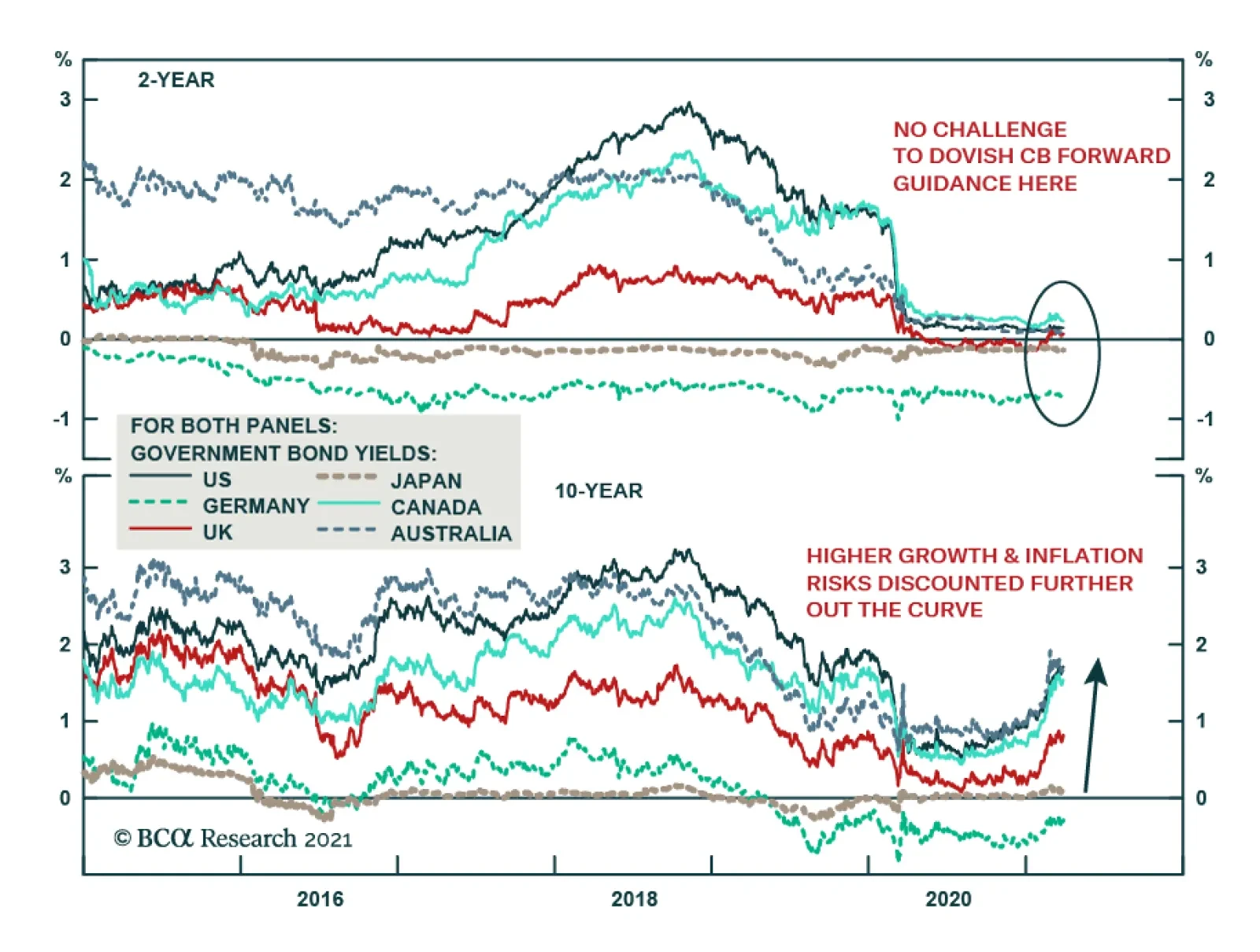
Global growth will rebound later this year, fueled by an end of lockdowns and generous fiscal stimulus. Despite that, central banks will not move towards tightening until 2023 at the earliest. This remains a very positive environment for risk assets like equities, though the upside is inevitably limited given stretched valuations. We continue to recommend a risk-on position, with overweights in equities and higher-risk corporate bonds. It is unlikely that long-term rates will rise much further over the coming months. But there is a risk that they could, and so we become more wary on interest-sensitive assets. Accordingly, we cut our overweight on the IT sector to neutral, and go overweight Financials. We continue to prefer cyclical sectors, and stay overweight Industrials and Energy. Chinese growth is slowing and so we cut our recommendation on Chinese equities to underweight. Some Emerging Markets will suffer from tighter US financial conditions, so we would be selective in our positions in both EM equity and debt. We stay firmly underweight government bonds, and recommend an underweight on duration, and favor linkers. Within alternatives, we raise Private Equity to overweight. The return to normality will give PE funds a wider range of opportunities, and allow them to pick up distressed assets at attractive valuations. Overview What Higher Rates Mean For Asset Allocation The past few months have seen a sharp rise in long-term interest rates everywhere (Chart 1). These have reflected better growth prospects, but also a greater appreciation of the risk of inflation over the next few years (Chart 2). Our main message in this Quarterly Portfolio Outlook is that we do not expect long-term rates to rise much further over the coming months, but that there is a risk that they could. This would be unlikely to undermine the positive case for risk assets overall, but it would affect asset allocation towards interest-rate sensitive assets such as growth stocks and Emerging Markets, and could have an impact on the US dollar. Chart 1Rates Are Rising Everywhere
Rates Are Rising Everywhere
Rates Are Rising Everywhere
Chart 2...Because Of Both Growth And Inflation Expectations
Quarterly Portfolio Outlook: What Higher Rates Mean For Asset Allocation
Quarterly Portfolio Outlook: What Higher Rates Mean For Asset Allocation
We accordingly keep our recommendation for an overweight on equities and riskier corporate credit on the 12-month investment horizon, but are tweaking some of our other allocation recommendations. The macro environment for the rest of the year continues to look favorable. Pent-up consumer demand will be released once lockdowns end. In the US, this should be mid-July by when, at the current rate, the US will have vaccinated enough people to achieve herd immunity (Chart 3). Excess household savings in the major developed economies have reached almost $3 trillion (Chart 4). At least a part of that will be spent when consumers can go out for entertainment and travel again. Chart 3US On Track To Hit Herd Immunity By July
US On Track To Hit Herd Immunity By July
US On Track To Hit Herd Immunity By July
Chart 4Global Excess Savings Total Trillion
Global Excess Savings Total $3 Trillion
Global Excess Savings Total $3 Trillion
Fiscal stimulus remains generous, especially in the US after the passing of the $1.9 trillion package in March (with another $2 trillion dedicated towards infrastructure spending likely to be approved within the next six months). The OECD estimates that the recent US stimulus alone will boost US GDP growth by almost 3 percentage points in the first full year and have a significant knock-on effect on other economies (Chart 5). Central banks, too, remain wary of the uneven and fragile nature of the recovery and so will not move towards tightening in the next 12 months. The Fed is not signalling a rate hike before 2024 – and it is likely to be the first major central bank to raise rates. In this environment, it is not surprising that long-term rates have risen. We showed in March’s Monthly Portfolio Update that, since 1990, equities have almost always performed strongly when rates are rising. This is likely to continue unless there is either (1) an inflation scare, or (2) the Fed turns more hawkish than the market believes is appropriate. Inflation could spike temporarily over the coming months, which might spook markets (see What Our Clients Are Asking on page 9 for more discussion of this). But sustained inflation is improbable until the labor market recovers to a level where significant wage increases come through (Chart 6). This is unlikely before 2023 at the earliest. Chart 5US Fiscal Stimulus Will Help Everyone
Quarterly Portfolio Outlook: What Higher Rates Mean For Asset Allocation
Quarterly Portfolio Outlook: What Higher Rates Mean For Asset Allocation
Chart 6Labor Market Still Well Away From Full Employment
Labor Market Still Well Away From Full Employment
Labor Market Still Well Away From Full Employment
BCA Research’s fixed-income strategists do not see the US 10-year Treasury yield rising much above 1.8% this year.1 Inflation expectations should settle down around the current level (shown in Chart 2, panel 2) which is consistent with the Fed achieving its 2% PCE inflation target on average over the cycle. Treasury yields are largely driven by whether the Fed turns out to be more or less hawkish than the market expects (Chart 7). The market is already pricing in the first Fed rate hike in Q3 2022 (Chart 8). We think it unlikely that the market will start to price in an earlier hike than that. Chart 7The Fed Unlikely To Hike Ahead Of What Market Expects...
The Fed Unlikely To Hike Ahead Of What Market Expects...
The Fed Unlikely To Hike Ahead Of What Market Expects...
Chart 8...Since This Is As Early As Q3 2022
...Since This Is As Early As Q3 2021
...Since This Is As Early As Q3 2021
How much would a further rise in rates hurt the economy and stock market? Rates are still well below a level that would trigger problems. First, long-term rates are considerably below trend nominal GDP growth, which is around 3.5% (Chart 9). Second, short-term real rates are well below r* – hard though that is to measure at the moment given the volatility of the economy in the past 12 months (Chart 10). Finally, one of the best indicators of economic pressure is a decline in cyclical sectors (consumer spending on durables, corporate capex, and residential investment) as a percentage of GDP (Chart 11). This is because these are the most interest-rate sensitive parts of the economy. But, at the moment, consumers are so cashed up they do not need to borrow to spend. The same is true of corporates, which raised huge amounts of cash last year. The only potential problem is real estate, buoyed last year by low rates which are now reversing (Chart 12). But mortgage rates are still very low and this is not a big enough sector to derail the broader economy. Chart 9Long-Term Rates Well Below Damaging Levels...
Long-Term Rates Well Below Damaging Levels...
Long-Term Rates Well Below Damaging Levels...
Chart 10...Such As The R-Star
Fed Still Below Neutral ...Such As The R-Star
Fed Still Below Neutral ...Such As The R-Star
Chart 11Interest-Rate Sensitive Sectors Are Robust...
Interest-Rate Sensitive Sectors Are Robust...
Interest-Rate Sensitive Sectors Are Robust...
Chart 12...With The Possible Exception Of Housing
...With The Possible Exception Of Housing
...With The Possible Exception Of Housing
Chart 13Debt Levels Are High In Emerging Markets...
Debt Levels Are High In Emerging Markets...
Debt Levels Are High In Emerging Markets...
Chart 14...Which Makes Them Vulnerable To Tightening Financial Conditions
...Which Makes Them Vulnerable To Tightening Financial Conditions
...Which Makes Them Vulnerable To Tightening Financial Conditions
This sanguine view may not apply to Emerging Markets, however. Given the amount of foreign-currency debt they have built up in the past decade (Chart 13), they are very sensitive to US financial conditions, particularly a rise in rates and an appreciation of the US dollar (Chart 14). Accordingly, we have become more cautious on the outlook for both EM equity and debt over the next 6-12 months. Garry Evans, Senior Vice President Chief Global Asset Allocation Strategist garry@bcaresearch.com What Our Clients Are Asking What will happen to inflation? How can we tell if it is trending up? Chart 15Watch The Trimmed Mean Inflation Measure
Watch The Trimmed Mean Inflation Measure
Watch The Trimmed Mean Inflation Measure
How much inflation rises will be a key driver of asset performance over the next 12-18 months. Too much inflation will push up long-term rates and undermine the case for risk assets. But the picture is likely to be complicated. US inflation will rise sharply in year-on-year terms in March and April because of the base effect (comparison with the worst period of the pandemic in 2020), pricier gasoline, rising import prices due to the weaker dollar, and supply-chain bottlenecks that are pushing up manufacturing costs. Core PCE inflation could get close to 2.5% year-on-year (Chart 15, panel 1). In the second half, too, an end to lockdowns could push up service-sector inflation – which has unsurprisingly been weak in the past nine months – as consumers rush out to restaurants and on vacation (panel 3). The Fed has signalled that it will view these as temporary effects. But they may spook the market for a while. Next year, however, it would be surprising to see strong underlying inflation unless employment makes a miraculous recovery. Payrolls would have to increase by 420,000 a month to get back to “maximum employment” by end-2022.2 Absent that, wage growth is likely to stay muted. Conventional inflation gauges may not be very useful at indicating underlying inflation pressures, in a world where consumers switch their spending depending on what is currently allowed under pandemic regulations. The Dallas Fed’s Trimmed Mean Inflation indicator (which excludes the 31% of the 178 items in the consumer basket with the highest price rises each month, and the 24% with the lowest) may be the best true measure. Research shows that historically it has been closer to trend headline PCE inflation in the long run than the core inflation measure, and predicts future inflation better (panel 4). Currently it is at 1.6% year-on-year and trending down. Investors should focus on this measure to see whether rising inflation is becoming a risk. How can investors best protect against rising inflation? In May 2019 we released a report describing how to best to hedge against inflation.3 In that report, we analyzed every period of rising inflation dating back to the 1970s. Our conclusions were the following: The level of inflation will determine how rising inflation affects assets. When inflation goes from 1% to 2%, the macro environment is entirely different from when it goes from 5% to 6%. Thus, inflation hedging should not be thought of as a static exercise but a dynamic one (Table 1). Table 1Winners During Different Inflationary Regimes
Quarterly Portfolio Outlook: What Higher Rates Mean For Asset Allocation
Quarterly Portfolio Outlook: What Higher Rates Mean For Asset Allocation
As long as the annual inflation rate is below about 3%, equities tend to be the best performing asset during high inflation periods, surpassing even commodities. This is because monetary policy tends to stay accommodative and cost pressures remain benign for most companies. However, as inflation passes this threshold, things start to change. Central banks start to become restrictive as they seek to curb inflation. This rise in policy rates starts to choke off the bull market. Meanwhile cost pressures become more significant and, as a result, equities begin to suffer. It is at this time when commodities – particularly oil and industrial metals – and US TIPS become a much better asset to hold. Finally, if the central bank fails to quash inflation, inflation expectations become unanchored, creating a toxic cocktail of rising prices and poor growth. During such periods, the best strategy is to hold the most defensive securities in each asset class, such as Health Care or Utilities within the equity market, or gold within commodities. Can the shift to renewables drive a new commodities supercycle? Chart 16The Shift To Renewables Is Likely To Be A Tailwind For Metal Prices...
The Shift To Renewables Is Likely To Be A Tailwind For Metal Prices...
The Shift To Renewables Is Likely To Be A Tailwind For Metal Prices...
The rise in commodity prices in H2 2020 has made investors ask whether we are on the verge of a new commodities “supercycle” (Chart 16). Our Commodity & Energy strategists argue that the fundamental drivers of each commodities segment differ. Here we focus on industrial metals – particularly those pertaining to renewable energy and transport electrification. Prices of metals used in electric vehicles (EVs) have risen by an average 53% since July 2020, reflecting strong demand that is outstripping supply (Chart 16). In the short-term, metals markets are likely to be in deficit, especially as demand recovers after the pandemic. Modelling longer-term demand is tricky since it relies on assumptions for the emergence of new technologies, metals’ efficiency, recycling rates, and the share of renewables. A study by the Institute for Sustainable Futures showed that, in the most positive scenarios, demand for some metals will exceed available resources and reserves (Table 2).4 The most pessimistic scenarios – which, for example, assume no major electrification of the transport system – show demand at approximately half of available resources. It is likely that demand will lay somewhere between those scenarios. Table 2...As Future Demand Exceeds Supply
Quarterly Portfolio Outlook: What Higher Rates Mean For Asset Allocation
Quarterly Portfolio Outlook: What Higher Rates Mean For Asset Allocation
Supply is concentrated in a handful of countries: For example, the DR Congo is responsible for more than 65% of cobalt production and 50% of the world’s reserves;5 Australia supplies almost 50% of the world’s lithium and has 22% of its reserves.6 Production bottlenecks could therefore put significant upside pressures on prices. Factoring in supply/demand dynamics, as well as an assessment of future technological advancements, we conclude that industrial metals might be posed for a bull market over the upcoming years. How can we add alpha in the bond bear market? Chart 17Government Bond Yield Sensitivities To USTs
Government Bond Yield Sensitivities To USTs
Government Bond Yield Sensitivities To USTs
For a portfolio benchmarked to the global Treasury index, one way to add alpha is through country allocation. BCA’s Fixed Income Strategy recommends overweighting low yield-beta countries (Germany, France, and Japan) and underweighting high yield-beta countries (Canada, Australia, and the UK).7 The yield beta is defined as the sensitivity of a country’s yield change to changes in the US 10-year Treasury yield, as shown in Chart 17. BCA’s view is that the Fed will be the first major central bank to lift interest rate, therefore investors' underweights should be concentrated in the US Treasury index. It’s worth noting, however, that yield beta is influenced by many factors, and can change over time. When applying this approach, it’s important to pay attention to key factors in each country, especially those that are critical to central bank policy decisions (Table 3). Table 3A Watch List For Bond Investors
Quarterly Portfolio Outlook: What Higher Rates Mean For Asset Allocation
Quarterly Portfolio Outlook: What Higher Rates Mean For Asset Allocation
Global Economy Chart 18US Growth Already Looks Strong...
US Growth Already Looks Strong...
US Growth Already Looks Strong...
Overview: Growth continues to recover from the pandemic, although the pace varies. Manufacturing has rebounded strongly, as consumers spend their fiscal handouts on computer and household equipment, but services remain very weak, especially in Europe and Japan. Successful vaccination programs and the end of lockdowns in many countries should lead to strong growth in H2, as consumers spend their accumulated savings and companies increase capex to meet this demand. Perhaps the biggest risk to growth is premature tightening in China, but the authorities there are very aware of this risk and so it is unlikely to drag much on global growth. US: Although the big upside surprises to economic growth are over (Chart 18, panel 1), the US continues to expand more strongly than other major economies, due to its relatively limited lockdowns and large fiscal stimulus (which last year and this combined reached 25% of GDP, with another $2 trillion package in the works). Fed NowCasts suggest that Q1 GDP will come in at around 5-6% quarter-on-quarter annualized, with the OECD’s full-year GDP growth forecast as high as 6.5%. Nonetheless, there is still some way to go: Consumer expenditure and capex remain weak by historical standards, and new jobless claims in March still averaged 727,000 a week. Euro Area: More stringent pandemic regulations and slow vaccine rollout mean that the European service sector has been slow to recover. The services PMI in March was still only 48.4, though manufacturing has rebounded strongly to 64.2 (Chart 19, panel 1). Fiscal stimulus is also much smaller than in the US, with the EUR750 billion approved in December to be spent mostly on infrastructure over a period of years. Growth should rebound in H2 if lockdowns end and the vaccination program accelerates. But the OECD forecasts full-year GDP growth of only 3.9%. Chart 19...But Chinese Growth Has Probably Peaked
...But Chinese Growth Has Probably Peaked
...But Chinese Growth Has Probably Peaked
Japan has seen the weakest rebound among the major economies, slightly puzzlingly so given its heavy weight in manufacturing and large exposure to the Chinese economy. Industrial production still shrank 3% year-on-year in February (Chart 19, panel 2), exports were down 4.5% YoY in February, and the manufacturing PMI is barely above 50. The main culprit remains domestic consumption, with confidence very weak and wages still declining, leading to a 2.4% YoY decline in retail sales in January. The OECD full-year GDP growth forecast is just 2.4%. Emerging Markets: The Chinese authorities have been moderately tightening policy for six months and this is starting to impact growth. Both the manufacturing and services PMIs have peaked, though they remain above 50 (panel 3). The policy tightening is likely to be only moderate and so growth this year should not slow drastically. Nonetheless, there remains the risk of a policy mistake. Elsewhere, many EM central banks are struggling with the dilemma of whether to cut rates to boost growth, or raise rates to defend a weakening currency. Real policy rates range from over 2% in Indonesia to below -2% in Brazil and the Philippines. This will add to volatility in the EM universe. Interest Rates: Policy rates in developed economies will not rise any time soon. The Fed is signalling no rise until 2024 (although the futures are now pricing in the first hike in Q3 2022). Other major central banks are likely to wait even longer. A crucial question is whether long-term rates will rise further, after the jump in the US 10-year Treasury yield to a high of 1.73%, from 0.92% at the start of the year. We see only limited upside in yields over the next nine months, as underlying inflation pressures should remain weak and central banks will remain highly reluctant to bring forward the pace of monetary policy normalization. Global Equities Chart 20Has The Equity Market Priced In All The Earnings Growth?
Has The Equity Market Priced In All The Earnings Growth?
Has The Equity Market Priced In All The Earnings Growth?
The global equities index eked out a 4% gain in Q1 2021, completely driven by a rebound in the profit outlook, since the forward PE multiple slightly contracted by 4%. Forward EPS has now recovered to the pre-pandemic level, while both the index level and PE multiple are 52% and 43% higher than at the end of March 2020 (Chart 20). While BCA’s global earnings model points to nearly 20% earnings growth over the next 12 months and analysts are still revising up earnings forecasts, the key question in our mind is whether the equity market has priced in all the earnings growth. Equity valuations are still not cheap by historical standards despite the small contraction in PEs in Q1. In addition, the VIX index has come down to 19.6, right at its historical average since January 1990, and profit margins in both EM and DM have come under pressure. As an asset class, however, stocks are still attractively valued compared to bonds (panel 5). Given our long-held approach of taking risk where risk will most likely be rewarded, we remain overweight equities versus bonds at the asset-class level, but we are taking some risk off the table in our country and sector allocations by downgrading China to underweight (from overweight) and upgrading the UK to overweight (from neutral), and by taking profits in our Tech overweight and upgrading Financials to overweight (see next two pages). To sum up, we are overweight the US and UK, underweight Japan, the euro area, and China, while neutral on Canada, Australia, and non-China EM. Sector-wise, we are overweight Industrials, Financials, Energy, and Health Care; underweight Consumer Staples, Utilities, and Real Estate; and neutral on Tech, Consumer Discretionary, Communication Services, and Materials. Country Allocation: Downgrade China To Underweight From Overweight Chart 21China Is Risking Overtightening
China Is Risking Overtightening
China Is Risking Overtightening
We started to separate the overall EM into China and Other EM in the January Monthly Portfolio Update this year. We initiated China with an Overweight and “Other EM” with a Neutral weighting in the global equity portfolio. The key rationale was that Chinese growth would remain strong in H1 2021 due to its earlier stimulus, while some EM countries would benefit from Chinese growth but others were still suffering from structural issues. In Q1, China underperformed the global benchmark by 4.5%, while the other EM markets underperformed slightly. China’s National People’s Congress (NPC) indicated that Chinese policymakers will gradually pull back policy support this year. BCA’s China Investment Strategists think that fiscal thrust will be neutral in 2021 while credit expansion will be at a lower rate compared to 2020. The Chinese economy should remain strong in H1 but will slow to a benign and managed growth rate afterwards. Therefore, the risk of policy overtightening is not trivial and could threaten China’s economic growth and corporate profit outlook. The outperformance of Chinese stocks since the end of 2019 has been largely driven by multiple expansion (Chart 21, panel 1), but the slowdown in the credit impulse implies that the recent underperformance of Chinese equities has not run its course because multiple contraction will likely have to catch up and will therefore put more downward pressure on price (panels 2 and 3). We remain neutral on the non-China EM countries, implying an underweight for the overall EM universe. We use the proceeds to fund an upgrade of the UK to Overweight from Neutral because the UK index is comprised largely of globally exposed companies and because we have upgraded GBP to overweight (see page 21). Sector Allocation: Upgrade Financials To Overweight By Downgrading Tech To Neutral Chart 22Financials And Tech: Trading Places
Financials And Tech: Trading Places
Financials And Tech: Trading Places
One year ago, we upgraded Tech to overweight and downgraded Financials to neutral given our views on the impact of the pandemic and interest rates.8 This position has netted out an alpha of 1123 basis points in one year. BCA Research’s House View now calls for somewhat higher global interest rates and steeper yield curves (especially in the US) over the next 9-12 months. Accordingly, we are downgrading Tech to neutral and upgrading Financials to overweight. Financials have outperformed the broad market by about 20% since September 2020 after global yields bottomed in July 2020. We do not expect yields to rise significantly from the current level, nor do we expect Tech earnings growth to slow significantly (Chart 22, panel 5). So why do we make such shift between Financials and Tech? There are three key reasons: First, the Tech sector is a long-duration asset with high sensitivity to changes in the discount rate. In contrast, Financials’ earnings benefit from steepening yield curves. If history is any guide, we should see more aggressive analyst earnings revisions going forward in favor of Financials (Chart 22, panel 3). Second, the performance of Financials relative to Tech has been on a long-term structural downtrend since the Global Financial Crisis. A countertrend rebound to the neutral zone from the currently very oversold level would imply further upside (Chart 22, panel 1). Last, Financials are trading at an extremely large discount to the Tech sector (Chart 22, panel 2). In an environment where overall equity valuations are stretched by historical standards, it is prudent to rotate into an extremely cheap sector from an extremely expensive sector. Government Bonds Chart 23Policy Mix Is Bond-Bearish
Policy Mix Is Bond-Bearish
Policy Mix Is Bond-Bearish
Maintain Below-Benchmark Duration. Global bond yields have climbed sharply in Q1, supported by strong economic growth, mostly smooth rollout of vaccination and the Biden Administration’s very stimulative fiscal package of USD1.9 trillion. The US stimulus package changes the trajectory of the 2021 US fiscal impulse from a $0.8 trillion contraction to a $0.3 trillion expansion, according to estimates from the US Committee for a Responsible Federal Budget. Going forward, the path of least resistance for global yields is still up, though the upside will be limited given the resolve of central banks to maintain accommodative monetary policies (Chart 23). Chart 24Stay Long TIPS
Stay Long TIPS
Stay Long TIPS
Still Favor Linkers Vs. Nominal Bonds. Our overweight position in inflation-linked bonds relative to nominal bonds has panned out well so far this year, as has our positioning for a flattening inflation-protection curve. Even though inflation expectations have run up quickly, the 5 year-5 year forward inflation breakeven rate is still below 2.3-2.5%, the range that is consistent with core PCE reaching the Fed’s 2% target in a sustainable fashion (Chart 24). The US TIPS 5/10-year curve is inverted already, but our fixed income strategists are still reluctant to exit the curve-flattening position for two key reasons: 1) The Fed has indicated that it will tolerate core PCE overshooting the 2% target because it will try to hit the target from above rather than from below; and 2) the short end of the inflation expectation curve is more sensitive to actual inflation than the long end. There are signs (core producer prices, prices paid in the ISM manufacturing survey, and NFIB reported prices are all rising) that core PCE will reach 2% in the next 12 months. Corporate Bonds Chart 25High-Yield Offers Best Value In Fixed Income
Quarterly Portfolio Outlook: What Higher Rates Mean For Asset Allocation
Quarterly Portfolio Outlook: What Higher Rates Mean For Asset Allocation
Since the beginning of the year, investment-grade bonds have outperformed duration-matched Treasurys by 62 basis points, while high-yield bonds have outperformed duration-marched Treasurys by 232 basis points. In the current reflationary environment, we believe that the best strategy within fixed-income portfolios is to overweight low-duration assets and maximize credit exposure where the spread makes a large portion of the yield. Thus, we remain overweight high-yield bonds. We believe that high yield offers much better value than higher quality credits. Currently spreads for high-yield bonds are in the middle of their historical distribution – a stark contrast from their investment-grade counterparts, which are trading at very expensive levels (Chart 25, panel 1). Moreover, the reopening of the economy should help the more cyclical sectors of the bond market, where the lower credit qualities are concentrated. But could a rise in yields start hurting sub-investment-grade companies and increase their borrowing costs? We do not think this is likely for now. Most of the bonds in the US high-yield index mature in more than three years, which means that high-risk corporates will not have to finance themselves with higher rates yet (Chart 25, panel 2). On the other hand, we remain underweight investment-grade credit. Not only are these bonds expensive, but they offer very little upside in any scenario. On the one hand, these bonds should underperform further if raise continue to rise – a result of their high duration. On the other hand, if a severe recession were to hit, spreads would most likely widen, which will also result in underperformance. Commodities Chart 26Limited Upside For Oil From Here
Limited Upside For Oil From Here
Limited Upside For Oil From Here
Energy (Overweight): Despite the recent mid-March selloff, which was most likely triggered by profit taking, oil prices are still up 25% since the beginning of the year. This happened on the back of the restoration of some economic activity, the OPEC 2.0 coalition maintaining production discipline and therefore keeping supply in check, and the recovery in crude demand drawing down inventory. However, earlier forecasts of the 2021 oil demand recovery were a bit too optimistic amid continuing pandemic uncertainty. There is now, therefore, only limited upside for the oil price, at least this year. Our Commodity & Energy strategists expect the Brent crude price to average $65/bbl this year (Chart 26, panels 1 & 2). Industrial Metals (Neutral): We have previously highlighted that Chinese restocking activity in 2020 was a big factor behind the rally in industrial metals prices. As this eases, and Chinese growth slows, commodity prices might correct somewhat in the short term. However, fundamental changes in demand for alternative energy makes us ask whether we are now entering a new commodities “supercycle” for certain metals (for more analysis of this, see What Our Clients Are Asking on page 11). If history is any guide, however, the commodities bear market may have a little longer to run. Historically, commodity bear cycles lasted 17 years on average and we are only 10 years into this one (panel 3). On balance, therefore, we remain neutral on industrial metals for now. Precious Metals (Neutral): After peaking last August, the gold price has continued to tumble, down almost 19% since and 11% since the beginning of the year. We have been wary of the metal’s lofty valuation – the real price of gold remains near a historical high. The recent rise in real rates put more downside pressure on gold. However, the pullback in prices should provide investors who see gold as a long-term inflation hedge and do not buy the metal with a view to strong absolute performance over the next 12 months, with an attractive entry point. We maintain a slight overweight position to hedge against inflation and unexpected tail risks (panel 4). Currencies US Dollar Chart 27Vaccinations will help USD and GBP in 2021
Vaccinations will help USD and GBP in 2021
Vaccinations will help USD and GBP in 2021
While we still believe that the dollar is in a major bear market, the current environment could see a significant dollar countertrend. Thanks to its gargantuan fiscal stimulus as well as its relatively fast vaccination campaign, the US is likely to grow faster than the rest of the world during 2021 (Chart 27, panel 1). This dynamic should put further upward pressure on US real rates relative to the rest of the world, helping the dollar in the process. To hedge this risk, we are upgrading the US dollar from underweight to neutral in our currency portfolio. Euro The euro should experience a temporary pullback. Economic activity in Europe, particularly in the service sector is lagging the US – a consequence of Europe’s slow vaccination campaign. This sluggishness in economic activity will translate into a worse real rate differential vis-a-vis the US, dragging the euro lower in the process. Thus, we are downgrading the euro from overweight to neutral. British Pound One currency that might perform well in this environment is the British pound. Consumer spending in the UK was particularly hard hit during the pandemic, since such a high share of it is geared towards social activities like restaurants and hotels (Chart 27, panel 2). However, thanks to Britain’s successful vaccination campaign, UK consumption is likely to experience a sharp snapback. As growth expectations improve, real rates should grind higher vis-à-vis the rest of the world, pushing the pound higher. Moreover, valuations for this currency are attractive: The pound currently trades at a 10% discount to purchasing power parity fair value. As a result, we are upgrading the GBP from neutral to overweight. Alternatives Chart 28Turning More Positive On Private Equity
Turning More Positive On Private Equity
Turning More Positive On Private Equity
Return Enhancers: In last October’s Quarterly Outlook, we advised investors to prepare for new opportunities in Private Equity (PE) as fund managers look to deploy record high dry power. A gradual return to normality is likely to provide PE funds with a wider range of opportunities, while still allowing them to pick up distressed assets at attractive valuations. This is illustrated by the annualized quarterly returns of PE funds in Q2 and Q3 2020, which reached 43% and 56% respectively. PE funds raised in recession and early-cycle years tend to have a higher median net IRR than those raised in the latter stages of bull markets. This suggests that returns from the 2020 and 2021 vintages should be strong. In recent years, capital flows have increasingly gone to the longer established and larger funds, which tend to have better access to the most attractive deals and therefore record the strongest returns. This trend is likely to continue. Given the time it takes to shift allocations in private assets, we increase our recommended allocation in PE to overweight. Inflation Hedges: It is not clear that inflation will come roaring back in the next couple of years. But what is certain is that market participants are concerned about this risk, which should give a boost to inflation-hedge assets. Given this backdrop, we continue to favor commodity futures (Chart 28, panel 2). In other circumstances, real estate would also have been a beneficiary in this environment. But the slowdown in commercial real estate, as many corporate tenants review whether they need expensive city-center space, makes us remain cautious on real estate. Volatility Dampeners: We continue to favor farmland and timberland over structured products, particularly mortgage-backed securities (MBS). Farmland offers attractive yields and should continue to provide the best portfolio protection in the event of any market distress (Chart 28, panel 3). Risks To Our View The main risks to our central view are to the downside. Because global equities have risen by 55% over the past 12 months, and with the forward PE of the MSCI ACWI index at 19.5x (Chart 29), the room for price appreciation over the next 12 months is inevitably limited. There are several things that could undermine the economic recovery and equity bull market. The COVID-19 pandemic remains the greatest unknown. The vaccination rollout has been very uneven (Chart 30). New strains, especially the one first identified in Brazil, are highly contagious and people who previously had COVID-19 do not seem to have immunity against them. Behavior once COVID cases decline is also hard to predict. Will people be happy again to fly, attend events in large stadiums, and socialize in crowded bars, or will many remain wary for years? This would undermine the case for a strong rebound in consumption. Chart 29Is Perfection Priced In?
Is Perfection Priced In?
Is Perfection Priced In?
Chart 30Vaccination Has Been Spotty Vaccination Has Been Spotty
Vaccination Has Been Spotty Vaccination Has Been Spotty
Vaccination Has Been Spotty Vaccination Has Been Spotty
Chart 31China Slowing Again?
China Slowing Again?
China Slowing Again?
As often, a slowdown in China is a risk. The authorities there have signalled a pullback in stimulus, and the credit impulse has begun to slow (Chart 31). Our China strategists think the authorities will be careful not to tighten too drastically (with the fiscal thrust expected to be neutral this year), and that growth will slow only to a benign and moderate rate in the second half.9 But there is a lot of room for policy error. Finally, inflation. As we argue elsewhere in this Quarterly, it will inevitably pick up for technical reasons in March and April, and then again in late 2021 as renewed consumer demand for services (especially travel and entertainment) pushes up prices. The Fed has emphasized that these phenomena are temporary and that underlying inflation will not emerge until the economy returns to full employment. But the market might get spooked for a while when inflation jumps, pushing up long-term interest rates and triggering an equity market correction. Footnotes 1 Please see US Bond Strategy Report, “The Fed Looks Backward While Markets Look Forward,” dated March 23, 2021. 2 Please see US Bond Strategy Report, “The Fed Looks Backward While Markets Look Forward,” dated March 23, 2021, 3 Please see Global Asset Allocation Special Report, “Investors’ Guide To Inflation Hedging: How To Invest When Inflation Rises,” dated May 22, 2019. 4 Dominish, E., Florin, N. and Teske, S., 2019, Responsible Minerals Sourcing for Renewable Energy. Report prepared for Earthworks by the Institute for Sustainable Futures, University of Technology Sydney. The optimistic scenario is referred to as “total metals demand” scenario, which assumed current materials intensity and market share continues into the future without recycling or efficiency improvements. This study is based on 2018 production levels and therefore expansion of future production may vary results. 5US Geological Survey, Mineral Commodity Summaries 2021. 6 Chile is estimated to have the largest reserve of lithium. 7 Please see Global Fixed Income Strategy Report, “Harder, Better, Faster, Stronger,” dated March 16, 2021. 8 Please see Global Asset Allocation, “Quarterly Portfolio Outlook: Playing The Optionality,” dated April 1, 2020. 9 Please see China Investment Strategy Report, “National People’s Congress Sets Tone For 2021 Growth,” dated March 17, 2021. GAA Asset Allocation
Highlights Underweighting T-bonds, tech versus the market, growth versus value, new economy versus old economy, and US versus the euro area are all just one massive correlated trade. Get the direction of the T-bond yield right, and you will get the whole correlated trade right. The rise in the 10-year T-bond yield will meet resistance much closer to 2 percent than to 3 percent… …because the level of the yield is already starting to weigh on the stock market, the financial system, and the real economy. Hence, on a 6-month horizon, fade the massive correlated trade. When allocating to stock markets, don’t confuse a ‘stock effect’ for a ‘country effect’. Fractal trade shortlist: European autos and European personal products. The Pareto Principle Of Investment Chart of the WeekCorrelated Trade: Tech And The US
Correlated Trade: Tech And The US
Correlated Trade: Tech And The US
One of the guiding principles of investment is that: Investment is complex, but it is not complicated. The words complex and complicated are often used synonymously, but they mean different things. Complex means something that is not fully predictable or analysable. Complicated means something that is made up of many parts. Investment is not complicated because a few parts drive the relative prices of everything. This is also known as the Pareto Principle, or the 20:80 rule. Just 20 percent of the input determines 80 percent of the output.1 Right now, the 20 that is determining the 80 is the bond yield. Higher bond yields are hurting high-flying tech stocks. This is because the ‘net present value’ of cashflows that are weighted deep into the future are highly sensitive to rising yields. Therefore, underweighting T-bonds means underweighting tech versus the market. Which extends to growth versus value, new economy versus old economy, US versus the euro area, and so on. In effect, all these positions have become one massive correlated trade (Chart of the Week, Chart I-2, and Chart I-3). Chart I-2Correlated Trade: T-Bond, And Growth Vs. Value
Correlated Trade: T-Bond, And Growth Vs. Value
Correlated Trade: T-Bond, And Growth Vs. Value
Chart I-3Correlated Trade: Growth Vs. Value, ##br##And Tech
Correlated Trade: Growth Vs. Value, And Tech
Correlated Trade: Growth Vs. Value, And Tech
Get the direction of the bond yield right and your whole investment strategy will be right. You will be a hero. Get the direction of the bond yield wrong and your whole investment strategy will be wrong. You will be a zero. Get the direction of the bond yield right and your whole investment strategy will be right. The hero/zero decision for investors is: from the current level of 1.7 percent, at what level will the 10-year T-bond yield peak and reverse? If the answer is, say, 3 percent, then the recent direction of this correlated trade has much further to go, and investors should stay on the ride. But if the answer is, say, 2 percent, then this correlated trade does not have much further to go, and it will soon be time to get off. To repeat, investment is not complicated, but it is complex. The evolution of the bond yield is not fully analysable or predictable. Still, our assessment is that the rise in the 10-year T-bond yield will meet resistance much closer to 2 percent than to 3 percent. This is because the level of yields is already starting to weigh on the stock market, the financial system, and the real economy. Specifically: The global stock market rally has stalled since mid-February because high-flying growth stocks have been reined back by rising bond yields. Recent margin calls and liquidations in the hedge fund space presage points of fragility in the financial system. Note, there is never just one cockroach. US mortgage applications for home purchases and building permits for new housebuilding appear to be rolling over (Chart I-4). Admittedly, these are just straws in the wind. But straws in the wind can be the first sign of a brewing storm. Chart I-4Are Higher Bond Yields Starting To Weigh On The Housing Market?
Are Higher Bond Yields Starting To Weigh On The Housing Market?
Are Higher Bond Yields Starting To Weigh On The Housing Market?
On a 6-month horizon, fade the underweighting to bonds, tech versus the market, growth versus value, new economy versus old economy, and US versus the euro area correlated trade. Sectors Still Rule The Stock Market World The evolution of the pandemic, the pace of vaccination roll-outs, and the size of fiscal stimuluses have become polarised by region and country, with clear leaders and laggards. This raises the question: are the regions and countries that are winning against the pandemic the investment winners too? For the major stock markets, the answer is an emphatic no. Compared with the US, the euro area is experiencing an aggressive third wave of infections, is lagging in its vaccination roll-outs, and is unleashing much less fiscal stimulus. Yet euro area equities have not been underperforming US equities. Proving that the outperformance and underperformance of the major stock markets has very little to do with what is going on in the local economy. The outperformance and underperformance of the major stock markets has very little to do with what is going on in the local economy. By far the biggest driver of euro area versus US stock market performance is the euro area’s massive underweighting to tech stocks vis-à-vis the US. Hence, the tech sector’s recent travails have boosted the euro area stock market’s relative performance. Similar types of sector skews explain the relative performance of all the major stock markets (Table I-1). For example, developed markets (DM) versus emerging markets (EM) is nothing more than healthcare versus basic resources (Chart I-5). Table I-1The Sector Fingerprints Of The Major Stock Markets
The Pareto Principle Of Investment
The Pareto Principle Of Investment
Chart I-5DM Vs. EM Is Nothing More Than Healthcare Vs. Basic Resources
DM Vs. EM Is Nothing More Than Healthcare Vs. Basic Resources
DM Vs. EM Is Nothing More Than Healthcare Vs. Basic Resources
Exchange rates can also have a bearing on stock market relative performance – though the main transmission mechanism is not through competitiveness, but through the so-called ‘currency translation effect.’ Specifically, the multinationals that dominate the major stock markets have their cost bases diversified across multiple currencies. Hence, for a euro-listed multinational company, a weaker euro doesn’t boost its competitiveness. But it does boost the translation of its multi-currency profits into euros, the currency of its stock market listing. Thereby, the weaker euro boosts its stock price. Don’t Confuse A ‘Stock Effect’ For A ‘Country Effect’ Many people think that there is also a strong ‘country effect’ in stock market selection. For example, if US tech hardware outperforms euro area tech hardware, then this is clearly not a sector effect. It must be to do with a difference between the US and the euro area, meaning a country effect. The truth is more nuanced. Many sectors are now highly concentrated in one or two dominant stocks. US tech hardware is concentrated in Apple while euro area tech hardware is concentrated in ASML. Hence, if US tech hardware is outperforming euro area tech hardware, it is because Apple is outperforming ASML (Chart I-6). Chart I-6Is US Tech Vs. Euro Area Tech A 'Country Effect' Or A 'Stock Effect'?
Is US Tech Vs. Euro Area Tech A 'Country Effect' Or A 'Stock Effect'?
Is US Tech Vs. Euro Area Tech A 'Country Effect' Or A 'Stock Effect'?
Likewise, if euro area pharma is outperforming UK pharma, it is because the dominant euro area pharma stock, Sanofi, is outperforming the dominant UK pharma stock, AstraZeneca (Chart I-7). Chart I-7Is Euro Area Pharma Vs. UK Pharma A 'Country Effect' Or A 'Stock Effect'?
Is Euro Area Pharma Vs. UK Pharma A 'Country Effect' Or A 'Stock Effect'?
Is Euro Area Pharma Vs. UK Pharma A 'Country Effect' Or A 'Stock Effect'?
So, if US tech hardware is outperforming euro area tech hardware, and euro area pharma is outperforming UK pharma, are these ‘country effects’, or are they ‘stock effects’? We would argue that, in truth, they are stock effects. Meaning they have little to do with what is happening in the country of listing, and much more to do with the specifics of the company. For example, if UK pharma is underperforming, it is because AstraZeneca is underperforming. And if AstraZeneca is underperforming, it is more likely to do with the performance of its Covid-19 vaccine than the performance of the UK economy. The problem is that most performance attributions will incorrectly count what are stock effects as country effects. And the more concentrated that sectors become, the more pronounced this error becomes. Yet nowadays, extreme concentration in one or two stocks per sector is the norm rather than the exception. Hence, what appears to be a country effect is, in most cases, a stock effect. What appears to be a country effect is, in most cases, a stock effect. The important lesson is that when allocating to the major stock markets, do not think in terms of regions or countries because the country effect is, in truth, negligible. Think in terms of the sectors and the dominant stocks that you want to own, and the regional and country allocation will resolve itself automatically. On this basis our high-conviction structural position to be overweight DM versus EM simply follows from our high-conviction structural position to be overweight healthcare versus basic resources. In the DM versus EM decision, everything else is largely irrelevant. Candidates For Countertrend Reversals This week’s candidates for countertrend reversal are European autos, and European personal products. The euphoria towards electric vehicles (EVs) has taken European auto stocks to a technically overbought extreme (Chart I-8). Chart I-8European Autos Are Overbought
European Autos Are Overbought
European Autos Are Overbought
Conversely, the euphoria towards economic reopening plays has taken European personal products stocks to a technically oversold extreme (Chart I-9). Chart I-9European Personal Products Are Oversold
European Personal Products Are Oversold
European Personal Products Are Oversold
Our recommended trade is overweight European personal products versus European autos (Chart I-10), setting a profit target and symmetrical stop-loss at 15 percent. Chart I-10Overweight European Personal Products Versus European Autos
Overweight European Personal Products Versus European Autos
Overweight European Personal Products Versus European Autos
Dhaval Joshi Chief Strategist dhaval@bcaresearch.com Footnotes 1 The exact numbers 20 and 80 are simply indicative of the Pareto Principle rather than set in stone, they could also be 5 and 95, or indeed 5 and 99 as they do not need to sum to 100. Fractal Trading System
The Pareto Principle Of Investment
The Pareto Principle Of Investment
6-Month Recommendations
The Pareto Principle Of Investment
The Pareto Principle Of Investment
Structural Recommendations
The Pareto Principle Of Investment
The Pareto Principle Of Investment
Closed Fractal Trades
The Pareto Principle Of Investment
The Pareto Principle Of Investment
The Pareto Principle Of Investment
The Pareto Principle Of Investment
The Pareto Principle Of Investment
The Pareto Principle Of Investment
Asset Performance
The Pareto Principle Of Investment
The Pareto Principle Of Investment
Equity Market Performance
The Pareto Principle Of Investment
The Pareto Principle Of Investment
The Pareto Principle Of Investment
The Pareto Principle Of Investment
Indicators Bond Yields Chart II-1Euro Area
Indicators To Watch - Bond Yields - Euro Area
Indicators To Watch - Bond Yields - Euro Area
Chart II-2Europe Ex Euro Area
Indicators To Watch - Bond Yields - Europe Ex Euro Area
Indicators To Watch - Bond Yields - Europe Ex Euro Area
Chart II-3Asia
Indicators To Watch - Bond Yields - Asia
Indicators To Watch - Bond Yields - Asia
Chart II-4Other Developed
Indicators To Watch - Bond Yields - Other Developed
Indicators To Watch - Bond Yields - Other Developed
Interest Rate Chart II-5Expectations
Indicators To Watch - Interest Rate Expectations
Indicators To Watch - Interest Rate Expectations
Chart II-6Expectations
Indicators To Watch - Interest Rate Expectations
Indicators To Watch - Interest Rate Expectations
Chart II_7Expectations
Indicators To Watch - Interest Rate Expectations
Indicators To Watch - Interest Rate Expectations
Chart II-8Expectations
Indicators To Watch - Interest Rate Expectations
Indicators To Watch - Interest Rate Expectations
BCA Research’s Global Fixed Income Strategy service believes that the current strong growth environment is likely to cause the bond market to further challenge the dovish forward guidance of central banks. Thus far, the trend in rising yields has been…
In the decade following the global financial crisis, investor concerns that the Fed’s monetary policies have artificially boosted equity market valuation have been mostly overblown. But today, it is now true that US equities are increasingly dependent on persistently low bond yields, as stocks can only avoid near bubble-like relative pricing if yields remain below trend rates of economic growth. Macroeconomic theory and the historical record both support the notion that nominal interest rates are normally in equilibrium when they are roughly equal to the trend rate of nominal income growth. A gap between interest rates and trend rates of growth was indeed justified for a few years following the global financial crisis, but in the few years prior to the pandemic, it is altogether possible that the neutral rate of interest (or “r-star”) was in fact meaningfully higher than academic estimates suggested. In a scenario where the US output gap closes quickly, inflation rises above target, and where permanent damage to the labor market from the pandemic is relatively limited, we expect the narrative of secular stagnation to be challenged and for investor expectations for the neutral rate to move closer to trend rates of economic growth. That would imply that the 5-year/5-year forward Treasury yield could hypothetically rise above 3%, and possibly as high as 4% or more. Such a shift would push the US equity risk premium back to 2002 levels based on current stock market pricing. This is not necessarily negative for equities, but it is also not clear what equity risk premium investors will require to contend with the myriad risks to the economic outlook that did not exist in the early 2000s. A low ERP that is technically not as low as that of the tech bubble era could thus still threaten stock prices, as T.I.N.A., “There Is No Alternative,” may not prevail. Many investors have questioned what asset allocation strategy should be pursued in a scenario where stock prices and bond yields are no longer positively correlated. While they are not likely to be without cost, options exist for investors to potentially earn positive absolute returns in a scenario where a significant shift in the interest rate outlook threatens both stock and bond prices. Chart II-1Equity Valuation Concerns Have Persisted For The Past Decade...
Equity Valuation Concerns Have Persisted For The Past Decade...
Equity Valuation Concerns Have Persisted For The Past Decade...
For the better part of the last decade, many investors have argued that the Fed’s monetary policies have artificially boosted equity market valuation. Based on the cyclically-adjusted P/E ratio metric originated by Robert Shiller, stocks reached pre-global financial crisis (GFC) multiples in late 2014 and early 2015 (Chart II-1). Based on metrics such as the price-to-sales ratio, stocks rose to pre-GFC valuation in late 2013, and are now even more richly valued than they were at the height of the dotcom bubble. These concerns have mostly occurred in response to absolute changes in stock multiples, but equity valuation cannot be divorced from the prevailing level of interest rates. Relative to bond yields, stocks were extraordinarily cheap for many years following the GFC. Measured by one simple approach to calculating the equity risk premium, the spread between the 12-month forward earnings yield (the inverse of the forward P/E ratio) and the real 10-year Treasury yield, stocks were the cheapest following the GFC that they had been since the mid 1980s, and remain reasonably priced today (Chart II-2). Chart II-2...But Stocks Have Actually Been Cheap Versus Bonds
...But Stocks Have Actually Been Cheap Versus Bonds
...But Stocks Have Actually Been Cheap Versus Bonds
The fact that stocks have appeared to be expensive for several years but quite cheap (or reasonably priced) relative to bonds underscores the fact that longer-term bond yields have been extraordinarily low following the global financial crisis. Still, equities were not dependent on low bond yields prior to the pandemic, as illustrated in Chart II-3. The chart highlights the range of 10-year Treasury yields that would be consistent with the pre-GFC equity risk premium range (measured from 2002-2007), alongside the actual 10-year yield and trend nominal GDP growth. The chart shows that for years following the financial crisis, bond yields could have risen to levels well above trend rates of economic growth and stocks would still have been priced in line with pre-crisis norms. This “normal pricing” range for the 10-year declined as the expansion continued, but remained consistent with trend growth rates and above the actual 10-year yield up until the beginning of the pandemic. Chart II-3 also highlights, however, that the circumstances changed last year. The equity risk premium briefly rose at the onset of the pandemic as stocks initially sold off sharply, but then quickly fell as stock prices recovered in response to aggressive fiscal and monetary easing. Today, it is true that US equities are increasingly dependent on persistently low bond yields, as stocks can only avoid bubble-like relative pricing if yields remain below trend rates of economic growth. Chart II-3Now, Stocks Are Increasingly Dependent On Low Bond Yields
Now, Stocks Are Increasingly Dependent On Low Bond Yields
Now, Stocks Are Increasingly Dependent On Low Bond Yields
Prior to the pandemic, most fixed-income investors would have viewed the risk of bond yields rising to trend nominal GDP growth, let alone above it, as minimal. Global investors have come to accept the secular stagnation narrative as described by Larry Summers in November 2013, and have gravitated to academic estimates of the neutral rate of interest (“R-star”) that show a substantial gap between the natural rate and trend real growth (Chart II-4). This view has manifested itself in a decline in surveyed estimates of the long-run Fed funds rate, but at present the 5-year/5-year forward Treasury yield has pushed well above this survey-derived fair value range (Chart II-5). It is possible that the fiscal response to the pandemic will cause investor views about r-star to evolve even further over the coming 12-24 months, and in this report we explore the potential headwind that such an evolution could present to stock prices at some point – potentially as early as next year. Chart II-4Investors Have Accepted Secular Stagnation, And The View That R-star Is Well Below Trend Rates Of Growth
Investors Have Accepted Secular Stagnation, And The View That R-star Is Well Below Trend Rates Of Growth
Investors Have Accepted Secular Stagnation, And The View That R-star Is Well Below Trend Rates Of Growth
Chart II-5The Market's Views About R-star May Be Shifting
The Market's Views About R-star May Be Shifting
The Market's Views About R-star May Be Shifting
R-star: A Brief Primer Macroeconomic theory and the historical record both support the notion that nominal interest rates are normally in equilibrium when they are roughly equal to the trend rate of nominal income growth. From the perspective of macro theory, the neutral rate of interest is determined by the supply of and demand for savings. But in practical terms, this implies that the neutral rate should normally be closely linked to the trend rate of economic growth. For example, if interest rates – and thus the cost of capital – were persistently below aggregate income growth, then demand for capital (and thus credit and likely labor demand) should increase as firms seek to profit from the gap between the interest rate and the expected rate of return from real investment. As such, the trend rate of growth acts as a good proxy for the interest rate that will balance the supply and demand for credit during normal economic circumstances. Empirically, academic estimates of r-star closely followed estimates of trend real GDP growth prior to the global financial crisis, as shown in Chart II-4 above. In addition, we noted in our January report that the stance of monetary policy, as defined by the difference between nominal GDP growth and the 10-year Treasury yield, has generally done a good job of explaining the US output gap prior to 2000. This supports the notion that monetary policy is stimulative (restrictive) when bond yields are below (above) trend growth rates. However, in the years following the GFC, investors’ estimates of r-star collapsed, as evidenced by the sharp decline in 5-year / 5-year forward Treasury yields (Chart II-6). This was followed by a decline in primary dealer and FOMC expectations for the long-term Fed funds rate, which investors took as validating their view that the neutral rate of interest has permanently declined. Chart II-6Investors Led The Fed And Others In Expecting A Lower Nominal Neutral Rate
Investors Led The Fed And Others In Expecting A Lower Nominal Neutral Rate
Investors Led The Fed And Others In Expecting A Lower Nominal Neutral Rate
R-star And Trend Growth: Is A Gap Between The Two Really Justified? Chart II-7R-star Likely Did Decline Following The GFC (For A Time)
R-star Likely Did Decline Following The GFC (For A Time)
R-star Likely Did Decline Following The GFC (For A Time)
It seems clear that r-star did indeed decline for a time after the GFC. The US and select European economies suffered a balance sheet recession in 2008/2009 that impacted credit demand for an extended period of time (Chart II-7), and extraordinarily low interest rates for several years did not fuel major credit excesses (at least in the household sector). But as we detailed in a Special Report last year,1 we doubt that the decline in r-star was permanent, for several reasons. The first, and most important, is that there have been at least four deeply impactful non-monetary shocks to both the US and global economies since 2008 that magnified the impact of prolonged household deleveraging and help explain the disconnect between growth and interest rates during the last economic cycle: The euro area sovereign debt crisis Premature fiscal austerity in the US, the UK, and euro area from 2010 – 2012/2014 The US dollar / oil price shock of 2014 The Trump administration’s aggressive use of tariffs beginning in 2018, impacting China but also other developed market economies. Chart II-8Recent Trends In US Private Sector Leverage Do Not Suggest R-star Is Very Low
Recent Trends In US Private Sector Leverage Do Not Suggest R-star Is Very Low
Recent Trends In US Private Sector Leverage Do Not Suggest R-star Is Very Low
Except for the oil price shock of 2014 (which was driven by technological developments and a price war among producers), all of these non-monetary shocks were caused or exacerbated by policymakers – often for political reasons or due to regulatory failures. Second, the trend in US private sector credit growth last cycle does not suggest that r-star fell permanently. Chart II-8 underscores two points: the first is that while US household sector credit contracted for several years following the global financial crisis, it started growing again in 2013 and had largely closed the gap with income growth prior to the pandemic. The second point is that the nonfinancial corporate sector clearly leveraged itself over the course of the last expansion, arguing that interest rates have not in any way been restrictive for businesses. Third, we disagree with a common view in the marketplace that the 2018-2019 period supported the validity of low academic estimates of the neutral rate. Chart II-9 highlights that monetary policy ceased to be stimulative in 2019 according to the Laubach & Williams r-star estimate, which some investors have argued explains the late 2018 equity market selloff, the 2019 slowdown in the US housing market, the inversion of the yield curve, and the global manufacturing recession. Chart II-9Monetary Policy Ceased To Be Stimulative In 2019, According To The LW R-star Estimate
Monetary Policy Ceased To Be Stimulative In 2019, According To The LW R-star Estimate
Monetary Policy Ceased To Be Stimulative In 2019, According To The LW R-star Estimate
But this narrative ignores other important factors that contributed to the slowdown. For example, Chart II-10 highlights that this period of economic weakness exactly coincided with the most intense phase of the Sino-US trade war, as well as a significant slowdown in Chinese credit growth. The chart highlights that the selloff in the US equity market began almost immediately after a surge in the effective tariff rates levied by the two countries against each other, and after the Chinese credit impulse fell three percentage points (from 30% to 27% of GDP). Chart II-10The 2018 Stock Market Selloff Occurred Once Sino-US Tariffs Exploded
The 2018 Stock Market Selloff Occurred Once Sino-US Tariffs Exploded
The 2018 Stock Market Selloff Occurred Once Sino-US Tariffs Exploded
Chart II-11 highlights that interest rates did likely impact the housing market, but that it was the speed at which rates rose that was damaging rather than their level. The chart shows that the rise in mortgage rates from late 2016 to late 2018 was among the largest 2-year increases that has occurred since the early 1980s, so it is unsurprising that the growth in home sales and real residential investment slowed for a time. Additionally, Chart II-12 highlights that the rise in mortgage rates during this period did not cause a downtrend in mortgage credit growth, which only occurred in Q4 2018 in response to the impact of the sharp selloff in the equity market on household net worth. Chart II-11Mortgage Rates Rose Very Significantly From Late 2016 To Late 2018
Mortgage Rates Rose Very Significantly From Late 2016 To Late 2018
Mortgage Rates Rose Very Significantly From Late 2016 To Late 2018
Chart II-12A Record Rise In Mortgage Rates Did Not Crack The Housing Market
A Record Rise In Mortgage Rates Did Not Crack The Housing Market
A Record Rise In Mortgage Rates Did Not Crack The Housing Market
In short, the late 2018 / 2019 period saw a major global aggregate demand shock occur following an already-established slowdown in Chinese credit growth and a rapid rise in interest rates in the DM world. It is these factors that were likely responsible for the 2019 slowdown in economic growth, not the fact that interest rates reached levels that restricted economic activity on their own. R-star In A Post-Pandemic World Charts II-7 – II-12 above suggest that a gap between interest rates and trend rates of growth was indeed justified for a few years following the global financial crisis, but that a decline in r-star only appeared to be permanent due to persistent, non-monetary policy shocks to aggregate demand. In the few years prior to the pandemic, it is altogether possible that r-star was in fact meaningfully higher than academic estimates suggested. But that is now a counterfactual assertion, as the pandemic has transformed the outlook for interest rates and bond yields in conflicting ways. A 10% decline in the level of real output was the most intensely negative non-monetary shock to aggregate demand since the 1930s (Chart II-13), and we agree that another depression would have occurred without extraordinary government assistance. The economic damage caused by the pandemic certainly does not work in favor of a higher neutral rate, and we highlighted in Section 1 of our report that the Fed expects there to be some lingering and persistent slack in the labor market even once the pandemic is over. Chart II-13Without Major Monetary And Fiscal Policy Support, The Pandemic Would Probably Have Caused A Depression
Without Major Monetary And Fiscal Policy Support, The Pandemic Would Probably Have Caused A Depression
Without Major Monetary And Fiscal Policy Support, The Pandemic Would Probably Have Caused A Depression
Chart II-14A Huge Increase In Government Transfers And Spending Is Underway
April 2021
April 2021
On the other hand, Larry Summers, the chief proponent of the theory of secular stagnation, has argued for several years that increased fiscal spending was warranted in order to address an imbalance between private sector savings and investment. Summers himself now characterizes US fiscal policy as the “least responsible” that he has seen over the past 40 years, because of too-large government spending that risks overheating the economy (Chart II-14). Summers’ critique rests in large part on the fact that new government spending has not occurred in the form of investment (to balance out the existence of excess savings), but is instead providing transfers to households that in many cases have already accumulated significant excess savings. But the key point for investors is that the pandemic has completely shifted the narrative about fiscal spending, from “arguably insufficient for several years following the global financial crisis” to now “risking a dramatic overheating of the economy.” Some elements of Summers’ criticism of the Biden administration’s fiscal policy are justified, particularly the policy of large direct transfer payments to workers who have suffered no loss in employment or income as a result of the pandemic. Despite this, as detailed in Section 1 of our report, we are more sanguine about the risks of aggressive overheating for three reasons: it does seem likely that some portion of the spending on services that has been “missing” over the past year will never return or will be slow to return, some of the excess savings that have accumulated will not be immediately (or ever) spent, and the rise in consumer inflation expectations that has occurred over the past year has happened from an extremely low starting point and has yet to even rise above its post-GFC range. The low odds that we assign to dangerously above-target inflation over the coming 12-24 months does not, however, mean that investors’ expectations for r-star will stay low. For right or for wrong, the US government has aggressively dis-saved over the past year, in an environment where low expectations for the neutral rate were anchored by a view of excessive private sector savings and insufficient demand from governments. In a scenario where the US output gap closes quickly, inflation rises modestly above target, and where permanent damage to the labor market from the pandemic is relatively limited, it seems reasonable to conclude that the narrative of secular stagnation will be challenged and that investor expectations for the neutral rate will converge towards trend rates of economic growth. That would imply that the 5-year/5-year forward Treasury yield could hypothetically rise above 3%, possibly as high as 4% or more. This is not our base case view, but it will be an important possibility to monitor as the decisive end to social distancing and other pandemic control measures draws nearer. Investment Conclusions A rise in the 5-year/5-year forward Treasury yield does not, in and of itself, suggest that 10-year Treasury yields will rise to levels that would threaten a significant decline in stock prices. The Fed does not control the long-end of the Treasury curve, but it does exert a very strong influence on the short-end. For example, were the Fed to follow the median current projection of FOMC participants and refrain from raising interest rates until sometime after 2023, it would limit how high current 10-year Treasury yields could rise. But it is not difficult to envision plausible scenarios where the 10-year Treasury yield rises above the range consistent with the pre-GFC US equity risk premium. Chart II-15 presents three hypothetical fair value paths for the 10-year yield assuming a mid-2022 liftoff date and a 4% terminal Fed funds rate for the following three scenarios: Chart II-1510-Year Yields Could Rise Meaningfully Further If Investors Shift Their Expectations For R-star
10-Year Yields Could Rise Meaningfully Further If Investors Shift Their Expectations For R-star
10-Year Yields Could Rise Meaningfully Further If Investors Shift Their Expectations For R-star
The Fed raises rates at a pace of 1% (4 hikes) per year, with a term premium of 10 basis points The Fed raises rates at a pace of 1% (4 hikes) per year, with a term premium of 50 basis points The Fed raises rates at a pace of 1.5% (6 hikes) per year, with a term premium of 50 basis points In the first scenario, based on the current US 12-month forward P/E ratio, the fair value of the 10-year Treasury yield would rise above the range consistent with a reasonable ERP in the middle of 2022, the liftoff point assumed in all three scenarios. In the second and third scenarios, the US equity ERP would already be quite low. When using the late 1999 / early 2000 bubble period as a reference point, even the scenarios shown in Chart II-15 are not very threatening to stock prices. Given current equity market pricing, the third scenario would take the US equity risk premium back to mid 2002 levels, which were still meaningfully higher than during the peak of the bubble. And that is assuming an earlier liftoff than the market currently expects, a faster pace of rate hikes than experienced during the last economic cycle, and a very meaningful increase in the market’s expectations for the neutral rate. But it is not clear what equity risk premium investors will require to contend with the myriad risks to the economic outlook that did not exist in the early 2000s. For example, equity investors are today faced with a riskier policy environment than existed 20 years ago in the US and in other developed economies that is at least partially driven by populist sentiment, potentially impacting earnings via lower operating margins or higher taxes. These or other risks existed at several points over the past decade and T.I.N.A. (“There Is No Alternative”) prevailed, but that occurred precisely because the equity risk premium was very elevated. A low ERP that is technically not as low as what prevailed during the tech bubble era could thus still threaten stock prices, raising the specter of negative absolute returns from stocks and nominal government bonds for a period of time, beginning potentially at or in the lead-up to the first Fed rate hike. Chart II-16There Are Alternatives To A Traditional 60/40 Portfolio In A Rising Rate Environment
There Are Alternatives To A Traditional 60/40 Portfolio In A Rising Rate Environment
There Are Alternatives To A Traditional 60/40 Portfolio In A Rising Rate Environment
Many investors have questioned what asset allocation strategy should be pursued in a scenario where stock prices and bond yields are no longer positively correlated. Chart II-16 provides some perspective on the question, by comparing the total return of a 60/40 stock/bond portfolio to a strategy involving the opportunistic redeployment of cash into stocks. The strategy rule maintains a 50/50 stock/cash allocation during normal market conditions, but it then shifts the entire cash allocation into equities following a 15% selloff in the stock market. The portfolio is shifted back to a 50/50 allocation once stocks rise to a new rolling 1-year high. The chart highlights that 60/40 balanced portfolio-style returns may be achievable with cash as the diversifier without a significant reduction in the Sharpe ratio. In fact, the strategy has the effect of lowering average volatility due to prolonged periods of comparatively lower equity exposure, although this occurs at the cost of higher volatility during periods of high market stress (precisely when investors most want protection from volatility). But the bottom line for investors is that while they are not likely to be without cost, options exist for investors to potentially earn positive absolute returns in a scenario where a significant shift in the interest rate outlook threatens both stock and bond prices. As noted above, this remains a risk to our view rather than our expectation, but we will continue to monitor the potential threat posed to stock prices as the pandemic draws to a decisive close later this year. Jonathan LaBerge, CFA Vice President The Bank Credit Analyst Footnotes 1 2020-03-20 GIS SR “Revisiting The Neutral Rate Of Interest: A Contrarian View In A Time Of Crisis.”
Highlights Central Bank Expectations: Market expectations of short-term interest rate moves over the next few years are inching higher. The potential for markets to offer a greater bond-bearish challenge to the current highly dovish forward guidance of the major central banks should not be dismissed given the growth-positive mix of expanding global vaccinations and US fiscal stimulus. Global Golden Rule: The gap between market expectations of global central bank policy rates and realized interest rate outcomes is a reliable predictor of government bond returns – a dynamic we have dubbed the “Global Golden Rule of Bond Investing”. Given our expectation that no major developed market central bank will hike rates within the next twelve months, the Global Golden Rule is calling for the recent government bond market laggards to outperform over the next year. Tapering & The Golden Rule: Government bonds in countries where central banks are most likely to begin tapering in 2022 well before considering rate hikes – most notably, the US and Canada – are likely to suffer returns worse than implied by the Global Golden Rule. It is too soon to raise allocations to those higher-beta bond markets. Feature As the first quarter of 2021 draws to a close, fixed income investors are licking their wounds from a rough start to the year. Government bonds across the developed world have absorbed heavy losses as yields have climbed higher, led by US Treasuries which are down -4.0% year-to-date in total return terms. Other markets have also been hit hard, like Canada (-3.9%), Australia (-3.5%) and the UK (-6.3%). The trend in rising yields has been concentrated at longer maturities, with shorter ends of yield curves seeing much smaller moves (Chart 1). Two-year government bond yields are still being pinned down by the dovish forward guidance of the major central banks. The Fed is signaling no rate hikes through at least the end of 2023, while other central banks are sending similar messages on the timing of any potential future rate moves. However, global growth expectations continue to gain upward momentum, fueled by the optimistic combination of expanding COVID-19 vaccinations and aggressive US fiscal stimulus. Real GDP growth is expected to soar to a mid-single digit pace in the US, UK, Canada and even the euro zone - moves heralded by the steady climb of the OECD leading economic indicators and composite purchasing manager indices (Chart 2). Chart 1Rising Yields Reflect Reflation
Rising Yields Reflect Reflation
Rising Yields Reflect Reflation
Chart 2A Bond-Bearish Surge In Global Growth
Revisiting Our Global Golden Rule Of Bond Investing
Revisiting Our Global Golden Rule Of Bond Investing
Markets will continue to pull forward the timing and pace of the next monetary tightening cycle if those faster above-trend growth forecasts are realized. This will represent a change of “leadership” in the global bond bear market from faster inflation breakevens to increased policy rate expectations helping drive real yields higher. That shift may already be underway according to the ZEW survey of global investor expectations which now shows that the net number of respondents expecting higher short-term interest rates in the US and UK has turned positive (Chart 3). Already, our Central Bank Monitors for the US, Canada and Australia (Chart 4) have climbed back to neutral levels suggesting that easier monetary policy is no longer required. Similar trends can be seen to a lesser extent in the UK, euro area and even Japan (Chart 5). These moves are already coinciding with increased cyclical upward pressure on global bond yields, even without any change in dovish central bank guidance alongside ongoing buying of government bonds via quantitative easing programs. Chart 3Shifting Expectations For Policy Rates?
Shifting Expectations For Policy Rates?
Shifting Expectations For Policy Rates?
Chart 4Diminishing Need For Easy Monetary Policy Here
Diminishing Need For Easy Monetary Policy Here
Diminishing Need For Easy Monetary Policy Here
Chart 5Easy Policy Still Required Here
Easy Policy Still Required Here
Easy Policy Still Required Here
How will a trend of rising short-term interest rate expectations translate into future expected returns on government bonds? For that, we revisit a framework temporarily set aside during the pandemic era of crisis monetary policies – the Global Golden Rule (GGR) of bond investing. An Update Of The Global Golden Rule, By Country In September 2018, we published a Special Report introducing a government bond return forecasting methodology called the “Global Golden Rule.” This was an extension of a framework introduced by our sister service, US Bond Strategy, that links US Treasury returns (versus cash) to changes in the fed funds rate that were not already discounted in the US Overnight Index Swap (OIS) curve.1 The historical results convincingly showed that investors who "get the Fed right" by making correct bets on changes in the funds rate versus expectations were very likely to make the right call on the direction of Treasury yields. We discovered that relationship also held in other developed market countries. Thus, we now had a framework to help project expected bond returns simply based on a view for future central bank interest rate moves versus market expectations.2 Specific details on the calculation of the Global Golden Rule can be found in those original 2018 papers. In the following pages, we present the latest results of the Global Golden Rule for the US, Canada, Australia, the UK, the euro area and Japan. The set-up for the chart shown for each country is the same. We show the 12-month policy rate “surprise”, defined as the actual change in the central bank policy rate over the preceding 12-months versus the expected 12-month change in the policy rate from a year earlier extracted from OIS curves (aka our 12-month discounters). We then compare the 12-month policy rate surprise to the annual excess return over cash (treasury bills) of the Bloomberg Barclays government bond index for each country. We also show the 12-month policy rate surprise versus the 12-month change in the government bond index yield. The very strong historical correlation between those latter two series is the backbone of the Global Golden Rule framework. After that, we present tables showing expected yield changes and excess returns for various maturity points, as well as the overall government bond index, derived from the Global Golden Rule regressions. The expected change in yield is derived from regressions on the policy rate surprises, with different estimations done for each maturity point. In the tables, we show the results for different scenarios for changes in policy rates. For example, the row in the return tables called “1 rate hike” would show the expected yield changes and excess returns if the central bank for that particular country lifts the policy interest rate by +25bps over the next 12 months. This allows us to pick the scenario(s) that most closely correlate to our own expectation for central bank actions, translating that into government bond return expectations. Global Golden Rule: US Chart 6UST Selloff Akin To A Hawkish Surprise
UST Selloff Akin To A Hawkish Surprise
UST Selloff Akin To A Hawkish Surprise
The Golden Rule would have underestimated the losses realized by US Treasuries over the past year (-4.5%), as negative excess returns over cash typically occur when the Fed is more hawkish than expectations – an outcome that did not occur (Chart 6). The trailing 12-month policy rate surprise for the US is currently zero, as last year’s massively dovish rate cuts have rolled off. The US OIS curve now discounts only 5bps of interest rate increases over the next 12 months, a period that runs to the end of first quarter of 2022. This is in line with the Fed’s guidance that no rate hikes will take place before the end of 2023. Our base case is the “Flat” scenario shown in Table 1 and Table 2, with the Fed keeping the funds rate unchanged near 0% for the next twelve months – a very modest “dovish” surprise. This produces a Golden Rule forecast of the overall US Treasury index yield falling -2bps that generates a total return of +1.1%. This is essentially a coupon-clipping return equivalent to the current index yield. Table 1US: Government Bond Index Total Return Forecasts Over The Next 12 Months
Revisiting Our Global Golden Rule Of Bond Investing
Revisiting Our Global Golden Rule Of Bond Investing
Table 2US: Expected Changes In Treasury Yields Over The Next 12 Months
Revisiting Our Global Golden Rule Of Bond Investing
Revisiting Our Global Golden Rule Of Bond Investing
Global Golden Rule: Canada Chart 7Canadian Bond Selloff Worse Than Implied By Golden Rule
Canadian Bond Selloff Worse Than Implied By Golden Rule
Canadian Bond Selloff Worse Than Implied By Golden Rule
Canadian government bonds have sold off smartly over the past 12 months, delivering an excess return over cash of -2.8%. That is a smaller loss, however, compared to other developed economy government bond markets. The Canadian OIS curve did not move as aggressively to price in rate cuts last year, so the rapid pace of Bank of Canada (BoC) easing that was actually delivered constituted a modest “dovish surprise” that helped mute Canadian bond losses to some degree (Chart 7). The trailing 12-month policy rate surprise for Canada is +37bps (a dovish surprise), but rate expectations are more aggressive on forward basis. The Canadian OIS curve now discounts +28bps of interest rate increases over the next 12-months, a period that runs to the end of first quarter of 2022. This stands out as the highest such figure among the countries discussed in this report. This is likely due to the relatively less dovish messaging from BoC officials who have hinted that QE could be tapered sooner than expected if the economy outperforms the BoC’s forecasts for 2021. Our base case is the “Flat” scenario shown in Table 3 and Table 4, with the BoC keeping the policy interest rate at 0.25% for the next twelve months. This produces a Golden Rule forecast of a decline in the overall Canadian government bond index yield of -12bps, delivering a projected total return of +1.69%. That return may turn out to be overly optimistic if the BoC does indeed begin tapering QE later this year. Table 3Canada: Government Bond Index Total Return Forecasts Over The Next 12 Months
Revisiting Our Global Golden Rule Of Bond Investing
Revisiting Our Global Golden Rule Of Bond Investing
Table 4Canada: Expected Changes In Government Bond Yields Over The Next 12 Months
Revisiting Our Global Golden Rule Of Bond Investing
Revisiting Our Global Golden Rule Of Bond Investing
Global Golden Rule: Australia Chart 8Australian Bonds Acting Like The RBA Was Hawkish
Australian Bonds Acting Like The RBA Was Hawkish
Australian Bonds Acting Like The RBA Was Hawkish
Australian government bonds have delivered a negative excess return over cash of -3.6% over the past year (Chart 8). This underperformed the projection from the Golden Rule, as the Reserve Bank of Australia (RBA) was not more hawkish than market expectations. The central bank actually delivered a dovish surprise in 2020, not only cutting policy rates dramatically but starting up a bond-buying QE program and instituting yield curve control to cap 3-year bond yields. The trailing 12-month policy rate surprise for Australia is zero, as last year’s massively dovish surprise rate cuts have rolled off. The Australia OIS curve now discounts only 7bps of interest rate increases over the next 12-months, a period that runs to the end of first quarter of 2022. This is in line with the RBA’s highly dovish guidance suggesting that there will be no change to current policy settings until Australian wage growth picks up to the 3% level consistent with the RBA’s 2-3% CPI inflation target. The central bank does not expect that to occur before 2023. We agree with dovish guidance from the RBA, thus our base case is the “Flat” scenario shown in Table 5 and Table 6, with the RBA keeping the Cash Rate unchanged at 0.1% for the next twelve months. This generates a Golden Rule forecast of an -5bps decline in the overall Australian government bond index yield, producing a total return projection of +1.4%. Table 5Australia: Government Bond Index Total Return Forecasts Over The Next 12 Months
Revisiting Our Global Golden Rule Of Bond Investing
Revisiting Our Global Golden Rule Of Bond Investing
Table 6Australia: Expected Changes In Government Bond Yields Over The Next 12 Months
Revisiting Our Global Golden Rule Of Bond Investing
Revisiting Our Global Golden Rule Of Bond Investing
Global Golden Rule: UK Chart 9A UK Gilt Selloff Without A Hawkish BoE
A UK Gilt Selloff Without A Hawkish BoE
A UK Gilt Selloff Without A Hawkish BoE
UK Gilts underperformed the Golden Rule forecast over the past 12 months, delivering a negative excess return over cash of –5.1% even with the Bank of England (BoE) not delivering any hawkish surprise versus market expectations (Chart 9). The trailing 12-month policy rate surprise for the UK is currently zero. The UK OIS curve now discounts only 5bps of interest rate increases over the next 12-months, a period that runs to the end of first quarter of 2022. This is in line with the BoE’s guidance that no monetary tightening will take place until there is clear evidence that the excess capacity created by the pandemic shock is clearly being absorbed. Yet while the BoE has still left the door open to moving to a negative policy rate if needed, markets are not discounting any such move. Our base case is the “Flat” scenario shown in Table 7 and Table 8, with the BoE keeping the Bank Rate unchanged at 0.1% for the next twelve months. This produces a Golden Rule forecast of the overall UK Gilt index yield falling -2bps that generates a total return of +1.0%. This is a return only slightly above the current index yield. Table 7UK: Government Bond Index Total Return Forecasts Over The Next 12 Months
Revisiting Our Global Golden Rule Of Bond Investing
Revisiting Our Global Golden Rule Of Bond Investing
Table 8UK: Expected Changes In Gilt Yields Over The Next 12 Months
Revisiting Our Global Golden Rule Of Bond Investing
Revisiting Our Global Golden Rule Of Bond Investing
Global Golden Rule: Germany Chart 10Even Bunds Acting Like ECB Is "Hawkish"
Even Bunds Acting Like ECB Is "Hawkish"
Even Bunds Acting Like ECB Is "Hawkish"
German government bonds have produced an excess return over cash of -1.6% over the past year. There was no surprise from the European Central Bank (ECB) during that time relative to market expectations (Chart 10), so that negative return reflected the modest rise in German bond yields on the back of improving global growth. The trailing 12-month policy rate surprise for Germany (and the overall euro area) remains stuck near zero, as has been the case since the ECB cut its deposit rate below zero and instituted QE back in 2016. The euro area OIS curve now discounts only -4bps of interest rate cuts over the next 12 months, a period that runs to the end of first quarter of 2022. This is in line with the ECB’s guidance that rates will be kept unchanged until at least 2023, as the central bank’s projections call for euro area inflation to not climb above 1.5% - below the ECB’s 2% target – through 2023. The OIS curve is discounting a small probability that the ECB could be forced to deliver a small rate cut given the degree of the euro area inflation undershoot. Our base case, however, is that the ECB will keep rates steady over the next 12 months (and likely for a few more years after that). Thus, the “Flat” scenarios shown in Table 9 and Table 10 are most relevant, with the German government bond index yield rising +2bps according to the Golden Rule. This produces a total return projection of -0.6%. Table 9Germany: Government Bond Index Total Return Forecasts Over The Next 12 Months
Revisiting Our Global Golden Rule Of Bond Investing
Revisiting Our Global Golden Rule Of Bond Investing
Table 10Germany: Expected Changes In Bund Yields Over The Next 12 Months
Revisiting Our Global Golden Rule Of Bond Investing
Revisiting Our Global Golden Rule Of Bond Investing
Global Golden Rule: Japan Chart 11JGBs Bucking The Global "Hawkish" Selloff
JGBs Bucking The Global "Hawkish" Selloff
JGBs Bucking The Global "Hawkish" Selloff
Japanese government bonds (JGBs) have delivered an excess return versus cash of -0.8% over the past twelve months (Chart 11). Although it may sound unusual for Japan, there was actually a tiny “hawkish” surprise as the Bank of Japan (BoJ) kept policy rates steady over the past year even as markets had priced in a possibility of a small rate cut in response to the COVID-19 growth shock. Admittedly, the Golden Rule framework is poorly suited to project Japanese bond returns. The Bank of Japan (BoJ) has been unable to lift policy rates for many years, while they have instituted yield curve control on 10-year JGBs since 2016, anchoring yields near zero. With no variability on policy rates or bond yields, a methodology that links bond returns to unexpected policy interest rate changes will have poor predictive power. The Japan OIS curve now discounts -5bps of interest rate cuts over the next 12 months, a period that runs to the end of first quarter of 2022. The BoJ has not ruled out the possibility of a small rate cut sometime in the next few months, as Japanese inflation remains far below the 2% BoJ target. Our base case is the “Flat” scenarios shown in Table 11 and Table 12, with the BoJ keeping policy rates unchanged near 0% for the next twelve months. That generates a Golden Rule forecast of a +5bp increase in the Japanese government bond index yield, with a total return projection of -0.4%. This would be consistent with the BoJ producing a small hawkish “surprise” by not cutting rates deeper into negative territory. Table 11Japan: Government Bond Index Total Return Forecasts Over The Next 12 Months
Revisiting Our Global Golden Rule Of Bond Investing
Revisiting Our Global Golden Rule Of Bond Investing
Table 12Japan: Expected Changes In JGB Yields Over The Next 12 Months
Revisiting Our Global Golden Rule Of Bond Investing
Revisiting Our Global Golden Rule Of Bond Investing
Investment Implications Of The Global Golden Rule Projections Among all the scenarios laid out above, our base case has been that no change in policy rates should be expected over the next 12 months in any of the countries. This fits with our view that central banks will be reluctant to consider any changes to the current dovish forward guidance on future rate hikes until there is clear evidence that the global economy has moved beyond the pandemic. That means taking some near-term inflation risks given the very robust pace of growth expected over the rest of 2021. In Table 13, we rank all the return projections generated by the Global Golden Rule for the “Flat” scenarios on policy rates over the next year. Returns are shown both in local currency terms and in USD-hedged terms. Table 13Government Bond Index Total Return Forecasts Over The Next 12 Months Assuming Policy Rates Remain Unchanged
Revisiting Our Global Golden Rule Of Bond Investing
Revisiting Our Global Golden Rule Of Bond Investing
The return rankings are a mirror image of the performance seen year-to-date, with the “higher beta” bond markets (Canada, Australia and the US) outperforming the more defensive low-yielding markets (the UK, Germany and Japan). Returns are projected to be moderate, however, with Canada leading the way both unhedged (+1.69%) and currency hedged (+1.73%). The return rankings excluding the +10-year maturity buckets of the government bond indices are shown in Table 14. We present these to allow a more “apples to apples” comparison of the six regions shown, as the UK index has a huge weighting in the +10-year bucket while there is no +10-year benchmark for Australia. On this basis, Australia stands out as having the best Global Golden Rule generated return projections, both unhedged (+1.44%) and USD-hedged (+1.66%).3 Table 14
Revisiting Our Global Golden Rule Of Bond Investing
Revisiting Our Global Golden Rule Of Bond Investing
These return rankings run counter to our current recommended country allocation: underweight the US, overweight Germany and Japan and neutral the UK, Canada and Australia. We still believe there is more near-term upside for global bond yields, led by US Treasuries, thus it is too soon to begin to position for the results projected by the Global Golden Rule. There is one other factor that leads us to interpret the results cautiously – the likelihood that some central banks will begin tapering their bond purchases within the next 12 months. Our expectation is that the Fed will begin to signal a need to slow the pace of its QE bond buying in the fourth quarter of this year, with actual tapering beginning in Q1 of 2022. The BoC is likely to follow suit shortly thereafter. Thus, the Fed and BoC will begin tapering within the 12-month forecasting window of the Global Golden Rule. The RBA and BoE will debate a need to taper later in 2022 – beyond that 12-month window – while the ECB and BoJ will maintain their current pace of bond buying until at least the end of 2022. From the point of view of bond markets, tapering by the Fed and BoC will likely feel as if those central banks were actually delivering rate hikes. Bond yields will likely rise by more than projected by the Global Golden Rule in the “Flat” scenarios highlighted earlier. Quantitative models that attempt to translate QE into interest rate changes, so-called “shadow rates”, show that the Fed’s QE bond buying over the past year has been equivalent to nearly 250bp of additional Fed rate cuts after the funds rate was slashed to 0% (Chart 12). Thus, when the Fed begins to taper QE, it will conceptually be as if the Fed started a rate hike cycle with the starting point of a fed funds rate at minus -2.5%. When looking at the historical correlation of changes in the US shadow rate and US Treasury yields, the +40bps rise in the Treasury index yield over the past 12 months is equivalent to roughly a 100bp increase in the shadow fed funds rate (Chart 13, top panel). That would line up with a fairly aggressive pace of Fed tapering when looking at the correlation of changes in the shadow rate to changes in the size of the Fed balance sheet (middle panel). Chart 12"Shadow Policy Rates" Are Below 0%
"Shadow Policy Rates" Are Below 0%
"Shadow Policy Rates" Are Below 0%
Chart 13UST Yields Discount A Lot Of Fed Tapering
UST Yields Discount A Lot Of Fed Tapering
UST Yields Discount A Lot Of Fed Tapering
US Treasury yields have been rising for more fundamental reasons like improving growth expectations alongside rising inflation expectations. If the Fed is forced to signal a tapering of QE later this year because that robust growth outlook comes to fruition, it is a stretch to think that Treasury yields will not see additional upward pressure. Thus, we are sticking with our current country allocations, despite the message from our Global Golden Rule. US Treasury returns may look more like the “1 rate hike” or “2 rate hikes” scenarios shown in Table 1 when the Fed begins tapering early in 2022. The same goes for Canadian bond yields once the BoC moves to taper soon after the Fed, as we expect, which is why we are keeping Canada on “downgrade watch.” Bottom Line: The Global Golden Rule is calling for the recent government bond market laggards to outperform over the next year if central banks keep rates on hold. Government bonds in countries where central banks are most likely to begin tapering in 2022 well before considering rate hikes – most notably, the US and Canada – are likely to suffer returns worse than implied by the Global Golden Rule. It is too soon to raise allocations to those higher-beta bond markets. Robert Robis, CFA Chief Fixed Income Strategist rrobis@bcaresearch.com Footnotes 1 Please see BCA Research US Bond Strategy Special Report, "The Golden Rule Of Bond Investing", dated July 24, 2018, available at usbs.bcarearch.com. 2 Please see BCA Research Global Fixed Income Strategy Special Report, "The Global Golden Rule Of Bond Investing", dated September 25, 2018, available at gfis.bcaresearch.com. 3 Note that in Table 14, we rescale the other maturity buckets after removing the +10-year bucket. The index returns are presented as a market-capitalization weighted combination of the expected returns of the remaining maturity buckets. Recommendations The GFIS Recommended Portfolio Vs. The Custom Benchmark Index
Revisiting Our Global Golden Rule Of Bond Investing
Revisiting Our Global Golden Rule Of Bond Investing
Duration Regional Allocation Spread Product Tactical Trades Yields & Returns Global Bond Yields Historical Returns
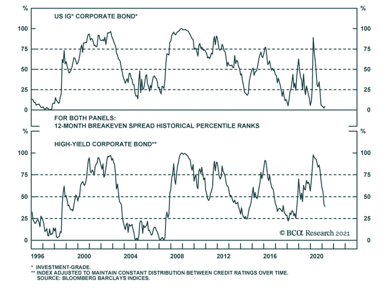
BCA Research’s Global Investment Strategy service still favor spread products over government bonds. Corporate spreads have narrowed substantially since last March. Nevertheless, in an environment of strong economic growth, it still makes sense to favor…
Highlights Duration: The Treasury market has moved quickly to price-in expectations of a strong economic recovery, while the Fed has been more cautious about moving its own rate forecasts. We think that the market’s expectations are well founded and that the Fed will eventually move its dots higher. Stick with below-benchmark portfolio duration. Corporate Bonds: Junk spreads already embed a significant decline in the default rate during the next 12 months, but reasonable assumptions for corporate debt growth and profit growth suggest that this outcome will be achieved. Investors should continue to favor spread product over Treasuries and continue to hold a down-in-quality bias within corporate credit. Economy: Disposable personal income fell in February compared to January, but it has risen massively since last year’s passage of the CARES act. The large pool of accumulated household savings will help drive economic growth as the pandemic recedes. Feature There is widespread anticipation that the economic recovery is about to kick into high gear. To us, this anticipation seems rather well founded. The United States’ vaccination roll-out is proceeding quickly and the federal government is pitching in with a tsunami of fiscal support. But it’s important to acknowledge that this positive outlook is still a forecast, one that has not yet been validated by hard economic data. The risk for investors is obvious. Market prices have already moved to price-in a significant amount of economic optimism and they are vulnerable in a situation where that optimism doesn’t pan out. In this week’s report we look at how much economic optimism is already discounted in both the Treasury and corporate bond markets. We conclude that the most likely scenario is one where the economic data are strong enough to validate current pricing in both markets. Investors should keep portfolio duration below-benchmark and continue to favor spread product over Treasuries, with a down-in-quality bias. Optimism In The Treasury Market The most obvious way to illustrate the economic optimism currently embedded in Treasury securities is to look at the rate hike expectations priced into the yield curve relative to the Fed’s own projections (Chart 1). The market is currently looking for four 25 basis point rate hikes by the end of 2023 while only seven out of 18 FOMC participants expect any hikes at all by then. Chart 1Market More Hawkish Than Fed
Market More Hawkish Than Fed
Market More Hawkish Than Fed
We addressed the wide divergence between market and FOMC expectations in last week’s report.1 We noted that the main reason for the divergence is that while the market is focused on expectations for rapid economic growth the Fed is making a concerted effort to rely only on hard economic data. This sentiment was echoed by Fed Governor Lael Brainard in a speech last week:2 The focus on achieved outcomes rather than the anticipated outlook is central to the Committee’s guidance regarding both asset purchases and the policy rate. The emphasis on outcomes rather than the outlook corresponds to the shift in our monetary policy approach that suggests policy should be patient rather than preemptive at this stage in the recovery. The upshot of the Fed’s excessively cautious approach is that its interest rate projections will move toward the market’s as the hard economic data strengthen during the next 6-12 months, keeping the bond bear market intact. As evidence for this view, consider that the US Economic Surprise Index remains at an extremely high level, consistent with a rising 10-year Treasury yield (Chart 2). Further, 12-month core inflation rates are poised to jump significantly during the next two months as the weak monthly prints from March and April 2020 fall out of the 12-month sample (Chart 3). Then, pipeline pressures in both the goods and service sectors will ensure that inflation remains relatively high for the balance of the year (Chart 3, bottom panel).3 Chart 2Data Surprises Remain Positive
Data Surprises Remain Positive
Data Surprises Remain Positive
Chart 3Inflation About To Jump
Inflation About To Jump
Inflation About To Jump
Finally, the hard economic data still do not reflect the truly massive amount of fiscal stimulus that is about to hit the US economy. Chart 4 illustrates how large last year’s fiscal stimulus was compared to what was seen during recent recessions, and this chart does not yet incorporate the recently passed $1.9 trillion American Rescue Plan (~8.7% of GDP) or the second infrastructure focused reconciliation bill that is likely to pass this fall. Our political strategists expect 2021’s second budget bill to be similar in size to the American Rescue Plan though tax hikes will also be included and, due to the infrastructure-focused nature of the bill, the spending will be more spread out over a number of years.4 Chart 4The Era Of Big Government Is Back
That Uneasy Feeling
That Uneasy Feeling
Bottom Line: The Treasury market has moved quickly to price-in expectations of a strong economic recovery, while the Fed has been more cautious about moving its own rate forecasts. We think that the market’s expectations are well founded and that the Fed will eventually move its dots higher. Stick with below-benchmark portfolio duration. Optimism In The Corporate Bond Market Chart 5What's Priced In Junk Spreads?
What's Priced In Junk Spreads?
What's Priced In Junk Spreads?
The way we assess the amount of economic optimism baked into the corporate bond market is to calculate the 12-month default rate that is implied by the current High-Yield Index spread (Chart 5). We need to make a few assumptions to do this. First, we assume that investors require an excess spread of at least 100 bps from the index after subtracting 12-month default losses. In past research, we’ve noted that High-Yield has a strong track record of outperforming duration-matched Treasuries when the realized excess spread is above 100 bps. High-Yield underperforms Treasuries more often than it outperforms when the realized excess spread is below 100 bps.5 Second, we must assume a recovery rate for defaulted bonds. The 12-month recovery rate tends to fluctuate between 20% and 60%, with higher levels seen when the default rate is low and lower levels when the default rate is high (Chart 5, bottom panel). For this week’s analysis, we assume a range of recovery rates, from 20% to 50%, though we expect the recovery rate to be closer to the top-end of that range during the next 12 months, given our expectations for a rapid economic recovery. With these assumptions in mind, we calculate that the High-Yield Index is fairly priced for a default rate between 2.8% and 4.5% for the next 12 months (Chart 5, panel 2). If the default rate falls into that range, or below, then we would expect High-Yield bonds (and corporate credit more generally) to outperform a duration-matched position in Treasuries. If the default rate comes in above 4.5%, then we would expect Treasuries to beat High-Yield. To figure out whether the default rate will meet the market’s expectations, we turn to a simple model of the 12-month speculative grade default rate that is based on nonfinancial corporate sector gross leverage (aka total debt over pre-tax profits) and C&I lending standards (Chart 6). If we make forecasts for nonfinancial corporate 12-month debt growth and pre-tax profit growth, we can let the model tell us what default rate to anticipate. Chart 6Default Rate Model
Default Rate Model
Default Rate Model
Debt Growth Expectations We expect corporate debt growth to be quite weak during the next 12 months (Chart 7). This is mainly because firms raised a huge amount of debt last spring when the Fed and federal government made it very attractive to do so. Now, we are emerging from a recession and the nonfinancial corporate sector already holds an elevated cash balance (Chart 7, bottom panel). Debt growth was also essentially zero during the past six months, and very low (or even negative) debt growth is a common occurrence right after a peak in the default rate (Chart 7, top 2 panels). It is true that the nonfinancial corporate sector’s Financing Gap – the difference between capital expenditures and retained earnings – is no longer negative (Chart 7, panel 3). But it is also not high enough to suggest that firms need to significantly add debt. Chart 7Debt Growth Will Be Slow
Debt Growth Will Be Slow
Debt Growth Will Be Slow
For our default rate calculations, we assume that corporate debt growth will be between 0% and 8% during the next 12 months. However, our sense is that it will be closer to 0% than to 8%. Profit Growth Expectations Chart 8Profit Growth Will Surge
Profit Growth Will Surge
Profit Growth Will Surge
Our expectation is that profit growth will surge during the next 12 months, as is the typical pattern when the economy emerges from recession. Year-over-year profit growth peaked at 62% in 2002 following the 2001 recession, and it peaked at 51% in 2010 coming out of the Global Financial Crisis (Chart 8). More specifically, if we model nonfinancial corporate sector pre-tax profit growth on real GDP and then assume 6.5% real GDP growth in 2021, in line with the Fed’s median forecast, then we get a forecast for 31% profit growth in 2021. If we use a higher real GDP growth forecast of 10%, in line with our US Political Strategy service's "maximum impact" scenario, then our model forecasts pre-tax profit growth of 40% for 2021.6 Default Rate Expectations Table 1 puts together different estimates for profit growth and debt growth and maps them to a range of 12-month default rate outcomes, as implied by our Default Rate Model. For example, profit growth of 30% and debt growth between 0% and 8% in 2021 maps to a 12-month default rate of between 3.2% and 3.8%. This falls comfortably within the range of 2.8% to 4.5% that is consistent with current market pricing. Table 1Default Rate Scenarios
That Uneasy Feeling
That Uneasy Feeling
In fact, for our model to output a default rate range that is higher than what is priced into junk spreads, we need to assume 2021 profit growth of 20% or less. This is quite far below the estimates we made above based on reasonable forecasts for real GDP. Bottom Line: Junk spreads already embed a significant decline in the default rate during the next 12 months, but reasonable assumptions for corporate debt growth and profit growth suggest that this outcome will be achieved. Investors should continue to favor spread product over Treasuries and continue to hold a down-in-quality bias within corporate credit. Economy: Household Income Update Last week’s personal income and spending report showed that disposable household income was lower in February than in January, a decline that is entirely attributable to the fact that the $600 checks to individuals that were part of the December stimulus bill were mostly delivered in January. These “Economic Impact Payments” totaled $138 billion in January and only $8 billion in February. This drop-off of $130 billion almost exactly matches the $128 billion monthly decline seen in disposable personal income. Consumer spending also fell in February compared to January, a result that likely owes a lot to February’s bad weather conditions, particularly the winter storm that caused much of Texas to lose power. Though spending has recovered a lot from last year’s lows, it remains significantly below its pre-COVID trend (Chart 9). In contrast to spending, disposable income has skyrocketed since the pandemic started last March. Chart 10 shows that disposable personal income has increased 8% in the 12 months since COVID struck compared to the 12 months prior. Moreover, it shows that the increase is entirely attributable to fiscal relief. Chart 9Households Have Excess ##br##Savings
Households Have Excess Savings
Households Have Excess Savings
Chart 10Disposable Personal Income Growth And Its Drivers
That Uneasy Feeling
That Uneasy Feeling
The result of below-trend spending and a surge in income is a big jump in the savings rate. The personal savings rate was 13.6% in February, well above its average pre-COVID level (Chart 9, panel 3), as it has been since the pandemic began. This consistently elevated savings rate has led to US households building up a $1.9 trillion buffer of excess savings compared to a pre-pandemic baseline (Chart 9, bottom panel). Perhaps the biggest question for economic growth is whether households will deploy this large pool of savings as the economy re-opens or whether they will continue to hoard it. In this regard, the individual checks that were part of last year’s CARES act are the most likely to be hoarded, as these checks were distributed to all Americans making less than $99,000. The income support provisions in this month’s American Rescue Plan are much more targeted. Only individuals making below $75,000 will receive a $1,400 check and the bill also includes expanded unemployment benefits and a large amount of aid for state & local governments. All in all, we anticipate that a substantial amount of household excess savings will be spent once the vaccination effort has made enough progress that people feel safe venturing out. This will lead to strong economic growth and higher inflation in the second half of 2021. Ryan Swift US Bond Strategist rswift@bcaresearch.com Footnotes 1 Please see US Bond Strategy Weekly Report, “The Fed Looks Backward While Markets Look Forward”, dated March 23, 2021, available at usbs.bcaresearch.com 2 https://www.federalreserve.gov/newsevents/speech/brainard20210323b.htm 3 For more details on our outlook for core inflation in 2021 please see US Bond Strategy Weekly Report, “Limit Rate Risk, Load Up On Credit”, dated March 16, 2021, available at usbs.bcaresearch.com 4 Please see US Political Strategy Second Quarter Outlook 2021, “From Stimulus To Structural Reform”, dated March 24, 2021, available at usps.bcaresearch.com 5 For more details on this excess spread analysis please see US Bond Strategy / Global Fixed Income Strategy Special Report, “Trading The US Corporate Bond Market In A Time Of Crisis”, dated March 31, 2020, available at usbs.bcaresearch.com 6 The "maximum impact" scenario assumes that the full amount of authorized outlays from the American Rescue Plan will be spent, with 60% of the outlays spent in FY2021. For more details see US Political Strategy Second Quarter Outlook 2021, “From Stimulus To Structural Reform”, dated March 24, 2021, available at usps.bcaresearch.com Fixed Income Sector Performance Recommended Portfolio Specification
Dear Client, We are sending you our Strategy Outlook today, where we outline our thoughts on the macro landscape and the direction of financial markets for the rest of 2021 and beyond. Next week, please join me for a webcast on Thursday, April 1 at 10:00 AM EDT (3:00 PM BST, 4:00 PM CEST, 10:00 PM HKT) where I will discuss the outlook. Best regards, Peter Berezin, Chief Global Strategist Highlights Growth outlook: The global economy will rebound over the course of the year, with momentum rotating from the US to the rest of the world. Inflation: Structurally higher inflation is not a near-term risk, even in the US, but could become a major problem by the middle of the decade. Global asset allocation: Investors should continue to overweight equities on a 12-month horizon. Unlike in the year 2000, the equity earnings yield is still well above the bond yield. Equities: Value stocks will maintain their recent outperformance. Investors should favor banks and economically-sensitive cyclical sectors, while overweighting stock markets outside the US. Fixed income: Continue to maintain below average interest-rate duration exposure. Spread product will outperform safe government bonds. Favor inflation-protected securities over nominal bonds. Currencies: While the dollar could strengthen in the near term, it will weaken over a 12-month period. Large budget deficits, a deteriorating balance of payments profile, and an accommodative Fed are all dollar bearish. Commodities: Tight supply conditions and a cyclical recovery in oil demand will support crude prices. Strong Chinese growth will continue to buoy the metals complex. I. Macroeconomic Outlook Global Growth: The US Leads The Way… For Now The global economy should rebound from the pandemic over the remainder of the year. So far, however, it has been a two-speed recovery. Whereas the Bloomberg consensus has US real GDP growing by 4.8% in the first quarter, analysts expect the economies in the Euro area, UK, and Japan to contract by 3.6%, 13.3%, and 5%, respectively. Chart 1Dismantling Of Lockdown Measures Occurring At Varying Pace
Second Quarter 2021 Strategy Outlook: Inflation Cometh?
Second Quarter 2021 Strategy Outlook: Inflation Cometh?
Chart 2US Is Among The Vaccination Leaders
US Is Among The Vaccination Leaders
US Is Among The Vaccination Leaders
Two things explain US growth outperformance. First, the successful launch of the US vaccination campaign has allowed state governments to begin dismantling lockdown measures (Chart 1). Currently, the US has administered 40 vaccine shots for every 100 inhabitants. Among the major economies, only the UK has performed better on the vaccination front (Chart 2). In contrast, parts of continental Europe are still battling a new wave of Covid infections, prompting policymakers there to further tighten social distancing rules. Second, US fiscal policy has been more stimulative than elsewhere (Chart 3). On March 11, President Biden signed the $1.9 trillion American Rescue Plan Act into law. Among other things, the Act provides direct payments to lower- and middle-class households, extends and expands unemployment benefits, and offers aid to state and local governments (Chart 4). Unlike President Trump’s Tax Cuts and Jobs Act, the Democrats’ legislation will raise the incomes of the poor much more than the rich (Chart 5). Chart 3The US Tops The Stimulus Race
Second Quarter 2021 Strategy Outlook: Inflation Cometh?
Second Quarter 2021 Strategy Outlook: Inflation Cometh?
We expect growth leadership to shift from the US to the rest of the world in the second half of the year. Nevertheless, US real GDP in Q4 of 2021 will probably end up 7% above the level of Q4 of 2020, enough to close the output gap. In Section II of this report, we discuss whether this could cause inflation to take off on a sustained basis. We conclude that such an outcome is unlikely for the next two years. However, materially higher inflation is indeed a risk over a longer-term horizon. Chart 4Composition Of The American Rescue Plan Act
Second Quarter 2021 Strategy Outlook: Inflation Cometh?
Second Quarter 2021 Strategy Outlook: Inflation Cometh?
Chart 5Biden’s Package Will Boost The Income Of The Poor More Than The Rich
Second Quarter 2021 Strategy Outlook: Inflation Cometh?
Second Quarter 2021 Strategy Outlook: Inflation Cometh?
The EU: Recovery After Lockdown The EU will benefit from a cyclical recovery later this year as the vaccination campaign picks up steam. The recent weakness in Europe was concentrated in services (Chart 6). The latest European PMI data shows that the service sector may have turned the corner. As in the US, European households have accumulated significant excess savings. The unleashing of pent-up demand should drive consumption over the remainder of the year (Chart 7). Chart 6For Now, The Service Sector Is Doing Better In The US Than The Euro Area
Second Quarter 2021 Strategy Outlook: Inflation Cometh?
Second Quarter 2021 Strategy Outlook: Inflation Cometh?
Chart 7European Households Have Accumulated Excess Savings
European Households Have Accumulated Excess Savings
European Households Have Accumulated Excess Savings
Meanwhile, the manufacturing sector continues to do well, with the Euro area manufacturing PMI hitting all-time highs in March. Sentiment indices such as the Sentix and ZEW surveys point to further upside for manufacturing activity (Chart 8). Chart 8Positive Outlook For Euro Area Manufacturing Activity
Positive Outlook For Euro Area Manufacturing Activity
Positive Outlook For Euro Area Manufacturing Activity
Fiscal policy should also turn modestly more expansionary. The EU recovery fund will begin disbursing aid in the second quarter. This should allow the southern European economies to maintain more generous levels of fiscal support. It also looks increasingly likely that the Green Party will either lead or join the coalition government in Germany, which could translate into greater spending. UK: Recovering From A One-Two Punch The UK had to shutter its economy late last year due to the emergence of a new, more contagious, strain of the virus. The resulting hit to the economy came on top of a decline in exports to the EU following Brexit. The economic picture will improve over the coming months. Thanks to the speedy vaccination campaign, the government plans to lift the “stay at home” rules on March 29. Most retail, dining, and hospitality businesses are scheduled to reopen on April 12. A strong housing market and the extension of both the furlough schemes and tax holidays should also sustain demand. Japan: More Fiscal Support Needed Like many other countries, Japan had to introduce new lockdown measures in late 2020 after suffering its worst wave of the pandemic. While the number of new cases has dropped dramatically since then, they have edged up again over the past two weeks. Japanese regulations require that vaccines be tested on Japanese people. Prime Minster Yoshihide Suga has promised that vaccine shots will be available to the country’s 36 million seniors by the end of June. However, with less than 1% of the population vaccinated so far, strict social distancing will persist well into the summer. The Japanese government passed a JPY 73 trillion (13.5% of GDP) supplementary budget in December. However, only 40 trillion of that has been allocated for direct spending. Due to negative bond yields, the Japanese government earns more interest than it pays on its debt. It should be running much more expansionary fiscal policy. China: Policy Normalization, Not Deleveraging Chart 9China: Tailwind For Easier Monetary And Fiscal Policies Will Fade Over The Remainder Of The Year
China: Tailwind For Easier Monetary And Fiscal Policies Will Fade Over The Remainder Of The Year
China: Tailwind For Easier Monetary And Fiscal Policies Will Fade Over The Remainder Of The Year
China’s combined credit/fiscal impulse peaked late last year (Chart 9). The impulse leads growth by about six months, implying that the tailwind from easier monetary and fiscal policies will fade over the rest of the year. Nevertheless, we doubt that China’s economy will experience much of a slowdown. First and foremost, the shock from the pandemic should fade, helping to revive consumer and business confidence. Second, the Chinese authorities are likely to pursue policy normalization, rather than outright deleveraging. Jing Sima, BCA’s chief China strategist, expects the general government deficit to remain broadly stable at 8% of GDP this year. She also thinks that the rate of credit expansion will fall by only 2-to-3 percentage points in 2021, bringing credit growth back in line with projected nominal GDP growth of 8%. Total credit was 290% of GDP at end-2020. Thus, credit growth of 8% would still generate 290%*8%=23% of GDP of net credit formation, providing more than enough support to the economy. II. Feature: Will The US Economy Overheat? As of February, US households were sitting on around $1.7 trillion in excess savings. About two-thirds of those savings can be chalked up to reduced spending during the pandemic, with the remaining one-third arising from increased transfer payments (Chart 10). The recently passed stimulus bill will boost household savings by an additional $300 billion, bringing the stock of excess savings to $2 trillion by April. This cash hoard will support spending. Already, real-time measures of economic activity have hooked up. Traffic congestion in many US cities is approaching pre-pandemic levels. OpenTable’s measure of restaurant occupancy is progressing back to where it was before the pandemic (Chart 11). J.P. Morgan reported that spending using its credit cards rose 23% year-over-year in the 9-day period through to March 19 as stimulus payments reached bank accounts. Anecdotally, airlines and cruise line companies have been expressing optimism on the back of a surge in bookings. Chart 10Lower Spending And Higher Income Led To Mounting Excess Savings
Lower Spending And Higher Income Led To Mounting Excess Savings
Lower Spending And Higher Income Led To Mounting Excess Savings
Chart 11Real-Time Measures Of Economic Activity Have Hooked Up
Second Quarter 2021 Strategy Outlook: Inflation Cometh?
Second Quarter 2021 Strategy Outlook: Inflation Cometh?
Meanwhile, the supply side of the economy could face temporary constraints. Under the stimulus bill, close to half of jobless workers will receive more income through to September from extended unemployment benefits than they did from working. This could curtail labor supply at a time when firms are trying to step up the pace of hiring. The Fed Versus The Markets In the latest Summary of Economic Projections released last week, the median “dot” for the fed funds rate remained stuck at zero through to end-2023. The bond market, in contrast, expects the Fed to start raising rates next year. Why is there a gap between the Fed and market expectations? Part of the answer is that the “dots” and market expectations measure different things. Whereas the dots reflect a modal, or “most likely” estimate of where short-term rates will be over the next few years, market expectations reflect a probability-weighted average. The fact that rates cannot fall deeply into negative territory – but can potentially rise a lot in a high-inflation scenario – has skewed market rate expectations to the upside. That said, there is another, more fundamental, reason at work: The Fed simply does not think that a negative output gap will lead to materially higher inflation. The “dots” assume that core PCE inflation will barely rise above 2% over the next two years, even though, by the Fed’s own admission, the unemployment rate will fall firmly below NAIRU in 2023 (Chart 12). Chart 12The Fed Sees Faster Recovery, Same Rate Path
Second Quarter 2021 Strategy Outlook: Inflation Cometh?
Second Quarter 2021 Strategy Outlook: Inflation Cometh?
Chart 13Just Like It Did In 2011, The Fed Will Disregard What It Sees As Transitory Price Shocks
Just Like It Did In 2011, The Fed Will Disregard What It Sees As Transitory Price Shocks
Just Like It Did In 2011, The Fed Will Disregard What It Sees As Transitory Price Shocks
Is the Federal Reserve’s relaxed view towards inflation risk justified? The Fed knows full well that headline inflation could temporarily reach 4% over the next two months due to base effects from last year’s deflationary shock, lingering supply chain disruptions, the rebound in gasoline prices, and the lagged effect from dollar weakness. However, as it did in late 2011, when headline inflation nearly hit 4% and producer price inflation briefly topped 10%, the Fed is inclined to regard these price shocks as transitory (Chart 13). The Fed believes that PCE inflation will tick up to 2.4% this year but then settle back down to 2% by the end of next year as supply disruptions dissipate and most fiscal stimulus measures roll off. Our bet is that the Fed will be right about inflation in the near term, but wrong in the long term. That is to say, we think that core inflation will probably remain subdued for the next two years, as the Fed expects. However, inflation is poised to rise significantly towards the middle of the decade, an outcome that is likely to surprise both the Fed and market participants. War-Time Inflation, But Which War? In some respects, the Fed sees the current environment as resembling a war, except this time the battle is against an invisible enemy: Covid-19. Chart 14 shows what happened to US inflation during WWI, WWII, the Korean War, and the Vietnam War. In the first three of those four wars, inflation rose but then fell back down after the war had concluded. That is what the Fed is counting on. What about the possibility that the coming years could resemble the period around the Vietnam War, where inflation continued to rise even though the number of US military personnel engaged in the conflict peaked in 1968? Chart 14Inflation During Wartime: Which War Is Most Relevant For Today?
Inflation During Wartime: Which War Is Most Relevant For Today?
Inflation During Wartime: Which War Is Most Relevant For Today?
Chart 15Inflation Started Accelerating Quickly Only When Unemployment Reached Very Low Levels In The 1960s
Inflation Started Accelerating Quickly Only When Unemployment Reached Very Low Levels In The 1960s
Inflation Started Accelerating Quickly Only When Unemployment Reached Very Low Levels In The 1960s
In the near term, this does not appear to be a major risk. In 1966, when the war effort was ramping up, the US unemployment rate was two percentage points below NAIRU (Chart 15). As of February, US employment was still more than 5% below pre-pandemic levels. Chart 16Employment Has Been Weak And Edging Lower At The Bottom Quartile Of The Wage Distribution
Second Quarter 2021 Strategy Outlook: Inflation Cometh?
Second Quarter 2021 Strategy Outlook: Inflation Cometh?
We estimate that the US output gap currently stands at around 5%-to-6% of GDP. Among the bottom quartile of the wage distribution, employment is 20% below pre-pandemic levels, and has been edging lower, not higher, since last October (Chart 16). Thus, for now, hyperbolic talk of how fiscal stimulus is crowding out private-sector spending is unwarranted. Inflation Nation Looking further out, the parallels between today and the late sixties are more striking. As we discussed in a report titled 1970s-Style Inflation: Yes, It Could Happen Again, much of what investors believe about how inflation emerged during the late 1960s is either based on myths, or at best, half-truths. To the extent that there are differences between today and that era, they don’t necessarily point to lower inflation in the coming years. For example, in the late sixties, the baby boomers were entering the labour force, supplying the economy with a steady stream of new workers. This helped to temper wage pressures. Today, baby boomers are leaving the labour force. They accumulated a lot of wealth over the past 50 years – so much so that they now control more than half of all US wealth (Chart 17). Over the coming two decades, they will run down that wealth, implying that household savings rates could drop. By definition, a lower savings rate implies more spending in relation to output, which is inflationary. Chart 17Baby Boomers Have Accumulated A Lot Of Wealth
Second Quarter 2021 Strategy Outlook: Inflation Cometh?
Second Quarter 2021 Strategy Outlook: Inflation Cometh?
III. Financial Markets A. Portfolio Strategy Overweight Stocks Versus Bonds Stocks usually outperform bonds when economic growth is strong and money is cheap (Chart 18). The end of the pandemic and ongoing fiscal stimulus should support growth over the next 12-to-18 months, allowing the bull market in equities to continue. With inflation slow to rise, monetary policy will remain accommodative over this period. Chart 18AStocks Usually Outperform Bonds When Economic Growth Is Strong...
Stocks Usually Outperform Bonds When Economic Growth Is Strong...
Stocks Usually Outperform Bonds When Economic Growth Is Strong...
Chart 18B... And Money Is Cheap
... And Money Is Cheap
... And Money Is Cheap
The recent back-up in long-term bond yields could destabilize stocks for a month or two. However, our research has shown that as long as bond yields do not rise enough to trigger a recession, stocks will shrug off the effect of higher yields (Chart 19 and Table 1). Indeed, there is a self-limiting aspect to how high bond yields can rise, and stocks can fall, in a setting where inflation remains subdued. Higher bond yields lead to tighter financial conditions. Tighter financial conditions, in turn, lead to weaker growth, which justifies an even longer period of low rates. It is only when inflation rises to a level that central banks find uncomfortable that tighter financial conditions become desirable. We are far from that level today. Chart 19What Happens To Equities When Treasury Yields Rise?
What Happens To Equities When Treasury Yields Rise?
What Happens To Equities When Treasury Yields Rise?
Table 1As Long As Bond Yields Don’t Rise Into Restrictive Territory, Stocks Will Recover
Second Quarter 2021 Strategy Outlook: Inflation Cometh?
Second Quarter 2021 Strategy Outlook: Inflation Cometh?
It’s Not 2000 In recent months, many analysts have drawn comparisons between the year 2000 and the present day. While there are plenty of similarities, ranging from euphoric retail participation to the proliferation of dubious SPACs and IPOs, there is one critical difference: The forward earnings yield today is above the real bond yield, whereas in 2000 the earnings yield was below the bond yield (Chart 20). The US yield curve inverted in February 2000, with the 10-year Treasury yield peaking a month earlier at 6.79%. An inverted yield curve is one of the most reliable recession predictors. We are a far cry from such a predicament today. By the same token, the S&P 500 dividend yield was well below the bond yield in 2000. Today, they are roughly the same. Even if one were to pessimistically assume that US companies are unable to raise nominal dividend payments at all for the next decade, the S&P 500 would need to fall by 20% in real terms for equities to underperform bonds. Many other stock markets would have to decline by an even greater magnitude (Chart 21). Chart 20Relative To Bonds, Stocks Are More Favorably Valued Now Than In 2000
Relative To Bonds, Stocks Are More Favorably Valued Now Than In 2000
Relative To Bonds, Stocks Are More Favorably Valued Now Than In 2000
Chart 21Stocks Would Need To Fall A Lot For Equities To Underperform Bonds
Stocks Would Need To Fall A Lot For Equities To Underperform Bonds
Stocks Would Need To Fall A Lot For Equities To Underperform Bonds
Protecting Against Long-Term Inflation Risk The bull market in stocks will end when central banks begin to fret over rising inflation. In the past, central banks have used forecasts of inflation to decide when to raise rates. The Federal Reserve’s revised monetary policy framework, which focuses on actual rather than forecasted inflation, almost guarantees that inflation will overshoot the Fed’s target. This is because monetary policy fully affects the economy with a lag of 12-to-18 months. By the time the Fed decides to clamp down on inflation, it will have already gotten too high. Investors looking to hedge long-term inflation risk should reduce duration exposure in fixed-income portfolios, favor inflation-protected securities over nominal bonds, and own more “real assets” such as property. In fact, one of the best inflation hedges is simply to buy a nice house financed with a high loan-to-value fixed-rate mortgage. In a few decades, you will still own the nice house, but the value of the mortgage will be greatly reduced in real terms. Gold Versus Cryptos Historically, gold has offered protection against inflation. Increasingly, many investors have come to believe that cryptocurrencies are a better choice. We disagree. As we recently discussed in a report titled Bitcoin: A Solution In Search Of A Problem, not only are cryptocurrencies such as Bitcoin highly inefficient mediums of exchange, they are also likely to turn out to be poor stores of value. Bitcoin’s annual electricity consumption now exceeds that of Pakistan and its 217 million inhabitants (Chart 22). About 70% of Bitcoin mining currently takes place in China, mainly using electricity generated by burning coal. Much of the rest of the mining takes place in countries such as Russia and Belarus with dubious governance records. Bitcoin and ESG are heading for a clash. We suspect ESG will win out. Chart 22Bitcoin Is Not Your Eco-Currency
Second Quarter 2021 Strategy Outlook: Inflation Cometh?
Second Quarter 2021 Strategy Outlook: Inflation Cometh?
B. Equities Favor Cyclicals, Value, And Non-US Stocks Chart 23Cyclicals And Ex-US Stocks Do Best When Global Growth Is On The Upswing
Cyclicals And Ex-US Stocks Do Best When Global Growth Is On The Upswing
Cyclicals And Ex-US Stocks Do Best When Global Growth Is On The Upswing
The vast majority of stock market capitalization today is concentrated in large multinational companies that are more leveraged to global growth rather than to the growth rate of countries in which they happen to be domiciled. Thus, while country-specific factors are not irrelevant, regional equity allocation often boils down to figuring out which stock markets will gain or lose from various global trends. The end of the pandemic will prop up global growth. In general, cyclical sectors outperform when global growth is on the upswing (Chart 23). As Table 2 illustrates, stock markets outside the US have more exposure to classically cyclical sectors such as industrials, energy, materials, and consumer discretionary that usually shine coming out of a downturn. This leads us to favor Europe, Japan, and emerging markets. We place banks in the cyclical category because faster economic growth tends to reduce bad loans, while also placing upward pressure on bond yields. Chart 24 shows that there is a very close correlation between the relative performance of bank shares and long-term bond yields. As government yields trend higher, banks will benefit. Table 2Financials Are Overrepresented In Ex-US Indices, While Tech Dominates The US Market
Second Quarter 2021 Strategy Outlook: Inflation Cometh?
Second Quarter 2021 Strategy Outlook: Inflation Cometh?
Chart 24Close Correlation Between Relative Performance Of Banks And Long-Term Bond Yields
Close Correlation Between Relative Performance Of Banks And Long-Term Bond Yields
Close Correlation Between Relative Performance Of Banks And Long-Term Bond Yields
Banks and most other cyclical sectors dominate value indices (Table 3). Not only is value still exceptionally cheap in relation to growth, but traditional value sectors have seen stronger upward earnings revisions than tech stocks since the start of the year (Chart 25). The likelihood that global bond yields put in a secular bottom last year, coupled with the emergence of a new bull market in commodities, makes us think that the nascent outperformance of value stocks has years to run. Table 3Breaking Down Growth And Value By Sector
Second Quarter 2021 Strategy Outlook: Inflation Cometh?
Second Quarter 2021 Strategy Outlook: Inflation Cometh?
Chart 25AValue Is Attractive On Multiple Levels (I)
Value Is Attractive On Multiple Levels (I)
Value Is Attractive On Multiple Levels (I)
Chart 25BValue Is Attractive On Multiple Levels (II)
Value Is Attractive On Multiple Levels (II)
Value Is Attractive On Multiple Levels (II)
US Corporate Tax Hikes Coming Finally, there is one country-specific factor worth mentioning, which reinforces our view of favoring non-US, cyclical, and value stocks: US corporate taxes are heading higher. BCA’s geopolitical strategists expect the Biden Administration and the Democrat-controlled Congress to raise the statutory corporate tax rate from 21% to as high as 28% later this year in order to fund, among other things, a major infrastructure investment program. Capital gains taxes will also rise. While tax hikes are unlikely to bring down the whole US stock market, they will detract from the relative performance of US stocks compared with their international peers. Cyclical sectors will benefit from the infrastructure spending. To the extent that such spending boosts growth and leads to a steeper yield curve, it should also benefit banks. In contrast, tech companies outside the clean energy sector will lag, especially if the bill introduces a minimum corporate tax on book income and raises taxes on overseas profits, as President Biden pledged to do during his campaign. C. Fixed Income Expect More US Curve Steepening As discussed above, inflation in the US and elsewhere will be slow to take off. However, when inflation does rise later this decade, it could do so significantly. Investors currently expect the Fed to start raising rates in December 2022, bringing the funds rate to 1.5% by the end of 2024 (Chart 26). In contrast, we think that a liftoff in the second half of 2023, preceded by a 6-to-12 month period of asset purchase tapering, is more likely. This implies a modest downside for short-dated US bond yields. Chart 26The Market Sees The Fed Rate Hike Cycle Kicking Off In Late 2022
The Market Sees The Fed Rate Hike Cycle Kicking Off In Late 2022
The Market Sees The Fed Rate Hike Cycle Kicking Off In Late 2022
Chart 27Long-Term US Real Yield Expectations Have Recovered But Remain Below Pre-Pandemic Levels
Long-Term US Real Yield Expectations Have Recovered But Remain Below Pre-Pandemic Levels
Long-Term US Real Yield Expectations Have Recovered But Remain Below Pre-Pandemic Levels
In contrast, long-term yields will face upward pressure first from strong growth, and later from higher inflation. The 5-year/5-year forward TIPS yield currently stands at 0.35%, which is still below pre-pandemic levels (Chart 27). Given structurally looser fiscal policy, the 5-year/5-year forward TIPS yield should be at least 50 basis points higher, which would translate into a 10-year Treasury yield of a bit over 2%. Regional Bond Allocation While the Fed will be slow out of the gate to raise rates, most other central banks will be even slower. The sole exception among developed market central banks is the Norges bank, which has indicated its intention to hike rates in the second half of this year. Conceivably, Canada could start tightening monetary policy fairly soon, given strong jobs growth and a bubbly housing market. While the Bank of Canada is eager to begin tapering asset purchases later this year, our global fixed-income strategists suspect that the BoC will wait for the Fed to raise rates first. An early start to rate hikes by the Bank of Canada could significantly push up the value of the loonie, which is something the BoC wants to avoid. New Zealand will also hike rates shortly after the Fed, followed by Australia. Bank of England governor Andrew Bailey has downplayed the recent rise in gilt yields. Nevertheless, the desire to maintain currency competitiveness in the post-Brexit era will prevent the BoE from hiking rates until 2024. Among the major central banks, the ECB and the BoJ will be the last major central banks to raise rates. Putting it all together, our fixed-income strategists advocate maintaining a below-benchmark stance on overall duration. Comparing the likely path for rate hikes with market pricing region by region, they recommend overweighting the Euro area and Japan, assigning a neutral allocation to the UK, Canada, Australia, and New Zealand, and an underweight on the US. Credit: Stick With US High Yield Corporates Corporate spreads have narrowed substantially since last March. Nevertheless, in an environment of strong economic growth, it still makes sense to favor riskier corporate credit over safe government bonds. Within corporate credit, we favor high yield over investment grade. Geographically, we prefer US corporate bonds over Euro area bonds. The former trade with a higher yield and spread than the latter (Chart 28). CHART 28Favor High-Yield Bonds Over Investment-Grade And US Corporates Over Euro Area (I)
Favor High-Yield Bonds Over Investment-Grade And US Corporates Over Euro Area (I)
Favor High-Yield Bonds Over Investment-Grade And US Corporates Over Euro Area (I)
Chart 28Favor High-Yield Bonds Over Investment-Grade And US Corporates Over Euro Area (II)
Favor High-Yield Bonds Over Investment-Grade And US Corporates Over Euro Area (II)
Favor High-Yield Bonds Over Investment-Grade And US Corporates Over Euro Area (II)
One way to gauge the attractiveness of credit is to look at the percentile rankings of 12-month breakeven spreads. The 12-month breakeven spread is the amount of credit spread widening that can occur before a credit-sensitive asset starts to underperform a duration-matched, risk-free government bond over a one-year horizon. For US investment-grade corporates, the breakeven spread is currently in the bottom decile of its historic range, which is rather unattractive from a risk-adjusted perspective. In contrast, the US high-yield breakeven spread is currently in the middle of the distribution. In the UK, high-yield debt is more appealing than investment grade, although not quite to the same extent as in the US. In the Euro area, both high-yield and investment-grade credit are fairly unattractive (Chart 29). Chart 29US High-Yield Stands Out The Most
Second Quarter 2021 Strategy Outlook: Inflation Cometh?
Second Quarter 2021 Strategy Outlook: Inflation Cometh?
D. Currencies Faster US Growth Should Support The Dollar In The Near Term… Chart 30US Has A Smaller Share Of Manufacturing Than Most Other Developed Economies
US Has A Smaller Share Of Manufacturing Than Most Other Developed Economies
US Has A Smaller Share Of Manufacturing Than Most Other Developed Economies
The US has a “low beta” economy. Compared to most other economies, the US has a bigger service sector and a smaller manufacturing base (Chart 30). The US economy is also highly diversified on both a regional and sectoral level. This tends to make US growth less volatile than growth abroad. The relatively low cyclicality of the US economy has important implications for the US dollar. While the US benefits from stronger global growth, the rest of the world usually benefits even more. Thus, when global growth accelerates, capital tends to flow from the US to other economies, dragging down the value of the dollar. This relationship broke down this year. Rather than lagging other economies, the US economy has led the charge thanks to bountiful fiscal stimulus and a successful vaccination campaign. As growth estimates for the US have been marked up, the dollar has caught a temporary bid (Chart 31). Chart 31US Growth Outperformance Could Be A Near-Term Tailwind For The Dollar
US Growth Outperformance Could Be A Near-Term Tailwind For The Dollar
US Growth Outperformance Could Be A Near-Term Tailwind For The Dollar
… But Underlying Fundamentals Are Dollar Bearish As discussed earlier in the report, growth momentum should swing back towards the rest of the world later this year. This should weigh on the dollar in the second half of the year. To make matters worse for the greenback, the US trade deficit has ballooned in recent quarters. The current account deficit, a broad measure of net foreign income flows, rose by nearly 35% to $647 billion in 2020. At 3.1% of GDP, it was the largest shortfall in 12 years (Chart 32). Consistent with the weak balance of payments picture, the dollar remains overvalued by about 10% on a purchasing power parity basis (Chart 33). Chart 32The Widening US External Gap
The Widening US External Gap
The Widening US External Gap
Chart 33The Dollar Is Expensive Based On Its PPP Fair Value
The Dollar Is Expensive Based On Its PPP Fair Value
The Dollar Is Expensive Based On Its PPP Fair Value
Historically, the dollar has weakened whenever fiscal policy has been eased in excess of what is needed to close the output gap (Chart 34). Foreigners have been net sellers of Treasurys this year. It is equity inflows that have supported the dollar (Chart 35). However, if non-US stock markets begin to outperform, foreign flows into US stocks could reverse. Chart 34The Greenback Tends To Weaken When Fiscal Policy Is Eased Relative To What The Economy Needs
The Greenback Tends To Weaken When Fiscal Policy Is Eased Relative To What The Economy Needs
The Greenback Tends To Weaken When Fiscal Policy Is Eased Relative To What The Economy Needs
Chart 35Equity Inflows Supported The Dollar This Year (I)
Equity Inflows Supported The Dollar This Year (I)
Equity Inflows Supported The Dollar This Year (I)
Chart 35Equity Inflows Supported The Dollar This Year (II)
Equity Inflows Supported The Dollar This Year (II)
Equity Inflows Supported The Dollar This Year (II)
Meanwhile, stronger US growth has pushed long-term real interest rate differentials only modestly in favor of the US. At the short end of the curve, real rate differentials have actually widened against the US since the start of the year, reflecting rising US inflation expectations and the Fed’s determination to keep rates near zero for an extended period of time (Chart 36). Chart 36Real Rate Differentials Have Moved In Favor Of The Dollar At The Long End Of The Curve, But Not At The Short End (I)
Real Rate Differentials Have Moved In Favor Of The Dollar At The Long End Of The Curve, But Not At The Short End (I)
Real Rate Differentials Have Moved In Favor Of The Dollar At The Long End Of The Curve, But Not At The Short End (I)
Chart 36Real Rate Differentials Have Moved In Favor Of The Dollar At The Long End Of The Curve, But Not At The Short End (II)
Real Rate Differentials Have Moved In Favor Of The Dollar At The Long End Of The Curve, But Not At The Short End (II)
Real Rate Differentials Have Moved In Favor Of The Dollar At The Long End Of The Curve, But Not At The Short End (II)
On balance, while the dollar could strengthen a bit more over the next month or so, the greenback will weaken over a 12-month horizon. Chester Ntonifor, BCA’s chief currency strategist, expects the dollar to fall the most against the Norwegian krone, Swedish krona, Australian dollar, and British pound over a 12-month horizon. In the EM space, stronger global growth will disproportionately benefit the Mexican peso, Chilean peso, Colombian peso, South African rand, Czech koruna, Indonesian rupiah, Korean won, and Singapore dollar. Chart 37Weak Dollar Is Usually A Tailwind For Cyclicals, Non-US Stocks, And Value Stocks (I)
Weak Dollar Is Usually A Tailwind For Cyclicals, Non-US Stocks, And Value Stocks (I)
Weak Dollar Is Usually A Tailwind For Cyclicals, Non-US Stocks, And Value Stocks (I)
Chart 37Weak Dollar Is Usually A Tailwind For Cyclicals, Non-US Stocks, And Value Stocks (II)
Weak Dollar Is Usually A Tailwind For Cyclicals, Non-US Stocks, And Value Stocks (II)
Weak Dollar Is Usually A Tailwind For Cyclicals, Non-US Stocks, And Value Stocks (II)
Consistent with our equity views, a weaker dollar would be good news for cyclical equity sectors, non-US stock markets, and value stocks (Chart 37). E. Commodities Favorable Outlook For Commodities Strong global growth against a backdrop of tight supply should sustain momentum in the commodity complex over the next 12-to-18 months. Capital investment in the oil and gas sector has fallen by more than 50% since 2014 (Chart 38). BCA’s Commodity & Energy Strategy service, led by Robert Ryan, expects annual growth in crude oil demand to outstrip supply over the remainder of this year (Chart 39). Chart 38Oil & Gas Capex Collapses In COVID-19’s Wake
Second Quarter 2021 Strategy Outlook: Inflation Cometh?
Second Quarter 2021 Strategy Outlook: Inflation Cometh?
Chart 39Crude Oil Demand Growth To Outstrip Supply Over The Remainder Of This Year
Crude Oil Demand Growth To Outstrip Supply Over The Remainder Of This Year
Crude Oil Demand Growth To Outstrip Supply Over The Remainder Of This Year
A physical deficit in the metals markets – particularly for copper and aluminum – should also persist this year (Chart 40). While the boom in electric vehicle (EV) production represents a long-term threat to oil, it is manna from heaven for many metals. A battery-powered EV can contain more than 180 pounds of copper compared with 50 pounds for conventional autos. By 2030, the demand from EVs alone should amount to close to 4mm tonnes of copper per year, representing about 15% of annual copper production. Chart 40ACopper Will Be In Physical Deficit...
Copper Will Be In Physical Deficit...
Copper Will Be In Physical Deficit...
Chart 40B...As Will Aluminum
...As Will Aluminum
...As Will Aluminum
China’s Commodity Demand Will Remain Strong Chart 41China Keeps Buying More And More Commodities
China Keeps Buying More And More Commodities
China Keeps Buying More And More Commodities
Strong demand for metals from China should also buoy metals prices. While trend GDP growth in China has slowed, the economy is much bigger in absolute terms than it was in the 2000s. China’s annual aggregate consumption of metals is five times as high as it was back then. The incremental increase in China’s metal consumption, as measured by the volume of commodities consumed, is also double what it was 20 years ago (Chart 41). As we discussed in our report To Deleverage Its Economy, China Needs MORE Debt, the Chinese government has no choice but to continue to recycle persistently elevated household savings into commodity-intensive capital investment. This will ensure ample commodity demand from China for years to come. Peter Berezin Chief Global Strategist pberezin@bcaresearch.com Global Investment Strategy View Matrix
Second Quarter 2021 Strategy Outlook: Inflation Cometh?
Second Quarter 2021 Strategy Outlook: Inflation Cometh?
Special Trade Recommendations
Second Quarter 2021 Strategy Outlook: Inflation Cometh?
Second Quarter 2021 Strategy Outlook: Inflation Cometh?
Current MacroQuant Model Scores
Second Quarter 2021 Strategy Outlook: Inflation Cometh?
Second Quarter 2021 Strategy Outlook: Inflation Cometh?
Highlights Fiscal stimulus is no longer a free lunch. US mortgage applications are down by 20 percent since the start of February. With rising bond yields now starting to choke private sector borrowing, bond yields are nearing an upper-limit, and even a reversal point. In which case, the tide out of defensives into cyclicals, and growth into value, will be a tide that reverses. New 6-month recommendation: underweight US banks (XLF) versus consumer staples (XLP). Fractal trade shortlist: US banks, bitcoin, ether, and GBP/JPY. Feature Chart of the WeekMortgage Applications Are Down 20 Percent
Mortgage Applications Are Down 20 Percent
Mortgage Applications Are Down 20 Percent
Why would anybody not get excited about trillions of dollars of fiscal stimulus? The two word answer is: crowding out. If a dollar that is borrowed and spent by the government (or even forecast to be borrowed and spent by the government) pushes up the bond yield, it makes it more expensive for the private sector to borrow and spend. If, as a result, the private sector scales back its borrowing by a dollar, the dollar of government spending has crowded out a dollar of private sector spending. In this case, fiscal stimulus will have no impact on GDP. The fiscal multiplier will be zero. Under some circumstances though, fiscal stimulus does not crowd out the private sector and the fiscal multiplier is extremely high. 2020 was the perfect case in point. As the pandemic gripped the world, much of the private sector was on its knees. Or to be more precise, in lockdown at home, doing nothing, receiving no income, and unwilling and unable to borrow. In such a crisis, the government became the ‘borrower of last resort’. It could, and had to, borrow at will to replace the private sector’s lost income and thereby to stabilise the collapse in demand. With no competition from private sector borrowers for the glut of excess savings, bond yields stayed depressed. Meaning that fiscal stimulus was a free lunch: it had lots of benefit with little cost (Chart I-2). Chart I-2Fiscal Stimulus Was A Free Lunch In 2020, But Not In 2021
Fiscal Stimulus Was A Free Lunch In 2020, But Not In 2021
Fiscal Stimulus Was A Free Lunch In 2020, But Not In 2021
Fiscal Stimulus Is No Longer A Free Lunch Covid-19 is still with us, and could be with us forever. Yet the economy will adapt and even thrive with structural changes, such as decentralisation, hybrid office/home working, a shift to online shopping, and less international travel. In fact, all these structural changes were underway long before Covid-19. Meaning that the pandemic was the accelerant rather than the cause of what was happening to the economy anyway. As the private sector now gets back on its feet to restructure, spend, and invest accordingly, fiscal stimulus is no longer a free lunch. Fiscal stimulus is most effective when it is not pushing up the bond yield. To repeat, last year’s massive fiscal stimulus was highly effective because it had little impact on the bond yield, so there was no crowding out of private sector borrowing. The markets have fully priced the 2021 stimulus, but not the crowding out. However, the most recent stimulus package has pushed up the bond yield or, at least, is a major culprit for the recent spike in yields. Hence, there will be some crowding out of private sector borrowing. Worryingly, US mortgage applications, for both purchasing and refinancing, are down by 20 percent since the start of February (Chart of the Week and Chart I-3). Chart I-3Mortgage Applications For Refi Are Down 20 Percent
Mortgage Applications For Refi Are Down 20 Percent
Mortgage Applications For Refi Are Down 20 Percent
The resulting choke on private sector borrowing and investment will at least partly negate any putative boost from this fiscal stimulus. The concern is that the markets have fully priced the stimulus, but not the crowding out. Time To Rotate Back In our February 18 report, The Rational Bubble Is Turning Irrational, we warned that high-flying tech stocks were at a point of vulnerability. Specifically, since 2009, the technology sector earnings yield had always maintained a minimum 2.5 percent premium over the 10-year T-bond yield, defining the envelope of a ‘rational bubble.’ In February, this envelope was breached, indicating that tech stock valuations were in a new and irrational phase (Chart I-4). Chart I-4The Rational Bubble Turned Irrational
The Rational Bubble Turned Irrational
The Rational Bubble Turned Irrational
The warning proved to be prescient. In the second half of February, tech stocks did sell off sharply and entered a technical correction.1 As a result, tech-dominated stock markets such as China and the Netherlands also suffered sharp declines. Proving once again that regional and country stock market performance is nothing more than an extension of sector performance (Chart I-5). Chart I-5As Tech Corrected, So Did Tech-Heavy Markets
As Tech Corrected, So Did Tech-Heavy Markets
As Tech Corrected, So Did Tech-Heavy Markets
But the aggregate stock market has remained more resilient than we expected, and is only modestly down versus its mid-February peak. The reason is that while highly-valued growth stocks suffered the anticipated correction, value stocks continued to advance (Chart I-6). Chart I-6Time To Rotate Back
Time To Rotate Back
Time To Rotate Back
We can explain this divergence in terms of the three components of stock market valuation: The bond yield. The additional return or ‘risk premium’ for owning stocks. The expected growth of earnings. Tech and other growth stocks are ‘long-duration’ assets meaning that their earnings are weighted into the distant future. Hence, for growth stocks the relevant valuation comparison is a long-duration bond yield, say the 10-year yield. Whereas for ‘shorter-duration’ value stocks the relevant valuation comparison is a shorter-duration bond yield, say the 2-year yield. Given that the 10-year yield has risen much more than the 2-year yield, the pain has been much more pronounced for growth stock valuations. Turning to the ‘risk premium’ for owning stocks, at ultra-low bond yields the risk premium just moves in tandem with the bond yield. Hence, as the 10-year yield has spiked, the combination of a rising yield plus a rising risk premium has doubled the pain for growth stock valuations. For a detailed explanation of this dynamic please see our February 18 report. Regarding the expected growth of earnings, the market believes that stimulus is much more beneficial for economically sensitive value stocks than for economically insensitive growth stocks. But now that we are at the point where rising bond yields are starting to choke private demand, the rise in bond yields is nearing a limit, and even a reversal point. In which case, the strong tide out of defensives into cyclicals will also be a tide that reverses. On this basis, and supported by the strong technical arguments in the next section, we are opening a new 6-month position: Underweight US banks versus US consumer staples, expressed as underweight XLF versus XLP. US Banks, Bitcoin, Ether, And The Pound This week we have identified susceptibilities to countertrend moves in three areas. The bullish groupthink in US banks is at an extreme. First, based on its fragile fractal structure, the (bullish) groupthink in US banks versus consumer staples is at an extreme approaching February 2016 (bearish), December 2016 (bullish), and March 2020 (bearish). All these previous extremes in fragility proved to be turning points in relative performance. If this proves true again, the next six months could see a reversal of US bank outperformance (Chart I-7). Chart I-7The Groupthink In US Banks Is At An Extreme
The Groupthink In US Banks Is At An Extreme
The Groupthink In US Banks Is At An Extreme
Second, we are extremely bullish on the structural prospects for cryptocurrencies, and are preparing a report detailing the compelling investment case. Look out for it. That said, the composite fractal structures of both bitcoin and ethereum indicate that they are technically very overbought (Chart I-8 and Chart I-9). Accordingly, we are hoping for pullbacks that provide better strategic entry points for bitcoin at $40,000, and for ethereum at $1300. Chart I-8Bitcoin Is Technically Overbought
Bitcoin Is Technically Overbought
Bitcoin Is Technically Overbought
Chart I-9Ethereum Is Technically Overbought
Ethereum Is Technically Overbought
Ethereum Is Technically Overbought
Third, the UK’s Covid-19 vaccination program was one of the fastest out of the blocks. As the vaccination rate quickly rose to over half the adult population (based on at least one vaccination dose), the pound was a major beneficiary. But now, the UK vaccination program is facing the hurdle of reduced supplies. Additionally, there is the danger that the third wave of infections in Continental Europe washes onto the shores of Britain. Hence, the recent strong rally in the pound is susceptible to a countertrend reversal (Chart 10). This week’s recommended trade is short GBP/JPY setting the profit target and symmetrical stop-loss at 2.2 percent. Chart I-10The Pound Is Susceptible To A Reversal
The Pound Is Susceptible To A Reversal
The Pound Is Susceptible To A Reversal
Dhaval Joshi Chief Strategist dhaval@bcaresearch.com Footnotes 1 A technical correction is defined as a 10 percent price decline. Fractal Trading System
Fiscal Stimulus Is Hurting
Fiscal Stimulus Is Hurting
Structural Recommendations
Fiscal Stimulus Is Hurting
Fiscal Stimulus Is Hurting
Closed Fractal Trades
Fiscal Stimulus Is Hurting
Fiscal Stimulus Is Hurting
Fiscal Stimulus Is Hurting
Fiscal Stimulus Is Hurting
Fiscal Stimulus Is Hurting
Fiscal Stimulus Is Hurting
Asset Performance
Fiscal Stimulus Is Hurting
Fiscal Stimulus Is Hurting
Equity Market Performance
Fiscal Stimulus Is Hurting
Fiscal Stimulus Is Hurting
Indicators Bond Yields Chart II-1Euro Area
Indicators To Watch - Bond Yields - Euro Area
Indicators To Watch - Bond Yields - Euro Area
Chart II-2Europe Ex Euro Area
Indicators To Watch - Bond Yields - Europe Ex Euro Area
Indicators To Watch - Bond Yields - Europe Ex Euro Area
Chart II-3Asia
Indicators To Watch - Bond Yields - Asia
Indicators To Watch - Bond Yields - Asia
Chart II-4Other Developed
Indicators To Watch - Bond Yields - Other Developed
Indicators To Watch - Bond Yields - Other Developed
Interest Rate Chart II-5Expectations
Indicators To Watch - Interest Rate Expectations
Indicators To Watch - Interest Rate Expectations
Chart II-6Expectations
Indicators To Watch - Interest Rate Expectations
Indicators To Watch - Interest Rate Expectations
Chart II-7Expectations
Indicators To Watch - Interest Rate Expectations
Indicators To Watch - Interest Rate Expectations
Chart II-8Expectations
Indicators To Watch - Interest Rate Expectations
Indicators To Watch - Interest Rate Expectations
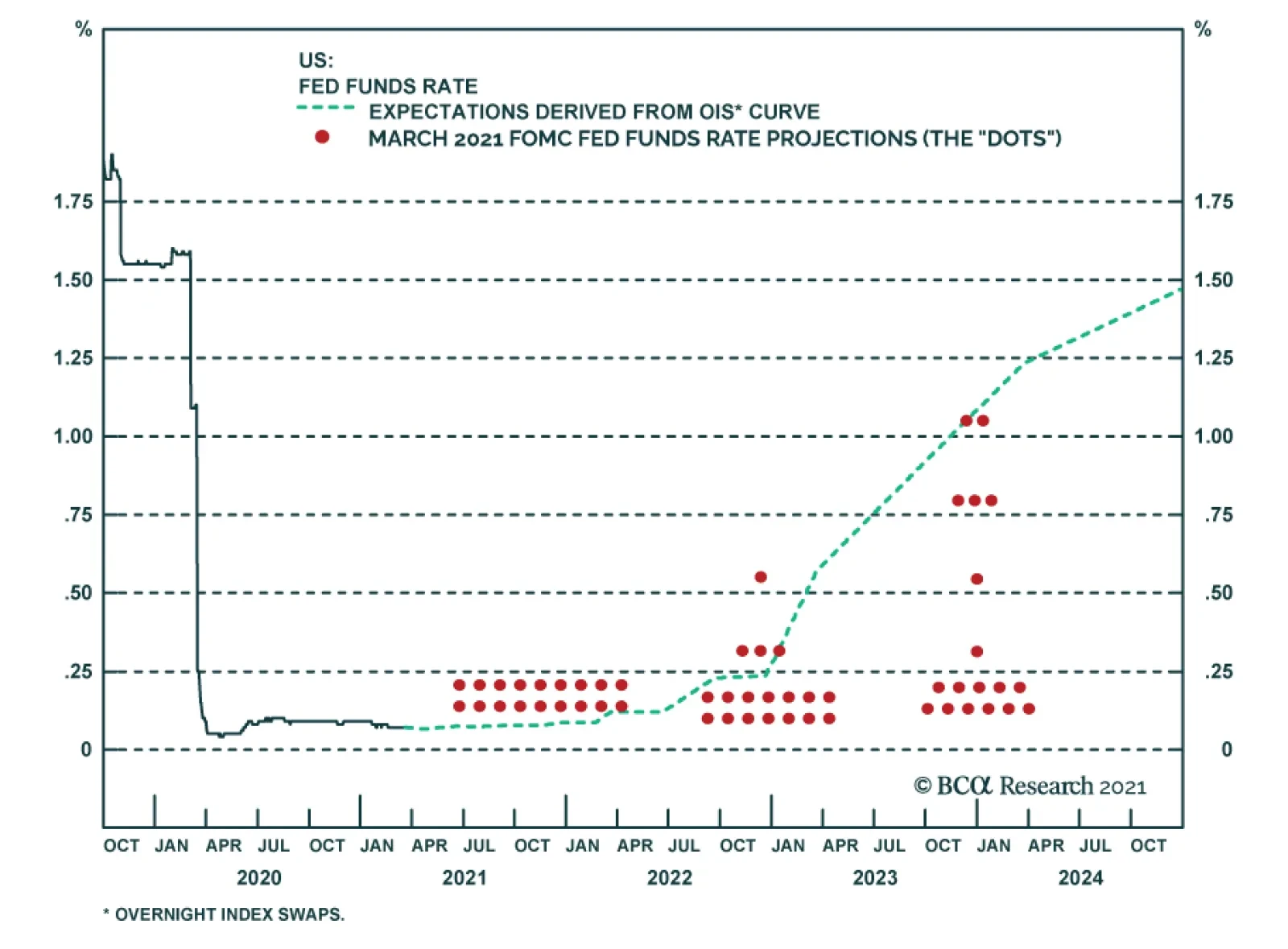
BCA Research’s US Bond Strategy service believes that the Fed is probably overly cautious and that the SEP’s forecasts will eventually move toward the market, validating current bond yields. Revisions to Fed policymakers’ interest rate forecasts at last…