Fixed Income

Highlights UK Interest Rates: A series of rolling shocks dating back to the 2008 financial crisis has prevented the Bank of England (BoE) from normalizing crisis-era levels of interest rates, even during years when inflation was overshooting the BoE 2% target. Brexit and COVID-19 were the last of those two shocks, but the growth- and inflation-dampening effects of both are fading fast. Implications for Gilts & GBP: The BoE’s dovish rhetoric, including hints that negative policy rates are still a viable option, looks increasingly inappropriate. The surge in real UK bond yields seen over the past month is just the beginning of a medium-term process of interest rate normalization. Maintain below-benchmark duration on Gilts, while downgrading UK allocations within dedicated global fixed income portfolios to neutral. The pound has upside in this environment, especially if depressed UK productivity starts to recover. Feature Chart 1UK Real Yields: Deeply Negative
Why Are UK Interest Rates Still So Low?
Why Are UK Interest Rates Still So Low?
The UK has become one of the more peculiar corners of the global fixed income universe. The outright level of longer-term Gilt yields is in the middle of the pack among the major advanced economies. The story is much different, however, when breaking those nominal UK yields into the real and inflation expectations components. The deeply negative real yields on UK inflation-linked Gilts are the lowest among the majors, even in a world where sub-0% real yields are prevalent in most countries (Chart 1). The flipside of that deeply negative real yield is a high level of inflation expectations. The breakeven inflation rate derived from the difference between the nominal and real 10-year Gilt yields is 3.3%, the highest in the developed “linkers” universe. Inflation expectations in UK consumer surveys are at similar levels, well above the 2% inflation target of the Bank of England (BoE), suggesting little confidence in the central bank’s ability or willingness to hit its own inflation goals. In this Special Report, jointly published by BCA Research Global Fixed Income Strategy and Foreign Exchange Strategy, we investigate why UK real interest rates have remained so persistently negative and assess the possibility of a shift in the low interest rate regime in a post-Brexit, post-pandemic UK – a move that could be quite bearish for UK fixed income markets and bullish for the British pound. Can The BoE Ignore Cyclical Upward Pressure On UK Bond Yields? The UK has suffered from a series of shocks, starting with the 2008 crisis, that have limited the ability of the BoE to attempt to tighten monetary policy. The 2011/12 European debt crisis hurt the UK’s most important trading partners, while the 2016 Brexit vote began a multi-year process of uncertainty over the future of those trading relationships. The COVID-19 pandemic is the latest shock, triggering a recession of historic proportions. The UK economy contracted by -10% in 2020, the largest decline since “The Great Frost” downturn of 1709. UK bond yields collapsed in response as the BoE cut rates to near-0% and reinforced that easy stance with aggressive quantitative easing and promises to keep rates unchanged over at the next few years. Today, UK financial markets are waking up to a world beyond the current COVID-19 lockdowns. The UK is running one of the world’s most successful vaccination rollouts, with 23 million jabs, or 35 per 100 people, already having been administered. UK Prime Minister Boris Johnson recently unveiled a bold plan to fully reopen the UK economy from the current severe lockdowns by mid-year. The UK government’s latest budget called for additional spending measures over the next year, including maintaining the work furlough scheme that has supported household incomes during the pandemic. As a result, UK growth expectations have exploded higher. According to the Bloomberg consensus economics survey, UK nominal GDP growth is expected to surge to 8.4% over calendar year 2021, an annual pace not seen since 1990 (Chart 2). Nominal Gilt yields have begun to reprice higher to reflect those surging growth expectations, with the 5-year/5-year forward Gilt yield climbing 67bps so far in 2021. Real Gilt yields are also moving higher with the 10-year inflation-linked Gilt climbing 38bps year to date, providing additional interest rate support that has fueled a surge in the pound versus the dollar (bottom panel). Our own BoE Monitor - containing growth, inflation and financial variables that typically lead to pressure on the central bank to adjust monetary policy – is signaling a reduced need for additional policy easing (Chart 3). The momentum of changes in longer-maturity UK Gilts and the trade-weighted UK currency index are usually correlated to the ebbs and flows of the BoE Monitor. The latest surge higher in yields and the currency suggests that the markets are anticipating the type of recovery that will put pressure on the BoE to tighten. Chart 2A Growth-Driven Repricing Of Gilts & GBP
A Growth-Driven Repricing Of Gilts & GBP
A Growth-Driven Repricing Of Gilts & GBP
Chart 3Gilts & GBP Sniffing Out A Less Dovish BoE?
Gilts & GBP Sniffing Out A Less Dovish BoE?
Gilts & GBP Sniffing Out A Less Dovish BoE?
It may take a while to see the BoE turn more hawkish, however. The BoE has become one of least active central banks in the world over the past decade. After the BoE cut its official policy interest rate, the Bank Rate, by 500bps during the 2008 financial crisis and 2009 recession, rates were kept in a range between 0.25% and 0.75% for ten consecutive years. The BoE cut rates aggressively in response to the COVID-19 pandemic, lowering the Bank Rate in March 2020 from 0.75% to 0.1%, where it still stands. The BoE has used quantitative easing (QE) and forward guidance to try and limit movements in bond yields whenever cyclical surges in inflation could have justified tighter monetary policy. That has led to an extended period of a negative BoE Bank Rate, something not seen since the inflationary 1970s (Chart 4). Back then, the BoE was lagging the surge in UK inflation, but still hiking nominal interest rates. Today, the central bank is keeping nominal rates near 0% with much lower levels of inflation. Chart 4Over A Decade Of Negative Real UK Interest Rates
Over A Decade Of Negative Real UK Interest Rates
Over A Decade Of Negative Real UK Interest Rates
Short-term interest rate markets are still pricing in a very slow response from the BoE to the current growth optimism. Only 36bps of rate hikes over the next two years are discounted in the UK overnight index swap (OIS) curve. This go-slow response is in line with the BoE’s guidance on future rate hikes which, similar to the language used by other central banks like the Fed, calls for no pre-emptive rate hikes before inflation has sustainably returned to the BoE target. That combination would be consistent with current forward market pricing on both short-term interest rates and inflation. Chart 5BoE Keeping Real Rates Well Below R*
BoE Keeping Real Rates Well Below R*
BoE Keeping Real Rates Well Below R*
In Chart 5, we show the real BoE Bank Rate, constructed by subtracting UK core CPI inflation from the Bank Rate. We also show a forward real rate calculated using the forward UK OIS and CPI swap curves. The market-implied path of the real Bank Rate shows very little change over the next decade, with the real Bank Rate expected to average around -2.5%. This is far below the estimates of a neutral UK real rate (or “r-star”) of just under 2%, as calculated by the New York Fed or recent academic studies. The neutral UK real rate has likely dipped because of the pandemic. The UK Office For Budget Responsibility (OBR) estimates that there has been a long-term “scarring” of the UK economy from COVID-19 through supply-side factors like weaker investment spending, lower productivity growth and diminished labor force participation – equal to three percentage points of the level of potential GDP.1 The BoE estimates a smaller “scarring” of 1.75 percentage points of potential output, but coming with a 6.5% reduction in the size of the UK capital stock. While these are significant reductions in the supply-side of the UK economy, they are not enough to account for the 4.5 percentage point difference between pre-pandemic estimates of the UK r-star and the market-implied path of the real BoE Bank Rate over the next decade. The implication is that the markets are not expecting the BoE to deviate from its strategy of doing very little with interest rates, even as growth recovers from the pandemic shock. That can be seen in the recent upturn in UK inflation expectations that is evident in both market-implied and survey-based measures. Chart 6UK Inflation Expectations Reflect BoE Policy, Not Actual Inflation
UK Inflation Expectations Reflect BoE Policy, Not Actual Inflation
UK Inflation Expectations Reflect BoE Policy, Not Actual Inflation
The 5-year/5-year forward UK CPI swap rate now sits at 3.6%, not far off the 3.3% level of 5-10 year consumer inflation expectations from the latest YouGov/Citigroup survey (Chart 6). The fact that inflation expectations can remain so elevated at a time when headline CPI inflation is struggling to avoid deflation is striking. This indicates a belief that the BoE will do very little in the future to stop a booming UK economy that is expected to put sustained downward pressure on the UK unemployment rate over the next few years (bottom panel). This is from a relatively low starting point of the unemployment rate given the massive government support programs that have limited the amount of pandemic-related layoffs over the past year. The BoE should have reasons to be more concerned about a resurgence of UK inflation. In its latest Monetary Policy Report, the BoE published estimates showing that the entire collapse in UK inflation in 2020 was attributable to weaker demand for goods and services – especially the latter (Chart 7). This suggests that UK inflation could rebound by a similar amount as the UK economy reopens from pandemic lockdowns. According to the UK OBR, 21% of UK household spending is on items described as “social consumption”, like restaurants and hotels (Chart 8). This is a much larger proportion than seen in other major developed economies (excluding Spain) and explains why consumer spending plunged so much more dramatically in the UK during 2020 than in other countries. Chart 7Only A Temporary Drag On UK Inflation From COVID-19
Why Are UK Interest Rates Still So Low?
Why Are UK Interest Rates Still So Low?
Chart 8UK Households More Focused On “Social Consumption”
Why Are UK Interest Rates Still So Low?
Why Are UK Interest Rates Still So Low?
If the UK pandemic-related restrictions are eased as planned over the next few months, the potential for a sharp snapback in UK consumer spending is significant. The BoE estimates that UK households now have £125bn of “excess” savings thanks to government income support and reduced spending on discretionary items like dining out and vacations. This is the fuel to support a rapid recovery in consumption over the next 6-12 months, especially as personal income growth will get a boost as furloughed workers begin returning to work (Chart 9). Chart 9UK Economy On The Mend
UK Economy On The Mend
UK Economy On The Mend
Chart 10Big Boost To UK Growth From Housing & Government Spending
Big Boost To UK Growth From Housing & Government Spending
Big Boost To UK Growth From Housing & Government Spending
A similar argument can be made for investment spending – the BoE estimates that UK businesses have amassed £100bn pounds of excess cash, and the latest reading on the BoE’s Agents' Survey of UK firms shows a slight increase after months of decline (bottom panel). With a Brexit deal with the EU finally reached at the start of 2021, UK businesses can also look to increase investment spending that had been delayed because of the years of Brexit uncertainty. The UK economy is already getting a boost from a recovery in the housing market fueled by low interest rates, high household savings and improving consumer confidence. Mortgage approvals have soared to the highest level since 2007, while house prices are now expanding at a 6.4% annual rate (Chart 10). Add it all up, and the economic momentum in the UK is positive and likely to accelerate further in the coming months as a greater share of the population becomes vaccinated. The BoE’s dovish policy stance is likely to appear increasingly inappropriate relative to accelerating UK growth and inflation trends over the next several months. Thus, on a cyclical basis, UK bond yields, both nominal and real, have more upside potential even after the recent increase. Bottom Line: A series of rolling shocks dating back to the 2008 financial crisis has prevented the Bank of England (BoE) from normalizing crisis-era levels of interest rates, even during years when inflation was overshooting the BoE 2% target. Brexit and COVID-19 were the last of those two shocks, but the growth- and inflation-dampening effects of both are fading fast. Structural Forces Keeping UK Interest Rates Low Are Fading Looking beyond the cyclical drivers, the structural factors that have held down UK interest rates in recent years are also starting to fade. The supply side of the UK economy has suffered because of Brexit uncertainty. The OECD’s estimate of potential UK GDP growth fell from 1.75% in 2015 to 1.0% in 2020 (Chart 11). This was mostly due to declining productivity growth – a consequence of years of very weak business investment. The 5-year annualized growth rate of real UK investment spending fell to -3% in 2020, a contraction only matched during the past 30 years after the 1992 ERM crisis and 2008 financial crisis. That plunge in investment coincided with almost no growth in UK labor productivity over that same 5-year window. Chart 11The Road To Faster Potential UK Growth Starts With Investment
The Road To Faster Potential UK Growth Starts With Investment
The Road To Faster Potential UK Growth Starts With Investment
Slowing population growth also weighed on UK potential growth, slowing to the lowest level in 15 years in 2019 as immigration from EU countries to the UK fell sharply. COVID-19 also hurt immigration flows into the UK last year. The UK Office for National Statistics estimated that the non-UK born population in the UK fell by 2.7% between June 2019 and June 2020. Diminished potential GDP growth is a factor that would structurally reduce the equilibrium real UK interest rate. We are likely past the worst for that downward pressure on potential growth and real rates. Population growth should also stabilize as the UK borders open up again and pandemic travel restrictions are loosened. Measured productivity is already starting to see a cyclical recovery, while investment spending is likely to improve as cash-rich UK companies began to ramp up capital spending plans deferred by Brexit and COVID-19. While the process leading from faster investment spending into speedier productivity growth is typically slow, the key point is that the worst of downtrend is likely over. This is an important development that has implications for UK fixed income markets. When looking at an international comparison of real central bank policy rates within the developed economies, the UK has fallen into the grouping of countries with persistently negative policy rates, namely Japan, the euro area, Switzerland, Sweden and Norway (Chart 12). We have dubbed that group the “Secular Stagnation 5”, after the term made famous by former US Treasury Secretary Lawrence Summers describing a state where the “natural” real rate of interest (r-star) that equates savings with investment is structurally negative. Chart 12Does The UK Belong In The 'Secular Stagnation 5'?
Does The UK Belong In The 'Secular Stagnation 5'?
Does The UK Belong In The 'Secular Stagnation 5'?
Does the UK belong in the “Secular Stagnation 5”? As a way to assess this, we made some comparisons of selected UK data with the same data for those five countries. When looking at potential GDP growth and population growth, the UK sits right in the middle of the range of those growth rates for the five countries (Chart 13). UK productivity growth has underperformed the others recently but, prior to the 2016 Brexit shock, UK productivity was also in the middle of the Secular Stagnation 5 range. Chart 13Brexit Became A Major Hit To UK Potential Growth
Brexit Became A Major Hit To UK Potential Growth
Brexit Became A Major Hit To UK Potential Growth
Chart 14UK Economy Less Focused On Investment & Exports
UK Economy Less Focused On Investment & Exports
UK Economy Less Focused On Investment & Exports
On other measures, the UK is nothing like those other countries. The UK’s economy is far less geared towards exports and investment (Chart 14) and is more tilted towards consumer spending. That can be seen most clearly when looking at the data on savings/investment balances. The UK continuously runs a current account deficit, as opposed to the persistent surpluses seen in the Secular Stagnation 5 (Chart 15). Put another way, the UK is not a “surplus” country that saves more than it invests on a structural basis, a condition that typically depresses real interest rates. Chart 15The UK Is Not A Surplus Country
The UK Is Not A Surplus Country
The UK Is Not A Surplus Country
Chart 16Gilts Will Not Become A Low-Beta Market
Gilts Will Not Become A Low-Beta Market
Gilts Will Not Become A Low-Beta Market
Based on these cross-country comparisons, it is unusual for the UK to have such persistently low real interest rates. This has implications for UK bond yields. Over the past few years, Gilts have been transitioning from a status as a “high yield beta” market – whose yield movements are more correlated to swings in the overall level of global bond yields. The lower beta markets are in countries like Germany, France and Japan – all members of the Secular Stagnation club (Chart 16). The UK does not appear to warrant a permanent membership in that low-yielding group, based on structural factors. That is evident when looking at how Gilt yields are rising even with the BoE absorbing an increasing share of the stock of outstanding Gilts (bottom panel). We conclude that the transition of the UK to a low-beta market is related to the Brexit uncertainty post 2016 and the pandemic shock that has hit the consumer-focused UK economy exceptionally hard – both factors that are set to fade over the next year. Bottom Line: The BoE’s dovish rhetoric, including hints that negative policy rates are still a viable option, looks increasingly inappropriate. The surge in real UK bond yields seen over the past month is just the beginning of a medium-term process of interest rate normalization. Investment Conclusions Chart 17Downgrade Gilts To Underweight
Downgrade Gilts To Underweight
Downgrade Gilts To Underweight
Our assessment of the cyclical and structural drivers of UK interest rates leads us to the following conclusions on UK fixed income and currency strategy: Duration: Maintain a below-benchmark exposure to UK interest rate movements. Gilt yields will rise by more than is discounted in the forwards over the next 6-12 months (Chart 17), coming more through rising real yields as the UK economy continues its post-Brexit, post-pandemic recovery. Country Allocation: Downgrade strategic allocations to UK Gilts to neutral from overweight in dedicated fixed income portfolios. Our long-standing view that Brexit uncertainty would lead to the outperformance of Gilts versus other developed bond markets is no longer valid. It is still too soon to move to a full underweight stance on Gilts – a better opportunity will develop by mid-year once it is more evident that the current success on UK vaccinations leads to a faster reopening of the UK economy. Yield Curve: Maintain positioning for a bearish steepening of the UK Gilt yield curve. While there is limited scope for more steepening through an even larger increase in inflation breakevens from current elevated levels, the long end of the Gilt curve can move higher by more than the front end as the market re-rates Gilts to a higher-beta status with a higher future trajectory for UK interest rates. Corporate Credit: Downgrade UK investment grade corporate bond exposure to neutral from overweight in dedicated fixed income portfolios. UK corporate spreads have returned to the 2017 lows and, while an improving growth dynamic is not overly bearish for credit, there is no longer a compelling valuation-based case for staying overweight UK investment grade corporates. This move brings our recommended UK allocation in line with our neutral stance on US and euro area investment grade corporates. Chart 18GBP/USD Appears Cheap On A PPP Basis
GBP/USD Appears Cheap On A PPP Basis
GBP/USD Appears Cheap On A PPP Basis
Chart 19Low Productivity Is Weighing On The Pound
Low Productivity Is Weighing On The Pound
Low Productivity Is Weighing On The Pound
Currency: A growth-driven path towards interest rate normalization should be positive for the British pound, which remains undervalued versus the US dollar on a purchasing power parity basis (Chart 18).2 A move to 1.45 on GBP/USD is possible within the next six months. A broader move towards pound strength will require an improvement in business investment, as the trade-weighted pound looks fairly valued on our productivity-based model (Chart 19). We do maintain our view that EUR/GBP can approach 0.80 by year-end based on a relatively stronger cyclical improvement in UK growth versus the euro area. Robert Robis, CFA Chief Fixed Income Strategist rrobis@bcaresearch.com Footnotes 1 For further details on the OBR estimates of UK growth, inflation and fiscal policy, please see the March 2021 OBR Economic & Financial Outlook, which can be found here: https://obr.uk/ 2 Please see BCA Research Foreign Exchange Strategy Report, "Thoughts On The British Pound", dated December 18, 2020, available at fes.bcaresearch.com.
Highlights China’s economic recovery is in a later stage than the US. A rebound in US Treasury yields is unlikely to trigger upward pressure on government bond yields in China. Imported inflation through mounting commodity and oil prices should be transitory and does not pose enough risk for Chinese authorities to further tighten policies. Historically, Chinese stocks have little correlation with changes in US Treasury yields; Chinese equity prices are primarily driven by the country’s domestic credit growth and economic conditions. We maintain our tactical (0 to 3 months) neutral position on Chinese stocks, in both absolute and relative terms. However, the near-term pullbacks are taking some air out of Chinese equities' frothy valuations, providing room for a cyclical upswing. Chinese offshore stocks, which are highly concentrated in the tech sector, are facing multiple challenges. We are closing our long investable consumer discretionary/short investable consumer staples trade and we recommend long A-shares/short MSCI China Index. Feature Chinese stocks extended their February losses into the first week of March. Market participants fear that escalating real government bond yields in the US and elsewhere will have a sustained negative impact on Chinese risk assets, reinforced by ongoing policy normalization in China. Global equity prices have been buffeted by crosscurrents. An acceleration in the deployment of vaccines and increased economic reopenings provide a positive backdrop to the recovery of corporate profits. At the same time, optimism about global growth and broadening fiscal stimulus in the US has prompted investors to expect higher policy rates sooner. The US 10-year Treasury yield is up by 68bps so far this year, depressing US equity valuations and sending ripple effects across global bourses. In this report, we examine how rising US and global bond yields would affect China’s domestic monetary policy and risk-asset prices. Will Climbing US Treasury Yields Push Up Chinese Rates? Chart 1Chinese Gov Bond Yields Have Led The US Counterpart Since 2015
Chinese Gov Bond Yields Have Led The US Counterpart Since 2015
Chinese Gov Bond Yields Have Led The US Counterpart Since 2015
Increasing bond yields in the US will not necessarily lead to higher bond yields in China. Chart 1 shows that the direction of China’s 10-year government bond yield has a tight correlation with its US counterpart. It is not surprising because business cycles in these giant economies have become more synchronized. Interestingly, China’s 10-year Treasury bond yield has led the US one since 2015. This may be due to China’s growing importance in the world economy. China’s credit and domestic demand growth leads the prices of many industrial metals and in turn, business cycles in many economies. China’s rising long-duration government bond yields reflect expectations of an improving domestic economy, and these expectations often spill over to the rest of the world, including the US. Although the recent sharp rebound in the US Treasury yield is mainly driven by domestic factors, the rebound is unlikely to spill over to their Chinese peers, because the countries are in different stages of their business and policy cycles. America is still at its early stage of economic recovery and fresh stimulus measures are still being rolled out, whereas China has already normalized its policy rates back to pre-pandemic levels and its credit growth peaked in Q4 last year. Chinese fixed-income markets will soon start pricing in moderating growth momentum in the second half of this year, suppressing the long-end of China’s Treasury yield curve (Chart 2). Importantly, none of the optimism that has lifted US Treasury yields - a vaccine-led global growth recovery and a massive US fiscal stimulus – would warrant a better outlook for China. Reopening worldwide economies will likely unleash pent-up demand for services, such as travel and catering, rather than merchandise trade. Chart 3 shows that since the pandemic US spending on goods, which benefited Chinese exports, has soared relative to spending on services. The trend will probably reverse when the US and world economy fully opens, limiting the upside for China’s exports and its contribution to growth this year. Chart 2China And The US Are In Different Stages Of Their Economic Recoveries
China And The US Are In Different Stages Of Their Economic Recoveries
China And The US Are In Different Stages Of Their Economic Recoveries
Chart 3US Consumers Have Been Spending Much More On Goods Than Services During The Pandemic
US Consumers Have Been Spending Much More On Goods Than Services During The Pandemic
US Consumers Have Been Spending Much More On Goods Than Services During The Pandemic
Bottom Line: China’s waning growth momentum will insulate Chinese bond yields from higher US Treasury yields. Do Rising Inflation Expectations In The US Pose Risks Of Policy Tightening In China? Chart 4Imported Inflation Shouldnt Constrain The PBoC
Imported Inflation Shouldnt Constrain The PBoC
Imported Inflation Shouldnt Constrain The PBoC
While China’s monetary policymaking is not entirely insulated from exogenous shocks, it is primarily driven by domestic economic conditions and inflation dynamics. We are not complacent about the risk of a meaningful uptick in global inflation, but we do not consider imported inflation a major policy constraint for the PBoC this year (Chart 4). Furthermore, at last week’s National People’s Congress (NPC), China set the inflation target in 2021 at 3%, which is a high bar to breach. Mounting commodity prices, particularly crude oil prices, may put upward pressures on China’s producer prices, but their impact on China’s overall inflation will be limited for the following reasons: China accounts for a large portion of the world’s commodity demand. Given that the country’s credit impulse has already peaked, domestic demand in capital-intensive sectors (such as construction and infrastructure spending) will slow this year. Reinforced policy restrictions on the property sector will also restrain the upside price potential in industrial raw materials such as steel and cement (Chart 5). For producers, the main and sustained risk for imported inflation will be concentrated in crude oil. The PPI may spike in Q2 and Q3 this year due to advancing oil prices and the extremely low base factor from the same period last year. The PBoC will likely view a spike in the PPI as transitory. Moreover, the recent improvement in producer pricing power appears to be narrow. The output price for consumer goods, which accounts for 25% of the PPI price basket, remains subdued (Chart 6). Chart 5Chinas Demand For Raw Materials Will Slow
Chinas Demand For Raw Materials Will Slow
Chinas Demand For Raw Materials Will Slow
Chart 6Output Price For Consumer Goods Remains In Contraction
Output Price For Consumer Goods Remains In Contraction
Output Price For Consumer Goods Remains In Contraction
Importantly, when oil prices plummeted in the first half of 2020, China’s crude oil inventories showed the fastest upturn on record (Chart 7). It suggests that China’s inventory restocking from last year may help to partially offset the impact from elevated oil prices this year. For consumers, oil prices account for a much smaller percentage of China’s CPI basket than in the US (Chart 8). Food prices, particularly pork, drive China’s headline CPI and can be idiosyncratic. We expect food price increases to be well contained this year due to improved supplies and the high base effect from last year. Chart 7Massive Buildup in Chinas Crude Oil Inventory In 2020
Massive Buildup in Chinas Crude Oil Inventory In 2020
Massive Buildup in Chinas Crude Oil Inventory In 2020
Chart 8Oil Prices Account For A Small Portion In China's Consumer Spending
Oil Prices Account For A Small Portion In Chinas Consumer Spending
Oil Prices Account For A Small Portion In Chinas Consumer Spending
Importantly, China’s inflation expectations have not recovered to their pre-pandemic levels and consumer confidence on future income growth also remains below its end-2019 figure (Chart 9). If this trend holds, then it will be difficult for producers to pass through escalating input costs to end users. Although China’s economy has strengthened, it is far from overheating (Chart 10). Without a sustained above-trend growth rebound, it is difficult to expect genuine inflationary pressures. The pandemic has distorted the balance of global supply and demand, propping up demand and price tags attached to it. In China’s case, however, production capacity and capital expenditures rebounded faster than demand and consumer spending, constraining the upsides in inflation (Chart 11). Chart 9Consumer Inflation Expectations Have Not Fully Recovered
Consumer Inflation Expectations Have Not Fully Recovered
Consumer Inflation Expectations Have Not Fully Recovered
Chart 10Chinese Economy Is Not Yet Overheating
Chinese Economy Is Not Yet Overheating
Chinese Economy Is Not Yet Overheating
China’s CPI is at its lowest point since 2009, making China’s real yields much greater than in the US. Rising real US government bond yields could be mildly positive for China because they help to narrow the Sino-US interest rate differential and temper the pace of the RMB’s appreciation (Chart 12). A breather in the RMB’s gains would be a welcome reflationary force for Chinese exporters and we doubt that Chinese policymakers will spoil it with a rush to hike domestic rates. Chart 11And Production Has Recovered Faster Than Demand
And Production Has Recovered Faster Than Demand
And Production Has Recovered Faster Than Demand
Chart 12Narrowing Real Rate Differentials Helps To Tamper The RMB Appreciation
Narrowing Real Rate Differentials Helps To Tamper The RMB Appreciation
Narrowing Real Rate Differentials Helps To Tamper The RMB Appreciation
Bottom Line: It is premature to worry about an inflation overshoot in China. The current environment is characterized as easing deflation rather than rising inflation. Our base case remains that inflationary pressures will stay at bay this year. Are Higher US Treasury Yields Headwinds For Chinese Stocks? Historically, Chinese stocks have exhibited a loose cyclical correlation with US government bond yields, particularly in the onshore market (Chart 13). Equity prices in China are more closely correlated with domestic long-duration government bond yields, but the relationship is inconsistent (Chart 14). Chart 13Chinese Stocks Have Little Correlation With US Treasury Yields
Chinese Stocks Have Little Correlation With US Treasury Yields
Chinese Stocks Have Little Correlation With US Treasury Yields
Chart 14Correlations Between Chinese Stocks And Domestic Gov Bond Yields Are Inconsistent
Correlations Between Chinese Stocks And Domestic Gov Bond Yields Are Inconsistent
Correlations Between Chinese Stocks And Domestic Gov Bond Yields Are Inconsistent
Chinese stocks are much more sensitive to changes in the quantity of domestic money supply than the price of money. A sharp rebound in China’s 10-year government bond yield in the second half of last year did not stop Chinese stocks from rallying. The insensitivity of Chinese stocks to changes in the price of money is particularly prevalent during the early stage of an economic recovery. As we pointed out in a previous report, since 2015 the PBoC has shifted its policy to target interest rates instead of the quantity of money supply. Thus, credit growth, which propels China’s business cycle and corporate profits, can still trend higher even as bond yields pick up. This explains why domestic credit growth, rather than China’s real government bond yields, has been the primary driver of the forward P/E of Chinese stocks (Chart 15A and 15B). This contrasts with the S&P, in which the forward P/E ratio moves in lockstep with the inverted real yield in US Treasuries (Chart 16). Chart 15ACredit Growth Has Been Driving Up Chinese Stock Valuations
Credit Growth Has Been Driving Up Chinese Stock Valuations
Credit Growth Has Been Driving Up Chinese Stock Valuations
Chart 15BCredit Growth Has Been Driving Up Chinese Stock Valuations
Credit Growth Has Been Driving Up Chinese Stock Valuations
Credit Growth Has Been Driving Up Chinese Stock Valuations
Credit growth in China peaked in Q4 last year and the intensity of the economic recovery has started to moderate. Hence, regardless of the changes in bond yields, Chinese stocks will need to rely on profit growth in order to sustain an upward trend (Chart 17). Chart 16Falling Real Rates Were Propping Up US Equity Valuations
Falling Real Rates Were Propping Up US Equity Valuations
Falling Real Rates Were Propping Up US Equity Valuations
Chart 17Earnings Growth Needs To Accelerate To Support Chinese Stock Performance
Earnings Growth Needs To Accelerate To Support Chinese Stock Performance
Earnings Growth Needs To Accelerate To Support Chinese Stock Performance
The good news is that recent gyrations in the US equity market, coupled with concerns about further tightening in China’s domestic economic policy have triggered shakeouts in China’s equity markets. The pullback in stock prices has helped to shed some excesses in frothy Chinese valuations and has opened a door for more upsides in Chinese stock on a cyclical basis. Bottom Line: Rising Treasury yields in the US or China will not have a direct negative impact on Chinese equities. Last year’s massive credit expansion has lifted both earnings and multiples in Chinese stocks and an acceleration in earnings growth is now needed to support stock performance. Investment Implications The key message from last week’s NPC meetings suggests that policy tightening will be gradual this year. While the 6% growth target was lower than expected, it represents a floor rather than a suggested range and it will likely be exceeded. Bond yields and policy rates are already at their pre-pandemic levels, indicating that there is not much room for further monetary policy tightening this year. The announced objectives for the fiscal deficit and local government bond quotas are only modestly smaller than last year. The economic and policy-support targets support our view that policymakers will be cautious and not overdo tightening. We will elaborate on our takeaways from this year’s NPC in next week’s report. Chart 18Chinese Cyclicals Can Still Benefit From An Improving Global Economic Backdrop
Chinese Cyclicals Can Still Benefit From An Improving Global Economic Backdrop
Chinese Cyclicals Can Still Benefit From An Improving Global Economic Backdrop
Meanwhile, there is still some room for Chinese cyclical stocks to run higher relative to defensives, given the current Goldilocks backdrop of global economic recovery and accommodative monetary policy (Chart 18). We maintain a tactical (0 to 3 months) neutral position on Chinese stocks, in both absolute and relative terms. The market correction has not fully run its course. However, the near-term pullbacks are taking some air out of Chinese equities' frothy valuations, providing room for a cyclical upswing. We are closing our long investable consumer discretionary/short investable consumer staples trade. Instead, we recommend the following trade: long A-share stocks/short MSCI China Index. Investable consumer discretionary sector stocks, which are concentrated in China’s technology giants, face a confluence of challenges ranging from the ripple effects of falling stock prices in the US tech sector and tightened antitrust regulations in China (Chart 19). In contrast, the A-share index is heavily weighted in value stocks while the MSCI China investable index has a large proportion of expensive new economy stocks (Chart 20). The trade is in line with our view that the investment backdrop has shifted in favor of global value versus growth stocks due to a strong US expansion, rising US bond yields and a weaker US dollar. Chart 19Chinese Investable Tech Sector Is Facing Strong Headwinds
Chinese Investable Tech Sector Is Facing Strong Headwinds
Chinese Investable Tech Sector Is Facing Strong Headwinds
Chart 20Overweight A Shares Versus Chinese Investable Stocks
Overweight A Shares Versus Chinese Investable Stocks
Overweight A Shares Versus Chinese Investable Stocks
Jing Sima China Strategist jings@bcaresearch.com Cyclical Investment Stance Equity Sector Recommendations
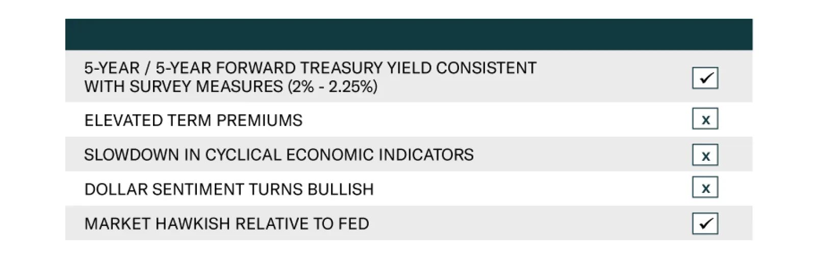
According to BCA Research’s US Bond Strategy service, only two of the five milestones on their Checklist For Increasing Portfolio Duration have been reached. Thus, a below-benchmark portfolio duration remains appropriate. The first item on the Checklist is…
Highlights Duration: Only 2 of the 5 items on our Checklist For Increasing Portfolio Duration have been checked. We will heed this message and stick with below-benchmark portfolio duration for the time being. We will have an opportunity to re-assess the items on our Checklist after the March FOMC meeting when the Fed’s interest rate forecasts will be updated. The Fed & Financial Conditions: The recent dip in the stock market is not the result of investors pricing-in worse economic outcomes. Rather, it is a sector rotation driven by extreme economic optimism. It is certainly not a concern for the Fed. The Fed & The Labor Market: We need to see monthly nonfarm payroll growth coming in consistently above 419 thousand before we can be confident that the Fed will hike rates by the end of 2022. Feature Chart 1Bearish Trend Intact
Bearish Trend Intact
Bearish Trend Intact
The bond bear market rages on. The Bloomberg Barclays Treasury Index returned -1.8% in February, its worst monthly performance since 2016. The sell-off then continued through the first week of March, culminating with the 10-year Treasury yield touching 1.56% as of Friday’s close (Chart 1). The 5-year/5-year forward Treasury yield ended the week at 2.41%, near the top-end of primary dealer estimates of the long-run neutral fed funds rate (Chart 1, bottom panel). We don’t want to catch a falling knife, but eventually, yields will look attractive enough for us to increase our recommended portfolio duration. To help us make that decision, we unveiled a Checklist For Increasing Portfolio Duration in our February Webcast (Table 1).1 Table 1Checklist For Increasing Portfolio Duration
No Panic From Powell
No Panic From Powell
This week, we check-in with our Checklist, concluding that it is still too early to increase portfolio duration. Checking-In With Our Duration Checklist Chart 2Cyclical & Valuation Indicators
Cyclical & Valuation Indicators
Cyclical & Valuation Indicators
The first item on our Checklist is the 5-year/5-year forward Treasury yield reaching levels consistent with survey estimates of the long-run neutral fed funds rate. As noted above, this condition has been met. Second, we would like to see survey-derived measures of the 10-year term premium reach extended levels. Specifically, we’d like to see them approach their 2018 peaks (Chart 2). Currently, our two measures are sending diverging signals. The term premium derived from the New York Fed’s Survey of Market Participants is 60 bps, only 15 bps off its 2018 peak. However, the term premium derived from the New York Fed’s Survey of Primary Dealers is only 22 bps, 53 bps off its 2018 peak. For now, our assessment is that this condition has not been met. It’s important to note that the surveys used to construct our two term premium measures and to obtain our fair value range for the 5-year/5-year forward Treasury yield have not been updated since January, and that they will be revised ahead of this month’s FOMC meeting. If primary dealers and market participants revise up their fed funds rate expectations, then our valuation measures will give the 10-year yield more room to rise. Third, we continue to track high-frequency cyclical economic indicators like the CRB/Gold ratio (Chart 2, panel 3) and the relative performance of cyclical versus defensive equity sectors (see section titled “The Fed’s Approach To Financial Conditions” below). These measures have yet to show any signs of deterioration, consistent with an environment where bond yields should be rising. Fourth, if current trends continue, we are concerned that US yields may rise too far compared to yields in the rest of the world. This could entice foreign inflows into the US bond market, sending yields back down. Historically, bullish sentiment toward the US dollar is a good indicator of when US yields have risen too far. At present, dollar sentiment remains extremely bearish (Chart 2, bottom panel). This suggests that we are not yet close to the point when foreign purchases will push US yields lower. Finally, we consider the market’s fed funds rate expectations relative to the Fed’s most recent forecast, as inferred from its quarterly “dot plot”. Currently, the market is priced for Fed liftoff to occur in January 2023, with a second rate hike delivered in May 2023 and a third in October 2023 (Chart 3). This is considerably more hawkish than the Fed’s median forecast from December, which called for no rate hikes until at least 2024! Chart 3Market Expects Liftoff In January 2023
Market Expects Liftoff In January 2023
Market Expects Liftoff In January 2023
We think it’s conceivable that economic conditions could warrant Fed liftoff in late-2022 (see section titled “Tracking Payrolls And The Countdown To Fed Liftoff” below), but the Fed will probably be more cautious about how quickly it brings its expected liftoff date forward. FOMC participants will have an opportunity to push back against the market when they update their funds rate forecasts at this month’s meeting. The Fed will likely bring forward its anticipated liftoff date, but probably not all the way to January 2023. This could halt the uptrend in bond yields, at least for a while. Bottom Line: Only 2 of the 5 items on our Checklist For Increasing Portfolio Duration have been checked. We will heed this message and stick with below-benchmark portfolio duration for the time being. We will have an opportunity to re-assess the items on our Checklist after the March FOMC meeting when the Fed’s interest rate forecasts will be updated. Other surveys used in the construction of our term premium estimates and 5-year/5-year yield targets will also be updated around this time. The Fed’s Approach To Financial Conditions Chart 4Financial Conditions Are Easy
Financial Conditions Are Easy
Financial Conditions Are Easy
Remarks from Fed Chair Jay Powell were a catalyst for higher bond yields last week. Apparently, there had been some expectation in the market that Powell would use his platform to express concern about the recent increase in long-maturity bond yields. In fact, many expected him to foreshadow changes to the Fed’s balance sheet policy, either extending the maturity of its ongoing asset purchases or initiating an Operation Twist, where the Fed sells short-dated securities and buys long-dated ones.2 Powell didn’t announce any of these things. In fact, he didn’t even express concern about the recent rise in long-dated yields despite being given several opportunities to do so. To understand why, we need to understand how the Fed thinks about financial conditions. The Fed only cares about conditions in financial markets to the extent that they are expected to influence the real economy. This means that the Fed takes a broad view of financial conditions, including bond yields, credit spreads and equity prices. From this perspective, financial markets do not currently pose a risk to the economy (Chart 4). Yes, long-dated bond yields have risen, but short-dated yields remain low. Credit spreads also remain very tight and equity prices have only dipped modestly from high levels. The Chicago Fed’s broad index of financial conditions shows that they are extremely accommodative (Chart 4), and thus support continued economic recovery. This financial market back-drop is not one that will cause the Fed to take additional actions to ease policy. Even the recent drop in the stock market appears to be more a reflection of economic optimism than a cause for concern. Looking at the performance of different equity sectors, we find that the sectors that stand to benefit from the end of the pandemic and economic re-opening are surging. Meanwhile, the sectors that are performing poorly are simply giving back some of the huge gains that were realized when the pandemic was raging last year. For example, cyclical sectors (Industrials, Energy and Materials) are soaring while defensive sectors (Healthcare, Communications, Consumer Staples and Utilities) have hooked down (Chart 5A). The ratio between the two remains tightly correlated with the 10-year Treasury yield. Similarly, Bank stocks have exploded higher since bond yields troughed last fall while the Technology sector has had difficulty making further gains (Chart 5B). Last year, the Tech sector benefited from low bond yields and surging demand. This year, Banks stand to profit from higher yields and an improving labor market. Finally, our US Equity Strategy team put together a basket of “COVID-19 Winners” designed to profit from the pandemic and a basket of “Back To Work” stocks designed to benefit from economic re-opening. Not surprisingly, the former is dragging the S&P 500 lower while the latter is on a tear (Chart 5C). Chart 5ASector Rotation: Cyclicals Vs. Defensives
Sector Rotation: Cyclicals Vs. Defensives
Sector Rotation: Cyclicals Vs. Defensives
Chart 5BSector Rotation: Banks Vs. Tech
Sector Rotation: Banks Vs. Tech
Sector Rotation: Banks Vs. Tech
Chart 5CSector Rotation: COVID Winners Vs. Re-Open Winners
Sector Rotation: COVID Winners Vs. Re-Open Winners
Sector Rotation: COVID Winners Vs. Re-Open Winners
The bottom line is that the recent dip in the stock market is not the result of investors pricing-in worse economic outcomes. Rather, it is a sector rotation driven by extreme economic optimism. It is certainly not a concern for the Fed. Other Reasons For The Fed To Change Its Balance Sheet Policy In addition to concerns about a drop in the stock market, several other reasons have been given for why the Fed might consider either increasing its asset purchases or shifting them toward the long end of the curve. 1) Treasury Market Liquidity Chart 6Treasury Market Liquidity
Treasury Market Liquidity
Treasury Market Liquidity
First, there is an ongoing tension in the Treasury market between imposing stricter capital regulations on dealer banks and ensuring that they have enough balance sheet capacity to maintain Treasury market liquidity during periods of stress.3 This delicate equilibrium broke down last March when Treasury market liquidity evaporated at a time when both equities and bonds were crashing. The Fed was forced to step into the Treasury market to sustain market functioning. Last week’s Treasury sell-off had a whiff of illiquidity about it as well. One liquidity index that measures the average curve fitting error across all government bond yields increased slightly, but not nearly as much as it did last March (Chart 6). Treasury bid/ask spreads also widened a touch, but unlike last March, Treasury ETFs continued to trade close to their net asset values. A significant deterioration in Treasury liquidity would prompt a quick response from the Fed. That is, the Fed would quickly ramp up purchases to restore market functioning. However, last week’s blip was not nearly severe enough to raise alarm bells. Other periods of Treasury market stress that have prompted the Fed to step in have occurred during periods of extreme economic deterioration and market panic, such as in March 2020 and 2008. With economic growth accelerating rapidly, we place low odds on a major Treasury market liquidity event occurring this year. 2) Expiry Of The SLR Exemption Chart 7Reserve Supply Is Massive
Reserve Supply Is Massive
Reserve Supply Is Massive
A second possible reason for the Fed to change its balance sheet policy is the upcoming expiry of the exemption to the Supplementary Leverage Ratio (SLR). The SLR is a regulation that requires large banks to hold common equity capital totaling at least 5% of assets. Assets are not risk-weighted for the purposes of the SLR. A problem arose with the SLR last March when the Fed bought massive amounts of bonds, flooding the banking system with reserves (Chart 7). The problem is that banks are forced to hold those reserves, and this makes it more difficult for them to meet their SLR requirement. To alleviate the problem, the Fed announced that reserves and Treasury securities would be exempted from the SLR calculation. Today, the issue is that this exemption is scheduled to expire at the end of March and the Fed has yet to announce whether it will be extended or allowed to lapse. Table 2US Bank Supplementary Leverage Ratios
No Panic From Powell
No Panic From Powell
If the exemption lapses, then banks may try to unload Treasury securities to remain compliant with the SLR. In theory, this could lead to upward pressure on Treasury yields that the Fed could mitigate by ramping up its asset purchases. However, it’s unclear how much of an impact a lapsing of the SLR exemption would actually have on the Treasury market. Even adjusting for a lapsing of the exemption, all major US banks remain compliant with the 5% SLR (Table 2). Also, banks could always decide to increase their SLRs by reducing share buybacks rather than by shedding Treasuries. In any event, an increase in Fed asset purchases to lean against rising Treasury yields driven by bank selling would be counterproductive. It would only flood the banking system with more reserves, making the SLR even more difficult to meet. Our view is that a fair compromise would be for the Fed to continue the SLR exemption for bank reserves, but to allow the Treasury security exemption to lapse. But even if the SLR exemption is allowed to lapse completely, we doubt that it will lead to enough market turmoil to prompt a change in the Fed’s balance sheet strategy. 3) Supply/Demand Imbalance In Money Markets Finally, some have noted that the large and growing supply of bank reserves could lead to problems in money markets. Specifically, with the Treasury Department now in the process of paying down its cash account (Chart 7, bottom panel), there is a lot of cash flooding into money markets and coming up against limited T-bill supply. In theory, the Fed could try to mitigate this problem by engaging in an Operation Twist – selling some T-bills and buying some coupon bonds. But we doubt this will occur. The Fed already has tools in place to maintain control over short rates in such circumstances. For example, the same situation arose in 2013 when an over-supply of bank reserves pushed short rates down toward the bottom of the Fed’s target range (Chart 8A). The Fed’s response was to create the Overnight Reverse Repo Facility (ON RRP). This facility allows counterparties to park excess cash at the Fed in exchange for a security off the Fed’s balance sheet. This proved to be an effective floor on repo rates and the fed funds rate, and we expect it will be again (Chart 8B). Chart 8AFed Created ON RRP In 2013...
Fed Created ON RRP In 2013...
Fed Created ON RRP In 2013...
Chart 8B... It Remains A Firm Floor On Rates
... It Remains A Firm Floor On Rates
... It Remains A Firm Floor On Rates
T-bill yields remained below the ON RRP rate for some time in 2014 and 2015, and the same thing could happen again this year. But this will not be a major concern for the Fed as long as it maintains control over the fed funds rate and the overnight repo rate. Eventually, the Treasury Department can deal with the lack of bill supply by increasing the amount of T-bill issuance. Bottom Line: Treasury market liquidity remains an ongoing concern for the Fed, and the possible expiry of the SLR exemption and lack of T-bill supply present additional near-term technical challenges. We think it’s unlikely that any of these things will prompt the Fed to deviate from its current pace and composition of asset purchases in 2021. Tracking Payrolls And The Countdown To Fed Liftoff Chart 9The Fed's Maximum Employment Targets
The Fed's Maximum Employment Targets
The Fed's Maximum Employment Targets
Employment growth surprised to the upside in February as 379 thousand jobs were added to nonfarm payrolls. This sent bond yields higher, but we caution that even stronger employment growth will be required to keep bond yields rising going forward. The Fed needs to see a return to “maximum employment” before it will lift rates off the zero bound. This means not only that the unemployment rate will have to fall to a range of 3.5% to 4.5%, but also that the labor force participation rate must make a full recovery to pre-pandemic levels (Chart 9). We calculate that average monthly employment growth of 419 thousand will be required to achieve this goal by the end of 2022 (Table 3). In other words, to justify the market’s January 2023 expected liftoff date, we will need to see average monthly payroll growth of at least 419 thousand going forward. Table 3Average Monthly Nonfarm Payroll Growth Required For The Unemployment Rate To Reach 4.5% By The Given Date
No Panic From Powell
No Panic From Powell
This number seems high, but it may be attainable. With vaccine distribution kicking into high gear, many service sectors of the economy will soon be able to re-open. This already started to happen last month when the Leisure & Hospitality sector added 355 thousand jobs. Even after last month’s gains, Leisure & Hospitality still accounts for 36% of the net job loss since last February (Table 4). This means that there is scope for extremely large employment gains this year if the coronavirus can be contained. Table 4Employment By Industry
No Panic From Powell
No Panic From Powell
Bottom Line: We need to see monthly nonfarm payroll growth coming in consistently above 419 thousand before we can be confident that the Fed will hike rates by the end of 2022. Ryan Swift US Bond Strategist rswift@bcaresearch.com Footnotes 1 https://www.bcaresearch.com/webcasts/detail/387 2 https://www.bloomberg.com/news/articles/2021-03-01/treasury-curve-dysfunction-ignites-talk-of-federal-reserve-twist?sref=Ij5V3tFi 3 For more details please see US Investment Strategy / US Bond Strategy Special Report, “Alphabet Soup, Part 2: Shocked And Awed”, dated July 28, 2020, available at usbs.bcaresearch.com Fixed Income Sector Performance Recommended Portfolio Specification
The US 10-year Treasury yield had climbed 16 basis points so far this month, alarming equity investors. March’s selloff to date follows a 35 basis point rise in February – the deepest monthly bond rout since November 2016. Although investors are…
Highlights The recent backup in bond yields could cause stocks to fall further in the near term. However, history suggests that as long as yields remain low in absolute terms, as they are now, equities will recover. Market angst that the Fed is about to turn more hawkish is unwarranted. Central banks around the world have both the tools and the inclination to keep bond yields from rising excessively. Despite the jump in bond yields, the forward earnings yield is 540 basis points above the real bond yield in the US. Outside the US, the forward earnings yield is 615 basis points above the real bond yield. In 2000, the earnings yield was below the real bond yield. Just as value stocks began to outperform growth stocks in mid-2000, the end of the pandemic will herald a similar period of value-oriented outperformance. Commodity producers and banks will lead the way. Some Parallels Between Today And 2000… Stock prices have buckled in recent weeks, raising concerns that global bourses are at risk of a major crash, just like they were in early 2000. There are certainly some notable similarities between 2000 and the present: In both cases, the preceding rise in stock prices was fueled by the Federal Reserve’s desire to prevent an exogenous shock from causing a major recession (Chart 1). Last year, the shock was the pandemic. In 1998, it was the collapse of Long-Term Capital Management (LTCM). The Connecticut-based hedge fund imploded shortly after Russia defaulted on its debt, leading to a gut-wrenching 22% decline in the S&P 500. The brewing crisis prompted the Fed to cut rates by a total of 75 basis points. Spurred on by fears of Y2K, the Fed also injected vast amounts of liquidity into the financial system. Tech stocks led the market higher both in the late 1990s and last year. The NASDAQ Composite rose 68% between its intra-day low in October 1998 and March 2000. In 2020, the NASDAQ outperformed the S&P 500 by 24% and returned 44% overall. Chart 1The NASDAQ's 1999 Surge Followed The 1998 “Insurance Cuts” And Coincided With The Fed’s Balance-Sheet Expansion
The NASDAQ's 1999 Surge Followed The 1998 "Insurance Cuts" And Coincided With The Fed's Balance-Sheet Expansion
The NASDAQ's 1999 Surge Followed The 1998 "Insurance Cuts" And Coincided With The Fed's Balance-Sheet Expansion
Chart 2Low-Priced Stocks Have Been The Winners In The First Quarter
Shades Of 2000
Shades Of 2000
The speculative mania in the 1990s spread from large-cap tech stocks to small-cap companies. We saw the same pattern earlier this year, with prices and trading volumes exploding among smaller, low-priced stocks (Chart 2). As was the case in the late 1990s, retail investors – this time armed with “stimmy” checks and access to zero-commission trading accounts – plowed into the market. Chart 3Some Pockets Of Bullish Equity Sentiment
Shades Of 2000
Shades Of 2000
Chart 4Some Pockets Of Bullish Equity Sentiment
Shades Of 2000
Shades Of 2000
Bullish equity investor sentiment was rampant at the peak of the stock market in 2000. Although not quite to the same extent as back then, most measures of investor sentiment turned bullish prior to the recent selloff (Chart 3). Like most investors, analysts were wildly optimistic on stocks in the late 1990s (Chart 4). Long-term earnings growth projections are very optimistic today, a potentially ominous signal given that (unlike in the late 1990s), productivity growth is now more anemic. Rising stock prices in the late 1990s allowed corporate insiders to cash in their options, while enabling new companies to go public. Recently, we have seen a flurry of companies list their shares, in some cases through dubious SPAC vehicles (Chart 5). Valuations reached nosebleed levels in 2000. While the forward P/E ratio on the S&P 500 is somewhat below its 2000 peak, other valuation measures such as price-to-sales, Tobin’s Q, and enterprise value-to-EBITDA are above where they were in 2000 (Chart 6). Chart 5Renewed Interest In Listing Stocks
Shades Of 2000
Shades Of 2000
Chart 6Stretched Valuations, Then And Now
Shades Of 2000
Shades Of 2000
… But One Important Difference Despite the parallels between today and 2000, there is an important difference: The Federal Reserve. Having cut rates in 1998, the Fed reversed course in mid-1999, eventually taking the fed funds rate up to 6.5% in May 2000. The yield curve inverted in February of that year, shortly after the 10-year yield reached a high of 6.79%. Chart 7What Happens To Equities When Treasury Yields Rise?
Shades Of 2000
Shades Of 2000
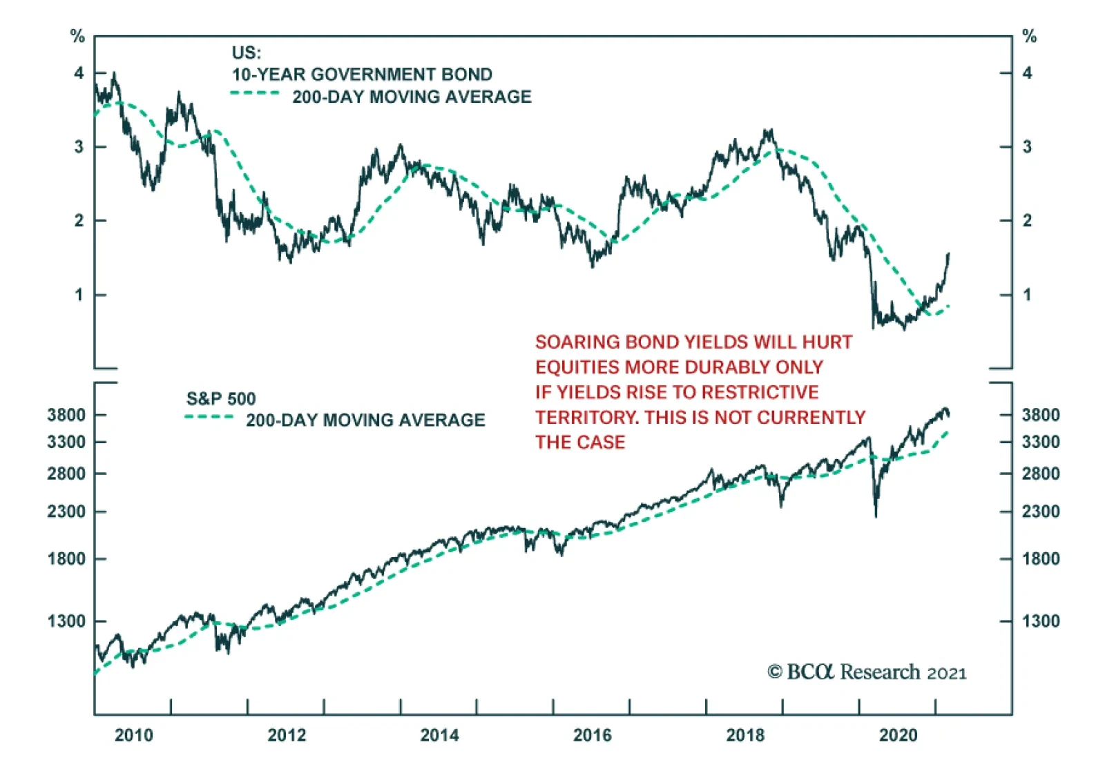
Bond yields have risen briskly over the past six months. However, they remain very low in absolute terms. While rising yields can produce a temporary stock market correction, they need to move into restrictive territory in order to trigger a recession and an accompanying bear market in equities. Chart 7 highlights some research that Garry Evans and BCA’s Global Asset Allocation team recently produced. It shows eight episodes since 1990 of a sharp rise in the 10-year Treasury yield. On every occasion (except in 1993-94, when the Fed unexpectedly raised rates in February 1994), equities performed strongly while rates were rising (Table 1). Today, the forward earnings yield on the S&P 500 is 540 basis points above the real yield. In 2000, the real bond yield was higher than the earnings yield (Chart 8). The gap between earnings yields and real bond yields is even greater outside the US, where valuations are generally more attractive. By the same token, the S&P 500 dividend yield was well below the bond yield in 2000. Today, they are roughly the same. Even if one were to pessimistically assume that US companies are unable to raise nominal dividend payments at all for the next decade, the S&P 500 would need to fall by 21% in real terms for equities to underperform bonds. Many other stock markets would have to decline by more than that (Chart 9). Table 1As Long As Bond Yields Don't Rise Into Restrictive Territory, Stocks Will Recover
Shades Of 2000
Shades Of 2000
Chart 8Relative To Bonds, Stocks Are More Favorably Valued Now Than in 2000
Relative Valuations Favor Equities
Relative Valuations Favor Equities
Chart 9Stocks Would Need To Fall A Lot For Equities To Underperform Bonds
Stocks Would Need To Fall A Lot For Equities To Underperform Bonds
Stocks Would Need To Fall A Lot For Equities To Underperform Bonds
Central Banks Will Lean Against Rising Bond Yields Stocks sold off earlier today on the perception that Jay Powell had failed to push back forcefully against the recent increase in bond yields. We think this angst is unwarranted. As Powell noted, most of the rise in bond yields reflected economic optimism. If yields were to continue rising in the absence of further economic improvements, the Fed would dial up the rhetoric, stressing its ability to buy bonds in unlimited quantities in order to support the economy. Despite all the fiscal stimulus, the unemployment rate remains elevated – perhaps as high as 10% according to some Fed measures. The prime-age employment-to-population ratio is four percentage points below where it was before the pandemic (Chart 10). Moreover, many stimulus measures will expire towards the end of the year. With the prospect of a “fiscal cliff” in 2022, we expect the Fed to want to tread carefully in withdrawing monetary support. What would really rattle investors is if long-term inflation expectations were to rise above the Fed’s comfort zone. However, considering the 5-year/5-year forward inflation breakevens are still below where they were in 2012-13, this is not an imminent risk (Chart 11). Chart 10The Fed Will Remain Accommodative To Aid The Labor Market Recovery
The Fed Will Remain Accommodative To Aid The Labor Market Recovery
The Fed Will Remain Accommodative To Aid The Labor Market Recovery
Chart 11Inflation Expectations Have Recovered But Are Still Low
Shades Of 2000
Shades Of 2000
Like the Fed, the ECB wants to keep financial conditions highly accommodative. On Tuesday, ECB Executive Board member Fabio Panetta, echoing comments made by other senior ECB officials, said that higher yields were “unwelcome and must be resisted.” He noted that “We are already seeing undesirable contagion from rising US yields into the euro area yield curve,” adding that the ECB “should not hesitate” to increase the pace of bond purchases. The ECB’s threat is credible. Already, its purchases have deviated significantly from its capital key, revealing Frankfurt’s willingness to act where and when it is needed. In the same spirit, the Reserve Bank of Australia boosted its government bond purchases earlier this week after the 10-year yield backed up from 0.7% last October to over 1.9% late last week. The RBA also reaffirmed its intent to maintain the current 3-year Yield Curve Control target at 0.1%, stating that “The Board will not increase the cash rate until actual inflation is sustainably within the 2-to-3 percent target range. For this to occur, wages growth will have to be materially higher than it is currently. This will require significant gains in employment and a return to a tight labour market. The Board does not expect these conditions to be met until 2024 at the earliest.” The RBA’s determination to keep bond yields down is noteworthy given that the neutral rate of interest is higher in Australia than in most other developed economies.1 If the RBA does not intend to raise rates for the next three years, it may take even longer for other central banks to take away the punch bowl. Will Value Stocks Begin To Outperform As They Did Starting In Mid-2000? There is another potential parallel with 2000 that is worth mentioning. This was the year that the outperformance of growth stocks came to a halt and value stocks began to shine. In fact, outside of the tech sector, the S&P 500 did not peak until May 2001 (Chart 12). Value continued to outperform right through to 2007. Since February 12th of this year, the price of the highly liquid Vanguard Growth ETF (VUG, market cap of $143 billion) has fallen by 8.9% while the price of the Vanguard Value ETF (VTV, market cap of $97 billion) has risen 0.5%. Despite the nascent outperformance of value names, they still remain relatively cheap. According to a simple valuation measure that combines price-to-earnings, price-to-book, and dividend yields, value stocks are more than three standard deviations cheap relative to growth stocks – a bigger valuation gap than seen at the height of the dotcom bubble (Chart 13). Chart 12The Non-Tech Portion Of The Stock Market Peaked More Than A Year After The Tech Bubble Burst
The Non-Tech Portion Of The Stock Market Peaked More Than A Year After The Tech Bubble Burst
The Non-Tech Portion Of The Stock Market Peaked More Than A Year After The Tech Bubble Burst
Chart 13The Tech Bust Of 2000 Also Marked The Start Of A Multi-Year Outperformance By Value
The Tech Bust Of 2000 Also Marked The Start Of A Multi-Year Outperformance By Value
The Tech Bust Of 2000 Also Marked The Start Of A Multi-Year Outperformance By Value
The Outlook For Commodity Stocks And Bank Shares Commodity producers are overrepresented in value indices. Strong global growth against a backdrop of tight supply should heat up the commodity complex over the next 12-to-18 months. Chart 14 shows that capital investment in the oil and gas sector has fallen by more than 50% since 2014. BCA’s Commodity & Energy Strategy service, led by Robert Ryan, expects crude oil demand to outstrip supply over the remainder of this year (Chart 15). Chart 14Oil + Gas Capex Collapses In COVID-19’s Wake
Shades Of 2000
Shades Of 2000
Chart 15Crude Oil Demand To Outstrip Supply Over The Remainder Of This Year
Shades Of 2000
Shades Of 2000
A physical deficit in the metals markets – particularly for copper and aluminum – should also persist this year (Charts 16A & 16B). While the boom in electric vehicle (EV) production represents a long-term threat to oil, it is manna from heaven for many metals. A battery-powered EV can contain more than 180 pounds of copper compared with 50 pounds for conventional autos. By 2030, the demand from EVs alone should amount to close to 4mm tonnes of copper per year, a big slug of demand in a market that consumes about 26mm tonnes per year. Chart 16ACopper Will Be In Physical Deficit...
Copper Will Be In Physical Deficit...
Copper Will Be In Physical Deficit...
Chart 16B...As Will Aluminum
...As Will Aluminum
...As Will Aluminum
Ongoing strong demand for metals from China should also buoy metals prices. While trend GDP growth in China has slowed, the economy is much bigger than it was in the 2000s. China’s annual aggregate consumption of metals is five times as high as it was back then. The incremental increase in China’s metal consumption, as measured by the volume of commodities consumed, is also double what it was 20 years ago (Chart 17). As we discussed in our report To Deleverage Its Economy, China Needs MORE Debt, the Chinese government has no choice but to continue to recycle persistently elevated household savings into commodity-intensive capital investment. This will ensure ample commodity demand from China for years to come. Chart 17China Keeps Buying More And More Commodities
Chinese Consumption Of Most Metals Continues To Rise China Keeps Buying More And More Commodities
Chinese Consumption Of Most Metals Continues To Rise China Keeps Buying More And More Commodities
Chart 18Credit Growth Has Been Recovering
Credit Growth Has Been Recovering
Credit Growth Has Been Recovering
Along with commodity producers, financials helped propel value indices during the 2000s. While credit growth is unlikely to revert to its pre-GFC days, it has been trending higher in both the US and Europe (Chart 18). Analysts are starting to take note of improving bank earnings prospects. EPS estimates for banks are rising more quickly than for tech companies on both sides of the Atlantic (Chart 19). Not only is the “E” in the P/E ratio for banks likely to rise, the ratio itself will increase. Currently, US and European banks are trading at 14 and 10-times forward earnings, respectively, a huge discount to the broad market in general, and tech stocks in particular (Chart 20). Chart 19EPS Estimates For Banks Are Rising More Quickly Than For Tech Companies (I)
EPS Estimates For Banks Are Rising More Quickly Than For Tech Companies (I)
EPS Estimates For Banks Are Rising More Quickly Than For Tech Companies (I)
Chart 19EPS Estimates For Banks Are Rising More Quickly Than For Tech Companies (II)
EPS Estimates For Banks Are Rising More Quickly Than For Tech Companies (II)
EPS Estimates For Banks Are Rising More Quickly Than For Tech Companies (II)
Chart 20Banks Are Cheap
Banks Are Cheap
Banks Are Cheap
Bottom Line: Despite near-term uncertainty, investors should overweight stocks on a 12-month horizon, while pivoting away from last year’s winners (growth stocks) towards last year’s losers (value stocks). Peter Berezin Chief Global Strategist pberezin@bcaresearch.com Footnotes 1 According to RBA’s estimates, the neutral rate of interest in Australia is at the high end of developed market estimates. Specifically, Australia’s R-star is higher than the average of the US and euro area R-stars and is slightly lower than the average of the Canadian and UK neutral rates. Global Investment Strategy View Matrix
Shades Of 2000
Shades Of 2000
Special Trade Recommendations
Shades Of 2000
Shades Of 2000
Current MacroQuant Model Scores
Shades Of 2000
Shades Of 2000
Dear client, In addition to this week’s abbreviated report, we are also sending you a Special Report on currency hedging, authored by my colleague Xiaoli Tang. Xiaoli’s previous work mapped out a dynamic hedging strategy for developed market equity investors in various home currencies. In this report, she extends the work to emerging market exposure. I hope you will find the report insightful. Next week, in lieu of our weekly report on Friday, we will be sending you a joint Special Report on the UK on Tuesday, together with our Global Fixed Income colleagues. Kind regards, Chester Highlights The DXY index is up for the year, but further gains will be capped at 2-3% from current levels. Long yen positions are offside amid the dollar rally. This should wash out stale longs, and underpin the bull case. Lower the limit-sell on the gold/silver ratio to 68. We were stopped out of our short AUD/MXN position amidst a broad-based selloff in EM currencies. We are reinitiating the trade this week. Feature Chart I-1The Dollar Has Been Strong In 2021
The Dollar Has Been Strong In 2021
The Dollar Has Been Strong In 2021
The DXY index has once again kissed off the 90 level and is gaining momentum in March. Year-to-date, the DXY index is up 1.1%. This performance has been particularly pronounced against other safe haven currencies, such as the Swiss franc and the Japanese yen. GBP and AUD have fared rather well in this environment (Chart I-1). As the “anti-dollar,” the euro has also suffered. Our technical indicators continue to warn that the dollar still has upside. Net speculative positions are at very depressed levels, consistent with many sentiment indicators that are bearish USD. However, this time around, any dollar rally could be capped at 2-3%, in sharp contrast to the bounce we witnessed in March 2020. The Message From Dollar Technical Indicators Our dollar capitulation index has bounced from very oversold levels, and is now sitting above neutral territory (Chart I-2). The index comprises a standardized measure of sentiment, net speculative positioning and momentum. It is very rare that a drop in this index below the -1.5 level does not trigger a rebound in the dollar. This time around, the bounce has been rather muted. Chart I-2BCA Dollar Capitulation Index Suggests Some Upside
BCA Dollar Capitulation Index Suggests Some Upside
BCA Dollar Capitulation Index Suggests Some Upside
Part of the reason has been concentration around dollar short positions. Investors throughout most of the pandemic executed their bearish dollar bets through the euro, yen and the Swiss franc (countries that already had negative interest rates). Positioning on risk on currencies such as the Australian dollar and the Mexican peso were neutral. This also explains the underperformance of the yen, as the dollar rises. From a sizing standpoint, ever since the dollar peaked in March 2020, counter-trend moves have been in the order of 2-3%. We expect this time to be no different. What To Do About The Yen The yen has been one of our core holdings on three fundamental pillars: it is cheap, it tends to rise during dollar bear markets and the economy in Japan is more hostage to deflation than the US. This bodes well for real rates in Japan, relative to the US. Over the last month, our long yen position has been put offside. First, demand for safe havens has ebbed as US interest rates have gapped higher (Chart I-3, panel 1). King dollar has once again become the safe haven of choice. As Chart I-1 illustrates, low beta currencies such as the Swiss franc and yen, that tend to do relatively well when the dollar is rallying, have underperformed. Yield curve control (YCC) in Japan is also negative for the yen as interest rates rise (panel 2). Economic momentum in Japan is also rolling over (panel 3). Prime Minister Yoshihide Suga’s mulling to extend the state of emergency in the Tokyo region could further cripple any Japanese economic recovery. Chart I-3A Healthy Reset In The Yen
A Healthy Reset In The Yen
A Healthy Reset In The Yen
Chart I-4USD/JPY Support Should Hold
USD/JPY Support Should Hold
USD/JPY Support Should Hold
For short-term investors, USD/JPY is very overbought and is approaching strong resistance (Chart I-4). In our view, a washing out of stale shorts would provide a healthy reset for the bear market to resume. Meanwhile, USD/JPY and the DXY change correlations during risk-off periods, where the yen appreciates versus the dollar. Therefore, a market reset is also positive for the yen. Housekeeping Chart I-5Remain Short AUD/MXN
Remain Short AUD/MXN
Remain Short AUD/MXN
We were stopped out of our short AUD/MXN trade last week for a loss of 6.1%. We are reinitiating the trade this week. The case for the trade, made a month ago, remains intact. A short-term recovery in the US economy, relative to the rest of the world, argues for an AUD/MXN short. In fact, a divergence has occurred between the BRL/MXN and the AUD/MXN exchange rate (Chart I-5). Domestic factors have certainly tempered the Brazilian real, but the underperformance of metal prices relative to oil in recent months is also a factor. We expect some convergence to occur, with MXN appreciating much faster than the AUD. Chester Ntonifor Foreign Exchange Strategist chestern@bcaresearch.com Currencies U.S. Dollar Chart II-1USD Technicals 1
USD Technicals 1
USD Technicals 1
Chart II-2USD Technicals 2
USD Technicals 2
USD Technicals 2
Recent data in the US have stepped up: Personal income rose by 10% in January, while personal spending rose by 2.4% month-on-month. The ISM report was stellar. The manufacturing PMI improved from 58.7 to 60.8 in February. Prices paid rose to 86. Factory orders were slightly above expectations at 2.6% month-on-month in January. The DXY index rose by 165 bps this week. The narrative of a counter-trend reversal in the DXY index isn playing out. As the story unfolds, it will be important to establish targets. Our bias is that the DXY stalls before 93-94 is reached. Report Links: Are Rising Bond Yields Bullish For The Dollar? - February 19, 2021 Portfolio And Model Review - February 5, 2021 Sizing A Potential Dollar Bounce - January 15, 2021 The Euro Chart II-3EUR Technicals 1
EUR Technicals 1
EUR Technicals 1
Chart II-4EUR Technicals 2
EUR Technicals 2
EUR Technicals 2
Recent data from the euro area remain weak: Core CPI in the Eurozone came in at 1.1%, in line with expectations. The unemployment rate declined from 8.3% to 8.1% in January. January retail sales were weak at -6.4% year-on-year. The euro fell by 1.7%% against the US dollar this week. It will be almost impossible for the euro to rise in an environment where the dollar is in a broad-based decline. Given elevated sentiment on the euro, a healthy reset is necessary for the bull market to resume. Report Links: Portfolio And Model Review - February 5, 2021 On Japanese Inflation And The Yen - January 29, 2021 The Dollar Conundrum And Protection - November 6, 2020 The Japanese Yen Chart II-5JPY Technicals 1
JPY Technicals 1
JPY Technicals 1
Chart II-6JPY Technicals 2
JPY Technicals 2
JPY Technicals 2
Recent data from Japan has been marginally positive: The employment report was positive, with the unemployment rate dipping to 2.9% and an improvement in the jobs-to-applicants ratio in January. Consumer confidence in February is rebounding from very low levels. The Japanese yen fell by 1.5% against the US dollar this week. The recovery in the Japanese economy is fragile, and tentative signs of a renewed lockdown will knock down confidence. In this transition phase, yen long positions could be hostage to losses. Longer-term, the yen is cheap and will benefit from a broad-based dollar decline. Report Links: On Japanese Inflation And The Yen - January 29, 2021 The Dollar Conundrum And Protection - November 6, 2020 The Near-Term Bull Case For The Dollar - February 28, 2020 British Pound Chart II-7GBP Technicals 1
GBP Technicals 1
GBP Technicals 1
Chart II-8GBP Technicals 2
GBP Technicals 2
GBP Technicals 2
Recent data out of the UK have been in line: Mortgage approvals rose 99K in January, in line with expectations. The construction PMI rose from 49.2 to 53.3 in February. Nationwide house prices are soaring, rising 6.9% in February on a year-on-year basis. The pound fell by 0.8% against the dollar this week. It is however the best performing currency this year. Our short EUR/GBP trade has benefited from faster vaccination in the UK (that could give way to a faster reopening of the economy) and a nice valuation starting point. Report Links: Portfolio And Model Review - February 5, 2021 The Dollar Conundrum And Protection - November 6, 2020 Revisiting Our High-Conviction Trades - September 11, 2020 Australian Dollar Chart II-9AUD Technicals 1
AUD Technicals 1
AUD Technicals 1
Chart II-10AUD Technicals 2
AUD Technicals 2
AUD Technicals 2
Recent data in Australia was robust: Home lending remained in an uptrend. Owner-occupied loans increased by 11% in January, while investor loans increased by 9.4%. Terms of trade are soaring, rising 24% year-on-year in February. The current account surplus came in near a record A$14.5 billion in Q4. GDP grew by 3.1% QoQ in Q4. The Aussie fell by 1.8% his week. Terms of trade will continue being a tailwind for the AUD/USD. We also like the AUD/NZD cross, as a valuation and terms-of-trade bet. However, we expect that any positive surprises in the US will hurt AUD relative to the Americas. One way to play this is by shorting AUD/MXN. Report Links: Portfolio And Model Review - February 5, 2021 Australia: Regime Change For Bond Yields & The Currency? - January 20, 2021 An Update On The Australian Dollar - September 18, 2020 New Zealand Dollar Chart II-11NZD Technicals 1
NZD Technicals 1
NZD Technicals 1
Chart II-12NZD Technicals 2
NZD Technicals 2
NZD Technicals 2
There was scant data out of New Zealand this week: Terms of trade rose by 1.3% in Q4. CoreLogic home prices rose 14.5% in February. The New Zealand dollar fell by 2.4% against the US dollar this week. The kiwi ranks as the most unattractive currency in our FX framework. For one, it has catapulted itself to the most expensive currency in our PPP models. Report Links: Portfolio And Model Review - February 5, 2021 Currencies And The Value-Versus-Growth Debate - July 10, 2020 Updating Our Balance Of Payments Monitor - November 29, 2019 Canadian Dollar Chart II-13CAD Technicals 1
CAD Technicals 1
CAD Technicals 1
Chart II-14CAD Technicals 2
CAD Technicals 2
CAD Technicals 2
Recent data from Canada was positive: The Nanos confidence index rose from 58.2 to 59.4 in February. Annualized 4Q GDP came in at 9.6%, above expectations. Building permits rose 8.2% month-on-month in January. The Canadian dollar fell 0.4% against the US dollar this week. Oil prices remain very much in an uptrend, which is underpinning the loonie. Better US economic performance in the near term should also help the CAD. Report Links: Will The Canadian Recovery Lead Or Lag The Global Cycle? - February 12, 2021 Currencies And The Value-Versus-Growth Debate - July 10, 2020 More On Competitive Devaluations, The CAD And The SEK - May 1, 2020 Swiss Franc Chart II-15CHF Technicals 1
CHF Technicals 1
CHF Technicals 1
Chart II-16CHF Technicals 2
CHF Technicals 2
CHF Technicals 2
Recent data out of Switzerland have been improving: Swiss GDP rose by 0.3% quarter-on-quarter in 4Q. The KOF leading indicator rose from 96.5 to 102.7 in February. The February manufacturing PMI rose from 59.4 to 61.3. Switzerland remains in deflation, with the core CPI that came in at -0.3% year-on-year in February. The Swiss franc fell by 2.6% against the US dollar this week. Safe -haven currencies continue to be laggards, as rates rise and gold falls to the wayside. This is bullish on procyclical currencies, and negative the Swiss franc. We are long EUR/CHF on this basis, but short USD/JPY purely as portfolio insurance. Report Links: Portfolio And Model Review - February 5, 2021 The Dollar Conundrum And Protection - November 6, 2020 On The DXY Breakout, Euro, And Swiss Franc - February 21, 2020 Norwegian Krone Chart II-17NOK Technicals 1
NOK Technicals 1
NOK Technicals 1
Chart II-18NOK Technicals 2
NOK Technicals 2
NOK Technicals 2
The data out of Norway has been robust: The unemployment rate fell from 4.4% to 4.3% The manufacturing PMI increased from 51.8 to 56.1 in February. The current account balance was robust in Q4. It should increase significantly in Q1 this year given the large trade balance in January. Being long the Norwegian krone is one of our high-conviction bets in the FX portfolio. The Norwegian krone fell by 1% against the US dollar this week, but outperformed the euro, amongst other currencies. The NOK ticks all the boxes of an attractive currency – cheap valuations, a liquidity discount, and primed to benefit from a global growth rebound. Report Links: Portfolio And Model Review - February 5, 2021 Revisiting Our High-Conviction Trades - September 11, 2020 A New Paradigm For Petrocurrencies - April 10, 2020 Swedish Krona Chart II-19SEK Technicals 1
SEK Technicals 1
SEK Technicals 1
Chart II-20SEK Technicals 2
SEK Technicals 2
SEK Technicals 2
Most Swedish data releases were in line with expectations: GDP came in at -0.2% quarter-on-quarter, below expectations. Retail sales rose 3.1% year-on-year, above expectations. The trade balance came in at a surplus of SEK 5.2 billion in January. The manufacturing PMI remained elevated at 61.6 in February. The Swedish krona fell by 2.4% against the US dollar this week. Manufacturing data is improving in Sweden but the economy remains hostage to COVID-19, compared to Norway. That is weighing on the krona. That said, Sweden is a highly levered play on the global cycle. Therefore, once the pandemic is behind us, the SEK will outperform. Report Links: Revisiting Our High-Conviction Trades - September 11, 2020 Updating Our Balance Of Payments Monitor - November 29, 2019 Where To Next For The US Dollar? - June 7, 2019 Trades & Forecasts Forecast Summary Core Portfolio Tactical Trades Limit Orders Closed Trades
Highlights We use a correlation-hedge approach to manage emerging market (EM) currency exposure for global investors with nine different home currencies. For USD-based investors, EM debt volatility is driven by the EM spot exchange rate vs. USD. Hedged EM debt has better absolute and risk-adjusted returns than US Treasurys. Investing in EM equities, on the other hand, makes sense only when the expected absolute return is positive on a sustained basis. During these episodes, hedging is not necessary. If USD-based investors choose to manage EM currency exposure directly, then a 12-month momentum-based dynamic hedging strategy could add value in terms of risk-adjusted returns for both EM stocks and bonds. USD-based investors could also diversify the source of funding by selling closely correlated DM currencies using an overlay of currency forwards. For non-USD-based investors, EM currency volatility is low and there is no need to fully hedge EM exposure. Domestic bonds have very low volatility, therefore these investors should avoid EM debt if their objective is to maximize risk-adjusted returns. To enhance returns, unhedged EM equities are a much better choice than EM debt. Currency overlay, in line with our long-held view on the total portfolio approach, should be managed at the total fund level. Feature How to manage EM currency exposure when investing in EM local currency debt and equities has been a frequently asked question since our reports on managing developed market (DM) currency exposure when investing in DM equities 1,2 and government bonds.3 According to the BIS Triennial Central Bank Survey, EM currency exchange markets have evolved rapidly since 2001. The daily turnover reached 1.65 trillion dollars in April 2019, which is about 25% of the global currency daily turnover.4 While it is becoming increasingly easy to trade EM currencies, compared with DM currencies it is still more costly and operationally more challenging to hedge EM currency exposure, especially the currencies with non-deliverable forwards (NDFs) that require collateral management. In this report, we identify the return and volatility drivers of EM local currency government bonds (represented by JP Morgan’s GBI-EM Global Diversified Local Currency Index) and EM equities (represented by MSCI’s EM Net Return Index). We briefly touch on a momentum-based dynamic hedging strategy to hedge EM exposure directly for USD-based investors. Our main focus is to test a correlation-hedge approach, both static and dynamic, for nine home currencies: the US dollar (USD), the euro (EUR), the Japanese yen (JPY), the British pound (GBP), the Canadian dollar (CAD), the Australian dollar (AUD), the New Zealand dollar (NZD), the Swedish krona (SEK), and the Norwegian krone (NOK). We want to determine if a USD-based investor’s return/risk profile would be improved when investing in EM assets by using unfunded overlays of DM currency forwards. Finally, we present solutions for non-USD investors, which vary based on the correlations between the home currencies and the EM currency aggregates. Part 1: The USD Perspective 1.1 EM Asset Return Drivers In general, unhedged USD returns for US investors from investing in foreign assets can be decomposed into three parts as shown in the following equation (1): (1+Rd) = (1+Rh) (1+Rc) (1+Rs) ..…..(1) Where, Rd is the unhedged return in USD. Rh is the hedged return in USD using currency forwards. Rc is the carry return resulting from the short-term rate differential between a foreign country and the US. Rs is the spot exchange rate return of a foreign currency vs. the USD (quoted as how many USD per 1 unit of foreign currency). Chart 1A and Chart 1B show the return decompositions of JP Morgan’s (JPM) EM local currency government bonds and MSCI’s EM equities based on equation (1). Chart 1AEM Local Debt USD Return Decomposition
EM Local Debt USD Return Decomposition
EM Local Debt USD Return Decomposition
Chart 1BEM Equities USD Return Decomposition
EM Equities USD Return Decomposition
EM Equities USD Return Decomposition
Hedging reduces both the volatility and returns for both EM local currency bonds and equities; however, the return and volatility reductions are more significant in bonds than in stocks (panel 1 in Chart 1A and Chart 1B). EM currency aggregate indexes implied from JPM and MSCI are different because of the different country compositions. The currency component has been very volatile for both indexes and has generated negative returns during the 18 years from January 2003 to January 2021 (panel 3 in Chart 1A and Chart 1B). The carry component from JPM is sharply higher than that from MSCI, which is also the result of different country compositions (panel 2, Chart 1A and Chart 1B). The carry components from both indexes have very low volatility with positive returns over the 18-year period. Many EM countries had much higher interest rates than the US, therefore a US investor had to be exposed to EM currencies to capture this carry gain. Thus, from a return-enhancing perspective, an investor should hedge only if he/she expects the EM currency spot exchange rate to depreciate more than the implied carry (panel 3, Chart 1A and Chart 1B). The answer may be different from a volatility-reducing perspective, especially for EM debt where currency volatility dominates bond volatility. We plot the return-risk profiles of EM local currency bonds and equities (hedged and unhedged) in Charts 2A, 2B and 2C to show how they behave in different environments compared to US equities, US Treasurys and hedged non-US global government bonds. Table 1 further lists the detailed statistics of all the above-mentioned assets, in addition to the spot currency and carry components implied from JPM’s EM local currency bond index and MSCI’s EM index, ranked by risk-adjusted return. The entire 18-year period (Chart 2A) is also separated into the period with steadily rising EM currencies (1/2003 – 7/2008, Chart 2B) and the period with declining EM currencies (8/2008-1/2021, Chart 2C). Chart 2AUSD Asset Return-Risk Profile For The Entire Period (1/2003-1/2021)
Managing EM Currency Exposure: A Correlation-Hedge Approach
Managing EM Currency Exposure: A Correlation-Hedge Approach
Chart 2BUSD Asset Return-Risk Profile When EM Currencies Were Strong (1/2003-7/2008)
Managing EM Currency Exposure: A Correlation-Hedge Approach
Managing EM Currency Exposure: A Correlation-Hedge Approach
Chart 2CUSD Asset Return-Risk Profile When EM Currencies Were Weak (8/2008-1/2021)
Managing EM Currency Exposure: A Correlation-Hedge Approach
Managing EM Currency Exposure: A Correlation-Hedge Approach
Both EM debt and equities had impressive unhedged returns in the period from January 2003 to July 2008 when the EM currency index rose steadily against the USD. Even on a hedged basis, EM bonds still delivered better absolute returns (5.1%) than US Treasurys (4.3%) with lower volatility. In terms of EM equities, although hedged return of 22.8% significantly outpaced US equities (9.7%), the volatility of EM equities (16.8%) was much higher than US equities (9.8%). Interestingly, in the period with declining EM FX from August 2008 to January 2021, hedged EM equities (5.6%) significantly underperformed US equities (11.5%) with comparable volatility, but hedged EM bonds (4.2%) outperformed US Treasurys (3.6%) with comparable volatility, despite the negative carry. It is easy to make the case for EM equities: US investors should not touch EM equities unless they are convinced that EM is entering a sustainably strong absolute return period. There is no need to hedge the currency exposure because the risk reduction is relatively small. In the case of EM local currency debt, the three components of total returns in USD based on equation (1) have distinct characteristics as follows: First, the carry component generated an annualized return of 3.4% with only 0.7% volatility in the entire period, making it the best performer among all the assets in terms of risk-adjusted return, as shown in Table 1. Table 1USD Asset Return-Risk Profile In Different Time Periods
Managing EM Currency Exposure: A Correlation-Hedge Approach
Managing EM Currency Exposure: A Correlation-Hedge Approach
Chart 3What Drives The Hedged Return Of EM Local Debt?
What Drives The Hedged Return Of EM Local Debt?
What Drives The Hedged Return Of EM Local Debt?
Second, the hedged return or the EM duration return (i.e. the compensation for a US investor to take on EM interest rate and term premia risks), had a better return/risk profile than US Treasurys in terms of both absolute return and risk-adjusted return, regardless of whether the EM currency index rose or fell against the USD. From January 2003 to January 2021, hedged EM debt returned 4.5% with a volatility of 4.1%, giving a 1.1 return per unit of risk, while US Treasurys returned 3.8% with a volatility of 4.3%, resulting in a 0.9 return per unit of risk. This component is mainly driven by the direction of government bonds in the developed markets as shown in Chart 3. Third, from January 2003 to January 2021, the JPM-implied EM currency had the worst return/risk profile with an annualized loss of 1.7% and annualized volatility of 9.1% (Table 1). However, this component was also the most regime-dependent. Between January 2003 and July 2008 it registered an annualized gain of 7.0% and an annualized volatility of 6.2%, in contrast with the annualized loss of 5.2% and annualized volatility of 9.9% from August 2008 to January 2021. Historically, the EM currency as an aggregate, no matter how the aggregate is calculated, closely correlates to commodities as shown in Chart 4. This is because many EM countries are either commodity producers or have significant trading exposure to China, the dominant player influencing commodity prices as shown in Chart 5. Chart 4EM FX Largely Driven By Commodities
EM FX Largely Driven By Commodities
EM FX Largely Driven By Commodities
Chart 5The Commodities-China Link
The Commodities-China Link
The Commodities-China Link
It is a challenge to build a systematic EM currency model due to the complex nature of EM economies. BCA’s FX Strategy team is working on EM currency models by applying the same approach they used for their DM models. BCA’s EMS Strategy team takes a more discretionary approach to forecasting currencies. Below we will explore two options: one for investors who choose to manage an EM FX hedging program directly and another for investors who cannot manage a direct EM currency hedging program but want to improve their return-risk profile in EM assets. 1.2 Momentum-Based Dynamic Hedging Of EM Currencies Price momentum is a useful tool for dynamic hedging as shown in our previous work on DM currency exposure management. A simple rule of hedging back to the home currency when the 12-month price momentum of a foreign currency turns negative adds value for investors with several DM home currencies. Given that the USD is a strong momentum currency, it makes sense to test if a simple 12-month price momentum rule for the EM FX aggregate vs. USD adds any value. The results are encouraging as shown in Chart 6A and Chart 6B and Chart 7A and Chart 7B. Chart 6AMomentum-Based Dynamic Hedging For EM Bonds
Momentum-Based Dynamic Hedging For EM Bonds
Momentum-Based Dynamic Hedging For EM Bonds
Chart 6BMomentum-Based Dynamic Hedging For EM Stocks
Momentum-Based Dynamic Hedging For EM Stocks
Momentum-Based Dynamic Hedging For EM Stocks
In the case of EM local debt, dynamic hedging reduced volatility to 8.4% from an unhedged volatility of 11.7%, while only trimming return slightly compared with the unhedged index (Charts 6A, 7A). For EM equities, dynamic hedging cut volatility to 18.6% from the unhedged volatility of 21.1%, while increasing the return by 25 bps, compared to the unhedged index. (Charts 6B, 7B). Chart 7AEM Local Debt Return-Risk Profiles: Static Hedging* Vs. Dynamic Hedging**
Managing EM Currency Exposure: A Correlation-Hedge Approach
Managing EM Currency Exposure: A Correlation-Hedge Approach
Chart 7BEM Equities Return-Risk Profiles: Static Hedging* Vs. Dynamic Hedging**
Managing EM Currency Exposure: A Correlation-Hedge Approach
Managing EM Currency Exposure: A Correlation-Hedge Approach
These results are directionally encouraging, but this method still requires hedging all EM currencies. The approach may operationally challenge investors who are not equipped to manage EM currency overlays. Bottom Line: Using only price momentum to hedge EM currency aggregates could improve the return-risk profile of both EM debt and equities, even though the improvements would be limited. This is encouraging for our eventual systematic approach for direct EM currency hedging. 1.3 Correlation Hedge Using DM Currencies EM FX is closely correlated with DM commodity currencies, such as the NOK, CAD, AUD, and NZD. As shown in Charts 8A and 8B, even the euro has an average correlation greater than 60% with EM currency aggregates. Only the JPY has an unstable correlation with the EM currencies of less than 25%, while the GBP also has a relative lower correlation. Chart 8AJPM-Implied EM FX* Correlation** With DM FX
JPM-Implied EM FX* Correlation** With DM FX
JPM-Implied EM FX* Correlation** With DM FX
Chart 8BMSCI-Implied EM FX* Correlation** With DM FX
MSCI-Implied EM FX* Correlation** With DM FX
MSCI-Implied EM FX* Correlation** With DM FX
Therefore, a USD-based investor, instead of hedging out EM currency exposure directly, should be able to eliminate part of EM currency volatility by selling lower-yielding DM currencies. This move would diversify his/her source of funding from USD to other DM currencies with high correlations with EM currencies. To test the effect on the return-risk profile, we use an unfunded overlay of 1-month DM currency forwards and rebalance monthly. To begin, we test a static correlation hedge where each of the eight DM currencies is sold individually. Then we test a dynamic correlation hedge where each one is dynamically sold based on the BCA Forex Strategy Team’s Intermediate-Term Timing Model (ITTM), which uses the same indicators described in our DM currency hedging report. To avoid subjective selection bias among the currencies, we also test an equally- weighted basket of eight currencies (AUD, NZD, JPY, GBP, EUR, CAD, NOK, and SEK) for dynamic hedging and an equally- weighted basket of five currencies (GBP, EUR, CAD, NOK, and SEK) for static hedging. The AUD, NZD, and JPY were excluded in the static hedging basket because in general, AUD and NZD had very high carries and JPY had an unstable correlation with EM currencies. The combined results are shown in Chart 9A and Chart 9B. Additionally, Table 2A and Table 2B list the return-risk profiles together with the fully hedged and unhedged EM indexes for equities and local debt. Chart 9AStatic Correlation Hedge For US Investors
Static Correlation Hedge For US Investors
Static Correlation Hedge For US Investors
Chart 9BDynamic Correlation Hedge For US Investors
Dynamic Correlation Hedge For US Investors
Dynamic Correlation Hedge For US Investors
Table 2AEM Debt Funding Source Diversification For USD-Based Investors (2/2003-1/2021)
Managing EM Currency Exposure: A Correlation-Hedge Approach
Managing EM Currency Exposure: A Correlation-Hedge Approach
Table 2BEM Equity Funding Source Diversification For USD-Based Investors (2/2003-1/2021)
Managing EM Currency Exposure: A Correlation-Hedge Approach
Managing EM Currency Exposure: A Correlation-Hedge Approach
For US investors investing in EM local currency bonds, the best risk-adjusted return of 1.08 would come from fully hedging all the EM currencies as shown in Table 2A. Fully-hedged EM debt has the lowest volatility (4.12%), but also the lowest return (4.45%). To achieve a comparable return of unhedged EM debt (6.18%) without incurring the same high volatility (11.71%), however, a USD-based investor could either statically sell the five DM currencies or dynamically sell the eight DM currencies. The resulting risk-adjusted return of 0.8 would still be comparable to US Treasurys as shown in Table 1. US investors investing in EM equities may improve their return-risk profile by funding their positions in DM currencies. If the aim is to maximize risk-adjusted returns, then the choice would be to fund the position by selling the basket of equally weighted five DM currencies using currency forwards (i.e. using a static correlation hedge). In this way, they would achieve a comparable volatility (16.25%) as if all the EM currencies were fully hedged to USD (16.29%), while also achieving a higher return (12.29%) than when all the EM currencies were not hedged (11.71%). The return per unit of risk of 0.76 would be the highest among all the cases as shown in Table 2B and be on par with US equities as shown in Table 1. If investors prefer even higher returns without significantly higher volatility, then dynamically selling an equally weighted basket of eight currencies would achieve an annualized return of 13.03% with a higher volatility of 18.71%, resulting in a risk-adjusted return of 0.7. Bottom Line: USD-based asset allocators should use the hedged EM debt index and the unhedged EM equities index as benchmarks to measure the performance of their asset-class managers. The EM currency exposure should be managed in a currency overlay at the total fund level by either statically or dynamically selling DM currencies using a correlation hedge, depending on the return-risk preferences. Part 2: Non-USD-Perspective Six out of the eight non-USD DM currencies have strong positive correlations with EM currencies as shown in Chart 8A and Chart 8B. Therefore, non-USD investors investing in EM assets should naturally experience less spot-currency volatility (Chart 10A and Chart 10B). Consequently, they do not need to hedge EM currency exposure from a volatility perspective. But what about return enhancement? Should they consider an allocation to EM assets in place of domestic assets? If they do, would the correlation-hedge approach used by USD-based investors benefit them too? Chart 10ADM Currency Per Unit Of EM Currency
DM Currency Per Unit Of EM Currency
DM Currency Per Unit Of EM Currency
Chart 10BDM Currency Per Unit Of EM Currency
DM Currency Per Unit Of EM Currency
DM Currency Per Unit Of EM Currency
To find answers to those questions, we compare the return-risk profiles of domestic assets, unhedged EM assets, and correlation-hedged EM assets in Table 3A and Table 3B. For the correlation-hedged results for non-USD investors, we simply use the results for the US investors converted into the non-USD home currencies at spot exchange rates. This way, the return enhancements from the correlation-hedged EM assets compared to the unhedged EM assets would be similar for all nine currencies. Chart 3AEM-Debt* For Non USD-Based Investors
Managing EM Currency Exposure: A Correlation-Hedge Approach
Managing EM Currency Exposure: A Correlation-Hedge Approach
Table 3BEM-Stocks* For Non USD-Based Investors
Managing EM Currency Exposure: A Correlation-Hedge Approach
Managing EM Currency Exposure: A Correlation-Hedge Approach
We find that non-USD investors would do better to avoid local-currency EM debt if their objective is to maximize risk-adjusted returns because domestic government bonds had unbeatably low volatility, resulting in the highest risk-adjusted returns, as shown in Table 3A. But domestic government bonds had lower returns than unhedged EM bonds for all but AUD- and NZD-based investors. To further enhance the return-risk profile, non-USD investors could follow their US counterparts by dynamically diversifying their funding sources, then converting their USD returns into their home currency at spot exchange rates (i.e. not hedging the USD exposure). GBP- and JPY-based investors would benefit the most from a dynamic correlation hedge with higher returns and lower volatility compared with the unhedged case. In the case of EM equities, other than SEK- and NZD-based investors, unhedged EM equities have higher returns on an absolute and risk-adjusted basis compared with domestic equities, with GBP-, JPY- and euro-based investors benefiting the most (Table 3B). Even though NOK-based investors increased their returns by only 1% by putting funds into unhedged EM equities, they enjoy lower volatility than in domestic equities. Unlike the case for EM debt where a static correlation hedge did not improve over an unhedged case, both static and dynamic correlation hedges improve the return/risk profiles relative to the unhedged case, and the dynamic hedge outperforms the static hedge in each country. While domestic equities underperform domestic government bonds in terms of risk-adjusted returns, EM equities outperform EM local currency debt when a dynamic correlation hedge is applied. Even in the unhedged case, EM equities are still a much better choice than EM debt (Chart 11). To evaluate how this could impact an asset allocation, we replace home equity with EM equities in a 60/40 home equity/Treasury portfolio. In this extreme exercise, six of the eight non-USD-based portfolios could generate better return/risk profiles, with only the NZD- and SEK-based portfolios worse off (Chart 12). Chart 11Risk-Adjusted Return: Stocks Minus Bonds
Managing EM Currency Exposure: A Correlation-Hedge Approach
Managing EM Currency Exposure: A Correlation-Hedge Approach
Chart 12Asset Allocation Implications*
Managing EM Currency Exposure: A Correlation-Hedge Approach
Managing EM Currency Exposure: A Correlation-Hedge Approach
Bottom Line: Non-USD-based investors should avoid EM local debt if their objective is to maximize their risk-adjusted returns. For the purposes of return enhancement, EM equities are a much better choice than EM debt for all investors with the exception of those based in New Zealand and Sweden. Xiaoli Tang Associate Vice President xiaolit@bcaresearch.com Footnotes 1,2Please see Global Asset Allocation Special Reports, “Currency Hedging: Dynamic Or Static? - A Practical Guide For Global Equity Investors,” dated September 29, 2017; and "Currency Hedging: Dynamic Or Static? - A Practical Guide For Global Equity Investors (Part II)," dated October 13, 2017. 3 Please see Global Asset Allocation Special Reports, “Why Invest In Foreign Government Bonds?” dated March 12, 2018. 4 Please see "Triennial Central Bank Survey Foreign exchange turnover in April 2019," Bank for International Settlements, dated 16 September 2019.
Dear Client From March 18 I will be writing under a new product title, the BCA Research Counterpoint. The aim of the Counterpoint is to generate a high volume of investment opportunities that are unconnected to the business cycle and run counter to the conventional wisdom. For those of you that have followed the European Investment Strategy through the past ten years, Counterpoint will seamlessly continue the same intellectual framework of investment ‘mega-themes’, fundamental analysis, fractal analysis, and sector primacy. The difference is that the investment opportunities will encompass all geographies. To whet your appetite, early Counterpoint reports will introduce new investment mega-themes including: the compelling structural case for cryptocurrencies; why shocks such as the pandemic are inherently predictable; and the structural transformation coming to the global labour market. There will also be an upgrade of the proprietary Fractal Trading System to generate more ideas per week and to boost the win ratio towards 70 percent. As for the European Investment Strategy, it will continue in the very capable hands of my colleague and friend, Mathieu Savary. Mathieu has previously written the Foreign Exchange Service, the flagship Bank Credit Analyst, and most recently the Daily Insights. Moreover, Mathieu is French. So if anyone knows how Europe works (and doesn’t work), it is Mathieu! I do hope you read both products. Best regards Dhaval Highlights If bond yields continue their march higher, the most dangerous earthquake will happen in the global real estate market. If higher bond yields caused even a 10 percent decline in the $300 trillion global real estate market it would unleash a deflationary impulse equal to one third of world GDP This would make any preceding inflationary impulse feel like a waltz in the park. For long-term investors who can ride out near term pain, there are three important conclusions: The ultimate low in bond yields is still ahead of us. The structural bull market in stocks will continue until bond yields reach their ultimate low. Equity investors should structurally tilt towards ‘growth’ sectors that will benefit from the ultimate low in bond yields. Feature Chart of the WeekThe Real Estate Market Dwarfs The Stock Market And The Global Economy
The Real Estate Market Dwarfs The Stock Market And The Global Economy
The Real Estate Market Dwarfs The Stock Market And The Global Economy
In the last couple of weeks, higher bond yields have caused tremors in the stock market. But if bond yields continue their march higher and stay there, the most dangerous earthquake will not happen in the stock market, it will happen in the real estate market. The $90 trillion worth of the global stock market is large, but it is chicken feed compared with the $300 trillion worth of global real estate (Chart of the Week). The big worry is that the valuation of global real estate is critically dependent on bond yields staying low. If higher bond yields caused even a 10 percent decline in global real estate values, it would amount to a $30 trillion plunge in global wealth. Such a deflationary impulse, equal to one third of world GDP, would make any preceding inflationary impulse feel like a waltz in the park. Hence, to anybody worried that we are on the road to inflation, we pose a simple question. How would the world economy cope with the massive deflationary impact on $300 trillion of global real estate?1 The Real Risk Is Real Estate Over the past decade, global real estate rents have broadly tracked nominal GDP, as they should. But real estate prices have massively outperformed rents (Chart I-2). The reason is that the valuation paid for those rents has surged by 35 percent. This ‘multiple expansion’ of real estate which has added $80 trillion to global wealth – broadly equivalent to global GDP – is entirely due to lower bond yields. Chart I-2Real Estate Prices Have Massively Outperformed Rents And GDP
Real Estate Prices Have Massively Outperformed Rents And GDP
Real Estate Prices Have Massively Outperformed Rents And GDP
Within the global real estate market, the residential segment constitutes 80 percent by value. Commercial real estate accounts for a little over 10 percent, and agricultural and forestry real estate makes up the remainder. It follows that the most important component of the real estate boom has been a housing boom. Given that most homes are owner-occupied, the boom in house prices has boosted the wealth of the ordinary global citizen by much more than the boom in stock prices. Moreover, the 2010s housing boom was unprecedented in its penetration and regional breadth, simultaneously encompassing cities, suburbs, and rural areas across North America, Europe, Asia and Australasia. Even Germany and Japan joined in, making it the most widely participated-in housing boom in economic history. What was behind this synchronised and broad-based housing boom? The answer is the universal decline in bond yields. As the global real estate firm Savills puts it: “Real estate has increased significantly in value, spurred on by the intervention of central banks and their suppression of bond yields” In fact, as the US and China now dominate the global real estate market, the downtrend in the global rental yield has closely tracked the downtrend in the US and China long bond yields. The big danger would be if this downtrend turned into an uptrend, undermining the valuation of $300 trillion of global real estate. To repeat, even a 10 percent synchronised decline in global real estate prices would wipe out $30 trillion of global wealth equal to one third of annual GDP, and it would impact almost everybody. The ‘multiple expansion’ of real estate has added $80 trillion to global wealth, broadly equivalent to global GDP. But where is the pain point? Our answer is that if inflation fears lifted the average US and China 30-year bond yield to 3.75 percent (from 3 percent now), it would constitute the change in trend that would unleash a massive countervailing deflationary impulse from falling house prices (Chart I-3). Chart I-3Higher Bond Yields Would Unleash A Massive Deflationary Impulse From Falling House Prices
Higher Bond Yields Would Unleash A Massive Deflationary Impulse From Falling House Prices
Higher Bond Yields Would Unleash A Massive Deflationary Impulse From Falling House Prices
Waiting For Rationality To Return To Stocks In the stock market, the August to mid-February period was a brief aberration in which stocks rallied in tandem with rising bond yields. But looking at the bigger picture, the bull market in stocks, just as for real estate, is due to lower bond yields (Chart I-4). Chart I-4The August To Mid-February Rally In Stocks Was An Aberration
The August To Mid-February Rally In Stocks Was An Aberration
The August To Mid-February Rally In Stocks Was An Aberration
Since 2008, global stock market profits have gone nowhere. Therefore, the only reason that the stock market surged is that the valuation paid for those unchanged profits surged. Just as for real estate, the stock market’s valuation surged because bond yields collapsed (Chart I-5). Chart I-5The Bull Market In Stocks Is Entirely Due To Higher Valuations
The Bull Market In Stocks Is Entirely Due To Higher Valuations
The Bull Market In Stocks Is Entirely Due To Higher Valuations
Taking account of this downtrend in bond yields, the post-2008 boom in valuations is rational. However, as we warned two weeks ago, the continued expansion of valuations while bond yields are backing up means that The Rational Bubble Is Turning Irrational. The point of vulnerability is in high-flying tech stocks. Since 2009, the technology sector earnings yield has always maintained a minimum 2.5 percent premium over the 10-year T-bond yield, defining the envelope of the rational bubble. But in recent weeks, this envelope has been breached, indicating that valuation is entering a new and irrational phase (Chart I-6). Chart I-6The Rational Bubble Is Turning Irrational
The Rational Bubble Is Turning Irrational
The Rational Bubble Is Turning Irrational
For long-term investors the pressing questions are: how much higher can bond yields go, and for how long? Our answers are, much less than 1 percent, and not for long – because the deflationary impact on $300 trillion of real estate would eventually force bond yields into a very sharp reversal. The Road To Inflation Ends At Deflation Many people believe that ‘real’ assets such as real estate and stocks perform well in an inflationary scare. But this is a misunderstanding. Granted, the income generated by real assets should keep pace with nominal GDP. But the valuation paid for that income collapses, taking the price of the asset down with it. From the state of price stability, in which most developed economies now find themselves, the creation of inflation is a non-linear phenomenon. Non-linear means that policymakers’ efforts result in either nothing (witness Japan or Switzerland), or in uncontrolled inflation (witness the US in the late 1960s). In fact, can you name any economy that has shifted from price stability to a controlled inflation? If you can, please tell me in an email! When an economy phase shifts from price stability to price instability, the valuations of real assets collapse. This is because the starting valuation needed to generate a given real return during uncontrolled inflation is much lower than during price stability. When an economy phase shifts from price stability to price instability, the valuations of real assets collapse. Chart I-7 should make this crystal clear. During the low-inflation 1990s and 2000s, a starting price to earnings multiple of 15 consistently generated a prospective 10-year real return of 10 percent. But during the uncontrolled inflation of the 1970s, the same starting multiple of 15 generated a real return of zero. To generate a real return of 10 percent, the starting multiple had to sink to 7. This explains why the prices of stocks and real estate collapsed in the 1970s and why they would collapse again in a new inflationary scare. Chart I-7In An Inflation Scare, Valuations Have To Collapse To Generate An Adequate Real Return
In An Inflation Scare, Valuations Have To Collapse To Generate An Adequate Real Return
In An Inflation Scare, Valuations Have To Collapse To Generate An Adequate Real Return
As an aside, this also explains why so-called ‘financial repression’ – whereby the central bank holds down bond yields while the government generates inflation – will not work. While it is conceivable that a government could corner its government bond market and thereby repress it, it would be near-impossible to repress the much larger asset-classes of stocks and real estate. Once these large and privately priced markets sniffed out the government’s nefarious plan, the valuation of such assets would collapse to generate the previously required real return – the result being an almighty crash in stock and real estate prices. Given that the combined value of such markets dwarfs the $90 trillion global economy, the road to inflation would end at deflation. For long-term investors who can ride out near term pain, all of this leads to three important conclusions: The ultimate low in bond yields is still ahead of us. The structural bull market in stocks will continue until bond yields reach their ultimate low. Equity investors should structurally tilt towards ‘growth’ sectors that will benefit from the ultimate low in bond yields. Fractal Trading System* In a very successful week, short MSCI Korea versus MSCI AC World achieved its 10.6 percent profit target and short tin versus lead quickly achieved its 13 percent profit target. This takes the rolling 12-month win ratio to 60 percent. Given the transition to the new product title, there are no new trades this week. We look forward to introducing the upgraded Fractal Trading System and some new trades in the BCA Counterpoint on March 18. Chart I-8MSCI Korea Vs. MSCI All-Country World
MSCI Korea Vs. MSCI All-Country World
MSCI Korea Vs. MSCI All-Country World
* For more details please see the European Investment Strategy Special Report “Fractals, Liquidity & A Trading Model,” dated December 11, 2014, available at eis.bcaresearch.com. Dhaval Joshi Chief European Investment Strategist dhaval@bcaresearch.com Footnotes 1 Source: Savills Prime Index: World Cities, August 2020; and Savills: 8 things to know about global real estate value, July 2018. Fractal Trading System Cyclical Recommendations Structural Recommendations Closed Fractal Trades Trades Closed Trades Asset Performance Currency & Bond Equity Sector Country Equity Indicators Bond Yields Chart II-1Indicators To Watch - Bond Yields - Euro Area
Indicators To Watch - Bond Yields - Euro Area
Indicators To Watch - Bond Yields - Euro Area
Chart II-2Indicators To Watch - Bond Yields - Europe Ex Euro Area
Indicators To Watch - Bond Yields - Europe Ex Euro Area
Indicators To Watch - Bond Yields - Europe Ex Euro Area
Chart II-3Indicators To Watch - Bond Yields - Asia
Indicators To Watch - Bond Yields - Asia
Indicators To Watch - Bond Yields - Asia
Chart II-4Indicators To Watch - Bond Yields - Other Developed
Indicators To Watch - Bond Yields - Other Developed
Indicators To Watch - Bond Yields - Other Developed
Interest Rate Chart II-5Indicators To Watch - Interest Rate Expectations
Indicators To Watch - Interest Rate Expectations
Indicators To Watch - Interest Rate Expectations
Chart II-6Indicators To Watch - Interest Rate Expectations
Indicators To Watch - Interest Rate Expectations
Indicators To Watch - Interest Rate Expectations
Chart II-7Indicators To Watch - Interest Rate Expectations
Indicators To Watch - Interest Rate Expectations
Indicators To Watch - Interest Rate Expectations
Chart II-8Indicators To Watch - Interest Rate Expectations
Indicators To Watch - Interest Rate Expectations
Indicators To Watch - Interest Rate Expectations

The 5-year TIPS breakeven inflation rate – the difference between the 5-year nominal US Treasury yield and the 5-year TIPS yield – is a measure of the market’s expectation for CPI inflation over the next five years. Recently, it has been surging. It even…