Fixed Income
In our monthly editorial meeting yesterday morning, BCA Research editors discussed the outlook for yields. We agreed that many cyclical forces point toward higher interest rates. The economy is proving surprisingly resilient, the weak dollar is reflationary…
According to BCA Research's US Bond Strategy service, municipal bonds offer exceptional value relative to both US Treasuries and corporate credit. Moreover, rising odds of a blue sweep make state & local government fiscal relief increasingly likely.…
Among value-oriented investors, the concept of a “margin of safety” is well known. In essence, a margin of safety approach focuses on capital preservation rather than outsized return potential, and espouses investing in securities with a positive gap between…

Highlights Our model suggests that more rate hikes are ahead in 2021; we project a less than 50bps increase in the PBoC policy rate from the current level. Chinese stock prices positively correlate with interest rates and bond yields. The relationship has strengthened since 2015. In the next six to nine months, Chinese stock prices will likely trend up alongside a rising policy rate and an accelerating economic growth. Feature China’s policy rate and bond yields have been rising sharply since May and are breaching their pre-COVID 19 levels. Meanwhile, Chinese stock prices have moved sideways since mid-July, despite a steady recovery in the domestic economy. While some commentators view higher interest rates as a harbinger of an impending equity market weakness, our research shows that the relationship between China’s stock prices and short-term rates has been positive since 2015. A rally in Chinese stocks and outperformance of cyclical stocks relative to defensives positively correlate with rising interest rates and bond yields (Chart 1A and 1B). Chart 1ARising Bond Yields Coincide With Ascending Chinese Stock Prices...
Rising Bond Yields Coincide With Ascending Chinese Stock Prices...
Rising Bond Yields Coincide With Ascending Chinese Stock Prices...
Chart 1B...And Offshore Cyclicals
...And Offshore Cyclicals
...And Offshore Cyclicals
Chart 2Massive Stimulus In 2020 Will Accelerate Economic Growth Into 1H21
Massive Stimulus In 2020 Will Accelerate Economic Growth Into 1H21
Massive Stimulus In 2020 Will Accelerate Economic Growth Into 1H21
China’s massive stimulus this year generated some self-sustaining momentum that will likely push the nation’s output higher in 1H21(Chart 2). The PBoC may raise the policy rate by as much as 50bps in 2021 from its current level, but strong domestic fundamentals should be able to drive up Chinese stock prices, in both absolute term and relative to global equities in the next six to nine months. PBoC Policy Hikes:Still More Ahead While the PBoC’s policy rate has rebounded sharply, it remains at its lowest level since the Global Financial Crisis. Looking forward, will the central bank bring the policy rate (e.g. 3-month SHIBOR) back to its pre-COVID 19 range of 3 – 3.5% or the pre-trade war level near 5%? The acceleration in China’s economic recovery is expected to continue and would boost China’s annual output growth in 1H21 to two to three percentage points above its trend. Based on these estimates, our interest rate model implies more than 200bps in rate increases in 2021 from the current level1 (Chart 3). Chart 3Rising Odds Of PBoC Rate Hikes In 2021
Rising Odds Of PBoC Rate Hikes In 2021
Rising Odds Of PBoC Rate Hikes In 2021
Historically, our model has successfully captured the major turning points in China's policy rate cycles. This time around, however, the pandemic and the subsequent economic recovery may have complicated the model's predictive power. The model suggests that, in 1H21 the policy rate will return to its pre-trade war range of 4-5%, but we think the rate increases will be capped within 50bps. The model follows a modified version of "Taylor's Rule," in which we assume that the PBoC will target its short-term interest rate based on the deviation between actual and desired inflation rates and the deviation between real GDP growth and China’s trend GDP growth rate. The latest data shows across-the-board strengthening in the economy; most indicators have surprised to the upside, confirming our optimistic assessment.2 However, Taylor's Rule is not able to account for sudden shocks in the economy, such as a pandemic-induced global recession. Thus, the model exaggerates the magnitude of interest rate bumps, based on an economic growth acceleration following a one-off economic shock. In a report earlier this year, we noted that the PBoC has been proactive in normalizing its monetary policy following short-term shocks.3 This is contrary to economic downturns when the PBoC has been a reactive central bank and its decisions often lagged a pickup in economic activity. As such, although interest rates have swiftly rebounded after the pandemic-induced growth contraction in Q1, we expect the pace of rate hikes to be slower in 2021. Chart 4Rapid RMB Appreciation Will Bring Headwinds To Chinese Industrial Profits
Rapid RMB Appreciation Will Bring Headwinds To Chinese Industrial Profits
Rapid RMB Appreciation Will Bring Headwinds To Chinese Industrial Profits
External factors are accounted for in the model, though they may be underestimated. The US Federal Reserve Bank has decisively shifted its monetary policy to broadly accommodative and will stay behind the inflation curve in the next few years. The collapse in interest rate differentials between the US and China has made RMB-denominated assets attractive, boosting strong inflows of foreign capital and rapidly pushing up the value of the RMB (Chart 4, top panel). While we think Chinese policymakers have pivoted to prefer a strong RMB, the recent countermeasures by the PBoC indicate that the central bank will not allow the RMB to climb too rapidly.4 China's drastic tightening in monetary conditions and the sharp rally in the trade-weighted RMB from 2011 to 2014 led to a prolonged economic downturn (Chart 4, bottom panel). Therefore, in the absence of synchronized policy tightening from other central banks, the magnitude of rate hikes by the PBoC will be measured. Bottom Line: The PBoC will continue to push up the policy rate in 2021, but our baseline view is that the magnitude will be capped below 50bps. Interest Rates And Chinese Stocks Chart 5Chinese Stocks/Bond Yields Correlation Became Much More Positive After 2015
Chinese Stocks/Bond Yields Correlation Became Much More Positive After 2015
Chinese Stocks/Bond Yields Correlation Became Much More Positive After 2015
Many investors might think that stock prices tend to react negatively to monetary policy tightening because interest rate upturns and mounting bond yields lead to higher costs of funding for corporations and lower profit growth. However, Chinese stock prices started moving in the same direction with policy rates and bond yields following the burst of the 2014/15 stock market bubble (Chart 5 and Chart 1A and 1B on Page 4 and 2). In general, when China’s economic and profit growth accelerates, share prices can rise with higher interest rates. Share prices can still climb with cuts in interest rates even when economic growth slows but profit growth rate remains in positive territory. However, when profit growth is expected to drop below zero, share prices will drop even if rates are falling (Chart 6A and 6B). In this vein, the most pertinent reason for Chinese stocks to move in tandem with bond yields is that Chinese stocks are increasingly driven by economic fundamentals, which are supported by the volume of total credit creation (measured by total social financing) rather than the price of money in China. Furthermore, the reverse relationship between the volume and price of money in China broke down after 2015; China’s credit creation has become less sensitive to changes in interest rates. Chart 6AWhen Interest Rates Rise...
When Interest Rates Rise...
When Interest Rates Rise...
Chart 6B...Economic Growth Holds The Key For Stock Performance
...Economic Growth Holds The Key For Stock Performance
...Economic Growth Holds The Key For Stock Performance
Since 2015, the PBOC shifted its policy to target interest rates instead of the quantity of money supply (Chart 7). In order to effectively manage the official interbank rates (the 7-day interbank repo rate), the central bank uses tools such as reserve requirement ratio cuts and liquidity injections in the interbank system (Chart 8). In other words, the central bank has forgone its control of the volume of money. Moreover, since late 2016, rather than direct interest rate hikes, the PBoC has been taking monetary policy tightening measures through changes in its macro-prudential assessment (MPA). The changes in the MPA are evident in the 3-month / 1-week repo spread.5 As such, an increase in the 3-month interbank repo rate (and SHIBOR) is often intended to curb shadow-banking activities rather than depress aggregate credit creation and business activities (Chart 9). Chart 7Monetary Policy Regime Shifted In 2015
Monetary Policy Regime Shifted In 2015
Monetary Policy Regime Shifted In 2015
Chart 8More Open Market Operations
Monetary Tightening ≠ Lower Stock Prices
Monetary Tightening ≠ Lower Stock Prices
Chart 9Most Monetary Tightening Has Been Carried Out Through MPA Since 2016
Most Monetary Tightening Has Been Carried Out Through MPA Since 2016
Most Monetary Tightening Has Been Carried Out Through MPA Since 2016
Another idiosyncrasy is China’s fiscal stimulus, which has become a more relevant driver of total social financing since the onset of the 2014/15 economic downcycle (Chart 10). The amount of government bond issuance is specified by the People’s Congress in March each year and is not affected by changes in interest rates or bond yields. Therefore, growth in total social financing can still accelerate despite a higher price of money (Chart 11). Chart 10Fiscal Lever Has Become More Prominent In Driving Business Cycles Since 2015
Fiscal Lever Has Become More Prominent In Driving Business Cycles Since 2015
Fiscal Lever Has Become More Prominent In Driving Business Cycles Since 2015
Chart 11Changes In Interest Rates Have Little Impact On Fiscal And Quasi-Fiscal Borrowing
Changes In Interest Rates Have Little Impact On Fiscal And Quasi-Fiscal Borrowing
Changes In Interest Rates Have Little Impact On Fiscal And Quasi-Fiscal Borrowing
By the same token, a rising 3-month SHIBOR can also be the result of rapid fiscal and quasi-fiscal expansions, as seen in Q3 this year. A flood of central and local government bond issuance drained liquidities from commercial banks, boosting the banks’ needs to borrow money from the interbank system. Nevertheless, the market’s appetite for risk assets increases because fiscal stimulus provides an imminent and powerful reflationary force in China’s business cycles. Chart 12Bank Lending Rates Can Still Trend Downwards Against A Rising Policy Rate
Bank Lending Rates Can Still Trend Downwards Against A Rising Policy Rate
Bank Lending Rates Can Still Trend Downwards Against A Rising Policy Rate
Rising policy rates typically push up corporate bond yields. However, bond yields in China play a relatively small role in driving corporate financing costs on an aggregate level, since commercial banks are still dominant in China’s debt market. Commercial banks' average lending rates closely track the PBoC’s policy rate on a cyclical basis, but Chinese authorities periodically use window guidance to target the Loan Prime Rate (LPR), a reformed bank lending rate. Hence, the direction in both the LPR and the average lending rate can temporarily diverge from the policy rate. These measures can boost bank loan growth even in a rising interest rate environment (Chart 12). Bottom Line: The key driver of Chinese stock performance is the country’s domestic credit, business, and corporate profit growth cycles. Since the 2014/15 cycle, the policy rate has not been the determinant of China’s economic or credit growth. Investment Conclusions We expect that this year’s massive monetary and fiscal stimulus to accelerate the country’s economic recovery into 1H21. Therefore, even if interest rates and bond yields advance, Chinese stock prices can still trend upward. Chinese cyclical stocks should also continue to outperform defensives, in both the onshore and offshore markets (Chart 13A and 13B). Chart 13AStay Invested In Chinese Stocks
Stay Invested In Chinese Stocks
Stay Invested In Chinese Stocks
Chart 13BCyclicals Still Have Upside Potentials
Cyclicals Still Have Upside Potentials
Cyclicals Still Have Upside Potentials
Rates will begin to climb and fiscal policy will also become more restrictive if China’s output moves above trend growth through 1H21. Government bond quotas and fiscal budget will be determined at the National People’s Congress in March. If the economy is strong, odds are that fiscal stimulus will be scaled back. At that point, investors should start to look for a peak in China’s business cycle linked to monetary and fiscal policy tightening. As growth expectations start to downshift in the equity market, yields on long-dated government bonds will start to decline while yields on the short end will not drop. Additionally, the small-cap ChiNext market has been considered as a speculative segment of the domestic financial market with higher multiples and greater volatility than large-cap A shares. The bourse's trailing price-to-earnings ratio and price-to-book ratio are extremely elevated at 79 and 8.6, respectively, much higher than for broader onshore and offshore Chinese stocks. As such, this market will remain the most vulnerable to domestic liquidity tightening. Jing Sima China Strategist jings@bcaresearch.com Footnotes 1 based on our estimates for 1h21: 7.5-8.0% GDP growth, 2.5-2.8% headline CPI, 6.5-6.7 USD/CNY, and the fed holding current fund rate unchanged. 2Please see China Investment Strategy Weekly Report "China Macro And Market Review," dated October 7, 2020, available at cis.bcaresearch.com 3Please see China Investment Strategy Weekly Report "Don’t Chase China’s Bond Yields Lower," dated February 19, 2020, available at cis.bcaresearch.com 4On October 12, the PBoC removed financial institutions’ Forex reserve ratio of 20%, making betting against the RMB cheaper. 5Please see China Investment Strategy Special Report "Seven Questions About Chinese Monetary Policy," dated February 22, 2018, available at cis.bcaresearch.com Cyclical Investment Stance Equity Sector Recommendations
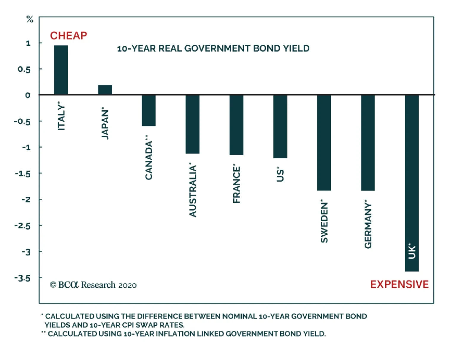
The German ZEW survey was a disappointment in October. While the Current Situation component improved a little bit in both Germany and the Eurozone, the Expectations component declined. This dichotomy was replicated in the UK, Japan and the US. As a result,…
Highlights Duration: Prospects for more pre-election fiscal stimulus are slim. But with the Democrats gaining ground in the polls, the bond market will stay focused on rising odds of a blue sweep election and greater fiscal stimulus in early 2021. Municipal Bonds: Municipal bonds offer exceptional value relative to both US Treasuries and corporate credit. Not only that, but rising odds of a blue sweep election make state & local government fiscal relief increasingly likely. Investors should overweight municipal bonds in US fixed income portfolios. Economy: The economic recovery continues to roll on, but it will be some time before the output gap is closed and inflation starts to rise. Slow consumer and corporate credit growth suggest that animal spirits have not yet taken hold. Meanwhile, the falling unemployment rate masks a persistent uptrend in the number of permanently unemployed. Feature Chart 1Breakout
Breakout
Breakout
After having been lulled to sleep by several months of stagnant yields, bond investors experienced a minor shockwave in early October. The 10-year Treasury yield and 2/10 slope both broke out of well-established trading ranges and implied interest rate volatility bounced off all-time lows to reach its highest level since June (Chart 1). We suspect this might turn out to be just the first small tremor in a tumultuous month leading up to the US election. Specifically, there are two main political risks that will be resolved within the next month. Both have major implications for the bond market. Bond-Bullish Risk: No More Stimulus Before The Election The first risk is the possibility that the current Congress will not deliver any more fiscal stimulus. This increasingly looks like less of a possibility and more of a likelihood, especially after the president tweeted that he is halting negotiations with House Democrats. While he partially walked those comments back the next day, the fact remains that there is very little time between now and November 3rd, and the two sides remain at loggerheads. We have argued that more household income support from Congress is necessary. Otherwise, consumer spending will massively disappoint during the next year.1 However, it could take a few more months before this becomes apparent in the consumer spending data. Real consumer spending still rose in August, though much less quickly than it did in June and July (Chart 2). Meanwhile, August disposable income remained above pre-COVID levels, as it continued to receive a boost from facilities related to the CARES act (Chart 2, bottom panel). This boost will fade as the CARES act’s money is doled out, pushing spending lower. That is, unless Congress enacts a follow-up bill. There are two main political risks that will be resolved within the next month and both have major implications for the bond market. It looks less and less likely that a bill will be passed this month but, depending on the election outcome, a follow-up stimulus bill could become more likely in January. If consumer spending can hang in for the next couple of months, then the bond market might look past Congress’ near-term failure. This appears to be what is happening so far. The stock market fell 1.4% last Tuesday after Trump tweeted about halting negotiations. The 10-year Treasury yield, however, dropped only 2 bps on the day. More generally, long-dated bond yields rose during the past month, even as stocks sold off and prospects for immediate fiscal relief dimmed (Chart 3). Chart 2September's Consumer Spending Report Is Critical
September's Consumer Spending Report Is Critical
September's Consumer Spending Report Is Critical
Chart 3Bonds Ignore Stock ##br##Market...
Bonds Ignore Stock Market...
Bonds Ignore Stock Market...
With all that in mind, we think September’s consumer spending data – the last month of data we will see before the election – are very important. If spending collapses, it might re-focus the market’s attention on Congress’ failure, sending bond yields down. However, we think the market would see through a modest drop in spending, especially if the election looks poised to bring us a larger bill in 2021. Bond-Bearish Risk: A Blue Sweep Election Chart 4...Take Cues From Election Odds
...Take Cues From Election Odds
...Take Cues From Election Odds
This brings us to the second big political risk that could influence bond yields during the next month: The possibility of a “blue sweep” election where the Democrats win control of the House, Senate and White House. This would clearly be a bearish outcome for bonds, as an unimpeded Democratic party would enact a large stimulus package – likely worth $2.5 to $3.5 trillion – shortly after inauguration. It appears that the bond market is already tentatively pricing-in this outcome. While the recent increase in bond yields is hard to square with weak equity prices and souring expectations for immediate stimulus, it is consistent with rising betting market odds of a blue sweep election (Chart 4). To underscore the bond bearishness of this potential election outcome, consider that not only would a unified Congress be able to quickly deliver another fiscal relief bill, but Joe Biden’s platform calls for even more spending on infrastructure, healthcare, education and other Democratic priorities. In total, Biden is proposing new spending of around 3% of GDP, only about half of which will be offset by tax increases (Table 1). Table 1ABiden Would Raise $4 Trillion In Revenue Over Ten Years
Political Risk Will Dominate In A Pivotal Month For The Bond Market
Political Risk Will Dominate In A Pivotal Month For The Bond Market
Table 1BBiden Would Spend $7 Trillion In Programs Over Ten Years
Political Risk Will Dominate In A Pivotal Month For The Bond Market
Political Risk Will Dominate In A Pivotal Month For The Bond Market
How likely is a “blue sweep” election? It is our Geopolitical Strategy service’s base case.2 Also, fivethirtyeight.com’s poll-based forecasting model sees a 68% chance that Democrats win the Senate, a 94% chance that they win the House and an 85% chance that Joe Biden wins the presidency. Investment Strategy These two political risks appear to put bond investors in a bit of a conundrum. On the one hand, if no stimulus bill is passed this month and September’s consumer spending data are weak, then bond yields could fall in the near-term. However, we are inclined to think that if all that occurs against the back-drop of rising odds of a blue sweep election outcome, the bond market will look beyond the near-term and yields will move higher on expectations of larger stimulus coming in January. As such, we retain our relatively pro-reflation investment stance. We recommend owning nominal and real yield curve steepeners, inflation curve flatteners and maintaining an overweight position in TIPS versus nominal Treasuries. All these positions are designed to profit from a rising yield environment.3 Municipal bonds look extremely cheap compared to other US fixed income sectors. We retain an “at benchmark” portfolio duration stance for now, for two reasons. First, while a blue sweep election outcome looks like the most likely scenario, it is not a guarantee. Second, even against the backdrop of greater government stimulus and continued economic recovery, the US economy will still be dealing with a large output gap next year that will temper inflationary pressures. This will keep the Fed on hold, limiting the upside in bond yields. That being said, the odds of another significant downleg in bond yields look increasingly slim. We will likely shift to a more aggressive “below-benchmark” duration stance this month, if our conviction in a blue sweep election outcome continues to rise. A Rare Buying Opportunity In Municipal Bonds No matter how you slice it, municipal bonds look extremely cheap compared to other US fixed income sectors. First, we can look at the spread between Aaa-rated munis and maturity-matched US Treasury yields (Chart 5). When we do this, we find that 2-year and 5-year municipal bonds trade at about the same yields as their Treasury counterparts. This is despite municipal debt’s tax-exempt status. Munis look even more attractive further out the curve, with 10-year and 30-year bonds trading at a before-tax premium relative to Treasuries. Chart 5Aaa Munis Versus ##br##Treasuries
Aaa Munis Versus Treasuries
Aaa Munis Versus Treasuries
Table 2Muni/Corporate Breakeven Effective Tax Rates (%)
Political Risk Will Dominate In A Pivotal Month For The Bond Market
Political Risk Will Dominate In A Pivotal Month For The Bond Market
Next, we can look at how municipal bonds stack up compared to corporates. We do this in a couple different ways. In Table 2, we start with the Bloomberg Barclays Investment Grade Corporate Index split by credit tier. We then find the General Obligation (GO) municipal bond that matches each corporate index’s credit rating and maturity and calculate the breakeven effective tax rate between the two yields. The breakeven effective tax rate is the effective tax rate that would make an investor indifferent between owning the municipal bond and the corporate bond. For example, if an investor faces an effective tax rate of 7%, they will observe the same after-tax yield in a 12-year A-rated GO municipal bond as they do in a 12-year A-rated corporate bond. If their effective tax rate is more than 7%, the muni offers an after-tax yield advantage. Alternatively, we can look at the relative value between munis and credit using the Bloomberg Barclays Municipal Indexes. In Chart 6A, we start with the average yield on the Bloomberg Barclays General Obligation indexes by maturity. We then find the US Credit index that matches the credit rating and duration of the municipal index and calculate the yield differential.4 We find that in all cases, for GO bonds ranging from 6 years to maturity and higher, the muni offers a before-tax yield advantage compared to the Credit Index. This is also true when we perform the same exercise using municipal revenue bonds instead of GOs (Chart 6B). Chart 6AGO Munis Versus Credit
GO Munis Versus Credit
GO Munis Versus Credit
Chart 6BRevenue Munis Versus Credit
Revenue Munis Versus Credit
Revenue Munis Versus Credit
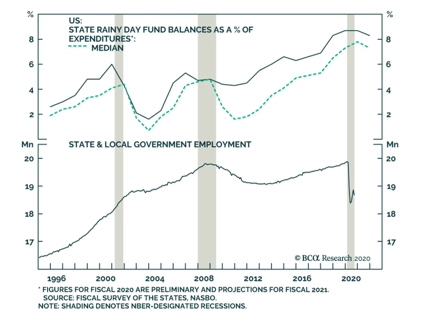
You may notice that municipal bonds trade at a before-tax premium to credit in Charts 6A and 6B, but at a discount in Table 2. This is because we compare bonds by maturity in Table 2 and by duration in Charts 6A and 6B. Unlike investment grade corporates, municipal bonds often carry call options making them negatively convex and giving them a duration that is much shorter than their maturity. Cheap For A Reason, Or Just Plain Cheap? Chart 7State & Local Balance Sheets Will Weather The Storm
State & Local Balance Sheets Will Weather The Storm
State & Local Balance Sheets Will Weather The Storm
We have effectively demonstrated that municipal bonds offer value relative to both Treasuries and corporate credit. But attractive value is not enough to warrant an overweight allocation. Ideally, we would also like some degree of confidence that wide spreads won’t eventually be justified by a wave of downgrades and defaults. While state & local government balance sheets are certainly stressed, we see strong odds that the muni market will emerge from the COVID recession relatively unscathed. For starters, state & local governments were experiencing strong revenue growth prior to the pandemic (Chart 7, top panel). This allowed them to build rainy day funds up to all-time highs (Chart 7, panel 4). Second, income support for households from the CARES act helped prop up state & local income tax revenues in the second quarter (Chart 7, panel 2), though sales tax revenues took a significant hit (Chart 7, panel 3). Going forward, a blue sweep election scenario would not only provide more income support for households – helping income tax revenues – but a Democratic controlled Congress would also quickly deliver fiscal aid directly to state & local governments. In fact, it is this aid for state & local governments that is currently the key sticking point in fiscal negotiations. In the meantime, state & local governments will continue to clamp down on spending. This can already be seen in the massive drop in state & local government employment (Chart 7, bottom panel). This is obviously a drag on economic growth, but the combination of austerity measures and high rainy day fund balances will help municipal bonds avoid downgrades and defaults, at least until a fiscal relief bill is passed next year. While state & local government balance sheets are certainly stressed, we see strong odds that the muni market will emerge from the COVID recession relatively unscathed. Bottom Line: Municipal bonds offer exceptional value relative to both US Treasuries and corporate credit. Not only that, but rising odds of a blue sweep election make state & local government fiscal relief increasingly likely. Investors should overweight municipal bonds in US fixed income portfolios. Economy: Credit Growth & The Labor Market Credit Growth Slowing Chart 8No Animal Spirits
No Animal Spirits
No Animal Spirits
Of notable economic data releases during the past two weeks, we find it particularly interesting that both consumer credit and Commercial & Industrial (C&I) bank lending continue to slow (Chart 8). On the consumer side, massive income support from the CARES act and few spending opportunities caused households to pay down debt this spring. Then, after two months of modest gains, consumer credit fell again in August (Chart 8, top panel). This strongly suggests that, even as lockdown restrictions have eased, consumers aren’t yet ready to open up the spending taps. On the corporate side, firms received much less of a direct cash injection from Congress and were forced to take on massive amounts of debt to get through the spring and early summer months. But as of the second quarter, we recently observed that nonfinancial corporate retained earnings now exceed capital expenditures.5 This strongly suggests that firms have taken out enough new debt and that C&I bank lending will remain slow in the coming months. Cracks Showing In The Labor Market Chart 9Far From Full Employment
Far From Full Employment
Far From Full Employment
Finally, we should mention September’s employment report that was released two weeks ago (Chart 9). It is certainly positive that the unemployment rate continues to fall, but the main takeaway for bond investors should be that the US economy remains far from full employment, and therefore far away from generating meaningful inflationary pressure. While the unemployment rate fell for the fifth consecutive month, it is now dropping much less quickly than it did early in the summer (Chart 9, panel 2). Also, we continue to note that labor market gains are entirely concentrated in temporarily unemployed people returning to work. The number of permanently unemployed continues to rise (Chart 9, bottom panel). Bottom Line: The economic recovery continues to roll on, but it will be some time before the output gap is closed and inflation starts to rise. Slow consumer and corporate credit growth suggest that animal spirits have not yet taken hold. Meanwhile, the falling unemployment rate masks a persistent uptrend in the number of permanently unemployed. Appendix The Fed rolled out a number of aggressive lending facilities on March 23. These facilities focused on different specific sectors of the US bond market. The fact that the Fed has decided to support some parts of the market and not others has caused some traditional bond market correlations to break down. It has also led us to adopt of a strategy of “Buy What The Fed Is Buying”. That is, we favor those sectors that offer attractive spreads and that benefit from Fed support. The below Table tracks the performance of different bond sectors since the March 23 announcement. We will use this to monitor bond market correlations and evaluate our strategy’s success. Table 3Performance Since March 23 Announcement Of Emergency Fed Facilities
Political Risk Will Dominate In A Pivotal Month For The Bond Market
Political Risk Will Dominate In A Pivotal Month For The Bond Market
Ryan Swift US Bond Strategist rswift@bcaresearch.com Footnotes 1 Please see US Bond Strategy Weekly Report, “More Stimulus Needed”, dated September 15, 2020, available at usbs.bcaresearch.com 2 Please see Geopolitical Strategy Weekly Report, “It Ain’t Over Till It’s Over”, dated October 9, 2020, available at gps.bcaresearch.com 3 For more details on these recommended positions please see US Bond Strategy Weekly Report, “Positioning For Reflation And Avoiding Deflation”, dated August 11, 2020, available at usbs.bcaresearch.com 4 Note that we use the US Credit Index in Charts 6A and 6B. This index includes the entire US corporate bond index but also some non-corporate credit sectors like Sovereigns and Foreign Agency bonds. 5 Please see US Bond Strategy Weekly Report, “Out Of Bullets”, dated September 29, 2020, available at usbs.bcaresearch.com Fixed Income Sector Performance Recommended Portfolio Specification
Highlights Does it still make sense to use historical yield betas for fixed income country allocation? Yes, favoring countries with higher government bond yield betas when global yields are falling, and vice versa, is still an appropriate way to manage fixed income risk – although betas do vary between global bond bull and bear markets. Can inflation breakevens and real yields continue moving in opposite directions? Yes, but that negative correlation will become less intense, especially in the US, with rising inflation expectations eventually becoming the more dominant influence on nominal bond yields. Will inflation breakevens continue to have a strong positive correlation with oil prices? Yes, but only for as long as non-energy inflation remains low and stable, which has made energy prices the only source of inflation variability in most developed countries. Feature Sleepy bond markets got a bit of a jolt over the past couple of weeks, with longer-maturity government bond yields moving higher across the developed markets, led by the US where the 30-year Treasury yield is now back to levels last seen in June. The move higher in US Treasury yields may be a sign that investors are taking the US election polling numbers – which now signal not only a Joe Biden victory on November 3, but also a swing of the US Senate to Democratic Party control – seriously. A so-called “Blue Sweep”, resulting in the full implementation of the Biden policy platform including a massive fiscal stimulus, is potentially bond bearish, and not only for US Treasuries, given the close correlation of US yields to other bond markets. There is a strong correlation between the level of bond yields, and the yield beta, for the major developed market countries. This brief burst of global bond market volatility, stemming from developments in the US, is a reminder that investors should always be aware of the importance of cross-market correlations when making trading and portfolio construction decisions. With that in mind, this week we ask some important questions about the critical correlations across global government bond markets that support our current investment recommendations – and under what conditions they could possibly change. Does It Still Make Sense To Use Historical Yield Betas For Fixed Income Country Allocation? Chart 1Developed Bond Yields Relative To The 'Global' Bond Yield
Developed Bond Yields Relative To The 'Global' Bond Yield
Developed Bond Yields Relative To The 'Global' Bond Yield
One of the key elements underlying our bond country allocation recommendations is the concept of “yield beta”. Simply put, this is a measure of the sensitivity of changes in individual country bond yields to changes in the overall level of global bond yields. The way we measure yield betas is by using a regression (over a three-year rolling window) of monthly changes for an individual country’s 10-year bond yield on the monthly change of the Bloomberg Barclays Global Treasury index yield for the 7-10 year maturity bucket (as the proxy for the “global” 10-year yield). The regression coefficient on the individual country yield change is the yield beta. There is a strong correlation between the level of bond yields, and the yield beta, for the major developed market countries. Currently, the list of “high-yielders” – with 10-year government bond yields above the benchmark index yield – includes the US, Italy, Canada, Australia and New Zealand (Chart 1). The low-yielders, with 10-year yields below the benchmark index yield, are Germany, France, Spain, the UK and Japan. When we look at the yield betas for that same list of countries, we can also break up the list into high-beta and low-beta bond markets. When we rank the ten countries by their rolling three-year yield betas, the five highest betas belong to the same five countries with the highest yields, and vice versa (Chart 2). This is an intuitive correlation, as countries with higher yield betas are, by definition, more volatile and should require higher yields from investors to compensate for that additional volatility. Chart 2The Higher-Yielding Countries Also Have Higher Yield Betas
The Higher-Yielding Countries Also Have Higher Yield Betas
The Higher-Yielding Countries Also Have Higher Yield Betas
The yield betas are not stable over time for all countries, however. The US has consistently remained the highest beta market, and Japan the lowest beta market, over the past twenty years. Other countries have seen their yield betas evolve over time. For example, France, Spain and, more recently, the UK have seen their yield betas decline in recent years, while Italy has gone from being low-beta to one of the higher-beta markets. In our view, the evolution of yield betas relates to the “activism” of policymakers in each country. Higher-beta, higher-yield countries also have central banks that move interest rates higher and lower with more frequency compared to the low-beta, low-yield countries. In our view, the evolution of yield betas relates to the “activism” of policymakers in each country. That high-beta group includes bond markets linked to the Federal Reserve, the Bank of Canada, the Reserve Bank of Australia and the Reserve Bank of New Zealand – all central banks that are not shy about aggressively cutting or hiking interest rates. The low-beta markets have central banks that move rates very infrequently, like the European Central Bank and the Bank of Japan. Table 1Yield Betas For The Major Developed Markets
Some Important Questions Regarding Bond Yield Correlations
Some Important Questions Regarding Bond Yield Correlations
One other interesting point on yield betas is that they do vary depending on the overall direction of global bond yields. As a way to show this, we estimated “upside” and “downside” yield betas for the same ten countries shown earlier. Those betas were calculated by sorting the monthly yield changes for all countries by months when the benchmark global bond index yield was rising or falling. Thus, upside yield beta comes from a regression of monthly yield changes for individual countries on changes in overall global bond yields, but only using data for months when global yields increased. The opposite is true for downside beta, where only data from months when the global benchmark index yield declined are used. The individual yield betas – for the overall sample and the upside and downside groupings – are presented in Table 1. One conclusion that comes from breaking up the data this way is that countries that were in the low-beta group when looking at the full set of data have relatively high yield betas during periods of rising global yields, like France and the UK (Chart 3). In addition, when looking at downside betas, US Treasuries have the highest beta, by far, when global yields are falling – with yields for euro area countries having relatively lower betas (Chart 4). Chart 3Yield Betas During Periods Of Rising Global Yields
Yield Betas During Periods Of Rising Global Yields
Yield Betas During Periods Of Rising Global Yields
Chart 4Yield Betas During Periods Of Falling Global Yields
Yield Betas During Periods Of Falling Global Yields
Yield Betas During Periods Of Falling Global Yields
Our conclusion from this analysis is that yield betas do have a useful role in making country allocation decisions for global fixed income investors. Specifically, adjusting allocations based on a view on the overall direction of global bond yields should help better manage portfolio risk and, potentially, improve returns. Chart 5Italy Has Become High-Beta As Spreads Have Narrowed
Italy Has Become High-Beta As Spreads Have Narrowed
Italy Has Become High-Beta As Spreads Have Narrowed
A final point on Italy – the reason Italy has had such a high yield beta over the past few years is because Italian government bond yields have been driven more by the reduction of Italian sovereign credit risk – including the redenomination risk from a potential Italian exit from the euro (Chart 5). As Italian credit spreads have melted away from the levels reached during the 2011/12 European Debt Crisis, yields have fallen faster than others during periods of falling global yields, and vice versa. Looking ahead, with the ECB continuing to be an aggressive buyer of Italian bonds in its various asset purchase programs, and with the COVID-19 pandemic forcing the European Union into a deeper level of economic co-operation – which now includes grants to Italy – the sovereign risk premium on Italian government debt should continue to narrow. That means Italy will continue to trade as a high-beta market when global yields are falling, and a low-beta market when yields are rising, making Italy an ideal overweight candidate in global bond portfolios. Bottom Line: Favoring countries with higher government bond yield betas when global yields are falling, and vice versa, is still an appropriate way to manage fixed income risk – although betas do vary between global bond bull and bear markets. Can Inflation Breakevens And Real Yields Continue Moving In Opposite Directions? The behavior of real bond yields over the past few months garnered a lot of attention in 2020, particularly the sharp fall in US TIPS yields into deeply negative territory. This has occurred at the same time as a widening of inflation breakevens, which exhibited a deeply negative correlation with real yields. The result: narrow trading ranges for nominal government bond yields in most developed countries, with moves in real yields and inflation breakevens largely offsetting each other. Adjusting allocations based on a view on the overall direction of global bond yields should help better manage portfolio risk and, potentially, improve returns. Looking at the history of real yields and inflation breakevens, periods of a negative correlation between the two are not unusual. In Chart 6, we show the range of historic correlations between 10-year inflation-linked bond yields, and 10-year inflation breakevens, for the US, UK, Germany, France, Italy, Australia, Canada and Japan since 2010. The dark bars represent the range of rolling correlations over a three-year period, while the red diamonds are a more recent correlation over the past thirteen weeks. All countries shown have seen periods of negative correlation, with only Australia and France having the most recent correlation be far lower than the historic experience. Chart 6Negative Real Yield/Breakevens Correlations Are Not Unprecedented
Some Important Questions Regarding Bond Yield Correlations
Some Important Questions Regarding Bond Yield Correlations
So if a negative real yield/inflation breakeven correlation is not that unusual, then what is the cause of it? We see two drivers: the amount of spare capacity in an economy and the central bank policy response to it. We can see this by looking at the data from the countries with the two largest inflation-linked bond markets, the US and UK. In the US, real TIPS yields and inflation breakevens have generally been positively correlated only during Fed tightening cycles, specifically after the Fed has raised the fed funds rate above the rate of realized core inflation (Chart 7). This was the case in the tightening cycles of the mid-2000s and 2016-18. During those episodes, the Fed pushed the real funds rate steadily higher, which also had the effect of pushing real TIPS bond yields higher, even as inflation expectations were stable-to-rising. Looking at the history of real yields and inflation breakevens, periods of a negative correlation between the two are not unusual. The opposite held true during Fed easing cycles since the advent of the TIPS market in the late 1990s, when the Fed always lowered the funds rate below realized inflation. The result was a period of a falling real funds rate, leading to lower real TIPS yields and eventually triggering an increase in inflation breakevens. In other words, the correlation between breakevens and real yields became negative. In the UK, the negative correlation between real index-linked Gilt yields and inflation breakevens has been consistently negative since the 2008 financial crisis (Chart 8). The Bank of England has barely moved policy rates since that crisis, while keeping nominal policy rates below 1% - a level that was consistently below core UK inflation. Thus, the Bank of England has maintained negative real policy rates for the past twelve years, with real Gilt yields declining steadily and inflation breakevens rising – a negative correlation - over that period. Chart 7Fed Policy Influences The US Real Yield/Breakevens Correlation
Fed Policy Influences The US Real Yield/Breakevens Correlation
Fed Policy Influences The US Real Yield/Breakevens Correlation
Chart 8A Persistently Negative Correlation Of UK Real Yields & Breakevens
A Persistently Negative Correlation Of UK Real Yields & Breakevens
A Persistently Negative Correlation Of UK Real Yields & Breakevens
For both the US (Chart 9) and UK (Chart 10), the rolling 3-year correlation between real yields and breakevens has itself been correlated to the unemployment gap, or the difference between the unemployment rate and the full-employment NAIRU rate, over the past two decades. This suggests that the ebbs and flows of labor market slack, and how the Fed and Bank of England have responded to them by easing or tightening monetary policy, also play a role in determining the real yield/breakevens correlation. Chart 9Real Yield/Breakevens Correlation Will Stay Negative In The US
Real Yield/Breakevens Correlation Will Stay Negative In The US
Real Yield/Breakevens Correlation Will Stay Negative In The US
Chart 10Real Yield/Breakevens Correlation Will Stay Negative In The UK
Real Yield/Breakevens Correlation Will Stay Negative In The UK
Real Yield/Breakevens Correlation Will Stay Negative In The UK
In the case of the US, a more extended UK-like period of negative real policy rates and real bond yields is likely if the Fed is to be taken at their word that they will keep rates low to engineer a US inflation overshoot. We suspect that the correlation will not be perfectly negative, as has occurred at times this year, with inflation expectations rising alongside stable-to-falling real TIPS yields as the US economy recovers from the COVID-19 shock – especially if there is a major boost from fiscal stimulus after next month’s elections. Bottom Line: We continue to see a case for inflation breakevens and real yields to stay negatively correlated in the developed economies over at least the next few years, as the labor market slack created by the 2020 COVID-19 global recession is slowly absorbed. That negative correlation will become less intense, especially in the US, with rising inflation expectations eventually becoming the more dominant influence on nominal bond yields. Will Inflation Breakevens Continue To Have A Strong Positive Correlation With Oil Prices? While the negative correlation between real inflation-linked bond yields and real yields has gotten attention this year, the positive correlation between breakevens and oil prices has become familiar to investors over the past several years. That correlation has been persistently high and positive across all developed economies since the 2008 financial crisis. Prior to that, oil prices and inflation breakevens moved together less frequently and, at times, were even uncorrelated (Chart 11). In both the US and euro area, the lack of non-energy inflation is the main reason why breakevens and oil are so correlated. In our view, the reason why breakevens and oil became strongly correlated is relatively straightforward. Since the 2008 crisis and ensuing Great Recession, swings in oil prices have been the main driver of changes in realized inflation, with ex-energy inflation rates staying very low and stable. We can see that in the US, where ex-energy CPI inflation has been broadly stable around 2% for the past decade, even as headline CPI inflation has seen more variability and has even approached 0% after the collapse in oil prices in 2014/15 and 2020 (Chart 12). Chart 11A Persistent Strong Correlation Of Global Breakevens To Oil
Real Yield/Breakevens Correlation Will Stay Negative In The UK
Real Yield/Breakevens Correlation Will Stay Negative In The UK
Chart 12Strong Oil/Breakevens Correlation While US Ex-Energy Inflation Is Low
Strong Oil/Breakevens Correlation While US Ex-Energy Inflation Is Low
Strong Oil/Breakevens Correlation While US Ex-Energy Inflation Is Low
Chart 13Energy Has Become The Only Source Of Euro Area Inflation
Energy Has Become The Only Source Of Euro Area Inflation
Energy Has Become The Only Source Of Euro Area Inflation
The same dynamics, only more intense, exist in the euro area. Ex-energy inflation has struggled to stay above 1% over the past decade, leaving changes in energy prices as an even greater determinant of realized headline inflation than in the US (Chart 13). In both the US and euro area, the lack of non-energy inflation is the main reason why breakevens and oil are so correlated. Until there is evidence of a more broad-based move higher in inflation rates outside of oil - which will almost certainly require an extended period of above-trend global growth and accommodative global fiscal and monetary policies - trading inflation breakevens off oil will still be a successful strategy. Bottom Line: Global inflation breakevens will maintain a strong positive correlation to oil prices, but only for as long as non-energy inflation remains low and stable, which has made energy prices the only source of inflation variability in most developed countries Robert Robis, CFA Chief Fixed Income Strategist rrobis@bcaresearch.com Footnotes Recommendations Duration Regional Allocation Spread Product Tactical Trades Yields & Returns Global Bond Yields Historical Returns
Highlights Both public opinion polls and betting markets suggest that Joe Biden will become President, with the Democrats gaining control of the Senate and retaining the House of Representatives. Such a “blue wave” would have mixed effects on the value of the S&P 500. On the one hand, corporate taxes would rise under a Biden administration. On the other hand, trade relations with China would improve. The Democrats would also push for more fiscal stimulus, which the stock market would welcome. The odds of Republicans and Democrats agreeing on a major new stimulus deal before the November elections look increasingly slim. In a blue wave scenario, the Democrats will enact $2.5-to-$3.5 trillion in pandemic relief shortly after Inauguration Day. Joe Biden‘s platform also calls for around 3% of GDP in additional spending on infrastructure, health care, education, climate, housing, and other Democratic priorities. Unlike in late 2016, the Fed is in no mood to raise interest rates. Large-scale fiscal easing will push down the value of the US dollar, while giving bond yields a modest boost. Non-US stocks will outperform their US peers. Value stocks will outperform growth stocks. Looking further out, Republicans will move to the left on economic issues, leaving corporate America with no clear backer among the two major parties. As such, while we are constructive on equities over the next 12 months, we see grave dangers ahead later this decade. Look, Here's The Deal: Joe Biden Is In The Lead With four weeks remaining until the US presidential election, Joe Biden remains on course to become the 46th president of the United States. According to recent public opinion polls, the former vice president leads Donald Trump by 10 percentage points nationwide, and by 4 points in battleground states (Chart 1). Far fewer voters are undecided today compared to 2016. This suggests that there is less scope for President Trump to narrow his deficit in the polls. Betting markets give Biden a 68% chance of prevailing in the race for the White House (Chart 2). They also assign a 67% probability that the Democrats will take control of the Senate and 89% odds that they will retain their majority in the House of Representatives. Chart 1Opinion Polls Favor Biden ...
Market Implications Of A Blue Wave
Market Implications Of A Blue Wave
Chart 2.... As Do Betting Markets
Market Implications Of A Blue Wave
Market Implications Of A Blue Wave
Mixed Impact On The S&P 500 What would the market implications of a “blue wave” be? Our sense is that the overall impact on the value of the S&P 500 would be small, largely because some negative repercussions from a Democratic sweep would be offset by positive repercussions. On the negative side, Biden has pledged to raise the corporate income tax rate from 21% to 28%, bringing it halfway back to the 35% rate that prevailed in 2017. He has also promised to introduce a minimum of 15% tax on the income that companies report in their financial statements to shareholders, raise taxes on overseas profits, and lift payroll taxes on households with annual earnings in excess of $400,000. Together, these measures would reduce S&P 500 earnings-per-share by 9%-to-10%. On the positive side, while geopolitical tensions will persist, US trade relations with China would likely improve if Joe Biden were to become the president. Biden has roundly criticized Trump’s tariffs, saying that they are “crushing farmers” and “hitting a lot of American manufacturing… choking it to within an inch of its life.”1 He has pledged to honor multilateral agreements. The World Trade Organization concluded on September 15 that Trump’s tariffs violated international trade rules. This judgement and the desire to turn the page on the Trump era could give Biden the impetus to eventually roll back some of the tariffs. In contrast, having been stricken by what he has called the “China virus,” Trump could take things personally and retaliate with a flurry of new punitive measures. Fiscal policy would be further loosened in a blue wave scenario, an outcome that the stock market would welcome. Voters would also applaud more pandemic relief. Table 1 shows that 72% of Americans, including the majority of Republicans, support the broader contours of the $2 trillion stimulus package that President Trump has rejected. Table 1Voters Support A New $2 Trillion Coronavirus Stimulus Package By A Fairly Wide Margin
Market Implications Of A Blue Wave
Market Implications Of A Blue Wave
At this point, the odds of Republicans and Democrats agreeing on a major new stimulus deal before the November elections look increasingly slim. If Biden wins and the Republicans lose control of the senate, the Democrats would likely enact a stimulus package worth $2.5-to-$3.5 trillion shortly after Inauguration Day on January 20. In addition to pandemic-related stimulus, Joe Biden has called for around 3% of GDP in spending on infrastructure, health care, education, climate, housing, and other Democratic priorities. Only about half of those expenditures would be matched by higher taxes, implying substantial net stimulus for the economy. A Weaker Dollar And Modestly Higher Bond Yields The greenback jumped on Tuesday after President Trump said he is breaking off negotiations with the Democrats over a new stimulus bill. This suggests that the dollar will weaken if fiscal policy is loosened. If that were to happen, it would be different from what transpired following Trump’s victory in 2016 when the dollar strengthened. Why the disconnect between now and then? The answer has to do with the outlook for monetary policy. Back then, the Fed was primed to start raising rates again – it hiked rates eight times beginning in December 2016, ultimately bringing the fed funds rate to 2.5% by end-2018 (Chart 3). This time around, the Fed is firmly on hold, with the vast majority of FOMC members expecting policy rates to stay at rock-bottom levels until at least 2023. This suggests that nominal bond yields will rise less than they did in late 2016. Since inflation expectations will likely move up in response to more stimulative fiscal policy, real yields will rise even less than nominal yields. Over the past 18 months, US real rates have fallen a lot more in relation to rates abroad than what one would have expected based on the fairly modest depreciation in the US dollar (Chart 4). If US real rates remain entrenched deep in negative territory, while the US current account deficit widens further on the back of strong domestic demand, the dollar will continue to weaken. Chart 3Trump Victory Was Followed By Rising Interest Rates
Trump Victory Was Followed By Rising Interest Rates
Trump Victory Was Followed By Rising Interest Rates
Chart 4A Relatively Muted Decline In The Dollar Given The Move In Real Yield Differentials
A Relatively Muted Decline In The Dollar Given The Move In Real Yield Differentials
A Relatively Muted Decline In The Dollar Given The Move In Real Yield Differentials
Favor Non-US And Value Stocks Non-US stocks typically outperform their US peers when the dollar is weakening (Chart 5). This partly stems from the fact that cyclical stocks are overrepresented in stock markets outside of the United States. It also reflects the fact that cash flows denominated in say, euros or yen, are worth more in dollars if the value of the dollar declines. Chart 5A Weaker Dollar Tends To Benefit Cyclical And Non-US Stocks
A Weaker Dollar Tends To Benefit Cyclical And Non-US Stocks
A Weaker Dollar Tends To Benefit Cyclical And Non-US Stocks
Financial stocks are overrepresented outside the US (Table 2). They are also overrepresented in value indices (Table 3). While a Biden administration would subject the largest US banks to additional regulatory scrutiny, the impact on their bottom lines would likely be small. US banks have been living under the shadows of the Dodd-Frank Act for over a decade. Today, banks operate more as stable utilities than as cavalier casinos. Table 2Financials Are Overrepresented In Ex-US Indexes, While Tech Dominates The US Market
Market Implications Of A Blue Wave
Market Implications Of A Blue Wave
Table 3Financials Are Overrepresented In Value, While Tech Dominates Growth Indexes
Market Implications Of A Blue Wave
Market Implications Of A Blue Wave
Stronger stimulus-induced growth next year will allow many banks to release some of the hefty provisions against bad loans that they built up this year, while modestly steeper yields curves will boost net interest margins. Tech stocks are overrepresented in growth indices. Better trade relations would help US tech companies, as would a weaker dollar. That said, Joe Biden’s plan to increase taxes on overseas profits would hit tech companies disproportionately hard since the tech sector derives over half its revenue from outside the United States. Stepped up antitrust enforcement and more stringent privacy rules could also weigh on tech profits. On balance, while there are many moving parts, a Democratic sweep would favor non-US equities over US equities, and value stocks over growth stocks. Trumpism Transcends Trump Chart 6Trump Targeted Socially Conservative Voters
Market Implications Of A Blue Wave
Market Implications Of A Blue Wave
In 2016, we bucked the consensus view that Hillary Clinton would win the election. On September 30, 2016, we predicted that “Trump will win and the dollar will rally,” noting that “Trump has seen a huge (yuge?) increase in support among working-class whites. If the so-called “likely voters” backing Clinton are, in fact, less likely to turn out at the polls than those backing Trump, this could skew the final outcome in Trump's favor.”2 Right-wing populism was the $1 trillion bill lying on the sidewalk that no mainstream Republican politician seemed eager to pick up. According to the Voter Study Group, only 4% of the US electorate identified as socially liberal and fiscally conservative in 2016, compared to 29% who saw themselves as fiscally liberal and socially conservative (Chart 6). The latter group had no political home, at least until Donald Trump came along. Rather than waxing poetically about small government conservatism – as most establishment Republicans were wont to do – Trump railed against mass immigration, unfair trade deals, rising crime, never-ending wars, and what he described as out-of-control political correctness. While Trump was able to carry out parts of his protectionist agenda, most of his other actions fell well short of what he had promised. His only major legislative achievement was a massive tax cut for corporations and wealthy individuals – something that the vast majority of his base never asked for. The Rich Are Flocking To The Democratic Party How did corporations and wealthy Americans reward Trump for lowering their taxes? By shifting their allegiances towards the Democrats, that’s how. According to the Pew Research Center, households earning more than $150,000 favored Democrats by 20 percentage points during the 2018 Congressional elections, a 13-point jump from 2016. Households earning between $30,000 and $149,999 favored Democrats by only 6 points in 2018. The only other income group that strongly favored Democrats were those earning less than $30,000 per year (Table 4). Table 4Democratic Candidates Had Wide Advantages Among The Highest-And-Lowest Income Voters
Market Implications Of A Blue Wave
Market Implications Of A Blue Wave
Chart 7Democratic Districts Have Fared Better Over The Past Decade
Market Implications Of A Blue Wave
Market Implications Of A Blue Wave
Other data tell a similar story. Median household income in Democratic congressional districts rose by 13% between 2008 and 2017. It fell by 4% in Republican districts. Today, on average, Republican districts have a median income that is 13% below Democratic districts (Chart 7). Campaign donations have shifted towards the Democrats. The latest monthly fundraising data shows that the Biden campaign received three times more large-dollar contributions in total than the Trump campaign. The nation’s CEOs have not been immune from this transformation. Seventy-seven percent of the business leaders surveyed by the Yale School of Management on September 23 said they would be voting for Joe Biden.3 As elites desert the Republican Party, will the Democratic Party start championing lower taxes and less regulation? That seems unlikely. According to the Voter Study Group, higher-income Democrats are actually more likely to support raising taxes on families earning more than $200,000 per year than lower-income Democrats (83% versus 79%). Among Republicans, the opposite is true: 45% of lower-income Republicans are in favor of raising taxes, compared to only 23% of higher-income Republicans.4 There used to be a time when companies tried to steer clear of the political limelight. This is starting to change. As the relative purchasing power of Democratic voters has risen, many companies have become emboldened to adopt overtly political stances on a variety of hot-button social and cultural issues, even if those stances alienate many conservative customers. What does this imply for investors? If big business abandons conservative voters, conservative voters will abandon big business. Corporate America will be left with no clear backer among the two major parties. Over the long haul, this is likely to be bad news for equity investors. As such, while we are constructive on equities over the next 12 months, we see grave dangers ahead later this decade. Peter Berezin Chief Global Strategist peterb@bcaresearch.com Footnotes 1 “Biden Takes On ‘Trump’s Tariffs’,” The Wall Street Journal, June 12, 2019. 2 Please see Global Investment Strategy Special Report, “Three (New) Controversial Calls,” dated September 30, 2016. 3 “CEO Caucus Survey: Business Leaders Fault Trump Administration on COVID and China,” Yale School of Management, September 24, 2020. 4 Lee Drutman, Vanessa Williamson, Felicia Wong, “On the Money: How Americans’ Economic Views Define — and Defy — Party Lines,” votersstudygroup.org, June 2019. Global Investment Strategy View Matrix
Market Implications Of A Blue Wave
Market Implications Of A Blue Wave
Current MacroQuant Model Scores
Market Implications Of A Blue Wave
Market Implications Of A Blue Wave
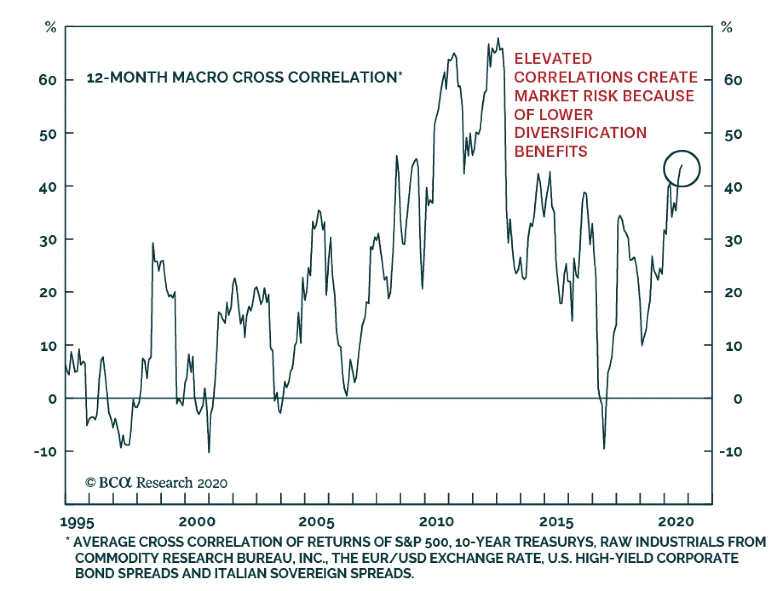
Correlations across asset classes move higher in times of crisis. 2020 proved no exception to this rule, which is problematic as it makes diversification more difficult to achieve exactly when investors need it most. The good news is that as economic…
Highlights US market risks stem from both the lack of fiscal stimulus before the new president assumes office in late January. Risk-off moves in US financial markets will weigh on EM. China’s stimulus has peaked and the country has begun a destocking phase in commodities inventories. These factors could add to investor worries reinforcing the pullback in commodities prices and EM currencies. The key risks to our strategy are that financial markets might look through the lack of US fiscal stimulus in the next several months and ignore the commodity destocking cycle in China. This will be the case if investors instead focus on the US and China’s benign growth outlook over the next nine months. In that regard, we are positive too. Hence, the difficulty is to navigate markets in the near-term. If EM risk assets and currencies prove resilient in the short term, we will upgrade our stance sooner than later. Feature Global risk assets are vulnerable as US Republicans and Democrats have failed to agree on a new round of fiscal stimulus. The odds of enacting significant stimulus legislation – including income support for the unemployed – before the new president assumes office in late January are low. Global risk assets will suffer due to their dependence on continuous government stimulus. The rally since late March has created an air pocket, somewhat disconnecting risk asset prices from their fundamentals. In particular, the gaps between share prices and corporate earnings and between corporate spreads and projected corporate default rates have widened dramatically (Chart I-1). We do not mean that corporate earnings will not recover. Our point is that share prices have risen too far, too fast. Absent a large fiscal stimulus package in the US, risk asset prices will likely experience a meaningful setback. These gaps have been sustained by hopes of continuous fiscal and monetary stimulus. However, absent a large fiscal stimulus package in the US, risk asset prices will likely experience a meaningful setback. We continue recommending EM investors maintain a defensive positioning for now. Asset allocators should remain neutral on EM equities and credit within their respective global portfolios. In the near term, EM currencies will depreciate against the US dollar. We continue shorting a basket of EM currencies versus the euro, CHF and JPY. These DM currencies are likely to experience some, but not substantial, downside versus the greenback. Elevated Expectations Economic growth expectations are rather elevated and investor sentiment is complacent: The Global ZEW expectations index – based on a survey of analysts from banks, insurance companies and finance departments from the corporate sector – is close to an all-time high (Chart I-2). This implies that investors’ and analysts’ growth expectations are substantially inflated. Chart I-1The Rally Has Been Too Fast, And Gone Too Far
The Rally Has Been Too Fast, And Gone Too Far
The Rally Has Been Too Fast, And Gone Too Far
Chart I-2Investor Expectations Are Very Elevated
Investor Expectations Are Very Elevated
Investor Expectations Are Very Elevated
The very low level of the SKEW for US stocks signifies investor complacency (Chart I-3). A low SKEW reading means investors are not pricing in tail risks. Further, the rally since March lows has been reinforced by the substantial speculative trading activities of retail investors. Finally, investors’ net long positions in copper are at their previous cyclical highs (Chart I-4). Chart I-3Low SKEW Signifies That Investors Are Not Ready For Tail Risks
Low SKEW Signifies That Investors Are Not Ready For Tail Risks
Low SKEW Signifies That Investors Are Not Ready For Tail Risks
Chart I-4Investors Are Very Long Copper
Investors Are Very Long Copper
Investors Are Very Long Copper
Peak Stimulus? China is approaching peak stimulus. Chart I-5 shows that the projected bond issuance by central and local governments will decline in the coming months. Besides, the loan approval index of the PBoC banking survey has rolled over decisively (Chart I-6). Chart I-5Peak Fiscal Stimulus In China?
Peak Fiscal Stimulus In China?
Peak Fiscal Stimulus In China?
Chart I-6Peak Credit Growth In China?
Peak Credit Growth In China?
Peak Credit Growth In China?
A combination of less government bond issuance and less loan origination by banks implies that the credit impulse will roll over in the coming months. This does not mean that the mainland economy will weaken in the coming months. The credit and fiscal spending as well as broad money impulses lead the economy by about nine months (Chart I-7). Therefore, even if the credit and fiscal spending impulse rolls over later this year, the economy will continue improving at least until next spring. Therefore, from a cyclical perspective, we remain positive on China’s business cycle. China’s peak stimulus and destocking phase in commodities could add to investor worries. That said, China-related financial markets have already rallied quite a bit and are likely to experience a pullback as US equity and credit markets sell off. Additionally, after having stockpiled commodities since spring, China has probably entered a commodity destocking cycle. Even though final demand in China will be firming, resource prices will likely relapse in the near term due to diminished mainland imports. In the US, the massive fiscal stimulus from the CARES Act has led to a surge in household income amidst the worst collapse in economic activity since the Great Depression and the massive layoffs that accompanied it. Government transfers during recessions are typically devised to moderate income decline but not lead to a boom in income as has occurred in the US this year (Chart I-8). Chart I-7China's Business Cycle Will Continue Improving
China's Business Cycle Will Continue Improving
China's Business Cycle Will Continue Improving
Chart I-8US Household Income Surged Amid Economic Collapse
US Household Income Surged Amid Economic Collapse
US Household Income Surged Amid Economic Collapse
Chart I-9Credit Standards At US Banks Are Tight
Credit Standards At US Banks Are Tight
Credit Standards At US Banks Are Tight
Without renewed fiscal transfers to households, personal income will erode and consumer spending will weaken. Further, state and local governments are retrenching as their revenue streams have evaporated. Finally, bank lending standards have tightened dramatically (Chart I-9). Crucially, the majority of investors are long risk assets because of expectations of recurring fiscal stimulus and the Federal Reserve’s implicit put on stocks and corporate credit. If one of these two pillars – in this case fiscal stimulus – fades away, some investors might throw in the towel. In EM excluding China, Korea and Taiwan, economic activity is rebounding post lockdowns. However, these economies are also approaching peak stimulus at a time when the level of economic activity in many countries remains very low. In addition, hit by a wave of defaults, banks in these economies are not in a position to originate new loans. Thereby, the transmission mechanism of monetary policy is partially broken. Their central banks’ stimulus have not been fully transmitted to the real economies. Bottom Line: Risks to the rally in US equities stem from both the lack of fiscal stimulus and political uncertainty following a possibly contested presidential election. Risk-off moves in US financial markets will weigh on EM. China’s peak stimulus and destocking phase in commodities could add to investor worries, reinforcing the pullback in commodities and EM risk assets. Indicator Review A number of indicators point to downside in EM risk assets and currencies. The advance-decline line for EM equities is below zero stocks (Chart I-10). This points to poor equity breadth in the EM universe. Chart I-10Poor Breadth In EM Equities
Poor Breadth In EM Equities
Poor Breadth In EM Equities
Chart I-11A Warning Signal For EM Stocks
A Warning Signal for EM Stocks
A Warning Signal for EM Stocks
The cross rate of the Swedish koruna versus the Swiss franc (de-trended) has been a good coincident indicator for EM share prices and it points to a selloff (Chart I-11). The implied volatility index for EM currencies is rising (shown inverted in the chart), pointing to a relapse in EM exchange rates versus the US dollar (Chart I-12, top panel). Chart I-12Red Flags For EM Equities And Currencies
Red Flags For EM Equities and Currencies
Red Flags For EM Equities and Currencies
Chart I-13Are Commodities In A Soft Spot?
Are Commodities In A Soft Spot?
Are Commodities In A Soft Spot?
Platinum prices are gapping down. This rings alarm bells for EM currencies as the two are strongly correlated (Chart I-12, bottom panel). Chinese steel rebar futures, global steel stocks and Glencore’s share price – a global bellwether for commodities – have all begun relapsing, even before Trump’s withdrawal from the fiscal stimulus talks (Chart I-13). Also, the latter has failed to break above its 200-day moving average. The same is true for oil prices. We read such a technical configuration as a telltale sign that these commodity plays have not entered a bull market and remain vulnerable. In emerging Asia, high-yield corporate credit’s relative performance versus investment-grade corporates has rolled over at its previous highs (Chart I-14). In the past several years, the failure to break above this technical resistance level was followed by a material selloff in EM credit and equity markets. Bottom Line: The majority of indicators for EM risk assets and currencies are presently flashing red. Investment Considerations The rally in share prices and drop in the US dollar yesterday following Trump’s cancellation of stimulus talks is puzzling. We expect the market to realize that the odds of considerable fiscal stimulus with meaningful income support for the unemployed is low until the new president assumes office in late January. We believe large and recurring US fiscal stimulus packages are very likely following the elections, favoring reflation and inflation strategies in the medium and long run, and weighing on the US dollar. That was the basis upon which we turned bearish on the US dollar on July 9 and upgraded EM stocks from underweight to neutral on July 30. However, in the near term, the lack of fiscal stimulus favors the deflation trade: a bet on lower growth and lower inflation. If EM risk assets and currencies prove resilient in the near term, we will upgrade our stance sooner than later. If the markets agree with our assessment that US growth will meaningfully disappoint without fiscal stimulus, not only will global share prices drop but also US inflation expectations will decline, US real rates will rise and the US dollar will rebound (Chart I-15). This would produce a bearish cocktail for EM currencies, credit markets and stocks in the near term. Chart I-14A Message From Emerging Asian Credit Markets
A Message From Emerging Asian Credit Markets
A Message From Emerging Asian Credit Markets
Chart I-15A Reset In US Inflation Expectations, Real Rates And US Dollar Is Overdue
A Reset In US Inflation Expectations, Real Rates And US Dollar Is Overdue
A Reset In US Inflation Expectations, Real Rates And US Dollar Is Overdue
The key risks to our strategy are that financial markets might look through the lack of US fiscal stimulus in the next several months and ignore the commodity destocking cycle in China. It will be the case if investors focus on the US and China’s benign growth outlook over the next nine months. In that regard, we are positive too. Hence, the difficulty is to navigate markets in the near-term. If EM risk assets and currencies prove resilient in the near term, we will upgrade our stance sooner than later. Stay tuned. Arthur Budaghyan Chief Emerging Markets Strategist arthurb@bcaresearch.com Strategy For Philippine Markets xChart II-1Philippine Equities: Relative & Absolute Performance
Philippine Equities: Relative & Absolute Performance
Philippine Equities: Relative & Absolute Performance
Our underweight stance on Philippine stocks has played out well as this bourse has massively underperformed the EM equity benchmark (Chart II-1, top panel). Notably, in absolute terms, Philippine share prices look disconcerting as they have stalled at their long-term moving average (Chart II-1, bottom panel). We continue to recommend an underweight position in this bourse for dedicated EM portfolios and a cautious stance for absolute-return investors. In terms of the currency market, our short position on the Philippine peso has not played out as the exchange rate has been very resilient. We are removing the PHP from our short EM currency basket by closing the short PHP/long the euro, CHF and JPY trade with a 1% loss. The key reason for the peso’s strength has been the rapidly improving current account balance (Chart II-2). The latter has moved into a surplus due to the collapse in domestic demand and imports as well as ballooning remittances. In brief, the balance of payment surplus has been so large that the currency appreciated against the US dollar even though the central bank accumulated large amounts of foreign exchange reserves. Such strong remittance inflows are probably due to returning expatriate Filipino workers from Gulf countries, bringing their entire savings with them. If so, such remittance inflow will not reoccur. Nevertheless, the trade and current account deficits are unlikely to widen rapidly because imports will stay subdued - due to weak domestic demand - and exports will be supported by electronics exports (Chart II-3). The latter make up 57% of total goods exports. Chart II-2Current Account Balance Is In Surplus
Current Account Balance Is In Surplus
Current Account Balance Is In Surplus
Chart II-3Philippine Exports Are Recovering
Philippine Exports Are Recovering
Philippine Exports Are Recovering
Commercial banks in the Philippines have tightened their lending standards meaningfully. On domestic demand, the post lockdown recovery will be moderate and slow and corporate profits will disappoint: Chart II-4Decelerating Bank Loan Growth
Decelerating Bank Loan Growth
Decelerating Bank Loan Growth
The country has not been handling the pandemic well. The health system is showing signs of stress and the authorities have been forced to continuously roll out new lockdowns and social distancing measures. This will prevent a strong revival in business activity in an economy where consumer spending represents 70% of GDP. The Philippine government has unleashed fiscal stimulus packages of about 4% of GDP to counter the pandemic-induced recession. With the fiscal year nearing its end, the cyclical growth outlook will depend on next year’s budget. Next year’s government spending will likely be 5% higher than the original 2020 budget, i.e., excluding extraordinary stimulus measures from both 2020 and 2021 budgets. Therefore, the 2021 budget is unlikely to be enough to support growth materially. Besides, even though the government is trying to roll out more stimulus for next year, its concerns about the size of budget deficit and its financing will limit stimulus. Crucially, bank loan growth is decelerating sharply (Chart II-4). Commercial banks will be reluctant to originate much new credit in this weak growth environment. In brief, the negative credit impulse will offset the fiscal stimulus. The Philippine central bank has been very aggressive in its measures. It has unleashed an unprecedented QE program – buying government bonds en masse – and has also injected liquidity into the banking system and cut its policy rate by 175 basis points (Chart II-5). Yet, the monetary transmission mechanism has been broken in the Philippines and the monetary easing has not benefited the real economy. In particular, commercial banks in the Philippines have tightened their lending standards meaningfully. In turn, banks’ lending rates have not dropped. As with many other EMs, this is occurring because Philippine banks want to protect or increase their net interest rate margins at a time when they are witnessing mounting non-performing loans, rising provisions, and tanking profits (Chart II-6). Chart II-5Philippine: Central Bank Is Doing QE
Philippine: Central Bank Is Doing QE
Philippine: Central Bank Is Doing QE
Chart II-6Banks Are Facing Mounting NPLs
Banks Are Facing Mounting NPLs
Banks Are Facing Mounting NPLs
Bottom Line: Continue underweighting Philippine stocks in an EM equity portfolio. Within this bourse, we are taking profit on the short position in property stocks. This recommendation has generated a 10% gain since its initiation on November 1, 2018. As to fixed-income markets, consistent with our view change on the currency we are upgrading Philippine sovereign credit from underweight to overweight and domestic bonds from underweight to neutral. Ayman Kawtharani Editor/Strategist ayman@bcaresearch.com Footnotes Equities Recommendations Currencies, Credit And Fixed-Income Recommendations