Fixed Income

Highlights Long-term investors who can tolerate volatility should buy SEK/USD for a potential 20 percent upside. Short-term investors who cannot tolerate volatility should buy CHF/USD. The dollar’s short-term moves are a perfect mirror-image of the global stock market. US and euro area long-duration bond yields will ultimately converge… …and the euro area’s huge trade surplus with the US will vanish. Fractal trade: Underweight European retailers versus market. Feature Chart of the WeekSEK/USD Is 20 Percent Undervalued Relative To The Sweden/US Bond Yield Differential
SEK/USD Is 20 Percent Undervalued Relative To The Sweden/US Bond Yield Differential
SEK/USD Is 20 Percent Undervalued Relative To The Sweden/US Bond Yield Differential
The demand for a foreign currency serves one of four purposes: To buy goods and services denominated in the foreign currency. To buy long-term investments denominated in the foreign currency, also known as foreign direct investment (FDI). To buy shorter-term financial investments like bonds and equities denominated in the foreign currency, also known as portfolio flows.1 To buy currency reserves denominated in the foreign currency. What Sets The Broad Level Of EUR/USD? Looking at the euro, three of the four components of demand tend to change relatively slowly. The net foreign demand for euro area goods and services is not particularly volatile. Neither is FDI. Demand for euro reserves also tends not to suffer wild gyrations, except at the rare moment that a currency peg starts or ends. All of which means that the usual driver of demand for euros are portfolio flows (Chart I-2). Chart I-2Euro Area Portfolio Flows Have A High Amplitude
Euro Area Portfolio Flows Have A High Amplitude
Euro Area Portfolio Flows Have A High Amplitude
Portfolio flows are of two main types: fixed income and equity. However, in the euro area, fixed income portfolio flows usually have the much higher amplitude (Chart I-3). The reason is that most savings are invested in fixed income assets. For example, German households hold 80 percent of their assets in fixed income, cash, or close proxies. This explains why the stock of government fixed income securities in the euro area is almost twice as large as the market capitalisation of all the euro area’s stock markets (Chart I-4). Chart I-3Euro Area Fixed Income Portfolio Flows Have A Higher Amplitude Than Equity Flows...
Euro Area Fixed Income Portfolio Flows Have A Higher Amplitude Than Equity Flows...
Euro Area Fixed Income Portfolio Flows Have A Higher Amplitude Than Equity Flows...
Chart I-4...Because Euro Area Fixed Income Is The Dominant Asset-Class
...Because Euro Area Fixed Income Is The Dominant Asset-Class
...Because Euro Area Fixed Income Is The Dominant Asset-Class
What causes fixed income flows to flood out of the euro area one moment and back in the next? The answer is the expected change in interest rates. The main issue is not the exact timing of short-term interest rate changes. Instead, it is the so-called terminal rate: the average interest rate over the very long term, proxied by the long-duration bond yield. Fixed income investors gravitate to the bonds with the highest potential returns adjusted for currency hedging costs or likely currency moves. In the euro area, fixed income portfolio flows have a higher amplitude than equity flows. When the expected interest rate in the euro area declines relative to that in the US, it diminishes any further price upside of euro area bonds compared with that of US T-bonds. Hence, fixed income investors shift out of the less attractive euro area bonds into US T-bonds. The outflow continues until it has depressed EUR/USD to a level where the potential upside to the exchange rate becomes symmetrically more attractive. At this new lower level for EUR/USD, the fixed income portfolio outflow stops because a new equilibrium has been established. International fixed income investors have less upside from the euro area bond price, but they now have symmetrically more upside from the cheaper EUR/USD – and the two factors cancel out. Chart I-5 provides powerful evidence of this dynamic. For the past 15 years, the broad territory in which EUR/USD trades has been a close function of the euro area/US long-duration bond yield spread.3 A zero yield spread equates to EUR/USD in the broad territory of 1.35 with every +/-100 bps equal to +/- 15 cents. Hence, the current yield spread of -100 bps equates to EUR/USD trading in the broad territory of 1.20. Chart I-5The Euro Area/US Bond Yield Differential Sets EUR/USD...
The Euro Area/US Bond Yield Differential Sets EUR/USD...
The Euro Area/US Bond Yield Differential Sets EUR/USD...
Interestingly, the euro area/US trade imbalance is also a close function of the bond yield spread. This confirms that the euro area’s massive trade surplus with the US is the direct result of the massive imbalance in relative monetary policy – which depressed EUR/USD and boosted the euro area’s relative competitiveness. Put simply, at a narrower (and more normal) bond yield spread, the euro area’s trade surplus with the US would largely vanish (Chart I-6). Chart I-6...And Thereby It Sets The Euro Area/US Trade Imbalance
...And Thereby It Sets The Euro Area/US Trade Imbalance
...And Thereby It Sets The Euro Area/US Trade Imbalance
The Euro Area/US Yield Spread Is Likely To Narrow Further The long-term evolution of EUR/USD – as well as the associated trade imbalance – hinges on the long-term evolution of the euro area/US long-duration bond yield spread. Will this spread widen or narrow? At a narrower bond yield spread, the euro area’s trade surplus with the US would largely vanish. From the euro area side, the answer is easy. The spread cannot widen, it can only narrow. With the ECB policy interest rate already expected to be stuck at its lower bound indefinitely, down is not an option. From the US side, the spread could go either way, at least mathematically. However, it is our high conviction view that in the long term it will narrow. The Federal Reserve’s recent strategic review has made its reaction function blatantly asymmetric. The central bank has told us that it will be thick-skinned to reflationary shocks, but trigger-happy to the slightest further deflationary shock. Hence, when the slightest further deflationary shock comes – and sooner or later it will – US long-duration bond yields will converge with those in the UK and Japan in one of two ways. Either the Fed will follow the Bank of England in a volte-face about adding negative interest rate policy into its toolbox. Or the Fed will follow the Bank of Japan in formally implementing yield curve control (Chart I-7). Chart I-7The US Bond Yield Will Converge With The Others
The US Bond Yield Will Converge With The Others
The US Bond Yield Will Converge With The Others
Buy SEK/USD For The Long Term, Buy CHF/USD For The Short Term Other European economies also exhibit the same strong link between their exchange rates with the dollar and their bond yield spreads with the US. In the case of Sweden, there is an attractive opportunity. SEK/USD is still about 20 percent undervalued relative to the long-term relationship with the Sweden/US bond yield spread. Hence, the long-term case for owning SEK/USD does not even require the yield spread to narrow from where it stands today. Of course, if the spread did narrow by a further 50 bps, the potential upside would approach 30 percent (Chart of the Week). SEK/USD is still about 20 percent undervalued relative to the long-term relationship with the Sweden/US bond yield spread. Nevertheless, for short-term investors, there is an important caveat. While fixed income portfolio flows drive the long-term values of European currencies versus the dollar, equity portfolio flows become dominant in periods of market stress. During such dislocations, equity flows tend to flee to perceived haven assets and markets, many of which are denominated in dollars. As a result, the dollar rallies. The compelling proof is that over the past year, the dollar has traded as a perfect mirror-image of the global stock market (Chart I-8). Chart I-8The Dollar In 2020 = A Perfect Mirror-Image Of The Stock Market
The Dollar In 2020 = A Perfect Mirror-Image Of The Stock Market
The Dollar In 2020 = A Perfect Mirror-Image Of The Stock Market
In Europe, the haven currency is the Swiss franc. Hence, while SEK/USD fell by 10 percent during this year’s market turbulence, CHF/USD remained unperturbed. Furthermore, CHF/USD is also undervalued relative to its relationship with the Switzerland/US bond yield spread.4 Albeit, the undervaluation is more modest, at around 6 percent (Chart I-9). Chart I-9CHF/USD Is Modestly Undervalued Relative To The Switzerland/US Bond Yield Differential
CHF/USD Is Modestly Undervalued Relative To The Switzerland/US Bond Yield Differential
CHF/USD Is Modestly Undervalued Relative To The Switzerland/US Bond Yield Differential
The conclusion is that long-term investors who can tolerate volatility should buy SEK/USD for its greater upside. Whereas short-term investors who cannot tolerate volatility should buy CHF/USD for its greater safety. Fractal Trading System* This week we note that the recent strong outperformance of European retailers is vulnerable to a trend reversal, and especially so if the pandemic resurges. Accordingly, the recommended trade is underweight European retailers versus the market (which can be implemented as EXH8 versus Euro Stoxx 600). The profit target and symmetrical stop-loss is set at 4.2 percent. Chart I-10European Retailers Vs. Market
European Retailers Vs. Market
European Retailers Vs. Market
The rolling 1-year win ratio now stands at 56 percent. When the fractal dimension approaches the lower limit after an investment has been in an established trend it is a potential trigger for a liquidity-triggered trend reversal. Therefore, open a countertrend position. The profit target is a one-third reversal of the preceding 13-week move. Apply a symmetrical stop-loss. Close the position at the profit target or stop-loss. Otherwise close the position after 13 weeks. * For more details please see the European Investment Strategy Special Report “Fractals, Liquidity & A Trading Model,” dated December 11, 2014, available at eis.bcaresearch.com. Footnotes 1 In this discussion, portfolio flows include short-term speculative flows. 2 For example, when the Swiss National Bank broke the franc’s peg with the euro in early 2015, it abruptly stopped buying euro reserves. 3 The euro area bond yield is the issue-weighted average of the euro area’s constituent sovereign bond yields. A good approximation of the euro area’s issue-weighted average is the French bond yield. Dhaval Joshi Chief European Investment Strategist dhaval@bcaresearch.com Fractal Trading System Cyclical Recommendations Structural Recommendations Closed Fractal Trades Trades Closed Trades Asset Performance Currency & Bond Equity Sector Country Equity Indicators Bond Yields Chart I-1Indicators To Watch - Bond Yields
Indicators To Watch - Bond Yields
Indicators To Watch - Bond Yields
Chart I-2Indicators To Watch - Bond Yields
Indicators To Watch - Bond Yields
Indicators To Watch - Bond Yields
Chart I-3Indicators To Watch - Bond Yields
Indicators To Watch - Bond Yields
Indicators To Watch - Bond Yields
Chart I-4Indicators To Watch - Bond Yields
Indicators To Watch - Bond Yields
Indicators To Watch - Bond Yields
Interest Rate Chart I-5Indicators To Watch - Interest Rate Expectations
Indicators To Watch - Interest Rate Expectations
Indicators To Watch - Interest Rate Expectations
Chart I-6Indicators To Watch - Interest Rate Expectations
Indicators To Watch - Interest Rate Expectations
Indicators To Watch - Interest Rate Expectations
Chart I-7Indicators To Watch - Interest Rate Expectations
Indicators To Watch - Interest Rate Expectations
Indicators To Watch - Interest Rate Expectations
Chart I-8Indicators To Watch - Interest Rate Expectations
Indicators To Watch - Interest Rate Expectations
Indicators To Watch - Interest Rate Expectations
In the Tuesday morning session of our BCA Research Annual investment Conference, Professor Larry Summers mentioned that the disconnect between stock prices and economic activity was a consequence of Secular Stagnation. Secular Stagnation causes a rise in…
Dear Client, Next week I will present our outlook on China’s economic recovery, the direction of economic policy and financial markets for the rest of the year and beyond in two live webcasts. The webcasts will take place next Wednesday, October 14 at 10:00AM EDT (English) and Friday, October 16 at 9:00 AM Beijing/HK/Taipei time, 12:00 PM Australian Eastern time (Mandarin). Best regards, Jing Sima, China Strategist Feature We have changed the format of our monthly China Macro And Market Review to deliver our messages more concisely and effectively. This week’s report consists of charts that are the most market relevant. Many charts are either self-explanatory or convey a message with brief comments. These charts present macro fundamentals as well as price signals and valuation profiles of China’s financial markets. Our key observations and investment conclusions are as follows: Recent economic data points to a broadening economic recovery in China. The demand side continues to accelerate, and its pace has outstripped production for three consecutive months. Both external and domestic demand measures jumped to above the 50 boom-bust threshold in September’s manufacturing PMI. Service PMI saw the largest monthly uptick since 2013. Credit expansion remained robust through August. Medium- and long-term bank loans to corporates have partially offset the dwindling short-term loans since May, suggesting that near-term liquidity constraints among corporates may be easing. Moreover, an improving bank loan structure will help to boost corporates’ Capex investments. As noted in last month’s China Macro and Market Review,1 the consistent outperformance in production recovery relative to demand in H1 this year has led to an inventory buildup. The ongoing inventory destocking has impeded China’s imports of major commodities and led to a weakening of commodity prices in the past two weeks. The continued destocking of commodities suggests that China’s demand for commodities will remain soft into Q4. Beyond Q4, however, the acceleration in both domestic and external demand should provide solid support to the ongoing economic recovery. Local governments still hold a substantial amount of unspent proceeds from special-purpose bonds issued earlier this year; the funds must be invested in infrastructure projects. We expect China’s imports of industrial raw materials to bounce back in Q1 2021 once the current inventory destocking runs its course. We remain overweight Chinese domestic and investable stocks in a global portfolio in the coming six to nine months. Even though Chinese share prices have run ahead of the country’s business cycle and have priced in an earnings recovery, they are still less overbought than their global peers. China’s economic recovery remains solid compared with other economies, thanks to its successful containment of the domestic COVID-19 outbreak. In absolute terms, we think Chinese stocks still have ample upside potential, as both monetary and fiscal stances remain historically accommodative and the economic recovery is accelerating. Recent setbacks in onshore and offshore stocks were due to the ripple effects from global equity selloffs. Escalating Sino-US frictions have had a very limited effect on China’s overall market because US sanctions are mostly targeted at individual technology companies. There is an elevated risk of a near-term correction in global equity prices, particularly in the next four weeks leading up to November’s US presidential election. In our view, these corrections will provide good buying opportunities. Both Chinese government bonds and onshore corporate bonds remain attractive in a global fixed-income portfolio, based on their higher yields and better risk-reward profile relative to their global peers. Within China’s onshore bond portfolio, returns on corporate bonds have consistently outperformed their duration-matched government bonds. We continue to recommend onshore corporate bond positions in the next 6-12 months. Qingyun Xu, CFA Senior Analyst qingyunx@bcaresearch.com Jing Sima China Strategist jings@bcaresearch.com Chart 1A Widening Economic Recovery
A Widening Economic Recovery
A Widening Economic Recovery
Chart 2Credit Expansion Will Likely Peak In October, But Its Impetus For The Economic Recovery Will Continue Through 1H2021
Credit Expansion Will Likely Peak In October, But Its Impetus For The Economic Recovery Will Continue Through 1H2021
Credit Expansion Will Likely Peak In October, But Its Impetus For The Economic Recovery Will Continue Through 1H2021
Chart 3ALocal Governments Still Have Plenty Of Unspent Fiscal Firepower
Local Governments Still Have Plenty Of Unspent Fiscal Firepower
Local Governments Still Have Plenty Of Unspent Fiscal Firepower
The divergence between total social financing and M2 growth during the past two months was mainly due to the lack of synchronization between government bond issuances and fiscal spending. Bond issuances are included in social financing and have pushed up fiscal deposits. Fiscal deposits do not derive M2 until they are eventually transferred into fiscal spending. Therefore, we expect that M2 growth will catch up in a few months. Most of the proceeds from government bond issuance have not been dispensed. Local governments have more than enough firepower to continue to support infrastructure spending in the next two quarters. Chart 3BChina's Bank Loan Structure Is Improving
China's Bank Loan Structure Is Improving
China's Bank Loan Structure Is Improving
Chart 3CLoan Demand And Loan Approvals Have Revitalized
Loan Demand And Loan Approvals Have Revitalized
Loan Demand And Loan Approvals Have Revitalized
Chart 4AChina's Resilient And Competitive Export Sector Has Performed Well During The Pandemic-Induced Global Recession...
China's Resilient And Competitive Export Sector Has Performed Well During The Pandemic-Induced Global Recession...
China's Resilient And Competitive Export Sector Has Performed Well During The Pandemic-Induced Global Recession...
Chart 4B...And Will Benefit From A World-wide Economic Recovery
...And Will Benefit From A World-wide Economic Recovery
...And Will Benefit From A World-wide Economic Recovery
Chart 5Ongoing Inventory Destocking Will Likely Continue To Impede China's Imports Of Commodities Into Q4
Ongoing Inventory Destocking Will Likely Continue To Impede China's Imports Of Commodities Into Q4
Ongoing Inventory Destocking Will Likely Continue To Impede China's Imports Of Commodities Into Q4
Chart 6A Faster Recovery In Demand In Downstream Industries Should Help To Revive The Manufacturing Sector
A Faster Recovery In Demand In Downstream Industries Should Help To Revive The Manufacturing Sector
A Faster Recovery In Demand In Downstream Industries Should Help To Revive The Manufacturing Sector
Chart 7AMounting Post-Pandemic Demand In The Property Market Has Invited Tighter Scrutiny From Chinese Authorities...
Mounting Post-Pandemic Demand In The Property Market Has Invited Tighter Scrutiny From Chinese Authorities...
Mounting Post-Pandemic Demand In The Property Market Has Invited Tighter Scrutiny From Chinese Authorities...
Chart 7B...But Near-Term Real Estate Construction Should Still Hold Up
...But Near-Term Real Estate Construction Should Still Hold Up
...But Near-Term Real Estate Construction Should Still Hold Up
As noted in last month’s China Macro And Market Review,2 recently tightened financing regulations on real estate development3 are not game changers. Historically, the government’s financial rules and land sales have not had a strong positive correlation with real estate investment growth. So far, Chinese authorities have kept property policies flexible, allowing most local governments to have their own housing policies. We expect property restrictions will tighten on tier-one and tier-two cities that are facing upward pressure on housing prices. Housing demand in smaller cities, however, remains soft and may see increased policy support next year. Chinese policymakers will continue to keep an eye on real estate speculation. In the near term, however, real estate developers need to complete their existing projects, which will support construction activities into H1 next year. Chart 8AHousehold Consumption Continues To Recover
Household Consumption Continues To Recover
Household Consumption Continues To Recover
Chart 8BRising Employment Should Further Lift Consumption
Rising Employment Should Further Lift Consumption
Rising Employment Should Further Lift Consumption
Chart 9AChina's Offshore And Onshore Forward Earnings Have Ticked Up
China's Offshore And Onshore Forward Earnings Have Ticked Up
China's Offshore And Onshore Forward Earnings Have Ticked Up
Chart 9BValuations In A Shares Are Not Too Extreme
Valuations In A Shares Are Not Too Extreme
Valuations In A Shares Are Not Too Extreme
Chart 9CChinese Stocks Are Not Expensive Compared With Global Benchmarks
Chinese Stocks Are Not Expensive Compared With Global Benchmarks
Chinese Stocks Are Not Expensive Compared With Global Benchmarks
Chart 10AChina's Cyclical Stocks Are Advancing Against The Backdrop Of Improving Economic Fundamentals
China's Cyclical Stocks Are Advancing Against The Backdrop Of Improving Economic Fundamentals
China's Cyclical Stocks Are Advancing Against The Backdrop Of Improving Economic Fundamentals
China offshore cyclical stock prices have been driven by hefty valuations since 2016, mostly because investable cyclicals are heavily weighted in high-flying tech stocks. Chinese tech stock prices will likely be extremely volatile in the next one to three months. We expect a tougher stance on China from the US in the next four weeks leading up to the presidential election. Furthermore, even if Trump does not get reelected, the “lame duck” President may still impose sanctions on China before he leaves the White House in January 2021. We are staying the course with our constructive cyclical view on Chinese stocks, even though the market will be more volatile during the next few months. Chinese tech company stocks have been shaken by negative surprises relating to frictions with the US. However, investors also cheer on even the slightest easing of tensions between the two countries.4 We expect this risk-on and -off sentiment to intensify through Q4. Onshore cyclical stocks have consistently underperformed defensives, driven by a downtrend in relative earnings per share. However, improvements in economic fundamentals of late suggest that the uptick in domestic cyclicals may be strengthening. We remain long on onshore and offshore consumer discretionary and materials relative to their respective broad market indexes. The investment calls are in place until policy dividends on those sectors subside, which we expect in mid-2021. Chart 10BChina's Equity Sectors In Perspective
China's Equity Sectors In Perspective
China's Equity Sectors In Perspective
Chart 10CChina's Equity Sectors In Perspective
China's Equity Sectors In Perspective
China's Equity Sectors In Perspective
Chart 11AA Solid Economic Recovery, A Relatively Stable Currency Exchange Rate And Higher Yields, All Have Made China's Stocks and Bonds Attractive To Foreign Investors
A Solid Economic Recovery, A Relatively Stable Currency Exchange Rate And Higher Yields, All Have Made China's Stocks and Bonds Attractive To Foreign Investors
A Solid Economic Recovery, A Relatively Stable Currency Exchange Rate And Higher Yields, All Have Made China's Stocks and Bonds Attractive To Foreign Investors
Chart 11BChinese Bonds Offer A Better Risk-Reward Profile In An Ultra-Low Yield Global Environment
Chinese Bonds Offer A Better Risk-Reward Profile In An Ultra-Low Yield Global Environment
Chinese Bonds Offer A Better Risk-Reward Profile In An Ultra-Low Yield Global Environment
Table 1China Macro Data Summary
China Macro And Market Review
China Macro And Market Review
Table 2China Financial Market Performance Summary
China Macro And Market Review
China Macro And Market Review
Footnotes 1Please see China Investment Strategy Weekly Report "China Macro And Market Review," dated September 9, 2020, available at cis.bcaresearch.com 2Please see China Investment Strategy Weekly Report "China Macro And Market Review," dated September 9, 2020, available at cis.bcaresearch.com 3China's widely circulated but unofficial "three red lines" policy sets limits on bank borrowings: a 70% ceiling on a developer’s debt-to-asset ratio after excluding advance receipts; a 100% cap on the net debt-to-equity ratio; and a requirement that short-term borrowing does not exceed cash reserves, according to S&P Global Ratings. 4Please see China Investment Strategy Weekly Report "Sticking With Chinese “Old Economy” Stocks In A Widening Tech War," dated August 12, 2020, available at cis.bcaresearch.com Cyclical Investment Stance Equity Sector Recommendations
BCA Research's Global Fixed Income Strategy service still prefers keeping aggregate portfolio duration close to benchmark, with only a moderate overweight allocation to spread product versus government bonds. Instead, investors should focus on relative value…
Highlights Q3/2020 Performance Breakdown: Our recommended model bond portfolio outperformed the custom benchmark by +19bps during the third quarter of the year. Winners & Losers: The government bond side of the portfolio outperformed by +10bps, led by overweights in US (+13bps), Canada (+2bps) and Italy (+4bps) that favored allocations to inflation-linked government bonds out of nominals. Spread product generated a similar-sized outperformance (+9bps), led by overweights to US investment grade corporates (+8bps). Portfolio Positioning For The Next Six Months: We continue to prefer keeping aggregate portfolio duration close to benchmark, with only a moderate overweight allocation to spread product versus government bonds, given the lingering uncertainties over the global spread of COVID-19 and near-term US election risk. Instead, we recommend focusing on relative value allocations, favoring countries and sectors that will benefit most in our base case medium-term scenario of slowly improving global growth, reflationary global monetary/fiscal policies, low bond yield volatility and a softening US dollar. Feature As we enter the final quarter of 2020, global financial markets are dealing with many near-term uncertainties related to the upcoming US presidential election, potential next moves in global policy stimulus and, perhaps most worrying, a second wave of coronavirus infections in Europe and the US. That means the “easy money” has been made in global fixed income from the unwind of the blowout in credit spreads, and collapse of government bond yields, seen following the COVID-19 related market turbulence of February and March. Investors should expect substantially lower fixed income returns in the coming months. Relative performance between countries and sectors will be the more dominant influence on bond portfolio returns in the absence of big directional moves in yields or spreads. Alternatively put, expect alpha to win out over beta. This week we are reviewing the performance of the BCA Research Global Fixed Income Strategy (GFIS) model bond portfolio during the third quarter of 2020. We also present our recommended positioning for the portfolio for the next six months. With that in mind, this week we are reviewing the performance of the BCA Research Global Fixed Income Strategy (GFIS) model bond portfolio during the third quarter of 2020. We also present our recommended positioning for the portfolio for the next six months (Table 1), as well as portfolio return expectations for our base case and alternative investment scenarios. Table 1GFIS Model Bond Portfolio Recommended Positioning For The Next Six Months
GFIS Model Bond Portfolio Q3/2020 Performance Review & Current Allocations: The Power Of Reflation
GFIS Model Bond Portfolio Q3/2020 Performance Review & Current Allocations: The Power Of Reflation
As a reminder to existing readers (and to new clients), the model portfolio is a part of our service that complements the usual macro analysis of global fixed income markets. The portfolio is how we communicate our opinion on the relative attractiveness between government bond and spread product sectors. We do this by applying actual percentage weightings to each of our recommendations within a fully invested hypothetical bond portfolio. Q3/2020 Model Portfolio Performance Breakdown: Another Positive Quarter, Led By Linkers & Corporates Chart of the WeekQ3/2020 Performance: Gains From Both Sides Of The Portfolio
Q3/2020 Performance: Gains From Both Sides Of The Portfolio
Q3/2020 Performance: Gains From Both Sides Of The Portfolio
The total return for the GFIS model portfolio (hedged into US dollars) in the third quarter was 3.14%, modestly outperforming the custom benchmark index by +19bps (Chart of the Week).1 This is the second consecutive positive quarter, lifting the year-to-date outperformance into positive territory (+12bps) – an impressive accomplishment given the sharp drawdown that occurred during the market volatility of February and March. In terms of the specific breakdown between the government bond and spread product allocations in our model portfolio, the former generated +10bps of outperformance versus our custom benchmark index while the latter outperformed by +9bps. That government bond return includes a substantial gain (+17bps) from inflation-linked bonds, which we added as a new asset class in our model portfolio framework back on June 23.2 In a world of very low bond yields (Table 2), our preference for the relatively higher-yielding government bond markets in the US, Canada and Italy was an important source of outperformance, delivering a combined excess return of +19bps (including inflation-linked bonds). This was only partially offset by the negative active returns from underweights in low-yielding countries such as Germany, France, and Japan (a combined drag of -9bps). Table 2GFIS Model Bond Portfolio Q3/2020 Overall Return Attribution
GFIS Model Bond Portfolio Q3/2020 Performance Review & Current Allocations: The Power Of Reflation
GFIS Model Bond Portfolio Q3/2020 Performance Review & Current Allocations: The Power Of Reflation
In spread product, our overweights in US investment grade corporates (+8bps), UK investment grade corporates (+3bps) and US Agency CMBS (+4bps) were the main sources of outperformance, while the negative active return from underweighting Euro Area high yield (-2bps) was minimal. Our preference to favor higher-rated US high-yield relative to lower-rated US junk bonds, even as riskier credit rallied, did little damage to portfolio performance, with a combined excess return across all three US junk credit tiers of just -2bps. The moderate outperformance of the model bond portfolio versus the benchmark in Q3 is in line with our cautious recommended stance on what are always the largest drivers of the portfolio returns: overall duration exposure and the relative allocation between government debt and spread product. We have stuck close to benchmark exposures on both, eschewing big directional bets on bond yields or credit spreads while focusing more on relative opportunities between countries and sectors – particularly in sectors most strongly supported by central bank easing actions, like US investment grade corporates. The bar charts showing the total and relative returns for each individual government bond market and spread product sector are presented in Charts 2 & 3. Chart 2GFIS Model Bond Portfolio Q3/2020 Government Bond Performance Attribution
GFIS Model Bond Portfolio Q3/2020 Performance Review & Current Allocations: The Power Of Reflation
GFIS Model Bond Portfolio Q3/2020 Performance Review & Current Allocations: The Power Of Reflation
Chart 3GFIS Model Bond Portfolio Q3/2020 Spread Product Performance Attribution By Sector
GFIS Model Bond Portfolio Q3/2020 Performance Review & Current Allocations: The Power Of Reflation
GFIS Model Bond Portfolio Q3/2020 Performance Review & Current Allocations: The Power Of Reflation
Biggest Outperformers: Long US TIPS (+12bps) Overweight US investment grade industrials (+5bps) Overweight US Agency CMBS (+4bps) Overweight UK investment grade corporates (+3bps) Overweight US high-yield Ba-rated corporates (+3bps) Biggest Underperformers: Underweight French government bonds with maturity greater than 10 years (-4bps) Underweight US high-yield B-rated corporates (-2bps) Chart 4 presents the ranked benchmark index returns of the individual countries and spread product sectors in the GFIS model bond portfolio for Q3/2020. Returns are hedged into US dollars (we do not take active currency risk in this portfolio) and adjusted to reflect duration differences between each country/sector and the overall custom benchmark index for the model portfolio. We have also color coded the bars in each chart to reflect our recommended investment stance for each market during Q3/2020 (red for underweight, dark green for overweight, gray for neutral).3 Ideally, we would look to see more green bars on the left side of the chart where market returns are highest, and more red bars on the right side of the chart were returns are lowest. Chart 4Ranking The Winners & Losers From The GFIS Model Bond Portfolio In Q3/2020
GFIS Model Bond Portfolio Q3/2020 Performance Review & Current Allocations: The Power Of Reflation
GFIS Model Bond Portfolio Q3/2020 Performance Review & Current Allocations: The Power Of Reflation
The top performing sectors within our model bond portfolio universe in Q3 were well distributed among government bonds and spread products: Italian government bonds (relative index return of +3.8), New Zealand government bonds (+3.0%), EM USD-denominated sovereign (+2.6%), US high-yield corporates (2.4%), Spanish government bonds (+2.3%), and investment grade corporates in the UK (+2%) and US (1.9%). Importantly, we were overweight or neutral all of those markets during the quarter, driven by our main investment themes of “buying what the central banks are buying” and “yield chasing.”4 On the other side, we had limited exposure to the worst performing sectors during Q3, with underweights to government bonds in Germany and Japan, US Agency MBS and euro area high-yield. Cutting our long-standing overweight on UK Gilts to neutral in early August also benefitted the portfolio performance, with Gilts being the worst performer in our model bond universe by far in Q3. Bottom Line: Our model bond portfolio modestly outperformed its benchmark index in the second quarter of the year by +19bps – a positive result driven by our relative positioning that favored higher yielding government debt and spread product sectors directly supported by central bank purchases. Future Drivers Of Portfolio Returns & Scenario Analysis Looking ahead, the performance of the model bond portfolio will be driven by relative positioning across sectors and countries, rather than big directional bets on moves in government bond yields or corporate credit spreads. This is in line with the current strategic investment recommendations of the BCA Research fixed income services. Looking ahead, the performance of the model bond portfolio will be driven by relative positioning across sectors and countries, rather than big directional bets on moves in government bond yields or corporate credit spreads. The overall duration of the portfolio is in line with that of the custom benchmark index (Chart 5), consistent with our strategic investment recommendation to be neutral on exposure to changes in interest rates. With central banks actively seeking to keep policy rates as low as possible until inflation returns – i.e. aiming to push real rates even lower - we expect the negative correlation seen between global inflation breakevens and real bond yields to persist over at least the next 6-12 months. Offsetting moves in both will continue to dampen the volatility of nominal bond yields, as has been the case over the past six months (Chart 6). Chart 5Overall Portfolio Duration Exposure: At Benchmark
Overall Portfolio Duration Exposure: At Benchmark
Overall Portfolio Duration Exposure: At Benchmark
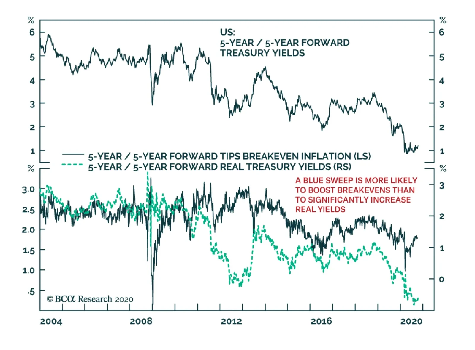
Central banks aiming for an inflation overshoot and negative real rates will also continue to boost the relative performance of inflation-linked bonds versus nominal equivalents. Chart 6Within Governments, Continue Overweighting Linkers Vs Nominals
The Strategic Case For Inflation-Linked Bond Outperformance
The Strategic Case For Inflation-Linked Bond Outperformance
We see this as a similar environment to the years following the 2008 financial crisis, with central banks keeping rates at 0% while rapidly expanding their balance sheets via quantitative easing and cheap liquidity provision for banks. The result was a multi-year period where linkers outperformed nominal government bonds (Chart 7). Thus, we are maintaining a large core allocation to linkers in the portfolio, focused on US TIPS and inflation-linked bonds in Italy and Canada. Chart 7The Strategic Case For Inflation-Linked Bond Outperformance
Within Governments, Continue Overweighting Linkers Vs Nominals
Within Governments, Continue Overweighting Linkers Vs Nominals
Chart 8Overall Portfolio Allocation: Moderately Overweight Credit Vs Governments
GFIS Model Bond Portfolio Q3/2020 Performance Review & Current Allocations: The Power Of Reflation
GFIS Model Bond Portfolio Q3/2020 Performance Review & Current Allocations: The Power Of Reflation
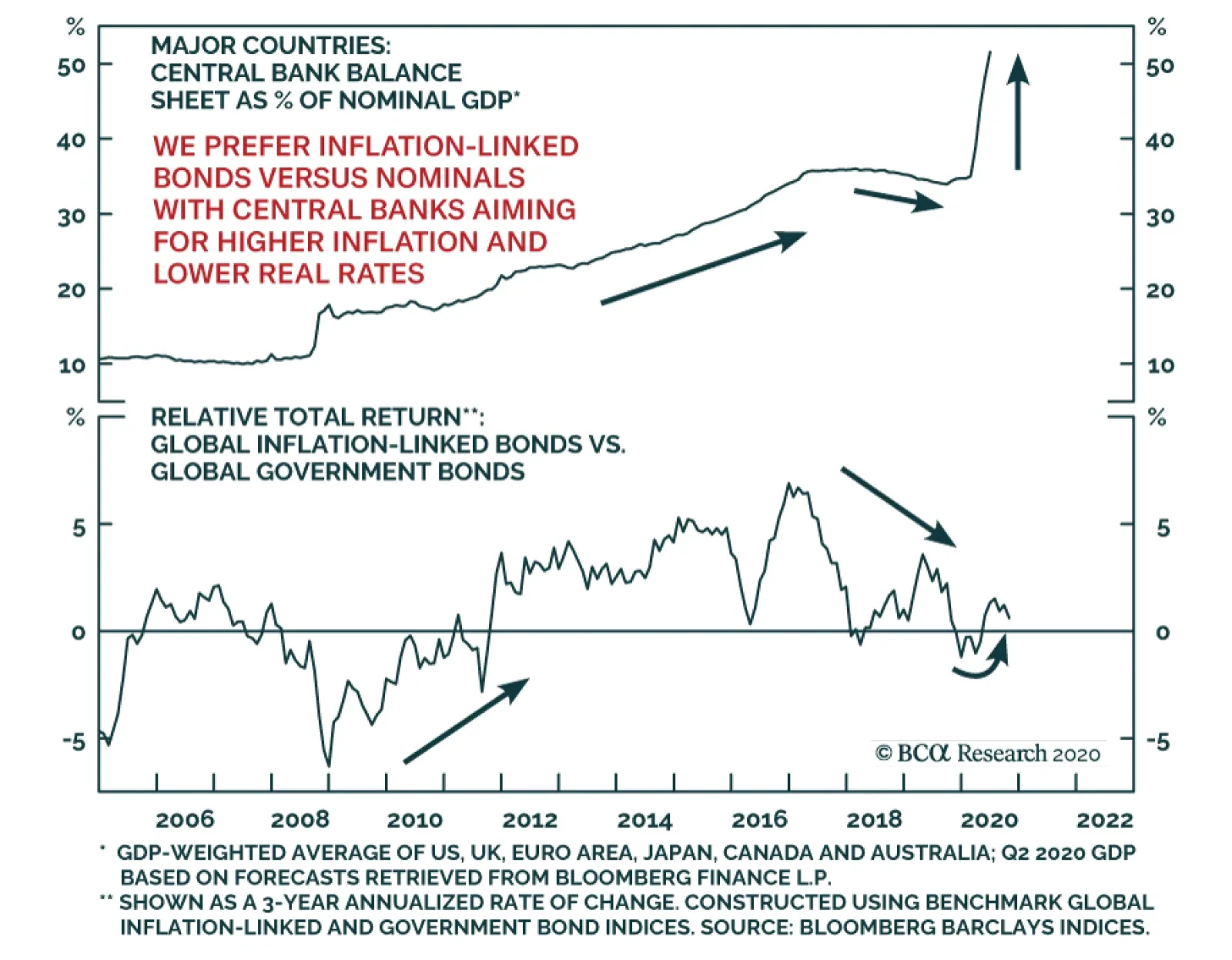
In terms of country allocations on the government bond side of the portfolio, we continue to favor overweights in higher-yielding markets with overall global yield volatility likely to remain subdued. Chart 9Global QE Continues To Support Credit Markets
Global QE Continues To Support Credit Markets
Global QE Continues To Support Credit Markets
That means overweighting the US, Canada, Australia, Italy and Spain, while underweighting Germany, France and Japan. The UK belongs in that latter list, but we are maintaining a neutral stance on the UK, for now, given the near-term uncertainty surrounding final Brexit negotiations and the surge in new UK COVID-19 cases. Turning to spread product, we are maintaining only a moderate aggregate overweight allocation versus government bonds, equal to 4% of the portfolio (Chart 8). The same aggressive easing of global monetary policy and expansion of central bank balance sheets that is good for relative inflation-linked bond performance also benefits global corporate bonds. The annual rate of growth of the combined balance sheets of the Fed, ECB, Bank of Japan and Bank of England has proven to be an excellent leading indicator of the excess returns of both global investment grade and high-yield corporates over the past decade (Chart 9). With the combined balance sheet now expanding at a 40% pace, corporate bonds are likely to continue to outperform government debt over the next 6-12 months. Thus, our allocation to inflation-linked bonds and corporate credit, both out of nominal government bonds, are both motivated by the same factor – monetary policy reflation. The rally in the lower-rated tiers of the high-yield corporate universe in the US and euro area looks particularly unsustainable, if corporate defaults follow the path of previous recessions in both regions. At the same time, we continue to maintain a cautious stance on allocations to countries and sectors within that overall overweight tilt towards spread product in the model bond portfolio. We prefer to stay relatively up-in-quality within global corporate debt, even with high-yield bonds in the US and Europe offering relatively high spreads using our 12-month breakeven spread metric (Chart 10).5 Chart 10US & European HY Offer Relatively Wide Breakeven Spreads
GFIS Model Bond Portfolio Q3/2020 Performance Review & Current Allocations: The Power Of Reflation
GFIS Model Bond Portfolio Q3/2020 Performance Review & Current Allocations: The Power Of Reflation
Chart 11US & European HY Offer No Spread Cushion Against Rising Defaults
US & European HY Offer No Spread Cushion Against Rising Defaults
US & European HY Offer No Spread Cushion Against Rising Defaults
The rally in the lower-rated tiers of the high-yield corporate universe in the US and euro area looks particularly unsustainable, if corporate defaults follow the path of previous recessions in both regions. Our measure of the default-adjusted spread, calculated by taking the option-adjusted spread of the Bloomberg Barclays high-yield index and subtracting default losses, shows that high-yield spreads on both sides of the Atlantic will be dwarfed by expected default losses over the next year, assuming a typical pattern of defaults after recessions (Chart 11). We continue to prefer staying up-in-quality within our recommended corporate allocations, favoring Ba-rated US high-yield over B-rated and Caa-rated credit while also underweighting euro area high-yield relative to euro area investment grade corporates. This strategy lowers the yield of the model portfolio, which is currently in line with that of the custom benchmark index (Chart 12), at the expense of stretching for yields in riskier credit that may not be sustainable over the medium-term. Chart 12Overall Portfolio Yield: At Benchmark
Overall Portfolio Yield: At Benchmark
Overall Portfolio Yield: At Benchmark
Chart 13Overall Portfolio Risk: Moderate
Overall Portfolio Risk: Moderate
Overall Portfolio Risk: Moderate
At the same time, our measured stance on relative corporate exposure also acts to reduce portfolio risk – a useful outcome as we are targeting a relatively moderate tracking error (relative portfolio volatility versus that of the benchmark) within the model portfolio (Chart 13). Given the near-term uncertainties over the US elections and the potential second wave of COVID-19 in the US and Europe, staying relatively cautious on the usage of the “risk budget” of the portfolio seems prudent. Scenario Analysis & Return Forecasts In past quarterly reviews of our model bond portfolio, we have presented forecasts for the performance of the overall portfolio based off scenario analysis and some simple quantitative model-based predictions of various fixed income sectors. Given the unprecedented nature of the COVID-19 shock, we chose to avoid such model driven forecasts based on historical coefficients and correlations that may not be applicable. As it turns out, we may have been too cautious in that decision. The “risk-factor” models that we have used to forecast future yield changes for global spread product sectors as a function of four major factors - the VIX, oil prices, the US dollar and the fed funds rate (Table 2A) - have actually done a reasonable job of predicting yield changes over the past year. This can be seen in the charts shown in the Appendix on pages 18-20. Only in the case of US Caa-rated high-yield and EM USD-denominated corporates – two sectors where we are underweight given our concerns about valuation - have yields fallen by a far greater amount than implied by our models. Table 2AFactor Regressions Used To Estimate Spread Product Yield Changes
GFIS Model Bond Portfolio Q3/2020 Performance Review & Current Allocations: The Power Of Reflation
GFIS Model Bond Portfolio Q3/2020 Performance Review & Current Allocations: The Power Of Reflation
Based on how the models have performed in the COVID era, we believe we can use them again to forecast the expected relative returns of the credit side of the model bond portfolio. For the government bond side, we avoid using regression models and instead use a yield-beta driven framework, taking forecasts for changes in US Treasury yields and translating those into changes in non-US bond yields by applying a historical yield beta (Table 2B). Table 2BEstimated Government Bond Yield Betas To US Treasuries
GFIS Model Bond Portfolio Q3/2020 Performance Review & Current Allocations: The Power Of Reflation
GFIS Model Bond Portfolio Q3/2020 Performance Review & Current Allocations: The Power Of Reflation
Chart 14Risk Factor Assumptions For The Scenario Analysis
Risk Factor Assumptions For The Scenario Analysis
Risk Factor Assumptions For The Scenario Analysis
For our scenario analysis over the next six months, we use a base case scenario plus two alternate “tail risk” scenarios, based on the following descriptions and inputs (Chart 14): Base Case: The US election result is initially uncertain, but a clear winner is determined within a few days. COVID cases continue to increase, but with less severe economic restrictions than during the first wave. Global growth continues to show steady improvement. There will be some additional global fiscal stimulus, with central banks keeping foot on monetary accelerator. There is mild bear steepening of the US Treasury curve with moderate widening of US inflation breakevens. The VIX reaches 25, the USD dollar depreciates by -5%, oil prices climb 10% and the fed funds rate remains at 0%. Based on how the models have performed in the COVID era, we believe we can use them again to forecast the expected relative returns of the credit side of the model bond portfolio. Optimistic Scenario: The US election goes smoothly and a clear winner is declared on election night. The current uptick in global COVID cases does not turn into a full-blown second wave requiring severe economic restrictions. Global growth continues to steadily improve, with additional global fiscal stimulus and central banks staying highly dovish. The US Treasury curve bear steepens as US inflation expectations steadily increase. The VIX falls to 20, the USD dollar depreciates by -7%, oil prices climb 20%, and the fed funds rate stays at 0%. Table 3AGFIS Model Bond Portfolio Scenario Analysis For The Next Six Months
GFIS Model Bond Portfolio Q3/2020 Performance Review & Current Allocations: The Power Of Reflation
GFIS Model Bond Portfolio Q3/2020 Performance Review & Current Allocations: The Power Of Reflation
Table 3BUS Treasury Yield Assumptions For The 6-Month Forward Scenario Analysis
GFIS Model Bond Portfolio Q3/2020 Performance Review & Current Allocations: The Power Of Reflation
GFIS Model Bond Portfolio Q3/2020 Performance Review & Current Allocations: The Power Of Reflation
Chart 15US Treasury Yield Assumptions For The Scenario Analysis
US Treasury Yield Assumptions For The Scenario Analysis
US Treasury Yield Assumptions For The Scenario Analysis
Pessimistic Scenario: There is a contested US election result taking weeks to resolve, leading to major US social unrest. A full-blown second COVID-19 wave hits the world and severe economic restrictions are implemented. Governments become more worried about debt/deficits and deliver underwhelming stimulus. Central banks do not provide enough additional stimulus to offset the shocks. The US Treasury curve bull-flattens as US inflation breakevens plunge. The VIX soars to 35, the USD dollar rise by 5%, oil prices fall -20%, while the fed funds rate remains at 0%. The excess return scenarios for the model bond portfolio, using the above inputs in our simple quantitative return forecast framework, are shown in Table 3A (the scenarios for the changes in US Treasury yields are shown in Table 3B and Chart 15). The model bond portfolio is expected to deliver an excess return over the next six months of +17bps in the base case and +27bps in the optimistic scenario, but is only projected to underperform by -1bp in the pessimistic scenario. Bottom Line: We continue to prefer keeping aggregate portfolio duration close to benchmark, with only a moderate overweight allocation to spread product versus government bonds, given the lingering uncertainties over the global spread of COVID-19 and near-term US election risk. Instead, we recommend focusing on relative value allocations, favoring countries and sectors that will benefit most in our base case medium-term scenario of slowly improving global growth, reflationary global monetary/fiscal policies, low bond yield volatility and a softening US dollar. Robert Robis, CFA Chief Fixed Income Strategist rrobis@bcaresearch.com Ray Park, CFA Research Analyst ray@bcaresearch.com Footnotes 1 The GFIS model bond portfolio custom benchmark index is the Bloomberg Barclays Global Aggregate Index, but with allocations to global high-yield corporate debt replacing very high quality spread product (i.e. AA-rated). We believe this to be more indicative of the typical internal benchmark used by global multi-sector fixed income managers. 2 Please see BCA Global Fixed Income Strategy Weekly Report, "How To Play The Revival Of lobal Inflation Expectations", dated June 23 2020, available at gfis.bcaresearch.com. 3 Note that sectors where we made changes to our recommended weightings during Q3/2020 will have multiple colors in the respective bars in Chart 4. 4 Please see BCA Research Global Fixed Income Strategy Weekly Report, "We’re All Yield Chasers Now", dated August 11, 2020, available at gfis.bcaresearch.com. 5 The 12-month breakeven spread measures the amount of spread widening that must take place for a credit product to have the same return over a one-year horizon as a duration-matched position in government bonds. We compare those breakeven spreads to their own history in a percentile ranking to determine the relative attractiveness of a credit product strictly from a spread and spread volatility perspective. Appen dix Appendix Chart 1US Investment Grade Sectors
US Investment Grade Sectors
US Investment Grade Sectors
Appendix Chart 2US High-Yield Credit Tiers
US High-Yield Credit Tiers
US High-Yield Credit Tiers
Appendix Chart 3US MBS & CMBS
US MBS & CMBS
US MBS & CMBS
Appendix Chart 4Euro Area And UK Credit
Euro Area and UK Credit
Euro Area and UK Credit
Appendix Chart 5Emerging Markets USD-Denominated Debt
Emerging Markets USD-Denominated Debt
Emerging Markets USD-Denominated Debt
Recommendations The GFIS Recommended Portfolio Vs. The Custom Benchmark Index
GFIS Model Bond Portfolio Q3/2020 Performance Review & Current Allocations: The Power Of Reflation
GFIS Model Bond Portfolio Q3/2020 Performance Review & Current Allocations: The Power Of Reflation
Duration Regional Allocation Spread Product Tactical Trades Yields & Returns Global Bond Yields Historical Returns
Highlights Chart 1Spending Held Up In August
Spending Held Up In August
Spending Held Up In August
The bulk of the CARES act’s income support provisions expired at the end of July and Congress has still not reached consensus on a follow-up package. Unsurprisingly, consumer spending responded by growing much more slowly in August, but at least so far, absolute calamity has been avoided (Chart 1). The failure of consumer spending to collapse has caused some, like St. Louis Fed President Jim Bullard, to question whether more stimulus is even necessary.1 We are less optimistic. The most recent personal income report shows that households still received $867 billion (annualized) of CARES act stimulus in August and the recovery in consumer confidence has been tepid at best (see page 12), suggesting that the savings rate will not drop quickly. We expect Congress to ultimately deliver more fiscal support, which will lead to a bear-steepening Treasury curve and spread product outperformance on a 6-12 month horizon. But continued brinkmanship warrants a more cautious near-term stance. Feature Investment Grade: Overweight Chart 2Investment Grade Market Overview
Investment Grade Market Overview
Investment Grade Market Overview
Investment grade corporate bonds underperformed the duration-equivalent Treasury index by 40 basis points in September, dragging year-to-date excess returns down to -394 bps. Last month’s sell-off caused some value to return to the sector. The overall index’s 12-month breakeven spread is back up to its 31st percentile since 1995 and the equivalent Baa spread is at its 38th percentile (Chart 2). Both levels appear somewhat expensive at first blush. However, considering the strong tailwinds from the Fed’s extraordinarily accommodative interest rate policy and emergency lending facilities, we see a lot of room for further spread tightening. Corporate bond issuance was up in August, but nowhere near the extreme levels seen in the spring (panel 4). The fact that the Financing Gap – the difference between capital expenditures and retained earnings – turned negative in the second quarter suggests that firms have sufficient cash to cover their investment needs, and that further debt issuance is unnecessary (bottom panel). At the sector level, we continue to recommend overweight allocations to subordinate bank bonds,2 Healthcare and Energy bonds.3 We also advise underweight allocations to Technology4 and Pharmaceutical bonds.5 Table 3ACorporate Sector Relative Valuation And Recommended Allocation*
Weathering The Storm … For Now
Weathering The Storm … For Now
Table 3BCorporate Sector Risk Vs. Reward*
Weathering The Storm … For Now
Weathering The Storm … For Now
High-Yield: Neutral Chart 3High-Yield Market Overview
High-Yield Market Overview
High-Yield Market Overview
High-Yield underperformed the duration-equivalent Treasury index by 107 basis points in September, dragging year-to-date excess returns down to -455 bps. Oddly, Ba-rated was the worst performing credit tier on the month and the lowest-rated (Caa & below) credits actually beat the Treasury benchmark by 42 bps. As we wrote last week, this suggests that there remains scope for low-rated junk to sell off in the event of a shock to economic growth expectations.6 Such a development could arise if Congress fails to pass a new stimulus bill. In terms of value, if we assume a 25% recovery rate on defaulted debt and a minimum required spread of 150 bps in excess of default losses, then the High-Yield index is priced for a default rate of 4.8% during the next 12 months (Chart 3). Such a large drop in the default rate would necessitate a rapid economic recovery and we are not yet confident that such a recovery can be achieved. Job Cut Announcements – a variable that correlates tightly with the default rate – ticked higher in September and they remain well above pre-COVID levels (bottom panel). At the sector level, we advise overweight allocations to high-yield Technology7 and Energy bonds.8 We are underweight the Healthcare and Pharmaceutical sectors.9 MBS: Underweight Chart 4MBS Market Overview
MBS Market Overview
MBS Market Overview
Mortgage-Backed Securities underperformed the duration-equivalent Treasury index by 14 basis points in September, dragging year-to-date excess returns down to -51 bps. The conventional 30-year MBS index option-adjusted spread (OAS) widened 4 bps on the month, and it continues to trade at a premium compared to other similarly risky sectors. The MBS index OAS is currently 80 bps. This compares to an OAS of 79 bps for Aa-rated corporate bonds, 66 bps for Agency CMBS and 30 bps for Aaa-rated consumer ABS. Despite the OAS advantage, we are concerned that the elevated primary mortgage spread is a warning that refinancing risk could flare during the next few months (Chart 4). Even if Treasury yields are unchanged, a further 50 bps drop in the mortgage rate due to spread compression cannot be ruled out. Such a move would lead to a significant increase in prepayment losses. With that in mind, we are concerned about the low level of expected prepayment losses (option cost) priced into the MBS index (panel 3). A fourth quarter refi wave would undoubtedly send that option cost higher, eating into the returns implied by the OAS. The recent spike in the mortgage delinquency rate does not pose a near-term risk to spreads as it is being driven by households that have been granted forbearance from the federal government (panel 4). The risk for MBS holders only comes into play if many households are unable to resume their regular mortgage payments when the forbearance period expires early next year. But even in that case, further government intervention to either support household incomes or extend the forbearance period would mitigate the risk. Government-Related: Underweight Chart 5Government-Related Market Overview
Government-Related Market Overview
Government-Related Market Overview
The Government-Related index underperformed the duration-equivalent Treasury index by 18 basis points in September, dragging year-to-date excess returns down to -313 bps. Sovereign debt underperformed duration-equivalent Treasuries by 99 bps on the month, dragging year-to-date excess returns down to -562 bps. Foreign Agencies underperformed the Treasury benchmark by 13 bps in September, dragging year-to-date excess returns down to -706 bps. Local Authority debt underperformed Treasuries by 4 bps in September, dragging year-to-date excess returns down to -341 bps. Domestic Agency bonds outperformed by 15 bps, bringing year-to-date excess returns up to -39 bps. Supranationals underperformed by 3 bps, dragging year-to-date excess returns down to -12 bps. US dollar weakness is usually a boon for Emerging Market (EM) Sovereign and Foreign Agency returns. However, most of this year’s dollar depreciation has occurred against other Developed Market currencies, not EMs (Chart 5). Added to that, dollar weakness against all trading partners helps US corporate sector profits, and Baa-rated corporate bonds continue to offer a spread pick-up versus EM Sovereigns (panel 4). We looked at EM Sovereign valuation on a country-by-country basis two weeks ago and concluded that Mexican and Russian Sovereigns offer the most compelling risk/reward trade-offs relative to the US corporate sector.10 Of those two countries, Mexican debt offers the best opportunity as the peso is on an appreciating trend versus the dollar. The Russian Ruble has been depreciating versus the dollar, and is vulnerable in the case of a Democratic sweep in November. Municipal Bonds: Overweight Chart 6Municipal Market Overview
Municipal Market Overview
Municipal Market Overview
Municipal bonds underperformed the duration-equivalent Treasury index by 12 basis points in September, dragging year-to-date excess returns down to -503 bps (before adjusting for the tax advantage). Short-dated municipal bond spreads versus Treasuries were stable in September, but long-maturity spreads widened. The entire Aaa muni curve remains above the Treasury curve, despite municipal debt’s tax-exempt status (Chart 6). Municipal bonds also remain attractively priced relative to corporate bonds across the entire investment grade credit spectrum. Aaa munis offer more after-tax yield than Aaa corporates for investors facing an effective tax rate above 15%. The breakeven effective tax rates for Aa, A and Baa-rated munis are 11%, 13% and 17%, respectively. Extremely attractive valuation causes us to stick with our municipal bond overweight, even as state and local governments face a credit crunch. State & local government payrolls shrank in September and, without federal support, cutbacks will no doubt continue (bottom panel). However, we expect that the combination of austerity measures and all-time high State Rainy Day Fund balances will be sufficient to prevent a wave of municipal ratings downgrades. Treasury Curve: Buy 5-Year Bullet Versus 2/10 Barbell Chart 7Treasury Yield Curve Overview
Treasury Yield Curve Overview
Treasury Yield Curve Overview
The Treasury curve bull-flattened somewhat in September, though even the 30-year yield only fell 3 bps on the month. The 2/10 and 5/30 Treasury slopes flattened 2 bps and 3 bps, reaching 56 bps and 118 bps, respectively. One easy way to think about nominal Treasury yields is as the market’s expectation of future changes in the fed funds rate.11 With that in mind, the Fed’s recent shift toward a regime of average inflation targeting will likely lead to nominal yield curve steepening on a 6-12 month horizon. That is, the Fed will keep a firm grip on the front-end of the curve but long-maturity yields will rise as investors price-in eventual Fed tightening in response to higher inflation. We recommend positioning for this outcome by owning the 5-year Treasury note and shorting a duration-matched barbell consisting of the 2-year and 10-year notes. This position is designed to profit from 2/10 curve steepening. We expect the economic recovery to be maintained over the next 6-12 months, allowing this steepening to play out. However, we also see near-term risks related to the passage of a follow-up stimulus bill. Those not already invested in steepeners are advised to wait until a deal is struck. Valuation is a concern with our recommended curve steepener, as the 5-year yield is below the yield on the duration-matched 2/10 barbell (Chart 7). However, the 5-year yield looked much more expensive during the last zero-lower-bound period between 2010 and 2013 (bottom 2 panels). We anticipate a return to similar valuation levels. TIPS: Overweight Chart 8TIPS Market Overview
TIPS Market Overview
TIPS Market Overview
TIPS underperformed the duration-equivalent nominal Treasury index by 54 basis points in September, dragging year-to-date excess returns down to -130 bps. The 10-year and 5-year/5-year forward TIPS breakeven inflation rates fell 18 bps and 16 bps on the month. They currently sit at 1.65% and 1.83%, respectively. Core CPI printed a strong +0.4% in August and the large divergence between core and trimmed mean inflation measures leads us to conclude that inflation will continue to rise quickly during the next few months (Chart 8). For this reason, we recommend maintaining an overweight allocation to TIPS versus nominal Treasuries for the time being, even though the 10-year TIPS breakeven rate is no longer cheap according to our Adaptive Expectations Model (panel 2).12 We could see inflation pressures moderating once core and trimmed mean inflation measures re-converge.13 This could give us an opportunity to reduce our exposure to TIPS sometime later this year. We also recommend holding real yield curve steepeners and inflation curve flatteners. With the Fed now officially targeting an overshoot of its 2% inflation goal, we would expect the cost of 2-year inflation protection to rise above the cost of 10-year inflation protection (panel 4). With the Fed also exerting more control over short-dated nominal yields than over long-term ones, this means that short-maturity real yields will come under downward pressure relative to the long end (bottom panel). ABS: Overweight Chart 9ABS Market Overview
ABS Market Overview
ABS Market Overview
Asset-Backed Securities outperformed the duration-equivalent Treasury index by 10 basis points in September, bringing year-to-date excess returns up to +63 bps. Aaa-rated ABS outperformed the Treasury benchmark by 7 bps on the month, bringing year-to-date excess returns up to +53 bps. Non-Aaa ABS outperformed by 32 bps, bringing year-to-date excess returns up to +128 bps. Aaa ABS are a high conviction overweight, given that spreads remain elevated compared to historical levels and that the sector benefits from Fed support through the Term Asset-Backed Loan Facility (TALF). However, spreads are even more attractive in non-Aaa ABS (Chart 9) and we recommend owning those securities as well. This is despite the fact that only Aaa-rated bonds are eligible for TALF. We explained our rationale for owning non-Aaa consumer ABS in a June report.14 We noted that stimulus received from the CARES act caused disposable income to increase significantly between February and July. Then, faced with fewer spending opportunities, households used much of that windfall to pay down consumer debt (panel 4). Granted, further income support from fiscal policymakers is needed now that the CARES act’s enhanced unemployment benefits have expired. But given the substantial boost to savings that has already occurred, we are confident that more stimulus will arrive in time to prevent a wave of consumer bankruptcies. Non-Agency CMBS: Neutral Chart 10CMBS Market Overview
CMBS Market Overview
CMBS Market Overview
Non-Agency Commercial Mortgage-Backed Securities outperformed the duration-equivalent Treasury index by 63 basis points in September, bringing year-to-date excess returns up to -259 bps. Aaa Non-Agency CMBS outperformed Treasuries by 46 bps on the month, bringing year-to-date excess returns up to -63 bps. Non-Aaa Non-Agency CMBS outperformed by 119 bps, bringing year-to-date excess returns up to -803 bps (Chart 10). We continue to recommend an overweight allocation to Aaa Non-Agency CMBS and an underweight allocation to Non-Aaa CMBS. Our reasoning is simple. Aaa CMBS are eligible for TALF, meaning that spreads can still tighten even as the hardship in commercial real estate continues. Without Fed support, Non-Aaa CMBS will struggle to deal with a climbing delinquency rate (panel 3).15 Agency CMBS: Overweight Agency CMBS underperformed the duration-equivalent Treasury index by 9 basis points in September, dragging year-to-date excess returns down to -12 bps. The average index spread widened 2 bps on the month to 68 bps, well above typical historical levels (bottom panel). The Fed is supporting the Agency CMBS market by directly purchasing the securities as part of its Agency MBS purchase program. The combination of strong Fed support and elevated spreads makes the sector a high conviction overweight. Appendix A: Buy What The Fed Is Buying The Fed rolled out a number of aggressive lending facilities on March 23. These facilities focused on different specific sectors of the US bond market. The fact that the Fed has decided to support some parts of the market and not others has caused some traditional bond market correlations to break down. It has also led us to adopt of a strategy of “Buy What The Fed Is Buying”. That is, we favor those sectors that offer attractive spreads and that benefit from Fed support. The below Table tracks the performance of different bond sectors since the March 23 announcement. We will use this to monitor bond market correlations and evaluate our strategy’s success. Table Performance Since March 23 Announcement Of Emergency Fed Facilities
Weathering The Storm … For Now
Weathering The Storm … For Now
Appendix B: Butterfly Strategy Valuations The following tables present the current read-outs from our butterfly spread models. We use these models to identify opportunities to take duration-neutral positions across the Treasury curve. The following two Special Reports explain the models in more detail: US Bond Strategy Special Report, “Bullets, Barbells And Butterflies”, dated July 25, 2017, available at usbs.bcaresearch.com US Bond Strategy Special Report, “More Bullets, Barbells And Butterflies”, dated May 15, 2018, available at usbs.bcaresearch.com Table 4 shows the raw residuals from each model. A positive value indicates that the bullet is cheap relative to the duration-matched barbell. A negative value indicates that the barbell is cheap relative to the bullet. Table 4Butterfly Strategy Valuation: Raw Residuals In Basis Points (As Of October 2nd, 2020)
Weathering The Storm … For Now
Weathering The Storm … For Now
Table 5 scales the raw residuals in Table 4 by their historical means and standard deviations. This facilitates comparison between the different butterfly spreads. Table 5Butterfly Strategy Valuation: Standardized Residuals (As Of October 2nd, 2020)
Weathering The Storm … For Now
Weathering The Storm … For Now
Table 6 flips the models on their heads. It shows the change in the slope between the two barbell maturities that must be realized during the next six months to make returns between the bullet and barbell equal. For example, a reading of 63 bps in the 5 over 2/10 cell means that we would only expect the 5-year to outperform the 2/10 if the 2/10 slope steepens by more than 63 bps during the next six months. Otherwise, we would expect the 2/10 barbell to outperform the 5-year bullet. Table 6Discounted Slope Change During Next 6 Months (BPs)
Weathering The Storm … For Now
Weathering The Storm … For Now
Appendix C: Excess Return Bond Map The Excess Return Bond Map is used to assess the relative risk/reward trade-off between different sectors of the US bond market. It is a purely computational exercise and does not impose any macroeconomic view. The Map’s vertical axis shows 12-month expected excess returns. These are proxied by each sector’s option-adjusted spread. Sectors plotting further toward the top of the Map have higher expected returns and vice-versa. Our novel risk measure called the “Risk Of Losing 100 bps” is shown on the Map’s horizontal axis. To calculate it, we first compute the spread widening required on a 12-month horizon for each sector to lose 100 bps or more relative to a duration-matched position in Treasury securities. Then, we divide that amount of spread widening by each sector’s historical spread volatility. The end result is the number of standard deviations of 12-month spread widening required for each sector to lose 100 bps or more versus a position in Treasuries. Lower risk sectors plot further to the right of the Map, and higher risk sectors plot further to the left. Chart 11Excess Return Bond Map (As Of October 2nd, 2020)
Weathering The Storm … For Now
Weathering The Storm … For Now
Ryan Swift US Bond Strategist rswift@bcaresearch.com Footnotes 1https://www.bloomberg.com/news/articles/2020-09-30/fed-s-bullard-says-debate-on-fiscal-aid-can-be-delayed-to-2021?sref=Ij5V3tFi 2 Please see US Bond Strategy Weekly Report, “The Case Against The Money Supply”, dated June 30, 2020, available at usbs.bcaresearch.com 3 Please see US Bond Strategy Special Report, “The Outlook For Energy Bonds Part 1: A Model Of Energy Bond Excess Returns”, dated July 14, 2020 and US Bond Strategy Special Report, “The Outlook For Energy Bonds Part 2: Buy The Dip In High-Yield Energy”, dated July 21, 2020, available at usbs.bcaresearch.com 4 Please see US Bond Strategy Weekly Report, “Take A Look At High-Yield Technology Bonds”, dated June 23, 2020, available at usbs.bcaresearch.com 5 Please see US Bond Strategy Weekly Report, “Assessing Healthcare & Pharma Bonds In A Pandemic”, dated June 9, 2020, available at usbs.bcaresearch.com 6 Please see US Bond Strategy Weekly Report, “Out Of Bullets”, dated September 29, 2020, available at usbs.bcaresearch.com 7 Please see US Bond Strategy Weekly Report, “Take A Look At High-Yield Technology Bonds”, dated June 23, 2020, available at usbs.bcaresearch.com 8 Please see US Bond Strategy Special Report, “The Outlook For Energy Bonds Part 1: A Model Of Energy Bond Excess Returns”, dated July 14, 2020 and US Bond Strategy Special Report, “The Outlook For Energy Bonds Part 2: Buy The Dip In High-Yield Energy”, dated July 21, 2020, available at usbs.bcaresearch.com 9 Please see US Bond Strategy Weekly Report, “Assessing Healthcare & Pharma Bonds In A Pandemic”, dated June 9, 2020, available at usbs.bcaresearch.com 10 Please see US Bond Strategy Weekly Report, “Trading Bonds In A Dollar Bear Market”, dated September 22, 2020, available at usbs.bcaresearch.com 11 For more details on this forecasting framework please see US Bond Strategy Weekly Report, “Positioning For Reflation And Avoiding Deflation”, dated August 11, 2020, available at usbs.bcaresearch.com 12 For more details on our model please see US Bond Strategy Weekly Report, “How Are Inflation Expectations Adapting?”, dated February 11, 2020, available at usbs.bcaresearch.com 13 Please see US Bond Strategy Weekly Report, “Positioning For Reflation And Avoiding Deflation”, dated August 11, 2020, available at usbs.bcaresearch.com 14 Please see US Bond Strategy Weekly Report, “No Holding Back”, dated June 16, 2020, available at usbs.bcaresearch.com 15 For a deeper dive into the outlook for US commercial real estate please see Global Investment Strategy Special Report, “Working From Home, Urban Flight, And Commercial Real Estate Loans: How Bad Can Things Get?”, dated August 28, 2020, available at gis.bcaresearch.com Fixed Income Sector Performance Recommended Portfolio Specification Corporate Sector Relative Valuation And Recommended Allocation
In recent days, Treasury yields have moved up nearly 15bps. Commentators are openly wondering about the cause of this move. The notion that following last week’s debate, the probability of Blue Wave (where the Democrats take control of both the White House…
Highlights Portfolio Strategy Buybacks are down but not out. While financials have been weighing heavily on the S&P buybacks index, we would not write off the artificial engineering of higher EPS via equity retirement, especially in a world of ZIRP likely for the next five-to-seven years. COVID-19 has permanently scarred demand while non-residential construction is elevated. This combination will deflate commercial real estate (CRE) prices further, which risks unraveling a CRE debt deflation spiral. Continue to avoid the S&P real estate sector. Recent Changes There are no changes to our portfolio this week. Table 1
Of Buybacks And Bonds
Of Buybacks And Bonds
Feature Equities sunk late last week, as diminishing chances of fiscal easing coupled with news that the POTUS and the First Lady tested positive for COVID-19 more than offset buyers taking advantage of oversold conditions. Our sense is that the SPX will bounce around key moving averages during October (Chart 1), until the election outcome breaks the stalemate. In the back half of the month, banks also kick-start Q3 earnings season, which is important because banks’ wellbeing rests on a fresh stimulus bill. Peering over at the bond market is instructive in order to try to make sense of these crosscurrents. Two weeks ago, we first highlighted that the corporate bond market was waving a yellow flag. The selloff in the LQD ETF will continue to weigh on equities (top panel, Chart 2) and corroborates our view that the Fed is now a bystander, which puts added pressure on fiscal authorities to act. It is not a coincidence that the Fed’s balance sheet impulse peaked first and soon thereafter so did the LQD. Chart 1Trapped Between Moving Averages
Trapped Between Moving Averages
Trapped Between Moving Averages
Worrisomely, the total return stock-to-bond ratio failed to break out to fresh all-time highs and has likely formed a head and shoulders pattern. The implication is that stocks are not out of the woods yet (bottom panel, Chart 2). Chart 2Bond Market…
Bond Market…
Bond Market…
Junk spreads are also firing a warning shot. The high-yield option-adjusted spread (OAS) was in a tight range between 2017 and 2019. Then spreads exploded higher because of the pandemic. However, unlike the SPX making new all-time highs, junk spreads failed to make new all-time lows and more importantly have not settled back down to the 2017-2019 range (middle panel, Chart 3). The VIX index is following a similar pattern to the high-yield OAS, which is quite unnerving for equity bulls. Put differently, still elevated VIX futures in the 30s warn that in the near-term more turbulence lies ahead for the SPX (bottom panel, Chart 3). As a reminder, we first recommended buying the December VIX futures on July 27 in a joined Special Report with our sister Geopolitical Strategy service, and we continue to recommend such a hedge to long equity exposure. Chart 3…And VIX Signal Trouble For Stocks
…And VIX Signal Trouble For Stocks
…And VIX Signal Trouble For Stocks
Bye-Bye Buybacks? According to the flow of funds data, a large dichotomy has taken shape between corporate debt issuance and net equity retirement. Up to very recently, the two moved in tandem. But now, the pandemic has caused a knee jerk reaction in non-financial corporate businesses that are tapping their credit lines and issuing debt at a breakneck pace. Worryingly, very little of these funds are used for equity retirement, which is a big break from recent past behavior (Chart 4). Not only does the Fed’s flow of funds data signal that buybacks have nearly ground to a halt, but also Standard and Poor’s data show that SPX buybacks collapsed to $88bn in Q2, from roughly $200bn in Q1. Crudely put, SPX buybacks have fallen by a whopping 67% quarter-over-quarter. Such a corporate buyer’s strike is negative for the near-term prospects of the S&P 500 (top panel, Chart 5). Chart 4Unsustainable Dichotomy
Unsustainable Dichotomy
Unsustainable Dichotomy
Chart 5Buybacks Are Down…
Buybacks Are Down…
Buybacks Are Down…
True, buybacks have come under intense scrutiny especially for bailed out sectors of the economy, nevertheless, the V-shaped economic recovery all but guarantees a rebound in depressed share buybacks sometime in 2021 (Chart 6). While our conservative $125/quarter buyback estimate proved overly optimistic in Q2, we maintain such an estimate for the next year (which it is the past decade’s average). On a cyclical 9-12 month horizon we have high conviction that SPX profits will return close to trend EPS of $162, and recovering CEO confidence should pave the way for a resumption of shareholder friendly activities, including equity retirement (middle panel, Chart 6). Drilling deeper beneath the surface is revealing. When we disaggregate the headline buybacks number into GICS1 sectors, we observe that once again the tech titans (comprising the S&P technology and the S&P communication services indexes) are doing all the heavy lifting accounting for 70% of the overall number (Chart 7). Q2 was the first time in recent memory where tech accounts for more buybacks that all the other sectors put together (bottom panel, Chart 5)! Chart 6But Not Out
But Not Out
But Not Out
Chart 7GICS1 Sector Buyback Breakdown: Q1 & Q2
Of Buybacks And Bonds
Of Buybacks And Bonds
Chart 8 shows the ebbs and flows of sectoral SPX buybacks since late-2006. In order for our estimate to prove accurate in 2021, the Fed will have to allow financials to resume their buybacks, which collapsed from over $45bn in Q1 to just above $5bn in Q2 (Chart 7). Chart 8GICS1 Sector Buyback Breakdown: An Historical Perspective
Of Buybacks And Bonds
Of Buybacks And Bonds
With regard to investable buyback indexes, financials dominate both the S&P 500 buyback index (Chart 9) and the NASDAQ US buyback achievers index. However, if the Fed does not relent and sustains a tight noose around banks’ shareholder friendly activities next year, then this index composition will change significantly in the 2021 rebalancing. While financials have been weighing heavily on the S&P 500 buyback index, its equal weighting methodology also partially explains why it has trailed the market cap weighted SPX by roughly 20% year-to-date (YTD). Nevertheless, in the long-haul buyback achievers come out on top. In fact, the S&P 500 buyback index has more than doubled the SPX’s return since the turn of the century (top panel, Chart 10) and such a portfolio tilt typically manages to shake off recession-related wobbles. Chart 9S&P 500 Buyback Index Sector Composition
Of Buybacks And Bonds
Of Buybacks And Bonds
Bottom Line: We would not write off the artificial engineering of higher EPS via equity retirement, especially in a world where ZIRP is likely for the next five-to-seven years. Already buyback announcements have troughed (bottom panel, Chart 10) and factors are falling into place for a sizable resumption of buybacks in 2021 as the economy stands back on its own feet. Chart 10Buyback Comeback?
Buyback Comeback?
Buyback Comeback?
Is CRE The Next Shoe To Drop? Last December in our 2020 Key Views report, the S&P real estate sector was one of our high-conviction underweight sectors for the year. However, frenetic trading in March compelled us to close out all our high-conviction trades and cement average relative gains of 3.4% in our eight high-conviction calls including 1.1% in the high-yielding S&P real estate sector. Nevertheless, we remained bearish on the prospects of this sector levered to commercial real estate (CRE) because the aftermath of the pandemic would leave this niche sector badly bruised. Already, YTD relative share prices are down 10%, and were it not for the tech/communications-laden – tower and digital storage – REITs that the S&P specialized REITs subgroup houses, then the relative underperformance would sink to 25% (Chart 11). In other words, the resilience of these mega cap tech-related REITs masks the carnage ongoing beneath the surface. Chart 11Specialized REITs Masking True Picture
Specialized REITs Masking True Picture
Specialized REITs Masking True Picture
Charts 12 & 13 break down the YTD relative performance of the real estate sector’s sub-groups and it is clear that most REITs categories are in distress with the exception of specialized and industrial REITs. Chart 12REITs Are Weak…
REITs Are Weak…
REITs Are Weak…
Chart 13…Across The Board
…Across The Board
…Across The Board
Not only will the long-term negative ramifications due to the pandemic scar office-, apartment- and mall-exposed REITs, but also uncertainty surrounding the fiscal stimulus bill risks a fresh down-leg in the S&P real estate sector. According to the latest Q2 Fed release, CRE delinquencies are on the rise (not shown) and CRE prices are on the verge of contracting (bottom panel, Chart 14). A fresh stimulus bill could transfer funds directly to unemployed consumers and to cash-strapped business owners and extend the eviction/foreclosure moratorium as well as mortgage forbearance agreements. Absent this help, CRE will remain distressed. Refinancing risk is another threat that could cause a gap down in CRE prices, as bankers remain unwilling to dole out CRE loans despite a collapse in interest rates. Once the underlying asset gets repriced lower, then the debt related house of cards comes crumbling down (top & middle panels, Chart 14). Recent news that “Cerberus repackaged near junk rated CMBS paper into a AAA rated CDO” (effectively creating a AAA security out of thin air) is eerily reminiscent of the subprime crisis in 2008 and a stark warning that CRE excesses have yet to fully flush out.1 Chart 14More Pain Looms
More Pain Looms
More Pain Looms
Chart 15Deflation Warning
Deflation Warning
Deflation Warning
The downdraft in demand for CRE is already showing up in declining occupancy rates (Chart 15). We fear that there are more skeletons hiding in the closet. First the “amazonification” of the economy is still wreaking havoc on retail/shopping center REITs. Second the new “work from home” reality is putting strains on office landlords. Lastly, lodging will remain in distress at least until a vaccine is readily available. As a result, REITs cash flow growth will remain elusive, which will further dampen prospects of a recovery in the relative share price ratio (Chart 15). Finally, the relentless increase in supply is not showing any signs of abating. Non-residential construction is hovering near previous highs, and multi-family housing starts are perched close to prior cyclical peaks of 400K/annum (Chart 16). Undoubtedly, this excess supply backdrop will continue to weigh on CRE prices. Chart 16Mind The Supply Overhang
Mind The Supply Overhang
Mind The Supply Overhang
Chart 17Valuations Have Yet To Fully Flush Out
Valuations Have Yet To Fully Flush Out
Valuations Have Yet To Fully Flush Out
Despite all this dour news and near all-time lows in relative performance, valuations have only corrected down to the neutral zone, leaving ample room for an undershoot phase (middle panel, Chart 17). Encouragingly, persistent recent selling has pushed our relative Technical Indicator deep in oversold territory signaling that a near-term reflex rebound may be forthcoming. Netting it all out, COVID-19 has permanently scarred demand while non-residential construction is elevated. This combination will deflate commercial real estate (CRE) prices further, which risks unraveling a CRE debt deflation spiral. Continue to avoid the S&P real estate sector. Bottom Line: Stay underweight the S&P real estate sector. The ticker symbols for the stocks in this index are: BLBG: S5RLST-AMT, EQIX, PLD, CCI, DLR, PSA, SBAC, AVB, WELL, ARE, O, SPG, WY, CBRE, EQR, ESS, FRT, PEAK, VTR, BXP, DRE, EXR, MAA, UDR, AIV, HST, IRM, KIM, REG, SLG, VNO. Anastasios Avgeriou US Equity Strategist anastasios@bcaresearch.com Footnotes 1 https://www.bloomberg.com/news/articles/2020-10-01/cerberus-is-repackaging-near-junk-cmbs-into-top-rated-securities Current Recommendations Current Trades Strategic (10-Year) Trade Recommendations
Drilling Deeper Into Earnings
Drilling Deeper Into Earnings
Size And Style Views July 27, 2020 Overweight cyclicals over defensives April 28, 2020 Stay neutral large over small caps June 11, 2018 Long the BCA Millennial basket The ticker symbols are: (AAPL, AMZN, UBER, HD, LEN, MSFT, NFLX, SPOT, TSLA, V). January 22, 2018 Favor value over growth
Highlights Misunderstanding 1: The danger of Covid-19 is its short-term mortality rate. In fact, the danger of Covid-19 is its long-term mortality and morbidity rate. Misunderstanding 2: The government-imposed lockdown causes the pandemic recession. In fact, the pandemic causes the pandemic recession. Misunderstanding 3: The pandemic’s main economic casualty is output. In fact, the pandemic’s main economic casualty is employment. Misunderstanding 4: The pandemic is a temporary shock to the way we live, work, and interact. In fact, the pandemic is accelerating long-term shifts in the way we live, work, and interact. Misunderstanding 5: The pandemic is pulling Europe apart. In fact, the pandemic is pulling Europe together. Feature Chart of the WeekThe Pandemic Is Pulling Europe Together
The Pandemic Is Pulling Europe Together
The Pandemic Is Pulling Europe Together
Covid-19 is a novel disease. And living through a pandemic is a novel experience for most of us. The result is that many things are not fully understood. In this report, we pull together five major misunderstandings about the Covid-19 pandemic. Or at least, five topics on which we disagree with the mainstream narratives. Misunderstanding 1: The danger of Covid-19 is its short-term mortality rate. Truth 1: The danger of Covid-19 is its long-term mortality and morbidity rate. Some people argue that the danger of Covid-19 is overstated. The mortality rate seems low, especially in the new waves of the pandemic. These people argue that we should just let the pandemic rip to achieve so-called ‘herd immunity’. Yet this focus on the low immediate mortality rate misunderstands the true danger (Chart I-2). Chart I-2Focussing On Covid-19’s Low Immediate Mortality Rate Misunderstands The Danger
Five Major Misunderstandings About Covid-19
Five Major Misunderstandings About Covid-19
The true danger might come from the long-term impact on mortality and morbidity. A good analogy is a non-lethal dose of radiation. It won’t kill you straightaway, and you might not even feel any immediate ill effects, but the exposure does irreparable long-term harm. Unlike other diseases, Covid-19 appears to have long-term sequelae. Unlike other diseases, Covid-19 appears to have long-term sequelae. It can permanently damage your respiratory, vascular, and metabolic systems. As The Lancet points out:1 “Weeks and months after the onset of Covid-19, people continue to suffer. 78 of 100 patients in an observational cohort study who had recovered from Covid-19 had abnormal findings on cardiovascular MRI and 36 reported dyspnoea and unusual fatigue… these patients are not only those recovering from the severe form of the acute disease, but also those who had mild and moderate disease. Long-term sequelae of Covid-19 are unknown… Other concerns are rising: does it cause diabetes, or other metabolic disorders? Will patients develop interstitial lung disease? We owe good answers on the long-term consequences of the disease to our patients and healthcare providers.” Until we know these answers, letting the pandemic rip to achieve herd-immunity is a very dangerous misunderstanding. Misunderstanding 2: The government-imposed lockdown causes the pandemic recession. Truth 2: The pandemic causes the pandemic recession. A pandemic is a classic complex adaptive system, in which there is constant feedback from millions of individual human actions to the pandemic, and from the pandemic to millions of individual human actions. It is this complex adaptive behaviour that generates a pandemic’s classic waves of infection, as well as its recessions. In response to an escalating pandemic, our instinct for self-preservation makes us go into our shells. In response to an escalating pandemic, our instinct for self-preservation makes us go into our shells. We shun crowds and public places, with the result that so-called ‘social consumption’ collapses. The misunderstanding is that the government-imposed lockdown causes the collapse in social consumption. In fact, this is a classic confusion between correlation and causation. The true cause of the recession is that the escalating pandemic is making millions of people go into their shells. But to the extent that an escalating pandemic also leads to an escalating lockdown, many people confuse the correlated lockdown with the underlying cause, the escalating pandemic. As we have previously pointed out, Sweden imposed no lockdown, while its neighbour Denmark imposed the most extreme lockdown in Europe. If it was the government-imposed lockdown that caused the recession, then the economy of no-lockdown Sweden should have fared much better than that of lockdown Denmark. In fact, based on the rise in unemployment rates, no-lockdown Sweden performed worse than lockdown Denmark (Chart I-3 and Chart I-4). Chart I-3No-Lockdown Sweden Performed No Better...
No-Lockdown Sweden Performed No Better...
No-Lockdown Sweden Performed No Better...
Chart I-4...Than Lockdown Denmark
...Than Lockdown Denmark
...Than Lockdown Denmark
Misunderstanding 3: The pandemic’s main economic casualty is output. Truth 3: The pandemic’s main economic casualty is employment. The widespread use of physical distancing and face masks restricts any activity that requires the use of your mouth and nose in proximity to others. These activities are concentrated in three highly labour-intensive sectors: hospitality, retail, and transport. Using the US as a template, hospitality, retail, and transport contribute 12 percent of economic output, but employ 25 percent of all workers (Table I-1). If the pandemic forces these sectors to operate one third below full capacity, the economy will lose a tolerable 4 percent of output. But it will lose a devastating 8.3 percent of jobs. And on less optimistic assumptions, the job destruction could rise to well over 10 percent. Table I-1Sectors Hurt By Social Distancing Employ 25% Of All Workers
Five Major Misunderstandings About Covid-19
Five Major Misunderstandings About Covid-19
Conversely, sectors which are unaffected by physical distancing and face masks make a much bigger contribution to economic output relative to employment. Financial activities generate 19 percent of economic output, but just 6 percent of jobs. Information technology generates 5 percent of output, but just 2 percent of jobs. Sectors hurt by social distancing employ 25 percent of all workers. Hence, the main economic casualty of the pandemic is not output. The main casualty is employment (Chart I-5 and Chart I-6). Worse, as employment suffers much more than output, the pandemic is devastating low-paid jobs. Chart I-5The Main Economic Casualty Of The Pandemic Is Employment…
Five Major Misunderstandings About Covid-19
Five Major Misunderstandings About Covid-19
Chart I-6…Not ##br##Output
Five Major Misunderstandings About Covid-19
Five Major Misunderstandings About Covid-19
Misunderstanding 4: The pandemic is a temporary shock to the way we live, work, and interact. Truth 4: The pandemic is accelerating long-term shifts in the way we live, work, and interact. The pandemic appears to have crystallised many shifts in consumer and business behaviour: for example, de-urbanisation, the shift from offline to online retailing, the shift from office working to remote working, and the shift from business travel to virtual meetings. In fact, these shifts were already in motion well before the pandemic hit (Chart I-7 and Chart I-8). Chart I-7The Pandemic Is Accelerating The Structural Shifts To De-Urbanisation…
Five Major Misunderstandings About Covid-19
Five Major Misunderstandings About Covid-19
Chart I-8…And Online ##br##Shopping
Five Major Misunderstandings About Covid-19
Five Major Misunderstandings About Covid-19
If the pandemic suddenly ended tomorrow, would people flock back to full-time office work in city centres? Would they flock back to bricks and mortar retailers? Would they return to the same intensity of long-haul business travel? We think not, because the shifts from these activities are not temporary. They are structural. The pandemic is devastating low-paid jobs. The pandemic has accelerated the hollowing out of labour-intensive industries such as bricks and mortar retailing, city centre cafes, bars and restaurants, and commercial travel. Combined with the ongoing threat to jobs from AI, this hollowing out process is blighting the job prospects of a generation, creating large numbers of underemployed and unemployed workers. Misunderstanding 5: The pandemic is pulling Europe apart. Truth 5: The pandemic is pulling Europe together. Let’s end on a positive note. The pandemic has allowed Europe to smash two major taboos: explicit fiscal transfers across countries, and the large-scale issuance of common EU bonds. The EU recovery plan also starts discussions on how the EU can ‘increase its own resources’. Which is to say, raise its own taxes. 2020 might turn out to be the most important year for European integration. The EU’s €750 billion ‘Next Generation’ recovery plan comprises €390 billion of grants whose main beneficiaries will be Italy and Spain – and these grants will be funded by common EU issuance. In breaking the long-standing taboos of fiscal transfers and common issuance, Next Generation constitutes a giant step towards European integration. Specifically, Italy’s net grant entitlement is likely to outweigh its contributions to the EU’s 2021-27 budget cycle. Thereby, Italy will flip from a net contributor to a net recipient of EU funds. The willingness to flip the sign of Italy’s contribution marks a sea-change in the EU’s attitude on fiscal solidarity, whose long-term significance should not be underestimated. 2020 might turn out to be the most important year for European integration. The irony is that it took a global pandemic to achieve it. Investment Conclusions The huge and growing slack in labour markets means that zero and negative interest rate policy will become a permanent feature of our lives. Hence, the relatively higher yielding 30-year US T-bond remains an effective hedge against stock market dislocations, as it did in March. Equity sectors whose profits can thrive off the shifts in the way we live, work, and interact, will outperform – specifically, technology, biotechnology, healthcare, and communications. Thereby, stock markets with an overweighting to these sectors will also outperform. The devastation of low-paying jobs means that bank credit growth is set to remain structurally weak or even non-existent. As such, banks should be bought for tactical countertrend moves (as now), but not for the long term. The yield spreads on euro area ‘periphery’ bonds over Germany and France will continue to tighten, and ultimately reach zero (Chart of the Week and Chart I-9). Chart I-9The Pandemic Is Pulling Europe Together
The Pandemic Is Pulling Europe Together
The Pandemic Is Pulling Europe Together
Fractal Trading System* Within the EM universe, the strong outperformance of India versus Czech Republic is vulnerable to a countertrend sell-off. Accordingly, this week’s recommended trade is short MSCI India versus MSCI Czech Republic. The profit target and symmetrical stop-loss is set at 8 percent. Chart I-10MSCI: India Vs. Czech Republic
MSCI: India Vs. Czech Republic
MSCI: India Vs. Czech Republic
In other trades, long USD/PLN achieved its 4 percent profit target, and short AUD/CHF reached the end of its holding period in profit. The rolling 1-year win ratio now stands at 57 percent. When the fractal dimension approaches the lower limit after an investment has been in an established trend it is a potential trigger for a liquidity-triggered trend reversal. Therefore, open a countertrend position. The profit target is a one-third reversal of the preceding 13-week move. Apply a symmetrical stop-loss. Close the position at the profit target or stop-loss. Otherwise close the position after 13 weeks. * For more details please see the European Investment Strategy Special Report “Fractals, Liquidity & A Trading Model,” dated December 11, 2014, available at eis.bcaresearch.com. Dhaval Joshi Chief European Investment Strategist dhaval@bcaresearch.com Footnotes 1 Please see The Lancet, Long-term consequences of Covid-19: research needs, September 1, 2020. Fractal Trading System Cyclical Recommendations Structural Recommendations Closed Fractal Trades Trades Closed Trades Asset Performance Currency & Bond Equity Sector Country Equity Indicators Bond Yields Chart II-1Indicators To Watch - Bond Yields
Indicators To Watch - Bond Yields
Indicators To Watch - Bond Yields
Chart II-2Indicators To Watch - Bond Yields
Indicators To Watch - Bond Yields
Indicators To Watch - Bond Yields
Chart II-3Indicators To Watch - Bond Yields
Indicators To Watch - Bond Yields
Indicators To Watch - Bond Yields
Chart II-4Indicators To Watch - Bond Yields
Indicators To Watch - Bond Yields
Indicators To Watch - Bond Yields
Interest Rate Chart II-5Indicators To Watch - Interest Rate Expectations
Indicators To Watch - Interest Rate Expectations
Indicators To Watch - Interest Rate Expectations
Chart II-6Indicators To Watch - Interest Rate Expectations
Indicators To Watch - Interest Rate Expectations
Indicators To Watch - Interest Rate Expectations
Chart II-7Indicators To Watch - Interest Rate Expectations
Indicators To Watch - Interest Rate Expectations
Indicators To Watch - Interest Rate Expectations
Chart II-8Indicators To Watch - Interest Rate Expectations
Indicators To Watch - Interest Rate Expectations
Indicators To Watch - Interest Rate Expectations
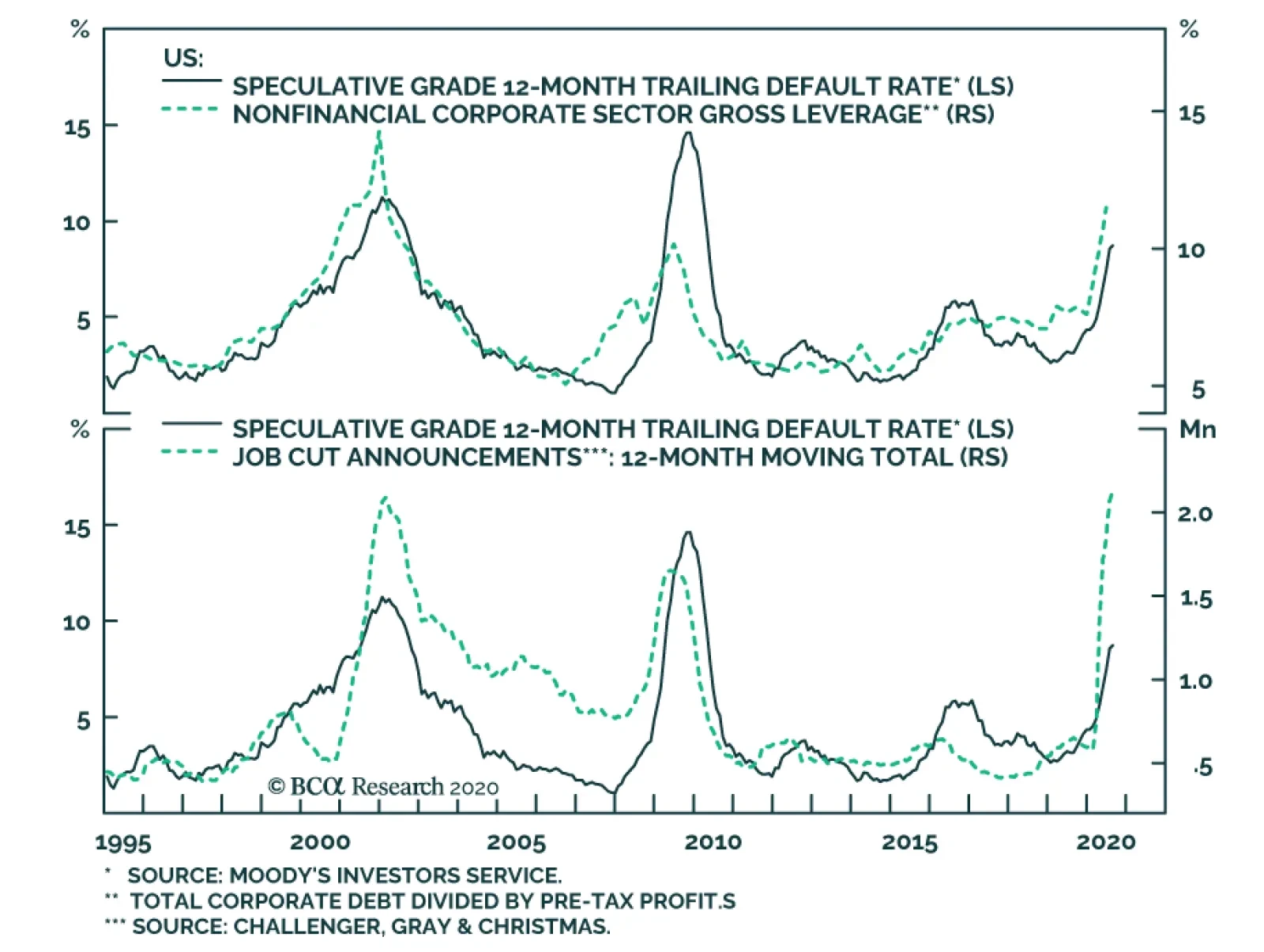
BCA Research's US Bond Strategy service ponders whether it is possible for the default rate to fall to 5% during the next 12 months. Historically, the default rate tends to fall very quickly when the economy is coming out of recession and, already, August…