Fixed Income

Highlights Monetary Policy: The Fed will keep rates at the zero bound at least until inflation is above 2% and it will maintain an accommodative policy stance until long-dated TIPS breakeven inflation rates move above 2.3%. Remain overweight spread product versus Treasuries and stay in nominal yield curve steepeners. Bond Yields & The Dollar: US dollar weakness will be bearish for bonds during the next 6-12 months. As long as the global economic recovery is maintained, the dollar will weaken further and bond yields have room to rise. EM Sovereigns: Remain underweight USD-denominated EM Sovereigns in a US bond portfolio, with the exception of Mexico. Economy: August’s poor retail sales figures strengthen our conviction that further fiscal stimulus is required to sustain the economic recovery. Our base case outlook is that Congress will deliver that stimulus in the coming weeks, and that yields will be higher in 6-12 months. But the risk of no deal is too great to ignore. Keep portfolio duration close to benchmark for now. Fed Adopts Explicit Forward Guidance, But Leaves Many Questions Unanswered Chart 1Fed And Markets Agree: No Rate Hike Until 2024
Fed And Markets Agree: No Rate Hike Until 2024
Fed And Markets Agree: No Rate Hike Until 2024
Following last month’s adoption of an average inflation targeting regime, the next logical step was for the Fed to translate its new policy framework into more explicit forward rate guidance.1 The Fed took that step at last week’s FOMC meeting by adding the following language to its post-meeting statement: The Committee decided to keep the target range for the federal funds rate at 0 to ¼ percent and expects it will be appropriate to maintain this target range until labor market conditions have reached levels consistent with the Committee’s assessments of maximum employment and inflation has risen to 2 percent and is on track to moderately exceed 2 percent for some time.2 Chart 2A Long Way From 2%
A Long Way From 2%
A Long Way From 2%
The new guidance says that the funds rate will not rise off the zero bound until three criteria are met: The labor market must be at “maximum employment” Inflation must be at or above 2% Inflation must be “on track to moderately exceed 2%” Notice that the criteria of “maximum employment” and inflation that “moderately exceeds 2%” are quite vague. In fact, Fed Chair Powell stated in his post-meeting press conference that “maximum employment” refers to a range of different labor market indicators, not just the unemployment rate. He also refused to provide more detail on how much of an inflation overshoot would qualify as “moderate”. This means that, practically, the only actionable information that the Fed gave investors is the promise that the funds rate won’t rise at least until inflation is at or above 2%. This is important info that can be easily visualized on a chart (Chart 2). We can plainly see that core inflation has a long way to go before it reaches the Fed’s target, and also that the Fed will not be making the same hawkish policy mistake it made in 2015, when it lifted rates with year-over-year core PCE inflation at 1.2%. Monetary policy will remain accommodative and supportive for risk assets until TIPS breakeven inflation rates return to well-anchored levels. For their part, FOMC participants don’t expect inflation to reach the 2% target for quite a while. The median participant doesn’t see core inflation reaching 2% until sometime in 2023, and only 4 out of 17 participants expect to lift rates before 2024. This is consistent with market pricing. The overnight index swap curve doesn’t price-in a full 25 basis point rate hike until September 2024 (Chart 1). Investment Implications We know that the Fed wants inflation to overshoot 2% for some period of time. Now, based on last week’s new guidance, we also know that no rate hikes will occur until inflation is above 2%. However, we still don’t know how much or how long of an inflation overshoot the Fed is targeting. For this reason, we think investors would be wise to keep in mind that the goal of the Fed’s new framework is to ensure that inflation expectations return to well-anchored levels. Our sense is that “well anchored” can be defined as a range of 2.3% to 2.5% for long-maturity TIPS breakeven inflation rates (Chart 3). Chart 3Inflation Expectations: The Fed's Real Target
Inflation Expectations: The Fed's Real Target
Inflation Expectations: The Fed's Real Target
We see monetary policy staying accommodative and supportive for risk assets until TIPS breakeven inflation rates reach those levels. This argues for maintaining an overweight 6-12 month allocation to spread product versus Treasuries. This also argues for staying overweight TIPS versus nominal Treasuries, and for positioning in nominal yield curve steepeners. The Fed will maintain its firm grip on the front-end of the curve for a long time yet, but the market will eventually start to price-in liftoff at the long end. A Weaker Dollar Will Be Bearish For Bonds, Bullish For EM Sovereign Spreads The broad trade-weighted US dollar is 8% off its 2020 peak, and the BCA house view is that the dollar will weaken further during the next 12 months. This section explores what that will mean for Treasury yields and for USD-denominated Emerging Market Sovereign debt. The Dollar And Treasury Yields Bond yields and the dollar are intimately related, but the relationship is more complex than a simple coincident correlation. We like to think of the relationship as a feedback loop between the exchange rate, bond yields and global economic growth (Chart 4). Chart 4The Dollar/Bond Feedback Loop
Trading Bonds In A Dollar Bear Market
Trading Bonds In A Dollar Bear Market
Since the dollar is currently falling, let’s start at the left-hand side of the feedback loop shown in Chart 4. The dollar’s current weakness is both a reflection of improving global economic growth and a catalyst for even stronger global economic growth. It is reflective because, compared to the rest of the world, the US is a large and stable economy. Firms and investors will respond to a positive global growth environment by sending capital overseas in search of higher returns. This puts downward pressure on the dollar. Dollar weakness also boosts global economic growth by making US dollars cheaper to acquire in global markets. This is particularly important for emerging markets, where a weaker dollar gives policymakers leeway to boost domestic growth via easier monetary and fiscal policies, without sacrificing the purchasing power of their currencies. Higher yielding countries tend to have less economic slack than low yielders. Moving to the top of the loop, stronger global economic growth (aka global reflation) will obviously impart upward pressure to bond yields. What’s less obvious is that US yields will rise by more than yields in the rest of the world. Chart 5 shows 3-year trailing yield betas for several major developed bond markets. Notice that the highest-yielding countries (US and Canada) also have the highest yield betas. This means that their yields rise the most when global bond yields are rising and fall the most when global bond yields are falling. This pattern holds because higher yielding countries tend to have less economic slack than low yielders. In other words, the high yielders will be quicker to price-in eventual monetary tightening when global growth is on the upswing. The high yielders also have more room to fall when growth ebbs. Chart 5High Yielding Bond Markets Are The Most Cyclical
High Yielding Bond Markets Are The Most Cyclical
High Yielding Bond Markets Are The Most Cyclical
Initially, global reflation sends US bond yields higher. But eventually, US yields will become too high relative to the rest of the world. At that point, the US dollar will respond to wide interest rate differentials and start to appreciate. This dollar appreciation will eventually lead to slower economic growth (“global deflation”), which will cause bond yields to decline. Finally, just as US bond yields rise more than non-US yields during the global growth upswing, they also fall more during the downswing. Eventually, the tightening rate differentials lead to US dollar depreciation and the cycle repeats. Where are we situated in the cycle right now? As of today, we contend that rate differentials between the US and the rest of the world have fallen a lot, and we are at the stage of the loop where the dollar is weakening in response (Chart 6). This means that dollar weakness has further to run, and we should expect that it will eventually lead to global reflation and higher US bond yields. In fact, Chart 7 shows that sentiment toward the dollar has already soured considerably, and that increasingly bearish dollar sentiment has a habit of leading to higher bond yields. Chart 6Rate Differentials Signal More Downside For Dollar
Rate Differentials Signal More Downside For Dollar
Rate Differentials Signal More Downside For Dollar
Chart 7Bearish Dollar Sentiment Leads To Higher Bond Yields
Bearish Dollar Sentiment Leads To Higher Bond Yields
Bearish Dollar Sentiment Leads To Higher Bond Yields
Eventually, US yields will rise too much compared to the rest of the world and the dollar’s depreciation will stop. But for now, dollar weakness is bearish for bonds. The Dollar And USD-Denominated EM Sovereign Spreads USD-denominated Emerging Market Sovereigns are an obvious sector that benefits from a weaker US dollar. Since the debt is denominated in US dollars but the country collects tax revenues in its local currency, any dollar weakness makes the issuer’s debt easier to service, and presumably leads to tighter sovereign spreads. Most of the dollar’s weakness this year has come against other developed market currencies, not against EMs. Despite this relationship, we are reluctant to advocate an overweight allocation to EM Sovereigns. First, most of the dollar’s weakness this year has come against other developed market currencies, not against EMs (Chart 8). Chart 8EM Currencies Have Lagged
EM Currencies Have Lagged
EM Currencies Have Lagged
Second, an environment of US dollar depreciation and global reflation is also a good environment for US corporate bonds and, with a couple exceptions, US corporate spreads are more attractive than EM Sovereign spreads. The vertical axis of Chart 9 shows the spread differential between the USD-denominated bonds of several EMs relative to a position in US corporate bonds with identical duration and credit rating. After differences in duration and credit rating are considered, only Turkey, Colombia, South Africa, Mexico and Russia offer a spread advantage over US corporate credit. The horizontal axis of Chart 9 shows each country’s export coverage of its foreign debt obligations. Greater coverage should make that country’s currency less vulnerable to depreciation, and vice-versa. In our view, the Turkish, Colombian and South African currencies are simply too risky. But Mexico and Russia present more interesting opportunities. Chart 9EM Sovereign Spread Over US Credit Versus Currency Vulnerability
Trading Bonds In A Dollar Bear Market
Trading Bonds In A Dollar Bear Market
We recommend an overweight allocation to Mexican Sovereigns because they offer a spread advantage relative to US corporates, and because the currency has been on an appreciating trend versus the dollar that still has further to run to get back to pre-COVID levels (Chart 8, panel 3). Despite the small spread pick-up, we would avoid Russian Sovereigns, at least until after the US election. The Ruble has been depreciating versus the dollar since mid-year (Chart 8, bottom panel) and a Democratic sweep in November will likely lead to the imposition of fresh US sanctions on Russia.3 Bottom Line: Remain underweight USD-denominated EM Sovereigns in a US bond portfolio. Despite the outlook for US dollar weakness, US corporate bonds offer more value and will deliver better returns. Mexican debt is the sole exception. Mexican spreads are attractive and the peso has room to appreciate. Economic Update: Signs Of Weakness In Consumer Spending Chart 10A Warning From Retail Sales
A Warning From Retail Sales
A Warning From Retail Sales
In last week’s report, we warned that without a fresh round of fiscal stimulus, the 12-month outlook for US consumer spending is dire.4 Then, last Wednesday, we received August’s retail sales figures – the first month of spending data since the expiry of the CARES act’s income support provisions – and learned that spending contracted on the month, after having rebounded sharply in May, June and July when the CARES act was in full force (Chart 10). There had been some hope that US consumers might be able to compensate for the lack of income by deploying some of the savings they had built up in the spring, thus keeping spending at decent levels for at least a few months. But August’s weak retail sales report challenges that narrative, as does the fact that consumer sentiment surveys have not improved very much since April (Chart 10, panel 3). Still low consumer sentiment suggests that households remain cautious and that they will be reluctant to spend with the same abandon they showed prior to COVID. We also note that, while weekly initial jobless claims continue to fall, the pace of improvement has significantly tapered off during the past few weeks and initial claims are still coming in about 4 times higher than they were last year (Chart 10, bottom panel). Bottom Line: While significant strides have been made, the US economy is not out of the woods. Our base case view is that Congress will deliver sufficient household income support in the coming weeks, allowing the economic recovery to continue. But the risk that they won’t is too great to ignore. Keep portfolio duration close to benchmark for now, and position for higher yields on a 6-12 month horizon via less risky duration-neutral yield curve steepeners. Appendix A: Buy What The Fed Is Buying The Fed rolled out a number of aggressive lending facilities on March 23. These facilities focused on different specific sectors of the US bond market. The fact that the Fed has decided to support some parts of the market and not others has caused some traditional bond market correlations to break down. It has also led us to adopt of a strategy of “Buy What The Fed Is Buying”. That is, we favor those sectors that offer attractive spreads and that benefit from Fed support. The below Table tracks the performance of different bond sectors since the March 23 announcement. We will use this to monitor bond market correlations and evaluate our strategy’s success. Table 1Performance Since March 23 Announcement Of Emergency Fed Facilities
Trading Bonds In A Dollar Bear Market
Trading Bonds In A Dollar Bear Market
Ryan Swift US Bond Strategist rswift@bcaresearch.com Footnotes 1 For a more detailed examination of the Fed’s new average inflation targeting regime please see US Bond Strategy / Global Fixed Income Strategy Special Report, “A New Dawn For Monetary Policy”, dated September 1, 2020, available at usbs.bcaresearch.com 2 https://www.federalreserve.gov/monetarypolicy/files/monetary20200916a1.pdf 3 Please see Geopolitical Strategy / Emerging Markets Strategy Special Report, “US-Russia: No Reverse Kissinger (Yet)”, dated July 3, 2020, available at gps.bcaresearch.com 4 Please see US Bond Strategy Weekly Report, “More Stimulus Needed”, dated September 15, 2020, available at usbs.bcaresearch.com Fixed Income Sector Performance Recommended Portfolio Specification
Feature In last week’s US Bond Strategy report, we presented the results of a scenario analysis on consumer spending.1 The goal of that analysis was to assess how much additional federal government income support is required to achieve consumer spending growth targets that won’t disappoint markets. The calculations regarding the amount of additional stimulus required to hit different spending targets are correct. However, a typo in our code (in fact, a missing letter “c”) caused us to specify the wrong targets. Last week, we targeted -3% 12-month over 12-month consumer spending growth for the period between March 2020 and February 2021. The rationale being that -3% was the worst spending growth seen during the 2008 Great Recession and would likely be the minimum that markets could tolerate this time around. As shown in the second panel of Chart 1, this number should have been -1.9%. Chart 1Consumer Spending Driven By Income & The Savings Rate
Consumer Spending Driven By Income & The Savings Rate
Consumer Spending Driven By Income & The Savings Rate
We also considered spending growth targets for the 12-month period between August 2020 and July 2021. Last week we set our target range for that period at between 2% and 6%, the growth rates seen during the recovery years that followed the Great Recession. That range should have been set at 2.5% to 5%. We present revised results from our scenario analysis in Table 1 and Table 2. These tables are identical to the ones presented last week, except that they now have the correct consumer spending targets. Table 1Without More Stimulus COVID's Impact On Consumer Spending Will Be Worse Than The GFC
A Correction To Last Week's Report
A Correction To Last Week's Report
Table 2At Least $600 Billion More Government Income Support Is Needed
A Correction To Last Week's Report
A Correction To Last Week's Report
Our conclusion remains similar, though our corrected numbers suggest that more income support from the federal government will be required to hit reasonable spending targets. Last week, we concluded that extra income support on the order of $500 - $800 billion is the minimum that will be required. Our corrected numbers suggest that more stimulus will be necessary, on the order of $600 billion to $1 trillion. Ryan Swift US Bond Strategist rswift@bcaresearch.com Footnotes 1 Please see US Bond Strategy Weekly Report, “More Stimulus Needed”, dated September 15, 2020, available at usbs.bcaresearch.com
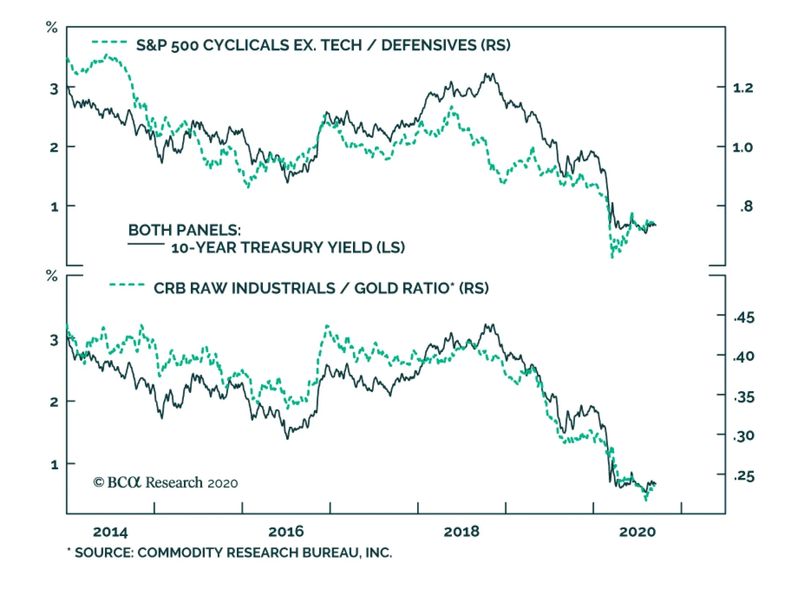
BCA Research's US Bond Strategy service assess the tech stock sell off and its implications on bonds. Bond yields correlate most strongly with: The performance of cyclical equities over defensive equities. The ratio of CRB Raw Industrials over…
BCA Research's US Bond Strategy service concludes that without additional household income support from Congress of $500 to $800 billion, consumer spending will massively disappoint expectations over the next 6-12 months. The CARES act played an essential…
This report contains an error in the section related to consumer spending and fiscal policy. That error somewhat changes the conclusions from the report, and it particularly impacts Chart 3, Table 2 and Table 3. The attached note explains the mistake and includes corrected versions of Chart 3, Table 2 and Table 3. Highlights Duration: A re-rating of Tech stock valuations is likely not a near-term catalyst for significantly lower bond yields. Congress’ continued failure to pass a follow-up to the CARES act is a greater near-term risk for bond bears. We continue to recommend an “at benchmark” portfolio duration stance alongside duration-neutral yield curve steepeners. Fiscal Policy: Without additional household income support from Congress, at least on the order of $500 - $800 billion, consumer spending will massively disappoint expectations during the next 6-12 months. Inflation: Inflation will continue its rapid ascent between now and the end of the year, but it is likely to level-off in 2021. We recommend staying long TIPS versus nominal Treasuries for the time being, but we will be looking to take profits on that position later this year. Feature Bond Implications Of A Tech Stock Sell-Off Risk-off sentiment reigned in equity and credit markets during the past two weeks. The S&P 500 fell 7% between September 2nd and 8th and the average junk spread widened from 471 bps to 499 bps. This represents the largest sell-off since June when the equity market saw a similar 7% decline and the junk spread widened from 536 bps to 620 bps (Chart 1). Chart 1Two Equity Sell-Offs, Two Different Bond Market Reactions
Two Equity Sell-Offs, Two Different Bond Market Reactions
Two Equity Sell-Offs, Two Different Bond Market Reactions
A comparison between the September and June episodes is particularly interesting for bond investors because Treasuries behaved very differently in each case. In June, bonds benefited from a flight to quality out of equities and the 10-year Treasury yield fell 22 bps. But this month, Treasuries actually delivered negative returns and the 10-year Treasury yield rose 3 bps (Chart 1, bottom panel). Table 1Selected Asset Class Performance During Last Two Equity Sell-Offs
More Stimulus Needed
More Stimulus Needed
Why would Treasuries perform so well in June but fail in their role as a diversifier of equity risk in September? The answer lies in the underlying drivers of the stock market’s decline, which are easily identified when we look at the performance of different equity sectors. Table 1 shows the performance of different equity sectors in both the June and September sell-offs. In June, it was the cyclical equity sectors – Industrials, Energy and Materials – that led the decline. These sectors tend to be the most sensitive to global economic growth. This month’s equity drawdown was led by Tech stocks, while cyclical and defensive sectors saw much smaller drops. Table 1 also shows that a broad measure of commodity prices – the CRB Raw Industrials index – rose by 0.79% during the September equity sell-off, significantly outpacing gains in the gold price. In June, the CRB index still rose but it lagged gold by a wide margin. The underlying drivers of the stock market’s decline explain why Treasuries performed well in June and underperformed in September. We bring up the performance of different equity sectors, commodity prices and gold because bond yields correlate most strongly with: The performance of cyclical equities over defensive equities (Chart 2, top panel). The ratio of CRB Raw Industrials over gold (Chart 2, bottom panel). Chart 2High-Frequency Bond Indicators
High-Frequency Bond Indicators
High-Frequency Bond Indicators
These correlations explain why bond yields fell a lot in June but not in September. June’s equity sell-off was more like a traditional risk-off event that saw investors questioning the sustainability of the global economic recovery. The cyclical equity sectors that are most exposed to the global economic cycle experienced the worst losses and demand for safe-haven gold far outpaced the demand for growth-sensitive industrial commodities. In contrast, this month’s sell-off was driven by a re-rating of Tech stock valuations, not so much expectations for a negative economic shock. Technology now makes up such a large portion of the equity index’s market cap that this sort of move can cause the entire stock market to fall, but the pass-through to bonds will be much smaller for any equity sell-off that isn’t prompted by a negative economic shock and led by cyclical equity sectors. Implications For Bond Investors Even after this month’s drop, there remains a legitimate concern about extreme Tech stock valuations. The fact that many of the larger Tech names, like Microsoft and Apple, have benefited from the pandemic only makes it more likely that their stock prices will suffer as the world slowly returns to normal. From a bond investor’s perspective, we doubt that even a large drop in Tech stock prices would lead to significantly lower bond yields, especially if that drop occurs in the context of an economy that continues to recover. Bond yields will only turn down if the market starts to question the sustainability of the economic recovery, an event that would be negative for cyclical equity sectors but much less so for the big Tech names. With that in mind, our base case outlook calls for continued economic recovery during the next 6-12 months, but we do see a significant risk that the failure to pass a follow-up to the CARES act will lead to just such a deflationary shock during the next couple of months. We therefore recommend keeping portfolio duration close to benchmark, while positioning for continued economic recovery via less risky duration-neutral yield curve steepeners. The Outlook For Consumer Spending And The Necessity Of Fiscal Stimulus After plunging during the lock-down months of March and April, consumer spending has rebounded strongly during the past few months. But can this strong rebound continue? Our view is that it cannot. That is, unless Congress delivers more income support to households. Even a large drop in Tech stock prices is unlikely to lead to significantly lower bond yields, especially if that drop occurs in the context of an economy that continues to recover. In this section we consider several different economic scenarios and estimate the amount of further income support that is necessary to sustain an adequate level of consumer spending. First off, to make forecasts for consumer spending we need to consider two main parameters: household income and the personal savings rate (Chart 3). More income leads to more spending in most cases. The only exception would be if cautious households decide to increase the amount they save relative to the amount they spend. Chart 3Consumer Spending Driven By Income & The Savings Rate
Consumer Spending Driven By Income & The Savings Rate
Consumer Spending Driven By Income & The Savings Rate
We’ve actually seen that exception play out somewhat during the past five months. The CARES act provided households with an income windfall, but the savings rate also shot higher. This suggests that households had enough income to spend even more during the past few months but have been much more cautious than usual. We cannot overstate the role the CARES act has played in supporting household incomes since March. Disposable income has grown 7.4% during the past five months compared to the five months prior to COVID, and the CARES act’s provisions pressured income 10.3% higher during that period (Chart 4). The CARES act’s one-time $1200 stimulus checks and expanded $600 weekly unemployment benefits were the two most important provisions in this regard. Together, they pushed disposable income higher by 7.5%. Chart 4Disposable Personal Income Growth And Its Drivers
More Stimulus Needed
More Stimulus Needed
This presents an obvious problem. The income support from the CARES act is now expired and Congress has yet to pass a follow-up stimulus bill. How vital is it that we get a new bill? And how large does it need to be? To answer these questions, we first need to set a target for adequate consumer spending growth. The second panel of Chart 3 shows 12-month over 12-month consumer spending growth. That is, it looks at total consumer spending during the last 12 months and shows how much it has increased (or decreased) compared to the previous 12 months. Notice that the worst 12-month period during the 2008 Great Financial Crisis (GFC) saw 12-month over 12-month consumer spending growth of -3%. During the economic recovery that followed, consumer spending growth fluctuated between +2% and +6%. Exercise 1: The March 2020 To February 2021 Period Chart 5Three Scenarios For Income And Savings
Three Scenarios For Income And Savings
Three Scenarios For Income And Savings
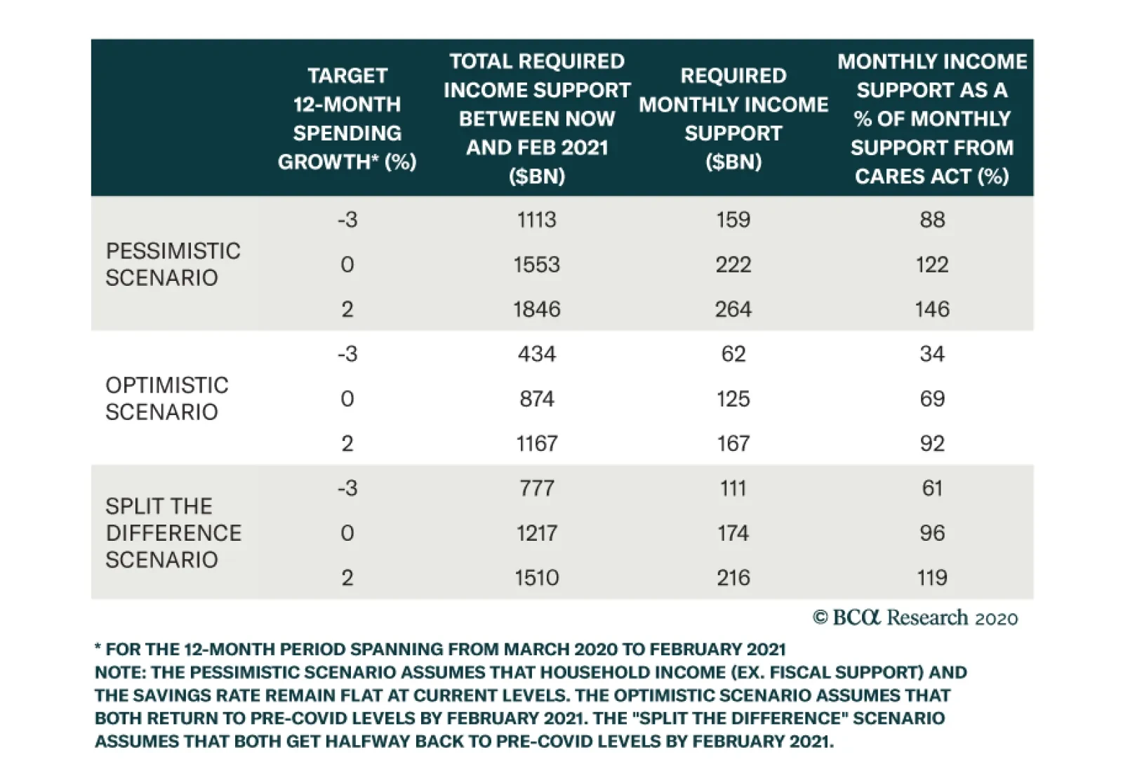
In our first exercise, we consider the 12-month period starting at the very beginning of the COVID recession in March 2020 and ending in February 2021. As a bare minimum, we target consumer spending growth of -3% for this 12-month period on the presumption that 12-month spending growth equal to the worst 12 months seen during the GFC is the bare minimum that markets might tolerate. We also consider somewhat rosier scenarios of 0% and 2% spending growth. In addition to consumer spending targets, we also make assumptions for household income and the savings rate. We consider income coming from all sources including automatic government stabilizers, but without assuming any additional fiscal support from the government. We consider three scenarios (Chart 5): A pessimistic scenario where both income and the savings rate hold steady at current levels. An optimistic scenario where both income and the savings rate return to pre-COVID levels by February 2021. A “split the difference” scenario where both income and the savings rate get halfway back to pre-COVID levels by next February. Table 2 shows how much additional income support from the government is needed between now and February to achieve each of our consumer spending growth targets in each of our three scenarios. For example, in the optimistic scenario the government will need to provide $434 billion of additional income support between now and February for consumer spending to hit our minimum -3% threshold. In the more realistic “split the difference” scenario, households will require another $777 billion of stimulus. Table 2 also shows that stimulus on a monthly basis and compares the monthly rate of stimulus to the rate provided by the CARES act. For example, an additional $777 billion of income doled out between August and February works out to $111 billion per month, 61% of the amount of monthly stimulus provided by the CARES act between April and July. Table 2Without More Stimulus COVID's Impact On Consumer Spending Will Be Worse Than The GFC
More Stimulus Needed
More Stimulus Needed
Two main conclusions jump out from this analysis. The first is that more income support from Congress is absolutely required. Otherwise, consumer spending will come in worse during the March 2020 to February 2021 period than it did during the worst 12 months of the GFC. Second, unless we assume a truly dire economic scenario, the follow-up stimulus does not need to be as large as the CARES act. In our most realistic “split the difference” scenario, that $777 billion of required stimulus is only 61% of what the CARES act doled out on a monthly basis. In that same scenario, a follow-up bill that delivered the same monthly stimulus as the CARES act would lead to positive 12-month consumer spending growth. Exercise 2: The August 2020 To July 2021 Period Chart 6One More Scenario
One More Scenario
One More Scenario
One potential problem with our last exercise is that our target was for total consumer spending between March 2020 and February 2021. This period includes five months for which we already have data and the exercise is therefore partially backward-looking. A more relevant analysis might target consumer spending on a purely forward-looking basis from August 2020 to July 2021. We therefore perform our calculations again for the August 2020 to July 2021 period. This time, we consider only one economic scenario where income and the savings rate both return to pre-COVID levels by July 2021 (Chart 6). This scenario works out to be slightly more optimistic than the “split the difference” scenario we considered earlier. Also, since our target 12-month spending growth period no longer contains the downtrodden months of March and April, we require a more ambitious target than -3% growth. A return to the post-GFC range of 2% to 6% represents a target that is likely more representative of market expectations. Table 3 shows the results of this second analysis. Once again, we see that some additional government stimulus is necessary to meet our spending targets. Even to achieve 0% spending growth over the next 12 months will require another $249 billion from the government, and that outcome would almost certainly disappoint markets. We calculate that an additional $534 billion is required to achieve 2% spending growth during the August 2020 to July 2021 timeframe. This result is consistent with the $777 billion we calculated in Table 2, though it has come down a bit because we have made slightly more optimistic economic assumptions. Table 3At Least Half A Trillion More Government Income Support Is Needed
More Stimulus Needed
More Stimulus Needed
Bottom Line: Our analysis suggests that further stimulus is needed to sustain the recovery in consumer spending. A new stimulus package doesn’t need to be as large as the CARES act on a monthly basis, but it should provide at least $500 - $800 billion of additional income support to households. With Congress still dithering on this issue, financial markets appear overly complacent in the near-term. While the economic constraints suggest that a deal should be reached soon, policymakers may need to see a spate of negative economic data and/or poor market performance before being spurred into action. In acknowledgement of this significant near-term risk to the economic outlook, bond investors should refrain from getting too bearish, and keep portfolio duration close to benchmark for the time being. Inflation’s Snapback Phase Chart 7Inflation Coming In Hot
Inflation Coming In Hot
Inflation Coming In Hot
The core Consumer Price Index rose 0.4% in August, the third large monthly increase in a row (Chart 7). We see inflation continuing to come in hot between now and the end of the year, before tapering off in 2021. As of now, we would describe inflation as being in a snapback phase. That is, back in March and April, when lock-down measures were widespread across the country, the sectors that were most affected by the shutdowns experienced massive price declines. However, notice that core inflation fell by much more than median or trimmed mean inflation during this period (Chart 7, panels 2 & 3). The median sector’s price didn’t fall that much, but the overall inflation number moved down because of deeply negative prints in a few sectors. Now that the economy is re-opening, many of the sectors that were most beaten down in March and April are coming back to life. As a result, those massive price declines are turning into massive price increases. Once again, the median and trimmed mean inflation figures have been much more stable. This “snapback” dynamic is illustrated very clearly in Chart 8 which shows the distribution of monthly price changes for 41 different sectors in April and in August. Notice that while the middle of the distribution hasn’t changed that much, April’s massive left tail has morphed into August’s massive right tail. Chart 8Distribution Of CPI Expenditure Categories
More Stimulus Needed
More Stimulus Needed
The continued wide divergence between core inflation and the median and trimmed mean measures suggests that this snapback phase has further to run. In other words, we will likely continue to see strong inflation prints for a few more months as the sectors that were most downbeat in March and April continue their rebounds. However, once core catches back up to the median and trimmed mean inflation measures, this snapback phase will come to an end and inflation’s uptrend will probably level-off. The continued wide divergence between core inflation and the median and trimmed mean measures suggests that this inflation’s snapback phase has further to run. We recommend that bond investors continue to favor TIPS over nominal Treasuries during this snapback phase, but we will be looking for an opportunity to go underweight TIPS versus nominal Treasuries later this year, once core inflation moves closer to the median and trimmed mean measures and the snapback phase ends. Appendix A: Buy What The Fed Is Buying The Fed rolled out a number of aggressive lending facilities on March 23. These facilities focused on different specific sectors of the US bond market. The fact that the Fed has decided to support some parts of the market and not others has caused some traditional bond market correlations to break down. It has also led us to adopt of a strategy of “Buy What The Fed Is Buying”. That is, we favor those sectors that offer attractive spreads and that benefit from Fed support. The below Table tracks the performance of different bond sectors since the March 23 announcement. We will use this to monitor bond market correlations and evaluate our strategy’s success. Table 4Performance Since March 23 Announcement Of Emergency Fed Facilities
More Stimulus Needed
More Stimulus Needed
Ryan Swift US Bond Strategist rswift@bcaresearch.com Fixed Income Sector Performance Recommended Portfolio Specification
Highlights Overweighting the SIFI banks is our highest-conviction call, … : Our enthusiasm for the four banks deemed to be systemically important financial institutions is founded on the view that generous monetary and fiscal policy will lead to considerably smaller credit losses than the SIFIs’ depressed valuations imply. … but investors are none too sure of it, inside and outside of BCA: The SIFIs have underperformed the broad market since we overweighted them in late April, and they will likely run in place until our mild-credit-loss thesis can be borne out. Banks’ fortunes are not tied to the slope of the yield curve … : Banks do not borrow short to lend long and the widespread belief that their stocks are hostage to the yield curve has no empirical support. … and the US banking industry is not in structural decline: US banks have experienced steady growth in real loans, net interest income and net income. Their businesses have yet to be disrupted by new entrants; so far, technology has increased profitability and we expect that the pandemic will point the way to future efficiency improvements. Feature In response to ongoing client questions and a lively internal debate, we are devoting this week’s report to reviewing our highest-conviction call: overweighting the SIFI banks.1 After restating our thesis and what it would take to get us to abandon it, we challenge two arguments that have been cited in support of a bearish view. We hold fast to our underlying rationale, though we concede that it will likely take more time for the call to pan out. We always recommended it for investors with a time frame of at least a year, and it may take until first quarter 2021 earnings to start generating alpha, but we still believe it will. A Feature, Not A Bug Our entire editorial staff gathers every month to define the consensus view on all the major asset classes, which becomes the BCA House View until we revisit it the next month (or sooner, if need be). The House View is not a party line that we all parrot; any individual managing editor is free to express an opposing view, provided s/he clearly states that s/he is departing from the House View and, ideally, explains why. Although this policy does not always lead to neatly packaged views, it affords clients a window on our internal debates, allowing them to evaluate the merits of opposing points of view for themselves. It also helps us attract and retain the informed, opinionated researchers we seek. Banking On Washington The pandemic, and the lockdown measures imposed to limit its spread, tore a huge hole in the economy. Policymakers swiftly mobilized to build a bridge across the hole until the virus could be contained. Before March was out, the Fed had soothed the Treasury market, prized open the corporate bond market and had set bond spreads on a path to tighten. Congress passed measures providing nearly $3 trillion of aid, highlighted by the massive CARES Act. Although another significant round of federal aid is not assured, it would be in the House's, the Senate's and the White House's interest, so we expect it will eventually materialize. Thanks to the CARES Act’s copious household support, personal income reversed its March slide and comfortably exceeded February's pre-pandemic level in April, May, June and July (Chart 1). With much of the economy still in suspended animation, absent another round of direct payments to households, unemployment insurance benefit supplements, support for badly disrupted businesses and aid to state and local governments facing severe revenue shortfalls, potentially dire economic consequences loom. With even run-of-the-mill recessions dooming incumbent administrations’ election prospects, it is in the White House’s best interests to advocate for more spending to hold back the flood. Republican control of the Senate also lies in the balance. Chart 1Fiscal Transfers Have Kept Households Afloat
Fiscal Transfers Have Kept Households Afloat
Fiscal Transfers Have Kept Households Afloat
With the Democrats seeking to demonstrate that bigger government is the solution, House, Senate and White House interests all align with the passage of a major new aid package ahead of the election. Despite the worsening climate, we expect that elected officials’ self-interest will carry the day. All creditors stand to benefit, since fiscal transfers have been vital to limiting bankruptcies and defaults, and the SIFIs would get a major boost as we attribute their dreadful year-to-date performance to market fears of credit losses well in excess of the loan loss reserves they’ve already set aside. The key to our pro-SIFIs call is that we see them as the foremost beneficiary of continued fiscal largesse. Just The SIFIs, Please We are not enamored of the entire banking industry. Low rates are likely to undermine net interest margins for an extended period and weakening loan growth, a function of borrower and lender caution, will hurt lending volumes. Banks that principally take deposits and make loans to the households and businesses within their geographic footprint will suffer. Several community banks face stiff headwinds as do some regionals. The SIFIs have quite a few earnings streams, though, and only get around half of their revenues from net interest income. They are hybrids that combine investment banks boasting bulge-bracket underwriting, top-tier sales and trading, and formidable wealth management businesses with a nationwide commercial banking footprint. These companies do not live and die by loan volumes and interest rate spreads, as much of their loan originations are securitized and their loan books are not bound to the intrinsic risk of their local economies. The SIFIs trade slightly below book value and only slightly above tangible book value (Table 1, left panel). This would be cold comfort if their book values were at risk of falling because of optimistic carrying values for their assets or impending reserve builds that would eat away at retained earnings. We are not at all worried about bad marks, however – post-GFC regulation kept the SIFIs from getting out over their skis in the just-concluded expansion – and we think that they are adequately reserved in the aggregate. Assuming that the virus will be contained by the end of the year, we stick to our initial projection that they would need to build sizable loan loss reserves only through this year's first three quarters. Table 1SIFI Book Values
Defending The SIFIs
Defending The SIFIs
On their second quarter earnings calls, the SIFIs were of the view that their reserve building was nearly complete. National infection rates have remained high, however, and the supplemental federal unemployment insurance benefit has since lapsed. We expect that the rollback of re-opening measures and the interruption of CARES Act relief provisions will force the SIFIs to add to their reserves this quarter in amounts approaching first and second quarter levels, but if Congress does provide another round of meaningful aid this month or next, we think that will be the end of the big builds. Equity investors do not seem to have recognized that the SIFIs’ earnings power has allowed them to take their sizable reserve builds in stride. Book values didn’t budge in the first two quarters (Table 1, right panel), and if they continue to hold their ground, the selling in their stocks is way overdone. We are quite happy to find a group that’s so inexpensive against a backdrop in which nearly every public security is trading at elevated levels relative to history, especially when that group will be a clear winner from continuing fiscal support. If further aid on a meaningful scale is not forthcoming, however, we will exit our SIFI overweight. We are not irresolute, but we close out positions when their underlying rationale no longer applies. Psst. The Yield Curve Doesn’t Matter Old superstitions die hard. US Investment Strategy has been presenting evidence for ten years that the yield curve does not drive bank earnings.2 Although the intuition behind the view is logical, it fails to acknowledge that banks do not borrow short to lend long. As the gargantuan interest rate swap market and the FDIC’s Quarterly Banking Profile demonstrate, all but the smallest community banks rigorously match the duration of their assets and liabilities. We typically show line charts overlaying the slope of the yield curve (the 10-year Treasury yield less the 3-month T-bill rate) with aggregate net interest income or net income, showing that there has been no consistent relationship between the two series. We’ve even shown that the yield curve is largely uncorrelated with bank net interest margins. Alas, one may as well try to convince a native New Yorker that s/he is not the most important element of the universe, or an English soccer fan that his/her side is not among the favorites to capture the next World Cup. Fiscal aid has held defaults way below levels that would typically be associated with such a severe economic shock and another hearty round of it would position SIFI credit losses to come in way below the market's worst fears. This time around, we present over 60 years of monthly data in one scatterplot after another that takes the shape of an amorphous blob. They demonstrate that there is no coincident relationship between the level of the slope of the yield curve and bank stocks’ performance relative to the S&P 500 (Chart 2), or the change in the slope of the yield curve and bank stocks’ relative performance (Chart 3). They also show that there is no leading relationship over six- (Chart 4A) or twelve-month periods (Chart 4B) between the level of the slope of the yield curve and bank stocks’ relative performance. The change in the slope of the yield curve also comes a cropper with six- (Chart 5A) and twelve-month lead times (Chart 5B). With every one of the six regressions generating r-squareds below 1%, we conclude that neither the level of the slope of the yield curve, nor its direction, explains any element of relative bank stock performance. Chart 2The Steepness Of The Yield Curve Does Not Influence Bank Stocks' Relative Performance
Defending The SIFIs
Defending The SIFIs
Chart 3The Change In The Steepness Of The Yield Curve Does Not Influence Bank Stocks' Relative Performance
Defending The SIFIs
Defending The SIFIs
Chart 4AThe Steepness Of The Yield Curve Does Not Lead Bank Stocks' Relative Performance Over 6 Months
Defending The SIFIs
Defending The SIFIs
Chart 4BThe Steepness Of The Yield Curve Does Not Lead Bank Stocks' Relative Performance Over 12 Months
Defending The SIFIs
Defending The SIFIs
Chart 5AChanges In Yield Curve Steepness Do Not Lead Bank Stocks' Relative Performance Over 6 Months
Defending The SIFIs
Defending The SIFIs
Chart 5BChanges In Yield Curve Steepness Do Not Lead Bank Stocks' Relative Performance Over 12 Months
Defending The SIFIs
Defending The SIFIs
Rumors Of The Banks’ Structural Decline Have Been Greatly Exaggerated We submit that US banks are not in the throes of a structural decline. Adjusted for inflation, growth in their core lending business has been steady, except during recessions and their aftermath, for 70 years (Chart 6). Despite a persistent trend toward increasing non-bank intermediation that has reduced the industry’s market share, loan volumes continue to expand. Chart 6Real Bank Loan Balances Have Steadily Grown For 70 Years
Real Bank Loan Balances Have Steadily Grown For 70 Years
Real Bank Loan Balances Have Steadily Grown For 70 Years
Industry viability is not only about sales volume, however. Participants in a declining industry could retain or even grow volumes, only to see their profits shrink in the face of competition from incumbents or new entrants. Real net interest income has continued to grow, however, more or less in line with real loan growth (Chart 7), demonstrating that margins have not eroded. Real net income, which includes credit costs and fees and other non-interest items that are more sensitive to the business cycle, is much more volatile, but has also followed a broad upward trend (Chart 8). Chart 7Real Net Interest Income Growth Has Decelerated, But It's Still Positive ...
Real Net Interest Income Growth Has Decelerated, But It's Still Positive ...
Real Net Interest Income Growth Has Decelerated, But It's Still Positive ...
Chart 8... While Real Net Income Quickly Surpassed Its Pre-GFC Peak
... While Real Net Income Quickly Surpassed Its Pre-GFC Peak
... While Real Net Income Quickly Surpassed Its Pre-GFC Peak
Futurists see fintech and cryptocurrencies as looming disruptive threats to the banking industry, but they have yet to make a significant dent in its volumes or its profits. To this point (Chart 9), technological advances have done more to reduce the industry’s operating costs than they have to undermine its moat. One would expect that a meaningful downward move in the efficiency ratio might be in store, based on what the banks have learned from the pandemic about optimizing human inputs, virtual applications and their costly branch footprints. The data do not support the claim that the industry is in the midst of a structural decline and an efficiency tailwind is likely in the offing once the acute phase of the pandemic passes. Chart 9Banks' Non-Interest Expenses Relative To Revenue Are Structurally Declining
Banks' Non-Interest Expenses Relative To Revenue Are Structurally Declining
Banks' Non-Interest Expenses Relative To Revenue Are Structurally Declining
Concluding Thoughts Stocks that are oversold can become even more oversold and cheap does not necessarily mean valuable. It is entirely possible that the SIFI banks are a value trap; our call has underperformed since the late May/early June backup in long yields was summarily unwound (Chart 10). Something seems off, however, when the SIFIs are performing nearly as badly year-to-date as office and retail REITs. The latter face a structural shrinking of their businesses while banks are looking at nothing more than a cyclical ebb. Chart 10A Marathon, Not A Sprint
A Marathon, Not A Sprint
A Marathon, Not A Sprint
Fiscal policymakers demonstrated their ability to counter the cyclical drag over the spring and summer; if they recover their willingness to do so, the SIFIs' outlook is far less grim than markets are currently discounting. Given our view that both the administration’s re-election prospects and Republican control of the Senate depend on staving off severe adverse economic consequences from the pandemic, we think that Congress will rediscover its resolve. If it doesn’t, we will have to close our position and potentially seek a better entry point after the new session of Congress convenes in January. It won't be all hearts and rainbows for the SIFIs over the next year, but concerns about the yield curve and the banking industry's trend earnings and revenue growth are misplaced. They are positioned to climb a wall of worry as soon as the pandemic begins to loosen its grip. Under our base-case policy scenario, the selling in the SIFIs has gone way too far. With policymakers squarely in the SIFIs’ corner, we’re thrilled to have a chance to take a shot at them from the long side below book value. The market is right to recognize that the banks will not have smooth sailing even if Congress eventually comes through, but we think it has failed to consider how much more protected the SIFIs are than their smaller brethren. If it’s holding them down because of yield curve concerns, or the idea that the banking industry is in the midst of a long-run decline, it simply has its facts wrong and we’re confident that they will rise over the next six to nine months. Doug Peta, CFA Chief US Investment Strategist dougp@bcaresearch.com Footnotes 1 JPM, BAC, C and WFC are the commercial/universal banks that regulators have deemed systemically important. 2 Please see the February 28, 2011 US Investment Strategy Special Report, “Banks And The Yield Curve,” available at usis.bcaresearch.com.
Highlights Stocks face near-term downside risks from further delays in passing a new US fiscal stimulus package, a potentially slower-than-expected rollout of a Covid-19 vaccine, and the unwinding of speculative call option positions in large-cap US tech companies. Nevertheless, we continue to favor equities over bonds over a 12-month horizon. One key reason is that the global equity risk premium – proxied by the difference between the stock market earnings yield and the real government bond yield – remains quite large. Many observers argue that the bond yield component of the equity risk premium is distorted by central bank manipulation. They also contend that low bond yields reflect poor economic prospects and that structurally low borrowing costs could lead to malinvestment down the road. In this report, we push back against these views. We argue that today’s low bond yields do, in fact, provide a reliable estimate of the risk-free component of the discount rate; that the drop in yields over the past year mainly reflects higher private-sector savings and easier monetary policy rather than pessimism about growth and earnings; and that instead of leading to overinvestment, the main effect of falling interest rates, at least so far, has been to inflate the rents earned by companies with monopoly power. All of this means that lower interest rates really do justify higher market valuations. The Correction Is Not Over, But We Are Sticking With Our Bullish 12-Month View On Stocks Chart 1Tech Stocks At Greatest Risk Of A Pullback
Tech Stocks At Greatest Risk Of A Pullback
Tech Stocks At Greatest Risk Of A Pullback
After recouping some of their losses on Wednesday, stocks stumbled again on Thursday. Since reaching new highs last week, global equities have dropped by 5.3%. US equities have taken the brunt of the beating. They are down 7% from last week’s top, compared to 3% for non-US stocks (Chart 1). The tech-heavy Nasdaq remains 9.4% off its record high. We continue to see near-term downside risks to global stocks, particularly US equities. It has now been six weeks since emergency US federal unemployment benefits lapsed. The US economy is set to rebound at a brisk pace in the third quarter – the Atlanta Fed’s GDPNow model projects that output will grow 30% at an annualized pace – but GDP is rising from a very low base. In the absence of a new fiscal package, US growth could slow sharply in the fourth quarter and beyond, causing more workers to become permanently unemployed. Concern over the safety of the vaccines being developed to fight Covid-19 could also unsettle investors. On Wednesday, AstraZeneca announced that it had temporarily paused the Phase 3 trial of its vaccine co-developed with the University of Oxford after a patient suffered a severe reaction. Such delays are normal in the conduct of vaccine testing, but they do raise memories of the 1976 debacle with the Swine flu vaccine, which caused 450 Americans to come down with Guillain-Barré syndrome, a life-threatening neurological disorder.1 Chart 2Nasdaq Volatility Declined Even As Share Prices Tumbled
Stock Prices And Interest Rates: Can We Trust TINA?
Stock Prices And Interest Rates: Can We Trust TINA?
These worries come on the heels of a six-month rally in tech stocks – one that was dangerously amplified by speculative call option purchases by retail investors. The preference among retail investors for short-dated calls allowed them to gain control of large swathes of shares at relatively little cost. Market makers and other counterparties who sold the calls were forced to buy the underlying stock to hedge their exposure. This created a self-reinforcing feedback loop where rising call option prices generated more purchases of the underlying stock, leading to even higher call prices. Starting last week, the process began to go in reverse. It is noteworthy that Nasdaq implied volatility actually fell on both Monday and Wednesday as tech stocks imploded, a possible sign that nervous investors were liquidating their call positions (Chart 2). It is difficult to know how much further this process has to run, but our guess is that a capitulation point has not yet been reached. This suggests that the correction is not yet over. TINA’s Siren Song Despite our near-term concerns, we expect global equities to be higher in 12 months’ time. At least one of the nine vaccine candidates currently in Phase 3 trials is likely to produce a viable formula. Policymakers are also liable to heed the will of voters and maintain generous fiscal stimulus measures. All this should allow global growth to pick up. Stocks usually do well when global growth is accelerating (Chart 3). And then there is TINA. TINA — There Is No Alternative — has become a popular adage on Wall Street. As the argument goes, no matter how expensive stocks seem to get, bonds and cash are even less attractive. There is some logic to this view. Today, the dividend yield on the S&P 500 stands at 1.6%. While this dividend yield is well below its historic average of 4.3%, it is still higher than the 0.68% yield on the 10-year Treasury note (Chart 4). Chart 3Stocks Usually Do Well When Global Growth Is Accelerating
Stocks Usually Do Well When Global Growth Is Accelerating
Stocks Usually Do Well When Global Growth Is Accelerating
Chart 4Bond Yields Have Fallen Below Dividend Yields
Bond Yields Have Fallen Below Dividend Yields
Bond Yields Have Fallen Below Dividend Yields
Imagine an investor having to decide whether to place their money in an S&P 500 index fund or a 10-year Treasury note. Dividends-per-share paid by S&P 500 companies have almost always increased over time. However, even if we make the pessimistic assumption that dividends-per-share remain unchanged for the next ten years, the value of the S&P 500 would still have to fall by 9% over the next decade to equal the return on the 10-year note. Assuming that inflation averages 2% over this period, the real value of the S&P 500 would need to drop by 25%. The picture is even more dramatic outside the US. In the euro area, the index would have to fall by over 30% in real terms for investors to make more money in bonds than stocks. In the UK, it would need to fall by over 50%. Elevated Equity Risk Premia Granted, stocks are riskier than bonds. However, based on a comparison of dividend yields with bond yields, stocks today are significantly cheaper than usual (Chart 5). Chart 5AStocks Would Need To Fall A Lot For Equities To Underperform Bonds
Stocks Would Need To Fall A Lot For Equities To Underperform Bonds
Stocks Would Need To Fall A Lot For Equities To Underperform Bonds
Chart 5BStocks Would Need To Fall A Lot For Equities To Underperform Bonds
Stocks Would Need To Fall A Lot For Equities To Underperform Bonds
Stocks Would Need To Fall A Lot For Equities To Underperform Bonds
The relative attractiveness of stocks can also be inferred by subtracting the real bond yield from the cyclically-adjusted earnings yield on stocks in order to get an implied equity risk premium (ERP)2 (Chart 6). Outside the US, the ERP is high both because earnings yields are elevated and because real bond yields are depressed. In the US, which accounts for 56% of global stock market capitalization, the earnings yield is below its long-term average. Nevertheless, the US ERP is still quite high because real bond yields reside deep in negative territory. In fact, the US ERP has barely fallen since March because the decline in real yields has largely offset the rise in stock prices (Chart 7). Chart 6Equity Risk Premia Are Elevated
Equity Risk Premia Are Elevated
Equity Risk Premia Are Elevated
Chart 7The Decline In US Real Yields Since March Has Largely Offset The Rise In Stock Prices
The Decline In US Real Yields Since March Has Largely Offset The Rise In Stock Prices
The Decline In US Real Yields Since March Has Largely Offset The Rise In Stock Prices
Are Bond Yields Fake News? Stock market bears will argue that the ERP is overstated by the abnormally low level of bond yields. Their argument typically centers on three points: Quantitative easing, forward guidance, NIRP and ZIRP have distorted bond yields to such an extent that we can no longer use them as a reliable measure of the risk-free component of the discount rate. Even if one accepts the premise that current bond yields are a valid proxy for the risk-free rate, the fact that yields are so low is hardly a cause for celebration. This is because today’s low yields reflect dismal economic prospects, which justifies a higher-than-normal equity risk premium. Low bond yields are incentivizing all sorts of malinvestment. With time, this will depress the rate of return on capital, leading to lower stock prices. Let’s examine all three arguments in turn. Are Bond Yields Being Manipulated? The term financial repression gets bandied around quite often these days. There is no doubt that central banks would like to keep yields low, but how much higher would yields be in the absence of any unorthodox monetary measures? Our guess is not much higher. The simplest test of whether bond yields are above or below their equilibrium level is to look at whether growth is above or below trend. The recovery following the financial crisis was anemic, suggesting that monetary policy was only modestly accommodative. If anything, one can argue that in much of the world, bond yields would be even lower today were it not for the fact that nominal interest rates cannot go much below zero. Do Low Bond Yields Reflect Bad News? Bond yields can decline for many reasons. Some of these reasons are positive for equity investors, while others are negative. If yields fall on the expectation of weaker economic growth, that is clearly bad for stocks. On the flipside, if yields drop because monetary policy has turned more dovish, that is good for stocks. The impact on equities from other factors influencing bond yields can be ambiguous. For example, consider the case of an increase in private-sector savings. All things equal, higher savings will lead to less spending. A decline in spending is likely to result in lower output and diminished corporate profits. That is bad for stocks. However, if governments absorb the excess private-sector savings by running larger budget deficits, there may end up being no net loss in aggregate demand. In that case, stock prices may not fall. Indeed, one can very easily envision a scenario where an adverse shock to private-sector spending leads to an increase in equity valuations. To see this point, consider a standard dividend discount model. Suppose something happens that leads the private sector to spend less at any given interest rate. Let us also suppose that the central bank reacts to this shock by cutting interest rates all the way down to zero, at which point governments, taking advantage of cheaper borrowing costs, step in and increase fiscal stimulus. The upshot could be a lower interest rate but at the same level of aggregate spending (See Box 1 for a formal economic discussion of how this process works). If aggregate demand – and by extension, corporate earnings and dividends — drop temporarily, while interest rates fall permanently (or at least semi-permanently), the present value of cash flows will rise. As far-fetched as this scenario may seem, something along these lines appears to have happened over the past six months. Chart 8 shows that analysts expect global profits to contract by 19% in 2020, but then rebound by 29% in 2021 and rise a further 16% the following year, leaving 2022 profits 21% above 2019 levels. Like everywhere else, analysts expect US profits to return to their long-term trend over the next few years. Meanwhile, the 30-year TIPS yield – a proxy for the risk-free component of the discount rate – has fallen by 94 basis points since the start of the year. Even if one assumes, contrary to the optimistic forecasts of analysts, that the level of US EPS does not return to its pre-pandemic trend until 2030, this would still leave the fair value of the S&P 500 17.5% higher than it was at the start of the year (Chart 9). Chart 8Analysts Expect Global Profits To Contract This Year Before Rebounding
Stock Prices And Interest Rates: Can We Trust TINA?
Stock Prices And Interest Rates: Can We Trust TINA?
Chart 9The Present Value Of Earnings: A Scenario Analysis
Stock Prices And Interest Rates: Can We Trust TINA?
Stock Prices And Interest Rates: Can We Trust TINA?
Will Low Interest Rates Lead To Malinvestment? A drop in interest rates may seem like a free lunch for shareholders: It increases the present value of future cash flows without reducing the cash flows themselves. In fact, one could argue that lower rates actually increase future cash flows by shrinking net interest payments on outstanding debt. That might be all fine and dandy, but what about the effect of low interest rates on future investment decisions? To the extent that lower rates increase the market value of a firm’s capital stock relative to its replacement cost – the so-called Tobin’s Q ratio – lower rates could spur more investment. Higher investment, in turn, could drive down the rate of return on capital, leading to lower profits (Box 2 illustrates this point with a simple example featuring a lemonade stand). While there is some truth to this logic, it is less compelling than it once was. This is because much of the capital stock of listed companies today takes the form of intangible capital – which is often difficult to reproduce – rather than physical capital. Such intangible capital may include patents and trademarks as well as monopoly power. In particular, internet companies have gained significant monopoly power from network effects: The more people use their service, the more valuable their service becomes. This is a key reason why falling interest rates have helped the tech giants more than other companies. The Path Ahead The section above argued that today’s low bond yields do, in fact, provide a reliable estimate of the risk-free component of the discount rate; that the drop in yields over the past year mainly reflects higher private-sector savings and easier monetary policy rather than pessimism about growth and earnings; and that instead of leading to overinvestment, the main effect of falling interest rates, at least so far, has been to inflate the rents earned by companies with monopoly power. All this means that lower interest rates really do justify higher market valuations. Looking out, while bond yields are unlikely to rise significantly over the next two years in the absence of any meaningful inflationary pressures, yields are unlikely to fall either given how low they already are. This is not necessarily bad news for stocks. As mentioned above, the equity risk premium is quite high, which means that stocks can rise even if bond yields do edge somewhat higher. The more interesting action is likely to occur beneath the broad indices. If bond yields stabilize, this will remove a major headwind to bank shares (Chart 10). On the flipside, the reopening of economies will benefit companies that were crushed by lockdown measures. Money will shift from “pandemic plays” to “recovery plays.” Chart 10Stabilization In Bond Yields Would Remove A Major Headwind To Bank Shares
Stabilization In Bond Yields Would Remove A Major Headwind To Bank Shares
Stabilization In Bond Yields Would Remove A Major Headwind To Bank Shares
Chart 11US Stocks Are More Expensive
Stock Prices And Interest Rates: Can We Trust TINA?
Stock Prices And Interest Rates: Can We Trust TINA?
As we predicted three weeks ago in a report titled “The Return Of Nasdog,” tech and health care stocks will go from leaders to laggards. The US has a higher concentration of tech and health care stocks than most other regions. US stocks are also quite expensive based on standard valuation measures, including the Tobin's Q ratio discussed above (Chart 11). The bottom line is that investors should remain overweight global equities over a 12-month horizon, while pivoting towards value stocks and non-US markets. Peter Berezin Chief Global Strategist peterb@bcaresearch.com Box 1The Role Of Monetary And Fiscal Policy Following Savings Shocks
Stock Prices And Interest Rates: Can We Trust TINA?
Stock Prices And Interest Rates: Can We Trust TINA?
Box 2Fancy Some Lemonade? An Example Of Tobin’s Q
Stock Prices And Interest Rates: Can We Trust TINA?
Stock Prices And Interest Rates: Can We Trust TINA?
Footnotes 1 Rick Perlstein, “Gerald Ford Rushed Out a Vaccine. It Was a Fiasco,” The New York Times, September 2, 2020. 2 It is necessary to subtract the real bond yield, rather than the nominal bond yield, from the earnings yield because the earnings yield provides an estimate of the real total expected return to shareholders. For further discussion on this, please see Appendix A of the Global Investment Strategy Special Report, “TINA To The Rescue?” dated August 23, 2019. Global Investment Strategy View Matrix
Stock Prices And Interest Rates: Can We Trust TINA?
Stock Prices And Interest Rates: Can We Trust TINA?
Current MacroQuant Model Scores
Stock Prices And Interest Rates: Can We Trust TINA?
Stock Prices And Interest Rates: Can We Trust TINA?
BCA Research's European Investment Strategy service believes that the tactical correction in growth stocks is healthy. This service also recommends that long-term equity investors still favor growth over value, which diverges from the BCA House View. …
Highlights Chart 1Permanent Job Losses Still Rising
Permanent Job Losses Still Rising
Permanent Job Losses Still Rising
The biggest event in bond markets last month was the Fed’s shift toward a regime of average inflation targeting. Treasuries sold off in the days following the announcement and, overall, the Bloomberg Barclays Treasury index underperformed cash by 111 basis points in August (Chart 1). We view this market reaction as sensible, since it seems clear that the Fed’s new commitment to tolerate an overshoot of its 2% inflation target will be bearish for bonds in the long run. However, for this bond bear market to play out the US economy must first generate some inflation. This will take time. Despite the drop in the headline U3 unemployment rate, August’s employment report showed that permanent job losses continue to rise (bottom panel). This is a clear sign that the economic recovery is not yet on a solid footing. We advise bond investors to keep portfolio duration close to benchmark for the time being. We also recommend several yield curve trades across the nominal, real and inflation compensation curves (see pages 10 & 11). Feature Investment Grade: Overweight Chart 2Investment Grade Market Overview
Investment Grade Market Overview
Investment Grade Market Overview
Investment grade corporate bonds outperformed the duration-equivalent Treasury index by 5 basis points in August, bringing year-to-date excess returns up to -356 bps. Spreads on Baa-rated corporate bonds continued their tightening trend through August, even as spreads were roughly flat for bonds rated A and above. As a result, Baa-rated bonds outperformed duration-matched Treasuries by 30 bps on the month while higher-rated credits underperformed. Valuation remains more attractive for the Baa space than for higher-rated credits (Chart 2), but spreads for all credit tiers look cheaper than they did near the end of 2019. Given the Fed’s strong support for the market through both its emergency lending facilities, and now, its extraordinarily dovish forward rate guidance, we see further room for spread compression across all credit tiers. At the sector level, we continue to recommend a focus on high-quality Baa-rated issuers. That is, Baa-rated bonds that are unlikely to face a ratings downgrade during the next 12 months. Subordinate bank bonds are a prime example of debt that falls into this sweet spot.1 We also recommend overweight allocations to Healthcare and Energy bonds2 and underweight allocations to Technology3 and Pharmaceutical bonds.4 Table 3ACorporate Sector Relative Valuation And Recommended Allocation*
The Fed’s New Framework Is Bond Bearish … But Not Yet
The Fed’s New Framework Is Bond Bearish … But Not Yet
Table 3BCorporate Sector Risk Vs. Reward*
The Fed’s New Framework Is Bond Bearish … But Not Yet
The Fed’s New Framework Is Bond Bearish … But Not Yet
High-Yield: Neutral Chart 3High-Yield Market Overview
High-Yield Market Overview
High-Yield Market Overview
High-Yield outperformed the duration-equivalent Treasury index by 121 basis points in August, bringing year-to-date excess returns up to -351 bps. All junk credit tiers delivered strong returns in August, but the lowest-rated credits performed best. Caa-rated & below junk bonds outperformed Treasuries by 255 bps on the month compared to 98 bps of outperformance for Ba-rated bonds (Chart 3). The recent strong performance of low-rated junk bonds makes us question whether our focus on the Ba-rated credit tier is overly conservative. If the economy is indeed on a quick road to recovery, then we are leaving some return on the table by avoiding the B-rated and lower credit tiers. However, we aren’t yet confident enough in the economic recovery to move down in quality. Last week’s employment report showed that permanent job losses continue to rise and Congress has still not passed a much needed follow-up to the CARES act. What’s more, current junk spreads imply a very rapid decline in the corporate default rate during the next 12 months, from its current level of 8.4% all the way to 4.4% (panel 3).5 In this regard, August’s steep drop in layoff announcements is a positive development (bottom panel), though job cuts are still running well above pre-pandemic levels. At the sector level, we advise overweight allocations to high-yield Technology6 and Energy7 bonds. We are underweight the Healthcare and Pharmaceutical sectors.8 MBS: Underweight Chart 4MBS Market Overview
MBS Market Overview
MBS Market Overview
Mortgage-Backed Securities outperformed the duration-equivalent Treasury index by 9 basis points in August, bringing year-to-date excess returns up to -37 bps. The conventional 30-year MBS index option-adjusted spread (OAS) tightened 7 bps in August, but it still offers a small spread pick-up compared to other similarly risky sectors. The MBS OAS of 77 bps is greater than the 75 bps offered by Aa-rated corporate bonds, the 67 bps offered by Agency CMBS and the 35 bps offered by Aaa-rated consumer ABS. Despite the spread advantage, we are concerned that the elevated primary mortgage spread is a warning that refinancing risk could flare later this year (Chart 4). Even if Treasury yields are unchanged, a further 50 bps drop in the mortgage rate due to spread compression cannot be ruled out. Such a move would lead to a significant increase in prepayment losses. With that in mind, we are concerned about the low level of expected prepayment losses (option cost) priced into the MBS index (panel 3). A fourth quarter refi wave would undoubtedly send that option cost higher, eating into the returns implied by the OAS. The recent spike in the mortgage delinquency rate does not pose a near-term risk to spreads as it is being driven by households that have been granted forbearance from the federal government (panel 4). The risk for MBS holders only comes into play if many households are unable to resume their regular mortgage payments when the forbearance period expires early next year. But even in that case, further government action to either support household incomes or extend the forbearance period could mitigate the risk. Government-Related: Underweight Chart 5Government-Related Market Overview
Government-Related Market Overview
Government-Related Market Overview
The Government-Related index outperformed the duration-equivalent Treasury index by 31 basis points in August, bringing year-to-date excess returns up to -295 bps. Sovereign debt outperformed duration-equivalent Treasuries by 105 bps on the month, bringing year-to-date excess returns up to -468 bps. Foreign Agencies outperformed the Treasury benchmark by 13 bps in August, bringing year-to-date excess returns up to -694 bps. Local Authority debt outperformed Treasuries by 33 bps in August, bringing year-to-date excess returns up to -337 bps. Domestic Agency bonds outperformed by 8 bps, bringing year-to-date excess returns up to -54 bps. Supranationals outperformed by 5 bps, bringing year-to-date excess returns up to -9 bps. US dollar weakness is usually a boon for Sovereign and Foreign Agency returns. However, most of the dollar’s recent depreciation has occurred against other Developed Market currencies, not Emerging Markets (Chart 5). Added to that, dollar weakness against all trading partners helps US corporate sector profits, and Baa-rated corporate bonds continue to offer a spread pick-up versus EM sovereigns (panel 4). Within the Emerging Market Sovereign space: Turkey, South Africa, Mexico, Colombia and Russia all offer a spread pick-up relative to quality and duration-matched US corporate bonds. Of those attractively priced countries, Mexico stands out as particularly compelling on a risk/reward basis.9 Municipal Bonds: Overweight Chart 6Municipal Market Overview
Municipal Market Overview
Municipal Market Overview
Municipal bonds underperformed the duration-equivalent Treasury index by 19 basis points in August, dragging year-to-date excess returns down to -492 bps (before adjusting for the tax advantage). Municipal bond spreads versus Treasuries have widened during the past month, more so at the long-end than at the short-end, and the entire Aaa muni curve remains above the Treasury curve, despite municipal debt’s tax-exempt status (Chart 6). Municipal bonds also remain attractively priced relative to corporate bonds across the entire investment grade credit spectrum, as we demonstrated in a recent report.10 The Fed reduced the pricing on its Municipal Liquidity Facility (MLF) by 50 basis points last month. Most likely, it felt pressure to act as Congress has still not passed a state & local government aid package. However, the Fed’s move will not have much impact on municipal bond spreads. Even after the reduction, municipal yields continue to run well below the cost offered by the MLF (panel 3). Extremely attractive valuation causes us to stick with our municipal bond overweight, though spreads will widen in the near-term if much needed stimulus doesn’t arrive soon. In the long-run, we remain optimistic that elevated state rainy day funds will help cushion the fiscal blow and lessen the risk of ratings downgrades (bottom panel). Treasury Curve: Buy 5-Year Bullet Versus 2/10 Barbell Chart 7Treasury Yield Curve Overview
Treasury Yield Curve Overview
Treasury Yield Curve Overview
The Treasury curve bear-steepened in August. The 2/10 and 5/30 Treasury slopes steepened 14 bps and 22 bps, reaching 58 bps and 121 bps, respectively. One easy way to think about nominal Treasury yields is as the market’s expectation of future changes in the federal funds rate.11 With that in mind, the Fed’s recent shift toward a regime of average inflation targeting will likely lead to nominal yield curve steepening. That is, the Fed will keep a firm grip on the front-end of the curve, but long-maturity yields could rise as investors price-in the possibility that the Fed will have to eventually respond to high inflation by quickly tightening policy. For this reason, we retain a core position in nominal yield curve steepeners. Specifically, we recommend buying the 5-year bullet and shorting a duration-matched 2/10 barbell. This position is designed to profit from 2/10 Treasury curve steepening, which should play out over the next 6-12 months, assuming the economic recovery is sustained. Valuation is a concern with this recommended positioning. The 5-year yield is below the yield on the duration-matched 2/10 barbell (Chart 7), and the 5-year bullet looks expensive on our yield curve models (Appendix B). However, the 5-year bullet traded at much more expensive levels during the last zero-lower-bound period between 2010 and 2013 (bottom panel). With short rates once again pinned at zero, we expect the 5-year to once again hit extreme levels of overvaluation. TIPS: Overweight Chart 8TIPS Market Overview
TIPS Market Overview
TIPS Market Overview
TIPS outperformed the duration-equivalent nominal Treasury index by 240 basis points in August, bringing year-to-date excess returns up to -76 bps. The 10-year and 5-year/5-year forward TIPS breakeven inflation rates rose 25 bps and 22 bps on the month. They currently sit at 1.67% and 1.78%, respectively. TIPS breakeven inflation rates have moved up rapidly during the past couple months, a trend that was supercharged by the Fed’s Jackson Hole announcement. In fact, the 10-year TIPS breakeven inflation rate is now right around fair value according to our Adaptive Expectations Model (Chart 8).12 TIPS will soon turn expensive if current trends continue. That is, unless stronger CPI inflation sends our model’s fair value reading higher. We place strong odds on the latter occurring during the next few months, with trimmed mean inflation measures still running well above core (panel 3). However, we cautioned in a recent report that inflation is likely to moderate in 2021 after core inflation re-converges with the trimmed mean.13 In addition to our overweight stance on TIPS, we continue to recommend real yield curve steepeners and inflation curve flatteners. With the Fed now officially targeting an overshoot of its 2% inflation goal, we would expect the cost of 2-year inflation protection to rise above the cost of 10-year inflation protection (panel 4). With the Fed also keeping a firmer grip over short-dated nominal yields than over long-dated ones, this means that short-maturity real yields will come under downward pressure relative to the long end (bottom panel). ABS: Overweight Chart 9ABS Market Overview
ABS Market Overview
ABS Market Overview
Asset-Backed Securities outperformed the duration-equivalent Treasury index by 30 basis points in August, bringing year-to-date excess returns up to +53 bps. Aaa-rated ABS outperformed the Treasury benchmark by 24 bps on the month, bringing year-to-date excess returns up to +46 bps. Non-Aaa ABS outperformed by 73 bps, bringing year-to-date excess returns up to +95 bps. Aaa ABS are a high conviction overweight, given that spreads remain elevated compared to historical levels and that the sector benefits from Fed support through the Term Asset-Backed Loan Facility (TALF). However, spreads are even more attractive in non-Aaa ABS (Chart 9) and we recommend owning those securities as well. This is despite the fact that only Aaa-rated bonds are eligible for TALF. We explained our rationale for owning non-Aaa consumer ABS in a recent report.14 We noted that the stimulus received from the CARES act caused real disposable personal income to increase significantly between February and July and, faced with fewer spending opportunities, households used that windfall to pay down consumer debt (bottom panel). Granted, further income support from fiscal policymakers is needed now that the CARES act’s enhanced unemployment benefits have expired. But given the substantial boost to savings that has already occurred, we are confident that more stimulus will arrive in time to prevent a wave of consumer bankruptcies. Non-Agency CMBS: Neutral Chart 10CMBS Market Overview
CMBS Market Overview
CMBS Market Overview
Non-Agency Commercial Mortgage-Backed Securities outperformed the duration-equivalent Treasury index by 77 basis points in August, bringing year-to-date excess returns up to -320 bps. Aaa Non-Agency CMBS outperformed Treasuries by 57 bps on the month, bringing year-to-date excess returns up to -108 bps. Non-Aaa Non-Agency CMBS outperformed by 160 bps, bringing year-to-date excess returns up to -1008 bps (Chart 10). We continue to recommend an overweight allocation to Aaa non-agency CMBS and an underweight allocation to non-Aaa CMBS. Our reasoning is simple. Aaa CMBS are eligible for TALF, meaning that spreads can still tighten even as the hardship in commercial real estate continues. Without Fed support, non-Aaa CMBS will struggle to deal with a climbing delinquency rate (panel 3).15 Agency CMBS: Overweight Agency CMBS outperformed the duration-equivalent Treasury index by 38 basis points in August, bringing year-to-date excess returns up to -4 bps. The average index spread tightened 6 bps on the month to 66 bps, still well above typical historical levels (bottom panel). The Fed is supporting the Agency CMBS market by directly purchasing the securities as part of its Agency MBS purchase program. The combination of strong Fed support and elevated spreads makes the sector a high conviction overweight. Appendix A: Buy What The Fed Is Buying The Fed rolled out a number of aggressive lending facilities on March 23. These facilities focused on different specific sectors of the US bond market. The fact that the Fed has decided to support some parts of the market and not others has caused some traditional bond market correlations to break down. It has also led us to adopt of a strategy of “Buy What The Fed Is Buying”. That is, we favor those sectors that offer attractive spreads and that benefit from Fed support. The below Table tracks the performance of different bond sectors since the March 23 announcement. We will use this to monitor bond market correlations and evaluate our strategy’s success. TablePerformance Since March 23 Announcement Of Emergency Fed Facilities
The Fed’s New Framework Is Bond Bearish … But Not Yet
The Fed’s New Framework Is Bond Bearish … But Not Yet
Appendix B: Butterfly Strategy Valuations The following tables present the current read-outs from our butterfly spread models. We use these models to identify opportunities to take duration-neutral positions across the Treasury curve. The following two Special Reports explain the models in more detail: US Bond Strategy Special Report, “Bullets, Barbells And Butterflies”, dated July 25, 2017, available at usbs.bcaresearch.com US Bond Strategy Special Report, “More Bullets, Barbells And Butterflies”, dated May 15, 2018, available at usbs.bcaresearch.com Table 4 shows the raw residuals from each model. A positive value indicates that the bullet is cheap relative to the duration-matched barbell. A negative value indicates that the barbell is cheap relative to the bullet. Table 4Butterfly Strategy Valuation: Raw Residuals In Basis Points (As Of September 3, 2020)
The Fed’s New Framework Is Bond Bearish … But Not Yet
The Fed’s New Framework Is Bond Bearish … But Not Yet
Table 5 scales the raw residuals in Table 4 by their historical means and standard deviations. This facilitates comparison between the different butterfly spreads. Table 5Butterfly Strategy Valuation: Standardized Residuals (As Of September 3, 2020)
The Fed’s New Framework Is Bond Bearish … But Not Yet
The Fed’s New Framework Is Bond Bearish … But Not Yet
Table 6 flips the models on their heads. It shows the change in the slope between the two barbell maturities that must be realized during the next six months to make returns between the bullet and barbell equal. For example, a reading of 72 bps in the 5 over 2/10 cell means that we would only expect the 5-year to outperform the 2/10 if the 2/10 slope steepens by more than 72 bps during the next six months. Otherwise, we would expect the 2/10 barbell to outperform the 5-year bullet. Table 6Discounted Slope Change During Next 6 Months (BPs)
The Fed’s New Framework Is Bond Bearish … But Not Yet
The Fed’s New Framework Is Bond Bearish … But Not Yet
Appendix C: Excess Return Bond Map The Excess Return Bond Map is used to assess the relative risk/reward trade-off between different sectors of the US bond market. It is a purely computational exercise and does not impose any macroeconomic view. The Map’s vertical axis shows 12-month expected excess returns. These are proxied by each sector’s option-adjusted spread. Sectors plotting further toward the top of the Map have higher expected returns and vice-versa. Our novel risk measure called the “Risk Of Losing 100 bps” is shown on the Map’s horizontal axis. To calculate it, we first compute the spread widening required on a 12-month horizon for each sector to lose 100 bps or more relative to a duration-matched position in Treasury securities. Then, we divide that amount of spread widening by each sector’s historical spread volatility. The end result is the number of standard deviations of 12-month spread widening required for each sector to lose 100 bps or more versus a position in Treasuries. Lower risk sectors plot further to the right of the Map, and higher risk sectors plot further to the left. Chart 11Excess Return Bond Map (As Of September 3, 2020)
The Fed’s New Framework Is Bond Bearish … But Not Yet
The Fed’s New Framework Is Bond Bearish … But Not Yet
Ryan Swift US Bond Strategist rswift@bcaresearch.com Footnotes 1 Please see US Bond Strategy Weekly Report, “The Case Against The Money Supply”, dated June 30, 2020, available at usbs.bcaresearch.com 2 Please see US Bond Strategy Special Report, “The Outlook For Energy Bonds Part 1: A Model Of Energy Bond Excess Returns”, dated July 14, 2020 and US Bond Strategy Special Report, “The Outlook For Energy Bonds Part 2: Buy The Dip In High-Yield Energy”, dated July 21, 2020, available at usbs.bcaresearch.com 3 Please see US Bond Strategy Weekly Report, “Take A Look At High-Yield Technology Bonds”, dated June 23, 2020, available at usbs.bcaresearch.com 4 Please see US Bond Strategy Weekly Report, “Assessing Healthcare & Pharma Bonds In A Pandemic”, dated June 9, 2020, available at usbs.bcaresearch.com 5 We assume a 25% recovery rate and target a spread of 150 bps in excess of default losses. For more details on this calculation please see US Bond Strategy Weekly Report, “No Holding Back”, dated June 16, 2020, available at usbs.bcaresearch.com 6 Please see US Bond Strategy Weekly Report, “Take A Look At High-Yield Technology Bonds”, dated June 23, 2020, available at usbs.bcaresearch.com 7 Please see US Bond Strategy Special Report, “The Outlook For Energy Bonds Part 1: A Model Of Energy Bond Excess Returns”, dated July 14, 2020, and US Bond Strategy Special Report, “The Outlook For Energy Bonds Part 2: Buy The Dip In High-Yield Energy”, dated July 21, 2020, available at usbs.bcaresearch.com 8 Please see US Bond Strategy Weekly Report, “Assessing Healthcare & Pharma Bonds In A Pandemic”, dated June 9, 2020, available at usbs.bcaresearch.com 9 Please see US Bond Strategy Weekly Report, “The Treasury Market Amid Surging Supply”, dated May 12, 2020, available at usbs.bcaresearch.com 10 Please see US Bond Strategy Weekly Report, “Bonds Are Vulnerable As North America Re-Opens”, dated May 26, 2020, available at usbs.bcaresearch.com 11 For more details on this forecasting framework please see US Bond Strategy Weekly Report, “Positioning For Reflation And Avoiding Deflation”, dated August 11, 2020, available at usbs.bcaresearch.com 12 For more details on our model please see US Bond Strategy Weekly Report, “How Are Inflation Expectations Adapting?”, dated February 11, 2020, available at usbs.bcaresearch.com 13 Please see US Bond Strategy Weekly Report, “Positioning For Reflation And Avoiding Deflation”, dated August 11, 2020, available at usbs.bcaresearch.com 14 Please see US Bond Strategy Weekly Report, “No Holding Back”, dated June 16, 2020, available at usbs.bcaresearch.com 15 For a deeper dive into the outlook for US commercial real estate please see Global Investment Strategy Special Report, “Working From Home, Urban Flight, And Commercial Real Estate Loans: How Bad Can Things Get?”, dated August 28, 2020, available at gis.bcaresearch.com Fixed Income Sector Performance Recommended Portfolio Specification Corporate Sector Relative Valuation And Recommended Allocation
Highlights EM domestic fundamentals, global trade and commodities prices, as well as global financial market themes are the main drivers of EM financial assets and currencies. The positive effect of improving global growth and rising commodity prices on EM currencies (ex-China, Korea and Taiwan) has been offset by these countries’ inferior domestic fundamentals. The odds of a near-term US dollar rebound are rising. This will likely produce a setback in EM currencies, fixed-income markets and equities. However, such a setback will likely prove to be a buying opportunity. Increased central bank intervention in asset markets may diminish the importance of fundamentals in determining the asset prices. Feature Chart I-1Unusual Divergences
Unusual Divergences
Unusual Divergences
EM risk assets have done well in absolute terms but have underperformed their DM counterparts. This is unusual given the substantial weakness in the US dollar and the rally in commodities prices since April (Chart I-1). Until early this year, many commentators had argued that monetary policies of DM central banks were the principal drivers of EM financial markets. Given the zero interest rates and money printing that is prevalent in DM, the underperformance of EM equities and currencies is especially intriguing. Is this underperformance an aberration or is it fundamentally justified? What really drives EM performance? Back To Basics As we have argued over the years, EM risk assets and currencies are primarily driven by their domestic fundamentals, rather than by the actions and policies of the US Federal Reserve or the ECB. The critical determinant of EM stocks’ absolute as well as relative performance versus DM equities has been corporate profits. Chart I-2 illustrates that relative equity performance and relative EPS between EM and the US move in tandem, both in common and, critically, local currency terms. Similarly, the main reason why EM share prices in absolute terms have failed to deliver positive returns over the past 10 years is that their profits have been stagnant over the same period, even prior to the pandemic (Chart I-3). Interestingly, fluctuations in EM EPS resemble those of Korea’s exports. This reflects the importance of global growth in shaping EM profit trends. Chart I-2Corporate Profits Drive EM Absolute And Relative Performance
Corporate Profits Drive EM Absolute And Relative Performance
Corporate Profits Drive EM Absolute And Relative Performance
Chart I-3EM EPS Has Been Flat For 10 Years
EM EPS Has Been Flat For 10 Years
EM EPS Has Been Flat For 10 Years
The key drivers of EM risk assets and currencies have been and remain: 1. EM domestic fundamentals that can be encapsulated by a potential risk-adjusted return on capital. The latter is impacted by both cyclical and structural growth trajectories, as well as by the quality and composition of growth. Risks to growth can be gauged based on factors such as (but not limited to): productivity, wages, inflation, fiscal and balance of payment positions, the global economic and financial environment, and the health of the banking system. In EM (ex-China, Korea and Taiwan), the fundamentals remain challenging: The business cycle recovery is slower in these economies than it is in China and advanced economies. Fiscal stimulus has not been as large as in many advanced countries, while the pandemic situation has been worse. Their banking systems were already fragile before the pandemic, and have lately been hit by defaults stemming from the unprecedented recession. These governments have less room than in DM and China, to stimulate fiscally and bail out debtors and banks. Banks in EM (ex-China, Korea and Taiwan) will continue struggling for some time, and their ability to finance a new expansion cycle will, for now, remain constrained (Chart I-4). A restructuring of non-performing loans and a recapitalization of banks will be required to kick-start a new credit cycle in many of these economies. 2. Global growth, especially relating to China’s business cycle and commodities. The recovery in China since April, along with rising commodities prices have been positive for EM (ex-China, Korea and Taiwan). Given the substantial stimulus injected into the Chinese economy, its recovery will continue well into next year (Chart I-5). As a result, higher commodities prices will benefit resource producing economies by supporting their balance of payments and enhancing income growth. Chart I-4EM ex-China: Limited Bank Support For Growth
EM ex-China: Limited Bank Support For Growth
EM ex-China: Limited Bank Support For Growth
Chart I-5China's Stimulus Entails More Upside In Commodity Prices
China's Stimulus Entails More Upside In Commodity Prices
China's Stimulus Entails More Upside In Commodity Prices
3. Global financial market themes: a search for yield and leadership of new economy stocks. Global investment themes have an important bearing on EM financial markets. For example, in recent years, the increased market cap of new economy and semiconductor stocks – due to an exponential rise in their share prices – has amplified their importance for the aggregate EM equity index. The largest six mega cap stocks in the EM benchmark are new economy and semiconductor companies, and make up about 25% of the EM MSCI market cap. The six FAANGM stocks presently account for about 25% of the S&P 500. Hence, the concentration risk in EM is as high as it is in the US. Consequently, the trajectory of new economy and semiconductor stocks globally will be essential to the performance of the EM equity index. On August 20, we published an in-depth Special Report assessing near-term and structural outlooks for global semiconductor stocks. With new economy and semiconductor share prices going parabolic worldwide, we are witnessing a full-fledged mania, as we discussed in our July 16 report. The equal-weighted US FAANGM stock index has risen by 24-fold in nominal and 20-fold in real (inflation-adjusted) terms, since January 1, 2010 (Chart I-6). Chart I-6History Of Manias Of Past Decades
History Of Manias Of Past Decades
History Of Manias Of Past Decades
In brief, with respect to magnitude and duration, the bull market in FAANGM is on par with the bubbles of previous decades (Chart I-6). Those bubbles culminated in bear markets, where prices fell by at least 50% after topping out. Chart I-7EM ex-TMT Stocks: Absolute And Relative Performance
EM ex-TMT Stocks: Absolute And Relative Performance
EM ex-TMT Stocks: Absolute And Relative Performance
We do not know when the FAANGM rally will end. Timing a reversal in a powerful bull market is impossible. Also, we are not certain about the magnitude of such a potential drawdown. Nevertheless, our message is that the risk-reward tradeoff of chasing FAANGM at this stage is very unattractive. Excluding technology, media and telecommunication (TMT) – as most growth stocks are a part of TMT– EM equities remain in a bear market (Chart I-7, top panel). In relative terms, EM ex-TMT stocks have massively underperformed their global peers (Chart I-7, bottom panel). Even with a larger weighting of mega-cap growth TMT stocks than the overall DM equity index, the aggregate EM equity index has underperformed the overall DM index. Bottom Line: EM domestic fundamentals, global trade and commodities prices, and global financial market themes are the main drivers of EM financial assets and currencies. What About The Dollar? The high correlation of the trade-weighted US dollar and EM equities is due to the following: (1) the greenback has been a countercyclical currency; and (2) the US dollar’s exchange rate against EM currencies reflects relative fundamentals in the US versus EM economies. When a global business cycle accelerates, the broad trade-weighted US dollar weakens. If this growth acceleration is led by China and other emerging economies, the greenback depreciates considerably versus EM currencies. The opposite is also true. In other words, the US dollar exchange rate’s strong negative correlation to EM equities is primarily due to the fact that the greenback’s exchange rates against EM currencies reflect both the global business cycle as well as EM growth and fundamentals. Chart I-8Divergence Between DM And EM Currencies
Divergence Between DM And EM Currencies
Divergence Between DM And EM Currencies
In recent months, the greenback has: (1) depreciated due to the global economic recovery; (2) tumbled versus DM currencies due to the still raging pandemic and the socio-political instability in the US as well as the Fed’s commitment to staying behind the inflation curve in the years to come; and (3) not fallen much against EM (ex-China, Korea and Taiwan) currencies because their fundamentals have been poor, as discussed above. Bottom Line: Exchange rates in EM (ex-China, Korea and Taiwan) have failed to appreciate versus the dollar despite the latter’s plunge versus other DM currencies (Chart I-8). The positive effect of improving global growth and rising commodities prices on EM currencies (ex-China, Korea and Taiwan) has been offset by these countries’ inferior domestic fundamentals. Flows And Cash On The Sidelines Chart I-9Cash On The Sidelines Has Been Produced By The Fed's Debt Monetization
Cash On The Sidelines Has Been Produced By The Fed's Debt Monetization
Cash On The Sidelines Has Been Produced By The Fed's Debt Monetization
What about capital flows? Aren’t they essential in driving EM financial markets? Of course, they are important. However, we view flows as resulting from and determined by fundamentals. Over the medium and long term, we assume that capital flows to regions where the return on capital is high or rising. Thus, we see ourselves as responsible for directing investors to those areas that we have identified as providing a high or rising return on capital (and cautioning investors when the opposite is true). The presumption is that beyond short-term volatility, investment flows will gravitate to countries/sectors/asset classes with high or rising returns on capital, just as they will abandon areas of low or falling returns on capital. In brief, fundamentals drive flows and flows determine asset price performance. Isn’t sizable cash on the sidelines a reason to be bullish? Yes, there is substantial cash on the sidelines. Along with zero short-term rates, this has been the potent force leading investors to purchase equities, credit and other risk assets since late March. Below we examine the case of the US, but this has also been true in many markets around the world. The top panel of Chart I-9 demonstrates that US institutional and retail money market funds – a measure of cash on the sidelines - presently stand at $4.2 trillion, having increased by $900 billion since March. Yet, the Fed and US commercial banks have increased their debt securities holdings by $2.9 trillion since March. Furthermore, the Fed and US commercial banks hold $10.6 trillion of debt securities (Chart I-9, middle panel) – amounting to 18% of the aggregate equity and US dollar fixed-income market value (Chart I-9, bottom panel). These securities, held by the Fed and US commercial banks, are not available to non-bank investors. Chart I-10Investors' Cash Holdings Ratio Is Still Elevated
Investors' Cash Holdings Ratio Is Still Elevated
Investors' Cash Holdings Ratio Is Still Elevated
Excluding debt securities owned by the Fed and commercial banks, we reckon that cash on the sidelines is equal to 8.4% of the value of equities and US dollar debt securities available to non-bank investors (Chart I-10). This is a relatively high cash ratio. Unprecedented purchases by the Fed and US commercial banks have not only removed a considerable chuck of debt securities from the market; they have also created money “out of thin air”. When central or commercial banks acquire a security from, or lend to, a non-bank entity, they are creating new money “out of thin air”. No one needs to save for the central bank and commercial banks to lend to or purchase a security from a non-bank. In short, savings versus spending decisions by economic agents (non-banks) do not affect the stock of money supply. We have deliberated on these topics at length in past reports. In sum, the Fed’s large purchases of debt securities amount to a de facto monetization of public and private debt. These operations have both reduced the amount of securities available to investors and boosted the latter’s cash balances. Hence, the Fed has boosted asset prices not only indirectly, by lowering short-term interest rates, but also directly, by printing new money and shrinking the amount of securities available to investors. We have in recent months argued that global risk assets are overpriced relative to fundamentals. However, investors have continued to deploy cash in asset markets, pushing prices higher. Given the zero money market interest rates and the still elevated cash balances, one can envision a scenario in which cash continues to be deployed in asset markets, pushing valuations to bubble levels across all risk assets. Pressure on investors to deploy their cash amid rising asset prices implies that only a major negative shock might be able to reverse this rally. There have been plenty of reasons to be cautious, including escalating US-China geopolitical tensions, the increasing odds of a contested US presidential election and, hence, elevated political uncertainty, the possibility of a US fiscal cliff, and a potential second wave of the pandemic. However, investors have so far shrugged off all of these and continue to allocate capital to risk assets. Bottom Line: Increased central bank intervention in asset markets may diminish the importance of fundamentals in determining the price of risk assets. This would also mean that the role of momentum investing and psychology may increase. Investment Strategy Currencies: The US dollar has become oversold and could stage a rebound in the near term. The euro has risen to its technical resistance (Chart I-11). The EM currency index (ex-China, Korea and Taiwan) has failed to break above its 200-day moving average (Chart I-12, top panel). The emerging Asian trade-weighted currency index (ADXY) has rebounded to the upper boundary of its falling channel (Chart I-12, bottom panel). Chart I-11A Short-Term Resistance For Euro/USD
A Short-Term Resistance For Euro/USD
A Short-Term Resistance For Euro/USD
Chart I-12EM Currencies Have Not Entered A Bull Market
EM Currencies Have Not Entered A Bull Market
EM Currencies Have Not Entered A Bull Market
Such technical profiles suggest that EM currencies have not yet entered a bull market despite the greenback’s considerable depreciation against DM currencies. This is a reflection of the poor fundamentals of EM (ex-China, Korea and Taiwan). In short, the odds of a US dollar rebound are rising. This could dent commodities prices and weigh on EM currencies. We continue recommending shorting a basket of EM currencies versus the euro, CHF and JPY. The downside in these DM currencies versus the greenback is limited. The euro could drop to 1.15, but not much below that level. Our basket of EM currencies to short includes: BRL, CLP, ZAR, TRY, PHP, KRW and IDR. Chart I-13EM Local Currency Bonds: Looking For A Better Entry Point
EM Local Currency Bonds: Looking For A Better Entry Point
EM Local Currency Bonds: Looking For A Better Entry Point
Fixed-Income Markets: We have been neutral on EM local currency bonds and EM credit markets (USD bonds) since April 23 and June 4, respectively. The strategy is to wait for a correction in these markets before going long. The rebound in the US dollar and correction in commodities will provide a better entry point for these fixed-income markets (Chart I-13). Equities: On July 30, we recommended shifting the EM equity allocation within a global equity portfolio from underweight to neutral. In the near term, EM share prices will likely continue underperforming their DM counterparts. A bounce in the US dollar, rising geopolitical tensions between the US and China, as well as the continuation of a FAANGM-driven mania in US equities will result in EM equity underperformance versus DM. However, in the medium- to long-term, the balance of risks no longer justifies an underweight allocation. Arthur Budaghyan Chief Emerging Markets Strategist arthurb@bcaresearch.com Equities Recommendations Currencies, Credit And Fixed-Income Recommendations