Fixed Income

Highlights Achieving 2 percent inflation, whether as a point-target or as an average over time, will continue to be a mission impossible. As central banks continue to push the monetary policy pedal to the metal, it will underpin the valuation of equities and other risk-assets. So long as bond yields do not spike, stock market sell offs will be short-lived rather than an outright bear market. Within bonds, steer towards those where the monetary policy toolbox is not fully depleted, namely US T-bonds. Within currencies, steer towards those where the monetary policy toolbox is already depleted, namely the Swiss franc and the yen. Inflationary fiscal policy, by spiking bond yields, risks collapsing the valuation underpinning of $450 trillion of global risk-assets and catalysing a deflationary bear market. Fractal trade: Euro strength is vulnerable. Feature Chart of the WeekUltra-Low Bond Yields Do Not Create Consumer Price Inflation, They Create Asset Price Inflation
Ultra-Low Bond Yields Do Not Create Consumer Price Inflation, They Create Asset Price Inflation
Ultra-Low Bond Yields Do Not Create Consumer Price Inflation, They Create Asset Price Inflation
Five years ago, we published a Special Report, Mission Impossible: 2% Inflation. We predicted that 2 percent inflation would remain elusive. Or that in the rare economies that it did appear, it would be runaway, rather than a sedate 2 percent. Either way, the 2 percent inflation point-target that had become a quasi-religious commandment for the world’s central banks would be a ‘mission impossible’.1 Our August 2015 report was heterodox and provocative. Some people pushed back, arguing that the all-powerful central banks could pick and hit whatever inflation target they desired. Yet five years on, we have been vindicated. Last week, the Federal Reserve finally threw in the towel on the 2 percent inflation point-target (Chart I-2). Chart I-2"Forecasts For 2 Percent Inflation Were Never Realised On A Sustained Basis"
"Forecasts For 2 Percent Inflation Were Never Realised On A Sustained Basis"
"Forecasts For 2 Percent Inflation Were Never Realised On A Sustained Basis"
“Over the years, forecasts from FOMC participants and private-sector analysts routinely showed a return to 2 percent inflation, but these forecasts were never realised on a sustained basis… (hence) our new statement indicates that we will seek to achieve inflation that averages 2 percent over time…”2 We suspect that, just like the Fed, European central banks will soon move their goal posts. Nevertheless, today we are doubling down on our August 2015 prediction. Achieving 2 percent inflation, whether as a point-target or as an average over time, will continue to be a mission impossible (Chart I-3). Chart I-3Mission Impossible: 2 Percent Inflation
Mission Impossible: 2 Percent Inflation
Mission Impossible: 2 Percent Inflation
Price Stability Is A State, Not A Number The current school of central bankers have misunderstood price stability. They have defined it as an over-precise inflation rate: two point zero. Yet most people feel price stability imprecisely and intuitively. A recent IFO paper points out that households’ inflation perceptions are “more in line with the imperfect information view prevailing in social psychology than with the rational actor view assumed in mainstream economics.”3 The human brain cannot distinguish between very low rates of inflation or deflation, a range we just perceive as ‘price stability’. In Real-Feel Inflation: Quantitative Estimation of Inflation Perceptions, Michael Ashton confirms that “it would be challenging for a consumer to distinguish 1 percent inflation from 2 percent inflation – that fine of a gradation in perception would be extremely unusual to find.”4 The human brain cannot distinguish between very low rates of inflation or deflation. As the entire range of ultra-low inflation just feels like one state of price stability, it is impossible for central banks to fine-tune our inflation expectations within that range. Therefore, our behaviour in terms of wage demands and willingness to borrow also stays unchanged. And if our behaviour is unchanged, what is the transmission mechanism to 2 percent inflation – or for that matter, any arbitrarily chosen inflation rate? Hence, inflation targeting can ‘phase-shift’ an economy between the states of price instability and price stability. Most notably, its inception in the 1990s ultimately phase-shifted many advanced economies into the state of price stability (Chart I-4). But once in either state, inflation targeting cannot fine-tune inflation to a desired number such as 2 percent, 4 percent, or 10 percent. Chart I-4Inflation Targeting Phase-Shifted Advanced Economies Into Price Stability
Inflation Targeting Phase-Shifted Advanced Economies Into Price Stability
Inflation Targeting Phase-Shifted Advanced Economies Into Price Stability
A recent NBER paper Inflation Expectations As A Policy Tool? points out that in advanced economies, “the inattention of households and firms to inflation is likely a reflection of policy-makers’ success in stabilizing inflation around a low level for decades. This price stability has reduced the benefit to being informed about aggregate inflation, leading many to rely on readily available price signals.”5 The ultimate proof is that even market-based inflation expectations just track realised inflation. Central Banks Have Gone Backwards In his must-read What’s Wrong With The 2 Percent Inflation Target, the late and great Paul Volcker argued that price stability is “that state in which expected changes in the general price level do not effectively alter business or household decisions. It is ill-advised to define that state with a point target, such as 2 percent, as false precision can lead to dangerous policies.”6 The irony, and tragedy, is that both the Fed and the ECB have gone backwards. Their original definitions of price stability were more correct than their more recent iterations. False precision can lead to dangerous policies. At the Federal Reserve’s July 1996 policy meeting, Chairman Alan Greenspan argued that if the aim of inflation targeting was a truly stable price level, it entailed an inflation target of 0-1 percent. But one of the persons present was not so sure. The dissenter was a Fed governor called Janet L. Yellen. She countered that if inflation ended up at 0-1 percent, the zero-bound of interest rates would prevent “real interest rates becoming negative on the rare occasions when required to counter a recession”, an argument that Jay Powell repeated last week. “Expected inflation feeds directly into the general level of interest rates… so if inflation expectations fall below our 2 percent objective, interest rates would decline in tandem. In turn, we would have less scope to cut interest rates to boost employment during an economic downturn.” Meanwhile in Europe, the ECB’s original inflation target of below 2 percent was close to Greenspan’s proposal of 0-1 percent. But in 2003 the ECB changed its inflation target to its current “below but close to 2 percent.” The reason, according to Mario Draghi: “The founding fathers of the ECB thought about the rebalancing of the different members. To rebalance these disequilibria, since the countries do not have the exchange rate, they must readjust their prices. This readjustment is much harder if you have zero inflation than if you have 2 percent.” Hence, the Fed, ECB and other central banks are targeting inflation at an arbitrary 2 percent to always allow some leeway for negative real rates. The central bank argument can be summarised as: we desperately need you to expect 2 percent inflation. Because otherwise, we won’t be able to help you by cutting real interest rates in a downturn. Yet this argument is facile, as it takes no account of the true science of inflation expectation formation (Chart I-5 and Chart I-6). And it is dangerous, as it takes no account of the financial and economic risks of pushing the monetary policy pedal to the metal. Chart I-5Inflation Expectations Just Track Realised Inflation
Inflation Expectations Just Track Realised Inflation
Inflation Expectations Just Track Realised Inflation
Chart I-6Inflation Expectations Just Track Realised Inflation
Inflation Expectations Just Track Realised Inflation
Inflation Expectations Just Track Realised Inflation
Beware The Twists In The Inflation Story Now we come to a couple of twists in the story. When bond yields become ultra-low, their impact on consumer price inflation breaks down – because the economy is already in the state of price stability – but the impact on stock market inflation increases exponentially (Chart of the Week). We refer readers to previous reports in which we have detailed this dynamic.7 The good twist is that as central banks continue to push the monetary policy pedal to the metal, it will underpin the valuation of equities and other risk-assets. So long as bond yields do not spike, stock market sell offs will be short-lived rather than an outright bear market. Remarkably, this has held true even this year in the worst economic downturn since the Depression. The current school of central bankers have misunderstood price stability. Within bonds, steer towards those where the monetary policy toolbox is not fully depleted, namely US T-bonds (Chart I-7 and Chart I-8). Conversely, within currencies, steer towards those where the monetary policy toolbox is already depleted, namely the Swiss franc and the yen. Chart I-7Steer Towards Bonds Where Monetary Policy Is Not Fully Depleted...
Steer Towards Bonds Where Monetary Policy Is Not Fully Depleted...
Steer Towards Bonds Where Monetary Policy Is Not Fully Depleted...
Chart I-8...Namely US ##br##T-Bonds
...Namely US T-Bonds
...Namely US T-Bonds
Finally, given that any economy can ultimately phase-shift to price instability, when should we worry about inflation in advanced economies? Not yet. To expand the broad money supply, somebody must borrow and spend money. If policymakers really want to create rampant inflation, that somebody is the government. It must borrow and spend money at will, with the central bank creating the money. In other words, the central bank loses its independence and government spending goes vertical. So far, we are not remotely close to this situation because government spending has barely replaced the lost incomes and livelihoods of the pandemic. Indeed, things could get worse once the current income replacement schemes end. Yet, in theory at least, government spending could ultimately go vertical. This would lead to the final bad twist. As bond yields spiked in response, the entire valuation support of global risk-assets would collapse, catalysing a devastating bear market. Given that the $450 trillion worth of global risk-assets (including real estate) is five times the size of the $90 trillion global economy, we reach an important conclusion. The road to inflation, if ever taken, goes via deflation. Fractal Trading System* This week we note that the recent strength in EUR/USD is vulnerable to a countertrend pullback. However, as we are already exposed to this via the correlated position in long USD/PLN, there is no new trade. The rolling 1-year win ratio now stands at 59 percent. Chart I-9EUR/USD
EUR/USD
EUR/USD
When the fractal dimension approaches the lower limit after an investment has been in an established trend it is a potential trigger for a liquidity-triggered trend reversal. Therefore, open a countertrend position. The profit target is a one-third reversal of the preceding 13-week move. Apply a symmetrical stop-loss. Close the position at the profit target or stop-loss. Otherwise close the position after 13 weeks. * For more details please see the European Investment Strategy Special Report “Fractals, Liquidity & A Trading Model,” dated December 11, 2014, available at eis.bcaresearch.com. Dhaval Joshi Chief European Investment Strategist dhaval@bcaresearch.com Footnotes 1 Please see the European Investment Strategy Special Report ‘Mission Impossible: 2% Inflation’, dated August 20, 2015, available at eis.bcaresearch.com. 2 Please see New Economic Challenges and the Fed's Monetary Policy Review, August 27, 2020 available at https://www.federalreserve.gov/newsevents/speech/powell20200827a.htm 3 Please see Households’ Inflation Perceptions and Expectations: Survey Evidence from New Zealand, IFO Working Paper, February 2018 available at https://www.ifo.de/DocDL/wp-2018-255-hayo-neumeier-inflation-perceptions-expectations.pdf 4 Please see Real-Feel Inflation: Quantitative Estimation of Inflation Perceptions by Michael Ashton, National Association for Business Economics available at https://link.springer.com/content/pdf/10.1057/be.2011.35.pdf 5 Please see Inflation Expectations As A Policy Tool? NBER, May 28th, 2018 available at http://conference.nber.org/conf_papers/f117592.pdf 6 Please see https://www.bloomberg.com/opinion/articles/2018-10-24/what-s-wrong-with-the-2-percent-inflation-target 7 Please see the European Investment Strategy Weekly Report ‘Risk: The Great Misunderstanding Of Finance’, dated October 25, 2018, available at eis.bcaresearch.com. Fractal Trading System Cyclical Recommendations Structural Recommendations Closed Fractal Trades Trades Closed Trades Asset Performance Currency & Bond Equity Sector Country Equity Indicators Bond Yields Chart II-1Indicators To Watch - Bond Yields
Indicators To Watch - Bond Yields
Indicators To Watch - Bond Yields
Chart II-2Indicators To Watch - Bond Yields
Indicators To Watch - Bond Yields
Indicators To Watch - Bond Yields
Chart II-3Indicators To Watch - Bond Yields
Indicators To Watch - Bond Yields
Indicators To Watch - Bond Yields
Chart II-4Indicators To Watch - Bond Yields
Indicators To Watch - Bond Yields
Indicators To Watch - Bond Yields
Interest Rate Chart II-5Indicators To Watch - Interest Rate Expectations
Indicators To Watch - Interest Rate Expectations
Indicators To Watch - Interest Rate Expectations
Chart II-6Indicators To Watch - Interest Rate Expectations
Indicators To Watch - Interest Rate Expectations
Indicators To Watch - Interest Rate Expectations
Chart II-7Indicators To Watch - Interest Rate Expectations
Indicators To Watch - Interest Rate Expectations
Indicators To Watch - Interest Rate Expectations
Chart II-8Indicators To Watch - Interest Rate Expectations
Indicators To Watch - Interest Rate Expectations
Indicators To Watch - Interest Rate Expectations
While the market PMIs for August were slightly revised down relative to their flash estimates, the ISM manufacturing survey, which has more weight toward smaller businesses, rose vigorously from 54.2 to 56, handily beating expectations of 54.8. The…
Recommended Allocation
Monthly Portfolio Update: Can Monetary Policy Alone Propel The Market?
Monthly Portfolio Update: Can Monetary Policy Alone Propel The Market?
Chart 1Only Internet Stocks Have Kept On Rising
Only Internet Stocks Have Kept On Rising
Only Internet Stocks Have Kept On Rising
It has been a very strange bull market. Although global equities are up 52% since their bottom on March 23rd, the rally has been limited largely to internet-related stocks. Excluding the three sectors (IT, Consumer Discretionary, and Communications) which house the internet names, equities have moved only sideways since May (Chart 1). Moreover, the rally comes amid sporadic serious new outbreaks of COVID-19 cases, most recently in Europe (Chart 2). Fears of the pandemic and much-reduced business activity in leisure-related industries have caused consumer confidence to diverge from the stock market in an unprecedented way (Chart 3). Chart 2New Outbreaks Of COVID-19 In Europe
New Outbreaks Of COVID-19 In Europe
New Outbreaks Of COVID-19 In Europe
Chart 3Why Are Stocks Rising When Consumers Are So Wary?
Why Are Stocks Rising When Consumers Are So Wary?
Why Are Stocks Rising When Consumers Are So Wary?
The only explanation for these phenomena is the unprecedented amount of monetary stimulus, which is causing excess liquidity to flow into risk assets. Since March, the balance-sheets of major central banks have increased by $7 trillion (Chart 4), and M2 money supply growth has soared (Chart 5). Chart 4Central Banks Have Grown Their Balance-Sheets...
Central Banks Have Grown Their Balance-Sheets...
Central Banks Have Grown Their Balance-Sheets...
Chart 5...Leading To A Big Rise in Money Growth
...Leading To A Big Rise in Money Growth
...Leading To A Big Rise in Money Growth
Moreover, the Fed’s new strategic framework announced in late August represents a commitment to keep monetary policy loose even when the economy begins to overheat. The Fed will (1) target 2% inflation on average over time which means that, after a period of low inflation, it will “aim to achieve inflation moderately above 2 percent for some time”; and (2) treat its employment mandate as asymmetrical, so that when employment is below potential the Fed will be accommodative, but that a rise in employment above its “maximum level” will not necessarily trigger tightening. Historically the Fed has raised rates when unemployment approached its natural rate (Chart 6). The new policy implies it will no longer do so. The aim of the policy is to raise inflation expectations which have become unanchored, with headline PCE inflation above the Fed’s 2% target for only 14 out of 102 months since the target was introduced in February 2012 (Chart 6, panel 3). Chart 6The Fed's Behavior Will Be Different In Future
The Fed's Behavior Will Be Different In Future
The Fed's Behavior Will Be Different In Future
Chart 7More Permanent Job Losses To Come
More Permanent Job Losses To Come
More Permanent Job Losses To Come
This commitment to easier monetary policy for longer will certainly help risk assets. But will it be enough? The global economic environment remains weak. Permanent job losses continue to increase, as workers initially put on furlough or dismissed temporarily, are fired (Chart 7). A second wave of COVID-19 cases in the Northern Hemisphere winter would worsen the situation. While central banks everywhere remain committed to aggressive policy, fiscal policy decision-makers are getting cold feet, with the UK’s wage-replacement scheme due to end in October, and government support in the US set to decline absent a big new fiscal package agreed by Congress (Chart 8). Credit risks are beginning to emerge, with bankruptcies surging (Chart 9), and mortgage delinquencies starting to rise (Chart 10). As a result, banks are becoming significantly more reluctant to lend (Chart 11). Chart 8Fiscal Support Is Starting To Slide
Fiscal Support Is Starting To Slide
Fiscal Support Is Starting To Slide
Chart 9Bankruptcies Are Surging…
Monthly Portfolio Update: Can Monetary Policy Alone Propel The Market?
Monthly Portfolio Update: Can Monetary Policy Alone Propel The Market?
Chart 10...Along With Mortgage Delinquencies
...Along With Mortgage Delinquencies
...Along With Mortgage Delinquencies
Chart 11Banks Turning Increasingly Cautious
Banks Turning Increasingly Cautious
Banks Turning Increasingly Cautious
To those concerns, we should add political risk ahead of the US presidential election. President Trump is probably not as far behind as the 7-percentage point gap in opinion polls suggests: After the Republican National Convention, online betting sites give him a 46% probability of being reelected (Chart 12). Over the next two months, he could be aggressive in foreign policy, particularly towards China. A disputed election is not unlikely. Investors might be wise to hedge against that possibility: BCA Research’s Geopolitical service recommends buying December VIX futures, which are still cheaply priced, and selling January VIX futures (Chart 13). 1 Chart 12Trump Could Still Pull It Off
Trump Could Still Pull It Off
Trump Could Still Pull It Off
Chart 13Hedge Against A Disputed Election Result
Monthly Portfolio Update: Can Monetary Policy Alone Propel The Market?
Monthly Portfolio Update: Can Monetary Policy Alone Propel The Market?
Given the power of monetary stimulus, we are reluctant to bet against equities – not least since the yield on fixed-incomes assets is so low. Nonetheless, we see the risk of a sharp correction over the coming six months, driven by a second pandemic wave, a renewed downturn in the global economy, or political events. We continue to recommend, therefore, only a neutral position on global equities. We would hold a large overweight in cash, to keep powder dry for when a better buying opportunity for risk assets arises. But a warning: The long-run return from all asset classes will be poor. The global bond index is unlikely to produce a nominal return much above zero over the coming decade. While equities look more attractive, our valuation indicator points to a nominal annual return of only around 3% (Chart 14). For the US, valuation suggests a return of zero. Investors will need to become more realistic about their return assumptions. The 7% annual return still assumed by the average US pension fund might have made sense when the yield on BBB-rated corporate bonds was 8%, but it no longer does when it has fallen to 2.3% (Chart 15). Chart 14Long-Term Equity Returns Will Be Poor
Long-Term Equity Returns Will Be Poor
Long-Term Equity Returns Will Be Poor
Chart 15Investors' Return Assumptions Are Unrealistic
Investors' Return Assumptions Are Unrealistic
Investors' Return Assumptions Are Unrealistic
Chart 16Value Sectors' Profits Have Been Terrible
Value Sectors' Profits Have Been Terrible
Value Sectors' Profits Have Been Terrible
Equities: The most vigorous debate among BCA Research strategists currently is over whether growth stocks will continue to outperform, or whether value will take over leadership. The Global Asset Allocation service is on the side of growth. The poor performance of value stocks (concentrated in Financials, Energy, and Materials) is explained by the structural decline in their profits for the past 12 years (Chart 16). With the yield curve unlikely to steepen and non-performing loans set to rise, we do not see Financials’ earnings recovering. China’s economic shifts represent a long-term headwind for Materials. Internet stocks are expensively valued, but we do not see them underperforming until (1) their earnings’ growth slows sharply, (2) regulation on them is significantly tightened, or (3) long-term bond yields rise, lowering the NPV of their future earnings. This view drives our Overweight on US equities versus Europe and Japan. US stocks have continued to outperform even in the risk-on rally since March (Chart 17). We are a little more enthusiastic (with a Neutral recommendation) about Emerging Market stocks, which are very cheaply valued (Chart 18). Chart 17US Stocks Have Outperformed Even In A Risk-On Market
US Stocks Have Outperformed Even In A Risk-On Market
US Stocks Have Outperformed Even In A Risk-On Market
Chart 18EM Stocks Are Cheap
EM Stocks Are Cheap
EM Stocks Are Cheap
Chart 19Short USD Is Now A Consensus Trade
Monthly Portfolio Update: Can Monetary Policy Alone Propel The Market?
Monthly Portfolio Update: Can Monetary Policy Alone Propel The Market?
Currencies: The US dollar has depreciated by 10% since mid-March. Over the next 12 months, the trend for the USD is likely to continue to be down. The new Fed policy emphasizes that real rates will stay low, and US inflation will probably be higher than in other developed economies. Nonetheless, short-USD/long-euro positions have become consensus (Chart 19) and, given the safe-haven nature of the dollar, a period of risk-off could push the dollar back up temporarily. Chart 20IG Spreads Are No Longer Attractive
Investment Grade Breakeven Spreads IG Spreads Are No Longer Attractive
Investment Grade Breakeven Spreads IG Spreads Are No Longer Attractive
Fixed Income: We don’t expect to see a sustained rise in nominal US Treasury yields, despite the Fed’s new monetary policy framework. The Fed has an implicit yield curve control policy, and would react if yields showed signs of rising significantly. TIPS breakevens should eventually rise further to reflect the likelihood of higher inflation in the longer term, though the recent sharp rise in inflation (core CPI rose by 0.6% month-on-month in July, the largest increase since 1991) will likely subside and so the upside for breakeven yields might be limited over the next six months. We are becoming a little more cautious on credit. Investment-grade spreads are now close to historic lows and so returns are likely to be limited (Chart 20). We lower our recommendation to Neutral. Ba-rated bonds still offer attractive yields and are supported by Fed purchases. But we would not go further down the credit curve, and so stay Neutral on high yield. This by definition means that we must also be Neutral within fixed income on government bonds, which is compatible with our view that rates will not rise much. Note, though, that we remain Underweight the fixed-income asset class overall, but no longer have a preference for spread product within it. One exception is EM dollar-denominated debt, both sovereign and corporate, which offers spreads that are attractive in a world of low returns from fixed income. Chart 21Crude Prices Can Rise Further As Demand Recovers
Crude Prices Can Rise Further As Demand Recovers
Crude Prices Can Rise Further As Demand Recovers
Commodities: Industrial metals prices have further to run up, as China continues its credit stimulus, which should lead to a rise in infrastructure investment and increased imports of commodities. The outlook for crude oil will be dominated by the demand side: OPEC forecasts demand destruction this year of 9 million barrels per day (compared to consensus expectations of 8 million) and so will be cautious about loosening its supply constraints. Demand should be boosted by increased driving, as people avoid using public transport for commuting and airlines for vacations. Based on a robust demand forecast (Chart 21), BCA Research’s energy strategists see Brent crude stable at around current levels through to the end of 2020 but averaging $65 a barrel next year. Garry Evans, Senior Vice President Global Asset Allocation garry@bcaresearch.com Footnotes 1 Please see Geopolitical Strategy Special Report, “What Is The Risk Of A Contested US Election?” dated July 27, 2020. GAA Asset Allocation
Highlights Fed Policy Changes: The official shift to an average inflation targeting regime represents a massive structural break relative to how the Fed conducted monetary policy in the past. The main takeaway for investors should be that inflation expectations will carry more weight than ever in the Fed’s thinking, with far less emphasis on estimated measures like the output gap. Investment Implications: The Fed’s new policy framework supports our current US fixed income recommendations: a neutral duration stance; overweighting TIPS versus nominal US Treasuries; positioning for real yield curve steepeners; and overweighting US spread product most directly supported by the Fed’s balance sheet (i.e. investment grade corporates and Ba-rated high-yield). Feature The pandemic forced the Federal Reserve to move its annual Jackson Hole Economic Policy Symposium online this year. That change deprived policymakers of a late-August vacation in the mountains of Wyoming, but offered the public a rare glimpse at the full proceedings live on YouTube.1 Federal Reserve Chairman Jerome Powell took advantage of that larger audience to announce significant changes to the Fed’s Statement on Longer-Run Goals and Monetary Policy Strategy. Though many of the basic elements of the new strategy were well telegraphed in advance, the adjustments are hugely significant and will shape the conduct of US – and, potentially, global - monetary policy for years to come. This Special Report presents the most important takeaways – and fixed income investment implications - from the Fed’s new approach to setting monetary policy. Say Hello To Average Inflation Targeting The most significant change has to do with how the Fed defines its price stability mandate. In its old Statement, the Fed defined its 2% inflation target as “symmetrical”, meaning that the Fed would be equally concerned if inflation were running persistently above or below the target. In the Fed’s words, communicating this symmetry was enough to “keep longer-term inflation expectations firmly anchored.” The Fed now believes that a more aggressive approach is required to keep inflation expectations anchored. The new Statement reads: In order to anchor longer-term inflation expectations at [2 percent], the Committee seeks to achieve inflation that averages 2 percent over time, and therefore judges that, following periods when inflation has been running persistently below 2 percent, appropriate monetary policy will likely aim to achieve inflation moderately above 2 percent for some time.2 In other words, the Fed’s 2% inflation target is no longer purely forward-looking. It is now dependent on the history of realized US inflation, and thus is now much more like a price level target than an inflation target. We will know that the Fed has seen enough inflation overshooting when long-term expectations are anchored at levels consistent with its 2% inflation target. For example, Chart 1 shows how the headline PCE price index would have evolved since the end of 2007 had it averaged 2% growth per year, exactly equal to the Fed’s target. Starting from today, PCE inflation would need to average 3% for the next seven years, or 2.5% for the next fourteen years, for the index to converge with this target. In other words, if the Fed seeks to achieve average 2% inflation since 2007, we are in for a prolonged period of overshooting the old 2% target. Chart 1An Illustration Of Average Inflation Targeting
An Illustration Of Average Inflation Targeting
An Illustration Of Average Inflation Targeting
Notice that we had to make several assumptions in our above example. First, we had to assume that the Fed will seek to achieve average 2% inflation since the end of 2007. The Fed could just as easily choose a different start date for calculating the 2% average. We also assumed that the year-over-year PCE inflation rate never breaks above 3% during the overshooting phase. As of now, we have no sense of whether the Fed would act to make sure that inflation only overshoots 2% by a small amount (say, between 0.5 and 1 percentage point) or whether it would tolerate a larger overshoot. A larger overshoot would potentially be more de-stabilizing, but it would allow the Fed to catch up to its price level target more quickly. We will probably get some more information about these missing details when the Fed translates its new framework into more explicit forward rate guidance (see section titled "Are There Any Additional Changes Coming?" below), but the Fed will still want to retain some flexibility. That is, we shouldn’t expect the Fed to tie its hands with a strict policy rule. This means that the question of how much inflation would prompt any future Fed tightening could linger for some time. Faced with this ambiguity, investors are advised to focus more keenly than ever on inflation expectations (Chart 2). Note that in the above excerpt from the revised Statement on Longer-Run Goals and Monetary Policy Strategy, the explicit goal of average inflation targeting is to “anchor long-term inflation expectations at [2 percent]”. This means that we will know that the Fed has seen enough inflation overshooting when long-term expectations are anchored at levels consistent with its 2% inflation target. We view this “well anchored” level as a range between 2.3% and 2.5% for long-dated TIPS breakeven inflation rates (top two panels). When TIPS breakevens reach those levels, we should expect the Fed to shift toward a more restrictive policy stance. Chart 2The Fed Wants Higher Inflation Expectations
The Fed Wants Higher Inflation Expectations
The Fed Wants Higher Inflation Expectations
How long will it take for TIPS breakevens to reach our target range? We expect it will take quite some time because Fed communications alone cannot drive long-term TIPS breakevens back to target. Rather, inflation expectations tend to follow trends in the actual inflation data, so expectations will only return to well-anchored levels once inflation has risen significantly. Further, long-dated inflation expectations tend to adapt slowly to changes in the actual inflation data. Notice in Chart 3 that the 5-year/5-year forward CPI swap rate correlates much more strongly with the 8-year rate of change in CPI inflation than it does with the 1-year rate of change. This suggests that, most likely, 12-month inflation will have to run above 2% for some time before long-term TIPS breakevens sustainably return to our target range. One way to understand the link between actual inflation and inflation expectations is to look at the distribution of individual inflation forecasts. Chart 4 shows the distribution of 10-year headline CPI inflation forecasts from the Survey of Professional Forecasters from 2004 – a year when inflation expectations were well anchored around 2% – and from August 2020. Notice that a similar proportion of respondents at both points in time expect inflation to be near the Fed’s target, in a range of 2% to 2.5%. The difference is that, in 2004, a large minority of respondents anticipated a significant overshoot of the inflation target. Today, hardly anyone anticipates a significant overshoot, and many expect a significant undershoot. Chart 3Inflation Expectations Adapt Slowly To The Actual Data
Inflation Expectations Adapt Slowly To The Actual Data
Inflation Expectations Adapt Slowly To The Actual Data
Chart 4Distribution Of Inflation Forecasts ##br##(2004 & Today)
A New Dawn For US Monetary Policy
A New Dawn For US Monetary Policy
Since market prices can be thought of as a weighted average of the entire distribution of inflation forecasts, it follows that to drive TIPS breakevens higher we need to see investors shift their forecasts from the left tail of the distribution to the right tail. This will only happen if actual inflation rises, and probably only if it stays durably above 2% for a prolonged period. Chart 5shows that the percentage of respondents that expect inflation to average above 3% for the next ten years tends to follow both the long-run inflation rate and the median inflation forecast. Chart 5Few Expect Inflation To Be Above 3%
Few Expect Inflation To Be Above 3%
Few Expect Inflation To Be Above 3%
Bottom Line: The official shift to an average inflation targeting regime represents a massive structural break relative to how the Fed conducted monetary policy in the past. The main takeaway for investors should be that inflation expectations carry more weight than ever in the Fed’s thinking. In particular, we should expect the Fed to move to a more restrictive policy stance only when long-maturity TIPS breakeven inflation rates return to a well-anchored range of 2.3% to 2.5%. Some Key Questions Following The Fed’s Big Shift Does The Phillips Curve Still Matter? The second big change that the Fed made to its official Statement on Longer-Run Goals and Monetary Policy Strategy is in how it views the unemployment rate relative to its “natural” level. Specifically, the change has to do with making estimates of the natural rate of unemployment (NAIRU) less important in the Fed’s reaction function. In its old Statement, the Fed talked about minimizing “deviations of employment from the Committee’s assessments of its maximum level”. The revised Statement talks about mitigating “shortfalls of employment from the Committee’s assessment of its maximum level.” This one word change says a lot about the Fed’s faith in the Phillips curve. In the past, the Fed viewed an unemployment rate below its estimate of NAIRU as a signal that inflation was poised to accelerate. This often led to premature tightening, and over time, a pattern of missing the inflation target to the downside. Now, the Fed is explicitly saying that it only cares about shortfalls of employment from its estimated maximum level. If the labor market appears overheated, the Fed will not take this as a sign that inflation is about to accelerate. Rather, it will wait for the evidence to show up in the actual inflation data. The percentage of respondents that expect inflation to average above 3% for the next ten years tends to follow both the long run inflation rate and the median inflation forecast. This change sends a very clear signal that the Fed will put much less emphasis on expected “Phillips curve effects” in the future than it has in the past. In addition to long-term implications, this change will likely also impact the type of forward rate guidance the Fed provides this year. What’s Missing? It is also interesting to touch on the things that Powell did not mention in his Jackson Hole speech. First, as noted above, Powell provided few details on the length of time over which the Fed will seek to hit average 2% inflation and did not specify any upper limit to the amount of inflation the Fed would tolerate during the overshooting phase. Perhaps more importantly, Powell also did not say much about how the Fed will seek to drive inflation higher, and whether there are additional tools at his disposal that have not yet been rolled out. We think there is good reason for this. In effect, we think the Fed is more or less tapped out in terms of the amount of additional monetary easing it can provide. Negative interest rates have already been ruled out. A Yield Curve Control policy of capping intermediate-maturity bond yields has been discussed, but this policy doesn’t accomplish much beyond what the Fed is already doing with its forward rate guidance. For example, a policy of capping the 2-year Treasury yield at the current level of 0.13% has essentially the same impact on bond prices as convincing the market that the fed funds rate will stay in a range between 0% and 0.25% for the next two years or more. The notion that the Fed is “out of bullets” was hammered home during the final Jackson Hole panel on Friday. The speakers for the panel titled “Post-Pandemic Monetary Policy and the Effective Lower Bound” shifted much of the onus for boosting growth, with policy interest rates at the effective lower bound, toward fiscal policymakers. Given the limitations on the amount of additional easing that the Fed can deliver, the potent impact of the changes announced last week will not really be felt until the economic recovery is further underway. Only once inflation starts to rise will we get a test of the Fed’s resolve to stay on the sidelines. Now that the changes have been enshrined in an official Fed document, we have no doubt that they will follow through. What About The Role Of QE? Chart 6The Future Of QE: Go Big & Go Fast
The Future Of QE: Go Big & Go Fast
The Future Of QE: Go Big & Go Fast
Not every speaker at Jackson Hole, however, felt that central banks had run out of policy options. Bank of England (BoE) Governor Andrew Bailey gave a speech on Day Two of the conference that focused on the use of central bank balance sheets as a more regular part of policymakers’ toolkits over the next decade with policy rates at the effective lower bound. Bailey noted that the use of quantitative easing (QE) in the future would be less about signaling future central bank intentions on interest rates, or forcing changes to the composition of assets held by the private sector, and would be more about “going big and going fast” to calm financial markets during periods of instability.3 Some past examples of such use of QE include the 2008 Global Financial Crisis, the 2011/12 European Debt Crisis and the 2016 UK Brexit shock (Chart 6). In Bailey’s view, QE will now have to be “state contingent”, based on the nature of the financial market shock and where liquidity (cash) needs are greatest at that time. In 2008, it was the banking system that needed liquidity, so central banks expanded their balance sheets in ways that got cash directly to the banks – like repos and government bond purchases. In 2020, the demand for liquidity from the COVID-19 shock came more from non-bank entities, like investment funds or the corporate sector itself. Therefore, central bank balance sheets had to be used to support loans to the private sector or even buying private assets like corporate debt, on top of the usual QE buying of sovereign debt to help drive down risk-free bond yields. What does that mean for the new policy regime of the Fed? It means that the type of market intervention we saw earlier this year – with the Fed announcing a variety of measures to support liquidity like corporate bond purchases when markets were not functioning – will become more commonplace during periods of severe market stress. This is because there cannot be any “emergency” Fed rate cuts to calm markets if the Fed is keeping rates at very low levels to try and make up for past undershoots of its inflation target. Chart 7The Fed Has Room To Do More QE In The Future
The Fed Has Room To Do More QE In The Future
The Fed Has Room To Do More QE In The Future
This also means that the balance sheets of the Fed, and other major global central banks, will likely continue to get larger over time. Tapering of balance sheets, as the Fed engineered during 2014-19, will become very rare events before inflation expectations are stabilized at policymaker targets. That does raise issues of capacity constraints for QE programs, as Bailey mentioned in his speech, where the central bank footprint in financial markets becomes so large as to impair market functionality. That is the case today where the Bank of Japan now owns nearly 50% of all outstanding Japanese government bonds (JGB) and the day-to-day liquidity in the JGB market is extremely challenging for market participants that need to buy and trade JGBs, like Japanese banks and investment funds. Bailey noted that there was still ample capacity for the BoE to ramp up its buying of UK Gilts (and even UK corporate debt) before the sheer size of its presence became a BoJ-like problem for the UK bond market (Chart 7). The same can be argued in the US, where the Fed only owns a little over 20% of outstanding US Treasuries – the supply of which is growing rapidly thanks to large US budget deficits. Are There Any Additional Changes Coming? As we outlined in a recent US Bond Strategy Webcast, after revising the Statement on Longer-Run Goals and Monetary Policy Strategy, the Fed’s next step will be to provide more explicit guidance about the economic conditions that will have to be in place before it considers lifting the fed funds rate.4 We speculate that this next announcement will occur before the end of the year, possibly at this month’s FOMC meeting, and that the guidance will be similar to the Evans Rule employed in 2012. The Evans Rule was a promise that the Fed would not lift rates at least until the unemployment rate was below 6.5% or inflation was above 2.5%. For the 2020 version of the Evans Rule, policymakers had been debating whether to specify both an unemployment target and an inflation target, as was done in 2012, or whether to specify only an inflation target. With the Fed’s new Statement putting much less emphasis on Phillips curve effects and estimates of NAIRU, it now appears much more likely that the 2020 version of the Evans Rule will have only an inflation trigger, or perhaps an inflation trigger and an inflation expectations trigger. Bottom Line: There are still many lingering unanswered questions about the new Fed strategy, but what we do know is that the Fed will focus more on inflation, rather than forecasts of inflation, when making future interest rate decisions. The Fed will also likely use its balance sheet more as a market stability tool during times of crisis. Investment Implications Chart 8Financial Conditions
Financial Conditions
Financial Conditions
The first implication of the Fed’s big shift has to do with the long-run outlook for risk asset prices (corporate bonds, equities and other fixed income spread product). With the Fed committing to give the economic recovery more runway before choking it off, risk asset valuations have been provided with a massive tailwind. In fact, the longer it takes for inflation to move up, the longer the Fed will stay on hold and the more expensive risk asset valuations will become. It is even possible that, if inflation remains subdued for a few more years, risk asset valuations will become so stretched that the Fed might have to exercise its financial stability “out clause”. That is, if the Fed viewed a growing asset bubble as a threat to the economic recovery and/or financial system, it could abandon its inflation target and lift interest rates to deflate that bubble. This out clause is specifically enshrined in the Fed’s Statement on Longer-Run Goals and Monetary Policy Strategy: Moreover, sustainably achieving maximum employment and price stability depends on a stable financial system. Therefore, the Committee’s policy decisions reflect its longer-run goals, its medium-term outlook, and its assessments of the balance of risks, including risks to the financial system that could impede the attainment of the Committee’s goals. We should stress that US financial asset valuations are currently nowhere near expensive enough to prompt this sort of move (Chart 8). However, that picture could change after a few more years of low inflation and zero interest rates. We have been saying since March 2019 that the two most important indicators to watch for gauging the eventual pace of Fed tightening are inflation expectations and financial conditions.5 Last week’s announcement serves to reinforce that view. The Fed could abandon its inflation target and lift interest rates to combat a growing asset bubble. A second investment implication of the Fed’s announcement is that TIPS will continue to outperform nominal US Treasuries until there is an eventual re-anchoring of long-run TIPS breakeven inflation rates in a range between 2.3% and 2.5%. As noted above, this structural investment position could take some time to pan out, and we may even get an opportunity to tactically position for periods of TIPS underperformance if breakevens start to look too high compared to the actual inflation data.6 For now, our models suggest that TIPS breakevens are fairly valued relative to the actual inflation data, and we recommend staying overweight TIPS versus nominal Treasuries as a core allocation in fixed income portfolios. We would also advise investors to enter flatteners along the inflation protection curve (TIPS breakevens or CPI swaps). This recommendation flows directly from the Fed’s announcement. If the Fed is eventually successful at achieving a temporary overshoot of its 2% inflation target, then the cost of short-maturity inflation protection should rise above the cost of long-maturity inflation protection. That is, the inflation protection curve should invert (Chart 9). This would be a stark dislocation compared to the past, but it is a logical one if the Fed is to be attacking its inflation target from above instead of from below. As for nominal Treasury yields, our baseline view is that yields will be flat-to-higher over the next 12 months, with the amount of upside dictated by the pace of economic recovery. The Fed’s extraordinarily dovish monetary policy will keep some downward pressure on nominal yields, but expectations of Fed tightening will eventually infiltrate the long end of the curve. Given that the Fed’s grip is much firmer at the short end of the curve than at the long end, we prefer to play the nominal Treasury curve through yield curve steepeners rather than through outright duration bets (Chart 10). Chart 9Position For Inflation Curve Inversion
Position For Inflation Curve Inversion
Position For Inflation Curve Inversion
Chart 10Enter Nominal Curve Steepeners
Enter Nominal Curve Steepeners
Enter Nominal Curve Steepeners
Finally, the level of real yields is perhaps the trickiest to get right in the current environment. The Fed’s dovish policies are clearly meant to push real yields down, but now that those policies have been announced, it may signal that we are near the trough. In fact, real yields actually rose somewhat on Thursday after the Fed’s announcement. As with nominal yields, we prefer to play the real Treasury (TIPS) curve via steepeners (Chart 11). Whether or not the Fed is able to apply further downward pressure on real yields, as long as its policies are viewed as reflationary and the economic recovery is maintained, then the real yield curve has ample room to steepen. Chart 11Enter Real Curve Steepeners
Enter Real Curve Steepeners
Enter Real Curve Steepeners
Bottom Line: The Fed’s new policy framework supports our current US fixed income recommendations: a neutral duration stance; overweighting TIPS versus nominal US Treasuries; positioning for real yield curve (TIPS) steepeners; and overweighting US spread product most directly supported by the Fed’s balance sheet (i.e. investment grade corporates and Ba-rated high-yield). Ryan Swift US Bond Strategist rswift@bcaresearch.com Robert Robis, CFA Chief Fixed Income Strategist rrobis@bcaresearch.com Footnotes 1 https://www.youtube.com/user/KansasCityFed 2 https://www.federalreserve.gov/monetarypolicy/guide-to-changes-in-statement-on-longer-run-goals-monetary-policy-strategy.htm 3 The full text of BoE Governor Bailey’s speech can be found here: https://www.bankofengland.co.uk/speech/2020/andrew-bailey-federal-reserve-bank-of-kansas-citys-economic-policy-symposium-2020 4 https://www.bcaresearch.com/webcasts/detail/338 5 Please see US Bond Strategy Weekly Report, “The New Battleground For Monetary Policy”, dated March 26, 2019, available at usbs.bcaresearch.com 6 This possibility is discussed in US Bond Strategy Weekly Report, “Positioning For Reflation And Avoiding Deflation”, dated August 11, 2020, available at usbs.bcaresearch.com
Highlights A weak dollar and low bond yields have pushed up the S&P 500 more than anticipated. Cyclical forces favor loftier stock prices in 12 months. Froth creates short-term vulnerabilities that higher yields could catalyze. The lack of yield curve control along with an improving economic outlook and a decline in deflationary risks indicate that Treasury yields will move toward 1% in the coming months. Long-term investors should begin to add small-cap stocks to their core US holdings. Feature The S&P 500 recent all-time high flies in the face of a long list of tactical indicators that flag an elevated risk of correction. The strength of the US equity market is a testament to the power of policy stimulus, the perceived invincibility of tech titans and the hopes that the powerful economic recovery will continue. Although equities will climb in the coming year, a move up in yields should transfer the leadership from tech and growth stocks to value and traditional cyclicals. While these shifts usually do not spell the end of bull runs, often they generate periods of elevated volatility, especially when the displaced leaders account for 40% of market capitalization. Small-cap stocks look increasingly attractive. A Post Mortem We have been cyclically bullish since late March,1 but on June 25th we warned that the S&P 500 would churn between 2800 and 3200 for the rest of the summer.2 This view did not materialize for several reasons. We underestimated the impact of a weak dollar, which has given a second life to the equity bull market. When expressed in euros, the S&P 500 has been flat since June 5 (Chart I-1). Relative to gold, the S&P 500 is down by 9% since June 8, which further highlights how equities have been supported by a weak US currency and a plentiful money supply. Meanwhile, the S&P 500 has outperformed the EURO STOXX 50 by 7.8% since June 5; however, when we factor in the effect of the strong euro, US equities have steadily underperformed the Eurozone benchmark since early May (Chart I-1, bottom panel). Low bond yields have also buttressed US equities. Near-zero interest rates have allowed the valuation of growth stocks to hit extraordinary levels. The NASDAQ trades at 32-times 2020 earnings and 27-times 2021 EPS. The S&P tech is valued at 29-times 2020 EPS and 25-times next year’s profits. In the most extreme cases, the five tech stocks that have accounted for 31.7% of market gains since March 23 (Apple, Amazon, Microsoft, Alphabet and Facebook) trade on average at 40-times 2020 EPS and 32-times 2021 earnings. Low bond yields have also buttressed US equities. Importantly, COVID-19 has had a positive influence on these same tech stocks. According to our European Investment Strategy colleagues, while spending on restaurant, entertainment and retail collapsed during the pandemic, outlays surged on Amazon, Apple products, Netflix subscriptions, etc.3 At the apex of the crisis, online retail sales expanded by 26.3% annually in the US, while bricks-and-mortar sales contracted by an unprecedented -17.7%. Meanwhile, global shipments of personal computers and servers are expanding by 11.2% and 21.5% annually, respectively (Chart I-2, top panel). Therefore, the largest sector of the S&P 500 is outperforming relative to the rest of the market (Chat I-2, bottom panel). As long as investors continue to expect COVID-19 to affect consumer behavior, they will pay a premium for tech stocks that benefit from the pandemic. Chart I-1The Weak Dollar Is Fueling The Recent Rally
The Weak Dollar Is Fueling The Recent Rally
The Weak Dollar Is Fueling The Recent Rally
Chart I-2Earnings Have Supported Tech Stocks
Earnings Have Supported Tech Stocks
Earnings Have Supported Tech Stocks
Can Stocks Remain Unscathed? The outlook for stocks is positive, but near-term risks have not dissipated because short-term market conditions remain frothy. Watch for higher bond yields as the force to concretize the tactical risks. The following cyclical forces continue to act as crucial tailwinds for equities: The equity risk premium (ERP) remains low. Computations of ERP must factor in the expected expansion of earnings. To incorporate this alteration, we assume that long-term cash flows will grow in line with potential nominal GDP growth. However, we must also consider the absence of stability of the ERP’s mean. After this adjustment, the ERP is still consistent with significant additional gains for the S&P 500 (Chart I-3). Monetary policy is extraordinarily accommodative. Even when we account for the S&P 500’s elevated multiples, the exceptional jump in the BCA Monetary Indicator is large enough to push up equity prices (Chart I-4). Moreover, the strength of US housing activity indicators confirms that the Federal Reserve has pulled the right levers to boost domestic economic activity. For example, the NAHB Housing Market Index has reached a 22-year record, building permits in July grew at their fastest monthly rate in 30 years, and the Mortgage Applications Index for purchases rocketed to a 11-year high in August. Chart I-3A Low ERP Underpins Equities...
A Low ERP Underpins Equities...
A Low ERP Underpins Equities...
Chart I-4...So Does Monetary Policy
...So Does Monetary Policy
...So Does Monetary Policy
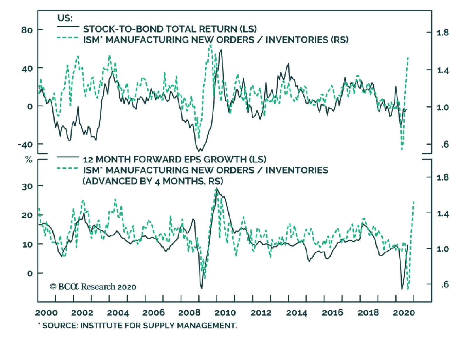
The US economy continues to heal. For stocks to climb further on a cyclical basis, the market will need more than five tech giants leading the charge. Hence, earnings expectations for the rest of the market must also mount. Practically, the economy must recover its output loss and the pandemic must ebb. For now, the four-week moving average of initial unemployment claims is drifting lower, and the ISM New Orders-to-Inventories spread is consistent with a faster and more solid business cycle upswing. The ERP is still consistent with significant additional gains for the S&P 500. The global industrial sector outlook is brightening. Manufacturing and trade disproportionately contribute to fluctuations in global economic activity, therefore, they exert an outsized influence on the earnings of non-tech multinationals. The strength in Singapore’s electronics shipments indicates that our Global Industrial Activity Nowcast will accelerate (Chart I-5, top panel). Moreover, the rapid expansion in China’s credit flows points to a marked increase in Chinese imports, which will help industrial and commodity exporters around the world (Chart I-5, bottom panel). Core producer prices have bottomed. Core producer prices are a direct input in the corporate sector’s pricing power. A trough in this inflation gauge leads to stronger EPS and widening profit margins for the S&P 500 (Chart I-6). Chart I-5The Global Industrial Cycle Is Turning The Corner
The Global Industrial Cycle Is Turning The Corner
The Global Industrial Cycle Is Turning The Corner
Chart I-6Easing Deflationary Pressures Will Help Profits
Easing Deflationary Pressures Will Help Profits
Easing Deflationary Pressures Will Help Profits
Investors should still wait to allocate new funds to the stock market. The stock market’s near-term outlook remains marked by short-term froth that dampens our cyclical optimism, especially because the market advance has been concentrated in a small group of equities. Chart I-7Tactical Froth
Tactical Froth
Tactical Froth
The Exposure Index of the National Association of Active Investment Managers has hit 100.1 (Chart I-7). Such a lofty reading indicates that the price of stocks already incorporates optimistic expectations. From a contrarian perspective, this development boosts the probability that swing traders will face disappointments in the near future and will sell their equity holdings. Similarly, the put/call ratio is near a 10-year low, which confirms that traders have bought a lot of upside exposure to stocks without much protection against a pullback. This level of confidence is often a precursor to a significant correction. Finally, our Tactical Strength Indicator is 1.7-sigma above its mean. Historically, when this risk gauge has hit a reading above 1.3, there is a good probability that the S&P 500 will correct or move sideways (Chart I-8). A catalyst must emerge for those aforementioned vulnerabilities to morph into a correction. If Treasury yields move closer to 1%, then stocks will experience a significant pullback of 10% or more as the market rotates away from the leadership of growth stocks. This risk would be especially salient if real yields move up. As Chart I-9 illustrates, falling TIPS yields have been a pillar of the powerful rally of growth stocks. Moreover, low real yields are arithmetically necessary to justify the current level of market multiples exhibited by the S&P 500 (Chart I-9, bottom panel). Chart I-8The S&P 500 Is Vulnerable To A Correction
The S&P 500 Is Vulnerable To A Correction
The S&P 500 Is Vulnerable To A Correction
Chart I-9Falling Real Yields Have Helped Growth Stocks
Falling Real Yields Have Helped Growth Stocks
Falling Real Yields Have Helped Growth Stocks
Growth and high-P/E ratio stocks are heavily represented in the tech and healthcare sectors, which together account for 42% of the S&P 500. This means that higher yields will likely temporarily drag down the entire market. Ultimately, leadership changes are painful events, but they rarely mark the end of bull markets. Can Yields Move Up? Chart I-10Positive Signs For Inflation
Positive Signs For Inflation
Positive Signs For Inflation
It is time to tweak our bond market view because yields should soon move higher. For the past five months, we have written that yields offer minimal downside and that their asymmetric risk profile made government bonds an unappealing investment. We underweighted this asset class relative to stocks and recommended investors bet on higher inflation breakeven rates. However, forces are aligning to expect real rates to rise and thus, nominal yields should move up. The sequencing of the market’s response to QE increasingly favors lower bond prices. Our US Equity Strategy team recently highlighted that in 2009 stocks were the first asset to reflect the implementation of QE1 by the Fed.4 A weaker dollar followed. Bond yields started to perk up only after the USD deteriorated by enough, after stock prices had climbed by enough and after corporate spreads had narrowed by enough to ease financial conditions to stimulate the economy. So far, 2020 echoes the 2009 pattern and our Financial Conditions Index is more stimulatory than it was prior to the COVID-19 outbreak (see Chart III-36 in Section III). Chart I-11Commodities Point To Higher Yields...
Commodities Point To Higher Yields...
Commodities Point To Higher Yields...
Inflation momentum confirms the risks to bonds. The apex of the deflationary shock has already passed. In July, core CPI excluding shelter rose by 0.84% month-on-month, which was the highest reading since 1981 when the Fed was combating the most violent inflation outbreak in generations. The upturn in core producer prices also warns that the annual inflation rate of core CPI should accelerate meaningfully by early 2021 (Chart I-10). The dollar’s weakness is another inflationary force. Import prices from China have already bottomed, which points to an escalation in goods inflation in the coming months. Firming commodity prices constitute another risk for yields. Our Commodities Advance/Decline line has recently broken out. This technical development is consistent with higher commodity prices and higher bond yields (Chart I-11). Rallying natural resources are inflationary, but they also indicate that the global economy is strengthening, which should put upward pressure on real interest rates. Strength in the housing sector also confirms that government bond yields have upside. As we highlighted above, a robust housing market is an important validation that monetary policy is very accommodative. By definition, the objective of loose policy is to boost future economic activity and eradicate deflationary pressures. The surge in lumber indicates bond prices are showing downside risk (Chart I-12). Additionally, the upswing in mortgage issuance is occurring as the Treasury and corporations boost their borrowings, which will generate more demand to use savings generated in the economy. The price of those savings will be higher real interest rates. Chart I-12...Especially Lumber
...Especially Lumber
...Especially Lumber
The ebbing of COVID-19 also suggests that economic activity has scope to accelerate. Moreover, the House of Representatives reconvened to address the problems plaguing the US Postal Service ahead of the November elections. This early return to work gives Washington another opportunity to negotiate the stimulus bill that it failed to pass earlier this month. We still expect such a bill to ultimately become law because both Democrats and Republicans have too much to lose in November if the economy relapses in response of political paralysis. Declining infections and increased government support will bolster aggregate demand and put upward pressure on rates. The stock market’s near-term outlook remains marked by short-term froth that dampens our cyclical optimism. Market dynamics are also very negative for bonds. Our Valuation Index highlights that Treasurys are incredibly expensive (Chart I-13, top panel). Moreover, our Composite Technical Indicator remains overbought, though it has lost momentum. In this context, the lack of appetite for yield curve control or more QE demonstrated by the Federal Open Market Committee creates a genuine danger for bonds. Without these policies, bond yields will have trouble resisting the upward push created by our rising US Pipeline Inflation Pressures Index, our rebounding Nominal Cyclical Spending proxy (which is an average of the ISM Manufacturing headline index and Prices Paid component), and the uptick in the amount of liquidity sitting on commercial banks’ balance sheets (Chart I-14). Chart I-13Treasurys Are Expensive And Losing Momentum
Treasurys Are Expensive And Losing Momentum
Treasurys Are Expensive And Losing Momentum
Chart I-14Building Cyclical Risks For Bonds
Building Cyclical Risks For Bonds
Building Cyclical Risks For Bonds
Thus, equities are at risk on a tactical basis because we anticipate that 10-year Treasury yields may climb towards 1%, including a rise in TIPS yields. The US election creates an additional near-term hurdle for stocks. As we wrote last month, President Trump will likely become more belligerent toward the US’s trading partners in the coming months. Moreover, Vice-President Joe Biden, who has a comfortable lead in the polls including in key swing states such as Florida, Michigan, Pennsylvania, and Wisconsin wants to cancel half of the 2017 tax cuts.5 Small Over Big Long-term investors should expect stocks to beat bonds on a 5- to 10-year horizon, but equities will generate paltry real returns compared with the past 40 years. Elevated valuations for US equities are consistent with long-term annualized real rates of return of only 0.5% (Chart I-15). Moreover, the long-term outlook for profit margins is poor. As we wrote three months ago, mounting populism will result in redistributive policies that will lift the share of wages relative to GDP.6 Moreover, the shift of the US population to the left on economic matters will push up corporate tax rates. Increased labor costs and corporate taxes are negative for profit margins. If profit margins normalize, then equities will probably underperform the uninspiring expected returns implied by current market multiples. The surge in lumber indicates bond prices are showing downside risk. Investors can still generate generous returns through geographical and sectoral selection. We have highlighted how value stocks, industrials and materials, and EM and European equities will likely beat US equities.7 This month we will explore how US small-cap equities are also well placed to best the dismal projected real returns offered by their large-cap counterparts. Our BCA Relative Technical Indicator shows that small-cap stocks are 1.8-sigma oversold when compared with the S&P 500, which indicates a capitulation among investors toward these equities. The bifurcation is even greater if we compare small-cap equities with the S&P 100’s mega-caps that have driven up the US market in recent years. Incorporating these influences, our Cyclical Capitalization Indicator has moved in favor of small-cap stocks, which suggests that small-cap stocks will be rerated if the yield curve can steepen further (Chart I-16). Equities are at risk on a tactical basis because we anticipate that 10-year Treasury yields may climb towards 1%. Chart I-15Valuations And Profit Margins Threaten Long-Term Stock Returns
Valuations And Profit Margins Threaten Long-Term Stock Returns
Valuations And Profit Margins Threaten Long-Term Stock Returns
Chart I-16Indicators Favor Small Cap Stocks
Indicators Favor Small Cap Stocks
Indicators Favor Small Cap Stocks
Chart I-17A Debt Turnaround Would Help Small Cap Stocks
A Debt Turnaround Would Help Small Cap Stocks
A Debt Turnaround Would Help Small Cap Stocks
Debt dynamics could also increasingly beneficial to small-cap equities. In the past few years, the heavy debt-to-EBITDA of smaller firms created a major headwind for small-cap investors. The indebtedness of small-cap stocks often decreases relative to large-caps when an economic recovery begins. This shift in leverage portends an increase in small-caps’ relative future returns (Chart I-17). Our negative bias toward the dollar and our positive view on commodities also benefit small-cap stocks. Since the early 1990s, increasing real commodity prices and a falling Dollar Index have coexisted with a robust performance of small-cap firms (Chart I-18). The negative US balance-of-payment dynamics, coupled with escalating inflation risks, will continue to weigh on the dollar, especially as various large EM nations try to diversify their reserves and payment systems away from the dollar.8 Meanwhile, a declining dollar, expanding global growth, monetary debasement, populism, inflation and a lack of investment in supply, all will accentuate the appeal of natural resources. The sectoral bias of small-cap indices will capitalize on these trends. Chart I-18Small Is Beautiful
Small Is Beautiful
Small Is Beautiful
Chart I-19Small Cap Stocks Like Higher Yields
Small Cap Stocks Like Higher Yields
Small Cap Stocks Like Higher Yields
Finally, cyclical timing is also moving in favor of small-cap firms. Since 2014, the Russell 2000 has outperformed the S&P 500 when real yields moved higher (Chart I-19). Small-cap firms display a more marked pro-cyclicality than large firms. Additionally, the S&P 500 growth bias implies that the US large-cap benchmark underperforms the small cap indices when real yields increase. Mathieu Savary Vice President The Bank Credit Analyst August 27, 2020 Next Report: September 24, 2020 II. Global Semiconductor Stocks: A Hiatus Is Overdue In A Structural Bull Market The strength in global semiconductor sales in recent months has been due to one-off factors stemming from pandemic-related lockdowns. As the one-off demand surge subsides, global semiconductor sales will decline modestly toward the end of this year. In the near term, global semiconductor stock prices are vulnerable due to overbought conditions, excessive valuations and demand disappointment. The global semiconductor industry is at the epicenter of the US-China confrontation, and more US restrictions on chips sales to China are probable. This is another risk for this sector's share prices. Nevertheless, the structural outlook for global semiconductor demand is constructive. Its CAGR may rise from 3% during 2014-2019 to 5% during 2020-2024. Investor euphoria has taken hold of semiconductor stocks. Global semiconductor stock prices have skyrocketed by 68% from March lows and 96% from December 2018 lows. Meanwhile, global semiconductor sales during March-June rose only by 5% from a year ago. As a result, the ratio of market cap for global semiconductor stocks relative to global semiconductor sales has reached its highest level since at least the inception of data in 2003 (Chart II-1). Chart II-1Global Semi Sector: Market Cap-To-Sales Ratio Has Surged
Global Semi Sector: Market Cap-To-Sales Ratio Has Surged
Global Semi Sector: Market Cap-To-Sales Ratio Has Surged
With semi equity multiples very elevated, their share prices have become even more sensitive to global semiconductor demand growth. Hence, the focus of this report is to try to gauge the strength of global semiconductor demand, both in the near term and structurally. The strength in global semiconductor sales in recent months has been due to one-off factors stemming from the lockdowns. Near-term semiconductor stock prices could disappoint due to weak chip demand from the smartphone sector and diminishing purchases of personal computers (PCs) and servers. However, structurally, we are positive on global semiconductor demand, which is underpinned by the continuing rollout of 5G networks and phones, a wider adoption of data centers, and further technological advancements in artificial intelligence (AI), cloud computing, edge computing and smaller nodes for chip manufacturing (Box II-1). Box II-1 Key Technologies Underpinning Potential Global Semiconductor Demand AI refers to the simulation of human intelligence in machines, for example, computers that play chess and self-driving cars. The goals of AI include learning, reasoning and perception. Cloud computing is the delivery of computing services – including servers, storage, databases, networking, software, analytics and intelligence – over the Internet (“the cloud”) to offer faster innovation, flexible resources and economies of scale. Edge computing is a form of distributed computing, which brings computation and data storage closer to where it is needed, to improve response times and save bandwidth. Technology node refers to the width of line that can be processed with a minimum width in the semiconductor manufacturing industry, such as technology nodes of 10 nanometers (nm), 7nm, 5nm and 3nm. The smaller the nodes are, the more advanced they are. Near-Term Headwinds Semiconductor demand worldwide grew by 6% year-on-year in the first half of this year. There has been a remarkable divergence between world semiconductor sales and the global business cycle (Chart II-2). The divergence between semiconductor sales and economic activity was most striking in the US and China. Semiconductor sales in China rose by 5% year-on-year in Q12020, and in the US they grew by 29% year-on-year in Q22020, despite a contraction in their aggregate demand during the same period. By contrast, Q2 annual growth of semiconductors sales was -2.2% for Japan, -17% for Europe and 1.8% for Asia ex. China and Japan (Chart II-3). Chart II-2World Semi Sales Diverged From The Global Business Cycle
World Semi Sales Diverged From The Global Business Cycle
World Semi Sales Diverged From The Global Business Cycle
Chart II-3Strong Semi Sales In The US And China, But Not Elsewhere
Strong Semi Sales In The US And China, But Not Elsewhere
Strong Semi Sales In The US And China, But Not Elsewhere
The reasons why the US and China posted a surge in semiconductor demand while Europe and Japan experienced a contraction in domestic semiconductor sales are as follows: Most data center investment is occurring in the US and China. Chart II-4 shows that 40% of global hyperscale data centers are operating in the US, much larger than any other countries/regions. China, in turn, ranked second, with a global share of 8%. Chart II-4The US Has The Most Global Hyperscale Data Centers
September 2020
September 2020
Demand contraction in Europe and Japan is due to semiconductor demand in these regions mainly originating from the automobile sector, where production was severely hit by the global pandemic. About 37% of European semiconductor sales were from last year’s automotive market. We believe the divergence between global economic activity and semiconductor sales, as demonstrated by Chart II-2 on page 3, has been due to one-off factors, as the global pandemic lockdowns have spurred semiconductor demand. Such a one-off demand boost will likely dissipate in the coming months. Traditional PCs and tablets: There has been a surge in demand for traditional PCs9 and tablets in the past six months. This was due to the significant increase in online activities, such as working from home, education, e-commerce, gaming and entertainment. Data from the International Data Corporation (IDC) has revealed that shipments of traditional PCs and tablets in volume terms had a strong year-on-year growth of 11.2% and 18.6%, respectively, in the period of April-June (Chart II-5). Looking forward, even renewed lockdowns will not lead to a similar rush to buy these products. Many households are already equipped to work from home and for other online activities. With many countries gradually opening their economies, such demand will diminish. The traditional PC and tablet sectors together account for about 13% of global chip demand (Chart II-6). Chart II-5Personal Computers Sales Have Surged Amid Lockdowns
Personal Computers Sales Have Surged Amid Lockdowns
Personal Computers Sales Have Surged Amid Lockdowns
Server demand: Another major semiconductor demand contribution in Q2020 was from the server sector, which spiked by 21% year-on-year (Chart II-7). The surge in online activities triggered a strong demand for cloud services and remote work applications, both of which require computer servers to run on. Chart II-6The Breakdown Of Global Semiconductor Sales By Type Of Usage
September 2020
September 2020
However, demand from the server sector is also set to diminish in 2H2020 and Q1 2021. Provided the inventories at major data center operators, including Microsoft, Google and Amazon, remain at high levels,10 global cloud service providers will likely reduce their orders of servers next quarter.11 Enterprises will also likely cut their investment in computer servers in 2H2020, as many of them had already increased their purchases of servers to prepare employees and business processes for remote working. We expect global server demand growth to soften in 2H2020. The Digitimes Research forecasted a 5.6% quarter-on-quarter contraction in 3Q2020 and a further cut in global sever shipment in the 4Q2020.10 The global server sector accounts for about 10% of global chip demand and, together with PCs and tablets, they make for 23% (please refer to Chart II-6 on page 5). Further, the smartphone sector – accounting for 27% of global semiconductor demand – will continue struggling in H2 this year. Chart II-7Server Sales Have Surged Amid Lockdowns
Server Sales Have Surged Amid Lockdowns
Server Sales Have Surged Amid Lockdowns
Chart II-8Global Smartphone Shipments Will Likely Remain Weak In 2020H2
Global Smartphone Shipments Will Likely Remain Weak In 2020H2
Global Smartphone Shipments Will Likely Remain Weak In 2020H2
The global total smartphone demand has been hit severely, as households delayed their new smartphone purchases. According to Canalys’ data, global smartphone shipments dropped by 13% and 14% year-on-year in Q1 and Q2, respectively. We expect smartphone shipments to continue contracting over the next three-to-six months (Chart II-8). We believe global consumers will remain cautious in their spending on discretionary goods, such as smartphones, due to lowered incomes and increased job uncertainty. The IDC also forecasted that global smartphone shipments would not grow until 1Q2021.12 The Chinese smartphone sales showed a considerable weakness in July, with a 35% year-on-year contraction, which is much deeper than the 20% decline in H1 this year. 5G smartphone shipments also slowed last month, with a 21% drop from the previous month. The global semiconductor industry is at the epicenter of the US-China confrontation. Bottom Line: The strength in global semiconductor sales in recent months has been due to one-off factors stemming from the lockdowns. As this one-off demand subsides, global semiconductor sales will decline modestly toward the end of this year. Given the overbought conditions and the elevated equity valuations, global semiconductor stocks are currently vulnerable to near-term disappointments in semiconductor demand. At The Epicenter Of The US-China Rivalry Semiconductors are at the epicenter of the US-China confrontation. Ultimately, the US-China contention is about future technological dominance. That is access to technology and the capability to develop new technologies. China currently accounts for about 35% of the global semiconductor demand. US restrictions on semi producers worldwide to supply semiconductors to Chinese buyers constitute a major risk to semiconductor stock prices. On August 17, the US announced fresh sanctions that restrict all US and foreign semiconductor companies from selling chips developed or produced using US software or technology to Huawei, without first obtaining a license. In May, the US had already limited companies, such as the Taiwan Semiconductor Manufacturing Company (TSMC), from making and supplying Huawei with its self-designed chips. In addition, the US recently threatened bans on Chinese-owned apps TikTok and WeChat, and signaled that it could soon restrict Alibaba’s operations in the US. Chart II-9Global Semi Companies' Sales To China Are Substantial
September 2020
September 2020
The global semiconductor sector is highly vulnerable to further escalation in the tension between these two superpowers. Major global semiconductor companies’ sales are heavily exposed to China, and their revenue from China ranges from 16% to 50% of total (Chart II-9). We have been puzzled why global semi share prices have been rallying in spite of US limitations on semiconductor shipments to Huawei and its affiliated entities. One explanation could be that the Chinese companies that are not affiliated with Huawei are able to import semiconductors and then supply them to Huawei. If this is true, the US will have no other choice but to limit all semiconductor sales to China. This will be devastating for global semi producers given their large exposure to China. In anticipation of US punitive policies limiting its access to semiconductors, China had boosted its semiconductor imports over the past 12 months (Chart II-10, top panel). Chinese imports of integrated circuits rose by 12% year-on-year in 1H2020, which is much higher than the 5% year-on-year increase in Chinese semiconductor demand during the same period (Chart II-10, bottom panel). This gap suggests the country had restocked its semiconductor inventories. China has particularly restocked its imports of non-memory chips with imports of processor & controller and other non-memory chips in H1, surging by 30% and 20%, respectively, in US dollar terms (Chart II-11). For memory chips, the contraction in Chinese imports was mainly due to a decline in global memory chip prices. Chart II-10China Had Likely Restocked Its Semi Inventories
China Had Likely Restocked Its Semi Inventories
China Had Likely Restocked Its Semi Inventories
Chart II-11Strong Chinese Imports In Non-Memory Chips
Strong Chinese Imports In Non-Memory Chips
Strong Chinese Imports In Non-Memory Chips
Bottom Line: The global semiconductor industry is at the epicenter of the US-China confrontation, and more restrictions on sales to China are probable. In turn, the restocked semiconductor inventory in China raises the odds of weakening mainland semiconductor import demand in H2 of this year. Structural Tailwinds Table II-1Global Semiconductor Demand CAGR Forecast Over 2020-2024 By Device
September 2020
September 2020
We are optimistic on structural global semiconductor demand. Its nominal CAGR may rise from 3% during 2014-2019 to 5% during 2020-2024 in US dollar terms. Table II-1 shows our demand growth forecasts for global chips in the main consuming sectors over the next five years. The major contributing sectors during 2020-2024 will be 5G smartphones, servers, industrials, electronics and automotive manufacturing. The underlying driving forces are the continuing rollout of 5G networks and phones, the development of data centers, and further technological advancements in AI, cloud computing and edge computing. Currently, the world is still in the early stages of 5G network development. AI, cloud computing and edge computing are constantly evolving. With increasing adoption of 5G smartphones, computer servers and IoT devices, global semiconductor demand is in a structural uptrend (Box II-2). Box II-2 Key Components For The Virtual World In Development Data centers and cloud computing allow data to be stored and applications to be running off-premises and to be accessed remotely through the internet. Edge computing allows data from Internet of things (IoT) devices to be analyzed at the edge of the network before being sent to a data center or cloud. IoT devices contain sensors and mini-computer processors that act on the data collected by the sensors via machine learning. The IoT is a growing system of billions of devices — or things — worldwide that connect to the internet and to each other through wireless networks. AI technology empowers cloud computing, edge computing and IoT devices. 5G is at the heart of the IoT industry transformation, making a world of everything connected possible. Chart II-125G Phone Shipments In China Will Continue To Rise
5G Phone Shipments In China Will Continue To Rise
5G Phone Shipments In China Will Continue To Rise
5G Smartphone Currently, China is the world’s largest 5G-smartphone consumer and the leading 5G-adopter in the world. According to Digitimes Research, global 5G smartphone shipments will reach over 250 million units in 2020, with 170 million (68%) in China and only 80 million units in the world ex. China. Looking forward, 5G smartphone shipments are set to accelerate worldwide over the coming years. The 5G phone shipments in China will continue to rise. The 5G phone sales penetration rate in China is likely to rise from 60% in July to 95% by the end of 2022. In such a case, we estimate that the monthly Chinese 5G phone shipments will increase from the current 16 million units to about 25-30 million units in 2022 (Chart II-12). In the rest of the world, the 5G smartphone adoption pace will also likely speed up over the next five years. The 5G phone selling prices in the world outside China will drop, as more models are introduced and become more affordable. 5G smartphone prices have already fallen in China and will inevitably fall elsewhere. Chinese 5G smartphone producers will ship their low-priced 5G phones overseas, putting pressure on other producers to lower their prices. The 5G infrastructure development is accelerating in China and will accelerate in the rest of the world. Both China and South Korea have been very aggressive in their respective 5G network development. As of the end of June, China's top three carriers: China Mobile, China Unicom, and China Telecom – which together serve more than 1.6 billion mobile users in the country – had installed 400,000 5G base stations against an annual target of 500,000. In comparison, as of April 2020, American carriers had only put up about 10,000 5G base stations.13 As the US is competing with China on the 5G front, the country will likely boost its investment in 5G network development aggressively over the next five years in order to catch up to, or even exceed, China. Importantly, the 5G smartphone has more silicon content than 4G smartphones. More silicon content means higher semiconductor value. Rising 5G smartphone sales and higher silicon content together will more than offset the loss in semiconductor sales due to falling global 4G smartphone shipments. Overall, global semiconductor stock prices have diverged from their sales and profits. Based on our analysis, we expect a CAGR growth of 4% in semiconductor demand from the global smartphone sector over the next five years, slightly lower than the 5% in previous five years (Table II-1 on page 10). This also takes into consideration that the 5G network will be more difficult and more expensive to develop than the 4G network. Servers Global server shipment growth will be highly dependent on both the pace and the scale of data center development (Box II-3). Data centers account for over 60% of global server demand. Box II-3 Data Centers There are four main types of data centers – enterprise data centers, managed services data centers, colocation data centers, and cloud data centers. Data centers can have a wide range of number of servers. Corporate data centers tend to have either 200 (small companies), or 1000 servers (large companies). In comparison, a hyperscale data center usually has a minimum of 5,000 servers linked with an ultra-high speed, high fiber count network. Outsourcing and a move towards the cloud are driving the growth of the hyperscale data center. Instead of companies investing in physical hardware, they can rent server space from a cloud provider to both save their data and reduce costs. Amazon, Microsoft, Google, Apple and Alibaba are all top global cloud service providers. The more hyperscales to be built up, the higher the demand for servers. In 2019, about 13% of the total number of data centers in China were of the hyperscale and large-scale varieties. The plan of new infrastructure development announced earlier this year by Beijing was aiming to increase the number of hyperscale and large-scale data centers in China. Among current data centers either under construction or to be developed in the near future, 36% of them are hyperscale and large-scale data centers. The future growth of data centers is promising. The global trend of data localization14 due to the concerns of data privacy and national security will also bolster a boom of data centers over the next five years. A growing number of countries are adopting data localization requirements, such as China, Russia, Indonesia, Nigeria, Vietnam and some EU countries. While the Chinese data center market is expected to expand by a CAGR of about 28% over 2020-2022,15 a report recently released by Technavio forecasted the global data center industry’s CAGR at over 17% during 2019-2023. We forecast that the global semiconductor demand from servers will grow at a CAGR of 12% over 2020-2024. IoTs Technological advancements in AI, cloud computing and edge computing, in combination with 5G network development, will facilitate the IoTs adoption. According to the GSMA,16 46 operators in 24 markets had launched commercially available 5G networks by 30 January 2020. It forecasted that global IoT connections will be increased from 12 billion mobile devices in 2019 to 25 billion in 2025 with a CAGR at 13%.17 IoTs chips include the Artificial Intelligence of Things (AIoT) – a powerful convergence of AI and the IoT. IoTs is an interconnected network of physical devices. Every device in the IoT is capable of collecting and transferring data through the network. Looking forward, global demand of AI chips and IoT chips will have significant potential to grow with creation of “smarter manufacturing”, “smarter buildings”, “smarter cities”, etc. AI applications can be used in manufacturing processes to render them smarter and more automated. Productivity will be enhanced as machines achieve significantly improved uptime while also reducing labor costs. There are plenty of upsides in industrial semiconductor demand (Chart II-13). We expect the CAGR of industrial electronics to increase from 3.4% during 2014-2019 to 8% during 2020-2024. AI applications can create smart buildings by increasing connectivity across enterprise assets, enabling home network infrastructure (e.g., routers and extenders) and employing home-security devices (e.g., cameras, alarms and locks). AI applications can be used to create smart cities. A smart city is an urban area that uses different types of IoT electronic sensors to collect data. Insights gained from that data are used to manage assets, resources and services efficiently; in return, that data is used improve operations across the city. China has already developed about 750 trial sites of smart cities with different degrees of smartness in the past decade. As AI and 5G technology advances, the existing smart cities’ “smartness” will be upgraded and new trial smart cities will be implemented. Based on IDC data, China’s investment in smart cities will rise at a CAGR of 13.5% over 2020-2023 (Chart II-14). Globally, the U.S., Japan, European countries and other nations are also actively developing smart cities. According to a new study conducted by Grand View Research, the global smart cities market size is expected to grow at a CAGR of 24.7% from 2020 to 2027.18 Chart II-13Plenty Of Upside In Industrial Semi Demand
Plenty Of Upside In Industrial Semi Demand
Plenty Of Upside In Industrial Semi Demand
Chart II-14China’s Investment In Smart Cities Will Continue To Grow
September 2020
September 2020
Automotive We expect the global automotive chip market to grow at a CAGR of 9% during 2020-2024, as in 2014-2019. The increase in consumption of semiconductors by the auto industry will continue to be driven by the market evolution toward autonomous, connected, electric and shared mobility. Most new vehicles now include some level of advanced driver assist systems (ADAS), such as adaptive cruise control, automatic brakes, blind spot monitoring, and parallel parking. The whole industry is progressing toward fully autonomous vehicles in the coming years. Increasing adoption of automotive chips and recovering car sales will revive automotive chip sales. In addition, rising penetration of new energy vehicles (NEVs) is beneficial to semiconductor sales, as NEVs contain higher semiconductor content than conventional vehicles. Conventional vehicles contain an average of a $330 value of semiconductor content while hybrid electric vehicles can contain up to $1,000 and $3,500 worth of semiconductors.19 Regarding other sectors, we are also positive on structural demand of storage and consumer electronics. AI applications generate vast volumes of data — about 80 exabytes per year, which is expected to increase by about tenfold to 845 exabytes by 2025.20 In addition, developers are now using more data in AI and deep learning (DL) training, which also increases storage requirements. With massive potential demand for storage, we estimate a CAGR of 7% over 2020-2024 (Table II-1 on page 10). A recent report from ABI Research predicts that the COVID-19 pandemic will increase global sales of wearables (such as a Fitbit or Apple Watch) by 29% to 30 million shipments of the devices this year. With contribution from wearables, we expect global semiconductor demand from the consumer sector to grow at a CAGR of 3% over 2020-2024, the same rate as in the previous five years. Bottom Line: Continuing rollout of 5G networks and phones, development of data centers, and further technological advancements in AI and cloud computing will provide tailwinds to structural global semiconductor demand, accelerating its CAGR growth from 3% during 2014-2019 to 5% during 2020-2024. Valuations And Investment Conclusions Most global semiconductor stocks are currently over-hyped. Critically, both DRAM and NAND prices have been deflating since January, reflecting weak demand for memory chips. Yet, share prices of memory producers have rallied (Chart II-15). Overall, global semiconductor stock prices have diverged from their sales and profits (Chart II-16). Chart II-15Falling Memory Prices Pose Risk To Memory Stocks
Falling Memory Prices Pose Risk To Memory Stocks
Falling Memory Prices Pose Risk To Memory Stocks
Chart II-16Global Semiconductor Stocks Have Deviated From Profits
Global Semiconductor Stocks Have Deviated From Profits
Global Semiconductor Stocks Have Deviated From Profits
Consequently, the multiples of semiconductor stocks have spiked to multi-year highs (Chart II-17). Even after adjusting for negative US real bond yields, valuations of semiconductor stocks are not cheap. Chart II-18 illustrates the equity risk premium for global semiconductor stocks is at the lower end of its range of the past 10 years. The ERP is calculated as forward earnings yield minus 10-year US TIPS yields. Chart II-17Global Semi Stocks: Elevated Valuations
Global Semi Stocks: Elevated Valuations
Global Semi Stocks: Elevated Valuations
Chart II-18Equity Risk Premium For Global Semi Stocks Is Historically Low
Equity Risk Premium For Global Semi Stocks Is Historically Low
Equity Risk Premium For Global Semi Stocks Is Historically Low
It is impossible to time a correction or know what the trigger would be (US-China tensions have been our best guess). Nevertheless, we do not recommend chasing semiconductor stocks higher due to their overstretched technicals and valuations on the one hand and potential weakening demand in H2 on the other. In addition, the ratio of global semi equipment stock prices relative to the semi equity index correlates with absolute share prices of global semi companies. This is because equipment producers are higher-beta as they outperform during growth accelerations and underperform during growth slumps. The basis is that semi manufacturers have to purchase equipment if there is actual strong demand coming up and vice versa. The recent underperformance by global semi equipment stocks relative to the semi equity index might be an early sign of a potential reversal in semi share prices in absolute terms (Chart II-19). Chart II-19A Signal Of A Potential Reversal In Semi Share Prices
A Signal Of A Potential Reversal In Semi Share Prices
A Signal Of A Potential Reversal In Semi Share Prices
Meanwhile, we believe the subsector- memory chip stocks - will outperform the overall semiconductor index amidst the potential correction, because they have lagged and are less over-extended. Finally, we remain neutral on Taiwanese and Korean bourses within the EM equity space for now. Escalation in US-China confrontation, as well as their exposure to semiconductors, put these bourses at near-term risk. That said, we are reluctant to underweight these markets because fundamentals in EM outside North Asia remain challenging. Ellen JingYuan He Associate Vice President Emerging Markets Strategy III. Indicators And Reference Charts We continue to favor stocks at the expense of bonds, but equities are increasingly vulnerable because short-term sentiment and positioning measures are growing increasingly stretched. Three forces can prompt a correction. First, a rebound in yields toward 1% would cause turbulence for the S&P 500, because the index is dominated by growth stocks that are highly sensitive to fluctuations in the risk-free rate. Second, a dollar bounce would hurt the S&P 500 because a depreciating USD has fueled the US stock market rally since June. Finally, the US presidential election is drawing nearer; hence, the risk of potentially damaging political headlines is growing. Despite these short-term risks, the main pillar supporting the rally remains intact: global monetary conditions are highly accommodative and the chance of inflation moving high enough to spook central bankers is minimal in the near future. Additionally, the fiscal spigots are open and governments around the world will ultimately continue to support their economies. Hence, any correction in the S&P 500 is unlikely to move beyond 15% or a level of 2900. Our cyclical indicators confirm the positive backdrop for stocks. While our Valuation Indicator has reached overvalued territory, our Monetary Indicator remains extremely accommodative. Moreover, our Technical Indicator is now flashing a clear buy signal. Putting all those forces together, our Intermediate-Term Indicator continues to support equities. Finally, our Revealed Preference Indicator strongly argues in favor of staying invested in equities. That being said, our Speculation Indicator has surged back up, thus the volatility of the rally should increase. Bonds remain extremely unappealing. Our Bond Valuation Index shows Treasurys as prohibitively expensive and our Composite Technical Indicator continues to lose momentum. So far, government bond yields have managed to remain stable at very low levels even if they have not declined further. Nonetheless, bonds have underperformed equities, which is a trend that will remain in place for many more quarters. Moreover, the pick-up in commodity prices and in various gauges of the business cycle suggests that bond yields should soon move higher, especially because the Fed is far from enthused at the concept of yield curve control. Our Cyclical Bond Indicator has turned higher and will soon flash an outright sell signal. The dollar continues to weaken after its recent breakdown. For now, the USD’s weakness has been concentrated among DM currencies. For the dollar to weaken further, EM currencies must begin to rally more markedly than they have until now, especially in Latin America. The firmness of the CNY is a good sign for the EM complex, but another clear up-leg in global growth must emerge before EM currencies can fully blossom. As a result, we are likely to have entered a temporary period of consolidation for the US dollar. The extremely oversold nature of our Dollar Composite Technical Indicator supports the idea that the dollar needs to digest its recent losses before its poor fundamentals force it lower once again. Finally, commodities have been a prime beneficiary of the weakness in the dollar and the combination of stable yields and improving economic activity. Our Composite Technical Indicator is now well into overbought territory which makes natural resource prices vulnerable to a pullback. A move up in yields as well as a short-term rebound in the dollar will likely catalyze any underlying technical risks to commodities. Gold will be particularly vulnerable to any such pullback, especially if higher real yields are the cause of the correction in natural resource prices. Despite these short-term worries, the outlook for commodities remains bright. As a result, we would use any correction to add exposure to the commodity complex. EQUITIES: Chart III-1US Equity Indicators
US Equity Indicators
US Equity Indicators
Chart III-2Willingness To Pay For Risk
Willingness To Pay For Risk
Willingness To Pay For Risk
Chart III-3US Equity Sentiment Indicators
US Equity Sentiment Indicators
US Equity Sentiment Indicators
Chart III-4Revealed Preference Indicator
Revealed Preference Indicator
Revealed Preference Indicator
Chart III-5US Stock Market Valuation
US Stock Market Valuation
US Stock Market Valuation
Chart III-6US Earnings
US Earnings
US Earnings
Chart III-7Global Stock Market And Earnings: Relative Performance
Global Stock Market And Earnings: Relative Performance
Global Stock Market And Earnings: Relative Performance
Chart III-8Global Stock Market And Earnings: Relative Performance
Global Stock Market And Earnings: Relative Performance
Global Stock Market And Earnings: Relative Performance
FIXED INCOME: Chart III-9US Treasurys And Valuations
US Treasurys And Valuations
US Treasurys And Valuations
Chart III-10Yield Curve Slopes
Yield Curve Slopes
Yield Curve Slopes
Chart III-11Selected US Bond Yields
Selected US Bond Yields
Selected US Bond Yields
Chart III-1210-Year Treasury Yield Components
10-Year Treasury Yield Components
10-Year Treasury Yield Components
Chart III-13US Corporate Bonds And Health Monitor
US Corporate Bonds And Health Monitor
US Corporate Bonds And Health Monitor
Chart III-14Global Bonds: Developed Markets
Global Bonds: Developed Markets
Global Bonds: Developed Markets
Chart III-15Global Bonds: Emerging Markets
Global Bonds: Emerging Markets
Global Bonds: Emerging Markets
CURRENCIES: Chart III-16US Dollar And PPP
US Dollar And PPP
US Dollar And PPP
Chart III-17US Dollar And Indicator
US Dollar And Indicator
US Dollar And Indicator
Chart III-18US Dollar Fundamentals
US Dollar Fundamentals
US Dollar Fundamentals
Chart III-19Japanese Yen Technicals
Japanese Yen Technicals
Japanese Yen Technicals
Chart III-20Euro Technicals
Euro Technicals
Euro Technicals
Chart III-21Euro/Yen Technicals
Euro/Yen Technicals
Euro/Yen Technicals
Chart III-22Euro/Pound Technicals
Euro/Pound Technicals
Euro/Pound Technicals
COMMODITIES: Chart III-23Broad Commodity Indicators
Broad Commodity Indicators
Broad Commodity Indicators
Chart III-24Commodity Prices
Commodity Prices
Commodity Prices
Chart III-25Commodity Prices
Commodity Prices
Commodity Prices
Chart III-26Commodity Sentiment
Commodity Sentiment
Commodity Sentiment
Chart III-27Speculative Positioning
Speculative Positioning
Speculative Positioning
ECONOMY: Chart III-28US And Global Macro Backdrop
US And Global Macro Backdrop
US And Global Macro Backdrop
Chart III-29US Macro Snapshot
US Macro Snapshot
US Macro Snapshot
Chart III-30US Growth Outlook
US Growth Outlook
US Growth Outlook
Chart III-31US Cyclical Spending
US Cyclical Spending
US Cyclical Spending
Chart III-32US Labor Market
US Labor Market
US Labor Market
Chart III-33US Consumption
US Consumption
US Consumption
Chart III-34US Housing
US Housing
US Housing
Chart III-35US Debt And Deleveraging
US Debt And Deleveraging
US Debt And Deleveraging
Chart III-36US Financial Conditions
US Financial Conditions
US Financial Conditions
Chart III-37Global Economic Snapshot: Europe
Global Economic Snapshot: Europe
Global Economic Snapshot: Europe
Chart III-38Global Economic Snapshot: China
Global Economic Snapshot: China
Global Economic Snapshot: China
Mathieu Savary Vice President The Bank Credit Analyst Footnotes 1 Please see The Bank Credit Analyst "April 2020," dated March 26, 2020, available at bca.bcaresearch.com 2 Please see The Bank Credit Analyst "July 2020," dated June 25, 2020, available at bca.bcaresearch.com 3 Please see European Investment Strategy "An Economy Without Mouths Or Noses Will Lose 10 Percent Of Jobs," dated July 30, 2020, available at eis.bcaresearch.com 4 Please see US Equity Strategy "Inversely Correlated," dated August 25, 2020, available at uses.bcaresearch.com 5 Please see The Bank Credit Analyst "August 2020," dated July 30, 2020, available at bca.bcaresearch.com 6 Please see The Bank Credit Analyst "June 2020," dated May 28, 2020, available at bca.bcaresearch.com 7 Please see The Bank Credit Analyst "August 2020," dated July 30, 2020, available at bca.bcaresearch.com 8 Diversifying away from the dollar does not mean that the USD will lose its reserve status. However, a return to the share of FX reserves that prevailed in the first half of the 1990s will hurt the dollar, especially because the US net international investment position has fallen from -4.6% of GDP in 1992 to -57% today. 9 Traditional PCs are comprised of desktops, notebooks, and workstations. 10 Global server shipments to contract 5.6% sequentially in 3Q2020, says Digitimes Research 11 Global server shipments forecast to increase by 5% this year: TrendForce 12 IDC Expects Worldwide Smartphone Shipments to Plummet 11.9% in 2020 Fueled by Ongoing COVID-19 Challenges 13 America does not want China to dominate 5G mobile networks 14 “Data localization” can be defined as the act of storing data on a device that is physically located within the country where the data was created. Data localization requirements are governmental obligations that explicitly mandate local storage of personal information or strongly encourage local storage through data protection laws that erect stringent legal compliance obligations on cross-border data transfers. 15 The big data center industry ushered in another outbreak 16 The GSMA represents the interests of mobile operators worldwide, uniting more than 750 operators with almost 400 companies in the broader mobile ecosystem, including handset and device makers, software companies, equipment providers and internet companies, as well as organizations in adjacent industry sectors. 17 GSMA: 5G Moves from Hype to Reality – but 4G Still King 18 Smart Cities Market Size Worth $463.9 billion By 2027 19 The Automotive Semiconductor Market – Key Determinants of U.S. Firm Competitiveness 20 AI is data Pac-Man. Winning requires a flashy new storage strategy.
Highlights Negative Rates: The persistence of the COVID-19 pandemic is intensifying pressure on policymakers in many countries to provide more stimulus. The odds that a new central bank will join the negative policy interest rate club are increasing. UK vs. New Zealand: Recent comments from Bank of England and Reserve Bank of New Zealand officials have hinted at the possibility of a shift to negative policy rates, should conditions warrant. The odds are greater for such a move in New Zealand. Go long 10-year New Zealand government bonds versus 10-year UK Gilts (currency-hedged into GBP) on tactical (0-6 months) basis. Feature Policymakers around the world are, once again, under increasing pressure to contemplate new responses to the COVID-19 pandemic, which continues to rage through much of the US and emerging world and is flaring up again across Europe. Additional fiscal policy measures will likely be necessary, but it is increasingly politically difficult in many countries to ramp up government support measures – or even extend existing programs - after the massive increase in deficits and debt undertaken this past spring. Chart of the WeekA Bull Market In Negative-Yielding Debt
A Bull Market In Negative-Yielding Debt
A Bull Market In Negative-Yielding Debt
An inadequate fiscal response will put even more pressure on monetary policy to give a boost to virus-stricken economies. Yet fresh options there are even more limited. Policy rates are already near 0% in all developed nations, with central banks promising to keep them there for at least the next couple of years. Central banks are also rapidly expanding their balance sheets to buy up assets via quantitative easing programs. A move to sub-0% policy rates may be the next option for central banks not already there like the ECB and the Bank of Japan. Although it remains questionable how much more stimulus monetary policy could hope to deliver. Government bond yields are at or near historic lows in most countries, while equity and credit markets continue to enjoy a spectacular recovery from the rout in February and March. The stock of global negative-yielding debt has risen to $16 trillion, according to Bloomberg, which remains close to the highs seen over the past few years (Chart of the Week). So who will be the next central bank to cross that bridge into negative rate territory? US Federal Reserve Chairman Jerome Powell, Bank of Canada Governor Tiff Macklem and Reserve Bank of Australia Governor Philip Lowe have all publicly dismissed the need for negative rates in their economies. Recent comments from Bank of England (BoE) Governor Andrew Bailey and Reserve Bank of New Zealand (RBNZ) Governor Adrian Orr, however, have suggested that negative rates could be a future policy choice, if needed. New Zealand looks like the more likely candidate to go to negative rates sometime in the next 3-6 months. Markets are increasingly discounting those outcomes. The UK Gilt yield curve is trading below 0% out to the 6-year maturity, while New Zealand nominal government bond yields are trading at or below a mere 0.3% out to 7-years (and where real yields on inflation-linked bonds have recently turned negative). Of the two, New Zealand looks like the more likely candidate to go to negative rates sometime in the next 3-6 months. A Negative Rates Checklist For The UK & New Zealand In a Special Report we published back in May, we looked back at the decisions that drove the move to negative policy rates by the ECB, Bank of Japan, Swiss National Bank and the Riksbank, with a goal of determining if such an outcome could happen elsewhere.1 We were motivated by the growing market chatter suggesting that the Fed would eventually be forced to cut the fed funds rate to sub-0% territory to fight the deep COVID-19 recession. Chart 2The Fundamental Case For Negative Rates
The Fundamental Case For Negative Rates
The Fundamental Case For Negative Rates
We concluded in that report that such a move was unlikely, but could occur if there was a contraction in US credit growth and/or a spike in the US dollar to new cyclical highs, both outcomes that would result in a major drop in US inflation expectations. Such moves preceded the shift to negative rates in those other countries during 2014-16, as a way to lower borrowing costs and weaken currencies. Since that May report, the US dollar has depreciated and US credit growth has continued to expand amid very stimulative financial conditions, thus the odds of the Fed having to cut the funds rate below 0% are very low. The Fed is far more likely to dovishly alter its forward guidance, or even institute yield curve control to cap US Treasury yields, to deliver additional monetary easing, if necessary. (NOTE: next week, we will be discussing the Fed’s next possible policy moves, and the potential impact on financial markets, in a Special Report jointly published with our colleagues at BCA Research US Bond Strategy). The pressure to consider negative interest rates in the non-negative rate developed market countries remains strong, however, after the major increase in unemployment rates and sharp falls in inflation seen earlier this year (Chart 2). Putting current levels of both into a simple Taylor Rule formula suggests that the “appropriate” level of nominal policy rates is currently negative in the US and Canada, mainly because of the double-digit unemployment rates in those countries. Taylor Rules for the UK and New Zealand remain slightly positive, however, at 0.2% and 0.9%, respectively. Yet the forecasts for inflation and unemployment from the BoE and RBNZ suggest a diverging dynamic between the two over the next couple of years. The BoE is forecasting a very sharp recovery from the 2020 recession, with the UK unemployment rate projected to fall back to 4.7% by 2022 from the surge to 7.5% this year. At the same time, the RBNZ’s forecasts are more cautious, with the New Zealand unemployment rate expected to fall to only 6.1% in 2022 from the projected 8.1% peak at the end of this year. Thus, the implied Taylor Rules using those forecasts suggest a need for negative rates in New Zealand, but a rising path for UK policy rates over the next two years (Chart 3). Clearly, markets are taking the RBNZ’s open talk about negative interest rates to heart, while remaining skeptical that the BoE’s optimistic path for the post-virus UK economy will come to fruition. Despite the diverging trajectory in policy rates implied by the two central banks’ forecasts, markets are pricing in a more similar path for rates. Forward overnight index swap (OIS) rates are discounting slightly negative rates in the UK and New Zealand to the end of 2022 (Chart 4). Clearly, markets are taking the RBNZ’s open talk about negative interest rates to heart, while remaining skeptical that the BoE’s optimistic path for the post-virus UK economy will come to fruition. Chart 3Mapping Central Bank Projections Into The Taylor Rule
Mapping Central Bank Projections Into The Taylor Rule
Mapping Central Bank Projections Into The Taylor Rule
Chart 4Markets Pricing Slightly Negative Rates In The UK & NZ
Markets Pricing Slightly Negative Rates In The UK & NZ
Markets Pricing Slightly Negative Rates In The UK & NZ
The individual cases of the UK and New Zealand as current candidates for negative interest rates can help derive a list of factors to monitor to determine if negative rates would be a more likely policy outcome for any central bank. Based on our read of recent comments from BoE and RBNZ officials, combined with our assessment of what took place in other countries that moved to negative rates in the past, we would include the following in any Negative Rates Checklist: Policymaker perceptions on the effective lower bound (ELB) on policy rates For central bankers, the ELB (or “reversal rate”) is defined as the policy rate below which additional rate cuts are deemed counterproductive to stimulating the economy. For example, cutting rates too low could limit the ability of the banking system to earn interest income, thus hindering banks’ appetite to make new loans. Chart 5Could The Effective Lower Bound Be Negative In the UK & NZ?
Could The Effective Lower Bound Be Negative In the UK & NZ?
Could The Effective Lower Bound Be Negative In the UK & NZ?
For most central banks, the belief is that the ELB is at or just above 0%. It is possible that because of a structural shift, a central bank could deem the ELB to be negative in that particular economy. That could be because of a sharp deterioration in trend economic growth or a rapid rise in debt or a belief that the banking system was strong enough to handle the income shock of negative rates. Currently, potential GDP growth rate estimates have been marked down in both the UK and New Zealand because of the 2020 COVID-19 recession (Chart 5). In New Zealand, taking the average of the RBNZ’s real GDP growth forecasts for the next three years as a proxy for trend growth suggests that trend growth is now around 1.2%, similar to the reduced estimates of UK potential GDP growth. In terms of debt levels, the ratio of total public and private non-financial debt to GDP is close to 400% in the UK, which is far greater than the 126% level of that same ratio in New Zealand. In terms of banking system health, banks in both countries are well capitalized. The Tier 1 capital ratio of the major UK banks is 14.5%, while the similar figure in New Zealand is 13.5%; both figures are provided by the BoE and RBNZ, respectively. Stress tests run by the central banks in recent months indicate that capital levels will remain adequate even after the likely hit from loan losses due to the severity of the 2020 economic downturn. Our assessment is that both the BoE and RBNZ can claim that the ELB is in fact below zero, based on the slow pace of trend economic growth in both. In the case of the UK, high debt levels also suggest that policy rates may have to go below 0% to generate any stimulus to growth via new borrowing activity. In both countries, the central banks can claim that the banking system can handle a period of negative rates, if policymakers go down that road to boost economic growth. Economic confidence is depressed An extended period of weak economic activity and depressed confidence can trigger a need to move to negative policy rates if rates were already at 0%. Currently, UK economic confidence is in tatters after the -20% decline in real GDP seen in the second quarter of 2020. The GfK consumer confidence index remains at recessionary low levels, while the BoE Agents’ survey of UK firms shows a collapse in plans for investment and hiring over the next year (Chart 6). Chart 6A Severe Hit To UK Growth & Confidence
A Severe Hit To UK Growth & Confidence
A Severe Hit To UK Growth & Confidence
New Zealand, the economy contracted -1.6% in the first quarter of the year with consensus forecasts calling for a -20% collapse in the second quarter. Yet economic confidence is surprisingly resilient. The Westpac survey of consumer confidence is falling, but the July reading was still above typical recessionary lows (Chart 7). The ANZ survey of business investing and hiring intentions has been surprisingly upbeat of late, rebounding from the April trough but still below pre-virus levels. Our assessment here is that the BoE has a stronger case for moving to negative rates, based on the deeper collapse in confidence in the UK compared to New Zealand. Inflation expectations are too low If inflation expectations remain too low once rates have hit 0%, then inflation-targeting central banks must consider more extraordinary options to revive inflation expectations. That could take the form of extended forward guidance on future interest rate moves, expanding the size and scope of quantitative easing programs, or cutting policy rates into negative territory. Currently, inflation expectations remain elevated in the UK. 5-year CPI swaps, 5-years forward, are now at 3.6%, while the Citigroup/YouGov survey of household inflation expectations 5-10 years out sits at 3.3% (Chart 8). In New Zealand, the RBNZ inflation survey shows inflation expectations have fallen into the bottom half of the central bank’s 1-3% target band. Chart 7Only A Very Modest Downturn In NZ
Only A Very Modest Downturn In NZ
Only A Very Modest Downturn In NZ
Chart 8Inflation Expectations Are Much Lower In NZ
Inflation Expectations Are Much Lower In NZ
Inflation Expectations Are Much Lower In NZ
Our assessment here is that only the RBNZ can argue for a move to negative rates because of weak inflation expectations. Our assessment here is that only the RBNZ can argue for a move to negative rates because of weak inflation expectations. Financial conditions turning more restrictive Chart 9The News Is Mixed On UK & NZ Financial Conditions
The News Is Mixed On UK & NZ Financial Conditions
The News Is Mixed On UK & NZ Financial Conditions
Another reason why a central bank could try negative rates is if asset prices were trading at depressed levels even after policy rates were at 0%. The current signals on financial conditions in the UK and New Zealand are generally stimulative, but more so in the latter. Currently, the MSCI equity index for New Zealand is nearing the all-time high reached in 1987, while the equivalent UK equity index is languishing near the lows of the past decade (Chart 9). The New Zealand dollar and British pound have both bounced off the cyclical lows seen earlier this year (more on that later). The annual growth rates of nominal house prices have started to pick up in both countries, but with a faster pace in New Zealand. Finally, corporate credit spreads have narrowed sharply since the end of the first quarter in both countries, with New Zealand spreads actually falling below the pre-virus levels seen this year. Our assessment here is that financial conditions in both countries remain generally stimulative, but more so in New Zealand. Neither central bank can point to restrictive financial conditions as a reason to move to negative rates. Signs of impairment of the transmission of policy interest rates to actual borrowing costs If bank lending growth was weakening and/or borrowing rates remained high relative to policy rates, this could be a sign that negative policy rates are necessary to induce greater loan demand by lowering borrowing costs. Chart 10NZ Lenders Are Not Passing On RBNZ Rate Cuts
NZ Lenders Are Not Passing On RBNZ Rate Cuts
NZ Lenders Are Not Passing On RBNZ Rate Cuts
Currently, the annual growth rate of bank lending is slowing in New Zealand, but remains positive at 4.5% (Chart 10). Loan growth in the UK is now a much more robust 7.4%, but some of that growth is due to UK companies drawing down lines of credit with their banks to survive during the COVID-19 lockdowns. A bigger issue is the lack of the full pass-through of the RBNZ’s recent cuts into borrowing rates, especially for home loans. The spread between 5-year fixed mortgage rates and the RBNZ cash rate is now an elevated 387bps, while the equivalent spread in the UK is much lower at 160bps. Our assessment here is that only the RBNZ can argue that an impaired transmission of policy rate cuts to actual borrowing rates could justify a move to negative rates. Scope For Currency Depreciation For any central bank, a benefit of a negative interest rate policy is that it can trigger more stimulus via a weaker currency. This can help boost economic growth by making exports more competitive, while also helping lift inflation by raising the cost of imports. On the growth side, a weaker currency would be somewhat more helpful for New Zealand where exports are 19% of GDP, compared to 16% in the UK. (Chart 11). That is an important distinction, as there is greater scope for the New Zealand dollar (NZD) to depreciate if the RBNZ went to negative rates than for the British pound (GBP) to weaken if the BoE did the same. Chart 11A New Experiment? Negative Rates With A Current Account Deficit
A New Experiment? Negative Rates With A Current Account Deficit
A New Experiment? Negative Rates With A Current Account Deficit
Chart 12BoE Does Not Need To Go Negative To Weaken The Pound
BoE Does Not Need To Go Negative To Weaken The Pound
BoE Does Not Need To Go Negative To Weaken The Pound
Perhaps the most interesting feature of this entire negative rates discussion is that, for the first time in the “negative rates era”, central banks of countries with current account deficits are considering pushing policy rates below 0%. For the first time in the “negative rates era”, central banks of countries with current account deficits are considering pushing policy rates below 0%. The UK and New Zealand both have similarly sized current account deficits, equal to -3.3% and -2.7% of GDP, respectively (middle panel). At the same time, both countries have net foreign direct investment surpluses roughly equal to those current account deficits, leaving their basic balances around 0 (bottom panel). In other words, both countries currently attract enough long-term foreign direct investment inflows to “fund” their current account deficits. Foreign investors may be less willing to continue buying as many New Zealand or UK financial assets if either country went to a negative interest rate to intentionally weaken the currency, as the RBNZ has publicly stated would be a desired outcome of such a move. Chart 13RBNZ Could Go Negative To Weaken The Kiwi
RBNZ Could Go Negative To Weaken The Kiwi
RBNZ Could Go Negative To Weaken The Kiwi
Our colleagues at BCA Foreign Exchange Strategy estimate that, on purchasing power parity (PPP) basis, the GBP/USD exchange rate is now -20% below its long-run fair value (Chart 12). The level of the currency is also broadly in line with the current level of interest rate differentials between the UK and the US (bottom panel). In other words, the GBP is already cheap and additional rate cuts would have limited impact in driving the currency lower. It is a different story for NZD/USD, which is fairly valued on a PPP basis but remains elevated relative to New Zealand-US interest rate differentials (Chart 13). Therefore, our assessment is that only the RBNZ can credibly generate meaningful currency weakness from a move to negative rates. Summing it all up Based on the elements of our Negative Rates Checklist, we deem it more likely for the RBNZ to go negative than the BoE. In the UK, there is less evidence pointing to a significantly impaired credit channel that could be remedied by negative rates, inflation expectations are elevated, and the pound is already at undervalued levels. In New Zealand, previous RBNZ rate cuts have not fully flowed through into bank lending rates, inflation expectations are low, and the New Zealand dollar is at fair value (and, therefore, has room to become cheaper via negative rates). Based on the elements of our Negative Rates Checklist, we deem it more likely for the RBNZ to go negative than the BoE. Bottom Line: The persistence of the COVID-19 pandemic is intensifying pressure on policymakers in many countries to provide more stimulus. The odds that a new central bank will join the negative policy interest rate club are increasing. Recent comments from Bank of England and Reserve Bank of New Zealand officials have hinted at the possibility of a shift to negative policy rates, should conditions warrant. The odds are greater for such a move in New Zealand. A Negative Rates Trade Idea: Go Long New Zealand Government Bonds Vs. UK Gilts Chart 14Go Long 10yr NZ Govt. Bonds Vs 10yr UK Gilts
Go Long 10yr NZ Govt. Bonds Vs 10yr UK Gilts
Go Long 10yr NZ Govt. Bonds Vs 10yr UK Gilts
Based on our analysis above, we are adding a new cross-country spread trade to our Tactical Overlay Trades list on page 18: going long 10-year New Zealand government bonds versus 10-year UK Gilts on a currency-hedged basis (i.e. hedging the NZD exposure into GBP). The trade is to be implemented using on-the-run cash bonds. The current unhedged NZ-UK 10-year yield spread is +36bps, but even on a hedged basis (using 3-month currency forwards) the yield differential is still positive at +23bps (Chart 14). We are targeting zero for the unhedged spread, to be realized sometime within the six months. We like this trade because it can win not only from a decline in New Zealand bond yields if the RBNZ goes to negative rates (as we think is increasingly likely), but also from a potential rise in Gilt yields if the BoE defies market pricing and does not go to negative rates. If both countries keep rates on hold, then the trade will earn a small positive spread over the current meagre level of Gilt yields. Robert Robis, CFA Chief Fixed Income Strategist rrobis@bcaresearch.com Footnotes 1 Please see BCA Research Special Report, "Negative Rates: Coming Soon To A Bond Market Near You?", dated May 20, 2020, available at gfis.bcaresearch.com. Recommendations The GFIS Recommended Portfolio Vs. The Custom Benchmark Index
Assessing The Leading Candidates To Join The Negative Rate Club
Assessing The Leading Candidates To Join The Negative Rate Club
Duration Regional Allocation Spread Product Tactical Trades Yields & Returns Global Bond Yields Historical Returns
BCA Research's Global Fixed Income Strategy service argues that the persistence of the COVID-19 pandemic intensifies pressure on policymakers around the world to provide more economic stimulus. The odds that more central banks will join the negative policy…
Highlights ESG-related equities have outperformed global benchmarks over the past two years, as well as during the recent equity selloff. Investor demand and institutional pressure will drive the financial industry to analyze nonfinancial disclosures more closely and take them more into account. The pathway to achieving that is not simple: Unification of reporting standards and improvement in the quality of disclosure are required. Governments can play a role by enforcing climate and sustainability disclosure for firms wanting bailout support. Key stakeholders in the financial system – especially asset managers and other providers of capital – will look to incorporate more sophisticated ESG analysis into their traditional frameworks. Introduction This report is an update to our Special Report published in late 2018 on the benefits of ESG investing. In that report we concluded that ESG indices have performed at least in line with, and may even have slightly outperformed, broad-market indices, while providing societal and environmental benefits.1 We can now also answer one of the questions we raised in that report: Whether ESG investing provides protection during recessions and bear markets. Since we published that report, the ESG space has continued to grow, with the number of new US “sustainable” fund launches, as tracked by Morningstar, increasing – albeit at a lower rate than in the previous two years (Chart 1).2 This can be attributed to an ever-increasing investor demand, predominantly from Europe, but growing rapidly in both the US and Asia, too. The Global Sustainable Investment Review estimates that ESG assets under management (using a relatively broad definition of ESG) totaled $30 trillion as of 2018.3 Chart 1The Industry Is Catering To Increasing Investor Demand
ESG Indices Outperformed Broad-Market Benchmarks In Most Regions During The Equity Selloff
ESG Indices Outperformed Broad-Market Benchmarks In Most Regions During The Equity Selloff
Our earlier report highlighted the increasing demand from investors to allocate capital based on environmental, social, and governance standards, or ESG. Simply put, we defined ESG investing as any investment activity that recognizes a certain set of principles, and screens securities based on those factors. While the term itself might be new, the core concept behind it is not. It encompasses a philosophy dating back hundreds of years, beginning with faith-based investing, to the more recent increased awareness of climate and governance issues. The COVID-19 pandemic – also considered an ESG risk – illustrated how quickly a health and environmental threat can turn into a social issue, as unemployment rates surged to new highs and economic activity came to a halt. In this report, we analyze how the performance of ESG indices has evolved since our last report, and in particular, during the recent February-March equity selloff. Additionally, we discuss the opportunities that governments, investors, and corporations can seize in the future. We also assess the various risks facing ESG investing, given that it is no longer a niche space. Performance Update Since we published our report in late 2018, ESG indices in most countries (with the exception of the US and Canada) have outperformed the broad market benchmarks.4 The global ESG index has outperformed the All-Country World (ACW) broad market index by 1% since (Chart 2). While this might not count as a remarkable outperformance, it answers some of the doubts cast on the merits of ESG investing. However, it is critical for investors to realize that ESG indices are not necessarily just another vehicle to invest in to try to outperform the market; rather, they are a sustainable alternative to traditional indices that do not detract from performance. Importantly, ESG indices either performed in line with or better than broad market indices during the equity selloff between February-March 2020. ESG indices in all major countries and regions, with the exception of the US, outperformed the benchmark during this period (Chart 2). Research by MSCI breaks down the active returns of various ESG country and region indices versus their corresponding broad market indices in Q1 2020. This analysis showed that the outperformance predominantly came from equity style tilts, followed by ESG-related factors and sector/industry tilts (Chart 3). Chart 2ESG Indices Outperformed Broad-Market Benchmarks In Most Regions During The Equity Selloff
ESG Indices Outperformed Broad-Market Benchmarks In Most Regions During The Equity Selloff
ESG Indices Outperformed Broad-Market Benchmarks In Most Regions During The Equity Selloff
ESG indices tilt towards higher-quality, low-beta, and high-yielding stocks relative to their benchmarks. As part of the index construction, some ESG indices exclude stocks not meeting the indices’ ESG eligibility criteria. This would include various names in the oil & gas industry, for example (for environmental criteria), as well as some tech giants (for social and governance reasons). The exclusion of some tech names partly explains the US index’s underperformance. Chart 3 shows that stock selection for the US MSCI ESG Leaders index – the one shown in Chart 2 – had a negative contribution to active returns over the first quarter. Chart 3Breaking Down ESG Performance
ESG Investing: From Niche To Mainstream
ESG Investing: From Niche To Mainstream
Index methodology plays a big role in determining expected performance. The methodology of the MSCI ESG index suite generally aims to reduce sector differences relative to the broad indices, thereby limiting systematic risk. However, even within the MSCI ESG suite, methodologies differ between indices (Tables 1 & 2).5 Table 1Index Methodology Determines Sector Tilts
ESG Investing: From Niche To Mainstream
ESG Investing: From Niche To Mainstream
Table 2Methodology Differences Matter
ESG Investing: From Niche To Mainstream
ESG Investing: From Niche To Mainstream
However, it is critical for investors to realize that ESG indices are not necessarily just another vehicle to invest in to try to outperform the market; rather, they are a sustainable alternative to traditional indices that do not detract from performance. It is also important for investors to understand that sustainability is a long-term issue. For example, as economies shut down when COVID-19 infections and deaths rose, investors rushed to sell their risky exposures: The five largest “traditional” US equity ETFs saw cumulative net equity outflows of as high as $22 billion during the three-week period between February 19 and March 13. By contrast, the five largest ESG equity funds experienced small, yet positive, inflows over the same period (Chart 4). This was also true globally, where sustainable funds tracked by Morningstar recorded inflows close to $45 billion dollars during this period, whereas equity funds overall recorded over $380 billion of outflows.6 The most likely reason for this is that investors see ESG investing as a defensive play, given its sector and factor tilts. Chart 4Small, Yet Steady Inflows During The Equity Selloff
ESG Investing: From Niche To Mainstream
ESG Investing: From Niche To Mainstream
Institutional Pressure Chart 5Analyzing Nonfinancial Disclosures Is A Must...
ESG Investing: From Niche To Mainstream
ESG Investing: From Niche To Mainstream
Investors – particularly those with longer investment horizons, such as pension funds and endowments – are becoming more committed to evaluating their investments more rigorously from an ESG standpoint. This means putting pressure on asset managers to screen and assess company performance using ESG factors. A survey by EY in June 2020 shows that only 2% of respondents conduct little-to-no review of nonfinancial disclosures relating to a company’s environmental and social performance, down from 36% in 2013 (Chart 5). However, absent a formal governing body, standardized reporting, and proper regulation regarding what should be labeled ESG, as well as how metrics are evaluated, asset managers struggle to comply. One of the key points we highlighted in our previous report is that consideration of ESG factors in investment decisions must go beyond simple reliance on ESG scores. The various ESG rating agencies rely on different metrics, factors, and datasets to rank companies and therefore produce very different benchmarks and funds, even though they may have the same objectives. This means that different investors using different ESG indices could end up with different allocations to the same universe of stocks. Therefore, analysis and inclusion based on ESG scores may be misleading and yield dissimilar results. A research paper by the MIT Sloan School of Management showed that the sources of differentiation of ESG rankings by ratings agencies stem from: 1) Scope Divergence: Ratings rely on different attributes to capture ESG performance; 2) Measurement Divergence: Relying on different indicators to measure the same attribute; and 3) Weight Divergence: Ranking the attributes differently in terms of importance. Of these, the paper found that the measurement divergence was the most important.7 Chart 6...With More Companies Now Reporting
ESG Investing: From Niche To Mainstream
ESG Investing: From Niche To Mainstream
Asset managers are not necessarily to blame. They simply lack adequate tools. The problem is not the dearth of disclosure, but rather its quality and comparability. In fact, over the past few years, more companies have begun reporting on their sustainability and social performance (Chart 6). However, the fact that reporting is voluntary, and companies rely on different reporting frameworks and standards, makes cross-country and inter-firm comparisons difficult. On the bright side however, there is a growing pressure for collaboration between the various reporting frameworks in order to bring about a single reporting standard. For example, a recently announced partnership between the Global Reporting Initiative (GRI) and the Sustainability Accounting Standards Board (SASB) – two of the many organizations responsible for creating sustainability reports and reporting on governance data – is an important step in bringing the various standard-setters together. This should promote greater reporting consistency, and highlight the importance of key non financial disclosures. Improved reporting will affect not only investors, but also providers of capital, including banks. Incorporating ESG factors into conventional investing frameworks will become a core step in assessing risk for asset allocators. Providers of capital will have to assess not only borrowers’ fundamentals and growth prospects, but also understand their governance policies and environmental footprint. A recently published report by the Bank of England (BoE) highlighted the potential impact of climate change – both through transition8 and physical risks9 – on UK banks, insurers, and the entire financial system. To highlight the extent of “climate-related exposure,” the analysis found that almost 10% of England’s mortgage value is on properties in flood-risk zones, and that loan exposures to high emission-intensive sectors represent almost 70% of the common equity Tier 1 capital of the UK’s largest banks.10 If a climate event occurs, or new regulations are implemented, the impact will be severe. Incorporating ESG factors into conventional investing frameworks will become a core step in assessing risk for asset allocators. Governments can play a role. As COVID-19 stimulus plans are rolled out – mainly in developed economies – governments are requiring companies in need of support or bailouts to improve their environmental and climate disclosures. This will make it easier for private-sector investors to incorporate ESG analysis. Large Canadian firms, for example, that apply for government loans, must now publish annual climate disclosure reports as well as other releases relating to environmental and sustainability goals. Additionally, further rounds of stimulus could be given to those investing in ESG-related areas – known as “green stimulus.” Since the beginning of the COVID-19 pandemic, G20 countries have committed over $300 billion to support various energy initiatives, of which approximately $150 billion was aimed at clean energy policies and renewable energy programs.11 This could set a precedent for future government support to aid the transition to a greener economy. It can perhaps also serve as an indicator of which areas can present opportunities for investment. Monetary policy is set to remain accommodative for the next few years. It is not unimaginable, then, that central banks’ unconventional monetary easing methods could involve purchasing green bonds,12 issued by both corporations and governments. This is something ECB president Christine Lagarde has hinted at, to aid in the world’s fight against climate change.13 Chart 7The Green Bond Market Is Growing
ESG Investing: From Niche To Mainstream
ESG Investing: From Niche To Mainstream
The green bond market continues to grow, with bond issuance in 2019 up over 55% year-on-year. This growth, however, has fallen somewhat in 2020 due to the economic slowdown (Chart 7), despite overall bond issuance increasing in the second quarter of the year, as companies rushed to raise cash and refinance at lower rates.14 The fact that proceeds issued by green bonds must explicitly be used for environmental projects is the most likely reason for the decline. Green bond issuance, in 2020, has totaled $112 billion as of July, with the US, Germany, France, and the Netherlands being the top four issuers. China, the top issuer in 2018 and 2019, slipped to sixth place in 2020, with its green bond issuance shrinking from $27 billion in 2019 to $6 billion year-to-date. Risks & Headwinds Investors should be wary of various short-to-medium term risks to ESG investment. In the short-term, a delay of climate-change targets is possible. A second wave of COVID-19 infections that would trigger further lockdowns might lead to a rollback in environmental regulation and a refocus of stimulus packages on all-out growth rather than on ESG and climate initiatives. Over the coming years, as ESG investing becomes more mainstream, investors will need to take greater care to spot “greenwashing.”15 For example, this includes funds labeled as “sustainable”, but which hold securities that do not fit under that umbrella. It would also include companies taking advantage of the absence of reporting regulations to report misleading or incomplete information. Such care will be crucial until a unified reporting framework is established. According to calculations by Morningstar, over 500 funds expanded their prospectuses to include ESG factors in their investment analysis in 2019, up from the roughly 50 funds which did so in 2018.16,17 Indeed, this is a sign that funds are responding to investor demand and adding appropriate ESG analysis. However, whether these funds use sustainability as a core factor in their investing is unclear. Therefore, investors should continue to undertake their own proper due diligence. Conclusions The path to fully incorporating ESG analyses into a traditional investing framework is heading in the right direction, but is not yet clear-cut. A unified framework that allows for consistent and comparable disclosures would fix one of the biggest hurdles that investors face. ESG-related equity indices have outperformed in most countries and regions since late 2018, as well as during the recent equity selloff. The full advantage to be derived from incorporating ESG factors should be unlocked as more accurate and comprehensive data becomes available. Investor demand for ESG-related investments will remain the dominant force in driving the shift to integrating ESG disclosures into traditional financial analysis. Amr Hanafy Senior Analyst amrh@bcaresearch.com Footnotes 1 Please see Global Asset Allocation Special Report, “ESG Investing: No Harm, Some Benefit,” dated November 21, 2018 available at gaa.bcaresearch.com. 2 Please see https://www.morningstar.com/articles/989209/esg-funds-setting-a-record-pace-for-launches-in-2020 3 "Global Sustainable Investment Review 2018," Global Sustainable Investment Alliance, gsi-alliance.org. 4 For the purpose of this analysis, we use the MSCI ESG Leaders index suite. 5 "MSCI ESG Indexes," MSCI, msci.com. 6 Please see https://www.morningstar.com/articles/984776/theres-ample-room-for-sustainable-investing-to-grow-in-the-us 7 Florian Bergand, Julian F Kölbel, and Roberto Rigobon, "Aggregate Confusion: The Divergence of ESG Ratings," May 17, 2020. 8 Transition risks can be defined as the risks of economic dislocation and financial losses associated with the transition to a lower-carbon economy. 9 Physicals risks can be defined as those arising from the interaction between climate-related events and human and natural systems. 10"The Bank of England’s climate-related financial disclosure 2020," Bank Of England. 11 "G20," energypolicytracker.org. 12 Green bonds are fixed income securities in which the proceeds are exclusively and explicitly assigned to projects or activities to finance and combat environmental issues – such as those relating to climate change and depletion of biodiversity and natural resources. 13 "Lagarde Puts Green Policy Top Of Agenda in ECB Bond Buying," Financial Times, July 8, 2020. 14 "Credit Trends: Global Financing Conditions: Bond Issuance Is Expected To Finish 2020 Up 6% After A Strong Second Quarter," S&P Global Ratings, July 27, 2020. 15Greenwashing is the process of relying on false claims and impressions to provide misleading information about how certain activities, investments, services, products, etc., are environmentally sound and friendly. 16 https://www.morningstar.com/articles/973432/the-number-of-funds-considering-esg-explodes-in-2019 17 As of March 2020, data by Morningstar show that 3,297 global sustainable funds exist.
Highlights Portfolio Strategy Softening operating metrics, the falling US dollar, the reopening of the economy, all suggest that investors should avoid hypermarket stocks. A firming macro backdrop, the USD’s recent drop, along with the bearish signals from financial variables, all concur that investors should start a program of modestly shedding consumer staples exposure. Recent Changes Downgrade the S&P hypermarkets index to underweight, today. This move also pushes our S&P consumer staples sector to a modest below benchmark allocation. Table 1
Lessons From The 1940s
Lessons From The 1940s
Feature In our March 23 Weekly Report, when we identified 20 reasons to start buying equities, we published a cycle-on-cycle profile (Chart 1, top panel) of how the SPX performs following a greater than 20% drawdown. History suggested that, on average, new all-time highs would emerge sometime in early 2022! Unfortunately, this assessment proved offside as the S&P 500 made fresh all-time closing highs last week, less than five months from the March 23 trough. Chart 1Overstretched
Overstretched
Overstretched
Nevertheless, comparing the current unprecedented SPX rebound with the historical recessionary profile remains instructive as it highlights how excessively stretched equities currently appear. The bottom panel of Chart 1 warns that the SPX is vulnerable to a snapback, were the SPX to return to the historical mean or median recovery profile. Likely rising (geo)political risks could serve as a near-term catalyst for a healthy pullback. Importantly, all of the SPX’s return since the March lows is due to the multiple expansion and then some, as forward EPS have taken a beating (not shown). Equities are long duration assets and given the drubbing in the discount rate, the forward P/E multiple has done all the heavy lifting. Chart 2 puts some historical context to the S&P 500 forward P/E going back to 1979 using I/B/E/S data. Empirical data supports finance theory and shows that the 40-year bull market in bond prices has caused a structural upshift to the SPX forward P/E. Chart 2Moving In Opposite Directions
Moving In Opposite Directions
Moving In Opposite Directions
While low rates explain the near all-time highs in the SPX forward P/E, looking ahead we doubt that the SPX multiple can expand much further if we assume that the easy assist from ZIRP is behind us and will not repeat; i.e. the Fed will refrain from wrecking the US banking system by exploring NIRP. In contrast, our analysis suggests that a selloff in the bond market is the missing ingredient that will ignite a massive rotation out of growth stocks and into value and propel deep cyclicals versus defensives to uncharted territory. More specifically, the rallies in copper prices, crude oil and the CRB Raw Industrials index need confirmation from the bond market that they are demand, rather than supply driven. This backdrop will also shift equity returns within deep cyclicals away from a handful of tech stocks and toward other beaten down high operating leverage sectors (i.e. energy, industrials and materials) as we posited in our recent August 3 Special Report “Top 10 Reasons To Start Nibbling On Cyclicals At The Expense Of Defensives”. Zooming out and observing how investors have moved capital from one asset class to the next in the aftermath of QE5 is in order (Chart 3). First, the SPX enjoyed a V-shaped recovery from the March 23 lows. Then in early-May, as we first posited in our May 11 Weekly Report, the big EURUSD up-move was set in motion and investors started piling into short USD positions taking cue from the Fed’s QE5 that was directly targeting the US dollar with liquidity swaps. The debasing of the dollar served as a global reflator. Now the final piece of the QE5 puzzle is the bond market. Chart 3 highlights that in order for QE to work, counterintuitively a selloff in the bond market would confirm that the economy is healing and is ready to start standing on its own two feet. The jury is still out. With regard to the Fed’s remaining bullets, yield curve control (YCC) is one unorthodox tool that the FOMC could choose to deploy in the coming years. On that front, turning back in time and drawing parallels with the 1940s is instructive. In 1942 the Fed, at the behest of the Treasury, pegged long-term interest rates at 2.5% and ballooned its balance sheet in order to finance the government’s expenditures during WWII. The Fed surrendered its independence, and this YCC unwarrantedly stayed in place until 1951 when in the midst of the Korean War, the Treasury-Federal Reserve Accord finally ended the peg of government long-dated bond interest rates.1 Chart 3Bonds Yields Are Left To Rally
Bonds Yields Are Left To Rally
Bonds Yields Are Left To Rally
Chart 4WWII-Like Starting Point
WWII-Like Starting Point
WWII-Like Starting Point
Chart 4 shows the ebbs and flows of the US government’s total debt-to-GDP ratio and fiscal deficit as a percentage of output since 1940. While the debt-to-GDP profile fell from 1945 onward owing partially to a tight fiscal ship that the US subsequently ran, it troughed when the US floated the greenback. Since then, the US has been fiscally irresponsible running large budget deficits and the debt-to-GDP ratio has never looked back and very recently went parabolic (top panel, Chart 4). Charts 5 & 6 take a closer look at some macro variables in the 1940s and Charts 7 & 8 compare them to today. Chart 5The…
The…
The…
Chart 6…1940s…
…1940s…
…1940s…
First, YCC did not prevent the late-1948 recession (Chart 5, shaded areas). Crudely put, monetary stimulus is not a panacea for boom/bust cycles. Second, M2 growth was climbing at a 30%/annum rate, the money multiplier was on a secular advance and money velocity was surging especially in the first half of the 1940s (Chart 6). As a result and as expected, YCC caused three significant inflationary jumps (bottom panel, Chart 6) that aided the US government in bringing down the massive debt-to-GDP ratio (i.e. inflating its way out of a debt trap) that it had accumulated via large deficits in the front half of the 1940s (top panel, Chart 5). Third, interest rates were a coiled spring and once the Treasury-Fed Accord was signed, they exploded higher (fourth panel, Chart 5). Finally, equities fared well during the first three years of YCC until the end of WWII, but then suffered an outsized setback until mid-1949, before recovering and taking out the 1945 highs in 1951 (bottom panel, Chart 5). Chart 7...Compared With…
...Compared With…
...Compared With…
Chart 8…Today
…Today
…Today
Were the Fed to embark on YCC in the near-future in order to monetize the US government’s deficits, there are a few parallels to draw with the 1940s especially given that the starting point of debt-to-GDP is similar to the WWII figure (top panel, Chart 4). The Fed would likely lose its independence. This would be a paradigm shift. The Fed would crowd out fixed income investors, and flood the market with US dollars. M2 money stock would continue to surge. Few investors will be chasing US dollar assets including equities. The path of least resistance would be significantly lower for the US dollar as foreign investors would flee. This debt monetization along with a depreciating currency and swelling money supply would result in inflation rearing its ugly head, especially given that import prices would soar. What is difficult to envision is how the economy would perform during an inflationary impulse. Our sense is that the risk of stagflation would rise significantly, especially given the current inverse correlation between M2 growth and the velocity of money.2 In the stagflationary 1970s, any liquidity injections via higher M2 growth failed to translate into rising money velocity. Importantly, the “Nixon shock” effectively ended the Bretton Woods system and floated the US dollar causing a 40% devaluation from peak-to-trough (Chart 9). Tack on the oil related supply shock and stagflation reigned supreme in the 1970s, owing to cost-push inflation. Chart 9Dollar The Reflator
Dollar The Reflator
Dollar The Reflator
In contrast during the 1940s, demand-pull inflation hit the economy rather hard, as the US was retooling its industrial base to win WWII alongside its allies. Also the US dollar was linked to gold since the Gold Reserve Act of 1934 and ten years later the Bretton Woods international monetary agreement ushered in the era of fixed exchange rates, which is a big difference from the 1970s.3 As a reminder, from a political perspective venturing down the inflation avenue is the least painful way of dealing with a debt burden, rather than pursuing tight fiscal policy which is synonymous with political suicide. From an equity perspective, owning commodity-levered sectors and other hard asset-linked equities including REITs would make sense as we highlighted in our recent inflation Special Report. Health care stocks would also shine in case of an inflationary spurt according to empirical evidence that we highlighted in the same Special Report. On the flip side, our inflation Special Report also revealed that shedding telecom services and utilities would be wise and most importantly avoiding technology stocks. Tech stocks are disinflationary beneficiaries as they are mired in constant deflation and have built business models not only to withstand, but also to thrive in deflation. Inflation is a tech killer as these growth stocks suffer when the discount rate spikes and causes valuations to move from a premium to a discount. Nevertheless, deflation/disinflation is more likely in the coming 12-to-18 months, whereas inflation is at least two-to-three years away as we mentioned in our recent inflation Special Report. This week we continue to augment our cyclicals versus defensives portfolio bent and take our defensive exposure down a notch by downgrading consumer staples to a modest below benchmark allocation via a downgrade in the S&P hypermarkets index. Downgrade Hypermarkets To Underweight… Last summer we upgraded the S&P hypermarkets index to overweight as we were preparing the portfolio to withstand a recessionary shock given that the yield curve had inverted. Fast forward to the March carnage in the equity markets and this defensive move served our portfolio well. However, we did not want to overstay our welcome and set a stop in order to exit this position that was triggered in late-March netting our portfolio 26% in relative gains. More recently, we have been adding cyclical exposure to the portfolio and lightening up on defensives and as a continuation of this shift we are now compelled to downgrade the S&P hypermarkets to underweight. The economy is reopening and thus it no longer pays to seek refuge in safe haven hypermarket equities. In fact most of the macro indicators we track suggest the recession is over that will sustain severe downward pressure on relative share prices. Chart 10 shows that the ISM manufacturing new orders subcomponent has slingshot from below 30 to north of 60, junk spreads are probing all-time lows, consumer confidence has troughed and small and medium enterprises hiring intentions are on the mend. Moreover, the extraordinary fiscal expansion has brought spending forward and PCE is all but certain to skyrocket when the Q3 GDP figures get released in late-October, signaling that the easy money has been made in Big Box retailers (top panel, Chart 11). Similarly, discretionary spending should pick up the slack from staple-related purchases, further dampening the need to own hypermarket shares (middle & bottom panels, Chart 11). Chart 10Rebounding Macro
Rebounding Macro
Rebounding Macro
Chart 11Returning to Normality
Returning to Normality
Returning to Normality
On the operating front, while WMT is making strides in its online presence and offering mix, non-store retail sales are on a tear dominated by King AMZN (as a reminder we are overweight the S&P internet retail index). This is a secular trend and should continue unabated and in a relative sense continue to weigh on hypermarket profitability (bottom panel, Chart 12). Finally, a significant tailwind is turning into a severe headwind for this industry: import price inflation. The US dollar has reversed course and it is in a freefall. Historically, the greenback has been an excellent leading indicator of import price inflation and the current message is grim for hypermarket razor thin profit margins (import prices shown inverted, Chart 13). Chart 12Amazonification Is On Track
Amazonification Is On Track
Amazonification Is On Track
Chart 13Currency Headwinds
Currency Headwinds
Currency Headwinds
Adding it all up, softening operating metrics, the falling US dollar, the reopening of the economy, all suggest that investors should avoid hypermarket stocks. Bottom Line: Trim the S&P hypermarkets index to underweight. The ticker symbols for the stocks in this index are: BLBG S5HYPC – WMT, COST. …Which Pushes Consumer Staples To A Below Benchmark Allocation The downgrade in the S&P hypermarkets index tilts our S&P consumer staples sector to a modest below benchmark allocation. Countercyclical consumer staples stocks served their purpose and provided the support to our portfolio in the front half of the year when we needed them most. Now that the economic reopening is gaining steam and the government, the health care system and society are all ready to effectively deal with a flare up in the pandemic, the allure of defensive positioning has diminished. In other words, COVID-19 is currently a known known risk versus an unknown unknown risk early in the year, and defending against it now is more successful. Moreover, according to our mid-April research on what sectors investors should avoid during recessionary recoveries, consumer staples stocks trail the SPX on average by 660bps one year following the SPX trough. The current macro backdrop corroborates this analysis and underscores that the path of least resistance is lower for relative share prices. Not only is the ISM manufacturing survey on fire, but also consumer confidence is making an effort to trough (ISM manufacturing and consumer confidence shown inverted, Chart 14). Meanwhile, financial market variables emit a similarly bearish signal for safe haven staples stocks. Following a brief spike in the bond-to-stock ratio (BSR), the BSR has recently resumed its downdraft (top panel, Chart 15). Volatility has all but collapsed since soaring to over 80 in March, as the Fed has orchestrated a quashing of all asset class volatilities (middle panel, Chart 15). Lastly, the pairwise correlation between stocks in the S&P 500 has also nosedived bringing some semblance of normality back into equity markets (bottom panel, Chart 15). All three of these financial market variables will continue to exert downward pressure on relative share prices. Chart 14V-shaped Recovery…
V-shaped Recovery…
V-shaped Recovery…
Chart 15...Across The Board
...Across The Board
...Across The Board
On the US dollar front, while consumer goods manufacturers get a P&L translation gain from a depreciating currency, their export exposure is on par with the SPX and does not provide a relative advantage. In marked contrast, empirical evidence shows that relative profitability moves in tandem with the greenback and the USD recent weakness will undercut consumer staples profitability (bottom panel, Chart 16), especially via climbing input cost inflation. In sum, a firming macro backdrop, the US dollar’s recent drop, along with the bearish signals from financial variables, all concur that investors should start a program of modestly shedding consumer staples exposure. Bottom Line: Downgrade the S&P consumer staples index to underweight. Chart 16Mind the Gap
Mind the Gap
Mind the Gap
Anastasios Avgeriou US Equity Strategist anastasios@bcaresearch.com Footnotes 1 https://www.richmondfed.org/publications/research/special_reports/treasury_fed_accord/background 2 The velocity of money “is the number of times one dollar is spent to buy goods and services per unit of time. If the velocity of money is increasing, then more transactions are occurring between individuals in an economy.” Source: Federal Reserve Bank of St. Louis. 3 Our colleagues from The Bank Credit Analyst recently illustrated how a strong dollar is good for the US economy on a medium term basis. Current Recommendations Current Trades Strategic (10-Year) Trade Recommendations
Drilling Deeper Into Earnings
Drilling Deeper Into Earnings
Size And Style Views July 27, 2020 Overweight cyclicals over defensives April 28, 2020 Stay neutral large over small caps June 11, 2018 Long the BCA Millennial basket The ticker symbols are: (AAPL, AMZN, UBER, HD, LEN, MSFT, NFLX, SPOT, TSLA, V). January 22, 2018 Favor value over growth
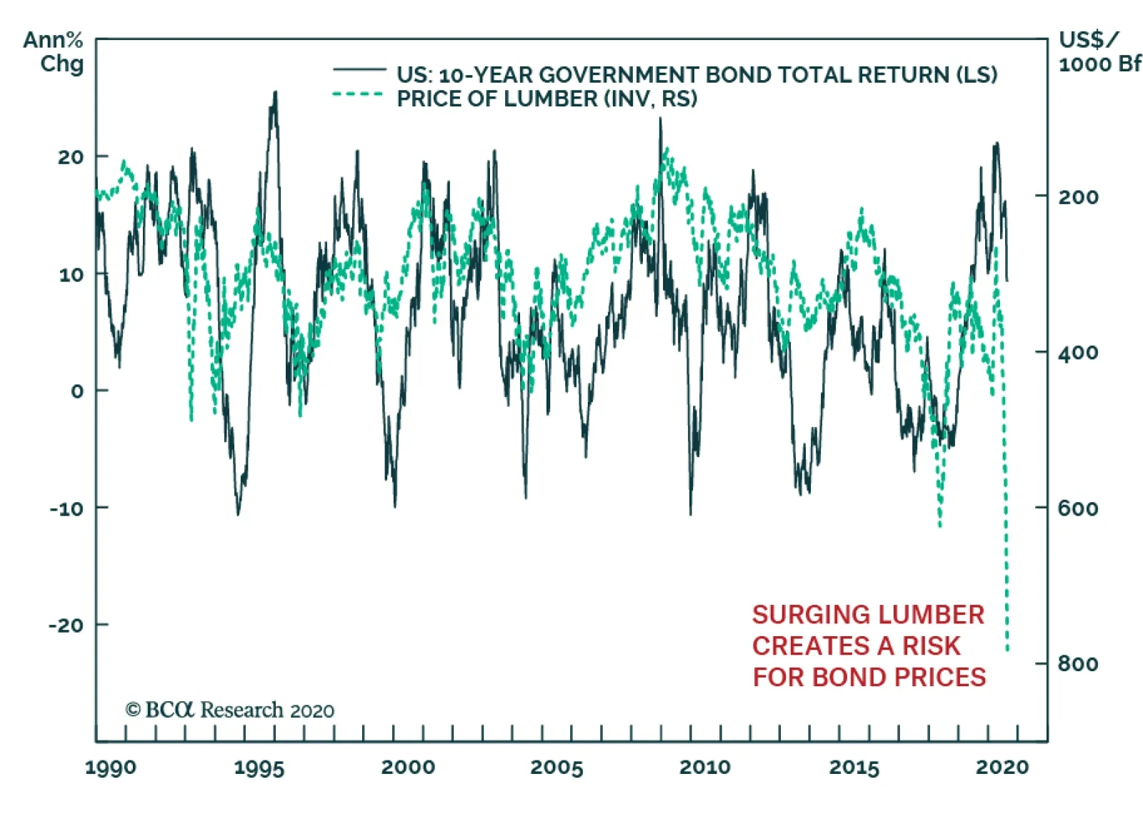
The lumber rally this year has been spectacular. We have been positive on this asset since February and sadly, cut our exposure too early relative to other commodities, five weeks ago. Nonetheless, we cannot ignore what the surge in lumber prices means. At…