Fixed Income
BCA Research's US Bond Strategy service concludes that nominal Treasury yields will move modestly higher during the next 6-12 months with the increase concentrated at the long-end of the curve. Investors should keep portfolio duration close to benchmark and…
BCA Research's Global Fixed Income Strategy service concludes the easy part of the liquidity-driven rally in credit is over. More gains are to come but investors will need to be more selective. We have described the Fed’s corporate bond-buying programs as…

Highlights Global Credit Spreads: The relentless rally in global credit markets since the rout in February and March has driven corporate spreads to near pre-pandemic lows in the US, Europe and even emerging markets. Central bank liquidity is dominating uncertainties over the coronavirus and US politics. Credit Strategy: Valuations now look far less compelling in US investment grade corporates, even with the Fed backstop. EM USD-denominated corporates offer better value versus US equivalents. High-yield spreads offer mixed signals in both the US and Europe: historically attractive breakeven spreads that offer no compensation for likely default losses over the next 6-12 months. Remain neutral US junk and underweight euro area junk, favoring Ba-rated names in both. Feature Chart of the WeekA Pandemic? Credit Markets Are Not Concerned
A Pandemic? Credit Markets Are Not Concerned
A Pandemic? Credit Markets Are Not Concerned
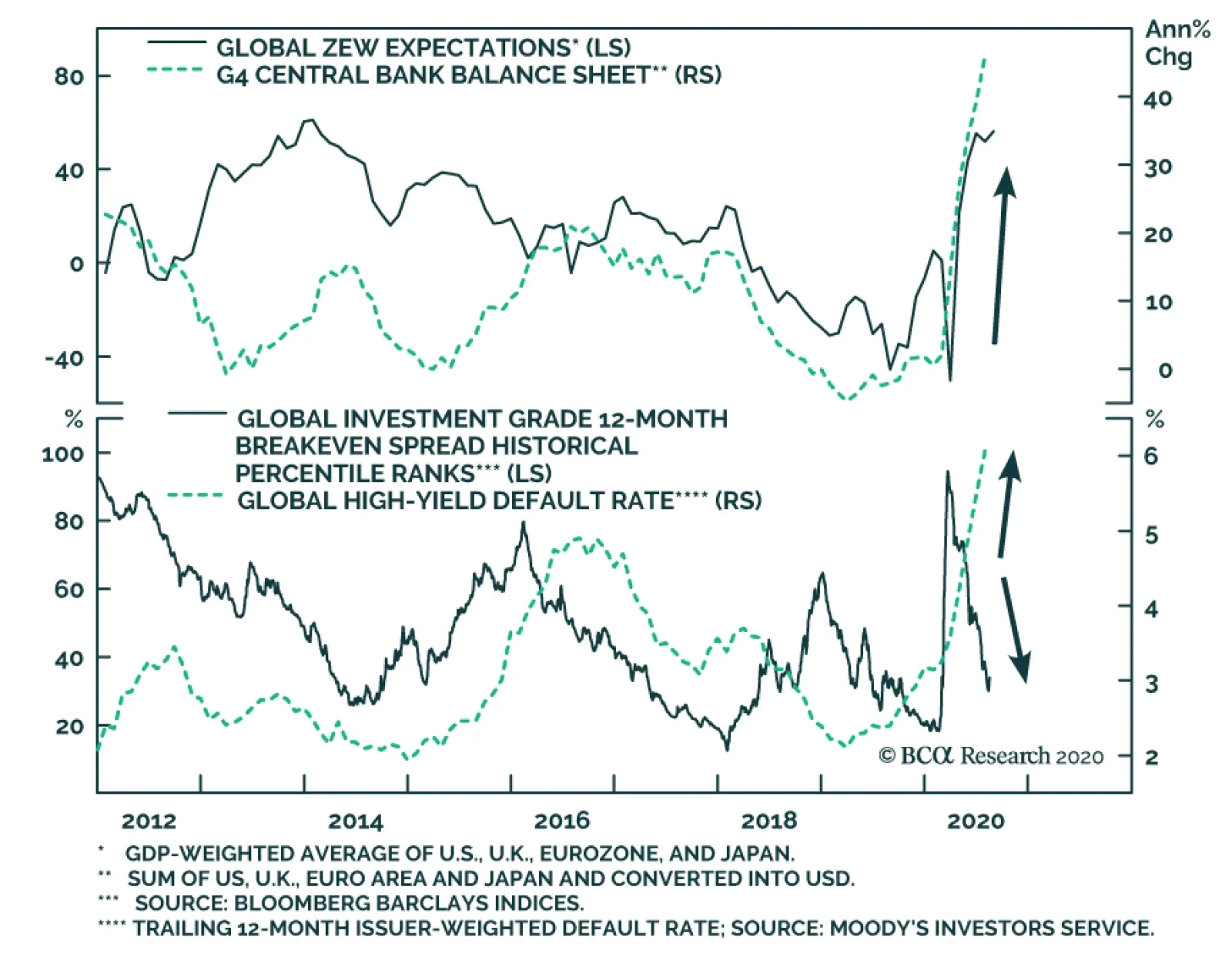
Global credit markets have enjoyed a spectacular recovery from the carnage seen just five months ago when investors realized the magnitude of the COVID-19 shock. The option-adjusted spread (OAS) on the Bloomberg Barclays Global Investment Grade Corporate index has tightened from the 2020 high of 326bps to 130bps, while the OAS on the Global High-Yield index has narrowed from the 2020 high of 1192bps to 556bps. Unsurprisingly, those spread peaks both occurred on the same day: March 23, the day the US Federal Reserve announced their corporate bond buying programs. We have described the Fed’s actions as effectively removing the “left tail risk” of investing in credit, and not just in the US, by introducing a central bank liquidity backstop to the US corporate bond market. The backdrop for global credit markets, on the surface, seems typical for sustained spread compression (Chart of the Week). Economic optimism is buoyant, with the global ZEW expectations index now at the highest level since 2014. Monetary conditions are highly supportive, with near-0% policy rates across all developed economies and the balance sheets of the Fed, ECB, Bank of Japan and Bank of England growing at a combined year-over-year pace of 46%. Credit markets seem to be signaling boom times ahead, ignoring the pesky details of an ongoing global pandemic and election-year political uncertainty in the US. Credit markets seem to be signaling boom times ahead, ignoring the pesky details of an ongoing global pandemic and election-year political uncertainty in the US. The next moves in credit will be more challenging and less rewarding than the past five months. Investment grade corporate credit spreads no longer offer compelling value in most developed economies, while high-yield spreads are tightening in the face of rising default rates in the US and Europe. While additional spread tightening is not out of the question in these markets, investors should consider rotating into credit sectors that still offer some relative value – like emerging market (EM) hard currency corporates. A World Tour Of Our Spread Valuation Indicators The sharp fall in global bond yields over the past several months has not just been confined to government debt. Yields have fallen toward, and even below, pre-virus lows for a variety of sectors ranging from US mortgage-backed securities (MBS) to EM USD-denominated sovereign debt (Chart 2). Investors are clearly reaching for yield in the current environment of tiny risk-free government bond yields, with no greater sign of this than the recent new issue by a US sub-investment grade borrower of a 10-year bond with a coupon below 3%.1 The drop in credit yields has also occurred alongside tightening credit risk premiums, although spreads remain above the pre-virus lows for most sectors in the US, Europe and EM (Chart 3). The degree of correlation across global credit markets has been intense, with very little differentiation between countries. Investment grade corporate spreads in the US, UK and euro area are all closing in on 100bps; high-yield spreads in those same regions are all around 500bps. Chart 2Global Credit Yields Are Low
Global Credit Yields Are Low
Global Credit Yields Are Low
Chart 3Global Credit Spreads Are Getting Tight
Global Credit Spreads Are Getting Tight
Global Credit Spreads Are Getting Tight
Last week, we introduced the concept of “yield chasing” to describe how the ranking of returns in developed market government bonds was becoming increasingly correlated to the ranking of outright yield levels.2 We have seen a similar dynamic unfold in global credit markets, especially since that peak in spreads in late March. In Chart 4 and Chart 5, we present the relationship between starting benchmark index yields, and the subsequent excess returns over risk-free government bonds, for a variety of developed market and EM credit products. The first chart covers the time from start of 2020 to the March 23 peak in spreads, while the second chart shows the relationship since then. The two charts are mirror images of each other. Chart 4Starting Yields & Subsequent Global Credit Excess Returns In 2020 (January 1 To March 20)
What Next For Global Corporate Credit Spreads?
What Next For Global Corporate Credit Spreads?
Chart 5Starting Yields & Subsequent Global Credit Excess Returns In 2020 (Since March 23)
What Next For Global Corporate Credit Spreads?
What Next For Global Corporate Credit Spreads?
The worst performing markets in the first three months of the year were those with the highest yield to begin 2020: high-yield corporates in the US and Europe along with EM credit, which have been the best performing markets since late March. The opposite is true for lower yielders like investment grade credit in Japan, the euro area and Australia, which were among the top performers before March 23 and have lagged sharply since then. While there appears to be “yield chasing” going on in credit markets, much of the spread tightening over the past five months has been a reflection of reduced market volatility that justify lower risk premiums. Chart 6Lower Vol = Lower Credit Risk Premia
Lower Vol = Lower Credit Risk Premia
Lower Vol = Lower Credit Risk Premia
While there appears to be “yield chasing” going on in credit markets, much of the spread tightening over the past five months has been a reflection of reduced market volatility that justify lower risk premiums. Measures of bond volatility like the MOVE index of US Treasury options prices have declined to pre-pandemic lows, while the VIX index of US equity volatility is now down to 22 from the 2020 peak around 80 (Chart 6). The excess return volatility of US corporate bond markets has followed suit, thus allowing for lower US credit spreads. Even allowing for the lower levels of overall market volatility, corporate credit spreads do look relatively tight in the US and Europe. The ratio of the US investment grade index OAS to the VIX is now one standard deviation below the median since 2000 (Chart 7). A similar reading exists for the ratio of the US high-yield index OAS to the VIX, which is also one standard deviation below the long-run average (bottom panel). In the euro area, the ratios of investment grade and high-yield OAS to European equity volatility, the VStoxx index, are not as stretched as in the US, but remain below long-run median levels (Chart 8). Chart 7Very Tight US Corporate Credit Spreads Relative To Equity Vol
Very Tight US Corporate Credit Spreads Relative To Equity Vol
Very Tight US Corporate Credit Spreads Relative To Equity Vol
Chart 8Tight Euro Area Corporate Credit Spreads Relative To Equity Vol
Tight Euro Area Corporate Credit Spreads Relative To Equity Vol
Tight Euro Area Corporate Credit Spreads Relative To Equity Vol
While these simple comparisons of spread to market volatility suggest that corporate credit spreads are tight in most major markets, other indicators paint a more nuanced picture of cross-market valuations. Our preferred measure of the attractiveness of credit spreads is the 12-month breakeven spread. That measures the amount of spread widening that must occur over a one-year horizon for a credit product to have the same return as government bonds. In other words, how much must spreads increase to eliminate the carry advantage of a credit product over a risk-free bond, after accounting for the volatility of that product. We compare those 12-month breakeven spreads with their own history in a percentile ranking, which determines the attractiveness of spreads. While the valuations for US investment grade credit look the least compelling among those three main regions, the power of the Fed liquidity backstop will continue to put downward pressure on spreads. A look at breakeven spread percentile rankings for the major credit groupings in the US (Chart 9), euro area (Chart 10) and EM (Chart 11) shows more diverging spread valuations. Chart 9US Corporate Bond Breakeven Spread Percentile Rankings
US Corporate Bond Breakeven Spread Percentile Rankings
US Corporate Bond Breakeven Spread Percentile Rankings
Chart 10Euro Area Corporate Bond Breakeven Spread Percentile Rankings
Euro Area Corporate Bond Breakeven Spread Percentile Rankings
Euro Area Corporate Bond Breakeven Spread Percentile Rankings
Chart 11EM USD Credit Breakeven Spread Percentile Rankings
EM USD Credit Breakeven Spread Percentile Rankings
EM USD Credit Breakeven Spread Percentile Rankings
The US investment grade breakeven spread is just below the 25th percentile of their long-run history, although the high-yield breakeven spread remains in the top quartile of its history. Euro area breakeven spreads are “fairly” valued, both sitting around the 50th percentile. The EM USD-denominated sovereign breakeven spread is in the third quartile below the 50th percentile, while the EM USD-denominated corporate breakeven spread looks better, sitting just at the 75th percentile. While the valuations for US investment grade credit look the least compelling among those three main regions, the power of the Fed liquidity backstop will continue to put downward pressure on spreads. We would not be surprised to see US investment grade spreads tighten back to the previous cyclical low at some point in the next 6-12 months. There are more compelling opportunities in other global credit markets, however, especially on a risk-adjusted basis. The only investment grade sectors that have attractive breakeven spreads are in Japan, Canada and, most interestingly, EM. Bottom Line: The relentless rally in global credit markets since the out in February and March has driven credit spreads to near pre-pandemic lows in the US, Europe and even emerging markets. Central bank liquidity is dominating uncertainties over the virus and US politics. Spread valuations are looking more stretched, but “yield chasing” and “spread chasing” behavior will remain dominant with central banks encouraging risk-seeking behavior with easy money policies. Putting It All Together: Recommended Allocations One way to look at the relative attractiveness of global spread product sectors is to compare them all by 12-month breakeven spread percentile rankings. We show that in Chart 12, not just for the overall credit indices by country but also among credit tiers within each country. Sectors rated below investment grade are in red to differentiate from higher-quality markets. Chart 12Global Corporate Bond Breakeven Spreads, Ordered By Percentile Ranks
What Next For Global Corporate Credit Spreads?
What Next For Global Corporate Credit Spreads?
The main conclusion form the chart is that there is a lot of red on the left side and none on the right side. That means junk bonds in the US and Europe have relatively high breakeven spreads, while investment grade credit in most countries have relatively lower breakeven spreads. The only investment grade sectors that have attractive breakeven spreads are in Japan, Canada and, most interestingly, EM. To further refine the cross-country comparisons, we must look at those breakeven spreads relative to the riskiness of each sector. In Chart 13, we present a scatter graph plotting the 12-month breakeven spreads versus our preferred measure of credit risk, duration-times-spread (DTS), for all developed market corporate credit tiers, as well as EM USD-denominated sovereign and corporate debt. The shaded region represents all values within +/- one standard error of the fitted regression line. Thus, sectors below that shaded region have breakeven spreads that are low relative to its DTS, suggesting a poor valuation/risk tradeoff. The opposite is true for sectors above the shaded region. Chart 13Comparing Value (Breakeven Spreads) With Risk (Duration Times Spread)
What Next For Global Corporate Credit Spreads?
What Next For Global Corporate Credit Spreads?
The sectors that stand out as most attractive in this framework are B-rated and Caa-rated US high-yield, and EM USD-denominated investment grade corporates. The least attractive sectors are US investment grade corporates, for both the overall index and the Baa-rated credit tier. While those US high-yield valuations suggest overweighting allocations to the lower credit tiers, we remain reluctant to make such a recommendation. Looking beyond the spread and volatility measures presented in this report, we must consider the default risk of high-yield bonds. Our preferred measure of valuation that incorporates default risk is the default-adjusted spread, which measures the current high-yield index spread net of default losses. While those US high-yield valuations suggest overweighting allocations to the lower credit tiers, we remain reluctant to make such a recommendation. The current US high-yield default-adjusted spread is now well below its long-run average (Chart 14). We expect a peak US default rate over the next year between 10-12% (levels seen after past US recessions) and a recovery rate given default between 20-25% (slightly below previous post-recession levels). That combination would mean that expected default loses from the COVID-19 recession could exceed the current level of the US high-yield index spread by as much as 400bps (see the bottom right of the chart). Given that risk of default losses overwhelming the attractiveness of US high-yield as measured by the 12-month breakeven spread, we prefer to stay up in quality by focusing on Ba-rated names within an overall neutral allocation to US junk bonds. For euro area high-yield, where default-adjusted spreads are also projected to be negative next year but with less attractive 12-month breakeven spreads, we recommend a cautious up-in-quality allocation to Ba-rated names only but within an overall underweight allocation. After ruling out increasing allocations to US B-rated and Caa-rated high-yield, that leaves the two remaining valuation outliers from Chart 13 - US investment grade and EM USD-denominated investment grade corporates. The gap between the index OAS of the two has narrowed from the March peak of 446bps to the latest reading of 259bps (Chart 15). We believe that gap can narrow further towards 200bps, especially given the supportive EM backdrop of USD weakness and China policy stimulus – both factors that were in place during the last sustained period of EM corporate bond outperformance in 2016-17. Chart 14No Cushion Against Credit Losses For US & Euro Area HY
No Cushion Against Credit Losses For US & Euro Area HY
No Cushion Against Credit Losses For US & Euro Area HY
Chart 15EM IG Corporates Remain Attractive Vs US IG
EM IG Corporates Remain Attractive Vs US IG
EM IG Corporates Remain Attractive Vs US IG
We upgraded our recommended allocation to EM USD-denominated credit out of US investment grade back in mid-July, and we continue to view that as the most attractive relative value opportunity in global spread product on a risk/reward basis. Bottom Line: Valuations now look far less compelling in US investment grade corporates, even with the Fed backstop. EM USD-denominated corporates offer better value versus US equivalents. High-yield spreads offer mixed signals in both the US and Europe: historically attractive breakeven spreads that offer no compensation for likely default losses over the next 6-12 months. Remain neutral US junk and underweight euro area junk, favoring Ba-rated names in both. Robert Robis, CFA Chief Fixed Income Strategist rrobis@bcaresearch.com Footnotes 1https://www.bloomberg.com/news/articles/2020-08-10/u-s-junk-bond-market-sets-record-low-coupon-in-relentless-rally 2 Please see BCA Research Global Fixed Income Strategy Weekly Report, "We’re All Yield Chasers Now", dated August 11, 2020, available at gfis.bcaresearch.com. Recommendations The GFIS Recommended Portfolio Vs. The Custom Benchmark Index
What Next For Global Corporate Credit Spreads?
What Next For Global Corporate Credit Spreads?
Duration Regional Allocation Spread Product Tactical Trades Yields & Returns Global Bond Yields Historical Returns
Highlights The strong rally in certain mega-cap stocks has masked the muted revival in the broad equity universe. Limited fiscal stimulus and a broken monetary transmission mechanism herald lackluster economic and profit recoveries. While dedicated EM equity investors should for now maintain an underweight position in India within an EM equity portfolio, they should consider upgrading this bourse on potential near-term underperformance. Absolute-return investors should consider buying this bourse on a setback in the coming months. Fixed-income investors should continue receiving 10-year swap rates but use any rupee selloff to rotate into cash bonds. Feature Indian share prices have staged a remarkable comeback following the financial carnage in March. However, the outlook for the economy and for corporate profits does not justify the current level of share prices. While this thesis is applicable to most markets around the world, the gap between share prices and economic activity is even larger in India. Chart I-1Loans To Companies Are Muted In India
Loans To Companies Are Muted In India
Loans To Companies Are Muted In India
In particular: The credit and liquidity crunch has been more acute in India than in many other EM and DM economies. Bank loan growth has surged in many countries as companies have borrowed to avoid a liquidity crunch due to a plunge in sales. However, in India bank loans to companies been shown little improvement (Chart I-1). This means that enterprises in India have not been able to draw on bank loans – to the same extent as they have done elsewhere – to attenuate a liquidity crunch stemming from revenue contraction. As a result, Indian enterprises have retrenched more in terms of both employment and capital spending, and their rebound has been more muted. As an example, the global manufacturing and non-manufacturing PMIs have risen above the 50 line but the same measures in India remain below the 50 line (Chart I-2). India’s employment index from the Manpower group has fallen to a record low as of early July (Chart I-3). As a result, household nominal income growth – which was slumping before the pandemic – has fallen much further. Chart I-2India Is Lagging In Global Recovery
India Is Lagging In Global Recovery
India Is Lagging In Global Recovery
Chart I-3India: Employment Conditions Are Very Poor
India: Employment Conditions Are Very Poor
India: Employment Conditions Are Very Poor
Passenger car and commercial vehicle sales have plummeted (Chart I-4). Corporate investment expenditure and production have crashed. Manufacturing output, capital goods production and imports all plummeted in March and April and rebounded only mildly in June (Chart I-5). Chart I-4India: Discretionary Spending Is Slow To Recover...
India: Discretionary Spending Is Slow To Recover...
India: Discretionary Spending Is Slow To Recover...
Chart I-5...As Are Production And Investment
...As Are Production And Investment
...As Are Production And Investment
Table I-1India: Share Of Each Equity Sector In Profits & Market Cap
Strategy For Indian Equities And Fixed-Income
Strategy For Indian Equities And Fixed-Income
Economic activity will improve gradually but the level of activity will remain below the pandemic level for some time. As a result, corporate profits will be slow to revive. Odds are that it will take more than one and half years before the EPS of listed companies reach their 2019 level. This is especially true for severely hit sectors – financials, industrials, materials, and consumer discretionary stocks – which together account for 44% of listed companies’ profits. The sectors less affected by the pandemic recession – namely, consumer staples, information technology and health care – together account for 30% of corporate profits (Table I-1). A Breakdown In The Monetary Transmission Mechanism Impediments to rapid economic recovery are the modest fiscal stimulus and a breakdown in the monetary transmission mechanism. While India announced a large fiscal stimulus, much of this is made up of loan guarantees. Some measures like central bank purchases of government bonds also do not represent actual fiscal spending. Chart I-6 illustrates that government spending has risen only moderately and it has been offset by the drop in the credit impulse. Provided that the credit impulse will remain weak due to reasons we discuss below, the aggregate stimulus will not be sufficient to produce a robust and rapid recovery. The outlook for the economy and for corporate profits does not justify the current level of share prices. Critically, the monetary policy transmission mechanism was impaired even before the pandemic broke out in India, and the situation has gotten worse since March. Even though the Reserve Bank of India (RBI) has been reducing its policy rate, the prime lending rate has dropped very modestly (Chart I-7). Indian commercial banks which are saddled with non-performing loans (NPLs) have been reluctant to reduce their lending rates. Chart I-6Drag From Credit Impulse Has Offset Fiscal Stimulus
Drag From Credit Impulse Has Offset Fiscal Stimulus
Drag From Credit Impulse Has Offset Fiscal Stimulus
Chart I-7India: Very Little Decline In Prime Lending Rate
India: Very Little Decline In Prime Lending Rate
India: Very Little Decline In Prime Lending Rate
Even though AAA local currency corporate bond yields have dropped, BBB corporate bond yields remain above 10% (Chart I-8). This compares with 5-year government bond yields of 5%. Critically, in real (inflation-adjusted) terms, borrowing costs remain elevated (Chart I-9). Such elevated real borrowing costs will continue to hinder credit demand. Chart I-8Corporate Bond Yields Remain Elevated
Corporate Bond Yields Remain Elevated
Corporate Bond Yields Remain Elevated
Chart I-9Borrowing Costs In Real Terms Are Restrictive
Borrowing Costs In Real Terms Are Restrictive
Borrowing Costs In Real Terms Are Restrictive
Finally, banks might be reluctant to originate much credit because of the rise in NPLs and the uncertainty over the extension of government guarantees on pandemic-induced NPLs and their own recapitalization programs. Bottom Line: Limited fiscal stimulus and a broken monetary transmission mechanism herald lackluster economic and profit recoveries. Beyond Mega Caps The strong rally in certain mega-cap stocks has masked the muted revival in the broad equity universe. The MSCI equity index has rallied by 50% since its late March lows and stands only 7% below its pre-pandemic highs in local currency terms. Yet, the MSCI equal-weighted index and small caps are, in local currency terms, still 15% and 16% below their pre-pandemic highs, respectively (Chart I-10). The performance of the overall equity index has been exaggerated by the rally in Reliance Industries’ share price as well as information technology stocks, consumer staples and health care. The 150% surge in Reliance Industries stock price since late March lows is due to company-specific rather than macro factors. This company presently accounts for 15% of the MSCI India index. The monetary policy transmission mechanism was impaired even before the pandemic broke out in India. In addition, info technology, consumer staples and health care (including sales of personal care products and medicine) have benefited due to the pandemic. By contrast, equity sectors leveraged to the business cycle in general and discretionary spending in particular have all underperformed. Importantly, bank share prices have been devasted due to poor economic growth and rising NPLs. India’s mega-cap stocks that have led the rally since March lows are expensive, as anywhere else. Finally, India’s equal-weighted equity index has failed to meaningfully outperform the EM equal-weighted index after underperforming severely in late 2019 and Q1 2020 (Chart I-11). Chart I-10Muted Revival In Broader Equity Universe
Muted Revival In Broader Equity Universe
Muted Revival In Broader Equity Universe
Chart I-11India Relative To EM: Little Outperformance
India Relative To EM: Little Outperformance
India Relative To EM: Little Outperformance
Bottom Line: The advance in Indian share prices has been amplified by the rally in large-cap stocks. Meanwhile, the equal-weighted and small-cap indexes have done considerably worse reflecting the downbeat economic conditions. Equity Valuations And Strategy Chart I-12Indian Equity Valuations Are Elevated On A Market-Cap Basis...
Indian Equity Valuations Are Elevated On A Market-Cap Basis...
Indian Equity Valuations Are Elevated On A Market-Cap Basis...
As discussed earlier, India’s equity market leaders like information technology, consumer staples and health care are already expensive, trading at a trailing P/E ratio of 23, 47 and 33, respectively. The rest of the equity market is not expensive, but its profit outlook is mediocre. As to other valuation metrices, the market seems to be moderately expensive both on an absolute basis and versus the EM equity benchmark: The 12-month forward P/E ratio is 22.5, the highest in the decade (Chart I-12, top panel). Relative to the EM benchmark, on the same measure is trading at 50% premium (Chart I-12, bottom panel). Based on the equal-weighted equity index – i.e. stripping out the effect of large-cap stocks on the index, Indian equities are overvalued in absolute terms (Chart I-13, top panel). On this equal-weighted measure, Indian stocks are currently trading at a 35% premium versus their EM peers (Chart I-13, bottom panel). The cyclically-adjusted P/E ratio is close to the historical mean (Chart I-14, top panel). Chart I-13...And On An Equal-Weighted Basis
...And On An Equal-Weighted Basis
...And On An Equal-Weighted Basis
Chart I-14Cyclically-Adjusted P/E Ratio
Cyclically-Adjusted P/E Ratio
Cyclically-Adjusted P/E Ratio
However, the CAPE ratio is agnostic to corporate earnings on a cyclical horizon. It assumes corporate profits will revert to their long-term rising trend (Chart I-14, bottom panel). This is not assured in the next six months in our opinion. Hence, a lackluster profits recovery – profits disappointments – is a risk to the performance of India’s bourse in the coming months. Equity Strategy: Weighing pros and cons, we recommend that dedicated EM equity investors maintain an underweight position in India within an EM equity portfolio. However, they should consider upgrading this bourse on potential near-term underperformance. The strong rally in certain mega-cap stocks has masked the muted revival in the broad equity universe. Absolute-return investors should consider buying this bourse on a setback in the coming months. Odds are that the index could drop up to 15% in US dollar terms triggered by a potential global risk-off phase and domestic profit disappointments. Currency And Fixed-Income Chart I-15Consumer Inflation Is Not A Problem In India
Consumer Inflation Is Not A Problem In India
Consumer Inflation Is Not A Problem In India
We have been recommending receiving 10-year swap rates in India since April 23 and this recommendation remains intact. As argued above, the economic recovery will be gradual, and the output gap will remain negative for some time. Consequently, wages and inflation will likely surprise on the downside. Even though headline and core inflation rates have recently picked up, this has been due to a rise in food prices, transportation and personal care products (Chart I-15). Hence, there are not genuine inflationary pressures in India and the RBI will be making a mistake if it stops easing due to rises in headline or core CPI readings. Food prices have been rising for a while due to supply shocks. Importantly, the rise in food prices should not be interpreted as genuine inflation. Meanwhile, personal care products include gold jewelry and this CPI sub-component has therefore been rising due to the surge in gold prices (Chart I-15, bottom panel). Finally, transport costs have been on the rise due to supply chain bottlenecks in India as a result of COVID-19 and due to the rise in global oil prices. The broken monetary transmission mechanism means that the RBI will have to cut rates by much more. The fixed-income market is not discounting rate cuts. There is value in long-term rates in India. The yield curve is very steep – the spread between 10-year and 1-year swap rates is 92 basis points. In addition, 10-year government bond yields are currently yielding 522 basis points above 10-year US Treasurys. We are not particularly concerned about public debt. Central government debt was at 52% of GDP before the recession and total public debt (including both central and state governments) was 80% of GDP. The same ratios are much higher in many other EM and DM economies. Chart I-16India's Stock-To-Bond Ratio Is At A Critical Resistance
India's Stock-To-Bond Ratio Is At A Critical Resistance
India's Stock-To-Bond Ratio Is At A Critical Resistance
Finally, the rupee could correct as the US dollar rebounds from oversold levels, but foreign investors should use that setback in India’s exchange rate to rotate from receiving rates to buying 10-year government bonds outright, i.e., taking on currency risk. The RBI has been accumulating foreign exchange reserves, meaning it has been preventing the currency from appreciating. The current account is balanced and the financial/capital account has passed its worse phase. India will continue to attract foreign capital due to its long-term appeal and higher-than-elsewhere interest rates. Domestic investors should favor bonds over stocks in the near term (Chart I-16). Bottom Line: Continue betting on lower interest rates in India. Fixed income investors should switch from receiving rates to buying 10-year government bonds on a correction in the rupee in the coming months. Dedicated EM local currency bond portfolios should continue overweighting India. Arthur Budaghyan Chief Emerging Markets Strategist arthurb@bcaresearch.com Ayman Kawtharani Editor/Strategist ayman@bcaresearch.com Footnotes Equities Recommendations Currencies, Credit And Fixed-Income Recommendations
BCA Research's Global Fixed Income Strategy service observes that the correlation between relative global government bond returns and yield levels is becoming more positive. The trend should continue as long as policymakers stick to their promises and…
Highlights Nominal Yields: Nominal Treasury yields will move modestly higher during the next 6-12 months with the increase concentrated at the long-end of the curve. Investors should keep portfolio duration close to benchmark and enter duration-neutral yield curve steepeners. Inflation Compensation: Remain overweight TIPS versus nominal Treasuries for now, but we anticipate getting an opportunity to tactically reverse this position near the end of the year. Investors should also position in flatteners across the inflation compensation curve, as both a near-term and long-term trade. Real Yields: The outlook for the level of real yields is highly uncertain, particularly at the long-end of the curve. However, as long as the reflation trade continues, real yield curve steepeners should perform well whether real yields are rising or falling. US Economy: Another stimulus bill is required in order to extend the economic recovery and prolong the reflation trade in financial markets. The President’s executive orders are not sufficient. The pressure on Congress to reach a compromise deal is high, and we expect one to be announced in the coming days. Feature Chart 1Reflation Pushes Real Yields Lower
Reflation Pushes Real Yields Lower
Reflation Pushes Real Yields Lower
Market movements during the past couple of months are consistent with an environment of economic reflation. Equities and commodity prices are up, the US dollar is down, spread product has outperformed Treasuries and TIPS breakeven inflation rates have widened. This “reflation trade” is the result of global economic recovery and highly accommodative Fed policy, the latter being particularly important. In fact, Fed policy has been so accommodative that bonds are the one asset class that has so far bucked the broader reflationary trend. Nominal Treasury yields dipped during the past few weeks, as rising inflation expectations were more than offset by plunging real yields (Chart 1). Our base case expectation is that, broadly speaking, the reflation trade will continue. Global economic growth will improve during the next 6-12 months and Fed policy will remain highly accommodative. In this week’s report we consider how to position for that outcome in US rates markets. In the process, we provide trade recommendations for the nominal, real and inflation compensation curves. We also consider the main risk to our reflationary view: The possibility that further US fiscal stimulus is too little or arrives too late. Positioning For Reflation Chart 2More Downside In Short-Maturity Real Yields
More Downside In Short-Maturity Real Yields
More Downside In Short-Maturity Real Yields
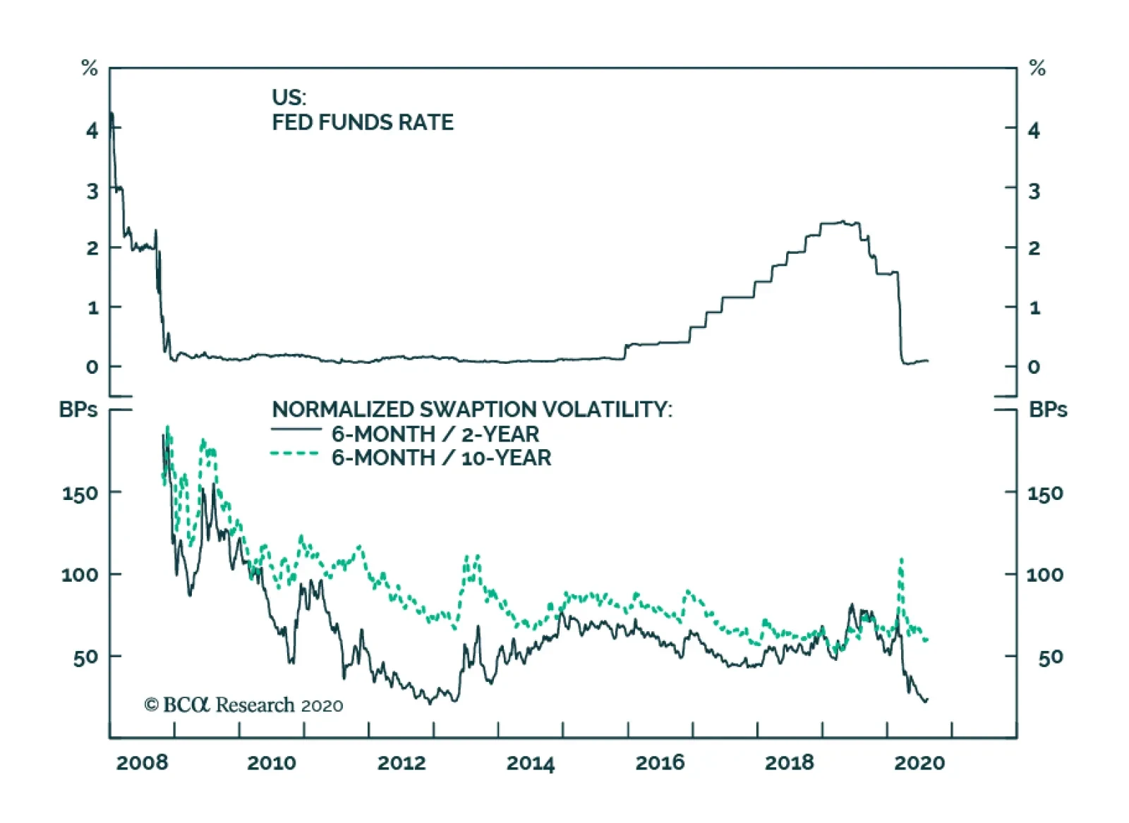
Back in April, we explained how the Fed’s zero-lower-bound interest rate policy can lead to unusual movements in bond markets, particularly in how real bond yields respond to broader market trends.1 The importance of the zero lower bound is easily seen through the lens of the Fisher Equation – the equation that connects nominal yields, real yields and inflation expectations. Real Yield = Nominal Yield – Inflation Expectations If the Fed is expected to hold the nominal short rate steady for a long period of time, then nominal bond yields won’t move around very much in response to the economy. Necessarily, this means that increases in inflation expectations must be matched by falling real yields. Chart 1 shows how this has played out for 10-year yields, but the dynamic is even more pronounced at the short-end of the curve where the Fed has greater control over nominal rate expectations (Chart 2). With these relationships in mind, we consider the outlooks for the nominal, inflation compensation and real yield curves. Nominal Treasury Curve Chart 3Fed Guidance Has Crushed Nominal Rate Vol
Fed Guidance Has Crushed Nominal Rate Vol
Fed Guidance Has Crushed Nominal Rate Vol
As is alluded to above, fed funds rate expectations drive nominal Treasury yields. Treasury yields rise when the market revises its rate expectations up and fall when the market revises its expectations down. But what happens when the Fed signals that the funds rate will stay pinned at its current level, even as inflationary pressures mount? What happens is that nominal bond yields become increasingly insensitive to fluctuations in economic data and rate volatility plunges (Chart 3). Not surprisingly, this decline in rate volatility has been more pronounced at the front-end of the curve than at the long-end (Chart 3, bottom panel). This is because the Fed’s rate guidance exerts more influence over short maturities. The market might be very confident that the fed funds rate will stay at its current level for the next year or two, but it will be less confident about rate expectations five or ten years down the road. The conclusion we draw is that the Fed’s dovish rate guidance will prevent a large increase in nominal bond yields, even as the reflation trade rolls on. But at some point, rising inflation expectations will cause the market to price-in policy firming at the long-end of the curve and long-maturity nominal Treasury yields will move somewhat higher. Historically, nominal bond yields usually move in the same direction as TIPS breakeven inflation rates (Chart 4). Chart 4Nominal Yields And Inflation Expectations Are Positively Correlated
Positioning For Reflation And Avoiding Deflation
Positioning For Reflation And Avoiding Deflation
While this base case outlook calls for flat-to-slightly higher Treasury yields, we recommend keeping portfolio duration close to benchmark on a 6-12 month investment horizon. The reason for this caution is that significant downside risks to our base case economic scenario remain (see section “Avoiding Deflation” below). Chart 5Bullets Trade Expensive When Rates Are Pinned At Zero
Bullets Trade Expensive When Rates Are Pinned At Zero
Bullets Trade Expensive When Rates Are Pinned At Zero
Instead, we recommend positioning for the continuation of the reflation trade via duration-neutral yield curve steepeners. The nominal yield curve will respond to global economic recovery by steepening because the market will price-in eventual policy tightening at the long-end of the curve before it prices-in near-term policy tightening at the front-end of the curve. Specifically, we suggest buying the 5-year bullet and shorting a duration-neutral barbell consisting of the 2-year and 10-year notes. This trade is designed to profit from steepening of the 2/10 yield curve.2 The one problem with our proposed trade is that it is not cheap. The 5-year bullet yield is below the 2/10 barbell yield and the 5-year bullet trades as expensive on our yield curve model (Chart 5). However, we note that the 5-year looked much more expensive at the height of the last zero-lower-bound episode in 2012. In today’s similar environment, we anticipate a return to similar valuation levels. Bottom Line: Nominal Treasury yields will move modestly higher during the next 6-12 months with the increase concentrated at the long-end of the curve. Investors should keep portfolio duration close to benchmark and enter duration-neutral yield curve steepeners. Inflation Compensation Curve Chart 6Adaptive Expectations Model
Adaptive Expectations Model
Adaptive Expectations Model
Almost by definition, the continuation of the reflation trade means that the cost of inflation compensation will rise (i.e. TIPS breakeven inflation rates will move higher), and we remain positioned for that outcome. However, at least according to our Adaptive Expectations Model, the inflation component of bond yields could have a more difficult time rising going forward. Our model, which is based on several different measures of realized inflation, shows that the 10-year TIPS breakeven inflation rate is more or less at its fair value (Chart 6). In other words, further upside from here is contingent upon rising inflation. Fortunately, rising inflation seems likely during the next few months. Month-over-month headline CPI bottomed in April (Chart 7), the oil price is trending up (Chart 7, panel 2) and core inflation has undershot relative to the trimmed mean (Chart 7, panel 3). All of this suggests that our model’s fair value will move higher during the next few months. Chart 7Inflation Has Bottomed
Inflation Has Bottomed
Inflation Has Bottomed
But beyond the near-term snapback that we anticipate, a wide output gap in the United States will prevent inflation from entering a sustainable uptrend as we head into 2021. After all, our Pipeline Inflation Indicator remains deep in deflationary territory (Chart 7, bottom panel). At some point near the end of this year, we anticipate getting an opportunity to move tactically underweight TIPS versus nominal Treasuries, once breakevens start to look expensive on our model. Our Adaptive Expectations Model shows that the 10-year TIPS breakeven inflation rate is more or less at its fair value. A higher conviction long-run trade relates to the slope of the inflation curve. At present, the 10-year CPI swap rate remains somewhat above the 2-year rate, but we eventually expect this slope to invert (Chart 8). With the Fed explicitly targeting a temporary overshoot of its 2% inflation target, it would make sense for the cost of short-maturity inflation protection to trade above the cost of long-maturity inflation protection. This would mark a significant break from historical trends, but this is also true of the Fed’s new policy approach. Chart 8Inflation Curve Will Invert
Inflation Curve Will Invert
Inflation Curve Will Invert
Bottom Line: Remain overweight TIPS versus nominal Treasuries for now, but we anticipate getting an opportunity to tactically reverse this position near the end of the year. Investors should also position in flatteners across the inflation compensation curve, as both a near-term and long-term trade. Real Yield Curve Chart 9Buy Real Yield Curve Steepeners
Buy Real Yield Curve Steepeners
Buy Real Yield Curve Steepeners
At the beginning of this report we noted that the combination of stable nominal rate expectations and rising inflation expectations has led to a steep decline in real Treasury yields. This decline has been more severe at the short-end of the curve, which has resulted in real yield curve steepening (Chart 9). At the long-end of the curve, the outlook for the level of real yields is highly uncertain, even under the assumption that the reflation trade continues. If 10-year nominal rate expectations hold steady, then continued reflation will lead to a further decline in the 10-year real yield. However, as discussed above, long-dated nominal rate expectations will eventually follow inflation expectations higher. If that adjustment to long-dated rate expectations outpaces the increase in expected inflation compensation, then the 10-year real yield will move up as well. The outlook for the short-end of the curve is more certain. Two-year nominal rate expectations are unlikely to budge anytime soon. This means that the continuation of the reflation trade will send the cost of 2-year inflation protection higher and the 2-year real yield lower. For this reason, we would rather take a position in real yield curve steepeners than an outright position on the level of real yields. In fact, as long as the reflation trade continues, the real yield curve should steepen whether the absolute level of real yields is rising or falling. It is only in a renewed deflation scare where we would expect the real yield curve to flatten, as occurred back in March. As long as the reflation trade continues, real yield curve steepeners should perform well whether real yields are rising or falling. Bottom Line: The outlook for the level of real yields is highly uncertain, particularly at the long-end of the curve. However, as long as the reflation trade continues, real yield curve steepeners should perform well whether real yields are rising or falling. Avoiding Deflation The first part of this report talked about how to position in rates markets assuming that the global economic recovery remains on track and that the so-called reflation trade continues. While this is our base case scenario, it is by no means a certainty. In fact, this view is contingent upon continued US fiscal stimulus that is sufficient to sustain household income and prevent a snowballing of foreclosures and bankruptcies. March’s CARES act did a more-than-admirable job supporting household income. In fact, disposable household income rose 7.2% in the four month period between March and June compared to the four months that preceded the COVID recession (Chart 10). This is a far greater increase than what was seen in the first four months of the 2008 recession (dashed line in Chart 10, panel 2), despite the fact that the hit to wage compensation has been worse (dashed line in Chart 10, bottom panel). Chart 11A confirms that, without the CARES act, the hit to disposable income would have been substantial. Chart 10Income Well Supported... So Far
Income Well Supported... So Far
Income Well Supported... So Far
Chart 11ADisposable Personal Income Growth And Its Drivers I
Positioning For Reflation And Avoiding Deflation
Positioning For Reflation And Avoiding Deflation
The problem is that the main income supporting provisions of the CARES act have either been paid out or have expired. Chart 11B shows the impact on disposable income of the CARES act’s different provisions. The two most important were: The Economic Impact Payments: The one-time $1200 stimulus checks. The Pandemic Unemployment Compensation Payments: The extra $600 per week that was added to unemployment benefits. Chart 11BDisposable Personal Income Growth And Its Drivers II
Positioning For Reflation And Avoiding Deflation
Positioning For Reflation And Avoiding Deflation
The Economic Impact Payments have all been delivered, and the Pandemic Unemployment Compensation Payments expired at the end of July. Based on the information that has been released about the ongoing negotiations over a follow-up stimulus bill, we expect that a compromise deal will be large enough to keep disposable income at or above pre-recession levels.3 However, a compromise is proving difficult. Congress’ foot dragging prompted President Trump to announce several executive orders of questionable legality in an attempt to deliver some stimulus. However, even if the executive orders are followed, the boost to household income will be meager without another bill. The President’s executive order to extend the extra unemployment benefits appropriates only $44 billion from the Disaster Relief Fund and asks states to contribute the rest. Many states will be unable to contribute anything, and an extra $44 billion amounts to only 8% of the income support provided by the CARES act. State & local government aid must be addressed in the new stimulus bill. The other urgent area that must be addressed in a follow-up stimulus bill is aid for state & local governments. State & local government spending fell 5.6% (annualized) in the second quarter, as governments have been forced to impose harsh austerity in the face of collapsing tax revenues (Chart 12). This is one area where the Democrats and Republicans are still far apart. The Center on Budget and Policy Priorities estimates that states need $555 billion to close COVID-related budget shortfalls.4 The Democrats’ initial proposal contained $1.13 trillion for states, the Republicans’ initial offer left out state & local government aid altogether. Chart 12State & Local Governments Need A Bailout
State & Local Governments Need A Bailout
State & Local Governments Need A Bailout
Bottom Line: Another stimulus bill is required in order to extend the economic recovery and prolong the reflation trade in financial markets. The President’s executive orders are not sufficient. The pressure on Congress to reach a compromise deal is high, and we expect one to be announced in the coming days. Based on the numbers that have been floated, that deal will contain sufficient income support to keep households afloat and the recovery on track. Appendix A: Buy What The Fed Is Buying The Fed rolled out a number of aggressive lending facilities on March 23. These facilities focused on different specific sectors of the US bond market. The fact that the Fed has decided to support some parts of the market and not others has caused some traditional bond market correlations to break down. It has also led us to adopt of a strategy of “Buy What The Fed Is Buying”. That is, we favor those sectors that offer attractive spreads and that benefit from Fed support. The below Table tracks the performance of different bond sectors since the March 23 announcement. We will use this to monitor bond market correlations and evaluate our strategy’s success. Table 1Performance Since March 23 Announcement Of Emergency Fed Facilities
Positioning For Reflation And Avoiding Deflation
Positioning For Reflation And Avoiding Deflation
Footnotes 1 Please see US Bond Strategy Weekly Report, “Negative Oil, The Zero Lower Bound And The Fisher Equation”, dated April 28, 2020, available at usbs.bcaresearch.com 2 To understand why this trade profits in an environment of yield curve steepening please see US Bond Strategy Special Report, “Bullets, Barbells And Butterflies”, dated July 25, 2017, available at usbs.bcaresearch.com 3 In their initial proposals, House Democrats offered $435 billion in Economic Impact Payments and $437 billion for expanded unemployment benefits. The Senate Republicans offered $300 billion for Economic Impact Payments and $110 billion for expanded unemployment benefits. For context, the CARES act authorized $293 billion for Economic Impact Payments and $268 billion for expanded unemployment benefits. For more details on the ongoing budget negotiations please see Geopolitical Strategy Weekly Report, “A Tech Bubble Amid A Tech War”, dated July 31, 2020, available at gps.bcaresearch.com 4 https://www.cbpp.org/research/state-budget-and-tax/states-continue-to-face-large-shortfalls-due-to-covid-19-effects Ryan Swift US Bond Strategist rswift@bcaresearch.com Fixed Income Sector Performance Recommended Portfolio Specification
Highlights Scarce Yield: The correlation of relative global government bond returns and yield levels is becoming more positive. The trend should continue if central bankers across the developed world stick to their promises to maintain very loose monetary policy settings for at least the next two years, forcing investors to chase scarce yields while worrying less about cyclical economic and inflation factors. Country Allocations: Maintain overweights to higher-yielding government bonds (Italy, the US, Canada) versus low-yielders (Germany, France, Japan) within USD-hedged fixed income portfolios. Upgrade higher-yielders Spain and Australia to overweight, at the expense of the low-yielding UK and Germany. Feature “What is the investment rationale for buying developed market government bonds now?” We begin this week with a question posed by a BCA client in a recent meeting. It was a perfectly logical inquiry given the current microscopic level of yields on offer almost everywhere. Why bother buying a 10-year US Treasury barely yielding more than 0.5%, or a 10-year Italian BTP yielding less than 1%, with both offering little compensation for future inflation or fiscal risks? Chart of the WeekYield Chasing Is Now The Only Winning Strategy
Yield Chasing Is Now The Only Winning Strategy
Yield Chasing Is Now The Only Winning Strategy
Our answer to the question – “because the Fed and ECB will do whatever is needed to prevent nominal bond yields from rising over the foreseeable future” – did little to influence the client’s view on the attractiveness of those yields (but did make her more comfortable about the equity and corporate credit exposures in her portfolio). In the current environment, where all countries are experiencing the ultimate exogenous negative growth shock – a deadly and highly contagious pandemic - the usual analysis of the cyclical economic and inflation dynamics of any single country now offers far less payoff to government bond investing. It is hard to find a country not suffering from weak growth, very low inflation, high unemployment (some of which is likely to be permanent) and ongoing uncertainty related to the spread of COVID-19. It is also hard to find a country where interest rates have not been cut to 0% (or even lower) and central banks have not ramped up bond buying activity. Increasingly, the relative performance of government bonds between countries reflects simple yield differentials, rather than differing monetary policy outlooks. Higher-yielding markets are outperforming the lower-yielding markets – a trend that has persisted throughout 2020 and is likely to intensify in the coming months (Chart of the Week). Growth? Inflation? Who Cares? Give Me Yield! Developed market government bond yields have been ignoring the usual message sent by cyclical economic indicators. The latest round of global manufacturing PMI data showed continued solid rebounds from the COVID-19 collapse in the US, UK, most of the euro area and other major regions. Nominal 10-year government bond yields in those countries typically track the path of the PMIs, but yields are now as much as 180bps (for US Treasuries) below the levels seen the last time PMIs were so elevated (Chart 2). There is an easy way to explain this discrepancy between bond yields and economic activity. In years past, markets would price in higher inflation expectations, and a greater probability of a future monetary tightening, when growth was improving. Today, policymakers worldwide are bending over backwards to let investors know that no interest rate increases should be expected for at least the next two years – even if growth is improving and inflation were to accelerate. This is having the effect of both lowering real bond yields and increasing inflation expectations, with central bankers also expressing a greater tolerance for future inflation that will limit “pre-emptive” rate increases. Our Central Bank Monitors continue to signal a need for easier monetary policies, even with the rebound in manufacturing data and economic optimism surveys witnessed in the US and UK lifting the Monitors there from the lows (Chart 3). Real bond yields are mirroring the trend in the Central Bank Monitors, indicating that some of the decline in real yields seen in the US, Europe, Canada and Australia is likely related to markets pricing in a lower-for-longer period of monetary policy rates, as we discussed in last week’s report.1 Chart 2Bond Yields Ignoring Improving PMIs
Bond Yields Ignoring Improving PMIs
Bond Yields Ignoring Improving PMIs
Chart 3Plunging Real Yields Reflect Pressure On CBs To Stay Dovish
Plunging Real Yields Reflect Pressure On CBs To Stay Dovish
Plunging Real Yields Reflect Pressure On CBs To Stay Dovish
Chart 4A Low-Volatility Backdrop Encourages Yield Chasing Behavior
A Low-Volatility Backdrop Encourages Yield Chasing Behavior
A Low-Volatility Backdrop Encourages Yield Chasing Behavior
With bond markets having little reason to expect a shift to more bond-unfriendly monetary policies, it is no surprise that higher yielding government bond markets are outperforming low-yielders at an accelerating rate. When there is little to be gained or lost from the duration exposure of government bonds, then the expected returns on government bonds will more closely track yield levels. Fixed income investors seeking the highest returns will be forced to chase the bonds with the highest yields. The current calm volatility backdrop is also fostering an environment of yield-chasing, carry-driven strategies. Measures of yield volatility like the MOVE index of US Treasury option prices and swaption volatilities in Europe have calmed dramatically from the spike seen during February and March (Chart 4). Liquidity in government bond markets has also improved, with bid/ask spreads on 30-year US Treasuries and UK Gilts now back to normal tight levels.2 In a world of low bond volatility and yield chasing behavior, markets with the highest yields should end up outperforming lower yielding markets. Chart 5"High" Yielders Are The Winners In A Low-Yield Environment
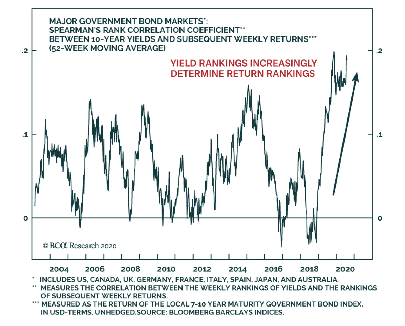
We’re All Yield Chasers Now
We’re All Yield Chasers Now
In Chart 5, we show the 2020 year-to-date government bond returns, for the 7-10 year maturity bucket, for the countries we include in our model bond portfolio (the US, Germany, France, Italy, Spain, the UK, Japan, Canada and Australia). The returns are shown both currency unhedged (in USD terms) and hedged into US dollars, with the yield levels from the start of 2020 shown at the top of each bar. The ranking of the returns does generally follow the ranking of yields at the start of the year – the US, Canada, Australia and Italy outperforming low-yielding Germany, France and Japan. What is more interesting is how that correlation between yield levels and performance has evolved over the course of 2020, and even dating back to 2019. If a dynamic of strict yield chasing behavior was gaining steam, then the performance rankings of government bonds should increasingly reflect the rankings of available yields. One way to measure such a dynamic is with a statistic called a Spearman’s rank correlation. Simply put, the Spearman’s rank shows the correlation between the rankings of two sets of variables within each set, rather than the correlation of the variables themselves. If the correlation between the rankings is increasing, this suggests that the relationship between the two variables is becoming more dependent on the levels of the variables relative to each other. We present the Spearman’s rank correlation between yield levels and subsequent bond returns for the nine countries in our model bond portfolio universe in Chart 6. Weekly correlations are calculated using the ranking of the 10-year government bond yields from those nine countries and the rankings of the subsequent weekly total returns (currency unhedged) for those same markets. We present a rolling 52-week correlation coefficient in the chart, which shows a steadily rising trend over the past year of relative bond market performance becoming more dependent on relative initial yield levels. Chart 6High' Yielders Are The Winners In A Low-Yield Environment
High' Yielders Are The Winners In A Low-Yield Environment
High' Yielders Are The Winners In A Low-Yield Environment
While the Spearman’s rank correlation is still relatively low, around 0.2 on the latest data point of the 52-week moving average, that does represent the highest level seen over the past two decades. On the margin, the more recent observations are showing an even higher level of correlation – a trend that should continue given the current easy global monetary policy settings described above that should continue to promote yield-chasing behavior. Another way to measure how much more yield driven government bond markets have become is to look at the relative performance of investment strategies that focus on allocations informed by yield levels. A simple such strategy is presented in Chart 7, using a rule of going long the highest yielding 10-year bond in our list of nine countries at the start of each week and holding only that bond for the subsequent week. We show the return of that simple strategy relative to the return Bloomberg Barclays 7-10 year Global Treasury index in the top panel of the chart, all measured in US dollars on an unhedged basis. The simple strategy of picking the highest yielding bond has been delivering solid outperformance versus the benchmark over the past 2-3 years, with year-over-year relative returns of between 5-10%. The strategy performed very well during the last period similar to today in the post-crisis years of 2012-16, when global policy rates were near 0% and central banks were aggressively expanding their balance sheets through quantitative easing. The year-over-year returns of this simple strategy were always positive during the period (shaded in the chart), which included some major moves in the US dollar that influenced unhedged bond returns. A simple strategy of selecting only the highest yielding government bond has also delivered solid returns of late when focused on other bond maturities besides the 10-year point (Chart 8). The information ratios of these strategies, shown in the chart as the relative year-over-year return of each strategy versus the benchmark compared to the volatility of that relative performance, are all at similar levels in the 0.27-0.94 range. Chart 7Chase The Highest Yields During Global QE & Extended ZIRP
Chase The Highest Yields During Global QE & Extended ZIRP
Chase The Highest Yields During Global QE & Extended ZIRP
Chart 8Yield Chasing Strategies Outperforming Across All Maturities
Yield Chasing Strategies Outperforming Across All Maturities
Yield Chasing Strategies Outperforming Across All Maturities
The efficiency of these strategies will likely not return to the levels seen during that 2012-16 period of extended easy global monetary policy, given the much lower yield levels seen across all bonds including outright negative yields in places like Germany and Japan. However, in a more general sense, selecting higher yielding bonds over lower yielding ones should continue to deliver stronger returns than passive low-yielding benchmarks for as long as policymakers continue to err on the side of reflation (0% rates, more quantitative easing, even yield curve control to limit yields from rising) when setting monetary policy. Selecting higher yielding bonds over lower yielding ones should continue to deliver stronger returns than passive low-yielding benchmarks for as long as policymakers continue to err on the side of reflation. Bottom Line: The correlation of relative global government bond returns and yield levels is becoming more positive. The trend should continue if policymakers stick to their promises to maintain very loose monetary policy settings for at least the next two years, forcing investors to chase scarce yields regardless of cyclical economic and inflation trends. Investment Implications & Alterations To Our Model Bond Portfolio Chart 9Higher-Yielding Government Bonds Will Continue To Shine
Higher-Yielding Government Bonds Will Continue To Shine
Higher-Yielding Government Bonds Will Continue To Shine
The intensified yield chasing behavior has obvious implications for fixed income investors. Within dedicated global government bond portfolios, exposures should be concentrated in higher yielding markets at the expense of the low yielders. Already, the relative returns year-to-date (on a USD-hedged and duration-matched basis versus the Global Treasury index) reflect that conclusion, with the US (+692bps versus the index), Canada (+458bps) and Italy (+87bps) outperforming and Germany (-111bps), France (-77bps) and Japan (-472bps) lagging (Chart 9). Our current investment recommendations, both on a medium-term strategic basis and within our more flexible model bond portfolio, are generally in line with those rankings. Our recommendations already include overweights in the US, Canada, Italy and the UK; with underweights in Germany, France and Japan. We are currently neutral Spain and Australia. The view on Spain was a relative value consideration, as we preferred an overweight on Italy as our recommended exposure within the European peripherals. For Australia, we closed our long-standing overweight stance there back in May, primarily due to signs that the Australian economy was showing signs of recovery after what was a very modest initial wave of COVID-19 cases.3 Now, we see good reasons to upgrade Spain and Australia to overweight to gain even more exposure to high-yielding government bonds in a yield-scarce, yield-chasing world. Our recommendations already include overweights in the US, Canada, Italy and the UK; with underweights in Germany, France and Japan. In Chart 10, we present a scatter chart showing 10-year government bond yields, hedged into US dollars, plotted versus the latest trailing 1-year beta of yield changes to those of the 7-10 maturity bucket for the Global Treasury index. This is a simple way to present a reward versus risk relationship, using the yield beta as the measure of risk. The chart shows that Spain and Australia offer relatively attractive yields compared to other markets with similar yield betas. This offers a way to boost the expected yield from our recommended portfolio without raising the yield beta of the portfolio. Chart 10Upgrade Spain & Australia, Downgrade The UK In Global Bond Portfolios
We’re All Yield Chasers Now
We’re All Yield Chasers Now
Specifically, we see two allocation changes that can be made to our model bond portfolio to reflect this view on relative yields: Upgrade Spain to overweight, while reducing the weight on UK Gilts to neutral Upgrade Australia to overweight, funded by reducing the German underweight allocation even further. We see good reasons to upgrade Spain and Australia to overweight to gain even more exposure to high-yielding government bonds in a yield-scarce, yield-chasing world. The USD-hedged yield pickup on both of those switches is substantial, as can be seen in Table 1 where we present unhedged and USD-hedged yields for 2-year, 5-year, 10-year and 30-year government bonds across all developed markets. Switching from the UK to Spain generates a modest yield pick-up on an unhedged basis at the 10-year and 30-year maturity points. The pickup is far more attractive across all maturity points on a USD-hedged basis, ranging from +22bps for 2-year maturities to +101bps for 30-year bonds. Table 1Developed Market Bond Yields, Both Unhedged & Hedged Into USD
We’re All Yield Chasers Now
We’re All Yield Chasers Now
In fact, UK Gilt yields across the entire maturity spectrum are now some of the lowest on offer within the developed market space, both on an unhedged and USD hedged basis. This alone is enough reason to downgrade Gilt exposure, especially with the Bank of England continuing to shoot down the notion of a move to negative UK policy rates that could also drive longer-dated Gilt yields into negative territory. As for Australia, the recent severe COVID-19 outbreak in Melbourne, the country’s second largest city, has raised fears that a new and more extended period of lockdowns may be necessary Down Under. This goes against our original thesis for downgrading Australian bond exposure a few months ago, thus a return to overweight as a yield pickup also makes sense on a fundamental basis – particularly with the RBA already using extreme measures like yield curve control to anchor the level of 3-year Australian bond yields from the short end of the curve. The yield pick-up from our recommended switch from Germany to Australia is significant from the 2-year to 30-year maturity points, ranging between 94bps to 182bps on an unhedged basis and 20bps to 109bps on a USD-hedged basis. The changes to our recommended country allocations in our model bond portfolio can be found on pages 12-13. Bottom Line: Maintain overweights to higher-yielding government bonds (Italy, the US, Canada) versus low-yielders (Germany, France, Japan) within USD-hedged fixed income portfolios. Upgrade higher-yielders Spain and Australia to overweight, at the expense of the low-yielding UK and Germany. Robert Robis, CFA Chief Fixed Income Strategist rrobis@bcaresearch.com Footnotes 1 Please see BCA Research Global Fixed Income Strategy Weekly Report, "Are Bond Markets Throwing In The Towel On Long-Term Growth?", dated August 4, 2020, available at gfis.bcaresearch.com. 2 The bid-ask spreads shown are taken from the Bank of England’s latest Financial Stability Review, available here: https://www.bankofengland.co.uk/-/media/boe/files/financial-stability-report/2020/august-2020.pdf 3 Please see BCA Research Global Fixed Income Strategy Special Report, "Australia: All Good Streaks Must Come To An End", dated May 13, 2020, available at gfis.bcaresearch.com. Recommendations
We’re All Yield Chasers Now
We’re All Yield Chasers Now
Duration Regional Allocation Spread Product Tactical Trades Yields & Returns Global Bond Yields Historical Returns
BCA Research's European Investment Strategy service believes that the 30-year bond yield is the driving variable in financial markets right now. The relative performance of banks has closely tracked the collapse in the 30-year yield, because the collapsed…
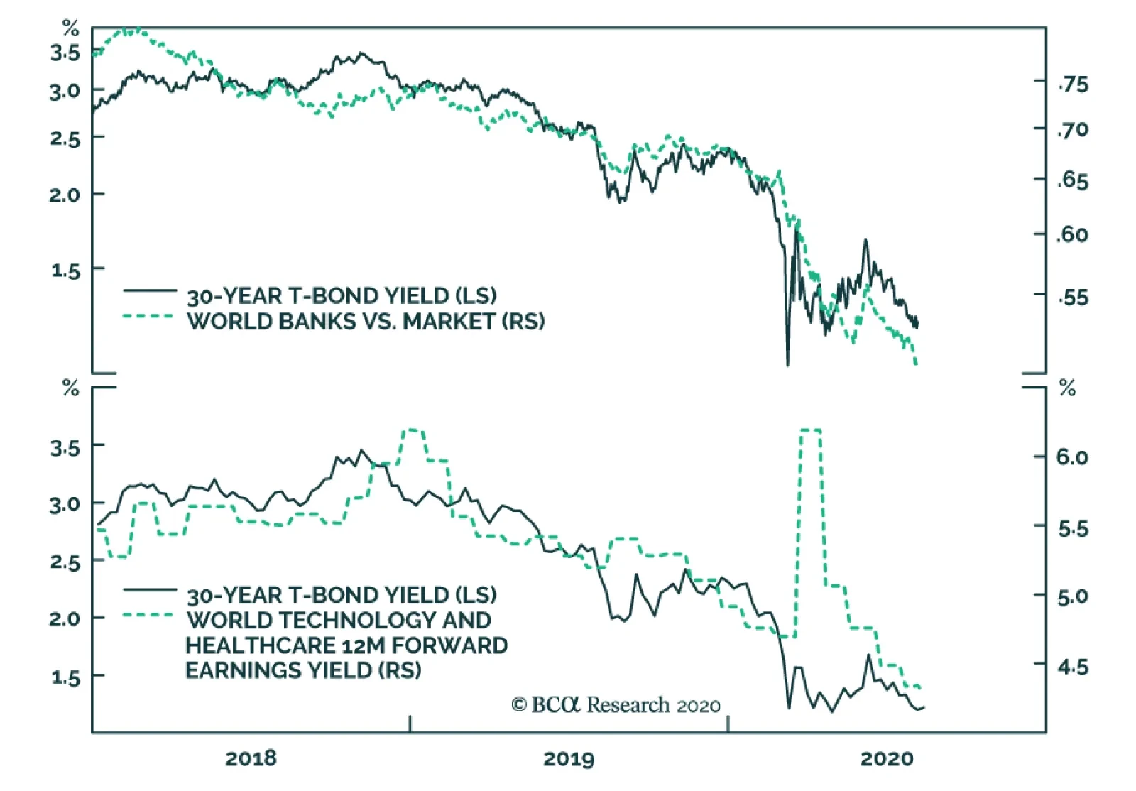
Please note that we will be on our summer holidays next week. Our next report will come out on August 20. Highlights The 30-year bond yield is the puppet master pulling the strings of all other investments. Where 30-year bond yields are still far from the lower bound, they will ultimately get a lot closer. Continue to overweight 30-year bonds in the US and periphery Europe versus 30-year bonds in core Europe. Continue to overweight the US stock market versus the European stock market. An expected near-term setback to stocks versus bonds will briefly pause the European currency rally. The gold rally is also due a pause, given that it is overstretched relative to the decline in the real bond yield. Fractal trade: Long USD/PLN. Feature Chart I-1AThe Collapsed 30-Year Bond Yield Explains The Collapse Of Banks...
The Collapsed 30-Year Bond Yield Explains The Collapse Of Banks...
The Collapsed 30-Year Bond Yield Explains The Collapse Of Banks...
Chart I-1B...And The Collapsed Earnings Yield (Surging Valuation) Of Tech And Healthcare
...And The Collapsed Earnings Yield (Surging Valuation) Of Tech And Healthcare
...And The Collapsed Earnings Yield (Surging Valuation) Of Tech And Healthcare
The abiding mantra of this publication is that investment is complex, but it is not complicated. By complex, we mean that the financial markets are not fully predictable or analysable. By not complicated, we mean that the relative prices of everything are inextricably connected, rather like the movements of a puppet. All you need to do is find the puppet master pulling the strings. Right now, the puppet master is the 30-year bond. The Real Action Is In 30-Year Bonds While most people are focussing on the 10-year bond yield, the real action has been at the ultra-long 30-year maturity. In the US and periphery Europe, 30-year yields are within a whisker of all-time lows. Yet these ultra-long bond yields are still well above those in core Europe which are much closer to the lower bound. The upshot is that while all yields have equal scope to rise, yields have more scope to fall further in the US and periphery Europe than in core Europe (Chart I-2 and Chart I-3). Chart I-230-Year Yields In The US And Periphery Europe...
30-Year Yields In The US And Periphery Europe...
30-Year Yields In The US And Periphery Europe...
Chart I-3...Are Still Well Above Those In ##br##Core Europe
...Are Still Well Above Those In Core Europe
...Are Still Well Above Those In Core Europe
This simple asymmetry has created a winning relative value strategy that will keep on winning. Overweight 30-year bonds in the US and periphery Europe versus 30-year bonds in core Europe. Our preferred expression is to overweight 30-year bonds in the US and Spain versus Germany and France. Bond yields have more scope to fall further in the US and periphery Europe than in core Europe. Remarkably, in the US, the 10-year real yield is also tightly tracking the 30-year nominal yield (minus a constant 2.2 percent) (Chart I-4). Using a little algebra, this means that the market’s 10-year inflation expectation is just a steady-state value of 2.2 percent minus a shortfall equalling the shortfall in the 10-year nominal yield versus the 30-year nominal yield (Chart I-5). Chart I-4The 10-Year Real Yield Is Just ##br##Tracking The 30-Year Nominal ##br##Yield
The 10-Year Real Yield Is Just Tracking The 30-Year Nominal Yield
The 10-Year Real Yield Is Just Tracking The 30-Year Nominal Yield
Chart I-5The 10-Year Inflation Expectation Can Be Derived From The 30-Year And 10-Year Nominal Yields
The 10-Year Inflation Expectation Can Be Derived From The 30-Year And 10-Year Nominal Yields
The 10-Year Inflation Expectation Can Be Derived From The 30-Year And 10-Year Nominal Yields
10-year inflation expectation = 2.2 – (30-year nominal yield – 10-year nominal yield) The reason that this is remarkable is we can explain the trend in inflation expectations from just the 30-year and 10-year nominal yields, and nothing more. In turn, gold is tightly tracking the inverted real yield, as it theoretically should. Gold, which generates no yield, becomes relatively more valuable as the real yield on other assets diminishes (Chart I-6). Having said that, the most recent surge in the gold price is stretched relative to its relationship with the real bond yield, suggesting that the strong rally in gold is due a pause (Chart I-7). Chart I-6Gold Is Just Tracking The (Inverted) Real Yield...
Gold Is Just Tracking The (Inverted) Real Yield...
Gold Is Just Tracking The (Inverted) Real Yield...
Chart I-7...But Gold's Most Recent Surge Is ##br##Stretched
...But Gold's Most Recent Surge Is Stretched
...But Gold's Most Recent Surge Is Stretched
The 30-Year Bond Is Driving Stock Markets Moving to the stock market, bank relative performance has closely tracked the collapse in the 30-year yield, because the collapsed bond yield signals both weaker bank credit growth and a likely increase in banks’ non-performing loans (Chart of the Week, left panel). Banks and other ‘value cyclicals’ whose cashflows are in terminal decline are highly sensitive to the prospects for near-term cashflows, which are under severe pressure in the pandemic era. At the same time, as the distant cashflows are small, the banks’ share prices are less sensitive to the uplifted net present values of these distant cashflows that come from lower bond yields. In contrast, technology, healthcare and other ‘growth defensives’ generate a growing stream of cashflows. Making their net present values highly sensitive to a change in the bond yield used to discount those large distant cashflows. The profits of the tech and healthcare sectors are proving to be highly resilient in the pandemic era. Through 2018, the 30-year yield went up by 1 percent, so the forward earnings yield of growth defensives went up by 1 percent (their valuations fell). Subsequently, the 30-year yield has collapsed by 2 percent, so unsurprisingly the forward earnings yield of growth defensives has also collapsed by 2 percent (their valuations have surged). To repeat, financial markets are not complicated (Chart of the Week, right panel). Moreover, the profits of the growth defensives are proving to be highly resilient in the pandemic era, holding up well in the worst shock to demand since the Great Depression. The combination of resilient profits with higher valuations explains why the technology and healthcare sectors are reaching new highs, while the rest of the stock market is going nowhere (Chart I-8). Chart I-8Tech And Healthcare At New Highs While The Rest Of The Market Languishes
Tech And Healthcare At New Highs While The Rest Of The Market Languishes
Tech And Healthcare At New Highs While The Rest Of The Market Languishes
Meanwhile, the relative performance of stock markets is also uncomplicated. It just stems from the relative exposure to the high-flying growth defensive sectors. Compared with Europe, the US has a 20 percent larger exposure to technology and healthcare (Chart I-9). Which is all you need to explain the consistent outperformance of the US versus Europe (Chart I-10). Chart I-9The US Is 20 Percent Over-Exposed To Tech And Healthcare...
The US Is 20 Percent Over-Exposed To Tech And Healthcare...
The US Is 20 Percent Over-Exposed To Tech And Healthcare...
Chart I-10...Which Explains Its Consistent Outperformance Versus Europe
...Which Explains Its Consistent Outperformance Versus Europe
...Which Explains Its Consistent Outperformance Versus Europe
A Quick Comment On European Currencies And The Dollar Turning to the foreign exchange market, the recent rally in European currencies can at least partly be explained as a sell-off in the dollar. Begging the question, what is behind the dollar’s recent weakness? The dollar has moved as a mirror-image of the global stock market. For the broad dollar index, the explanation is quite straightforward. True to its traditional role as a haven currency, the dollar has moved as a mirror-image of the global stock market, measured by the MSCI All Country World Index (in local currencies). Simply put, as the stock market has shaken off its year-to-date losses, the dollar has shaken off its year-to-date gains (Chart I-11). Chart I-11The Dollar Has Just Tracked The (Inverted) Stock Market
The Dollar Has Just Tracked The (Inverted) Stock Market
The Dollar Has Just Tracked The (Inverted) Stock Market
Looking ahead, we can link the prospects of currencies to the outlook for 30-year bond yields. A further compression in yields will weaken the dollar, and help European currencies, in two ways. First, as already mentioned, yields have more scope to decline in the US than in core Europe, and a fading US yield premium will weigh on the dollar. Second, to the extent that the lower yields can prevent a protracted bear market in stocks and other risk-assets, non-haven currencies can perform well versus the haven dollar. Having said that, an expected near-term setback to stocks versus bonds will briefly pause the European currency rally. Concluding Remarks The charts in this report should leave you in no doubt that the 30-year bond yield – particularly in the US – is the puppet master pulling the strings of all investments: bond market relative performance, real bond yields, gold, banks, growth defensives, equity market relative performance, and major currencies. Which raises the crucial question, can the downtrend in 30-year bond yields continue? Yes, absent an imminent vaccine or treatment for Covid-19, the downtrend in yields can continue. As we explained last week in An Economy Without Mouths And Noses Will Lose 10 Percent Of Jobs, the spectre of mass unemployment is looming large. Specifically, the major threat to the jobs market lies in the coming months when government lifelines to employers – such as state-subsidised furlough schemes – are cut or weakened. Where 30-year bond yields are still far from the lower bound, they will ultimately get a lot closer. Hence, it is inevitable that those central banks that can become more dovish will become more dovish. Given the political difficulties of using fiscal policy bullets, the lessons from Japan and Europe are that the monetary policy bullets get fully expended first. In practical terms, this means that where 30-year bond yields are still far from the lower bound, they will ultimately get a lot closer. The upshot is that core European bonds will continue to underperform US bonds, and that the European stock market will continue to underperform the US stock market. European currencies will trend higher versus the dollar, albeit a setback to stocks versus bonds is a near-term risk to the European currency uptrend. Fractal Trading System* This week’s recommended trade is to play a potential countertrend move in the dollar via long USD/PLN. The profit target and symmetrical stop-loss is set at 4 percent. The rolling 1-year win ratio now stands at 57 percent. Chart I-12USD/PLN
USD/PLN
USD/PLN
When the fractal dimension approaches the lower limit after an investment has been in an established trend it is a potential trigger for a liquidity-triggered trend reversal. Therefore, open a countertrend position. The profit target is a one-third reversal of the preceding 13-week move. Apply a symmetrical stop-loss. Close the position at the profit target or stop-loss. Otherwise close the position after 13 weeks. * For more details please see the European Investment Strategy Special Report “Fractals, Liquidity & A Trading Model,” dated December 11, 2014, available at eis.bcaresearch.com. Dhaval Joshi Chief European Investment Strategist dhaval@bcaresearch.com Fractal Trading System Cyclical Recommendations Structural Recommendations Closed Fractal Trades Trades Closed Trades Asset Performance Currency & Bond Equity Sector Country Equity Indicators Bond Yields Chart II-1Indicators To Watch - Bond Yields
Indicators To Watch - Bond Yields
Indicators To Watch - Bond Yields
Chart II-2Indicators To Watch - Bond Yields
Indicators To Watch - Bond Yields
Indicators To Watch - Bond Yields
Chart II-3Indicators To Watch - Bond Yields
Indicators To Watch - Bond Yields
Indicators To Watch - Bond Yields
Chart II-4Indicators To Watch - Bond Yields
Indicators To Watch - Bond Yields
Indicators To Watch - Bond Yields
Interest Rate Chart II-5Indicators To Watch - Interest Rate Expectations
Indicators To Watch - Interest Rate Expectations
Indicators To Watch - Interest Rate Expectations
Chart II-6Indicators To Watch - Interest Rate Expectations
Indicators To Watch - Interest Rate Expectations
Indicators To Watch - Interest Rate Expectations
Chart II-7Indicators To Watch - Interest Rate Expectations
Indicators To Watch - Interest Rate Expectations
Indicators To Watch - Interest Rate Expectations
Chart II-8Indicators To Watch - Interest Rate Expectations
Indicators To Watch - Interest Rate Expectations
Indicators To Watch - Interest Rate Expectations
Highlights A buildup in industrial inventory may temporarily slow down China’s commodity imports over the next month or two. Last week’s Politburo meeting stated that policy supports will remain in place for 2H20, despite a rising policy rate. We think the policy rate normalization will not imminently reverse the credit impulse; strong bank lending growth will be sustained and fiscal support will likely accelerate through Q3. The liquidity-driven hype in Chinese equities may be waning, but improving economic fundamentals should support a continued bull run (in both absolute and relative terms) for the rest of this year. Feature July’s official PMI indicates that China's economic recovery remains two-tracked, with a rebound in the supply side outpacing demand and investment outpacing consumption. This uneven improvement in the economy may lead to some inventory buildup in July and August. Nevertheless, both production and demand have grown steadily and should continue to pick up in the rest of the year, ahead of other major economies.1 The annual mid-year Politburo meeting last week indicates that the monetary and fiscal policies will remain accommodative through the end of 2020. Chinese policymakers also emphasized the importance of reviving domestic demand and consumption in H2. While we have seen a rising interbank rate since late April, the current growth in credit should be sustained at least through Q3. Moreover, we expect fiscal spending to accelerate in H2 and boost infrastructure investment growth even higher. The authorities’ stringent regulations on equity margin lending may curb speculation in the financial markets. However, stronger economic fundamentals in the second half of 2020 bodes well for China’s equity performance, particularly for cyclical stocks on a 6-12 month time horizon. Tables 1 and 2 present key developments in China’s economic and financial market performance over the past month, and we highlight several developments below: Table 1China Macro Data Summary
China Macro And Market Review
China Macro And Market Review
Table 2China Financial Market Performance Summary
China Macro And Market Review
China Macro And Market Review
Chart 1Export Growth Has Been Beating Expectations (And Our Model)
Export Growth Has Been Beating Expectations (And Our Model)
Export Growth Has Been Beating Expectations (And Our Model)
China’s official manufacturing PMI rose to 51.1 in July, beating the market consensus. The export order subcomponent of the PMI rebounded substantially last month, although it remains below the 50 percent boom-bust threshold (Chart 1). Recent high-frequency data in the US suggests that America’s economic and consumption recovery may be stalling.2 While weak economic improvement in major global economies will be a drag on external demand for consumer and capital goods, we expect that China’s export growth will continue to be supported by the pandemic-related need for medical supplies. Both the production and demand subcomponents of the PMI improved in July, but the demand side was outpaced by the supply side. This has led to a significant uptick in the finished-goods inventory subcomponent, which is the first advance in four months (Chart 2). The acceleration in post-lockdown construction activity in Q2 and exceptionally low commodity prices have driven up China’s imports of major commodities, such as steel, copper and crude oil. In turn, industrial inventories remained at their highest levels since late 2017 (Chart 3). This suggests that an inventory destocking and delay in construction activity in the flood-stricken southern part of China may hold back commodity import growth in August and possibly September. Chart 2Faster Production Rebound Leads To A Pickup In Inventory
Faster Production Rebound Leads To A Pickup In Inventory
Faster Production Rebound Leads To A Pickup In Inventory
Chart 3High Product Inventories May Curb Commodity Imports In Q3
High Product Inventories May Curb Commodity Imports In Q3
High Product Inventories May Curb Commodity Imports In Q3
Chart 4Chinese Demand For Commodities Remains Strong
Chinese Demand For Commodities Remains Strong
Chinese Demand For Commodities Remains Strong
Despite this, any moderation in China’s imports should be temporary. Industrial profit growth sprung back sharply in June. Rejuvenated growth in China’s industrial profits is crucial for fixed-asset investment and demand for durable goods, which would allow imports of commodities to remain robust in most of H2 this year (Chart 4). Statements from the mid-year Politburo meeting highlighted that “monetary policy will be more flexible and targeted in 2H20; and that the PBoC will focus on guiding the loan primary rate (LPR) lower to reduce financing costs for enterprises, particularly to the manufacturing sector and the SMEs.” Since late April, the 3-month SHIBOR (the de facto policy rate) has been rising, though it remains at a historic low. Our take is that the authorities intend to normalize liquidity conditions in the interbank system, at least for the time being, to curb financial institutions’ speculative activities (Chart 5). Even though the rising policy rate has pushed up both government and corporate bond yields, it does not necessarily lead to an imminent tightening in credit growth. Instead, we expect bank lending and fiscal spending to accelerate. Even if the 3-month SHIBOR decisively bottomed in April, the momentum in credit growth should continue through Q3 and possibly peak in October (Chart 6). Our view is based on the following: Chart 5Policymakers May Be Trying To Curb "Animal Spirits"...
Policymakers May Be Trying To Curb "Animal Spirits"...
Policymakers May Be Trying To Curb "Animal Spirits"...
Chart 6...Without Stopping Capitals From Flowing To The Real Economy
...Without Stopping Capitals From Flowing To The Real Economy
...Without Stopping Capitals From Flowing To The Real Economy
The rising policy rate and corporate bond yields do not seem to affect the amount of corporate bonds being issued. Moreover, corporate bond issuance as a share of total social financing has been flat since 2016 and remains small relative to bank lending (Chart 7, top and middle panels) On the other hand, the local government bonds’ share of total social financing has been rising since 2016 (Chart 7, middle panel). Since the amount of local government bonds issued is set at the annual National People’s Congress, a rising policy rate and bond yields have little effect on this segment of total social financing. Last week’s Politburo meeting called for local governments to speed up their special purpose bonds (SPB) issuance and complete the 3.75 trillion yuan annual quota by the end of October. The government bond issuance in July was dominated by special COVID-19 relief treasury bonds (STB), therefore, the SPB issuance will be concentrated in August to October. Based on our estimates, the average SPB issuance may reach 500 billion yuan per month in August through October, a more than 30% increase from the average monthly issuance in H1 this year. The largest share in total social financing is bank lending, which has not correlated with the policy rate since 2016 (Chart 7, bottom panel). Instead, bank loan growth and lending rates are affected by the LPR, which rate policymakers vow to guide further downwards (Chart 8). Additionally, the PBoC signaled that bank lending in 2020 is targeted at 20 trillion yuan. This leaves the second half of 2020 with a minimum of 40% of the target, or 8 trillion yuan of newly increased bank lending. To complete this annual target, according to our calculations, the growth rate of bank lending in 2H20 will need to reach at least 13% on an annual basis. This would equal to the annual growth in bank lending seen in H1. Chart 7Fiscal Support Will Accelerate
Fiscal Support Will Accelerate
Fiscal Support Will Accelerate
Chart 8Bank Loans Should Accelerate Too When Lending Rates Are Lower
Bank Loans Should Accelerate Too When Lending Rates Are Lower
Bank Loans Should Accelerate Too When Lending Rates Are Lower
China’s domestic and investable stocks dropped by 2% and 4%, respectively, from their peaks in early July, a technical correction that was mainly driven by market concerns that Chinese policymakers will withdraw stimulus too soon. China’s policymakers have indeed tightened interbank liquidity conditions and adopted more stringent measures to curb speculative behavior in the financial markets. However, we think the strong credit growth and fiscal stimulus will continue in the second half of the year, and will provide substantial support to boost China’s economic growth. As shown in Chart 9 (top panel), there has not been a steady correlation between China’s policy rate and equity performance. Rather, economic fundamentals are still the main driver for stock performance on a cyclical basis (6-12 month) (Chart 9, bottom panel). The multiples in Chinese stocks are not too elevated compared with their global peers (Chart 10A,10B, and 10C). Moreover, Chinese cyclical stocks have outperformed defensives, enhancing our cyclical bullish view on stocks in both absolute and relative terms (Chart 11). Chart 9Chinese Equity Performances Are More Correlated With Economic Fundamentals Than Policy Rate
Chinese Equity Performances Are More Correlated With Economic Fundamentals Than Policy Rate
Chinese Equity Performances Are More Correlated With Economic Fundamentals Than Policy Rate
Chart 10AChinese A Shares Are Not Too Decoupled From Economic Fundamentals
Chinese A Shares Are Not Too Decoupled From Economic Fundamentals
Chinese A Shares Are Not Too Decoupled From Economic Fundamentals
Chart 10BChinese Offshore Stocks Are More Driven By Multiple Expansions...
Chinese Offshore Stocks Are More Driven By Multiple Expansions...
Chinese Offshore Stocks Are More Driven By Multiple Expansions...
Chart 10C...But Still Not As Much As Their Global Peers
...But Still Not As Much As Their Global Peers
...But Still Not As Much As Their Global Peers
Chart 11Cyclical Stocks Are Having The Upper Hand
Cyclical Stocks Are Having The Upper Hand
Cyclical Stocks Are Having The Upper Hand
Qingyun Xu, CFA Senior Analyst qingyunx@bcaresearch.com Jing Sima China Strategist jings@bcaresearch.com Footnotes 1Please see Global Investment Strategy Outlook "Third Quarter 2020 Strategy Outlook: Navigating The Second Wave," dated June 30, 2020, available at gis.bcaresearch.com 2Please see Daily Insights "A Bumpy Recovery, But Stocks Have Room To Run," dated July 31, 2020, available at bcaresearch.com Cyclical Investment Stance Equity Sector Recommendations