Fixed Income
BCA Research's Global Fixed Income Strategy service concludes that the growing divide between falling negative real bond yields and rising inflation expectations in major developed economies may be a sign of investors pricing in slower long-run potential…

Highlights Global Bond Yields: The growing divide between falling negative real bond yields and rising inflation expectations in the US and other major developed economies may be a sign of investors pricing in slower long-run potential economic growth in the aftermath of the COVID-19 recession – and, thus, lower equilibrium real interest rates. Stay overweight inflation-linked bonds versus nominal equivalents. Currency-hedged spread product: A broad ranking of currency-hedged global spread product yields, adjusted for volatility and credit quality, shows that the most attractive yields (hedged into USD, EUR, GBP and JPY) are on offer in emerging market USD-denominated investment grade corporates and high-yield company debt in the US and UK. Feature Global bond yields are testing the downside of the narrow trading ranges that have persisted since May. As of last Friday, the yield on the Bloomberg Barclays Global Treasury index was at 0.41%, only 3 basis points (bps) above the 2020 low seen back in March. The 10-year US Treasury yield closed yesterday at 0.56%, only 6bps above the year-to-date low. Chart of the Week
A Massive Shock To Growth ... And Interest Rates
A Massive Shock To Growth ... And Interest Rates
Concerns about global growth, with the number of new COVID-19 cases still surging in the US and new breakouts occurring in countries like Spain and Australia, would seem to be the logical culprit for the decline in yields. The first reads on global GDP data for the 2nd quarter released last week were historically miserable, with declines of -33% (annualized) in the US and -10% in the euro area (non-annualized). That represents a very deep hole of lost output, literally wiping out several years of growth. Even with the sharp improvements seen recently in cyclical indicators like global manufacturing PMIs, especially in China and Europe, a return to pre-pandemic levels of global economic output is many years away. Central banks will have no choice but to keep policy rates near 0% for at last the next couple of years, as is the current forward guidance provided by the Fed, ECB and others. Lower global bond yields may simply be reflecting the reality that it will take a long time to heal the economic wounds from the pandemic. However, there may be a more insidious reason why bond yields are falling. Investors may be permanently marking down their expectations for long-term potential economic growth, and equilibrium interest rates, in response to the devastation caused by the COVID-19 recession. Last week, Fitch Ratings lowered its estimates for long-term potential GDP growth, used to determine sovereign credit ratings, by 0.5 percentage points for the US (now 1.4%), 0.5 percentage points for the euro area (now 0.7%) and 0.7 percentage points in the UK (now 0.7%).1 These are declines similar in magnitude to the plunge in the OECD’s potential growth rate estimates seen after the 2009 Great Recession (Chart of the Week). Bond yields in the US and Europe witnessed a fundamental repricing in response, with nominal 5-year yields, 5-years forward breaking 200bps below the 4-6% range that prevailed in the US and Europe during the decade prior to the Great Recession. A similar re-rating of global bond yields to structurally lower levels may now be happening, with investors now believing that central banks will have difficulty raising rates much (if at all) in the future - even after the pandemic has ended. The Message From Declining Negative Real Bond Yields Chart 2The Real Rate/Breakevens Divergence Continues
The Real Rate/Breakevens Divergence Continues
The Real Rate/Breakevens Divergence Continues
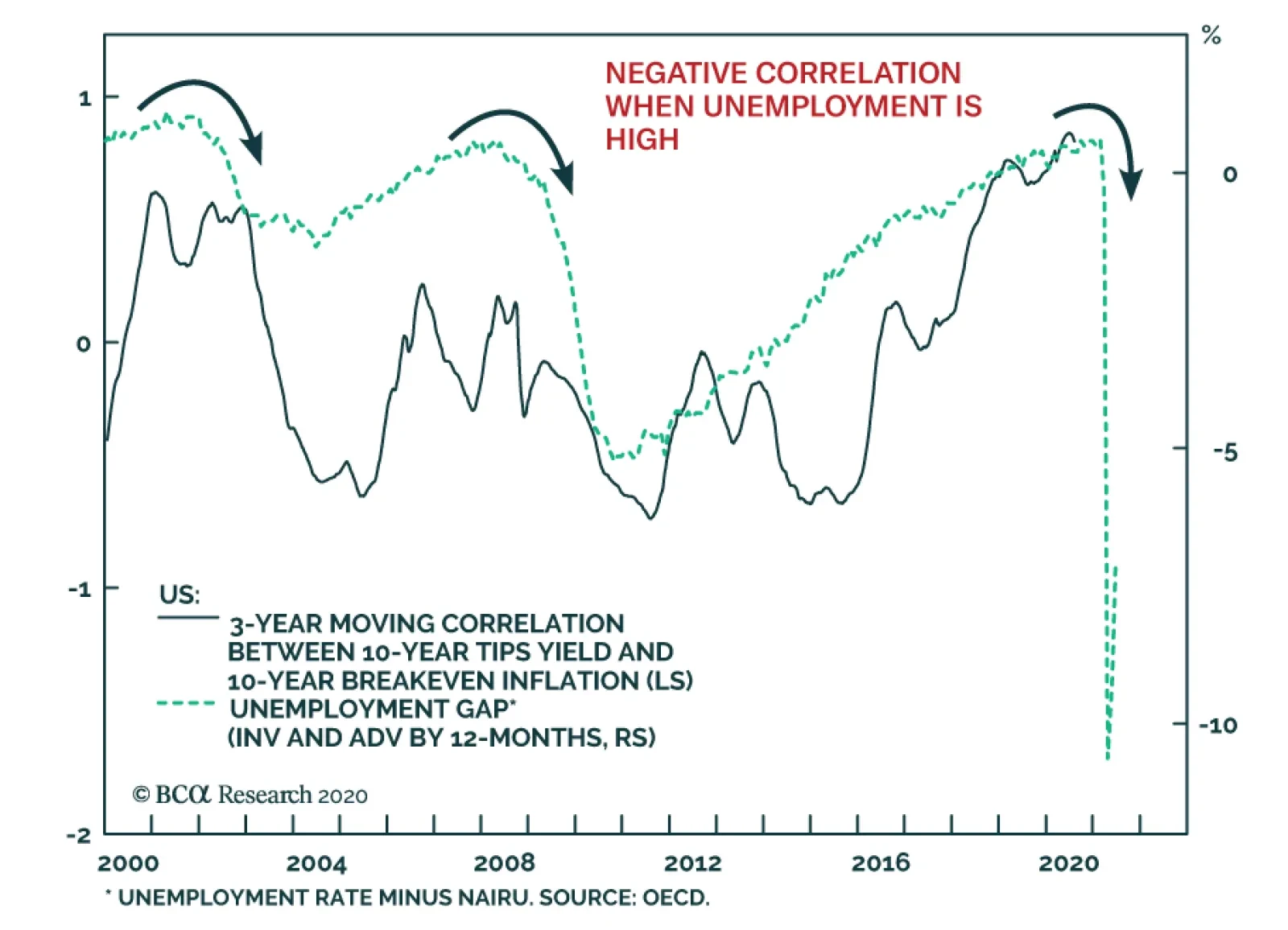
The typical signals about economic growth from government bond yields are now less clear because of the aggressive policy responses to the COVID-19 crisis. 0% policy rates, dovish forward guidance on the timing of any future rate increases, large scale asset purchases (QE), and more extreme measures like yield curve control to peg bond yields, have all acted to suppress the level and volatility of nominal global bond yields. Within those calm nominal yields, however, the dynamic that has been in place since May - rising inflation breakevens and falling real bond yields – is growing in intensity. The 10-year US TIPS real yield is now at a new all-time low of -1.02%, while the 10-year TIPS breakeven is now up to 1.58%, the highest since February before the pandemic began to roil financial markets (Chart 2). Similar trends are evident in most other major developed economy bond markets, with the gap between falling real yields and widening breakevens growing at a notably faster pace in Canada and Australia. More often than not, longer-term real yields tend to move in the same direction as inflation expectations when economic growth is improving. The former responds to faster economic activity, often with an associated pick up in private sector credit demand. At the same time, rising inflation expectations discount higher economic resource utilization (i.e. lower unemployment) and confidence that inflation will start to pick up. A deeply negative correlation between longer-term real yields and inflation expectations is unusual, but not unprecedented. A deeply negative correlation between longer-term real yields and inflation expectations is unusual, but not unprecedented. In Chart 3, we show the range of rolling three-year correlations between 10-year inflation-linked (real) government bond yields and 10-year inflation breakevens in the US, Germany, France, Italy, the UK, Japan, Canada and Australia for the post-crisis period. The triangles in the chart are the latest three-year correlation, while the diamonds are a more recent measure showing the 13-week correlation. There are a few key takeaways from this chart: Chart 3Negative Real Yield/Breakevens Correlations Are Not Unprecedented
Are Bond Markets Throwing In The Towel On Long-Term Growth?
Are Bond Markets Throwing In The Towel On Long-Term Growth?
All countries shown have experienced a sustained period of negative correlation between real yields and inflation breakevens; The correlation has mostly been positive in Australia and has always been negative in Japan; Most importantly, the deeply negative correlations seen over the past three months – with rising breakevens all but fully offsetting falling real yields – are at or below the range of historical experience for all countries shown. Chart 4TIPS Yields May Stay Negative For Some Time
TIPS Yields May Stay Negative For Some Time
TIPS Yields May Stay Negative For Some Time
In the current virus-stricken world, where many businesses that have closed during the pandemic may never reopen, there will be abundant spare global economic capacity for several years. In the US, measures of spare capacity like the unemployment gap (the unemployment rate minus the full-employment NAIRU rate) have been a reliable leading directional indicator of the long-run correlation between real TIPS yields and TIPS breakevens over the past decade (Chart 4). The surge in US unemployment seen since the spring, which has pushed the jobless rate into double-digit territory, suggests that the current deeply negative correlation between US real yields and inflation breakevens can persist over the next 6-12 months. Given the large increases in unemployment seen in other countries, the negative correlations between real yields and inflation breakevens should also continue outside the US. As for inflation expectations, those remain correlated in the short-run to changes in oil prices and exchange rates in all countries. On that front, there is still some room for breakevens to widen to reach the fair value levels implied by our models.2 A good conceptual way to think about inflation breakevens on a more fundamental level, however, is as a “vote of confidence” in a central bank’s monetary policy stance. If investors perceive policy settings to be too tight, markets will price in slower growth and lower inflation expectations, and vice versa. Every developed market central bank is now setting policy rates near or below 0% - and promising to keep them there until at least the end of 2022. Thus, the trend of rising global inflation breakevens can continue as a reflection of very dovish central banks that will be more tolerant of increases in inflation and not tighten policy pre-emptively. Currently, real 10-year inflation-linked bond yields are below the New York Fed’s estimates of the neutral real short-term rate, or “r-star”, in the US and the UK (Chart 5), as well as in the euro area and Canada (Chart 6).3 In the US and euro area, real yields have followed the broad trend of r-star, but the gap between the two is relatively moderate with r-star estimated to be only 0.5% in the US and 0.2% in the euro zone (where the ECB is setting a negative nominal interest rate on European bank deposits at the central bank – a policy choice that the Fed has been very reluctant to consider). Chart 5Negative Real Bond Yields Are Below R* In The US & UK ...
Negative Real Bond Yields Are Below R* In The US & UK ...
Negative Real Bond Yields Are Below R* In The US & UK ...
Chart 6... As Well As In The Euro Area & Canada
... As Well As In The Euro Area & Canada
... As Well As In The Euro Area & Canada
A more interesting study is in the UK where 10yr inflation-linked Gilt yields have fallen below -2.5%, but without the Bank of England implementing any negative nominal policy rates. In the UK, inflation expectations have been relatively high – running in the 2.5-3% range prior to the COVID-19 recession – as the Bank of England has consistently kept overnight interest rates below actual CPI inflation since the 2008 financial crisis. Thus, nominal Gilt yields have stayed relatively low for longer, as real yields and inflation expectations have remained negatively correlated for a long period with the Bank of England maintaining a consistently negative real policy rate. Chart 7Spillovers From Negative TIPS Yields Into Other Assets
Spillovers From Negative TIPS Yields Into Other Assets
Spillovers From Negative TIPS Yields Into Other Assets
If the Fed were to do the same in the US, keeping the funds rate very low even as inflation rises, then a similar dynamic could take place where real TIPS yields continue to fall and TIPS breakevens continue to rise as the market prices in a sustained negative real fed funds rate. That may already be happening, with Fed Chair Jerome Powell hinting last week that the Fed is in the process of completing its inflation strategy review – with a shift towards rate hikes occurring only after realized inflation has sustainably increased to the Fed’s 2% target. A forecast of inflation heading to 2% because of falling unemployment will no longer be enough.4 Other factors may be at work depressing real bond yields while boosting inflation expectations, such as the massive QE bond buying programs of the Fed, ECB and other central banks. Yet even QE programs are essentially an aggressive form of forward guidance designed to drive down longer-term bond yields by lowering expectations of future interest rates. In sum, it is increasingly likely that the current phase of negative global real bond yields may become longer lasting if markets believe that equilibrium real policy rates are now negative. Bond investors will expect central banks to sit on their hands and do nothing in that environment, even if inflation starts to increase. This not only has implications for bond markets, but other asset classes as well based on what is happening in the US. The steady decline in the in the 10-year US TIPS yield has boosted the valuation of assets that typically have been considered inflation hedges, like equities and gold (Chart 7). The fall in TIPS yields also suggests that more weakness in the US dollar is likely to come over the next 6-12 months – another reflationary factor that should help lift global inflation expectations and boost the attractiveness of inflation-linked bonds. The current phase of negative global real bond yields may become longer lasting if markets believe that equilibrium real policy rates are now negative. Bottom Line: The growing divide between falling negative real bond yields and rising inflation expectations in the US and other major developed economies may be a sign of investors pricing in slower long-run potential economic growth in the aftermath of the COVID-19 recession – and, thus, lower equilibrium real interest rates. Stay overweight inflation-linked bonds versus nominal equivalents. Searching For Value In Global Spread Product Last week, we looked at the impact of currency hedging on the attractiveness of government bond yields across the developed markets.5 We concluded that US Treasuries still offered superior yields to most other countries’ sovereign bonds, even with the US dollar in a weakening trend and after hedging out currency risk. We also presented a cursory look at the relative attractiveness of the major global spread product categories in that report, but without factoring in any considerations on the relative credit quality or volatility between sectors. This week, we will look at the relative value of global spread products hedged into USD, GBP, EUR and JPY, but after controlling for those credit and volatility risks. We conducted a similar analysis in early 2018,6 ranking the currency-hedged yields for a wide variety of global spread products by the ratio of yields to trailing volatility. This time, instead of looking at the just that simple valuation metric, we use regression models to make a judgment on how under- or over-valued spread products are relative to their “fair value”. To recap the methodology of this analysis, we take the Bloomberg Barclays index yield-to-maturity (YTM) for each spread product category, hedged into the four currencies used in this analysis, and divide it by the annualized trailing volatility of those yields over both short-term (1-year) and long-term (3-year) windows. In order to hedge the yields into each currency, we used the annualized differentials between spot and 3-month forward exchange rates, which is the all-in cost of hedging. We then compare those currency-hedged, volatility-adjusted yields to two measures of risk: the index credit rating and duration times spread (DTS) for each spread product. Table 1 summarizes the attractiveness of each product when hedged into different currencies. The rank is based on the average of four different valuation measures.7 The higher the rank, the more attractive the sector is in terms of yield relative to risk measures such as both short-term and long-term volatilities, credit ratings, and DTS. Table 1Ranking Currency-Hedged, Risk-Adjusted Global Spread Product Yields
Are Bond Markets Throwing In The Towel On Long-Term Growth?
Are Bond Markets Throwing In The Towel On Long-Term Growth?
A few interesting points come from the table: Emerging market (EM) USD-denominated investment grade (IG) corporate debt ranks at or near the top of the rankings, for all currencies; the opposite holds true for EM USD-denominated sovereign bonds Almost all European spread products rank poorly for non-euro denominated investors US & UK high-yield (HY) rank highly for all currencies US real estate related assets (MBS and CMBS) also rank well for all investor groups In general, US products are more attractive than European credit sectors. This is mainly because US spread products offer higher yields than European ones even after accounting for volatility and the weakening US dollar. Almost all European spread products rank poorly for non-euro denominated investors. Chart 8 shows the unhedged YTM on the x-axis and the option-adjusted spread (OAS) on the y-axis (Table 2 contains the abbreviations used in this chart and all remaining charts in this report). Unsurprisingly, the YTM and OAS follow a very tight linear relationship. However, when yields are hedged into different currencies and risk measures are factored in, the result changes. Chart 8Global Spread Product Yields & Spreads
Are Bond Markets Throwing In The Towel On Long-Term Growth?
Are Bond Markets Throwing In The Towel On Long-Term Growth?
Charts 9A to 12B show the details of spread product analysis with different currency hedges and risk factors. To limit the number of charts shown, we show only currency-hedged yields adjusted by long-term trailing volatility (the rankings do not change significantly when using a shorter-term volatility measure). The y-axis in all charts shows the volatility-adjusted yields, while the x-axis shows credit ratings and DTS. Sectors that are close to upper-right in each chart are more attractive (undervalued), while spread products that are close to bottom-left are less attractive (overvalued). Chart 9AGlobal Spread Product Yields, Hedged Into USD, Adjusted For Credit Quality
Are Bond Markets Throwing In The Towel On Long-Term Growth?
Are Bond Markets Throwing In The Towel On Long-Term Growth?
Chart 9BGlobal Spread Product Yields, Hedged Into USD, Adjusted For Duration-Times-Spread
Are Bond Markets Throwing In The Towel On Long-Term Growth?
Are Bond Markets Throwing In The Towel On Long-Term Growth?
Chart 10AGlobal Spread Product Yields, Hedged Into EUR, Adjusted For Credit Quality
Are Bond Markets Throwing In The Towel On Long-Term Growth?
Are Bond Markets Throwing In The Towel On Long-Term Growth?
Chart 10BGlobal Spread Product Yields, Hedged Into EUR, Adjusted For Duration-Times-Spread
Are Bond Markets Throwing In The Towel On Long-Term Growth?
Are Bond Markets Throwing In The Towel On Long-Term Growth?
Chart 11AGlobal Spread Product Yields, Hedged Into GBP, Adjusted For Credit Quality
Are Bond Markets Throwing In The Towel On Long-Term Growth?
Are Bond Markets Throwing In The Towel On Long-Term Growth?
Chart 11BGlobal Spread Product Yields, Hedged Into GBP, Adjusted For Duration-Times-Spread
Are Bond Markets Throwing In The Towel On Long-Term Growth?
Are Bond Markets Throwing In The Towel On Long-Term Growth?
Chart 12AGlobal Spread Product Yields, Hedged Into JPY, Adjusted For Credit Quality
Are Bond Markets Throwing In The Towel On Long-Term Growth?
Are Bond Markets Throwing In The Towel On Long-Term Growth?
Chart 12BGlobal Spread Product Yields, Hedged Into JPY, Adjusted For Duration-Times-Spread
Are Bond Markets Throwing In The Towel On Long-Term Growth?
Are Bond Markets Throwing In The Towel On Long-Term Growth?
Table 2Global Spread Products In Our Analysis
Are Bond Markets Throwing In The Towel On Long-Term Growth?
Are Bond Markets Throwing In The Towel On Long-Term Growth?
An interesting result is that when comparing the three major high-yield products (US-HY, EMU-HY and UK-HY), US-HY is the most attractive in USD terms, but UK-HY is more attractive when hedged into GBP, EUR, and JPY. Another observation is that higher quality bonds such as government-related and agency debt in the US and euro area are overvalued and less attractive given how low their yields are, regardless of their low volatility. The results from this analysis may differ from our current recommendations. For example, we currently only have a neutral recommendation on EM corporates, but based on this analysis, EM corporates offer the most attractive return in USD terms. This analysis is purely based on YTM and traditional risk factors without considering other concerns that could make EM assets riskier such as the spread of COVID-19 in major EM countries. However, these rankings do line up with our major spread product call of overweighting US IG and HY corporate debt versus euro area equivalents. Based on this analysis, EM corporates offer the most attractive return in USD terms. Bottom Line: A broad ranking of currency-hedged global spread product yields, adjusted for volatility and credit quality, shows that the most attractive yields (hedged into USD, EUR, GBP and JPY) are on offer in emerging market USD-denominated investment grade corporates and high-yield company debt in the US and UK. Robert Robis, CFA Chief Fixed Income Strategist rrobis@bcaresearch.com Ray Park, CFA Research Analyst ray@bcaresearch.com Footnotes 1https://www.fitchratings.com/research/sovereigns/coronavirus-impact-on-gdp-will-be-felt-for-years-to-come-27-07-2020 2 Please see BCA Global Fixed Income Strategy Weekly Report, "How To Play The Revival Of Global Inflation Expectations", dated June 23, 2020, available at gfis.bcaresarch.com. 3 We use the French 10-year inflation-linked bond as the proxy for the entire euro area, as this is the oldest inflation-linked bond market in the region and thus has the most data history. 4https://www.wsj.com/articles/fed-weighs-abandoning-pre-emptive-rate-moves-to-curb-inflation-11596360600?mod=hp_lead_pos6 5 Please see BCA Research Weekly Report, “What A Weaker US Dollar Means For Global Bond Investors”, dated July 28, 2020, available at gfis.bcaresarch.com. 6 Please see BCA Global Fixed Income Strategy Weekly Report, "Policymakers Are Now Selling Put Options On Volatility, Not Asset Prices", dated March 6, 2018, available at gfis.bcareseach.com. 7 Hedged YTM/Short-term trailing volatility vs. Credit Rating; Hedged YTM/Long-term trailing volatility vs. Credit Rating; Hedged YTM/Long-term trailing volatility vs. Duration; Hedged YTM/Long-term trailing volatility vs. Duration. Recommendations The GFIS Recommended Portfolio Vs. The Custom Benchmark Index
Are Bond Markets Throwing In The Towel On Long-Term Growth?
Are Bond Markets Throwing In The Towel On Long-Term Growth?
Duration Regional Allocation Spread Product Tactical Trades Yields & Returns Global Bond Yields Historical Returns
Highlights Chart 1How Much Lower For Real Yields?
How Much Lower For Real Yields?
How Much Lower For Real Yields?
Treasury yields moved lower last month even as the overall bond market priced-in a more reflationary economic environment. Spread product outperformed Treasuries and inflation expectations rose, but nominal bond yields still fell as plunging real yields offset the rising cost of inflation compensation (Chart 1). This sort of market behavior is unusual, but it is also easily explained. The market is starting to believe in the economic recovery, and it is pushing inflation expectations higher as a result. However, it also believes that the Fed will keep the nominal short rate pinned at zero even as inflation rises. Falling real yields result from rising inflation expectations and stable nominal rate expectations. This combination of market moves can’t go on forever. Eventually, inflation expectations will rise enough that the market will price-in policy tightening. This will push real yields higher, starting at the long-end of the curve. However, it’s difficult to know when this will occur, especially with the Fed doing its best to convey a dovish bias. In this environment, we advise investors to keep portfolio duration near benchmark and to play the reflation trade through real yield curve steepeners (see page 11). Real yield curve steepeners will profit in both rising and falling real yield environments, as long as the reflation trade remains intact. Feature Investment Grade: Overweight Chart 2Investment Grade Market Overview
Investment Grade Market Overview
Investment Grade Market Overview
Investment grade corporate bonds outperformed the duration-equivalent Treasury index by 177 basis points in July, bringing year-to-date excess returns up to -361 bps. Spreads continue to tighten and investment grade corporate bond valuation is turning expensive, particularly for the highest credit tiers. The 12-month breakeven spread for the overall corporate index has been tighter 29% of the time since 1996 (Chart 2). The similar figure for the Baa credit tier is a relatively cheap 38% (panel 3). With the Fed providing a strong back-stop for investment grade corporates – one that has now officially been extended until the end of the year – we should expect spreads to turn even more expensive, likely returning to the all-time stretched valuations seen near the end of 2019. With that in mind, we want to focus our investment grade corporate bond exposure on high quality Baa-rated bonds. These are bonds that offer greater expected returns than those rated A and above, but that are also unlikely to be downgraded into junk (panel 4). Subordinate bank bonds are prime examples of securities that exist within this sweet spot.1 At the sector level, we also recommend overweight allocations to Healthcare and Energy bonds,2 as well as underweight allocations to Technology3 and Pharmaceutical bonds.4 Table 3ACorporate Sector Relative Valuation And Recommended Allocation*
A Different Kind Of Reflation Trade
A Different Kind Of Reflation Trade
Table 3BCorporate Sector Risk Vs. Reward*
A Different Kind Of Reflation Trade
A Different Kind Of Reflation Trade
High-Yield: Neutral Chart 3High-Yield Market Overview
High-Yield Market Overview
High-Yield Market Overview
High-Yield outperformed the duration-equivalent Treasury index by 425 basis points in July, bringing year-to-date excess returns up to -466 bps. All junk credit tiers delivered strong returns on the month with the exception of the lowest-rated (Ca & below) bonds (Chart 3). These securities underperformed Treasuries by 267 bps, as a rising default rate weighs on the weakest credits. We are sticking with our relatively cautious stance toward high-yield, favoring bonds only from those issuers that will be able to access the Fed’s emergency lending facilities if need be. This includes most of the Ba-rated credit tier, some portion of the B-rated credit tier, and very few bonds rated Caa & below. We view the Fed back-stop as critically important because junk spreads are far too tight based on fundamentals alone. For example, current market spreads imply that the default rate must come in below 4.5% during the next 12 months for the junk index to deliver a default-adjusted spread consistent with positive excess returns versus Treasuries (panel 3).5 This would require a rapid improvement in the economic outlook. At the sector level, we advise overweight allocations to high-yield Technology6 and Energy7 bonds. We are underweight the Healthcare and Pharmaceutical sectors.8 MBS: Underweight Chart 4MBS Market Overview
MBS Market Overview
MBS Market Overview
Mortgage-Backed Securities underperformed the duration-equivalent Treasury index by 2 basis points in July, dragging year-to-date excess returns down to -46 bps. The conventional 30-year MBS index option-adjusted spread (OAS) tightened 12 bps in July, but it still offers a pick-up relative to other comparable sectors. The MBS OAS of 86 bps is greater than the 75 bps offered by Aa-rated corporate bonds (Chart 4), the 47 bps offered by Aaa-rated consumer ABS and the 72 bps offered by Agency CMBS. Despite this spread advantage, we are concerned that the elevated primary mortgage spread is a warning that refinancing risk could flare later this year (bottom panel). Even if Treasury yields are unchanged, a further 50 bps drop in the mortgage rate due to spread compression cannot be ruled out. Such a move would lead to a significant increase in prepayment losses. With that in mind, we are concerned about the low level of expected prepayment losses (option cost) priced into the MBS index (panel 3). A refi wave in the second half of this year would undoubtedly send that option cost higher, eating into the returns implied by the lofty OAS. Government-Related: Underweight Chart 5Government-Related Market Overview
Government-Related Market Overview
Government-Related Market Overview
The Government-Related index outperformed the duration-equivalent Treasury index by 77 basis points in July, bringing year-to-date excess returns up to -325 bps. Sovereign debt outperformed duration-equivalent Treasuries by 285 bps on the month, bringing year-to-date excess returns up to -567 bps. Foreign Agencies outperformed the Treasury benchmark by 62 bps in July, bringing year-to-date excess returns up to -706 bps. Local Authority debt outperformed Treasuries by 74 bps in July, bringing year-to-date excess returns up to -368 bps. Domestic Agency bonds underperformed by 4 bps, dragging year-to-date excess returns down to -62 bps. Supranationals outperformed by 5 bps, bringing year-to-date excess returns up to -14 bps. The US dollar’s recent weakness, particularly against EM currencies, is a huge boon for Sovereign and Foreign Agency returns (Chart 5). However, US corporate spreads will also perform well in an environment of improving global growth and dollar weakness and, for the most part, value remains more compelling in the US corporate space (panel 3). Within the Emerging Market Sovereign space: South Africa, Mexico, Colombia, Malaysia, UAE, Saudi Arabia, Qatar, Indonesia, Russia and Chile all offer a spread pick-up relative to quality and duration-matched US corporate bonds. Of those attractively priced countries, Mexico stands out as particularly compelling on a risk/reward basis.9 Municipal Bonds: Overweight Chart 6Municipal Market Overview
Municipal Market Overview
Municipal Market Overview
Municipal bonds outperformed the duration-equivalent Treasury index by 115 basis points in July, bringing year-to-date excess returns up to -473 bps (before adjusting for the tax advantage). Municipal bond spreads versus Treasuries tightened in July, but remain elevated compared to typical historical levels. In fact, both the 2-year and 10-year Aaa Muni yields are above equivalent-maturity Treasury yields, despite municipal debt’s tax exempt status (Chart 6). Municipal bonds are also attractively priced relative to corporate bonds across the entire investment grade credit spectrum, as we demonstrated in a recent report.10 In that report we also mentioned our concern about the less-than-generous pricing offered by the Fed’s Municipal Liquidity Facility (MLF). At present, MLF funds are only available at a cost that is well above current market prices (panel 3). This means that the MLF won’t help push Muni yields lower from current levels. Despite the MLF’s shortcomings, we stick with our overweight allocation to municipal bonds. For one thing, federal assistance to state & local governments will be included in the forthcoming stimulus bill. The Fed will also feel increased pressure to reduce MLF pricing the longer the passage of that bill is delayed. Further, while the budget pressure facing municipal governments is immense, states hold very high rainy day fund balances (bottom panel). This will help cushion the blow and lessen the risk of ratings downgrades. Treasury Curve: Buy 5-Year Bullet Versus 2/10 Barbell Chart 7Treasury Yield Curve Overview
Treasury Yield Curve Overview
Treasury Yield Curve Overview
The Treasury curve bull flattened in July. The 2/10 and 5/30 Treasury slopes flattened 6 bps and 13 bps, reaching 44 bps and 99 bps, respectively. Unusually, the bull flattening of the Treasury curve that occurred last month was not the result of a deflationary market environment. Rather, the inflation compensation curve bear flattened – the 2-year and 10-year CPI swap rates increased 25 bps and 16 bps, respectively – while the real yield curve underwent a large parallel shift down. It will be difficult for the nominal yield curve to keep flattening if this reflationary back-drop continues. Eventually, rising inflation expectations will pull up real yields at the long-end of the curve. For this reason, we retain our bias toward duration-neutral yield curve steepeners on a 6-12 month horizon. Specifically, we advise going long the 5-year bullet and short a duration-matched 2/10 barbell. In a recent report we noted that valuation is a concern with this positioning.11 The 5-year yield is below the yield on the duration-matched 2/10 barbell (Chart 7), and the 5-year bullet looks expensive on our yield curve models (Appendix B). However, the 5-year bullet traded at much more expensive levels during the last zero-lower-bound period between 2010 and 2013 (bottom panel). With short rates once again pinned at zero, we expect the 5-year to once again hit extreme levels of overvaluation. TIPS: Overweight Chart 8TIPS Market Overview
TIPS Market Overview
TIPS Market Overview
TIPS outperformed the duration-equivalent nominal Treasury index by 95 basis points in July, bringing year-to-date excess returns up to -309 bps. The 10-year TIPS breakeven inflation rate rose 21 bps on the month to hit 1.56%. The 5-year/5-year forward TIPS breakeven inflation rate rose 18 bps on the month to hit 1.71%. TIPS breakeven inflation rates have moved up rapidly during the past couple of months, and the 10-year breakeven is now within 6 bps of the fair value reading from our Adaptive Expectations Model (Chart 8).12 TIPS will soon turn expensive if current trends continue. That is, unless stronger CPI inflation sends our model's fair value estimate higher. We place strong odds on the latter occurring. Month-over-month core CPI bottomed in April, as did the oil price. In addition, trimmed mean inflation measures suggest that core has room to play catch-up (panel 3). As mentioned on page 1, we continue to recommend real yield curve steepeners as a way to take advantage of the ongoing reflation trade. With the Fed now targeting a temporary overshoot of its 2% inflation goal, we would expect the cost of 2-year inflation protection to eventually trade above the cost of 10-year inflation protection (panel 4). With the Fed also keeping a firmer grip over short-dated nominal yields than over long-dated ones, this means that short-maturity real yields will come under downward pressure relative to the long-end (bottom panel).13 ABS: Overweight Chart 9ABS Market Overview
ABS Market Overview
ABS Market Overview
Asset-Backed Securities outperformed the duration-equivalent Treasury index by 25 basis points in July, bringing year-to-date excess returns up to +23 bps. Aaa-rated ABS outperformed the Treasury benchmark by 15 bps on the month, bringing year-to-date excess returns up to +22 bps. Non-Aaa ABS outperformed by 111 bps, bringing year-to-date excess returns up to +22 bps. Aaa ABS are a high conviction overweight, given that spreads remain elevated compared to historical levels and that the sector benefits from Fed support through the Term Asset-Backed Securities Loan Facility (TALF). However, spreads are even more attractive in non-Aaa ABS (Chart 9) and we recommend owning those securities as well. This is despite the fact that only Aaa-rated bonds are eligible for TALF. We explained our rationale for owning non-Aaa consumer ABS in a recent report.14 We noted that the stimulus received from the CARES act caused real personal income to increase significantly during the past four months and, faced with fewer spending opportunities, households used that windfall to pay down consumer debt (bottom panel). Granted, further fiscal stimulus is needed to sustain recent income gains. But we expect the follow-up stimulus bill to be passed soon. Our Geopolitical Strategy service has shown that the new bill will likely contain sufficient income support for households.15 Non-Agency CMBS: Neutral Chart 10CMBS Market Overview
CMBS Market Overview
CMBS Market Overview
Non-Agency Commercial Mortgage-Backed Securities outperformed the duration-equivalent Treasury index by 112 basis points in July, bringing year-to-date excess returns up to -395 bps. Aaa CMBS outperformed Treasuries by 43 bps on the month, bringing year-to-date excess returns up to -111 bps. Non-Aaa CMBS outperformed by 256 bps, bringing year-to-date excess returns up to -1042 bps (Chart 10). We continue to recommend an overweight allocation to Aaa non-agency CMBS and an underweight allocation to non-Aaa CMBS. Our reasoning is simple. Aaa CMBS are eligible for TALF, meaning that spreads can still tighten even as the hardship in commercial real estate continues. Without Fed support, non-Aaa CMBS will struggle as the delinquency rate continues to climb (panel 3).16 Agency CMBS: Overweight Agency CMBS outperformed the duration-equivalent Treasury index by 17 basis points in July, bringing year-to-date excess returns up to -42 bps. The average index spread tightened 5 bps on the month to 72 bps, still well above typical historical levels (bottom panel). The Fed is supporting the Agency CMBS market by directly purchasing the securities as part of its Agency MBS purchase program. The combination of strong Fed support and elevated spreads makes the sector a high conviction overweight. Appendix A: Buy What The Fed Is Buying The Fed rolled out a number of aggressive lending facilities on March 23. These facilities focused on different specific sectors of the US bond market. The fact that the Fed has decided to support some parts of the market and not others has caused some traditional bond market correlations to break down. It has also led us to adopt of a strategy of “Buy What The Fed Is Buying”. That is, we favor those sectors that offer attractive spreads and that benefit from Fed support. The below Table tracks the performance of different bond sectors since the March 23 announcement. We will use this to monitor bond market correlations and evaluate our strategy’s success. Table Performance Since March 23 Announcement Of Emergency Fed Facilities
A Different Kind Of Reflation Trade
A Different Kind Of Reflation Trade
Appendix B: Butterfly Strategy Valuations The following tables present the current read-outs from our butterfly spread models. We use these models to identify opportunities to take duration-neutral positions across the Treasury curve. The following two Special Reports explain the models in more detail: US Bond Strategy Special Report, “Bullets, Barbells And Butterflies”, dated July 25, 2017, available at usbs.bcaresearch.com US Bond Strategy Special Report, “More Bullets, Barbells And Butterflies”, dated May 15, 2018, available at usbs.bcaresearch.com Table 4 shows the raw residuals from each model. A positive value indicates that the bullet is cheap relative to the duration-matched barbell. A negative value indicates that the barbell is cheap relative to the bullet. Table 4Butterfly Strategy Valuation: Raw Residuals In Basis Points (As Of July 31, 2020)
A Different Kind Of Reflation Trade
A Different Kind Of Reflation Trade
Table 5 scales the raw residuals in Table 4 by their historical means and standard deviations. This facilitates comparison between the different butterfly spreads. Table 5Butterfly Strategy Valuation: Standardized Residuals (As Of July 31, 2020)
A Different Kind Of Reflation Trade
A Different Kind Of Reflation Trade
Table 6 flips the models on their heads. It shows the change in the slope between the two barbell maturities that must be realized during the next six months to make returns between the bullet and barbell equal. For example, a reading of 57 bps in the 5 over 2/10 cell means that we would only expect the 5-year to outperform the 2/10 if the 2/10 slope steepens by more than 57 bps during the next six months. Otherwise, we would expect the 2/10 barbell to outperform the 5-year bullet. Table 6Discounted Slope Change During Next 6 Months (BPs)
A Different Kind Of Reflation Trade
A Different Kind Of Reflation Trade
Appendix C: Excess Return Bond Map The Excess Return Bond Map is used to assess the relative risk/reward trade-off between different sectors of the US bond market. It is a purely computational exercise and does not impose any macroeconomic view. The Map’s vertical axis shows 12-month expected excess returns. These are proxied by each sector’s option-adjusted spread. Sectors plotting further toward the top of the Map have higher expected returns and vice-versa. Our novel risk measure called the “Risk Of Losing 100 bps” is shown on the Map’s horizontal axis. To calculate it, we first compute the spread widening required on a 12-month horizon for each sector to lose 100 bps or more relative to a duration-matched position in Treasury securities. Then, we divide that amount of spread widening by each sector’s historical spread volatility. The end result is the number of standard deviations of 12-month spread widening required for each sector to lose 100 bps or more versus a position in Treasuries. Lower risk sectors plot further to the right of the Map, and higher risk sectors plot further to the left. Chart 11Excess Return Bond Map (As Of July 31, 2020)
A Different Kind Of Reflation Trade
A Different Kind Of Reflation Trade
Ryan Swift US Bond Strategist rswift@bcaresearch.com Footnotes 1 Please see US Bond Strategy Weekly Report, “The Case Against The Money Supply”, dated June 30, 2020, available at usbs.bcaresearch.com 2 For our outlook on Energy bonds please see US Bond Strategy Special Report, “The Outlook For Energy Bonds Part 1: A Model Of Energy Bond Excess Returns”, dated July 14, 2020 and US Bond Strategy Special Report, “The Outlook For Energy Bonds Part 2: Buy The Dip In High-Yield Energy”, dated July 21, 2020, available at usbs.bcaresearch.com 3 Please see US Bond Strategy Weekly Report, “Take A Look At High-Yield Technology Bonds”, dated June 23, 2020, available at usbs.bcaresearch.com 4 Please see US Bond Strategy Weekly Report, “Assessing Healthcare & Pharma Bonds In A Pandemic”, dated June 9, 2020, available at usbs.bcaresearch.com 5 We assume a 25% recovery rate and target a spread of 150 bps in excess of default losses. For more details on this calculation please see US Bond Strategy Weekly Report, “No Holding Back”, dated June 16, 2020, available at usbs.bcaresearch.com 6 Please see US Bond Strategy Weekly Report, “Take A Look At High-Yield Technology Bonds”, dated June 23, 2020, available at usbs.bcaresearch.com 7 Please see US Bond Strategy Special Report, “The Outlook For Energy Bonds Part 1: A Model Of Energy Bond Excess Returns”, dated July 14, 2020 and US Bond Strategy Special Report, “The Outlook For Energy Bonds Part 2: Buy The Dip In High-Yield Energy”, dated July 21, 2020, available at usbs.bcaresearch.com 8 Please see US Bond Strategy Weekly Report, “Assessing Healthcare & Pharma Bonds In A Pandemic”, dated June 9, 2020, available at usbs.bcaresearch.com 9 Please see US Bond Strategy Weekly Report, “The Treasury Market Amid Surging Supply”, dated May 12, 2020, available at usbs.bcaresearch.com 10 Please see US Bond Strategy Weekly Report, “Bonds Are Vulnerable As North America Re-Opens”, dated May 26, 2020, available at usbs.bcaresearch.com 11 Please see US Bond Strategy Weekly Report, "Take A Look At High-Yield Technology Bonds”, dated June 23, 2020, available at usbs.bcaresearch.com 12 For more details on our model please see US Bond Strategy Weekly Report, “How Are Inflation Expectations Adapting?”, dated February 11, 2020, available at usbs.bcaresearch.com 13 For more details on our recommended real yield curve steepener trade please see US Bond Strategy Weekly Report, “Negative Oil, The Zero Lower Bound And The Fisher Equation”, dated April 28, 2020, available at usbs.bcaresearch.com 14 Please see US Bond Strategy Weekly Report, “No Holding Back”, dated June 16, 2020, available at usbs.bcaresearch.com 15 Please see Geopolitical Strategy Weekly Report, “A Tech Bubble Amid A Tech War (GeoRisk Update)”, dated July 31, 2020, available at gps.bcaresearch.com 16 We discussed our CMBS outlook in more detail in US Bond Strategy Weekly Report, “No Holding Back”, dated June 16, 2020, available at usbs.bcaresearch.com Fixed Income Sector Performance Recommended Portfolio Specification Corporate Sector Relative Valuation And Recommended Allocation
Markets have shrugged off the rise in COVID-19 cases in the US and new clusters in other places such as Spain, Hong Kong, Melbourne, and Tokyo (Chart 1). The MSCI All-Country World Index is now only 4% off its all-time high in February. We don’t see the markets ignoring reality for much longer. Economic activity remains very subdued (Chart 2), which will eventually cause a significant rise in bankruptcies and problems for banks. Nevertheless, the unprecedented monetary and fiscal stimulus will be increased further in coming weeks, which should prevent a big shift towards pessimism for a while. The crunch time will come in the northern-hemisphere winter, when COVID cases in North America and Europe are likely to rise sharply again. Risk assets at their current levels are not pricing in those risks. Recommended Allocation
Monthly Portfolio Update: Winter Is Coming – But Maybe Not Yet
Monthly Portfolio Update: Winter Is Coming – But Maybe Not Yet
Chart 1COVID Cases Are Still On The Rise
COVID Cases Are Still On The Rise
COVID Cases Are Still On The Rise
Chart 2Activity Remains Subdued
Monthly Portfolio Update: Winter Is Coming – But Maybe Not Yet
Monthly Portfolio Update: Winter Is Coming – But Maybe Not Yet
Markets are driven by the second derivative of growth. It is not surprising, then, that equities began to rally in March, exactly when economic data stopped deteriorating, even though it remained atrocious (Chart 3). Real interest rates have also continued to fall, even as risk assets rallied; this further fueled the rally, since the theoretical value of equities rises as the rate at which they are discounted falls (Chart 4). Chart 3Data Stopped Deteriorating In March
Data Stopped Deteriorating In March
Data Stopped Deteriorating In March
Chart 4Real Interest Rates Have Continued To Fall
Real Interest Rates Have Continued To Fall
Real Interest Rates Have Continued To Fall
But the question now is: Can the data continue to improve? PMIs will fall back towards 50, and economic releases are unlikely to surprise so strongly on the upside. In the US, as a result of the rise in COVID-19 cases and renewed (albeit mostly moderate) government restrictions on activity, consumer confidence has started to weaken again and initial unemployment claims to pick up (Charts 5 and 6). Even though the Fed will remain ultra-dovish, real rates will not fall much further from their current level, which is the lowest since TIPS started trading in the late 1990s. Chart 5Consumer Confidence Is Weakening Again
Consumer Confidence Is Weakening Again
Consumer Confidence Is Weakening Again
Chart 6The Jobs Market Has Stopped Improving
The Jobs Market Has Stopped Improving
The Jobs Market Has Stopped Improving
Chart 7Will Money Supply Growth Peak?
Will Money Supply Growth Peak?
Will Money Supply Growth Peak?
Money supply growth has grown rapidly, as a result of the increase in central-bank balance-sheets and the rush of companies to borrow to shore up their cash positions (Chart 7). The increase in excess liquidity has also been a force behind the rise in risk assets. But money supply growth is likely to slow from now. At least partly offsetting these risks will be further fiscal stimulus. BCA Research’s Geopolitical strategists see Congress approving a big new package of around $2.5 trillion, mainly because of widespread popular support for an extension of more generous unemployment benefits (Table 1). Agreement should come before the scheduled recess on August 10 (if it doesn’t, this would trigger a market selloff). The recent agreement between European Union leaders on a EUR750 billion fiscal package was a major breakthrough, since it represented joint borrowing backed by the rich northern European countries to provide transfers to the poorer periphery. Table 1There Is Much Public Support For Fiscal Stimulus
Monthly Portfolio Update: Winter Is Coming – But Maybe Not Yet
Monthly Portfolio Update: Winter Is Coming – But Maybe Not Yet
Further upside may come as the many investors who have missed the rally since March capitulate and buy risk assets. Investor sentiment is currently unusually polarized. Speculative individuals and hedge funds are very bullish (Chart 8). But more conservative pension funds, wealth managers, and individual investors, mostly remain cautious, as evidenced by the AAII weekly survey, in which many more investors say they expect the stock market to fall over the next six months than to rise (Chart 9). Cash levels remain high by historical standards (Chart 10). Although only a minority of investors turned positive in March, a recent academic study demonstrated how hedge funds and small active institutions have a disproportionate influence on price movements (Chart 11). A downside risk, then, would be if these investors decided to take profits or turned more bearish. Chart 8Hedge Funds Are Bullish...
Hedge Funds Are Bullish...
Hedge Funds Are Bullish...
Chart 9...But Retail Investors Very Cautious
...But Retail Investors Very Cautious
...But Retail Investors Very Cautious
Chart 10Cash Holdings Remain Elevated
Cash Holdings Remain Elevated
Cash Holdings Remain Elevated
Chart 11Some Smaller Investors Have A Big Impact
Monthly Portfolio Update: Winter Is Coming – But Maybe Not Yet
Monthly Portfolio Update: Winter Is Coming – But Maybe Not Yet
We have argued, since the pandemic began, that investors should not take high-conviction bets in such an uncertain environment. They should, rather, design portfolios which are robust under various scenarios. After the 43% rise in global equities since March, we cannot recommend an above-benchmark weighting, since downside risks are not priced in. We remain neutral on global equities. However, fixed-income instruments look even more unattractive at the current low level of rates; we remain underweight. We recommend hedging via a large overweight in cash, which leaves dry powder for when a better buying opportunity arises. Currencies: A key (as always) to the macro view is what happens to the US dollar. Many of the drivers of the dollar – interest-rate differentials, valuation, momentum, and relative money-supply growth – point to it weakening further (Chart 12). The trade-weighted dollar is already off 9% from its March peak. We turned bearish on the USD in our Quarterly published at the beginning of July. It is too early, however, to declare that the dollar bull market, which began in 2012, is definitely over. Chart 12Dollar Indicators Are Bearish...
Dollar Indicators Are Bearish...
Dollar Indicators Are Bearish...
Chart 13…But Short USD Is Now A Consensus
Monthly Portfolio Update: Winter Is Coming – But Maybe Not Yet
Monthly Portfolio Update: Winter Is Coming – But Maybe Not Yet
A new downturn in the global economy would push the dollar back up again, since it is a safe-haven currency. Shorting the dollar, especially against the euro, is now a consensus position, and so a near-term reversal is quite likely (Chart 13). But, over the next 12-18 months, a move above 1.22 for the euro and towards 100 for the yen is possible. We will continue to analyze whether the dollar could be entering a bear market, since this would necessarily make us more structurally positive on commodities and emerging markets. Equities: A pickup in global growth and a weakening US dollar might prove positive for cyclicals and value stocks in the long run, which would cause European and EM equities to outperform. Given the current uncertainty, however, we cannot recommend that stance and therefore continue to prefer “growth defensives” such as Health Care and Technology, which implies an overweight on the overall US market. Valuations in the Health Care sector remain attractive (Chart 14). Companies in the (broadly defined) Tech sector are beneficiaries of the pandemic, generally have robust balance-sheets, and should continue to see strong earnings growth for some years. And, while Technology is clearly expensive, valuations are still nowhere as excessive as in 2000 (Chart 15). For Tech to crash would require either that it go ex-growth, or that there is significant regulatory action. Chart 14Health Care Still Attractively Valued
Health Care Still Attractively Valued
Health Care Still Attractively Valued
Chart 15Tech Still Way Below Bubble Levels
Tech Still Way Below Bubble Levels
Tech Still Way Below Bubble Levels
Chart 16Europe No Longer So Dominated By Financials
Europe No Longer So Dominated By Financials
Europe No Longer So Dominated By Financials
Neither of these seems likely for now. Euro zone equities are less dominated than they were by Financials, but remain more cyclical than the US, with very few internet-related names (Chart 16). Fixed Income: Central banks will remain very dovish and, as Fed chair Jerome Powell has emphasized, are not even thinking about thinking about tightening policy. This suggests that nominal rates will rise only moderately, even if growth continues to pick up. The Fed still has plenty of room to ease further if needed, since the programs it rolled out in March have barely been taken up yet (Table 2). We thus recommend a neutral position on duration. We find TIPS attractive as a hedge against an eventual spike in inflation. The 10-year breakeven inflation rate implied in TIPS remains around 100 basis points below being compatible with the Fed achieving its 2% PCE inflation target in the long run (Chart 17). The announcement in September of the results of the Fed’s 18-month review of its policy framework, which is likely to intensify its efforts to achieve the inflation target, could push breakevens up a bit further. In credit, we continue to recommend buying whatever central banks are buying, mostly investment-grade corporate bonds and the top end of the US junk bond market. Though spreads have fallen a long way, they are still well above end-2019 levels, and look attractive in a world of such low government bond yields (Chart 18). Table 2Usage Of The 2020 Federal Reserve Emergency Lending Facilities
Monthly Portfolio Update: Winter Is Coming – But Maybe Not Yet
Monthly Portfolio Update: Winter Is Coming – But Maybe Not Yet
Chart 17TIPS Still Pricing Low Inflation For A Decade
TIPS Still Pricing Low Inflation For A Decade
TIPS Still Pricing Low Inflation For A Decade
Chart 18Credit Spreads Could Fall Further
Credit Spreads Could Fall Further
Credit Spreads Could Fall Further
Commodities: The weakening US dollar and continued expansion of Chinese stimulus (Chart 19) should be positive for industrial metals prices over the next six to nine months. Oil prices also have some further upside, since the OPEC 2.0 agreement to restrict supply is being adhered to, and demand will gradually pick up (although air travel will remain depressed, more commuters are using their cars as they avoid public transport). BCA Research’s Energy Service forecasts Brent crude to average $44 in the second half of this year, and $65 in 2021 (up from the current $43). Gold has already run up a lot and is now close to a record high price in real terms, with sentiment very optimistic (Chart 20). Chart 19China Stimulus Positive For Metals
China Stimulus Positive For Metals
China Stimulus Positive For Metals
Nonetheless, in an environment of very low real rates, it represents a good hedge against extreme tail risks, and therefore we continue to recommend a moderate position as an insurance. Chart 20Gold Looking Rather Toppish
Gold Looking Rather Toppish
Gold Looking Rather Toppish
Garry Evans, Senior Vice President Global Asset Allocation garry@bcaresearch.com Recommended Asset Allocation
BCA Research's Global Fixed Income Strategy service recommends investors underweight German, French, the British, Swedish and Japanese sovereign markets versus the US in USD-hedged portfolios, because both their unhedged and USD-hedged yields are below…
Highlights The Fed’s emergency lending facilities have successfully stabilized markets … : Credit spreads have tightened dramatically since March and liquidity has been restored to the US Treasury market. … at very little cost to the central bank: Just the announcement of Fed lending facilities has been enough to push spreads lower in most cases. The facilities themselves have seen very little actual uptake. The only cost borne by the Fed has been a dramatic expansion of its balance sheet due to purchases of Treasury securities. We still want to “buy what the Fed is buying”: In US fixed income, we want to favor those sectors that are eligible for Fed support. This includes corporate bonds rated Ba and higher, municipal bonds and Aaa-rated securitizations. Keep portfolio duration at neutral: The Fed will be much more cautious about raising interest rates than in the past, and could wait until inflation is above its target before lifting off zero. Feature Back in April, we published a detailed explainer of the extraordinary actions taken by the Federal Reserve to combat the pandemic-induced recession.1 This week, we re-visit that Special Report to assess what the Fed has accomplished during the past three months and to speculate about what lies ahead. Overall, the Fed’s response has been highly effective. Stability was restored to financial markets almost immediately after the most dramatic policy interventions were announced, and it turns out that the announcements themselves did most of the work. The ultimate usage of the Fed’s Section 13(3) emergency lending facilities has been extremely low relative to their stated maximum capacities (Table 1). If you are the Fed, it is apparently enough to marshal overwhelming force and announce your willingness to deploy it. Like the ECB demonstrated in the fraught Eurozone summer of 2012, a bazooka can restore order without being fired.2 Table 1Usage Of The 2020 Federal Reserve Emergency Lending Facilities
Alphabet Soup, Part 2: Shocked And Awed
Alphabet Soup, Part 2: Shocked And Awed
The only possible cost borne by the Fed has been an explosion in the size of its balance sheet, mostly attributable to purchases of Treasury securities. The ultimate usage of the Fed’s facilities has been extremely low relative to their stated maximum capacities. This report looks at how the Fed’s actions have influenced (and will influence) interest rates, Treasury market liquidity, the corporate bond market and other fixed income spread products. It also considers the potential impact of the size of the Fed’s balance sheet on the economy and financial markets. Interest Rates The Fed dropped the funds rate to a range of 0% to 0.25% on March 15, and since then it has aggressively signaled that rates will stay pinned at the zero-lower-bound for a long time. Investors quickly took this message on board (Chart 1). The median estimate from the New York Fed’s Survey of Market Participants has the funds rate holding steady at least through the end of 2022. Meanwhile, the overnight index swap curve isn’t pricing-in a rate hike until 2024. Chart 1The Fed And Market Agree: No Hikes Through 2022
The Fed And Market Agree: No Hikes Through 2022
The Fed And Market Agree: No Hikes Through 2022
Chart 2Better Signaling From The Fed
Better Signaling From The Fed
Better Signaling From The Fed
The market adjusted much more quickly to the Fed’s zero interest rate policy this year than it did during the last zero-lower-bound episode (Chart 2). The MOVE index of Treasury yield volatility has already plunged to below 50. It took several years for it to reach those levels after the Fed cut rates to zero at the end of 2008. Similarly, the yield curve is much flatter today than it was during the last zero-lower-bound episode. This partly reflects the market’s expectation that rates will stay at zero for longer and partly the downward revisions to estimates of the long-run neutral fed funds rate that have occurred during the past few years. The bottom line is that the Fed has successfully achieved its goal on interest rate policy. The funds rate is at its effective lower bound and the entire term structure is priced for it to stay there for a very long time. There are two main reasons for this success. First, the Fed’s forward guidance has been more dovish this year than at any point during the last zero-lower-bound episode, with many FOMC participants calling for the Fed to target a temporary overshoot of the 2% inflation target. Second, the market is more skeptical about inflation ever returning to that target, as evidenced by much lower long-dated inflation expectations (Chart 2, bottom panel). What’s Next? The Fed has already made it clear that it won’t pursue negative interest rates. With those off the table, the next step will be for the Fed to make its forward rate guidance more explicit. In all likelihood this will involve the return of some form of the Evans Rule that was in place between 2012 and 2014. The Evans Rule was a commitment to not lift rates at least until the unemployment rate moved below 6.5% or inflation moved above 2.5%.3 The new version of the Evans Rule will be much more dovish. In a recent speech, Governor Lael Brainard favorably cited research suggesting that the Fed should refrain from liftoff until inflation reaches the 2% target.4 That may very well be the rule that ends up becoming official Fed guidance. If the Fed wants to strengthen its commitment to low rates even more, it could follow the Reserve Bank of Australia’s lead and implement a Yield Curve Control policy. This policy would involve setting caps for Treasury yields out to a 2-year or 3-year maturity. The Fed would pledge to buy as many securities as necessary to enforce the caps and would only lift the caps when the criteria of its new Evans Rule are met. While spreads have tightened across all credit tiers, investment grade corporates have become much more expensive than high-yield. For the time being, there is no rush for the Fed to deliver more explicit forward guidance and/or Yield Curve Control. As we noted above, bond yields are already pricing-in an extremely lengthy period of zero rates. But these policies will become more important as the economic recovery progresses and market participants start to speculate about an eventual exit from the zero bound. Explicit forward guidance and/or Yield Curve Control would then prevent a premature rise in bond yields and tightening of financial conditions. With all that in mind, we would not be surprised to see more explicit (Evans Rule-style) forward guidance rolled out at some point this year, but unless bonds sell off significantly beforehand, it probably won’t have an immediate impact on yields. The same is true for Yield Curve Control, though the odds of that being announced this year are lower as it is a tool with which the Fed is less comfortable. Treasury Market Liquidity Chart 3When Treasury Market Liquidity Evaporated
When Treasury Market Liquidity Evaporated
When Treasury Market Liquidity Evaporated
As the COVID-19 crisis flared in March, there were several tense days when liquidity in the US Treasury market evaporated. Bond yields jumped even as the equity market plunged (Chart 3). Meanwhile, liquidity markers showed that it had become much more difficult to transact in US Treasuries. Treasury Bid/Ask spreads widened dramatically and the iShares 20+ Year Treasury ETF (TLT) traded at a huge discount to its net asset value (Chart 3, panel 3). During the past four months, researchers have identified hedge fund selling of Treasuries to meet margin calls and foreign bank selling of Treasuries to meet demands for US dollar funding as the proximate causes of March’s Treasury rout. However, it is clearly a failure of market structure that the Treasury market was unable to accommodate that selling pressure without liquidity disappearing. In a recent paper from The Brookings Institution, Darrell Duffie explains why the Treasury market was unable to maintain its liquidity during this tumultuous period.5 Essentially, he argues that it is the combination of rising Treasury supply and post-2008 regulations imposed on dealer banks that has led to an environment where there is a large and growing amount of Treasury supply, but where dealers have less balance sheet capacity to intermediate trading. To illustrate, Chart 4 shows the ratio between the outstanding supply of Treasury securities and the quantity of Treasury inventories for which primary dealers obtained financing. Quite obviously, the dealers’ intermediation activities have not kept pace with the expanding size of the market. Chart 4Primary Dealers Have Not Kept Up With Treasury Issuance
Primary Dealers Have Not Kept Up With Treasury Issuance
Primary Dealers Have Not Kept Up With Treasury Issuance
What’s Next? Without changes to Treasury market structure or bank capital requirements (Duffie recommends abandoning the system of competing dealer banks altogether and moving all Treasury trades through one central clearinghouse), we are likely to see more episodes like March where a spate of Treasury selling leads to an evaporation of market liquidity. When that happens, the Fed will be forced to step in and buy Treasuries, as it did in March (Chart 3, bottom panel). The goal of that intervention is simply to remove enough supply from the market so that the remaining trading volume can be handled by the dealers. As this pattern repeats itself over time, it will cause the Fed’s presence in the Treasury market to grow. Bottom Line: Unless structural changes are made to the Treasury market or bank capital regulations are rolled back, we should expect more episodes of Treasury market illiquidity like we saw in March. We should also expect the Fed to respond to those episodes with aggressive Treasury purchases, and for the Fed’s presence in the Treasury market to grow over time. Corporate Bonds The Fed’s intervention in the corporate bond market consists of three lending facilities: The Secondary Market Corporate Credit Facility (SMCCF) where the Fed purchases investment grade corporate bonds and recent Ba-rated fallen angels in the secondary market. This facility also purchases investment grade and high-yield ETFs. The Primary Market Corporate Credit Facility (PMCCF) where the Fed buys new issuance from investment grade-rated issuers (and recent fallen angels) in the primary market. The Main Street Lending Facility (MSLF) where the Fed purchases loans off of bank balance sheets. The loans must be made to small or medium-sized firms with Debt-to-EBITDA ratios below 6.0. Chart 5Corporate Issuance Surged Following The Fed's Announcements
Corporate Issuance Surged Following The Fed's Announcements
Corporate Issuance Surged Following The Fed's Announcements
As mentioned above, these facilities have barely been tapped. As of July 1, the Fed had purchased $1.5 billion of corporate bonds and just under $8 billion of ETFs through the SMCCF, while the PMCCF had not been used at all. However, the impact of the Fed’s promise to back-stop such a large portion of the corporate debt market has been immense. Corporate bond issuance surged following the announcement of the Fed’s facilities, and set monthly post-2008 records in March, April and May (Chart 5). The effect on corporate bond spreads has been just as dramatic. Spreads peaked on March 23, the day that the SMCCF and PMCCF were announced, and have tightened significantly since then. Further underscoring the importance of the SMCCF, PMCCF and MSLF announcements is that those segments of the corporate bond market most likely to have access to the Fed’s lending facilities have seen the most spread compression. Recall that investment grade issuers and recent fallen angels have access to the SMCCF and PMCCF, while the MSLF will benefit most issuers rated Ba or higher. Some B-rated issuers are able to tap the MSLF, but not the majority. Issuers rated Caa or below are much less likely to benefit from any of the Fed’s programs. Table 2 shows how the impact of the Fed’s facilities has played out across the different corporate credit tiers. It shows each credit tier’s option-adjusted spread and 12-month breakeven spread as of March 23 and today. It also shows the percentile rank of those spreads since 2010 (100% indicating the widest spread since 2010 and 0% indicating the tightest). While spreads have tightened across all credit tiers, investment grade corporates have become much more expensive than high-yield. The B-rated and below credit tiers are particularly cheap, with 12-month breakeven spreads all above their 80th percentiles since 2010. Table 2The Fed's Impact On Corporate Spreads
Alphabet Soup, Part 2: Shocked And Awed
Alphabet Soup, Part 2: Shocked And Awed
Chart 6Spread Curve Back To Normal
Spread Curve Back To Normal
Spread Curve Back To Normal
The market impact of the Fed’s corporate lending facilities is also apparent across the corporate bond term structure. In March, the investment grade corporate bond spread slope inverted, as 1-5 year maturity corporate bond spreads widened relative to spreads of securities with more than 5 years to maturity (Chart 6).6 The Fed concentrated its lending facilities on securities with less than 5 years to maturity, and it has successfully re-steepened the corporate spread curve. But the Fed’s corporate lending facilities are not all powerful. As Chair Powell likes to say: “the Fed has lending powers, not spending powers”. So while the promise of Fed lending is a big help, it still means that troubled firms will have to increase their debt loads to survive the economic downturn. Those firms that take on debt may still see their credit ratings downgraded as their balance sheet health deteriorates. Indeed, this is exactly what has happened. Ratings downgrades have jumped during the past few months, as have defaults (Chart 7). There has also been a spike in the number of fallen angels – firms downgraded out of investment grade – but not as big a jump as was seen during the last recession (Chart 7, panel 2). The Fed’s emergency lending facilities have likely prevented some downgrades, but not all. Chart 7Fed Can't Prevent Downgrades
Fed Can't Prevent Downgrades
Fed Can't Prevent Downgrades
What’s Next? The Fed’s lending facilities are responsible for a huge portion of the spread compression we’ve seen since late March. That said, it is a potential problem for corporate bonds that those facilities are scheduled to expire at the end of September. Our sense is that the expiry date will be extended, and that the facilities will only be wound down after a significant period of time where they see zero usage. At that point, the Fed should be able to halt the facilities without unduly impacting markets. In terms of investment implications, we think that the Fed’s back-stop will continue to be the most important driver of corporate bond spreads during the next few months. This means we would avoid chasing the attractive valuations in bonds rated B & below, and would continue to focus our corporate bond exposure on bonds rated Ba and above. We make an exception to our “buy what the Fed is buying” rule when it comes to positioning across the corporate bond term structure. Here, we are inclined to grab the extra spread offered by longer-maturity securities even though Fed secondary market purchases are concentrated at the front-end. Our rationale is that the Fed’s secondary market purchases are already low and will likely decline as time goes on. Meanwhile, if firms with long-maturity debt outstanding need help they can still access the PMCCF if needed. Other Fed Lending Facilities & Fixed Income Sectors Outside of the three programs geared toward the corporate bond market, the Fed also rolled out emergency lending facilities meant to back-stop: money market mutual funds (MMLF), the commercial paper market (CPFF), the asset-backed securities market (TALF), the municipal bond market (MLF) and the federal government’s new Paycheck Protection Program (PPPLF). Once again, the announcement effect did most of the work for all of these facilities and the Fed managed to quickly restore stability to each targeted market without doing much actual lending. For starters, the MMLF successfully halted a flight out of prime money market funds with a relatively modest $53 billion in loans (Chart 8). The CPFF caused the commercial paper/T-bill spread to normalize with only $4 billion of lending, and the LIBOR/OIS spread also tightened soon after the Fed rolled out its facilities (Chart 8, bottom panel). The Fed has dramatically expanded the size of its balance sheet through purchases of Treasury securities and agency MBS. In the asset-backed securities market, the Fed decided that only Aaa-rated securitizations are eligible for TALF. With that in mind, Aaa-rated consumer ABS and CMBS spreads have tightened considerably since TALF’s announcement (Chart 9). Non-Aaa consumer ABS spreads have tightened modestly despite the lack of Fed support. This is because fiscal stimulus has, so far, kept households flush with cash and prevented a wave of consumer bankruptcies. Non-Aaa CMBS, on the other hand, have struggled due to lack of Fed support and a sharp increase in commercial real estate delinquencies. Chart 8Stability Restored
Stability Restored
Stability Restored
Chart 9Consumer ABS & CMBS Spreads Tightened Considerably...
Consumer ABS & CMBS Spreads Tightened Considerably...
Consumer ABS & CMBS Spreads Tightened Considerably...
The announcement of the MLF also successfully led to compression in municipal bond spreads (Chart 10), though the Aaa muni curve still trades cheap relative to Treasuries. Like the other facilities, the MLF has seen very low take-up. In this instance, low MLF usage results from its expensive pricing. Municipal governments can access loans through the MLF for a period of up to three years at a cost of 3-year OIS plus a fixed spread that varies depending on the municipality’s credit rating. However, current market pricing is well below the MLF rate for all credit tiers (Chart 10, bottom 2 panels). This means that the MLF provides a nice back-stop in case muni spreads widen again, but it is not currently an effective means of getting cash to struggling state & local governments. Chart 10...As Have Municipal Bond Spreads
...As Have Municipal Bond Spreads
...As Have Municipal Bond Spreads
Finally, the PPPLF is a facility that purchases loans made through the Paycheck Protection Program (PPP) off of bank balance sheets. Essentially, it is an insurance policy designed to make sure that banks have the necessary balance sheet capacity to deliver all of the PPP loans authorized by Congress. It has achieved this goal with relatively little usage. Banks have doled out more than $500 billon of PPP loans and the Fed has purchased only $68 billion. What’s Next? As with the corporate lending facilities discussed above, there is a risk surrounding the scheduled expiry of these other lending facilities at the end of September. Once again, we see the Fed being very cautious in this regard. All facilities will be extended until they have seen long periods of no usage. In the near-term, we think it’s possible that the Fed will make MLF loans cheaper. They will likely feel intense pressure to do so if Congress fails to pass sufficient stimulus to state & local governments in the next bailout package. In terms of investment strategy, we want to stick with what has worked so far. We are overweight Aaa consumer ABS and Aaa CMBS due to the TALF back-stop. We are also overweight municipal bonds, especially in the Aaa-rated space where yields are attractive versus Treasuries and the risk of default is low. We would also advise taking some extra risk in non-Aaa consumer ABS. These securities have no TALF back-stop, but we expect Congress to deliver enough government stimulus to keep the underlying borrowers solvent. The Size Of The Fed’s Balance Sheet As this report has made clear, the Fed’s emergency lending facilities have accomplished a lot during the past four months with the Fed taking very little actual risk onto its balance sheet. But while its usage of the emergency lending facilities has been low, the Fed has dramatically expanded the size of its balance sheet through purchases of Treasury securities and agency MBS. To restore stability to the Treasury and MBS markets, the Fed avidly bought Treasuries and agency MBS from mid-March to mid-April, ballooning the size of its balance sheet by $2 trillion in just five weeks. Tacked onto the QE programs undertaken to battle the GFC, the Fed’s balance sheet expansion has been massive, and it is roughly six times larger as a share of GDP than it was in the three decades preceding the subprime crisis (Chart 11). Chart 11Massive Expansion Of The Fed's Balance Sheet
chart 11
Massive Expansion Of The Fed's Balance Sheet
Massive Expansion Of The Fed's Balance Sheet
Investors and citizens may ask what that balance sheet expansion has achieved so far, and what it’s likely to achieve going forward. Are there unintended consequences that haven’t yet made their presence felt? What constitutes a normalized Fed balance sheet, and when will the Fed be able to get back to it? The immediate consequence many investors attribute to the balance sheet expansion is higher stock prices (Chart 12). Fans of the balance sheet/equities link are undeterred by the decoupling after 2015, arguing that standing pat/tapering the balance sheet by 15% helped precipitate its vicious sell-off in the fourth quarter of 2018. It probably has not escaped their notice that the spectacular bounce from March’s lows has occurred alongside a 70% balance sheet expansion. The money supply boost may prove short-lived, though, as it appears that businesses are borrowing to ensure their continued liquidity, rather than to spend or invest. We don’t think there is much to the observed relationship, however. Correlation is not causation and we have a hard time seeing how the Fed’s purchases of Treasuries, agencies and agency MBS flowed into the equity market. While the Fed’s pre-pandemic QE purchases turbo-charged the size of the monetary base, it only gently expanded the money supply, because the banks that sold securities to the Fed largely handed the proceeds right back to it as deposits (Chart 13). The net effect mainly filled the Fed’s vaults with the new money it had conjured up via its open-market operations. Chart 12Fed Balance Sheet & Stock Prices: Correlation Is Not Causation
Fed Balance Sheet & Stock Prices: Correlation Is Not Causation
Fed Balance Sheet & Stock Prices: Correlation Is Not Causation
Chart 13Only A Modest Expansion Of Money Supply
Only A Modest Expansion Of Money Supply
Only A Modest Expansion Of Money Supply
Banks were not the only counterparties to the Fed’s QE purchases, of course. Fixed income mutual funds, insurance companies and pension funds must also have trimmed their holdings to accommodate the Fed. They were likely obligated by prospectus mandates or regulatory oversight to redeploy the proceeds into other bonds. Surely some unconstrained investors turned QE cash into new equity investments, but the larger QE effect on financial markets was likely to narrow credit spreads as dedicated fixed income investors redeployed their proceeds further out the risk curve. Tighter spreads helped reduce corporations’ cost of servicing newly issued debt, boosting corporate profits at the margin, but we think it’s a stretch to say QE drove the equity rally. What’s Next? Chart 14Wave Of Bank Deposits
Wave Of Bank Deposits
Wave Of Bank Deposits
The picture is slightly different today, with the money supply popping amidst frenzied corporate borrowing. The money supply boost may prove short-lived, though, as it appears that businesses are borrowing to ensure their continued liquidity, rather than to spend or invest. The largest banks were inundated with deposits in the second quarter (Chart 14), possibly driven by corporations stashing their issuance proceeds in cash just as banks previously stashed their QE proceeds in excess reserves. With households actively paying down their debt and businesses having already pre-funded two or three years of cash needs, the deposits may not be lent out, hemming in the money multiplier and limiting the self-reinforcing magic of fractional-reserve banking. Liquidity that is being hoarded is not available to drive up equity multiples, so we don’t expect the Fed’s new balance sheet expansion will directly boost stock prices any more than we think it did post-crisis. Indirectly, we think it does contribute to economic growth and risk asset appreciation because we view QE and other extraordinary easing measures as a signal that zero interest rate policy will remain in place for a long time. The importance of that signal, and the possibility that nineteen months of tapering at the start of Jay Powell’s term as Fed chair did promote volatility and increased equities’ vulnerability to a sharp downdraft, may well keep the Fed from attempting to normalize the balance sheet any time soon. An outsized Fed balance sheet may well be the new normal, and it may well breed unintended consequences, but we don’t think that kiting stock prices will be one of them. Ryan Swift US Bond Strategist rswift@bcaresearch.com Doug Peta, CFA Chief US Investment Strategist dougp@bcaresearch.com Jennifer Lacombe Associate Editor JenniferL@bcaresearch.com Jeremie Peloso Senior Analyst jeremiep@bcaresearch.com Footnotes 1 Please see US Investment Strategy / US Bond Strategy Special Report, “Alphabet Soup: A Summary Of The Fed’s Anti-Virus Measures”, dated April 14, 2020, available at usis.bcaresearch.com and usbs.bcaresearch.com 2 The Outright Monetary Transactions facility at the heart of ECB President Mario Draghi’s “whatever it takes” pledge was never actually used. The ECB did eventually purchase government securities through a separate facility. But this didn’t occur until 2015, after sovereign bond yields had already fallen. 3 This explicit forward guidance was the brainchild of Chicago Fed President Charles Evans. It was official Fed forward guidance between December 2012 and March 2014. 4 https://www.federalreserve.gov/newsevents/speech/brainard20200714a.htm 5 https://www.brookings.edu/wp-content/uploads/2020/05/WP62_Duffie_v2.pdf 6 This inversion of the corporate spread curve is typical during default cycles. For more details on this dynamic please see US Bond Strategy Special Report, “On The Term Structure Of Credit Spreads”, dated July 10, 2013, available at usbs.bcaresearch.com
Highlights US Dollar: The overvalued US dollar is finally cracking under the weight of aggressive Fed policy reflation and non-US growth outperformance coming out of the COVID-19 recession. The US dollar weakness has more room to run, forcing investors to reconsider bond allocation and currency hedging decisions in multi-currency portfolios. Currency-Hedged Bond Yields: For USD-based investors, US Treasuries still offer enough yield such that currency-hedged non-US government bond yields remain less appealing in most countries. The notable exceptions are Germany, France, the UK, Sweden and Japan, where both unhedged and USD-hedged yields are below comparable US yields – stay underweight those sovereign markets versus the US in USD-hedged portfolios. Currency-Hedged Corporates: For corporate bonds, both US high-yield and investment grade offer more attractive yields, in both USD and euros, relative to euro area equivalents. Stay overweight US corporates versus the euro area in USD-hedged and EUR-hedged portfolios. Feature Chart of the WeekStart Hedging USD Exposure?
Start Hedging USD Exposure
Start Hedging USD Exposure
The mighty US dollar (USD), which had remained impervious to plunging US interest rates and surging US COVID-19 cases, is finally breaking down. The DXY index of major developed economy currencies is down -3% so far in 2020, and nearly -10% from the peak seen in March during the worst of the COVID-19 global market rout. Other forms of currency, like precious metals and even Bitcoin, are also surging with the price of gold hitting a new all-time high yesterday. A new USD bear market would represent a major change to the global economic and investment landscape, affecting global economic growth, inflation, corporate profitability and capital flows. We will cover these topics in more detail in the coming weeks and months with the USD entering what appears to be a sustainable bearish trend. In this report, however, we tackle the most basic question for global fixed income investors in light of the new weakening trend for the USD – what to do with non-US bond holdings, and currency hedges, after nearly a decade of generating outperformance by hedging non-US currencies into USD (Chart of the Week). Say Farewell To The USD Bull Market Chart 2These Currencies Have Clearly Broken Out
These Currencies Have Clearly Broken Out
These Currencies Have Clearly Broken Out
The latest breakdown of the USD has been broad-based across the developed market currencies, although some currencies have been faring much better. The biggest moves versus the USD have been for majors like the euro, Australian dollar and Swiss franc, all of which have clearly broken out above their 200-day moving averages (Chart 2). In fact, the 200-day moving averages for those currencies are now moving higher, indicating that the new medium-term trend for those pairs is appreciation versus the USD. Other important currencies like the British pound, Canadian dollar and Japanese yen have gained ground versus the USD, but at a much slower pace (Chart 3). This reflects some of the unique issues within those economies (ongoing Brexit uncertainty in the UK, the pause in the oil price rally in Canada and flailing growth in Japan). Yet even the Chinese yuan, heavily managed by Chinese policymakers, has seen some mild upward pressure versus the greenback (bottom panel). The USD is clearly a currency that wants to weaken further, with the decline broadening in terms of the number of currencies now rising versus the USD. There are numerous reasons why this is happening now and is likely to continue doing so in the months ahead: The USD is clearly a currency that wants to weaken further, with the decline broadening in terms of the number of currencies now rising versus the USD. The Fed’s aggressive rate cuts earlier this year – and even dating back to the 75bps of easing delivered in 2019 – have dramatically reduced the robust interest rate differentials that had previously boosted the USD and attracted global capital flows into the currency (Chart 4). This is true for both nominal and inflation-adjusted real yields. Chart 3These Currencies Are On The Cusp Of Breaking Out
These Currencies Are On The Cusp Of Breaking Out
These Currencies Are On The Cusp Of Breaking Out
Chart 4Low US Rates + Better Non-US Growth = A Weaker USD
Low US Rates + Better Non-US Growth = A Weaker USD
Low US Rates + Better Non-US Growth = A Weaker USD
Chart 5Does The USD Require A COVID-19 Risk Premium?
Does The USD Require A COVID-19 Risk Premium?
Does The USD Require A COVID-19 Risk Premium?
Chart 6Relative QE Trends Are USD-Negative
Relative QE Trends Are USD-Negative
Relative QE Trends Are USD-Negative
Chart 7The USD Is No Longer A High Carry Currency
The USD Is No Longer A High Carry Currency
The USD Is No Longer A High Carry Currency
Economic growth has been rebounding from the COVID-19 shock faster outside the US. The latest round of manufacturing purchasing managers’ index (PMI) data for July published last week showed significant monthly increases in the euro area, the UK and even Japan, with only a modest pickup in the US. This boosted the spread between the US and non-US manufacturing PMI, which correlates strongly to the price momentum of the US dollar, to the highest level in nearly three years (bottom panel). The surge in new COVID-19 cases in the southern US states represents a dramatic divergence with the lower number of cases in Europe and other developed countries (Chart 5). While there are some renewed flare-ups of the virus in places like Spain and Japan, the numbers pale in comparison to the explosion of new US cases. With the most affected areas in the US already reestablishing restrictions on economic activity, the gap between US and non-US growth seen in the PMI data is likely to widen in a USD-bearish direction. The Fed has been more aggressive in the expansion of its balance sheet compared to other major central banks like the ECB and Bank of Japan. While not a perfect indicator, the ratio of the Fed’s balance sheet to that of other central banks did coincide with the broad directional moves in the USD during the Fed’s “QE-era” after the 2008 financial crisis (Chart 6). We may be entering another such period, but with a lower impact as many other central banks are also aggressively expanding their balance sheets through asset purchases. Summing it all up, it is clear that the US weakness has further to run over the next few months - and perhaps longer with the Fed promising the keep the funds rate near 0% until the end of 2022. This fundamentally alters bond investing, and currency hedging, considerations, as the carry earned by being long US dollars is now far less attractive than has been the case over the past few years (Chart 7). In the current environment of microscopic global government bond yields, currency fluctuations will dominate the relative return performance between individual countries. Bottom Line: The overvalued US dollar is finally cracking under the weight of aggressive Fed policy reflation and non-US growth outperformance coming out of the COVID-19 recession. The US dollar weakness has more room to run, forcing investors to reconsider bond allocation and currency hedging decisions in multi-currency portfolios. Where Are The Most Attractive Yields Now For USD-Based Investors? Chart 8Puny Bond Yields Across The Developed Markets
Puny Bond Yields Across The Developed Markets
Puny Bond Yields Across The Developed Markets
In the current environment of microscopic global government bond yields, currency fluctuations will dominate the relative return performance between individual countries. That makes the decisions on bond allocation at the country level more challenging, as the relative yields on offer represent a tiny proportion of a bond’s overall return on a currency-unhedged basis. For example, a 30-year US Treasury currently yields 1.25%, while a 30-year German government bond yields -0.08% (Chart 8). While the decision to hold the US Treasury over the German bond should be obvious given that 133bp (annualized) yield differential, the -4.6% decline in EUR/USD seen so far in the month of July alone has already swamped the additional income earned by owning the US Treasury. This example shows why the decision to actively take, or hedge, the currency exposure of a foreign bond relative to a domestic equivalent so important for any global fixed income investor. For someone whose base currency is entering a depreciation trend, like the USD, the currency decision becomes critical – in fact, it is the ONLY decision that matters for the expected return on any unhedged bond allocation. A proper “apples for apples” comparison of the relative attractiveness of yields in different countries, however, needs to be done after adjusting for cost of currency hedging. On that basis, US fixed income assets still look relatively attractive, even in a USD bear market. In Tables 1-4, we present developed market government bond yields across different maturity points (2-year, 5-year, 10-year and 30-year) for twelve countries. In each table, we show the current yield in local currency terms, while also showing the yield hedged into six different currencies (USD, EUR, GBP, JPY, CAD, AUD). We calculate the gain/cost of hedging using the ratio of current spot exchange rates and 3-month forward exchange rates. That is an all-in cost of hedging that includes both short-term interest rate differentials and the additional currency funding costs determined by cross-currency basis swaps. Table 1Currency-Hedged 2-Year Government Bond Yields
What A Weaker US Dollar Means For Global Bond Investors
What A Weaker US Dollar Means For Global Bond Investors
Table 2Currency-Hedged 5-Year Government Bond Yields
What A Weaker US Dollar Means For Global Bond Investors
What A Weaker US Dollar Means For Global Bond Investors
Table 3Currency-Hedged 10-Year Government Bond Yields
What A Weaker US Dollar Means For Global Bond Investors
What A Weaker US Dollar Means For Global Bond Investors
Table 4Currency-Hedged 30-Year Government Bond Yields
What A Weaker US Dollar Means For Global Bond Investors
What A Weaker US Dollar Means For Global Bond Investors
Using the example of the 30-year US and German bonds described earlier, that 30-year German yield of -0.08%, hedged into USD, has an all-in yield of +0.74%. This is still well below the 30-year US Treasury yield of 1.25%. Thus, that 30-year EUR-denominated German bond is unattractive compared to the USD-denominated US Treasury, after converting the German bond to a USD-equivalent security through hedging. That relationship holds even if we were to hedge the Treasury into euros. As can be seen in Table 4, the 30-year US Treasury has a EUR-hedged yield of +0.48%, 56bps above the EUR-denominated 30-year German bond yield. Therefore, while owning the US Treasury seems like the riskier bet on an unhedged basis now with the EUR/USD appreciating rapidly, the US bond is the superior yielding bet once currency risk is hedged away. Right now, Italy, Spain and Australia offer the highest yields both in unhedged and USD-hedged terms for most maturities. For those that prefer charts over numbers, much of the data in Tables 1-4 is shown as static snapshots of government bond yields curves in Chart 9 (for local currency, or unhedged, yield curves), while Chart 10 shows all yields hedged into USD. The charts show that there appear to be far more interesting relative value opportunities across countries at varying yield maturities now, but those gaps become smaller after hedging non-US bonds into USD. Chart 9Currency-Unhedged Global Government Bond Yield Curves
What A Weaker US Dollar Means For Global Bond Investors
What A Weaker US Dollar Means For Global Bond Investors
Chart 10USD-Hedged Global Government Bond Yield Curves
What A Weaker US Dollar Means For Global Bond Investors
What A Weaker US Dollar Means For Global Bond Investors
Right now, Italy, Spain and Australia offer the highest yields both in unhedged and USD-hedged terms for most maturities, making those bonds interesting to USD-based investors that choose to either take or hedge the EUR and AUD exposure of those bonds. In Tables 5-8, we take the yield data from the previous tables and show the hedged yields as spreads to the “base yield” of each currency, which is the government bond yield for that country. For example, in Table 3, we can see that for all countries shown, the 10-year yield hedged into GBP terms produces a yield that is above that of the 10-year UK Gilt. This is true even or negative yielding German bunds and Japanese government bonds. Thus, looking purely from a yield perspective, currency-hedged non-UK government bonds look very attractive to a UK bond investor with GBP as the base currency. Table 5Currency-Hedged 2-Year Govt. Bond Yields Spreads Within The "G-6"
What A Weaker US Dollar Means For Global Bond Investors
What A Weaker US Dollar Means For Global Bond Investors
Table 6Currency-Hedged 5-Year Govt. Bond Yields Spreads Within The "G-6"
What A Weaker US Dollar Means For Global Bond Investors
What A Weaker US Dollar Means For Global Bond Investors
Table 7Currency-Hedged 10-Year Govt. Bond Yields Spreads Within The "G-6"
What A Weaker US Dollar Means For Global Bond Investors
What A Weaker US Dollar Means For Global Bond Investors
Table 8Currency-Hedged 30-Year Govt. Bond Yields Spreads Within The "G-6"
What A Weaker US Dollar Means For Global Bond Investors
What A Weaker US Dollar Means For Global Bond Investors
Chart 11Global Spread Product Yields Are Low
Global Spread Product Yields Are Low
Global Spread Product Yields Are Low
We can try the same analysis above for global spread products like corporate debt. Currency returns still matter for the returns on these assets, but less so given the higher outright yields offered compared to government bonds. Yields are relatively low across investment grade credit, junk bonds, mortgage-backed securities and emerging market debt after the massive rallies seen since March, but remain much higher than the sub-1% levels seen in most of the developed market government bond universe (Chart 11). In Table 9, we show the index yield (using Bloomberg Barclays indices) in both unhedged and currency-hedged terms for the main global credit sectors we include in our model bond portfolio universe. The index yields do not change that much after currency hedging costs are included, but there are some notable differences between corporate bonds of similar credit quality in the US and euro area. Table 9Currency-Hedged Spread Product Yields
What A Weaker US Dollar Means For Global Bond Investors
What A Weaker US Dollar Means For Global Bond Investors
Specifically, for both investment grade and high-yield corporate credit, the yield in the US is higher than that seen in the euro area. This is true for both USD-hedged and EUR-hedged terms, thus making US corporates more attractive simply from a yield perspective without factoring in credit quality. Currency-hedged non-UK government bonds look very attractive to a UK bond investor with GBP as the base currency. Looking within the high-yield universe by credit tiers, US yields are higher than euro area equivalents for Ba-rated bonds, while euro area yields are slightly higher for B-rated debt (Chart 12). Yields on lower-quality Caa-rated debt are similar, both for US yields hedged into euros and vice versa. Chart 12No Major Differences In US & Euro Area Junk Yields
What A Weaker US Dollar Means For Global Bond Investors
What A Weaker US Dollar Means For Global Bond Investors
Within investment grade, there is no contest with US yields higher than euro area equivalents across all credit tiers (Chart 13). Chart 13US IG Yields Are More Attractive Than Euro Area IG (in USD & EUR)
What A Weaker US Dollar Means For Global Bond Investors
What A Weaker US Dollar Means For Global Bond Investors
Summing it all up, the new trend towards USD weakness has not altered much of the relative attractiveness of US fixed income assets on a currency-hedged basis for USD-based investors. This is true even after the sharp fall in US bond yields since March. Bottom Line: In Germany, France, the UK, Sweden and Japan, both unhedged and USD-hedged government bond yields are below comparable US Treasury yields – underweight those sovereign markets versus the US in USD-hedged portfolios. For corporate bonds, both US high-yield and investment grade offer more attractive yields, in both USD and euros, relative to euro area equivalents. Stay overweight US corporates versus the euro area in USD-hedged and EUR-hedged portfolios. Robert Robis, CFA Chief Fixed Income Strategist rrobis@bcaresearch.com Recommendations The GFIS Recommended Portfolio Vs. The Custom Benchmark Index
What A Weaker US Dollar Means For Global Bond Investors
What A Weaker US Dollar Means For Global Bond Investors
Duration Regional Allocation Spread Product Tactical Trades Yields & Returns Global Bond Yields Historical Returns
BCA Research's European Investment Strategy service recommends that investors play good news in Europe by remaining long EUR, CHF, and SEK versus USD, and long US T-bonds and Spanish Bonos versus German Bunds and French OATs. Things have been going right…
Highlights Equities and other risk assets face near-term headwinds from the surge in Covid cases in the US Sun Belt and the looming fiscal cliff. We think these problems will be resolved, but the next few weeks could be rough sledding for markets. Government bond yields have moved sideways-to-down since late March even though inflation expectations have rebounded. The resulting decline in real yields has been an important, if rather overlooked, driver of higher equity prices. The failure of government bond yields to rise in line with higher inflation expectations can be attributed to the ongoing dovish shift in monetary policy. Nominal yields are likely to increase modestly over the next two years as growth recovers. However, inflation expectations should rise even more. Hence, real yields may fall further, justifying an overweight position in TIPS and a generally positive medium-term view on equities. As long as there is spare capacity in the economy, fiscal stimulus will not push up real yields. This is because bigger budget deficits tend to raise overall savings, thus creating the resources with which to finance the deficits. Once economies return to full employment in about three years, the fiscal free lunch will end. At that point, the combination of easy monetary and fiscal policies could cause inflation to accelerate. Central banks will welcome higher inflation initially. However, they will eventually be forced to hike rates aggressively if inflation continues to march upwards. When this happens, bond yields will rise sharply, while stocks will tumble. A Curious Divergence Government bond yields have moved sideways-to-down in most developed economies since stocks bottomed in late March (Chart 1). In contrast, inflation expectations have risen. As a result, real yields have declined. In the US, TIPS yields have fallen into negative territory across all maturities (Chart 2). Chart 1Nominal Yields Have Moved Sideways-To-Down, Inflation Expectations Have Risen, And Real Yields Have Declined
Nominal Yields Have Moved Sideways-To-Down, Inflation Expectations Have Risen, And Real Yields Have Declined
Nominal Yields Have Moved Sideways-To-Down, Inflation Expectations Have Risen, And Real Yields Have Declined
Chart 2TIPS Yields Have Fallen Into Negative Territory Across The Board
TIPS Yields Have Fallen Into Negative Territory Across The Board
TIPS Yields Have Fallen Into Negative Territory Across The Board
The decline in real yields has been one of the unsung drivers of higher equity prices this year. The forward P/E ratios of the major US indices have moved closely in line with real yields (Chart 3). Gold prices have also risen, as they are often wont to do when real yields go down (Chart 4). Chart 3Lower Real Yields Have Lifted Stock Multiple
Lower Real Yields Have Lifted Stock Multiple
Lower Real Yields Have Lifted Stock Multiple
Chart 4Gold Prices Have Risen On The Back Of Falling Real Yields
Gold Prices Have Risen On The Back Of Falling Real Yields
Gold Prices Have Risen On The Back Of Falling Real Yields
It is fairly uncommon for inflation expectations to rise without a commensurate increase in nominal bond yields (Chart 5). As a rule of thumb, when the economic data surprise to the upside, as has occurred over the past few months, bond yields go up (Chart 6). Chart 5It Is Unusual For Inflation Expectations To Rise Without A Corresponding Increase In Nominal Bond Yields
It Is Unusual For Inflation Expectations To Rise Without A Corresponding Increase In Nominal Bond Yields
It Is Unusual For Inflation Expectations To Rise Without A Corresponding Increase In Nominal Bond Yields
Chart 6Bond Yields Usually Rise When Economic Data Surprise To The Upside
Bond Yields Usually Rise When Economic Data Surprise To The Upside
Bond Yields Usually Rise When Economic Data Surprise To The Upside
An important exception to this rule occurs when monetary policy is becoming more expansionary. Bond yields tend to follow the path of expected policy rates (Chart 7). When central banks guide rate expectations lower, bond yields can fall, even as the reflationary impulse from lower yields delivers an upward kick to inflation projections. Chart 7ABond Yields Tend To Follow The Path Of Expected Policy Rates
Bond Yields Tend To Follow The Path Of Expected Policy Rates
Bond Yields Tend To Follow The Path Of Expected Policy Rates
Chart 7BBond Yields Tend To Follow The Path Of Expected Policy Rates
Bond Yields Tend To Follow The Path Of Expected Policy Rates
Bond Yields Tend To Follow The Path Of Expected Policy Rates
The last time such a divergence between yields and inflation expectations occurred was in early 2019. The stock market crash in late 2018 forced the Fed to abandon its plans to hike rates. Jay Powell’s dovish pivot occurred just three months after he said that rates were “a long way” from neutral. The Fed would go on to cut rates by 75 bps over the course of 2019. Real Yields Could Fall Further Chart 8Inflation Expectations Are Still Quite Depressed In Most Countries
Will Bond Yields Ever Go Up?
Will Bond Yields Ever Go Up?
The key question for investors is how much longer the pattern of rising inflation expectations and stable bond yields can persist. Our sense is that nominal bond yields will rise modestly over the next few years as growth recovers. However, inflation expectations are likely to rise even more, justifying an overweight position in TIPS relative to nominal bonds. Inflation expectations are still quite depressed in most countries (Chart 8). If global growth rebounds, both actual and expected inflation should edge higher. Chart 9 shows that the US ISM manufacturing index leads core inflation by about 12-to-18 months. Higher oil prices should also lift inflation expectations (Chart 10). Will global growth recover? The answer is “yes” if we are talking about a horizon of 12 months or so. That said, as we discuss below, there are some near-term risks to growth. This implies that equities and other risk assets could trade nervously over the next few weeks. Chart 9Global Growth Recovery Will Lead To Higher Inflation Down The Line
Global Growth Recovery Will Lead To Higher Inflation Down The Line
Global Growth Recovery Will Lead To Higher Inflation Down The Line
Chart 10Inflation Expectations And Oil Prices Move In Lockstep
Inflation Expectations And Oil Prices Move In Lockstep
Inflation Expectations And Oil Prices Move In Lockstep
Near-Term Risks To Global Growth The two biggest threats to global growth over the coming months are the Covid outbreaks in a number of countries and the possibility that fiscal stimulus will be rolled back, especially in the US, where a “fiscal cliff” is looming. Despite progress in suppressing the virus in Europe, Japan, and most of East Asia, the number of reported daily infections continues to rise globally (Chart 11). In the developed world, the US remains a major hotspot. Although the number of cases appears to have peaked in Arizona, it is still rising in the other Sun Belt states (Chart 12). Among emerging markets, the epicenter has moved from Brazil and Russia to India (Chart 13). Chart 11Despite Progress In Europe, Japan, And Most Of East Asia, The Number Of Covid Infections Continues To Rise Globally
Will Bond Yields Ever Go Up?
Will Bond Yields Ever Go Up?
Chart 12A Second Wave Is A Key Macro Risk
Will Bond Yields Ever Go Up?
Will Bond Yields Ever Go Up?
Chart 13BRICs: Covid Leaving No Stone Unturned
Will Bond Yields Ever Go Up?
Will Bond Yields Ever Go Up?
While efforts to contain the virus will boost growth in the long run, they will weigh on economic activity in the near term. Over half of the US population lives in states that have either reversed or suspended reopening plans (Chart 14). Chart 14Not So Fast
Will Bond Yields Ever Go Up?
Will Bond Yields Ever Go Up?
Google data on visits to shopping malls, recreation centers, public transport facilities, and office destinations have dipped in recent weeks. The decline in visits has occurred alongside a decrease in the New York Fed’s high-frequency economic activity indicator (Chart 15). Initial unemployment claims also rose this week. At this point, it looks likely that the recovery in US consumer spending will stall in July and August. Chart 15Covid Outbreak Is Weighing On Spending
Will Bond Yields Ever Go Up?
Will Bond Yields Ever Go Up?
While it is difficult to know what will happen starting in September, our guess is that the pandemic will ebb in the southern states, just like it did in the northeast. This is partly because mask-wearing is becoming more widespread. Back in early March, when most mainstream news sources were tweeting out misinformation such as “Oh, and face masks? You can pass on them,” we noted that both logic and evidence suggest that masks are an effective tool against the virus. Increased testing should also help identify asymptomatic people before they have had the chance to spread the virus to many others. Meanwhile, improved medical care should also help reduce the mortality and morbidity rates from the disease. Just this week, scientists presented the results of a double-blind clinical trial showing that the inhalation of interferon beta, a cytokine used to treat multiple sclerosis, reduced the risk of developing severe Covid symptoms by nearly 80%. Fiscal Cliff Ahead? In addition to the pandemic, investors have to grapple with uncertainty over whether fiscal policy will remain sufficiently accommodative to reflate the economy. Unlike the EU, which managed to cobble together a framework for creating a 750 billion euro pandemic relief fund earlier this week, the US Congress remains deadlocked on the size and complexion of a new stimulus bill. Under current law, US households will stop receiving expanded unemployment benefits at the end of July. These benefits were legislated as part of the original CARES Act and currently total over 4% of GDP. The Paycheck Protection Program for small businesses is also nearly drained, while state and local governments are facing a major cash crunch due to evaporating tax revenues and higher pandemic-related spending needs. We estimate that about $2-to-$2.5 trillion in new stimulus will be necessary to keep fiscal policy from turning unduly restrictive. Senate Majority Leader Mitch McConnell has been floating a number of $1.3 trillion. If McConnell gets his way, risk assets will likely sell off. Our guess is that he will not prevail, however. President Trump favors a larger stimulus bill, as do the Democrats. Critically, more than four out of five voters, both nationwide and in swing states, support extending benefits (Table 1). Thus, there is a high probability that Senate Republicans will agree on a much larger package than what they are currently proposing. Table 1There Is Much Public Support For Fiscal Stimulus
Will Bond Yields Ever Go Up?
Will Bond Yields Ever Go Up?
Fiscal Stimulus And Bond Yields Could continued fiscal stimulus deplete national savings, leading to significantly higher real yields? For the next few years, the answer is no. National savings depend not just on how much people spend, but on how much they earn. To the extent that fiscal stimulus raises GDP, it also raises national income. For the global economy as a whole, savings must equal investment. If fiscal stimulus in the major economies prompts firms to undertake more investment spending than they would have otherwise, overall savings will rise. How can that be? The answer is that fiscal stimulus raises private savings by more than it reduces government savings when an economy is operating below its full capacity. From the perspective of the bond market, this means that currently, large budget deficits are self-financing. Bigger budget deficits will produce an even bigger pool of private income, allowing the private sector to buy more government bonds. Indeed, a premature pullback in fiscal support would almost certainly raise real rates by depressing inflation expectations. If that sounds far-fetched, recall that this is precisely what happened in March. Full Employment And Beyond Chart 16Government Debt Levels Have Surged In The Wake Of The Pandemic
Government Debt Levels Have Surged In The Wake Of The Pandemic
Government Debt Levels Have Surged In The Wake Of The Pandemic
The fiscal free lunch will end only when economies return to full employment. At that point, bigger budget deficits will no longer be able to raise output since everyone who wants to work will already have found a job. Rather, increased government borrowing will crowd out private-sector investment. National savings will decline. If monetary and fiscal policy stay accommodative, inflation could accelerate. Central banks will probably welcome the initial burst of inflation, since they have been lamenting below-target inflation for many years now. However, if inflation continues to march higher, central banks may get spooked and start talking up the prospect of rate hikes. Higher rates would create a lot of problems for debt-saddled governments (Chart 16). It would not be at all surprising if politicians leaned on central banks to keep rates low. Governments could also end up forcing central banks to buy more debt in order to keep long-term yields from rising. In the extreme case, governments could even force central banks to cap yields. While such measures would prevent bond prices from tumbling, this would be cold comfort for bondholders. If central banks were to keep bond yields below their equilibrium level, inflation would rise even further, thus eroding the purchasing power of the bonds. In the end, central banks would still have to raise rates, probably more than they would have had they acted more swiftly to quell inflation. Investment Conclusions To answer the question posed in the title of this report, yes, bond yields will eventually go up. However, they are not likely to rise very much until inflation reaches intolerably high levels. That point is at least three years away. Despite the near-term risks posed by the pandemic and the looming fiscal cliff, investors should remain overweight equities over a 12-month horizon. Given the run-up in some of the large cap US tech names, we suggest shifting equity exposure to other parts of the stock market. The cyclically-adjusted price-earnings ratio is significantly lower outside the US, implying that international stocks are well placed to outperform their US peers over the coming decade (Chart 17). A weaker dollar should also help non-US stocks as well as the more cyclical equity sectors (Chart 18). Chart 17Non-US Stocks: The Place To Be Over The Coming Decade
Non-US Stocks: The Place To Be Over The Coming Decade
Non-US Stocks: The Place To Be Over The Coming Decade
Chart 18A Weaker Dollar Should Boost Non-US Stocks Along With The More Cyclical Equity Sectors
A Weaker Dollar Should Boost Non-US Stocks Along With The More Cyclical Equity Sectors
A Weaker Dollar Should Boost Non-US Stocks Along With The More Cyclical Equity Sectors
Peter Berezin Chief Global Strategist peterb@bcaresearch.com Global Investment Strategy View Matrix
Will Bond Yields Ever Go Up?
Will Bond Yields Ever Go Up?
Current MacroQuant Model Scores
Will Bond Yields Ever Go Up?
Will Bond Yields Ever Go Up?
Highlights For financials and energy to produce a sustained rally, there must be no relapse in global growth during the autumn and winter of 2020/21. However, with the coronavirus still in play and the usual flu and virus season yet to come, a key hurdle to overcome will be the physical reopening of schools and childcare facilities this September. Hence, for the time being, remain overweight healthcare and technology versus financials and energy. This implies underweight European stocks versus US stocks, and overweight Germany, France, Netherlands and Switzerland within Europe. Play good news in Europe by remaining long EUR, CHF, and SEK versus USD, and long US T-bonds and Spanish Bonos versus German Bunds and French OATs. Fractal trade: Short silver. Feature Chart Of The WeekDenmark's OMX Is At An All-Time High, While The FTSE 100 Is Languishing. Why?
Denmark's OMX Is At An All-Time High, While The FTSE 100 Is Languishing. Why?
Denmark's OMX Is At An All-Time High, While The FTSE 100 Is Languishing. Why?
Once upon a time, the stock market existed as a barometer of the economy. Or at least, a good representation of the size and composition of profits in the host economy. But that time is long gone. Today, a tiny handful of companies are driving the performance of supposedly broad indexes such as the FTSE 100 and the S&P 500. Indeed, we should more accurately call the FTSE 100 the FTSE ‘10’ ignoring the other 90. And we should call the S&P 500 the S&P ‘5’ ignoring the other 495. Meaning that stock markets are no longer stock ‘markets’. Yet many analysts still try and explain the stock market’s performance through traditional top-down macro drivers such as GDP growth, profit margins across the host economy, and so on. The trouble is that when the stock market is dominated by a tiny handful of companies, this 20th century approach is doomed to fail. Today, we must take a more granular approach based on the type of companies that are dominating each stock market. Sector Concentration Is Driving Stock Markets The handful of companies that dominate each stock market tend to be the leaders in their global sector. This means that each stock market is defined by a sector concentration, which has often evolved by chance, based on where companies chose to start up and list. This sector concentration usually has little or no connection with the host economy. For example, Denmark’s OMX index is dominated by Novo Nordisk, a global biotech company. The FTSE 100 is heavily weighted to the oil majors Royal Dutch and BP as well as global bank HSBC, which have only a limited exposure to the UK economy. On the other side of the Atlantic, Apple, Microsoft, Amazon, Google and Facebook are massively over-represented in the S&P 500 compared with their contribution to the US economy. A crucial defining feature of a stock market turns out to be its exposure to healthcare and technology – whose profits are in major structural uptrends – versus the exposure to financials and energy – whose profits are in major structural downtrends (Charts 2 - 5). Chart I-2Healthcare Profits Are In A Structural Uptrend
Healthcare Profits Are In A Structural Uptrend
Healthcare Profits Are In A Structural Uptrend
Chart I-3Technology Profits Are In A Structural Uptrend
Technology Profits Are In A Structural Uptrend
Technology Profits Are In A Structural Uptrend
Chart I-4Financial Profits Are In A Structural Downtrend
Financial Profits Are In A Structural Downtrend
Financial Profits Are In A Structural Downtrend
Chart I-5Energy Profits Are In A Structural Downtrend
CHART 5
CHART 5
The stock market capitalisation in healthcare and technology stands at 52 percent for Denmark and 40 percent for the US, compared with just 20 percent for Europe and 12 percent for the UK. The flip side is that the stock market capitalisation in financials and energy stands at just 8 percent for Denmark and 11 percent for the US, compared with 21 percent for Europe and 30 percent for the UK. This explains, for example, why Denmark’s OMX is hitting all-time highs while the FTSE 100 is languishing (Chart of the Week). That said, the price of the growing stream of healthcare and technology profits can still fall if it is at an unjustifiably high level. And the price of the shrinking stream of financial and energy profits can still rise if it is at an unjustifiably low level. Hence, the key question is: what determines the prices of these two groups of sectors, one whose profits are in a major uptrend, the other whose profits are in a major downtrend? Healthcare And Tech Performance Hinges On The Bond Yield The price of a rapidly growing profit stream is weighted to the values of the large distant cashflows, making it highly sensitive to the discount rate applied to those distant cashflows. Whereas the price of a rapidly shrinking profit stream is weighted to the values of the large immediate cashflows, making it much more sensitive to the near-term evolution of the economy (Box I-1). Box I-1Bond Yield Sensitivity Versus Economic Sensitivity
The End Of The Stock 'Market'
The End Of The Stock 'Market'
The upshot is that for stocks and sectors whose profits are in a major uptrend, the key driver of the price is the direction of the bond yield. Whereas for stocks and sectors whose profits are in a major downtrend, the key driver is the near-term direction of the world economy (Chart I-6 and Chart I-7). Chart I-6Exposure To Healthcare And Technology Determines Bond Yield Sensitivity
Exposure To Healthcare And Technology Determines Bond Yield Sensitivity
Exposure To Healthcare And Technology Determines Bond Yield Sensitivity
Chart I-7Exposure To Financials And Energy Determines Economic Sensitivity
Exposure To Financials And Energy Determines Economic Sensitivity
Exposure To Financials And Energy Determines Economic Sensitivity
Pulling all of this together, the rally in healthcare and technology stocks is extremely vulnerable to a sustained rise in the bond yield. But a sustained rise in the bond yield seems highly unlikely without a breakthrough vaccine or treatment for COVID-19. While the coronavirus is still in play, the long-term hollowing out and scarring in the jobs market will only become apparent in the coming months once furlough schemes and temporary relief programs end. This will force all central banks to remain ultra-dovish and where possible, become more dovish. Meanwhile, for financials and energy to produce a sustained rally, there must be no relapse in global growth during the autumn and winter of 2020/21. However, with the coronavirus still in play and the usual flu and virus season yet to come, a key hurdle to overcome will be the physical reopening of schools and childcare facilities this September. Hence, for the time being, remain overweight healthcare and technology versus financials and energy. This translates to underweight Europe versus the US. And overweight Germany, France, Netherlands and Switzerland within Europe. How To Play Good News In Europe Things have been going right in Europe. First, unlike in the US, the COVID-19 outbreak is subsiding, at least for now. New infections have been steadily declining through the warm summer months (Chart I-8). Chart I-8New Infections Declining In Europe, Rising In The US
New Infections Declining In Europe, Rising In The US
New Infections Declining In Europe, Rising In The US
Second, the ECB has injected ample liquidity into the banking system which, combined with ultra-low interest rates, has permitted a strong expansion in bank lending. Though somewhat disappointingly, the bank lending surveys tell us that the loans are being used for emergency working capital requirements rather than investment. Third, the EU has approved a €750 billion Recovery Fund, over half of which will take the form of grants to the sectors and regions most stricken by the coronavirus crisis. Given that the fund will be financed by jointly issued EU bonds, this amounts to a fiscal transfer to the areas that need the most help. Hence, even if the amount of the stimulus may be smaller than in other parts of the word, it comprises a huge symbolic step towards greater unity in the EU and euro area. Still, despite this trifecta of good news, European stock markets have not outperformed (Chart I-9). This just emphasises that stock market relative performance has little connection with domestic economics and politics. To reiterate, stock market relative performance is almost always the result of the sector concentration of a handful of dominant stocks. Chart I-9Despite Good News In Europe, European Equities Are Not Outperforming
Despite Good News In Europe, European Equities Are Not Outperforming
Despite Good News In Europe, European Equities Are Not Outperforming
Begging the question: how to play the continuation of good news in Europe? The answer is through the currency and fixed income markets, which have a much stronger connection with domestic economics and politics (Chart I-10 and Chart I-11). Chart I-10Play Good News In Europe Via European Currencies...
Play Good News In Europe Via European Currencies...
Play Good News In Europe Via European Currencies...
Chart I-11...And Sovereign Yield Spread Tightening
...And Sovereign Yield Spread Tightening
...And Sovereign Yield Spread Tightening
Remain long a basket of EUR, CHF, and SEK versus the USD. Our favourite cross out of these three is long CHF/USD given the haven character of the CHF in periods of market stress. To play bond yield convergence between the US and Europe and between core and periphery Europe, remain long US 30-year T-bonds and Spanish 30-year Bonos versus German 30-year bunds and French 30-year OATs. Dhaval Joshi Chief European Investment Strategist dhaval@bcaresearch.com Fractal Trading System* The spectacular rally in silver is fractally fragile, and at a point which has signalled several trend reversals through the past five years. Accordingly, this week’s recommended trade is short silver, with the profit target and symmetrical stop-loss set at 12.5 percent. In other trades, long GBP/RUB achieved its profit target. Against this, short Germany versus UK and long bitcoin cash versus ethereum reached their stop-losses. Long nickel versus copper reached the end of its holding period in partial loss. The rolling 12-month win ratio now stands at 59 percent.
Silver
Silver
When the fractal dimension approaches the lower limit after an investment has been in an established trend it is a potential trigger for a liquidity-triggered trend reversal. Therefore, open a countertrend position. The profit target is a one-third reversal of the preceding 13-week move. Apply a symmetrical stop-loss. Close the position at the profit target or stop-loss. Otherwise close the position after 13 weeks. * For more details please see the European Investment Strategy Special Report “Fractals, Liquidity & A Trading Model,” dated December 11, 2014, available at eis.bcaresearch.com. Fractal Trading System Cyclical Recommendations Structural Recommendations Closed Fractal Trades Trades Closed Trades Asset Performance Currency & Bond Equity Sector Country Equity Indicators Bond Yields Chart II-1Indicators To Watch - Bond Yields
Indicators To Watch - Bond Yields
Indicators To Watch - Bond Yields
Chart II-2Indicators To Watch - Bond Yields
Indicators To Watch - Bond Yields
Indicators To Watch - Bond Yields
Chart II-3Indicators To Watch - Bond Yields
Indicators To Watch - Bond Yields
Indicators To Watch - Bond Yields
Chart II-4Indicators To Watch - Bond Yields
Indicators To Watch - Bond Yields
Indicators To Watch - Bond Yields
Interest Rate Chart II-5Indicators To Watch - Interest Rate Expectations
Indicators To Watch - Interest Rate Expectations
Indicators To Watch - Interest Rate Expectations
Chart II-6Indicators To Watch - Interest Rate Expectations
Indicators To Watch - Interest Rate Expectations
Indicators To Watch - Interest Rate Expectations
Chart II-7Indicators To Watch - Interest Rate Expectations
Indicators To Watch - Interest Rate Expectations
Indicators To Watch - Interest Rate Expectations
Chart II-8Indicators To Watch - Interest Rate Expectations
Indicators To Watch - Interest Rate Expectations
Indicators To Watch - Interest Rate Expectations