Fixed Income

Highlights Energy Bond Model: This report presents models for both investment grade and high-yield Energy bond excess returns. The models are based on overall corporate bond index spreads and the oil price. They can be used to generate Energy bond excess return forecasts for investment horizons up to 12 months. IG Energy Bonds: Our model suggests that investment grade Energy bond excess returns will be strong during the next 12 months under likely economic scenarios. We recommend an overweight allocation to investment grade Energy bonds. HY Energy Bonds: Our models imply positive excess return outcomes for high-yield Energy bonds, but we remain concerned about near-term default risk for lower-rated issuers. We advise a cautious (neutral) allocation for now. Part 2 of this Special Report, to be published next week, will dig further into the high-yield Energy index on an issuer-by-issuer basis. Feature Table 1Energy Bond Excess Return* Scenarios (12-Month Investment Horizon)
The Outlook For Energy Bonds Part 1: A Model Of Energy Bond Excess Returns
The Outlook For Energy Bonds Part 1: A Model Of Energy Bond Excess Returns
During the past couple of months we’ve published several reports that take more detailed looks at specific industry groups within both the investment grade and high-yield corporate bond markets. So far, we’ve published reports on: Banks1 Healthcare & Pharmaceuticals2 Technology3 This week and next week, we continue our series with a deep dive into Energy bonds that is split between two Special Reports. This week’s report develops a model for Energy bond excess returns based on overall corporate bond index excess returns and the oil price. In next week’s report, we look more deeply into the characteristics of the investment grade and high-yield Energy indexes. We also consider the outlooks for the five sub-categories of Energy debt: Independent, Integrated, Oil Field Services, Refining and Midstream. A Model Of Energy Bond Excess Returns A good starting point for modeling the excess returns of any corporate bond sector is to combine the sector’s Duration-Times-Spread (DTS) ratio with the excess returns of the overall corporate bond index.4 Please note that “excess returns” refers to returns relative to a duration-matched position in Treasury securities. The DTS-only model explains 86% of the variance in monthly investment grade Energy excess returns. Considering only a sector’s DTS ratio, we can define the following model for monthly investment grade Energy excess returns: EXSENRG = (DTSENRG / DTSCORP) * EXSCORP Where: EXSENRG = Monthly investment grade Energy excess returns versus duration-matched Treasuries (DTSENRG / DTSCORP) = The investment grade Energy sector’s DTS ratio EXSCORP = Monthly investment grade corporate index excess returns versus duration-matched Treasuries For example, the current DTS for the investment grade Energy sector is 18. The DTS for the overall corporate index is 12. This means that the DTS ratio for the Energy sector is 18/12 = 1.5. According to our simple model, we would expect Energy sector excess returns to be 1.5 times corporate index excess returns in any given month. It turns out that our simple model performs quite well. Chart 1 shows monthly investment grade Energy sector excess returns versus our model’s prediction. Our sample period spans from 1997 to the present. Specifically, we find that our model explains 86% of the variance in monthly investment grade Energy excess returns. Chart 1Investment Grade Energy Monthly Excess Returns*: DTS-Only Model**
The Outlook For Energy Bonds Part 1: A Model Of Energy Bond Excess Returns
The Outlook For Energy Bonds Part 1: A Model Of Energy Bond Excess Returns
The simple (DTS-only) model’s performance is admirable, but we can do slightly better if we also incorporate the oil price. Chart 2 shows a statistically significant relationship between the residual from the DTS-only model and the monthly change in the Brent crude oil price. Chart 2Residual From DTS-Only Model* Versus Oil Price
The Outlook For Energy Bonds Part 1: A Model Of Energy Bond Excess Returns
The Outlook For Energy Bonds Part 1: A Model Of Energy Bond Excess Returns
Combining the models shown in Charts 1 and 2, we get a model for investment grade Energy monthly excess returns based on both corporate index excess returns and the oil price: EXSENRG = (DTSENRG / DTSCORP) * EXSCORP + (376.84 * ∆ ln Oil) – 1.0587 Where excess returns are measured in basis points and (∆ ln Oil) = the monthly change in the natural logarithm of the Brent crude oil price. Chart 3 shows the historical performance of this complete model. Note that the model now explains 91% of the historical variance of investment grade Energy excess returns, 5% more than the initial DTS-only model. Chart 3Investment Grade Energy Monthly Excess Returns*: Complete Model (DTS & Oil)**
The Outlook For Energy Bonds Part 1: A Model Of Energy Bond Excess Returns
The Outlook For Energy Bonds Part 1: A Model Of Energy Bond Excess Returns
Robustness Checks We performed the same analysis for 3-month, 6-month and 12-month excess returns and found very consistent results (Table 2). The oil price adds significant explanatory power to the model in each case, but the bulk of variation in investment grade Energy excess returns is determined by trends in the overall corporate index spread. Table 2Investment Grade Energy Excess Returns*: Model Results Using Different Return Frequencies (1997 - Present)
The Outlook For Energy Bonds Part 1: A Model Of Energy Bond Excess Returns
The Outlook For Energy Bonds Part 1: A Model Of Energy Bond Excess Returns
We also find consistent results when looking at high-yield Energy returns (Table 3). Once again, the bulk of excess return variation is explained by multiplying the DTS ratio and the benchmark index’s excess returns. The oil price also adds a statistically significant amount of extra explanatory power. Table 3High-Yield Energy Excess Returns*: Model Results Using Different Return Frequencies (1997 - Present)
The Outlook For Energy Bonds Part 1: A Model Of Energy Bond Excess Returns
The Outlook For Energy Bonds Part 1: A Model Of Energy Bond Excess Returns
One final observation is that oil explains a greater proportion of the variation in Energy sector excess returns if we limit our sample period to the past few years. Specifically, we re-ran the monthly iterations of both the investment grade and high-yield models from July 2014 to present. We found that the DTS component of the model explains the same amount of excess return variation as it did for the full sample. However, we also found that the oil price has a much greater impact if the sample is limited to the past six years (Table 4). Table 41-Month Excess Return* Models: Full Sample (1997 - Present) Versus Recent Sample (2014 - Present)
The Outlook For Energy Bonds Part 1: A Model Of Energy Bond Excess Returns
The Outlook For Energy Bonds Part 1: A Model Of Energy Bond Excess Returns
Energy Excess Return Scenarios Finally, using our 12-month excess return models for investment grade and high-yield Energy, we can project likely outcomes for Energy excess returns versus Treasuries for the next 12 months. All we have to do is assume different outcomes for the overall benchmark index spread (either the investment grade or High-Yield index, depending on the model) and the oil price.5 The results of this scenario analysis are shown in Table 1. Starting with investment grade Energy, we see that all scenarios where the investment grade corporate index spread tightens lead to positive Energy excess returns. This is true even in a scenario where the oil price falls by $20 during the next year. Our model also suggests that a $10-$20 increase in the oil price during the next 12 months will keep Energy excess returns positive, even in a modest “risk off” scenario where the corporate index spread widens by 25 bps. All scenarios where the investment grade corporate index spread tightens lead to positive Energy excess returns. The story is similar in high-yield, though returns are much more variable. For example, high-yield Energy is projected to lose money relative to Treasuries in a scenario where the junk index spread tightens 50 bps and the oil price falls by $20. There are no scenarios where benchmark index spread tightening coincides with negative Energy excess returns in the investment grade model. Chart 4Watch For Falling Inventories
Watch For Falling Inventories
Watch For Falling Inventories
In terms of likely scenarios for the next 12 months, we anticipate further spread tightening for corporate bonds rated Ba & above. But we also view B-rated and lower spreads as too tight given the default outlook for the next 12 months and the fact that these lower-rated issuers usually can’t access the Fed’s emergency lending facilities.6 With that in mind, we would confidently bet on investment grade index spread tightening during the next 12 months, but can envision high-yield spread widening driven by the lower credit tiers. On oil, our Commodity & Energy Strategy service forecasts an average Brent crude oil price of $65 in 2021, a sizeable increase relative to the current price of $43.27.7 Our strategists expect a significant supply contraction in the second quarter of this year that will cause the oil market to enter a physical deficit in the second half of 2020. Investors can look for falling storage levels in the coming months to confirm whether that forecast is playing out (Chart 4). Escalating tensions between the US and Iran pose an additional near-term upside risk to oil prices. This risk increased during the past few weeks as a string of mysterious explosions struck several Iranian military and economic facilities.8 However, with major oil producers now operating significantly below capacity, any net impact on oil prices from a supply disruption in the Persian Gulf would likely be short-lived. Investment Conclusions All in all, our bullish outlook for both investment grade corporate bond spreads and the oil price makes us inclined to overweight investment grade Energy bonds on a 12-month horizon. Within high-yield, our model also suggests that we should have a bullish bias toward Energy, but we remain concerned about default risk for lower-rated (B & below) Energy issuers during the next few months. We will dig into the high-yield Energy index on an issuer-by-issuer basis in Part 2 of this report, to be published next week. For now, we advise a more cautious stance toward high-yield Energy. Ryan Swift US Bond Strategist rswift@bcaresearch.com Footnotes 1 Please see US Bond Strategy Weekly Report, “Negative Oil, The Zero Lower Bound And The Fisher Equation”, dated April 28, 2020, available at usbs.bcaresearch.com 2 Please see US Bond Strategy Weekly Report, “Assessing Healthcare & Pharma Bonds In A Pandemic”, dated June 9, 2020, available at usbs.bcaresearch.com 3 Please see US Bond Strategy Weekly Report, “Take A Look At High-Yield Technology Bonds”, dated June 23, 2020, available at usbs.bcaresearch.com 4 Duration-Times-Spread (DTS) is a simple measure that is highly correlated with excess return volatility for corporate bonds. The DTS ratio is the ratio of a sector’s DTS to that of the benchmark index. It can be thought of like the beta of a stock. A DTS ratio above 1.0 signals that the sector is cyclical (or “high beta”), a DTS ratio below 1.0 signals that the sector is defensive or (“low beta”). For more details on the DTS measure please see: Arik Ben Dor, Lev Dynkin, Jay Hyman, Patrick Houweling, Erik van Leeuwen & Olaf Penninga, “DTS (Duration-Times-Spread)”, Journal of Portfolio Management 33(2), January 2007. 5 We translate changes in benchmark index spread into 12-month excess returns using the formula: excess return = option-adjusted spread – (duration * change in option-adjusted spread) 6 Please see US Bond Strategy Weekly Report, “No Holding Back”, dated June 16, 2020, available at usbs.bcaresearch.com 7 Please see Commodity & Energy Strategy Weekly Report, “Low Vol, High Uncertainty Keeps Oil-Price Rally On Tenterhooks”, dated June 18, 2020, available at ces.bcaresearch.com 8 Please see Geopolitical Strategy Special Alert, “Cyber-Rattling In The Middle East”, dated July 10, 2020, available at gps.bcaresearch.com
BCA Research's European Investment Strategy service's fractal trading model has given them a sell signal on the stock-to-bond ratio. Since 2015, a collapsed 65-day fractal structure of the German stock-to-bond ratio has reliably presaged a change in trend,…
Feature Over the last several years when I travelled to Europe, I would meet with Ms. Mea, an outspoken client of the Emerging Markets Strategy service. We have published our conversations with Ms. Mea in the past and this semi-annual series has complemented our regular reports. She has challenged our views and convictions, serving as a voice for many other clients. In addition, these conversations have highlighted nuances of our analysis, for her and to the benefit of our readers. With travel restrictions in force, this time we had to resort to an online meeting with Ms. Mea. Below are the key parts of our conversation from earlier this week. Ms. Mea: Let’s begin with your main thesis, which over the past several years has been as follows: China’s growth drives EM business cycles and financial markets overall. Indeed, as long as China’s growth dithers, EM growth and asset prices languish. However, since the pandemic started China has stimulated aggressively and there are clear signs that the economy is recovering. The latest surge in Chinese share prices confirms that a robust recovery is underway. Why do you not think China’s economy is on the upswing? Answer: True, we believe China’s business cycle is instrumental to EM economies’ growth and balance of payments. We upgraded our outlook for Chinese growth in our May 28 report as the National People’s Congress set the objective for monetary policy in 2020 to significantly accelerate the growth rate of broad money supply and total social financing relative to last year. Indeed, broad money growth as well as both private and public credit have accelerated since April and will continue to increase (Chart I-1). Domestic orders have also surged though export orders are still languishing (Chart I-2). Chart I-1China: Money And Credit Will Continue Accelerating
China: Money And Credit Will Continue Accelerating
China: Money And Credit Will Continue Accelerating
Chart I-2China: Improvement In Domestic Orders But Not In Export Ones
China: Improvement In Domestic Orders But Not In Export Ones
China: Improvement In Domestic Orders But Not In Export Ones
That said, financial markets, including the ones leveraged to China, have run ahead of fundamentals and a pullback is overdue. We have been waiting for such a setback to turn more positive on EM risk assets and currencies. Further, the snapback in business activity following the lockdown should not be confused with an economic expansion. As economies around the world reopened, business activity was bound to improve. Were any asset markets priced to reflect months or a whole year of closures? Even at the nadir of the global equity selloff in late March, we do not think risk assets were priced for extended lockdowns. The Chinese economy will likely eventually experience a robust expansion later this year but the nearterm outlook for global risk assets and commodities remains risky. In our view, the rally in global stocks and commodities has been much stronger than is warranted by the near-term economic conditions in a majority of economies around the world. In short, we have not been surprised at all by the economic data that has emerged since economies have reopened, but we have been perplexed by the markets’ response to these data. Even in China, which is ahead of all other countries in regards to the reopening and normalization of business activity, the level and thrust of economic activity remains worrisome. Specifically: China's manufacturing PMI new orders and the backlog of orders sub-components remain below the neutral 50 line (Chart I-3). The imports subcomponent of the manufacturing PMI has shown signs of peaking below the 50 line, portending a risk to industrial metals prices (Chart I-4). Chart I-3China Manufacturing PMI: Measures Of Orders Are Still Below 50
China Manufacturing PMI: Measures Of Orders Are Still Below 50
China Manufacturing PMI: Measures Of Orders Are Still Below 50
Chart I-4A Yellow Flag For Commodities
A Yellow Flag For Commodities
A Yellow Flag For Commodities
Marginal propensity to spend for both enterprises and households continues to trend lower (Chart I-5). These gauge the willingness of consumers and companies to spend and, hence, reflect the multiplier effect of the stimulus. These indicators contend that the multiplier so far remains low/weak. Finally, with the exception of new economy stocks (such as Ali-Baba and Tencent) that have been exceptionally strong worldwide, Chinese share prices leveraged to capital expenditure and consumer discretionary spending had not been particularly strong before last week, as illustrated in Chart I-6. Chart I-5Marginal Propensity To Spend Among Chinese Households And Enterprises
Marginal Propensity To Spend Among Chinese Households And Enterprises
Marginal Propensity To Spend Among Chinese Households And Enterprises
Chart I-6Chinese Stocks Had Been Languishing Till Late Outside New Economy Ones
Chinese Stocks Had Been Languishing Till Late Outside New Economy Ones
Chinese Stocks Had Been Languishing Till Late Outside New Economy Ones
In a nutshell, the Chinese economy will likely eventually experience a robust expansion later this year but the near-term outlook for global risk assets and commodities remains risky. As to EM risk assets, the key risk to our stance is a FOMO-driven rally buoyed by the “visible hand” of governments. Ms. Mea: What is your interpretation of the latest policy push in China for higher share prices? Is it also a part of the “visible hand” of government? Don’t you think this could create another strong multi-month run like it did in early 2015? Answer: Yes, this is one of many instances of the “visible hand” of governments around the world. It is not clear why Beijing is boosting investor sentiment and explicitly promoting higher share prices given how badly similar efforts in 2015 ultimately ended. At the moment, we can only speculate that one or several of the following reasons are behind this move: Beijing is preparing for an escalation in the US-China geopolitical confrontation ahead of the US presidential elections. This latter is highly probable in our opinion.1 To limit the impact of this confrontation on their economy, they want to ensure that the stock market remains in an uptrend. The same can be said for the US authorities. Apparently, the “visible hands” of both Washington and Beijing have and will continue to push share prices higher in their domestic markets. Robust equity markets will become a prominent feature of the geopolitical confrontation between the US and China. In the long run, however, this is a very negative phenomenon for the world because the two of the largest and most prominent stock markets could increasingly be driven by the “visible hand” of their governments rather than by fundamentals. As a result, equity markets could regularly send wrong price signals and will no longer serve as an efficient mechanism of capital allocation. Chart I-7Foreign Inflows Into China Have Accelerated This Year
Foreign Inflows Into China Have Accelerated This Year
Foreign Inflows Into China Have Accelerated This Year
Beijing has been luring foreign investors to buy onshore stocks and bonds and this strategy has become more vital in expectation of an escalation in the US-China confrontation. Chart I-7 shows that net inflows into onshore stocks and bonds have been surging. The more US investors buy into mainland markets, the more these investors will exercise pressure on the current and future US administrations to go soft on China. Like those US companies relying on Chinese demand, large US investment funds will have a notable exposure to Chinese financial markets and will accordingly lobby the White House and Congress to take a less adversarial stance toward China. This will reduce the maneuvering room of US politicians in this geopolitical confrontation. Finally, it is also possible that these latest media reports encouraging a bull market in China were not initiated by leaders in Beijing but were in fact spurred by mid-level bureaucrats. If that is the case, a full-blown mania akin to the one in 2015 will not be repeated and the latest frenzy surrounding Chinese stocks could end up being the final surge before a correction sets in. In brief, Chinese stocks, like other bourses worldwide, are in a FOMO-driven mania that might last for a while. Nevertheless, regardless of the direction of Chinese stocks in absolute terms, we reiterate our overweight stance on Chinese equities within the EM benchmark. Also, we have a strong conviction with respect to the merits of a long Chinese/short Korean stocks trade. Both these positions were initiated on June 18 before the latest surge in Chinese stocks. The “visible hands” of both Washington and Beijing have and will continue to push share prices higher in their domestic markets. Ms. Mea: What will it take for you to go long EM risk assets and currencies in absolute terms? Answer: EM equities, credit markets and currencies are driven by three, or more recently four, factors. We need to witness or foresee an imminent improvement in three out of four of these to go outright long. These factors include: (1) China’s business cycle and its impact on EM via global trade; (2) each individual EM country’s domestic fundamentals (inflation/deflation, balance of payments, return on capital, domestic economic cycles, monetary and fiscal policies, health of the banking system, domestic politics, etc.); (3) global risk-on and risk-off cycles that drive portfolio flows into EM. The direction of the S&P500 is an important trendsetter for these risk-on and risk-off cycles; (4) swings in geopolitical confrontation between the US and China. The first element – China’s impact on EM – is becoming positive. There could be a minor setback in mainland business cycles in the near term, but this should be used as a buying opportunity. As to structural problems in China like credit/money and property bubbles as well as the misallocation of capital, ongoing money and credit growth acceleration will fill in holes and kick the can down the road. That said, those structural problems will become even more challenging in the years to come. In short, Beijing is making credit, money and property bubbles even bigger. The second factor – domestic fundamentals in EM ex-China, Korea and Taiwan – remain downbeat. The COVID-19 outbreak has been out of control in a number of EM economies (Chart I-8). In addition, outside of China, Korea and Taiwan, EM fiscal stimulus has not been as large as in DM economies. Critically, the monetary transmission mechanism has been broken in several developing economies. In particular, central banks’ rate cuts have not translated to lower lending rates in real terms (Chart I-9). Chart I-8The COVID-19 Pandemic Has Not Peaked In Several Major EM Economies
The COVID-19 Pandemic Has Not Peaked In Several Major EM Economies
The COVID-19 Pandemic Has Not Peaked In Several Major EM Economies
Chart I-9Lending Rates Are Still High In EM ex-China, Korea And Taiwan
Lending Rates Are Still High In EM ex-China, Korea And Taiwan
Lending Rates Are Still High In EM ex-China, Korea And Taiwan
The basis is two-fold: First, banks saddled with non-performing loans are reluctant to bring down their lending rates and lend more; and second, the considerable decline in EM inflation has pushed up real lending rates (Chart I-9). The third variable driving EM financial markets – the S&P 500 – remains at risk of a material setback. If the S&P drops more than 10 or 15%, EM stocks, currencies and credit markets will also sell off markedly. Finally, there is the fourth aspect of the EM view – geopolitics – which could be critical in the coming months. The US-China confrontation will likely heighten leading up to the US elections. This will likely involve North and South Korea and Taiwan. Chart I-10EM ex-China, Korea And Taiwan: Stocks And Currencies
EM ex-China, Korea And Taiwan: Stocks And Currencies
EM ex-China, Korea And Taiwan: Stocks And Currencies
Chinese investable stocks as well as Korean and Taiwanese equities altogether make up 65% of the MSCI EM benchmark. Hence, a flareup in geopolitical tensions will weigh on these three bourses. Outside these markets, EM share prices and currencies have already rolled over (Chart I-10). In sum, out of the four factors listed above only the Chinese business cycle warrants an upgrade on overall EM. The other three drivers of the EM view are still negative. This keeps us on the sidelines for now. Importantly, we have been gradually moving our investment strategy from bearish to neutral on EM. Specifically, we: Took profits on the long EM currencies volatility trade on March 5. Took large profits on the long gold / short oil and copper trade on March 11. Booked gains on the short position in EM stocks on March 19. Recommended receiving long-term (10-year) swap rates (or buying local currency bonds while hedging the exchange rate risk) in many EMs on April 23. Upgraded EM sovereign credit from underweight and booked profits on our short EM corporate and sovereign credit / long US investment grade bonds strategy on June 4. The only asset class where we have not yet closed our shorts is EM currencies. In fact, we now recommend shifting our short in EM currencies (BRL, CLP, ZAR, TRY, KRW, PHP and IDR) from the US dollar to an equal-weighted basket of the Swiss franc, the euro and the Japanese yen. Unlike the March selloff, the dollar could depreciate even if the S&P 500 and global stocks drop. Ms. Mea: What is the rationale behind switching your short positions in EM currencies against the US dollar to short positions versus the Swiss franc, the euro and Japanese yen? Wouldn’t the selloff in global stocks drive the greenback higher? Answer: We have been bullish on the US dollar since 2011, consistent with our negative view on EM and commodities prices and recommendation of favoring the S&P 500 versus EM. What is making us question this strategy are the following, in order of importance: First, the Federal Reserve is monetizing US public and some private debt. The amount of US dollars is surging. Meanwhile, the pace of broad money supply growth is much more timid in the euro area, Switzerland and Japan. Broad money growth is 23% in the US, 9% in the euro area, 2.5% in Switzerland, 5% in Japan and 11% in China. This will reduce investors’ willingness to hold dollars as a store of value, incentivizing them to switch to other DM currencies. Second, the pandemic is out of control in the US and this will damage its near-term growth outlook. More fiscal stimulus and more debt monetization will be required to revive the economy. Third, the Fed will not hike interest rates even if inflation rises well above their 2% target in the next several years. This implies that the Fed will prefer to be behind the inflation curve in the years to come, which is bearish for the greenback. Finally, the yen and the euro as well as EM currencies are cheaper than the US dollar (Chart I-11 and Chart I-12). Chart I-11The US Dollar Is Expensive, The Yen Is Cheap
The US Dollar Is Expensive, The Yen Is Cheap
The US Dollar Is Expensive, The Yen Is Cheap
Chart I-12EM ex-China, Korea And Taiwan: Currencies Are Cheap
EM ex-China, Korea And Taiwan: Currencies Are Cheap
EM ex-China, Korea And Taiwan: Currencies Are Cheap
The broad trade-weighted US dollar has yet to break down as per the top panel of Chart I-13, but we are becoming nervous about it. Unlike the March selloff, the dollar could depreciate even if the S&P 500 and global stocks drop. Ms. Mea: That is interesting. Has there ever been an episode where the US dollar depreciated while the S&P 500 sold off? Answer: Yes, it occurred in late 2007 and H1 2008. The 2007-08 bear market in global stocks can be split into two periods. During the initial phase of that bear market, the US dollar depreciated substantially despite the drawdowns in global equity and credit markets (Chart I-14, top and middle panels). Chart I-13Trade-Weighted Dollar And Asian Currencies: At A Critical Juncture
Trade-Weighted Dollar And Asian Currencies: At A Critical Juncture
Trade-Weighted Dollar And Asian Currencies: At A Critical Juncture
Chart I-14In Late 2007 And H1 2008: The US Dollar Fell Amid An Equity Bear Market
In Late 2007 And H1 2008: The US Dollar Fell Amid An Equity Bear Market
In Late 2007 And H1 2008: The US Dollar Fell Amid An Equity Bear Market
EM stocks performed in line with DM ones during the first phase (Chart I-14, bottom panel). The economic backdrop was characterized by the US recession and US banks tightening credit. In fact, EM growth was still robust during that phase even though the US economy was shrinking. Remarkably, commodities prices were surging – oil reached $140 per a barrel and copper $4 per ton in June 2008. The second phase of that bear market commenced in autumn of 2008 when Lehman went bust. The orderly bear market in global stocks gave way to an acute phase – a crash in all global risk assets. Business activity collapsed worldwide and the US dollar surged. In the current cycle, the order will likely be the reverse of the 2007-08 bear market. March 2020 witnessed a crash in global risk assets and the global economy plunged similar to the second phase of the 2007-08 bear market while the US dollar surged. The second stage of this recession could resemble the first phase of the 2007-08 bear market. There will be neither worldwide lockdowns nor a crash in business activity. However, the level of activity might struggle to recover as rapidly as markets have priced in or there might be relapses in economic conditions in certain parts of the world. This is especially true for the US and other countries where the pandemic has not been effectively contained. On the whole, the second downleg in the S&P 500 and global stocks will be less dramatic but could last for a while and still be meaningful (more than 10-15%). Critically, unlike the March 2020 selloff, the greenback will likely struggle during this episode for the reasons we outlined above. Ms. Mea: What about overweighting EM equities and credit versus their DM peers? Will EM equities, credit and currencies underperform their DM peers in the potential selloff that you expect? Wouldn’t USD weakness help EM risk assets to outperform even in a broad risk selloff? Answer: Yes, we can see a scenario where EM stocks and credit markets perform in line or better than their DM peers in a potential selloff. The key is the dollar’s dynamics. If the dollar rebounds, EM stocks and credit markets will underperform their DM counterparts. If the dollar weakens during this selloff, EM stocks and credit will likely perform in line with or better than their DM peers. In sum, a technical breakdown in the broad trade-weighted dollar and a breakout in the emerging Asian currency index – both shown in Chart I-13 – would lead us to upgrade our EM allocation in both global equity and credit portfolios. For now, we are only switching our shorts in EM currencies from the US dollar to an equally-weighted basket of the Swiss franc, the euro and the Japanese yen. Ms. Mea: What are some of your other current observations on financial markets? Answer: The breadth and thrust of this global equity rally has already peaked and is weakening. It is just a matter of time before a narrowing breadth translates into lower aggregate stock indexes for both EM and DM equities as illustrated by our advance-decline lines in Chart I-15. Chart I-15EM and DM Equity Breadth Measures Have Rolled Over
EM and DM Equity Breadth Measures Have Rolled Over
EM and DM Equity Breadth Measures Have Rolled Over
Chart I-16Cyclicals And High-Beta Stocks Have Been Struggling
Cyclicals and High-Beta Stocks Have Been Struggling
Cyclicals and High-Beta Stocks Have Been Struggling
Consistently, there has already been a decoupling between various sectors and industries. The rally has been solely focused on tech and new economy stocks. Equity prices in China and Taiwan have been surging while the rest of the EM equity index has been languishing. In the DM equity space, global industrials, US high-beta stocks and micro caps have already rolled over (Chart I-16). Further, our Risk-On/Safe-Haven currency index is flashing red for EM equities (Chart I-17). Chart I-17A Red Flag For EM Equities?
A Red Flag For EM Equities?
A Red Flag For EM Equities?
Chart I-18Long Gold / Short Stocks
Long Gold / Short Stocks
Long Gold / Short Stocks
Finally, EM share prices have outperformed DM stocks since late May mostly due to the sharp rally in Chinese, Korean and Taiwanese stocks. Hence, the breadth of EM equity outperformance has been subdued. Ms. Mea: To wrap up our conversation, I want to ask you what is your strongest conviction trade for the coming months? Answer: Our strongest conviction trade is long gold / short global or EM stocks (Chart I-18). This trade will do well regardless of the direction of global share prices, the US dollar, and bond yields. Arthur Budaghyan Chief Emerging Markets Strategist arthurb@bcaresearch.com Footnotes 1 Please see Geopolitical Strategy Special Report "Watch Out For A Second Wave (Of US-China Frictions)," dated June 10, 2020, available at gps.bcaresearch.com Equities Recommendations Currencies, Credit And Fixed-Income Recommendations
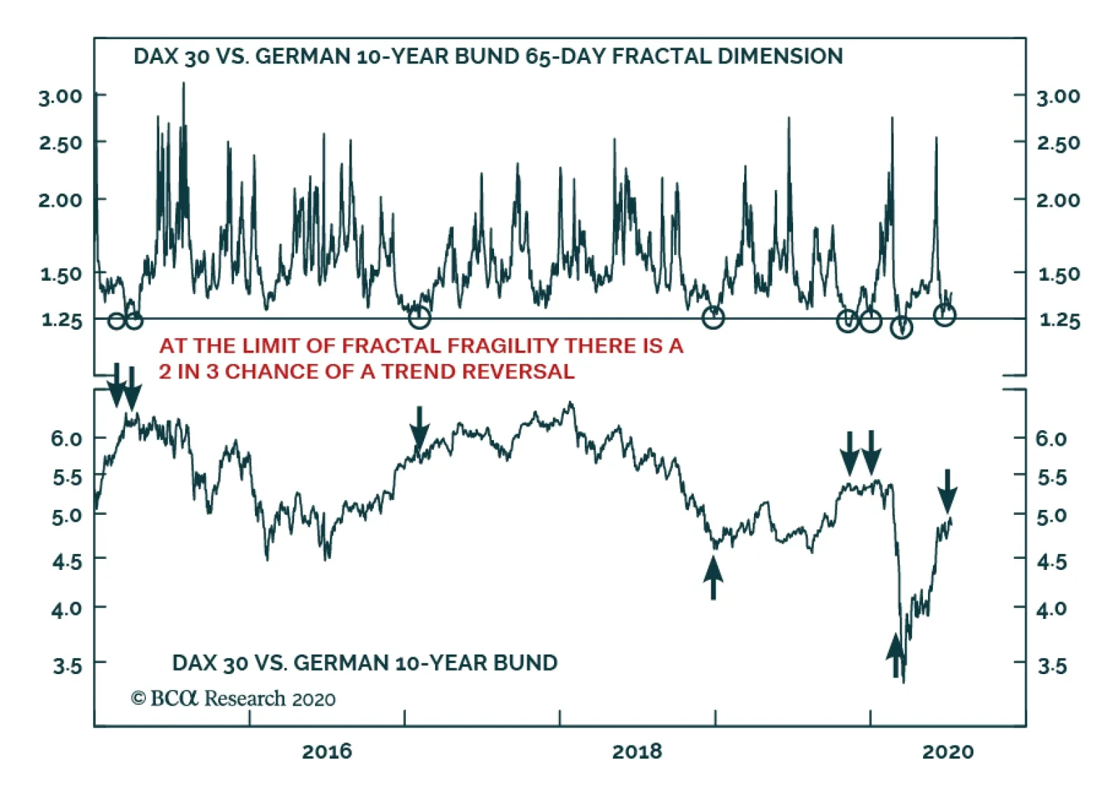
Please note that I will be hosting a webcast on Friday July 17 and that the webcast will replace next week’s report. Highlights Go tactically short stocks versus bonds. But express it as short DAX versus the US 10-year T-bond, given the greater scope for compression in US bond yields than in German bond yields. Target a profit of 10 percent but apply a stop-loss if stock versus bond outperformance continues for another 10 percent. There is now a strong incentive for short-term investing and a strong disincentive for long-term investing, forcing formerly long-term investors to think and behave like traders. Don’t obsess with the Covid-19 mortality rate. Focus instead on the morbidity, or hospitalization, rate. Covid-19 is unlikely to kill you, but it can make you ill and, in some unlucky cases, permanently ill. Feature Chart of the WeekA Sell Signal For Stocks To Bonds
A Sell Signal For Stocks To Bonds
A Sell Signal For Stocks To Bonds
Financial markets have reached an absurdity. It is now more rewarding to be a short-term trader who holds investments for just three months than it is to be a long-term investor who buys and holds them for ten years. And just to be clear, we are comparing cumulative returns over the entire holding period of three months versus one that is forty times longer at ten years. The case for buying and holding most mainstream investments has collapsed. Investors seeking attractive long-term returns can no longer rely on mainstream bond and stock markets. Nowadays, the long-term investment story is about sectors and themes, and we will continue to tell this story in our regular reports. However, this week we will focus on the implications of short-termism in the mainstream markets. Short-Term Returns Now Beat Long-Term Returns Through the past year, anybody who has bought the German 10-year bund, with the intention of holding it until it redeems in 2029 is guaranteed a deeply negative return. Yet there have been many three-month periods in which the bund has generated a high single-digit return (Chart I-2). Chart I-23-Month Returns Now Beat 10-Year Returns!
3-Month Returns Now Beat 10-Year Returns!
3-Month Returns Now Beat 10-Year Returns!
Likewise, anybody who owns the US 10-year T-bond has made almost as much money in the first three months of this year as they mathematically can by holding it for ten years! By extension, the same principle also applies to mainstream stock markets which are priced for feeble long-term returns – yet can rally by 20-30 percent in the space of a few weeks. It is now more rewarding to be a short-term trader who holds investments for three months than it is to be a long-term investor who buys and holds them for ten years. Admittedly, these are nominal returns, and the long-term real returns could be boosted by deflation. Nevertheless, the economy would have to experience Great Depression levels of deflation to make the long-term real returns genuinely attractive. Yet it wasn’t always like this. Until recent years, the cumulative returns available from long-term investing were many multiples of those available from short-term investing – as they should be (Chart I-3 and Chart I-4). But today, the incentive structure is back-to-front. There is a strong disincentive for long-term investing and a strong incentive for short-term investing, forcing formerly long-term investors to think and behave like traders. Albeit traders that must get their timing right. Chart I-3Today, There Is A Strong Disincentive For Long-Term Investing...
Today, There Is A Strong Disincentive For Long-Term Investing...
Today, There Is A Strong Disincentive For Long-Term Investing...
Chart I-4...And A Strong Incentive For Short-Term Investing
...And A Strong Incentive For Short-Term Investing
...And A Strong Incentive For Short-Term Investing
Unfortunately, when everybody behaves like traders there are worrying implications for financial market liquidity and stability. Short-Termism Destroys Market Liquidity We have been brought up to believe that agreement and consensus create peace and harmony, whereas disagreement and opposition create conflict and discord. Hence, it is natural to think that agreement and consensus also create calm and stability in the financial markets. Yet nothing could be further from the truth. A calm and stable market requires disagreement. Disagreement is the source of market liquidity and stability. Meaning, the ability to convert stocks into cash, or cash into stocks, quickly and in volume without destabilising the stock price. For an investor to convert a large amount of stocks into cash without destabilising the price, a mirror-image investor must be willing to take the opposite position. It follows that market liquidity comes from a disagreement about the attractiveness of the investment at a given price. As an aside, we often read comments such as ‘investors are moving out of stocks into cash’, or vice-versa. Such comments are nonsensical. If one investor is selling stocks, then a mirror-image investor must be buying stocks. The stocks cannot just vanish into thin air! A market which loses its variation of investment horizons loses its liquidity and stability. If institutional investors are selling, then a mirror-image investor must be buying. The mirror-image buyer could be less savvy retail investors, in which case we might interpret the institutional selling as a sell signal. Or the mirror-image buyer could be ‘smart money’ hedge funds, in which case we might interpret the institutional selling as a buy signal. It follows that unless we know the identity of both the seller and the buyer, the ‘flows’ information is useless. The much more useful information is the variation of investment horizons in the market. This is because a market which possesses a variation of investment horizons also possesses the disagreement required for liquidity and stability. Conversely, a market which lacks this variation of investment horizons could soon run out of liquidity and undergo a change in trend. Investors with different time horizons disagree about the attractiveness of an investment at a given price because they interpret the same facts and information differently. For example, a day-trader will interpret an outsized rally as a ‘momentum’ buy signal, whereas a value investor will interpret the same information as a ‘loss of value’ sell signal. Therefore, the market possesses liquidity and stability when its participants possess a variation of investment horizons. For example, both a 1-day horizon and a 3-month (65 business days) horizon. The corollary is that the market’s liquidity and stability disappear when its participants no longer possess this healthy variation in horizons. In technical terms, this occurs when the market’s fractal structure collapses. In the above example, it would be signalled by the 65-day fractal dimension collapsing to its lower limit (Chart I-5). Chart I-5The Stock-To-Bond Fractal Structure Has Collapsed
The Stock-To-Bond Fractal Structure Has Collapsed
The Stock-To-Bond Fractal Structure Has Collapsed
All of which brings us to our tactical stock-to-bond sell signal. A Sell Signal For Stocks To Bonds Since 2015, a collapsed 65-day fractal structure of the German stock-to-bond ratio has reliably presaged a change in trend, implying either a sell or buy signal based on the direction of the preceding trend. The two most recent occurrences happened this year on January 2, a sell signal, and March 9, a buy signal (Chart of the Week). A collapsed 65-day fractal structure of the German stock-to-bond ratio has reliably presaged a change in trend. The 65-day fractal structure of the German stock-to-bond ratio has collapsed once again, reinforced by a similar observation in the US stock-to-bond ratio. This suggests that the recent 40 percent rally in stocks versus bonds is approaching exhaustion and is susceptible to a tactical reversal (Chart I-6). Chart I-6The 40 Percent Rally In Stocks Versus Bonds May Be Near Exhaustion
The 40 Percent Rally In Stocks Versus Bonds May Be Near Exhaustion
The 40 Percent Rally In Stocks Versus Bonds May Be Near Exhaustion
Hence, go tactically short stocks versus bonds. But express it as short DAX versus the US 10-year T-bond, given the greater scope for compression in US bond yields than in German bond yields. Target a profit of 10 percent but apply a stop-loss if the outperformance continues for another 10 percent. One caveat is that bullish fundamentals can swamp fragile fractal structures. Hence, the strong outperformance of stocks versus bonds would persist if, for example, a breakthrough treatment or vaccine suddenly emerged for Covid-19. On the other hand, it is worth noting that US hospitalizations for the disease are rising once again, even if deaths, so far, are not (Chart I-7). Nevertheless, we reiterate that the Covid-19 morbidity (severe illness) rate is much more important than the mortality rate, for two reasons. Chart I-7US Hospitalizations For Covid-19 Are Rising Again
A Sell Signal For Stocks To Bonds
A Sell Signal For Stocks To Bonds
First, it is morbidity rather than mortality that swamps the finite and limited intensive care unit (ICU) capacity in healthcare systems. Second, the evidence now suggests that many recovered Covid-19 victims suffer long-term damage to their lungs and/or other vital organs such as kidneys, the liver, and the brain. This is the case even for apparently mild cases of the disease that do not require hospitalization. Therefore, don’t obsess with the Covid-19 mortality rate. Focus instead on the morbidity, or hospitalization, rate. The threat from Covid-19 is not that it will kill you. It almost certainly won’t. The threat is that it will make you ill and, in some unlucky cases, permanently ill. Fractal Trading System* As discussed, this weeks recommended trade is short DAX versus 10-year T-bond, setting a profit target and symmetrical stop-loss at 10 percent. Chart I-8GBP/RUB
GBP/RUB
GBP/RUB
In other trades, long GBP/RUB is within a whisker of its 3 percent profit target. The rolling 1-year win ratio now stands at 59 percent When the fractal dimension approaches the lower limit after an investment has been in an established trend it is a potential trigger for a liquidity-triggered trend reversal. Therefore, open a countertrend position. The profit target is a one-third reversal of the preceding 13-week move. Apply a symmetrical stop-loss. Close the position at the profit target or stop-loss. Otherwise close the position after 13 weeks. * For more details please see the European Investment Strategy Special Report “Fractals, Liquidity & A Trading Model,” dated December 11, 2014, available at eis.bcaresearch.com. Dhaval Joshi Chief European Investment Strategist dhaval@bcaresearch.com Fractal Trading System Cyclical Recommendations Structural Recommendations Closed Fractal Trades Trades Closed Trades Asset Performance Currency & Bond Equity Sector Country Equity Indicators Bond Yields Chart II-1Indicators To Watch - Bond Yields
Indicators To Watch - Bond Yields
Indicators To Watch - Bond Yields
Chart II-2Indicators To Watch - Bond Yields
Indicators To Watch - Bond Yields
Indicators To Watch - Bond Yields
Chart II-3Indicators To Watch - Bond Yields
Indicators To Watch - Bond Yields
Indicators To Watch - Bond Yields
Chart II-4Indicators To Watch - Bond Yields
Indicators To Watch - Bond Yields
Indicators To Watch - Bond Yields
Interest Rate Chart II-5Indicators To Watch - Interest Rate Expectations
Indicators To Watch - Interest Rate Expectations
Indicators To Watch - Interest Rate Expectations
Chart II-6Indicators To Watch - Interest Rate Expectations
Indicators To Watch - Interest Rate Expectations
Indicators To Watch - Interest Rate Expectations
Chart II-7Indicators To Watch - Interest Rate Expectations
Indicators To Watch - Interest Rate Expectations
Indicators To Watch - Interest Rate Expectations
Chart II-8Indicators To Watch - Interest Rate Expectations
Indicators To Watch - Interest Rate Expectations
Indicators To Watch - Interest Rate Expectations
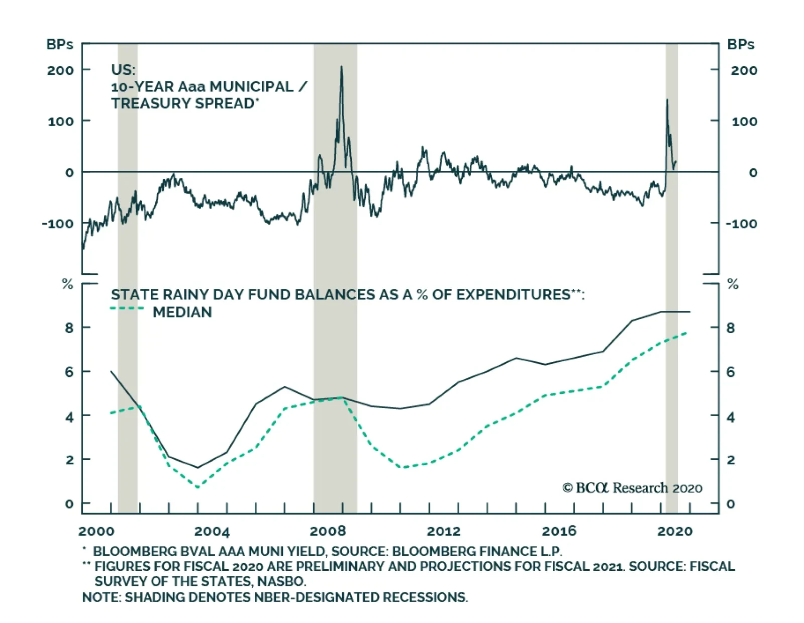
BCA Research's US Bond Strategy service re-iterates its overweight stance on municipal bonds. Municipal bonds outperformed the duration-equivalent Treasury index by 68 basis points in June, bringing year-to-date excess returns up to -582 bps (before…
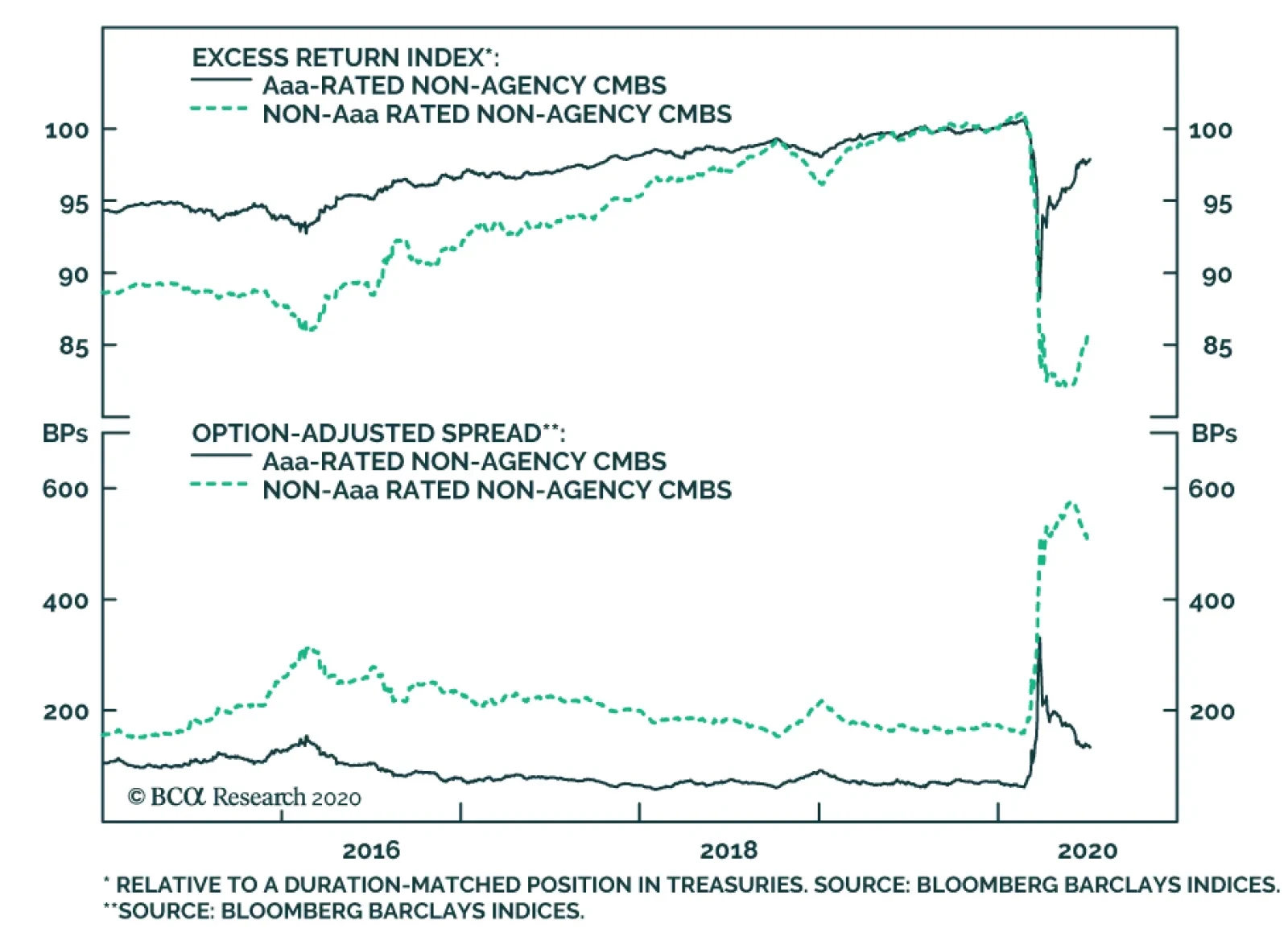
BCA Research's US Bond Strategy service has downgraded non-agency CMBS. Our view of non-agency CMBS has not changed during the past month, but we realize that it is more accurately described as a “Neutral” allocation as opposed to “Overweight”. We…
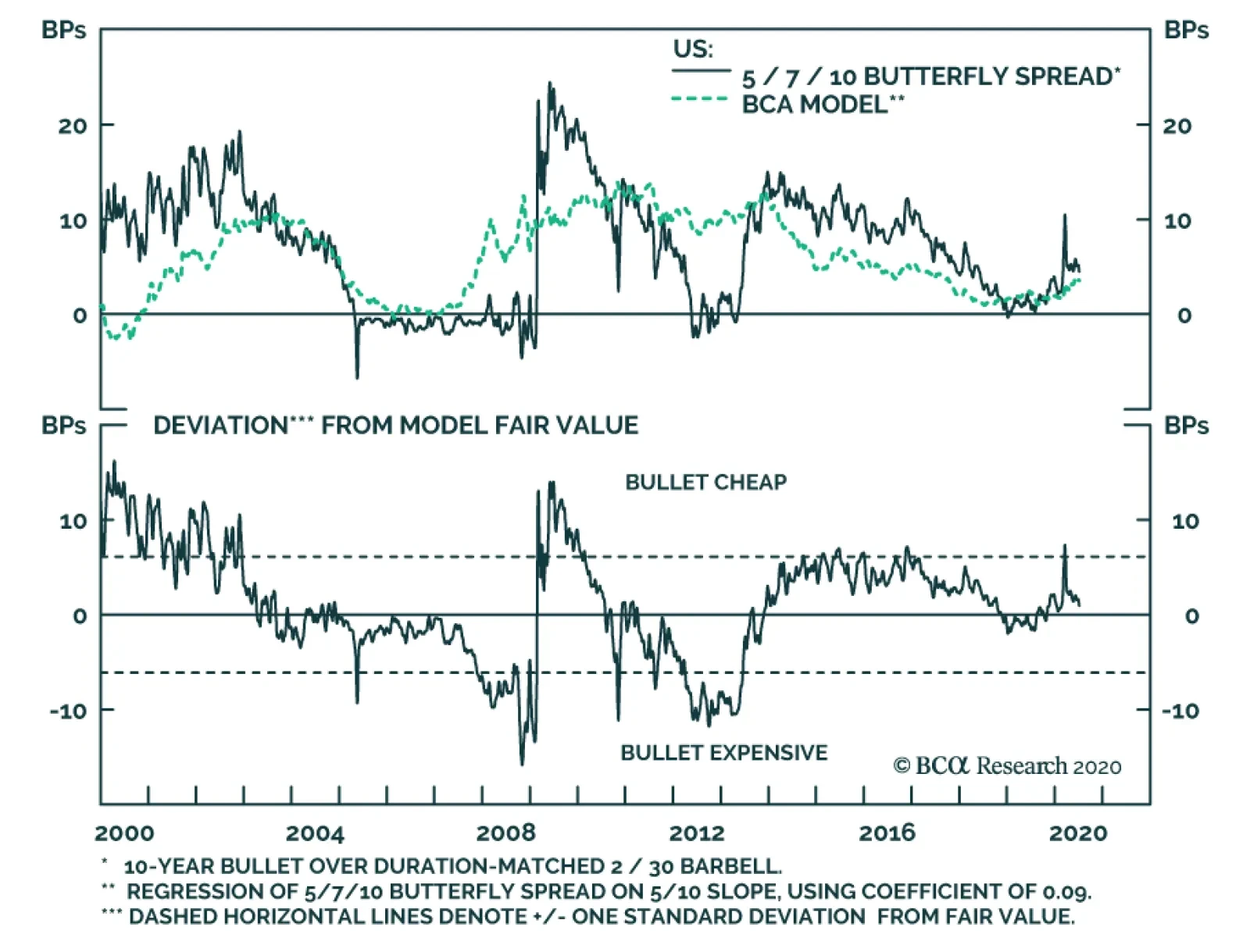
BCA Research's Global Fixed Income Strategy service is initiating a long 7-year bullet vs. 5/10 barbell trade. Even though steepeners in the US are currently expensive, valuations can become even more overstretched with the Fed signaling no rate increases…
Highlights Butterflies & Yield Curve Models: With bond market volatility now back to the subdued levels seen prior to the COVID-19 market turbulence earlier in 2020, it is a good time to update our global yield curve valuation models to look for attractive butterfly trade ideas. Valuations: The models generally indicate that flattener trades offer better value across all countries. Our medium-term strategic bias, however, is towards steeper yield curves with policy rates on hold and depressed global inflation expectations likely to continue drifting higher over the latter half of the year. Yield Curve Trades: We are initiating the first set of yield curve trades within our rebooted Tactical Trade Overlay: going long a 7-year bullet vs. a 5-year/10-year barbell in the US; long a 2-year/30-year barbell vs. a 5-year bullet in France; long a 5-year/30-year barbell vs. a 10-year bullet in Italy; and long a 3-year/20-year barbell vs. a 10-year bullet in the UK. Feature In a Special Report published back in February of this year, we dusted off our model-based framework to find value in trades focused on the shape of government bond yield curves.1 By comparing the market-implied short-term interest rate expectations extracted from our curve models to our own macro views, we are able to come up with actionable buy or sell signals across the yield curve in nine developed markets: the US, Germany, France, Italy, Spain, the UK, Japan, Canada, and Australia. Table 1Most Attractive Butterfly Trades
Global Yield Curve Trades: Netting Returns With Butterflies
Global Yield Curve Trades: Netting Returns With Butterflies
Given the extreme market turbulence around the time we published that report, as the full scope of the COVID-19 pandemic was becoming evident, we chose not to recommend any curve trades from our models until global volatility subsided to acceptable levels. The vigorous action from central banks to manipulate bond yields since then - quantitative easing, aggressive forward guidance, outright yield curve control in Japan and Australia, and other unconventional monetary policy measures - introduced another layer of difficulty in implementing successful curve trades using models estimated in more normal times. With global bond market volatility now back down to pre-COVID levels, we feel that the time is right to use our curve models to help identify opportunities. Specifically, we are implementing new recommended yield curve trades in the US, France, Italy, and the UK. Table 1 shows the most attractive butterfly trades across all the markets covered in this analysis. Note that three of the four trades we are initiating include very long-dated bonds where yields are less susceptible to direct central bank influence. The only exception is our US long 7-year bullet vs. 5-year/10-year barbell trade, the reasoning for which we outline later in this report. Three of the four trades we are initiating include very long-dated bonds where yields are less susceptible to direct central bank influence. The only exception is our US long 7-year bullet vs. 5-year/10-year barbell trade. Before delving into our analysis proper, a quick note: in the interest of brevity, we will limit ourselves to a simple explanation of butterfly strategies and our yield curve models in this report. For those interested in a deeper explanation of the curve modeling framework, please refer to our February 25, 2020 Special Report. A Recap On Butterflies And An Update On Our Yield Curve Models A butterfly fixed income strategy involves two main components: a barbell (a weighted combination of long-term and short-term bonds) and a bullet (a medium-term bond that sits within the yield curve segment selected in the barbell). To implement a butterfly strategy, a bond investor would go long (short) the barbell while simultaneously going short (long) the bullet. By weighting the combination of the long- and short-term bonds in the butterfly such that the weighted sum of their duration equals the duration of the medium-term bond in the bullet, we achieve immunization to parallel shifts in the yield curve. At the same time, due to the relatively higher duration of the longer-term component of the butterfly, we get exposure to specific changes in the slope of the yield curve. In general, the barbell will outperform the bullet in a flattening yield curve environment, and vice-versa. Chart of the WeekButterfly Spreads & Yield Curves
Butterfly Spreads & Yield Curves
Butterfly Spreads & Yield Curves
To actually decide how, and on which parts of the yield curve, to implement our butterfly strategies, we make use of our yield curve models. These models rely on the positive relationship typically observed between the butterfly spread and the slope of the yield curve. When the curve steepens, the butterfly spread widens, and vice-versa (Chart of the Week). This has to do with mean reversion: as the curve steepens, it increases the odds that the curve will flatten in the future since it cannot steepen indefinitely. Consequently, investors will ask for greater compensation to enter a curve steepener trade when the curve is already steepening. As a result, we can create simplified models of the yield curve by regressing any butterfly spread on its corresponding curve slope. Deviations from these fair value models indicate which butterfly strategies are cheap or expensive. However, the model output does not by itself constitute a buy or sell signal and must be integrated with our macro view on the slope of the curve. For example, a butterfly strategy with an expensive bullet implies that there is already a certain amount of steepening discounted in the yield curve. If the yield curve flattens, or even steepens by an amount smaller than what is discounted in the yield curve over the investment horizon, the barbell will outperform, as expected. However, if we see more steepening than is discounted in the yield curve, the bullet will outperform, even though it was already at relatively expensive levels. Therefore, it is crucial to integrate our macro view on how much the curve will steepen or flatten over the investment horizon into our curve trade selection framework. In recent reports, we have emphasized our high-conviction view that global inflation expectations will drift higher in the coming months, driven by reflationary fiscal and monetary policy and a continued rebound in global commodity prices (most notably, oil).2 However, a rise in inflation expectations does not necessarily translate to a “one-to-one” rise in nominal yields if it is offset by a compression in real bond yields. To disentangle this, we look at the 3-year rolling betas of nominal 10-year government bond yields to the corresponding 10-year breakeven inflation rates using inflation-linked bonds (Chart 2). The data suggest a currently weaker relationship between inflation expectations and nominal yields, with all betas well below their post-crisis maxima. Our overall macro bias is towards a global steepening in yield curves, but given our strong belief in a rebound in inflation expectations, we would be more willing to enter steepener trades in higher-beta regions such as Germany, Canada, the US, and Australia where it is more likely that a rise in inflation expectations will translate to higher nominal yields. Conversely, we are less hesitant to enter flatteners in the lower-beta regions such as the UK, France, Italy, and Japan. Chart 2The Link Between Nominal Yields And Inflation Expectations Has Weakened
Global Yield Curve Trades: Netting Returns With Butterflies
Global Yield Curve Trades: Netting Returns With Butterflies
When we said earlier this year that we were “dusting off” our yield curve models, that was not just a figure of speech. The models date back originally to 2002, meaning that they are old enough to vote—perhaps even for a popular rapper. Even though we have been refining and updating it along the way, one of our concerns was that this model was estimated for a pre-crisis sample period before near-zero rates became ubiquitous in developed markets. Our overall macro bias is towards a global steepening in yield curves, but given our strong belief in a rebound in inflation expectations, we would be more willing to enter steepener trades in higher-beta regions such as Germany, Canada, the US, and Australia. To test that the curve relationships within our models are maintained when global central banks are pinning policy rates near 0%, we have re-estimated all the regressions for the post-financial crisis period from 2009 to 2017 when most central banks kept rates near the zero bound. Chart 3 shows the results for the representative 2-year, 5-year and 10-year portions of the yield curve. On the whole, the coefficients are weaker but still positive with the exception of Japan, where many years of zero rates and quantitative easing have caused the 2-year/5-year/10-year butterfly spread to become largely unmoored from the 2-year/10-year slope. Chart 3Looking For Structural Shifts In Our Yield Curve Models
Global Yield Curve Trades: Netting Returns With Butterflies
Global Yield Curve Trades: Netting Returns With Butterflies
Therefore, we still see value in our curve modeling approach, even in the current environment where central banks are likely to be on hold for a period measured in years, not months. Bottom Line: Butterfly strategies are an effective way to position for changes in the slope of the yield curve without exposure to shifts in the curve. Our current strategic bias is to expect steepening of developed market yield curves through rising longer-term inflation expectations, but our global yield curve models indicate better value in most flattening trades. Thus, we need to be extremely selective in recommending trades based on the results of our yield curve models. Yield Curve Models And Trades By Region In the remaining pages of this report, we present the current read-outs from of our yield curve models for each of the major developed markets. More specifically, we provide the deviations from fair value for different combinations of bullets and barbells and highlight the most attractive butterfly strategy. The deviations from fair value shown in Tables 2-10 are standardized to facilitate comparisons between the different butterfly combinations. In addition, for each country we provide a quick assessment of the performance of these butterfly strategies over time by applying a simple mechanical trading rule. Every month, we enter the most attractive butterfly strategy, i.e. the one with the highest absolute standardized deviation from its model fair value. The overall message from the models is that barbells appear attractive relative to bullets across all the countries shown. However, we will only initiate trades in cases where the model output and our macro outlook complement each other. US Looking solely at our model output, US Treasury curve flatteners appear most attractive, with the long 3-year/30-year barbell vs. 5-year bullet trade displaying the greatest deviation from fair value with a residual of -1.55 (Table 2). However, we are inclined to agree with our colleagues at BCA Research US Bond Strategy on how to interpret Treasury curve valuation in the current environment. They argue that even though steepeners in the US are currently expensive, valuations can become even more overstretched with the Fed signaling no rate increases for at least the next two years and the market priced for an extended period of near-zero rates.3 Table 2US: Butterfly Strategy Valuation: Standardized Residuals
Global Yield Curve Trades: Netting Returns With Butterflies
Global Yield Curve Trades: Netting Returns With Butterflies
Our fundamental bias is towards US Treasury curve steepening, with the Fed locking down the front end of the curve and rising inflation expectations putting upward pressure on longer-term yields. Thus, we are entering into the long 7-year bullet vs. 5/10 barbell trade which has a small but positive model residual of +0.17. That represents a better valuation starting point than the other US butterfly spreads, and is therefore a more efficient and profitable way to position for steepeners becoming even more expensive going forward. As highlighted earlier, nominal yields in the US are also more sensitive to rising inflation expectations—another reason to enter into a curve steepener. The specific securities used to execute this trade, as well as the weights for the barbell component used to the make both legs of the trade duration-equivalent, can be found on Page 27 within our Tactical Trade Overlay table. Nominal yields in the US are also more sensitive to rising inflation expectations—another reason to enter into a curve steepener. The 7-year bullet appears just 1bp cheap according to our model and would only underperform its counterpart given a flattening in the 5-year/10-year Treasury slope greater than 22bps, which we believe is unlikely given the reasons outlined above (Chart 4A). Chart 4AUS 5/7/10 Spread Fair Value Model
US 5/7/10 Spread Fair Value Model
US 5/7/10 Spread Fair Value Model
Chart 4BUS Butterfly Strategy Performance
US Butterfly Strategy Performance
US Butterfly Strategy Performance
Following the mechanical trading rule has delivered steady returns with only a few periods of negative year-over-year returns (Chart 4B). Germany The most attractively valued butterfly combination on the German yield curve is going long the 1-year/30-year barbell and shorting the 5-year bullet, which is almost one standard deviation above its model-implied fair value, with a standardized residual of -0.97 (Table 3). Table 3Germany: Butterfly Strategy Valuation: Standardized Residuals
Global Yield Curve Trades: Netting Returns With Butterflies
Global Yield Curve Trades: Netting Returns With Butterflies
The 5-year bullet appears 29bps expensive according to our model and would only outperform its counterpart given a steepening in the 1-year/30-year German curve slope greater than 50bps (Chart 5A). Chart 5AGermany 1/5/30 Spread Fair Value Model
Germany 1/5/30 Spread Fair Value Model
Germany 1/5/30 Spread Fair Value Model
Chart 5BGermany Butterfly Strategy Performance
Germany Butterfly Strategy Performance
Germany Butterfly Strategy Performance
Following the mechanical trading rule has been quite profitable, delivering consistently positive year-over-year returns for all but the initial period of our sample (Chart 5B). France The most attractively valued butterfly combination on the French OAT yield curve is going long the 2-year/30-year barbell and shorting the 5-year bullet (Table 4). This combination is a little less than one standard deviation over its model-implied fair value with a standardized residual of -0.84. Nominal yields in France are also relatively less correlated with inflation expectations, which makes this a prime candidate for a flattener trade. The specific securities used to execute this trade, as well as the weights for the barbell component used to the make both legs of the trade duration-equivalent, can be found on Page 27 within our Tactical Trade Overlay table. Table 4France: Butterfly Strategy Valuation: Standardized Residuals
Global Yield Curve Trades: Netting Returns With Butterflies
Global Yield Curve Trades: Netting Returns With Butterflies
The 5-year bullet appears 21bps expensive according to our model and would only outperform its counterpart given a steepening in the 2-year/30-year French curve slope greater than 48bps (Chart 6A). Chart 6AFrance 2/5/30 Spread Fair Value Model
France 2/5/30 Spread Fair Value Model
France 2/5/30 Spread Fair Value Model
Chart 6BFrance Butterfly Strategy Performance
France Butterfly Strategy Performance
France Butterfly Strategy Performance
As with Germany, following the mechanical trading rule in the French OAT market has also been profitable, with only three periods of negative year-over-year returns in our sample period (Chart 6B). Italy And Spain In Italy, the most attractively valued butterfly combination is going long the 5-year/30-year barbell and shorting the 10-year bullet – a combination with a standardized residual of -0.79 (Table 5). In Spain, going long the 3-year/30-year barbell and short the 5-year bullet seems most attractive with a standardized residual of -0.83 (Table 6). Of the two peripheral euro area countries, we are choosing to put on a trade in the relatively larger and more liquid Italian government bond market. As with France, Italian nominal yields also display a relatively low beta to inflation breakevens. The specific securities used to execute this trade, as well as the weights for the barbell component used to the make both legs of the trade duration-equivalent, can be found on Page 27 within our Tactical Trade Overlay table. Table 5Italy: Butterfly Strategy Valuation: Standardized Residuals
Global Yield Curve Trades: Netting Returns With Butterflies
Global Yield Curve Trades: Netting Returns With Butterflies
Table 6Spain: Butterfly Strategy Valuation: Standardized Residuals
Global Yield Curve Trades: Netting Returns With Butterflies
Global Yield Curve Trades: Netting Returns With Butterflies
In Italy, the 10-year bullet appears 22bps expensive according to our model and would only outperform its counterpart given a steepening in the 5-year/30-year Italian curve slope greater than 153bps (Chart 7A). Following the mechanical trading rule in Italy has yielded strong excess returns, with only one very short period of negative year-over-year returns in our sample period (Chart 7B). As with Italy, following the mechanical trading rule in Spain has yielded some of the strongest excess returns on a cumulative and year-over-year basis. Chart 7AItaly 5/10/30 Spread Fair Value Model
Italy 5/10/30 Spread Fair Value Model
Italy 5/10/30 Spread Fair Value Model
Chart 7BItaly Butterfly Strategy Performance
Italy Butterfly Strategy Performance
Italy Butterfly Strategy Performance
In Spain, the 5-year bullet appears 14bps expensive according to our model and would only outperform its counterpart given a steepening in the 3-year/30-year Spanish curve slope greater than 47bps (Chart 8A). As with Italy, following the mechanical trading rule in Spain has yielded some of the strongest excess returns on a cumulative and year-over-year basis (Chart 8B). Chart 8ASpain 3/5/30 Spread Fair Value Model
Spain 3/5/30 Spread Fair Value Model
Spain 3/5/30 Spread Fair Value Model
Chart 8BSpain Butterfly Strategy Performance
Spain Butterfly Strategy Performance
Spain Butterfly Strategy Performance
UK On the UK Gilt yield curve, the most attractive butterfly combination is holding a 3-year/20-year barbell versus a 10-year bullet, which currently displays a standardized residual of -1.08 (Table 7). As with France and Italy, not only is this flattener trade attractively valued, the UK is also one of the countries where inflation breakevens are relatively less correlated with nominal yields, making this another excellent candidate for our Tactical Trade Overlay. The specific securities used to execute this trade, as well as the weights for the barbell component used to the make both legs of the trade duration-equivalent, can be found on Page 27. Table 7UK: Butterfly Strategy Valuation: Standardized Residuals
Global Yield Curve Trades: Netting Returns With Butterflies
Global Yield Curve Trades: Netting Returns With Butterflies
The 10-year bullet appears 13bps expensive according to our model and would only outperform its counterpart given a steepening in the 3-year/20-year Gilt curve slope greater than 52bps (Chart 9A). Chart 9AUK 3/10/20 Spread Fair Value Model
UK 3/10/20 Spread Fair Value Model
UK 3/10/20 Spread Fair Value Model
Chart 9BUK Butterfly Strategy Performance
UK Butterfly Strategy Performance
UK Butterfly Strategy Performance
Following the mechanical trading rule in the UK has produced consistent returns on a year-over-year basis (Chart 9B). Canada The most attractively valued butterfly combination on the Canadian yield curve is favoring the 5-year/30-year barbell versus the 7-year bullet, which currently displays a standardized residual of -1.41 (Table 8). Table 8Canada: Butterfly Strategy Valuation: Standardized Residuals
Global Yield Curve Trades: Netting Returns With Butterflies
Global Yield Curve Trades: Netting Returns With Butterflies
The 7-year bullet appears 7bps expensive according to our model and would only outperform its counterpart given a steepening in the 5-year/30-year Canadian curve slope greater than 42bps (Chart 10A). Chart 10ACanada 5/7/30 Spread Fair Value Model
Canada 5/7/30 Spread Fair Value Model
Canada 5/7/30 Spread Fair Value Model
Chart 10BCanada Butterfly Strategy Performance
Canada Butterfly Strategy Performance
Canada Butterfly Strategy Performance
Following the mechanical trading rule in Canada has historically been a good strategy, but we do note two periods of minor losses in 2013 and 2019 (Chart 10B). Japan The most attractively valued butterfly combination on the JGB yield curve is the 5-year/20-year barbell versus the 7-year bullet, which currently has a standardized residual of -1.03 (Table 9). As we noted earlier, however, valuations in the JGB market are likely distorted due to the Bank of Japan’s long-running programs of quantitative easing, zero policy rates and Yield Curve Control that aims to keep the 10-year JGB yield around 0%. Table 9Japan: Butterfly Strategy Valuation: Standardized Residuals
Global Yield Curve Trades: Netting Returns With Butterflies
Global Yield Curve Trades: Netting Returns With Butterflies
The 7-year bullet appears 6bps expensive according to our model and would only outperform its counterpart given a steepening in the 5-year/20-year Japan curve slope greater than 23bps (Chart 11A). Following our mechanical trading rule has produced decent returns, especially given the dormant nature of the JGB market, with only a couple minor periods without positive year-over-year returns. Chart 11AJapan 5/7/20 Spread Fair Value Model
Japan 5/7/20 Spread Fair Value Model
Japan 5/7/20 Spread Fair Value Model
Chart 11BJapan Butterfly Strategy Performance
Japan Butterfly Strategy Performance
Japan Butterfly Strategy Performance
Following our mechanical trading rule has produced decent returns, especially given the dormant nature of the JGB market, with only a couple minor periods without positive year-over-year returns (Chart 11B). Australia The most attractively valued butterfly combination on the Australian yield curve is going long the 2-year/10-year barbell versus the 7-year bullet, displaying a standardized residual of -1.73 (Table 10). Table 10Australia: Butterfly Strategy Valuation: Standardized Residuals
Global Yield Curve Trades: Netting Returns With Butterflies
Global Yield Curve Trades: Netting Returns With Butterflies
The 7-year bullet appears 15bps expensive according to our model and would only outperform its counterpart given a steepening in the 2-year/10-year Australian curve slope greater than 101bps (Chart 12A). Chart 12AAustralia 2/7/10 Spread Fair Value Model
Australia 2/7/10 Spread Fair Value Model
Australia 2/7/10 Spread Fair Value Model
Chart 12BAustralia Butterfly Strategy Performance
Australia Butterfly Strategy Performance
Australia Butterfly Strategy Performance
Compared to the other markets in our analysis, following the mechanical trading rule in Australia has not produced stellar returns (Chart 12B). However, excess returns on a year-over-year basis have been positive barring two periods. Shakti Sharma Research Associate ShaktiS@bcaresearch.com Footnotes 1 Please see BCA Research Global Fixed Income Strategy Special Report, "Global Yield Curve Trades: Follow The Butterflies", dated February 25, 2020, available at gfis.bcaresearch.com. 2 Please see BCA Research Global Fixed Income Strategy Weekly Report, "How To Play The Revival Of Global Inflation Expectations", dated June 23, 2020, available at gfis.bcaresearch.com. 3 Please see BCA Research US Bond Strategy Weekly Report, "Take A Look At High-Yield Technology Bonds", dated June 23, 2020, available at usbs.bcaresearch.com. Recommendations The GFIS Recommended Portfolio Vs. The Custom Benchmark Index
Global Yield Curve Trades: Netting Returns With Butterflies
Global Yield Curve Trades: Netting Returns With Butterflies
Duration Regional Allocation Spread Product Tactical Trades Yields & Returns Global Bond Yields Historical Returns
Highlights Chart 1More Stimulus Required
More Stimulus Required
More Stimulus Required
The unemployment rate fell for the second consecutive month in June, down to 11.1% from a peak of 14.7%. Bond markets shrugged off the news, and rightly so, as this recent pace of improvement is unlikely to continue through July and August. The main reason for pessimism is that the number of new COVID cases started rising again in late June, consistent with a pause in high-frequency economic indicators (Chart 1). This second wave of infections will slow the pace at which furloughed employees are returning to work, a development that has been responsible for all of the unemployment rate’s recent improvement. Beneath the surface, the number of permanently unemployed continues to rise (Chart 1, bottom panel). The implication for policymakers is that it is too early to back away from fiscal stimulus. In particular, expanded unemployment benefits must be extended, in some form, beyond the July 31 expiry date. We are confident that Congress will eventually pass another round of stimulus, though it may not make the July 31 deadline. For investors, bond yields are still biased higher on a 6-12 month horizon, but their near-term outlook is now in the hands of Congress. We continue to recommend benchmark portfolio duration, along with several tactical overlay trades designed to profit from higher yields. Feature Investment Grade: Overweight Chart 2Investment Grade Market Overview
Investment Grade Market Overview
Investment Grade Market Overview
Investment grade corporate bonds outperformed the duration-equivalent Treasury index by 189 basis points in June, bringing year-to-date excess returns up to -529 bps. The average index spread tightened 24 bps on the month. We still view investment grade corporates as attractively valued, with the index’s 12-month breakeven spread only just below its historical median (Chart 2). With the Fed providing strong backing for the market, we are confident that investment grade corporate bond spreads will continue to tighten. As such, we want to focus on cyclical segments of the market that tend to outperform during periods of spread tightening (panel 2). One caveat is that the Fed’s lending facilities can’t prevent ratings downgrades (bottom panel). Therefore, we also want to avoid sectors and issuers that are mostly likely to be downgraded. High-quality Baa-rated issues are the sweet spot that we want to target. Those securities will tend to outperform the overall index as spreads tighten, but are not likely to be downgraded. Subordinate bank bonds are a prime example of securities that exist within that sweet spot.1 In recent weeks we published deep dives into several different industry groups within the corporate bond market. In addition to our overweight recommendation for subordinate bank bonds, we also recommend an overweight allocation to investment grade Healthcare bonds.2 We advise underweight allocations to investment grade Technology and Pharmaceutical bonds.3 Table 3ACorporate Sector Relative Valuation And Recommended Allocation*
Watch Out For July’s Fiscal Cliff
Watch Out For July’s Fiscal Cliff
Table 3BCorporate Sector Risk Vs. Reward*
Watch Out For July’s Fiscal Cliff
Watch Out For July’s Fiscal Cliff
High-Yield: Neutral High-Yield outperformed the duration-equivalent Treasury index by 90 basis points in June, bringing year-to-date excess returns up to -855 bps (Chart 3A). The average index spread tightened 11 bps on the month and has tightened 500 bps since the Fed unveiled its corporate bond purchase programs on March 23. We reiterated our call to overweight Ba-rated junk bonds and underweight bonds rated B and below in a recent report.4 In that report, we noted that high-yield spreads appear tight relative to fundamentals across the board, but that the Ba-rated credit tier will continue to perform well because most issuers are eligible for support through the Fed’s emergency lending facilities. Specifically, we showed that “moderate” and “severe” default scenarios for the next 12 months – defined as a 9% and 12% default rate, respectively, with a 25% recovery rate – would lead to a negative excess spread for B-rated bonds (Chart 3B). The same holds true for lower-rated credits. Chart 3AHigh-Yield Market Overview
High-Yield Market Overview
High-Yield Market Overview
Chart 3BB-Rated Excess Return Scenarios
Watch Out For July’s Fiscal Cliff
Watch Out For July’s Fiscal Cliff
We appear to be on track for that sort of outcome. Moody’s recorded 20 defaults in May, matching the worst month of the 2015/16 commodity bust and bringing the trailing 12-month default rate up to 6.4%. Meanwhile, the trailing 12-month recovery rate is a meagre 22%. At the industry level, in recent reports we recommended an overweight allocation to high-yield Technology bonds5 and underweight allocations to high-yield Healthcare and Pharmaceuticals.6 MBS: Underweight Chart 4MBS Market Overview
MBS Market Overview
MBS Market Overview
Mortgage-Backed Securities underperformed the duration-equivalent Treasury index by 13 basis points in June, dragging year-to-date excess returns down to -44 bps. The conventional 30-year MBS index option-adjusted spread (OAS) has tightened 5 bps since the end of May, but it still offers a pick-up relative to other comparable sectors. The MBS index OAS stands at 95 bps, greater than the 81 bps offered by Aa-rated corporate bonds (Chart 4), the 54 bps offered by Aaa-rated consumer ABS and the 76 bps offered by Agency CMBS. At some point this spread advantage will present a buying opportunity, but we think it is still too soon. As we wrote in a recent report, we are concerned that the elevated primary mortgage spread is a warning that refinancing risk could flare in the second half of this year (bottom panel).7 The primary mortgage rate did not match the decline in Treasury yields seen earlier this year. Essentially, this means that even if Treasury yields are unchanged in 2020 H2, a further 50 bps drop in the mortgage rate cannot be ruled out. Such a move would lead to a significant increase in prepayment losses, one that is not priced into current index spreads. While the index OAS has widened lately, expected prepayment losses (aka option cost) have dropped (panels 2 & 3). We are concerned this decline in expected prepayment losses has gone too far and that, as a result, the current index OAS is overstated. Government-Related: Underweight Chart 5Government-Related Market Overview
Government-Related Market Overview
Government-Related Market Overview
The Government-Related index outperformed the duration-equivalent Treasury index by 78 basis points in June, bringing year-to-date excess returns up to -399 bps. Sovereign debt outperformed duration-equivalent Treasuries by 112 bps on the month, bringing year-to-date excess returns up to -828 bps. Foreign Agencies outperformed the Treasury benchmark by 37 bps in June, bringing year-to-date excess returns up to -764 bps. Local Authority debt outperformed Treasuries by 268 bps in June, bringing year-to-date excess returns up to -439 bps. Domestic Agency bonds outperformed by 14 bps, bringing year-to-date excess returns up to -58 bps. Supranationals outperformed by 12 bps, bringing year-to-date excess returns up to -19 bps. We updated our outlook for USD-denominated Emerging Market (EM) Sovereign bonds in a recent report.8 In that report we posited that valuation and currency trends are the primary drivers of EM sovereign debt performance (Chart 5). On valuation, we noted that the USD sovereign bonds of: Mexico, Colombia, UAE, Saudi Arabia, Qatar, Indonesia, Malaysia and South Africa all offer a spread pick-up relative to US corporate bonds of the same credit rating and duration. However, of those countries that offer attractive spreads, most have currencies that look vulnerable based on the ratio of exports to foreign debt obligations. In general, we don’t see a compelling case for USD-denominated sovereigns based on value and currency outlook, although Mexican debt stands out as looking attractive on a risk/reward basis. Municipal Bonds: Overweight Chart 6Municipal Market Overview
Municipal Market Overview
Municipal Market Overview
Municipal bonds outperformed the duration-equivalent Treasury index by 68 basis points in June, bringing year-to-date excess returns up to -582 bps (before adjusting for the tax advantage). Municipal bond spreads versus Treasuries widened in June and continue to look attractive compared to typical historical levels. In fact, both the 2-year and 10-year Aaa Muni yields are higher than the same maturity Treasury yield, despite municipal debt’s tax exempt status (Chart 6). Municipal bonds are also attractively priced relative to corporate bonds across the entire investment grade credit spectrum, as we demonstrated in a recent report.9 In that report we also mentioned our concern about the less-than-generous pricing offered by the Fed’s Municipal Liquidity Facility (MLF). At present, MLF funds are only available at a cost that is well above current market prices (panel 3). This means that the MLF won’t help push muni yields lower from current levels. Despite the MLF’s shortcomings, we aren’t yet ready to downgrade our muni allocation. For one thing, federal assistance to state & local governments will probably be the centerpiece of the forthcoming stimulus bill. The Fed could also feel pressure to reduce MLF pricing if the stimulus is delayed. Further, while the budget pressure facing municipal governments is immense, states are also holding very high rainy day fund balances (bottom panel). This will help cushion the blow and lessen the risk of ratings downgrades. Treasury Curve: Buy 5-Year Bullet Versus 2/10 Barbell Chart 7Treasury Yield Curve Overview
Treasury Yield Curve Overview
Treasury Yield Curve Overview
The Treasury curve was mostly unchanged in June. Both the 2-year/10-year and 5-year/30-year slopes steepened 1 bp on the month, reaching 50 bps and 112 bps, respectively. With no expectation – from either the Fed or market participants – that the fed funds rate will be lifted before the end of 2022, short-maturity yield volatility will stay low and the Treasury slope will trade directionally with the level of yields for the foreseeable future. The yield curve will steepen when yields rise and flatten when they fall. With that in mind, we continue to recommend duration-neutral yield curve steepeners that will profit from moderately higher yields, but that won’t decrease the average duration of your portfolio. Specifically, we recommend going long the 5-year bullet and short a duration-matched 2/10 barbell.10 In a recent report we noted that valuation is a concern with this recommended position.11 The 5-year yield is below the yield on the duration-matched 2/10 barbell (Chart 7), and the 5-year bullet also looks expensive on our yield curve models (Appendix B). However, we also noted that the 5-year bullet traded at much more expensive levels during the last zero-lower-bound period between 2010 and 2013 (bottom panel). With short rates once again pinned at zero, we expect the 5-year bullet will once again hit levels of extreme over-valuation. TIPS: Overweight Chart 8TIPS Market Overview
TIPS Market Overview
TIPS Market Overview
TIPS outperformed the duration-equivalent nominal Treasury index by 99 basis points in June, bringing year-to-date excess returns up to -400 bps. The 10-year TIPS breakeven inflation rate rose 19 bps on the month and currently sits at 1.39%. The 5-year/5-year forward TIPS breakeven inflation rate rose 5 bps on the month and currently sits at 1.62%. TIPS breakevens have moved up rapidly during the past couple of months, but they remain low compared to average historical levels. Our own Adaptive Expectations Model suggests that the 10-year TIPS breakeven inflation rate should rise to 1.53% during the next 12 months (Chart 8).12 On inflation, it also looks like we are past the cyclical trough. The WTI oil price is back up to $41 per barrel after having briefly turned negative (panel 4), and trimmed mean inflation measures suggest that the massive drop in core is overdone (panel 3). If inflation has indeed troughed, then the real yield curve will continue to steepen as near-term inflation expectations move higher. We have been advocating real yield curve steepeners since the oil price turned negative in April.13 The curve has steepened considerably since then, but still has upside relative to levels seen during the past few years (bottom panel). ABS: Overweight Chart 9ABS Market Overview
ABS Market Overview
ABS Market Overview
Asset-Backed Securities outperformed the duration-equivalent Treasury index by 103 basis points in June, bringing year-to-date excess returns up to -2 bps. Aaa-rated ABS outperformed duration-equivalent Treasuries by 8 bps in June, bringing year-to-date excess returns up to +7 bps. Meanwhile, non-Aaa ABS outperformed by 233 bps in June, bringing year-to-date excess returns up to -88 bps (Chart 9). Aaa ABS are a high conviction overweight, given that spreads remain elevated compared to historical levels and that the sector benefits from Fed support through the Term Asset-Backed Securities Loan Facility (TALF). However, spreads are even more attractive in non-Aaa ABS and we recommend owning those securities as well. This is despite the fact that non-Aaa bonds are not eligible for TALF. We explained our rationale for owning non-Aaa consumer ABS in a recent report.14 We noted that the stimulus received from the CARES act caused real personal income to increase significantly during the past few months and, faced with fewer spending opportunities, households used that windfall to pay down consumer debt (bottom panel). Granted, further fiscal stimulus will be needed to sustain those recent income gains. But we are sufficiently confident that a follow-up stimulus bill will be passed that we advocate moving down in quality within consumer ABS. Non-Agency CMBS: Overweight Neutral Chart 10CMBS Market Overview
CMBS Market Overview
CMBS Market Overview
Non-Agency Commercial Mortgage-Backed Securities outperformed the duration-equivalent Treasury index by 211 basis points in June, bringing year-to-date excess returns up to -501 bps. Aaa CMBS outperformed Treasuries by 164 bps in June, bringing year-to-date excess returns up to -233 bps. Non-Aaa CMBS outperformed by 407 bps in June, bringing year-to-date excess returns up to -1451 bps (Chart 10). Our view of non-agency CMBS has not changed during the past month, but we realize that it is more accurately described as a “Neutral” allocation as opposed to “Overweight”. Our view is that we want an overweight allocation to Aaa-rated CMBS because that sector offers an attractive spread relative to history and benefits from Fed support through TALF. However, we advocate an underweight allocation to non-Aaa non-agency CMBS. Those securities are not eligible for TALF and, unlike consumer ABS, their fundamental credit outlook has deteriorated significantly as a result of the COVID recession.15 Agency CMBS: Overweight Agency CMBS outperformed the duration-equivalent Treasury index by 104 basis points in June, bringing year-to-date excess returns up to -58 bps. The average index spread tightened 19 bps on the month to 77 bps, still well above typical historical levels (bottom panel). The Fed is supporting the Agency CMBS market by directly purchasing the securities as part of its Agency MBS purchase program. The combination of strong Fed support and elevated spreads makes the sector a high conviction overweight. Ryan Swift US Bond Strategist rswift@bcaresearch.com Appendix A: Buy What The Fed Is Buying The Fed rolled out a number of aggressive lending facilities on March 23. These facilities focused on different specific sectors of the US bond market. The fact that the Fed has decided to support some parts of the market and not others has caused some traditional bond market correlations to break down. It has also led us to adopt of a strategy of “Buy What The Fed Is Buying”. That is, we favor those sectors that offer attractive spreads and that benefit from Fed support. The below Table tracks the performance of different bond sectors since the March 23 announcement. We will use this to monitor bond market correlations and evaluate our strategy’s success. Performance Since March 23 Announcement Of Emergency Fed Facilities
Watch Out For July’s Fiscal Cliff
Watch Out For July’s Fiscal Cliff
Appendix B: Butterfly Strategy Valuations The following tables present the current read-outs from our butterfly spread models. We use these models to identify opportunities to take duration-neutral positions across the Treasury curve. The following two Special Reports explain the models in more detail: US Bond Strategy Special Report, “Bullets, Barbells And Butterflies”, dated July 25, 2017, available at usbs.bcaresearch.com US Bond Strategy Special Report, “More Bullets, Barbells And Butterflies”, dated May 15, 2018, available at usbs.bcaresearch.com Table 4 shows the raw residuals from each model. A positive value indicates that the bullet is cheap relative to the duration-matched barbell. A negative value indicates that the barbell is cheap relative to the bullet. Table 4Butterfly Strategy Valuation: Raw Residuals In Basis Points (As Of July 3, 2020)
Watch Out For July’s Fiscal Cliff
Watch Out For July’s Fiscal Cliff
Table 5 scales the raw residuals in Table 4 by their historical means and standard deviations. This facilitates comparison between the different butterfly spreads. Table 5Butterfly Strategy Valuation: Standardized Residuals (As Of July 3, 2020)
Watch Out For July’s Fiscal Cliff
Watch Out For July’s Fiscal Cliff
Table 6 flips the models on their heads. It shows the change in the slope between the two barbell maturities that must be realized during the next six months to make returns between the bullet and barbell equal. For example, a reading of 57 bps in the 5 over 2/10 cell means that we would only expect the 5-year to outperform the 2/10 if the 2/10 slope steepens by more than 57 bps during the next six months. Otherwise, we would expect the 2/10 barbell to outperform the 5-year bullet. Table 6Discounted Slope Change During Next 6 Months (BPs)
Watch Out For July’s Fiscal Cliff
Watch Out For July’s Fiscal Cliff
Appendix C: Excess Return Bond Map The Excess Return Bond Map is used to assess the relative risk/reward trade-off between different sectors of the US bond market. It is a purely computational exercise and does not impose any macroeconomic view. The Map’s vertical axis shows 12-month expected excess returns. These are proxied by each sector’s option-adjusted spread. Sectors plotting further toward the top of the Map have higher expected returns and vice-versa. Our novel risk measure called the “Risk Of Losing 100 bps” is shown on the Map’s horizontal axis. To calculate it, we first compute the spread widening required on a 12-month horizon for each sector to lose 100 bps or more relative to a duration-matched position in Treasury securities. Then, we divide that amount of spread widening by each sector’s historical spread volatility. The end result is the number of standard deviations of 12-month spread widening required for each sector to lose 100 bps or more versus a position in Treasuries. Lower risk sectors plot further to the right of the Map, and higher risk sectors plot further to the left. Chart 11Excess Return Bond Map (As Of July 3, 2020)
Watch Out For July’s Fiscal Cliff
Watch Out For July’s Fiscal Cliff
Footnotes 1 Please see US Bond Strategy Weekly Report, “The Case Against The Money Supply”, dated June 30, 2020, available at usbs.bcaresearch.com 2 Please see US Bond Strategy Weekly Report, “Assessing Healthcare & Pharma Bonds In A Pandemic”, dated June 9, 2020, available at usbs.bcaresearch.com 3 Please see US Bond Strategy Weekly Report, “Take A Look At High-Yield Technology Bonds”, dated June 23, 2020, available at usbs.bcaresearch.com 4 Please see US Bond Strategy Weekly Report, “No Holding Back”, dated June 16, 2020, available at usbs.bcaresearch.com 5 Please see US Bond Strategy Weekly Report, “Take A Look At High-Yield Technology Bonds”, dated June 23, 2020, available at usbs.bcaresearch.com 6 Please see US Bond Strategy Weekly Report, “Assessing Healthcare & Pharma Bonds In A Pandemic”, dated June 9, 2020, available at usbs.bcaresearch.com 7 Please see US Bond Strategy Weekly Report, “No Holding Back”, dated June 16, 2020, available at usbs.bcaresearch.com 8 Please see US Bond Strategy Weekly Report, “The Treasury Market Amid Surging Supply”, dated May 12, 2020, available at usbs.bcaresearch.com 9 Please see US Bond Strategy Weekly Report, “Bonds Are Vulnerable As North America Re-Opens”, dated May 26, 2020, available at usbs.bcaresearch.com 10 The rationale for why this position will profit from curve steepening is found in US Bond Strategy Special Report, “Bullets, Barbells And Butterflies”, dated July 25, 2017, available at usbs.bcaresearch.com 11 Please see US Bond Strategy Weekly Report, “Take A Look At High-Yield Technology Bonds”, dated June 23, 2020, available at usbs.bcaresearch.com 12 Please see US Bond Strategy Weekly Report, “Take A Look At High-Yield Technology Bonds”, dated June 23, 2020, available at usbs.bcaresearch.com 13 Please see US Bond Strategy Weekly Report, “Negative Oil, The Zero Lower Bound And The Fisher Equation”, dated April 28, 2020, available at usbs.bcaresearch.com 14 Please see US Bond Strategy Weekly Report, “No Holding Back”, dated June 16, 2020, available at usbs.bcaresearch.com 15 We discussed our outlook for CMBS in more detail in US Bond Strategy Weekly Report, “No Holding Back”, dated June 16, 2020, available at usbs.bcaresearch.com Fixed Income Sector Performance Recommended Portfolio Specification Corporate Sector Relative Valuation And Recommended Allocation
Highlights The cost of housing is the one item that has held up US inflation vis a vis European inflation in recent years. But as the cost of housing flips from being a strong tailwind to a strong headwind, US inflation is about to converge down to European levels and stay there. This means that US and European bond yields will also converge. If the US 30-year yield converges down to the UK 30-year yield, it would equate to a price appreciation of 15 percent. Underweight the dollar versus the most defensive European currency, the Swiss franc. Continue to favour long-duration defensive equities, technology and healthcare, whose net present values are most leveraged to a decline in the US T-bond yield. Fractal trade: long GBP/RUB. Feature Chart I-1Housing Cost Inflation Has Been Subdued In The UK...
Housing Cost Inflation Has Been Subdued In The UK...
Housing Cost Inflation Has Been Subdued In The UK...
Chart I-2...But Running Hot In The US. What Happens Next?
...But Running Hot In The US. What Happens Next?
...But Running Hot In The US. What Happens Next?
One of the biggest ongoing costs that we face is the cost of housing. Yet economists remain perplexed on how to measure this cost in a consumer price index. For people who rent their homes, the issue is straightforward – the rent paid every month captures the cost of the housing services that are consumed. But for owner occupiers, the biggest ongoing cost tends to be the mortgage interest payment. Therein lies a problem. Measuring Housing Costs Is A Challenge A consumer price index aims to measure the costs of consumption. But a mortgage interest payment measures the cost of borrowing money, rather than a cost of consumption. Therefore, capturing owner occupiers’ housing costs poses a challenge, and economists have developed several theoretical approaches to measure them (Box I-1). Box I-1The Different Methods Of Measuring Owner Occupiers’ Housing Costs
Why Housing Costs Matter More Than Ever
Why Housing Costs Matter More Than Ever
This report focusses on the approach known as rental equivalence or ‘owners’ equivalent rent’. The reason is that rental equivalence is the approach used in the UK CPI including housing (CPIH) – though be aware that the Bank of England still targets inflation using the CPI excluding housing. Rental equivalence is also the approach used in the US CPI and PCE, and the Federal Reserve does target inflation including housing. The treatment of housing costs in inflation matters enormously. The UK versus US comparison reveals something odd. In the UK, owner occupiers’ housing inflation has been running well below overall inflation, whereas in the US it has been running hot (Chart I-1 and Chart I-2). In fact, remove the 25 percent weighting to owners’ equivalent rent from the US consumer price index – to make it comparable with Europe – and the US inflation rate would now be one of the lowest in the world at minus 1 percent! (Chart I-3). Hence, the treatment of housing costs in inflation matters enormously. Chart I-3Excluding Owners' Equivalent Rent, US Inflation Is Minus 1 Percent
Excluding Owners' Equivalent Rent, US Inflation Is Minus 1 Percent
Excluding Owners' Equivalent Rent, US Inflation Is Minus 1 Percent
What Is Driving Housing Costs? A UK Versus US Comparison Rental equivalence uses the rent paid for an equivalent house as a proxy for the costs faced by an owner occupier. The approach answers the question: “how much rent would I have to pay to live in a home like mine?” In other words, the housing services are valued by looking at the cost of the next best alternative to owning the home, namely renting an identical or near-identical property. As rental equivalence aims to measure the cost of housing services rather than the asset value of the house, it should not be expected to move in line with house prices in the short-term. Indeed, the rent for a property is likely to be lower in relation to the house price when the monthly mortgage payment is lower. This is because a lower monthly mortgage payment makes it more affordable to own a house, pushing down the prices of rents and rental equivalence. Economists remain perplexed on how to measure housing costs in a consumer price index. In the UK, mortgages tend to have a variable interest rate linked to the Bank of England policy rate. Hence, the change in short-term mortgage rates explains the profile of housing cost inflation. For the past few years, UK owner occupiers’ housing inflation has been subdued because short-term mortgage rates have been drifting down (Chart I-4). Chart I-4UK Owner Occupiers' Housing Cost Inflation Tracks Changes In The Mortgage Rate
UK Owner Occupiers' Housing Cost Inflation Tracks Changes In The Mortgage Rate
UK Owner Occupiers' Housing Cost Inflation Tracks Changes In The Mortgage Rate
But in the US, mortgages tend to have fixed rates resulting in a different explanation for the profile of housing cost inflation. US owners’ equivalent rent inflation moves in lockstep with actual rent inflation. In fact, the two series are almost indistinguishable (Chart I-5). Raising the question: what drives US rent inflation? Empirically, the most important driver is the (inverted) unemployment rate – which establishes the number of people who can rent a property. Chart I-5US Owners' Equivalent Rent Tracks Actual Rent Inflation
US Owners' Equivalent Rent Tracks Actual Rent Inflation
US Owners' Equivalent Rent Tracks Actual Rent Inflation
This leads to a crucial finding. The last three times that the US unemployment rate moved into the high single digits – in the recessions of the early 1980s, early 1990s, and 2008 – rent inflation plus owners’ equivalent rent inflation flipped from being a strong tailwind to core inflation into a very strong headwind. Given the consistent relationship in each of the last three recessions, and with US unemployment rate now running in double digits, only a brave man would bet on it being any different in the 2020 recession (Chart I-6). Chart I-6Whenever US Unemployment Surges, Shelter Inflation Flips From An Inflation Tailwind To An Inflation Headwind
Whenever US Unemployment Surges, Shelter Inflation Flips From An Inflation Tailwind To An Inflation Headwind
Whenever US Unemployment Surges, Shelter Inflation Flips From An Inflation Tailwind To An Inflation Headwind
The combination of rent plus owners’ equivalent rent – shelter – comprises 34 percent of the US consumer price index, 42 percent of the core CPI, as well as a hefty weighting in the core PCE. It is the one item that has held up US core inflation vis a vis European core inflation in recent years (Chart I-7). But as shelter inflation flips from being a strong tailwind to a strong headwind, US inflation is about to converge down to European levels and stay there. Chart I-7Shelter Has Propped Up US Core Inflation... But For How Much Longer?
Shelter Has Propped Up US Core Inflation... But For How Much Longer?
Shelter Has Propped Up US Core Inflation... But For How Much Longer?
The Implications Of Converging Inflation As US inflation converges down to European levels, the last few years of divergence in US bond yields from European yields will prove to be a brief aberration. Before 2016, US and European yields were joined at the hip. It is highly likely that they will soon re-join at the hip (Chart I-8 and Chart I-9). Chart I-8The Last Few Years Of Divergence Between US And European Bond Yields...
The Last Few Years Of Divergence Between US And European Bond Yields...
The Last Few Years Of Divergence Between US And European Bond Yields...
Chart I-9...Will Prove To Be A Brief ##br##Aberration
...Will Prove To Be A Brief Aberration
...Will Prove To Be A Brief Aberration
All of which reinforces three of our existing investment recommendations: Stay overweight US T-bonds versus high-quality European government bonds. In fact, if the US 30-year yield converges down to the UK 30-year yield, it would equate to a price appreciation of 15 percent. Meaning that an absolute overweight to the US long bond will also reap rewards. Turning to currencies, yield convergence should be bearish for the dollar versus European currencies. That said, the dollar has the merit of being well bid during periods of economic and financial stress which might prove to be regular occurrences in the coming year. On this basis, the best strategy is to underweight the dollar versus the most defensive European currency, the Swiss franc. If the US 30-year yield converges down to the UK 30-year yield, it would equate to a price appreciation of 15 percent. Finally, in the equity markets, continue to favour long-duration growth defensives – whose net present values are most leveraged to a decline in the US T-bond yield. This means technology and healthcare. Fractal Trading System* The rally in the Russian rouble is technically stretched and susceptible to a countertrend reversal. Accordingly, this week’s recommended trade is long GBP/RUB. Set the profit target and symmetrical stop-loss at 3 percent. Chart I-10GBP/RUB
GBP/RUB
GBP/RUB
In other trades, long Australia versus New Zealand closed at the end of its 65 day holding period flat. The rolling 1-year win ratio now stands at 59 percent. When the fractal dimension approaches the lower limit after an investment has been in an established trend it is a potential trigger for a liquidity-triggered trend reversal. Therefore, open a countertrend position. The profit target is a one-third reversal of the preceding 13-week move. Apply a symmetrical stop-loss. Close the position at the profit target or stop-loss. Otherwise close the position after 13 weeks. * For more details please see the European Investment Strategy Special Report “Fractals, Liquidity & A Trading Model,” dated December 11, 2014, available at eis.bcaresearch.com. Dhaval Joshi Chief European Investment Strategist dhaval@bcaresearch.com Fractal Trading System Cyclical Recommendations Structural Recommendations Closed Fractal Trades Trades Closed Trades Asset Performance Currency & Bond Equity Sector Country Equity Indicators Bond Yields Chart II-1Indicators To Watch - Bond Yields
Indicators To Watch - Bond Yields
Indicators To Watch - Bond Yields
Chart II-2Indicators To Watch - Bond Yields
Indicators To Watch - Bond Yields
Indicators To Watch - Bond Yields
Chart II-3Indicators To Watch - Bond Yields
Indicators To Watch - Bond Yields
Indicators To Watch - Bond Yields
Chart II-4Indicators To Watch - Bond Yields
Indicators To Watch - Bond Yields
Indicators To Watch - Bond Yields
Interest Rate Chart II-5Indicators To Watch - Interest Rate Expectations
Indicators To Watch - Interest Rate Expectations
Indicators To Watch - Interest Rate Expectations
Chart II-6Indicators To Watch - Interest Rate Expectations
Indicators To Watch - Interest Rate Expectations
Indicators To Watch - Interest Rate Expectations
Chart II-7Indicators To Watch - Interest Rate Expectations
Indicators To Watch - Interest Rate Expectations
Indicators To Watch - Interest Rate Expectations
Chart II-8Indicators To Watch - Interest Rate Expectations
Indicators To Watch - Interest Rate Expectations
Indicators To Watch - Interest Rate Expectations