Fixed Income
BCA Research's US Bond Strategy service recommends holding onto duration-neutral yield curve steepeners, despite unattractive valuations. Specifically, we favor going long the 5-year bullet and short a duration-matched 2/10 barbell. These sorts of…
To bet on higher yields, BCA Research's US Bond Strategy service recommends that investors overweight TIPS versus nominal Treasuries over both short- and long-run horizons. TIPS breakeven inflation rates have moved up considerably since mid-March.…

Highlights Treasuries: Keep portfolio duration close to benchmark on a 6-12 month horizon, but continue to hold tactical overlay positions that will profit from modestly higher bond yields: Overweight TIPS versus nominal Treasuries, hold duration-neutral nominal curve steepeners, hold real yield curve steepeners. IG Tech: Given our positive outlook for investment grade corporate bond spreads, the Technology sector’s high credit rating and defensive characteristics make it decidedly un-compelling. However, Tech spreads are attractive compared to other A-rated corporate bonds. HY Tech: We want to focus our high-yield allocation on defensive sectors where a large proportion of issuers are able to benefit from Fed support. The high-yield Technology sector checks both of those boxes and offers attractive risk-adjusted compensation to boot. Feature Chart 1Three Treasury Trades
Three Treasury Trades
Three Treasury Trades
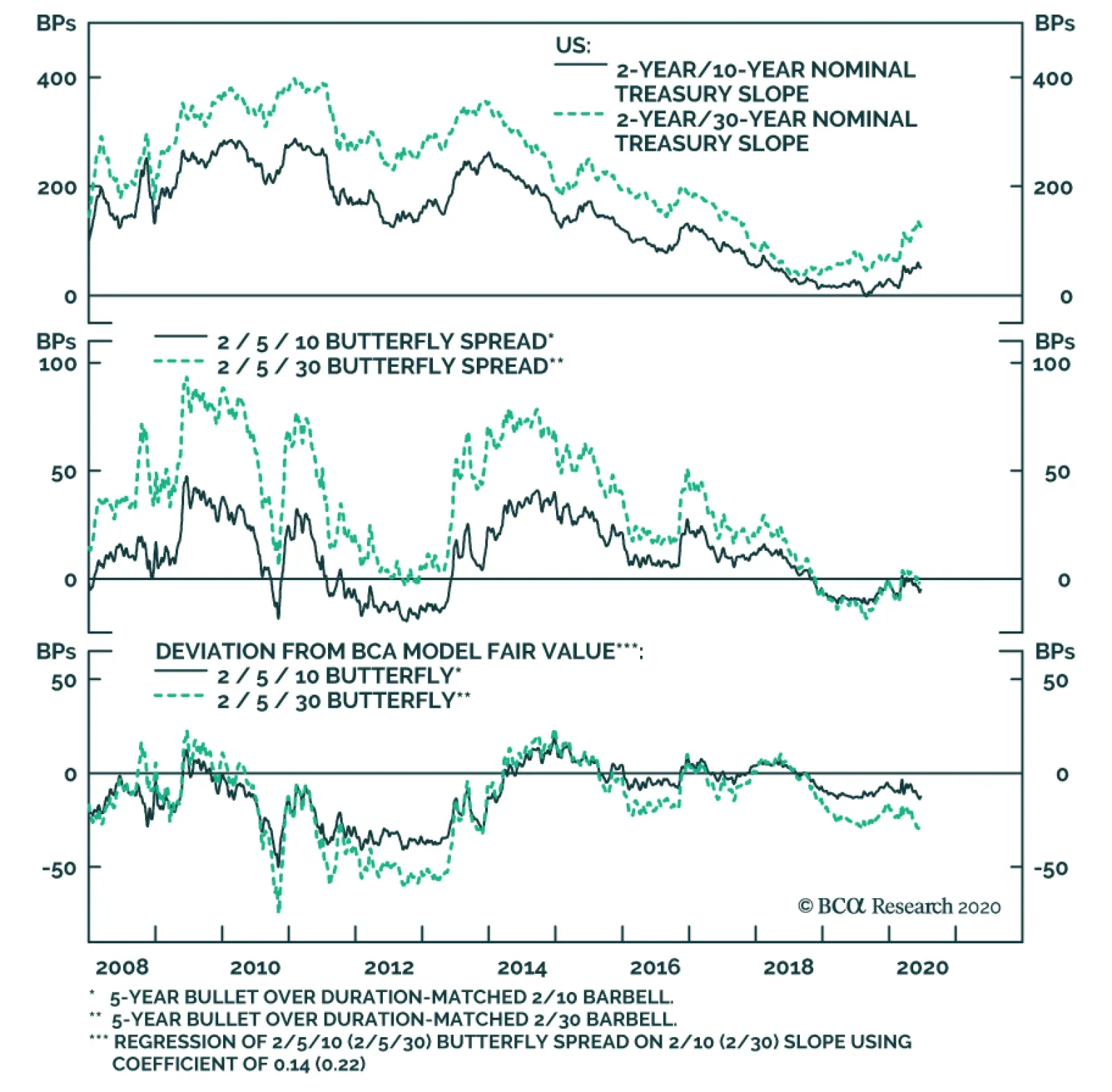
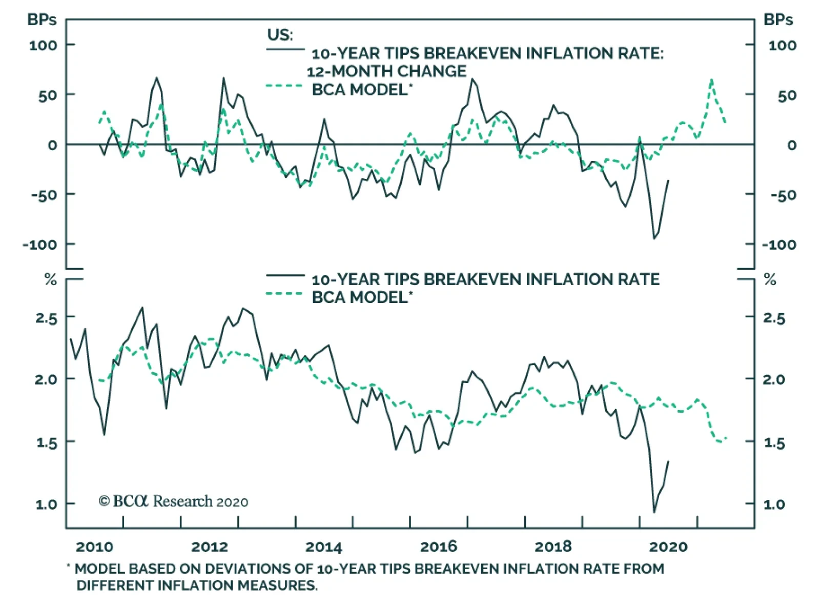
As we have previously written, bond yields should move modestly higher over the course of the summer as the US economy re-opens.1 However, there are enough potential medium-term pitfalls related to US politics and COVID transmission that we aren’t yet comfortable with below-benchmark portfolio duration. Instead, we recommend that investors keep portfolio duration close to benchmark on a 6-12 month horizon, but add three tactical overlay positions that will profit from higher bond yields: Overweight TIPS versus nominal Treasuries Duration-neutral nominal Treasury curve steepeners Real yield curve steepeners All three of these positions have performed well during the past couple of months (Chart 1), and in the first section of this report we assess whether they have further to run. The remaining two sections of this week’s report consider the outlooks for investment grade and high-yield Technology bonds, respectively. Three Trades To Profit From Higher Yields 1) Overweight TIPS Versus Nominals Chart 2Adaptive Expectations Model
Adaptive Expectations Model
Adaptive Expectations Model
TIPS breakeven inflation rates have moved up considerably since mid-March. Back then, the 10-year TIPS breakeven rate troughed at 0.50%. It currently sits at 1.31%. Despite the large move, TIPS breakeven inflation rates still have a considerable amount of upside. One way to assess how much is through the lens of our Adaptive Expectations Model (Chart 2).2 This model considers several different measures of inflation expectations (based on realized CPI inflation and surveys) and uses the difference between those measures of inflation expectations and the 10-year TIPS breakeven inflation rate to forecast the future 12-month change in the 10-year TIPS breakeven. At present, the model forecasts that the 10-year TIPS breakeven inflation rate will rise 23 bps during the next 12 months, bringing it to 1.54%. It’s important to note that our model is biased towards measures of longer-run inflation expectations. As a result, it can be surprised from time to time by large fluctuations in drivers of short-term inflation expectations, like the oil price. This year’s massive drop in oil – and concurrent decline in headline inflation – were the main factors that caused the 10-year TIPS breakeven inflation rate to fall so far below our model’s fair value. However, as we discussed in last week’s report, the oil price looks to have troughed and there is preliminary evidence that we might also be past the lowest point for headline CPI.3 Profit from rising bond yields by entering a duration-neutral yield curve steepener. We see TIPS continuing to outperform nominal Treasuries over both short- and long-run horizons. 2) Duration-Neutral Yield Curve Steepeners Chart 3Stick With Steepeners
Stick With Steepeners
Stick With Steepeners
Another way to profit from rising bond yields without taking a large duration bet is via a duration-neutral yield curve steepener. One example would be a long position in the 5-year note and a short position in a duration-matched barbell consisting of the 2-year and 10-year notes. Alternatively, you could use the 2-year note and 30-year bond as the two legs of the barbell. These sorts of duration-matched trades where you take a long position in a bullet maturity near the middle of the curve and go short the wings are designed to perform well in periods of yield curve steepening.4 In the current environment, where dovish Fed guidance has dampened volatility at the front-end of the yield curve, any bond sell-off will be felt disproportionately at the long-end, leading to a steeper curve. The only problem with this proposed trade is that it is no longer cheap. The spread between the 5-year bullet and 2/10 barbell is -6 bps and the spread relative to the 2/30 barbell is -3 bps (Chart 3). What’s more, the 5-year bullet trades expensive relative to the 2/10 and 2/30 barbells, according to our fair value models (Chart 3, bottom panel). However, for the time being we are inclined to overlook stretched valuations. The 5-year bullet does appear expensive but it has been more expensive in the past, most notably during the last zero-lower-bound episode from 2010 to 2013. Similar to then, the market is now priced for an extended period of a zero fed funds rate. We would not be surprised to see bullets become much more expensive in that sort of environment, and possibly even return to extended 2010-2013 valuations. We recommend holding onto duration-neutral yield curve steepeners, despite unattractive valuations. Specifically, we favor going long the 5-year bullet and short a duration-matched 2/10 barbell. 3) Real Yield Curve Steepeners Chart 4Higher Inflation Means Steeper Real Yield Curve
Higher Inflation Means Steeper Real Yield Curve
Higher Inflation Means Steeper Real Yield Curve
The final position we recommend is a steepener along the real yield curve. We first recommended this trade on April 28 when a plunge in oil (and spike in deflationary sentiment) caused the real 2-year yield to jump to 0.28% compared to a real 10-year yield of -0.70%.5 Since then, the real 2-year yield has collapsed to -1% compared to a real 10-year yield of -0.87%. Although the real 2-year/10-year slope is once again positive, it has typically been higher during the past few years (Chart 4). We therefore expect further steepening as long as the oil price and headline inflation continue to recover from April’s lows. Much like during the 2008/09 financial crisis, the combination of the Fed’s zero-lower-bound forward guidance and a massive drop in both oil and headline inflation caused short-dated real yields to jump. Subsequently, this led to a massive steepening of the real yield curve, once the oil price and headline inflation started to recover. We believe that same dynamic is playing out today. Investors should continue to hold real yield curve steepeners, at least until rebounding oil and headline CPI return short-dated inflation expectations to more reasonable levels. Investment Grade Tech Risk Profile Technology accounts for 9% of the overall Bloomberg Barclays investment grade corporate index, which makes it the second biggest industry group, after Banking. Its large index weight is due to the presence of three tech giants: Microsoft (Aaa-rated), Apple (Aa-rated) and Oracle (A-rated) which, combined, constitute 38% of the Tech sector. Investment grade Technology is a highly defensive corporate bond sector. In sharp contrast with the equity market, Technology is a highly defensive corporate bond sector. That is, it tends to outperform the overall corporate bond index during periods of spread widening and underperform during periods of spread tightening. This largely comes down to the fact that Tech has a higher credit rating than the overall corporate index. Twenty five percent of the Tech sector’s market cap carries a Aaa or Aa rating compared to just 9% for the overall index (Chart 5). Further, of the high-flying FAANG stocks that garner a lot of attention from equity analysts, only Apple is a significant presence in the Technology bond index.6 Chart 5Investment Grade Credit Rating Distributions*
Take A Look At High-Yield Technology Bonds
Take A Look At High-Yield Technology Bonds
Chart 6IG Technology Risk ##br##Profile
IG Technology Risk Profile
IG Technology Risk Profile
The Tech sector’s defensive nature is confirmed by looking at its duration-times-spread (DTS) ratio and historical excess returns (Chart 6).7 The sector’s DTS ratio is consistently below 1.0, and its excess returns show a clear pattern of outperformance during periods of spread widening and underperformance during periods of spread tightening. Valuation In terms of valuation, although the Tech sector does not offer a spread advantage over the corporate index – which should be expected given its higher credit rating – we find that it trades cheap relative to its comparable credit tier (Table 1). Tech offers an option-adjusted spread of 115 bps versus 111 bps for the A-rated corporate index, and the sector still appears attractive after controlling for duration differences by looking at the 12-month breakeven spread. In absolute terms, Tech sector spreads are just above their median since 2010. The A-rated corporate index spread currently sits right on top of its post-2010 median. Table 1IG Technology Valuation
Take A Look At High-Yield Technology Bonds
Take A Look At High-Yield Technology Bonds
Balance Sheet Health Chart 7IG Technology Debt Growth
IG Technology Debt Growth
IG Technology Debt Growth
The Technology sector added a large amount of debt during the last recovery. The par value of the Tech index’s outstanding debt has grown 5.2 times since 2010 compared to 2.4 times for the benchmark. As a result, Tech’s weight in the corporate index has more than doubled, from 4% to 9% (Chart 7). However, earnings have done a pretty good job of keeping pace with the large increase in debt. The market cap-weighted net debt-to-EBITDA ratio for the investment grade Tech index is only 2.4, and the sector’s average credit rating has been stable since 2010. At the individual issuer level, there are 58 issuers in the Tech index and only 4 currently have a negative ratings outlook from Moody’s (Appendix B). What’s more, of the 16 Tech sector ratings that Moody’s has reviewed this year, 12 have been affirmed with a stable outlook, 1 was assigned a positive outlook and only 3 were assigned negative outlooks. Macro Considerations Chart 8Technology Sector Macro Drivers
Technology Sector Macro Drivers
Technology Sector Macro Drivers
The Tech sector can be split into three major segments that have distinct macro drivers: Software (26% of Tech index market cap, includes Microsoft and Oracle) Hardware (29% of Tech index market cap, includes Apple, IBM and Dell) Semiconductors (24% of Tech index market cap, includes Intel and Avago Technologies) Software investment has been in a structural bull market for many years, and should remain resilient during the COVID recession as demand for remote working solutions increases. While we only have data through the end of March, software investment did not see the same collapse as other sectors during the first quarter (Chart 8). The Hardware and Semiconductor segments are more cyclical and geared toward manufacturing. As such, their macro outlooks were already challenged pre-COVID, due to the US/China trade war and manufacturing downturn of 2019. Both US computer exports and global semiconductor sales were showing signs of life near the end of last year, but were decimated when the pandemic struck in 2020 (Chart 8, panels 3 & 4). A revival in this space is contingent upon continued gradual re-opening and a return to economic growth. More optimistically, US consumer spending on personal computers and peripheral equipment has not fallen as much as broad consumer spending during the past few months (Chart 8, bottom panel). In the long-run, the 5G smartphone rollout is a significant structural tailwind for both semiconductor issuers and Apple. Meanwhile, the threat of significant regulatory crackdown on Tech firms remains a long-run risk. Our sense is that any push toward stricter regulations won’t have that much impact on Technology bond returns. This is because the subjects of most lawmaker scrutiny – Facebook, Amazon and Google – are largely absent from the Bloomberg Barclays Tech index. Investment Conclusions We expect that investment grade corporate bond spreads will tighten during the next 6-12 months. Against this positive back-drop, investors should focus exposure on cyclical (lower-rated) sectors that offer greater expected returns. With that in mind, the Tech sector’s high credit rating and defensive characteristics make it decidedly un-compelling. However, Tech does offer a slight spread advantage compared to other A-rated bonds and the macro back-drop is reasonably supportive. We would therefore recommend Tech bonds to investors looking for some A-rated corporate bond exposure. But in general, we prefer the greater spreads on offer from sectors that occupy the high-quality Baa space, such as subordinate bank debt.8 High-Yield Tech Risk Profile High-Yield Technology’s credit rating profile is similar to that of the overall benchmark, but with a slightly larger presence of low-rated (Caa & below) issuers (Chart 9). The largest issuers in the space are Dell (5.7% of Tech index market cap, Ba-rated), MSCI Inc. (5.1% of Tech index market cap, Ba-rated, see copyright declaration) and CommScope (8.1% of Tech index market cap, B-rated). High-yield Tech recently transitioned from being a cyclical sector to a defensive one. Interestingly, the high-yield Tech sector recently transitioned from being a cyclical sector to a defensive one. The sector behaved cyclically during the 2008 recession, underperforming the index when spreads widened and outperforming when they tightened. But Tech then outperformed the High-Yield index during the spread widening episodes of 2015 and 2020. Based on the sector’s low DTS ratio, this defensive behavior should persist for the next 12 months (Chart 10). Chart 9High-Yield Credit Rating Distributions*
Take A Look At High-Yield Technology Bonds
Take A Look At High-Yield Technology Bonds
Chart 10HY Technology Risk Profile
HY Technology Risk Profile
HY Technology Risk Profile
Valuation The High-Yield Technology option-adjusted spread (OAS) is significantly lower than the average OAS for the benchmark High-Yield index. However, it offers a spread premium compared to other Ba-rated issuers (Table 2). Adjusting for duration differences by looking at the 12-month breakeven spread makes high-yield Tech look significantly more attractive. The high-yield Tech spread would have to widen by 146 bps for the sector to underperform duration-matched Treasuries during the next 12 months. This compares to 96 bps for other Ba-rated issuers and 152 bps for the overall junk index. Table 2HY Technology Valuation
Take A Look At High-Yield Technology Bonds
Take A Look At High-Yield Technology Bonds
It is apparent that the Tech sector’s low average duration (Chart 10, bottom panel) is a major reason for its relatively tight OAS. On a risk-adjusted basis, high-yield Tech valuation actually appears quite compelling, with a 12-month breakeven spread only 6 bps below that of the overall index. Balance Sheet Health Chart 11HY Technology Debt Growth
HY Technology Debt Growth
HY Technology Debt Growth
The amount of outstanding high-yield Technology debt has grown a bit more rapidly than overall junk index debt since 2010 (Chart 11). As a result, Technology’s weight in the index has increased from 5% in 2010 to 6% today. At the issuer level, the Tech sector should benefit from having a large number of issuers that will be able to take advantage of the Fed’s Main Street Lending facilities. To be eligible for the Main Street facilities, issuers must have less than 15000 employees or less than $5 billion in 2019 revenue. Also, the issuers must be able to keep their Debt-to-EBITDA ratios below 6.0, including any new debt added through the Main Street programs. Of the 43 high-yield Tech issuers with available data, we estimate that 30 are eligible to receive support from the Main Street facilities (Appendix C). This even includes 11 out of the 16 B-rated issuers. Typically, we don’t expect that many B-rated issuers will be eligible for the Main Street facilities, which makes this result encouraging for Tech sector spreads. Investment Conclusions We recommend an overweight allocation to high-yield Technology bonds. As we wrote last week, high-yield spreads appear too tight if we ignore the impact of the Fed’s emergency lending facilities and consider only the fundamental credit back-drop.9 With that in mind, we want to focus our high-yield allocation on defensive sectors where a large proportion of issuers able to benefit from Fed support. The Technology sector checks both of those boxes and offers attractive risk-adjusted compensation to boot. Appendix A: Buy What The Fed Is Buying The Fed rolled out a number of aggressive lending facilities on March 23. These facilities focused on different specific sectors of the US bond market. The fact that the Fed has decided to support some parts of the market and not others has caused some traditional bond market correlations to break down. It has also led us to adopt of a strategy of “Buy What The Fed Is Buying”. That is, we favor those sectors that offer attractive spreads and that benefit from Fed support. The below Table tracks the performance of different bond sectors since the March 23 announcement. We will use this to monitor bond market correlations and evaluate our strategy’s success. Table 3Performance Since March 23 Announcement Of Emergency Fed Facilities
Take A Look At High-Yield Technology Bonds
Take A Look At High-Yield Technology Bonds
Appendix B Table 4Investment Grade Technology Issuers
Take A Look At High-Yield Technology Bonds
Take A Look At High-Yield Technology Bonds
Appendix C Table 5High-Yield Technology Issuers
Take A Look At High-Yield Technology Bonds
Take A Look At High-Yield Technology Bonds
Ryan Swift US Bond Strategist rswift@bcaresearch.com Jeremie Peloso Senior Analyst jeremiep@bcaresearch.com Footnotes 1 Please see US Bond Strategy Weekly Report, “Bonds Vulnerable As North America Re-Opens”, dated May 26, 2020, available at usbs.bcaresearch.com 2 For more details on our Adaptive Expectations Model please see US Bond Strategy Weekly Report, “How Are Inflation Expectations Adapting?”, dated February 11, 2020, available at usbs.bcaresearch.com 3 Please see US Bond Strategy Weekly Report, “No Holding Back”, dated June 16, 2020, available at usbs.bcaresearch.com 4 For an explanation of why this works please see US Bond Strategy Special Report, “Bullets, Barbells And Butterflies”, dated July 25, 2017, available at usbs.bcaresearch.com 5 Please see US Bond Strategy Weekly Report, “Negative Oil, The Zero Lower Bound And The Fisher Equation”, dated April 28, 2020, available at usbs.bcaresearch.com 6 Of the other FAANG stocks: Google accounts for just 0.5% of Tech bond sector market cap, Facebook has close to no debt, Amazon is included in the Consumer Cyclical corporate bond index and Netflix is included in the Media: Entertainment sector of the High-Yield index. 7 Duration-Times-Spread (DTS) is a simple measure that is highly correlated with excess return volatility for corporate bonds. The DTS ratio is the ratio of a sector’s DTS to that of the benchmark index. It can be thought of like the beta of a stock. A DTS ratio above 1.0 signals that the sector is cyclical (or “high beta”), a DTS ratio below 1.0 signals that the sector is defensive or (“low beta”). For more details on the DTS measure please see: Arik Ben Dor, Lev Dynkin, Jay Hyman, Patrick Houweling, Erik van Leeuwen & Olaf Penninga, “DTS (Duration-Times-Spread)”, Journal of Portfolio Management 33(2), January 2007. 8 For more details on our recommendation to overweight subordinate bank bonds please see US Bond Strategy Weekly Report, “Negative Oil, The Zero Lower Bound And The Fisher Equation”, dated April 28, 2020, available at usbs.bcaresearch.com 9 Please see US Bond Strategy Weekly Report, “No Holding Back”, dated June 16, 2020, available at usbs.bcaresearch.com Fixed Income Sector Performance Recommended Portfolio Specification
The copper/gold ratio troughed at the end of March and has been rising ever since. When the price of copper leads the price of gold higher, the market is sniffing out the positive impact on growth of reflation efforts by global central banks and fiscal…
Highlights We conservatively estimate lost output from shutdowns and social distancing will equal $10 trillion, and we expect the jobs market to be permanently scarred. Inflation, even at 2 percent, is a pipe dream, which leads to three investment conclusions on a 1-year horizon: Overweight US T-bonds and Spanish Bonos versus German Bunds and French OATs. Any high-quality bond yield that can decline will decline. Overweight CHF/USD. The tightening yield spread will structurally favour the CHF, while the haven status of the CHF should prevent it from underperforming in periods of market stress. Overweight defensive equities (technology and healthcare) versus cyclical equities (banks and energy). This implies underweight European equities versus other markets. Fractal trade: Short Germany versus the UK. The recent outperformance of German equities is technically extended. Feature Chart of the WeekCredit Impulses Are Large, But The Hole In Output Is Much Larger
Credit Impulses Are Large, But The Hole In Output Is Much Larger
Credit Impulses Are Large, But The Hole In Output Is Much Larger
Big numbers befuddle us. Hardly a day passes without someone listing the unprecedented global stimulus unleashed to counter the coronavirus forced shutdowns – the trillions in government spending promises, tax relief, loan guarantees, money supply growth, and central bank asset-purchases. The most optimistic estimates quantify the total stimulus at $15 trillion. This includes $7 trillion of loan guarantees plus increases in central bank balance sheets which do not directly boost demand. So the direct stimulus is closer to $7 trillion.1 Yet the size of the stimulus is meaningless until we quantify the massive hole in economic output that needs to be filled. Assuming no further large-scale shutdowns, we conservatively estimate that the hole will amount to 12 percent of world output, or $10 trillion. A $10 Trillion Hole In Output Last week, the UK’s Office for National Statistics (ONS) helped us to estimate the hole in output, because unusually the ONS calculates UK GDP on a monthly basis. Between February and April, when the UK economy went from fully open to full shutdown, UK GDP collapsed by 25 percent. This despite the UK having an outsized number of jobs suitable for ‘working from home.’ For a more typical economy, we estimate that a full shutdown collapses output by 30 percent (Chart I-2). Chart I-2A Full Shutdown Collapses Output By 30 Percent
A Full Shutdown Collapses Output By 30 Percent
A Full Shutdown Collapses Output By 30 Percent
The next question is: how long does the full shutdown last? Assuming it lasts for three months, output would suffer a hole amounting to 7.5 percent of annual GDP.2 But in practice, the economy will not fully re-open after three months. Social distancing will persist until people feel confident that the pandemic is under control. An effective vaccine against Covid-19 is unlikely to be available for a year. So, even without government policy to enforce social distancing, many people will choose to avoid crowds and congregations for fear of catching the virus. The size of the stimulus is meaningless until we quantify the massive hole in economic output. This means that the sectors that rely on crowds and congregations – leisure and hospitality and retail trade – will be operating at half-capacity, at best. Given that these sectors generate 9 percent of GDP, operating at half-capacity will create an additional hole amounting to 4.5 percent of output. More worryingly, these two sectors employ 21 percent of all workers, so operating at sub-par will leave the jobs market permanently scarred.3 Combining the 7.5 percent existing hole with the 4.5 percent future hole, the full hole in economic output will amount to around 12 percent of annual GDP. As global GDP is worth around $85 trillion, this equates to $10 trillion. Crucially though, our estimate assumes that a second wave of the pandemic will not force a new cycle of shutdowns. If it does, the hole will become even bigger. Don’t Be Fooled By Money Supply Growth The recent growth in broad money supply seems a big number. Since the start of the year, the outstanding stock of bank loans has increased by around $0.7 trillion in the euro area, and by $1 trillion in both the US and China (Chart I-3 and Chart I-4). This has boosted the 6-month credit impulses in all three economies. Indeed, the US 6-month credit impulse recently hit its highest value of all time, and the combined 6-month impulse across all three blocs equals around $2 trillion (Chart of the Week). Chart I-3Don't Be Fooled By Money Supply Growth In The Euro Area And The US...
Don't Be Fooled By Money Supply Growth In The Euro Area And The US...
Don't Be Fooled By Money Supply Growth In The Euro Area And The US...
Chart I-4...And In ##br##China
...And In China
...And In China
This 6-month credit impulse quantifies the additional borrowing in the most recent six-month period compared to the previous period. Ordinarily, a $2 trillion impulse would create a huge boost to demand. After all, the private sector does not usually borrow just to hold the cash in a bank. Yet in the coronavirus crisis this is precisely what has happened. While the shutdowns lasted, firms drew on existing bank credit lines to build up emergency cash buffers. Therefore, much of the money growth will not generate new demand. While the shutdowns lasted, firms drew on existing bank credit lines to build up emergency cash buffers. To the extent that this cash is sitting idly in a firm’s bank account, the monetary velocity will decline. Meaning there will be a much-reduced transmission from credit impulses to spending growth. Furthermore, when the economy re-opens, many firms will relinquish the precautionary credit lines. There is no point holding cash in the bank when there are few investment opportunities. Hence, credit impulses will fall back – as seems to be the case right now in the US. QE: The Great Misunderstanding To repeat, big numbers befuddle us. They must always be put into context. No truer is this than when it comes to central bank asset-purchases. The great misunderstanding is that the act of central banks buying assets, per se, drives up those asset prices. Central banks act as lenders of last resort to solvent but illiquid banks and sovereigns. If there is ample liquidity in these markets – as is the case now – then the primary function of central bank asset-purchases is to set the term-structure of interest rates. In turn, the term-structure of global interest rates establishes the prices of $500 trillion of global assets. The prices of these assets are inextricably inter-connected and inter-dependent4 (Chart I-5). Chart I-5The Prices Of $500 Trillion Of Assets Are Inextricably Inter-Connected
The Prices Of $500 Trillion Of Assets Are Inextricably Inter-Connected
The Prices Of $500 Trillion Of Assets Are Inextricably Inter-Connected
The great misunderstanding is that the act of central banks buying assets, per se, drives up those asset prices. Yet central banks set no price target for their asset-purchases. They leave that to the market. Moreover, in the context of the $500 trillion of inter-dependent asset prices, the $10-15 trillion or so of central bank asset-purchases to date constitutes chicken feed (Chart I-6). Hence, the mechanism by which asset-purchases work is through the signal they give to the $500 trillion market on the likely course of interest rate policy. This sets the term-structure of interest rates, which in turn sets the required return on all the $500 trillion of assets (Chart I-7). Chart I-6$10-15 Trillion Of QE Is Chicken Feed...
$10-15 Trillion Of QE Is Chicken Feed...
$10-15 Trillion Of QE Is Chicken Feed...
Chart I-7...Compared To $500 Trillion Of Assets Priced By The Term-Structure Of Interest Rates
...Compared To $500 Trillion Of Assets Priced By The Term-Structure Of Interest Rates
...Compared To $500 Trillion Of Assets Priced By The Term-Structure Of Interest Rates
As the ECB’s former Chief Economist, Peter Praet, explains: “There is a signalling channel inherent in asset purchases, which reinforces the credibility of forward guidance on policy rates. This credibility of promises to follow a certain course for policy rates in the future is enhanced by the asset purchases, as these asset purchases are a concrete demonstration of our desire (to keep policy rates at the lower bound.)” The credible commitment to keep policy rates near the lower bound for an extended period depresses bond yields towards the lower bound too. But once bond yields have reached their lower bound the effectiveness of central bank asset-purchases becomes exhausted. Three Investment Conclusions The main purpose of this report was to put the $7 trillion of direct stimulus dollars unleashed into the economy into a proper context. With lost output estimated at $10 trillion and the jobs market permanently scarred, inflation – even at 2 percent – is a pipe dream. Moreover, a second wave of the pandemic and a new cycle of shutdowns would inject a further disinflationary impulse. This leads to three investment conclusions on a 1-year horizon: Any high-quality bond yield that can decline – because it is not already near the -1 percent lower bound to yields – will decline. An excellent relative value trade is to overweight US T-bonds and Spanish Bonos versus German Bunds and French OATs (Chart I-8). Long CHF/USD is a win-win. The tightening yield spread will structurally favour the CHF, while the haven status of the CHF should prevent it from underperforming in periods of market stress. Overweight defensive equities versus cyclical equities, with technology correctly defined as defensive, not cyclical. The performance of cyclicals (banks and energy) versus defensives (technology and healthcare) is now joined at the hip to the bond yield (Chart I-9). This implies underweight European equities versus other markets. Chart I-8Bond Yields That Can Decline Will Decline
Bond Yields That Can Decline Will Decline
Bond Yields That Can Decline Will Decline
Chart I-9The Performance Of Cyclicals Versus Defensives Is Joined At The Hip To The Bond Yield
The Performance Of Cyclicals Versus Defensives Is Joined At The Hip To The Bond Yield
The Performance Of Cyclicals Versus Defensives Is Joined At The Hip To The Bond Yield
Fractal Trading System* The recent outperformance of German equities is technically extended. Accordingly, this week’s recommended trade is to go short Germany versus the UK, expressed through the MSCI dollar indexes. Set the profit target and symmetrical stop-loss at 5 percent.
MSCI: Germany Vs. UK
MSCI: Germany Vs. UK
In other trades, long euro area personal products versus healthcare achieved its 7 percent profit target at which it was closed. The rolling 1-year win ratio now stands at 65 percent. When the fractal dimension approaches the lower limit after an investment has been in an established trend it is a potential trigger for a liquidity-triggered trend reversal. Therefore, open a countertrend position. The profit target is a one-third reversal of the preceding 13-week move. Apply a symmetrical stop-loss. Close the position at the profit target or stop-loss. Otherwise close the position after 13 weeks. * For more details please see the European Investment Strategy Special Report “Fractals, Liquidity & A Trading Model,” dated December 11, 2014, available at eis.bcaresearch.com. Footnotes 1 Source: Reuters estimate. 2 A 30 percent loss in output for a quarter of a year (3 months) amounts to a 30*0.25 = 7.5 percent loss in annual output. 3 Using the weights of leisure and hospitality and retail trade in the US economy as a proxy for the global weights. 4 The $500 trillion of assets comprises: real estate $300 trillion, public and private equity $100 trillion, corporate bonds and EM debt $50 trillion, and high-quality government bonds $50 trillion. Dhaval Joshi Chief European Investment Strategist dhaval@bcaresearch.com Fractal Trading System Cyclical Recommendations Structural Recommendations Closed Fractal Trades Trades Closed Trades Asset Performance Currency & Bond Equity Sector Country Equity Indicators Bond Yields Indicators To Watch - Bond Yields
Indicators To Watch - Bond Yields
Indicators To Watch - Bond Yields
Indicators To Watch - Bond Yields
Indicators To Watch - Bond Yields
Indicators To Watch - Bond Yields
Indicators To Watch - Bond Yields
Indicators To Watch - Bond Yields
Indicators To Watch - Bond Yields
Indicators To Watch - Bond Yields
Indicators To Watch - Bond Yields
Indicators To Watch - Bond Yields
Interest Rate Indicators To Watch - Interest Rate Expectations
Indicators To Watch - Interest Rate Expectations
Indicators To Watch - Interest Rate Expectations
Indicators To Watch - Interest Rate Expectations
Indicators To Watch - Interest Rate Expectations
Indicators To Watch - Interest Rate Expectations
Indicators To Watch - Interest Rate Expectations
Indicators To Watch - Interest Rate Expectations
Indicators To Watch - Interest Rate Expectations
Indicators To Watch - Interest Rate Expectations
Indicators To Watch - Interest Rate Expectations
Indicators To Watch - Interest Rate Expectations
BCA Research's US Bond Strategy service maintains its underweight allocation to bonds rated B and below. Ba-rated bonds are largely eligible for the Fed’s emergency lending facilities while lower-rated junk bonds are mostly left out in the cold. Moreover,…
Highlights High-Yield: Our analysis of current junk spread levels relative to likely economic outcomes leaves us inclined to maintain our current recommended positioning: Overweight Ba-rated bonds, underweight bonds rated B & below. Fed/Treasuries: There is no urgency for the Fed to provide more explicit forward rate guidance. The market has already taken on board the expectation that the funds rate will stay pinned at zero at least through the end of 2022. Investors should keep portfolio duration near benchmark but add tactical overlay positions: long TIPS versus nominal Treasuries, and steepeners along both the nominal and real yield curves. Securitizations: We recommend that investors continue to overweight Aaa-rated consumer ABS and CMBS, as both sectors offer attractive spreads and benefit from TALF. Despite the lack of Fed support, adding some non-Aaa consumer ABS exposure also makes sense. Investors should continue to avoid Agency MBS, where value has improved but prepayment risk remains high. Feature In case it wasn’t already obvious that the Fed will continue to act as a tailwind behind risky asset prices, Chair Powell made it abundantly clear at last week’s FOMC press conference. When asked about the risk of bubbles in financial markets, Powell’s response was to focus on the millions of unemployed workers and imply that it would be a dereliction of the Fed’s duties if it were to hold back on monetary stimulus because it thought asset prices were too high. Ironically, this strong statement of market support came the day before the S&P 500 fell 6% in a single session. Nonetheless, with the Fed providing such aggressive forward guidance on top of direct intervention in certain segments of the fixed income market, it behooves us to consider whether our recommended portfolio allocation is insufficiently aggressive. The Strong Performance Of Low-Rated Junk Chart 1Lower-Rated Junk Bonds Playing Catch-Up
Lower-Rated Junk Bonds Playing Catch-Up
Lower-Rated Junk Bonds Playing Catch-Up
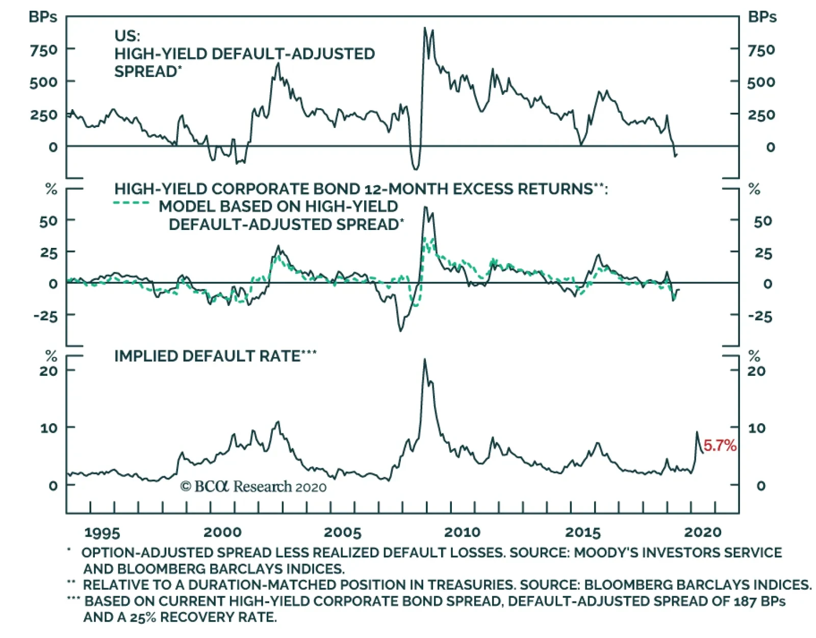
Within the high-yield corporate bond market we have been advising an overweight allocation to Ba-rated bonds but an underweight allocation to bonds rated B and below. The reasoning is that Ba-rated bonds are largely eligible for the Fed’s emergency lending facilities while lower-rated junk bonds are mostly left out in the cold.1 This positioning worked well throughout April and the first half of May, but lower-rated junk bonds have started to play catch-up during the past month (Chart 1). High-Yield Index Fundamentals To get a sense of whether we should extend our overweight recommendation to the B and below credit tiers, let’s first perform a valuation exercise on the entire high-yield index. In this exercise we consider current spread levels relative to likely economic outcomes. We set aside any impact from direct Fed intervention for the time being. Our analysis revolves around the High-Yield Default-Adjusted Spread (Chart 2). This valuation measure takes the junk index spread and subtracts default losses realized during the subsequent 12 month period. The spread’s historical average is around 250 bps, but it has occasionally dipped below zero during periods when default losses swamp the compensation offered by the index. Chart 2High-Yield Index Assessment: Default-Adjusted Spread
High-Yield Index Assessment: Default-Adjusted Spread
High-Yield Index Assessment: Default-Adjusted Spread
The Default-Adjusted Spread also lines up very closely with 12-month excess returns (Chart 2, panel 2). A simple linear regression model of 12-month excess returns versus the Default-Adjusted Spread gives an R2 of 53% and tells us that the threshold between positive and negative excess returns is a Default-Adjusted Spread of 187 bps. That is, if the Default-Adjusted Spread is above 187 bps we should expect high-yield to outperform Treasuries, if it is below 187 bps we should expect high-yield to underperform. With that in mind, we can apply some quick figures to the current context. The High-Yield index option-adjusted spread is 611 bps. If we assume a default rate of 10% and recovery rate of 25% for the next 12 months, we get expected default losses of 750 bps and a Default-Adjusted Spread of -139 bps. We should expect Treasuries to outperform junk bonds in that scenario. Ba-rated bonds are largely eligible for the Fed’s emergency lending facilities while lower-rated junk bonds are mostly left out in the cold. We can also perform the same sort of analysis in reverse. If we target a Default-Adjusted Spread of 187 bps – the spread that is consistent with high-yield performing in line with Treasuries – and we also assume a recovery rate of 25%, then the current index spread gives us an implied 12-month default rate of 5.7% (Chart 2, bottom panel). That is, we should expect high-yield to outperform Treasuries during the next 12 months if the default rate comes in below 5.7%, and underperform if it is above 5.7%. There are a couple assumptions used in the above analysis that require clarification. First, we relied on a simple linear regression model to get the result that a Default-Adjusted Spread of 187 bps is consistent with junk bonds breaking even with Treasuries. This is not an entirely accurate depiction of the historical record. Table 1 shows a more complete picture of the historical linkage between the Default-Adjusted Spread and 12-month high-yield excess returns. Here, we see that junk bonds have actually outperformed duration-matched Treasuries 81% of the time when the Default-Adjusted Spread is between 150 bps and 200 bps, and 72% of the time when it is between 100 bps and 150 bps. Relative junk bond losses only become more likely than gains when the Default-Adjusted Spread is below 100 bps. Table 1The Default-Adjusted Spread & High-Yield Excess Returns
No Holding Back
No Holding Back
Second, we assumed a 25% recovery rate when we calculated our implied default rate of 5.7%. This is low compared to the historical average, but we would argue that a low recovery rate assumption is appropriate in the current environment. We analyzed the main economic drivers of default and recovery rates in a recent Special Report and found that the recovery rate observed during an economic downturn is primarily driven by corporate balance sheet leverage heading into that downturn.2 Corporate balance sheets were carrying a lot of debt heading into the current recession, meaning that we should expect a lower-than-normal recovery rate. In fact, the current trailing 12-month recovery rate is 22%, below our assumed level. Table 2 shows what the Default-Adjusted Spread will be for the next 12 months under different default and recovery rate assumptions. We think that 25% is a reasonable recovery rate assumption and expect that the default rate will be somewhere between 9% and 12% during the next 12 months. At present, Moody’s baseline 12-month default rate forecast is 11.6%. Table 2Default-Adjusted Spread (BPs) Given Different Assumptions For Default And Recovery Rates
No Holding Back
No Holding Back
Clearly, junk spreads do not offer adequate compensation for default losses in the economic environment we anticipate. This logic also extends to the individual B and Caa/C credit tiers when we look at them in isolation. A Focus On B-Rated & Below Junk Bonds Charts 3A and 3B show the historical linkage between Default-Adjusted Spreads and excess returns for those specific credit tiers, with forecasts plugged in for “mild”, “moderate” and “severe” default scenarios. All three scenarios use a recovery rate of 25%. The assumed default rate is 6% in the “mild” scenario, 9% in the “moderate” scenario and 12% in the “severe” scenario. Default-adjusted compensation is unattractive in all three cases. Chart 3AB-Rated Default-Adjusted Spread
No Holding Back
No Holding Back
Chart 3BCaa/C-Rated Default-Adjusted Spread
No Holding Back
No Holding Back
Bottom Line: Our analysis of current junk spread levels relative to likely economic outcomes leaves us inclined to maintain our current recommended positioning: Overweight Ba-rated bonds, underweight bonds rated B & below. The Fed’s support for the Ba credit tier will significantly limit default losses for those bonds, making current spread levels attractive. However, absent Fed intervention, junk spreads are already far too tight. Investors should avoid bonds rated B & below where issuers generally don’t benefit from the Fed’s emergency programs. No Rush For More Explicit Forward Guidance In addition to Chair Powell’s strong statement of support for risky assets, last week’s FOMC meeting brought us the committee’s updated interest rate projections. With only two exceptions, those projections revealed that all Fed policymakers expect to keep the fed funds rate at its current level at least until the end of 2022. There had been some expectation that the Fed might provide more explicit forward guidance for the funds rate. Something along the lines of the “Evans Rule” that was used during the last zero-lower-bound episode. For example, the Fed could pledge to not increase rates until the unemployment rate is below some specified threshold or inflation is above some specified threshold. Fed policymakers expect to keep the fed funds rate at its current level at least until the end of 2022. This sort of forward guidance would be useful if the Fed needed to convince markets about its commitment to keeping rates pinned near zero, but the market has already internalized that message. Notice in Chart 4 that expectations priced into the overnight index swap curve show no rate hikes through the end of 2022. The same goes for the median estimate from the New York Fed’s April 2020 Survey of Market Participants. Chart 4Fed Policymakers And Market Participants Agree: No Hikes Until 2023
Fed Policymakers And Market Participants Agree: No Hikes Until 2023
Fed Policymakers And Market Participants Agree: No Hikes Until 2023
More explicit forward rate guidance will likely be required in the future, when the market starts to price-in the eventual return of rate hikes. But for the time being, the Fed will probably be content to stay the course. Treasury Positioning The combination of the Fed’s strong commitment to zero interest rates and the risks to the 6-12 month economic outlook that we detailed in last week’s report make us inclined to maintain our recommended “At Benchmark” portfolio duration stance.3 However, we also recognize that yields are more likely to rise than fall in the coming months as the US economy re-opens and the economic data trend higher. For this reason, we advise holding several tactical overlay trades that will profit from rising bond yields: overweight TIPS versus nominal Treasuries, duration-neutral nominal curve steepeners, real yield curve steepeners. On TIPS, May’s CPI report showed a third consecutive month-over-month decline but the drop was far less severe than what was seen in March and April (Chart 5). This is a preliminary indication that we could already be passed the trough in inflation. The fact that trimmed mean CPI has not followed the core measure lower during the past few months is further evidence that inflation may not fall much more from its current level (Chart 5, bottom panel). If inflation has indeed bottomed, then our recommendation to favor TIPS over nominal Treasuries looks very good. We calculate that the current 1-year TIPS breakeven inflation rate is 0.1%, slightly below trailing 12-month headline CPI inflation (Chart 5, panel 2). Along the nominal Treasury curve, we continue to recommend favoring the 5-year bullet over a duration-matched 2/10 barbell. This position will profit from continued 2/10 yield curve steepening (Chart 6). We also recommend steepeners along the real yield curve. The real 2/10 slope has already steepened a lot (Chart 6, bottom panel), but has more room to run given that the 2-year cost of inflation compensation remains well below the 10-year cost (Chart 6, panel 3). Chart 5Is The Trough In Inflation Already##br## Behind Us?
Is The Trough In Inflation Already Behind Us?
Is The Trough In Inflation Already Behind Us?
Chart 6Keep Steepeners Along Both The Nominal And Real Yield Curves
Keep Steepeners Along Both The Nominal And Real Yield Curves
Keep Steepeners Along Both The Nominal And Real Yield Curves
Bottom Line: There is no urgency for the Fed to provide more explicit forward rate guidance. The market has already taken on board the expectation that the funds rate will stay pinned at zero at least through the end of 2022. Investors should keep portfolio duration near benchmark but add tactical overlay positions: long TIPS versus nominal Treasuries, and steepeners along both the nominal and real yield curves. Securitized Products Update Take Some Non-Aaa Risk In Consumer ABS, But Not In CMBS Since the Fed rolled out its emergency lending facilities in late-March, our spread product strategy has been to favor sectors that offer attractive spreads and that benefit from Fed support. This has meant owning Aaa-rated consumer ABS and CMBS, which are eligible for the Fed’s Term Asset-Backed Securities Loan Facility (TALF), and avoiding non-Aaa securitizations, which don’t qualify for Fed support. How has this worked out? Aaa-rated ABS and CMBS have both performed well since spreads peaked on March 23 (Chart 7). Within ABS, Aaa issues have beaten Treasuries by 390 bps since March 23 compared to 290 bps for non-Aaa securities. In CMBS, non-Aaa securities have lagged, losing 470 bps versus Treasuries since March 23 compared to gains of 810 bps for Aaa CMBS. As Chart 7 makes plain, no segments of either market have regained all of the ground that was lost during March’s blow-up. Chart 7Opportunities In Non-Aaa Consumer ABS, But Not In CMBS
Opportunities In Non-Aaa Consumer ABS, But Not In CMBS
Opportunities In Non-Aaa Consumer ABS, But Not In CMBS
Going forward, we think it is wise to re-consider our strategy when it comes to consumer ABS. Specifically, we think investors should dip into non-Aaa ABS where we see potential for strong returns, even in the absence of Fed support. The reason for our optimism is that consumer credit losses will probably turn out to be significantly lower than many had feared in March. During the past two months, we learned that federal government stimulus actually caused real personal income to rise by 9% since February. Also, consumers have generally been able to keep up with their debt payments.4 According to data from TransUnion, the percentage of credit card and mortgage loans that are more than 30 days past due actually declined in April compared to March. For auto loans it only increased by 7 bps (Table 3). Further, the data show that households paid off significantly more of their credit card balances than usual in April, presumably because they received an influx of cash from the government but had fewer spending opportunities due to the quarantine. Table 3No Spike In Consumer Credit Delinquencies
No Holding Back
No Holding Back
There remains a risk that Congress will delay passing further stimulus measures to keep consumers flush during the next few months. But we think enough stimulus will be delivered to prevent a significant default spike in credit cards and auto loans. Investors should add some exposure to non-Aaa consumer ABS. CMBS is a different story. The commercial real estate market is particularly challenged by the current environment. The office and retail sectors in particular were already facing structural headwinds from remote working and online shopping, respectively. The pandemic has accelerated the adoption of those trends. Not surprisingly, May’s CMBS delinquency rate saw its largest jump since 2017 and more delinquencies are certainly on the way (Chart 8). Chart 8Challenging Environment For CMBS
Challenging Environment For CMBS
Challenging Environment For CMBS
Investors should continue to avoid non-Aaa CMBS. Continue To Avoid Agency MBS We have been advising an underweight allocation to Agency MBS because, even though the securities benefit from support through the Fed’s direct MBS purchases, value has been insufficiently attractive. That is starting to change. Agency MBS spreads widened considerably during the past month and are now very close to Aa-rated corporate bond spreads. They are also greater than Agency CMBS and Aaa ABS spreads (Chart 9). However, despite improving valuations, we remain concerned about risks in the MBS sector. Notice in the top 2 panels of Chart 9 that the MBS option-adjusted spread (OAS) has returned to 2012 levels, but the nominal spread (which is not adjusted for expected prepayment losses) remains quite low. This means that the prepayment loss assumption embedded in the current index OAS is much lower than it was in 2012. Is this reasonable? We estimate that 63% of the conventional 30-year MBS index is eligible for refinancing. In part, yes it is. Even with mortgage rates at all-time lows, we estimate that 63% of the conventional 30-year MBS index is eligible for refinancing. This is lower than what was seen in 2012 (Chart 10). However, we would also argue that mortgage rates have room to fall further Chart 9Agency MBS Spreads Have Widened
Agency MBS Spreads Have Widened
Agency MBS Spreads Have Widened
Chart 10Prepayment Risk Is Elevated
Prepayment Risk Is Elevated
Prepayment Risk Is Elevated
Despite having fallen to all-time lows, this year’s decline in the 30-year mortgage rate has been much smaller than what was seen in Treasury or MBS yields (Chart 10, bottom 3 panels). The 30-year mortgage rate could drop by another 50 bps and it would only restore typical primary and secondary mortgage spread levels. We estimate that a further 50 bps drop in the mortgage rate would increase the refinanceable share of the MBS index from 63% to 74% (horizontal dashed line in the second panel of Chart 10). This is below 2012 levels, but still leads us to the conclusion that the current index OAS understates the risk of prepayment losses. In summary, the Agency MBS OAS is starting to look more attractive but we are concerned that it embeds an overly optimistic prepayment loss assumption. Investors should maintain underweight allocations to Agency MBS. Bottom Line: We recommend that investors continue to overweight Aaa-rated consumer ABS and CMBS, as both sectors offer attractive spreads and benefit from TALF. Despite the lack of Fed support, adding some non-Aaa consumer ABS exposure also makes sense. Investors should continue to avoid Agency MBS, where value has improved but prepayment risk remains high. Appendix A: Buy What The Fed Is Buying The Fed rolled out a number of aggressive lending facilities on March 23. These facilities focused on different specific sectors of the US bond market. The fact that the Fed has decided to support some parts of the market and not others has caused some traditional bond market correlations to break down. It has also led us to adopt of a strategy of “Buy What The Fed Is Buying”. That is, we favor those sectors that offer attractive spreads and that benefit from Fed support. The below Table tracks the performance of different bond sectors since the March 23 announcement. We will use this to monitor bond market correlations and evaluate our strategy’s success. Table 4Performance Since March 23 Announcement Of Emergency Fed Facilities
No Holding Back
No Holding Back
Footnotes 1 For more details on the Fed’s emergency lending facilities please see US Investment Strategy/US Bond Strategy Special Report, “Alphabet Soup: A Summary Of The Fed’s Anti-Virus Measures”, dated April 14, 2020, available at usbs.bcaresearch.com 2 Please see US Bond Strategy/Global Fixed Income Strategy Special Report, “Trading The US Corporate Bond Market In A Time Of Crisis”, dated March 31, 2020, available at usbs.bcaresearch.com 3 Please see US Bond Strategy Weekly Report, “Assessing Healthcare & Pharma Bonds In A Pandemic”, dated June 9, 2020, available at usbs.bcaresearch.com 4 For more details on the outlook for the US consumer please see US Investment Strategy Weekly Report, “So Far, So Good (How Markets Learned To Stop Worrying And Love Washington, DC)”, dated June 8, 2020, available at usis.bcaresearch.com Ryan Swift US Bond Strategist rswift@bcaresearch.com Fixed Income Sector Performance Recommended Portfolio Specification
Sweden’s strategy to deal with the COVID-19 crisis has been controversial. While many dispute its health implication, its impact on the Swedish economy has been positive. Despite the profound pro-cyclicality of Sweden’s economy, its current recession is set…
Highlights Equities hit an air pocket last week after making another recovery high: Investors seemed to reassess the economy’s direction following official forecasts that ranged from sober to grim. “Whatever we can, and for as long as it takes”: The FOMC’s outlook may have dampened investors’ mood now, but it contained the promise of an extended period of easy policy. Further fiscal help is on the way: The White House supports additional spending and some new Republican proposals offered a hint of what the next phase of fiscal relief might look like. Bank stocks quailed at the prospect of lower rates: The SIFI banks sold off sharply as investors feared that falling rates and a flatter yield curve would crimp net interest margins. We are undeterred from our bullish stance on the group. Feature Coming into last week, the gap between the effervescence of the stock market and the gloom of the pandemic-stricken economy was Topic A for investors and the financial media. We have interpreted the gap as a vote of confidence for policymakers. The Fed and Congress have thrown nearly everything they have at shielding the economy from the virus’ depredations and investors have concluded that they’ll succeed, bidding equities higher and corporate bond spreads tighter (Chart 1). Chart 1Spreads Are Back To The Middle Of Their Post-GFC Range ...
Spreads Are Back To The Middle Of Their Post-GFC Range ...
Spreads Are Back To The Middle Of Their Post-GFC Range ...
Through last Monday, the benchmark Bloomberg Barclays Investment Grade and High Yield Corporate Bond Indexes had generated total returns of 17% and 24%, respectively, since their March 20-23 lows, while the S&P 500 was up 45% peak-to-trough on a total return basis. Equities’ torrid run had the S&P in the black year-to-date and within just 5% of its mid-February peak (Chart 2). Given that the economic projections have only worsened since late March, and the virus toll has been worse than the consensus expected, policy has had to shoulder the entire load. Chart 2... And Equities Made It All The Way Back To Their 2019 Close
... And Equities Made It All The Way Back To Their 2019 Close
... And Equities Made It All The Way Back To Their 2019 Close
In the monetary sphere, the Fed swiftly cut the fed funds rate to zero, purchased Treasuries and agency MBS at a faster rate than it did during the global financial crisis, revived several GFC initiatives and announced it would lend money directly to investment-grade-rated corporations1 for the first time. The medley of measures quickly gained traction. Though the new issuance market initially seized up upon the arrival of the pandemic, record amounts of corporate bonds were issued in both March and April. All-out stimulus efforts from Congress and the Fed have produced a remarkable market turnaround. From the fiscal side, Congress passed several measures to speed aid to vulnerable parts of the economy, crowned by the CARES Act. As we detailed last week,2 its expansion of state unemployment insurance benefits has made two-thirds of the unemployed eligible to earn more than they did at their jobs. Bolstering unemployment insurance and sending direct $1,200 payments to nearly two-thirds of taxpayers has allowed households to service their debt and pay their rent, preventing wider contagion. Although several fiscal hawks cited May’s way-better-than-expected employment situation report as evidence that Congress can relax its fiscal efforts, we expect that another phase of assistance will follow by the end of July. The potential vulnerability in financial markets stems from the prevailing certainty that policymakers have already won. But things could still go wrong, as highlighted by last week’s bracing economic projections from the OECD and the Fed. US financial markets are generally unaware of the OECD’s semi-annual outlooks, but this one’s probability assessments were striking: it sees a 50-50 chance that an infection second wave will require new lockdowns before the end of the year. The Fed Has The Economy’s Back … Chart 3Take All This ZIRP And Call Me In 2023
The Fed, Congress And The Yield Curve
The Fed, Congress And The Yield Curve
“At the Federal Reserve, we are strongly committed to using our tools to do whatever we can, and for as long as it takes, to provide some relief and stability, to ensure that the recovery will be as strong as possible, and to limit lasting damage to the economy.” As Chair Powell stated at the beginning of his prepared remarks, whatever it takes was the theme of last week’s FOMC meeting press conference. He made it very clear that the Fed intends to err to the side of providing too much accommodation as it confronts the highly uncertain environment. Asked how long the Fed would stick with zero interest rates if the economy surprises to the upside, he said, “we’re not even thinking about thinking about raising rates.” The first Summary of Economic Projections (SEP) since December validated his statement. Every voter projected that the fed funds rate will remain at its current near-zero level for all of 2020 and 2021, and only two voters foresaw rate hikes in 2022 (Chart 3). After Powell described the new round of QE purchases as a necessary measure to support the smooth functioning of financial markets and ensure credit access, a reporter asked if they were still needed, given how market disruptions have dissipated amidst the recovery rally. He replied that the FOMC did not want to take anything for granted and risk prematurely withdrawing its support. As he said in his prepared remarks, “We will continue to use [our emergency lending] powers forcefully, proactively, and aggressively until we are confident that we are solidly on the road to recovery.” The Fed is not even thinking about thinking about raising rates. Powell’s pledges to keep applying the Fed’s full range of tools to support the economy went to the heart of our rationale for overweighting equities over the cyclical timeframe: the Fed will maintain hyper-accommodative policy settings even after they’re no longer necessary. Every rose has its thorn, however, and the Fed would not be on an emergency footing if conditions weren’t dire. Though Powell and the committee expect a recovery to take hold over the next two quarters, the median SEP participant expects the unemployment rate to exceed 9% at the end of this year and does not see GDP returning to its 2019 level until the second half of 2022. The glum projections dampened investors’ enthusiasm and halted equities’ upward march. … And Congress Eventually Will, Too In testimony before a Senate committee on Wednesday, Treasury Secretary Mnuchin touted the budding recovery but made it clear that the administration wants additional stimulus measures. “I definitely think we are going to need … to put more money into the economy,” he said. He expressed a preference for programs that get people back to work and voiced concern that the first round of enhanced unemployment benefits may encourage people to stay out of work, but left the door open to some form of extension. He also indicated that the administration would consider another round of direct payments to taxpayers. Unemployment benefits well in excess of median wages may not be extended beyond July 31st but Republican senators and representatives have begun to put forth appealing alternative proposals like a temporary $450 weekly bonus or an additional two weeks of the existing $600 supplement for those returning to work. The bottom line is that events are validating our geopolitical strategists’ view that another fiscal stimulus package is inevitable. Senate holdouts caught between the House’s and the White House’s desire for more aid will be unable to thwart another round. Banks And The Yield Curve Just a week ago, when the animal spirits sap was rising and a range of indicators suggested that growth may be bottoming, the 10-year Treasury yield surged 26 basis points (bps) in six sessions, from 0.65% to 0.91%, and the 2s/10s segment of the curve steepened by 20 bps. Bank stocks surged, and the SIFIs gained an average of 22% (Table 1). Then the 10-year yield reversed field, tumbling 25 bps in just three sessions from Tuesday to Thursday, and the curve flattened by 23 bps. The SIFI rally evaporated across the three midweek sessions, and the group fell 18% to end the nine-day round trip 30 bps from where it began. Table 1Back So Soon?
The Fed, Congress And The Yield Curve
The Fed, Congress And The Yield Curve
The violent back and forth reinforced the conventional wisdom that banks are joined at the hip with long yields and the slope of the curve. If the 10-year doesn’t go anywhere, the thinking goes, and the curve doesn’t steepen, bank stocks can’t make any significant headway. We beg to differ. The link from the curve to bank earnings runs through net interest margin (NIM), the difference between the banks’ weighted-average lending yield and cost of funds. It makes perfect sense that NIM would expand and contract as the yield curve steepens and flattens, and it did into the early nineties. But by then banks had learned the lesson of the savings and loan debacle – borrowing short and lending long can be fatal if inflation and/or the Fed drive short rates much higher – and they became fastidious about matching the duration of their assets and liabilities. In the new duration-matched regime, NIM has become insensitive to the slope of the curve (Chart 4). With the NIM link broken, the yield curve has no influence on bank earnings (Chart 5). There is no doubt that banks regularly trade with long yields, but any link with the yield curve is easily severed (Chart 6) by earnings surprises. If the policy outlook doesn’t change between now and mid-July, we expect the SIFI banks will get a boost from smaller than expected loan-loss reserve builds. Taking our cue from the way monetary and fiscal largess will hold down defaults, we reiterate our overweight on the SIFI banks. Chart 4There's No Empirical Relationship Between Bank NIM And The Yield Curve, ...
There's No Empirical Relationship Between Bank NIM And The Yield Curve, ...
There's No Empirical Relationship Between Bank NIM And The Yield Curve, ...
Chart 5... Or Bank Net Income And The Yield Curve
... Or Bank Net Income And The Yield Curve
... Or Bank Net Income And The Yield Curve
Chart 6Bank Stocks' Relative Performance Is Not A Function Of The Yield Curve
Bank Stocks' Relative Performance Is Not A Function Of The Yield Curve
Bank Stocks' Relative Performance Is Not A Function Of The Yield Curve
Investment Implications A client asked us last week how investors who have built up cash holdings over the last few months should approach re-entering the equity market. Patiently, we replied, in line with the qualms we’ve had about the magnitude and speed of the rally from the March lows. We are only neutral equities over the tactical 0-to-3-month horizon because the S&P 500’s forward P/E multiple is elevated (Chart 7) and investors don’t seem to be assigning a high enough probability to the possibility that the virus, Congress, or geopolitics could create a bump in the road. We are still looking for a double-digit correction. Our SIFI banks thesis doesn't require a steeper curve or higher long yields; it'll work as long as loan-loss reserve builds fall short of investors' fears. Chart 7Stocks Are Expensive
Stocks Are Expensive
Stocks Are Expensive
Table 2Downside Insurance Is Awfully Expensive
The Fed, Congress And The Yield Curve
The Fed, Congress And The Yield Curve
We suggested that the client get 15-20% of the desired allocation deployed that day (Thursday, fortuitously) and parcel the rest out at lower limits all the way down to 2,875 (10% below the recent peak around 3,200) or some lower target like 2,700 or 2,800. With the revival in the VIX, we also suggested considering writing out-of-the-money put options on the SPY ETF. As of Thursday’s close, an investor could be compensated handsomely for agreeing to get hit down another 6.7% (280) or 10% (270) any time between now and the third Friday of July (Table 2). Writing puts is a way to get paid to wait to deploy capital, and with the VIX in the 40s, an investor can earn 20-30% annualized on the notional amount of capital s/he is committing by writing the option. Doug Peta, CFA Chief US Investment Strategist dougp@bcaresearch.com Footnotes 1 Corporations downgraded to junk ("fallen angels") after the lending facility was announced subsequently became eligible to participate. 2 Please see the June 8, 2020 US Investment Strategy Weekly Report, "So Far, So Good (How Markets Learned To Stop Worrying And Love Washington, DC)", available at usis.bcaresearch.com.
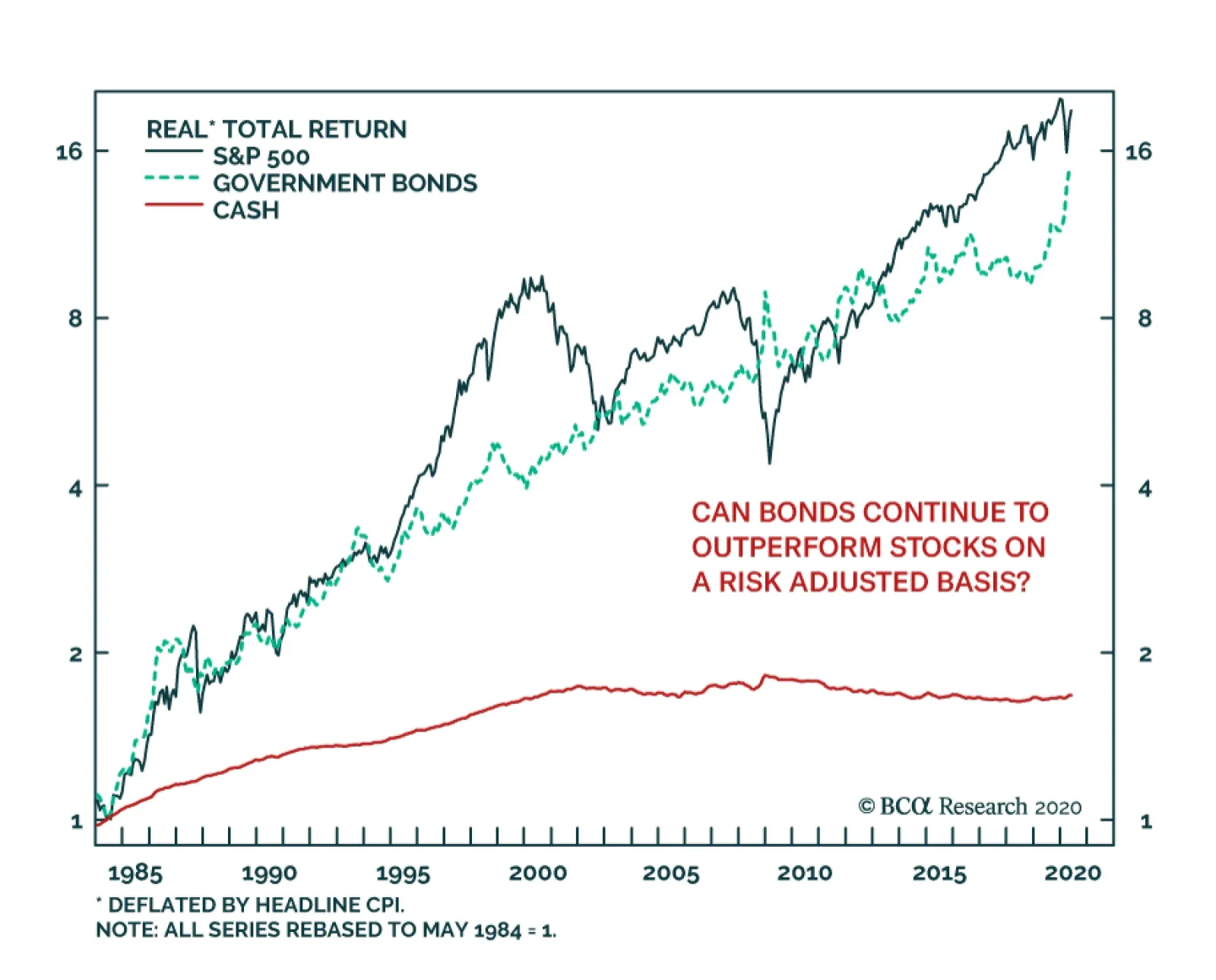
Despite their much higher volatility, stocks have not significantly outperformed bonds over the course of the past 35 years. This environment has obviously benefited risk parity strategies and growth stocks that strive on a low rate environment. Over the…