Fixed Income
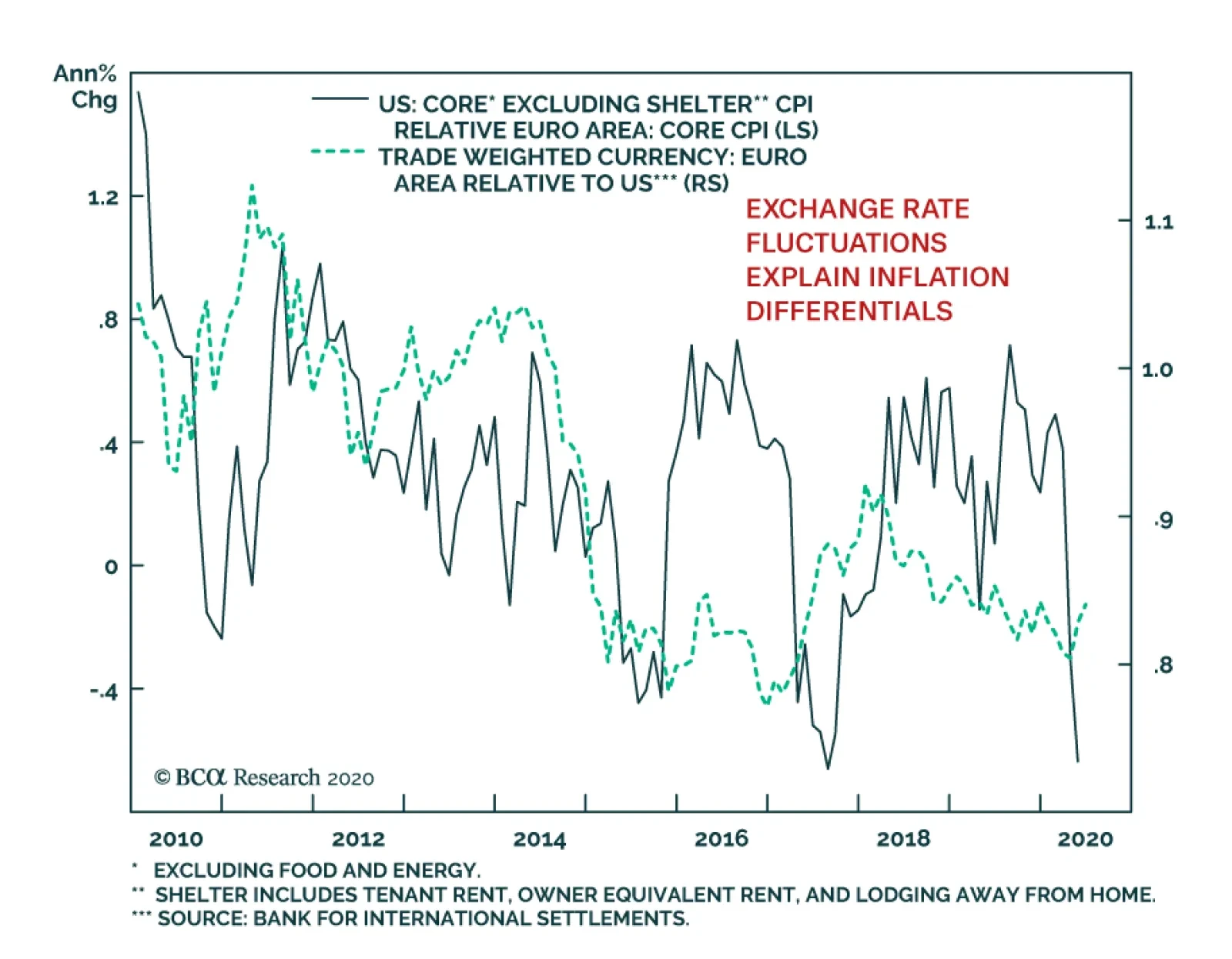
When comparing inflation between the US and the euro area, investors must make a crucial adjustment. US core CPI includes a shelter component that is absent in the European gauge. Removing the shelter component reveals that US inflation runs below that of…

Please note that yesterday we published Special Report on Egypt recommending buying domestic bonds while hedging currency risk. Today we are enclosing analysis on Hungary, Poland and Colombia. I will present our latest thoughts on the global macro outlook and implications for EM during today’s webcast at 10 am EST. You can access the webcast by clicking here. Yours sincerely, Arthur Budaghyan Hungary Versus Poland: Mind The Reversal Conditions are set for the Hungarian forint to outperform the Polish zloty over the coming months. We recommend going long the HUF against the PLN. Hungarian opposition parties criticized the government about the considerable depreciation in the forint. As a result, we suspect that political pressure from Prime Minister Viktor Orban led monetary authorities to alter their stance since April. Critically, the main architect of super-dovish monetary policy Marton Nagy resigned from the board of the central bank on May 28. In line with tighter liquidity, interbank rates have risen above the policy rate. This is marginally positive for the forint. The Hungarian central bank (NBH) tweaked its monetary policy in April after the currency had plunged to new lows against the euro, underperforming its Central European counterparts. The NBH widened its policy rate corridor by hiking the upper interest band to 1.85% and keeping the policy rate at 0.90%. The wider interest rate corridor makes it more costly for commercial banks to borrow reserves from the central bank. Hence, such liquidity tightening is positive for the forint. For years, Hungary was pursuing a super-easy monetary policy and consumer price inflation rose to 4% (Chart I-1). With the NBH keeping interest rates close to zero, real rates have plunged well into negative territory (Chart I-2, top panel). Chart I-1Hungary: Inflation Could Pause For Now
Hungary: Inflation Could Pause For Now
Hungary: Inflation Could Pause For Now
Chart I-2Hungary Vs. Poland: Real Rates Reversal Is Coming
Hungary Vs. Poland: Real Rates Reversal Is Coming
Hungary Vs. Poland: Real Rates Reversal Is Coming
In brief, the central bank has been behind the inflation curve. As a result, the forint has been depreciating against both the euro and its central European peers. In such a situation, the key to reversal in the exchange rate trend would be the monetary authority’s readiness to raise real interest rates. The NBH has made a small step in this direction. Going forward, the central bank will be restrained in its quantitative easing (QE) program and will not augment it any further. So far, QE uptake has been slow: around half out of the available HUF 1,500 billion has been tapped by commercial banks and corporates. Importantly, the NBH announced its intention to sterilize its government and corporate bond purchases. Already, the commercial banks excess reserves at the central bank have fallen to zero, which suggests that liquidity is no longer abundant in the banking system (Chart I-3). In line with tighter liquidity, interbank rates have risen above the policy rate. This is marginally positive for the forint. Hungarian authorities have become more cognizant of the economic and financial risks associated with their ultra-accommodative policies. For instance, they initiated a clampdown on real estate speculation, which is leading to dwindling real estate prices. This will lead to a decline in overall inflation expectations and, thereby, lift expected real interest rates. The open nature of Hungary’s economy – whereby exports of goods and services constitute 85% of GDP - makes it much more sensitive to pan-European tourism and manufacturing cycles. With the collapse in its manufacturing and tourism revenues, wage growth in Hungary is bound to decelerate rapidly (Chart I-4). Chart I-3Hungary: Central Bank Has Drained Liquidity
Hungary: Central Bank Has Drained Liquidity
Hungary: Central Bank Has Drained Liquidity
Chart I-4Economic Growth: Hungary Is More Vulnerable Than Poland
Economic Growth: Hungary Is More Vulnerable Than Poland
Economic Growth: Hungary Is More Vulnerable Than Poland
Rapidly deteriorating wage and employment dynamics reduces the odds of an inflation breakout anytime soon. This will cool down inflation and, thereby, increase real rates on the margin. The central bank in Poland will stay super accommodative while the National Bank of Hungary will be a bit less aggressive. Bottom Line: Although this monetary policy adjustment does not entail the end of easy policy in Hungary, generally, it does signal restraint on the part of monetary authorities resulting from a much reduced tolerance for currency depreciation. This creates conditions for the forint to outperform. Poland In the meantime, Polish monetary authorities have switched into an ultra-accommodative mode. Recent policy announcements by the National Bank of Poland (NBP) represent the most dramatic example of policy easing in Central Europe. Such a policy stance in Poland will produce lower real rates than in Hungary, which is negative for the Polish zloty against the forint. The NBP is set to finance the majority of a new 11% of GDP fiscal spending program enacted by the government amid the COVID-19 lockdowns. This amounts to de-facto public debt and fiscal deficit monetization. The latter will not be sterilized unlike in Hungary and will therefore lead to an excess liquidity overflow in the banking system. The Polish central bank has cut interest rates by 140 bps to 10 bps since March. Pushing nominal rates down close to zero has produced more negative real policy rates than in Hungary (Chart I-2, top panel on page 2). Also, Polish prime lending rates in real terms have fallen below those in Hungary (Chart I-2, bottom panel). Chances are that inflation in Poland will also prove to be stickier than in Hungary due to the minimum wage raise at the beginning of the year and very aggressive fiscal and monetary stimulus since the pandemics has erupted (Chart I-5). Critically, the Polish economy is much less open than Hungary’s, and it is therefore less vulnerable to the collapse of pan-European manufacturing and tourism. This will ensure better employment and wage conditions in Poland. All in all, Poland’s final demand outperformance, versus Hungary, will contribute to a higher rate of inflation there. Bottom Line: The central bank in Poland will stay super accommodative while the National Bank of Hungary will be a bit less aggressive. This is producing a U-turn in both countries’ nominal and relative real interest rates, which heralds a reversal in the HUF / PLN cross rate (Chart I-6). Chart I-5Polish Inflation Will Be Sticker Than In Hungary
Polish Inflation Will Be Sticker Than In Hungary
Polish Inflation Will Be Sticker Than In Hungary
Chart I-6Go Long HUF / Short PLN
Go Long HUF / Short PLN
Go Long HUF / Short PLN
Investment Strategy For Central Europe A new trade: go long the HUF versus the PLN. Take a 3% profit on the short HUF and PLN / long CZK trade. Close the short IDR / long PLN trade with a 20% loss. Downgrade central European bourses (Polish, Czech and Hungarian) from an overweight to a neutral allocation within the EM equity benchmark. Lower for longer European interest rates disfavor bank stocks that dominate central European bourses. Andrija Vesic Associate Editor andrijav@bcaresearch.com Colombia: Continue Betting On Lower Rates Colombia has been badly hit by two shocks: the precipitous fall in oil prices and the strict quarantine measures to constrain the spread of the COVID-19 outbreak. An underwhelming fiscal stimulus in response to the lockdowns will further weigh on private demand. An underwhelming fiscal stimulus in response to the lockdowns will further weigh on private demand. We have been recommending receiving 10-year swap rates in Colombia since April 23rd and this strategy remains unchanged: While oil prices seem to have rebounded sharply, they will remain structurally low (Chart II-1). The Emerging Markets Strategy team's view is that oil prices will average $40 per barrel this year and next.1 After the recent rally, chances of further upside in crude prices are limited. Chart II-1A Long-Term Perspective On Oil Prices
A Long-Term Perspective On Oil Prices
A Long-Term Perspective On Oil Prices
Table II-1Colombia’s Fiscal Package Is The Lowest In The Region
Hungary Versus Poland; Colombia
Hungary Versus Poland; Colombia
Colombia's high sensitivity to oil prices is particularly visible via its current account balance. Indeed, Colombia’s net crude exports cover as much as 50% of the current account deficit, such that low oil prices severely affect the currency and produce a negative income shock for the economy. Fiscal policy remains unreasonably tight, especially in the face of the global pandemic. The government’s fiscal response plan amounts to only a meagre 1.5% of GDP. This is low not only compared to advanced economies but also to the rest of Latin America (Table II-1). Moreover, President Duque’s administration has been running the tightest fiscal budget in almost a decade, with the primary fiscal balance reaching 1% of GDP before the pandemic. The country’s COVID-19 response has been fast and effective. Colombia has managed to achieve the lowest amount of infections and deaths among major economies in Latin America (Chart II-2). Chart II-2COVID-19 Casualties Across Latin America
COVID-19 Casualties Across Latin America
COVID-19 Casualties Across Latin America
Duque’s administration has taken a pragmatic approach to handling the pandemic by enforcing strict lockdowns and banning international and inter-municipal travel since late March, only three days after the country’s first casualty. Further, the nationwide confinement measures have been extended until July 1st, with particularly stringent rules applying to major cities. These have helped the country avoid a nation-wide health crisis, but they will engender prolonged economic pain. Regarding monetary stimulus, the central bank (Banrep) has cut interest rates by 150 basis points since March of this year. It also embarked on the first and largest QE program in the region. Banrep has committed to purchase 12 trillion pesos worth of government and corporate securities (amounting to a whopping 8% of GDP). Consumer price inflation is falling across various core measures and will drop below the low end of Banrep’s target range (Chart II-3). This will push the central bank to continue cutting rates. Despite the monetary easing, nominal lending rates are still restrictive. Real lending rates (deflated by core CPI) remain elevated at 7% (Chart II-4). Chart II-3Colombia: Inflation Will Fall Below Target
Colombia: Inflation Will Fall Below Target
Colombia: Inflation Will Fall Below Target
Chart II-4Colombia: Real Lending Rates Are Still High
Colombia: Real Lending Rates Are Still High
Colombia: Real Lending Rates Are Still High
Chart II-5The Colombian Economy Was Already Under Pressure
The Colombian Economy Was Already Under Pressure
The Colombian Economy Was Already Under Pressure
Importantly, there has not been an appropriate amount of credit support and debt waving programs for SMEs, as there has been in many other countries. Given that SMEs employ a large share of the workforce, and that household spending accounts for about 70% of GDP, consumer spending and overall economic growth will contract substantially and be slow to recover. Employment rates had already been contracting, and wage growth downshifting, before the pandemic started (Chart II-5). Household income is now certainly in decline as major cities are in full lockdown and economic activity is frozen. Investment Recommendations Even though we are structurally positive on the country due to its orthodox macroeconomic policies, positive structural reforms, and low levels of debt among both households and companies, we maintain a neutral allocation on Colombian stocks within an EM equity portfolio. This bourse is dominated by banks and energy stocks. The lack of both fiscal support and bank loan guarantees amid the recession means that banks will carry the burden of ultimate losses. They will suffer materially due to loan restructuring and defaults. For fixed income investors, we reiterate our call to receive 10-year swap rates and recommend overweighting local currency government bonds versus the EM domestic bond benchmark. The yield curve is steep and real bond yields are elevated (Chart II-6). Hence, long-term interest rates offer great value. Additional monetary easing, including quantitative easing, will suppress yields much further. Chart II-6A Great Opportunity In Colombian Rates
A Great Opportunity In Colombian Rates
A Great Opportunity In Colombian Rates
Chart II-7The COP Has Depreciated Considerably
The COP Has Depreciated Considerably
The COP Has Depreciated Considerably
We are upgrading Colombia sovereign credit from neutral to overweight within an EM credit portfolio. General public debt (including the central and state governments) stands at 59% of GDP. Conservative fiscal policy and the central bank’s large purchases of local bonds will allow the government to finance itself locally. Presently, 40% of public debt is foreign currency and 60% local currency denominated. As a result, sovereign credit will outperform the EM credit benchmark. In terms of the currency, we recommend investors to be cautious for now. Even though the peso is cheap (Chart II-7), another relapse in oil prices or a potential flare up in social protests could cause further downfall in the currency. Juan Egaña Research Associate juane@bcaresearch.com 1 This differs from the view of BCA’s Commodities and Energy Strategy service. We believe structural forces such as the lasting decline in air travel and commuting will impede a recovery in oil demand while, at the same time, US shale production will rise again considerably if crude prices rise and remain well above $40 Equities Recommendations Currencies, Credit And Fixed-Income Recommendations
In a webcast this Friday I will be joined by our Chief US Equity Strategist, Anastasios Avgeriou to debate ‘Sectors To Own, And Sectors To Avoid In The Post-Covid World’. Today’s report preludes five of the points that we will debate. Please join us for the full discussion and conclusions on Friday, June 12, at 8:00 AM EDT (1:00 PM BST, 2:00 PM CEST, 8.00 PM HKT). Highlights Technology is behaving like a Defensive. Defensive versus Cyclical = Growth versus Value. Growth stocks are not a bubble if bond yields stay ultra-low. The post-Covid world will reinforce existing sector mega-trends. Sectors are driving regional and country relative performance. Fractal trade: Long ZAR/CLP. Chart of the WeekSector Defensiveness/Cyclicality = Positive/Negative Sensitivity To The Bond Price
Sector Defensiveness/Cyclicality = Positive/Negative Sensitivity To The Bond Price
Sector Defensiveness/Cyclicality = Positive/Negative Sensitivity To The Bond Price
1. Technology Is Behaving Like A Defensive How do we judge an equity sector’s sensitivity to the post-Covid economy, so that we can define it as cyclical or defensive? One approach is to compare the sector’s relative performance with the bond price. According to this approach, the more negatively sensitive to the bond price, the more cyclical is the sector. And the more positively sensitive to the bond price, the more defensive is the sector (Chart I-1). On this basis the most cyclical sectors in the post-Covid economy are, unsurprisingly: energy, banks, and materials. Healthcare is unsurprisingly defensive. Meanwhile, the industrials sector sits closest to neutral between cyclical and defensive, showing the least sensitivity to the bond price. The tech sector’s vulnerability to economic cyclicality appears to have greatly reduced. The big surprise is technology, whose high positive sensitivity to the bond price during the 2020 crisis qualifies it as even more defensive than healthcare. This contrasts sharply with its behaviour during the 2008 crisis. Back then, tech’s relative performance was negatively correlated with the bond price, defining it as classically cyclical. But over the past year, tech’s relative performance has been positively correlated with the bond price, defining it as classically defensive (Chart I-2 and Chart I-3). Chart I-2In 2008, Tech Behaved Like ##br##A Cyclical...
In 2008, Tech Behaved Like A Cyclical...
In 2008, Tech Behaved Like A Cyclical...
Chart I-3...But In 2020, Tech Is Behaving Like A Defensive
...But In 2020, Tech Is Behaving Like A Defensive
...But In 2020, Tech Is Behaving Like A Defensive
This is not to say that the big tech companies cannot suffer shocks. They can. For example, from new superior technologies, or from anti-oligopoly legislation. However, the tech sector’s vulnerability to economic cyclicality appears to have greatly reduced over the past decade. 2. Defensive Versus Cyclical = Growth Versus Value If we reclassify the tech sector as defensive in the 2020s economy, then the post mid-March rebound in stocks was first led by defensives. Cyclicals took over leadership of the rally only in May. Moreover, with the reclassification of tech as defensive, the two dominant defensive sectors become tech and healthcare. But tech and healthcare are also the dominant ‘growth’ sectors. The upshot is that growth versus value has now become precisely the same decision as defensive versus cyclical (Chart I-4). Chart I-4Defensive Versus Cyclical = Growth Versus Value
Defensive Versus Cyclical = Growth Versus Value
Defensive Versus Cyclical = Growth Versus Value
3. Growth Stocks Are Not A Bubble If Bond Yields Stay Ultra-Low Some people fear that growth stocks have become dangerously overvalued. There is even mention of the B-word. Let’s address these fears. Yes, valuations have become richer. For example, the forward earnings yield for healthcare is down to 5 percent; and for big tech it is down to just over 4 percent. This valuation starting point has proved to be an excellent guide to prospective 10-year returns, and now implies an expected annualised return from big tech in the mid-single digits. Yet this modest positive return is well above the extremes of the negative 10-year returns implied and delivered from the dot com bubble (Chart I-5). Chart I-5Big Tech Is Priced To Deliver A Positive Return, Unlike In 2000
Big Tech Is Priced To Deliver A Positive Return, Unlike In 2000
Big Tech Is Priced To Deliver A Positive Return, Unlike In 2000
Moreover, we must judge the implied returns from growth stocks against those available from competing long-duration assets – specifically, against the benchmark of high-quality government bond yields. If bond yields are ultra-low, then they must depress the implied returns on growth stocks too. Meaning higher absolute valuations (Chart I-6 and Chart I-7). Chart I-6Tech's Forward Earnings Yield Is Above The Bond Yield, Unlike In 2000
Tech's Forward Earnings Yield Is Above The Bond Yield, Unlike In 2000
Tech's Forward Earnings Yield Is Above The Bond Yield, Unlike In 2000
Chart I-7Healthcare's Forward Earnings Yield Is Above The Bond Yield, Unlike In 2000
Healthcare's Forward Earnings Yield Is Above The Bond Yield, Unlike In 2000
Healthcare's Forward Earnings Yield Is Above The Bond Yield, Unlike In 2000
In the real bubble of 2000, big tech was priced to return 12 percent (per annum) less than the 10-year T-bond. Whereas today, the implied return from big tech – though low in absolute terms – is above the ultra-low yield on the 10-year T-bond. If bond yields are ultra-low, then they must depress the implied returns on growth stocks too. The upshot is that high absolute valuations of growth stocks are contingent on bond yields remaining at ultra-low levels. And that the biggest threat to growth stock valuations would be a sustained rise in bond yields. 4. The Post-Covid World Will Reinforce Existing Sector Mega-Trends If a sector maintains a structural uptrend in sales and profits, then a big drop in the share price provides an excellent buying opportunity for long-term investors. This is because the lower share price stretches the elastic between the price and the up-trending profits, resulting in an eventual catch-up. However, if sales and profits are in terminal decline, then the sell-off is not a buying opportunity other than on a tactical basis. This is because the elastic will lose its tension as profits drift down towards the lower price. In fact, despite the sell-off, if the profit downtrend continues, the price may be forced ultimately to catch-down. This leads to a somewhat counterintuitive conclusion. After a big drop in the stock market, long-term investors should not buy everything that has dropped. And they should not buy the stocks and sectors that have dropped the most if their profits are in major downtrends. In this regard, the post-Covid world is likely to reinforce the existing mega-trends. The profits of oil and gas, and of European banks will remain in major structural downtrends (Chart I-8 and Chart I-9). Conversely, the profits of healthcare, and of European personal products will remain in major structural uptrends (Chart I-10 and Chart I-11). Chart I-8Oil And Gas Profits In A Major ##br##Downtrend
Oil And Gas Profits In A Major Downtrend
Oil And Gas Profits In A Major Downtrend
Chart I-9Bank Profits In A Major ##br##Downtrend
European Banks Profits In A Major Downtrend Bank Profits In A Major Downtrend
European Banks Profits In A Major Downtrend Bank Profits In A Major Downtrend
Chart I-10Healthcare Profits In A Major Uptrend
Healthcare Profits In A Major Uptrend
Healthcare Profits In A Major Uptrend
Chart I-11Personal Products Profits In A Major Uptrend
Personal Products Profits In A Major Uptrend
Personal Products Profits In A Major Uptrend
5. Sectors Are Driving Regional And Country Relative Performance Finally, sector winners and losers determine regional and country equity market winners and losers. Nowadays, a stock market’s relative performance is predominantly a play on its distinguishing overweight and underweight ‘sector fingerprint’. This is because major stock markets are dominated by multinational corporations which are plays on their global sectors, rather than the region or country in which they have a stock market listing. It follows that when tech and healthcare outperform, the tech-heavy and healthcare-heavy US stock market must outperform, while healthcare-lite emerging markets (EM) must underperform. It also follows that the tech-heavy Netherlands and healthcare-heavy Denmark stock markets must outperform. Sector mega-trends will shape the mega-trends in regional and country relative performance. Equally, when energy and banks underperform, the energy-heavy Norway and bank-heavy Spain stock markets must underperform. (Chart I-12 and Chart I-13). These are just a few examples. Every stock market is defined by a sector fingerprint which drives its relative performance. Chart I-12Sector Relative Performance Drives...
Sector Relative Performance Drives...
Sector Relative Performance Drives...
Chart I-13...Regional And Country Relative Performance
...Regional And Country Relative Performance
...Regional And Country Relative Performance
If sector mega-trends continue, they will also shape the mega-trends in regional and country relative performance – favouring those stock markets that are heavy in growth stocks and light in old-fashioned cyclicals. Please join the webcast to hear the full debate and conclusions. Fractal Trading System* This week’s recommended trade is to go long the South African rand versus the Chilean peso. Set the profit target and symmetrical stop-loss at 5 percent. In other trades, long Spanish 10-year bonds versus New Zealand 10-year bonds achieved its 3.5 percent profit target at which it was closed. And long Australia versus New Zealand equities is approaching its 12 percent profit target. The rolling 1-year win ratio now stands at 63 percent. Chart I-14ZAR/CLP
ZAR/CLP
ZAR/CLP
When the fractal dimension approaches the lower limit after an investment has been in an established trend it is a potential trigger for a liquidity-triggered trend reversal. Therefore, open a countertrend position. The profit target is a one-third reversal of the preceding 13-week move. Apply a symmetrical stop-loss. Close the position at the profit target or stop-loss. Otherwise close the position after 13 weeks. * For more details please see the European Investment Strategy Special Report “Fractals, Liquidity & A Trading Model,” dated December 11, 2014, available at eis.bcaresearch.com. Dhaval Joshi Chief European Investment Strategist dhaval@bcaresearch.com Fractal Trading System Cyclical Recommendations Structural Recommendations Closed Fractal Trades Trades Closed Trades Asset Performance Currency & Bond Equity Sector Country Equity Indicators Bond Yields Chart II-1Indicators To Watch - Bond Yields
Indicators To Watch - Bond Yields
Indicators To Watch - Bond Yields
Chart II-2Indicators To Watch - Bond Yields
Indicators To Watch - Bond Yields
Indicators To Watch - Bond Yields
Chart II-3Indicators To Watch - Bond Yields
Indicators To Watch - Bond Yields
Indicators To Watch - Bond Yields
Chart II-4Indicators To Watch - Bond Yields
Indicators To Watch - Bond Yields
Indicators To Watch - Bond Yields
Interest Rate Chart II-5Indicators To Watch - Interest Rate Expectations
Indicators To Watch - Interest Rate Expectations
Indicators To Watch - Interest Rate Expectations
Chart II-6Indicators To Watch - Interest Rate Expectations
Indicators To Watch - Interest Rate Expectations
Indicators To Watch - Interest Rate Expectations
Chart II-7Indicators To Watch - Interest Rate Expectations
Indicators To Watch - Interest Rate Expectations
Indicators To Watch - Interest Rate Expectations
Chart II-8Indicators To Watch - Interest Rate Expectations
Indicators To Watch - Interest Rate Expectations
Indicators To Watch - Interest Rate Expectations
Highlights Egypt’s balance of payments have deteriorated materially due to both the crash in oil prices and the global pandemic. The country’s foreign funding requirements in 2020 are high and the currency is under depreciation pressures. Unless domestic interest rates are brought considerably lower, the nation’s public debt is on an unsustainable trajectory. Hence, Egypt needs to reduce local interest rates substantially and rapidly. And in so doing, the central bank cannot control or defend the exchange rate. The latter is set to depreciate. Investors should buy Egyptian local currency bonds while hedging their currency exposure. Feature The Central Bank of Egypt (CBE) is depleting its foreign exchange (FX) reserves to defend the currency (Chart I-1). As the CBE’s foreign exchange reserves diminish, so will its ability to support the currency. As such, the Egyptian pound will likely depreciate in the next 6-9 months. Interestingly, despite being a net importer of energy, many of Egypt’s critical macro parameters are positively correlated with oil prices (Chart I-2). Egypt is in fact deeply integrated in the Gulf oil-economy network via trade and capital flows. In other words, Egypt is a veiled play on oil. Chart I-1The CBE Has Been Defending The Currency
The CBE Has Been Defending The Currency
The CBE Has Been Defending The Currency
Chart I-2Egypt: A Veiled Play On Oil
Egypt: A Veiled Play On Oil
Egypt: A Veiled Play On Oil
Although oil prices have rallied sharply recently, the Emerging Markets Strategy team believes upside is limited and that oil prices will average about $40 over the next three years.1 In addition, local interest rates that are persistently above 10% are disastrous for both Egypt’s domestic demand and public debt sustainability. Egypt’s current account balance strongly correlates with oil prices because of the strong interlinkages that exist between Egypt and the oil-exporting Gulf countries. To preclude a vicious cycle in both the economy and public debt, the CBE should reduce interest rates materially and rapidly. Therefore, higher interest rates cannot be used to defend the exchange rate. Balance Of Payments Strains Egypt’s balance of payments (BoP) dynamics have deteriorated and the probability of a currency devaluation has risen: Current Account: The current account deficit – which stood at $9 billion and 3% of the GDP as of December 2019 – is widening significantly due to the plunge in oil prices this year (Chart I-2, top panel). Egypt’s current account balance strongly correlates with oil prices because of the strong interlinkages that exist between Egypt and the oil-exporting Gulf countries. The latter have been hard hit by the twin shocks of the coronavirus pandemic and the oil crash. First, Egypt’s $27 billion in annual remittances are drying up (Chart I-2, bottom panel). The majority of these transmittals come from Egyptian workers working in Gulf countries. Second, Egypt’s tourism industry – which brings in $13 billion in annual revenues or 4% of GDP – has collapsed due to the pandemic. Tourist arrivals from Middle Eastern countries – which makeup 20% of total tourist arrivals into Egypt – will diminish substantially due to both the pandemic and the negative income shock that the Gulf economies have experienced (Chart I-3). Third, Egyptian exports are in freefall (Chart I-4, top panel). Not only is this due to the freeze in global trade, but also because the country’s exports to the oil-leveraged Arab economies have taken a massive hit. The latter make up 25% of Egypt’s total goods shipments. Chart I-3Egypt: Tourism Is Linked To Oil Prices
Egypt: Tourism Is Linked To Oil Prices
Egypt: Tourism Is Linked To Oil Prices
Chart I-4Exports Revenues Swing With Oil Prices
Exports Revenues Swing With Oil Prices
Exports Revenues Swing With Oil Prices
Furthermore, since 2019 Egypt has been increasingly exporting natural gas. The collapse in gas prices has probably already wiped out a large of chunk its natural gas export revenues (Chart I-5). Chart 6 exhibits the structure of Egypt’s exports of goods and services. Energy, tourism and transportation constituted 67% of total exports in 2019. Chart I-5Gas Export Revenues Are At Risk
Gas Export Revenues Are At Risk
Gas Export Revenues Are At Risk
Chart I-6Egypt: Structure Of Goods & Services Exports
Egypt: A Veiled Oil Play
Egypt: A Veiled Oil Play
Chart I-7Exports Are Shrinking Amid Resilient Imports
Exports Are Shrinking Amid Resilient Imports
Exports Are Shrinking Amid Resilient Imports
Finally, while export revenues have plunged, imports remain resilient (Chart I-7). Critically, 26% of Egypt’s imports are composed of essential and basic items such as consumer non-durable goods, wheat and maize. Consumption of these staples and goods are less sensitive to business cycle oscillations. Therefore, the nation’s current account deficit has ballooned. A wider current account deficit needs to be funded by foreign inflows. With foreign investors reluctant to provide funds, the CBE has lately been financing BoP by depleting its foreign exchange reserves (Chart I-1, on page 1). Foreign Funding Requirements: Not only is Egypt facing a massively deteriorating current account deficit, but the country also carries large foreign funding debt obligations (FDO). FDOs are the sum of debt expiring in the next 12 months, and interest as well as amortization payments over the next 12 months. FDOs due in 2020 were $24 billion.2 In turn, Egypt’s total foreign funding requirements (FFR) – which is the sum of FDOs and the country’s current account deficit – has risen to $33 billion.3 Importantly, this FFR amount is based on the current account for 2019 and, thereby, does not take Egypt’s deteriorating current account deficit into consideration – as discussed above. Meanwhile, the central bank has net FX reserves of only $8 billion.4 If the monetary authorities continue to fund FFR of $33 billion in 2020 to prevent the pound from depreciating, the CBE will soon run out of its net FX reserves. Overall, Chart I-8 compares Egypt to the rest of the EM universe: with respect to (1) exports-to-FDO on the x-axis and (2) foreign exchange reserves-to-FFR on the y-axis. Based on these two measurements, Egypt is among the most vulnerable EM countries in terms of the balance of payments as it has the lowest FX reserves-to-FFR ratio and a low export-to-FDO ratio as well. Chart I-8Egypt Is One Of The Most Exposed EM Countries To Currency Depreciation
Egypt: A Veiled Oil Play
Egypt: A Veiled Oil Play
Chart I-9FDI Inflows Are Set To Diminish
FDI Inflows Are Set To Diminish
FDI Inflows Are Set To Diminish
Foreign Funding of Private Sector: Egypt will struggle to attract private-sector foreign inflows to meet its large FFR amid this adverse regional economic environment and the likely renewed relapse in oil prices in the months ahead. FDI inflows are set to drop (Chart I-9). The oil & gas sector has been the largest recipient of FDI inflows recently (around 55% in 2019 according to the central bank). The crash in both crude oil and natural gas prices will therefore ensure that FDIs into this sector will dry up. Besides, overall FDI inflows emanating from Gulf countries are poised to shrink substantially.5 Chart I-10The Egyptian Pound Is Once Again Expensive
The Egyptian Pound Is Once Again Expensive
The Egyptian Pound Is Once Again Expensive
Foreign Funding of Government: With FDI inflows diminishing, the Egyptian government has once again been forced to approach the IMF for assistance. The country managed to secure $8 billion in assistance from the IMF ($2.8 billion in May and $5.2 in June). This has ameliorated international investor confidence in Egypt. Indeed, the country raised $5 billion by issuing US dollar-denominated sovereign bonds in May. Egypt is now seeking another $4 billion from other international lenders. Crucially, assuming Egypt manages to get the $4 billion loan, which would allow it to raise a total of $17 billion, Egypt would still be short on foreign funding to finance its $33 billion in FFR. Therefore, the currency will come under pressure of devaluation. As we argue below, the nation’s public debt sustainability is in jeopardy unless local currency interest rates are brought down substantially. This can only happen if the currency is allowed to depreciate. Consistently, foreign investors might be unwilling to lend to Egypt until interest rates are pushed lower and the country’s public debt trajectory is placed back on a sustainable path. Finally, the Egyptian pound has once again become expensive according to the real effective exchange rate (REER) which is based on both consumer and producer prices (Chart I-10). Bottom Line: Egypt is facing sharply slowing foreign inflows due to both the crash in oil prices and the global pandemic. This is occurring amid increased FFRs. Meanwhile, the CBE’s net FX reserves are insufficient to defend the exchange rate. Public Debt Sustainability The BoP strains discussed above are forcing the CBE to keep interest rates high to prevent the currency from depreciating. Yet the country’s public debt is on a dangerous path due to elevated interest rates. In turn, without currency devaluation that ultimately allows local interest rates to drop dramatically, the sustainability of Egypt’s public debt will worsen considerably. The BoP strains discussed above are forcing the CBE to keep interest rates high to prevent the currency from depreciating. Yet the country’s public debt is on a dangerous path due to elevated interest rates. To start, Egypt’s public debt stands at 97% of GDP – local currency and foreign currency debt account for 79% and 18% of GDP respectively (Chart I-11, top panel). Chart I-12 illustrates that interest payments on public debt is already using up 60% of government revenue and stands at 10% of GDP. Chart I-11Egypt: Public Debt Profile
Egypt: Public Debt Profile
Egypt: Public Debt Profile
Chart I-12The Government's Interest Payments Are Unsustainable
The Government's Interest Payments Are Unsustainable
The Government's Interest Payments Are Unsustainable
Therefore, if the CBE keeps interest rates at the current level, then the government will continue to pay high interest on its debt. Generally, two conditions need to be met to ensure public debt sustainability in any country (i.e., to ensure that the public debt-to-GDP ratio does not to surge). Nominal GDP growth needs to be higher than government borrowing costs. The government needs to run persistently large primary fiscal surpluses. Chart I-13Egypt: Nominal GDP Growth And Government Borrowing Costs
Egypt: Nominal GDP Growth And Government Borrowing Costs
Egypt: Nominal GDP Growth And Government Borrowing Costs
Regarding the first condition, nominal GDP growth was already dangerously close to the level of Egypt’s government borrowing costs even before the pandemic hit Egypt (Chart I-13). With the pandemic, both domestic demand and exports have plunged. Consequently, nominal GDP is likely close to zero while local currency borrowing costs are above 10%. So long as nominal GDP growth remains below borrowing costs, the public debt sustainability will continue to deteriorate. As to the second condition, Egypt only started running primary fiscal surpluses in 2018 as it implemented extremely tight fiscal policy by cutting non-interest expenditures (Chart I-14). However, that was only possible because economic growth was then strong. As growth has slumped, government revenue is most likely shrinking. Chart I-14Egypt Only Recently Started Running A Primary Fiscal Surplus
Egypt Only Recently Started Running A Primary Fiscal Surplus
Egypt Only Recently Started Running A Primary Fiscal Surplus
Tightening fiscal policy amid the economic downturn will be ruinous. Cutting non-interest expenditures further will depress the already weak economy, drying up both nominal GDP and government revenues even more. This will bring about a vicious economic cycle. Needless to say, the latter option is politically unviable. The most feasible option to ensure sustainability of public debt dynamics is to bring down domestic interest rates considerably. Lower local interest rates will reduce interest expenditures on its domestic debt and will either narrow overall fiscal deficit or free up space for the government to spend elsewhere, boosting much needed economic growth. Meanwhile lower interest rates will boost demand for credit and revive private-sector domestic demand. Provided Egypt’s public debt has a short maturity profile, lower interest rates will reasonably quickly feed into lower interest payments for the government. This means that lower interest rates could reasonably quickly feed to lower interest payments for the government. Importantly, there is a trade-off between the exchange rates and interest rates. Lowering interest rates entail currency depreciation. According to the impossible trinity theory, a central bank facing an open capital needs to choose between controlling interest rates or the exchange rate, it cannot control both simultaneously. As such, if the Central Bank of Egypt opts to bring down local interest rates, while keeping the capital account reasonably open, it needs to tolerate a weaker currency amid its ongoing BoP strains. Bottom Line: Public debt dynamics are treading on a dangerous path. Egypt needs to bring down local interest rates down substantially and rapidly. And in so doing, the CBE cannot control and defend the exchange rate. Devaluation Is Needed All in all, the Egyptian authorities are facing a tight tradeoff: (1) either they continue to defend the currency at the expense of depressing the economy and worsening public debt dynamic, or (2) they tolerate a one-off currency devaluation which would allow the monetary authorities reduce interest rates aggressively. The latter will help stimulate economic growth and make public debt sustainable. Specifically, if the Central Bank of Egypt opts for defending the currency from depreciation, it will need to tolerate much higher interest rates for a long period of time. The CBE would essentially need to deplete whatever little net FX reserves it currently has to fund BoP deficits. This would simultaneously shrink local banking system liquidity, pushing domestic interbank rates higher. All in all, the Egyptian authorities are facing a tight tradeoff: (1) either they continue to defend the currency at the expense of depressing the economy and worsening public debt dynamic, or (2) they tolerate a one-off currency devaluation which would allow the monetary authorities reduce interest rates aggressively. Worryingly, not only would high interest rates devastate the already shaky Egyptian economy, but higher domestic interest rates carry major ramifications for Egypt’s public debt sustainability as discussed earlier. A one-off currency devaluation is painful and carries some political risks yet, it is still the least worst choice for Egypt from a longer-term perspective. Although inflation will spike due to pass-through from currency devaluation, it will be a transitory one-off increase (Chart I-15). Besides, the pertinent risk to the Egyptian economy currently is low inflation and high real interest rates (Chart I-16). Chart I-15Egypt: Currency-Induced Inflation Is A One-Off
Egypt: Currency-Induced Inflation Is A One-Off
Egypt: Currency-Induced Inflation Is A One-Off
Chart I-16Egypt: Real Interest Rates Are High
Egypt: Real Interest Rates Are High
Egypt: Real Interest Rates Are High
In turn, currency depreciation will ultimately provide the CBE with scope to reduce its policy rate which will help stimulate the ailing economy as well as make public debt trajectory more sustainable. Finally, odds are high that Egyptian authorities might choose to devalue the currency sooner rather than later. The basis for this is that the government’s foreign public debt is still relatively small at 18% of the GDP and 19% of the total government debt (Chart I-11, on page 8). Further, the majority (70%) of Egypt’s foreign public debt remains linked to international and bilateral government loans making it easier to renegotiate their terms than in the case of publicly traded sovereign US dollar bonds (Chart I-11, bottom panel). This means that currency depreciation will not materially deteriorate the government’s debt servicing ability. Furthermore, Egypt has experience managing and tolerating currency depreciation. The currency depreciated against the US dollar by 50% in 2016 and before that by 12% in 2013. Bottom Line: The Central Bank of Egypt will not hike interest rates or sell its foreign currency reserves for too long to defend the pound. Odds are high that it will allow the currency to depreciate and will cut interest rates materially. Investment Recommendations Chart I-17Egyptian Pound In The Forward Market
Egyptian Pound In The Forward Market
Egyptian Pound In The Forward Market
Investors should buy Egyptian 3-year local currency bonds while hedging their currency exposure. The basis is that low inflation and a depressed economy in Egypt will lead the CBE to cut rates by several hundred basis points over the next 12 months while allowing currency to depreciate. Forward markets are pricing 5% depreciation in the EGP in the next 6 months and 10% in the next 12 months (Chart I-17). We would assign a higher probability of depreciation. For now, EM credit portfolios should have a neutral allocation on Egyptian sovereign credit. While another potential drop in oil prices and the currency devaluation could push sovereign spreads wider (Chart I-18), eventually large rate cuts by the CBE will make public debt dynamics more sustainable. Absolute return investors should wait for devaluation to go long on Egypt’s US dollar sovereign bonds. Chart I-18Remain Neutral On Egypt's Sovereign Credit
Remain Neutral On Egypt's Sovereign Credit
Remain Neutral On Egypt's Sovereign Credit
Chart I-19Remain Neutral On Egyptian Equities
Remain Neutral On Egyptian Equities
Remain Neutral On Egyptian Equities
Equity investors should keep a neutral allocation on Egyptian stocks with an EM equity portfolio (Chart I-19). Lower interest rates ahead will eventually boost this stock market. Ayman Kawtharani Editor/Strategist ayman@bcaresearch.com 1 This is the view of BCA’s Emerging Markets Strategy service and it differs from the view of BCA’s Commodities and Energy Strategy service. 2 We exclude the Central Bank’s foreign liabilities due in 2020 as they are mostly deposits at the Central Bank of Egypt owed to Gulf countries. It is highly likely that Gulf lenders will agree to extend these deposits given the difficulties Egypt is experiencing. 3 Excluding the Central Bank’s foreign liabilities due in the next 12 months. Please refer to above footnote. 4 The amount of net foreign exchange reserves currently at the Central Bank – i.e. excluding the Bank’s foreign liabilities– are now low at $8 billion. 5 Gulf Co-operation Countries (GCC) are in no position to provide much financial assistance due to the pandemic and oil crash as they are under severe financial strain themselves. Also, GCC countries run strict currency pegs and need to preserve their dwindling foreign exchange reserves to defend their currency pegs to the US dollar.
BCA Research's Global Fixed Income Strategy service sees five main reasons why global bond yields are moving higher. 1) Investor risk aversion is declining There has been a sharp recovery in global risk appetite since late March, diminishing the demand…
Highlights Rising Bond Yields: Global risk assets are discounting a V-shaped economic recovery. With economic data starting to revive as more economies emerge from virus-related shutdowns, bond yields are showing signs of following suit. Duration Strategy: Even with global yields showing signs of a cyclical bottom, we continue to recommend a neutral duration stance. Central banks will remain highly accommodative given the lack of inflationary pressures after the deep COVID-19 recessions. There are still significant risks in the coming months from a potential second wave of coronavirus after economies reopen, worsening US-China relations and domestic US sociopolitical turmoil. Duration Proxy Trades: Given those lingering uncertainties, we prefer to focus on “duration-lite” trades in the developed economies, like overweighting inflation-linked government bonds versus nominals as inflation expectations will drift higher over the next 6-12 months. Feature Dear Client, Next week, instead of publishing a regular Weekly Report, we will hold a webcast on Tuesday, June 16 at 10:00 am ET, discussing our latest views on global fixed income markets. The format will be a short presentation, followed by a Q&A session. We hope you will join us, armed with interesting questions. Kind regards, Rob Robis, Chief Fixed Income Strategist Chart of the WeekBond Yields Bottoming, But Backdrop Not Yet Bearish
Bond Yields Bottoming, But Backdrop Not Yet Bearish
Bond Yields Bottoming, But Backdrop Not Yet Bearish
Bond yields around the world awoke from their COVID-19 induced slumber last week, responding to a growing body of evidence indicating that global growth has bottomed. Over a span of four days, benchmark 10-year government bond yields rose in the US (+20bps), Germany (+13bps), Canada (+20bps), China (+14bps), Japan (+4bps), Mexico (+13bps) and the UK (+12bps). There is potential for yields to continue drifting higher over the next few months, as more countries reopen from virus-related shutdowns. The bounce already seen in survey data like manufacturing and services PMIs, as well as economic sentiment measures like the global ZEW index, should soon translate into real improvements in activity data. This comes at a time when rising commodity prices, most notably oil, suggest that depressed inflation expectations can lead bond yields higher. The cyclical bottom for global yields has likely passed, based on the improvement already seen in our own Global Duration Indicator (Chart of the Week). However, economic policy uncertainty remains elevated as devastated economies try to reopen from lockdowns. In addition, our Central Bank Monitors continue to indicate pressure on policymakers to keep interest rates as low as possible to maintain easy financial conditions as easy as possible. Tighter monetary policies remain a distant prospect, given very high unemployment rates. The cyclical bottom for global yields has likely passed, based on the improvement already seen in our own Global Duration Indicator. Amid those uncertainties, we recommend maintaining a neutral strategic (6-12 months) and tactical (0-6 months) stance on overall duration exposure in fixed income portfolios. Instead, we prefer focusing on lower volatility trades that will benefit from improving global growth and policy reflation, like going long inflation-linked bonds versus nominal government debt throughout the developed markets with breakevens looking too low on our models. Why Are Bond Yields Rising Now? We see five main reasons why global bond yields have started to move higher: 1) Investor risk aversion is declining There has been a sharp recovery in global risk appetite since late March, diminishing the demand for risk-free global government debt. In the US, the S&P 500 is up 43% from its March lows, while the NASDAQ index is back to the all-time highs reached before the coronavirus turned into a global pandemic (Chart 2). US corporate debt has also performed well since the March 23rd peak in spreads, with investment grade and high-yield spreads down -227bps and -564bps, respectively. Non-US assets are also flying, with emerging market (EM) equities up 29% and EM USD-denominated corporate debt up 14% in excess return terms over US Treasuries since the March trough. Even severely lagging assets like European bank stocks are showing a pulse, up 38% since the lows of May 15. Commodity prices are also improving, led not only by gains in oil after the April crash by recoveries in the prices of growth-sensitive commodities like copper (+17%) and lumber (+42%). Add it all up, and the message is clear: investors now prefer risk to safety, which has tempered the demand for government bonds. The flipside of the boom in risk appetite is weakening prices for safe haven assets (Chart 3). The price of gold in US dollar terms is down -4% from the 2020 high on May 20, while the euro price of gold is down –6%. Safe haven currencies like the Japanese yen and Swiss franc have underperformed, while interest rate volatility measures like the US MOVE index and long-dated euro swaption volatility are back to the pre-coronavirus lows. Chart 2Risk Assets Are Booming Worldwide
Risk Assets Are Booming Worldwide
Risk Assets Are Booming Worldwide
Chart 3Safe Haven Trades Losing Luster
Safe Haven Trades Losing Luster
Safe Haven Trades Losing Luster
Add it all up, and the message is clear: investors now prefer risk to safety, which has tempered the demand for government bonds that helped drive yields lower when risk assets were tanking in late February and March. 2) Global growth is improving One of the reasons for the improvement in investor risk appetite is belief that the world economy has exited from the severe COVID-19 global recession. While timely real data is still coming in slowly given reporting lags, there has been a notable bounce in survey data in many countries. PMIs for both manufacturing and services climbed higher in May (Chart 4). The expectations components of economic confidence measures like the ZEW indices have also recovered the losses seen in February and March. Data surprises have also been increasingly on the positive side of late in China, Europe and the US, including the shocking 2.5 million increase in US employment in May. However, the US unemployment rate remains very high at 13.3%, indicating abundant spare capacity that will likely take years, not months, to work off – a problem that most of the world will continue to deal with post-recession. 3) Central bank liquidity is booming The other main reason for the boom in risk asset performance that has started to put upward pressure on bond yields is the extremely accommodative stance of global monetary policy. This is occurring through 0% policy rates in the developed economies but, even more importantly, the aggressive expansion of central bank balance sheets through quantitative easing (QE). The Fed has its foot firmly on the monetary accelerator, with year-over-year growth in its balance sheet of 87% (Chart 5). The European Central Bank (ECB) is no slouch, though, with its balance sheet up 19% from a year ago and having expanded its Pandemic Emergency Purchase Program (PEPP) by another €600 billion last week. Chart 4Signs Of Life In The Global Economy
Signs Of Life In The Global Economy
Signs Of Life In The Global Economy
Chart 5'QE Forever' Driving Money From Bonds To Risk Assets
QE Forever' Driving Money From Bonds To Risk Assets
QE Forever' Driving Money From Bonds To Risk Assets
The combined annual growth of the central bank balance sheets for the “G4” (the Fed, ECB, Bank of Japan and Bank of England) is now up to 26%. The rate of G4 balance sheet expansion has been a reliable leading indicator of global risk asset performance since the 2008 financial crisis (with about a 12-month lead), and the current boom in “liquidity” suggests that the current rise in global equity and corporate bond markets can continue over the next year. Easing global financial conditions are now returning to levels that should support economic growth in the coming months, helping to mitigate (but not eliminate) the potential credit stresses from companies that have suffered during the COVID-19 recession. This recovery remains fragile, however, and policymakers will continue to maintain an extremely dovish policy bias – even with significant fiscal stimulus measures also in place to help economies climb out of recession. This suggests that the current rise in global bond yields is not the start of a new bond bear market driven by expectations of tighter monetary policies. The current rise in global bond yields is not the start of a new bond bear market driven by expectations of tighter monetary policies. Chart 6Global Bond Sentiment Is Still Very Bullish
Global Bond Sentiment Is Still Very Bullish
Global Bond Sentiment Is Still Very Bullish
4) Bullish sentiment for bonds is at extremes From a contrarian perspective, another factor helping put a floor underneath bond yields is investor sentiment towards fixed income, which remains bullish. The widely followed ZEW survey of economic forecasters also contains a question on the expected change in bond yields over the next year. The latest read on the surveys shows a net balance still expecting lower bond yields in the US, Germany, the UK and Japan, nearing levels seen prior to the end of the recessionary bond bull markets in the early 2000s and after the 2008 financial crisis (Chart 6). In addition, the Market Vane survey of bullish sentiment on US Treasuries is nearing past cyclical peaks, suggesting limited scope for new bond buyers that could drive US yields to new lows. 5) Inflation expectations are moving higher Finally, global yields are rising because the inflation expectations component of yields has started to move higher. The hyper-easy stance of monetary policy is playing a role here. Market-based inflation expectations measures like the breakevens on inflation-linked bonds (or CPI swap rates) are a vote of confidence by investors in the “appropriateness” of policy settings. The fact that inflation expectations are now drifting higher suggests that bond markets now believe that central banks are now "easy" enough to give inflation a shot at rising sustainably as growth recovers. Global yields are rising because the inflation expectations component of yields has started to move higher. Chart 7Oil Prices & Breakeven Inflation Rates Are Both Recovering
Oil Prices & Breakeven Inflation Rates Are Both Recovering
Oil Prices & Breakeven Inflation Rates Are Both Recovering
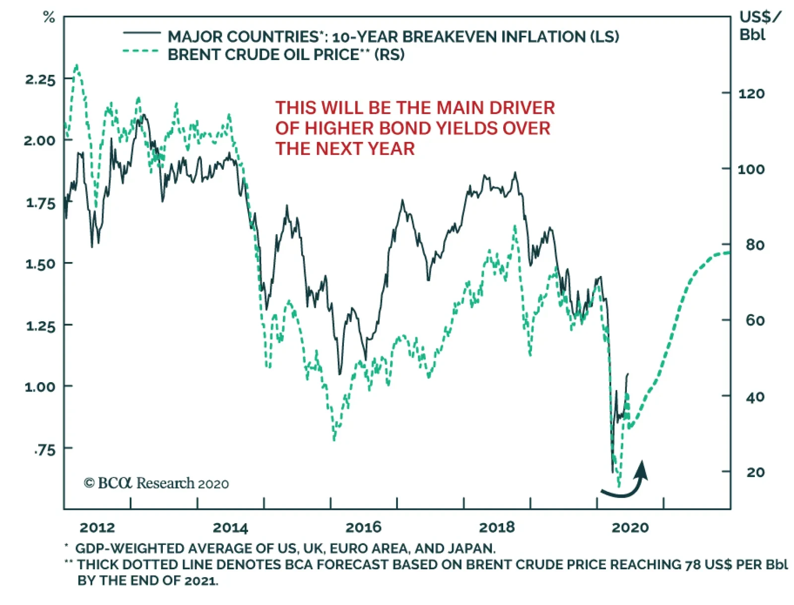
This move higher in inflation expectations can continue in the coming months, particularly with global oil prices likely to move even higher. Our colleagues at BCA Research Commodity & Energy Strategy are quite bullish on oil prices, forecasting the benchmark Brent oil price to rise to around $50/bbl by the end of 2020 and continuing up to $78/bbl by the end of 2021. Such an outcome would push up market-based inflation expectations, and likely put more upward pressure on nominal bond yields, given the strong correlation between oil and inflation breakevens in the developed economies that has existed over the past decade (Chart 7). Bottom Line: Global risk assets are discounting a V-shaped economic recovery. With economic data starting to revive as more economies emerge from virus-related shutdowns, bond yields are showing signs of following suit. Duration Strategy For The Next Few Months The trends in growth, inflation and financial conditions all suggest bond yields can continue to drift higher over at least the next 3-6 months. Yet given the potential for a negative shock from a second wave of coronavirus infection, or geopolitical uncertainties in a volatile US election year, a below-benchmark global duration stance is not yet warranted. This is especially true with unemployment rates in most countries remaining elevated even as growth rebounds from recession, forcing central banks to maintain a very dovish policy posture. Our “Risk Checklist” that we have been monitoring to move to a more aggressive recommended investment stance on global spread product – the US dollar, the VIX and the number of new COVID-19 cases - can also be helpful in helping us determine when to shift to a more defensive bias on global duration. On that note, the Checklist still argues for a neutral duration stance, rather than positioning for a big move higher in yields. The US dollar has started to soften, but remains at a very high level relative to interest rate differentials (Chart 8). A weaker greenback is a source of global monetary reflation, primarily through changes in the prices of commodities and other traded goods that are denominated in dollars, but also by helping alleviate funding pressures for companies that have borrowed heavily in US dollars (especially in the emerging world). The dollar is also an “anti-growth” currency that appreciates during periods of slowing global growth, and vice versa, so some depreciation should unfold as more of the world economy emerges from lockdown (middle panel). The VIX index – a measure of investor uncertainty - continues to climb down from the massive surge in February and March, now sitting at 26 after peaking around 80. This is the one part of our Risk Checklist that argues for reducing duration exposure now. We prefer trades that will benefit from the combination of continued global policy reflation and growing investor risk appetite. We call these “duration-lite” trades. The daily number of new reported cases of COVID-19 (using data from the World Health Organization) has come down dramatically in Europe, but in the US the decline in new cases has stalled over the past month – a worrisome sign as the country continues to reopen amid mass protests in major cities (Chart 9). New cases outside the US and Europe are rapidly moving higher, however, primarily in major Latin American countries like Brazil and Mexico. This suggests that while there is a concern about a “second wave” of coronavirus later in the year, the risks from the first wave are far from over. Chart 8Still Not Much Reflationary Push From A Weaker USD
Still Not Much Reflationary Push From A Weaker USD
Still Not Much Reflationary Push From A Weaker USD
Chart 9The COVID-19 Threat Has Not Gone Away
The COVID-19 Threat Has Not Gone Away
The COVID-19 Threat Has Not Gone Away
Instead of shifting to a below-benchmark recommended stance on overall portfolio duration too soon in the cycle, we prefer trades that will benefit from the combination of continued global policy reflation and growing investor risk appetite. We call these “duration-lite” trades. Specifically, we like owning inflation-linked government bonds versus nominal debt, while also positioning for steeper government yield curves (on a duration-neutral basis). Longer-dated breakeven inflation rates within the major developed markets are becoming increasingly correlated to both the level of 10-year government bond yields (Chart 10) and the slope of the 2-year/10-year yield curve (Chart 11). Chart 10Rising Inflation Expectations Will Lead To Higher Bond Yields ...
Rising Inflation Expectations Will Lead To Higher Bond Yields ...
Rising Inflation Expectations Will Lead To Higher Bond Yields ...
Chart 11... And Steeper Yield Curves
... And Steeper Yield Curves
... And Steeper Yield Curves
In terms of country selection for these trades, we look to the valuations on inflation-linked bond breakevens from our modeling framework that we introduced back in late April.1 In that framework, we model 10-year breakevens as a function of oil prices, exchange rates and the long-run trend in realized inflation. Chart 12Global Inflation Breakevens Look Cheap On Our Models
Global Inflation Breakevens Look Cheap On Our Models
Global Inflation Breakevens Look Cheap On Our Models
In Chart 12, we show the deviation of 10-year inflation breakevens from the model-implied fair value, shown both terms of standard deviations and basis points. The “cheapest” breakevens from our models are for inflation-linked bonds in Italy and Canada, although almost all counties (outside of the UK) have breakevens to look far too low. This suggests that global bond investors should consider a multi-country portfolio of inflation-linked bonds versus nominal paying equivalents – or in countries where the inflation-linked bond markets are small and illiquid, duration-neutral yield curve steepeners - as a more efficient way to play for a continuation of the current reflationary global backdrop without taking duration risk. Bottom Line: Even with global yields showing signs of a cyclical bottom, we continue to recommend a neutral duration stance. Given the lingering uncertainties about a second wave of coronavirus, and the rising political and social tensions in the US only five months before the presidential election, we prefer to focus on “duration-lite” trades in the developed economies - like overweighting inflation-linked government bonds versus nominals as inflation expectations will drift higher over the next 6-12 months. Robert Robis, CFA Chief Fixed Income Strategist rrobis@bcaresearch.com Footnotes 1 Please see BCA Research Global Fixed Income Strategy Weekly Report, "Global Inflation Expectations Are Now Too Low", dated April 28, 2020, available at gfis.bcaresearch.com. Recommendations The GFIS Recommended Portfolio Vs. The Custom Benchmark Index
Global Yields Are Stirring, But It’s Not Yet A Bond Bear Market
Global Yields Are Stirring, But It’s Not Yet A Bond Bear Market
Duration Regional Allocation Spread Product Tactical Trades Yields & Returns Global Bond Yields Historical Returns
Highlights Duration: Investors should keep portfolio duration close to benchmark, but continue to hold yield curve steepeners (on both the nominal and real yield curves) as well as overweight TIPS positions versus nominal Treasuries. These tactical trades will profit from higher Treasury yields in the near-term. Healthcare: We recommend an overweight allocation to investment grade Healthcare bonds relative to the overall investment grade corporate index. But we also recommend an underweight allocation to high-yield Healthcare relative to the high-yield corporate index. Pharmaceuticals: Investors should underweight Pharmaceutical bonds in both the investment grade and high-yield credit universes. How Much Higher For Bond Yields? Two weeks ago, we warned that bonds would struggle in the near-term as the re-opening of the US economy led to an improvement in economic data.1 However, we definitely didn’t anticipate the magnitude of the positive data surprise that has occurred since then. The US Economic Surprise Index was -55 one week ago and today it sits at +66 (Chart 1)! The bulk of that jump occurred after Friday’s employment report revealed that 2.5 million jobs were added in May when Bloomberg’s consensus estimate had called for a contraction of 7.5 million. Against this back-drop, it shouldn’t be too surprising that bond yields jumped sharply. The 30-year Treasury yield rose 27 bps last week to 1.68% and the 10-year yield rose 26 bps to 0.91% (Chart 2). The 2-year yield rose a more modest 6 bps to 0.22%, as the Fed maintains its tight grip on the front-end of the curve. Chart 1Back In Business
Back In Business
Back In Business
Chart 2Yields Have Room To Move Higher
Yields Have Room To Move Higher
Yields Have Room To Move Higher
For investors, the first relevant question is: How high can yields go? Our view is that if last week does indeed represent the cyclical economic trough, then forward rates at the long-end of the curve will revert to levels consistent with market expectations for the long-run neutral fed funds rate. The median estimate of that rate from the New York Fed’s most recent Survey of Market Participants is 2%, but with an unusually wide interquartile range of 1.3% to 2.5% (Chart 2, bottom panel). At the very least, we’d expect the 10-year and 30-year Treasury yields to re-test their respective 200-day moving averages of 1.38% and 1.91%, respectively. However, we are not ready to declare last week the economic trough for three reasons: First, we cannot rule out a re-acceleration in the number of confirmed COVID cases as the economy re-opens. This could lead to the re-imposition of lockdown measures come fall. Second, last week’s positive economic data might cause some members of Congress to question the need for further fiscal stimulus. This would be a mistake. In last week’s report we showed that fiscal measures have done a good job propping up household income so far, but these measures are temporary and will need to be renewed.2 Even after last week’s large drop, the unemployment rate is still 3.3% above its Great Recession peak (Chart 1, bottom panel). This is by no means a fully healed economy that can withstand policymakers taking their feet off the gas. Even after last week’s large drop, the unemployment rate is still 3.3% above its Great Recession peak. Finally, US political risks are heightened with anti-police protests occurring daily in most major cities. Added to that, President Trump is now the underdog heading into November’s election and he will need to develop a reelection bid that doesn’t hinge on the economy. Our geopolitical strategists think a doubling down on “America First” foreign and trade policies makes the most sense.3 A significant move in that direction would certainly send a flight to quality into US bonds. Investment Strategy As we advised two weeks ago, nimble investors should tactically reduce duration as yields still have more upside in the next month or two. However, we are not yet sufficiently confident in the sustainability of the economic rebound to recommend reducing portfolio duration on a 6-12 month horizon. Rather, we continue to recommend keeping portfolio duration close to benchmark while holding several less risky positions that will profit from higher yields. Specifically, investors should hold duration-neutral curve steepeners along the nominal Treasury curve. We advise going long the 5-year note and short a 2/10 barbell.4 We also like holding TIPS over nominal Treasuries and positioning for a steeper real Treasury curve.5 In terms of spread product, we also recommend staying the course. This entails overweighting corporate bonds rated Ba and higher, Aaa consumer ABS, Aaa CMBS (both agency and non-agency) and municipal bonds, while avoiding corporate bonds rated B and below and residential mortgage-backed securities. Appendix A at the end of this report shows how these positions have performed since the March 23 peak in spreads. The remainder of this report focuses on the Healthcare and Pharmaceutical sectors of both the investment grade and high-yield corporate bond markets. Investment Grade Healthcare & Pharma Risk Profile When assessing the risk profiles for investment grade-rated Healthcare and Pharmaceutical bonds, we first consider the credit rating distributions of both sectors relative to the overall Bloomberg Barclays corporate index (Chart 3). Chart 3Investment Grade Credit Rating Distribution*
Assessing Healthcare & Pharma Bonds In A Pandemic
Assessing Healthcare & Pharma Bonds In A Pandemic
Immediately, we see that the Healthcare sector has a lower credit rating than the benchmark: 71% of the Healthcare index is rated Baa, compared to 48% for the corporate index. Meanwhile, the Pharmaceuticals sector has slightly higher credit quality than the corporate benchmark: 12% of the Pharmaceuticals index is rated Aa or Aaa, compared to 8% for the corporate index. Credit rating alone suggests that Healthcare should trade cyclically relative to the corporate index. That is, it should outperform during periods of spread tightening and underperform during periods of spread widening. However, this turns out to not be the case. Chart 4 shows that healthcare has outperformed the corporate benchmark during each of the last five major bouts of spread widening and underperformed during periods of spread tightening. Clearly, despite its low credit rating, Healthcare trades like a defensive corporate bond sector. Healthcare’s historically defensive nature is confirmed by its duration-times-spread (DTS) ratio, which has tended to be below 1.0 (Chart 4, top panel).6 Though recently, the DTS ratio climbed above 1.0 due to a lengthening of the sector’s duration (Chart 4, bottom panel). This suggests that Healthcare, while historically defensive, might trade more cyclically during the next 12 months. Neither the Healthcare nor Pharmaceuticals sectors offer a spread advantage over the corporate index. Pharmaceuticals, on the other hand, are a much more cut and dry defensive sector (Chart 5). The DTS ratio is almost always below 1.0 and the sector has a strong track record of outperforming the corporate index during periods of spread widening (Chart 5, panels 2 & 3) Chart 4IG Healthcare Risk Profile
IG Healthcare Risk Profile
IG Healthcare Risk Profile
Chart 5IG Pharma Risk Profile
IG Pharma Risk Profile
IG Pharma Risk Profile
Valuation Turning to valuation, we find that neither sector offers a spread advantage compared to the corporate index or its comparable credit tier (Table 1). This is true whether we look at the raw option-adjusted spread or if we control for duration differences by looking at the 12-month breakeven spread.7 It is interesting to note that the Healthcare index offers a spread advantage compared to the A-rated corporate index. On the one hand, this is not surprising because the Healthcare index carries an average Baa rating. On the other hand, we have seen that Healthcare tends to trade more defensively than its average credit rating implies. This arguably makes its spread advantage over A-rated debt somewhat compelling. Table 1IG Healthcare & Pharma Valuation
Assessing Healthcare & Pharma Bonds In A Pandemic
Assessing Healthcare & Pharma Bonds In A Pandemic
Balance Sheet Health Both the Healthcare and Pharmaceuticals sectors loaded up on debt during the last recovery. The amount of Healthcare debt in the corporate index grew 8.8 times since 2010. Meanwhile, total debt in the corporate index grew 2.4 times. The result is that Healthcare’s weight in the corporate index increased from 1.1% in 2010 to 4.3% today (Chart 6). The Pharma sector also increased its debt load at a faster pace than the overall corporate universe since 2010 (3.2 times versus 2.4 times), but the boom in Pharma debt has been much milder than in Healthcare. The weight of Pharmaceuticals in the corporate index increased from 4.1% in 2010 to 5.5% today (Chart 7). Chart 6IG Healthcare Debt Growth
IG Healthcare Debt Growth
IG Healthcare Debt Growth
Chart 7IG Pharma Debt Growth
IG Pharma Debt Growth
IG Pharma Debt Growth
Despite rapid debt growth during the past few years, credit quality in both the Healthcare and Pharma sectors appears quite solid. Appendix B lists the issuers in the Healthcare index, grouping them by credit tier and indicating whether they carry a positive, stable or negative ratings outlook from Moody’s. Of the 56 issuers in the Healthcare index, only six currently have a negative ratings outlook. The two largest issuers in the Healthcare index are Cigna and CVS Health. Both carry Baa ratings, but Moody’s just confirmed Cigna’s ratings outlook at stable in mid-May. CVS Health, on the other hand, has carried a negative ratings outlook since 2018. Appendix C lists issuers in the Pharmaceuticals index. Of the 17 issuers, only four carry a negative ratings outlook. None of the Baa-rated Pharmaceutical issuers currently has a negative ratings outlook. The two biggest issuers in the index are Bristol-Myers Squibb and Abbvie. Bristol-Myers Squibb is A-rated with a negative outlook, while Abbvie is Baa-rated with a stable outlook. Macro Considerations In a typical demand-driven recession, consumers tend to prioritize healthcare spending while they cut back on more discretionary outlays. This dynamic is probably what causes healthcare bonds to trade defensively relative to the overall corporate index. However, the unique nature of the COVID recession has thrown this traditional pattern into reverse. Consumer spending on health care services is down 40% since February while overall consumer spending is 19% lower (Chart 8). Oddly, healthcare bonds shrugged off this year’s massive drop in spending and continued to behave defensively – outperforming the corporate index when spreads widened and underperforming since the March 23 peak in spreads. Despite the plunge in spending, pricing power in the health care industry remains strong. Health care services prices continue to accelerate even as overall inflation has dropped sharply (Chart 8, bottom panel). Unlike healthcare, pharmaceutical spending has held firm during the past couple of months (Chart 9). Consumer spending on pharmaceuticals is only down 4% since February, while overall consumer spending is down 19%. But despite firm spending, medicinal drug prices have decelerated in concert with the overall headline CPI (Chart 9, bottom panel). Chart 8Healthcare Demand & Pricing Power
Healthcare Demand & Pricing Power
Healthcare Demand & Pricing Power
Chart 9Pharmaceutical Demand & Pricing Power
Pharmaceutical Demand & Pricing Power
Pharmaceutical Demand & Pricing Power
Investment Conclusions Putting everything together, we are inclined to recommend an underweight allocation to Pharmaceuticals and an overweight allocation to investment grade Healthcare. Pharmaceuticals are simply too expensive and too defensive for the current environment. Given our positive outlook on investment grade corporate bonds, we should target cyclical sectors with elevated spreads that have more room to compress. Healthcare is slightly more interesting. It has behaved like a typical defensive sector so far this year, but there are some indications that it is becoming more cyclical. The DTS ratio recently shot above 1.0 and consumer spending on healthcare services is poised for a rapid snapback. In terms of valuation, healthcare is expensive relative to other Baa-rated bonds but cheap versus the A-rated universe. This would seem to make healthcare a good risk-adjusted bet. Even if the sector continues to behave defensively, its spread advantage over A-rated bonds makes it an attractively priced defensive sector. High-Yield Healthcare & Pharma Risk Profile Considering the risk profile of high-yield Healthcare and Pharmaceuticals, we first notice that both sectors have significantly lower credit ratings than the overall junk index (Chart 10). Ba-rated credits account for 29% and 24% of the Healthcare and Pharma indexes, respectively, compared to 54% for the High-Yield index as a whole. Chart 10High-Yield Credit Rating Distribution*
Assessing Healthcare & Pharma Bonds In A Pandemic
Assessing Healthcare & Pharma Bonds In A Pandemic
The fact that significant portions of the Healthcare and Pharmaceutical indexes are rated B and lower immediately raises alarm bells. This is because we do not expect that many B-rated or lower issuers will be able to take advantage of the Fed’s Main Street Lending Program. This lack of Fed support for the lower-rated junk tiers has led us to recommend underweighting junk bonds rated B & below.8 High-yield Healthcare and Pharmaceuticals sectors have significantly lower credit ratings than the overall junk index. Interestingly, despite low credit ratings, a look at both sectors’ DTS ratios and historical excess returns reveals that they tend to trade defensively relative to the high-yield benchmark index. Healthcare outperformed the high-yield index by 473 bps from the beginning of the year until the March 23 peak in spreads and has underperformed the index by 123 bps since (Chart 11). Similarly, Pharmaceuticals outperformed the junk index by 670 bps from the beginning of the year until March 23 and have since underperformed by 136 bps (Chart 12). Chart 11HY Healthcare Risk Profile
HY Healthcare Risk Profile
HY Healthcare Risk Profile
Chart 12HY Pharma Risk Profile
HY Pharma Risk Profile
HY Pharma Risk Profile
Valuation Turning to spreads, we would characterize both high-yield Healthcare and Pharmaceuticals as expensive (Table 2). Despite both sectors carrying average credit ratings of B, they offer spreads that are below both the overall junk index average and the average for other B-rated credits. Tight option-adjusted spreads are at least partially attributable to low average duration for both sectors. If we adjust for duration differences by looking at 12-month breakeven spreads, we see that Pharmaceuticals look somewhat cheap versus other B-rated credits while Healthcare remains expensive. Table 2HY Healthcare & Pharma Valuation
Assessing Healthcare & Pharma Bonds In A Pandemic
Assessing Healthcare & Pharma Bonds In A Pandemic
Balance Sheet Health Healthcare debt has grown less quickly than overall high-yield index debt since 2010 (Chart 13). Healthcare debt has grown 1.7 times since 2010 while the overall index has grown 1.8 times. This has caused Healthcare’s weight in the index to fall from 6.2% to 5.7%. In contrast, the high-yield Pharmaceuticals sector has grown rapidly during the past decade (Chart 14). Pharma debt has increased 10.3 times since 2010 compared to 1.8 times for the overall index. This has brought the sector’s weight in the index up to 2.3% from 0.4% Chart 13HY Healthcare Debt Growth
HY Healthcare Debt Growth
HY Healthcare Debt Growth
Chart 14HY Pharma Debt Growth
HY Pharma Debt Growth
HY Pharma Debt Growth
Looking beyond debt growth, in the current environment we are mostly concerned with the number of issuers in each index that will be able to access Fed support through the Main Street Lending facilities. In this regard, neither sector fares particularly well. Appendix D lists all high-yield Healthcare issuers along with their ratings outlooks, number of employees, 2019 revenues and total debt-to-EBITDA ratios. To qualify for the Fed’s Main Street Lending facilities, issuers must have either less than 15000 employees or less than $5 billion in 2019 revenues. Additionally, they must be able to keep their Debt-to-EBITDA ratios below 6.0. We estimate that all but three of the Ba-rated Healthcare issuers are eligible for the Main Street program, but only one of the B-rated issuers is eligible. High-yield Pharmaceuticals issuers are listed in Appendix E. Here, we once again find that only one of the B-rated issuers is likely to qualify for the Main Street lending facilities. Of the two Ba-rated issuers, one is likely to qualify. The other is Bausch Health, a Canadian firm that is by far the largest issuer in the Pharma index. It would need to turn to the Canadian authorities for help in an emergency lending situation. Investment Conclusions We recommend underweight allocations to both the high-yield Healthcare and Pharmaceuticals sectors. In the current environment we prefer to focus our high-yield credit exposure on the Ba-rated credit tier where issuers are more likely to have access to Fed support. The large concentration of B-rated and lower issuers in both the Healthcare and Pharma sectors, along with their generally expensive valuations, makes us wary about both sectors. Appendix A: Buy What The Fed Is Buying The Fed rolled out a number of aggressive lending facilities on March 23. These facilities focused on different specific sectors of the US bond market. The fact that the Fed has decided to support some parts of the market and not others has caused some traditional bond market correlations to break down. It has also led us to adopt of a strategy of “Buy What The Fed Is Buying”. That is, we favor those sectors that offer attractive spreads and that benefit from Fed support. The below Table tracks the performance of different bond sectors since the March 23 announcement. We will use this to monitor bond market correlations and evaluate our strategy’s success. Table 3Performance Since March 23 Announcement Of Emergency Fed Facilities
Assessing Healthcare & Pharma Bonds In A Pandemic
Assessing Healthcare & Pharma Bonds In A Pandemic
Appendix B Table 4Investment Grade Healthcare Issuers
Assessing Healthcare & Pharma Bonds In A Pandemic
Assessing Healthcare & Pharma Bonds In A Pandemic
Appendix C Table 5Investment Grade Pharmaceuticals Issuers
Assessing Healthcare & Pharma Bonds In A Pandemic
Assessing Healthcare & Pharma Bonds In A Pandemic
Appendix D Table 6High-Yield Healthcare Issuers
Assessing Healthcare & Pharma Bonds In A Pandemic
Assessing Healthcare & Pharma Bonds In A Pandemic
Appendix E Table 7High-Yield Pharmaceuticals Issuers
Assessing Healthcare & Pharma Bonds In A Pandemic
Assessing Healthcare & Pharma Bonds In A Pandemic
Ryan Swift US Bond Strategist rswift@bcaresearch.com Footnotes 1 Please see US Bond Strategy Weekly Report, “Bonds Vulnerable As North America Re-Opens”, dated May 26, 2020, available at usbs.bcaresearch.com 2 Please see US Bond Strategy Portfolio Allocation Summary, “Filling The Income Gap”, dated June 2, 2020, available at usbs.bcaresearch.com 3 Please see Geopolitical Strategy Weekly Report, “Spheres Of Influence (GeoRisk Update)”, dated May 29, 2020, available at gps.bcaresearch.com 4 For more details on this recommended yield curve position please see US Bond Strategy Weekly Report, “Life At The Zero Bound”, dated March 24, 2020, available at usbs.bcaresearch.com 5 For more details on these recommendations please see US Bond Strategy Weekly Report, “Negative Oil, The Zero Lower Bound And The Fisher Equation”, dated April 28, 2020, available at usbs.bcaresearch.com 6 Duration-Times-Spread (DTS) is a simple measure that is highly correlated with excess return volatility for corporate bonds. The DTS ratio is the ratio of a sector’s DTS to that of the benchmark index. It can be thought of like the beta of a stock. A DTS ratio above 1.0 signals that the sector is cyclical (or “high beta”), a DTS ratio below 1.0 signals that the sector is defensive or (“low beta”). For more details on the DTS measure please see: Arik Ben Dor, Lev Dynkin, Jay Hyman, Patrick Houweling, Erik van Leeuwen & Olaf Penninga, “DTS (Duration-Times-Spread)”, Journal of Portfolio Management 33(2), January 2007. 7 The 12-month breakeven spread represents the spread widening that must occur for a sector to underperform a duration-matched position in Treasury securities during the next 12 months. It can be proxied by option-adjusted spread divided by duration. 8 For more details please see US Investment Strategy/US Bond Strategy Special Report, “Alphabet Soup: A Summary Of The Fed’s Anti-Virus Measures”, dated April 14, 2020, available at usbs.bcaresearch.com Fixed Income Sector Performance Recommended Portfolio Specification
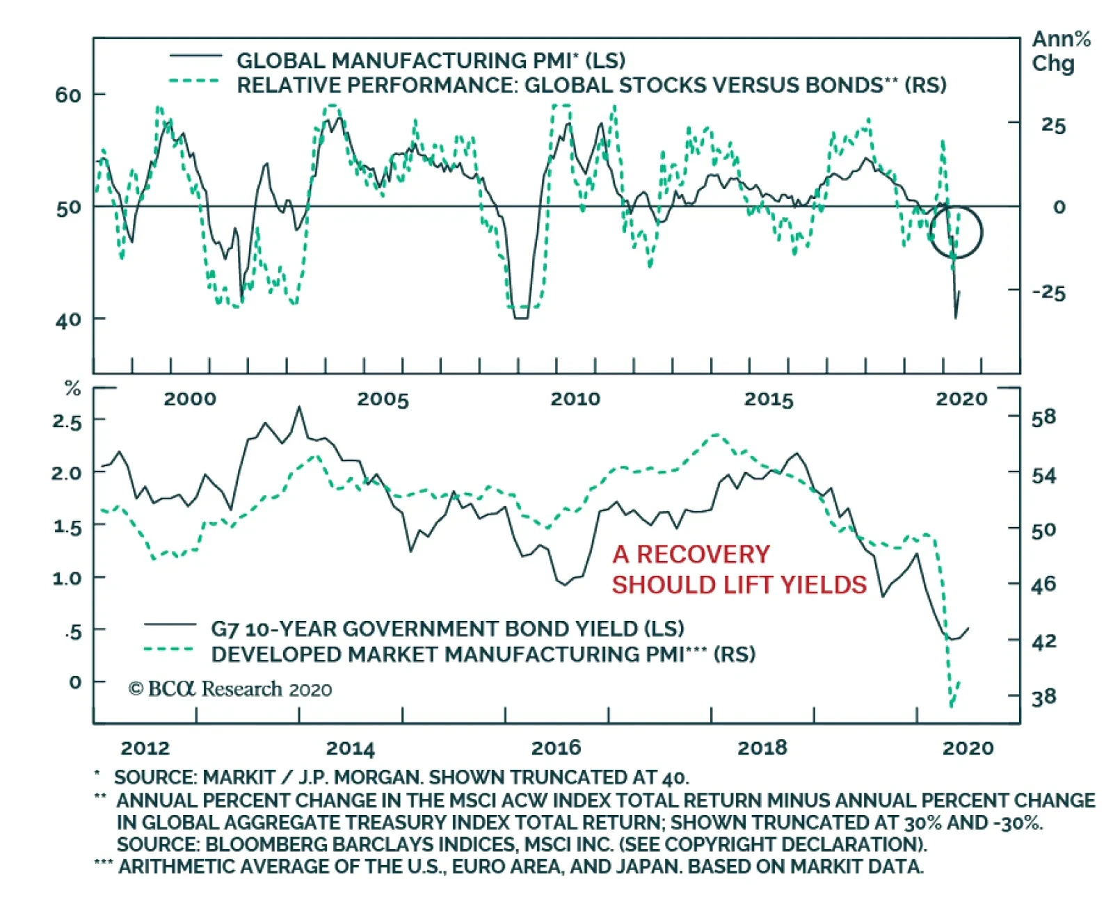
A common refrain is that equities have moved fast ahead of any reasonable expectation of the speed of the recovery. At first glance, this argument is compelling, but the reality is more complex. The stock-to-bond ratio is pricing in a quick recovery from…
Highlights Social distancing must persist to prevent dangerous super-spreading of COVID-19. The jobs recovery will be much weaker than the output recovery, because the sectors most hurt by social distancing have a very high labour intensity. This will force a prolonged period of ultra-accommodative monetary policy… …structurally favour T-bonds and Bonos over Bunds and OATs… …growth defensives such as tech and healthcare… …and the S&P 500 over the Euro Stoxx 50. Stay overweight Animal Care (PAWZ). Working from home has generated a puppy boom. Fractal trade: short gold, long lead. Feature As economies reopen, economists and strategists are quibbling about the shape of the output recovery: U, V, W, square root, or even ‘swoosh’. But for the furloughed or displaced worker, the more urgent question is, what will be the shape of the jobs recovery? Unfortunately, the jobs recovery will be much weaker than the output recovery – because the sectors most hurt by social distancing have a very high labour intensity (Chart Of The Week). Chart Of The Week 1ALeisure And Hospitality Makes A Large Contribution To Jobs Relative To Output
A Jobless V-Shape Recovery, And A Puppy Boom
A Jobless V-Shape Recovery, And A Puppy Boom
Chart Of The Week 1BFinance Makes A Small Contribution To Jobs Relative To Output
A Jobless V-Shape Recovery, And A Puppy Boom
A Jobless V-Shape Recovery, And A Puppy Boom
Output Might Snap Back, But Jobs Will Not The sectors most hurt by social distancing make a huge contribution to employment but a much smaller contribution to economic output. This is true for Europe and all advanced economies, though the following uses US data given its superior granularity and timeliness. The leisure and hospitality sector generates 11 percent of jobs, but just 4 percent of output. Retail trade generates 10 percent of jobs, but just 5 percent of output. It follows that if both sectors are operating at half their pre-coronavirus capacity, output will be down by 4.5 percent, but employment will collapse by 10.5 percent. Conversely, sectors which are relatively unaffected by social distancing make a small contribution to employment but a much bigger contribution to economic output. Financial activities generate just 6 percent of jobs, but 19 percent of economic output. Information technology generates just 2 percent of jobs, but 5 percent of output (Table I-1). Table I-1Sectors Hurt By Social Distancing Have A Very High Labour Intensity
A Jobless V-Shape Recovery, And A Puppy Boom
A Jobless V-Shape Recovery, And A Puppy Boom
If economies are reopened but social distancing persists – either via government policy or personal choice – then output can rebound in a V-shape, but employment cannot (Chart I-2). Forcing a prolonged period of ultra-accommodative monetary policy, with all its ramifications for financial markets. Chart I-2UK Unemployment Is Set To Surge If The US Is Any Guide
UK Unemployment Is Set To Surge If The US Is Any Guide
UK Unemployment Is Set To Surge If The US Is Any Guide
This raises a key question. Must social distancing persist? To answer, we need to pull together our latest understanding of COVID-19. COVID-19: What We Know So Far Many people argue that coronavirus fears are disproportionate. The mortality rate seems comfortingly low, at well below 0.5 percent (Chart 3). Yet this argument misses the point. Chart I-3The COVID-19 Mortality Rate Is Not High
A Jobless V-Shape Recovery, And A Puppy Boom
A Jobless V-Shape Recovery, And A Puppy Boom
COVID-19 is dangerous not because it kills, but because it makes a lot of people seriously ill. It has a low mortality rate, but a high morbidity rate. According to the World Health Organisation, around one in six that gets infected “develops difficulty in breathing”. Moreover, The Lancet points out that many recovered COVID-19 patients suffer pulmonary fibrosis, a permanent scarring of the lungs that impairs their breathing for the rest of their lives. Hence, while COVID-19 is highly unlikely to kill you, it could damage your health forever1 (Figure I-1). Figure 1COVID-19 Is Unlikely To Kill You, But It Could Permanently Damage Your Lungs
A Jobless V-Shape Recovery, And A Puppy Boom
A Jobless V-Shape Recovery, And A Puppy Boom
The most famous COVID-19 victim to date is British Prime Minister Boris Johnson who spent several days recovering in intensive care. By his own admission, Johnson’s only pre-existing conditions are that he is overweight and “drinks an awful lot”. But those pre-existing conditions could apply to a large swathe of the population. COVID-19 is virulent. But we now know that most infections are the result of so-called ‘super-spreaders’ – a small minority of virus carriers who infect tens or hundreds of other people. We also know that talking loudly, singing, or chanting tends to eject higher doses of the virus, and in an aerosol form that can linger in enclosed spaces. This creates the perfect conditions for one infected person to infect scores of others very quickly. Based on this latest knowledge, the good news is that economies can reopen. The bad news is that, until an effective vaccine is developed, social distancing must persist. Specifically, people must avoid forming the crowds, congregations, and loud gatherings that can generate very dangerous super-spreading events. Hence, the sectors that are most hurt by social distancing – leisure and hospitality and retail trade – will continue to operate well below capacity for many months, at a minimum. And as these sectors have a very high labour intensity, there will be no V-shape recovery in jobs. Without Higher Bond Yields, European Equities Struggle To Outperform Social distancing is set to persist, which will create heaps of slack in advanced economy labour markets. This will force central banks to push the monetary easing ‘pedal to the metal’ – though in many cases, the pedal is already at the metal. In turn, this will force bond yields to stay ultra-low and, where they can, go even lower. One immediate takeaway is to stay overweight positively yielding US T-bonds and Spanish Bonos versus negatively yielding German Bunds and French OATs. Depressed bond yields must also compress the discount rate on competing long-duration investments that generate safely growing cashflows. Meaning, growth defensive equities such as technology and healthcare. Now comes the part that is conceptually difficult to grasp because it is novel to this unprecedented era of ultra-low bond yields. Take some time to absorb the following few paragraphs. For growth defensives, both components of the discount rate – the bond yield and the equity risk premium (ERP) – compress together. This is because the ERP is a tight function of the difference in equity and bond price ‘negative asymmetries’, defined as the potential price downside versus upside. When bond yields converge to their lower limit, bond prices converge to their upper limit, which increases the potential price downside versus upside. The result is that the difference in equity and bond negative asymmetries converges to zero, forcing the ERP to converge to zero. As the discount rate on growth defensives such as tech and healthcare collapses towards zero, the net present value must increase exponentially. This exponentially higher valuation of tech and healthcare is a mathematical consequence of the novel risk relationship between growth defensive equities and bonds at ultra-low bond yields. The unprecedented phenomenon has a major implication for European equity relative performance. The Euro Stoxx 50 is heavily underweight technology and healthcare, and this defining sector fingerprint is the key structural driver of European equity market relative performance (Chart I-4). Meanwhile, the relative performance of technology and healthcare is just an inverse exponential function of the bond yield (Chart I-5). The upshot is that European equities tend to outperform other regions only when bond yields are heading higher and the growth defensives are underperforming (Chart I-6). Chart I-4The Euro Stoxx 50's Underweight In Tech Drives Its Relative Performance
The Euro Stoxx 50's Underweight In Tech Drives Its Relative Performance
The Euro Stoxx 50's Underweight In Tech Drives Its Relative Performance
Chart I-5Tech Outperforms When The Bond Yield Declines...
Tech Outperforms When The Bond Yield Declines...
Tech Outperforms When The Bond Yield Declines...
Chart I-6...Hence, Without Higher Bond Yields The Euro Stoxx 50 Struggles To Outperform
...Hence, Without Higher Bond Yields The Euro Stoxx 50 Struggles To Outperform
...Hence, Without Higher Bond Yields The Euro Stoxx 50 Struggles To Outperform
Some commentators are calling the higher valuations in tech and healthcare a new bubble. But it is a bubble only to the extent that bond yields are in a ‘negative bubble’, meaning that ultra-low yields are unsustainable. However, with social distancing set to leave heaps of slack in the advanced economy labour markets, ultra-low bond yields are here to stay and could go even lower. Moreover, as shown earlier, tech and healthcare demand and output are immune to social distancing. They may even benefit from social distancing. Hence, on a one-year horizon and beyond, stay overweight the growth defensive tech and healthcare sectors. And stay overweight the tech and healthcare heavy S&P 500 versus Euro Stoxx 50. A Puppy Boom We finish on a very positive note for animal lovers. The shift to working from home has generated a puppy boom. The Association of German Dogs claims that “the demand for puppies is endless” and the UK Kennel Club says that “there is unprecedented demand.” In the era of social distancing, the waiting list for puppies has quadrupled, and prices of easy to look after crossbreeds such as cockapoos have more than doubled. The demand for pet food and equipment is also very strong. Dogs make excellent companions for the socially isolated, which describes how many people are now feeling. Furthermore, with millions of people now working from home or on extended furlough, a growing number of households can fulfil the dream of owning a dog. We have recommended a structural overweight to the Animal Care sector based on the ‘humanisation’ of pets and the structural uptrend in spend per pet, especially on veterinary costs (Chart I-7). Animal Care has outperformed by 50 percent in the past two and a half years, but the shift to working from home will add impetus to the structural uptrend (Chart I-8). Chart I-7Animal Care Prices Are Rising...
Animal Care Prices Are Rising...
Animal Care Prices Are Rising...
Chart I-8...And The Animal Care Sector Is Strongly Outperforming
...And The Animal Care Sector Is Strongly Outperforming
...And The Animal Care Sector Is Strongly Outperforming
Stay overweight Animal Care. The ETF ticker, appropriately enough, is called PAWZ. Fractal Trading System This week’s recommended trade is to short gold versus lead, given that the relative performance recently reached a fractal resistance point that has successfully identified four previous turning points. Set the profit target and symmetrical stop-loss at 13 percent. In our other open trades, five are in profit and one is in loss. The rolling 1-year win ratio now stands at 64 percent.
Gold Vs. Lead
Gold Vs. Lead
When the fractal dimension approaches the lower limit after an investment has been in an established trend it is a potential trigger for a liquidity-triggered trend reversal. Therefore, open a countertrend position. The profit target is a one-third reversal of the preceding 13-week move. Apply a symmetrical stop-loss. Close the position at the profit target or stop-loss. Otherwise close the position after 13 weeks. * For more details please see the European Investment Strategy Special Report “Fractals, Liquidity & A Trading Model,” dated December 11, 2014, available at eis.bcaresearch.com. Dhaval Joshi Chief European Investment Strategist dhaval@bcaresearch.com Footnotes 1 https://www.thelancet.com/journals/lanres/article/PIIS2213-2600(20)30222-8/fulltext Fractal Trading System Cyclical Recommendations Structural Recommendations Closed Fractal Trades Trades Closed Trades Asset Performance Currency & Bond Equity Sector Country Equity Indicators Bond Yields Chart II-1Indicators To Watch - Bond Yields
Indicators To Watch - Bond Yields
Indicators To Watch - Bond Yields
Chart II-2Indicators To Watch - Bond Yields
Indicators To Watch - Bond Yields
Indicators To Watch - Bond Yields
Chart II-3Indicators To Watch - Bond Yields
Indicators To Watch - Bond Yields
Indicators To Watch - Bond Yields
Chart II-4Indicators To Watch - Bond Yields
Indicators To Watch - Bond Yields
Indicators To Watch - Bond Yields
Interest Rate Chart II-5Indicators To Watch - Interest Rate Expectations
Indicators To Watch - Interest Rate Expectations
Indicators To Watch - Interest Rate Expectations
Chart II-6Indicators To Watch - Interest Rate Expectations
Indicators To Watch - Interest Rate Expectations
Indicators To Watch - Interest Rate Expectations
Chart II-7Indicators To Watch - Interest Rate Expectations
Indicators To Watch - Interest Rate Expectations
Indicators To Watch - Interest Rate Expectations
Chart II-8Indicators To Watch - Interest Rate Expectations
Indicators To Watch - Interest Rate Expectations
Indicators To Watch - Interest Rate Expectations
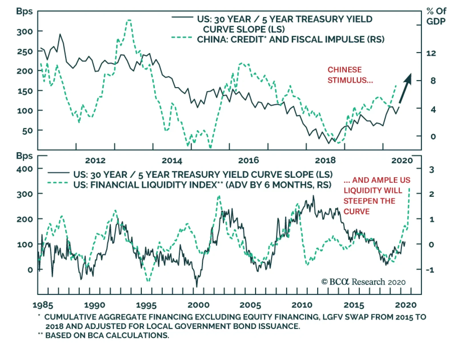
Since March 9, the US 5-/30-year yield curve has steepened by 68bps. This is a more pronounced steepening than that of the 2-/30-year yield curve because the Fed’s actions have a lower impact on the volatility of T-Bonds than that of T-Notes. This…