Fixed Income
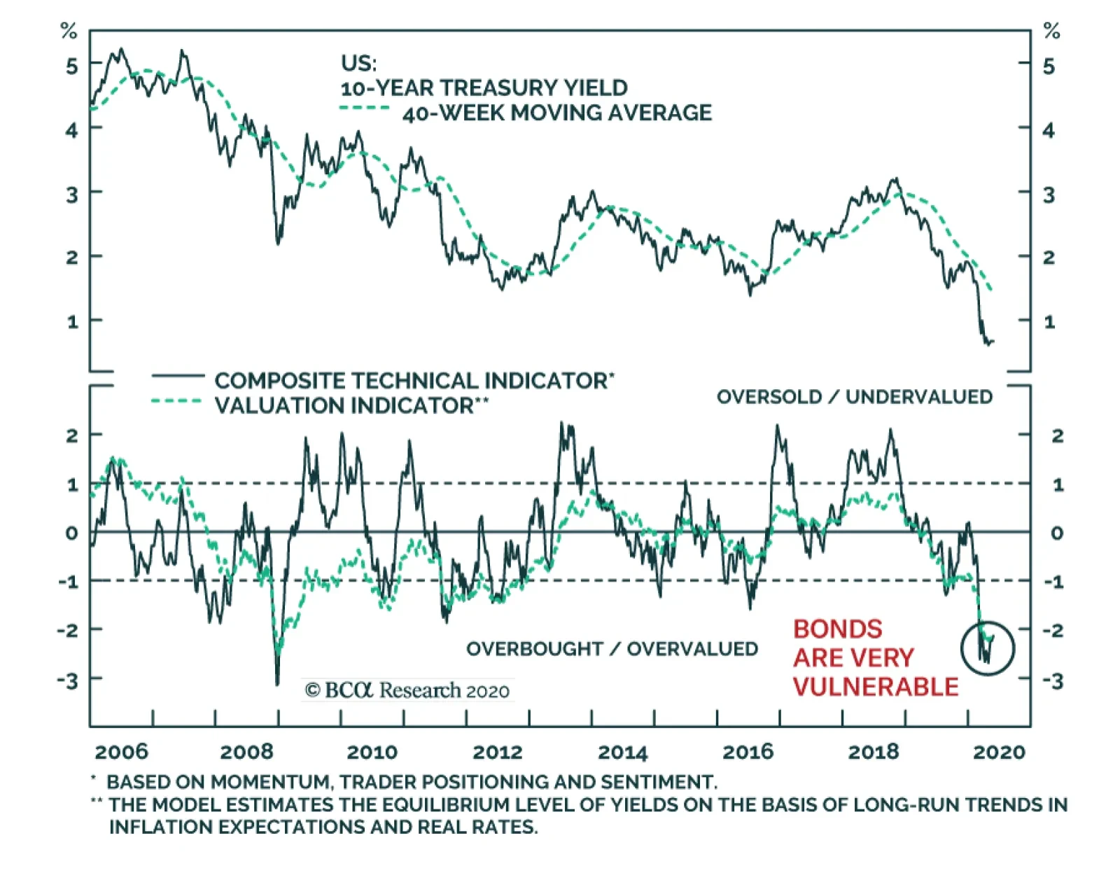
The Treasury market is becoming highly vulnerable. Our BCA Bond Valuation index and our Composite Technical Indicator are as expensive and as overbought as they were in December 2008, just prior to a 171 basis points pick up in Treasury yields. …
Yesterday, BCA Research's US Bond Strategy service gave three reasons to remain overweight municipal bonds within US fixed income portfolios. First, the Fed is already facing criticism about the Municipal Liquidity Facility (MLF) rates and their cost. The…

Highlights Duration: The easing of shelter-in-place restrictions and resultant improvement in economic growth will cause US bond yields to rise somewhat during the next couple of months. However, the magnitude of economic improvement will be modest, and the Fed’s dovish rate guidance will temper the severity of any yield back-up. Municipal Bonds: The less-than-generous pricing offered through the Fed’s Municipal Liquidity Facility will not help push muni yields lower from current levels. However, very attractive valuations and the expectation of federal government relief justify an overweight allocation to the sector. Inflation & TIPS: We are not worried about significant inflation pressures any time soon. But equally, we don’t see 12-month headline CPI falling much below zero this year. This means that TIPS are cheap relative to nominal Treasuries. Treasury Yield Outlook Chart 1Taking A Breather
Taking A Breather
Taking A Breather
Bond yields have been relatively stable since early April, and the Treasury index has performed roughly in-line with cash for most of the second quarter. This of course follows on the heels of massive outperformance in Q1 (Chart 1). Nonetheless, the recent stabilization in yields raises the question of whether bond returns are approaching a cyclical peak, or merely experiencing a temporary lull. Yields Are Biased Higher In The Near-Term … Our view is that a modest bond sell-off is likely during the next couple of months for four reasons. First, high-frequency global growth indicators are finally starting to hook up (Chart 2). Specifically, we like to track the CRB Raw Industrials commodity price index, emerging market currencies and the relative performance of cyclical versus defensive US equities. All three indicators track bond yields closely, and all three are showing signs of bottoming. Chart 2High-Frequency Global Growth Indicators
High-Frequency Global Growth Indicators
High-Frequency Global Growth Indicators
Second, FLASH PMI estimates for May showed broad-based improvement compared to the April lows. Specifically, FLASH Manufacturing PMIs for the United States, Euro Area and United Kingdom all increased compared to April (Chart 3A). Of countries that have FLASH PMI estimates, only Japan saw a continued decline in May. If these numbers are to be believed, they suggest that April might indeed represent the global economic trough. We are still waiting for May data from China and the rest of the emerging world, important economic blocs that together account for 47% of the Global Manufacturing PMI. But China’s PMI, at least, has already rebounded off its February low (Chart 3B). China’s number will likely pressure the global index higher when it is released next week. Chart 3APMI Estimates For May
PMI Estimates For May
PMI Estimates For May
Chart 3BChina's PMI Is Close To Neutral
China's PMI Is Close To Neutral
China's PMI Is Close To Neutral
Third, high-frequency US economic data are consistent with an economy that is close to, or perhaps already passed, its economic trough. Initial jobless claims are still very high but have printed successively lower since peaking seven weeks ago. Similarly, the New York Fed’s Weekly Economic Index remains at its all-time low but is no longer in free fall (Chart 4).1 Chart 4US Economic Indicators
US Economic Indicators
US Economic Indicators
Finally, but also most importantly, the slightly better data noted above are the result of economies that are slowly starting to re-open as daily new COVID cases roll over. This is particularly the case in Europe and North America (Chart 5). Restrictions will probably continue to ease during the next couple of months, meaning that both the economic data and bond yields are biased higher. Chart 5Global COVID-19 Cases
Global COVID-19 Cases
Global COVID-19 Cases
… But Don’t Expect Anything More Than A Modest Sell-Off Chart 6Fed's Forward Guidance Quickly Dampened Vol
Fed's Forward Guidance Quickly Dampened Vol
Fed's Forward Guidance Quickly Dampened Vol
However, there are also a few reasons to not get too bearish on US bonds. First, it is entirely possible – and even likely – that COVID cases will start to increase as shelter-in-place restrictions are lifted. If these second waves of the infection aren’t adequately suppressed via testing and contact tracing then restrictions could be re-instated by the fall, putting renewed downward pressure on bond yields. Also, while new COVID cases are declining in many parts of Europe and North America, several large emerging markets are still seeing cases accelerate. Brazil and India, for example, have yet to see a peak in new cases, while Russia’s new cases have just started to roll over (Chart 5, bottom 2 panels). Together, Brazil, Russia and India account for 8% of the Global Manufacturing PMI. Slow growth in those nations will significantly dampen any global economic recovery. On top of uncertainty surrounding the speed of any nascent global economic recovery, bond yields will also be held down by the Fed’s highly credible zero-lower-bound interest rate guidance. As we discussed in last week’s report, large bond sell-offs are almost always associated with a significant hawkish shift in monetary policy.2 This will not occur any time soon. In fact, the New York Fed’s latest Survey of Market Participants, taken just prior to the April 28-29 FOMC meeting, reveals that the median market participant expects the fed funds rate to stay at its current level at least until the end of 2022!3 On the one hand, such depressed expectations suggest scope for a massive re-pricing at some point in the future, but this will not occur until inflation forces the Fed to act. We agree with the survey respondents that this is a long way off. While new COVID cases are declining in many parts of Europe and North America, several large emerging markets are still seeing cases accelerate. It’s also interesting to note the speed at which the market has bought into the Fed’s zero-lower-bound rate guidance during the past two months. Chart 6 shows that after the Fed first cut rates to zero in December 2008, it still took several years for implied interest rate volatility to reach historically low levels. That is, the market was not initially convinced that rates would stay at zero for the long haul. In contrast, interest rate volatility has plunged dramatically since the Fed cut rates to zero on March 15. This time around, the market has been quick to buy into the Fed’s dovish message. Bottom Line: The easing of shelter-in-place restrictions and resultant improvement in economic growth will cause US bond yields to rise somewhat during the next couple of months. However, the magnitude of economic improvement will be modest, and the Fed’s dovish rate guidance will temper the severity of any yield back-up. Additionally, we can’t rule out the resumption of lockdown restrictions in the fall, should COVID cases rise during the summer. In terms of strategy, nimble investors may want to position for higher yields in the near-term. However, given the risks involved, we prefer to keep portfolio duration close to benchmark while implementing duration-neutral curve steepeners that will profit from rising yields. Specifically, we recommend going long the 5-year note and short a duration-matched barbell consisting of the 2-year and 10-year notes.4 Munis Carry Some Risk, But Offer A Lot Of Value Chart 7Munis Cheap Versus Treasuries
Munis Cheap Versus Treasuries
Munis Cheap Versus Treasuries
Our spread product investment strategy during the recession has been to favor those sectors that: a) Offer attractive yields/spreads b) Benefit from one or more of the Fed’s emergency lending facilities Municipal bonds check both of those boxes. In terms of value, Aaa-rated municipal bond yields are consistently above Treasury yields across the entire maturity spectrum (Chart 7), a yield advantage that becomes especially pronounced when you factor in munis’ tax-exempt status. There is even a strong case for tax-exempt municipal bonds relative to corporate bonds. Table 1A shows the yield differential between tax-exempt municipal bonds and corporate bonds that carry the same credit rating and maturity. Not surprisingly, municipal bond yields are below corporate yields in most cases, with A-rated yields and longer-maturity Baa-rated yields being glaring exceptions. To put those yield differentials in context, Table 1B shows the breakeven effective tax rate for each muni/corporate combination. For example, the breakeven effective tax rate between Aaa-rated 5-year municipal and corporate bonds is 23%. This means that an investor will earn more after-tax yield in the municipal bond if his effective tax rate is above 23%, and less if it is below. It is apparent that breakeven effective tax rates are quite low, especially at the bottom-end of the credit spectrum. Table 1ASpread Between Municipal Bonds & Credit Index Yields* (BPs)
Bonds Vulnerable As North America Re-Opens
Bonds Vulnerable As North America Re-Opens
Table IBMuni/Credit Breakeven Effective Tax Rate* (%)
Bonds Vulnerable As North America Re-Opens
Bonds Vulnerable As North America Re-Opens
As for our second criterion, the municipal sector clearly benefits from the Fed’s Municipal Liquidity Facility (MLF). Through this facility, the Fed lends directly to eligible state & local governments for up to three years.5 However, there is a problem with the MLF: The cost. The Fed recently revealed that it will charge a rate of OIS + 150 bps for new loans taken out by Aaa-rated issuers through the MLF. That fixed spread rises as the issuer’s credit rating declines. Aa2 issuers are charged OIS + 175 bps, A2 issuers are charged OIS + 250 bps, etc…6 Chart 8MLF Pricing Doesn't Help Muni Investors
MLF Pricing Doesn't Help Muni Investors
MLF Pricing Doesn't Help Muni Investors
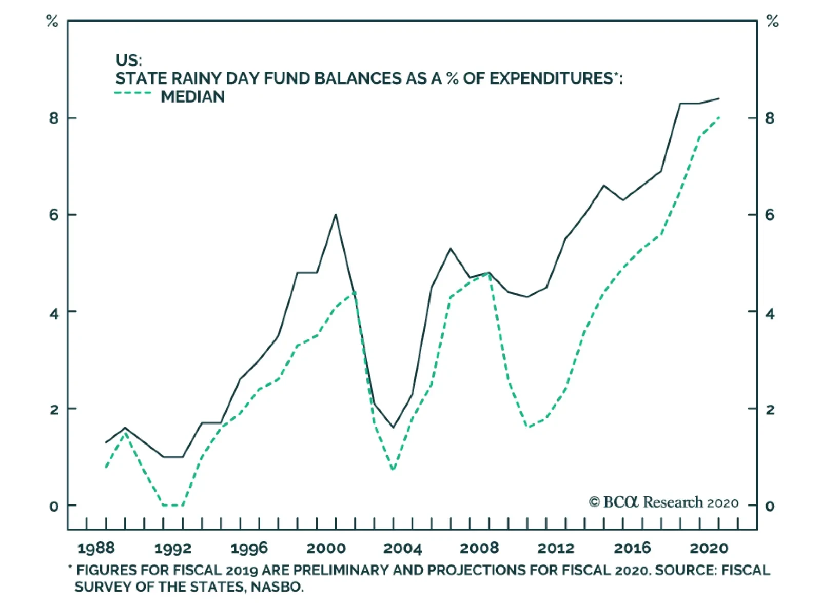
For each credit rating, the rate available through the MLF is significantly higher than the actual market yield (Chart 8). This means that the MLF currently places a cap on how high municipal yields can rise, but it doesn’t actively pressure them lower. This stands in stark contrast to the rates offered through the Term Asset-Backed Securities Loan Facility (TALF) that are considerably below market yields on Aaa-rated CMBS and similar to market yields on Aaa-rated consumer ABS. Uncharitable MLF pricing structure aside, we think there are several reasons to remain overweight municipal bonds within US fixed income portfolios. First, the Fed is already facing criticism about the MLF rates and it could lower them in the near future. It has already shown a willingness to alter its facilities in response to market pressure. The MLF initially only made loans with maturities of 2 years or less, now it offers loans of up to 3 years. Second, direct federal aid to state & local governments was the centerpiece of the relief bill that recently passed through the House of Representatives. That bill will not get through the Senate in its current form, but another federal government relief package is forthcoming and it will almost certainly include money for state & local governments. There is even a strong case for tax-exempt municipal bonds relative to corporate bonds. Third, despite the massive challenges ahead, state governments entered the present crisis with relatively strong budget positions and well stocked rainy day funds (Chart 9). State & local governments will obviously be forced to make some tough budget decisions in the coming months, but there is no doubt that they are in a better position to do so than they were prior to the last two recessions. Chart 9State Rainy Day Funds
State Rainy Day Funds
State Rainy Day Funds
Bottom Line: The less-than-generous pricing offered through the Fed’s Municipal Liquidity Facility will not help push muni yields lower from current levels. However, very attractive valuations and the expectation of federal government relief justify an overweight allocation to the sector. Deflation A Bigger Risk Than Inflation, But TIPS Still Make Sense Chart 10Energy Inflation May Have Troughed
Energy Inflation May Have Troughed
Energy Inflation May Have Troughed
April’s CPI report saw year-over-year headline inflation fall to 0.4%, the lowest level since 2015. Deflation is clearly a bigger risk than inflation this year, but we would argue that TIPS prices are so beaten down that the sector still offers value. This is true over investment horizons as short as one year. We calculate that headline CPI inflation would have to come in below -0.85% over the next 12 months for a hold-to-maturity position in TIPS to underperform a similar position in nominal Treasuries (Chart 10). Could we actually see that much deflation during the next 12 months? It is possible, but we’d bet against it. First, the collapse in oil prices and energy inflation has been an important driver of falling inflation during the past couple of months (Chart 10, panel 2). But with oil prices having already dipped into negative territory and massive production cuts about to come on board, energy inflation may have already troughed for the year.7 At the very least, with oil prices already so low there is much less room for them to decline and thus less scope for further energy CPI deceleration. Second, the Great Financial Crisis (GFC) was the last time that headline CPI inflation went significantly below zero. Year-over-year core inflation had to get to 0.6% for that to happen. This year, 12-month core CPI dropped to 1.4% in April from 2.1%, but the trimmed mean measure only fell from 2.4% to 2.2% (Chart 10, bottom panel). During the GFC, both core and trimmed mean inflation fell in tandem. This gives us some reason to doubt the persistence of core CPI’s recent drop. Headline CPI inflation would have to come in below -0.85% over the next 12 months for a hold-to-maturity position in TIPS to underperform a similar position in nominal Treasuries. Finally, shelter accounts for roughly one third of headline inflation. Year-over-year shelter CPI troughed at -0.6% during the GFC. It also dropped sharply in April – from 3.0% to 2.6% – but it still has a long way to go to get back to GFC levels (Chart 11). We don’t think that shelter inflation will move back into negative territory, and without that drag it is hard to see 12-month headline CPI falling much below zero. Chart 11Shelter Is One Third Of CPI
Shelter Is One Third Of CPI
Shelter Is One Third Of CPI
Rental vacancies are the number one driver of shelter CPI. The rental vacancy rate has only been updated through the end of March, and April’s data will definitely show a spike. However, the vacancy rate is starting from below 7%. The vacancy rate needed to spend several years hovering around 10% or higher before shelter CPI saw its big drop in 2008/09 (Chart 11, panel 2). The National Multifamily Housing Council (NMHC)’s Apartment Market Diffusion Index also does a good job predicting shelter inflation. Shelter inflation tends to fall when the index is below 50 and rise when it is above 50 (Chart 11, bottom panel). The Diffusion Index experienced a massive drop in April, back to GFC levels. However, it remains to be seen whether it will recover rapidly or remain below 50 for ten consecutive quarters like it did between 2007 and 2010. In fact, there is some reason to believe that the recovery might be fairly quick. Other data released by the NMHC show that as of May 20 2020, 90.8% of renters had made their monthly payments for May. In April 2020, 89.2% of renters had made their monthly payments by the 20th of the month. Unsurprisingly, both of these figures are below what was seen last year: In 2019, about 93% of renters had made their April and May monthly payments by the 20th of the month. But the fact that May 2020 data show a small increase compared to April indicates that the situation is not worsening, and it may in fact be getting better. Bottom Line: We are not worried about significant inflation pressures any time soon. But equally, we don’t see 12-month headline CPI falling much below zero this year. This means that TIPS are cheap relative to nominal Treasuries. We recommend overweighting TIPS versus nominal Treasuries across the entire maturity spectrum. We also recommend implementing TIPS curve steepeners.8 Appendix - Buy What The Fed Is Buying The Fed rolled out a number of aggressive lending facilities on March 23. These facilities focused on different specific sectors of the US bond market. The fact that the Fed has decided to support some parts of the market and not others has caused some traditional bond market correlations to break down. It has also led us to adopt a strategy of “Buy What The Fed Is Buying”. That is, we favor those sectors that offer attractive spreads and that benefit from Fed support. Right now, that means we are overweight corporate bonds rated Ba and higher, Aaa-rated Agency and non-agency CMBS, Aaa-rated consumer ABS and municipal bonds. We are underweight residential mortgage-backed securities and corporate bonds rated B and lower. The below Table tracks the performance of these different bond sectors since the Fed’s March 23 announcement. We will use this Table to monitor bond market correlations and evaluate our strategy's success. Table 2Performance Since March 23 Announcement Of Emergency Fed Facilities
Bonds Vulnerable As North America Re-Opens
Bonds Vulnerable As North America Re-Opens
Ryan Swift US Bond Strategist rswift@bcaresearch.com Footnotes 1 The Weekly Economic Index is a composite of 10 daily and weekly indicators of real economic activity. For more details on its construction please see https://www.newyorkfed.org/research/policy/weekly-economic-index 2 Please see US Bond Strategy Weekly Report, “The Treasury Market Amid Surging Supply”, dated May 12, 2020, available at usbs.bcaresearch.com 3 https://www.newyorkfed.org/medialibrary/media/markets/survey/2020/apr-2020-smp-results.pdf 4 For more details on our recommended yield curve positioning please see US Bond Strategy Weekly Report, “Life At The Zero Bound”, dated March 24, 2020, available at usbs.bcaresearch.com 5 For more details on the MLF and the Fed’s other emergency lending facilities please see US Investment Strategy/US Bond Strategy Special Report, “Alphabet Soup: A Summary Of The Fed’s Anti-Virus Measures”, dated April 14, 2020, available at usbs.bcaresearch.com 6 For full pricing details please see https://www.federalreserve.gov/newsevents/pressreleases/files/monetary20200511a1.pdf 7 For more details on BCA’s outlook for oil prices please see Commodity & Energy Strategy Weekly Report, “US Politics Will Drive 2H20 Oil Prices”, dated May 21, 2020, available at ces.bcaresearch.com 8 For more details on our recommendation for TIPS curve steepeners please see US Bond Strategy Weekly Report, “Negative Oil, The Zero Lower Bound And The Fisher Equation”, dated April 28, 2020, available at usbs.bcaresearch.com Fixed Income Sector Performance Recommended Portfolio Specification
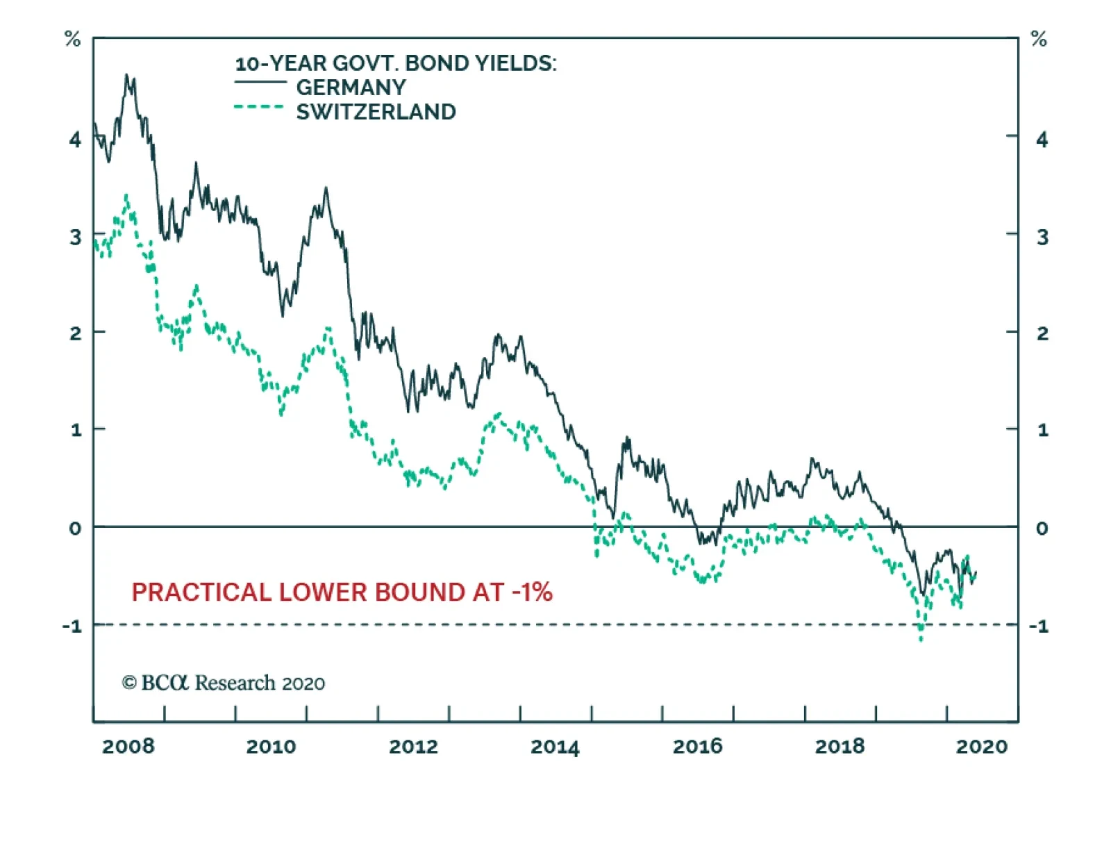
BCA Research's European Investment Strategy service argues that German Bunds and Swiss Bonds are no longer safe-haven assets. German and Swiss bond yields are close to the practical lower limit to yields, which we believe is around -1%. This means that…
Highlights German bunds and Swiss bonds are no longer haven assets. The haven assets are the Swiss franc, Japanese yen, and US T-bonds. Gold is less effective as a haven asset. During this year’s coronavirus crash, the gold price fell by -7 percent. As such, our haven asset of choice for a further demand shock would be the 30-year T-bond, whose price rose by 10 percent during the crash. Technology and healthcare are the two sectors most likely to contain haven equities. Fractal trade: long Polish zloty versus euro. German Bunds And Swiss Bonds Are No Longer Haven Assets Chart of the WeekGold Is Tracking The US 30-Year T-Bond Price... But The T-Bond Is The Better Haven Asset
Gold Is Tracking The US 30-Year T-Bond Price... But The T-Bond Is The Better Haven Asset
Gold Is Tracking The US 30-Year T-Bond Price... But The T-Bond Is The Better Haven Asset
European investors have been left defenceless. German bunds and Swiss bonds used to be the safest of haven assets. You used to be able to bet your bottom dollar – or euro or Swiss franc for that matter – that the bond prices would rally during a demand shock. Not in 2020. When the global economy and stock markets collapsed from mid-February through mid-March, the DAX slumped by -39 percent. Yet the German 10-year bund price, rather than rallying, fell by -2 percent, while the Swiss 10-year bond price fell by -4 percent.1 The lower limit to bond yields is around -1 percent. The reason is that German and Swiss bond yields are close to the practical lower limit to yields, which we believe is around -1 percent (Chart I-2). This means that German and Swiss bond prices cannot rise much, though they can theoretically fall a lot. Chart I-2German And Swiss Bond Yields Are Near Their Practical Lower Bound
German And Swiss Bond Yields Are Near Their Practical Lower Bound
German And Swiss Bond Yields Are Near Their Practical Lower Bound
The behaviour of German bunds and Swiss bonds during the current crisis contrasts with previous episodes of market stress when their yields were unconstrained by the -1 percent lower limit. During the heat of the euro debt crisis in 2011, the 10-year bund price rallied by 12 percent. Likewise, during the frenzy of the global financial crisis in 2008, the 10-year bund price rallied by 7 percent (Chart I-3 - Chart I-5). Chart I-3German And Swiss Bonds Protected Investors During The 2008 Crash
German And Swiss Bonds Protected Investors During The 2008 Crash
German And Swiss Bonds Protected Investors During The 2008 Crash
Chart I-4German And Swiss Bonds Protected Investors During The 2011 Crash
German And Swiss Bonds Protected Investors During The 2011 Crash
German And Swiss Bonds Protected Investors During The 2011 Crash
Chart I-5German And Swiss Bonds Did Not Protect Investors During The 2020 Crash
German And Swiss Bonds Did Not Protect Investors During The 2020 Crash
German And Swiss Bonds Did Not Protect Investors During The 2020 Crash
The defencelessness of European investors can also be illustrated via a ‘balanced’ 25:75 portfolio containing the DAX and 10-year German bund. The balanced portfolio theory is that a large weighting to bonds should counterbalance a sharp sell-off in equities, thereby protecting the overall portfolio. The theory worked well… until now. In this year’s coronavirus crisis, the 25:75 DAX/bund portfolio suffered a loss of -13 percent. This is substantially worse than the loss of -2 percent during the euro debt crisis in 2011, and the loss of -7 percent during the global financial crisis in 2008 (Chart I-6 - Chart I-8). Chart I-6A 25:75 DAX:Bund Portfolio Lost 7 Percent During The 2008 Crash
A 25:75 DAX:Bund Portfolio Lost 7 Percent During The 2008 Crash
A 25:75 DAX:Bund Portfolio Lost 7 Percent During The 2008 Crash
Chart I-7A 25:75 DAX:Bund Portfolio Lost 2 Percent During The 2011 Crash
A 25:75 DAX:Bund Portfolio Lost 2 Percent During The 2011 Crash
A 25:75 DAX:Bund Portfolio Lost 2 Percent During The 2011 Crash
Chart I-8A 25:75 DAX:Bund Portfolio Lost 13 Percent During The 2020 Crash
A 25:75 DAX:Bund Portfolio Lost 13 Percent During The 2020 Crash
A 25:75 DAX:Bund Portfolio Lost 13 Percent During The 2020 Crash
What Are The Haven Assets? The lower limit to the policy interest rate – and therefore bond yields – is around -1 percent, because -1 percent counterbalances the storage costs of holding physical cash or other stores of value. If banks passed a deeply negative policy rate to their depositors, the depositors would flee into other stores of value. But if banks did not pass a deeply negative policy rate to their depositors, it would wipe out the banks’ net interest (profit) margin. Either way, a deeply negative policy rate would destroy the banking system. German and Swiss bond prices cannot rise much. German and Swiss bond yields are close to the -1 percent lower limit, meaning that the bond prices are close to their upper limit. Begging the question: what are the haven assets whose prices will rise and protect long-only investors when economic demand slumps? We can think of three. The Swiss franc. The Japanese yen (Chart I-9). US T-bonds. Chart I-9The Swiss Franc And Japanese Yen Are Haven Assets
The Swiss Franc And Japanese Yen Are Haven Assets
The Swiss Franc And Japanese Yen Are Haven Assets
During the coronavirus crash, the 10-year T-bond price rallied by 4 percent while the 30-year T-bond price rallied by 10 percent (Chart I-10). Compared with German bund and Swiss bond yields, US T-bond yields were – and still are – further from the -1 percent lower limit. The good news is that long-dated T-bonds can still protect investors during a demand shock, although be warned that the extent of protection diminishes as yields get closer to the lower limit. Chart I-10Long-Dated US T-Bonds Are Haven Assets
Long-Dated US T-Bonds Are Haven Assets
Long-Dated US T-Bonds Are Haven Assets
What about gold? As gold has a zero yield, it becomes relatively more attractive to own as the yield on other haven assets declines and turns negative. In fact, through the last three years, the gold price has been nothing more than a proxy for the US 30-year T-bond price (Chart of the Week). But gold is an inferior haven asset. During the coronavirus crash, the gold price fell by -7 percent, meaning it did not offer the protection that T-bonds offered. As such, our haven asset of choice for a further demand shock would not be gold. It would be the 30-year T-bond. What Are The Haven Equities? Many investors still use (root mean squared) volatility as a metric of investment risk. There’s a big problem with this. Volatility treats price upside the same as price downside. This is unrealistic. Nobody minds the price upside, they only care about the downside! Hence, a truer metric of risk is the potential for short-term losses versus gains. This truer measure of risk is known as negative asymmetry, or negative skew. In the twilight zone of ultra-low bond yields, bond prices take on this unattractive negative skew. As German bunds and Swiss bonds have taught us this year, bond prices can suffer losses, but they cannot offer gains. This means that bonds become riskier investments relative to other long-duration investments such as equities whose own negative skew remains relatively stable. The upshot is that the prospective return offered by equities must collapse. This is because both components of the equity return – the bond yield plus the equity risk premium – shrink simultaneously. Equity valuations rise as an exponential function of inverted bond yields. Given that valuation is just the inverse of prospective return, the effect is that equity valuations rise as an exponential function of inverted bond yields. Chart I-11 illustrates this exponentiality by showing that technology equity multiples have tightly tracked the inverted bond yield plotted on a logarithmic scale. Chart I-11Technology Valuations Are Exponentially Sensitive To The (Inverted) Bond Yield
Technology Valuations Are Exponentially Sensitive To The (Inverted) Bond Yield
Technology Valuations Are Exponentially Sensitive To The (Inverted) Bond Yield
Unfortunately, not all equities will benefit from this powerful dynamic. Equities must meet two crucial conditions to justify this exponential re-rating. One condition is that their sales and profits must be relatively resilient in the face of the current coronavirus induced demand shock. And they should not be at risk of a structural discontinuity, as is likely for say airlines, leisure and many other old-fashioned cyclicals. A second condition is that their cashflows must be weighted further into the future, so that their ‘net present values’ are much more geared to the decline in bond yields. Equities that meet these two conditions are likely to benefit the most from the ongoing era of ultra-low bond yields. And the two equity sectors that appear the biggest beneficiaries are technology and healthcare. In the coronavirus world, these two sectors will likely contain the haven equities. Stay structurally overweight technology and healthcare. Fractal Trading System* This week’s recommended trade is to go long the Polish zloty versus the euro. The profit-target and symmetrical stop-loss are set at 2 percent. Most of the other open trades are flat, though long Australian 30-year bonds versus US 30-year T-bonds and Euro area personal products versus healthcare are comfortably in profit. The rolling 1-year win ratio now stands at 61 percent. Chart I-12PLN/EUR
PLN/EUR
PLN/EUR
When the fractal dimension approaches the lower limit after an investment has been in an established trend it is a potential trigger for a liquidity-triggered trend reversal. Therefore, open a countertrend position. The profit target is a one-third reversal of the preceding 13-week move. Apply a symmetrical stop-loss. Close the position at the profit target or stop-loss. Otherwise close the position after 13 weeks. * For more details please see the European Investment Strategy Special Report “Fractals, Liquidity & A Trading Model,” dated December 11, 2014, available at eis.bcaresearch.com. Dhaval Joshi Chief European Investment Strategist dhaval@bcaresearch.com Footnotes 1 From February 19 through March 18, 2020. Fractal Trading System Cyclical Recommendations Structural Recommendations Closed Fractal Trades Trades Closed Trades Asset Performance Currency & Bond Equity Sector Country Equity Indicators Bond Yields Chart II-1Indicators To Watch - Bond Yields
Indicators To Watch - Bond Yields
Indicators To Watch - Bond Yields
Chart II-2Indicators To Watch - Bond Yields
Indicators To Watch - Bond Yields
Indicators To Watch - Bond Yields
Chart II-3Indicators To Watch - Bond Yields
Indicators To Watch - Bond Yields
Indicators To Watch - Bond Yields
Chart II-4Indicators To Watch - Bond Yields
Indicators To Watch - Bond Yields
Indicators To Watch - Bond Yields
Interest Rate Chart II-5Indicators To Watch - Interest Rate Expectations
Indicators To Watch - Interest Rate Expectations
Indicators To Watch - Interest Rate Expectations
Chart II-6Indicators To Watch - Interest Rate Expectations
Indicators To Watch - Interest Rate Expectations
Indicators To Watch - Interest Rate Expectations
Chart II-7Indicators To Watch - Interest Rate Expectations
Indicators To Watch - Interest Rate Expectations
Indicators To Watch - Interest Rate Expectations
Chart II-8Indicators To Watch - Interest Rate Expectations
Indicators To Watch - Interest Rate Expectations
Indicators To Watch - Interest Rate Expectations
So far, the Chinese economy has been a useful template to understand the evolution of the global economy in response to the COVID-19 shock. China entered quarantine first, experienced a catastrophic collapse in industrial and service activity first, softened…
Highlights Fed/BoE NIRP: It is too soon for either the Fed or Bank of England to consider a move to a negative interest rate policy (NIRP), even with US and UK money markets flirting with pricing in that outcome. Lessons from “NIRP 1.0”: In the countries that did go to negative rates in 2014-16 (Japan, Switzerland, the euro area, Sweden and Denmark), there existed some combination of weak economies, near-0% inflation, anemic credit growth or unwanted currency appreciation. Negative rates were needed to help fight those trends by driving down longer-term bond yields. NIRP 2.0?: Among the major countries without negative rate policies in effect (the US, UK, Canada and Australia), there is no evidence that longer-term borrowing rates need to fall further to boost credit growth, even in the midst of deep recessions. However, additional strength of the stubbornly resilient US dollar could be the deflationary shock that eventually forces the Fed into NIRP. Feature Chart 1NIRP 2.0 Would Trigger A Surge Of Negative Yielding Bonds
NIRP 2.0 Would Trigger A Surge Of Negative Yielding Bonds
NIRP 2.0 Would Trigger A Surge Of Negative Yielding Bonds
Within a 20-month window in 2014-16, the central banks of Japan, Sweden, the euro area, Switzerland and Denmark all cut policy interest rates to below 0% - where they remain to this day. Fast forward to 2020, in the midst of a global pandemic and deep worldwide recession that has already forced major developed market central banks to cut rates close to 0%, there is now increased speculation that the negative interest rate policy (NIRP) club might soon get a few new members. The Federal Reserve has been front and center in that group. Fed funds futures contracts had recently priced in slightly negative rates in 2021, despite Fed Chair Jerome Powell repeatedly saying that a sub-0% funds rate was not in the Fed’s plans. The Bank of England (BoE) has also seen markets inch toward pricing in negative rates, although BoE officials have been more open to the idea of negative rates as a viable policy choice. Even the Reserve Bank of New Zealand has suggested that negative rates may be needed there soon. An expansion of the list of countries that have moved to negative rates, beyond the “NIRP 1.0” group of 2014-16, has the potential to drive down global bond yields even further. Already, there is $11 trillion of negative yielding debt within the Bloomberg Barclays Global Aggregate index, representing 20% of the total (Chart 1) If there is a shift to negative rates in the potential “NIRP 2.0” group of major developed economies with policy rates now near 0% – a list that includes the US, the UK, Canada and Australia – then the amount of negative yielding debt worldwide will soar to new highs. An expansion of the list of countries that have moved to negative rates, beyond the “NIRP 1.0” group of 2014-16, has the potential to drive down global bond yields even further. In this report, we take a look at the conditions that led the NIRP 1.0 countries to shift to negative rates in the middle of the last decade, to see if any similarities exist in non-NIRP countries today. We conclude that the conditions are not yet in place for a shift to sub-0% policy rates in the US, the UK, Canada or Australia – all countries where central banks still have other policy tools available to provide stimulus before resorting to negative rates. How Negative Interest Rates Can “Work” To Revive Growth Broadly speaking, central banks around the world have had difficulty meeting their inflation targets since the 2008 Global Financial Crisis. The main reason for this has been sub-par economic growth, much of which is structural due to aging demographics and weak productivity. Since central bankers must stick to their legislated inflation targeting mandates, they are forced to cut rates when economic growth and inflation are too low. If real economic growth remains weak for structural reasons, then central banks can enter into a cycle of continually cutting rates all the way to zero, or even below zero, in order to try and prevent low inflation from becoming entrenched into longer-term inflation expectations. If growth and inflation continue to languish even after policy rates have reached 0%, then other tools must be used to ease monetary conditions to try and stimulate economies. These typically involve driving down longer-term borrowing rates (bond yields) through dovish forward guidance on future monetary policy, bond purchases through quantitative easing (QE) and, if those don’t work, moving to negative policy interest rates. A nice summary indicator to identify this intertwined dynamic of real economic growth and inflation is to look at the trend growth rate of nominal GDP. Chart 2 shows the policy interest rates three-year annualized trend of nominal GDP growth for the NIRP 1.0 countries, dating back to before the 2008 crisis. Japan stands out as the weakest of the group, with trend nominal growth contracting during and after the 2009 recession, while struggling to reach even +2% since then. The euro area, Sweden and Switzerland all enjoyed +5% nominal growth prior to 2008, before a plunge to the 1-2% range during and after the recession. After that, the three countries had varying degrees of economic success. Between 2016 and 2019, Sweden saw trend nominal growth between 4-5%, while the euro area struggled to achieve even +3% nominal growth and Switzerland maintained a Japan-like pace. Chart 2Fewer Tools Left For NIRP 1.0 Countries To Boost Growth
Fewer Tools Left For NIRP 1.0 Countries To Boost Growth
Fewer Tools Left For NIRP 1.0 Countries To Boost Growth
Chart 3NIRP 2.0 Candidates Can Still Expand QE First
NIRP 2.0 Candidates Can Still Expand QE First
NIRP 2.0 Candidates Can Still Expand QE First
The European Central Bank (ECB), Swiss National Bank (SNB), the Bank of Japan (BoJ) and Sweden’s Riksbank all cut policy rates aggressively in 2008/09, helping spur a recovery in nominal growth. The central banks had to keep rates lower for longer because of structurally weak growth, leaving far less capacity to ease aggressively in response to the growth downturn a few years later. Eventually, the ECB, SNB, BoJ and Riksbank all went to negative rates between June 2014 and February 2016. The BoJ and SNB, facing persistent headwinds from strengthening currencies, also resorted to aggressive balance sheet expansion to provide additional monetary stimulus – trends that have continued to this day, with both central banks having balance sheets equal to around 120% of GDP. The experience of these four NIRP 1.0 countries showed that the move to negative rates was a process that began in the 2008 financial crisis. Central banks there were unable to raise rates much, if at all, after the recession, leaving little ammunition to fight the varying growth slowdowns suffered between 2012 and 2016. Eventually, rates had to be cut below 0% which, combined with QE, helped generate lower bond yields, weaker currencies and, eventually, a pickup in growth and inflation. Looking at the NIRP 2.0 candidate countries, nominal GDP growth has also struggled since the financial crisis, unable to stay much above 3-4% in the US, Canada and the UK. Only Australia has seen trend growth reach peaks closer to 5-6% (Chart 3). The Fed, BoE, Reserve Bank of Australia (RBA) and Bank of Canada (BoC) all also cut rates aggressively in 2008/09, with the Fed and BoE doing QE buying of domestic bonds. Rates were left at low levels after the crisis in the US and UK, with only the RBA and, to a lesser extent, the BoC hiking rates after the recession ended. When growth slowed again in these countries during the 2014-16 period, the RBA and BoC did lower policy rates, but negative rates were avoided by all four central banks. Today, nominal growth rates have collapsed because of the COVID-19 lockdowns that have shuttered much of the world economy. Central banks that have had any remaining capacity to cut policy rates back to 0% have done so, yet this recession has already become so deep that additional declines in rates may be necessary to stabilize unemployment and inflation. The experience of the NIRP 1.0 countries shows that negative rates can also be effective in boosting growth – especially in countries suffering unwanted currency strength. One way to see the problem that monetary policymakers are now facing is by looking at Taylor Rule estimates of appropriate interest rate levels (Charts 4 and 5). Given the rapid surge in global unemployment rates to levels that, in some cases, have not been seen since the Great Depression (Chart 6), alongside decelerating inflation, Taylor Rule implied policy rates are now deeply negative in the US (-5.6%), Canada (-2.9%) and euro area (-1.7%).1 Taylor Rules show that moderately negative rates are also needed in Sweden (-0.5%), Switzerland (-0.2%) and Japan (-0.2%). Only in Australia (+1.3%) and the UK (+0.3%) is the Taylor Rule indicating that negative rates are not currently required. Chart 4Taylor Rule Says More Rate Cuts Needed Here …
Taylor Rule Says More Rate Cuts Needed Here ...
Taylor Rule Says More Rate Cuts Needed Here ...
Chart 5… But Rates Are Appropriate Here
... But Rates Are Appropriate Here
... But Rates Are Appropriate Here
Chart 6The Main Reason Why Taylor Rule Implied Policy Rates Have Plunged
The Main Reason Why Taylor Rule Implied Policy Rates Have Plunged
The Main Reason Why Taylor Rule Implied Policy Rates Have Plunged
Among the potential NIRP 2.0 candidates, the negative rate option has been avoided and aggressive QE balance sheet expansion has been pursued by all of them – including the BoC and RBA who avoided asset purchase programs in 2008/09. Balance sheet expansion can be an adequate substitute for policy interest rate cuts by helping drive down longer-term bond yields and borrowing rates, which helps spur credit demand and, eventually, economic growth. Yet the experience of the NIRP 1.0 countries shows that negative rates can also be effective in boosting growth – especially in countries suffering unwanted currency strength. How negative rates worked for the NIRP 1.0 countries For the ECB (Chart 7), BoJ (Chart 8), Riksbank (Chart 9) and SNB, the path from negative policy rates in 2014-16 to, eventually, faster economic growth and inflation followed a similar process: Chart 7The Euro Area's Negative Rates Experience
The Euro Area's Negative Rates Experience
The Euro Area's Negative Rates Experience
Chart 8Japan's Negative Rates Experience
Japan's Negative Rates Experience
Japan's Negative Rates Experience
Chart 9Sweden's Negative Rates Experience
Sweden's Negative Rates Experience
Sweden's Negative Rates Experience
Moving to negative policy rates resulted in a sharp decline in nominal government bond yields The fall in yields helped trigger currency depreciation Nominal yields fell faster than inflation expectations, allowing real bond yields to turn negative Credit growth eventually began to pick up in response to the decline in real borrowing costs Inflation bottomed out and started to move higher. In Japan, the euro area and Sweden, this process played out fairly rapidly with credit growth and inflation bottoming within 6-12 months of the move to negative rates. Only in Switzerland (Chart 10), where the SNB gave up on currency intervention in January 2015, was the process delayed, as the surge in the currency triggered a move into deeper deflation and higher real bond yields. It took a little more than a year for the deflationary impact of the franc’s surge to fade, allowing real bond yields to decline and credit growth and inflation to bottom out and recover. The implication is clear – negative rates are good for real assets, but troublesome for banks. Of course, we are talking about the pure economic effect of negative rates as a monetary policy tool. There are side effects of having negative nominal interest rates and deeply negative real bond yields, like surging asset values (especially for real assets like housing). Bank profitability is also negatively impacted by the sharp fall in longer-term bond yields that hurts net interest margins, even with higher lending volumes and reduced non-performing loans. Chart 10Switzerland's Negative Rates Experience
Switzerland's Negative Rates Experience
Switzerland's Negative Rates Experience
Chart 11Negative Rates Are Good For Real Assets
Negative Rates Are Good For Real Assets
Negative Rates Are Good For Real Assets
This can be seen in Charts 11 & 12, which compare the performance of real house prices and bank equities (relative to the domestic equity market) in the years leading up to, and following, the move to negative rates in 2014-16 for the NIRP 1.0 countries. The implication is clear – negative rates are good for real assets, but troublesome for banks. Chart 12Negative Rates Are Bad For Bank Stocks
Negative Rates Are Bad For Bank Stocks
Negative Rates Are Bad For Bank Stocks
Nonetheless, the experience of the NIRP 1.0 countries suggests that the potential NIRP 2.0 countries could see similar benefits on growth and inflation – but not before other policy options are exhausted first. Bottom Line: In the countries that did go to negative rates in 2014-16 (Japan, Switzerland, the euro area, Sweden and Denmark), there existed some combination of weak economies, near-0% inflation, anemic credit growth or unwanted currency appreciation. Negative rates were needed to help fight those trends by driving down longer-term bond yields and helping spur credit growth and, eventually, some inflation. Depreciating currencies had a big role to play in generating those outcomes. Negative Rates Are Not Necessary (Yet) In The NIRP 2.0 Countries As discussed earlier, the sharp surge in unemployment because of the COVID-19 global recession means that negative interest rates may now be “appropriate” in the US and Canada, based on Taylor Rules. Negative rates are not needed in the UK and Australia, however, although policy rates need to stay very low in both countries. A similar divergence can be seen in inflation. Headline CPI inflation rates were already under severe downward pressure from the recent collapse in oil prices. The surge in spare economic capacity opened up by the current recession can only exacerbate the disinflation trend. However, the drop in inflation has been more acute in the US and Canada relative to the UK and Australia, suggesting a greater need for the Fed and BoC to be even more stimulative than the BoE or RBA (Chart 13). A renewed breakout of the currency to new cyclical highs could be the deflationary signal that triggers the Fed into an even more aggressive policy response. There is one area where the Fed stands alone in this group. The relentless strength of the US dollar, even as the Fed’s rate cuts have taken much of the attractive carry out of the greenback, hurts US export competitiveness in a demand-deficient recessionary global economy. The strong dollar also acts as a dampening influence on US inflation. A renewed breakout of the currency to new cyclical highs could be the deflationary signal that triggers the Fed into an even more aggressive policy response (Chart 14). This would mirror the experience of the NIRP 1.0 countries prior to the move to negative rates, where unwanted currency strength crippled both economic growth and inflation. Chart 13The Threat Of Deflation Could Trigger NIRP
The Threat Of Deflation Could Trigger NIRP
The Threat Of Deflation Could Trigger NIRP
Chart 14Could More USD Strength Drag The Fed Into NIRP?
Could More USD Strength Drag The Fed Into NIRP?
Could More USD Strength Drag The Fed Into NIRP?
For now, the Fed has many other policy options open before negative rates would be seriously considered. The reach of its QE programs could be expanded even further, even including equity purchases. The existing bond QE could be combined with a specific yield target (i.e. yield curve control) for shorter-maturity US Treasuries, helping anchor US yields at low levels for longer. Summing it all up, we do not see the need for any of the NIRP 2.0 candidates to move to negative rates anytime soon. The need for such extreme policies is not yet necessary, though, both in the US and the other NIRP 2.0 candidate countries. Bank lending is expanding at a double-digit pace in the US, and still at a decent 5-7% pace in the UK, Canada and Australia, even in the midst of a sharp recession (Chart 15). This may only be due to the numerous loan guarantees provided by governments as part of fiscal stimulus responses, or it may be related to companies running down credit lines to maintain liquidity. The experience of the NIRP 1.0 countries, though, suggests that credit growth must be far weaker than this to require negative policy rates to push down longer-term borrowing costs. Chart 15These Already Look Very "NIRP-ish"
These Already Look Very "NIRP-ish"
These Already Look Very "NIRP-ish"
Chart 16Too Soon For Global NIRP, Maintain Neutral Global Duration Exposure
Too Soon For Global NIRP, Maintain Neutral Global Duration Exposure
Too Soon For Global NIRP, Maintain Neutral Global Duration Exposure
Summing it all up, we do not see the need for any of the NIRP 2.0 candidates to move to negative rates anytime soon. In terms of investment implications, we continue to recommend an overall neutral stance on global duration exposure, as we see little immediate impetus for yields to move lower because of reduced expectations of future interest rates or inflation (Chart 16). We will continue to watch currency levels and credit growth as a sign that policymakers may need to shift their tone in the coming months. Bottom Line: Among the major countries without negative rate policies in effect (the US, UK, Canada and Australia), there is no evidence that longer-term borrowing rates need to fall further to boost credit growth, even in the midst of deep recessions. However, additional strength of the stubbornly resilient US dollar could be the deflationary shock that eventually forces the Fed into NIRP. Robert Robis, CFA Chief Fixed Income Strategist rrobis@bcaresearch.com The GFIS Recommended Portfolio Vs. The Custom Benchmark Index
Negative Rates: Coming Soon To A Bond Market Near You?
Negative Rates: Coming Soon To A Bond Market Near You?
Footnotes 1 Our specification of the Taylor Rule uses unemployment rates relative to full employment (NAIRU) levels as the measure of spare capacity in the economies. For the neutral real interest rate, we use the New York Fed’s estimate of r-star for the US, Canada, the euro area and the UK; while using the OECD’s estimate of potential GDP growth as the neutral real rate measure for countries where we have no r-star estimate (Japan, Sweden, Switzerland and Australia).
Feature The SPX suffered its third 5.3-7.3% pullback since early April last week, which we deem a healthy development as markets cannot go up in a straight line. While there is a chance this latest pullback may morph into a correction, our sense is that equities will remain range bound in the near-term consolidating the vast gains made since the March 23 lows. Now that earnings season is practically over and macro data will remain backward looking, a large void signals that technicals will dominate trading. On that front, this looming lateral move will likely confine the SPX between the critical 50-day and 200-day moving averages – a roughly 10% range between 2,712 and 3,000 – until a catalyst breaks the stalemate (top panel, Chart 1A). With regard to the cyclical outlook, ultra-accommodative fiscal and monetary policies remain the dominant macro themes, and underpin our sanguine equity market view for the next year. Chart 1AConsolidating Gains
Consolidating Gains
Consolidating Gains
Dollar The Reflator Importantly, King Dollar is a key macro variable that we are closely monitoring and as we highlighted last week, the Fed is indirectly aiming at jawboning the greenback.1 US dollar based liquidity is one of the most important determinants/drivers of global growth. The longer US dollar liquidity gets replenished, the more upward pressure it will put on SPX momentum and SPX EPS (Chart 1B). Sloshing US dollar based liquidity will serve as a much needed catalyst for a global growth recovery. Chart 1BHeed The Message From US Dollar Liquidity: Chart Of The Year Candidate
Heed The Message From US Dollar Liquidity: Chart Of The Year Candidate
Heed The Message From US Dollar Liquidity: Chart Of The Year Candidate
The Yield Curve, Interests Rates And Profits Meanwhile, the yield curve, in fact a number of different yield curve slopes, troughed prior to the SPX in March, preserving its leading properties both near equity market tops and bottoms (middle & bottom panels, Chart 1A). The Fed orchestrated the steepening of the yield curve – which is typical during recessions – with the two preemptive cuts in March. Crucially, the yield curve is signaling that in the back half of the year SPX profits will also trough. True, a profit shortfall is upon us in Q2, and the steeper the fall, the higher the chance of a V-shaped recovery, owing to base effects (yield curve shown advanced, Chart 2). Chart 2Steep Yield Curve Slope Will Reflate Profits
Steep Yield Curve Slope Will Reflate Profits
Steep Yield Curve Slope Will Reflate Profits
Encouragingly, the Fed reiterated last week that it will remain ultra-accommodative. While it will refrain from delving into NIRP, QE5 can expand anew and sustain the perching of the 2-year and even the 5-year and 7-year Treasury yields near zero. In fact, the shadow fed funds rate is already below zero as we highlighted last week.2 This monetary backdrop coupled with rising fiscal deficits as far as the eye can see – which will put upward pressure on long-term Treasury yields – will ensure a steep yield curve, and thus engineer a profit recovery (Chart 2). With regard to the interplay of interest rates and profit growth, the two are tightly inversely correlated (Chart 3). Empirical evidence suggests that since the mid-1980s profit growth is the mirror image of the year-over-year change in 7-year Treasury yields, albeit with a significant lag. Chart 3Interest Rate Pummeling Is A Boon For EPS
Interest Rate Pummeling Is A Boon For EPS
Interest Rate Pummeling Is A Boon For EPS
What EPS Growth Is Discounted? Currently, if the relationship between profits and yields were to hold, then SPX EPS growth would stage a sizable come back in 2021. Chart 4 depicts the sell side’s quarterly EPS forecasts all the way to end 2021. Indeed, following a steep contraction, a brisk V-shaped profit recovery is looming in 2021 as we first argued three weeks ago that “historical precedents show an explosive year-over-year growth increase in EPS from recessionary troughs”.3 In more detail, Chart 5 breaks down 12-month forward EPS growth per sector. Tech comes out on top and by a wide margin with a near double-digit profit growth rate in absolute terms. This gulf is even more pronounced relative to the contracting SPX EPS growth rate. In fact, tech relative profit growth just reached the highest level since 2004 and explains the broad market’s tech dependence. As a reminder, tech market cap is back to the 2018 peak despite the fact the GOOGL and FB have now moved to the newly formed S&P communication services index. If one were to add the pair and AMZN back to the tech sector’s weight, it would comprise over 36% of the SPX, higher even than the dotcom bubble era (Chart 6)! Chart 4V-Shaped Profit Recovery
V-Shaped Profit Recovery
V-Shaped Profit Recovery
Chart 5Tech…
Tech…
Tech…
Chart 6…Reigns Supreme
…Reigns Supreme
…Reigns Supreme
Tech Titans Digression A brief digression is in order as it pertains to the tech titans. We have been inundated with requests recently on the subject of valuations and the concentration of returns in the top five SPX stocks. We first commented on this in January, and reiterate today that the current tech sector’s supposed overvaluation is nowhere near the dotcom excesses .4 Back then, the top five SPX stocks commanded a forward P/E over 60, but today’s valuation pales in comparison with the late-1990s, as the equivalent P/E is roughly half that multiple (please refer to Chart 2 of the January 27, 2020 Weekly Report). Why? Because at the turn of the millennium, tech stocks had very little earnings to show for, but now the tech sector has the largest profit weight among its GICS1 peers. Thus, tech stocks trade at a modest 9% premium to the broad market whereas in 1999 they were changing hands at more than twice the SPX multiple (Chart 7). Chart 8 attempts to shed more light on the subject. The top panel shows the overall SPX market cap and also excluding the top five stocks. Then we subtract the top five stocks’ forward P/E from the broad market and show where the S&P 500 ex-top five stocks P/E trades (second panel, Chart 8). Since the FB IPO, these stocks have indeed increased their influence on the broad market’s valuation (third panel, Chart 8). Chart 7What Relative Overvaluation?
What Relative Overvaluation?
What Relative Overvaluation?
Chart 8Top Five Are Pricey, But For Good Reason
Top Five Are Pricey, But For Good Reason
Top Five Are Pricey, But For Good Reason
Sectorial Profit Growth Breakdown Circling back to the breakdown of 12-month forward EPS growth per sector, traditional defensive sectors (utilities, staples and health care) all enjoy positive 12-month forward profit growth in absolute terms, and so do communication services that just kissed off the zero line. All other sectors are contracting at differing degrees (Chart 5). On a longer-term basis, as expected no GICS1 sector is slated to contract, but their five-year growth rates are widely dispersed. Consumer discretionary, real estate, materials and tech occupy the top ranks with double digit growth rates, while utilities, consumer staples, energy, industrials and financials are in mid-single digits and at the bottom of the pit. Communication services and health care hover in the middle, on a par with the broad market (Chart 9). Chart 9Long-Term Growth Has Reset Lower
Long-Term Growth Has Reset Lower
Long-Term Growth Has Reset Lower
Higher Profits Are Synonymous With Higher Returns Intuitively, the higher the forward profit growth rate, the higher each sector’s trailing return. Chart 10 depicts this positive correlation on the GICS1 sectors and corroborates that the laggard energy sector has the lowest year-to-date return, whereas tech stocks lead the pack. Importantly, SPX sector profit weights are extremely important. Chart 11 ranks the GICS1 sectors 12-month forward profit weights. Tech, health care and financials comprise roughly 60% of total S&P 500 earnings for the coming year. Whereas the drubbing in the energy sector (83% projected EPS contraction) has drifted into oblivion within the SPX context and has a mere 0.5% profit weight (Chart 11). Chart 10Higher Growth = Higher Returns
Debunking Earnings
Debunking Earnings
Chart 11Top three Comprise 60% Of Profit Weight
Debunking Earnings
Debunking Earnings
Bottom Line: While the top three sectors inherently carry the bulk of the risk on the SPX earnings front courtesy of the high concentration, our sense is that both tech (neutral) and health care (overweight) will deliver according to the messages from our macro EPS growth models (Chart 12). Financials (overweight) profits are a question mark, and therefore pose the greatest risk to our still constructive 9-12 month broad equity market view. Anastasios Avgeriou US Equity Strategist anastasios@bcaresearch.com Chart 12EPS Growth Models Emit Positive Signals
EPS Growth Models Emit Positive Signals
EPS Growth Models Emit Positive Signals
Footnotes 1 Please see BCA US Equity Strategy Weekly Report, “The Bottomless Punchbowl” dated May 11, 2020, available at uses.bcaresearch.com. 2 Ibid. 3 Please see BCA US Equity Strategy Weekly Report, “Gauging Fair Value” dated April 27, 2020, available at uses.bcaresearch.com. 4 Please see BCA US Equity Strategy Weekly Reports, “Three EPS Scenarios” dated January 13, 2020 and “When The Music Stops...” dated January 27, 2020, available at uses.bcaresearch.com.
Dear Client, In lieu of our regular report next week, we will be sending you a Special Report on China from Matt Gertken, BCA Research’s Chief Geopolitical Strategist. Matt will discuss whether China’s President Xi Jinping is losing his political mandate. Best regards, Peter Berezin, Chief Global Strategist Highlights The pandemic is likely to have a more severe impact on Main Street than Wall Street, which helps explain why stocks have rallied off their lows even as bond yields have remained depressed. Equity investors are hoping that central banks will keep rates lower for longer, while fiscal easing will revive demand. The end result could be lower bond yields within the context of a full employment economy – a win-win for stocks. In the near term, these hopes could be dashed, given bleak economic data, falling earnings estimates, and rising worries about a second wave of the pandemic. Longer term, an elevated equity risk premium and the likelihood that the pandemic will not have a significantly negative effect on the supply side of the economy argue for overweighting stocks over bonds. Negative real rates will continue to support gold prices. A weaker dollar later this year will also help. Divergent Signals Chart 1Conflicting Signals
Conflicting Signals
Conflicting Signals
Global equities have rallied 24% off their March lows. The S&P 500 is down only 12% year-to-date and is trading close to where it was last August. In contrast, bond yields have barely risen since March. The US 10-year note currently yields 0.63%, down from 1.92% at the start of the year. The yield on the 30-year bond stands at a mere 1.3%. While crude oil and industrial metal prices have generally tracked bond yields, gold prices have rallied alongside equities (Chart 1). It would be easy to throw up one’s hands and exclaim that markets are behaving schizophrenically. Yet, we think it is possible to reconcile these seemingly divergent price patterns in a way that sheds light on where the major asset classes are likely to go in the months ahead. Two important points should be kept in mind: Bonds and industrial commodities tend to reflect the outlook for the real economy (i.e., Main Street) whereas stocks reflect the outlook for corporate earnings (i.e., Wall Street). The two often move together but can occasionally diverge in important ways. Stock prices and bond yields will tend to move in tandem when deflationary pressures are intensifying; however, the two often move in opposite directions when monetary policy is becoming more accommodative. The former prevailed in early March whereas the latter has been the dominant force since central banks have opened up the monetary spigots. The Real Economy Is Suffering The current economic downturn will go down as the deepest since the Great Depression. The IMF expects global GDP to contract by 3% this year, compared with a flat reading in 2009. GDP in advanced economies is projected to fall by 6%, twice as bad as in 2009 (Chart 2). Chart 2Severe Damage To The Global Economy This Year
Are Stocks And Bonds Sending Mixed Messages?
Are Stocks And Bonds Sending Mixed Messages?
Unemployment rates are also likely to reach the highest levels since the 1930s. The US unemployment rate spiked to 14.7% in April. Even that understates the true increase in joblessness. The labor force has shrunk by 8 million workers since February. If everyone who had left the labor force had been considered unemployed, the unemployment rate would have jumped to nearly 19% (Chart 3). Unemployment among less-skilled workers rose more than among the skilled. Joblessness also increased more among women than men (Chart 4). Chart 3Increase In Joblessness Is Understated
Increase In Joblessness Is Understated
Increase In Joblessness Is Understated
Chart 4Unemployment Has Risen More For Less Skilled Workers And Women
Are Stocks And Bonds Sending Mixed Messages?
Are Stocks And Bonds Sending Mixed Messages?
The one silver lining is that unlike in past recessions, temporary layoffs have accounted for the vast majority of job losses (Chart 5). This suggests that the links between firms and workers have yet to be severed. As businesses reopen, the hope is that most of these workers will be able to return to their jobs, fueling a rebound in spending. Chart 5Temporary Layoffs Account For Most Of The Recent Increase In Unemployment
Temporary Layoffs Account For Most Of The Recent Increase In Unemployment
Temporary Layoffs Account For Most Of The Recent Increase In Unemployment
Risks Of A Second Wave Will that hope be realized? As we discussed last week, the virus that causes COVID-19 is highly contagious – probably twice as contagious as the one that caused the Spanish flu.1 While some social distancing measures will persist even if governments relax lockdown orders, the risk is high that we will see a second wave of infections. Even if a second wave ensues, we do not expect stocks to take out their March lows. In many places, the second wave could come on top of a first wave that has barely abated. This is precisely what happened during the Spanish flu pandemic (Chart 6). Stock prices and credit spreads have closely tracked the number of Google queries about the coronavirus (Chart 7). If the number of new infections begins to trend higher, concern about the pandemic will deepen. This makes us somewhat wary about the near-term direction of risk assets. Chart 6The Lesson From The Spanish Flu: The Second Wave Could Be Worse Than The First
Are Stocks And Bonds Sending Mixed Messages?
Are Stocks And Bonds Sending Mixed Messages?
Chart 7Joined At The Hip
Joined At The Hip
Joined At The Hip
March Was The Bottom In Equities Nevertheless, even if a second wave ensues, we do not expect stocks to take out their March lows. This is partly because the cone of uncertainty around the virus has narrowed. We now know that the fatality rate from the virus is around 1%-to-1.5%, which makes COVID-19 ten times more deadly than the common flu, but still less lethal than SARS or MERS, let alone some avian flu strains which have mortality rates upwards of 50%. A few treatments for the virus are on the horizon. Gilead’s remdesivir appears to be effective in treating COVID-19. Blood plasma injections also look promising. A vaccine developed by researchers at the University of Oxford has been shown to be safe on humans and effective against COVID-19 on rhesus monkeys. Production of the vaccine has already begun, and if it works well on humans, the Oxford scientists expect it to be widely available by September.2 The Stock Market Is Not The Economy Then there is the issue of Main Street versus Wall Street. US equities account for over half of global stock market capitalization. Tech and health care are the two largest sectors in the S&P 500. The former has benefited from the shift towards digital commerce in the wake of the pandemic, while the latter is a highly defensive sector that has gained from the flurry of interest in new treatments for the disease (Chart 8). Chart 8AUS Equity Sectors: Winners And Losers From The Pandemic (I)
US Equity Sectors: Winners And Losers From The Pandemic
US Equity Sectors: Winners And Losers From The Pandemic
Chart 8BUS Equity Sectors: Winners And Losers From The Pandemic (II)
US Equity Sectors: Winners And Losers From The Pandemic
US Equity Sectors: Winners And Losers From The Pandemic
Even within individual sectors, the impact on Wall Street has been more muted than on Main Street. For example, spending on consumer discretionary goods and services has plummeted across the real economy over the past few months. Yet, this has not hurt equity investors as much as one might have expected. Amazon accounts for 55% of the retail sector’s market capitalization. Home Depot is in second place by market cap. Home Depot’s stock is trading near an all-time high, buoyed by increased spending on home improvement projects by people stuck at home. McDonald's, which is benefiting from the shift to take-out ordering, is the largest stock in the consumer services sector (followed by Starbucks). Contrary to the claim that the stock market is blissfully ignorant of the mounting economic damage, those sectors that one would expect to suffer from a pandemic-induced downturn have, in fact, suffered. Airline stocks, which account for less than 2% of the industrials sector, have plunged. The same is true for cruise ship stocks. Bank stocks have also been beaten down, reflecting fears of heightened loan losses. Likewise, lower oil prices have undercut the stocks of energy exploration and production companies (Chart 9). At the regional level, non-US stocks, with their heavy weighting in deep cyclicals and financials, have underperformed their US peers. Small caps have also lagged their large cap brethren, while value stocks have trailed growth stocks (Chart 10). Chart 9Sectors Expected To Suffer From A Pandemic-Induced Downturn Have, In Fact, Suffered
Sectors Expected To Suffer From A Pandemic-Induced Downturn Have, In Fact, Suffered
Sectors Expected To Suffer From A Pandemic-Induced Downturn Have, In Fact, Suffered
Chart 10Non-US Stocks, Small Caps, And Value Stocks Have Underperformed
Non-US Stocks, Small Caps, And Value Stocks Have Underperformed
Non-US Stocks, Small Caps, And Value Stocks Have Underperformed
Tech stocks are overrepresented in growth indices, which helps explain why growth has outperformed value. Tech companies also tend to carry little debt while sporting large cash holdings. Companies with strong balance sheets have greatly outperformed companies with weak ones since the start of the year (Chart 11). Chart 11Firms With Strong Balance Sheets Have Excelled Relative To Weak Ones
Firms With Strong Balance Sheets Have Excelled Relative To Weak Ones
Firms With Strong Balance Sheets Have Excelled Relative To Weak Ones
Chart 12Real Rates Have Come Down This Year
Real Rates Have Come Down This Year
Real Rates Have Come Down This Year
In addition, growth companies have disproportionately benefited from the dramatic decline in real interest rates (Chart 12). A drop in the discount rate raises the present value of a stream of cash flows more the further out in time those cash flows are expected to be realized. What Low Bond Yields Are Telling Us Doesn’t the decline in real long-term interest rates signal that future economic growth will be considerably weaker? If so, doesn’t this nullify the benefit to growth companies in particular, and the stock market in general, from a lower discount rate? Not necessarily! While lockdowns have led to a temporary drop in aggregate supply, they have not severely undermined the long-term productive capacity of the economy. Unlike during a war, no factories have been destroyed. And while heightened unemployment could lead to some atrophying of skills, the human capital base has remained largely intact. Chart 13 shows that output-per-worker eventually returned to its long-term trend following the Great Depression. Chart 13No Clear Evidence That The Great Depression Lowered Long-Term Trend Growth
No Clear Evidence That The Great Depression Lowered Long-Term Trend Growth
No Clear Evidence That The Great Depression Lowered Long-Term Trend Growth
What the pandemic has done is made some forms of capital obsolete. We probably will not need as many cruise ships or airplanes as we once thought. But these items are not a huge part of the capital stock. And while some brick and mortar stores will disappear, this was part of a long-term shift toward a digital economy – a shift that has been raising productivity levels, rather than lowering them. Demand Is The Bigger Issue So why have long-term real interest rates fallen so much? The answer has more to do with demand than supply. Investors are betting that the pandemic will force central banks to keep interest rates at ultra-low levels for a very long period of time. All things equal, such an extended period of low rates might be necessary if the pandemic causes households to increase precautionary savings and prompts businesses to cut back on investment spending for an extended period of time. All things are not equal, however. As discussed in greater detail in Box 1, if real interest rates fall by enough, aggregate demand could still return to levels consistent with full employment since lower interest rates would discourage savings while encouraging capital expenditures. What if interest rates cannot fall by enough because of the zero-lower bound? In that case, fiscal policy would have to pick up the slack. Either taxes would need to be cut so that the private sector becomes more eager to spend, or the government would need to undertake more spending directly on goods and services. When interest rates are close to zero, worries about debt sustainability diminish since debt can be rolled over at little cost. In the end, the economy could end up in a new post-pandemic equilibrium where real interest rates are lower and fiscal deficits are larger. Applying Theory To Practice Framed in this light, we can make sense of what has happened over the past few months. The drop in long-term bond yields in February and early March was driven by falling inflationary expectations and rising financial stress. Yields then briefly jumped in mid-March as panicky investors dumped bonds in a mad scramble to raise cash. Not surprisingly, stocks suffered during this period. The Federal Reserve reacted to this turmoil by cutting rates to zero. It also initiated large-scale asset purchases, which injected much needed cash into the markets. In addition, the Fed dusted off the alphabet soup of programs created during the financial crisis, while launching a few new ones in an effort to increase the availability of credit and reduce funding costs. Other central banks also eased aggressively. As Chart 14 illustrates with a set of simple examples, even a modest decline in long-term interest rates has the power to significantly raise the present value of future cash flows. To compliment the easing in monetary policy, governments loosened fiscal policy (Chart 15). The point of the stimulus was not to raise GDP. After all, governments wanted most non-essential workers to remain at home. What fiscal easing did do was allow many struggling households and businesses to meet their financial obligations, while hopefully having enough income left over to generate some pent-up demand for when businesses did reopen their doors. Chart 14What Happens To Earnings During A Recessionary Shock?
Are Stocks And Bonds Sending Mixed Messages?
Are Stocks And Bonds Sending Mixed Messages?
Chart 15Will It Be Enough?
Are Stocks And Bonds Sending Mixed Messages?
Are Stocks And Bonds Sending Mixed Messages?
Ultimately, equity investors are hoping for an outcome where fiscal policy is eased by enough to eventually restore full employment while interest rates stay low well beyond that point in order to induce the private sector to keep spending: A win-win combination for stocks. Chart 16Gold Prices Move In The Opposite Direction To Real Rates
Gold Prices Move In The Opposite Direction To Real Rates
Gold Prices Move In The Opposite Direction To Real Rates
The discussion above can also explain the divergent moves in commodity prices. Most industrial metals are consumed not long after they are produced. This makes industrial metal prices highly sensitive to the state of the global business cycle. In contrast, almost all of the gold that has ever been unearthed is still around. This makes gold an anticipatory asset whose price reflects expectations about future demand. Since owning gold does not generate any income, the opportunity cost of holding gold is simply the interest rate (Chart 16). When real interest rates rise, as they did briefly in early March when deflationary fears intensified, gold prices tend to fall. When real interest rates decline, as they did after central banks slashed rates and restarted large-scale QE programs, gold prices tend to rise. Investment Conclusions The current environment bears a passing resemblance to the one that prevailed in late 2008. Following the stock market crash in the wake of Lehman’s bankruptcy, the S&P 500 rallied by 24% between November 20, 2008 and January 6, 2009 to reach a level of 935. Had you bought stocks on that day in January, you still would have made good money over a 12-month horizon. However, you would have lost money over a 3-month horizon since the S&P 500 ultimately dropped to as low as 667 on March 6. During that painful first quarter of 2009, the economic surprise index remained firmly below zero, while earnings estimates continued to drift lower, just like today (Chart 17). As noted above, we do not expect stocks to take out their March 2020 lows, but a temporary sell-off would not surprise us, especially against a backdrop where a second wave of the pandemic looks increasingly likely. Chart 17Is Today A Replay Of Late 2008/Early 2009?
Is Today A Replay Of Late 2008/Early 2009?
Is Today A Replay Of Late 2008/Early 2009?
Chart 18Favor Equities Over Bonds Over A 12-Month Horizon
Favor Equities Over Bonds Over A 12-Month Horizon
Favor Equities Over Bonds Over A 12-Month Horizon
Despite our near-term concerns, we continue to think that stocks will outperform bonds over a 12-month horizon. The equity risk premium remains elevated, particularly outside the US (Chart 18). While non-US stocks do not have as much exposure to tech and health care, they do benefit from very cheap valuations. European banks are trading at washed out levels (Chart 19). The cyclically-adjusted PE ratio for EM stocks is near record lows (Chart 20). Investors should consider increasing exposure to non-US equities if global growth begins to reaccelerate this summer. Chart 19European Banks Are Trading At Washed Out Levels
European Banks Are Trading At Washed Out Levels
European Banks Are Trading At Washed Out Levels
Chart 20EM Stocks Are Very Cheap
Are Stocks And Bonds Sending Mixed Messages?
Are Stocks And Bonds Sending Mixed Messages?
Given our view that central banks want real rates to stay low and will refrain from tightening monetary policy even if inflation eventually begins to rise, investors should maintain above-average exposure to gold. A weaker US dollar later this year will also help bullion. Box 1The Role Of Monetary And Fiscal Policy Following Savings Shocks
Are Stocks And Bonds Sending Mixed Messages?
Are Stocks And Bonds Sending Mixed Messages?
Peter Berezin Chief Global Strategist peterb@bcaresearch.com Footnotes 1 Please see Global Investment Strategy Weekly Report, “Risks To The U,” dated May 7, 2020. 2 Charlie D’Agata, “Oxford scientists say a vaccine may be widely available by September,” cbsnews (April 30, 2020). Global Investment Strategy View Matrix
Are Stocks And Bonds Sending Mixed Messages?
Are Stocks And Bonds Sending Mixed Messages?
Current MacroQuant Model Scores
Are Stocks And Bonds Sending Mixed Messages?
Are Stocks And Bonds Sending Mixed Messages?
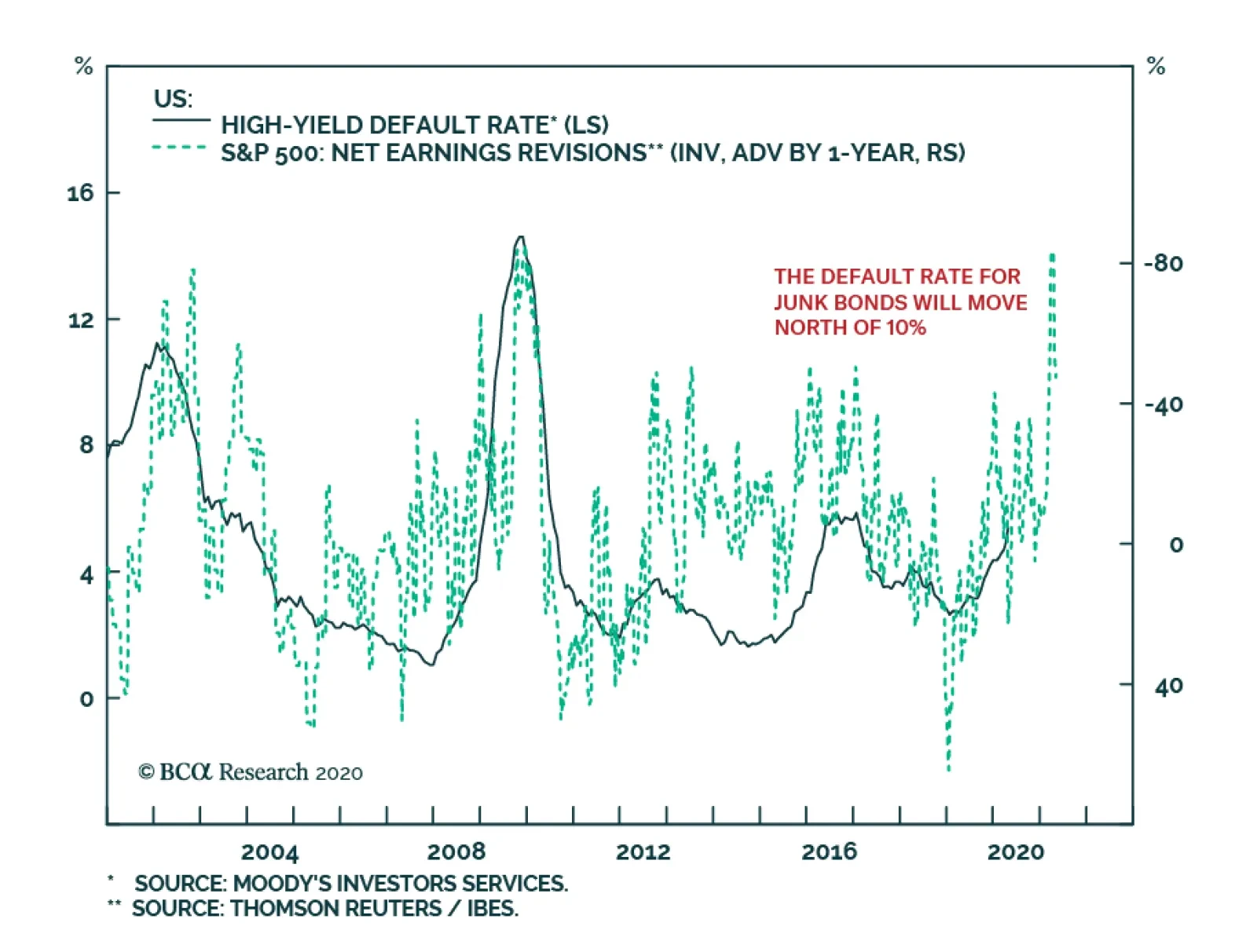
The Fed is providing some support to the junk bond market, but not blanket protection. Companies rated below Ba are not covered by the Fed’s programs. Are their securities attractive at current yields? The trend in earnings revision ratios indicates that…