Fixed Income

Highlights The six-month increase in European bank credit flows amounts to an underwhelming $70 billion, compared to a record high $660 billion in the US and $550 billion in China. Underweight European domestic cyclicals versus their peers in the US and China. Specifically, underweight euro area banks versus US banks. Overweight equities on a long-term (2 years plus) horizon. The mid-single digit return that equities are offering makes them attractive versus ultra-low yielding bonds. But remain neutral equities on a 1-year horizon, until it becomes clear that we can prevent a second wave of the pandemic. Fractal trade: long bitcoin cash, short ethereum. Feature Chart I-1Bank Credit 6-Month Flow Up $70 Bn ##br##In The Euro Area…
Bank Credit 6-Month Flow Up $70 Bn In The Euro Area...
Bank Credit 6-Month Flow Up $70 Bn In The Euro Area...
Chart I-2…But Up $700 Bn ##br##In The US
...But Up $700 Bn In The US
...But Up $700 Bn In The US
Governments and central banks are dishing out an alphabet soup of stimulus. The question is: how much is reaching those that need it? Our preferred approach to assessing monetary stimulus is to focus on the evolution of bank credit flows and bond yields over a six-month period. Bank Credit Flows Have Surged In The US And China, Not In Europe On our preferred assessment, Europe’s monetary stimulus is underwhelming compared with that in the US and China. The six-month increase in US bank credit flows, at $660 billion, is the highest in a decade and not far from the highest ever. In China, the equivalent six-month increase is $550 billion. But in the euro area, the six-month increase in bank credit flows amounts to an underwhelming $70 billion (Charts I-1 - Chart I-4). Chart I-3Bank Credit 6-Month Flow Up $550 Bn In China…
Bank Credit 6-Month Flow Up $550 Bn In China...
Bank Credit 6-Month Flow Up $550 Bn In China...
Chart I-4...And Up ##br##Globally
...And Up Globally
...And Up Globally
Admittedly, US firms are drawing on pre-arranged bank credit lines rather than taking out new loans. Furthermore, the link between bank credit flows and final demand might be compromised during the current economic shutdown. For example, if firms are borrowing to pay workers who are not producing any output, then the transmission of a credit flow acceleration to a GDP acceleration would be weakened. Europe’s monetary stimulus is underwhelming compared with that in the US and China. Nevertheless, some bank credit flows will still reach the real economy. And the US and China are creating more bank credit flows than Europe. Focus On The Deceleration Of The Bond Yield Turning to the bond yield, it is important to focus not on its level, and not on its decline. Instead, it is important to focus on its deceleration. The focus on the deceleration of the bond yield sounds counterintuitive, but it results from a fundamental accounting identity. The next two paragraphs may seem somewhat technical but read them carefully, as they are important for understanding the transmission of stimulus. GDP is a flow. It measures the flow of goods and services produced in a quarter. Hence, GDP receives a contribution from the flow of credit. The flow of credit, in turn, is established by the level of bond yields. When we talk about stimulating the economy, we mean boosting the GDP growth rate from, say, -1 percent to +1 percent, which is an acceleration of GDP. This acceleration in the GDP flow must come from an acceleration in the flow of credit. This acceleration in the flow of credit, in turn, must come from a deceleration of bond yields. In other words, the bond yield decline in the most recent period must be greater than the decline in the previous period. Banks tend to perform better after bond yields have decelerated. The good news is that in the US and China, bond yields have decelerated; the bad news is that in Europe, they have not. Over the past six months, the 10-year bond yield has decelerated by 40 bps in the US and by 65 bps in China. Yet in France, despite the coronavirus crisis, the 10-year bond yield has accelerated by 60 bps (Charts I-5 - Chart I-8).1 Chart I-5The Bond Yield Has Accelerated ##br##In The Euro Area...
The Bond Yield Has Accelerated In The Euro Area... CHART B
The Bond Yield Has Accelerated In The Euro Area... CHART B
Chart I-6...Decelerated ##br##In The US...
...Decelerated In The US...
...Decelerated In The US...
Chart I-7...Decelerated In China...
...Decelerated In China...
...Decelerated In China...
Chart I-8...And Decelerated Globally
...And Decelerated Globally
...And Decelerated Globally
European bond yields are struggling to decelerate because of their proximity to the lower bound to bond yields, at around -1 percent. The inability to decelerate the bond yield constrains the monetary stimulus that Europe can apply compared to the US and China, whose bond yields are much further from the lower bound constraint. Compared to Europe, the US and China have much stronger decelerations in their bond yields and much stronger accelerations in their bank credit flows. This suggests underweighting European domestic cyclicals versus their peers in the US and China. Specifically, banks tend to perform better after bond yields have decelerated; and they tend to perform worse after bond yields have accelerated. On this basis, underweight euro area banks versus US banks (Chart I-9). Chart I-9Banks Perform Better After Bond Yields Have Decelerated, Worse After Bond Yields Have Accelerated
Banks Perform Better After Bond Yields Have Decelerated, Worse After Bond Yields Have Accelerated
Banks Perform Better After Bond Yields Have Decelerated, Worse After Bond Yields Have Accelerated
Long-Term Asset Allocation Is Straightforward, Shorter-Term Is Not The level of the bond yield, or of so-called ‘financial conditions’, does not drive the short-term oscillations in credit flows. To repeat, it is the acceleration and deceleration of the bond yield that matters. Yet when it comes to the long-term valuation of assets, the level of the bond yield does matter, and when the bond yield is ultra-low it matters enormously. An ultra-low bond yield justifies a much lower prospective return on competing long-duration assets, like equities. The reason is that when bond yields approach their lower bound, bond prices can no longer rise, they can only fall. This higher riskiness of bonds justifies an abnormally low (or zero) ‘risk premium’ on equities. In this world of ultra-low numbers – for both bond yields and equity risk premiums – the low to mid-single digit long-term return that equities are offering makes them attractive versus bonds (Chart I-10). Chart I-10Equities Are Offering Mid-Single Digit Long-Term Returns
Equities Are Offering Mid-Single Digit Long-Term Returns
Equities Are Offering Mid-Single Digit Long-Term Returns
But this long-term valuation argument only works for those with long-term investment horizons. What does long-term mean? There is no clear dividing line, but we would define long-term as two years at the very minimum. For a one-year investment horizon, the much more important question is: what will happen to 12-month forward earnings (profits)? In the stock market recessions of 2008-09 and 2015-16, the stock market reached its low just before forward earnings reached their low. Assuming the same holds true in 2020-21, we must establish whether forward earnings are close to their low or not. In 2008-09, world forward earnings collapsed by 45 percent. In the current recession, which is putatively worse, world forward earnings are down by less than 20 percent to date. To have already reached the cycle low in forward earnings with only half the decline of 2008, the current recession needs to be much shorter than the 2008-09 episode (Chart I-11 and Chart I-12). Chart I-11In The Global Financial Crisis, Forward Earnings Collapsed By 45 Percent
In The Global Financial Crisis, Forward Earnings Collapsed By 45 Percent
In The Global Financial Crisis, Forward Earnings Collapsed By 45 Percent
Chart I-12In The Current Crisis, Forward Earnings Are Down 20 Percent. Is That Enough?
In The Current Crisis, Forward Earnings Are Down 20 Percent. Is That Enough?
In The Current Crisis, Forward Earnings Are Down 20 Percent. Is That Enough?
Whether this turns out to be the case or not hinges on the pandemic and our response to it. A controlled easing of lockdowns will boost growth as more of the economy comes back to life. But too rapid an easing of lockdowns will unleash a second wave of the pandemic, requiring a second wave of economic shutdowns, a double dip recession and a new low in the stock market. Hence, if you have a long-term (2-year plus) investment horizon, the choice between equities and bonds is very straightforward: overweight equities. On this long-term horizon, German and Swedish equities are especially attractive versus negative-yielding bonds. On a 1-year investment horizon, the key question is: can we avoid a second wave of the pandemic? But if you have a 1-year investment horizon, the choice is less straightforward, because it hinges on whether we can avoid a second wave of the pandemic or not. Until it becomes clear that governments will not reopen economies too quickly, remain neutral equities on the 1-year horizon. Fractal Trading System* This week’s recommended trade is a pair-trade within the cryptocurrency asset-class. Long bitcoin cash / short ethereum. Set the profit target at 21 percent with a symmetrical stop-loss. The 12-month rolling win ratio now stands at 61 percent. Chart I-13Bitcoin Cash Vs. Ethereum
Bitcoin Cash Vs. Ethereum
Bitcoin Cash Vs. Ethereum
When the fractal dimension approaches the lower limit after an investment has been in an established trend it is a potential trigger for a liquidity-triggered trend reversal. Therefore, open a countertrend position. The profit target is a one-third reversal of the preceding 13-week move. Apply a symmetrical stop-loss. Close the position at the profit target or stop-loss. Otherwise close the position after 13 weeks. * For more details please see the European Investment Strategy Special Report “Fractals, Liquidity & A Trading Model,” dated December 11, 2014, available at eis.bcaresearch.com. Dhaval Joshi Chief European Investment Strategist dhaval@bcaresearch.com Footnotes 1 In the US, the 10-year bond yield has declined by 120 bps in the past six months compared with 80 bps in the preceding six months, which equals a deceleration of 40 bps; in China, the 10-year bond yield has declined by 73 bps in the past six months compared with 18 bps in the preceding six months, which equals a deceleration of 65 bps; but in France, the 10-year bond yield has increased by 12 bps in the past six months compared with a 48 bps decline in the preceding six months, which equals an acceleration of 60 bps. Fractal Trading System Cyclical Recommendations Structural Recommendations Closed Fractal Trades Trades Closed Trades Asset Performance Currency & Bond Equity Sector Country Equity Indicators Bond Yields Chart II-1Indicators To Watch - Bond Yields
Indicators To Watch - Bond Yields
Indicators To Watch - Bond Yields
Chart II-2Indicators To Watch - Bond Yields
Indicators To Watch - Bond Yields
Indicators To Watch - Bond Yields
Chart II-3Indicators To Watch - Bond Yields
Indicators To Watch - Bond Yields
Indicators To Watch - Bond Yields
Chart II-4Indicators To Watch - Bond Yields
Indicators To Watch - Bond Yields
Indicators To Watch - Bond Yields
Interest Rate Chart II-5Indicators To Watch - Interest Rate Expectations
Indicators To Watch - Interest Rate Expectations
Indicators To Watch - Interest Rate Expectations
Chart II-6Indicators To Watch - Interest Rate Expectations
Indicators To Watch - Interest Rate Expectations
Indicators To Watch - Interest Rate Expectations
Chart II-7Indicators To Watch - Interest Rate Expectations
Indicators To Watch - Interest Rate Expectations
Indicators To Watch - Interest Rate Expectations
Chart II-8Indicators To Watch - Interest Rate Expectations
Indicators To Watch - Interest Rate Expectations
Indicators To Watch - Interest Rate Expectations
Yesterday, BCA Research's US Bond Strategy service made the case that investors should overweight subordinate bank bonds. The Fed’s aggressive policy response means that investment-grade corporate bond spreads have already peaked. Defensive senior bank…
Highlights Real Yield Curve: Last week’s negative oil print could signal the peak in deflationary sentiment for this cycle. It’s a good time for bond investors to enter real yield curve steepeners. Buy a short-maturity real yield (1-year or 2-year) and sell a long-maturity real yield (10-year or 30-year). High-Yield: High-yield bond spreads are much too tight relative to the VIX and ratings migration. This is justified for Ba-rated issuers that can tap the Fed’s emergency programs. However, B-rated and below spreads look vulnerable. Investors should overweight Ba-rated junk bonds and underweight the B-rated and below credit tiers. Bank Bonds: US bond investors should overweight subordinate bank bonds within an allocation to investment grade corporate credit. Subordinate bank bonds are Baa-rated and thus offer reasonably high spreads. But unlike other Baa-rated bonds, banks should avoid ratings downgrades during this cycle. Feature Oil was the big mover in financial markets last week, with the WTI price dropping briefly into negative territory on the day before expiry of the May futures contract.1 Bond markets didn’t react much to the negative oil price (Chart 1), but this doesn’t mean that the energy market is unimportant for yields. On the contrary, the oil price often sends important signals about the near-term outlook for inflation, a key input for bond investors. Chart 1Negative Oil Didn't Shock The Bond Market
Negative Oil Didn't Shock The Bond Market
Negative Oil Didn't Shock The Bond Market
A Bond Market Trade Inspired By Negative Oil The Fisher Equation is the formula that relates nominal yields, real yields and inflation expectations. In its simplest form the Fisher equation is: Nominal Yield = Real Yield + Inflation Expectations When applying this equation to the act of bond yield forecasting we find it helpful to note that both the nominal yield and inflation expectations have specific valuation anchors. The Federal Reserve sets the valuation anchor for nominal yields because it controls the overnight nominal interest rate. If you enter a long position in a nominal Treasury security and hold to maturity you will make money versus a position in cash if the average overnight nominal interest rate turns out to be lower than the nominal bond yield at the time of purchase. The oil price often sends important signals about the near-term outlook for inflation, a key input for bond investors. Similarly, inflation expectations are anchored by the actual inflation rate. If you enter a long position in inflation protection and hold to maturity you will make money if actual inflation turns out to be higher than the rate that was embedded in bond prices at the time of purchase.2 Turning to real yields, we see why the Fisher Equation is important. Real yields have no obvious valuation anchor. This means that the best forecasting technique is often to: (1) Use our known valuation anchors (the fed funds rate and inflation) to forecast the nominal yield and inflation expectations. (2) Use the Fisher Equation to back-out a fair value for real yields. With all that said, let’s apply this framework to today’s bond market in light of last week’s dramatic oil price moves. Inflation Compensation The cost of inflation protection tracks the oil price, more so at the front end of the curve than at the long end. This makes sense given that recent oil price trends tell us a fair amount about the outlook for inflation over the next year but very little about the outlook for inflation over the next 10 or 30 years. The inflation market didn’t react much to oil’s dip into negative territory last week, but this year’s broader drop in the WTI price from above $50 to below $20 had a big impact on TIPS breakeven inflation rates and CPI swap rates, particularly at short maturities (Chart 2). In fact, consistent with expectations for a very low oil price, the bond market is now pricing-in deflation over the next two years. Chart 2Bond Market Priced For Deflation
Bond Market Priced For Deflation
Bond Market Priced For Deflation
Nominal Yields The Fed’s zero interest rate policy is having a profound effect on nominal bond yield volatility. Because the consensus investor expectation is that the Fed will keep rates pinned near zero for a long time, almost irrespective of economic outcomes, even a significant market event like a plunge in the oil price will do very little to move nominal bond yields. During the last zero-lower-bound period, nominal bond yield volatility fell across the entire yield curve but fell much more at the short end of the curve than at the long end (Chart 3). The same phenomenon will re-occur during the current zero-lower-bound episode. Chart 3The Zero Lower Bound Crushes Nominal Bond Yield Volatility
The Zero Lower Bound Crushes Nominal Bond Yield Volatility
The Zero Lower Bound Crushes Nominal Bond Yield Volatility
Real Yields Using the Fisher Equation, we can deduce how real yields must move given changes in inflation expectations and nominal bond yields. With the Fed ensuring that short-maturity nominal yields remain stable, the recent decline in oil and inflation expectations caused short-dated real yields to jump (Chart 4). Long-maturity real yields remain low because (a) the shock to inflation expectations was smaller at the long-end of the curve and (b) the Fed’s forward rate guidance doesn’t suppress nominal bond yield volatility as much for long maturities. Chart 4There's Value In Short-Maturity Real Yields
There's Value In Short-Maturity Real Yields
There's Value In Short-Maturity Real Yields
Investment Implications If we assume that last week’s -$37.60 WTI print will mark the cyclical trough in oil prices, US bond investors can profit by implementing real yield curve steepeners.3 Short-dated real yields will fall as oil and short-dated inflation expectations recover and nominal yields remain stable. In this scenario, real yields are more likely to rise at the long-end of the curve, given the greater volatility in long-dated nominal yields and the fact that long-maturity inflation expectations are not as depressed. Looking at the 2008 episode as a comparable, we see that the cost of inflation protection bottomed around the same time as the trough in oil, and about 7 months before the trough in 12-month headline CPI (Chart 5). After that trough, with the Fed keeping short-dated nominal rates pinned near zero, the inflation compensation curve flattened and the real yield curve steepened. Chart 5Initiate Real Yield Curve Steepeners
Initiate Real Yield Curve Steepeners
Initiate Real Yield Curve Steepeners
Bottom Line: Last week’s negative oil print could signal the peak in deflationary sentiment for this cycle. It’s a good time for bond investors to enter real yield curve steepeners. Buy a short-maturity real yield (1-year or 2-year) and sell a long-maturity real yield (10-year or 30-year). Poor Junk Bond Valuations Illustrated In recent reports we have been advising investors to own spread products that offer attractive spreads and that benefit from Fed support.4 This includes investment grade corporate bonds and Ba-rated high-yield bonds, but not junk bonds rated B or below. In past reports we also showed that B-rated and below junk spreads don’t adequately compensate investors for likely default losses. But this week, we want to quickly illustrate that junk spreads are trading too tight even compared to other common coincident indicators. Specifically, we zero in on the VIX and ratings migration. In 2008, the cost of inflation protection bottomed around the same time as the trough in oil, and about 7 months before the trough in 12-month headline CPI. Charts 6A, 7A and 8A show the historical relationship between the VIX and Ba, B and Caa junk spreads. In all three cases, spreads are well below levels that have been historically consistent with the current reading from the VIX. Charts 6B, 7B and 8B show the historical relationship between the monthly Moody’s rating downgrade/upgrade ratio and Ba, B and Caa spreads. These charts tell a similar story. In fact, March saw nearly 12 times as many ratings downgrades as upgrades, the third highest monthly ratio since 1986. With more downgrades coming in the months ahead, it is apparent that junk spreads are stretched. Chart 6ABa Spreads & VIX
Negative Oil, The Zero Lower Bound And The Fisher Equation
Negative Oil, The Zero Lower Bound And The Fisher Equation
Chart 6BBa Spreads & Ratings
Negative Oil, The Zero Lower Bound And The Fisher Equation
Negative Oil, The Zero Lower Bound And The Fisher Equation
Chart 7AB Spreads & VIX
Negative Oil, The Zero Lower Bound And The Fisher Equation
Negative Oil, The Zero Lower Bound And The Fisher Equation
Chart 7BB Spreads & Ratings
Negative Oil, The Zero Lower Bound And The Fisher Equation
Negative Oil, The Zero Lower Bound And The Fisher Equation
Chart 8ACaa Spreads & VIX
Negative Oil, The Zero Lower Bound And The Fisher Equation
Negative Oil, The Zero Lower Bound And The Fisher Equation
Chart 8BCaa Spreads & Ratings
Negative Oil, The Zero Lower Bound And The Fisher Equation
Negative Oil, The Zero Lower Bound And The Fisher Equation
Relatively tight spreads are probably justified in the Ba space where firms will benefit from the Federal Reserve’s Main Street Lending facilities.5 However, B-rated and below securities have mostly been left out in the cold. We see high odds of spread widening for those credit tiers. Bottom Line: High-yield bond spreads are much too tight relative to the VIX and ratings migration. This is justified for Ba-rated issuers that can tap the Fed’s emergency programs. However, B-rated and below spreads look vulnerable. Investors should overweight Ba-rated junk bonds and underweight the B-rated and below credit tiers. Subordinate Bank Debt Is A Good Bet The Fed’s decision to exclude bank bonds from its primary and secondary market corporate bond purchases complicates our investment strategy. We want to focus on sectors that offer attractive spreads and that benefit from Fed support, but should we carve out an exception for bank bonds? Bank Bonds Are A Defensive Sector First, we note that banks are a defensive corporate bond sector. This is due to bank debt’s relatively high credit rating and low duration. Notice that banks outperformed the rest of the corporate index when spreads widened in March, but have lagged the index by 131 bps since spreads peaked on March 23 (Chart 9). Bank equities don’t exhibit the same behavior and have in fact steadily underperformed the S&P 500 since the start of the year (Chart 9, bottom 2 panels). Chart 9Bank Bonds Are Defensive...
Bank Bonds Are Defensive...
Bank Bonds Are Defensive...
However, if we consider senior and subordinate bank debt separately, a different picture emerges (Chart 10). Senior bank bonds behave defensively, as described above, but the lower-rated/higher duration subordinate bank bond index is more cyclical. It has outperformed the corporate benchmark by 316 bps since March 23 (Chart 10, bottom panel). Chart 10...Except Subordinate Debt
...Except Subordinate Debt
...Except Subordinate Debt
The Value In Bank Bonds Despite being a defensive sector, senior bank bonds offer attractive risk-adjusted value. The average spread of the senior bank index is 18 bps above the spread offered by the equivalently-rated (A) corporate bond benchmark. Further, the senior bank index has lower average duration than the A-rated benchmark, making the sector very attractive on a per-unit-of-duration basis (Chart 11A). Chart 11ASenior Bank Bond Valuation
Senior Bank Bond Valuation
Senior Bank Bond Valuation
Chart 11BSubordinate Bank Bond Valuation
Subordinate Bank Bond Valuation
Subordinate Bank Bond Valuation
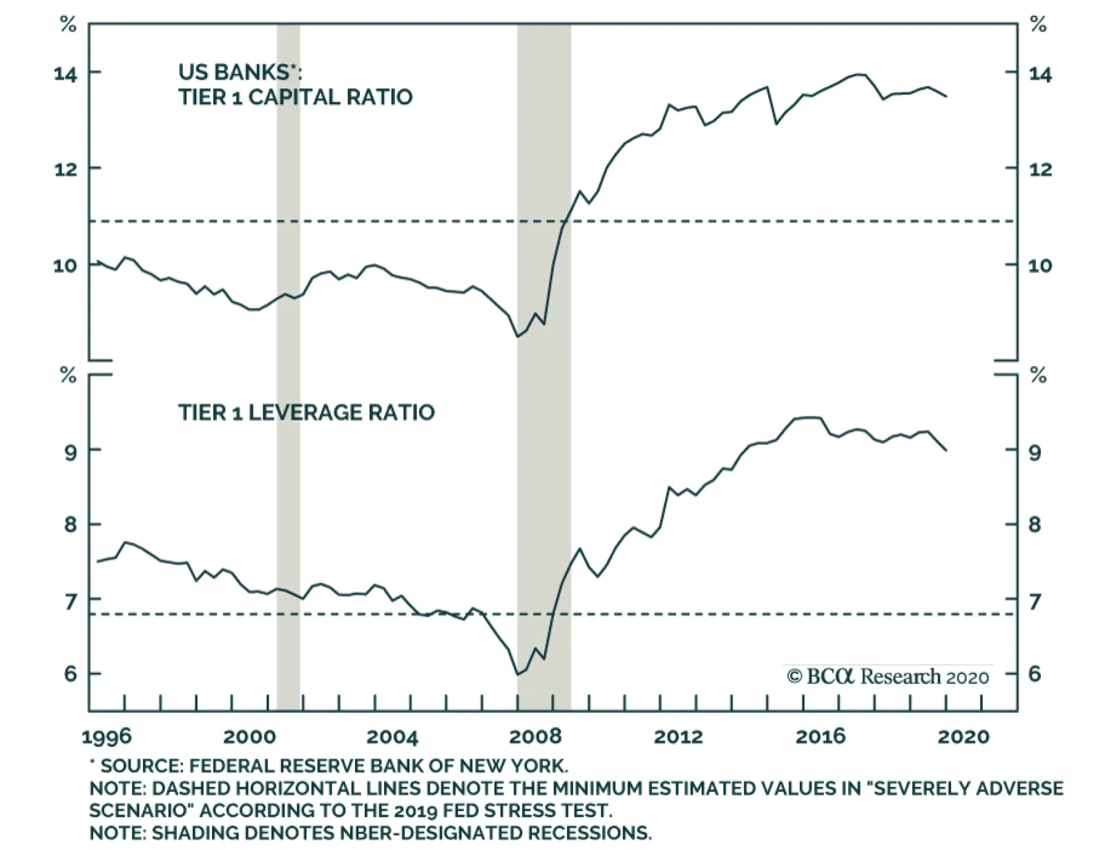
Turning to subordinate bank bonds, risk-adjusted value looks only fair compared to other equivalently-rated (Baa) corporate bonds (Chart 11B). However, in absolute terms the subordinate bank index offers a spread of 246 bps, compared to a spread of 178 bps on the senior bank index. Downgrade Risk Is Minimal We think investors should overweight subordinate bank bonds for two reasons. First, we think the Fed’s aggressive policy response means that investment grade corporate bond spreads, in general, have already peaked. We would expect defensive senior bank bonds to underperform in this environment of spread tightening, even though they offer attractive risk-adjusted value. Subordinate bank bonds should outperform the index in this environment, even if other Baa-rated sectors offer better value. Second, other Baa-rated corporate bond sectors offer elevated spreads because downgrade risk remains high. The Fed’s facilities will prevent default for investment grade firms, but many Baa-rated issuers will end up taking on a lot of debt to avoid bankruptcy and will get downgraded. We think banks are insulated from this downgrade risk. Even in the Fed's "Severely Adverse Scenario", three of banks' four main capital ratios remain above pre-GFC levels. Chart 12 shows the four main capital ratios calculated for US banks, and the dashed line shows the minimum value the Fed estimates that those ratios will hit under the “Severely Adverse Scenario” from the 2019 Stress Test. Three of the four ratios would remain above pre-crisis levels, and the Tier 1 Leverage Ratio would be only a touch lower. Chart 12Banks Have Huge Capital Buffers
Banks Have Huge Capital Buffers
Banks Have Huge Capital Buffers
Further, our US Investment Strategy service observes that the large banks had sufficient earnings in the first quarter to significantly ramp up loan loss provisions without taking any capital hit at all.6 Our US Investment Strategy team believes that, as long as the shutdown doesn’t last more than six months, the big banks will have sufficient earnings power to absorb loan losses this year, without having to mark down their capital ratios, which in any case are extremely high. Bottom Line: US bond investors should overweight subordinate bank bonds within an allocation to investment grade corporate credit. Subordinate bank bonds are Baa-rated and thus offer reasonably high spreads. But unlike other Baa-rated bonds, banks should avoid ratings downgrades during this cycle. In short, subordinate bank debt looks like a reasonably safe way to capture high-beta exposure to the investment grade corporate bond market. Ryan Swift US Bond Strategist rswift@bcaresearch.com Footnotes 1 For a more detailed explanation of the WTI price’s shocking move please see Commodity & Energy Strategy Special Alert, “WTI In Free Fall”, dated April 20, 2020, available at ces.bcaresearch.com 2 An example of a long position in inflation protection would be buying the 5-year TIPS and shorting the equivalent-maturity nominal Treasury security. 3 Our Commodity & Energy Strategy service’s view is that the WTI oil price will average ~$60 to $65 in 2021. For further details please see Commodity & Energy Strategy Weekly Report, “US Storage Tightens, Pushing WTI Lower”, dated April 16, 2020, available at ces.bcaresearch.com 4 Please see US Bond Strategy Weekly Report, “Is The Bottom Already In?”, dated April 21, 2020, available at usbs.bcaresearch.com 5 For more details on the Fed’s different emergency facilities please see US Investment Strategy / US Bond Strategy Special Report, “Alphabet Soup: A Summary Of The Fed’s Anti-Virus Measures”, dated April 14, 2020, available at usbs.bcaresearch.com 6 Please see US Investment Strategy Weekly Report, “The Big Bank Beige Book, April 2020”, dated April 20, 2020, available at usis.bcaresearch.com Fixed Income Sector Performance Recommended Portfolio Specification
Highlights Inflation-Linked Bonds: The plunging price of oil has put renewed downward pressure on global bond yields via lower inflation expectations. With oil prices set to recover over the next 6-12 months as the global economy awakens from the COVID-19 slumber, depressed market-derived inflation expectations can move higher across the developed markets – most notably in the US, the UK, Australia and Canada. Favor inflation-linked government bonds versus nominals in those countries on a strategic (6-12 months) basis. UK Corporates: The Bank of England (BoE) is supporting the UK investment grade corporate bond market with an unprecedented level and pace of purchases, with credit spreads at attractive levels. Upgrade UK investment grade corporates to overweight on a tactical (0-6 months) and strategic (6-12 months) basis. Across sectors, favor debt from sectors such as non-bank Financials and Communications that are less exposed to pandemic-related uncertainty but still benefit from BoE buying. Feature Chart of the WeekThe Link Between Oil & Bond Yields Remains Strong
The Link Between Oil & Bond Yields Remains Strong
The Link Between Oil & Bond Yields Remains Strong
The shocking, albeit brief, journey of the West Texas Intermediate (WTI) oil price benchmark below zero last week was another in a long line of stunning market moves seen during the COVID-19 pandemic. Those negative oil prices were technical in nature and lasted all of one day, but the ramifications for global bond markets of the falling cost of oil in 2020 have been more enduring. Government bond yields have largely followed the ebbs and flows in energy markets for most of the past decade, and this year has been no exception (Chart of the Week). That link from oil has been through the inflation expectations component of yields, which have been (and remain) highly correlated to oil prices in virtually every developed market country. This is likely due to the persistent low global inflation backdrop since the 2008 financial crisis, which has made cyclical swings in energy prices the marginal driver of both realized and expected inflation. Chart 2BCA's Commodity Strategists Expect Oil Prices To Recover
BCA's Commodity Strategists Expect Oil Prices To Recover
BCA's Commodity Strategists Expect Oil Prices To Recover
Our colleagues at BCA Research Commodity & Energy Strategy now anticipate higher oil prices over the next 12-18 months.1 Global growth is expected to recover from the COVID-19 recession sooner (and faster) than global oil production, helping to improve the demand/supply balance in energy markets and boost oil prices (Chart 2). Our energy strategists expect the benchmark Brent oil price to rise to $42/bbl by the end of 2020 and $78/bbl by the end of 2021. Those are big moves compared to the current spot price around $20/bbl, and would impart significant upward pressure on inflation expectations if the history of the past decade is any guide. That kind of move in oil prices should also help lift overall nominal government bond yields. Although the real (inflation-adjusted) component of yields is likely to remain low as major central banks like the Fed and ECB will remain highly accommodative, even when growth and inflation begin to recover, given the severity of the COVID-19 global recession. With market-based inflation expectations now at such beaten-up levels, and with the disinflationary effect of falling energy prices set to fade, we see an opportunity to play for a cyclical rebound in inflation breakevens across the developed markets by favoring inflation-linked government bonds versus nominal yielding equivalents. A Simple Framework For Finding Value In Inflation Breakevens Given the remarkably tight correlation between oil prices and market-determined inflation expectations in so many countries, it should be fairly straightforward to model the latter using the former as the main input. We have developed a series of fair value regressions for breakevens in the major developed countries which do exactly that. In this simple approach, we attempt to model the 10-year breakeven from inflation-linked bonds for eight countries – the US, the UK, Germany, Japan, France, Italy, Canada and Australia - as a function of a short-run variable (oil prices) and a long-run variable (the trend in realized inflation). Specifically, we are using the annual percentage change in the Brent oil price benchmark in local currency terms (i.e. converted from US dollars at spot exchange rates) as the short-run variable and a five-year moving average of realized headline CPI inflation as the long-run variable. The latter is included to provide an “anchor” for breakevens based on the actual performance of inflation in each country. In other words, expectations about what inflation will look like in the future are informed by what it has done in the past – what economists refer to as “adaptive” expectations. The generic regression equation used for each country is: 10-year inflation breakeven = α + β1 * (annual % change of Brent oil price in local currency terms) + β2 * (60-month moving average of headline CPI inflation) In Table 1, we present the results of the regressions of each of the eight countries, which use weekly data dating back to the start of 2012 to capture the period when oil prices have most heavily influenced inflation expectations. The coefficients, R-squareds and standard errors of the regressions are all shown, as well as the most recent model residual (i.e. the deviation of 10-year inflation expectations from model-determined fair value). All the coefficients for each model are significant. The R-squareds of the models vary, with the models for France and Australia doing the best job of explaining changes in inflation expectations in those two countries. Table 1Details Of Our New 10-Year Inflation Breakeven Models
Global Inflation Expectations Are Now Too Low
Global Inflation Expectations Are Now Too Low
For the UK and Japan, we added an additional “dummy” variable to control for the unique situations that we believe have influenced inflation breakevens in those countries. For the UK, the period since the June 2016 Brexit vote has seen the path of inflation expectations stay nearly 50bps higher than implied by moves in GBP-denominated oil prices and the trend in actual UK inflation. For Japan, the period since the Bank of Japan initiated its Yield Curve Control policy in September 2016 has seen breakevens stay nearly 60bps below fair value as derived from JPY-denominated oil prices and the trend in actual Japanese inflation. Bond investors with longer-term investment horizons looking to play for a global growth recovery from the COVID-19 recession over the next 12-18 months should position for some widening of breakevens by favoring inflation-linked bonds over nominal paying government debt. In Charts 3 to10 over the next four pages, we show the models for each country. 10-year inflation breakevens versus the independent variables in the models are shown in the top two panels, the model fair value is presented in the 3rd panel, and the deviation from fair value is in the bottom panel. In all cases, breakevens are below fair value, suggesting that inflation-linked bonds look relatively attractive versus nominal government bonds. Chart 3Our US 10-Year TIPS Breakevens Model
Our US 10-Year TIPS Breakevens Model
Our US 10-Year TIPS Breakevens Model
Chart 4Our UK 10-Year Breakeven Inflation Model
Our UK 10-Year Breakeven Inflation Model
Our UK 10-Year Breakeven Inflation Model
Chart 5Our France 10-Year Breakeven Inflation Model
Our France 10-Year Breakeven Inflation Model
Our France 10-Year Breakeven Inflation Model
Chart 6Our Italy 10-Year Breakeven Inflation Model
Our Italy 10-Year Breakeven Inflation Model
Our Italy 10-Year Breakeven Inflation Model
Chart 7Our Japan 10-Year Breakeven Inflation Model
Our Japan 10-Year Breakeven Inflation Model
Our Japan 10-Year Breakeven Inflation Model
Chart 8Our Germany 10-Year Breakeven Inflation Model
Our Germany 10-Year Breakeven Inflation Model
Our Germany 10-Year Breakeven Inflation Model
Chart 9Our Canada 10-Year Breakeven Inflation Model
Our Canada 10-Year Breakeven Inflation Model
Our Canada 10-Year Breakeven Inflation Model
Chart 10Our Australia 10-Year Breakeven Inflation Model
Our Australia 10-Year Breakeven Inflation Model
Our Australia 10-Year Breakeven Inflation Model
Chart 11Real Inflation-Linked Bond Yields Will Remain Subdued For Longer
Real Inflation-Linked Bond Yields Will Remain Subdued For Longer
Real Inflation-Linked Bond Yields Will Remain Subdued For Longer
The largest deviations from fair value can be found in Canada (-70bps), Australia (-48bps), the UK (-29bps), and the US (-26bps). 10-year breakevens are also below fair value in the euro zone countries and Japan, but not by more than one standard deviation as is the case for the other four countries. Bond investors with longer-term investment horizons looking to play for a global growth recovery from the COVID-19 recession over the next 12-18 months should position for some widening of breakevens by favoring inflation-linked bonds over nominal paying government debt. Focus on the four markets with breakevens furthest from fair value, although from a market liquidity perspective it is easier to implement those positions in the US and UK, which represent a combined 69% of the Bloomberg Barclays Global Inflation-Linked bond index. A rise in inflation expectations should also, eventually, put some sustained upward pressure on nominal bond yields. We would rather play that initially by positioning for higher inflation breakevens, rather than having outright below-benchmark duration exposure, as developed market central banks will stay accommodative for longer given the severity of the COVID-19 recession - that will keep real bond yields lower for longer (Chart 11). Breakevens from inflation-linked bonds are now too low across the developed markets – most notably in the US, the UK, Australia and Canada. Bottom Line: The plunging price of oil has put renewed downward pressure on global bond yields via lower inflation expectations. With oil prices set to recover over the next 6-12 months as the global economy starts to awaken from the coronavirus induced slumber, breakevens from inflation-linked bonds are now too low across the developed markets – most notably in the US, the UK, Australia and Canada. Favor linkers over nominals in those countries. Where Is The Value In UK Corporate Bonds? Chart 12Upgrade UK IG Corporates To Overweight On BoE Buying
Upgrade UK IG Corporates To Overweight On BoE Buying
Upgrade UK IG Corporates To Overweight On BoE Buying
The Bank of England (BoE) initiated its Corporate Bond Purchase Scheme (CBPS) in August 2016 as part of a package of stimulus measures to cushion the economic blow from the UK’s vote to exit the European Union. As we noted in recent joint report with our sister service, BCA Research US Bond Strategy,2 the CBPS helped tighten spreads by lowering downgrade and default risk premiums and also helped spur corporate bond issuance (Chart 12). Shortly after that report was published, the BoE announced that it would be purchasing a further £10 billion in investment grade nonfinancial corporate bonds in the coming months, doubling the scheme’s aggregate holdings to £20 billion. In addition, the bank would make these purchases at a significantly faster pace than in 2016, which implies a faster transmission towards tightening of spreads. Compared to other central bank peers, however, the BoE’s program still has room to expand, which makes UK investment grade credit attractive over tactical and strategic investment horizons. Using the market value of the Bloomberg Barclays UK corporate bond index (excluding financials) as a proxy for the total value of eligible bonds, the CBPS is on track to own roughly 9% of all eligible bonds by the time the £20 billion target is reached. The neighboring European Central Bank, on the other hand, already owns 23% of the stock of eligible euro area corporate bonds in its market, and that figure is only set to increase with policymakers set to do “whatever it takes” to backstop the investment grade market. Year-to-date, UK corporate bonds appear to have recovered somewhat from the panicked selloff earlier this quarter (Table 2), with the Bloomberg Barclays UK investment grade corporate bond index down only -0.3% in total return terms. In excess return terms relative to duration-matched UK corporate bonds, however, the index is down -5.2%, indicating that weakness has persisted in the pure credit component. Table 2UK Investment Grade Corporate Bond Returns
Global Inflation Expectations Are Now Too Low
Global Inflation Expectations Are Now Too Low
At the broad sector level, Other Industrials appear to be the outlier, having delivered positive excess returns (+0.6%) and significant total returns (+16%). These returns are not nearly as attractive, however, on a risk-adjusted basis once you consider that this sector has an index duration more than three times that of the overall index.3 Outside of that sector, the best performers, in excess return terms, are predominantly the more “defensive” sectors—Utilities (-3.4%), Technology (-3.7%), Communications (-4.2%) and Consumer Non-Cyclical (-4.6%). Meanwhile, the sectors most exposed to vanishing consumer demand and weak global growth have performed the worst—Transportation (-9.5%), Capital Goods (-7%), Energy (-6.8%), and Basic Industry (-6.2%). Credit spreads in the UK indicate that the market has already begun to stabilize in response to the BoE’s new round of corporate bond purchases. Credit spreads in the UK indicate that the market has already begun to stabilize in response to the BoE’s new round of corporate bond purchases (Chart 13). The overall index spread, although still elevated at 228bps, has already tightened by 57bps from the peak in late March. The gap between the index spreads of Baa-rated and Aa-rated UK debt remained relatively stable through the wave of sell-offs, peaking at +53bps, below the 2019 high of +55bps, and settling now to +36bps. Outside the purview of the CBPS, however, the situation is a bit rockier, with the overall high-yield index spread +590bps above that of the investment grade index. Broadly speaking, there is a clear disparity between those credit tiers that have the support of the monetary authorities and those that do not. Investment grade spreads will continue to tighten as the BoE rapidly increases its holdings of investment grade corporate bonds. However, high-yield bonds remain exposed to downgrade/default risk and ongoing uncertainty stemming from the COVID-19 economic shock. To drill down into which credit tier spreads offer the most value within the UK investment grade space, we use the 12-month breakeven spread percentile rankings. This is one of the tools we use to assess value in global credit spreads, as measured by historical “spread cushions”. Specifically, we calculate how much spread widening is required over a one-year horizon to eliminate the yield advantage of owning corporate bonds versus duration-matched government debt. We then show those breakeven spreads as a percentile ranking versus its own history, to allow comparisons over periods with differing underlying spread volatility. Chart 14 shows the 12-month breakeven spread percentile rankings for all the credit tiers in the UK investment grade space. Aaa-rated debt appears most unattractive, with the spreads currently ranking below the historical median. Between the other three tiers, Aa-rated debt offers the most value, although all three are at historically attractive levels. Chart 13UK IG Has Held Up Well During The COVID-19 Shock
UK IG Has Held Up Well During The COVID-19 Shock
UK IG Has Held Up Well During The COVID-19 Shock
Chart 14UK IG Breakeven Spreads Look Most Attractive For Aa-Rated Bonds
UK IG Breakeven Spreads Look Most Attractive For Aa-Rated Bonds
UK IG Breakeven Spreads Look Most Attractive For Aa-Rated Bonds
On the sector-level, the disparity in spreads is most clearly visible in the sectors most exposed to the pandemic. In Charts 15 & 16, we show the history of option-adjusted spreads (OAS) for the major industrial sub-groupings of the Bloomberg Barclays UK investment grade corporate index. Spreads look widest relative to history for sectors such as Energy and Transportation, while spread widening has been contained in more insulated sectors such as Financials. Chart 15A Mixed Performance For UK IG By Sector In 2020 …
A Mixed Performance For UK IG By Sector In 2020 ...
A Mixed Performance For UK IG By Sector In 2020 ...
Chart 16… But Spreads, In General, Remain Below Previous Cyclical Peaks
... But Spreads, In General, Remain Below Previous Cyclical Peaks
... But Spreads, In General, Remain Below Previous Cyclical Peaks
Another way to assess value across UK investment grade corporates is our sector relative value framework. Borrowing from the methodology used for US corporate credit by our colleagues at BCA Research US Bond Strategy, the sector relative value framework determines “fair value” spreads for each of the major and minor industry level sub-indices of the overall UK investment grade universe. The methodology takes each sector's individual OAS and regresses it in a cross-sectional regression with all other sectors. The dependent variables in the model are each sector's duration, 12-month trailing spread volatility and credit rating - the primary risk factors for any corporate bond. Using the common coefficients from that regression, a risk-adjusted "fair value" spread is calculated. The difference between the actual OAS and fair value OAS is our valuation metric used to inform our sector allocation ranking. We see this as an opportune time to upgrade our recommended allocation for UK investment grade corporates to overweight. The latest output from the UK relative value spread model can be found in Table 3. We also show the duration-times-spread (DTS) for each sector in those tables, which we use as the primary way to measure the riskiness (volatility) of each sector. The scatterplot in Chart 17 shows the tradeoff between the valuation residual from our model and each sector's DTS. Table 3UK Investment Grade Corporate Sector Valuation & Recommended Allocation
Global Inflation Expectations Are Now Too Low
Global Inflation Expectations Are Now Too Low
Chart 17UK Investment Grade Corporate Sectors: Valuation Versus Risk
Global Inflation Expectations Are Now Too Low
Global Inflation Expectations Are Now Too Low
We can then apply individual sector weights based on the model output and our desired level of overall spread risk to come up with a recommended credit portfolio. The weights are determined at our discretion and are not the output from any quantitative portfolio optimization process. The only constraints are that all sector weights must add to 100% (i.e. the portfolio is fully invested with no use of leverage) and the overall level of spread risk (DTS) must equal our desired target. Amid a backdrop of global uncertainty, we reiterate one of our major themes this quarter—buy what the central banks are buying. Given that UK corporate spreads are attractive on a breakeven basis, and with the BoE purchasing corporate debt at an even faster pace than during the volatile period following the shock Brexit vote in 2016, we see this as an opportune time to upgrade our recommended allocation for UK investment grade corporates to overweight. This is both on a tactical (0-6 months) and strategic basis (6-12 months). In our model bond portfolio, we have added two percentage points to our recommended UK corporate bond allocation, funded by reducing further our existing underweight on Japanese government bonds. At the sector level, given this positive backdrop for credit performance, we do not see a need to favor lower risk sectors with a DTS score below that of the overall UK investment grade index. On that basis, we are looking to go overweight sectors with higher relatively higher DTS and positive risk-adjusted spread residuals from our relative value model (and vice versa). Those overweight candidates would ideally be located in the upper right quadrant of Chart 17. Based on the latest output from the relative value model, the strongest overweight candidates are the following UK investment grade sectors: selected Financials (Insurance, Subordinated Bank Debt, and Other Financials), Media Entertainment, Cable Satellite, Tobacco, Diversified Manufacturing, and Communications. The least attractive sectors within this framework are: Packaging, Lodging, REITs, Other Industrials, Metals, Natural Gas, Restaurants, Transportation Services, Financial Institutions, and Midstream Energy. Bottom Line: The BoE is supporting the UK investment grade corporate bond market with an unprecedented level and pace of purchases. Spreads have already begun to tighten in response but are still at attractive levels. Upgrade UK investment grade corporates to overweight on a tactical (0-6 months) and strategic (6-12 months) basis. Across credit tiers, favor Aa-rated debt. Across sectors, favor debt from sectors such as non-bank Financials and Communications that are less exposed to pandemic-related uncertainty but still benefit from the CBPS. Robert Robis, CFA Chief Fixed Income Strategist rrobis@bcaresearch.com Shakti Sharma Research Associate shaktis@bcaresearch.com Footnotes 1 Please see BCA Commodity & Energy Strategy Weekly Report, "US Storage Tightens, Pushing WTI Lower", dated April 16, 2020, available at ces.bcaresearch.com. 2 Please see BCA US Bond Strategy Special Report, "Trading The US Corporate Bond Market In A Time Of Crisis", dated March 31 2020, available at usbs.bcaresearch.com. 3 Other Industrials has an index duration of 28.6 years, compared to 8.5 years for the overall UK investment grade corporate bond index. Recommendations The GFIS Recommended Portfolio Vs. The Custom Benchmark Index
Global Inflation Expectations Are Now Too Low
Global Inflation Expectations Are Now Too Low
Duration Regional Allocation Spread Product Tactical Trades Yields & Returns Global Bond Yields Historical Returns
Highlights Why is the gap between the stock market and the economy so wide?: It is well established that stocks can diverge considerably from fundamentals in the near term, but lately it is as if the stock tables and the front-page headlines are from entirely different newspapers. It may be because the virus poses much less of a threat to the owners of equities than the general populace: More affluent households are more readily able to work from home and to practice social distancing. They also have access to better medical care. With the S&P 500 having hit technical resistance, however, the gap may be nearing its upper limit: Large-caps have run in place since retracing half of their peak-to-trough losses, and the next Fibonacci resistance level is only another 5% higher. Where are the shoddy loans?: During the expansion, corporations were able to borrow on prodigally easy terms. If banks aren't holding the loans, who is? Feature That’s New York’s future, not mine – “Hold On” (Reed) For someone who entered the business as a sell-side trader, it is a matter of course that prices can diverge from fundamentals. The trading desk had a one-day horizon, and the traders necessarily made their way on price signals while barely considering fundamentals. Though the junior traders had been exposed to dividend discount models at their fancy colleges, the ones who lasted recognized they weren’t relevant to the desk’s mission. Trading the daily flow required accepting that new news can have a dramatically larger effect on stocks in the here and now than it would on the lifetime stream of earnings available to common shareholders. Long-run fair value might solely turn on the fundamentals, but animal spirits hold sway over any given tick. The sudden stop imposed by stay-at-home orders has made backward-looking economic data nearly irrelevant, but the sizable upward surprises in unemployment claims should not be ignored. Our Global Investment Strategy colleagues showed last week just how difficult it is for even severe near-term shocks to materially alter the present value of aggregate future earnings.1 Furthermore, the market effects of negative earnings shocks are inherently self-limiting at the margin because they tend to be accompanied by lower interest rates, driving up the equity risk premium and making stocks more attractive relative to “safe” fixed income alternatives. Bear markets coincide with recessions, though, as near-term earnings expectations are revised lower and animal spirits droop (Chart 1). Given that the recession just begun is expected to be the worst since the Great Depression, one would expect that equities would be stumbling in search of a bottom as investors remained fearful of taking on risk. Chart 1Joined At The Hip
Joined At The Hip
Joined At The Hip
They have instead been acting like the S&P 500 found that bottom on March 23rd, when the index completed a 35% peak-to-trough decline in just 23 sessions. It then proceeded to gain 28.5% over the next eighteen sessions. Some retracement is to be expected after a sudden, sharp move, and the S&P 500 has only recovered half of the ground that it lost. It certainly priced in a great deal of bad news on the way down, but the data have been worsening, and investors have been forced to give up on the notion of a swift economic recovery. Why are stocks rising when economic projections are being downwardly revised and good virus news has been few and far between? We ourselves have been barely glancing at backward-looking economic data releases that merely confirm the well-understood fact that draconian social distancing measures have wrung much of the life out of the economy. The degree to which job losses have outrun consensus forecasts stands out nonetheless. Aggregate initial unemployment claims over the last five weeks have exceeded consensus expectations by 5.5 million (Table 1). Even though the forecasts have caught up to the situation on the ground, the claims data suggest that unemployment is now pushing 20%, a worst-case-scenario level that is far above the first forecasts that incorporated the effects of stay-at-home orders. Claims may well have peaked, but they’re still an order of magnitude higher than normal, and they are not finished exerting upward pressure on the unemployment rate. Table 1Job Losses Have Been Worse Than Expected
Dichotomy
Dichotomy
Meanwhile, COVID-19 data have yet to provoke much optimism. The rate of US infections has yet to come down to Italy’s level (Chart 2), and hopes that remdesivir might prove to be a wonder drug were dashed late last week. Clients are increasingly asking us why the stock market is traveling such a dramatically different path than the economy and the virus. How could stocks have plunged at a record rate as the coronavirus drew a bead on the United States, but surged after crippling social distancing measures were put in place? Chart 2The US Has Fallen Behind Italy's Pace
Dichotomy
Dichotomy
A Tale Of Two Boroughs The simplest answer is that the Fed’s response was swifter and more far-reaching than expected. Ditto Congressional actions, and we expect that DC will continue to deploy its fiscal firepower to try to shield households and businesses from the worst of the effects of the anti-virus measures. We believe the monetary and fiscal efforts will make a difference, and do not think it’s a coincidence that equities turned around the week of March 23rd, which began with the Fed’s rollout of a formidable new arsenal and ended with the passage of the CARES Act. But the market action has not accounted for the shift from expectations of a V-bottom to talk of Us, Ls and Ws. Two articles published a week apart in The New Yorker vividly illustrated a demographic virus gap. The first looked at COVID-19 from the perspective of financial professionals at hedge funds and other sophisticated investment aeries.2 Although the views of the investors in the profile shifted with the tide of the incoming data, they were generally of the mind that the health threat was being dramatically overhyped. One retired hedge fund manager boasted about his and his family’s non-stop early March air travel between New York, London and a Wyoming ski resort. The second article followed an emergency room resident at Elmhurst, a publicly funded hospital in a working-class Queens neighborhood, which has been described as the epicenter of the outbreak in several local media reports.3 “‘It’s become very clear to me what a socioeconomic disease this is,’” he said. “‘Short-order cooks, doormen, cleaners, deli workers – that is the patient population here. Other people were at home, but my patients were still working. A few weeks ago, when they were told to socially isolate, they still had to go back to an apartment with ten other people. Now they are in our cardiac room dying.’” Stock ownership is largely reserved to the affluent, with the top percentile of households owning 53% of equities as of the end of 2019, and the rest of the top decile owning another 35% (Chart 3). For households in the top decile, maintaining a healthy distance from the virus isn’t that difficult. Knowledge workers equipped with a laptop and a reliable internet connection can work from anywhere, unlike the Elmhurst patients in low-skilled service positions who have to work onsite. The tonier precincts of Manhattan feel nearly deserted, with their residents having decamped for second homes in lower-density areas. Perhaps it's because the Fed's attempts to shore up the economy have far more personal relevance for investors than the spread of the virus. There are no comprehensive data series on virus infections and outcomes by zip code, which would facilitate analysis of the link between household wealth and COVID-19, but New York state reports age-adjusted fatality rates in four racial/ethnic categories. In New York state ex-New York city, which has lesser extremes of wealth than the city itself, the cross-category disparities are striking (Chart 4). Race/ethnicity is far from an ideal proxy for inequality, but it is fair to conclude that financial market participants have a sound basis for being more sanguine about the virus than the overall population. Assuming that more affluent households will be able to remain out of the virus’ reach, the dichotomy can persist for as long as the economic impacts do not become so bad that investors cannot reasonably look through them. Chart 3Demographics Drive Stock Ownership ...
Dichotomy
Dichotomy
Chart 4... And COVID-19 Fatalities
Dichotomy
Dichotomy
Technical Resistance Back on the trading desk, technical analysis was the go-to tool for traders pricing large blocks of stock in real time. Following sizable moves, the Fibonacci sequence provided a popular method for assessing how far a stock might retrace its steps before resuming its course. The most widely used Fibonacci retracement levels are 38% and 62%, and 50%, a round number exactly between the two, has also become an anticipated stopping point. From the February 19 closing high of 3,386.15 to the March 23 closing low of 2,237.40, the S&P 500 lost 1,148.75 points. The 38%, 50% and 62% retracement levels are 2,673.93, 2,811.78 and 2,949.63, respectively. The S&P paused at the 38% level for just two days before breaking through it decisively, but it’s had more trouble making its way through 2,812, failing to hold above it for more than a day or two at a time (Chart 5). Should it escape 2,812, the 2,950 level waits just 5% higher. Chart 5Fibonacci Retracement Levels For The S&P 500
Fibonacci Retracement Levels For The S&P 500
Fibonacci Retracement Levels For The S&P 500
We are fundamental investors who do not get hung up on technical levels, though they can become self-fulfilling prophecies if enough participants are following them. Given the popularity of Fibonacci retracement, it is possible that a critical mass of short-term investors may view 2,812 and 2,950 as preferred levels for exiting long positions in the S&P. Our bigger near-term concern is that it is hard to see US equities making much more headway while the virus and ongoing distancing measures have the potential to cause investors to revise their fundamental expectations lower and/or lose a little bit of their policy-fueled nerve. Who's Left Holding The Bag? Multiple commentators have expressed alarm at the post-2008 increase in corporate debt, especially given anecdotal reports that lending covenants had been loosened dramatically. If the banks don’t hold the debt, as we’ve argued, who does, and could a wave of virus-inspired defaults cause larger problems in the financial system? The Fed’s fourth quarter Flow of Funds report, published last month, provides some clues, but does not answer the question definitively. As we saw in higher frequency data on aggregate banking system exposures, bank loans to nonfinancial corporations grew modestly (3.2% annualized) since December 31, 2008. Nonfinancial corporations borrowed in the bond market at double that rate (6.2% annualized). Foreign loans, powered by near doubling in 2017 and 2018, grew at an annualized 13.4% pace, and are four times as large as they were at the end of 2008. Finance company loans have shrunk, and trade payables grew at a modest 2% rate. (Chart 6). Chart 6Debt Risks Are Pretty Well Diffused
Dichotomy
Dichotomy
Publicly available data from Preqin on the capital raised by direct lending funds suggests that their impact has been modest, accounting for only about a quarter of outstanding bank loans if every dollar they’ve raised is currently deployed. Demand for leveraged loans, senior floating-rate debt issued to high-yield borrowers, was occasionally intense as investors sought protection from rising rates. The desire for duration protection has faded as rates have plunged to new lows, but ETFs and CLOs were eager buyers at points during the last expansion. In a Special Report published last summer, our US Bond Strategy and Global Fixed Income Strategy services concluded that the ownership of leveraged loans is diffuse enough that credit strains are unlikely to pose a systemic threat. They were also encouraged that leveraged loans and high yield corporate bonds act as substitutes, keeping one another in check as investor preferences for fixed and floating instruments wax and wane. They also noted that leveraged loan lending standards had tightened last year, with a reduced share of covenant-lite loans being issued, though standards have eased again since they published their report (Chart 7). Chart 7Covenant Protections Have Eroded
Covenant Protections Have Eroded
Covenant Protections Have Eroded
Chart 8Diverse Corporate Bond Ownership Will Help Mitigate The Effect Of Defaults
Dichotomy
Dichotomy
There is no way around the fact that high yield corporate bondholders (Chart 8), owners of CLO tranches rated below AAA and leveraged loan holders face elevated credit losses as the broad economic shutdown provokes a wave of defaults in instruments without Fed support. We expect that the default losses will be spread out across enough constituents that they will not become worryingly concentrated, but they may contribute to a further erosion of risk appetites. Doug Peta, CFA Chief US Investment Strategist dougp@bcaresearch.com Footnotes 1 Please see the April 23, 2020 Global Investment Strategy Weekly Report, "Could The Pandemic Actually Raise Stock Prices?" available at gis.bcaresearch.com. 2 Paumgarten, Nick. "The Price of a Pandemic." The New Yorker, April 20, 2020, pp. 20-24. The article, relaying traders’ conversations, contains some profanity. 3 Galchen, Rivka. "The Longest Shift." The New Yorker, April 27, 2020, pp. 20-26. The article, relaying ER conversations, contains some profanity.
The timing of the turnaround in yields will depend both on when global growth bottoms and the dollar tops out. Uncertainty around those two outcomes remains elevated. While we cannot exactly pinpoint when yields will start rising, we can still evaluate the…
Highlights Yesterday we published a Special Report titled EM: Foreign Currency Debt Strains. We are upgrading our stance on EM local currency bonds from negative to neutral. Before upgrading to a bullish stance, we would first need to upgrade our stance on EM currencies. We recommend receiving long-term swap rates in Russia, Mexico, Colombia, China and India. EM central banks’ swap lines with the Fed could be used to fend off short-term speculative attacks on EM currencies. Nevertheless, they cannot prevent EM exchange rates from depreciation when fundamental pressures warrant weaker EM currencies. For the rampant expansion of US money supply to produce a lasting greenback depreciation, US dollars should be recycled abroad. This is not yet occurring. Domestic Bonds: A New Normal Chart I-1Performance Of EM Domestic Bonds In The Last Decade
Performance Of EM Domestic Bonds In The Last Decade
Performance Of EM Domestic Bonds In The Last Decade
In recent years, our strategy has favored the US dollar and, by extension, US Treasurys over EM domestic bonds. Chart I-1 demonstrates that the EM GBI local currency bond total return index in US dollar terms is at the same level as it was in 2011, and has massively underperformed 5-year US Treasurys. We are now upgrading our stance on EM local currency bonds from negative to neutral. Consistently, we recommend investors seek longer duration in EM domestic bonds while remaining cautious on the majority of EM currencies. Before upgrading to a bullish stance on EM local bonds, we would first need to upgrade our stance on EM currencies. Still, long-term investors who can tolerate volatility should begin accumulating EM local bonds on any further currency weakness. Our upgrade is based on the following reasons: First, there has been a fundamental shift in EM central banks’ policies. In past global downturns, many EM central banks hiked interest rates to defend their currencies. Presently, they are cutting rates aggressively despite large currency depreciation. This is the right policy action to fight the epic deflationary shock that EM economies are presently facing. There has been a fundamental shift in EM central banks’ policies. They are cutting rates aggressively despite large currency depreciation. Historically, EM local bond yields were often negatively correlated with exchange rates (Chart I-2, top panel). Similarly, when EM currencies began plunging two months ago, EM local bond yields initially spiked. However, following the brief spike, bond yields have begun dropping, even though EM currencies have not rallied (Chart I-2, bottom panel). This represents a new normal, which we discussed in detail in our October 24 report. Overall, even if EM currencies continue to depreciate, EM domestic bond yields will drop as they price in lower EM policy rates. Second, the monetary policy transmission mechanism in many EMs was broken before the COVID-19 outbreak. Even though central banks in many developing countries were reducing their policy rates before the pandemic, commercial banks’ corresponding lending rates were not dropping much (Chart I-3, top panel). Chart II-2EM Local Bond Yields And EM Currencies
EM Local Bond Yields And EM Currencies
EM Local Bond Yields And EM Currencies
Chart I-3EM ex-China: Monetary Transmission Has Been Impaired
EM ex-China: Monetary Transmission Has Been Impaired
EM ex-China: Monetary Transmission Has Been Impaired
Further, core inflation rates were at all time lows and prime lending rates in real terms were extremely high (Chart I-3, middle panels). Consequently, bank loan growth was slowing preceding the pandemic (Chart I-3, bottom panel). The reason was banks’ poor financial health. Saddled with a lot of NPLs, banks had been seeking wide interest rate margins to generate profit and recapitalize themselves. With the outburst of the pandemic and the sudden stop in domestic and global economic activity, EM banks’ willingness to lend has all but evaporated. Chart I-4 reveals EM ex-China bank stocks have plunged, despite considerable monetary policy easing in EM, which historically was bullish for bank share prices. This upholds the fact that the monetary policy transmission mechanism in EM is broken. Mounting bad loans due to the pandemic will only reinforce these dynamics. Swap lines with the Fed cannot prevent EM exchange rates from depreciation when fundamental pressures – global and domestic recessions – warrant weaker EM currencies. In brief, EM lower policy rates will not be transmitted to lower borrowing costs for companies and households anytime soon. Loan growth and domestic demand will remain in an air pocket for some time. Consequently, EM policy rates will have to drop much lower to have a meaningful impact on growth. Third, there is value in EM local yields. The yield differential between EM GBI local currency bonds and 5-year US Treasurys shot up back to 500 basis points, the upper end of its historical range (Chart I-5). Chart I-4EM ex-China: Bank Stocks Plunged Despite Rate Cuts
EM ex-China: Bank Stocks Plunged Despite Rate Cuts
EM ex-China: Bank Stocks Plunged Despite Rate Cuts
Chart I-5The EM Vs. US Yield Differential Is Attractive
The EM Vs. US Yield Differential Is Attractive
The EM Vs. US Yield Differential Is Attractive
Bottom Line: Odds favor further declines in EM local currency bond yields. Fixed-income investors should augment their duration exposure. We express this view by recommending receiving swap rates in the following markets: Russia, Mexico, Colombia, India and China. This is in addition to our existing receiver positions in Korean and Malaysian swap rates. For more detail, please refer to the Investment Recommendations section on page 8. Nevertheless, absolute-return investors should be cognizant of further EM currency depreciation. EM Currencies: At Mercy Of Global Growth Chart I-6EM Currencies Correlate With Commodities Prices
EM Currencies Correlate With Commodities Prices
EM Currencies Correlate With Commodities Prices
The key driver of EM currencies has been and remains global growth. The latter will remain very depressed for some time, warranting patience before turning bullish on EM exchange rates. We have long argued that EM exchange rates are driven not by US interest rates but by global growth. Industrial metals prices offer a reasonable pulse on global growth. Chart I-6 illustrates their tight correlation with EM currencies. Even though the S&P 500 has rebounded sharply in recent weeks, there are no signs of a meaningful improvement in industrial metals prices. Various raw materials prices in China are also sliding (Chart I-7). In a separate section below we lay out the case as to why there is more downside in iron ore and steel as well as coal prices in China. Finally, the ADXY – the emerging Asia currency index against the US dollar – has broken down below its 2008, 2016 and 2018-19 lows (Chart I-8). This is a very bearish technical profile, suggesting more downside ahead. This fits with our fundamental assessment that a recovery in global economic activity is not yet imminent. Chart I-7China: Commodities Prices Are Sliding
China: Commodities Prices Are Sliding
China: Commodities Prices Are Sliding
Chart I-8A Breakdown In Emerging Asian Currencies
A Breakdown In Emerging Asian Currencies
A Breakdown In Emerging Asian Currencies
What About The Fed’s Swap Lines? A pertinent question is whether EM central banks’ foreign currency reserves and the Federal Reserve’s swap lines with several of its EM counterparts are sufficient to prop up EM currencies prior to a pickup in global growth. The short answer is as follows: These swap lines will likely limit the downside but cannot preclude further depreciation. With the exception of Turkey and South Africa, virtually all mainstream EM banks have large foreign currency reserves. On top of this, several of them – Brazil, Mexico, South Korea and Singapore– have recently obtained access to Fed swap lines. Their own foreign exchange reserves and the swap lines with the Fed give them an option to defend their currencies from depreciation if they choose to do so. However, selling US dollars by EM central banks is not without cost. When central banks sell their FX reserves or dollars obtained from the Fed via swap lines, they withdraw local currency liquidity from the system. As a result, banking system liquidity shrinks, pushing up interbank rates. This is equivalent to hiking interest rates. The Fed’s outright money printing is the sole reason to buy EM risk assets and currencies at the moment. Yet, EM fundamentals – namely, its growth outlook – remain downbeat. Hence, the cost of defending the exchange rate by using FX reserves is both liquidity and credit tightening. In such a case, the currency could stabilize but the economy will take a beating. Since the currency depreciation was itself due to economic weakness, such a policy will in and of itself be self-defeating. The basis is that escalating domestic economic weakness will re-assert its dampening effect on the currency. Of course, EM central banks can offset such tightening by injecting new liquidity. However, this could also backfire and lead to renewed currency depreciation. Bottom Line: EM central banks’ swap lines with the Fed are primarily intended to instill confidence among investors in financial markets. They could be used to fend off short-term speculative attacks on EM currencies. Nevertheless, they cannot prevent EM exchange rates from depreciation when fundamental pressures – global and domestic recessions – warrant weaker EM currencies. What About The Fed’s Money Printing? Chart I-9The Fed Is Aggressively Printing Money
The Fed Is Aggressively Printing Money
The Fed Is Aggressively Printing Money
The Fed is printing money and monetising not only public debt but also substantial amounts of private debt. This will ultimately be very bearish for the US dollar. Chart I-9 illustrates that the Fed is printing money much more aggressively than during its quantitative easing (QE) policies post 2008. The key difference between the Fed’s liquidity provisions now and during its previous QEs is as follows: When the Fed purchases securities from or lends to commercial banks, it creates new reserves (banking system liquidity) but it does not create money supply. Banks’ reserves at the Fed are not a part of broad money supply. This was generally the case during previous QEs when the Fed was buying bonds mostly – but not exclusively – from banks, therefore increasing reserves without raising money supply by much. When the Fed lends to or purchases securities from non-banks, it creates both excess reserves for the banking system and money supply (deposits at banks) out of thin air. The fact that US money supply (M2) growth is now much stronger than during the 2010s QEs suggests the recent surge in US money supply is due to the Fed’s asset purchases from and lending to non-banks, which creates money/deposits outright. The rampant expansion of US money supply will eventually lead to the greenback’s depreciation. However, for the US dollar to depreciate against EM currencies, the following two conditions should be satisfied: 1. US imports should expand, reviving global growth, i.e., the US should send dollars to the rest of the world by buying goods and services. This is not yet happening as domestic demand in America has plunged and any demand recovery in the next three to six months will be tame and muted. 2. US investors should channel US dollars to EM to purchase EM financial assets. In recent weeks, foreign flows have been returning to EM due to the considerable improvement in EM asset valuations. However, the sustainability of these capital flows into EM remains questionable. The main reasons are two-fold: (A) there is huge uncertainty on how efficiently EM countries will be able handle the economic and health repercussions of the pandemic; and (B) global growth remains weak and, as we discussed above, it has historically been the main driver of EM risk assets and currencies. Bottom Line: The Fed’s outright money printing is the sole reason to buy EM risk assets and currencies at the moment. Yet, EM fundamentals – namely, its growth outlook – remain downbeat. Overall, we recommend investors to stay put on EM risk assets and currencies in the near-term. Investment Recommendations Chart I-10China: Bet On Lower Long-Term Yields
China: Bet On Lower Long-Term Yields
China: Bet On Lower Long-Term Yields
We have been recommending receiving rates in a few markets such as Korea and Malaysia. Now, we are widening this universe to include Russia, Mexico, Colombia, China, and India. In China, the long end of the yield curve offers value (Chart I-10, top panel). The People’s Bank of China has brought down short rates dramatically but the long end has so far lagged (Chart I-10, bottom panel). We recommend investors receive 10-year swap rates. Fixed-income investors could also bet on yield curve flattening. The recovery in China will be tame and the PBoC will keep interest rates lower for longer. Consequently, long-dated swap rates will gravitate toward short rates. We are closing three fixed-income trades: In Mexico, we are booking profits on our trade of receiving 2-year / paying 10-year swap rates – a bet on a steeper yield curve. This position has generated a 152 basis-point gain since its initiation on April 12, 2018. In Colombia, our bet on yield curve flattening has produced a loss of 28 basis points since January 17, 2019. We are closing it. In Chile, we are closing our long 3-year bonds / short 3-year inflation-linked bonds position. This trade has returned 2.0% since we recommended it on October 3, 2019. For dedicated EM domestic bond portfolios, our overweights are Russia, Mexico, Peru, Colombia, Korea, Malaysia, Thailand, India, China, Pakistan and Ukraine. Our underweights are South Africa, Turkey, Brazil, Indonesia and the Philippines. The remaining markets warrant a neutral allocation. Regarding EM currencies, we continue to recommend shorting a basket of the following currencies versus the US dollar: BRL, CLP, ZAR, IDR, PHP and KRW. Arthur Budaghyan Chief Emerging Markets Strategist arthurb@bcaresearch.com Chinese Steel, Iron Ore And Coal Markets: Heading South Chart II-1Steel, Iron Ore And Coal Prices: More Downside Ahead?
Steel, Iron Ore And Coal Prices: More Downside Ahead?
Steel, Iron Ore And Coal Prices: More Downside Ahead?
Odds are that iron ore, steel and coal prices will all continue heading south (Chart II-1). Lower prices will harm both Chinese and global producers of these commodities. Steel And Iron Ore The oversupplied conditions in the Chinese steel market will become even more aggravated over the next three to six months. First, Chinese output of steel products has not contracted even though demand plunged in the first three months of the year, creating oversupply. Despite falling steel prices and the demand breakdown resulting from the COVID-19 outbreak, Chinese crude steel output still grew at 1.5% and its steel products output only declined 0.6% between January and March from a year ago (Chart II-2). Chart II-2Steel Products Output In China: Still No Contraction
Steel Products Output In China: Still No Contraction
Steel Products Output In China: Still No Contraction
The profit margin of Chinese steel producers has compressed but not enough to herald a sizable cut in mainland steel production. Despite oversupply, Chinese steel producers are reluctant to curtail output to prevent layoffs. This year, there will be 62 million tons of new steel production capacity while 82 million tons of obsolete capacity will be shut down. As the capacity-utilization rate (CUR) of the new advanced production capacity will be much higher than the CUR on those soon-to-be-removed capacities in previous years, this will help lift steel output. Second, Chinese steel demand has plummeted, and any revival will be mild and gradual over the next three to six months. Construction accounts for about 55% of Chinese steel demand, with about 35% coming from the property market and 20% from infrastructure. Additionally, the automobile industry contributes about 10% of demand. All three sectors are currently in deep contraction (Chart II-3). Looking ahead, we expect that the demand for steel from property construction and automobile production will revive only gradually. Overall, it will continue contracting on a year-on-year basis, albeit at a diminishing rate than now. While we projected a 6-8% rise in Chinese infrastructure investment for this year, most of that will be back-loaded to the second half of the year. In addition, modest and gradual steel demand increases from this source will not be able to offset the loss of demand from the property and automobile sectors. The oversupplied conditions in the Chinese steel market will become even more aggravated over the next three to six months. Reflecting the disparity between weak demand and resilient supply, steel inventories in the hands of producers and traders are surging, which also warrants much lower prices (Chart II-4). Chart II-3Deep Contraction In Steel Demand From Major Users
Deep Contraction In Steel Demand From Major Users
Deep Contraction In Steel Demand From Major Users
Chart II-4Significant Build-Up In Steel Inventories
Significant Build-Up In Steel Inventories
Significant Build-Up In Steel Inventories
Chart II-5Chinese Iron Ore Imports Will Likely Decline In 2020
Chinese Iron Ore Imports Will Likely Decline In 2020
Chinese Iron Ore Imports Will Likely Decline In 2020
Regarding iron ore, mushrooming steel inventories in China and lower steel prices will eventually lead to steel output cutbacks in the country. This will be compounded by shrinking steel production outside of China, dampening global demand for iron ore. Besides, in China, scrap steel prices have fallen more sharply than iron ore prices have. This makes the use of scrap steel more appealing than iron ore in steel production. Chinese iron ore imports will likely drop this year (Chart II-5). Finally, the global output of iron ore is likely to increase in 2020. The top three producers (Vale, Rio Tinto and BHP) have all set their 2020 guidelines above their 2019 production levels. This will further weigh on iron ore prices. Coal Although Chinese coal prices will also face downward pressure, we believe that the downside will be much less than that for steel and iron ore prices. Coal prices have already declined nearly 27% from their 2019 peak. They recently declined below 500 RMB per ton – the lower end of a range that the government generally tries to maintain. Prices had not dropped below this level since September 2016. In the near term, prices could go down by another 5-10%, given that record-high domestic coal production and imports have overwhelmed the market (Chart II-6). Coal prices have already declined nearly 27% from their 2019 peak. They recently declined below 500 RMB per ton – the lower end of a range that the government generally tries to maintain. However, there are emerging supportive forces. China Coal Transport & Distribution Association (CCTD), the nation’s leading industry group, on April 18, called on the industry to slash production (of both thermal and coking coal) in May by 10%. It also proposed that the government should restrict imports. The CCTD stated that about 42% of the producers are losing money at current coal prices. The government had demanded producers make similar cuts for a much longer time duration in 2016, which pushed coal to sky-high prices. The outlook for a revival in the consumption of electricity and, thereby, in the demand for coal is more certain than it is for steel and iron ore. About 60% of Chinese coal is used to generate thermal power. Finally, odds are rising that the government will temporarily impose restrictions on coal imports as it did last December – when coal imports to China fell by 70% as a result. Investment Implications Companies and countries producing these commodities will be hurt by the reduction of Chinese purchases. These include, but are not limited to, producers in Indonesia, Australia, Brazil and South Africa. Iron ore and coal make up 10% of total exports in Brazil, 6% in South Africa, 18% in Indonesia and 32% in Australia. Investors should avoid global steel and mining stocks (Chart II-7). Chart II-6Chinese Coal Output And Imports Are At Record Highs
Chinese Coal Output And Imports Are At Record Highs
Chinese Coal Output And Imports Are At Record Highs
Chart II-7Avoid Global Steel And Mining Stocks For Now
Avoid Global Steel And Mining Stocks For Now
Avoid Global Steel And Mining Stocks For Now
We continue to recommend shorting BRL, ZAR and IDR versus the US dollar. Ellen JingYuan He Associate Vice President ellenj@bcaresearch.com Footnotes Equities Recommendations Currencies, Credit And Fixed-Income Recommendations
Highlights The Chinese economy is recovering at a slower rate than the equity market has priced in. There is a high likelihood of negative revisions to Q2 EPS estimates and an elevated risk of a near-term price correction in Chinese stocks. We expect a meaningful pickup in credit growth in H1 to improve domestic demand gain tractions in H2. This supports our overweight stance on Chinese stocks in the next 6-12 months, in both absolute and relative terms. There is still a strong probability that the yield curve will flatten, and the 10-year government bond yield may even dip below 2% in the wake of disappointing economic data in Q2. But our baseline scenario suggests the 10-year government bond yield should bottom no later than Q3 of this year. Feature This week’s report addresses pressing concerns from clients in China’s post-Covid-19 environment. China’s economy contracted by 6.8% in Q1, the largest GDP growth slump since 1976. Furthermore, the IMF’s baseline scenario projects a 3% contraction in global economic growth in 2020, with the Chinese economy growing at a mere 1.2%.1 This dim annual growth outlook means that the contraction in China’s economy will likely extend to Q2, dragging down corporate profit growth. In our April 1st report2 we recommended that investors maintain a neutral stance on Chinese stocks in the next three months due to uncertainties surrounding the pandemic, the oversized passive outperformance in Chinese stocks, and heightened risks for further risk-asset selloffs. On a 6- to 12-month horizon, however, we have a higher conviction that Chinese stocks will outperform global benchmarks. Our view is based on a decisive shift by policymakers to a “whatever it takes” approach to boost the economy. We believe that the speed of China’s economic recovery in the second half of 2020 will outpace other major economies. Q: China’s economy is recovering ahead of other major economies. Why did you recently downgrade your tactical call on Chinese equities from overweight to neutral relative to global stocks? A: China’s economy is recovering, but it is recovering at a slower rate than the equity market has fully priced in (Chart 1A and 1B). We believe the likelihood of negative revisions to Q2 EPS estimates is high, and the risk of a near-term price correction in Chinese stocks remains elevated. Chart 1AElevated Chinese Equity Outperformance Relative To Global Stocks
Elevated Chinese Equity Outperformance Relative To Global Stocks
Elevated Chinese Equity Outperformance Relative To Global Stocks
Chart 1BChinese Stocks Largely Ignored Weakness In Domestic Economy
Chinese Stocks Largely Ignored Weakness In Domestic Economy
Chinese Stocks Largely Ignored Weakness In Domestic Economy
The lackluster March data suggests that the pace of China’s economic recovery in April and even May will likely disappoint, weighing on the growth prospects for Q2’s corporate earnings (Chart 2). Chart 2EPS Growth Estimates Likely To Capitulate In Q2
EPS Growth Estimates Likely To Capitulate In Q2
EPS Growth Estimates Likely To Capitulate In Q2
The work resumption rate in China’s 36 provinces jumped sharply between mid-February and mid-March. However, since that time, the resumption rate among large enterprises has hovered around 80% of normal capacity (Chart 3). Chart 3Work Resumption Hardly Improved Since Mid-March
Three Questions Following The Coronacrisis
Three Questions Following The Coronacrisis
The flattening of the work resumption rate curve is due to a lack of strong recovery in demand. Chart 4So Far No Strong Recovery In Domestic Demand
So Far No Strong Recovery In Domestic Demand
So Far No Strong Recovery In Domestic Demand
The flattening of the resumption rate curve is due to a lack of strong recovery in demand. Although there was a surge in Chinese imports in crude oil and raw materials, the increase was the result of China taking advantage of low commodity prices. This surge cannot be sustained without a pickup in domestic demand. The March bounce back in domestic demand from the manufacturing, construction, and household sectors has all been lackluster (Chart 4). External demand, which growth remained in contraction through March, will likely worsen in Q2 (Chart 5). Exports shrunk by 6.6% in March, up from a deep contraction of 17.2% in January-February. Export orders can take more than a month to be processed, therefore, March’s data reflects pent-up orders from the first two months of the year. The US and European economies started their lockdowns in March, so Chinese exports will only feel the full impact of the collapse in demand from its trading partners in April and May. The work resumption rate will advance only if the momentum in domestic demand recovery increases to fully offset the collapse in external demand. The current 83% rate of work resumption implies that industrial output growth in April will remain in contraction on a year-over-year basis (Chart 6). Chart 5External Demand Will Worsen In Q2
External Demand Will Worsen In Q2
External Demand Will Worsen In Q2
Chart 6Will Q2 Industrial Output Growth Remain In Contraction?
Will Q2 Industrial Output Growth Remain In Contraction?
Will Q2 Industrial Output Growth Remain In Contraction?
Although we maintain a constructive outlook on Chinese risk assets in the next 6 to 12 months, the short-term picture remains volatile in view of the emerging economic data. As such, we recommend investors to maintain short-term hedges for risk asset positions. Q: China’s policy response to mitigate the economic blow from COVID-19 has been noticeably smaller than programs rolled out in key developed economies, especially the US. Why do you think such measured stimulus from China warrants an overweight stance on Chinese stocks in the next 6-12 months relative to global benchmarks? A: It is true that the size of existing Chinese stimulus, as a percentage of the Chinese economy, is smaller than that has been announced in the US. But this is due to a different approach China is taking in stimulating its economy. In addition, both the recent policy rhetoric and PBoC actions suggest a large credit expansion is in the works. This will likely overcompensate the damage on China’s aggregate economy, and generate an outperformance in both Chinese economic growth and returns on Chinese risk assets in the next 6 to 12 months. China’s policy responses have an overarching focus on stimulating new demand and investment, which is a different approach from the programs offered by its Western counterparts. In the US, the combination of fiscal and monetary stimulus amounts to 11% of GDP as of April 16, with almost all policy support targeted at keeping companies and individuals afloat. In comparison, China’s policy response accounts for a mere 1.2% of its GDP.3 However, this direct comparison understates the enormous firepower in the Chinese stimulus toolkit, specifically a credit boom. As noted in our February 26 report,4 China has largely resorted to its “old economic playbook” by generating a huge credit wave to ride out the economic turmoil. Our prediction of the policy shift towards a significant escalation in stimulus was confirmed at the March 27 Politburo meeting. Moreover, the April 17 Politburo meeting reinforced a “whatever it takes” policy shift with direct calls on more forceful central bank policy actions, a first since the global financial crisis in 2008.5 Since 2008, the overnight repo rate’s breaking into the IORR-IOER corridor has been a reliable indicator leading to impressive credit upcycles. The PBoC’s recent aggressive easing measures have pushed down the interbank repo rate below the central bank’s interest rate on required reserves (IORR). The price for interbank borrowing is now near the lower range of the rate corridor, between the IORR and the interest rate on excess reserves (IOER). Since 2008, the overnight repo rate’s breaking into the IORR-IOER corridor has been a reliable indicator leading to impressive credit upcycles (Chart 7). Such credit super cycles, in turn, have led to both economic booms and an outperformance in Chinese stocks. Chart 7Another Credit Super Cycle Is In The Works
Another Credit Super Cycle Is In The Works
Another Credit Super Cycle Is In The Works
Chart 8Financial Conditions Were Extremely Tight In 2011-2014
Financial Conditions Were Extremely Tight In 2011-2014
Financial Conditions Were Extremely Tight In 2011-2014
The 2012-2015 cycle was an exception to the relationship between the overnight interbank repo rate, credit growth and Chinese stock performance. A steep pickup in credit growth in 2012 coincided with a leap in the overnight interbank repo rate, and the credit boom did not help boost demand in the real economy or improve Chinese stock performance. This is because corporate borrowing was severely curtailed by high lending rates during a four-year monetary tightening cycle from 2011 to 2014 (Chart 8). The credit boom during that cycle was largely driven by explosive growth in short-term shadow-bank lending and wealth management products (WMP), and did not channel into the real economy.6 We do not think such an extreme phenomena will replay under the current circumstances. Monetary stance will likely remain tremendously accommodative through the end of the year to facilitate a continuous rollout of medium- to long-term bank loans and local government bonds. Chinese financial institutions’ “animal spirits” may have been unleashed. But under the scrutiny of the Macro-Prudential Assessment Framework and the New Asset Management Rules,7 the "animal spirits" are unlikely to run up enough risks to prompt the PBoC to prematurely tighten liquidity conditions in the interbank market. Marginal propensity in China is pro-cyclical, which tends to lag credit cycles by 6 months. Chart 9Marginal Propensity In China Is Pro-Cyclical
Marginal Propensity In China Is Pro-Cyclical
Marginal Propensity In China Is Pro-Cyclical
Both corporate and household marginal propensity, a measure of the willingness to spend, will pick up as well. Marginal propensity is pro-cyclical, which tends to lag credit cycles by 6 months (Chart 9). In other words, when interest rates are low and credit growth improves, corporates and households tend to spend more. The meaningful expansion in credit growth, which started in Q1 and will sustain in the coming two to three quarters, will help corporate and household spending gain tractions in H2. This constructive view on Chinese stimulus and economic recovery supports our overweight stance on Chinese stocks in the next 6-12 months, in both absolute and relative terms. Q: The yield curve in Chinese government bonds has steepened following PBoC’s aggressive monetary easing announcements. Has the Chinese 10-year bond yield bottomed? A: No, we do not think the 10-year bond yield has bottomed. There is probability the 10-year government bond yield may briefly dip below 2% in Q2. However, barring a multi-year global economic recession, we think the 10-year government bond yield will bottom no later than Q3 this year. Chart 10A Wide Gap Between The Long and Short
A Wide Gap Between The Long and Short
A Wide Gap Between The Long and Short
The short end of the yield curve dropped disproportionally compared with the long end, following the PBoC’s announcement to place its first IOER cut since 2008 (Chart 10). This led to a rapid steepening in the yield curve. While our view supports a flattening of the yield curve in Q2 and even a 50bps drop in the 10-year government bond yield, we think that the capitulation will be brief. In order for the 10-year government bond yield to remain below 2% for an extended period of time, the market needs to believe one or more of the following will happen: The pandemic will cause a multi-year global economic recession, preventing the PBoC from normalizing its policy stance in the foreseeable future. The duration and depth of the economic impact from the pandemic are still moving targets. Our baseline scenario suggests that the Chinese economic recovery will pick up momentum in H2 this year. The PBoC will not normalize its policy stance even when the economy has stabilized. The PBoC has a track record as a reactive central bank rather than a proactive one. Still, during each of the past three economic and credit cycles, the PBoC has started to normalize its interest rate on average nine months following a bottom in the business cycle (Chart 11). The tightening of interest rate even applied to the prolonged economic downturn and deep deflationary cycle in 2015/16 (Chart 12). Chart 11The 'Old Faithful' PBoC Policy Normalization Pattern
The 'Old Faithful' PBoC Policy Normalization Pattern
The 'Old Faithful' PBoC Policy Normalization Pattern
Chart 12Policy Normalized Even After A Long Economic Downturn
Policy Normalized Even After A Long Economic Downturn
Policy Normalized Even After A Long Economic Downturn
Chart 132008 Or 2015?
2008 Or 2015?
2008 Or 2015?
How the yield curve has historically behaved also depended on the market’s expectations on the speed of the economic recovery, and the timing of the subsequent monetary policy normalization. The yield curved spiked in the wake of substantial monetary easing and pickup in credit growth, in both 2008 and 2015 (Chart 13). While in 2008 the yield curve moved in lockstep with the 3-month SHIBOR with a perfect reverse correlation, in the 2015/16 cycle the yield curve spiked initially but quickly flattened. The long end of the yield curve capitulated as soon as the market realized the economic slowdown was a prolonged one. The 10-year government bond yield, after trending sideways in early 2016, only truly bottomed after the nominal output growth troughed in Q1 2016 (Chart 13, bottom panel). Will the yield curve behave like in 2008, or more like in 2015 in this cycle? We think it will be somewhere in between. The current economic cycle bottomed in Q1, but the economy is only recovering slowly and we expect a U-shaped economic recovery rather than a 2008-style V-shaped one. At the same time, our baseline scenario does not suggest the current environment will evolve into a 4-year deflationary cycle as in the 2012-2016 period. Therefore, we expect the low interest rate environment to endure for another two to three quarters before the PBoC starts to reverse its policy stance back to the pre-COVID-19 range. As such, the yield on 10-year government bonds will fall, possibly by as much as 50bps, when the economic data disappoint in Q2 and more rate cuts are forthcoming. But it will bottom when the economic recovery starts to gain traction in H22020 and the market starts to price in a subsequent monetary policy normalization. When growth slows and debt rises sharply, the PBoC will need to join its western counterparts to permanently maintain an ultra-low interest rate policy to accommodate its high debt level. We acknowledge the fact that China’s potential output growth is trending down (Chart 14). But it has been trending downwards since 2011. A structurally slowing rate of economic growth has not prevented the PBoC from cyclically raising its policy rate. Hence, unless we see evidence that the pandemic is meaningfully lowering China’s potential growth on par with growth rates in the DMs, our baseline scenario does not support a structural ultra-low interest rate environment in China. China’s debt-to-GDP ratio will most likely rise substantially this year, given that the credit impulse will gain momentum and GDP will grow very modestly. However, this rapid rise in the debt-to-GDP ratio will most likely not be sustained beyond this year. Even if we assume that credit impulse will account for 40% of GDP in 2020 (the same magnitude as in 2008/09), a sharp reversal in the output gap in 2021, as predicted by IMF,8 will flatten the debt-to-GDP ratio curve (Chart 15). Moreover, following every credit super cycle in the past, Chinese authorities have put a brake on the debt-to-GDP ratio. Chart 14China's Potential Growth Is Likely To Trend Lower...
China's Potential Growth Is Likely To Trend Lower...
China's Potential Growth Is Likely To Trend Lower...
Chart 15...But Has Not Stopped PBoC From Flattening The Debt Curve
...But Has Not Stopped PBoC From Flattening The Debt Curve
...But Has Not Stopped PBoC From Flattening The Debt Curve
All in all, while we see a high possibility for the 10-year government bond yield to fall in Q2, the decline will be limited in terms of duration. Jing Sima China Strategist jings@bcaresearch.com Footnotes 1IMF World Economic Outlook, April 2020 2Please see China Investment Strategy Weekly Report "Investing During A Global Pandemic," dated April 1, 2020, available at cis.bcaresearch.com 3IMF, Policy Responses To COVID-19 https://www.imf.org/en/Topics/imf-and-covid19/Policy-Responses-to-COVID-19#U 4Please see China Investment Strategy Weekly Report "China: Back To Its Old Economic Playbook?" dated February 26, 2020, available at cis.bcaresearch.com 5“Stable monetary policy must become more flexible” and “use RRR reductions, lower interest rates, re-lending and other measures to preserve adequate liquidity and guide the loan prime rate downwards.” Statements from Xi Jinping, April 17, 2020 Politburo Meeting. http://www.gov.cn/xinwen/2020-04/17/content_5503621.htm 6 Bankers’ acceptances - short-term debt instruments guaranteed by commercial banks - swelled by 887% between end-2008 and 2012. The outstanding amount of WMPs jumped from 1.7 trillion RMB in 2009 to more than 9 trillion RMB by H12013. In contrast, the amount of RMB-denominated bank loans increased by only 67% during the same period. 7The Macro-Prudential Assessment Framework and the New Asset Management Rules were implemented in 2016 and 2018, respectively. They are designed to create additional restrictions to curb shadow-bank lending and broaden the PBoC’s oversight on banks’ WMP holdings. 8The April IMF World Economic Outlook predicts a 1.2% Chinese GDP growth in 2020 and a 9.2% GDP growth in 2021. Cyclical Investment Stance Equity Sector Recommendations
Highlights Social distancing makes it impossible to do jobs that require close personal interaction, yet these are the very job sectors that have kept jobs growth alive in recent decades. If social distancing persists, then AI will penetrate these job sectors too. Aggregate wage inflation is set to collapse – not just temporarily, but structurally. Structurally overweight US T-bonds versus the core European bonds in Germany, France, Netherlands, Switzerland and Sweden. Structurally overweight big technology, structurally underweight banks. Structurally overweight S&P 500 versus Euro Stoxx 50. Fractal trade: long Australian 30-year bond versus US 30-year T-bond. Feature Social distancing will feature large in our lives for the foreseeable future, and it carries a profound consequence. Social distancing really means physical distancing. And physical distancing diminishes the ways that we can interact with other humans – through the qualities of empathy, sympathy, the ability to recognise and respond to emotional cues, and to express ourselves through complex movements. You cannot hug someone on Facetime. Social distancing makes it impossible to do jobs that require close personal interaction. From an economic perspective, social distancing makes it impossible to do jobs that require close personal interaction. It follows that in the recent bloodbath of job losses, the biggest casualties have been in employment sectors that rely on this close personal interaction: food services and drinking places (waitresses, bartenders, and baristas), ambulatory healthcare services, hotels, and social assistance (Table I-1). Table I-1Social Distancing Is Destroying Jobs That Require Close Personal Interaction
Social Distancing Is Good For Robots, Bad For Humans
Social Distancing Is Good For Robots, Bad For Humans
A profound consequence arises because these are the very sectors that have kept jobs growth alive in recent decades (Table I-2). Millions of new jobs that rely on close personal interaction have more than offset the structural job destruction in manufacturing and finance. As well as being export-proof, jobs that require this close personal interaction have been ‘artificial intelligence (AI) proof’. That is, until now. Table I-2Jobs That Require Close Personal Interaction Have Been The Engine Of Jobs Growth
Social Distancing Is Good For Robots, Bad For Humans
Social Distancing Is Good For Robots, Bad For Humans
One UK doctor told the New York Times “we’re basically witnessing 10 years of change in one week”. Before the virus, online consultations made up only 1 percent of doctors’ appointments. But now, three in four UK patients are seeing their doctor remotely. Moravec’s Paradox + Social Distancing = A Very Tough Jobs Market Regular readers will know that one of our mega-themes is the far-reaching societal and economic implications of Moravec’s Paradox. Named after the professor of robotics, Hans Moravec, the paradox points out that: For AI the hard things are easy, but the easy things are hard. By the hard things, we mean things that require ‘narrow-frame pattern recognition’ within a defined body of knowledge. For example, playing chess, translating languages, diagnosing medical conditions, and analysing legal problems. We find these tasks hard, but AI finds them effortless. By the easy things, we mean our social skills: empathy, sympathy, the ability to recognise and respond to emotional cues, and to express ourselves through complex movements. To us, all these things are second nature, but AI finds them very hard to replicate. The reason, it turns out, is that the higher brain that enables us to learn and play chess and solve similar abstract problems evolved relatively recently. Whereas the ancient lower brain that enables complex movement and the associated giving and receiving of emotional signals took much longer to evolve. As AI is just reverse engineering the human brain, AI has found it easy to replicate the less-evolved higher brain functions, but very difficult to replicate the skills that emanate from the deeply evolved lower brain. Millions of new jobs that rely on close personal interaction have more than offset the structural job destruction in manufacturing and finance. The far-reaching societal and economic implication is that we have misunderstood and mispriced what is difficult and what is easy. By reverse engineering the brain, AI is correcting this mispricing. So far, AI has been most disruptive to high-paying jobs requiring abstract problem-solving skills, such as in finance. AI has been less disruptive to jobs requiring close personal interaction (Table I-3). But if social distancing persists, then AI will disrupt those jobs too, especially during a recession. Table I-3New Jobs That Require Close Personal Interaction Have Offset Lost Jobs In Manufacturing And Finance
Social Distancing Is Good For Robots, Bad For Humans
Social Distancing Is Good For Robots, Bad For Humans
Labour Market Disruption Intensifies During A Recession To paraphrase Ernest Hemingway, industries adopt labour-saving technologies gradually then suddenly. And the suddenly tends to be during a recession. This is because once an industry has already shed many workers, it is easier to restructure the industry with a new labour-saving technology that reduces labour input permanently. At the start of the Great Depression a substantial part of the US automobile industry was still based on skilled craftsmanship. These smaller, less productive craft-production plants were the ones that shut down permanently, while plants that had adopted labour-saving mass production had the competitive advantage that enabled them to survive. The result was a major restructuring of the auto productive structure. Likewise, until the late 1990s, the ‘typing pool’ was a ubiquitous feature of the office environment. But once the 2000 downturn arrived, these typing jobs became extinct to be replaced by the wholesale roll-out of Microsoft Word. After the 2008-09 recession, UK economic power became focussed in a few large firms that could access the finance to ensure their survival. As small firms went by the wayside, job growth came disproportionately from self-employment and the ‘gig economy’. In this case, the labour market disruption hurt productivity as an army of freelancers ended up doing their own sales, marketing and accounts in which they had no specialism (Chart I-1 and Chart I-2). Chart I-1The 1990s UK Recovery Produced No Increase In Self-Employment...
The 1990s UK Recovery Produced No Increase In Self-Employment...
The 1990s UK Recovery Produced No Increase In Self-Employment...
Chart I-2...But The 2010s UK Recovery Produced A Huge Increase In Self-Employment
...But The 2010s UK Recovery Produced A Huge Increase In Self-Employment
...But The 2010s UK Recovery Produced A Huge Increase In Self-Employment
The point is that all recessions produce major structural changes in the labour market and the current recession will be no different. If social distancing persists, it will nullify the social skill advantage that humans have over AI. Therefore, one structural change will be that AI disrupts the more ‘human’ job sectors that have so far escaped its penetration. All recessions produce major structural changes in the labour market. To repeat, labour market disruption arrives suddenly. Within the space of a few weeks, most UK patients have switched to receiving their medical care online or by telephone. Admittedly, the patients are still ‘seeing’ a human doctor, but the question and answer consultations are a classic example of narrow-frame pattern recognition. Meaning that it would be a small step to upgrade the human doctor to the superior diagnosis from AI. And if AI can produce a superior diagnosis to your human doctor, why can’t AI also produce a a superior legal analysis to your human lawyer? The Investment Implications Even when the labour market seemed to be humming and unemployment rates were at multi-decade lows, aggregate wage inflation was anaemic (Chart I-3 and Chart I-4). A major reason was the hollowing out of high paying jobs and substitution with low paying jobs. Now that unemployment rates are surging, and AI is penetrating even more job sectors, aggregate wage inflation is set to collapse – not just temporarily, but structurally. Chart I-3Unemployment Rates Have Been At Multi-Decade Lows...
Unemployment Rates Have Been At Multi-Decade Lows...
Unemployment Rates Have Been At Multi-Decade Lows...
Chart I-4...But Wage Inflation Has Been ##br##Anaemic
...But Wage Inflation Has Been Anaemic
...But Wage Inflation Has Been Anaemic
This leads to the following investment implications: 1. All bond yields will gravitate to their lower bound, so any bond yield that can go lower will go lower. 2. It follows that bond investors should continue to overweight US T-bonds versus the core European bonds in Germany, France, Netherlands, Switzerland and Sweden (Chart I-5). Chart I-5Any Bond Yield That Can Go Lower Will Go Lower
Any Bond Yield That Can Go Lower Will Go Lower
Any Bond Yield That Can Go Lower Will Go Lower
3. Underweight banks structurally. Depressed and flattening yield curves combined with shrinking demand for private credit constitutes a strong headwind. Banks are now underperforming in both up markets and in down markets (Chart I-6). Chart I-6Banks Are Underperforming In Both Up Markets And Down Markets
Banks Are Underperforming In Both Up Markets And Down Markets
Banks Are Underperforming In Both Up Markets And Down Markets
4. Overweight technology structurally. As AI penetrates even more job sectors, the superstar companies of big tech will continue to thrive. The duopoly of Apple and Google are designing proximity-tracking apps for every smartphone in the world. Big tech is laying down the law to governments, and there is not even a hint of antitrust suits. Tech is now outperforming in both up markets and in down markets (Chart I-7). Chart I-7Tech Is Outperforming In Both Up Markets And Down Markets
Tech Is Outperforming In Both Up Markets And Down Markets
Tech Is Outperforming In Both Up Markets And Down Markets
5. Finally, if big tech outperforms banks, the sector composition of the S&P 500 versus the Euro Stoxx 50 makes it inevitable that the US equity market will structurally outperform the euro area equity market (Chart I-8). Chart I-8If Big Tech Outperforms Banks, The S&P 500 Must Outperform The Euro Stoxx 50
If Big Tech Outperforms Banks, The S&P 500 Must Outperform The Euro Stoxx 50
If Big Tech Outperforms Banks, The S&P 500 Must Outperform The Euro Stoxx 50
Fractal Trading System* The steep decline in the US 30-year T-bond yield means that it has crossed below the Australian 30-year bond yield for the first time in recent history. Resulting from this dynamic, this week’s recommended trade is long the Australian 30-year bond versus the US 30-year T-bond. Set the profit target at 9 percent with a symmetrical stop-loss. Chart I-930-Year Govt. Bonds: Australia Vs. US
30-Year Govt. Bonds: Australia Vs. US
30-Year Govt. Bonds: Australia Vs. US
In other trades, long IBEX versus Euro Stoxx 600 hit its 3 percent stop-loss, while long nickel versus copper is half way to its 11 percent profit target. The rolling 12-month win ratio now stands at 63 percent. When the fractal dimension approaches the lower limit after an investment has been in an established trend it is a potential trigger for a liquidity-triggered trend reversal. Therefore, open a countertrend position. The profit target is a one-third reversal of the preceding 13-week move. Apply a symmetrical stop-loss. Close the position at the profit target or stop-loss. Otherwise close the position after 13 weeks. * For more details please see the European Investment Strategy Special Report “Fractals, Liquidity & A Trading Model,” dated December 11, 2014, available at eis.bcaresearch.com. Dhaval Joshi Chief European Investment Strategist dhaval@bcaresearch.com Fractal Trading System Cyclical Recommendations Structural Recommendations Closed Fractal Trades Trades Closed Trades Asset Performance Currency & Bond Equity Sector Country Equity Indicators Bond Yields Chart II-1Indicators To Watch - Bond Yields
Indicators To Watch - Bond Yields
Indicators To Watch - Bond Yields
Chart II-2Indicators To Watch - Bond Yields
Indicators To Watch - Bond Yields
Indicators To Watch - Bond Yields
Chart II-3Indicators To Watch - Bond Yields
Indicators To Watch - Bond Yields
Indicators To Watch - Bond Yields
Chart II-4Indicators To Watch - Bond Yields
Indicators To Watch - Bond Yields
Indicators To Watch - Bond Yields
Interest Rate Chart II-5Indicators To Watch - Interest Rate Expectations
Indicators To Watch - Interest Rate Expectations
Indicators To Watch - Interest Rate Expectations
Chart II-6Indicators To Watch - Interest Rate Expectations
Indicators To Watch - Interest Rate Expectations
Indicators To Watch - Interest Rate Expectations
Chart II-7Indicators To Watch - Interest Rate Expectations
Indicators To Watch - Interest Rate Expectations
Indicators To Watch - Interest Rate Expectations
Chart II-8Indicators To Watch - Interest Rate Expectations
Indicators To Watch - Interest Rate Expectations
Indicators To Watch - Interest Rate Expectations
Highlights In mainstream EM, foreign currency debt restructuring is more likely to occur among corporates than governments. Thus, dedicated EM credit investors should overweight mainstream EM sovereign credit and underweight EM corporate debt. Urgency among EM companies and banks to hedge their large foreign currency liabilities will continue exerting downward pressure on EM exchange rates. Ongoing currency depreciation and the lack of buyers of last resort for EM credit underpin the following strategy: short EM sovereign and corporate credit / long US investment-grade corporate credit. Feature Scope And Focus Of Analysis This report re-visits the issue of EM foreign currency debt, assessing EM debt vulnerability. This report focuses on mainstream EM (countries included in Table 1), excluding Gulf countries and frontier markets. Frontier markets like Argentina, Ecuador, Egypt, Ukraine, Lebanon and sub-Saharan African countries occupy somewhat idiosyncratic positions and are therefore not part of this report. Gulf countries on the other hand, are extremely leveraged to oil prices and, unlike mainstream EMs they have currency pegs warranting a separate analysis.1 Chart 1Favor EM Sovereign Against EM Corporate Credit
Favor EM Sovereign Against EM Corporate Credit
Favor EM Sovereign Against EM Corporate Credit
Among mainstream EM countries, public debt restructuring is not imminent and in the majority of cases is unlikely. However, there is a growing risk of foreign currency debt restructuring among EM companies and banks. Hence, we make a new investment recommendation: overweight mainstream EM sovereign credit / underweight EM corporate debt (Chart 1). We also reiterate the short EM sovereign and corporate credit / long US investment-grade corporate credit strategy. In this report, foreign currency debt is defined as the sum of foreign debt securities (i.e., foreign currency bonds) and foreign currency loans. In short, foreign currency debt measures foreign currency borrowing of companies, banks and governments. These statistics do not include foreign holdings of local currency bonds and equities or any other local currency liability of residents to foreigners. Overall, the level of foreign currency debt is pertinent in assessing EM debt vulnerability originating from exchange rate depreciation. Table 12 offers comprehensive foreign currency debt statistics for each individual country and EM as a whole. It details foreign currency debt by type of borrower - the government, corporates and banks – and also reveals the breakdown between foreign debt securities and foreign currency loans for each segment. Table 1EM FX Debt: Who Owes How Much
EM: Foreign Currency Debt Strains
EM: Foreign Currency Debt Strains
Chart 2EM FX Debt Has Doubled Since 2008
EM FX Debt Has Doubled Since 2008
EM FX Debt Has Doubled Since 2008
The foreign currency debt of Chinese companies and banks is quite substantial relative to other EM countries. Hence, including China in the EM aggregates would materially affect these EM aggregates. We thus focus our analysis on EM ex-China and present China’s numbers separately. Since early 2009, EM ex-China aggregate foreign currency debt has doubled to about $3 trillion (Chart 2). Furthermore, this $3 trillion EM ex-China foreign currency debt is split as follows in terms of borrower type: non-financial corporates ($1.25 billion), banks ($846 billion) and governments ($878 billion). Government Foreign Currency Debt Among mainstream EM countries, foreign currency government debt is not vulnerable to restructuring or default. The reason is that the foreign currency debt burden of governments is low, having declined dramatically in the last decade. Table 2 illustrates that the share of local currency government debt is by far greater than the foreign currency debt in each EM country. Table 2EM Public Debt: Local Currency Exceeds FX Debt
EM: Foreign Currency Debt Strains
EM: Foreign Currency Debt Strains
In the past 10 years, EM governments have deliberately replaced their foreign currency debt with local currency debt. Search for yield by international fixed-income investors has facilitated this debt swap: enormous foreign demand for EM domestic bonds has allowed EM governments to issue a considerable amount of local currency bonds. Chart 3EM Foreign Exchange Reserves Are Large
EM Foreign Exchange Reserves Are Large
EM Foreign Exchange Reserves Are Large
In addition, mainstream EM countries, with exception of Turkey and South Africa, hold large foreign currency reserves (Chart 3). Lately, several mainstream EM countries have gained a new defense tool from the Federal Reserves – US dollar swap lines. EM central banks’ swap lines with the Fed are primarily intended to instill confidence among investors in financial markets. They could be used to fend off short-term speculative attacks on EM currencies. Nevertheless, they cannot alleviate insolvency problems. We will elaborate more about these swap lines with the Fed in another report this week. As to local currency public debt, the odds of debt restructuring are also low. First, the majority of EM countries have low aggregate public debt burdens as a share of the GDP (Table 2). Second, the majority of these nations have flexible currency regimes. This means that their central banks control the printing press. In the worst-case scenario - when investors become reluctant to own EM local currency government bonds, EM central banks can buy those bonds in both the secondary or primary markets if needed. In short, EM central banks can resort to a form of quantitative easing, i.e., purchasing local currency government bonds that would amount to public debt monetization. The wild card in this case will be the exchange rate – the currencies could depreciate substantially amid public debt monetization by central banks. Given that government liabilities in foreign currencies have declined substantially, exchange rate depreciation will not be a constraint for policymakers’ ability to monetize local currency debt. Remarkably, in the past two months amid the global indiscriminate selloff, central banks in several EM countries have begun purchasing government bonds or have stated that they will do so if required. This has created a precedent that will be used in future. One country that has large local currency government debt is Brazil. We have previously argued that Brazil requires robust nominal GDP growth to climb out of a public debt trap. With the COVID-19 crisis, the outbreak for its public debt has worsened considerably. Without the central bank monetizing public debt, it will be difficult for Brazil to escape rising government debt strains and, ultimately, local currency debt restructuring. In short, the cost of avoiding local currency public debt restructuring in Brazil could be large currency depreciation. Bottom Line: In mainstream EM, neither foreign currency nor local currency government debt face an imminent risk of restructuring. Public debt restructuring and defaults are occurring in Argentina and among frontier markets like Ecuador, Lebanon and a few sub-Saharan nations that are beyond the scope of this report. If local currency government bond markets become anxious about public debt sustainability, EM central banks could purchase government paper. If done on large scale, this will cause further currency depreciation. Corporate Foreign Currency Debt From a macro perspective, there are presently some pre-conditions that herald rising odds of foreign currency debt restructuring among EM corporates and banks: (1) rapid and massive foreign currency debt built up in the past 10-15 years; (2) substantial plunge in corporate revenues; and (3) massive currency depreciation. Taken together, these create fertile ground for debt restructuring by some corporate debtors. Foreign currency debt of companies and banks in mainstream EM ex-China countries has swelled in the past 10 years reaching $2.1. Bonds account for about $1.4 trillion while foreign currency loans account for the remaining $0.7 trillion. The global recession brought about by the COVID-19 pandemic is producing a collapse in EM companies’ local currency revenues and exports. Notably, EM ex-China exports were contracting even before the COVID-19 outbreak and they are currently crashing (Chart 4). Chart 4EM Exports & Corporate Credit Spreads
EM Exports & Corporate Credit Spreads
EM Exports & Corporate Credit Spreads
Chart 5Commodities Prices And Currencies Drive EM Credit Spreads
Commodities Prices And Currencies Drive EM Credit Spreads
Commodities Prices And Currencies Drive EM Credit Spreads
The top panel of Chart 5 illustrates EM corporate credit spreads (inverted) correlate with commodities prices. Hence, plunging commodities prices entail growing foreign currency debt stress for EM companies and banks. Finally, EM ex-China currencies have depreciated substantially making foreign currency debt more expensive to service (Chart 5, bottom panel). Please refer to Box 1 attesting that for EM debtors with US dollar liabilities, EM exchange rate depreciation is worse than that of higher US bond yields. Box 1 What Is More Imperative For EM FX Debt: Exchange Rates Or Interest Rates? EM debtors with dollar debt are much more vulnerable to an appreciating dollar than rising US interest rates. Table 3 illustrates this point using the following hypothetical simulation: We consider a conjectural Brazilian debtor with $1,000 in debt with five years remaining to maturity, and a starting point exchange rate of 4 BRL per USD. In our example, a 5% depreciation in local currency against the dollar boosts the overall debt burden by 200 BRL (please refer to row 2 of Table 3). This does not include the rise in local currency costs of interest payments. It reflects only the increased burden of principal. Table 3A Hypothetical Simulation: FX Debt Burden Is More Sensitive To Exchange Rate Than Borrowing Costs
EM: Foreign Currency Debt Strains
EM: Foreign Currency Debt Strains
An equivalent rise in debt servicing costs in local currency will require a 100-basis-point increase in US dollar borrowing costs. In brief, US dollar rates should rise by 100 basis points for interest payments to increase by BRL 200 over a five-year period, the time remaining to maturity. This simulation reveals that a 5% dollar appreciation versus local currency is as painful as a 100 basis points rise in US dollar rates and is more burdensome if the cost of coupon payments is accounted for. Provided there are higher odds of 5% currency depreciation in many EMs than a 100-basis-point rise in US dollar borrowing costs, we infer that EM FX debtors’ creditworthiness is more sensitive to exchange rates than to US Treasury yields. As the bottom panel of Chart 5 above clearly demonstrates, EM corporate and sovereign credit spreads correlate strongly with EM exchange rates. Consequently, the trend in EM exchange rates versus the US dollar is much more important for EM credit spreads than fluctuations in US bond yields. As to the currency composition of EM FX debt, about 82% of EM external debt is in US-dollar terms. Bottom Line: So long as EM currencies depreciate against the greenback, EM FX debt stress will mount, and EM corporate and sovereign credit spreads will widen. This will occur irrespective of whether US Treasury yields rise or drop. If the bear market in commodities persists and/or EM currencies depreciate further – which is our baseline scenario, defaults on and restructuring of foreign currency debt among EM companies and banks are probable. One avenue to avoid corporate defaults is for the government to guarantee or assume the banks’ and companies’ foreign currency liabilities. It is probable because many of these borrowers are large entities with close links to their governments. However, governments will step in only after a debtor is on the brink default and its credit spreads are very wide. Briefly put, investors should be careful not to bet too early on government backstops of EM corporates’ and banks’ foreign currency debt. Identifying which corporate issuers could default or restructure debt involves bottom-up analysis that is beyond the scope of the macro research that BCA specializes in. An important question is what portion of corporate foreign currency liabilities have these debtors already hedged? Unfortunately, there are no macro data to answer this question either. Judging by the magnitude and speed of EM currency depreciation we have seen in the past two months, odds are that they have already partially hedged their exchange rate risk. Yet, given the sheer size of foreign currency liabilities, it is hard to imagine that corporates and banks have hedged all of them. Below we analyze each countries’ ability to service its foreign currency debt from a macro perspective. Vulnerability Assessment From a macro standpoint, foreign debt servicing vulnerability can be measured by foreign debt obligations (FDOs) and foreign funding requirements (FFRs). Chart 6EM FDOs And FFRs (Annualized)
EM FDOs And FFRs (Annualized)
EM FDOs And FFRs (Annualized)
FDOs are the sum of debt expiring in the next 12 months, and interest as well as amortization payments over the next 12 months. FDO data are available until Q3 of 2019 (Chart 6, top panel). Hence, using this latest datapoint is pertinent to gauging the ability of individual countries to service their foreign debt over the coming six months. FFRs are the sum of FDOs in the next 12 months and current account balance (Chart 6, bottom panel). It measures the amount of foreign capital inflows required in the next 12 months for a country to cover any shortfalls in its balance of payment dynamics. Exports Coverage Of FDO: This measure compares annualized US dollar export revenues available to each country to its foreign debt service obligations in the next 12 months (Chart 7). The most vulnerable countries according to this measure are Brazil, Colombia, Turkey and Peru. On the other hand, Russia, Mexico, India & Korea have higher exports-to-FDO ratios. Chart 7Exports-To-Foreign Debt Obligations Ratio
EM: Foreign Currency Debt Strains
EM: Foreign Currency Debt Strains
Foreign Exchange Reserves-to-FFRs Ratio: These metrics compare the size of foreign exchange reserves held by each nation’s central bank to its FFRs in the next 12 months (Chart 8). By this measure, Chile, Colombia, Turkey, Indonesia and Mexico have large FFRs relative to their central bank foreign exchange reserves. Meanwhile, Russia, Korea and Thailand fare well on this metric. Chart 8FX Reserves-To-Foreign Funding Requirements
EM: Foreign Currency Debt Strains
EM: Foreign Currency Debt Strains
On the whole, Chart 9 is a scatter plot combining both FDO and FFR measures to determine the most and least vulnerable EMs. The most vulnerable EMs are Brazil, Turkey, Colombia and Chile. Meanwhile, Russia, Korea, India and the Philippines are the least vulnerable. Chart 9EM FX Debt And Currency Vulnerability
EM: Foreign Currency Debt Strains
EM: Foreign Currency Debt Strains
Investment Recommendations So long as EM currencies depreciate against the greenback, EM foreign currency debt stress will mount, and EM corporate and sovereign credit spreads will widen. We remain bearish on EM currencies. They usually trade with the global business cycle and the latter remains in free fall. We continue recommending shorting a basket of the following currencies versus the US dollar: BRL, CLP, ZAR, IDR, PHP and KRW. There will likely be no imminent restructuring or default on public debt in mainstream EM countries, outside frontier markets like Argentina, Ecuador, Lebanon and sub-Saharan African countries. However, there could be meaningful credit stress among EM corporate issuers. Consequently, dedicated EM credit investors should overweight mainstream EM sovereign credit and underweight EM corporate debt. We continue to recommend underweighting EM sovereign and corporate credit versus US investment-grade corporate credit (Chart 10). Not only is the Fed buying US investment-grade and some high-yield bonds but US companies will also benefit from the substantial fiscal stimulus. In EM, corporates and banks lack such support. Crucially, in contrast to US corporates, EM issuers also suffer from currency depreciation. Within the EM sovereign credit universe, our overweights are Russia, Mexico, Peru, Thailand and Malaysia. Underweights include South Africa, Brazil, Indonesia, the Philippines and Turkey. The rest warrant a neutral allocation within an EM sovereign credit portfolio. Finally, within corporate credit, we reiterate our long-standing recommendation of long Asian investment-grade corporates / Asian short high-yield corporate (Chart 11). We continue recommending shorting a basket of the following currencies versus the US dollar: BRL, CLP, ZAR, IDR, PHP and KRW. Chart 10Remain Underweight EM Credit Versus US IG Credit
Remain Underweight EM Credit Versus US IG Credit
Remain Underweight EM Credit Versus US IG Credit
Chart 11Long Asian IG Corporate / Short Asian HY Corporate
Long Asian IG Corporate / Short Asian HY Corporate
Long Asian IG Corporate / Short Asian HY Corporate
Andrija Vesic Associate Editor andrijav@bcaresearch.com Arthur Budaghyan Chief Emerging Markets Strategist arthurb@bcaresearch.com Footnotes 1We will publish a report on Saudi Arabia in the coming weeks. 2We have compiled data on foreign currency securities issued by non-financial companies and banks from Bloomberg. Bloomberg data accounts for the nationality of debt issuers. For instance, a US dollar bond issued by a Brazilian corporate subsidiary or a shell company located in the Cayman Islands is counted as Brazilian foreign corporate debt, rather than a Cayman Island debt security. For foreign loans, we use the Bank of International Settlements (BIS) datasets on Banking Statistics.