Fixed Income
Yesterday. BCA Research's US Bond Strategy service's analysis concluded that it is premature to call the bottom in Treasury yields. We are seeing the bad US economic data, which raises the possibility that we are close to the trough in US economic growth.…

Highlights Q1/2020 Performance Breakdown: Our recommended model bond portfolio underperformed the custom benchmark by -40bps during the first quarter of the year – a number that would have been far worse if not for the changes in exposures for duration (increased) and spread product (decreased) made in early March. Winners & Losers: Underperformance was concentrated in sovereign debt, US Treasuries in particular (-94bps), as yields plummeted. This detracted from the outperformance in spread product (+51bps) led by US investment grade corporates (+34bps) and emerging markets (+20bps). Scenario Analysis For The Next Six Months: Given the ongoing uncertainty over when the COVID-19 pandemic and economy-crushing global lockdown will end, we are sticking close to benchmark on overall duration and spread product exposure. Instead, we recommend focusing more on country allocation and spread product relative value to generate outperformance, favoring markets where there is direct involvement from central banks. Feature Global bond markets were roiled in the first quarter of 2020 by the economic fallout from the COVID-19 pandemic. Government bond yields crashed to all-time lows while volatility reached extremes across both sovereign debt and credit. The quick, coordinated policy response from global monetary and fiscal authorities – which includes unprecedented levels of direct central bank asset purchases, both in terms of size and the breadth across markets and counties - has helped stabilize global credit spreads and risk assets, more generally. The outlook remains highly uncertain, however, with many governments worldwide looking to reopen their collapsed economies, risking the potential resurgence of a virus still lacking effective treatment or a vaccine. We are focusing more on relative value between counties and sectors. In this report, we review the performance of the BCA Research Global Fixed Income Strategy (GFIS) model bond portfolio during the eventful first quarter of 2020. We also present our updated recommended positioning for the portfolio for the next six months. The main takeaway there is that we are focusing more on relative value between counties and sectors while staying close to benchmark on both overall global duration and spread product exposure versus government bonds (Table 1). Table 1GFIS Model Bond Portfolio Recommended Positioning For The Next Six Months
GFIS Model Bond Portfolio Q1/2020 Performance Review & Current Allocations: Traversing The Turmoil
GFIS Model Bond Portfolio Q1/2020 Performance Review & Current Allocations: Traversing The Turmoil
Chart 1Q1/2020 Performance: Lagging, But It Could Have Been Much Worse
Q1/2020 Performance: Lagging, But It Could Have Been Much Worse
Q1/2020 Performance: Lagging, But It Could Have Been Much Worse
As a reminder to existing readers (and to new clients), the model portfolio is a part of our service that complements the usual macro analysis of global fixed income markets. The portfolio is how we communicate our opinion on the relative attractiveness between government bond and spread product sectors. This is done by applying actual percentage weightings to each of our recommendations within a fully invested hypothetical bond portfolio. Q1/2020 Model Portfolio Performance Breakdown: A Missed Rally In Sovereigns, Outperformance In Credit The total return for the GFIS model portfolio (hedged into US dollars) in the first quarter was -0.1%, underperforming the custom benchmark index by -40bps (Chart 1).1 That relative underperformance came from the government bond side of the portfolio, while our spread product allocation outperformed the benchmark. US Treasuries underperformed the most (-91bps) with losses concentrated in the +10 year maturity bucket. (Table 2). After US Treasuries, euro area high-yield corporates were the second worst performer, underperforming the benchmark by -10bps. Outperformance in spread product was driven by US investment grade industrials (+22bps) and EM credit (+20bps). Table 2GFIS Model Bond Portfolio Q1/2020 Overall Return Attribution
GFIS Model Bond Portfolio Q1/2020 Performance Review & Current Allocations: Traversing The Turmoil
GFIS Model Bond Portfolio Q1/2020 Performance Review & Current Allocations: Traversing The Turmoil
The potential losses to our model portfolio were greatly mitigated by changes in positioning during the quarter. Our decision to raise overall global duration exposure to neutral at the beginning of March helped shield the portfolio as yields plummeted.2 We followed this by upgrading sovereign debt in the US and Canada, both higher-beta countries, to overweight while moving to an underweight stance on US high-yield debt, euro area investment-grade and high-yield debt, and emerging market (EM) USD-denominated sovereign and corporate debt.3 In an environment of rampant uncertainty, these allocation changes helped prevent catastrophic losses in the model portfolio that had previously been positioned for a pickup in global growth. The potential losses to our model portfolio were greatly mitigated by changes in positioning during the quarter. In terms of the specific breakdown between the government bond and spread product allocations in our model portfolio, the former generated -91bps of underperformance versus our custom benchmark index while the latter outperformed by +51bps. The bar charts showing the total and relative returns for each individual government bond market and spread product sector are presented in Charts 2 and 3. Chart 2GFIS Model Bond Portfolio Q1/2020 Government Bond Performance Attribution
GFIS Model Bond Portfolio Q1/2020 Performance Review & Current Allocations: Traversing The Turmoil
GFIS Model Bond Portfolio Q1/2020 Performance Review & Current Allocations: Traversing The Turmoil
Chart 3GFIS Model Bond Portfolio Q1/2020 Spread Product Performance Attribution By Sector
GFIS Model Bond Portfolio Q1/2020 Performance Review & Current Allocations: Traversing The Turmoil
GFIS Model Bond Portfolio Q1/2020 Performance Review & Current Allocations: Traversing The Turmoil
The most significant movers were: Biggest Outperformers Overweight US investment grade industrials (+22bps) Underweight euro area investment grade corporate bonds (+16bps) Underweight EM USD-denominated corporates (+12bps) Overweight US investment grade financials (+10bps) Underweight Japanese government bonds with maturity greater than 10 years (+8bps) Biggest Underperformers Underweight US government bonds with maturity greater than 10 years (-36bps) Underweight US government bonds with maturity of 3-5 years (-17bps) Underweight US government bonds with maturity of 5-7 years (-16bps) Underweight US government bonds with maturity of 1-3 years (-13bps) Underweight US government bonds with maturity of 7-10 years (-12bps) Chart 4 presents the ranked benchmark index returns of the individual countries and spread product sectors in the GFIS model bond portfolio for Q1/2020. The returns are hedged into US dollars (we do not take active currency risk in this portfolio) and are adjusted to reflect duration differences between each country/sector and the overall custom benchmark index for the model portfolio. We have also color-coded the bars in each chart to reflect our recommended investment stance for each market during Q1/2020 (red for underweight, dark green for overweight, gray for neutral).4 Ideally, we would look to see more green bars on the left side of the chart where market returns are highest, and more red bars on the right side of the chart were returns are lowest. Predictably, government debt performed the best in Q1/2020 as global bond yields fell and monetary authorities raced to support economies and inject liquidity. UK, US, and Canadian government debt delivered the best returns this quarter. While we started the year neutral or underweight those assets, we moved to an overweight allocation in March, which helped salvage some returns. Also worth noting is that Australian government debt, where we have maintained a structural overweight stance, was one of the top performing markets during the first quarter. The deepest losses were sustained in EM USD-denominated sovereign and corporate debt, and euro area high-yield. Although it seems a distant memory at this point, we did start this quarter on an optimistic note and expected spreads on these products to narrow as global growth picked up. However, we were able to shield our portfolio against excessive losses in these products by moving to an underweight stance in March once the severity of the COVID-19 global economic shock become apparent. Bottom Line: Our recommended model bond portfolio underperformed the custom benchmark index during the first quarter of the year. The underperformance was concentrated in government bonds, which rallied on the back of the global pandemic. However, the portfolio outperformed the benchmark in spread products, where the combination of massive fiscal/monetary easing and direct central bank asset purchases have brought credit spreads under control. Future Drivers Of Portfolio Returns Typically, in these quarterly performance reviews of our model bond portfolio, we attempt to make return forecasts for the portfolio based off scenario analysis and quantitative predictions of various fixed income asset classes. In the current unprecedented economic and financial market environment, however, we are reluctant to rely on model coefficients and correlations to estimate expected returns. Instead, in this report, we will focus on discussing the logic behind our current model portfolio positioning and how those allocations should expect to contribute to the overall portfolio performance over the next six months. Looking ahead, the performance of the model bond portfolio will be driven by three main factors: Our recommended overweight stance on US spread product that is backstopped by the Fed—US investment grade corporates, Agency CMBS, and Ba-rated high-yield; Our recommended overweight stance on relatively higher-yielding sovereigns like the US and Italy; Our recommended underweight stance on EM USD-denominated corporates and sovereigns, where the specter of defaults and liquidity crunches looms. In terms of specific weightings in the GFIS model bond portfolio, we have moderated our stance on global spread product since our previous review of the portfolio.5 While the monetary liquidity backdrop is highly bullish, with central banks aggressively buying bonds and keeping policy rates at the zero lower bound, it is still unclear if and when economies will be able to successfully reopen and put an end to the COVID-19 recession. We are now recommending only a small relative overweight of two percentage points for spread product versus the benchmark index (Chart 5), leaving room to add more should the news on the virus and global growth take a turn for the better. Chart 5Overall Portfolio Allocation: Slightly Overweight Credit
GFIS Model Bond Portfolio Q1/2020 Performance Review & Current Allocations: Traversing The Turmoil
GFIS Model Bond Portfolio Q1/2020 Performance Review & Current Allocations: Traversing The Turmoil
We also remain neutral on overall portfolio duration exposure. Our Global Duration Indicator, which contains growth data like our global leading economic indicator and the global ZEW expectations index, has plunged and is signaling bond yields will stay depressed over the next six months (Chart 6). Yet at the same time, yields in most countries have been unable to hit new lows after the panic-driven bond rally in late February and early March, even as global oil prices have collapsed and inflation expectations remain depressed, suggesting that yields already discount a lot of bad news. Chart 6Our Duration Indicator Is Signaling Government Bond Yields Will Stay Low
Our Duration Indicator Is Signaling Government Bond Yields Will Stay Low
Our Duration Indicator Is Signaling Government Bond Yields Will Stay Low
We do not see much value in taking a big directional bet on yields through overall duration exposure at the present time. We also think it is far too early to contemplate reducing duration – even with many global equity and credit markets having rallied sharply off the lows – given the persistent uncertainty over the timing of a recovery in global growth. Thus, we are maintaining a neutral overall portfolio exposure (Chart 7). Chart 7Overall Portfolio Duration: At Benchmark
Overall Portfolio Duration: At Benchmark
Overall Portfolio Duration: At Benchmark
Chart 8Country Allocation: Favor Those With Higher Betas To Global Yields
Country Allocation: Favor Those With Higher Betas To Global Yields
Country Allocation: Favor Those With Higher Betas To Global Yields
Within the government bond side of the model bond portfolio, we recommend focusing more on country allocation to generate outperformance. That means concentrating exposures in relatively higher yielding markets like the US, Canada and peripheral Europe while maintaining underweights in core Europe and Japan, where yields have relatively little room to fall. That allocation also lines up with the sensitivity of each market to changes in the overall level of global bond yields, i.e. the yield beta (Chart 8). By favoring those higher beta markets, the model portfolio would still benefit from a renewed leg down in global bond yields, while still maintaining an overall neutral level of portfolio duration. By favoring those higher beta markets, the model portfolio would still benefit from a renewed leg down in global bond yields. Turning to spread product allocations, we recommend focusing more on policymaker responses to the COVID-19 recession rather than the downturn itself. Yes, the earlier widening of global high-yield spreads is forecasting a sharp plunge in global growth and rising unemployment rates (Chart 9, top panel). At the same time, the now double-digit year-over-year growth in global central bank balance sheets - a measure that has led global high-yield bond excess returns by one year in the years after the Global Financial Crisis (bottom panel) – is pointing to a period of improved global corporate bond market performance over the next 6-12 months. Chart 9Global Corporate Performance Should Benefit From Global QE
Global Corporate Performance Should Benefit From Global QE
Global Corporate Performance Should Benefit From Global QE
In other words, we are focusing on global QE rather than global recession, while maintaining a modest recommended overall weighting on global spread product. Chart 10Credit Allocation: Buy What The Central Banks Are Buying
Credit Allocation: Buy What The Central Banks Are Buying
Credit Allocation: Buy What The Central Banks Are Buying
That allocation could be larger, but we suggest picking the lowest hanging fruit in the credit universe rather than going for the highest beta credit markets. That means concentrating spread product allocations on the parts of global credit markets where central banks are directly buying (Chart 10). We are focusing on global QE rather than global recession, while maintaining a modest recommended overall weighting on global spread product. In the US, that means overweighting US investment grade corporate bonds (particularly those with maturities of less than five years), US Ba-rated high-yield that the Fed is now allowed to hold in its corporate bond buying program, and euro area investment grade corporate bonds (excluding bank debt) that the ECB is also buying in its increased bond purchase programs. Chart 11Stay Underweight EM Credit
Stay Underweight EM Credit
Stay Underweight EM Credit
One new change we are making this week is upgrading US agency commercial mortgage-backed securities (CMBS) to overweight, funding by a reduction in US agency residential mortgage-backed securities (MBS) to underweight. While the Fed is still buying agency MBS debt in its new QE programs, MBS spreads have already compressed substantially and are now exposed to potential refinancing risk as eligible US homeowners look to take advantage of the recent plunge in US mortgage rates. We prefer to increase the allocation to agency CMBS, which the Fed can now buy within its expanded QE programs and which offer more attractive spreads than agency MBS (middle panel). One part of the spread product universe where we continue to recommend an underweight stance is USD-denominated EM corporate and sovereign debt. The time to buy those markets will be when the US dollar has clearly peaked and global growth has clearly bottomed. Neither of those conditions is in place now, with the price momentum in both the EM currency index and the trade-weighted US dollar still tilted towards a stronger greenback. That backdrop is unlikely to change in the next few months, suggesting a defensive stance on EM credit is still warranted (Chart 11). A defensive stance on EM credit is still warranted. Model bond portfolio yield and tracking error considerations The selective global government bond and credit portfolio we have just outlined does not come without a cost. While we are currently overweight countries with higher-yielding government bonds, our underweight positions on riskier spread product like EM debt and lower-rated US junk bonds bring the yield of our model portfolio down to 1.8%, –15bps below the yield of the model portfolio benchmark index (Chart 12). We feel that is an acceptable level of “negative carry” given the still heightened levels of uncertainty over global growth. This leads us to focus more on relative value between countries and sectors to generate outperformance that we expect to offset the impact of underweighting the highest yielding credit markets. Chart 12Portfolio Yield: Moderately Below Benchmark
Portfolio Yield: Moderately Below Benchmark
Portfolio Yield: Moderately Below Benchmark
Chart 13Portfolio Volatility: Currently High, But Expected To Fall
Portfolio Volatility: Currently High, But Expected To Fall
Portfolio Volatility: Currently High, But Expected To Fall
Finally, turning to the risk budget of the model portfolio, we are aiming for a “moderate” overall tracking error, or the gap between the portfolio’s volatility and that of the benchmark index. However, given our pro-risk positioning in the first two months of 2020, combined with the extreme volatility in markets during the first quarter, the realized portfolio tracking error blew through our self-imposed ceiling of 100bps (Chart 13). We expect this to settle down in the coming months as the recent changes in our positioning start to be reflected in the trailing volatility of our portfolio. Bottom Line: Given the ongoing uncertainty over when the COVID-19 pandemic and economy-crushing global lockdown will end, we are sticking close to benchmark on overall duration and spread product exposure. Instead, we recommend focusing more on country allocation and spread product relative value to generate outperformance, favoring markets where there is direct involvement from central banks. Robert Robis, CFA Chief Fixed Income Strategist rrobis@bcaresearch.com Shakti Sharma Research Associate shaktis@bcaresearch.com Footnotes 1 The GFIS model bond portfolio custom benchmark index is the Bloomberg Barclays Global Aggregate Index, but with allocations to global high-yield corporate debt replacing very high quality spread product (i.e. AA-rated). We believe this to be more indicative of the typical internal benchmark used by global multi-sector fixed income managers. 2 Please see BCA Global Fixed Income Strategy Weekly Report, "What Bond Investors Should Do After The 'Great Correction'", dated March 3 2020, available at gfis.bcaresearch.com. 3 Please see BCA Global Fixed Income Strategy Weekly Report, "The Train Is Empty", dated March 10, 2020, available at gfis.bcaresearch.com. 4 Note that sectors where we made changes to our recommended weightings during Q1/2020 will have multiple colors in the respective bars in Chart 4. 5 Please see BCA Research Global Fixed Income Strategy Weekly Report, "2019 GFIS Model Bond Portfolio Performance Review: Praise Credit & Blame Duration", dated January 14, 2020, available at gfis.bcaresearch.com. Recommendations The GFIS Recommended Portfolio Vs. The Custom Benchmark Index
GFIS Model Bond Portfolio Q1/2020 Performance Review & Current Allocations: Traversing The Turmoil
GFIS Model Bond Portfolio Q1/2020 Performance Review & Current Allocations: Traversing The Turmoil
Duration Regional Allocation Spread Product Tactical Trades Yields & Returns Global Bond Yields Historical Returns
Highlights Duration: While it’s possible that we are close to the US economic trough, we don’t see any immediate upside in Treasury yields. Investors should keep portfolio duration at benchmark and await signs of recovery in our preferred global growth indicators. Spread Product: Investors should buy spread products that offer attractive spreads relative to history and that benefit from Fed support. We favor: Aaa non-agency CMBS, Agency CMBS, Aaa ABS, municipal bonds and investment grade corporate bonds. High-Yield: We recommend an overweight allocation to Ba-rated high-yield corporates and an underweight allocation to high-yield bonds rated B and lower. Ba-rated bonds will benefit from Fed support and value in the B-rated and below credit tiers does not adequately compensate for likely default losses. Feature Chart 1Fed Actions Spur Rally
Fed Actions Spur Rally
Fed Actions Spur Rally
Even though the economy remains closed and most of us are still confined to our homes, the mood in financial markets has shifted during the past few weeks. Risk assets are rallying as investors react to a cresting in the number of new COVID-19 cases and an unprecedented fiscal and monetary response. Since the Fed announced that it would step into the corporate bond market on March 23, equities have outpaced Treasuries by 28% and high-yield bonds have beaten the Treasury benchmark by 15% (Chart 1). Treasury securities initially rallied after the landmark Fed announcement but have only kept pace with cash during the past two weeks (Chart 1, bottom panel). This reversal in markets begs the question: Is the bottom already in? In this week’s report we ask that question about several different US bond sectors. Too Early To Call The Bottom In Treasury Yields At least in the Treasury market, we think it is premature to call the bottom in yields. Chart 2The Depths Of The Downturn
The Depths Of The Downturn
The Depths Of The Downturn
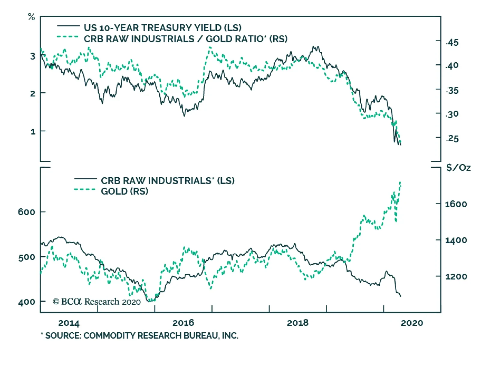
In prior reports we outlined a checklist to call the trough in Treasury yields.1 Two of the items on that checklist were: a severe deterioration in the US economic data and signs of economic recovery in the rest of the world, particularly in those places where the pandemic struck first – like China. We are certainly now seeing the bad US economic data. The Economic Surprise Index is just off its all-time low and a composite of 10 high-frequency economic indicators compiled by the New York Federal Reserve is at its lowest point since the series began in 2008 (Chart 2). Similarly, weekly initial jobless claims set a record three weeks ago. Though they remain extremely elevated, new claims have declined in each of the past two weeks (Chart 2, bottom panel). All this at least raises the possibility that we are close to the trough in US economic growth. However, our second criterion of improving demand outside the US, particularly in China, has not been met. This is crucial because bond investors will need to see that there is light at the end of the tunnel before concluding that US economic activity will trend higher. China’s Manufacturing PMI bounced to just above 50 in March, suggesting that only a small majority of firms experienced better economic conditions in March compared to February. China’s credit impulse is advancing, demonstrating that policymakers are pumping a large amount of stimulus into the economy. But high-frequency growth barometers – like the CRB Raw Industrials index, the performance of cyclical versus defensive equity sectors and the trend in Emerging Market currencies – all remain downbeat (Chart 3). Bond investors will need to see improving demand outside the US before concluding that US economic activity will trend higher. For Treasury yields, the broad CRB Raw Industrials commodity benchmark is particularly important. This is because the ratio between the CRB index and the price of gold closely tracks the 10-year Treasury yield (Chart 4). In a typical economic downturn, we first see Treasury yields and the CRB index fall together as global demand weakens. Then, monetary policy responds by turning more accommodative, leading to a rebound in the price of gold as investors start to reckon with the potential long-run inflationary impact of monetary stimulus. Eventually, bond yields will bottom. But this will only occur once the stimulus seeps through to the real economy and gains in the CRB index start to outpace gains in gold. Chart 3No Global Growth Recovery Yet
No Global Growth Recovery Yet
No Global Growth Recovery Yet
Chart 4Track The CRB/Gold Ratio
Track The CRB/Gold Ratio
Track The CRB/Gold Ratio
The dynamic described above means that we should expect Treasury yields to lag risk assets as the market bottoms. In other words, we will see a sustained rebound in equity prices and corporate bond excess returns before Treasury yields move meaningfully higher. This is especially true in this cycle because the Fed has indicated that it will be slow to shift away from its accommodative policy stance. Bottom Line: While it’s possible that we are close to the US economic trough, we don’t see any immediate upside in Treasury yields. Investors should keep portfolio duration at benchmark and await signs of recovery in our preferred global growth indicators. To hedge against the risk of higher Treasury yields without making a large duration bet, investors should implement duration-neutral curve steepeners. We recommend going long the 5-year bullet and short the duration-matched 2/10 barbell.2 Is The Bottom In For Investment Grade Spread Product Excess Returns? We hesitate to call the bottom in overall spread product returns versus Treasuries. However, we do see many buying opportunities in specific US fixed income sectors. In deciding which sectors to own, we advise investors to search for sectors that: (A) Have attractive spreads and (B) Benefit from one or more of the Fed’s recently announced programs We described each of the Fed’s different lending facilities in last week’s Special Report, and will not repeat that exercise this week.3 Instead, we run through a list of sectors where we think spreads have already peaked and that bond investors should own today. Aaa CMBS Aaa-rated CMBS, both non-agency and agency-backed, meet our two criteria of offering attractive spreads and benefiting from Fed support (Chart 5). The Aaa non-agency CMBS index spread is 119 bps wider than at the end of 2019, and the securities can be used as collateral under the Fed’s Term Asset-Backed Loan Facility (TALF). Specifically, bondholders can borrow from TALF against their Aaa non-agency CMBS collateral at a rate of OIS + 125 bps (Chart 5, panel 2). TALF will also impose a haircut of around 15% on CMBS collateral. Chart 5Buy Aaa CMBS
Buy Aaa CMBS
Buy Aaa CMBS
Agency-backed CMBS are even more attractive on a risk-adjusted basis. The Agency CMBS index spread is 50 bps above its end-2019 level and the Fed is directly purchasing Agency CMBS as part of its ongoing mortgage-backed securities purchases. As of April 15, the Fed had purchased $5.7 billion of Agency CMBS since it announced CMBS purchases on March 23. The outstanding par value of the Bloomberg Barclays Agency CMBS index is about $204 billion. If the Fed’s current pace of purchases continues for one year, it will own just under half of the index’s par value. Aaa ABS Though the spread is not quite as attractive as for Aaa non-agency CMBS, the spread on Aaa-rated consumer ABS is 115 bps wider since the end of 2019 (Chart 6). As with CMBS, this sector also benefits from TALF with an interest rate of OIS + 125 bps, and an even smaller haircut. Chart 6Buy Aaa Consumer ABS & Munis
Buy Aaa Consumer ABS & Munis
Buy Aaa Consumer ABS & Munis
Municipal Bonds We also like the opportunity in municipal bonds. Spreads between Aaa-rated municipal bond yields and Treasuries have come down off their recent all-time highs but remain attractive compared to historical levels (Chart 6, bottom panel). The Fed’s Municipal Liquidity Facility (MLF) offers direct 2-year loans to state & local governments. This will provide a back-stop for municipal debt with a maturity of 2 years or less but will also help municipalities meet interest payments on longer-maturity bonds when they are due. Aaa-rated CMBS, both non-agency and agency-backed, meet our two criteria of offering attractive spreads and benefiting from Fed support. We would therefore advise investors to buy municipal bonds at both the short and long ends of the curve. We also do not rule out further Fed measures to support the municipal bond market in the coming weeks, possibly even secondary market bond purchases. The amount of Fed support for state & local governments so far is much less than what is being done for the corporate sector. There is also no convincing moral hazard argument against scaling-up support for investment grade rated munis, especially when the Fed is already supporting some parts of the high-yield corporate market. Investment Grade Corporates As mentioned above, the Fed is providing an exceptional amount of policy support to the investment grade corporate bond market, mainly through three facilities: The Secondary Market Corporate Credit Facility (SMCCF) that will purchase corporate bonds and ETFs in the secondary market. The Primary Market Corporate Credit Facility (PMCCF) that will purchase new bond issues in the primary market. The Main Street New and Expanded Lending Facilities (MSNLF & MSELF) that will purchase corporate loans from banks, removing them from bank balance sheets. All three of these facilities support the investment grade corporate bond market, and investment grade corporate spreads remain elevated compared to history across all credit tiers (Chart 7). Chart 7Buy Investment Grade Corporates
Buy Investment Grade Corporates
Buy Investment Grade Corporates
Bottom Line: Investors should buy spread products that offer attractive spreads relative to history and that benefit from Fed support. We favor: Aaa non-agency CMBS, Agency CMBS, Aaa ABS, municipal bonds and investment grade corporate bonds. Have High-Yield Spreads Already Peaked? In the high-yield market we follow the same rules we applied in the previous section. We want to buy sectors that have attractive spreads and that benefit from Fed support. Within high-yield, the Ba credit tier meets these criteria as it offers an elevated spread and loans to Ba-rated issuers are eligible under the MSNLF and MSELF. The SMCCF will also purchase some high-yield ETFs and both the SMCCF and PMCCF will purchase securities that were recently downgraded to Ba from Baa. However, for the most part, securities rated B and below will not benefit from the Fed’s new facilities and thus will trade purely on fundamentals.4 This demarcation between securities rated Ba and above and those rated B and below is already showing up in excess returns. Since the Fed first announced corporate bond purchases on March 23, Ba-rated junk bonds have outperformed Treasuries by 16.88%, beating B-rated bonds (13.84%), Caa-rated bonds (9.53%) and the lowest Ca/C-rated credit tier (6.85%) (Table 1). Table 1Corporate Bond Performance Since Announcement Of Fed Purchases
Is The Bottom Already In?
Is The Bottom Already In?
Assessing High-Yield Fundamentals Even without Fed support, lower-tier junk bonds are still worth buying if spreads provide adequate compensation for expected defaults. We assessed the likely magnitude of the looming default cycle in a recent Special Report.5 One main conclusion from that report is that, due to elevated corporate sector leverage, the recovery rate on defaulted debt will likely be low during the next 12 months – on the order of 20-25%. Second, based on the expected magnitude and duration of the current economic shock, we expect a significant surge in the speculative grade corporate default rate during the next 12 months, likely hitting a range of 9%-13%. Even without Fed support, lower-tier junk bonds are still worth buying if spreads provide adequate compensation for expected defaults. With these default loss assumptions in hand, we can see what sort of buffer is priced into different high-yield credit tiers. Charts 8-10 show calendar-year excess returns for Ba, B and Caa-C high-yield credit tiers on the vertical axes. On the horizontal axes, the charts show the index spread at the start of the 12-month investment horizon less realized default losses over the course of the year.6 Chart 8Ba Default-Adjusted Spread
Is The Bottom Already In?
Is The Bottom Already In?
Chart 9B Default-Adjusted Spread
Is The Bottom Already In?
Is The Bottom Already In?
Chart 10Caa-C Default-Adjusted Spread
Is The Bottom Already In?
Is The Bottom Already In?
We first observe that a Default-Adjusted Spread below 200 bps usually coincides with negative excess returns for all three credit tiers. In fact, for the Caa-C tier, we’d like to see a Default-Adjusted Spread above 500 bps before going long. Second, the green diamonds in all three charts identify likely outcomes for the next 12 months in three different default loss scenarios. The “Mild Scenario” is defined as a 6% speculative grade default rate and 25% recovery rate. The “Moderate Scenario” is defined as a 9% speculative grade default rate and 25% recovery rate. The “Severe Scenario” is defined as a 12% default rate and 25% recovery rate.7 Based on those choices, we’d place our base case default loss assumptions for the next 12 months somewhere between the Moderate and Severe scenarios. Charts 8-10 clearly show that, while Ba-rated issuers might still perform decently, the B-rated and below credit tiers are not priced at all for our base case default outlook. Note that this analysis does not consider Fed support in any way. Factoring that in, Ba-rated bonds look even better compared to bonds rated B and below. Bottom Line: We recommend an overweight allocation to Ba-rated high-yield corporates and an underweight allocation to high-yield bonds rated B and lower. Ba-rated bonds will benefit from Fed support and value in the B-rated and below credit tiers does not adequately compensate for likely default losses. Ryan Swift US Bond Strategist rswift@bcaresearch.com Footnotes 1 Please see US Bond Strategy Weekly Report, “When And Where Will Bond Yields Trough?”, dated March 10, 2020, available at usbs.bcaresearch.com 2 For more details on why we recommend this yield curve positioning please see US Bond Strategy Weekly Report, “Life At The Zero Bound”, dated March 24, 2020, available at usbs.bcaresearch.com 3 Please see US Investment Strategy/US Bond Strategy Special Report, “Alphabet Soup: A Summary Of The Fed’s Anti-Virus Measures”, dated April 14, 2020, available at usbs.bcaresearch.com 4 As we noted in last week’s Special Report, some B-rated issuers will benefit from the MSELF. But this support is minor compared to what is being offered to securities rated Ba and higher. 5 Please see US Bond Strategy/Global Fixed Income Strategy Special Report, “Trading The US Corporate Bond Market In A Time Of Crisis”, dated March 31, 2020, available at usbs.bcaresearch.com 6 We use Ba and Caa-C default losses for those credit tiers. For B-rated bonds, we found that overall speculative grade default losses work slightly better than default losses for the B credit tier specifically. 7 We use historical correlations to translate overall speculative grade default rate assumptions into default rate assumptions for the Ba and Caa-C credit tiers. Fixed Income Sector Performance Recommended Portfolio Specification
The 10-year yield spread between US Treasurys and German Bunds has quickly narrowed, falling by 170bps from a higher of 279bps in November 2018. Despite this sharp narrowing, the spread remains elevated by historical standards, which begs the question of…
Highlights Risk assets have rallied thanks to a healthy dose of economic stimulus and mounting evidence that the number of new COVID-19 cases has peaked. Unfortunately, the odds of a second wave of infections remain high. In the absence of a vaccine or effective treatment, only mass testing can keep the virus at bay. Such testing will become available, but probably not for a few more months. Meanwhile, the global economy remains depressed. As earnings estimates are revised lower, stocks could give up some of their recent gains. Despite the fact that the supply of goods and services has fallen sharply during this recession, the overall effect has been deflationary. Deflationary pressures should subside later this year as demand picks up, commodity prices rise, and the US dollar weakens. Looking several years out, deglobalization and the increasing politicization of central banking could lead to accelerating inflation. Long-term investors should maintain a structurally below-benchmark duration stance in fixed-income portfolios, and position for steeper yield curves. Now What? Imagine being chased through the woods by an angry bear. You manage to climb a tree, getting high enough so that the bear cannot reach you. You breathe a sigh of relief. You are out of harm's way. Or so you think. You look down, and the bear is waiting for you at the base of the tree. You have no weapons. You feel cold and hungry. It is getting dark. This is the state the world finds itself in today. We have climbed up the tree. The number of new infections has peaked in Italy and Spain, the first large European countries hit by the virus. Hospital admissions in New York are falling. This, combined with a generous dose of economic stimulus, has allowed stocks to rally by 28% from their March 23 intraday lows. Yet, we have neither a vaccine nor a cure for the virus (although as we go to press, unconfirmed news reports suggest that Gilead’s drug, remdesivir, has had success in treating patients at a Chicago hospital). Chart 1Widespread Social Distancing Dampened The Spread Of All Flus And Colds
Still Stuck In The Tree
Still Stuck In The Tree
COVID-19 is part of the coronavirus family, which includes four members that are responsible for up to 30% of common colds (most other colds are caused by rhino-viruses). Social distancing has driven the number of cold and influenza-like cases in the US to very low levels (Chart 1). But does anyone really think that the common cold or flu will be permanently eradicated because of recent measures? If not, what will prevent COVID-19, which is no less contagious than these other illnesses, from resurfacing? In short, the bear is still there, waiting for us to reopen the economy. A Deep Recession As we wait, the economic damage continues to mount. The IMF’s baseline scenario foresees the global economy contracting by 3% in 2020, with advanced economies shrinking by 6.1%. This is far deeper than during the 2008/09 financial crisis (Chart 2). The IMF’s projections assume that the pandemic subsides in the second half of 2020, allowing containment measures to be relaxed. If the pandemic were to last longer than that, global output would fall by an additional 3% in 2020 relative to the Fund’s already bleak baseline. A second outbreak next year would push global GDP almost 5% below the IMF’s baseline in 2021, while the combination of a longer outbreak this year and a second outbreak next year would cause the level of output to fall 8% below the 2021 baseline (Chart 3). Chart 2Severe Damage To The Global Economy This Year
Severe Damage To The Global Economy This Year
Severe Damage To The Global Economy This Year
Chart 3Downside Risks To The IMF's Projections
Still Stuck In The Tree
Still Stuck In The Tree
The Ties That Bind The sudden stop in economic activity has led to a dramatic surge in unemployment. US initial unemployment claims have risen by a cumulative 22 million over the past four weeks. The true scale of layoffs is probably higher than that, given that some state websites have been unable to handle the flood of insurance applications. Chart 4Only About One-Third Of Those Who Lose Their Jobs Apply For Benefits
Still Stuck In The Tree
Still Stuck In The Tree
Historically, only about one-third of those laid off have applied for benefits (Chart 4). While the take-up rate will be higher this time – the CARES Act increases weekly unemployment compensation, while expanding eligibility to self-employed workers – it is still reasonable to assume that the claims data do not capture how much of the workforce has been laid idle. The one piece of good news is that at least so far, temporarily laid-off workers account for the vast majority of the increase in unemployment. This is encouraging because it implies that in most cases, the ties that bind workers to firms have not been permanently severed. In this respect, the recovery in employment following this recession may end up resembling that of another “man-made” recession: the 1982 downturn (Chart 5). Back then, policymakers felt that a recession was a price worth paying to quash inflation. Once inflation fell, central banks were able to cut rates, allowing economic activity to recover. Today, the hope is that by shutting down all nonessential businesses, the virus will be quashed, and life will return to normal. Chart 5Comparing The 1982 Recession Versus Today: Employment Edition
Comparing The 1982 Recession Versus Today: Employment Edition
Comparing The 1982 Recession Versus Today: Employment Edition
Exit Plans It remains to be seen whether vanquishing the virus will be as straightforward as vanquishing inflation was in the early 1980s. As we noted last week, in the absence of a vaccine or an effective treatment, our best hope is that mass testing will allow businesses to reopen.1 The technology for such tests already exists; it just has yet to become available on a large enough scale. Just like during the Second World War, the production of weapons necessary to fight the virus will grow at an exponential pace (Chart 6). Chart 6Now Let's Do The Same For Test Kits
Still Stuck In The Tree
Still Stuck In The Tree
Near-Term Pressures On Risk Assets Exponential change is a difficult concept for the human mind to grasp. What seems painfully slow at first can quickly become unfathomably fast later on. The apocryphal story about the origins of the game of chess comes to mind.2 This puts investors in a bit of a quandary. Growth is likely to recover in the latter half of 2020 as COVID-19 testing becomes pervasive and the effects of fiscal and monetary stimulus make their way through the economy. But, the near-term picture could be soured by news stories of continued acute shortages of medical supplies and delays in providing financial assistance to hard-hit households and businesses, not to mention dire corporate earnings performance. The one piece of good news is that at least so far, temporarily laid-off workers account for the vast majority of the increase in unemployment. Indeed, bottom-up analyst earnings estimates still have further to fall. The Wall Street consensus expects S&P 500 companies to earn $142 per share this year and $174 in 2021. Our US equity strategists are projecting only $100 and $140 in EPS, respectively. Stock prices and earnings estimates generally travel together (Chart 7). On balance, we continue to favor global equities over bonds on a 12-month horizon, owing to the fact that the cyclically-adjusted earnings yield is quite a bit higher than the bond yield (Chart 8). However, we have less conviction about the near-term (3-month) direction of stocks, and would recommend that investors maintain above-average cash levels for now which can be deployed on any major selloff. Chart 7Negative Earnings Revisions Will Weigh On Stocks In The Near Term
Negative Earnings Revisions Will Weigh On Stocks In The Near Term
Negative Earnings Revisions Will Weigh On Stocks In The Near Term
Chart 8Favor Equities Over Bonds Over A 12-Month Horizon
Favor Equities Over Bonds Over A 12-Month Horizon
Favor Equities Over Bonds Over A 12-Month Horizon
Inflation And Supply Shocks: A Keynesian Paradox? One of the distinguishing features of this recession is that it has involved a simultaneous supply shock and a demand shock. Businesses have had to curb supply in order to allow workers to stay at home, while workers have reduced spending out of fear of going to stores or other venues where they could inadvertently contract the virus. Worries about job losses have further dented demand. There is no question about what happens to output when both demand and supply decline: output falls. In contrast, the impact on the price level depends on which shock dominates (Chart 9). Chart 9Inflation And Supply Shocks
Still Stuck In The Tree
Still Stuck In The Tree
As Appendix 1 illustrates with a set of simple numerical examples, in theory, a negative supply shock spread evenly across all sectors of the economy should cause the price level to rise. This is because unemployed workers, who are no longer contributing to output, will still end up consuming some goods and services by tapping into their savings, taking on new debt, or by receiving income transfers from the government. In the current situation, however, the supply shock has not been spread evenly throughout the economy. Some businesses have been completely shuttered, while others deemed essential have been allowed to operate. As the appendix shows, in such cases, the drop in aggregate demand is likely to be larger than if all sectors were equally impacted. In fact, it is possible for a supply shock to trigger a demand shock that is larger than the supply shock itself, leading to a perverse situation where a decline in supply results in a surfeit of output. A recent paper by Guerrieri, Lorenzoni, Straub, and Werning argues that the current pandemic represents such a “Keynesian supply shock.”3 Intuitively, such perverse supply shocks can arise if workers are cut off from purchasing many of the goods that they would normally buy. When the menu of available goods shrinks, even workers who are still employed could end up saving much of their income. Deflationary For Now All this implies that the pandemic is likely to be deflationary until more businesses reopen. The data seem to bear this out. The US core consumer price index fell by 0.1% month-over-month in March on a seasonally adjusted basis, led by steep declines in airfares and hotel lodging prices. High-frequency indicators, as well as the prices paid components of various purchasing manager indices, suggest that deflationary pressures have persisted into April (Chart 10). Chart 10Deflation Reigns For Now
Deflation Reigns For Now
Deflation Reigns For Now
Shelter inflation was reasonably firm in March but should soften over the coming months. A number of major apartment operators have announced rent freezes. In addition, the lagged effects from a stronger dollar and lower energy prices will contribute to lower goods inflation, while higher unemployment will hold back service inflation. Inflation Should Bounce Back In 2021 The discussion of Keynesian supply shocks suggests that aggregate demand will increase faster than supply as more sectors of the economy reopen. This should ease deflationary pressures. In addition, a rebound in global growth starting in the second half of 2020 will prompt a recovery in commodity prices. The forward oil curve is predicting that Brent and WTI crude prices will rise by 42% and 79%, respectively, over the next 12 months (Chart 11). Inflation expectations and oil prices tend to move closely together (Chart 12). Chart 11H2 2020 Rebound In Growth Will Lift Oil Prices
H2 2020 Rebound In Growth Will Lift Oil Prices
H2 2020 Rebound In Growth Will Lift Oil Prices
Chart 12Inflation Expectations And Oil Prices Tend To Move Closely Together
Inflation Expectations And Oil Prices Tend To Move Closely Together
Inflation Expectations And Oil Prices Tend To Move Closely Together
As a countercyclical currency, the US dollar will weaken over the next 12-to-18 months as global growth rebounds, providing an additional reflationary impulse (Chart 13). Falling unemployment will also eat into labor market slack, helping to support wages. Chart 13Stronger Global Growth In The Back Half Of The Year Will Weaken The Dollar, Putting Upward Pressure On US Inflation
Stronger Global Growth In The Back Half Of The Year Will Weaken The Dollar, Putting Upward Pressure On US Inflation
Stronger Global Growth In The Back Half Of The Year Will Weaken The Dollar, Putting Upward Pressure On US Inflation
The Structural Outlook For Inflation… And Bond Yields Looking further out, the outlook for inflation will depend on whether the structural forces that have suppressed the rise in consumer prices over the past few decades intensify or abate. On the one hand, it is possible that the pandemic will cast a pall over consumer and business sentiment for years to come. If households and firms restrain spending, this would exacerbate deflationary pressures. Likewise, if governments tighten fiscal policy in order to pay off the debts incurred during the pandemic, this could weigh on growth. On the other hand, high government debt levels may increase the political pressure on central banks to keep rates low, even once the labor market recovers. This could eventually lead to economic overheating in two-to-three years. Chart 14Global Trade Was Already Stagnating
Global Trade Was Already Stagnating
Global Trade Was Already Stagnating
A partial roll back in globalization could also cause consumer prices to rise. Global trade was already stagnant even before the trade war flared up (Chart 14). The pandemic may further inflame nationalist sentiment. Against the backdrop of high unemployment, Donald Trump is likely to campaign as a “war president,” relentlessly chiding Joe Biden for having too cozy a relationship with China. On balance, we suspect that inflation will rise more than expected over the long haul. This is not a particularly high bar to clear. Investors currently expect US inflation to average only 1.2% over the next decade based on TIPS breakevens. Market-based inflation expectations are even more subdued in most other advanced economies. If inflation does surprise to the upside, long-term bond yields are likely to increase by more than expected. Investors should maintain a structurally below-benchmark duration stance in fixed-income portfolios, and position for steeper yield curves. APPENDIX 1: Keynesian Supply Shocks Suppose there are two sectors, A and B. The economy consists of 2,000 workers, with each sector employing 1,000 workers. To keep things simple, assume that workers in each sector evenly split their consumption between the two sectors. Thus, a worker in sector A spends as much on goods from sector A as from sector B, and vice versa. Also assume that each worker, if employed, produces $1,000 of goods and receives a salary of $1,000 for his or her efforts. With this in mind, let us consider three scenarios: Scenario 1: Both Sectors Are Open For Business In this scenario, $1 million of good A and $1 million of good B are produced and supplied to the market. Since each of the 2,000 workers spends $500 on good A and $500 on good B, a total of $1 million of both goods are demanded. Aggregate demand equals aggregate supply.
Still Stuck In The Tree
Still Stuck In The Tree
Scenario 2: Partial Closure Of Both Sectors Suppose that half the workers in both sectors are laid off. While the unemployed workers do not earn any income, they still spend half as much as they used to by tapping into their savings ($250 on good A and $250 on good B for each unemployed worker). Each employed worker continues to spend $500 on good A and $500 on good B. Now there is $500,000 in total of each good produced, but $750,000 of each good demanded. Aggregate demand exceeds supply.
Still Stuck In The Tree
Still Stuck In The Tree
Scenario 3: Sector A, Deemed The Essential Sector, Remains Completely Open, While B Is Closed In this case, all sector A workers are still employed, earning $1,000 each. Since good B is no longer available for purchase, sector A workers increase spending on good A by 20% (from $500 to $600 per worker). Workers in sector B are all unemployed. However, they continue to tap into their savings. Rather than spending $250 on good A as they did in scenario 2, they increase their expenditures on good A by 20% (from $250 to $300). A total of $900,000 of good A is now demanded ($600*1,000+$300*1,000), which is less than the $1 million of good A supplied. Aggregate supply now exceeds demand for the part of the economy that is still open. The chart and table below summarize the results. The key insight is that a 50% shock to the entire economy curbs aggregate demand less than a 100% shock to half the economy. This implies that demand is likely to grow faster than supply as mass testing allows more of the economy to reopen.
Still Stuck In The Tree
Still Stuck In The Tree
Still Stuck In The Tree
Still Stuck In The Tree
Peter Berezin Chief Global Strategist peterb@bcaresearch.com Footnotes 1 Please see Global Investment Strategy Weekly Report, “Testing Times,” dated April 9, 2020. 2 In one account, the King of India was so impressed when the game of chess was demonstrated to him that he offered its inventor any reward he desired. After thinking for a while, the inventor said “Your Highness, please give me one grain of rice for the first square on the chessboard, two grains for the next square, four grains for the one after that, doubling the number of grains until the 64th square.” Stunned that the inventor would ask for such a puny reward, the King quickly agreed. A week later, the King’s treasurer informed His Highness that he would need to give the inventor 18 quintillion grains of rice, which is more than enough rice to cover the entire planet’s surface. “Holy Ganges, what have I done?” the King exclaimed, before having the inventor executed. 3 Veronica Guerrieri, Guido Lorenzoni, Ludwig Straub, and Iván Werning, “Macroeconomic Implications of COVID-19: Can Negative Supply Shocks Cause Demand Shortages?” NBER Working Paper No. 26918 (April 2020). Global Investment Strategy View Matrix
Still Stuck In The Tree
Still Stuck In The Tree
Current MacroQuant Model Scores
Still Stuck In The Tree
Still Stuck In The Tree
Yesterday, BCA Research's Global Fixed Income Strategy service asserted that central banks have become best friends with corporate bond investors. The actions of policymakers worldwide to help mitigate the severe economic shock from the COVID-19…
Highlights The Fed has been awfully busy since the middle of March, … : Over the last 30 days, the Fed has unleashed a barrage of measures to support market liquidity and alleviate economic hardship. … unveiling a package of facilities to keep credit flowing to consumers, businesses and municipalities, … : The Fed is building a sizable firewall against market seizure, touching on commercial paper, money market funds, asset-backed securities, small business loans, municipal notes, investment-grade corporate bonds and ETFs and high-yield corporate ETFs. … and loosening regulatory strictures to encourage banks to put their capital buffers to work: The Fed and other major bank regulators have eased some of the post-2008 rules to encourage banks to ramp up market-making activity and increase lending to cushion the shock to the economy. Investors should buy what the Fed is buying: Fixed income investors should look to capture excess spreads in markets that have not yet priced in the full effect of the Fed’s indemnity. Banks and agency mortgage REITs offer a way to implement this theme in equities. Feature What A Difference A Pandemic Makes “Whatever it takes” is clearly the order of the day for Jay Powell and company, as well as Congress and the White House, to mitigate the potentially pernicious second-round economic damage from COVID-19. In this Special Report, we detail the Fed’s key initiatives. Central banks are neither omniscient nor omnipotent, and they cannot stave off all of the pressure from mass quarantines, but we do expect the Fed’s measures will cushion the economic blow, and reflate prices in targeted asset markets. The Fed began pulling out all the stops to fight the virus on Sunday, March 15th with what have now become stock emergency responses: zero rates and purchases of Treasuries and agency mortgage-backed securities (MBS). Although the MBS purchases began the week of March 23rd, and have continued at a steady clip despite appearing to have swiftly surpassed their $200 billion target, they have not yet achieved much traction in the mortgage market. The spread between the current coupon agency MBS and the 10-year Treasury yield has come down a bit, but the average 30-year fixed-rate home mortgage rate does not reflect the 150 basis points ("bps") of rate cuts since the beginning of March (Chart 1). The Fed’s measures are intended to help direct the flow of credit to adversely affected constituencies with a pressing need for it. Other measures to relieve liquidity pressures, like the Fed’s ongoing overnight repo operations, have achieved their aim. The signal indicator of liquidity strains, the effective fed funds rate, was bumping up against the top of the Fed’s target range for several days after the return to zero interest rate policy. Over the last week, however, it has settled around 5 bps, near the bottom of its range (Chart 2), suggesting that the formerly tight overnight funding market is now amply supplied. Chart 1MBS Purchases Haven't Helped Main Street Yet
MBS Purchases Haven't Helped Main Street Yet
MBS Purchases Haven't Helped Main Street Yet
Chart 2Overnight Funding Stresses ##br##Have Eased
Overnight Funding Stresses Have Eased
Overnight Funding Stresses Have Eased
The rest of the Fed’s measures (Table 1) have been more finely targeted, intended to help direct the flow of credit to adversely affected constituencies with a pressing need for it. We focus on the most important measures in the following section and summarize their common elements in Table 2. The following discussions of the individual programs highlight their intent, their chances of success, and yardsticks for tracking their progress. We conclude with the fixed income and equity niches that are most likely to benefit from the Fed’s efforts. Table 1A Frenzied Month Of Activity
Alphabet Soup: A Summary Of The Fed's Anti-Virus Measures
Alphabet Soup: A Summary Of The Fed's Anti-Virus Measures
Table 2The 2020 Federal Reserve Emergency Programs
Alphabet Soup: A Summary Of The Fed's Anti-Virus Measures
Alphabet Soup: A Summary Of The Fed's Anti-Virus Measures
A Field Guide To The Acronym Jungle Money Market Mutual Fund Liquidity Facility (MMLF) Under the MMLF, which started on March 23rd, US banks can borrow from the Fed to purchase eligible assets mainly from prime money market funds. These assets are in turn pledged to the Fed as collateral, effectively allowing the Fed to lend to prime money market funds via banks. Assets eligible for purchase from these funds include: US Treasuries & fully guaranteed agencies Securities issued by US GSEs Asset-backed commercial paper (ABCP) rated A1 or its equivalent, issued by a US issuer US municipal short-term debt (excluding variable rate demand notes) Backed by $10 billion of credit protection from the Treasury, the Fed will lend at the primary credit rate (the discount rate, currently 0.25%) for pledged asset purchases of US Treasuries, fully guaranteed agencies or securities issued by US GSEs. For any other assets pledged, the Fed will charge an additional 100 bps – with the exception of US municipal short-term debt to which the Fed only applies a 25-bps surcharge. Chart 3The MMLF Already Providing Some Relief
The MMLF Already Providing Some Relief
The MMLF Already Providing Some Relief
Loans made under the MMLF are fully non-recourse (the Fed can recover nothing more from the borrower than the pledged collateral). Banks borrowing from the Fed under the MMLF bear no credit risk and have therefore been exempted from risk-based capital and leverage requirements for any asset pledged to the MMLF, an important element that should promote MMLF participation. This facility is a direct descendant of the Asset-Backed Commercial Paper Money Market Mutual Fund Liquidity Facility (AMLF), which operated from September 2008 to February 2010 to prevent a run on prime money market funds after a prominent fund “broke the buck.” Its objective is to help prime money market funds meet redemption requests from investors and increase liquidity in the markets for the assets held by these funds – most notably commercial paper where prime money market funds represent 21% of the market. Those funds have experienced large outflows in the midst of the coronavirus pandemic and building economic crisis – erasing $140 billion, or 18%, of the fund segment’s total net assets in a matter of days (Chart 3, top panel). Since it started, the MMLF has extended $53 billion of credit to prime money funds, about a third of AMLF’s output in its first 10 days of operation. The financial sector is suffering a big shock, but it is not the source of the problem like it was in 2008, so the situation is not as dire as it was in late 2008, and we are already seeing a tentative stabilization of asset outflows from money market funds. Commercial paper spreads have also narrowed, implying that the combination of the MMLF and the CPFF (see below) is having the intended effect (Chart 3, bottom panel). Commercial Paper Funding Facility (CPFF) Starting today, April 14th, the Fed will revive 2008’s Commercial Paper Funding Facility (CPFF) with the aim of restoring liquidity to a market where investment grade corporate borrowers raise cash to finance payroll, inventories, accounts payable and other short-term liabilities. The 2020 iteration applies to municipalities as well, extending its reach across the real economy. Via a Special Purpose Vehicle (SPV) (see Box) funded with a $10 billion equity investment from the Treasury Department, the CPFF will purchase US dollar-denominated investment-grade (A1/P1/F1) three-month asset-backed, corporate and municipal commercial paper priced at the overnight index swap rate (OIS) plus 110 bps. Lower-rated issuers are not eligible, but investment-grade borrowers who were downgraded to A2/P2/F2 after March 17th, 2020 can be grandfathered into the program at a higher spread of OIS+200 bps. The pricing is tighter than it was in 2008, when unsecured investment grade and asset-backed issues were priced at OIS+100 bps and OIS+300 bps, respectively, and the Fed did not have the loss protection provided by an equity investment in the SPV. Box 1 - SPV Mechanics The Fed has set up Special Purpose Vehicles (SPV) in connection with most of the facilities we examine here. Each SPV has been seeded by the Treasury department to carry out the facility’s work. The Fed lends several multiples of the Treasury’s initial equity investment to each SPV to provide it with a total capacity of anywhere from eight to fourteen times its equity capital, based on the riskiness of the assets the SPV is purchasing or lending against. The result is that most of the cash used to operate the facilities will come from the Fed in the form of loans with full recourse to the SPVs’ assets, but the Treasury department will own the equity tranche. The Treasury therefore bears the first credit losses, should any occur. Issuers are only eligible if they have issued three-month commercial paper in the twelve months preceding the March 17th announcement of the program. The Federal Reserve did not set an explicit limit on the size of the program, but funding for any single issuer is limited to the amount of outstanding commercial paper it had during that twelve-month period. The 2020 CPFF could therefore max out above $750 billion, the peak size of the domestic commercial paper market over the past year (Chart 4). If the first CPFF’s experience is any guide, however, it’s unlikely that its full capacity will be needed. Its assets peaked at $350 billion in January 2009, around a quarter of 2008’s $1.5 trillion average outstanding balance. A similar proportion today would cap the fund at $175-200 billion. As in 2008 (Chart 5, bottom panel), the mere announcement of the program has driven commercial paper spreads significantly below their previously stressed levels (Chart 5, top panel). Chart 4Pressure On The Domestic Commercial Paper Market...
Pressure On The Domestic Commercial Paper Market...
Pressure On The Domestic Commercial Paper Market...
Chart 5...Is Being Relieved Ahead Of The CPFF Implementation
...Is Being Relieved Ahead Of The CPFF Implementation
...Is Being Relieved Ahead Of The CPFF Implementation
Term Asset-Backed Securities Loan Facility (TALF) The asset-backed securities (ABS) market funds a significant share of the credit extended to consumers and small businesses. The Fed’s TALF program that started on March 23rd aims to provide US companies holding AAA collateral with funding of up to $100 billion, in the form of 3-year non-recourse loans secured by AAA-rated ABS. It will be conducted via an SPV backed by a $10 billion equity investment from the US Treasury Department. Chart 6Narrower Spreads Promote Easier Financial Conditions At The Margin
Narrower Spreads Promote Easier Financial Conditions At The Margin
Narrower Spreads Promote Easier Financial Conditions At The Margin
Eligible collateral includes ABS with exposure to auto loans, student loans, credit card receivables, equipment loans, floorplan loans, insurance premium finance loans, SBA-guaranteed loans and leveraged loans issued after March 23rd, 2020. Last week, the Fed added agency CMBS issued before March 23rd, 2020 and left the door open to further expansion of the pool of eligible securities. The rate charged on the loans is based on the type of collateral and its weighted average life. Depending on the ABS, the spreads will range from 75 bps to 150 bps over one of four different benchmarks (LIBOR, SOFR, OIS or the upper 25-bps bound of the target fed funds range). The spreads are reasonable, and will not keep ABS holders away from the facility, but they’re not meant to be giveaways. The 2009 TALF program originally had a $200 billion capacity, which was later expanded to $1 trillion. Those numbers make the current iteration’s $100 billion limit look awfully modest, but only $71 billion worth of loans were eventually granted the first time around. ABS spreads have already narrowed significantly (Chart 6), suggesting the program is already making a difference. Although an incremental $100 billion of loans is not likely to move the needle much for the US economy, narrower spreads will promote easier financial conditions at the margin. Secondary Market Corporate Credit Facility (SMCCF) Though no firm start date has been given, the Fed will soon enter the secondary market and start purchasing corporate bonds. As with all of the other facilities discussed in this section except the MMLF, the SMCCF is set up as an SPV. It will have up to $250 billion of buying power, anchored by $25 billion of equity funding from the Treasury department. Once it’s up and running, the SMCCF will buy non-bank corporate bonds in the secondary market that meet the following criteria: Issuer rated at least BBB-/Baa3 (the lowest investment grade tier) as of March 22nd, 2020 A remaining maturity of 5 years or less Issuer is a US business with material operations, and a majority of its employees, in the US Issuer is not expected to receive direct financial assistance from the federal government The SMCCF can own a maximum of 10% of any single firm’s outstanding debt, and it may dip into the BB-rated market for securities that were downgraded from BBB after March 22nd. In addition to cash bonds, the SMCCF will also buy ETFs that track the broad corporate bond market. The Fed says that the “preponderance” of SMCCF ETF purchases will be of ETFs tracking investment grade corporate bond benchmarks (like LQD), but it will also buy some high-yield ETFs (like HYG). We expect that the SMCCF will be able to achieve its direct goal of driving down borrowing costs for otherwise healthy firms that may struggle to access credit markets in the current environment. One way to track the program’s success is to monitor investment grade corporate credit spreads (Chart 7). Spreads have been tightening aggressively since the Fed announced the program on March 23rd but are still elevated compared to average historical levels. The slope of the line of investment grade corporate bond spreads plotted by maturity will be another important metric (Chart 8). An inverted spread slope tends to coincide with a sharply rising default rate, since it signals that investors are worried about near-term default risk. By purchasing investment grade bonds with maturities of 5 years or less, the Fed hopes to maintain a positively sloped spread curve. Chart 7SMCCF Announcement Marked The Peak In Spreads
SMCCF Announcement Marked The Peak In Spreads
SMCCF Announcement Marked The Peak In Spreads
Chart 8Fed Wants A Positive ##br##Spread Slope
Fed Wants A Positive Spread Slope
Fed Wants A Positive Spread Slope
Primary Market Corporate Credit Facility (PMCCF) The PMCCF employs the same structure as the SMCCF, but it is twice as large. The Treasury’s initial equity investment will be $50 billion and Fed loans will scale its capacity up to $500 billion. As a complement to the SMCCF, the PMCCF will purchase newly issued non-bank corporate bonds. The eligibility criteria are the same as the SMCCF’s, but the PMCCF will only buy bonds with a maturity of 4 years or less. The new issuance purchased by the PMCCF can be new debt or it can be used to refinance existing debt. The only caveat is that the maximum amount of borrowing from the facility cannot exceed 130% of the issuer’s maximum debt outstanding on any day between March 22nd, 2019 and March 22nd, 2020. Essentially, eligible firms can use the facility to refinance their entire stock of debt and then top it up by another 30% if they so choose. The goals of the PMCCF are to keep the primary issuance markets open and to prevent bankruptcy for firms that were rated investment grade before the virus outbreak. Investment grade corporate bond issuance shut down completely for a stretch in early March, but then surged once the Fed announced the PMCCF and SMCCF on March 23rd. The PMCCF will have achieved lasting traction if gross corporate bond issuance holds up in the coming months (Chart 9). It should also meet its bankruptcy-prevention goal, since firms will be able to refinance their maturing obligations and tack on some new debt to get through the next few months. Given the large amount of outstanding BBB-rated debt, a lot of fallen angel supply is poised to hit the high-yield bond market. While we expect the PMCCF will succeed in achieving its primary aims, it is unlikely to prevent a large number of ratings downgrades. If a given firm only makes use of the facility to refinance its existing debt at a lower rate, then its ability to service its debt will improve at the margin and its rating should be safe. However, any firm that increases its debt load via this facility will end up with a riskier balance sheet. Ratings agencies will not look through an increased debt burden, and we expect a significant number of ratings downgrades in the coming months (Chart 10, top panel). Chart 9Primary Markets Have Re-Opened
Primary Markets Have Re-Opened
Primary Markets Have Re-Opened
Chart 10Fed Actions Won't Prevent Downgrades
Fed Actions Won't Prevent Downgrades
Fed Actions Won't Prevent Downgrades
Given the large amount of outstanding BBB-rated debt, a lot of fallen angel supply is poised to hit the high-yield bond market (Chart 10, middle and bottom panels). The Fed will try to contain the surge by allowing the SMCCF to purchase fallen angel debt, and by providing some support to the upper tiers of high-yield credits through its Main Street Lending Programs. Main Street New Loan Facility (MSNLF) and Main Street Expanded Loan Facility (MSELF) The goal of the MSNLF and MSELF is to provide relief to large firms that are not investment grade credits. Both facilities will draw from the same SPV, which will be funded by a $75 billion equity stake from the Treasury and will then be levered up to a total size of “up to $600 billion” by the Fed. The Main Street facilities are structured differently than the PMCCF and SMCCF in that the Fed will not transact directly with nonfinancial corporate issuers. Rather, the Fed will purchase 95% of the par value of eligible loans from banks (which will retain 5% of the credit risk of each loan), hoping to free up enough extra room on bank balance sheets to promote more lending. To be eligible for purchase by the Main Street New Loan Facility, loans must be issued after April 8th, 2020 and meet the following criteria: Borrowers have less than 10,000 employees or $2.5 billion of 2019 revenue Borrowers are US firms with significant operations, and a majority of employees, in the US Loans are unsecured and have a maturity of 4 years Loans are made at an adjustable rate of SOFR + 250-400 bps Principal and interest payments are deferred for one year Loan size of $1 million to the lesser of $25 million or the amount that keeps the borrower’s Debt-to-EBITDA ratio below 4.01 Loan proceeds cannot be used to refinance existing debt Borrowers must commit to “make reasonable efforts to maintain payroll and retain employees during the term of the loan” The Main Street Expanded Loan Facility applies similar criteria to existing loans that banks will upsize before transferring 95% of the incremental risk to the Fed. The MSELF allows for loans up to the lesser of $150 million, 30% of the borrower’s existing debt (including undrawn commitments) or the amount keeps the borrower’s Debt-to-EBITDA ratio below 6.0. Borrowers can participate in only one of the MSNLF, MSELF and PMCCF, though they can tap the PPP alongside one of the Main Street lending facilities. Chart 11Main Street Programs Will Spur Bank Lending
Main Street Programs Will Spur Bank Lending
Main Street Programs Will Spur Bank Lending
The Main Street facilities endeavor to have banks adopt an “originate to distribute” model. With the Fed assuming 95% of each loan’s credit risk, banks will have nearly unlimited balance sheet capacity to continue originating these sorts of loans. Retaining 5% of each loan ensures that the banks will have enough skin in the game to perform proper due diligence. We expect to see a significant increase in commercial bank C&I loan growth in the coming months once these facilities are up to speed (Chart 11). Crucially for high-yield investors, the debt-to-EBITDA constraints ensure that the Main Street facilities will aid BB- and some B-rated issuers but will not bail out high-default-risk issuers rated CCC and below. BB-rated firms typically have debt-to-EBITDA ratios between 3 and 4, while B-rated issuers typically fall in a range of 4 to 6. For the most part, BB-rated firms will be able to make use of either the MSNLF or MSELF, while B-rated firms will be limited to the MSELF. By leaving out issuers rated CCC & below, the Fed is acquiescing to a significant spike in corporate defaults over the next 12 months. The bulk of corporate defaults come from firms that were rated CCC or below 12 months prior (Chart 12). Chart 12A Significant Increase In Corporate Defaults Is Coming
A Significant Increase In Corporate Defaults Is Coming
A Significant Increase In Corporate Defaults Is Coming
As with the PMCCF, we note that the Main Street facilities offer loans, not grants. While they will address firms’ immediate liquidity issues, they will do so at the cost of more indebted balance sheets. Downgrade risk remains high for BB- and B-rated companies. Paycheck Protection Program Liquidity Facility (PPPLF) The Paycheck Protection Program (PPP) is a component of the CARES Act that was designed to forestall layoffs by small businesses. PPP loans are fully guaranteed by the Small Business Association (SBA), which will forgive them if the borrower maintains its employee headcount for eight weeks. The size of the PPPLF has yet to be announced, along with the details of its funding, but its intent is to get PPP loans off of issuers’ balance sheets so as to free up their capital and allow them to make more loans, expanding the PPP’s reach. The Fed will lend on a non-recourse basis at a rate of 0.35% to any depository institution making PPP loans,2 taking PPP loans as collateral at their full face value. PPP loans placed with the Fed are exempt from both risk-weighted and leverage-based capital adequacy measures (please see “Easing Up On The Regulatory Reins,” below). PPP is meant to be no less than a lifeline for households and small businesses, but the devil is in the details. Banks were reportedly overwhelmed with demand for PPP loans over the first five business days that they were available, suggesting that many small businesses still qualify, despite 17 million initial unemployment claims over the last three weeks. Media reports about the program highlighted that there are quite a few kinks yet to be worked out, and it has arrived too late to stave off the first waves of layoffs. Success may be most easily measured by the size of the PPPLF, which should eventually translate into fewer layoffs and bankruptcies than would otherwise have occurred. Municipal Liquidity Facility (MLF) Chart 13State & Local Governments Need Support
State & Local Governments Need Support
State & Local Governments Need Support
The Municipal Liquidity Facility is similar in structure to the PMCCF, only it is designed to support state and local governments. The MLF SPV will be funded by a $35 billion equity investment from the Treasury, and the Fed will lever it up to a maximum size of $500 billion to purchase newly issued securities directly from state and local governments that meet the following criteria: All states (including D.C.) are eligible, as are cities with populations above 1 million and counties with populations above 2 million. The newly issued notes will have a maximum maturity of 2 years. The MLF can buy new issuance from any one state, city or county up to an amount equal to 20% of that borrower’s fiscal year 2017 general revenue. States can request a higher limit to procure funds for political subdivisions or instrumentalities that aren’t eligible themselves for the MLF. The MLF’s goal is to keep state and local governments liquid as they deal with the COVID-19 pandemic. The large size of the facility – $500 billion is five times 2019’s aggregate muni issuance – should allow it to meet its goal. However, as with the Fed’s other facilities, the support comes in the form of loans, not grants. The lost tax revenue and increased pandemic expenditures cannot be recovered. State and local government balance sheets will emerge from the recession weaker. We can track the program’s success by looking at the spread between municipal bond yields and comparable US Treasury yields. These spreads widened to all-time highs in March, but have since come in significantly, even for longer maturities (Chart 13). If this tightening does not continue, the Fed may eventually enter the secondary market to purchase long-maturity municipal bonds. Supporting such a fragmented market will be tricky, and the Fed may be hoping that more aid will come from Capitol Hill. Central Bank Liquidity Swaps Chart 14US Dollar Debt Is A Global Problem
US Dollar Debt Is A Global Problem
US Dollar Debt Is A Global Problem
The global economy is loaded with USD-denominated debt issued by entities outside of the US. As of 3Q19, there was roughly $12 trillion of outstanding foreign-issued US dollar debt, exceeding the domestic nonfinancial corporate sector’s total issuance (Chart 14). As the sole provider of US dollars, the Fed has a role to play in supporting foreign dollar-debt issuers during this tumultuous period. Currency swap lines linking the Fed with other central banks can help alleviate the pressure on foreign borrowers to access the US dollars they need to service their debt. For example, once the Fed exchanges dollars for euros using its swap line with the European Central Bank (ECB), the ECB can then direct those US dollars toward USD-denominated borrowers within the Euro Area. Widening cross-currency basis swap spreads are a tried-and-true signal that US dollars are becoming too scarce. The Fed responded to widening basis swap spreads by instituting swap lines during the financial crisis and again during the Eurozone debt crisis of 2011. In both instances, the swap lines eventually calmed the market and basis swap spreads moved back toward zero (Chart 15). Chart 15The Cost Of US Dollars
The Cost Of US Dollars
The Cost Of US Dollars
Since 2013, the Fed has maintained unlimited swap lines with the central banks of the Euro Area, Canada, UK, Japan and Switzerland. On March 19th, it extended limited swap lines to the central banks of Australia, Brazil, Denmark, Korea, Mexico, Norway, New Zealand, Singapore and Sweden. These swap lines will help ease stresses for some foreign issuers of US dollar debt, but not all. One potential problem is that the foreign central banks that acquire dollars via the swap lines may be unwilling or unable to direct those dollars to debtors in their countries. Another problem is that several emerging markets (EM) countries do not have access to the Fed’s swap facility. EM issuers account for roughly one-third of foreign-issued dollar debt (Chart 14, bottom panel). For example, the governments of the Philippines, Colombia, Indonesia and Turkey all carry large US dollar debt balances, not to mention US dollar debt issued by the EM corporate sector in non-swap line countries. Currency swap lines linking the Fed with other central banks can help alleviate the pressure on foreign borrowers to access the US dollars they need to service their debt. The swap lines that are already in place have led to basis swap spread tightening in developed markets. If global growth eventually rebounds and the dollar weakens, EM dollar-debt burdens will become easier to service. However, until that happens, a default by some foreign issuer of US dollar debt remains a non-trivial tail risk. The Fed may need to extend swap lines to more countries to mitigate this risk in the months ahead. Easing Up On The Regulatory Reins As we’ve argued in US Investment Strategy Special Reports the last two weeks, the largest US banks are extremely well capitalized.3 The Fed agrees, and over the last 30 days, it has issued six separate statements encouraging the banks to lend or to work with struggling borrowers, all but one of them in concert with its fellow banking regulators. Although the largest banks have amassed sizable capital cushions that would support increased lending, post-GFC regulations often crimp incentives to deploy them. Over the last 30 days, the Fed and the other federal regulators have granted banks relief from the key binding constraints. Those constraints fall into two broad categories: risk-based requirements, which are based on risk weightings assigned to individual assets, and leverage requirements, which are based on total assets or total leverage exposure. All banks are required to maintain minimum ratios of equity capital to risk-weighted assets under the former and to total leverage, which includes some off-balance-sheet exposures, under the latter. The three federal banking regulators have amended rules to exclude MMLF and PPP exposures from the regulatory capital denominator used to calculate risk-weighted and leverage ratios. The Fed also made a similar move by excluding Treasury securities and deposits held at the Fed from the denominator of the supplementary leverage ratio large banks must maintain (3% for banks with greater than $250 billion in assets, 5% for SIFIs). Reducing the denominators increases the banks’ ratios and expands their lending capacity. Community banks’ capital adequacy is determined by their leverage ratio (equity to total assets), and regulators have temporarily cut it to 8% from 9%. We expect that easing capital constraints will spur the banks to lend more in the coming weeks and months, but it’s not a sure thing. A clear lesson from the Bernanke Fed’s three rounds of quantitative easing is that the Fed can lead banks to water, but it can’t make them drink. A considerable amount of the funds the Fed deployed to buy Treasury and agency securities was simply squirreled away by banks, and wound up being neither lent nor spent. Lending is not the Fed’s sole focus, though: it hopes that easing capital regulations will also encourage banks and broker-dealers to ramp up their market-making activity, improving capital market liquidity across a range of instruments. Investment Implications While all of the programs discussed above have expiration dates, they can be extended if necessary. Flexible end dates illustrate the open-ended nature of the Fed’s (and Congress’) support, and help underpin our contention that more aid will be forthcoming at the drop of a hat. Confronting the most severe recession in 90 years and an especially competitive election, policymakers can be counted upon to err to the side of providing too much stimulus. That is not to say, however, that the measures amount to a justification for loading up on all risk assets. Every space will not be helped equally. Spreads for all corporate credit tiers are cheap compared to history, but only BB-rated and higher benefit from the Fed’s programs. Within US fixed income, investors should look for opportunities in sectors that offer attractive spreads and directly benefit from Fed support. In the corporate bond market this means owning securities rated BB or higher and avoiding debt rated B and below. Spreads for all corporate credit tiers are cheap compared to history (Charts 16A & 16B), but only BB-rated and higher benefit from the Fed’s programs. Some B-rated issuers will be able to access the MSELF, but Fed support for the B-rated credit tier is limited. Fed support is non-existent for securities rated CCC or lower. Chart 16AInvestment Grade Valuation
Investment Grade Valuation
Investment Grade Valuation
Chart 16BHigh-Yield Valuation
High-Yield Valuation
High-Yield Valuation
Elsewhere, several traditionally low-risk spread sectors also meet our criteria of offering attractive spreads and benefitting from Fed support. AAA-rated Consumer ABS spreads are wide and will benefit from TALF. Agency CMBS spreads are also attractive and those securities are being directly purchased by the Fed (Chart 17). We also like the opportunity in Agency bonds (the debt of Fannie Mae and Freddie Mac) and Supranationals, where spreads are currently well above historical levels (Chart 17, third panel). Chart 17Opportunities In Low-Risk Spread Product
Opportunities In Low-Risk Spread Product
Opportunities In Low-Risk Spread Product
Chart 18Not Enough Value In Agency MBS
Not Enough Value In Agency MBS
Not Enough Value In Agency MBS
Agency MBS are less appealing. Spreads have already tightened back to pre-COVID levels and while continued Fed buying should keep them low, returns will be much better in the investment grade corporate space (Chart 18). Meanwhile, we would also advocate long positions in municipal bonds. Spreads are wide and the Fed is now providing support out to the 2-year maturity point (see Chart 13). We also see potential for the Fed to start purchasing longer-maturity municipal debt if spreads don’t tighten quickly enough. Chart 19Look For Attractive Spreads In Countries With Swap Lines
Look For Attractive Spreads In Countries With Swap Lines
Look For Attractive Spreads In Countries With Swap Lines
Finally, we would also consider the USD-denominated sovereign debt of countries to which the Fed has extended swap lines, with Mexico offering a prime example. Its USD-denominated debt offers an attractive spread and it has been extended a swap line (Chart 19). In equities, agency mortgage REITs – monoline lenders that manage MBS portfolios 8-10 times the size of their equity capital – are a levered play on buying what the Fed’s buying. They were beaten up quite badly throughout March, and have been de-rated enough to deliver double-digit total returns as long as the repo market doesn’t flare up again, and agency MBS spreads do not widen anew. We see large banks as a direct beneficiary of policymakers’ efforts to limit credit distress and expect that their loan losses could ultimately be less than markets fear. While lenders have an incentive to be the first to push secured borrowers into default in a normal recession to ensure they’re first in line to liquidate collateral, they now have an incentive to keep borrowers from defaulting lest they end up having to carry the millstone of seized collateral on their balance sheets for an indefinite period. Regulatory forbearance may end up being every bit as helpful for bank book values as the ability to move securities into the Fed’s non-recourse facilities. Footnotes 1 This calculation uses 2019 EBITDA and includes undrawn loan commitments in total debt. 2 The Fed plans to expand the program to include non-bank SBA-approved lenders in the near future. 3 Please see the US Investment Strategy Special Reports, “How Vulnerable Are US Banks? Part 1: A 50-Year Bottom-Up Case Study,” and “How Vulnerable Are US Banks? Part 2: It’s Complicated,” published March 30 and April 6, 2020, respectively, available at usis.bcaresearch.com. Doug Peta, CFA Chief US Investment Strategist dougp@bcaresearch.com Ryan Swift US Bond Strategist rswift@bcaresearch.com Jennifer Lacombe Associate Editor jenniferl@bcaresearch.com Jeremie Peloso Senior Analyst jeremiep@bcaresearch.com
Highlights US Corporates: The Fed continues to expand the reach of its extraordinary monetary policies designed to combat the COVID-19 recession, now giving itself the ability to hold BB-rated US high-yield bonds within its corporate bond buying programs. Raise allocations to US BB-rated corporates to overweight, within a neutral overall strategic (6-12 months) allocation to US high-yield. Euro Area Corporates: European investment grade corporate debt has seen significant spread widening over the past month, but spreads have stabilized with the ECB introducing a new asset purchase program with fewer restrictions. Upgrade euro area investment grade corporates to neutral from underweight on both a tactical (0-6 months) and strategic (6-12 months) basis. Favor debt from beaten-up sectors that are already priced for severe economic weakness like Energy, Transportation and non-bank Financials. Central Banks Are A Corporate Bond Investor’s Best Friend Right Now Chart of the WeekThe Fed & ECB Are Supporting Bond Markets
The Fed & ECB Are Supporting Bond Markets
The Fed & ECB Are Supporting Bond Markets
The actions of policymakers worldwide to help mitigate the severe economic shock from the COVID-19 recession have helped boost global risk assets over the past couple of weeks. This is particularly notable in US corporate bond markets, where credit spreads have tightened for both shorter-maturity investment grade bonds and Ba-rated high-yield (Chart of the Week). It is not a coincidence that those are the parts of the US corporate bond market that the Fed is now explicitly backstopping through its off-balance-sheet investment programs. Last week, the Fed unveiled yet another “bazooka” to help ease US financial conditions, broadening the scope of its previously investment grade-only corporate bond purchase programs to include Ba-rated high-yield corporate bonds and high-yield ETFs. In Europe, meanwhile, the European Central Bank (ECB) is also providing additional monetary support through increased asset purchases of both government and corporate debt. Those purchases are focused more on the weakest links in the euro area financial and economic chain like Italian sovereign bonds. This has helped to stabilize credit spreads for both Italian government bonds and euro area investment grade corporate debt. This support from policymakers is critical to prevent a further tightening of financial conditions during a severe global recession (Chart 2). The excess return (over government bonds) for the Bloomberg Barclays global high-yield bond index is now down 15% on a year-over-year basis. High-yield corporate bond spreads are well above the lows seen earlier this year on both sides of the Atlantic, across all credit quality tiers. In the US, spreads between credit quality tiers had widened to levels not seen in several years. Within the US investment grade universe, the gap between Baa-rated and Aa-rated spreads had widened from 20bps to 60bps (Chart 3), a level last seen in September 2011, but now sits at 39bps. Chart 2Junk Bonds Already Discount A Big Recession
Junk Bonds Already Discount A Big Recession
Junk Bonds Already Discount A Big Recession
Chart 3The Fed Wants These Spreads To Tighten
The Fed Wants These Spreads To Tighten
The Fed Wants These Spreads To Tighten
Looking in the other direction of the credit quality spectrum, the spread between Baa-rated and Ba-rated corporates – the line of demarcation between investment grade and high-yield bonds – had blown out from 132bps in February to 556bps, but is now at 360bps. This is the market pricing in the growing risk of fallen angels being downgraded from investment grade to junk. In our view, the Ba-Baa spread is the best indicator to follow to see if the Fed’s extension of its bond purchase program to high-yield is working to reduce borrowing costs for lower-rated US companies. Both in the US and Europe, we continue to recommend a credit investment strategy that favors the parts of the markets that the Fed and ECB are most directly involved in now. That means staying overweight US investment grade corporate bonds with maturities of less than five years (the Fed’s maturity limit for its bond buying program). It also means staying overweight Italian government debt versus core European equivalents. The Fed’s new extension into high-yield corporates within its buying programs means we need to upgrade our recommendation on US BB-rated high-yield to overweight within our recommended neutral strategic (6-12 months) allocation to US junk bonds. We are making that change on a tactical basis in our model bond portfolio, as well, as can be seen on pages 14-15. As the title of this Weekly Report suggests, buy what the central banks are buying. The Fed’s new extension into high-yield corporates within its buying programs means we need to upgrade our recommendation on US BB-rated high-yield to overweight within our recommended neutral strategic (6-12 months) allocation to US junk bonds. In Europe, there is now scope to also raise allocations to euro area corporate bonds, as well, as we discuss over the remainder of this report. Bottom Line: The Fed continues to expand the reach of its extraordinary monetary policies designed to combat the COVID-19 recession, now giving itself the ability to hold BB-rated US high-yield bonds within its corporate bond buying programs. Raise allocations to US BB-rated corporates to overweight within a neutral overall strategic (6-12 months) allocation to US high-yield. Looking For Value In Euro Area Investment Grade Bonds The outlook for euro area spread product does not have as clean-cut a story as is the case for US credit. The ECB is not explicitly supporting European corporate credit markets to the same degree as the Fed is with its open-ended off-balance sheet investment vehicles. While the ECB has introduced a new large €750bn asset purchase program, the Pandemic Emergency Purchase Program (PEPP), to help ease financial conditions in the euro area, no specific details have yet been provided specifying how much of the PEPP will go towards corporate debt versus sovereign bonds. The ECB has already loosened the country and issuer limit restrictions it has imposed on its existing Asset Purchase Program (APP), however, which means that the central bank will be very flexible with the PEPP purchases. That means helping reduce sovereign risk premiums in Peripheral Europe by buying greater amounts of Italian, Spanish and even Greek government debt. That also likely means buying more corporate debt in the most stressed sectors of the euro area economy, as needed. Greater ECB bond purchases would make euro area investment grade credit – which has seen some value restored after the recent bout of spread widening - more attractive over both tactical and strategic investment horizons. This is true even with much of the euro area now in a deep recession because of COVID-19 lockdowns, which has already been discounted in the poor investment performance of euro area corporates. Greater ECB bond purchases would make euro area investment grade credit – which has seen some value restored after the recent bout of spread widening - more attractive over both tactical and strategic investment horizons. Year-to-date, euro area corporate credit markets have been hit hard by the global credit selloff (Table 1). In total return terms denominated in euros, the Bloomberg Barclays euro area investment grade corporate bond index is down -5.0% so far in 2020. The numbers are slightly better relative to duration-matched euro area government bonds (the pure credit component), with the index excess return down -5.5% year-to-date. At the broad sector level, the laggards so far in 2020 have been the sectors most exposed to the sharp downturn in European (and global) economic growth. In excess return terms, the worst performing sectors year-to-date within the eleven major groupings shown in Table 1 have been Consumer Cyclicals (-8.5%), Transportation (-8.1%), Energy (-7.2%). The best performing sectors are those that would be categorized as less cyclical and more “defensive”, like Utilities (-4.3%), Technology (-4.3%) and Financials (-4.7%). In many ways, this is a mirror image of 2019, when Consumer Cyclicals and Transportation were among the top performers while Technology was the worst performer. Table 1Euro Area Investment Grade Corporate Bond Returns
Buy What The Central Banks Are Buying
Buy What The Central Banks Are Buying
Chart 4Euro Area Corporate Spreads Are Relatively Subdued Vs. Past Credit Cycles
Euro Area Corporate Spreads Are Relatively Subdued Vs. Past Credit Cycles
Euro Area Corporate Spreads Are Relatively Subdued Vs. Past Credit Cycles
When looking at the differences in spreads between credit tiers in the euro area, the gaps are not as wide as in the US (Chart 4). The index spread on Baa-rated euro area corporates is only 44bps above that of Aa-rated credit, far below the 100bps gap seen at the peak of the 2001 and 2011 spread widening episodes and well below the 200bps witnessed in 2008. Looking at the difference between Ba-rated and Baa-rated euro area spreads paints a similar picture, with the gap between the highest high-yield credit tier and lowest investment grade credit tier now sitting at 297bps after getting as wide as 431bps in late March – close to the 500bps peak seen in 2011 but far below the 1000bps levels seen in 2001 and 2007 The broad conclusion looking strictly at credit tiers is that euro area corporates have cheapened up a bit during the COVID-19 selloff, but on a more modest scale compared to previous euro area credit cycles. A similar conclusion is reached when looking at industry-level credit spreads. The broad conclusion looking strictly at credit tiers is that euro area corporates have cheapened up a bit during the COVID-19 selloff, but on a more modest scale compared to previous euro area credit cycles. A similar conclusion is reached when looking at industry-level credit spreads. In Charts 5 & 6, we show the history of option-adjusted spreads (OAS) for the major industrial sub-groupings of the Bloomberg Barclays euro area investment grade corporate indices. Unsurprisingly, spreads look relatively wide for the biggest underperforming sectors like Energy, Consumer Cyclicals and Transportation. The spread widening has been more contained in the better performing sectors like Technology. Chart 5A Mixed Performance For Euro Area Investment Grade Spreads By Industry …
A Mixed Performance For Euro Area Investment Grade Spreads By Industry ...
A Mixed Performance For Euro Area Investment Grade Spreads By Industry ...
Chart 6…. With Spreads Well Below 2001 And 2008 Credit Cycle Peaks
... With Spreads Well Below 2001 And 2008 Credit Cycle Peaks
... With Spreads Well Below 2001 And 2008 Credit Cycle Peaks
When looking at the individual country corporate bond indices within the euro area, the current levels of spreads do not look particularly wide in an historical context. In Chart 7, we show a bar chart of the range of index OAS for the six largest euro area countries (Germany, France, Italy, Spain, the Netherlands, Belgium and Austria). The current OAS is shown within that historical range. The chart shows that current spreads are in the middle of that range for most countries, suggesting some better value has been restored by the COVID-19 selloff but with spreads remaining relatively subdued compared to past euro area credit cycles.1 Chart 7Euro Area Investment Grade Corporate Spreads By Country
Buy What The Central Banks Are Buying
Buy What The Central Banks Are Buying
On a relative basis, investment grade spreads are tightest in France (203bps), the Netherlands (202bps) and Belgium (226bps), and widest in Germany (255bps), Italy (255bps), Austria (251bps) and Spain (234bps). With the ECB already promising greater flexibility in the country allocations of its sovereign bond purchases within the PEPP, Italian corporates may offer the best value within the major euro area countries. With the ECB already promising greater flexibility in the country allocations of its sovereign bond purchases within the PEPP, Italian corporates may offer the best value within the major euro area countries. We can get a better sense of relative corporate bond spread valuation at the country level by looking at the 12-month breakeven spread percentile rankings of those spreads. This is one of the tools we use to assess value in global credit spreads, as measured by historical “spread cushions”. Specifically, we calculate how much spread widening is required over a one-year horizon to eliminate the yield advantage of owning corporate bonds versus duration-matched government debt. We then show those breakeven spreads as a percentile ranking versus its own history, to allow comparisons over periods with differing underlying spread volatility. In Charts 8 & 9, we show the 12-month breakeven spread percentile rankings for Germany, France, Italy, Spain, Belgium and Austria. On this basis, the current level of spreads looks most historically attractive in Germany, Italy and France, with the breakeven spread in the upper quartile versus its history dating back to the year 2000. Spreads in Spain, Belgium and Austria also look relatively wide versus their own history, but to a lesser extent than in Germany, France and Italy. Chart 8German, Italian & French Investment Grade Corporates Offer Better Value On A Breakeven Spread Basis ….
German, Italian & French Investment Grade Corporates Offer Better Value On A Breakeven Spread Basis ...
German, Italian & French Investment Grade Corporates Offer Better Value On A Breakeven Spread Basis ...
Chart 9… Than Spanish, Belgian & Austrian Investment Grade Corporates
Buy What The Central Banks Are Buying
Buy What The Central Banks Are Buying
Chart 10Euro Area Investment Grade Corporate Spreads Are Relatively Wide Across All Credit Tiers
Euro Area Investment Grade Corporate Spreads Are Relatively Wide Across All Credit Tiers
Euro Area Investment Grade Corporate Spreads Are Relatively Wide Across All Credit Tiers
So while there are some modest differences in value to exploit within the euro area investment grade corporate bond universe at the country level, there is less to choose from across credit tiers. The 12-month breakeven spreads for Aaa-rated, Aa-rated, A-rated and Baa-rated euro area corporates are all within the upper quartiles of their own history (Chart 10). One other tool we can use to assess value across euro area investment grade corporates is our sector relative value framework. Borrowing from the methodology used by our colleagues at BCA Research US Bond Strategy to assess US investment grade corporates, the sector relative value framework determines “fair value” spreads for each of the major and minor industry level sub-indices of the overall euro area investment grade universe. The methodology takes each sector's individual OAS and regresses it in a cross-sectional regression with all other sectors. The independent variables in the model are each sector's duration, trailing 12-month spread volatility, and credit rating - the primary risk factors for any corporate bond. Using the common coefficients from that regression, a risk-adjusted "fair value" spread is calculated. The difference between the actual OAS and fair value OAS is our valuation metric used to inform our sector allocation ranking. The latest output from the euro area relative value spread model can be found in Table 2. We also show the duration-times-spread (DTS) for each sector in those tables, which we use as the primary way to measure the riskiness (volatility) of each sector. The scatterplot in Chart 11 shows the tradeoff between the valuation residual from our model and each sector's DTS. Table 2Euro Area Investment Grade Corporate Sector Valuation & Recommended Allocation
Buy What The Central Banks Are Buying
Buy What The Central Banks Are Buying
We can then apply individual sector weights based on the model output and our desired level of overall spread risk to come up with a recommended credit portfolio. The weights are determined at our discretion and are not the output from any quantitative portfolio optimization process. The only constraints are that all sector weights must add to 100% (i.e. the portfolio is fully invested with no use of leverage) and the overall level of spread risk (DTS) must equal our desired target. The strongest overweight candidates (a DTS score equal to or greater than that of the overall index with the highest positive valuation residual) are the following euro area investment grade sectors: Packaging, Tobacco, Other Industrials, Media Entertainment, Supermarkets, Integrated Energy, Consumer Cyclical Services and all non-bank Financials (Insurance, REITs, Brokerages and Finance Companies). Against the current backdrop of euro area corporate spreads offering relatively wide spreads on a breakeven spread basis, and with the ECB providing a highly accommodative monetary backdrop that includes more purchases of both government and corporate debt, we think targeting an overall portfolio DTS greater than that of the euro area investment grade corporate bond index is reasonable. On that basis, we are looking to go overweight sectors with relatively higher DTS and positive risk-adjusted spread residuals from our relative value model (and vice versa). Those overweight candidates would ideally be located in the upper right quadrant of Chart 11. Chart 11Euro Area Investment Grade Corporate Sectors: Valuation Versus Risk
Buy What The Central Banks Are Buying
Buy What The Central Banks Are Buying
Based on the latest output from the relative value model, the strongest overweight candidates (a DTS score equal to or greater than that of the overall index with the highest positive valuation residual) are the following euro area investment grade sectors: Packaging, Tobacco, Other Industrials, Media Entertainment, Supermarkets, Integrated Energy, Consumer Cyclical Services and all non-bank Financials (Insurance, REITs, Brokerages and Finance Companies). The least attractive sectors within this framework (negative risk-adjusted valuations) are: Senior Bank Debt, Natural Gas, Other Utilities, Metals and Mining, Chemicals, Construction Machinery, Lodging, Cable and Satellite, Restaurants, Food/Beverage, Health Care, Oil Field Services, Building Materials and Aerospace/Defense. Bottom Line: European investment grade corporate debt has seen significant spread widening over the past month, but spreads should stabilize with the ECB introducing a new asset purchase program with fewer restrictions. Upgrade euro area investment grade corporates to neutral from underweight on both a tactical (0-6 months) and strategic (6-12 months) basis. Favor debt from beaten-up sectors that are already priced for severe economic weakness like Energy, Transportation and non-bank Financials. Robert Robis, CFA Chief Fixed Income Strategist rrobis@bcaresearch.com Footnotes 1 For the Netherlands, there is a much shorter history of corporate bond index data available from Bloomberg Barclays than the other euro area countries shown in Chart 7. The OAS range only encompasses about seven years of data, while the other countries go back as far as the early 2000s. Recommendations The GFIS Recommended Portfolio Vs. The Custom Benchmark Index
Buy What The Central Banks Are Buying
Buy What The Central Banks Are Buying
Duration Regional Allocation Spread Product Tactical Trades Yields & Returns Global Bond Yields Historical Returns
BCA Research's European Investment Strategy service recommends investors overweight Italian BTPs and underweight German bunds on a cyclical (6-12 month) horizon. Europe is dithering on its fiscal response to the pandemic. Specifically, Germany and the…
Highlights Europe’s dirty little secret: Euro area debt is already mutualised. Investment implication: Overweight Italian BTPs, underweight German bunds, and overweight the euro on a structural (2-year plus) horizon. ESM plus ECB plus OMT equals a compromise solution to fund stimulus at a mutualised euro area interest rate. Investment implication: Overweight Italian BTPs, underweight German bunds on a cyclical (6-12 month) horizon. Spain’s high early peak in morbidity means that it has taken its pain upfront, at least compared to other countries. Investment implication: upgrade Spain’s IBEX to a tactical overweight – and remove it from the cyclical underweight basket. Feature Chart of the WeekThe Underperformances Of China, Italy And Spain Were A Mirror-Image Of Their Covid-19 Morbidity Curves
The Underperformances Of China, Italy And Spain Were A Mirror-Image Of Their Covid-19 Morbidity Curves
The Underperformances Of China, Italy And Spain Were A Mirror-Image Of Their Covid-19 Morbidity Curves
More About Morbidity Curves Most analyses of the pandemic tend to focus on the grim daily mortality statistics. Yet the key to the pandemic’s evolution is not its mortality rate, but rather its morbidity (severe illness) rate. This is because, without a vaccine, the total area underneath the morbidity curve is fixed. The cumulative number of people who will fall severely ill is pre-determined at the outset (Figures 1-3). Figure I-1The Area Under The Morbidity Curve Is Fixed, A High First Peak Means A Low Second Peak
Will Europe Unite Or Split?
Will Europe Unite Or Split?
Figure I-2A Low First Peak Means An Extended First Peak…
Will Europe Unite Or Split?
Will Europe Unite Or Split?
Figure I-3…Or A High Second Peak
Will Europe Unite Or Split?
Will Europe Unite Or Split?
Very optimistically assuming a Covid-19 morbidity rate of 1 percent, and that 65 percent of the population must get infected to exhaust the pandemic, we know that Covid-19 will ultimately make 0.65 percent of the population severely ill. Absent a vaccine, this number is set in stone. But the number of deaths is not set in stone. It depends on the availability of emergency medical treatment for those that are severely ill. For Covid-19 this means access to ventilation in an intensive care unit (ICU). Yet even the best equipped countries only have ICUs for 0.03 percent of the population. Therefore, the emergency treatment must be rationed either by supply or by demand. Without a Covid-19 vaccine, we cannot change the cumulative number of people who will become severely ill. Rationing by supply means that we must deny emergency treatment to the severely ill – not just Covid-19 patients but victims of, say, heart attacks or car crashes. Accept more deaths. Rationing by demand means that we must flatten the demand (morbidity) curve so that demand is always satisfied by the limited ICU supply. During the pandemics of 1918-19 and 1957, countries could ration emergency medical treatment by supply. Not in 2020. In an era of universal healthcare, everybody is entitled to, and expects to get, emergency medical care. Which means we must ration emergency medical treatment by demand. As such, we must analyse the 2020 response differently to the responses in 1918-19 and 1957. To repeat, without a vaccine, we cannot change the area under the morbidity curve. There is no way of escaping this truth. A low first peak requires a very elongated peak or a high second peak (Chart I-2). Conversely, countries that have suffered a high first peak will need a shorter peak and small (or no) second peak. Chart I-2Japan's Early Stabilisation Was A False Dawn
Japan's Early Stabilisation Was A False Dawn
Japan's Early Stabilisation Was A False Dawn
Turning to an equity market implication, the underperformances of highly cyclical and domestically exposed Spain and Italy have closely tracked their morbidity curves (Chart I-1). Given that both countries have suffered very high first peaks in morbidity, the strong implication is that they have taken their pain upfront – at least compared to other countries. In the case of Spain, the market is also technically oversold (see Fractal Trading System). Investment implication: upgrade Spain’s IBEX to a tactical overweight – and remove it from the cyclical underweight basket. How Europe Could Unite Europe is dithering on its fiscal response to the pandemic. Specifically, Germany and the Netherlands are pushing back against the concept of mutualised euro area debt in the form of ‘corona-bonds’. But a pandemic is an act of nature, an indiscriminate exogenous shock. What is the point of the economic and monetary union if Italy must fund its response to an act of nature at the Italian 10-year yield of 1.5 percent rather than the euro area 10-year yield of 0 percent? (Chart I-3 and Chart I-4) Chart I-3To Fight An Act Of Nature Why Should Italy Borrow At A Higher Rate...
To Fight An Act Of Nature Why Should Italy Borrow At A Higher Rate...
To Fight An Act Of Nature Why Should Italy Borrow At A Higher Rate...
Chart I-4...When It Could Borrow At A Lower Mutualised Rate?
...When It Could Borrow At A Lower Mutualised Rate?
...When It Could Borrow At A Lower Mutualised Rate?
The good news is there is a compromise solution to fund stimulus at a mutualised interest rate. It uses the euro area’s €500 billion bailout fund, the European Stability Mechanism (ESM). But the compromise solution carries two problems which need mitigation. First, ESM credit lines come with conditionality. Italy would rightly balk if it were shackled like Greece, Portugal, and Ireland were after the euro debt crisis. Luckily, the ESM is likely to regard the current ‘act of nature’ crisis very differently to the debt crisis and impose only minimum and appropriate conditionality – for example, that credit lines should be used for healthcare and social welfare spending. Second, ESM credit lines come with a stigma. Taking fright that Italy is tapping the ESM, the bond market might drive up the yields on Italian BTPs. If this pushed up Italy’s overall funding rate, it would defeat the purpose of using the ESM in the first place. ESM plus ECB plus OMT equals a compromise solution to borrow at a mutualised interest rate. The hope is that the bond market, realising that Italy is using the bailout facility to counter an act of nature, would not drive up BTP yields. But if it did, the ECB could counter this by buying BTPs. One option would be to use its Outright Monetary Transactions (OMT) facility. Set up during the euro debt crisis, the OMT’s specific function is to counter bond market attacks when they are not justified by the economic fundamentals. In other words, to prevent a liquidity crisis escalating into a solvency crisis. Thereby, ESM plus ECB plus OMT equals a compromise solution to fund stimulus at a mutualised euro area interest rate. Investment implication: Overweight Italian BTPs, underweight German bunds on a cyclical (6-12 month) horizon. Europe’s Dirty Little Secret Outwardly, Germany and the Netherlands are reluctant to go down the slippery slope to mutualised euro area debt. But here’s the dirty little secret they don’t want you to know. Euro area debt is already mutualised. The stealth mutualisation has happened via the Target2 banking imbalance which now stands at €1.5 trillion. This imbalance is an accounting identity showing that Italy is owed ‘German euros’ via its large quantity of bank deposits in German banks while Germany is symmetrically owed ‘Italian euros’ via its large effective holding of Italian government bonds. The imbalance is irrelevant if a German euro equals an Italian euro. But if Italy defaulted on its bonds – by repaying them in a reinstated and devalued lira – then Target2 means that Germany must pick up the bill (Chart I-5). Chart I-5Target2 Means That If Italy Defaults, Germany Picks Up The Bill
Will Europe Unite Or Split?
Will Europe Unite Or Split?
The Target2 imbalance is the result of the ECB’s QE program, in which the central bank has bought hundreds of billions of Italian bonds. If Italy repaid those bonds in a devalued lira, then the ECB would become insolvent, and the central bank’s remaining shareholders would have to plug the hole. The biggest shareholder would be Germany. Could Germany force Italy to repay its bonds in euros? No. According to a legal principle called ‘lex monetae’ Italy can repay its debt in its sovereign currency, whatever that is. Meanwhile, because of the fragility of the Italian banking system, the Italians who sold the bonds to the ECB deposited the cash in German banks. Legally, these depositors must be paid back in whatever is the German currency. Euro area debt is already mutualised. If euro area debt is already mutualised, why do policymakers continue to pretend that it isn’t? There are three reasons. First no policymaker would want to publicise that Germany is now on the hook if Italy left the euro. Second, no policymaker would want to publicise that the ECB has put Germany in this position (Chart I-6). Chart I-6ECB QE Has Created The Target2 Imbalance
ECB QE Has Created The Target2 Imbalance
ECB QE Has Created The Target2 Imbalance
Third, and most important, policymakers would point out that the mutualisation of debt only happens if the euro breaks up. They would argue that because the euro is irreversible, the debt is not mutualised. In fact, their argument is completely back to front. The truth is: Because euro area debt is now mutualised, the euro has become irreversible. Investment implication: Overweight Italian BTPs, underweight German bunds, and overweight the euro on a structural (2-year plus) horizon. Fractal Trading System* As already discussed, this week’s recommended trade is long Spain’s IBEX 35 versus the Euro Stoxx 600. The profit target is 3 percent with a symmetrical stop-loss. Meanwhile our other trade, long Australia versus New Zealand has moved into a 2 percent profit. The rolling 12-month win ratio now stands at 66 percent. Chart I-7IBEX 35 Vs. EUROSTOXX 600
IBEX 35 Vs. EUROSTOXX 600
IBEX 35 Vs. EUROSTOXX 600
When the fractal dimension approaches the lower limit after an investment has been in an established trend it is a potential trigger for a liquidity-triggered trend reversal. Therefore, open a countertrend position. The profit target is a one-third reversal of the preceding 13-week move. Apply a symmetrical stop-loss. Close the position at the profit target or stop-loss. Otherwise close the position after 13 weeks. * For more details please see the European Investment Strategy Special Report “Fractals, Liquidity & A Trading Model,” dated December 11, 2014, available at eis.bcaresearch.com. Dhaval Joshi Chief European Investment Strategist dhaval@bcaresearch.com Fractal Trading System Cyclical Recommendations Structural Recommendations Closed Fractal Trades Trades Closed Trades Asset Performance Currency & Bond Equity Sector Country Equity Indicators Bond Yields Chart II-1Indicators To Watch - Bond Yields
Indicators To Watch - Bond Yields
Indicators To Watch - Bond Yields
Chart II-2Indicators To Watch - Bond Yields
Indicators To Watch - Bond Yields
Indicators To Watch - Bond Yields
Chart II-3Indicators To Watch - Bond Yields
Indicators To Watch - Bond Yields
Indicators To Watch - Bond Yields
Chart II-4Indicators To Watch - Bond Yields
Indicators To Watch - Bond Yields
Indicators To Watch - Bond Yields
Interest Rate Chart II-5Indicators To Watch - Interest Rate Expectations
Indicators To Watch - Interest Rate Expectations
Indicators To Watch - Interest Rate Expectations
Chart II-6Indicators To Watch - Interest Rate Expectations
Indicators To Watch - Interest Rate Expectations
Indicators To Watch - Interest Rate Expectations
Chart II-7Indicators To Watch - Interest Rate Expectations
Indicators To Watch - Interest Rate Expectations
Indicators To Watch - Interest Rate Expectations
Chart II-8Indicators To Watch - Interest Rate Expectations
Indicators To Watch - Interest Rate Expectations
Indicators To Watch - Interest Rate Expectations