Fixed Income

Highlights Please note that we are publishing an analysis on Vietnam below. The unprecedented depth of this recession entails that many businesses will likely be operating below their break-evens for a while, even after the confinement measures are eased. Consequently, the process of bottoming in this bear market will be drawn out, and share prices will gyrate substantially in the interim. Elevated foreign currency debt levels among some EM corporations, plunging revenues and local currency depreciation combine for a perfect storm in EM corporate credit. Continue underweighting EM stocks and credit within global equity and credit portfolios, respectively. Take profits on the long EM currency volatility trade. Feature If history is any guide, the speed of the rebound in global equities is more consistent with a bear market rally than the beginning of a new bull market. Typically, for a new durable bull market to emerge after a vicious bear market, a consolidation period or a base-building phase is needed. As of now, share prices have not formed such a base. Playing bear market rallies is all about timing, in which fundamental analysis is not useful. Rebounds die as abruptly as they begin. Hence, it is all about chasing momentum on either side. The unprecedented depth of this recession heralds that many businesses will likely be operating below their break-evens for a while, even after the confinement measures are eased. We closed our absolute short position in EM equities on March 19 but we have continued shorting EM currencies versus the US dollar. Even though EM share prices have become cheap based on their cyclically-adjusted P/E ratio (Chart I-1), valuation is not a good timing tool. This is especially true for this structural valuation indicator. Chart I-1EM Equities Are As Cheap As In Previous Bottoms
EM Equities Are As Cheap As In Previous Bottoms EM Equities Are Cheap According To The Cyclically-Adjusted P/E Ratio
EM Equities Are As Cheap As In Previous Bottoms EM Equities Are Cheap According To The Cyclically-Adjusted P/E Ratio
Why The Rebound? After the massive selloff, investor sentiment on risk assets in general, and cyclicals specifically, has become very depressed. In particular: Sentiment of traders and investment advisors on US stocks has plummeted (Chart I-2). That said, net long positions in US equity futures are still above their 2016 and 2011 lows, as we noted last week. Traders’ sentiment on cyclical currencies such as the CAD and AUD as well as on copper and oil has dropped to their previous lows (Chart I-3). Chart I-2Investor Sentiment On US Equities Is Poor
Investor Sentiment On US Equities Is Poor
Investor Sentiment On US Equities Is Poor
Chart I-3Investor Sentiment On Copper And Oil Is Depressed
Investor Sentiment On Copper And Oil Are Depressed
Investor Sentiment On Copper And Oil Are Depressed
Consistently, net long positions of investors in both copper and oil have been trimmed substantially (Chart I-4A and I-4B). Chart I-4AInvestors’ Net Long Positions In Copper...
Investors Net Long Positions In Copper...
Investors Net Long Positions In Copper...
Chart I-4B…And Oil
...And Oil
...And Oil
On the whole, it should not be surprising that after having become very oversold, risk assets rebounded in the past two weeks. Nevertheless, depressed investor sentiment is a necessary but not sufficient condition for a major bear market bottom. As illustrated in Chart I-3, sentiment on oil and copper was extremely depressed in late 2014. Yet with the exception of brief rebounds, both oil and copper prices continued to plunge for about a year before bottoming in January 2016. The necessary and sufficient condition for a durable bottom in global cyclical assets is an improvement in global demand. Chart I-5The S&P 500 And VIX In The Last Two Bear Markets
The S&P 500 And VIX In The Last Two Bear Markets
The S&P 500 And VIX In The Last Two Bear Markets
Given the US and Europe are still in strict confinement and the Chinese economy remains quite weak (please see our more detailed discussion on this below), the global recession is still deepening. Further, while the enormous amounts of stimulus injected by policymakers is certainly positive, it is not yet clear whether these efforts are sufficient to entirely offset the collapse in the level of economic activity and its second round effects. Nevertheless, the Federal Reserve and the European Central Bank have probably contained the acute phase of the financial market crisis by buying financial assets and providing credit to the real economy. Odds are that the VIX and other volatility measures will not retest their recent highs. However, this does not mean that risk assets cannot retest their lows or make fresh ones. For example, in the previous 2001-2002 and 2008 bear markets, the S&P 500 re-tested its low in early 2003 and made a deeper trough in early 2009 even though the VIX drifted lower (Chart I-5). Finally, as we discuss below, a unique feature of this recession makes it unlikely that a definite equity market bottom has been established so quickly. How This Recession Is Distinct From an investor viewpoint, this global recession stands out from others in a particularly distinct way: In an average recession, nominal output levels do not contract. In the US, since 1960 it was only during 2008 that the level of nominal GDP contracted (Chart I-6). Presently, we are experiencing the gravest collapse in nominal output/sales since the 1930s – much worse than what transpired in 2008. Chart I-6US Nominal GDP And Corporate Profits Growth
US Nominal GDP And Corporate Profits Growth
US Nominal GDP And Corporate Profits Growth
When a company’s sales shrink, a critical threshold for sustainability is the level of its revenues relative to its break-even point. The latter is the level of sales where total revenue is equal to total cost – i.e., where profits are nil. Break-even points have ramifications for share prices and the shape of a potential recovery. In an average recession, break-even points for the majority of companies are not breached – i.e., they remain profitable. As a result, a moderate and sequential revival in sales boosts profits, often exponentially. Share prices react positively to even modest sequential growth. Besides, when profits are expanding, managers and owners of these businesses are often quick to augment their capital spending and hiring. A marginal and sequential recovery from this very low point is not sufficient to produce a durable bull market for stocks or corporate credit. When a company’s sales drop below its break-even level, a moderate sequential recovery in sales could be insufficient to make the company profitable. In such a case, the share price may not rally vigorously unless they had priced in a much worse outcome – i.e., a bankruptcy. Crucially, a moderate sequential revival in activity may not lead to more capital spending and hiring. Given US and global nominal GDP are presently contracting at an unprecedented double-digit pace, the revenue of a majority of companies has fallen below costs – i.e., they are presently operating below their break-evens (experiencing losses). This makes this recession distinct from others. On the whole, the loosening of confinement measures and the resumption of business operations may not be sufficient reasons to turn bullish on equities. So long as a company operates below its break-even, its share price may not rally much in response to marginal sequential growth. In short, the pace of recovery will be crucial. Yet, there is considerable uncertainty with respect to these dynamics. Such uncertainty also warrants a high equity risk premium. A U-shaped recovery is most likely, but the latter assumes that many companies will be operating with losses for some time. Consequently, odds are that the process of bottoming in this bear market will be drawn out, and share prices will gyrate substantially in the interim. Taking Pulse Of The Global Economy In our March 19 report, we argued that this global recession is much worse than the one in 2008. High-frequency data are confirming our view: The weekly US economic index from the New York Fed has plunged more than it did in 2008 (Chart I-7). Capital spending plans have been shelved around the world. Odds are many businesses will be operating below their break-evens even after confinement measures are eased. Therefore, they will not rush to invest in new capacity and equipment, or rush to hire. China is a case in point. Commodities prices on the mainland remain in a downtrend, despite the resumption of business activity (Chart I-8). This is a sign of lingering weakness in construction/capital spending. Chart I-7An Unprecedented Plunge In Economic Activity
An Unprecedented Plunge In Economic Activity
An Unprecedented Plunge In Economic Activity
Chart I-8Commodities Prices In China Are Drifting Lower
Commodities Prices In China Are Drifting Lower
Commodities Prices In China Are Drifting Lower
The world’s oil consumption is presently probably down by more than 35%. According to INRIX, US car traffic last week was 47% below its level in late February before the confinement measures were introduced. Plus, airline travel has literally ground to a halt worldwide. In China’s major cities, traffic during rush hour is re-approaching its pre-pandemic levels. However, automobile congestion data from TomTom shows that in the afternoons and evenings, traffic remains well below where it was before the lockdown. This reveals that people go to work, spend most of their time at the office, and then quickly return home. They do not go out during lunch time or in the evenings. Hence, we infer that China’s service sector remains in recession. Chart I-9EM ex-China, Korea And Taiwan: Nominal Growth Was Very Weak Before The Pandemic
EM ex-China, Korea And Taiwan: Nominal Growth Was Very Weak Before The Pandemic
EM ex-China, Korea And Taiwan: Nominal Growth Was Very Weak Before The Pandemic
The Chinese manufacturing and service PMI indexes registered 51 and 47 respectively in March, revealing that their economic recoveries are very subdued. As per our discussion above, we suspect revenues for many businesses in February dropped below break-even levels. The fact that only about a half of both manufacturing and service sector companies said their March activity improved from February is rather underwhelming. EM ex-China, Korea and Taiwan nominal GDP and core consumer price inflation were at very low levels before the pandemic (Chart I-9). The ongoing plunge in economic activity will produce the worst nominal output recession for many developing economies. Consequently, corporate profits of companies exposed to domestic demand will crash in local currency terms. Bottom Line: The unprecedented depth of this recession heralds that many businesses will likely be operating below their break-evens for a while, even after the confinement measures are eased. Thus, a marginal and sequential recovery from this very low point is not sufficient to produce a durable bull market for stocks or corporate credit. Credit Markets Hold The Key Solvency concerns for companies become acute and doubt about their debt sustainability persist when their revenues drop below their break-evens. Thus, a marginal improvement in revenue – as lockdowns worldwide are relaxed – may not suffice to produce a material tightening in EM corporate credit spreads. Playing bear market rallies is all about timing, in which fundamental analysis is not useful. Rebounds die as abruptly as they begin. Interestingly, equity markets often take their cues from credit markets. Chart I-10 demonstrates that EM US dollar corporate bond yields (inverted on the chart) correlate with equity prices. This chart unambiguously expounds that what matters for EM share prices is not US Treasurys yields but rather their own borrowing costs in US dollars. Chart I-10EM US Dollar Corporate Bond Yields And Stock Prices
EM US Dollar Corporate Bond Yields And Stock Prices
EM US Dollar Corporate Bond Yields And Stock Prices
Presently, there are no substantive signs that US dollar borrowing costs for EM companies or sovereigns are declining. Chart I-11 illustrates that investment and high-yield corporate bond yields for aggregate EM and emerging Asia remain elevated. Remarkably, bank bond yields in overall EM and emerging Asia have not eased much (Chart I-12). The latter is crucial as banks’ external high borrowing costs will dampen their appetite to originate credit domestically. Chart I-11EM US Dollar Corporate Bond Yields
EM US Dollar Corporate Bond Yields
EM US Dollar Corporate Bond Yields
Chart I-12EM Banks US Dollar Bond Yields
EM Banks US Dollar Bond Yields
EM Banks US Dollar Bond Yields
Chart I-13EM Credit Spreads, Currencies And Commodities
EM Credit Spreads, Currencies And Commodities
EM Credit Spreads, Currencies And Commodities
In turn, the direction of EM corporate and sovereign credit spreads is contingent on EM exchange rates and commodities prices, as demonstrated in Chart I-13. Credit spreads are shown inverted in both panels of this chart. We remain negative on both EM currencies and commodities prices, and argue for a cautious approach to EM credit markets. Bottom Line: Elevated foreign currency debt levels among some EM corporations, plunging revenues and local currency depreciation combine for a perfect storm in EM corporate credit. To make matters worse, this asset class as well as EM sovereign credit were extremely overbought before this selloff. Therefore, there could be more outflows from these markets as adverse fundamentals persist. Investment Strategy And Positions We continue to recommend underweighting EM stocks and credit versus their DM counterparts. Importantly, the EM equity index has been underperforming the global equity benchmark in the recent rebound (Chart I-14). Aggressive policy stimulus in the US and Europe have improved investor sentiment towards their credit and equity markets. Yet, the Chinese stimulus has so far been less aggressive than in the past. This will weigh on the growth outlook for emerging Asia and Latin America. The outlook for oil prices is currently a coin toss. Price volatility will remain enormous and it is not worth betting on either the long or short side of crude. Apart from oil, industrial metal prices remain at risk due to subdued demand from China. In general, this is consistent with lower EM currencies (Chart I-15). Chart I-14Continue Underweighting EM Stocks Versus The Global Benchmark
Continue Underweighting EM Stocks Versus The Global Benchmark
Continue Underweighting EM Stocks Versus The Global Benchmark
Chart I-15EM Currencies Correlate With Industrial Metals Prices
EM Currencies Correlate With Industrial Metals Prices
EM Currencies Correlate With Industrial Metals Prices
Chart I-16Book Profits On Long EM Currency Volatility Trade
Book Profits On Long EM Currency Volatility Trade
Book Profits On Long EM Currency Volatility Trade
In accordance with our discussion above that the most acute phase of this crisis might be over, we are booking profits on our long EM currency volatility trade. We recommended this trade on January 23, 2020 and the JP Morgan EM currency implied volatility measure has risen from 6% to 12% (Chart I-16). While EM currencies could still sell off, we doubt this volatility measure will make a new high. Arthur Budaghyan Chief Emerging Markets Strategist arthurb@bcaresearch.com Vietnamese Stocks: Stay Overweight Like many EM bourses, Vietnamese stocks have plunged 35% over the past two months in US dollar terms. How should investors now position themselves with regard to Vietnamese equities, in both absolute and relative terms? In absolute terms, there are near-term risks to Vietnamese equities: Vietnam’s economy is highly dependent on exports, which amount to more than 100% of the country’s GDP. The deepening global recession entails that overseas demand for Vietnamese exports will be decimated. Chart II-1 illustrates how share prices often swing along with export cycles. Customers from the US and EU, which together account for 40% of Vietnamese exports, have been cancelling their orders. In addition, the number of visitor arrivals has already dropped significantly, and tourism revenue – which amounts to about 14% of GDP – will continue to contract (Chart II-2). Chart II-1Vietnamese Stocks: Risks Are External
Vietnamese Stocks: Risks Are External
Vietnamese Stocks: Risks Are External
Chart II-2Tourism Has Crashed
Tourism Has Crashed
Tourism Has Crashed
Nevertheless, we expect Vietnamese stocks to outperform the EM benchmark, in USD terms, both cyclically and structurally. First, Vietnam has solid macro fundamentals. The country’s annualized trade surplus has ballooned, reaching $12 billion in March (Chart II-3). Even as exports contract, the current account balance is unlikely to turn negative. Notably, Vietnam imports many of the materials required to produce its exported goods. As such, its imports will shrink along with its exports, which will support its current account balance. Meanwhile, the year-on-year growth of domestic nominal retail sales of goods has slowed down, but remains at 8% as of March, which is quite remarkable (Chart II-4). Chart II-3Vietnam Has Large Trade Surplus
Vietnam Has Large Trade Surplus
Vietnam Has Large Trade Surplus
Chart II-4Consumer Spending To Slow But Not Contract
Consumer Spending To Slow But Not Contract
Consumer Spending To Slow But Not Contract
Second, the government has announced a sizable policy stimulus package. On March 16, the State Bank of Vietnam cut its policy rate by 50bps, from 4% to 3.5%, and its refinancing rate by 100bps, from 6% to 5%. On April 3, Vietnam's Ministry of Finance passed a fiscal stimulus package worth VND180 trillion (equal to US$7.64 billion, or 2.9% of its GDP). Third, Vietnam has contained the COVID-19 outbreak better than many other countries. With aggressive testing and isolation, the country has so far limited the infection rate to only three out of one million citizens, and reported zero deaths. This reduces the probability that Vietnam will be forced to adopt severe confinement measures that would derail its economy. This nation’s success also contrasts with the difficulties that many emerging and frontier economies are having in their struggle with COVID-19 containment. We continue to overweight Vietnamese stocks relative to EM due to healthy fundamentals, attractive valuations, a large current account balance and a successful economic and health response to the COVID-19 outbreak. Fourth, the country remains quite competitive in global trade. For some time, multinational companies have been moving their supply chains to Vietnam in order to take advantage of its cheap and productive labor, inexpensive land and supportive government policies. As a result, Vietnamese exports have been outpacing those of China across many industries (Chart II-5). Given the geopolitical confrontation between the US and China is likely to persist over many years, more manufacturing will shift from China to Vietnam. Investment Recommendations In absolute terms, we believe Vietnamese stocks are still at risk. Stock prices falling to their 2016 low is possible over the coming weeks and months, which corresponds to a 10-15% downslide from current levels (Chart II-6, top panel). Chart II-5Vietnam Continues Gaining Export Market Share
Vietnam Continues Gaining Export Market Share
Vietnam Continues Gaining Export Market Share
Chart II-6Vietnamese Stocks: Absolute & Relative Performance
Vietnamese Stocks: Absolute & Relative Performance
Vietnamese Stocks: Absolute & Relative Performance
Relative to the EM equity benchmark, however, we continue overweighting Vietnam equities, both cyclically and structurally. Technically, this bourse’s relative performance has declined to a major support line and it could be bottoming at current levels (Chart II-6, bottom panel). Ellen JingYuan He Associate Vice President ellenj@bcaresearch.com Footnotes Equities Recommendations Currencies, Credit And Fixed-Income Recommendations
Recently, BCA Research's Global Fixed Income Strategy and US Bond Strategy services advocated an overweight allocation to US investment-grade corporate bonds, especially on securities eligible for the Fed's programs. Prior to the Fed’s announcement of…
Highlights Bond Yield Differentials: The deepening global recession has prompted aggressive monetary easing measures by virtually every developed economy central bank. With policy rates now near zero everywhere, government bond yield differentials between countries have been reduced substantially. Currency Hedged vs Unhedged Yields: Opportunities still exist in some countries to create synthetically “higher” yields relative to low local rates by hedging the currency exposure of foreign bonds. Country Allocation: Italy and Spain government bonds offer the most attractive yields, hedged into any of the major currencies (USD, EUR, GBP, JPY). Among the lower yielders, Canadian, Australian, French and Japanese government bonds offer the most attractive yield pickups, on a currency-hedged basis, versus yields in the US, Germany, and the UK. Feature Chart 1A Synchronized Collapse
A Synchronized Collapse
A Synchronized Collapse
The COVID-19 economic downturn is already shaping up to be one of the deepest global recessions in history. While there have been worldwide industrial slowdowns and manufacturing recessions in the past, what is happening now is different in that all countries are suffering sharp contractions in activity in the much larger services sectors that employ far more workers. The result will be massive increases in unemployment, as is already happening in the US where a staggering 10 million workers have filed for jobless benefits over just the past two weeks. Central bankers have responded to the shock to growth by following essentially the same playbook: cutting interest rates to zero as rapidly as possible, followed up with quantitative easing and other programs to support financial markets. With a synchronized economic collapse leading to policy convergence, government bond yields have plunged worldwide, but yield differentials between countries have also fallen sharply as a result (Chart of the Week). In this report, we will present the case for using currency hedging more actively than usual to create more attractive global bond yields. What can a global government bond investor do in this environment of tiny-but-highly-correlated bond yields to squeeze out some incremental additional return? In this report, we will present the case for using currency hedging more actively than usual to create more attractive global bond yields. A Fundamentally Driven Yield Convergence Chart 2Yields Are Low Everywhere
Yields Are Low Everywhere
Yields Are Low Everywhere
As a simple starting point, just looking at the level of government bond yields in the developed economies is a good indication of how little there is to choose from between countries right now. For example, a 10-year government bond in the US was yielding 0.67% yesterday, compared to a 10-year yield in Australia, Canada and the UK of 0.82%, 0.75%, and 0.33% respectively (Chart 2). Not only are those low absolute yields, but those spreads versus US Treasuries are very narrow in an historical context. Another way to see how similar interest rate structures have become within the major developed markets is by looking at market expectations of future policy rates. Our proxy for the market’s pricing of the terminal nominal policy rate – the 5-year overnight index swap (OIS) rate, 5-years forward – shows that interest rate markets are expecting policy rates to stay very low over the next few years. The fall in the terminal rate estimate has been the largest in the US and Canada, where the markets were still pricing in a “peak” policy rate level around 2% as late as December – the figure is now 0.6% in the US and 1.1% in Canada (Chart 3). Chart 3Global Policy Rate Convergence
Global Policy Rate Convergence
Global Policy Rate Convergence
So if the bond markets now believe that the current levels of bond yields will be sustained for longer, is that a realistic belief? There is already a considerable amount of both monetary and fiscal stimulus that has been introduced by policymakers. At some point, this stimulus should begin to stabilize and boost economic growth, but only after the immediate public health crisis of the COVID-19 outbreak has begun to subside. That will eventually help put a floor under developed market government bond yields. Chart 4The Backdrop Remains Conducive To Global Bond Yields Staying Low
The Backdrop Remains Conducive To Global Bond Yields Staying Low
The Backdrop Remains Conducive To Global Bond Yields Staying Low
As we discussed in a recent weekly report, three elements must all happen before a true and lasting bottom for both risk assets and bond yields can begin to take place (Chart 4):1 The net number of new COVID-19 cases must begin to slow in critical countries like the US and Italy, a first step before the lockdown restrictions can start to be lifted; The US dollar (USD) must peak out and begin to roll over, taking stress off non-US borrowers of USD-denominated debt; The VIX must sustainably fall back from the levels above 40 that imply very volatile markets and continued investor nervousness about the future. Global government bond yields are likely to remain relatively range bound over the next month or two, at least. Out of this list, the slowing in the number of new cases of the virus in Italy is a positive sign, as is the VIX falling back to the mid-40s. The sticky USD is still a major issue, however, particularly for borrowers with major dollar debts in the emerging world. There is not yet an “all clear” from this checklist, suggesting that global government bond yields are likely to remain relatively range bound over the next month or two, at least. This means bond investors need to consider alternative strategies to boost the yield of their government bond portfolios. Bottom Line: The deepening global recession has prompted similar monetary easing measures by virtually every developed economy central bank. With policy rates near zero everywhere, government bond yield differentials between countries have been largely eliminated. Searching For More Attractive Yields - With Currency Hedging When discussing our country allocation strategy, we have always looked at the yields and relative returns of government bonds in each country in hedged currency terms rather than in local currency terms. This is to remove the significant return volatility coming from currency exposure, while also making an appropriate “apples-to-apples” comparison of the yields on offer in each country. We have chosen the USD as the “base currency” for all these comparisons. In Chart 5, we show a static snapshot of the government bond yield curves, in local currency terms, for the US, Germany, France, Italy, the UK, Japan, Canada and Australia. The US, Canada and Australia remain the relative high-yielders within the major developed markets, although the “riskier” credits of Italy and Spain offer the highest outright yields. Unhedged German yields look particularly unattractive here, with the entire yield curve offering yields below 0%. Chart 5Currency-Unhedged Global Government Bond Yield Curves
Get Out The Magnifying Glass: Finding Value In Government Bond Yields
Get Out The Magnifying Glass: Finding Value In Government Bond Yields
Chart 6USD-Hedged Global Government Bond Yield Curves
Get Out The Magnifying Glass: Finding Value In Government Bond Yields
Get Out The Magnifying Glass: Finding Value In Government Bond Yields
In Chart 6, we show those same yield curves, but with the non-US yields all shown on a USD-hedged basis. The yields include the net gain/cost of hedging foreign currency back into US dollars using 3-month currency forwards. Shown this way, the non-US yield curves can be more directly compared to the “base” US Treasury curve. Looking at those yields shows that there is a much tighter convergence of yields with the US for most countries, but in a relative narrower range between 0.5% and 1.25% across the full maturity spectrum. The Fed’s rapid easing cycle, which started with the 75bps of rate cuts in the summer of 2019 and continued with the rapid move to a near-zero funds rate during the COVID-19 crisis, has dramatically altered the calculus for both global bond country allocation and currency hedging. Chart 7Fed Rate Cuts Have Reduced The Yield Advantage of USTs
Fed Rate Cuts Have Reduced The Yield Advantage of USTs
Fed Rate Cuts Have Reduced The Yield Advantage of USTs
Chart 8Fed Rate Cuts Have Taken The Carry Out Of The USD
Fed Rate Cuts Have Taken The Carry Out Of The USD
Fed Rate Cuts Have Taken The Carry Out Of The USD
First, the Fed’s easing cycle triggered a major decline in US Treasury yields that was not matched in other countries, eliminating much of the unhedged yield advantage of Treasuries over non-US peers (Chart 7). At the same time, the Fed’s rate cuts eliminated much of the interest rate “carry” of owning US dollars versus other currencies. The amount of that reduction was significant, with the gain of hedging a euro or yen currency exposure into dollars reduced from nearly around 250bps in the spring of 2019 to just over 100bps today (Chart 8). That dramatically alters the attractiveness of even negative-yielding German and Japanese government bonds, whose yields could once have been transformed into a relatively high USD-based yield via currency hedging. The Fed’s easing cycle triggered a major decline in US Treasury yields that was not matched in other countries, eliminating much of the unhedged yield advantage of Treasuries over non-US peers. At the same time, the Fed’s rate cuts eliminated much of the interest rate “carry” of owning US dollars versus other currencies. Country Allocation Strategy Implications For dedicated global government bond investors, the only way to earn meaningfully higher yields in the current environment is to consider selective currency hedging of bond exposures. In Tables 1-4, we show 2-year, 5-year, 10-year and 30-year government bond yields for the major developed economy bond markets. The yields are hedged into USD, EUR, GBP and JPY, to allow comparisons of foreign yields for investors with those four base currencies. Table 1Currency-Hedged 2-Year Government Bond Yields
Get Out The Magnifying Glass: Finding Value In Government Bond Yields
Get Out The Magnifying Glass: Finding Value In Government Bond Yields
Table 2Currency-Hedged 5-Year Government Bond Yields
Get Out The Magnifying Glass: Finding Value In Government Bond Yields
Get Out The Magnifying Glass: Finding Value In Government Bond Yields
Table 3Currency-Hedged 10-Year Government Bond Yields
Get Out The Magnifying Glass: Finding Value In Government Bond Yields
Get Out The Magnifying Glass: Finding Value In Government Bond Yields
Table 4Currency-Hedged 30-Year Government Bond Yields
Get Out The Magnifying Glass: Finding Value In Government Bond Yields
Get Out The Magnifying Glass: Finding Value In Government Bond Yields
For USD-based investors, there are still some interesting opportunities available to find a USD-hedged foreign yield that can exceed that of US Treasuries. The higher-yielding European markets like Italy and Spain are the obvious places to find yield, and we continue to recommend those bonds with the ECB now buying more of the riskier euro area government bonds as part of its new Pandemic Emergency Purchase Program. However, Canadian, Australian and French bonds – hedged into USD – all offer intriguing yield pickups over US Treasuries. Even the negative yields available in Japan and Switzerland look interesting when expressed in USD terms, although that is not the case for negative yielding German bonds. Canadian, Australian and French bonds – hedged into USD – all offer intriguing yield pickups over US Treasuries. Even the negative yields available in Japan and Switzerland look interesting when expressed in USD terms, although that is not the case for negative yielding German bonds. In Tables 5-8, the currency-hedged yields for each country are shown as a spread to the relevant “base” bond yield for each currency. For example, under the “EUR” column in Table 6, the cells show the yield spread between 5-year government bonds hedged into euros and 5-year German bonds. Here, we can see that there are far fewer opportunities for euro-based bond investors to find non-European yields that offer adequate yield pickups versus German yields. The pickings are even less slim for Japanese investors, with many non-Japanese yields trading below Japanese yields on a JPY-hedged basis. Table 5Currency-Hedged 2-Year Govt. Bond Yield Spreads Versus The
Get Out The Magnifying Glass: Finding Value In Government Bond Yields
Get Out The Magnifying Glass: Finding Value In Government Bond Yields
Table 6Currency-Hedged 5-Year Govt. Bond Yield Spreads Versus The
Get Out The Magnifying Glass: Finding Value In Government Bond Yields
Get Out The Magnifying Glass: Finding Value In Government Bond Yields
Table 7Currency-Hedged 10-Year Govt. Bond Yield Spreads Versus The
Get Out The Magnifying Glass: Finding Value In Government Bond Yields
Get Out The Magnifying Glass: Finding Value In Government Bond Yields
Table 8Currency-Hedged 30-Year Govt. Bond Yield Spreads Versus The
Get Out The Magnifying Glass: Finding Value In Government Bond Yields
Get Out The Magnifying Glass: Finding Value In Government Bond Yields
In sum, looking across all eight tables shown, the most consistently attractive yields, across all currencies and maturities, can be found in Australia, Canada, France, Italy and Spain. Bottom Line: Opportunities still exist in some countries to create synthetically “higher” yields relative to low local rates by hedging the currency exposure of foreign bonds. Italy and Spain government bonds offer the most attractive yields, hedged into any of the major currencies (USD, EUR, GBP, JPY). Among the lower yielders, Canadian, Australian, French and Japanese government bonds offer the most attractive yield pickups, on a currency-hedged basis, versus yields in the US, Germany, and the UK. Robert Robis, CFA Chief Fixed Income Strategist rrobis@bcaresearch.com Footnotes 1 Please see BCA Global Fixed Income Strategy Weekly Report, "Central Banks To Markets: Redefining "Whatever It Takes"", dated March 24, 2020, available at gfis.bcaresearch.com. Recommendations The GFIS Recommended Portfolio Vs. The Custom Benchmark Index
Get Out The Magnifying Glass: Finding Value In Government Bond Yields
Get Out The Magnifying Glass: Finding Value In Government Bond Yields
Duration Regional Allocation Spread Product Tactical Trades Yields & Returns Global Bond Yields Historical Returns
Highlights Chart 1Will Fed Purchases Mark The Top?
Will Fed Purchases Mark The Top?
Will Fed Purchases Mark The Top?
Policymakers can’t do much to boost economic activity when the entire population is under quarantine, but they can take steps to contain the ongoing credit shock and mitigate the risk of widespread corporate bankruptcy. If most firms can stay afloat, then at least there will be jobs to return to when shelter in place restrictions are lifted. Are the steps taken so far by the Federal Reserve and Congress sufficient in this regard? We expect that the Fed’s announcement of investment grade corporate bond purchases will mark the peak in investment grade corporate bond spreads (Chart 1). However, the Fed is doing nothing for high-yield issuers and its purchases only lower borrowing costs for investment grade firms, they don’t clean up highly levered balance sheets. Similarly, much of Congress’ fiscal stimulus package comes in the form of loans instead of grants. As such, ratings downgrades will surge and high-yield spreads probably have more near-term upside. Investors should keep portfolio duration close to benchmark, overweight investment grade corporate bonds and remain cautious vis-à-vis high-yield. Investors should also take advantage of the attractive long-run value in TIPS. Investment Grade: Overweight Chart 2Investment Grade Market Overview
Investment Grade Market Overview
Investment Grade Market Overview
Investment grade corporate bonds underperformed the duration-equivalent Treasury index by 1040 basis points in March, dragging year-to-date excess returns down to -1268 bps. The average index spread widened 251 bps from the beginning of the month until the Fed announced its corporate bond purchase programs. It then tightened by 90 bps. It currently sits at 283 bps. Even after the recent tightening, investment grade spreads are extremely high relative to history. Our measure of the 12-month breakeven spread adjusted for changing index credit quality ranks at its 89th percentile since 1989 (Chart 2).1 This means that the sector has only been cheaper 11% of the time since 1989. As we wrote in last week’s Special Report, the Fed’s two new corporate bond purchase programs could be thought of as adding an agency guarantee to eligible securities (those with 5-years to maturity or less).2 We would also expect ineligible (longer maturity) securities to benefit from some knock-on effects, since many firms issue at both the short and long ends of the curve. As such, we recommend an overweight allocation to investment grade corporate bonds, with a preference for the short-end of the curve (5-years or less). The Fed’s purchases should lead to spread tightening, and a steepening of the spread curve (panel 4). Table 3ACorporate Sector Relative Valuation And Recommended Allocation*
Containing The Credit Shock
Containing The Credit Shock
Table 3BCorporate Sector Risk Vs. Reward*
Containing The Credit Shock
Containing The Credit Shock
High-Yield: Neutral Chart 3High-Yield Market Overview
High-Yield Market Overview
High-Yield Market Overview
High-Yield underperformed the duration-equivalent Treasury index by 1330 basis points in March, dragging year-to-date excess returns down to -1659 bps. The average index spread widened 600 bps from the beginning of the month until the Fed announced its corporate bond purchase programs. It then tightened by 158 bps. It currently sits at 942 bps. As we wrote in last week’s Special Report, the Fed’s corporate bond purchases will cause investment grade corporate spreads to tighten, but so far, high-yield has been left out in the cold.3 This means that we must view high-yield spreads in the context of what sort of default cycle we expect for the next 12 months. To do that, we use our Default-Adjusted Spread – the excess spread available in the index after accounting for default losses. At current spreads, our base case expectation of an 11%-13% default rate and 20%-25% recovery rate implies a Default-Adjusted Spread between -98 bps and +117bps (Chart 3). For a true buying opportunity, we would prefer a Default-Adjusted Spread above its historical average of 250 bps. This means that we would consider upgrading high-yield to overweight if the index spread widens to a range of 1075 bps – 1290 bps, in the near-term. Until then, junk investors should stay cautious. MBS: Underweight Chart 4MBS Market Overview
MBS Market Overview
MBS Market Overview
Mortgage-Backed Securities underperformed the duration-equivalent Treasury index by 22 basis points in March, dragging year-to-date excess returns down to -81 bps. The conventional 30-year zero-volatility spread widened 13 bps on the month, driven by a 16 bps widening of the option-adjusted spread that was offset by a 3 bps decline in expected prepayment losses (aka option cost). Like investment grade corporates, MBS spreads will benefit from aggressive Fed purchases for the foreseeable future. However, we prefer investment grade corporates over MBS because of much more attractive valuations. Notice that the option-adjusted spread offered by a Aa-rated corporate bond is 98 bps greater than that offered by a conventional 30-year MBS (Chart 4). Further, servicer back-log is currently keeping primary mortgage rates elevated compared to both Treasury and MBS yields (panels 4 & 5). This is preventing many homeowners from refinancing, despite the Fed’s dramatic rate cuts. However, we expect these homeowners will eventually get their chance. The Fed will be very cautious about raising rates in the future, and primary mortgage spreads will tighten as servicers add capacity. This means that there is a significant amount of refi risk that is not yet priced into MBS. Government-Related: Underweight Chart 5Government-Related Market Overview
Government-Related Market Overview
Government-Related Market Overview
The Government-Related Index underperformed the duration-equivalent Treasury index by 574 basis points in March, dragging year-to-date excess returns down to -667 bps. Sovereign debt underperformed duration-equivalent Treasuries by 1046 bps in March, dragging year-to-date excess returns down to -1375 bps. Foreign Agencies underperformed the Treasury benchmark by 850 bps on the month, dragging year-to-date excess returns down to -1023 bps. Local Authority debt underperformed Treasuries by 990 bps in March, dragging year-to-date excess returns down to -948 bps. Domestic Agency bonds underperformed by 96 bps in March, dragging year-to-date excess returns down to -103 bps. Supranationals underperformed by 70 bps on the month, dragging year-to-date excess returns down to -63 bps. USD-denominated Sovereigns handily outperformed Baa-rated corporate bonds during last month’s market riot (Chart 5). But going forward, we prefer to grab the extra spread available in Baa-rated corporates, with the added bonus that the corporate sector now benefits from direct Fed purchases. The Fed’s dollar swap lines should remove some of the liquidity premium priced into sovereign spreads, but these swap lines only extend to 14 countries (Euro Area, Canada, UK, Japan, Switzerland, Australia, Brazil, Denmark, Korea, Mexico, Norway, New Zealand, Singapore and Sweden) and further dollar appreciation is possible until global growth recovers. One silver lining of last month’s indiscriminate spread widening is that some value has been created in traditionally low-risk sectors. Specifically, the Domestic Agency and Supranational option-adjusted spreads are at 46 bps and 31 bps, respectively (bottom panel). Both look like attractive buying opportunities. Municipal Bonds: Overweight Chart 6Municipal Market Overview
Municipal Market Overview
Municipal Market Overview
Municipal bonds underperformed the duration-equivalent Treasury index by a whopping 649 basis points in March, dragging year-to-date excess returns down to -755 bps (before adjusting for the tax advantage). In fact, Aaa-rated Municipal / Treasury yield ratios have blown out across the entire curve and have made new all-time highs, above where they were during the 2008 financial crisis (Chart 6). While the spread levels are alarming, it’s not hard to understand why muni spread widening has been so dramatic. State and local governments are not only shouldering massive expenses fighting the COVID-19 crisis, but will also see tax revenues plunge as economic activity grinds to a halt. This opens up a massive whole in state & local government budgets and municipal bond prices are reacting in kind. Support in the form of Fed municipal bond purchases and direct cash injections from the federal government is required to right the ship. So far, the Fed is only supporting municipal debt with less than six months to maturity and federal government aid has come in the form of grants directed at specific spending areas. Ideally, the Fed will start purchasing long-dated municipal bonds (as it is doing with corporates) and the federal government will provide more direct aid to fill budget gaps. We expect both of those policies to be launched in the coming weeks, and thus think it is a good time to buy municipal bonds on the expectation that the “policy put” will drive spreads lower. Treasury Curve: Buy 5-Year Bullet Versus 2/10 Barbell Chart 7Treasury Yield Curve Overview
Treasury Yield Curve Overview
Treasury Yield Curve Overview
The Treasury curve underwent a massive bull-steepening in March, as the Fed cut rates by 100 bps, all the way back to the zero bound. The 2-year/10-year Treasury slope steepened 20 bps on the month. It currently sits at 39 bps. The 5-year/30-year Treasury slope steepened 22 bps on the month. It currently sits at 85 bps. One good thing about the fed funds rate being pinned at zero is that it greatly simplifies yield curve strategy. As we showed in a recent report, when the funds rate is at its lower bound the Treasury slope will trade directionally with yields.4 That is, the yield curve will steepen when yields rise and flatten when they fall. Therefore, if you want to put on a position that will profit from lower yields but that doesn’t increase the average duration of your portfolio, you can enter a duration-neutral flattener: long a 2/10 or 2/30 barbell and short the 5-year or 7-year bullet, in duration-matched terms. Or, if like us, you do not want to make a large duration bet but suspect that Treasury yields will be higher in 12 months, you can enter a duration-neutral steepener: long the 5-year bullet and short a duration-matched 2/10 barbell.5 In terms of value, the 5-year yield no longer trades deeply negative relative to the 2/10 and 2/30 barbells (Chart 7), though it remains somewhat expensive according to our models (see Appendix B). TIPS: Overweight Chart 8Inflation Compensation
Inflation Compensation
Inflation Compensation
TIPS underperformed the duration-equivalent nominal Treasury index by 515 basis points in March, dragging year-to-date excess returns down to -735 bps. The 10-year TIPS breakeven inflation rate fell 55 bps on the month. It currently sits at 1.09%. The 5-year/5-year forward TIPS breakeven inflation rate fell 24 bps on the month. It currently sits at 1.39%. As we noted in a recent report, the market crash has created an extraordinary amount of long-run value in TIPS.6 For example, the 10-year and 5-year TIPS breakeven inflation rates have fallen to 1.09% and 0.78%, respectively. This means that a buy & hold position long the TIPS and short the equivalent-maturity nominal Treasury will make money if average annual inflation is greater than 0.78% for the next five years, or greater than 1.09% for the next ten (Chart 8). This seems like a slam dunk. Even on a 1-year horizon, we would argue that TIPS trades make sense. We calculate that the TIPS note maturing in April 2021 will deliver greater returns than a 12-month T-bill as long as headline CPI inflation is above -1.25% during the next 12 months (panel 4). Granted, the oil price collapse is a significant drag on CPI (bottom panel). But, we would also note that the worst year-over-year CPI print during the 2008 financial crisis was -2.1% and this included deflation in the shelter component. Shelter accounts for 33% of the CPI, compared to only 7% for Energy. ABS: Underweight Overweight Chart 9ABS Market Overview
ABS Market Overview
ABS Market Overview
Asset-Backed Securities underperformed the duration-equivalent Treasury index by 342 basis points in March, dragging year-to-date excess returns down to -317 bps. The index option-adjusted spread for Aaa-rated ABS soared 158 bps on the month. It currently sits at 163 bps, well above average historical levels (Chart 9). Aaa-rated consumer ABS were not immune to the recent sell-off, but we think today’s elevated spreads signal an opportunity to increase exposure to the sector. In addition to the value argument, the Fed’s re-launched Term Asset-Backed Securities Loan Facility (TALF) should cause Aaa-rated ABS spreads to tighten in the coming months. Through TALF, eligible private investors can take out non-recourse loans from the Fed and use the proceeds to purchase Aaa-rated ABS. In our view, the combination of elevated spreads and direct Fed support for the sector suggests a buying opportunity in Aaa-rated consumer ABS. Non-Agency CMBS: Neutral Underweight Chart 10CMBS Market Overview
CMBS Market Overview
CMBS Market Overview
Non-agency Commercial Mortgage-Backed Securities underperformed the duration-equivalent Treasury index by 786 basis points in March, dragging year-to-date excess returns down to -785 bps. The index option-adjusted spread for non-agency Aaa-rated CMBS widened 133 bps on the month. It currently sits at 217 bps, well above typical historical levels (Chart 10). Despite wide spreads, we are hesitant about stepping into the sector. The Fed has so far not extended its asset purchases to non-agency CMBS. There are other sectors – such as consumer ABS, Agency CMBS, and investment grade corporate bonds – that also offer attractive spreads and are benefitting directly from Fed support. Agency CMBS: Overweight Agency CMBS underperformed the duration-equivalent Treasury index by 394 basis points in March, dragging year-to-date excess returns down to -361 bps. The average index spread for Agency CMBS widened 74 bps on the month. It currently sits at 121 bps, well above typical historical levels (panel 3). Unlike its non-agency counterpart, the Fed is buying Agency CMBS as part of its mortgage-backed securities purchase program. The combination of an elevated spread and direct Fed support makes the Agency CMBS sector a high conviction overweight. Appendix A: The Golden Rule Of Bond Investing With the federal funds rate pinned at its effective lower bound for the foreseeable future, yield volatility at the front-end of the curve will decline markedly. This means that the 12-month fed funds rate expectations embedded in the yield curve provide little useful information. As such, our Golden Rule of Bond Investing is not a useful framework for implementing duration trades when the fed funds rate is pinned at zero. We will therefore temporarily stop updating the Golden Rule tables that were previously shown in Appendix A of our monthly Portfolio Allocation Summary. The Golden Rule framework will return when the fed funds rate is close to lifting off from zero. Please feel free to contact us if you have any questions. Appendix B: Butterfly Strategy Valuations The following tables present the current read-outs from our butterfly spread models. We use these models to identify opportunities to take duration-neutral positions across the Treasury curve. The following two Special Reports explain the models in more detail: US Bond Strategy Special Report, “Bullets, Barbells And Butterflies”, dated July 25, 2017, available at usbs.bcaresearch.com US Bond Strategy Special Report, “More Bullets, Barbells And Butterflies”, dated May 15, 2018, available at usbs.bcaresearch.com Table 4 shows the raw residuals from each model. A positive value indicates that the bullet is cheap relative to the duration-matched barbell. A negative value indicates that the barbell is cheap relative to the bullet. Table 4Butterfly Strategy Valuation: Raw Residuals In Basis Points (As Of April 3, 2020)
Containing The Credit Shock
Containing The Credit Shock
Table 5 scales the raw residuals in Table 4 by their historical means and standard deviations. This facilitates comparison between the different butterfly spreads. Table 5Butterfly Strategy Valuation: Standardized Residuals (As Of April 3, 2020)
Containing The Credit Shock
Containing The Credit Shock
Table 6 flips the models on their heads. It shows the change in the slope between the two barbell maturities that must be realized during the next six months to make returns between the bullet and barbell equal. For example, a reading of 46 bps in the 5 over 2/10 cell means that we would only expect the 5-year to outperform the 2/10 if the 2/10 slope steepens by more than 46 bps during the next six months. Otherwise, we would expect the 2/10 barbell to outperform the 5-year bullet. Table 6Discounted Slope Change During Next 6 Months (BPs)
Containing The Credit Shock
Containing The Credit Shock
Appendix C: Excess Return Bond Map The Excess Return Bond Map is used to assess the relative risk/reward trade-off between different sectors of the US bond market. It is a purely computational exercise and does not impose any macroeconomic view. The Map’s vertical axis shows 12-month expected excess returns. These are proxied by each sector’s option-adjusted spread. Sectors plotting further toward the top of the Map have higher expected returns and vice-versa. Our novel risk measure called the “Risk Of Losing 100 bps” is shown on the Map’s horizontal axis. To calculate it, we first compute the spread widening required on a 12-month horizon for each sector to lose 100 bps or more relative to a duration-matched position in Treasury securities. Then, we divide that amount of spread widening by each sector’s historical spread volatility. The end result is the number of standard deviations of 12-month spread widening required for each sector to lose 100 bps or more versus a position in Treasuries. Lower risk sectors plot further to the right of the Map, and higher risk sectors plot further to the left. Chart 11Excess Return Bond Map (As Of April 3, 2020)
The Golden Rule's Track Record
The Golden Rule's Track Record
Ryan Swift US Bond Strategist rswift@bcaresearch.com Footnotes 1 The 12-month breakeven spread is the spread widening required to deliver negative excess returns versus duration-matched Treasuries on a 12-month horizon. 2 Please see US Bond Strategy/Global Fixed Income Strategy Special Report, “Trading The US Corporate Bond Market In A Time Of Crisis”, dated March 31, 2020, available at usbs.bcaresearch.com 3 Please see US Bond Strategy/Global Fixed Income Strategy Special Report, “Trading The US Corporate Bond Market In A Time Of Crisis”, dated March 31, 2020, available at usbs.bcaresearch.com 4 Please see US Bond Strategy Weekly Report, “Life At The Zero Bound”, dated March 24, 2020, available at usbs.bcaresearch.com 5 The rationale for why barbell positions profit from curve flattening and bullet positions profit from curve steepening is found in US Bond Strategy Special Report, “Bullets, Barbells And Butterflies”, dated July 25, 2017, available at usbs.bcaresearch.com Fixed Income Sector Performance Recommended Portfolio Specification Corporate Sector Relative Valuation And Recommended Allocation
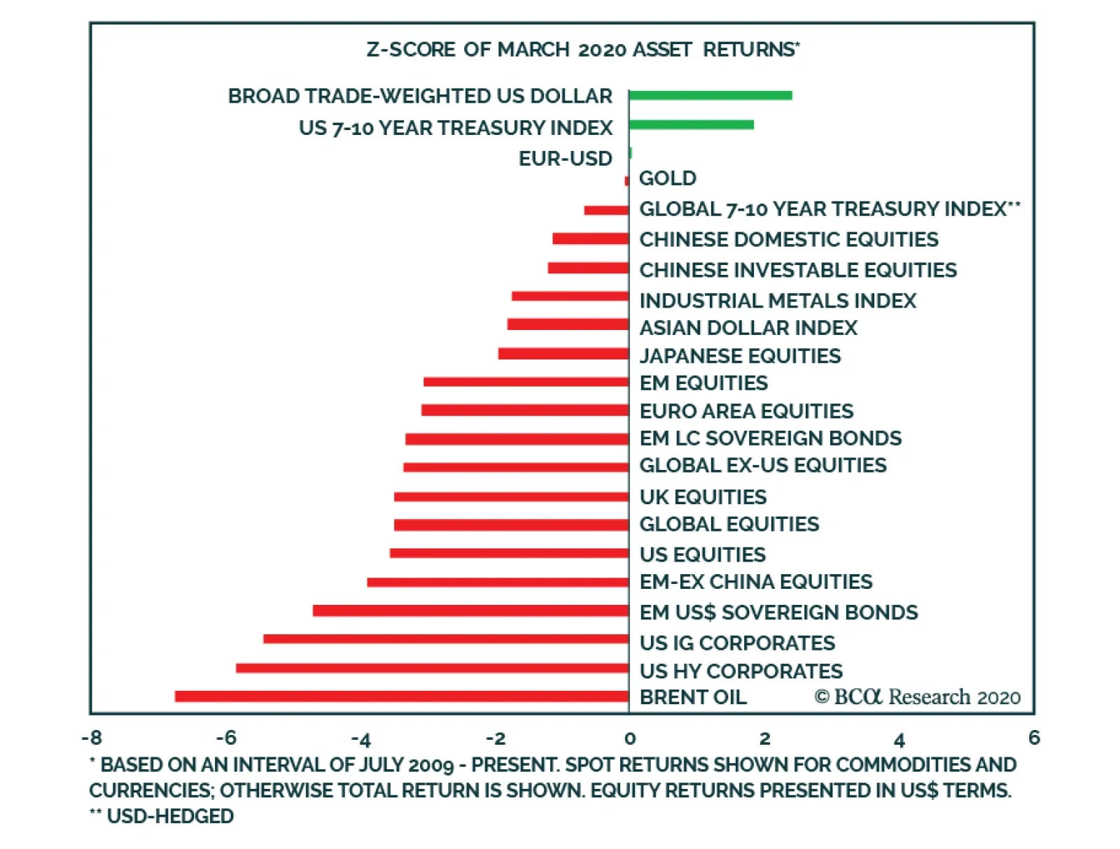
The chart above presents the March monthly returns of a variety of important financial assets, shown as the number of standard deviations from the average that has prevailed since the end of the Great Recession in 2009. Several points are noteworthy: The…
Highlights Please note that we published a Special Report early this week titled Brazilian Banks: Falling Angels, and an analysis on India. Please also note that we are publishing an analysis on Indonesia below. Given uncertainty over the depth and duration of the unfolding global recession, a sustainable equity bull run is now unlikely. It is still early to lift EM equity and EM credit allocations from underweight to overweight within global equity and global credit portfolios, respectively. EM currencies and EM fixed-income markets will remain under selling pressure. Feature The question investors now face is whether the recent rebound will endure for a few months or it will just be a bear market rebound that is already fading. BCA’s Emerging Market Strategy service believes it is the latter. EM and DM share prices will likely make new lows. A Tale Of Two Charts Chart I-1and I-2 overlay the current S&P 500 selloff with the market crashes of 1987 and 1929, respectively. The speed and ferocity of the current selloff is on a par with both. In 1987, following the 33% crash, share prices rebounded 14% but then relapsed without breaking below previous lows (Chart I-1). That was a hint that US share prices were entering a major bull market that indeed ensued. We do not know if the S&P 500 will make a lower low, but a retest of the recent lows is very likely. In 1929, US share prices collapsed by 36% over several weeks. Then, the overall index staged an 18% rebound within a couple of weeks, rolled over and plunged to new lows. The magnitude of the second downleg was 27% (Chart I-2). Chart I-1S&P 500: Now Versus 1987
S&P 500: Now Versus 1987
S&P 500: Now Versus 1987
Chart I-2S&P 500: Now Versus 1929
S&P 500: Now Versus 1929
S&P 500: Now Versus 1929
Fast forward to today, the S&P 500 plummeted 34% in a matter of only four weeks and then staged a 17.5% rebound in only a few days. We do not know if the S&P 500 will make a lower low, but a retest of the recent lows is very likely. In fact, we are assigning a higher probability to share prices in EM and DM breaking down to new lows than for the recent lows to hold. Chart I-3S&P 500: Now Versus 1929-32
S&P 500: Now Versus 1929-32
S&P 500: Now Versus 1929-32
Readers may question why we are comparing the current episode with the 1929 bear market. The argument against this comparison stresses that policymakers made numerous mistakes between 1929 and 1932, refusing to ease policy even after the crisis commenced. That led to debt deflation and a banking crisis, which in turn produced a vicious equity bear market of 85% lasting 3 years. At present, authorities around the world have reacted swiftly, providing enormous fiscal and monetary stimulus. We agree with this reasoning, but our point is as follows: Due to the US’s ongoing aggressive and timely policy response, stocks will avoid the protracted second phase of the 1930-‘32 bear market when share prices plummeted by another 80% (Chart I-3). Nonetheless, the US equity market could still repeat what occurred in the initial part of the 1929 bear market, as illustrated in Chart I-2 and Chart I-3. The Fundamentals The basis for our expectations of continued weakness in share prices is as follows: The selloff in the S&P 500 began from overbought and expensive levels (Chart I-4). The duration of the selloff so far has been only four weeks. We doubt that such a short, albeit vicious, selloff was enough to clear out valuation and positioning excesses. For example, even though by March 24 net long positions in US equity futures had dropped significantly, they were still above their 2011 and 2015/16 lows (Chart I-5). Chart I-4S&P 500: Correcting From Expensive Levels
S&P 500: Correcting From Expensive Levels
S&P 500: Correcting From Expensive Levels
Chart I-5Net Long Positions In US Equity Indexes Futures
Net Long Positions In US Equity Indexes Futures
Net Long Positions In US Equity Indexes Futures
Besides, US equity valuations are still elevated. The cyclically adjusted P/E ratio for the S&P 500 – based on operating profits – is 25 compared with its historical mean of 16.5, as demonstrated in the top panel of Chart I-4. While this valuation model does not take into account interest rates, our hunch is as follows: facing such high uncertainty over the profit outlook, investors will require higher than usual risk premiums to invest in equities. In short, the ongoing profit collapse and the extreme uncertainty over the cyclical outlook heralds a higher risk premium. The discount rate – which is the sum of the risk-free rate and risk premium – presently should not be lower than its average over the past 20 years. We are experiencing a sort of natural disaster, and there is little policymakers can do amid lockdowns. Natural disasters require time to play out, and financial markets are attempting to price in this downturn. Most stimulus measures taken worldwide to boost demand will only gain traction after the lockdowns are over. At the moment, global output and demand remain in freefall. The recovery will be hesitant and is unlikely to be V-shaped for two reasons: (1) social distancing measures will be eased only gradually; and (2) the lost household income and corporate profits from weeks and months of shutdowns will continue to weigh on consumer and business sentiment and their spending patterns for several months. China’s economy is a case in point. Both manufacturing and services PMIs for March posted readings in the 50-52 range. These are rather underwhelming numbers. Following stringent lockdowns in February when the level of economic output literally collapsed, only 52% of companies surveyed reported an improvement in their business activity/new orders in March relative to February. Chart I-6Our Reflation Confirming Indicator Is Downbeat
Our Reflation Confirming Indicator Is Downbeat
Our Reflation Confirming Indicator Is Downbeat
If true, these PMI readings imply a level of output and demand in China that is still well below March 2019 levels. It seems China has not been able to engineer a V-shaped recovery in demand and output. Therefore, the odds are that, outside China, economic activity will come back only slowly. This entails that some businesses will not reach their breakeven points anytime soon, and that their profits will be contracting for some time to come. We do not think this is reflected in today’s asset prices. Finally, our Reflation Confirming Indicator – which is composed of equally-weighted prices of industrial metals, platinum and US lumber – is pointing down (Chart I-6). Bottom Line: This bear market has been ferocious, but too short in duration. It is unlikely that share prices have already bottomed, given uncertainty over the depth and duration of the unfolding global recession. EM Versus DM: Stay Underweight Chart I-7EM Versus DM: Relative Equity Prices
EM Versus DM: Relative Equity Prices
EM Versus DM: Relative Equity Prices
EM stocks have failed to outperform DM equities in the recent rebound. As a result, EM versus DM relative share prices are testing new lows (Chart I-7). Odds are that EM will underperform DM in the coming weeks or months. Outside North Asian economies (China, Korea and Taiwan), EM countries have less capacity to deal with the COVID-19 pandemic than advanced countries. First, health care systems in developing countries are far less equipped to deal with the pandemic than DM ones. Chart I-8 shows the number of hospital beds per 1,000 people in India, Indonesia, Brazil and Mexico are significantly lower than in Europe and the US. Chart I-8Many EMs Have Poor Health Infrastructure
Downside Risks Prevail
Downside Risks Prevail
Second, EM ex-North Asian economies lack both the social safety net of Europe and the US’s capacity to inject large amounts of fiscal and monetary stimulus into the system. With the US dollar being the world reserve currency, the US has no problem monetizing its public debt and fiscal deficits. The same is true for the European Central Bank (ECB). If current account-deficit EM countries following in the footsteps of the US and monetize fiscal deficits/public debt, their currencies will likely depreciate. Last week, the South African central bank announced that it will buy local currency government bonds to cap their yields and inject liquidity into the system. This is of little help to foreign investors in domestic bonds because the rand has continued to sell off, eroding the US dollar value of their government bond holdings. Hence, the foreign investor exodus from the local currency bond market will likely continue. The same would be true for many other EM countries if they contemplate QE-type policies. Most stimulus measures taken worldwide to boost demand will only gain traction after the lockdowns are over. Third, unlike the Fed and the ECB, EM ex-North Asia central banks have limited capacity to alleviate funding stress for their companies. The Fed is also purchasing investment-grade corporate bonds and is setting up structures to channel credit to companies. All of this will marginally help ease financial and credit stress in the US. In contrast, central banks in EM ex-North Asia are unlikely to adopt similar policies on a comparable scale as the US. While DM countries do not mind seeing their currencies depreciate, authorities in many developing countries are fearful of further depreciation. The latter will inflict more stress on EM companies and banks that have large foreign currency debt. We will publish a report on EM foreign currency debt next week. Further, corporate bonds in DM are issued in local currency, allowing their central banks to purchase corporate bonds in unlimited quantities by creating money “out of thin air.” Chart I-9EM Performance Correlates With Commodities
EM Performance Correlates With Commodities
EM Performance Correlates With Commodities
In contrast, outside of China and Korea, the majority of EM corporate bonds are issued in US dollars. This means that to bring down their corporate US borrowing costs, central banks in developing countries need to spend their finite US dollar reserves. Finally, commodities prices are critical to EM financial markets’ absolute and relative performance (Chart I-9). The outlook for commodities prices remains dismal. As the global economy has experienced a sudden stop, demand for raw materials and energy has literally evaporated. Liquidity provisions by the Fed and other key central banks may at a certain point help financial assets but will not help commodities. The basis is that demand for equities and bonds is entirely driven by investors, but in the case of commodities a large share of demand comes from the real economy. In bad times like these, central banks’ liquidity provisions can at a certain point persuade investors to look through the recession and begin buying financial assets before the real economy bottoms. In the case of commodities, when real demand is collapsing, financial demand will not be able to revive commodities prices. Bottom Line: It is still early to lift EM equity and EM credit allocations from underweight to overweight within global equity and global credit portfolios, respectively. Technicals: Old Support = New Resistance? Calling tops and bottoms in financial markets is never easy. When formulating investment strategy it is helpful to examine both market price actions and other subtle clues that financial markets often provide. The global equity index and global industrial stocks have rebounded to levels that acted as supports during previous selloffs. We have detected the following patterns that suggest the recent rebound is facing major resistance, and new lower lows are likely: The global equity index and global industrial stocks have rebounded to levels that acted as supports during previous selloffs (Chart I-10). Unless these equity indexes decisively break above these lines, the odds favor retesting their recent lows or even falling to new lows. Many other equity indexes and individual stocks are also displaying similar technical patterns. The Korean won versus the US dollar as well as silver prices exhibit a similar technical profile (Chart I-11). Chart I-10Ominous Technical Signals
Ominous Technical Signals
Ominous Technical Signals
Chart I-11New Lows Ahead
New Lows Ahead
New Lows Ahead
Global materials have decisively broken below their long-term moving average that served as a major support in 2002, 2008 and 2015 (Chart I-12). The same multi-year moving average is now likely to act as a resistance. Hence, any rebound in global materials stocks – that extremely closely correlate with EM share prices – is very unlikely to prove durable until this support-turned-resistance level is decisively breached. US FAANGM (FB, AMZN, APPL, NFLX, GOOG, MSFT) equally-weighted stock prices have dropped below their 200-day moving average that served as a major support in recent years (Chart I-13). They did rebound but have not yet broken above the same line. Odds are that this line will become a resistance. If true, this will entail new lows in FAANGM stocks. Chart I-12Global Materials Broke Below Their Long-Term Defense Line
Global Materials Broke Below Their Long-Term Defense Line
Global Materials Broke Below Their Long-Term Defense Line
Chart I-13FAANGM: Previous Support Has Become New Resistance
FAANGM: Previous Support Has Become New Resistance
FAANGM: Previous Support Has Become New Resistance
Bottom Line: Various financial markets are exhibiting technical patterns consistent with retesting recent lows or making lower lows. Stay put. Arthur Budaghyan Chief Emerging Markets Strategist arthurb@bcaresearch.com Indonesia: A Fallen Angel Chart II-1Indonesian Equities Are In Freefall In Absolute & Relative Terms
Indonesian Equities Are In Freefall In Absolute & Relative Terms
Indonesian Equities Are In Freefall In Absolute & Relative Terms
Indonesian stock prices are in freefall - both in absolute terms and relative to EM - with no visible support (Chart II-1). We recommend that investors maintain an underweight position in both Indonesian equities and fixed-income and continue to short the rupiah versus the US dollar. We explain the reasoning behind this recommendation below. First, the key vulnerability of Indonesian financial markets is that they had been supported by massive foreign inflows stirred by falling US interest rates, despite deteriorating domestic fundamentals and falling commodities prices. We discussed this at length in our previous reports. However, the COVID-19 pandemic has brought these weak fundamentals to light. The latter have overshadowed falling US interest rates (Chart II-2) triggering an exodus of foreign portfolio capital and a plunge in the exchange rate. Currency depreciation has in turn mounted foreign investors losses resulting in a vicious feedback loop. As of the end of February, foreigners held about 37% of local currency bonds. Meanwhile, they held 56% of equities as of last week. Ongoing currency weakness and continued jitters in global financial markets will likely generate more foreign capital outflows. Second, the Indonesian economy - both domestic demand and exports - were already weak even before the breakout of COVID-19 occurred (Chart II-3). Chart II-2Indonesia: Falling US Rates Stopped Mattering
Indonesia: Falling US Rates Stopped Mattering
Indonesia: Falling US Rates Stopped Mattering
Chart II-3Indonesia: Domestic Demand Was Weak Before COVID-19 Outbreak
Indonesia: Domestic Demand Was Weak Before COVID-19 Outbreak
Indonesia: Domestic Demand Was Weak Before COVID-19 Outbreak
Chart II-4Indonesia: Struggling Under High Lending Rates
Indonesia: Struggling Under High Lending Rates
Indonesia: Struggling Under High Lending Rates
With imposition of social distancing measures, output and nominal incomes will contract (Chart II-4). Third, the nation’s very underdeveloped health care system makes it more vulnerable to a pandemic compared to other mainstream EM countries. For example, the number of hospital beds per 1000 people - at 1.2 - is among the lowest within the mainstream EM universe. We discuss this issue for EM in greater detail in our most recent weekly report. In brief, it will take a longer time for this nation to overcome the pandemic and get its economy back on track. Fourth, Indonesia - as with many EM countries - is short on both social safety programs and fiscal stabilizers that are available in North Asian countries, Europe and the US. Moreover, the country lacks the administrative system needed to promptly execute fiscal stimulus. Besides, the economic stimulus announced by the Indonesian authorities is so far insufficient to meaningfully moderate the economic blow. The government announced a fiscal stimulus that barely amounts to 1% of GDP. This will do little to counter the recession that the nation’s economy is now entering. On the monetary policy front, though the central bank has been cutting policy rates and injecting local currency liquidity into the system, this will only help reduce liquidity stress. It will not directly aid ailing households and small businesses suffering from an income shock. Critically, prime lending rates have not dropped despite dramatic cuts in policy rates (Chart II-4). Chart II-5Bank Stocks - Last Shoe To Drop - Are Unraveling Now
Bank Stocks - Last Shoe To Drop - Are Unraveling Now
Bank Stocks - Last Shoe To Drop - Are Unraveling Now
Meanwhile, the government’s decision to grant a debt servicing holiday to borrowers will only help temporarily. These borrowers will still need to repay their debts at some point down the line. Given the magnitude and uncertain duration of their income loss, there is no guarantee they will be in a position to service their debt after the pandemic is over. Eventually, Indonesian commercial banks will experience a large increase in non-performing loans (NPLs). Overall, the plunge in domestic demand combined with the fall in global trade and commodities prices entails that Indonesia is heading into its first recession since 1998. Given Indonesia has for many years been one of the darlings of EM investors, a recession in Indonesia and global flight to safety herald continued liquidation in its financial markets. Both local government bond yields and corporate US dollar bonds yields are breaking out. Rising borrowing costs amidst the recession will escalate the selloff in equities. Remarkably, non-financial stocks and small-caps have already fallen by 40% and 55% in US dollar terms, respectively (Chart II-5, top two panels). It was banks stocks – which comprise 35% of total market cap – that were holding up the overall index (Chart II-5, bottom panel). Given banks will likely experience rising defaults as discussed above, their share prices have more risk to the downside. Bottom Line: Absolute return investors should stay put on Indonesian risk assets for now. We maintain our short position on the rupiah versus the US dollar. EM-dedicated equity investors should keep underweighting Indonesian equities within an EM equity portfolio. Meanwhile, EM-dedicated fixed income investors should continue to underweight Indonesian local currency bonds as well as sovereign and corporate credit. Ayman Kawtharani Editor/Strategist ayman@bcaresearch.com Footnotes Equities Recommendations Currencies, Credit And Fixed-Income Recommendations
Highlights The economic shutdown needed to exhaust the coronavirus pandemic must last much longer than is anticipated. For example, in Italy it must last 24 weeks. If the economy is reopened too soon, the pandemic will reignite in a second wave later this year, just as in 1918. Take the 12 percent profit in the tactical overweight to equities versus bonds and go neutral. Stay underweight European equities and euro area banks given their high sensitivity to the economy. Stay overweight US T-bonds versus German bunds and Swiss bonds. All high-quality bond yields will eventually reach the lower bound of -1 percent, making US T-bonds the most attractive in class. The euro is a structural overweight but a tactical neutral – because in equity market corrections the repatriation of foreign investments into domestic cash boosts the demand for dollars relative to the euro. Fractal trades: Go long Australia versus New Zealand. Short palladium versus nickel was closed at 32 percent profit. Feature “You’ve got to understand that you don’t make the timeline, the virus makes the timeline” – Dr. Anthony Fauci, Director of the National Institute of Allergy and Infectious Diseases It’s A Biological Crisis The coronavirus crisis is first and foremost a biological crisis. This makes it fundamentally different to the 2008 global financial crisis, the 2000 dot com bust, the 1990 Japanese crash, and the 1930s Great Depression – all of which were financial crises needing financial and economic cures. As such, the current crisis needs to be analysed very differently. Crucially, the financial and economic policy responses to the coronavirus crisis are only a palliative, not a cure. The cure is to exhaust the coronavirus pandemic. But to exhaust the pandemic without overburdening stretched healthcare systems will require shutting the economy for months. If the economy is reopened too soon, then the pandemic will reignite in a second and a possible third wave just as in 1918-19 (Chart of the Week). Chart I-1If The Economy Is Reopened Too Soon The Pandemic Will Reignite, Just As In 1918-19
If The Economy Is Reopened Too Soon The Pandemic Will Reignite, Just As In 1918-19
If The Economy Is Reopened Too Soon The Pandemic Will Reignite, Just As In 1918-19
The US fiscal stimulus package amounts to 10 percent of annual GDP. But if exhausting the pandemic requires a third of the economy to be shut for a third of the year, then the economy would lose one ninth, or 11 percent, of its annual output. Hence, despite the biggest fiscal boost of all time, the economy would end up shrinking (Chart I-2). Chart I-2Fiscal Stimulus Is Massive, But Might Not Be Enough
The Economy Must Shut For 24 Weeks
The Economy Must Shut For 24 Weeks
Meanwhile, Germany’s willingness to remove the ‘debt brake’ that limits its structural federal deficit to 0.35 percent of GDP, the willingness to issue euro ‘corona-bonds’, and the ECB’s willingness to increase the size and breath of its asset-purchase program are minor details in a much bigger story. Rather like rearranging the deckchairs on the Titanic. Ignore the minor details and concentrate on the bigger story. How long must the economy stay shut to exhaust the pandemic? The Crucial Metric Is Not Mortality, It Is Morbidity Some people counter that in shutting the economy, “the cure is worse than the disease”. They argue that most coronavirus victims suffer mild or no illness. Moreover, the mortality rate is low and might not be much higher than that of the flu. Even if this turns out to be true, the argument misses the point. Death requires very little medical intervention and resource, whereas severe illness requires massive medical intervention and resource. Moreover, when the severe illness is a respiratory illness, it leaves the sufferer struggling to breathe and needing ventilation in an intensive care unit (ICU). No civilized society can deny an ICU to somebody who is struggling to breathe. Therefore, the most important metric for the coronavirus crisis is not its mortality rate, but rather its morbidity (severe illness) rate. Or more specifically, the morbidity rate versus the economy’s ICU capacity. How long must the economy stay shut to exhaust the pandemic? Enter the Diamond Princess. The cruise ship turned into a laboratory for the coronavirus because all 3700 passengers and crew were quarantined and tested for the infection. Of the 700 people who tested positive, 11 have subsequently died. But the more important point is that 45 people needed ICU treatment, meaning the coronavirus morbidity rate was four times its mortality rate (Table I-1). Table I-1On The Diamond Princess, The COVID-19 Morbidity Rate Was Four Times Its Mortality Rate
The Economy Must Shut For 24 Weeks
The Economy Must Shut For 24 Weeks
A separate study by the Intensive Care National Audit & Research Centre in the UK corroborates this, suggesting that the coronavirus morbidity rate is around three times the mortality rate and that the average time in an ICU for a coronavirus patient is half a week.1 Let’s be optimistic and assume that the coronavirus mortality rate is around 0.3 percent and that its morbidity rate is around three times higher at 1 percent. This means that if a hundred thousand people get infected, one thousand will need ICU treatment. But even advanced economies have only a dozen or so ICU beds per hundred thousand people. For example, Italy has 12.5 (Chart I-3). Chart I-3Advanced Economies Have Only A Dozen Or So ICU Beds Per Hundred Thousand People
The Economy Must Shut For 24 Weeks
The Economy Must Shut For 24 Weeks
If each severely ill coronavirus patient averages half a week in an ICU, this means that only 2500 Italians out of hundred thousand, or 2.5 percent of the population, can get infected every week before the ICU capacity is breached. Northern Italy, specifically Lombardy, went into crisis because it allowed its coronavirus infection rate to breach its ICU capacity. Yet ‘flattening the curve’ of infections comes at a cost. Keeping the weekly infection rate below ICU capacity means that the infection rate must be suppressed for longer to achieve the holy grail of ‘herd immunity’. This is the point when around 60 percent of the population have caught the disease. To achieve herd immunity without breaching its ICU capacity, Italy would have to shut its economy for 24 weeks. Other economies might need less or more time depending on their own morbidity rates versus ICU capacity, but it would still be a minimum of many months. Meaning that the draconian measures that flatten the infection curve – quarantining, social distancing, and essentially shutting the economy – must also stay in place for many months after infection rates have stopped rising. Therein lies the big problem.2 If The Economy Reopens Too Soon The Pandemic Will Reignite A pandemic is a classic complex adaptive system. Its evolution depends on the sum of many millions of individual actions which themselves depend on the evolving pandemic data. When mortality, morbidity and infection rates are surging the public will sense an emergency, and so accept the loss of liberty and livelihood that comes from quarantining and shutting the economy. The result is that ‘R-nought’ – the number of people that each infected person infects – drops, which suppresses the pandemic. If the economy reopens too soon, the pandemic will reignite in a second wave. But once infection rates level off or reverse, the public’s sense of emergency dissipates. People push back against the continued loss of liberty and livelihood. As do policymakers, especially those seeking imminent re-election. The result is that R-nought reaccelerates. In fact, the emergency has not dissipated. Once R-nought reaccelerates, the large proportion of the population who have not been infected are sitting ducks for the virus. Therefore, if the economy reopens too soon, the pandemic will reignite in a second wave (Chart I-4). Chart I-4When A Large Proportion Of The Population Is Uninfected, ‘R-Nought’ Must Stay Low
The Economy Must Shut For 24 Weeks
The Economy Must Shut For 24 Weeks
History provides a salutary warning. During the 1918-19 pandemic, no US city experienced a second wave while its main battery of social distancing policies remained in place. Second waves only occurred after the city economies were reopened too soon.3 Implications For The Financial Markets The key message is that the economic shutdown must last longer than is anticipated. And that if the economy is reopened too soon, the pandemic will reignite in a second wave later this year. Therefore: 1. Move to neutral equities tactically: Our March 12 tactical recommendation to overweight equities versus bonds (long S&P500 versus German 30-year bund) achieved its 12 percent profit target and is now closed (Chart I-5). Chart I-5The Technical Rebound Has Happened As Predicted
The Technical Rebound Has Happened As Predicted
The Technical Rebound Has Happened As Predicted
2. Overweight equities on a long-term horizon: Investors with a 2 year or longer horizon beyond the pandemic should overweight equities versus bonds – because the prospective annualised return from equities, 6 percent, is much more attractive than that from bonds, 1 percent (Chart I-6 and Chart I-7). Chart I-6The Prospective Annual Return From Equities At 6 Percent…
The Prospective Annual Return From Equities At 6 Percent...
The Prospective Annual Return From Equities At 6 Percent...
Chart I-7...Is Much More Attractive Than 1 Percent From Bonds
...Is Much More Attractive Than 1 Percent From Bonds
...Is Much More Attractive Than 1 Percent From Bonds
3. Underweight European equities: Our 2020 recommendation to underweight the euro area relative to the US and Japan is providing rich rewards as the S&P 500 has outperformed by 8 percent, and the Nikkei 225 has outperformed by 10 percent. Given the economic sensitivity of the Eurostoxx 50, stay underweight. 4. Underweight euro area banks: Likewise, euro area banks have underperformed the market by almost 25 percent this year. But it is too soon to remove this underweight. 5. Overweight US T-bonds versus German bunds and Swiss bonds: The US 30-year T-bond has outperformed the German 30-year bund by 18 percent this year. Stick with this position. Ultimately, all high-quality bond yields are going to hit the lower bound of -1 percent, making US T-bonds the most attractive in class. 6. The euro is a structural overweight but a tactical neutral: The structural pecking order for currencies is the reverse of bonds. However, during equity market corrections the repatriation of foreign investments into domestic cash boosts the demand for dollars relative to other currencies. This warrants a tactically neutral stance to the euro. Fractal Trading System* The fractal trading system has performed very well during the recent crisis. Long S&P 500 versus the German 30-year bund delivered its 12 percent profit target. And short palladium versus nickel delivered its 32 percent profit target. This week’s recommended trade is to go long Australia versus New Zealand expressed through their MSCI (US$) indexes. The profit target is 12 percent with a symmetrical stop-loss. The rolling 12-month win ratio now stands at 64 percent. Chart I-8Australia Vs. New Zealand
Australia Vs. New Zealand
Australia Vs. New Zealand
When the fractal dimension approaches the lower limit after an investment has been in an established trend it is a potential trigger for a liquidity-triggered trend reversal. Therefore, open a countertrend position. The profit target is a one-third reversal of the preceding 13-week move. Apply a symmetrical stop-loss. Close the position at the profit target or stop-loss. Otherwise close the position after 13 weeks. * For more details please see the European Investment Strategy Special Report “Fractals, Liquidity & A Trading Model,” dated December 11, 2014, available at eis.bcaresearch.com. Dhaval Joshi Chief European Investment Strategist dhaval@bcaresearch.com Footnotes 1 Source: ICNARC report on COVID-19 in critical care, 27 March 2020 2 If 60 percent are infected, then 0.6 percent would require an ICU. This equates to 600 people out of a hundred thousand for whom there are 12.5 ICUs. If the average stay in the ICU is half a week, this would require 600/12.5 half weeks, or 0.5*600/12.5 full weeks = 24 weeks. 3 Source: Public health interventions and epidemic intensity during the 1918 influenza pandemic; Hatchett, Mecher, and Lipsitch Fractal Trading System
The Economy Must Shut For 24 Weeks
The Economy Must Shut For 24 Weeks
The Economy Must Shut For 24 Weeks
The Economy Must Shut For 24 Weeks
Cyclical Recommendations Structural Recommendations
The Economy Must Shut For 24 Weeks
The Economy Must Shut For 24 Weeks
The Economy Must Shut For 24 Weeks
The Economy Must Shut For 24 Weeks
The Economy Must Shut For 24 Weeks
The Economy Must Shut For 24 Weeks
The Economy Must Shut For 24 Weeks
The Economy Must Shut For 24 Weeks
Closed Trades Asset Performance Currency & Bond Equity Sector Country Equity Indicators Bond Yields Indicators To Watch - Bond Yields
Indicators To Watch - Bond Yields
Indicators To Watch - Bond Yields
Indicators To Watch - Bond Yields
Indicators To Watch - Bond Yields
Indicators To Watch - Bond Yields
Indicators To Watch - Bond Yields
Indicators To Watch - Bond Yields
Indicators To Watch - Bond Yields
Indicators To Watch - Bond Yields
Indicators To Watch - Bond Yields
Indicators To Watch - Bond Yields
Interest Rate Indicators To Watch - Interest Rate Expectations
Indicators To Watch - Interest Rate Expectations
Indicators To Watch - Interest Rate Expectations
Indicators To Watch - Interest Rate Expectations
Indicators To Watch - Interest Rate Expectations
Indicators To Watch - Interest Rate Expectations
Indicators To Watch - Interest Rate Expectations
Indicators To Watch - Interest Rate Expectations
Indicators To Watch - Interest Rate Expectations
Indicators To Watch - Interest Rate Expectations
Indicators To Watch - Interest Rate Expectations
Indicators To Watch - Interest Rate Expectations
Highlights Recommended Allocation
Quarterly Portfolio Outlook: Playing The Optionality
Quarterly Portfolio Outlook: Playing The Optionality
The outlook for markets over the next few months is highly uncertain. On the optimistic side, new COVID-19 cases are probably close to peaking (for now), and so equities could continue to rally. But there are many risks too. Growth numbers will be horrendous for some months. Second-round effects (corporate defaults, problems in EM and with euro zone banks, for example) will emerge. We recommend a balanced portfolio, robust both for risk-on rallies and a further sell-off. We stay overweight equities versus bonds. Government bonds will not provide significantly positive returns even in a severe recession. Thus, over the next 12-months, equities are likely to outperform them. But we leaven the equity overweight with a “minimum volatility” strategy, overweight the low-beta US market, and more stable sectors such as Healthcare and Technology. Within bonds, we stay underweight government bonds, and raise Investment Grade credit to overweight, given the Fed’s backstop. Even in a risk-on rally, government yields will not rise quickly so we recommend a neutral stance on duration. The massive stimulus will eventually be inflationary, so we recommend TIPS, which are very cheaply valued. We are overweight cash and gold as hedges against further market turbulence. Among alternatives, macro hedge funds and farmland look attractively defensive now. We would start to look for opportunities in private debt (especially distressed debt) as the recession advances. Commodity futures are attractive as an inflation hedge. Overview Playing The Optionality From the start of the crisis, we argued that markets would bottom around the time when new cases of COVID-19 peaked. At the end of March, there were clear signs that this would happen in April, with Italy and Spain having probably already peaked and the US, if it follows the same trajectory, being only two or three weeks away (Chart 1). Chart 1Close To A Peak In New Cases?
Quarterly Portfolio Outlook: Playing The Optionality
Quarterly Portfolio Outlook: Playing The Optionality
But what happens next? A relief rally is likely, as often happens in bear markets – and indeed one probably started with the three-day 18% rise in US equities in the last week of March. Note, for example, the strong rallies in spring 2008 and summer 2000 before the second leg down in those bear markets (Chart 2). Chart 2Mid Bear Market Rallies Are Common
Mid Bear Market Rallies Are Common
Mid Bear Market Rallies Are Common
However, there is still a lot of potential bad news for markets to digest. Global growth has collapsed, as a result of people in many countries being forced to stay at home. US GDP growth in Q2 could fall by as much as 10% quarter-on-quarter (unannualized). Horrendously bad data will come as a shock to investors over the coming months. Despite the unprecedented stimulus measures from central banks and governments worldwide (Chart 3), nasty second-round effects are inevitable. Given the high level of corporate debt in the US, defaults will rise, to perhaps above the level of 2008-9 (Chart 4). EM borrowers have almost $4 trillion of foreign-currency debt outstanding, and will struggle to service this after the rise in the dollar and wider credit spreads. Euro area banks are poorly capitalized and have high non-performing debt levels left over from the last recession; they will be hit by a new wave of bankruptcies. Undoubtedly, there are some banks and hedge funds sitting on big trading losses after the drastic sell-off and stomach-churning volatility. Mid-East sovereign wealth funds will unload more assets to fill fiscal holes left by the collapsed oil price. Chart 3Massive Stimulus Everywhere
Quarterly Portfolio Outlook: Playing The Optionality
Quarterly Portfolio Outlook: Playing The Optionality
Chart 4Possible Second-Round Effects
Possible Second-Round Effects
Possible Second-Round Effects
There is also the question of when the pandemic will end. We are not epidemiologists, so find this hard to judge (but please refer to the answers from an authority in our recent Special Report1). The coronavirus will disappear only when either enough people in a community have had the disease to produce “herd immunity,” or there is a vaccine – which is probably 18 months away. Some epidemiologists argue that in the UK and Italy 40%-60% of the population may have already had COVID-19 and are therefore immune.2 But an influential paper from researchers at Imperial College suggested that repeated periods of lockdown will be necessary each time a new wave of cases emerges3 (Chart 5). Chart 5More Waves Of The Pandemic To Come?
Quarterly Portfolio Outlook: Playing The Optionality
Quarterly Portfolio Outlook: Playing The Optionality
At the end of March, global equities were only 23% off their mid-February record high – and were down only 34% even at their low point. That doesn’t seem like enough to fully discount all the potential pitfalls over coming months. This sort of highly uncertain environment is where portfolio construction comes in. We recommend that clients position their portfolios with optionality to remain robust in any likely outcome. There are likely to be rallies in risk assets over coming months, particularly when the coronavirus shows signs of petering out. There is significant asymmetric career risk for portfolio managers here. No portfolio manager will be fired for missing the pandemic and underperforming year-to-date (though some may because their firms go out of business or retrench). But a PM who misses a V-shaped rebound in risk assets over the rest of the year could lose their job. This will provide a strong incentive to try to pick the bottom. Chart 6Bond Yields Can't Go Much Lower
Bond Yields Can't Go Much Lower
Bond Yields Can't Go Much Lower
Government bond yields are close to their theoretical lows. The 10-year US Treasury yield is 0.6% and it unlikely to fall below 0% even in a severe recession (since the Fed has stated that it will not cut short-term rates below 0%). In other countries, the low for yields has turned out to be around -0.3% to -0.9% (Chart 6). The total return from risk-free bonds, therefore, will be close to zero even in a dire economic environment (Table 1). This means that the call between bonds and equities comes down to whether equity prices will be higher or lower in 12-months. Quite likely, they will be higher. Given this, and the optionality of participating in rebounds, we maintain our overweight on equities versus bonds. We would, however, be inclined to lower our equity weighting in the event of a big rally in stocks over the next few months. Table 1Not Much Room For Upside From Bonds
Quarterly Portfolio Outlook: Playing The Optionality
Quarterly Portfolio Outlook: Playing The Optionality
Table 2Bear Markets Are Often Much Worse
Quarterly Portfolio Outlook: Playing The Optionality
Quarterly Portfolio Outlook: Playing The Optionality
But there are also many downside risks. In the past two recessions, global equities fell by 50%-60% (Table 2). Despite the much worse economic environment this time, the peak-to-trough decline is so far much more limited. Moreover, valuations are not particularly compelling yet (Chart 7). To leaven our overall overweight on equities, we recommend a “minimum volatility” strategy, with tilts towards the low-beta US market, and some more defensive sectors such as Healthcare and Technology. China and China-related stocks also look somewhat attractive, since that country got over the coronavirus first, and is responding with a big increase in infrastructure spending (Chart 8). To hedge against downside risk, we also leave in place our overweights in cash and gold. Chart 7Equities Are Not Yet Super Cheap
Equities Are Not Yet Super Cheap
Equities Are Not Yet Super Cheap
Chart 8China Infra Spending To Rise
China Infra Spending To Rise
China Infra Spending To Rise
Garry Evans, Senior Vice President Chief Global Asset Allocation Strategist garry@bcaresearch.com What Our Clients Are Asking – About The Coronavirus Have We Seen The Bottom In Equity Markets? Chart 9Watch Closely COVID-19
Quarterly Portfolio Outlook: Playing The Optionality
Quarterly Portfolio Outlook: Playing The Optionality
After hitting a low on March 23, global equities have recovered more than one-third of their loss during this particularly rapid bear market, in response to the massive monetary and fiscal stimulus around the globe. It’s very hard to pinpoint the exact bottom of any equity bear market. The current one is particularly difficult in two ways: First, it was largely due to the exogenous shock from the COVID-19 pandemic. If history is any guide, we will first need to see a peak in infected cases globally before we can call a true bottom in equities (Chart 9). Second, the massive and coordinated response from central banks and governments around the world is unprecedented, as the global “lockdown” freezes the global economy. It’s encouraging to see the Chinese PMI bouncing back to 52 in March after a sharp drop to deep contraction level in February. However, the bounce back was mostly from production. Both export orders and imports remain weak. US initial jobless claims have skyrocketed to 3.3 million. If the peak of infection in the US follows similar patterns in China and Italy, then it would be another encouraging sign even if the US economic data continued to get worse. BCA Research’s base-case is for this recession to have a U-shaped recovery. This means that equity markets are likely to be range bound until we have a better handle on the future course of the pandemic. As such, we suggest investors actively manage risk by adding to positions when the S&P 500 gets close to 2250 and reducing risk when it gets close to 2750 during the bottoming process. What Will Be The Long-Term Consequences? Maybe it seems too early to think about this, but the coronavirus pandemic will change the world at least as profoundly as did the 1970s inflation, 9/11, and the Global Financial Crisis (GFC). Here are some things that might change: Chart 10Government Debt Will Rise Significantly
Government Debt Will Rise Significantly
Government Debt Will Rise Significantly
Government debt levels will rise dramatically, as a result of the huge fiscal packages being (rightly) implemented by many countries. In the US, after the $2 trillion spending increase and a fall in tax revenues, the annual fiscal deficit will rise from 6% of GDP to 15%-20%. Government debt/GDP could exceed the 122% reached at the end of WW2 (Chart 10). Ultimately, central banks will have to monetize this debt, perhaps by capping long-term rates or by buying a substantial part of issuance. This could prove to be inflationary. Households and companies may want to build in greater cushions and no longer live “on the edge”. US households have repaired their balance-sheets since 2009, raising the savings rate to 8% (Chart 11). But surveys suggest that almost one-third of US households have less than $1,000 in savings. They may, therefore, now save more. This could depress consumption further in coming years. Companies have maximized profitability over the past decades, under pressure from shareholders, by keeping inventories, spare cash, and excess workers to a minimum. Given the sudden stop caused by the pandemic (and who is to say that there will not be more pandemics in future), companies may want to protect themselves from future shocks. The inventory/sales ratio, which had been falling for decades, has picked up a little since the GFC (Chart 12). Inventory levels are likely to be raised further. Companies may also run less leveraged balance-sheets, rather than hold the maximum amount of debt their targeted credit rating can bear. This is all likely to reduce long-term profit growth. Chart 11Households May Become Even More Cautious
Households May Become Even More Cautious
Households May Become Even More Cautious
Chart 12Companies Will Run With Higher Inventories
Companies Will Run With Higher Inventories
Companies Will Run With Higher Inventories
The pandemic has highlighted the vulnerability of healthcare systems. China still spends only 5% of GDP on health, compared to 9% in Brazil and 8% in South Africa (Chart 13). The lack of intensive care beds and woefully inadequate epidemic plans in the US and other developed countries will also need to be tackled. Healthcare stocks should benefit. Chart 13Healthcare Spending Will Need To Rise
Healthcare Spending Will Need To Rise
Healthcare Spending Will Need To Rise
How Risky Are Euro Area Banks? Chart 14Euro Area Banks Are Quite Fragile
Euro Area Banks Are Quite Fragile
Euro Area Banks Are Quite Fragile
Banks in the euro area have underperformed their developed market peers by over 65% since the Global Financial Crisis (GFC) (Chart 14, panel 1). Their structural issues – many of which we highlighted in a previous Special Report – remain unsolved. Euro area banks remain highly leveraged compared to their US counterparts (panel 2). Their exposure to emerging economies is high (panel 3), and they continue to be a major provider of European corporate funding. US corporates, by contrast, are mainly funded through capital markets. The sector is also highly fragmented with both outward and inward M&A activity declining post the GFC. Profitability continues to be a key long-term concern, despite having recently stabilized (panel 4). The ECB’s ultra-dovish monetary stance and negative policy rates do not help banks’ performance either. Banks’ relative return has been correlated to the ECB policy rate since the GFC (panel 5). Following the coronavirus outbreak, the ECB is likely to remain dovish for a prolonged period. The ECB’s recently announced measures should, however, provide banks with ample liquidity to hold and spur economic activity through increased lending to households and corporates. Absent consolidation in the European banking sector, competition is likely to dampen banks’ profits. Additionally, the severity of the economic downturn caused by the coronavirus outbreak will determine if their significant exposure to emerging economies, the energy sector, and domestic corporates will hurt them further. For now, we would recommend investors underweight euro area banks. Where Can I Get Income In This Low-Yield World? Chart 15The Bear Market Has Unveiled Attractive Income Opportunities
The Bear Market Has Unveiled Attractive Income Opportunities
The Bear Market Has Unveiled Attractive Income Opportunities
For long-term investors who can tolerate price volatility, there is currently an opportunity to invest in high-income securities at relatively cheap prices. Below we list three of our favorite assets to obtain income returns: Dividend Aristocrats: The S&P 500 Dividend Aristocrats Index is composed of S&P 500 companies which have increased dividend payouts for 25 consecutive years or more. In order to provide such a steady stream of income through a such long timeframe, and even provide dividend increases in recessions, the companies in this index need to have a track record of running cashflow-rich businesses. Thus, the risk of dividend cuts is relatively low in these companies. Currently, the Dividend Aristocrat Index has a trailing dividend yield of 3.2% (Chart 15 – top panel). Fallen Angels: As we discussed in our November Special Report, fallen angels have attractive characteristics that separate them from the rest of the junk market. They tend to have longer maturities as well as a higher credit quality than the overall index. Crucially, fallen angels often enter the high-yield index at a discount, since certain institutional investors are forced to sell them when they are no longer IG-rated (middle panel). Thus, selected fallen angels which are not at a substantial risk of default could be a tremendous income opportunity. Currently fallen angels have a yield to worst of 10.65%. Sovereign US dollar EM debt: Our Emerging Markets Strategy service has argued that most EM sovereigns are unlikely to default on their debts, and instead will use their currencies as a release valve to ease financial conditions in their economies. Thus, hard-currency sovereign issues could prove to be attractive income investments if held to maturity. The bottom panel of Chart 15 (panel 3) shows the current yield-to-worst of the EM sovereign hard currency debt that has an overweight rating by our Emerging Markets service. Global Economy Chart 16The Collapse Begins
The Collapse Begins
The Collapse Begins
Overview: The global economy in early January looked on the cusp of a strong manufacturing pickup, driven by the natural cycle and by moderate fiscal stimulus out of China. The coronavirus changed all that. We now face a recession of a severity unseen since the 1930s. The fiscal and monetary response has been similarly rapid and radical. This will tackle immediate liquidity and even solvency risks. But, with consumers in many countries confined to their homes, a recovery is entirely dependent on when the number of new cases of COVID-19 peaks. In an optimistic scenario, this might be in late April or May. On a pessimistic one, the pandemic will continue in waves for several quarters. US: It is highly likely that the NBER will eventually declare that the US entered recession in March 2020. With many states in lockdown, consumption (which comprises 70% of GDP) will slump: only half of consumption is non-discretionary (rent, food, utility bills etc.); the other half is likely to shrink significantly while lockdowns continue. Judged by the 3.3 million initial claims in the week of March 16-21, unemployment will jump from its February level of 3.5% very rapidly towards 10%. Fiscal and monetary stimulus measures will cushion the downside (enabling households to pay rent and companies to service debt). But whether the recession is V-shaped or prolonged will be dependent on the length of the pandemic. Euro Area: European manufacturing growth was showing clear signs of picking up before the coronavirus pandemic hit (Chart 16 panel 1). But lockdowns in Italy, Spain and other countries will clearly push growth way into negative territory. The severity is clear from the first datapoints to reflect March activity, such as the ZEW survey. The ECB, after an initially disappointing response, has promised EUR750 billion (and more if needed) in bond purchases. The fiscal response so far has been more lukewarm, although Germany has now scrapped its requirement to run a budget surplus. One key question: will the stronger nothern European economies agree to “euro bonds”, joint and severally guaranteed, to finance fiscal spending in the weaker periphery? Chart 17...With Chinese Data Leading The Way
...With Chinese Data Leading The Way
...With Chinese Data Leading The Way
Japan: Japan’s economy was performing poorly even before the coronavirus pandemic, mainly because of the side-effects of last October’s consumption tax hike, and the slowdown in China (Chart 17, panel 2). So far, Japan has seen fewer cases of COIVD-19 than other large countries, but this may just reflect a lack of testing. Japan also has less room for policy response. Government debt is already 250% of GDP. The Bank of Japan has moderately increased purchases of equity ETFs and remains committed to maintaining government bonds yields around 0%. But Japan seems culturally and institutionally unable to roll out the sort of ultra-radical measures taken in other developed economies. Emerging Markets: China’s economy was severely disrupted in January and February, as reflected in an unprecedented collapse of the Caixin Services PMI to 26.5 (Chart 17, panel 3). However, big data (such as traffic congestion) suggest that in March people were gradually returning to work and companies restarting manufacturing operations. Q1 GDP growth will clearly be negative, and growth for the year may be barely above 0%. The authorities are ramping up infrastructure spending, which BCA expects to grow by 6-8% this year.4 Interest rates have also fallen below their 2015 levels, but not yet to their 2009 lows. Both fiscal and monetary policy are likely to be eased further. Elsewhere in Emerging Markets, the key question is whether central banks will cut rates to support rapidly weakening economies, or keep rates steady to prop up collapsing currencies. This is not an easy choice. Interest Rates: Central banks in developed markets have cut rates to their lowest possible levels with the Fed, for example, slashing from 1.25%-1.5% to 0%-0.25% within just 10 days in March. The Fed has signalled that it will not go below zero. Short-term policy rates globally, therefore, have essentially hit their lower bounds. Long-term rates have been volatile, with the 10-year US Treasury yield swinging down to 0.6% before jumping to 1.2%. While uncertainty continues, long-term risk-free rates are unlikely to rise substantially and, in the event of a prolonged severe recession, we would see the US 10-year yield falling to zero – but no lower. Global Equities Chart 18Is The V-Shaped Recovery Sustainable?
Quarterly Portfolio Outlook: Playing The Optionality
Quarterly Portfolio Outlook: Playing The Optionality
What’s Next? Global equities lost 32.8% year-to-date as of March 23, 2020. All countries and sectors in our coverage were in the red. Even the best performing country (Japan) and the best performing global sector (Consumer Staples) lost 26.7% and 23.2% respectively. From March 24 to March 26, however, equities made the best three-day gains since the Great Depression, recouping about one-third of the loss, even though US initial jobless claims came in at 3.3 million and also the US reported a higher number of cumulative infected people than China, with a much higher number of deaths per million people (Chart 18). So have we reached the bottom of the bear market? Is this “V-shaped” recovery sustainable? How should an investor construct a multi-asset global portfolio that’s sound for the next 9-12 months given the uncertainty associated with COVID-19 and the massive monetary and fiscal stimulus around the world? Based on our long-held philosophy of taking risks where risks will most likely be rewarded, we are most comfortable taking risk at the asset class level, by overweighting equities versus bonds, together with overweights in cash and gold as hedges. Within the equity portfolio, we are reducing risk by making the following adjustments: Upgrade US to overweight from underweight financed by downgrading the euro zone to underweight from overweight. Upgrade Tech to overweight, while closing two overweight bets on Financials and Energy and one underweight on consumer staples to benchmark weighting. Country Allocation: Becoming More Defensive Chart 19US And Euro Area: Trading Places
US And Euro Area: Trading Places
US And Euro Area: Trading Places
In December 2019 we added risk by upgrading the euro area to overweight and Emerging Markets to neutral based on our macro view that the global economy was on its way to recovery. Data releases in January did show signs of recovery in the global economy. However, the COVID-19 outbreak has changed the global landscape, and we are clearly in a recession now. When conditions change, we change our recommendations. We must make a judgment call because the economic data will not give us any timely, useful readings for some time to come. Back in December, the key reason to upgrade the euro area was the recovery of China which flows into the exports of the euro area. We think China will continue to stimulate its economy. However, given the global growth collapse, the “flow through” effect to the euro area will be delayed for some time. We prefer to play the China effect directly rather than indirectly. That’s why we maintain the neutral weighting of EM versus DM, but downgrade the euro area to underweight, and upgrade US to overweight. We also note the two following factors: First, as shown in Chart 19, panel 1, the relative performance between the euro area and the US is highly correlated with the relative performance between global Financials and Technology. This is not surprising given the sector composition of the two region’s equity indices. As such, this country adjustment is in line with our sector adjustment of upgrading Technology and downgrading Financials. Second, with a lower beta, US equities provide a better defense when economic uncertainty and financial market volatility are high. The risk to this adjustment, however, is valuation. As shown in panel 4, euro area valuation is extremely cheap compared to the US. However, PMI releases as well as forward earnings estimates are likely to get worse again before they get better, given the region’s reliance on exports to China and the structural issues in its banking system. Global Sector Allocation: Getting Closer To Benchmark Chart 20Reducing Sector Bets
Reducing Sector Bets
Reducing Sector Bets
We make four changes in the global sector portfolio to reduce sector bets, since we do not have a high conviction given market volatility and our house view that recovery out of this recession will be U-shaped. These are downgrading Financials to neutral, while upgrading Technology to overweight. We also close the overweight in Energy and underweight in Consumer Staples, leaving them both at benchmark weighting. Financials: We upgraded Financials in October last year as an upside hedge. This move did not pan out as bond yields plummeted. BCA Research’s US Bond Strategy service upgraded duration to neutral from underweight on March 10 as they do not see a high likelihood for yields to move significantly higher over the next 9-12 months. This does not bode well for Financials’ performance (Chart 20, panel 1). Even though the Fed and other central banks have come in as the lenders of last resort, loan growth could be weak going forward and non-performing loans could increase, especially in the euro area. Valuation, however, is very attractive. Technology: DRAM prices started to improve even before the COVID-19 outbreak. The global lockdown to fight against the pandemic is further spurring demand for both software and hardware, which should support better earnings growth (panel 2). The risk is that relative valuation is still not cheap, even though absolute valuation has come down after the recent selloff. Energy: The outlook for oil prices is too uncertain. The fight between Saudi Arabia and Russia is weighing on the supply side, while the global lockdown is denting demand prospect. The earnings outlook for energy companies is dire, while valuations are very attractive (panel 3). Consumer Staples: This is a classic defensive sector that does well in recessions. In addition, its relative valuation has improved to neutral from very expensive (panel 4). Government Bonds Chart 21Stay Aside On Duration
Stay Aside On Duration
Stay Aside On Duration
Upgrade Duration To Neutral. Global bond yields had a wild ride in Q1 as equities plummeted into bear market territory. The 10-year US Treasury yield made an historical low of 0.32% overnight on March 9, then quickly reversed back up to 1.27% on March 18, closing the quarter at 0.67%, compared to 1.88% at the beginning of the quarter (Chart 21). We are already in a recession and BCA’s house view is for a U-shaped recovery. This implies that global bond yields will likely follow a bottoming process similar to global equities, as new infections peak and high-frequency economic data start to recover. As such, we upgrade our duration call to neutral, to be in line with the position of BCA Research’s US Bond Strategy (USBS) service. Favor Linkers Vs. Nominal Bonds. The combined effect of the plummet in oil prices and the coronavirus outbreak has crushed inflation expectation to an extremely low level. As shown in Chart 22, the 10-year breakeven inflation rate is currently at 0.95%, 88 bps lower than its fair value. The fair value is estimated based on USBS’s Adaptive Expectations Model. Investors with a 12-month investment horizon should continue to favor TIPS over nominal Treasuries, but those with shorter horizons may be advised to stand aside and wait for the daily number of new COVID-19 cases to reach zero before re-initiating the position. Chart 22TIPS Offer A Ton Of Long-Run Value Extremely Cheap Inflation Protection
TIPS Offer A Ton Of Long-Run Value Extremely Cheap Inflation Protection
TIPS Offer A Ton Of Long-Run Value Extremely Cheap Inflation Protection
Corporate Bonds Chart 23High Quality Junk
High Quality Junk
High Quality Junk
It is undeniable that the dearth of cashflow caused by the lockdowns will spur a ferocious wave of defaults, particularly in the high-yield sector. It also is not clear that this risk is adequately compensated for. Currently, our US bond strategist believes that spreads are pricing an 11% default rate – in line with the default rate of the 2000/2001 recession. While it is not our base case, a default cycle like 2008, where 14% of companies in the index defaulted is a very clear possibility, as revenues have ground to a halt. However, several positive factors in the junk space must also be considered. Roughly 1% of the high-yield index matures in less than one year, which means that refinancing risk for junk credits should remain relatively subdued (Chart 23, top panel). Moreover, the quality of junk bonds is relatively high compared to previous periods of stress: when the market peaked in 2000 and 2007, Ba-rated credit (the highest quality of high yield) stood at 30% and 37% of the overall index respectively (middle panel). Today this credit quality stands at 49% of the high yield market, indicating a relatively healthier credit profile for junk. Additionally, the high-risk energy sector, which is likely to experience a substantial amount of defaults given the collapse in oil prices, now represents less than 8% of the market capitalization of the whole index (bottom panel). Taking these positive factors into consideration, we believe that a downgrade to underweight is not warranted, and instead we are downgrading high-yield credit from overweight to neutral. What about the investment-grade space? the massive stimulus package announced by the Fed, which effectively allows IG issuers to roll over their entire stock of debt, should provide a backstop to this market. One valid concern is that credit agencies can still downgrade a large number of issuers, making them ineligible to receive support. However, it seems that the credit agencies are aware of how much hinges on their ratings, and are communicating that they will factor the measures taken by various government programs into their credit analysis.5 Thus, considering that spreads are already extended, the Fed is providing unprecedent support and credit agencies are unlikely to knock out many companies out of investment-grade ratings, we are upgrading investment-grade credit from neutral to overweight. Commodities Chart 24Oil Prices & Politics Do Not Mix
Oil Prices & Politics Do Not Mix
Oil Prices & Politics Do Not Mix
Energy (Overweight): Oil markets were driven by supply/demand dynamics until a third factor, politics, shifted the market equilibrium. The recent clash between Saudi Arabia and Russia led to the breakdown of the OPEC 2.0 coalition and to Brent prices tanking by over 60% to $26 in March. The length of this breakdown is unknown. However, we believe the parties are likely to return to the negotiation table within the next months as the damage to countries which are dependent on oil begins to appear. The fiscal budget breakeven point remains much higher than the current oil price – it is around $83 for Saudi Arabia and $47 for Russia. Weakness in global crude demand will continue to put further downward pressure on prices, until economic activity recovers from the COVID-19 slowdown. Our Commodity & Energy Strategists expect the Brent crude oil price to average $36/bbl, with WTI trading some $3-$4 below that, in 2020 (Chart 24, panels 1 & 2). Industrial Metals (Neutral): Industrial metals prices were on track to pick up until the coronavirus hit global activity at the beginning of the year. Prices face further short-term headwinds as global manufacturing remains suppressed. Once the global social distancing ends and activity resumes, industrial metal prices should pick up as fiscal stimulus and infrastructure spending, especially in China, is implemented (panel 3). Precious Metals (Neutral): As the coronavirus spread, global risk assets have tumbled. Over the past 12 months, we have recommended investors increase their allocation to gold as both an inflation hedge and a beneficiary of accommodative monetary policy globally. However, we also recently highlighted that gold was reaching overbought territory and that a pullback was possible in the short-term. Nevertheless, investors should continue to maintain gold exposure to hedge against the eventuality that the pandemic is not contained within the coming weeks (panels 4 & 5). Currencies Chart 25Competing Forces Pushing The US Dollar In Different Directions
Competing Forces Pushing The US Dollar In Different Directions
Competing Forces Pushing The US Dollar In Different Directions
The USD has gone through a rollercoaster during the coronavirus crisis. Initially, the DXY fell by 4.8%, as rate differentials moved violently against the dollar when the Fed cut rates to zero. But this fall didn’t last long: as liquidity dried up, the cost for dollar funding surged, causing the dollar to skyrocket by almost 8.3%. Since then, the liquidity measures taken by monetary authorities have made the dollar reverse course once more. At this point there are multiple forces pulling the greenback in opposing directions. On the one hand, the collapse in global growth caused by the shutdowns should push the dollar higher. Moreover, momentum – one of the most reliable directional indicators for the dollar – continues to point to further upside (Chart 25, panels 1 and 2). However, the Fed’s generous USD swap lines with other major central banks as well as the massive pool of liquidity deployed have already stabilized funding costs in European and British currency markets, and look poised to do the same in others (Chart 25, panel 3). Thus, since there is no clarity on which force will prevail in this tug of war, we are remaining neutral on the US dollar. That being said, long-term investors can begin to buy some of the most depressed currencies, such as AUD/USD. This cross is currently trading at a 12% discount to PPP according to the OECD – the steepest discount that this currency has had in 17 years. Additionally, our China Investment Strategy projects that China will accelerate infrastructure investment this year to counteract the negative economic effects of the lockdown. This pick up in investment should increase base-metal demand, proving a boost to the Australian dollar in the process. Alternatives Chart 26Favor Macro Hedge Funds Over Private Equity During Recessions
Favor Macro Hedge Funds Over Private Equity During Recessions
Favor Macro Hedge Funds Over Private Equity During Recessions
Intro: The coronavirus outbreak caused tremendous market volatility and huge declines in liquid assets. Many clients have asked over the past few weeks which illiquid assets make sense in the current environment. To answer that, we stick to our usual recommendation framework, dividing illiquid assets into three buckets: Return Enhancers: Over the past year, we have been recommending clients to pare back private-equity exposure and increase allocation to hedge funds – particularly macro hedge funds, which often outperform other risky alternative assets during economic slowdowns and recessions (Chart 26, panel 1). Private debt – particularly distressed debt – could become a beneficiary of the current environment. The market turmoil will leave some assets heavily discounted, which can provide an opportunity for nimble funds to make investments at attractive valuations. In a previous Special Report, we highlighted Business Development Companies (BDCs) as a liquid alternative to direct private lending.6 They have taken a hit over the past month, even compared to equities and junk bonds. However, their recovery as markets bottom is usually significant (panels 2 & 3). Inflation Hedges: The coordinated “whatever-it-takes” stance implemented by global governments and central banks to mitigate the coronavirus crisis is likely to have inflationary consequences in the long-term. In that environment, investors should favor commodity futures over real estate (panel 4). As global growth reaccelerates in response to stimulus and resumed manufacturing activity over the next 12 months, the USD should weaken, and commodity prices should rise. Volatility Dampeners: Timberland and farmland remain our long-time favorite assets within this bucket. We have previously shown that both assets outperform other traditional and alternative assets during recessions and equity bear markets (panel 5). Farmland particularly should fare well in this environment, being more insulated from the economy, given food’s inelastic demand Risks To Our View Chart 27Dollar Would Fall In A Strong Recovery
Dollar Would Fall In A Strong Recovery
Dollar Would Fall In A Strong Recovery
Since our recommendations are based on a middle course, hedging both upside and downside risks, we need to consider how extreme these two eventualities could be. On the upside, the most optimistic scenario would be one in which the coronavirus largely disappears after April or May. The massive amount of fiscal and monetary stimulus would produce a jet-fuelled rally in risk assets. The dollar has soared over the past few weeks, as a risk-off currency (Chart 27), and would likely fall sharply. This would be very positive for commodities and Emerging Markets assets. The strong cyclical recovery would also help euro zone and Japanese equities relative to the more defensive US. Value stocks and small caps would outperform. Chart 28Could It Get Worse Than 2008 - Or Even 1932?
Could It Get Worse Than 2008 - Or Even 1932?
Could It Get Worse Than 2008 - Or Even 1932?
Downside risks are less easy to forecast. As Warren Buffet wrote in 2002: “you only find out who is swimming naked when the tide goes out.” The shock to the system caused by the coronavirus is certainly larger than the Global Financial Crisis of 2007-9 and could approach that caused by the Great Depression (Chart 28), though hopefully without the egregious policy errors of the latter. It is hard, therefore, to know where problems will emerge: US corporate debt, EM borrowers, and euro zone banks would be our most likely candidates. But there could be others. The oil price is another key uncertainty. Demand could collapse by at least 10% as a result of the severe recession. The breakdown of the production agreement between Saudi Arabia and Russia could produce a supply increase of 4-5%. Given this, Brent crude would fall to $20 a barrel. That would represent a strong tailwind to global recovery (Chart 29). On the other hand, a rapprochement between Saudi and Russia (and even with regulators in Texas) could push oil prices back up again – a positive for markets such as Canada and Mexico. Chart 29Cheap Oil Boosts Growth
Cheap Oil Boosts Growth
Cheap Oil Boosts Growth
Footnotes 1 Please see BCA Special Report, "Questions On The Coronavirus: An Expert Answers," dated 31 March 2020, available at bcaresearch.com 2 https://www.medrxiv.org/content/10.1101/2020.03.24.20042291v1 3 https://www.imperial.ac.uk/media/imperial-college/medicine/sph/ide/gida-fellowships/Imperial-College-COVID19-NPI-modelling-16-03-2020.pdf 4 Please see China Investment Strategy Weekly Report, “Chinese Economic Stimulus: How Much For Infrastructure And The Property Market,” dated 25th March 2020, available at cis.bcaresarch.com 5 A release by Moody’s on March 25 stated that their actions “will be more tempered for higher-rated companies that are likely to benefit from policy intervention or extraordinary government support.” 6 Please see Global Asset Allocation Special Report, “Private Debt: An Investment Primer,” dated June 6, 2018, available at gaa.bcaresearch.com GAA Asset Allocation
Highlights Chinese stocks have outperformed global benchmarks by a wide margin. We are taking profits on our overweight position, and downgrading our tactical call on Chinese stocks to neutral. In absolute terms, Chinese stocks have failed to buck the trend in a global selloff of risk assets. This suggests Chinese stocks are not immune to worldwide panics. Investors should wait for a peak in the global pandemic before going long on Chinese equities. Chinese stocks have become less cheap relative to global benchmarks. The size of Chinese stimulus is also less impressive compared with other major economies such as the US. Therefore, in order to maintain an overweight stance on Chinese risk assets in a global portfolio, Chinese stocks need to either offer a better price entry point, or a more upside potential in earnings outlook relative to their global peers. Feature Chart I-1Chinese Stocks Have Significantly Outperformed Global Benchmarks...
Chinese Stocks Have Significantly Outperformed Global Benchmarks...
Chinese Stocks Have Significantly Outperformed Global Benchmarks...
In the current pandemic environment, economic fundamentals mean little to panicked investors who have mostly ignored the unprecedented degree of monetary and fiscal stimulus pouring into the global economy. Investors are looking for clear signs that the COVID-19 crisis can be brought under control, but medical experts have been unable to predict the timing of a peak in the pandemic. Policymakers around the world are beginning to address investors’ concerns that substantial and timely fiscal policy supports are needed to offset the knock-on effects on businesses and individuals.1 However, until the number of new infections in major economies peaks, the erratic trading behavior among global investors will persist. Given the lack of near-term certainty, we are downgrading our tactical stance on Chinese stocks from overweight to neutral. Chart 1 highlights since we upgraded our tactical call to overweight in end-2019, Chinese stocks have significantly outperformed global stocks. This outperformance has been passive in nature; Chinese stocks are down about 10% year-to-date in US$ terms, versus a 23% decline in global stocks. We are also closing 7 of our 10 high-conviction investment calls from our trade book, for reasons cited here and then detailed in the next sections. Of the 10 active trades in our book, 7 have generated a positive return since their inceptions, including 3 that have recorded double-digit gains.2 Investors should wait for clarity on the peak of the global pandemic before going long on risk assets. Investors should wait for more signs of an upside potential in earnings and/or a better price entry point to go long on Chinese stocks. China Is Not Immune To A Global Pandemic Chart I-2...But Their Prices Have Also Plunged In Absolute Terms
...But Their Prices Have Also Plunged In Absolute Terms
...But Their Prices Have Also Plunged In Absolute Terms
Chinese equities have not been immune from the gyrations in the global financial markets, which have not responded to monetary and fiscal stimulus measures in either a customary or predictive manner. Unlike the 2008 global recession triggered by a financial crisis, public health crises damage the economy by reducing human activity and, therefore, erode both supply and demand. A return to normalcy depends almost entirely on whether the pandemic can be contained. Even though Chinese business activities are gradually resuming, Chinese stocks failed to buck the worldwide trend of a liquidation in risk assets. While Chinese stocks have outperformed global benchmarks by a wide margin, the relative gains have mostly been passive since early March. In absolute terms, Chinese domestic stocks have lost all their gains from February and investable stock prices have fallen back to their November 2018 level (Chart 2). Chart I-3Number Of Imported Cases Now On The Rise
Investing During A Global Pandemic
Investing During A Global Pandemic
China is not immune to a second COVID-19 wave. China has been reporting zero-to-low single-digit numbers of locally transmitted cases since mid-March, but it is now experiencing an increase in imported cases from overseas travelers (Chart 3). The mounting numbers have led the Chinese government to shut its borders to non-Chinese citizens.3 This indicates that it is still too early to claim a victory in China’s virus containment efforts. Given that China’s domestic businesses are open, the trajectory of new cases also remains unknown. These lingering doubts will slow the pace in the resumption of Chinese production (Chart 4). Chart I-4Chinese Companies Operating At 80% Capacity
Investing During A Global Pandemic
Investing During A Global Pandemic
Moreover, China is not immune to qualms about the depth and duration of a global recession. China has the political will and policy room to stimulate its economy, and the country’s dominant domestic demand makes the economy relatively insulated from a global recession. However, when more than 40% of China’s trading partners (including Europe and the US) remain under lockdown, a collapse of external demand will weigh on China’s economic and corporate profit recovery in the next quarter or two. Therefore, short-term risks on Chinese stocks are tilted to the downside. Bottom Line: Chinese stocks have failed to buck the trend in the global pandemic and the tsunami selloff in risk assets. Investors should wait for a peak in the outbreak before going long on Chinese equities. Chinese Stocks Have Become Less Cheap Relative To Global Benchmarks Chart I-5Outperformance In Chinese Stocks Seems Quite Extended
Outperformance In Chinese Stocks Seems Quite Extended
Outperformance In Chinese Stocks Seems Quite Extended
Chinese stocks, particularly in the domestic market, are no longer priced at deep discounts compared with global equities (Chart 5). The recent outperformance of Chinese stocks has brought the relative performance trend in both investable and domestic stocks back close to late-2017/early-2018 levels. That was before the US-China trade war began, and at a point where China’s economy was close to peak strength for the cycle. Although a passive outperformance does not automatically warrant an underweight stance on Chinese stocks, investors will demand a higher upside potential in Chinese corporate earnings to justify an overweight position in Chinese equities. Therefore, we will watch for the following signs before buying Chinese stocks: a strengthening in China’s economy and corporate profits outpacing recoveries in other major economies, and/or a near-term drop in Chinese stock prices outsizing the decline in global stock prices. Given the exceedingly strong policy responses from G20 economies (particularly the US), China’s stimulus will need to be amplified so that investors are confident that the rate of Chinese corporate profit recovery will surpass their global counterparts.4 In a recent Politburo meeting, Chinese policymakers signaled their willingness to expand stimulus, including much larger fiscal deficits and local-government special bond issuance quotas in 2020, along with further interest rate cuts.5 An escalation in policy support will probably bring China’s stimulus in line with that extended in the 2008-2009 global financial crisis. However, the size of the stimulus package will be determined at the National People’s Congress (NPC) meeting, which is delayed to end-April or early May. In the near term, the selloff in Chinese stocks will likely persist as financial markets continue to price in bad news in the global economy. Chinese investable stock prices continue to be priced at a discount relative to global benchmarks, although the discount is much smaller than it was three months ago. In absolute terms, Chinese investable stock prices have not reached their technical support levels. The offshore market historically rebounds when prices approach a major defense line, measured by a 12-year moving average. This technical support for the MSCI China Index is currently 65, still about 13% below the March 30 close (Chart 6). Chart I-6Investable Stock Prices Not Yet At Their Long-Term Support
Investable Stock Prices Not Yet At Their Long-Term Support
Investable Stock Prices Not Yet At Their Long-Term Support
The prices in Chinese domestic stocks have reached their 12-year moving average, although A-share prices are not decisively in a structural “cheap” territory yet (Chart 7). Investors should wait on the sidelines for now, since the full effects of any enhanced stimulus in China will be felt in the real economy with a time lag. China’s production supply side is only operating at about 80% of normal capacity, and demand has yet to catch up (Chart 4 and Chart 8). This suggests the rebound in economic activities in Q2 will likely be gradual, and corporate profits are likely to remain depressed. Chart I-7Domestic Stock Prices Approaching A Structural "Cheap" Territory
Domestic Stock Prices Approaching A Structural "Cheap" Territory
Domestic Stock Prices Approaching A Structural "Cheap" Territory
Chart I-8Demand In Manufacturing Remains Sluggish
Demand In Manufacturing Remains Sluggish
Demand In Manufacturing Remains Sluggish
Bottom Line: Chinese stocks have become less cheap against the backdrop of a massive liquidation of global equities. Chinese existing stimulus also appears moderate compared with other major economies. Therefore, in order for investors to overweight Chinese risk assets in a global portfolio, Chinese stocks either will have to offer a better entry price point or more upside corporate earnings potential. Both are currently missing. Investment Conclusions Investors should stay neutral on Chinese stocks in the next 3 months, and we are closing 7 out of the 10 active positions in our trade book. These trades are especially vulnerable to a protracted global recession and more selloffs in the domestic stock market. We will look for opportunities to incrementally add new trades to our book in the coming months. Here are our reasons for retaining or closing some of our positions: Long China Onshore Corporate Bonds (Maintain): The trade has yielded a handsome return of 16% since its inception in June 2017, (Chart 9). Although the spread in Chinese onshore corporate bond yields has widened sharply in the past few weeks, it has been the result of an indiscriminate global selloff of financial assets rather than the market pricing in any China-centric credit risks (Chart 10). In the next 6 to 12 months, corporate credit spreads should normalize as we expect monetary policies in major economies to remain ultra-loose, the global economy to recover and investors’ risk sentiment to improve. Chinese onshore corporate bonds will likely continue to offer a better risk-reward profile relative to other economies, with a higher risk premium and relatively stable default rate. Chart I-9Chinese Onshore Corporate Bonds Remain Attractive
Chinese Onshore Corporate Bonds Remain Attractive
Chinese Onshore Corporate Bonds Remain Attractive
Chart I-10Corporate Credit Spreads Should Narrow Over A 12-Month Horizon
Corporate Credit Spreads Should Narrow Over A 12-Month Horizon
Corporate Credit Spreads Should Narrow Over A 12-Month Horizon
Long MSCI China Energy Stocks (Close): This trade has had the worst performance among our positions due to consistently falling oil prices since October 2018 (Chart 11). Although BCA’s commodity strategists expect Brent prices to average $36/barrel in 2020, $3 higher than the average oil prices in March, it is still at a 50% discount from the $70 price tag just 3 months ago. Such a minor improvement in the price outlook does not offer enough upside potentials to offset downside risks in earnings in the next 9 months. Therefore, we would rather cut the losses. Long China Domestic Consumer Discretionary Equities Versus Benchmark and Long China Domestic Consumer Discretionary Equities/Short China Domestic Consumer Staples Equities (Close): As explained in the previous sections, we think there will be better entry price points for Chinese stocks as well as cyclical stocks. Besides, discretionary consumption in China has yet to show signs of a meaningful rebound. In the near term, we will also look for opportunities to go long position in domestic consumer staple stocks because we think that food and beverage price inflation will persist well into the second half of this year (Chart 12). Chart I-11Depressed Oil Prices Lead To Significant Underperformance In Energy Stocks
Depressed Oil Prices Lead To Significant Underperformance In Energy Stocks
Depressed Oil Prices Lead To Significant Underperformance In Energy Stocks
Chart I-12Consumer Staple Stocks Should Benefit From Stubbornly High Food Prices
Consumer Staple Stocks Should Benefit From Stubbornly High Food Prices
Consumer Staple Stocks Should Benefit From Stubbornly High Food Prices
Long MSCI China Index, Long MSCI China Onshore Index, Long MSCI China Growth Index/ Short MSCI All Country World (Close): We will need to see more stable sentiment in the global financial markets, a better entry price point for Chinese stocks and a sure sign of outsized Chinese stimulus before reinitiating a long position on Chinese stocks. Jing Sima China Strategist jings@bcaresearch.com Appendix Table 1Massive Stimulus In Response To Pandemic
Investing During A Global Pandemic
Investing During A Global Pandemic
Footnotes 1 Please see Table 1 in the Appendix. 2 Please see the trade table at the end of the report. 3 https://www.bloomberg.com/news/articles/2020-03-26/china-to-suspend-foreigners-entry-starting-saturday?mc_cid=1bdcd29ddd&mc_eid=9da16a4859 4 The stimulus package announced in the US amounts to 9% of the country’s 2019 GDP, whereas China’s stimulus would be about 3% of its 2019 GDP. 5 http://www.xinhuanet.com/politics/leaders/2020-03/27/c_1125778940.htm Cyclical Investment Stance Equity Sector Recommendations
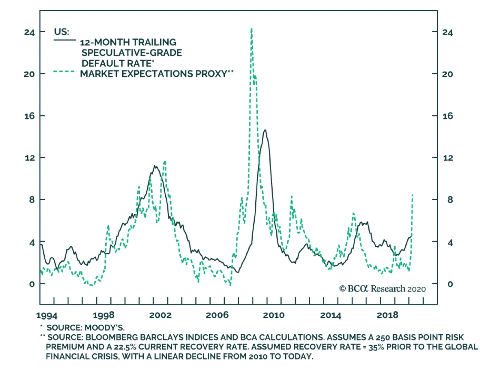
US high-yield corporate bond spreads have exploded over the past month, as corporate bond investors moved to rapidly price-in a US recession. Still, as noted in a Special Report this week from BCA Research’s US Bond Strategy and Global Fixed Income Strategy…