Fixed Income

Highlights Investors’ hunt for yield over the past few years has increasingly led them to view emerging markets debt (EMD) as an attractive component of portfolios. EMD should not be viewed as one homogeneous asset class. Investors should distinguish between its key segments: hard-currency sovereign debt, hard-currency corporate debt, and local-currency sovereign debt. EMD allows investors to own bonds with higher yields than DM sovereign or corporate bonds. But it comes with specific risks that investors need to understand. EMD, being a highly cyclical asset class, should perform well in an environment of accelerating global growth – which we expect to see during 2020. Within this asset class, we favor EM hard-currency sovereign bonds over both EM hard-currency corporate debt and local-currency sovereign bonds. However, the coronavirus outbreak makes us reluctant to pull the trigger on this recommendation now. Rather, we are placing EM hard-currency sovereign debt on upgrade watch. Feature Emerging markets debt (EMD) as an asset class has grown over the past decades to over US$24 trillion in bonds outstanding – becoming an integral part of the global investment universe, and presenting an interesting investment opportunity for investors. The EMD universe, which was previously dominated by sovereign issues in hard currencies, has become more diverse, and consequently, difficult for investors to ignore. In this Special Report, we identify the segments that make up EMD and the various exposures that investors face when allocating to it. We analyze their risk-return characteristics and the drivers contributing to their returns, and compare EMD to other asset classes. We conclude by identifying any diversification benefits that investors can reap as the hunt for yield continues. Introduction Estimates value total debt in emerging markets at over $24 trillion as of Q2 2019. This includes both sovereign and corporate debt, in both local and hard currencies (Chart 1).1 The bulk of EMD, however, is in local currencies – almost 90%. Chart 1Estimates Of Total EMD
Understanding Emerging Markets Debt
Understanding Emerging Markets Debt
In this Special Report, we focus on the following three segments of emerging markets debt (EMD): Sovereign debt issued in hard currency – the majority of which is USD denominated – estimated at $2 trillion. I. We distinguish between “pure” sovereigns and quasi-sovereign bonds. Corporate debt2 issued in hard currency – mainly in USD – estimated to be $1.5 trillion. Sovereign debt issued in local currency – estimated at $10.3 trillion. We do not cover local-currency corporate debt, as more than half of it – estimated to be $8.1 trillion – is issued by Chinese firms and is hard to access for most investors. Each of these segments offers an array of opportunities, is driven by different dynamics, and bears risks that investors must recognize before allocating to it. We recommend clients view the segments of EMD as different asset classes, rather than an aggregate. Hard-Currency Debt Hard-currency EMD refers to debt issued by governments and firms in emerging markets that is denominated in a currency other than their local currency. Estimates suggest 90%-95% of total hard-currency debt is USD denominated, with the remaining in euros and yen. The main feature of hard-currency EMD is that it provides investors with protection against currency depreciation risk. Nevertheless, it is important to highlight that currency movements can affect spreads, default risk, as well as liquidity. If a country’s currency depreciates, its ability to service its foreign debt deteriorates. This is crucial, as exemplified by currency crises over the past few years in countries such as Argentina, Turkey, Egypt, and Venezuela. Hard-Currency Sovereign Debt Since 2004, EM hard-currency sovereign bond investors have enjoyed an annualized total return of 7.4%, much higher than the 3.2% from the global Treasury index. Even on a risk-adjusted return basis, the incremental performance compensates for the additional 1.7% of annualized volatility. Investing in EM hard-currency sovereigns allows investors to find higher-yielding debt than government bonds in developed economies. Since 2004, the average yield on EM hard-currency sovereign debt was 6.1%, 3.8 percentage points higher than the 2.3% on their DM counterparts. Investors received positive returns even in real terms, as inflation in DM and the US have averaged 2.2% and 2.1% respectively, since 2004 (Chart 2). This has been extremely useful, particularly in the past few years, when bond yields in many developed economies reached zero or turned negative, and investors increasingly hunted for yield. The risk profile of the aggregate EM sovereign debt index is balanced between the safer Middle Eastern economies such as Saudi Arabia, UAE, and Qatar, and the riskier Latin American economies such as Mexico, Brazil, and Argentina. Those two buckets each comprise approximately 30% of the index, with the remainder of the index split between Asia, Emerging Europe, and Africa at 17%, 11%, and 10%, respectively (Chart 3). Other portfolios are benchmarked to J.P. Morgan’s indexes where Gulf countries have very little weight. Chart 2EM USD-Sovereigns Provide Value To DM Investors
Understanding Emerging Markets Debt
Understanding Emerging Markets Debt
Chart 3Risk Profile Of EM USD-Sovereigns
Understanding Emerging Markets Debt
Understanding Emerging Markets Debt
We believe it is reasonable to compare hard-currency EM sovereign debt to US investment-grade bonds due to their shared characteristics. Both have comparable duration (approximately eight years) and similar credit qualities, despite EM sovereign debt being a little riskier on average than the US corporate market (Chart 4). Nevertheless, since 2004, EM sovereign hard-currency debt has outperformed US investment-grade bonds by 40% – although its outperformance has lost steam over the past few years (Chart 5). Chart 4EM USD-Sovereigns Are Slightly Riskier Than US Investment-Grade Bonds
Understanding Emerging Markets Debt
Understanding Emerging Markets Debt
Chart 5EM USD-Sovereigns Have Outperformed US IG Bonds...
Understanding Emerging Markets Debt
Understanding Emerging Markets Debt
This does not mean that EM debt is immune to problems.3 The cumulative average default rate of EM foreign-currency sovereign debt – while lower than US corporates – remains high and is more pronounced as one goes down the credit-rating curve (Table 1). Idiosyncratic country risks can skew the data. If one excludes Argentina – currently weighted at only 3.5% – from the index, almost 100 basis points of spread get shaved off (Chart 6). Table 1…However, Beware Of The Default Rates
Understanding Emerging Markets Debt
Understanding Emerging Markets Debt
Chart 6Excluding Argentina, Spreads Are Much Lower
Understanding Emerging Markets Debt
Understanding Emerging Markets Debt
Given that most of our clients invest through passive vehicles, throughout this report, we focus on the EM aggregate indexes rather than on specific countries. However, it is important to identify over/undervalued countries, given the wide-ranging risk-profile spectrum of emerging economies. By drawing a US corporate credit curve, based on credit ratings and breakeven spreads, one can spot over- or undervalued countries relative to US investment-grade bonds. Currently, the sovereign bonds of Poland, UAE, Qatar, and Saudi Arabia appear to be more attractively valued than those of Russia, Hungary, and Brazil. The charts also show the transition of these countries across time (Chart 7, A,B,C,D). Chart 7Country Selection Is Important…
Understanding Emerging Markets Debt
Understanding Emerging Markets Debt
Chart 8...With The UAE And Saudi As Good Examples
Understanding Emerging Markets Debt
Understanding Emerging Markets Debt
For example, South African sovereign bonds – given their current credit rating and spreads – have moved from being overvalued relative to US corporates to undervalued over the past five years. This implies a buying opportunity, or simply that they are getting cheaper ahead of a potential downgrade. For investors with less restricted mandates, country selection can be very valuable. For example, the UAE and Saudi Arabia, two highly rated economies at Aa2 and A1 respectively, trade at 23 and 30 basis points over similarly rated US corporate bonds (Chart 8). We find that EM hard-currency sovereign spreads are mainly driven by global growth cycles, something BCA Research’s Emerging Market strategists have often highlighted.4 We rely on several key indicators to gauge where we are in the cycle. These include Germany’s IFO manufacturing business expectations, global and emerging market PMIs, as well as OECD’s Leading Economic Indicators (LEI) (Chart 9). Upward moves in these indicators have historically led to a tightening in EM sovereign spreads. Chart 9Spreads Will Tighten Once Global Growth Picks Up
Understanding Emerging Markets Debt
Understanding Emerging Markets Debt
Quasi-Sovereign Bonds Chart 10Quasi-Sovereigns Are Focused In The Energy Sector
Understanding Emerging Markets Debt
Understanding Emerging Markets Debt
Investors need to differentiate between EM sovereign bonds and quasi-sovereign bonds. While formal definitions vary among market participants and academics, the most common definition of “quasi-sovereign” is bonds issued by an entity where the government either fully owns the institution, controls more than 50% of its equity, or has a majority of its voting rights.5 Examples of such companies include Brazil’s Petrobras, Mexico’s Pemex, and Venezuela’s PDVSA. One reason why we highlight quasi-sovereigns is the rapid growth in the amount of such debt outstanding.6 As of January 2020, the quasi-sovereign bond market has grown by over US$630 billion throughout the past decade to US$714 billion and it now makes up over 42% of the combined EM Sovereign amd Quasi-Sovereign Bloomberg Barclays index. The oil & gas sector represents over a third of quasi-sovereign entities (Chart 10). Chart 11Quasi-Sovereigns...A Defensive Play On Corporate Bonds
Understanding Emerging Markets Debt
Understanding Emerging Markets Debt
Some investors assume that a quasi-sovereign entity would have the full backing of its government. While that is true in most cases, the majority of quasi-sovereign bonds only have an “implicit” backing from the issuer’s government, meaning that the government holds no legal liability in case of default. Dubai World, a state-owned conglomerate, was a perfect example of this during the aftermath of the Global Financial Crisis. The government stood on the sidelines as the firm went through financial distress, forcing billions of dollars of debt to be restructured.7 Given this additional level of uncertainty and corporate risk, EM quasi-sovereign bonds trade at higher spreads than their sovereign counterparts (Chart 11). Nonetheless, bonds with even the simplest implicit backing from the government are considered a more defensive play than “pure” corporate bonds, which trade at even higher spreads. Hard-Currency Corporate Debt The increase in quasi-sovereign issuance has been a big factor in the growth of the hard-currency corporate-debt universe – a segment that became of interest to investors in the early 2000s. The outstanding amount of hard-currency corporate debt has surpassed hard-currency sovereign debt, according to the Bank Of International Settlements (BIS) (Chart 1). The EM corporate debt index8 has similar sector exposure to the MSCI EM equity index. Almost 69% of the bond index is concentrated in the Industrials category,9 with the Financial/Banking and Utilities sectors making up the remaining 26% and 5%, respectively (Chart 12). The Technology sector is an exception – comprising only 5% of the corporate bond index compared to over 16% in the equity index. The country exposure, however, is less skewed to Asian economies compared to equities (Chart 13). Chart 12EM Corporates Provide Similar Sector Exposure To Equities…
Understanding Emerging Markets Debt
Understanding Emerging Markets Debt
Chart 13…Yet With Different Country Exposure
Understanding Emerging Markets Debt
Understanding Emerging Markets Debt
Chart 14EM Corporates: A Defensive Play On Equities...
Understanding Emerging Markets Debt
Understanding Emerging Markets Debt
The overlap in sector coverage can be advantageous to investors who want quasi-exposure to EM equities but with much lower volatility. The same can be said for DM corporate bonds, whose return is highly correlated to equities but with about one-third the beta.10 The correlation between EM corporate bonds and EM equities is currently close to its post-2003 average of 0.61, and the beta of EM corporate bonds to EM equities has averaged only 0.13 (Chart 14). Despite having a lower annualized return11 than EM equities, 5.6% versus 8.3%, EM corporate bonds had almost half the realized volatility, and so outperformed equities on a risk-adjusted basis. In fact, since late 2007, they have generally outperformed EM equities even in absolute terms, despite a few periods of EM equity outperformance. Like sovereigns, EM corporate bonds provided investors with a cushion against equity downside risk. For example, during the 2015/2016 slowdown in China and emerging economies, EM equities fell by almost 28%, whereas EM corporate bonds fell by only 5% (Chart 15). Chart 15...With Lower Drawdowns
Understanding Emerging Markets Debt
Understanding Emerging Markets Debt
On a valuation basis, however, EM corporate bonds have looked unattractive relative to EM equities, providing investors with 4% real yield, compared to an equity earnings yield of 7% since 2004 (Chart 16). Nevertheless, the current level of spreads points to moderate returns for the asset class, slightly below 4% annualized over the next five years, assuming that historical default and recovery rates remain the same, and no change in spreads (Chart 17). This implies that exposure to emerging markets via corporate bonds should be more attractive than equities on a risk-adjusted basis.12 Chart 16EM Corporate Bonds Are Unattractive Compared To Equities
Understanding Emerging Markets Debt
Understanding Emerging Markets Debt
Chart 17Forward Returns Driven By The Spread
Understanding Emerging Markets Debt
Understanding Emerging Markets Debt
EM corporate debt is similar to its sovereign counterpart in the range of risk profiles of its constituents. Default figures vary significantly by region and during different crises. For example, the hard-currency corporate default rate for Argentinian corporates peaked at slightly over 50% during the 2001/2002 sovereign debt crisis, while for Chile and Mexico it remained below 10%. Surprisingly, default rates in emerging market corporate speculative-grade debt have on average been below those of both the US and Europe (Chart 18). Additionally, the 12-month trailing default rate for the overall EM corporate universe, as measured by Moodys’ Investors Service, at the end of 2018 was lower than for advanced economies – at 1.4% versus 1.6%.13 Chart 18Default Rates In EM Are Surprisingly Lower Than In DM
Understanding Emerging Markets Debt
Understanding Emerging Markets Debt
Chart 19EM Corporates Suffer From Weaker Balance Sheets
Understanding Emerging Markets Debt
Understanding Emerging Markets Debt
EM corporate spreads are driven by a few main variables – revenue and profit growth, the business cycle, and the exchange rate. The health of EM corporates is also an important factor. This is an area of concern as corporate leverage levels have risen since 2010, and EM firms’ ability to service debt – gauged by their interest-coverage ratio – has fallen to below 2008 levels (Chart 19). Political turmoil can upset markets. Even though investors do not face the risk of currency depreciation with hard-currency debt, EM corporates with revenues mostly in local currency, face higher debt-repayment risk during a slowdown in their economies. Local-Currency Sovereign Debt Chart 20There Is Value In EM Local-Currency Bonds
Understanding Emerging Markets Debt
Understanding Emerging Markets Debt
Emerging-market governments, to avoid foreign currency liquidity crunches, have in recent years shifted some of their debt issuance to their own currency. However, to attract investors, yields on local-currency sovereign bonds have to compensate for the added layer of currency risk as well as conventional sovereign risk. Over the lifetime of the index,14 since 2003, yields on local-currency sovereign debt have averaged 6.7%, compared to 2.5% for the US Treasury index, 2.4% for the euro area treasury index, and 0.63% for the Japanese treasury index (Chart 20). Since 2004, EM local sovereign bonds have provided investors with attractive returns. On an annualized basis, they have returned 8.4% and 6.8% in local terms and dollar terms, respectively, albeit with higher volatility than their hard-currency counterparts on a common-currency basis (Table 2). However, those returns remain higher than those of government bonds in developed economies such as Germany and Japan, both in local- currency terms and on an unhedged basis from a USD perspective. Table 2EM Local-Currency Bonds Outperforming Other DM Government Bonds In USD And Local Currency Terms
Understanding Emerging Markets Debt
Understanding Emerging Markets Debt
Investors allocating to this segment assume a simple yet plausible notion: that EM economies will never default on debt issued in their own currency, as they can easily “print more money”. This is partially correct: default rates across rated EM sovereign local debt remain lower than for foreign-currency sovereign debt (Table 3). Table 3Default Rates: Local-Currency Debt Versus Hard-Currency Debt
Understanding Emerging Markets Debt
Understanding Emerging Markets Debt
Most interestingly, the gap in default rates between B- and CCC-rated bonds illustrates the “near certainty” of default for low-credit-rated sovereigns ahead of time. However, proponents of the notion that governments will not default neglect the consequences those economies will suffer if they monetize public debt: currency devaluation and high inflation, which turn into weak economic growth and tightening monetary policy, leading to a further weakening in growth. The case of Argentina between 1998 and 2002 is a perfect example of this mechanism. The economy was hurting under an uncompetitive pegged currency as well as a large debt burden. The government’s move to increase taxes, as a solution to boost government revenues, triggered a cascade of events which resulted in faltering economic growth, increased unemployment, abandonment of the currency peg, and interest rates as high as 100%, ultimately leading to Argentina’s default on its local-currency sovereign debt (Chart 21). Chart 21Argentina: A Case Study
Understanding Emerging Markets Debt
Understanding Emerging Markets Debt
Chart 22Country Breakdown Of Local-Currency EM Sovereigns
Understanding Emerging Markets Debt
Understanding Emerging Markets Debt
Argentina was recently removed from J.P. Morgan’s EM local-currency sovereign index due to the capital controls the authorities have instituted. As of mid-February, Mexico was the largest issuer in the index along with Indonesia, Brazil, and Thailand close behind (Chart 22). J.P. Morgan also announced that it would gradually add Chinese government bonds to its local sovereign bond indexes over a period of 10 months starting February 2020, up to the 10% country cap.15 This move is likely to push the index’s yield lower as Chinese yields are below the current yield on the index. There is some overlap between the drivers of local- and hard-currency sovereign spreads. The most important factor for investors to consider is the direction of emerging market currencies versus the US dollar. This relationship closely tracks inflation differentials between the US and EM economies (Chart 23). Chart 23The Link Between EM Currencies And Inflation
Understanding Emerging Markets Debt
Understanding Emerging Markets Debt
Chart 24The USD Is The Most Important Factor To Consider
Understanding Emerging Markets Debt
Understanding Emerging Markets Debt
The top panel in Chart 24 emphasizes this point. It shows that EM local-currency sovereign bonds from a USD perspective have returned -2.8% since the peak in EM currencies in early 2013. This coincides with a time when EM currencies, on a real effective exchange rate basis, weakened against the US dollar (Chart 24, bottom panel). Other drivers of local-currency sovereign yields include commodity prices, global trade, and EM sovereign bond yields. However, this year has witnessed a significant decoupling between local bond yields and these drivers (Chart 25). Chart 25Sustainable Divergence?
Understanding Emerging Markets Debt
Understanding Emerging Markets Debt
Chart 26Investors Continue To Hunt For Yield In Emerging Markets
Understanding Emerging Markets Debt
Understanding Emerging Markets Debt
Our EM strategists wonder whether we are seeing a “new normal” for EM local bond yields – a paradigm in which they fall, not rise, during periods of slowing global growth and behave similarly to DM yields.16 This, however, would imply that investors view EM local debt as a safe haven rather than a risky asset class. We agree with their conclusion that the recent rally in EM local sovereign bonds – hence the decline in yields – was due, rather, to investors’ hunt for yield in an environment of over $10 trillion of negative-yielding debt (Chart 26). This trend is likely to continue in the short term until there is a sustained pickup in global growth. Once that happens, long-term yields are likely to rise in tandem (Chart 27). Chart 27ALong Term Yields Will Rise When Global Growth Picks Up
Understanding Emerging Markets Debt
Understanding Emerging Markets Debt
Chart 27BLong Term Yields Will Rise When Global Growth Picks Up
Understanding Emerging Markets Debt
Understanding Emerging Markets Debt
Diversification And Portfolio Impact Investors with a broad mandate can think about EMD as part of their overall portfolios. We analyze how the addition of EMD to a monthly rebalanced “conventional” portfolio, consisting of 50% global equities, 30% global treasurys, and 20% global corporate debt (split equally between investment-grade and high-yield bonds), would have performed since 2003. We found that the incremental additions of each of the three segments of EMD – from 5% to 20% each – produced a higher portfolio risk-adjusted return relative to the conventional portfolio. In all cases, replacing global equities, treasurys, and corporate bonds with EM debt, led either to a higher annualized portfolio return, reduced volatility, or sometimes both (Table 4). Unsurprisingly, given the cyclicality of EM assets, the “enhanced” portfolios have a higher correlation with global equities, as well as with DM corporate bonds (Table 5). Table 4Portfolio Simulation: Risk-Return Profiles (Feb. 2003 – Feb. 2020)
Understanding Emerging Markets Debt
Understanding Emerging Markets Debt
Table 5EMD Is Highly Correlated With Global Equities And Corporate Bonds
Understanding Emerging Markets Debt
Understanding Emerging Markets Debt
It is important to note, however, that most of the outperformance from the enhanced portfolios – particularly in the most heavily EMD-tilted portfolios – occurred before the slowdown in emerging economies beginning in 2013 (Chart 28). Since 2013, as the USD appreciated against EM currencies, allocating to EM local-currency sovereign bonds detracted from portfolio returns. During this period other EM risk assets, such as equities and corporate bonds, also underperformed their DM counterparts. Chart 28Allocating To EMD Adds Some Value
Understanding Emerging Markets Debt
Understanding Emerging Markets Debt
Our Current View Over the past few years, GAA has been structurally negative on EM risk assets – both equity and debt. Productivity levels, far below historical averages, have been a key reason for this view (Chart 29). In a previous Special Report, we argued that productivity needs to mean-revert to its historical average for emerging markets to perform well, but that this is unlikely without structural reform. 17 Chart 29Global Productivity Growth Levels
Understanding Emerging Markets Debt
Understanding Emerging Markets Debt
Chart 30Divergence Between Spreads And Growth
Understanding Emerging Markets Debt
Understanding Emerging Markets Debt
Tactically, however, there are times when EM assets can outperform despite the structural headwinds (2016-2017 was an example of this). This could happen again later this year, if global growth continues to rebound. Nonetheless, this optimistic view is on hold due to the risk to global growth in the short term from the coronavirus outbreak. Our global strategists expect global growth to fall to zero in the first quarter of 2020, before picking up throughout the rest of the year – assuming the outbreak is contained within the next few weeks.18 Providing this happens, and our view of global growth reaccelerating pans out, EMD should perform well. Within the asset class, segment selection is key. The environment is likely to be more favorable for EM hard-currency sovereign debt than hard-currency corporate debt or local-currency sovereign bonds. The recent divergence between hard-currency sovereign spreads and growth metric could point to an attractive entry point for investors (Chart 30). We remain cautious on EM corporate bonds, which are vulnerable in the face of sluggish domestic demand in most emerging economies, leading to contracting profits (Chart 31). A weaker USD, when global growth recovers, helped by a dovish stance from the Fed, should keep US financial conditions loose and help EM local-currency sovereign debt perform well (Chart 32). However, relative financial conditions between the US and emerging markets are just as important to monitor. If growth in EM economies fails to pick up, EM currencies could depreciate, putting downward pressure on local-currency sovereign bonds. Chart 31EM Corporates Face Weak Domestic Demand
Understanding Emerging Markets Debt
Understanding Emerging Markets Debt
Chart 32Easier US Financial Conditions Lead To Better EM LC Sovereign Returns
Understanding Emerging Markets Debt
Understanding Emerging Markets Debt
We will wait to pull the trigger on this recommendation until we get further clarity regarding the impact on growth of the coronavirus outbreak. Conclusion EMD has grown to become an interesting asset class for allocators, allowing them to capitalize on bonds with higher yields than their DM counterparts. Not only has EMD provided higher returns, it gives equity-like exposure to emerging markets with significantly reduced downside during recessions and market selloffs. We recommend clients view EMD as three separate segments – hard-currency sovereign debt, hard-currency corporate debt, and local-currency sovereign debt – due to the different dynamics that influence each segment. Global growth, the direction of EM currencies versus the US dollar, and EM domestic demand are the three most important overall factors to consider when allocating to any of the segments of EMD. Amr Hanafy, Senior Analyst amrh@bcaresearch.com Footnotes 1We use the BIS’s definition of international debt securities (IDS) for hard-currency debt, and domestic debt securities (DDS) for local-currency debt. 2Includes both financial and nonfinancial corporations. 3For the purpose of assessing this segment, we use the broad EM and regional Bloomberg Barclays USD Aggregate Sovereign Indices, which track USD-denominated bonds issued by EM governments. Another commonly used index is the J.P. Morgan Chase & Co.’s EMBI Global Diversified Index, which tracks EM hard-currency sovereign debt, as well as fully owned and explicitly guaranteed quasi-issuers. Additionally, J.P. Morgan Chase & Co’s suite of indices following EM Sovereign debt includes their EMBI+ index. This index is primarily focused on EM sovereign issuers, however with a stricter liquidity requirement for inclusion. The reason why we do not rely on this index is due to its tilt towards LATAM and away from Middle Eastern and Asian economies. 4Please see Emerging Markets Strategy Special Report titled, “A Primer On EM External Debt,” available at ems.bcaresearch.com. 5Commercial index providers treat such distinctions by separating quasi-sovereign entities that are/are not fully owned by governments. For example, J.P. Morgan Chase & Co.’s EMBI Global Diversified Index, probably the most widely used index in tracking EM hard-currency sovereign debt, includes sovereign debt as well as fully owned and explicitly guaranteed quasi-issuers in its index. 6Please see “Fears mount over rise of sovereign-backed corporate debt,” Financial Times, dated January 5, 2016. 7Please see “Dubai World secures deal to restructure $14.6bn debt” Financial Times, dated January 12, 2015. 8For the purpose of assessing this segment, we use the broad EM and regional USD Aggregate Corporate Indices, which track USD-denominated bonds issued by EM corporates. 9Includes Basic Industry, Capital Goods, Communication, Consumer Cyclical, Consumer Non-Cyclical, Energy, Technology, and Transportation sectors. 10Please see Global Asset Allocation Special Report, “High-Yield Bonds: Low Volatility Equities?”, available at gaa.bcaresearch.com 11Annualized returns since 2004. 12Please see Global Asset Allocation Special Report, “Return Assumptions – Refreshed and Refined,” available at gaa.bcaresearch.com 13Please see “Emerging market corporate default and recovery rates, 1995 – 2018,” Moody’s Investors Service, dated January 30, 2019. 14For the purpose of assessing this segment, we use the J.P Morgan GBI-EM global diversified index, an investable benchmark accessible to most investors. This index tracks local-currency bonds issued by EM governments. 15Please see “JP Morgan to add China bonds to GBI-EM indexes from February 2020,” Reuters, dated September 4, 2019. 16Please see Emerging Markets Strategy Weekly Report titled, “EM Local Bonds: A New Normal?”, available at ems.bcaresearch.com. 17Please see Global Asset Allocation Special Report titled, “Return Assumptions – Refreshed and Refined,” available at gaa.bcaresearch.com. 18Please see Global Investment Strategy Report titled, “Markets Too Complacent About The Coronavirus,” available at gis.bcaresearch.com.
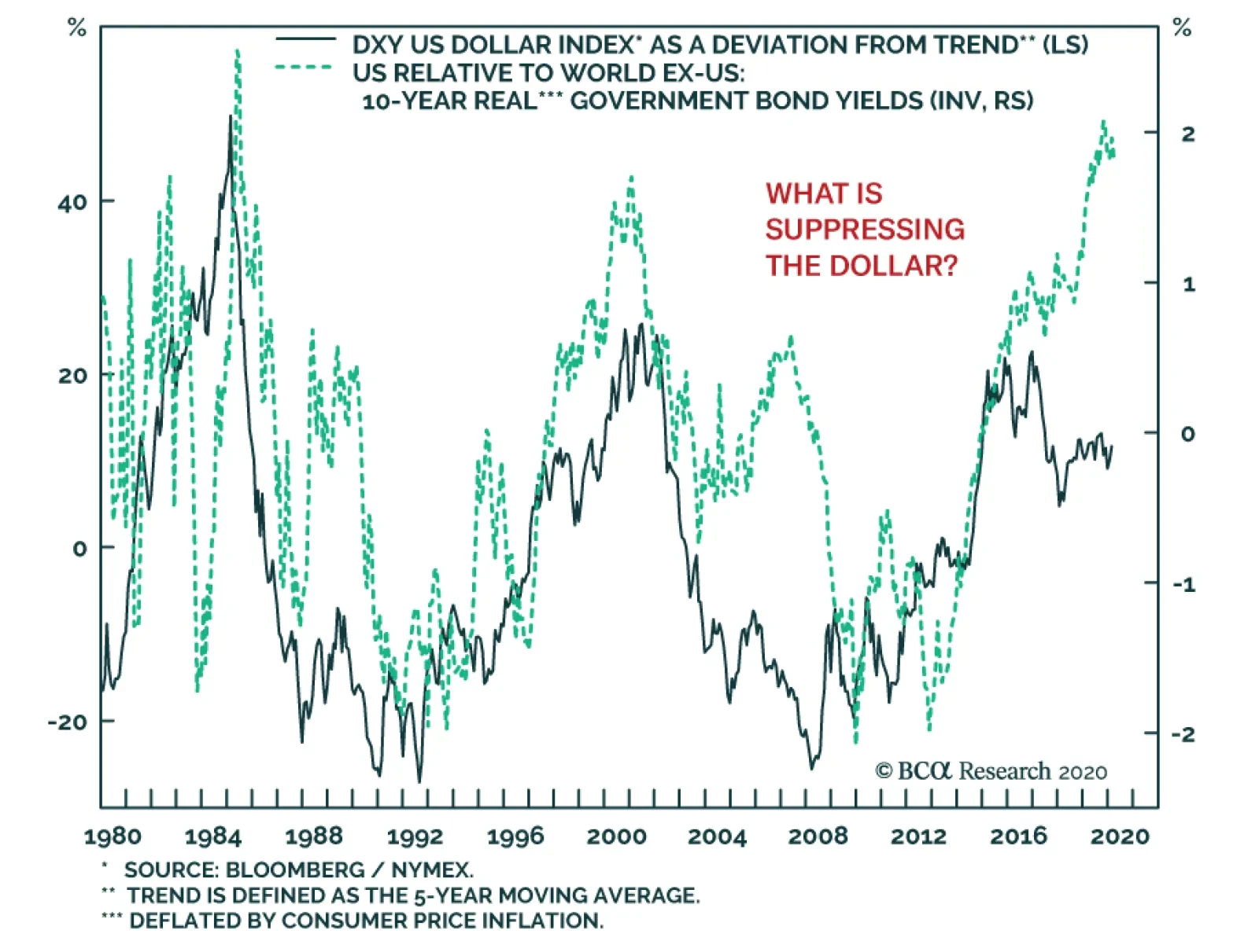
Once it became evident that global growth would suffer a shock from the Covid-19 outbreak, investors seeking safe-havens bid up the dollar. Oddly, the greenback is actually lagging behind real interest rate differentials. This suggests that underlying forces…
Highlights Dear Client, This week, we had originally planned to publish a Special Report introducing a framework for modeling and selecting global yield curve trades. In light of the market turbulence of the past few days, however, we felt the need to provide a short note updating our current thoughts on the expanding threats to the global economy and financial markets from the coronavirus (a.k.a. 2019-nCoV, COVID-19). Thus, this week, you will be receiving two reports from BCA Research Global Fixed Income Strategy. Kind regards, Robert Robis Feature The news of more occurrences of the COVID-19 virus in countries outside China – South Korea, Italy, Iran, and Israel – has created a new wave of fear among investors who had started to see signs that the spread of the virus was losing some momentum in China. The appearance of COVID-19 infections in countries like Italy, where there was no obvious connection to the epicenter in China, raised new concerns that the outbreak could turn into a true global pandemic that would be a major negative shock to global growth. The latest market moves fit the profile of a major risk-off move driven by higher uncertainty. Global equities have sold off sharply over the past two trading sessions, and volatility measures like the VIX have spiked. The 10-year US Treasury yield reached a new all-time low (on an intraday basis) of 1.35% yesterday, leaving it -18bps below the 3-month US Treasury bill rate. That curve inversion has occurred alongside falling TIPS breakevens and rising expectations of Fed rate cuts in 2020, in a familiar parallel to the “tariff war shock” of 2019 that prompted the Fed to lower the funds rate by a cumulative 75bps. We see some similarities today to a more recent “black swan” event: the June 2016 UK Brexit vote, which was when the previous intraday all-time low in US Treasury yields was reached. Yield movements have been somewhat smaller in other countries where yields were already very low to begin with, like the 10-year German bund reaching -0.49% and 10-year UK Gilt hitting 0.54% yesterday. Global credit markets have also underperformed, with corporate bond spreads widening alongside spiking equity market volatility in the US and Europe. Amidst the fear, investors have been searching for a potential roadmap to follow, for economies and financial markets, based on past viral outbreaks like the 2003 SARS epidemic and the 2009 global swine flu (H1N1) pandemic. We see some similarities today to a more recent “black swan” event: the June 2016 UK Brexit vote, which was when the previous intraday all-time low for US Treasury yields was reached. After that stunning electoral outcome, investors worldwide tried to process the potential negative implications of an unexpected political outcome. Risk assets sold off and government bonds rallied sharply. Global policymakers responded with various easing measures, both direct (rate cuts and fresh QE from the Bank of England) and indirect (delayed Fed rate hikes, more QE from the ECB). This all came at a time when global growth momentum was already picking up before the Brexit vote, stoked by large-scale fiscal and monetary stimulus in China (Chart 1). In the end, the supportive monetary/fiscal backdrop, and not the political uncertainty, won out and the global economy – along with risk assets and bond yields – all recovered over the second half of 2016. Chart 1Doomsday? Or 2016 Revisited?
The Pandemic Panic
The Pandemic Panic
Today, policymakers are starting to mobilize to fight the threat to growth from COVID-19, hinting at potential monetary easing measures. China is already set to deliver more monetary and fiscal easing, although it is not clear if those will be on the same massive scale as 2015/16. While the scale of the shock to global growth from a potential pandemic is obviously far different than the political uncertainty of Brexit, stimulus measures in 2020 could generate a similar positive response from financial markets if the coronavirus impacts growth less than currently feared. So what should investors expect next? We admit that we do not have a strong conviction level on near-term market moves, given how the coronavirus outbreak has set off an unpredictable chain of events that has gone against our base case expectation of a global growth rebound in 2020. Yet amidst all the uncertainty and fear, we can hazard a few guesses as to the potential future moves in global bond markets. For riskier borrowers, the ability to service debt is what matters most, and the majority of borrowers can still meet their interest payments with global borrowing costs near all-time lows. DURATION: A lot of bad news is discounted in current global bond yield levels, both in terms of absolute levels and expected rate cuts. Yet until there are signs of the virus being contained, both within and outside China, investors will continue to seek out hedges for the uncertainty. That means the any challenge to the current downward momentum in yields may not become evident until the economic data releases begin to show signs of a Q2 recovery from what is assuredly going to be an awful Q1 for the global economy. YIELD CURVE: A continuation of the risk-off momentum in global equity markets will put additional bull-flattening pressure on developed market government bond yield curves in the near term. The more medium-term move, however, should be towards steeper yield curves. Either the viral outbreak becomes contained and/or the growth shock is minimized, triggering a reversal of the latest risk-off bull flattening into risk-on bear-steepening; or the economic downturn and risk asset selloff intensifies and central banks deliver rate cuts that will bull-steepen global yield curves. CREDIT: Global corporate bond spreads should remain under upward pressure in the near term until the spread of the coronavirus outbreak begins to ease. However, the cumulative spread widening in credit markets could turn out to be surprisingly modest. The conditions that are typically in place before credit bear markets and periods of sustained spread widening – tight monetary policy and rapidly deteriorating corporate financial health – are not currently in place. This is true in both the US and Europe for high-yield, where our bottom-up Corporate Health Monitors are still sending a neutral message – thanks largely to interest coverage ratios that are still above typical pre-recessionary levels (Chart 2). For riskier borrowers, the ability to service debt is what matters most, and the majority of borrowers can still meet their interest payments with global borrowing costs near all-time lows - even in the event of a sharp, but short, global economic slowdown. Chart 2Low Yields Supporting High-Yield Borrowers
The Pandemic Panic
The Pandemic Panic
Robert Robis, CFA Chief Fixed Income Strategist rrobis@bcaresearch.com
Highlights Duration: The coronavirus is still weighing on yields and could push them down further in the near-term. However, the history of past viral outbreaks suggests that yields will move sharply higher once the daily number of new cases falls to zero. Fed: We would speculate that, this year, the Fed is very likely to change its framework so that it can seek a temporary overshoot of its 2% inflation target. This may involve moving to an “average inflation targeting” regime implemented via operational inflation ranges. Labor Market: It is very likely that employment growth peaked for the cycle in 2015, but falling employment growth is only consistent with the end of the economic recovery when it breaks below monthly labor force growth, causing the unemployment rate to rise. Feature Chart 1Fresh Lows!
Fresh Lows
Fresh Lows
The ultimate economic fallout from the coronavirus remains uncertain, but bond investors are starting to fear the worst. As we go to press, the 10-year and 30-year Treasury yields have both made new cyclical troughs at 1.36% and 1.83%, respectively (Chart 1). The 3-month / 10-year Treasury slope is once again inverted and the 2/10 slope is down to 11 bps, from 34 bps at the start of the year (Chart 1, bottom panel). This behavior tells us that the market is pricing-in a significant economic slowdown stemming from the coronavirus, one that will force the Fed to ease policy this year. Indeed, the overnight index swap curve is priced for more than 50 bps of rate cuts during the next 12 months, and fed funds futures are discounting 58% chance of a 25 basis point rate cut in either March or April. In direct opposition to the market’s moves, the past week saw several FOMC members push back against the idea of a rate cut. Atlanta Fed President Raphael Bostic said in an interview:1 There are many different scenarios about what’s going to happen between now and say June or July. My baseline expectations are that the economy is not going to see rising risks and it’s going to stay stable, so we won’t have to do anything. St. Louis Fed President James Bullard was even more forceful, saying:2 There’s a high probability that the coronavirus will blow over as other viruses have, be a temporary shock and everything will come back. But there’s a low probability that this could get much worse. Markets have to price that in, and that drags down the center of gravity a little bit. But if this all goes away, I expect that pricing will come back out of the market and we’ll be back to the on-hold scenario. Finally, Fed Vice Chair Richard Clarida challenged the notion that expectations for a 2020 rate cut are widespread. Similar to Bullard, he claimed that market prices reflect hedging against potential downside risks. He went on to cite survey measures that show investors looking for a flat funds rate in their base case scenarios.3 There’s a wide gap between survey and market rate expectations. Clarida’s point about the discrepancy between market and survey rate expectations is well taken. Chart 2 shows that the median forecast from the New York Fed’s Survey of Market Participants calls for an unchanged fed funds rate through 2022. However, it’s important to note that this survey was taken prior to the January FOMC meeting, when the coronavirus was only just starting to hit the news. Chart 2A Wide Gap Between Market And Survey Expectations
A Wide Gap Between Market And Survey Expectations
A Wide Gap Between Market And Survey Expectations
Do They Protest Too Much? We can sympathize with the FOMC’s desire to push back against market expectations that it feels are off target, but we also think the strategy could prove self-defeating. If the market starts to believe that the Fed will not ease policy quickly enough, the yield curve will flatten even more and risk assets (equities and credit spreads) will sell off. Both of those developments would increase the pressure on the Fed to ease policy. Chart 3The History Of Viral Outbreaks
The History Of Viral Outbreaks
The History Of Viral Outbreaks
In fact, if the present market turmoil continues, the Fed is very likely to deliver a rate cut sometime this year in an effort to support confidence and limit the potential economic damage from the coronavirus. Unfortunately, at this point we have no idea whether the coronavirus will spread further during the next couple of months, or whether it will be contained. In the former scenario, financial conditions will continue to tighten and the Fed will ease policy. In the latter scenario, financial conditions will not tighten aggressively and the Fed will stay on hold. In either case, given the uncertainty of the situation, we recommend stepping aside on our prior recommendation to short the August 2020 fed funds futures contract. No matter how long it takes to contain the coronavirus, we would expect growth to rebound quickly once the situation is resolved. This has been the pattern of past viral outbreaks: a steady decline in bond yields that sharply reverses course when the daily number of new cases reaches zero (Chart 3). Even accounting for its sharp drop during the past few days, the 10-year Treasury yield is still tracking the pattern of past viral outbreaks, and a jump in yields seems likely once the virus is contained. For this reason, we are inclined to maintain below-benchmark duration on a 12-month horizon. The US Election Is The Biggest Risk To Our Cyclical View The main risk to our 6-12 month below-benchmark portfolio duration stance is the possibility that as soon as the market is done worrying about the coronavirus it jumps right to worrying about the outcome of the US election. This could keep Treasury yields low throughout all of 2020. We argued last week that Treasury yields could come under downward pressure if Bernie Sanders looks set to win the election, while a victory for Donald Trump or one of the other Democratic candidates would be neutral for yields.4 As it stands now, Sanders has taken a more decisive lead in the Democratic leadership race after winning in Nevada. But President Trump’s approval rating has also been tacking higher. We will continue to monitor this risk closely in the coming weeks, and may alter our cyclical duration view depending on how polls evolve in March. The Fed may be forced to cut rates this year if financial conditions continue to tighten. Bottom Line: The coronavirus is still weighing on yields and could push them down further in the near-term. However, the history of past viral outbreaks suggests that yields will move sharply higher once the daily number of new cases falls to zero. Likewise, credit spreads have near-term upside until the virus is contained, but will tighten anew once the threat has passed. As discussed last week, the fundamental credit cycle backdrop remains supportive.5 The Fed may be forced to cut rates this year if financial conditions continue to tighten. Dual Mandate Update As discussed above, Fed participants generally view the current level of interest rates as appropriate and have been reluctant to hint at any upcoming policy changes. It’s not that difficult to see why. If we recall that the Fed’s dual mandate – as set by Congress – is to pursue maximum employment and price stability, then it’s pretty clear that current policy is delivering on both fronts. Chart 4 shows that the sum of the unemployment rate and 12-month consumer price inflation – the so-called Misery Index – is about as low as it has been since the 1960s. Further, the outlook for 2020 is that employment growth will remain firm and inflation tepid. Chart 4The Fed Has The Economy In A Good Spot
The Fed Has The Economy In A Good Spot
The Fed Has The Economy In A Good Spot
Labor Market Chart 5Employment Growth Greater Than Labor Force Growth
Employment Growth Greater Than Labor Force Growth
Employment Growth Greater Than Labor Force Growth
It is very likely that employment growth peaked for the cycle back in 2015, but falling employment growth is only consistent with the end of the economic recovery when it breaks below monthly labor force growth, causing the unemployment rate to rise. During the past 12 months, monthly employment gains have averaged +171k compared to a +122k average increase in the labor force (Chart 5). In other words, employment growth is slowly trending down but it remains at a comfortable level. Beyond decelerating employment, rising labor force participation is the other important trend in the US labor market. While it’s tempting to think that stronger labor force growth might only raise the bar for what employment growth is necessary to keep the recovery on track, this is not the case. In practice, gross labor flow data show that, since 2017, 73% of people that entered the labor force transitioned directly to being employed. Only 27% of those entering the labor force transitioned to unemployed status. Simply, rising labor force growth tends to push employment growth higher as well. It does not make it more likely that the unemployment rate will rise. Rising labor force participation has not gone unnoticed. The minutes from January’s FOMC meeting revealed that: Many participants pointed to the strong performance of labor force participation despite the downward pressures associated with an aging population, and several raised the possibility that there was some room for labor force participation to rise further. The prime age participation rate is already back to pre-crisis levels and the female 24-54 part rate is making new highs (Chart 6). Nonetheless, US prime age participation remains low compared to other developed countries – like its closest neighbor Canada – making further gains possible. Chart 6Do Part Rates Have More ##br##Upside?
Do Part Rates Have More Upside
Do Part Rates Have More Upside
Chart 7Don't Be Alarmed By The Drop In Job Openings
Don't Be Alarmed By The Drop In Job Openings
Don't Be Alarmed By The Drop In Job Openings
Finally, many have pointed to the recent drop in Job Openings as a reason to be concerned about the state of the US labor market (Chart 7). We view these concerns as unfounded. First, the drop in openings does not appear to be related to flagging labor demand. The Job Hires rate is steady and involuntary layoffs are low. Against a backdrop of steady demand, fewer openings could simply mean that there is a little more slack in the labor market than was previously thought. Inflation On inflation, we see little chance of a meaningful surge this year. The Prices Paid and Supplier Delivery components of the ISM Manufacturing index, two indicators that tend to lead changes in core inflation, are downtrodden (Chart 8). Meanwhile, base effects could cause 12-month core CPI to jump in the next month or two, but are more likely to drag it down on a 6-month horizon (Chart 8, bottom panel). Chart 8Inflation Will Remain Tame In 2020
Inflation Will Remain Tame In 2020
Inflation Will Remain Tame In 2020
At the component level, shelter is the largest component of core CPI but it is unlikely to accelerate in the coming months. The National Multifamily Housing Council’s Survey of Apartment Market Conditions just ticked below 50 (Chart 9). Shelter inflation is more likely to rise when the index is firmly above 50 in “tightening” territory. Further, the recent jump in core goods inflation is set to wane in the coming months. Core goods inflation tracks non-oil import prices with a lag of about 18 months, and import prices have been on a declining trend (Chart 9, bottom panel). Chart 9Shelter And Core Goods Inflation
Shelter And Core Goods Inflation
Shelter And Core Goods Inflation
Bottom Line: The Fed is performing well on its dual mandate. Employment growth is firm, inflationary pressures are tepid and continued accommodative monetary policy might be able to pull more people into the labor force. Absent any desire to preemptively ease to counteract the effects of the coronavirus, the Fed’s on hold policy stance is appropriate. Tracking The Fed’s Balance Sheet We strongly disagree with the suggestion that the increase in the size of the Fed’s balance sheet meaningfully impacted Treasury yields or risky assets this year.6 But the Fed’s balance sheet policy remains a point of interest nonetheless, and last week we received more information about what the Fed intends to do with its balance sheet this year. Specifically, the Fed has decided that $1.5 trillion will serve as a firm floor for bank reserves. That is, the Fed will not allow the supply of reserves to fall below that level, and will typically maintain a significant buffer above $1.5 trillion. To accomplish this, the Fed would prefer to transition away from daily repo transactions. It would rather rely on its Treasury and T-bill purchases to keep reserves at desired levels. $1.5 trillion will be the firm floor on bank reserves. With that in mind, the Fed now plans to scale daily repo operations back to zero by the end of April. The Fed’s $60 billion per month T-bill purchases will continue through the second quarter. After that, the pace of asset purchases will be lowered, with the goal of simply keeping reserve supply stable. It has not yet been decided whether Treasury purchases after June will be concentrated in T-bills or spread out across the maturity spectrum. Chart 10 and Table 1 show our updated projections for what the Fed’s balance sheet will look like at the end of June. Our projections show a reserve level of $1.7 trillion at the end of June, significantly above the $1.5 trillion floor. This provides a healthy buffer in case a spike in the Treasury’s General Account leads to a temporary drop in reserve supply. Chart 10The Fed's Balance Sheet Securities And Reserves
The Fed's Balance Sheet Securities And Reserves
The Fed's Balance Sheet Securities And Reserves
Table 1Fed's Balance Sheet Projections
Fighting The Fed
Fighting The Fed
The Biggest Changes The Fed Could Make This Year (And More Details About The Ongoing Strategic Review) Chart 11Monitoring Financial Conditions
Monitoring Financial Conditions
Monitoring Financial Conditions
The minutes from the January FOMC meeting, released last week, revealed a few important details about the Fed’s ongoing strategic review. The strategic review is a process that the Fed expects to complete by mid-year, where it will consider potential changes to its monetary policy strategy, tools and communication practices. At the last FOMC meeting, the committee took up the issues of how to incorporate financial stability into the Fed’s monetary policy strategy and of whether it should consider targeting an inflation range instead of a specific point. Financial Stability The traditional consensus in central banking was that interest rates should not be used to manage financial stability risks. Rather, monetary policy should remain focused on the dual mandate of full employment and inflation. In January’s discussion, FOMC participants generally agreed that macroprudential and regulatory policies remain the preferred methods for dealing with financial stability risks. But participants also recognized that this might not suffice: Many participants remarked that the Committee should not rule out the possibility of adjusting the stance of monetary policy to mitigate financial stability risks, particularly when those risks have important implications for the economic outlook and when macroprudential tools had been or were likely to be ineffective at mitigating those risks. At January’s FOMC meeting, the Fed staff also presented the idea of a “financial stability escape clause” that would “provide leeway for the central bank to deviate from its usual monetary policy strategy if financial vulnerabilities become significant.” For our part, we have consistently argued that, if inflation expectations remain stubbornly low, the Fed may eventually lift rates this cycle in response to signs of excess in financial markets.7 So far, we don’t see asset valuations as stretched enough to prompt Fed tightening (Chart 11), but the longer that interest rates stay low, the more likely it is that financial market valuations will reach bubbly levels. Inflation Ranges The FOMC discussed two types of inflation ranges at the January FOMC meeting. They discussed ranges that are symmetrical around the Fed’s 2% target, and “operational ranges” that could be moved around depending on the Fed’s policy goals. In theory, the advantage of a symmetric inflation range around the Fed’s 2% target is that it could help communicate the inherent uncertainty in measuring inflation, and the difficulty in forecasting it with precision. However, participants worried that introducing a symmetric inflation range at a time when inflation has been running below the Fed’s 2% target would signal that the Fed is comfortable with below-target inflation. In contrast, the idea of an operational range has some appeal, especially if the Fed decides to shift from a pure forward-looking 2% inflation target to a target that seeks to achieve average 2% inflation over time. How would this work? In an environment where inflation had been running below 2% for several years, the Fed would set its operational range to be 2%-2.5% for a time (Chart 12). Once it judged that enough of an overshoot of 2% had taken place to make up for past downside misses, it would shift back to a symmetric operational range of say 1.75%-2.25%. Or perhaps, if it judged that inflation needed to undershoot 2% for a time, it would set its operational range as 1.5%-2%. Crucially, the operational range would be moved around at the discretion of the Committee with the goal of achieving 2% inflation on average over time. Chart 12The Fed Could Adopt An Operational Target Inflation Range of 2-2.5 This Year
The Fed Could Adopt An Operational Target Inflation Range of 2-2.5 This Year
The Fed Could Adopt An Operational Target Inflation Range of 2-2.5 This Year
The Most That Could Be Announced This Year Based on the info we’ve received so far from the FOMC minutes and the speeches of several Fed Governors, two in particular from Governor Lael Brainard.8 We now have a decent sense of the most dramatic changes that could be announced this year. In all likelihood, the announced changes will be somewhat less dramatic than those listed below, as consensus amongst committee members on all the details will be difficult to achieve. The Fed will change from a forward-looking 2% inflation target to one that seeks to achieve average inflation of 2% over time. It will implement its new inflation targeting framework by using operational inflation ranges that will be moved around at the discretion of the Committee. The Fed will allow for the possibility of changing interest rates in response to financial stability risks, if it is thought that those risks threaten the dual mandate of full employment and 2% inflation. It will announce a new tool for implementing monetary policy at the zero-lower bound where it puts a hard cap on bond yields out to some specific maturity. The cap won’t be lifted until some specified economic goals are met. We would speculate that, this year, the Fed is very likely to change its framework so that it can seek a temporary overshoot of its 2% inflation target. This may involve moving to an “average inflation targeting” regime implemented via operational inflation ranges, or it could be a more watered down version of the same idea. Similarly, we would also expect that any announced changes to the Fed’s policy strategy will include more explicit language related to financial stability risks. As for the idea of adopting bond yield caps at the zero-lower bound, a policy that is similar to the Bank of Japan’s current Yield Curve Control policy. This may not be announced this year, especially since the Fed probably believes that it has more time to mull over this sort of proposal. Ryan Swift US Bond Strategist rswift@bcaresearch.com Footnotes 1 Please see “CNBC Exclusive: CNBC Transcript: Atlanta Fed President Raphael Bostic Speaks with CNBC’s Steve Liesman on CNBC’s “Squawk Box” Today,” CNBC, dated February 21, 2020. 2 Please see “CNBC Exclusive: CNBC Excerpts: St. Louis Fed President James Bullard Speaks with CNBC’s “Squawk Box” Today,” CNBC, dated February 21, 2020. 3 Please see “CNBC Exclusive: CNBC Transcript: Federal Reserve Vice Chair Richard Clarida Speaks with CNBC’s Steve Liesman,” CNBC, dated February 20, 2020. 4 Please see US Bond Strategy Weekly Report, “The Credit Cycle Is Far From Over,” dated February 18, 2020, available at usbs.bcaresearch.com 5 Please see US Bond Strategy Weekly Report, “The Credit Cycle Is Far From Over,” dated February 18, 2020, available at usbs.bcaresearch.com 6 Our rationale is explained in US Bond Strategy Special Report, “The Fed In 2020,” dated December 17, 2019, available at usbs.bcaresearch.com 7 Please see US Bond Strategy Special Report, “The Fed In 2020,” dated December 17, 2019, available at usbs.bcaresearch.com 8 Governor Lael Brainard, “Federal Reserve Review of Monetary Policy Strategy, Tools, and Communications: Some Preliminary Views,” dated November 26, 2019, and “Monetary Policy Strategies and Tools When Inflation and Interest Rates Are Low,” dated February 21, 2020, Board of Governors of the Federal Reserve System, Fixed Income Sector Performance Recommended Portfolio Specification
Long-term investors face a difficult situation. Yields still have some technical downside on a very short-term basis. Even though the US economy is not soft enough to ring alarm bells, a weaker RMB creates an additional risk that could push yields lower over…
Highlights Butterfly Strategy: A butterfly fixed income strategy is a combination of a barbell (a weighted combination of long- and short-term bonds) and a bullet (the medium-term bonds that sit within the yield curve segment selected in the barbell) designed to provide investors exposure to specific yield curve changes while being insulated from parallel shifts. Yield Curve Models: Simple yield curve models, based on the positive relationship between the slope of the yield curve and butterfly spreads – and to a certain extent, implied interest rate volatility – can be used to identify which part of the yield curve is most attractively valued by comparing what change in the slope is being discounted with our own macro views. Current Valuation: The overall message from our new suite of global yield curve models is that trades favoring barbells over bullets are attractive across all the developed market countries covered in our analysis. Feature In February 2002, BCA Global Fixed Income Strategy (GFIS) introduced a framework for measuring market expectations for changes in short-term interest rates embedded in the slope of government bond yield curves.1 By comparing those discounted changes with our own macro view on where rates were headed, this framework provided signals on potential value in trades focusing on the shape of the yield curve. This analysis originally focused on one specific yield curve (butterfly) strategy across six developed markets; the US, Germany, the UK, Japan, Canada, and Australia. Table 1Most Attractive Butterfly Trades
Global Yield Curve Trades: Follow The Butterflies
Global Yield Curve Trades: Follow The Butterflies
More recently, our sister service US Bond Strategy applied this framework to each different butterfly spread combination across the entire US Treasury curve, creating a tool to identify the most attractively valued parts of the US yield curve at any point in time.2 In this Special Report, we revisit the original GFIS methodology for identifying attractive yield curve trades in global government bond markets. Furthermore we extend the analysis to all butterfly combinations and add three additional European countries to the list - France, Italy and Spain. The overall message is that trades that favor barbells over bullets are attractive across all the developed markets covered in this analysis. Table 1 displays the most attractive combinations of barbells over bullets for each country. Going forward, we will rely on the readings from our refreshed yield curve models, combined with our macro views, to populate our new Tactical Trade Overlay framework with yield curve trades in global government bond markets. What Is A Butterfly Strategy? A butterfly fixed income strategy involves two main components: a barbell (a weighted combination of long-term and short-term bonds) and a bullet (a medium-term bond that sits within the yield curve segment selected in the barbell). This strategy owes its name to the resemblance that barbells and bullets can have with the wings and body of an actual butterfly, not to lepidopterology.3 To implement a butterfly strategy, a bond investor would go long (short) the barbell while simultaneously going short (long) the bullet. In general, barbells are expected to outperform bullets in a flattening yield curve environment, and vice-versa. The reason butterfly strategies are so widely used is that they provide fixed-income investors exposure to specific changes in the slope of the yield curve, while being neutral to small parallel shifts. This immunization to small parallel shifts is achieved by setting the weights of the short- and long-term bonds in the barbell such that the weighted sum of their dollar duration (referred to as DV01 – the dollar value of a basis point) equals the DV01 of the bullet. In the event of large parallel shifts in the yield curve – which are quite rare – the barbell will outperform the bullet since the former will always have a greater convexity than the latter in the absence of convexity-matching between each leg of the trade. We illustrate how a 2/5/10 butterfly strategy works for US Treasuries, using hypothetical constant-maturity par bond yields, in Table 2A.4 Table 2AThe Butterfly (Strategy) Effect Illustrated
Global Yield Curve Trades: Follow The Butterflies
Global Yield Curve Trades: Follow The Butterflies
As can be seen in the ”Weighted DV01” column of Table 2A, the DV01 of each leg of the trade (the bullet and the two combined bonds in the barbell) are identical. Importantly, the weighted DV01 contribution to the barbell from the 2-year note and the 10-year bond differ substantially, meaning that the barbell is more sensitive to changes in the 10-year yield than changes in the 2-year yield. This mismatch is precisely what gives a butterfly strategy exposure to the slope of the curve. Table 2A also presents three yield curve scenarios to demonstrate the benefits of butterfly strategies. In the parallel shift scenario, yields across the entire yield curve rise by 10bps. This parallel shift is neutralized as the two legs of the strategy cancel out. In the steepening curve scenario, the 2-year yield falls by 10bps, the 10-year yield rises by 10bps and the 5-year yield remains flat. In this case, the small gains on the 2-year note cannot offset the losses on the 10-year bond; hence the barbell underperforms the 7-year bullet. Finally, the “Flattening” column in the table shows that the barbell outperforms the bullet when the curve flattens. Our government bond yield curve models rely on the positive relationship typically observed between the butterfly spread and the slope of the yield curve. Bottom Line: A butterfly fixed income strategy is a combination of a barbell (a weighted combination of long- and short-term bonds) and a bullet (the medium-term bonds that sit within the yield curve segment selected in the barbell) designed to provide investors exposure to specific yield curve changes while being insulated from parallel shifts. Dusting Off The GFIS Yield Curve Models Chart 1Butterfly Spreads & Yield Curves
Butterfly Spreads & Yield Curves
Butterfly Spreads & Yield Curves
Our government bond yield curve models rely on the positive relationship typically observed between the butterfly spread and the slope of the yield curve. When the curve steepens, the butterfly spread widens, and vice-versa (Chart 1). This has to do with mean reversion: as the curve steepens, it increases the odds that the curve will flatten in the future since it cannot steepen indefinitely. Consequently, investors will ask for greater compensation to enter a curve steepener trade when the curve is already steepening. As a result, we can create simplified models of the yield curve by regressing any butterfly spread on its corresponding curve slope. Deviations from these fair value models indicate which butterfly strategies are cheap or expensive. While positive, the correlations between yield curve slopes and butterfly spreads vary widely across butterfly combinations and also among countries – in Japan, for example, the historical relationship seems dubious (Chart 1, panel 4). We can further improve the fit of some of our yield curve models by including the MOVE US bond volatility index as a second independent variable. As our colleagues at US Bond Strategy have pointed out, implied interest rate volatility is also positively correlated with the slope of the yield curve (Chart 2, top panel). This matters for butterfly trades because of the convexity mismatch between the barbell and the bullet, particularly given the fact that high convexity is beneficial when implied interest rate volatility is elevated. Simply put, a larger convexity mismatch between the two legs makes them more sensitive to changes in the slope of the curve, and therefore easier to model (Chart 2, bottom panel). Importantly, one other useful application of the relationship between yield curve slopes and butterfly spreads is that we can reverse the yield curve models to calculate what amount of curve steepening or flattening is being discounted in current butterfly spreads. In other words, our models allow us to calculate change in the curve slope that would force the butterfly spread to be equal to its fair value (Chart 3). Chart 2Taking Into Account Implied Vol
Taking Into Account Implied Vol
Taking Into Account Implied Vol
Armed with that information, we can then apply our macro views to determine potential butterfly spread trades. Chart 3Case In Point: US 2/5/10 Spread Fair Value Model
Case In Point: US 2/5/10 Spread Fair Value Model
Case In Point: US 2/5/10 Spread Fair Value Model
For example, the 2/5/10 butterfly spread in the US (the 5-year bullet yield minus the weighted combination of 2-year and 10-year yields) is, at the moment, below its fair value with 46bps of steepening discounted over the next six months (Chart 3, panels 2 & 3). That means the bullet is expensive as per our model and therefore the recommended butterfly strategy would be to go long the 2/10 barbell and short the bullet. However, in the event the 2/10 Treasury slope steepens by more than 46bps over the next six months, the 5-year bullet would be expected to outperform the barbell. In other words, when the butterfly is initially below its fair value, more curve steepening will be needed for the bullet to outperform the barbell. Conversely, if it is above fair value, more curve flattening will be required for the barbell to outperform. In light of this, let’s consider the example of curve steepening from before, but this time looking at two scenarios: the butterfly spread is at fair value the butterfly spread is initially different from its model-implied fair value, but is then expected to revert to fair value by the end of the investment horizon. Under the first scenario, the bullet outperforms the barbell when the curve steepens, as expected given that the butterfly spread is at fair value (Table 2B). Now, in the second scenario, the bullet actually ends up underperforming the barbell, although it is the same curve steepening environment. Table 2BButterfly Strategy Performance And Deviations From Model-Implied Fair Values
Global Yield Curve Trades: Follow The Butterflies
Global Yield Curve Trades: Follow The Butterflies
The reason for this underperformance is that the butterfly spread is now below the fair value shown in scenario #1, thus requiring more steepening for the bullet to outperform the barbell. Ultimately, we have to rely on our macro view of how the slope of the yield curve will change alongside the message from our yield curve models to choose the right butterfly strategy. This means that, ultimately, we have to rely on our macro view of how the slope of the yield curve will change alongside the message from our yield curve models to choose the right butterfly strategy. Bottom Line: Simple yield curve models, based on the positive relationship between the slope of the yield curve and butterfly spreads – and to a certain extent, implied interest rate volatility – can be used to identify which part of the yield curve is most attractively valued by comparing what change in the slope is being discounted with our own macro views. The Message From Our Butterfly Strategy Valuations In the remaining pages of this Special Report, we present the current read-outs from of our yield curve models for each of the major developed market. More specifically, we provide the deviations from fair value for different combinations of bullets and barbells and highlight the most attractive butterfly strategy. The deviations from fair value shown in Tables 3-11 are standardized to facilitate comparison between the different butterfly combinations. Also, for each country we provide a quick assessment of the performance of these butterfly strategies over time by applying a simple mechanical trading rule. Every month, we enter the most attractive butterfly strategy, i.e. the one with the highest absolute standardized deviation from its model fair value. The overall message is that barbells appear attractive relative to bullets across all the countries shown. Trades that favor barbells over bullets are attractive across all the developed markets covered in our analysis. This is consistent with our near term macro view. Global government bond markets have been experiencing bull flattening pressures ever since the COVID-19 virus outbreak sparked a generalized flight-to-safety. Markets woke up to the recent news about the spread of the virus in countries outside of China – namely Italy, South Korea, Japan, Iran and Israel – and all traces of complacency have now vanished.5 There is too much uncertainty about COVID-19 in terms of severity and duration, and government bond yields may very well continue falling until the threat is contained. In the meantime, this may force major central banks to provide even easier monetary policy. While this may be difficult for the ECB and the BoJ, which both already seem out of ammunition, the other central banks could very well end up delivering the rate cuts currently discounted in the overnight index swap curves.6 Looking back at our Central Bank Discounters, the largest amount of rate cuts over the next year are now discounted in the US (-53bps), now discounted in the US (-53bps), Australia (-38bps), Canada (-37bps) and the UK (-23bps). At the same time, the fewest cuts are priced in Japan (-8bps), the euro area (-6bps) and New Zealand (-25bps). The resulting bull steepening would likely be mild, however; after all, rate cuts cannot fight a pandemic, but can only try and cushion the blow to growth. In the event COVID-19 virus does not turn into a pandemic and we observe a decline in the daily change of the number of cases, then global government bond yields would rebound from their current lows. Given the current valuation cushion, we would expect barbelled portfolios to do well, especially since we would not expect more steepening than what is currently being discounted (i.e. we do not expect the 2/30 Treasury slope to steepen by more than 73bps in the near term). Jeremie Peloso Senior Analyst jeremiep@bcaresearch.com US There are presently three butterfly combinations standing out in that they appear attractive according to our yield curve model. One of them is going long the 2/30 barbell and shorting the 10-year bullet, which currently displays a standardized residual of -1.42 (Table 3). Table 3US: Butterfly Strategy Valuation: Standardized Residuals
Global Yield Curve Trades: Follow The Butterflies
Global Yield Curve Trades: Follow The Butterflies
The bullet appears 21bps expensive according to our model and would only outperform its counterpart given a steepening in the 2/30 Treasury slope greater than 73bps, which we view as unlikely given the current environment (Chart 4A). Chart 4AUS: 2/10/30 Spread Fair Value Model
US: 2/10/30 Spread Fair Value Model
US: 2/10/30 Spread Fair Value Model
Chart 4BUS Butterfly Strategy Performance
US Butterfly Strategy Performance
US Butterfly Strategy Performance
Following the mechanical trading rule looks promising (Chart 4B). In fact, we observe few periods of negative year-over-year returns. Germany The most attractively valued butterfly combination currently on the German yield curve is going long the 2/30 barbell and shorting the 10-year bullet, which is currently a little bit more than one standard deviation above its implied-model fair value, with a standardized residual of -1.09 (Table 4). Table 4Germany: Butterfly Strategy Valuation: Standardized Residuals
Global Yield Curve Trades: Follow The Butterflies
Global Yield Curve Trades: Follow The Butterflies
The bullet appears 14bps expensive according to our model and would only outperform its counterpart given a steepening in the 2/30 German curve slope greater than 36bps (Chart 5A). Chart 5AGermany: 2/10/30 Spread Fair Value Model
Germany: 2/10/30 Spread Fair Value Model
Germany: 2/10/30 Spread Fair Value Model
Chart 5BGerman Butterfly Strategy Performance
German Butterfly Strategy Performance
German Butterfly Strategy Performance
Over time, picking the cheapest butterfly combinations based on our yield curve models works relatively well (Chart 5B). Importantly, we observe very few episodes of underperformance since 1990. France The most attractively valued butterfly combination currently on the French OAT yield curve is going long the 5/30 barbell and shorting the 10-year bullet, which currently displays a standardized residual of -1.13 (Table 5). Table 5France: Butterfly Strategy Valuation: Standardized Residuals
Global Yield Curve Trades: Follow The Butterflies
Global Yield Curve Trades: Follow The Butterflies
The 10-year bullet appears 11bps expensive according to our model and would only outperform its counterpart given a steepening in the 5/30 French OAT curve slope greater than 44bps (Chart 6A). Chart 6AFrance: 5/10/30 Spread Fair Value Model
France: 5/10/30 Spread Fair Value Model
France: 5/10/30 Spread Fair Value Model
Chart 6BFrench Butterfly Strategy Performance
French Butterfly Strategy Performance
French Butterfly Strategy Performance
The mechanical trading rule appears to also work relatively well when applied to butterfly combinations in the French OAT government bond market (Chart 6B). Italy & Spain Turning to European countries in the periphery, the most attractively valued butterfly combinations appear to be going long the 5/30 barbell and shorting the 7-year bullet in the Italian government bond yield curve (Table 6), and favoring the 7/30 barbell versus the 10-year bullet in the Spanish government bond market (Table 7). Table 6Italy: Butterfly Strategy Valuation: Standardized Residuals
Global Yield Curve Trades: Follow The Butterflies
Global Yield Curve Trades: Follow The Butterflies
Table 7Spain: Butterfly Strategy Valuation: Standardized Residuals
Global Yield Curve Trades: Follow The Butterflies
Global Yield Curve Trades: Follow The Butterflies
In the case of Italy, the 7-year bullet appears 7bps expensive according to our model and would only outperform its counterpart given a steepening in the 5/30 Italian curve slope greater than 41bps (Chart 7A). The mechanical trading rule appears to work well when applied to Italian butterfly combinations, displaying better excess returns than for most other countries we’ve looked at (Chart 7B). Chart 7AItaly: 5/7/30 Spread Fair Value Model
Italy: 5/7/30 Spread Fair Value Model
Italy: 5/7/30 Spread Fair Value Model
Chart 7BItalian Butterfly Strategy Performance
Italian Butterfly Strategy Performance
Italian Butterfly Strategy Performance
Looking at Spain, the 10-year bullet appears 8bps expensive according to our model and would only outperform its counterpart given a steepening in the 7/30 Spanish curve slope greater than 64bps, which seems highly unlikely at this point in time (Chart 8A). The mechanical trading rule works well when applied to Spanish butterfly combinations and shows very few periods of underperformance since the early 90s (Chart 8B). Chart 8ASpain: 7/10/30 Spread Fair Value Model
Spain: 7/10/30 Spread Fair Value Model
Spain: 7/10/30 Spread Fair Value Model
Chart 8BSpanish Butterfly Strategy Performance
Spanish Butterfly Strategy Performance
Spanish Butterfly Strategy Performance
UK The most attractively valued butterfly combination currently on the UK Gilts yield curve is holding a 2/30 barbell versus the 10-year bullet, which currently displays a standardized residual of -1.64 (Table 8). Table 8UK: Butterfly Strategy Valuation: Standardized Residuals
Global Yield Curve Trades: Follow The Butterflies
Global Yield Curve Trades: Follow The Butterflies
The 10-year bullet appears 21bps expensive according to our model and would only outperform its counterpart given a steepening in the 2/30 curve slope greater than 62bps (Chart 9A). Chart 9AUK: 2/10/30 Spread Fair Value Model
UK: 2/10/30 Spread Fair Value Model
UK: 2/10/30 Spread Fair Value Model
Chart 9BUK Butterfly Strategy Performance
UK Butterfly Strategy Performance
UK Butterfly Strategy Performance
Chart 9B shows that applying the simple mechanical trading rule works well over time. Canada The most attractively valued butterfly combination currently on the Canadian yield curve is favoring a 1/30 barbell versus the 10-year bullet, which currently displays a standardized residual of -1.11 (Table 9). Table 9Canada: Butterfly Strategy Valuation: Standardized Residuals
Global Yield Curve Trades: Follow The Butterflies
Global Yield Curve Trades: Follow The Butterflies
The 10-year bullet appears 18bps expensive according to our model and would only outperform its counterpart given a steepening in the 1/30 curve slope greater than 60bps (Chart 10A). Chart 10ACanada: 1/10/30 Spread Fair Value Model
Canada: 1/10/30 Spread Fair Value Model
Canada: 1/10/30 Spread Fair Value Model
Chart 10BCanadian Butterfly Strategy Performance
Canadian Butterfly Strategy Performance
Canadian Butterfly Strategy Performance
Once more, following the mechanical trading rule looks promising (Chart 10B). In fact, we observe only four periods of negative year-over-year returns. Japan The most attractively valued butterfly combination currently on the Japanese JGBs yield curve is going long the 5/10 barbell and shorting the 7-year bullet, which is currently below one standard deviation above its implied-model fair value, with a standardized residual of only -0.86 (Table 10). Table 10Japan: Butterfly Strategy Valuation: Standardized Residuals
Global Yield Curve Trades: Follow The Butterflies
Global Yield Curve Trades: Follow The Butterflies
The bullet appears slightly expensive, by 5bps, and would only outperform its counterpart given a steepening in the 5/10 JGB curve slope greater than 32bps (Chart 11A). Chart 11AJapan: 5/7/10 Spread Fair Value Model
Japan: 5/7/10 Spread Fair Value Model
Japan: 5/7/10 Spread Fair Value Model
Chart 11BJapanese Butterfly Strategy Performance
Japanese Butterfly Strategy Performance
Japanese Butterfly Strategy Performance
The mechanical trading rule also performs well when selecting the most attractive butterfly combinations in the Japanese government bond market (Chart 11B). Australia The most attractively valued butterfly combination currently on the Australian government bond yield curve is going long the 3/10 barbell and shorting the 7-year bullet, which presently displays a standardized residual of -1.52 (Table 11). Table 11Australia: Butterfly Strategy Valuation: Standardized Residuals
Global Yield Curve Trades: Follow The Butterflies
Global Yield Curve Trades: Follow The Butterflies
Please note that we excluded the 20- and 30-year government bonds from our analysis since they were first issued only a few years ago. Our yield curve model suggests that the bullet is 10bps expensive and would only outperform its counterpart given a steepening in the 3/10 Australian curve slope greater than a whopping 92bps (Chart 12A). Chart 12AAustralia: 3/7/10 Spread Fair Value Model
Australia: 3/7/10 Spread Fair Value Model
Australia: 3/7/10 Spread Fair Value Model
Chart 12BAustralian Butterfly Strategy Performance
Australian Butterfly Strategy Performance
Australian Butterfly Strategy Performance
The mechanical trading rule also performs well when picking the most attractive butterfly combinations in the Australian government bond market (Chart 12B). Footnotes 1 Please contact your sales representative to request a copy. 2 Please see US Bond Strategy Special Report, "More Bullets, Barbells And Butterflies", dated May 15, 2018, available at usbs.bcaresearch.com. 3 The scientific study of butterflies. 4 Using benchmark Treasury yields would only result in slightly different weightings for the bonds in the barbell without affecting the outcome. 5 Please see Global Investment Strategy Weekly Report, "Markets Too Complacent About The Coronavirus", dated February 21, 2020, available at gis.bcaresearch.com. 6 Please see Global Fixed Income Strategy Weekly Report, "What Central Banks Are (Or Should Be) Watching", dated February 19th, 2019, available at gfis.bcaresearch.com.
Highlights The coronavirus is a wild card that may have a significant impact on the global economy, … : The COVID-19 outbreak is unfolding in real time, half a world away, and its ultimate course is uncertain. For now, our China strategists think the worst-case scenarios are unlikely, but we will not remain constructive if the virus outlook materially worsens. … but as long as there is not a significantly negative exogenous event, the US economy will be just fine, … : From a domestic perspective, the US expansion is in very good shape. Easy monetary conditions will support a range of activities, and a potent labor market will give increasing numbers of households the confidence and wherewithal to ramp up consumption. … and if there’s no recession, there will not be a bear market: Recessions and equity bear markets coincide, with stocks typically peaking six months ahead of the onset of a recession. If the next recession doesn’t come before late 2021/early 2022, the bull market should remain intact at least through the end of this year. What We Do US Investment Strategy’s stated mission is to analyze the US economy and its future direction for the purpose of helping clients make asset-allocation and portfolio-management decisions. As important as the economic backdrop is, however, we never forget that we are investment strategists, not economic forecasters. We don’t belabor the state of every facet of the economy because neither we nor our clients care about 10- to 20-basis-point wiggles in real GDP growth in themselves. They do want us to keep them apprised of the general trend, though, and we are always trying to assess it. Ultimately, macro analysis benefits investors by providing them with timely recognition of the approach or emergence of an inflection point in the cycles that matter most for financial assets. We view investment strategy as the practical application of the study of cycles, and we are continuously monitoring the business cycle, the credit cycle, the monetary policy cycle and the squishy and only sporadically relevant sentiment cycle. This week, we turn our attention to the business cycle, and the ongoing viability of the expansion, which is already the longest on record at 128 months and counting. If it remains intact, risk assets are likely to continue to generate returns in excess of returns on Treasuries and cash. The Message From Our Simple Recession Indicator We have previously described our simple recession indicator.1 It has just three components, and all three of them have to be sounding the alarm to conclude that a recession is imminent. Our first input is the slope of the yield curve, measured by the difference between the yield on the 10-year Treasury bond and the 3-month T-bill.2 The yield curve inverts when the 3-month bill yield exceeds the 10-year bond yield, and a recession has followed all but one yield curve inversion over the last 50 years (Chart 1). The yield curve inverted from May through September last year, and the coronavirus outbreak (COVID-19) has driven it to invert again, but the unprecedentedly negative term premium (Chart 2) has made the curve much more prone to set off a false alarm. Chart 1An Inverted Curve May Not Be What It Used To Be ...
An Inverted Curve May Not Be What It Used To Be ...
An Inverted Curve May Not Be What It Used To Be ...
Chart 2... When A Negative Term Premium Is Holding Down Long Yields
... When A Negative Term Premium Is Holding Down Long Yields
... When A Negative Term Premium Is Holding Down Long Yields
The indicator’s second input is the year-over-year change in the leading economic index (“LEI”). When the LEI contracts on a year-over-year basis, a recession typically ensues. As with the inverted yield curve, year-over-year contractions in the LEI have successfully called all of the recessions in the last 50 years with just one false positive (Chart 3). The LEI bounced off the zero line thanks to January’s strong reading, and the year-ago comparisons are much easier than they were last year, but we are mindful that it is flirting with sending a recession warning. Chart 3Leading Indicators Are Wobbly, ...
Leading Indicators Are Wobbly, ...
Leading Indicators Are Wobbly, ...
It takes more than tight monetary conditions to make a recession, but you can't have one without them. To confirm the signal from the yield curve and the LEI and make it more robust, we also consider the monetary policy backdrop. Over the nearly 60 years for which BCA’s model calculates an equilibrium rate, every recession has occurred when the fed funds rate has exceeded our estimate of equilibrium (Chart 4). Tight monetary policy isn’t a sufficient condition for a recession – expansions continued for six more years despite tight policy in the mid-‘80s and mid-'90s – but it is a necessary one. Our indicator will not definitively signal an approaching recession until monetary conditions turn restrictive. Chart 4... But The Fed Is Nowhere Near Inducing A Recession
... But The Fed Is Nowhere Near Inducing A Recession
... But The Fed Is Nowhere Near Inducing A Recession
Bottom Line: In our view, the yield curve and the LEI both represent yellow lights, though the LEI has a greater likelihood of turning red, especially in the wake of COVID-19. Monetary policy is unambiguously green, however, and we will not conclude that a recession is imminent until the Fed deliberately attempts to rein in the economy. Bolstering Theory With Observation A potential shortcoming of our recession indicator is its reliance on a theoretical concept. The equilibrium (or natural) rate of interest cannot be directly observed, so our judgment of whether monetary policy is easy or tight turns on an estimate. To bolster our assessment of whether or not the expansion can continue, we have been tracking the drivers of the main components of US output. Going back to the GDP equation from Introductory Macroeconomics, GDP = C + I + G + (X - M), we look at the forces supporting Consumption (C), Investment (I) and Government Spending (G). (Because the US is a comparatively closed economy in which trade plays a minor role, we ignore net exports (X-M).) Consumption is by far the largest component, accounting for two-thirds of overall output, while investment and government spending each contribute a sixth. As critical as consumption is for the US economy, it is not the whole story; smaller but considerably more volatile investment is capable of plunging the economy into a recession on its own. The Near-Term Outlook For Consumption Chart 5Labor Market Slack Has Been Absorbed
Labor Market Slack Has Been Absorbed
Labor Market Slack Has Been Absorbed
Consumption depends on household income, the condition of household balance sheets, and households’ willingness to spend. The labor market remains extremely tight, with the unemployment rate at a 50-year low, and “hidden” unemployment dwindling as the supply of discouraged (Chart 5, top panel) and involuntary part-time workers (Chart 5, bottom panel) has withered. The prime-age employment-to-population ratio trails only the peak reached during the dot-com era (Chart 6), which bodes well for household income. The historical correlation between the prime-age non-employment-to-population ratio and wage gains has been quite robust, and compensation growth has plenty of room to run before it catches up with the best-fit line (Chart 7). Chart 6Prime-Age Employment Has Surged, ...
Prime-Age Employment Has Surged, ...
Prime-Age Employment Has Surged, ...
Chart 7... And Wages Will Eventually Follow Suit
Back To Basics
Back To Basics
Chart 8No Pressing Need To Save, Or Pay Down Debt
No Pressing Need To Save, Or Pay Down Debt
No Pressing Need To Save, Or Pay Down Debt
Households can use additional income to increase savings or pay down debt instead of spending it, but it doesn’t look like they will. The savings rate is already quite elevated, having returned to its mid-‘90s levels (Chart 8, top panel); households have already run debt down to its post-dot-com bust levels (Chart 8, middle panel); and debt service is less demanding than it has been at any point in the last 40 years (Chart 8, bottom panel). The health of household balance sheets, and the recent pickup in the expectations component of the consumer confidence surveys, suggest that households have the ability and the willingness to keep consumption growing at or above trend. Household balance sheets are healthy enough to support spending income gains; there's even room to borrow to augment them. The Near-Term Outlook For Investment Table 1GDP Equation Recession Probabilities
Back To Basics
Back To Basics
Chart 9A Budding Turnaround
A Budding Turnaround
A Budding Turnaround
We previously identified investment as the individual component most likely to decline enough to zero out trend growth from the other two components (Table 1), and it was a drag in 2019, declining in each of the last three quarters to end the year more than 3% below its peak. We expect it will hold up better this year, however, as the capital spending intentions components of the NFIB survey of smaller businesses (Chart 9, top panel) and the regional Fed manufacturing surveys (Chart 9, bottom panel) have both pulled out of declines. The trade tensions with China weighed heavily on business confidence in 2019, but the signing of the Phase 1 trade agreement lifted that cloud, and we expect that capex will revive in line with confidence once COVID-19 has been subdued. Government Spending In An Election Year Chart 10State And Local Revenues Are Well Supported
State And Local Revenues Are Well Supported
State And Local Revenues Are Well Supported
Heading into the most hotly contested election in many years, we confidently assert that federal spending is not going to go away. Regardless of party affiliation, everyone in Congress sees the appeal of distributing pork to their constituents. Spending by state and local governments, which accounts for 60% of aggregate government spending, should also hold up well, as a robust labor market will support state income tax (Chart 10, top panel) and sales tax (Chart 10, middle panel) receipts. Healthy trailing home price gains will support property tax assessments, keeping municipal coffers full (Chart 10, bottom panel). Coronavirus Uncertainties The coronavirus epidemic (COVID-19) is unfolding in real time, generating daily updates on new infections, deaths and recoveries. Any opinion we offer on the economy’s future is conditioned on the virus' ongoing course. If it takes a sharp turn for the worse, with more severe consequences than we had previously expected, it is likely that we will downgrade our outlook. For now, we are operating under the projection that the virus will cause China’s first quarter output to contract sharply enough to zero out global growth in the first quarter. Our base-case scenario, following from the work of our China Investment Strategy service, is fairly benign from there. For now, we are expecting that the worst of the effects will be confined to the first quarter, and that the Chinese economy and the global economy will bounce back vigorously in the second quarter and beyond, powered by pent-up demand that will go unfilled until the outbreak begins to recede. Our China strategists continue to be heartened by Chinese officials' aggressive (albeit belated) measures to stem the outbreak, revealed in the apparent slowing of the rate of new infections in Hubei province, the epicenter of the outbreak (Chart 11, top panel), and in the rest of China (Chart 11, bottom panel). They also expect a determined policy response to offset the drag from the epidemic (Charts 12 and 13), as officials pursue the imperative of meeting their goal to double the size of the economy between 2010 and 2020. Chart 11Stringent Quarantine Measures May Be Gaining Traction
Back To Basics
Back To Basics
Chart 12The PBOC Is Doing Its Part, ...
The PBOC Is Doing Its Part, ...
The PBOC Is Doing Its Part, ...
Chart 13... By Easing Monetary Conditions
... By Easing Monetary Conditions
... By Easing Monetary Conditions
If the economy is expanding, investors' bar for de-risking should be high. Bottom Line: Our China strategists’ COVID-19 view remains fairly optimistic, though it is subject to unfolding developments. Our US view is contingent on BCA’s evolving COVID-19 views. Investment Implications As we noted at the outset, we are not interested in the economy for the economy’s sake; we are only interested in its impact on financial markets. The key business-cycle takeaway for markets is that bear markets and recessions typically coincide, as it is difficult to get a 20% decline at the index level without a meaningful decline in earnings, and earnings only decline meaningfully during recessions. No recession means no bear market, and it also means no meaningful pickup in loan delinquencies and defaults. The bottom line is that it is premature to de-risk while the expansion remains intact. We reiterate our recommendation that investors should remain at least equal weight equities in balanced portfolios, and at least equal weight spread product within fixed income allocations, though we may turn more cautious as we learn more about the progression of COVID-19. Doug Peta, CFA Chief US Investment Strategist dougp@bcaresearch.com Footnotes 1 Please see the August 13, 2018 US Investment Strategy Special Report, "How Much Longer Can The Bull Market Last?" available at usis.bcaresearch.com. 2 We use the 3-month/10-year segment instead of the more common 2-year/10-year because the 3-month bill is a cleaner proxy for short rates than the 2-year note, which incorporates estimates of the Fed’s future actions.
BCA Research may anticipate US yields to rise this year, but the upside is likely to be capped at 2.25%. The main factor driving the annual return of Treasurys is the Fed’s policy surprise, i.e. how hawkish or dovish the Fed turns out to be, relative to what…
Highlights Analyses on Asian semis, Argentina and Russia are available on pages 7, 12 and 14, respectively. The most likely trajectory for Chinese growth will be as follows: the initial plunge in business activity will be succeeded by a rather sharp snap-back due to pent-up demand. However, that quick rebound will probably be followed by weaker growth. Financial markets will soon focus on growth beyond the temporary rebound. In our opinion, it will be weaker than markets are currently pricing. Thus, risks for EM risk assets and currencies are skewed to the downside. A major and lasting selloff in EM stocks will only occur if EM corporate bond yields rise. In this week’s report we discuss what it will take for EM corporate credit spreads to widen. Feature The downside risks to EM risk assets and currencies are growing. We continue to recommend underweighting EM equities, credit and currencies versus their DM counterparts. Today we are initiating a short position in EM stocks in absolute terms. Chart I-1 illustrates that the total return index (including carry) of EM ex-China currencies versus the US dollar has failed to break above its 2019 highs, and has rolled over decisively. In contrast, the trade-weighted US dollar has exhibited a bullish technical configuration by rebounding from its 200-day moving average (Chart I-2). Odds are the dollar will make new highs. An upleg in the greenback will foreshadow a relapse in EM financial markets. Chart I-1EM Ex-China Currencies Have Been Struggling Despite Low US Rates
EM Ex-China Currencies Have Been Struggling Despite Low US Rates
EM Ex-China Currencies Have Been Struggling Despite Low US Rates
Chart I-2The US Dollar Remains In A Bull Market
The US Dollar Remains In A Bull Market
The US Dollar Remains In A Bull Market
Growth Trajectory After The Dust Settles The evolution of the coronavirus remains highly uncertain and unpredictable. As with any pandemic or virus outbreak, its evolution will be complex with non-trivial odds of a second wave. Even under the assumption that the epidemic will be fully contained by the end of March, its economic impact on the Chinese and Asian economies will likely be greater than global financial markets are currently pricing. As investors come to the realization that this initial pick-up in economic activity after the virus outbreak will be followed by weaker growth, the odds of a selloff in equities and credit markets will rise. In our January 30 report titled Coronavirus Versus SARS: Mind The Economic Differences, we argued that using the framework from the SARS outbreak to analyze the current epidemic is inappropriate. First, only a small portion of the Chinese economy was shut down in 2003, and for a brief period of time. The current closures and limited operations are much more widespread and likely more prolonged. Table I-1China’s Importance Now And In 2003
EM: Growing Risk Of A Breakdown
EM: Growing Risk Of A Breakdown
Second, China accounts for a substantially larger share of the global economy today than it did in 2003 (Table I-1). Hence, the global business cycle is presently much more sensitive to demand and production in the mainland than it was during the SARS outbreak. Global financial markets have rebounded following the initial selloff in late January on expectations that the Chinese and global economies will experience a V-shaped recovery. In last week’s report, we discussed why the odds favor a tepid recovery for the Chinese business cycle and global trade. The main point of last week’s report was as follows: with the median company and household in China being overleveraged, any reduction in cash flow or income will undermine their ability to service their debt and will dent their confidence for some time. Hence, consumption, investment and hiring over the next several months will be negatively affected, even after the outbreak is contained. This in turn will diminish the multiplier effect of policy stimulus in China. Chart I-3Our Expectations Of China’s Business Cycle
EM: Growing Risk Of A Breakdown
EM: Growing Risk Of A Breakdown
The most likely pattern for Chinese growth will likely resemble the trajectory demonstrated in Chart I-3. It assumes the plunge in business activity will be succeeded by a rather sharp snap-back due to pent-up demand. However, that snap-back will likely be followed by weaker growth, for reasons discussed in last week’s report. Equity and credit markets in Asia and worldwide have been sanguine because they have so far focused exclusively on expectations of a sharp rebound. As investors come to the realization that this initial pick-up in economic activity will be followed by weaker growth, the odds of a selloff in equities and credit markets will rise. Bottom Line: The most likely trajectory for Chinese and Asian growth will be as follows: the initial plunge in business activity will be succeeded by a rather sharp snap-back due to pent-up demand. However, that quick rebound will probably be followed by weaker growth. Financial markets are not pricing in this scenario. Thus, risks are skewed to the downside for EM risk assets and currencies. The Missing Ingredient For An Equity Selloff The missing ingredient for a selloff in EM equities is rising EM corporate bond yields. Chart I-4 illustrates that bear markets in EM stocks typically occur when EM US dollar corporate bond yields are rising. Hence, what matters for the direction of EM share prices is not risk-free rates/yields but EM corporate borrowing costs. Chart I-4The Destiny Of EM Equities Is DependEnt On EM Corporate Bond Yields
The Destiny Of EM Equities is DependEnt On EM Corporate Bond Yields
The Destiny Of EM Equities is DependEnt On EM Corporate Bond Yields
EM (and US) corporate bond yields can rise under the following circumstances: (1) when US Treasury yields are ascending more than corporate credit spreads are tightening; (2) when credit spreads are widening more than Treasury yields are falling; or (3) when both government bond yields and corporate credit spreads are increasing simultaneously. Provided the backdrop of weaker growth is bullish for government bonds, presently corporate bond yields can only rise if credit spreads widen by more than the drop in Treasury yields. In short, the destiny of EM equities currently relies on corporate spreads. A major and lasting selloff in EM stocks will only occur if their respective corporate bond yields rise. From a historical perspective, EM and US corporate credit spreads are currently extremely tight (Chart I-5). A China-related growth scare could trigger a widening in EM corporate credit spreads. As this occurs, corporate bond yields will climb, causing share prices to plummet. EM corporate spreads have historically been correlated with EM exchange rates, the global/Chinese business cycle, and commodities prices (Chart I-6). The Chinese property market plays an especially pivotal role for the outlook of EM corporate spreads. Chart I-5EM And US Corporate Spread Remain Tame
EM And US Corporate Spread Remain Tame
EM And US Corporate Spread Remain Tame
Chart I-6EM Corporate Spreads Inversely Correlate With EM Currencies And Commodities Prices
EM Corporate Spreads Inversely Correlate With EM Currencies And Commodities Prices
EM Corporate Spreads Inversely Correlate With EM Currencies And Commodities Prices
First, offshore bonds issued by mainland property developers account for a large share of the EM corporate bond index. Chart I-7China Property Market Will Continue Disappointing
China Property Market Will Continue Disappointing
China Property Market Will Continue Disappointing
Second, swings in China’s property markets often drive the mainland’s business cycle and its demand for resources, chemicals and industrial machinery. In turn, Chinese imports of commodities affect both economic growth and exchange rates of EM ex-China. Finally, the latter two determine the direction of EM ex-China corporate spreads. China’s construction activity and property developers were struggling before the coronavirus outbreak (Chart I-7). Given their high debt burden, the ongoing plunge in new property sales and their cash flow will not only weigh on their debt sustainability but also force them to curtail construction activity. The latter will continue suppressing commodities prices. The sensitivity of EM corporate spreads to these variables have in recent years diminished because of the unrelenting search for yield by global investors. As QE policies by DM central banks have removed some $9 trillion of high-quality securities from circulation, the volume of securities available in the markets has shrunk. This has distorted historical correlations of EM corporate spreads with their fundamental drivers – namely, China’s construction activity, commodities prices, EM exchange rates and the global trade cycle. Nonetheless, EM corporate credit spreads’ sensitivity to these variables has diminished, but has not vanished outright. If EM currencies depreciate meaningfully, commodities prices plunge and China’s growth and the global trade cycle disappoint, odds are that EM corporate spreads will widen. Given that credit markets are already in overbought territory, any selloff could trigger a cascading effect, resulting in meaningful credit-spread widening. Bottom Line: A major and lasting selloff in EM stocks will only occur if their respective corporate bond yields rise. The timing is uncertain, but the odds of EM corporate credit spreads widening are mounting as Chinese growth underwhelms, commodities prices drop and EM currencies depreciate. If these trends persist, they will push EM shares prices over the cliff. As to today’s recommendation to short the EM stock index, we anticipate at least a 10% selloff in EM stocks in US-dollar terms. For currency investors, we are maintaining our shorts in a basket of EM currencies versus the dollar. This basket includes the BRL, CLP, COP, ZAR, KRW, IDR and PHP. Arthur Budaghyan Chief Emerging Markets Strategist arthurb@bcaresearch.com Are Semiconductor Stocks Facing An Air Pocket? Global semiconductor share prices have continued to hit new highs, even though there has not been any recovery (positive growth) in global semiconductor sales or in their corporate earnings (EPS). The coronavirus outbreak and the resulting delay in 5G phone sales in China in the first half of 2020 will trigger a pullback in semiconductor equities. Global semiconductor sales bottomed on a rate-of-change basis in June, but their annual growth rate was still negative in December. In the meantime, global semi share prices have been rallying since January 2019. This divergence between stock prices and revenue of global semiconductor stocks is unprecedented (Chart II-1). Chart II-1Over-Hyped Global Semi Share Prices
Global Semiconductor Market: Sales & Share Prices Over-Hyped Global Semi Share Prices
Global Semiconductor Market: Sales & Share Prices Over-Hyped Global Semi Share Prices
Odds are that global semi stocks in general, and Asian ones in particular, will experience a pullback in the coming weeks. The coronavirus outbreak will likely dampen expectations related to the speed of 5G adoption and penetration in China. Critically, China accounted for 35% of global semiconductor sales in 2019, versus 19% for the US and 10% for the whole of Europe. In brief, semiconductor demand from China is now greater than the US and European demand combined. Furthermore, the latest news that the US administration is considering changing its regulations to prevent shipments of semiconductor chips to China’s Huawei Technologies from global companies - including Taiwan's TSMC - could hurt chip stocks further. Since Huawei Technologies is the global leader in 5G networks and smartphones, the ban, if implemented, will instigate a sizable setback to 5G adoption in China and elsewhere. Table II-1Industry Forecasts Of The 2020 Global 5G- Smartphone Shipments
EM: Growing Risk Of A Breakdown
EM: Growing Risk Of A Breakdown
Our updated estimate of global 5G smartphone shipments is between 160 million and 180 million units in 2020, which is below the median of industry expectations of 210 million units (Table II-1). The key reasons why the industry’s expectations are unreasonably high, in our opinion, are as follows: Chinese demand for new smartphones will likely stay weak (Chart II-2). The mainland smartphone market has become extremely saturated, with 1.3 billion units having been sold in just the past three years – nearly equaling the entire Chinese population. Chinese official data show that each Chinese household owned 2.5 phones on average in 2018, and that the average household size was about three persons (Chart II-3). This suggests that going forward nearly all potential phone demand in China is for replacement phones, and that there is no urgent need for households to buy new phones. Chart II-2Chinese Smartphone Demand: Further Decline In 2020
Chinese Smartphone Demand: Further Decline In 2020
Chinese Smartphone Demand: Further Decline In 2020
Chart II-3Chinese Households: No Urgent Need For A New Phone
Chinese Households: No Urgent Need For A New Phone
Chinese Households: No Urgent Need For A New Phone
The Chinese government’s boost to 5G infrastructure investment will likely increase annual installed 5G base stations from 130,000 units last year to about 600,000 to 800,000 this year. However, the total number of 5G base stations will still only account for about 7-9% of total base stations in China in 2020. Hence, geographical coverage will not be sufficiently wide enough to warrant a very high rate of 5G smartphone adoption and penetration. From Chinese consumers’ perspectives, a 5G phone in 2020 will be a ‘nice-to-have,’ but not a ‘must-have.’ Given increasing economic uncertainty and many concerns related to the use of 5G phones, mainland consumers may delay their purchases into 2021 when 5G phone networks will have more geographic coverage. The number of 5G phone models on the market is expanding, but not that quickly. Consumers may take their time to wait for more models to hit the market before making a 5G phone purchase. For example, Apple will release four 5G phone models, but only in September 2020. Moreover, the price competition between 5G and 4G phones is getting increasingly intense. Smartphone producers have already started to cut prices of their 4G phones aggressively. For example, the price of Apple’s iPhone XS, released in September 2018, has already dropped by about 50% in China. Outside of China, 5G infrastructure development will be much slower. The majority of developed countries will likely give in to pressure from the US and limit their use of Huawei 5G equipment. This will delay infrastructure installation and adoption of 5G throughout the rest of the world because Huawei has the leading and cheapest 5G technology. In 2019, China accounted for about 70% of worldwide 5G smartphone shipments. We reckon that in 2020 Chinese 5G smartphone shipments will be between 120 million and 130 million units. Assuming this accounts for about 70-75% of the world shipment of 5G phones this year, we arrive at our estimate of global 5G smartphone shipments of between 160 million and 180 million units. We agree that 5G technology is revolutionary. Nevertheless, we still believe global semi share prices are presently overhyped by unreasonably optimistic 2020 projections. Overall, investors are pricing global semi stocks using the pace and trajectory of 4G smartphones adoption. However, in 2020 the number and speed of 5G phone penetration will continue lagging that of 4G ones when the latter were introduced in December 2013 (Chart II-4). We agree that 5G technology is revolutionary, and its adoption and penetration will surge in the coming years. Nevertheless, we still believe global semi share prices are presently overhyped by unreasonably optimistic 2020 projections (Chart II-5). Chart II-4China 5G-Adoption Pace: Slower Than The Case With 4G
China 5G-Adoption Pace: Slower Than The Case With 4G
China 5G-Adoption Pace: Slower Than The Case With 4G
Chart II-5Net Earnings Of Global Semi Sector: Too Optimistic?
Net Earnings Of Global Semi Sector: Too Optimistic?
Net Earnings Of Global Semi Sector: Too Optimistic?
Investment Implications Global semi stocks’ valuations are very elevated, as shown in Chart II-6 and Chart II-7. Besides, semi stocks are overbought, suggesting they could correct meaningfully if lofty growth expectations currently baked into their prices do not materialize in the first half of this year. Chart II-6Global Semi Stocks Valuations: Very Elevated
Global Semi Stocks Valuations: Very Elevated
Global Semi Stocks Valuations: Very Elevated
Chart II-7Global Semi Stocks’ Valuations: Very Elevated
Global Semi Stocks Valuations: Very Elevated
Global Semi Stocks Valuations: Very Elevated
The coronavirus outbreak and the resulting delay in 5G phone sales in China in the first half of 2020, along with US pressure on global semi producers not to sell to Huawei, will likely trigger a pullback in semiconductor equities. We recommend patiently waiting for a better entry point for absolute return investors. Within the EM equity universe, we have not been underweight Asian semi stocks because of our negative outlook for the overall EM equity benchmark. The Argentine government will drag out foreign debt negotiations with the IMF and foreign private creditors to secure a more favorable settlement. We remain neutral on Taiwan and overweight Korea. The reason is that DRAM makers such as Samsung and Hynix have rallied much less than TSMC. Besides, geopolitical risks in relation to Taiwan in general and TSMC in particular are rising, warranting a more defensive stance on Taiwanese stocks relative to Korean equities. Ellen JingYuan He Associate Vice President ellenj@bcaresearch.com Argentina’s Eternal Tango With Foreign Creditors Chart III-1Downside Risks To Bond Prices
Downside Risks to Bond Prices
Downside Risks to Bond Prices
Our view remains that debt negotiations will be drawn-out because the Argentine government is both unwilling and lacks the financial capacity to service public foreign debt. The administration’s recent attitude toward foreign creditors and the IMF have startled markets: sovereign Eurobond bond prices have tanked (Chart III-1). The reasons why the Fernandez administration will play tough ball with creditors and the IMF are as follows: The country’s foreign funding and the public sector debt situations are precarious. Hence, the lower the recovery rate they negotiate with creditors, the more funds will be available to expand social programs and secure domestic political support. Given Fernandez’s and Peronist’s voter base, the government is inclined to please the population at expense of foreign creditors. Moreover, Alberto Fernandez is facing increasing scrutiny from radical Peronists, who want to dissolve the debt altogether. Vice-president Fernandez de Kirchner stated that Argentina should not pay international agents until the economy escapes a recession. To further add to creditors’ frustration, the government has yet to announce a comprehensive economic plan to revive the economy and service outstanding debt. The public foreign currency debt burden is unsustainable – its level stands at $250 billion, about 4 times larger than exports. The country is still in a recession, and economic indicators do not show much improvement. Committing to fiscal austerity to service foreign debt would entail further economic suffering for Argentine businesses and households, something Fernandez rejected throughout his campaign. The authorities are singularly focused on reviving the economy: government expenditures have grown by over 50% annually under the current administration (Chart III-2). Crucially, Argentina has already achieved a large trade surplus and its current account balance is approaching zero (Chart III-3). Assuming exports stay flat, the economy can afford to maintain its current level of imports. This makes the authorities less willing to compromise and more inclined to adopt a tough stance in debt negotiations. Chart III-2Peronist Government Has Again Boosted Fiscal Spending
Peronist Government Has Again Boosted Fiscal Spending
Peronist Government Has Again Boosted Fiscal Spending
Chart III-3Argentina: Current Account Is Almost Balanced
Argentina: Current Account Is Almost Balanced
Argentina: Current Account Is Almost Balanced
The risk of this negotiation strategy is that the nation will not be able to raise foreign funding for a while. Nevertheless, the country is currently de facto not receiving any external financing. Hence, this risk is less pressing. Moreover, the administration has already delayed all US$ bond payments until August. This allows them to extend negotiations with creditors over the next six months, thereby increasing uncertainty and further pushing down bond prices. A lower market price on Argentine bonds is beneficial for the government’s negotiation strategy as it implies lower expectations for foreign creditors. Thus, the Fernandez administration’s strategy will be to play hardball and draw-out negotiations as long as possible. We expect Argentina to reach a settlement with creditors no earlier than in the third quarter of this year and at recovery rates below current prices of the nation’s Eurobonds. Russian financial assets will be supported due to improving public sector governance, accelerating domestic demand growth and healthy macro fundamentals. Bottom Line: The government will drag out foreign debt negotiations with the IMF and foreign private creditors to secure a more favorable settlement. Continue to underweight Argentine financial assets over the next several months. Juan Egaña Research Associate juane@bcaresearch.com Russia: Harvesting The Benefits Of Macro Orthodoxy Russian financial markets have shown resilience in face of falling oil prices. This has been the upshot of the nation’s prudent macro policies in recent years. We have been positive on Russia and overweight Russian markets over the past two years and this stance remains intact. Going forward, Russian financial assets will be supported due to improving public sector governance, accelerating domestic demand growth and healthy macro fundamentals: Fiscal policy will be relaxed substantially – both infrastructure and social spending will rise. Specifically, the Kremlin is eager to ramp up the national projects program. This is bullish for domestic demand. Russia’s public finances are currently in a very healthy state. Public debt (14% of GDP) is minimal and foreign public debt (4% of GDP) is tiny. The overall fiscal balance is in large surplus (2.7% of GDP). The current account is also in surplus. Hence, a major boost in fiscal spending will not undermine Russia’s macro stability for some time. As a major sign of policy change, President Putin has sidelined or reduced the authority of policymakers who have been advocating tight fiscal policy. This policy change has been overdue as fiscal policy has been unreasonably tight for longer than required (Chart IV-1). Chart IV-1Russia: Government Spending Has Been Extremely Weak
Russia: Government Spending Has Been Extremely Weak
Russia: Government Spending Has Been Extremely Weak
Importantly, the recent changes at the highest levels of government are also positive for governance and productivity. The new Prime Minister Mishustin has earned this appointment for his achievements as the head of the federal tax authority. He has restructured and reorganized the tax department in a way that has boosted its efficiency/productivity substantially and increased tax collection. By promoting him to the head of government, Putin has boosted Mishustin’s authority to reform the entire federal governance system. Given his record of accomplishment, odds are that the new prime minister will succeed in implementing some reforms and restructuring. Thereby, productivity growth that has been stagnant in Russia for a decade could revive modestly. Also, Putin was reluctant to boost infrastructure spending as he was afraid of money being misappropriated without a proper monitoring system. Putin now hopes Mishustin can introduce an efficient governance system of fiscal spending to assure infrastructure projects can be realized with reasonably minimal losses. As to monetary policy, real interest rates are still very high. The prime lending rate is 10%, the policy rate is 6% and nominal GDP growth is 3.3% (Chart IV-2). Weak growth (Chart IV-3) and low inflation will encourage the central bank to continue cutting interest rates. Chart IV-2Russia: Interest Rates Remain Excessively High
Russia: Interest Rates Remain Excessively High
Russia: Interest Rates Remain Excessively High
Chart IV-3Russia's Growth Is Very Sluggish
Russia's Growth Is Very Sluggish
Russia's Growth Is Very Sluggish
Finally, the economy does not have any structural excesses and imbalances. The central bank has done a good job in cleansing the banking system and the latter is in healthy shape. Bottom Line: The ruble will be supported by improving productivity, cyclical growth acceleration and a healthy fiscal position. We continue recommending overweighting Russian stocks, local currency bonds and sovereign credit relative to their respective EM benchmarks. Last week, we also recommended a new trade: Short Turkish bank stocks / long Russian bank stocks. The main risk to the absolute performance of Russian markets is another plunge in oil prices and a broad selloff in EM. On November 14, 2019 we recommended absolute return investors to go long Russian local currency bonds and short oil. This strategy remains intact. Finally, we have been recommending the long ruble / short Colombian peso trade since May 31, 2018. This position has generated large gains and we are reiterating it. Arthur Budaghyan Chief Emerging Markets Strategist arthurb@bcaresearch.com Footnotes Equities Recommendations Currencies, Credit And Fixed-Income Recommendations
Highlights In case you missed it in real-time, please listen to a playback of this this quarter’s webcast ‘What Are The Most Attractive Investments In Europe?’ available at eis.bcaresearch.com. Growth is set to plunge in the first quarter, keeping bond yields depressed for the early part of 2020 at least. Stay structurally overweight equities versus bonds so long as bond yields stay around current or lower levels. A 10 basis points decline in the 10-year bond yield can offset a 2 percent decline in stock market profits. Underweight economically sensitive sectors – and regional and country equity indexes with a high weighting to them – until growth and bond yields enter a convincing uptrend. A strong signal for shifting to a more pro-cyclical stance in the coming months would be if/when the 10-year bond yield has reached a sufficiently strong 6-month deceleration. Fractal trade: the strong outperformance of utilities versus oil and gas is technically stretched. Feature Chart I-1Forget Growth, It's All About Valuation
Forget Growth, It's All About Valuation
Forget Growth, It's All About Valuation
‘Global health scare takes world stock markets to new highs’ would make a jarring, provocative, and counterintuitive headline. But it would be true… at least so far. Most economists expect the global health scare emanating from China to depress economic growth. My colleague, Peter Berezin, forecasts global growth to drop to near zero during the first quarter. Yet the aggregate stock market seems largely unfazed. Most bourses are riding high, and in some cases not far from all-time highs. How can this be if the market is downgrading growth? Ultra-Low Bond Yields Are Protecting The Stock Market Although stock market profits are being revised down, the multiple paid for those profits is rising by more than the profits are falling. Stock market valuations have become hyper-sensitive (inversely) to ultra-low bond yields. Meaning that the valuation boost from a small decline in bond yields is more than sufficient to counter the growth drag from the coronavirus scare. This is not just a recent phenomenon. For the past two years, a good motto for investors has been: forget growth, it’s all about valuation (Chart of the Week). Through 2018-19, profits drifted sideways. Yet the stock market fell 30 percent, then rose 30 percent – because the multiple paid for the profits plunged in 2018, then surged in 2019 (Chart I-2 and Chart I-3). The reason was the dramatic swing in bond yields. This is hardly surprising given that the prospective return on equities is sensitive to the prospective return offered by competing (long-duration) bonds. But crucially, at ultra-low bond yields, this sensitivity becomes hyper-sensitivity. Chart I-2The Big Moves In The Stock Market...
The Big Moves In The Stock Market...
The Big Moves In The Stock Market...
Chart I-3...Have Been About Valuation, Not Growth
...Have Been About Valuation, Not Growth
...Have Been About Valuation, Not Growth
When bond yields approach their lower bound, bonds become extremely risky investments because the scope for price rises diminishes while the scope for price collapses increases. The upshot is that all (long-duration) investments become equally risky, and the much higher prospective returns required on formerly more risky equities collapses to the feeble return offered on now equally-risky bonds. Given that valuation is just the inverse of the prospective return, the valuation of equities becomes hyper-sensitive to small changes in bond yields. A 10 basis points decline in the bond yield can offset a 2 percent decline in stock market profits Through 2018-2019, the 10-year T-bond yield took a round trip from around 2 percent to 3.2 percent and then down to around 1.6 percent today. This explains the mirror-image round trip in the stock market’s multiple: from 16 down to 13 and then up to around 17 today, a 30 percent increase. Which means that broadly speaking, a 10 basis points decline in the bond yield can offset a 2 percent decline in stock market profits (Chart I-4). Chart I-4The Bond Yield Is Driving The Stock Market's Valuation
The Bond Yield Is Driving The Stock Market's Valuation
The Bond Yield Is Driving The Stock Market's Valuation
Therefore, as the coronavirus scare illustrates, the biggest structural threat to the aggregate stock market does not come from slowing growth so long as bond yields continue to adjust downwards. The biggest threat comes from an outsized increase in bond yields, stemming from a subsequent modest acceleration in either growth or inflation. But we do not expect this in the first half of the year (at least). Bond Yields To Stay Depressed For The First Half At Least Although the coronavirus scare is a convenient scapegoat for the growth downgrade, the scare has just amplified a growth deceleration that was going to happen anyway. As we explained at the start of the year in Strong Headwind Warrants Caution In H1, a growth deceleration in Europe and worldwide during early 2020 was already well baked in the cake. The 6-month acceleration in bond yields at the end of 2019 was among the sharpest in recent years. Growth decelerations stem neither from the level of bond yields nor from the change in bond yields (or financial conditions). Growth decelerations stem from the acceleration of bond yields. And the 6-month acceleration in bond yields at the end of 2019 – both in Europe and worldwide – was among the sharpest in recent years (Chart I-5). Chart I-5After A Sharp 6-Month Acceleration In Bond Yields, Yields Stay Depressed For The Following 6 Months
After A Sharp 6-Month Acceleration In Bond Yields, Yields Stay Depressed For The Following 6 Months
After A Sharp 6-Month Acceleration In Bond Yields, Yields Stay Depressed For The Following 6 Months
Although the link between a bond yield acceleration and a GDP deceleration seems hard to grasp, it results from a basic accounting identify. GDP is a flow statistic. So if a credit flow contributes to GDP, it must be a credit flow deceleration that contributes to a GDP deceleration. And if the level of the bond yield establishes the size of a credit flow, it must be a bond yield acceleration that establishes the size of a credit flow deceleration (Chart I-6). Chart I-6A Bond Yield Acceleration Causes A Credit Flow Deceleration
A Bond Yield Acceleration Causes A Credit Flow Deceleration
A Bond Yield Acceleration Causes A Credit Flow Deceleration
Given the lags between bond yields impacting credit flows and credit flows impacting spending, a sharp 6-month acceleration in the bond yield – like the one experienced at the end of 2019 – tends to keep the bond yield depressed for the following six months. On this basis, we would not expect an outsized increase in the bond yield during the first half of this year. In fact, a continued decline in yields could eventually turn into a sharp 6-month deceleration in the bond yield, leading to an acceleration in credit flows and growth, and providing a forthcoming opportunity to become more pro-cyclical. Big Winners And Losers Across Sectors, Regions, And Countries To repeat, the growth scare has not had a major impact on the aggregate stock market (so far) because the valuation boost from a small decline in bond yields is more than sufficient to counter the downgrade to profits. But the growth scare has had a major impact on sector, regional, and country winners and losers. Understandably, the sectors most exposed to the declining bond yield have performed very well. These fall under two categories: the first is bond proxies, meaning sectors that pay a stable bond-like income, such as utilities; the second is long-duration investments meaning sectors whose income is likely to grow rapidly, such as tech and healthcare. This is because the more distant is the future cash flow, the greater is the uplift to its ‘net present value’ for a given decline in the bond yield. The growth scare has had a major impact on sector, regional, and country winners and losers. Conversely, the sectors most exposed to short-term growth have performed poorly. These include banks and energy. Banks suffer also because declining bond yields erode their net interest (profit) margin (Chart I-7). In turn, the sector winners and losers have determined the regional and country equity market winners and losers. Nowadays, a stock market’s relative performance is predominantly a play on its distinguishing overweight and underweight ‘sector fingerprint’. This is because major stock markets are dominated by multinational corporations which are plays on their global sectors, rather than the region or country in which they have a stock market listing. It follows that when tech and healthcare outperform, the tech-heavy Netherlands and healthcare-heavy Denmark stock markets must outperform. When energy underperforms, the energy-heavy Norway and UK stock markets must underperform. It also follows that the tech-heavy and healthcare-heavy US stock market must outperform (Chart I-8). Chart I-7Sector Winners And ##br##Losers...
Sector Winners And Losers...
Sector Winners And Losers...
Chart I-8...Explain Regional And Country Winners And Losers
...Explain Regional And Country Winners And Losers
...Explain Regional And Country Winners And Losers
Some of the more extreme sector and country outperformances and underperformances are now technically stretched (see following section). Nevertheless, a general strategy to underweight economically sensitive sectors – and regional and country equity indexes with a high weighting to them – will remain appropriate until growth and bond yields enter a convincing uptrend. To reiterate, one strong signal for shifting to a more pro-cyclical stance in the coming months would be if/when the bond yield has reached a sufficiently strong 6-month deceleration. Stay tuned. Fractal Trading System* The strong outperformance of utilities versus oil and gas is technically stretched, especially in the US, and a reversal is likely within the next three months. Short US utilities versus oil and gas, setting a profit target of 7.5 percent with a symmetrical stop-loss. In other trades, short Ireland versus Europe reached the end of its holding period having achieved half of its profit target. The rolling 1-year win ratio now stands at 59 percent. Chart I-9US: Utilities Vs. Oil And Gas
US: Utilities Vs. Oil And Gas
US: Utilities Vs. Oil And Gas
When the fractal dimension approaches the lower limit after an investment has been in an established trend it is a potential trigger for a liquidity-triggered trend reversal. Therefore, open a countertrend position. The profit target is a one-third reversal of the preceding 13-week move. Apply a symmetrical stop-loss. Close the position at the profit target or stop-loss. Otherwise close the position after 13 weeks. * For more details please see the European Investment Strategy Special Report “Fractals, Liquidity & A Trading Model,” dated December 11, 2014, available at eis.bcaresearch.com. Dhaval Joshi Chief European Investment Strategist dhaval@bcaresearch.com Fractal Trading Model
Forget Growth, It's The Bond Yield That's Driving Markets
Forget Growth, It's The Bond Yield That's Driving Markets
Forget Growth, It's The Bond Yield That's Driving Markets
Forget Growth, It's The Bond Yield That's Driving Markets
Cyclical Recommendations Structural Recommendations
Forget Growth, It's The Bond Yield That's Driving Markets
Forget Growth, It's The Bond Yield That's Driving Markets
Forget Growth, It's The Bond Yield That's Driving Markets
Forget Growth, It's The Bond Yield That's Driving Markets
Forget Growth, It's The Bond Yield That's Driving Markets
Forget Growth, It's The Bond Yield That's Driving Markets
Forget Growth, It's The Bond Yield That's Driving Markets
Forget Growth, It's The Bond Yield That's Driving Markets
Trades Closed Trades Asset Performance Currency & Bond Equity Sector Country Equity Indicators Bond Yields Chart II-1Indicators To Watch - Bond Yields
Indicators To Watch - Bond Yields
Indicators To Watch - Bond Yields
Chart II-2Indicators To Watch - Bond Yields
Indicators To Watch - Bond Yields
Indicators To Watch - Bond Yields
Chart II-3Indicators To Watch - Bond Yields
Indicators To Watch - Bond Yields
Indicators To Watch - Bond Yields
Chart II-4Indicators To Watch - Bond Yields
Indicators To Watch - Bond Yields
Indicators To Watch - Bond Yields
Interest Rate Chart II-5Indicators To Watch - Interest Rate Expectations
Indicators To Watch - Interest Rate Expectations
Indicators To Watch - Interest Rate Expectations
Chart II-6Indicators To Watch - Interest Rate Expectations
Indicators To Watch - Interest Rate Expectations
Indicators To Watch - Interest Rate Expectations
Chart II-7Indicators To Watch - Interest Rate Expectations
Indicators To Watch - Interest Rate Expectations
Indicators To Watch - Interest Rate Expectations
Chart II-8Indicators To Watch - Interest Rate Expectations
Indicators To Watch - Interest Rate Expectations
Indicators To Watch - Interest Rate Expectations