Fixed Income
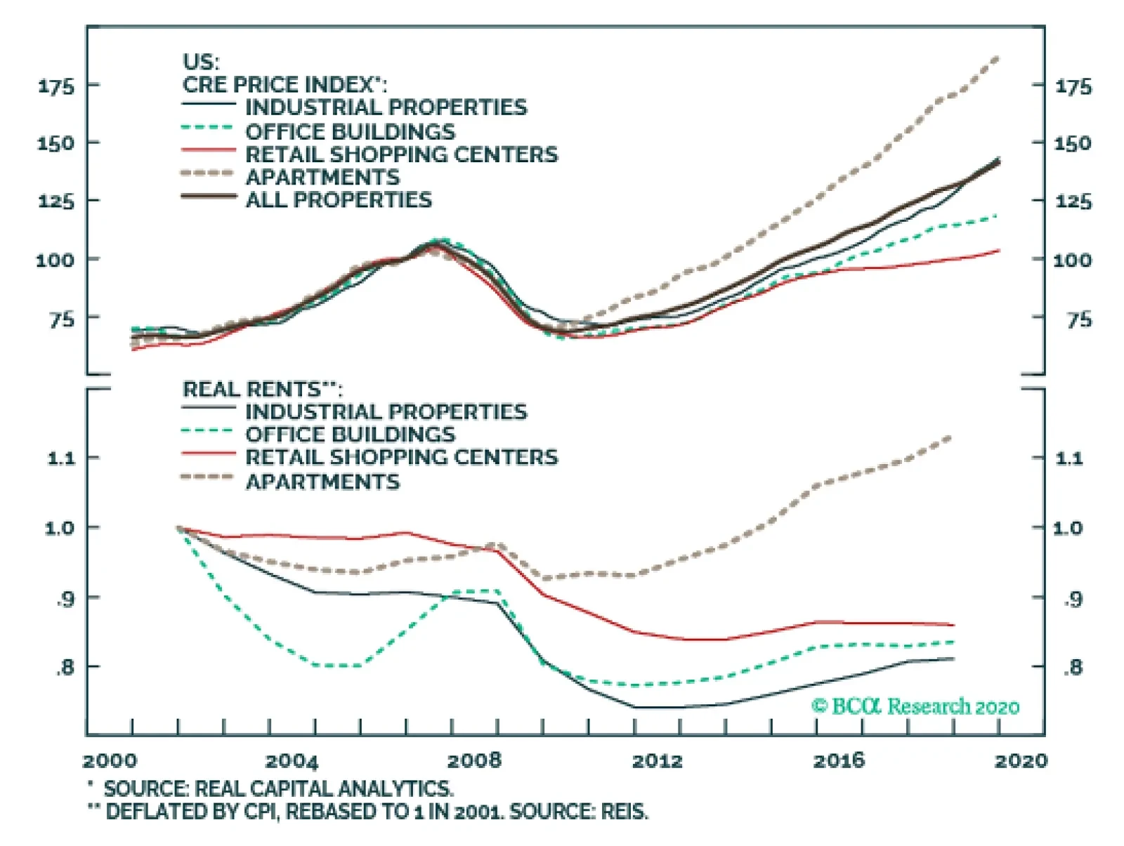
With the exception of multi-family residential real estate, American real rents have fallen, revealing that low rates have propelled commercial properties’ price appreciation over the past decade. The combination of falling real rents and surging property…
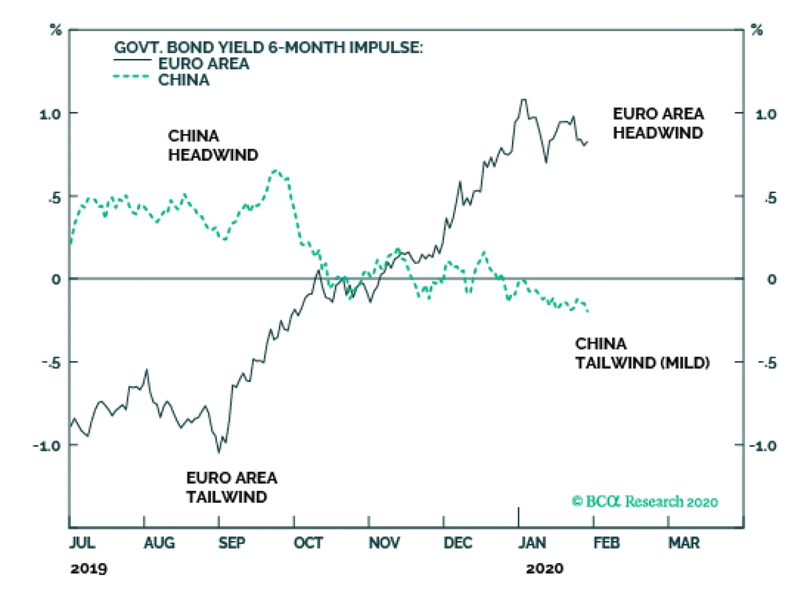
The euro area 6-month bond yield impulse stands near +100 bps, posing the strongest headwind to growth in three years. To make matters worse, the impulse has flipped from a strong -100 bps tailwind last summer into the current strong headwind, equating to a…

Highlights Commercial rents have fallen in real terms, revealing that the commercial property price rally has been fueled exclusively by low rates. Limited upside for rents and an upward direction for future rates are two significant headwinds. However, commercial real estate is especially pro-cyclical and inflationary pressures need to work their way into the economy before the risk of a downturn becomes imminent. The good news is that the economy is less vulnerable to slipping commercial property prices. Large banks have shrunk their commercial property loan books and their composition has shifted towards safer categories of commercial loans. While the macroeconomic outlook remains somewhat neutral, CMBS’ risk/reward profile appears reasonably attractive relative to other US bond sectors. Feature Real estate was a bane for markets and the banking system in the last recession, and commercial properties have lately become an increasingly popular source of concern among investors. Average prices have grown by 90% over the past decade, rising well above their pre-Great Financial Crisis peaks. We have made the case that we are heading into the expansion’s last stretch. The study of economic cycles and our relentless quest to identify inflection points ahead of time become more timely as the bull market ages. To this end, current commercial property valuations deserve close scrutiny and we explore whether any underlying excesses could potentially disrupt financial stability or precipitate a recession in the US. We conclude that although commercial property prices have little hope of appreciating significantly from current levels, a reversal is not imminent until inflationary pressure forces rates higher. When prices eventually slip, the impact on the overall economy should be more attenuated than it was in the last recession, as the banking system has become less vulnerable to a downturn in commercial real estate. While the fundamental macro outlook remains neutral, suggesting no imminent pressure on spreads, US bond investors can find relative value in non-agency Aaa-rated CMBS (vs. corporate bonds rated A or higher) and in agency CMBS (vs. agency residential mortgaged-backed securities). A Rate-Driven Rally Chart 1Commercial Rents Have Decoupled From Property Prices
Commercial Rents Have Decoupled From Property Prices
Commercial Rents Have Decoupled From Property Prices
Like all financial assets, commercial property prices are derived from discounting future cash flows to their present value. Since the crisis, a low rate environment, supported by a sluggish inflation backdrop and continuously accommodative monetary policy, has depressed the valuation equation’s denominator. Meanwhile, strong economic fundamentals and demographic trends - such as urbanization and the millennials’ tendency to marry and purchase a home at a later age - have helped boost the numerator for commercial and multi-family residential properties in the past decade. However, with the exception of multi-family residential real estate - for which price appreciation has also been the strongest - real rents have fallen (Chart 1), revealing that low rates have propelled commercial properties’ price appreciation over the past decade. The combination of falling real rents and surging property prices has depressed commercial real estate cap rates1 to cyclical low levels, raising the question of a potential unwind. Mathematically, an increase in cap rates could result, on the one hand, from rent growth outpacing inflation growth, translating into an increase in real rents on the numerator. Alternatively, cap rates could rise from falling property prices, reducing the denominator. On a cyclical horizon, the latter outcome seems more likely than the former. Little Upside Left For Rents First, the fact that rents in real terms have decreased in spite of sluggish inflation is a bad omen for the outlook for future real rents. We have made the case that there is more inflationary pressure than meets the eye beneath the surface of the US economy. The combination of an already very tight labor market and a pickup in manufacturing activity point towards further wage growth. Inflation is a lagging indicator that has more scope to rise than roll-over at this stage of the cycle. All else equal, upward inflationary pressure will depress real rents further. Second, nominal rents themselves are also facing significant headwinds. Office buildings’ and retail shopping centers’ vacancies have barely recovered from the hit they took in the last recession, while new inventory is struggling to get absorbed by new demand (Chart 2). A strong labor market generally supports the demand for office spaces but a tight labor market limits its future upside. The latter, though, increases potential wage gains and consumers’ purchasing power, whose fundamentals are already strong. We have shown that US consumers’ increased savings rates and lower debt levels put them in a good position to spend their incremental income. Chart 2Post-Crisis Office And Shopping Center Vacancies Remain Elevated...
Post-Crisis Office And Shopping Center Vacancies Remain Elevated...
Post-Crisis Office And Shopping Center Vacancies Remain Elevated...
Chart 3...As These Sectors Face Structural Disruptions
...As These Sectors Face Structural Disruptions
...As These Sectors Face Structural Disruptions
However, both sectors are facing structural disruptions. Co-working has introduced a new player in the office segment – a sub-lessor who signs long-term leases on space it rents out in short-term chunks. If a sizable sub-lessor like WeWork were forced to shrink its footprint, a lot of office supply would come back on to the market, while demand is shrinking as businesses attempt to reduce the area each employee occupies. Brick-and-mortar retailers continue to be buffeted as e-commerce captures an increasing share of consumer spending, keeping downward pressure on retail rents (Chart 3). The picture looks slightly brighter in the industrial properties space, where vacancies have recovered to healthier levels, though low vacancies have failed to lift rents as demand for properties is being met by new inventory (Chart 4). The revival in global manufacturing activity that we are expecting to occur this year should support industrial property rents in the near term, but the advanced age of the cycle limits future upside. Chart 4A Brighter Picture For Industrial And Apartment Buildings...
A Brighter Picture For Industrial And Apartment Buildings...
A Brighter Picture For Industrial And Apartment Buildings...
Chart 5...Thanks To Rising Renters Income
...Thanks To Rising Renters Income
...Thanks To Rising Renters Income
Chart 6Over-Construction Of High-Tier Properties
Over-Construction Of High-Tier Properties
Over-Construction Of High-Tier Properties
Multi-family residential housing is the only sector that has experienced steady real rent growth, fueled by a combination of rising rentership rates and rising household income amongst renters (Chart 5). Homebuilders’ focus on building higher-end units has led to an oversupply of more expensive properties, and their prices have already started to contract on a year-on-year basis (Chart 6). Multi-family residential properties rents should lose momentum as the alternative cost of owning homes falls, especially as homebuilders attempt to right-size their mix of properties to offer more lower-end supply. Exhausted Demand A commercial real estate rally fueled by perpetually falling rates is unsustainable. Although the market sees the potential for an additional rate cut, we think the Fed is done cutting. Labor market strength and a revival in global manufacturing activity argue that no further accommodation or insurance rate cuts are necessary. From current levels, the path of least resistance for rates is upwards (Chart 7). Strong demand from institutional investors has also contributed to fueling prices. Pension funds and insurance companies’ holdings of mortgages and agency-backed securities have nearly doubled since 2010 (Chart 8, first panel) and their allocation as a percentage of total assets is nearing pre-recession highs (Chart 8, second panel). These levels allow them little flexibility to sustain their demand impulse, as there is only so much they can allocate to real estate and other alternative investments. Chart 7Stronger Economic Growth Will Put Upward Pressure On Government Bond Yields
Stronger Economic Growth Will Put Upward Pressure On Government Bond Yields
Stronger Economic Growth Will Put Upward Pressure On Government Bond Yields
Chart 8Saturated Demand From Institutional Investors...
Saturated Demand From Institutional Investors...
Saturated Demand From Institutional Investors...
Demand from yield-hungry investors may also get exhausted if CMBS yields deflate to the point where they lose competitiveness relative to other income-producing investments. CMBS yields have broadly moved with other bond yields since the crisis, though US high-yield corporates have widened somewhat over the last few years, making them a slightly more appealing alternative to CMBS, all else equal (Chart 9). The steady downward pressure on multi-family cap rates since 2010 (Chart 10) reveals that the collateral underlying multi-family loans has become increasingly ambitiously priced, suggesting that losses given default on multi-family backed CMBS without agency backing may be rising, eroding prospective default-adjusted returns. Chart 9...And From Yield-Hungry Investors?
...And From Yield-Hungry Investors?
...And From Yield-Hungry Investors?
Chart 10Cap Rates Have Reached Cyclical Lows
Cap Rates Have Reached Cyclical Lows
Cap Rates Have Reached Cyclical Lows
New regulations also have the potential to retract a significant share of demand for commercial mortgages. The severe housing market deterioration during the Great Financial Crisis and the government intervention required to ensure Freddie Mac’s and Fannie Mae’s solvency led the Federal Housing Finance Agency (FHFA) to place these two government sponsored enterprises (GSEs) under conservatorship in 2014 and to cap their holdings of multi-family mortgages to US$ 100 billion for each GSE. A commercial real estate rally fueled by perpetually falling rates is unsustainable. Current holdings of multi-family residential loans far exceed the stated limits (Table 1). GSEs hold nearly half of all multi-family residential loans outstanding. The post-crisis growth in GSE-guaranteed loans is largely attributable to the exclusion from the cap of certain categories of loans such as green energy loans (Chart 11). The FHFA eliminated these exemptions last year, making the US$ 200 billion cap more binding and applicable to all multi-family loans without exception.2 The impact on mortgage originators and investors is yet to be seen but it would naturally follow that demand for multi-family mortgages to bundle into CMBS would decline if the GSEs are forced to take a step back from the space. Table 1Commercial Real Estate Loans By Holder ($US Mn)
Commercial Real Estate And US Financial Stability
Commercial Real Estate And US Financial Stability
Chart 11Multi-Family Mortgage Debt Outstanding By Mortgage Holder
Multi-Family Mortgage Debt Outstanding By Mortgage Holder
Multi-Family Mortgage Debt Outstanding By Mortgage Holder
Late-Cycle Dynamics Commercial mortgages are typically non-recourse (in case of default, the borrower can only recover the value of the collateralized property) making the loss given default a function of property prices. When times are good and property prices rise, borrowers can easily refinance their loans. The opposite holds in bad times. Therefore, commercial real estate prices are especially pro-cyclical. In spite of the headwinds outlined above, a commercial property downturn does not seem imminent. In spite of the headwinds outlined above, a commercial property downturn does not seem imminent. First, the US economy still has momentum, is supported by highly accommodative monetary policy and should get a boost from a global growth revival. Absent any major exogenous shock to the global economy, we expect that a recession is at least eighteen months away. For as long as the economy keeps expanding, commercial real estate prices can remain elevated. Second, sources of financing remain abundant as the emergence of alternative lenders (Chart 12) has offset the banks’ tighter lending standards for commercial properties (Chart 13). The proliferation of non-bank lenders is typically a late-cycle indicator. Chart 12The Proliferation Of Alternative Lenders…
Commercial Real Estate And US Financial Stability
Commercial Real Estate And US Financial Stability
However, when the economy starts contracting, a commercial real estate downturn could have an outsized impact on banks with significant exposure. In the late 1980s, the commercial property downturn induced a recession and the subprime mortgage bust gave rise to the Great Financial Crisis. Healthier Balance Sheets The good news for the economy today is that banks are less vulnerable to a downturn in commercial real estate than they were back then. The good news for the economy today is that banks are less vulnerable to a downturn in commercial real estate. Banks have decreased their overall exposure to commercial property loans to levels below their 2008 and 1989 peaks (Chart 14). It is worth noting, though, that smaller banks have taken an increasingly important role in the commercial property market as they now finance 65% of all commercial property loans. However, a stronger concentration in smaller banks represents a localized rather than systemic risk, as smaller banks tend to have a more concentrated geographic exposure. Conversely, large banks have significantly shrunk their commercial real estate loan books.3 Chart 14Large Banks Have Shrunk Their CRE Books...
Large Banks Have Shrunk Their CRE Books...
Large Banks Have Shrunk Their CRE Books...
Chart 15...And Shifted Away From Speculative-Grade Loans
...And Shifted Away From Speculative-Grade Loans
...And Shifted Away From Speculative-Grade Loans
Most importantly, the composition of the commercial property loan book has changed drastically since the Great Financial Crisis. Banks have significantly reduced their exposure to more speculative construction and development loans (Chart 15). Risk appetite typically increases in the latter stages of an expansion, yet construction loans remain at relatively depressed levels. The growth in commercial property loans since 2013 has entirely been explained by the rise in relatively less risky multi-family and non-residential non-farm loans. Investment Implications A commercial real estate downturn is probably not a 2020 event. Inflationary pressures need to make their presence felt across a wide swath of the economy before Fed hikes will give rates the scope to move sustainably higher. In the meantime, bond investors with a mandate to remain exposed to CMBS can reap the benefits of attractive risk/reward profiles relative to other segments of the US bond market. US Bond Strategy’s Excess Return Bond Map measures the number of standard deviations of spread widening a sector would need to experience, before losing 100 basis points relative to a duration-matched position in Treasuries4 (Chart 16). Sectors plotting near the top-right of the Map carry both high expected return and low risk. Sectors plotting near the bottom-left carry low expected return and high risk. Chart 16BCA US Bond Strategy’s Excess Return Bond Map
Commercial Real Estate And US Financial Stability
Commercial Real Estate And US Financial Stability
Chart 17Tighter Standards And Decelerating Prices
Tighter Standards And Decelerating Prices
Tighter Standards And Decelerating Prices
This valuation framework currently suggests that CMBS look reasonably attractive. Non-agency Aaa-rated CMBS’ expected return is more promising than Aaa-and Aa-rated corporate bonds and somewhat similar to the expected return on an A-rated corporate bond. Meanwhile, CMBS exhibit a lower risk of losing 100 bps. Similarly, Agency CMBS offer greater expected return than Conventional 30-year Agency-backed residential MBS, along with a similar risk of losses. Although relative valuations appear attractive, the fundamental outlook remains neutral for CMBS spreads, for now. Periods of tightening commercial real estate lending standards and weakening commercial loan demand have historically coincided with decelerating commercial real estate prices and widening CMBS spreads. The Fed’s Q3 2019 Senior Loan Officer Survey revealed only a small net tightening of lending standards and unchanged demand (Chart 17). Overall, the lack of inflationary pressure suggests that neither a commercial real estate downturn nor a meaningful widening of CMBS spreads is an imminent threat. Jennifer Lacombe Senior Analyst JenniferL@bcaresearch.com Ryan Swift US Bond Strategist rswift@bcaresearch.com Footnotes 1 A capitalization rate is the ratio of net operating income (rent) to price and measures the expected rate of return on a real estate investment. As such, a property’s price can also be derived by dividing its rent by its cap rate. 2 More information about GSE’s conservatorship can be found on the FHFA’s website (https://www.fhfa.gov/Conservatorship/Pages/History-of-Fannie-Mae--Freddie-Conservatorships.aspx and https://www.fhfa.gov/Media/PublicAffairs/Pages/New-Multifamily-Caps-9132019.aspx). 3 An analysis of the largest banks’ earnings call we carried out last October also revealed that large banks were unanimously shrinking their commercial real estate books. For more details, please refer to US Investment Strategy Weekly Report from October 28, 2019, "What The Biggest Banks See", available at usis.bcaresearch.com. 4 For more details on the methodology behind our Excess Return Bond Map please see US Bond Strategy October 15, 2019 Weekly Report "A Perspective On Risk And Reward", available at usbs.bcaresearch.com.
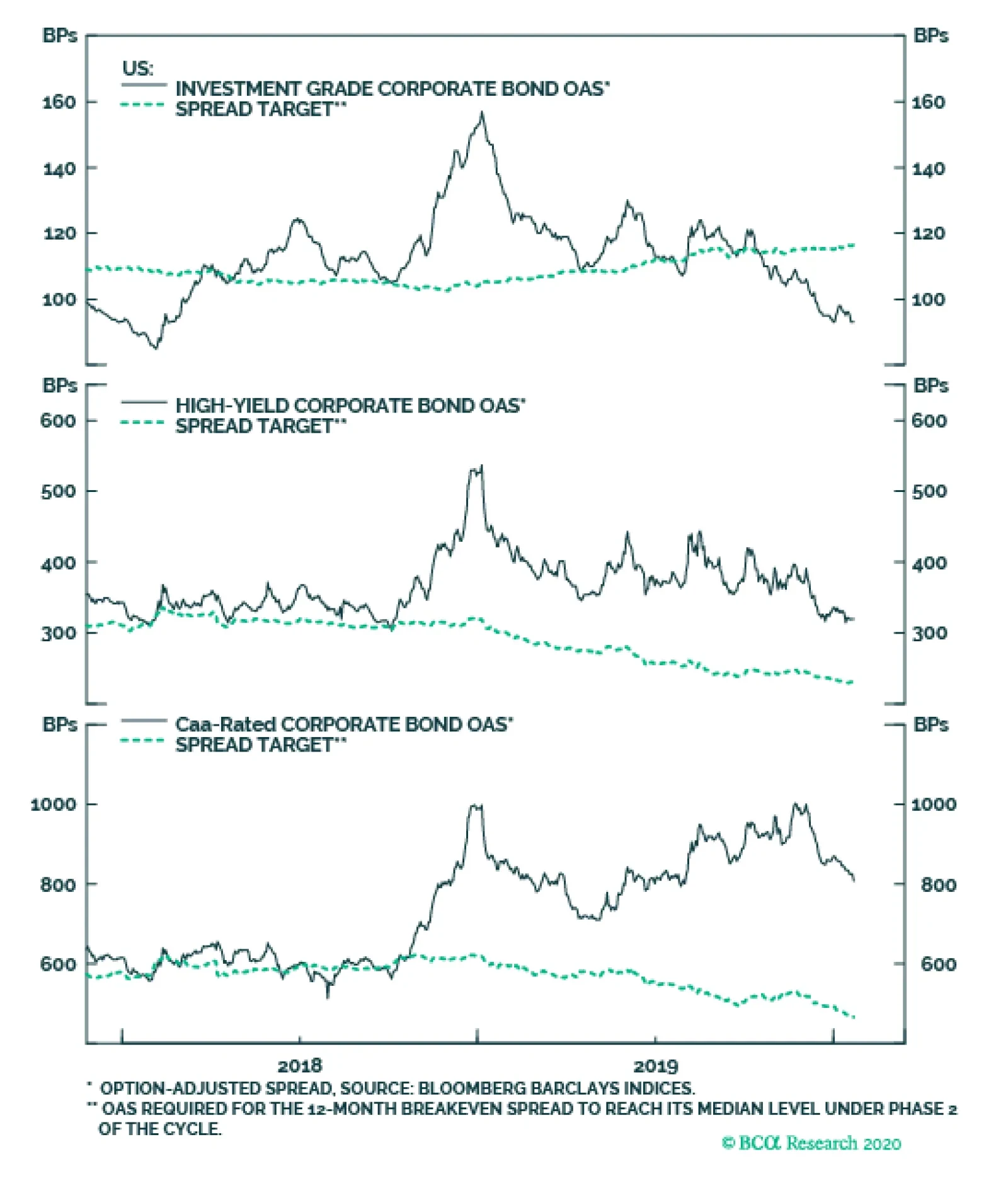
It’s still early, but corporate bonds have so far not joined in with this year’s equity rally. Year-to-date, the investment grade corporate bond index is only up 8 bps versus Treasuries. High-yield bonds have fared better. Caa-rated junk bonds have…
Highlights Global Corporates: The cyclical backdrop – accommodative monetary policies, improving global growth momentum, moderate inflation and subdued volatility – is supportive for the continued outperformance of global corporate bonds over sovereign debt in 2020. Corporate Bond Valuation: Extending a valuation framework we’ve introduced for US corporates to non-US credit – looking at volatility-adjusted spreads relative to both their own history and the “phase” of the monetary policy cycle - we calculate spread targets for non-US corporates in the euro area, UK and Canada. 2020 Opportunities: Current corporate spread levels are furthest above our targets (i.e. cheap) for US high-yield (most notably for Ba- and Caa-rated credit), UK high-yield and UK investment grade. Spreads are furthest below our targets (i.e. expensive) for euro area high-yield (mostly Ba-rated), US investment grade (all credit tiers) and Canadian investment grade. Feature Chart 1Deviations From Corporate Spread Targets
How To Find Value In Global Corporate Bonds
How To Find Value In Global Corporate Bonds
One of our main investment themes for 2020 is that accommodative monetary policies and faster economic growth will delay the peak in the aging global credit cycle, giving investors another year of corporate bond outperformance versus sovereign debt in the developed economies. Returns this year will be nowhere near as robust as in 2019, however, given rich valuation starting points for much of the global corporate universe. Against this backdrop, fixed income investors will have to be more selective in allocations by country, sector and credit quality in order to outperform. To that end, in this Special Report we extend a valuation framework for corporate bond spreads first introduced for US corporates by our sister service, US Bond Strategy, to non-US credit. This methodology looks at spreads on a volatility-adjusted basis, allowing comparison of valuations versus their own history and relative to similar stages of past monetary policy cycles. Chart 1 shows the deviations of current benchmark index option-adjusted spreads (OAS) from spread targets derived from our methodology for different countries (the US, euro area, the UK and Canada) and credit quality tiers (investment grade vs. high-yield). Positive deviations imply current spreads are above the targets derived from our framework – in other words, relatively undervalued - and vice-versa. Returns this year will be nowhere near as robust as in 2019, however, given rich valuation starting points for much of the global corporate universe. Against this backdrop, fixed income investors will have to be more selective in allocations by country, sector and credit quality in order to outperform. The conclusions are that there are still opportunities for additional spread tightening from current levels for lower-rated US high-yield and both UK investment grade and high-yield corporates. At the same time, valuations are looking most stretched for euro area high-yield, US investment grade (all credit tiers) and Canadian investment grade. A Brief Word On The Outlook For Global Corporate Credit In 2020 Chart 2Positive Backdrop For Corporate Bonds
Positive Backdrop For Corporate Bonds
Positive Backdrop For Corporate Bonds
The backdrop for global corporate bond markets will remain positive in 2020 for three main reasons: Global monetary policies will remain accommodative. Central bankers are now focusing more on boosting soft growth and low inflation expectations. Real policy interest rates in the US, euro area, UK and Canada are already below estimates of neutral like r-star (Chart 2, top panel), and will likely remain so throughout 2020. In the past, periods of credit market underperformance have occurred when monetary policy was restrictive, with real rates above neutral or government bond yield curves that were very flat or inverted (more on that later). Global growth momentum will improve. Recent data releases (global manufacturing PMIs, sentiment surveys like the global ZEW and German IFO) have shown that the 2019 global industrial downturn was in the process of bottoming out during the 4th quarter of the year. Additional improvement is likely in the coming months, based on the steady gains of the BCA Global Leading Economic Indicator (LEI). The elevated level of our global LEI diffusion index – measuring the share of individual country LEIs that are rising and which is itself a leading indicator of both the global LEI and corporate bond returns - suggests that additional outperformance of global corporates versus sovereign bonds is likely within the next 12 months (Chart 2, middle panel). Financial conditions are stimulative. Global equities and credit are off to a strong start in 2020, while market volatility is subdued across a variety of asset classes. For example, the US VIX index is now just above its 2019 low, which is consistent with narrow global corporate bond spreads (Chart 2, bottom panel). That low volatility backdrop – supported by market-friendly central bank policies - is helping keep financial conditions easy enough to lift economic growth, while also boosting investor risk appetite for corporate credit. The overall outlook for global corporate credit is still positive and investors should expect another year of corporate bond outperformance versus sovereign debt in the developed economies. Nonetheless, returns will be lower in 2020 than in 2019 due to expensive valuation starting points. As can be seen from Chart 3, global corporate bond spreads are already fairly tight relative to their long-term historical range. Also, outright index yields in many asset classes, like US high-yield, are now at new all-time lows. We interpret this as a sign that the “easy money” has already been made in being generally long corporate credit versus government bonds. Having the right tools to assess the relative values among differing credit markets will be critical to finding the best investment opportunities in this environment. Chart 3Rich Valuation Starting Points In Corporate Credit
How To Find Value In Global Corporate Bonds
How To Find Value In Global Corporate Bonds
We can use the breakeven spread as a valuation tool by looking at the percentile rank relative to its own history, effectively showing the percentage of time that the breakeven spread has been lower in the past. Bottom Line: The cyclical backdrop – accommodative monetary policies, improving global growth momentum, moderate inflation and subdued volatility – is supportive for the continued outperformance of global corporate bonds over sovereign debt in 2020. Valuations are likely to be more of a headwind for corporate bond returns, though. Using Breakeven Spreads As A Credit Valuation Tool As a reminder to existing readers (and to new clients), one of our main valuation tools for credit instruments is the 12-month breakeven spread. That is, the amount of spread widening required for corporate bond returns to break even with a duration-matched position in government bond securities over a 12-month horizon. It can be approximated by dividing the OAS of a bond (or a benchmark bond index) by its duration. More specifically, we can use the breakeven spread as a valuation tool by looking at the percentile rank relative to its own history, effectively showing the percentage of time that the breakeven spread has been lower in the past. We find this valuation tool to be superior to others for two main reasons: (i) using the breakeven spread rather than the average index OAS allows us to control for the changing average duration of the benchmark bond indices; and (ii) the percentile rank is often a better representation of credit spreads than the spread itself.1 BCA Research US Bond Strategy and Global Fixed Income Strategy have both regularly shown the percentile rankings of US investment grade and high-yield breakeven spreads as part of our discussion of US corporate bond markets. We have never produced such rankings for non-US credit, until now. InCharts 4- 7, we show those percentile ranks relative to history for credit in the US and, for the first time, the euro area, UK, Canada, Japan, Australia and Emerging Markets US dollar denominated corporates. We also provide the breakeven spread historical percentile ranks for each individual credit tier in the Appendix charts on pages 13-16. Chart 4US: Corporate Bond Breakeven Spreads
US: Corporate Bond Breakeven Spreads
US: Corporate Bond Breakeven Spreads
Chart 5Euro Area: Corporate Bond Breakeven Spreads
Euro Area: Corporate Bond Breakeven Spreads
Euro Area: Corporate Bond Breakeven Spreads
Chart 6UK: Corporate Bond Breakeven Spreads
UK: Corporate Bond Breakeven Spreads
UK: Corporate Bond Breakeven Spreads
Using these charts, we can gauge which markets offer the best (or worst) level of spread, adjusted by its own volatility and compared to its own history. The most attractive corporate credit spreads on a volatility-adjusted basis are: US high-yield (mostly Caa-rated and B-rated) Japan investment grade (mostly Baa-rated and A-rated) Canada Aaa-rated UK high-yield (excluding financials) Chart 7Other Countries: Corporate Bond Breakeven Spreads
More Corporate Bond Breakeven Spreads
More Corporate Bond Breakeven Spreads
The least attractive corporate credit spreads on a volatility-adjusted basis are: US investment grade (all credit tiers) UK Aaa-rated Canada Baa-rated Euro Area high-yield Using this metric, US Caa-rated junk bonds look most “undervalued”, with a volatility-adjusted spread in the upper 20% of all observations. Chart 8 displays the current breakeven spread historical percentile ranks across countries and credit quality, with high-yield markets shown in red. Using this metric, US Caa-rated junk bonds look most “undervalued”, with a volatility-adjusted spread in the upper 20% of all observations. While this chart provides a quick overview of which corporate bond markets are cheap/expensive with respect to their own history, it does not allow for comparisons of the relative cheapness between markets. To do this, we need to find a way to convert the percentile rankings into some measure of a “fair value” credit spread. Chart 8Global Corporate Bond 12-Month Breakeven Spreads By Percentile Rank (%)
How To Find Value In Global Corporate Bonds
How To Find Value In Global Corporate Bonds
Using Monetary Policy Cycles To Determine Corporate Spread Targets Our colleagues at BCA Research US Bond Strategy have come up with a novel approach for determining spread targets for US corporate credit, based on the breakeven spread percentile rankings.2 Essentially, the stance of US monetary policy, as measured by the slope of the US Treasury curve, is used to predict changes in the US credit cycle, helping to determine “cyclical” spread targets relative to the stance of monetary policy. The first step of this process is to group corporate bond excess returns (vs government debt) into buckets defined by the following “phases” of the US monetary policy cycle, measured by the yield differential between 10-year and 3-year Treasuries: Phase 1: from the end of the previous recession until the slope goes below 50 bps. Phase 2: from the time that the slope crosses below 50 bps until it inverts. Phase 3: from the time that the yield curve first inverts to the start of the next recession. Recessionary periods are not included in these phases, as all corporate credit exhibits the worst returns during those episodes. That is because economic growth and downgrade/default risks, and not the state of monetary policy, are the driving factor behind credit spread moves during recessions. Chart 9 shows the history of the US corporate bond markets broken down into “curve-defined” cycles.3 Dating back to 1974, the earliest date for investment grade bond index data, there have been five such cycles. Chart 9US Corporate Bond Performance And The Yield Curve
US Corporate Bond Performance And The Yield Curve
US Corporate Bond Performance And The Yield Curve
In Charts 10-12, we show the same phases for the euro area, the UK and Canada, using their own government bond yield curves to determine the phase of the monetary policy cycle in the same fashion as was done for the US.4 Once the phases of the monetary policy cycle are defined, we can then calculate corporate bond excess returns during each phase. Chart 10Euro Area: Corporate Bond Performance And The Yield Curve
Euro Area Corporate Bond Performance And The Yield Curve
Euro Area Corporate Bond Performance And The Yield Curve
Chart 11UK: Corporate Bond Performance And The Yield Curve
UK: Corporate Bond Performance And The Yield Curve
UK: Corporate Bond Performance And The Yield Curve
Chart 12Canada: Corporate Bond Performance And The Yield Curve
Canada: Corporate Bond Performance And The Yield Curve
Canada: Corporate Bond Performance And The Yield Curve
Table 1 shows the average corporate bond annualized excess returns under each phase across every cycle that can be defined with available data. Excess returns tend to be highest in Phase 1, quite low but still positive in Phase 2, and usually turn negative during Phase 3, once the yield curve has inverted. Table 1Corporate Bond Annualized Excess Returns* (%) Under Each Phase Of The Cycle
How To Find Value In Global Corporate Bonds
How To Find Value In Global Corporate Bonds
Currently, we are in Phase 2 in the US, euro area and UK, with yield curves that are relatively flat but still positively sloped. Historically, such periods have generated positive excess returns for corporate debt versus duration-matched government bonds, although of far smaller magnitudes compared to Phase 1 periods. Given our expectation that the Fed, ECB and Bank of England will maintain a dovish bias throughout 2020, we expect the no shift from Phase 2 for the US, euro area and the UK that would hurt corporate bond excess returns in those countries. With the Canadian yield curve now slightly inverted, however, Canada is now in Phase 3. This raises the risk that the recent strong outperformance of Canadian investment grade corporate bonds could end if the Bank of Canada does not deliver the monetary easing currently discounted in the Canadian yield curve. How We Determine Corporate Spread Targets Having defined the three phases of the monetary policy cycle, we then re-calculate our corporate bond breakeven spread percentile ranks within each phase. We then back-out a spread target for each credit tier by taking the median 12-month breakeven spread seen in similar monetary policy environments, as determined by the slope of the yield curve.5 Finally, we convert those “median” breakeven spreads into OAS targets using the current benchmark index duration and credit rating distribution. We are assuming that a reasonable spread target for any corporate bond market is determined by adjusting for both spread volatility AND the monetary policy cycle. So, essentially, we are assuming that a reasonable spread target for any corporate bond market is determined by adjusting for both spread volatility AND the monetary policy cycle. Charts 13-16 show the index OAS and their respective targets for the US (both investment grade and high-yield), euro area (both investment grade and high-yield), the UK (both investment grade and high-yield excluding financials), and Canada (only investment grade). Further, the spread targets for each individual credit tier are provided in the Appendix on pages 17-19. Chart 13US: Corporate Bond Spread Targets
US Corporate Bond Spread Targets
US Corporate Bond Spread Targets
Chart 14Euro Area: Corporate Bond Spread Targets
Euro Area: Corporate Bond Spread Targets
Euro Area: Corporate Bond Spread Targets
Chart 15UK: Corporate Bond Spread Targets
UK: Corporate Bond Spread Targets
UK: Corporate Bond Spread Targets
Chart 16Canada: Corporate Bond Spread Targets
Canada: Corporate Bond Spread Target
Canada: Corporate Bond Spread Target
For example, our spread target for US B-rated high-yield is 227bps, which is 80bps below the current index OAS. From the charts, we can make the following conclusions about the relative attractiveness of current spread levels: The largest deviations from our spread target (i.e. potentially most undervalued) are: US high-yield (mostly Caa-rated and B-rated) UK high-yield (excluding financials) The lowest deviations from our spread target (i.e. potentially most overvalued) are: Euro Area high-yield (mostly Ba-rated) Canada investment grade US investment grade (all credit tiers) This framework is an interesting way to derive corporate bond value, by adjusting for both the volatility and monetary policy backdrop. Of course, there are other factors that are more difficult to quantify that can keep spreads too tight or too wide versus these fair value levels, like investor risk tolerance or risk premia for political uncertainty. In terms of factors that are quantifiable, however, this spread target methodology is a useful way to get a sense of the richness or cheapness of global corporate debt. In terms of factors that are quantifiable, however, this spread target methodology is a useful way to get a sense of the richness or cheapness of global corporate debt. We will regularly update these targets in future BCA Research Global Fixed Income Strategy reports. Bottom Line: Current corporate spread levels are furthest above our targets (i.e. cheap) for US high-yield (most notably for Ba- and Caa-rated credit), UK high-yield and UK investment grade. Spreads are furthest below our targets (i.e. expensive) for euro area high-yield (mostly Ba-rated), US investment grade (all credit tiers) and Canadian investment grade. Jeremie Peloso Research Analyst jeremiep@bcaresearch.com Robert Robis, CFA Chief Fixed Income Strategist rrobis@bcaresearch.com Footnotes 1 This is because credit spreads often tighten to very low levels and then remain tight for an extended period. Thus, by showing the percentage of time that a given spread has been tighter than its current level, the percentile rank gives a better sense of this pattern than the actual spread. 2 Please see US Bond Strategy Special Report, “2019 Key Views: Implications For US Fixed Income”, dated December 11, 2018, available at usbs.bcaresearch.com. 3 Note that the Treasury curve used for this analysis is the spread between the 10-year Treasury and the 3-year Treasury yield. The more widely-followed 2-year Treasury was not used as there was more historical data available for the 3-year maturity. 4 Note that there are fewer cycles to analyze for these countries due to the shorter available history of corporate bond market data outside the US. 5 For more details on the spread targets please see US Bond Strategy Weekly Report, “Paid To Wait”, dated February 26, 2019, available at usbs.bcaresearch.com. Appendix Chart 1AUS: Investment Grade Breakeven Spreads
US: Investment Grade Breakeven Spreads
US: Investment Grade Breakeven Spreads
Chart 1BUS: High-Yield Breakeven Spreads
US: High-Yield Breakeven Spreads
US: High-Yield Breakeven Spreads
Chart 1CEuro Area: Investment Grade Breakeven Spreads By Credit Tiers
Euro Area: Investment Grade Breakeven Spreads
Euro Area: Investment Grade Breakeven Spreads
Chart 1DEuro Area: High-Yield Breakeven Spreads By Credit Tiers
Euro Area: High-Yield Breakeven Spreads
Euro Area: High-Yield Breakeven Spreads
Chart 1EUK: Investment Grade Breakeven Spreads
UK: Investment Grade Breakeven Spreads
UK: Investment Grade Breakeven Spreads
Chart 1FCanada: Investment Grade Breakeven Spreads
Canada: Investment Grade Breakeven Spreads
Canada: Investment Grade Breakeven Spreads
Chart 1GJapan: Investment Grade Breakeven Spreads
Japan: Investment Grade Breakeven Spreads
Japan: Investment Grade Breakeven Spreads
Chart 2AUS: Investment Grade Spread Targets
US: Investment Grade Spread Targets
US: Investment Grade Spread Targets
Chart 2BUS: High-Yield Spread Targets
US: High-Yield Spread Targets
US: High-Yield Spread Targets
Chart 2CEuro Area: Investment Grade Spread Targets By Credit Tiers
Euro Area: Investment Grade Spread Targets
Euro Area: Investment Grade Spread Targets
Chart 2DEuro Area: High-Yield Spread Targets By Credit Tiers
How To Find Value In Global Corporate Bonds
How To Find Value In Global Corporate Bonds
Chart 2EUK: Investment Grade Spread Targets By Credit Tiers
UK: Investment Grade Spread Targets
UK: Investment Grade Spread Targets
Chart 2FCanada: Investment Grade Spread Targets By Credit Tiers
Canada: Investment Grade Spread Targets
Canada: Investment Grade Spread Targets
Please note that next week’s US Bond Strategy Weekly Report will be replaced by a Special Report on Commercial Real Estate that was produced jointly with our US Investment Strategy team. That report will be published on Monday instead of Tuesday. Highlights Duration: Financial markets have taken the Fed’s dovish guidance on board, and the asset prices that are most sensitive to monetary policy are rallying strongly. If we follow the typical pattern, as was the case in 2015/16, accommodative policy will soon lead to a rebound in our preferred global growth indicators and higher bond yields. Keep portfolio duration low. Credit: The macro environment for corporate bonds remains attractive, but investors should favor high-yield bonds – particularly Caa-rated and energy debt – where spreads still have room to narrow. Yield Curve: Barbelled Treasury portfolios still make sense in the current macro environment. Specifically, we recommend that investors overweight a duration-matched 2-year/30-year barbell and underweight the 5-year bullet. Feature Bond yields have mostly trended sideways during the past few weeks, even as the S&P 500 surged. The result is that a wide gulf has opened up between the equity and bond markets (Chart 1). At times like this it becomes popular to ask whether the stock market or bond market is “right”. That is, are equities bound to sell off and re-converge with bonds? Or, will the stock market pull bond yields higher? We agree with our Global Investment Strategy team that the risk of a near-term equity sell-off is high.1 But we also think that both the equity and bond markets are responding rationally to an economic environment characterized by abundant central bank liquidity and global growth that has yet to convincingly rebound. Tech stocks are responsible for the bulk of the recent rally. To see why, we can take a look at the relative performance of different equity sectors. Technology stocks are responsible for the bulk of the recent rally, while defensive sectors have performed in-line with the benchmark index and cyclical sectors have lagged (Chart 2). This is consistent with an environment of depressed global growth and plentiful central bank liquidity. Chart 1Stocks Versus##br## Bonds
Stocks Versus Bonds
Stocks Versus Bonds
Chart 2Cyclical (or Growth Sensitive) Sectors Have Lagged ...
Cyclical (or Growth Sensitive) Sectors Have Lagged ...
Cyclical (or Growth Sensitive) Sectors Have Lagged ...
Many technology firms trade off the promise of large cash flows that will only be delivered in the distant future. In a sense, we can think of these stocks as long duration assets whose prices are very sensitive to the discount rate. The Fed’s highly accommodative interest rate guidance is the main reason for the tech sector’s outperformance. In contrast, cyclical equity sectors – like materials, industrials and energy – are less sensitive to Fed policy and more geared toward global economic growth. These sectors have lagged because global growth has yet to put in a decisive bottom. Like cyclical equity sectors, Treasury yields are also most sensitive to trends in global growth. In fact, the 10-year Treasury yield closely tracks the relative performance of cyclical versus defensive equity sectors (Chart 3). Commodity prices are also consistent with this picture (Chart 4). Gold has rallied sharply, something that often results from a shift toward more dovish monetary policy, while the growth-sensitive CRB Raw Industrials commodity index has only just begun to hook up. Historically, bond yields only rise when gains in the CRB index start to outpace gains in gold (Chart 4, bottom panel). Chart 3... Consistent With Bond Yields
... Consistent With Bond Yields
... Consistent With Bond Yields
Chart 4The CRB/Gold Ratio
The CRB/Gold Ratio
The CRB/Gold Ratio
But we can’t think of monetary policy and global growth as completely separate issues. They tend to follow each other in a pattern explained by our Fed Policy Loop (Chart 5). Applying the Loop to the current environment, we see that the Fed eased policy after growth weakened last year and financial markets are currently responding to this shift in monetary conditions. The most interest rate sensitive assets – e.g. tech stocks and gold – are rallying. This represents an easing of financial conditions that will eventually lead to a rebound in global growth indicators. It is only when those global growth indicators increase that US bond yields will rise. Chart 5The Fed Policy Loop
The Best Spot On The Yield Curve
The Best Spot On The Yield Curve
On that note, we also see signs that the economy is transitioning from the ‘Asset Price Inflation’ section of the Loop to the ‘Stronger Economic Growth’ section. The US ISM Manufacturing PMI is currently downbeat at 47.2, but it should be at 50.8 according to a model based on regional Fed manufacturing surveys (Chart 6). Further, the ISM non-Manufacturing index is well above 50 and moving higher (Chart 6, panel 2). Finally, industrial production growth is nowhere near as weak as it was in 2016, even though the PMI is lower (Chart 6, bottom panel). Chart 6ISM Will Soon Trough
ISM Will Soon Trough
ISM Will Soon Trough
Bottom Line: Financial markets have taken the Fed’s dovish guidance on board, and the asset prices that are most sensitive to monetary policy are rallying strongly. If we follow the typical pattern, as was the case in 2015/16, accommodative policy will soon lead to a rebound in our preferred global growth indicators and higher bond yields. Keep portfolio duration low. Stay Long Junk It’s still early, but corporate bonds have so far not joined in with this year’s equity rally. Year-to-date, the investment grade corporate bond index is only up 8 bps versus Treasuries (Chart 7). High-yield bonds have fared better. They have outperformed duration-matched Treasuries by 48 bps so far this year, and the segments of the junk market that were most beaten down in 2019 are leading the charge. Caa-rated junk bonds have outperformed Treasuries by 108 bps so far in 2020. The energy sector has also fared well since December, and is up a decent 43 bps versus Treasuries in January. Chart 7Corporate Bond Returns
Corporate Bond Returns
Corporate Bond Returns
Chart 8Favor HY Over IG
Favor HY Over IG
Favor HY Over IG
We see the divergence between investment grade and high-yield returns continuing during the next few months, due to large differences in valuation. The investment grade corporate index spread is well below our cyclical target, while the high-yield index spread still looks cheap (Chart 8).2 High-yield’s attractiveness is mostly due to Caa-rated securities which underperformed dramatically in 2019 even as junk bonds overall delivered solid returns (Chart 8, bottom panel). As we discussed in a recent report, the underperformance of Caa-rated debt was in large part due to weakness in the shale oil sector.3 The yield curve is no longer deeply inverted out to the 5-year maturity point. Bottom Line: Corporate bonds will deliver solid returns as the economy transitions from the ‘Asset Price Inflation’ stage to the ‘Stronger Economic Growth’ stage of our Fed Policy Loop. However, relative valuation dictates that returns will concentrated in high-yield, especially Caa-rated and energy debt. Finding The Best Spot On The Yield Curve We have been recommending that investors run barbelled Treasury portfolios for some time, favoring the long and short ends of the curve at the expense of the belly (5-year/7-year). However, the shape of the curve has changed a lot since the 2/10 slope briefly inverted last August. Specifically, the curve is no longer deeply inverted out to the 5-year maturity point (Chart 9A). In light of this shift, it is worth considering whether our recommended curve positioning still makes sense. First, we take a look at the 12-month rolling yield for each point on the Treasury curve (Chart 9B). The 12-month rolling yield equals each security’s coupon return plus rolldown return. It is essentially the return you would earn in each maturity if the yield curve stayed completely unchanged during the next 12 months. Despite recent curve shifts, we still see a significant pick-up in rolling yield beyond the 5-year maturity point, as was the case last August. Chart 9APar Coupon Yield Curve
The Best Spot On The Yield Curve
The Best Spot On The Yield Curve
Chart 9B12-Month Rolling Yield Curve
The Best Spot On The Yield Curve
The Best Spot On The Yield Curve
But yield pick-up is just one consideration. We also need to think about how the shape of the curve will change during the next 6-12 months. One way to do this is to look at a sample of recent data – we use the past six months – and calculate how sensitive each point on the Treasury curve has been to changes in our 12-month Fed Funds Discounter.4 That is, if the market moves to price-in fewer Fed rate cuts during the next 12 months, as we expect, how should we expect each point on the Treasury curve to respond? To answer this question, Chart 10 shows how sensitive weekly changes in each Treasury yield have been to changes in our Discounter during the past six months. Chart 10Risk & Reward Along The Treasury Curve
The Best Spot On The Yield Curve
The Best Spot On The Yield Curve
The first thing we notice is that the 5-year yield is the most sensitive to changes in our Discounter and the 2-year yield is the least sensitive. The 20-year and 30-year yields are relatively insulated from changes in the Discounter, and offer the greatest rolling yields. The second and third panels of Chart 10 show how these sensitivities change if we consider increases and decreases in our Discounter differently. Here we see that maturities from 5-20 years have been similarly sensitive to increases in the Discounter during the past six months. Meanwhile, the 5-year yield has been most sensitive to declines in the Discounter. The 2-year yield is not sensitive at all to a rising Discounter, but is fairly exposed to a falling Discounter. In general, since we expect the Discounter to move up during the next 6-12 months, the 2-year note looks like the safest place to camp out. Meanwhile, the 30-year bond looks attractive in terms of its yield pick-up per unit of sensitivity. The 2-year yield is least sensitive to changes in our Fed Funds Discounter. Another approach we can take is to look at how different parts of the yield curve respond to “risk on” and “risk off” market environments. To do this, we classify months as “risk on” if both the stock-to-bond total return ratio rises and the high-yield index spread tightens. Conversely, we classify months as “risk off” if both the stock-to-bond total return ratio falls and the high-yield index spread widens. Chart 11A shows the cumulative changes in different yield curve slopes since 2010 during “risk on” months only. The chart shows that, recently, “risk on” financial market behavior has coincided with the yield curve steepening out to the 7-year/10-year part of the curve, and then flattening beyond the 10-year point. Similarly, Chart 11B shows that “risk off” months have recently coincided with yield curve flattening out to the 7-year/10-year part of the curve, and steepening beyond that. Chart 11ASlope Changes In "Risk On" Environments
Slope Changes In "Risk On" Environments
Slope Changes In "Risk On" Environments
Chart 11BSlope Changes In "Risk Off" Environments
Slope Changes In "Risk Off" Environments
Slope Changes In "Risk Off" Environments
In other words, if recent correlations hold, a “risk on” environment during the next few months would cause the 7-year and 10-year yields to rise the most, while the 2-year and 30-year yields would have less upside. Investment Conclusions We expect economic growth to strengthen during the next 6-12 months, leading to “risk on” financial market behavior and a rising Fed Funds Discounter. Based on this view and our analysis of rolling yields and curve sensitivities, we conclude that a barbelled Treasury portfolio still makes the most sense. We want to be overweight the 2-year note because it should have less upside in a “risk-on” environment, and overweight the 30-year bond to get some extra yield pick-up while taking less risk than in the 5-year, 7-year or 10-year notes. In general, we want to avoid the 5-year, 7-year and 10-year maturities. According to our yield curve models, all three of those maturities look expensive relative to a duration-matched 2/30 barbell (Chart 12).5 Chart 12Butterfly Spread Fair Value Models
Butterfly Spread Fair Value Models
Butterfly Spread Fair Value Models
If we wanted to get even more precise, we could note that a duration-matched 2/30 barbell offers 5 bps of yield pick-up compared to the 5-year note, only 1 bp of yield pick-up relative to the 7-year note and about the same yield as the 10-year note. To split hairs, those extra few basis points give us a slight preference for being short the 5-year bullet compared to the 7-year and 10-year notes, though we would prefer to avoid all three. Bottom Line: Barbelled Treasury portfolios still make sense in the current macro environment. Specifically, we recommend that investors overweight a duration-matched 2-year/30-year barbell and underweight the 5-year bullet. Ryan Swift US Bond Strategist rswift@bcaresearch.com Footnotes 1 Please see Global Investment Strategy Weekly Report, “Time For A Breather”, dated January 10, 2020, available at gis.bcaresearch.com 2 For details on how we arrive at our spread targets please see US Bond Strategy Weekly Report, “The Value In Corporate Bonds”, dated February 19, 2019, available at usbs.bcaresearch.com 3 Please see US Bond Strategy Weekly Report, “Caa-Rated Bonds: Warning Sign Or Buying Opportunity?”, dated November 26, 2019, available at usbs.bcaresearch.com 4 Our 12-month Fed Funds Discounter measures the 12-month change in the fed funds rate that is currently priced into the overnight index swap curve. 5 For details on our yield curve models please see US Bond Strategy Special Report, “Bullets, Barbells And Butterflies”, dated July 25, 2017, available at usbs.bcaresearch.com Fixed Income Sector Performance Recommended Portfolio Specification
Highlights We continue to have a positive view on global equities over the next 12 months, but see heightened risks of a near-term correction. Despite dwindling spare capacity, government bond yields are still lower today than they were shortly after the financial crisis. Many investors argue that bond yields cannot rise much because asset values would plunge if yields rose sharply, while debt burdens would quickly become unsustainable. We disagree. We think there is greater scope for yields to rise than is widely believed. Investors should maintain below-benchmark duration in fixed-income portfolios, favoring inflation-linked over nominal bonds and positioning for steeper yield curves. Gold should also do well next year. As long as bond yields are rising in response to stronger growth, as will be the case for the next two years, equities will fare well. The stock market will buckle, however, once stagflation sets in around 2022. Stocks Need To Work Off Overbought Conditions Before Moving Higher Again In last week’s report, entitled “Time For A Breather,” we downgraded our tactical three-month view on global equities from overweight to neutral on the grounds that stocks had run up too hard, too fast. Net long positions in equity futures among asset managers and levered funds are now at levels that have historically preceded corrections (Chart 1). Chart 1Stocks Are At A Heightened Risk Of A Correction
Stocks Are At A Heightened Risk Of A Correction
Stocks Are At A Heightened Risk Of A Correction
Chart 2Breadth Is Quite Narrow
Breadth Is Quite Narrow
Breadth Is Quite Narrow
Chart 3The Equity Risk Premium Is Fairly High, Especially Outside The US
The Equity Risk Premium Is Fairly High, Especially Outside The US
The Equity Risk Premium Is Fairly High, Especially Outside The US
The rally has been lopsided, characterized by very narrow breadth. The top five stocks in the S&P 500 (Apple, Microsoft, Alphabet, Amazon, and Facebook) now comprise 18% of market cap, a higher share than in the late 1999/early 2000s (Chart 2). As my colleague, Anastasios Avgeriou, has pointed out, Apple’s $30 billion one day market cap gain on January 9th was greater than the market cap of the median stock in the S&P 500 index. Despite our near-term concerns, we continue to maintain a positive 12-month view on global equities. Easier financial conditions, a turn in the global inventory cycle, modestly looser fiscal policy in the UK and euro area, and re-upped fiscal/credit stimulus in China should all support global growth this year. Faster growth, in turn, will lift corporate earnings. The equity risk premium also remains quite high, particularly outside the US (Chart 3). A Fragile Trade Truce A de-escalation in the trade war should provide a further tailwind to equities. The “phase one” agreement signed on Wednesday features a commitment by China to purchase an additional $200 billion in US goods and services over the next two years relative to 2017 levels. In return, the US will halve tariffs, to 7.5%, on the $120 billion tranche in Chinese imports and suspend any further tariff hikes. No firm schedule exists to begin “phase two” talks, and at this point, it is quite likely that no negotiations will take place until after the US presidential election. Nevertheless, the tail risk of an out-of-control trade war has receded for the time being, which is positive for stocks. Better Chinese Trade Data Adding to growing optimism over the global economy and diminished trade tensions, Chinese trade data surprised on the upside this week. Exports rose 7.6% in December, well above the consensus estimate of 2.9%. Imports surged 16.3%, easily surpassing the consensus estimate of 9.6%. While base effects explain some of the improvement, the overall tone of the trade data is consistent with the strengthening Chinese PMIs and improvement in industrial production and retail sales (Chart 4). Chart 4Chinese Trade Data Is Improving
Chinese Trade Data Is Improving
Chinese Trade Data Is Improving
Chart 5Better News Out Of China Has Propelled The Yuan Higher Versus The US Dollar
Better News Out Of China Has Propelled The Yuan Higher Versus The US Dollar
Better News Out Of China Has Propelled The Yuan Higher Versus The US Dollar
Better news out of China has pushed the yuan to the strongest level against the US dollar since last summer (Chart 5). The Chinese currency is the most important driver of other EM currencies. If the yuan continues to strengthen, as we expect, EM assets – particularly EM stocks and local-currency bonds – should do well this year. How High Can Bond Yields (Realistically) Go? Despite rising over the past few months, global government bond yields are lower today than they were shortly after the financial crisis ended (Chart 6). The decline in yields has occurred alongside dwindling spare capacity. In most countries, the unemployment rate today is below 2007/08 lows (Chart 7). Many investors argue that bond yields cannot rise much from current levels because asset values would plunge if yields rose sharply, while debt burdens would quickly become unsustainable. If such an unfortunate turn of events were to occur, central bankers would have to shelve any tightening plans, just as Jay Powell had to do in late 2018. Chart 6Bond Yields Are Lower Today Than They Were After The Great Recession
Bond Yields Are Lower Today Than They Were After The Great Recession
Bond Yields Are Lower Today Than They Were After The Great Recession
Chart 7Unemployment Rates Are Below Their Pre-Recession Lows In Most Economies
Bond Yields: How High Is Too High?
Bond Yields: How High Is Too High?
Convexity Fears One argument often heard these days is that asset prices have become hypersensitive to changes in interest rates. There is some basis for thinking this. As Box 1 explains, the relationship between asset returns and interest rates tends to be “convex,” meaning that any given change in interest rates will have a bigger effect on returns if rates are low to begin with, as they are today. The effect is particularly pronounced for long duration assets such as long-term bonds, equities, or real estate. Nevertheless, while the theoretical presence of convexity in asset returns is crystal clear, many commentators overstate its practical importance. As Chart 8 shows, the average maturity of government debt stands at seven years. At that level of maturity, the effects of convexity tend to be quite small.1 Chart 8Average Debt Maturity Is Below 10 Years In Most Countries
Bond Yields: How High Is Too High?
Bond Yields: How High Is Too High?
Granted, the overall stock of debt has increased in relation to GDP. However, much of that additional debt has been absorbed by central banks, reducing the amount of government debt available for the private sector. What about equities? The ratio of stock market capitalization-to-GDP has risen to 59%, up from a low of 24% in 2009, and close to its 2000 highs (Chart 9). Does that mean that stocks will sink if yields rise from current levels? Not necessarily. Remember that the discount rate is not the only thing that affects the present value of a stream of income. The expected growth rate of that income also matters. In fact, in the standard dividend discount model, it is simply the difference between the discount rate and the growth rate of dividends that determines how much a stock is worth. If higher bond yields coincide with rising growth expectations, stock prices do not need to fall at all. Chart 9Equity Market Cap Is Approaching Previous Highs
Equity Market Cap Is Approaching Previous Highs
Equity Market Cap Is Approaching Previous Highs
Chart 10 shows that the monthly correlation between equity returns and bond yields remains as high as ever. This suggests that favorable economic news, to the extent that it leads investors to revise up the expected growth rate for earnings, usually more than compensates for a rising discount rate (Chart 11). Chart 10Correlation Between Equity Returns And Bond Yields Remains High
Correlation Between Equity Returns And Bond Yields Remains High
Correlation Between Equity Returns And Bond Yields Remains High
Chart 11Earnings Estimates Tend To Move In Sync With Swings In Bond Yields
Earnings Estimates Tend To Move In Sync With Swings In Bond Yields
Earnings Estimates Tend To Move In Sync With Swings In Bond Yields
So why are so many investors worried that higher bond yields will undercut stocks? The answer has less to do with convexity and more to do with the fear that bond yields will reach a level that chokes off growth. The combination of a rising discount rate and a falling growth rate would be toxic for equities and other risk assets. Debt Worries Likewise, it is not so much that corporate bond investors are worried that rising yields will cause interest payments to swell. After all, interest costs are still quite low as a share of cash flows for most firms (Chart 12). Rather, the fear is that higher yields will imperil growth, causing those cash flows to evaporate. Government debt is also much less of a problem than often assumed, at least in countries that issue bonds in their own currencies. The standard rule for debt sustainability says that the debt-to-GDP ratio will always converge to a stable level if the interest rate is below the growth rate of the economy.2 This is easily the case in almost all economies today (Chart 13). Chart 12US Corporate Sector: Interest Payments Are Not A Worry
US Corporate Sector: Interest Payments Are Not A Worry
US Corporate Sector: Interest Payments Are Not A Worry
Chart 13Bond Yield Minus GDP Growth: Please Mind The Gap
Bond Yields: How High Is Too High?
Bond Yields: How High Is Too High?
The only places where central banks are severely constrained in raising rates are in economies such as Canada, Sweden, and Australia where debt-financed housing bubbles have formed (Chart 14). However, even in these countries, the quality of mortgage underwriting has generally been strong, implying that a banking crisis would likely be avoided. Chart 14Canada, Sweden, And Australia Stand Out As Having Very Frothy Housing Markets
Canada, Sweden, And Australia Stand Out As Having Very Frothy Housing Markets
Canada, Sweden, And Australia Stand Out As Having Very Frothy Housing Markets
It’s Really About The Neutral Rate The discussion above suggests that the main constraint to higher bond yields is the economy itself. If bond yields rise enough, the interest rate-sensitive sectors of the economy will weaken, and a recession will ensue. As long as bond yields are rising in response to stronger growth, as will be the case for the next two years, equities will be fine. Unfortunately, no one knows where the neutral rate – the interest rate demarcating the boundary between expansionary and contractionary monetary policy – really lies. Chart 15Rising Labor Share Of Income Occurring Alongside Labor Market Tightening
Rising Labor Share Of Income Occurring Alongside Labor Market Tightening
Rising Labor Share Of Income Occurring Alongside Labor Market Tightening
Slower trend growth has probably reduced the neutral rate, as has the shift to a more “capital-lite” economy. On the flipside, other forces have probably raised the neutral rate over the past few years. A tighter labor market has increased workers’ share of national income (Chart 15). Since workers spend more of every dollar of income than companies, this has raised aggregate demand. Fiscal policy has also been loosened, while elevated asset prices have likely incentivized some spending that would otherwise not have taken place. Even though we do not know the exact value of the neutral rate, we do know that the unemployment rate has been falling in most countries for the past 10 years, a period during which bond yields were generally higher than today. This suggests that monetary policy remains in expansionary territory. True, global growth did slow in 2018, just as the Fed was raising rates. However, this probably had more to do with the natural ebb and flow of the global manufacturing cycle, exacerbated by the Chinese deleveraging campaign and the brewing trade war. If global growth recovers this year, as we expect, estimates of the neutral rate will rise. This will allow equity prices to increase even in an environment of modestly higher bond yields. Inflation Is Coming… Eventually While stronger economic growth will lift bond yields this year, the big move in yields will only come when inflation breaks out. Core inflation tends to track unit labor costs (Chart 16). Unit labor cost inflation has remained range-bound for most of the recovery in the United States, which explains the failure of inflation to take flight. Unit labor cost inflation has been even more moribund elsewhere. Chart 16Core Inflation Tends To Track Unit Labor Costs
Core Inflation Tends To Track Unit Labor Costs
Core Inflation Tends To Track Unit Labor Costs
Chart 17Correlation Between Labor Market Slack And Wage Growth Remains Intact
Bond Yields: How High Is Too High?
Bond Yields: How High Is Too High?
Looking out, barring a major surge in productivity, rising wage growth should lead to accelerating unit labor cost inflation, first in the US and then in the rest of the world, which will translate into higher price inflation. We doubt that such a price-wage spiral will erupt this year. If anything, US wage growth has leveled off recently, with the year-over-year change in average hourly earnings falling back below the 3% mark. Nevertheless, the long-term correlation between labor market slack and wage growth remains intact (Chart 17). As wage growth reaccelerates, unit labor cost inflation will drift higher, setting the stage for a period of rising price inflation. Investors should maintain below-benchmark duration in global fixed-income portfolios, favoring inflation-linked over nominal bonds and positioning for steeper yield curves. Gold should also do well next year. As long as bond yields are rising in response to stronger growth, as will be the case for the next two years, equities will be fine. The stock market will buckle, however, once stagflation sets in around 2022. Box 1 Asset Prices And Interest Rates: The Role Of Convexity
Bond Yields: How High Is Too High?
Bond Yields: How High Is Too High?
Peter Berezin Chief Global Strategist peterb@bcaresearch.com Footnotes 1Assuming semi-annual compounding, the price of a 10-year bond with a 5% coupon rate falls by 7.9% if the yield increases from 1% to 2%, which is only slightly higher than the 7.6% decline that would be incurred if the yield increases from 4% to 5%. 2One might add that if the interest rate is below the growth rate of the economy, a higher starting point for the debt stock will allow for more debt issuance without leading to a higher debt-to-GDP ratio. As we have shown before, the steady-state debt-to-GDP ratio can be expressed as p/(r-g), where r is the interest rate, g is trend GDP growth, and p is the primary (i.e., non-interest) budget balance. Thus, for example, if the government wanted to achieve a stable debt-to-GDP ratio of 50% and r-g is -2%, it would need to run a primary budget deficit of 0.5*0.02=1% of GDP. However, if the government targeted a stable debt-to-GDP ratio of 200%, it could run a primary budget deficit of 2*0.02=4% of GDP. Global Investment Strategy View Matrix
Bond Yields: How High Is Too High?
Bond Yields: How High Is Too High?
MacroQuant Model And Current Subjective Scores
Bond Yields: How High Is Too High?
Bond Yields: How High Is Too High?
Strategic Recommendations Closed Trades
Highlights The euro area bond yield 6-month impulse recently hit 100 bps, constituting the strongest headwind to growth for three years. Nine times out of ten, the strong headwind to nominal growth pushes the bond yield to a lower level six months later. Downgrade banks and materials to underweight. Downgrade the Eurostoxx 50 to underweight versus the S&P 500 and the Nikkei 225. Upgrade Switzerland to overweight, and upgrade Denmark to neutral. Downgrade Sweden to neutral, and downgrade Spain and Austria to underweight. Fractal trade: short NZD/JPY. Feature Chart of the WeekIf You Get The Bond Yield Right, You'll Get Banks Right Too
If You Get The Bond Yield Right, You'll Get Banks Right Too
If You Get The Bond Yield Right, You'll Get Banks Right Too
The analysis in this report differs from the BCA house view which is overweight European versus US equities and expects modestly higher bond yields in the next six months. The euro area 10-year bond yield stands at a miserly 50 bps, though admittedly this does mark a 60 bps increase from its record low of -10 bps last August (Chart I-2).1 However, if you look only at the level or the change in the bond yield you will miss the bigger story. As we explained in Four Impulses, Three Mistakes, the bond yield’s impact on growth accelerations and decelerations comes neither from its level nor from its change – instead, the impact comes from the change in its change, the bond yield impulse.2 Chart I-2The Recent Rise In Bond Yields Followed A Sharp Decline In The Preceding Six Months
The Recent Rise In Bond Yields Followed A Sharp Decline In The Preceding Six Months
The Recent Rise In Bond Yields Followed A Sharp Decline In The Preceding Six Months
The Strongest Headwind Impulse For Three Years The euro area bond yield 6-month impulse recently hit 100 bps, its highest mark, and therefore its strongest headwind to growth, for three years. The impulse hit such a high mark because the recent rise in yields followed a sharp decline in yields in the preceding six months. The euro area bond yield 6-month impulse recently hit 100 bps, its highest mark, and therefore its strongest headwind to growth, for three years. Since the turn of the century, the euro area bond yield 6-month impulse has reached the 100 bps strong headwind mark ten times. Nine times out of the ten, the strong headwind to nominal growth pushed the yield to a lower level six months later. That’s the bigger story. The one exception was in 2006 at the frothy end of the credit bubble which bears no resemblance to today. In any case, nine times out of ten are odds that we wouldn’t want to bet against right now (Chart I-3). Chart I-3Nine Times Out Of Ten, A Strong Headwind Bond Yield Impulse Pushes Yields To A Lower Level Six Months Later
Nine Times Out Of Ten, A Strong Headwind Bond Yield Impulse Pushes Yields To A Lower Level Six Months Later
Nine Times Out Of Ten, A Strong Headwind Bond Yield Impulse Pushes Yields To A Lower Level Six Months Later
Suffice to say, in the vast majority of these cases the lower bond yield also hurt bond yield proxies in the equity market such as banks and materials. The Bond Yield Drives Sector Strategy Investment is complex but it is not complicated. The words complex and complicated are often used interchangeably but they mean different things. Complex means something that is not fully predictable or analysable, whereas complicated means something that is made up of many parts. A car’s movement in traffic is complex, but it is not complicated. A car engine is complicated, but it is not complex. Unlike a car engine, investment is not complicated. This is because investment has just a few key parts that drive everything, albeit these parts are themselves highly complex. The objective of investment is to identify the few key parts that drive everything and to conquer their complexity. One key part is the bond yield. The Chart of the Week and Chart I-4 should leave you in no doubt that if you get the bond yield right, you will also get the relative performance of banks right, whether you are in Europe, Japan, or, for that matter, anywhere. Chart I-4If You Get The Bond Yield Right, You'll Get Banks Right Too
If You Get The Bond Yield Right, You'll Get Banks Right Too
If You Get The Bond Yield Right, You'll Get Banks Right Too
The connection between the bond yield and bank performance is twofold. First, to the extent that a higher bond yield reflects higher nominal economic growth, it also likely reflects higher growth in bank credit, which effectively constitutes bank ‘sales’. Second, a higher bond yield also typically signifies a steeper yield curve, which lifts bank net interest (profit) margins. And vice versa for a lower bond yield. Investment is complex but it is not complicated. Likewise, Chart I-5 should also leave you in no doubt that if you get the bond yield right you will also get commodity prices right. Again, this is not surprising. The higher nominal economic growth reflected in a higher bond yield could come from stronger real demand or from higher inflation, either of which would be bullish for commodity prices. And vice versa for a lower bond yield. Albeit the causality can sometimes go the other way, from a commodity price shock via inflation to the bond yield. Chart I-5If You Get The Bond Yield Right, You'll Get Commodity Prices Right Too
If You Get The Bond Yield Right, You'll Get Commodity Prices Right Too
If You Get The Bond Yield Right, You'll Get Commodity Prices Right Too
However, the bond yield’s movement itself is highly complex because it is subject to numerous feedback loops. One feedback loop is that the valuation of equities and other risk-assets depends inversely and exponentially on the bond yield level. A higher yield will ultimately undermine equity and other risk-asset prices and thereby unleash a deflationary impulse, and vice versa. A separate feedback loop comes via the direct impact on economic accelerations and decelerations which, as we have just seen, depends on the bond yield impulse – which is to say, its second derivative. Mathematicians will immediately recognise this setup as a second order differential equation with delayed negative feedback. They will tell you that it describes a complex adaptive system (CAS) which you cannot predict or analyse with any certainty. The best you can do is understand the probabilities that the system goes in one direction or the other. Based on the euro area bond yield impulse at a strong headwind mark, and the previous ten outcomes from this setup, there is a high probability that the post-August burst of outperformance from banks and materials is now over. Accordingly, we are now downgrading both banks and materials to underweight. Sector Strategy Drives Regional And Country Strategy To repeat, investment is highly complex but it is not highly complicated. If you get the bond yield right you will get your equity sector strategy right. And if you get your equity sector strategy right you will automatically get your regional and country allocation right too. This is because each major stock market has a distinguishing ‘long’ sector in which it contains up to a quarter of its total market capitalisation, as well as a distinguishing ‘short’ sector in which it has a significant under-representation. The combination of this long sector and short sector gives each equity index its distinguishing fingerprint which drives relative performance (Table I-1): Table 1The Sector Fingerprints Of Major Regional Stock Markets
Strong Headwind Warrants Caution In H1
Strong Headwind Warrants Caution In H1
FTSE 100 = long energy, short technology. Eurostoxx 50 = long banks, short technology. Nikkei 225 = long industrials, short banks and energy. S&P 500 = long technology, short materials. MSCI Emerging Markets = long technology, short healthcare. Specifically, the Eurostoxx 50 has an 11 percent overrepresentation to banks and materials versus both the S&P 500 and the Nikkei 225. Against the S&P 500 it is at the expense of technology and against the Nikkei 225 it is at the expense of industrials. It follows that if banks and materials underperform technology and industrials, the Eurostoxx 50 must underperform the S&P 500 and the Nikkei 225. Chart I-6 and Chart I-7 should convince you that there are no ifs, buts, or maybes. Chart I-6Euro Stoxx 50 Vs. S&P 500 = Global Banks In Euros Vs. Global Technology In Dollars
Euro Stoxx 50 Vs. S&P 500 = Global Banks In Euros Vs. Global Technology In Dollars
Euro Stoxx 50 Vs. S&P 500 = Global Banks In Euros Vs. Global Technology In Dollars
Chart I-7Euro Stoxx 50 Vs. Nikkei 225 = Global Banks In Euros Vs. Global Industrials In Dollars
Euro Stoxx 50 Vs. Nikkei 225 = Global Banks In Euros Vs. Global Industrials In Dollars
Euro Stoxx 50 Vs. Nikkei 225 = Global Banks In Euros Vs. Global Industrials In Dollars
Accordingly we are now downgrading the Eurostoxx 50 to underweight versus the S&P 500 and the Nikkei 225. Exactly the same principle applies to the stock markets within Europe. Relative performance comes from nothing more than the stock market’s long and short sector fingerprint combined with sector performance (Table I-2 and Table I-3). Table I-2The Sector Fingerprints Of Euro Area Stock Markets
Strong Headwind Warrants Caution In H1
Strong Headwind Warrants Caution In H1
Table I-3The Sector Fingerprints Of Non Euro Area European Stock Markets
Strong Headwind Warrants Caution In H1
Strong Headwind Warrants Caution In H1
Based on the expected underperformance of banks and materials, we are now upgrading Switzerland to overweight, and upgrading Denmark to neutral. Also, we are downgrading Sweden to neutral, and downgrading Spain and Austria to underweight (Chart I-8). Chart I-8Spain = Long Banks
Spain = Long Banks
Spain = Long Banks
Fractal Trading System* This week's recommended trade is short NZD/JPY. Set the profit target at 2.3 percent with a symmetrical stop-loss. The rolling 1-year win ratio now stands at 61 percent. Chart I-9NZD/JPY
NZD/JPY
NZD/JPY
When the fractal dimension approaches the lower limit after an investment has been in an established trend it is a potential trigger for a liquidity-triggered trend reversal. Therefore, open a countertrend position. The profit target is a one-third reversal of the preceding 13-week move. Apply a symmetrical stop-loss. Close the position at the profit target or stop-loss. Otherwise close the position after 13 weeks. * For more details please see the European Investment Strategy Special Report “Fractals, Liquidity & A Trading Model,” dated December 11, 2014, available at eis.bcaresearch.com. Dhaval Joshi Chief European Investment Strategist dhaval@bcaresearch.com Footnotes 1 This is the weighted average of 10-year government bond yields in the euro area, weighted by the stock of government issued debt. 2 Please see the European Investment Strategy Weekly Report “Four Impulses, Three Mistakes” October 31, 2019 available at eis.bcaresearch.com. Fractal Trading System
Strong Headwind Warrants Caution In H1
Strong Headwind Warrants Caution In H1
Strong Headwind Warrants Caution In H1
Strong Headwind Warrants Caution In H1
Cyclical Recommendations Structural Recommendations
Strong Headwind Warrants Caution In H1
Strong Headwind Warrants Caution In H1
Strong Headwind Warrants Caution In H1
Strong Headwind Warrants Caution In H1
Strong Headwind Warrants Caution In H1
Strong Headwind Warrants Caution In H1
Strong Headwind Warrants Caution In H1
Strong Headwind Warrants Caution In H1
Trades Closed Trades Asset Performance Currency & Bond Equity Sector Country Equity Indicators Bond Yields Chart II-1Indicators To Watch - Bond Yields
Indicators To Watch - Bond Yields
Indicators To Watch - Bond Yields
Chart II-2Indicators To Watch - Bond Yields
Indicators To Watch - Bond Yields
Indicators To Watch - Bond Yields
Chart II-3Indicators To Watch - Bond Yields
Indicators To Watch - Bond Yields
Indicators To Watch - Bond Yields
Chart II-4Indicators To Watch - Bond Yields
Indicators To Watch - Bond Yields
Indicators To Watch - Bond Yields
Interest Rate Chart II-5Indicators To Watch - Interest Rate Expectations
Indicators To Watch - Interest Rate Expectations
Indicators To Watch - Interest Rate Expectations
Chart II-6Indicators To Watch - Interest Rate Expectations
Indicators To Watch - Interest Rate Expectations
Indicators To Watch - Interest Rate Expectations
Chart II-7Indicators To Watch - Interest Rate Expectations
Indicators To Watch - Interest Rate Expectations
Indicators To Watch - Interest Rate Expectations
Chart II-8Indicators To Watch - Interest Rate Expectations
Indicators To Watch - Interest Rate Expectations
Indicators To Watch - Interest Rate Expectations
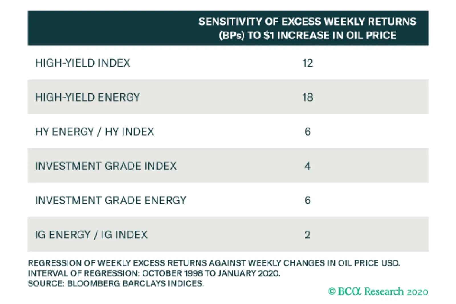
Investment grade and high-yield corporate bond returns both respond positively to changes in oil prices. Moreover, energy bonds are more sensitive to the oil price, outperforming the overall index when oil prices rise, and vice-versa. When oil prices are…
The table above shows the sensitivity of weekly changes in different market-based inflation expectations to a $1 increase in the price of Brent crude oil. The entire CPI swap curve is positively correlated with the oil price. Additionally, the sensitivity of…