Fixed Income

Highlights 2019 Performance Breakdown: Our recommended model bond portfolio underperformed the custom benchmark index by -38bps for all of 2019. Winners & Losers: The underperformance of our model bond portfolio in 2019 was concentrated in the government bond side of the portfolio (-103bps), a result of below-benchmark duration positioning and underweights to US Treasuries and Italian government bonds. On the other side was a solid outperformance from spread product allocations (+65bps), mostly driven by an overweight to US high-yield corporate bonds. Q4/2019 Performance: The year ended strongly, however, as the portfolio outperformed by +28bps in Q4, split equally between government bonds and spread product. Scenario Analysis For The Next Six Months: We are targeting a moderately aggressive level of overall portfolio risk, with below-benchmark duration exposure alongside meaningful overweight allocations to global corporate credit. In our base case scenario, global growth will continue to recover supported by accommodative monetary policies, thus opening a window for another year of global corporates outperforming sovereign bonds in 2020. Feature Last week, we published the Global Fixed Income Strategy (GFIS) model bond portfolio strategy for the coming year, in which we translated our 2020 global fixed income Key Views into recommended investment positioning for the next 6-12 months.1 In this week’s report, take a final look back to review the performance of the model portfolio for both the fourth quarter of 2019 and the entire calendar year. We also present our updated scenario analysis, and return projections, for the portfolio over the next six months, incorporating the new recommended allocations introduced last week. As a reminder to existing readers (and to new clients), the model portfolio is a part of our service that complements the usual macro analysis of global fixed income markets. The portfolio is how we communicate our opinion on the relative attractiveness between government bond and spread product sectors. This is done by applying actual percentage weightings to each of our recommendations within a fully invested hypothetical bond portfolio. 2019 Performance: A Short Summary Of A Long Year Chart of the Week2019 Performance: Credit Good, Duration Bad, But A Solid Q4
2019 Performance: Credit Good, Duration Bad, But A Solid Q4
2019 Performance: Credit Good, Duration Bad, But A Solid Q4
The 2019 performance of the model portfolio can be summarized by duration dominating credit. Government bond yields rapidly fell in the first three quarters of the year due to weakening global growth and growing political uncertainty, to the detriment of our below-benchmark stance on overall portfolio duration. At the same time, global credit markets performed strongly in 2019, even as risk-free government bond yields plunged, which benefited our overweight stance on global spread product. The 2019 performance of the model portfolio can be summarized by duration dominating credit. All in all, the overall portfolio return in 2019 was +7.9% (hedged into USD), underperforming our custom benchmark index by -38bps (Chart of the Week).2 That underperformance was more pronounced before the strong rebound in global bond yields witnessed at the beginning of the fourth quarter, at which point the portfolio was underperforming the custom benchmark by -68bps (Table 1). Table 1GFIS Model Bond Portfolio Q4/2019 Overall Return Attribution
2019 GFIS Model Bond Portfolio Performance Review: Praise Credit & Blame Duration
2019 GFIS Model Bond Portfolio Performance Review: Praise Credit & Blame Duration
Looking at the breakdown of underperformance in 2019, our recommended positioning on government bonds (duration and country allocation) dragged the overall performance by -104bps, while our credit tilts (by country and broadly defined credit sectors) provided a partial offset, contributing +65bps. The details of the full year 2019 performance can be found in the Appendix on pages 14-16. In terms of specifics, the biggest sources of underperformance were underweights in US Treasuries (-66bps) and Italian government bonds (-28bps). Those positions, however, were used to “fund” corporate bond overweights in US investment grade (+28bps) and US high-yield (+46bps), as well as euro area corporate debt (+6bps) – allocations that performed well and helped offset the underperformance in US and Italian sovereign debt. More generally across the government bond portion of the portfolio, the drag on returns was concentrated in the 10+ year maturity buckets. This was a consequence of combining our below-benchmark duration stance with a curve-steepening bias that was hurt severely by the bullish flattening of global yield curves in the first three quarters of the year. The drag on returns from curve positioning was particularly acute in Japan and France, where the 10+ year maturity buckets underperformed by -27bps and -13bps, respectively. On a more positive note with regards to country selection, three of our favorite overweights for 2020 – Germany (+10bps), Australia (+7bps) and the UK (+5bps) – all outperformed versus the model portfolio benchmark. Q4/2019 Model Portfolio Performance Breakdown: Winning On Both Sides The GFIS model bond portfolio performed well at the end of 2019, as fixed income markets began to discount stabilizing global growth and reduced central bank easing expectations. The total return for the GFIS model portfolio (hedged into US dollars) in Q4/2019 was only +0.1%, but this managed to outperform the custom benchmark index by a solid +28bps. The GFIS model bond portfolio performed well at the end of 2019, as fixed income markets began to discount stabilizing global growth and reduced central bank easing expectations. In terms of the specific breakdown between the government bond and spread product allocations in our model portfolio, the former generated +14bps of outperformance versus our custom benchmark index while the latter outperformed by +15bps. The bar charts showing the total and relative returns for each individual government bond market and spread product sector are presented in Charts 2 and 3. Chart 2GFIS Model Bond Portfolio Q4/2019 Government Bond Performance Attribution
2019 GFIS Model Bond Portfolio Performance Review: Praise Credit & Blame Duration
2019 GFIS Model Bond Portfolio Performance Review: Praise Credit & Blame Duration
Chart 3GFIS Model Bond Portfolio Q4/2019 Spread Product Performance Attribution By Sector
2019 GFIS Model Bond Portfolio Performance Review: Praise Credit & Blame Duration
2019 GFIS Model Bond Portfolio Performance Review: Praise Credit & Blame Duration
The most significant movers were: Biggest outperformers Underweight US government bonds with maturity beyond 10+ years (+8bps) Overweight US Ba-rated high-yield corporates (+5bps) Overweight US B-rated high-yield corporates (+5bps) Underweight Italian government bonds with maturity beyond 10+ years (+4bps) Underweight German government bonds with maturity beyond 10+ years (+3bps) Biggest underperformers Underweight US government bonds with maturity of 1-3 years (-2bps) Overweight Japanese government bonds with maturity of 5-7 years (-2bps) Overweight Japanese government bonds with maturity of 7-10 years (-1bp) Overweight UK government bonds with maturity of 5-7 years (-1bp) Underweight German government bonds with maturity of 7-10 years (-1bp) Chart 4 presents the ranked benchmark index returns of the individual countries and spread product sectors in the GFIS model bond portfolio for Q4/2019. The returns are hedged into US dollars (we do not take active currency risk in this portfolio) and are adjusted to reflect duration differences between each country/sector and the overall custom benchmark index for the model portfolio. We have also color-coded the bars in each chart to reflect our recommended investment stance for each market during Q4/2019 (red for underweight, green for overweight, gray for neutral).3 Ideally, we would look to see more green bars on the left side of the chart where market returns are highest, and more red bars on the right side of the chart were returns are lowest. Chart 4Ranking The Winners & Losers From The Model Bond Portfolio In Q4/2019
2019 GFIS Model Bond Portfolio Performance Review: Praise Credit & Blame Duration
2019 GFIS Model Bond Portfolio Performance Review: Praise Credit & Blame Duration
Global spread product dominates the left half of the chart. EM corporates and EM sovereigns denominated in US dollars turned to be the best performers in Q4, followed by US and European corporate bonds. This was a boon for our model portfolio performance, given our overweight stances on global corporate bonds. This was due to credit spread narrowing, supported by accommodative monetary policy and fading fears of slower global growth. On the other hand, the right side of Chart 4 is predominantly occupied by government bonds. The worst performers in Q4 were German, New Zealand and UK governments bonds – three markets where we have been overweight, although we did take profits on our long-held bullish view on New Zealand in mid-November.4 Bottom Line: Our recommended model bond portfolio outperformed the custom benchmark index during the fourth quarter of the year. The outperformance came both from the government and spread product sides of the portfolio, driven by a smaller exposure to the long-ends of government bond yield curves and our recommended overweight position on US high-yield corporate bonds. Future Drivers Of Portfolio Returns Chart 5Overall Portfolio Allocation: Significantly Overweight Credit
2019 GFIS Model Bond Portfolio Performance Review: Praise Credit & Blame Duration
2019 GFIS Model Bond Portfolio Performance Review: Praise Credit & Blame Duration
Looking ahead, the performance of the model bond portfolio will be driven by three main factors: our below-benchmark duration bias, our overweight stance on corporate debt versus global government bonds, and last week’s upgrade of EM USD-denominated sovereigns and corporates to overweight. In terms of specific weightings in the GFIS model bond portfolio, we now have a more pronounced bias favoring global spread product over government debt, with a relative overweight of fifteen percentage points versus the benchmark index (Chart 5). We also remain modestly below-benchmark on duration, with an overall exposure equal to 0.5 years short of the benchmark (Chart 6). While we do not expect a major surge in bond yields this year, global yield curves discount inflation expectations that are too low and monetary policy easing in 2020 that is unlikely to be delivered (especially in the US). With global growth showing signs of bottoming out, and leading indicators pointing to continued improvement in the next 6-12 months, the risk/reward bias is tilted in favor of global yields moving higher, justifying reduced duration exposure. Looking ahead, the performance of the model bond portfolio will be driven by three main factors: our below-benchmark duration bias, our overweight stance on corporate debt versus global government bonds, and last week’s upgrade of EM USD-denominated sovereigns and corporates to overweight. Chart 6Overall Portfolio Duration: Moderately Below Benchmark
Overall Portfolio Duration: Moderately Below Benchmark
Overall Portfolio Duration: Moderately Below Benchmark
Chart 7Portfolio Yield: Significant Positive Carry From Credit
Portfolio Yield: Significant Positive Carry From Credit
Portfolio Yield: Significant Positive Carry From Credit
Chart 8Portfolio Risk Budget Usage: Moderately Aggressive
Portfolio Risk Budget Usage: Moderately Aggressive
Portfolio Risk Budget Usage: Moderately Aggressive
To better position the model bond portfolio to this backdrop of slowly rising global yields, we adjusted our government bond country allocations last week in favor of lower-beta markets such as Japan, Germany, France, Spain, Australia and the UK, while maintaining underweight positions in higher-beta markets such as the US, Canada and Italy.5 Our decision to upgrade global credit exposure helps boost the yield of our model portfolio to around 3%, or +43bps in excess of the benchmark index yield (Chart 7). Further, these changes represent an increase in the usage of the “risk budget” of our model bond portfolio, which is now running a tracking error (or excess volatility versus that of the benchmark) of 73bps (Chart 8). This is slightly higher than the 58bps prior to last week’s changes, but is still below the maximum allowable tracking error of 100bps that we have imposed on the model portfolio since its inception. More importantly, this is consistent with our view that investors should maintain a “moderately aggressive” level of risk in fixed income portfolios in 2020. Scenario Analysis & Return Forecasts To help provide some insight as to the potential excess returns from our model bond portfolio tilts, we use a framework for estimating total returns for all government bond markets and spread product sectors, based on common risk factors. For credit, returns are estimated as a function of changes in the US dollar, the Fed funds rate, oil prices and market volatility as proxied by the VIX index (Table 2A). For government bonds, non-US yield changes are estimated using historical betas to changes in US Treasury yields (Table 2B). We take yield forecasts for US Treasuries that are translated to shifts in non-US yields using these yield betas.6 Table 2AFactor Regressions Used To Estimate Spread Product Yield Changes
2019 GFIS Model Bond Portfolio Performance Review: Praise Credit & Blame Duration
2019 GFIS Model Bond Portfolio Performance Review: Praise Credit & Blame Duration
Table 2BEstimated Government Bond Yield Betas To US Treasuries
2019 GFIS Model Bond Portfolio Performance Review: Praise Credit & Blame Duration
2019 GFIS Model Bond Portfolio Performance Review: Praise Credit & Blame Duration
In Tables 3A and 3B, we present our three main scenarios for the next six months, defined by changes in the risk factors, and the expected performance of the model bond portfolio in each case. The scenarios, described below, all revolve around our expectation that the most important drivers of future market returns will continue to be the momentum of global growth and the path of US monetary policy. Base Case (Global Growth Recovery): The Fed stays on hold, the US dollar weakens by -2%, oil prices rise by +10%, the VIX hovers around 13, and there is a bear-steepening of the UST curve. This is a scenario where global growth keeps recovering, alongside a US dollar which slightly weakens. The model bond portfolio is expected to beat the benchmark index by +90bps in this case. Global Growth Accelerates: The Fed stays on hold, the US dollar weakens by -5%, oil prices rise by +15%, the VIX declines to 10, and there is a more pronounced bear-steepening of the UST curve. Under this scenario, the pickup in global growth is faster than anticipated, causing the US dollar to weaken substantially as global capital flows move into more growth-sensitive markets outside the US. Both of these forces support EM economies and support oil prices. The model bond portfolio is expected to beat the benchmark index by +125bps in this case. Global Growth Upturn Fails: The Fed cuts rates by -25bps, the US dollar appreciates by +3%, oil prices fall by -20%, the VIX rises to 25; there is a parallel shift down in the UST curve. This is a scenario where global growth merely stabilizes at weak levels but fails to rebound. The Fed finds itself delivering one more rate cut in order to support the US economy. Meantime, the US dollar appreciates as capital flows out of growth-sensitive regions into the safe-haven greenback, particularly as global recession fears result in increased financial market volatility. The model portfolio will underperform the benchmark by -38bps in this scenario. Table 3AScenario Analysis For The GFIS Model Bond Portfolio For The Next Six Months
2019 GFIS Model Bond Portfolio Performance Review: Praise Credit & Blame Duration
2019 GFIS Model Bond Portfolio Performance Review: Praise Credit & Blame Duration
Table 3BUS Treasury Yield Assumptions For The 6-Month Forward Scenario Analysis
2019 GFIS Model Bond Portfolio Performance Review: Praise Credit & Blame Duration
2019 GFIS Model Bond Portfolio Performance Review: Praise Credit & Blame Duration
The scenario inputs for the four main risk factors (the fed funds rate, the price of oil, the US dollar and the VIX index) are shown visually in Chart 9, while the US Treasury yield scenarios are in Chart 10. Chart 9Risk Factor Assumptions For The Scenario Analysis
Risk Factor Assumptions For The Scenario Analysis
Risk Factor Assumptions For The Scenario Analysis
Chart 10US Treasury Yield Assumptions For The Scenario Analysis
US Treasury Yield Assumptions For The Scenario Analysis
US Treasury Yield Assumptions For The Scenario Analysis
In terms of our conviction level among the main drivers of the model portfolio returns – duration allocation (across yield curves and countries) and asset allocation (credit versus government bonds) – we are confident that global growth is much more likely to rebound than decelerate further over the course of 2020. This will allow our increased spread product allocation to be the main driver of the portfolio returns. Thus, the overall expected excess return of our model bond portfolio over the benchmark is positive, given that the scenario analysis produces positive excess returns in the Base Case and “Global Growth Accelerates” outcomes. We are confident that global growth is much more likely to rebound than decelerate further over the course of 2020. This will allow our increased spread product allocation to be the main driver of the portfolio returns. Bottom Line: We are targeting a moderately aggressive level of overall portfolio risk, with below-benchmark duration exposure alongside meaningful overweight allocations to global corporate credit. In our base case scenario, global growth will continue to recover supported by accommodative global monetary policy, thus opening a window for another year of global corporates outperforming sovereign bonds in 2020. Jeremie Peloso Research Analyst jeremiep@bcaresearch.com Robert Robis, CFA Chief Fixed Income Strategist rrobis@bcaresearch.com Footnotes 1 Please see BCA Global Fixed Income Strategy Weekly Report, “Our Model Bond Portfolio Strategy For 2020: Selectively Aggressive”, dated January 7, 2020, available at gfis.bcarsearch.com. 2 The GFIS model bond portfolio custom benchmark index is the Bloomberg Barclays Global Aggregate Index, but with allocations to global high-yield corporate debt replacing very high quality spread product (i.e. AA-rated). We believe this to be more indicative of the typical internal benchmark used by global multi-sector fixed income managers. 3 Note that sectors where we made changes to our recommended weightings during Q4/2019 will have multiple colors in the respective bars in Chart 4. 4 Please see BCA Research Global Fixed Income Strategy Weekly Report, “When In Doubt, Trust The Leading Indicators”, dated November 19, 2019, available at gfis.bcaresearch.com. 5 We are defining “beta” here in terms of yield beta, or the sensitivity to changes in an individual country's bond yield to changes the overall level of global bond yields. 6 We are making a change in the betas used in our scenario analysis this week, using trailing 3-year yield betas to US Treasuries in place of the longer-term post-crisis yield betas that were measured over a full 10 years. Appendix Appendix Table 1GFIS Model Bond Portfolio Full Year 2019 Overall Return Attribution
2019 GFIS Model Bond Portfolio Performance Review: Praise Credit & Blame Duration
2019 GFIS Model Bond Portfolio Performance Review: Praise Credit & Blame Duration
Appendix Chart 1GFIS Model Bond Portfolio Full Year 2019 Government Bond Performance Attribution
2019 GFIS Model Bond Portfolio Performance Review: Praise Credit & Blame Duration
2019 GFIS Model Bond Portfolio Performance Review: Praise Credit & Blame Duration
Appendix Chart 2GFIS Model Bond Portfolio Full Year 2019 Spread Product Performance Attribution By Sector
2019 GFIS Model Bond Portfolio Performance Review: Praise Credit & Blame Duration
2019 GFIS Model Bond Portfolio Performance Review: Praise Credit & Blame Duration
Recommendations The GFIS Recommended Portfolio Vs. The Custom Benchmark Index
2019 GFIS Model Bond Portfolio Performance Review: Praise Credit & Blame Duration
2019 GFIS Model Bond Portfolio Performance Review: Praise Credit & Blame Duration
Duration Regional Allocation Spread Product Tactical Trades Yields & Returns Global Bond Yields Historical Returns
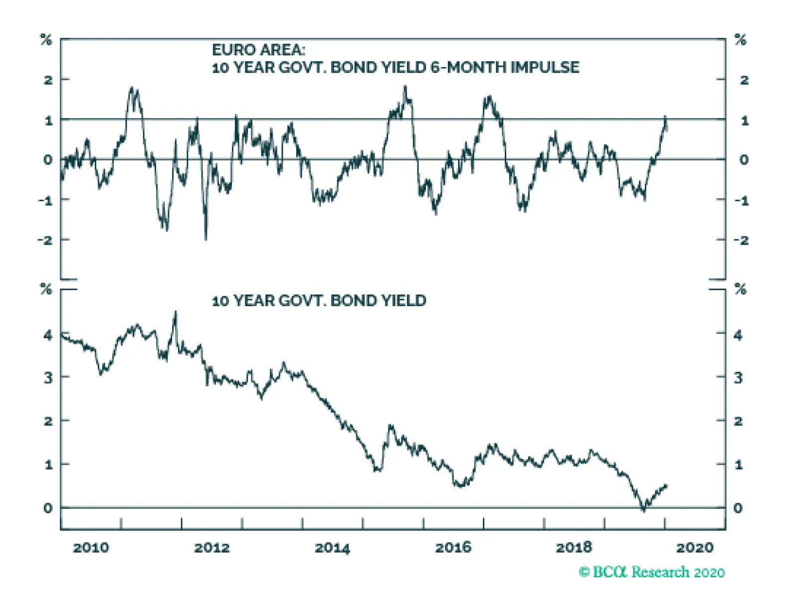
The euro area 10-year bond yield stands at a lowly 0.45 percent and the 6-month change is a seemingly benign +0.2 percent. However, the crucial 6-month impulse equals a severe +1 percent, because the +0.2 percent rise in yields followed a sharp -0.8 percent…
Highlights Duration: Despite recent setbacks, global growth looks set to improve and policy uncertainty set to ease during the next couple of months. Both will conspire to push bond yields higher. Investors should maintain below-benchmark portfolio duration. US political risks could flare again around mid-year, sending yields lower. TIPS: We recommend that investors enter TIPS breakeven curve flatteners, both because short-term inflation expectations will respond more quickly than long-term expectations to stronger realized inflation data and to hedge against the risk of an oil supply shock. High-Yield: Investors should add (or increase) exposure to the high-yield energy sector, within an overweight allocation to junk bonds. Junk energy spreads are attractive, and exposure to the sector will mitigate the impact of a potential oil supply shock. Feature Only a month ago, investors were becoming more optimistic about a global growth rebound and the US/China phase 1 trade deal was pushing political risk into the background. Both of those factors caused the 10-year Treasury yield to rise throughout December, hitting an intra-day Christmas Eve peak of 1.95% (Chart 1). But since then, softer global PMI data and the US/Iranian military conflict brought global growth concerns and political risk back to the fore, breaking the uptrend in yields. Chart 1Bond Bear On Pause
Bond Bear On Pause
Bond Bear On Pause
Global growth and political uncertainty are two of the five macro factors that we identify as important for US bond yields.1 And despite the recent setback, we think both factors will push yields higher in the coming months. Global Growth We have found that the Global Manufacturing PMI, the US ISM Manufacturing PMI and the CRB Raw Industrials index are the three global growth indicators that correlate most strongly with US bond yields. One reason for the recent pullback in yields is the disappointing December data from the Global and US Manufacturing PMIs. The ISM Manufacturing PMI moved deeper into recessionary territory. The Global Manufacturing PMI had been in a clear uptrend since mid-2019, but fell back to 50.1 in December, from 50.3 the month before (Chart 2). The US and Chinese PMIs also declined in December, though they remain well above the 50 boom/bust line (Chart 2, panels 3 & 4). The Eurozone and Japanese PMIs, meanwhile, are still in the doldrums (Chart 2, panels 2 & 5). More worrying than the small tick down in Global PMI is the US ISM Manufacturing PMI moving deeper into recessionary territory, from 48.1 to 47.2. However, we have good reason to think that stronger data are just around the corner (Chart 3). Chart 2Global PMI Ticks Down
Global PMI Ticks Down
Global PMI Ticks Down
Chart 3ISM Manufacturing Index Will Rebound
ISM Manufacturing Index Will Rebound
ISM Manufacturing Index Will Rebound
First, the difference between the new orders and inventories components of the ISM index often leads the overall index at turning points, 2016 being a prime example (Chart 3, top panel). Much like in 2016, a gap is opening up between new orders-less-inventories and the overall ISM. Second, the non-manufacturing ISM index remains strong despite the weakness in manufacturing (Chart 3, panel 2). With no contagion to the service sector of the economy, we’d expect manufacturing to pick back up. Third, the ISM Manufacturing index has diverged sharply from the Markit Manufacturing PMI, with the Markit index printing well above the ISM (Chart 3, panel 3).2 The ISM index has been more volatile than the Markit index in recent years, and should trend toward the Markit index over time. Fourth, regional Fed manufacturing surveys have generally been stronger than the ISM during the past few months. A simple regression model of the ISM index based on data from regional Fed surveys suggests that the ISM index should be at 49.7 today, instead of 47.2 (Chart 3, bottom panel). Finally, unlike the PMI surveys, the CRB Raw Industrials index has increased quite sharply in recent weeks (Chart 4). We should note that it is not the CRB index itself but rather the ratio between the CRB index and gold that tracks bond yields most closely, and this ratio has actually declined lately due to the strength in gold. Nonetheless, a sustained turnaround in the CRB index would mark a big change from 2019 and would send a strong bond-bearish signal. Chart 4CRB Sends A Bond-Bearish Signal
CRB Sends A Bond-Bearish Signal
CRB Sends A Bond-Bearish Signal
Political Uncertainty The second factor that sent bond yields lower during the past few weeks was the military conflict between the US and Iran. Tensions appear to have de-escalated for now, and we would expect any flight-to-quality flows to unwind during the next few weeks.3 But while we see policy uncertainty easing in the near-term, sending bond yields higher, we reiterate our view that US political uncertainty is the number one risk factor that could derail the 2020 bear market in bonds.4 Specifically, we see two looming US political risks. The first relates to President Trump’s re-election odds. For now, Trump’s approval rating is in line with past incumbent presidents that have won re-election (Chart 5). But if his approval doesn’t keep pace in the coming months, he will try to do something to change his fortunes. That could mean re-igniting the trade war with China, or once again ramping up tensions with Iran. A Bernie Sanders or Elizabeth Warren victory would send a flight-to-quality into bonds. The second risk is that one of the progressive candidates – Bernie Sanders or Elizabeth Warren – secures the Democratic nomination for president. Right now, both trail Joe Biden in the polls and betting markets (Chart 6), but things could change rapidly as the primary results come in during the next few months. The stock market would certainly sell off if an Elizabeth Warren or Bernie Sanders presidency seems likely, sending a flight to quality into bonds.5 Chart 5Trump’s Approval Rating Must Rise
Bond Market Implications Of An Oil Supply Shock
Bond Market Implications Of An Oil Supply Shock
Chart 6Democratic Nomination Betting Odds
Democratic Nomination Betting Odds
Democratic Nomination Betting Odds
Bottom Line: Despite recent setbacks, global growth looks set to improve and policy uncertainty set to ease during the next couple of months. Both will conspire to push bond yields higher. Investors should maintain below-benchmark portfolio duration. US political risks could flare again around mid-year, sending yields lower. Playing An Oil Supply Shock In US Bond Markets US/Iranian military tensions are easing for now, but could flare again in the future. For that reason, it’s worth considering how US bond markets would respond in the event of a conflict between the US and Iran that removed a significant amount of the world’s oil supply from the market, causing the oil price to spike. The first implication is that US bond yields would fall. Even though it’s tempting to say that the inflationary impact of higher oil prices would push yields up, this effect would not dominate the flight-to-quality into US bonds that would result from the increase in political uncertainty. Case in point, Chart 1 shows that, while the inflation component of yields was stable as tensions flared during the past few weeks, it didn’t come close to offsetting the drop in the 10-year real yield. Beyond the impact on Treasury yields, there are two other segments of the US bond market that would be materially impacted by an oil supply shock: the TIPS breakeven inflation curve and corporate bond spreads. Buy TIPS Breakeven Curve Flatteners Table 1CPI Swap Curve Sensitivity To Oil
Bond Market Implications Of An Oil Supply Shock
Bond Market Implications Of An Oil Supply Shock
When considering the impact of an oil supply shock on TIPS breakeven inflation rates, we first look at how the cost of inflation protection is influenced by changes in the oil price. Table 1 shows the sensitivity of weekly changes in different CPI swap rates to a $1 increase in the price of Brent crude oil. We use CPI swap rates instead of TIPS breakeven inflation rates because data are available for a wider maturity spectrum. Our analysis applies equally to the TIPS breakeven inflation curve. Two conclusions are apparent from Table 1. First, the entire CPI swap curve is positively correlated with the oil price, a higher oil price moves CPI swap rates higher and vice-versa. Second, the sensitivity of CPI swap rates to the oil price is greater at the short-end of the curve than at the long-end. This is fairly intuitive given that higher oil prices are inflationary in the short-term but could be deflationary in the long-run if they hamper economic growth. Chart 7Coefficients Stable Over Time
Coefficients Stable Over Time
Coefficients Stable Over Time
Chart 7 shows that our two main conclusions are not dependent on the chosen time horizon. The 2-year CPI swap rate is positively correlated with the oil price for our entire sample period, as is the 10-year rate except for a brief window in 2014. The 2-year rate’s sensitivity is also consistently higher than the 10-year’s. Based on this analysis, we can suggest two good ways to hedge against the risk of an oil supply shock that sends prices higher: Buy inflation protection, either in the CPI swaps market or by going long TIPS versus duration-equivalent nominal Treasuries. Buy CPI swap curve (or TIPS breakeven inflation curve) flatteners.6 But we can introduce one more wrinkle to our analysis. Oil prices can rise because of stronger demand or because a shock suddenly removes supply from the market. It’s possible that the cost of inflation protection behaves differently in each case. Fortunately, the New York Fed has made an attempt to distinguish between those two scenarios. In its weekly Oil Price Dynamics Report, the Fed decomposes Brent oil price changes into demand-driven changes and supply-driven changes.7 It does this by looking at how other financial assets respond to oil price changes each week. Chart 8 shows the cumulative change in the Brent oil price since 2010, along with the New York Fed’s supply and demand factors. According to the Fed, demand has pressured the oil price higher since 2010, but this has been more than offset by greater supply. Chart 8Supply & Demand Oil Price Decomposition
Supply & Demand Oil Price Decomposition
Supply & Demand Oil Price Decomposition
Using the New York Fed’s supply and demand series, we look at how CPI swap rates respond to higher oil prices in three different scenarios. First, we identify 252 weeks when demand and supply both contributed to higher oil prices. Second, we identify 95 weeks when higher oil prices were driven solely by demand. Finally, and most pertinently, we identify 92 weeks when higher oil prices were driven only by supply (Table 2). Table 2Weekly Change In CPI Swap Rate When Brent Oil Price Increases
Bond Market Implications Of An Oil Supply Shock
Bond Market Implications Of An Oil Supply Shock
Results for the ‘Demand & Supply Driven’ and ‘Demand Driven’ scenarios are consistent with our results from Table 1. CPI swap rates across the entire curve move higher more than half the time, with greater increases at the short-end of the curve. However, the scenario we are most interested in is the ‘Supply Driven’ scenario. Presumably, a military conflict with Iran that took oil supply off the market would lead to less supply and also a decrease in global demand. Results for this scenario are more mixed. The 1-year CPI swap rate still rises 60% of the time, but rates further out the curve are somewhat more likely to fall. With this in mind, CPI swap curve or TIPS breakeven curve flatteners look like the best way to hedge against an oil supply shock, better than an outright long position in inflation protection. This is good news, since we have previously argued that owning TIPS breakeven curve flatteners is a good idea even without an oil supply shock.8 Corporate bond excess returns respond positively to changes in the oil price. We recommend that investors enter TIPS breakeven curve flatteners, both because short-term inflation expectations will respond more quickly than long-term expectations to stronger realized inflation data and to hedge against the risk of an oil supply shock. Buy Energy Junk Bonds Table 3Corporate Bond Sensitivity To Oil
Bond Market Implications Of An Oil Supply Shock
Bond Market Implications Of An Oil Supply Shock
Corporate bonds are the second segment of the US fixed income market that could be materially impacted by an oil supply shock, particularly bonds in the energy sector. To assess the potential value of corporate bonds as a hedge, we repeat the above analysis but use weekly corporate bond excess returns versus duration-matched Treasuries instead of CPI swap rates. Table 3 shows that investment grade and high-yield corporate bond returns both respond positively to changes in the oil price. Further, we see that energy bonds are more sensitive to the oil price, outperforming the overall index when the oil price rises, and vice-versa. Chart 9 shows that, while oil price sensitivities vary considerably over time, they are almost always positive. Also, energy sector sensitivity has been consistently above that of the benchmark index since 2014. Chart 9Betas Mostly Positive
Betas Mostly Positive
Betas Mostly Positive
Going one step further, we once again use the New York Fed’s supply and demand decomposition to identify weeks when supply and/or demand was responsible for higher oil prices. Because we have more historical data for corporate bonds than for CPI swaps, this time we identify 340 weeks when both supply and demand drove the oil price higher, 123 weeks when only demand drove it higher and 142 weeks when only supply was responsible for the higher oil price (Table 4). Table 4Weekly Corporate Bond Excess Returns (BPs) When Brent Oil Price Increases
Bond Market Implications Of An Oil Supply Shock
Bond Market Implications Of An Oil Supply Shock
Results for the ‘Demand & Supply Driven’ and ‘Demand Driven’ scenarios show that higher oil prices boost excess returns to both investment grade and high-yield corporate bonds more than half the time. Energy bonds also tend to outperform their respective benchmark indexes in the ‘Demand & Supply Driven’ scenario, but perform roughly in-line with the benchmark in the ‘Demand Driven’ scenario. But once again, it is the ‘Supply Driven’ scenario that we are most interested in. Here, we see that an oil supply disruption that leads to higher oil prices also leads to lower corporate bond excess returns. This is true for both the investment grade and high-yield indexes and for energy bonds in both rating categories. However, we also note that high-yield energy debt significantly outperforms the overall junk index during these “risk off” periods. In contrast, investment grade energy debt is not a clear outperformer. Chart 10HY Energy Spreads Are Very Attractive
HY Energy Spreads Are Very Attractive
HY Energy Spreads Are Very Attractive
These results line up with our intuition. When oil prices are driven higher by demand it could simply be a sign of strong economic growth and not any specific trend related to the energy sector. As such, we’d expect all corporate bonds to perform well in those scenarios, but wouldn’t necessarily expect energy debt to outperform. However, supply disruptions in the Middle East directly benefit US shale oil players, whose debt is principally found in the high-yield energy sector. The investment grade energy sector is less exposed to the US shale space, and its documented outperformance in the ‘Supply Driven’ scenario is weaker as a result. We already recommend an overweight allocation to high-yield bonds and a neutral allocation to investment grade corporates. Within that overweight allocation to high-yield bonds, we recommend shifting some exposure toward the energy sector for two reasons. First, high-yield energy was severely beaten-down last year and is ripe for a rebound if global economic growth recovers, as we expect (Chart 10). Second, our analysis suggests that an allocation to energy will help mitigate losses in the event of a renewed flaring of US/Iranian tensions that removes oil supply from the market. Bottom Line: We recommend that investors initiate TIPS breakeven curve flatteners (or CPI swap curve flatteners) and add exposure to the high-yield energy sector. Both positions look attractive on their own terms, but will also help hedge the risk of an oil supply disruption if US/Iranian tensions flare back up in the months ahead. Ryan Swift US Bond Strategist rswift@bcaresearch.com Footnotes 1 The others are: the output gap, the US dollar and sentiment. For more details please see US Bond Strategy Weekly Report, “Bond Kitchen”, dated April 9, 2019, available at usbs.bcaresearch.com 2 The Markit index is used in the construction of the Global PMI shown in Chart 2, 3 For more details on the politics behind the US/Iran conflict please see Geopolitical Strategy Special Alert, “A Reprieve Amid The Bull Market In Iran Tensions”, dated January 8, 2020, available at gps.bcaresearch.com 4 Please see US Bond Strategy Special Report, “2020 Key Views: US Fixed Income”, dated December 10, 2019, available at usbs.bcaresearch.com 5 Please see Global Investment Strategy Weekly Report, “Elizabeth Warren And The Markets”, dated September 13, 2019, available at gis.bcaresearch.com 6 In the TIPS market, an example of a breakeven curve flattener would be to buy 2-year TIPS and short the 2-year nominal Treasury note, while also buying the 10-year nominal Treasury note and shorting the 10-year TIPS. 7 https://www.newyorkfed.org/research/policy/oil_price_dynamics_report 8 Please see US Bond Strategy Weekly Report, “Position For Modest Curve Steepening”, dated October 29, 2019, available at usbs.bcaresearch.com Fixed Income Sector Performance Recommended Portfolio Specification
Highlights Incoming economic data suggests that China’s economy is in the process of bottoming, but also that the intensity of a recovery is likely to be more muted than it has been during past economic cycles. Recent Chinese equity market performance is consistent with a bottoming in the economy: cyclicals are outperforming defensives, and both the investable and domestic markets have broken above their respective 200-day moving averages versus global stocks. We continue to recommend that investors cyclically overweight Chinese domestic and investable stocks relative to the global benchmark. However, there is more potential upside for investable than domestic stocks, and the gains in both markets may be front loaded in the first half of the year. Feature Tables 1 and 2 on pages 2 and 3 highlight key developments in China’s economy and its financial markets over the past month. On the growth front, several indicators now suggest that China’s economy is in the process of bottoming, but these indicators also imply that the intensity of a recovery in economic activity is likely to be more muted than it has been during past economic cycles. We see this as consistent with the views presented in our December 11 Weekly Report,1 which laid out four key themes for China and its financial markets for 2020. Table 1China Macro Data Summary
China Macro And Market Review
China Macro And Market Review
Table 2China Financial Market Performance Summary
China Macro And Market Review
China Macro And Market Review
Within financial markets, recent developments are also consistent with the view that Chinese economic activity will modestly accelerate and that a Sino-American trade truce will last until the US presidential election in November 2020. Chinese stocks have rallied both in absolute terms and relative to global equities over the past month, and cyclical stocks are clearly outperforming defensives on an equally-weighted basis in both markets. The RMB has also appreciated modestly, with USD-CNY having now durably fallen back below the 7 mark. We continue to recommend that investors cyclically overweight Chinese domestic and investable stocks relative to the global benchmark, with the caveat that we expect more potential upside for investable than domestic stocks and the gains in both markets may be front loaded in the first half of the year. We expect modest further gains in the RMB over the coming few months, as we see the PBoC is unwilling to allow rapid appreciation. In reference to Tables 1 and 2, we provide several detailed observations below concerning developments in China’s macro and financial market data: Chart 1A Bottoming In China's Economic Growth Is Now Likely Underway
A Bottoming In China's Economic Growth Is Now Likely Underway
A Bottoming In China's Economic Growth Is Now Likely Underway
On a smoothed basis, the Bloomberg Li Keqiang index (LKI) rose in November, driven largely by an improvement in electricity output (Chart 1). While our alternative LKI is weaker than Bloomberg’s measure, we see the improvement in the latter as a sign of a bottoming process for growth that is now underway (Bottom panel, Chart 1). Our leading indicator for the Li Keqiang index was essentially flat in November, with the large gap that has persisted between the degree of monetary accommodation and money & credit growth still present. There was a notable improvement in the Bloomberg Monetary Conditions Index (MCI) in November, but this can be attributed to a surge in headline inflation (which depressed real interest rates). This underscores that the ongoing uptrend in our LKI leading indicator is modest, and that an improvement in economic activity this year is thus unlikely to be sharp or intense. With the pace of pledged supplementary lending (PSL) injections and Tier 1 housing price appreciation as exceptions, all of the housing market data series that we track in Table 1 deteriorated in November. On a smoothed basis, residential housing sales rose at a slower pace and the previous surge in housing construction waned, in line with our expectation (Chart 2). House prices have continued to deviate from housing sales; deteriorating affordability and tight housing regulations have contributed to this divergence. Although funding from the PBoC’s PSL program improved in November, even further funding assistance is likely necessary in order to expect a strong uptrend in housing sales given the affordability and regulatory headwinds (Bottom panel, Chart 2). Both China’s Caixin and official manufacturing PMIs continue to signal positive signs for Chinese economic activity. While the Caixin PMI fell slightly in December, it stayed in expansionary territory for the fifth consecutive month. The official PMI also provided positive signs: the overall index remained above 50 for the second month, the production component rose further into expansionary territory, and the new export orders moved above the 50 mark. All told, China’s PMI data now clearly suggests that a bottoming in China’s economic growth is underway. Although the overall PMI data is sending a positive signal, Chart 3 highlights two series that are somewhat less positive. First, while the import component of the official PMI is rising, it is lagging other key sub-components and remains below 50. In addition, the PMI for small enterprises, which led the early phase of the 2016 recovery in the official PMI, has not meaningfully changed over the past few months. For now, these series suggest that a recovery in growth is likely to be muted compared with previous episodes over the past decade. Chart 2More Accommodative Funding Is Needed For Stronger Housing Sales
More Accommodative Funding Is Needed For Stronger Housing Sales
More Accommodative Funding Is Needed For Stronger Housing Sales
Chart 3Weaker PMI Sub-Components Suggest A More Muted Recovery
Weaker PMI Sub-Components Suggest A More Muted Recovery
Weaker PMI Sub-Components Suggest A More Muted Recovery
In USD terms, China’s equity markets (both investable and domestic) have rallied more than 8%-9% in absolute terms over the past month. In relative terms, both investable and A-share markets have also outperformed the global benchmark. It is notable that the relative performance trend of Chinese investable stocks has broken clearly above its 200-day moving average, which is the first time since the trade talks collapsed in May of last year (Chart 4A). The strong rally in China’s stock prices over the past month, particularly in the investable market, largely reflect the likely signing of a trade truce between the US and China. In our view, more accommodative monetary and fiscal support in 2020, as well as an ongoing truce, provide a sound basis to overweight China’s stocks within a global equity portfolio over both a tactical and cyclical horizon. However, we expect that China’s investable market has more upside potential than its domestic peer, given how much further the former fell in 2019. From an equity sector perspective, the most notable development over the past month is that cyclical sectors have outperformed defensives in both the investable and domestic markets and have broken above their respective 200-day moving averages (Chart 4B). Among cyclical sectors, industrials, energy, consumer discretionary, especially materials and telecommunication services, have all contributed to cyclical outperformance over the past month. The outperformance of cyclical sectors is strongly consistent with continued outperformance of Chinese stocks versus the global average, and strengthens our conviction that investors should be overweight Chinese markets within a regional equity portfolio. China’s 3-month repo rate fell meaningfully over the past week, in response to a 50 bps cut in the reserve requirement ratio (RRR). The decline has merely returned the repo rate back to the level that prevailed on average in 2019, but it does underscore the PBoC’s desire to modestly ease liquidity on a net basis. We will be presenting a Special Report on China’s government bond market later this month, but for now, our view remains that easier monetary policy is unlikely to materially impact Chinese government bond yields this year, unless the PBoC decides to target sharply lower interbank repo rates (which is not our expectation). Chart 4AThe Meaningful Rally In China's Equity Markets Sends A Positive Signal
The Meaningful Rally In China's Equity Markets Sends A Positive Signal
The Meaningful Rally In China's Equity Markets Sends A Positive Signal
Chart 4BThe Outperformance Of Cyclicals Over Defensives Is Consistent With An Economic Recovery
The Outperformance Of Cyclicals Over Defensives Is Consistent With An Economic Recovery
The Outperformance Of Cyclicals Over Defensives Is Consistent With An Economic Recovery
China’s onshore corporate bond spread has risen slightly over the past month alongside falling corporate yields. Despite persistent concerns of rising defaults on China’s onshore corporate bonds, the overall default rate remains quite low compared with those in developed economies, and China’s corporate bond market will benefit from even a modest improvement in economic growth this year. As such, we expect a continued uptrend in China’s onshore corporate bond total return index, and would favor onshore corporate over duration-matched Chinese government bonds. Chart 5A Modest Further Downtrend In USD-CNY This Year Is Likely
A Modest Further Downtrend In USD-CNY This Year Is Likely
A Modest Further Downtrend In USD-CNY This Year Is Likely
The RMB has gained more than 1.35% versus the U.S. dollar over the last month, which caused USD-CNY to durably break below 7 (Chart 5). The rise was clearly in response to news that the US and China will agree to a trade truce, and we expect a further modest downtrend in USD-CNY as China’s economy continues to improve. Investors should note that we are likely to close our long USD-CNH trade (currently registering a gain of 1%) following the signing of the Phase One deal on Jan 15, given that we opened the trade as a currency hedge for our overweight towards Chinese stocks (denominated in USD terms). As such, upon the signing of the deal, we would recommend that investors favor Chinese stocks versus the global benchmark in unhedged terms. Qingyun Xu, CFA Senior Analyst qingyunx@bcaresearch.com Jing Sima China Strategist jings@bcaresearch.com Footnotes 1 Please see China Investment Strategy Weekly Report "2020 Key Views: Four Themes For China In The Coming Year," dated December 11, 2019, available at cis.bcaresearch.com Cyclical Investment Stance Equity Sector Recommendations
Highlights Stock markets begin 2020 with fragile short-term fractal structures, which means there is a two in three chance of a tactical reversal. The bond yield impulse is now a strong headwind, which reliably predicts that bond yields are not far from a near-term peak. The oil price tailwind impulse is fading. German and European growth will lose some momentum in the first and/or second quarters of 2020. Tactically underweight equities versus bonds. But on a longer-term horizon, the low level of bond yields justifies and underpins exponentially elevated equity market valuations. Markets Are Fractally Fragile Stock markets begin 2020 with fragile short-term fractal structures. In plain English, this means that usually cautious value investors have become momentum traders, and their buy orders have fuelled a strong short-term trend. But the danger is that when everybody becomes a momentum trader, liquidity evaporates and the market loses its stability. After all, when everybody agrees, who will take the other side of the trade without destabilising the price? When everybody becomes a momentum trader, liquidity evaporates and the market loses its stability. When a fractal structure is fragile the tiniest of straws can break the camel’s back. But the straw is simply the catalyst for a potential market reversal. The straw could be, say, US/Iran geopolitical tensions escalating, or it could be something else, or there might be no straw needed at all. The underlying cause of the potential reversal is the market’s fragile fractal structure and its associated illiquidity and instability (Chart of the Week). Chart of the WeekStock Markets Are Fractally Fragile
Stock Markets Are Fractally Fragile
Stock Markets Are Fractally Fragile
Investment presents no certainties, only probabilities. Successful investing is about identifying and playing those probabilities right. When the market’s fractal structure is at its limit of fragility, the probability that the short-term trend reverses by a third rises to two in three, while the probability that the short-term trend continues uninterrupted drops to one in three. Hence, a fractal warning of a reversal will be right two times out of three, but it will be wrong one time out of three. Still, we can accept being wrong one time out of three if it means we are right the other two times! For further details please revisit our recent Special Report ‘Fractals: The Competitive Advantage In Investing’.1 Translating all of this into current index levels, there is a two in three probability that over the next three months the Euro Stoxx 600 sees 405 before it sees 435. Across the Atlantic, there is a two in three probability that the S&P500 sees 3150 before it sees 3400 (Chart I-2). Nevertheless, a better tactical trade might be to play a short-term reversal in stocks in relative terms versus bonds. Chart I-2Stock Markets Are Fractally Fragile
Stock Markets Are Fractally Fragile
Stock Markets Are Fractally Fragile
The Bond Yield Impulse Is Now A Strong Headwind A commonly held belief is that a decline in bond yields causes economic growth to accelerate. For example, we frequently hear bold claims such as: financial conditions have eased, so economic growth is likely to pick up. Unfortunately, the commonly held belief is wrong. What causes growth to accelerate or decelerate is not the change in financial conditions but rather the change in the change – the impulse. If the decline in the bond yield is the same in two successive periods, growth will not accelerate. For example, a 0.5 percent decline in the bond yield will trigger new borrowing through an increase in credit demand. The new borrowing will add to spending, meaning it will generate growth. But in the following period, all else being equal, a further 0.5 percent decline in the bond yield will generate the same additional new borrowing and thereby exactly the same growth rate. Therefore, what matters for a growth acceleration or deceleration is whether the bond yield change in the second period is greater or less than that in the first period. In other words, what matters is the bond yield impulse. A bond yield impulse at +1 percent constitutes a strong headwind to short-term growth. Now look at the actual numbers. The euro area 10-year bond yield stands at a lowly 0.45 percent and the 6-month change is a seemingly benign +0.2 percent. Nothing to worry about, right? Wrong. The crucial 6-month impulse equals a severe +1 percent, because the +0.2 percent rise in yields followed a sharp -0.8 percent drop in the preceding period (Chart I-3). A similar story holds in the US, where the bond yield 6-month impulse now equals +0.5 percent, the highest level in two years (Chart I-4). Chart I-3The Euro Area Bond Yield Impulse Is Now A Strong Headwind
The Euro Area Bond Yield Impulse Is Now A Strong Headwind
The Euro Area Bond Yield Impulse Is Now A Strong Headwind
Chart I-4The US Bond Yield Impulse Is A Headwind Too
The US Bond Yield Impulse Is A Headwind Too
The US Bond Yield Impulse Is A Headwind Too
A bond yield impulse at +1 percent constitutes a strong headwind to short-term growth. Hence, through the past decade, this impulse level has reliably predicted that bond yields are not far from a near-term peak (Chart I-5). Combined with fractally fragile stock markets, there is a two in three chance that equities underperform bonds by about 4 percent on a three month tactical horizon. Chart I-5When The Bond Yield Impulse Is A Strong Headwind, Bond Yields Are Near A Local Peak
When The Bond Yield Impulse Is A Strong Headwind, Bond Yields Are Near A Local Peak
When The Bond Yield Impulse Is A Strong Headwind, Bond Yields Are Near A Local Peak
Yet on a longer horizon, the low level of bond yields also provides comfort to equity investors by underpinning elevated valuations. At ultra-low yields, bonds become a risky ‘lose-lose’ proposition: prices can no longer rise much, but they can fall a lot. As bonds become riskier, the much higher return required on formerly riskier assets – such as equities – collapses to the feeble return offered on equally-risky bonds (Chart I-6). Meaning that the valuation of equities resets at an exponentially higher level. Chart I-6Ultra-Low Bond Yields Justify Ultra-Low Returns From Equities
When The Bond Yield Impulse Is A Strong Headwind, Bond Yields Are Near A Local Peak
When The Bond Yield Impulse Is A Strong Headwind, Bond Yields Are Near A Local Peak
As long as bond yields stay near current levels, long-term investors should prefer equities over bonds. The Oil Price Tailwind Impulse Is Fading The preceding discussion on the bond yield impulse applies equally to how the oil price can catalyse growth accelerations and decelerations. For the impact on inflation, what matters is the oil price change. But for the impact on growth accelerations and decelerations what matters is the oil price impulse. The German economy is especially sensitive to the oil price impulse. The German economy is especially sensitive to the oil price impulse. This is because its decentralized ‘hub and spoke’ structure requires a lot of criss-crossing of road traffic that relies on imported oil. Hence, when the oil price falls it subtracts from imports and thereby adds to Germany’s net exports, and vice versa (Chart I-7). But just as for the bond yield, what matters for a growth acceleration or deceleration is whether the oil price change in a given 6-month period is greater or less than that in the preceding 6-month period. In other words, the evolution of the oil price 6-month impulse. Chart I-7The Oil Price Explains Swings In Germany's Net Exports
The Oil Price Explains Swings In Germany's Net Exports
The Oil Price Explains Swings In Germany's Net Exports
Oscillations in the oil price 6-month impulse have explained the oscillations in Germany’s 6-month economic growth with an uncanny precision. The first half of 2019 constituted a severe headwind impulse, because a 30 percent increase in the oil price followed a 40 percent decline in the previous period, equating to a severe headwind impulse of 70 percent.2 But as the oil price stabilized in the second half of 2019, this flipped into a tailwind impulse of 30 percent (Chart I-8). Chart I-8The Oil Price Tailwind Impulse Is Fading
The Oil Price Tailwind Impulse Is Fading
The Oil Price Tailwind Impulse Is Fading
Allowing for typical lags of a few months, this severe headwind impulse followed by a tailwind impulse explains why Germany experienced a sharp slowdown in the middle of 2019 followed by a healthy rebound which continued through the fourth quarter (Chart I-9). Chart I-9The Oil Price Impulse Explains Oscillations In German Growth
The Oil Price Impulse Explains Oscillations In German Growth
The Oil Price Impulse Explains Oscillations In German Growth
However, even without any escalation of US/Iran tensions, the oil price 6-month impulse is now fading. Combined with the headwind from the bond yield 6-month impulse it is highly likely that German and European growth will lose some momentum in the first and/or second quarters of 2020. Next week, we will explain what all of this means for sector, country, and regional equity allocation in the first half of 2020. Stay tuned. Fractal Trading System* To repeat the main theme of the week, all of the major stock markets are fractally fragile. Play this by going tactically short stocks versus bonds. Our preferred expression of this is short the S&P500 versus the 10-year T-bond. Set the profit target at 5 percent with a symmetrical stop-loss. Chart I-10EUROSTOXX 600
EUROSTOXX 600
EUROSTOXX 600
In other trades, short GBP/NOK achieved its 2.5 percent profit target at which it was closed. The rolling 1-year win ratio now stands at 62 percent comprising 19.7 wins and 12.0 losses. When the fractal dimension approaches the lower limit after an investment has been in an established trend it is a potential trigger for a liquidity-triggered trend reversal. Therefore, open a countertrend position. The profit target is a one-third reversal of the preceding 13-week move. Apply a symmetrical stop-loss. Close the position at the profit target or stop-loss. Otherwise close the position after 13 weeks. * For more details please see the European Investment Strategy Special Report “Fractals, Liquidity & A Trading Model,” dated December 11, 2014, available at eis.bcaresearch.com. Dhaval Joshi Chief European Investment Strategist dhaval@bcaresearch.com Footnotes 1 Please see the European Investment Strategy Special Report ‘Fractals: The Competitive Advantage In Investing’, October 10, 2019 available at eis.bcaresearch.com. 2 The 6-month steps in the WTI crude oil price were $74.15, $45.21, and $58.24. The first change equated to a 40 percent decrease and the second change equated to a 30 percent increase. So the 6-month impulse was 70 percent. Fractal Trading System
Markets Are Fractally Fragile
Markets Are Fractally Fragile
Markets Are Fractally Fragile
Markets Are Fractally Fragile
Cyclical Recommendations Structural Recommendations
Markets Are Fractally Fragile
Markets Are Fractally Fragile
Markets Are Fractally Fragile
Markets Are Fractally Fragile
Markets Are Fractally Fragile
Markets Are Fractally Fragile
Markets Are Fractally Fragile
Markets Are Fractally Fragile
Trades Closed Trades Asset Performance Currency & Bond Equity Sector Country Equity Indicators Bond Yields Chart II-1Indicators To Watch - Bond Yields
Indicators To Watch - Bond Yields
Indicators To Watch - Bond Yields
Chart II-2Indicators To Watch - Bond Yields
Indicators To Watch - Bond Yields
Indicators To Watch - Bond Yields
Chart II-3Indicators To Watch - Bond Yields
Indicators To Watch - Bond Yields
Indicators To Watch - Bond Yields
Chart II-4Indicators To Watch - Bond Yields
Indicators To Watch - Bond Yields
Indicators To Watch - Bond Yields
Interest Rate Chart II-5Indicators To Watch - Interest Rate Expectations
Indicators To Watch - Interest Rate Expectations
Indicators To Watch - Interest Rate Expectations
Chart II-6Indicators To Watch - Interest Rate Expectations
Indicators To Watch - Interest Rate Expectations
Indicators To Watch - Interest Rate Expectations
Chart II-7Indicators To Watch - Interest Rate Expectations
Indicators To Watch - Interest Rate Expectations
Indicators To Watch - Interest Rate Expectations
Chart II-8Indicators To Watch - Interest Rate Expectations
Indicators To Watch - Interest Rate Expectations
Indicators To Watch - Interest Rate Expectations
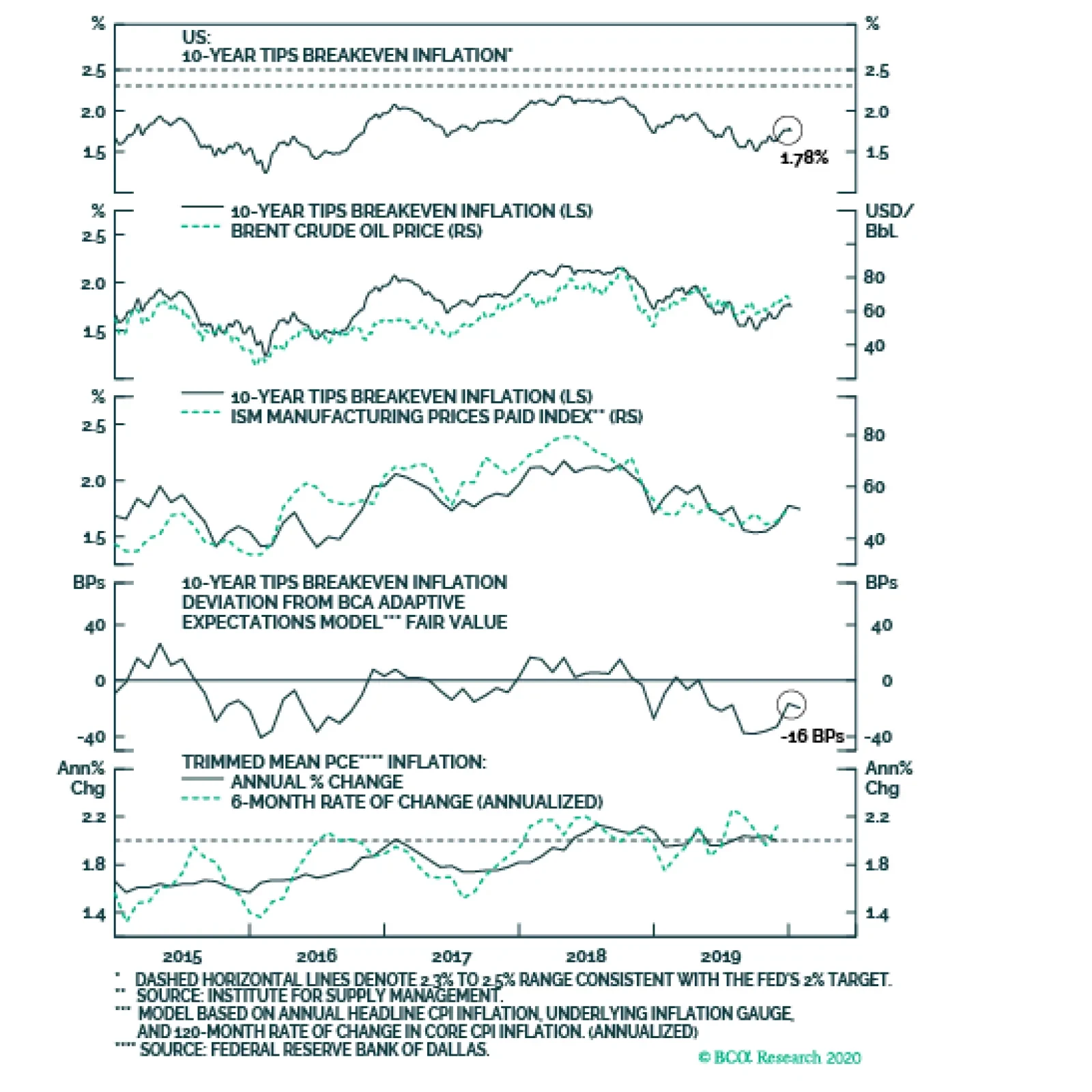
The divergence between the actual inflation data and inflation expectations remains stark. Trimmed mean PCE inflation has been fluctuating around the Fed’s target since mid-2018. However, long-maturity TIPS breakeven inflation rates remain stubbornly low. …
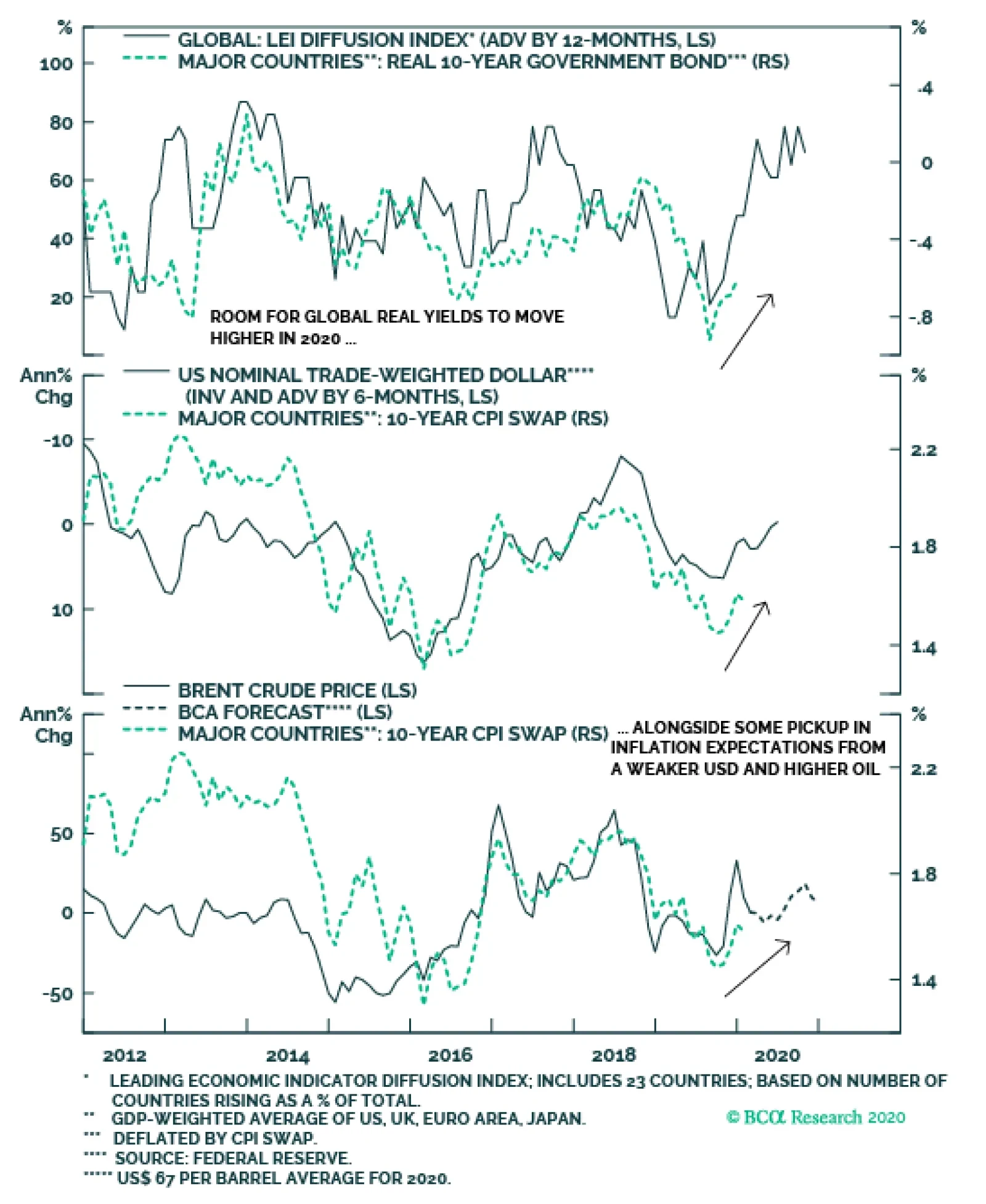
The expected improvement in global growth in 2020 would normally be anticipated to put upward pressure on the real component of global government bond yields. However, with all major developed market central banks now expressing a desire to keep policy as…
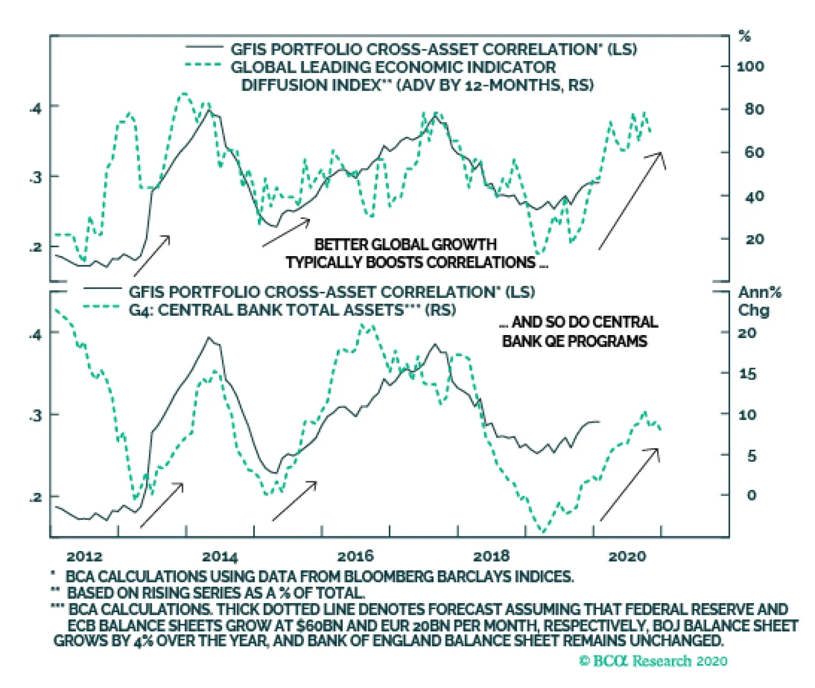
Cross-asset correlations across fixed income sectors should drift higher alongside a more broad-based upturn in global economic growth and expanding monetary liquidity. This pickup in correlations suggests that there is scope for markets that lagged the 2019…
Highlights 2020 Model Bond Portfolio Positioning: Translating our 2020 global fixed income Key Views into recommended positioning within our model bond portfolio comes up with the following conclusions: target a moderately aggressive level of overall portfolio risk, with below-benchmark duration exposure alongside meaningful overweight allocations to global corporate credit. Country Allocations: The cyclical improvement in global growth heralded by leading indicators should put upward pressure on overall global bond yields in 2020. With central banks likely to maintain accommodative policy settings to try and boost depressed inflation expectations, government bond allocations should reflect each country’s “beta” to global yield changes. That means favoring lower-beta countries (Japan, Germany, Spain, Australia, the UK) over higher-beta countries (the US, Canada, Italy). Spread Product: Better global growth, combined with stimulative monetary conditions, will provide an ideal backdrop for growth-sensitive spread product like corporate bonds to outperform government debt this year. We are maintaining an overweight stance on US high-yield credit, while increasing overweights to euro area corporates (both investment grade and high-yield). With the US dollar likely to soften as 2020 evolves, emerging market hard currency debt, both sovereign and corporate, is poised to outperform – we are upgrading both to overweight. Feature Welcome to our first report of the New Year. Just before our holiday break last month, we published our 2020 “Key Views” report, outlining the thematic implications of the BCA 2020 Outlook for global bond markets.1 In this follow-up report, we turn those themes into specific investment recommendations for the next twelve months. We will also make any necessary changes to the allocations in the Global Fixed Income Strategy (GFIS) model bond portfolio to reflect our themes. The main takeaway is that 2020 will be a much different year than 2019, when virtually all global fixed income classes delivered solid absolute returns. The unusual combination of rapidly falling government bond yields and stable-to-narrowing spreads on the majority of credit products – especially in developed market corporate debt – will not be repeated in 2020. Absolute returns from fixed income will be far lower than in 2019, forcing bond investors to focus on relative returns across maturities, countries and credit sectors to generate outperformance. With global monetary policy to remain stimulative, alongside improved global growth, market volatility should remain subdued over the next 6-12 months. Being more aggressive on overall levels of portfolio risk, particularly through higher allocations to markets like high-yield corporates and emerging market (EM) credit, is a solid strategy in a world of low risk-free interest rates and tame volatility. Top-Down Bond Market Implications Of Our Key Views As a reminder, the main fixed income investment themes from our 2020 Key Views report were the following: Global growth will rebound in 2020, led by the US and China, putting upward pressure on global bond yields. Central banks will stay dovish until policy reflation has clearly turned into inflation, limiting how high bond yields can climb in 2020 but sowing the seeds for a far more bond-bearish backdrop in 2021. Accommodative monetary policy and faster growth will delay the peak in the aging global credit cycle. Returns on global fixed income will be far lower in 2020 than in 2019, given rich valuation starting points. Country and sector selection will be more important in driving fixed income outperformance. We now present the specific fixed income investment recommendations that derive from those themes, described along the following lines: overall portfolio risk, overall duration exposure, country allocations within government bonds, yield curve allocations within countries, and corporate credit allocations by country and credit rating. Overall Portfolio Risk: MODERATELY AGGRESSIVE Global growth is in the process of bottoming out after the sharp manufacturing-driven slowdown in 2019. The cumulative lagged impact of monetary easing by central banks last year, led by the US Federal Reserve cutting rates and the European Central Bank (ECB) restarting its Asset Purchase Program, is a main reason why growth is set to rebound. Reduced trade uncertainty between the US and China should augment the impact of easier monetary policy through improved business confidence. Our global leading economic indicator (LEI), which has increased for nine consecutive months, is already heralding this improvement in the global economy. Our global LEI diffusion index – which measures the number of countries with a rising LEI and is itself a leading indicator of the LEI – suggests more gains ahead as 2020 progresses. The LEI diffusion index is also a reliable leading indicator of bond market volatility, with the former signaling that the latter will remain quiescent in 2020 (Chart 1). At the same time, cross-asset correlations across fixed income sectors should drift a bit higher alongside a more broad-based upturn in global economic growth and expanding monetary liquidity via central bank asset purchases (Chart 2). This pickup in correlations suggests that there is scope for markets that lagged the 2019 global credit rally, like EM USD-denominated sovereign debt, to make up for that underperformance in 2020. Chart 1Improving Global Growth Will Keep Volatility Subdued
Improving Global Growth Will Keep Volatility Subdued
Improving Global Growth Will Keep Volatility Subdued
Chart 2Cross-Asset Correlations Should Increase In 2020
Cross-Asset Correlations Should Increase In 2020
Cross-Asset Correlations Should Increase In 2020
The combination of better growth, stable volatility – but with only a mild rise in correlations – is a good backdrop to take a somewhat more aggressive investment stance in fixed income portfolios in 2020. The combination of better growth, stable volatility – but with only a mild rise in correlations – is a good backdrop to take a somewhat more aggressive investment stance in fixed income portfolios in 2020. We prefer to take that additional risk by adding to our recommended overweight to global credit, rather than further reducing our below-benchmark overall duration exposure. Overall Portfolio Duration Exposure: BELOW BENCHMARK Chart 3Global Bond Yields Poised To Move Higher
Global Bond Yields Poised To Move Higher
Global Bond Yields Poised To Move Higher
The improvement in global growth that we are anticipating in 2020 would normally be expected to put upward pressure on the real component of global government bond yields (Chart 3, top panel). This would initially manifest itself through asset allocation shifts out of bonds into equities and, later, through expectations of rate hikes and tighter monetary policy. However, with all major developed market central banks now expressing a desire to keep policy as easy as possible to try and boost inflation expectations, the cyclical move higher in real yields is likely to be more muted in 2020. However, given our expectation that the US dollar is likely to see a moderate decline, as global capital flows move into more growth-sensitive markets in EM and Europe, there is scope for global bond yields to rise via higher inflation expectations – especially with global oil prices likely to move a bit higher, as our commodity strategists expect (bottom two panels). We recommend only a moderate below-benchmark overall duration exposure in global fixed income portfolios in 2020, given that real yields will likely stay relatively muted. Investors should maintain core allocations to inflation-linked bonds, however, to benefit from the pickup in inflation expectations that is likely to occur this year. We recommend only a moderate below-benchmark overall duration exposure in global fixed income portfolios in 2020, given that real yields will likely stay relatively muted. Investors should maintain core allocations to inflation-linked bonds, however, to benefit from the pickup in inflation expectations that is likely to occur this year. Government Bond Country Allocation: UNDERWEIGHT HIGHER-BETA MARKETS, OVERWEIGHT LOWER-BETA MARKETS At the country level, we would typically let our expectations of monetary policy changes guide our recommended allocations. Yet in 2020, we see very little potential for any change in monetary policy outside of Australia (where rate cuts can happen early in the year) and Canada (where a rate hike may be possible later in the year). Thus, we think that a more useful framework for making fixed income country allocation decisions in 2020 is to rely on the “yield betas” of each country to changes in the overall level of global bond yields. Chart 4 shows the three-year trailing yield betas for 10-year government bonds of the major developed markets. Changes in the 10-year yields are compared to the yield of the 7-10 year maturity bucket of the Bloomberg Barclays Global Treasury Index (as a proxy for the unobservable “global bond yield”). On that basis, the higher-beta markets are the US, Canada and Italy, while the lower-beta markets are Japan, Germany, France, Spain, Australia and the UK. Thus, we want to maintain underweight positions in the former group and overweight positions in the latter group. At the moment, we already have most of those tilts within our model bond portfolio, with two exceptions: we are currently neutral (benchmark index weight) in the UK and Canada. For the UK, Brexit uncertainty has made it difficult to take a strong view on the direction of Gilt yields - a problem now compounded further with Andrew Bailey set to take over from Mark Carney as the new Governor of the Bank of England. Staying neutral, for now, still seems like the best strategy until all the policy uncertainties are fully resolved. Canadian bond yields are more likely to maintain their “higher-beta” status as global yields rise, as we discussed in a recent report.2 Thus, this week, we move our recommended allocation for Canadian government bonds to underweight from neutral. For Canada, the growth and inflation data continue to print strong enough to keep the Bank of Canada on a relatively more hawkish path than the other developed market central banks. This suggests that Canadian bond yields are more likely to maintain their “higher-beta” status as global yields rise, as we discussed in a recent report.2 Thus, this week, we move our recommended allocation for Canadian government bonds to underweight from neutral. Applying Our Global Golden Rule To Government Bond Allocations In September 2018, we published a Special Report introducing a government bond return forecasting methodology called the “Global Golden Rule.”3 This is an extension of a framework introduced by our sister service, US Bond Strategy, that links US Treasury returns (versus cash) to changes in the fed funds rate not already discounted in the US Overnight Index Swap (OIS) curve. That relationship also holds in other developed market countries, where there is a clear correlation between the level of bond yields and our 12-month discounters, which measure the change in policy rates over the next year priced into OIS curves (Chart 5). Chart 4Favor Lower-Beta Government Bond Markets In 2020
Favor Lower-Beta Government Bond Markets In 2020
Favor Lower-Beta Government Bond Markets In 2020
In Table 1, we show the expected returns generated by the Global Golden Rule (shown hedged into US dollars) for the countries in our model bond portfolio universe, based on monetary policy scenarios that we deem to be most plausible for 2020. Chart 5Monetary Policy Expectations Will Remain Critical For Bond Yields
Monetary Policy Expectations Will Remain Critical For Bond Yields
Monetary Policy Expectations Will Remain Critical For Bond Yields
In Table 2, we show the returns on a duration-adjusted basis (expected total return divided by duration). We then rank the return scenarios for overall country indices, aggregating the returns of the individual yield curve maturity buckets shown in those two tables, in Table 3. Table 1Global Golden Rule Forecasts For 2020
Our Model Bond Portfolio Strategy For 2020: Selectively Aggressive
Our Model Bond Portfolio Strategy For 2020: Selectively Aggressive
The results in Table 1 show that expected returns are still expected to be positive across most countries, although this is largely due to the gains from hedging into higher-yielding US dollars. The duration-adjusted returns shown in Table 2 look most attractive at the front-end of yield curves across all the countries. This is somewhat consistent with our view, discussed in the 2020 Key Views report, that investors should expect some “bear-steepening” of global yield curves over the course of this year as inflation expectations drift higher (Chart 6). Table 2Global Golden Rule Duration-Adjusted Forecasts For 2020
Our Model Bond Portfolio Strategy For 2020: Selectively Aggressive
Our Model Bond Portfolio Strategy For 2020: Selectively Aggressive
Chart 6Expect A Mild Reflationary Bear Steepening Of Global Yield Curves
Expect A Mild Reflationary Bear Steepening Of Global Yield Curves
Expect A Mild Reflationary Bear Steepening Of Global Yield Curves
Table 3Ranking The 2020 Return Scenarios
Our Model Bond Portfolio Strategy For 2020: Selectively Aggressive
Our Model Bond Portfolio Strategy For 2020: Selectively Aggressive
The results in Table 3 show that the best expected returns would come in rate cutting scenarios – an unsurprising outcome given that there is very little change in policy rates currently discounted in OIS curves in all countries in our model bond portfolio universe. We see rates more likely to remain stable across all countries, however, making the “rates flat” scenarios in the middle of Table 3 more likely in 2020. After our downgrade of Canada this week, our recommended country allocations now reflect both yield betas and the results of our Global Golden Rule. Spread Product Allocation: OVERWEIGHT GLOBAL CORPORATES VERSUS GOVERNMENT BONDS, IN THE US, EURO AREA AND EM Chart 7Stay Overweight US High-Yield
Stay Overweight US High-Yield
Stay Overweight US High-Yield
Turning to credit markets, the shift of global central banks to a more accommodative stance – with global growth improving – has opened a window for another year of outperformance versus sovereign bonds in 2020. With market volatility likely to remain low, as discussed earlier, there is a strong case to increase credit allocations relative to government debt as 2020 begins. Turning to credit markets, the shift of global central banks to a more accommodative stance – with global growth improving – has opened a window for another year of outperformance versus sovereign bonds in 2020. We already have a recommended overweight allocation to US high-yield corporate debt within our model bond portfolio. As we discussed in a recent report, the conditions that would lead us to become more cautious on US junk bonds – deteriorating corporate health, restrictive Fed policy and tightening bank lending standards – are currently not in place (Chart 7).4 If US economic growth starts to rebound in the first half of 2020, as we expect, then the case for US junk bond outperformance is even stronger. We are maintaining only a neutral allocation to US investment grade corporates, however, but this is part of a relative value view versus US Agency mortgage backed securities, which look more attractive on a volatility-adjusted basis.5 We are comfortable with our US credit views, but we are making the following changes this week to raise the credit allocation in our model bond portfolio: Upgrade EM USD-denominated sovereign and corporate debt to overweight. The two conditions that typically must be in place before EM hard currency debt can outperform – a softer US dollar and improving global growth – are now both in place. The two conditions that typically must be in place before EM hard currency debt can outperform – a softer US dollar and improving global growth – are now both in place (Chart 8). The momentum in the US dollar has clearly rolled over and even in level terms, the trade-weighted dollar is peaking. Add in the improvement in both our global LEI and the global manufacturing PMI (and the China PMI, most importantly) and the case for upgrading EM hard currency debt for 2020 is a strong one. Increase the size of overweights to euro area investment grade and high-yield corporate debt. We already have a modest overweight stance on euro area corporate bonds in our model bond portfolio, based on our expectations that the ECB will maintain a highly-accommodative stance – which could include buying more corporate debt in its Asset Purchase Program. Yet with an increasing body of evidence highlighting that the sharp downturn in European growth seen in 2019 is bottoming out, the argument for raising euro area corporate bond allocations for this year is compelling. This is especially true for euro area high-yield, where the backdrop looks even more constructive (Chart 9) compared to US junk bonds using the same metrics described above – corporate health (not deteriorating), monetary policy (not restrictive) and lending standards (not tightening). Chart 8Upgrade EM Credit To Overweight
Upgrade EM Credit To Overweight
Upgrade EM Credit To Overweight
Chart 9Increase Overweights To European Credit
Increase Overweights To European Credit
Increase Overweights To European Credit
Summing It All Up: Our Model Bond Portfolio Adjustments To Begin 2019 The outlook described in our 2020 Key Views report, and in this week’s report, lead us to make several adjustments to our model bond portfolio weightings seen in the table on Pages 15 and 16. The results of those changes are the following: Duration: We are maintaining an overall portfolio duration of 6.5 years, which is 0.5 years below that of our custom benchmark portfolio index (Chart 10). Credit Allocation: We are increasing the allocation to EM USD-denominated debt, funded by reducing exposure to US Treasuries. We are also increasing the size of the overweight positions in euro area investment grade and high-yield corporate debt, funded by cutting allocations to German and French government bonds. The net effect of these changes is to increase our total spread product weighting to 57% of the portfolio (Chart 11), which represents an overweight tilt versus the benchmark of +15% (versus a +8% overweight prior to this week’s changes). Chart 10Stay Below-Benchmark On Duration Exposure
Stay Below-Benchmark On Duration Exposure
Stay Below-Benchmark On Duration Exposure
Chart 11A Larger Recommended Allocation To Spread Product For 2020
Our Model Bond Portfolio Strategy For 2020: Selectively Aggressive
Our Model Bond Portfolio Strategy For 2020: Selectively Aggressive
Country Allocation: We are cutting the Canadian government bond allocation to underweight, while making additional modest adjustments to yield curve positioning in the US, Japan, and the UK to reflect the output from our Global Golden Rule. The net result of these changes, combined with the increased allocation to corporate bonds, is to boost the overall portfolio yield to 3%, which represents a positive carry of +43bps versus our benchmark index (Chart 12). Chart 12Greater Portfolio Yield To Begin 2020
Greater Portfolio Yield To Begin 2020
Greater Portfolio Yield To Begin 2020
Chart 13Move To A Moderately Aggressive Level Of Portfolio Risk
Move To A Moderately Aggressive Level Of Portfolio Risk
Move To A Moderately Aggressive Level Of Portfolio Risk
Overall Portfolio Risk: All of the above changes represent an increase in the usage of the “risk budget” of our model bond portfolio, which is now running a tracking error (or excess volatility versus that of the benchmark) of 73bps (Chart 13). This is higher than the 58bps prior to this week’s changes, but is still below the maximum allowable tracking error of 100bps that we have imposed on the model portfolio since its inception. This is consistent with our view that investors should maintain a “moderately aggressive” level of risk in fixed income portfolios in 2020. Robert Robis, CFA Chief Fixed Income Strategist rrobis@bcaresearch.com Footnotes 1 Please see BCA Global Fixed Income Strategy Weekly Report, “2020 Key Views: Delay Of Reckoning”, dated December 12th 2019, available at gfis.bcarsearch.com. 2 Please see BCA Research Global Fixed Income Strategy Weekly Report, “How Sweet It Is”, dated November 6, 2019, available at gfis.bcaresearch.com. 3 Please see BCA Research Global Fixed Income Strategy Special Report, “The Global Golden Rule Of Bond Investing”, dated September 25th 2018, available at gfis.bcaresearch.com. 4 Please see BCA Research Global Fixed Income Strategy Weekly Report, “The Lowdown On Low-Rated High-Yield”, dated November 27, 2019, available at gfis.bcaresearch.com. 5 Please see BCA Research Global Fixed Income Strategy Weekly Report, “Big Mo(mentum) Is Turning Positive”, dated October 29, 2019, available at gfis.bcaresearch.com. Recommendations The GFIS Recommended Portfolio Vs. The Custom Benchmark Index
Our Model Bond Portfolio Strategy For 2020: Selectively Aggressive
Our Model Bond Portfolio Strategy For 2020: Selectively Aggressive
Duration Regional Allocation Spread Product Tactical Trades Yields & Returns Global Bond Yields Historical Returns
Highlights Chart 1Softer PMIs In December
Softer PMIs In December
Softer PMIs In December
A bond bear market looked to be underway in December, with the 10-year Treasury yield reaching as high as 1.93% just before Christmas. But two developments during the past week drove it back down to 1.80%, and could prevent yields from rising during the next month or two. Five macro factors are important for US bond yields (global growth, the output gap, the US dollar, policy uncertainty and sentiment). Two of those factors flipped from sending bond-bearish to bond-bullish signals during the past week. First, policy uncertainty had been ebbing due to the US/China phase 1 trade deal, but it ramped up again due to US military conflict with Iran. Second, our preferred global growth indicators had been showing tentative signs of bottoming, but reversed course in December. The Global Manufacturing PMI fell from 50.3 to 50.1 in December, and the US ISM Manufacturing PMI fell from 48.1 to 47.2 (Chart 1). We continue to forecast higher bond yields in 2020, but recent events have likely postponed any significant sell-off. Stay tuned. Feature Investment Grade: Neutral Chart 2Investment Grade Market Overview
Investment Grade Market Overview
Investment Grade Market Overview
Investment grade corporate bonds outperformed the duration-equivalent Treasury index by 119 basis points in December and by 619 bps in 2019. In our 2020 Key Views report, we argued that the credit cycle will remain supportive for corporate bonds this year, but that we prefer to take credit risk in the high-yield space where valuation is more attractive.1 With inflation expectations still depressed, the Fed can maintain its “easy money” policy for some time yet. This accommodative stance will encourage banks to keep the credit taps running, leading to tight spreads. The third quarter’s tightening of C&I lending standards is a risk to our view (Chart 2), especially if this month’s survey reveals that the tightening continued into Q4. We don’t think that will be the case, given that the yield curve – another indicator of monetary conditions – steepened sharply in the fourth quarter. As stated above, valuation is the main hurdle for investment grade corporates. Spreads for all credit tiers are below our targets (panels 2 & 3).2 As a result, we advise only a neutral allocation to investment grade corporate bonds. We also recommend increasing exposure to Agency MBS in place of corporate bonds rated A or higher. Table 3ACorporate Sector Relative Valuation And Recommended Allocation*
Setbacks
Setbacks
Table 3BCorporate Sector Risk Vs. Reward*
Setbacks
Setbacks
High-Yield Overweight Chart 3High-Yield Market Overview
High-Yield Market Overview
High-Yield Market Overview
High-Yield outperformed the duration-equivalent Treasury index by 202 basis points in December, and by 886 bps in 2019. The index option-adjusted spread tightened 34 bps on the month and currently sits at 335 bps, 102 bps above our target (Chart 3). With attractive valuation, accommodative monetary conditions and a looming recovery in global economic growth, we expect junk spreads to tighten during the next 6-12 months. One notable development from last year is that the Ba and B credit tiers outperformed the Caa credit tier. This is unusual in an environment of positive excess junk returns. We analyzed the divergence between Caa and the rest of the junk index in a recent report and came to two conclusions.3 First, the historical data show that 12-month periods of overall junk bond outperformance are more likely to be followed by underperformance if Caa is the worst performing credit tier. Second, we can identify several reasons for 2019’s Caa spread widening that make us inclined to downplay any negative signal. Specifically, we note that the Caa credit tier’s exposure to the shale oil sector is responsible for the bulk of 2019’s underperformance (bottom panel). The conflict between the US and Iran should boost oil prices during the next few months, benefiting the US shale sector and causing some of this divergence to unwind. MBS: Overweight Chart 4MBS Market Overview
MBS Market Overview
MBS Market Overview
Mortgage-Backed Securities outperformed the duration-equivalent Treasury index by 34 basis points in December, and by 56 basis points in 2019. The conventional 30-year zero-volatility spread tightened 10 bps on the month, driven by an 8 bps tightening of the option-adjusted spread (OAS) and a 2 bps decline in expected prepayment losses (aka option cost). We recommend an overweight allocation to Agency MBS, particularly relative to corporate bonds rated A or higher, for three reasons.4 First, expected compensation is competitive. The conventional 30-year MBS OAS is 45 bps (Chart 4). This is only 7 bps below the spread offered by Aa-rated corporate bonds (panel 4). Also, spreads for all investment grade corporate bond credit tiers are below our targets. Second, risk-adjusted compensation heavily favors MBS. The Excess Return Bond Map in Appendix C shows that Agency MBS plot well to the right of investment grade corporates. This means that the sector is less likely to see losses versus Treasuries on a 12-month horizon. Finally, the macro environment for MBS remains supportive. Mortgage lending standards have barely eased since the financial crisis (bottom panel), and most homeowners have already had at least one opportunity to refinance. This burnout will keep refi activity low, and MBS spreads tight. Government-Related: Underweight Chart 5Government-Related Market Overview
Government-Related Market Overview
Government-Related Market Overview
The Government-Related index outperformed the duration-equivalent Treasury index by 54 basis points in December, and by 252 bps in 2019. Sovereign debt outperformed duration-equivalent Treasuries by 175 bps on the month, and by 697 bps in 2019. Local Authority and Foreign Agency bonds outperformed the Treasury benchmark by 41 bps and 73 bps, respectively, in December, and by 287 bps and 341 bps, respectively, in 2019. Domestic Agency bonds and Supranationals both performed in line with Treasuries in December, but outperformed by 51 bps and 36 bps, respectively, in 2019. We continue to recommend an underweight allocation to USD-denominated sovereign bonds, given that spreads remain expensive compared to US corporate credit (Chart 5). However, we noted in a recent report that Mexican and Saudi Arabian sovereigns look attractive on a risk/reward basis.5 This is also true for Local Authorities and Foreign Agencies, as shown in the Bond Map in Appendix C. Our Emerging Markets Strategy service also thinks that worries about Mexico’s fiscal position are overblown, and that bond yields embed too high of a risk premium (bottom panel).6 Municipal Bonds: Overweight Chart 6Municipal Market Overview
Municipal Market Overview
Municipal Market Overview
Municipal bonds outperformed the duration-equivalent Treasury index by 51 basis points in December, and by 57 bps in 2019 (before adjusting for the tax advantage). The average Aaa-rated Municipal / Treasury (M/T) yield ratio fell 6% in December, and currently sits at 78% (Chart 6). We upgraded municipal bonds in early October, as yield ratios had become significantly more attractive, especially at the long-end of the Aaa curve (panel 2).7 Yield ratios have tightened a lot since then, but value remains at long maturities. Specifically, 2-year, 5-year and 10-year M/T yield ratios are all below average pre-crisis levels at 66%, 68% and 78%, respectively. But 20-year and 30-year yield ratios stand at 87% and 91%, respectively, above average pre-crisis levels. Fundamentally, state and local government balance sheets remain solid. Our Municipal Health Monitor remains in “improving health” territory and state & local government interest coverage has improved considerably in recent quarters (bottom panel). Both of these trends are consistent with muni ratings upgrades continuing to outpace downgrades going forward. Treasury Curve: Maintain A Barbell Curve Positioning Chart 7Treasury Yield Curve Overview
Treasury Yield Curve Overview
Treasury Yield Curve Overview
Long-dated Treasury yields rose in December, while the Fed’s forward guidance kept short-maturity yields low. The result is that the 2/10 slope steepened 17 bps in December and the 5/30 slope steepened 11 bps (Chart 7). Looking back on 2019 we find that, despite August’s curve inversion scare, the 2/10 slope steepened 13 bps on the year and the 5/30 slope steepened 19 bps. In our 2020 Key Views report, we argued that the 2/10 Treasury slope will stay positive in 2020, in a range between 0 bps and 50 bps.8 We also expect further modest steepening during the next few months as the Fed continues to hold down the front-end of the curve in an effort to re-anchor inflation expectations, even as improving global growth pushes long-dated yields higher. Despite our outlook for modest curve steepening, we continue to recommend holding a barbelled Treasury portfolio. Specifically, we favor holding a 2/30 barbell versus the 5-year bullet, in duration-matched terms. This position offers positive carry (bottom panel), due to the extreme overvaluation of the 5-year note. It also looks attractive on our yield curve models (see Appendix B). TIPS: Overweight Chart 8Inflation Compensation
Inflation Compensation
Inflation Compensation
TIPS outperformed the duration-equivalent nominal Treasury index by 112 basis points in December, and by 42 bps in 2019. The 10-year TIPS breakeven inflation rate rose 16 bps on the month and currently sits at 1.78%. The 5-year/5-year forward TIPS breakeven inflation rate rose 14 bps on the month and currently sits at 1.86%. Both rates remain well below the 2.3%-2.5% range consistent with the Fed’s target. The divergence between the actual inflation data and inflation expectations remains stark. Trimmed mean PCE inflation has been fluctuating around the Fed’s target since mid-2018 (Chart 8). However, long-maturity TIPS breakeven inflation rates remain stubbornly low. It takes time for expectations to adapt to a changing macro environment, but even accounting for those long lags, our Adaptive Expectations Model pegs the 10-year TIPS breakeven inflation rate as 16 bps too low (panel 4).9 It is highly likely that the Fed will have to tolerate some overshoot of its 2% inflation target in order to re-anchor long-term inflation expectations. As a result, the actual inflation data will lead expectations higher, causing the TIPS breakeven inflation curve to flatten.10 Any politically-driven increase in oil prices will only exacerbate TIPS breakeven curve flattening. ABS: Underweight Chart 9ABS Market Overview
ABS Market Overview
ABS Market Overview
Asset-Backed Securities underperformed the duration-equivalent Treasury index by 5 basis points in December, but outperformed the benchmark by 69 bps in 2019. The index option-adjusted spread for Aaa-rated ABS widened 6 bps on the month. It currently sits at 37 bps, 3 bps above its minimum pre-crisis level (Chart 9). Our Excess Return Bond Map (see Appendix C) shows that Aaa-rated consumer ABS ranks among the most defensive US spread products, and also offers more expected return than other low-risk sectors such as Domestic Agency bonds and Supranationals. However, we remain wary of allocating too much to consumer ABS because credit trends continue to shift in the wrong direction. The consumer credit delinquency rate remains low, but has put in a clear bottom. This is also true for the household interest expense ratio (panel 3). Senior Loan Officers also continue to tighten lending standards for both credit cards and auto loans. Tighter lending standards usually coincide with rising delinquencies (bottom panel). All in all, our favorable outlook for global growth causes us to shy away from defensive spread products, and deteriorating credit metrics make consumer ABS even less appealing. Stay underweight. Non-Agency CMBS: Neutral Chart 10CMBS Market Overview
CMBS Market Overview
CMBS Market Overview
Non-Agency Commercial Mortgage-Backed Securities outperformed the duration-equivalent Treasury index by 11 basis points in December, and by 233 bps in 2019. The index option-adjusted spread for non-agency Aaa-rated CMBS widened 1 bp on the month. It currently sits at 71 bps, below its average pre-crisis level but somewhat above levels seen during the past two years (Chart 10). The macro outlook for commercial real estate (CRE) is somewhat unfavorable, with lenders tightening loan standards (panel 4) in an environment of tepid demand. The Fed’s Senior Loan Officer Survey shows that banks saw slightly stronger demand for nonfarm nonresidential CRE loans in Q3, after four consecutive quarters of falling demand (bottom panel). Despite the poor fundamental picture, our Excess Return Bond Map shows that CMBS offer a reasonably attractive risk/reward trade-off compared to other bond sectors (see Appendix C). Agency CMBS: Overweight Agency CMBS underperformed the duration-equivalent Treasury index by 16 basis points in December, but outperformed the benchmark by 91 bps in 2019. The index option-adjusted spread widened 4 bps on the month, and currently sits at 57 bps. The Excess Return Bond Map in Appendix C shows that Agency CMBS offer a compelling risk/reward trade-off. An overweight allocation to this high-rated sector remains appropriate. Appendix A: The Golden Rule Of Bond Investing We follow a two-step process to formulate recommendations for bond portfolio duration. First, we determine the change in the federal funds rate that is priced into the yield curve for the next 12 months. Second, we decide – based on our assessments of the economy and Fed policy – whether the change in the fed funds rate will exceed or fall short of what is priced into the curve. Most of the time, a correct answer to this question leads to the appropriate duration call. We call this framework the Golden Rule Of Bond Investing, and we demonstrated its effectiveness in the US Bond Strategy Special Report, “The Golden Rule Of Bond Investing”, dated July 24, 2018, available at usbs.bcaresearch.com. Chart 11 illustrates the Golden Rule’s track record by showing that the Bloomberg Barclays Treasury Master Index tends to outperform cash when rate hikes fall short of 12-month expectations, and vice-versa. Chart 11The Golden Rule's Track Record
The Golden Rule's Track Record
The Golden Rule's Track Record
At present, the market is priced for 22 basis points of cuts during the next 12 months. We anticipate a flat fed funds rate over that time horizon, and therefore anticipate that below-benchmark portfolio duration positions will profit. We can also use our Golden Rule framework to make 12-month total return and excess return forecasts for the Bloomberg Barclays Treasury index under different scenarios for the fed funds rate. Excess returns are relative to the Bloomberg Barclays Cash index. To forecast total returns we first calculate the 12-month fed funds rate surprise in each scenario by comparing the assumed change in the fed funds rate to the current value of our 12-month discounter. This rate hike surprise is then mapped to an expected change in the Treasury index yield using a regression based on the historical relationship between those two variables. Finally, we apply the expected change in index yield to the current characteristics (yield, duration and convexity) of the Treasury index to estimate total returns on a 12-month horizon. The below tables present those results, along with 95% confidence intervals. Excess returns are calculated by subtracting assumed cash returns in each scenario from our total return projections.
Setbacks
Setbacks
Setbacks
Setbacks
Appendix B: Butterfly Strategy Valuations The following tables present the current read-outs from our butterfly spread models. We use these models to identify opportunities to take duration-neutral positions across the Treasury curve. The following two Special Reports explain the models in more detail: US Bond Strategy Special Report, “Bullets, Barbells And Butterflies”, dated July 25, 2017, available at usbs.bcaresearch.com US Bond Strategy Special Report, “More Bullets, Barbells And Butterflies”, dated May 15, 2018, available at usbs.bcaresearch.com Table 4 shows the raw residuals from each model. A positive value indicates that the bullet is cheap relative to the duration-matched barbell. A negative value indicates that the barbell is cheap relative to the bullet. Table 4Butterfly Strategy Valuation: Raw Residuals In Basis Points (As Of January 3, 2020)
Setbacks
Setbacks
Table 5 scales the raw residuals in Table 4 by their historical means and standard deviations. This facilitates comparison between the different butterfly spreads. Table 5Butterfly Strategy Valuation: Standardized Residuals (As Of January 3, 2020)
Setbacks
Setbacks
Table 6 flips the models on their heads. It shows the change in the slope between the two barbell maturities that must be realized during the next six months to make returns between the bullet and barbell equal. For example, a reading of 33 bps in the 5 over 2/10 cell means that we would only expect the 5-year to outperform the 2/10 if the 2/10 slope steepens by more than 33 bps during the next six months. Otherwise, we would expect the 2/10 barbell to outperform the 5-year bullet. Table 6Discounted Slope Change During Next 6 Months (BPs)
Setbacks
Setbacks
Appendix C: Excess Return Bond Map The Excess Return Bond Map is used to assess the relative risk/reward trade-off between different sectors of the US bond market. It is a purely computational exercise and does not impose any macroeconomic view. The Map’s vertical axis shows 12-month expected excess returns. These are proxied by each sector’s option-adjusted spread. Sectors plotting further toward the top of the Map have higher expected returns and vice-versa. Our novel risk measure called the “Risk Of Losing 100 bps” is shown on the Map’s horizontal axis. To calculate it, we first compute the spread widening required on a 12-month horizon for each sector to lose 100 bps or more relative to a duration-matched position in Treasury securities. Then, we divide that amount of spread widening by each sector’s historical spread volatility. The end result is the number of standard deviations of 12-month spread widening required for each sector to lose 100 bps or more versus a position in Treasuries. Lower risk sectors plot further to the right of the Map, and higher risk sectors plot further to the left. Chart 12Excess Return Bond Map (As Of January 3, 2020)
Setbacks
Setbacks
Ryan Swift US Bond Strategist rswift@bcaresearch.com Footnotes 1 Please see US Bond Strategy Special Report, “2020 Key Views: US Fixed Income”, dated December 10, 2019, available at usbs.bcaresearch.com 2 For details on how we arrive at our spread targets please see US Bond Strategy Weekly Report, “The Value In Corporate Bonds”, dated February 19, 2019, available at usbs.bcaresearch.com 3 Please see US Bond Strategy Weekly Report, “Caa-Rated Bonds: Warning Sign Or Buying Opportunity?”, dated November 26, 2019, available at usbs.bcaresearch.com 4 Please see US Bond Strategy Weekly Report, “Two Themes And Two Trades”, dated October 1, 2019, available at usbs.bcaresearch.com 5 Please see US Bond Strategy Weekly Report, “A Perspective On Risk And Reward”, dated October 15, 2019, available at usbs.bcaresearch.com 6 Please see Emerging Markets Strategy Weekly Report, “Country Insights: Malaysia, Mexico & Central Europe”, dated October 31, 2019, available at ems.bcaresearch.com 7 Please see US Bond Strategy Weekly Report, “Two Themes And Two Trades”, dated October 1, 2019, available at usbs.bcaresearch.com 8 Please see US Bond Strategy Special Report, “2020 Key Views: US Fixed Income”, dated December 10, 2019, available at usbs.bcaresearch.com 9 For further details on our Adaptive Expectations Model please see US Bond Strategy Weekly Report, “Adaptive Expectations In The TIPS Market”, dated November 20, 2018, available at usbs.bcaresearch.com 10 Please see US Bond Strategy Special Report, “2020 Key Views: US Fixed Income”, dated December 10, 2019, available at usbs.bcaresearch.com Fixed Income Sector Performance Recommended Portfolio Specification Corporate Sector Relative Valuation And Recommended Allocation