Fixed Income
During the past few weeks, high-yield bonds and Agency MBS have looked particularly attractive. Their one commonality is that they are negatively convex. As a result, this year’s big drop in yields has led to large declines in duration for both high-yield…

Highlights Duration: Trade uncertainty has depressed survey measures of economic sentiment, but the hard economic data have been relatively robust. If the trade war starts to calm down during the next two months, as we expect, then the survey data will rebound, causing bond yields to move higher. Fed: With inflation expectations low, the Fed must ensure that financial conditions stay accommodative and that the economic recovery remains on track. This means that the Fed will meet market expectations and cut rates next week. Beyond that, we expect growth to improve enough that further cuts are unnecessary. Negative Convexity: This year’s large decline in yields has increased the attractiveness of negatively convex assets, in risk-adjusted terms. Investors should favor high-yield over investment grade corporates. They should also favor Agency MBS over Aaa, Aa and A rated corporates. Feature Chart 1Positive Surprises Driven By The Hard Data
Positive Surprises Driven By The Hard Data
Positive Surprises Driven By The Hard Data
The next two months are crucial for the U.S economy. Measures of sentiment, on both the business and consumer side, are sending recessionary signals. However, measures of actual economic activity paint a more benign picture (Chart 1). This divergence between the “hard” and “soft” data will likely resolve itself within the next couple of months, and the outcome of U.S./China trade negotiations will play a major part in determining whether that resolution is positive or negative. On the “Hard” And “Soft” Data There is a ton of economic data available to investors these days, but all of it can generally be classified as either “soft” or “hard”. We call measures of actual economic activity, such as housing starts or retail sales, “hard” data. These are the sorts of measures used to calculate a nation’s GDP. Alternatively, we use the term “soft” data to describe survey measures where firms or consumers are asked to describe whether activity is improving or deteriorating, or whether they are becoming more or less optimistic about the future. Some examples of soft data are PMI surveys and measures of consumer confidence. Both sorts of measures have value. Soft data are usually timelier and often lead the hard data. However, they are also more prone to whipsaws. The hard data tend to be more reliable, but don’t always provide enough lead time to be actionable. The soft and hard data are sending very different signals. At present, the soft and hard data are sending very different signals. On the consumer side, core retail sales are growing at the robust year-over-year pace of 4.8%, even though consumer confidence has declined during the past year (Chart 2). On the business side, the ISM manufacturing PMI survey came in at 47.8 in September, the lowest print since 2009. However, industrial production has fallen by only 0.1% during the past year. Industrial production growth got as low as -4% during the 2015/16 period, when the ISM was at a higher level (Chart 3). Similarly, actual orders for core durable goods have barely contracted, even though CEO confidence is at recessionary levels (Chart 3, panel 2). Capacity utilization also remains fairly strong, well above its 2016 low (Chart 3, bottom panel) Chart 2Hard Vs. Soft Data: On The Consumer Side
Hard Vs. Soft Data: On The Consumer Side
Hard Vs. Soft Data: On The Consumer Side
Chart 3Hard Vs. Soft Data: On The Business Side
Hard Vs. Soft Data: On The Business Side
Hard Vs. Soft Data: On The Business Side
Housing is the only sector of the economy that doesn’t currently display a dichotomy between the hard and soft data. All measures of housing activity are growing strongly, a rapid snapback following last year’s weakness (Chart 4). Chart 4Housing Activity Summary
Housing Activity Summary
Housing Activity Summary
Trade Negotiations Are Pivotal The soft data started to lag the hard data at around the same time as the Global Economic Policy Uncertainty index shot higher last year (Chart 5). This leads us to conclude that worries about the trade war’s negative consequences have caused sharp declines in measures of sentiment and confidence, even though the trade war’s actual impact on the hard data has been minor. This is what makes the outcome of November’s U.S./China trade talks so important. If an agreement is reached that makes it clear that no new tariffs will be implemented, we expect that would remove enough uncertainty for the soft data to improve, converging with the hard data. However, if things fall apart, then we would expect the negative survey data to eventually drag the hard data lower. Housing is the only sector of the economy that doesn’t currently display a dichotomy between the hard and soft data. Our sense at the moment is that the looming 2020 U.S. election provides enough incentive for both sides to strike a deal, but the outcome could still go either way. Last Friday’s report from our Global Investment Strategy service discussed the outlook for trade negotiations in more detail.1 For bond investors, we are confident that a removal of trade uncertainty would lead to a rebound in important soft data measures such as the ISM manufacturing PMI and the CRB Raw Industrials index. Any increase in those measures would also send bond yields sharply higher. The ratio between the CRB Raw Industrials index and Gold continues to track the 10-year Treasury yield closely (Chart 6). Chart 5Trade War Worries Affecting ##br##Sentiment
Trade War Worries Affecting Sentiment
Trade War Worries Affecting Sentiment
Chart 6Bond Yields Will Shoot Higher Once Trade Uncertainty Dissipates
Bond Yields Will Shoot Higher Once Trade Uncertainty Dissipates
Bond Yields Will Shoot Higher Once Trade Uncertainty Dissipates
Bottom Line: Trade uncertainty has depressed survey measures of economic sentiment, but the hard economic data have been relatively robust. If the trade war starts to calm down during the next two months, as we expect, then the survey data will rebound, causing bond yields to move higher. The Fed Next Week The dichotomy between hard and soft data fits nicely with how the Fed has been describing the economic outlook for most of the year. That is, an economy who’s baseline outlook is favorable but that faces some downside risks. While that outlook doesn’t immediately suggest a policy response, low inflation expectations make it pretty clear what the Fed’s course of action will be during the next few months. The 5-year/5-year forward TIPS breakeven inflation rate is currently 1.68%, well below the 2.3%-2.5% range that is consistent with the Fed’s inflation target (Chart 7). What’s more, the median 3-year inflation forecast from the New York Fed’s Survey of Consumer Expectations just hit an all-time low (Chart 7, bottom panel). The Fed must take appropriate action to drive inflation expectations higher. At present, this means that it must ensure that financial conditions stay accommodative so that the economic recovery can continue. Eventually, continued economic recovery will lead to higher realized inflation (Chart 7, panel 2), and inflation expectations will follow realized inflation higher. Chart 7Low Inflation Expectations Equals Accommodative Fed
Low Inflation Expectations Equals Accommodative Fed
Low Inflation Expectations Equals Accommodative Fed
In order to keep financial conditions accommodative, the Fed must at least match the market’s current rate cut expectations. An October rate cut is more or less fully priced, and it is therefore highly likely that the Fed will cut rates next week. After that, the market is pricing in roughly 50/50 odds of a fourth rate cut in December. But those expectations will certainly change as we learn the outcome of November’s trade talks and as the economic data roll in. Ultimately, we expect that enough good news will hit the wire between now and December that a fourth rate cut will be unnecessary. But the more important message is that, as long as inflation expectations are low, the Fed will not risk upsetting market expectations. Balance Sheet Update The Fed decided not to wait until next week to unveil its revamped balance sheet policy. It didn’t really have the luxury of time, given the turmoil in money markets that we discussed in a recent report.2 The main conclusion from our report is that the Fed must inject more bank reserves into the economy if it wants to maintain control of interest rates. This is exactly what the Fed will do going forward. It announced that it will purchase Treasury bills at least until the second quarter of 2020, starting at an initial pace of $60 billion per month. It will also continue to reinvest the proceeds from maturing Treasury notes/bonds and MBS into newly issued Treasury notes/bonds. Continued economic recovery will lead to higher realized inflation. Assuming the pace of $60 billion per month stays constant, and making some other assumptions about the growth rates of non-reserve liabilities, we project that the Fed’s actions will cause the supply of reserves to rise from $1.53 to $1.63 trillion by next June, and that its securities holdings will rise from $3.59 to $4.05 trillion (see Chart 8 and Table 1). Chart 8The Fed's Balance Sheet Over Time
The Fed's Balance Sheet Over Time
The Fed's Balance Sheet Over Time
Table 1Fed's Balance Sheet: Projections
Crisis Of Confidence
Crisis Of Confidence
As we have argued in the past, now that the link between the Fed’s balance sheet and its interest rate policy has been severed, we see no investment implications from the Fed’s new balance sheet strategy. As per our Golden Rule of Bond Investing, changes in the fed funds rate relative to expectations will continue to drive bond yields.3 Since the Fed’s balance sheet strategy tells us nothing about its future interest rate plans, it should mostly be ignored. Bottom Line: With inflation expectations low, the Fed must ensure that financial conditions stay accommodative and that the economic recovery remains on track. This means that the Fed will meet market expectations and cut rates next week. Beyond that, we expect growth to improve enough that further cuts are unnecessary. A Good Time To Buy Negative Convexity We have repeatedly mentioned the attractiveness of high-yield bonds and Agency MBS during the past few weeks. The one thing those sectors have in common is that they are negatively convex. That is, unlike most fixed income instruments, their durations are positively correlated with yields. As a result, this year’s big drop in yields has led to large declines in duration for both high-yield and agency MBS (Chart 9). But despite this lower duration, junk spreads have remained relatively flat while MBS spreads have actually widened. In other words, expected return has not fallen even as the risk embedded in negatively convex securities has declined markedly. Chart 9Negatively Convex Products Are Attractive
Negatively Convex Products Are Attractive
Negatively Convex Products Are Attractive
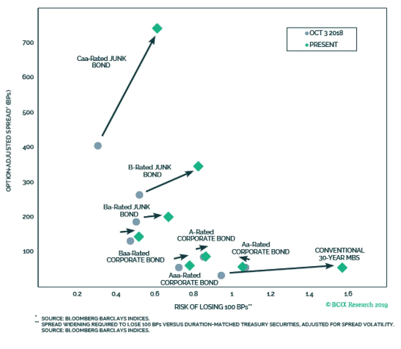
Last week we unveiled a new way of measuring risk for U.S. spread products.4 The Risk Of Losing 100 bps can be thought of as the number of standard deviations of annual spread change necessary for a sector to underperform duration-matched Treasuries by more than 100 basis points. A higher value means the sector is at a lower risk of losing 100 bps, and vice-versa. Chart 10 shows our new risk measure plotted against expected return for the investment grade and high-yield credit tiers, as well as for conventional 30-year Agency MBS. The y-axis shows each sector’s 12-month expected excess return, which we calculate as OAS less an adjustment for expected default losses. The x-axis shows the Risk Of Losing 100 bps. To put recent market moves in context, we show how each sector has moved within Chart 10 since spreads last troughed, about one year ago. Notice that last October, Ba and B rated junk bonds offered more expected return than Baa-rated corporates, with similar risk. Now, Ba and B offer a similar return advantage, but with much less risk. Caa-rated junk now strictly dominates the Baa sector in terms of risk and reward. Chart 10Risk-Reward Tradeoff Favors Negatively Convex Securities
Crisis Of Confidence
Crisis Of Confidence
Turning to Agency MBS, we see again that the large fall in duration has led to a substantial risk reduction since last October. This is why we recently recommended upgrading Agency MBS at the expense of Aaa, Aa, and A corporates.5 Bottom Line: This year’s large decline in yields has increased the attractiveness of negatively convex assets, in risk-adjusted terms. Investors should favor high-yield over investment grade corporates. They should also favor Agency MBS over Aaa, Aa and A rated corporates. Ryan Swift U.S. Bond Strategist rswift@bcaresearch.com Footnotes 1 Please see Global Investment Strategy Weekly Report, “Kumbaya”, dated October 18, 2019, available at gis.bcaresearch.com 2 Please see U.S. Bond Strategy Weekly Report, “What’s Up In U.S. Money Markets?”, dated September 24, 2019, available at usbs.bcaresearch.com 3 Please see U.S. Bond Strategy Special Report, “The Golden Rule Of Bond Investing”, dated July 24, 2018, available at usbs.bcaresearch.com 4 Please see U.S. Bond Strategy Weekly Report, “A Perspective On Risk And Reward”, dated October 15, 2019, available at usbs.bcaresearch.com 5 Please see U.S. Bond Strategy Weekly Report, “Two Themes And Two Trades”, dated October 1, 2019, available at usbs.bcaresearch.com Fixed Income Sector Performance Recommended Portfolio Specification
Highlights The investors we met last week were ready to hear some good news: The constructive story we told across three days of client meetings is more sanguine than the consensus view, but clients were open to considering it. Global economic weakness and the elevated risk of a U.S. recession were primary concerns, … : As our Global Investment Strategy colleagues have suggested, it will take some time for investors to be convinced that global manufacturing really has seen the bottom and that the U.S. isn’t flirting with a recession. … followed by trade tensions and corporate indebtedness, … : Our small sample suggests that investors may have become de-sensitized to the daily ebb and flow of the U.S.-China conflict, though we continue to believe it looms large in the minds of corporate managements. … but nothing matches the anxiety provoked by Elizabeth Warren’s ascent: Every client asked about the potential consequences of a Warren White House. Feature We spent most of last week meeting with a subset of wealth management and family office clients. They are more focused on absolute returns than relative returns, but their primary concerns are nearly identical to their relative-return peers’. Our meetings touched on a broad constellation of questions about the fate of the expansion, the equity bull market, global growth and the U.S.-China trade negotiations. Clients also asked about the credit outlook and if inflation should be on their radar, but the topic that they raised with the most fervor, in every single one of our meetings, was the prospect of a Warren or Sanders presidency. Q: What is the bond market telling us? We think of the bond market as having two distinct components, rates (Treasuries) and credit (spread product). We have gotten used to regular retracements in the 10-year Treasury yield since it bottomed in July 2016, but watching it melt from 3.25% last November to 1.5% this August has challenged our constructive take on the U.S. economy. Falling yields are not necessarily signaling imminent economic trouble, however, so we continue to hold the view that a recession won’t occur before late 2021 or early 2022. We see this year’s falling Treasury yields as a coincident reflection of decelerating growth, not a harbinger of a recession. On a purely domestic basis, the principal driver of the decline in yields has been the shift in monetary policy expectations. The Fed’s dovish pivot did not occur in a vacuum, of course. Clear signs of decelerating growth set the stage for easier policy, both here and abroad. Whether or not the Fed was always calling the tune, all three step-function declines in 12-month forward fed funds rate expectations occurred as it was guiding markets to expect easier policy: ahead of the March FOMC meeting, when Fed speakers began warning of the danger of inflation expectations becoming unanchored on the downside; in May, when they were busily preparing the ground for a rate cut; and after the July meeting raised the prospect that the July cut would not be a one-off event (Chart 1). Chart 1The Fed's Dovish Pivot, ...
The Fed's Dovish Pivot, ...
The Fed's Dovish Pivot, ...
Sovereign rates are not entirely determined domestically, and much of the softness in Treasury yields reflects the softness in yields in the rest of the world. So far this year, 10-year sovereign yields have moved in lockstep on either side of the Atlantic (Chart 2), preserving no-arbitrage conditions in currency-hedged Treasuries, gilts and bunds. Crude prices are another global variable, and their decline has weighed on inflation break-even rates (Chart 3), dampening the inflation compensation demanded by Treasury buyers. From a rates perspective, we think the bond market is telling us that global growth has slowed, central banks have taken monetary accommodation up a notch, and oil prices have slid. That’s not exactly an ideal growth backdrop, but it hardly spells the end of the expansion. Chart 2... And European Sovereigns' Gravitational Pull Have Dragged Treasury Yields Lower
... And European Sovereigns' Gravitational Pull Have Dragged Treasury Yields Lower
... And European Sovereigns' Gravitational Pull Have Dragged Treasury Yields Lower
The credit market concurs. It doesn’t betray a whit of concern that the expansion is in trouble. Spreads quickly unwound last year’s fourth-quarter spike, and have since hung around their post-crisis lows (Chart 4). Non-financial corporations have become more indebted throughout the expansion, but servicing the debt is not at all onerous with yields at rock-bottom levels (Chart 5). Our U.S. Bond Strategy service’s proprietary corporate health monitor is signaling that corporate balance sheets have weakened (Chart 6, third panel), but the other elements required for a meaningful widening of spreads – a completed monetary tightening cycle1 (Chart 6, second panel), and a tightening of lending standards (Chart 6, bottom panel) – are not yet in place. Chart 3Falling Oil Prices Have Smothered Inflation Worries
Falling Oil Prices Have Smothered Inflation Worries
Falling Oil Prices Have Smothered Inflation Worries
Chart 4Spreads Are Tight, ...
Spreads Are Tight, ...
Spreads Are Tight, ...
Chart 5... And Debt Service Is Easy
... And Debt Service Is Easy
... And Debt Service Is Easy
Q: Isn’t it time to reduce credit exposures? Tight spreads may be a contrarian warning sign. Though it is sensible to shift some of a company’s financing burden to debt when it is so much cheaper than equity, combining a larger debt burden with degraded covenant protections is a concern. Low interest rates will keep debt service costs from chafing, and help keep defaults in check for now, but the bond market is increasingly vulnerable. Chart 6Spread Widening Conditions Aren't Yet In Place
Spread Widening Conditions Aren't Yet In Place
Spread Widening Conditions Aren't Yet In Place
Chart 7Income Investors Need Not Apply
Income Investors Need Not Apply
Income Investors Need Not Apply
Despite that vulnerability, when the next default cycle arrives, it will not have anywhere near the impact of the housing bust because it will deal no more than a glancing blow to the banks. Single-family homes collateralize the American banking system; corporate bonds are held by a diffuse assortment of unlevered players. It stinks for any unlevered investor when it loses money, but it doesn’t cause much of a ripple in the overall economy. Today’s buildup in corporate borrowing is not analogous to 2006-7’s residential mortgage Superfund site, and suggestions to the contrary are ill-founded. Elevated corporate leverage is a vulnerability, but it is not enough for an investor to identify a vulnerability; s/he also has to identify the catalyst that will cause it to snap. Nonfinancial corporate debt levels are a fissure that has been made longer by debauched covenants. Markets won’t suffer until the fissure lengthens and widens enough to turn into a crack that no investor can ignore. It is our view that easy monetary conditions will keep the fissure out of sight and out of mind for several months at least. Defaults only occur when a borrower is unable to refinance its maturing obligations. As long as there is at least one lender willing to extend new credit at manageable terms, the borrower won’t go bust. The current monetary policy backdrop, featuring zero/negative interest rate policy in much of the major economies, all but ensures a steady supply of willing lenders. Life insurers, pension funds and endowments with a need for income to offset fixed liabilities have been forced out the risk curve to source income sufficient to meet them (Chart 7). The net result has been to provide even wobbly credits offering an incremental 50 or 75 basis points with a line of would-be lenders out the door and around the corner. The global manufacturing sector has already succumbed to recession, but stout performance in the service sector has allowed developed economies to keep expanding. The weakest credits will not find lifelines, but plenty of dubious ones will. The current ultra-loose monetary policy environment is simply not a backdrop in which defaults pick up in earnest. Until central banks get a little less prodigal, the marginal lender won’t become more selective, the plates will keep spinning, and spread product will continue to generate excess returns over cash and Treasuries. Q: Things look worse outside the U.S. What’s your global growth outlook? Chart 8Manufacturing May Be Bottoming, ...
Manufacturing May Be Bottoming, ...
Manufacturing May Be Bottoming, ...
The global manufacturing sector is in recession, but the overall global economy is not (Chart 8). A manufacturing recession does not necessarily lead to a full-blown recession, and the ongoing expansion in developed economies’ much larger service sector provides a formidable bulwark against manufacturing’s struggles (Chart 9). While it is too early to conclude if or when global activity will accelerate, our global leading economic indicator, and the diffusion index that leads it, suggest that it is in the process of bottoming (Chart 10). Chart 9... And Services May Have Stopped Decelerating ...
... And Services May Have Stopped Decelerating ...
... And Services May Have Stopped Decelerating ...
Chart 10... If Leading Indicators Have Found A Footing
... If Leading Indicators Have Found A Footing
... If Leading Indicators Have Found A Footing
Chart 11From Headwind To Tailwind
From Headwind To Tailwind
From Headwind To Tailwind
Our China Investment Strategy team sees scope for Chinese growth to gather some steam in the first quarter of 2020, when local governments will be freed from the budget constraints imposed by Beijing through the end of this year. In the meantime, September money and credit growth topped expectations, and policymakers have been undertaking modest stimulus measures like trimming bank reserve requirement ratios. Changes in Chinese credit growth lead changes in global growth (Chart 11), via China’s credit-reliant import channel. Its imports are Europe’s, Japan’s, Asian EMs’, and Australia’s, Brazil’s and Chile’s exports. As their exports rise, so too does their aggregate demand, giving rise to a self-reinforcing virtuous circle. Q: What would President Warren mean for markets? Investors’ concerns about a Warren presidency are surely justified; Senator Warren has openly, and often gleefully, expressed hostility for banks, defense contractors, drug companies, oil companies engaged in fracking, and big tech. That’s quite a list, and it accounts for a considerable share of S&P 500 market capitalization. It is fair to say that a Warren administration would be unfriendly to equity investors, but there are several points to keep in mind before liquidating one’s portfolio and fleeing the country. It’s too early to award her the Democratic nomination. In October 2007, the smart money was certain that Hillary Clinton had already locked up a berth in the finals against the eventual Republican nominee. Very few Americans could have named the freshman senator from Illinois, known for little more than a well-received speech at the 2004 convention, but he became President Obama. A lot could still happen between now and the Iowa caucuses on February 3rd. Unseating an incumbent president is a tall order. As long as the economy does not enter a recession between now and next November, and the administration can achieve a policy victory without suffering a high-profile policy failure, our Geopolitical Strategy colleagues argue that Trump should be the presumed winner of the 2020 election. Their presumption applies no matter who captures the Democratic nomination, even as the U.S. electorate is shifting to the left over time (Chart 12). Transforming Washington is easier said than done. The framers designed the federal government to be fairly resistant to sweeping change. The Electoral College tamps down popular passions in the presidential election, and Congress and the courts limit the power of the executive branch. Administrations with majorities in the House and Senate routinely find themselves with less freedom than they would like, especially after they exhaust political capital achieving one major legislative initiative (as with the Obama Administration and the Affordable Care Act). Even if the Democrats ride President Warren’s coattails to control over Capitol Hill next November, legislators from conservative or swing districts and states will balk at her entire suite of proposals. Chart 12Democratic Voters Are Leaning More Left
Questions From The Road
Questions From The Road
Investment Implications Our sunnier view of the global economic outlook translates into more constructive equity allocations across global regions and blocs. The BCA house view recommends equal weight allocations to Emerging Markets and the Eurozone within global equity portfolios across tactical (0-3-month) and cyclical (3-12-month) timeframes. We expect to upgrade EM and Eurozone equities to overweight, and downgrade U.S. equities from overweight, across those timeframes once global growth begins to accelerate. We would also favor higher-beta currencies versus the dollar, and limit or avoid exposure to lower-beta currencies like the yen or the Swiss franc, if the data are poised to validate our base-case growth scenario. BCA’s recommendations have become especially data dependent because global investors seem to be firmly ensconced in “show-me” mode. It has been our sense as a firm, supported by the impression we got from last week’s meetings, that investors are reluctant to give growth prospects, and risk assets, the benefit of the doubt. Ground down by trade-related tweets, and skeptical that the latest wave of extraordinary monetary policy measures will have a perceptible impact on growth or inflation, they want to see definitive evidence of a turn before they’ll adjust their portfolio positioning to accommodate it. The wariness is also a reflection of the conflicting signals issued late in the business cycle and the elevated levels of geopolitical uncertainty. If the global economy turns as we think it soon will, global investors should be prepared to add cyclical exposures to their portfolios, even if Elizabeth Warren solidifies her current status as the front-runner for the Democratic nomination. That sense of wariness keeps us recommending benchmark duration exposure in fixed income portfolios over the 0-to-3-month tactical timeframe, though we have little appetite for interest-rate exposure looking out beyond the near term, and are below-benchmark duration over the 3-to-12-month cyclical and greater-than-12-month strategic timeframes. We still like spread product over the full 12-month horizon, as we expect stronger growth will make viable U.S. corporations better credits and that ZIRP/NIRP will continue to protect some of the rest. We endorse the house view that relative U.S. equity returns may slow, but global growth should give a boost to absolute equity returns, and we continue to recommend that investors remain at least equal weight equities in balanced portfolios. Doug Peta, CFA Chief U.S. Investment Strategist dougp@bcaresearch.com Footnotes 1 We are in accord with Chair Powell’s stated view that the rate cuts are mid-cycle cuts, not the beginning of a new easing cycle.
Highlights Duration & Fed: Our late-1990s & 2015/16 roadmap for the economy still holds, but risks are mounting. Despite the risks, we expect that trade tensions will calm enough for the economic data to improve during the next few months. The result will be one more Fed rate cut this month, followed by an extended on-hold period. Investors should keep portfolio duration low in that environment. Junk Quality Spreads: This year’s divergence between the Caa/Ba quality spread and the high-yield index spread is highly unusual, but has more to do with movements in Treasury yields and changing index duration than with broader concerns about corporate credit quality. Investment Grade Risk & Reward: We present a novel approach for assessing the risk/reward trade-off among investment grade corporate bond sectors. We note that Saudi Arabian and Mexican Sovereign bonds, Foreign Agency bonds and Conventional 30-year Agency MBS look particularly attractive in risk-adjusted terms. Feature Contagion? This publication has repeatedly pointed to the late-1990s and the 2015/16 periods as appropriate comparables for today’s global growth slowdown. That is, we expect that the current spate of weakness will stay confined within the manufacturing sector and will not spread into the broader economy, leading the U.S. into recession. This call is important from an investment perspective because it implies that the Fed is not currently engaged in an easing cycle that will bring the funds rate back to zero. Rather, we anticipate only three rate cuts this year (we’ve already seen two), followed by the eventual resumption of hikes. Bond yields will not make new lows in that environment. Chart 1Manufacturing Weakness Spreading?
Manufacturing Weakness Spreading?
Manufacturing Weakness Spreading?
Chart 2"Hard" Data Still Firm
"Hard" Data Still Firm
"Hard" Data Still Firm
But some data received this month challenge our economic narrative. Specifically, September’s drop in the ISM Non-Manufacturing PMI from 56.4 to 52.6 and the year-over-year decline in the Conference Board’s survey of consumer confidence (Chart 1). Both are sending tentative signals that economic weakness might be spreading from the manufacturing sector into the broader U.S. economy. The Fed is worried about the same thing, as evidenced by this passage from the September FOMC minutes: One risk that the economy faced was that the softness recorded of late in firms’ capital formation, manufacturing, and exporting activities might spread to their hiring decisions, with adverse implications for household income and spending. Participants observed that such an eventuality was not embedded in their baseline outlook; however, a couple of them indicated that this was partly because they assumed that an appropriate adjustment to the policy rate path would help forestall that eventuality. This passage makes two important points. First, it stresses the risk of contagion from manufacturing into services and consumer spending as a precondition for recession. This risk has clearly increased, but we are not yet ready to abandon our base case outlook. For one thing, Chart 1 shows that the ISM Non-Manufacturing survey printed at 51.8 for one month in 2016, before rebounding sharply. Second, the “hard” economic data paint a much rosier picture that the “soft” survey data (Chart 2). Industrial production has already bounced off its lows and, unlike the ISM Manufacturing PMI, has not yet approached 2015/16 levels. Similarly, new orders for capital goods are much stronger than during the 2015/16 period. As for consumer spending, it continues to grow at a rapid pace despite the drop in confidence. Chart 3Expect One Rate Cut In October
Expect One Rate Cut In October
Expect One Rate Cut In October
The most logical explanation for the divergence between “hard” and “soft” data is that business and consumer sentiment are being pulled down by concerns about the ongoing trade war. Our sense is that some positive news on that front is now required to bring the survey data back into line with the “hard” numbers. On that note, we anticipate that the looming 2020 election will provide enough incentive for President Trump to reach some sort of détente with China. In fact, as we go to press, optimism about a potential trade deal has pushed the 10-year Treasury yield up above 1.70%. If this optimism is not vindicated, then weak survey data will eventually drag the “hard” data lower. The economy is at a critical and highly uncertain juncture. Amidst so much uncertainty, and with so much hinging on near-term political decisions, how should we expect the Fed to respond? The above passage from the September FOMC minutes gives us a strong clue. It illustrates that the Fed believes that sufficiently accommodative monetary policy will help mitigate the risk of contagion from manufacturing into services and consumer spending. In other words, the Fed must help weather the current storm by ensuring that financial conditions remain supportive. This means refraining from delivering hawkish surprises to market expectations.1 The Fed believes that sufficiently accommodative monetary policy will help mitigate the risk of contagion from manufacturing into services and consumer spending. With that in mind, we note that the market has mostly priced-in an October rate cut (Chart 3), and we expect the Fed to deliver on that expectation. Assuming an October cut, the market is only pricing-in a 28% chance of another cut in December. Overall, the market is priced for 59 basis points of rate cuts during the next 12 months. We anticipate a 25 bps cut this month, followed by an improvement in the economic data that will make further cuts unnecessary. Bottom Line: Our late-1990s & 2015/16 roadmap for the economy still holds, but risks are mounting. Despite the risks, we expect that trade tensions will calm enough for the economic data to improve during the next few months. The result will be one more Fed rate cut this month, followed by an extended on-hold period. Investors should keep portfolio duration low in that environment. High-Yield Quality Spreads: Less Than Meets The Eye Corporate bonds have generally performed quite well this year, but oddly, the lowest tier of junk has not kept pace (Chart 4). Investment grade excess returns have followed a typical risk-on pattern. That is, the lowest rated / riskiest credit tiers have performed best in a bull market. However, in the high-yield space, Caa-rated debt has bucked the trend and actually underperformed the duration-matched Treasury index by 33 bps. Chart 4Caa-Rated Junk Is Not Keeping Pace
Caa-Rated Junk Is Not Keeping Pace
Caa-Rated Junk Is Not Keeping Pace
Is this a potentially worrying sign for corporate spreads more generally? To consider the question, we looked at the historical relationships between quality spreads – the spread differential between low-rated and high-rated credit tiers – and the overall index spreads for both investment grade and high-yield. We found a strong positive correlation in both cases, but no leading or lagging properties. That is, quality spreads tend to follow the same trend as the overall index spread, but do not flag signs of trouble before the overall index. Nonetheless, the current divergence between the Caa/Ba quality spread and the high-yield index spread is highly unusual (Chart 5). Our sense, however, is that the divergence has less to do with concerns about credit quality and more to do with this year’s large moves in Treasury yields and changes to bond index duration. Chart 5De-Coupling In Quality Spreads...
De-Coupling In Quality Spreads...
De-Coupling In Quality Spreads...
Chart 6...Is Due To Duration
...Is Due To Duration
...Is Due To Duration
Specifically, we note that this year’s large decline in Treasury yields has caused junk index duration to plunge, but the drop has been greater for the Ba credit tier than the Caa credit tier (Chart 6). Ba index duration has fallen by 0.8 this year (from 4.4 to 3.5), while Caa index duration has fallen by 0.6 (3.4 to 2.8). The result is that if we control for changes in duration by looking at a 12-month breakeven spread instead of the average index option-adjusted spread (OAS), we see that the quality spread widening is roughly consistent with the overall index (Chart 6, panel 3).2 In other words, the steep drop in Treasury yields has not led to the same reduction in risk in the Caa credit tier as it has in the other junk credit tiers. Caa spreads have widened on a relative basis, as a result. This year’s large decline in Treasury yields has caused junk index duration to plunge. It’s also interesting to note that the opposite dynamic is afoot within the investment grade corporate space. The Baa/Aa quality spread is more or less consistent with the overall index spread in OAS terms (Chart 5, top panel), but the quality spread widening is exacerbated when the impact of changing duration is considered (Chart 6, panels 1 & 2). That is, index duration has lengthened by more for the upper credit tiers than it has for the Baa credit tier. This makes Baa corporates look particularly attractive in risk-adjusted terms, as we have noted in prior research.3 From a big picture perspective, it is unusual for Treasury yields to fall so much without a concurrent widening in credit risk premiums. Eventually, this anomaly will be resolved by either: Higher Treasury yields in the event that recession is avoided, or Wider credit spreads in the event of a contraction in U.S. economic activity But in the meantime, negatively convex sectors such as high-yield corporates and Agency MBS look particularly attractive on a risk-adjusted basis. These sectors have benefited from the drop in Treasury yields by seeing their durations fall. They should perform well as long as the current environment of low Treasury yields and stable credit spreads persists. We take a more detailed look at the prospects for risk-adjusted performance within the different investment grade bond sectors in the next section. Risk And Reward In Investment Grade Bond Sectors As mentioned above, in this week’s report we present a novel approach for considering the risk/reward trade-off between different investment grade sectors of the U.S. bond market. We consider 23 sectors in total: 4 corporate credit tiers Conventional 30-year Agency MBS and Agency CMBS Aaa-rated non-Agency CMBS, credit card ABS and auto loan ABS Domestic and Foreign Agency bonds Supranationals Local Authority bonds (mostly taxable munis and USD-denominated Canadian provincial debt) USD-denominated Sovereign bonds for 10 different emerging markets Reward First, we consider the reward side of the equation. We do not impose any macro view, but instead, use the average index OAS as the best estimate for each sector’s 12-month expected excess returns relative to a duration-matched position in Treasuries. Chart 7 shows the expected excess returns for each sector. Right away, the attractiveness of Mexican sovereign debt is apparent. Mexico carries an A rating, but offers a greater spread than the Baa corporate index. Chart 7Expected Returns
A Perspective On Risk And Reward
A Perspective On Risk And Reward
Risk We decided to assess risk using a breakeven spread framework. We calculate a 12-month breakeven spread for each sector. This spread represents the basis point spread widening required for each sector to break even with a duration-matched position in Treasury securities on a 12-month horizon. We calculate the breakeven spread using the following equation: 0 = OAS – D(B) + 0.5*CVXs*(dYs)2 - 0.5*CVXT*(dYT)2 Where: OAS = the sector’s option-adjusted spread D = the sector’s duration B = the breakeven spread CVXs = the sector’s convexity CVXT = the convexity of a duration-matched Treasury security dYs = trailing 1-year volatility of the sector’s yield dYT = trailing 1-year volatility of the duration-matched Treasury yield Chart 8 shows each sector’s 12-month breakeven spread, and it illustrates that the breakeven spread is a sub-optimal measure of risk. In theory, the highest breakeven spreads should be the least likely to see losses, but this is obviously not the case. Baa-rated South African Sovereign debt carries the largest breakeven spread, but it should be among the riskiest of the sectors. Chart 812-Month Breakeven Spreads
A Perspective On Risk And Reward
A Perspective On Risk And Reward
The missing piece of the puzzle is spread volatility. South African sovereign spreads need to widen by 39 bps before losses are incurred, while Aaa-rated credit card ABS spreads only need to widen by 13 bps. However, if spread volatility is much higher for South African sovereigns than for credit card ABS, then the sovereign sector still might be more likely to see losses. To control for this difference we calculate the standard deviation of annual spread changes for each sector, starting from May 2014 when all sectors have available data. We then divide each sector’s breakeven spread by the result. This calculation gives us a volatility-adjusted 12-month breakeven spread. In other words, it is the number of standard deviations of spread widening required for each sector to see losses on a 12-month horizon (Chart 9). Chart 912-Month Volatility-Adjusted Breakeven Spreads
A Perspective On Risk And Reward
A Perspective On Risk And Reward
Risk & Reward We bring risk and reward together in Charts 10-12. Chart 10 shows expected returns on the y-axis and the vol-adjusted 12-month breakeven spread on the x-axis. Sectors plotting near the top-right of the chart give the best returns and lowest risk of losses, while sectors plotting near the bottom-left provide low expected returns and high risk of losses. Immediately, Saudi Arabian sovereigns and Foreign Agency debt stand out as offering high expected returns for their risk levels. Note that South African sovereigns plot off the charts, toward the top-left of Charts 10-12, as indicated by the arrows. Chart 10Expected Returns Vs. Risk Of Negative Excess Returns
A Perspective On Risk And Reward
A Perspective On Risk And Reward
Chart 11Expected Returns Vs. Risk Of Losing 100 BPs
A Perspective On Risk And Reward
A Perspective On Risk And Reward
Chart 12Expected Returns Vs. Risk Of Losing 200 BPs
A Perspective On Risk And Reward
A Perspective On Risk And Reward
In Charts 11 and 12 we make one further refinement to our risk measure. In these charts, instead of calculating 12-month breakeven spreads, we calculate the spread change necessary for each sector to underperform Treasuries by 100 bps and 200 bps, respectively. Saudi Arabian sovereigns and Foreign Agency debt stand out as offering high expected returns for their risk levels. This adjustment arguably gives a more useful perspective on risk. For example, because spreads are quite narrow in the Supranational and Domestic Agency sectors, the risk of negative returns versus Treasuries is quite elevated. However, these sectors also carry high credit ratings and low spread volatility, making it exceedingly unlikely that they would deliver losses of 100 bps or more. Considering Charts 11 and 12, we look for sectors that clearly dominate other ones, i.e. plotting both higher and further to the right. Once again, Foreign Agencies and Saudi Arabian sovereigns both look very appealing. Mexican sovereign debt also offers very high expected return, and less risk that the Baa corporate sector. We would also like to point out the attractiveness of Agency MBS. As we noted in a recent report, Agency MBS offer considerably less risk than high-rated corporate debt, and similar expected returns. Note that this analysis doesn’t impose any macroeconomic view, and our sense is that the macro back-drop is more favorable for MBS spreads than for corporates.4 All in all, we reiterate our recommendation to favor Agency MBS over Aaa-, Aa- and A-rated corporate bonds. We will continue to refine this approach to measuring the risk/reward trade-off in the coming weeks, including incorporating high-yield debt into our analysis. Stay tuned. Ryan Swift, U.S. Bond Strategist rswift@bcaresearch.com Footnotes 1 For further discussion on this topic please see U.S. Bond Strategy Weekly Report, “Act As Appropriate”, dated August 27, 2019, available at usbs.bcaresearch.com 2 The 12-month breakeven spread is the spread widening required on a 12-month horizon to break even with a duration-matched position in Treasury securities. It can be approximated by dividing the option-adjusted spread by duration, as is done in Chart 6. 3 Please see U.S. Bond Strategy Weekly Report, “Two Themes And Two Trades”, dated October 1, 2019, available at usbs.bcaresearch.com 4 Please see U.S. Bond Strategy Weekly Report, “Two Themes And Two Trades”, dated October 1, 2019, available at usbs.bcaresearch.com Fixed Income Sector Performance Recommended Portfolio Specification
Highlights In this Weekly Report, we present our semi-annual chartbook of the BCA Central Bank Monitors. All of the Monitors are now below the zero line, indicating a growing need to ease global monetary policy (Chart of the Week). Central bankers have already gone down that path in several countries over the past few months (the U.S., the euro area, Australia and New Zealand), helping sustain the powerful 2019 rally in global bond markets. Feature With the global manufacturing & trade downturn now threatening to spill over into domestic demand in the major developed markets, policymakers will need to stay dovish to stave off recession. This will keep global bond yields at depressed levels in the near term, at least until widely-followed data like manufacturing PMIs stabilize and/or there is positive news on U.S.-China trade negotiations. Chart of the WeekStrong Pressures To Ease Global Monetary Policy
Strong Pressures To Ease Global Monetary Policy
Strong Pressures To Ease Global Monetary Policy
Yields already discount a lot of bad economic news, however, and there is a ray of hope visible in the bottoming out of our global leading economic indicator. A sustainable bottom in global bond yields, though, will require some change in the current downward growth or inflation momentum highlighted in our Central Bank Monitors. Yields already discount a lot of bad economic news, however, and there is a ray of hope visible in the bottoming out of our global leading economic indicator. A sustainable bottom in global bond yields, though, will require some change in the current downward growth or inflation momentum highlighted in our Central Bank Monitors. An Overview Of The BCA Central Bank Monitors* Chart 2Low Bond Yields Are Consistent With Our CB Monitors
Low Bond Yields Are Consistent With Our CB Monitors
Low Bond Yields Are Consistent With Our CB Monitors
The BCA Central Bank Monitors are composite indicators designed to measure the cyclical growth and inflation pressures that can influence future monetary policy decisions. The economic data series used to construct the Monitors are not the same for every country, but the list of indicators generally measure the same things (i.e. manufacturing cycles, domestic demand strength, commodity prices, labor market conditions, exchange rates, etc). The data series are standardized and combined to form the Monitors. Readings above the zero line for each Monitor indicate pressures for central banks to raise interest rates, and vice versa. Through the nexus between growth, inflation, and market expectations of future interest rate changes, the Monitors do exhibit broad correlations to government bond yields in the Developed Markets (Chart 2). All of the Monitors are currently pointing in a bond-bullish direction, making them less useful as a country allocation tool within global bond portfolios. With easing pressures most intense in the euro area, given that the ECB Monitor has the lowest reading, our recommended overweight stance on core euro area government bonds (hedged into U.S. dollars) remains well supported. In each BCA Central Bank Monitor Chartbook, we include a new chart for each country that we have not shown previously. In this edition, we show the components of the Monitors, grouped into those focusing on economic growth and inflation, plotted against our central bank discounters that indicate the amount of rate cuts/hikes priced into global Overnight Index Swap (OIS) curves. Fed Monitor: Signaling A Need For More Cuts Our Fed Monitor has fallen below the zero line (Chart 3A), indicating that the Fed’s summer rate cuts were justified with more easing still required. The Monitor, however, has not yet fallen to levels seen during U.S. recessions and is more consistent with the below-trend growth periods in 2016 and the late-1990s. The views of the FOMC on U.S. monetary policy are more deeply divided now than has been seen in many years. The doves can point to slumping global growth, persistent trade uncertainty, contracting capital spending and falling inflation expectations as reasons to continue cutting rates. The hawks can look at continued labor market tightness, elevated asset prices and realized inflation rates holding near the Fed’s 2% inflation target (Chart 3B) as reasons to keep monetary policy steady. That mixed picture can be seen in the components of our Fed Monitor, with the growth components showing the biggest pressure for more rate cuts compared to more stable readings from the inflation and financial components (Chart 3C). Chart 3AU.S.: Fed Monitor
U.S.: Fed Monitor
U.S.: Fed Monitor
Chart 3BU.S. Realized Inflation Holding Firm
U.S. Realized Inflation Holding Firm
U.S. Realized Inflation Holding Firm
Chart 3CGreatest Pressure For Fed Rate Cuts From Growth Components Of Our Fed Monitor
Greatest Pressure For Fed Rate Cuts From Growth Components Of Our Fed Monitor
Greatest Pressure For Fed Rate Cuts From Growth Components Of Our Fed Monitor
The U.S. Treasury market may have gotten ahead of itself after the latest decline in yields, which looks stretched versus the Fed Monitor. The U.S. Treasury market may have gotten ahead of itself after the latest decline in yields, which looks stretched versus the Fed Monitor (Chart 3D). We still expect the Fed to deliver just one more rate cut at the FOMC meeting at the end of October, as the “hard” U.S. data is outpeforming the “soft” data like the weak ISM surveys. That leaves Treasury yields vulnerable to some rebound if global growth stabilizes, although that is conditional on no new breakdown of the U.S.-China trade negotiations – a factor that continues to weigh on U.S. business confidence. Chart 3DTreasury Yields More Than Fully Discount Fed Easing Pressures
Treasury Yields More Than Fully Discount Fed Easing Pressures
Treasury Yields More Than Fully Discount Fed Easing Pressures
BoE Monitor: Easier Policy Needed Our Bank of England (BoE) Monitor, which was in the “tighter money required” zone from 2016-18, has been below the zero line since April of this year (Chart 4A). The market agrees with the message from the Monitor and is now pricing in -12bps of rate cuts over the next twelve months. The relentless uncertainty surrounding Brexit has triggered sharp downgrades of growth expectations and weakened business confidence, which the BoE is now factoring into its own projections. In the August Inflation Report, the BoE lowered its 2020 inflation forecast to below 2% - no surprise given the sharp fall in realized inflation that has already occurred even as economic growth has still not yet fallen substantially below trend (Chart 4B). Chart 4AU.K.: BoE Monitor
U.K.: BoE Monitor
U.K.: BoE Monitor
Chart 4BFalling U.K. Inflation Opens The Door To A BoE Ease
Falling U.K. Inflation Opens The Door To A BoE Ease
Falling U.K. Inflation Opens The Door To A BoE Ease
Still, weakening growth components have been the main driver of the BoE Monitor into rate cut territory (Chart 4C). While a strong jobs market is helping support consumer spending, the Brexit turmoil is having a lasting impact on future growth. Since the 2016 Brexit referendum, business confidence and real business investment have collapsed which, in turn, has hurt productivity growth, as we discussed in a Special Report last month.1 Chart 4CBrexit Uncertainty + Slumping Growth = Pressure For BoE Rate Cuts
Brexit Uncertainty + Slumping Growth = Pressure For BoE Rate Cuts
Brexit Uncertainty + Slumping Growth = Pressure For BoE Rate Cuts
The uncertainty around Brexit dominates the economic outlook and any future BoE decisions. Our Geopolitical Strategy service anticipates that Brexit will be delayed beyond October 31st. As a result, uncertainty will continue to weigh on Gilt yields, even though yields have already fallen in line with our BoE Monitor (Chart 4D). We continue to recommend an overweight stance on U.K. Gilts. Chart 4DGilt Yields Have Fallen In Line With Our BoE Monitor
Gilt Yields Have Fallen In Line With Our BoE Monitor
Gilt Yields Have Fallen In Line With Our BoE Monitor
ECB Monitor: Intense Pressure For Easier Monetary Policy Our European Central Bank (ECB) Monitor is now well below the zero line, signaling a strong need for easier monetary policy (Chart 5A). The global manufacturing downturn has hit the export-dependent economies of the euro area hard, with Germany now likely in a technical recession. Our European Central Bank (ECB) Monitor is now well below the zero line, signaling a strong need for easier monetary policy. Despite the weaker growth momentum, there remains far less spare capacity in the euro area economy than at any time since before the 2009 global recession (Chart 5B). This is keeping realized inflation in positive territory, in contrast to what was seen during the previous downturn in 2015-16. Chart 5AEuro Area: ECB Monitor
Euro Area: ECB Monitor
Euro Area: ECB Monitor
Chart 5BEuro Area Inflation Is Subdued, Despite Tight Labor Markets
Euro Area Inflation Is Subdued, Despite Tight Labor Markets
Euro Area Inflation Is Subdued, Despite Tight Labor Markets
The ECB has already responded to the weakening growth & inflation pressures, introducing a new TLTRO program back in March and then cutting the overnight deposit rate and restarting its Asset Purchase Program in September. The latest policy moves were reported to be more contentious, with the “hard money” northern euro area countries opposed to restarting bond purchases. The new incoming ECB President, Christine Lagarde, will likely have her hands full trying to gain consensus on any further easing measures from here, even as both the growth and inflation components of our ECB Monitor indicate that more stimulus is needed (Chart 5C). Chart 5CA Consistent Message On The Need For Future ECB Easing From Growth & Inflation
A Consistent Message On The Need For Future ECB Easing From Growth & Inflation
A Consistent Message On The Need For Future ECB Easing From Growth & Inflation
The big decline in euro area bond yields, which has pushed large swaths of sovereign yields into negative territory, does not look particularly stretched relative to the plunge in the ECB Monitor (Chart 5D). Without signs that the global manufacturing downturn is ending, however, euro area yields will stay mired at current deeply depressed levels. We recommend a moderate overweight on core European government bonds, on a currency-hedged basis into U.S. dollars. Chart 5DBund Rally Looks In Line With The ECB Monitor
Bund Rally Looks In Line With The ECB Monitor
Bund Rally Looks In Line With The ECB Monitor
BoJ Monitor: A Rate Cut On The Horizon? Our Bank of Japan (BoJ) Monitor has drifted slightly below the zero line into “rate cut required” territory (Chart 6A). Over the past few years, the BoJ’s monetary policy has remained unchanged for the most part and its messaging has grown less dovish, citing an expanding economy. However, recent Japanese economic data shows widespread deterioration in growth momentum, as the nation has been hit hard by the global manufacturing and trade recession. Yet even with weaker growth, Japan’s unemployment rate keeps hitting all-time lows. This has not helped boost inflation much, though, with Japan’s CPI inflation still struggling to reach even the 1% level (Chart 6B). Still, the latest leg lower in our BoJ Monitor has been driven by the growth, rather than inflation, components (Chart 6C). Chart 6AJapan: BoJ Monitor
Japan: BoJ Monitor
Japan: BoJ Monitor
Chart 6BNo Spare Capacity In Japan, But Still No Inflation
No Spare Capacity In Japan, But Still No Inflation
No Spare Capacity In Japan, But Still No Inflation
Weakening confidence has resulted in significant declines in both consumer spending and business investment. Due to the struggling domestic economy, it was expected that the Abe government would postpone the scheduled consumption tax hike, but it was finally initiated on October 1st. The timing could not be worse given the ongoing contraction in global manufacturing and trade activity that has clearly spilled over into Japan’s export and industrially-focused economy. Chart 6CThe Slumping Japanese Economy Could Use Some More BoJ Assistance
The Slumping Japanese Economy Could Use Some More BoJ Assistance
The Slumping Japanese Economy Could Use Some More BoJ Assistance
The BoJ will likely try and deliver some sort of easing in the next few months, but its options are limited after years of already hyper-easy policy. A modest rate cut is likely all that will be delivered, on top of a continuation of the Yield Curve Control policy. That will be enough to keep JGB yields at depressed levels (Chart 6D), even if global yields were to begin climbing. Chart 6DJGB Yields Look Fairly Valued Vs The BoJ Monitor
JGB Yields Look Fairly Valued Vs The BoJ Monitor
JGB Yields Look Fairly Valued Vs The BoJ Monitor
BoC Monitor: Rate Cuts Needed, But Will The BoC Deliver? The Bank of Canada (BoC) Monitor has been below zero since April of this year, indicating a need for easier monetary policy (Chart 7A). Although the BoC has maintained its policy rate at 1.75%, dovish Fed policy and softening domestic economic growth are making it harder for the BoC to continue sitting on its hands Although the Canadian labor market remains solid, household consumption has continued to weaken alongside falling consumer confidence. However, the inflation rate for both headline and core CPI measures is still hovering near the mid-point of BoC 1-3% target range (Chart 7B). Chart 7ACanada: BoC Monitor
Canada: BoC Monitor
Canada: BoC Monitor
Chart 7BRising Inflation Making The BoC’s Job Harder
Rising Inflation Making The BoC's Job Harder
Rising Inflation Making The BoC's Job Harder
At the moment, our BoC Monitor is more influenced by weaker growth components than stabilizing inflation components (Chart 7C). Similar mixed messages are also evident in other data. According to the latest BoC Business Outlook Survey, the overall outlook has edged up to the historical average,2 but real capex growth remains in negative territory and manufacturing new orders are still falling. In contrast, the Canadian labor market remains tight and both wage and price inflation are holding firm. Chart 7CBoC Growth & Inflation Components Signaling Moderate Pressure To Ease
BoC Growth & Inflation Components Signaling Moderate Pressure To Rise
BoC Growth & Inflation Components Signaling Moderate Pressure To Rise
Canadian government bonds have rallied strongly this year, but the yield momentum has appeared to overshoot the decline in our BoC Monitor (Chart 7D). The Canadian OIS curve is discounting -27bps of rate cuts over the next twelve months, but the BoC is not signaling that they will ease. We upgraded our recommended stance on Canadian government bonds to neutral back in May, and we see no need to alter that view without further evidence of more deterioration in Canadian growth or inflation data.3 Chart 7DCanadian Bond Rally Looks A Bit Stretched
Canadian Bond Rally Looks A Bit Stretched
Canadian Bond Rally Looks A Bit Stretched
RBA Monitor: Expect Another Cut The Reserve Bank of Australia (RBA) Monitor has been below the zero line since September 2018, indicating a need for easier monetary policy (Chart 8A). The RBA has already delivered on that signal this year, cutting the Cash Rate twice to an all-time low of 0.75%. Markets are still expecting more, with the Australian OIS curve discounting another -29bps of cuts over the next year, although most of those cuts are expected to occur within the next six months. The signal from our RBA Monitor suggests that Australian bond yields should remain under downward pressure, although the yield momentum has been excessive relative to the fall in the Monitor. Both headline and core CPI inflation remain below the RBA’s 2-3% target range (Chart 8B), and the central bank continues to lower its inflation forecasts, suggesting an entrenched dovish bias. Chart 8AAustralia: RBA Monitor
Australia: RBA Monitor
Australia: RBA Monitor
Chart 8BNo Inflation For The RBA To Worry About
No Inflation For The RBA To Worry About
No Inflation For The RBA To Worry About
The latest downturn in our RBA Monitor is related to declines in both the inflation and growth components (Chart 8C). The weakness in the growth components is led by falling exports to Asia, in addition to the sharp drop in house prices in the major cities. The fall in the inflation components reflects both weak inflation expectations and spare capacity in labor markets. Chart 8CA Loud & Clear Message On The Need For RBA Easing
A Loud & Clear Message On The Need For RBA Easing
A Loud & Clear Message On The Need For RBA Easing
The signal from our RBA Monitor suggests that Australian bond yields should remain under downward pressure, although the yield momentum has been excessive relative to the fall in the Monitor (Chart 8D). Australia’s economy will not begin to outperform again, however, until China’s current growth slump starts to bottom out, which is unlikely to occur until the first quarter of 2020 at the earliest. Thus, we expect the RBA to deliver another rate cut before the end of the year, justifying a continued overweight stance on Australian government bonds. Chart 8DA Lot Of Bad News Discounted In Australian Bond Yields
A Lot Of Bad News Discounted In Australian Bond Yields
A Lot Of Bad News Discounted In Australian Bond Yields
RBNZ Monitor: More Easing To Come Our Reserve Bank of New Zealand (RBNZ) monitor remains well below zero, indicating that easier monetary policy is still required (Chart 9A). The central bank has already delivered two rate cuts this year: a -25bps cut in May and, more importantly, a shock rate cut of -50bps in August. Forward guidance remains dovish, with RBNZ Governor Adrian Orr signaling more easing is likely and even hinting at negative rates in the future. This rhetoric is reflected in the NZ OIS curve, which is pricing in a further -42bps of easing over the next twelve months. High inflation is not a constraint for the RBNZ. Both headline and core measures of inflation are currently at 1.7% (Chart 9B). As the RBNZ targets a 1-3% range over the medium term, the prospect of overshooting the 2% longer-term target will not restrict policymakers from acting as appropriate to boost growth. Chart 9ANew Zealand: RBNZ Monitor
New Zealand: RBNZ Monitor
New Zealand: RBNZ Monitor
Chart 9BNZ Inflation Creeping Higher
NZ Inflation Creeping Higher
NZ Inflation Creeping Higher
Most of the pressure to ease has come from the continued deterioration in the growth component of our RBNZ Monitor (Chart 9C), reflecting weakness in manufacturing and consumption. The manufacturing PMI is currently in contractionary territory at 48.4, having fallen almost five points since February of this year. Annual growth in retail sales has been slowing for the past two years while consumer confidence is at 7-year lows. Chart 9CWeak Growth Is The Reason RBNZ Rate Cuts Are Needed
Weak Growth Is The Reason RBNZ Rate Cuts Are Needed
Weak Growth Is The Reason RBNZ Rate Cuts Are Needed
We feel confident in reiterating our bullish recommendation on NZ government bonds versus U.S. and German sovereign debt. The RBNZ Monitor suggests that policy will stay dovish for some time, while NZ yields still offer a relatively attractive yield, unlike deeply overbought Treasuries and Bunds (Chart 9D). Chart 9DStill A Bullish Case For New Zealand Government Bonds
Still A Bullish Case For New Zealand Government Bonds
Still A Bullish Case For New Zealand Government Bonds
Riksbank Monitor: Watching And Waiting Our Riksbank Monitor remains very slightly below zero and the market is currently priced for -4bps of rate cuts over the next year (Chart 10A). The Riksbank has decided to hold the Repo Rate constant at -0.25% while forecasting a hike towards the end of this year or the beginning of 2020. Given the policy environment, rate cuts remain unlikely. At most, the Riksbank can further delay rate hikes if the data continues to disappoint. The Riksbank noted in its September Monetary Policy Report that the unexpectedly weak development of the labor market indicates that resource utilization will normalize sooner than expected. This is reflected in Chart 10B, where the unemployment gap is now negative. Meanwhile, inflation readings are giving a mixed signal for the central bank. While the headline CPI measure has declined precipitously year-to-date, owing to the dramatic fall in oil prices, core inflation has continued to climb steadily. Chart 10ASweden: Riksbank Monitor
Sweden: Riksbank Monitor
Sweden: Riksbank Monitor
Chart 10BMixed Messages From Swedish Inflation
Mixed Messages From Swedish Inflation
Mixed Messages From Swedish Inflation
As a result, the inflation components of our Riksbank monitor - driven by a spike in the Citigroup Inflation Surprise Index, wage growth hooking upward and inflation expectations holding firm around 2% - are signaling the need for tighter monetary policy (Chart 10C). However, the growth components – led by weak exports, employment, and manufacturing data - are exerting pressure in the opposite direction. This is evident in the Swedish Manufacturing PMI, which tumbled from 51.8 to 46.3 in September, deep into contractionary territory. Chart 10CThere Is A Reason Why The Riksbank Has Been On Hold
There Is A Reason Why The Riksbank Has Been On Hold
There Is A Reason Why The Riksbank Has Been On Hold
Keeping in mind the inflation constraint, it remains unlikely that the Riksbank will cut rates unless the economic data disappoints more significantly to the downside. This should help put a floor under Swedish bond yields in the near term (Chart 10D). Chart 10DSwedish Yields Have Fallen Too Far, Too Fast
Swedish Yields Have Fallen Too Far, Too Fast
Swedish Yields Have Fallen Too Far, Too Fast
Robert Robis, CFA Chief Fixed Income Strategist rrobis@bcaresearch.com Ray Park, CFA Research Analyst ray@bcaresearch.com Shakti Sharma Research Associate shaktis@bcaresearch.com Footnotes * NOTE: All information in this report reflects our knowledge of global events as of Thursday, October 10. 1 Please see BCA Global Fixed Income Strategy Special Report “United Kingdom: Cyclical Slowdown Or Structural Malaise?” dated September 20, 2019, available at gfis.bcaresearch.com. 2https://www.bankofcanada.ca/2019/06/business-outlook-survey-summer-2019/ 3 Please see BCA Global Fixed Income Weekly Report, “Reconcilable Differences” dated May 8, 2019, available at gfis.bcaresearch.com. Recommendations The GFIS Recommended Portfolio Vs. The Custom Benchmark Index
BCA Central Bank Monitor Chartbook: Intensifying Pressure To Ease
BCA Central Bank Monitor Chartbook: Intensifying Pressure To Ease
Duration Regional Allocation Spread Product Tactical Trades Yields & Returns Global Bond Yields Historical Returns
Asset-Backed Securities underperformed the duration-equivalent Treasury index by 2 basis points in September, dragging year-to-date excess returns down to +72 bps. The index option-adjusted spread for Aaa-rated ABS widened 2 bps on the month. It currently…

High-Yield outperformed the duration-equivalent Treasury index by 66 basis points in September, before giving back 117 bps in the first week of October. The junk index’s option-adjusted spread (OAS) has been fairly stable for most of the year, but the…
Highlights Q3/2019 Performance Breakdown: Our recommended model bond portfolio underperformed the custom benchmark by -30bps during the third quarter of the year. Winners & Losers: The biggest underperformance came from underweight positions in U.S. Treasuries (-28bps) and Italian government bonds (-18bps) as yields plunged, dwarfing gains from overweights in corporate bonds in the U.S. (+11bps) and euro area (+4bps). Scenario Analysis For The Next Six Months: We are maintaining our current positioning, staying below-benchmark on duration while overweighting U.S. and euro area corporates vs. government debt. In our base case scenario, global growth will begin to stabilize but the Fed will deliver one more “insurance” rate cut by year-end, leading to corporate bond outperformance. Feature Global bond markets have enjoyed a powerful bull run throughout 2019, as yields have plummeted alongside weakening global growth and growing political uncertainty. Those two forces came to a head in the third quarter of the year, with U.S.-China trade tensions ratcheting up another notch after the imposition of higher U.S. tariffs in early August and global manufacturing PMI data moving into contraction territory – especially in the U.S. The result was a significant fall in government bond yields as markets discounted both lower inflation expectations and more aggressive monetary easing from global central banks, led by the Fed and ECB. The benchmark 10-year U.S. Treasury yield and 10-year German Bund yield plunged -40bps and -25bps, respectively, during the July-September period. Yet at the same time, global credit markets remained surprisingly stable, as the option-adjusted spread on the Bloomberg Barclays Global Corporates index was unchanged over the same three months. In this report, we review the performance of the BCA Global Fixed Income Strategy (GFIS) model bond portfolio during the eventful third quarter of 2019. We also present our updated scenario analysis, and total return projections, for the portfolio over the next six months. As a reminder to existing readers (and to new clients), the model portfolio is a part of our service that complements the usual macro analysis of global fixed income markets. The portfolio is how we communicate our opinion on the relative attractiveness between government bond and spread product sectors. This is done by applying actual percentage weightings to each of our recommendations within a fully invested hypothetical bond portfolio. Q3/2019 Model Portfolio Performance Breakdown: Good News On Credit Trumped By Bad News On Duration Chart of the WeekDuration Losses Dwarf Credit Gains In Q3/19
Duration Losses Dwarf Credit Gains In Q3/19
Duration Losses Dwarf Credit Gains In Q3/19
The total return for the GFIS model portfolio (hedged into U.S. dollars) in the third quarter was 2.0%, lagging the custom benchmark index by -30 bps (Chart of the Week).1 This brings the cumulative year-to-date total return of the portfolio to +7.8%, which has underperformed the benchmark by a disappointing –67bps. The Q3 drag on relative returns came entirely from the government bond side of the portfolio; specifically, the underweight allocation to U.S. Treasuries and Italian government bonds (Table 1). Those allocations reflected our views on overall portfolio duration (below benchmark) and a relative value consideration within European spread product (preferring corporates to Italy). Both those recommendations went against us as global bond yields dropped during Q3, with Italian yields collapsing (the benchmark 10-year yield was down –126bps) as investors chased any positive yield denominated in euros after the ECB signaled a new round of policy easing. The total return for the GFIS model portfolio (hedged into U.S. dollars) in the third quarter was 2.0%, lagging the custom benchmark index by -30 bps Table 1GFIS Model Bond Portfolio Q3/2019 Overall Return Attribution
Q3/2019 GFIS Model Bond Portfolio Performance Review: More Duration/Credit Divergence
Q3/2019 GFIS Model Bond Portfolio Performance Review: More Duration/Credit Divergence
Providing some partial offset to the U.S. and Italy allocations were gains from overweight positions in government bonds in the U.K., Australia and Japan. More importantly, our overweights in corporate debt in the U.S. and euro area made a strong positive contribution to the performance of the portfolio. The bar charts showing the total and relative returns for each individual government bond market and spread product sector are presented in Charts 2 and 3. The most significant movers were: Chart 2GFIS Model Bond Portfolio Q3/2019 Government Bond Performance Attribution
Q3/2019 GFIS Model Bond Portfolio Performance Review: More Duration/Credit Divergence
Q3/2019 GFIS Model Bond Portfolio Performance Review: More Duration/Credit Divergence
Chart 3GFIS Model Bond Portfolio Q3/2019 Spread Product Performance Attribution By Sector
Q3/2019 GFIS Model Bond Portfolio Performance Review: More Duration/Credit Divergence
Q3/2019 GFIS Model Bond Portfolio Performance Review: More Duration/Credit Divergence
Biggest outperformers Overweight U.S. high-yield Ba-rated (+4bps) Overweight U.S. high-yield B-rated (+3bps) Overweight U.S. investment grade industrials (+3bps) Overweight Japanese government bonds with maturity of 5-7 years (+2bps) Overweight euro area corporates, both investment grade (+2bps) and high-yield (+2bps) Biggest underperformers Underweight U.S. government bonds with maturity beyond 10+ years (-15bps) Underweight Italy government bonds with maturity beyond 10+ years (-10bps) Underweight U.S. government bonds with maturity of 7-10 years (-5bps) Underweight Japanese government bonds with maturity beyond 10+ years (-4bps) Underweight U.S. government bonds with maturity of 3-5 years (-4bps) Chart 4 presents the ranked benchmark index returns of the individual countries and spread product sectors in the GFIS model bond portfolio for Q3/2019. The returns are hedged into U.S. dollars (we do not take active currency risk in this portfolio) and are adjusted to reflect duration differences between each country/sector and the overall custom benchmark index for the model portfolio. We have also color-coded the bars in each chart to reflect our recommended investment stance for each market during Q3/2019 (red for underweight, blue for overweight, gray for neutral).2 Ideally, we would look to see more blue bars on the left side of the chart where market returns are highest, and more red bars on the right side of the chart were returns are lowest. Chart 4Ranking The Winners & Losers From The Model Bond Portfolio In Q3/2019
Q3/2019 GFIS Model Bond Portfolio Performance Review: More Duration/Credit Divergence
Q3/2019 GFIS Model Bond Portfolio Performance Review: More Duration/Credit Divergence
One thing that stands out from Chart 4 is that every fixed income sector generated a positive return, except for EM USD-denominated corporates. This is a fascinating outcome given the sharp falls in risk-free government bond yields which typically would correlate to a selloff in risk assets and widening of credit spreads. The soothing balm of looser global monetary policy seems to have offset the impact of elevated uncertainty on trade and future economic growth, allowing both bond yields and credit spreads to stay low. The soothing balm of looser global monetary policy seems to have offset the impact of elevated uncertainty on trade and future economic growth, allowing both bond yields and credit spreads to stay low. We maintained an overweight stance on global spread product throughout Q3, as we felt that the monetary policy effect would continue to overwhelm uncertainty. We did, however, make some tactical adjustments to our duration stance after the U.S. raised tariffs on Chinese imports, upgrading to neutral on August 6th.3 We had felt that higher tariffs were a sign that a potential end to the U.S.-China trade conflict was now even less likely, which raised the odds of a potential risk-off financial market event that would temporarily push bond yields lower. We shifted back to a below-benchmark duration stance on September 17th, given signs of de-escalation in the trade dispute and, more importantly, some improvement evident in global leading economic indicators.4 Bottom Line: Our recommended model bond portfolio underperformed the custom benchmark index during the third quarter of the year, with the drag on performance from an underweight stance on U.S. Treasuries and Italian BTPs overwhelming the gains from corporate credit overweights in the U.S. and euro area. Future Drivers Of Portfolio Returns Looking ahead, the performance of the model bond portfolio will continue to be driven by two main factors: our below-benchmark duration bias and our overweight stance on global corporate debt versus government bonds. Chart 5Overall Portfolio Allocation: Overweight Credit
Q3/2019 GFIS Model Bond Portfolio Performance Review: More Duration/Credit Divergence
Q3/2019 GFIS Model Bond Portfolio Performance Review: More Duration/Credit Divergence
In terms of the specific high-level weightings in the model portfolio, we currently have a moderate overweight, equal to eight percentage points, on spread product versus government debt (Chart 5). This reflects a more constructive view on future global growth. Early leading economic indicators are starting to bottom out and global central bankers are maintaining a dovish policy bias despite low unemployment rates – both factors that will continue to benefit growth-sensitive assets like corporate debt. Early leading economic indicators are starting to bottom out and global central bankers are maintaining a dovish policy bias despite low unemployment rates – both factors that will continue to benefit growth-sensitive assets like corporate debt. We are maintaining our below-benchmark duration tilt at 0.6 years short of the custom benchmark (Chart 6). We recognize, however, that the underperformance from duration in the model portfolio will not begin to be clawed back until there are signs of a bottoming in widely-followed cyclical economic indicators like the U.S. ISM index and the German ZEW. We think that will happen given the uptick in our global leading economic indicator (LEI), but that may take a few more months to develop based on the usual lead time from the LEI to the survey data like the ISM. The hook up in the global LEI does still gives us more confidence that the big decline in global bond yields seen this year is over, especially if a potential truce in the U.S.-China trade war is soon reached, as our political strategists believe to be increasingly likely. Chart 6Overall Portfolio Duration: Moderately Below Benchmark
Overall Portfolio Duration: Moderately Below Benchmark
Overall Portfolio Duration: Moderately Below Benchmark
Turning to country allocation, we are sticking with overweights in countries where central banks are likely to be more dovish than the Fed over the next 6-12 months (Germany, France, the U.K., Japan, and Australia). We are staying underweight the U.S. where inflation expectations appear too low and Fed rate cut expectations look too extreme. The Italy underweight has become a trickier call. We have long viewed Italian debt as a growth-sensitive credit instrument rather than the yield-driven rates vehicle it became in Q3 as markets priced in fresh monetary easing measures from the ECB (including restarting government purchases). We will revisit our Italy views in an upcoming report but, until then, we will continue to view Italian BTPs within the context of our European spread product allocation. Thus, we are maintaining an overweight on euro area corporate debt (by 1% each in investment grade and high-yield) while having an equal-sized underweight (-2%) in Italian government bonds. Our combined positioning generates a portfolio that has “positive carry”, with a yield of 3.1% (hedged into U.S. dollars) that is +25bps over that of the custom benchmark index (Chart 7). That same portfolio, however, generates an estimated tracking error (excess volatility of the portfolio versus its benchmark) of 55bps - well below our self-imposed 100bps ceiling and still within the 40-60bps range we have targeted since the start of 2019 (Chart 8). Chart 7Portfolio Yield: Positive Carry From Credit
Portfolio Yield: Positive Carry From Credit
Portfolio Yield: Positive Carry From Credit
Chart 8Portfolio Risk Budget Usage: Cautious
Portfolio Risk Budget Usage: Cautious
Portfolio Risk Budget Usage: Cautious
Scenario Analysis & Return Forecasts In April 2018, we introduced a framework for estimating total returns for all government bond markets and spread product sectors, based on common risk factors.5 For credit, returns are estimated as a function of changes in the U.S. dollar, the Fed funds rate, oil prices and market volatility as proxied by the VIX index (Table 2A). For government bonds, non-U.S. yield changes are estimated using historical betas to changes in U.S. Treasury yields (Table 2B). Table 2AFactor Regressions Used To Estimate Spread Product Yield Changes
Q3/2019 GFIS Model Bond Portfolio Performance Review: More Duration/Credit Divergence
Q3/2019 GFIS Model Bond Portfolio Performance Review: More Duration/Credit Divergence
Table 2BEstimated Government Bond Yield Betas To U.S. Treasuries
Q3/2019 GFIS Model Bond Portfolio Performance Review: More Duration/Credit Divergence
Q3/2019 GFIS Model Bond Portfolio Performance Review: More Duration/Credit Divergence
This framework allows us to conduct scenario analysis of projected returns for each asset class in the model bond portfolio by making assumptions on those individual risk factors. In Tables 3A & 3B, we present our three main scenarios for the next six months, defined by changes in the risk factors, and the expected performance of the model bond portfolio in each case. The scenarios, described below, all revolve around our expectation that the most important drivers of future market returns will continue to be the momentum of global growth and the path of U.S. monetary policy. The scenario inputs for the four main risk factors (the fed funds rate, the price of oil, the U.S. dollar and the VIX index) are shown visually in Chart 9. Table 3AScenario Analysis For The GFIS Model Bond Portfolio For The Next Six Months
Q3/2019 GFIS Model Bond Portfolio Performance Review: More Duration/Credit Divergence
Q3/2019 GFIS Model Bond Portfolio Performance Review: More Duration/Credit Divergence
Table 3BU.S. Treasury Yield Assumptions For The 6-Month Forward Scenario Analysis
Q3/2019 GFIS Model Bond Portfolio Performance Review: More Duration/Credit Divergence
Q3/2019 GFIS Model Bond Portfolio Performance Review: More Duration/Credit Divergence
Chart 9Risk Factor Assumptions For The Scenario Analysis
Risk Factor Assumptions For The Scenario Analysis
Risk Factor Assumptions For The Scenario Analysis
Base Case (Global Growth Bottoms): The Fed delivers one more -25bp rate cut by the end of 2019, the U.S. dollar weakens by -3%, oil prices rise by +10%, the VIX hovers around 15, and there is a bear-steepening of the UST curve. This is a scenario where the U.S. economy ends up avoiding recession and grows at roughly a trend-like pace. The Fed, however, still delivers one more “insurance” rate cut to mitigate the risk of low inflation expectations becoming more entrenched. Global growth is expected to bottom out as heralded by the global leading indicators. A truce (but not a full deal) is expected on the U.S.-China trade front, helping to moderately soften the U.S. dollar through reduced risk aversion. The model bond portfolio is expected to beat the benchmark index by +91bps in this case. Global Growth Strongly Rebounds: The Fed stays on hold, the U.S. dollar weakens by -5%, oil prices rise by +20%, the VIX declines to 12, there is a modest bear-steepening of the UST curve. In this tail-risk scenario, global growth starts to reaccelerate in lagged response to the global monetary easing seen this year, combined with some fiscal stimulus in major countries (China, the U.S., perhaps even Germany). The U.S. dollar weakens as global capital flows shift to markets which are more sensitive to global growth. The model bond portfolio is expected to beat the benchmark index by +106bps in this case. U.S. Downturn Intensifies: The Fed cuts rates by -75bps, the U.S. dollar is flat, oil prices fall by -15%, the VIX rises to 30; there is a bull-steepening of the UST curve. Under this tail-risk scenario, the current slowing of U.S. growth momentum gains speed, pushing the economy towards recession. The Fed cuts rates aggressively in response, helping weaken the U.S. dollar, but not before global risk assets sell off sharply to discount a worldwide recession. The model portfolio will underperform the benchmark by -38bps in this scenario. In terms of our conviction level among the main drivers of the model portfolio returns – duration allocation (across yield curves and countries) and asset allocation (credit versus government bonds) – we are most confident that credit returns will exceed those of sovereign debt over the next six months. In terms of our conviction level among the main drivers of the model portfolio returns – duration allocation (across yield curves and countries) and asset allocation (credit versus government bonds) – we are most confident that credit returns will exceed those of sovereign debt over the next six months. The underweight duration position, however, will also eventually begin to pay off if the message from the budding improvement in global leading economic indicators turns out to be correct. A collapse of the U.S.-China trade negotiations is the biggest threat to our base case, which would make the “U.S. Downturn Intensifies” scenario a more likely outcome. Bottom Line: We are maintaining our current positioning, staying below-benchmark on duration while overweighting U.S. and euro area corporates governments. In our base case scenario, global growth will begin to stabilize but the Fed will deliver one more “insurance” rate cut by year-end, leading to spread product outperformance. Robert Robis, CFA, Chief Fixed Income Strategist rrobis@bcaresearch.com Ray Park, CFA, Research Analyst ray@bcaresearch.com Footnotes 1 The GFIS model bond portfolio custom benchmark index is the Bloomberg Barclays Global Aggregate Index, but with allocations to global high-yield corporate debt replacing very high quality spread product (i.e. AA-rated). We believe this to be more indicative of the typical internal benchmark used by global multi-sector fixed income managers. 2 Note that sectors where we made changes to our recommended weightings during Q3/2019 will have multiple colors in the respective bars in Chart 4. 3 Please see BCA Global Fixed Income Strategy Weekly Report, “Trade War Worries: Once More, With Feeling”, dated August 6, 2019, available at gfis.bcaresearch.com. 4 Please see BCA Global Fixed Income Strategy Weekly Report, “The World Is Not Ending: Return To Below-Benchmark Portfolio Duration”, dated September 17, 2019, available at gfis.bcaresearch.com. 5 Please see BCA Global Fixed Income Strategy Weekly Report, “GFIS Model Bond Portfolio Q1/2018 Performance Review: A Rough Start”, dated April 10th 2018, available at gfis.bcareseach.com. Recommendations The GFIS Recommended Portfolio Vs. The Custom Benchmark Index
Q3/2019 GFIS Model Bond Portfolio Performance Review: More Duration/Credit Divergence
Q3/2019 GFIS Model Bond Portfolio Performance Review: More Duration/Credit Divergence
Duration Regional Allocation Spread Product Tactical Trades Yields & Returns Global Bond Yields Historical Returns
Highlights Chart 1Contagion?
Contagion?
Contagion?
Until last week, global growth weakness had been wholly confined to the manufacturing sector. But the drop to 52.6 in September’s Non-Manufacturing PMI (from 56.4 in August) raises the specter of contagion from manufacturing into the broader U.S. economy. A further drop would be consistent with an economy headed toward recession, and run contrary to the 2015/16 roadmap that has been our base case (Chart 1). We think it is still premature to abandon the 2015/16 episode as an appropriate comparable for the current period. For one thing, the hard economic data paint a rosier picture than the PMI surveys. Industrial production and core durable goods new orders are up 2.5% and 2.3% (annualized), respectively, during the past 3 months. These data have helped drive the economic surprise index above zero, an event that usually coincides with rising yields (bottom panel). The divergence between soft and hard data makes it clear that trade uncertainties are so far having a greater impact on business sentiment than on actual production, but history tells us that these divergences don’t last long. Some positive news on the trade front will be required during the next few months to raise business sentiment and push bond yields higher. Stay tuned. Feature Investment Grade: Overweight Chart 2Investment Grade Market Overview
Investment Grade Market Overview
Investment Grade Market Overview
Investment grade corporate bonds outperformed the duration-equivalent Treasury index by 42 basis points in September, before giving back 37 bps in the first week of October. We consider three main factors in our credit cycle analysis: (i) corporate balance sheet health, (ii) monetary conditions, and (iii) valuation. At present, the chief conundrum for investors is that while corporate balance sheet health is weak, the monetary environment is extraordinarily accommodative.1 On balance sheets, our top-down measure of gross leverage is elevated and rising (Chart 2). In contrast, interest coverage ratios remain solid, propped up by the Fed’s accommodative stance. With inflation expectations still very low, the Fed can maintain its “easy money” policy for some time yet. This will ensure that interest coverage stays solid and that bank lending standards continue to ease (bottom panel). This is an environment where corporate bond spreads should tighten. How low can spreads go? Our assessment of reasonable spread targets for the current environment suggests that Aaa, Aa and A-rated spreads are already fully valued, while Baa-rated spreads are 13 bps cheap (panels 2 & 3).2 We recommend focusing investment grade corporate bond exposure on the Baa credit tier, and subbing some Agency MBS into your portfolio in place of corporate bonds rated A or higher. Table 3ACorporate Sector Relative Valuation And Recommended Allocation*
Crunch Time
Crunch Time
Table 3BCorporate Sector Risk Vs. Reward*
Crunch Time
Crunch Time
High-Yield: Overweight Chart 3High-Yield Market Overview
High-Yield Market Overview
High-Yield Market Overview
High-Yield outperformed the duration-equivalent Treasury index by 66 basis points in September, before giving back 117 bps in the first week of October. The junk index’s option-adjusted spread (OAS) has been fairly stable for most of the year, but the sector has become increasingly attractive from a risk/reward perspective.3 This is because the index’s negatively convex nature has caused its average duration to fall alongside declining Treasury yields. Chart 3 shows that while the index OAS has been rangebound, the 12-month breakeven spread has widened considerably.4 In other words, while junk expected returns have been stable, those expected returns now come with considerably less risk. As a result, the junk index OAS looks increasingly attractive relative to our spread target.5 Specifically, we now view the junk index OAS as 171 bps cheap (panel 3). Falling index duration also explains the divergence between quality spreads and the index OAS. Many have observed that the spread differential between Caa and Ba-rated junk bonds has widened in recent months, while the overall index OAS has been stable (panel 4). However, the divergence evaporates when we look at 12-month breakeven spreads instead of OAS (bottom panel). MBS: Neutral Chart 4MBS Market Overview
MBS Market Overview
MBS Market Overview
Mortgage-Backed Securities outperformed the duration-equivalent Treasury index by 24 basis points in September, before giving back 25 bps in the first week of October. MBS have underperformed Treasuries by 31 bps, year-to-date. The conventional 30-year zero volatility spread held flat at 82 bps in September, as a 3 bps increase in expected prepayment losses (option cost) was offset by a 3 bps tightening in the option-adjusted spread (OAS). In last week’s report, we recommended favoring Agency MBS over Aaa, Aa and A-rated corporate bonds.6 We have three main reasons for this recommendation. First, expected compensation is competitive. The conventional 30-year MBS OAS is now 57 bps. This is above the pre-crisis average (Chart 4), and only 4 bps below the spread offered by a Aa-rated corporate bond. Aaa, Aa and A-rated corporate bond spreads also all look expensive relative to our targets. Second, risk-adjusted compensation heavily favors MBS. The 12-month breakeven spread for a conventional 30-year MBS is 21 bps. This compares to 6 bps, 8 bps and 12 bps for Aaa, Aa and A-rated corporates, respectively. Finally, the macro environment for MBS remains supportive. Mortgage lending standards have barely eased since the financial crisis (bottom panel), and most people have already had at least one opportunity to refinance their mortgage. This burnout will keep refi activity low, and MBS spreads tight (panel 2), going forward. Government-Related: Underweight Chart 5Government-Related Market Overview
Government-Related Market Overview
Government-Related Market Overview
The Government-Related index outperformed the duration-equivalent Treasury index by 10 basis points in September, bringing year-to-date excess returns up to +163 bps. September returns were concentrated in the Foreign Agency sub-sector. These securities outperformed the Treasury benchmark by 55 bps on the month, bringing year-to-date excess returns up to +197 bps. Sovereign bonds underperformed duration-equivalent Treasuries by 6 bps in September, dragging year-to-date excess returns down to +436 bps. Local Authority and Domestic Agency debt underperformed by 1 bp and 2 bps on the month, respectively. Meanwhile, Supranationals bested the Treasury benchmark by a single basis point. Sovereign debt remains very expensive relative to equivalently-rated U.S. corporate credit (Chart 5). While the sector would benefit if the Fed’s dovish pivot eventually results in a weaker dollar, U.S. corporate bonds would also perform well in such an environment. Given the much more attractive starting point for U.S. corporate bond spreads, we find it difficult to recommend sovereign debt as an alternative. While sovereign debt in general looks expensive. USD-denominated Mexican sovereign bonds continue to look attractive relative to U.S. corporates (bottom panel). Investors should favor Mexican sovereigns within an otherwise underweight allocation to the sector as a whole. Municipal Bonds: Overweight Chart 6Municipal Market Overview
Municipal Market Overview
Municipal Market Overview
Municipal bonds underperformed the duration-equivalent Treasury index by 10 basis points in September, dragging year-to-date excess returns down to -57 bps (before adjusting for the tax advantage). We recommended upgrading municipal bonds from neutral to overweight in last week’s report.7 We based the decision on the increasing attractiveness of yield ratios, despite an underlying credit environment that remains supportive for munis. Municipal bond yields failed to keep pace with falling Treasury yields in recent months, and now look quite attractive as a result (Chart 6). The average Aaa-rated Municipal / Treasury (M/T) yield ratio rose 4% in September and is now back above 90%. This is well above the 81% average that prevailed in the late stages of the previous cycle, between mid-2006 and mid-2007. In fact, Aaa M/T yield ratios for every maturity are now above average pre-crisis levels. Though yield ratios still look best at the long-end of the Aaa curve (panel 2), we now recommend owning munis in place of Treasuries across the entire maturity spectrum. Fundamentally, state & local government balance sheets remain solid. We showed in last week’s report that our Municipal Health Monitor is in “improving health” territory, and noted that state & local government interest coverage is positive (bottom panel). Both of those trends are consistent with muni ratings upgrades continuing to outnumber downgrades going forward. Treasury Curve: Maintain A Barbell Curve Positioning Chart 7Treasury Yield Curve Overview
Treasury Yield Curve Overview
Treasury Yield Curve Overview
The Treasury curve bear-steepened in September, and then bull-steepened sharply last week. All in all, the 2/10 Treasury slope is +12 bps, 12 bps steeper than it was at the end of August. The 5/30 slope is +67 bps, 10 bps steeper than at the end of August. Our fair value models (see Appendix B) continue to show that bullets are expensive relative to barbells across the entire Treasury curve. In particular, 5-year and 7-year maturities look very expensive compared to the short and long ends of the curve. Notice that the 2/5/10 butterfly spread, the spread between the 5-year bullet and a duration-matched 2/10 barbell, remains negative despite the recent 2/10 steepening (Chart 7). We have shown in prior research that the 5-year and 7-year maturities are the most highly correlated with our 12-month Fed Funds Discounter. Our discounter is currently at -74 bps, meaning that the market is priced for nearly three more Fed rate cuts during the next 12 months (top panel). We expect fewer cuts than that, and as such, think the Discounter is more likely to rise. 5-year and 7-year maturities would underperform the rest of the curve in that scenario. We also continue to hold our short position in the February 2020 fed funds futures contract. That contract is currently priced for 2 more rate cuts during the next 3 FOMC meetings. That outcome is possible, but our base case economic outlook is more consistent with 1 further cut, likely occurring this month. TIPS: Overweight Chart 8Inflation Compensation
Inflation Compensation
Inflation Compensation
TIPS underperformed the duration-equivalent nominal Treasury index by 38 basis points in September, dragging year-to-date excess returns down to -142 bps. The 10-year TIPS breakeven inflation rate fell 3 bps in September, and then another 2 bps last week. It currently sits at 1.51%, well below levels consistent with the Fed’s target. The divergence between the actual inflation data and inflation expectations is becoming increasingly stark. Trimmed mean PCE inflation has been fluctuating around the Fed’s target for most of the year (Chart 8). However, long-maturity TIPS breakeven inflation rates remain stubbornly low, nowhere near the 2.3% - 2.5% range that is consistent with the Fed’s target. As we have pointed out in prior research, it can take time for expectations to adapt to a changing macro environment.8 That being said, the 10-year TIPS breakeven inflation rate is currently 43 bps too low according to our Adaptive Expectations Model, a model whose primary input is 10-year trailing core inflation (panel 4). It is highly likely that the Fed will have to tolerate some overshoot of its 2% inflation target in order to re-anchor inflation expectations near desired levels. We anticipate that the committee will do so, and we maintain our view that long-dated TIPS breakevens will move above 2.3% before the end of the cycle. ABS: Underweight Chart 9ABS Market Overview
ABS Market Overview
ABS Market Overview
Asset-Backed Securities underperformed the duration-equivalent Treasury index by 2 basis points in September, dragging year-to-date excess returns down to +72 bps. The index option-adjusted spread for Aaa-rated ABS widened 2 bps on the month. It currently sits at 36 bps, very close to its minimum pre-crisis level (Chart 9). ABS also appear unattractive on a risk/reward basis, as both Aaa-rated auto loans and credit cards have moved into the “Avoid” quadrant of our Excess Return Bond Map (Appendix C). The Map uses each bond sector’s spread, duration and volatility to calculate the likelihood of earning or losing 100 bps of excess return versus Treasuries on a 12-month horizon. At present, the Map shows that ABS offer poor expected return for their level of risk. In addition to poor valuation, the ABS sector’s credit fundamentals are shifting in a negative direction. Household interest payments continue to trend up, suggesting a higher delinquency rate in the future (panel 3). Meanwhile, senior loan officers continue to tighten lending standards for both credit cards and auto loans. Tighter lending standards usually coincide with rising delinquencies (bottom panel). All in all, the combination of poor value and deteriorating credit quality leads us to recommend an underweight allocation to consumer ABS. Non-Agency CMBS: Neutral Chart 10CMBS Market Overview
CMBS Market Overview
CMBS Market Overview
Non-Agency Commercial Mortgage-Backed Securities outperformed the duration-equivalent Treasury index by 9 basis points in September, bringing year-to-date excess returns up to +227 bps. The index option-adjusted spread for non-agency Aaa-rated CMBS held flat on the month, before widening 4 bps last week. It currently sits at 75 bps, below average pre-crisis levels but above levels seen in 2018 (Chart 10). The macro outlook for commercial real estate is somewhat unfavorable, with lenders tightening loan standards (panel 4) amidst falling demand (bottom panel). Commercial real estate prices have accelerated of late, but are still not keeping pace with CMBS spreads (panel 3). Despite the poor fundamental picture, our Excess Return Bond Map shows that CMBS offer a reasonably attractive risk/reward trade-off compared to other bond sectors (see Appendix C). Agency CMBS: Overweight Agency CMBS outperformed the duration-equivalent Treasury index by 2 basis points in September, bringing year-to-date excess returns up to +90 bps. The index option-adjusted spread held flat on the month, before widening by 5 bps last week. It currently sits at 61 bps. The Excess Return Bond Map in Appendix C shows that Agency CMBS offer high potential return compared to other low-risk spread products. Appendix A - The Golden Rule Of Bond Investing We follow a two-step process to formulate recommendations for bond portfolio duration. First, we determine the change in the federal funds rate that is priced into the yield curve for the next 12 months. Second, we decide – based on our assessments of the economy and Fed policy – whether the change in the fed funds rate will exceed or fall short of what is priced into the curve. Most of the time, a correct answer to this question leads to the appropriate duration call. We call this framework the Golden Rule Of Bond Investing, and we demonstrated its effectiveness in the U.S. Bond Strategy Special Report, “The Golden Rule Of Bond Investing”, dated July 24, 2018, available at usbs.bcaresearch.com. Chart 11 illustrates the Golden Rule’s track record by showing that the Bloomberg Barclays Treasury Master Index tends to outperform cash when rate hikes fall short of 12-month expectations, and vice-versa. Chart 11The Golden Rule's Track Record
The Golden Rule's Track Record
The Golden Rule's Track Record
At present, the market is priced for 74 basis points of cuts during the next 12 months. We anticipate fewer rate cuts over that time horizon, and therefore anticipate that below-benchmark portfolio duration positions will profit. We can also use our Golden Rule framework to make 12-month total return and excess return forecasts for the Bloomberg Barclays Treasury index under different scenarios for the fed funds rate. Excess returns are relative to the Bloomberg Barclays Cash index. To forecast total returns we first calculate the 12-month fed funds rate surprise in each scenario by comparing the assumed change in the fed funds rate to the current value of our 12-month discounter. This rate hike surprise is then mapped to an expected change in the Treasury index yield using a regression based on the historical relationship between those two variables. Finally, we apply the expected change in index yield to the current characteristics (yield, duration and convexity) of the Treasury index to estimate total returns on a 12-month horizon. The below tables present those results, along with 95% confidence intervals. Excess returns are calculated by subtracting assumed cash returns in each scenario from our total return projections.
Crunch Time
Crunch Time
Crunch Time
Crunch Time
Appendix B - Butterfly Strategy Valuation The following tables present the current read-outs from our butterfly spread models. We use these models to identify opportunities to take duration-neutral positions across the Treasury curve. The following two Special Reports explain the models in more detail: U.S. Bond Strategy Special Report, “Bullets, Barbells And Butterflies”, dated July 25, 2017, available at usbs.bcaresearch.com U.S. Bond Strategy Special Report, “More Bullets, Barbells And Butterflies”, dated May 15, 2018, available at usbs.bcaresearch.com Table 4 shows the raw residuals from each model. A positive value indicates that the bullet is cheap relative to the duration-matched barbell. A negative value indicates that the barbell is cheap relative to the bullet. Table 5 scales the raw residuals in Table 4 by their historical means and standard deviations. This facilitates comparison between the different butterfly spreads. Table 6 flips the models on their heads. It shows the change in the slope between the two barbell maturities that must be realized during the next six months to make returns between the bullet and barbell equal. For example, a reading of +48 bps in the 5 over 2/10 cell means that we would only expect the 5-year to outperform the 2/10 if the 2/10 slope steepens by more than 48 bps during the next six months. Otherwise, we would expect the 2/10 barbell to outperform the 5-year bullet. Table 4Butterfly Strategy Valuation: Raw Residuals In Basis Points (As of October 4, 2019)
Crunch Time
Crunch Time
Table 5Butterfly Strategy Valuation: Standardized Residuals (As of October 4, 2019)
Crunch Time
Crunch Time
Table 6
Crunch Time
Crunch Time
Appendix C - Excess Return Bond Map The Excess Return Bond Map is used to assess the relative risk/reward trade-off between different sectors of the U.S. fixed income market. The Map employs volatility-adjusted breakeven spread analysis to show how likely it is that a given sector will earn/lose money during the subsequent 12 months. The Map does not incorporate any macroeconomic view. The horizontal axis of the Map shows the number of days of average spread widening required for each sector to lose 100 bps versus a position in duration-matched Treasuries. Sectors plotting further to the left require more days of average spread widening and are therefore less likely to see losses. The vertical axis shows the number of days of average spread tightening required for each sector to earn 100 bps in excess of duration-matched Treasuries. Sectors plotting further toward the top require fewer days of spread tightening and are therefore more likely to earn 100 bps of excess return. Chart 12Excess Return Bond Map (As Of October 4, 2019)
Crunch Time
Crunch Time
Ryan Swift, U.S. Bond Strategist rswift@bcaresearch.com Footnotes 1 Please see U.S. Bond Strategy Weekly Report, “Corporate Bond Investors Should Not Fight The Fed”, dated September 17, 2019, available at usbs.bcaresearch.com 2 For more details on how we arrive at our spread targets please see U.S. Bond Strategy Weekly Report, “The Value In Corporate Bonds”, dated February 19, 2019, available at usbs.bcaresearch.com 3 Please see U.S. Bond Strategy Weekly Report, “Corporate Bond Investors Should Not Fight The Fed”, dated September 17, 2019, available at usbs.bcaresearch.com 4 The 12-month breakeven spread is the spread widening required to break even with a duration-matched position in Treasuries on a 12-month horizon. It can be approximated by OAS divided by duration. 5 For more details on how we arrive at our spread targets please see U.S. Bond Strategy Weekly Report, “The Value In Corporate Bonds”, dated February 19, 2019, available at usbs.bcaresearch.com 6 Please see U.S. Bond Strategy Weekly Report, “Two Themes And Two Trades”, dated October 1, 2019, available at usbs.bcaresearch.com 7 Please see U.S. Bond Strategy Weekly Report, “Two Themes And Two Trades”, dated October 1, 2019, available at usbs.bcaresearch.com 8 Please see U.S. Bond Strategy Weekly Report, “Adaptive Expectations In The TIPS Market”, dated November 20, 2018, available at usbs.bcaresearch.com Fixed Income Sector Performance Recommended Portfolio Specification Corporate Sector Relative Valuation And Recommended Allocation
Brief Market Overview The S&P 500 convulsed last week, as a slew of weaker-than-expected data shattered investors’ confidence in the longevity of the business and profit cycles. Importantly, both ISM surveys declined month-over-month, arguing that the manufacturing sector’s ails are infecting services industries (second panel, Chart 1). Chart 1The U.S. Dollar Is The Key Indicator To Monitor
The U.S. Dollar Is The Key Indicator To Monitor
The U.S. Dollar Is The Key Indicator To Monitor
The “In Fed We Trust” doctrine will get severely tested in upcoming weeks. The Federal Reserve’s reaction function to the poor data took center stage with bond investors pricing a 75% probability of a rate cut in late October. However, our four factor EPS growth model continues to predict that earnings will remain weak for the rest of 2019 (not shown). Thus, next year’s 10% EPS growth is wishful thinking and profit growth will begin to bottom in Q1/2020 at the earliest. Absent profit growth, stocks will have to face reality and continue to drift lower. Importantly, the U.S. dollar – the great reflator – is the key determinant of both profit and global economic growth in coming quarters. The third panel of Chart 1 shows that currently that are no advanced economy central banks that have a policy rate higher than the Fed. Historically, this has been U.S. dollar bullish and has weighed on SPX momentum (trade-weighted U.S. dollar shown inverted, bottom panel, Chart 1). It remains to be seen if aggressive Fed easing can change this relationship, stave off recession and engineer a soft landing. U.S. Equity Strategy’s view remains intact that things will get worse before they get better and therefore a cautious overall U.S. equity market stance is still warranted on a cyclical 9-12 month time horizon. NIPA VS. SPX Profit Margins On the eve of earnings season, we decided to delve deeper into corporate profits and margins, and tally where we are in the cycle, specifically with regard to profit margin drivers. To start off, we compare overall economy profits, as measured by the NIPA accounts, with SPX earnings (Chart 2). While a lot of ink has been spent on this topic and the differences between these two profit measures are more or less well recognized and understood, Kenneth A. Petrick’s commentary on the issue is worth re-reading. Without going into much detail, according to Petrick four key reasons explain the differences between NIPA and S&P 500 profits: “coverage, changing shares, industry representation and accounting principles”.1 What interests us is the leading property of NIPA profits. Importantly, NIPA profits have peaked in advance of SPX earnings in the previous three cycles. Economy-wide profits may have already peaked this cycle, warning that the SPX earnings juggernaut is long in the tooth (top panel, Chart 2). Chart 2Earnings Fatigue
Earnings Fatigue
Earnings Fatigue
Given that NIPA profits include a broader universe of firms, small and medium enterprise (SME) profits are weighing on the overall NIPA number. The recent drubbing in economically hypersensitive S&P 400 (mid-caps) and S&P 600 (small-caps) profit estimates confirms this SME profit deterioration and forewarns that SPX profits are likely running out of fuel. While the SPX has not cracked yet courtesy of the heavyweight S&P software index, the Value Line Arithmetic (VLA, gauging the average stock) and Value Line Geometric (VLG, gauging the median stock) indexes appear to have peaked and correspond better to the NIPA profits as these indexes are broad-based are not market capitalization weighted (bottom panel, Chart 3). Chart 3Top Chart Of The Year
Top Chart Of The Year
Top Chart Of The Year
Worryingly for the S&P 500, the VLG index is an excellent leading indicator of the SPX. Based on empirical evidence, it has led the SPX tops in the past three cycles, making it a serious contender for our “Chart Of The Year” award (top panel, Chart 3). Not only have NIPA profits likely crested, but NIPA profit margins are in steep retreat and have definitively peaked. Similar to earnings, NIPA margins lead SPX profit margins (top panel, Chart 4). Importantly, the delta between the two margin gauges is surprisingly wide. This margin gap now sits nearly three standard deviations above the historical mean and has only been wider during the dotcom bubble (bottom panel, Chart 4). Our sense is that such an acute divergence is unsustainable and will likely narrow via a mean reversion in SPX margins. Chart 4Mind The Gap
Mind The Gap
Mind The Gap
Primary Margin Drivers Taking a deeper dive into traditional margin drivers is instructive. We use SPX margins since 1960 and prior to that we have used reconstructed SPX earnings divided by U.S. GDP (gauging SPX sales) to recreate a longer-term equity market profit margin proxy. The primary net-profit margin drivers are: Interest rates, Tax rates, Labor costs / Globalization, And corporate pricing power. Globalization has been another significant profit margin booster in the U.S. As countries are more outward looking, trade flourishes and openness to trade allows the free flow of capital to take advantage of profit maximizing projects. The bond bull market since the early 1980s has been a clear contributor to the secular advance in profits margins. Interest rates cut both ways and the big rise in long-term bond yields post World War II ate into margins. If the bond bull market is ending, then interest rates will start eating into margins anew (interest rates shown inverted, top panel, Chart 5). Intuitively, taxes and margins are also inversely correlated (tax rate shown inverted, bottom panel, Chart 5). Following the 2018 fiscal easing package, the effective corporate tax rate is now hovering in the mid-teens and explains the jump to all-time highs in SPX margins. We doubt corporate tax rates will drop further. At best, taxes will be margin-neutral in the coming years. Rising labor input costs squeeze margins and declining wages boost corporate profit margins. While labor’s share of income tentatively peaked in 1980, the late-1990s is this series’ ultimate peak and since then, it has been in a steady decline (employee compensation shown inverted, second panel, Chart 5). This labor input cost suppression has likely run its course and given that the U.S. economy is at full employment, wage inflation should also start denting margins. Globalization has been another significant profit margin booster in the U.S. As countries are more outward looking, trade flourishes and openness to trade allows the free flow of capital to take advantage of profit maximizing projects. Following the end of the Great Recession and similar to the Great Depression, de-globalization has commenced (third panel, Chart 5). Chart 5Primary...
Primary...
Primary...
Clearly, the Sino-U.S. war has accentuated and accelerated the inward movement of countries including Korea and Japan, and has had negative knock on effects on trade as evidenced by the now nearly two-year old global growth deceleration. The longer the U.S./China trade war remains unresolved, the deeper the cracks in the foundations of global trade. Such a backdrop is negative for profit margins, as inward looking countries prevent capital from being allocated most efficiently. Moreover, the uprooting of supply chains due to the trade war hurts margins and the redeployment of equipment in different jurisdictions will weigh on margins at a time when final demand suffers a setback. Corporate pricing power is deteriorating, which will negatively impact profit margins, given that they are joined at the hip. The current global manufacturing recession is wreaking havoc on selling prices around the world as a number of countries are experiencing outright producer price deflation. To compete, the U.S. corporate sector is doomed to suffer the same fate, which is depressing our Corporate Pricing Power proxy, an indicator composed of 60 top-down sector price series (bottom panel, Chart 6). Chart 6...And Secondary Profit Margin Drivers
...And Secondary Profit Margin Drivers
...And Secondary Profit Margin Drivers
Secondary Margin Drivers The ability of the overall corporate sector to lift prices is largely a function of firming final demand (i.e. volumes) and a falling greenback for the 40% of SPX sales that are international. This leads us to two secondary profit margin drivers: The trade-weighted U.S. dollar, And the yield curve. The ability of the overall corporate sector to lift prices is largely a function of firming final demand (i.e. volumes) and a falling greenback for the 40% of SPX sales that are international. Thus, not only is S&P 500 revenue growth and the trade-weighted U.S. dollar tightly inversely correlated, but also the same holds true for the greenback and profit margins (U.S. dollar shown inverted, top panel, Chart 6). Given that the U.S. dollar refuses to fall and is breaking out according to some Federal Reserve trade-weighted indexes, the path of least resistance for profit margins points south. The yield curve is related to the primary “interest rate” driver discussed above, but its most important signal concerns the business cycle. Empirically, profit margins mean revert at the onset of recession (yield curve shown advanced, middle panel, Chart 6). As a reminder, parts of the yield curve inverted last December, signaling that a corporate profit margin squeeze is looming. Income Inequality And Margins Finally, we make an interesting geopolitical observation. Rising profit margins are synonymous with wealth accruing to the top 1% of U.S. families and vice versa. This relationship dates back to the late-1920s, as far back as our dataset goes. Using Piketty and Saez data excluding capital gains it is clear that profit margin expansion accentuates income inequality (Chart 7).2 Chart 7Income Inequality And Margins
Income Inequality And Margins
Income Inequality And Margins
Rising profit margins lead to rising profits. Because families at the top of the income distribution are more often than not business owners, income disparities are the widest when margins are in overshoot territory. Eventually this income chasm comes to a head and potentially explains the rise of populism. Income re-distribution is therefore a rising probability event in the coming decades.3 Bottom Line: Unequivocally, all six key drivers we have identified (interest rates, tax rates, labor costs / globalization, corporate pricing power, yield curve and the U.S. dollar) are firing warning shots that profit margins have peaked and a “catch down” phase of SPX margins to NIPA margins is in store in the coming quarters. Anastasios Avgeriou, U.S. Equity Strategist anastasios@bcaresearch.com Footnotes 1 https://apps.bea.gov/scb/pdf/national/niparel/2001/0401cpm.pdf 2 https://eml.berkeley.edu/~saez/TabFig2017.xls 3 Please see BCA Geopolitical Strategy Special Report, “The End Of The Anglo-Saxon Economy?” dated April 13, 2016, available at gps.bcaresearch.com.