Fixed Income

Highlights Q3/2019 Performance Breakdown: Our recommended model bond portfolio underperformed the custom benchmark by -30bps during the third quarter of the year. Winners & Losers: The biggest underperformance came from underweight positions in U.S. Treasuries (-28bps) and Italian government bonds (-18bps) as yields plunged, dwarfing gains from overweights in corporate bonds in the U.S. (+11bps) and euro area (+4bps). Scenario Analysis For The Next Six Months: We are maintaining our current positioning, staying below-benchmark on duration while overweighting U.S. and euro area corporates vs. government debt. In our base case scenario, global growth will begin to stabilize but the Fed will deliver one more “insurance” rate cut by year-end, leading to corporate bond outperformance. Feature Global bond markets have enjoyed a powerful bull run throughout 2019, as yields have plummeted alongside weakening global growth and growing political uncertainty. Those two forces came to a head in the third quarter of the year, with U.S.-China trade tensions ratcheting up another notch after the imposition of higher U.S. tariffs in early August and global manufacturing PMI data moving into contraction territory – especially in the U.S. The result was a significant fall in government bond yields as markets discounted both lower inflation expectations and more aggressive monetary easing from global central banks, led by the Fed and ECB. The benchmark 10-year U.S. Treasury yield and 10-year German Bund yield plunged -40bps and -25bps, respectively, during the July-September period. Yet at the same time, global credit markets remained surprisingly stable, as the option-adjusted spread on the Bloomberg Barclays Global Corporates index was unchanged over the same three months. In this report, we review the performance of the BCA Global Fixed Income Strategy (GFIS) model bond portfolio during the eventful third quarter of 2019. We also present our updated scenario analysis, and total return projections, for the portfolio over the next six months. As a reminder to existing readers (and to new clients), the model portfolio is a part of our service that complements the usual macro analysis of global fixed income markets. The portfolio is how we communicate our opinion on the relative attractiveness between government bond and spread product sectors. This is done by applying actual percentage weightings to each of our recommendations within a fully invested hypothetical bond portfolio. Q3/2019 Model Portfolio Performance Breakdown: Good News On Credit Trumped By Bad News On Duration Chart of the WeekDuration Losses Dwarf Credit Gains In Q3/19
Duration Losses Dwarf Credit Gains In Q3/19
Duration Losses Dwarf Credit Gains In Q3/19
The total return for the GFIS model portfolio (hedged into U.S. dollars) in the third quarter was 2.0%, lagging the custom benchmark index by -30 bps (Chart of the Week).1 This brings the cumulative year-to-date total return of the portfolio to +7.8%, which has underperformed the benchmark by a disappointing –67bps. The Q3 drag on relative returns came entirely from the government bond side of the portfolio; specifically, the underweight allocation to U.S. Treasuries and Italian government bonds (Table 1). Those allocations reflected our views on overall portfolio duration (below benchmark) and a relative value consideration within European spread product (preferring corporates to Italy). Both those recommendations went against us as global bond yields dropped during Q3, with Italian yields collapsing (the benchmark 10-year yield was down –126bps) as investors chased any positive yield denominated in euros after the ECB signaled a new round of policy easing. The total return for the GFIS model portfolio (hedged into U.S. dollars) in the third quarter was 2.0%, lagging the custom benchmark index by -30 bps Table 1GFIS Model Bond Portfolio Q3/2019 Overall Return Attribution
Q3/2019 GFIS Model Bond Portfolio Performance Review: More Duration/Credit Divergence
Q3/2019 GFIS Model Bond Portfolio Performance Review: More Duration/Credit Divergence
Providing some partial offset to the U.S. and Italy allocations were gains from overweight positions in government bonds in the U.K., Australia and Japan. More importantly, our overweights in corporate debt in the U.S. and euro area made a strong positive contribution to the performance of the portfolio. The bar charts showing the total and relative returns for each individual government bond market and spread product sector are presented in Charts 2 and 3. The most significant movers were: Chart 2GFIS Model Bond Portfolio Q3/2019 Government Bond Performance Attribution
Q3/2019 GFIS Model Bond Portfolio Performance Review: More Duration/Credit Divergence
Q3/2019 GFIS Model Bond Portfolio Performance Review: More Duration/Credit Divergence
Chart 3GFIS Model Bond Portfolio Q3/2019 Spread Product Performance Attribution By Sector
Q3/2019 GFIS Model Bond Portfolio Performance Review: More Duration/Credit Divergence
Q3/2019 GFIS Model Bond Portfolio Performance Review: More Duration/Credit Divergence
Biggest outperformers Overweight U.S. high-yield Ba-rated (+4bps) Overweight U.S. high-yield B-rated (+3bps) Overweight U.S. investment grade industrials (+3bps) Overweight Japanese government bonds with maturity of 5-7 years (+2bps) Overweight euro area corporates, both investment grade (+2bps) and high-yield (+2bps) Biggest underperformers Underweight U.S. government bonds with maturity beyond 10+ years (-15bps) Underweight Italy government bonds with maturity beyond 10+ years (-10bps) Underweight U.S. government bonds with maturity of 7-10 years (-5bps) Underweight Japanese government bonds with maturity beyond 10+ years (-4bps) Underweight U.S. government bonds with maturity of 3-5 years (-4bps) Chart 4 presents the ranked benchmark index returns of the individual countries and spread product sectors in the GFIS model bond portfolio for Q3/2019. The returns are hedged into U.S. dollars (we do not take active currency risk in this portfolio) and are adjusted to reflect duration differences between each country/sector and the overall custom benchmark index for the model portfolio. We have also color-coded the bars in each chart to reflect our recommended investment stance for each market during Q3/2019 (red for underweight, blue for overweight, gray for neutral).2 Ideally, we would look to see more blue bars on the left side of the chart where market returns are highest, and more red bars on the right side of the chart were returns are lowest. Chart 4Ranking The Winners & Losers From The Model Bond Portfolio In Q3/2019
Q3/2019 GFIS Model Bond Portfolio Performance Review: More Duration/Credit Divergence
Q3/2019 GFIS Model Bond Portfolio Performance Review: More Duration/Credit Divergence
One thing that stands out from Chart 4 is that every fixed income sector generated a positive return, except for EM USD-denominated corporates. This is a fascinating outcome given the sharp falls in risk-free government bond yields which typically would correlate to a selloff in risk assets and widening of credit spreads. The soothing balm of looser global monetary policy seems to have offset the impact of elevated uncertainty on trade and future economic growth, allowing both bond yields and credit spreads to stay low. The soothing balm of looser global monetary policy seems to have offset the impact of elevated uncertainty on trade and future economic growth, allowing both bond yields and credit spreads to stay low. We maintained an overweight stance on global spread product throughout Q3, as we felt that the monetary policy effect would continue to overwhelm uncertainty. We did, however, make some tactical adjustments to our duration stance after the U.S. raised tariffs on Chinese imports, upgrading to neutral on August 6th.3 We had felt that higher tariffs were a sign that a potential end to the U.S.-China trade conflict was now even less likely, which raised the odds of a potential risk-off financial market event that would temporarily push bond yields lower. We shifted back to a below-benchmark duration stance on September 17th, given signs of de-escalation in the trade dispute and, more importantly, some improvement evident in global leading economic indicators.4 Bottom Line: Our recommended model bond portfolio underperformed the custom benchmark index during the third quarter of the year, with the drag on performance from an underweight stance on U.S. Treasuries and Italian BTPs overwhelming the gains from corporate credit overweights in the U.S. and euro area. Future Drivers Of Portfolio Returns Looking ahead, the performance of the model bond portfolio will continue to be driven by two main factors: our below-benchmark duration bias and our overweight stance on global corporate debt versus government bonds. Chart 5Overall Portfolio Allocation: Overweight Credit
Q3/2019 GFIS Model Bond Portfolio Performance Review: More Duration/Credit Divergence
Q3/2019 GFIS Model Bond Portfolio Performance Review: More Duration/Credit Divergence
In terms of the specific high-level weightings in the model portfolio, we currently have a moderate overweight, equal to eight percentage points, on spread product versus government debt (Chart 5). This reflects a more constructive view on future global growth. Early leading economic indicators are starting to bottom out and global central bankers are maintaining a dovish policy bias despite low unemployment rates – both factors that will continue to benefit growth-sensitive assets like corporate debt. Early leading economic indicators are starting to bottom out and global central bankers are maintaining a dovish policy bias despite low unemployment rates – both factors that will continue to benefit growth-sensitive assets like corporate debt. We are maintaining our below-benchmark duration tilt at 0.6 years short of the custom benchmark (Chart 6). We recognize, however, that the underperformance from duration in the model portfolio will not begin to be clawed back until there are signs of a bottoming in widely-followed cyclical economic indicators like the U.S. ISM index and the German ZEW. We think that will happen given the uptick in our global leading economic indicator (LEI), but that may take a few more months to develop based on the usual lead time from the LEI to the survey data like the ISM. The hook up in the global LEI does still gives us more confidence that the big decline in global bond yields seen this year is over, especially if a potential truce in the U.S.-China trade war is soon reached, as our political strategists believe to be increasingly likely. Chart 6Overall Portfolio Duration: Moderately Below Benchmark
Overall Portfolio Duration: Moderately Below Benchmark
Overall Portfolio Duration: Moderately Below Benchmark
Turning to country allocation, we are sticking with overweights in countries where central banks are likely to be more dovish than the Fed over the next 6-12 months (Germany, France, the U.K., Japan, and Australia). We are staying underweight the U.S. where inflation expectations appear too low and Fed rate cut expectations look too extreme. The Italy underweight has become a trickier call. We have long viewed Italian debt as a growth-sensitive credit instrument rather than the yield-driven rates vehicle it became in Q3 as markets priced in fresh monetary easing measures from the ECB (including restarting government purchases). We will revisit our Italy views in an upcoming report but, until then, we will continue to view Italian BTPs within the context of our European spread product allocation. Thus, we are maintaining an overweight on euro area corporate debt (by 1% each in investment grade and high-yield) while having an equal-sized underweight (-2%) in Italian government bonds. Our combined positioning generates a portfolio that has “positive carry”, with a yield of 3.1% (hedged into U.S. dollars) that is +25bps over that of the custom benchmark index (Chart 7). That same portfolio, however, generates an estimated tracking error (excess volatility of the portfolio versus its benchmark) of 55bps - well below our self-imposed 100bps ceiling and still within the 40-60bps range we have targeted since the start of 2019 (Chart 8). Chart 7Portfolio Yield: Positive Carry From Credit
Portfolio Yield: Positive Carry From Credit
Portfolio Yield: Positive Carry From Credit
Chart 8Portfolio Risk Budget Usage: Cautious
Portfolio Risk Budget Usage: Cautious
Portfolio Risk Budget Usage: Cautious
Scenario Analysis & Return Forecasts In April 2018, we introduced a framework for estimating total returns for all government bond markets and spread product sectors, based on common risk factors.5 For credit, returns are estimated as a function of changes in the U.S. dollar, the Fed funds rate, oil prices and market volatility as proxied by the VIX index (Table 2A). For government bonds, non-U.S. yield changes are estimated using historical betas to changes in U.S. Treasury yields (Table 2B). Table 2AFactor Regressions Used To Estimate Spread Product Yield Changes
Q3/2019 GFIS Model Bond Portfolio Performance Review: More Duration/Credit Divergence
Q3/2019 GFIS Model Bond Portfolio Performance Review: More Duration/Credit Divergence
Table 2BEstimated Government Bond Yield Betas To U.S. Treasuries
Q3/2019 GFIS Model Bond Portfolio Performance Review: More Duration/Credit Divergence
Q3/2019 GFIS Model Bond Portfolio Performance Review: More Duration/Credit Divergence
This framework allows us to conduct scenario analysis of projected returns for each asset class in the model bond portfolio by making assumptions on those individual risk factors. In Tables 3A & 3B, we present our three main scenarios for the next six months, defined by changes in the risk factors, and the expected performance of the model bond portfolio in each case. The scenarios, described below, all revolve around our expectation that the most important drivers of future market returns will continue to be the momentum of global growth and the path of U.S. monetary policy. The scenario inputs for the four main risk factors (the fed funds rate, the price of oil, the U.S. dollar and the VIX index) are shown visually in Chart 9. Table 3AScenario Analysis For The GFIS Model Bond Portfolio For The Next Six Months
Q3/2019 GFIS Model Bond Portfolio Performance Review: More Duration/Credit Divergence
Q3/2019 GFIS Model Bond Portfolio Performance Review: More Duration/Credit Divergence
Table 3BU.S. Treasury Yield Assumptions For The 6-Month Forward Scenario Analysis
Q3/2019 GFIS Model Bond Portfolio Performance Review: More Duration/Credit Divergence
Q3/2019 GFIS Model Bond Portfolio Performance Review: More Duration/Credit Divergence
Chart 9Risk Factor Assumptions For The Scenario Analysis
Risk Factor Assumptions For The Scenario Analysis
Risk Factor Assumptions For The Scenario Analysis
Base Case (Global Growth Bottoms): The Fed delivers one more -25bp rate cut by the end of 2019, the U.S. dollar weakens by -3%, oil prices rise by +10%, the VIX hovers around 15, and there is a bear-steepening of the UST curve. This is a scenario where the U.S. economy ends up avoiding recession and grows at roughly a trend-like pace. The Fed, however, still delivers one more “insurance” rate cut to mitigate the risk of low inflation expectations becoming more entrenched. Global growth is expected to bottom out as heralded by the global leading indicators. A truce (but not a full deal) is expected on the U.S.-China trade front, helping to moderately soften the U.S. dollar through reduced risk aversion. The model bond portfolio is expected to beat the benchmark index by +91bps in this case. Global Growth Strongly Rebounds: The Fed stays on hold, the U.S. dollar weakens by -5%, oil prices rise by +20%, the VIX declines to 12, there is a modest bear-steepening of the UST curve. In this tail-risk scenario, global growth starts to reaccelerate in lagged response to the global monetary easing seen this year, combined with some fiscal stimulus in major countries (China, the U.S., perhaps even Germany). The U.S. dollar weakens as global capital flows shift to markets which are more sensitive to global growth. The model bond portfolio is expected to beat the benchmark index by +106bps in this case. U.S. Downturn Intensifies: The Fed cuts rates by -75bps, the U.S. dollar is flat, oil prices fall by -15%, the VIX rises to 30; there is a bull-steepening of the UST curve. Under this tail-risk scenario, the current slowing of U.S. growth momentum gains speed, pushing the economy towards recession. The Fed cuts rates aggressively in response, helping weaken the U.S. dollar, but not before global risk assets sell off sharply to discount a worldwide recession. The model portfolio will underperform the benchmark by -38bps in this scenario. In terms of our conviction level among the main drivers of the model portfolio returns – duration allocation (across yield curves and countries) and asset allocation (credit versus government bonds) – we are most confident that credit returns will exceed those of sovereign debt over the next six months. In terms of our conviction level among the main drivers of the model portfolio returns – duration allocation (across yield curves and countries) and asset allocation (credit versus government bonds) – we are most confident that credit returns will exceed those of sovereign debt over the next six months. The underweight duration position, however, will also eventually begin to pay off if the message from the budding improvement in global leading economic indicators turns out to be correct. A collapse of the U.S.-China trade negotiations is the biggest threat to our base case, which would make the “U.S. Downturn Intensifies” scenario a more likely outcome. Bottom Line: We are maintaining our current positioning, staying below-benchmark on duration while overweighting U.S. and euro area corporates governments. In our base case scenario, global growth will begin to stabilize but the Fed will deliver one more “insurance” rate cut by year-end, leading to spread product outperformance. Robert Robis, CFA, Chief Fixed Income Strategist rrobis@bcaresearch.com Ray Park, CFA, Research Analyst ray@bcaresearch.com Footnotes 1 The GFIS model bond portfolio custom benchmark index is the Bloomberg Barclays Global Aggregate Index, but with allocations to global high-yield corporate debt replacing very high quality spread product (i.e. AA-rated). We believe this to be more indicative of the typical internal benchmark used by global multi-sector fixed income managers. 2 Note that sectors where we made changes to our recommended weightings during Q3/2019 will have multiple colors in the respective bars in Chart 4. 3 Please see BCA Global Fixed Income Strategy Weekly Report, “Trade War Worries: Once More, With Feeling”, dated August 6, 2019, available at gfis.bcaresearch.com. 4 Please see BCA Global Fixed Income Strategy Weekly Report, “The World Is Not Ending: Return To Below-Benchmark Portfolio Duration”, dated September 17, 2019, available at gfis.bcaresearch.com. 5 Please see BCA Global Fixed Income Strategy Weekly Report, “GFIS Model Bond Portfolio Q1/2018 Performance Review: A Rough Start”, dated April 10th 2018, available at gfis.bcareseach.com. Recommendations The GFIS Recommended Portfolio Vs. The Custom Benchmark Index
Q3/2019 GFIS Model Bond Portfolio Performance Review: More Duration/Credit Divergence
Q3/2019 GFIS Model Bond Portfolio Performance Review: More Duration/Credit Divergence
Duration Regional Allocation Spread Product Tactical Trades Yields & Returns Global Bond Yields Historical Returns
Highlights Chart 1Contagion?
Contagion?
Contagion?
Until last week, global growth weakness had been wholly confined to the manufacturing sector. But the drop to 52.6 in September’s Non-Manufacturing PMI (from 56.4 in August) raises the specter of contagion from manufacturing into the broader U.S. economy. A further drop would be consistent with an economy headed toward recession, and run contrary to the 2015/16 roadmap that has been our base case (Chart 1). We think it is still premature to abandon the 2015/16 episode as an appropriate comparable for the current period. For one thing, the hard economic data paint a rosier picture than the PMI surveys. Industrial production and core durable goods new orders are up 2.5% and 2.3% (annualized), respectively, during the past 3 months. These data have helped drive the economic surprise index above zero, an event that usually coincides with rising yields (bottom panel). The divergence between soft and hard data makes it clear that trade uncertainties are so far having a greater impact on business sentiment than on actual production, but history tells us that these divergences don’t last long. Some positive news on the trade front will be required during the next few months to raise business sentiment and push bond yields higher. Stay tuned. Feature Investment Grade: Overweight Chart 2Investment Grade Market Overview
Investment Grade Market Overview
Investment Grade Market Overview
Investment grade corporate bonds outperformed the duration-equivalent Treasury index by 42 basis points in September, before giving back 37 bps in the first week of October. We consider three main factors in our credit cycle analysis: (i) corporate balance sheet health, (ii) monetary conditions, and (iii) valuation. At present, the chief conundrum for investors is that while corporate balance sheet health is weak, the monetary environment is extraordinarily accommodative.1 On balance sheets, our top-down measure of gross leverage is elevated and rising (Chart 2). In contrast, interest coverage ratios remain solid, propped up by the Fed’s accommodative stance. With inflation expectations still very low, the Fed can maintain its “easy money” policy for some time yet. This will ensure that interest coverage stays solid and that bank lending standards continue to ease (bottom panel). This is an environment where corporate bond spreads should tighten. How low can spreads go? Our assessment of reasonable spread targets for the current environment suggests that Aaa, Aa and A-rated spreads are already fully valued, while Baa-rated spreads are 13 bps cheap (panels 2 & 3).2 We recommend focusing investment grade corporate bond exposure on the Baa credit tier, and subbing some Agency MBS into your portfolio in place of corporate bonds rated A or higher. Table 3ACorporate Sector Relative Valuation And Recommended Allocation*
Crunch Time
Crunch Time
Table 3BCorporate Sector Risk Vs. Reward*
Crunch Time
Crunch Time
High-Yield: Overweight Chart 3High-Yield Market Overview
High-Yield Market Overview
High-Yield Market Overview
High-Yield outperformed the duration-equivalent Treasury index by 66 basis points in September, before giving back 117 bps in the first week of October. The junk index’s option-adjusted spread (OAS) has been fairly stable for most of the year, but the sector has become increasingly attractive from a risk/reward perspective.3 This is because the index’s negatively convex nature has caused its average duration to fall alongside declining Treasury yields. Chart 3 shows that while the index OAS has been rangebound, the 12-month breakeven spread has widened considerably.4 In other words, while junk expected returns have been stable, those expected returns now come with considerably less risk. As a result, the junk index OAS looks increasingly attractive relative to our spread target.5 Specifically, we now view the junk index OAS as 171 bps cheap (panel 3). Falling index duration also explains the divergence between quality spreads and the index OAS. Many have observed that the spread differential between Caa and Ba-rated junk bonds has widened in recent months, while the overall index OAS has been stable (panel 4). However, the divergence evaporates when we look at 12-month breakeven spreads instead of OAS (bottom panel). MBS: Neutral Chart 4MBS Market Overview
MBS Market Overview
MBS Market Overview
Mortgage-Backed Securities outperformed the duration-equivalent Treasury index by 24 basis points in September, before giving back 25 bps in the first week of October. MBS have underperformed Treasuries by 31 bps, year-to-date. The conventional 30-year zero volatility spread held flat at 82 bps in September, as a 3 bps increase in expected prepayment losses (option cost) was offset by a 3 bps tightening in the option-adjusted spread (OAS). In last week’s report, we recommended favoring Agency MBS over Aaa, Aa and A-rated corporate bonds.6 We have three main reasons for this recommendation. First, expected compensation is competitive. The conventional 30-year MBS OAS is now 57 bps. This is above the pre-crisis average (Chart 4), and only 4 bps below the spread offered by a Aa-rated corporate bond. Aaa, Aa and A-rated corporate bond spreads also all look expensive relative to our targets. Second, risk-adjusted compensation heavily favors MBS. The 12-month breakeven spread for a conventional 30-year MBS is 21 bps. This compares to 6 bps, 8 bps and 12 bps for Aaa, Aa and A-rated corporates, respectively. Finally, the macro environment for MBS remains supportive. Mortgage lending standards have barely eased since the financial crisis (bottom panel), and most people have already had at least one opportunity to refinance their mortgage. This burnout will keep refi activity low, and MBS spreads tight (panel 2), going forward. Government-Related: Underweight Chart 5Government-Related Market Overview
Government-Related Market Overview
Government-Related Market Overview
The Government-Related index outperformed the duration-equivalent Treasury index by 10 basis points in September, bringing year-to-date excess returns up to +163 bps. September returns were concentrated in the Foreign Agency sub-sector. These securities outperformed the Treasury benchmark by 55 bps on the month, bringing year-to-date excess returns up to +197 bps. Sovereign bonds underperformed duration-equivalent Treasuries by 6 bps in September, dragging year-to-date excess returns down to +436 bps. Local Authority and Domestic Agency debt underperformed by 1 bp and 2 bps on the month, respectively. Meanwhile, Supranationals bested the Treasury benchmark by a single basis point. Sovereign debt remains very expensive relative to equivalently-rated U.S. corporate credit (Chart 5). While the sector would benefit if the Fed’s dovish pivot eventually results in a weaker dollar, U.S. corporate bonds would also perform well in such an environment. Given the much more attractive starting point for U.S. corporate bond spreads, we find it difficult to recommend sovereign debt as an alternative. While sovereign debt in general looks expensive. USD-denominated Mexican sovereign bonds continue to look attractive relative to U.S. corporates (bottom panel). Investors should favor Mexican sovereigns within an otherwise underweight allocation to the sector as a whole. Municipal Bonds: Overweight Chart 6Municipal Market Overview
Municipal Market Overview
Municipal Market Overview
Municipal bonds underperformed the duration-equivalent Treasury index by 10 basis points in September, dragging year-to-date excess returns down to -57 bps (before adjusting for the tax advantage). We recommended upgrading municipal bonds from neutral to overweight in last week’s report.7 We based the decision on the increasing attractiveness of yield ratios, despite an underlying credit environment that remains supportive for munis. Municipal bond yields failed to keep pace with falling Treasury yields in recent months, and now look quite attractive as a result (Chart 6). The average Aaa-rated Municipal / Treasury (M/T) yield ratio rose 4% in September and is now back above 90%. This is well above the 81% average that prevailed in the late stages of the previous cycle, between mid-2006 and mid-2007. In fact, Aaa M/T yield ratios for every maturity are now above average pre-crisis levels. Though yield ratios still look best at the long-end of the Aaa curve (panel 2), we now recommend owning munis in place of Treasuries across the entire maturity spectrum. Fundamentally, state & local government balance sheets remain solid. We showed in last week’s report that our Municipal Health Monitor is in “improving health” territory, and noted that state & local government interest coverage is positive (bottom panel). Both of those trends are consistent with muni ratings upgrades continuing to outnumber downgrades going forward. Treasury Curve: Maintain A Barbell Curve Positioning Chart 7Treasury Yield Curve Overview
Treasury Yield Curve Overview
Treasury Yield Curve Overview
The Treasury curve bear-steepened in September, and then bull-steepened sharply last week. All in all, the 2/10 Treasury slope is +12 bps, 12 bps steeper than it was at the end of August. The 5/30 slope is +67 bps, 10 bps steeper than at the end of August. Our fair value models (see Appendix B) continue to show that bullets are expensive relative to barbells across the entire Treasury curve. In particular, 5-year and 7-year maturities look very expensive compared to the short and long ends of the curve. Notice that the 2/5/10 butterfly spread, the spread between the 5-year bullet and a duration-matched 2/10 barbell, remains negative despite the recent 2/10 steepening (Chart 7). We have shown in prior research that the 5-year and 7-year maturities are the most highly correlated with our 12-month Fed Funds Discounter. Our discounter is currently at -74 bps, meaning that the market is priced for nearly three more Fed rate cuts during the next 12 months (top panel). We expect fewer cuts than that, and as such, think the Discounter is more likely to rise. 5-year and 7-year maturities would underperform the rest of the curve in that scenario. We also continue to hold our short position in the February 2020 fed funds futures contract. That contract is currently priced for 2 more rate cuts during the next 3 FOMC meetings. That outcome is possible, but our base case economic outlook is more consistent with 1 further cut, likely occurring this month. TIPS: Overweight Chart 8Inflation Compensation
Inflation Compensation
Inflation Compensation
TIPS underperformed the duration-equivalent nominal Treasury index by 38 basis points in September, dragging year-to-date excess returns down to -142 bps. The 10-year TIPS breakeven inflation rate fell 3 bps in September, and then another 2 bps last week. It currently sits at 1.51%, well below levels consistent with the Fed’s target. The divergence between the actual inflation data and inflation expectations is becoming increasingly stark. Trimmed mean PCE inflation has been fluctuating around the Fed’s target for most of the year (Chart 8). However, long-maturity TIPS breakeven inflation rates remain stubbornly low, nowhere near the 2.3% - 2.5% range that is consistent with the Fed’s target. As we have pointed out in prior research, it can take time for expectations to adapt to a changing macro environment.8 That being said, the 10-year TIPS breakeven inflation rate is currently 43 bps too low according to our Adaptive Expectations Model, a model whose primary input is 10-year trailing core inflation (panel 4). It is highly likely that the Fed will have to tolerate some overshoot of its 2% inflation target in order to re-anchor inflation expectations near desired levels. We anticipate that the committee will do so, and we maintain our view that long-dated TIPS breakevens will move above 2.3% before the end of the cycle. ABS: Underweight Chart 9ABS Market Overview
ABS Market Overview
ABS Market Overview
Asset-Backed Securities underperformed the duration-equivalent Treasury index by 2 basis points in September, dragging year-to-date excess returns down to +72 bps. The index option-adjusted spread for Aaa-rated ABS widened 2 bps on the month. It currently sits at 36 bps, very close to its minimum pre-crisis level (Chart 9). ABS also appear unattractive on a risk/reward basis, as both Aaa-rated auto loans and credit cards have moved into the “Avoid” quadrant of our Excess Return Bond Map (Appendix C). The Map uses each bond sector’s spread, duration and volatility to calculate the likelihood of earning or losing 100 bps of excess return versus Treasuries on a 12-month horizon. At present, the Map shows that ABS offer poor expected return for their level of risk. In addition to poor valuation, the ABS sector’s credit fundamentals are shifting in a negative direction. Household interest payments continue to trend up, suggesting a higher delinquency rate in the future (panel 3). Meanwhile, senior loan officers continue to tighten lending standards for both credit cards and auto loans. Tighter lending standards usually coincide with rising delinquencies (bottom panel). All in all, the combination of poor value and deteriorating credit quality leads us to recommend an underweight allocation to consumer ABS. Non-Agency CMBS: Neutral Chart 10CMBS Market Overview
CMBS Market Overview
CMBS Market Overview
Non-Agency Commercial Mortgage-Backed Securities outperformed the duration-equivalent Treasury index by 9 basis points in September, bringing year-to-date excess returns up to +227 bps. The index option-adjusted spread for non-agency Aaa-rated CMBS held flat on the month, before widening 4 bps last week. It currently sits at 75 bps, below average pre-crisis levels but above levels seen in 2018 (Chart 10). The macro outlook for commercial real estate is somewhat unfavorable, with lenders tightening loan standards (panel 4) amidst falling demand (bottom panel). Commercial real estate prices have accelerated of late, but are still not keeping pace with CMBS spreads (panel 3). Despite the poor fundamental picture, our Excess Return Bond Map shows that CMBS offer a reasonably attractive risk/reward trade-off compared to other bond sectors (see Appendix C). Agency CMBS: Overweight Agency CMBS outperformed the duration-equivalent Treasury index by 2 basis points in September, bringing year-to-date excess returns up to +90 bps. The index option-adjusted spread held flat on the month, before widening by 5 bps last week. It currently sits at 61 bps. The Excess Return Bond Map in Appendix C shows that Agency CMBS offer high potential return compared to other low-risk spread products. Appendix A - The Golden Rule Of Bond Investing We follow a two-step process to formulate recommendations for bond portfolio duration. First, we determine the change in the federal funds rate that is priced into the yield curve for the next 12 months. Second, we decide – based on our assessments of the economy and Fed policy – whether the change in the fed funds rate will exceed or fall short of what is priced into the curve. Most of the time, a correct answer to this question leads to the appropriate duration call. We call this framework the Golden Rule Of Bond Investing, and we demonstrated its effectiveness in the U.S. Bond Strategy Special Report, “The Golden Rule Of Bond Investing”, dated July 24, 2018, available at usbs.bcaresearch.com. Chart 11 illustrates the Golden Rule’s track record by showing that the Bloomberg Barclays Treasury Master Index tends to outperform cash when rate hikes fall short of 12-month expectations, and vice-versa. Chart 11The Golden Rule's Track Record
The Golden Rule's Track Record
The Golden Rule's Track Record
At present, the market is priced for 74 basis points of cuts during the next 12 months. We anticipate fewer rate cuts over that time horizon, and therefore anticipate that below-benchmark portfolio duration positions will profit. We can also use our Golden Rule framework to make 12-month total return and excess return forecasts for the Bloomberg Barclays Treasury index under different scenarios for the fed funds rate. Excess returns are relative to the Bloomberg Barclays Cash index. To forecast total returns we first calculate the 12-month fed funds rate surprise in each scenario by comparing the assumed change in the fed funds rate to the current value of our 12-month discounter. This rate hike surprise is then mapped to an expected change in the Treasury index yield using a regression based on the historical relationship between those two variables. Finally, we apply the expected change in index yield to the current characteristics (yield, duration and convexity) of the Treasury index to estimate total returns on a 12-month horizon. The below tables present those results, along with 95% confidence intervals. Excess returns are calculated by subtracting assumed cash returns in each scenario from our total return projections.
Crunch Time
Crunch Time
Crunch Time
Crunch Time
Appendix B - Butterfly Strategy Valuation The following tables present the current read-outs from our butterfly spread models. We use these models to identify opportunities to take duration-neutral positions across the Treasury curve. The following two Special Reports explain the models in more detail: U.S. Bond Strategy Special Report, “Bullets, Barbells And Butterflies”, dated July 25, 2017, available at usbs.bcaresearch.com U.S. Bond Strategy Special Report, “More Bullets, Barbells And Butterflies”, dated May 15, 2018, available at usbs.bcaresearch.com Table 4 shows the raw residuals from each model. A positive value indicates that the bullet is cheap relative to the duration-matched barbell. A negative value indicates that the barbell is cheap relative to the bullet. Table 5 scales the raw residuals in Table 4 by their historical means and standard deviations. This facilitates comparison between the different butterfly spreads. Table 6 flips the models on their heads. It shows the change in the slope between the two barbell maturities that must be realized during the next six months to make returns between the bullet and barbell equal. For example, a reading of +48 bps in the 5 over 2/10 cell means that we would only expect the 5-year to outperform the 2/10 if the 2/10 slope steepens by more than 48 bps during the next six months. Otherwise, we would expect the 2/10 barbell to outperform the 5-year bullet. Table 4Butterfly Strategy Valuation: Raw Residuals In Basis Points (As of October 4, 2019)
Crunch Time
Crunch Time
Table 5Butterfly Strategy Valuation: Standardized Residuals (As of October 4, 2019)
Crunch Time
Crunch Time
Table 6
Crunch Time
Crunch Time
Appendix C - Excess Return Bond Map The Excess Return Bond Map is used to assess the relative risk/reward trade-off between different sectors of the U.S. fixed income market. The Map employs volatility-adjusted breakeven spread analysis to show how likely it is that a given sector will earn/lose money during the subsequent 12 months. The Map does not incorporate any macroeconomic view. The horizontal axis of the Map shows the number of days of average spread widening required for each sector to lose 100 bps versus a position in duration-matched Treasuries. Sectors plotting further to the left require more days of average spread widening and are therefore less likely to see losses. The vertical axis shows the number of days of average spread tightening required for each sector to earn 100 bps in excess of duration-matched Treasuries. Sectors plotting further toward the top require fewer days of spread tightening and are therefore more likely to earn 100 bps of excess return. Chart 12Excess Return Bond Map (As Of October 4, 2019)
Crunch Time
Crunch Time
Ryan Swift, U.S. Bond Strategist rswift@bcaresearch.com Footnotes 1 Please see U.S. Bond Strategy Weekly Report, “Corporate Bond Investors Should Not Fight The Fed”, dated September 17, 2019, available at usbs.bcaresearch.com 2 For more details on how we arrive at our spread targets please see U.S. Bond Strategy Weekly Report, “The Value In Corporate Bonds”, dated February 19, 2019, available at usbs.bcaresearch.com 3 Please see U.S. Bond Strategy Weekly Report, “Corporate Bond Investors Should Not Fight The Fed”, dated September 17, 2019, available at usbs.bcaresearch.com 4 The 12-month breakeven spread is the spread widening required to break even with a duration-matched position in Treasuries on a 12-month horizon. It can be approximated by OAS divided by duration. 5 For more details on how we arrive at our spread targets please see U.S. Bond Strategy Weekly Report, “The Value In Corporate Bonds”, dated February 19, 2019, available at usbs.bcaresearch.com 6 Please see U.S. Bond Strategy Weekly Report, “Two Themes And Two Trades”, dated October 1, 2019, available at usbs.bcaresearch.com 7 Please see U.S. Bond Strategy Weekly Report, “Two Themes And Two Trades”, dated October 1, 2019, available at usbs.bcaresearch.com 8 Please see U.S. Bond Strategy Weekly Report, “Adaptive Expectations In The TIPS Market”, dated November 20, 2018, available at usbs.bcaresearch.com Fixed Income Sector Performance Recommended Portfolio Specification Corporate Sector Relative Valuation And Recommended Allocation
Brief Market Overview The S&P 500 convulsed last week, as a slew of weaker-than-expected data shattered investors’ confidence in the longevity of the business and profit cycles. Importantly, both ISM surveys declined month-over-month, arguing that the manufacturing sector’s ails are infecting services industries (second panel, Chart 1). Chart 1The U.S. Dollar Is The Key Indicator To Monitor
The U.S. Dollar Is The Key Indicator To Monitor
The U.S. Dollar Is The Key Indicator To Monitor
The “In Fed We Trust” doctrine will get severely tested in upcoming weeks. The Federal Reserve’s reaction function to the poor data took center stage with bond investors pricing a 75% probability of a rate cut in late October. However, our four factor EPS growth model continues to predict that earnings will remain weak for the rest of 2019 (not shown). Thus, next year’s 10% EPS growth is wishful thinking and profit growth will begin to bottom in Q1/2020 at the earliest. Absent profit growth, stocks will have to face reality and continue to drift lower. Importantly, the U.S. dollar – the great reflator – is the key determinant of both profit and global economic growth in coming quarters. The third panel of Chart 1 shows that currently that are no advanced economy central banks that have a policy rate higher than the Fed. Historically, this has been U.S. dollar bullish and has weighed on SPX momentum (trade-weighted U.S. dollar shown inverted, bottom panel, Chart 1). It remains to be seen if aggressive Fed easing can change this relationship, stave off recession and engineer a soft landing. U.S. Equity Strategy’s view remains intact that things will get worse before they get better and therefore a cautious overall U.S. equity market stance is still warranted on a cyclical 9-12 month time horizon. NIPA VS. SPX Profit Margins On the eve of earnings season, we decided to delve deeper into corporate profits and margins, and tally where we are in the cycle, specifically with regard to profit margin drivers. To start off, we compare overall economy profits, as measured by the NIPA accounts, with SPX earnings (Chart 2). While a lot of ink has been spent on this topic and the differences between these two profit measures are more or less well recognized and understood, Kenneth A. Petrick’s commentary on the issue is worth re-reading. Without going into much detail, according to Petrick four key reasons explain the differences between NIPA and S&P 500 profits: “coverage, changing shares, industry representation and accounting principles”.1 What interests us is the leading property of NIPA profits. Importantly, NIPA profits have peaked in advance of SPX earnings in the previous three cycles. Economy-wide profits may have already peaked this cycle, warning that the SPX earnings juggernaut is long in the tooth (top panel, Chart 2). Chart 2Earnings Fatigue
Earnings Fatigue
Earnings Fatigue
Given that NIPA profits include a broader universe of firms, small and medium enterprise (SME) profits are weighing on the overall NIPA number. The recent drubbing in economically hypersensitive S&P 400 (mid-caps) and S&P 600 (small-caps) profit estimates confirms this SME profit deterioration and forewarns that SPX profits are likely running out of fuel. While the SPX has not cracked yet courtesy of the heavyweight S&P software index, the Value Line Arithmetic (VLA, gauging the average stock) and Value Line Geometric (VLG, gauging the median stock) indexes appear to have peaked and correspond better to the NIPA profits as these indexes are broad-based are not market capitalization weighted (bottom panel, Chart 3). Chart 3Top Chart Of The Year
Top Chart Of The Year
Top Chart Of The Year
Worryingly for the S&P 500, the VLG index is an excellent leading indicator of the SPX. Based on empirical evidence, it has led the SPX tops in the past three cycles, making it a serious contender for our “Chart Of The Year” award (top panel, Chart 3). Not only have NIPA profits likely crested, but NIPA profit margins are in steep retreat and have definitively peaked. Similar to earnings, NIPA margins lead SPX profit margins (top panel, Chart 4). Importantly, the delta between the two margin gauges is surprisingly wide. This margin gap now sits nearly three standard deviations above the historical mean and has only been wider during the dotcom bubble (bottom panel, Chart 4). Our sense is that such an acute divergence is unsustainable and will likely narrow via a mean reversion in SPX margins. Chart 4Mind The Gap
Mind The Gap
Mind The Gap
Primary Margin Drivers Taking a deeper dive into traditional margin drivers is instructive. We use SPX margins since 1960 and prior to that we have used reconstructed SPX earnings divided by U.S. GDP (gauging SPX sales) to recreate a longer-term equity market profit margin proxy. The primary net-profit margin drivers are: Interest rates, Tax rates, Labor costs / Globalization, And corporate pricing power. Globalization has been another significant profit margin booster in the U.S. As countries are more outward looking, trade flourishes and openness to trade allows the free flow of capital to take advantage of profit maximizing projects. The bond bull market since the early 1980s has been a clear contributor to the secular advance in profits margins. Interest rates cut both ways and the big rise in long-term bond yields post World War II ate into margins. If the bond bull market is ending, then interest rates will start eating into margins anew (interest rates shown inverted, top panel, Chart 5). Intuitively, taxes and margins are also inversely correlated (tax rate shown inverted, bottom panel, Chart 5). Following the 2018 fiscal easing package, the effective corporate tax rate is now hovering in the mid-teens and explains the jump to all-time highs in SPX margins. We doubt corporate tax rates will drop further. At best, taxes will be margin-neutral in the coming years. Rising labor input costs squeeze margins and declining wages boost corporate profit margins. While labor’s share of income tentatively peaked in 1980, the late-1990s is this series’ ultimate peak and since then, it has been in a steady decline (employee compensation shown inverted, second panel, Chart 5). This labor input cost suppression has likely run its course and given that the U.S. economy is at full employment, wage inflation should also start denting margins. Globalization has been another significant profit margin booster in the U.S. As countries are more outward looking, trade flourishes and openness to trade allows the free flow of capital to take advantage of profit maximizing projects. Following the end of the Great Recession and similar to the Great Depression, de-globalization has commenced (third panel, Chart 5). Chart 5Primary...
Primary...
Primary...
Clearly, the Sino-U.S. war has accentuated and accelerated the inward movement of countries including Korea and Japan, and has had negative knock on effects on trade as evidenced by the now nearly two-year old global growth deceleration. The longer the U.S./China trade war remains unresolved, the deeper the cracks in the foundations of global trade. Such a backdrop is negative for profit margins, as inward looking countries prevent capital from being allocated most efficiently. Moreover, the uprooting of supply chains due to the trade war hurts margins and the redeployment of equipment in different jurisdictions will weigh on margins at a time when final demand suffers a setback. Corporate pricing power is deteriorating, which will negatively impact profit margins, given that they are joined at the hip. The current global manufacturing recession is wreaking havoc on selling prices around the world as a number of countries are experiencing outright producer price deflation. To compete, the U.S. corporate sector is doomed to suffer the same fate, which is depressing our Corporate Pricing Power proxy, an indicator composed of 60 top-down sector price series (bottom panel, Chart 6). Chart 6...And Secondary Profit Margin Drivers
...And Secondary Profit Margin Drivers
...And Secondary Profit Margin Drivers
Secondary Margin Drivers The ability of the overall corporate sector to lift prices is largely a function of firming final demand (i.e. volumes) and a falling greenback for the 40% of SPX sales that are international. This leads us to two secondary profit margin drivers: The trade-weighted U.S. dollar, And the yield curve. The ability of the overall corporate sector to lift prices is largely a function of firming final demand (i.e. volumes) and a falling greenback for the 40% of SPX sales that are international. Thus, not only is S&P 500 revenue growth and the trade-weighted U.S. dollar tightly inversely correlated, but also the same holds true for the greenback and profit margins (U.S. dollar shown inverted, top panel, Chart 6). Given that the U.S. dollar refuses to fall and is breaking out according to some Federal Reserve trade-weighted indexes, the path of least resistance for profit margins points south. The yield curve is related to the primary “interest rate” driver discussed above, but its most important signal concerns the business cycle. Empirically, profit margins mean revert at the onset of recession (yield curve shown advanced, middle panel, Chart 6). As a reminder, parts of the yield curve inverted last December, signaling that a corporate profit margin squeeze is looming. Income Inequality And Margins Finally, we make an interesting geopolitical observation. Rising profit margins are synonymous with wealth accruing to the top 1% of U.S. families and vice versa. This relationship dates back to the late-1920s, as far back as our dataset goes. Using Piketty and Saez data excluding capital gains it is clear that profit margin expansion accentuates income inequality (Chart 7).2 Chart 7Income Inequality And Margins
Income Inequality And Margins
Income Inequality And Margins
Rising profit margins lead to rising profits. Because families at the top of the income distribution are more often than not business owners, income disparities are the widest when margins are in overshoot territory. Eventually this income chasm comes to a head and potentially explains the rise of populism. Income re-distribution is therefore a rising probability event in the coming decades.3 Bottom Line: Unequivocally, all six key drivers we have identified (interest rates, tax rates, labor costs / globalization, corporate pricing power, yield curve and the U.S. dollar) are firing warning shots that profit margins have peaked and a “catch down” phase of SPX margins to NIPA margins is in store in the coming quarters. Anastasios Avgeriou, U.S. Equity Strategist anastasios@bcaresearch.com Footnotes 1 https://apps.bea.gov/scb/pdf/national/niparel/2001/0401cpm.pdf 2 https://eml.berkeley.edu/~saez/TabFig2017.xls 3 Please see BCA Geopolitical Strategy Special Report, “The End Of The Anglo-Saxon Economy?” dated April 13, 2016, available at gps.bcaresearch.com.
Highlights MARKET FORECASTS
Fourth Quarter 2019 Strategy Outlook: A "Show Me" Market
Fourth Quarter 2019 Strategy Outlook: A "Show Me" Market
Investment Strategy: Markets have entered a “show me” phase. Better economic data and meaningful progress on the trade negotiations will be necessary for stocks to move sustainably higher. We think both preconditions will be realized. Until then, risk assets could come under pressure. Global Asset Allocation: Investors should overweight stocks relative to bonds over a 12-month horizon, but maintain higher-than-normal cash positions in the near term as a hedge against downside risks. Equities: EM and European stocks will outperform once global growth bottoms out. Cyclical sectors, including financials, will also start to outperform defensives when the growth cycle turns. Bonds: Central banks will remain dovish, but yields will nevertheless rise modestly on the back of stronger global growth. Favor high-yield corporate credit over government bonds. Currencies: As a countercyclical currency, the U.S. dollar should peak later this year. Commodities: Oil and industrial metals prices will move higher. Gold prices have entered a holding pattern, but should shine again late next year or in 2021 when inflation finally breaks out. Feature Dear Client, In lieu of this report, I hosted a webcast on Monday, October 7th at 10:00 AM EDT, where I discussed the major investment themes and views I see playing out for the rest of the year and beyond. Best regards, Peter Berezin, Chief Global Strategist I. Global Macro Outlook A Testing Phase For The Global Economy The global economy has reached a critical juncture. Growth has been slowing since early 2018, reaching what many would regard as “stall speed.” This is the point where economic weakness begins to feed on itself, potentially triggering a recession. Will the growth slowdown worsen? Our guess is that it won’t. Global financial conditions have eased significantly over the past four months, thanks in part to the dovish pivot by most central banks. Looser financial conditions usually bode well for global growth (Chart 1). Our global leading indicator has hooked up, mainly due to a marginal improvement in emerging markets’ data (Chart 2). Chart 1Easier Financial Conditions Will Boost Global Growth
Easier Financial Conditions Will Boost Global Growth
Easier Financial Conditions Will Boost Global Growth
Chart 2Global LEI Has Moved Off Its Lows
Global LEI Has Moved Off Its Lows
Global LEI Has Moved Off Its Lows
An important question is whether the weakness in the manufacturing sector will spread to the much larger services sector. There is some evidence that this is happening, with yesterday’s weaker-than-expected ISM non-manufacturing release being the latest example. Nevertheless, the deceleration in service sector activity has been limited so far (Chart 3). Even in Germany, with its large manufacturing base, the service sector PMI remains in expansionary territory. This is a key difference with the 2001/02 and 2008/09 periods, when service sector activity collapsed in lockstep with manufacturing activity. Chart 3AThe Service Sector Has Softened Less Than Manufacturing (I)
The Service Sector Has Softened Less Than Manufacturing (I)
The Service Sector Has Softened Less Than Manufacturing (I)
Chart 3BThe Service Sector Has Softened Less Than Manufacturing (II)
The Service Sector Has Softened Less Than Manufacturing (II)
The Service Sector Has Softened Less Than Manufacturing (II)
The Drive-By Slowdown If one were to ask most investors the reasons behind the manufacturing slowdown, they would probably cite the trade war or the Chinese deleveraging campaign. These are both valid reasons, but there is a less well-known culprit: autos. According to WardsAuto, global auto sales fell by over 5% in the first half of the year, by far the biggest decline since the Great Recession (Chart 4). Production dropped by even more. Chart 4Weakness In The Auto Sector Has Exacerbated The Manufacturing Downturn
Weakness In The Auto Sector Has Exacerbated The Manufacturing Downturn
Weakness In The Auto Sector Has Exacerbated The Manufacturing Downturn
Chart 5U.S. Auto Demand Is Recovering
U.S. Auto Demand Is Recovering
U.S. Auto Demand Is Recovering
The weakness in the global auto sector reflects a variety of factors. New stringent emission requirements, expiring tax breaks, lagged effects from tighter auto loan lending standards, and trade tensions have all played a role. In addition, the decline in gasoline prices in 2015/16 probably brought forward some automobile purchases. This suggests that the 2015/16 global manufacturing downturn may have helped sow the seeds for the current one. The fact that automobile output is falling faster than sales is encouraging because it means that excess inventories are being worked off. U.S. auto loan lending standards have started to normalize, with banks reporting stronger demand for auto loans in the latest Senior Loan Officer Survey (Chart 5). In China, auto sales have troughed after having declined by as much as 14% earlier this year (Chart 6). The Chinese automobile ownership rate is a fifth of what it is in the U.S., a quarter of what it is in Japan, and a third of what it is in Korea (Chart 7). Given the low starting point, Chinese auto sales are likely to resume their secular uptrend. Chart 6Auto Sector In China Is Finding A Floor
Auto Sector In China Is Finding A Floor
Auto Sector In China Is Finding A Floor
Chart 7China: Structural Outlook For Autos Is Bright
China: Structural Outlook For Autos Is Bright
China: Structural Outlook For Autos Is Bright
The Trade War: Tracking Towards A Détente? Chart 8A Fairly Regular Three-Year Manufacturing Cycle
A Fairly Regular Three-Year Manufacturing Cycle
A Fairly Regular Three-Year Manufacturing Cycle
Manufacturing cycles typically last about three years – 18 months of slowing growth followed by 18 months of rising growth (Chart 8). To the extent that the global manufacturing PMI peaked in the first half of 2018, we should be nearing the end of the current downturn. Of course, much depends on policy developments. As we go to press, high-level negotiations between the U.S. and China have resumed. While it is impossible to predict the outcome of these talks, it does appear that both sides have an incentive to de-escalate the trade conflict. President Trump gets much better marks from voters on his management of the economy than on anything else, including his handling of trade negotiations with China (Chart 9). A protracted trade war would hurt U.S. growth, while weakening the stock market. Both would undermine Trump’s re-election prospects. Chart 9Trump Gets Reasonably High Marks On His Handling Of The Economy, But Not Much Else
Fourth Quarter 2019 Strategy Outlook: A "Show Me" Market
Fourth Quarter 2019 Strategy Outlook: A "Show Me" Market
Chart 10Who Will Win The 2020 Democratic Nomination?
Fourth Quarter 2019 Strategy Outlook: A "Show Me" Market
Fourth Quarter 2019 Strategy Outlook: A "Show Me" Market
China also wants to bolster growth. As difficult as it has been for the Chinese leadership to deal with Donald Trump, trying to secure a trade deal with him after he has been re-elected would be even more challenging. This would especially be the case if Trump thought that the Chinese had tried to sabotage his re-election bid. Even if Trump were to lose the election, it is not clear that China would end up with someone more pliant to deal with on trade matters. Does the Chinese government really want to negotiate over environmental standards and human rights with President Warren, who betting markets now think has a better chance of becoming the Democratic nominee than Joe Biden (Chart 10)? The Democrats’ initiative to impeach President Trump make a trade resolution somewhat more likely. First, it brings attention to Joe Biden’s (and his son’s) own dubious dealings in Ukraine, thus delivering a blow to China’s preferred U.S. presidential candidate. Second, it makes Trump more inclined to want to put the China spat behind him in order to focus his energies on domestic matters. More Chinese Stimulus? Strategically, China has a strong incentive to stimulate its economy in order to prop up growth and gain greater leverage in the trade negotiations. The Chinese credit impulse bottomed in late 2018. The impulse leads Chinese nominal manufacturing output and most other activity indicators by about nine months (Chart 11). So far, the magnitude of China’s credit/fiscal easing has come nowhere close to matching the stimulus that was unleashed on the economy both in 2015/16 and 2008/09. This is partly because the authorities are more worried about excessive debt levels today than they were back then, but it is also because the economy is in better shape. The shock from the trade war has not been nearly as bad as the Great Recession – recall that Chinese exports to the U.S. are only 2.7% of GDP in value-added terms. Unlike in 2015/16, when China lost over $1 trillion in external reserves, capital outflows have remained muted this time around (Chart 12). Chart 11Chinese Stimulus Should Boost Global Growth
Chinese Stimulus Should Boost Global Growth
Chinese Stimulus Should Boost Global Growth
Chart 12China: No Major Capital Outflows
China: No Major Capital Outflows
China: No Major Capital Outflows
Better-than-expected Chinese PMI data released earlier this week offers a glimmer of hope. Nevertheless, in light of the disappointing August activity numbers, China is likely to increase the pace of stimulus in the coming months. The authorities have already reduced bank reserve requirements. We expect them to cut policy rates further in the coming months. They will also front-load local government bond issuance, which should help boost infrastructure spending. European Growth Should Improve A pickup in global growth will help Europe later this year. Germany, with its trade-dependent economy, will benefit the most. Chart 13Spreads Have Come In Across Southern Europe
Spreads Have Come In Across Southern Europe
Spreads Have Come In Across Southern Europe
Chart 14Faster Money Growth Bodes Well For GDP Growth In The Euro Area
Faster Money Growth Bodes Well For GDP Growth In The Euro Area
Faster Money Growth Bodes Well For GDP Growth In The Euro Area
Falling sovereign spreads should also support Southern Europe (Chart 13). The Italian 10-year spread with German bunds has narrowed by almost a full percentage point since mid-August, taking the Italian 10-year yield down to 0.83%. Greek 10-year bonds are now yielding less than U.S. Treasurys (the Greek manufacturing PMI is currently the strongest in the world). With the ECB back in the market buying sovereign and corporate debt, borrowing rates should remain low. Euro area money growth, which leads GDP growth, has already picked up (Chart 14). Bank lending to the private sector should continue to accelerate. A modest serving of fiscal stimulus will also help. The European Commission estimates that the fiscal thrust in the euro area will increase by 0.5% of GDP in 2019 (Chart 15). Assuming, conservatively, a fiscal multiplier of one, this would boost euro area growth by half a percentage point. Owing to lags between changes in fiscal policy and their impact on the real economy, most of the gains to GDP growth will occur over the remainder of this year and in 2020. Chart 15Euro Area Fiscal Stimulus Will Also Boost Growth
Euro Area Fiscal Stimulus Will Also Boost Growth
Euro Area Fiscal Stimulus Will Also Boost Growth
Chart 17Brexit Angst: A Case Of Bremorse
Brexit Angst: A Case Of Bremorse
Brexit Angst: A Case Of Bremorse
Chart 16U.K.: Brexit Uncertainty Is Weighing On Growth
U.K.: Brexit Uncertainty Is Weighing On Growth
U.K.: Brexit Uncertainty Is Weighing On Growth
In the U.K., Brexit uncertainty continues to weigh on growth. U.K. business investment has been especially hard hit (Chart 16). Prime Minister Boris Johnson remains insistent that he will take the U.K. out of the EU with or without a deal at the end of October. We would downplay his bluster. The Supreme Court has already denied his attempt to shutter parliament. The public is having second thoughts about the desirability of Brexit (Chart 17). While we do not have a strong view on the exact plot twists in the Brexit saga, we maintain that the odds of a no-deal Brexit are low. This is good news for U.K. growth and the pound. Japan: Own Goal Recent Japanese data releases have not been encouraging: Machine tool orders declined by 37% year-over-year in August. Exports contracted by over 8%, with imports recording a drop of 12%. The September PMI print exposed further deterioration in manufacturing, with the index falling to 48.9 from 49.3 in August. In addition, industrial production contracted by more than expected in August, falling by 1% month-over-month, and close to 5% year-over-year. The ongoing uncertainty surrounding the U.S.-China trade negotiations, as well as Japan’s own tensions with neighboring South Korea, have also weighed on the Japanese economy. Japanese industrial activity will improve later this year as global growth rebounds. But the government has not helped growth prospects by raising the consumption tax on October 1st. While various offsets will blunt the full effect of the tax hike, it still amounts to unwarranted tightening in fiscal policy. Nominal GDP has barely increased since the early 1990s. What Japan needs are policies that boost nominal income. Such reflationary policies may be the only way to stabilize debt-to-GDP without pushing the economy back into a deflationary spiral.1 The U.S.: Hanging Tough Chart 18U.S. Has A Smaller Share Of Manufacturing Than Most Other Developed Economies
Fourth Quarter 2019 Strategy Outlook: A "Show Me" Market
Fourth Quarter 2019 Strategy Outlook: A "Show Me" Market
The U.S. economy has fared relatively well during the latest global economic downturn, partly because manufacturing represents a smaller share of GDP than in most other economies (Chart 18). According to the Atlanta Fed GDPNow model, real GDP is on track to rise at a trend-like pace of 1.8% in the third quarter (Chart 19). Personal consumption is set to increase by 2.5%, after having grown by 4.6% in the second quarter. Consumer spending should stay robust, supported by rising wage growth. The personal savings rate also remains elevated, which should help cushion households from any adverse shocks (Chart 20). Chart 19U.S. Growth Has Softened, But Is Still Close To Trend
Fourth Quarter 2019 Strategy Outlook: A "Show Me" Market
Fourth Quarter 2019 Strategy Outlook: A "Show Me" Market
Residential investment finally looks as though it is turning the corner. Housing starts, building permits, and home sales have all picked up. Given the tight relationship between mortgage rates and homebuilding, construction activity should accelerate over the next few quarters (Chart 21). Low inventory and vacancy rates, rising household formation, and reasonable affordability all bode well for the housing market (Chart 22). Chart 20The Savings Rate Has (A Lot Of) Room To Drop, Judging From The Historical Relationship With Wealth
The Savings Rate Has (A Lot Of) Room To Drop, Judging From The Historical Relationship With Wealth
The Savings Rate Has (A Lot Of) Room To Drop, Judging From The Historical Relationship With Wealth
Chart 21U.S. Housing Will Rebound
U.S. Housing Will Rebound
U.S. Housing Will Rebound
Chart 22U.S. Housing: On A Solid Foundation
U.S. Housing: On A Solid Foundation
U.S. Housing: On A Solid Foundation
Chart 23U.S. Capex Plans Have Come Off Their Highs, But Are Nowhere Close to Recessionary Levels
U.S. Capex Plans Have Come Off Their Highs, But Are Nowhere Close to Recessionary Levels
U.S. Capex Plans Have Come Off Their Highs, But Are Nowhere Close to Recessionary Levels
In contrast to residential investment, business capex continues to be weighed down by the manufacturing recession, a strong dollar, and trade policy uncertainty. Core durable goods orders declined in August. Capex intention surveys have also weakened, although they remain well above recessionary levels (Chart 23). The ISM manufacturing index hit its lowest level since July 2009 in September. The internals of the report were not quite as bad as the headline. The new orders-to-inventories component, which leads the ISM by two months, moved back into positive territory. The weak ISM print also stands in contrast to the more upbeat Markit U.S. manufacturing PMI, which rose to its highest level since April. Statistically, the Markit PMI does a better job of tracking official measures of U.S. manufacturing output, factory orders, and employment than the ISM. Taking everything together, the U.S. economy is likely to see modestly stronger growth later this year, as the global manufacturing recession comes to an end, while strong consumer spending and an improving housing market bolster domestic demand. II. Financial Markets Global Asset Allocation Markets have entered a “show me” phase. Better economic data and meaningful progress on the trade negotiations will be necessary for stocks to move sustainably higher. As such, investors should maintain larger-than-normal cash positions for the time being to guard against downside risks. Chart 24Stocks Will Outperform Bonds If Growth Recovers
Stocks Will Outperform Bonds If Growth Recovers
Stocks Will Outperform Bonds If Growth Recovers
Fortunately, any pullback in risk asset prices is likely to be temporary. If trade tensions subside and global growth rebounds later this year, as we expect, stocks and spread product should handily outperform government bonds over a 12-month horizon (Chart 24). Admittedly, there are plenty of things that could upend this sanguine 12-month recommendation: Global growth could continue to deteriorate; the trade war could intensify; supply-side shocks could cause oil prices to spike up again; the U.K. could end up leaving the EU in a “hard Brexit” scenario; and last but not least, Elizabeth Warren or some other far-left candidate could end up becoming the next U.S. president. The key question for investors today is whether these risks have been fully discounted in financial markets. We think they have. Chart 25 shows our estimates for the global equity risk premium (ERP), calculated as the difference between the earnings yield and the real bond yield. Our calculations suggest that stocks still look quite cheap compared to bonds. Chart 25AEquity Risk Premia Remain Quite High (I)
Equity Risk Premia Remain Quite High (I)
Equity Risk Premia Remain Quite High (I)
Chart 25BEquity Risk Premia Remain Quite High (II)
Equity Risk Premia Remain Quite High (II)
Equity Risk Premia Remain Quite High (II)
One might protest that the ERP is high only because today’s ultra-low bond yields are reflecting very poor growth prospects. There is some truth to that claim, but not as much as one might think. While trend GDP growth has fallen in the U.S. over the past decade, bond yields have declined by even more. The gap between U.S. potential nominal GDP growth, as estimated by the Congressional Budget Office, and the 10-year Treasury yield is close to two percentage points, the highest since 1979 (Chart 26). Chart 26Bond Yields Have Fallen More Than Trend Nominal GDP Growth
Bond Yields Have Fallen More Than Trend Nominal GDP Growth
Bond Yields Have Fallen More Than Trend Nominal GDP Growth
At the global level, trend GDP growth has barely changed since 1980, largely because faster-growing emerging markets now make up a larger share of the global economy (Chart 27). For large multinational companies, global growth, rather than domestic growth, is the more relevant measure of economic momentum. Gauging Future Equity Returns A high ERP simply says that equities are attractive relative to bonds. To gauge the prospective return to stocks in absolute terms, one should look at the absolute level of valuations. Chart 27The Trend In Global Growth Has Remained Steady Thanks To Faster-Growing EM
chart 27
The Trend In Global Growth Has Remained Steady Thanks To Faster-Growing EM
The Trend In Global Growth Has Remained Steady Thanks To Faster-Growing EM
Chart 28S&P 500: All Of The Increase In Margins Has Occurred In The IT Sector
S&P 500: All Of The Increase In Margins Has Occurred In The IT Sector
S&P 500: All Of The Increase In Margins Has Occurred In The IT Sector
As we argued in a recent report entitled “TINA To The Rescue?,”2 the earnings yield can be used as a proxy for the expected real total return on equities. Empirically, the evidence seems to bear this out: Since 1950, the earnings yield on U.S. equities has averaged 6.7%, compared to a real total return of 7.2%. Today, the trailing and forward PE ratio for U.S. stocks stand at 21.1 and 17.4, respectively. Using a simple average of the two as a guide for future returns, U.S. stocks should deliver a long-term real total return of 5.2%. While this is below its historic average, it is still a fairly decent return. One might complain that this calculation overstates prospective equity returns because the U.S. earnings yield is temporarily inflated by abnormally high profit margins. The problem with this argument is that virtually all of the increase in S&P 500 margins has occurred in just one sector: technology. Outside of the tech sector, S&P 500 margins are not far from their historic average (Chart 28). If high IT margins reflect structural changes in the global economy – such as the emergence of “winner take all” companies that benefit from powerful network effects and monopolistic pricing power – they could remain elevated for the foreseeable future. Regional And Sector Equity Allocation The earnings yield is roughly two percentage points higher outside the U.S., suggesting that non-U.S. stocks will best their U.S. peers over the long haul. In the developed market space, Germany, Spain, and the U.K. appear especially cheap. In the EM realm, China, Korea, and Russia stand out as being very attractively priced (Chart 29). At the sector level, cyclical stocks look more appealing than defensives (Chart 30). Chart 29U.S. Stocks Appear Expensive Compared To Their Peers
Fourth Quarter 2019 Strategy Outlook: A "Show Me" Market
Fourth Quarter 2019 Strategy Outlook: A "Show Me" Market
Chart 31Economic Growth Drives Stocks Over A 12-Month Horizon
Economic Growth Drives Stocks Over A 12-Month Horizon
Economic Growth Drives Stocks Over A 12-Month Horizon
Chart 30Cyclical Stocks Are More Attractive Than Defensives
Cyclical Stocks Are More Attractive Than Defensives
Cyclical Stocks Are More Attractive Than Defensives
Chart 32EM And Euro Area Equities Usually Outperform When Global Growth Improves
EM And Euro Area Equities Usually Outperform When Global Growth Improves
EM And Euro Area Equities Usually Outperform When Global Growth Improves
Valuations are useful mainly as a guide to long-term returns. Over a horizon of say, 12 months, cyclical factors – i.e., what happens to growth, interest rates, and exchange rates – matter more (Chart 31). Fortunately, our cyclical views generally line up with our valuation assessment. Stronger global growth, a weaker dollar, and rising commodity prices should benefit cyclical stocks relative to defensives. To the extent that EM and European stock markets have more of a cyclical sector skew than U.S. stocks, the former should end up outperforming (Chart 32). We would put financials on our list of sectors to upgrade by year end once global growth begins to reaccelerate. Falling bond yields have hurt bank profits (Chart 33). The drag on net interest margins should recede as yields start rising. European banks, which currently trade at only 7.6 times forward earnings, 0.6 times book value, and sport a hefty dividend yield of 6.3%, could fare particularly well (Chart 34). Chart 33AHigher Bond Yields And Steeper Yield Curves Will Benefit Financials (I)
Higher Bond Yields And Steeper Yield Curves Will Benefit Financials (I)
Higher Bond Yields And Steeper Yield Curves Will Benefit Financials (I)
Chart 33BHigher Bond Yields And Steeper Yield Curves Will Benefit Financials (II)
Higher Bond Yields And Steeper Yield Curves Will Benefit Financials (II)
Higher Bond Yields And Steeper Yield Curves Will Benefit Financials (II)
As Chart 35 illustrates, a bet on financials is similar to a bet on value stocks. Growth has trounced value over the past 12 years, but a bit of respite for value is in order over the next 12-to-18 months. Chart 34European Banks Are Attractive
European Banks Are Attractive
European Banks Are Attractive
Chart 35Is Value Turning The Corner?
Is Value Turning The Corner?
Is Value Turning The Corner?
Fixed Income Chart 36AYields Should Rise On Stronger Growth (I)
Yields Should Rise On Stronger Growth (I)
Yields Should Rise On Stronger Growth (I)
Dovish central banks and, for the time being, still-subdued inflation will help keep government bond yields in check over the next 12 months. Nevertheless, yields will still rise from currently depressed levels on the back of stronger global growth (Chart 36). Chart 36BYields Should Rise On Stronger Growth (II)
Yields Should Rise On Stronger Growth (II)
Yields Should Rise On Stronger Growth (II)
Bond yields tend to rise or fall depending on whether central banks adjust rates by more or less than is anticipated (Chart 37). Investors currently expect the Fed to cut rates by another 80 basis points over the next 12 months. While we think the Fed will bring down rates by 25 basis points on October 30th, we do not anticipate any further cuts beyond then. The cumulative 75 basis points in cuts during this easing cycle will be equivalent to the amount of easing delivered during the two mid-cycle slowdowns in the 1990s (1995/96 and 1998). All told, the U.S. 10-year Treasury yield is likely to move back into the low 2% range by the middle of 2020. Chart 37AStronger Economic Growth Will Put Upward Pressure On Government Bond Yields (I)
Stronger Economic Growth Will Put Upward Pressure On Government Bond Yields (I)
Stronger Economic Growth Will Put Upward Pressure On Government Bond Yields (I)
Chart 36BStronger Economic Growth Will Put Upward Pressure On Government Bond Yields (II)
Stronger Economic Growth Will Put Upward Pressure On Government Bond Yields (II)
Stronger Economic Growth Will Put Upward Pressure On Government Bond Yields (II)
Chart 38U.S. Government Bond Yields Are More Procyclical Than Yields Abroad
U.S. Government Bond Yields Are More Procyclical Than Yields Abroad
U.S. Government Bond Yields Are More Procyclical Than Yields Abroad
Unlike U.S. equities, which tend to have a low beta compared to stocks abroad, U.S. bonds possess a high beta. This means that U.S. Treasury yields usually rise more than yields abroad when global bond yields, in aggregate, are increasing, and fall more than yields abroad when global bond yields are decreasing (Chart 38). Moreover, U.S. Treasurys currently yield less than other bond markets once currency-hedging costs are taken into account (Table 1). If U.S. yields were to rise more than those abroad over the next 12-to-18 months, this would further detract from Treasury returns. As a result, investors should underweight Treasurys within a global government bond portfolio. Stronger global growth should keep corporate credit spreads at bay. Lending standards for U.S. commercial and industrial loans have moved back into easing territory, which is usually bullish for corporate credit (Chart 39). According to our U.S. bond strategists, high-yield corporate spreads, and to a lesser extent, Baa-rated investment-grade spreads, are still wider than is justified by the economic fundamentals (Chart 40).3 Better-rated investment-grade bonds, in contrast, offer less relative value. Table 1Bond Markets Across The Developed World
Fourth Quarter 2019 Strategy Outlook: A "Show Me" Market
Fourth Quarter 2019 Strategy Outlook: A "Show Me" Market
Chart 39Easier Lending Standards Bode Well For Corporate Credit
Easier Lending Standards Bode Well For Corporate Credit
Easier Lending Standards Bode Well For Corporate Credit
Chart 40U.S. Corporates: Focus On Baa And High-Yield Credit
U.S. Corporates: Focus On Baa And High-Yield Credit
U.S. Corporates: Focus On Baa And High-Yield Credit
Looking beyond the next 18 months, there is a high probability that inflation will start to move materially higher. The unemployment rate across the G7 has fallen to a multi-decade low (Chart 41). The share of developed economies that have reached full employment has hit a new cycle high (Chart 42). For all the talk about how the Phillips curve is dead, wage growth has remained tightly correlated with labor market slack (Chart 43). Chart 41Unemployment Rates Keep Trending Lower
Unemployment Rates Keep Trending Lower
Unemployment Rates Keep Trending Lower
Chart 42Developed Markets: Full Employment Reaching New Cycle Highs
Developed Markets: Full Employment Reaching New Cycle Highs
Developed Markets: Full Employment Reaching New Cycle Highs
Chart 43The Phillips Curve Is Alive And Well
The Phillips Curve Is Alive And Well
The Phillips Curve Is Alive And Well
As wages continue to rise, prices will start to move up, potentially setting off a wage-price spiral. The Fed, and eventually other central banks, will have to start raising rates at that point. Once interest rates move into restrictive territory, equities will fall and credit spreads will widen. A global recession could ensue in 2022. Currencies And Commodities Chart 44The Dollar Is A Countercyclical Currency
The Dollar Is A Countercyclical Currency
The Dollar Is A Countercyclical Currency
The U.S. dollar is a countercyclical currency, meaning that it tends to move in the opposite direction of the global business cycle (Chart 44). We do not have a strong near-term view on the direction of the dollar at the moment, but expect the greenback to begin to weaken by year end as global growth starts to rebound. EUR/USD should increase to around 1.13 by mid-2020. GBP/USD will rise to 1.29. USD/CNY will move back to 7. USD/JPY is likely to be flat, reflecting the yen’s defensive nature and the drag on Japanese growth from the consumption tax hike. The trade-weighted dollar will continue to depreciate until late-2021, after which time a more aggressive Fed and a slowdown in global growth will cause the dollar to rally anew. During the period in which the dollar is weakening, commodity prices will move higher (Chart 45). Chart 45Dollar Weakness Is A Boon For Commodities
Dollar Weakness Is A Boon For Commodities
Dollar Weakness Is A Boon For Commodities
BCA’s commodity strategists are particularly bullish on oil over a 12-month horizon (Chart 46). They see Brent crude prices rising to $70/bbl by the end of this year and averaging $74/bbl in 2020 based on the expectation that stronger global growth and production discipline will drive down oil inventory levels. OPEC spare capacity – the difference between what the cartel is capable of producing and what it is actually producing – is currently below its historic average (Chart 47). Crude oil reserves have also been trending lower within the OECD. Saudi Arabia’s own reserves have fallen by over 40% since peaking in 2015 (Chart 48). Chart 46Supply Deficit To Continue
Supply Deficit To Continue
Supply Deficit To Continue
Chart 47Limited Availability Of Spare Capacity To Offset Outages
Fourth Quarter 2019 Strategy Outlook: A "Show Me" Market
Fourth Quarter 2019 Strategy Outlook: A "Show Me" Market
Chart 48Key Strategic Petroleum Reserves
Key Strategic Petroleum Reserves
Key Strategic Petroleum Reserves
Higher oil prices should benefit currencies such as the Canadian dollar, Norwegian krone, Russian ruble and Colombian peso. Finally, a few words on gold. We closed our long gold trade on August 29th for a 20-week gain of 20.5%. We still see gold as an excellent long-term hedge against higher inflation. In the near term, however, rising bond yields may take the wind out of gold’s sails, even if a weaker dollar does help bullion at the margin. We will reinitiate our long gold position towards the end of next year or in 2021 once inflation begins to break out. Peter Berezin, Chief Global Strategist Global Investment Strategy peterb@bcaresearch.com Footnotes 1Please see Global Investment Strategy Weekly Report, “Are High Debt Levels Deflationary Or Inflationary?” dated February 15, 2019. 2Please see Global Investment Strategy Special Report, “TINA To The Rescue?” dated August 23, 2019. 3Please see U.S. Bond Strategy Weekly Report, “Corporate Bond Investors Should Not Fight The Fed,” dated September 17, 2019. Strategy & Market Trends MacroQuant Model And Current Subjective Scores
Fourth Quarter 2019 Strategy Outlook: A "Show Me" Market
Fourth Quarter 2019 Strategy Outlook: A "Show Me" Market
Tactical Trades Strategic Recommendations Closed Trades
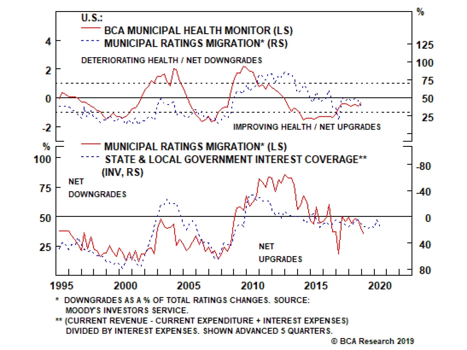
We see no signs of immediate credit distress. Municipal bond rating upgrades continue to outpace downgrades, our Municipal Health Monitor remains in “improving health” territory and state & local government interest coverage is strong. The…
Highlights European and global growth will rebound in the fourth quarter but the rebound will lack longevity. Bonds: Expect bond yields to edge modestly higher, especially for those yields that are deeply in negative territory. Underweight German bunds in a European or global bond portfolio. Currencies: Zero/negative yielding currencies have the most to gain, and our preference remains the yen. Equities: a tug of war between growth and valuation will leave the broad equity market index in a sideways channel. But with the higher yield, prefer equities over bonds. Equity sectors: Non-China cyclical plays will outperform China plays. Continue to overweight banks versus resources and/or industrials. Equity regions: Continue to overweight the Eurostoxx 50 versus the Shanghai Composite and/or the Nikkei 225. Feature Comfort and discomfort are not absolute, they are relative. Put your hand in cold water, and whether it feels comfortable or uncomfortable depends on where your hand has come from. If your hand has come from room temperature, the cold water will feel uncomfortable. But if your hand has come from an ice bucket, the cold water will feel like bliss! The same principle applies to how we, and the financial markets, perceive short-term economic growth. After a strong expansion, a pedestrian growth rate of 1 percent feels uncomfortable. But after an economic contraction, 1 percent growth feels very pleasant. This leads to two important points: In the short term, the market is less concerned about the rate of growth per se, it is more concerned about whether the rate of growth is accelerating or decelerating. When it comes to the short term drivers of growth – bond yields, credit, and the oil price – we must focus not on their changes, we must focus on their impulses, meaning the changes in their changes. This is because it is the impulses of bond yields, credit, and the oil price that drive the accelerations and decelerations of economic growth, often with a useful lead time of a few months. The Chart of the Week combined with Chart I-1-Chart I-4 should leave you in no doubt. In the euro area, United States, and China, the domestic bond yield 6-month impulses have led their domestic 6-month credit impulses with near-perfect precision. Chart of the WeekCredit Growth To Rebound In The Fourth Quarter, Then Fade
Credit Growth To Rebound In The Fourth Quarter, Then Fade
Credit Growth To Rebound In The Fourth Quarter, Then Fade
Chart I-2The Euro Area Bond Yield Impulse Leads Its Credit Impulse
The Euro Area Bond Yield Impulse Leads Its Credit Impulse
The Euro Area Bond Yield Impulse Leads Its Credit Impulse
Chart I-3The U.S. Bond Yield Impulse Leads Its Credit Impulse
The U.S. Bond Yield Impulse Leads Its Credit Impulse
The U.S. Bond Yield Impulse Leads Its Credit Impulse
Chart I-4The China Bond Yield Impulse Leads Its Credit Impulse
The China Bond Yield Impulse Leads Its Credit Impulse
The China Bond Yield Impulse Leads Its Credit Impulse
Based on this near-perfect precision, the credit impulses in the euro area and the U.S. should briefly rebound in the fourth quarter. But expect much less of a rebound, if any, in China. While bond yields have collapsed in the euro area and the U.S., resulting in tailwind credit impulses, they have moved much less in China. Indeed, China’s bond yield 6-month impulse has been moving deeper into headwind territory in the past few months (Chart I-5). Chart I-5Bond Yield Impulses Were Tailwinds In The Euro Area And U.S., But Not In China
Bond Yield Impulses Were Tailwinds In The Euro Area And U.S., But Not In China
Bond Yield Impulses Were Tailwinds In The Euro Area And U.S., But Not In China
It follows that a credit growth rebound in the fourth quarter will be sourced in Europe and the U.S. rather than in China. From a tactical perspective, this will favour non-China cyclical plays over China plays. But moving into the early part of 2020, expect the credit impulses to fade across all the major economies – unless bond yields now fall very sharply everywhere. Investing On Impulse Many people still find it confusing that it is the impulses – and not the changes – of bond yields, credit, and the oil price that drive the accelerations and decelerations of economic growth. To resolve this confusion, let’s clarify the point. The credit impulses in the euro area and the U.S. should briefly rebound in the fourth quarter. A bond yield decline will trigger new borrowing. For example, a given decline in the U.S. bond yield, say 0.5 percent, will trigger a given increase in the number of mortgage applications (Chart I-6). New borrowing will add to demand, meaning it will generate growth. But in the following period, a further bond yield decline of 0.5 percent will generate the same further new borrowing and growth rate. The crucial point is that, if the decline in the bond yield is the same, growth will not accelerate. Chart I-6A Given Decline In The Bond Yield Triggers A Given Increase In New Borrowing
A Given Decline In The Bond Yield Triggers A Given Increase In New Borrowing
A Given Decline In The Bond Yield Triggers A Given Increase In New Borrowing
Growth will accelerate only if the first 0.5 percent bond yield decline is followed by a bigger, say 0.6 percent, decline – meaning a tailwind impulse. Conversely and counterintuitively, growth will decelerate if the first 0.5 percent decline is followed by a smaller, say 0.4 percent, decline – meaning a headwind impulse. Don’t Blame Autos For A German Recession Chart I-7German Car Production Rebounded In The Third Quarter
German Car Production Rebounded In The Third Quarter
German Car Production Rebounded In The Third Quarter
If the German economy contracts in the third quarter and thereby enters a technical recession, the knee-jerk response will be to blame the troubles in the auto industry. But the evidence does not support this story. German new car production rebounded in the third quarter (Chart I-7). Begging the question: if not autos, what is the true culprit for the deceleration? The likely answer is that Germany recently suffered a severe headwind from the oil price impulse. Germany has one of the world’s highest volumes of road traffic per unit of GDP, second only to the U.S. (Table I-1). A possible explanation for Germany’s high traffic intensity is that, just like the U.S., Germany is a decentralised economy with multiple ‘hubs and spokes’ requiring a lot of criss-crossing of traffic. But unlike the U.S., German transport is highly dependent on oil imports, which tend to be non-substitutable and highly inelastic to price. As the value of German oil imports rise in lockstep with the oil price, Germany’s net exports decline, weighing on growth. Table I-1Germany Has A Very High Road Traffic Intensity
Growth To Rebound In The Fourth Quarter, But Fade In 2020
Growth To Rebound In The Fourth Quarter, But Fade In 2020
The upshot is that the oil price impulse has a major bearing on Germany’s short term growth accelerations and decelerations. The six month period ending around June 2019 constituted a severe headwind impulse. This is because a 30 percent increase in the oil price in that period followed a 40 percent decline in the previous six month period, equating to a headwind impulse of 70 percent.1 Germany has one of the world’s highest volumes of road traffic per unit of GDP. Allowing for typical lags of a few months, this severe headwind impulse was a major contributor to Germany’s recent deceleration. Oscillations in the oil price’s 6-month impulse have explained the oscillations in Germany’s 6-month economic growth with a spooky accuracy (Chart I-8). The good news is that the oil price’s severe headwind impulse has eased – allowing a rebound in German economic growth during the fourth quarter. Chart I-8The Oil Price Impulse Explains Oscillations In German Growth
The Oil Price Impulse Explains Oscillations In German Growth
The Oil Price Impulse Explains Oscillations In German Growth
Nevertheless, a putative rebound could be nullified by a wildcard: the ‘geopolitical risk impulse’. To be clear this is not an impulse in the technical sense, but it is a similar concept: are the number of potential tail-events increasing or decreasing? For the fourth quarter, our subjective answer is they are decreasing. In Europe, the formation of a new coalition government in Italy has removed Italian politics as a possible tail-event for the time being. Meanwhile, we assume that the Benn-Burt law in the U.K. has been drafted well enough to eliminate a potential no-deal Brexit on October 31. Elsewhere, the U.S/China trade war and Middle East tensions are most likely to be in stasis through the fourth quarter. How To Position For The Fourth Quarter After a disappointing third quarter for global and European growth, we expect a rebound in the fourth quarter. But at the moment, we do not have any conviction that the rebound’s momentum will take it deeply into 2020. Position for the fourth quarter as follows: Expect a rebound in the fourth quarter. Bonds: Expect bond yields to edge modestly higher, especially for those yields that are deeply in negative territory. Underweight German bunds in a European or global bond portfolio. Currencies: Zero/negative yielding currencies have the most to gain, and our preference remains the yen. With a Brexit denouement, the pound could be the biggest mover and our inkling is to the upside. But we await more clarity before pulling the trigger. Equities: a tug of war between growth and valuation will leave the broad equity market index in the sideways range in which it has existed over the past two years (Chart I-9). But with a higher yield than bonds, equities are the preferred asset-class in the ugly contest. Equity sectors: Non-China cyclical plays will outperform China plays. Continue to overweight banks versus resources and/or industrials. Equity regions: Continue to overweight the Eurostoxx 50 versus the Shanghai Composite and/or the Nikkei 225 (Chart I-10). Chart I-9Global Equities Have Gone Nowhere For Two Years
Global Equities Have Gone Nowhere For Two Years
Global Equities Have Gone Nowhere For Two Years
Chart I-10Stay Overweight Europe ##br##Versus China
Stay Overweight Europe Versus China
Stay Overweight Europe Versus China
Fractal Trading System* The recent surge in the nickel price is due to scares about supply disruption, specifically an Indonesian export ban. However, the extent of the rally appears technically stretched. We would express this as a pair-trade versus gold: long gold / short nickel. Chart I-11Nickel VS. Gold
Nickel VS. Gold
Nickel VS. Gold
Set a profit target of 11 percent with a symmetrical stop-loss. For any investment, excessive trend following and groupthink can reach a natural point of instability, at which point the established trend is highly likely to break down with or without an external catalyst. An early warning sign is the investment’s fractal dimension approaching its natural lower bound. Encouragingly, this trigger has consistently identified countertrend moves of various magnitudes across all asset classes. The post-June 9, 2016 fractal trading model rules are: When the fractal dimension approaches the lower limit after an investment has been in an established trend it is a potential trigger for a liquidity-triggered trend reversal. Therefore, open a countertrend position. The profit target is a one-third reversal of the preceding 13-week move. Apply a symmetrical stop-loss. Close the position at the profit target or stop-loss. Otherwise close the position after 13 weeks. Use the position size multiple to control risk. The position size will be smaller for more risky positions. * For more details please see the European Investment Strategy Special Report “Fractals, Liquidity & A Trading Model,” dated December 11, 2014, available at eis.bcaresearch.com. Dhaval Joshi, Chief European Investment Strategist dhaval@bcaresearch.com Footnotes 1 The 6-month steps in the WTI crude oil price were $74.15, $45.21, and $58.24. The first change equated to a 40 percent decrease and the second change equated to a 30 percent increase. So the 6-month impulse was 70 percent. Fractal Trading Model Cyclical Recommendations Structural Recommendations Closed Fractal Trades Trades Closed Trades Asset Performance Currency & Bond Equity Sector Country Equity Indicators Bond Yields Chart II-1Indicators To Watch - Bond Yields
Indicators To Watch - Bond Yields
Indicators To Watch - Bond Yields
Chart II-2Indicators To Watch - Bond Yields
Indicators To Watch - Bond Yields
Indicators To Watch - Bond Yields
Chart II-3Indicators To Watch - Bond Yields
Indicators To Watch - Bond Yields
Indicators To Watch - Bond Yields
Chart II-4Indicators To Watch - Bond Yields
Indicators To Watch - Bond Yields
Indicators To Watch - Bond Yields
Interest Rate Chart II-5Indicators To Watch - Interest Rate Expectations
Indicators To Watch - Interest Rate Expectations
Indicators To Watch - Interest Rate Expectations
Chart II-6Indicators To Watch - Interest Rate Expectations
Indicators To Watch - Interest Rate Expectations
Indicators To Watch - Interest Rate Expectations
Chart II-7Indicators To Watch - Interest Rate Expectations
Indicators To Watch - Interest Rate Expectations
Indicators To Watch - Interest Rate Expectations
Chart II-8Indicators To Watch - Interest Rate Expectations
Indicators To Watch - Interest Rate Expectations
Indicators To Watch - Interest Rate Expectations
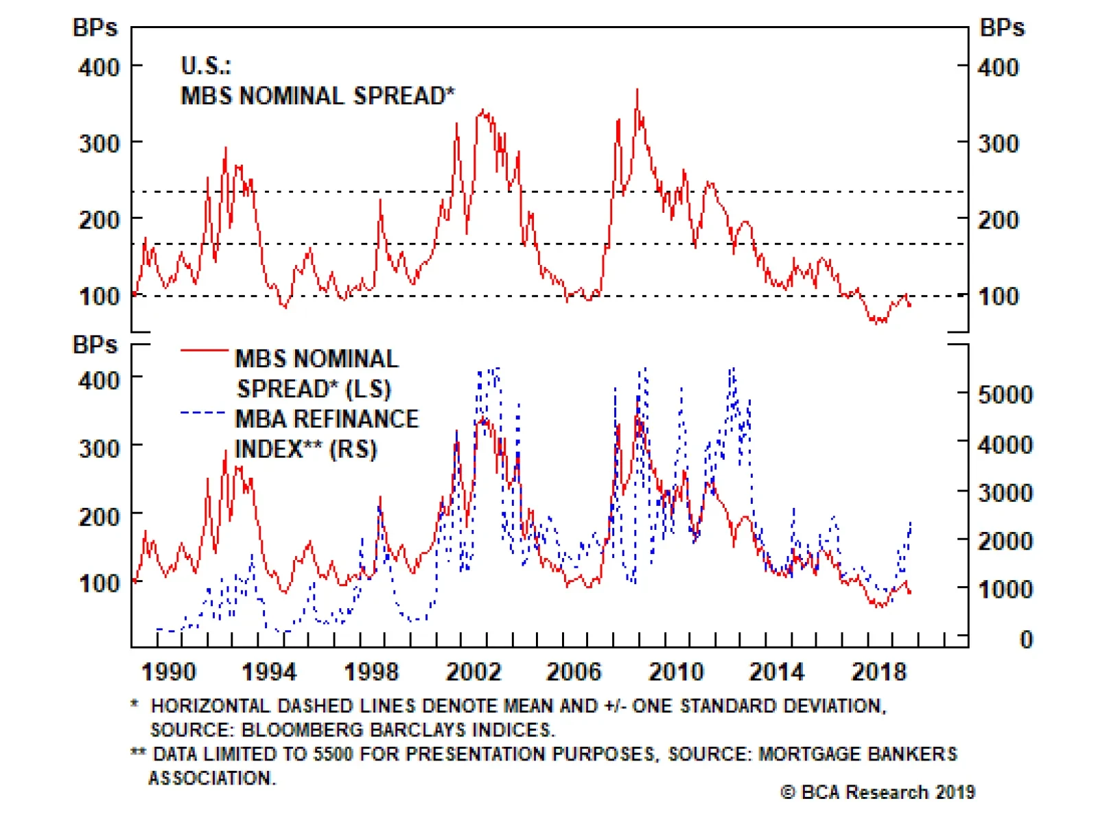
While we are not yet sounding the alarm about the macro risks to corporate bonds, we are even less concerned about the macro risks surrounding agency MBS. Mortgage refinancing activity is the most important macro driver of MBS spreads, and it should stay…
The average option-adjusted spread (OAS) for conventional 30-year agency MBS has widened in recent months and now looks like an attractive alternative to high-rated corporate credit. We recommend that investors shift out of Aaa, Aa and A-rated corporate…
Highlights Chinese economic activity is declining at a slower pace, but has not yet bottomed. The September PMIs surprised to the upside, suggesting that activity improved last month. Still, PMIs can provide false signals (as they did earlier this year). Consequently, investors should wait for clearer signs of a “hard data” improvement before concluding that China’s economy has bottomed. Investors should maintain a cyclically overweight stance towards Chinese stocks. Actual evidence of a “hard data” improvement could cause us to upgrade our tactical stance (from underweight); for now, the risks outweigh the potential gains over the very near-term. Feature Tables 1 and 2 highlight key developments in China’s economy and its financial markets over the past month. On the growth front, Chinese economic activity appears to be declining at a slower pace, but it has not yet bottomed. China’s September manufacturing PMIs surprised to the upside, and this legitimately raises the odds that the next update of our China Activity Index will meaningfully improve. However, investors should remember that a similar rebound in the Caixin manufacturing PMI quickly reversed itself earlier this year without leading to a meaningful impact on actual activity. The bottom line is that investors should wait for clearer signs of improvement in the “hard” data before concluding that China’s economic cycle is beginning to turn higher. Table 1China Macro Data Summary
China Macro And Market Review
China Macro And Market Review
Table 2China Financial Market Performance Summary
China Macro And Market Review
China Macro And Market Review
From an investment strategy perspective, we continue to recommend that investors maintain a cyclically overweight stance. Two possible scenarios underpin our cyclical view: either China’s existing reflationary effort soon succeeds at stabilizing economic activity, or policymakers will be forced to stimulate even further. In either case, we see good odds that Chinese relative performance (versus global stocks) will be higher in 12-months. Tactically, we remain cautious because of the still-elevated potential for a further escalation in the trade war, and the fact that Chinese activity has yet to decisively bottom. A significant re-acceleration in money & credit growth, actual evidence of a pickup in Chinese economic activity (i.e., a “hard data” improvement), or an agreement between the U.S. and China that removes most or all of the tariffs are likely to be catalysts to upgrade our tactical stance. For now, we continue to believe that the risks outweigh the potential gains over the very near-term. Chart 1Chinese Economic Activity Continues To Decline, At A Slower Pace
Chinese Economic Activity Continues To Decline, At A Slower Pace
Chinese Economic Activity Continues To Decline, At A Slower Pace
In reference to Tables 1 and 2, we provide below several detailed observations concerning developments in China’s macro and financial market data: The Bloomberg Li Keqiang index ticked slightly higher in August, but remained in a clear downtrend. Chart 1 illustrates that our BCA China Activity Index, a broader coincident measure of China’s economy that incorporates elements of the Li Keqiang index, remains weak and continued to decline in August. In short, Chinese economic activity is declining at a slower pace, but it has yet to decisively bottom. Our leading indicator for the Li Keqiang index rose fractionally in August, driven by the monetary conditions and money supply components (particularly M3). However, the credit components sequentially declined, weighing on the overall index. Abstracting from month-to-month changes in the indicator, Chart 2 highlights that there continues to be a large gap between the degree of monetary accommodation and the growth in credit and the supply of money. Investors should be especially watching for a decisive pickup in the latter, as it would be a clear sign that China’s reflationary efforts have succeeded in boosting the domestic economy. Chart 2The Gap Between Monetary Conditions and Money & Credit Remains Wide
The Gap Between Monetary Conditions and Money & Credit Remains Wide
The Gap Between Monetary Conditions and Money & Credit Remains Wide
China’s housing data continued to slow in August, with the exception of floor space sold (which stopped contracting). House price appreciation is slowing, and our diffusion indexes point to an even slower pace of appreciation going forward. Following a very sharp slowdown in construction over the past few months, the modest re-acceleration in sales volume has effectively eliminated the previously enormous gap between the pace of floor space started and sold. We argued in several previous reports that this gap would likely close via slower housing starts, as strong construction must ultimately be validated by strong sales. The pickup in sales suggests that China’s housing market fundamentals may be in the very early stages of stabilization, but a sustained rise into high single-digit territory would be needed in order to confirm this view. China’s September manufacturing PMIs surprised to the upside, particularly the Caixin PMI (which is more focused on the private sector). The components of each PMI told conflicting stories; the Caixin PMI reported that total new orders outpaced new export business (implying stronger domestic demand), whereas the official PMI reported a much stronger improvement for new export orders versus the import and overall new orders components. It is possible that the improvement in the PMIs is signaling a meaningful rise in our China Activity Index for September, but investors should recognize that this is no guarantee of a sustainable bottom in economic activity. For example, a similar rebound in the Caixin manufacturing PMI quickly reversed itself earlier this year, and had no meaningful impact on actual activity (Chart 3). The bottom line is that investors should wait for clearer signs of improvement in the “hard” data before concluding that China’s economic cycle is beginning to turn higher. Chart 3An Improving PMI Is No Guarantee Of An Improving Economy
An Improving PMI Is No Guarantee Of An Improving Economy
An Improving PMI Is No Guarantee Of An Improving Economy
In US$ terms, China’s equity markets (both investable and domestic) have been flat in absolute terms over the past month, but have underperformed global equities by 1-2%. Over the past week, investable stocks have been particularly impacted by the reported threat that the Trump administration is considering de-listing Chinese firms from U.S. stock exchanges. Administration officials have since denied the report, but even if it were to occur a shift in listing from the U.S. to Hong Kong is very unlikely to alter the earnings outlooks for these companies over a 6-12 month time horizon. A near-term selloff in response to a de-listing event is highly possible, but it would not likely affect our cyclical stance unless the administration moved towards (and succeeded at) completely prohibiting U.S. ownership of Chinese securities. Chinese financials, technology, and communication services companies have outperformed in both the investable and domestic markets over the past month, with energy, materials, and industrials also outperforming in the investable market. The outperformance of investable energy stocks is clearly linked to the mid-September attack on Aramco’s oil processing facilities, even though Brent oil prices have fallen back to the level that prevailed before the attack. We have maintained a long absolute position in Chinese energy stocks over the past year, with disappointing results (the position is down 28% since initiation on October 3, 2018). Still, we recommend that investors continue to favor Chinese energy stocks over the cyclical horizon on a value basis: the sector is cheap relative to global energy stocks and global oil production (Chart 4). In addition, BCA’s Commodity & Energy Strategy service is forecasting that Brent oil prices will trade at $74/barrel on average next year ($12/barrel higher than prices today), implying that a value catalyst looms over the coming 6-12 months. Chart 4Chinese Energy Stocks Have Rarely Been Cheaper
Chinese Energy Stocks Have Rarely Been Cheaper
Chinese Energy Stocks Have Rarely Been Cheaper
Chart 5Is Stable Real Estate Performance Predicting A Stable Housing Market?
Is Stable Real Estate Performance Predicting A Stable Housing Market?
Is Stable Real Estate Performance Predicting A Stable Housing Market?
The underperformance of the investable real estate sector that began this summer appears to have occurred in anticipation of the slowdown in house price appreciation and housing construction that we highlighted above. This is notable, as real estate relative performance appears to have stabilized since the beginning of September (Chart 5). The implication is that real estate stocks may now be forecasting a stabilization in China’s housing market, which would increase the odds that Chinese domestic demand will soon durably bottom. For now, it remains too early to confidently project that real estate stocks have halted their decline, but the relative performance trend bears monitoring over the coming weeks. Chinese interbank rates and government bond yields have largely been unchanged over the past month, with the exception of the highly volatile 7-day interbank repo rate (which rose). The relative year-to-date stability of Chinese government bond yields is in sharp contrast to the collapse in U.S. 10-year Treasury yields (Chart 6), and reflects (in part) the reluctance of Chinese authorities to ease materially further. There have been no major changes in the onshore Chinese corporate bond market over the past month, and overall onshore corporate spreads continue to trend sideways. While lower-quality spreads have risen modestly since early-June, bonds rated AA and AA- continue to outperform the aggregate onshore corporate bond market (Chart 7). Investors should stay long onshore corporate bonds, in hedged currency terms. Chart 6The Divergence In Bond Yields Reflects China's Policymaker Reluctance
The Divergence In Bond Yields Reflects China's Policymaker Reluctance
The Divergence In Bond Yields Reflects China's Policymaker Reluctance
Chart 7Own Chinese Onshore Corporate Bonds In Hedged Terms
Own Chinese Onshore Corporate Bonds In Hedged Terms
Own Chinese Onshore Corporate Bonds In Hedged Terms
The RMB has gained approximately 0.1% versus the U.S. dollar over the past month, and nearly 1.1% versus the euro. While the latter largely reflects weakness in the euro rather than significant RMB strength, it remains clear that China’s currency is being driven by developments related to the trade negotiations. Besides the negative impact that it would have on global risk assets, investors should expect significant further strength in USD-CNH if the negotiations that are scheduled to begin next weekend result in renewed escalation. Conversely, we would expect a major rally in the RMB in response to any agreement between the U.S. and China that removes most or all of the tariffs. Jonathan LaBerge, CFA, Vice President Special Reports jonathanl@bcaresearch.com Jing Sima China Strategist jings@bcaresearch.com Cyclical Investment Stance Equity Sector Recommendations
Highlights The global manufacturing cycle is likely to bottom soon, and consumption and services remain robust. The risk of recession over the next 12 months is low. This suggests that equities will continue to outperform bonds. But the risks to this optimistic scenario are rising. A denting of consumer confidence and worsening of geopolitical tensions could hurt risk assets. We hedge this by overweighting cash. China remains reluctant for now to use aggressive monetary easing. Until it does, the less cyclical U.S. equity market should outperform. We may shift into EM and European equities when China ramps up stimulus and the manufacturing cycle clearly bottoms. To hedge against this upside risk, we go tactically overweight Financials, and reiterate our overweight on Industrials and neutral on Australia. Bond yields should continue their rebound. We recommend an underweight on duration and favor TIPS. Credit should outperform on the cyclical horizon, but high corporate debt is a risk – we recommend a neutral position. Recommendations
Quarterly Portfolio Outlook: Hedges All Around
Quarterly Portfolio Outlook: Hedges All Around
Feature Overview Hedges All Around This is a particularly uncertain time for the global economy – and so a tricky one for asset allocators. Will manufacturing activity bottom soon, or will it drag down the services sector and consumption with it? Will bond yields continue their strong rebound? Is the Fed done cutting rates? Will China now ramp up monetary stimulus? Will Iran escalate a confrontation with Saudi Arabia? What will President Trump tweet about next? This is the sort of environment in which portfolio construction comes into its own. We have our view on all these questions, but our level of conviction is somewhat lower than usual. The way for investors to react is to plan asset allocation in such a way that a portfolio is robust in all the most probable scenarios. We expect the global manufacturing cycle to bottom soon. The Global Leading Economic Indicator is already picking up, and the Global PMI shows some signs of bottoming (Chart 1). The shortest-term lead indicator, the Citigroup Economic Surprise Index, has recently jumped in every region except Europe (Chart 2). (See also What Our Clients Are Asking on page 7 for some more esoteric indicators of cycle bottoms.) The bottoming-out is due to easier financial conditions over the past nine months, a stabilization in Chinese growth, and simply time – the down-leg in manufacturing cycles typically last 18 months, and this one peaked in H1 2018. Chart 1First Signs Of Bottoming
First Signs Of Bottoming
First Signs Of Bottoming
Chart 2Surprisingly Strong Surprises
Surprisingly Strong Surprises
Surprisingly Strong Surprises
At the same time, government bond yields should have further to rise. The Fed may cut rates once more but, given the resilient U.S. economy, no more than that. This is less than the 59 basis points of cuts over the next 12 months priced in by the Fed Fund futures. The recent pick-up in economic surprises suggests that the 10-year U.S. Treasury yield should return at least to where it was six months ago, 2.3-2.4% (Chart 3). This might be delayed, however, if there is an increase in political tensions, for example a break-up of the U.S./China trade talks (Chart 4). Chart 3Long-Term Rates To Rebound Further...
Long-Term Rates To Rebound Further...
Long-Term Rates To Rebound Further...
Chart 4...But Geopolitical Tensions Remain A Risk
...But Geopolitical Tensions Remain A Risk
...But Geopolitical Tensions Remain A Risk
This implies that equities are likely to continue to outperform bonds over the next few quarters, and so we remain overweight global equities and underweight global bonds on the 12-month investment horizon. However, the risks to this rosy scenario are rising. We remain concerned about the inverted yield curve, which has accurately forecast every recession since World War II, usually about 18 months in advance (Chart 5). The 3-month/10-year curve inverted in the middle of this year. We also worry that the weakness in the manufacturing sector may dent consumer confidence. There are some signs of this in Europe and Japan – but none significant yet in the U.S. (Chart 6). Accordingly last month, as a hedge against an economic downturn, we went overweight cash, which we see as a more attractive hedge, from a risk/reward point-of-view, than bonds. Chart 5Can We Ignore The Message From The Yield Curve?
Can We Ignore The Message From The Yield Curve?
Can We Ignore The Message From The Yield Curve?
Chart 6Some Signs Of Weaker Consumer Confidence
Some Signs Of Weaker Consumer Confidence
Some Signs Of Weaker Consumer Confidence
We also remain overweight U.S. equities, which are lower-beta and have fewer structural headwinds than equities in other regions. However, we continue to look for an entry point into the more cyclical equity markets which would also be beneficiaries of bolder China stimulus. China’s monetary easing remains more tepid than in previous stimulus episodes. It has probably been enough to stabilize domestic activity (Chart 7) but not to trigger a rally in industrial commodity prices, EM assets, and euro area equities, as it did in 2016. A pick-up in global PMIs and signs of stronger Chinese credit growth would clearly help EM and Europe (Chart 8) but we need higher conviction that these things are indeed happening before making that move. In the meantime, we are hedging the upside risk by raising the global Financials sector tactically to overweight, since it would likely do well if euro area stocks started to outperform. Earlier this year, we raised the Industrials sector to overweight and Australian equities to neutral, also to hedge against the upside risk from more aggressive Chinese stimulus. Chart 7Chinese Stimulus Has Merely Stabilized Growth
Chinese Stimulus Has Merelyy Stabilized Growth
Chinese Stimulus Has Merelyy Stabilized Growth
Chart 8Europe And EM Are The Most Cyclical Markets
Europe And EM Are The Most Cyclical Markets
Europe And EM Are The Most Cyclical Markets
Chart 9Oil Price Spikes Often Precede Recessions
Oil Price Spikes Often Precede Recessions
Oil Price Spikes Often Precede Recessions
The biggest geopolitical risk to our sanguine scenario is the situation in the Middle East, after the attacks on Saudi oil refineries. Every recession in the past 50 years has been preceded by a 100% year-on-year spike in the crude oil price (though note that Brent would need to rise to over $100 a barrel by year-end, from $61 today, for that to eventuate (Chart 9)). A short-term oil shortage is not the problem since strategic reserves are ample. But the attack demonstrates the vulnerability of the Saudi installations. And a reprisal attack on Iran could lead it to block the Strait of Hormuz, through which more than 20% of global oil passes. We have an overweight on the Energy sector, partly as a hedge against these risks. BCA’s oil strategists expected Brent crude to rise to $70 this year, and average $74 in 2020, even before the recent attack. They argue that the risk premium in the oil price (the residual in Chart 10) is too low, given not only tensions with Iran, but also other potential supply disruptions in Iraq, Libya, Venezuela and elsewhere. Chart 10Is The Oil Risk Premium Too Low?
Quarterly Portfolio Outlook: Hedges All Around
Quarterly Portfolio Outlook: Hedges All Around
Garry Evans, Senior Vice President Chief Global Asset Allocation Strategist garry@bcaresearch.com What Our Clients Are Asking Which Leading Indicators Should Investors Watch To Time The Rebound In Global Growth? Chart 11Positive Signals For Global Growth
Is Eurozone Manufacturing Close To A Bottom? Positive Signals For Global Growth
Is Eurozone Manufacturing Close To A Bottom? Positive Signals For Global Growth
During 2019, the global growth decline was a key driver of the bond rally and the outperformance of defensive assets. Thus, timing when this decline will reverse will be crucial, since it would also result in a change of leadership from defensive to cyclical assets. But how can this be done? Below we list three of our favorite indicators that have provided reliable leading signals on the global economy in the past: Carry-trade performance: The performance of EM currencies with very high carry versus the yen tends to be a leading indicator for global growth (Chart 11, panel 1). In general, carry trades distribute liquidity from countries where funds are plentiful but rates of return are low (like Japan), to places with savings shortfalls and high risk, but where prospective returns are high. Positive performance of these currencies tends to signal a positive shift in global liquidity, which usually fuels global growth. Swedish inventory cycle: The Swedish new-orders-to-inventories ratio is a leading indicator of the global manufacturing cycle (panel 2). Why? Sweden is a small open economy that is very sensitive to global growth dynamics. Moreover, Swedish exports are weighted towards intermediate goods, which sit early in the global supply chain. This makes the Swedish inventory cycle a good early barometer of the health of the global manufacturing cycle. G3 monetary trends: G3 excess money supply – measured as the difference between money supply growth and loan growth – is a leading indicator of global industrial production (panel 3). As base money and deposits become more plentiful in the banking system relative to the pool of existing loans, the liquidity position of commercial banks improves. This provides banks with the necessary fuel to generate more loan growth, a development which eventually provides a boon to economic activity. Importantly, all these leading indicators are sending a positive signal on the global economy. This confirms our view that rates should go up as global growth strengthens. Therefore, investors should remain overweight equities and underweight bonds in their portfolios. Is It Time To Buy Euro Area Banks? In a Special Report on euro area banks in December 2018, we noted that “Historically, when the relative P/B discount hits the lower band and the relative dividend yield hits the upper band, a rebound in relative return performance could be expected”.1 Our recommendation back then was that “long-term investors should avoid banks in the region, but investors with a more tactical mandate and much nimbler style could use the valuation indicators to ‘time’ their entry into and exit out of banks as a short-term trade.” Since then, banks have continued to underperform the overall market by over 10%, further pushing down relative valuation metrics. Currently, both relative P/B and relative dividend yield are at extreme levels that have historically heralded at least a short-term bounce. The euro area PMI is still below 50, but there are signs that the euro area economy could rebound later this year, which should be positive for banks’ relative earnings. Already, forward EPS growth has been stabilizing relative to the broad market (Chart 12, panel 4). In addition, two of the key concerns back in December 2018 were Italian government debt and the unwinding of QE. Now Italian debt is no longer in crisis and the ECB has relaunched QE. As such, investors with a tactical mandate and a nimble style should buy (overweight) banks in the euro area. Long-term investors should still avoid such a short-term trade because structural issues remain. Chart 12Tactically Upgrade Euro Area Banks
Tactically Upgrade Euro Area Banks
Tactically Upgrade Euro Area Banks
Is The Gold Rally Over? Spot gold prices have increased 17% year-to-date, on the back of global growth weakness, dovish central banks, and rising political tensions. Should investors now pare back their gold exposure? Common sense would suggest they should. However, these are not ordinary times. In the short term, gold prices might suffer from some profit-taking due to overbought technicals and excessively positive sentiment (Chart 13, panel 1). Moreover, gold prices have moved this year due to increased market expectations of central bank easing (panel 2). We expect that markets will be disappointed going forward by only limited rate cuts, which could put downward pressure on gold. On the other hand, with approximately 27%, or $14.9 trillion, of global debt with negative yields at the moment, investors will continue to shift to the next best asset – zero-yielding gold (panel 3). This is clear from the rise in holdings of gold over the past few years by both central banks and investors (panels 4 & 5). We expect this trend to persist as investors continue their search to avoid negative yields and focus on capital preservation. Geopolitical tensions have intensified since the beginning of the year: ongoing yet inconclusive trade negotiations between the U.S. and China, implementation of further tariffs, Brexit uncertainty, and the recent military attacks in the Middle East (panel 6). This environment should also continue to push gold prices higher. We continue to recommend gold as a hedge against inflation – which we see picking up over the next 12 months – as well as against any further deterioration in global growth and the geopolitical situation. Chart 13Gold: Sell Or Hold?
Gold: Sell Or Hold?
Gold: Sell Or Hold?
Risks to the rosy scenario are rising. We remain concerned about the inverted yield curve, which has accurately forecast every recession since World War II. How Low Can Rates Go? The zero lower bound is a thing of the past. Last month, Denmark’s central bank cut rates to -0.75%, and 10-year government bonds in Switzerland hit a historic low for any major country, -1.12%. In the next recession, how much further could interest rates theoretically fall? For individuals, cash rates might be limited by the cost of storing paper currency, which has a zero yield (unless governments find a way to ban cash or charge an annual fee on it). A bank safety deposit box costs about $300 a year, and a professional-quality safe big enough to store $1 million (which would be a pile of $100 bills 31 x 55 cms, weighing 10 kg) costs $2,000 with installation costs. Amortize the latter over 10 years, and the cost of storing $1 million is about 0.2%-0.3% a year. Swiss franc bills – maximum denomination CHF1,000 – would cost less to store. But storage costs for physical gold are around 2% a year. Since rates have fallen below this, there must be other constraints. Individuals would find storing money in cash possibly dangerous and certainly very inconvenient (imagine having to transport the cash to a bank to pay a tax bill). And the cost for a rich individual or company of storing, say, $1 billion (weighing 10 tonnes) would be much higher. Given the history in even low-rate countries (Chart 14, panel 1), we suspect around -1% is the level at which cashholders would seek alternatives to bank deposits of government bills. Chart 14How Low Can They Go?
How Low Can They Go?
How Low Can They Go?
Chart 15Yield Curves When Rates Are At Zero Or Below
Yield Curves When Rates Are At Zero Or Below
Yield Curves When Rates Are At Zero Or Below
At the long end, the yield curve does not typically invert much when short-term rates are zero or negative (Chart 15). The biggest 3-month/10-year inversion was in Switzerland earlier this year, -0.05%. This points then to the absolute lowest level for 10-year bonds anywhere, even in the middle of a nasty recession, at around -1.1%. That is a worry for asset allocators. It means that the maximum mathematical upside for Swiss government bonds from their current level (-0.8%) is 3% while it is 5% for German bonds (currently -0.5%). This is not much of a hedge. Only the U.S. looks better: if the 10-year Treasury yield falls to 0%, the total return is 18%. Global Economy Chart 16U.S. Growth Remains Solid
U.S. Growth Remains Solid
U.S. Growth Remains Solid
Overview: Industrial-sector growth globally has been weak, with the manufacturing PMI in most countries falling below 50. But consumption and services almost everywhere have remained resilient, even in the manufacturing-heavy euro area. And there are tentative signs of a bottoming-out in manufacturing. However, a full-scale rebound will depend on further monetary stimulus in China, where the authorities still seem cautious about rolling out easing on the scale of what was done in 2016. U.S.: U.S. manufacturing has now followed the rest of the world into contraction, with the ISM manufacturing index slipping below 50 in August (Chart 16, panel 2). However, consumption and services are holding up well. Employment continues to expand (albeit at a slightly slower pace than last year, perhaps because of a lack of jobseekers), there is no sign of a rise in layoffs, and consumer confidence remains close to a historical high (though it slipped slightly in September). Housing has recovered after last year’s slowdown, and the recent congressional budgetary agreement means fiscal policy will be mildly expansionary over the coming 12 months. Only capex (panel 5) has slowed, as companies postpone investment decisions due to uncertainty surrounding the trade war. The consensus expects U.S. real GDP growth of 2.2% this year, above most estimates of trend growth. Euro Area: Given its higher concentration in manufacturing, European growth is weaker than in the U.S. The manufacturing PMI has been below 50 since February, and fell further to 45.6 in August. Industrial production is shrinking by 2% year-on-year. Italy has experienced two negative quarters of growth, and Germany may also enter a technical recession in Q3 (GDP shrank by 0.1% in Q2). However, there are some tentative signs that manufacturing is bottoming: the ZEW survey in September, for example, surprised on the upside. And, like the U.S., consumption remains strong. Even in manufacturing-heavy Germany, employment continues to grow, and retail sales in July were up 4.4% year-on-year. In the U.K., however, uncertainty surrounding Brexit has damaged business investment, though employment has been strong.2 Chart 17First Signs Of A Rebound In The Rest Of The World?
First Signs Of A Rebound In The Rest Of The World?
First Signs Of A Rebound In The Rest Of The World?
Japan: Consumption has already slipped, even before the consumption tax hike scheduled in October. Retail sales in July fell 2% year-on-year, due to negative wage growth and consumer sentiment falling to a five-year low. Manufacturing continues to suffer from China’s slowdown and the strong yen (up 6% over the past 12 months), with exports falling 6% and industrial production down 2% year-on-year over the past three months. The effect of the consumption tax hike may be cushioned by government measures (lowering taxes on autos and making high-school education free, for example). And a pickup in Chinese growth would boost exports. But there are scant signs yet of a bottoming in activity. Emerging Markets: China’s growth appears to have stabilized, with both manufacturing and non-manufacturing PMIs above 50 (Chart 17, panel 3). But confidence remains fragile, with retail sales growth slowing to a 20-year low and car sales down 7% in August, despite the introduction of cars compliant with new emissions standards. The authorities have responded with further easing measures (including a further cut in the reserve requirement in September) but seem reluctant to launch a full-scale monetary stimulus, similar to what they did in 2016. Elsewhere in EM, growth has slowed in countries with structural issues (latest year-on-year real GDP growth in Argentina is -5.7%, in Turkey -1.5% and in Mexico -0.8%) but remains fairly resilient elsewhere (India 5%, Indonesia 5%, Poland 4.2%, Colombia 3.4%). Interest Rates: Central banks almost everywhere have turned dovish, with the Fed cutting rates for a second time, the ECB restarting asset purchases, and the Bank of Japan signaling it will ease in October. But further monetary accommodation will probably be less than the market expects. The Fed signaled that its cuts were just a mid-cycle correction and that further easing is unlikely. And the ECB and BoJ have little ammunition left. With signs of growth bottoming, and the market understanding that central banks’ dovish turn is reaching its end, long-term rates, which have already risen in the U.S. from 1.45% to 1.72% in September, are likely to move higher. Investors should also carefully watch U.S. inflation, which is showing signs of underlying strength, with core CPI inflation rising 2.4% year-on-year in August (and as much as 3.4% annualized over the past three months). Global Equities Chart 18Has Earnings Growth Bottomed?
Has Earnings Growth Bottomed?
Has Earnings Growth Bottomed?
Still Cautious, But Adding An Upside Hedge: Global equities registered a small loss of 8 basis points in Q3 (Chart 18) despite all the headline risks from geopolitics and weakening economic data. Overall, our defensive country allocation worked well in Q3, since DM equities outperformed EM by 4.5%, and the U.S. outperformed the euro area by 2.8%. Our sector positioning did not do as well since underweights in Utilities and Consumer Staples and overweights in Industrials, Energy and Health Care all went in the wrong direction, even though the underweight in Materials did help to offset the loss. During the quarter, however, both sector and country rotations were evident within the global equity universe, in line with the wild swings in bond yields. September saw some reversals in DM/EM, U.S./euro area and cyclical/defensives. Going forward, BCA’s House View remains that global economic growth will begin to recover over the coming months, albeit a little later than we previously expected. As such, our defensive country allocation remains appropriate. We did put euro area and EM equities on upgrade watch in April,3 but the delay in the global recovery also implies that it is still not the time to trigger this call. With our view that bond yields have hit bottom,4 we are making one adjustment in our global sector allocation by upgrading Financials to overweight from neutral. We are financing this by cutting in half the double overweight in Health Care to overweight (see next page for more details). This adjustment also acts as a hedge against two possible outcomes: 1) that the euro area outperforms the U.S., and 2) that Elizabeth Warren wins in the upcoming U.S. presidential election.5 Upgrade Global Financials To Overweight From Neutral Chart 19Upgrade Global Financials
Upgrade Global Financials
Upgrade Global Financials
The relative performance of global Financials to the overall equity market has been hugely affected by the movements in global bond yields (Chart 19, panel 1). As bond yields made a sharp reversal in September, so did the relative performance of Financials, even though it is barely evident on the chart given how much Financials have underperformed the broad market over recent years. It’s not clear how sustainable the sharp reversal in bond yields will be, but BCA’s House View is that bond yields will move higher over the next 9-12 months. As such, we are upgrading Financials to overweight from neutral, for the following additional reasons: Valuations are extremely attractive as shown in panel 2. More importantly, the relative valuation is now at an extreme level that historically heralded a bounce in Financials’ relative performance. Loan quality has improved. The U.S. non-performing loan (NPL) ratio is nearing the lows reached before the Global Financial Crisis (GFC). Even in Spain and Italy, NPL ratios have fallen significantly, though they remain higher than they were prior to the GFC (panel 3). U.S. consumption has been strong, housing has rebounded, and demand for loans is getting stronger (panel 4), in line with data such as the Citi Economic Surprise Index, suggesting that economic data may have hit bottom. To finance this upgrade, we cut the double overweight of Health Care to overweight, as a hedge against Elizabeth Warren winning next year’s U.S. presidential election and tightening rules on drug pricing. Government Bonds Maintain Slight Underweight On Duration. Our below-benchmark duration call was severely challenged by the global bond markets in the first two months of the third quarter. The U.S. 10-year Treasury yield hit 1.43% on September 3 in response to the weaker-than-expected ISM manufacturing index in the U.S., 57 bps lower than the level at the end of previous quarter, and just a touch higher than the historical low of 1.32% reached on July 6, 2016. The rebound in bond yields since September 5, however, was driven not only by the ebb and flow in the U.S./China trade policy dynamics, but also by the positive surprises in economic data releases, as shown in Chart 20. BCA’s Global Duration Indicator, constructed by our Global Fixed Income Strategy team using various leading economic indicators, is also pointing to higher yields globally going forward. Investors should maintain a slight underweight on duration over the next 9-12 months. Favor Linkers Vs. Nominal Bonds. Global inflation expectations have also rebounded after continuing their downtrend in the first two months of the quarter. This largely reflects the acceleration in August in realized inflation measures such as core CPI, core PCE, and average hourly earnings. In addition, historically, the change in the crude oil price tends to have a good correlation with inflation expectations. The oil price jumped initially by 20% following the attack on the Saudi Arabian oil production facilities. While it’s not clear how the geopolitical tensions will evolve in the Middle East, a conservative assumption of a flat oil price until the end of the year still points to much higher inflation expectations, supporting our preference for inflation-linked bonds over nominal bonds. We also favor linkers in Japan and Australia over their respective nominal bonds (Chart 21). Chart 20Bond Yields Have Hit Bottom
Bond Yields Have Hit Bottom
Bond Yields Have Hit Bottom
Chart 21Favor Inflation Linkers
Favor Linkers
Favor Linkers
We continue to look for an entry point into more cyclical markets which would benefit from a bolder Chinese stimulus. Corporate Bonds Since we turned cyclically overweight on credit within a fixed-income portfolio, investment-grade bonds and high-yield bonds have produced 220 and 73 basis points, respectively, of excess return over duration-matched government bonds. We remain bullish on the outlook for credit over the next 12 months, as we expect global growth to accelerate before the end of the year. Historically, improving global growth has resulted in sustained outperformance of credit over government bonds. Moreover, default rates should remain subdued over the next year given that lending standards continue to ease (Chart 22, panel 1). How long will we remain overweight credit? High levels of leverage, declining interest coverage ratios, and the high share of Baa-rated debt in the U.S. corporate debt market continue to make credit a risky proposition on a structural basis. However, with inflation expectations still very low, the Fed has a strong incentive to keep monetary policy easy. This dovish monetary policy should keep interest costs at bay, helping credit outperform over the next year. That said, we believe that there are some credit categories that are more attractive than others. Specifically, we recommend investors favor Baa-rated and high yield securities, given that there is still room for further credit compression in these credit buckets (panel 2 and panel 3). On the other hand, investors should stay away from the highest credit categories, as they no longer offer value (panel 4). Chart 22Baa-rated And High-Yield Credit Offer The Most Value
Baa-rated And High-Yield Credit Offer The Most Value
Baa-rated And High-Yield Credit Offer The Most Value
Commodities Chart 23No Supply Shock In The Oil Market
Quarterly Portfolio Outlook: Hedges All Around
Quarterly Portfolio Outlook: Hedges All Around
Energy (Overweight): September’s drone attack on Saudi crude facilities sent oil prices soaring as much as 20% in the days following, before falling back to pre-attack levels. Initial estimates estimated the supply disruption at 5.7 million barrels a day – approximately 5.5% of global supply – making it the largest crude supply outage in history. However, assuming the Saudis can return 70% of the lost output back online as they claim, OPEC’s spare capacity, approximately 1.8 million barrels a day, should be able to balance the market and cover the remaining lost production.6,7 In the longer-term, a pick-up in global oil demand, as economic growth rebounds, plus supply tightness should keep oil price elevated, with Brent reaching $70 this year and averaging $74 in 2020 (Chart 23, panels 1 & 2). Industrial Metals (Neutral): A combination of half-hearted year-to-date stimulus by Chinese authorities and a stronger USD in the second and third quarters of 2019 have driven industrial metals spot prices lower. However, the Chinese government announced additional stimulus in September, with further bond issuance to finance infrastructure projects and an easing of monetary policy (panel 3). This should give some upside for industrial metal prices over the coming six-to-12 months. Precious Metals (Neutral): We remain positive on gold, despite its strong performance year-to-date, since we see it as a good hedge against recession, inflation, and geopolitical risks. We discuss gold in detail in the What Our Clients Are Asking section on page 9. Silver also looks attractive in the short term. The nature of the use of silver has changed over the past two decades, from being mostly a base metal for industrial fabrication to becoming more of a precious metal viewed as a safe haven. The correlation between gold and silver prices has increased since the Global Financial Crisis from an average of 0.5 pre-crisis to 0.8 post-crisis (panels 4 & 5). Global growth and political uncertainty should support silver prices in the coming months. Currencies U.S. Dollar: The trade-weighted dollar has appreciated by 2.5% since we turned neutral in April. We expect that the steep drop in yields will continue to ease financial conditions and help global growth in the last quarter of the year. Given that the dollar is a counter-cyclical currency, an environment where global growth rallies have historically been negative for the greenback. Euro: Since we turned bullish in April, EUR/USD has depreciated by 2.7%. Overall, we continue to be positive on EUR/USD on a cyclical timeframe. After the ECB cut rates by 10 basis points and announced further rounds of quantitative easing, there is not much room left for the euro area to keep easing relative to the U.S. (Chart 24, panel 1). Moreover, improving expectations of profit growth in the euro area vis-à-vis the U.S. will drive money flows towards Europe, pushing EUR/USD up in the process (panel 2). Emerging Market Currencies: We remain bearish on emerging market currencies for the time being. That being said, they remain on upgrade watch for the end of the year. There are multiple signs that global growth is turning up, a consequence of the easy financial conditions caused by some of the lowest bond yields on record. Moreover, the marginal propensity to spend (proxied by M1 growth relative to M2 growth) in China, the main engine of EM growth, continues to point to further appreciation in emerging market currencies (panel 3). Chart 24Interest Rate And Profit Expectation Differentials Favor The Euro
The Euro Might Soon Pop Interest Rate And Profit Expectations Differentials Favor The Euro
The Euro Might Soon Pop Interest Rate And Profit Expectations Differentials Favor The Euro
Alternatives Chart 25Favor Hedge Funds Untill Global Growth Bottoms
Favor Hedge Funds Untill Global Growth Bottoms
Favor Hedge Funds Untill Global Growth Bottoms
Return Enhancers: Over the past 12 months, we have recommended investors pare back on private equity and increase allocations to hedge funds – macro hedge funds in particular. This was due to our judgement that we are late in the economic cycle. While we expect growth to pick up over the coming months, this is not yet clear in the data (Chart 25, panel 1). This uncertain macro outlook will prove tough for private equity funds, especially given an environment of rising multiples and increasing competition for deals. We continue to see global macro hedge funds as the best hedge ahead of the next recession and would advise investors to allocate funds now, given the time it takes to move allocations in the illiquid space. Inflation Hedges: In the current environment, TIPS are likely a better inflation hedge than illiquid alternative assets. Our May 2019 Special Report 8 showed that TIPS produce a particularly attractive risk-adjusted return during times when inflation is rising, but still fairly low (below 2.3%). TIPS should do well, therefore, in the environment we expect over the next few months, where the Fed remains dovish, cutting rates perhaps once more, while condoning a moderate acceleration of inflation (panel 2). Volatility Dampeners: Structured products – mostly Mortgage-Backed Securities (MBS) – have had an excellent record of reducing portfolio volatility (panel 3). Despite that, we do not recommend more than a neutral allocation to MBS currently due to a less-than-attractive valuation picture. Despite Treasury yields falling by more than 100 basis points this year and refinancing activity picking up, nominal MBS spreads remained near their all-time lows. However, as Treasury yields bottom, we expect refinancing to slow, putting downward pressure on spreads. Risks To Our View The most likely upside risk comes from the Fed being too dovish and falling behind the curve. Underlying inflation pressures in the U.S. remain strong (with core CPI up 3.4% annualized over the past three months). After two rate cuts, the Fed Funds rate is now comfortably below the neutral rate: 0.1% in real terms compared to a Laubach-Williams r* of 0.8% (Chart 26). Tightness in the money markets have pushed the Fed to start expanding its balance sheet again. If manufacturing growth accelerates next year, and wages and profits begin to rise, a stock market melt-up, similar to that in 1999, would be possible. Eventually, though, the Fed would need to raise rates (perhaps sharply) to kill inflation, which could usher in the next recession. There are a broader range of possible downside risks. As argued throughout this Quarterly, there are various possible triggers of recession: failure of China to stimulate, and a loss of confidence by consumers, in particular. Some models of recession put the risk over the next 12 months as high as 30% (Chart 27). Structurally, the biggest risk is probably the high level of corporate debt in the U.S. (Chart 28). A breakdown in the junk bond market, as seen briefly last December, could lead to companies failing to refinance the large amount of debt maturing over the next 18 months. Geopolitical risks also remain elevated and are, by nature, hard to forecast. The outcome of Brexit remains highly uncertain – though we see low risk of a no-deal exit. We expect trade talks between the U.S. and China to drag on, without a comprehensive deal, while a clear breakdown would be negative. Impeachment of President Trump is probably not a significant market event, but might hurt market sentiment briefly (particularly if it makes the election of Elizabeth Warren more likely). The Iran/Saudi conflict could escalate. Risk premiums may need to rise to take into account these threats. Chart 26Is The Fed Turning Too Dovish?
Is The Fed Turning Too Dovish?
Is The Fed Turning Too Dovish?
Chart 27What Risk Of Recession?
What Risk Of Recession?
What Risk Of Recession?
Chart 28Is Corporate Debt The Biggest Risk?
Is Corporate Debt The Biggest Risk?
Is Corporate Debt The Biggest Risk?
Footnotes 1Please see Global Asset Allocation Special Report, titled "Euro Area Banks: Value Play Or Value Trap?" dated December 14, 2018, available at gaa.bcaresearch.com. 2 Please see Foreign Exchange Strategy Special Report, “United Kingdom: Cyclical Slowdown Or Structural Malaise?”, dated 20 September 2019, available at fes.bcaresearch.com. 3Please see Global Asset Allocation Quarterly, titled "Quarterly - April 2019" dated April 1, 2019, available at gaa.bcaresearch.com. 4Please see Global Investment Strategy Weekly Report, titled "Bond Yields Have Hit Bottom," dated September 6, 2019, available at gis.bcaresearch.com. 5Please see Global Investment Strategy Weekly Report, titled "Elizabeth Warren And The Markets," dated September 13, 2019, available at gis.bcaresearch.com. 6Dmitry Zhdannikov and Alex Lawler “Exclusive: Saudi oil output to return faster than first thought - sources,” Reuters, dated Sepetmber 17, 2019. 7Please see Geopolitical Strategy Special Alert titled, “Attacks On Critical Infrastructure In KSA Raises Questions About U.S. Response,” dated September 16, 2019, available at gps.bcaresearch.com. 8Please see Global Asset Allocation Special Report, titled “Investors’ Guide To Inflation Hedging: How To Invest When Inflation Rises,” dated May 22, 2019, available at gaa.bcaresearch.com GAA Asset Allocation