Fixed Income

Highlights Corporate Bonds: High corporate debt levels will be a problem for corporate bond investors during the next downturn, but spreads will not respond to them until inflationary pressures mount and monetary policy turns restrictive. Maintain an overweight allocation to corporate bonds versus Treasuries, with a preference for the Baa and high-yield credit tiers. MBS: Agency MBS spreads are competitive with high-rated (Aaa, Aa, A) corporate bonds, and look even more attractive on a risk-adjusted basis. We recommend that investors swap the Aaa, Aa and A-rated corporate bonds in their portfolios for agency MBS. Municipal Bonds: Investors should upgrade municipal bonds from neutral to overweight, given the recent back-up in Municipal / Treasury yield ratios. Within munis, investors should retain a preference for long-maturity Aaa-rated bonds, where yields are most compelling. Feature We attended BCA’s annual Investment Conference last week. The event always provides a good opportunity to hear from some expert panelists and find out what issues are front and center in our clients’ minds. More than anything else, two themes kept popping up in the different presentations and in conversations with attendees: Large corporate debt balances Under-priced inflation risk We can’t help but see a strong connection between the two. On Corporate Debt The consensus among panelists and attendees was very much in line with our own view: Highly levered balance sheets will be a problem for corporate bond investors during the next default cycle, but don’t help us determine when that default cycle will occur. Chart 1 shows that, despite the persistent increase in the debt-to-profits ratio, corporate bankruptcies are well contained. We examined the reasons for this divergence in a recent report, concluding that accommodative monetary policy is holding down the default rate by keeping interest costs low and giving banks the confidence to roll over maturing debt.1 Essentially, banks will look through signs of deteriorating corporate balance sheet health until the Fed shifts to a more restrictive policy stance. Chart 1Corporate Balance Sheets Are In Bad Shape, But Defaults Are Low
Corporate Balance Sheets Are In Bad Shape, But Defaults Are Low
Corporate Balance Sheets Are In Bad Shape, But Defaults Are Low
On Inflation This is where inflation becomes important. The Fed is currently running an accommodative monetary policy because many years of low prices have convinced investors that inflation might never return. As a result, the 10-year TIPS breakeven inflation rate is only 1.53%, well below the 2.3% - 2.5% range consistent with the Fed’s target. The Fed must maintain an accommodative policy stance until it achieves its goal of re-anchoring inflation expectations. Only then will monetary policy turn restrictive, raising the risk of a corporate default cycle. We have long held the view that a 10-year TIPS breakeven inflation rate above 2.3% would cause us to turn much more cautious on corporate credit. It might take many months of core inflation printing near the Fed’s target before investors start to believe that it will stay there indefinitely. Many conference panelists thought that inflation risks are currently under-priced, and while we tend to agree that it is premature to declare the death of the Phillips curve, we expect it will still take some time before inflation expectations hit our 2.3% - 2.5% target range. We have shown in prior research that inflation expectations adapt only slowly to changes in the actual inflation data.2 At present, the fair value reading from our Adaptive Expectations Model of the 10-year TIPS breakeven inflation rate is only 1.94% (Chart 2). This fair value will move higher if inflation continues to print near current levels, but that process will take some time. In other words, it might take many months of core inflation printing near the Fed’s target before investors start to believe that it will stay there indefinitely. Chart 2Adaptive Expectations Model
Adaptive Expectations Model
Adaptive Expectations Model
Chart 3Inflation Not Far From Target
Inflation Not Far From Target
Inflation Not Far From Target
While the adaptive process might take a long time, it’s important to note that inflation is already quite close to the Fed’s target. Trailing 12-month trimmed mean PCE inflation came in at 1.96% in August, while year-over-year core PCE hit 1.77% (Chart 3). Trimmed mean inflation has been more stable than other inflation measures since the financial crisis, and core PCE has tended to drift toward the trimmed mean over time. On Corporate Debt & Inflation In our view, the two themes of high corporate debt and under-priced inflation risk are tightly linked. It has taken a very long time for the economy to recover from the financial crisis. As a result, inflation has been low for a prolonged period and the Fed has been forced to maintain an accommodative policy stance. That accommodative policy stance encourages banks to extend credit, and encourages firms to issue debt. Eventually, inflation pressures will mount, the Fed’s policy will turn restrictive and weak corporate balance sheets will be exposed. Only then, will corporate spreads widen significantly. Until that time, the pertinent question is whether corporate spreads offer adequate compensation for the risk that inflationary pressures emerge earlier than anticipated. For now, our answer is yes, with the caveat that the risk/reward trade-off is more attractive in the lower credit tiers. The 12-month high-yield breakeven spread is very attractive, well above its historical median (Chart 4). But within investment grade, we view only the Baa-rated credit tier as offering adequate compensation (Chart 4, bottom panel). There are better alternatives to owning Aaa, Aa and A-rated corporate bonds, as discussed in the next section. Chart 4Corporate Bond Valuation
Corporate Bond Valuation
Corporate Bond Valuation
Favor Agency MBS Over High-Rated Corporate Credit Chart 5MBS More Attractive Than High-Rated Corporate Bonds
MBS More Attractive Than High-Rated Corporate Bonds
MBS More Attractive Than High-Rated Corporate Bonds
As noted above, investment grade corporate bonds rated A or higher don’t offer much expected compensation at current spread levels. In fact, our prior research notes that their spreads are already below our cyclical targets.3 But on the plus side, the average option-adjusted spread (OAS) for conventional 30-year agency MBS has widened in recent months and now looks like an attractive alternative to high-rated corporate credit. We recommend that investors shift out of Aaa, Aa and A-rated corporate credit and into agency MBS for three reasons. 1) Expected Compensation Is Competitive The average OAS for conventional 30-year agency MBS now stands at 52 bps. This is only 6 bps below the average OAS offered by a Aa-rated corporate bond, and 37 bps less than that offered by an A-rated credit (Chart 5). That’s not bad for a Aaa-rated bond with agency backing. 2) Risk-Adjusted Compensation Is Stellar MBS spreads look much more attractive when we consider the risk profile. Specifically, when we consider that the average duration of the MBS index has fallen sharply this year, while the average duration of the investment grade corporate bond index has risen (Chart 5, panel 2). In fact, the average duration of the MBS index is only 2.9, compared to 7.8 for an A-rated corporate bond. This means that the MBS spread needs to widen by 18 bps over the next 12 months for an investor to see losses, while the A-rated spread needs to widen by only 11 bps (Chart 5, bottom panel). We recommend that investors shift out of Aaa, Aa and A-rated corporate credit and into agency MBS. Because MBS exhibit negative convexity, their duration declines when yields fall. By contrast, non-callable investment grade corporate bonds have positive convexity and have seen their durations rise. This means that, all else equal, negatively convex securities start to look more attractive on a risk-adjusted basis after a large decline in bond yields. This is also the main reason why negatively convex high-yield corporate bonds currently look much more attractive than investment grade corporate bonds.4 Interestingly, MBS did not look so attractive relative to corporate bonds in 2015/16, the last time that MBS index duration fell sharply. That’s because corporate bond spreads also widened during that period. This time around, corporate bond spreads have been stable as MBS index duration has plunged. Unless you think that Treasury yields have further downside, which we do not,5 agency MBS look like a good buy. 3) Macro Risks Are Lower While, as discussed above, we are not yet sounding the alarm about the macro risks to corporate bonds, we are even less concerned about the macro risks surrounding agency MBS. Mortgage refinancing activity is the most important macro driver of MBS spreads, and it should stay relatively low for a very long time. At such low mortgage rates, most homeowners have already had an opportunity to refinance, so refi burnout is currently very high. This is obvious when we observe that there was only a small spike in refi activity this year, despite a very large decline in mortgage rates (Chart 6). Chart 6Muted Refi Activity Will Keep Nominal Spreads Low
Muted Refi Activity Will Keep Nominal Spreads Low
Muted Refi Activity Will Keep Nominal Spreads Low
Chart 6 also shows that the nominal MBS spread is highly correlated with refi activity, and that it remains near its historical tights. This spread contains both the OAS – which is a proxy for an MBS investor’s expected return – and the portion of the spread that is expected to be lost as a result of prepayment activity. The fact that the OAS is reasonably elevated compared to history while the overall nominal spread remains low means that MBS are pricing-in very little buffer for prepayment losses. Given the macro back-drop, this seems appropriate. Beyond refi risk, we also note that the credit quality of outstanding mortgages remains very high. The median FICO score on new mortgages has barely come down since the financial crisis (Chart 7). Further, while mortgage lending standards have been easing for the bulk of the post-crisis period, the Fed’s July Senior Loan Officer survey reported that the banks that view lending standards as tighter than the post-2005 average outnumber those that view standards as easier. Stronger housing activity data generally lead to higher mortgage rates, which in turn limit refi activity. Finally, there is very little reason to be concerned about significant weakness in housing activity. Of the six major housing activity data series that we track, all have rebounded sharply since this year’s drop in mortgage rates (Chart 8). Stronger housing activity data generally lead to higher mortgage rates, which in turn limit refi activity. Chart 7Mortgage Lending Standards Are Tight
Mortgage Lending Standards Are Tight
Mortgage Lending Standards Are Tight
Chart 8Housing Activity Hooking Up
Housing Activity Hooking Up
Housing Activity Hooking Up
Bottom Line: Agency MBS spreads are competitive with high-rated (Aaa, Aa, A) corporate bonds, and look even more attractive on a risk-adjusted basis. We recommend that investors swap the Aaa, Aa and A-rated corporate bonds in their portfolios for agency MBS. Upgrade Municipal Bonds On July 23, we advised investors to reduce municipal bond exposure from overweight to neutral.6 The rationale was purely valuation driven. We saw no immediate signs of municipal credit distress, but noted that yields were simply too low relative to the alternatives. Today, we similarly see no signs of immediate credit distress. In fact, municipal bond ratings upgrades continue to outpace downgrades, our Municipal Health Monitor remains in “improving health” territory and state & local government interest coverage is strong (Chart 9).7 Chart 9Muni Credit Quality Is Not A Concern
Muni Credit Quality Is Not A Concern
Muni Credit Quality Is Not A Concern
The difference, however, is that yield ratios have rebounded dramatically since early August, and municipal bonds have once again become attractive (Chart 10). Chart 10Munis Attractive Once Again
Munis Attractive Once Again
Munis Attractive Once Again
Bottom Line: Investors should upgrade municipal bonds from neutral to overweight, given the recent back-up in Municipal / Treasury yield ratios. Within munis, investors should retain a preference for long-maturity Aaa-rated bonds, where yields are most compelling. Ryan Swift, U.S. Bond Strategist rswift@bcaresearch.com Footnotes 1 Please see U.S. Bond Strategy Weekly Report, “Corporate Bond Investors Should Not Fight The Fed”, dated September 17, 2019, available at usbs.bcaresearch.com 2 Please see U.S. Bond Strategy Weekly Report, “Adaptive Expectations In The TIPS Market”, dated November 20, 2018, available at usbs.bcaresearch.com 3 Please see U.S. Bond Strategy Weekly Report, “Corporate Bond Investors Should Not Fight The Fed”, dated September 17, 2019, available at usbs.bcaresearch.com 4 The high-yield bond index is negatively convex because most high-yield credits carry embedded call options. Investment grade corporate bonds tend to be non-callable. 5 Please see U.S. Bond Strategy Weekly Report, “What’s Up In U.S. Money Markets?”, dated September 24, 2019, available at usbs.bcaresearch.com 6 Please see U.S. Bond Strategy Weekly Report, “A Message To The TIPS Market”, dated July 23, 2019, available at usbs.bcaresearch.com 7 For further details on our Municipal Health Monitor please see U.S. Bond Strategy Special Report, “Trading The Municipal Credit Cycle”, dated October 18, 2016, available at usbs.bcaresearch.com Fixed Income Sector Performance Recommended Portfolio Specification
Highlights We are upgrading Indian stocks from underweight to neutral within an EM equity portfolio. Nevertheless, the outlook for the absolute performance of Indian share prices remains downbeat. Odds are that local bond yields will rise due to a widening budget deficit. Higher bond yields and still depressed growth will overwhelm the one-off positive effect of corporate tax cuts on equity prices. Feature The unexpected extraordinary measure was adopted because growth in the Indian economy has downshifted drastically. The Indian government resorted to an unexpected large corporate income tax cut last week. The government reduced the effective corporate tax rate from 35% to around 25%. What are the investment implications of this dramatic policy change? Why The Extraordinary Measure? The unexpected extraordinary measure was adopted because growth in the Indian economy has downshifted drastically: Household discretionary spending is shrinking (Chart I-1). Measures of capital spending by enterprises are extremely weak, and in many cases are also contracting (Chart I-2). Chart I-1India: Household Discretionary Spending Is Contracting
India: Household Discretionary Spending Is Contracting
India: Household Discretionary Spending Is Contracting
Chart I-2India: Capital Spending Is In The Doldrums
India: Capital Spending Is In The Doldrums
India: Capital Spending Is In The Doldrums
Earnings per share for the top 500 listed Indian companies are down 8% from a year ago in local currency terms (Chart I-3). Core measures of inflation are low (Chart I-4). Chart I-3Indian Corporate Earnings Are Contracting
Indian Corporate Earnings Are Contracting
Indian Corporate Earnings Are Contracting
Chart I-4Inflation Is Extremely Subdued
Inflation Is Extremely Subdued
Inflation Is Extremely Subdued
The central bank has been cutting interest rates, but borrowing costs in real terms remain elevated. The reason is that inflation has dropped, pushing lending rates higher in real (inflation-adjusted) terms (Chart I-5). Besides, corporate borrowing costs (local currency BBB corporate bond yields) are above nominal GDP growth (Chart I-6). This implies that borrowing costs are not at levels conducive for capital expenditure outlays among businesses. The government’s decision to cut corporate income taxes drastically is the right policy decision in the current environment. Policymakers are hoping businesses will in turn invest and a virtuous economic cycle will unfold. Chart I-5Real Rates Are High And Rising
Real Rates Are High And Rising
Real Rates Are High And Rising
Chart I-6Borrowing Rates Are High Relative To Nominal Growth
Borrowing Rates Are High Relative To Nominal Growth
Borrowing Rates Are High Relative To Nominal Growth
Chart I-7Commercial Bank Lending: Public Vs. Private
Commercial Bank Lending: Public Vs. Private
Commercial Bank Lending: Public Vs. Private
Finally, lenders are still licking their wounds from non-performing loans. Public banks have undergone retrenchment, non-bank finance companies are currently shrinking their balance sheets and private banks could be the next in line to reduce their pace of credit origination (Chart I-7). Realizing that gradual reduction in the central bank’s policy rates is unlikely to boost growth in the near term, authorities have resorted to fiscal policy to stimulate. India is an underinvested country and capital spending holds the key to its long-term growth potential. Therefore, the government’s decision to cut corporate income taxes drastically is the right policy decision in the current environment. Policymakers are hoping businesses will in turn invest and a virtuous economic cycle will unfold. A pertinent question for investors, however, is whether these policy measures will put a floor under share prices now or if a better buying opportunity lies ahead. Local Bond Yields Hold The Key To Stock Prices If government and corporate local bond yields rise materially in response to this fiscal stimulus, share prices will struggle. Chart I-8High Borrowing Costs Are Negative For Stock Prices
High Borrowing Costs Are Negative For Stock Prices
High Borrowing Costs Are Negative For Stock Prices
If domestic bond yields rise materially in response to this fiscal stimulus, share prices will struggle. In contrast, if local bond yields remain close to current levels, equity prices will fare well, especially relative to the EM benchmark (Chart I-8). Critically, stock prices are much more sensitive to interest rates and long-term growth expectations than to next year’s profits or dividends.1 The reduction in corporate taxes is a one-off event that will boost earnings and possibly dividends next year, but only next year. If interest rates rise or expectations of long-term nominal growth moderate, a one-off rise in corporate profits will not be sufficient to justify higher equity valuations. On the contrary, higher interest rates or lower nominal growth expectations will overwhelm the positive effect of one-off rise in corporate profits next year. As a result, the fair value of equities will drop, not rise. Bottom Line: Local currency bond yields and long-term growth expectations are much more important for equity valuations than the one-off rise in corporate earnings. The Outlook For Domestic Bonds Why would local bond yields spike amid lingering weak growth and very low inflation? The primary reason is a sharply widening fiscal deficit, instigating a need to increase issuance of government bonds. The central government’s overall fiscal deficit was 3.7% of GDP prior to the latest corporate tax cut. Combined with state governments, the aggregate fiscal deficit is around 6% of GDP. Going forward, the central budget deficit will considerably exceed the government’s 3.3% of GDP forecast for this fiscal year. On top of the corporate tax reductions, government revenue growth has been plunging and will continue to drop until at least the end of the current fiscal year – March 2020 – due to very sluggish nominal growth. Chart I-9India: Money Creation Versus The Fiscal Deficit
India: Money Creation Versus The Fiscal Deficit
India: Money Creation Versus The Fiscal Deficit
If broad money creation by commercial banks falls short of the aggregate fiscal deficit (which is equivalent to net government bond issuance), bond yields will come under upward pressure. Chart I-9 shows that as the aggregate fiscal deficit surges, the incremental increase in broad money supply might not be sufficient to absorb the widening deficit. Barring banks’ large purchases of bonds, this would entail that there is less financing available for both the public and private sectors. This would push bond yields higher. There are rising odds that new bond issuance is unlikely to be easily absorbed by the market. At 28% of deposits, banks’ holdings of government bonds are already well above the statutory minimum of 18.75%. Foreigners’ holdings of government bonds have also surged since 2014. Foreign investors’ appetite for Indian government bonds will likely be sluggish in the coming months for the following reasons: A sharply rising public debt-to-GDP ratio from its current elevated level of 67%. EM currency depreciation will likely trigger foreign capital outflows from EM fixed-income markets, which will erode international demand for Indian local currency bonds. Banks account for 42% of government bond holdings, insurance companies 23%, and mutual funds and foreigners 3% each. Altogether, they presently account for 71% of outstanding government bonds. Hence, banks hold the key to financing both public and private sectors. Chart I-10RBI Ownership Of Government Bonds
RBI Ownership Of Government Bonds
RBI Ownership Of Government Bonds
A risk to the scenario of higher bond yields is if Indian’s central bank further accelerates its ongoing purchases of government bonds (Chart I-10). In such a case, bond yields will be capped. However, this entails quantitative easing or monetization of public debt. The latter will lead to currency depreciation and trigger capital flight. Bottom Line: Odds are that Indian government bond yields will drift higher. This will push up local currency corporate bond yields and in turn weigh on equity valuations. Investment Conclusions The outlook for the absolute performance of Indian share prices remains downbeat (Chart I-11, top panel). Nevertheless, we are using the underperformance of the past several months to upgrade this bourse from underweight to neutral within an EM equity portfolio (Chart I-11, bottom panel). Odds of equity outperformance versus the EM benchmark have risen because of the corporate tax cuts but are not high enough to justify an overweight allocation. Chart I-11Indian Stock Prices: Profiles Of Absolute And Relative Performance
Indian Stock Prices: Profiles Of Absolute And Relative Performance
Indian Stock Prices: Profiles Of Absolute And Relative Performance
Chart I-12Our Long Indian Software / Short EM Stocks Position
Our Long Indian Software / Short EM Stocks Position
Our Long Indian Software / Short EM Stocks Position
As is the case with other EM currencies, the rupee is vulnerable to a pullback in the coming months. Historically, foreign investors in India have cumulatively pumped $148 billion into equity and investment funds. Hence, accruing disappointments by foreign investors concerning India’s growth trajectory and fiscal deficits could trigger a period of outflows. A weaker currency and our theme of favoring DM growth plays versus EM continue warranting a long Indian software stocks / short overall EM equity index position. We have initiated this position on December 21, 2016 and it has produced sizable gains (Chart I-12). Fixed-income investors should continue betting on yield curve steepening by receiving 1-year / paying 10-year swap rates. Arthur Budaghyan Chief Emerging Markets Strategist arthurb@bcaresearch.com Ayman Kawtharani, Editor/Strategist ayman@bcaresearch.com Footnotes 1 The reason is that both interest rates and earnings long-term growth rate are present in the denominator of any cash flow discount model (Stock Price = Expected Dividends / (Interest rate – Earnings long-term growth rate)). Hence, they have the potential to affect share prices exponentially while dividends/profits are present in the numerator so their impact on equity prices is linear. Equities Recommendations Currencies, Credit And Fixed-Income Recommendations
Highlights U.S. growth will soon rebound thanks to robust drivers of domestic activity, and strengthening money and credit trends. The U.S. Federal Reserve will maintain an easing bias and will expand its balance sheet again. A growing Fed balance sheet will catalyze an underlying improvement in global liquidity conditions and boost the global economy. Brexit, China and Iran are key risks. The dollar will depreciate, bond yields will rise further and silver will outperform gold. Equities will surpass bonds on both cyclical and structural investment horizons. Financials and energy are more attractive than tech and healthcare. Thus, Europe is becoming increasingly appealing relative to the U.S. Feature Global equities are only 5% below their January 2018 all-time highs and the S&P 500 is close to breaking out above its July 2019 record. Meanwhile, yields are rebounding and value stocks are crushing momentum plays. Are these trends durable? Global growth is the key. If economic activity around the world can stabilize and ultimately improve, then stocks will break out and bond prices will suffer in the coming year. Otherwise, these recent financial market developments will undo themselves. Even if current activity remains weak, the outlook for global growth is looking up, despite trade wars, Brexit, Middle East tensions and problems in the interbank market. Therefore, we continue to favor stocks over bonds, because the backup in yields has further to go. If the dollar weakens, our pro-risk stance will only strengthen. U.S. Growth Drivers Are Healthy Chart I-1Recession Indicators Are Flashing A Yellow Flag
Recession Indicators Are Flashing A Yellow Flag
Recession Indicators Are Flashing A Yellow Flag
The U.S. is near the end of a potent mid-cycle slowdown, but a recession will be avoided. Current conditions support an improvement in U.S. activity next year, even if key recessionary indicators, such as the yield curve and the annual rate of change of the Leading Economic Indicator, are still sending muddy signals (Chart I-1). U.S. growth will intensify because of five fundamental factors that will ultimately push the LEI higher and force the yield curve to re-steepen: A budding housing rebound, robust household spending, a stabilizing manufacturing sector, limited inflationary pressures, and a pick-up in money and credit trends. Housing The housing market has stabilized, buoyed by strong household formation, decent affordability, passing of the shock created by the cap in state and local tax deductions, and a 110-basis point collapse in mortgage yields since November 2018. Housing market indicators are finally catching up with leading variables, such as mortgage applications. In the past nine months, the NAHB housing market index has recovered nearly two-thirds of its decline since December 2018. Building permits and housing starts are at their highest levels since 2007, despite a significant fall last year. Even existing home sales have increased by 11% since December and are tracking the stimulation offered by lower borrowing costs (Chart I-2). Chart I-2The Housing Recovery Is Real
The Housing Recovery Is Real
The Housing Recovery Is Real
Residential investment should soon boost economic activity after curtailing the level of GDP by 1% over the past six quarters. Moreover, rebounding housing activity implies that policy is not constraining growth. The real estate sector is historically the most sensitive to monetary conditions. Households Are Still Doing Well Core U.S. real retail sales continue to grow at a more than 4% annual pace and the Atlanta Fed GDPNow model forecasts a healthy 3.1% annual rise in consumer spending in the third quarter. This resilience is particularly impressive in the face of economic uncertainty and an ISM Manufacturing index below the 50 boom-bust line. Strong balance sheets are crucial to households. After 12-years of deleveraging, household debt has contracted by 37 percentage points to 99% of disposable income. Consequently, debt-servicing costs only represent 10% of disposable income, the lowest level in more than 45 years. Moreover, the household savings rate is a healthy 7.9% of after-tax income, which is particularly high in the context of the highest net worth ever and the lowest debt-to-asset ratio since 1985. Household income creates an additional support to consumption. Real disposable income is expanding at a 3% annual rate, despite slowing job creation. A tight labor market explains this apparent paradox. The employment-to-population ratio for prime-age workers is our favorite measure of labor market slack, and it has escalated to 79.7%, a level consistent with the 2.9% pace of annual growth in wages and salary (Chart I-3). The UAW strike at GM, the quits-rate at an 18-year high, and the difficulties small firms face to find qualified workers, all suggest that wages (and thus, consumption) will remain well underpinned (Chart I-3, bottom panel). Improving Manufacturing Outlook Manufacturing activity is set to rebound, despite the weakness in the ISM Manufacturing index. Recent industrial production numbers have already improved. Monthly IP expanded at a 0.6% monthly pace in August, but as recently as April, it was shrinking at a -0.6% rate. U.S. monetary conditions will continue to support asset prices and worldwide economic activity for the coming 18 months or so. The car sector will soon bottom. Weak auto production has been a primary diver of the recent global manufacturing slowdown. The automotive component of GDP contracted at a stunning 29.1% annual rate in the second quarter. However, U.S. light-vehicle sales are essentially flat. This dichotomy implies that the automobile sector’s inventories are contracting briskly (Chart I-4). Chart I-3A Tight Labor Market Supports Consumption
October 2019
October 2019
Chart I-4Will Auto Production Rebound Soon?
Will Auto Production Rebound Soon?
Will Auto Production Rebound Soon?
Capex should also recover. Last quarter, investment in structures and equipment subtracted from GDP growth. Before this, capex intentions had fallen significantly, now, the Philly Fed’s capital expenditure component is trying to stabilize. Capex must stop falling if global manufacturing is to strengthen. Limited Inflationary Pressures Inflationary pressures remain muted in the U.S., which supports growth in two ways. First, muted inflation allows the Fed to maintain accommodative monetary conditions. In the absence of crippling debt-servicing costs, easy policy guarantees a continued expansion. Secondly, low inflation keeps real income growth higher and increases the welfare of households. At 2.4%, core CPI is perky, but will soon roll over. Core goods prices have been driving fluctuations in aggregate core prices in the past three years, while service sector inflation has been stable at 2.7% during this period. Goods inflation will soon weaken for the following reasons: Chart I-5The Trade War Is Masking The Economy's Deflationary Tendencies
The Trade War Is Masking The Economy's Deflationary Tendencies
The Trade War Is Masking The Economy's Deflationary Tendencies
Soft global economic activity will drive down global inflation. Inflation lags real activity and proxies for the global economy, such as Singapore’s GDP, point to weaker core CPI in the OECD (Chart I-5). This weakness will act as a drag on U.S. inflation because U.S. goods prices have a large international component. U.S. import prices peaked 15 months ago and they normally lead goods inflation by roughly a year and a half. The strength in the broad trade-weighted dollar, which has climbed by nearly 15% in the past 18 months to an all-time high, will hurt goods prices. U.S. capacity utilization declined through 2019 and remains well below the 80% level that historically causes core goods prices to overheat. The White House’s tariffs on China are boosting inflation but this effect will prove transitory. The tariffs are pushing up inflation for goods touched by the levies, while unaffected goods are experiencing deflation (Chart I-5, bottom panel). Given that tariffs have a one-off impact and that inflation expectations are hovering near record lows, inflation for tariffed-goods will converge toward the underlying trend in non-tariffed goods. Stronger Money And Credit Trends Money and credit trends indicate that the recent slump will not translate into a recession. Moreover, improving U.S. private-sector liquidity conditions argues that the mid-cycle slowdown is ending. Chart I-6Liquidity Indicators Point To A Growth Rebound
Liquidity Indicators Point To A Growth Rebound
Liquidity Indicators Point To A Growth Rebound
U.S. broad money is recovering. After falling to 0.9% last November, U.S. real M2 growth is expanding at a 3% annual rate, a pace in keeping with the end of mid-cycle slowdowns. Moreover, money is also accelerating relative to credit issuance, which historically has pointed to quicker industrial activity. Similarly, our U.S. financial liquidity index is rapidly escalating, a development that normally precedes turning points in the ISM manufacturing (Chart I-6) index. Credit activity is also picking up. Corporate bond issuance is firming and, according to the Fed’s Senior Loan Officer Survey, demand for loans is rebounding across the board. The yield collapse is boosting credit growth across the G-10. Gold is outperforming bonds, which confirms that a mid-cycle slowdown occurred. If inflation is not a problem, then the yellow metal always underperforms bonds ahead of recessions. However, before mid-cycle slumps, gold consistently outperforms bonds (Chart I-7). Chart I-7Bonds Outperform Gold Ahead Of Recession
Bonds Outperform Gold Ahead Of Recession
Bonds Outperform Gold Ahead Of Recession
More Fed Easing Imminent U.S. monetary conditions will continue to support asset prices and worldwide economic activity for the coming 18 months or so. The Fed will ease policy further and is a long way from tightening. Last week, the Federal Open Market Committee (FOMC) curtailed the fed funds target rate by 25 basis points to 2%. Additionally, while the median projection shows that Fed members expect no more rate cuts for at least the next 18 months, the reality is more subtle. Among 17 FOMC members, 7 expect to cut the fed funds rate by another 25 basis points by year end, and 8 foresee a lower policy rate in late 2020. The greenback is very expensive and will decline as global liquidity conditions improve. We are still on track for three 25-basis-point rate cuts this year. The Fed remains highly data dependent and is particularly sensitive to depressed inflation expectations. This means the Fed is acutely aware of the danger created by a sudden tightening in financial conditions. If by year-end the market has not moved away from discounting another cut in 2019, the FOMC will likely deliver this easing. Otherwise, financial conditions could suddenly tighten, which would hurt inflation expectations and the economic outlook. If global growth does not recover in early 2020, the Fed would probably cut rates an additional time in the first quarter, which would validate the current 12-month pricing in the OIS curve. Chart I-8Not Enough Excess Reserves
Not Enough Excess Reserves
Not Enough Excess Reserves
The Fed will again increase the size of its balance sheet. Interbank markets have boxed the FOMC into adding welcomed stimulus to the global economy. Allowing commercial bank excess reserves to grow anew will have a greater positive impact for global growth compared with rate cuts alone. Last month, we highlighted the risks to the repo market created by the combination of the dwindling of excess reserves, the bloated securities inventory of primary dealers financed via repo transactions, and the growth in the issuance of Treasurys.1 These risks materialized last week, when the Secured Overnight Financing Rate (SOFR) suddenly spiked above 5% (Chart I-8). To calm the market, the Fed injected $75 billion each day last week starting Tuesday to bring repo rates closer to the Interest Rate on Excess Reserves (IOER). But this is not a long-term solution. Chart I-9Higher Excess Reserves Will Hurt The Dollar And Boost Global Growth
Higher Excess Reserves Will Hurt The Dollar And Boost Global Growth
Higher Excess Reserves Will Hurt The Dollar And Boost Global Growth
Paradoxically, the crystallization of the repo market tensions is good news for the global economy because it will force the Fed to again expand its balance sheet as soon as next month. The supply of funds to the repo market needs to increase permanently, which means that banks’ excess reserves must re-expand. As we showed last month, higher excess reserves will hurt the U.S. dollar, lift EM exchange rates and boost global PMIs (Chart I-9). Higher excess reserves ease global liquidity conditions. The money injected will find its way to the rest of the world. The dollar trades 25% above its long-term, fair-value estimate of purchasing power parity. Therefore, a growing fiscal deficit indirectly financed by a larger Fed balance sheet will lead to a larger U.S. current account deficit, which in turn, will lift global FX reserves. As a result, the Fed’s custodial holdings of securities on behalf of other central banks will rise. Thus, global dollar-based liquidity will stop contracting relative to the stock of U.S. dollar-denominated foreign currency debt it supports (Chart I-10). Higher excess reserves will also ease global financial conditions. By boosting dollar-based liquidity, a larger Fed balance sheet will dampen offshore dollar interest rates. Moreover, rising excess reserves depreciate the greenback, which further cuts the cost of credit for foreign entities borrowing in U.S. dollars. This phenomenon is especially significant for EM. Therefore, we should see an easing of EM financial conditions, which are heavily dependent on EM exchange rates. Historically, looser EM financial conditions lead to stronger global growth (Chart I-11). Chart I-10High-Powered Liquidity Set To Improve
High-Powered Liquidity Set To Improve
High-Powered Liquidity Set To Improve
Chart I-11Easier EM FCI Should Lead To Faster Growth
Easier EM FCI Should Lead To Faster Growth
Easier EM FCI Should Lead To Faster Growth
Risks: The U.K., China And Iran While the outlook generally points to a rebound in global growth, which will create a positive environment for risk assets, the situations in the U.K., China, and Iran should be closely monitored. The U.K. Brexit remains a potential danger for the world even though our base case calls for a benign outcome. U.K. Prime Minister Boris Johnson’s gambit to push for a No-Deal Brexit to force the EU to make concessions could result in a miscalculation. Such a turn of events would plunge a European economy – already damaged by weak global trade – into recession. The dollar would strengthen and global financial conditions would tighten. Global growth would take another hit. Chart I-12U.K.: No Clear Winner Ahead Of A Potential Election
U.K.: No Clear Winner Ahead Of A Potential Election
U.K.: No Clear Winner Ahead Of A Potential Election
Following this week’s Supreme Court unanimous ruling against Johnson’s decision to prorogue Parliament, No-Deal carries a less than 10% probability. Johnson lacks a majority in a Parliament staunchly against a hard Brexit and he is unable to call an election prior to the October 31st deadline to leave the EU. Therefore, a delay is the most likely outcome, which will allow the EU and the U.K. to reach a deal on the Irish backstop that Parliament can then ratify. Ultimately, the U.K. needs another election to break the current logjam, which could materialize in November or December. However, the Remain vote is split between Labour, Lib Dems, and the SNP, but the Brexit vote is not nearly as divided. (Chart I-12). Hence, Brexit will remain a risk lurking in the background even if it does not morph into a full-blown assault on global growth. China Chart I-13Chinese Stimulus Remains Too Tepid To Move The Needle
Chinese Stimulus Remains Too Tepid To Move The Needle
Chinese Stimulus Remains Too Tepid To Move The Needle
China’s economic activity continues to soften. In August, industrial production and fixed-asset investment decelerated to 4.4% and 5.5%, respectively. Moreover, total social financing growth slowed on an annual basis and overall Chinese credit flows decreased as a share of GDP (Chart I-13). Chinese policy reflation remains too tepid to undo the drag created by trade uncertainty and the weakness in the marginal propensity to spend (Chart I-13, bottom panel). Sino-U.S. trade tensions have significantly decreased in recent months, but they will remain an important source of uncertainty for China and the world. China and the U.S. will again hold high-level talks next month, U.S. President Donald Trump has again postponed some of the tariff increases, and China is again buying mid-Western soybeans and pork. But last Friday’s cancelation of U.S. farm visits by Chinese officials reminds us that the situation is very fluid. Ultimately, China and the U.S. are long-term geopolitical rivals. Trump may be constrained by the 2020 election, but China could still drive a hard bargain. Hence, it is prudent to expect a stop-and-go pattern in the negotiations. Chart I-14Deflation Unleashes A Vicious Circle Of Higher Real Borrowing Costs
Deflation Unleashes A Vicious Circle Of Higher Real Borrowing Costs
Deflation Unleashes A Vicious Circle Of Higher Real Borrowing Costs
A weak China will sow the seeds of its own recovery. In addition to the negative effect on capex intentions and credit demand of trade uncertainty, Beijing faces deteriorating employment and producer price inflation of -0.8% (Chart I-14, top panel). As PPI inflation becomes more negative, heavily indebted corporate borrowers face rising real interest rates (Chart I-14, bottom panel). This higher cost of debt weakens an already vulnerable economy, unleashing a vicious circle. Chinese policymakers are unlikely to tolerate this situation for much longer. The cumulative 400-basis point cuts in the reserve requirement ratio since April 2018 are steps in the right direction, but are not yet enough. The dovish change to the Politburo’s and State Council’s language indicates that greater stimulus is forthcoming. Thus, credit expansion, local government special bonds issuance and fiscal stimulus will become even more prevalent in the final quarter of 2019. This policy should noticeably goose economic activity in 2020, which will help global growth accelerate. Iran Tensions are re-flaring and a spike in oil prices would threaten the fragile global economy. However, this remains a risk, not a central case. In the July issue of The Bank Credit Analyst, we warned that tensions with Iran were the greatest visible risk to global growth and risk assets.2 This danger came into focus last week with the drone attacks on the Khurais oil field and Abqaiq oil processing facility in Saudi Arabia, which curtailed global oil supply by an unprecedented 5.7 million bbl/day, or 5.5% of global demand. Unsurprisingly, Brent prices quickly surged by 12% to $68/bbl. Chart I-15Higher Energy Efficiency Makes The World More Robust
Higher Energy Efficiency Makes The World More Robust
Higher Energy Efficiency Makes The World More Robust
A durable spike in oil prices would push the global economy into a recession, especially while the global economy is already on weak footing. Chief U.S. Equity Strategist Anastasios Avgeriou reminded his clients3 that according to a seminal 2011 paper by Prof. James D. Hamilton, a doubling of oil prices preceded all but one of the post-war recessions.4 However, an oil-induced recession would likely be shallow because the oil intensity of the global economy has significantly declined in the past 30 years (Chart I-15). Moreover, global fiscal authorities would respond forcefully to an economic contraction, which would also limit the impact of the shock. There is a low likelihood that oil will double by year-end. It would require Brent prices to surge to $100/bbl. Saudi Arabia has already stated that production will return to pre-crisis levels in the coming days and not a single shipment will be missed. This promise implies further inventory drawdowns. Aramco also expects to achieve maximum output by late November. Moreover, higher oil prices will encourage further activity in the U.S. shale patch. Consequently, oil prices are unlikely to surge by another $35/bbl in the next three months. However, Brent prices could climb to $75/bbl next year, because while oil demand is set to recover, investors must also embed a greater risk premium against Saudi supply disruptions. A military conflict with Iran is a tail risk, but if it were to materialize, crude prices would surge by $35/bbl or more in an instant. According to Matt Gertken, BCA’s Chief Geopolitical strategist, the appetite for such a conflict is low in the U.S.5 President Trump has isolationist instincts and does not want to be mired in another conflict. Investment Implications The Dollar The dollar has significant downside. The greenback is very expensive and will decline as global liquidity conditions improve (Chart I-16). These dynamics reflect the countercyclical nature of the dollar and also lead to strong greenback momentum, both on the way up and down. The dollar would weaken in response to improving global growth and liquidity conditions, the lower dollar would ease global financial conditions, further stimulating the global economy. A virtuous circle could then emerge. Chart I-16Increasing Financial Liquidity Will Hurt The Greenback
Increasing Financial Liquidity Will Hurt The Greenback
Increasing Financial Liquidity Will Hurt The Greenback
Repatriation flows will also move from a tailwind to a headwind for the greenback. Prompted by both rising risk aversion and the Trump tax cuts, U.S. economic agents have repatriated $461 billion in the past 18 months. This has created powerful support for the USD (Chart I-17). The effect of the tax cut is vanishing and rising global growth will incentivize U.S. households and firms to buy foreign assets more levered to the global business cycle. In the process, they will sell the dollar. Chart I-17Repatriation Will Not Support The Dollar For Much Longer
Repatriation Will Not Support The Dollar For Much Longer
Repatriation Will Not Support The Dollar For Much Longer
The euro will continue to behave as the anti-dollar, a consequence of the pair’s plentiful market liquidity. Moreover, the euro trades at a 17% discount to its purchasing power parity equilibrium. After last week’s rate cut and QE announcement, the European Central Bank has no more room to ease. Instead, the recent fall in peripheral bond spreads is loosening European financial conditions, which is boosting European growth prospects. This makes the euro more attractive. Bonds And Precious Metals Safe-haven yields will have significant upside in the coming 12 to 18 months. As we highlighted last month, bonds are so expensive, overbought and over-owned that they suffer from an extremely elevated probability of negative cyclical returns (Chart I-18, left and right panels). Moreover, excess reserves will once again grow when the Fed re-starts to expand its balance sheet. Higher excess reserves lead to a steeper yield curve slope (Chart I-19). Short rates have limited downside, therefore, the curve can only steepen via higher 10-year yields. Chart I-18AValuation And Technicals Point Toward Higher Yields In 12 Months (I)
Valuation And Technicals Point Toward Higher Yields In 12 Months (I)
Valuation And Technicals Point Toward Higher Yields In 12 Months (I)
Chart I-18BValuation And Technicals Point Toward Higher Yields In 12 Months (II)
Valuation And Technicals Point Toward Higher Yields In 12 Months (II)
Valuation And Technicals Point Toward Higher Yields In 12 Months (II)
Chart I-19Fed Purchases Will Steepen The Curve
Fed Purchases Will Steepen The Curve
Fed Purchases Will Steepen The Curve
Short-term dynamics are more complex. Treasury yields have climbed by 21 basis points since their September 3rd low, mostly on the back of decreasing trade tensions. In previous mid-cycle slowdowns, bond price tops only emerged after the ISM bottomed. We are not there yet. We expect substantial short-term volatility in yields in view of the unpredictable Sino-U.S. negotiations and the current lack of pick-up in global growth. During this transition process, cyclical investors should use bond rallies such as the current one to build below-benchmark duration positions in their fixed-income portfolios. Within precious metals, we continue to prefer silver to gold. We have favored precious metals since late June,6 but higher bond yields are negative for gold. However, central banks are maintaining a dovish bias aimed at lifting inflation breakevens back to their historical norm of 2.3% to 2.5%. This process increases the chance that the economy will overheat late next year. For the next 12 months, rising inflation expectations, not higher real rates, will push up bond yields. Combined with a weaker dollar, this configuration is mildly bullish for gold. Silver has a higher beta and more industrial uses than gold, which will allow for a period of outperformance if global growth increases. In this context, the silver-to-gold ratio, which stands at its 6th percentile since 1970, is an attractive mean-reversion play (Chart I-20). Chart I-20The Silver-Gold Ratio Is A Bargain
The Silver-Gold Ratio Is A Bargain
The Silver-Gold Ratio Is A Bargain
Equities Investors should continue to favor stocks relative to bonds in the next year. Equities perform well up to six months before a recession starts (Table I-1). Moreover, our monetary and technical indicators are upbeat (see Section III). Additionally, sentiment surveys do not show rampant investor complacency (see Section III), which limits risks from a contrarian perspective. Meanwhile, yields have upside, which implies an outperformance of stocks versus bonds. Table I-1The S&P 500 Doesn’t Peak Until Six Months Before A Recession
October 2019
October 2019
The short-term picture is more complex. P/E ratio expansion powered 90% of the S&P 500’s gains since it bottomed in December 24, 2018, and according to our model, U.S. operating earnings will contract for at least eight more months (Chart I-21). Thus, if yields mount through the rest of the year, multiples will likely contract. The S&P 500 is set to continue to churn over that time frame. Chart I-21U.S. Profits Still Have Downside
U.S. Profits Still Have Downside
U.S. Profits Still Have Downside
In this context, strategy dictates investors focus on internal stock market dynamics. Namely, investors should favor financials and energy at the expense of tech and healthcare for the following reasons: Rising bond yields lift financials’ net interest margins. They also hurt multiples for tech stocks, which carry a large percentage of their intrinsic value in long-term cash flows and their terminal value. Thus, rising yields correlate with an outperformance of financials relative to tech (Chart I-22). Moreover, financials’ valuations and technicals are very depressed relative to tech, while comparative earnings estimates are equally morose (Chart I-23). Finally, our U.S. Equity Strategy team expects buybacks by financials to increase significantly.7 Chart I-22If Yields Rise, Financials Will Beat Tech
If Yields Rise, Financials Will Beat Tech
If Yields Rise, Financials Will Beat Tech
Chart I-23Valuations, Technicals And Sentiment Favor Financials Over Tech
Valuations, Technicals And Sentiment Favor Financials Over Tech
Valuations, Technicals And Sentiment Favor Financials Over Tech
Rising yields also hurts healthcare stocks. Additionally, the rising popularity of Democratic progressives like Senator Elizabeth Warren requires investors embed a risk premium in the price of healthcare stocks (Chart I-24). The progressives want to nationalize healthcare insurance and compress healthcare profit margins, from drugs to hospitals. Chart I-24The Rise Of The Progressives Requires A Risk Premium In Health Care Stocks
October 2019
October 2019
We have used energy stocks as a hedge against rising tensions in the Middle East. Now, our U.S. Equity Strategy colleagues have become more positive on this sector. Energy valuations and technicals are very attractive relative to the S&P 500 (Chart I-25).8 Energy stocks will outperform if global growth recovers and lifts global bond yields These sectoral recommendations argue investors should soon begin to favor European relative to U.S. stocks. Financials and energy are overrepresented in European equities while tech and healthcare are large overweight’s in the U.S. (Table I-2). Moreover, European activity is more sensitive to global economic momentum than the U.S. Thus, when global yields rally and the world economy stabilizes, European stocks will outperform their U.S. counterparts (Chart I-26). Additionally, European banks trade at 0.6-times book value which makes them the ultimate value play, one highly geared to easier European financial conditions and higher yields. Chart I-25Energy Is A Compelling Buy
Energy Is A Compelling Buy
Energy Is A Compelling Buy
Table I-2Overweighting Europe Is Consistent With Our Sectoral Recommendations
October 2019
October 2019
Chart I-26Europe Will Soon Outperform The U.S.
Europe Will Soon Outperform The U.S.
Europe Will Soon Outperform The U.S.
Chart I-27Long-Term Investors Should Favor Stocks Over Bonds
Long-Term Investors Should Favor Stocks Over Bonds
Long-Term Investors Should Favor Stocks Over Bonds
These sectoral biases are also consistent with value stocks outperforming growth equities. However, as Xiaoli Tang from BCA’s Global Asset Allocation service argues in Section II, the value-versus-growth question is a complex one that needs to be differentiated across geographies and equity size. Finally, long-term investors should also favor stocks over bonds. According to BCA Chief Global Strategist Peter Berezin, global stocks at their current valuations offer an expected 10-year real return of 4.2%. By historical standards, these are not elevated returns, but they are still much more generous than government bonds. Based on their dividend yields, U.S., Japanese and European equities need to fall by 18%, 28% and 40% before underperforming bonds on a 10-year basis, respectively.9 This is a large margin of safety (Chart I-27). We prefer foreign stocks with their more attractive valuations and local-currency expected returns. Additionally, the dollar is expensive and will weaken in a 5- to 10-year investment horizon. Mathieu Savary Vice President The Bank Credit Analyst September 26, 2019 Next Report: October 31, 2019 II. Value? Growth? It Really Depends! Investors should pay particular attention to definition and methodology when evaluating value versus growth strategies, both academically and in practice. Value investors should focus on non-U.S. markets, especially the emerging market small-cap universe. Growth investors should focus on large caps, especially the U.S. large-cap universe. Small-cap investors should focus on value. Large- and mid-cap investors should not be making bets between value and growth strategically. Tactical style rotation should be done only when valuation spreads reach extreme levels. GAA remains neutral on value versus growth, but prefers to use sector positioning (cyclicals versus defensives, financials versus tech and health care) and country positioning (euro area versus U.S.) to implement style tilts. Investing by way of style is as old as investing itself. Value versus growth has been one of the most frequently asked questions among our clients of late, particularly given the sharp style reversal in recent weeks. In this report, we attempt to answer some of the most often-asked questions on value versus growth. We have arranged these questions into five separate sections: First, we look at 93 years of history of the Fama-French value and growth portfolios to see how value, growth, and size have interacted over time, because academics have mostly used the Fama-French framework. Second, we look at how comparable U.S. style indices are, including the S&P, the Russell and the MSCI, since practitioners mostly use these commercial indices as their benchmarks. Third, we investigate if international markets share the same value-growth performance cycles as the U.S., using the MSCI suite of value-growth indices (since MSCI is the only index provider that produces value-growth indices for each market under its global coverage). Fourth, we investigate if pure exposure to value and growth can actually improve the value-growth performance spread by comparing the pure style indices from the S&P and the Russell to their standard counterparts. Finally, we present the GAA approach to style tilts in a section on our investment conclusions. 1. Is It True That Value Outperforms Growth In The Long Run? There has been overwhelming academic evidence supporting the existence of the value premium.10 Academically, the “value premium”, also known as the HML (high minus low) factor premium, or the value outperformance, is defined as the return differential between the cheapest stocks and the most expensive. Even though Fama and French used book-to-price as the sole valuation criterion,11 many researchers have combined book-to-price with other valuation measures such as earnings-to-price, sales-to-price, dividend yield,12 and so on. There is also academic evidence suggesting that “value outperformance is almost non-existent among large-cap stocks.”13 What is more, in 2014 Fama and French caused a huge stir by publishing “A Five-Factor Asset Pricing Model” working paper demonstrating that “HML is a redundant factor” because “the average HML return is captured by the exposure of the HML to other factors” (such as size, profitability, and investment pattern) based on U.S. data from 1963 to 2013.14 Asset owners and allocators should pay special attention when selecting benchmarks for value and growth. For non-quant practitioners, especially the long-only investors, value and growth are two separate investment styles, even though the style classification shares the same principle as the academic “value factor.” Their definitions vary, as evidenced by how S&P Dow Jones, FTSE Russell, and MSCI define their value and growth indexes (see next section on page 7). In general, value stocks are cheap, with lower-than-average earnings growth potential, while growth stocks have higher-than-average earnings growth potential but are very expensive. The indices published by commercial index providers do not have very long histories, however. Fortunately, Fama and French also provide value-growth-size portfolios on their publicly available website.15 Table II-1 shows that for 93 years, from July 1926 to June 2019, U.S. value portfolios in both large-cap and small-cap buckets based on the well-known Fama-French approach have returned more than their growth counterparts, no matter whether the portfolios are equal-weighted or market-cap-weighted. Most strikingly, equal-weighted small-cap value outperformed its growth counterpart by over 10% a year in absolute terms, and has more than doubled the risk-adjusted return compared to its growth counterpart. Table II-1Fama-French Value-Growth-Size Portfolio Performance*
October 2019
October 2019
Some media reports have claimed that value stocks are “less volatile” because they are on average “larger and better-established companies.”16 This may be true for some specific time periods. For the 93 years covered by Fama and French, however, this common belief is not supported. In fact, value portfolios in both the large- and small-cap universes have consistently had higher volatility than growth portfolios, no matter how the components are weighted. The excess returns, however, have more than offset the higher volatilities in three out of four pairs, with the exception being market cap-weighted large-cap growth, which has a slightly higher risk-adjusted return due to much lower volatility than its value counterpart. From a very long-term perspective, the value outperformance does come from taking higher risk. Further investigation shows that the superior long-run outperformance of value relative to growth came mostly in the first 80 years of Fama and French’s 93-year sample. In more recent years since 2007, however, value has underperformed growth significantly in three out of the four Fama-French value-growth pairs, with the equal-weighted small-cap value-growth pair being the sole exception, as shown in Table II-2. Even though the equal-weighted small-cap value has still outperformed its growth counterpart in the most recent period, the hit ratio drops to 54% compared to 76% in the first 80 years, while the magnitude of average calendar-year outperformance drops to a meager 1.3%, compared to 12.5% in the first 80 years. Table II-2The Fight Between Value And Growth*
October 2019
October 2019
Statistical analysis is sensitive to the time period chosen. How have value and growth been performing over time? Chart II-1 shows the long-term dynamics among value, growth, and size. The following conclusions are clear: Chart II-1Fama-French Value-Growth-Size Peformance Dynamics*
Fama-French Value-Growth-Size Peformance Dynamics*
Fama-French Value-Growth-Size Peformance Dynamics*
Value investors should favor small caps over large caps, while growth investors should do the opposite, favoring large caps over small caps, albeit with much less potential success (Chart II-1, panel 1). Small-cap investors should favor value stocks over growth stocks (panel 2). Value outperformance in the large-cap space (panel 3) is much weaker than in the small-cap space (panel 2). Fama and French define small and large caps based on the median market cap of all NYSE stocks on CRSP (Center for Research In Security Prices), then use the NYSE median size to split NYSE, AMEX and NASDAQ (after 1972) into a small-cap group and a large-cap group. The value and growth split is based on book-to-price, with stocks in the lowest 30% classified as growth, and the highest 30% as value. Interestingly, small-cap value and small-cap growth account for only a very small portion of the entire universe, as shown in Charts II-2A and II-2B. Value stocks’ average market cap is about half of that of growth stocks, in both the large- and small-cap universes (panel 3 in Charts II-2A and II-2B). Again, this does not support some media claims that value stocks are larger and better-established companies. However, it does add further support to the claim that all investors should favor small-cap value stocks. Unfortunately, “small-cap value” is a very small universe. As of June 2019, the CRSP total U.S. equity market cap was $26.2 trillion, with small-cap value accounting for only 1.5% (about $383 billion); even large-cap value comprises only a relatively small weight, 13% (US$3.5 trillion). Chart II-2ASmall-Cap Value-Growth Portfolios*
Small-Cap Value Growth Portfolios
Small-Cap Value Growth Portfolios
Chart II-2BLarge-Cap Value-Growth Portfolios*
Large-Cap Value Growth Portfolios
Large-Cap Value Growth Portfolios
The U.S. market is dominated by large-cap growth stocks with a heavy weight of 56% (US$14.7 trillion, as of June 2019). This is encouraging because academic research does show that the value premium among large caps is weak. But the large-cap value weakness mostly started from 2007, after 80 years of strength relative to large-cap growth (Chart II-1, panel 3). The Fama-French approach is widely used in academic research, partly due to its long history from 1926. For non-quant practitioners, especially long-only investors, however, commercial indexes from FTSE Russell, S&P Dow Jones, and MSCI are more often used as performance benchmarks. In this report, we study a series of commercial value-growth indexes in the U.S. and globally to shed light on value-growth dynamics, and how asset allocators can incorporate them into their decision-making processes. 2. Not All U.S. Style Indexes Are Created Equal Three major index providers have style indices. They are FTSE Russell (which launched the industry’s first set of value-growth indexes in 1987), S&P Dow Jones, and MSCI. MSCI is the only provider that has a full suite of value-growth indices for all individual markets under coverage. While all three provide “standard” style indices that include the full component of the parent index, the FTSE Russell and the S&P Dow Jones also provide “pure” style indices. There are two major differences between “standard” and “pure” style indices: 1) the standard indices are market-cap weighted, while the “pure” indices are weighted based on style score. 2) Standard value and standard growth have overlapping components, while pure value and pure growth do not share any common components. We prefer to use sector and country positioning to implement style tilts tactically. Other than book-to-price, the value variable used by the Fama-French approach, the three providers have added different variables in the determination of value and growth, as shown in Table II-3. This also reflects the evolution of the industry’s understanding on value and growth. For example, when MSCI first launched its style index in 1997, it used only book-to-price, but changed its approach in May 2003 to the current “multi-factor two-dimension” framework. Table II-3Value-Growth Index Criteria
October 2019
October 2019
Because of the differences in index construction methodology, value-growth indices for the U.S. have behaved differently. The S&P 500, the Russell 1000, and the MSCI standard (large and mid-cap) indices are widely followed institutional benchmarks, with back-tested history dating to the 1970s. Chart II-3 shows the relative value/growth performance dynamics from the three index providers, together with that from Fama and French (market value-weighted, to be consistent with the approach from the index providers). One can observe the following: Chart II-3Which Value/Growth?
Which Value/Growth?
Which Value/Growth?
None of the three pairs looks exactly like Fama-French’s market-cap value-weighted value/growth. This raises the question of how historical analysis based on the long history of Fama-French value/growth portfolios can be applied to the commercial indices. In the first cycle from 1975 to February 2000, all three index pairs made a round trip, with flat performance between value and growth. Also, even though the S&P 500 and Russell 1000 were more closely correlated with one another than with the MSCI, the three were quite similar. In the current cycle that began in February 2000, however, Russell value/growth has rebounded much more strongly than the other two. But in the down period that started in 2007, the three indices performed in line with each other, as shown in Table II-4. Table II-4U.S. Style Index Performance*
October 2019
October 2019
In addition, the difference between S&P and Russell does not just lie between the S&P 500 and the Russell 1000. It actually exists in every market-cap segment, as shown in Chart II-4. Unfortunately, MSCI does not provide history from 1975 for the detailed cap segments. In the current cycle since February 2000, S&P value rebounded the least between 2000 and 2006. Why? Chart II-4Know Your Benchmark
Know Your Benchmark
Know Your Benchmark
Further investigation reveals some interesting observations, as shown in Chart II-5. Chart II-5Value/Growth: Russell Vs. S&P
Value/Growth: Russell Vs. S&P
Value/Growth: Russell Vs. S&P
At the aggregate level, the S&P 1500, the Russell 3000 and their respective style indices have performed largely in line with one another in the most recent cycle starting from February 2000 (Chart II-5, panel 4), reflecting the industry trend of index convergence. In different market cap segments, however, the divergence is still prominent, especially in the small-cap space (panel 1). The S&P 600 has consistently outperformed the Russell 2000 in both the value and growth categories. In addition to different style factors, this consistency also reflects different universes, size distribution, and sector exposure, as explained in an earlier GAA Special Report on small caps.17 Managers with Russell 2000 as their performance benchmark could simply beat it by doing a total-return-performance swap between the Russell 2000 and the S&P 600. Bottom Line: Asset owners and allocators should pay special attention when selecting benchmarks for value and growth. 3. How Have Value And Growth Performed Globally? MSCI is the only index provider that also produces value-growth indices for each equity market under its global coverage, using the same methodology. Unfortunately, only the “standard” (i.e., large- and mid-cap) universe has a long history, dating from December 1974. Charts II-6A and II-6B show the value/growth dynamics in major DM and EM markets. The relative performance of MSCI DM value versus growth shares a similar pattern to that of the U.S. in the latest cycle since 2000, but looks very different in the period before 2000 (Chart II-6A). The ratio of EM large- and mid-cap value versus growth did not peak until February 2012, about five years after the peak of its DM peer (Chart II-6B, panel 1). On the other hand, EM small-cap value has resumed its outperformance versus growth since early 2016 after having peaked around the same time as its large-cap counterpart. Chart II-6AIs Value Dead In DM?
Is Value Dead In DM?
Is Value Dead In DM?
Chart II-6BIs Value Dead In EM?
Is Value Dead In EM?
Is Value Dead In EM?
The global value/growth dynamics also show that the “value outperforming growth” effect is more prominent in the small-cap space. But why has small value also underperformed small growth in most DM markets? Our explanation is that the EM universe is much less efficient than the DM universe because there are not many quant funds dedicated to the EM small-cap space – in addition to the fact that, in general, EM small caps are much smaller than those in DM markets. This is also in line with our finding that, in general, factor premia are more prominent in the EM universe.18 Bottom Line: Value premium is more prominent in non-U.S. markets, especially the EM small-cap universe. 4. Do Pure Style Indices Improve Performance? Both S&P Dow Jones and FTSE Russell provide pure-value and pure-growth indices. Unlike the standard value-growth indices, which target about 50% of the parent market cap, the pure-style indices include only stocks with the strongest value and growth characteristics. There is no overlap between the two. In theory, the pure-style indices should outperform the standard-style indices because of their concentrated exposure to style factors. How do they do in reality? Table II-5 shows that in terms of absolute return, this is indeed the case for 14 out of the 18 pairs of indices from S&P and Russell for the period between 1998 and 2019. However, the higher returns from greater exposure to style factors have largely come from much higher volatility in 17 out of the 18 pairs. Pure style has higher volatility than standard style in general, the only exception being the Russell mid-cap value space. As such, on a risk-adjusted basis, pure style is not necessarily better. Table II-5Purer Is Not Necessarily Better
October 2019
October 2019
Charts II-7A and II-7B show the different performance dynamics for the S&P and Russell families of style indices. For the S&P indices, pure growth has outperformed standard growth for the entire period in all three market-cap segments, but only the S&P 500 pure value outperformed its standard counterpart. Therefore, more concentrated exposure to style characteristics has improved the value-growth spread only in the large-cap space, but it has actually worsened the value-growth spread in the mid- and small-cap universes (Chart II-7A). Chart II-7AS&P Pure Styles*
S&P Pure Styles*
S&P Pure Styles*
Chart II-7BRussell Pure Styles*
Russell Pure Styles*
Russell Pure Styles*
For the Russell indices, it’s clear that there were a lot more tech stocks in its pure-growth indices leading up to the 2000 tech bubble, because pure growth shot up significantly more than the standard growth before the bubble burst, and also crashed more severely following it. Overall, only in the small-cap space did the value-growth spread improve by the more concentrated exposure to style factors. However, this improvement was not because of the outperformance of the pure-style relative to the standard indices. In fact, both pure value and pure growth in the small-cap universe underperformed their standard counterparts, but pure growth performed even worse (Chart II-7B and Table II-5). 5. Investment Conclusions Value and growth can mean very different things and behave very differently. Investors should pay special attention to the definitions and methodologies when evaluating style indices or strategies, both academically and in practice. Depending on an investor’s mandate, the following is recommended: Value investors should focus on non-U.S. markets, especially the emerging market small-cap universe. Growth investors should focus on large caps, especially the U.S. large-cap space. Small-cap investors should focus on value. Large-and mid-cap investors should not make bets between value and growth strategically. Tactical style rotation should be done only when valuation spreads reach extreme levels. Price-to-book is the only common variable used in the determination of value and growth by academics and practitioners. Its track record as a systematic return predictor has been poor, as shown in panel 2 of Charts II-8A and II-8B. Another factor we have a long history for is dividend yield. Its predictive power is even worse than that of price-to-book (panel 3). Chart II-8AValuation Is A Poor Timing Tool In The U.S.
Valuation Is A Poor Timing Tool In The U.S.
Valuation Is A Poor Timing Tool In The U.S.
Chart II-8BValuation Is A Poor Timing Tool Globally
Valuation Is A Poor Timing Tool
Valuation Is A Poor Timing Tool
Many factors have been used in conjunction with price-to-book by both academics and practitioners to time the rotation between value and growth. However, the results have been mixed. Regression models that correctly predicted in the past may not work in the future. For example, a regression model based on valuation spread and earnings-growth spread using data from January 1982 to October 1999 successfully predicted the rebound of value outperformance starting in early 2000,19 but the universal suffering of value funds over the past several years implies that this model may have given many false signals. Chart II-9 demonstrates how difficult it is to use regression models as a timing tool for value and growth rotation. A simple regression is conducted between value and growth return differentials (subsequent 60-month returns) and relative price-to-book. For data from December 1974 to July 2019, the r-squared for the MSCI world is 0.38 and for the U.S. it is 0.09. In hindsight, both models predicted the value outperformance starting in early 2000. However, the gaps between actual value and fitted value started to open, long before 2000. By late 1998, the gaps were already wider than the previous cycle lows, yet they continued to widen as value continued to underperform growth until February 2000. Chart II-9How Good Is The Fit?
How Good Is The Fit?
How Good Is The Fit?
What should investors currently do, based on these models? The gaps are large, but not as large as in early 2000. At which point should investors start to shift into value given its more than 12 years of underperformance? We have often written that we prefer to use sector and country positioning to implement style tilts.20, 21 This preference has not changed. Value and growth indices have sector tilts that change over time. Currently, the S&P Dow Jones large- and mid-cap value indices have a clear overweight in financials but an underweight in tech and health care compared to their growth counterparts (Table II-6). Table II-6Sector Bets In Value And Growth Indices*
October 2019
October 2019
Chart II-10Prefer Sector And Country Positioning To Style
Prefer Sector and Country Positioning To Style Tilts
Prefer Sector and Country Positioning To Style Tilts
We have been neutral on value and growth, but would likely change this view if we change our country equity allocation between the U.S. and the euro area, and our equity sector allocation between cyclicals and defensives as well as between financials and information technology (Chart II-10). Xiaoli Tang Associate Vice President Global Asset Allocation III. Indicators And Reference Charts The S&P 500 will continue to churn this year. U.S. stocks have rebounded sharply through the month of September, yet, sentiment is neutral. Nonetheless, for now, stocks are likely to find it hard to meaningfully break above their July highs. Short-term momentum oscillators are overbought and U.S. profits still have downside. Because this year’s equity rally has been nearly entirely driven by multiples, this leaves equities vulnerable to any back-up in yields. As yields have not priced in any pick-up in growth, potential positive economic surprises are more likely to lift yields than stock prices. However, if growth disappoints, weak rates will cushion to blow to expected earnings. In line with this picture, our Revealed Preference Indicator (RPI) continues to shun stocks. The RPI combines the idea of market momentum with valuation and policy measures. It provides a powerful bullish signal if positive market momentum lines up with constructive readings from the policy and valuation measures. Conversely, if strong market momentum is not supported by valuations and policy, investors should lean against the market trend. Global growth remains the biggest problem for stocks. Until the global economy finds a floor, the outlook for profits will be poor and our RPI will argue against buying equities. The outlook for next year remains constructive for stocks. Our Willingness-to-Pay (WTP) indicator for the U.S. and Japan is markedly improving. However, it continues to deteriorate in Europe. The WTP indicator tracks flows, and thus provides information on what investors are actually doing, as opposed to sentiment indexes that track how investors are feeling. Global yields remain very depressed at highly stimulatory levels. Moreover, money growth has picked up around the world, and global central banks are cutting rates and expanding their balance sheets again. As a result, our Monetary Indicator remains at its most accommodative level since early 2015. Furthermore, our Composite Technical Indicator might not be improving anymore but it is still very much in constructive territory. Therefore, unlike four years ago, equities are more likely to avoid the headwind created by their overvaluation, especially as our BCA Composite Valuation index continues to improve. 10-year Treasurys may have cheapened a bit since last month, but they remain very expensive. Moreover, when current overvaluation levels are met by our technical indicator being as massively overbought as it is today, safe-haven bonds experience significant price declines over the following 12 months. That being said, the timing of a backup in yields is uncertain. If previous mid-cycle slowdowns are any guide, yields might need to wait for a bottom in the global manufacturing PMIs before rising freely. Nonetheless, the current setup argues against adding to long-duration bets. On a PPP basis, the U.S. dollar is only growing more expensive and the U.S. current account is deteriorating anew. For now, weak global manufacturing activity has helped the dollar stay well bid. However, our Composite Technical Indicator has lost momentum and has formed a negative divergence with the Greenback’s level. This means that the dollar is highly vulnerable to any stabilization in growth. In fact, we would argue that the USD might prove to be the best variable to evaluate whether global growth is forming a durable bottom or not. EQUITIES: Chart III-1U.S. Equity Indicators
U.S. Equity Indicators
U.S. Equity Indicators
Chart III-2Willingness To Pay For Risk
Willingness To Pay For Risk
Willingness To Pay For Risk
Chart III-3U.S. Equity Sentiment Indicators
U.S. Equity Sentiment Indicators
U.S. Equity Sentiment Indicators
Chart III-4Revealed Preference Indicator
Revealed Preference Indicator
Revealed Preference Indicator
Chart III-5U.S. Stock Market Valuation
U.S. Stock Market Valuation
U.S. Stock Market Valuation
Chart III-6U.S. Earnings
U.S. Earnings
U.S. Earnings
Chart III-7Global Stock Market And Earnings: Relative Performance
Global Stock Market And Earnings: Relative Performance
Global Stock Market And Earnings: Relative Performance
Chart III-8Global Stock Market And Earnings: Relative Performance
Global Stock Market And Earnings: Relative Performance
Global Stock Market And Earnings: Relative Performance
FIXED INCOME: Chart III-9U.S. Treasurys And Valuations
U.S. Treasurys And Valuations
U.S. Treasurys And Valuations
Chart III-10Yield Curve Slopes
Yield Curve Slopes
Yield Curve Slopes
Chart III-11Selected U.S. Bond Yields
Selected U.S. Bond Yields
Selected U.S. Bond Yields
Chart III-1210-Year Treasury Yield Components
10-Year Treasury Yield Components
10-Year Treasury Yield Components
Chart III-13U.S. Corporate Bonds And Health Monitor
U.S. Corporate Bonds And Health Monitor
U.S. Corporate Bonds And Health Monitor
Chart III-14Global Bonds: Developed Markets
Global Bonds: Developed Markets
Global Bonds: Developed Markets
Chart III-15Global Bonds: Emerging Markets
Global Bonds: Emerging Markets
Global Bonds: Emerging Markets
CURRENCIES: Chart III-16U.S. Dollar And PPP
U.S. Dollar And PPP
U.S. Dollar And PPP
Chart III-17U.S. Dollar And Indicator
U.S. Dollar And Indicator
U.S. Dollar And Indicator
Chart III-18U.S. Dollar Fundamentals
U.S. Dollar Fundamentals
U.S. Dollar Fundamentals
Chart III-19Japanese Yen Technicals
Japanese Yen Technicals
Japanese Yen Technicals
Chart III-20Euro Technicals
Euro Technicals
Euro Technicals
Chart III-21Euro/Yen Technicals
Euro/Yen Technicals
Euro/Yen Technicals
Chart III-22Euro/Pound Technicals
Euro/Pound Technicals
Euro/Pound Technicals
COMMODITIES: Chart III-23Broad Commodity Indicators
Broad Commodity Indicators
Broad Commodity Indicators
Chart III-24Commodity Prices
Commodity Prices
Commodity Prices
Chart III-25Commodity Prices
Commodity Prices
Commodity Prices
Chart III-26Commodity Sentiment
Commodity Sentiment
Commodity Sentiment
Chart III-27Speculative Positioning
Speculative Positioning
Speculative Positioning
ECONOMY: Chart III-28U.S. And Global Macro Backdrop
U.S. And Global Macro Backdrop
U.S. And Global Macro Backdrop
Chart III-29U.S. Macro Snapshot
U.S. Macro Snapshot
U.S. Macro Snapshot
Chart III-30U.S. Growth Outlook
U.S. Growth Outlook
U.S. Growth Outlook
Chart III-31U.S. Cyclical Spending
U.S. Cyclical Spending
U.S. Cyclical Spending
Chart III-32U.S. Labor Market
U.S. Labor Market
U.S. Labor Market
Chart III-33U.S. Consumption
U.S. Consumption
U.S. Consumption
Chart III-34U.S. Housing
U.S. Housing
U.S. Housing
Chart III-35U.S. Debt And Deleveraging
U.S. Debt And Deleveraging
U.S. Debt And Deleveraging
Chart III-36U.S. Financial Conditions
U.S. Financial Conditions
U.S. Financial Conditions
Chart III-37Global Economic Snapshot: Europe
Global Economic Snapshot: Europe
Global Economic Snapshot: Europe
Chart III-38Global Economic Snapshot: China
Global Economic Snapshot: China
Global Economic Snapshot: China
Mathieu Savary Vice President The Bank Credit Analyst Footnotes 1 Please see The Bank Credit Analyst Section I, “September 2019,” dated August 29, 2019, available at bca.bcaresearch.com 2 Please see The Bank Credit Analyst Section I, “July 2019,” dated June 27, 2019, available at bca.bcaresearch.com 3 Please see U.S. Equity Strategy Weekly Report, “The Oil Factor,” dated September 23, 2019, available at uses.bcaresearch.com 4 J. D. Hamilton, "Historical Oil Shocks," NBER Working Paper No. 16790. 5 Please see Geopolitical Strategy Special Report "Policy Risk, Uncertainty Cloud Oil Price Forecast," dated September 19, 2019, available at gps.bcaresearch.com 6 Please see The Bank Credit Analyst Section I, “July 2019,” dated June 27, 2019, available at bca.bcaresearch.com 7 Please see U.S. Equity Strategy Weekly Report, “The Great Rotation,” dated September 16, 2019, available at uses.bcaresearch.com 8 Please see U.S. Equity Strategy Weekly Report, “The Oil Factor,” dated September 23, 2019, available at uses.bcaresearch.com 9 Please see Global Investment Strategy Special Report, “TINA To The Rescue?,” dated August 23, 2019, available at gis.bcaresearch.com 10 Antti Ilmanen, Ronen Israel, Tobias J. Moskowitz, Ashwin Thapar, Franklin Wang, “Factor Premia and Factor Timing: A Century of Evidence,” AQR Working Paper, July 2, 2019. 11 Eugene F. Fama and Kenneth R. French, “Common risk factors in the return on stocks and bonds,” Journal of Financial Economics, 33 (1993). 12 Clifford Asness, Andrea Frazzini, Ronen Israel and Tobias Moskowitz, “Fact, Fiction, and Value Investing,” The Journal of Portfolio Management, Vol. 42 No.1, Fall 2015. 13 Ronen Israel and Tobias J. Moskowitz, “The Role of Shorting, Firm Size and Time on Market Anomalies,” Journal of Financial Economics, Vol 108, Issue 2, May 2013 14 Eugene F. Fama and Kenneth R. French, “A Five-Factor Asset Pricing Model,” Working Paper, University of Chicago, September 2014. 15 Fama-French value-growth-size portfolios. 16 Mark P. Cussen, “Value or growth Stocks: Which are Better?” Investopedia, Jun 25, 2019. 17 Please see Global Asset Allocation Special Report titled “Small Cap Outperformance: Fact or Myth?” dated April 7, 2017, available at gaa.bcaresearch.com. 18 Please see Global Asset Allocation Special Report titled, “Is Smart Beta A Useful Tool In Global Asset Allocation?” dated July 8, 2016, available at gaa.bcaresearch.com. 19 Clifford S. Asness, Jacques A Friedman, Robert J. Krail and John M Liew, “Style Timing: Value versus Growth,” The Journal of Portfolio Management, Spring 2000. 20 Please see Global Asset Allocation Quarterly Portfolio Outlook, “Quarterly - March 2016,” dated March 31, 2016, and available at gaa. bcaresearch.com. 21 Please see Global Asset Allocation Quarterly Portfolio Outlook, “Quarterly - April 2019,” dated April 1, 2019 available at gaa.bcaresearch.com.
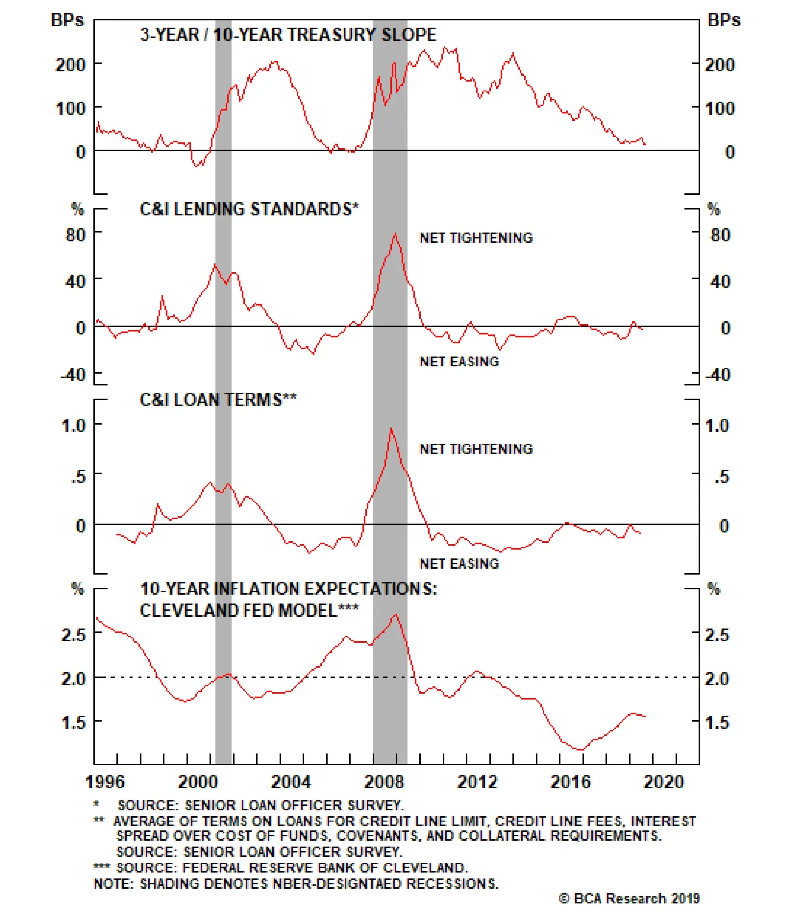
C&I lending standards and loan terms are both in “net easing” territory and, crucially, inflation expectations are extremely depressed. Low inflation expectations mean that the Fed must ensure that monetary policy stays accommodative until inflation…
Our research has demonstrated that corporate bond excess returns versus Treasuries tend to be highest early in the recovery when the yield curve is steep. On the flipside, we’ve also shown that an inverted yield curve is often a good signal to scale back…
Highlights Monetary Policy: The Fed wants to maintain accommodative financial conditions, and will therefore deliver another rate cut this year if it is expected by the market. This creates a supportive environment for spread product. Ultimately, stronger global growth will lead rate expectations higher over the next 12 months. Keep portfolio duration low. Money Markets & Fed Balance Sheet: Investors shouldn’t worry about last week’s chaotic action in money markets, and should pay less attention to the Fed’s balance sheet policy in general. Yes, the Fed will start growing its balance sheet again in the coming months, but this is much less important than what it decides to do with the fed funds rate. Global Economy: Leading indicators suggest that the global manufacturing downturn is near a trough, but the coincident PMI data have not yet bottomed. Treasury yields won’t move significantly higher until the Global Manufacturing PMI reverses course. Feature Chart 1Fed Dots Versus Market Expectations
Fed Dots Versus Market Expectations
Fed Dots Versus Market Expectations
Fed Chairman Jerome Powell had his work cut out for him at last week’s FOMC press conference. First, he had to craft a coherent message about the Fed’s reaction function following a meeting where three voting members dissented from the committee’s decision to lower the funds rate by 25 bps. One dissenter, St. Louis Fed President James Bullard, wanted a 50 bps reduction. The other two, Boston Fed President Eric Rosengren and Kansas City Fed President Esther George, preferred to leave rates unchanged. Not only that, but Powell also had to field questions about the recent turmoil in money markets. Turmoil that caused the overnight repo rate to spike and the effective fed funds rate to briefly print outside the Fed’s target band (see section titled “Repo Madness” below). Chart 2Tracking Financial Conditions
Tracking Financial Conditions
Tracking Financial Conditions
How did he perform? On all accounts we give the Chairman top marks. He managed to articulate a reaction function that didn’t commit to any near-term policy action, but most importantly, he did so in a way that prevented a sharp tightening of financial conditions. As we have argued in past reports, Chairman Powell’s most important job is to ensure that financial conditions remain accommodative so that the economic recovery can continue for long enough to bring long-dated inflation expectations back up to target.1 Chart 2 shows that, even after a tricky Fed meeting, financial conditions remain significantly more accommodative than they were earlier in the month: Credit spreads are tighter (Chart 2, panel 2) The yield curve has un-inverted (Chart 2, panel 3) TIPS breakeven inflation rates have widened (Chart 2, panel 4) The trade-weighted dollar has weakened (Chart 2, bottom panel) All this with only 7 out of 17 FOMC participants agreeing with the market’s assessment that one more 25 bps rate cut before year-end will be appropriate (see Chart 1). All in all, Powell did exactly what he needed to do. Investment Implications Table 1What's Priced In For The Rest Of 2019?
What's Up In U.S. Money Markets?
What's Up In U.S. Money Markets?
As mentioned above, the market is priced for roughly one more 25 bps rate cut before the end of the year. More specifically, the fed funds futures market is split 50/50 on whether that rate cut occurs at the October or December FOMC meeting (Table 1). The market currently sees only a 4% chance of a rate cut at both meetings, and zero chance of no rate cut at all. We think the market’s view of the next two FOMC meetings is roughly correct, though we would not discount the possibility that global economic data improve enough that further rate cuts are avoided (see section titled “Still Searching For A Bottom” below). Ideally, the Fed wants the economic data to lead rate expectations higher so that it can avoid cutting rates without shocking the market and tightening financial conditions. Conversely, if the market starts to fully price-in an October rate cut in the next few weeks, then the Fed will likely deliver. This reaction function is extremely supportive for credit spreads, and we recommend sticking with an overweight allocation to spread product versus Treasuries. Chart 3Treasury Returns Track Rate Expectations
Treasury Returns Track Rate Expectations
Treasury Returns Track Rate Expectations
As for portfolio duration, we continue to abide by our Golden Rule framework.2 If the Fed delivers less than the 57 bps of easing that the market expects over the next 12 months, then the Bloomberg Barclays Treasury index will likely underperform a position in cash (Chart 3). We see better odds of zero or one rate cut over that timeframe, and therefore recommend a below-benchmark duration stance. Bottom Line: The Fed wants to maintain accommodative financial conditions, and will therefore deliver another rate cut this year if it is expected by the market. This creates a supportive environment for spread product. Ultimately, stronger global growth will lead rate expectations higher over the next 12 months. Keep portfolio duration low. Repo Madness What Happened? Chart 4What Happened Here?
What Happened Here?
What Happened Here?
As mentioned above, overnight U.S. interest rates spiked dramatically last week, grabbing headlines and causing many to question the stability of financial markets. The commotion peaked last Tuesday when the overnight general collateral repo rate closed at just under 7% and the effective fed funds rate ended the day above the upper limit of the Fed’s target band (Chart 4). Why Did This Happen? Chart 5Looking For The Culprit
Looking For The Culprit
Looking For The Culprit
The turmoil’s proximate cause is that dealer banks found themselves short of cash. They therefore scrambled to borrow in money markets, driving overnight rates higher. Dealer banks were short on cash for a number of reasons. Many corporations withdrew funds to pay tax bills, and there was an unusually large amount of Treasury issuance in September, along with few redemptions (Chart 5). Dealer banks must purchase Treasury debt at auction, and of course require cash on hand to do so. But setting the proximate cause aside, the more important question is: Why don’t dealer banks have sufficient cash to weather such periods, which are bound to occur from time to time? The answer to this question has to do with the quantity of reserves being supplied to the banking system, which is ultimately a result of the Fed’s balance sheet policy. The Fed’s Balance Sheet & The Supply Of Bank Reserves Table 2Simplified Fed Balance Sheet
What's Up In U.S. Money Markets?
What's Up In U.S. Money Markets?
Table 2 shows an abridged version of the Fed’s balance sheet as of last Wednesday, September 18. Notice that the Fed’s securities holdings appear on the asset side of the balance sheet, while the Fed’s liabilities include: (i) currency in circulation, (ii) the Treasury department’s cash account and (iii) bank reserves. Reserves are a liability on the Fed’s balance sheet, but appear as an asset on the consolidated balance sheet of the U.S. banking system. In other words, the banking system’s supply of liquid reserves is always equal to the Fed’s assets less the amount of currency in circulation and the Fed’s other “non-reserve liabilities”. Put simply, if dealer banks don’t have enough cash, it is because the Fed is not holding enough securities. Chart 6The Fed's Balance Sheet Over Time
The Fed's Balance Sheet Over Time
The Fed's Balance Sheet Over Time
In fact, the Fed has been steadily draining the supply of bank reserves since 2014 (Chart 6). Initially, it did so passively by keeping its securities holdings constant and allowing reserves to decline by the amount of increase in currency-in-circulation and other “non-reserve liabilities”. Then, between October 2017 and July of this year, it actually shrank its portfolio, causing reserves to leave the system even more quickly. In August, the Fed returned to a policy of keeping its securities holdings constant, slowing the rate of decline in bank reserves. It is also worth mentioning that the rate of decline in bank reserves was recently exacerbated by a sharp increase in the Treasury department’s cash holdings (Chart 6, bottom panel). The Treasury department needed to rebuild its cash balance after having run it down in advance of the last debt ceiling deadline. Like currency-in-circulation, the Treasury department’s cash holdings are a liability on the Fed’s balance sheet. All else equal, an increase in the Treasury’s cash holdings leads to a decline in the supply of bank reserves. Next Steps Chart 7The Fed's Floor System
The Fed's Floor System
The Fed's Floor System
This year the Fed has been navigating through a process of “balance sheet normalization” where it seeks to reduce its asset holdings while still supplying enough bank reserves to ensure the effective operation of monetary policy. The Fed has already decided to operate monetary policy using a “floor system”, in contrast to the “corridor system” it employed prior to the financial crisis. In a corridor system, the Fed keeps the supply of bank reserves scarce, and then engages in daily repo transactions to ensure that it supplies just enough bank reserves to prevent the overnight rate from breaking through the top of its target range. In contrast, to operate a floor system the Fed must supply more reserves than the banking system demands. The excess supply of reserves forces the overnight rate down toward a floor set by the Fed’s overnight reverse repo facility (ON RRP). Essentially, the Fed sets the ON RRP rate at a level near the bottom of its target range, and pledges to pay that rate to any banks with excess cash (Chart 7). The fact that interest rates broke out above the top-end of the Fed’s target band last week suggests that the Fed is not supplying enough reserves to effectively operate its floor system. This means that we should consider the Fed’s “balance sheet normalization” process complete. In the coming weeks the Fed will roll out a plan to start growing its securities portfolio. It will do this by purchasing Treasuries with a maturity structure that roughly matches that of the outstanding debt load. The pace of Treasury purchases will either be set equal to the estimated rate of growth in non-reserve liabilities, a pace that would keep the supply of bank reserves flat and one that the Fed calls “organic growth”. Alternatively, the Fed might decide that the supply of reserves needs to rise for a time before leveling off. In that case, it would purchase Treasuries at a somewhat faster pace for a few months, before settling into an “organic growth” regime. The Fed will probably also roll out a standing repo facility in the coming months, with a rate set close to the upper-end of its target band. This will act as the mirror image of the current ON RRP, essentially capping the upside in interest rates by agreeing to lend overnight cash at a stated rate. The supply of bank reserves necessary for the Fed to maintain effective control of interest rates is much higher than during the pre-crisis.period It will take at least a few weeks for the Fed to roll out its new balance sheet strategy and standing repo facility. In the meantime, the New York Fed will transact daily in the repo markets to ensure that enough reserves are supplied. This action represents a temporary return to a corridor system. Once the Fed starts growing its Treasury holdings again, it will be able to resume its floor system and the daily repo transactions will not be necessary. Some have probably already noted that the supply of bank reserves necessary for the Fed to maintain effective control of interest rates is much higher than during the pre-crisis period (see Chart 6). This is purely the result of the new post-crisis regulatory environment (see Box). Box - New Regulations Mean Banks Want More Reserves Two new regulations, specifically, have increased the amount of reserves that banks wish to hold. The first is the liquidity coverage ratio (LCR). The LCR mandates that banks hold sufficient high-quality liquid assets (HQLA) to cover 30 days of cash outflows in a stressed scenario. Bank reserves qualify as HQLAs, as do Treasury securities. Some other securities can also count as HQLAs after a haircut is applied. While banks can opt to hold Treasuries instead of reserves and still maintain compliance with the LCR. A St. Louis Fed report from March showed that large U.S. banks are using reserves to cover 20% - 65% of their net outflows.3 The second relevant regulation is the resolution plan, or living will, that large banks are now forced to file with regulators. While the criteria here are more opaque, banks must demonstrate to regulators that they have enough short-term liquidity to cover demands from counterparties and other stakeholders in the event of material financial distress. Regulators likely put a greater emphasis on reserves than Treasury securities during such stress tests, since during a period of financial turmoil there may be doubts about how quickly a bank can convert a Treasury security into cash in the repo market. Is This The Return Of QE? The answer really depends on how you want to define QE. If you want to call any increase in the Fed’s securities holdings QE, then yes the Fed will soon re-start QE. If you want to define QE as an expansion in the supply of bank reserves, then the Fed might briefly engage in QE for a few months, before reverting to an “organic growth” policy that keeps the reserve supply stable. In any event, unless you are active in money markets, we would advise investors to pay much less attention to the Fed’s balance sheet policy. The goal of its balance sheet policy is to ensure that interest rates remain within its target band, and the Fed will move that target band around independently of what is happening with its balance sheet. Changes in the Fed’s target interest rates are what matter for financial markets. Still Searching For A Bottom For reasons articulated in prior reports – notably, accommodative financial conditions and resolute service sector growth – we remain convinced that the current global manufacturing slowdown is near a trough.4 However, we must also point out that the 10-year U.S. Treasury yield tends to track the broad swings in the Global Manufacturing PMI, and a significant rebound in the 10-year yield is unlikely without a corresponding PMI upswing (Chart 8). Chart 8No PMI Rebound Yet...
No PMI Rebound Yet...
No PMI Rebound Yet...
Chart 9...But Leading Indicators Are Hooking Up
...But Leading Indicators Are Hooking Up
...But Leading Indicators Are Hooking Up
On that note, September Flash PMI data for the U.S. and Eurozone were released yesterday, and were at best a mixed bag. The Eurozone Manufacturing PMI fell from 47.0 in August to 45.6 in September (Chart 8, bottom panel) while its U.S. counterpart ticked higher from 50.3 to 51.0 (Chart 8, panel 3). In general, it is too early to say that the global PMI data have bottomed, especially with the CRB Raw Industrials index – a broad commodities benchmark – still in free fall (Chart 8, panel 2). Global Leading Economic Indicators paint a somewhat rosier picture than the PMIs. In fact, our Global LEI appears to have bottomed, and should eventually lead the Global PMI higher if prior correlations hold (Chart 9). We also observe that the U.S. economic data are once again beating expectations, an occurrence that usually corresponds with higher yields (Chart 9, bottom panel). In general, it is too early to say that the global PMI data have bottomed. Bottom Line: Leading indicators suggest that the global manufacturing downturn is near a trough, but the coincident PMI data have not yet bottomed. Treasury yields won’t move significantly higher until the Global Manufacturing PMI reverses course. Ryan Swift, U.S. Bond Strategist rswift@bcaresearch.com Footnotes 1 Please see U.S. Bond Strategy Weekly Report, “Act As Appropriate”, dated August 27, 2019, available at usbs.bcaresearch.com 2 Please see U.S. Bond Strategy Special Report, “The Golden Rule Of Bond Investing”, dated July 24, 2018, available at usbs.bcaresearch.com 3 https://www.stlouisfed.org/on-the-economy/2019/march/banks-demand-reserves-face-liquidity-regulations 4 Please see U.S. Bond Strategy / Global Fixed Income Strategy Weekly Report, “Where’s The Positive Carry In Bond Markets?”, dated August 20, 2019, available at usbs.bcaresearch.com Fixed Income Sector Performance Recommended Portfolio Specification
Highlights The U.K. economy has been holding up fairly well, despite the overhang of political uncertainty. However, even before the actual withdrawal of the U.K. from the E.U. has occurred, Brexit has left a lasting mark on the U.K. economy through elevated uncertainty, severe weakness in business investment spending, and anemic productivity. The net result is an economy with lower trend growth, a structurally weaker exchange rate, and relatively high domestic inflation. Brexit will be delayed beyond October 31. No-deal Brexit is an overstated risk unless an early election strengthens Boris Johnson’s hand. That is unlikely. The investment outlook for the British pound and U.K. gilts is highly binary: a “smooth” Brexit is bullish for the pound and bearish for gilts, while no-deal Brexit would push both the pound and gilt yields even lower. Feature Ever since the United Kingdom voted in 2016 to exit the European Union, the outlook for the economy and financial assets has been tied to the binary outcome of whether or not an exit would be orderly. This has been a tremendous source of uncertainty, putting the Bank of England (BoE) in one of the most inconvenient positions ever faced by a central bank. In this week’s report, we look to address a few high-level questions. First, has the slowdown in the U.K. economy been run of the mill, given the global manufacturing recession? Or has it been unduly protracted given heightened political uncertainty? If the latter, what are the prospects of a rebound should anything other than a “no-deal” Brexit prevail? Finally, has there been irreparable damage already done to the economy because of delayed investment, with longer-term ramifications irrespective of the relationship outcome with the E.U.? An Employment Boom The U.K. is currently experiencing the best jobs recovery since the Second World War. 4.2 million new jobs have been created over the past decade, nudging the employment-to-population ratio to the highest level in almost 50 years. What is remarkable is that this recovery looks even more impressive than that of the U.S., where labor market conditions have been very robust. For example, in the U.S., the employment rate stands at 60.9%, just a nudge below the U.K. but still nearly four percentage points below its pre-crisis peak (Chart 1). Compared to the eurozone, the outperformance of the U.K. labor market has been very evident. Despite this recovery, the pickup in wages has been the most tepid since the Boer War. The quality of jobs has also been stellar – full-time job creation has outpaced part-time and female participation rates are soaring. The jobs bonanza has also been broad across regions and industries. Yes, the manufacturing sector has seen some measure of volatility, but aside from the East Midland region, unemployment rates continue to converge downward across the United Kingdom (Chart 2) Chart 1An Employment Boom
An Employment Boom
An Employment Boom
Chart 2Recovery Is Broad-Based
Recovery Is Broad-Based
Recovery Is Broad-Based
Despite this recovery, the pickup in wages has been the most tepid since the Boer War. In a July speech, the BoE’s chief economist, Andy Haldane, rightly noted that the lost decade of pay has been an equal-opportunity disaster across the major U.K. regions. From the 1950s until the Great Recession, real pay in the U.K. grew by about 2% per annum. Since the Great Recession, real pay has stagnated at a rate of -0.4% per year (Chart 3).1 Chart 3Wages Stagnated Until Recently
Wages Stagnated Until Recently
Wages Stagnated Until Recently
There have been a few reasons for this. First, there has been strong growth in self-employment, zero-hours contracts and agency work. So even though the share of full-time work has been rising during the post-crisis period, it remains well below its pre-crisis highs. This has increased the fluidity of the labor market, lowering the cost of doing business in the process. Compensation of self-employed or zero-hours contract workers lies significantly below their permanent counterparts. The silver lining is that this phenomenon is not specific to the U.K., but is happening worldwide, especially in Europe where structural reform has disentangled rigidities in the labor market. The key question going forward is whether the nascent rise in wages will continue. Over a cyclical horizon, our contention is that should positive employment trends continue, the U.K. could begin to experience significantly stronger wage pressures. There are four fundamental reasons for this: Job offers continue to outpace the number of seekers. Depending on the measure used, there are 20%-40% more jobs than there are applicants (Chart 4). This impasse cannot easily be resolved by a higher employment rate (it is at a secular high) or lower unemployment. The BoE estimates NAIRU in the U.K. is at 4.4%, which means that the unemployment rate is firmly below its structural level. Business surveys continue to suggest that a shortage of skilled labor is among the top problems firms are facing. The Phillips curve in the U.K. has flattened in the last few years, but wage growth has started to inflect higher of late. Like many other countries, the Phillips curve in the U.K. is kinked, whereby the convexity of wage growth increases as the unemployment gap closes. The velocity of circulation in the jobs market, also known as the job-to-job flow, has picked up. This has historically been positive for wage growth (Chart 5). This is also mirrored by the quits rate, which has been accelerating since 2012. Chart 4Wage Pressures Should Mount
Wage Pressures Should Mount
Wage Pressures Should Mount
Chart 5Velocity Of U.K. Employment Rising
Velocity Of U.K. Employment Rising
Velocity Of U.K. Employment Rising
At the moment, the transmission mechanism from a tight labor market to higher wages is being impeded by political uncertainty, which will continue to cast a near-term shadow on longer-term hiring plans. For example, for all the talk of the U.K. being a financial center, attrition in banking and insurance employment remains entrenched (Chart 6). The U.K. continues to attract a significant amount of financial business, especially in the foreign exchange market, but there was a clear hit to volumes in 2016, the year the Brexit referendum was held (Chart 7). Meanwhile, for the manufacturing sector, it will take a while to rekindle animal spirits and re-attract foreign direct investment. Chart 6Attrition In Manufacturing And Finance Employment
Attrition In Manufacturing And Finance Employment
Attrition In Manufacturing And Finance Employment
Chart 7The U.K. Is An Important Financial Center
United Kingdom: Cyclical Slowdown Or Structural Malaise?
United Kingdom: Cyclical Slowdown Or Structural Malaise?
That said, the U.K. economy remains mostly driven by services, meaning wages will still face some measure of upward pressure. Service sector wage growth has been robust and unless the manufacturing recession grows deeper and starts to infect other sectors of the U.K. economy, the path of least resistance for wages remains up. Bottom Line: The U.K. economy has been holding up fairly well, despite the overhang of political uncertainty. Virtuous Circle Of Spending While the U.K. income pie could grow, a lack of confidence is nonetheless constraining spending. Chart 8 shows that U.K. consumer confidence has negatively diverged from trends in both the U.S. and the euro area. There have been a few offsetting factors at play suggesting that once the clouds of Brexit uncertainty lift, spending could re-accelerate higher. The transmission mechanism from a tight labor market to higher wages is being impeded by political uncertainty, which will continue to cast a near-term shadow. A big driver for retail sales in the U.K. is tourist arrivals and the weaker pound is likely to keep attracting an influx of visitors (Chart 9). Chart 8Confidence Will Be Key For ##br##Any Recovery
Confidence Will Be Key For Any Recovery
Confidence Will Be Key For Any Recovery
Chart 9The Cheap Pound Will Encourage ##br##Foreign Shoppers
The Cheap Pound Will Encourage Foreign Shoppers
The Cheap Pound Will Encourage Foreign Shoppers
The U.K. commands many of the world’s leading brands that will benefit from a cheap currency. The household deleveraging process is well advanced, and the tentative recovery in borrowing and mortgage applications is helping to cushion the fall in U.K. house prices. This is underpinned by the fact that mortgage-borrowing costs in the U.K. have collapsed along with yields (Chart 10). That said, any rise is borrowing will be mitigated by the fact that household debt-to-GDP in the U.K. remains higher than in many other developed economies. Chart 10Low Rates Should Help Housing
Low Rates Should Help Housing
Low Rates Should Help Housing
Chart 11Cost-Push Inflation
Cost-Push Inflation
Cost-Push Inflation
Inflation expectations are blasting upward, partly in response to the weaker currency. What is remarkable is that the pound has plummeted by a lot more than is warranted on a fundamental PPP basis. This will bring about imported inflation (Chart 11). Bottom Line: The big risk to the U.K. economy is that it enters into stagflation. A BoE survey pins the loss to output in the event of a no-deal Brexit at around 3% of GDP, but these are estimates since the bulk of the economic adjustment might occur through the exchange rate. The range of estimates for the economic impact of a no-deal (Table 1), perhaps not coincidentally, mirrors the range of Britain’s recessions in the 20th century (Chart 12). This puts the BoE in a particularly uncomfortable “wait and see” mode. For example, if a hard exit leads to a fall in the pound and a rise in inflation expectations, it is not clear the BoE’s Monetary Policy Committee would cut rates if it were to meet its inflation mandate. Table 1Wide Range Of Estimates For Impact ##br##Of No-Deal Brexit
United Kingdom: Cyclical Slowdown Or Structural Malaise?
United Kingdom: Cyclical Slowdown Or Structural Malaise?
Chart 12Past British Recessions Offer Guidelines ##br##For No-Deal Impact
United Kingdom: Cyclical Slowdown Or Structural Malaise?
United Kingdom: Cyclical Slowdown Or Structural Malaise?
Brexit Uncertainty Has Already Caused Lasting Damage To U.K. Growth A major drag on U.K. economic growth over the past three years has been the collapse in business confidence and associated contraction in capital spending (Chart 13). Since the 2016 Brexit vote, business investment has been substantially weaker than at similar points in previous U.K. business cycles – by a cumulative 26%, according to the BoE (Chart 14). While some of the softness seen in 2019 can also be attributable to slowing global economic growth and uncertainty related to the U.S.-China trade war, U.K. capital spending has been far weaker than that of other advanced economies (Chart 15). Since the 2016 Brexit vote, business investment has been substantially weaker than at similar points in previous U.K. business cycles – by a cumulative 26%. This is a critical point to consider when judging the long-run damage that has already been inflicted on the U.K. economy just from the uncertainty of Brexit. The best way to evaluate this damage is through the lens of capital spending, the growth of which is highly correlated to changes in productivity and potential economic growth (Chart 16). Chart 13Gloomy U.K. Businesses Have Stopped Investing
Gloomy U.K. Businesses Have Stopped Investing
Gloomy U.K. Businesses Have Stopped Investing
Chart 14Massive Underperformance Of U.K. Capex Compared To History ...
United Kingdom: Cyclical Slowdown Or Structural Malaise?
United Kingdom: Cyclical Slowdown Or Structural Malaise?
Chart 15...And Compared To ##br##Global Peers
...And Compared To Global Peers
...And Compared To Global Peers
Chart 16A Lasting Hit To The U.K. Economy From Brexit Uncertainty
A Lasting Hit To The U.K. Economy From Brexit Uncertainty
A Lasting Hit To The U.K. Economy From Brexit Uncertainty
An important research paper published by the BoE last month – co-authored by two current members of the BoE Monetary Policy Committee, Ben Broadbent and Silvana Tenreyro – discusses the linkages between Brexit uncertainty, capital spending and U.K. productivity.2 The authors concluded that the economic effects of the Brexit referendum result can be categorized as a response to an anticipated, persistent decline in productivity growth for the tradeable sectors of the U.K. economy. In that framework, the following chain of events would occur after the “news” of weaker expected productivity (i.e. the Brexit referendum result) is announced: Chart 17A Misallocation of Resources
A Misallocation of Resources
A Misallocation of Resources
An immediate and permanent fall in the relative price of non-tradeable output relative to tradeable output, i.e. the real exchange rate. Resources shift to the tradeable sector to take advantage of the higher relative price, leading to an increase in output and a rise in exports. Productivity growth in the tradeable sector then falls, as heralded by the “news” of the Brexit vote, leading to a shift in economic resources back towards the higher productivity non-tradeable sectors. U.K. interest rates fall relative to the world, as financial markets discount the expected relatively slower path of U.K. productivity. Aggregate business investment growth slows, but overall employment growth remains resilient. This is exactly how the U.K. economy has evolved since the 2016 Brexit vote: The BoE’s trade-weighted index for the pound has fallen in both nominal and real terms. The export share of U.K. real GDP rose from 27% to 30%, while the investment share of real GDP declined from 10% to 9% (Chart 17, top panel). Annual employment growth in U.K. services (non-tradeable) fell from 2.1% to zero by the end of 2018, but has since begun to recover; manufacturing (tradeable) employment growth initially increased from 0.5% to 2.7% within a year of the Brexit vote, before slowing back to 0% in 2018, and is also starting to move higher (Chart 17, third panel). Productivity growth has declined from 1.9% to nil, even as wage growth has accelerated due to the steady pace of labor demand at a time of low unemployment (Chart 17, bottom panel). On a sectoral level, the worst growth rates of realized productivity growth are occurring in tradeable industries like metal products and financial services, while the highest productivity growth is seen in non-tradeable industries like professional services and retail (Chart 18).3 Chart 18Latest U.K. Productivity Growth Rates, By Industry
United Kingdom: Cyclical Slowdown Or Structural Malaise?
United Kingdom: Cyclical Slowdown Or Structural Malaise?
Summing it all up, according to the analytic framework of the BoE research paper, the Brexit referendum result essentially created a signal, manifested by the plunge in the British pound, for the misallocation of U.K. resources away from higher-productivity non-tradeable industries to lower productivity tradeable sectors. If true, we would also expect to see the following: Chart 19Inflationary Consequences of Brexit Uncertainty
Inflationary Consequences of Brexit Uncertainty
Inflationary Consequences of Brexit Uncertainty
Much higher inflation rates in more domestically-focused measures like services and wages. Faster growth in unit labor cost as a result of the gap between accelerating wages and stagnant productivity. Structurally higher inflation expectations. Lower real interest rates in the U.K. than in other advanced economies. Prolonged weakness in the exchange rate. Again, all of this has come to fruition in the U.K. (Chart 19): Services CPI inflation is now at 2.2%, compared to only 1.7% for overall CPI inflation. Unit labor costs growth has accelerated from below zero before the Brexit referendum to a 2%-3% range since the end of 2016. The real 10-year gilt yield (deflated by the 10-year CPI swap rate) is now -3.1%, compared to a 0% real yield on 10-year U.S. Treasurys. The trade-weighted British pound remains close to its post-Brexit referendum lows. It is clear that the Brexit uncertainty has resulted in a structurally weaker, and more inflationary, U.K. economy – an outcome that may not be quickly reversed in the event a no-deal Brexit is avoided. This has important implications for the future monetary policy decisions of the BoE and the investment outlook for the pound and U.K. gilts. Bottom Line: Even before the actual withdrawal of the U.K. from the E.U. has occurred, Brexit has left a lasting mark on the U.K. economy through elevated uncertainty, severe weakness in business investment spending and anemic productivity. The net result is an economy with lower trend growth, a structurally weak exchange rate, and relatively high domestic inflation. Political Uncertainty Prevails Chart 20Public Opposes No-Deal Brexit
United Kingdom: Cyclical Slowdown Or Structural Malaise?
United Kingdom: Cyclical Slowdown Or Structural Malaise?
Even after considering the cyclical and structural state of the U.K. economy, as we have done in this report, the near-term outlook is still entirely dependent on the Brexit outcome. The state of Brexit is more uncertain than ever due to the Supreme Court case against the government’s suspension of Parliament and Prime Minister Boris Johnson’s refusal to obey an order by Parliament to seek an extension to the October 31 exit deadline. What is not in doubt is that parliament opposes a disorderly, no-deal Brexit. And the best polling suggests that public opinion opposes a no-deal Brexit as well (Chart 20). Members soundly rejected Prime Minister Boris Johnson’s negotiation strategy in September – they prohibited both a no-deal Brexit and voted against holding an early election on two separate occasions (Chart 21). Johnson lost his coalition majority and yet cannot go to new elections, leaving him hamstrung until Parliament returns. What is likely regardless of the outcome is a substantial increase in fiscal spending, The United Kingdom is not a seventeenth-century Stuart monarchy – Parliament is the supreme political body in the constitution and its decrees cannot be permanently ignored or disobeyed. Whenever Parliament reconvenes, likely October 14, it will have the ability to ensure that the Brexit deadline is extended. The E.U. is likely to grant an extension because it is in the E.U.’s interest to delay or cancel Brexit and demonstrate to all members that leaving the bloc is neither desirable nor practical. The result will then be an election. Chart 21Boris Johnson’s Negotiation Strategy Failed
United Kingdom: Cyclical Slowdown Or Structural Malaise?
United Kingdom: Cyclical Slowdown Or Structural Malaise?
Chart 22A Hung Parliament Is The Likely Outcome
A Hung Parliament Is The Likely Outcome
A Hung Parliament Is The Likely Outcome
Election polls show the Conservative Party breaking out, the Liberal Democrats overtaking Labour, and the Brexit Party maintaining an edge (Chart 22). Translating these polls to parliamentary seats is not straightforward because the first-past-the-post electoral system means that a smaller party can steal crucial votes from the most popular party leaving the second- or third-most popular party to win the seat. The key point is that the Brexit Party is a single-issue party and the Tories under Johnson are now monopolizing that same issue. If this dynamic persists, the Lib Dems pose a greater threat of splitting Labour’s votes than the Brexit Party does of splitting Conservative votes. The result is that it is still possible for the Conservatives to gain a majority, even though it seems unlikely given that they need 325-plus seats and have fallen to 288 seats after purging unruly members and losing leadership in Scotland. A hung Parliament is a more likely outcome. A hung Parliament will prolong the indecision and uncertainty – but will also be likely to remain united against a no-deal Brexit. An opposition coalition government will prevent a no-deal Brexit. Even a single-party Tory majority is not a disastrous outcome, as it would increase Johnson’s leverage with the E.U. and increase the likelihood that the E.U. would offer some concessions to get a withdrawal agreement passed, resulting in a Brexit deal and an orderly exit (Specifically, a Northern Irish limitation to the backstop, or a sunset clause or withdrawal mechanism for the same). Such a deal is in Johnson’s best interests so that he does not preside over a recession from the moment he returns to office. All of these outcomes point toward either an exit deal or a new chapter in which parliament seeks a new referendum. Chart 23Expect An Increase In Fiscal Spending
Expect An Increase In Fiscal Spending
Expect An Increase In Fiscal Spending
The worst outcome for the markets would be a weak Tory coalition majority that cannot agree on Ireland or pass an exit deal, as this could lead to paralysis, as it did with Theresa May, at a time when the prime minister is committed to delivering an exit come hell or high water. This is the scenario in which no-deal once again becomes a genuine risk. Subjectively we have estimated that the risk of no-deal is around 30%, but this is currently falling, not rising, as a result of parliament’s strong majorities against that outcome in September – and only an election can change that. It is fruitless trying to predict the U.K.’s future political landscape without knowing the conclusion of the Brexit saga. What is likely regardless of the outcome is a substantial increase in fiscal spending, reversing the “austerity” of the aftermath of the Great Recession. This trend is already apparent from Johnson’s current attempt to present a generous social spending package at the Tory party conference this fall – which would, if vindicated by a new election, represent a turnaround in Conservative fiscal policy (Chart 23). More fiscal spending will be needed to counteract the negative impact of a disorderly Brexit, or to placate the middle class once it becomes clear that leaving the E.U. is not a panacea for the UK’s problems, or to fulfill the agenda of an opposition government when it comes to power. In the event that a no-deal Brexit occurs, the U.K. will not only face a tumultuous economic aftermath, but the constitutional struggles among the three kingdoms will reignite due to the negative impact in Northern Ireland and the likely revival of Scottish independence efforts. Bottom Line: The U.K. is not a dictatorship and the prime minister cannot refuse to obey Parliament’s will. Parliament has voted clearly to delay a no-deal Brexit and will continue to do so. A disorderly exit remains a risk because an eventual election could return the Tories to power. But in this case, the E.U. will be more likely to offer a concession that enables Parliament to pass a withdrawal bill. The odds of no deal are no higher than 30%. The structural takeaway, regardless of the outcome, is that fiscal spending will rise. Investment Conclusions The episodes surrounding the collapse of the pound in 1992 carry important lessons for today.4 Crucially, most of the adjustment in the pound happened quickly, but a key difference from today is that an exit from the European Exchange Rate Mechanism was unanticipated, unlike Brexit. Foreign exchange markets are extremely fluid and adjust to expectations quite quickly. Peak to trough, cable has already fallen by circa 30% suggesting the bulk of the downward adjustment is done. Chart 24A Binary Brexit Outcome for Gilts
A Binary Brexit Outcome for Gilts
A Binary Brexit Outcome for Gilts
The British currency is free floating, meaning there are less “hidden sins” compared to the fixed exchange rate period. That said, the fair value of the pound has structurally weakened. Our bias is that if there is a hard Brexit, the pound could easily drop to the 1.10-1.15 zone. Part of this move will be an undershoot. In the case of a soft Brexit (or no Brexit), the pound should converge toward the mid-point of its historical real effective exchange rate range, which would pin it 15%-20% higher, or at around 1.50. From a risk-reward perspective, this looks attractive. For U.K. gilts, the direction of yields is also dependent on the Brexit outcome, as there is essentially no change in policy rates discounted in the U.K. Overnight Index Swap (OIS) curve (Chart 24). A “smooth” Brexit would allow the BoE to return its focus to fighting elevated U.K. inflation expectations. That would likely result in both higher gilt yields and a flattening of the gilt yield curve, as the market prices in future BoE rate hikes, and lower longer-term inflation expectations. A rising cable will also temper inflation expectations. Neither gilts nor U.K. inflation-linked bonds would perform well in this scenario.. A “no deal” Brexit, on the other hand, would prompt the BoE to cut interest rates in order to offset the potential hit to business and consumer confidence. This could occur even if inflation expectations remain high or rise further on pound weakness. That would mean lower gilt yields and a steepening of the gilt curve. Going overweight gilts but also long inflation-linked bonds would be the best way to position for this outcome. The scenarios for fiscal easing outlined earlier would also influence the shape of the gilt curve, resulting in some degree of bearish steepening as the gilt curve prices in both larger deficits and higher future inflation, all else equal. Robert Robis, CFA Chief Fixed Income Strategist rrobis@bcaresearch.com Chester Ntonifor, Foreign Exchange Strategist chestern@bcaresearch.com Matt Gertken, Geopolitical Strategist mattg@bcaresearch.com Ray Park, CFA, Research Analyst ray@bcaresearch.com Footnotes 1 Andrew G Haldane, “Climbing the Jobs Ladder,” Bank of England, July 23, 2019 2 Bank of England External MPC Unit Discussion Paper No. 51, “The Brexit vote, productivity growth and macroeconomic adjustments in the United Kingdom”, August 2019 3 London’s role as a major global financial center makes the U.K. financial services industry a “tradeable” sector, in that a significant share of its output is “traded” to non-U.K. users. 4 Mathias Zurlinden, “The Vulnerability of Pegged Exchange Rates: The British Pound in the ERM,” Economic Research, Vol. 75, No. 5 (September/October 1993). Trades & Forecasts Forecast Summary Core Portfolio Tactical Trades Limit Orders Closed Trades
Dear Client, BCA’s New York conference takes place next week on September 26-27, and I look forward to meeting some of you there. Because of the conference, our next report will come out on October 3. Dhaval Joshi Highlights If the WTI crude oil price breached $70, Germany’s net export growth would suffer a short-term relapse. If the WTI crude oil price breached $90, Germany’s economic growth would suffer a much longer setback. The WTI crude oil price is now trading at $59, well below even the first pain threshold. Hence, at the moment, the oil price ‘spike’ is a minor irritant rather than a major risk to a German (and European) economic rebound in the fourth quarter. Stay overweight the Eurostoxx50 versus the Shanghai Composite and Nikkei225. If the WTI price stabilises well below $70, we intend to initiate an overweight to the DAX versus global equities. German bunds are a structural short relative to U.S. T-bonds. Feature Chart of the WeekOil Price Oscillations Have Explained German Growth Oscillations With A Spooky Precision
Oil Price Oscillations Have Explained German Growth Oscillations With A Spooky Precision
Oil Price Oscillations Have Explained German Growth Oscillations With A Spooky Precision
It is touch and go whether Germany suffered a technical recession through the second and third quarters.1 We will know in about six weeks’ time, once the statisticians have finished crunching the numbers. But for the financial markets, this is old news. A technical recession in Germany during the second and third quarters is already baked in the market cake. The economy and financial markets are entwined in a perpetual dance. In a dance, sometimes one person decides the steps and sometimes the other person does, but the couple always moves together. And so it is with the economy and markets. The ZEW indicator of (German) economic sentiment recently hit its lowest level since 2011, and the performance of the DAX versus global equities has moved in near perfect lockstep (Chart I-2). Chart I-2A German Recession Is Already Baked In The Market Cake
A German Recession Is Already Baked In The Market Cake
A German Recession Is Already Baked In The Market Cake
Some people try to predict the movement of markets based on the releases of backward-looking economic data or even supposedly real-time economic data, such as sentiment surveys. Good luck with that. The markets instantaneously discount those releases. To predict the markets, the key question is: what will the future releases look like? If the German economy rebounds in the fourth quarter, then the stark underperformance of the DAX constitutes a compelling buying opportunity versus other equity markets. That said, a new potential risk has emerged: the spike in the crude oil price. Germany Is Highly Sensitive To The Oil Price Europeans are large importers of energy, with 55 percent of all energy needs met by net imports. Moreover, the volume of energy they import tends to be price inelastic. Hence, when energy prices plunge, it boosts net exports and thereby it boosts growth. Conversely, when energy prices soar – as they have recently – it depresses net exports and thereby it depresses growth.2 98 percent of Germany’s consumption of oil depends on imports. This is especially true for Germany whose energy import dependency, at 65 percent, is well above the European average. The most important energy source is still oil which accounts for over a third of Germany’s primary energy use (Chart I-3). Moreover, 98 percent of Germany’s consumption of oil depends on imports.3 Chart I-3Germany Is Highly Sensitive To The Oil Price
A German Recession Is Baked In The Market Cake. Now What?
A German Recession Is Baked In The Market Cake. Now What?
Most of Germany’s oil consumption is for transport. On a timeframe of decades, the planned decarbonisation of all sectors by 2050 should all but eliminate fossil oil from German energy consumption. However, on a timeframe of quarters, oil consumption for transport is highly inelastic and non-substitutable. Hence, in recent years, swings in the oil price have always caused swings in Germany’s net exports (Chart I-4). Based on this excellent relationship, a likely rebound in German net exports in the fourth quarter would be threatened if the WTI crude price reached and stayed in the mid $70s. Chart I-4Swings In The Oil Price Cause Swings In Germany's Net Exports
Swings In The Oil Price Cause Swings In Germany's Net Exports
Swings In The Oil Price Cause Swings In Germany's Net Exports
For Economic Growth, The Oil Price Impulse Is What Matters Empirically, we have found that the German economy is much more sensitive to the oil price than other European economies (Chart I-5 and Chart I-6). This could be because other drivers of the economy such as credit developments are less significant in Germany. Chart I-5Germany Is More Sensitive To The Oil Price...
Germany Is More Sensitive To The Oil Price...
Germany Is More Sensitive To The Oil Price...
Chart I-6...Than Other European ##br##Economies
...Than Other European Economies
...Than Other European Economies
Most analysts argue that it is the change in the oil price that is relevant for the economy. This is obviously correct for the impact on inflation, which is, by definition, the change in a price. However, it is incorrect to argue that the change in the oil price drives economic growth. Instead, it is the impulse of the oil price – the change in its change – that drives economic growth. To understand why, consider a simplified example. Let’s say a 20 percent drop in the oil price added to Germany’s net exports, causing the economy to grow 1 percent. In the following period, another 20 percent drop in the oil would cause the economy to grow again by 1 percent, so growth would stay unchanged. On the other hand, if the oil price dropped by 10 percent, the economy would still grow, but now at a reduced rate of 0.5 percent. Therefore somewhat paradoxically, though the oil price has declined by 10 percent, growth has slowed. This is because the second drop in the price (10 percent) is less than the first (20 percent) – which means the tailwind impulse has faded. Now let’s put in the actual numbers for the oil price’s 6-month impulse. The period ending around June 2019 constituted a severe headwind impulse. This is because a 30 percent increase in the oil price followed a 40 percent decline in the previous period, equating to a headwind impulse of 70 percent.4 Allowing for typical lags of a few months, this severe headwind impulse is a likely culprit, or at least a contributing culprit, for Germany’s slowdown during the second and third quarters. As the Chart of the Week compellingly illustrates, oscillations in the oil price’s 6-month impulse have explained the oscillations in Germany’s 6-month economic growth with a spooky precision. Empirically, other explanatory factors are not needed. The period ending June 2019 constituted a severe headwind impulse from the oil price. Now the good news. Until the last few days, the oil price’s severe headwind impulse had eased – and this fading of the headwind strongly suggested a rebound in German economic growth during the fourth quarter and beyond. This raises a crucial question: to what level would the crude oil price have to spike for the maximum headwind impulse to return, and thereby extinguish the chance of such a rebound? By reverse engineering the price from the maximum headwind impulse, the answer is the WTI crude price at $90. Pulling all of this together, the first pain threshold is WTI breaching $70, at which Germany’s net export growth could suffer a short-term relapse. The second and greater pain threshold is WTI breaching $90, at which Germany’s economic growth could be stifled for much longer. Having said all that, WTI is now trading at $59, well below even the first pain threshold. Hence, at the moment, this is a minor irritant rather than a major risk to a German (and European) economic rebound. Stay overweight the Eurostoxx50 versus the Shanghai Composite and Nikkei225. And in the coming week or so, if the WTI price stabilises well below $70, we intend to initiate an overweight to the DAX versus global equities. The ECB Fired A Dud So much for the ECB’s promise to ‘shock and awe’ the markets. The bazooka ended up firing a dud! Unlimited QE is not really unlimited when the ECB’s asset purchase program is running close to its individual issuer limit, and its country composition cannot deviate too far from the ECB’s capital key. QE is nothing more than a signal of intent to keep policy interest rates ultra-low for a protracted period. In any case, QE is nothing more than a signal of intent to keep policy interest rates ultra-low for a protracted period. But once the markets have fully discounted this intent – as they have in the euro area and Japan – the monetary policy armoury is effectively out of ammunition (Chart I-7-Chart I-10). So it is not surprising that the ECB fired a dud. Chart I-7Monetary Policy Is Exhausted In The Euro Area...
Monetary Policy Is Exhausted In The Euro Area...
Monetary Policy Is Exhausted In The Euro Area...
Chart I-8...But The U.S. Still Has ##br##Ammunition
...But The U.S. Still Has Ammunition
...But The U.S. Still Has Ammunition
Chart I-9Monetary Policy Is Exhausted In Japan...
Monetary Policy Is Exhausted In Japan...
Monetary Policy Is Exhausted In Japan...
Chart I-10...But China Still Has Ammunition
...But China Still Has Ammunition
...But China Still Has Ammunition
Some people counter that there are even more exotic monetary policy options in the pipeline, such as ‘helicopter money’. However, as Mario Draghi correctly pointed out, “giving money to people in whatever form is not a monetary policy task, it’s a fiscal policy task.” Helicopter money might be a step too far, but its notion encapsulates the shape of things to come in Europe. With euro area monetary policy exhausted, the baton is passing to fiscal policy. The upshot is that in a bond portfolio, German bunds are a structural short relative to U.S. T-bonds. Fractal Trading System* Although we are structurally overweight Italian long-dated BTPs, the 130-day fractal dimension is signalling that the pace of the rally is now technically extended and therefore vulnerable to a countertrend correction. This week’s trade recommendation is to express this via a short position in the Italian 10-year BTP, setting a profit target of 3 percent with a symmetrical stop-loss. In other trades, short the U.S. 10-year T-bond quickly achieved its profit target, while short financial services versus market reached the end of its holding period in slight loss. For any investment, excessive trend following and groupthink can reach a natural point of instability, at which point the established trend is highly likely to break down with or without an external catalyst. An early warning sign is the investment’s fractal dimension approaching its natural lower bound. Encouragingly, this trigger has consistently identified countertrend moves of various magnitudes across all asset classes. Chart I-11
Italy 30-Year Govt. Bond
Italy 30-Year Govt. Bond
The post-June 9, 2016 fractal trading model rules are: When the fractal dimension approaches the lower limit after an investment has been in an established trend it is a potential trigger for a liquidity-triggered trend reversal. Therefore, open a countertrend position. The profit target is a one-third reversal of the preceding 13-week move. Apply a symmetrical stop-loss. Close the position at the profit target or stop-loss. Otherwise close the position after 13 weeks. Use the position size multiple to control risk. The position size will be smaller for more risky positions. * For more details please see the European Investment Strategy Special Report “Fractals, Liquidity & A Trading Model,” dated December 11, 2014, available at eis.bcaresearch.com. Dhaval Joshi, Chief European Investment Strategist dhaval@bcaresearch.com Footnotes 1 We define a technical recession as two consecutive quarters of contraction in real GDP. 2 Energy dependence = (imports – exports) / gross available energy. 3 According to the Federal Institute for Geosciences and Natural Resources. 4 The 6-month steps in the WTI crude oil price were $74.15, $45.21, and $58.24. The first change equated to a 40 percent decrease and the second change equated to a 30 percent increase. So the 6-month impulse was 70 percent. Fractal Trading System Cyclical Recommendations Structural Recommendations Closed Fractal Trades Trades Closed Trades Asset Performance Currency & Bond Equity Sector Country Equity Indicators Bond Yields Chart II-1Indicators To Watch - Bond Yields
Indicators To Watch - Bond Yields
Indicators To Watch - Bond Yields
Chart II-2Indicators To Watch - Bond Yields
Indicators To Watch - Bond Yields
Indicators To Watch - Bond Yields
Chart II-3Indicators To Watch - Bond Yields
Indicators To Watch - Bond Yields
Indicators To Watch - Bond Yields
Chart II-4Indicators To Watch - Bond Yields
Indicators To Watch - Bond Yields
Indicators To Watch - Bond Yields
Interest Rate Chart II-5Indicators To Watch - Interest Rate Expectations
Indicators To Watch - Interest Rate Expectations
Indicators To Watch - Interest Rate Expectations
Chart II-6Indicators To Watch - Interest Rate Expectations
Indicators To Watch - Interest Rate Expectations
Indicators To Watch - Interest Rate Expectations
Chart II-7Indicators To Watch - Interest Rate Expectations
Indicators To Watch - Interest Rate Expectations
Indicators To Watch - Interest Rate Expectations
Chart II-8Indicators To Watch - Interest Rate Expectations
Indicators To Watch - Interest Rate Expectations
Indicators To Watch - Interest Rate Expectations
Looking ahead, the ECB will run into some difficulties on running a “QE Forever” program given the current self-imposed constraints on the APP. The ECB cannot own more than 33% of the outstanding pubic debt of any single country. At the moment, the ECB…
Highlights Fed: The Fed will cut rates by 25bps this week, accompanied by a balanced message on future moves given firm domestic U.S. growth amid global uncertainties. This could trigger additional near-term increases in Treasury yields if the market prices out future expected rate cuts. More likely, higher Treasury yields will manifest via higher inflation expectations, as investors price in Fed accommodation amid the recent acceleration of realized inflation. ECB: The ECB’s easing package last week fell short of market expectations, as policymakers face the operational constraints of cutting already-negative interest rates and restarting asset purchases. Portfolio Recommendations: Return to below-benchmark on overall interest rate duration on a tactical (0-3 months) basis, with global leading economic indicators bottoming and U.S.-China trade tensions easing. Within country allocation, maintain an underweight stance on U.S. Treasuries versus German Bunds on a USD-hedged basis. Feature Dear Client, Next week, we will be publishing a joint Special Report on the U.K. with our colleagues at BCA Foreign Exchange Strategy and BCA Geopolitical Strategy. The report will be sent to clients this Friday, September 20, on the regular publishing day of the other two services. Thus, Global Fixed Income Strategy clients will be receiving their next report a few days early. We will return to our usual publishing schedule on Tuesday, October 1. Best regards, Rob Robis Chart of the WeekA Fundamental Bottoming Of Bond Yields
A Fundamental Bottoming Of Bond Yields
A Fundamental Bottoming Of Bond Yields
The bond market has been full of surprises over the past year, and the price action so far this month is no exception. The benchmark 10-year U.S. Treasury yield has climbed +42bps from the September 3 inter-day low of 1.43%, while the 10-year German Bund yield also rose by +23bps over that same period, even as the ECB announced a fresh set of policy easing measures last week. There are several possible reasons for this increase in yields: profit-taking in deeply overbought government bond markets; global central bankers delivering incrementally less dovish surprises; and hints of progress in the U.S-China trade negotiations. We prefer a more fundamental explanation – bond markets may be sniffing out an end of the 2019 global growth downturn. The message from the improving trend in both our global leading economic indicator (LEI) and our Duration Indicator is that global growth (Chart of the Week) is stabilizing, which should help boost government bond yields from current depressed levels. The recent attack on oil facilities in Saudi Arabia does represent a near term risk to this potentially more optimistic narrative on the world economy. Our colleagues at BCA Geopolitical Strategy do expect a military response from the U.S., although U.S. President Trump will attempt to keep it limited. A full-blown U.S.-Iran conflict would likely further raise the risk premium on global oil prices, potentially creating the kind of major spike that has preceded past global recessions – an outcome that Trump would prefer to avoid heading into an election year. For now, we prefer to heed the message from our cyclical indicators, which point to additional increases in bond yields in the next few months. For now, we prefer to heed the message from our cyclical indicators, which point to additional increases in bond yields in the next few months, led by some improvement in inflation expectations and a reduction in the amount of monetary easing discounted in markets – most notably, in the U.S. We now see less of a need for the cautious near-term view on overall duration exposure that we’ve maintained since the announcement of fresh U.S. tariffs on China in early August, especially given the recent easing of U.S.-China trade tensions ahead of the next round of talks in early October. Thus, we recommend shifting to a below-benchmark stance on overall portfolio duration on a tactical (0-3 months) basis, bringing that view back in line with our cyclical (up to 12 months) call, which has remained bearish on bonds (see the table on Page 12 for changes to our model bond portfolio). FOMC Preview: 25bps This Week, With No Promises After That While there is still a lot of investor angst over the underlying health of the global economy, the “recession narrative” appears to be receding. The New York Fed’s recession probability model, based on the slope of the U.S. Treasury curve, has seen the odds of a 2020 downturn fall from a peak of 42% in August to 32% today. At the same time, there has been a sharp drop in the number of Google searches involving the word “recession” (Chart 2). Chart 2Hold Off On That Inevitable Recession
Hold Off On That Inevitable Recession
Hold Off On That Inevitable Recession
A similar message can be seen in financial markets, where classic risk-off/save haven assets like gold, and the VIX index have pulled back a bit from recent highs (Chart 3). Government bond volatility measures like the MOVE index remain elevated, though, as fixed income markets continue to price in expectations of low inflation and easier monetary policy – especially in the U.S. Chart 3Yields Discount A Lot Of Risk-Aversion
Yields Discount A Lot Of Risk-Aversion
Yields Discount A Lot Of Risk-Aversion
This week’s FOMC meeting, including an update to the committee’s own growth and rate forecasts, will shed light on the Fed’s latest thinking. A modest downgrade of the Fed’s U.S. growth projections is likely given the downturn in the U.S. manufacturing sector. Yet with U.S. financial conditions easing (Chart 4) and the U.S. consumer remaining confident and willing to spend – purely a function of a robust labor market and despite media coverage of the growing threat of recession – the risk is that the Fed does not end up downgrading its growth projections much. Already, the annual growth rate of core U.S. retail sales is up to a solid 5.3%, after the nearly 10% (annualized) surge seen over the June-August period. Chart 4U.S. Domestic Economic Growth Is Rebounding
U.S. Domestic Economic Growth Is Rebounding
U.S. Domestic Economic Growth Is Rebounding
Chart 5U.S. Inflation Is Accelerating Inflation Could Use A Boost
U.S. Inflation Is Accelerating Inflation Could Use A Boost
U.S. Inflation Is Accelerating Inflation Could Use A Boost
A similar story exists in realized U.S. inflation measures, the majority of which are accelerating. Core CPI in August rose to 2.4% on year-over-year basis, after a surge of 3.4% annualized over the previous three months – the fast such rate over such a short window since May 2006 (Chart 5). Core PCE inflation has also picked up, and is now up 1.6% year-over-year and 2.2% – above the Fed’s 2% target – on a 3-month annualized basis. Wage growth, measured using average hourly earnings, continues to grow at a solid 3.6% year-over-year rate. Given these readings, combined with a persistently low unemployment rate, the FOMC is likely to make few (if any) changes to its inflation forecasts at this week’s meeting. Chart 6Stretched Treasury Yields Can Keep Climbing
Stretched Treasury Yields Can Keep Climbing
Stretched Treasury Yields Can Keep Climbing
Given the underlying firm trends in the U.S. economic and inflation data, odds are low that the Fed will deliver an incremental dovish surprise to markets. The reverse is more likely. At the same time, the Fed is keenly aware of the fragility of non-U.S. economic growth, and U.S. financial markets, amid the persistent drag on U.S. manufacturing activity and business confidence from the U.S.-China tariff war. Once again, Fed Chair Jerome Powell will have to thread the needle with a message that sounds neither too dovish nor too hawkish. We fully expect another 25bp rate cut to be delivered this week. However, we also expect forward guidance to reflect a balanced outlook for a strong U.S. economy juxtaposed against concern for non-U.S. growth. In other words, the same message the Fed has been giving the markets since mid-year. Given the current stretched momentum of Treasury yields/prices, amid large overweight positioning according to measures like the J.P. Morgan client duration survey, any sign of a less dovish Fed should trigger some increase in Treasury yields (Chart 6). This is especially true with the U.S. Overnight Index Swap (OIS) curve still discounting 71bps of rate cuts over the next twelve months – an amount of easing that is unlikely to be delivered. In our view, though, the bigger near-term threat of rising Treasury yields will not come from the Fed being too hawkish, but from appearing too dovish amid accelerating inflation and firm U.S. economic growth. In our view, though, the bigger near-term threat of rising Treasury yields will not come from the Fed being too hawkish, but from appearing too dovish amid accelerating inflation and firm U.S. economic growth. Market-based inflation expectations remain depressed, with the 10-year TIPS breakeven rate now at 1.68%. That is well below levels consistent with the Fed’s 2% PCE inflation target despite the persistent tightness of the U.S. labor market and the acceleration seen in realized inflation measures. We recommend that clients shift back to a below-benchmark duration stance in the U.S. this week, while maintaining the maximum exposure to TIPS versus nominal Treasuries to position for higher inflation expectations that will also result in some steepening of the Treasury yield curve. Bottom Line: The Fed will cut rates by 25bps this week, accompanied by a balanced message on future moves given firm domestic U.S. growth amid global uncertainties. This could trigger additional near-term increases in Treasury yields if the market prices out future expected rate cuts. More likely, higher Treasury yields will manifest via rising inflation expectations, as investors price in Fed accommodation amid the recent acceleration of realized inflation. ECB: Take It To The Limit One More Time Last week’s much anticipated policy easing announcement by the European Central Bank (ECB) was comprehensive in scope, but disappointing in size. Short-term interest rates were cut, but only through a modest -10bp reduction in the overnight deposit rate. The Asset Purchase Program (APP) was restarted, but only at a pace of €20bn per month, well off the €80bn peak pace of the 2015-18 APP (Chart 7). Chart 7A Relatively Modest Easing Package From The ECB
A Relatively Modest Easing Package From The ECB
A Relatively Modest Easing Package From The ECB
Those new initiatives fell short of the consensus forecast of a -20bp cut and €30bn of new APP. The ECB did introduce some tools to help struggling euro area banks - allowing some portion of banks’ excess reserves to Chart 8No Wonder There Is Disagreement With The ECB
No Wonder There Is Disagreement With The ECB
No Wonder There Is Disagreement With The ECB
avoid the negative deposit rate (a.k.a. “tiering”) and extending the maturity of the TLTRO III program announced earlier this year from two to three years. Nonetheless, the overall stimulus package fell short of a “big bazooka” that did not break new ground on policy instruments (like buying equities in the APP). The biggest change from previous ECB easing initiatives was by making these new programs “open-ended”, with no specific expiration date. Instead, the asset purchases and lower interest rates would be maintained until euro zone inflation sustainably converged to the ECB’s inflation target of just under 2%. With the ECB’s newly revised forecasts calling for headline inflation to only climb to 1.5% by 2021, the new program has already been mockingly branded “QE Forever” by those who do not expect inflation to ever return to 2%. A big reason why the ECB was unable to deliver a bigger package was the disagreement within the ECB Governing Council on the need for more aggressive stimulus. Prior to last week’s meeting, several ECB officials publically voiced their reluctance to restart asset purchases and deliver deeper interest rate cuts, believing that they would have little impact on future euro area growth and inflation. While the opposition to fresh bond buying came from predictable sources like Germany and Austria, there was also an unprecedented level of public dissent after the ECB meeting, with the heads of the Dutch, Austrian and French central banks publically expressing doubts on the effectiveness of the new easing measures. This came after outgoing ECB President Mario Draghi noted in his post-meeting press conference last week that the consensus on restarting APP within the Governing Council was so broad that “there was no need to take a vote.” Given the diverging economic and inflation trends within the euro area, it should not be a surprise that a broad consensus within the Governing Council was hard to produce. For example, Germany is suffering through a much deeper manufacturing downturn than the other major euro area countries, judging by the trends in manufacturing PMIs (Chart 8). At the same time, Germany has a much lower unemployment rate and higher inflation rates than Italy and Spain. Focusing only on the German manufacturing downturn when setting monetary policy may produce results that are too stimulative – especially when the services sides of euro area economies appear in better shape (most notably in Germany). The ECB will run into some difficulties on running a “QE Forever” program of asset purchases given the current self-imposed constraints on the APP. Looking ahead, the ECB will run into some difficulties on running a “QE Forever” program of asset purchases given the current self-imposed constraints on the APP. The ECB cannot own more than 33% of the outstanding pubic debt of any single country (counting both sovereign debt and government agency bonds). At the moment, the ECB ownership shares are below that 33% threshold for the largest countries, based on our calculations that are presented in Chart 9. Chart 9"QE Forever" Is Not Credible Under Current Constraints
The World Is Not Ending: Return To Below-Benchmark Portfolio Duration
The World Is Not Ending: Return To Below-Benchmark Portfolio Duration
However, that 33% limit will be threatened by the end of 2020 in several countries: the ECB will buy €15bn per month of government bonds under the new APP1 the ECB continues to allocate its bond buying in line with the size of each country (as determined by the ECB Capital Key) the stock of debt eligible for the APP expands at the same rate as consensus forecasts of nominal GDP growth Draghi also noted in his press conference that there was “relevant headroom to go on for quite a long time at this rhythm without the need to raise the discussion about limits.”2 We disagree, as our calculations show that the 33% threshold will be at threat of being reached by the end of next year in Germany, Spain, the Netherlands, Finland & Ireland (see the gray bars of Chart 9). If the ECB truly wants to commit itself to buying bonds until inflation returns to just under 2%, however long that takes, then one of three things must happen: the ECB must raise the issuer limit from 33% the ECB must allocate its bond buying using different weights than the Capital Key the supply of available government debt must increase through easier fiscal policy. Chart 10The ECB Will Have To Raise Issuer Limits To BoJ Levels
The ECB Will Have To Raise Issuer Limits To BoJ Levels
The ECB Will Have To Raise Issuer Limits To BoJ Levels
Of those three options, altering the country weights away from the Capital Key is the most politically contentious, as it would involve more purchases from countries with weaker government finances, like Italy and Spain. Raising the issuer limit from 33% is a more realistic option, as that is a completely self-imposed rule with no economic grounds, although it raises the risk of the ECB bond ownership approaching Bank of Japan type levels (Chart 10). Solving the ECB’s “headroom” constraint by issuing more government debt through fiscal expansion is the one option that could truly help Europe get out of its low inflation trap. Yet that is also an option fraught with political tension in places like Germany where keeping low levels of government debt has been a politically popular choice. With the new ECB President, Christine Lagarde, set to take over from Draghi in November, the policy debate within Europe will turn toward the need for more fiscal stimulus. Already, there have been media reports suggesting the German government is considering new stimulus measures to boost a Germany economy that is now in a technical recession. Solving the ECB’s “headroom” constraint by issuing more government debt through fiscal expansion is the one option that could truly help Europe get out of its low inflation trap. Chart 11Inflation Expectations & Bund Yields Are Stabilizing
Inflation Expectations & Bund Yields Are Stabilizing
Inflation Expectations & Bund Yields Are Stabilizing
If the ECB’s APP capacity issues are not eventually resolved, then the market will soon come to the realization that there can be no “QE Forever”. Combined with the known limitations on pushing policy rates deeper into negative territory - for fears of reaching a “reversal rate” that will cause banks to horde cash and make fewer loans - there is limited scope for additional declines in euro area bond yields from the deeply depressed current levels under the new policy announcements made last week. For now, we continue to favor overweighting core euro area government debt in global fixed income portfolios, on a currency-hedged basis. Despite the persistent negative yields on offer, those can be transformed into positive-yielding assets when the currency exposure is swapped into U.S. dollars. Furthermore, the so-called “convexity buying” of longer-dated euro area government bonds by asset-liability managers like insurers and pension funds will continue to anchor the long-end of euro area yield curves (Chart 11) – although that same factor can potentially hyper-charge a rise in yields as convexity buying turns into convexity selling if the economic fundamentals were to swing in a bond-bearish fashion (which is a topic we plan on covering in a future report). Bottom Line: The ECB’s easing package last week fell short of market expectations, as policymakers face the operational limits of cutting already-negative interest rates and restarting asset purchases. Yet for now, the economic/inflation backdrop in Europe remains bond friendly. Maintain a strategic overweight stance on Germany versus the U.S. in global government bond portfolios, with Bunds still supported by ECB buying and with USD-hedged Bund yields continuing to offer a yield pickup over Treasuries. Robert Robis, CFA, Chief Fixed Income Strategist rrobis@bcaresearch.com Footnotes 1 The other €5bn per month is assumed to go towards the purchases of corporate debt. 2 The full transcript of Draghi’s press conference can be found here: https://www.ecb.europa.eu/press/pressconf/2019/html/ecb.is190912~658eb51d68.en.htm The GFIS Recommended Portfolio Vs. The Custom Benchmark Index
The World Is Not Ending: Return To Below-Benchmark Portfolio Duration
The World Is Not Ending: Return To Below-Benchmark Portfolio Duration
Recommendations Duration Regional Allocation Spread Product Tactical Trades Yields & Returns Global Bond Yields Historical Returns