Fixed Income

Highlights When it comes to policy easing, the euro area 5-year yield at -0.15 percent is running out of road, while the U.S. 5-year yield is still at the dizzying heights of 1.8 percent. Hence, the ECB is likely to come out the loser in any ‘battle of the doves’ with the Federal Reserve. German bunds will continue to underperform U.S. T-bonds Take profits in the overweighting to Spanish Bonos and Portuguese bonds. Equity investors should go underweight European industrials and switch to the less economically-sensitive and price-sensitive healthcare sector. Feature The German 5-year bund yield recently plunged to -0.7 percent – significantly below even the -0.25 percent yield on the Japanese 5-year government bond (JGB) (Chart of the Week). This has left many people scratching their heads and wondering: is the bond market signalling that Europe is on the cusp of a vicious deflationary vortex? Chart I-1Bund Yield, How Low Can You Go?
Bund Yield, How Low Can You Go?
Bund Yield, How Low Can You Go?
The answer is, not necessarily. The head-to-head comparison of the yields on German bunds and JGBs is misleading, because the German bund yield includes a significant discount for the possibility of currency redenomination to a new ‘super deutschmark’ (Chart I-2) while the JGB yield does not, and cannot, have such a redenomination discount given that the yen cannot break up. Chart I-2The German 5-Year Bund Yield Carries A Redenomination Discount
The German 5-Year Bund Yield Carries A Redenomination Discount
The German 5-Year Bund Yield Carries A Redenomination Discount
Why The German Bund Yield Can Go Deeply Negative The German bund yield can drop to deeply negative levels, even when the policy interest rate is, and expected to remain, close to zero. This is because a negative yield on the German bund is rational if investors anticipate an equal and opposite currency gain in the event that the euro broke up. A negative yield on the German bund is rational if investors anticipate an equal and opposite currency gain. For example, if you were certain that the bund was going to deliver you deutschmarks worth 20 percent more than euros, you would accept a symmetrically negative yield near -20 percent; if you were sure of a 10 percent redenomination gain, you would accept a yield near -10 percent; and even if you expected a relatively low one-in-twenty likelihood of the 10 percent redenomination gain, this would equate to an expected gain of 0.5 percent, so you would accept a negative yield near -0.5 percent.1 Hence, an individual euro area bond yield is made up of three components: The interest rate term-structure. The likely size and direction of a currency redenomination. The likelihood of such a currency redenomination event. Chart I-3The Euro Area Term-Structure Is Much Lower Than In The U.S., But Not Quite As Low As In Japan
The Euro Area Term-Structure Is Much Lower Than In The U.S., But Not Quite As Low As In Japan
The Euro Area Term-Structure Is Much Lower Than In The U.S., But Not Quite As Low As In Japan
By contrast, the yield on the JGB, U.S. T-bond and U.K. gilt is made up of just the first component, the interest rate term-structure. So, unlike the JGB, T-bond, or gilt, we cannot get information about the euro area’s interest rate term-structure from the German bund yield – or any other euro area bond yield – by itself. Fortunately, we can derive the euro area interest rate term-structure from the average euro area bond yield because, at the aggregate level, the expected currency redenomination must sum to zero.2 Understanding the components of the German 5-year bund yield enables us to decompose its current -0.7 percent yield into two parts: -0.15 percent is from the interest rate term-structure – which is low but not quite as low as Japan (Chart I-3) – while the lion’s share, -0.55 percent, is from the redenomination discount. A Strategy For Bonds Turning to the decline in the yield through the past nine months, the lion’s share has not come from a widening redenomination discount. It has come from a collapse in the global interest rate term-structure, during which the redenomination discount has actually narrowed by 0.2 percent. One important consequence is that German bunds have underperformed their peers as their yield shortfall versus both U.S. T-bonds and Italian BTPs has narrowed (Chart I-4 and Chart I-5). Can the trend continue? Chart I-4The German 5-Year Bund's Yield Shortfall Has Narrowed Versus Both U.S. T-Bonds And Italian BTPs
The German 5-Year Bund's Yield Shortfall Has Narrowed Versus Both U.S. T-Bonds And Italian BTPs
The German 5-Year Bund's Yield Shortfall Has Narrowed Versus Both U.S. T-Bonds And Italian BTPs
Chart I-5The German 10-Year Bund's Yield Shortfall Has Narrowed Versus Both U.S. T-Bonds And Italian BTPs
The German 10-Year Bund's Yield Shortfall Has Narrowed Versus Both U.S. T-Bonds And Italian BTPs
The German 10-Year Bund's Yield Shortfall Has Narrowed Versus Both U.S. T-Bonds And Italian BTPs
The answer is yes. When it comes to policy easing, the euro area 5-year yield at -0.15 percent is running out of road, compared with the U.S. 5-year yield at the dizzying heights of 1.8 percent. Put bluntly, from these levels of yields the ECB is likely to come out the loser in any ‘battle of the doves’ with the Federal Reserve and bunds will underperform T-bonds – exactly as we witnessed last week. Meanwhile, as absolute yields have declined euro redenomination (break-up) risk has actually diminished (Chart I-6). This makes perfect sense because solvency is an absolute concept, and the solvency of fragile Italian banks has improved in line with the higher capital values of their Italian BTP holdings. Many euro area ‘periphery’ yield spreads have already compressed to wafer-thin levels. That said, many euro area ‘periphery’ yield spreads have already compressed to wafer-thin levels. Hence, we are pleased to report that our overweighting to Spanish Bonos (versus French OATS) is now up 10 percent while our long-standing overweighting to Portuguese bonds is up 50 percent. Given that most of the yield spread compression for Spain and Portugal is now over, we are closing these positions and taking the healthy profits (Chart I-7). Chart I-6Euro Break-Up Risk Has Diminished Recently
Euro Break-Up Risk Has Diminished Recently
Euro Break-Up Risk Has Diminished Recently
Chart I-7For Spain, Most Of The Yield Spread Compression Has Already Happened
For Spain, Most Of The Yield Spread Compression Has Already Happened
For Spain, Most Of The Yield Spread Compression Has Already Happened
Where President Trump Is Right About Europe President Trump and the ECB might be like chalk and cheese, but they do agree on one thing. The ECB’s own analysis – available at https://www.ecb.europa.eu/stats – shows that the trade-weighted euro needs to appreciate by at least 10 percent to cancel the euro area’s competitive advantage versus its major trading partners including the United States (Chart I-8). Chart I-8The Euro Needs To Appreciate By 10 Percent To Cancel The Euro Area’s ##br##Over-Competitiveness
The Euro Needs To Appreciate By 10 Percent To Cancel The Euro Area's Over-Competitiveness
The Euro Needs To Appreciate By 10 Percent To Cancel The Euro Area's Over-Competitiveness
Even more controversially, the central bank’s own analysis shows that the ECB itself is to blame for the euro area’s significant competitive advantage. Prior to the ECB’s extreme and unprecedented policy easing, the euro area’s competitiveness was exactly in line with its trading partners. The ECB does not explicitly target the exchange rate, but it is fully aware that extremely accommodative monetary policy, and especially relative monetary policy, will boost the euro area’s competitiveness and thereby create trade imbalances. On this point, President Trump is spot on (Chart I-9). Chart I-9Relative Monetary Policy Has Created The Huge Trade Imbalance Between The Euro Area And The U.S.
Relative Monetary Policy Has Created The Huge Trade Imbalance Between The Euro Area And The U.S.
Relative Monetary Policy Has Created The Huge Trade Imbalance Between The Euro Area And The U.S.
Even if the ECB feels justified in its policy, it is now running out of road. To reiterate, in the coming months the ECB is likely to come out second best in any ‘battle of the doves’ with the Federal Reserve. Any resulting yield spread compression between the euro area and U.S. will lift the euro and start to correct the euro area’s massive trade surplus with the U.S. The euro needs to appreciate by 10 percent to cancel the euro area’s competitive advantage. Another development is that the up-oscillation in growth that has benefited the euro area, and world, economy over the past two or three quarters is about to end and flip into a down-oscillation. We will expand on this crucial issue in next week’s report, so don’t miss it! Putting this all together, euro area firms exporting price-elastic discretionary goods and services are likely to get hurt. For the second half of the year, equity investors should go underweight European industrials and switch to the less economically-sensitive and price-sensitive healthcare sector. Finally, following the dovish surprises from central banks in recent weeks, our short 30:60:10 portfolio of equities, bonds and oil reached its 3 percent technical stop-loss. However, we are maintaining the short portfolio for the time being, in the belief that a continued synchronized rally across all asset-classes is now harder to deliver. Fractal Trading System* Supporting the fundamental argument in the main body of the report, the fractal trading system highlights that the 6-month outperformance of euro area industrials is now technically extended and vulnerable to a trend-reversal. Accordingly, this week’s recommended trade is to short euro area industrials versus the market. The tickers are EXH4 versus EXSA, and the profit target is 2 percent with a symmetrical stop-loss. In other trades, short bitcoin reached its stop-loss and is now closed. The other trades are all in profit. For any investment, excessive trend following and groupthink can reach a natural point of instability, at which point the established trend is highly likely to break down with or without an external catalyst. An early warning sign is the investment’s fractal dimension approaching its natural lower bound. Encouragingly, this trigger has consistently identified countertrend moves of various magnitudes across all asset classes. Chart I-10Euro Area Industrials Vs. Market
Euro Area Industrials Vs. Market
Euro Area Industrials Vs. Market
The post-June 9, 2016 fractal trading model rules are: When the fractal dimension approaches the lower limit after an investment has been in an established trend it is a potential trigger for a liquidity-triggered trend reversal. Therefore, open a countertrend position. The profit target is a one-third reversal of the preceding 13-week move. Apply a symmetrical stop-loss. Close the position at the profit target or stop-loss. Otherwise close the position after 13 weeks. Use the position size multiple to control risk. The position size will be smaller for more risky positions. * For more details please see the European Investment Strategy Special Report “Fractals, Liquidity & A Trading Model,” dated December 11, 2014, available at eis.bcaresearch.com. Dhaval Joshi, Chief European Investment Strategist dhaval@bcaresearch.com Footnotes 1 The numbers quoted are for a simplified example. Consider a zero-coupon German bund redeeming at 100 a year from now. If the interest rate was zero, then you would pay 100 for it today, meaning the bund yield would be zero. But if you were certain that the bund would redeem not in euros, but in deutschmarks which would appreciate 20 percent versus the euro, you would pay 120 for the bund, meaning it would yield -17 percent. If the certain redenomination was a 10 percent appreciation, you would pay 110, and the yield would be -9 percent. But if this 10 percent redenomination was uncertain with a probability of 5 percent, your expected gain would be 0.5, you would pay 100.5, and the yield would be -0.5 percent. 2 Effectively, we can think of the euro as the sum of its strong and weak ‘component’ currencies. Fractal Trading System Recommendations Asset Allocation Equity Regional and Country Allocation Equity Sector Allocation Bond and Interest Rate Allocation Currency and Other Allocation Closed Fractal Trades Trades Closed Trades Asset Performance Currency & Bond Equity Sector Country Equity Indicators Bond Yields Chart II-1Indicators To Watch - Bond Yields
Indicators To Watch - Bond Yields
Indicators To Watch - Bond Yields
Chart II-2Indicators To Watch - Bond Yields
Indicators To Watch - Bond Yields
Indicators To Watch - Bond Yields
Chart II-3Indicators To Watch - Bond Yields
Indicators To Watch - Bond Yields
Indicators To Watch - Bond Yields
Chart II-4Indicators To Watch - Bond Yields
Indicators To Watch - Bond Yields
Indicators To Watch - Bond Yields
Interest Rate Chart II-5Indicators To Watch - Interest Rate Expectations
Indicators To Watch - Interest Rate Expectations
Indicators To Watch - Interest Rate Expectations
Chart II-6Indicators To Watch - Interest Rate Expectations
Indicators To Watch - Interest Rate Expectations
Indicators To Watch - Interest Rate Expectations
Chart II-7Indicators To Watch - Interest Rate Expectations
Indicators To Watch - Interest Rate Expectations
Indicators To Watch - Interest Rate Expectations
Chart II-8Indicators To Watch - Interest Rate Expectations
Indicators To Watch - Interest Rate Expectations
Indicators To Watch - Interest Rate Expectations
The upshot is that while the Fed’s dovish pivot will take some time to translate into stronger global growth and higher Treasury yields (see previous Insight), it will provide an immediate boost to excess corporate bond returns. Our U.S. Bond Strategy…
We remain confident that the combination of a July Fed rate cut and Chinese credit stimulus will put a floor under global growth in the second half of the year. However, no such global growth rebound is yet evident in the crucial manufacturing PMI data. …
Highlights We update our long-range forecasts of returns from a range of asset classes – equities, bonds, alternatives, and currencies – and make some refinements to the methodologies we used in our last report in November 2017. We add coverage of U.K., Australian, and Canadian assets, and include Emerging Markets debt, gold, and global Real Estate in our analysis for the first time. Generally, our forecasts are slightly higher than 18 months ago: we expect an annual return in nominal terms over the next 10-year years of 1.7% from global bonds, and 5.9% from global equities – up from 1.5% and 4.6% respectively in the last edition. Cheaper valuations in a number of equity markets, especially Japan, the euro zone, and Emerging Markets explain the higher return assumptions. Nonetheless, a balanced global portfolio is likely to return only 4.7% a year in the long run, compared to 6.3% over the past 20 years. That is lower than many investors are banking on. Feature Since we published our first attempt at projecting long-term returns for a range of asset classes in November 2017, clients have shown enormous interest in this work. They have also made numerous suggestions on how we could improve our methodologies and asked us to include additional asset classes. This Special Report updates the data, refines some of our assumptions, and adds coverage of U.K., Australian, and Canadian assets, as well as gold, global Real Estate, and global REITs. Our basic philosophy has not changed. Many of the methodologies are carried over from the November 2017 edition, and clients interested in more detailed explanations should also refer to that report.1 Our forecast time horizon is 10-15 years. We deliberately keep this vague, and avoid trying to forecast over a 3-7 year time horizon, as is common in many capital market assumptions reports. The reason is that we want to avoid predicting the timing and gravity of the next recession, but rather aim to forecast long-term trend growth irrespective of cycles. This type of analysis is, by nature, as much art as science. We start from the basis that historical returns, at least those from the past 10 or 20 years, are not very useful. Asset allocators should not use historical returns data in mean variance optimizers and other portfolio-construction models. For example, over the past 20 years global bonds have returned 5.3% a year. With many long-term government bonds currently yielding zero or less, it is mathematically almost impossible that returns will be this high over the coming decade or so. Our analysis points to a likely annual return from global bonds of only 1.7%. Our approach is based on building-blocks. There are some factors we know with a high degree of certainly: such as the return on U.S. 10-year Treasury yields over the next 10 years (to all intents and purposes, it is the current yield). Many fundamental drivers of return (credit spreads, the small-cap premium, the shape of the yield curve, profit margins, stock price multiples etc.) are either steady on average over the cycle, or mean revert. For less certain factors, such as economic growth, inflation, or equilibrium short-term interest rates, we can make sensible assumptions. Most of the analysis in this report is based on the 20-year history of these factors. We used 20 years because data is available for almost all the asset classes we cover for this length of time (there are some exceptions, for example corporate bond data for Australia and Emerging Markets go back only to 2004-5, and global REITs start only in 2008). The period from May 1999 to April 2019 is also reasonable since it covers two recessions and two expansions, and started at a point in the cycle that is arguably similar to where we are today. Some will argue that it includes the Technology bubble of 1999-2000, when stock valuations were high, and that we should use a longer period. But the lack of data for many assets classes before the 1990s (though admittedly not for equities) makes this problematic. Also, note that the historical returns data for the 20 years starting in May 1999 are quite low – 5.8% for U.S. equities, for example. This is because the starting-point was quite late in the cycle, as we probably also are now. We make the following additions and refinements to our analysis: Add coverage of the U.K., Australia, and Canada for both fixed income and equities. Add coverage of Emerging Markets debt: U.S. dollar and local-currency sovereign bonds, and dollar-denominated corporate credit. Among alternative assets, add coverage of gold, global Direct Real Estate, and global REITs. Improve the methodology for many alt asset classes, shifting from reliance on historical returns to an approach based on building blocks – for example, current yield plus an estimation of future capital appreciation – similar to our analysis of other asset classes. In our discussion of currencies, add for easy reference of readers a table of assumed returns for all the main asset classes expressed in USD, EUR, JPY, GBP, AUD, and CAD (using our forecasts of long-run movements in these currencies). Added Sharpe ratios to our main table of assumptions. The summary of our results is shown in Table 1. The results are all average annual nominal total returns, in local currency terms (except for global indexes, which are in U.S. dollars). Table 1BCA Assumed Returns
Return Assumptions – Refreshed And Refined
Return Assumptions – Refreshed And Refined
Unsurprisingly, given the long-term nature of this exercise, our return projections have in general not moved much compared to those in November 2017. Indeed, markets look rather similar today to 18 months ago: the U.S. 10-year Treasury yield was 2.4% at end-April (our data cut-off point), compared to 2.3%, and the trailing PE for U.S. stocks 21.0, compared to 21.6. If anything, the overall assumption for a balanced portfolio (of 50% equities, 30% bonds, and 20% equal-weighted alts) has risen slightly compared to the 2017 edition: to 4.7% from 4.1% for a global portfolio, and to 4.9% from 4.6% for a purely U.S. one. That is partly because we include specific forecasts for the U.K., Australia, and Canada, where returns are expected to be slightly higher than for the markets we limited our forecasts to previously, the U.S, euro zone, Japan, and Emerging Markets (EM). Equity returns are also forecast to be higher than 18 months ago, mainly because several markets now are cheaper: trailing PE for Japan has fallen to 13.1x from 17.6x, for the euro zone to 15.5x from 18.0x, and for Emerging Markets to 13.6x from 15.4x (and more sophisticated valuation measures show the same trend). The long-term picture for global growth remains poor, based on our analysis, but valuation at the starting-point, as we have often argued, is a powerful indicator of future returns. We include Sharpe ratios in Table 1 for the first time. We calculate them as expected return/expected volatility to allow for comparison between different asset classes, rather than as excess return over cash/volatility as is strictly correct, and as should be used in mean variance optimizers. Chart 1Volatility Is Easier To Forecast Than Returns
Volatility Is Easier To Forecast Than Returns
Volatility Is Easier To Forecast Than Returns
For volatility assumptions, we mostly use the 20-year average volatility of each asset class. As discussed above, historical returns should not be used to forecast future returns. But volatility does not trend much over the long-term (Chart 1). We looked carefully at volatility trends for all the asset classes we cover, but did not find a strong example of a trend decline or rise in any. We do, however, adjust the historic volatility of the illiquid, appraisal-based alternative assets, such as Private Equity, Real Estate, and Farmland. The reported volatility is too low, for example 2.6% in the case of U.S. Direct Real Estate. Even using statistical techniques to desmooth the return produces a volatility of only around 7%. We choose, therefore, to be conservative, and use the historic volatility on REITs (21%) and apply this to Direct Real Estate too. For Private Equity (historic volatility 5.9%), we use the volatility on U.S. listed small-cap stocks (18.6%). Looking at the forecast Sharpe ratios, the risk-adjusted return on global bonds (0.55) is somewhat higher than that of global equities (0.33). Credit continues to look better than equities: Sharpe ratio of 0.70 for U.S. investment grade debt and 0.62 for high-yield bonds. Nonetheless, our overall conclusion is that future returns are still likely to be below those of the past decade or two, and below many investors’ expectations. Over the past 20 years a global balanced portfolio (defined as above) returned 6.3% and a similar U.S. portfolio 7.0%. We expect 4.7% and 4.9% respectively in future. Investors working on the assumption of a 7-8% nominal return – as is typical among U.S. pension funds, for example – need to become realistic. Below follow detailed descriptions of how we came up with our assumptions for each asset class (fixed income, equities, and alternatives), followed by our forecasts of long-term currency movements, and a brief discussion of correlations. 1. Fixed Income We carry over from the previous edition our building-block approach to estimating returns from fixed income. One element we know with a relatively high degree of certainty is the return over the next 10 years from 10-year government bonds in developed economies: one can safely assume that it will be the same as the current 10-year yield. It is not mathematical identical, of course, since this calculation does not take into account reinvestment of coupons, or default risk, but it is a fair assumption. We can make some reasonable assumptions for returns from cash, based on likely inflation and the real equilibrium cash rate in different countries. After this, our methodology is to assume that other historic relationships (corporate bond spreads, default and recovery rates, the shape of the yield curve etc.) hold over the long run and that, therefore, the current level reverts to its historic mean. The results of our analysis, and the assumptions we use, are shown in Table 2. Full details of the methodology follow below. Table 2Fixed Income Return Calculations
Return Assumptions – Refreshed And Refined
Return Assumptions – Refreshed And Refined
Projected returns have not changed significantly from the 2017 edition of this report. In the U.S., for the current 10-year Treasury bond yield we used 2.4% (the three-month average to end-April), very similar to the 2.3% on which we based our analysis in 2017. In the euro zone and Japan, yields have fallen a little since then, with the 10-year German Bund now yielding roughly 0%, compared to 0.5% in 2017, and the Japanese Government Bond -0.1% compared to zero. Overall, we expect the Bloomberg Barclays Global Index to give an annual nominal return of 1.7% over the coming 10-15 years, slightly up from the assumption of 1.5% in the previous edition. This small rise is due to the slight increase in the U.S. long-term risk-free rate, and to the inclusion for the first time of specific estimates for returns in the U.K., Australia, and Canada. Fixed Income Methodologies Cash. We forecast the long-run rate on 3-month government bills by generating assumptions for inflation and the real equilibrium cash rate. For inflation, in most countries we use the 20-year average of CPI inflation, for example 2.2% in the U.S. and 1.7% in the euro zone. This suggests that both the Fed and the ECB will slightly miss their inflation targets on the downside over the coming decade (the Fed targets 2% PCE inflation, but the PCE measure is on average about 0.5% below CPI inflation). Of course, this assumes that the current inflation environment will continue. BCA’s view is that inflation risks are significantly higher than this, driven by structural factors such as demographics, populism, and the advent of ultra-unorthodox monetary policy.2 But we see this as an alternative scenario rather than one that we should use in our return assumptions for now. Japan’s inflation has averaged 0.1% over the past 20 years, but we used 1% on the grounds that the Bank of Japan (BoJ) should eventually see some success from its quantitative easing. For the equilibrium real rate we use the New York Fed’s calculation based on the Laubach-Williams model for the U.S., euro zone, U.K., and Canada. For Japan, we use the BoJ’s estimate, and for Australia (in the absence of an official forecast of the equilibrium rate) we take the average real cash rate over the past 20 years. Finally, we assume that the cash yield will move from its current level to the equilibrium over 10 years. Government Bonds. Using the 10-year bond yield as an anchor, we calculate the return for the government bond index by assuming that the spread between 7- and 10-year bonds, and between 3-month bills and 10-year bonds will average the same over the next 10 years as over the past 20. While the shape of the yield curve swings around significantly over the cycle, there is no sign that is has trended in either direction (Chart 2). The average maturity of government bonds included in the index varies between countries: we use the five-year historic average for each, for example, 5.8 years for the U.S., and 10.2 years for Japan. Spread Product. Like government bonds, spreads and default rates are highly cyclical, but fairly stable in the long run (Chart 3). We use the 20-year average of these to derive the returns for investment-grade bonds, high-yield (HY) bonds, government-related securities (e.g. bonds issued by state-owned entities, or provincial governments), and securitized bonds (e.g. asset-backed or mortgage-backed securities). For example, for U.S. high-yield we use the average spread of 550 basis points over Treasuries, default rate of 3.8%, and recovery rate of 45%. For many countries, default and recovery rates are not available and so we, for example, use the data from the U.S. (but local spreads) to calculate the return for high-yield bonds in the euro zone and the U.K. Inflation-Linked Bonds. We use the average yield over the past 10 years (not 20, since for many countries data does not go back that far and, moreover, TIPs and their equivalents have been widely used for only a relatively short period.) We calculate the return as the average real yield plus forecast inflation. Chart 2Yield Curves
Yield Curves
Yield Curves
Chart 3Credit Spreads & Default Rates
Credit Spreads & Defaykt Rates
Credit Spreads & Defaykt Rates
Bloomberg Barclays Aggregate Bond Indexes. We use the weights of each category and country (from among those we forecast) to derive the likely return from the index. The composition of each country’s index varies widely: for example, in the euro zone (27% of the global bond index), government bonds comprise 66% of the index, but in the U.S. only 37%. Only the U.S. and Canada have significant weightings in corporate bonds: 29% and 50% respectively. This can influence the overall return for each country’s index. Table 3Emerging Market Debt
Return Assumptions – Refreshed And Refined
Return Assumptions – Refreshed And Refined
Emerging Market Debt. We add coverage of EMD: sovereign bonds in both local currency and U.S. dollars, and USD-denominated EM corporate debt. Again, we take the 20-year average spread over 10-year U.S. Treasuries for each category. A detailed history of default and recovery is not available, so for EM corporate debt we assume similar rates to those for U.S. HY bonds. For sovereign bonds, we make a simple assumption of 0.5% of losses per year – although in practice this is likely to be very lumpy, with few defaults for years, followed by a rush during an EM crisis. For EM local currency debt, we assume that EM currencies will depreciate on average each year in line with the difference between U.S. inflation and EM inflation (using the IMF forecast for both – please see the Currency section below for further discussion on this). After these calculations, we conclude that EM USD sovereign bonds will produce an annual return of 4.7%, and EM USD corporate bonds 4.5% – in both cases a little below the 5.6% return assumption we have for U.S. high-yield debt (Table 3). 2. Equities Our equity methodologies are largely unchanged from the previous edition. We continue to use the return forecast from six different methodologies to produce an average assumed return. Table 4 shows the results and a summary of the calculation for each methodology. The explanation for the six methodologies follows below. Table 4Equity Return Calculations
Return Assumptions – Refreshed And Refined
Return Assumptions – Refreshed And Refined
The results suggest slightly higher returns than our projections in 2017. We forecast global equities to produce a nominal annual total return in USD of 5.9%, compared to 4.6% previously. The difference is partly due to the inclusion for the first time of specific forecasts for the U.K., Australia and Canada, which are projected to see 8.0%, 7.4% and 6.0% returns respectively. The projection for the U.S. is fairly similar to 2017, rising slightly to 5.6% from 5.0% (mainly due to a slightly higher assumption for productivity growth in future, which boosts the nominal GDP growth assumption). Japan, however, does come out looking significantly more attractive than previously, with an assumed return of 6.2%, compared to 3.5% previously. This is mostly due to cheaper valuations, since the growth outlook has not improved meaningfully. Japan now trades on a trailing PE of 13.1x, compared to 17.6x in 2017. This helps improve the return indicated by a number of the methodologies, including earnings yield and Shiller PE. The forecast for euro zone equities remains stable at 4.7%. EM assumptions range more widely, depending on the methodology used, than do those for DM. On valuation-based measures (Shiller PE, earnings yield etc.), EM generally shows strong return assumptions. However, on a growth-based model it looks less attractive. We continue to use two different assumptions for GDP growth in EM. Growth Model (1) is based on structural reform taking place in Emerging Markets, which would allow productivity growth to rebound from its current level of 3.2% to the 20-year average of 4.1%; Growth Model (2) assumes no reform and that productivity growth will continue to decline, converging with the DM average, 1.1%, over the next 10 years. In both cases, the return assumption is dragged down by net issuance, which we assume will continue at the 10-year average of 4.9% a year. Our composite projection for EM equity returns (in local currencies) comes out at 6.6%, a touch higher than 6.0% in 2017. Equity Methodologies Equity Risk Premium (ERP). This is the simplest methodology, based on the concept that equities in the long run outperform the long-term risk-free rate (we use the 10-year U.S. Treasury yield) by a margin that is fairly stable over time. We continue to use 3.5% as the ERP for the U.S., based on analysis by Dimson, Marsh and Staunton of the average ERP for developed markets since 1900. We have, however, tweaked the methodology this time to take into account the differing volatility of equity markets, which should translate into higher returns over time. Thus we use a beta of 1.2 for the euro zone, 0.8 for Japan, 0.9 for the U.K., 1.1 for both Australia and Canada, and 1.3 for Emerging Markets. The long-term picture for global growth remains poor, but valuation at the starting-point, as we have often argued, is a powerful indicator of future returns. Growth Model. This is based on a Gordon growth model framework that postulates that equity returns are a function of dividend yield at the starting point, plus the growth of earnings in future (we assume that the dividend payout ratio stays constant). We base earnings growth off assumptions of nominal GDP growth (see Box 1 for how we calculate these). But historically there is strong evidence that large listed company earnings underperform nominal GDP growth by around 1 percentage point a year (largely because small, unlisted companies tend to show stronger growth than the mature companies that dominate the index) and so we deduct this 1% to reach the earnings growth forecast. We also need to adjust dividend yield for share buybacks which in the U.S., for tax reasons, have added 0.5% to shareholder returns over the past 10 years (net of new share issuance). In other countries, however, equity issuance is significantly larger than buybacks; this directly impacts shareholders’ returns via dilution. For developed markets, the impact of net equity issuance deducts 0.7%-2.7% from shareholder returns annually. But the impact is much bigger in Emerging Markets, where dilution has reduced returns by an average of 4.9% over the past 10 years. Table 5 shows that China is by far the biggest culprit, especially Chinese banks. Table 5Dilution In Emerging Markets
Return Assumptions – Refreshed And Refined
Return Assumptions – Refreshed And Refined
BOX 1 Estimating GDP Growth We estimate nominal GDP growth for the countries and regions in our analysis as the sum of: annual growth in the working-age population, productivity growth, and inflation (we assume that capital deepening remains stable over the period). Results are shown in Table 6. Table 6Calculations Of Trend GDP Growth
Return Assumptions – Refreshed And Refined
Return Assumptions – Refreshed And Refined
For population growth, we use the United Nations’ median scenario for annual growth in the population aged 25-64 between 2015 and 2030. This shows that the euro zone and Japan will see significant declines in the working population. The U.S. and U.K. look slightly better, with the working population projected to grow by 0.3% and 0.1% respectively. There are some uncertainties in these estimates. Stricter immigration policies would reduce the growth. Conversely, greater female participation, a later retirement age, longer working hours, or a rise in the participation rate would increase it. For emerging markets we used the UN estimate for “less developed regions, excluding least developed countries”. These countries have, on average, better demographics. However, the average number hides the decline in the working-age population in a number of important EM countries, for example China (where the working-age population is set to shrink by 0.2% a year), Korea (-0.4%), and Russia (-1.1%). By contrast, working population will grow by 1.7% a year in Mexico and 1.6% in India. For productivity growth, we assume – perhaps somewhat optimistically – that the decline in productivity since the Global Financial Crisis will reverse and that each country will return to the average annual productivity growth of the past 20 years (Chart 4). Our argument is that the cyclical factors that depressed productivity since the GFC (for example, companies’ reluctance to spend on capex, and shareholders’ preference for companies to pay out profits rather than to invest) should eventually fade, and that structural and technical factors (tight labor markets, increasing automation, technological breakthroughs in fields such as artificial intelligence, big data, and robotics) should boost productivity. Based on this assumption, U.S. productivity growth would average 2.0% over the next 10-15 years, compared to 0.5% since 1999. Note that this is a little higher than the Congressional Budgetary Office’s assumption for labor productivity growth of 1.8% a year. Chart 4AProductivity Growth (I)
Productivity Growth (I)
Productivity Growth (I)
Chart 4BProductivity Growth (II)
Productivity Growth (II)
Productivity Growth (II)
Our assumptions for inflation are as described above in the section on Fixed Income. The overall results suggest that Japan will see the lowest nominal GDP growth, at 0.9% a year, with the U.S. growing at 4.4%. The U.K. and Australia come out only a little lower than the U.S. For emerging markets, as described in the main text, we use two scenarios: one where productivity grow continues to slow in the absence of reforms, especially in China, from the current 3.2% to converge with the average in DM (1.1%) over the next 10-15 years; and an alternative scenario where reforms boost productivity back to the 20-year average of 4.1%. Growth Plus Reversion To Mean For Margins And Profits. There is logic in arguing that profit margins and multiples tend to revert to the mean over the long term. If margins are particularly high currently, profit growth will be significantly lower than the above methodology would suggest; multiple contraction would also lower returns. Here we add to the Growth Model above an assumption that net profit margin and trailing PE will steadily revert to the 20-year average for each country over the 10-15 years. For most countries, margins are quite high currently compared to history: 9.2% in the U.S., for example, compared to a 20-year average of 7.7%. Multiples, however, are not especially high. Even in the U.S. the trailing PE of 21.0x, compares to a 20-year average of 20.8x (although that admittedly is skewed by the ultra-high valuations in 1999-2000, and coming out of the 2007-9 recession – we would get a rather lower number if we used the 40-year average). Indeed, in all the other countries and regions, the PE is currently lower than the 20-year average. Note that for Japan, we assumed that the PE would revert to the 20-year average of the U.S. and the euro zone (19.2), rather than that of Japan itself (distorted by long periods of negative earnings, and periods of PE above 50x in the 1990s and 2000s). Earnings Yield. This is intuitively a neat way of thinking about future returns. Investors are rewarded for owning equity, either by the company paying a dividend, or by reinvesting its earnings and paying a dividend in future. If one assumes that future return on capital will be similar to ROC today (admittedly a rash assumption in the case of fast-growing companies which might be tempted to invest too aggressively in the belief that they can continue to generate rapid growth) it should be immaterial to the investor which the company chooses. Historically, there has been a strong correlation between the earnings yield (the inverse of the trailing PE) and subsequent equity returns, although in the past two decades the return has been somewhat higher that the EY suggested, and so in future might be somewhat lower. This methodology produces an assumed return for U.S. equities of 4.8% a year. Shiller PE. BCA’s longstanding view is that valuation is not a good timing tool for equity investment, but that it is crucial to forecasting long-term returns. Chart 5 shows that there is a good correlation in most markets between the Shiller PE (current share price divided by 10-year average inflation-adjusted earnings) and subsequent 10-year equity returns. We use a regression of these two series to derive the assumptions. This points to returns ranging from 5.4% in the case of the U.S. to 12.5% for the U.K. Composite Valuation Indicator. There are some issues that make the Shiller PE problematical. It uses a fixed 10-year period, whereas cycles vary in length. It tends to make countries look cheap when they have experienced a trend decline in earnings (which may continue, and not mean revert) and vice versa. So we also use a proprietary valuation indicator comprising a range of standard parameters (including price/book, price/cash, market cap/GDP, Tobin’s Q etc.), and regress this against 10-year returns. The results are generally similar to those using the Shiller PE, except that Japan shows significantly higher assumed returns, and the U.K. and EM significantly lower ones (Chart 6). Chart 5Shiller PE Vs. 10-Year Return
Shiller PE Vs. 10-Year Return
Shiller PE Vs. 10-Year Return
Chart 6Composite Valuation Vs. 10-Year Return
Composite Valuation Vs. 10-Year Return
Composite Valuation Vs. 10-Year Return
3. Alternative Investments We continue to forecast each illiquid alternative investment separately, but we have made a number of changes to our methodologies. Mostly these involve moving away from using historical returns as a basis for our forecasts, and shifting to an approach based on current yield plus projected future capital appreciation. In direct real estate, for example, in 2017 we relied on a regression of historical returns against U.S. nominal GDP growth. We move in this edition to an approach based on the current cap rate, plus capital appreciation (based on forecasts of nominal GDP growth), and taking into account maintenance costs (details below). We also add coverage of some additional asset classes: global ex-U.S. direct real estate, global ex-U.S. REITs, and gold. Table 7 summarizes our assumptions, and provides details of historic returns and volatility. Table 7Alternatives Return Calculations
Return Assumptions – Refreshed And Refined
Return Assumptions – Refreshed And Refined
It is worth emphasizing here that manager selection is far more important for many alternative investment classes than it is for public securities (Chart 7). There is likely to be, therefore, much greater dispersion of returns around our assumptions than would be the case for, say, large-cap U.S. equities. Chart 7For Alts, Manager Selection Is Key
For Alts, Manager Selection Is Key
For Alts, Manager Selection Is Key
Hedge Funds Chart 8Hedge Fund Return Over Cash
Hedge Fund Return Over Cash
Hedge Fund Return Over Cash
Hedge fund returns have trended down over time (Chart 8). Long gone is the period when hedge funds returned over 20% per year (as they did in the early 1990s). Over the past 10 years, the Composite Hedge Fund Index has returned annually 3.3% more than 3-month U.S. Treasury bills. But that was entirely during an economic expansion and so we think it is prudent to cut last edition’s assumption of future returns of cash-plus-3.5%, to cash-plus-3% going forward. Direct Real Estate Our new methodology for real estate breaks down the return, in a similar way to equities, into the current cash yield (cap rate) plus an assumption of future capital growth. For the cap rate, we use the average, weighted by transaction volumes, of the cap rates for apartments, office buildings, retail, industrial real estate, and hotels in major cities (for example, Chicago, Los Angeles, Manhattan, and San Francisco for the U.S., or Osaka and Tokyo for Japan). We assume that capital values grow in line with each’s country’s nominal GDP growth (using the IMF’s five-year forecasts for this). We deduct a 0.5% annual charge for maintenance, in line with industry practice. Results are shown in Table 8. Our assumptions point to better returns from real estate in the U.S. than in the rest of the world. Not only is the cap rate in the U.S. higher, but nominal GDP growth is projected to be higher too. Table 8Direct Real Estate Return Calculations
Return Assumptions – Refreshed And Refined
Return Assumptions – Refreshed And Refined
REITs We switch to a similar approach for REITs. Previously we used a regression of REITs against U.S. equity returns (since REITs tend to be more closely correlated with equities than with direct real estate). This produced a rather high assumption for U.S. REITs of 10.1%. We now use the current dividend yield on REITs plus an assumption that capital values will grow in line with nominal GDP growth forecasts. REITs’ dividend yields range fairly narrowly from 2.9% in Japan to 4.7% in Canada. We do not exclude maintenance costs since these should already be subtracted from dividends. The result of using this methodology is that the assumed return for U.S. REITs falls to a more plausible 8.5%, and for global REITs is 6.2%. Private Equity & Venture Capital Chart 9Private Equity Premium Has Shrunk Around
Private Equity Premium Has Shrunk Around
Private Equity Premium Has Shrunk Around
It makes sense that Private Equity returns are correlated with returns from listed equities. Most academic studies have shown a premium over time for PE of 5-6 percentage points (due to leverage, a tilt towards small-cap stocks, management intervention, and other factors). However, this premium has swung around dramatically over time (Chart 9). Over the past 10 years, for example, annual returns from Private Equity and listed U.S. equities have been identical: 12%. However, there appears to be no constant downtrend and so we think it advisable to use the 30-year average premium: 3.4%. This produces a return assumption for U.S. Private Equity of 8.9% per year. Over the same period, Venture Capital has returned around 0.5% more than PE (albeit with much higher volatility) and we assume the same will happen going forward. Structured Products In the context of alternative asset classes, Structured Products refers to mortgage-backed and other asset-backed securities. We use the projected return on U.S. Treasuries plus the average 20-year spread of 60 basis points. Assumed return is 2.7%. Farmland & Timberland Chart 10Farm Prices Grow More Slowly Than GDP
Farm Prices Grow More Slowly Than GDP
Farm Prices Grow More Slowly Than GDP
As with Real Estate and REITs, we move to a methodology using current cash yield (after costs) plus an assumption for capital appreciation linked to nominal GDP forecasts. The yield on U.S. Farmland is currently 4.4% and on Timberland 3.2%. Both have seen long-run prices grow significantly more slowly than nominal GDP growth. Since 1980, for example, farm prices have risen at a compound rate of 3.9% per acre, compared to U.S. nominal GDP growth of 5.2% and global GDP growth of 5.5% (Chart 10). We assume that this trend will continue, and so project farm prices to grow 1.5 percentage points a year more slowly than global GDP (using global, not U.S., economic growth makes sense since demand for food is driven by global factors). This produces a total return assumption of 6%. For timberland, we did not find a consistent relationship with nominal GDP growth and so assumed that prices would continue to grow at their historic rate over the past 20 years (the longest period for which data is available). We project timberland to produce an annual return of 4.8%. Commodities & Gold For commodities we use a very different methodology (which we also used in the previous edition): the concept that commodities prices consistently over time have gone through supercycles, lasting around 10 years, followed by bear markets that have lasted an average of 17 years (Chart 11). The most recent super-cycle was 2002-2012. In the period since the supercycle ended, the CRB Index has fallen by 42%. Comparing that to the average drop in the past three bear markets, we conclude that there is about 8% left to fall over the next nine years, implying an annual decline of about 1%. Our overall conclusion is that future returns are still likely to be below those of the past decade or two, and below many investors’ expectations. We add gold to our assumptions, since it is an asset often held by investors. However, it is not easy to project long-term returns for the metal. Since the U.S. dollar was depegged from gold in 1968, gold too has gone through supercycles, in the 1970s and 2002-11 (Chart 12). We find that change in real long-term interest rates negatively affects gold (logically since higher rates increase the opportunity cost of owning a non-income-generating asset). We use, therefore, a regression incorporating global nominal GDP growth and a projection of the annual change in real 10-year U.S. Treasury yields (based on the equilibrium cash rate plus the average spread between 10-year yields and cash). This produces an assumption of an annual return from gold of 4.7% a year. We continue to see this asset class more as a hedge in a portfolio (it has historically had a correlation of only 0.1 with global equities and 0.24 with global bonds) rather than a source of return per se. Chart 11Commodities Still In A Bear Market
Commodities Still In A Bear Market
Commodities Still In A Bear Market
Chart 12Gold Also Has Supercycles
Gold Also Has Supercycles
Gold Also Has Supercycles
4. Currencies Chart 13Currencies Tend To Revert To PPP
Currencies Tend To Revert To PPP
Currencies Tend To Revert To PPP
All the return projections in this report are in local currency terms. That is a problem for investors who need an assumption for returns in their home currency. It is also close to impossible to hedge FX exposure over as long a period as 10-15 years. Even for investors capable of putting in place rolling currency hedges, GAA has shown previously that the optimal hedge ratio varies enormously depending on the home currency, and that dynamic hedges (i.e. using a simple currency forecasting model) produce better risk-adjust returns than a static hedge.3 Fortunately, there is an answer: it turns out that long-term currency forecasting is relatively easy due to the consistent tendency of currencies, in developed economies at least, to revert to Purchasing Power Parity (PPP) over the long-run, even though they can diverge from it for periods as long as five years or more (Chart 13). We calculate likely currency movements relative to the U.S. dollar based on: 1) the current divergence of the currency from PPP, using IMF estimates of the latter; 2) the likely change in PPP over the next 10 years, based on inflation differentials between the country and the U.S. going forward (using IMF estimates of average CPI inflation for 2019-2024 and assuming the same for the rest of the period). The results are shown in Table 9. All DM currencies, except the Australian dollar, look cheap relative to the U.S. dollar, and all of them, again excluding Australia, are forecast to run lower inflation that the U.S. implying that their PPPs will rise further. This means that both the euro and Japanese yen would be expected to appreciate by a little more than 1% a year against the U.S. dollar over the next 10 years or so. Table 9Currency Return Calculations
Return Assumptions – Refreshed And Refined
Return Assumptions – Refreshed And Refined
PPP does not work, however, for EM currencies. They are all very cheap relative to PPP, but show no clear trend of moving towards it. The example of Japan in the 1970s and 1980s suggests that reversion to PPP happens only when an economy becomes fully developed (and is pressured by trading partners to allow its currency to appreciate). One could imagine that happening to China over the next 10-20 years, but the RMB is currently 48% undervalued relative to PPP, not so different from its undervaluation 15 years ago. For EM currencies, therefore, we use a different methodology: a regression of inflation relative to the U.S. against historic currency movements. This implies that EM currencies are driven by the relative inflation, but that they do not trend towards PPP. Based on IMF inflation forecasts, many Emerging Markets are expected to experience higher inflation than the U.S. (Table 10). On this basis, the Turkish lira would be expected to decline by 7% a year against the U.S. dollar and the Brazilian real by 2% a year. However, the average for EM, which we calculated based on weights in the MSCI EM equity index, is pulled down by China (29% of that index), Korea (15%) and Taiwan (12%). China’s inflation is forecast to be barely above that in the U.S, and Korean and Taiwanese inflation significantly below it. MSCI-weighted EM currencies, consequently, are forecast to move roughly in line with the USD over the forecast horizon. One warning, though: the IMF’s inflation forecasts in some Emerging Markets look rather optimistic compared to history: will Mexico, for example, see only 3.2% inflation in future, compared to an average of 5.7% over the past 20 years? Higher inflation than the IMF forecasts would translate into weaker currency performance. Table 10EM Currencies
Return Assumptions – Refreshed And Refined
Return Assumptions – Refreshed And Refined
In Table 11, we have restated the main return assumptions from this report in USD, EUR, JPY, GBP, AUD, and CAD terms for the convenience of clients with different home currencies. As one would expect from covered interest-rate parity theory, the returns cluster more closely together when expressed in the individual currencies. For example, U.S. government bonds are expected to return only 0.8% a year in EUR terms (versus 2.1% in USD terms) bringing their return closer to that expected from euro zone government bonds, -0.4%. Convergence to PPP does not, however, explain all the difference between the yields in different countries. Table 11Returns In Different Base Currencies
Return Assumptions – Refreshed And Refined
Return Assumptions – Refreshed And Refined
5. Correlations Chart 14Correlations Are Hard To Forecast
Correlations Are Hard To Forecast
Correlations Are Hard To Forecast
We have not tried to forecast correlations in this Special Report. As discussed, historical returns from different asset classes are not a reliable guide to future returns, but it is possible to come up with sensible assumptions about the likely long-run returns going forward. Volatility does not trend much over the long term, so we think it is not unreasonable to use historic volatility data in an optimizer. But correlation is a different matter. As is well known, the correlation of equities and bonds has moved from positive to negative over the past 40 years (mainly driven by a shift in the inflation environment). But the correlation between major equity markets has also swung around (Chart 14). Asset allocators should preferably use rough, conservative assumptions for correlations – for example, 0.1 or 0.2 for the equity/bond correlation, rather than the average -0.1 of the past 20 years. We plan to do further work to forecast correlations in a future edition of this report. But for readers who would like to see – and perhaps use – historic correlation data, we publish below a simplified correlation matrix of the main asset classes that we cover in this report (Table 12). We would be happy to provide any client with the full spreadsheet of all asset classes . Table 12Correlation Matrix
Return Assumptions – Refreshed And Refined
Return Assumptions – Refreshed And Refined
Garry Evans Chief Global Asset Allocation Strategist garry@bcaresearch.com Footnotes 1 Please see Global Asset Allocation Special Report, “What Returns Can You Expect?”, dated 15 November 2017, available at gaa.bcaresearch.com 2 Please see Global Asset Allocation Special Report, “Investors’ Guide To Inflation Hedging: How To Invest When Inflation Rises,” dated 22 May 2019, available at gaa.bcaresearch.com 3 Please see GAA Special Report, “Currency Hedging: Dynamic Or Static? A Practical Guide For Global Equity Investors,” dated 29 September 2017, available at gaa.bcaresearch.com
Highlights Fed: The Fed will cut rates in July, and possibly once more this year. This extra stimulus will help boost global growth in the second half of 2019. Credit: With inflation expectations low, the Fed will not risk upsetting financial markets by striking a hawkish tone. This will be a boon for corporate bonds. We no longer advocate a cautious near-term allocation to corporate credit. Spreads have likely peaked. Duration: The economic environment bears a greater resemblance to prior mid-cycle slowdowns than to prior pre-recession periods. As such, the Fed will not deliver more than the 89 basis points of rate cuts that are already discounted for the next 12 months. Maintain below-benchmark portfolio duration. Feature More Houdini Than Bullwinkle When Fed Chair Jay Powell reached into his hat at last week’s FOMC meeting, most – including us – thought he might emerge looking like Bullwinkle the cartoon moose.1 Instead, he pulled a rabbit, delivering a dovish surprise to markets that already expected a lot. The yield curve was discounting 80 basis points of rate cuts over the next 12 months heading into last Wednesday’s announcement. Then, the Fed’s statement and Powell’s press conference pushed our 12-month discounter all the way down to -94 bps (Chart 1). The 10-year Treasury yield also dropped 8 bps post-FOMC, while the 2-year yield fell a whopping 14 bps. The Fed will go to great lengths to signal that monetary conditions remain accommodative. The Fed communicated its dovish pivot through both the post-meeting statement and its interest rate projections. In the post-meeting statement, the Fed replaced its pledge to be “patient” with a promise to “act as appropriate to sustain the expansion”. A re-phrasing that is clearly designed to signal a rate cut in July. FOMC participants also revised their interest rate projections sharply lower (Chart 2). In March, 11 out of 17 participants expected the Fed to stay on hold for the balance of 2019, while 4 participants called for one rate hike and 2 called for two rate hikes. Now, 8 out of 17 participants continue to expect a steady fed funds rate, but 7 are calling for two rate cuts this year. Only one participant is still looking for a 2019 hike. Chart 1A Dovish Magic Show
Dovish Magic Show
Dovish Magic Show
Chart 2Dots Revised Lower
Dots Revised Lower For 2020
Dots Revised Lower For 2020
In his press conference, Chair Powell explicitly linked the Fed’s dovish pivot to “trade developments” and “concerns about global growth”. Bond investors will undoubtedly heed this message, and Treasury yields will be extra sensitive to any trade-related news that comes out of this weekend’s G20 summit, as well as to any fluctuations in the global growth data (see section titled “No PMI Recovery Yet” below). Ultimately, our baseline expectation is that there will be enough progress in trade negotiations at the G20 summit to keep the U.S. from imposing a further $300 billion in tariffs on Chinese imports. However, an all-encompassing deal, which rolls back existing tariffs, is not in the cards. Table 1Fed Funds Futures: What's Priced In?
The Fed’s Got Your Back
The Fed’s Got Your Back
But even such a muddle-though scenario, when combined with a Fed rate cut in July and continued credit easing out of China, will be sufficient to support global growth in the second half of this year. This will prevent the Fed from delivering the 79 bps of rate cuts that are priced-in for between now and next February (Table 1). We remain short the February 2020 fed funds futures contract. And Now Here’s Something We Hope You’ll Really Like Our main takeaway from the FOMC meeting is that the Fed will go to great lengths to signal that monetary conditions remain accommodative. We posited back in March that the new battleground for monetary policy is between inflation expectations and financial conditions.2 That is, the Fed will only move to a restrictive policy stance in response to above-target inflation expectations or “bubbly” financial asset prices. While the Fed’s reflationary efforts will cause corporate bond spreads to tighten in the coming months, they will not immediately translate into a higher 10-year Treasury yield. At present, long-maturity TIPS breakeven inflation rates remain well below target levels and financial markets are far from “bubbly” (Chart 3): The Financial Conditions component of our Fed Monitor is close to neutral (Chart 3, panel 2). The S&P 500 12-month forward P/E ratio has rebounded this year, but is not close to the highs seen in late-2017/early-2018 (Chart 3, panel 3). The GZ measure of the excess premium in corporate bond spreads after accounting for expected default losses is low, but above where it traded throughout most of the 2000s (Chart 3, bottom panel). The upshot is that the Fed will continue to act as a tailwind for risk assets, and we therefore remove our prior recommendation to stay cautious on credit spreads in the near-term. It is now likely that credit spreads have peaked, a message confirmed by our list of “peak credit spread” indicators (Chart 4): Chart 3No Rush For Fed To Tighten
No Movement On The Fed's Battleground
No Movement On The Fed's Battleground
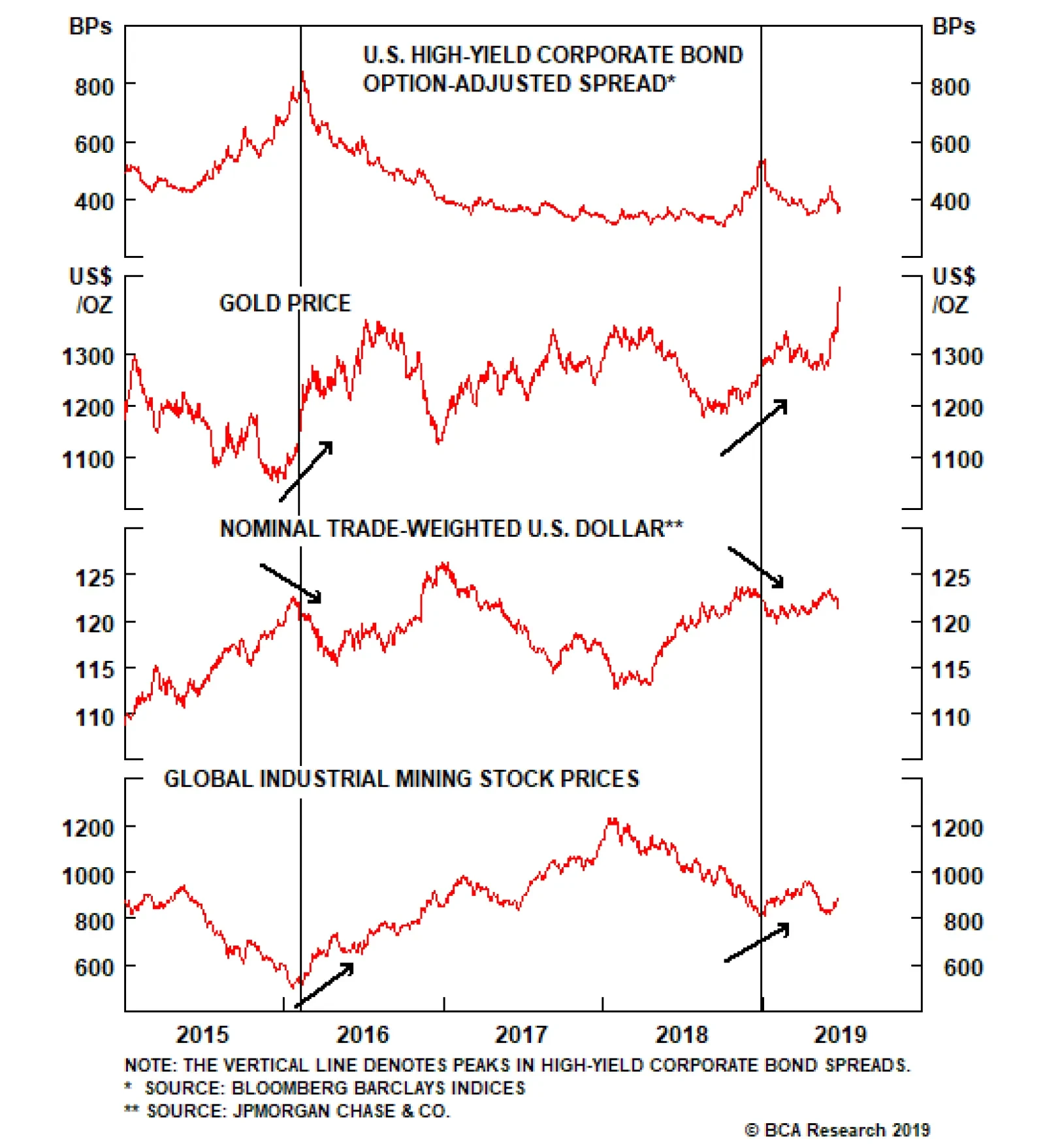
Chart 4Credit Spreads Have Likely Peaked
Credit Spreads Have Likely Peaked
Credit Spreads Have Likely Peaked
The price of gold has decisively broken-out to the upside, a sign that the market views monetary policy as reflationary (Chart 4, panel 2). Such a breakout has preceded the last two peaks in corporate bond spreads. The dollar’s uptrend has abated, signaling that the market views U.S. monetary policy as less out of step with the rest of the world (Chart 4, panel 3). Global industrial mining stocks have rebounded (Chart 4, panel 4). The CRB Raw Industrials index is the sole holdout (Chart 4, bottom panel). A rebound in this index would confirm our intuition that credit spreads have peaked. Chart 5Waiting For Improving Global Growth
Waiting For Improving Global Growth
Waiting For Improving Global Growth
While the Fed’s reflationary efforts will cause corporate bond spreads to tighten in the coming months, they will not immediately translate into a higher 10-year Treasury yield. The ratio between the CRB Raw Industrials index and Gold correlates very tightly with the 10-year yield, and it continues to plummet (Chart 5). The CRB/Gold ratio will only rise when gains in the CRB index start to outpace gains in Gold. In other words, the Fed’s reflationary policy stance needs to translate into an improving global growth outlook. This could take a few months, though we ultimately continue to think that Treasury yields will be higher on a 6-12 month horizon. As explained in the next section, as long as the U.S. economy avoids recession, mid-cycle rate cuts tend to be followed by higher Treasury yields. A History Of Rate Cuts Part 2 In last week’s report we looked at every Fed rate cut since 1995 and showed how the 10-year Treasury yield reacted during the subsequent 21-day, 65-day, 130-day and 261-day periods.3 Our main conclusion was that the 10-year Treasury yield tended to rise following mid-cycle rate cuts, such as those that occurred in 1995-98 and 2003, and decline following rate cuts that led into a U.S. recession. For reference, we have attached last week’s analysis as an Appendix to this report, along with a new table showing how the Bloomberg Barclays Treasury Master index performed relative to cash following each post-1995 rate cut. The 2/10 Treasury slope tends to steepen quite sharply in the immediate aftermath of a mid-cycle rate cut, before starting to flatten after a few months have passed. This week, we delve a little deeper and look at the market’s interest rate expectations around each prior cut, and also at how the 2/10 Treasury slope responded in each case. Rate Expectations At The Time Of Fed Rate Cuts Table 2 shows the 12-month change in the fed funds rate that the market was discounting prior to each Fed rate cut announcement since 1995. It also shows the actual change in the fed funds rate that occurred over the subsequent 12-month period, and the difference between what occurred and what was expected – the 12-month fed funds surprise. Table 2A History Of Rate Cuts: Rate Expectations
The Fed’s Got Your Back
The Fed’s Got Your Back
According to our Golden Rule of Bond Investing, a dovish surprise (actual change < expectations) should coincide with a falling 10-year Treasury yield, and a hawkish surprise (actual change > expectations) should coincide with a rising 10-year yield.4 The table shows that this indeed occurred in 26 out of 29 episodes. As was the case last week, the mid-1990s rate cuts immediately capture our attention. We have previously noted the resemblance between today’s economic environment and that of the mid-1990s.5 It’s interesting that the market is currently priced for a similar number of rate cuts as at that time. Once again, we expect those expectations will be disappointed. The Global Manufacturing PMI is the measure of global growth that lines up best with the 10-year Treasury yield. Yield Curve: Steeper Now = Flatter Later Another interesting trend is that the 2/10 Treasury slope steepened dramatically in the run-up to, and following, last week’s FOMC meeting. It is now back up to 29 bps after having troughed at 11 bps near the end of last year (Chart 6). It is also worth noting that the 2/10 Treasury slope has yet to invert this cycle. Such an inversion has occurred prior to every U.S. recession since at least 1960. Table 3 shows how the 2/10 Treasury slope has responded to Fed rate cuts in the past, and it reveals an interesting pattern. The slope tends to steepen quite sharply in the immediate aftermath of a mid-cycle rate cut, before starting to flatten after a few months have passed. The 2003 episode is a prime example. The 2/10 slope steepened by 62 bps in the month following the rate cut, but a year later it was 14 bps below where it started. Chart 6The Fed Steepens The Curve
On Track: Steeper Now...
On Track: Steeper Now...
Table 3A History Of Rate Cuts: 2/10 Treasury Slope
The Fed’s Got Your Back
The Fed’s Got Your Back
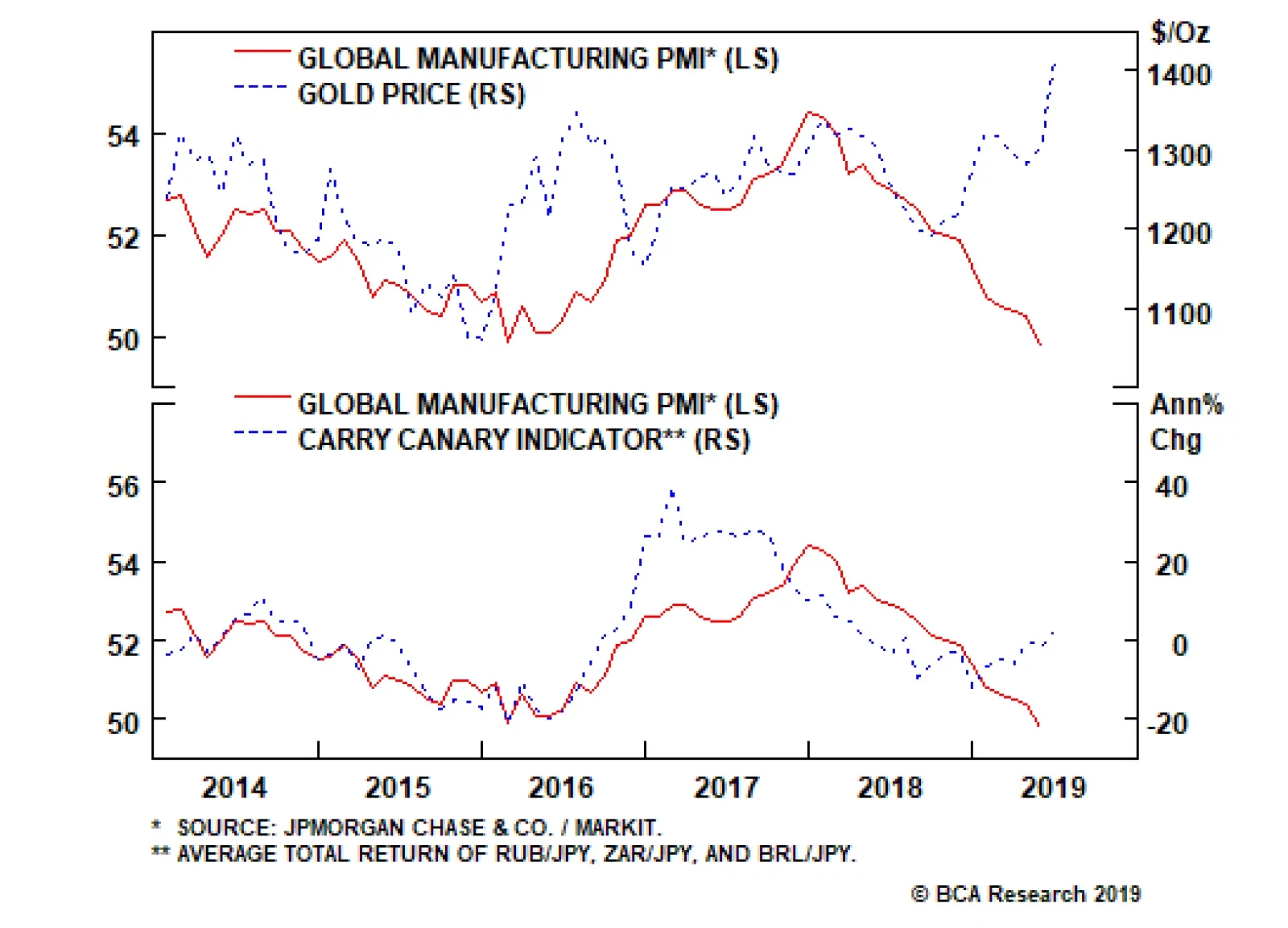
In contrast, the 2/10 steepening that immediately follows a “pre-recession” rate cut tends to be milder, but the steepening then accelerates as time passes and the Fed eases further. The observed yield curve patterns line up well with theory. We would expect rapid curve steepening immediately following a mid-cycle rate cut, as the market prices in a quick return to tighter policy settings. Then, the curve should eventually flatten as the Fed reverses its initial cuts. In contrast, a rate cut that precedes a recession should not lead to much initial steepening, because the market would not be expecting a quick recovery. The steepening would then accelerate as more rate cuts are eventually delivered. The fact that the 2/10 slope has steepened a lot in recent weeks is another datapoint in favor of “mid-cycle” rather than “pre-recession” market behavior. No PMI Recovery Yet We remain confident that the combination of a July Fed rate cut and Chinese credit stimulus will put a floor under global growth in the second half of the year. However, no such global growth rebound is yet evident in the crucial manufacturing PMI data. The Global Manufacturing PMI is the measure of global growth that lines up best with the 10-year Treasury yield, and it remains in a free-fall, even breaking below the 50 boom/bust line in May (Chart 7). Flash PMI data paint an equally dim picture for June: The Euro Area Manufacturing PMI is expected to tick up in June, but only to 47.8 from 47.7 in May (Chart 7, panel 2). The U.S. Manufacturing PMI is expected to fall to 50.1 in June, from 50.5 in May (Chart 7, panel 3). The Japanese Manufacturing PMI is expected to fall to 49.5 in June, from 49.8 in May (Chart 7, bottom panel). There is no Flash PMI data for China, but the Chinese index stood at 50.2 in May, only a hair above the 50 boom/bust line. On the bright side, financial markets are starting to price-in the beginnings of a reflation trade. Gold is rallying strongly, as we noted above, and an index of high-beta currency pairs (RUB/USD, ZAR/USD and BRL/USD) is off its lows. Both of these moves signal that the policy backdrop is becoming more supportive, and both have led upswings in the Global Manufacturing PMI in the past (Chart 8). Chart 7No Rebound In Sight Yet...
No Rebound In Sight Yet...
No Rebound In Sight Yet...
Chart 8...But Financial Markets Are Already Looking Ahead
...But Financial Markets Alread Are Looking Ahead
...But Financial Markets Alread Are Looking Ahead
Bottom Line: Treasury yields will probably need to see a rebound in the Global Manufacturing PMI before moving higher, but a few reflationary indicators suggest that such a rebound will occur in the second half of the year. Stay tuned. Ryan Swift, U.S. Bond Strategist rswift@bcaresearch.com Appendix Table 4A History Of Rate Cuts: 10-Year Treasury Yield
The Fed’s Got Your Back
The Fed’s Got Your Back
Table 5A History Of Rate Cuts: Treasury Excess Returns
The Fed’s Got Your Back
The Fed’s Got Your Back
Footnotes 1 https://www.youtube.com/watch?v=kx3sOqW5zj4 2 Please see U.S. Bond Strategy Weekly Report, “The New Battleground For Monetary Policy”, dated March 26, 2019, available at usbs.bcaresearch.com 3 Please see U.S. Bond Strategy Weekly Report, “Track Records”, dated June 18, 2019, available at usbs.bcaresearch.com 4 Please see U.S. Bond Strategy Special Report, “The Golden Rule Of Bond Investing”, dated July 24, 2018, available at usbs.bcaresearch.com 5 Please see U.S. Bond Strategy Weekly Report, “Tracking The Mid-1990s”, dated June 11, 2019, available at usbs.bcaresearch.com Fixed Income Sector Performance Recommended Portfolio Specification
Interest rate differentials are moving against the dollar, but our important takeaway – that gold continues to outperform Treasurys – is an ominous sign. Gold has stood as a viable threat to dollar liabilities, any sign that the balance of forces are moving…
Highlights We are searching for evidence of an imminent end to this business cycle, … : Investors who recognize the onset of the recession in a timely fashion will have a leg up on the competition all the way through the intermediate term. … but the data do not support the increasingly popular conclusion that it is nearly at hand, … : The U.S. economy is doing quite well and contradicts the message from the inverted yield curve, which may well be a less powerful signal than it has been in the past. … and it’s hard to see the end of the expansion when the Fed’s trying its utmost to sustain it: Restrictive monetary policy is a necessary, if not sufficient, condition for a recession. Last week’s FOMC meeting pushed that eventuality beyond the visible horizon. Maintain a pro-risk portfolio positioning. Feature What if you gave a party and nobody came? The U.S. economy is finding out as we speak. The expansion that began in July 2009 turns ten years old at the end of the week, and no one seems to care. An expansion and bull market that have been derided from the get-go as “artificial,” “manufactured,” and “propped up by money printing” continue to be unloved, yet manage to keep chugging along like the Energizer bunny. The expansion has been no more pleasing to the eye than the famous toy in the battery commercials, plodding along at an often sluggish pace, but that may be the secret to its longevity. It has never been able to achieve a high enough rate of speed to give rise to unsustainable activity in the most cyclical segments of the economy. Ditto the bull markets in equities and spread product. Held in check by a deficiency of animal spirits, they have failed to breed valuation excesses. In the absence of a clearly approaching catalyst for reversal, internal or external, there is no reason to expect that the U.S. economy cannot continue to expand at its meandering post-crisis pace. An increasing number of market participants, including some within BCA, cite the inverted yield curve, disappointing May employment report, and weakening manufacturing activity at home and abroad as ill portents for the economy. On the face of it, these factors are surely inauspicious. Upon further examination, though, they aren’t as bad as they’ve been made out to be. An investor who sniffs out the next recession, and shifts asset allocation aggressively in line with that recognition, will have a very good chance of outperforming over both the near and intermediate term. Timely recognition of inflection points is how macro analysis most clearly benefits money managers. Since equity bull markets tend to be highly potent in their final stages, however, crying wolf can be especially damaging to relative performance. In our view, the available evidence does not support the conclusion that the end of the cycle is at hand and that investors should de-risk their portfolios. The Yield Curve Isn’t What It Used To Be We do not know how many basis points can dance on the head of a pin, and neither do the battalions of central bank economists who have been unable to settle exactly how large-scale asset purchases hold down interest rates. Those purchases’ flow effect (the share of newly-issued bonds purchased by a central bank), stock effect (the share of outstanding bonds held by a central bank), and forward guidance’s muzzling of bond and inflation volatility may all play a role. At the end of the day, it appears quite likely that QE has depressed the term premium on the 10-year Treasury bond, which recently made 50-year lows. The term premium is the compensation investors receive for tying up their money in a longer-maturity instrument, and it is a whopping 250 basis points below its long-run mean (Chart 1). Chart 1The Bombed-Out Term Premium ...
The Bombed-Out Term Premium ...
The Bombed-Out Term Premium ...
Yield curve has been a reliable, if often early, leading indicator of recessions for the last 50 years. The unprecedentedly low 10-year term premium renders the definitive 3-month/10-year segment of the yield curve considerably more prone to invert. The only sustained yield-curve inversion that issued a false recession signal in the 57-year history of the Adrian, Crump and Moench term-premium estimate occurred in late 1966/early 1967,1 when the term premium skittered around both sides of the zero bound (Chart 2). If investors had received no additional compensation for holding the 10-year Treasury over the last five decades, an inverted curve would be a regular feature of the investment landscape (Chart 3). Chart 2... Is Distorting The Signal From The Yield Curve, ...
... Is Distorting The Signal From The Yield Curve, ...
... Is Distorting The Signal From The Yield Curve, ...
Chart 3... Which Wouldn't Slope Upward Without It
... Which Wouldn't Slope Upward Without It
... Which Wouldn't Slope Upward Without It
Leading Data Do Not Confirm The Yield Curve’s Signal Chart 4Only Manufacturing Looks Recession-ish
Only Manufacturing Looks Recession-ish
Only Manufacturing Looks Recession-ish
Investors ignore the yield curve at their own risk. It has been a reliable, if often early, leading indicator of recessions for the last 50 years. We view its current inversion as a yellow light, and it is making us more vigilant about seeking out evidence of a slowdown. Given that the negative term premium weighs heavily on long-dated yields, however, investors should not de-risk portfolios unless the flow of data corroborates its signal. Our Global Fixed Income Strategy colleagues sought that corroboration by performing a cycle-on-cycle analysis of a selection of data series with leading properties – the Conference Board’s LEI, initial unemployment claims, the manufacturing ISM’s new-orders-to-inventories ratio and the Conference Board’s consumer confidence index. The analysis compares the current position of each indicator with its average position in the run-up to the last five recessions (January-July ’80 through December ’07-June ’09). With the exception of the weak new-orders-to-inventories ratio (Chart 4, third panel), none of the indicators are in a position that suggests trouble lies ahead (Chart 4). For the time being, the incoming data flow only confirms the concerns about the weak manufacturing outlook. Is Economic Activity Really Slowing? The course of GDP growth makes it appear as if the U.S. is slowing pretty quickly. After the first quarter’s surprisingly strong 3.1% growth, consensus second-quarter estimates are hovering around 1.75%. Viewed alongside the sizable shortfall in May payroll gains, uninspiring housing activity and a sharp global manufacturing downturn, the deceleration in GDP growth seems to confirm the notion that the U.S. economy is weakening fast. We are not overly concerned about the labor market, housing or manufacturing, however, and the GDP trend is not what it appears to be at first blush. Real final domestic demand growth at 3% is well above the economy’s long-run potential and is hardly the sign of an economy that’s gasping for air, or staggering under the weight of an overly high fed funds rate. To get the best read on the underlying state of the domestic economy, we adjust GDP data to back out net exports and inventory adjustments. Backing out net exports puts the focus on domestic conditions, while removing inventory adjustments isolates sales to end consumers. The result is real final domestic demand, and according to the Atlanta Fed’s GDPNow model, it accelerated sharply between the first and second quarters. The first quarter was flattered by a 60-basis-point (“bps”) inventory build and a highly-unlikely-to-be-repeated 100-bps contribution from net exports. After backing those components out of the headline 3.1% gain, first quarter growth slips to 1.5%. That may not look like much against 2-2.25% trend growth, but it was not at all bad given the body blows the economy sustained in the first quarter: the federal government shutdown that stretched across nearly all of January, and the severe tightening in financial conditions resulting from the fourth quarter’s sharp sell-offs in equities and risky bonds. Following last week’s stronger-than-expected May retail sales report (and upwardly revised April data), the GDPNow model is projecting 2% growth in the second quarter. Per the model’s detailed projections, the headline gain is being held back by a 100-bps inventory runoff. Removing the inventory adjustment, real final domestic demand is projected to grow at 3% (net exports are projected to make zero contribution). 3% growth is well above the economy’s long-run potential and is hardly the sign of an economy that’s gasping for air, or staggering under the weight of an overly high fed funds rate. Per the current GDPNow projections, real final domestic demand growth is above the expansion’s mean growth rate, casting some doubt on whether the yield curve’s signal has been overwhelmed by a pickup in risk aversion and the factors that have flipped the term premium on its head. 3% real final domestic demand represents a quickening in the pace of growth that has prevailed across the 40 quarters of the expansion (Chart 5), and is incompatible with the message from the New York Fed’s yield curve-based recession probability indicator (“RPI”). To evaluate the current warning, we compared the standardized value of real final domestic demand growth during the previous quarters of the expansion when the New York Fed’s RPI was above the 33% level that has accurately foretold every recession over the last 50 years (Chart 6). When all of the previous RPI warning signals were issued, real final domestic demand growth was slower than its expansion average (z-score less than zero), and in all but one case considerably slower, clustering around one standard deviation below the mean (Table 1). Per the current GDPNow projections, real final domestic demand growth is above the expansion’s mean growth rate, casting some doubt on whether the yield curve’s signal has been overwhelmed by a pickup in risk aversion and the factors that have flipped the term premium on its head. Chart 5Real Final Domestic Demand Is Still Vigorous
Real Final Domestic Demand Is Still Vigorous
Real Final Domestic Demand Is Still Vigorous
Chart 6The New York Fed's Yield-Curve-Based Recession Model Is Flashing Red
The New York Fed's Yield-Curve-Based Recession Model Is Flashing Red
The New York Fed's Yield-Curve-Based Recession Model Is Flashing Red
The Labor Market Is Still Roaring Table 1New York Fed Recession Warnings And Economic Conditions
Everybody Into The Pool!
Everybody Into The Pool!
Consumption plays an outsized role in the U.S. economy, accounting for over two-thirds of GDP. As macro analysts are well aware, if you have an accurate read on consumption, you’ll know where the U.S. economy is headed. Extending the relationship to encompass household income’s impact on spending, and employment’s impact on income, the expression can be rewritten as: If you get the labor market right, you’ll get consumption right. The May employment situation report was roundly disappointing, as May net hirings fell short of expectations by about 100,000 and March and April gains were revised down by 75,000. Chart 7Employees Are Gaining The Upper Hand
Employees Are Gaining The Upper Hand
Employees Are Gaining The Upper Hand
The three-month moving average of net payroll additions slipped to just over 150,000. 110,000 monthly net additions is all it takes to keep the unemployment rate at a steady state, however, and there is some evidence that Midwestern flooding held down the May figure. With the job openings rate at a series high well above the 2006-07 peak and (most likely) above the peak in 1999-2000 (Chart 7, top panel), there is quite a lot of demand for new workers, as confirmed by the sizable margin of consumers who report that jobs are plentiful over those who report they’re hard to get (Chart 7, middle panel). The elevated quits rate (Chart 7, bottom panel) indicates that employers are competing fiercely to fill that demand. Given that almost no one quits a job unless s/he already has another one lined up, the quits rate reveals that employers are poaching employees from each other. When Employer A, after losing an employee to Employer B, plucks a replacement away from Employer C or Employer D, a self-reinforcing cycle quickly springs up that endows employees with some bargaining power. The budding dynamic is good for household income and good for consumption. Manufacturing’s Softness Isn’t Such A Big Deal The weakness in manufacturing PMI surveys around the world reveals that there has clearly been a significant global manufacturing slowdown, if not a full-on global manufacturing recession. The steep slide in the U.S. manufacturing PMI shows that it has not been immune. Manufacturing only accounts for about one-sixth of U.S. output and employment, however, and the level of the PMI series, which has simply returned to its mean level across the last three complete cycles, is not a cause for concern (Chart 8). The trend is worrisome, though, and we are watching to see if it breaks through the 50 boom-bust line. Manufacturing is weakening, but it’s not in dire straits yet. Chart 8Manufacturing Is Weakening, But It's Not In Dire Straits Yet
Manufacturing Is Weakening, But It's Not In Dire Straits Yet
Manufacturing Is Weakening, But It's Not In Dire Straits Yet
Refilling The Punch Bowl This week’s FOMC meeting delivered on the change in tone intimated by Fed speakers at the beginning of the month. It appears that a couple of rate cuts may be forthcoming, whether the economy needs them or not. We had advised clients that the chances of a July rate cut were slightly more than fifty-fifty, but the probability now appears to be much higher. A follow-up cut in September also seems likely. The Fed’s move to insure against an economic shock pushes out our recession timetable yet again. If the fed funds rate is headed to 2% from its current 2.5%, the road to a restrictive policy setting in the mid-3s just got longer. The good news for our recommendations is that they were already decidedly risk friendly, on the grounds that there’s no need to de-risk until a recession is around six months away. Assuming no exogenous event intrudes on U.S. economic activity, neither the expansion nor the bull markets in risk assets will end until the Fed takes away the punch bowl. Right now, it seems intent on refilling it. As a client in Western Canada put it in a meeting with us last week, “Game on!” Doug Peta, CFA Chief U.S. Investment Strategist dougp@bcaresearch.com Footnotes 1 On the basis of monthly rate/yield data, the 1998 false positive comprised just one observation (September).

The Yield Curve Control (YCC) strategy is the only real remaining arrow in the BoJ’s quiver. Via YCC, the BoJ targets a 10-year JGB yield close to 0% and manages purchases to sustain the yield target. In our view, any upward adjustment of that yield target…
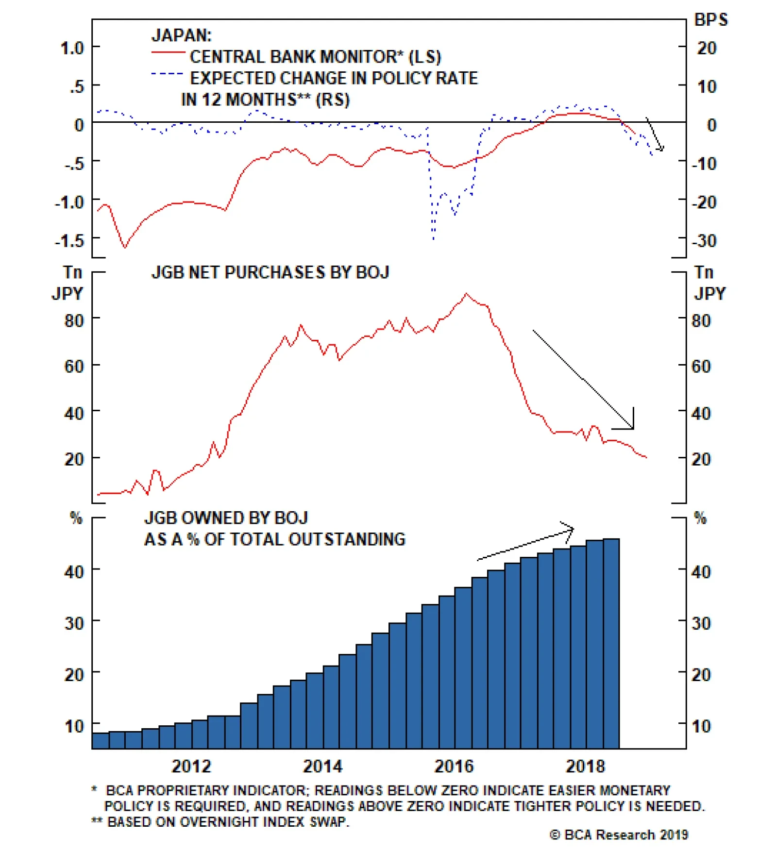
JGBs outperform their developed market peers when global yields rise, and underperform when global yields fall. In other words, JGBs are a low-beta sovereign bond market, making them a useful way to manage duration risk in a global bond portfolio –…
Highlights As long as the global long bond yield stays near 2 percent or below, European equities will end the year at broadly the same level as now… …but they will experience a dip of at least 4-5 percent along the way. All central banks have pivoted to dovish but the Fed has more easing armoury than the ECB. This means that the recent outperformance of 10-year U.S. T-bonds versus 10-year German bunds can continue. It also means that the euro has a sound structural underpinning versus the dollar. Feature At the start of this year we explained Why 2019 Is A Pivotal Year For Monetary Policy. Today we want to elaborate on that report, and its key observations: Since 2008, no developed economy central bank has been able to hike interest rates sequentially by more than 2 percent before needing to take a breather… and then reverse course. The current vulnerability to tightening emanates from the hyper-sensitivity of financial conditions to rate hikes, rather than from the direct impact on rate-sensitive sectors in the economy. Since October 2017, no stock market rally or sell-off has lasted more than three months or so (Chart Of The Week). These observations are as relevant – or more relevant – now, as they were at the time of our original report.1 Since the Global Financial Crisis, no developed economy central bank has been able to hike interest rates sequentially by more than 2 percent. Chart Of The WeekSince October 2017, No Rally Or Sell-Off Has Lasted More Than Three Months
Since October 2017, No Rally Or Sell-Off Has Lasted More Than Three Months
Since October 2017, No Rally Or Sell-Off Has Lasted More Than Three Months
A 2 Percent Tightening Is The Post-2008 Limit Since the Global Financial Crisis, no developed economy central bank has been able to hike interest rates sequentially by more than 2 percent before having to reverse course (Chart I-2 and Chart I-3). Chart I-2A 2 Percent Sequential Tightening Is The Post-2008 Limit
A 2 Percent Sequential Tightening Is The Post-2008 Limit
A 2 Percent Sequential Tightening Is The Post-2008 Limit
Chart I-3A 2 Percent Sequential Tightening Is The Post-2008 Limit
A 2 Percent Sequential Tightening Is The Post-2008 Limit
A 2 Percent Sequential Tightening Is The Post-2008 Limit
In 2008, Swedish interest rates peaked near 5 percent before collapsing to the zero bound in the financial crisis. But when the Riksbank started its so-called ‘policy normalisation’ in 2010, the interest rate could only reach 2 percent before the central bank had to backtrack; Norway could manage just 1 percent of tightening before its volte-face. Though admittedly, both Sweden and Norway were caught in the maelstrom of the euro debt crisis in 2011-12. However, on the other side of the world and relatively immune to the crisis in Europe, New Zealand could achieve a tightening also of only 1 percent; Korea could manage just 1.25 percent; the Reserve Bank of Australia marched interest rates up by 1.75 percent before taking a breather… and then marched them down again. The consensus was taking far too rosy a view on the global financial system’s capacity to tolerate further tightening. The Federal Reserve raised interest rates sequentially by 2 percent through December 2016 to December 2018, and guess what – it is now on the cusp of reversing course. The ultimate course will have a huge bearing on investment strategy for European equities, bonds and currencies. The Neutral Real Rate Of Interest Is Zero Many economists and strategists expected the Fed to continue hiking through 2019, but this publication pushed back hard. The consensus was taking far too rosy a view on the global financial system’s capacity to tolerate further tightening. Central to this publication’s resistance was, and is, a high-conviction view that the so-called ‘neutral’ real rate of interest – the real interest rate that is neither accommodative nor restrictive, the real interest rate consistent with an economy maintaining full employment while keeping inflation constant – is zero. The neutral rate of interest is very low. In our Special Report Why The Neutral Rate Of Interest Is Zero we proposed that the neutral rate is global rather than region-specific, that it refers to the bond yield rather than to the policy rate, and that it is extremely low. As it happens, the Fed broadly concurs. With the policy rate, bond yield, and inflation all at around 2 percent, the real policy rate and real bond yield are both near zero. At this level the central bank claims that “the policy stance is now in the Committee’s estimates of neutral… and when you get to that range we have to let the data speak to us.”2
Chart I-4
However, the data that is speaking most loudly is not necessarily the economic data, it is the financial market data. Jay Powell has said that if there is a sustained change in financial conditions through any one or more of its components then “that has to play into our thinking.” We think it has (Chart I-4). Comparing Today’s Rich Valuations With 2007 In the aftermath of the dot com bubble burst in 2000, policy interest rates collapsed to very low levels but, crucially, long bond yields did not. This contrasts with the aftermath of the Global Financial Crisis in 2008, during which both policy interest rates and bond yields have plunged to all-time lows (Charts I-5 - I-7). Funny things happen when the long bond yield gets to, and remains, at ultra-low nominal levels. Chart I-5In The Aftermath Of 2000, Bond Yields Did Not Collapse; But In The Aftermath Of 2008, They Did
In The Aftermath Of 2000, Bond Yields Did Not Collapse; But In The Aftermath Of 2008, They Did
In The Aftermath Of 2000, Bond Yields Did Not Collapse; But In The Aftermath Of 2008, They Did
Chart I-6In The Aftermath Of 2000, Bond Yields Did Not Collapse; But In The Aftermath Of 2008, They Did
In The Aftermath Of 2000, Bond Yields Did Not Collapse; But In The Aftermath Of 2008, They Did
In The Aftermath Of 2000, Bond Yields Did Not Collapse; But In The Aftermath Of 2008, They Did
Chart I-7In The Aftermath Of 2000, Bond Yields Did Not Collapse; But In The Aftermath Of 2008, They Did
In The Aftermath Of 2000, Bond Yields Did Not Collapse; But In The Aftermath Of 2008, They Did
In The Aftermath Of 2000, Bond Yields Did Not Collapse; But In The Aftermath Of 2008, They Did
The difference between the post-2000 and post-2008 policy responses can be summarized in two letters: QE. For all its apparent complexity, QE is actually a very simple monetary policy tool. It is just a mechanism for signalling that the policy interest rate will remain low for an extended period. Thereby, QE pulls down the long-term interest rate, which is to say the long bond yield. The double-digit rally over the past six months is technically extended. But as we have consistently pointed out on these pages, funny things happen when the long bond yield gets to, and remains, at ultra-low nominal levels. We refer readers to our other reports for the details, but in a nutshell the risk of owning bonds converges to the risk of owning equities and other so-called ‘risk-assets’. The upshot of this risk convergence is that investors price these risk-assets to deliver the same ultra-low nominal return as bonds, meaning that the valuation of the risk-assets soars.3 Chart I-8Since 2015, The Global Long Bond Yield Has Been Unable To Remain Above 2.5 Percent
Since 2015, The Global Long Bond Yield Has Been Unable To Remain Above 2.5 Percent
Since 2015, The Global Long Bond Yield Has Been Unable To Remain Above 2.5 Percent
All of which brings us to the crucial point. The post-2000 extreme policy easing distorted the real economy. It engineered a credit boom. So the fragility to the subsequent policy tightening emanated from the real economy, and particularly the most rate-sensitive sectors in the economy such as mortgage lending and housing. In contrast, the post-2008 extreme policy easing – driven by QE – has distorted the valuation of risk-assets. Moreover, the value of global risk-assets, at $400 trillion dwarfs the $80 trillion global economy by five to one. So the current fragility to policy tightening does not emanate from the real economy, it emanates from the hyper-sensitivity of financial conditions to higher bond yields (Chart 8). Some European Investment Implications The integration of global capital markets means that the valuation anchor for European – and all regional – stock markets now comes from the global long bond yield, which we define as the simple average of the 10-year yields in the euro area, U.S., and China. Through the past five years, the inability of the global long bond yield to remain above 2.5 percent confirms the hyper-sensitivity of financial conditions to higher interest rates. And it suggests that the ‘neutral’ rate on this measure is around 2 percent. The good news is that this measure now stands slightly below neutral at 1.9 percent. The euro has a sound structural underpinning versus the dollar. At around this level of the global long bond yield, the rich valuation of European equities has some support. That said, the double-digit rally over the past six months is technically extended, as most of the things that could go right did go right – central banks pivoted to dovish, euro area growth rebounded, and, until recently, geopolitical risks were easing. Hence, as long as the global long bond yield stays near 2 percent or below, we expect European equities to end the year at broadly the same level as now, though our technical signals do strongly suggest a dip of at least 4-5 percent along the way (Chart I-9). Chart I-9The Double-Digit Rally In Stock Markets Over The Past Six Months Is Technically Extended
The Double-Digit Rally In Stock Markets Over The Past Six Months Is Technically Extended
The Double-Digit Rally In Stock Markets Over The Past Six Months Is Technically Extended
Chart I-10The Fed Has More Easing Armoury Than The ECB
The Fed Has More Easing Armoury Than The ECB
The Fed Has More Easing Armoury Than The ECB
As regards bonds and currencies, all central banks have pivoted to dovish but the Fed has more easing armoury than the ECB (Chart I-10). This means that the recent outperformance of 10-year U.S. T-bonds versus 10-year German bunds can continue. It also means that the euro has a sound structural underpinning versus the dollar. However, this structural underpinning also applies to the yen, and until we get some clarity on Brexit we prefer the yen over the euro. Fractal Trading System* In line with the main body of this report and Chart 9, we see evidence that the double-digit rally in stock markets over the past six months is technically extended. Accordingly, this week’s recommended trade is to short the MSCI All-Country World index, setting the profit target at 4 percent with a symmetrical stop-loss. This leaves us with four open positions. For any investment, excessive trend following and groupthink can reach a natural point of instability, at which point the established trend is highly likely to break down with or without an external catalyst. An early warning sign is the investment’s fractal dimension approaching its natural lower bound. Encouragingly, this trigger has consistently identified countertrend moves of various magnitudes across all asset classes.
Global Financial Services Vs. Market
Global Financial Services Vs. Market
* For more details please see the European Investment Strategy Special Report “Fractals, Liquidity & A Trading Model,” dated December 11, 2014, available at eis.bcaresearch.com. Dhaval Joshi, Chief European Investment Strategist dhaval@bcaresearch.com Footnotes 1 Please see the European Investment Strategy Weekly Report ‘Why 2019 Is A Pivotal Year For Monetary Policy’ February 7, 2019 available at eis.bcaresearch.com. 2 Please see the European Investment Strategy Special Report ‘Why The Neutral Rate Of Interest Is Zero’ June 6, 2019 available at eis.bcaresearch.com. 3 Please see the European Investment Strategy Weekly Report ‘Risk: The Great Misunderstanding Of Finance’ October 25, 2018 available at eis.bcaresearch.com. Fractal Trading System
Image
Recommendations Asset Allocation Equity Regional and Country Allocation Equity Sector Allocation Bond and Interest Rate Allocation Currency and Other Allocation Closed Fractal Trades Trades Closed Trades Asset Performance Currency & Bond Equity Sector Country Equity Indicators Bond Yields Chart II-1Indicators To Watch - Bond Yields
Indicators To Watch - Bond Yields
Indicators To Watch - Bond Yields
Chart II-2Indicators To Watch - Bond Yields
Indicators To Watch - Bond Yields
Indicators To Watch - Bond Yields
Chart II-3Indicators To Watch - Bond Yields
Indicators To Watch - Bond Yields
Indicators To Watch - Bond Yields
Chart II-4Indicators To Watch - Bond Yields
Indicators To Watch - Bond Yields
Indicators To Watch - Bond Yields
Interest Rate Chart II-5Indicators To Watch - Interest Rate Expectations
Indicators To Watch - Interest Rate Expectations
Indicators To Watch - Interest Rate Expectations
Chart II-6Indicators To Watch - Interest Rate Expectations
Indicators To Watch - Interest Rate Expectations
Indicators To Watch - Interest Rate Expectations
Chart II-7Indicators To Watch - Interest Rate Expectations
Indicators To Watch - Interest Rate Expectations
Indicators To Watch - Interest Rate Expectations
Chart II-8Indicators To Watch - Interest Rate Expectations
Indicators To Watch - Interest Rate Expectations
Indicators To Watch - Interest Rate Expectations