Sorry, you need to enable JavaScript to visit this website.
Skip to main content

Fixed Income

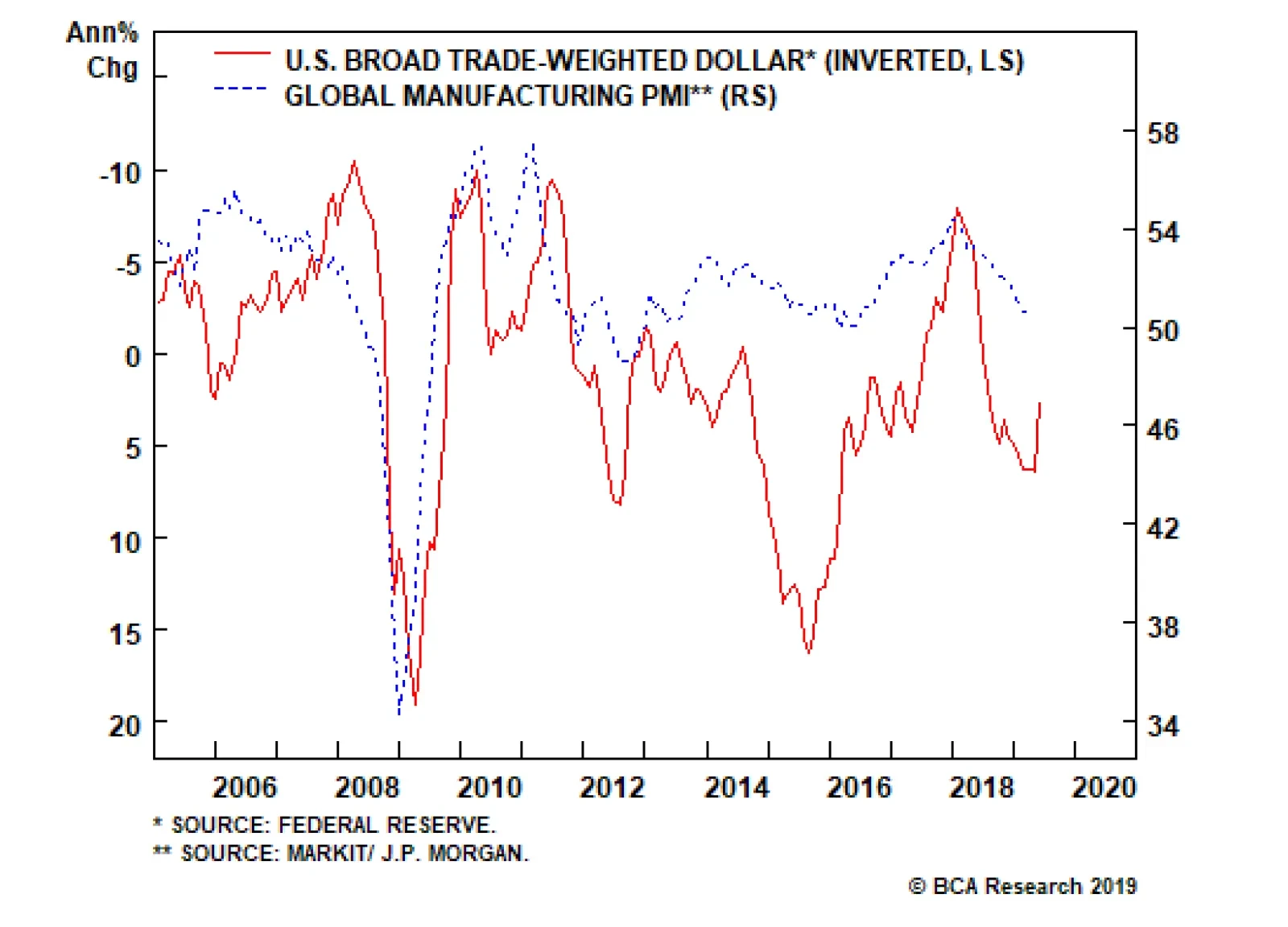
HighlightsU.S. inflation is on a structural uptrend. Monetary and fiscal policy, populism, and demographics will tend to push inflation higher over the coming decade.How can investors protect portfolios against inflation risk? We look at periods of rising inflation to determine which assets were the best inflation hedge.We find that the level of inflation is very important in determining which assets work best.When inflation is rising and high, or very high, the best inflation hedges at the asset class level are commodities and U.S. TIPS.When inflation is very high, gold is the best commodity to hold and defensive sectors will minimize losses in an equity portfolio.However, hedges have a cost. Allocating a large percentage of a portfolio to inflation hedges will be a drag on returns. Investors should opt for a low allocation to hedges now, and increase to a medium level when inflation rises further.FeatureSome 38 years have passed since the last time the U.S. suffered from double-digit inflation. The Federal Reserve reform of 1979, championed by Paul Volcker, changed the way the Fed approached monetary policy by putting a focus on controlling money growth.1 The reform gave way to almost four decades of relatively controlled inflation, which persists today.But times are changing. While most of today’s investors have never experienced anything other than periods of tame inflation, BCA expects that rising inflation will be a major driving force of asset returns over the coming decade.2 The main reasons behind this view are the following:A rethink in the monetary policy framework: At its most recent meeting, the FOMC openly discussed the idea of a price-level target, implying that it would be open to the economy running hot to compensate for the past 10 years of below-target inflation (Chart I-1A, top panel).Procyclical fiscal policy: The U.S. is conducting expansionary fiscal policy while the economy is at near-full employment (Chart I-1A, middle panel). The last time this happened in the U.S., during the 1960s, high inflation followed, as the fiscal boost made the economy run substantially above capacity.Waning Fed independence: President Trump has openly questioned the hiking campaign undertaken by the Fed. Moreover, he has tried to nominate Fed governors with dovish tendencies. Historically around the world, a lack of central bank independence has often led to higher inflation rates (Chart I-1A, bottom panel).Peak in globalization: Globalization accelerated significantly in the 1990s and 2000s, flooding the global economy with cheap labor (Chart I-1B, top panel). However, we believe that globalization has peaked. Instead, populism and protectionism will be the dominant paradigms for years to come, reducing the cheap pool of workers and goods previously available.Demographics: The population in the U.S. is set to age in coming years (Chart I-1B, middle panel). As the percentage of U.S. retirees increases, the number of spenders relative to savers will begin to rise (Chart I-1B, bottom panel). Higher spending and lower savings in the economy should create upward pressure on inflation. Chart I-1AStructural Forces Point To Higher Inflation In The Coming Decade (I) Structural Forces Point To Higher Inflation In The Coming Decade (I) Structural Forces Point To Higher Inflation In The Coming Decade (I)   Chart I-1BStructural Forces Point To Higher Inflation In The Coming Decade (II) Structural Forces Point To Higher Inflation In The Coming Decade (II) Structural Forces Point To Higher Inflation In The Coming Decade (II)  If our view is correct, how should investors allocate their money?We attempt to answer this question by evaluating the performance of five major asset classes during periods when inflation was rising. Furthermore, we look into sub-asset class performance to determine how investors should position themselves within each asset class to take advantage of an inflationary environment.In our asset-class analysis, we use a data sample starting in 1973 and we limit ourselves to five publicly traded assets that have adequate history: global equities, U.S. Treasuries, U.S. real estate (REITs), U.S. inflation-linked bonds,3 and commodities. We compare asset classes according to their Sharpe ratios: average annualized excess returns divided by annualized volatilities.4 BCA expects that rising inflation will be a major driving force of asset returns over the coming decade.In our sub-asset class analysis, we analyze global equity sectors, international vs U.S. equities, and individual commodities. In some of the sections in our sub-asset class analysis, our sample is slightly reduced due to lack of historical data. Moreover, since in some instances all sectors have negative returns, we compare sub-asset classes according to their excess returns only.We base our analysis on the U.S. Consumer Price Index, given that most of the assets in our sample are U.S. based. We opt for this measure because it tends to track the living expenses for most U.S. citizens and it is the preferred measure to index defined-benefit payments.Finally, we decompose the periods of rising inflation into four quartiles in order to examine whether the level of inflation has any impact on the performance of each asset. Chart I-2 and Table I-1 show the different ranges we use for our analysis as well as a description of the typical economic and monetary policy environments in each of them. Chart I-2 Chart I- Summary Of ResultsTable I-2 shows the summary of our results. For a detailed explanation on how each asset class and sub-asset class behaves as inflation rises, please see the Asset Class section and the Sub-Asset Class section below. Chart I- Which assets perform best when inflation is rising?Rising inflation affects assets very differently, and is especially dependent on how high inflation is.Global equities performed positively when inflation was rising and low or mild, but they were one of the worst-performing assets when inflation was rising and high or very high. Importantly, equities underperformed U.S. Treasuries in periods of both high and very high inflation.Commodities and U.S. TIPS were the best performers when inflation was high or very high.U.S. REITs were not a good inflation hedge.Which global equity sectors perform best when inflation is rising?Energy and materials outperformed when inflation was high.Every single sector had negative excess returns when inflation was very high, but defensive sectors such as utilities, healthcare, and telecommunications5 minimized losses.Which commodities perform best when inflation is rising?With the exception of energy, most commodities had subpar excess returns when inflation was in the first two quartiles.Industrial metals outperformed when inflation was high.Gold and silver outperformed when inflation was very high. Additionally, gold had consistent returns and low volatility.What is the cost of inflation hedging?To answer this question, we construct four portfolios with different levels of inflation hedging:Benchmark (no inflation hedging): 60% equities / 40% bonds.Low Inflation Hedging: 50% equities / 40% bonds / 5% TIPS / 5% commoditiesMedium Inflation Hedging: 40% equities / 30% bonds / 15% TIPS / 15 % commoditiesPure Inflation Hedging: 50% TIPS / 50% commodities. At the asset-class level, investors should allocate to commodities and U.S. TIPS to hedge inflation. Chart I-3Inflation Hedging Comes At A Cost Inflation Hedging Comes At A Cost Inflation Hedging Comes At A Cost  While increased inflation hedging provides better performance when inflation is high and rising, these hedges are costly to hold when inflation is at lower ranges or when it is falling (Chart I-3, panels 1 & 2). However, adding moderate inflation hedging (low or medium) to a portfolio achieved the right balance between cost and protection, and ultimately improved risk-adjusted returns over the whole sample (Chart I-3, panel 3).What about absolute returns? The benchmark outperformed over the whole sample. However, the low and medium inflation hedging did not lag far behind, while avoiding the big drawdowns of high inflation periods (Chart I-3, panel 4).Investment ImplicationsHigh inflation may return to the U.S. over the next decade. Therefore, inflation hedging should be a key consideration when constructing a portfolio. Based on our results, our recommendations are the following:1.  At the asset-class level, investors should allocate to commodities and U.S. TIPS to hedge inflation.2.  However, these hedges are costly to hold as they will create a drag on returns in periods when inflation is not high or very high. Therefore, a low allocation to inflation hedges is warranted now.3.  Inflation will probably start to pick up in the 2020s. A medium allocation to inflation hedges will then be appropriate.4.  When inflation is high (3.3%-4.9%), investors should overweight energy and materials in their equity portfolios. Likewise, they should overweight industrial metals and energy within a commodity portfolio.5.  When inflation is very high (4.9% or more), investors should overweight defensive sectors in their equity portfolio to minimize losses. Moreover, investors should overweight gold within a commodity portfolio.Asset ClassesGlobal EquitiesThe relationship between equity returns and rising inflation depends on how high inflation is, with outstanding performance when inflation is rising but low or mild, and poor performance as it gets higher (Chart II-1, top panel). Chart II-1 This relationship can be explained by the interaction between interest rates, inflation, earnings, and valuations:Earnings growth was usually slightly negative when inflation was recovering from low levels. However, given that interest rates were very low in this environment and growth expectations were high, multiple expansion boosted equity returns (Chart II-1, bottom panel).When inflation was mild, the Fed typically started to raise rates, resulting in a declining multiple. However, equities had the best performance in this range thanks to very high earnings growth – a result of the economy growing strongly due to a healthy level of inflation.When inflation climbed into the high or very high range, earnings growth was usually positive but beginning to slow, as high inflation weighed on growth. Meanwhile the multiple started to decline rapidly due to rising interest rates and declining growth expectations.With the exception of the mild inflation range, the return profile of equities during inflationary periods was similar to its normal profile: negative skew and excess kurtosis (Table II-1). However, the consistency of returns decreased at higher levels of inflation, with only 45% of months with positive returns when inflation was rising and in its highest quartile. Chart II- U.S. Treasuries Chart II-2 U.S. Treasuries reacted in a similar fashion to equities when inflation was rising (Chart II-2). However, while Treasuries underperformed equities when inflation was low or mild, they actually outperformed equities when inflation was high or very high. This was in part due to the fact that at higher inflation ranges, U.S. Treasuries offer a higher coupon return when rates are high, at least partially counteracting losses from falling prices.The steady stream of cash flows from the coupons helped Treasuries achieve positive returns roughly two-thirds of the time at the highest levels of inflation (Table II-2). However, this consistency in returns came at a cost: very high inflation resulted in negative skew and high excess kurtosis. Therefore, while Treasuries provided frequent positive returns when inflation was very high, they were prone to violent selloffs. Chart II- U.S. REITs Chart II-3 While REITs had high risk-adjusted returns when inflation was rising but mild, much like equities they had subpar performance in every other quartile and particularly poor performance when inflation was high or very high (Chart II-3). These results confirm our previous research showing that REITs performance is very similar to that of equities.6The return consistency for REITs was generally poor in inflationary periods, with the second-lowest percentage of positive return of any asset class (Table II-3). Moreover, REIT returns had excess kurtosis and negative skew throughout all inflation quartiles. Chart II- Commodity Futures Chart II-4 Commodities performed positively in every quartile, and did particularly well when inflation was mild (Chart II-4, top panel). However, total return and price return were very different due to the behavior of the roll and collateral return:Total risk-adjusted returns were lower than spot risk-adjusted returns when inflation was low and rising. This happened because during these periods, commodity supply was high relative to demand, as the economy was recovering from a deflationary shock. Thus, there was an incentive for producers to conserve inventories, making the futures curve upward-sloping (contango). Thus, roll return was negative (Chart II-4, bottom panel).When inflation was in the upper two quartiles, total risk-adjusted returns were much higher than risk-adjusted spot returns. This was because high inflation was the product of supply shocks. These supply shocks resulted in a downward-sloping futures curve (backwardation), which, in turn, resulted in a positive roll return. Additionally, high rates during these regimes contributed to a high collateral return.Commodities provided good return consistency during inflationary periods, with roughly 60% of positive return months in the upper two inflation quartiles (Table II-4). The skew of returns was neutral or positive in the top two quartiles. This means that although volatility was high for commodities, extreme return movements were normally positive. Chart II- U.S. Inflation-Protected Bonds Chart II-5 While inflation-protected bonds provided meager returns when inflation was rising but in the mild range, they provided excellent performance at the highest levels of inflation (Chart II-5). Moreover, this high Sharpe ratio was not just simply the result of low volatility, since U.S. TIPS had excess returns of 4.6% when inflation was high and 5.7% when inflation was very high.7The return profile of inflation-protected bonds during inflationary periods was also attractive in our testing period. Average skew was positive, while kurtosis was relatively low (Table II-5). The percentage of positive months across all quartiles was also the highest of all asset classes, with a particularly high share of positive returns in the periods of highest inflation. Chart II- Sub-Asset ClassesGlobal Equity Sectors Chart III-1 For the sector analysis, we looked at information technology, financials, energy, materials, utilities, healthcare, and telecommunications. We excluded industrials, consumer discretionary, and consumer staples given that they do not have adequate back data.Once again, we separate rising inflation periods into four quartiles, arriving at the following results:When inflation was low, information technology had the best excess returns while utilities had the worst (Chart III-1, panel 1). This matches our observations at the asset class level, as IT is highly responsive to changes in the valuation multiple.When inflation was mild, energy had the best performance, followed by information technology (Chart III-1, panel 2). Meanwhile, financials had the worst performance, as rates were normally rising in these periods.When inflation was high, sectors highly correlated with commodity prices such as energy and materials outperformed. Meanwhile, IT was the worst performer (Chart III-1, panel 3).When inflation was very high, every sector had negative excess returns. Overall, investing in energy minimized losses (Chart III-1, panel 4). However, this performance was in part attributable to the oil spikes of the 1970s. Alternatively, defensive sectors such as utilities, telecommunications, and healthcare also minimized losses. International vs U.S. Equities Chart III-2 How do equities outside of the U.S. behave when inflation is rising? While the high share of U.S. equities in the global index causes U.S. equities to be the main driver of global stock prices, is it possible to improve returns in inflationary environments by overweighting international equities?The answer once again depends on the level of inflation. When inflation was rising but low, U.S. stocks outperformed global ex-U.S. equities in both common currency and local currency terms (Chart III-2, panel 1). This was in part due to the inherent tech bias in U.S. stocks. Additionally, the low level of inflation was often accompanied by slowing global growth in our sample, helping the U.S. dollar.When inflation was mild, U.S. stocks once again outperformed international stocks in both local and common currency terms, though to a lesser degree (Chart III-2, panel 2). The dollar was roughly flat in this environmentU.S. stocks started to have negative excess returns when inflation was high (Chart III-2, panel 3). On the other hand international equities had positive excess returns in dollar terms, partly because of their energy and material bias and partly because the dollar was generally weak in this period.U.S. equities outperformed global ex-U.S. equities by a small margin when inflation was very high, given that defensive sectors such as telecommunication were over-represented in the U.S. index (Chart III-2, panel 4). The dollar was roughly flat in this period. Individual Commodities Chart III-3 Our analysis above confirmed that commodities were one of the best assets to hold when inflation was rising. However, which commodity performed best?8Total return for every commodity was lower than spot return when inflation was low (Chart III-3, panel 1). This was due to the upward-sloping term structure of the futures curve (contango), resulting in a negative roll yield. In this range, energy had the best performance, followed by industrial metals. Precious metals had negative excess returns.When inflation was mild, energy had the best performance of any commodity by far (Chart III-3, panel 2). Precious and industrial metals had low but positive excess returns in this period.When inflation was high, industrial metals had the highest excess returns, followed by energy (Chart III-3, panel 3).We omit energy for the last quartile since there is not enough data available. Overall, when inflation was very high, both gold and silver had the highest excess returns (Chart III-3, panel 4). However, gold’s return volatility was much lower, while it also had positive returns  64% of the time compared to 52% for silver.Other AssetsU.S. Direct Real Estate Chart IV-1Direct Real Estate Is A Good Inflation Hedge Direct Real Estate Is A Good Inflation Hedge Direct Real Estate Is A Good Inflation Hedge  Our asset-class analysis confirmed that public real estate (REITs) as an asset class offered poor risk-adjusted returns during inflationary periods. But how did direct real estate perform?We analyzed direct real estate separately from all other assets because of a couple of issues:Our return dataset is available only on a quarterly basis, versus a monthly basis for the rest of the assets in our sample. Even when annualized, volatility is not directly comparable when using data with different frequencies.The NCREIF Real Estate Index that we used is a broad aggregate, which is not investable. Individual property prices might differ from this aggregate.Finally, real estate returns are measured on an appraisal basis. Appraisal-based indices are not reflective of real transactions. Moreover, prices tend to be sticky. To attenuate this issue we unsmoothed the capital returns by removing return autocorrelation.Overall, the Sharpe ratio of direct real estate was solid throughout the first three quartiles of rising inflation (Chart IV-1, top panel). There is not enough data available for the fourth quartile. However, judging by the performance of U.S. housing in the 1970s from OECD, risk-adjusted returns when inflation was very high was likely positive (Chart IV-1, bottom panel). Cash Chart IV-2Very High Inflation Erodes The Value Of Cash Very High Inflation Erodes The Value Of Cash Very High Inflation Erodes The Value Of Cash  Cash (investing in a 3-month U.S. Treasury bill) outperformed inflation over our sample. (Chart IV-2, top panel). Moreover, cash provided positive real returns when inflation was mild, or high, or when it was decreasing (Chart IV-2, bottom panel). However, cash was not a good inflation hedge at the highest inflation quartile, with an average annualized real loss of almost 2%. Juan Manuel Correa OssaSenior Analystjuanc@bcaresearch.com Footnotes1      Please see Carl E. Walsh, “October 6, 1979,” FRSBF Economic Letter, 2004:35, (December 3, 2004).2      Please see Global Investment Strategy Special Report, “1970s-Style Inflation: Could it Happen Again? (Part 1), ” dated August 10, 2018, available at gis.bcaresearch.com and Global Investment Strategy Special Report, “1970s-Style Inflation: Could it Happen Again? (Part 2),” dated August 24, 2018, available at gis.bcaresearch.com.3      We use a synthetic TIPS series for data prior to 1997. For details on the methodology, please see: Kothari, S.P. and Shanken, Jay A., “Asset Allocation with Inflation-Protected Bonds,” Financial Analysts Journal, Vol. 60, No. 1, pp. 54-70, January/February 2004. Jay A., “Asset Allocation with Inflation-Protected Bonds,” Financial Analysts Journal, Vol. 60, No. 1, pp. 54-70, January/February 2004.4      Excess returns are defined as asset return relative to a 3-month Treasury bill.5      Sector classification does not take into account GICS changes prior to December 2018. 6      Please see Global Asset Allocation Strategy Special Report "REITS Vs Direct: How To Get Exposure To Real Estate," dated September 15, 2016, available at gaa.bcaresearch.com.7      It is important to note that the synthetic TIPS series does not completely match actual TIPS series for the periods where they overlap. Specifically, volatility is significantly higher in the synthetic series. Thus, results should be taken as approximations.8      We decompose the returns into the same 4 quartiles to answer this question. However, due to lower data availability, we start our sample in 1978 instead of 1973. Moreover, our sample for energy is smaller beginning in 1983. This mainly reduces the amount of data available at the upper quartile.       
Highlights Global financial markets are currently dealing with a fresh round of uncertainty related to U.S.-China trade tensions. Yet while equities and government bond yields have fallen in response to the U.S. imposition of tariffs and escalation of the trade war with China, corporate bond markets in the developed economies have been relatively well-behaved (so far). Credit spreads have only widened modestly, which perhaps should not be surprising given central bankers’ increasingly dovish bias combined with early signs of a cyclical global growth rebound (Chart 1). Feature Chart 1Global Corporates: Shifting To A Friendlier Growth Backdrop? Global Corporates: Shifting To A Friendlier Growth Backdrop? Global Corporates: Shifting To A Friendlier Growth Backdrop? With that in mind, this week we are presenting the latest update of our Corporate Health Monitor (CHM) Chartbook. The CHMs are composite indicators of balance sheet and income statement ratios (using both top-down and bottom-up data) that are designed to assess the financial well-being of the overall non-financial corporate sectors in the major developed economies. A brief overview of the methodology is presented in Appendix 1 on page 15. The main conclusion from the latest readings on our CHMs is that slower economic growth over the past year has resulted in some erosion of overall global credit quality. The deterioration was most pronounced in the more economically fragile regions that have suffered the deepest pullbacks in growth: Europe and Japan. The CHMs are currently giving an overall “neutral” signal in the U.S., although there are some worrying trends developing within the sub-components like interest coverage and short-term liquidity. Meanwhile, the CHMs in the U.K. and Canada are showing modest cyclical deterioration from very strong levels. Broadly speaking, the CHMs support our main global corporate bond market investment recommendations: a tactical aggregate overweight versus global government bonds, with a regional bias favoring the U.S. over Europe, and a quality bias tilted towards U.S. high-yield (HY) over investment grade (IG). Renewed U.S.-China trade hostilities represent a threat to that pro-cyclical fixed income asset allocation, although we expect more aggressive responses from policymakers on both sides (more fiscal and monetary stimulus in China, a more dovish bias from the Fed) to offset any tariff-induced weakness in growth. U.S. Corporate Health Monitors: Cyclically OK, But Longer-Term Problems Are Brewing Our top-down U.S. CHM is sending a neutral message on credit quality, sitting right on the threshold separating “deteriorating health” from “improving health” (Chart 2). The indicator, however, has been trending in a direction showing improving credit metrics over the past year. From a fundamental perspective, the top-down U.S. CHM suggests that the U.S. credit cycle is being extended by the stubborn endurance of the U.S. business cycle.  The resilience of the U.S. economy, combined with the positive impact on U.S. profitability from the Trump corporate tax cuts, has put U.S. companies in a cyclically healthier position, even with relatively high leverage. The ratios directly related to corporate profits that go into the top-down CHM – return on capital, profit margins and interest coverage – have all gone up over the past year, generating the bulk of the directional improvement in the top-down CHM. From a fundamental perspective, the top-down U.S. CHM suggests that the U.S. credit cycle is being extended by the stubborn endurance of the U.S. business cycle. In other words, there are no immediate domestic pressures on U.S. corporate finances that should require significantly wider credit spreads to compensate for rising downgrade/default risk. That does not mean that all the news is good, however. The short-term liquidity ratio has fallen sharply and is now at levels last seen in the years leading up to the 2008 Financial Crisis. Similar deteriorations can be seen in the short-term liquidity ratios within the bottom-up versions of our U.S. CHMs for IG corporates (Chart 3) and HY companies (Chart 4). Coming at a time when interest coverage ratios have been steadily declining for IG, and are already at low levels for HY, declining short-term liquidity would leave U.S. corporates highly vulnerable during the next economic downturn. Chart 2Top-Down U.S. CHM: A Neutral Reading Top-Down U.S. CHM: A Neutral Reading Top-Down U.S. CHM: A Neutral Reading Chart 3Bottom-Up U.S. IG CHM: Modest Deterioration With Worrying Trends Bottom-Up U.S. IG CHM: Modest Deterioration With Worrying Trends Bottom-Up U.S. IG CHM: Modest Deterioration With Worrying Trends We see no reason yet to exit our tactical overweight stance on U.S. IG and HY corporates versus both U.S. Treasuries and non-U.S. corporates. For now, however, the message from our bottom-up U.S. CHMs is the same as that from our top-down U.S. CHM, with all hovering near the zero line suggesting no major deterioration in overall credit quality. We see no reason yet to exit our tactical overweight stance on U.S. IG and HY corporates versus both U.S. Treasuries and non-U.S. corporates (Chart 5). Our favored indicators continue to point to a rebound in global growth in the latter half of 2019, and the Fed currently has no desire to push the funds rate into restrictive territory, so the risk/reward over the next six months still favors staying overweight U.S. corporates. The medium-term outlook, however, is far more challenging given the growing body of evidence pointing to the advanced age of the U.S. credit cycle, such as falling interest coverage and liquidity. Chart 4Bottom-Up U.S. HY CHM: A Cyclical Improvement, Nothing More Bottom-Up U.S. HY CHM: A Cyclical Improvement, Nothing More Bottom-Up U.S. HY CHM: A Cyclical Improvement, Nothing More Chart 5U.S. Corporates: Stay Tactically Overweight IG & HY U.S. Corporates: Stay Tactically Overweight IG & HY U.S. Corporates: Stay Tactically Overweight IG & HY One final point – in Appendix 2 starting on page 17, we present bottom-up CHMs for the main industry sector groupings of companies that go into our overall U.S. IG CHM. Most of the sector CHMs are hovering near the zero line, but two industry groupings stand out as having a rising CHM that is now well within “deteriorating health” territory – Consumer Staples and Utilities. Euro Corporate Health Monitors: Worsened By Weaker Growth The message from our bottom-up CHMs for the euro area shows that there was some damage done to credit quality from last year’s growth slump, evidenced by lower profit margins and interest coverage ratios. Although overall credit quality remains fairly neutral (i.e. the CHMs remain near the zero line). For euro area IG, the gap between domestic and foreign issuers in the euro area corporate bond market continues to widen, with the former now slightly in the “deteriorating health” zone (Chart 6). Profit margins have fallen far more sharply for domestic issuers, reflecting the very rapid slowing of euro area growth over the latter half of 2019. Interest coverage for domestic issuers is also lower than for foreign issuers, while short-term liquidity ratios have weakened for both over the past year. For euro area HY, the signal from the bottom-up CHM is more consistently positive between domestic and foreign issuers (Chart 7). Leverage has declined, but profit-based metrics have worsened for both sets of issuers. Interest/debt coverage and liquidity, however, are far worse for domestic issuers. Chart 6Bottom-Up Euro Area IG CHMs: Weaker Growth Hitting Domestic Issuers Bottom-Up Euro Area IG CHMs: Weaker Growth Hitting Domestic Issuers Bottom-Up Euro Area IG CHMs: Weaker Growth Hitting Domestic Issuers Chart 7Bottom-Up Euro Area HY CHMs: Healthier Through Lower Leverage Bottom-Up Euro Area HY CHMs: Healthier Through Lower Leverage Bottom-Up Euro Area HY CHMs: Healthier Through Lower Leverage Within the euro area, our bottom-up IG CHMs for Core and Periphery countries have worsened over the past year, from healthy levels, and are now hovering just above the zero line (Chart 8). Interest coverage is considerably stronger for Core issuers, although profitability metrics are remarkably similar. Short-term liquidity ratios have also fallen for both regional groups over the past year. The spread tightening already seen in euro area credit is too extreme relative to the still sluggish pace of economic growth in the region. Despite the lack of a major overall negative signal from the euro area CHMs, we are only maintaining a neutral allocation to euro area corporates, even within our current overweight stance on overall global corporates (Chart 9). The spread tightening already seen in euro area credit is too extreme relative to the still sluggish pace of economic growth in the region. This will inhibit the ability for spreads to tighten further in the event of a pickup in growth, while also leaving spreads vulnerable to widening pressures if euro area growth continues to languish. Chart 8Bottom-Up Euro Area Regional IG CHMs: Trending In The Wrong Direction Bottom-Up Euro Area Regional IG CHMs: Trending In The Wrong Direction Bottom-Up Euro Area Regional IG CHMs: Trending In The Wrong Direction Chart 9Euro Area Corporates: Stay Tactically Neutral IG & HY Euro Area Corporates: Stay Tactically Neutral IG & HY Euro Area Corporates: Stay Tactically Neutral IG & HY Chart 10Relative Bottom-Up CHMs: Continue To Favor U.S. Over Europe Relative Bottom-Up CHMs: Continue To Favor U.S. Over Europe Relative Bottom-Up CHMs: Continue To Favor U.S. Over Europe In addition, we are sticking with our preference to favor U.S. corporates – both IG and HY – over euro area equivalents for two important reasons: stronger U.S. growth and better U.S. corporate health. The gap between the combined IG/HY bottom-up CHMs for the U.S. and euro area has been strongly correlated to the difference in credit spreads between euro area and U.S. issuers (Chart 10).1 The latest trends show a narrowing of the gap between the U.S. and euro area CHMs, suggesting relative corporate health favors U.S. names (middle panel). At the same time, the relatively stronger performance of the U.S. economy continues to support U.S. corporate performance versus euro area equivalents (bottom panel). U.K. Corporate Health Monitor: Brexit Uncertainty Is Not Helping Our top-down U.K. CHM remains in the “improving health” zone, although the indicator has been drifting towards “deteriorating health” over the past two years. Almost all of the components of the U.K. CHM have contributed to this worsening trend (Chart 11), with only short-term liquidity remaining in a powerful multi-year uptrend. Most worryingly, the interest and debt coverage ratios remain historically depressed, even as the Bank of England has keep interest rates at extraordinarily low levels for the past several years. The cyclical deterioration in the U.K. CHM components can be traced to the sluggish performance of the U.K. economy and corporate profits.   The cyclical deterioration in the U.K. CHM components can be traced to the sluggish performance of the U.K. economy and corporate profits. The persistent uncertainty from Brexit has weighed on business confidence and investment spending by U.K. firms, keeping growth at a below-trend pace. While the immediate deadline of “Brexit Day” came and went back in March, there is still a high degree of uncertainty over the U.K.’s future economic relationship with the European Union. With Prime Minister Theresa May now set to step down, an election will extend the period of politically-driven uncertainty in the U.K. We have maintained a moderate underweight recommendation on U.K. corporates in our model bond portfolio over the past year, despite the lack of an obvious negative signal from our U.K. CHM. Spread widening in 2018 has been followed by spread tightening in 2019 (Chart 12), but the latter has been driven by the global rally in risk assets rather than diminished perceptions of U.K. political risk. Chart 11U.K. Top-Down CHM: Modest Pullback From Healthy Levels U.K. Top-Down CHM: Modest Pullback From Healthy Levels U.K. Top-Down CHM: Modest Pullback From Healthy Levels Chart 12U.K. Corporates: Stay Modestly Underweight U.K. Corporates: Stay Modestly Underweight U.K. Corporates: Stay Modestly Underweight Although there has been some improvement in U.K. economic data of late, leading economic indicators continue to trend lower. In addition, the Bank of England continues to hint that any positive resolution to the Brexit uncertainty could result in a tightening of monetary policy (although that is less of a threat given the synchronized dovish turn by global central bankers over the past few months). Given all the uncertainties, the risk/reward balance continues to favor a modest underweight in U.K. corporates, particularly at current tight spread levels to Gilts. Japan Corporate Health Monitor: A Modest Cyclical Deterioration Our bottom-up Japan CHM has shown a worsening trend over the past year and now sits in the “deteriorating health” zone (Chart 13).2 Interestingly, all of the individual components have contributed to that move in the CHM, and not just the cyclical components (profit margins, return on capital, interest coverage) that reflect the recent slowing of economic growth in Japan. Leverage has increased (albeit from very low levels), while short-term liquidity has also weakened (albeit from very high levels). Strictly looking at the overall level of all the Japan CHM components, the message does not signal a major deterioration in Japanese corporate credit quality. Leverage, defined here as the ratio of total debt to the book value of equity, is still below 100%, well below the 100-140% range seen between 2006 and 2015. The same story applies to the return on capital, which at 5% is still high versus Japan’s history (although very low by global standards). Interest coverage and short-term liquidity both remain high relative to the past decade. The absolute level of Japanese corporate health remains solid, but there has been marginal deterioration from weaker economic growth. On that front, the cyclical momentum in Japan’s economy is not improving. According to the latest Tankan survey, Japanese firms reported that their business outlook was worse than previously expected. Declining confidence has damaged capital spending, as shown by the falling growth of domestic machinery and machine tool orders. Japan’s economy remains highly levered to global growth and export demand and their economy has taken a hit from the slower pace of global trade over the past year. Wage growth has also weakened after finally seeing some positive momentum in 2018, which is weighing on consumer confidence and spending. Japan’s corporate spread has widened slightly (+5bps) since the beginning of this year (Chart 14), in contrast to the spread tightening seen in other major developed economy corporate bond markets (the Bloomberg Barclays Global Corporates index spread has tightened by -33bps year-to-date). This is a sign that the markets have responded to the slowing growth momentum in Japan with a bit of a wider risk premium. Yet despite that widening, Japanese corporates with small positive yields continue to generate positive excess returns versus Japanese Government Bonds (JGBs) with yields held near zero by the Bank of Japan’s Yield Curve Control policy. Thus, we continue to recommend an overweight stance on Japanese corporates vs JGBs as a buy-and-hold carry trade, even with the softening in our Japan CHM. Chart 13Japan Bottom-Up CHM: Cyclical Deterioration Japan Bottom-Up CHM: Cyclical Deterioration Japan Bottom-Up CHM: Cyclical Deterioration Chart 14Japan Corporates: Stay Overweight Vs JGBs For Carry Japan Corporates: Stay Overweight Vs JGBs For Carry Japan Corporates: Stay Overweight Vs JGBs For Carry Canada Corporate Health Monitor: Still In Decent Shape Our top-down and bottom-up Canadian CHMs indicate an improving trend in Canadian corporate health, with both remaining in the “improving health” area over the past few years (Chart 15). The marginal moves have shown some modest deterioration in the cyclically-sensitive components (most notably, return on capital and profit margins for the top-down Canadian CHM). This should not be surprising given how rapidly Canadian economic growth slowed in the final quarter of 2018. There has also been some deterioration in the non-cyclical components. Leverage is high and rising, while the absolute levels of return on capital and debt/interest coverage are historically low. This may be building up risks for the next major Canadian economic downturn, but for now, Canadian companies look in decent shape. With so much of Canada’s economy (and its financial markets) geared to the performance of the energy sector, the recent recovery in global oil prices is a significant boost for the overall Canadian corporate market. Our commodity strategists see additional upside in oil prices over the next six months, which will further underpin the health of Canadian oil companies – and should also help support Canadian corporate bond performance. The Bank of Canada is now taking an extended pause from its rate-hiking cycle, with policy rates well below the central bank’s own estimate of neutral (2.25-3.25%). Accommodative monetary conditions and relatively low Canadian interest rates will continue to make Canadian corporates attractive, in an environment of decent growth and firm corporate health. Chart 15Canada CHMs: Still Healthy, Despite Slower Growth Canada CHMs: Still Healthy, Despite Slower Growth Canada CHMs: Still Healthy, Despite Slower Growth Chart 16Canadian Corporates: Stay Overweight Vs Canadian Govt. Debt Canadian Corporates: Stay Overweight Vs Canadian Govt. Debt Canadian Corporates: Stay Overweight Vs Canadian Govt. Debt We continue recommending an overweight position in Canadian corporate debt relative to Canadian government bonds as a carry trade. Spreads have been in a very stable range since the 2009 recession (Chart 16), ranging between 100-200bps even during periods when our CHMs were indicating worsening corporate health. To break out of that range to the upside, we would need to see a prolonged deterioration of Canadian economic growth or sharp monetary tightening from the Bank of Canada – neither outcome is likely over the next 6-12 months.   Robert Robis, CFA, Chief Fixed Income Strategist rrobis@bcaresearch.com Ray Park, CFA, Research Analyst ray@bcaresearch.com   Appendix 1: An Overview Of The BCA Corporate Health Monitors The BCA Corporate Health Monitor (CHM) is a composite indicator designed to assess the underlying financial strength of the corporate sector for a country. The Monitor is an average of six financial ratios inspired by those used by credit rating agencies to evaluate individual companies. However, we calculate our ratios using top-down (national accounts) data for profits, interest expense, debt levels, etc. The idea is to treat the entire corporate sector as if it were one big company, and then look at the credit metrics that would be used to assign a credit rating to it. Importantly, only data for the non-financial corporate sector is used in the CHM, as the measures that would be used to measure the underlying health of banks and other financial firms are different than those for the typical company. The six ratios used in the CHM are shown in Table 1 below. To construct the CHM, the individual ratios are standardized, added together, and then shown as a deviation from the medium-term trend. That last part is important, as it introduces more cyclicality into the CHM and allows it to better capture major turning points in corporate well-being. Largely because of this construction, the CHM has a very good track record at heralding trend changes in corporate credit spreads (both for Investment Grade and High-Yield) over many cycles. Table 1Definitions Of Ratios That Go Into The CHMs BCA Corporate Health Monitor Chartbook: Growth Powdering Over Some Warts BCA Corporate Health Monitor Chartbook: Growth Powdering Over Some Warts Top-down CHMs are now available for the U.S., euro area, the U.K. and Canada. The CHM methodology was extended in 2016 to look at corporate health by industry and by credit quality.3 The financial data of a broad set of individual U.S. and euro area companies was used to construct individual “bottom-up” CHMs using the same procedure as the more familiar top-down CHM. Some of the ratios differ from those used in the top-down CHM (see Table 1), largely due to definitional differences in data presented in national income accounts versus those from actual individual company financial statements. The bottom-up CHMs analyze the health of individual sectors, and can be aggregated up into broad CHMs for Investment Grade and High-Yield groupings to compare with credit spreads. In 2018, we introduced bottom-up CHMs for Japan and Canada. With the country expansion of our CHM universe, we now have coverage for 92% of the Bloomberg Barclays Global Aggregate Corporate Bond Index (Appendix Chart 1). Image Appendix 2: U.S. Bottom-Up CHMs For Selected Sectors APPENDIX 2: ENERGY SECTOR APPENDIX 2: ENERGY SECTOR APPENDIX 2: MATERIALS SECTOR APPENDIX 2: MATERIALS SECTOR   APPENDIX 2: COMMUNICATIONS SECTOR APPENDIX 2: COMMUNICATIONS SECTOR APPENDIX 2: CONSUMER DISCRETIONARY SECTOR APPENDIX 2: CONSUMER DISCRETIONARY SECTOR APPENDIX 2: CONSUMER STAPLES SECTOR APPENDIX 2: CONSUMER STAPLES SECTOR APPENDIX 2: HEALTH CARE SECTOR APPENDIX 2: HEALTH CARE SECTOR APPENDIX 2: INDUSTRIALS SECTOR APPENDIX 2: INDUSTRIALS SECTOR APPENDIX 2: TECHNOLOGY SECTOR APPENDIX 2: TECHNOLOGY SECTOR APPENDIX 2: UTILITIES SECTOR APPENDIX 2: UTILITIES SECTOR     Footnotes 1 We only use the CHMs for euro area domestic issuers in this aggregate bottom-up CHM, as this is most reflective of uniquely European corporate credits. This also eliminates double-counting from U.S. companies that issue in the euro area market that are part of our U.S. CHMs. 2 We do not currently have a top-down CHM for Japan given the lack of consistent government data sources for all the necessary components. 3 Please see Section II of The Bank Credit Analyst, “U.S. Corporate Health Gets A Failing Grade”, dated February 2016, available at bca.bcaresearch.com. Recommendations The GFIS Recommended Portfolio Vs. The Custom Benchmark Index BCA Corporate Health Monitor Chartbook: Growth Powdering Over Some Warts BCA Corporate Health Monitor Chartbook: Growth Powdering Over Some Warts Duration Regional Allocation Spread Product Tactical Trades Yields & Returns Global Bond Yields Historical Returns
Investors expect the Fed to cut rates by 62 basis points by the end of next year. While rates could come down in the event of a major trade war, on a probability weighted-average basis, they are more likely to rise. The U.S. neutral rate is higher than widely…
Highlights Duration: We see current bond market behavior as very similar to mid-2016, when heightened political uncertainty obscured the economy’s true strength and kept bond yields lower for longer than was justified by the economic fundamentals. The correct strategy at that time was to sell into the bond market’s strength, and we advocate a similar strategy today. China: Any attempt by the Chinese government to retaliate in the trade war by selling U.S. Treasury securities would be either self-defeating or ineffective, depending on the exact strategy employed. In either case, U.S. Treasury yields will be unaffected. Fed: At least part of the Fed’s dovish turn might represent a desire to send the labor share of national income higher. We introduce a new data series for Fed Watchers to track. Feature The Trump Administration fired the latest salvo in the trade war two weeks ago, expanding tariffs to a broader swathe of Chinese imports. Then last week, the escalation of tensions spilled over to the bond market, sending global yields abruptly lower. Chart 1Flight To Safety Flight To Safety Flight To Safety The 10-year U.S. Treasury yield bounced off 2.35% last Thursday and has since settled at 2.39% (Chart 1). Meanwhile, the overnight index swap curve is now priced for 44 bps of Fed rate cuts over the next 12 months (Chart 1, bottom panel). It is possible, and even likely, that geopolitical tensions will keep yields low during the next month or two. In fact, our Geopolitical Strategy service places the odds of a complete breakdown in trade negotiations by the end of June at 50%.1  But we would encourage investors to sell into rallies, positioning for higher yields on a 6-12 month horizon. To see why, we return to a Weekly Report from early April where we walked through different factors that would be useful in the creation of a macroeconomic model for the 10-year U.S. Treasury yield.2 We consider what has changed during the past six weeks and what those developments mean for bond yields going forward. Back In The Bond Kitchen In early April, we ran through four different factors that should be included in any bond model and suggested macroeconomic indicators that best capture the trends in each. The four factors are: Global Growth: Best proxied by the Global Manufacturing PMI and Bullish Dollar Sentiment Policy Uncertainty: Best proxied by the Global Economic Policy Uncertainty Index Output Gap: Best proxied by Average Hourly Earnings Sentiment: Best proxied by the U.S. Economic Surprise Index We consider each factor in turn. Global Growth Chart 2Monitoring Global Growth Monitoring Global Growth Monitoring Global Growth The Global Manufacturing PMI, our preferred series for tracking global growth, ticked down during the past month, continuing the free-fall that has been in place since the end of 2017 (Chart 2). At 50.3, it is now only slightly above the 50 boom/bust line and is close to where it was in mid-2016, when the 10-year yield hit its cyclical low. But on a positive note, several leading indicators have hooked up in recent months, suggesting that the Global PMI could soon trough and move higher in the second half of the year. Specifically, the ZEW survey of global economic sentiment is off its lows, as is the BCA Global Leading Economic Indicator (LEI). Meanwhile, the Global LEI Diffusion Index has surged, indicating that 74% of the 23 countries in our sample are seeing improvement in their LEIs. Historically, the Global LEI Diffusion Index leads changes in both the Global LEI and the Global Manufacturing PMI (Chart 2, panel 3). Financial market prices that are highly geared to global growth had been singing a similar tune, but they rolled over as trade tensions flared during the past two weeks. For example, cyclical equity sectors recently started to underperform defensive sectors (Chart 2, bottom panel), and the important CRB Raw Industrials index took a nosedive. We place particular importance on the CRB Raw Industrials index as a timely indicator of global growth, because the ratio between the CRB index and gold correlates nicely with the 10-year Treasury yield (Chart 3).3 Unsurprisingly, the ratio’s recent dip coincides with last week’s drop in the 10-year. Several leading indicators have hooked up in recent months, suggesting that the Global PMI could soon trough and move higher in the second half of the year.  In addition to the Global Manufacturing PMI, we recommend including a survey of bullish sentiment toward the U.S. dollar in any bond model. More bullish dollar sentiment coincides with lower Treasury yields, and vice-versa. Our preferred survey shows that dollar sentiment remains elevated, but hasn’t changed much since April (Chart 4). The dollar itself, however, has begun to appreciate during the past two weeks (Chart 4, bottom panel). Chart 3A Falling CRB/Gold Ratio... A Falling CRB/Gold Ratio... A Falling CRB/Gold Ratio... Chart 4...And The Greenback Is On The Rise ...And The Greenback Is On The Rise ...And The Greenback Is On The Rise Bottom Line: The coincident global growth indicators that correlate best with bond yields – the Global Manufacturing PMI and Dollar Bullish Sentiment – are sending a similar message as in April. Meanwhile, leading economic indicators continue to suggest that we should expect improvement in the second half of the year. The biggest change from April is that global growth indicators derived from financial market prices – cyclical versus defensive equities, the CRB Raw Industrials index and the trade-weighted dollar – have responded negatively to heightened political risk. If this weakness persists and eventually infects the economic data, then it could prevent a second-half rebound in global growth, keeping Treasury yields low for even longer.   Policy Uncertainty Spikes in the monthly Global Economic Policy Uncertainty Index often cause capital to seek out the safety of U.S. Treasuries, and we recommend including this index in any macroeconomic bond model (Chart 5A). Spikes in the monthly Global Economic Policy Uncertainty Index often cause capital to seek out the safety of U.S. Treasuries. While there have been no updates to the monthly index since the trade war’s recent escalation, one of its components – a daily index that tracks the number of relevant news stories – has surged during the past two weeks (Chart 5B). This clearly illustrates that a sharp increase in political uncertainty has been the catalyst for the bond market rally. Investors are obviously concerned that an ongoing and intensifying trade war might derail the economic recovery, and they are seeking out Treasuries as a hedge. Chart 5AGlobal Uncertainty Set To Spike Global Uncertainty Set To Spike Global Uncertainty Set To Spike Chart 5BMarkets Are Concerned Markets Are Concerned Markets Are Concerned In such situations, the traditional playbook is to fade any purely uncertainty-driven rally, on the view that markets tend to overreact to headline risk. This strategy worked well following the mid-2016 Brexit vote. The uncertainty shock from the vote sent the 10-year quickly down to 1.37%, but it then increased in the second half of the year when it became apparent that the economic recovery would continue. While higher tariffs will certainly be a drag on growth going forward, accommodative Fed policy and a probable increase in Chinese economic stimulus will mitigate the impact, keeping the economic recovery intact.4 Output Gap Chart 6Wages Are Headed Higher Wages Are Headed Higher Wages Are Headed Higher The output gap is a concept that represents where the economy is operating relative to its peak capacity, and its progress during the past three years is the main reason why bond yields will not re-test 2016 lows. We have found that wage growth is the most reliable way to measure the output gap: higher wage growth signals less spare capacity, and less spare capacity coincides with higher bond yields. We recommend Average Hourly Earnings as the best wage measure to include in any bond model. Since April, average hourly earnings growth has been roughly flat, but leading indicators suggest that further acceleration is highly likely in the coming months (Chart 6). While the Fed is keen to let wage growth accelerate, rising wage growth also makes a rate cut difficult to justify. The combination of rising wage growth and an on-hold Fed should put a rising floor under long-maturity bond yields. Sentiment The final factor that should be included in any bond model is sentiment. In April, we suggested that the U.S. Economic Surprise Index is the best measure of sentiment. When the surprise index has been deeply negative for a long time, it usually means that investors are downbeat on the economy and that the bar for a positive surprise is low. This has actually been the case in recent months, and our simple auto-regressive model suggests that the surprise index is biased higher (Chart 7). Positioning data confirm this message, and in fact show that investors are taking as much duration risk as they were when yields troughed in mid-2016 (Chart 8). Chart 7Low Bar For Positive Surprises Low Bar For Positive Surprises Low Bar For Positive Surprises Chart 8Similar Positioning As In Mid-2016 Similar Positioning As In Mid-2016 Similar Positioning As In Mid-2016 The overall message is that bond investors have a very dim view of the economy, and it will not take much positive news to send yields higher. Investment Strategy We see current bond market behavior as very similar to mid-2016, when heightened political uncertainty obscured the economy’s true strength and kept bond yields lower for longer than was justified by the economic fundamentals. The correct strategy at that time was to sell into the bond market’s strength, and we advocate a similar strategy today. Timing when the next move higher in bond yields will occur is difficult, but we take some comfort in the fact that the flatness of the yield curve makes it less costly than usual to carry below-benchmark duration positions. In fact, the average yield on the Bloomberg Barclays Cash index is 7 bps higher than the average yield on the Bloomberg Barclays Treasury Master Index. Bond investors have a very dim view of the economy, and it will not take much positive news to send yields higher. To further mitigate the cost of keeping duration low, we advocate taking duration-neutral positions that are short the belly (5-year & 7-year) part of the yield curve and long the very long and very short ends of the curve. Such trades are also provide a positive yield pick-up, and will earn capital gains when Treasury yields move higher.5 A Quick Note On China’s Treasury Purchases Chart 9Do Not Expect Treasuries To Be Used As A Weapon In This War Do Not Expect Treasuries To Be Used As A Weapon In This War Do Not Expect Treasuries To Be Used As A Weapon In This War The trade war’s recent escalation has led some to speculate that China could retaliate against higher tariffs by dumping U.S. Treasury securities onto the open market. The speculation only increased when the TIC data revealed that Chinese net Treasury purchases totaled -$24 billion in March, the most deeply negative figure since October 2016 (Chart 9).   We see low odds that China will employ this tactic in the trade war, and no meaningful impact on Treasury yields in any case. To see why, let’s consider two possible scenarios. In the first scenario, China sells a large amount of U.S. Treasury securities and keeps the proceeds from the sales in its domestic currency. Assuming the amounts in question are sufficiently large, these transactions would cause the RMB to appreciate and lead to a tightening of Chinese monetary conditions. Tighter monetary conditions are exactly what the Chinese government does not want as it seeks to counteract the negative economic impact from tariffs. In fact, China is much more likely to engineer a further easing of monetary conditions, much like in 2015/16 (Chart 9, bottom panel). In the second scenario, China could sell U.S. Treasuries and purchase other foreign bonds (German bunds, for example). This would nullify any impact on Chinese monetary conditions, but it would not have much impact on U.S. Treasury yields. With Chinese money still flowing into global bond markets, the re-balancing would only push other investors out of non-U.S. bond markets and into U.S. Treasuries. Without changing the overall demand for global bonds, it is difficult to envision much of an impact on U.S. yields. Bottom Line: Any attempt by the Chinese government to retaliate in the trade war by selling U.S. Treasury securities would be either self-defeating or ineffective, depending on the exact strategy employed. In either case, U.S. Treasury yields will be unaffected. A New Data Series For Fed Watchers: Rich’s Ratio A number of recent Fed speeches have referred to the time series plotted in Chart 10: The share of national income going to labor, as opposed to corporate profits. Chart 10Introducing Rich's Ratio Introducing Rich's Ratio Introducing Rich's Ratio Vice-Chair Richard Clarida brought this analysis to the Fed, and the data series was actually once dubbed “Rich’s Ratio” by Clarida’s old PIMCO colleague Paul McCulley. The idea behind Rich’s Ratio is that while some late-cycle wage gains are passed through to prices, a portion also eat into corporate profits. Notice in Chart 10 that Rich’s Ratio has a tendency to rise late in the economic recovery. Based on his past writings, we would not be surprised if at least part of the Fed’s recent dovish turn represents a desire to send Rich’s Ratio higher, even if that goal might entail a modest overshoot of the Fed's 2 percent inflation target. We will have more to say about Rich’s Ratio in the coming weeks. For now, we simply want to make Fed Watchers aware that they have a new series to track. Stay tuned. Ryan Swift, U.S. Bond Strategist rswift@bcaresearch.com Footnotes 1 Please see Geopolitical Strategy Weekly Report, “How Trump Became A War President”, dated May 17, 2019, available at gps.bcaresearch.com 2 Please see U.S. Bond Strategy Weekly Report, “Bond Kitchen”, dated April 9, 2019, available at usbs.bcaresearch.com 3 The rationale for why the CRB/Gold ratio tracks the 10-year Treasury yield is found in U.S. Bond Strategy Weekly Report, “The Search For Aaa Spread”, dated March 12, 2019, available at usbs.bcaresearch.com 4 Please see Global Investment Strategy Weekly Report, “Tarrified”, dated May 16, 2019, available at gis.bcaresearch.com 5 Please see U.S. Bond Strategy Weekly Report, “Paid To Wait”, dated February 26, 2019, available at usbs.bcaresearch.com Fixed Income Sector Performance Recommended Portfolio Specification

While we remain bullish on global equities and other risk assets over 12 months, we went tactically short the S&P 500 last Friday following the market’s complacent reaction to the Trump Administration’s further tariffs increases on Chinese imports. While a moderate trade war would still produce more economic damage than standard economic models imply, this would be greatly mitigated by significant Chinese economic stimulus and a Fed that is in no hurry to raise rates and could even cut rates. Barring any further major developments, we recommend investors start increasing risk exposure if the S&P 500 falls to 2711. A dip in global bourses would also create an opportunity to go overweight EM/European equities. Favor gold over government bonds as a low-cost hedge against trade war risks for now.

Monetary & Fiscal Policy Is More Important Than Trade Policy (Part 3) …
Monetary & Fiscal Policy Is More Important Than Trade Policy (Part 2) …
Monetary & Fiscal Policy Is More Important Than Trade Policy (Part 1) …
Highlights U.S. Bond Strategy: U.S. Treasury yields are already priced for rate cuts and lower inflation, even as U.S. (and global) growth indicators are improving and U.S. realized inflation has ticked up. Maintain a below-benchmark stance on U.S. duration, even in the face of the current U.S.-China trade tensions. Stay overweight U.S. corporates versus Treasuries as well, with global growth indicators improving and U.S. monetary policy not yet restrictive. European Bond Strategy: Government bond yields in core Europe are too low relative to tentative signs that growth has bottomed out. At the same time, tight euro area corporate bond spreads already discount better economic momentum. Stay below-benchmark on euro area duration exposure, but maintain only a neutral weighting on euro area corporate bonds. Feature Monetary & Fiscal Policy Is More Important Than Trade Policy Chart 1Government Bonds Are Overvalued Government Bonds Are Overvalued Government Bonds Are Overvalued The old market bugaboo from 2018, “global trade uncertainty”, returned last week after the U.S. and China failed to reach a trade deal by last Friday’s deadline. The Trump Administration followed through on its threat to raise the tariff rate on $200 billion of Chinese exports to the U.S. from 10% to 25%, effective immediately. China retaliated by announcing fresh tariffs on $60 billion of U.S. exports to China, effective June 1st. Global equities have responded negatively, with the S&P 500 down -5% since President Trump first Tweeted his threat to increase tariffs on May 5. Global bond yields have declined in a standard risk-off move. The 10-year U.S. Treasury yield dropped -13bps over the past week - despite higher-than-expected April CPI and PPI inflation releases – and now sits at 2.40%. Meanwhile, the 10-year German Bund has dipped back into negative territory despite recent data releases showing an unexpected pickup in German industrial activity in March, and a sharp increase in Euro Area core inflation in April. Despite the greater uncertainty, we do not see a case for making any changes to our recommended pro-growth medium-term fixed income recommendations on duration (below-benchmark) or asset allocation (overweight corporates versus government debt). The BCA Global Fixed Income Strategy Duration Indicator continues to climb, indicating cyclical pressures for higher global bond yields (Chart 1). Yet at the same time, the deeply negative term premium component of yields in the U.S. and Europe (and most other developed markets) suggests that there is a lot of pessimism on growth and inflation (and a big safe-haven bid from investors) embedded in the current level of yields. Despite the greater uncertainty, we do not see a case for making any changes to our recommended pro-growth medium-term fixed income recommendations on duration (below-benchmark) or asset allocation (overweight corporates versus government debt). Our colleagues at BCA Geopolitical Strategy now believe that the odds of a trade agreement being reached this year are a 50/50 coin flip. If the talks do break down completely, however, China’s policymakers will almost certainly ramp up additional stimulus measures to offset the hit to growth from the U.S. tariffs. As a reminder, China’s exports to the U.S. only account for around 3.5% of China’s GDP (Chart 2), so U.S. tariffs matter far less than domestic stimulus via fiscal and monetary easing. Thus, any additional stimulus will help sustain the current blossoming rebound in global growth, which has been fueled in part by improved economic sentiment and a pickup in Chinese credit growth (Chart 3). In addition, Chinese import demand has ticked higher, our global leading economic indicator (LEI) is bottoming out, the ZEW surveys of economic sentiment are climbing higher and even the OECD LEI for China is starting to perk up. Chart 2China-U.S. Trade Is A Small Part Of The Two Economies China-U.S. Trade Is A Small Part Of The Two Economies China-U.S. Trade Is A Small Part Of The Two Economies Dovish central banks will also help limit the damage from increased trade uncertainty. In particular, the Fed will not rock the boat and stay “patient” by keeping rates on hold for longer. Chart 3A Consistent Message On A Global Growth Recovery A Consistent Message On A Global Growth Recovery A Consistent Message On A Global Growth Recovery Although given the inflationary implications of higher tariffs and the FOMC’s belief that the recent dip in core PCE inflation was “transitory”, the current market pricing for Fed easing appears too optimistic. Dovish central banks will also help limit the damage from increased trade uncertainty. We did get our first post-tariff read on the Fed’s thinking last Friday, and it did not sound like rate cuts were on the way. Atlanta Fed president Raphael Bostic noted that the most recent CPI and PPI inflation readings suggest that “price pressures are a little hotter” and that the U.S. is “almost to the cusp where we are going to see prices move”.1 He also noted that U.S. businesses are far more likely to pass on a higher 25% tariff on Chinese imports to consumer prices, where previously they had been more willing to absorb the higher cost of the smaller 10% tariff. Of course, an even bigger near-term selloff in global equity and credit markets is possible, if the current impasse between D.C. and Beijing persists without any indication of fresh negotiations. BCA Global Investment Strategy has recommended a tactical hedge to the overall overweight allocation to global equities in our House View matrix by shorting the S&P 500 index.2 However, we do not see the need to make any similar recommendations on the U.S. fixed income side – both the below-benchmark duration stance and the overweight corporate credit tilt - for the following reasons (Chart 4): Our Fed Monitor continues to signal that no rate cuts are required in the U.S., while -31bps of cuts over the next year are already discounted in the U.S. Overnight Index Swap curve. U.S. financial conditions have only tightened modestly on last week’s moves – after the substantial easing seen year-to-date – and still point to above-trend GDP growth over the rest of 2019. U.S. inflation expectations have dipped back to recent lows, even as realized inflation has hooked up; TIPS breakevens are now 40-50bps below levels consistent with the Fed hitting its 2% PCE inflation target. The Treasury market is now very overbought from a momentum perspective, while duration positioning is now very long according to the JPMorgan Client Survey. The reaction of U.S. corporate credit spreads to the trade headlines has been relatively muted to date (Chart 5), less than what was seen last December when the market feared a hawkish Fed policy mistake – over the medium-term, monetary policy matters more than trade policy for credit markets. Chart 4Stay Below-Benchmark U.S. Duration Stay Below-Benchmark U.S. Duration Stay Below-Benchmark U.S. Duration Chart 5A Modest Reaction (So Far) To The Tariffs A Modest Reaction (So Far) To The Tariffs A Modest Reaction (So Far) To The Tariffs In other words, U.S. Treasury yields now discount a lot of bad news and, thus, have limited downside even in the event of a further breakdown of U.S.-China trade talks. On the other hand, any positive news on fresh U.S.-China negotiations could send both equities and bond yields substantially higher and tighten credit spreads. On a risk/reward basis, a below-benchmark U.S. duration stance and overweight tilt on U.S. corporates are still warranted, even with the more elevated uncertainty on U.S.-China trade. Bottom Line: U.S. bond yields are already priced for rate cuts and lower inflation, even as U.S. (and global) growth indicators are improving and U.S. realized inflation has ticked up. Maintain a below-benchmark stance on U.S. duration, even in the face of the current U.S.-China trade tensions. Stay overweight U.S. corporates versus Treasuries as well, with global growth indicators improving and U.S. monetary policy not yet restrictive. European Bond Markets – Too Much Bad News In Yields, Too Much Good News In Credit Spreads With markets now focused on the U.S.-China trade squabble, the European economic situation is garnering few headlines. Investors may be missing out on a good story, with euro area data now more frequently surprising to the upside (Chart 6). The ZEW measures of economic sentiment have been picking up in the past few months, most notably in Germany and France, even with current conditions still perceived to be soft. Improved sentiment is where economic upturns begin, however, and it looks like better days lie ahead for European growth. Investors may be missing out on a good story, with euro area data now more frequently surprising to the upside. The 2018 downturn in euro area GDP growth was a result of a sharp downturn in exports that fed into large pullbacks in industrial production. The most recent data, however, shows that exports have started growing again, and production growth is stabilizing (Chart 7). Credit growth has also hooked up in Germany and France, while the credit contraction in Italy and Spain is bottoming out. Chart 6Upside Growth Surprises In Europe? Upside Growth Surprises In Europe? Upside Growth Surprises In Europe? Chart 7Starting To Reverse The 2018 Downturn Starting To Reverse The 2018 Downturn Starting To Reverse The 2018 Downturn The improvement in global leading indicators, such as the China credit impulse and our global LEI diffusion index, points to a rebound in euro area export growth over the latter half of the year (Chart 8). The escalation in the U.S.-China trade dispute is a potential source of concern but, as discussed earlier in this report, Chinese policymakers will likely provide additional stimulus measures to offset any hit from U.S. tariffs. This will help boost European exports to China, especially if Chinese citizens are forced to divert demand away from tariffed U.S. goods towards tariff-free European products. The likely result is that a recovery in net exports will help boost overall euro area GDP growth to an above-trend pace over the next few quarters, which could generate some surprising upside pressures on inflation. Overall euro area inflation remains well below the European Central Bank (ECB) target of “just below” 2%. Looking ahead, faster rates of inflation are more likely over the next 6-12 months (Chart 9). The early “flash” estimate for April headline HICP inflation was 1.7%, but the lagged impact of higher oil prices and a soft euro should provide a lift towards Q4/2019, boosted by faster year-over-year comparisons versus the 2018 plunge in global oil prices. The flash estimate for April also showed that core HICP inflation jumped from 1% to 1.3%. That is a large move even for a data series that has always been volatile, and there may be more signal than noise this time with wage growth also accelerating. Chart 8Exports Set To Boost European Growth Exports Set To Boost European Growth Exports Set To Boost European Growth Chart 9A Whiff Of Inflation? A Whiff Of Inflation? A Whiff Of Inflation? In terms of bond investment strategy, the benchmark 10yr German Bund yield looks too low according to most valuation components (Chart 10): Inflation expectations are too low relative to the rising trend in euro-denominated oil prices, and with actual inflation stabilizing. Our estimate of the term premium component of the Bund yield is also depressed, within 25bps of the deeply negative levels seen during 2015/16, when inflation was near zero and the ECB was most aggressively buying government bonds in its Asset Purchase Program. Our proxy for the market’s expectation of the real neutral short-term interest rate in the euro area - the 5-year EUR Overnight Index Swap rate, 5-years forward minus the 5-year EUR CPI swap rate, 5-years forward – is now down to -0.6%. Even allowing for modest potential growth rates in the euro area, and the persistent problems of weak profitability for European banks, such deeply negative real rate expectations discount a lot of pessimism. Similar to the story for U.S. Treasury yields laid our earlier in this report, the medium term risk/reward tradeoff for German Bund yields points to a below-benchmark duration stance as most appropriate. The upside in yields will likely come almost entirely from the inflation expectations component initially, as the ECB will maintain a dovish bias until they are convinced that the economy is indeed accelerating. Thus, we continue to recommend owning inflation protection in the euro area, either through inflation-linked bonds or CPI swaps. Similar to the story for U.S. Treasury yields laid our earlier in this report, the medium term risk/reward tradeoff for German Bund yields points to a below-benchmark duration stance as most appropriate. For spread product, a combination of improving growth, moderate inflation and stable monetary policy should be ideal for the performance of credit. Unfortunately, the robust rally in euro area corporate bonds so far in 2019 has tightened spreads to levels consistent with an accelerating economy (Chart 11). In other words, European corporate credit already discounts the faster growth that is likely to be seen later this year. Just looking at the relationship between credit and the euro area manufacturing PMI, the current level of spreads is more consistent with a PMI several points above the current soft reading that is still below the expansionary 50 line. Chart 10Stay Below-Benchmark ##br##Euro Area Duration Stay Below-Benchmark Euro Area Duration Stay Below-Benchmark Euro Area Duration Chart 11Stay Neutral European Corporates & Underweight BTPs Stay Neutral European Corporates & Underweight BTPs Stay Neutral European Corporates & Underweight BTPs We continue to recommend only a neutral allocation to euro area corporates (both investment grade and high-yield), given the competing forces of cyclical improvement but stretched valuation. As for our other major tilt in Europe, we continue to recommend a cautious, below-benchmark, stance on Italian government bonds. The indicators for the Italian economy are lagging the signs of life seen in other large euro area nations, amidst ongoing fiscal squabbles with the EU. We continue to recommend a below-benchmark stance on Italian government bonds until there is more decisive evidence of a rebound in Italian growth, signaled by a rising OECD LEI for Italy (which has been negatively correlated to Italy-German spreads over the past decade). Bottom Line: Government bond yields in core Europe are too low relative to tentative signs that growth has bottomed out. At the same time, tight euro area corporate bond spreads already discount better economic momentum. Stay below-benchmark on euro area duration exposure, but maintain only a neutral weighting on euro area corporate bonds.   Robert Robis, CFA, Chief Fixed Income Strategist rrobis@bcaresearch.com Footnotes 1https://www.bloomberg.com/news/articles/2019-05-09/fed-s-bostic-warns-consumers-may-feel-hit-on-china-tariff-boost 2 Please see BCA Global Investment Strategy Special Alert, “Stay Cyclically Overweight Global Equities, But Hedge Near-Term Downside Risks From An Escalation Of A Trade War”, dated May 10th 2019, available at gis.bcareseach.com. Recommendations Duration Regional Allocation Spread Product Tactical Trades Yields & Returns Global Bond Yields Historical Returns
The BoC places a lot of weight on the Business Outlook Survey (BoS) in determining its economic forecasts, and in setting monetary policy. Thus, it is no surprise that in the official statement following the April 24 monetary policy meeting, the BoC…