Gov Sovereigns/Treasurys

Highlights Fed: The Fed’s interest rate projections moved up sharply in June but its verbal forward guidance on interest rates and asset purchases didn’t change in any meaningful way. Investors should ignore the Fed’s dot plot and assess the timing of rate hikes based on when they expect the Fed’s “maximum employment” goal to be met. We expect it will be met in time for Fed liftoff in 2022. Duration: The drop in long-dated yields following last week’s FOMC meeting is overdone. Maintain below-benchmark portfolio duration. TIPS: Long-maturity TIPS breakeven inflation rates have fallen below the Fed’s 2.3% to 2.5% target band. We expect they will quickly move back into that range but doubt they will move above 2.5%. Maintain a neutral allocation to TIPS versus nominal Treasuries. Yield Curve: We are now close enough to Fed liftoff that investors should shift out of curve steepeners and into curve flatteners. Specifically, we recommend shorting the 5-year bullet and buying a duration-matched 2/10 barbell. Feature Chart 1Markets React To The Fed's Hawkish Surprise
Markets React To The Fed's Hawkish Surprise
Markets React To The Fed's Hawkish Surprise
The Fed caused quite a stir in bond markets last week. The 10-year US Treasury yield did a roundtrip from 1.50% before Wednesday’s FOMC meeting up to a peak of 1.58% and then back down to 1.44% by Friday’s close. This, however, wasn’t the most significant bond market move. Shorter-dated Treasury yields increased sharply after the FOMC statement was released and have remained high, resulting in a huge flattening of the curve (Chart 1). Real yields, at both the long and short ends of the curve, also jumped on Wednesday and have not fallen back down. This led to a significant drop in TIPS breakeven inflation rates. In fact, both the 10-year and 5-year/5-year forward TIPS breakeven inflation rates are now below the Fed’s 2.3% - 2.5% target range (Chart 1, bottom panel). What’s really interesting is that this massive re-shaping of both the real and nominal yield curves was prompted by an FOMC meeting where the Fed didn’t make any significant policy announcements and, at least from our perspective, didn’t alter its forward guidance on interest rates or asset purchases in any meaningful way. In this report we will try to disentangle the seeming contradiction between the Fed’s actions and the market’s reaction. The first section looks at what the Fed actually announced at last week’s meeting and considers what that means for the future course of monetary policy. The second section looks at the market’s reaction in more detail to see if it presents any investment opportunities. What The Fed Said Considering the sum total of last week’s Fed communications – the FOMC Statement, the Summary of Economic Projections and Jay Powell’s press conference – we arrive at four takeaways: 1. The Dots Moved In The Fed’s interest rate forecasts shifted noticeably higher compared to where they were in March, a change that likely catalyzed the dramatic move in bond markets. Thirteen out of 18 FOMC participants now expect to lift rates before the end of 2023 (Chart 2A). At the March FOMC meeting only seven participants forecasted rate hikes in 2023 (Chart 2B). On top of that, seven FOMC participants now expect to lift rates before the end of 2022, this is up from four in March. Finally, the median participant’s interest rate forecast went from calling for no rate hikes through the end of 2023 to two. Cahrt 2AMarket And Fed Rate Expectations After The June FOMC Meeting
Market And Fed Rate Expectations After The June FOMC Meeting
Market And Fed Rate Expectations After The June FOMC Meeting
Chart 2BMarket And Fed Rate Expectations Before The June FOMC Meeting
Market And Fed Rate Expectations Before The June FOMC Meeting
Market And Fed Rate Expectations Before The June FOMC Meeting
Rate expectations embedded in the overnight index swap (OIS) market also moved up last week. The OIS curve is now priced for Fed liftoff in December 2022 and for a total of 87 bps of rate hikes by the end of 2023 (Chart 2A). Prior to the FOMC meeting, the OIS curve was priced for Fed liftoff in April 2023 and for a total of 78 bps of rate hikes by the end of 2023 (Chart 2B). It’s important to note that this change in the Fed’s interest rate forecasts occurred without the Fed changing its forward guidance about when it will be appropriate to lift rates. The Fed continues to communicate that it has a three-pronged test for liftoff: 12-month PCE inflation must be above 2% The labor market must be at “maximum employment” The committee must expect that inflation will remain above 2% for some time We asserted back in March that investors should focus on this verbal forward guidance from the Fed and not the dot plot, noting that the Fed’s interest rate forecasts were inconsistent with its own verbal forward guidance.1 The reason for the inconsistency is that Fed participants were trying to err on the side of signaling dovishness to the market. In his March press conference Chair Powell said that the Fed wants to see “actual progress” towards its economic objectives not “forecast[ed] progress”. This bias likely led FOMC participants to place their dots too low, ignoring the strong likelihood that the economy would make rapid progress toward its employment and inflation goals in the coming months. After last week, the Fed’s dots are now more consistent with a reasonable timeline for achieving its policy goals, but our advice remains the same. Investors should ignore the dot plot and focus instead on what the Fed is telling us about when it will lift rates. On that note, we have repeatedly made the case that the three items on the Fed’s liftoff checklist will be met in time for rate hikes to begin next year.2 2. Upside Risks To Inflation Chart 3Upside Risks To Inflation
Upside Risks To Inflation
Upside Risks To Inflation
The second change the Fed made last week was in how it characterized the risks surrounding inflation. The official FOMC Statement continues to describe the recent increase in inflation as “transitory”, but the Summary of Economic Projections revealed a huge increase in the number of participants who view the risks surrounding their inflation forecasts as tilted to the upside (Chart 3). This shouldn’t be too surprising. Inflation has been incredibly strong in recent months with 12-month core CPI and 12-month core PCE rising to 3.80% and 3.06%, respectively. Importantly, however, a change in risk assessment doesn’t portend a change in policy. The Fed’s median forecast sees core PCE inflation falling from 3.4% this year to 2.1% in 2022, and we also agree that inflation has peaked.3 That said, it is interesting to consider how the Fed might respond if consumer prices continue to accelerate. On that question, Chair Powell said last week that the Fed would “be prepared to adjust the stance of monetary policy” if it “saw signs that the path of inflation or longer-term inflation expectations were moving materially and persistently beyond levels consistent with [its] goal.” Our sense is that the Fed would be prepared to bring forward the tapering of its asset purchases in response to stronger-than-expected inflation, but it is extremely unlikely that it would lift rates before its three liftoff criteria are met. In fact, given the Phillips Curve lens through which the Fed views inflation, it is much more likely that any increase in inflation that isn’t matched by a tight labor market will continue to be written off as “transitory”. 3. Tapering Discussions Have Begun Third, Jay Powell revealed in his post-meeting press conference that the Fed has begun discussions about when to start tapering its asset purchases. The Fed’s test for when to start tapering is “substantial further progress” toward its policy goals. This test is much vaguer than the criteria for liftoff, and this gives the Fed more flexibility on when it could announce tapering. For what it’s worth, Powell also said that “the standard of ‘substantial further progress’ is still a ways off.” We don’t view this revelation about tapering discussions as that significant for markets. For one thing, there is already a strong consensus among market participants that tapering will begin in Q1 2022 (Tables 1A & 1B). Given that the Fed has promised to “provide advance notice before announcing any decision to make changes to our purchases”, starting discussions this summer seems consistent with market expectations, as well as our own.4 Table 1ASurvey Of Market Participants Expected Fed Timeline
How To Re-Shape The Yield Curve Without Really Trying
How To Re-Shape The Yield Curve Without Really Trying
Table 1BSurvey Of Primary Dealers Expected Fed Timeline
How To Re-Shape The Yield Curve Without Really Trying
How To Re-Shape The Yield Curve Without Really Trying
It’s also important to note that any announcement of asset purchase tapering wouldn’t tell us much about when the Fed’s three liftoff criteria are likely to be met. In other words, a tapering announcement doesn’t tell us anything about when rate hikes are likely to occur. This means that any tapering announcement will have much less of an impact on financial markets than the 2013 taper tantrum, for example. In 2013, markets interpreted the tapering announcement as a signal that rate hikes were coming sooner than expected. The Fed’s explicit interest rate guidance will prevent that outcome this time around. 4. Operational Tweaks Finally, the Fed raised the interest rate it pays on excess reserves (IOER) from 0.10% to 0.15% and the interest rate on its overnight reverse repo facility (ON RRP) from 0% to 0.05% (Chart 4). We discussed the possibility that the Fed might make these changes in last week’s report.5 In recent months, a surplus of cash in overnight markets caused benchmark interest rates to fall toward the lower-end of the Fed’s 0% - 0.25% target range. Critically for the Fed, the ON RRP facility functioned properly as a firm floor on interest rates. It saw its usage surge (Chart 4, bottom panel) but it prevented interest rates from falling below 0%. The IOER and ON RRP rate increases are probably not necessary if the Fed’s goal is to simply keep overnight interest rates within its target band, but the increases will help push rates up toward the middle of the target range. They may also lead to some decline in ON RRP usage, though that has not occurred just yet. In any event, the surplus of cash in money markets that is applying downward pressure to overnight interest rates will evaporate within the next few months. The Treasury Department expects to hit a cash balance of $450 billion by the end of July and, as long as Congress passes legislation to increase the debt limit this summer, the Treasury’s cash balance will probably not get much below $450 billion (Chart 5). A tapering of the Fed’s asset purchases starting late this year or early next year would also remove surplus cash from money markets. Chart 4IOER And ON RRP Rate Hikes
IOER And ON RRP Rate Hikes
IOER And ON RRP Rate Hikes
Chart 5The Cash Surplus In Money Markets
The Cash Surplus In Money Markets
The Cash Surplus In Money Markets
Bottom Line: The Fed’s interest rate projections moved up sharply in June but its verbal forward guidance on interest rates and asset purchases didn’t change in any meaningful way. Investors should ignore the Fed’s dot plot and assess the timing of rate hikes based on when they expect the Fed’s “maximum employment” goal to be met. We expect it will be met in time for Fed liftoff in 2022. How The Market Reacted As noted at the outset of this report, the bond market didn’t have the same sanguine reaction to the Fed’s communications as we did. It reacted as though the Fed had delivered a massive hawkish surprise. The major bond market moves were as follows: Short-maturity nominal Treasury yields jumped following the FOMC meeting on Wednesday, and those short-dated yields remained at their new higher levels through Thursday and Friday (Table 2A). Table 2AChange In Nominal Yields Following June FOMC Meeting
How To Re-Shape The Yield Curve Without Really Trying
How To Re-Shape The Yield Curve Without Really Trying
Table 2BChange In Real Yields Following June FOMC Meeting
How To Re-Shape The Yield Curve Without Really Trying
How To Re-Shape The Yield Curve Without Really Trying
Table 2CChange In TIPS Breakeven Inflation Rates Following June FOMC Meeting
How To Re-Shape The Yield Curve Without Really Trying
How To Re-Shape The Yield Curve Without Really Trying
The 10-year nominal Treasury yield also increased following the Fed meeting, but then gave back all of that increase and then some on Thursday and Friday (Table 2A). The result is a significant flattening of the nominal Treasury curve, consistent with the market discounting a more hawkish path for monetary policy. Looking at real yields, we see significant increases following Wednesday’s Fed meeting for all maturities (Table 2B). Then, with the exception of the 30-year yield, real yields did not fall back down later in the week. Finally, we see large declines in the cost of inflation compensation at both the short and long ends of the curve (Table 2C). Once again, this is consistent with the market pricing-in a more hawkish Fed that will be less tolerant of an inflation overshoot. In light of these significant yield moves, we consider the investment implications for the level of bond yields, the performance of TIPS versus nominal Treasuries and the slope of the nominal Treasury curve. The Level Of Yields Chart 65y5y Yield Has Upside
5y5y Yield Has Upside
5y5y Yield Has Upside
There were two major developments last week that influence our view on the level of Treasury yields. First, the market is now priced for a more reasonable December 2022 liftoff date and 87 bps of rate hikes by the end of 2023. Second, the 5-year/5-year forward Treasury yield fell sharply. It currently sits at 2.06%, just 6 bps above the median estimate of the long-run neutral fed funds rate from the New York Fed’s Survey of Market Participants and 25 bps below the same measure from the Survey of Primary Dealers (Chart 6). On the one hand, the market-implied path for overnight interest rates looks more in line with reality, though we still see scope for it to move higher. On the other hand, the 5-year/5-year forward Treasury yield now looks too low compared to consensus estimates of the long-run neutral interest rate. We are inclined to think that the market-implied path for rates will either stay where it is or move higher and that the drop in the 5-year/5-year forward yield is overdone. We maintain our recommended below-benchmark portfolio duration stance. TIPS Versus Nominal Treasuries As shown in Chart 1, long-maturity TIPS breakeven inflation rates have fallen back to levels below the Fed’s desired target range. We don’t think TIPS breakeven inflation rates will stay below target for long. The principal goal of the Fed’s new Average Inflation Targeting strategy is to ensure that long-term inflation expectations are well-anchored near target levels. Recent market action seems to imply that the Fed will overtighten and miss its inflation objective from below, but that is highly unlikely. We recently downgraded our recommended TIPS allocation from overweight to neutral because breakevens were threatening to break above the top-end of the Fed’s target band.6 We maintain our neutral 6-12 month allocation, but we do see long-maturity TIPS breakevens moving back into the 2.3% to 2.5% target band relatively quickly. Nimble investors may wish to buy TIPS versus nominal Treasuries as a short-term trade. Nominal Treasury Curve Slope Chart 7A Transition To Curve Flattening
A Transition To Curve Flattening
A Transition To Curve Flattening
We see the potential for some of last week’s dramatic curve flattening to reverse in the near-term. It was, after all, a drop in long-maturity TIPS breakeven inflation rates that was responsible for the curve flattening on Thursday and Friday and, as was already discussed, this drop in the cost of inflation compensation will likely prove fleeting. However, if we look out on a longer 6-12 month time horizon, it is much more likely that the curve will continue to flatten rather than steepen. If we assume that the first rate hike occurs in December 2022, it means that we are roughly 18 months away from the start of a rate hike cycle. In past cycles, 18 months prior to liftoff was pretty close to the inflection point between curve steepening and flattening, whether we look at the 2/10, 5/30 or even 2/5 slope (Chart 7). For this reason, we think it makes more sense to enter curve flatteners at this stage of the cycle than steepeners, even though flatteners tend to have negative carry. We therefore exit our prior curve position – long 5-year bullet / short duration-matched 2/30 barbell – a trade that was designed to be a positive carry hedge against our below-benchmark portfolio duration allocation.7 In its place, we recommend that investors enter a 2/10 curve flattener. Specifically, we recommend shorting the 5-year note and going long a duration-matched 2/10 barbell. This trade offers a negative yield pick-up of 16 bps, but the 2/10 barbell does look somewhat cheap relative to the 5-year on our model (Chart 8). Chart 8Buy 2/10 Barbell, Sell 5-Year Bullet
Buy 2/10 Barbell, Sell 5-Year Bullet
Buy 2/10 Barbell, Sell 5-Year Bullet
We expect to hold this trade for some time, profiting from a bear-flattening of the 2/10 yield curve as we move closer and closer to eventual Fed liftoff. Ryan Swift US Bond Strategist rswift@bcaresearch.com Footnotes 1 Please see US Bond Strategy Weekly Report, “The Fed Looks Backward While Markets Look Forward”, dated March 23, 2021. 2 Please see US Bond Strategy Weekly Report, “Watch Employment, Not Inflation”, dated June 15, 2021. 3 Please see US Bond Strategy Weekly Report, “Entering A New Yield Curve Regime”, dated May 11, 2021. 4 Please see US Bond Strategy/Global Fixed Income Strategy Special Report, “A Central Bank Timeline For The Next Two Years”, dated June 1, 2021. 5 Please see US Bond Strategy Weekly Report, “Watch Employment, Not Inflation”, dated June 15, 2021. 6 Please see US Bond Strategy Portfolio Allocation Summary, “Fed Won’t Catch Inflation Fever”, dated May 4, 2021. 7 Please see US Bond Strategy Weekly Report, “Entering A New Yield Curve Regime”, dated May 11, 2021. Fixed Income Sector Performance Recommended Portfolio Specification
Feature This week, we present the BCA Central Bank Monitor Chartbook, detailing our set of proprietary indicators measuring the cyclical forces influencing future monetary policy decisions in developed market countries. The surging Monitors are all sending a similar message: tighter global monetary policy is necessary because of above-trend economic growth, intensifying inflation pressures and booming financial markets (Charts 1A & 1B). Chart 1ATightening Pressures …
Tightening Pressures...
Tightening Pressures...
Chart 1B… Everywhere
...Everywhere
...Everywhere
The Monitors are pointing to a continuation of the cyclical rise in global bond yields seen since mid-2020, justifying our recommended below-benchmark stance on overall duration exposure in global bond portfolios. The driver of the next leg upward in yields, however, is shifting from growth and inflation expectations to monetary policy expectations. The Fed is starting to slowly prepare markets for the next US tightening cycle, which is already putting flattening pressure on the US Treasury curve and creating more two-way risk for the US dollar over the next 6-12 months. The timing and pace of rate hikes discounted by markets varies across countries, however, creating interesting opportunities for currency pairs, via changing interest rate differentials, away from the US dollar crosses. An Overview Of The BCA Research Central Bank Monitors The BCA Research Central Bank Monitors are composite indicators that include data which have historically been correlated to changes in monetary policy. The economic data series used to construct the Monitors are not the same for every country, but the list of indicators generally measure similar things (i.e. manufacturing cycles, domestic demand strength, commodity prices, labor market conditions, financial conditions). The data series are standardized and combined to form the Monitors. We have constructed Monitors for ten developed market countries: the US, the euro area, the UK, Japan, Canada, Australia, New Zealand, Sweden, Switzerland and Norway. A rising trend for each Monitor indicates growing pressures for central banks to tighten policy, and vice versa. Within each country, we have aggregated the various data series within the Monitors into sub-groupings covering economic, inflation and financial conditions indicators (equity prices, corporate credit spreads, etc). The latter is critical as policymakers have increasingly realized the importance of financial conditions as a key transmission mechanism of monetary policy to the real economy. The weightings of each bucket vary by country, based on the strength of historical correlations of the Monitors to actual changes in policy interest rates. Disaggregating the Monitors this way offers an additional layer of analysis by helping describe central bank reaction functions (i.e. some central banks respond more strongly to economic growth, others to inflation or financial conditions). Through the nexus between growth, inflation, and market expectations of future interest rate changes, the Monitors do exhibit broad correlations to government bond yields in the major developed markets (Charts 2A & 2B). The Monitors do also exhibit steady correlations to currencies, although not in the same consistent fashion as with bond yields. For example, the Fed Monitor is typically negatively correlated to the US dollar, while the Reserve Bank of Australia (RBA) Monitor is positively correlated to the Australian dollar. We present charts showing the links between the Monitors and bond yields (and foreign exchange rates) in the individual country sections of this Chartbook. Chart 2AThe Surging CB Monitors ….
The Surging CB Monitors...
The Surging CB Monitors...
Chart 2B… Suggest More Upside For Bond Yields
...Suggesting Bond Yields Should Creep Higher
...Suggesting Bond Yields Should Creep Higher
In each edition of the Central Bank Monitor Chartbook, we include a “non-standard” chart that shows an interesting correlation between the Monitors and a financial market variable. In this latest report, we show how the relationship between the Monitors and our 24-Month Discounters, which measure that amount of rate hikes/cuts discounted in overnight index swap (OIS) forward curves over the next two years. We have also added a new Appendix Table that shows the so-called “liftoff dates” (the date when a first full rate hike is discounted in OIS curves), the cumulative amount of rate hikes expected to the end of 2024, and the valuation of each country’s currency on a purchasing power parity (PPP) basis. We’ve ranked the countries in the table by liftoff dates, thus providing a handy reference to see how markets are judging the order with which central banks will begin the next monetary policy tightening cycle. Fed Monitor: A Clear Signal Our Fed Monitor has been climbing steadily, uninterrupted, for 13 consecutive months, driven by the combination of strong US growth, sharply higher inflation and booming financial markets (Chart 3A). The message from the highly elevated level of the indicator is clear – the Fed should begin the process of unwinding the massive monetary policy accomodation put in place because of the COVID-19 pandemic. At this week’s FOMC meeting, the Fed delivered a mildly hawkish surprise by pulling forward the projected timing of “liftoff” (the first fed funds rate hike) from 2024 to 2023. The timing and pace of future Fed tapering of asset purchases and rate hikes will be determined by how rapidly the US economy approaches the Fed’s definition of “maximum employment”. We see that happening by the end of 2022, which is a bit ahead of the Fed’s own projections for the unemployment rate. The US OIS curve now discounts liftoff near the end of 2022 (see Appendix Table 1), which is now more in line with our own view that the Fed will begin tapering next January and begin rate hikes in December 20221. US economic growth momentum has likely peaked in Q2, but will remain solid in the latter half of 2021. Most of the nation has lifted the remaining pandemic restrictions on activity after a succesful vaccination program, and fiscal policy is still providing a boost to growth. The Fed’s updated economic projections call for real GDP growth to reach 7% this year, 3.4% in 2022 and 2.4% in 2023. The Fed’s assumption is trend GDP growth is still only 1.8%, thus the central bank now expects three consecutive years of above-trend growth. Unsurprisingly, the Fed is forecasting headline PCE inflation to stay above the Fed’s 2% target for all three years (Chart 3B). Chart 3AUS: Fed Monitor
US: Fed Monitor
US: Fed Monitor
Chart 3BIs This Really 'Transitory' Inflation?
Is This Really 'Transitory' Inflation?
Is This Really 'Transitory' Inflation?
The recovery in the Fed Monitor has been led primarily by the growth component, although the inflation and financial components have also risen significantly (Chart 3C). The Fed Monitor has typically been negatively correlated to the momentum of the US dollar, which has always been more of a counter-cyclical currency that weakens in good economic times. A more hawkish path for US interest rates could eventually give a sustainable lift to the greenback, but for now, the currency will be caught in a tug of war between shifting Fed expectations and robust global growth over the next 6-12 months. Chart 3CBooming Growth Supporting USD Weakness
Booming Growth Supporting USD Weakness
Booming Growth Supporting USD Weakness
We continue to recommend an underweight strategic allocation to US Treasuries within global government bond portfolios, with markets still pricing in a pace of Fed tightening that appears too conservative (Chart 3D). Chart 3DNot Enough Fed Rate Hikes Priced
Not Enough Fed Rate Hikes Priced
Not Enough Fed Rate Hikes Priced
The Fed’s mildly hawkish surprise this week generated a signficant flattening of the US Treasury curve, with the spread between 5-year and 30-year US yields narrowing by a whopping 20bps. We are closing our two recommeded yield curve trades in the BCA Research Global Fixed Income Strategy tactical trade portfolio, which were positioned more to earn near-term carry in a stable curve environment that has now changed with the Fed injecting volatility back into the bond market. BoE Monitor: More Hawkish Surprises Coming Our Bank of England (BoE) Monitor has spiked higher, fueled by a rapid recovery of UK growth alongside a pickup in inflation pressures (Chart 4A). The BoE has already responded by slowing the pace of its asset purchases in May, and we expect more tapering announcements over the next 6-12 months. The most recent set of BoE economic forecasts calls for headline UK CPI inflation to rise to 2.3% in 2022 before settling down to 2% in 2023 and 1.9% in 2024 (Chart 4B). This would be a mild inflation outcome by recent UK standards during what will certainly be a period of strong post-pandemic growth over the next 12-18 months. Longer-term inflation expectations, both survey-based and extracted from CPI swaps and inflation-linked Gilts, are priced for a bigger inflation upturn above 3%. Chart 4AUK: BoE Monitor
UK: BoE Monitor
UK: BoE Monitor
Chart 4BUpside UK Inflation Surprises Ahead?
Upside UK Inflation Surprises Ahead?
Upside UK Inflation Surprises Ahead?
The recent decision by the UK government to delay “Freedom Day”, when all remaining COVID-19 restrictions would be lifted, into July because of the spread of the Delta virus variant represents a potential near-term setback to UK growth momentum. The bigger picture, however, still points to an economy benefitting far more from the earlier success of the vaccination program. Consumer confidence remains resilient, while business confidence – and investment intentions – has taken a notable turn higher as well. The housing market has also started to heat up, with house price inflation accelerating. The backdrop still remains one of above-potential UK growth over the next 12-24 months. Within the BoE Monitor sub-components, the economic and financial elements stand out as having the biggest moves over the past year (Chart 4C). Momentum in the British pound is positively correlated to our BoE Monitor. As the central bank moves incrementally moves towards more tapering and eventual rate hikes, the currency, which remains moderately undervalued on a PPP basis (see Appendix Table 1), should be well supported. Chart 4CAll BoE Monitor Components Are Rising
All BoE Monitor Components Are Rising
All BoE Monitor Components Are Rising
The UK OIS curve currently discounts BoE liftoff in May 2023, with 57bps of cumulative rate hikes expected by the end of 2024. We see risks of the central bank moving sooner than the market on liftoff, with a rate hike in the 3rd or 4th quarter of 2022 more likely. The Gilt market is vulnerable to any hawkish shift by the BoE with so few rate hikes discounted (Chart 4D). For now, we are maintaining a neutral stance on UK Gilts, given the BoE’s history of talking hawkishly but failing to deliver, but we do have them on “downgrade watch.” Chart 4DBoE Monitor Suggests Continued Downward Pressure On Gilt Yields
BoE Monitor Suggests Continued Downward Pressure On Gilt Yields
BoE Monitor Suggests Continued Downward Pressure On Gilt Yields
ECB Monitor: Growth? Yes. Inflation? No. Our European Central Bank (ECB) Monitor has moved sharply higher as more of the euro area has emerged from pandemic restrictions (Chart 5A). Yet the central bank is not sending any of the kinds of moderately hawkish signals coming from the Fed and other central banks. The ECB is still a long way from such a move. While growth has clearly recovered strongly, the overall euro area unemployment rate remains high at 8% and wage growth remains anemic in most countries. There is the potential for upside growth surprises coming from fiscal policy, with the Next Generation EU (NGEU) funds set to be disributed by the EU later this year. Yet even with this fiscal boost, most of the euro area is likely to remain far enough away from full employment allowing the ECB to stay dovish for longer. While headine euro area inflation reached the ECB’s 2% target in May, core inflaton remained subdued at a mere 0.9% (Chart 5B). Market based measures of inflation expectations are also well below the ECB target, with the 5-year/5-year forward CPI swap rate only at 1.6%. Such “boring” inflation readings – even after a surge in commodity price fueled inflation in many other countries – proves that there remains ample spare capacity in the euro area economy and labor markets. The ECB is under no pressure to turn less dovish anytime soon. Chart 5AEuro Area: ECB Monitor
Euro Area: ECB Monitor
Euro Area: ECB Monitor
Chart 5BStill Lots Of Spare Capacity In Europe
Still Lots Of Spare Capacity In Europe
Still Lots Of Spare Capacity In Europe
The lack of an immediate inflation threat can also be seen in the sub-components of our ECB Monitor, where the inflation elements have clearly lagged the growth upturn (Chart 5C). From a currency perspective, a growth fueled surge in the ECB Monitor is usually enough to provide a boost to the euro. Yet, without an inflation trigger, the likelihood of the ECB dialing back bond purchases, let alone raising interest rates, is low. This suggests any rally in the euro from current levels will be a slow adjustment towards fair value. Chart 5CInflation Components Lagging
Inflation Components Lagging
Inflation Components Lagging
Currently, the European OIS curve is discounting an initial ECB rate hike in October 2023, with only 27bps of rate hikes expected by the end of 2024 - one of the most dovish pricings in the G10 (see Appendix Table 1). Even though our ECB Monitor suggests that European bond markets should be pricing in more rate hikes (Chart 5D), that is unlikely to happen with the ECB messaging a dovish stance and with the central bank set to release a review of its inflation strategy later this year. We continue to recommend an overweight stance on European government bonds within global fixed income portfolios. Chart 5DMarkets Hear The ECB's Dovish Message
Markets Hear The ECB's Dovish Message
Markets Hear The ECB's Dovish Message
BoJ Monitor: Deflation Is Still A Threat Our Bank of Japan (BoJ) Monitor has recovered from deeply depressed pandemic lows to just above the zero line (Chart 6A). This is welcome news for the BoJ, that kept interest rates and asset purchases unchanged at yesterday's meeting, but recognized the need for additional stimulus via "green" loans.The reading from the central bank monitor is also consistent with a Japanese economy that requires more accommodative monetary policy vis-à-vis the rest of the G10. The Japanese economy remains under siege from the pandemic. The number of new COVID-19 cases remains at the highest level per capita in developed Asia. Meanwhile, the manufacturing PMI is the lowest in the developed world and a third wave of infections has also crippled the services sector. This pins the Japanese recovery well behind that of other G10 countries. The IMF expects the output gap in Japan to close sometime in 2023, but it is worth noting that there are few signs of inflationary pressures that would signal such an outcome. Both core and headline Japanese prices are deflating in a world where the risks are tilted towards an inflation overshoot (Chart 6B). The unemployment rate has rolled over, but still remains a ways from pre-pandemic lows. Savings in Japan are also surging, short-circuiting the sort of positive feedback loop that will generate genuine inflation. Chart 6AThe BoJ Monitor
The BoJ Monitor
The BoJ Monitor
Chart 6BDeflation Is Still A Threat In Japan
Deflation Is Still A Threat In Japan
Deflation Is Still A Threat In Japan
The individual elements of the BoJ Monitor suggest that the growth component has seen steady improvement over the last few months, while the financial component has rolled over (Chart 6C). The latter reflects the underperformance of Japanese equities in recent months, after a spectacular rally late last year. However, weakness in the yen has also allowed financial conditions to remain relatively easy. The yen is a safe-haven currency, making the relationship with the central bank monitor less intuitive. When the central bank monitor is improving (both in Japan and globally), traders tend to use the yen to fund carry trades elsewhere, which weakens the currency. When risk aversion sets in, these trades are unwound, and the yen rallies. This year, the yen has weakened in sympathy with improving global growth, suggesting this playbook remains very much relevant. Chart 6CModest Improvement In The Growth And Inflation Components
Modest Improvement In The Growth And Inflation Components
Modest Improvement In The Growth And Inflation Components
The strength of our BoJ Monitor indicates that Japanese Government Bond (JGB) yields should rise towards the upper bound of the -25bps to +25bps band. However, the BoJ will stand firm in maintaining easy monetary policy, as expected by market participants (Chart 6D). This policy-induced stability makes JGBs a defensive bond market when US Treasury yields are rising, a key reason for our overweight stance on JGBs. Chart 6DNo Change In Policy Expected
No Change In Policy Expected
No Change In Policy Expected
BoC Monitor: Strong Growth = Early Tightening Our Bank of Canada (BoC) Monitor has shown an impressive rebound and currently displays the highest figure among our Central Bank Monitors (Chart 7A). With a growing number of central banks contemplating a less dovish turn, Canada will be in the group of developed countries that hikes policy rates first. The Canadian economy started the year gaining significant positive momentum, with Q1 GDP growing by +5.6% (annualized quarter-on-quarter rate of change). The Q2 picture is a bit more mixed because of another wave of COVID-19 lockdowns. However, thanks to the rapid improvement in the pace of vaccinations after a botched initial rollout, Canadian household consumption and confidence have notably accelerated. Business confidence and investment intentions have also picked up solidly according the BoC’s most recent Business Outlook Survey. The job market also gained significant momentum, and as the lockdown measures gradually ease, workers who have been laid off during the pandemic will return to work. Therefore, the improvement in labor market will continue. A rapidly closing output gap means that the current surge in inflation may endure after the base effect comparisons to 2020 fade (Chart 7B). Chart 7ACanada: BoC Monitor
Canada: BoC Monitor
Canada: BoC Monitor
Chart 7BCanadian Inflation Pressures Intensifying
Canadian Inflation Pressures Intensifying
Canadian Inflation Pressures Intensifying
Looking at the components of our BoC Monitor, all three factors have clearly rebounded but the growth factor has shown the most impressive move (Chart 7C). Amid the broad economic factors that have improved, booming house prices – a primary cause for the BoC’s decision to taper its asset purchases back in April - have caused the growth factor to rebound quickly. Chart 7CA Positive Story For The CAD
A Positive Story For The CAD
A Positive Story For The CAD
The Canadian OIS curve is pricing in BoC liftoff in August 2022 (Appendix Table 1), with a sooner liftoff only expected in Norway and New Zealand. We see risks that the BoC moves much sooner than that next year. A quicker liftoff which will put additional upward pressure on the Canadian dollar, both against the US dollar and on a trade-weighted basis, particularly if Canadian export demand remains solid and oil prices continue to climb, as our commodity strategists expect. Our PPP model suggests that the Loonie is close to fair value, so valuation is not yet an impediment to additional strength in the Canadian dollar. Looking at the longer-term horizon, the OIS curve is discounting four BoC rate hikes within the next 24 months, and it is not clear that will be enough to cool off the red-hot Canadian housing market – currently the biggest threat to inflation stability in Canada (Chart 7D). Given that relatively hawkish view, the more optimistic growth outlook, and the high-beta status of Canadian government bonds, we continue to recommend an underweight position on Canadian government bonds within a global fixed income portfolio. Chart 7DCanadian Rate Expectations Look Fairly Priced
Canadian Rate Expectations Look Fairly Priced
Canadian Rate Expectations Look Fairly Priced
RBA Monitor: Waiting For Inflation Our Reserve Bank of Australia (RBA) Monitor has continued its strong rebound since the trough in 2020 and is now at all-time highs, suggesting heightened pressure on the RBA to tighten policy (Chart 8A). This rebound comes amid dovish messaging from an RBA that is waiting on signs of an inflation turnaround. The RBA’s patience makes sense when you consider measures of slack in the economy, such as output and unemployment gaps (Chart 8B). While the IMF does expect the output gap to tighten up significantly in 2021, it does not expect it to be closed even by 2022. Looking to capacity in the labor market, the unemployment rate has just returned to pre-COVID levels. However, the labor market will need to run “hot” for a sustained period of time to push up wage inflation, which remains deep in the doldrums according to the RBA’s wage price index. Chart 8AAustralia: RBA Monitor
Australia: RBA Monitor
Australia: RBA Monitor
Chart 8BMuted Inflationary Pressures Down Under
BCA Central Bank Monitor Chartbook: The Long Kiss Goodnight
BCA Central Bank Monitor Chartbook: The Long Kiss Goodnight
A look at the components of our RBA Monitor explains the RBA’s dovishness in the face of the tightening pressure indicated by the “headline” figure (Chart 8C). The rebound in the Monitor can be attributed almost entirely to the growth and financial components, which are driven in turn by improving confidence and an expanding RBA balance sheet. However, the inflation component, which has barely budged off its 2020 low, best captures the metrics that the RBA is watching. Importantly, the RBA will need to see sustainable domestically-generated inflation before it can begin to tolerate a stronger AUD which would otherwise imperil tradable goods inflation. With the AUD only slightly expensive on our PPP models, the RBA does not have much of a “valuation cushion” to play with in terms of delivering a hawkish surprise (Appendix Table 1). Chart 8CGrowth Factors Are Driving the RBA Monitor
Growth Factors Are Driving the RBA Monitor
Growth Factors Are Driving the RBA Monitor
Chart 8D shows that market pricing for hikes over the next two years has remained mostly flat in 2021 in the face of persistently dovish messaging from the RBA. Our view, as expressed in a recent update of our “RBA checklist”2, is that fundamental factors will force the RBA to remain dovish, making Australian government debt an attractive overweight within global government bond portfolios. Chart 8DMarkets Are (Rightly) Looking Through Tightening Pressures In Australia
Markets Are (Rightly) Looking Through Tightening Pressures In Australia
Markets Are (Rightly) Looking Through Tightening Pressures In Australia
RBNZ Monitor: Heating Up Our Reserve Bank of New Zealand (RBNZ) Monitor has rebounded to levels last seen in 2017, largely on the back of improving growth (Chart 9A). Success at containing the virus has allowed the New Zealand economy to beat growth expectations for Q1/2021, effectively pulling forward future policy tightening. Measures of capacity utilization in New Zealand will likely respond accordingly to improved growth prospects, with the output gap likely to close even faster than projected by the IMF (Chart 9B). Measures of core and headline inflation remain within the RBNZ’s 1-3% target range, with the Bank expecting headline inflation to shoot up to 2.6% in Q2/2021 before settling around the midpoint of the range. Chart 9ANew Zealand: RBNZ Monitor
New Zealand: RBNZ Monitor
New Zealand: RBNZ Monitor
Chart 9BThe New Zealand Economy Is Quickly Working Off Slack
The New Zealand Economy Is Quickly Working Off Slack
The New Zealand Economy Is Quickly Working Off Slack
Looking at the individual components of our RBNZ Monitor, the rebound in the overall indicator is clearly a growth story (Chart 9C). This component of our Monitor also captures the effect of accelerating house prices, which have become a direct concern for RBNZ policy. According to the bank’s own projections, house prices will post a whopping 29% growth rate in the second quarter. With issues of housing affordability at the forefront, and political pressure mounting, the RBNZ will likely be forced to turn less dovish soon, even if it comes with unwanted strength in the NZD. However, the currency is among the most expensive on our PPP models (Appendix Table 1), which means that a reversion to fair value could counteract upward pressure from a hawkish RBNZ. Chart 9CThe RBNZ Will Do Whatever It Takes To Stabilize House Prices
The RBNZ Will Do Whatever It Takes To Stabilize House Prices
The RBNZ Will Do Whatever It Takes To Stabilize House Prices
Historically, our RBNZ Monitor has correlated well with market pricing embedded in the OIS curve (Chart 9D). In 2021, however, market expectations have far outstripped the signal from our central bank monitor, meaning that markets believe the RBNZ is more focused on growth factors rather than the overall picture, a view that we largely agree with. Chart 9DMarkets Expect A Hawkish RBNZ
Markets Expect A Hawkish RBNZ
Markets Expect A Hawkish RBNZ
Even after the Fed’s hawkish surprise at this week’s meeting, we still believe that the RBNZ will be among the first to taper its balance sheet and move towards normalizing policy. Stay underweight New Zealand sovereign debt. Riksbank Monitor: Watch For An Upside Surprise Our Riksbank Monitor has posted a strong rebound, reaching all-time highs (Chart 10A). This rebound has come on the back of a robust economic recovery. Meanwhile, monetary policy has been accommodative with the Riksbank holding the repo rate at 0% while expanding the size of its balance sheet. Capacity utilization, which in Sweden did not fall nearly as much as in other developed economies, is looking set to recover in the coming years (Chart 10B). Although headline CPI shot past the 2% target, driven by fuel and food prices, underlying core inflation remains stable. The Riksbank expects inflation to fall due to less favorable year-over-year base effects, and only sustainably climb to the 2% level by mid-2024. Chart 10ASweden: Riksbank Monitor
Sweden: Riksbank Monitor
Sweden: Riksbank Monitor
Chart 10BThe Rise In Swedish Inflation Is 'Transitory'...
The Rise In Swedish Inflation Is 'Transitory'...
The Rise In Swedish Inflation Is 'Transitory'...
Breaking down the rise in the Riksbank Monitor, we can see that it is driven overwhelmingly by the growth component (Chart 10C). This, in turn, has been driven by surging PMIs and soaring business and consumer confidence. Our colleagues at BCA Research European Investment Strategy have pointed out that the small export-sensitive economy will be poised to benefit from an upturn in the global industrial cycle3. While Sweden did arguably botch its COVID-19 response last year, it is catching up, with 42% of Swedes having already received their first dose of the vaccine. The case for the SEK is strong, given that the currency is a high-beta play on global growth and is also quite undervalued according to our PPP models (Appendix Table 1). Market expectations are that the Riksbank will lag others in normalizing policy, putting off a hike until September 2023. The Riksbank baseline is a flat repo rate out to Q2/2024 but an earlier rate hike is well within the “uncertainty bands” of the Riksbank’s forecast. Such a scenario may manifest if growth and inflation surprise to the upside. Chart 10C...But The Riksbank Cannot Ignore Explosive Growth
...But The Riksbank Cannot Ignore Explosive Growth
...But The Riksbank Cannot Ignore Explosive Growth
Given the positive economic backdrop and the financial stability risks posed by rising house prices and household indebtedness, we believe market pricing is too dovish relative to the actual pressure on the Riksbank to tighten policy (Chart 10D). This makes Swedish sovereign debt an attractive underweight candidate in global government bond portfolios. Chart 10DThe OIS Curve Is Pricing In Too Much Dovishness From The Riksbank
The OIS Curve Is Pricing In Too Much Dovishness From The Riksbank
The OIS Curve Is Pricing In Too Much Dovishness From The Riksbank
Norges Bank Monitor: The First To Hike Our Norges Bank Monitor has risen sharply from the pandemic lows and now signals that emergency monetary settings are no longer appropriate for the Norwegian economy (Chart 11A). Consistent with this message, Norges Bank governor, Øystein Olsen, suggested this week that a rate hike will occur in September, with possibly another hike by December of this year. Norway has handled the pandemic successfully. Since the onset of the COVID-19 crisis, it has registered the lowest rate of infections per capita, in part aided by its early decision to close its borders. Fiscal stimulus was also prompt and finely tailored to the sectors most in need of emergency funds. Moreover, monetary policy was highly accommodative, with the Norges Bank cutting interest rates to zero for the first time since its founding in 1816. Fiscal stimulus will remain relatively accommodative, as Norway will register one of the smallest fiscal drags in the G10 for the remainder of 2021 and 2022. Rapid improvement in the labor market also continues. After peaking at 9.5% in March 2020, the headline unemployment rate has fallen to 3.3%. On the energy front, the new Johan Sverdrup oil and gas discovery marks a major turnaround in capital spending for Norway. According to the Norges Bank, real petroleum investment will increase from approximately NOK 175bn in 2021 to NOK 198bn by 2024. These developments have set the Norwegian economy on a sustainable recovery path. This positive economic outlook suggests that Norwegian inflation will remain above the central bank’s target of 2%. Already, headline CPI stands at 3% (Chart 11B). Meanwhile, while core inflation at 2% is decelerating, the slowdown should be temporary. According to a Norges Bank survey, both long-term and near-term inflation expectations among economists, business leaders, and households are rising, which indicates that a deflationary mindset has not taken root in Norway. Chart 11AThe Norges Bank Monitor
The Norges Bank Monitor
The Norges Bank Monitor
Chart 11BInflation Is Well Anchored In Norway
Inflation Is Well Anchored In Norway
Inflation Is Well Anchored In Norway
The biggest improvement in our Norges Bank Monitor comes from its growth and inflation components, the former surging to its highest level in two decades. This improvement surpasses those that followed the global financial crisis and the bursting of the dot-com bubble (Chart 11C). In essence, the growth component of the Monitor signals that the Norwegian economy has achieved escape velocity. The Monitor shows a very tight correlation with the trade-weighted currency, suggesting the exchange rate is an important valve for adjusting financial conditions. As an oil-producing economy, the drop in the NOK cushioned the crash in oil prices last year. This year, a recovery has benefitted the krone. The Norwegian krone also remains undervalued according to our PPP models. Chart 11CThe Norges Bank Should Hike Rates
The Norges Bank Should Hike Rates
The Norges Bank Should Hike Rates
A positive correlation also exists between the Monitor and expected rate hikes by the Norges bank (Chart 11D). This suggest yields in Norway should either coincide or lead the improvement in global bond yields. From a portfolio perspective, our default stance is neutral, as the market is thinly traded. Chart 11DThe Norges Bank Should Hike Rates
The Norges Bank Should Hike Rates
The Norges Bank Should Hike Rates
SNB Monitor: Green Shoots Our Swiss National Bank (SNB) Monitor has recovered smartly, and is at the highest level in over a decade (Chart 12A). This is a marked turnaround for a country that has had negative interest rates since 2015. It also raises the prospect that Switzerland may be finally able to escape its liquidity trap, allowing the SNB to modestly adjust monetary policy upward. The Swiss economy has recovered swiftly. As of May, the manufacturing PMI was at 69.9, the highest reading since the start of the series. If past manufacturing sentiment is prologue, the Swiss economy is about to experience its biggest rebound in decades. This will quell any deflationary fears about domestic conditions in Switzerland and begin to re-anchor inflation expectations upwards. This will also be a very welcome development for the SNB. Inflation dynamics in Switzerland will be particularly beholden to improvements in private sector demand. The unemployment rate in Switzerland has rolled over, which should begin to provide an anchor to wage growth. Both core and headline inflation are also recovering, albeit at a slow pace (Chart 12B). Import prices in Switzerland will also rise, driven by the relative weakness of the currency. This is important because for a small, open economy like Switzerland, the exchange rate often dictates the trend in domestic inflation. Chart 12AThe SNB Monitor
The SNB Monitor
The SNB Monitor
Chart 12BSwiss Inflation Not Out Of The Woods
Swiss Inflation Not Out Of The Woods
Swiss Inflation Not Out Of The Woods
Looking at the components of our SNB Monitor, the growth component has been in the driver’s seat (Chart 12C). But encouragingly, both the inflation and financial component have also been grinding higher. This improvement suggests that the weakness in the franc, especially amidst global dollar weakness, has been a welcome jolt to the economy. Like the yen, the CHF is a safe-haven currency, making the relationship with the central bank monitor less intuitive. Most of the time, the relationship with the monitor is inverse, corresponding to investors using the Swiss franc for carry trades when global conditions improve. Similar to the yen this year, the CHF has also weakened in sympathy with improving global growth. Should global growth see a setback in the near term, the franc will benefit. Chart 12CGrowth Indicators Are Surging In Switzerland
Growth Indicators Are Surging In Switzerland
Growth Indicators Are Surging In Switzerland
The SNB Monitor is more accurate at capturing expected policy changes by the SNB. This means that yields in Switzerland could see more meaningful upside (Chart 12D). That said, our default stance on Swiss bonds is neutral in a global portfolio, given low liquidity. Chart 12DCould The SNB Finally Lift Rates?
Could The SNB Finally Lift Rates?
Could The SNB Finally Lift Rates?
Appendix Table 1 Table 1Appendix Table 1
BCA Central Bank Monitor Chartbook: The Long Kiss Goodnight
BCA Central Bank Monitor Chartbook: The Long Kiss Goodnight
Footnotes 1 See BCA Research US Bond Strategy/Global Fixed Income Strategy Special Report, “A Central Bank Timeline For The Next Two Years”, dated June 1, 2021, available at gfis.bcaresearch.com 2 Please see BCA Research Global Fixed Income Strategy Report, "A Summer Nap For Global Bond Yields", dated June 9, 2021, available at gfis.bcaresearch.com. 3 Please see BCA Research European Investment Strategy Report, "Take A Chance On Sweden", dated May 3, 2021, available at eis.bcaresearch.com. Trades & Forecasts Forecast Summary Core Portfolio Tactical Trades Limit Orders Closed Trades
Feature This week, we present the BCA Central Bank Monitor Chartbook, detailing our set of proprietary indicators measuring the cyclical forces influencing future monetary policy decisions in developed market countries. The surging Monitors are all sending a similar message: tighter global monetary policy is necessary because of above-trend economic growth, intensifying inflation pressures and booming financial markets (Charts 1A & 1B). Chart 1ATightening Pressures …
Tightening Pressures...
Tightening Pressures...
Chart 1B… Everywhere
...Everywhere
...Everywhere
The Monitors are pointing to a continuation of the cyclical rise in global bond yields seen since mid-2020, justifying our recommended below-benchmark stance on overall duration exposure in global bond portfolios. The driver of the next leg upward in yields, however, is shifting from growth and inflation expectations to monetary policy expectations. The Fed is starting to slowly prepare markets for the next US tightening cycle, which is already putting flattening pressure on the US Treasury curve and creating more two-way risk for the US dollar over the next 6-12 months. The timing and pace of rate hikes discounted by markets varies across countries, however, creating interesting opportunities for currency pairs, via changing interest rate differentials, away from the US dollar crosses. An Overview Of The BCA Research Central Bank Monitors The BCA Research Central Bank Monitors are composite indicators that include data which have historically been correlated to changes in monetary policy. The economic data series used to construct the Monitors are not the same for every country, but the list of indicators generally measure similar things (i.e. manufacturing cycles, domestic demand strength, commodity prices, labor market conditions, financial conditions). The data series are standardized and combined to form the Monitors. We have constructed Monitors for ten developed market countries: the US, the euro area, the UK, Japan, Canada, Australia, New Zealand, Sweden, Switzerland and Norway. A rising trend for each Monitor indicates growing pressures for central banks to tighten policy, and vice versa. Within each country, we have aggregated the various data series within the Monitors into sub-groupings covering economic, inflation and financial conditions indicators (equity prices, corporate credit spreads, etc). The latter is critical as policymakers have increasingly realized the importance of financial conditions as a key transmission mechanism of monetary policy to the real economy. The weightings of each bucket vary by country, based on the strength of historical correlations of the Monitors to actual changes in policy interest rates. Disaggregating the Monitors this way offers an additional layer of analysis by helping describe central bank reaction functions (i.e. some central banks respond more strongly to economic growth, others to inflation or financial conditions). Through the nexus between growth, inflation, and market expectations of future interest rate changes, the Monitors do exhibit broad correlations to government bond yields in the major developed markets (Charts 2A & 2B). The Monitors do also exhibit steady correlations to currencies, although not in the same consistent fashion as with bond yields. For example, the Fed Monitor is typically negatively correlated to the US dollar, while the Reserve Bank of Australia (RBA) Monitor is positively correlated to the Australian dollar. We present charts showing the links between the Monitors and bond yields (and foreign exchange rates) in the individual country sections of this Chartbook. Chart 2AThe Surging CB Monitors ….
The Surging CB Monitors...
The Surging CB Monitors...
Chart 2B… Suggest More Upside For Bond Yields
...Suggesting Bond Yields Should Creep Higher
...Suggesting Bond Yields Should Creep Higher
In each edition of the Central Bank Monitor Chartbook, we include a “non-standard” chart that shows an interesting correlation between the Monitors and a financial market variable. In this latest report, we show how the relationship between the Monitors and our 24-Month Discounters, which measure that amount of rate hikes/cuts discounted in overnight index swap (OIS) forward curves over the next two years. We have also added a new Appendix Table that shows the so-called “liftoff dates” (the date when a first full rate hike is discounted in OIS curves), the cumulative amount of rate hikes expected to the end of 2024, and the valuation of each country’s currency on a purchasing power parity (PPP) basis. We’ve ranked the countries in the table by liftoff dates, thus providing a handy reference to see how markets are judging the order with which central banks will begin the next monetary policy tightening cycle. Fed Monitor: A Clear Signal Our Fed Monitor has been climbing steadily, uninterrupted, for 13 consecutive months, driven by the combination of strong US growth, sharply higher inflation and booming financial markets (Chart 3A). The message from the highly elevated level of the indicator is clear – the Fed should begin the process of unwinding the massive monetary policy accomodation put in place because of the COVID-19 pandemic. At this week’s FOMC meeting, the Fed delivered a mildly hawkish surprise by pulling forward the projected timing of “liftoff” (the first fed funds rate hike) from 2024 to 2023. The timing and pace of future Fed tapering of asset purchases and rate hikes will be determined by how rapidly the US economy approaches the Fed’s definition of “maximum employment”. We see that happening by the end of 2022, which is a bit ahead of the Fed’s own projections for the unemployment rate. The US OIS curve now discounts liftoff near the end of 2022 (see Appendix Table 1), which is now more in line with our own view that the Fed will begin tapering next January and begin rate hikes in December 20221. US economic growth momentum has likely peaked in Q2, but will remain solid in the latter half of 2021. Most of the nation has lifted the remaining pandemic restrictions on activity after a succesful vaccination program, and fiscal policy is still providing a boost to growth. The Fed’s updated economic projections call for real GDP growth to reach 7% this year, 3.4% in 2022 and 2.4% in 2023. The Fed’s assumption is trend GDP growth is still only 1.8%, thus the central bank now expects three consecutive years of above-trend growth. Unsurprisingly, the Fed is forecasting headline PCE inflation to stay above the Fed’s 2% target for all three years (Chart 3B). Chart 3AUS: Fed Monitor
US: Fed Monitor
US: Fed Monitor
Chart 3BIs This Really 'Transitory' Inflation?
Is This Really 'Transitory' Inflation?
Is This Really 'Transitory' Inflation?
The recovery in the Fed Monitor has been led primarily by the growth component, although the inflation and financial components have also risen significantly (Chart 3C). The Fed Monitor has typically been negatively correlated to the momentum of the US dollar, which has always been more of a counter-cyclical currency that weakens in good economic times. A more hawkish path for US interest rates could eventually give a sustainable lift to the greenback, but for now, the currency will be caught in a tug of war between shifting Fed expectations and robust global growth over the next 6-12 months. Chart 3CBooming Growth Supporting USD Weakness
Booming Growth Supporting USD Weakness
Booming Growth Supporting USD Weakness
We continue to recommend an underweight strategic allocation to US Treasuries within global government bond portfolios, with markets still pricing in a pace of Fed tightening that appears too conservative (Chart 3D). Chart 3DNot Enough Fed Rate Hikes Priced
Not Enough Fed Rate Hikes Priced
Not Enough Fed Rate Hikes Priced
The Fed’s mildly hawkish surprise this week generated a signficant flattening of the US Treasury curve, with the spread between 5-year and 30-year US yields narrowing by a whopping 20bps. We are closing our two recommeded yield curve trades in the BCA Research Global Fixed Income Strategy tactical trade portfolio, which were positioned more to earn near-term carry in a stable curve environment that has now changed with the Fed injecting volatility back into the bond market. BoE Monitor: More Hawkish Surprises Coming Our Bank of England (BoE) Monitor has spiked higher, fueled by a rapid recovery of UK growth alongside a pickup in inflation pressures (Chart 4A). The BoE has already responded by slowing the pace of its asset purchases in May, and we expect more tapering announcements over the next 6-12 months. The most recent set of BoE economic forecasts calls for headline UK CPI inflation to rise to 2.3% in 2022 before settling down to 2% in 2023 and 1.9% in 2024 (Chart 4B). This would be a mild inflation outcome by recent UK standards during what will certainly be a period of strong post-pandemic growth over the next 12-18 months. Longer-term inflation expectations, both survey-based and extracted from CPI swaps and inflation-linked Gilts, are priced for a bigger inflation upturn above 3%. Chart 4AUK: BoE Monitor
UK: BoE Monitor
UK: BoE Monitor
Chart 4BUpside UK Inflation Surprises Ahead?
Upside UK Inflation Surprises Ahead?
Upside UK Inflation Surprises Ahead?
The recent decision by the UK government to delay “Freedom Day”, when all remaining COVID-19 restrictions would be lifted, into July because of the spread of the Delta virus variant represents a potential near-term setback to UK growth momentum. The bigger picture, however, still points to an economy benefitting far more from the earlier success of the vaccination program. Consumer confidence remains resilient, while business confidence – and investment intentions – has taken a notable turn higher as well. The housing market has also started to heat up, with house price inflation accelerating. The backdrop still remains one of above-potential UK growth over the next 12-24 months. Within the BoE Monitor sub-components, the economic and financial elements stand out as having the biggest moves over the past year (Chart 4C). Momentum in the British pound is positively correlated to our BoE Monitor. As the central bank moves incrementally moves towards more tapering and eventual rate hikes, the currency, which remains moderately undervalued on a PPP basis (see Appendix Table 1), should be well supported. Chart 4CAll BoE Monitor Components Are Rising
All BoE Monitor Components Are Rising
All BoE Monitor Components Are Rising
The UK OIS curve currently discounts BoE liftoff in May 2023, with 57bps of cumulative rate hikes expected by the end of 2024. We see risks of the central bank moving sooner than the market on liftoff, with a rate hike in the 3rd or 4th quarter of 2022 more likely. The Gilt market is vulnerable to any hawkish shift by the BoE with so few rate hikes discounted (Chart 4D). For now, we are maintaining a neutral stance on UK Gilts, given the BoE’s history of talking hawkishly but failing to deliver, but we do have them on “downgrade watch.” Chart 4DBoE Monitor Suggests Continued Downward Pressure On Gilt Yields
BoE Monitor Suggests Continued Downward Pressure On Gilt Yields
BoE Monitor Suggests Continued Downward Pressure On Gilt Yields
ECB Monitor: Growth? Yes. Inflation? No. Our European Central Bank (ECB) Monitor has moved sharply higher as more of the euro area has emerged from pandemic restrictions (Chart 5A). Yet the central bank is not sending any of the kinds of moderately hawkish signals coming from the Fed and other central banks. The ECB is still a long way from such a move. While growth has clearly recovered strongly, the overall euro area unemployment rate remains high at 8% and wage growth remains anemic in most countries. There is the potential for upside growth surprises coming from fiscal policy, with the Next Generation EU (NGEU) funds set to be disributed by the EU later this year. Yet even with this fiscal boost, most of the euro area is likely to remain far enough away from full employment allowing the ECB to stay dovish for longer. While headine euro area inflation reached the ECB’s 2% target in May, core inflaton remained subdued at a mere 0.9% (Chart 5B). Market based measures of inflation expectations are also well below the ECB target, with the 5-year/5-year forward CPI swap rate only at 1.6%. Such “boring” inflation readings – even after a surge in commodity price fueled inflation in many other countries – proves that there remains ample spare capacity in the euro area economy and labor markets. The ECB is under no pressure to turn less dovish anytime soon. Chart 5AEuro Area: ECB Monitor
Euro Area: ECB Monitor
Euro Area: ECB Monitor
Chart 5BStill Lots Of Spare Capacity In Europe
Still Lots Of Spare Capacity In Europe
Still Lots Of Spare Capacity In Europe
The lack of an immediate inflation threat can also be seen in the sub-components of our ECB Monitor, where the inflation elements have clearly lagged the growth upturn (Chart 5C). From a currency perspective, a growth fueled surge in the ECB Monitor is usually enough to provide a boost to the euro. Yet, without an inflation trigger, the likelihood of the ECB dialing back bond purchases, let alone raising interest rates, is low. This suggests any rally in the euro from current levels will be a slow adjustment towards fair value. Chart 5CInflation Components Lagging
Inflation Components Lagging
Inflation Components Lagging
Currently, the European OIS curve is discounting an initial ECB rate hike in October 2023, with only 27bps of rate hikes expected by the end of 2024 - one of the most dovish pricings in the G10 (see Appendix Table 1). Even though our ECB Monitor suggests that European bond markets should be pricing in more rate hikes (Chart 5D), that is unlikely to happen with the ECB messaging a dovish stance and with the central bank set to release a review of its inflation strategy later this year. We continue to recommend an overweight stance on European government bonds within global fixed income portfolios. Chart 5DMarkets Hear The ECB's Dovish Message
Markets Hear The ECB's Dovish Message
Markets Hear The ECB's Dovish Message
BoJ Monitor: Deflation Is Still A Threat Our Bank of Japan (BoJ) Monitor has recovered from deeply depressed pandemic lows to just above the zero line (Chart 6A). This is welcome news for the BoJ, that kept interest rates and asset purchases unchanged at yesterday's meeting, but recognized the need for additional stimulus via "green" loans.The reading from the central bank monitor is also consistent with a Japanese economy that requires more accommodative monetary policy vis-à-vis the rest of the G10. The Japanese economy remains under siege from the pandemic. The number of new COVID-19 cases remains at the highest level per capita in developed Asia. Meanwhile, the manufacturing PMI is the lowest in the developed world and a third wave of infections has also crippled the services sector. This pins the Japanese recovery well behind that of other G10 countries. The IMF expects the output gap in Japan to close sometime in 2023, but it is worth noting that there are few signs of inflationary pressures that would signal such an outcome. Both core and headline Japanese prices are deflating in a world where the risks are tilted towards an inflation overshoot (Chart 6B). The unemployment rate has rolled over, but still remains a ways from pre-pandemic lows. Savings in Japan are also surging, short-circuiting the sort of positive feedback loop that will generate genuine inflation. Chart 6AThe BoJ Monitor
The BoJ Monitor
The BoJ Monitor
Chart 6BDeflation Is Still A Threat In Japan
Deflation Is Still A Threat In Japan
Deflation Is Still A Threat In Japan
The individual elements of the BoJ Monitor suggest that the growth component has seen steady improvement over the last few months, while the financial component has rolled over (Chart 6C). The latter reflects the underperformance of Japanese equities in recent months, after a spectacular rally late last year. However, weakness in the yen has also allowed financial conditions to remain relatively easy. The yen is a safe-haven currency, making the relationship with the central bank monitor less intuitive. When the central bank monitor is improving (both in Japan and globally), traders tend to use the yen to fund carry trades elsewhere, which weakens the currency. When risk aversion sets in, these trades are unwound, and the yen rallies. This year, the yen has weakened in sympathy with improving global growth, suggesting this playbook remains very much relevant. Chart 6CModest Improvement In The Growth And Inflation Components
Modest Improvement In The Growth And Inflation Components
Modest Improvement In The Growth And Inflation Components
The strength of our BoJ Monitor indicates that Japanese Government Bond (JGB) yields should rise towards the upper bound of the -25bps to +25bps band. However, the BoJ will stand firm in maintaining easy monetary policy, as expected by market participants (Chart 6D). This policy-induced stability makes JGBs a defensive bond market when US Treasury yields are rising, a key reason for our overweight stance on JGBs. Chart 6DNo Change In Policy Expected
No Change In Policy Expected
No Change In Policy Expected
BoC Monitor: Strong Growth = Early Tightening Our Bank of Canada (BoC) Monitor has shown an impressive rebound and currently displays the highest figure among our Central Bank Monitors (Chart 7A). With a growing number of central banks contemplating a less dovish turn, Canada will be in the group of developed countries that hikes policy rates first. The Canadian economy started the year gaining significant positive momentum, with Q1 GDP growing by +5.6% (annualized quarter-on-quarter rate of change). The Q2 picture is a bit more mixed because of another wave of COVID-19 lockdowns. However, thanks to the rapid improvement in the pace of vaccinations after a botched initial rollout, Canadian household consumption and confidence have notably accelerated. Business confidence and investment intentions have also picked up solidly according the BoC’s most recent Business Outlook Survey. The job market also gained significant momentum, and as the lockdown measures gradually ease, workers who have been laid off during the pandemic will return to work. Therefore, the improvement in labor market will continue. A rapidly closing output gap means that the current surge in inflation may endure after the base effect comparisons to 2020 fade (Chart 7B). Chart 7ACanada: BoC Monitor
Canada: BoC Monitor
Canada: BoC Monitor
Chart 7BCanadian Inflation Pressures Intensifying
Canadian Inflation Pressures Intensifying
Canadian Inflation Pressures Intensifying
Looking at the components of our BoC Monitor, all three factors have clearly rebounded but the growth factor has shown the most impressive move (Chart 7C). Amid the broad economic factors that have improved, booming house prices – a primary cause for the BoC’s decision to taper its asset purchases back in April - have caused the growth factor to rebound quickly. Chart 7CA Positive Story For The CAD
A Positive Story For The CAD
A Positive Story For The CAD
The Canadian OIS curve is pricing in BoC liftoff in August 2022 (Appendix Table 1), with a sooner liftoff only expected in Norway and New Zealand. We see risks that the BoC moves much sooner than that next year. A quicker liftoff which will put additional upward pressure on the Canadian dollar, both against the US dollar and on a trade-weighted basis, particularly if Canadian export demand remains solid and oil prices continue to climb, as our commodity strategists expect. Our PPP model suggests that the Loonie is close to fair value, so valuation is not yet an impediment to additional strength in the Canadian dollar. Looking at the longer-term horizon, the OIS curve is discounting four BoC rate hikes within the next 24 months, and it is not clear that will be enough to cool off the red-hot Canadian housing market – currently the biggest threat to inflation stability in Canada (Chart 7D). Given that relatively hawkish view, the more optimistic growth outlook, and the high-beta status of Canadian government bonds, we continue to recommend an underweight position on Canadian government bonds within a global fixed income portfolio. Chart 7DCanadian Rate Expectations Look Fairly Priced
Canadian Rate Expectations Look Fairly Priced
Canadian Rate Expectations Look Fairly Priced
RBA Monitor: Waiting For Inflation Our Reserve Bank of Australia (RBA) Monitor has continued its strong rebound since the trough in 2020 and is now at all-time highs, suggesting heightened pressure on the RBA to tighten policy (Chart 8A). This rebound comes amid dovish messaging from an RBA that is waiting on signs of an inflation turnaround. The RBA’s patience makes sense when you consider measures of slack in the economy, such as output and unemployment gaps (Chart 8B). While the IMF does expect the output gap to tighten up significantly in 2021, it does not expect it to be closed even by 2022. Looking to capacity in the labor market, the unemployment rate has just returned to pre-COVID levels. However, the labor market will need to run “hot” for a sustained period of time to push up wage inflation, which remains deep in the doldrums according to the RBA’s wage price index. Chart 8AAustralia: RBA Monitor
Australia: RBA Monitor
Australia: RBA Monitor
Chart 8BMuted Inflationary Pressures Down Under
BCA Central Bank Monitor Chartbook: The Long Kiss Goodnight
BCA Central Bank Monitor Chartbook: The Long Kiss Goodnight
A look at the components of our RBA Monitor explains the RBA’s dovishness in the face of the tightening pressure indicated by the “headline” figure (Chart 8C). The rebound in the Monitor can be attributed almost entirely to the growth and financial components, which are driven in turn by improving confidence and an expanding RBA balance sheet. However, the inflation component, which has barely budged off its 2020 low, best captures the metrics that the RBA is watching. Importantly, the RBA will need to see sustainable domestically-generated inflation before it can begin to tolerate a stronger AUD which would otherwise imperil tradable goods inflation. With the AUD only slightly expensive on our PPP models, the RBA does not have much of a “valuation cushion” to play with in terms of delivering a hawkish surprise (Appendix Table 1). Chart 8CGrowth Factors Are Driving the RBA Monitor
Growth Factors Are Driving the RBA Monitor
Growth Factors Are Driving the RBA Monitor
Chart 8D shows that market pricing for hikes over the next two years has remained mostly flat in 2021 in the face of persistently dovish messaging from the RBA. Our view, as expressed in a recent update of our “RBA checklist”2, is that fundamental factors will force the RBA to remain dovish, making Australian government debt an attractive overweight within global government bond portfolios. Chart 8DMarkets Are (Rightly) Looking Through Tightening Pressures In Australia
Markets Are (Rightly) Looking Through Tightening Pressures In Australia
Markets Are (Rightly) Looking Through Tightening Pressures In Australia
RBNZ Monitor: Heating Up Our Reserve Bank of New Zealand (RBNZ) Monitor has rebounded to levels last seen in 2017, largely on the back of improving growth (Chart 9A). Success at containing the virus has allowed the New Zealand economy to beat growth expectations for Q1/2021, effectively pulling forward future policy tightening. Measures of capacity utilization in New Zealand will likely respond accordingly to improved growth prospects, with the output gap likely to close even faster than projected by the IMF (Chart 9B). Measures of core and headline inflation remain within the RBNZ’s 1-3% target range, with the Bank expecting headline inflation to shoot up to 2.6% in Q2/2021 before settling around the midpoint of the range. Chart 9ANew Zealand: RBNZ Monitor
New Zealand: RBNZ Monitor
New Zealand: RBNZ Monitor
Chart 9BThe New Zealand Economy Is Quickly Working Off Slack
The New Zealand Economy Is Quickly Working Off Slack
The New Zealand Economy Is Quickly Working Off Slack
Looking at the individual components of our RBNZ Monitor, the rebound in the overall indicator is clearly a growth story (Chart 9C). This component of our Monitor also captures the effect of accelerating house prices, which have become a direct concern for RBNZ policy. According to the bank’s own projections, house prices will post a whopping 29% growth rate in the second quarter. With issues of housing affordability at the forefront, and political pressure mounting, the RBNZ will likely be forced to turn less dovish soon, even if it comes with unwanted strength in the NZD. However, the currency is among the most expensive on our PPP models (Appendix Table 1), which means that a reversion to fair value could counteract upward pressure from a hawkish RBNZ. Chart 9CThe RBNZ Will Do Whatever It Takes To Stabilize House Prices
The RBNZ Will Do Whatever It Takes To Stabilize House Prices
The RBNZ Will Do Whatever It Takes To Stabilize House Prices
Historically, our RBNZ Monitor has correlated well with market pricing embedded in the OIS curve (Chart 9D). In 2021, however, market expectations have far outstripped the signal from our central bank monitor, meaning that markets believe the RBNZ is more focused on growth factors rather than the overall picture, a view that we largely agree with. Chart 9DMarkets Expect A Hawkish RBNZ
Markets Expect A Hawkish RBNZ
Markets Expect A Hawkish RBNZ
Even after the Fed’s hawkish surprise at this week’s meeting, we still believe that the RBNZ will be among the first to taper its balance sheet and move towards normalizing policy. Stay underweight New Zealand sovereign debt. Riksbank Monitor: Watch For An Upside Surprise Our Riksbank Monitor has posted a strong rebound, reaching all-time highs (Chart 10A). This rebound has come on the back of a robust economic recovery. Meanwhile, monetary policy has been accommodative with the Riksbank holding the repo rate at 0% while expanding the size of its balance sheet. Capacity utilization, which in Sweden did not fall nearly as much as in other developed economies, is looking set to recover in the coming years (Chart 10B). Although headline CPI shot past the 2% target, driven by fuel and food prices, underlying core inflation remains stable. The Riksbank expects inflation to fall due to less favorable year-over-year base effects, and only sustainably climb to the 2% level by mid-2024. Chart 10ASweden: Riksbank Monitor
Sweden: Riksbank Monitor
Sweden: Riksbank Monitor
Chart 10BThe Rise In Swedish Inflation Is 'Transitory'...
The Rise In Swedish Inflation Is 'Transitory'...
The Rise In Swedish Inflation Is 'Transitory'...
Breaking down the rise in the Riksbank Monitor, we can see that it is driven overwhelmingly by the growth component (Chart 10C). This, in turn, has been driven by surging PMIs and soaring business and consumer confidence. Our colleagues at BCA Research European Investment Strategy have pointed out that the small export-sensitive economy will be poised to benefit from an upturn in the global industrial cycle3. While Sweden did arguably botch its COVID-19 response last year, it is catching up, with 42% of Swedes having already received their first dose of the vaccine. The case for the SEK is strong, given that the currency is a high-beta play on global growth and is also quite undervalued according to our PPP models (Appendix Table 1). Market expectations are that the Riksbank will lag others in normalizing policy, putting off a hike until September 2023. The Riksbank baseline is a flat repo rate out to Q2/2024 but an earlier rate hike is well within the “uncertainty bands” of the Riksbank’s forecast. Such a scenario may manifest if growth and inflation surprise to the upside. Chart 10C...But The Riksbank Cannot Ignore Explosive Growth
...But The Riksbank Cannot Ignore Explosive Growth
...But The Riksbank Cannot Ignore Explosive Growth
Given the positive economic backdrop and the financial stability risks posed by rising house prices and household indebtedness, we believe market pricing is too dovish relative to the actual pressure on the Riksbank to tighten policy (Chart 10D). This makes Swedish sovereign debt an attractive underweight candidate in global government bond portfolios. Chart 10DThe OIS Curve Is Pricing In Too Much Dovishness From The Riksbank
The OIS Curve Is Pricing In Too Much Dovishness From The Riksbank
The OIS Curve Is Pricing In Too Much Dovishness From The Riksbank
Norges Bank Monitor: The First To Hike Our Norges Bank Monitor has risen sharply from the pandemic lows and now signals that emergency monetary settings are no longer appropriate for the Norwegian economy (Chart 11A). Consistent with this message, Norges Bank governor, Øystein Olsen, suggested this week that a rate hike will occur in September, with possibly another hike by December of this year. Norway has handled the pandemic successfully. Since the onset of the COVID-19 crisis, it has registered the lowest rate of infections per capita, in part aided by its early decision to close its borders. Fiscal stimulus was also prompt and finely tailored to the sectors most in need of emergency funds. Moreover, monetary policy was highly accommodative, with the Norges Bank cutting interest rates to zero for the first time since its founding in 1816. Fiscal stimulus will remain relatively accommodative, as Norway will register one of the smallest fiscal drags in the G10 for the remainder of 2021 and 2022. Rapid improvement in the labor market also continues. After peaking at 9.5% in March 2020, the headline unemployment rate has fallen to 3.3%. On the energy front, the new Johan Sverdrup oil and gas discovery marks a major turnaround in capital spending for Norway. According to the Norges Bank, real petroleum investment will increase from approximately NOK 175bn in 2021 to NOK 198bn by 2024. These developments have set the Norwegian economy on a sustainable recovery path. This positive economic outlook suggests that Norwegian inflation will remain above the central bank’s target of 2%. Already, headline CPI stands at 3% (Chart 11B). Meanwhile, while core inflation at 2% is decelerating, the slowdown should be temporary. According to a Norges Bank survey, both long-term and near-term inflation expectations among economists, business leaders, and households are rising, which indicates that a deflationary mindset has not taken root in Norway. Chart 11AThe Norges Bank Monitor
The Norges Bank Monitor
The Norges Bank Monitor
Chart 11BInflation Is Well Anchored In Norway
Inflation Is Well Anchored In Norway
Inflation Is Well Anchored In Norway
The biggest improvement in our Norges Bank Monitor comes from its growth and inflation components, the former surging to its highest level in two decades. This improvement surpasses those that followed the global financial crisis and the bursting of the dot-com bubble (Chart 11C). In essence, the growth component of the Monitor signals that the Norwegian economy has achieved escape velocity. The Monitor shows a very tight correlation with the trade-weighted currency, suggesting the exchange rate is an important valve for adjusting financial conditions. As an oil-producing economy, the drop in the NOK cushioned the crash in oil prices last year. This year, a recovery has benefitted the krone. The Norwegian krone also remains undervalued according to our PPP models. Chart 11CThe Norges Bank Should Hike Rates
The Norges Bank Should Hike Rates
The Norges Bank Should Hike Rates
A positive correlation also exists between the Monitor and expected rate hikes by the Norges bank (Chart 11D). This suggest yields in Norway should either coincide or lead the improvement in global bond yields. From a portfolio perspective, our default stance is neutral, as the market is thinly traded. Chart 11DThe Norges Bank Should Hike Rates
The Norges Bank Should Hike Rates
The Norges Bank Should Hike Rates
SNB Monitor: Green Shoots Our Swiss National Bank (SNB) Monitor has recovered smartly, and is at the highest level in over a decade (Chart 12A). This is a marked turnaround for a country that has had negative interest rates since 2015. It also raises the prospect that Switzerland may be finally able to escape its liquidity trap, allowing the SNB to modestly adjust monetary policy upward. The Swiss economy has recovered swiftly. As of May, the manufacturing PMI was at 69.9, the highest reading since the start of the series. If past manufacturing sentiment is prologue, the Swiss economy is about to experience its biggest rebound in decades. This will quell any deflationary fears about domestic conditions in Switzerland and begin to re-anchor inflation expectations upwards. This will also be a very welcome development for the SNB. Inflation dynamics in Switzerland will be particularly beholden to improvements in private sector demand. The unemployment rate in Switzerland has rolled over, which should begin to provide an anchor to wage growth. Both core and headline inflation are also recovering, albeit at a slow pace (Chart 12B). Import prices in Switzerland will also rise, driven by the relative weakness of the currency. This is important because for a small, open economy like Switzerland, the exchange rate often dictates the trend in domestic inflation. Chart 12AThe SNB Monitor
The SNB Monitor
The SNB Monitor
Chart 12BSwiss Inflation Not Out Of The Woods
Swiss Inflation Not Out Of The Woods
Swiss Inflation Not Out Of The Woods
Looking at the components of our SNB Monitor, the growth component has been in the driver’s seat (Chart 12C). But encouragingly, both the inflation and financial component have also been grinding higher. This improvement suggests that the weakness in the franc, especially amidst global dollar weakness, has been a welcome jolt to the economy. Like the yen, the CHF is a safe-haven currency, making the relationship with the central bank monitor less intuitive. Most of the time, the relationship with the monitor is inverse, corresponding to investors using the Swiss franc for carry trades when global conditions improve. Similar to the yen this year, the CHF has also weakened in sympathy with improving global growth. Should global growth see a setback in the near term, the franc will benefit. Chart 12CGrowth Indicators Are Surging In Switzerland
Growth Indicators Are Surging In Switzerland
Growth Indicators Are Surging In Switzerland
The SNB Monitor is more accurate at capturing expected policy changes by the SNB. This means that yields in Switzerland could see more meaningful upside (Chart 12D). That said, our default stance on Swiss bonds is neutral in a global portfolio, given low liquidity. Chart 12DCould The SNB Finally Lift Rates?
Could The SNB Finally Lift Rates?
Could The SNB Finally Lift Rates?
Appendix Table 1 Table 1Appendix Table 1
BCA Central Bank Monitor Chartbook: The Long Kiss Goodnight
BCA Central Bank Monitor Chartbook: The Long Kiss Goodnight
Footnotes 1 See BCA Research US Bond Strategy/Global Fixed Income Strategy Special Report, “A Central Bank Timeline For The Next Two Years”, dated June 1, 2021, available at gfis.bcaresearch.com 2 Please see BCA Research Global Fixed Income Strategy Report, "A Summer Nap For Global Bond Yields", dated June 9, 2021, available at gfis.bcaresearch.com. 3 Please see BCA Research European Investment Strategy Report, "Take A Chance On Sweden", dated May 3, 2021, available at eis.bcaresearch.com.
Highlights Duration: The Fed will ignore inflation for the time being and focus on its “maximum employment” target to decide when to lift rates off the zero bound. As a result, bond investors should also ignore inflation and focus on the employment data. We anticipate that significant positive nonfarm payroll surprises will start in late-summer/early-fall and that they will catalyze a move higher in bond yields. Keep portfolio duration below benchmark. Fed Operations: We see no implications for the Fed’s balance sheet or interest rate policies stemming from the recent uptick in ON RRP usage. It is possible that the Fed will decide to slightly increase the IOER or ON RRP rates at this month’s FOMC meeting in an effort to move the funds rate closer to the middle of its target range, but we don’t view this as a pressing need. Inflation: Inflation will moderate in the coming months, but 12-month core inflation will remain close to or above the Fed’s target at least through the end of 2022. Baffling Bond Market Strength We’ve received more questions than usual in recent days, mostly from readers seeking to understand why long-dated bond yields fell during a week that saw one of the strongest CPI prints of the past 40 years and the Treasury dump $38 billion of new 10-year supply on the market. We believe we can explain the conundrum. First, consensus expectations are finally starting to catch up with the pace of economic recovery. Economic surprise indexes measure the strength of economic data relative to consensus expectations and they have fallen a lot compared to the elevated levels seen last year (Chart 1). In fact, if it weren’t for incredibly strong inflation data these indexes would be much closer to “negative surprise” territory. The Industrial Sector and Labor Market components of the Bloomberg Economic Surprise Index have already dipped well below the zero line (Chart 1, bottom panel). Encouragingly, the fall in surprise indexes has more to do with investor expectations ratcheting higher than it does with a slowdown in the pace of economic growth, or at least that is the message you get from the CRB/Gold ratio, an excellent coincident indicator for bond yields (Chart 2). The CRB Raw Industrials commodity price index serves as a proxy for global economic growth and it remains in a solid uptrend. What has changed in the past few weeks is that gold is also staging a rally (Chart 2, bottom panel). This tells us that bond yields are not falling because of a slowdown in economic growth. Rather, they are falling because investors see the Federal Reserve turning increasingly dovish. Chart 1Surprise Indexes
Surprise Indexes
Surprise Indexes
Chart 2CRB/Gold Ratio
CRB/Gold Ratio
CRB/Gold Ratio
Why might investors have this impression of Fed Policy? During the past few months the Fed has successfully convinced markets that it will not lift rates until its “maximum employment” target is achieved, irrespective of what happens with inflation or inflation expectations (more on this in the section titled “A Checklist For Liftoff” below). This explains why bond investors are ignoring positive inflation surprises and focusing instead on the employment data, which have been disappointing. Nonfarm payroll growth came in significantly below consensus expectations in both May and April (Table 1). In light of those disappointing numbers, investors have pushed out expectations for the timing of Fed liftoff and bond yields have fallen as a result. Table 1Monthly Nonfarm Payroll Results Versus Consensus
Watch Employment, Not Inflation
Watch Employment, Not Inflation
In For A Jolt Chart 3Labor Demand Is Not The Problem
Labor Demand Is Not The Problem
Labor Demand Is Not The Problem
We view the recent drop in yields as a bond market over-reaction to weak employment data. Investors are focusing on the weaker-than-expected nonfarm payroll numbers but ignoring skyrocketing indicators of labor demand such as the JOLTS Job Openings Rate, the NFIB Jobs Hard To Fill survey and the Consumer Confidence Jobs Plentiful less Hard To Get survey (Chart 3). As we have noted in past reports, the demand for labor has already fully recovered from the pandemic and it is the lack of labor supply that is holding back the employment recovery.1 That is, people are not making themselves available to work. When we think about possible reasons why people are not making themselves available for job opportunities, the most obvious candidates relate to the pandemic and the fiscal response to the pandemic. Table 2 shows the net number of jobs lost since February 2020 broken down by major industry group. It shows that the Leisure & Hospitality sector (mostly restaurants and bars) accounts for about one third of the net job loss. Together, the Education & Health Services and Government sectors account for another third. A lot of these missing jobs are close-proximity service industry jobs that pay a relatively low average hourly wage. It therefore shouldn’t be too surprising that people are reluctant to take these jobs due to fears of contracting COVID and the fact that they have received large income supplements from the federal government in the form of stimulus checks and expanded unemployment benefits. Table 2Employment By Industry
Watch Employment, Not Inflation
Watch Employment, Not Inflation
It seems unlikely that these constraints to labor supply will persist beyond the next few months. Virus fears will ebb over time, as long as the case count remains low, and government income support will also go away. There will be no more stimulus checks and expanded unemployment benefits are scheduled to expire in September. Chart 4S&L Government Hiring Will Increase
S&L Government Hiring Will Increase
S&L Government Hiring Will Increase
With this in mind, we expect that labor supply constraints will ease by end-summer/early-fall and the result will be significant upside surprises to nonfarm payroll growth. Bond yields will likely stay rangebound in the near-term, but the next significant move will be an increase in yields driven by strong employment data. As a final point on the labor market, we noted above that the Government sector accounts for about 15% of the net job loss since February 2020. In fact, all those missing government jobs are from state & local governments.2 State & local governments cut expenditures drastically last year, but thanks to a faster-than-expected recovery in tax revenues and generous transfers from the federal government, they actually saw overall revenues exceed expenditures in 2020 and again in the first quarter of 2021 (Chart 4). The upshot is that state & local governments are now in a position to ramp up spending, and their pace of hiring should accelerate in the coming months. Bottom Line: The Fed will ignore inflation for the time being and focus on its “maximum employment” target to decide when to lift rates off the zero bound. As a result, bond investors should also ignore inflation and focus on the employment data. We anticipate that significant positive nonfarm payroll surprises will start in late-summer/early-fall and that they will catalyze a move higher in bond yields. Keep portfolio duration below benchmark. A Note On Reverse Repos And Fed Operations Chart 5An Over-Supply Of Reserves
An Over-Supply Of Reserves
An Over-Supply Of Reserves
Many investors have noticed that usage of the Fed’s Overnight Reverse Repo Facility (ON RRP) has surged during the past few weeks, and many are also wondering if this will force the Fed to alter its interest rate or balance sheet policies. The short answer is no. In fact, the increased take-up of the ON RRP is a sign that the Fed’s operational strategy is working as intended. Let’s explain. The Fed’s main task is to set a target range for the federal funds rate and then ensure that the funds rate stays within that range. Today, that target range is between 0% and 0.25%. The fed funds market is where banks trade reserves amongst each other. If the Fed has over-supplied the market with reserves, then they will be very cheap to acquire and the fed funds rate will fall. Conversely, if the Fed has under-supplied the market with reserves, they will be more expensive to acquire and the fed funds rate will rise. At present, the market is awash with reserves. This is the result of the Fed’s asset purchases and the Treasury department’s ongoing policy of reducing its cash holdings.3 This over-supply of reserves is forcing the fed funds rate down, toward the lower-end of the Fed’s target band (Chart 5). This is where the ON RRP comes to the rescue. Through the ON RRP, the Fed pledges to borrow reserves from any eligible counterparty at a rate of 0% using a security off its balance sheet as collateral. This effectively gives any eligible counterparty the option of depositing excess reserves at the Fed in return for a rate of 0%. The result is that the ON RRP establishes a firm floor of 0% under the fed funds rate. Chart 6An Under-Supply Of Reserves
An Under-Supply Of Reserves
An Under-Supply Of Reserves
This is why we say that the ON RRP is working as intended. The market is currently over-supplied with bank reserves and the ON RRP is absorbing that excess while keeping the funds rate anchored within the Fed’s target range. We should note that, in addition to the ON RRP rate, the Fed also pays a rate of interest on excess reserves (IOER). This IOER rate is currently 0.10%. Much like the ON RRP, the IOER should function as a floor on interest rates since it promises banks a rate of 0.10% for excess reserves deposited at the Fed. The problem is that the IOER is only available to primary dealer banks that have accounts at the Federal Reserve. There are other major players in overnight money markets, such as the GSEs and large money market funds, and these institutions do not have access to the IOER, only to the ON RRP. It is this broader counterparty access that makes the ON RRP the true floor on interest rates. It’s also interesting to look back at a time when the Fed was grappling with the opposite issue. In September 2019 the Fed was supplying the market with too few reserves and the fed funds rate was rising as a result (Chart 6). During this period, the fed funds rate actually did briefly break above the top-end of the Fed’s target range. This is because the Fed does not have a standing facility to put a ceiling above rates the way that the ON RRP provides a floor. In September 2019, the Fed had to conduct ad-hoc repo operations – lending reserves in exchange for securities – in order to bring the funds rate back down. Fortunately, the Fed has plans to rectify this problem. The minutes from the last FOMC meeting reveal that a “substantial majority of participants” supported the establishment of a standing repo facility to serve as a ceiling on interest rates in the same way that the ON RRP serves as a floor. The establishment of such a facility will make it easier for the Fed to shrink the size of its balance sheet when the time comes. All in all, we see no implications for the Fed’s balance sheet or interest rate policies stemming from the recent uptick in ON RRP usage. It is possible that the Fed will decide to slightly increase the IOER or ON RRP rates at this month’s FOMC meeting in an effort to move the funds rate closer to the middle of its target band (the fed funds rate is currently 0.06%), but we don’t view this as a pressing need. It is more likely that the Fed will stay the course, knowing that the over-supply of reserves will abate once the Treasury’s cash balance re-normalizes and that the ON RRP will keep the funds rate well-anchored in the meantime. A Checklist For Liftoff Table 3The Fed’s Liftoff Checklist
Watch Employment, Not Inflation
Watch Employment, Not Inflation
At the beginning of this report we claimed that, in determining when to lift rates off the zero bound, the Fed will ignore inflation and inflation expectations and will be guided only by the labor market. This claim stems from the three criteria that the Fed has said will determine the timing of liftoff (Table 3). Yes, above-target inflation is one of the items on the checklist. However, the checklist places no upper limit on inflation that would cause the Fed to ignore the checklist’s “maximum employment” criteria. Further, it’s highly likely that inflation will remain close to or above the Fed’s target at least through the end of 2022. In essence, this means that the inflation portion of the Fed’s liftoff checklist has been achieved and it is only employment that will determine the timing of liftoff. Inflation To see why inflation is likely to remain close to or above target levels we look at 12-month core CPI (Chart 7A) and 12-month core PCE (Chart 7B) and run some scenarios based on future monthly growth rates of 0.1%, 0.2%, 0.3% and 0.4%. For context, core CPI grew 0.9% in April and 0.7% in May. Core PCE grew 0.7% in April and May data have not yet been released. Chart 7A12-Month Core CPI Scenarios
12-Month Core CPI Scenarios
12-Month Core CPI Scenarios
Chart 7B12-Month Core PCE Scenarios
12-Month Core PCE Scenarios
12-Month Core PCE Scenarios
Charts 7A and 7B show that an average monthly growth rate of 0.2%, a significant drop from current rates, will cause 12-month core CPI and core PCE to level-off either at or above target levels and this leveling-off won’t even occur until the middle of next year. Given that we are likely to see at least a few more elevated monthly inflation prints, it is highly likely that inflation will be at or above the Fed’s target by the end of 2022. Employment As for the Fed’s “maximum employment” criteria, we have updated our scenarios for the average monthly pace of nonfarm payroll growth required to reach “maximum employment” by specific dates in the future. As a reminder, we define “maximum employment” as an unemployment rate between 3.5% and 4.5% and a labor force participation rate of 63.3%, equal to its February 2020 level. Our results are presented in Tables 4A-4C. We calculate that average monthly nonfarm payroll growth of between +378k and +462k is required to reach “maximum employment” by the end of 2022. As noted above, we expect that nonfarm payroll growth will come in far above this range starting in late-summer/early-fall. Table 4AAverage Monthly Nonfarm Payroll Growth Required For The Unemployment To Reach 4.5% By The Given Date
Watch Employment, Not Inflation
Watch Employment, Not Inflation
Table 4BAverage Monthly Nonfarm Payroll Growth Required For The Unemployment To Reach 4% By The Given Date
Watch Employment, Not Inflation
Watch Employment, Not Inflation
Table 4CAverage Monthly Nonfarm Payroll Growth Required For The Unemployment To Reach 3.5% By The Given Date
Watch Employment, Not Inflation
Watch Employment, Not Inflation
All in all, we think that the Fed’s maximum employment and inflation criteria will both be met in time for a rate hike in 2022. Ryan Swift US Bond Strategist rswift@bcaresearch.com Footnotes 1 For more details on the lack of labor supply please see US Bond Strategy Weekly Report, “Making Money In Municipal Bonds”, dated April 27, 2021. 2 The federal government has added a net 24 thousand jobs since Feb. 2020. State & local governments have lost a net 1.2 million. 3 For more details on how the Treasury department’s cash management policy is influencing the supply of bank reserves please see US Bond Strategy Weekly Report, “No Panic From Powell”, dated March 9, 2021. Fixed Income Sector Performance Recommended Portfolio Specification
Highlights The ECB did not tighten policy, despite its upgrade to the Euro Area growth outlook. The rise in the Eurozone inflation will be transitory. The Euro Area continues to suffer from excessive slack, and current price pressures are narrow. The ECB rightfully worries about tightening financial conditions by prematurely removing monetary accommodation. The ECB does not want to move ahead of the release of its Strategy Review. Global growth is likely to experience a temporary hiccup this summer. The ECB will only taper its PEPP program in Q1 2022 with no firm announcement until Q4 2021. Stay overweight European peripheral bonds. Despite a favorable 18-month outlook, European cyclical equities face pronounced risks this summer. Investors should raise cash levels for now to keep dry powder for this fall. Feature At its policy meeting last week, the ECB refrained from adjusting policy. While the euro and bund yields barely budged on the news, Italian and Greek spreads narrowed a few basis point, welcoming the dissipating risk of decreased bond purchases. The ECB’s decision is in line with the analysis we published two weeks ago, which argued against the Governing Council hinting at a tapering of asset purchases at its June meeting. Growing signs that the expected pick-up in the Eurozone inflation will be transitory and that China’s credit slowdown will negatively impact Europe increase our confidence that the ECB will not announce any adjustment to its asset purchases until the fourth quarter of 2021. This setup supports European peripheral bonds. However, it also points to a correction in European cyclical stocks. The ECB Announcement ECB President Christine Lagarde highlighted the need for a steady hand, with no policy change. The risks to growth are now “broadly balanced,” but enough uncertainty remains that removing accommodation too early still creates a much poorer risk/reward trade-off than maintaining the current policy. The ECB boosted its growth forecast in 2021 and 2022. As Table 1A illustrates, 2021 GDP growth was raised to 4.6% from 4% in March, and 2022 GDP growth was raised to 4.7% from 4.1%. Activity was left unchanged at 2.1% in 2023. The ECB and this publication are on the same page; Euro Area domestic activity will enjoy a welcomed fillip as a result of the re-opening of the economy, a response to the improving pace of vaccination across the continent. Moreover, the NGEU program will start disbursing funds this summer and will add another boost to growth. Despite this significant upgrade to anticipated growth, the ECB kept its accelerated pace of asset purchases in place, at least through the summer, because the inflation outlook remains below its target of “close but below 2%” durably. As Table 1B shows, the ECB expects HICP to hit 1.9% in 2021, but it will subsequently slow to 1.5% in 2022 and 1.4% in 2021. Table 1AUpgraded Growth Forecast
Slow Ride
Slow Ride
Table 1BBelow Target Inflation
Slow Ride
Slow Ride
Bottom Line: The ECB did not taper its PEPP purchases, because of uncertainty and below-target inflation. Too Many Deflationary Risks The policy stance of the ECB is appropriate on three levels. First, the case for Eurozone inflation to be transitory is even stronger than it is in the US. Second, financial conditions could easily deteriorate if the ECB were to tighten policy too early. Finally, the Strategy Review due this fall further paralyzes the ECB for now. Transitory Inflation Headline and core CPI in the Eurozone will increase significantly in the coming months but will slow next year. The ECB’s core CPI measure, which excludes food and energy, is set to rise above the levels of the past 15 years. As the US re-opened, core CPI spiked on both yearly and monthly bases. The presence of bottlenecks across domestic and global supply chains indicates that the Euro Area will experience a similar outcome. Assuming that monthly inflation rates will settle between 0.2% and 0.25% for the remainder of 2021, by year’s end, annual inflation will stand between 2% and 2.5% (Chart 1). The European PMI indices confirm the upside for the Euro Area’s core inflation. Service inflation has been more stable than in the US, but goods inflation is rising in line with the higher manufacturing PMI (Chart 2). Services inflation will accelerate according to the services PMI. Chart 1Higher Inflation For 2021
Higher Inflation For 2021
Higher Inflation For 2021
Chart 12Accelerating Goods And Services Inflation
Accelerating Goods And Services Inflation
Accelerating Goods And Services Inflation
Surveys confirm that this summer’s re-opening will jumpstart inflation. The employment components of both the European Commission’s Retail and Services Surveys are consistent with a rapid pickup in employment (Chart 3). This will support household income and consumption. Additionally, the EC’s Consumer Survey indicates that European households are ready to increase their purchase of homes and cars compared to last year (Chart 3, bottom panel). When stronger demand meets supply bottlenecks, higher prices ensue. Already, the EC’s Retail Survey points to this outcome (Chart 4). Despite these inflationary developments, most economic forces indicate that the Eurozone’s core and headline CPI will not stay elevated for long. Chart 3Stronger Employment In Pandemic-Hit Sectors
Stronger Employment In Pandemic-Hit Sectors
Stronger Employment In Pandemic-Hit Sectors
Chart 4Re-Opening Pricing Pressures
Re-Opening Pricing Pressures
Re-Opening Pricing Pressures
Our Trimmed Mean Inflation measure for the Euro Area (which mimics the construction of the Cleveland Fed Trimmed-Mean CPI in the US) has weakened to 0.1% (Chart 5). Hence, underlying inflation trends are still muted and the recent uptick in core CPI reflects outliers, as has been the case in the US. The outlook for the components of CPI confirms that any uptick in Euro Area inflation will be temporary. Shelter inflation, which accounts for 24% of the ECB core CPI, will rise as the unemployment rate declines. However, the strength in the euro is limiting import prices, which will cap non-energy industrial goods inflation (Chart 6). Moreover, the peak in oil price annual increases points toward a rollover in transportation inflation. Together, these two categories represent almost 60% of the core CPI components. Chart 5Inflation Is Not Broad-Based
Inflation Is Not Broad-Based
Inflation Is Not Broad-Based
Chart 6Key CPI Components Will Slow
Key CPI Components Will Slow
Key CPI Components Will Slow
Labor market dynamics are also consistent with a temporary inflation spurt. Total hours worked remain 6.5% below their pre-COVID-19 summit and underneath the level congruent with full employment based on the size of the Eurozone’s working-age population (Chart 7). This model understates the slack in the labor market, because the reforms implemented in peripheral economies in the wake of last decade’s Euro Area crisis have brought down structural unemployment. Moreover, the chart shows that, after total hours worked return to their equilibrium, it still takes a few years before negotiated wages firm up. Even if labor shortages materialized earlier than we anticipate, it does not guarantee a pickup in core CPI. From 2016 to 2019, a large proportion of Euro Area businesses cited labor shortages as a key factor limiting production. Yet, despite both this perceived tightness and a trendless euro, core CPI remained flat, averaging 1% per annum (Chart 8). Chart 7Still Too Much Slack
Still Too Much Slack
Still Too Much Slack
Chart 8Labor Shortages Do Not Guarantee Inflation
Labor Shortages Do Not Guarantee Inflation
Labor Shortages Do Not Guarantee Inflation
Outside of the labor market, the amount of stimulus injections also argues against a permanent increase in European inflation. BCA’s US Bond Strategy, Global Investment Strategy, and Bank Credit Analyst services believe that the current spurt of US Inflation is temporary, despite vast monetary and fiscal stimuli. In relation to 2019 GDP, the ECB’s liquidity injections have been larger than those of the Fed; however, the US fiscal activism greatly outdid that of the Eurozone (Chart 9). Consequently, the combined monetary and fiscal impulse in the US is larger, and its greater weight toward fiscal policy makes it more inflationary. Thus, if the US is unlikely to see durable inflation, the Eurozone is even less at risk. Chart 9More Timid European Stimulus
Slow Ride
Slow Ride
Chart 10Lower European Inflation Expectations
Lower European Inflation Expectations
Lower European Inflation Expectations
Euro Area inflation expectations are also muted compared to that of the US (Chart 10). This development confirms that Eurozone policy is less inflationary than that of the US. It also creates an anchor for realized inflation, which will constrain the acceleration in the Euro Area CPI. Financial Conditions The ECB is deeply concerned about the impact of the hurried removal of monetary accommodation on the Eurozone’s financial conditions. Chart 11The Euro Is Deflationary
The Euro Is Deflationary
The Euro Is Deflationary
The ECB does not want to see a much more rapid pace of appreciation in the euro. If it begins to slow its QE program when the Fed remains reluctant to talk about tapering, EUR/USD will surge. This will feed into weaker core inflation in the region. The ECB’s broad trade-weighted euro, based on 41 currencies, has already rallied to a record high. Thus, an even more rapid euro rally would spell deeper deflationary pressures in the region (Chart 11). Peripheral spreads remain fragile. The ECB will not want to cause a rapid widening of Italian, Spanish, or Greek government bond spreads by decreasing its asset purchases prematurely. Otherwise, the health of the banking sector in the periphery will once again deteriorate, which will both harm the recovery and ignite deflationary tendencies. Strategy Review The ECB’s Strategy Review also prevents the Governing Council from adjusting policy. The ECB will release its Strategy Review in September or October. This exercise could result in a change to the inflation target. In line with the new Fed Average Inflation Target, the ECB objective may become more symmetric. Inflation has not hit the ECB’s target of nearly 2% since 2012, and the level of HICP stands 8% below what the target implies. Therefore, if the ECB adjusts its target this fall, it will become harder to justify the removal of accommodation. Bottom Line: The ECB wants to avoid a repeat of its 2011 policy mistake, when it tightened policy prematurely and catalyzed a period of profound weakness in the European economy. Eurozone inflation will increase this year; however, this bump is transitory and inflation will once again decline in 2022. Moreover, the ECB rightfully worries about tightening financial conditions, because the euro is exerting profound deflationary forces on the continent and peripheral spreads remain fragile. Finally, the ongoing Strategy Review limits what the ECB can do until its results are known. Look Out For Q4 2021 The ECB will keep the PEPP program in place until March 2022, as was originally announced. Therefore, the ECB will only telegraph its intention after the summer and will most likely announce in December its firm commitment to begin tapering. The program size does not constrain the ECB. The total envelope of the PEPP stands at EUR1850 billion, and the ECB has already purchased EUR1100 billion (Chart 12). Based on the current accelerated pace of purchases, the ECB will run out of room in February 2022. Thus, the ECB continues to enjoy great flexibility without adjusting the PEPP program meaningfully. Chart 12Plentiful PEPP Room
Plentiful PEPP Room
Plentiful PEPP Room
Chart 13China Will Act As A Drag
China Will Act As A Drag
China Will Act As A Drag
Chart 14The Global Growth Tax Is Biding
The Global Growth Tax Is Biding
The Global Growth Tax Is Biding
The expanding threat of a global growth scare will likely limit the ability of the ECB to tighten policy ahead of Q4. China’s credit impulse is decelerating, which portends an imminent peak in our BCA Global Industrial Activity Nowcast (Chart 13). Moreover, the rise in global yields since August 2020 and the rapid rally in oil prices since April 2020 are consistent with a meaningful deceleration in global manufacturing activity. The collapse in our Global Leading Economic Indicator Diffusion Index also hints at a coming global soft patch (Chart 14). Hence, the heightened sensitivity of the Euro Area economy to the global manufacturing sector points toward softer-than-anticipated growth this summer. Historically, a deceleration of the Chinese PMI New Orders components warns of a decline in the 1-year forward EONIA (Chart 15). While the ECB is unlikely to flag a rate reduction in response to the upcoming global deterioration, it could respond by delaying its tapering decision. Ultimately, the accumulation of constraints and risks suggests that, even after the PEPP taper starts in 2022, the ECB will roll it into the older PSPP program. The ECB will want to keep a lid on peripheral spreads and guarantee that the euro does not melt up. Germany is unlikely to block this initiative, because its large Target 2 surplus means that problems in the periphery will percolate to the German banking system (Chart 16). Moreover, Germany’s export sector will benefit from a euro whose appreciation is contained. Chart 15Chinese New Orders Are Inconsistent With A Tighter ECB
Chinese New Orders Are Inconsistent With A Tighter ECB
Chinese New Orders Are Inconsistent With A Tighter ECB
Chart 16Germany Does Not Want Italian Troubles
Germany Does Not Want Italian Troubles
Germany Does Not Want Italian Troubles
Bottom Line: The ECB will not formally announce its tapering until December 2021. The ECB still has considerable room to continue using the PEPP program, and the global economy is likely to generate a negative growth surprise this summer. Instead, once the PEPP taper begins in 2022, the program will be rolled into the PSPP rather than being completely discarded. European policy, therefore, will remain accommodative. Investment Implications A dovish ECB is consistent with a continued overweight in European peripheral bonds. Chart 17European Peripheral Bonds Remain Attractive
Slow Ride
Slow Ride
Portuguese, Greek, Spanish, and Italian bonds offer much more attractive valuations than the global or the European averages (Chart 17). The robust pace of ECB bond purchases, along with the increased fiscal risk-sharing created by the NGEU programs, will allow this value to continue to generate excess returns for investors. The growth scare, however, threatens our positive stance on European equities and cyclical stocks. We expect a correction to take place this summer or early fall. Thus, investors should raise cash now to buy cyclicals stocks once they correct. First, a deceleration in global growth catalyzed by a Chinese credit slowdown is consistent with an underperformance of cyclical stocks and European stocks in general. Second, the ECB Central Bank Monitor currently sports an elevated 2.1 reading, which is negative for cyclicals. A high reading for the monitor materializes when the Eurozone economy is experiencing strong momentum. However, markets are forward looking, and they rapidly internalize a brightened outlook. Once the price of cyclical stocks embed enough good news, they will start to generate poorer returns. Consequently, positive readings of the monitor are followed by negative relative excess returns for cyclical stocks, such as Industrials, Financials, Tech, and Consumer discretionary on both 6- and 12-month horizons (Table 2A). Table 2AThe Higher The ECB Monitor Rises, The More Poorly Cyclicals Perform
Slow Ride
Slow Ride
The higher the ECB Monitor reaches, the worse the cyclical sectors’ excess returns become, even if the ECB does not tighten policy. Moreover, outliers do not distort the results of the study. The batting averages confirm that, the higher the ECB Monitor, the lower the probability of a subsequent outperformance of cyclicals. The reverse is true for defensive sectors. The higher the ECB Monitor climbs, the greater the subsequent 6- and 12-month relative excess returns for Telecommunication, Consumer Staples, Utilities, and Healthcare turn out. Their probability of outperformance also increases (Table 2B). Table 2BThe Higher The ECB Monitor Rises, The More Poorly Cyclicals Perform
Slow Ride
Slow Ride
Investors should therefore curtail their exposure to risk over the coming months, tactically tilt toward some attractive defensive names and buy some hedges or raise some cash in order to participate more fully in the rest of the rally later this year. Bottom Line: An easy ECB policy favors an overweight stance in European peripheral bonds. However, if global growth slows, the current reading of our ECB Monitor is consistent with a period of underperformance for cyclical equities. Such underperformance should correlate with a corrective episode for the broad market as well as an underperformance of European stocks relative to the US. Investors, therefore, should raise cash levels and tactically move into attractive defensive names in order to buy back cyclicals later this year. Mathieu Savary, Chief European Investment Strategist Mathieu@bcaresearch.com Currency Performance
Slow Ride
Slow Ride
Fixed Income Performance Government Bonds
Slow Ride
Slow Ride
Corporate Bonds
Slow Ride
Slow Ride
Equity Performance Major Stock Indices
Slow Ride
Slow Ride
Geographic Performance
Slow Ride
Slow Ride
Sector Performance
Slow Ride
Slow Ride
Highlights Bond Market Performance: Government bonds in the developed economies are currently trapped in ranges, consolidating the sharp upward moves seen in the first quarter of 2021. This is only a pause in the broader cyclical uptrend, however, with central banks under increasing pressure to turn less dovish amid surging inflation and tightening labor markets. Oversold USTs: Technical indicators of yield/price momentum and investor sentiment/positioning suggest that US Treasuries are oversold. Working off this condition can take another 2-3 months, based on an analysis of past oversold episodes. Beyond that, higher yields loom with the Fed starting to prepare the markets for a taper in 2022. Stay underweight Treasuries in global bond portfolios on a cyclical basis. RBA Checklist: Only one of the five components of our “RBA Checklist” – designed to measure the pressures that would force the Reserve Bank of Australia to turn less dovish – is flashing such a signal. We are upgrading our recommended allocation for Australian government bonds to overweight on a tactical (0-6 months) investment horizon. Feature Dear Client, Next week, in lieu of our regularly weekly report, I will be hosting a webcast on Tuesday, June 15 where I will discuss the outlook for global fixed income markets in the second half of 2021. Following that, we will be jointly publishing our bi-annual Global Central Bank Monitor Chartbook with our colleagues at BCA Research Foreign Exchange Strategy on Friday, June 18th. We will return to our regular publishing schedule on Tuesday, June 29th. Best Regards, Rob Robis Chart of the WeekA Tale Of Two Quarters
A Summer Nap For Global Bond Yields
A Summer Nap For Global Bond Yields
The performance of government bond markets in the developed world so far in 2021 has been a tale of two quarters. In Q1, yields were rising steadily on the back of upside surprises in global growth and emerging signs of the biggest inflation upturn seen in nearly a generation. The Bloomberg Barclays Global Treasury index delivered a total return of -2.7% (hedged into US dollars) during the quarter, with no country escaping losses (Chart of the Week). The biggest declines were seen in the UK (-7.5%) the US (-4.3%), with the smallest losses occurring in Japan (-0.3%) and Italy (-0.7%). Chart 2Lower Vol Means High Yielders Outperform Low Yielders
Lower Vol Means High Yielders Outperform Low Yielders
Lower Vol Means High Yielders Outperform Low Yielders
Q2 has been a different story, however. Yields have retreated somewhat from the year-to-date peaks seen at the end of Q1, leading to positive returns so far in Q2 in the UK (+0.8), the US (+1.2%) and Australia (+1.1%). The laggards are the low yielding euro area markets, most notably Italy (-0.7%) and France (-0.9%), that have seen yields move higher on the back of accelerating European growth. The Q2 returns look very much like a carry-driven market, with higher-yielding markets outperforming lower-yielding ones. That trend can persist if the current backdrop of low market volatility persists (Chart 2), although this calm will eventually be broken by a shift towards less dovish monetary policies. Some countries will make that shift at a faster pace than others, leading to relative value opportunities for bond investors in the latter half of 2021. This week, we discuss one such opportunity – Australia versus the US. US Treasuries: Oversold & Trendless – For Now After reaching a 2021 intraday high of 1.77% back on March 30, the benchmark 10-year US Treasury yield has traded in a narrow 15bp range between 1.55% and 1.70%. From a fundamental perspective, US yields are lacking direction because inflation expectations have already made a major upward adjustment to the more inflationary backdrop, but real yields have remained depressed by the continued dovish messaging from the Fed – for now - with regards to the timing of tapering or future rate hikes. From a technical perspective, however, the sideways pattern for US Treasury yields is also consistent for a market that trying to work off an oversold condition. Most of the technical indicators for the US Treasury market that we monitor regularly were at or close to the most bearish/oversold extremes seen since 2000 (Chart 3): Chart 3US Treasuries Are Working Off An Oversold Condition
US Treasuries Are Working Off An Oversold Condition
US Treasuries Are Working Off An Oversold Condition
The 10-year Treasury yield is 39bps above its 200-day moving average, but that gap was as high as 84bps on March 19; The 26-week total return of the 10-year Treasury is -4.7%, after reaching a low of -8.8% on March 19; The JP Morgan client survey of bond managers and traders shows some of the largest underweight duration positioning in the 19-year history of the series; The Market Vane index of sentiment for Treasuries is in the bottom half of the range that has prevailed since 2000; The CFTC data on positioning in 10-year Treasury futures is the only one of our indicators that is not signaling an oversold market, with a small net long position of +3% (scaled by open interest). The overall message of these indicators suggests that price momentum and positioning reached such a bearish extreme by mid-March that some pullback in Treasury yields was inevitable. However, a look back at past periods when Treasuries became heavily oversold since the turn of the century shows that the duration and magnitude of such a pullback is highly variable – anywhere from two months to ten months. The main determining factors are the trends in economic growth and inflation in the US, and the Fed’s expected policy response to both. To show this, we conducted a simple study, updating work we first presented in a 2018 report.1 We looked at “oversold episodes” since 2000, which began when the 10-year Treasury yield was trading at least 50bps above its 200-day moving average. We then defined the end of the oversold episode as simply the point when the 10-year Treasury yield subsequently converged back to its 200-day moving average. We then looked at the length of the episode (in days), and the change in bond yields, for each oversold episode. There were nine such episodes since the year 2000, not counting the current one which has not yet ended. In Table 1, we rank the episodes by the number of days it took to complete each one, based on our simple moving average rule. We also show the change in both the 10-year Treasury yield and its 200-day moving average during each episode, to show how the convergence between the two unfolds. Table 1A Look At Prior Episodes Of An Oversold Treasury Market
A Summer Nap For Global Bond Yields
A Summer Nap For Global Bond Yields
To describe the US economic backdrop during each episode, we looked at the change in the ISM manufacturing index and core PCE inflation during those oversold periods. We also show changes in two important determinants of the level of Treasury yields: inflation expectations using 10-year TIPS breakeven rates, and Fed rate hike expectations using our 12-month Fed discounter which measures the expected change in interest rates - one year ahead - priced into the US overnight index swap (OIS) curve. At the bottom of the table, we show the average for all nine oversold episodes, as well as the averages for the episodes were the ISM was rising and where core PCE inflation was rising. Chart 4US Treasury Market Oversold Episodes: 2003-2007
US Treasury Market Oversold Episodes: 2003-2007
US Treasury Market Oversold Episodes: 2003-2007
There are a few messages gleaned from the results in Table 1: The longest correction of an oversold Treasury market since 2000 took place between February 2018 and December 2018, when 305 days passed before the 10-year yield fell back to its 200-day moving average; The shortest correction was between June 2007 and August 2007, where only 52 days elapsed; Treasury yields typically decline during oversold periods, with two notable exceptions: 2018 and 2013/14, which were also the two longest episodes; During all of the oversold periods, markets reduced the amount of expected Fed tightening by an average of 26bps. However, that was entirely concentrated in four of the nine episodes - including three of the four shortest episodes – and is typically associated with a decline in inflation expectations. Growth momentum appears to be a bigger factor than inflation momentum in determining the length of an oversold episode, with longer episodes typically occurring alongside a rising ISM index, and vice versa. The notable exception was the longest episode in 2018, where the ISM declined by six points, although the bulk of that decline occurred in a single month at the end of the period (November 2018). For the more visually oriented, we present the time series for all the data in Table 1, shaded for the oversold periods, in Chart 4 (for the 2003-2007 period), Chart 5 (2008-2012), Chart 6 (2013-2017) and Chart 7 (2018 to today). We’ve added one additional variable – our Fed Monitor, designed to signal the need for tighter or looser US monetary policy – in the bottom panel of each of those charts. Chart 5US Treasury Market Oversold Episodes: 2008-2012
US Treasury Market Oversold Episodes: 2008-2012
US Treasury Market Oversold Episodes: 2008-2012
Chart 6US Treasury Market Oversold Episodes: 2013-2017
US Treasury Market Oversold Episodes: 2013-2017
US Treasury Market Oversold Episodes: 2013-2017
Chart 7US Treasury Market Oversold Episodes: 2018 To Today
US Treasury Market Oversold Episodes: 2018 To Today
US Treasury Market Oversold Episodes: 2018 To Today
What does this look back tell us about looking ahead? The current episode, at only 105 days old, is still 62 days “younger” than the average oversold period, and 76 days “younger” than the average period where core inflation was rising. This would put the end of the current episode sometime in August. The ISM is essentially unchanged over the current episode so far, making it difficult to draw conclusions based on growth momentum – although the longest episode in 2018 shows that yields can trade sideways for a long time, even in the absence of a big slowing of growth, if the Fed is in a rate hiking cycle. However, the current episode differs dramatically from others in this analysis on two critical fronts. Core inflation has surged 1.6 percentage points since the oversold period began in February, far more than any other episode, while the gap between a rapidly increasing Fed Monitor and a flat 12-month Fed Discounter is also unique among post-2000 oversold periods. In other words, the Treasury market is still vulnerable to a repricing of Fed tightening expectations, especially with positioning and sentiment measures like the Market Vane survey and net futures positioning not yet at fully bearish extremes. Bottom Line: The current oversold condition in the US Treasury market can take another 2-3 months to unwind, based on an analysis of past oversold episodes. Beyond that, higher yields loom with the Fed starting to prepare the markets for a taper in 2022. Stay underweight Treasuries in global bond portfolios on a cyclical basis. RBA Checklist Update: No Case For A Hawkish Turn Yet Australia has been one of the top performing government bond markets within the developed economies, as discussed earlier. This performance has occurred even with strong acceleration of both Australian economic momentum and market-based inflation expectations (Chart 8). Despite our RBA Monitor flashing pressure on the RBA to tighten, and the Australian OIS curve already discounting 48bps of rate hikes over the next two years, Australian bond yields have remained very well behaved during the “calm” second quarter for global fixed income. Chart 8RBA Policies Limiting Rise In Bond Yields
RBA Policies Limiting Rise In Bond Yields
RBA Policies Limiting Rise In Bond Yields
Chart 9RBA Stimulus Takes Many Forms
RBA Stimulus Takes Many Forms
RBA Stimulus Takes Many Forms
The continued dovish messaging from the Reserve Bank of Australia (RBA) is the main reason for the solid Australia bond performance. The central bank is signaling no imminent shift in its combination of 0.1% nominal policy rates, deeply negative real rates, yield curve control on 3-year bonds and quantitative easing on longer-maturity bonds (Chart 9). Other central banks are starting to inch towards reining in the massive monetary accommodation of the past year. Could the RBA be next? In a Special Report published back in January of this year, we outlined a list of variables to watch to determine when the Reserve Bank of Australia (RBA) could be expected to turn less dovish.2 This checklist would also inform our country allocation view on Australian government bonds, which has remained neutral. A quick update on the latest readings from the RBA Checklist shows little pressure on the RBA to begin preparing markets for tighter monetary policy. 1. The vaccination process goes quickly and smoothly We are NOT placing a checkmark next to this part of our RBA Checklist. Australia has weathered COVID-19 far better than most other Western countries in terms of actual cases and deaths, but the vaccine rollout Down Under has been underwhelming. Only 16% of the population has received at least one vaccine jab, while a mere 2% is fully vaccinated. These are numbers that are more comparable to pandemic-ravaged emerging market countries like India and Brazil where access to vaccines is an issue (Chart 10). Chart 10A Slow Vaccine Rollout Down Under
A Summer Nap For Global Bond Yields
A Summer Nap For Global Bond Yields
The slow vaccine rollout is less worrisome in light of the Australian government having secured enough vaccine doses to inoculate the entire population, and with the domestic economy facing limited remaining COVID-19 restrictions. The issue has been distribution and that is now occurring at a quickening pace. Until a much greater share of the population is vaccinated, however, Australia will continue to maintain aggressive COVID-related international travel restrictions – the government just announced that borders will remain shut until mid-2022 - that will be a major drag on the economically-important tourism sector. 2. Private sector demand accelerates alongside fiscal stimulus (✔) We ARE placing a checkmark next to this part of our RBA Checklist. Australia’s fiscal stimulus in response to the pandemic was one of the largest in the developed world. The stimulus was heavily focused on wage subsidies and income support measures like the JobSeeker program, which expired back in March. As the expensive stimulus programs are unwound, it is critical that the domestic economy can stand on its own without support. On that front, the news is good. Australia’s economy grew by 1.8% during Q1/2021, lifting the level of real GDP above the pre-pandemic peak (Chart 11). Both consumer spending and business investment posted solid growth during the quarter, fueled by surging confidence with the NAB business outlook measure hitting a record high in May (bottom panel). As a sign that the domestic economy is benefitting from a return to pre-pandemic habits, Q1 saw a 15% increase in spending in hotels, cafes and restaurants. That strength looked to extend into the Q2, with retail sales rising 1.1% in April, suggesting that Australian domestic demand is enjoying strong upward momentum. Chart 11A Confidence-Led Recovery In Domestic Demand
A Confidence-Led Recovery In Domestic Demand
A Confidence-Led Recovery In Domestic Demand
Chart 12China Is A Drag On Australian Exports
China Is A Drag On Australian Exports
China Is A Drag On Australian Exports
3. China reins in policy stimulus by less than expected We are NOT placing a checkmark next to this part of our RBA Checklist. China is by far Australia’s largest trading partner, so Chinese demand is always an important contributor to Australian economic growth. This is why we included a China element in our RBA Checklist. Specifically, we deemed the outcome that would potentially turn the RBA more hawkish would be Chinese policymakers pulling back monetary and fiscal stimulus by less than expected in 2021 after the big policy support in 2020. The combined fiscal and credit impulse for China has already slowed by 9% of GDP since December 2020, signaling a meaningful cooling of Chinese growth in the latter half of 2021 that should weigh on demand for imports from Australia (Chart 12). However, Chinese import demand has already been severely impacted because of worsening China-Australia political tensions, which has led Beijing to impose restrictions on Australian imports for a variety of products, include coal, wine, beef, barley and cotton. The result is that there has been no growth in Australian total exports to China over the past year – an outcome that was flattered by the surge in iron ore prices - which has weighed on overall Australian export growth. Given this weak starting point for Chinese demand for Australian goods, the sharp reduction in the China stimulus is, on the margin, a factor that will not force the RBA to turn less dovish sooner than expected. 4. Inflation, both realized and expected, returns to the RBA’s 2-3% target We are NOT placing a checkmark next to this part of our RBA Checklist. Australian inflation remains well below the RBA’s 2-3% target range, with the headline CPI and the less volatile trimmed mean CPI both expanding at only a 1.1% annual rate in Q1/2021 (Chart 13). The RBA is forecasting a brief boost to both measures in Q2, before settling back below 2% to the end of 2022. Chart 13No Bond-Bearish RBA Policy Shift Without More Inflation
No Bond-Bearish RBA Policy Shift Without More Inflation
No Bond-Bearish RBA Policy Shift Without More Inflation
Chart 14Diminishing Financial Stability Risks From Housing
Diminishing Financial Stability Risks From Housing
Diminishing Financial Stability Risks From Housing
The RBA’s message on the inflation outlook has been very consistent. A sustainable move of realized inflation back to the 2-3% target range – that would prompt a normalization of monetary policy – cannot occur without a significant tightening of labor markets that drives wage growth back to 3% from the Q1/2021 reading of 1.5%. The RBA currently does not expect that outcome to occur before 2024. The RBA believes that the full employment NAIRU is between 4-4.5%, well below the OECD’s latest estimate of 5.4%. Given the sharp drop in Australian unemployment already seen over the past few quarters, there is the potential for an upside surprise in the wage data that could lead the RBA to change its policy bias. The central bank would need to see a few quarters of such wage surprises, however, before altering its forward guidance on the timing of future rate hikes. 5. House price inflation begins to accelerate We are NOT placing a checkmark next to this part of our RBA Checklist. Given Australia’s past history with periods of surging home values, signs that housing markets were overheating could prompt the RBA to consider tighten monetary policy. The annual growth of median house prices has dipped from +8% in Q1 2020 to +4% in Q4 2020, despite robust housing demand as evidenced by the 40% growth in building approvals. At the same time, housing valuations have become less stretched with the ratio of median home prices to median household incomes falling -9% from the 2017 peak according to data from the OECD (Chart 14). The RBA remains sensitive to the potential financial stability risks from overvalued housing. The latest trends in the house price data, however, suggest that the central bank does not yet to have the use the blunt tool of tighter monetary policy to cool off an overheated housing market. Chart 15Upgrade Australia To Overweight (Vs. USTs)
Upgrade Australia To Overweight (Vs. USTs)
Upgrade Australia To Overweight (Vs. USTs)
In sum, the majority of items in our RBA Checklist are signaling no immediate pressure on the central bank to tighten policy. The first 25bp rate hike is not discounted in the Australian OIS curve until April 2023, a little ahead of RBA guidance but still consistent with a very dovish policy bias. The inflation data, in our view, will be the critical factor that could prompt the markets to pull forward expected monetary tightening, leading to a surge in Australian bond yields. With the RBA already expecting a surge in inflation in the Q2/2020 data, the central bank would likely want to see at least a couple of more quarterly inflation prints – both for the CPI and wage price index - before signaling a more hawkish policy shift. Thus, the RBA will likely stay dovish over the latter half of 2021 Therefore, we are moving to an overweight recommended stance on Australian government bonds on a tactical (0-6 months) basis. In our model bond portfolio on pages 16-17, we are “funding” that shift to an above-benchmark weighting in Australia out of US Treasury exposure. Given our view that the Fed will soon begin to signal a 2022 taper of its asset purchases, relative policy dovishness should lead Australian government bonds to outperform US Treasuries in the latter half of this year. In addition, Australian bonds have a lower yield beta to changes in US Treasury yields, relative to the high beta to changes in non-US developed market yields (Chart 15), making allocations out of the US into Australia attractive from a risk management perspective in a global bond portfolio. Bottom Line: Only one of the five components of our “RBA Checklist” – designed to measure the pressures that would force the Reserve Bank of Australia to turn less dovish – is flashing such a signal. We are upgrading our recommended allocation to Australian government bonds to overweight on a tactical investment horizon. Robert Robis, CFA Chief Fixed Income Strategist rrobis@bcaresearch.com Footnotes 1 See BCA Research Global Fixed Income Strategy Report, "Bond Markets Are Suffering Withdrawal Symptoms", dated March 20, 2018. 2 See BCA Research Global Fixed Income Strategy/Foreign Exchange Strategy Special Report, "Australia: Regime Change For Bond Yields & The Currency?", dated January 20, 2021. Recommendations The GFIS Recommended Portfolio Vs. The Custom Benchmark Index
A Summer Nap For Global Bond Yields
A Summer Nap For Global Bond Yields
Duration Regional Allocation Spread Product Tactical Trades Yields & Returns Global Bond Yields Historical Returns
Highlights Chart 1Tracking Nonfarm Payrolls
Tracking Nonfarm Payrolls
Tracking Nonfarm Payrolls
With 12-month PCE inflation already above the Fed’s 2% target, it is progress toward the Fed’s “maximum employment” goal that will determine both the timing of Fed liftoff and whether bond yields rise or fall. On that note, the bond market is currently priced for Fed liftoff in early 2023. We also calculate that average monthly nonfarm payroll growth of between 378k and 462k is required to meet the Fed’s “maximum employment” goal by the end of 2022, in time for an early-2023 rate hike. It follows from this analysis that any monthly employment print above +462k should be considered bond-bearish and any print below +378k should be considered bond-bullish (Chart 1). In that light, May’s +559k print is bond-bearish, and we anticipate further bond-bearish employment reports in the coming months as COVID fears fade and people return to a labor market that is already awash with demand. Investors should maintain below-benchmark portfolio duration in US bond portfolios and also continue to favor spread product over duration-matched Treasuries. Feature Table 1Recommended Portfolio Specification
It’s All About Employment
It’s All About Employment
Table 2Fixed Income Sector Performance
It’s All About Employment
It’s All About Employment
Investment Grade: Neutral Chart 2Investment Grade Market Overview
Investment Grade Market Overview
Investment Grade Market Overview
Investment grade corporate bonds outperformed the duration-equivalent Treasury index by 47 basis points in May, bringing year-to-date excess returns up to +159 bps. The combination of above-trend economic growth and accommodative monetary policy supports positive excess returns for spread product versus Treasuries. At 142 bps, the 2/10 Treasury slope is very steep and the 5-year/5-year forward TIPS breakeven inflation rate sits at 2.27% - almost, but not quite, within the 2.3% to 2.5% range that the Fed considers “well anchored”.1 The message from these two indicators is that the Fed is not yet ready for monetary conditions to turn restrictive. Despite the positive macro back-drop, investment grade corporate valuations are extremely tight. The investment grade corporate index’s 12-month breakeven spread is almost at its lowest since 1995 (Chart 2). Though we retain a positive view of spread product as a whole, tight valuations cause us to recommend only a neutral allocation to investment grade corporates. We prefer high-yield corporates, municipal bonds and USD-denominated Emerging Market Sovereigns. Last week, the Fed announced that it will wind down its corporate bond portfolio over the coming months. The corporate bond purchase facility has not been operational since December 2020, meaning that the corporate bond market has been functioning without an explicit Fed back-stop for all of 2021. The portfolio itself is also quite small compared to the size of the corporate bond market. As a result, we anticipate no material impact on spreads. Table 3ACorporate Sector Relative Valuation And Recommended Allocation*
It’s All About Employment
It’s All About Employment
Table 3BCorporate Sector Risk Vs. Reward*
It’s All About Employment
It’s All About Employment
High-Yield: Overweight Chart 3High-Yield Market Overview
High-Yield Market Overview
High-Yield Market Overview
High-Yield outperformed the duration-equivalent Treasury index by 8 basis points in May, bringing year-to-date excess returns up to +343 bps. In a recent report, we looked at the default expectations that are currently priced into the junk index and considered whether they are likely to be met.2 If we demand an excess spread of 100 bps and assume a 40% recovery rate on defaulted debt, then the High-Yield index embeds an expected default rate of 3.3% (Chart 3). Using a model of the speculative grade default rate that is based on gross corporate leverage (pre-tax profits over total debt) and C&I lending standards, we can estimate a likely default rate for the next 12 months using assumptions for profit and debt growth. The median FOMC forecast of 6.5% real GDP growth in 2021 is consistent with 31% corporate profit growth. We also assume that last year’s corporate debt binge will moderate in 2021. According to our model, 30% profit growth and 2% debt growth is consistent with a default rate of 3.4%, very close to what is priced into junk spreads. Given that the large amount of fiscal stimulus coming down the pike makes the Fed’s 6.5% real GDP growth forecast look conservative, and the fact that the combination of strong economic growth and accommodative monetary policy could easily cause valuations to overshoot in the near-term, we are inclined to maintain an overweight allocation to High-Yield bonds. MBS: Underweight Chart 4MBS Market Overview
MBS Market Overview
MBS Market Overview
Mortgage-Backed Securities underperformed the duration-equivalent Treasury index by 36 basis points in May, dragging year-to-date excess returns down to -9 bps. The nominal spread between conventional 30-year MBS and equivalent-duration Treasuries widened 7 bps in May. The spread remains wide compared to recent history, but it is still tight compared to the pace of mortgage refinancings (Chart 4). The conventional 30-year MBS option-adjusted spread (OAS) currently sits at 24 bps. This is considerably below the 51 bps offered by Aa-rated corporate bonds and the 27 bps offered by Agency CMBS. It is only slightly more than the 18 bps offered by Aaa-rated consumer ABS. All in all, value in MBS is not appealing compared to other similarly risky sectors. In a recent report, we looked at MBS performance and valuation across the coupon stack.3 We noted that the higher convexity of high-coupon MBS makes them likely to outperform lower-coupon MBS in a rising yield environment. Higher coupon MBS also have greater OAS than lower coupons. This makes the high-coupon MBS more likely to outperform in a flat bond yield environment as well. Given our view that bond yields will be flat-to-higher during the next 6-12 months, we recommend favoring high coupons over low coupons within an overall underweight allocation to Agency MBS. Government-Related: Neutral Chart 5Government-Related Market Overview
Government-Related Market Overview
Government-Related Market Overview
The Government-Related index outperformed the duration-equivalent Treasury index by 15 basis points in May, bringing year-to-date excess returns up to +87 bps (Chart 5). Sovereign debt outperformed duration-equivalent Treasuries by 32 bps in May, bringing year-to-date excess returns up to +53 bps. Foreign Agencies outperformed the Treasury benchmark by 2 bps on the month, bringing year-to-date excess returns up to +37 bps. Local Authority bonds outperformed by 30 bps in May, bringing year-to-date excess returns up to +360 bps. Domestic Agency bonds and Supranationals both outperformed by 8 bps, bringing year-to-date excess returns up to +27 bps and +24 bps, respectively. We recently took a detailed look at USD-denominated Emerging Market (EM) Sovereign valuation.4 We found that, on an equivalent-duration basis, EM Sovereigns offer a spread advantage over investment grade US corporates. Attractive countries include: Qatar, UAE, Saudi Arabia, Indonesia, Mexico, Russia and Colombia. We prefer US corporates over EM Sovereigns in the high-yield space where there is still some value left in US corporate spreads and where the EM space is dominated by distressed credits like Turkey and Argentina. Municipal Bonds: Overweight Chart 6Municipal Market Overview
Municipal Market Overview
Municipal Market Overview
Municipal bonds underperformed the duration-equivalent Treasury index by 21 basis points in May, dragging year-to-date excess returns down to +286 bps (before adjusting for the tax advantage). We took a detailed look at municipal bond performance and valuation in a recent report and came to the following conclusions.5 First, the economic and policy back-drop is favorable for municipal bond performance. The recently enacted American Rescue Plan includes $350 billion of funding for state & local governments, a bailout that comes after state & local government revenues already exceeded expenditures in 2020 (Chart 6). President Biden has also proposed increasing income tax rates. However, there may not be time to pass these tax hikes before the 2022 midterm elections. Second, Aaa-rated municipal bonds look expensive relative to Treasuries (top panel). Muni investors should move down in quality to pick up additional yield. Third, General Obligation (GO) and Revenue munis offer better value than investment grade corporates with the same credit rating and duration, particularly at the long-end of the curve. Revenue munis in the 12-17 year maturity bucket offer a before-tax yield pick-up versus corporates. GO munis offer a breakeven tax rate of just 7% (panel 2). Fourth, taxable munis offer a yield advantage over investment grade corporates that investors should take advantage of (panel 3). Finally, high-yield muni spreads are reasonably attractive relative to high-yield corporates, offering a breakeven tax rate of 22% (panel 4). But despite the attractive spread, we recommend only a neutral allocation to high-yield munis versus high-yield corporates as the deep negative convexity of high-yield munis makes them prone to extension risk if bond yields gap higher. Treasury Curve: Buy 5-Year Bullet Versus 2/30 Barbell Chart 7Treasury Yield Curve Overview
Treasury Yield Curve Overview
Treasury Yield Curve Overview
Treasury yields fell in May, with the 5-10 year part of the curve benefiting the most. The 7-year yield fell 8 bps in May while the 5-year and 10-year yields both fell 7 bps. Yield declines were smaller for shorter (< 5-year) and longer (> 10-year) maturities. The 2/10 Treasury slope flattened 5 bps to end the month at 144 bps. The 5/30 Treasury slope steepened 3 bps to end the month at 147 bps (Chart 7). We recently changed our recommended yield curve position from a 5 over 2/10 butterfly to a 5 over 2/30 butterfly.6 In making the switch we noted that the slope of the Treasury curve has behaved differently since bond yields peaked in early April. Prior to April, the rise in bond yields was concentrated at the very long-end (10-year +) of the curve. During the past two months, the belly of the curve (5-7 years) has seen more volatility. We conclude that we are now close enough to an expected Fed liftoff date that further significant increases in yields will be met with a flatter curve beyond the 5-year maturity point and that the 5-year and 7-year notes are likely to benefit the most if bond yields dip. We also observe an exceptional yield pick-up of +33 bps in the 5-year bullet over a duration-matched 2/30 barbell. Given our view that bond yields will be flat-to-higher during the next 6-12 months, we recommend buying the 5-year bullet over a duration-matched 2/30 barbell to take advantage of the strong positive carry in a flat yield environment, and as a hedge against our below-benchmark portfolio duration stance. TIPS: Neutral Chart 8TIPS Market Overview
TIPS Market Overview
TIPS Market Overview
TIPS outperformed the duration-equivalent nominal Treasury index by 86 basis points in May, bringing year-to-date excess returns up to +484 bps. The 10-year and 5-year/5-year forward TIPS breakeven inflation rates rose 1 bp and 2 bps on the month, respectively. At 2.42%, the 10-year TIPS breakeven inflation rate is near the top-end of the 2.3% to 2.5% range that is consistent with inflation expectations being well anchored around the Fed’s target (Chart 8). Meanwhile, at 2.27%, the 5-year/5-year forward TIPS breakeven inflation rate is just below the target band (panel 3). With long-maturity breakevens already consistent (or close to consistent) with the Fed’s target, they have limited upside going forward. The Fed has so far welcomed rising TIPS breakeven inflation rates, but it will have an increasing incentive to lean against them if they continue to move up. We also think that the market has priced-in an overly aggressive inflation outlook at the front-end of the curve. The 1-year and 2-year CPI swap rates stand at 3.76% and 3.12%, respectively. There is a good chance that these lofty inflation expectations will not be confirmed by the actual data. With all that in mind, investors should maintain a neutral allocation to TIPS versus nominal Treasuries and also a neutral posture towards the inflation curve (panel 4). The inflation curve could steepen somewhat in the near-term if short-maturity inflation expectations moderate, but we expect the curve to remain inverted for a long time yet. An inverted inflation curve is more consistent with the Fed’s Average Inflation Target than a positively sloped one, and it should be considered the natural state of affairs moving forward. ABS: Overweight Chart 9ABS Market Overview
ABS Market Overview
ABS Market Overview
Asset-Backed Securities outperformed the duration-equivalent Treasury index by 13 basis points in May, bringing year-to-date excess returns up to +33 bps. Aaa-rated ABS outperformed by 13 bps on the month, bringing year-to-date excess returns up to +26 bps. Non-Aaa ABS outperformed by 12 bps on the month, bringing year-to-date excess returns up to +70 bps. The stimulus from last year’s CARES act led to a significant increase in household savings when individual checks were mailed in April 2020. This excess savings has still not been spent and, already, the most recent round of stimulus checks is pushing the savings rate higher again (Chart 9). The extraordinarily large stock of household savings means that the collateral quality of consumer ABS is also extraordinarily high. Indeed, many households have been using their windfalls to pay down consumer debt (bottom panel). Investors should remain overweight consumer ABS and should also take advantage of the high quality of household balance sheets by moving down the quality spectrum. Non-Agency CMBS: Neutral Chart 10CMBS Market Overview
CMBS Market Overview
CMBS Market Overview
Non-Agency Commercial Mortgage-Backed Securities outperformed the duration-equivalent Treasury index by 41 basis points in May, bringing year-to-date excess returns up to +163 bps. Aaa Non-Agency CMBS outperformed Treasuries by 27 bps in May, bringing year-to-date excess returns up to +78 bps. Non-Aaa Non-Agency CMBS outperformed by 84 bps, bringing year-to-date excess returns up to +453 bps (Chart 10). Though returns have been strong and spreads remain attractive, particularly for lower-rated CMBS, we continue to recommend only a neutral allocation to the sector because of the structurally challenging environment for commercial real estate. Even with the economic recovery well underway, commercial real estate loan demand continues to weaken and banks are not making lending standards more accommodative (panels 3 & 4). Agency CMBS: Overweight Agency CMBS outperformed the duration-equivalent Treasury index by 37 basis points in May, bringing year-to-date excess returns up to +125 bps. The average index option-adjusted spread tightened 7 bps on the month and it currently sits at 27 bps (bottom panel). Though Agency CMBS spreads have completely recovered their pre-COVID levels, they still look attractive compared to other similarly risky spread products. Stay overweight. Appendix A: Butterfly Strategy Valuations The following tables present the current read-outs from our butterfly spread models. We use these models to identify opportunities to take duration-neutral positions across the Treasury curve. The following two Special Reports explain the models in more detail: US Bond Strategy Special Report, “Bullets, Barbells And Butterflies”, dated July 25, 2017, available at usbs.bcaresearch.com US Bond Strategy Special Report, “More Bullets, Barbells And Butterflies”, dated May 15, 2018, available at usbs.bcaresearch.com Table 4 shows the raw residuals from each model. A positive value indicates that the bullet is cheap relative to the duration-matched barbell. A negative value indicates that the barbell is cheap relative to the bullet. Table 4Butterfly Strategy Valuation: Raw Residuals In Basis Points (As Of May 28TH, 2021)
It’s All About Employment
It’s All About Employment
Table 5 scales the raw residuals in Table 4 by their historical means and standard deviations. This facilitates comparison between the different butterfly spreads. Table 5Butterfly Strategy Valuation: Standardized Residuals (As Of May 28TH, 2021)
It’s All About Employment
It’s All About Employment
Table 6 flips the models on their heads. It shows the change in the slope between the two barbell maturities that must be realized during the next six months to make returns between the bullet and barbell equal. For example, a reading of 57 bps in the 5 over 2/10 cell means that we would only expect the 5-year to outperform the 2/10 if the 2/10 slope steepens by more than 57 bps during the next six months. Otherwise, we would expect the 2/10 barbell to outperform the 5-year bullet. Table 6Discounted Slope Change During Next 6 Months (BPs)
It’s All About Employment
It’s All About Employment
Appendix B: Excess Return Bond Map The Excess Return Bond Map is used to assess the relative risk/reward trade-off between different sectors of the US bond market. It is a purely computational exercise and does not impose any macroeconomic view. The Map’s vertical axis shows 12-month expected excess returns. These are proxied by each sector’s option-adjusted spread. Sectors plotting further toward the top of the Map have higher expected returns and vice-versa. Our novel risk measure called the “Risk Of Losing 100 bps” is shown on the Map’s horizontal axis. To calculate it, we first compute the spread widening required on a 12-month horizon for each sector to lose 100 bps or more relative to a duration-matched position in Treasury securities. Then, we divide that amount of spread widening by each sector’s historical spread volatility. The end result is the number of standard deviations of 12-month spread widening required for each sector to lose 100 bps or more versus a position in Treasuries. Lower risk sectors plot further to the right of the Map, and higher risk sectors plot further to the left. Chart 11Excess Return Bond Map (As Of May 28TH, 2021)
It’s All About Employment
It’s All About Employment
Ryan Swift US Bond Strategist rswift@bcaresearch.com Footnotes 1 For further discussion of how we assess the state of monetary policy vis-à-vis spread product please see US Bond Strategy Weekly Report, “Lower For Longer, Then Faster Than You Think”, dated May 25, 2021. 2 Please see US Bond Strategy Weekly Report, “That Uneasy Feeling”, dated March 30, 2021. 3 Please see US Bond Strategy Weekly Report, “A New Conundrum”, dated April 20, 2021. 4 Please see US Bond Strategy Weekly Report, “Searching For Value In Spread Product”, dated January 26, 2021. 5 Please see US Bond Strategy Weekly Report, “Making Money In Municipal Bonds”, dated April 27, 2021. 6 Please see US Bond Strategy Weekly Report, “Entering A New Yield Curve Regime”, dated May 11, 2021.
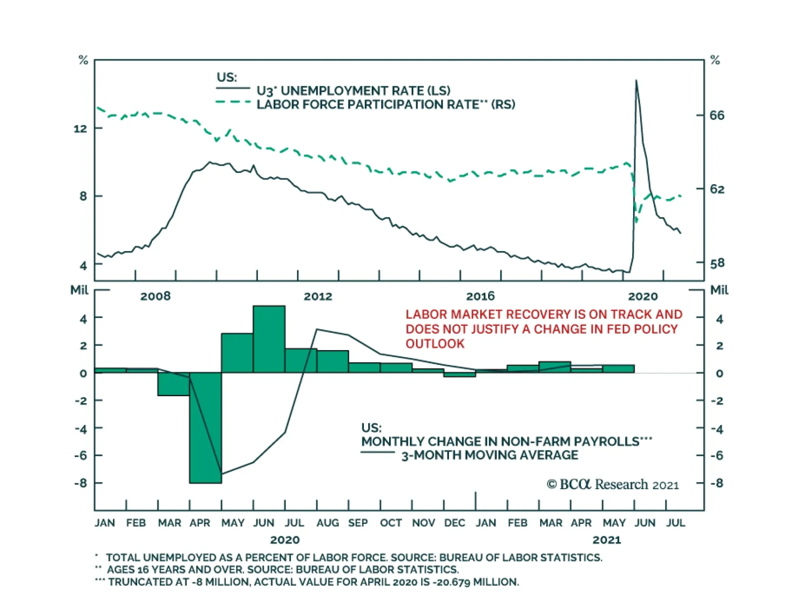
Friday’s US employment report was another miss. Nonfarm payroll employment increased by 559 thousand in May, below the anticipated 675 thousand. Moreover, the labor force participation rate ticked down to 61.6% from 61.7%. Thus, the 0.3 percentage point…
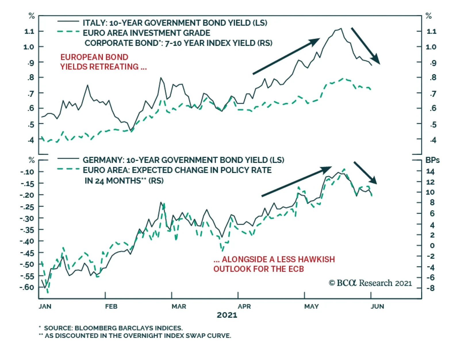
European bond markets have calmed down after a rough couple of months that saw the benchmark 10-year German bund yield rise from a low of -0.39% on March 25 to a high of -0.11% on May 19. Yields on riskier European debt saw even bigger increases over that…
Highlights The Fed: The Fed will formally discuss tapering plans over the course of this summer and fall and announce the slowing of asset purchases before the end of 2021. Its labor market objectives will also be achieved in time to lift rates in 2022. Non-US Developed Markets: The central banks outside the US most likely to deliver tapering and/or outright rate hikes over the next 1-2 years are those facing housing bubbles – the Bank of Canada and Reserve Bank of New Zealand. The ECB will do nothing on rates while adjusting asset purchase programs to preserve the size of its balance sheet, while the Reserve Bank of Australia will also sit on their hands for longer. Bond Strategy Recommendations: Investors should maintain below-benchmark portfolio duration in US-only and global fixed income portfolios. Global bond investors should also favor exposure in markets where central banks will be more dovish than expected (core Europe, Australia), while limiting exposure to markets where hawkish surprises are more likely (the US, Canada, New Zealand). Feature The recovery from the 2020 COVID recession is now well underway and many investors are getting antsy about when central bankers might respond by removing monetary policy accommodation. Some central banks appear more eager than others. Both the Bank of Canada and Bank of England, for instance, have already started to reduce their rates of bond buying. Meanwhile, the US Federal Reserve is only just now starting to talk about the timing of its own tapering. This Special Report lays out a timeline for what central bank actions we should expect during the next two years. The first section focuses exclusively on the US Federal Reserve and the second section incorporates likely announcements from other central banks. Based on a comparison of our expected central bank timeline with current market prices, we conclude that investors should maintain below-benchmark portfolio duration in US-only and global fixed income portfolios. Global bond investors should also favor government bonds in countries where central banks are likely to be less hawkish than markets expect (core Europe, Australia) versus bonds from countries where hawkish surprises are more likely (US, Canada, New Zealand and, potentially, the UK and Sweden). The Federal Reserve’s Timeline Chart 1 shows our anticipated timeline for when the Federal Reserve will make specific policy announcements between now and the start of 2024. Chart 1The Federal Reserve’s Timeline
A Central Bank Timeline For The Next Two Years
A Central Bank Timeline For The Next Two Years
First, over the course of this summer, the Fed will initiate discussions about when to taper its asset purchases. Then, asset purchase tapering will be announced at the December 2021 FOMC meeting with purchases set to decline as of the beginning of 2022. We expect that net Fed purchases will fall to zero by the end of Q3 2022. That is, by that time the Fed will no longer be adding to its securities holdings. Rather, it will keep the size of its balance sheet constant. Then, with its balance sheet no longer growing, the Fed will begin the process of lifting interest rates. We expect the first rate hike to occur at the December 2022 FOMC meeting. Finally, some time after the fed funds rate is well above the zero bound, the Fed will try to reduce the size of its securities portfolio. How do we arrive at this timeline? Table 1A Checklist For Liftoff
A Central Bank Timeline For The Next Two Years
A Central Bank Timeline For The Next Two Years
We start with the Fed’s forward guidance about the timing of the first rate hike (Table 1). The Fed has told us that it will lift rates off the zero bound once (i) PCE inflation is above 2%, (ii) the labor market is at “maximum employment” and (iii) inflation is expected to remain above 2% for some time. The first item on the Fed’s liftoff checklist has already been met and the third item logically follows from the other two. That is, if inflation is above 2% and the labor market is at “maximum employment” then the Fed will certainly expect inflation to remain high. This means that the second item on the Fed’s checklist is the most critical for assessing the timing of liftoff. In assessing the US labor market’s progress toward “maximum employment” we first have to define what “maximum employment” means. Based on the Fed’s communications, we infer that “maximum employment” means an unemployment rate between 3.5% and 4.5% - a range consistent with the Fed’s NAIRU estimates – and a labor force participation rate that has recovered back to pre-pandemic levels (Chart 2). Table 2 presents the average monthly growth in nonfarm payrolls that is required to reach that definition of maximum employment by specific future dates. For example, we calculate that average monthly payroll growth of 698k to 830k will cause the labor market to reach maximum employment by the end of this year. Average monthly payroll growth of 412k to 493k is required to hit the Fed’s target by the end of 2022. Chart 2Defining "Maximum Employment"
Defining "Maximum Employment"
Defining "Maximum Employment"
Table 2Average Monthly Nonfarm Payroll Growth Required To Reach Maximum Employment By The Given Date
A Central Bank Timeline For The Next Two Years
A Central Bank Timeline For The Next Two Years
The most recent issue of the Bank Credit Analyst posits several reasons why US employment growth will pick up steam in the coming months.1 We agree with this view and note that indicators of labor demand such as job openings, the NFIB “jobs hard to get” survey and the Conference Board’s “jobs plentiful” survey also point to accelerating employment gains.2 All told, we think that average monthly payroll growth of 412k to 493k is eminently achievable (Chart 3). This means that the Fed will hit its three liftoff criteria in time to hike rates before the end of 2022. Chart 3Max Employment By The End of 2022
Max Employment By The End of 2022
Max Employment By The End of 2022
Working backwards from the expected liftoff date, the Fed has said that it needs to see “substantial progress” toward the criteria listed in Table 1 before it will taper its pace of asset purchases. The definition of “substantial progress” remains somewhat unclear, but a few recent Fed communications provide some clues. First, Fed Chair Jay Powell said that he wants to see a “string of months” like the strong March employment report before it will be appropriate to reduce the pace of asset purchases. The question of how many months constitutes a “string” remains unclear, but it certainly seems plausible that we could see two or three more strong employment reports over the course of the summer. Other Fed Governors appear to agree with this timeline. Governor Randal Quarles: If my expectations about economic growth, employment, and inflation over the coming months are borne out, however, and especially if they come in stronger than I expect, then, as noted in the minutes of the last FOMC meeting, it will become important for the FOMC to begin discussing our plans to adjust the pace of asset purchases at upcoming meetings.3 Fed Vice-Chair Richard Clarida: I myself think that the pace of labor market improvement will pick up. […] It may well be the time that – there will come a time in upcoming meetings we’ll be at the point where we can begin to discuss scaling back the pace of asset purchases …4 Fed Governor Christopher Waller: The May and June jobs report[s] may reveal that April was an outlier, but we need to see that first before we start thinking about adjusting our policy stance.5 Our takeaway from these comments is that two or three more strong employment reports, say 500k or higher, would be sufficient for the Fed to more formally discuss tapering plans. Further, several Fed Governors seem to agree with our forecast that nonfarm payroll growth will accelerate in the coming months. With that in mind, it seems reasonable to expect that the Fed will discuss tapering plans over the course of the summer and fall, and that it will have seen sufficient labor market gains to announce a formal plan before the end of this year. Assuming that a tapering announcement occurs before the end of this year and that asset purchases actually start declining as of Jan 1st 2022, we estimate that the tapering process will conclude by the end of Q3 2022. That is, the Fed will hold the size of its balance sheet constant as of that date. Chart 4Balance Sheet Growth Will End Before The First Rate Hike
Balance Sheet Growth Will End Before The First Rate Hike
Balance Sheet Growth Will End Before The First Rate Hike
At the very least, the Fed will certainly bring its net purchases to zero before it lifts rates. This is because it would be incoherent for the Fed to be tightening policy through its interest rate actions while it eases policy with its balance sheet strategy. Indeed, this is the roadmap that the Fed followed leading up to the 2015 rate hike cycle (Chart 4). Finally, we note that the Fed will try to reduce the size of its balance sheet only after the process of rate hikes is well underway. This will be consistent with the last tightening cycle when the Fed waited until the funds rate was 1.5% before it pared the size of its securities portfolio (Chart 4). We also want to stress that the Fed will only try to reduce the size of its balance sheet. In fact, we doubt that this process will get very far. The main reason for our skepticism is that there is an ongoing structural issue in the Treasury market where the supply of securities keeps growing while stricter regulations make it more costly for primary dealers to intermediate trades.6 In this environment, there are strong odds that Treasury market liquidity will evaporate whenever there is a significant shock to financial markets. When that happens, the Fed will be forced to support Treasury market liquidity through large-scale purchases, as was the case during last March’s market turmoil (Chart 5). In essence, the likelihood of future shocks that will necessitate Fed intervention in the Treasury market makes it unlikely that the Fed will make much progress reducing the size of its balance sheet. Chart 5Fed Had To Support Treasury Market In March 2020
Fed Had To Support Treasury Market In March 2020
Fed Had To Support Treasury Market In March 2020
Market Expectations And Investment Implications We can get a sense of how our Fed timeline compares to consensus expectations by looking at the New York Fed’s Surveys of Market Participants and Primary Dealers (Tables 3A & 3B). Respondents to these surveys expect tapering to start in early 2022, in line with our expectations, though they generally see it taking longer for net purchases to fall to zero. Respondents also expect a later Fed liftoff date than we do and don’t see the Fed trying to reduce the size of its balance sheet until well after rate hikes have begun. Table 3ASurvey of Market Participants Expected Fed Timeline
A Central Bank Timeline For The Next Two Years
A Central Bank Timeline For The Next Two Years
Table 3BSurvey Of Primary Dealers Expected Fed Timeline
A Central Bank Timeline For The Next Two Years
A Central Bank Timeline For The Next Two Years
But more important for investors than survey results is what is currently priced into the yield curve. In that regard, the overnight index swap curve is priced for Fed liftoff in February 2023 and a total of 75 bps of rate hikes by the end of 2023 (Chart 6). We expect rate hikes to start earlier and proceed more quickly than that, and therefore recommend running below-benchmark duration in US bond portfolios. Chart 6Market Rate Expectations
Market Rate Expectations
Market Rate Expectations
The Timelines For Other Central Banks Policymakers outside the US are facing many of the same issues that the Fed is – rapidly recovering economies coming out of the pandemic, inflation overshoots, and surging asset prices. However, not every central bank will respond at the same time, or same pace, as the Fed. In Charts 7a and 7b, we show additional timelines for two of the most important non-Fed central banks: the European Central Bank (ECB) and the BoE. We see the likely dates and policy decisions playing out as follows. Chart 7AThe ECB’s Timeline
A Central Bank Timeline For The Next Two Years
A Central Bank Timeline For The Next Two Years
Chart 7BThe Bank Of England’s Timeline
A Central Bank Timeline For The Next Two Years
A Central Bank Timeline For The Next Two Years
European Central Bank For the ECB, the timing of its upcoming inflation strategy review is the most critical element. That report is due to be delivered in the latter half of this year, most likely in September or October (no firm release date has been announced by the ECB). It is highly unlikely that any meaningful policy changes will be implemented before that strategic review is completed. Some ECB officials have hinted that a move to a Fed-like interpretation of the ECB inflation target, tolerating overshoots of the target to make up for past undershoots, could result from the strategy review. The more likely option will be a move to an inflation target range, perhaps a 1-3% tolerance band, that offers more policy flexibility than the current target of just below 2%. This will potentially “move the goalposts” for the ECB in a way that will make monetary tightening even less likely compared to previous cycles. Looking at past ECB tightening episodes dating back to the central bank’s inception in 1998, it is clear that a majority of countries within the euro area must be seeing inflation that is high enough, with unemployment low enough, before any policy tightening can take place. Chart 8 illustrates this point, by showing “breadth” measures for unemployment and inflation across the euro area.7 Chart 8The ECB Usually Tightens When Growth AND Inflation Are Broad Based
The ECB Usually Tightens When Growth AND Inflation Are Broad Based
The ECB Usually Tightens When Growth AND Inflation Are Broad Based
Specifically, the chart shows the percentage of euro area countries with an unemployment rate below the OECD’s estimate of full employment (second panel), the percentage of euro area countries with headline inflation higher than one year earlier (third panel) and the percentage of euro area countries with headline inflation above the ECB’s 2% target (bottom panel). We compare those breadth measures to the actual path of policy interest rates and the size of the ECB’s balance sheet (top panel). The conclusion from the chart is that the euro area is still a long way from having the sort of broad-based rise in inflation or fall in unemployment necessary to trigger a reduction in the size of its balance sheet or actual interest rate hikes. Chart 9The ECB Is Under No Pressure To Tighten Pre-Emptively
The ECB Is Under No Pressure To Tighten Pre-Emptively
The ECB Is Under No Pressure To Tighten Pre-Emptively
Nonetheless, our expectation is that the ECB will want to begin preparing the markets for the end of the Pandemic Emergency Purchase Program (PEPP) - which has been buying government bonds since March 2020 in a less constrained fashion than previous asset purchase programs - shortly after the inflation strategy review is concluded. Much of the euro area economy is already showing signs of rapid recovery from pandemic induced lockdowns, amid an accelerating pace of vaccinations. On top of that, the Next Generation European Union (NGEU) recovery fund is set to begin distributing funds in the final quarter of 2021, providing a meaningful lift to government investment and expected growth in 2022. It will be difficult for the ECB to justify the need for an “emergency” program like the PEPP to continue against such a growth backdrop, especially with euro area inflation no longer at the depressed levels seen in 2020. We expect the ECB to begin preparing the market for the end of PEPP heading into the December 2021 ECB policy meeting, when it will be announced that the program will not be renewed when it expires in March 2022 (Chart 9). As always for such major policy announcements, the ECB will wish to do so when there is a new set of economic forecasts used to justify any changes. This is why December – the first meeting after the strategic review is completed that will also have new forecasts – is the earliest realistic date for an announcement on the PEPP. The communication around the PEPP announcement will need to be delicate, as the PEPP has significantly increased the ECB’s footprint in European bond markets. The share of government bonds owned by the ECB has increased by anywhere from five to ten percentage points since the PEPP began (Chart 10). We expect the ECB will be forced to expand its existing Public Sector Purchase Program (PSPP) to make up for the eventual disappearance of the PEPP. This means that the PEPP will be effectively “rolled into” the PSPP, to limit the damage from a likely post-PEPP surge in bond yields in the more fragile markets like Italy, Spain and even Greece – especially with the euro now trading close to pre-2008 highs on a trade-weighted basis (Chart 11). Chart 10The PEPP Can Expire, But Cannot Disappear
A Central Bank Timeline For The Next Two Years
A Central Bank Timeline For The Next Two Years
Chart 11ECB Must Avoid A 'PEPP Taper Tantrum'
ECB Must Avoid A 'PEPP Taper Tantrum'
ECB Must Avoid A 'PEPP Taper Tantrum'
There is a chance that the ECB will want to avoid any “PEPP taper tantrum” in Peripheral European yields (and spreads versus Germany) by making an announcement on PEPP expiry and PSPP expansion at the same meeting. If that happens, we suspect it would happen in December of this year rather than sometime in the first quarter of 2022. Beyond that, the ECB will likely seek to keep financial conditions as accommodative as possible by keeping policy interest rates unchanged well into 2023, with an actual rate hike not likely until mid-2024 at the earliest. The ECB could deliver a more modest form of “tightening” before then by letting some of the cheap bank funding programs (TLTROs) expire. Although we suspect that even those programs will need to be renewed, perhaps at less attractive financing terms, to prevent an unwanted tightening of credit conditions in the euro area banking system. Bank Of England Chart 12BoE Forecasts Are Conservative
BoE Forecasts Are Conservative
BoE Forecasts Are Conservative
Having already announced a tapering of the pace of its bond buying in early May, the BoE is likely to continue along that path over the next year. We expect the BoE, like the ECB, to make any future taper announcements when new sets of economic forecasts are published in Monetary Policy Reports. Thus, the next taper announcements are expected in August 2021, November 2021 and February 2022, with a full tapering down to zero net purchases (new buying only replacing maturing bonds) by May 2022 at the latest. The first rate hike will occur between 6-12 months after the end of tapering, possibly as early as November 2022 but, more likely in our view, sometime closer to mid-2023. The most recent set of BoE economic forecasts calls for headline UK CPI inflation to rise to 2.3% in 2022 before settling down to 2% in 2023 and 1.9% in 2024 (Chart 12). This would be a mild inflation outcome by recent UK standards during what will certainly be a period of strong post-pandemic growth over the next 12-18 months. Longer-term inflation expectations, both survey-based and extracted from CPI swaps and inflation-linked Gilts, are priced for a bigger inflation upturn above 3%. The BoE has been one of the least active central banks in the developed world since the 2008 financial crisis. The BoE main policy rate, the Bank Rate, has been no higher than 0.75% since then, even with the BoE threatening to lift rates to higher levels many times under the leadership of former Governor Mark Carney when inflation was overshooting the bank’s 2% target. Of course, the Brexit uncertainty since mid-2016 effectively tied the hands of the central bank and prevented any possible policy tightening. Now that Brexit has actually happened, however, the BoE has more flexibility to respond to developments with UK economic growth and inflation, as needed. A possible path for the UK Cash Rate was laid out in a recent speech by BoE Monetary Policy Committee (MPC) member Gertjan Vlieghe.8 He triggered a selloff across the Gilt market with his comment that a BoE rate hike could occur as early as Q2 2022 – with the Bank Rate rising to 1.25% from the current 0.1% by 2024 - under more optimistic scenarios for UK growth and employment. His base case, however, was that the coming uptick in UK inflation will prove to be temporary, but that a move towards full employment will make the first hike more likely toward the end of 2022 with modest rate increases in 2023 and 2024 that will take the Bank Rate to 0.75% (Chart 13). Chart 13Gilts Are Vulnerable To A Hawkish Surprise
Gilts Are Vulnerable To A Hawkish Surprise
Gilts Are Vulnerable To A Hawkish Surprise
Vlighe’s base case scenario on growth and interest rates is in line with the BoE’s current forecasts that call for spare capacity in the UK economy to be fully eliminated by mid-2022, with rate hikes to begin in mid-2023. That is broadly in line with our projected BoE timeline and with current pricing in the UK OIS curve, although we see risks tilted towards faster growth and inflation – and the BoE moving more aggressively than projected – over the next 12-18 months. Other Major Developed Market Central Banks Looking beyond the “Big Three” of the Fed, ECB and BoE, central bank timelines have become increasingly dependent on a single factor – the strength of domestic housing markets. House prices are booming in Canada, New Zealand and Sweden, with valuation measures like the ratio of median house prices to median incomes soaring to historical extremes according to the OECD (Chart 14). House prices are also climbing fast in the US and UK, but the valuation measures have not surpassed the peaks seen during the mid-2000s housing bubble. The housing boom has already motivated some central banks to respond by turning less dovish sooner than expected, even with unemployment rates still above pre-pandemic peaks (Chart 15).9 The BoC noted that soaring Canadian housing values motivated the taper announcement in April. The Reserve Bank of New Zealand (RBNZ) has come under political pressure over the growing unaffordability of New Zealand homes, with the government changing the central bank’s remit earlier this year to force the RBNZ to explicitly consider house price inflation when setting monetary policy. Chart 14Surging House Prices Can Turn Doves Into Hawks
Surging House Prices Can Turn Doves Into Hawks
Surging House Prices Can Turn Doves Into Hawks
Chart 15These CBs Could Turn More Hawkish Before Reaching Full Employment
These CBs Could Turn More Hawkish Before Reaching Full Employment
These CBs Could Turn More Hawkish Before Reaching Full Employment
We expect more tapering announcements from the BoC over the latter half of 2021, with a first rate hike likely sometime in the first quarter of 2022. We see the RBNZ moving aggressively, as well, tapering over the remainder of 2021 before lifting rates by the spring of 2022 at the latest. Sweden’s Riksbank will be the next central bank to turn more hawkish because of surging home values, although they will lag the pace of the BoC and RBNZ with Sweden only now beginning to emerge from lockdowns associated with a third wave of COVID-19 cases. Importantly, Australia – a country that has dealt with house price surges in the past – has seen house price valuations retreat over the past few years, even with the Reserve Bank of Australia (RBA) slashing policy rates to historic lows. The RBA also introduced yield curve control in 2020 to anchor the level of short-term bond yields, while also engaging in outright bond purchases to mitigate the rise in longer-term bond yields. With Australian inflation still remaining well below target in a year of rising global inflation, and with subdued labor costs likely to keep price pressures moderate over the next 12-18 months, we expect the RBA to move very slowly on both tapering and rate hikes. Finally, for completeness, we should note that we do not expect any policy changes from the Bank of Japan (BoJ) over the next two years, with inflation likely to remain far below the central bank’s 2% target. Non-US Investment Implications In Table 4, we show the timing of the first rate hike (i.e. “liftoff”), and the subsequent amount of total rate hikes to the end of 2024, as currently discounted in the OIS curves of the eight countries discussed in this report. We rank the countries in the table in order of liftoff dates, starting with the closest to today. Table 4The “Pecking Order” Of Central Bank Rate Hikes
A Central Bank Timeline For The Next Two Years
A Central Bank Timeline For The Next Two Years
The RBNZ is expected to hike first in May 2022, followed by the BoC (September 2022), the Fed (February 2023), the RBA (April 2023), the Riksbank (May 2023), the BoE (May 2023), the ECB (June 2023) and the BoJ (October 2025). The cumulative amount of rate hikes discounted to the end of 2024 rank similarly: more rate increases are expected in New Zealand (167bps), Canada (150bps), the US (137bps) and Australia (113bps); while fewer rate increases are expected in the Sweden (63bps), the UK (61bps), the euro area (31bps) and Japan (7bps). According to our various central bank timelines discussed in this report, we see the risks of a rate hike coming sooner than discounted by markets in the US, Canada and New Zealand. We see central banks moving slower than markets expect in the euro area and Australia, while we see Sweden and UK priced in line with our base case views (although we see risks tilted towards a more hawkish turn faster than expected in the latter two). The story is the same in terms of cumulative rate hikes discounted in OIS curves, with markets not pricing in enough rate hikes in New Zealand, Canada and the US – and, possibly, Sweden and the UK – while pricing too many hikes in Australia and the euro area. This leads us to recommend the following country allocations in a global government bond portfolio: Underweight the US, Canada and New Zealand Overweight Australia and core Europe (and Japan) Neutral Sweden and the UK, but with a bias to downgrade. Ryan Swift US Bond Strategist rswift@bcaresearch.com Robert Robis, CFA Chief Fixed Income Strategist rrobis@bcaresearch.com Footnotes 1 Please see The Bank Credit Analyst June 2021 Monthly Report, "Global House Prices: A New Threat For Policymakers", dated May 27, 2021. 2 Please see US Bond Strategy Weekly Report, “Lower For Longer, Then Faster Than You Think”, dated May 25, 2021. 3 https://www.federalreserve.gov/newsevents/speech/quarles20210526b.htm 4 https://ca.news.yahoo.com/federal-reserve-vice-chair-richard-clarida-yahoo-finance-transcript-may-2021-173007192.html 5 https://www.federalreserve.gov/newsevents/speech/waller20210513a.htm 6 For a longer discussion of Treasury market liquidity issues please see US Investment Strategy / US Bond Strategy Special Report, “Alphabet Soup 2: Shocked And Awed”, dated July 28, 2020. 7 For more details, please see Global Fixed Income Strategy Report, “ECB Outlook: Walking On Eggshells”, dated May 19, 2021. 8 The full speech can be found here: https://www.bankofengland.co.uk/speech/2021/may/gertjan-vlieghe-speech-hosted-by-the-department-of-economics-and-the-ipr 9 For more details on the global housing boom, see Global Fixed Income Strategy Special Report, “Global House Prices: A New Threat For Policymakers”, dated May 28, 2021. Fixed Income Sector Performance Recommended Portfolio Specification