Gov Sovereigns/Treasurys

Highlights Chart 1The 2003 SARS Roadmap
The 2003 SARS Roadmap
The 2003 SARS Roadmap
The bond market impact from the coronavirus has already been substantial. The 10-year Treasury yield has fallen back to 1.51%, below the fed funds rate. Meanwhile, the investment grade corporate bond index spread is back above 100 bps, from a January low of 93 bps. The 2003 SARS crisis is the best roadmap we can apply to the current situation. Back then, Treasury yields also fell sharply but then rebounded just as quickly when the number of SARS cases peaked (Chart 1). The impact on corporate bond excess returns was more short-lived (Chart 1, bottom panel). Like in 2003, we expect that bond yields will rise once the number of coronavirus cases peaks, but it is difficult to put a timeframe on how long that will take. The economic impact from the virus could also weigh on global PMI surveys during the next few months, delaying the move higher in Treasury yields we anticipated earlier this year. In short, we continue to expect higher bond yields and tighter credit spreads in 2020, but those moves will be delayed until markets are confident that the virus has stopped spreading. Feature Investment Grade: Neutral Chart 2Investment Grade Market Overview
Investment Grade Market Overview
Investment Grade Market Overview
Investment grade corporate bonds underperformed the duration-equivalent Treasury index by 80 basis points in January. The sector actually outpaced the Treasury benchmark by 7 bps until January 21 when the impact of the coronavirus started to push spreads wider. As stated on page 1, we expect the impact of the coronavirus on corporate spreads to be short lived. Beyond that, low inflation expectations will keep monetary conditions accommodative. This in turn will encourage banks to ease credit supply, keeping defaults at bay and providing a strong tailwind for corporate bond returns.1 Yesterday’s Fed Senior Loan Officer survey showed a slight easing of C&I lending standards in Q4 2019, reversing the tightening that occurred in the third quarter (Chart 2). We expect that accommodative Fed policy will lead to continued easing of C&I lending standards for the remainder of the year. Despite the positive tailwind from accommodative Fed policy and easing bank lending standards, investment grade corporate bond spreads are quite expensive. Spreads for all credit tiers are below our targets (panels 2 & 3).2 As a result, we advise only a neutral allocation to investment grade corporate bonds. We also recommend increasing exposure to Agency MBS in place of corporate bonds rated A or higher (see page 7). Table 3ACorporate Sector Relative Valuation And Recommended Allocation*
Contagion
Contagion
Table 3BCorporate Sector Risk Vs. Reward*
Contagion
Contagion
High-Yield Overweight Chart 3High-Yield Market Overview
High-Yield Market Overview
High-Yield Market Overview
High-Yield underperformed the duration-equivalent Treasury index by 111 basis points in January. Junk outperformed the Treasury benchmark by 30 bps until January 21 when the coronavirus outbreak sent spreads sharply wider. Once the negative impact of the coronavirus passes, junk spreads will have plenty of room to tighten in 2020. In fact, the junk index spread is now at 390 bps, 154 bps above our target (Chart 3).3 While spreads for all junk credit tiers are currently above our targets, Caa-rated bonds look particularly cheap. We analyzed the divergence between Caa and the rest of the junk index in a recent report and came to two conclusions.4 First, the historical data show that 12-month periods of overall junk bond outperformance are more likely to be followed by underperformance if Caa is the worst performing credit tier. Second, we can identify several reasons for 2019’s Caa spread widening that make us inclined to downplay any negative signal. Specifically, we note that the Caa credit tier’s exposure to the shale oil sector is responsible for the bulk of 2019’s underperformance (bottom panel). Absent significant further declines in the oil price, this sector now has room to recover. MBS: Overweight Chart 4MBS Market Overview
MBS Market Overview
MBS Market Overview
Mortgage-Backed Securities underperformed the duration-equivalent Treasury index by 53 basis points in January. The sector was only lagging the Treasury benchmark by 7 bps as of January 21, when the coronavirus outbreak sent spreads wider. The conventional 30-year zero-volatility spread widened 8 bps in January, driven by a 7 bps widening of the option-adjusted spread (OAS) and a 1 bp increase in expected prepayment losses (aka option cost). The fact that expected prepayment losses only rose by a single basis point even though the 30-year mortgage rate fell by 23 bps is notable. It speaks to the high level of refi burnout in the mortgage market, which is a key reason why we prefer mortgage-backed securities over investment grade corporate bonds in our portfolio. Essentially, most homeowners have already had at least one opportunity to refinance during the past few years, so prepayment risk is low even if rates fall further. Competitive expected compensation is another reason to move into Agency MBS. The conventional 30-year MBS OAS is 49 bps, only 7 bps below the spread offered by Aa-rated corporate bonds (Chart 4). Also, spreads for all investment grade corporate bond credit tiers are below our cyclical targets. Risk-adjusted compensation favors MBS even more strongly. The Excess Return Bond Map in Appendix C shows that Agency MBS plot well to the right of investment grade corporates. This means that the sector is less likely to see losses versus Treasuries on a 12-month horizon. Government-Related: Underweight Chart 5Government-Related Market Overview
Government-Related Market Overview
Government-Related Market Overview
The Government-Related index underperformed the duration-equivalent Treasury index by 14 basis points in January. The index was up 2 bps versus the Treasury benchmark until January 21, when the coronavirus outbreak hit. Sovereign debt underperformed duration-equivalent Treasuries by 99 bps on the month, and Foreign Agencies underperformed by 28 bps. Local Authorities, however, bested the Treasury benchmark by 60 bps. Domestic Agency bonds underperformed Treasuries by 2 bps in January, while Supranationals outperformed by 2 bps. We continue to recommend an underweight allocation to USD-denominated sovereign bonds, given that spreads remain expensive compared to US corporate credit (Chart 5). However, we noted in a recent report that Mexican and Saudi Arabian sovereigns look attractive on a risk/reward basis.5 This is also true for Local Authorities and Foreign Agencies, as shown in the Bond Map in Appendix C. Our Emerging Markets Strategy service also thinks that worries about Mexico’s fiscal position are overblown, and that bond yields embed too high of a risk premium (bottom panel).6 Municipal Bonds: Overweight Chart 6Municipal Market Overview
Municipal Market Overview
Municipal Market Overview
Municipal bonds underperformed the duration-equivalent Treasury index by 33 basis points in January (before adjusting for the tax advantage). They were up 39 bps versus the Treasury index before the coronavirus outbreak hit on January 21. The average Aaa-rated Municipal / Treasury (M/T) yield ratio swung around during the month, but settled close to where it began at 77% (Chart 6). We upgraded municipal bonds in early October, as yield ratios had become significantly more attractive, especially at the long-end of the Aaa curve (panel 2).7 Yield ratios have tightened a lot since then, but value remains at long maturities. Specifically, the 2-year, 5-year and 10-year M/T yield ratios are all below average pre-crisis levels at 62%, 65% and 78%, respectively. But 20-year and 30-year yield ratios stand at 89% and 93%, respectively, above average pre-crisis levels. Fundamentally, state and local balance sheets remain solid. Our Municipal Health Monitor is in “improving health” territory and state & local government interest coverage has improved considerably in recent quarters (bottom panel). Both of these trends are consistent with muni ratings upgrades continuing to outpace downgrades going forward. Treasury Curve: Maintain A Barbell Curve Positioning Chart 7Treasury Yield Curve Overview
Treasury Yield Curve Overview
Treasury Yield Curve Overview
The Treasury curve bull-flattened dramatically in January. Treasury yields declined across the curve, and the 2/10 slope flattened from 34 bps to 18 bps. The 5/30 slope flattened from 70 bps to 67 bps. Despite the significant flattening, the 2/10 slope remains near the middle of our target 0 – 50 bps range for 2020, and we anticipate some bear-steepening once the coronavirus is contained.8 The front-end of the curve also moved in January to price-in 57 bps of Fed rate cuts during the next 12 months (Chart 7). At the beginning of the year the curve was priced for only 14 bps of rate cuts. We expect that the Fed would respond with rate cuts if the coronavirus epidemic worsens, leading to inversion of the 2/10 yield curve. However, for the time being the safer bet is that the virus will be contained relatively quickly and the Fed will remain on hold for all of 2020. Based on this view, we continue to recommend holding a barbelled Treasury portfolio. Specifically, we favor holding a 2/30 barbell versus the 5-year bullet, in duration-matched terms. The position offers positive carry and looks attractive on our yield curve models (see Appendix B).9 TIPS: Overweight Chart 8Inflation Compensation
Inflation Compensation
Inflation Compensation
TIPS underperformed the duration-equivalent Treasury index by 75 basis points in January. The 10-year TIPS breakeven inflation rate fell 12 bps on the month and currently sits at 1.66%. The 5-year/5-year forward TIPS breakeven inflation rate fell 16 bps on the month and currently sits at 1.71%. Both rates remain well below the 2.3%-2.5% range consistent with the Fed’s target. The divergence between the actual inflation data and inflation expectations remains stark. Trimmed mean PCE inflation has been fluctuating around the Fed’s target since mid-2018 (Chart 8). However, long-maturity TIPS breakeven inflation rates remain stubbornly low. It takes time for expectations to adapt to a changing macro environment, but even accounting for those long lags, our Adaptive Expectations Model pegs the 10-year TIPS breakeven inflation rate as 31 bps too low (panel 4).10 It is highly likely that the Fed will have to tolerate some overshoot of its 2% inflation target in order to re-anchor long-term inflation expectations. As a result, the actual inflation data will lead expectations higher, causing the TIPS breakeven inflation curve to flatten.11 ABS: Underweight Chart 9ABS Market Overview
ABS Market Overview
ABS Market Overview
Asset-Backed Securities outperformed the duration-equivalent Treasury index by 32 basis points in January. The index option-adjusted spread for Aaa-rated ABS tightened 14 bps on the month. It currently sits at 26 bps, below its minimum pre-crisis level (Chart 9). Our Excess Return Bond Map (see Appendix C) shows that Aaa-rated consumer ABS ranks among the most defensive US spread products. This explains why the sector performed so well in January when other spread sectors struggled. ABS also offer higher expected returns than other low-risk sectors such as Domestic Agency bonds and Supranationals. However, we remain wary of allocating too much to consumer ABS because credit trends are slowly shifting in the wrong direction. The consumer credit delinquency rate remains low, but has put in a clear bottom. This is also true for the household interest expense ratio (panel 3). Senior Loan Officers also continue to tighten lending standards for both credit cards and auto loans. Tighter lending standards usually coincide with rising delinquencies (bottom panel). Non-Agency CMBS: Neutral Chart 10CMBS Market Overview
CMBS Market Overview
CMBS Market Overview
Non-Agency Commercial Mortgage-Backed Securities outperformed the duration-equivalent Treasury index by 43 basis points in January. The index option-adjusted spread for non-agency CMBS tightened 6 bps on the month. It currently sits at 67 bps, below its average pre-crisis level (Chart 10). In last week’s Special Report, we explored how low interest rates have boosted commercial real estate (CRE) prices this cycle, and concluded that a sharp drawdown in CRE prices is likely only when inflation starts to pick up steam.12 In that report we also mentioned that non-agency Aaa-rated CMBS spreads look attractive relative to US corporate bonds from a risk/reward perspective (see our Excess Return Bond Map in Appendix C), and that the macro environment is only slightly unfavorable for CMBS spreads. Specifically, CRE bank lending standards are just in “net tightening” territory. But both lending standards and loan demand are very close to neutral (bottom 2 panels). Agency CMBS: Overweight Agency CMBS outperformed the duration-equivalent Treasury index by 34 basis points in January. The index option-adjusted spread tightened 4 bps on the month to reach 54 bps. The Excess Return Bond Map in Appendix C shows that Agency CMBS offer a compelling risk/reward trade-off. An overweight allocation to this sector remains appropriate. Appendix A: The Golden Rule Of Bond Investing We follow a two-step process to formulate recommendations for bond portfolio duration. First, we determine the change in the federal funds rate that is priced into the yield curve for the next 12 months. Second, we decide – based on our assessments of the economy and Fed policy – whether the change in the fed funds rate will exceed or fall short of what is priced into the curve. Most of the time, a correct answer to this question leads to the appropriate duration call. We call this framework the Golden Rule Of Bond Investing, and we demonstrated its effectiveness in the US Bond Strategy Special Report, “The Golden Rule Of Bond Investing”, dated July 24, 2018, available at usbs.bcaresearch.com. Chart 11 illustrates the Golden Rule’s track record by showing that the Bloomberg Barclays Treasury Master Index tends to outperform cash when rate hikes fall short of 12-month expectations, and vice-versa. At present, the market is priced for 57 basis points of cuts during the next 12 months. We anticipate a flat fed funds rate over that time horizon, and therefore anticipate that below-benchmark portfolio duration positions will profit. Chart 11The Golden Rule's Track Record
The Golden Rule's Track Record
The Golden Rule's Track Record
We can also use our Golden Rule framework to make 12-month total return and excess return forecasts for the Bloomberg Barclays Treasury index under different scenarios for the fed funds rate. Excess returns are relative to the Bloomberg Barclays Cash index. To forecast total returns we first calculate the 12-month fed funds rate surprise in each scenario by comparing the assumed change in the fed funds rate to the current value of our 12-month discounter. This rate hike surprise is then mapped to an expected change in the Treasury index yield using a regression based on the historical relationship between those two variables. Finally, we apply the expected change in index yield to the current characteristics (yield, duration and convexity) of the Treasury index to estimate total returns on a 12-month horizon. The below tables present those results, along with 95% confidence intervals. Excess returns are calculated by subtracting assumed cash returns in each scenario from our total return projections.
Contagion
Contagion
Contagion
Contagion
Appendix B: Butterfly Strategy Valuations The following tables present the current read-outs from our butterfly spread models. We use these models to identify opportunities to take duration-neutral positions across the Treasury curve. The following two Special Reports explain the models in more detail: US Bond Strategy Special Report, “Bullets, Barbells And Butterflies”, dated July 25, 2017, available at usbs.bcaresearch.com US Bond Strategy Special Report, “More Bullets, Barbells And Butterflies”, dated May 15, 2018, available at usbs.bcaresearch.com Table 4 shows the raw residuals from each model. A positive value indicates that the bullet is cheap relative to the duration-matched barbell. A negative value indicates that the barbell is cheap relative to the bullet. Table 4Butterfly Strategy Valuation: Raw Residuals In Basis Points (As Of January 31, 2020)
Contagion
Contagion
Table 5 scales the raw residuals in Table 4 by their historical means and standard deviations. This facilitates comparison between the different butterfly spreads. Table 5Butterfly Strategy Valuation: Standardized Residuals (As Of January 31, 2020)
Contagion
Contagion
Table 6 flips the models on their heads. It shows the change in the slope between the two barbell maturities that must be realized during the next six months to make returns between the bullet and barbell equal. For example, a reading of 33 bps in the 5 over 2/10 cell means that we would only expect the 5-year to outperform the 2/10 if the 2/10 slope steepens by more than 33 bps during the next six months. Otherwise, we would expect the 2/10 barbell to outperform the 5-year bullet. Table 6Discounted Slope Change During Next 6 Months (BPs)
Contagion
Contagion
Appendix C: Excess Return Bond Map The Excess Return Bond Map is used to assess the relative risk/reward trade-off between different sectors of the US bond market. It is a purely computational exercise and does not impose any macroeconomic view. The Map’s vertical axis shows 12-month expected excess returns. These are proxied by each sector’s option-adjusted spread. Sectors plotting further toward the top of the Map have higher expected returns and vice-versa. Our novel risk measure called the “Risk Of Losing 100 bps” is shown on the Map’s horizontal axis. To calculate it, we first compute the spread widening required on a 12-month horizon for each sector to lose 100 bps or more relative to a duration-matched position in Treasury securities. Then, we divide that amount of spread widening by each sector’s historical spread volatility. The end result is the number of standard deviations of 12-month spread widening required for each sector to lose 100 bps or more versus a position in Treasuries. Lower risk sectors plot further to the right of the Map, and higher risk sectors plot further to the left. Excess Return Bond Map (As Of January 31, 2020)
Contagion
Contagion
Footnotes 1 Please see US Bond Strategy Special Report, “2020 Key Views: US Fixed Income”, dated December 10, 2019, available at usbs.bcaresearch.com 2 For details on how we calculate our spread targets please see US Bond Strategy Weekly Report, “The Value In Corporate Bonds”, dated February 19, 2019, available at usbs.bcaresearch.com 3 For details on how we calculate our spread targets please see US Bond Strategy Weekly Report, “The Value In Corporate Bonds”, dated February 19, 2019, available at usbs.bcaresearch.com 4 Please see US Bond Strategy Weekly Report, “Caa-Rated Bonds: Warning Sign Or Buying Opportunity?”, dated November 26, 2019, available at usbs.bcaresearch.com 5 Please see US Bond Strategy Weekly Report, “A Perspective On Risk And Reward”, dated October 15, 2019, available at usbs.bcaresearch.com 6 Please see Emerging Markets Strategy Weekly Report, “Country Insights: Malaysia, Mexico & Central Europe”, dated October 31, 2019, available at ems.bcaresearch.com 7 Please see US Bond Strategy Weekly Report, “Two Themes And Two Trades”, dated October 1, 2019, available at usbs.bcaresearch.com 8 Please see US Bond Strategy Special Report, “2020 Key Views: US Fixed Income”, dated December 10, 2019, available at usbs.bcaresearch.com 9 For further details on our recommended yield curve trade please see US Bond Strategy Weekly Report, “The Best Spot On The Yield Curve”, dated January 21, 2020, available at usbs.bcaresearch.com 10 For further details on our Adaptive Expectations Model please see US Bond Strategy Weekly Report, “Adaptive Expectations In The TIPS Market”, dated November 20, 2018, available at usbs.bcaresearch.com 11 Please see US Bond Strategy Special Report, “2020 Key Views: US Fixed Income”, dated December 10, 2019, available at usbs.bcaresearch.com 12 Please see US Investment Strategy / US Bond Strategy Special Report, “Commercial Real Estate And US Financial Stability”, dated January 27, 2020, available at usbs.bcaresearch.com Fixed Income Sector Performance Recommended Portfolio Specification Corporate Sector Relative Valuation And Recommended Allocation
Highlights Global Growth Fears: Efforts to contain the China coronavirus outbreak risk creating the outcome that investors feared most in 2019 from the US-China trade war – weaker global growth and a severe disruption to supply chains worldwide. Monetary Policy Responses: Global bond yields have plunged as investors have piled into safe haven assets and priced in additional monetary easing from major central banks. Some of that decline in yields, however, may be a repricing of future rate hike probabilities with central banks like the Fed and ECB rethinking their inflation mandates and how to achieve them. Duration Strategy: Maintain a moderate below-benchmark cyclical (6-12 months) stance on overall interest rate duration in global fixed income portfolios. Yields now discount a significant hit to global economic growth from China. This outcome is far from certain, especially if China delivers more aggressive fiscal and monetary policy easing to mitigate the deflationary effects of the public health crisis. Feature Chart of the WeekBond Yields Have "Gone Viral"
Bond Yields Have "Gone Viral"
Bond Yields Have "Gone Viral"
Global bond yields have declined sharply over the past two weeks, as investors have tried to process the potential implications of the China coronavirus outbreak. Scenes of empty streets in Chinese cities under quarantine look like something out of a Hollywood science fiction movie. Fears of a “zombie apocalypse” scenario plunging the global economy into recession are proliferating among doomsayers. The viral outbreak is interrupting global growth just as it is starting to show signs of recovery from the manufacturing slump of 2019 (Chart of the Week). Global bond yields had been slowly rising alongside that economic improvement, and risk premia in equity and credit markets had begun to narrow in earnest. Against that backdrop with markets priced for perfection, a massive public health crisis in the most marginal driver of global growth, China, was a potent trigger for a correction in risk assets. The story is obviously very fluid, with the number of infected continuing to grow in China and more cases being discovered across the world. At least 50 million Chinese citizens are now under quarantine, across several major cities. More countries are instituting travel bans to and from China, and important global companies like Apple are shuttering their China operations until further notice. The ultimate hit to global growth is yet to be determined, but measures being taken to slow the spread of the coronavirus will clearly have an impact on global trade, supply chain management and, thus, economic growth. This risks a repeat of the May-August period last year, when markets were pricing in the potential negative effects of US-China trade tariffs on global growth, triggering a major decline in global bond yields. A big driver of that bond rally last year was a shift towards expectations of easier global monetary policy. Those were largely realized as central banks cut rates while global growth was actually slowing. Bond yields now discount another round of rate cuts, most importantly from the US Federal Reserve, despite no formal indication (yet) that policymakers are looking to deliver more easing. The risk now is that investors will become too pessimistic, setting up a swing of the pendulum in the opposite direction if the hit to global growth from the virus is less than feared. On that note, a significant Chinese economic growth slowdown now appears fully priced into global bond yields. The risk now is that investors will become too pessimistic, setting up a swing of the pendulum in the opposite direction if the hit to global growth from the virus is less than feared. On that note, a significant Chinese economic growth slowdown now appears fully priced into global bond yields, as we discuss later in this Weekly Report. Breaking Down The Latest Decline In Global Bond Yields The decline in government bond yields in the developed markets (DM) has been sharpest since Chinese authorities confirmed human-to-human transmission of the coronavirus on Monday, January 20. That appears to be the date when investors began to take the outbreak much more seriously. Growth-sensitive assets like emerging market (EM) equities, copper and oil prices peaked on Friday, January 17, while measures of volatility like the US VIX index and US high-yield credit spreads troughed (Chart 2). The price of safe haven assets like gold and the Japanese yen have also increased since that “pre-virus peak” on January 17, as have bond volatility measures like the US MOVE index or European swaption volatility (Chart 3). Importantly, the increases in rates volatility have been smaller to date compared to mid-2019, when the “convexity” trade triggered an insatiable demand for duration that drove longer-maturity global bond yields sharply lower. Chart 2A Pullback In Growth-Sensitive Assets
A Pullback In Growth-Sensitive Assets
A Pullback In Growth-Sensitive Assets
Chart 3A Mild Bid For Safe Havens Compared To 2019
A Mild Bid For Safe Havens Compared To 2019
A Mild Bid For Safe Havens Compared To 2019
A breakdown of the decline in the benchmark 10-year government bond yields in the major DM countries (US, Germany, Japan, the UK, Canada and Australia) since that “pre-virus peak” is shown in Table 1. Table 1Global Bond Yield Changes Since January 17, 2020
The China Syndrome
The China Syndrome
The biggest declines were in the US (-33bps), Canada (-29bps) and Australia (-23bps) where central bank monetary policy expectations also saw the largest shift. Our 12-month discounters, which measure the change in short-term interest rates over a one-year horizon priced into Overnight Index Swap (OIS) curves, have fallen by -30bps in the US, -26bps in Canada and -22bps in Australia – indicating that markets had fully priced in a rate cutting response to the coronavirus outbreak from the Fed, Bank of Canada and Reserve Bank of Australia. Bond yields have fallen to a lesser extent in Germany (-19bps), the UK (-11bps) and Japan (-7bps), but with very modest declines in our 12-month discounters for those three countries were policy interest rates are close to, or below, 0%. Therefore, the decline global yields over the past two weeks can, on the surface, be attributed to expectations of easier monetary policy in response to the potential hit to growth, and tightening of financial conditions as risk assets sell off, from the coronavirus (Chart 4). Chart 4Falling Yields Reflect Expectations Of More Rate Cuts In 2020...
Falling Yields Reflect Expectations Of More Rate Cuts In 2020...
Falling Yields Reflect Expectations Of More Rate Cuts In 2020...
Chart 5...But Also Expectations Of Lower Rates For Longer
...But Also Expectations Of Lower Rates For Longer
...But Also Expectations Of Lower Rates For Longer
Yet when looking at our estimates of the term premium for all six countries, the decline in the nominal 10-year yields is almost equal to the reduction in the term premium. On the surface, this would be consistent with the idea that the fall in yields is due to risk aversion driving up the demand for the safety of government bonds – and can hence be unwound if the news were to turn less gloomy on the spread of the coronavirus. Yet interest rates further out the yield curve have also fallen by similar amounts in all countries shown, when looking at 1-year interest rates, 5-years forward (the bottom row of Table 1). That decline in longer-dated forwards does correlate strongly with lower inflation expectations as measured by 10-year CPI swap rates (Chart 5). This suggests an alternative explanation for the recent fall in global bond yields that is not related to worries over the coronavirus: bond markets increasingly believe that policy interest rates will be lower for a lot longer. An alternative explanation for the recent fall in global bond yields that is not related to worries over the coronavirus: bond markets increasingly believe that policy interest rates will be lower for a lot longer. With the Fed and ECB now openly discussing changing their monetary policy frameworks to manage achievement of their statutory inflation targets more proactively, the hurdle for contemplating any interest rate hikes in the future is now much higher. Thus, central banks are giving forward guidance to the markets that rates will be lower. That is a message that would also be consistent with the decline in the term premium, to the extent that the premium is compensation for the future volatility of short-term interest rates. When looking at all the components, the message from the most recent decline in global bond yields may be more complex than simple virus-driven risk aversion. Our Duration Indicator continues to improve alongside rebounding global economic sentiment, signaling cyclical upward pressure on yields (Chart 7) – assuming, of course, that the hit to Chinese growth from the coronavirus outbreak is no worse than currently discounted in financial asset prices. In the case of US Treasuries, the bond rally also has a cyclical component, with yields now down to levels more consistent with the softer pace of growth indicated by the ISM Manufacturing index and the recent softening trend in US data surprises (Chart 6). Yet with US monetary policy and financial conditions still highly accommodative, the odds still favor some improvement in the current trend-like pace for US GDP growth that will, eventually, begin to put moderate upward pressure on Treasury yields again. Chart 6Low UST Yields Are Not Just A coronavirus Story
Low UST Yields Are Not Just A coronavirus Story
Low UST Yields Are Not Just A coronavirus Story
Chart 7Global Yields Were Due For A Corrective Pullback
Global Yields Were Due For A Corrective Pullback
Global Yields Were Due For A Corrective Pullback
A similar message is given when we look at global bond yields, more generally. Our Duration Indicator continues to improve alongside rebounding global economic sentiment, signaling cyclical upward pressure on yields (Chart 7) – assuming, of course, that the hit to Chinese growth from the coronavirus outbreak is no worse than currently discounted in financial asset prices. Bottom Line: Efforts to contain the China coronavirus outbreak risk creating the outcome that investors feared most in 2019 from the US-China trade war – weaker Chinese growth and a severe disruption to global supply chains. Global bond yields have plunged as investors have piled into safe haven assets and priced in additional monetary easing from major central banks. Some of that decline in yields, however, may be a repricing of future rate hike probabilities with central banks like the Fed and ECB rethinking their inflation mandates and how to achieve them. How Much China Weakness Is Priced Into Global Bond Yields? The China coronavirus outbreak, and the response to contain it, represents a potentially severe hit to Chinese – and global – economic growth. A lot of comparisons have been made to the 2003 SARS outbreak to try and find a comparable past event. However, as our colleagues at BCA Research Emerging Markets Strategy have noted, China’s economy is so much larger now, rendering comparisons of the economic impact from SARS to that of the coronavirus far less meaningful.1 For example, China’s GDP at purchasing power parity accounts for 19.3% of world GDP compared to 8.3% in 2002 before the SARS outbreak occurred. China’s share of the global consumption of various industrial metals has surged, as well, from between 10-20% in 2002 to 50-60% today. A simple alternative way to measure the impact of any virus-driven slowing of Chinese economic growth would be to calculate the reduction in full-year 2020 GDP growth relative to consensus forecasts. In this sense, the comparison is made to current expectations rather than to a past episode – an approach that should be far more relevant for predicting the response of financial asset prices today. For example, the Bloomberg consensus expectation for Chinese nominal GDP growth for all of 2020 is currently 7.2%. Using that rate and the level of nominal GDP from 2019, we can calculate an expected level for nominal GDP for 2020. We can then make some simplifying assumptions for the impact on full-year growth from an extended period of lost output from the quarantines, government-ordered factory shutdowns and extended holidays, travel bans, etc. Assuming that one full month of expected nominal GDP growth is lost (i.e. 1/12th of the expected increase in the level of nominal China GDP), the full-year growth rate falls to 6.6% Assuming that two full months of expected nominal GDP growth are lost, the full year growth rate falls to 6.0% Global bond yields now reflect a considerable slowdown of Chinese economic activity from the coronavirus, representing between 1-2 months of expected full-year 2020 nominal GDP growth that will be lost. The last time that Chinese nominal GDP growth fell to a sub-7% pace was back in 2015 (Chart 8). The Caixin manufacturing PMI reached a low of 47.2 then, 3.9 points below the current level of 51.1. The level of global bond yields, using our “Major Countries” GDP-weighted aggregate, was at 0.72% - similar to today’s level. Global growth ex-China was also at similarly subdued levels in 2015 (i.e. the US ISM manufacturing index was below 50). Chart 8Global Yields Already Priced For A 2015-Type Slowdown In China
Global Yields Already Priced For A 2015-Type Slowdown In China
Global Yields Already Priced For A 2015-Type Slowdown In China
Chart 9New Stimulus Measures In China Are Inevitable
New Stimulus Measures In China Are Inevitable
New Stimulus Measures In China Are Inevitable
We conclude from this admittedly simple analysis that global bond yields now reflect a considerable slowdown of Chinese economic activity from the coronavirus, representing between 1-2 months of expected full-year 2020 nominal GDP growth that will be lost. The final impact on China economic growth in 2020 will likely be less than that full hit, as Chinese policymakers will surely look to ease monetary and fiscal policy to offset the hit to the economy (Chart 9). While BCA’s China strategists do not currently expect the same magnitude of policy responses as was seen in 2015/16, there will likely be enough to at least partially offset the hit to growth from containing the virus. In terms of timing, the critical point for financial markets – and bond yields – will be when the growth rate of new coronavirus cases peaks. During the 2003 SARS episode, global equity markets bottomed when that number of new cases peaked, which we believe to be a useful template for timing a potential turning point in the “fear narrative” (Chart 10). The number of new coronavirus infections continues to rise, however, suggesting that risk assets and bond yields will likely remain subdued in the near term. Chart 10Markets Bottomed In 2003 When The SARS Infection Rate Peaked
Markets Bottomed In 2003 When The SARS Infection Rate Peaked
Markets Bottomed In 2003 When The SARS Infection Rate Peaked
When that turn does happen, any potential increase in global bond yields will be driven more by unwinding the declines in real yields and term premia of the past two weeks shown earlier in this report in Table 1. Chart 11Only A Pause In The Cyclical Upturn In Yields?
Only A Pause In The Cyclical Upturn In Yields?
Only A Pause In The Cyclical Upturn In Yields?
That suggests a potential rise in the 10-year US Treasury yield of as much as 30bps, and a 23bps increase in the 10-year German bund yield. An additional increase of 5-10bps for both markets could come from higher inflation expectations, although that would likely need to be accompanied by a sizeable rebound in the price of oil and other industrial commodities. We are not seeing signs in our most favored leading indicators – like our global LEI diffusion index or the global ZEW index – suggesting that the next cyclical move in yields will be lower. We acknowledge that the recent fall in yields has gone against our expectations of a moderate grind higher global bond yields in 2020. However, we are not seeing signs in our most favored leading indicators – like our global LEI diffusion index or the global ZEW index – suggesting that the next cyclical move in yields will be lower (Chart 11). We will monitor those indicators in the coming months for any signs of a serious hit to global growth from the coronavirus outbreak. Bottom Line: Maintain a moderate below-benchmark cyclical (6-12 months) stance on overall interest rate duration in global fixed income portfolios. Yields now discount a significant hit to global economic growth from China. This outcome is far from certain, especially if China delivers more aggressive fiscal and monetary policy easing to mitigate the deflationary effects of the public health crisis. Robert Robis, CFA Chief Fixed Income Strategist rrobis@bcaresearch.com Footnotes 1 Please see BCA Research Emerging Markets Strategy Weekly Report, "Coronavirus Versus SARS: Mind The Economic Differences", dated January 30, 2020, available at ems.bcaresearch.com. Recommendations The GFIS Recommended Portfolio Vs. The Custom Benchmark Index
The China Syndrome
The China Syndrome
Duration Regional Allocation Spread Product Tactical Trades Yields & Returns Global Bond Yields Historical Returns
Feature Everyone’s asset-allocation plans for the year have been disrupted by the novel coronavirus (2019-nCoV). Our view is that, while the virus is serious and will hurt the Chinese and global economy in the short term, it does not change the 12-month structural outlook for financial markets. Once the epidemic is under control (which it is not yet), there will be an excellent buying opportunity for risk assets and for the most affected asset classes. Many commentators have pointed to the lessons from SARS in 2003. Markets bottomed around the time that new cases of the disease peaked (Chart 1). But there are risks with such a simplistic comparison. The US invasion of Iraq happened at the same time – between 19 March and 1 May 2003 – with arguably a bigger impact on global markets. The Chinese economy was much less significant: China represented only 4% of global nominal GDP in 2003 (versus 17% now), 7% of global car sales (35% now), and 10-20% of commodity demand (50-60%). And it is still unclear how similar 2019-nCoV is to SARS: it appears to be spreading more rapidly (Chart 2) but (so far, at least) is less deadly, with a mortality rate of about 2%, compared to 10% for SARS. Recommended Allocation
Monthly Portfolio Update: Going Viral
Monthly Portfolio Update: Going Viral
Chart 1The Lesson From Sars
The Lesson From Sars
The Lesson From Sars
Chart 2But Is Novel Coronavirus Different?
Monthly Portfolio Update: Going Viral
Monthly Portfolio Update: Going Viral
Nonetheless, the basic theory that markets should bottom around the time that new cases and deaths peak is likely to prove correct. With the number of deaths still growing, however, that is not yet the case. Our advice to investors would be not to sell at this point. The hedges we have in our portfolio (overweight cash and gold) should help to cushion any further downside. But, within a few weeks, assets such as EM equities, airline stocks, commodities, or the Australian dollar should look very attractive again (Chart 3). For the next few months, economic data, particularly from China, will be hard to interpret. In 2003, Chinese GDP was reduced by 1.1% because of SARS, according to estimates by the Brookings Institute.1 The global economy is likely to be more heavily impacted this time, given today’s closely integrated supply chains. On the other hand, most academic research shows that consumption and production lost during an epidemic are later made up. Additionally, the Chinese government is likely to respond with easier fiscal and monetary policy. Once the air clears, we think our thesis that the manufacturing cycle bottomed in late 2019 will remain intact. The data over the past few weeks supports this. In Asia, in particular, PMIs for the major emerging economies are back above 50 (Chart 4). Europe’s rebound has lagged a little but, in the key German economy, indicators of business and investor sentiment have bottomed. Demand in the auto sector, crucial for Europe and Japan, is clearly starting to recover. Data in Europe and EM have generally surprised to the upside recently (Chart 5). Chart 3Some Assets May Soon Look Attractive
Some Assets May Soon Look Attractive
Some Assets May Soon Look Attractive
Chart 4Asian And European Data Picking Up
Asian And European Data Picking Up
Asian And European Data Picking Up
Chart 5Positive Surprises
Positive Surprises
Positive Surprises
The theory that markets should bottom around the time that new cases and deaths peak is likely to prove correct. To a degree, the new virus gave investors an excuse to take profits in some over-bought markets. The US equity market, in particular, looked expensive at the start of the year, with a forward PE of 19x. But we would dismiss the common view that investors had become too optimistic. The bull-bear ratio is not elevated (Chart 6), with only 37% of US individual investors at the start of January believing that the stock market would go up over the next six months, not particularly high by historical standards – it has fallen now to 32%. Last year, investors took money out of equity funds, despite strong returns from stocks. In the past – for example 2012 and 2016 – when this happened, it was followed by further gains for equities, as investors belatedly bought into the rally (Chart 7). Chart 6Retail Investors Aren't So Bullish...
Retail Investors Aren't So Bullish...
Retail Investors Aren't So Bullish...
Chart 7...Indeed, They Have Been Selling Stocks
...Indeed, They Have Been Selling Stocks
...Indeed, They Have Been Selling Stocks
On a 12-month investment horizon, therefore, we remain overweight risk assets such as equities and credit, albeit with some hedges. The upside to global growth remains underestimated: the economists’ consensus is for only 1.8% GDP growth in the US and 1.0% in the euro area this year. A combination of accelerating global growth and central banks that will stay dovish should allow equities to outperform bonds over the next 12 months (Chart 8). Chart 8If PMIs Pick Up, Equities Will Outperform
If PMIs Pick Up, Equities Will Outperform
If PMIs Pick Up, Equities Will Outperform
Chart 9First Signs Of US Equity Underperformance?
First Signs Of US Equity Underperformance?
First Signs Of US Equity Underperformance?
Equities: In December, we moved underweight US equities and recommended shifting into more cyclical markets: overweight the euro zone, and neutral on EM, the UK, and Australia. Before the outbreak of 2019-nCoV, this had worked in EM, but less well in Europe (Chart 9). Once the effects of the virus have cleared, we still believe this allocation will outperform as the global manufacturing cycle picks up. But we have a couple of concerns. (1) The recent US/China trade deal will require China to increase imports from the US by a highly unrealistic 83% year-on-year in 2020 (Chart 10). Our China strategists don’t expect this target to be fully met, but think any increase will come from substitution.2 This would hurt exporters in Europe and Asia. (2) The outperformance of euro area equities is very much determined by how banks fare. The headwinds against them continue: the ECB recently decreed that six major banks fall below required capital ratios; loan growth to corporates in the euro area has fallen to 3.2% year-on-year. Much, though, depends on the yield curve (Chart 11). If it steepens, as a result of stronger growth this year, as we expect, bank stocks should outperform, especially since they remain very cheap (the average price/book ratio of euro area banks is currently only 0.65). Chart 10China’s Import Targets Are Unrealistic
Monthly Portfolio Update: Going Viral
Monthly Portfolio Update: Going Viral
Chart 11Bank Performance Depends On The Yield Curve
Bank Performance Depends On The Yield Curve
Bank Performance Depends On The Yield Curve
Once the air clears, we think our thesis that the manufacturing cycle bottomed in late 2019 will remain intact. Fixed Income: Government bond yields have fallen in recent weeks as investors sought cover, with the US Treasury 10-year yield dropping to 1.55%. While it may test last September’s low of 1.46%, we do not see much further room for global yields to fall. They tend to be highly correlated with manufacturing PMIs, which we expect to rise over the next 12 months (Chart 12). Also, we see the Fed staying on hold this year, not cutting rates twice, as the market is now pricing in. This mildly hawkish surprise should push up rates (Chart 13). We continue to prefer credit over government bonds. Our global fixed-income strategists consider that, from a valuation standpoint, US high yield, and UK investment grade and high yield are the most attractive (Chart 14).3 Chart 12Rates Move In Line With PMIs
Rates Move In Line With PMIs
Rates Move In Line With PMIs
Chart 13What If The Fed Doesn't Cut Rates?
What If The Fed Doesn't Cut Rates?
What If The Fed Doesn't Cut Rates?
Chart 14US Junk Looks Most Attractive
Monthly Portfolio Update: Going Viral
Monthly Portfolio Update: Going Viral
Currencies: Defensive currencies such as the yen, Swiss franc, and US dollar have benefitted from the recent risk-off move. We see this as temporary. Once investors refocus on growth, the US dollar should start to depreciate again (the DXY index did fall by 3% between September and early January). The dollar is a counter-cyclical currency. It is 15% overvalued relative to PPP (Chart 15). It is also very momentum-driven – and, since December, momentum has pointed to depreciation and continues to do so (Chart 16). Chart 15Dollar Is 15% Overvalued...
Dollar Is 15% Overvalued...
Dollar Is 15% Overvalued...
Chart 16...And Momentum Has Moved Against USD
...And Momentum Has Moved Against USD
...And Momentum Has Moved Against USD
Commodities: Industrial metals prices had started to pick up over the past few months, reflecting the stabilization of Chinese growth (Chart 17). How they fare from now will depend on: (1) how sharply Chinese growth slows as a result of 2019nCoV, and (2) how much stimulus the Chinese government rolls out to offset this. Given the degree of decline in some commodity prices (zinc down by 16% since mid-January, and copper by 9%, for example), there should be an attractive buying opportunity in these assets over coming weeks. Gold has proved to be a handy hedge against geopolitical risks (Iran) and unexpected tail risks (the coronavirus), rising by 4% year-to-date. We continue to believe it has a useful place in investors’ portfolios as a diversifier and hedge, particularly in a world of very low interest rates where cash is unattractive (Chart 18). The oil price has been hit by the disruption to air travel in January, but supply remains tight (and OPEC is likely to cut supply further in response to the demand shock).4 As long as economic growth picks up later this year, we see the crude oil price recovering over the coming months. Chart 17Metals Reflect Chinese Growth
Chinese Slowdown Will Weigh On Metal Prices Metals Reflect Chinese Growth
Chinese Slowdown Will Weigh On Metal Prices Metals Reflect Chinese Growth
Chart 18Gold Attractive With Bond Yields So Low
Gold Attractive With Bond Yields So Low
Gold Attractive With Bond Yields So Low
Garry Evans, Senior Vice President Chief Global Asset Allocation Strategist garry@bcaresearch.com Footnotes 1 Please see Globalization and Disease: The Case Of SARS, Jong-Wha Lee and Warwick J. McKibbin, Brookings Discussion Paper No. 156, available at https://www.brookings.edu/wp-content/uploads/2016/06/20040203-1.pdf 2 Please see China Investment Strategy Weekly Report “Managing Expectations,” dated 22 January 2020, available at cis.bcaresearch.com 3 Please see Global Fixed Income Strategy Weekly Report “How To Find Value In Corporate Bonds,” dated 21 January 2020, available at gfis.bcaresearch.com 4 Please see Commodity & Energy Strategy Weekly Report “Expect OPEC 2.0 To Cut Supply In Response to Demand Shock,” dated 30 January 2020, available at ces.bcaresearch.com GAA Asset Allocation
Highlights The coronavirus scare is the catalyst for the recent correction, not the cause. The true cause is that the stock market had reached a point of groupthink-triggered instability and therefore needed the slightest catalyst to correct. Bond yields will stay depressed for (at least) the first half of 2020. Long-term investors should use corrections to overweight equities versus bonds, provided bond yields stay near or below current levels. The pound and UK-exposed investments will come under near-term pressure as UK/EU trade deal tensions ratchet up. But ultimately, UK-exposed investments will enjoy a major leg up later this year if both the UK and EU blink. Feature Chart of the WeekThe Next Up-Leg In The Pound And UK-Exposed Investments Will Occur Later In 2020
The Next Up-Leg In The Pound And UK-Exposed Investments Will Occur Later in 2020
The Next Up-Leg In The Pound And UK-Exposed Investments Will Occur Later in 2020
Corrections, Catalysts, And Coronavirus Markets have suffered a correction, begging the question: what caused it? The question is a good one, because identifying the cause can help to inform our response. Yet the danger is that the knee-jerk narrative pinpoints the catalyst rather than the true cause. In which case our response will be wrong too. For example, consider the following two narratives: Tree foliage collapses because of 40 mph winds. Tree foliage collapses because it is autumn. The first narrative is exciting, satisfying, and headline grabbing, but it only pinpoints the catalyst for the foliage collapse: the puff of wind. The second explanation is dull and less newsworthy, but it pinpoints the true cause: in autumn, tree foliage is unstable. Likewise, the coronavirus scare is the catalyst for the recent correction. The true cause is that the stock market had reached a point of groupthink-triggered instability and therefore needed the slightest catalyst to correct. The catalyst could have come from anywhere at any time. If it hadn’t been the coronavirus scare, it would have been the next worry… or the one after that. On January 9 in Markets Are Fractally Fragile we warned that usually cautious value investors had become momentum traders – undermining market liquidity and stability. When this happens, there is a two in three chance of a tactical reversal (Chart I-2). Chart I-2When Markets Are Fractally Fragile, There Is A 2 In 3 Chance Of A Tactical Reversal
When Markets Are Fractally Fragile, There Is A 2 In 3 Chance Of A Tactical Reversal
When Markets Are Fractally Fragile, There Is A 2 In 3 Chance Of A Tactical Reversal
We also warned that the bond yield 6-month impulse – the change in the change – had recently become a severe 100 bps headwind to growth. At this severity of headwind, there is a nine in ten chance that bond yields have reached a near-term peak (Chart I-3). Chart I-3When The Bond Yield 6-Month Impulse Becomes A Severe Headwind, There Is A 9 In 10 Chance Of A Near-Term Peak In Yields
When The Bond Yield 6-Month Impulse Becomes A Severe Headwind, There Is A 9 In 10 Chance Of A Near-Term Peak In Yields
When The Bond Yield 6-Month Impulse Becomes A Severe Headwind, There Is A 9 In 10 Chance Of A Near-Term Peak In Yields
In combination, we warned that equities would underperform bonds by about 4 percent on a tactical horizon. Now that this anticipated correction has happened, what next? Long-term investors should use corrections to overweight equities versus bonds. First, irrespective of coronavirus – or any other catalyst – the recent severe headwind to growth from the bond yield impulse suggests that bond yields will stay depressed for (at least) the first half of 2020. Second, the good news is that the ultra-low bond yields justify and underpin the valuation of equities. Hence, at the current level of bond yields, long-term investors should use corrections to overweight equities versus bonds. Brexit Is “Done”. Or Is It? Rumour has it that Boris Johnson will banish the word Brexit from the UK government lexicon after January 31, because Brexit is now “done”. Good luck with that. When Britain wakes up bleary-eyed on Saturday February 1, what will have changed? Not a lot. The UK will have lost its voice and votes in the EU decision making institutions. Yet in practical terms nothing will have changed, because the UK and EU will enter an 11-month ‘standstill’ transition period in which existing arrangements will continue: the free movement of people, financial contributions, and full access to the single market without tariffs or customs checks. The Conservative government made a manifesto pledge not to extend the 11-month transition, so the more important question is: what will change when the standstill period ends on December 31? The answer depends on what sort of trade deal the UK and EU can negotiate in the limited space of 11 months. Or indeed whether they can negotiate a trade deal at all. Therein lies the problem. A free trade deal with the EU will require a mutual commitment to a ‘level playing field’. If the UK wants to diverge on food standards, environmental protection, labour rights, and state aid – as the Brexit purists yearn – then there is zero chance that the EU will agree to a free trade deal. This leaves two options, neither of which is appealing. The first is for the UK to end the 11-month standstill period without a trade deal. Technically, this would not be ‘no deal’ because the withdrawal agreement would still bind both sides on citizens’ rights, financial contributions, and arrangements for Northern Ireland. A free trade deal with the EU will require a mutual commitment to a ‘level playing field’. However, for UK companies, the option of ending the standstill period without a trade deal would constitute a painful dislocation from the single market involving tariffs and customs checks. It would also hurt the EU economies most exposed to the UK, notably Ireland and the Netherlands. Moreover, a full customs and tariff border in the Irish Sea would endanger the very existence of a ‘United’ Kingdom which included Northern Ireland. The second option is for the UK to accept a trade deal on EU terms, recognising that the EU is the larger and more economically powerful party in the negotiation. The EU will offer the UK a tariff-free and quota-free trade deal conditional on strict level playing field conditions where the UK chooses to diverge from EU standards, combined with a mechanism to adjudicate on any level playing field disputes. Though economically better than no trade deal at all, the Brexit purists would claim it isn’t Brexit. Meanwhile, even without tariffs and quotas, UK companies whose just-in-time supply chains depended on the EU would still suffer disruption, as the level playing field was policed at every border crossing. So this option would satisfy nobody in the UK. The bigger practical problem is a lack of time to leave the EU regulatory orbit smoothly. Nobody believes that eleven months is enough time to implement a system in Northern Ireland that prevent a hard border in the Irish Sea; or indeed to implement a new UK immigration system if free movement were to end at the end of 2020. So what’s the resolution? The answer is the same as it has always been for Brexit – a gradual ratcheting up of tension ahead of a hard deadline to focus minds and force progress. Followed by a ‘fudged resolution’ at the eleventh hour in which both sides blink – because neither side is prepared to go over the cliff-edge. Recall that to get the withdrawal agreement over the line, the UK blinked by allowing Northern Ireland to be treated differently; but the EU also blinked by allowing the withdrawal agreement to be reopened. And once this happened, the pound and UK-exposed investments enjoyed a major leg up (Chart I-1 and Chart I-4-Chart I-7). Chart I-4The FTSE 250 Is A UK-Exposed ##br##Investment
The FTSE 250 Is A UK-Exposed Investment
The FTSE 250 Is A UK-Exposed Investment
Chart I-5The FTSE 100 Is Not A UK-Exposed Investment
The FTSE 100 Is Not A UK-Exposed Investment
The FTSE 100 Is Not A UK-Exposed Investment
Chart I-6UK General Retail Is A UK-Exposed Investment
UK General Retail Is A UK-Exposed Investment
UK General Retail Is A UK-Exposed Investment
Chart I-7UK Clothing And Accessories Is Not A ##br##UK-Exposed Investment
UK Clothing And Accessories Is Not A UK-Exposed Investment
UK Clothing And Accessories Is Not A UK-Exposed Investment
In the next fudged resolution, the UK could blink by retaining full regulatory alignment with the EU in most areas for a little while longer, and where it doesn’t the EU could blink by becoming flexible in its interpretation of ‘level playing field’. Obviously, nobody would call this an extension to the transition, but the UK would, in most practical terms, still be in the single market on January 1 2021. UK-exposed investments will enjoy their next major leg up later this year In this playbook, the pound and UK-exposed investments will come under near-term pressure, as UK/EU trade deal tensions ratchet up. But ultimately, UK-exposed investments will enjoy their next major leg up later this year if both the UK and the EU blink (Chart I-8). Chart I-8The Pound Still Has A Brexit Discount
The Pound Still Has A Brexit Discount
The Pound Still Has A Brexit Discount
Fractal Trading System* There are no new trades this week. The rolling 1-year win ratio now stands at 62 percent. Chart I-9EUR/GBP
EUR/GBP
EUR/GBP
When the fractal dimension approaches the lower limit after an investment has been in an established trend it is a potential trigger for a liquidity-triggered trend reversal. Therefore, open a countertrend position. The profit target is a one-third reversal of the preceding 13-week move. Apply a symmetrical stop-loss. Close the position at the profit target or stop-loss. Otherwise close the position after 13 weeks. * For more details please see the European Investment Strategy Special Report “Fractals, Liquidity & A Trading Model,” dated December 11, 2014, available at eis.bcaresearch.com. Dhaval Joshi Chief European Investment Strategist dhaval@bcaresearch.com Fractal Trading System
Don't Mention The C-Word Or The B-Word
Don't Mention The C-Word Or The B-Word
Don't Mention The C-Word Or The B-Word
Don't Mention The C-Word Or The B-Word
Cyclical Recommendations Structural Recommendations
Don't Mention The C-Word Or The B-Word
Don't Mention The C-Word Or The B-Word
Don't Mention The C-Word Or The B-Word
Don't Mention The C-Word Or The B-Word
Don't Mention The C-Word Or The B-Word
Don't Mention The C-Word Or The B-Word
Don't Mention The C-Word Or The B-Word
Don't Mention The C-Word Or The B-Word
Trades Closed Trades Asset Performance Currency & Bond Equity Sector Country Equity Indicators Bond Yields Chart II-1Indicators To Watch - Bond Yields
Indicators To Watch - Bond Yields
Indicators To Watch - Bond Yields
Chart II-2Indicators To Watch - Bond Yields
Indicators To Watch - Bond Yields
Indicators To Watch - Bond Yields
Chart II-3Indicators To Watch - Bond Yields
Indicators To Watch - Bond Yields
Indicators To Watch - Bond Yields
Chart II-4Indicators To Watch - Bond Yields
Indicators To Watch - Bond Yields
Indicators To Watch - Bond Yields
Interest Rate Chart II-5Indicators To Watch - Interest Rate Expectations
Indicators To Watch - Interest Rate Expectations
Indicators To Watch - Interest Rate Expectations
Chart II-6Indicators To Watch - Interest Rate Expectations
Indicators To Watch - Interest Rate Expectations
Indicators To Watch - Interest Rate Expectations
Chart II-7Indicators To Watch - Interest Rate Expectations
Indicators To Watch - Interest Rate Expectations
Indicators To Watch - Interest Rate Expectations
Chart II-8Indicators To Watch - Interest Rate Expectations
Indicators To Watch - Interest Rate Expectations
Indicators To Watch - Interest Rate Expectations
Highlights BCA’s “Golden Rule of Bond Investing” framework, which links developed economy government bond returns to central bank policy rate “surprises” versus market expectations, also works in China. The relationship between unexpected changes in China’s de facto short-term policy rate and government bond yields has been surprisingly strong over the past decade. Any additional easing by the PBoC this year is likely to be focused on reducing lending rates to the real economy, not interbank rates (which drive government bond yields). As such, yields at the short-end are likely to be flat until later this year at the earliest, whereas yields at the long-end are likely to move modestly higher, at most. The persistent historical gap between economic growth and bond yields in China makes it difficult to forecast the structural outlook for yields using conventional methods. To the extent that Chinese policymakers succeed at shifting the drivers of growth from investment to consumption, we believe that bond yields are more likely to structurally rise than fall. Over the coming 6-12 months, investors should underweight Chinese government bonds versus Chinese equities and onshore corporate bonds. Within a regional government bond portfolio, however, investors should overweight USD-hedged China versus US and developed markets ex-US, as well as in unhedged terms. Feature Last year’s inclusion of Chinese onshore government and policy bank bonds in the Bloomberg Barclays Global Aggregate Index was a significant milestone of China’s journey to internationalize its capital markets. Other bond benchmark providers have since followed suit, highlighting that the trend of increased passive exposure to Chinese assets is likely to continue. Over the past year, the bulk of the market discussion concerning the addition of China to the major bond indices has focused on estimating the size of potential capital inflows that could be triggered and the related impact on onshore bond yields. By contrast, comparatively little work has been done to analyze the core drivers of Chinese government bond yields, and how they compare to the factors that influence yields in the developed markets that dominate the bond indices. This Special Report attempts to fill a hole in the analysis of Chinese bonds. This Special Report attempts to fill that hole in the analysis of Chinese bonds. We look at the predictability of China’s government bond market through the lens of BCA’s “golden rule” framework, and find a surprisingly strong relationship between changes in China’s de facto short-term policy rate and government bond yields. We then present our cyclical (6-12 month) and secular outlooks for government yields given this relationship, and conclude by presenting four specific investment recommendations pertaining to China’s fixed-income market with two audiences in mind: mainland/onshore investors who are focused on returns in unhedged RMB terms, and global fixed-income investors who are primarily focused on hedged US-dollar regional bond exposure. The Golden Rule Of Bond Investing, With Chinese Characteristics In a July 2018 Special Report,1 BCA’s Chief US Bond Strategist, Ryan Swift, elegantly distilled the cyclical US government bond call into a simple question: During the next 12-months, will the Federal Reserve move interest rates by more or less than what is currently priced into the market? Chart 1The (US) Golden Rule Of Bond Investing In Practice
The (US) Golden Rule Of Bond Investing In Practice
The (US) Golden Rule Of Bond Investing In Practice
Ryan argued that a predictive framework for US Treasury returns built around the answer to this question has historically worked so well that it should be referred to as the “Golden Rule of bond investing” (Chart 1). In a follow-up report, our Global Fixed Income Strategy service confirmed that the Golden Rule also largely works in non-US developed market economies, with the exception of Japan due to the absence of any meaningful fluctuation in policy rates over the past two decades.2 The Golden Rule provides a very strong framework to aid fixed-income investors with their cyclical (i.e. 6-12 month) asset allocation decisions, by quantitatively linking government bond returns relative to cash – in other words, the excess return earned by taking duration risk - to policy rate “surprises” compared to what is discounted in shorter-term money markets. The practical application is that a decision to allocate to longer-maturity government bonds is reduced to a bet on whether a central bank will adjust policy rates by more or less than the market expects. The first question we address in this report is to what degree does the Golden Rule apply in China (in yield space rather than in return space), along with an explanation of any differences that may exist. However, we must first note why the Golden Rule of bond investing works, particularly in the US. The first reason is that there is a strong relationship between the US 3-month T-bill rate and Treasury yields of all other maturities. Conceptually, all fixed income investors have a choice when buying US government bonds: they can purchase a 3-month Treasury bill and simply perpetually roll over the position as it matures, or they can purchase a Treasury bond of a longer maturity. This means that yields on longer maturity Treasury bonds simply reflect investor expectations for the average 3-month T-bill rate over the life of the bond, plus some positive risk premium to compensate for the inherent uncertainty of the path and tendency of short-term yields. This helps explain the close link between cyclical changes in 3-month T-bill rates and yields on longer maturity Treasurys. Chart 2In The US, The 3-Month T-Bill Rate Perfectly Tracks The Fed Funds Rate
In The US, The 3-Month T-Bill Rate Perfectly Tracks The Fed Funds Rate
In The US, The 3-Month T-Bill Rate Perfectly Tracks The Fed Funds Rate
The second reason for the Golden Rule’s success is that there is a very tight relationship between the effective Fed funds rate and the 3-month T-bill rate. While it is the (higher) discount rate that is the theoretical no-arbitrage ceiling for the 3-month rate, in practice T-bill rates trade extremely close to the Fed funds rate (Chart 2). This means that Fed funds rate “surprises” (relative to traded market expectations) are akin to surprises in the 3-month rate, which in turn strongly influence the expected future path of short-term interest rates and thus yields on longer maturity Treasurys. In China, we noted in a February 2018 Special Report3 that the 7-day interbank repo rate is now the de jure short-term policy rate in China following the establishment of an interest rate corridor system in 2015. Chart 3 presents our first test of the Golden Rule in China (in yield space rather than in return space), by plotting the annual change in the level of Chinese government bond yields alongside the 7-day repo rate “surprise” over the past year from 2010 to the present. Here, we use the first principal component of zero coupon Chinese government bond yields to represent the average level of yields (rather than selecting a particular maturity), and we use the 12-month RMB swap rate (versus 7-day repo) to represent market expectations for the policy rate. The chart highlights that the fit is good, as measured by a 50% R-squared between the two series. However, deviations in the relationship do exist, with the most notable exception having occurred in 2017: Chinese government bond yields rose considerably more than what the annual surprise in the 7-day repo rate would have suggested. Chart 3In China, The Golden Rule Works Decently Well Using 7-Day Repo...
In China, The Golden Rule Works Decently Well Using 7-Day Repo...
In China, The Golden Rule Works Decently Well Using 7-Day Repo...
Chart 4...And Extremely Well Using 3-Month SHIBOR
...And Extremely Well Using 3-Month SHIBOR
...And Extremely Well Using 3-Month SHIBOR
Chart 4 helps resolve a good portion of the 2017 discrepancy, and clarifies the link between Chinese monetary policy and government bond yields. Chart 4 is similar to Chart 3, except that it replaces the 7-day repo rate surprise with that of 3-month SHIBOR (which trades very closely to the 3-month repo rate). The chart illustrates an even closer fit between the two series (with an R-squared close to 80%), and shows that the 3-month SHIBOR surprise does a meaningfully better job at explaining the 2017 rise in Chinese government bond yields. The Golden Rule of bond investing works surprisingly well in China. The fact that the annual surprise in 3-month SHIBOR has done a better job at predicting changes in bond yields over the past decade underscores that the 3-month repo rate is the de facto short-term policy rate in China, a point that we have made in several previous reports. We have noted that the spike in the 3-month/7-day repo rate spread that occurred in late-2016 and lasted until mid-2018 happened because of China’s crackdown on shadow banking activity. This crackdown caused a funding squeeze for China’s small & medium banks, which caused a material rise in lending rates and government bond yields. This episode highlights that future changes in the 3-month repo rate are likely to reflect both underlying changes in net liquidity provided to large commercial banks (measured by the 7-day repo rate), and any dislocations in the interbank market that have the potential to push up lending rates and government bond yields. Bottom Line: BCA’s “Golden Rule” framework, which links developed economy government bond returns to central bank policy rate “surprises” versus market expectations, works for China as well – using the correct measure of the PBOC policy rate. This provides a useful investment framework for Chinese government bonds, which are now significant part of major global bond market benchmarks. The Cyclical Outlook For Chinese Government Bond Yields Given the establishment of the relationship between Chinese short-term interbank rates and government bond yields detailed above, we are now able to more precisely discuss the likely cyclical trajectory of Chinese government bond yields as a function of Chinese monetary policy. Two opposing forces have the potential to affect China’s government bond market this year. The first, a stabilization and modest rebound in Chinese economic activity, may exert upward pressure on yields due to expectations of eventual policy tightening. The second, continued attempts by the PBoC to ease corporate lending rates, may exert downward pressure on yields as it will reflect not just easy but easier monetary conditions. Yields at the long-end are likely to move modestly higher this year, at most. For investors, the raises the obvious question of whether Chinese government bond yields are likely to move up, down, or trend sideways this year. In our view, yields at the short-end are likely to be flat until later this year at the earliest, whereas yields at the long-end are likely to move modestly higher, at most. Yields at the short-end of China’s government bond curve are likely to stay flat for most of this year. There are two reasons why yields at the short-end of China’s government bond curve are likely to stay flat for most of this year. The first is that the PBoC is generally a reactive central bank and has historically lagged a pickup in economic activity, as illustrated in Chart 5. The chart shows the historical path of 3-month SHIBOR in the year following a bottom in economic activity in 2009, 2012, and 2015, and makes it clear that there has been no precedent for a significant rise in interbank rates in the first nine months of an economic recovery. The 2012 episode did see a very sharp rise in 3-month SHIBOR once the PBoC shifted into tightening mode, but we doubt that this experience will be repeated again unless economic growth accelerates much more aggressively than we expect. The second reason why we expect yields at the short-end of the curve to remain muted this year is because any additional easing by the PBoC is likely to be focused on reducing corporate lending rates, not interbank rates. Chart 6 highlights that while there is a strong correlation between changes in Chinese government bond yields and average lending rates in the economy, the former leads the latter. In the past, this relationship has existed because changes in interbank rates have coincided with reductions in the now obsolete benchmark lending rate, with the former usually occurring earlier than the latter. But in a scenario where the PBoC reduces the loan prime rate (LPR) and keeps net banking sector liquidity roughly constant, the extremely tight relationship shown in Chart 4 suggests that short-term bond yields are unlikely to be affected by a reduction in lending rates. Any meaningful decline in short-term yields below short-term interbank rates would simply prompt banks to stop buying these bonds. Chart 5The PBoC Is Generally A Reactive Central Bank
The PBoC Is Generally A Reactive Central Bank
The PBoC Is Generally A Reactive Central Bank
Chart 6Average Lending Rates Lag Short-Term Bond Yields
Average Lending Rates Lag Short-Term Bond Yields
Average Lending Rates Lag Short-Term Bond Yields
Chart 7China's Yield Curve Is Generally Pro-Cyclical
China's Yield Curve Is Generally Pro-Cyclical
China's Yield Curve Is Generally Pro-Cyclical
Additional easing by the PBoC does have the potential to impact the long-end of the government bond curve if investors view these actions as a sign that interbank rates will remain low for some time. This view is reinforced by the fact that China’s yield curve is not particularly flat, and thus has room to move lower. However, Chart 7 also shows that China’s yield curve, defined here as the second principal component of zero coupon Chinese government bond yields, is positively correlated with the relative performance of investable Chinese equities. This suggests that there is a procyclical element to the curve. We suspect that this procyclical element will dominate a potential decline in expectations for future short-term interest rates, but that yields at the long-end are likely to move modestly higher this year, at most. Bottom Line: Any additional easing by the PBoC this year is likely to be focused on reducing lending rates to the real economy, not interbank rates (which drive government bond yields). As such, yields at the short-end are likely to be flat until later this year at the earliest, whereas yields at the long-end are likely to move modestly higher, at most. The Secular Outlook For Chinese Government Bond Yields A common approach to forecasting the likely structural trend for nominal government bond yields is to estimate the trajectory of real long-term potential output growth and to add the monetary authority’s inflation target. This framework is based on the idea that interest rates are in equilibrium when the cost of borrowing is roughly equal to nominal income growth, a condition that results in no change in the burden to service existing debt. Chart 8China's Potential Growth Is Likely To Trend Lower...
China's Potential Growth Is Likely To Trend Lower...
China's Potential Growth Is Likely To Trend Lower...
Based on this framework, we would expect Chinese government bond yields to trend down over time, or possibly flat if the PBoC were to tolerate higher inflation over the coming decade. Chart 8 illustrates the IMF’s forecast of falling real potential growth in China over the coming several years, which is consistent with a shift in the composition of growth from investment to consumption as well as China’s looming demographic crisis. But Chart 9highlights an obvious problem with applying this framework to forecast the secular trend in Chinese government bond yields: over the past decade, yields have persistently averaged below actual nominal GDP growth, both in China and in the developed world. In the latter case, it is an open question whether this will continue to be true in the future, but in China’s case it is clear that government bond yields have little connection (in magnitude) to the pace of GDP growth. This reflects the longstanding strategy of Chinese policymakers to promote investment via persistently low interest rates, as has occurred in other manufacturing and export-oriented Asian economies (Chart 10). Chart 9...But Bond Yields Are Well Below GDP Growth, Just Like In Developed Markets
...But Bond Yields Are Well Below GDP Growth, Just Like In Developed Markets
...But Bond Yields Are Well Below GDP Growth, Just Like In Developed Markets
Chart 10In Industrial Asian Economies, Low Bond Yields Are A Policy Choice
In Industrial Asian Economies, Low Bond Yields Are A Policy Choice
In Industrial Asian Economies, Low Bond Yields Are A Policy Choice
The persistent historical gap between economic growth and bond yields in China makes it difficult to forecast the structural outlook for yields using conventional methods, and largely limits us to inference. To the extent that Chinese policymakers succeed at shifting the drivers of growth from investment to consumption, bond yields are more likely to rise than fall over time. This is because as long as interest rates remain well below the pace of income growth, the incentive to excessively borrow (and invest) is likely to persist. Chart 11China Needs Higher Interest Rates, But Only To A Point
China Needs Higher Interest Rates, But Only To A Point
China Needs Higher Interest Rates, But Only To A Point
However, even in a scenario where Chinese government bond yields structurally trend higher, we expect the rise to be modest. Chart 11 highlights that China’s “private sector” debt service ratio is extremely elevated, underscoring that the country’s ability to tolerate significantly higher bond yields is not strong. In addition, since 2015, China’s debt service ratio has been mostly flat despite rising a rising debt-to-GDP ratio, which has been achieved through lower short-term interest rates. To the extent that policymakers fail to make meaningful progress in shifting China’s growth drivers away from investment over the coming few years, lower (potentially sharply lower) bond yields would appear to be all but inevitable to cope with what would become a permanently growing drag on economic activity from the servicing of debt. For now, we would characterize this scenario as a risk to our base case view, but it is a risk that we will be closely monitoring over the coming years. Bottom Line: The persistent gap between Chinese nominal GDP growth and government bond yields is likely contributing to the problem of excessive leveraging. To the extent that Chinese policymakers succeed at shifting the drivers of growth from investment to consumption, bond yields are more likely to structurally rise than fall. Investment Conclusions Our analysis above points to four recommendations for investors over the coming year: Overweight Chinese stocks versus Chinese government bonds in RMB and USD terms Overweight Chinese onshore corporate bonds versus duration-matched Chinese government bonds in RMB terms Overweight 7-10 year USD-hedged Chinese government bonds versus their US and developed market (DM) counterparts For offshore US dollar-based investors, long 7-10 year Chinese government bonds in unhedged terms Regarding the first two recommendations, our view that yields are likely to be flat at the short-end and modestly higher at the long-end suggests that investors can expect total returns on the order of 2-3% from Chinese government bonds this year. Barring a major and lasting economic slowdown from the 2019-nCoV outbreak, we expect Chinese domestic and investable equities to outperform government securities over the coming 6-12 months. Onshore corporate bonds have a similar outlook: onshore spreads are pricing in (massively) higher default losses than we believe is warranted, meaning that they will outperform duration-matched government equivalents without any changes in yield. Chart 12Within Global Fixed-Income, Hedged Chinese 10-Year Yields Are Relatively Attractive
Within Global Fixed-Income, Hedged Chinese 10-Year Yields Are Relatively Attractive
Within Global Fixed-Income, Hedged Chinese 10-Year Yields Are Relatively Attractive
Chart 13Unhedged Yield Spreads Predict Hedged Relative Performance Versus The US
Unhedged Yield Spreads Predict Hedged Relative Performance Versus The US
Unhedged Yield Spreads Predict Hedged Relative Performance Versus The US
For global fixed-income investors, Charts 12-14 present USD-hedged 10-year Chinese government yields versus the US and DM/DM ex-US, along with the historical relative return profile of USD-hedged Chinese bonds versus hedged and unhedged returns. In hedged space, Chinese 10-year government bond yields are modestly attractive: 2.2% versus 1.6% in the US and 1.8% in DM ex-US. China’s historically low yield beta to the overall level of global 10-year bond yields (Chart 15) suggests that Chinese yields should perform well in 2020 – a year where we expect global bond yields to drift higher as economic growth rebounds. Combined with relatively attractive valuation, this bodes well for the relative performance of Chinese debt versus DM equivalents. A low yield beta against a backdrop of drifting higher global yields implies that longer-maturity Chinese government bonds will outperform their DM equivalents. Chart 14Unhedged Yield Spreads Predict Hedged Relative Performance Versus DM
Unhedged Yield Spreads Predict Hedged Relative Performance Versus DM
Unhedged Yield Spreads Predict Hedged Relative Performance Versus DM
Chart 15China's Yield Beta Has Been Rising, But Is Still Japan-Like
China's Yield Beta Has Been Rising, But Is Still Japan-Like
China's Yield Beta Has Been Rising, But Is Still Japan-Like
We would also recommend longer-maturity Chinese government bonds in unhedged terms versus a USD-hedged global government bond portfolio. Chart 16 highlights that the relative return of this trade is strongly (negatively) linked to USD-CNY, and we expect further (albeit more modest) gains in RMB over the cyclical horizon. Chart 16Modest Further RMB Upside Means Unhedged Chinese Bonds Will Outperform
Modest Further RMB Upside Means Unhedged Chinese Bonds Will Outperform
Modest Further RMB Upside Means Unhedged Chinese Bonds Will Outperform
As a final point, investors should note that today’s report is part of a heightened focus on China’s fixed income market, in terms of both forecasting fixed income returns and analyzing the cyclical and structural implications of the increasing investability of China’s financial markets. More research on this topic is likely to come in 2020 and beyond: Stay Tuned! Jonathan LaBerge, CFA, Vice President Special Reports jonathanl@bcaresearch.com Footnotes 1 Please see US Bond Strategy Special Report "The Golden Rule Of Bond Investing," dated July 24, 2018, available at usbs.bcaresearch.com 2 Please see Global Fixed Income Strategy Special Report "The Global Golden Rule Of Bond Investing," dated September 25, 2018, available at gfis.bcaresearch.com 3 Please see China Investment Strategy Special Report "Seven Questions About Chinese Monetary Policy," dated February 22, 2018, available at cis.bcaresearch.com
Dear clients, Please note that in next week’s China Macro And Market Review, we will include a section explaining our view on the coronavirus outbreak and its economic as well as financial market implications. We maintain our overweight stance on both Chinese investable and A-share equities, over a tactical (0-3 months) and cyclical (6-12 months) time horizon. Please stay tuned. Jing Sima, China Strategist Highlights BCA’s “Golden Rule of Bond Investing” framework, which links developed economy government bond returns to central bank policy rate “surprises” versus market expectations, also works in China. The relationship between unexpected changes in China’s de facto short-term policy rate and government bond yields has been surprisingly strong over the past decade. Any additional easing by the PBoC this year is likely to be focused on reducing lending rates to the real economy, not interbank rates (which drive government bond yields). As such, yields at the short-end are likely to be flat until later this year at the earliest, whereas yields at the long-end are likely to move modestly higher, at most. The persistent historical gap between economic growth and bond yields in China makes it difficult to forecast the structural outlook for yields using conventional methods. To the extent that Chinese policymakers succeed at shifting the drivers of growth from investment to consumption, we believe that bond yields are more likely to structurally rise than fall. Over the coming 6-12 months, investors should underweight Chinese government bonds versus Chinese equities and onshore corporate bonds. Within a regional government bond portfolio, however, investors should overweight USD-hedged China versus US and developed markets ex-US, as well as in unhedged terms. Feature Last year’s inclusion of Chinese onshore government and policy bank bonds in the Bloomberg Barclays Global Aggregate Index was a significant milestone of China’s journey to internationalize its capital markets. Other bond benchmark providers have since followed suit, highlighting that the trend of increased passive exposure to Chinese assets is likely to continue. Over the past year, the bulk of the market discussion concerning the addition of China to the major bond indices has focused on estimating the size of potential capital inflows that could be triggered and the related impact on onshore bond yields. By contrast, comparatively little work has been done to analyze the core drivers of Chinese government bond yields, and how they compare to the factors that influence yields in the developed markets that dominate the bond indices. This Special Report attempts to fill a hole in the analysis of Chinese bonds. This Special Report attempts to fill that hole in the analysis of Chinese bonds. We look at the predictability of China’s government bond market through the lens of BCA’s “golden rule” framework, and find a surprisingly strong relationship between changes in China’s de facto short-term policy rate and government bond yields. We then present our cyclical (6-12 month) and secular outlooks for government yields given this relationship, and conclude by presenting four specific investment recommendations pertaining to China’s fixed-income market with two audiences in mind: mainland/onshore investors who are focused on returns in unhedged RMB terms, and global fixed-income investors who are primarily focused on hedged US-dollar regional bond exposure. The Golden Rule Of Bond Investing, With Chinese Characteristics In a July 2018 Special Report,1 BCA’s Chief US Bond Strategist, Ryan Swift, elegantly distilled the cyclical US government bond call into a simple question: During the next 12-months, will the Federal Reserve move interest rates by more or less than what is currently priced into the market? Chart 1The (US) Golden Rule Of Bond Investing In Practice
The (US) Golden Rule Of Bond Investing In Practice
The (US) Golden Rule Of Bond Investing In Practice
Ryan argued that a predictive framework for US Treasury returns built around the answer to this question has historically worked so well that it should be referred to as the “Golden Rule of bond investing” (Chart 1). In a follow-up report, our Global Fixed Income Strategy service confirmed that the Golden Rule also largely works in non-US developed market economies, with the exception of Japan due to the absence of any meaningful fluctuation in policy rates over the past two decades.2 The Golden Rule provides a very strong framework to aid fixed-income investors with their cyclical (i.e. 6-12 month) asset allocation decisions, by quantitatively linking government bond returns relative to cash – in other words, the excess return earned by taking duration risk - to policy rate “surprises” compared to what is discounted in shorter-term money markets. The practical application is that a decision to allocate to longer-maturity government bonds is reduced to a bet on whether a central bank will adjust policy rates by more or less than the market expects. The first question we address in this report is to what degree does the Golden Rule apply in China (in yield space rather than in return space), along with an explanation of any differences that may exist. However, we must first note why the Golden Rule of bond investing works, particularly in the US. The first reason is that there is a strong relationship between the US 3-month T-bill rate and Treasury yields of all other maturities. Conceptually, all fixed income investors have a choice when buying US government bonds: they can purchase a 3-month Treasury bill and simply perpetually roll over the position as it matures, or they can purchase a Treasury bond of a longer maturity. This means that yields on longer maturity Treasury bonds simply reflect investor expectations for the average 3-month T-bill rate over the life of the bond, plus some positive risk premium to compensate for the inherent uncertainty of the path and tendency of short-term yields. This helps explain the close link between cyclical changes in 3-month T-bill rates and yields on longer maturity Treasurys. Chart 2In The US, The 3-Month T-Bill Rate Perfectly Tracks The Fed Funds Rate
In The US, The 3-Month T-Bill Rate Perfectly Tracks The Fed Funds Rate
In The US, The 3-Month T-Bill Rate Perfectly Tracks The Fed Funds Rate
The second reason for the Golden Rule’s success is that there is a very tight relationship between the effective Fed funds rate and the 3-month T-bill rate. While it is the (higher) discount rate that is the theoretical no-arbitrage ceiling for the 3-month rate, in practice T-bill rates trade extremely close to the Fed funds rate (Chart 2). This means that Fed funds rate “surprises” (relative to traded market expectations) are akin to surprises in the 3-month rate, which in turn strongly influence the expected future path of short-term interest rates and thus yields on longer maturity Treasurys. In China, we noted in a February 2018 Special Report3 that the 7-day interbank repo rate is now the de jure short-term policy rate in China following the establishment of an interest rate corridor system in 2015. Chart 3 presents our first test of the Golden Rule in China (in yield space rather than in return space), by plotting the annual change in the level of Chinese government bond yields alongside the 7-day repo rate “surprise” over the past year from 2010 to the present. Here, we use the first principal component of zero coupon Chinese government bond yields to represent the average level of yields (rather than selecting a particular maturity), and we use the 12-month RMB swap rate (versus 7-day repo) to represent market expectations for the policy rate. The chart highlights that the fit is good, as measured by a 50% R-squared between the two series. However, deviations in the relationship do exist, with the most notable exception having occurred in 2017: Chinese government bond yields rose considerably more than what the annual surprise in the 7-day repo rate would have suggested. Chart 3In China, The Golden Rule Works Decently Well Using 7-Day Repo...
In China, The Golden Rule Works Decently Well Using 7-Day Repo...
In China, The Golden Rule Works Decently Well Using 7-Day Repo...
Chart 4...And Extremely Well Using 3-Month SHIBOR
...And Extremely Well Using 3-Month SHIBOR
...And Extremely Well Using 3-Month SHIBOR
Chart 4 helps resolve a good portion of the 2017 discrepancy, and clarifies the link between Chinese monetary policy and government bond yields. Chart 4 is similar to Chart 3, except that it replaces the 7-day repo rate surprise with that of 3-month SHIBOR (which trades very closely to the 3-month repo rate). The chart illustrates an even closer fit between the two series (with an R-squared close to 80%), and shows that the 3-month SHIBOR surprise does a meaningfully better job at explaining the 2017 rise in Chinese government bond yields. The Golden Rule of bond investing works surprisingly well in China. The fact that the annual surprise in 3-month SHIBOR has done a better job at predicting changes in bond yields over the past decade underscores that the 3-month repo rate is the de facto short-term policy rate in China, a point that we have made in several previous reports. We have noted that the spike in the 3-month/7-day repo rate spread that occurred in late-2016 and lasted until mid-2018 happened because of China’s crackdown on shadow banking activity. This crackdown caused a funding squeeze for China’s small & medium banks, which caused a material rise in lending rates and government bond yields. This episode highlights that future changes in the 3-month repo rate are likely to reflect both underlying changes in net liquidity provided to large commercial banks (measured by the 7-day repo rate), and any dislocations in the interbank market that have the potential to push up lending rates and government bond yields. Bottom Line: BCA’s “Golden Rule” framework, which links developed economy government bond returns to central bank policy rate “surprises” versus market expectations, works for China as well – using the correct measure of the PBOC policy rate. This provides a useful investment framework for Chinese government bonds, which are now significant part of major global bond market benchmarks. The Cyclical Outlook For Chinese Government Bond Yields Given the establishment of the relationship between Chinese short-term interbank rates and government bond yields detailed above, we are now able to more precisely discuss the likely cyclical trajectory of Chinese government bond yields as a function of Chinese monetary policy. Two opposing forces have the potential to affect China’s government bond market this year. The first, a stabilization and modest rebound in Chinese economic activity, may exert upward pressure on yields due to expectations of eventual policy tightening. The second, continued attempts by the PBoC to ease corporate lending rates, may exert downward pressure on yields as it will reflect not just easy but easier monetary conditions. Yields at the long-end are likely to move modestly higher this year, at most. For investors, the raises the obvious question of whether Chinese government bond yields are likely to move up, down, or trend sideways this year. In our view, yields at the short-end are likely to be flat until later this year at the earliest, whereas yields at the long-end are likely to move modestly higher, at most. Yields at the short-end of China’s government bond curve are likely to stay flat for most of this year. There are two reasons why yields at the short-end of China’s government bond curve are likely to stay flat for most of this year. The first is that the PBoC is generally a reactive central bank and has historically lagged a pickup in economic activity, as illustrated in Chart 5. The chart shows the historical path of 3-month SHIBOR in the year following a bottom in economic activity in 2009, 2012, and 2015, and makes it clear that there has been no precedent for a significant rise in interbank rates in the first nine months of an economic recovery. The 2012 episode did see a very sharp rise in 3-month SHIBOR once the PBoC shifted into tightening mode, but we doubt that this experience will be repeated again unless economic growth accelerates much more aggressively than we expect. The second reason why we expect yields at the short-end of the curve to remain muted this year is because any additional easing by the PBoC is likely to be focused on reducing corporate lending rates, not interbank rates. Chart 6 highlights that while there is a strong correlation between changes in Chinese government bond yields and average lending rates in the economy, the former leads the latter. In the past, this relationship has existed because changes in interbank rates have coincided with reductions in the now obsolete benchmark lending rate, with the former usually occurring earlier than the latter. But in a scenario where the PBoC reduces the loan prime rate (LPR) and keeps net banking sector liquidity roughly constant, the extremely tight relationship shown in Chart 4 suggests that short-term bond yields are unlikely to be affected by a reduction in lending rates. Any meaningful decline in short-term yields below short-term interbank rates would simply prompt banks to stop buying these bonds. Chart 5The PBoC Is Generally A Reactive Central Bank
The PBoC Is Generally A Reactive Central Bank
The PBoC Is Generally A Reactive Central Bank
Chart 6Average Lending Rates Lag Short-Term Bond Yields
Average Lending Rates Lag Short-Term Bond Yields
Average Lending Rates Lag Short-Term Bond Yields
Chart 7China's Yield Curve Is Generally Pro-Cyclical
China's Yield Curve Is Generally Pro-Cyclical
China's Yield Curve Is Generally Pro-Cyclical
Additional easing by the PBoC does have the potential to impact the long-end of the government bond curve if investors view these actions as a sign that interbank rates will remain low for some time. This view is reinforced by the fact that China’s yield curve is not particularly flat, and thus has room to move lower. However, Chart 7 also shows that China’s yield curve, defined here as the second principal component of zero coupon Chinese government bond yields, is positively correlated with the relative performance of investable Chinese equities. This suggests that there is a procyclical element to the curve. We suspect that this procyclical element will dominate a potential decline in expectations for future short-term interest rates, but that yields at the long-end are likely to move modestly higher this year, at most. Bottom Line: Any additional easing by the PBoC this year is likely to be focused on reducing lending rates to the real economy, not interbank rates (which drive government bond yields). As such, yields at the short-end are likely to be flat until later this year at the earliest, whereas yields at the long-end are likely to move modestly higher, at most. The Secular Outlook For Chinese Government Bond Yields A common approach to forecasting the likely structural trend for nominal government bond yields is to estimate the trajectory of real long-term potential output growth and to add the monetary authority’s inflation target. This framework is based on the idea that interest rates are in equilibrium when the cost of borrowing is roughly equal to nominal income growth, a condition that results in no change in the burden to service existing debt. Chart 8China's Potential Growth Is Likely To Trend Lower...
China's Potential Growth Is Likely To Trend Lower...
China's Potential Growth Is Likely To Trend Lower...
Based on this framework, we would expect Chinese government bond yields to trend down over time, or possibly flat if the PBoC were to tolerate higher inflation over the coming decade. Chart 8 illustrates the IMF’s forecast of falling real potential growth in China over the coming several years, which is consistent with a shift in the composition of growth from investment to consumption as well as China’s looming demographic crisis. But Chart 9highlights an obvious problem with applying this framework to forecast the secular trend in Chinese government bond yields: over the past decade, yields have persistently averaged below actual nominal GDP growth, both in China and in the developed world. In the latter case, it is an open question whether this will continue to be true in the future, but in China’s case it is clear that government bond yields have little connection (in magnitude) to the pace of GDP growth. This reflects the longstanding strategy of Chinese policymakers to promote investment via persistently low interest rates, as has occurred in other manufacturing and export-oriented Asian economies (Chart 10). Chart 9...But Bond Yields Are Well Below GDP Growth, Just Like In Developed Markets
...But Bond Yields Are Well Below GDP Growth, Just Like In Developed Markets
...But Bond Yields Are Well Below GDP Growth, Just Like In Developed Markets
Chart 10In Industrial Asian Economies, Low Bond Yields Are A Policy Choice
In Industrial Asian Economies, Low Bond Yields Are A Policy Choice
In Industrial Asian Economies, Low Bond Yields Are A Policy Choice
The persistent historical gap between economic growth and bond yields in China makes it difficult to forecast the structural outlook for yields using conventional methods, and largely limits us to inference. To the extent that Chinese policymakers succeed at shifting the drivers of growth from investment to consumption, bond yields are more likely to rise than fall over time. This is because as long as interest rates remain well below the pace of income growth, the incentive to excessively borrow (and invest) is likely to persist. Chart 11China Needs Higher Interest Rates, But Only To A Point
China Needs Higher Interest Rates, But Only To A Point
China Needs Higher Interest Rates, But Only To A Point
However, even in a scenario where Chinese government bond yields structurally trend higher, we expect the rise to be modest. Chart 11 highlights that China’s “private sector” debt service ratio is extremely elevated, underscoring that the country’s ability to tolerate significantly higher bond yields is not strong. In addition, since 2015, China’s debt service ratio has been mostly flat despite rising a rising debt-to-GDP ratio, which has been achieved through lower short-term interest rates. To the extent that policymakers fail to make meaningful progress in shifting China’s growth drivers away from investment over the coming few years, lower (potentially sharply lower) bond yields would appear to be all but inevitable to cope with what would become a permanently growing drag on economic activity from the servicing of debt. For now, we would characterize this scenario as a risk to our base case view, but it is a risk that we will be closely monitoring over the coming years. Bottom Line: The persistent gap between Chinese nominal GDP growth and government bond yields is likely contributing to the problem of excessive leveraging. To the extent that Chinese policymakers succeed at shifting the drivers of growth from investment to consumption, bond yields are more likely to structurally rise than fall. Investment Conclusions Our analysis above points to four recommendations for investors over the coming year: Overweight Chinese stocks versus Chinese government bonds in RMB and USD terms Overweight Chinese onshore corporate bonds versus duration-matched Chinese government bonds in RMB terms Overweight 7-10 year USD-hedged Chinese government bonds versus their US and developed market (DM) counterparts For offshore US dollar-based investors, long 7-10 year Chinese government bonds in unhedged terms Regarding the first two recommendations, our view that yields are likely to be flat at the short-end and modestly higher at the long-end suggests that investors can expect total returns on the order of 2-3% from Chinese government bonds this year. Barring a major and lasting economic slowdown from the 2019-nCoV outbreak, we expect Chinese domestic and investable equities to outperform government securities over the coming 6-12 months. Onshore corporate bonds have a similar outlook: onshore spreads are pricing in (massively) higher default losses than we believe is warranted, meaning that they will outperform duration-matched government equivalents without any changes in yield. Chart 12Within Global Fixed-Income, Hedged Chinese 10-Year Yields Are Relatively Attractive
Within Global Fixed-Income, Hedged Chinese 10-Year Yields Are Relatively Attractive
Within Global Fixed-Income, Hedged Chinese 10-Year Yields Are Relatively Attractive
Chart 13Unhedged Yield Spreads Predict Hedged Relative Performance Versus The US
Unhedged Yield Spreads Predict Hedged Relative Performance Versus The US
Unhedged Yield Spreads Predict Hedged Relative Performance Versus The US
For global fixed-income investors, Charts 12-14 present USD-hedged 10-year Chinese government yields versus the US and DM/DM ex-US, along with the historical relative return profile of USD-hedged Chinese bonds versus hedged and unhedged returns. In hedged space, Chinese 10-year government bond yields are modestly attractive: 2.2% versus 1.6% in the US and 1.8% in DM ex-US. China’s historically low yield beta to the overall level of global 10-year bond yields (Chart 15) suggests that Chinese yields should perform well in 2020 – a year where we expect global bond yields to drift higher as economic growth rebounds. Combined with relatively attractive valuation, this bodes well for the relative performance of Chinese debt versus DM equivalents. A low yield beta against a backdrop of drifting higher global yields implies that longer-maturity Chinese government bonds will outperform their DM equivalents. Chart 14Unhedged Yield Spreads Predict Hedged Relative Performance Versus DM
Unhedged Yield Spreads Predict Hedged Relative Performance Versus DM
Unhedged Yield Spreads Predict Hedged Relative Performance Versus DM
Chart 15China's Yield Beta Has Been Rising, But Is Still Japan-Like
China's Yield Beta Has Been Rising, But Is Still Japan-Like
China's Yield Beta Has Been Rising, But Is Still Japan-Like
We would also recommend longer-maturity Chinese government bonds in unhedged terms versus a USD-hedged global government bond portfolio. Chart 16 highlights that the relative return of this trade is strongly (negatively) linked to USD-CNY, and we expect further (albeit more modest) gains in RMB over the cyclical horizon. Chart 16Modest Further RMB Upside Means Unhedged Chinese Bonds Will Outperform
Modest Further RMB Upside Means Unhedged Chinese Bonds Will Outperform
Modest Further RMB Upside Means Unhedged Chinese Bonds Will Outperform
As a final point, investors should note that today’s report is part of a heightened focus on China’s fixed income market, in terms of both forecasting fixed income returns and analyzing the cyclical and structural implications of the increasing investability of China’s financial markets. More research on this topic is likely to come in 2020 and beyond: Stay Tuned! Jonathan LaBerge, CFA, Vice President Special Reports jonathanl@bcaresearch.com Footnotes 1 Please see US Bond Strategy Special Report "The Golden Rule Of Bond Investing," dated July 24, 2018, available at usbs.bcaresearch.com 2 Please see Global Fixed Income Strategy Special Report "The Global Golden Rule Of Bond Investing," dated September 25, 2018, available at gfis.bcaresearch.com 3 Please see China Investment Strategy Special Report "Seven Questions About Chinese Monetary Policy," dated February 22, 2018, available at cis.bcaresearch.com Cyclical Investment Stance Equity Sector Recommendations
Highlights We continue to have a positive view on global equities over the next 12 months, but see heightened risks of a near-term correction. Despite dwindling spare capacity, government bond yields are still lower today than they were shortly after the financial crisis. Many investors argue that bond yields cannot rise much because asset values would plunge if yields rose sharply, while debt burdens would quickly become unsustainable. We disagree. We think there is greater scope for yields to rise than is widely believed. Investors should maintain below-benchmark duration in fixed-income portfolios, favoring inflation-linked over nominal bonds and positioning for steeper yield curves. Gold should also do well next year. As long as bond yields are rising in response to stronger growth, as will be the case for the next two years, equities will fare well. The stock market will buckle, however, once stagflation sets in around 2022. Stocks Need To Work Off Overbought Conditions Before Moving Higher Again In last week’s report, entitled “Time For A Breather,” we downgraded our tactical three-month view on global equities from overweight to neutral on the grounds that stocks had run up too hard, too fast. Net long positions in equity futures among asset managers and levered funds are now at levels that have historically preceded corrections (Chart 1). Chart 1Stocks Are At A Heightened Risk Of A Correction
Stocks Are At A Heightened Risk Of A Correction
Stocks Are At A Heightened Risk Of A Correction
Chart 2Breadth Is Quite Narrow
Breadth Is Quite Narrow
Breadth Is Quite Narrow
Chart 3The Equity Risk Premium Is Fairly High, Especially Outside The US
The Equity Risk Premium Is Fairly High, Especially Outside The US
The Equity Risk Premium Is Fairly High, Especially Outside The US
The rally has been lopsided, characterized by very narrow breadth. The top five stocks in the S&P 500 (Apple, Microsoft, Alphabet, Amazon, and Facebook) now comprise 18% of market cap, a higher share than in the late 1999/early 2000s (Chart 2). As my colleague, Anastasios Avgeriou, has pointed out, Apple’s $30 billion one day market cap gain on January 9th was greater than the market cap of the median stock in the S&P 500 index. Despite our near-term concerns, we continue to maintain a positive 12-month view on global equities. Easier financial conditions, a turn in the global inventory cycle, modestly looser fiscal policy in the UK and euro area, and re-upped fiscal/credit stimulus in China should all support global growth this year. Faster growth, in turn, will lift corporate earnings. The equity risk premium also remains quite high, particularly outside the US (Chart 3). A Fragile Trade Truce A de-escalation in the trade war should provide a further tailwind to equities. The “phase one” agreement signed on Wednesday features a commitment by China to purchase an additional $200 billion in US goods and services over the next two years relative to 2017 levels. In return, the US will halve tariffs, to 7.5%, on the $120 billion tranche in Chinese imports and suspend any further tariff hikes. No firm schedule exists to begin “phase two” talks, and at this point, it is quite likely that no negotiations will take place until after the US presidential election. Nevertheless, the tail risk of an out-of-control trade war has receded for the time being, which is positive for stocks. Better Chinese Trade Data Adding to growing optimism over the global economy and diminished trade tensions, Chinese trade data surprised on the upside this week. Exports rose 7.6% in December, well above the consensus estimate of 2.9%. Imports surged 16.3%, easily surpassing the consensus estimate of 9.6%. While base effects explain some of the improvement, the overall tone of the trade data is consistent with the strengthening Chinese PMIs and improvement in industrial production and retail sales (Chart 4). Chart 4Chinese Trade Data Is Improving
Chinese Trade Data Is Improving
Chinese Trade Data Is Improving
Chart 5Better News Out Of China Has Propelled The Yuan Higher Versus The US Dollar
Better News Out Of China Has Propelled The Yuan Higher Versus The US Dollar
Better News Out Of China Has Propelled The Yuan Higher Versus The US Dollar
Better news out of China has pushed the yuan to the strongest level against the US dollar since last summer (Chart 5). The Chinese currency is the most important driver of other EM currencies. If the yuan continues to strengthen, as we expect, EM assets – particularly EM stocks and local-currency bonds – should do well this year. How High Can Bond Yields (Realistically) Go? Despite rising over the past few months, global government bond yields are lower today than they were shortly after the financial crisis ended (Chart 6). The decline in yields has occurred alongside dwindling spare capacity. In most countries, the unemployment rate today is below 2007/08 lows (Chart 7). Many investors argue that bond yields cannot rise much from current levels because asset values would plunge if yields rose sharply, while debt burdens would quickly become unsustainable. If such an unfortunate turn of events were to occur, central bankers would have to shelve any tightening plans, just as Jay Powell had to do in late 2018. Chart 6Bond Yields Are Lower Today Than They Were After The Great Recession
Bond Yields Are Lower Today Than They Were After The Great Recession
Bond Yields Are Lower Today Than They Were After The Great Recession
Chart 7Unemployment Rates Are Below Their Pre-Recession Lows In Most Economies
Bond Yields: How High Is Too High?
Bond Yields: How High Is Too High?
Convexity Fears One argument often heard these days is that asset prices have become hypersensitive to changes in interest rates. There is some basis for thinking this. As Box 1 explains, the relationship between asset returns and interest rates tends to be “convex,” meaning that any given change in interest rates will have a bigger effect on returns if rates are low to begin with, as they are today. The effect is particularly pronounced for long duration assets such as long-term bonds, equities, or real estate. Nevertheless, while the theoretical presence of convexity in asset returns is crystal clear, many commentators overstate its practical importance. As Chart 8 shows, the average maturity of government debt stands at seven years. At that level of maturity, the effects of convexity tend to be quite small.1 Chart 8Average Debt Maturity Is Below 10 Years In Most Countries
Bond Yields: How High Is Too High?
Bond Yields: How High Is Too High?
Granted, the overall stock of debt has increased in relation to GDP. However, much of that additional debt has been absorbed by central banks, reducing the amount of government debt available for the private sector. What about equities? The ratio of stock market capitalization-to-GDP has risen to 59%, up from a low of 24% in 2009, and close to its 2000 highs (Chart 9). Does that mean that stocks will sink if yields rise from current levels? Not necessarily. Remember that the discount rate is not the only thing that affects the present value of a stream of income. The expected growth rate of that income also matters. In fact, in the standard dividend discount model, it is simply the difference between the discount rate and the growth rate of dividends that determines how much a stock is worth. If higher bond yields coincide with rising growth expectations, stock prices do not need to fall at all. Chart 9Equity Market Cap Is Approaching Previous Highs
Equity Market Cap Is Approaching Previous Highs
Equity Market Cap Is Approaching Previous Highs
Chart 10 shows that the monthly correlation between equity returns and bond yields remains as high as ever. This suggests that favorable economic news, to the extent that it leads investors to revise up the expected growth rate for earnings, usually more than compensates for a rising discount rate (Chart 11). Chart 10Correlation Between Equity Returns And Bond Yields Remains High
Correlation Between Equity Returns And Bond Yields Remains High
Correlation Between Equity Returns And Bond Yields Remains High
Chart 11Earnings Estimates Tend To Move In Sync With Swings In Bond Yields
Earnings Estimates Tend To Move In Sync With Swings In Bond Yields
Earnings Estimates Tend To Move In Sync With Swings In Bond Yields
So why are so many investors worried that higher bond yields will undercut stocks? The answer has less to do with convexity and more to do with the fear that bond yields will reach a level that chokes off growth. The combination of a rising discount rate and a falling growth rate would be toxic for equities and other risk assets. Debt Worries Likewise, it is not so much that corporate bond investors are worried that rising yields will cause interest payments to swell. After all, interest costs are still quite low as a share of cash flows for most firms (Chart 12). Rather, the fear is that higher yields will imperil growth, causing those cash flows to evaporate. Government debt is also much less of a problem than often assumed, at least in countries that issue bonds in their own currencies. The standard rule for debt sustainability says that the debt-to-GDP ratio will always converge to a stable level if the interest rate is below the growth rate of the economy.2 This is easily the case in almost all economies today (Chart 13). Chart 12US Corporate Sector: Interest Payments Are Not A Worry
US Corporate Sector: Interest Payments Are Not A Worry
US Corporate Sector: Interest Payments Are Not A Worry
Chart 13Bond Yield Minus GDP Growth: Please Mind The Gap
Bond Yields: How High Is Too High?
Bond Yields: How High Is Too High?
The only places where central banks are severely constrained in raising rates are in economies such as Canada, Sweden, and Australia where debt-financed housing bubbles have formed (Chart 14). However, even in these countries, the quality of mortgage underwriting has generally been strong, implying that a banking crisis would likely be avoided. Chart 14Canada, Sweden, And Australia Stand Out As Having Very Frothy Housing Markets
Canada, Sweden, And Australia Stand Out As Having Very Frothy Housing Markets
Canada, Sweden, And Australia Stand Out As Having Very Frothy Housing Markets
It’s Really About The Neutral Rate The discussion above suggests that the main constraint to higher bond yields is the economy itself. If bond yields rise enough, the interest rate-sensitive sectors of the economy will weaken, and a recession will ensue. As long as bond yields are rising in response to stronger growth, as will be the case for the next two years, equities will be fine. Unfortunately, no one knows where the neutral rate – the interest rate demarcating the boundary between expansionary and contractionary monetary policy – really lies. Chart 15Rising Labor Share Of Income Occurring Alongside Labor Market Tightening
Rising Labor Share Of Income Occurring Alongside Labor Market Tightening
Rising Labor Share Of Income Occurring Alongside Labor Market Tightening
Slower trend growth has probably reduced the neutral rate, as has the shift to a more “capital-lite” economy. On the flipside, other forces have probably raised the neutral rate over the past few years. A tighter labor market has increased workers’ share of national income (Chart 15). Since workers spend more of every dollar of income than companies, this has raised aggregate demand. Fiscal policy has also been loosened, while elevated asset prices have likely incentivized some spending that would otherwise not have taken place. Even though we do not know the exact value of the neutral rate, we do know that the unemployment rate has been falling in most countries for the past 10 years, a period during which bond yields were generally higher than today. This suggests that monetary policy remains in expansionary territory. True, global growth did slow in 2018, just as the Fed was raising rates. However, this probably had more to do with the natural ebb and flow of the global manufacturing cycle, exacerbated by the Chinese deleveraging campaign and the brewing trade war. If global growth recovers this year, as we expect, estimates of the neutral rate will rise. This will allow equity prices to increase even in an environment of modestly higher bond yields. Inflation Is Coming… Eventually While stronger economic growth will lift bond yields this year, the big move in yields will only come when inflation breaks out. Core inflation tends to track unit labor costs (Chart 16). Unit labor cost inflation has remained range-bound for most of the recovery in the United States, which explains the failure of inflation to take flight. Unit labor cost inflation has been even more moribund elsewhere. Chart 16Core Inflation Tends To Track Unit Labor Costs
Core Inflation Tends To Track Unit Labor Costs
Core Inflation Tends To Track Unit Labor Costs
Chart 17Correlation Between Labor Market Slack And Wage Growth Remains Intact
Bond Yields: How High Is Too High?
Bond Yields: How High Is Too High?
Looking out, barring a major surge in productivity, rising wage growth should lead to accelerating unit labor cost inflation, first in the US and then in the rest of the world, which will translate into higher price inflation. We doubt that such a price-wage spiral will erupt this year. If anything, US wage growth has leveled off recently, with the year-over-year change in average hourly earnings falling back below the 3% mark. Nevertheless, the long-term correlation between labor market slack and wage growth remains intact (Chart 17). As wage growth reaccelerates, unit labor cost inflation will drift higher, setting the stage for a period of rising price inflation. Investors should maintain below-benchmark duration in global fixed-income portfolios, favoring inflation-linked over nominal bonds and positioning for steeper yield curves. Gold should also do well next year. As long as bond yields are rising in response to stronger growth, as will be the case for the next two years, equities will be fine. The stock market will buckle, however, once stagflation sets in around 2022. Box 1 Asset Prices And Interest Rates: The Role Of Convexity
Bond Yields: How High Is Too High?
Bond Yields: How High Is Too High?
Peter Berezin Chief Global Strategist peterb@bcaresearch.com Footnotes 1Assuming semi-annual compounding, the price of a 10-year bond with a 5% coupon rate falls by 7.9% if the yield increases from 1% to 2%, which is only slightly higher than the 7.6% decline that would be incurred if the yield increases from 4% to 5%. 2One might add that if the interest rate is below the growth rate of the economy, a higher starting point for the debt stock will allow for more debt issuance without leading to a higher debt-to-GDP ratio. As we have shown before, the steady-state debt-to-GDP ratio can be expressed as p/(r-g), where r is the interest rate, g is trend GDP growth, and p is the primary (i.e., non-interest) budget balance. Thus, for example, if the government wanted to achieve a stable debt-to-GDP ratio of 50% and r-g is -2%, it would need to run a primary budget deficit of 0.5*0.02=1% of GDP. However, if the government targeted a stable debt-to-GDP ratio of 200%, it could run a primary budget deficit of 2*0.02=4% of GDP. Global Investment Strategy View Matrix
Bond Yields: How High Is Too High?
Bond Yields: How High Is Too High?
MacroQuant Model And Current Subjective Scores
Bond Yields: How High Is Too High?
Bond Yields: How High Is Too High?
Strategic Recommendations Closed Trades
Highlights The euro area bond yield 6-month impulse recently hit 100 bps, constituting the strongest headwind to growth for three years. Nine times out of ten, the strong headwind to nominal growth pushes the bond yield to a lower level six months later. Downgrade banks and materials to underweight. Downgrade the Eurostoxx 50 to underweight versus the S&P 500 and the Nikkei 225. Upgrade Switzerland to overweight, and upgrade Denmark to neutral. Downgrade Sweden to neutral, and downgrade Spain and Austria to underweight. Fractal trade: short NZD/JPY. Feature Chart of the WeekIf You Get The Bond Yield Right, You'll Get Banks Right Too
If You Get The Bond Yield Right, You'll Get Banks Right Too
If You Get The Bond Yield Right, You'll Get Banks Right Too
The analysis in this report differs from the BCA house view which is overweight European versus US equities and expects modestly higher bond yields in the next six months. The euro area 10-year bond yield stands at a miserly 50 bps, though admittedly this does mark a 60 bps increase from its record low of -10 bps last August (Chart I-2).1 However, if you look only at the level or the change in the bond yield you will miss the bigger story. As we explained in Four Impulses, Three Mistakes, the bond yield’s impact on growth accelerations and decelerations comes neither from its level nor from its change – instead, the impact comes from the change in its change, the bond yield impulse.2 Chart I-2The Recent Rise In Bond Yields Followed A Sharp Decline In The Preceding Six Months
The Recent Rise In Bond Yields Followed A Sharp Decline In The Preceding Six Months
The Recent Rise In Bond Yields Followed A Sharp Decline In The Preceding Six Months
The Strongest Headwind Impulse For Three Years The euro area bond yield 6-month impulse recently hit 100 bps, its highest mark, and therefore its strongest headwind to growth, for three years. The impulse hit such a high mark because the recent rise in yields followed a sharp decline in yields in the preceding six months. The euro area bond yield 6-month impulse recently hit 100 bps, its highest mark, and therefore its strongest headwind to growth, for three years. Since the turn of the century, the euro area bond yield 6-month impulse has reached the 100 bps strong headwind mark ten times. Nine times out of the ten, the strong headwind to nominal growth pushed the yield to a lower level six months later. That’s the bigger story. The one exception was in 2006 at the frothy end of the credit bubble which bears no resemblance to today. In any case, nine times out of ten are odds that we wouldn’t want to bet against right now (Chart I-3). Chart I-3Nine Times Out Of Ten, A Strong Headwind Bond Yield Impulse Pushes Yields To A Lower Level Six Months Later
Nine Times Out Of Ten, A Strong Headwind Bond Yield Impulse Pushes Yields To A Lower Level Six Months Later
Nine Times Out Of Ten, A Strong Headwind Bond Yield Impulse Pushes Yields To A Lower Level Six Months Later
Suffice to say, in the vast majority of these cases the lower bond yield also hurt bond yield proxies in the equity market such as banks and materials. The Bond Yield Drives Sector Strategy Investment is complex but it is not complicated. The words complex and complicated are often used interchangeably but they mean different things. Complex means something that is not fully predictable or analysable, whereas complicated means something that is made up of many parts. A car’s movement in traffic is complex, but it is not complicated. A car engine is complicated, but it is not complex. Unlike a car engine, investment is not complicated. This is because investment has just a few key parts that drive everything, albeit these parts are themselves highly complex. The objective of investment is to identify the few key parts that drive everything and to conquer their complexity. One key part is the bond yield. The Chart of the Week and Chart I-4 should leave you in no doubt that if you get the bond yield right, you will also get the relative performance of banks right, whether you are in Europe, Japan, or, for that matter, anywhere. Chart I-4If You Get The Bond Yield Right, You'll Get Banks Right Too
If You Get The Bond Yield Right, You'll Get Banks Right Too
If You Get The Bond Yield Right, You'll Get Banks Right Too
The connection between the bond yield and bank performance is twofold. First, to the extent that a higher bond yield reflects higher nominal economic growth, it also likely reflects higher growth in bank credit, which effectively constitutes bank ‘sales’. Second, a higher bond yield also typically signifies a steeper yield curve, which lifts bank net interest (profit) margins. And vice versa for a lower bond yield. Investment is complex but it is not complicated. Likewise, Chart I-5 should also leave you in no doubt that if you get the bond yield right you will also get commodity prices right. Again, this is not surprising. The higher nominal economic growth reflected in a higher bond yield could come from stronger real demand or from higher inflation, either of which would be bullish for commodity prices. And vice versa for a lower bond yield. Albeit the causality can sometimes go the other way, from a commodity price shock via inflation to the bond yield. Chart I-5If You Get The Bond Yield Right, You'll Get Commodity Prices Right Too
If You Get The Bond Yield Right, You'll Get Commodity Prices Right Too
If You Get The Bond Yield Right, You'll Get Commodity Prices Right Too
However, the bond yield’s movement itself is highly complex because it is subject to numerous feedback loops. One feedback loop is that the valuation of equities and other risk-assets depends inversely and exponentially on the bond yield level. A higher yield will ultimately undermine equity and other risk-asset prices and thereby unleash a deflationary impulse, and vice versa. A separate feedback loop comes via the direct impact on economic accelerations and decelerations which, as we have just seen, depends on the bond yield impulse – which is to say, its second derivative. Mathematicians will immediately recognise this setup as a second order differential equation with delayed negative feedback. They will tell you that it describes a complex adaptive system (CAS) which you cannot predict or analyse with any certainty. The best you can do is understand the probabilities that the system goes in one direction or the other. Based on the euro area bond yield impulse at a strong headwind mark, and the previous ten outcomes from this setup, there is a high probability that the post-August burst of outperformance from banks and materials is now over. Accordingly, we are now downgrading both banks and materials to underweight. Sector Strategy Drives Regional And Country Strategy To repeat, investment is highly complex but it is not highly complicated. If you get the bond yield right you will get your equity sector strategy right. And if you get your equity sector strategy right you will automatically get your regional and country allocation right too. This is because each major stock market has a distinguishing ‘long’ sector in which it contains up to a quarter of its total market capitalisation, as well as a distinguishing ‘short’ sector in which it has a significant under-representation. The combination of this long sector and short sector gives each equity index its distinguishing fingerprint which drives relative performance (Table I-1): Table 1The Sector Fingerprints Of Major Regional Stock Markets
Strong Headwind Warrants Caution In H1
Strong Headwind Warrants Caution In H1
FTSE 100 = long energy, short technology. Eurostoxx 50 = long banks, short technology. Nikkei 225 = long industrials, short banks and energy. S&P 500 = long technology, short materials. MSCI Emerging Markets = long technology, short healthcare. Specifically, the Eurostoxx 50 has an 11 percent overrepresentation to banks and materials versus both the S&P 500 and the Nikkei 225. Against the S&P 500 it is at the expense of technology and against the Nikkei 225 it is at the expense of industrials. It follows that if banks and materials underperform technology and industrials, the Eurostoxx 50 must underperform the S&P 500 and the Nikkei 225. Chart I-6 and Chart I-7 should convince you that there are no ifs, buts, or maybes. Chart I-6Euro Stoxx 50 Vs. S&P 500 = Global Banks In Euros Vs. Global Technology In Dollars
Euro Stoxx 50 Vs. S&P 500 = Global Banks In Euros Vs. Global Technology In Dollars
Euro Stoxx 50 Vs. S&P 500 = Global Banks In Euros Vs. Global Technology In Dollars
Chart I-7Euro Stoxx 50 Vs. Nikkei 225 = Global Banks In Euros Vs. Global Industrials In Dollars
Euro Stoxx 50 Vs. Nikkei 225 = Global Banks In Euros Vs. Global Industrials In Dollars
Euro Stoxx 50 Vs. Nikkei 225 = Global Banks In Euros Vs. Global Industrials In Dollars
Accordingly we are now downgrading the Eurostoxx 50 to underweight versus the S&P 500 and the Nikkei 225. Exactly the same principle applies to the stock markets within Europe. Relative performance comes from nothing more than the stock market’s long and short sector fingerprint combined with sector performance (Table I-2 and Table I-3). Table I-2The Sector Fingerprints Of Euro Area Stock Markets
Strong Headwind Warrants Caution In H1
Strong Headwind Warrants Caution In H1
Table I-3The Sector Fingerprints Of Non Euro Area European Stock Markets
Strong Headwind Warrants Caution In H1
Strong Headwind Warrants Caution In H1
Based on the expected underperformance of banks and materials, we are now upgrading Switzerland to overweight, and upgrading Denmark to neutral. Also, we are downgrading Sweden to neutral, and downgrading Spain and Austria to underweight (Chart I-8). Chart I-8Spain = Long Banks
Spain = Long Banks
Spain = Long Banks
Fractal Trading System* This week's recommended trade is short NZD/JPY. Set the profit target at 2.3 percent with a symmetrical stop-loss. The rolling 1-year win ratio now stands at 61 percent. Chart I-9NZD/JPY
NZD/JPY
NZD/JPY
When the fractal dimension approaches the lower limit after an investment has been in an established trend it is a potential trigger for a liquidity-triggered trend reversal. Therefore, open a countertrend position. The profit target is a one-third reversal of the preceding 13-week move. Apply a symmetrical stop-loss. Close the position at the profit target or stop-loss. Otherwise close the position after 13 weeks. * For more details please see the European Investment Strategy Special Report “Fractals, Liquidity & A Trading Model,” dated December 11, 2014, available at eis.bcaresearch.com. Dhaval Joshi Chief European Investment Strategist dhaval@bcaresearch.com Footnotes 1 This is the weighted average of 10-year government bond yields in the euro area, weighted by the stock of government issued debt. 2 Please see the European Investment Strategy Weekly Report “Four Impulses, Three Mistakes” October 31, 2019 available at eis.bcaresearch.com. Fractal Trading System
Strong Headwind Warrants Caution In H1
Strong Headwind Warrants Caution In H1
Strong Headwind Warrants Caution In H1
Strong Headwind Warrants Caution In H1
Cyclical Recommendations Structural Recommendations
Strong Headwind Warrants Caution In H1
Strong Headwind Warrants Caution In H1
Strong Headwind Warrants Caution In H1
Strong Headwind Warrants Caution In H1
Strong Headwind Warrants Caution In H1
Strong Headwind Warrants Caution In H1
Strong Headwind Warrants Caution In H1
Strong Headwind Warrants Caution In H1
Trades Closed Trades Asset Performance Currency & Bond Equity Sector Country Equity Indicators Bond Yields Chart II-1Indicators To Watch - Bond Yields
Indicators To Watch - Bond Yields
Indicators To Watch - Bond Yields
Chart II-2Indicators To Watch - Bond Yields
Indicators To Watch - Bond Yields
Indicators To Watch - Bond Yields
Chart II-3Indicators To Watch - Bond Yields
Indicators To Watch - Bond Yields
Indicators To Watch - Bond Yields
Chart II-4Indicators To Watch - Bond Yields
Indicators To Watch - Bond Yields
Indicators To Watch - Bond Yields
Interest Rate Chart II-5Indicators To Watch - Interest Rate Expectations
Indicators To Watch - Interest Rate Expectations
Indicators To Watch - Interest Rate Expectations
Chart II-6Indicators To Watch - Interest Rate Expectations
Indicators To Watch - Interest Rate Expectations
Indicators To Watch - Interest Rate Expectations
Chart II-7Indicators To Watch - Interest Rate Expectations
Indicators To Watch - Interest Rate Expectations
Indicators To Watch - Interest Rate Expectations
Chart II-8Indicators To Watch - Interest Rate Expectations
Indicators To Watch - Interest Rate Expectations
Indicators To Watch - Interest Rate Expectations
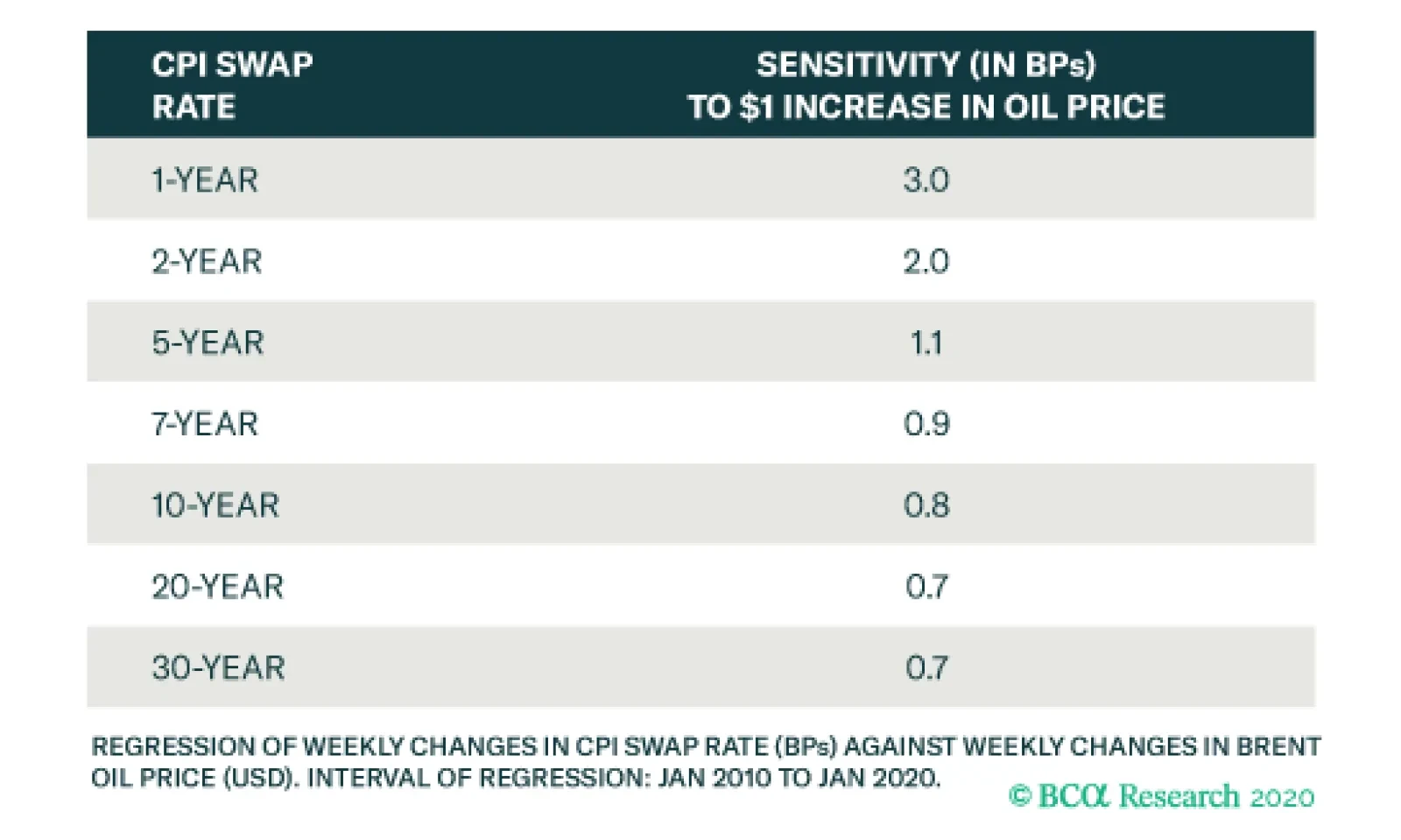
The table above shows the sensitivity of weekly changes in different market-based inflation expectations to a $1 increase in the price of Brent crude oil. The entire CPI swap curve is positively correlated with the oil price. Additionally, the sensitivity of…
Highlights 2019 Performance Breakdown: Our recommended model bond portfolio underperformed the custom benchmark index by -38bps for all of 2019. Winners & Losers: The underperformance of our model bond portfolio in 2019 was concentrated in the government bond side of the portfolio (-103bps), a result of below-benchmark duration positioning and underweights to US Treasuries and Italian government bonds. On the other side was a solid outperformance from spread product allocations (+65bps), mostly driven by an overweight to US high-yield corporate bonds. Q4/2019 Performance: The year ended strongly, however, as the portfolio outperformed by +28bps in Q4, split equally between government bonds and spread product. Scenario Analysis For The Next Six Months: We are targeting a moderately aggressive level of overall portfolio risk, with below-benchmark duration exposure alongside meaningful overweight allocations to global corporate credit. In our base case scenario, global growth will continue to recover supported by accommodative monetary policies, thus opening a window for another year of global corporates outperforming sovereign bonds in 2020. Feature Last week, we published the Global Fixed Income Strategy (GFIS) model bond portfolio strategy for the coming year, in which we translated our 2020 global fixed income Key Views into recommended investment positioning for the next 6-12 months.1 In this week’s report, take a final look back to review the performance of the model portfolio for both the fourth quarter of 2019 and the entire calendar year. We also present our updated scenario analysis, and return projections, for the portfolio over the next six months, incorporating the new recommended allocations introduced last week. As a reminder to existing readers (and to new clients), the model portfolio is a part of our service that complements the usual macro analysis of global fixed income markets. The portfolio is how we communicate our opinion on the relative attractiveness between government bond and spread product sectors. This is done by applying actual percentage weightings to each of our recommendations within a fully invested hypothetical bond portfolio. 2019 Performance: A Short Summary Of A Long Year Chart of the Week2019 Performance: Credit Good, Duration Bad, But A Solid Q4
2019 Performance: Credit Good, Duration Bad, But A Solid Q4
2019 Performance: Credit Good, Duration Bad, But A Solid Q4
The 2019 performance of the model portfolio can be summarized by duration dominating credit. Government bond yields rapidly fell in the first three quarters of the year due to weakening global growth and growing political uncertainty, to the detriment of our below-benchmark stance on overall portfolio duration. At the same time, global credit markets performed strongly in 2019, even as risk-free government bond yields plunged, which benefited our overweight stance on global spread product. The 2019 performance of the model portfolio can be summarized by duration dominating credit. All in all, the overall portfolio return in 2019 was +7.9% (hedged into USD), underperforming our custom benchmark index by -38bps (Chart of the Week).2 That underperformance was more pronounced before the strong rebound in global bond yields witnessed at the beginning of the fourth quarter, at which point the portfolio was underperforming the custom benchmark by -68bps (Table 1). Table 1GFIS Model Bond Portfolio Q4/2019 Overall Return Attribution
2019 GFIS Model Bond Portfolio Performance Review: Praise Credit & Blame Duration
2019 GFIS Model Bond Portfolio Performance Review: Praise Credit & Blame Duration
Looking at the breakdown of underperformance in 2019, our recommended positioning on government bonds (duration and country allocation) dragged the overall performance by -104bps, while our credit tilts (by country and broadly defined credit sectors) provided a partial offset, contributing +65bps. The details of the full year 2019 performance can be found in the Appendix on pages 14-16. In terms of specifics, the biggest sources of underperformance were underweights in US Treasuries (-66bps) and Italian government bonds (-28bps). Those positions, however, were used to “fund” corporate bond overweights in US investment grade (+28bps) and US high-yield (+46bps), as well as euro area corporate debt (+6bps) – allocations that performed well and helped offset the underperformance in US and Italian sovereign debt. More generally across the government bond portion of the portfolio, the drag on returns was concentrated in the 10+ year maturity buckets. This was a consequence of combining our below-benchmark duration stance with a curve-steepening bias that was hurt severely by the bullish flattening of global yield curves in the first three quarters of the year. The drag on returns from curve positioning was particularly acute in Japan and France, where the 10+ year maturity buckets underperformed by -27bps and -13bps, respectively. On a more positive note with regards to country selection, three of our favorite overweights for 2020 – Germany (+10bps), Australia (+7bps) and the UK (+5bps) – all outperformed versus the model portfolio benchmark. Q4/2019 Model Portfolio Performance Breakdown: Winning On Both Sides The GFIS model bond portfolio performed well at the end of 2019, as fixed income markets began to discount stabilizing global growth and reduced central bank easing expectations. The total return for the GFIS model portfolio (hedged into US dollars) in Q4/2019 was only +0.1%, but this managed to outperform the custom benchmark index by a solid +28bps. The GFIS model bond portfolio performed well at the end of 2019, as fixed income markets began to discount stabilizing global growth and reduced central bank easing expectations. In terms of the specific breakdown between the government bond and spread product allocations in our model portfolio, the former generated +14bps of outperformance versus our custom benchmark index while the latter outperformed by +15bps. The bar charts showing the total and relative returns for each individual government bond market and spread product sector are presented in Charts 2 and 3. Chart 2GFIS Model Bond Portfolio Q4/2019 Government Bond Performance Attribution
2019 GFIS Model Bond Portfolio Performance Review: Praise Credit & Blame Duration
2019 GFIS Model Bond Portfolio Performance Review: Praise Credit & Blame Duration
Chart 3GFIS Model Bond Portfolio Q4/2019 Spread Product Performance Attribution By Sector
2019 GFIS Model Bond Portfolio Performance Review: Praise Credit & Blame Duration
2019 GFIS Model Bond Portfolio Performance Review: Praise Credit & Blame Duration
The most significant movers were: Biggest outperformers Underweight US government bonds with maturity beyond 10+ years (+8bps) Overweight US Ba-rated high-yield corporates (+5bps) Overweight US B-rated high-yield corporates (+5bps) Underweight Italian government bonds with maturity beyond 10+ years (+4bps) Underweight German government bonds with maturity beyond 10+ years (+3bps) Biggest underperformers Underweight US government bonds with maturity of 1-3 years (-2bps) Overweight Japanese government bonds with maturity of 5-7 years (-2bps) Overweight Japanese government bonds with maturity of 7-10 years (-1bp) Overweight UK government bonds with maturity of 5-7 years (-1bp) Underweight German government bonds with maturity of 7-10 years (-1bp) Chart 4 presents the ranked benchmark index returns of the individual countries and spread product sectors in the GFIS model bond portfolio for Q4/2019. The returns are hedged into US dollars (we do not take active currency risk in this portfolio) and are adjusted to reflect duration differences between each country/sector and the overall custom benchmark index for the model portfolio. We have also color-coded the bars in each chart to reflect our recommended investment stance for each market during Q4/2019 (red for underweight, green for overweight, gray for neutral).3 Ideally, we would look to see more green bars on the left side of the chart where market returns are highest, and more red bars on the right side of the chart were returns are lowest. Chart 4Ranking The Winners & Losers From The Model Bond Portfolio In Q4/2019
2019 GFIS Model Bond Portfolio Performance Review: Praise Credit & Blame Duration
2019 GFIS Model Bond Portfolio Performance Review: Praise Credit & Blame Duration
Global spread product dominates the left half of the chart. EM corporates and EM sovereigns denominated in US dollars turned to be the best performers in Q4, followed by US and European corporate bonds. This was a boon for our model portfolio performance, given our overweight stances on global corporate bonds. This was due to credit spread narrowing, supported by accommodative monetary policy and fading fears of slower global growth. On the other hand, the right side of Chart 4 is predominantly occupied by government bonds. The worst performers in Q4 were German, New Zealand and UK governments bonds – three markets where we have been overweight, although we did take profits on our long-held bullish view on New Zealand in mid-November.4 Bottom Line: Our recommended model bond portfolio outperformed the custom benchmark index during the fourth quarter of the year. The outperformance came both from the government and spread product sides of the portfolio, driven by a smaller exposure to the long-ends of government bond yield curves and our recommended overweight position on US high-yield corporate bonds. Future Drivers Of Portfolio Returns Chart 5Overall Portfolio Allocation: Significantly Overweight Credit
2019 GFIS Model Bond Portfolio Performance Review: Praise Credit & Blame Duration
2019 GFIS Model Bond Portfolio Performance Review: Praise Credit & Blame Duration
Looking ahead, the performance of the model bond portfolio will be driven by three main factors: our below-benchmark duration bias, our overweight stance on corporate debt versus global government bonds, and last week’s upgrade of EM USD-denominated sovereigns and corporates to overweight. In terms of specific weightings in the GFIS model bond portfolio, we now have a more pronounced bias favoring global spread product over government debt, with a relative overweight of fifteen percentage points versus the benchmark index (Chart 5). We also remain modestly below-benchmark on duration, with an overall exposure equal to 0.5 years short of the benchmark (Chart 6). While we do not expect a major surge in bond yields this year, global yield curves discount inflation expectations that are too low and monetary policy easing in 2020 that is unlikely to be delivered (especially in the US). With global growth showing signs of bottoming out, and leading indicators pointing to continued improvement in the next 6-12 months, the risk/reward bias is tilted in favor of global yields moving higher, justifying reduced duration exposure. Looking ahead, the performance of the model bond portfolio will be driven by three main factors: our below-benchmark duration bias, our overweight stance on corporate debt versus global government bonds, and last week’s upgrade of EM USD-denominated sovereigns and corporates to overweight. Chart 6Overall Portfolio Duration: Moderately Below Benchmark
Overall Portfolio Duration: Moderately Below Benchmark
Overall Portfolio Duration: Moderately Below Benchmark
Chart 7Portfolio Yield: Significant Positive Carry From Credit
Portfolio Yield: Significant Positive Carry From Credit
Portfolio Yield: Significant Positive Carry From Credit
Chart 8Portfolio Risk Budget Usage: Moderately Aggressive
Portfolio Risk Budget Usage: Moderately Aggressive
Portfolio Risk Budget Usage: Moderately Aggressive
To better position the model bond portfolio to this backdrop of slowly rising global yields, we adjusted our government bond country allocations last week in favor of lower-beta markets such as Japan, Germany, France, Spain, Australia and the UK, while maintaining underweight positions in higher-beta markets such as the US, Canada and Italy.5 Our decision to upgrade global credit exposure helps boost the yield of our model portfolio to around 3%, or +43bps in excess of the benchmark index yield (Chart 7). Further, these changes represent an increase in the usage of the “risk budget” of our model bond portfolio, which is now running a tracking error (or excess volatility versus that of the benchmark) of 73bps (Chart 8). This is slightly higher than the 58bps prior to last week’s changes, but is still below the maximum allowable tracking error of 100bps that we have imposed on the model portfolio since its inception. More importantly, this is consistent with our view that investors should maintain a “moderately aggressive” level of risk in fixed income portfolios in 2020. Scenario Analysis & Return Forecasts To help provide some insight as to the potential excess returns from our model bond portfolio tilts, we use a framework for estimating total returns for all government bond markets and spread product sectors, based on common risk factors. For credit, returns are estimated as a function of changes in the US dollar, the Fed funds rate, oil prices and market volatility as proxied by the VIX index (Table 2A). For government bonds, non-US yield changes are estimated using historical betas to changes in US Treasury yields (Table 2B). We take yield forecasts for US Treasuries that are translated to shifts in non-US yields using these yield betas.6 Table 2AFactor Regressions Used To Estimate Spread Product Yield Changes
2019 GFIS Model Bond Portfolio Performance Review: Praise Credit & Blame Duration
2019 GFIS Model Bond Portfolio Performance Review: Praise Credit & Blame Duration
Table 2BEstimated Government Bond Yield Betas To US Treasuries
2019 GFIS Model Bond Portfolio Performance Review: Praise Credit & Blame Duration
2019 GFIS Model Bond Portfolio Performance Review: Praise Credit & Blame Duration
In Tables 3A and 3B, we present our three main scenarios for the next six months, defined by changes in the risk factors, and the expected performance of the model bond portfolio in each case. The scenarios, described below, all revolve around our expectation that the most important drivers of future market returns will continue to be the momentum of global growth and the path of US monetary policy. Base Case (Global Growth Recovery): The Fed stays on hold, the US dollar weakens by -2%, oil prices rise by +10%, the VIX hovers around 13, and there is a bear-steepening of the UST curve. This is a scenario where global growth keeps recovering, alongside a US dollar which slightly weakens. The model bond portfolio is expected to beat the benchmark index by +90bps in this case. Global Growth Accelerates: The Fed stays on hold, the US dollar weakens by -5%, oil prices rise by +15%, the VIX declines to 10, and there is a more pronounced bear-steepening of the UST curve. Under this scenario, the pickup in global growth is faster than anticipated, causing the US dollar to weaken substantially as global capital flows move into more growth-sensitive markets outside the US. Both of these forces support EM economies and support oil prices. The model bond portfolio is expected to beat the benchmark index by +125bps in this case. Global Growth Upturn Fails: The Fed cuts rates by -25bps, the US dollar appreciates by +3%, oil prices fall by -20%, the VIX rises to 25; there is a parallel shift down in the UST curve. This is a scenario where global growth merely stabilizes at weak levels but fails to rebound. The Fed finds itself delivering one more rate cut in order to support the US economy. Meantime, the US dollar appreciates as capital flows out of growth-sensitive regions into the safe-haven greenback, particularly as global recession fears result in increased financial market volatility. The model portfolio will underperform the benchmark by -38bps in this scenario. Table 3AScenario Analysis For The GFIS Model Bond Portfolio For The Next Six Months
2019 GFIS Model Bond Portfolio Performance Review: Praise Credit & Blame Duration
2019 GFIS Model Bond Portfolio Performance Review: Praise Credit & Blame Duration
Table 3BUS Treasury Yield Assumptions For The 6-Month Forward Scenario Analysis
2019 GFIS Model Bond Portfolio Performance Review: Praise Credit & Blame Duration
2019 GFIS Model Bond Portfolio Performance Review: Praise Credit & Blame Duration
The scenario inputs for the four main risk factors (the fed funds rate, the price of oil, the US dollar and the VIX index) are shown visually in Chart 9, while the US Treasury yield scenarios are in Chart 10. Chart 9Risk Factor Assumptions For The Scenario Analysis
Risk Factor Assumptions For The Scenario Analysis
Risk Factor Assumptions For The Scenario Analysis
Chart 10US Treasury Yield Assumptions For The Scenario Analysis
US Treasury Yield Assumptions For The Scenario Analysis
US Treasury Yield Assumptions For The Scenario Analysis
In terms of our conviction level among the main drivers of the model portfolio returns – duration allocation (across yield curves and countries) and asset allocation (credit versus government bonds) – we are confident that global growth is much more likely to rebound than decelerate further over the course of 2020. This will allow our increased spread product allocation to be the main driver of the portfolio returns. Thus, the overall expected excess return of our model bond portfolio over the benchmark is positive, given that the scenario analysis produces positive excess returns in the Base Case and “Global Growth Accelerates” outcomes. We are confident that global growth is much more likely to rebound than decelerate further over the course of 2020. This will allow our increased spread product allocation to be the main driver of the portfolio returns. Bottom Line: We are targeting a moderately aggressive level of overall portfolio risk, with below-benchmark duration exposure alongside meaningful overweight allocations to global corporate credit. In our base case scenario, global growth will continue to recover supported by accommodative global monetary policy, thus opening a window for another year of global corporates outperforming sovereign bonds in 2020. Jeremie Peloso Research Analyst jeremiep@bcaresearch.com Robert Robis, CFA Chief Fixed Income Strategist rrobis@bcaresearch.com Footnotes 1 Please see BCA Global Fixed Income Strategy Weekly Report, “Our Model Bond Portfolio Strategy For 2020: Selectively Aggressive”, dated January 7, 2020, available at gfis.bcarsearch.com. 2 The GFIS model bond portfolio custom benchmark index is the Bloomberg Barclays Global Aggregate Index, but with allocations to global high-yield corporate debt replacing very high quality spread product (i.e. AA-rated). We believe this to be more indicative of the typical internal benchmark used by global multi-sector fixed income managers. 3 Note that sectors where we made changes to our recommended weightings during Q4/2019 will have multiple colors in the respective bars in Chart 4. 4 Please see BCA Research Global Fixed Income Strategy Weekly Report, “When In Doubt, Trust The Leading Indicators”, dated November 19, 2019, available at gfis.bcaresearch.com. 5 We are defining “beta” here in terms of yield beta, or the sensitivity to changes in an individual country's bond yield to changes the overall level of global bond yields. 6 We are making a change in the betas used in our scenario analysis this week, using trailing 3-year yield betas to US Treasuries in place of the longer-term post-crisis yield betas that were measured over a full 10 years. Appendix Appendix Table 1GFIS Model Bond Portfolio Full Year 2019 Overall Return Attribution
2019 GFIS Model Bond Portfolio Performance Review: Praise Credit & Blame Duration
2019 GFIS Model Bond Portfolio Performance Review: Praise Credit & Blame Duration
Appendix Chart 1GFIS Model Bond Portfolio Full Year 2019 Government Bond Performance Attribution
2019 GFIS Model Bond Portfolio Performance Review: Praise Credit & Blame Duration
2019 GFIS Model Bond Portfolio Performance Review: Praise Credit & Blame Duration
Appendix Chart 2GFIS Model Bond Portfolio Full Year 2019 Spread Product Performance Attribution By Sector
2019 GFIS Model Bond Portfolio Performance Review: Praise Credit & Blame Duration
2019 GFIS Model Bond Portfolio Performance Review: Praise Credit & Blame Duration
Recommendations The GFIS Recommended Portfolio Vs. The Custom Benchmark Index
2019 GFIS Model Bond Portfolio Performance Review: Praise Credit & Blame Duration
2019 GFIS Model Bond Portfolio Performance Review: Praise Credit & Blame Duration
Duration Regional Allocation Spread Product Tactical Trades Yields & Returns Global Bond Yields Historical Returns