Gov Sovereigns/Treasurys

Dear Client, BCA’s New York conference takes place next week on September 26-27, and I look forward to meeting some of you there. Because of the conference, our next report will come out on October 3. Dhaval Joshi Highlights If the WTI crude oil price breached $70, Germany’s net export growth would suffer a short-term relapse. If the WTI crude oil price breached $90, Germany’s economic growth would suffer a much longer setback. The WTI crude oil price is now trading at $59, well below even the first pain threshold. Hence, at the moment, the oil price ‘spike’ is a minor irritant rather than a major risk to a German (and European) economic rebound in the fourth quarter. Stay overweight the Eurostoxx50 versus the Shanghai Composite and Nikkei225. If the WTI price stabilises well below $70, we intend to initiate an overweight to the DAX versus global equities. German bunds are a structural short relative to U.S. T-bonds. Feature Chart of the WeekOil Price Oscillations Have Explained German Growth Oscillations With A Spooky Precision
Oil Price Oscillations Have Explained German Growth Oscillations With A Spooky Precision
Oil Price Oscillations Have Explained German Growth Oscillations With A Spooky Precision
It is touch and go whether Germany suffered a technical recession through the second and third quarters.1 We will know in about six weeks’ time, once the statisticians have finished crunching the numbers. But for the financial markets, this is old news. A technical recession in Germany during the second and third quarters is already baked in the market cake. The economy and financial markets are entwined in a perpetual dance. In a dance, sometimes one person decides the steps and sometimes the other person does, but the couple always moves together. And so it is with the economy and markets. The ZEW indicator of (German) economic sentiment recently hit its lowest level since 2011, and the performance of the DAX versus global equities has moved in near perfect lockstep (Chart I-2). Chart I-2A German Recession Is Already Baked In The Market Cake
A German Recession Is Already Baked In The Market Cake
A German Recession Is Already Baked In The Market Cake
Some people try to predict the movement of markets based on the releases of backward-looking economic data or even supposedly real-time economic data, such as sentiment surveys. Good luck with that. The markets instantaneously discount those releases. To predict the markets, the key question is: what will the future releases look like? If the German economy rebounds in the fourth quarter, then the stark underperformance of the DAX constitutes a compelling buying opportunity versus other equity markets. That said, a new potential risk has emerged: the spike in the crude oil price. Germany Is Highly Sensitive To The Oil Price Europeans are large importers of energy, with 55 percent of all energy needs met by net imports. Moreover, the volume of energy they import tends to be price inelastic. Hence, when energy prices plunge, it boosts net exports and thereby it boosts growth. Conversely, when energy prices soar – as they have recently – it depresses net exports and thereby it depresses growth.2 98 percent of Germany’s consumption of oil depends on imports. This is especially true for Germany whose energy import dependency, at 65 percent, is well above the European average. The most important energy source is still oil which accounts for over a third of Germany’s primary energy use (Chart I-3). Moreover, 98 percent of Germany’s consumption of oil depends on imports.3 Chart I-3Germany Is Highly Sensitive To The Oil Price
A German Recession Is Baked In The Market Cake. Now What?
A German Recession Is Baked In The Market Cake. Now What?
Most of Germany’s oil consumption is for transport. On a timeframe of decades, the planned decarbonisation of all sectors by 2050 should all but eliminate fossil oil from German energy consumption. However, on a timeframe of quarters, oil consumption for transport is highly inelastic and non-substitutable. Hence, in recent years, swings in the oil price have always caused swings in Germany’s net exports (Chart I-4). Based on this excellent relationship, a likely rebound in German net exports in the fourth quarter would be threatened if the WTI crude price reached and stayed in the mid $70s. Chart I-4Swings In The Oil Price Cause Swings In Germany's Net Exports
Swings In The Oil Price Cause Swings In Germany's Net Exports
Swings In The Oil Price Cause Swings In Germany's Net Exports
For Economic Growth, The Oil Price Impulse Is What Matters Empirically, we have found that the German economy is much more sensitive to the oil price than other European economies (Chart I-5 and Chart I-6). This could be because other drivers of the economy such as credit developments are less significant in Germany. Chart I-5Germany Is More Sensitive To The Oil Price...
Germany Is More Sensitive To The Oil Price...
Germany Is More Sensitive To The Oil Price...
Chart I-6...Than Other European ##br##Economies
...Than Other European Economies
...Than Other European Economies
Most analysts argue that it is the change in the oil price that is relevant for the economy. This is obviously correct for the impact on inflation, which is, by definition, the change in a price. However, it is incorrect to argue that the change in the oil price drives economic growth. Instead, it is the impulse of the oil price – the change in its change – that drives economic growth. To understand why, consider a simplified example. Let’s say a 20 percent drop in the oil price added to Germany’s net exports, causing the economy to grow 1 percent. In the following period, another 20 percent drop in the oil would cause the economy to grow again by 1 percent, so growth would stay unchanged. On the other hand, if the oil price dropped by 10 percent, the economy would still grow, but now at a reduced rate of 0.5 percent. Therefore somewhat paradoxically, though the oil price has declined by 10 percent, growth has slowed. This is because the second drop in the price (10 percent) is less than the first (20 percent) – which means the tailwind impulse has faded. Now let’s put in the actual numbers for the oil price’s 6-month impulse. The period ending around June 2019 constituted a severe headwind impulse. This is because a 30 percent increase in the oil price followed a 40 percent decline in the previous period, equating to a headwind impulse of 70 percent.4 Allowing for typical lags of a few months, this severe headwind impulse is a likely culprit, or at least a contributing culprit, for Germany’s slowdown during the second and third quarters. As the Chart of the Week compellingly illustrates, oscillations in the oil price’s 6-month impulse have explained the oscillations in Germany’s 6-month economic growth with a spooky precision. Empirically, other explanatory factors are not needed. The period ending June 2019 constituted a severe headwind impulse from the oil price. Now the good news. Until the last few days, the oil price’s severe headwind impulse had eased – and this fading of the headwind strongly suggested a rebound in German economic growth during the fourth quarter and beyond. This raises a crucial question: to what level would the crude oil price have to spike for the maximum headwind impulse to return, and thereby extinguish the chance of such a rebound? By reverse engineering the price from the maximum headwind impulse, the answer is the WTI crude price at $90. Pulling all of this together, the first pain threshold is WTI breaching $70, at which Germany’s net export growth could suffer a short-term relapse. The second and greater pain threshold is WTI breaching $90, at which Germany’s economic growth could be stifled for much longer. Having said all that, WTI is now trading at $59, well below even the first pain threshold. Hence, at the moment, this is a minor irritant rather than a major risk to a German (and European) economic rebound. Stay overweight the Eurostoxx50 versus the Shanghai Composite and Nikkei225. And in the coming week or so, if the WTI price stabilises well below $70, we intend to initiate an overweight to the DAX versus global equities. The ECB Fired A Dud So much for the ECB’s promise to ‘shock and awe’ the markets. The bazooka ended up firing a dud! Unlimited QE is not really unlimited when the ECB’s asset purchase program is running close to its individual issuer limit, and its country composition cannot deviate too far from the ECB’s capital key. QE is nothing more than a signal of intent to keep policy interest rates ultra-low for a protracted period. In any case, QE is nothing more than a signal of intent to keep policy interest rates ultra-low for a protracted period. But once the markets have fully discounted this intent – as they have in the euro area and Japan – the monetary policy armoury is effectively out of ammunition (Chart I-7-Chart I-10). So it is not surprising that the ECB fired a dud. Chart I-7Monetary Policy Is Exhausted In The Euro Area...
Monetary Policy Is Exhausted In The Euro Area...
Monetary Policy Is Exhausted In The Euro Area...
Chart I-8...But The U.S. Still Has ##br##Ammunition
...But The U.S. Still Has Ammunition
...But The U.S. Still Has Ammunition
Chart I-9Monetary Policy Is Exhausted In Japan...
Monetary Policy Is Exhausted In Japan...
Monetary Policy Is Exhausted In Japan...
Chart I-10...But China Still Has Ammunition
...But China Still Has Ammunition
...But China Still Has Ammunition
Some people counter that there are even more exotic monetary policy options in the pipeline, such as ‘helicopter money’. However, as Mario Draghi correctly pointed out, “giving money to people in whatever form is not a monetary policy task, it’s a fiscal policy task.” Helicopter money might be a step too far, but its notion encapsulates the shape of things to come in Europe. With euro area monetary policy exhausted, the baton is passing to fiscal policy. The upshot is that in a bond portfolio, German bunds are a structural short relative to U.S. T-bonds. Fractal Trading System* Although we are structurally overweight Italian long-dated BTPs, the 130-day fractal dimension is signalling that the pace of the rally is now technically extended and therefore vulnerable to a countertrend correction. This week’s trade recommendation is to express this via a short position in the Italian 10-year BTP, setting a profit target of 3 percent with a symmetrical stop-loss. In other trades, short the U.S. 10-year T-bond quickly achieved its profit target, while short financial services versus market reached the end of its holding period in slight loss. For any investment, excessive trend following and groupthink can reach a natural point of instability, at which point the established trend is highly likely to break down with or without an external catalyst. An early warning sign is the investment’s fractal dimension approaching its natural lower bound. Encouragingly, this trigger has consistently identified countertrend moves of various magnitudes across all asset classes. Chart I-11
Italy 30-Year Govt. Bond
Italy 30-Year Govt. Bond
The post-June 9, 2016 fractal trading model rules are: When the fractal dimension approaches the lower limit after an investment has been in an established trend it is a potential trigger for a liquidity-triggered trend reversal. Therefore, open a countertrend position. The profit target is a one-third reversal of the preceding 13-week move. Apply a symmetrical stop-loss. Close the position at the profit target or stop-loss. Otherwise close the position after 13 weeks. Use the position size multiple to control risk. The position size will be smaller for more risky positions. * For more details please see the European Investment Strategy Special Report “Fractals, Liquidity & A Trading Model,” dated December 11, 2014, available at eis.bcaresearch.com. Dhaval Joshi, Chief European Investment Strategist dhaval@bcaresearch.com Footnotes 1 We define a technical recession as two consecutive quarters of contraction in real GDP. 2 Energy dependence = (imports – exports) / gross available energy. 3 According to the Federal Institute for Geosciences and Natural Resources. 4 The 6-month steps in the WTI crude oil price were $74.15, $45.21, and $58.24. The first change equated to a 40 percent decrease and the second change equated to a 30 percent increase. So the 6-month impulse was 70 percent. Fractal Trading System Cyclical Recommendations Structural Recommendations Closed Fractal Trades Trades Closed Trades Asset Performance Currency & Bond Equity Sector Country Equity Indicators Bond Yields Chart II-1Indicators To Watch - Bond Yields
Indicators To Watch - Bond Yields
Indicators To Watch - Bond Yields
Chart II-2Indicators To Watch - Bond Yields
Indicators To Watch - Bond Yields
Indicators To Watch - Bond Yields
Chart II-3Indicators To Watch - Bond Yields
Indicators To Watch - Bond Yields
Indicators To Watch - Bond Yields
Chart II-4Indicators To Watch - Bond Yields
Indicators To Watch - Bond Yields
Indicators To Watch - Bond Yields
Interest Rate Chart II-5Indicators To Watch - Interest Rate Expectations
Indicators To Watch - Interest Rate Expectations
Indicators To Watch - Interest Rate Expectations
Chart II-6Indicators To Watch - Interest Rate Expectations
Indicators To Watch - Interest Rate Expectations
Indicators To Watch - Interest Rate Expectations
Chart II-7Indicators To Watch - Interest Rate Expectations
Indicators To Watch - Interest Rate Expectations
Indicators To Watch - Interest Rate Expectations
Chart II-8Indicators To Watch - Interest Rate Expectations
Indicators To Watch - Interest Rate Expectations
Indicators To Watch - Interest Rate Expectations
Looking ahead, the ECB will run into some difficulties on running a “QE Forever” program given the current self-imposed constraints on the APP. The ECB cannot own more than 33% of the outstanding pubic debt of any single country. At the moment, the ECB…
Highlights Fed: The Fed will cut rates by 25bps this week, accompanied by a balanced message on future moves given firm domestic U.S. growth amid global uncertainties. This could trigger additional near-term increases in Treasury yields if the market prices out future expected rate cuts. More likely, higher Treasury yields will manifest via higher inflation expectations, as investors price in Fed accommodation amid the recent acceleration of realized inflation. ECB: The ECB’s easing package last week fell short of market expectations, as policymakers face the operational constraints of cutting already-negative interest rates and restarting asset purchases. Portfolio Recommendations: Return to below-benchmark on overall interest rate duration on a tactical (0-3 months) basis, with global leading economic indicators bottoming and U.S.-China trade tensions easing. Within country allocation, maintain an underweight stance on U.S. Treasuries versus German Bunds on a USD-hedged basis. Feature Dear Client, Next week, we will be publishing a joint Special Report on the U.K. with our colleagues at BCA Foreign Exchange Strategy and BCA Geopolitical Strategy. The report will be sent to clients this Friday, September 20, on the regular publishing day of the other two services. Thus, Global Fixed Income Strategy clients will be receiving their next report a few days early. We will return to our usual publishing schedule on Tuesday, October 1. Best regards, Rob Robis Chart of the WeekA Fundamental Bottoming Of Bond Yields
A Fundamental Bottoming Of Bond Yields
A Fundamental Bottoming Of Bond Yields
The bond market has been full of surprises over the past year, and the price action so far this month is no exception. The benchmark 10-year U.S. Treasury yield has climbed +42bps from the September 3 inter-day low of 1.43%, while the 10-year German Bund yield also rose by +23bps over that same period, even as the ECB announced a fresh set of policy easing measures last week. There are several possible reasons for this increase in yields: profit-taking in deeply overbought government bond markets; global central bankers delivering incrementally less dovish surprises; and hints of progress in the U.S-China trade negotiations. We prefer a more fundamental explanation – bond markets may be sniffing out an end of the 2019 global growth downturn. The message from the improving trend in both our global leading economic indicator (LEI) and our Duration Indicator is that global growth (Chart of the Week) is stabilizing, which should help boost government bond yields from current depressed levels. The recent attack on oil facilities in Saudi Arabia does represent a near term risk to this potentially more optimistic narrative on the world economy. Our colleagues at BCA Geopolitical Strategy do expect a military response from the U.S., although U.S. President Trump will attempt to keep it limited. A full-blown U.S.-Iran conflict would likely further raise the risk premium on global oil prices, potentially creating the kind of major spike that has preceded past global recessions – an outcome that Trump would prefer to avoid heading into an election year. For now, we prefer to heed the message from our cyclical indicators, which point to additional increases in bond yields in the next few months. For now, we prefer to heed the message from our cyclical indicators, which point to additional increases in bond yields in the next few months, led by some improvement in inflation expectations and a reduction in the amount of monetary easing discounted in markets – most notably, in the U.S. We now see less of a need for the cautious near-term view on overall duration exposure that we’ve maintained since the announcement of fresh U.S. tariffs on China in early August, especially given the recent easing of U.S.-China trade tensions ahead of the next round of talks in early October. Thus, we recommend shifting to a below-benchmark stance on overall portfolio duration on a tactical (0-3 months) basis, bringing that view back in line with our cyclical (up to 12 months) call, which has remained bearish on bonds (see the table on Page 12 for changes to our model bond portfolio). FOMC Preview: 25bps This Week, With No Promises After That While there is still a lot of investor angst over the underlying health of the global economy, the “recession narrative” appears to be receding. The New York Fed’s recession probability model, based on the slope of the U.S. Treasury curve, has seen the odds of a 2020 downturn fall from a peak of 42% in August to 32% today. At the same time, there has been a sharp drop in the number of Google searches involving the word “recession” (Chart 2). Chart 2Hold Off On That Inevitable Recession
Hold Off On That Inevitable Recession
Hold Off On That Inevitable Recession
A similar message can be seen in financial markets, where classic risk-off/save haven assets like gold, and the VIX index have pulled back a bit from recent highs (Chart 3). Government bond volatility measures like the MOVE index remain elevated, though, as fixed income markets continue to price in expectations of low inflation and easier monetary policy – especially in the U.S. Chart 3Yields Discount A Lot Of Risk-Aversion
Yields Discount A Lot Of Risk-Aversion
Yields Discount A Lot Of Risk-Aversion
This week’s FOMC meeting, including an update to the committee’s own growth and rate forecasts, will shed light on the Fed’s latest thinking. A modest downgrade of the Fed’s U.S. growth projections is likely given the downturn in the U.S. manufacturing sector. Yet with U.S. financial conditions easing (Chart 4) and the U.S. consumer remaining confident and willing to spend – purely a function of a robust labor market and despite media coverage of the growing threat of recession – the risk is that the Fed does not end up downgrading its growth projections much. Already, the annual growth rate of core U.S. retail sales is up to a solid 5.3%, after the nearly 10% (annualized) surge seen over the June-August period. Chart 4U.S. Domestic Economic Growth Is Rebounding
U.S. Domestic Economic Growth Is Rebounding
U.S. Domestic Economic Growth Is Rebounding
Chart 5U.S. Inflation Is Accelerating Inflation Could Use A Boost
U.S. Inflation Is Accelerating Inflation Could Use A Boost
U.S. Inflation Is Accelerating Inflation Could Use A Boost
A similar story exists in realized U.S. inflation measures, the majority of which are accelerating. Core CPI in August rose to 2.4% on year-over-year basis, after a surge of 3.4% annualized over the previous three months – the fast such rate over such a short window since May 2006 (Chart 5). Core PCE inflation has also picked up, and is now up 1.6% year-over-year and 2.2% – above the Fed’s 2% target – on a 3-month annualized basis. Wage growth, measured using average hourly earnings, continues to grow at a solid 3.6% year-over-year rate. Given these readings, combined with a persistently low unemployment rate, the FOMC is likely to make few (if any) changes to its inflation forecasts at this week’s meeting. Chart 6Stretched Treasury Yields Can Keep Climbing
Stretched Treasury Yields Can Keep Climbing
Stretched Treasury Yields Can Keep Climbing
Given the underlying firm trends in the U.S. economic and inflation data, odds are low that the Fed will deliver an incremental dovish surprise to markets. The reverse is more likely. At the same time, the Fed is keenly aware of the fragility of non-U.S. economic growth, and U.S. financial markets, amid the persistent drag on U.S. manufacturing activity and business confidence from the U.S.-China tariff war. Once again, Fed Chair Jerome Powell will have to thread the needle with a message that sounds neither too dovish nor too hawkish. We fully expect another 25bp rate cut to be delivered this week. However, we also expect forward guidance to reflect a balanced outlook for a strong U.S. economy juxtaposed against concern for non-U.S. growth. In other words, the same message the Fed has been giving the markets since mid-year. Given the current stretched momentum of Treasury yields/prices, amid large overweight positioning according to measures like the J.P. Morgan client duration survey, any sign of a less dovish Fed should trigger some increase in Treasury yields (Chart 6). This is especially true with the U.S. Overnight Index Swap (OIS) curve still discounting 71bps of rate cuts over the next twelve months – an amount of easing that is unlikely to be delivered. In our view, though, the bigger near-term threat of rising Treasury yields will not come from the Fed being too hawkish, but from appearing too dovish amid accelerating inflation and firm U.S. economic growth. In our view, though, the bigger near-term threat of rising Treasury yields will not come from the Fed being too hawkish, but from appearing too dovish amid accelerating inflation and firm U.S. economic growth. Market-based inflation expectations remain depressed, with the 10-year TIPS breakeven rate now at 1.68%. That is well below levels consistent with the Fed’s 2% PCE inflation target despite the persistent tightness of the U.S. labor market and the acceleration seen in realized inflation measures. We recommend that clients shift back to a below-benchmark duration stance in the U.S. this week, while maintaining the maximum exposure to TIPS versus nominal Treasuries to position for higher inflation expectations that will also result in some steepening of the Treasury yield curve. Bottom Line: The Fed will cut rates by 25bps this week, accompanied by a balanced message on future moves given firm domestic U.S. growth amid global uncertainties. This could trigger additional near-term increases in Treasury yields if the market prices out future expected rate cuts. More likely, higher Treasury yields will manifest via rising inflation expectations, as investors price in Fed accommodation amid the recent acceleration of realized inflation. ECB: Take It To The Limit One More Time Last week’s much anticipated policy easing announcement by the European Central Bank (ECB) was comprehensive in scope, but disappointing in size. Short-term interest rates were cut, but only through a modest -10bp reduction in the overnight deposit rate. The Asset Purchase Program (APP) was restarted, but only at a pace of €20bn per month, well off the €80bn peak pace of the 2015-18 APP (Chart 7). Chart 7A Relatively Modest Easing Package From The ECB
A Relatively Modest Easing Package From The ECB
A Relatively Modest Easing Package From The ECB
Those new initiatives fell short of the consensus forecast of a -20bp cut and €30bn of new APP. The ECB did introduce some tools to help struggling euro area banks - allowing some portion of banks’ excess reserves to Chart 8No Wonder There Is Disagreement With The ECB
No Wonder There Is Disagreement With The ECB
No Wonder There Is Disagreement With The ECB
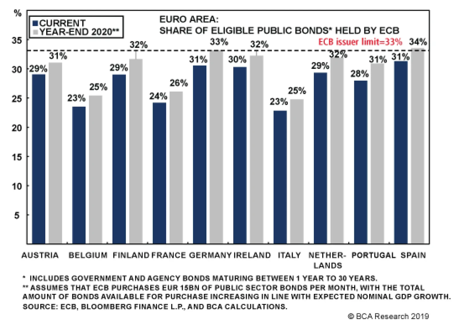
avoid the negative deposit rate (a.k.a. “tiering”) and extending the maturity of the TLTRO III program announced earlier this year from two to three years. Nonetheless, the overall stimulus package fell short of a “big bazooka” that did not break new ground on policy instruments (like buying equities in the APP). The biggest change from previous ECB easing initiatives was by making these new programs “open-ended”, with no specific expiration date. Instead, the asset purchases and lower interest rates would be maintained until euro zone inflation sustainably converged to the ECB’s inflation target of just under 2%. With the ECB’s newly revised forecasts calling for headline inflation to only climb to 1.5% by 2021, the new program has already been mockingly branded “QE Forever” by those who do not expect inflation to ever return to 2%. A big reason why the ECB was unable to deliver a bigger package was the disagreement within the ECB Governing Council on the need for more aggressive stimulus. Prior to last week’s meeting, several ECB officials publically voiced their reluctance to restart asset purchases and deliver deeper interest rate cuts, believing that they would have little impact on future euro area growth and inflation. While the opposition to fresh bond buying came from predictable sources like Germany and Austria, there was also an unprecedented level of public dissent after the ECB meeting, with the heads of the Dutch, Austrian and French central banks publically expressing doubts on the effectiveness of the new easing measures. This came after outgoing ECB President Mario Draghi noted in his post-meeting press conference last week that the consensus on restarting APP within the Governing Council was so broad that “there was no need to take a vote.” Given the diverging economic and inflation trends within the euro area, it should not be a surprise that a broad consensus within the Governing Council was hard to produce. For example, Germany is suffering through a much deeper manufacturing downturn than the other major euro area countries, judging by the trends in manufacturing PMIs (Chart 8). At the same time, Germany has a much lower unemployment rate and higher inflation rates than Italy and Spain. Focusing only on the German manufacturing downturn when setting monetary policy may produce results that are too stimulative – especially when the services sides of euro area economies appear in better shape (most notably in Germany). The ECB will run into some difficulties on running a “QE Forever” program of asset purchases given the current self-imposed constraints on the APP. Looking ahead, the ECB will run into some difficulties on running a “QE Forever” program of asset purchases given the current self-imposed constraints on the APP. The ECB cannot own more than 33% of the outstanding pubic debt of any single country (counting both sovereign debt and government agency bonds). At the moment, the ECB ownership shares are below that 33% threshold for the largest countries, based on our calculations that are presented in Chart 9. Chart 9"QE Forever" Is Not Credible Under Current Constraints
The World Is Not Ending: Return To Below-Benchmark Portfolio Duration
The World Is Not Ending: Return To Below-Benchmark Portfolio Duration
However, that 33% limit will be threatened by the end of 2020 in several countries: the ECB will buy €15bn per month of government bonds under the new APP1 the ECB continues to allocate its bond buying in line with the size of each country (as determined by the ECB Capital Key) the stock of debt eligible for the APP expands at the same rate as consensus forecasts of nominal GDP growth Draghi also noted in his press conference that there was “relevant headroom to go on for quite a long time at this rhythm without the need to raise the discussion about limits.”2 We disagree, as our calculations show that the 33% threshold will be at threat of being reached by the end of next year in Germany, Spain, the Netherlands, Finland & Ireland (see the gray bars of Chart 9). If the ECB truly wants to commit itself to buying bonds until inflation returns to just under 2%, however long that takes, then one of three things must happen: the ECB must raise the issuer limit from 33% the ECB must allocate its bond buying using different weights than the Capital Key the supply of available government debt must increase through easier fiscal policy. Chart 10The ECB Will Have To Raise Issuer Limits To BoJ Levels
The ECB Will Have To Raise Issuer Limits To BoJ Levels
The ECB Will Have To Raise Issuer Limits To BoJ Levels
Of those three options, altering the country weights away from the Capital Key is the most politically contentious, as it would involve more purchases from countries with weaker government finances, like Italy and Spain. Raising the issuer limit from 33% is a more realistic option, as that is a completely self-imposed rule with no economic grounds, although it raises the risk of the ECB bond ownership approaching Bank of Japan type levels (Chart 10). Solving the ECB’s “headroom” constraint by issuing more government debt through fiscal expansion is the one option that could truly help Europe get out of its low inflation trap. Yet that is also an option fraught with political tension in places like Germany where keeping low levels of government debt has been a politically popular choice. With the new ECB President, Christine Lagarde, set to take over from Draghi in November, the policy debate within Europe will turn toward the need for more fiscal stimulus. Already, there have been media reports suggesting the German government is considering new stimulus measures to boost a Germany economy that is now in a technical recession. Solving the ECB’s “headroom” constraint by issuing more government debt through fiscal expansion is the one option that could truly help Europe get out of its low inflation trap. Chart 11Inflation Expectations & Bund Yields Are Stabilizing
Inflation Expectations & Bund Yields Are Stabilizing
Inflation Expectations & Bund Yields Are Stabilizing
If the ECB’s APP capacity issues are not eventually resolved, then the market will soon come to the realization that there can be no “QE Forever”. Combined with the known limitations on pushing policy rates deeper into negative territory - for fears of reaching a “reversal rate” that will cause banks to horde cash and make fewer loans - there is limited scope for additional declines in euro area bond yields from the deeply depressed current levels under the new policy announcements made last week. For now, we continue to favor overweighting core euro area government debt in global fixed income portfolios, on a currency-hedged basis. Despite the persistent negative yields on offer, those can be transformed into positive-yielding assets when the currency exposure is swapped into U.S. dollars. Furthermore, the so-called “convexity buying” of longer-dated euro area government bonds by asset-liability managers like insurers and pension funds will continue to anchor the long-end of euro area yield curves (Chart 11) – although that same factor can potentially hyper-charge a rise in yields as convexity buying turns into convexity selling if the economic fundamentals were to swing in a bond-bearish fashion (which is a topic we plan on covering in a future report). Bottom Line: The ECB’s easing package last week fell short of market expectations, as policymakers face the operational limits of cutting already-negative interest rates and restarting asset purchases. Yet for now, the economic/inflation backdrop in Europe remains bond friendly. Maintain a strategic overweight stance on Germany versus the U.S. in global government bond portfolios, with Bunds still supported by ECB buying and with USD-hedged Bund yields continuing to offer a yield pickup over Treasuries. Robert Robis, CFA, Chief Fixed Income Strategist rrobis@bcaresearch.com Footnotes 1 The other €5bn per month is assumed to go towards the purchases of corporate debt. 2 The full transcript of Draghi’s press conference can be found here: https://www.ecb.europa.eu/press/pressconf/2019/html/ecb.is190912~658eb51d68.en.htm The GFIS Recommended Portfolio Vs. The Custom Benchmark Index
The World Is Not Ending: Return To Below-Benchmark Portfolio Duration
The World Is Not Ending: Return To Below-Benchmark Portfolio Duration
Recommendations Duration Regional Allocation Spread Product Tactical Trades Yields & Returns Global Bond Yields Historical Returns
Highlights Duration: The ebbing of U.S. / China trade tensions and swing toward positive data surprises are enough for us to re-initiate a below-benchmark duration recommendation, on both tactical (0-3 month) and cyclical (6-12 month) time horizons. While not our base case, a continued deterioration in the Manufacturing PMI or CRB Raw Industrials, or a significant appreciation of the U.S. dollar would cause us to question our view. Credit: Corporate debt levels are elevated, but still-low inflation expectations will ensure that monetary conditions remain accommodative for the time being. Easy Fed policy will support interest coverage ratios and prevent banks from tightening lending standards. Stay overweight corporate bonds, focusing on the Baa and high-yield credit tiers. Fed: The Fed will cut rates by 25 basis points tomorrow and Chairman Powell will do his best to sound dovish and prevent a tightening of financial conditions. Core inflation has strengthened in recent months, but the Fed needs to see a rebound in inflation expectations before turning hawkish. Feature Move Back To Below-Benchmark Portfolio Duration The sensitivity of bond yields to U.S./China trade policy was on full display last week. President Trump took significant steps to de-escalate tensions between the two nations, delaying the October 1st tariff hike and scheduling talks between principal negotiators for October. The result is that the bond market sold off dramatically. The 10-year Treasury yield rose from 1.55% at the start of the week to 1.90% as of last Friday. As we go to press, the yield has fallen back to 1.85% in response to the drone attacks in Saudi Arabia and resulting spike in oil prices. Chart 1Has The Tide Turned?
Has The Tide Turned?
Has The Tide Turned?
Our Geopolitical Strategy service discussed the near-term outlook for U.S. / China trade negotiations in last week’s report.1 Our main takeaway is that the President has shifted into dealmaker mode, hoping to secure some “wins” in advance of next year’s election. Talk of a looming recession in the mainstream media is doubtless also encouraging the President to adopt a more conciliatory strategy. Our political strategists view a comprehensive U.S. / China trade agreement as unlikely. But if the U.S. and China can reach a détente where tariffs are no longer rising every few months and the immediate threat to economic growth dissipates, then U.S. bond yields have a lot of upside. Chart 1 shows that the 10-year Treasury yield fell much more sharply in recent months than would have been expected given the U.S. economic data. The chart also shows that economic data are now beating expectations for the first time since February. Positive data surprises usually coincide with rising Treasury yields, and the chart suggests that yields still have a lot of catching-up to do. The de-escalation of trade tensions and shift in data surprises is enough for us to remove our tactical “at benchmark” duration stance, which had been in place since August 6. Investors should keep portfolio duration low on both tactical (0-3 month) and cyclical (6-12 month) time horizons. Risks To The Duration View There are three main risks to our below-benchmark duration positioning. The first is that the global manufacturing data – Manufacturing PMIs and the CRB Raw Industrials index – have not yet rebounded (Chart 2). We have written extensively about why we expect a bounce-back before the end of the year, and an ebbing of U.S. / China trade tensions will only speed that process along, as firms gain more confidence in the outlook and initiate long-delayed investments.2 However, until we actually see the data improve we cannot be certain. It’s notable, and concerning, that the ratio between the CRB Raw Industrials index and Gold did not increase alongside Treasury yields during the past week (Chart 2, bottom panel). If the dollar continues to appreciate as Treasury yields move up, it will limit how high yields rise. The second risk to our view comes from the dollar. If it continues to appreciate as Treasury yields move up, it will limit how high yields rise. Treasury yields can increase alongside a stronger dollar when global leading indicators are improving, as was the case in the second half of 2016 (Chart 3). But a strong dollar will eventually undermine global growth and cap the upside in yields. Chart 2Risk 1: Global Manufacturing Still Weak
Risk 1: Global Manufacturing Still Weak
Risk 1: Global Manufacturing Still Weak
Chart 3Risk 2: Stronger Dollar
Risk 2: Stronger Dollar
Risk 2: Stronger Dollar
The third risk is that the recent attack on Saudi oil installations prompts a military response from the U.S. government that escalates into all-out war. The lesson from the oil crash of 2014 is that any negative effects on the U.S. consumer from a spike in the oil price will be offset by greater investment from U.S. energy firms. However, if the situation dissolves into a significant military conflict, then U.S. bonds would benefit from flight to quality flows. Our Geopolitical and Commodity teams discussed the still-unfolding situation in a Special Alert yesterday.3 Bottom Line: The ebbing of U.S. / China trade tensions and swing toward positive data surprises are enough for us to re-initiate a below-benchmark duration recommendation, on both tactical (0-3 month) and cyclical (6-12 month) time horizons. While not our base case, a continued deterioration in the Manufacturing PMI or CRB Raw Industrials, or a significant appreciation of the U.S. dollar would cause us to question our view. Corporate Bonds: Weak Balance Sheets Vs. Easy Money The slope of the yield curve is an important and useful indicator for corporate bond investors. In fact, our research has demonstrated that corporate bond excess returns versus Treasuries tend to be highest early in the recovery when the yield curve is steep. On the flipside, we’ve also shown that an inverted yield curve is often a good signal to scale back exposure.4 Corporate balance sheets are highly levered today, as they were in the mid-1990s. For this purpose, our preferred measure of the yield curve has been the 3-year/10-year slope, calculated on a monthly basis using average daily closing values. Chart 4 shows this slope with vertical lines denoting the first inversion of each cycle. Notice that we have not yet received an inversion signal from this measure in the current cycle, but it is getting close. Chart 4Yield Curve & Corporate Spreads
Yield Curve & Corporate Spreads
Yield Curve & Corporate Spreads
Even if we get an inversion signal in the next few months, Chart 4 reveals an interesting contrast between the mid-2000s cycle and the mid-1990s cycle. In the mid-1990s, 3/10 curve inversion was an excellent signal to reduce corporate credit exposure. Spreads widened almost immediately, and didn’t peak until four years later. Conversely, spreads continued to tighten for another year after the yield curve inverted in 2006. So how should we view the current cycle in relation to these prior two episodes? Should we expect further outperformance after the yield curve inverts, as in the mid-2000s? Or should we prepare to reduce corporate bond exposure as soon as the yield curve sends a signal, as in the 1990s? Balance Sheets Are In Poor Health … Chart 5Firms Carrying A lot Of Debt
Firms Carrying A lot Of Debt
Firms Carrying A lot Of Debt
The first thing to consider is how corporate balance sheets stack up compared to each of these prior two episodes. Chart 5 makes it apparent that balance sheets are highly levered today, as they were in the mid-1990s. Net debt-to-EBITDA for the median high-yield firm in our dynamic bottom-up sample is above 4.0x, even higher than in the late 1990s. Similarly, the median firm’s debt-to-assets ratio is reminiscent of the 1990s. Chart 5 clearly shows that balance sheets were in poor health in the 1990s, and are in a similar state today. This is in sharp contrast to the mid-2000s, when balance sheets were pristine. The sole exception is interest coverage, which remains robust (Chart 5, bottom panel). This is the result of still-accommodative monetary policy (more on this below). … But The Monetary Environment Is Supportive While today’s corporate balance sheets have more in common with the mid-1990s than the mid-2000s, today’s monetary environment looks more like the mid-2000s, and is probably even more supportive. Chart 6Supportive Monetary Environment: Reminiscent Of The Mid-2000s
Supportive Monetary Environment: Reminiscent Of The Mid-2000s
Supportive Monetary Environment: Reminiscent Of The Mid-2000s
Chart 6 shows that when the yield curve inverted in the 1990s, banks’ commercial & industrial (C&I) lending standards were on the cusp of tightening, as were the terms that banks offered on C&I loans. In contrast, C&I lending standards and loan terms continued to ease for some time after the curve inverted in the mid-2000s. Today, C&I lending standards and C&I loan terms are both in “net easing” territory. But most crucially, inflation expectations are extremely depressed (Chart 6, bottom panel). Low inflation expectations mean that the Fed must ensure that monetary policy stays accommodative until inflation expectations are re-anchored at levels closer to its target. Accommodative Fed policy will keep firms’ interest costs down, and give lenders the confidence to extend credit, even if firms are already loaded with debt. Bringing it all together, we find that both credit quality metrics and monetary indicators help explain the corporate default rate (Chart 7). Our top-down measure of gross leverage (total debt over pre-tax profits) lines up well with the default rate over time, but has diverged during the past few years (Chart 7, top panel). Meanwhile, C&I lending standards also correlate tightly with the default rate, and this relationship continues to track (Chart 7, panel 3). Chart 7Drivers Of The Corporate Default Rate
Drivers Of The Corporate Default Rate
Drivers Of The Corporate Default Rate
Overall, we find the divergence between gross leverage and the default rate concerning, and reminiscent of 2007/08 when it predicted a surge in the default rate. However, unlike in 2007/08, lending standards are moving deeper into “net easing” territory and interest coverage remains steady. Considering all the evidence, we are inclined to remain bullish on corporate credit spreads for the time being. Yes, corporate debt levels are a worry, as they were in the 1990s. But, with inflation expectations still very low, the Fed has a strong incentive to keep policy easy. Historically, banks do not tighten lending standards unless the monetary environment is restrictive. Our sense is that, in this cycle, banks will turn a blind eye to corporate debt levels until inflation expectations rise and the Fed moves interest rates into restrictive territory. Credit Investment Strategy Chart 8Focus On The Baa And High-Yield Credit Tiers
Focus On The Baa And High-Yield Credit Tiers
Focus On The Baa And High-Yield Credit Tiers
Our relatively bullish assessment of the credit cycle means that we will continue to abide by the spread targets we introduced in February.5 To obtain those targets we calculated the median 12-month breakeven spread for each credit tier during periods when the yield curve was very flat (less than 50 bps), but not yet inverted.6 We then converted those breakeven spreads into option-adjusted spread targets using current index duration and the current index credit rating distribution. Chart 8 shows that investment grade spreads are slightly above target, but this is only due to the cheapness of Baa-rated debt. Aaa, Aa and A-rated credits all trade at spreads below our targets, and we recommend focusing investment grade exposure on the Baa space. Chart 8 also shows that high-yield spreads are much more attractive relative to target. This is partly because the negatively convex nature of high-yield debt means that index duration fell sharply as bonds rallied this year (Chart 8, bottom panel). All else equal, lower index duration means that more spread widening is required before investors see losses. Thus, spreads appear more attractive. Bottom Line: Corporate debt levels are elevated, but still-low inflation expectations will ensure that monetary conditions remain accommodative for the time being. Easy Fed policy will support interest coverage ratios and prevent banks from tightening lending standards. Stay overweight corporate bonds, focusing on the Baa and high-yield credit tiers. FOMC Preview: Fed Will Do Its Best To Stay Dovish The results of this week’s FOMC meeting will be made public tomorrow afternoon. A 25 basis point rate cut is widely anticipated, and we expect that is what will be delivered. A 25 basis point rate cut is widely anticipated, and we expect that is what will be delivered. Judging from recent remarks, Fed Chairman Jerome Powell is well aware that easy financial conditions will encourage a recovery in economic growth.7 He also understands that in order for financial conditions to stay easy, the market must continue to believe that monetary policy is supportive. We therefore think that Chairman Powell will do everything he can to prevent a hawkish surprise following tomorrow’s FOMC statement and press conference. However, the Chairman cannot control the placement of each FOMC participant’s interest rate forecast (or “dot”), and there is a risk that the end-of-2019 forecasts don’t fall enough to appease markets. Chart 9 shows the fed funds rate along with a projection based on current pricing in the fed funds futures market. It shows that the market expects a 25 bps rate cut tomorrow, followed by one more 25 bps cut before the end of the year. We don’t expect the majority of FOMC participants to forecast such a dovish outcome, but as long as a significant number of participants forecast one more cut before the end of the year, a hawkish surprise should be avoided. Chart 9Can The Fed Avoid Sounding Hawkish?
Can The Fed Avoid Sounding Hawkish?
Can The Fed Avoid Sounding Hawkish?
Case in point, the Fed avoided a hawkish surprise following the June meeting. Heading into that meeting the market was priced for an end-of-2019 funds rate of 1.75% (denoted by the ‘X’ in Chart 9). The June FOMC dots show that 7 FOMC participants expected a similar outcome (also shown in Chart 9). If around 7 participants place their 2019 dot in the 1.50%-1.75% range following tomorrow’s meeting, it should be enough to prevent a hawkish surprise. Will Strong Inflation Sway The Fed? There has been some speculation that the recent spate of strong inflation data might prevent the Fed from delivering a sufficiently dovish message. We think this is unlikely. It’s true that core inflation has rebounded sharply, but inflation expectations remain downtrodden (Chart 10). At this juncture, the Fed is principally concerned with re-anchoring inflation expectations near target levels. It may require an overshoot of the actual inflation target to achieve this goal. Investors should focus more on inflation expectations to assess Fed policy going forward. Chart 10Still Well Anchored?
Still Well Anchored?
Still Well Anchored?
Chart 11Unsustainable Uptrend in Goods
Unsustainable Uptrend in Goods
Unsustainable Uptrend in Goods
Further, if we dig into the details of the recent inflation prints, we find some reason to believe that the recent uptrend is not sustainable. Chart 11 shows that a substantial portion of inflation’s rise has been driven by the core goods component, which tracks non-oil import prices with a lag of about 1½ years (Chart 11, panel 2). For their part, import prices have already rolled over and will continue to decelerate unless we see a significant depreciation of the dollar (Chart 12). Chart 12Import Prices & The Dollar
Import Prices & The Dollar
Import Prices & The Dollar
Bottom Line: The Fed will cut rates by 25 basis points tomorrow and Chairman Powell will do his best to sound dovish and prevent a tightening of financial conditions. Core inflation has strengthened in recent months, but the Fed needs to see a rebound in inflation expectations before turning hawkish. Ryan Swift, U.S. Bond Strategist rswift@bcaresearch.com Footnotes 1 Please see Geopolitical Strategy Weekly Report, “Trump’s Tactical Retreat”, dated September 13, 2019, available at gps.bcaresearch.com 2 Please see U.S. Bond Strategy / Global Fixed Income Strategy Weekly Report, “Where’s The Positive Carry In Bond Markets?”, dated August 20, 2019, available at usbs.bcaresearch.com 3 Please see Commodity & Energy Strategy / Geopolitical Strategy Special Alert, “Attacks On Critical Infrastructure In KSA Raise Questions About U.S. Response”, dated September 16, 2019, available at ces.bcaresearch.com 4 Please see U.S. Bond Strategy Special Report, “2019 Key Views: Implications For U.S. Fixed Income”, dated December 11, 2018, available at usbs.bcaresearch.com 5 Please see U.S. Bond Strategy Weekly Report, “The Value In Corporate Bonds”, dated February 19, 2019, available at usbs.bcaresearch.com 6 The 12-month breakeven spread is the spread widening required before a corporate bond sees losses versus a duration-matched Treasury bond on a 12-month horizon. It can be calculated roughly as the option-adjusted spread per unit of duration. 7 https://www.cnbc.com/2019/09/06/watch-fed-chairman-jerome-powells-qa-in-zurich-live.html Fixed Income Sector Performance Recommended Portfolio Specification
Highlights The ECB loaded a bazooka, and core Eurozone yields rose: The ECB surprised dovishly last Thursday, and European bond yields duly fell … for an hour. Then they began to back up as fast as they fell, and when Friday’s trading ended, only Greek and Italian yields were lower than where they started. The market action supports our contention that things are not so bad, assuming the worst-case trade scenarios do not materialize: Underpinned by a robust labor market, the U.S. should have little trouble growing at a trend pace over the next twelve months. Meanwhile, the global economy may be in the process of turning. Reversals within the U.S. equity market have gotten a lot of attention so far this month, but it’s too early to claim that a broad factor inflection is underway: If global growth prospects have bottomed, defensive sectors’ outperformance is due to reverse, which will cause havoc for momentum strategies. It is premature to call for a value revival, however. Feature Maybe long Treasury yields aren’t going to zero after all. After bottoming just below 1.43% the day after Labor Day, the 10-year Treasury yield surged 45 basis points across eight sessions as of Friday’s lunchtime peak (Chart 1). The move has been enough to retrace better than three-fifths of its steep slide from mid-July to the beginning of September, but relative to the extended plunge from 3.24% that began last November, the bounce barely registers. Chart 1Up, Up And Away
Here Comes The Cavalry (Again)
Here Comes The Cavalry (Again)
Chart 2Pulled Lower By Expected Rate Cuts...
Pulled Lower By Expected Rate Cuts...
Pulled Lower By Expected Rate Cuts...
The takeaway is that it’s important to keep the moves in context. Just as the collapse in Treasury yields didn’t indicate that the U.S. economy was headed for an imminent recession, their modest, if rapid, recovery doesn’t indicate that all the dark clouds are gone from the horizon. From a purely domestic perspective, the 180-basis-point (“bps”) peak-to-trough decline in the 10-year Treasury yield unfolded nearly step-for-step with an equivalent decline in the expected fed funds rate twelve months out (Chart 2). Since a 1.25% target fed funds rate this time next year is incompatible with our view of the economy, we expect rates will move higher. The ECB committed itself to accommodation for longer than markets had expected; … Chart 3...And Other Sovereign Yields
...And Other Sovereign Yields
...And Other Sovereign Yields
Chart 4Better Times Ahead?
Better Times Ahead?
Better Times Ahead?
The Treasury market doesn’t exist in a vacuum, however. Yield moves in similarly-rated sovereign bonds have an effect on Treasuries, and declines in European sovereign yields have exerted a gravitational pull all year long (Chart 3). The backup in yields that followed the ECB’s dovish surprise on Thursday suggests that Eurozone sovereign bond markets may have bought the rumor and sold the news. If global growth is in the process of bottoming, as global leading indicators suggest, falling yields would run counter to the fundamental backdrop (Chart 4). You May Fire When Ready, Draghi To judge by the spate of columns urging helicopter-style accommodation measures, the expectations bar for the European Central Bank’s long-awaited September meeting had been set pretty high. The cut in the ECB’s deposit facility rate to -0.5% from -0.4%, with provisions to mitigate the pressure negative rates exert on banks, was in line with the market consensus, as was a resumption of quantitative easing. Investors did not foresee that the ECB would embark on open-ended bond purchases, however, a plan quickly labeled “QE Infinity.” The ECB also dumped its no-hikes-before-mid-2020 guidance – now it won’t move until the inflation outlook “robustly” moves toward its 2% target – and lengthened the maturities on TLTRO loans while lowering their rates.1 The surprise indicated that the ECB is taking the slowdown seriously, at home (most evident in Germany, which is flirting with recession after a quarter-over-quarter GDP contraction) and abroad. It is premature to declare the action a flop, as headline writers were quick to do, citing the evanescent decline in core bond yields and the euro, because QE impacts are subject to several factors. Sovereign yields can rise on QE announcements if markets judge the impact of relaxed inflation vigilance will outweigh the impact of the entry of a new, price-insensitive buyer to the marketplace. As long as real yields fall, the central bank will have achieved its goal. … if it develops that the incremental accommodation wasn’t necessary, equities and spread product should reap the benefits. U.S. investors are mostly concerned with the impact on global markets and the global economy. Even if nominal sovereign yields have bottomed and competitive devaluation has neutered the currency channel, incremental easing should boost risk assets’ prospects, via pushing incumbent sovereign holders into spread product (the portfolio balance effect), promoting business and consumer confidence, incentivizing bank lending, and nudging other central banks (like Denmark’s, which immediately cut its policy rate in response) to ease monetary conditions themselves (Figure 1). On those counts, we view the ECB’s surprise as modestly improving the prospects for risk assets. TINA is alive and well. Figure 1Monetary Policy And The Economy
Here Comes The Cavalry (Again)
Here Comes The Cavalry (Again)
The Employment Situation We have repeatedly cited the robustness of the labor market as a reason for not giving up on the U.S. economy, or equities and spread product. If expanding payrolls and increasing compensation can keep consumption growing at just a 2% clip, the probability of a U.S. recession, and of an equity bear market and a new default cycle, is fairly slim. If the labor market isn’t as strong as we’ve judged, more defensive portfolio positioning may be in order. Since the beginning of the second quarter, the monthly employment situation reports have revealed a slowing in hiring activity, halting the quickening that stretched from last year through the end of the first quarter (Chart 5). The slowing trend is less concerning than it might appear to be on its face. The current expansion, 122 months old and counting, is the longest on record, and now that it has already drawn considerable numbers of people back into the labor force and back to work, it has become increasingly difficult to find and attract new workers. Even the current monthly pace of job gains, 156,000 over the last three months, still puts downward pressure on the unemployment rate, as it takes less than 110,000 new jobs to maintain the status quo. With net job gains outpacing new entrants into the labor force, wages should rise. Average hourly earnings rose 3.2% in August on a year-over-year basis, though the 0.4% month-over-month gain suggests they may be about to challenge the top end of the tight 3.1-3.2% range that’s prevailed all year. Investors’ and economists’ patience with the Phillips Curve is increasingly wearing thin, as they wait for the decline in the unemployment rate to show up in wage gains, but we consider the underlying supply-demand relationship to be immutable. The prime-age employment-to-population ratio hit an 11-year high in August, and is solidly back in the middle of the range that has prevailed over the 30 years that female participation gains have stabilized (Chart 6). Chart 5Slower Payroll Gains...
Slower Payroll Gains...
Slower Payroll Gains...
Chart 6...Will Still Tighten The Labor Market
...Will Still Tighten The Labor Market
...Will Still Tighten The Labor Market
Chart 7The Unkinked Phillips Curve
Here Comes The Cavalry (Again)
Here Comes The Cavalry (Again)
The prime-age employment-to-population ratio is an important measure for the Phillips Curve because it exhibits a consistent linear relationship with wage gains. The fit between the non-employment-to-population ratio (1 minus the employment-to-population ratio) and the employment cost index (Chart 7, top panel) is a little tighter than the fit with average hourly earnings (Chart 7, bottom panel), but both regression equations project an annual increase in wages of 3.3% at the current 20% (1-80%) level, and a 7-bps gain for every 20-bps decline in the prime-age non-employment-to-population ratio. Given that our payrolls model projects a pickup in the pace of hiring (Chart 8, top panel), and the quits rate just moved off of its extended plateau (Chart 9), upward pressure on wages will continue to build. Chart 8Demand For Workers Is Still Solid
Demand For Workers Is Still Solid
Demand For Workers Is Still Solid
Chart 9Movin' On Up
Movin' On Up
Movin' On Up
Bottom Line: Payroll gains are slowing, but they remain robust enough to push the key prime-age employment-to-population ratio higher, and exert upward pressure on wages. Factor Rotation Chart 10Momentum Hits The Wall,...
Momentum Hits The Wall,...
Momentum Hits The Wall,...
Reversals within the U.S. equity market have been drawing increasing amounts of attention, as momentum stocks have hit a wall while long-suffering value stocks have begun to peel themselves off the canvas (Chart 10). We can easily see a scenario in which the momentum factor has a very difficult time, if relative performance shifts from defensive sectors to cyclical sectors as investors begin to perceive that they have been overly pessimistic about the domestic and global business cycle, and cease to hide in bond proxies like Utilities and REITs. Given the defensives’ run of outperformance over the last year, momentum indexes disproportionately favor them over cyclicals. The S&P 500, MidCap 400 and SmallCap 600 Momentum Indexes all show a pronounced defensives bias, with Health Care, Utilities and Real Estate all commanding double their baseline weight in at least one index (Table 1), making S&P’s momentum indexes vulnerable to a defensives-to-cyclicals rotation. Table 1The Dullest Stocks Have Been The Hottest
Here Comes The Cavalry (Again)
Here Comes The Cavalry (Again)
Over the last three years, we have thought a lot about the value factor, asking how it should be defined, which financial statement metrics indicate its presence, and the business and monetary policy cycle backdrops that are most conducive to its outperformance. Low-priced stocks have been in a punishing extended slump versus high-priced stocks since early 2007 (Chart 11), and we think they have yet to bottom. The recent value stock rally has been a function of higher 10-year Treasury yields, and banks’ (which account for an outsized share of popular value benchmarks) recent tendency to trade in lockstep with them. We do not think a two-week backup in yields is the stuff that a genuine value factor inflection point is made of. Chart 11...But The Value Factor Has Yet To Turn
...But The Value Factor Has Yet To Turn
...But The Value Factor Has Yet To Turn
A detailed explanation of our rationale is beyond the scope of this report,2 but the following points summarize our take: The value factor has gotten killed since the crisis, but we doubt that it’s dead. Value has historically treaded water during bull markets, and shined in bear markets. The fed funds rate cycle is the best predictor of value’s relative performance. Value has historically crushed the overall market when monetary policy is restrictive. The most popular style indexes have barely any factor merit. The S&P 500’s Growth and Value indexes are little more than Tech and Financials proxies. Value will shine again, but not until monetary policy is restrictive. If the Fed doesn’t hike the fed funds rate above the equilibrium fed funds rate until 2021, value investors will have to gut out another year-plus of underperformance. Bottom Line: The momentum factor could suffer in the near term if cyclicals reassert primacy over formerly hot defensives. The value factor’s fortunes will not turn for at least another year. Investment Implications We understand the discomfort of investors who feel like ZIRP, NIRP and QE have obliterated normal investing relationships. Disorienting as it has been to see nominal Treasury returns shrivel, the rising tide of negative-yielding bonds is like a surreal detail from a David Lynch movie. The investment world has indeed turned upside-down when investors buy bonds for capital gains to offset the interest they have to pay for the privilege of lending. Austrian School advocates are surely not the only dearly departed investing veterans rolling in their graves. It’s not the environment we wanted, but it’s the environment we got, so we’re going to buck up and do our best to squeeze excess returns out of it. We have to invest in the markets we have, however, not the markets we want. It does neither ourselves nor our clients any good to throw up our hands, bitterly lament our fate and wish ill upon the exponents of the activist, ultra-accommodative approach to central banking that is now in fashion. Some old relationships still apply, and the combination of a quietly improving global economic backdrop with incremental monetary accommodation everywhere one turns is good for risk assets. We continue to recommend that investors resist the urge to get defensive before the excess-return window closes for this cycle. We are not advocating that investors let their guard down, and assume that central banks will be able to keep the plates spinning indefinitely. They will not – monetary interventions are a poor substitute for organic growth in productivity or the size of the working-age population, and so are inefficiently directed fiscal spending programs – but we bet they can through the next quarterly or annual period over which an institutional manager is going to be evaluated. The upshot is that investors should remain especially vigilant for signs of trouble, and be prepared to act more tactically than normal to adjust their portfolios, but shouldn’t de-risk them yet, lest they miss the last of the fat-year returns they’ll need to tide themselves over during the coming lean years. Doug Peta, CFA Chief U.S. Investment Strategist dougp@bcaresearch.com Footnotes 1 Targeted longer-term refinancing operations (TLTROs) are ECB loans to banks intended to encourage lending to households and non-financial corporations. 2 Interested readers should see the May 16, 2018 Global ETF Strategy/Equity Trading Strategy Special Report, “Smart-Beta ETF Selection Update – Is Value Still Worth It?,” the October 2018 Bank Credit Analyst Special Report, “Is It Time To Buy Value Stocks?,” and the October 2, 2018 U.S. Investment Strategy Special Report, “When Will Value Work Again?,” available at etf.bcaresearch.com, www.bcaresearch.com and usis.bcaresearch.com, respectively.
Highlights The lack of dollar liquidity has been a tailwind behind the dollar bull market. Going forward, an end to a contraction in the Federal Reserve’s balance sheet should help stem the global shortage of dollars. Outside of a few basket cases, there remains scant evidence that the shortage of dollars has begun to trigger widespread negative feedback loops, symptomatic of a funding crisis. If the global economy picks up steam, a deterioration in the U.S. current account and rising FX reserves will improve the dollar liquidity situation. A trade war remains the key risk to this view. For the remainder of the year, portfolio managers should focus on relative value trades on the crosses rather than outright dollar bets. The European Central Bank’s resumption of quantitative easing could be paradoxically bullish for the euro beyond the near term. For now, stay short the euro versus a basket of petro-currencies. Feature At the center of the global financial architecture is the U.S. dollar and the Federal Reserve. The process behind the creation of dollars is a simple one, which goes as follows: In order to stimulate the U.S. economy, the authorities pursue macroeconomic policies that tend to weaken the dollar, such as lowering rates and/or running a wider fiscal deficit. The central bank helps finance this fiscal deficit via expanding the monetary base (seignorage). The drop in rates causes the yield curve to steepen. This incentivizes banks to lend, which in turn boosts U.S. money supply. As the economy recovers, and demand for imports (machinery, commodities, consumer goods) rises, the current account deficit widens. As a reserve currency, the U.S. trade deficit is settled in dollars. This leads to a flow of greenbacks outside U.S. borders. Wary of losing competitiveness via a rising exchange rate, other central banks will purchase these dollars from the private sector in exchange for local currency. The rise in foreign exchange reserves can be reinvested back into Treasurys and held in custody at the Fed, meaning that the current account deficit (or capital account surplus) finances the budget deficit. Call this an exorbitant privilege. The key question is whether dollar liquidity will ease over the near term or the shortage will intensify. A few factors suggest the former. The sum of the Fed’s custody holdings together with the U.S. monetary base constitutes the root of global dollar liquidity. Each time this measure has severely contracted, the reduction in dollars has triggered a blowup somewhere, typically among other countries running twin deficits (Chart I-1). For example, since the Global Financial Crisis, a fall in the growth of this measure below the critical zero line coincided with the European debt crisis, China’s slowdown, and more recently slowing global trade and a manufacturing recession. Importantly, the slowdown in global trade preceded escalation in trade tensions between the U.S. and China, meaning other endogenous factors were also at play. Lack of dollar liquidity was perhaps a factor. Chart I-1A Liquidity Squeeze Of Dollars
A Liquidity Squeeze Of Dollars
A Liquidity Squeeze Of Dollars
Chart I-2The U.S. Budget Deficit Needs To Be Financed
The U.S. Budget Deficit Needs To Be Financed
The U.S. Budget Deficit Needs To Be Financed
In the past, the Fed was quick to correct the situation: most episodes when the U.S. current account deficit was shrinking, the domestic economy was on the cusp of a slowdown or recession. This time around, easy fiscal policy and a trade-hawkish President have allowed the Fed to ignore the liquidity crisis happening outside the U.S. Key to this is that the lines are now blurred between how much of the trade slowdown is tariff escalation, and how much is due to endogenous factors. As a result, the Fed no longer felt obliged to intervene for markets outside the U.S., especially if the U.S. domestic economy was faring well. A shrinking U.S. current account deficit is incompatible with a resolution to the dollar crisis, especially as the greenback remains the global reserve currency (Chart I-2). On the surface, this is dollar bullish. Meanwhile, our geopolitical strategists contend that the trade war is just a symptom of a much larger battle for hegemonic supremacy, which will last for many years to come. However, the key question is whether dollar liquidity will ease over the near term or the shortage will intensify. A few factors suggest the former. Balance Sheet, Current Account And Foreign Debt Chart I-3The Contraction In Custody Holdings Is Over
The Contraction In Custody Holdings Is Over
The Contraction In Custody Holdings Is Over
The Fed’s tapering of asset purchases has been a net drain on global dollar liquidity. But that is slated to change. The Fed’s balance sheet peaked a nudge above US$4.5 trillion in early 2015 and has been falling since. This has triggered a severe contraction in the U.S. monetary base, and severely curtailed commercial banks’ excess reserves. The Federal Reserve’s custody holdings argue that this was a huge drag on international dollar liquidity, even worse than during the 2008 crisis (Chart I-3). The good news is that the Fed has ended the tapering of its balance sheet and has started cutting rates. This combination will improve dollar's liquidity going forward. Meanwhile, balance-of-payment dynamics are heading in the wrong direction. Over the next five years, the U.S. Congressional Budget Office (CBO) estimates that the U.S. budget deficit will swell to 4.8% of GDP. Assuming the current account deficit widens a bit and then stabilizes, this will pin the twin deficits at around 8% of GDP. This assumes no recession, which would have the potential to swell the deficit even further. Part of these deficits will need to be funded through money printing. One difference between now and the past is that over the last several years, the dollar has become expensive. The narrowing of the U.S. current account balance might therefore be over. The U.S. saw its twin deficits swell to almost 13% of GDP following the financial crisis. However, then the dollar was cheap and commodity currencies were overvalued, following a natural resource bust. One way to solve an overvaluation problem is to increase the supply of dollars. Dollar liquidity shortages tend to be vicious because they trigger negative feedback loops. As the velocity of international U.S. dollars rises, offshore dollar rates begin to rise, lifting the cost of capital for borrowing countries. Debt repayment replaces capital spending. Yet there is little evidence that a dollar shortage has been triggering this sort of negative feedback loop. U.S. dollar funding to external entities is growing by circa 4% a year and has slowed to a crawl among both developed and emerging markets (Chart I-4). Historically, this slowdown has been symptomatic of a funding crisis in EM. Yet this time around, there have been other forces at play: The growth in euro- and yen-denominated debt is exploding, which mirrors the gradual shift in the allocation of FX reserves away from dollars into other currencies. The growth in euro- and yen-denominated debt is exploding (Chart I-5). This is much smaller in outstanding amounts than U.S.-denominated debt, but mirrors the gradual shift in the allocation of FX reserves away from dollars into other currencies. If the U.S. has started to weaponize the U.S. dollar, foreign entities may have no other choice than to rally into other currency blocs, which may eventually entail the Chinese yuan. Chart I-4Growth In The Dollar Short Position Has Eased
Growth In The Dollar Short Position Has Eased
Growth In The Dollar Short Position Has Eased
Chart I-5Lots Of Yen And Euro Debt ##br##Issuance
Lots Of Yen And Euro Debt Issuance
Lots Of Yen And Euro Debt Issuance
The fall in the use of dollars gradually redistributes the “exhorbitant priviledge” of the U.S. currency. This alleviates the need for the U.S. to run a wider current account deficit (President Trump’s goal). This means lower growth in foreign exchange reserves could become the norm rather than the exception (Chart I-6). Historically, current account imbalances have been a major source of currency crises, meaning the system could actually be more stable. Chart I-6The Drop In FX Reserves Is Not Precarious
The Drop In FX Reserves Is Not Precarious
The Drop In FX Reserves Is Not Precarious
The performance of some emerging market currency pairs will determine if the so-called funding crisis stays benign or becomes more malignant. Despite a deeper liquidity shortage than during the 2015-2016 crisis, most EM currency pairs are still trading within well-defined wedges and/or above critical thresholds (Chart I-7). Meanwhile, EM volatility remains much subdued – not symptomatic of a funding crisis (Chart I-8). Chart I-7EM Currency Pairs Remain Outside The Danger Zone
EM Currencies Pairs Remain Outside The Danger Zone
EM Currencies Pairs Remain Outside The Danger Zone
Chart I-8EM FX Volatility##br## Is Low
EM FX Volatility Is Low
EM FX Volatility Is Low
Bottom Line: One way to track if a dollar-funding crisis is becoming more acute is through the convenience yield, or cross-currency basis swap.1 This measures the difference in yield between an actual Treasury and a synthetic one trading in the offshore market. On this basis, it remains well below the panic levels observed in 2008, 2011 and 2015-2016, suggesting the dollar shortage is not as acute as back then (Chart I-9). Chart I-9The Convenience Yield For The Dollar Remains Low
The Convenience Yield For The Dollar Remains Low
The Convenience Yield For The Dollar Remains Low
The ECB Bazooka Chart I-10Relative R-Star* In The Eurozone Could Rebound
Relative R-Star* In The Eurozone Could Rebound
Relative R-Star* In The Eurozone Could Rebound
The ECB provided the stimulus the market wanted: they cut rates 10 basis points, offered a tiered system for their marginal deposit facility, and are starting an open-ended QE program at €20 billion a month in November. Yet the euro bounced. Our bias is that European rates were already well below equilibrium compared to the U.S., and the ECB’s dovish shift will help further lift the euro area’s growth potential (Chart I-10). If a central bank eases financing conditions at a time when growth is hitting a nadir, it is hardly bearish for the currency. Since the introduction of the euro, most of the economic imbalances from the region have stemmed from the standard contradiction of a common currency regime. This has been that interest rates have always been too low for one nation, while expensive for others. As such, the euro has typically been caught in a tug-of-war between a rising equilibrium rate of interest for one country, but a very low neutral rate for others.2 In the early 2000s, Spanish and Irish long-term rates were too low, and the reverse was true for Germany. The result was a massive boom in Spanish real estate, the accumulation of debt and buildup of major imbalances. Once bond vigilantes started punishing the periphery for their sins after the Great Recession, Germany found itself with rates that were too low relative to its newly reformed economy, while the periphery deflated. Capital spending in the peripheral countries has been rising faster than in core Europe, suggesting the spread between the cost of capital in these countries and the return on capital remains wide. The good news is this has not been the case for a few months now: 10-year government bond yields in France, Spain and even Portugal now sit at -24 basis points, 22 basis points and 24 basis points respectively, much below the neutral rate. This is severely easing financial conditions across the entire euro zone (Chart I-11). Chart I-11The Common-Currency Dilemma Solved
The Common-Currency Dilemma Solved
The Common-Currency Dilemma Solved
There has been a reason behind the collapse in spreads, aside from a dovish ECB. Labor market reforms in Mediterranean Europe have seen unit labor costs in Greece, Ireland, Portugal and Spain collectively contract by almost 10%. This has effectively eliminated the competitiveness gap that had accumulated over the past two decades (Chart I-12). Italy remains saddled with a rigid and less productive workforce, but overall adjustments have still come a long way to closing a key fissure plaguing the common-currency area. The result is in the numbers. Capital spending in the peripheral countries has been rising faster than in core Europe, suggesting the spread between the cost of capital in these countries and the return on capital remains wide (Chart I-13). More rapid capital spending in the periphery is a key channel to close the productivity gap between member nations and lift the neutral rate of interest for the entire euro zone. Chart I-12The Competitiveness Gap Has Closed
The Competitiveness Gap Has Closed
The Competitiveness Gap Has Closed
Chart I-13The Cost Of Capital Is Low In The Periphery
The Cost Of Capital Is Low In The Periphery
The Cost Of Capital Is Low In The Periphery
The euro tends to be largely driven by pro-cyclical flows. Fortunately for investors, European equities, especially those in the periphery, remain unloved, given they are trading at some of the cheapest cyclically adjusted price-to-earnings multiples in the developed world. Analysts began revising up their earnings estimates for euro zone equities earlier this year. If they are right, this tends to firmly lead the euro by about nine to 12 months (Chart I-14). Meanwhile, European bonds in hedged terms still remain very attractive (Table I-1). Chart I-14The Euro Might Soon Pop
The Euro Might Soon Pop
The Euro Might Soon Pop
Table I-1Bond Markets Across The Developed World
Is The World Short Of Dollars?
Is The World Short Of Dollars?
A key barometer to watch will be the performance of European banks. So far, they have avoided falling below the critical death zone (Chart I-15). We are awaiting further evidence that the global growth environment is becoming less precarious to place outright long euro bets. Stay tuned. Chart I-15Watch Eurozone Banks
Watch Eurozone Banks
Watch Eurozone Banks
Chester Ntonifor, Foreign Exchange Strategist chestern@bcaresearch.com Footnotes 1 Arvind Krishnamurthy and Hanno Lustig, “Mind the Gap in Sovereign Debt Markets: The U.S. Treasury basis and the Dollar Risk Factor,” Stanford University, August 29, 2019. 2 Please see Foreign Exchange Strategy Weekly Report, titled “EUR/USD And The Neutral Rate of Interest,” dated June 14, 2019, available at fes.bcaresearch.com. Currencies U.S. Dollar Chart II-1USD Technicals 1
USD Technicals 1
USD Technicals 1
Chart II-2USD Technicals 2
USD Technicals 2
USD Technicals 2
Recent data in U.S. have been mostly positive: Starting with labor market, nominal average hourly earnings were little changed at 3.2% year-on-year in August, however real average hourly earnings yearly growth increased from 1.3% to 1.5% year-on-year. The unemployment rate was unchanged at 3.7%. Nonfarm payrolls increased by 130,000 in August, below expectations of 158,000. NFIB small business optimism index fell from 104.7 to 103.1 in August. Both headline and core PPI increased by 1.8% and 2.3% year-on-year in August. While headline inflation somewhat slowed to 1.7% year-on-year in August, core inflation came in strong at 2.4% year-on-year. DXY index appreciated initially by 0.6% post ECB, then soon plunged, ending -0.2% this week. BLS reported a large increase in temporary positions in the federal government, reflecting the preparation for the 2020 Census. Notable job gains also occurred in health care and finance, while mining lost jobs. During a Q&A session in Zurich last Friday, Powell noted that the outlook remains a favorable one despite global trade risks. The most likely scenario for the U.S. is continued moderate growth. Report Links: Preserving Capital During Riot Points - September 6, 2019 Has The Currency Landscape Shifted? - August 16, 2019 USD/CNY And Market Turbulence - August 9, 2019 The Euro Chart II-3EUR Technicals 1
EUR Technicals 1
EUR Technicals 1
Chart II-4EUR Technicals 2
EUR Technicals 2
EUR Technicals 2
Recent data in the euro area have been mostly negative: GDP growth increased to 1.2% year-on-year in Q2, from a downwardly-revised 1.1% in the previous quarter. Sentix confidence came in at -11.1 in September, remaining in negative territory but higher than expected. Industrial production contracted by 2% year-on-year in July. EUR/USD fell by 0.9% post ECB meeting, followed by a quick rebound, gaining 0.3% in total this week. Mario Draghi’s last meeting as governor delivered another “bazooka.” The deposit facility rate was cut by 10 bps to a new low of -0.5%, and the ECB will restart QE at €20 billion monthly in November. It will also introduce a two-tiered system for interest rates. Report Links: Battle Of The Central Banks - June 21, 2019 EUR/USD And The Neutral Rate Of Interest - June 14, 2019 Take Out Some Insurance - May 3, 2019 Japanese Yen Chart II-5JPY Technicals 1
JPY Technicals 1
JPY Technicals 1
Chart II-6JPY Technicals 2
JPY Technicals 2
JPY Technicals 2
Recent data in Japan have been negative: Average cash earnings contracted by 0.3% year-on-year in July. Annualized GDP growth slowed from 1.8% to 1.3% quarter-on-quarter in Q2. The adjusted BoP current account balance narrowed to ¥1.65 trillion in July. The BoP trade balance shifted to a deficit of ¥74.5 billion. While the ECO watchers current index rebounded to 42.8 in August, the outlook component dropped to 39.1, the lowest since 2014. Preliminary machine tool orders kept contracting by 37.1% year-on-year in August. Core machinery orders yearly growth fell from 12.5% to 0.3% in July. PPI decreased by 0.9% year-on-year in August. USD/JPY increased by 1% this week. The outlook for Japan remains worrisome in anticipation of the scheduled consumption tax hike next month. Besides that, the relationship between Japan and South Korea is in the worst state in decades. Tourist arrivals between the two neighbors are both deteriorating. However, the BoJ remains out of policy bullets. This puts a floor under the safe-haven yen, until the BoJ acts. Report Links: Has The Currency Landscape Shifted? - August 16, 2019 Portfolio Tweaks Into Thin Summer Trading - July 5, 2019 Battle Of The Central Banks - June 21, 2019 British Pound Chart II-7GBP Technicals 1
GBP Technicals 1
GBP Technicals 1
Chart II-8GBP Technicals 2
GBP Technicals 2
GBP Technicals 2
Recent data in U.K. have been slightly improving: Manufacturing production grew by 0.3% month-on-month in July. On a year-on-year basis, it contracted by 0.6%, an improvement from the previous -1.4%. Industrial production contracted by 0.9% year-on-year in July, higher than the consensus of -1.1%. Total trade deficit (including EU) slightly increased to £0.22 billion in July. Trade deficit (non-EU) widened to £1.93 billion. ILO unemployment rate fell to 3.8% in July. Average earnings growth increased to 4% year-on-year in July. GBP/USD increased by 0.4% this week. We believe that the probability of a no-deal Brexit remains low, but for the time being, we are standing aside while waiting for the chaos to settle. Next week we will be publishing an update on the U.K. economy. Stay tuned. Report Links: Battle Of The Central Banks - June 21, 2019 A Contrarian View On The Australian Dollar - May 24, 2019 Take Out Some Insurance - May 3, 2019 Australian Dollar Chart II-9AUD Technicals 1
AUD Technicals 1
AUD Technicals 1
Chart II-10AUD Technicals 2
AUD Technicals 2
AUD Technicals 2
Recent data in Australia have been mixed: Home loans grew by 4.2% month-on-month in July, up from 0.4% in the previous month. Westpac consumer confidence fell by 1.7% month-on-month in September. National Australia Bank (NAB) business confidence fell from 4 to 1 in August. AUD/USD appreciated by 0.5% this week. Investor and consumer sentiment remain depressed amid global trade worries and the diminishing returns from Chinese stimulus. However, we are seeing tentative signs of recovery as the housing sector stabilizes. We maintain a positive view on the Australian dollar. Report Links: A Contrarian View On The Australian Dollar - May 24, 2019 Beware Of Diminishing Marginal Returns - April 19, 2019 Not Out Of The Woods Yet - April 5, 2019 New Zealand Dollar Chart II-11NZD Technicals 1
NZD Technicals 1
NZD Technicals 1
Chart II-12NZD Technicals 2
NZD Technicals 2
NZD Technicals 2
Recent data in New Zealand have been neutral: Net migration increased by 5100 in July. Manufacturing sales contracted by 2.7% quarter-on-quarter in Q2. The New Zealand dollar has been more or less flat against the U.S. dollar this week, but fell by 0.5% against the Australian dollar. China granted several U.S. products a one-year exemption from tariffs this week. While the good news regarding a potential U.S.-China trade deal could benefit pro-cyclical currencies, we believe the kiwi will underperform at the crosses. Report Links: USD/CNY And Market Turbulence - August 9, 2019 Where To Next For The U.S. Dollar? - June 7, 2019 Not Out Of The Woods Yet - April 5, 2019 Canadian Dollar Chart II-13CAD Technicals 1
CAD Technicals 1
CAD Technicals 1
Chart II-14CAD Technicals 2
CAD Technicals 2
CAD Technicals 2
Recent data in Canada have been solid: In August, 81,100 jobs were added, the unemployment rate was unchanged at 5.7%, and average hourly wages grew by 3.8% year-on-year. Ivey PMI increased to 60.6 in August, from the previous 54.2 in July. Bloomberg Nanos confidence was little changed at 56.5 for the past week. Housing starts increased by 226,600 in August. Building permits grew by 3% month-on-month in July. New house price index fell by 0.4% year-on-year in July. USD/CAD increased by 0.2% this week. While the oil prices and robust job numbers could benefit the Canadian dollar in the near term, a rising exchange rate, and increasing interest rate differentials might tighten financial conditions, and thus limit the upside of the loonie. Report Links: Preserving Capital During Riot Points - September 6, 2019 Portfolio Tweaks Into Thin Summer Trading - July 5, 2019 On Gold, Oil And Cryptocurrencies - June 28, 2019 Swiss Franc Chart II-15CHF Technicals 1
CHF Technicals 1
CHF Technicals 1
Chart II-16CHF Technicals 2
CHF Technicals 2
CHF Technicals 2
There is scant data from Switzerland this week: Producer and import prices contracted by 1.9% year-on-year in August. Unemployment rate was unchanged at 2.3% in August. USD/CHF has been flat this week. Last Friday, during the Q&A session in Zurich, SNB chairman Jordan emphasized that as a small open economy, Switzerland is heavily impacted by global economic developments, notably what is happening in the U.S., Europe, and China. The recent slowdown has weighed on the Swiss economy. More importantly, Jordan noted that price stability remains an important mandate for the Swiss people and the bank. Further policy adjustments, besides interest rates, might be necessary to stimulate the economy. The ECB policy meeting this week has also put more pressure on SNB to further ease monetary policy. Report Links: What To Do About The Swiss Franc? - May 17, 2019 Beware Of Diminishing Marginal Returns - April 19, 2019 Balance Of Payments Across The G10 - February 15, 2019 Norwegian Krone Chart II-17NOK Technicals 1
NOK Technicals 1
NOK Technicals 1
Chart II-18NOK Technicals 2
NOK Technicals 2
NOK Technicals 2
Recent data in Norway have been neutral: Manufacturing output grew by 1% in July. Headline and core inflation both slowed to 1.6% and 2.1% year-on-year in August. USD/NOK fell by 0.4% this week, as oil prices continued to rally. Prince Abdulaziz Bin Salman was appointed as the new Energy Minister of Kingdom of Saudi Arabia (KSA), and he is committed to oil production control. Moreover, the possible good news over a U.S.-China trade deal is likely to revive oil demand, thus lifting Norwegian krone. Report Links: Portfolio Tweaks Into Thin Summer Trading - July 5, 2019 On Gold, Oil And Cryptocurrencies - June 28, 2019 Currency Complacency Amid A Global Dovish Shift - April 26, 2019 Swedish Krona Chart II-19SEK Technicals 1
SEK Technicals 1
SEK Technicals 1
Chart II-20SEK Technicals 2
SEK Technicals 2
SEK Technicals 2
Recent data in Sweden have been mostly negative: Household consumption increased by 2.8% year-on-year in July. Headline inflation slowed from 1.7% to 1.4% year-on-year in August. Core inflation also slowed to 1.6% year-on-year, from the previous 1.7%. USD/SEK fell by 0.4% this week. Last week, the Riksbank kept interest rates on hold, and said that they are still planning to raise interest rates but at a slower pace. The slowdown in inflation this week might further delay their plan for a rate hike. Report Links: Where To Next For The U.S. Dollar? - June 7, 2019 Balance Of Payments Across The G10 - February 15, 2019 A Simple Attractiveness Ranking For Currencies - February 8, 2019 Trades & Forecasts Forecast Summary Core Portfolio Tactical Trades Limit Orders Closed Trades
Highlights The structural message for equities: prefer equities over bonds. As long as the global 10-year bond yield remains below 2 percent, the equity market’s rich valuation is underpinned, albeit the long-term return from equities is likely to be a feeble low single-digit. The structural message for bonds: overweight the higher yielding versus the lower yielding quality sovereigns, most notably overweight U.S. T-bonds versus German bunds. 10-year yields cannot rise much – maybe only 50-100 basis points – before the rise destabilises equity and other risk-asset valuations. But 10-year yields that are deeply in negative territory can fall even less. The structural message for currencies: tilt towards lower yielding currencies, with a preference for the yen. Once monetary policy is already ultra-accommodative, a central bank’s ability to devalue its currency becomes more and more constrained. Feature Japanification: Bring It On! I have always been bemused and perplexed by people using ‘Japanification’ as a pejorative for the European economy (Chart of the Week). In the west, the received wisdom is that Japan is a ‘basket case’, a fate to be avoided at all costs. Yet nothing could be further from the truth: Japan is, in many ways, an economic role model to which Europe and the rest of the western world should aspire. Chart of the WeekEmbrace 'Japanification'
Embrace 'Japanification'
Embrace 'Japanification'
Over the past twenty years, Japan’s productivity growth has outperformed all the other major economies (Chart I-2). To be clear, this is based on real GDP per head of working age (15-64) population, the cohort of people who generate economic output. Still, some people counter that this definition flatters Japan’s productivity growth by omitting the significant number of over 65s who work, and that a fairer definition should divide by the total population. Yet even on this alternative definition, Japan has been doing just fine, performing better than France and broadly in line with Canada (Chart I-3). Chart I-2Japan Is Not A 'Basket Case'
Japan Is Not A 'Basket Case'
Japan Is Not A 'Basket Case'
Chart I-3Japan Is Doing Just Fine
Japan Is Doing Just Fine
Japan Is Doing Just Fine
Japan’s real output per head has improved while consumers have enjoyed genuine price stability (Chart I-4). Meaning zero inflation, and not the ‘fake price stability’ of 2 percent inflation that central banks are trying – and failing – to reach. ‘Japanification’ is a state that Europe should not eschew; it is a state that Europe should espouse. Moreover, contrary to what the Philips Curve would have you believe, the absence of inflation does not mean there is a reserve army of the unemployed. Japan’s unemployment rate, at 2.2 percent, is one of the lowest in the world. As is income inequality (Chart I-5). While life expectancy is one of the highest in the world. Chart I-4Japan Has Enjoyed Genuine ##br##Price Stability...
Japan Has Enjoyed Genuine Price Stability...
Japan Has Enjoyed Genuine Price Stability...
Chart I-5...And The Absence Of Extreme Income Inequality
...And The Absence Of Extreme Income Inequality
...And The Absence Of Extreme Income Inequality
This combination of rising productivity, genuine price stability, absence of extreme income inequality, and rising life expectancy means that, in Japan, living standards have been rising for the many, and not just for the few. In turn this has meant that while populist backlashes have erupted elsewhere in the world, Japan has remained a paragon of political stability. In all of these important regards, ‘Japanification’ is a state that Europe should not eschew; it is a state that Europe should espouse. Countering The Counterarguments Nevertheless, in the interests of a balanced debate, we must address the main counterarguments: First, isn’t Japan’s declining population evidence of a national malaise? No. Japan lacks living space. Its mountainous islands are habitable on only tiny slivers along the coasts, and these are among the most densely populated regions in the world. Therefore, as the journalist and Japan specialist Eamonn Fingleton explains, Japan’s low birth rate is a fundamental national policy that can be traced back to the late 1940s. Japan lacks living space. Shorn of empire, Japan faced a major food security problem. At a stroke, Japanese officials stopped dead in its track a huge baby boom which took hold between 1946 and 1948. Ever afterwards Japan has enjoyed – yes, that is the appropriate word – a low birth rate. Although the program’s rationale is not recognized in the West, it is fully understood in the East and both Singapore and China went on to formulate similar policies. Chart I-6Japan's Rising Public Indebtedness Counterbalanced A Plunge In Private Indebtedness
Japan's Rising Public Indebtedness Counterbalanced A Plunge In Private Indebtedness
Japan's Rising Public Indebtedness Counterbalanced A Plunge In Private Indebtedness
Clearly, a nation whose working population is shrinking will produce less than it otherwise might have, but this doesn’t mean the economy is a basket case. Far from it. On a per head basis, as we have shown, Japan is doing just fine, and the imbalance between workers and retirees will gradually work out as people adjust their retirement ages (just as they will have to in the west). A second counterargument is that Japan’s government indebtedness has skyrocketed to over 200 percent of GDP, the highest among any major economy. But this increase in public debt was needed as a crucial counterbalance to a sharp decline in private indebtedness, and thereby prevent a deep slump (Chart I-6). Japan’s total indebtedness has remained broadly flat for decades. Third, the Nikkei 225, at 21,500 today, is barely at half of its 39,000 peak value in 1989. The simple explanation is that the main determinant of any long-term return is the starting valuation. The 1989 peak bubble valuation was so extreme – a price to sales of 2.2 compared to 0.75 today – that the subsequent dire returns were baked in the cake (Chart I-7). Chart I-7Japan's Bubble Was So Extreme That Subsequent Dire Returns Were Inevitable
Japan's Bubble Was So Extreme That Subsequent Dire Returns Were Inevitable
Japan's Bubble Was So Extreme That Subsequent Dire Returns Were Inevitable
Fourth, Japanese bond yields have been near-zero or negative for almost two decades, which some commentators claim is a classic sign of an economy in ‘secular stagnation’. But as we have shown, these ultra-low yields have coexisted with a Japanese economy that is doing just fine. More recently, the residents of Switzerland and Sweden will vouch for the same thing – that negative bond yields categorically do not mean that their economies are ‘basket cases’. But have these economies progressed only because they have these ultra-low bond yields? No, the charts in this report show no (inverse) relationship between bond yields and long-term productivity growth. Which begs the question: if ultra-low bond yields are not a sign of an economy stuck in a funk, what are they a sign of? The Real Reason For Ultra-Low Bond Yields Chart I-8Inflation Is Stuck Well Short Of The 2 Percent Target
Inflation Is Stuck Well Short Of The 2 Percent Target
Inflation Is Stuck Well Short Of The 2 Percent Target
Today, like a stuck record, the ECB will repeat again that inflation remains well short of its 2 percent target (Chart I-8), but that its resolve to reach the target is unwavering. Just as it was at the last meeting… last year… the year before that… and five years before that! Instead of loosening even further, the ECB should be explaining why, in spite of years of negative interest rates and trillions of euros of QE, inflation expectations have barely budged. As the ECB will not provide the explanation, we will. The public’s expected inflation – a fundamental input into economists’ models during the past half-century – is not well defined when an economy has reached price stability, as it has now. Chart I-9Unemployment Rates Are At Multi-Decade Lows
Unemployment Rates Are At Multi-Decade Lows
Unemployment Rates Are At Multi-Decade Lows
Confirming what this publication has previously argued, Professor Jeffrey Frankel of Harvard University explains “most people pay little attention to the inflation rate when price growth is as low as it has been in recent years.” As a result, argues a paper from the NBER, large policy change announcements in the U.S., the U.K., and the euro area seem to have only limited effects on the inflation expectations of households and firms.1 However, as most economists and central banks fear that their credibility is at stake, they remain fixated on the need to reach the 2 percent inflation target. This requires them to double down, triple down, and then quadruple down on extreme accommodation, even though prices are stable, the economy is progressing, and unemployment rates have declined to multi-decade lows (Chart I-9). So in answer to our previous question, ultra-low bond yields are not a sign of an economy stuck in a funk; they are a sign of central banks that are chasing the wrong inflation target, and that are too scared to change the target for the damage it would do to their credibility. What Does This Mean For Stocks, Bonds, And Currencies? Ultra-low bond yields are coexisting with economies that are doing fine, as we have seen in Japan, Switzerland, and Sweden. But at such low yields, the unattractive asymmetry of limited bond price upside with unlimited downside justifies exponentially higher valuations for equities and other risk-assets. Chart I-1010-Year Bond Yields Can Rise By Only 50-100 Basis Points
10-Year Bond Yields Can Rise By Only 50-100 Basis Points
10-Year Bond Yields Can Rise By Only 50-100 Basis Points
So the structural message for equities is: as long as the global 10-year bond yield remains below 2 percent, the equity market’s rich valuation is underpinned. And on anything other than a trading horizon, equities are to be preferred over bonds – albeit the long-term return from equities is likely to be a feeble low single-digit. The structural message for bonds is: 10-year yields cannot rise much – maybe only 50-100 basis points – before the rise destabilises equity and other risk-asset valuations, thereby acting as a limiter (Chart I-10). But given that there is a lower bound to policy interest rates, 10-year yields that are deeply in negative territory can fall even less. Hence, the risk-reward dynamic suggests going overweight the higher yielding versus the lower yielding quality sovereigns: most notably, overweight U.S. T-bonds versus German bunds. On a structural horizon, prefer equities over bonds. The structural message for currencies is essentially the opposite to that for bonds: tilt towards lower yielding currencies because in a ‘race to the bottom’, a central bank’s ability to devalue its currency becomes more and more constrained. But which low yielding currency? As Japan has already undergone its ‘Japanification’, we like the yen. Fractal Trading System* With geopolitical risks having ebbed somewhat, a good tactical trade would be to lean against the technically overbought conditions in high-quality government bonds. Hence, this week’s recommended trade is to short the U.S. 10-year T-bond setting a profit target of 1.5 percent with a symmetrical stop-loss. In yield terms, this broadly equates to a target yield of 1.9% and stop-loss at 1.5%. Chart I-11U.S. 10-year T-Bond Price
U.S. 10-year T-Bond Price
U.S. 10-year T-Bond Price
For any investment, excessive trend following and groupthink can reach a natural point of instability, at which point the established trend is highly likely to break down with or without an external catalyst. An early warning sign is the investment’s fractal dimension approaching its natural lower bound. Encouragingly, this trigger has consistently identified countertrend moves of various magnitudes across all asset classes. The post-June 9, 2016 fractal trading model rules are: When the fractal dimension approaches the lower limit after an investment has been in an established trend it is a potential trigger for a liquidity-triggered trend reversal. Therefore, open a countertrend position. The profit target is a one-third reversal of the preceding 13-week move. Apply a symmetrical stop-loss. Close the position at the profit target or stop-loss. Otherwise close the position after 13 weeks. Use the position size multiple to control risk. The position size will be smaller for more risky positions. * For more details please see the European Investment Strategy Special Report “Fractals, Liquidity & A Trading Model,” dated December 11, 2014, available at eis.bcaresearch.com. Footnotes 1 Please see http://conference.nber.org/conf_papers/f117592.pdf and the European Investment Strategy Special Report ‘The Case Against Secular Stagnation’ August 29, 2019 available at eis.bcaresearch.com. Dhaval Joshi, Chief European Investment Strategist dhaval@bcaresearch.com Fractal Trading System Cyclical Recommendations Structural Recommendations Closed Fractal Trades Trades Closed Trades Asset Performance Currency & Bond Equity Sector Country Equity Indicators Bond Yields Chart II-1Indicators To Watch - Bond Yields
Indicators To Watch - Bond Yields
Indicators To Watch - Bond Yields
Chart II-2Indicators To Watch - Bond Yields
Indicators To Watch - Bond Yields
Indicators To Watch - Bond Yields
Chart II-3Indicators To Watch - Bond Yields
Indicators To Watch - Bond Yields
Indicators To Watch - Bond Yields
Chart II-4Indicators To Watch - Bond Yields
Indicators To Watch - Bond Yields
Indicators To Watch - Bond Yields
Interest Rate Chart II-5Indicators To Watch - Interest Rate Expectations
Indicators To Watch - Interest Rate Expectations
Indicators To Watch - Interest Rate Expectations
Chart II-6Indicators To Watch - Interest Rate Expectations
Indicators To Watch - Interest Rate Expectations
Indicators To Watch - Interest Rate Expectations
Content Chart II-7Indicators To Watch - Interest Rate Expectations
Indicators To Watch - Interest Rate Expectations
Indicators To Watch - Interest Rate Expectations
Chart II-8Indicators To Watch - Interest Rate Expectations
Indicators To Watch - Interest Rate Expectations
Indicators To Watch - Interest Rate Expectations
Highlights Growth & Yields: The massive bond rally of 2019 is in its dying days - the sharp downward momentum of global bond yields is fading, just as leading economic indicators are starting to move higher. Data Surprises & Yields: The risk of a snapback in yields is growing in countries where there are more positive economic data surprises but where yields remain depressed – like the U.S., Canada, Australia and New Zealand. Duration Strategy: We still recommend investors to stick to a neutral (at benchmark) stance on overall portfolio duration in the near term (0-3 months). Markets will need more than just one or two positive data points to be convinced that global growth is rebounding, and U.S.-China trade tensions remain a lingering concern. On a cyclical horizon (6-12 months), however, once it is clear that we’ve entered into a new global manufacturing up-cycle, global yields will rise more sustainably, justifying reduced duration exposure. Feature Chart of the WeekA Potential Bottoming Of Growth & Yields
A Potential Bottoming Of Growth & Yields
A Potential Bottoming Of Growth & Yields
Is The Great Global Bond Rally of 2019 finally running out of gas? Government bond yields in the major developed economies have stabilized and are now starting to drift a bit higher. Benchmark 10-year yields are all up by healthy amounts from the inter-day lows reached on September 3rd (U.S. +18bps, Germany +17bps, U.K. +24bps, Canada +24bps). Yields remain well below intermediate term trend measures like the 200-day moving average, however, suggesting that these rebounds may only be corrective in nature and not yet the start of a more sustained cyclical move higher. Reliable economic data like our global manufacturing PMI are still falling and remain at levels suggesting weakening global growth. Yet on a rate-of-change basis, the pace of the decline in the PMI is fading, indicating that the worst of the downturn is likely behind us. A bottoming of the downward momentum of the PMI typically coincides with fading downward momentum in bond yields (Chart of the Week), which suggests that, at a minimum, bond yields are unlikely to fall below the recent lows. A similar signal is given by our global leading economic indicator (LEI), which has clearly bottomed and is now starting to drift higher. We shifted to a tactically neutral stance on global duration exposure back in early August, based on our near-term concerns that the ratcheting up of U.S.-China trade tensions through new tariffs would further raise economic uncertainty and heighten the demand for safe assets like government bonds – especially given the decline in global manufacturing activity. Last week’s announcement that U.S.-China trade talks would resume in early October was a positive step towards a potential de-escalation of trade tensions, which did help provide a pro-risk lift to global bond yields (at least for one day). For now, however, we are staying with a near-term neutral view on duration until we see more concrete signs of progress from the October 5 U.S.-China trade meetings in D.C. The heightened political drama in the U.K. is another reason to be cautious, with the October 31 Brexit deadline – and potentially a U.K. election before then – fast approaching (NOTE: we will be publishing a joint Special Report on the U.K. with our colleagues at Foreign Exchange Strategy and Geopolitical Strategy on September 20). More fundamentally, we will look to reduce our recommended duration exposure back to below-benchmark once global manufacturing data (i.e. U.S. ISM, Markit PMIs) and economic sentiment data (i.e. global ZEW, German IFO) stabilize – an outcome that grows increasingly likely given the signs of improvement we are seeing in the global LEI. Finding The Biggest Disagreements Between Economic Data & Bond Yields One time-tested way to identify a potential cyclical market top or bottom, for any asset class and not just bonds, is to look for divergences in prices from fundamentals. For example, when bond yields continue to fall despite signs that economic data are starting to improve (or, at least, when there is less data underperforming expectations). We can see such a divergence today when looking at bond yields versus data surprise indices. The most visible divergences between better data surprises and low bond yields are in the U.S., Australia, Canada and New Zealand. In Charts 2 & 3, we show the 26-week change in the benchmark 10-year government bond yield (in basis points) versus the widely followed Citigroup Economic Data Surprise Indices for the U.S., euro area, Japan, the U.K., Australia, Canada, New Zealand and Sweden The broad relationship is that yields fall faster when data is weaker than expected, and vice versa. The relationship is stronger in some countries like the U.S. and the U.K., and very weak in Japan, but we can still look for divergences between yield changes and data surprises for signs of bond yields deviating from economic growth. Chart 2Data Surprises Diverging From Yields In The U.S. …
Data Surprises Diverging From Yields In The U.S. ...
Data Surprises Diverging From Yields In The U.S. ...
Chart 3… And In "The Dollar Bloc"
... And In "The Dollar Bloc"
... And In "The Dollar Bloc"
The most visible such divergences are in the U.S., Japan, Australia, Canada and New Zealand; in those countries, more data releases have been surprising to the upside versus consensus forecasts of late, yet bond yields have been falling at a very rapid rate. In the euro area, the U.K. and Sweden, data has been disappointing versus expectations, justifying the rapid move down in bond yields in those countries purely from an economic growth perspective. For all countries shown, interest rate markets are now priced for aggressive monetary easing. Our 12-month discounters, based on pricing from Overnight Index Swap (OIS) curves, all show that money markets expect central banks to ease policy over the next year. Our discounters remain highly correlated to the level of government bond yields (Charts 4 & 5), which means that the biggest risk to the Great Global Bond Rally of 2019 is that policymakers do not deliver the full amount of easing discounted by markets. Chart 4Bond Yields Are Vulnerable To A Rebound …
Bond Yields Are Vulnerable To A Rebound ...
Bond Yields Are Vulnerable To A Rebound ...
Chart 5… Given Overly Dovish Policy Expectations
... Given Overly Dovish Policy Expectations
... Given Overly Dovish Policy Expectations
That risk looks greatest in countries where there is both a divergence between improving data surprises and low bond yields AND a significant amount of interest rate cuts priced into the OIS curve – like the U.S. (98bps of cuts discounted), Australia (42bps), Canada (32bps) and New Zealand (33bps). Japan (13bps), the euro area (22bps) and Sweden (4bps) are all cases where central bank policy rates (and bond yields) are negative but where additional rate cuts are still discounted. Data continues to disappoint to the downside in the euro area and Sweden, however, suggesting that bond yields there are less at risk of a corrective snapback. A similar argument applies in the U.K. (25bps), where there is not a divergence between weak data and falling Gilt yields. Given the weak correlation between data surprises and changes in bond yields in Japan – an unsurprising outcome given the Bank of Japan’s outright manipulation of JGB yields – we find it difficult to make any conclusions on the next move in yields based solely on an analysis of Japanese data surprises. That risk of higher bond yields is greatest in countries where data surprises are diverging from bond yields AND a significant amount of interest rate cuts are discounted. Bottom Line: The massive bond rally of 2019 is in its dying days - the sharp downward momentum of global bond yields is fading, just as leading economic indicators are starting to move higher. The risk of a snapback in yields is growing in countries where there are more positive economic data surprises but where yields remain depressed – like the U.S., Canada, Australia and New Zealand. The Increasingly Schizophrenic Nature Of Global Central Banks The dovish turn of global monetary policy in 2019 has been fairly limited in terms of the size of cuts, but broad in terms of the number of countries that have delivered cuts. Our Global Monetary Easing Indicator (GMEI), which measures the percentage of central banks (out of a list of 29) that have cut policy rates from three months earlier, is a simple way to measure the “breadth” of the global monetary policy cycle. In Chart 6, we compare the GMEI (shown on an inverted scale) to our global LEI. Historically, the GMEI has peaked around three months after the global LEI troughs. Afterward, facing prospects of improving growth, central banks gradually took their feet off the gas pedal, with the GMEI moving to zero as the global LEI continued to climb. Chart 6Introducing Our Global Monetary Easing Indicator
Introducing Our Global Monetary Easing Indicator
Introducing Our Global Monetary Easing Indicator
The ups and downs of central banker actions have become more complicated since 2008. After the financial crisis, policymakers had to keep rates at or near the zero lower bound. For the Fed looking over at its Japanese counterpart, the prospect of keeping rates too low for too long, and thereby eventually losing the ability to stimulate the economy through rate cuts in the next downturn, was a fearful one. At the same time, creating overly easy financial conditions and indirectly causing the next asset bubble was another concern for policymakers in the aftermath of the financial crisis. After 2016, central bank behavior became particularly misguided. This “bi-polar” policy environment clearly caused a change in the reaction function of global central banks. Post-crisis, they have been slower to react to signs of global weakness. In 2016, for example, the GMEI peaked a full six months after the trough in the LEI – a longer reaction time compared to previous cycles. Even when they did react, however, it was at a lower intensity, with smaller easings by fewer banks, compared to previous cycles After 2016, however, central bank behavior became particularly misguided. The subsequent monetary tightening was clearly too abrupt. Investor sentiment and expectations of global growth, captured by our GFIS duration indicator (Chart 7), were on their way down while global central banks were all too eager to stop easing, ignoring the data showing signs of global weakness – especially from China. Chart 7Central Banks Are Zigging When They Should Be Zagging
Central Banks Are Zigging When They Should Be Zagging
Central Banks Are Zigging When They Should Be Zagging
By June 2018, none of the central banks included in the GMEI were easing, despite the global LEI having peaked six months earlier. In September 2018, despite facing persistent global weakness – the global manufacturing PMI had fallen from its peak of 54.4 nine months earlier to 52.1 and the global LEI was already in negative territory indicating more weakness to come – only a meagre 3% of central banks had begun stimulating. The Fed exemplified this complacency with its rate hike in December 2018 and its refusal to clearly pivot in a dovish direction until three months later. When they ultimately delivered a rate cut in late July of this year, it was clear they had waited too long. Chart 8How Will Dovish Policymakers Respond To Improving Growth?
How Will Dovish Policymakers Respond To Improving Growth?
How Will Dovish Policymakers Respond To Improving Growth?
Globally, the overall policy response was non-existent all the way until May 2019, when central banks finally got with the program and scrambled to ease. Now, with the Fed having cut rates and facing the possibility of further rate cuts (possibly hastened by the Tweeter-in-Chief), global central bankers will not want to be left behind, lest they suffer unwanted currency strength and forgo export competitiveness. However, they might be once again misreading the data and the global easing cycle might be much closer to its end than its beginning. BCA’s Chief Global Strategist, Peter Berezin, has noted that global manufacturing cycles average three years from peak to peak. As the last growth cycle began in late spring of 2017, this means that we are likely at the bottom of the current cycle and therefore, global growth should start to pick up soon. This message is reinforced by our Global LEI diffusion index (Chart 8), which indicates that the Global LEI has put in a bottom and will continue climbing higher in the coming months. The easing of global financial conditions, and the lagged impact of China’s policy stimulus measures from earlier in 2019, corroborate the message from the global LEI. With bonds as overbought as they are today, we expect yields to rebound once investors realize that the sky is not really falling. A pick up in the global LEI, in turn, suggests that the global PMI will follow and should soon move higher, with a lead time of six months based on past cycles (as we show in the bottom panel of Chart 1). Another reliable leading growth indicator, the level of high-yield corporate bond spreads, is also signaling a rebound in both the U.S. and euro area economies over the next few quarters (Chart 9). Chart 9High-Yield Spreads Are A Leading Economic Indicator
High-Yield Spreads Are A Leading Economic Indicator
High-Yield Spreads Are A Leading Economic Indicator
Global bond yields, meanwhile, seem stuck between a rock and a hard place. As shown in Chart 10, yields move with expectations of future growth. Bond investors are sensitive to declines in expectations of future growth, captured by the global LEI, as this necessitates central bank intervention in the future to lower short-term rates, thus bringing down the expectations component of long-term yields. At the same time, a slowdown in growth in the present increases the safe-haven demand for bonds which again drives down yields. Chart 10Potential Triggers For Higher Bond Yields
Potential Triggers For Higher Bond Yields
Potential Triggers For Higher Bond Yields
Although the global is ticking back up, global policy uncertainty (Chart 10, middle panel) is near all-time highs due to the U.S.-China trade war. In such an environment, investors will naturally flock to the safety of bonds. In previous reports, we have shown how similar the current backdrop is to the 2015/2016 episode, when nervous bond investors were less likely to be forward-looking and needed to see firm evidence of a pickup in global growth before they started to push up yields on a sustained basis. Given the increasing likelihood that global central banks will not be able to fully deliver the amount of aggressive easing discounted by markets because of a more stable growth backdrop, any lessening of trade tensions – a growing possibility with U.S. President Donald Trump gearing up for the 2020 election – should allow calmer heads to once again prevail as global economic momentum improves and policy uncertainty wanes. With bonds as overbought as they are today, we expect yields to rebound once investors realize that the sky is not really falling. It remains to be seen how policymakers respond to that outcome. Given recent history, however, we fear that central bankers could end up turning more hawkish once again faster than markets expect, which would set the stage for a more sustainable rise in global bond yields in 2020. Bottom Line: We still recommend that investors stick to a neutral benchmark overall portfolio duration stance in the near term (0-3 months). Markets will need more than just one or two positive data points to be convinced that global growth is rebounding. On a cyclical horizon, once it is clear that we’ve entered into a new global manufacturing up-cycle, global yields are likely to rise. As Trump reaches for a deal ahead of the 2020 election, the decline in global policy uncertainty will contribute to a more bond-bearish environment. Robert Robis, CFA, Chief Fixed Income Strategist rrobis@bcaresearch.com Shakti Sharma, Research Associate shaktis@bcaresearch.com Recommendations The GFIS Recommended Portfolio Vs. The Custom Benchmark Index
As The Yield Turns
As The Yield Turns
Duration Regional Allocation Spread Product Tactical Trades Yields & Returns Global Bond Yields Historical Returns
Highlights Chart 1Waiting For A Manufacturing Rebound
Waiting For A Manufacturing Rebound
Waiting For A Manufacturing Rebound
The 2015/16 roadmap is holding. As in that period, the ISM Manufacturing PMI has fallen into recessionary territory, but the Services PMI remains strong (Chart 1). As is typically the case, bond yields have taken their cue from the manufacturing index. The resilient service sector and global shift toward easier monetary policy will support an eventual rebound in manufacturing, and the Fed will continue to play its part this month with another 25 basis point rate cut. As for the Treasury market, much stronger wage growth than in 2016 will prevent the Fed from cutting rates back to zero. This means that the 10-year yield will not re-visit its 2016 trough of 1.37% (Chart 1, bottom panel). Strategically, investors should maintain a benchmark duration stance for now, but stand ready to reduce duration once the global manufacturing data stabilize. Feature Investment Grade: Overweight Chart 2Investment Grade Market Overview
Investment Grade Market Overview
Investment Grade Market Overview
Investment grade corporate bonds underperformed the duration-equivalent Treasury index by 105 basis points in August, dragging year-to-date excess returns down to +323 bps. In remarks last week, Fed Chairman Powell noted that the Fed has lowered the market’s expected path of interest rates, and that he views this easing of financial conditions as providing important support for the economy.1 The July FOMC minutes echoed this sentiment, sending a strong signal that the Fed will do everything it can to prevent a significant tightening of financial conditions. The accommodative monetary environment is extremely positive for corporate spreads. In terms of valuation, Baa-rated securities offer the most value in the investment grade corporate bond space (Chart 2). Baa spreads remain 13 bps above our cyclical target (panel 2).2 Conversely, Aa and A-rated spreads are 2 bps and 1 bp below target, respectively (panel 3). Aaa spreads are 15 bps below target (not shown). The main risk to spreads comes from the relatively poor state of corporate balance sheets. Our measure of gross leverage – total debt over pre-tax profits – was already high, and was revised even higher after the Bureau of Economic Analysis’ annual GDP revision (panel 4). But for now, likely in large part due to accommodative Fed policy, loan officers aren’t inclined to cut off the flow of credit. C&I lending standards remain in “net easing” territory (bottom panel). Table 3ACorporate Sector Relative Valuation And Recommended Allocation*
The 2019 Manufacturing Recession
The 2019 Manufacturing Recession
Table 3BCorporate Sector Risk Vs. Reward*
The 2019 Manufacturing Recession
The 2019 Manufacturing Recession
High-Yield: Overweight Chart 3High-Yield Market Overview
High-Yield Market Overview
High-Yield Market Overview
High-Yield underperformed the duration-equivalent Treasury index by 114 basis points in August, dragging year-to-date excess returns down to +551 bps. The average index option-adjusted spread widened 22 bps on the month. At 385 bps, it is well above the cycle-low of 303 bps. We see more potential for spread tightening in high-yield than in investment grade. Within investment grade, only Baa-rated spreads appear cheap. However, in high-yield, Ba-rated spreads are 49 bps above our target (Chart 3), B-rated spreads are 151 bps above our target (panel 3) and Caa-rated spreads are 398 bps cheap (not shown).3 Junk spreads also offer reasonable value relative to expected default losses. The current Moody’s baseline forecast calls for a default rate of 3.2% over the next 12 months. This translates into 207 bps of excess spread in the High-Yield index after adjusting for expected default losses (panel 4). That 207 bps of excess spread is comfortably above zero, though it is below the historical average of 250 bps. As noted on page 3, C&I lending standards have now eased for two consecutive quarters and job cut announcements are off their highs (bottom panel). Both trends are supportive of lower default expectations in the future. MBS: Neutral Chart 4MBS Market Overview
MBS Market Overview
MBS Market Overview
Mortgage-Backed Securities underperformed the duration-equivalent Treasury index by 63 basis points in August, dragging year-to-date excess returns down to -31 bps. The conventional 30-year zero-volatility spread widened 9 bps on the month, driven entirely by the option-adjusted spread (OAS). The compensation for prepayment risk (option cost) held flat at 29 bps. At 51 bps, the OAS for conventional 30-year MBS has widened back close to its average pre-crisis level (Chart 4). However, value is less attractive when we look at the nominal MBS spread, which remains near its all-time lows.4 The nominal spread has also widened less than would have been expected in recent months, considering the jump in refi activity (panel 2). The mixed valuation picture means we are not yet inclined to augment MBS exposure. However, we are equally disinclined to downgrade MBS, given our view that Treasury yields are close to a trough. An increase in Treasury yields would cause refi activity to slow, putting downward pressure on MBS spreads. All in all, we expect the next big move in the MBS/Treasury basis will be a tightening, as global growth improves and mortgage rates rise. However, valuation is not sufficiently attractive to warrant more than a neutral allocation. Government-Related: Underweight Chart 5Government-Related Market Overview
Government-Related Market Overview
Government-Related Market Overview
The Government-Related index underperformed the duration-equivalent Treasury index by 12 basis points in August, dragging year-to-date excess returns down to +152 bps. Sovereign debt underperformed duration-equivalent Treasuries by 45 bps on the month, dragging year-to-date excess returns down to +442 bps. Local Authorities underperformed the Treasury benchmark by 31 bps, dragging year-to-date excess returns down to +212 bps. Meanwhile, Foreign Agencies underperformed by 11 bps, dragging year-to-date excess returns down to +141 bps. Domestic Agencies outperformed by 13 bps in August, bringing year-to-date excess returns up to +44 bps. Supranationals outperformed by 3 bps, bringing year-to-date excess returns up to +39 bps. Sovereign debt remains very expensive relative to equivalently rated U.S. corporate credit (Chart 5). While the sector would benefit if the Fed’s dovish pivot eventually results in a weaker dollar, U.S. corporate bonds would still outperform in that scenario given the more attractive starting point for spreads. We continue to recommend an underweight allocation to Sovereigns. Unlike the debt of most other countries, Mexican sovereign bonds continue to trade cheap relative to U.S. corporates (bottom panel). Investors should favor Mexican sovereigns within an otherwise underweight allocation to the sector as a whole. Municipal Bonds: Neutral Chart 6Municipal Market Overview
Municipal Market Overview
Municipal Market Overview
Municipal bonds underperformed the duration-equivalent Treasury index by 104 basis points in August, dragging year-to-date excess returns down to -46 bps (before adjusting for the tax advantage). The average Aaa-rated Municipal / Treasury (M/T) yield ratio rose 9% in August, and currently sits at 85% (Chart 6). The ratio is close to one standard deviation below its post-crisis mean, but slightly above the 81% average that prevailed in the late stages of the previous cycle, between mid-2006 and mid-2007. We shifted our recommended stance on municipal bonds from overweight to neutral near the end of July.5 The reason for the downgrade was that the sector had become extremely expensive. Yield ratios have risen somewhat since then, but not yet by enough for us to re-initiate an overweight recommendation. We also continue to observe that the best value in the municipal bond space is found at the long-end of the Aaa curve. 2-year and 5-year M/T yield ratios remain below average pre-crisis levels, while yield ratios beyond the 10-year maturity point are above. 20-year and 30-year Aaa M/T yield ratios, in particular, are the most attractive (panel 2). Fundamentally, state & local government balance sheets remain in decent shape and a material increase in ratings downgrades is unlikely any time soon (bottom panel). Our recent shift to a more cautious stance was driven purely by valuation and not a concern for municipal bond credit quality. A further cheapening in the coming months would cause us to re-initiate an overweight stance. Treasury Curve: Maintain A Barbell Curve Positioning Chart 7Treasury Yield Curve Overview
Treasury Yield Curve Overview
Treasury Yield Curve Overview
The Treasury curve bull-flattened dramatically in August, as the global manufacturing recession continued to pull yields down. At present, the 2/10 Treasury slope is just above the zero line at 2 bps, 11 bps flatter than at the end of July. The 5/30 slope is currently 60 bps, 9 bps flatter than at the end of July. Our 12-month Fed Funds Discounter is currently -98 bps (Chart 7). This means that the market is priced for almost four more 25 basis point rate cuts during the next year. While we have shifted to a tactically neutral duration stance because of uncertainty surrounding the timing of the next move higher in yields, four rate cuts on a 12-month horizon seems excessive given the underlying strength of the U.S. economy. For this reason, we are inclined to maintain a barbelled position across the Treasury curve, and also to stay short the February 2020 fed funds futures contract. The February 2020 contract is priced for three rate cuts over the next four FOMC meetings. One of those rate cuts will occur this month, but if the global manufacturing data recover, further cuts may not be needed. A short position in this contract continues to make sense. On the Treasury curve, our butterfly spread models continue to show that barbells look cheap relative to bullets (see Appendix B). Further, the 5-year and 7-year yields will rise the most when the market prices-in a more hawkish path for the policy rate. Investors should favor the long-end and short-end of the curve, while avoiding the belly (5-year and 7-year). TIPS: Overweight Chart 8Inflation Compensation
Inflation Compensation
Inflation Compensation
TIPS underperformed the duration-equivalent nominal Treasury index by 174 basis points in August, dragging year-to-date excess returns down to -104 bps. The 10-year TIPS breakeven inflation rate fell 21 bps on the month and currently sits at 1.55% (Chart 8). The 5-year/5-year forward TIPS breakeven inflation rate also fell 21 bps in August. It currently sits at 1.74%. As we have noted in recent research, FOMC members are monitoring long-dated inflation expectations and are committed to keeping policy easy enough to “re-anchor” them at levels consistent with the Fed’s 2% target.6 Eventually, this will support a return of long-dated TIPS breakeven inflation rates (both 10-year and 5-year/5-year forward) to our 2.3% - 2.5% target range. However, for breakevens to move higher, investors also need to see evidence that inflation will be sustained near 2%. On that note, recent trends are encouraging. Through July, trimmed mean PCE is running at 2.22% on a trailing 6-month basis (annualized) and at 1.99% on a trailing 12-month basis (bottom panel). As a result, the 10-year TIPS breakeven inflation rate looks very low relative to the reading from our Adaptive Expectations model, a model based on several different measures of inflation (panel 4).7 Supportive Fed policy and rising inflation should support wider TIPS breakevens in the coming months, remain overweight. ABS: Underweight Chart 9ABS Market Overview
ABS Market Overview
ABS Market Overview
Asset-Backed Securities outperformed the duration-equivalent Treasury index by 15 basis points in August, bringing year-to-date excess returns up to +74 bps. The index option-adjusted spread for Aaa-rated ABS tightened 4 bps on the month. It currently sits at 28 bps, below its minimum pre-crisis level of 34 bps (Chart 9). ABS also appear unattractive on a risk/reward basis, as both Aaa-rated auto loans and credit cards have moved into the “Avoid” quadrant of our Excess Return Bond Map (see Appendix C). The Map uses each bond sector’s spread, duration and volatility to calculate the likelihood of earning or losing 100 bps of excess return versus Treasuries. At present, the Map shows that ABS offer poor expected return for their level of risk. In addition to poor valuation, the ABS sector’s credit fundamentals are shifting in a negative direction. Household interest payments continue to trend up, suggesting a higher delinquency rate in the future (panel 3). Meanwhile, senior loan officers continue to tighten lending standards for both credit cards and auto loans. Tighter lending standards usually coincide with rising delinquencies (bottom panel). All in all, the combination of poor value and deteriorating credit quality leads us to recommend an underweight allocation to consumer ABS. Non-Agency CMBS: Neutral Chart 10CMBS Market Overview
CMBS Market Overview
CMBS Market Overview
Non-Agency Commercial Mortgage-Backed Securities underperformed the duration-equivalent Treasury index by 16 basis points in August, dragging year-to-date excess returns down to +218 bps. The index option-adjusted spread for non-agency Aaa-rated CMBS widened 6 bps on the month. It currently sits at 69 bps, below average pre-crisis levels but above levels seen in 2018 (Chart 10). The macro outlook for commercial real estate is somewhat unfavorable, with lenders tightening loan standards (panel 4) amidst falling demand (bottom panel). Commercial real estate prices have accelerated of late, but are still not keeping pace with CMBS spreads (panel 3). Despite the poor fundamental picture, our Excess Return Bond Map shows that CMBS offer a reasonably attractive risk/reward trade-off compared to other bond sectors (see Appendix C). Agency CMBS: Overweight Agency CMBS underperformed the duration-equivalent Treasury index by 31 basis points in August, dragging year-to-date excess returns down to +88 bps. The index option-adjusted spread widened 7 bps on the month and currently sits at 56 bps. The Excess Return Bond Map in Appendix C shows that Agency CMBS offer high potential return compared to other low-risk spread products. Appendix A - The Golden Rule Of Bond Investing We follow a two-step process to formulate recommendations for bond portfolio duration. First, we determine the change in the federal funds rate that is priced into the yield curve for the next 12 months. Second, we decide – based on our assessments of the economy and Fed policy – whether the change in the fed funds rate will exceed or fall short of what is priced into the curve. Most of the time, a correct answer to this question leads to the appropriate duration call. We call this framework the Golden Rule Of Bond Investing, and we demonstrated its effectiveness in the U.S. Bond Strategy Special Report, “The Golden Rule Of Bond Investing”, dated July 24, 2018, available at usbs.bcaresearch.com. Chart 11 illustrates the Golden Rule’s track record by showing that the Bloomberg Barclays Treasury Master Index tends to outperform cash when rate hikes fall short of 12-month expectations, and vice-versa. Chart 11The Golden Rule's Track Record
The Golden Rule's Track Record
The Golden Rule's Track Record
At present, the market is priced for 98 basis points of cuts during the next 12 months. We anticipate fewer rate cuts over that time horizon, and therefore anticipate that below-benchmark portfolio duration positions will profit. We can also use our Golden Rule framework to make 12-month total return and excess return forecasts for the Bloomberg Barclays Treasury index under different scenarios for the fed funds rate. Excess returns are relative to the Bloomberg Barclays Cash index. To forecast total returns we first calculate the 12-month fed funds rate surprise in each scenario by comparing the assumed change in the fed funds rate to the current value of our 12-month discounter. This rate hike surprise is then mapped to an expected change in the Treasury index yield using a regression based on the historical relationship between those two variables. Finally, we apply the expected change in index yield to the current characteristics (yield, duration and convexity) of the Treasury index to estimate total returns on a 12-month horizon. The below tables present those results, along with 95% confidence intervals. Excess returns are calculated by subtracting assumed cash returns in each scenario from our total return projections.
The 2019 Manufacturing Recession
The 2019 Manufacturing Recession
The 2019 Manufacturing Recession
The 2019 Manufacturing Recession
Appendix B - Butterfly Strategy Valuation The following tables present the current read-outs from our butterfly spread models. We use these models to identify opportunities to take duration-neutral positions across the Treasury curve. The following two Special Reports explain the models in more detail: U.S. Bond Strategy Special Report, “Bullets, Barbells And Butterflies”, dated July 25, 2017, available at usbs.bcaresearch.com U.S. Bond Strategy Special Report, “More Bullets, Barbells And Butterflies”, dated May 15, 2018, available at usbs.bcaresearch.com Table 4 shows the raw residuals from each model. A positive value indicates that the bullet is cheap relative to the duration-matched barbell. A negative value indicates that the barbell is cheap relative to the bullet. Table 4Butterfly Strategy Valuation: Raw Residuals In Basis Points (As of September 6, 2019)
The 2019 Manufacturing Recession
The 2019 Manufacturing Recession
Table 5 scales the raw residuals in Table 4 by their historical means and standard deviations. This facilitates comparison between the different butterfly spreads. Table 5Butterfly Strategy Valuation: Standardized Residuals (As of September 6, 2019)
The 2019 Manufacturing Recession
The 2019 Manufacturing Recession
Table 6 flips the models on their heads. It shows the change in the slope between the two barbell maturities that must be realized during the next six months to make returns between the bullet and barbell equal. For example, a reading of +49 bps in the 5 over 2/10 cell means that we would only expect the 5-year to outperform the 2/10 if the 2/10 slope steepens by more than 49 bps during the next six months. Otherwise, we would expect the 2/10 barbell to outperform the 5-year bullet. Table 6Discounted Slope Change During Next 6 Months (BPs)
The 2019 Manufacturing Recession
The 2019 Manufacturing Recession
Appendix C - Excess Return Bond Map The Excess Return Bond Map is used to assess the relative risk/reward trade-off between different sectors of the U.S. fixed income market. The Map employs volatility-adjusted breakeven spread analysis to show how likely it is that a given sector will earn/lose money during the subsequent 12 months. The Map does not incorporate any macroeconomic view. The horizontal axis of the Map shows the number of days of average spread widening required for each sector to lose 100 bps versus a position in duration-matched Treasuries. Sectors plotting further to the left require more days of average spread widening and are therefore less likely to see losses. The vertical axis shows the number of days of average spread tightening required for each sector to earn 100 bps in excess of duration-matched Treasuries. Sectors plotting further toward the top require fewer days of spread tightening and are therefore more likely to earn 100 bps of excess return. Chart 12Excess Return Bond Map (As Of September 6, 2019)
The 2019 Manufacturing Recession
The 2019 Manufacturing Recession
Ryan Swift, U.S. Bond Strategist rswift@bcaresearch.com Jeremie Peloso, Research Analyst jeremiep@bcaresearch.com Footnotes 1 https://www.cnbc.com/2019/09/06/watch-fed-chairman-jerome-powells-qa-in-zurich-live.html 2 For more details on how we arrive at our spread targets please see U.S. Bond Strategy Weekly Report, “The Value In Corporate Bonds”, dated February 19, 2019, available at usbs.bcaresearch.com 3 For more details on how we arrive at our spread targets please see U.S. Bond Strategy Weekly Report, “The Value In Corporate Bonds”, dated February 19, 2019, available at usbs.bcaresearch.com 4 The nominal spread is simply the difference between MBS index yield and the duration-matched Treasury yield. No adjustment is made for prepayment risk. 5 Please see U.S. Bond Strategy Weekly Report, “A Message To The TIPS Market”, dated July 23, 2019, available at usbs.bcaresearch.com 6 Please see U.S. Bond Strategy Weekly Report, “A Message To The TIPS Market”, dated July 23, 2019, available at usbs.bcaresearch.com 7 For further details on our Adaptive Expectations Model please see U.S. Bond Strategy Weekly Report, “Adaptive Expectations In The TIPS Market”, dated November 20, 2018, available at usbs.bcaresearch.com Fixed Income Sector Performance Recommended Portfolio Specification Corporate Sector Relative Valuation And Recommended Allocation
Highlights Global bond yields have closely tracked the trajectory of global growth. While the global economy remains fragile, some positive signs are emerging: Our global leading economic indicator has moved off its lows; global financial conditions have eased significantly; U.S. household spending remains resilient; and China is set to further increase stimulus. Neither a severe escalation of the trade war nor a hard Brexit is likely. A simple comparison between current dividend yields and bond yields implies that global equities would need to fall by an outsized amount over the next decade for bonds to outperform stocks. As global growth stabilizes and then begins to recover over the coming months, bond yields will rebound from depressed levels. Investors should overweight stocks versus bonds for now, and look to upgrade EM and European equities later this year. Feature Global Growth Driving Bond Yields Chart 1Global Bond Yields: How Low Will They Go?
Global Bond Yields: How Low Will They Go?
Global Bond Yields: How Low Will They Go?
Global bond yields rose sharply yesterday on word that U.S. and Chinese trade negotiators will meet in October. The announcement by China’s State Council of additional stimulus measures and better-than-expected data on the health of the U.S. service sector also drove the bond sell-off. The jump in yields follows a period of almost unrelenting declines. After hitting a high of 3.25% last October, the U.S. 10-year yield fell to 1.43% this Tuesday, just shy of its all-time low of 1.34% reached on July 5, 2016. The 30-year Treasury yield broke below 2% for the first time in history on August 15, falling to as low as 1.91% this week. It now stands at 2.07%. In Japan and across much of Europe, bond yields remain firmly in negative territory (Chart 1). The large movements in bond yields can be attributed to both the state of the global economy as well as to changes in how central banks are reacting to economic uncertainty. Just as stronger global growth pushed yields higher between mid-2016 and early-2018, the deceleration in growth since then has pulled yields lower. Chart 2 shows that there has been a close correlation between changes in the U.S. 10-year yield and the ISM manufacturing index. The release on Tuesday of a weaker-than-expected ISM manufacturing print for August was enough to push the 10-year yield down by seven basis points within a matter of minutes. Chart 2The Deceleration In Growth Has Pulled Yields Down
The Deceleration In Growth Has Pulled Yields Down
The Deceleration In Growth Has Pulled Yields Down
The forward-looking new orders component of the ISM manufacturing index sunk to a seven-year low. The export orders component fell to the lowest level since 2009. Export volumes track ISM export orders quite closely (Chart 3). Not surprisingly, the ISM press release noted that trade remains “the most significant issue” for U.S. manufacturers. Chart 3Export Volumes Track The ISM Export Component
Export Volumes Track The ISM Export Component
Export Volumes Track The ISM Export Component
The only redeeming feature in the report was that the customers’ inventories index dropped a notch from 45.7 in July to 44.9 in August. A reading below 50 for this subindex indicates that manufacturers believe that their customers are holding too few inventories, which is positive for future production. Global Manufacturing PMI Not Looking Much Brighter The Markit global manufacturing PMI remained below 50 for the fourth month in a row in August. While the global PMI did edge up slightly from July’s reading, this was largely due to a modest rebound in the Chinese PMI, which rose from 49.9 to 50.4. The improvement in the China Markit-Caixin PMI stands in contrast to the further deterioration observed in the “official” National Bureau of Statistics PMI. The former is more heavily geared towards private-sector exporting companies, and hence may have been influenced by the front-loading of exports ahead of the planned tariff increase on Chinese exports to the United States. Some Positive Signs Chart 4Global LEI Has Moved Off Its Lows
Global LEI Has Moved Off Its Lows
Global LEI Has Moved Off Its Lows
In light of the disappointing manufacturing data, it is too early to call a bottom in the global industrial cycle. Nevertheless, there are some hopeful signs. Our Global Leading Economic Indicator (LEI) has moved off its lows (Chart 4). It usually leads the PMIs by a few months. Sterling will probably be the best performing currency in the G7 over the next five years. Despite ongoing weakness in the manufacturing sector, household spending has held up in most economies. In the U.S., the nonmanufacturing ISM index jumped to 56.4 in August from 53.7 in July. Real personal consumption is still on track to grow by 2.8% in Q3 according to the Atlanta Fed (Chart 5). The euro area services PMIs have also been resilient (Chart 6). In Germany, where the manufacturing PMI stood at 43.5 in August, the services PMI rose to 54.8. Chart 5Inventories And Net Exports Have Subtracted From U.S. Growth In Q2 And Q3
Bond Yields Have Hit Bottom
Bond Yields Have Hit Bottom
Chart 6AThe Service Sector Has Softened Much Less Than Manufacturing (I)
The Service Sector Has Softened Much Less Than Manufacturing (I)
The Service Sector Has Softened Much Less Than Manufacturing (I)
Chart 6BThe Service Sector Has Softened Much Less Than Manufacturing (II)
The Service Sector Has Softened Much Less Than Manufacturing (II)
The Service Sector Has Softened Much Less Than Manufacturing (II)
Global financial conditions have eased significantly, mainly thanks to the steep decline in bond yields. The current level of financial conditions implies that global growth could rebound swiftly (Chart 7). The Chinese government is also likely to step up fiscal/credit stimulus over the coming months in an effort to shore up growth. In a boldly worded statement released on Wednesday, the Chinese State Council promised to further increase bond issuance to finance infrastructure projects, while cutting interest rates and reserve requirements. A stronger Chinese economy should benefit global growth (Chart 8). Chart 7Easier Financial Conditions Will Benefit Global Growth
Easier Financial Conditions Will Benefit Global Growth
Easier Financial Conditions Will Benefit Global Growth
Chart 8Stronger Chinese Growth Should Benefit The Global Economy
Stronger Chinese Growth Should Benefit The Global Economy
Stronger Chinese Growth Should Benefit The Global Economy
The Trade War: Moving Towards A Détente? The announcement that the U.S. and China will resume trade negotiations on October 5th is a step in the right direction. As we noted last week, both parties have an incentive to de-escalate the trade conflict. President Trump wants to prop up the stock market and the economy in order to improve his re-election prospects. China also wants to bolster growth.1 Chart 9Would China Really Be Better Off Negotiating With A Democrat As President?
Would China Really Be Better Off Negotiating With A Democrat As President?
Would China Really Be Better Off Negotiating With A Democrat As President?
As difficult as it has been for China to deal with Donald Trump, trying to secure a trade deal with him after he has been re-elected would be even more challenging. This would be especially the case if Trump thought that the Chinese had tried to sabotage his re-election bid. Even if Trump were to lose the election, it is not clear that China would end up with someone more palatable to deal with on trade matters. Does the Chinese government really want to negotiate over labor standards and human rights with President Warren, who betting markets now think has a better chance of becoming the Democratic nominee than Joe Biden (Chart 9)? While Republicans in Congress would be able to restrain a Democratic president on domestic issues, the president would still enjoy free rein over trade policy. Brexit Uncertainty Adding To Investor Angst Two weeks before the Brexit vote on June 23, 2016, I wrote that “Just like my gut told me last August that Trump would do much better at the polls than almost anyone thought possible, I increasingly feel that come June 24th, the EU may find itself with one less member.”2 Chart 10Brexit Opposition Has Been Growing
Brexit Opposition Has Been Growing
Brexit Opposition Has Been Growing
Soon after the shocking verdict, we argued that a hard Brexit would prove to be politically infeasible, meaning that the U.K. would either end up holding another referendum or be forced to negotiate some sort of customs union with the EU. Our view that a hard Brexit will not happen has not changed. Chart 10 shows that opposition to Brexit has only grown since that fateful day. Boris Johnson does not have enough votes in Westminster to force a hard Brexit. Another election would not change this outcome, given that it would almost certainly produce a hung parliament. In any case, it is not clear that Johnson actually wants a hard Brexit. The Times of London recently reported that the government’s own contingency plans for a hard Brexit, weirdly code-named “Operation Yellowhammer,” predicted a crippling logjam at British ports leading to shortages of fuel, food and medicine.3 Boris Johnson is all hat and no cattle. He will be forced to make a deal with the EU. Buy the pound on any dips. Sterling will probably be the best performing currency in the G7 over the next five years. Central Banks: Cut First, Ask Questions Later Chart 11Inflation Expectations Are Low Across The Globe
Inflation Expectations Are Low Across The Globe
Inflation Expectations Are Low Across The Globe
Despite a few glimmers of good news, central banks are in no mood to take any chances. St. Louis Fed President James Bullard said it bluntly last week: “Our job is to get the yield curve uninverted.”4 If history is any guide, global growth will stabilize and begin to recover over the coming months. Inflation expectations are below target in most economies (Chart 11). Central banks know full well that if the current slowdown morphs into a full-blown recession, they will be out of monetary ammunition very quickly. In such a setting, it does not make sense to hold your punches. Much better to generate as much inflation as possible, and as soon as possible, so that real rates can be brought deeper into negative territory if economic circumstances later warrant it. What If The Medicine Works? The risk of easing monetary policy too much is that economies will eventually overheat, producing more inflation than is desirable. It is easy to forget that the aggregate unemployment rate in the G7 is now below its 2007 lows (Chart 12). True, inflation has yet to take off, but this may simply be because inflation is a lagging indicator (Chart 13). Chart 12Unemployment Rates Keep Trending Lower
Unemployment Rates Keep Trending Lower
Unemployment Rates Keep Trending Lower
Chart 13Inflation Is A Lagging Indicator
Bond Yields Have Hit Bottom
Bond Yields Have Hit Bottom
For all the talk about how the Phillips curve is dead, the empirical evidence suggests it is very much alive and well (Chart 14). Ironically, this means that lower interest rates today could set the stage for much higher rates in the future if hyperstimulative monetary policies ultimately generate a bout of inflation. Chart 14The Phillips Curve Is Alive And Well
The Phillips Curve Is Alive And Well
The Phillips Curve Is Alive And Well
Chart 15The Dollar Is A Countercyclical Currency
The Dollar Is A Countercyclical Currency
The Dollar Is A Countercyclical Currency
Investment Conclusions Like most economic forecasters, central banks tend to extrapolate recent trends too far into the future. Global growth has been weakening since early 2018 so it seems reasonable to assume that this trend will persist into next year. However, as we have documented, global industrial cycles tend to last about three years – 18 months of rising growth followed by 18 months of falling growth.5 If history is any guide, global growth will stabilize and begin to recover over the coming months. Should that occur, we will enter an environment where the lagged effects of easier monetary policy are hitting the economy just when the manufacturing cycle is taking a turn for the better. Stocks are likely to fare well in such a setting, while long-term bond yields will move higher. As a countercyclical currency, the dollar will also start to weaken anew (Chart 15). Granted, an intensification of the trade war or some other major adverse shock would upset this rosy forecast. Nevertheless, current market pricing offers a fairly large cushion against downside risks. Thanks to the drop in bond yields, the equity risk premium is quite high globally (Chart 16). Even if one were to assume that nominal dividend payments remain unchanged for the next ten years, the S&P 500 would still need to fall by more than 20% in real terms over the next decade for bonds to outperform stocks (Chart 17). Euro area stocks would need to drop by more than 42%. U.K. stocks would need to plummet by at least 60%! Chart 16AEquity Risk Premia Remain Quite High (I)
Equity Risk Premia Remain Quite High (I)
Equity Risk Premia Remain Quite High (I)
Chart 16BEquity Risk Premia Remain Quite High (II)
Equity Risk Premia Remain Quite High (II)
Equity Risk Premia Remain Quite High (II)
Chart 17AStocks Need To Fall By A Considerable Amount For Bonds To Outperform Over A 10-Year Horizon (I)
Stocks Need To Fall By A Considerable Amount For Bonds To Outperform Over A 10-Year Horizon (I)
Stocks Need To Fall By A Considerable Amount For Bonds To Outperform Over A 10-Year Horizon (I)
Chart 17BStocks Need To Fall By A Considerable Amount For Bonds To Outperform Over A 10-Year Horizon (II)
Stocks Need To Fall By A Considerable Amount For Bonds To Outperform Over A 10-Year Horizon (II)
Stocks Need To Fall By A Considerable Amount For Bonds To Outperform Over A 10-Year Horizon (II)
Investors should remain overweight stocks versus bonds over the next 12 months. We intend to upgrade EM and European equities once we see a bit more evidence that global growth has troughed. Peter Berezin, Chief Global Strategist Global Investment Strategy peterb@bcaresearch.com Footnotes 1Please see Global Investment Strategy Weekly Report, “A Psychological Recession?” dated August 30, 2019. 2Please see Global Investment Strategy Weekly Report, “Worry About Brexit, Not Payrolls,” dated June 10, 2016. 3Rosamund Urwin and Caroline Wheeler, “Operation Chaos: Whitehall’s Secret No-Deal Brexit Preparations Leaked,” The Times, August 18, 2019. 4“Fed’s Bullard Sees ‘Robust Debate’ Over Half-Point Cut,” Bloomberg, August 23, 2019. 5Please see Global Investment Strategy Weekly Report, “Three Cycles,” dated July 26, 2019. Strategy & Market Trends MacroQuant Model And Current Subjective Scores
Bond Yields Have Hit Bottom
Bond Yields Have Hit Bottom
Strategic Recommendations Closed Trades