Gov Sovereigns/Treasurys

Highlights Negative Interest Rates: Time will tell if negative bond yields are indeed the “new normal”. We need to see negative yields maintained outside of a growth slowdown to prove that thesis. USTs & Bunds: U.S. Treasuries and German Bunds both look overbought, amid extreme price/yield momentum and aggressively long duration positioning. Yet given the persistent headline risk from the U.S.-China trade dispute, and without signs of improving growth in China or Europe, it is too early to position for a reversal of the stretched yield moves. Maintain a neutral overall stance on global duration exposure.1 Feature Positive Headlines On Negative Yields? Investors should always be cautious of “new era” explanations to justify an elevated asset price after a massive rally. That is akin to internet stocks in the late 1990s that were valued on “clicks and eyeballs” in the absence of actual profits. Or the “peak oil” thesis, predicting an impending exhaustion of global petroleum supplies, that was trotted out during past periods when oil prices were already above $100/bbl. The latest such argument can be found in government bonds, where fundamental justifications for the growing inventory of negative yielding bonds being “the new normal” have started to proliferate. The arguments underlying the “Negative Normal Thesis” (which we will coin “NNT”, not to be confused with the MMT of Modern Monetary Theory!) are hardly new. Aging demographics, “savings gluts” and a dwindling supply of global safe assets have been widely cited as causes for low bond yields since early in the 21st century (remember former Fed Chair Alan Greenspan’s famous “bond conundrum”?). Proponents of NNT point to Japan as the textbook example of how rates can stay low forever when savings are high and demand for capital is low. They are now declaring the “Japanification” of Europe … with the U.S. next in line to eventually join the negative rate party. If the argument that negative interest rates are now normal were to hold, however, we would need to see bond yields continue to stay at negative (or at least extremely low) levels even after global economic growth has stabilized. Chart of the WeekIs This Really A “New Era” For Bond Yields?
Is This Really A "New Era" For Bond Yields?
Is This Really A "New Era" For Bond Yields?
If the argument that negative interest rates are now normal were to hold, however, we would need to see bond yields continue to stay at negative (or at least extremely low) levels even after global economic growth has stabilized. For if negative yields are, in fact, structurally driven by excess savings and not just cyclically driven by weak nominal growth, then improving economic momentum should have little impact on the level of interest rates. That would be a true “Japanification” scenario. For now, as far as we can tell from the data, the big decline in bond yields over the past year can be fully explained by the classic drivers – slowing economic growth and soft inflation (Chart of the Week). Investors are keenly aware of the triggers for these moves by now: a) slowing global trade and capital spending, both victims of the ever-worsening U.S.-China trade dispute; b) the lagged impact of past monetary tightening (Fed rate hikes and, arguably, the end of ECB bond buying at the end of 2018); and c) the persistent strength of the U.S. dollar preventing global “reflation”. You do not have to be an aging saver to view those as good reasons to favor the near-term safety of government bonds. Right now, the steady drumbeat of weakening cyclical global growth indicators is fueling bullish bond sentiment, especially in the parts of the world most exposed to global trade like Europe. Looking ahead, however, we may get the first test of NNT much sooner than expected. The latest update of the OECD’s leading economic indicators (LEI) was released last week. The message is consistent with the modest improvement seen over the past several months (Chart 2), with meaningful gains seen in many economies sensitive to global growth like Mexico, Taiwan, Australia and, most importantly, China. Our “leading leading” indicator – the diffusion index of the global LEI, which includes many of the individual country OECD LEIs – continues to show that the majority of countries are seeing a rise in their LEI. We have shown that the LEI diffusion index has, in the past, been a fairly reliable leading indicator of the direction of not only the global LEI itself but of global bond yields as well. At present, the relatively optimistic reading from the global LEI diffusion index is at odds with the sharp downward momentum in bond yields (see the middle panel of the Chart of the Week). NNT at work, or a sign of a bubble forming in government bond markets? Time will tell. To be sure, the shaken confidence of investors thanks to the intensifying U.S.-China trade dispute has likely weakened the link between growth and yields – at least temporarily. Investors need to see hard evidence that global growth is bottoming out before seriously reevaluating the current level of bond yields. Signs of improvement in Chinese growth momentum would go a long way to turning around depressed investor confidence. It is still a bit too soon, however, to expect a rebound in Chinese domestic demand given the long lags between leading indicators like the OECD measure (or the China credit impulse) and hard Chinese economic data (Chart 3). More likely, a change in trend for these series would not be visible until well into the 4th quarter of 2019, at the earliest. Chart 2A Ray Of Hope For Global Growth?
A Ray Of Hope For Global Growth?
A Ray Of Hope For Global Growth?
Chart 3Still A Bit Too Soon To Expect A China Turnaround
Still A Bit Too Soon To Expect A China Turnaround
Still A Bit Too Soon To Expect A China Turnaround
Signs of better growth in Europe – where negative bond yields are most prevalent, including in corporate bonds – would also help to reverse excessive investor pessimism. A turnaround there, however, also needs better growth in China, given the heavy exposure of European exporters to Chinese demand. So until we see signs of a pickup in Chinese growth momentum, the economic gloomsters, “Ice Agers” and NNT crowd are in charge of the global government bond market. Until we see signs of a pickup in Chinese growth momentum, the economic gloomsters, “Ice Agers” and NNT crowd are in charge of the global government bond market. Bottom Line: Time will tell if negative bond yields are indeed the “new normal”. We need to see negative yields sustained outside of a growth slowdown to prove that thesis. Have The Rallies In U.S. Treasuries & German Bunds Now Gone Too Far? Last week, we upgraded our overall global duration call to neutral on a tactical (0-3 month) basis.2 This was driven by the growing risk that the global central banks – most notably, the Federal Reserve – could be forced to become even more dovish because of the escalation in the U.S.-China trade war. Furthermore, our Global Duration Indicator has pulled back after the steady rise since late 2018, and is now in line with the aggregate level of 10-year bond yields in the major developed markets (Chart 4). This is consistent with a neutral tactical duration view. Chart 4The Signal From Our Duration Indicator Is Consistent With A Neutral Stance
The Signal From Our Duration Indicator Is Consistent With A Neutral Stance
The Signal From Our Duration Indicator Is Consistent With A Neutral Stance
There are signs, however, that Treasuries are overbought: Even as Treasury yields are heading closer to the 2016 lows, U.S. inflation expectations derived from the TIPS market are closer to 2% than the lows below 1.5% seen in 2016 (Chart 5). That market pricing seems reasonable, with realized inflation higher, and the labor market tighter, than was the case three years ago. The price momentum for the 10-year Treasury yield is approaching the extremes seen in the “post Fed QE” era (Chart 6), with the 6-month rate of change of the Bloomberg Barclays U.S. Treasury index approaching 10%. The deviation of the 10-year Treasury yield from its 200-day moving average, which is also at the post-QE extreme of -75bps, tells a similar story. Chart 5A Different U.S. Inflation Backdrop Vs. 2016
A Different U.S. Inflation Backdrop Vs. 2016
A Different U.S. Inflation Backdrop Vs. 2016
Chart 6The Fall In UST Yields Looks Stretched
The Fall In UST Yields Looks Stretched
The Fall In UST Yields Looks Stretched
Investor positioning has become VERY long, with the J.P. Morgan duration survey of Active Clients surging to the highest level in the two-decade history of the series (Chart 6, third panel). A similar story applies to the German bond market, where the entire yield curve out to 30-years is trading below 0% (raising a cheer from the NNTers): Market-based inflation expectations have collapsed, with the 5-year CPI swap, 5-years forward reaching a low of 1.2% – lower than 2016, despite a tighter overall euro area labor market, accelerating wage growth and core inflation remaining sticky around 1% (Chart 7). The 6-month total return of the German government bond index is reaching a post-European Debt Crisis extreme near 10%, while the 10-year Bund yield is trading around a similar extreme of 50bps below its 200-day moving average (Chart 8). Chart 7European Inflation: Expectations Worse Than Reality
European Inflation: Expectations Worse Than Reality
European Inflation: Expectations Worse Than Reality
Chart 8The Fall in Bund Yields Is Looking Stretched
The Fall in Bund Yields Is Looking Stretched
The Fall in Bund Yields Is Looking Stretched
While the near-term backdrop does not justify a tactically bearish view on Treasuries or Bunds, the stretched technical backdrop suggests that yields could snap back quite sharply on any sign of better global growth or an easing of U.S.-China trade tensions. While the near-term backdrop does not justify a tactically bearish view on Treasuries or Bunds, the stretched technical backdrop suggests that yields could snap back quite sharply on any sign of better global growth or an easing of U.S.-China trade tensions. Bottom Line: U.S. Treasuries and German Bunds both look overbought, amid extreme price/yield momentum and aggressively long duration positioning. Yet given the persistent headline risk from the U.S.-China trade dispute, and without durable signs of improving growth in China or Europe, it is too early to position for a reversal of the stretched yield moves. Maintain a neutral overall stance on global duration exposure. Robert Robis, CFA, Chief Fixed Income Strategist rrobis@bcaresearch.com Footnotes 1 Please see BCA Global Fixed Income Strategy Weekly Report, “Trade War Worries: Once More, With Feeling”, dated August 6, 2019, available at gfis.bcarsearch.com. 2 Please see BCA Global Fixed Income Strategy Weekly Report, “Trade War Worries: Once More, With Feeling”, dated August 6, 2019, available at gfis.bcarsearch.com. Recommendations The GFIS Recommended Portfolio Vs. The Custom Benchmark Index
A "New Negative" World For Bonds? Or Just The Latest Bubble?
A "New Negative" World For Bonds? Or Just The Latest Bubble?
Duration Regional Allocation Spread Product Tactical Trades Yields & Returns Global Bond Yields Historical Returns
Highlights A lot has changed in a week and a half, … : The FOMC meeting that we thought would mark the end of global market-moving news until September turned out to be a prelude for the real fireworks. … as U.S.-China trade tensions escalated, … : The imposition of tariffs on the only remaining subset of Chinese imports that had escaped duties so far inspired China to let the yuan fall below a key technical level. … and other countries braced for the fallout: China’s devaluation opened up a new front in the conflict, turning a bilateral tariff spat into a threat to other countries’ well-being and competitiveness. Asia-Pacific central banks swiftly followed with larger-than-expected rate cuts. Below-benchmark-duration positioning is no longer appropriate in the near term, and we recommend moving to benchmark duration: Interest rates will be hard-pressed to rise with global central banks squarely in easing mode. Although we still believe that inflation and the fed funds rate will surprise to the upside, it’s going to take a while. Feature Dear Client, There will be no U.S. Investment Strategy next week as we take our final summer break. U.S. Investment Strategy will return on Monday, August 26th. Best regards, Doug Peta So much for the idea that the July 30-31 FOMC meeting would be the last market-moving event before Labor Day. By lunchtime on August 1st, the S&P 500 was back to its July 30th close above 3,010; the 10-year Treasury yield had settled around 1.96%, ten basis points (“bps”) lower than its pre-meeting level; and gold had fallen by ten bucks, to $1,420, as markets digested the news that the Fed was less concerned about the economy than they were. Then the trade war reared its ugly head in the form of new tariffs on Chinese imports to the U.S., and the S&P slid to 2,822, the 10-year Treasury yield tumbled to 1.59%, and gold surged to $1,510. The new round would ensnare the subset of goods that had previously been spared from import duties, and Beijing promised to retaliate. It’s hard for rates to rise when every central bank has an easing bias as it nervously eyes the U.S.-China tilt. Chart 1Beijing Plays The Currency Card
Beijing Plays The Currency Card
Beijing Plays The Currency Card
The retaliation arrived Sunday night in the U.S., when Chinese officials allowed the renminbi to trade above 7 to the dollar for the first time since 2008 (Chart 1). The move provoked a global equity selloff, and the S&P 500 lost 3% in its worst session of the year. With the currency floodgates opened, the trade war morphed from a bilateral tariff spat into a global battle for competitiveness, and central banks in India, Thailand and New Zealand responded with larger-than-expected rate cuts. India is a comparatively closed economy battling a domestic downturn, but it is clear that countries with any reliance on exports are loath to be saddled with a strong currency that will hamstring their global competitiveness. It turns out that the Fed isn’t the only central bank that sees the appeal of taking out some insurance. That is an unfriendly backdrop for below-benchmark-duration positioning, and we are joining our fixed-income colleagues in raising our duration recommendation from underweight to neutral over the tactical timeframe (0-3 months). While we still believe that the fed funds rate and long yields will surprise to the upside, they cannot do so while bond investors are adamant that the Fed is going to have to adopt an easing bias over the near term. Our rates checklist, discussed in the rest of this report, supports the decision. The shift in the rates backdrop undermines our newly established agency mortgage REIT recommendation, and we are watching it closely. The Rates Checklist: The Fed Table 1Rates View Checklist
When The Facts Change
When The Facts Change
Turning to our rates view checklist (Table 1), the first item is derived from our U.S. Bond Strategy service’s golden rule of bond investing.1 The golden rule asks one simple question to anchor views on Treasuries: Over the next 12 months, will the Fed move the fed funds rate by more or less than the bond market is currently discounting? Since 1990, when the Fed has surprised dovishly (the fed funds rate has turned out to be lower than the money market implied twelve months earlier), Treasuries have almost always generated positive excess returns over cash. Periods of negative excess returns have occurred nearly exclusively when the Fed has delivered a hawkish surprise. We still think inflation will become a problem, but it certainly isn’t one yet. Since we rolled out the checklist last year, we have consistently expected a hawkish surprise. Though we continue to believe that an extended cycle of rate cuts is not in the cards, markets disagree, and we concede that the Fed now has a near-term easing bias, despite Chair Powell’s demurrals at the post-meeting press conference. We are leaving the box unchecked because we believe that nearly four more 25-bps cuts over the next twelve months, equating to a target fed funds rate of 1.25-1.50% (Chart 2), are unlikely. The spread between our expectations and the market’s expectations is still wide enough to merit a below-benchmark-duration view over the next twelve months, even if benchmark duration makes more sense for the rest of the year. Chart 2Four More Rate Cuts Are A Stretch
Four More Rate Cuts Are A Stretch
Four More Rate Cuts Are A Stretch
The yield curve’s inversion has become more pronounced in the wake of the re-escalation of the trade war (Chart 3), and we duly check the second box. As a reminder, we track the 3-month/10-year segment of the yield curve to define inversion because it is less susceptible to estimate error, and has been a timelier indicator of recessions, than the more frequently cited 2-year/10-year segment. We have argued before that the unprecedentedly large negative 10-year term premium makes the curve more prone to invert and makes it a less sensitive economic barometer, but part of the rationale of creating a checklist is to limit one’s discretion in interpreting events. Chart 3More Rate Cuts, Please
More Rate Cuts, Please
More Rate Cuts, Please
The Rates Checklist: Inflation Inflation has gone AWOL around the globe. Although the U.S. no longer faces the negative output gaps that remain in other major economies, its main measures of consumer prices (Chart 4) do nothing to counteract the widespread view that the Fed has a free pass to devote its energies to shoring up growth. Inflation break-evens were making progress toward the 2.3-2.5% range consistent with the Fed’s 2% inflation target when we launched the checklist last year, but the plunge in oil prices stopped them in their tracks (Chart 5). Rather than encouraging the Fed to hike, soft inflation expectations helped drive the Fed’s dovish pivot. Chart 4Realized Inflation Is Below Target, ...
Realized Inflation Is Below Target, ...
Realized Inflation Is Below Target, ...
Chart 5... And So Are Inflation Expectations
... And So Are Inflation Expectations
... And So Are Inflation Expectations
Our view that the seeds of inflation pressures have been sown has not changed. After slowing on a real final domestic demand basis in the first quarter from the one-two punch of the government shutdown and the fourth quarter’s sharp tightening of financial conditions, the U.S. economy has resumed operating above capacity. Though we check the “sluggish-inflation” boxes, and acknowledge that inflation is not going to inspire a more restrictive turn in Fed policy any time soon, we do think it will become an issue down the road. The Rates Checklist: The Labor Market The labor market remains robust. The headline unemployment rate remains at a level last seen in 1969, and is well below the CBO’s estimate of NAIRU. NAIRU is the minimum structural unemployment rate, and wage gains quicken when the unemployment rate falls below it (Chart 6). The broader definition of unemployment, encompassing discouraged workers and involuntary part-time workers, fell to its lowest level since 2000 in July (Chart 7), and the job openings and job quits rates (Chart 8) indicate that demand for workers remains high. Chart 6Wage Gains Will Accelerate, ...
Wage Gains Will Accelerate, ...
Wage Gains Will Accelerate, ...
Chart 7... As Slack Has Been Absorbed, ...
... As Slack Has Been Absorbed, ...
... As Slack Has Been Absorbed, ...
Chart 8... And Demand Is Robust
... And Demand Is Robust
... And Demand Is Robust
Chart 9
3.2% year-over-year growth in average hourly earnings may not be thrilling, but wages do remain in an uptrend. The laws of supply and demand (Chart 9), and the Fed’s best efforts, suggest that the uptrend will continue. We do not check any of the labor market boxes, and expect that we will not over the rest of the year. The Rates Checklist: Instability At Home And Abroad Chart 10No Overheating Yet
No Overheating Yet
No Overheating Yet
There continue to be no signs of cyclical overheating in the U.S. economy, as the most cyclical segments of the economy are nowhere near the red end of the tachometer (Chart 10). Financial imbalances have moved to the back burner, but they are part of the Fed’s post-crisis mandate, and we are leaving the imbalances box unticked to reflect that the “low spreads and loosening credit terms” Governor Brainard decried last September2 may stay the Fed from embarking on a full-on easing cycle. We are checking the international duress box, at least for the time being, given the potential for a self-reinforcing rate-cutting cycle that could hold down the entire term structure of rates around the world. Bottom Line: The inverted yield curve, a lack of consumer price inflation, and the cloud cast by the trade war all suggest that bond markets will require some convincing before they allow rates to rise much higher. We conclude that a neutral duration stance is appropriate in the near term. Keeping Score We have been staunch supporters of below-benchmark duration positioning since the end of last July,3 given that we thought the 10-year Treasury yield was too low relative to our assessment of the strength of the U.S. economy and the potential for inflation to begin to rise. It appears that our stronger-than-consensus economic view was correct, but we were myopic in failing to grasp how punk growth in the rest of the world would keep long-maturity Treasury yields from making a sustained move higher. We were way early on inflation’s ETA, and slow to grasp how sensitive the Fed would be to faltering global growth and escalating trade tensions in its absence. In short, both our model of the Fed’s reaction function and the inputs to our model turned out to be faulty. The duration call stings, but our asset allocation recommendations have worked out. The fix we are making is to wait until inflation is a clear and present danger before assuming that the Fed will respond to it. Although we got the duration call wrong, investment-grade and high-yield corporate bonds have outperformed Treasuries in the aggregate since we upgraded them to overweight versus Treasuries at the end of January (Chart 11). BCA as a house niftily sidestepped the fourth-quarter selloff in equities by downgrading them to equal weight, and raising cash to overweight, late last June. We upgraded equities to overweight versus cash and fixed income in our first publication of the year, and the S&P 500 has handily outperformed Treasuries since that date, despite the nasty selloff following the July FOMC meeting and the new round of tariffs (Chart 12). Chart 11Spread Product Has Modestly Outperformed Treasuries, ...
Spread Product Has Modestly Outperformed Treasuries, ...
Spread Product Has Modestly Outperformed Treasuries, ...
Chart 12... But Equities Have Crushed Them
... But Equities Have Crushed Them
... But Equities Have Crushed Them
Agency Mortgage REIT Implications We recommended agency mortgage REITs a day before the FOMC meeting, suggesting that investors allocate capital away from equities and high yield as a way to reduce equity beta and boost portfolio income away from the herd chasing lower and lower high-yield bond yields. Through Thursday’s close, the Bloomberg Mortgage REIT Index has gained about 35 bps on a total return basis, while the Barclays High Yield Index is off 70 bps and the S&P 500 is down 2.7%. Unfortunately, the agency mREITs we sought out for their yield curve exposure have lagged badly as the yield curve has relentlessly flattened. For now, only the one agency mREIT with a dedicated adjustable-rate mortgage portfolio faces immediate earnings pressure. The rest are subject to refinancing volumes, which are likely to be higher than we expected when we projected that the 10-year Treasury yield wouldn’t fall much below 2%. The specter of increased prepayments makes the agency mREITs a less attractive investment than we thought they would be two weeks ago. On the other hand, their exclusively domestic exposure, and low credit risk, increases their value as a haven from global turmoil. Net-net, we are sticking with them, though they are now on a far shorter leash than they were when we made the recommendation. We will not stick with a position to save face, or to avoid looking irresolute. Flexibility and a willingness to admit mistakes are essential characteristics of successful investors. When the facts change, we change our mind, without the faintest hint of embarrassment. Doug Peta, CFA Chief U.S. Investment Strategist dougp@bcaresearch.com Footnotes 1 Please see the July 24, 2018 U.S. Bond Strategy Special Report, “The Golden Rule Of Bond Investing,” available at usbs.bcaresearch.com. 2 Brainard, Lael (2018). “What Do We Mean by Neutral And What Role Does It Play in Monetary Policy,” speech delivered at the Detroit Economic Club, Detroit, Mich., September 12, 2018. 3 Please see the July 30, 2018 U.S. Investment Strategy Weekly Report, “The Rates Outlook,” available at usis.bcaresearch.com.
Dear Client, In case you missed it in real time, please listen to a replay of this quarter’s webcast ‘The Investment World in 5 Charts and 18 Minutes’ available at eis.bcaresearch.com. Also please note that we will be taking a summer break, so our next report will come out on August 22. Dhaval Joshi Highlights The aggregate equity market will go nowhere for the remainder of this year – as the sell-offs from a down-oscillation in growth fight the rallies from the valuation boost given by ultra-low bond yields. But there will be sector and regional losers and winners. Economically-sensitive ‘value’ sectors will be the losers, specifically Industrials and Semiconductors. Defensive ‘growth’ sectors will be the relative winners, specifically Healthcare. Continue to overweight European equities versus Chinese equities. Feature Chart of the WeekThe Global Bond Yield Is Within A Whisker Of An All-Time Low
The Global Bond Yield Is Within A Whisker Of An All-Time Low
The Global Bond Yield Is Within A Whisker Of An All-Time Low
This week the global long bond yield came within a whisker of the all-time low reached after the shock vote for Brexit in June 2016 (Chart of the Week). By definition, this means that the aggregate bond market has gone nowhere for several years. Since the autumn of 2017, the aggregate equity market has also gone nowhere, with no rally or sell-off lasting more than three months (Chart I-2).1 Chart I-2Since October 2017, No Rally Or Sell-Off Has Lasted More Than Three Months
Since October 2017, No Rally Or Sell-Off Has Lasted More Than Three Months
Since October 2017, No Rally Or Sell-Off Has Lasted More Than Three Months
The correct strategy then has been to sell the equity market’s three month rallies and buy the three month sell-offs. In June we predicted that equities would end the year at broadly the same level as then, but that they would experience a dip of at least 4-5 percent along the way. We are now experiencing the dip. The correct strategy has been to sell the three month rallies and buy the three month sell-offs. But isn’t the global bond yield approaching an all-time low a good thing for the economy and equity market? The answer is yes, and no. Yes, the ultra-low level of yields is a boon for the valuation of risk-assets. However, when it comes to credit-sourced economic growth, what matters is not the level of the bond yield, nor its direction, so much as its rate of change. If Bond Yields Decline At A Reduced Pace, Growth Slows Many people struggle to understand this subtle and counterintuitive point. If the bond yield declines, but at a reduced pace, it can slow credit-sourced growth. To understand why, imagine that in a certain period, a -0.5 percent decline in the bond yield added €50 billion to credit creation. This would constitute additional economic demand. If, in the following period, a further -0.5 percent yield decline added another €50 billion of credit-sourced demand, it would constitute the same amount of additional demand – which is to say, the same growth – as in the first period. By comparison, a -0.25 percent yield decline which added €25 billion to demand would result in the growth rate halving. The subtle and counterintuitive point is that the bond yield has continued to decline, yet it has caused credit-sourced growth to slow! Chart I-3In China, The Bond Yield's Peak Rate Of Decline Happened 6 Months Ago
In China, The Bond Yield's Peak Rate Of Decline Happened 6 Months Ago
In China, The Bond Yield's Peak Rate Of Decline Happened 6 Months Ago
This counterintuitive dynamic has unfolded in the global economy this year. Although bond yields have been heading lower, the peak rate of decline – notably in China – happened six months ago. Meaning that credit-sourced growth has almost certainly slowed (Chart I-3). Amplifying this down-oscillation in growth, geopolitical storm clouds are now regathering over the global economy. In the early part of this year, trade tensions and currency wars between the major economic blocs seemed to dissipate, the Middle East was quiet, and the Brexit deadline was postponed. But the lull was temporary. The geopolitical headwinds to growth are now strengthening with a vengeance. That’s the bad news. Equity Valuations Are Hyper-Sensitive To Low Bond Yields Now the good news. While the level of bond yields does not drive economic growth, it does drive the valuations of equities and other risk-assets. Moreover, it does so in a powerful non-linear way. Below a threshold level, ultra-low bond yields can give the valuation of equities an exponential boost. Geopolitical storm clouds are now regathering over the global economy. We refer readers to our other reports for the details, but in a nutshell at ultra-low bond yields the risk of owning bonds converges to the risk of owning equities. The upshot of this risk convergence is that investors price equities to deliver the same feeble nominal return as bonds, meaning that the valuation of equities soars (Chart I-4).2 Chart I-4The Valuation Of Equities Is Back To The Peak Level Of 2000 And 2007
The Valuation Of Equities Is Back To The Peak Level Of 2000 And 2007
The Valuation Of Equities Is Back To The Peak Level Of 2000 And 2007
Theoretically and empirically, this threshold level of the bond yield is in the region of 2 percent. And the bond yield that matters is the global long bond yield, defined as the simple average of the 10-year yields of the U.S., the euro area, and China. To simplify matters, we can proxy the 10-year yield of the aggregate euro area with the 10-year yield of France. So calculate the simple average of the 10-year yields of the U.S., France, and China. A value rising towards 2.5 percent equates to danger for equity valuations. A value falling below 2.0 percent equates to an underpinning for equity valuations. Today, the value stands near 1.5 percent creating a good support for equity and risk-asset valuations. The upshot is that the aggregate equity market will go nowhere for the remainder of this year – as the sell-offs from the down-oscillation in growth fight the rallies from the valuation boost given by ultra-low bond yields. But there will be sector losers and winners. Essentially, economically-sensitive ‘value’ sectors will be the losers while defensive ‘growth’ sectors will be the relative winners. Put simply, the sector trends present during the last up-oscillation in global growth are likely to unwind if they have not already done so. In which case, the sectors most likely to suffer underperformance are: Industrials and Semiconductors (Chart I-5). Chart I-5Industrials Outperformed Strongly... But Are Now Underperforming
Industrials Outperformed Strongly... But Are Now Underperforming
Industrials Outperformed Strongly... But Are Now Underperforming
And the sector most likely to see (continued) outperformance is: Healthcare. There will also be regional losers and winners. This is because regional equity market relative performance just follows from sector relative performance combined with each region’s sector ‘fingerprint’. Bear in mind that a fingerprint can be defined not just by overweight sectors but also by underweight sectors, such as the Shanghai Composite’s negligible weighting in Healthcare, making the Chinese index ultra-cyclical. Continue to overweight European equities versus Chinese equities (Chart I-6). Chart I-6Overweight Europe Versus China
Overweight Europe Versus China
Overweight Europe Versus China
Market Dislocations And Recessions: Cause And Effect As investment strategists, our primary focus should be the financial markets rather than the economy. On this basis, we define a major dislocation in terms of the markets: an episode in which equities underperform bonds by more than 20 percent over a period of more than six months. There have been three such episodes in the twenty-first century.3 Yet our market based definition of a major dislocation also perfectly captures the three last times that the European economy went into recession or near-recession. Does this mean that the recessions caused the financial market dislocations? No. Quite the reverse. The twenty-first century’s recessions have all resulted from financial market dislocations. The twenty-first century’s recessions have all resulted from the financial market dislocations that followed market distortion or mispricing: the bubble valuations of the technology, media and telecom sectors in 2000 (Chart I-7); the mispricing of U.S. mortgages and credit in 2007 (Chart I-8); and the mispricing of euro area sovereign credit risk in 2011 (Chart I-9). Therefore, the major dislocations in the financial markets have always preceded the recessions and near-recessions, sometimes by several quarters, even when both are measured in real time. Chart I-7The Twenty First Century Recessions Stemmed From Financial Market Distortions: The Dot Com Bubble In 1999/2000...
The Twenty First Century Recessions Stemmed From Financial Market Distortions: The Dot Com Bubble In 1999/2000...
The Twenty First Century Recessions Stemmed From Financial Market Distortions: The Dot Com Bubble In 1999/2000...
Chart I-8...The Mispricing Of U.S.##br## Mortgages And Credit In##br## 2007/2008...
...The Mispricing Of U.S. Mortgages And Credit In 2007/2008...
...The Mispricing Of U.S. Mortgages And Credit In 2007/2008...
Chart I-9...And The Mispricing Of Euro Area Sovereign Credit Risk In 2010/2011
...And The Mispricing Of Euro Area Sovereign Credit Risk In 2010/2011
...And The Mispricing Of Euro Area Sovereign Credit Risk In 2010/2011
Today, the consensus overwhelmingly believes that a recession will cause the next major dislocation in financial markets. But history has taught us time and time again that the causality is much more likely to run the other way. Hence, a major dislocation in the financial markets – should one occur – will cause the next recession. And not the other way round! Fractal Trading System* The nickel price has surged on continued fears over Indonesian exports bans. But from a technical perspective the recent surge is excessive and susceptible to a reversal on any easing of the fears. Accordingly, this week’s trade is short nickel versus copper, setting a profit target of 10 percent with a symmetrical stop-loss. In other trades, short ASX200 versus FTSE100 hit its 2 percent stop-loss, but short MSCI All-Country World has moved well into profit. For any investment, excessive trend following and groupthink can reach a natural point of instability, at which point the established trend is highly likely to break down with or without an external catalyst. An early warning sign is the investment’s fractal dimension approaching its natural lower bound. Encouragingly, this trigger has consistently identified countertrend moves of various magnitudes across all asset classes. Chart I-10Short Nickel, Long Copper
Short Nickel, Long Copper
Short Nickel, Long Copper
The post-June 9, 2016 fractal trading model rules are: When the fractal dimension approaches the lower limit after an investment has been in an established trend it is a potential trigger for a liquidity-triggered trend reversal. Therefore, open a countertrend position. The profit target is a one-third reversal of the preceding 13-week move. Apply a symmetrical stop-loss. Close the position at the profit target or stop-loss. Otherwise close the position after 13 weeks. Use the position size multiple to control risk. The position size will be smaller for more risky positions. * For more details please see the European Investment Strategy Special Report “Fractals, Liquidity & A Trading Model,” dated December 11, 2014, available at eis.bcaresearch.com. Dhaval Joshi, Chief European Investment Strategist dhaval@bcaresearch.com Footnotes 1 We define the global long bond yield as the simple average of the 10-year yields in the U.S., euro area, and China. And to make things simple, France provides a good proxy for the euro area long bond yield. 2 Please see the European Investment Strategy Weekly Report “Risk: The Great Misunderstanding Of Finance”, October 25, 2018 available at eis.bcaresearch.com. 3 Based on the relative performance of the MSCI All Country World Index versus the JP Morgan Global Government Bond Index, both in local currency terms. Fractal Trading System Cyclical Recommendations Structural Recommendations Closed Fractal Trades Trades Closed Trades Asset Performance Currency & Bond Equity Sector Country Equity Indicators Bond Yields Chart II-1Indicators To Watch - Bond Yields
Indicators To Watch - Bond Yields
Indicators To Watch - Bond Yields
Chart II-2Indicators To Watch - Bond Yields
Indicators To Watch - Bond Yields
Indicators To Watch - Bond Yields
Chart II-3Indicators To Watch - Bond Yields
Indicators To Watch - Bond Yields
Indicators To Watch - Bond Yields
Chart II-4Indicators To Watch - Bond Yields
Indicators To Watch - Bond Yields
Indicators To Watch - Bond Yields
Interest Rate Chart II-5Indicators To Watch - Interest Rate Expectations
Indicators To Watch - Interest Rate Expectations
Indicators To Watch - Interest Rate Expectations
Chart II-6Indicators To Watch - Interest Rate Expectations
Indicators To Watch - Interest Rate Expectations
Indicators To Watch - Interest Rate Expectations
Chart II-7Indicators To Watch - Interest Rate Expectations
Indicators To Watch - Interest Rate Expectations
Indicators To Watch - Interest Rate Expectations
Chart II-8Indicators To Watch - Interest Rate Expectations
Indicators To Watch - Interest Rate Expectations
Indicators To Watch - Interest Rate Expectations
Highlights U.S.-China: The escalation of the trade war has renewed investor fears that uncertainty could create an even deeper drag on global growth, requiring a more aggressive easing of global monetary policy. Fed: The Fed had an opportunity last week to regain control of monetary policy from the markets, but opted for only a cautious rate cut that came off as too hawkish. The FOMC will be forced to play defense in the next 3-6 months, likely by cutting rates more than originally envisioned given the market turbulence stemming from the trade war escalation. Fixed Income Asset Allocation: Raise overall global portfolio duration to neutral on a tactical (0-3 months) basis, at least until equity markets stabilize. Maintain strategic (6-12 months) overweights to global corporate bonds, however, as global leading economic indicators are bottoming. Feature A Painful Repricing Chart of the WeekNot A Pretty Picture
Not A Pretty Picture
Not A Pretty Picture
A long-overdue correction in risk assets, or the start of something more sinister? That is the question investors must now consider. Another Twitter blast from @realDonaldTrump has triggered chaos in global financial markets, with the imposition of fresh U.S. tariffs on Chinese imports. This shattered the market calm since the June G20 meeting, when an announced truce on the U.S.-China trade dispute led to optimism that a real deal could be reached. China retaliated to the new tariffs by allowing the USD/CNY exchange rate to depreciate beyond the perceived line in the sand at 7.0. The trade news came at a bad time for financial markets, a few days after the release of soft global manufacturing PMI data for July that highlighted how global growth remains highly vulnerable to trade war developments (Chart of the Week). The Fed did not help matters by delivering an interest rate cut last week but somehow coming across as hawkish (or, at least, not dovish enough). The market response to the renewed trade tensions and yuan weakness has been classic “macro risk-off” – sharply lower government bond yields, alongside big declines in global equity markets and commodity prices (Chart 2) and increases in the value of typical safe-havens like gold and the Japanese yen (Chart 3). Chart 2Growth-Sensitive Assets Not Doing Well
Growth-Sensitive Assets Not Doing Well
Growth-Sensitive Assets Not Doing Well
Chart 3Safe Havens In Demand
Safe Havens In Demand
Safe Havens In Demand
The nature of the fall in global bond yields has been consistent with what has been seen so far in 2019 – fairly coordinated moves in terms of size, with much smaller changes seen in cross-country yield spreads. This suggests that the unobservable “global” bond yield is falling in response to deteriorating global growth expectations, rather than country-specific factors driving local bond yields. Global trade uncertainty – and what that implies for future weakness in corporate profits, investment and employment – is indeed an “external shock” for every nation. We admit that our current duration recommendations have not been aligned to benefit from these moves. Our forecasting philosophy for government bond yields is based on what our colleagues at our sister service, BCA U.S. Bond Strategy, have dubbed “The Golden Rule of Bond Investing”.1 In that framework, the primary driver of government bond market returns (excess returns over cash, to be precise) is the outcome of central bank policy moves versus what is discounted in interest rate markets. In the U.S., we have been steadfast in our expectation that the Fed would disappoint market pricing that was calling for as much as 90bps of rate cuts over the next 12 months. Global trade uncertainty – and what that implies for future weakness in corporate profits, investment and employment – is indeed an “external shock” for every nation. Chart 4Rate Cuts Required - And Discounted - Everywhere
Rate Cuts Required - And Discounted - Everywhere
Rate Cuts Required - And Discounted - Everywhere
Now, with the President giving markets the unpleasant news that a trade deal with China is not imminent, and new tariffs about to be imposed, the pressure is on the Fed to provide an offset through easier monetary policy. Some are even interpreting the timing of Trump’s latest Tariff Tweet in a Machiavellian fashion, as if he wanted to create more uncertainty to get to Fed to cut rates (and, by association, help deliver Trump’s goal of weakening the U.S. dollar). On the surface, Trump ratcheting up the trade tensions sounds like a risky economic game to play leading up to the 2020 Presidential election. Our colleagues at BCA Geopolitical Strategy, however, note that many of the leading Democratic presidential nominee contenders have themselves been pushing for a more hawkish stance on China. Trump may now feel politically emboldened to become even harder on China himself, to avoid being outflanked by the Democrats – even if it means the U.S. stock market suffers a nasty selloff as a result. Although, again, if the Fed cuts rates as a result, Trump will likely view that as a victory given his constant haranguing of Fed Chair Jay Powell over the past year. With Powell tipping his hand last week that trade uncertainty was something that could trigger additional Fed interest rate cuts, and with Trump now highly incentivized to create that uncertainty, the case for betting against the rate cuts discounted in U.S. interest rate markets has weakened – even though it is still debatable whether the U.S. economy has softened enough to justify a full-blown easing cycle. With Powell tipping his hand last week that trade uncertainty was something that could trigger additional Fed interest rate cuts, and with Trump now highly incentivized to create that uncertainty, the case for betting against the rate cuts discounted in U.S. interest rate markets has weakened Our Central Bank Monitors are now signaling a need for some easing of monetary policy in all the major developed economies, including the U.S. (Chart 4). Even though our 12-month Discounters also show that a lot of easing is already priced into Overnight Index Swap (OIS) curves in those same countries, the amount of cuts discounted is consistent with the dovish message from our Central Bank Monitors. Given the renewed trade tensions, alongside no signs of much improvement in overall global growth momentum, we are less certain at the moment that the amount of cuts discounted by markets will not be delivered. Thus, under our Golden Rule framework, a below-benchmark overall global duration stance is not warranted at this time. Therefore, this week, we are increasing our overall duration stance to neutral from below-benchmark, on a tactical basis. In our model bond portfolio on Page 10, we are implementing this view by “neutralizing” the duration exposures within each country. This is done by keeping the same total country weightings versus the benchmark index, but allocating across all maturities in line with the index weightings within each country. This adds about one-half of year of duration to the model portfolio to bring it up the same level as the benchmark index, but without altering the overall allocations to countries or spread product sectors. What To Do Beyond The Short-Term? Chart 5A Lot Of Bad News Discounted In Bond Yields
A Lot Of Bad News Discounted In Bond Yields
A Lot Of Bad News Discounted In Bond Yields
Despite the near-term concerns and volatility stemming from the increased trade tensions, we do not advocate moving to a more defensive portfolio allocation (above-benchmark duration, underweight corporate bonds) to position for a deeper global growth slowdown, for the following reasons: A lot of bad news is already discounted in global bond yields. The rally in government bond markets this year has pushed bond yields down to stretched levels using typical valuation metrics (Chart 5) like the 5-year OIS rate, 5-years forward; the term premium on 10-year yields, and market-implied inflation expectations from CPI swaps or inflation-linked bonds. Additional sustainable declines will be harder to achieve from current levels. The U.S. economy is still holding up relatively well, especially compared to other major economies. Although the U.S. manufacturing sector data has slowed, U.S. Treasury yields already are in line with the diminished readings of the ISM Manufacturing index, which is still above the 50 level signifying expanding activity (Chart 6). The non-manufacturing (services) side of the economy has not seen the same degree of slowing, while consumer confidence and retail sales have both picked up of late. Also, the mean-reverting U.S. data surprise index – which is correlated to the momentum of bond yields – is very stretched to the downside, suggesting less downside potential for Treasury yields from weak U.S. data (Chart 7). Chart 6UST Yields Consistent With Slower Manufacturing
UST Yields Consistent With Slower Manufacturing
UST Yields Consistent With Slower Manufacturing
In addition, the easing of U.S. financial conditions from the 2019 rally in U.S. equity and credit markets before the past few days does suggest a rebound in U.S. growth is likely beyond the next few months. It will take much bigger market declines than seen so far, something beyond a mere “garden-variety” correction in U.S. equities, to tighten financial conditions enough to offset the prior loosening. Chart 7Treasuries Are Vulnerable To Better Data
Treasuries Are Vulnerable To Better Data
Treasuries Are Vulnerable To Better Data
Early leading indicators are flashing a future bottoming of global growth. Several of the more reliable leading economic signals, like our global LEI diffusion index and the China credit impulse, are both flashing the potential for a rebound in global growth to begin around the end of the year (Chart 8). If Chinese policymakers choose to offset the negative domestic economic impact of the new Trump tariffs with even more stimulus measures, as seems likely, then the odds of an eventual growth rebound would improve – especially if there is also a healthy dose of monetary easing from the Fed, ECB (both rate cuts and renewed asset purchases) and other major central banks. Early leading indicators are flashing a future bottoming of global growth. Summing it all up, we see the best way to protect against the risks of an even deeper near-term selloff in risk assets is to increase duration by buying liquid government bonds, rather than reduce credit exposure by selling less liquid corporate bonds. It would take signs that the improvement in leading economic indicators is reversing to justify downgrading global corporate bond exposure. We think it more likely that we’ll be reducing our recommended duration exposure back to below-benchmark sometime in the next few months. We will be watching news on global trade, China stimulus and U.S. non-manufacturing growth before making the next change to our duration call. We see the best way to protect against the risks of an even deeper near-term selloff in risk assets is to increase duration by buying liquid government bonds, rather than reduce credit exposure by selling less liquid corporate bonds. With regards to country allocation within developed market government bonds, we are choosing to stick with our current recommendations: overweight core Europe, the U.K., Japan, Australia and Spain; underweight the U.S. and Italy; and neutral Canada (Chart 9). Those allocations have served us reasonably throughout 2019, with the bulk of the overweights outperforming the Bloomberg Barclays Global Treasury index in hedged USD terms, and the U.S. actually only just matching the global hedged benchmark (thanks to the yield pickup for non-U.S. debt from hedging currency exposure back to higher-yielding U.S. dollars). Chart 8A Light At The End Of The Tunnel?
A Light At The End Of The Tunnel?
A Light At The End Of The Tunnel?
Chart 9We're Sticking With Our Country Allocations
We're Sticking With Our Country Allocations
We're Sticking With Our Country Allocations
Only in the case of Italy, were we have maintained an underweight stance given our concerns about weak Italian growth and the implications for debt sustainability, have we seen a significant underperformance of our recommendation. At current yield/spread levels, however, we remain reluctant to simply chase higher-yielding Italian bond yields in the absence of any sign of improving Italian growth that would justify lower Italian risk premia. Bottom Line: The escalation of the trade war has renewed investor fears that trade could create an even deeper drag on global growth, requiring a more aggressive easing of global monetary policy. Raise overall global portfolio duration to neutral on a tactical (0-3 months) basis, at least until equity markets stabilize. Maintain strategic (6-12 months) overweights to global corporate bonds, however, as global leading economic indicators are bottoming. Robert Robis, CFA, Chief Fixed Income Strategist rrobis@bcaresearch.com Footnotes 1 Please see BCA U.S. Bond Strategy Special Report, “The Golden Rule Of Bond Investing”, dated July 24, 2018, available at usbs.bcaresearch.com. Recommendations The GFIS Recommended Portfolio Vs. The Custom Benchmark Index
Trade War Worries: Once More, With Feeling
Trade War Worries: Once More, With Feeling
Duration Regional Allocation Spread Product Tactical Trades Yields & Returns Global Bond Yields Historical Returns
Highlights Chart 1Keep Tracking The CRB / Gold Ratio
Keep Tracking The CRB / Gold Ratio
Keep Tracking The CRB / Gold Ratio
The Fed cut rates by 25 basis points last week, a move that Chairman Powell described as an “insurance” cut meant to counter the risks from trade tensions and global growth weakness. Powell also described the move as a “mid-cycle adjustment to policy” and not “the beginning of a lengthy cutting cycle”. We agree with the Fed’s “mid-cycle” view of the U.S. economy and think an extended cutting cycle is unwarranted, but the market clearly disagrees. Long-end yields fell on Powell’s remarks and fell further as U.S. / China trade tensions re-escalated during the past few days. The 2015/16 period continues to be a good roadmap for the current environment, and we expect the next big move in Treasury yields will be higher. The timing of that move, however, is highly uncertain. Our political strategists expect an increase in saber-rattling between the U.S. and China in the coming months, and bond yields will not rise until either trade tensions ease and/or the global growth data recover. We recommend a tactical neutral allocation to portfolio duration, but expect to switch back to below-benchmark when those conditions are met. The CRB / Gold ratio will continue to be a good guide for the 10-year yield (Chart 1). Feature Investment Grade: Overweight Chart 2Investment Grade Market Overview
Investment Grade Market Overview
Investment Grade Market Overview
Investment grade corporate bonds outperformed the duration-equivalent Treasury index by 63 basis points in July, bringing year-to-date excess returns up to +432 bps. Corporate spreads widened somewhat following Jerome Powell’s perceived hawkishness at last week’s FOMC meeting, but that spread widening will prove fleeting. The Fed remains committed to keeping monetary policy accommodative and that means doing everything it can to prevent a significant tightening of financial conditions.1 The soaring price of gold is the strongest indicator of the Fed’s dovishness, and it is also a buy signal for corporate credit (Chart 2). In terms of valuation, Baa-rated securities offer the most value in investment grade corporate bond space. Baa spreads remain 7 bps above our cyclical target.2 Conversely, Aa and A-rated spreads are 3 bps and 4 bps below target, respectively (panel 4). Aaa spreads are 16 bps below target (not shown). The Fed’s Senior Loan Officer Survey for Q2, released yesterday, showed that commercial & industrial (C&I) lending standards eased for the second consecutive quarter. C&I loan demand continued to contract, but less aggressively than its recent pace (bottom panel). Easing lending standards usually coincide with spread tightening, and vice-versa.
Chart
Chart
High-Yield: Overweight Chart 3High-Yield Market Overview
High-Yield Market Overview
High-Yield Market Overview
High-Yield outperformed the duration-equivalent Treasury index by 66 basis points in July, bringing year-to-date excess returns up to +673 bps. The average index option-adjusted spread tightened 6 bps in July, then widened 26 bps in the first two days of August. At 397 bps, it is currently well above the cycle-low of 303 bps. We see more potential for spread tightening in high-yield than in investment grade. Within investment grade, only Baa-rated spreads appear cheap. However, in high-yield, Ba-rated spreads are 71 bps above our target (Chart 3), B-rated spreads are 142 bps above our target (panel 3) and Caa-rated spreads are 298 bps above our target (not shown).3 Junk spreads also offer reasonable value relative to expected default losses. The current Moody’s baseline forecast calls for a default rate of 2.9% over the next 12 months, not far from our own projection.4 This would translate into 238 bps of excess spread in the High-Yield index, after adjusting for default losses (panel 4). This is comfortably above zero, and only just below the historical average of 250 bps. As noted on page 3, C&I lending standards have now eased for two consecutive quarters and job cut announcements are off their highs (bottom panel). Both trends are supportive of lower default expectations in the future. MBS: Neutral Chart 4MBS Market Overview
MBS Market Overview
MBS Market Overview
Mortgage-Backed Securities outperformed the duration-equivalent Treasury index by 43 basis points in July, bringing year-to-date excess returns up to +32 bps. The conventional 30-year zero-volatility spread tightened 10 bps on the month, consisting of a 9 bps tightening in the option-adjusted spread (OAS) and a 1 bp decline in the compensation for prepayment risk (option cost). Falling mortgage rates hurt MBS in the first half of this year, as lower rates led to an increase in refi activity that drove MBS spreads wider (Chart 4). In fact, the conventional 30-year index OAS moved all the way back to its pre-crisis mean, before tightening last month (panel 3). However, as we noted in a recent report, the nominal 30-year MBS spread remains very tight, at close to one standard deviation below its historical mean.5 The mixed valuation picture means we are not yet inclined to augment MBS exposure, especially given the recent downleg in Treasury yields that could spur another small jump in refis. However, we are equally disinclined to downgrade MBS, given our view that Treasury yields are close to a trough. All in all, we expect the next big move in the MBS/Treasury basis will be a tightening, as global growth improves and mortgage rates rise. However, valuation is not sufficiently attractive to warrant more than a neutral allocation. Government-Related: Underweight Chart 5Government-Related Market Overview
Government-Related Market Overview
Government-Related Market Overview
The Government-Related index outperformed the duration-equivalent Treasury index by 30 basis points in July, bringing year-to-date excess returns up to +164 bps. Sovereign debt outperformed duration-equivalent Treasuries by 68 bps on the month, bringing year-to-date excess returns up to +490 bps. Local Authorities outperformed the Treasury benchmark by 31 bps, bringing year-to-date excess returns up to +244 bps. Meanwhile, Foreign Agencies outperformed by 49 bps, bringing year-to-date excess returns up to +153 bps. Domestic Agencies outperformed by 6 bps in July, bringing year-to-date excess returns up to +31 bps. Supranationals outperformed by 7 bps on the month, bringing year-to-date excess returns up to +36 bps. Sovereign debt remains very expensive relative to equivalently rated U.S. corporate credit (Chart 5). While the sector would benefit if the Fed’s dovish pivot eventually results in a weaker dollar, U.S. corporate bonds would still outperform in that scenario given the more attractive starting point for spreads. We continue to recommend an underweight allocation to Sovereigns. Unlike the debt of most other countries, Mexican sovereign bonds continue to trade cheap relative to U.S. corporates (bottom panel). While this remains an attractive option from a valuation perspective, the President’s on again/off again tariff threats make it a risky near-term proposition. Municipal Bonds: Neutral Chart 6Municipal Market Overview
Municipal Market Overview
Municipal Market Overview
Municipal bonds outperformed the duration-equivalent Treasury index by 102 basis points in July, bringing year-to-date excess returns up to +58 bps (before adjusting for the tax advantage). The average Aaa-rated Municipal / Treasury yield ratio fell 8% in July, and currently sits at 78% (Chart 6). The ratio is more than one standard deviation below its post-crisis mean, and even below the 81% average that prevailed in the late stages of the previous cycle, between mid-2006 and mid-2007. We noted the strong outperformance of municipal bonds in our report two weeks ago, and recommended cutting exposure from overweight to neutral, based on how expensive the bonds have become.6 In that report we noted that Aaa-rated Municipal / Treasury yield ratios for 2-year, 5-year and 10-year maturities were all more than one standard deviation below average pre-crisis levels. Only 20-year and 30-year Aaa-rated municipal bonds continue to look cheap, and we recommend that investors focus muni exposure on that segment of the market. Fundamentally, state & local government balance sheets remain in decent shape and a material increase in ratings downgrades is unlikely any time soon (bottom panel). Our shift to a more cautious stance is driven purely by valuation, and not any immediate concern for municipal bond credit quality. Treasury Curve: Maintain A Barbell Curve Positioning Chart 7Treasury Yield Curve Overview
Treasury Yield Curve Overview
Treasury Yield Curve Overview
The Treasury curve bear-flattened in July, before undergoing a roughly parallel shift down of about 30 bps in the first two days of August, following the FOMC meeting and news about the escalation of the U.S./China trade war. As we go to press, the 2/10 Treasury slope stands at 16 bps, 9 bps flatter than at the end of June. The 5/30 slope is currently 76 bps, exactly equal to its end-of-June level. Our 12-month Fed Funds Discounter is currently -78 bps (Chart 7). This means that the market is priced for roughly three more 25 basis point rate cuts during the next year. While we have shifted to a tactically neutral duration stance because of the uncertainty surrounding the timing of the next move higher in yields, three rate cuts on a 12-month horizon still seems excessive given the underlying strength of the U.S. economy. For this reason we are inclined to maintain a barbelled position across the Treasury curve, and also to stay short the February 2020 fed funds futures contract. The February 2020 contract is priced for three rate cuts spread over the next four FOMC meetings. A short position continues to make sense. On the yield curve, our butterfly spread models continue to show that barbells look cheap relative to bullets (see Appendix B). Further, the 5-year and 7-year yields will rise the most when the market prices-in a more hawkish path for the policy rate. Investors should favor the long-end and short-end of the curve, while avoiding the belly (5-year and 7-year). TIPS: Overweight Chart 8Inflation Compensation
Inflation Compensation
Inflation Compensation
TIPS outperformed the duration-equivalent nominal Treasury index by 43 basis points in July, bringing year-to-date excess returns up to +71 bps. The 10-year TIPS breakeven inflation rate rose 8 bps in July to reach 1.77%, before falling back to 1.67% in the first few days of August (Chart 8). The 5-year/5-year forward TIPS breakeven inflation rate followed a similar path and currently sits at 1.88%. As we have noted in recent research, FOMC members are monitoring long-dated inflation expectations and are committed to keeping policy easy enough to “re-anchor” them at levels consistent with the Fed’s 2% target.7 In the long-run, this will support a return of long-dated TIPS breakeven inflation rates (both 10-year and 5-year/5-year forward) to our 2.3% - 2.5% target range. However, for breakevens to move higher, investors will also need to see evidence that realized inflation can be sustained near 2%. On that note, the core PCE deflator grew at an annualized rate of 2.48% during the past three months. However, the 12-month rate of change remains at 1.5%. The 12-month trimmed mean PCE inflation rate is currently running at 2%, exactly equal to the Fed’s target. In a recent report we noted that 12-month core PCE inflation has a track record of converging toward the trimmed mean.8 We see continued upside in core inflation over the remainder of the year, and therefore recommend an overweight allocation to TIPS versus nominal Treasuries. ABS: Underweight Chart 9ABS Market Overview
ABS Market Overview
ABS Market Overview
Asset-Backed Securities outperformed the duration-equivalent Treasury index by 8 basis points in July, bringing year-to-date excess returns up to +59 bps. The index option-adjusted spread for Aaa-rated ABS tightened 3 bps on the month. It currently sits at 31 bps, well below the pre-crisis mean of 64 bps (Chart 9). In addition to poor valuation, the sector’s credit fundamentals are shifting in a negative direction. Household interest payments continue to trend up, suggesting a higher delinquency rate going forward (panel 3). Meanwhile, the Fed’s Senior Loan Officer Survey for Q2, released yesterday, showed a continued tightening in lending standards for both credit cards and auto loans. Tighter lending standards usually coincide with rising delinquencies (bottom panel). On the bright side, stronger demand for both credit cards and auto loans was reported for the first time since the fourth quarter of 2016. All in all, the combination of poor value and deteriorating credit quality leads us to recommend an underweight allocation to consumer ABS. Non-Agency CMBS: Neutral Chart 10CMBS Market Overview
CMBS Market Overview
CMBS Market Overview
Non-Agency Commercial Mortgage-Backed Securities outperformed the duration-equivalent Treasury index by 42 basis points in July, bringing year-to-date excess returns up to +234 bps. The index option-adjusted spread for non-agency Aaa-rated CMBS tightened 6 bps on the month. It currently sits at 64 bps, below average pre-crisis levels but above levels seen in 2018 (Chart 10). The macro outlook for commercial real estate looks somewhat unfavorable, with lenders tightening standards (panel 4) amidst falling demand (bottom panel). However, on a positive note, commercial real estate prices recently accelerated and are now much more consistent with current CMBS spreads (panel 3). Despite the mixed fundamental picture, CMBS still offer excellent compensation compared to other similarly-rated fixed income sectors.9 Agency CMBS: Overweight Agency CMBS outperformed the duration-equivalent Treasury index by 26 bps in July, bringing year-to-date excess returns up to +119 bps. The index option-adjusted spread tightened 3 bps on the month and currently sits at 47 bps. The Excess Return Bond Map in Appendix C shows that Agency CMBS offer high potential return compared to other low-risk spread products. An overweight allocation to this defensive sector remains appropriate. Appendix A - The Golden Rule Of Bond Investing We follow a two-step process to formulate recommendations for bond portfolio duration. First, we determine the change in the federal funds rate that is priced into the yield curve for the next 12 months. Second, we decide – based on our assessments of the economy and Fed policy – whether the change in the fed funds rate will exceed or fall short of what is priced into the curve. Most of the time, a correct answer to this question leads to the appropriate duration call. We call this framework the Golden Rule Of Bond Investing, and we demonstrated its effectiveness in the U.S. Bond Strategy Special Report, “The Golden Rule Of Bond Investing”, dated July 24, 2018, available at usbs.bcaresearch.com. Chart 11 illustrates the Golden Rule’s track record by showing that the Bloomberg Barclays Treasury Master Index tends to outperform cash when rate hikes fall short of 12-month expectations, and vice-versa. Chart 11The Golden Rule's Track Record
The Golden Rule's Track Record
The Golden Rule's Track Record
At present, the market is priced for 78 basis points of cuts during the next 12 months. We anticipate fewer rate cuts over that time horizon, and therefore anticipate that below-benchmark portfolio duration positions will profit. We can also use our Golden Rule framework to make 12-month total return and excess return forecasts for the Bloomberg Barclays Treasury index under different scenarios for the fed funds rate. Excess returns are relative to the Bloomberg Barclays Cash index. To forecast total returns we first calculate the 12-month fed funds rate surprise in each scenario by comparing the assumed change in the fed funds rate to the current value of our 12-month discounter. This rate hike surprise is then mapped to an expected change in the Treasury index yield using a regression based on the historical relationship between those two variables. Finally, we apply the expected change in index yield to the current characteristics (yield, duration and convexity) of the Treasury index to estimate total returns on a 12-month horizon. The below tables present those results, along with 95% confidence intervals. Excess returns are calculated by subtracting assumed cash returns in each scenario from our total return projections.
Image
Image
Appendix B - Butterfly Strategy Valuation The following tables present the current read-outs from our butterfly spread models. We use these models to identify opportunities to take duration-neutral positions across the Treasury curve. The following two Special Reports explain the models in more detail: U.S. Bond Strategy Special Report, “Bullets, Barbells And Butterflies”, dated July 25, 2017, available at usbs.bcaresearch.com U.S. Bond Strategy Special Report, “More Bullets, Barbells And Butterflies”, dated May 15, 2018, available at usbs.bcaresearch.com Table 4 shows the raw residuals from each model. A positive value indicates that the bullet is cheap relative to the duration-matched barbell. A negative value indicates that the barbell is cheap relative to the bullet. Table 4Butterfly Strategy Valuation: Raw Residuals In Basis Points (As of August 2, 2019)
Underinsured
Underinsured
Table 5 scales the raw residuals in Table 4 by their historical means and standard deviations. This facilitates comparison between the different butterfly spreads. Table 5Butterfly Strategy Valuation: Standardized Residuals (As of August 2, 2019)
Underinsured
Underinsured
Table 6 flips the models on their heads. It shows the change in the slope between the two barbell maturities that must be realized during the next six months to make returns between the bullet and barbell equal. For example, a reading of +55 bps in the 5 over 2/10 cell means that we would only expect the 5-year to outperform the 2/10 if the 2/10 slope steepens by more than 55 bps during the next six months. Otherwise, we would expect the 2/10 barbell to outperform the 5-year bullet. Table 6Discounted Slope Change During Next 6 Months (BPs)
Underinsured
Underinsured
Appendix C - Excess Return Bond Map The Excess Return Bond Map is used to assess the relative risk/reward trade-off between different sectors of the U.S. fixed income market. The Map employs volatility-adjusted breakeven spread analysis to show how likely it is that a given sector will earn/lose money during the subsequent 12 months. The Map does not incorporate any macroeconomic view. The horizontal axis of the Map shows the number of days of average spread widening required for each sector to lose 100 bps versus a position in duration-matched Treasuries. Sectors plotting further to the left require more days of average spread widening and are therefore less likely to see losses. The vertical axis shows the number of days of average spread tightening required for each sector to earn 100 bps in excess of duration-matched Treasuries. Sectors plotting further toward the top require fewer days of spread tightening and are therefore more likely to earn 100 bps of excess return.
Chart 12
Ryan Swift, U.S. Bond Strategist rswift@bcaresearch.com Jeremie Peloso, Research Analyst jeremiep@bcaresearch.com Footnotes 1 Please see U.S. Bond Strategy / Global Fixed Income Strategy Weekly Report, “The Fed’s Got Your Back”, dated June 25, 2019, available at usbs.bcaresearch.com 2 For more details on how we arrive at our spread targets please see U.S. Bond Strategy Weekly Report, “The Value In Corporate Bonds”, dated February 19, 2019, available at usbs.bcaresearch.com 3 For more details on how we arrive at our spread targets please see U.S. Bond Strategy Weekly Report, “The Value In Corporate Bonds”, dated February 19, 2019, available at usbs.bcaresearch.com 4 Please see U.S. Bond Strategy Special Report, “Assessing Corporate Default Risk”, dated March 19, 2019, available at usbs.bcaresearch.com 5 Please see U.S. Bond Strategy Weekly Report, “The Long Awkward Middle Phase”, dated July 2, 2019, available at usbs.bcaresearch.com 6 Please see U.S. Bond Strategy Weekly Report, “A Message To The TIPS Market”, dated July 23, 2019, available at usbs.bcaresearch.com 7 Please see U.S. Bond Strategy Weekly Report, “A Message To The TIPS Market”, dated July 23, 2019, available at usbs.bcaresearch.com 8 Please see U.S. Bond Strategy Weekly Report, “Hedge Near-Term Credit Exposure”, dated May 28, 2019, available at usbs.bcaresearch.com 9 Please see U.S. Bond Strategy Weekly Report, “The Search For Aaa Spread”, dated March 12, 2019, available at usbs.bcaresearch.com Fixed Income Sector Performance Recommended Portfolio Specification Corporate Sector Relative Valuation And Recommended Allocation
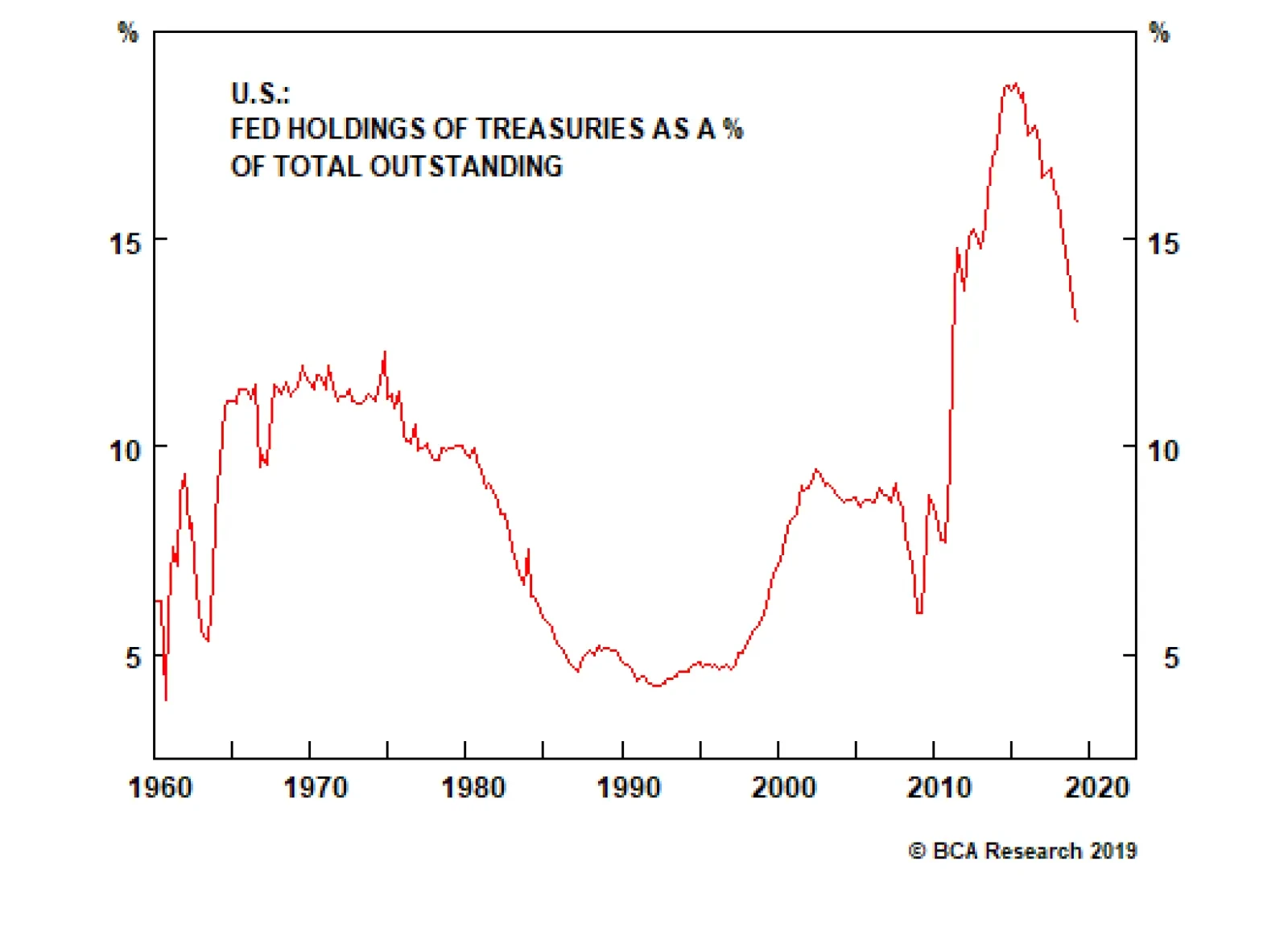
The extraordinary measures taken during the Great Financial Crisis significantly increased the size of the Fed’s balance sheet and made it a major market player. The Fed’s Treasury holdings peaked at 19% of the market in 2015. In October 2017, the Fed…
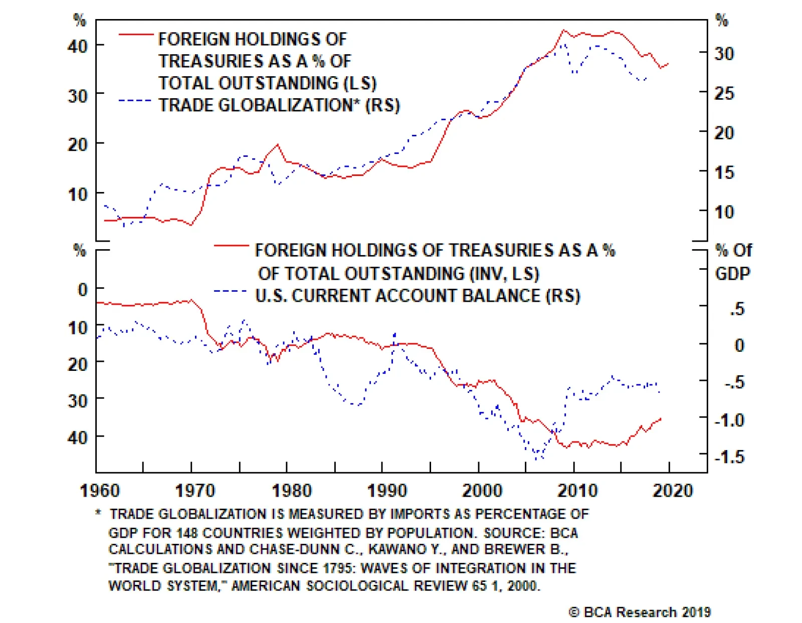
Official foreign entities became a major holder of Treasuries after the abandonment of Bretton Woods in 1971. By ending the U.S. dollar’s convertibility to gold, the former became the global reserve currency and Treasuries the most-demanded foreign reserve in…
Feature This publication’s approach to bond investing is based on an expectations view of the yield curve. We project the future path of Fed policy and compare our forecast to what is priced into the market.1 In other words, we tend to eschew investment approaches that involve forecasting ex-ante supply and demand flows in the Treasury market. That being said, it is still important to understand the details of the markets we study. In this Special Report we get closer to that understanding by looking at the major sources of demand for U.S. Treasuries. We consider what motivates each market actor’s Treasury ownership, and how their presence in the market might evolve in the years to come.
Chart 1
The bulk of Treasury ownership is split between six market players (Chart 1): Foreign official and private entities (aka rest of the world, 36%) Pension funds (14%) The Federal Reserve (13%) Open-ended mutual funds, ETFs & money market funds (12%) Households (12%) Private depositary institutions (aka banks, 4%) We consider each source of Treasury demand in turn. Rest Of The World Foreign Treasury holdings are split between official (i.e. central banks) and private entities, with central banks accounting for roughly two thirds of overall foreign demand. Official foreign entities became a major holder of Treasuries after the abandonment of Bretton Woods in 1971. By ending the U.S. dollar’s convertibility to gold, the former became the global reserve currency and Treasuries the most-demanded foreign reserve in the world. Foreign Treasury holdings then surged a second time in the late 1990s, after a series of financial crises prompted many emerging market economies to shift from being net importers of capital to net exporters. A shift that caused Ben Bernanke to coin the term “global savings glut” in 2005.2 Pension fund Treasury holdings, in the aggregate, are principally determined by demographics and pension plan funded status. Bernanke’s global savings glut refers to the export-oriented growth strategies pursued by many emerging market economies in the 1990s and 2000s. These nations commonly had high domestic savings rates and a lack of internal investment opportunities. This manifested in growing emerging market current account surpluses that were offset by an expanding U.S. current account deficit. The imbalance led to a massive build-up of emerging market foreign-exchange reserves that was funneled back into the U.S. Treasury market (Chart 2). Chart 2Globalization Has Peaked, So Have ##br##Foreign Treasury Holdings
Globalization Has Peaked, So Have Foreign Treasury Holdings
Globalization Has Peaked, So Have Foreign Treasury Holdings
Although it is still early in the process, global exports peaked relative to GDP in 2014. Average tariffs have increased since then and, according to the World Trade Organization, the number of new trade restrictions exceeded the number of trade liberalizing initiatives in 2016. As can be seen in Chart 2, the rollback of globalization implies that global current account imbalances will slowly fade during the next few years. Foreigners will therefore have less of a need to own U.S. Treasuries. In other words, foreign holdings of Treasuries have probably already peaked. Bottom Line: The apex of globalization is likely behind us. Going forward, protectionist trade policies will drive global exports lower as a share of GDP. As a result, foreign holdings of Treasuries have peaked, and although the foreign sector will remain the largest player in the Treasury market for quite some time, its importance will slowly fade. Pension Funds Chart 3Pension Funds Do Not Weigh As Much
Pension Funds Do Not Weigh As Much
Pension Funds Do Not Weigh As Much
Pension funds, regardless of their status (private vs. public) or design (defined benefit vs. defined contribution plans), have liability structures that require matched assets on the other side of their balance sheets. In the past, pension funds accomplished this by holding mostly Treasuries and corporate bonds. Then, regulations in the 80s and 90s led to a softening of the constraints placed on pension funds, effectively giving them more latitude to reallocate away from fixed income securities. In the early 2000s, pension funds owned more than 25% of the Treasury market, compared to 14% today (Chart 3). As is explained below, pension fund Treasury holdings, in the aggregate, are principally determined by demographics and pension plan funded status. Funded Status Chart 4It's All About Funded Status For Pension Funds
It's All About Funded Status For Pension Funds
It's All About Funded Status For Pension Funds
Pension plan funded status represents the difference between the present value of pension fund liabilities and assets. Ideally, funded status should remain close to 100%, but it has deteriorated during the past 20 years. When the funded status is lower, pensions often choose to take more risk in the hopes of “catching up”. “Catching up” means that pensions will decrease their holdings of Treasuries in order to invest more in riskier assets (Chart 4). On the flipside, funded status improvements cause pensions to de-risk their portfolios by moving back into the safety of U.S. Treasuries. Chart 4 shows that pension funded status and pension fund Treasury holdings are positively correlated over time. Interest rates are an important determinant of funded status. Lower (higher) interest rates lead to deteriorating (improving) funded ratios. This correlation holds for two reasons. Low interest rates mean that plans earn less income from their asset portfolios, and they also inflate the present value of plan liabilities. Conversely, high interest rates increase plan investment returns and dampen the present value of plan liabilities. The relationship means that pensions tend to increase their Treasury holdings as rates rise and decrease their holdings as rates fall. Outside of interest rates, stock market performance is the most important determinant of plan funded status. Pension funds usually maintain something close to a 60/40 split between equities and bonds. As such, equity market outperformance forces pension funds to buy more Treasuries in order to keep these weights balanced. Periods of strong stock market performance also improve plan funded status, leading to even more Treasury buying. Demographics Demographic trends dictate the amount of assets that pension funds have to invest in the first place. Arguably the most important demographic trend is the ratio of retirees to workers. When that ratio is low, many more people are paying into pensions than are withdrawing money, leading to greater pension fund security holdings – including Treasuries. Conversely, a higher ratio of retirees to workers means that pension funds have fewer assets to invest. For many years, the ratio of retirees to workers had been flat, around 15%, before it started to rise rapidly when the first baby boomers started retiring around 2009 (Chart 4, bottom panel). Projections show the ratio continuing to increase through 2050, suggesting that demographics are no longer a tailwind for pension fund Treasury holdings. The Fed will always be a source of demand for Treasuries. The ratio of retirees to workers also impacts pension plan funded status. The increasing number of retirees relative to workers means pension funds are experiencing more cash outflows, from more individuals tapping into their plans, than inflows from the working population. All else equal, this translates into more underfunded pensions. Notice how the pick-up in old-age dependency ratio coincides with the deterioration in plan funded status (Chart 4, panels 1 & 4). Bottom Line: Pension funds will probably increase their Treasury purchases between now and the end of the economic recovery. The Fed will need to deliver further rate hikes before the next recession hits, and higher interest rates along with continued stock market gains will lead to an improvement in plan funded status on a cyclical horizon. But structurally, demographic trends point to fewer pension fund assets under management and worse plan funded status in the long-run. Pension fund Treasury demand should be lower during the next economic recovery than it is during the present one. Federal Reserve Chart 5Normalization Under Way: Do Not Disturb
Normalization Under Way: Do Not Disturb
Normalization Under Way: Do Not Disturb
The Fed has always been an important actor in the Treasury market, though historically it focused mostly on T-bills. But the extraordinary measures taken during the Great Financial Crisis significantly increased the size of the Fed’s balance sheet and made it a major market player. The Fed’s Treasury holdings peaked at 19% of the market in 2015 (Chart 5). In October 2017, the Fed started unwinding its balance sheet by gradually letting its assets – essentially Treasuries and Agency MBS - mature without reinvesting the proceeds. The amount of assets that could leave the balance sheet that way followed predetermined monthly caps, which reached $30 billion for Treasuries and $20 billion for MBS in October 2018. So far, $371 billion of Treasuries and $245 billion of MBS have left the Fed’s balance sheet since the beginning of the runoff. But now, the Fed’s balance sheet run-off is nearly complete, and last March the Fed provided a detailed roadmap for its final stages. Beginning in October 2019, the Fed will maintain its overall assets constant, which we project should be in the vicinity of $3.54 trillion (Table 1).3 Meantime, MBS will continue to run off, but this time, the proceeds will be reinvested into Treasuries. Put differently, the Fed will once again become an active buyer of Treasuries, by the amount of MBS that runs off, which will be no more than $20 billion per month. Table 1Simplied Fed Balance Sheet Projections
Treasury Demand On A Map
Treasury Demand On A Map
The policy of keeping its assets constant ensures that the supply of bank reserves will continue to shrink. This is because the Fed’s other non-reserve liabilities – mostly currency in circulation – will continue to grow. If we assume that (i) the Fed allows bank reserves to shrink until the end of 2020, (ii) MBS run off the balance sheet at a pace of $15 billion per month and (iii) currency in circulation grows by 5% per year, then we calculate that the Fed will add close to $200 billion of Treasuries by the end of next year. Alternatively, the Fed could decide much earlier that bank reserves have shrunk to an appropriate level. In that case, Treasury buying would be higher. For example, if the Fed decides to keep the supply of reserves flat as of the end of Q1 2020, we calculate that it would buy $267 billion of Treasuries between now and the end of 2020. In the very long run, the Fed’s balance sheet normalization plan also involves transitioning back to a Treasury-only portfolio. While it will take years to implement, it means that, ultimately, the $1,484 billion of MBS currently on the balance sheet will be converted into Treasuries. Bottom Line: The Fed will always be a source of demand for Treasuries. The normalization process that was initiated back in 2017 is now almost complete, and the Fed will start increasing its Treasury holdings in October. Treasury purchases will be modest at first, limited to the amount of MBS that runs off the Fed’s balance sheet, but they will accelerate once the Fed decides that enough bank reserves have been drained from the system. That decision could come as early as next year. Open-Ended Mutual Funds, ETFs & Money Market Funds Chart 6Growing Presence
Growing Presence
Growing Presence
The combined Treasury holdings of open-ended mutual funds, ETFs and money market funds make them the fourth largest actor in the market, representing 12% of total supply (Chart 6). Open-Ended Mutual Funds Bond mutual funds make up 28% of open-ended mutual funds total net assets (ex. money market funds). Following the financial crisis, the sustained shift into bond funds from equity funds and the growth of passive investing have been two of the major trends for the sector (Chart 7). According to the Investment Company Institute, actively managed equity mutual funds have experienced negative cumulative flows of $1.4 trillion post-crisis, while bond funds and passive equity funds registered $2.2 billion and $1.6 of inflows over the same period, respectively. Further, net new cash flows to bond mutual funds tend to correlate with bond market total return performance (Chart 7, bottom panel). Chart 7Bond Mutual Funds As Popular As Ever
Bond Mutual Funds As Popular As Ever
Bond Mutual Funds As Popular As Ever
Finally, the fact that fixed-income funds are usually popular with retirees – who are more risk averse and are looking for a steady cash flow – ensures that there is still more upside in the Treasury buying of these funds, based on aging population and the baby boomers retiring. Exchange-Traded Funds (ETFs) The growth of passive investing, driven by lower fees, has benefitted ETFs. They now hold 1% of the Treasury market, driven by bond ETFs’ net assets growing at double digits since the end of the financial crisis. We expect this trend will continue and for ETFs to become a more active Treasury buyer. Money Market Funds Money market funds invest in very short-term assets and are divided into two broad categories: government money market funds that can only invest in government debt, and prime funds that can also invest in high-quality corporate debt. In October 2016, sweeping reforms on liquidity and maturity provisions adopted by the SEC resulted in prime funds becoming much less attractive to investors, leading to an increase in demand for government money market funds and thus indirectly raising the demand for Treasuries (Chart 8, top panel). Chart 8Money Market Funds' Drivers
Money Market Funds' Drivers
Money Market Funds' Drivers
With that information in hand, we can turn to who invests in money market funds to assess what the demand for Treasuries will be. Households own 59% of money market fund shares, with nonfinancial corporations far behind with 15%. Money market funds experience inflows during tightening cycles, as short-term yields become more attractive (Chart 8, bottom panel). Periods of expensive equity valuation also coincide with more inflows, as individual investors put money on the sidelines (not shown). Bottom Line: Open-ended mutual funds, ETFs and money market funds have become major actors in the Treasury market. The rapid growth of ETFs, the shift to bond funds from equity funds and, more structurally, changing demographics, are all contributing trends that should not fade anytime soon; expect more Treasury buying. Household Sector Chart 9Once Bitten Twice Shy?
Once Bitten Twice Shy?
Once Bitten Twice Shy?
Household ownership has declined over time. In the early 1950s, households accounted for about 30% of Treasury ownership but that has fallen to a meagre 2% by 2007. Households have been buying Treasuries again since the financial crisis, and now hold 12% of the market (Chart 9). As would be expected, household Treasury ownership is highly correlated with the personal savings rate. A falling savings rate during the 1980s, 1990s and 2000s caused Treasury holdings to decline, but the shock of the financial crisis has led to more conservative household behavior and greater Treasury ownership. We should note that Federal Reserve data on household Treasury ownership includes some institutional investors such as onshore hedge funds. It is conceivable that the financial crisis has permanently shifted household preferences, leading to a much higher savings rate than in prior recoveries. However, high household wealth and elevated consumer sentiment suggest that the savings rate is more likely to fall than rise during the next couple of years (Chart 9, bottom 2 panels). We don’t see much more upside in household Treasury ownership. Bottom Line: Households have added to their Treasury holdings since the financial crisis. But as of today, the savings rate is more likely to fall than rise further. Expect household Treasury ownership to remain low for the next few years. Banks Chart 10Banks Haven't Been Active Buyers...Until Recently
Banks Haven't Been Active Buyers...Until Recently
Banks Haven't Been Active Buyers...Until Recently
In the early 50s, banks accounted for more than 30% of Treasury ownership. Since then, it has steadily declined and now barely amounts to 5% of total securities outstanding (Chart 10). Simply put, banks haven’t been active buyers of Treasuries. But this is starting to change, albeit slowly, due to the regulatory burdens that have been imposed since the Financial crisis. Under Basel III, large U.S. banks are mandated to hold enough high-quality liquid assets (HQLAs) to cover 30 days worth of net cash outflows in a stressed scenario. The ratio between HQLAs and potential net cash outflows is called the Liquidity Coverage Ratio (LCR), and banks must maintain a LCR of at least 100%. HQLAs consist of Level 1 assets and Level 2 assets (which cannot exceed 40% of HQLA). Level 1 assets are bank reserves, cash and Treasury securities, and Level 2 assets are riskier securities such as Agency MBS and corporate bonds. A haircut is applied to level 2 assets for calculating HQLA. With reserves and Treasuries being interchangeable from the perspective of the HQLA calculation, the fact that the Fed is currently shrinking the supply of reserves means that banks might need to increase their Treasury buying to compensate for it. A great deal of Treasury buying will probably not be necessary to compensate for the Fed shrinking the supply of reserves. Based on disclosures from the eight U.S. Systemically Important Financial Institutions (SIFIs) – who have close to $500 billion of reserves held at the Fed – a great deal of Treasury buying is probably not necessary. As shown in Table 2, although these banks display a large degree of heterogeneity in their approaches to meeting their LCR requirements, they all enjoy decent buffers above the 100% minimum requirement. In other words, they can allow the supply of bank reserves to shrink and still maintain LCR compliance with minimal Treasury buying. Table 2 also shows that, on average, reserves represent 19% of the SIFIs’ eligible HQLA, implying these banks are not overly dependent on reserves to comply with Basel III. Table 2Simplied Fed Balance Sheet Projections
Treasury Demand On A Map
Treasury Demand On A Map
In a 2017 paper, Ihrig, Kim, Kumbhat and Vohtech4 observed the following: [D]uring the run-up to becoming LCR compliant, banks in aggregate took on a significant quantity of excess reserves. However, after becoming compliant, many such banks adjusted their liquid holdings, reducing their stocks of reserve balances and raising their holdings of other HQLA components, presumably to achieve a more optimal configuration. Table 3Factors Affecting Demand For Reserves
Treasury Demand On A Map
Treasury Demand On A Map
This suggests that, subsequent to LCR implementation, decisions regarding reserve holdings for banks may either be tied to daily business operations or rely on a risk-return decision framework. These findings are corroborated by the answers provided by the 51 banks surveyed by the Federal Reserve in the Senior Financial Officer Survey published last September. As shown in Table 3, the factors affecting their respective demand for reserves ranked as “important” or “very important” have to do with self-imposed and internal controls or daily business operations. Only 37% of the respondents ranked the HQLA requirement as an important factor. Bottom Line: The shrinking supply of bank reserves will probably lead to greater Treasury buying from banks, but a surge in bank Treasury demand is unlikely. Banks are already compliant with the Liquidity Coverage Ratio, and their High-Quality Liquid Asset balances are not overly dependent on reserves. Jeremie Peloso, Research Analyst jeremiep@bcaresearch.com Footnotes 1 Please see U.S. Bond Strategy Special Report, “The Golden Rule Of Bond Investing”, dated July 24, 2018, available at usbs.bcaresearch.com 2 https://www.federalreserve.gov/boarddocs/speeches/2005/200503102/default.htm 3 Please see U.S. Bond Strategy Weekly Report, “Full Speed Ahead”, dated April 16, 2019, available at usbs.bcarsearch.com 4 https://files.stlouisfed.org/files/htdocs/publications/review/2019/07/12/how-have-banks-been-managing-the-composition-of-high-quality-liquid-assets.pdf
BCA takes pride in its independence. Strategists publish what they really believe, informed by their framework and analysis. Occasionally, this independence results in strongly diverging views and we currently are in one of those times. Within BCA, two views on the cyclical (six to 12-months) outlook for assets have emerged. One camp expects global growth to rebound in the second half of the year. Along with accelerating growth, they anticipate stock prices and risk assets to remain firm, cyclical equities to outperform defensive ones, safe-haven yields to move up, and the dollar to weaken. Meanwhile, another group foresees a further deterioration in activity or a delayed recovery, additional downside in stocks and risk assets, outperformance of defensives relative to cyclicals, low safe-haven yields, and a generally stronger dollar. For the sake of transparency, we have asked representatives of each camp to make their case in a round-table discussion, allowing our clients to decide for themselves which view is more appealing to them. Global Investment Strategy’s Peter Berezin, U.S. Investment Strategy’s Doug Peta, and Global Fixed Income Strategy’s Rob Robis take the mantle for the bullish camp. U.S. Equity Strategy’s Anastasios Avgeriou, Emerging Market Strategy’s Arthur Budaghyan, and European Investment Strategy’s Dhaval Joshi represent the bearish group.1 The round-table discussion below focuses on the cyclical outlook. For longer investment horizons, most strategists agree that a recession is highly likely by 2022. Moreover, on a long-term basis, valuations in both risk assets and safe-haven bonds are very demanding. In this context, a significant back up in yields could hammer risk assets. The BCA Round Table Mathieu Savary: Yield curve inversions have often been harbingers of recessions. Anastasios, you are amongst those investors troubled by this inversion. Do you not worry that this episode might prove similar to 1998, when the curve only inverted temporarily and did not foreshadow a recession? Moreover, how do you account for the highly variable time lags between the inversion of the yield curve and the occurrence of a recession? Chart II-1 (ANASTASIOS)The 1998 Episode Revisited
The 1998 Episode Revisited
The 1998 Episode Revisited
Anastasios Avgeriou: The yield curve inverts at or near the peak of the business cycle and it eventually forewarns of upcoming recessions. This past December, parts of the yield curve inverted and now, BCA’s U.S. Equity Strategy service is heeding the signal from this simple indicator, especially given that the SPX has subsequently made all-time highs as our research predicted.2 The yield curve inversion forecasts a Fed rate cut, and it has never been wrong on that front. It served well investors that heeded the message in June of 1998 as the market soon thereafter fell 20% in a heartbeat. If investors got out at the 1998 peak near 1200 and forwent about 350 points of gains until the March 2000 SPX cycle peak, they still benefited if they held tight as the market ultimately troughed near 777 in October 2002 (Chart II-1). With regard to timing the previous seven recessions using the yield curve, if we accept that mid-1998 is the starting point of the inversion, it took 33 months before the recession commenced. Last cycle, the recession began 24 months after the inversion. Consequently, December 2020 is the earliest possible onset of recession and September 2021, the latest. Our forecast calls for SPX EPS to fall 20% in 2021 to $140 with the multiple dropping between 13.5x and 16.5x for an SPX end-2020 target range of 1,890-2,310.3 In other words we are not willing to play a 100-200 point advance for a potential 1,000 point drawdown. The risk/reward tradeoff is to the downside, and we choose to sit this one out. Mathieu: Rob, you take a much more sanguine view of the current curve inversion. Why? Rob Robis: While the four most dangerous words in investing are “this time is different,” this time really does appear to be different. Never before have negative term premia on longer-term Treasury yields and a curve inversion coexisted (Chart II-2). Longer-term Treasury yields have therefore been pushed down to extremely low levels by factors beyond just expectations of a lower fed funds rate. The negative Treasury term premium is distorting the economic message of the U.S. yield curve inversion. Chart II-2 (ROB)Negative Term Premium Distorting The Economic Message Of An Inverted Yield Curve
Negative Term Premium Distorting The Economic Message Of An Inverted Yield Curve
Negative Term Premium Distorting The Economic Message Of An Inverted Yield Curve
Term premia are depressed everywhere, as seen in German, Japanese and other yields, reflecting the intense demand for safe assets like government bonds during a period of heightened uncertainty. Global bond markets may also be discounting a higher probability of the ECB restarting its Asset Purchase Program, as term premia typically fall sharply when central banks embark on quantitative easing. This has global spillovers. Prior to previous recessions, U.S. Treasury curve inversions occurred when the Fed was running an unequivocally tight monetary policy. That is not the case today. The real fed funds rate still is not above the Fed’s estimate of the neutral real rate, a.k.a. “r-star,” which was the necessary ingredient for all previous Treasury curve inversions since 1960 (Chart II-3). Chart II-3 (ROB)Fed Policy Is Not Tight Enough For Sustained Curve Inversion
Fed Policy Is Not Tight Enough For Sustained Curve Inversion
Fed Policy Is Not Tight Enough For Sustained Curve Inversion
Mathieu: The level of policy accommodation will most likely determine whether Anastasios or Rob is proven right. Peter, you have been steadfastly arguing that policy, in the U.S. at least, remains easy. Can you elaborate why? Peter Berezin: Remember that the neutral rate of interest is the rate that equalizes the level of aggregate demand with the economy’s supply-side potential. Loose fiscal policy and fading deleveraging headwinds are boosting demand in the United States. So is rising wage growth, especially at the bottom of the income distribution. Given that the U.S. does not currently suffer from any major imbalances, I believe that the economy can tolerate higher rates without significant ill-effects. In other words, monetary policy is currently quite easy. Of course, we cannot observe the neutral rate directly. Like a black hole, one can only detect it based on the effect that it has on its surroundings. Housing is by far the most interest rate-sensitive sector of the economy. If history is any guide, the recent decline in mortgage rates will boost housing activity in the remainder of the year (Chart II-4). If that relationship breaks down, as it did during the Great Recession, it would suggest that the neutral rate is quite low. Chart II-4 (PETER)Declining Mortgage Rates Bode Well For Housing
Declining Mortgage Rates Bode Well For Housing
Declining Mortgage Rates Bode Well For Housing
Given that mortgage underwriting standards have been quite strong and the homeowner vacancy is presently very low, our guess is that housing will hold up well. We should know better in the next few months. Mathieu: Dhaval, you do not agree. Why do you think global rates are not accommodative?
Chart II-5
Dhaval Joshi: Actually, I think that global rates are accommodative, but that the global bond yield can rise by just 70 bps before conditions become perilously un-accommodative. Here’s where I disagree with Peter: for me, the danger doesn’t come from economics, it comes from the mathematics of ultra-low bond yields. The unprecedented and experimental panacea of our era has been ‘universal QE’ – which has led to ultra-low bond yields everywhere. But what is not understood is that when bond yields reach and remain close to their lower bound, weird things happen to the financial markets. I refer you to other reports for the details, but in a nutshell, the proximity of the lower bound to yields increases the risk of owning supposedly ‘safe’ bonds to the risk of owning so-called ‘risk-assets’. The result is that the valuation of risk-assets rises exponentially (Chart II-5). Because when the riskiness of the asset-classes converges, investors price risk-assets to deliver the same ultra-low nominal return as bonds.4 Comparisons with previous economic cycles miss the current danger. The post-2000 policy easing distorted the global economy by engineering a credit boom – so the subsequent danger emanated from the most credit-sensitive sectors in the economy such as mortgage lending. In contrast, the post-2008 ‘universal QE’ has severely distorted the valuation relationship between bonds and global risk-assets – so this is where the current danger lies. Higher bond yields can suddenly undermine the valuation support of global risk-assets whose $400 trillion worth dwarfs the global economy by five to one. Where is this tipping point? It is when the global 10-year yield – defined as the average of the U.S., euro area,5 and China – approaches 2.5%. Through the past five years, the inability of this yield to remain above 2.5% confirms the hyper-sensitivity of financial conditions to this tipping point (Chart II-6). Right now, I agree that bond yields are accommodative. But the scope for yields to move higher is quite limited. Chart II-6 (DHAVAL)Since 2015, the Global Long Bond Yield Has Struggled To Surpass 2.5 Percent
Since 2015, the Global Long Bond Yield Has Struggled To Surpass 2.5 Percent
Since 2015, the Global Long Bond Yield Has Struggled To Surpass 2.5 Percent
Mathieu: Monetary policy is important to the outlook, but so is the global manufacturing cycle. The global growth slowdown has been concentrated in the manufacturing sector, tradeable goods in particular. Across advanced economies, the service and consumer sectors have been surprisingly resilient, but this will not last if the industrial sector decelerates further. Arthur, you still do not anticipate any major improvement in global trade and industrial production. Can you elaborate why? Chart II-7 (ARTHUR)Global Trade Is Down Due To China Not U.S.
Global Trade Is Down Due To China Not U.S.
Global Trade Is Down Due To China Not U.S.
Arthur Budaghyan: To properly assess the economic outlook, one needs to understand what has caused the ongoing global trade/manufacturing downturn. One thing we know for certain: It originated in China, not the U.S. Chart II-7 illustrates that Korean, Japanese, Taiwanese and Singaporean exports to China have been shrinking at an annual rate of 10%, while their shipments to the U.S. have been growing. China’s aggregate imports have also been contracting. This entails that from the perspective of the rest of the world, China has been and remains in recession. Chart II-8 (ARTHUR)Stimulus Versus Marginal Propensity To Spend
Stimulus Versus Marginal Propensity To Spend
Stimulus Versus Marginal Propensity To Spend
U.S. manufacturing is the least exposed to China, which is the main reason why it has been the last shoe to drop. Hence, the U.S. has lagged in this downturn, and one should not be looking to the U.S. for clues about a potential global recovery. We need to gauge what will turn Chinese demand around. In this regard, the rising credit and fiscal spending impulse is positive, but it has so far failed to kick start a recovery (Chart II-8). The key reason has been a declining marginal propensity to spend among households and companies. Notably, the marginal propensity to spend of mainland companies leads industrial metals prices by a few months, and it currently continues to point south (Chart II-8, bottom panel). The lack of willingness among Chinese consumers and enterprises to spend is due to several factors: (1) the U.S.-China confrontation; (2) high levels of indebtedness among both enterprises and households (Chart II-9); (3) ongoing regulatory scrutiny over banks and shadow banking as well as local government debt; and (4) a lack of outright government subsidies for purchases of autos and housing. Chart II-9 (ARTHUR)Chinese Households Are Leveraged Than U.S. Ones
Chinese Households Are Leveraged Than U.S. Ones
Chinese Households Are Leveraged Than U.S. Ones
On the whole, the falling marginal propensity to spend will all but ensure that any recovery in mainland household and corporate spending is delayed. Mathieu: Meanwhile, Peter, you have a much more optimistic stance. Why do you differ so profoundly with Arthur’s view? Peter: China’s deleveraging campaign began more than a year before global manufacturing peaked. I have no doubt that slower Chinese credit growth weighed on global capex, but we should not lose sight of the fact there are natural ebbs and flows at work. Most manufactured goods retain some value for a while after they are purchased. If spending on, say, consumer durable goods or business equipment rises to a high level for an extended period, a glut will form, requiring a period of lower production. These demand cycles typically last about three years; roughly 18 months on the way up, 18 months on the way down (Chart II-10). The last downleg in the global manufacturing cycle began in early 2018, so if history is any guide, we are nearing a trough. The fact that U.S. manufacturing output rose in both May and June, followed by this week’s sharp rebound in the July Philly Fed Manufacturing survey, supports this view. Chart II-10 (PETER)The Global Manufacturing Cycle Has Likely Reached A Bottom
The Global Manufacturing Cycle Has Likely Reached A Bottom
The Global Manufacturing Cycle Has Likely Reached A Bottom
Of course, extraneous forces could complicate matters. If trade tensions ratchet higher, this would weaken my bullish thesis. Nevertheless, with China stimulating its economy again, it would probably take a severe trade war to push the global economy into recession. Mathieu: Dhaval, you are not as negative as Arthur, but nonetheless expect a slowdown in the second half of the year. What is your rationale? Dhaval: To be clear, I am not forecasting a recession or major downturn – unless, as per my previous answer, the global 10-year bond yield approaches 2.5% and triggers a severe dislocation in global risk-assets. In fact, many people get the relationship between recession and financial market dislocation back-to-front: they think that the recession causes the financial market dislocation when, in most cases, the financial market dislocation causes the recession! Nevertheless, I do believe that European and global growth is entering a regular down-oscillation based on the following compelling evidence: 1. From a low last summer, quarter-on-quarter GDP growth rates in the developed economies have already rebounded to the upper end of multi-year ranges. 2. Short-term credit impulses in Europe, the U.S., and China are entering down-oscillations (Chart II-11). Chart II-11 (DHAVAL)Short-Term Impulses Rebounded... But Are Now Rolling Over
Short-Term Impulses Rebounded... But Are Now Rolling Over
Short-Term Impulses Rebounded... But Are Now Rolling Over
3. The best current activity indicators, specifically the ZEW economic sentiment indicators, have rolled over. 4. The outperformance of industrials – the equity sector most exposed to global growth – has also rolled over. Why expect a down-oscillation? Because it is the rate of decline in the bond yield that drove the rebound in growth after its low last summer. Furthermore, it is impossible for the rate of decline in the bond yield to keep increasing, or even stay where it is. Counterintuitively, if bond yields decline, but at a reduced pace, the effect is to slow economic growth. Mathieu: A positive and a negative view of the world logically result in bifurcated outlooks for interest rates and the dollar. Rob, how do you see U.S., German, and Japanese yields evolving over the coming 12 months? Rob: If global growth rebounds, U.S. Treasury yields will have far more upside than Bund or JGB yields. Inflation expectations should recover faster in the U.S., with the Fed taking inflationary risks by cutting rates with a 3.7% unemployment rate and core CPI inflation at 2.1%. The Fed is also likely to disappoint by delivering fewer rate cuts than are currently discounted by markets (90bps over the next 12 months). Treasury yields can therefore increase more than German and Japanese yields, with the ECB and BoJ more likely to deliver the modest rate cuts currently discounted in their yield curves (Chart II-12). Chart II-12 (ROB)U.S. Treasuries Will Underperform Bunds & JGBs
U.S. Treasuries Will Underperform Bunds & JGBs
U.S. Treasuries Will Underperform Bunds & JGBs
Japanese yields will remain mired at or below zero over the next 6-12 months, as wage growth and core inflation remain too anemic for the BoJ to alter its 0% target on 10-year JGB yields. German yields have a bit more potential to rise if European growth begins to recover, but will lag any move higher in Treasury yields. That means that the Treasury-Bund and Treasury-JGB spreads will move higher over the next year. Negative German and Japanese yields may look completely unappetizing compared to +2% U.S. Treasury yields, but this handicap vanishes when all three yields are expressed in U.S. dollar terms. Hedging a 10-year German Bund or JGB into higher-yielding U.S. dollars creates yields that are 50-60bps higher than a 10-year U.S. Treasury. It is abundantly clear that German and Japanese bonds will outperform Treasuries over the next year if global growth recovers. Mathieu: Peter, your positive view on global growth means that the Fed will cut rates less than what is currently priced into the OIS curve. So why do you expect the dollar to weaken in the second half of 2019? Peter: What the Fed does affects interest rate differentials, but just as important is what other central banks do. The ECB is not going to raise rates over the next 12 months. However, if euro area growth surprises on the upside later this year, investors will begin to question the need for the ECB to keep policy rates in negative territory until mid-2024. The market’s expectation of where policy rates will be five years out tends to correlate well with today’s exchange rate. By that measure, there is scope for interest rate differentials to narrow against the U.S. dollar (Chart II-13). Chart II-13A (PETER)Interest Rate Expectations Against The U.S. Should Narrow (II)
Interest Rate Expectations Against The U.S. Should Narrow (I)
Interest Rate Expectations Against The U.S. Should Narrow (I)
Chart II-13B (PETER)Interest Rate Expectations Against The U.S. Should Narrow (I)
Interest Rate Expectations Against The U.S. Should Narrow (II)
Interest Rate Expectations Against The U.S. Should Narrow (II)
Chart II-14 (PETER)The Dollar Is A Countercyclical Currency
The Dollar Is A Countercyclical Currency
The Dollar Is A Countercyclical Currency
Keep in mind that the U.S. dollar is a countercyclical currency, meaning that it moves in the opposite direction of global growth (Chart II-14). This countercyclicality stems from the fact that the U.S. economy is more geared towards services than manufacturing compared with the rest of the world. As such, when global growth accelerates, capital tends to flow from the U.S. to the rest of the world, translating into more demand for foreign currency and less demand for dollars. If global growth picks up in the remainder of the year, as I expect, the dollar will weaken. Mathieu: Arthur, as you are significantly more negative on growth than either Rob or Peter, how do you see the dollar and global yields evolving over the coming six to 12 months? Arthur: I am positive on the trade-weighted U.S. dollar for the following reasons: The U.S. dollar is a countercyclical currency – it exhibits a negative correlation with the global business cycle. Persistent weakness in the global economy emanating from China/EM is positive for the dollar because the U.S. economy is the major economic block least exposed to a China/EM slowdown. Meanwhile, the greenback is only loosely correlated with U.S. interest rates. Thereby, the argument that lower U.S. rates will drive the value of the U.S. currency much lower is overemphasized. The Federal Reserve will cut rates by more than what is currently priced into the market only in a scenario of a complete collapse in global growth. Yet this scenario would be dollar bullish. In this case, the dollar’s strong inverse relationship with global growth will outweigh its weak positive relationship with interest rates. Contrary to consensus views, the U.S. dollar is not very expensive. According to unit labor costs based on the real effective exchange rate – the best currency valuation measure – the greenback is only one standard deviation above its fair value. Often, financial markets tend to overshoot to 1.5 or 2 standard deviations below or above their historical mean before reversing their trend. One of the oft-cited headwinds facing the dollar is positioning, yet there is a major discrepancy between positioning in DM and EM currencies versus the U.S. dollar. In aggregate, investors – asset managers and leveraged funds – have neutral exposure to DM currencies, but they are very long liquid EM exchange rates such as the BRL, MXN, ZAR and RUB versus the greenback. The dollar strength will occur mostly versus EM and commodities currencies. In other words, the euro, other European currencies and the yen will outperform EM exchange rates. I have less conviction on global bond yields. While global growth will disappoint, yields have already fallen a lot and the U.S. economy is currently not weak enough to justify around 90 basis points of rate cuts over the next 12 months. Mathieu: Before we move on to investment recommendations, Anastasios, you have done a lot of interesting work on the outlook for U.S. profits. What is the message of your analysis? Chart II-15 (ANASTASIOS)Gravitational Pull
Gravitational Pull
Gravitational Pull
Anastasios: While markets cheered the trade truce following the recent G-20 meeting, no tariff rollback was agreed. Since the tariff rate on $200bn of Chinese imports went up from 10% to 25% on May 10, odds are high that manufacturing will remain in the doldrums. This will likely continue to weigh on profits for the remainder of the year. Profit growth should weaken further in the coming six months. Periods of falling manufacturing PMIs result in larger negative earnings growth surprises as market forecasters rarely anticipate the full breadth and depth of slowdowns. Absent profit growth, equity markets lack the necessary ‘oxygen’ for a durable high-quality rally. Until global growth momentum turns, investors should fade rallies. Our four-factor SPX EPS growth model is flirting with the contraction zone. In addition, our corporate pricing power proxy and Goldman Sachs’ Current Activity Indicator both send a distress signal for SPX profits (Chart II-15). Already, more than half of the S&P 500 GICS1 sectors’ profits are estimated to have contracted in Q2, and three sectors could see declining revenues on a year-over-year basis, according to I/B/E/S data. Q3 depicts an equally grim profit picture that will also spill over to Q4. Adding it all up, profits will underwhelm into year-end. Mathieu: Doug, you do not share Anastasios’s anxiety. What offsets do you foresee? Moreover, you are not concerned by the U.S. corporate balance sheets. Can you share why? Doug Peta: As it relates to earnings, we foresee offsets from a revival in the rest of the world. Increasingly accommodative global monetary policy and reviving Chinese growth will give global ex-U.S. economies a boost. That inflection may go largely unnoticed in U.S. GDP, but it will help the S&P 500, as U.S.-based multinationals’ earnings benefit from increased overseas demand and a weaker dollar. When it comes to corporate balance sheets, shifting some of the funding burden to debt from equity when interest rates are at generational lows is a no-brainer. Even so, non-financial corporates have not added all that much leverage (Chart II-16). Low interest rates, wide profit margins and conservative capex have left them with ample free cash flow to service their obligations (Chart II-17). Chart II-16 (DOUG)Corporations Have Not Added Much Leverage ...
Corporations Have Not Added Much Leverage ...
Corporations Have Not Added Much Leverage ...
Chart II-17 (DOUG)...Though They Have Ample Cash Flow To Service It
...Though They Have Ample Cash Flow To Service It
...Though They Have Ample Cash Flow To Service It
Every single viable corporate entity with an effective federal tax rate above 21% became a better credit when the top marginal rate was cut from 35% to 21%. Every such corporation now has more net income with which to service debt, and will have that income unless the tax code is revised. You can’t see it in EBITDA multiples, but it will show up in reduced defaults. Mathieu: The last, and most important question. What are each of your main investment recommendations to capitalize on the economic trends you anticipate over the coming 6-12 months? Let’s start with the pessimists: Arthur: First, the rally in global cyclicals and China plays since December has been premature and is at risk of unwinding as global growth and cyclical profits disappoint. Historical evidence suggests that global share prices have not led but have actually been coincident with the global manufacturing PMI (Chart II-18). The recent divergence is unprecedented. Chart II-18 (ARTHUR)Global Stocks Historically Did Not Lead PMIs
Global Stocks Historically Did Not Lead PMIs
Global Stocks Historically Did Not Lead PMIs
Chart II-19 (ARTHUR)China And EM Profits Are Contracting
China And EM Profits Are Contracting
China And EM Profits Are Contracting
Second, EM risk assets and currencies remain vulnerable. EM and Chinese earnings per share are shrinking. The leading indicators signal that the rate of contraction will deepen, at least the end of this year (Chart II-19). Asset allocators should continue underweighting EM versus DM equities. Finally, my strongest-conviction, market-neutral trade is to short EM or Chinese banks and go long U.S. banks. The latter are much healthier than EM/Chinese ones, as we discussed in our recent report.6 Anastasios: The U.S. Equity Strategy team is shifting away from a cyclical and toward a more defensive portfolio bent. Our highest conviction view is to overweight mega caps versus small caps. Small caps are saddled with debt and are suffering a margin squeeze. Moreover, approximately 600 constituents of the Russell 2000 have no forward profits. Only one S&P 500 company has negative forward EPS. Given that both the S&P and the Russell omit these figures from the forward P/E calculation, this is masking the small cap expensiveness. When adjusted for this discrepancy, small caps are trading at a hefty premium versus large caps (Chart II-20). We have also upgraded the S&P managed health care and the S&P hypermarkets groups. If the economic slowdown persists into early 2020, both of these defensive subgroups will fare well. In mid-April, we lifted the S&P managed health care group to an above benchmark allocation and posited that the selloff in this group was overdone as the odds of “Medicare For All” becoming law were slim. Moreover, a tight labor market along with melting medical cost inflation would boost the industry’s margins and profits (Chart II-21). Chart II-20 (ANASTASIOS)Continue To Avoid Small Caps
Continue To Avoid Small Caps
Continue To Avoid Small Caps
Chart II-21 (ANASTASIOS)Buy Hypermarkets
Buy Hypermarkets
Buy Hypermarkets
Chart II-22 (ANASTASIOS)Stick With Managed Health Care
Stick With Managed Health Care
Stick With Managed Health Care
This week, we upgraded the defensive S&P hypermarkets index to overweight arguing that the souring macro landscape coupled with a firming industry demand outlook will support relative share prices (Chart II-22). Dhaval: To be fair, I am not a pessimist. Provided the global bond yield stays well below 2.5 percent, the support to risk-asset valuations will prevent a major dislocation. But in a growth down-oscillation, the big game in town will be sector rotation into pro-defensive investment plays, especially into those defensives that have underperformed (Chart II-23). On this basis: Overweight Healthcare versus Industrials. Overweight the Eurostoxx 50 versus the Shanghai Composite and the Nikkei 225. Overweight U.S. T-bonds versus German bunds. Overweight the JPY in a portfolio of G10 currencies. Chart II-23 (DHAVAL)Switch Out Of Growth-Sensitives Into Healthcare
Switch Out Of Growth-Sensitives Into Healthcare
Switch Out Of Growth-Sensitives Into Healthcare
Mathieu: And now, the optimists: Doug: So What? is the overriding question that guides all of BCA’s research: What is the practical investment application of this macro observation? But Why Now? is a critical corollary for anyone allocating investment capital: Why is the imbalance you’ve observed about to become a problem? As Herbert Stein said, “If something cannot go on forever, it will stop.” Imbalances matter, but Dornbusch’s Law counsels patience in repositioning portfolios on their account: “Crises take longer to arrive than you can possibly imagine, but when they do come, they happen faster than you can possibly imagine.” Look at Chart II-24, which shows a vast white sky (bull markets) with intermittent clusters of gray (recessions) and light red (bear markets) clouds. Market inflections are severe, but uncommon. When the default condition of an economy is to grow, and equity prices to rise, it is not enough for an investor to identify an imbalance, s/he also has to identify why it’s on the cusp of reversing. Right now, as it relates to the U.S., there aren’t meaningful imbalances in either markets or the real economy. Chart II-24 (DOUG)Recessions And Bear Markets Travel Together
Recessions And Bear Markets Travel Together
Recessions And Bear Markets Travel Together
Even if we had perfect knowledge that a recession would arrive in 18 months, now would be way too early to sell. The S&P 500 has historically peaked an average of six months before the onset of a recession, and it has delivered juicy returns in the year preceding that peak (Table II-1). Bull markets tend to sprint to the finish line (Chart II-25). If this one is like its predecessors, an investor risks significant relative underperformance if s/he fails to participate in its go-go latter stages.
Chart II-
Chart II-25
We are bullish on the outlook for the next six to twelve months, and recommend overweighting equities and spread product in balanced U.S. portfolios while significantly underweighting Treasuries. Peter: I agree with Doug. Equity bear markets seldom occur outside of recessions and recessions rarely occur when monetary policy is accommodative. Policy is currently easy, and will get even more stimulative if the Fed and several other central banks cut rates. Global equities are not super cheap, but they are not particularly expensive either. They currently trade at about 15-times forward earnings. Given the ultra-low level of global bond yields, this generates an equity risk premium (ERP) that is well above its historical average (Chart II-26). One should favor stocks over bonds when the ERP is high. Chart II-26A (PETER)Equity Risk Premia Remain Elevated (I)
Equity Risk Premia Remain Elevated (I)
Equity Risk Premia Remain Elevated (I)
Chart II-26B (PETER)Equity Risk Premia Remain Elevated (II)
Equity Risk Premia Remain Elevated (II)
Equity Risk Premia Remain Elevated (II)
The ERP is especially elevated outside the United States. This is partly because non-U.S. stocks trade at a meager 13-times forward earnings, but it also reflects the fact that bond yields are lower overseas. As global growth accelerates, the dollar will weaken. Equity sectors and regions with a more cyclical bent will benefit (Chart II-27). We expect to upgrade EM and European stocks later this summer. A softer dollar will also benefit gold. Bullion will get a further boost early next decade when inflation begins to accelerate. We went long gold on April 17, 2019 and continue to believe in this trade. Rob: For fixed income investors, the most obvious way to play a combination of monetary easing and recovering global growth is to overweight corporate debt versus government bonds (Chart II-28). Chart II-27 (PETER)EM And Euro Area Equities Outperform When Global Growth Improves
EM And Euro Area Equities Outperform When Global Growth Improves
EM And Euro Area Equities Outperform When Global Growth Improves
Chart II-28 (ROB)Best Bond Bets: Overweight Global Corporates & Inflation-Linked Bonds
Best Bond Bets: Overweight Global Corporates & Inflation-Linked Bonds
Best Bond Bets: Overweight Global Corporates & Inflation-Linked Bonds
Within the U.S., corporate bond valuations look more attractive in high-yield over investment grade. Assuming a benign outlook for default risk in a reaccelerating U.S. economy, with the Fed easing, going for the carry in high-yield looks interesting. Emerging market credit should also do well if we see a bit of U.S. dollar weakness and additional stimulus measures in China. European corporates, however, may end up being the big winner if the ECB chooses to restart its Asset Purchase Program and ramps up its buying of European company debt. There are fewer restrictions for the ECB to buy corporates compared to the self-imposed limits on government bond purchases. The ECB would be entering a political minefield if it chose to buy more Italian debt and less German debt, but nobody would mind if the ECB helped finance European companies by buying their bonds. If one expects reflation to be successful, a below-benchmark stance on portfolio duration also makes sense given the current depressed level of government bond yields worldwide. Yields are more likely to grind upward than spike higher, and will be led first by increasing inflation expectations. Inflation-linked bonds should feature prominently in fixed income portfolios, especially in the U.S. where TIPS will outperform nominal yielding Treasuries. Mathieu: Thank you very much to all of you. Below is a comparative summary of the main arguments and investment recommendations of each camp. Anastasios Avgeriou U.S. Equity Strategist Peter Berezin Chief Global Strategist Arthur Budaghyan Chief Emerging Markets Strategist Dhaval Joshi Chief European Investment Strategist Doug Peta Chief U.S. Investment Strategist Robert Robis Chief Fixed Income Strategist Mathieu Savary The Bank Credit Analyst Summary Of Views And Recommendations The Bulls…
Image
…And The Bears
Image
Footnotes 1 To be fair to each individual involved, this is simplifying their views. Even within each camp, the negativity or positivity ranges on a spectrum, as you will be able to tell from the debate itself. 2 Please see BCA U.S. Equity Strategy Weekly Report, “Signal Vs. Noise,” dated December 17, 2018, available at uses.bcaresearch.com. 3 Please see BCA U.S. Equity Strategy Weekly Report, “A Recession Thought Experiment,” dated June 10, 2019, available at uses.bcaresearch.com. 4 Please see the European Investment Strategy Weekly Report “Risk: The Great Misunderstanding Of Finance,” October 25, 2018 available at eis.bcaresearch.com. 5 France is a good proxy for the euro area. 6 Please see Emerging Markets Strategy Weekly Report, “On Chinese Banks And Brazil,” available at ems.bcaresearch.com.
Highlights Global inflation will slow further, allowing central banks to ease policy. Liquidity indicators will have more upside as monetary policy will remain accommodative. Widening fiscal deficits, easing Chinese credit trends and rising U.S. consumer real income levels, all will allow improved liquidity to boost global growth in the second half of 2019. Important indicators are already flashing an increase in global growth. Yields have upside; keep a below-benchmark duration within bond portfolios. Commodity plays will perform well. The 12-month outlook for stocks remains positive, but they will churn over the coming six months. Equities will nonetheless outperform bonds. Favor cyclicals over defensives and international equities over the U.S. Feature Treasury yields are stuck near 2%, yet the S&P 500 is flirting with all-time highs. Investors are worried about global growth, still hoping that central banks will step in. The fears are well-placed: manufacturing has not stabilized, Asian trade is contracting, and the U.S. real estate sector is in the doldrums. Other concerns include the threat of U.S. President Donald Trump re-igniting the trade war and the U.S. corporate sector’s growing debt load. The positive news is that global inflation will remain low for the next 12 months or so. Without prices accelerating upward, global policymakers will continue to ease monetary and fiscal conditions. Consequently, nascent improvements in global liquidity conditions will blossom and growth will rebound in the second half of the year. Increased growth creates a paradox. At current levels, it is bearish for bonds and bullish for commodities. However, stock valuations will be undermined by higher bond yields, especially because earnings should experience additional downside this year. Consequently, the S&P 500 will churn sideways for the coming three to six months before taking off. In the meantime, stocks should outperform bonds. Blessed By Low Inflation The best news for the global economy is that inflation will stay low. Our U.S. Bond Investment Strategy colleagues recently showed that when the private sector does not quickly build large debt loads, rising inflation prompts all the post-war recessions.1 Today, the private sector’s debt vulnerability is limited. Nonfinancial private-sector leverage has only expanded by 2.1 percentage points of GDP since its trough four years ago (Chart I-1). In particular, after a drop from 134% to 106%, the household sector's debt-to-disposable income ratio has flat-lined for the past three years. Meanwhile, household debt-servicing costs as a percentage of after-tax income are at multi-generational lows. Even in the corporate sector, excesses are smaller than they appear. Despite accumulating US$5 trillion in credit since 2009, the nonfinancial corporate sector’s debt-to-asset ratio remains below its historical average of 22.4%. This sector is also generating free cash flows equal to 2.1% of GDP. Prior to recessions, the corporate sector consumed cash instead of generating it.2 Chart I-1No Excessive Debt Built-Up In The U.S.
No Excessive Debt Built-Up In The U.S.
No Excessive Debt Built-Up In The U.S.
In this context, we are optimists because inflation is set to slow, leaving policymakers around the world a window to maintain generous monetary conditions and support growth. At the global level, we currently see a paucity of inflation. Among advanced economies, average core inflation is only 1.5%. Moreover, only 15% of these nations are experiencing rates of underlying inflation above the critical 2% level (Chart I-2). Chart I-2Global Inflation Will Stay Tame
Global Inflation Will Stay Tame
Global Inflation Will Stay Tame
Going forward, risks are skewed toward a deceleration in prices. Inflation is the most lagging economic variable. Thus, the recent global economic slowdown will continue to exert downward pressure on prices. Singapore, a country highly dependent on trade, is an excellent barometer for global cyclical sectors. In the second quarter of 2019, Singapore’s annual GDP growth declined to 0.1%, its lowest level since the Great Financial Crisis. Historically, this has presaged a marked deceleration in global core CPI (Chart I-2, bottom panel). The weakness in global inflation also will translate into lower U.S. underlying inflation. U.S. import prices (excluding oil) are contracting by 1.4% on an annual basis. Despite U.S. tariffs, import prices from China are also shrinking by 1.5%, the deepest retrenchment since the deflationary scare of 2016. This will weigh on the price of U.S. goods. U.S. activity suggests imported disinflation will spill over into overall core CPI. Since 2009, the changes in the ISM manufacturing index and the annual performance of transport stocks relative to utilities have led core inflation (Chart I-3). Based on these relationships, core CPI should slow markedly. Pipeline inflation measures suggest this is a fait accompli. Core crude producer prices are melting, signaling lower inflation excluding food and energy. Chart I-3Deflationary Forces In The U.S. As Well
Deflationary Forces In The U.S. As Well
Deflationary Forces In The U.S. As Well
Finally, there is only a slim chance that inflation will exceed 2.5% in the coming year, according to the St. Louis Fed’s Price Pressure Measure (Chart I-4, top panel). Import prices point toward lower goods prices, while core service CPI is quickly slowing and medical care CPI remains close to 2%, which is near record lows (Chart I-4, second panel). Meanwhile, shelter CPI shows little upward momentum (Chart I-4, third panel). Finally, the rebound in productivity growth to 2.4% is also limiting the inflationary impact of rising wages: unit labor costs are contracting at a 0.8% annual rate, despite a 3.1% year-over-year expansion in average hourly earnings (Chart I-4, bottom panel). Chart I-4Details Of U.S. CPI
Details Of U.S. CPI
Details Of U.S. CPI
Evidence, therefore, points to inflation slowing down in advanced economies, even in the more robust U.S. Opening The Liquidity Spigots The lack of inflation allows central banks to ease policy in response to the slowdown in global growth. The Fed is set to trim rates by 25 basis points next week and again later this year. The ECB just telegraphed a rate cut and potentially a resumption of its QE program for September. The Reserve Bank of Australia has chopped rates twice this year, and the Reserve Bank of New Zealand, one time. Meanwhile, the People’s Bank of China has slashed the reserve requirement ratio (RRR) by 3.5% in the past 15 months. The Fed’s interest rate cuts are crucial for U.S. growth and emerging market liquidity conditions. Money moved into EM economies as interest rate markets priced in ever-deeper U.S. rate cuts after the Federal Open Market Committee’s dovish pivot this winter. As a result, EM currencies stabilized, allowing EM central banks to ease policy to support their sagging domestic economies. The Bank of India, the Bank of Indonesia, the Bank of Korea, the South African Reserve Bank, the Bank of Russia, Bank Negara Malaysia, and the Turkish Central Bank have all cut rates. Central banks in Brazil and Mexico are expected to follow suit. Global policy easing should solidify an improvement in many global liquidity indicators and thus, support global growth in the next year: M2 growth in the U.S. bottomed last November. Concurrently, the growth of money of zero maturity in excess of credit has improved since late last year. This sends a positive signal for BCA’s Global Nowcast, BCA’s Global LEIs, and global and Asian export prices (Chart I-5). Chart I-5More Excess Money, More Activity
More Excess Money, More Activity
More Excess Money, More Activity
Our U.S. Financial Liquidity Index continues to accelerate, corroborating the message about global growth conditions from our excess-money indicator (Chart I-6). Chart I-6Improving Global Liquidity Conditions
Improving Global Liquidity Conditions
Improving Global Liquidity Conditions
Emerging Markets’ M1 is turning up, albeit at a depressed level. This improvement will likely morph into a recovery as EM and DM central banks ease policy. EM M1 has excellent leading properties on EM activity and profits. Gold, a traditional reflation gauge, has broken out as real rates remain depressed. Finally, TED spreads, both on a spot and a three-month forward basis, have tumbled to near all-time lows (Chart I-7). Plentiful global liquidity narrows these spreads. Moreover, their tightness indicates that there is minimal stress in the financial system. Also, TED spreads were more elevated and getting wider before previous recessions, during the euro area crisis and even during the 2015-16 slowdown. Chart I-7No Stress In TED Spreads
No Stress In TED Spreads
No Stress In TED Spreads
Low inflation allows monetary authorities to nurture an improvement in liquidity, which would raise the odds that the cycle should soon bottom. Global Growth Indicators In addition to a supportive liquidity environment, important developments point toward a meaningful global growth pick in the second half of the year. At first glance, data continues to deteriorate. Aggregate capital goods orders in the U.S., Japan, and Germany are contracting at a 7.3% annual pace, the flash PMI numbers released this week were poor and the U.S. LEI shrunk last month on a sequential basis and only increased 1.6% year-on-year. However, these data points miss crucial undercurrents. Governments normally loosen fiscal policy – as measured by the changes in cyclically-adjusted primary balances – after a recession has begun. This time, governments are already expanding deficits. In the euro area, the fiscal thrust is moving from -0.3% of GDP to 0.4% of GDP, a 0.7% of GDP boost to growth compared to last year. In China, fiscal deficits are deepening. In response to large tax cuts and expanding subsidies to various sectors, Beijing’s official budget hole has grown from 3.7% of GDP in 2017 to 4.9% this year. Broader measures, which include provincial and local governments, and off-balance-sheet entities, recorded a deficit of 11% this year. In Japan, the government is implementing fiscal offsets as large, if not larger, than the upcoming VAT increase. Even in the U.S., fiscal policy will probably ease. The Congressional Budget Office tabulates a fiscal drag of 0.5% of GDP in 2020 because of the 2011 Budget Control Act. However, the national debt was set to hit its ceiling soon. In response, the GOP and the Democrats have agreed to a proposed funding measure that will ultimately boost spending by US$50 billion more than the previously tabulated fiscal retrenchment (Chart I-8).
Chart I-8
Chinese credit policy is also increasingly supportive of global growth. Adjustments to the RRR normally take approximately 12 months to affect China’s adjusted total social financing (TSF) (Chart I-9, top panel). Changes to the RRR also lead global industrial activity, albeit more loosely, by 18 months (Chart I-9, second panel). This last relationship exists because soon after the TSF expands, Chinese economic agents use the proceeds to invest or spend on durable goods. This process boosts Chinese imports and lifts global economic activity (Chart I-9, bottom panel). Moreover, as we argued last month, we expect China’s reflationary efforts to continue for the rest of the year.3 Chart I-9The Impact Of The Chinese Stimulus Is Only Starting To Be Felt
The Impact Of The Chinese Stimulus Is Only Starting To Be Felt
The Impact Of The Chinese Stimulus Is Only Starting To Be Felt
China’s stimulus is showing early signs of working, despite regulatory constraints on the banking sector. Construction and installation spending by Chinese real estate firms troughed in June 2018 and are growing at a 5.4% annual pace. The growth of equipment purchases is a stunning 22%, near its highest yearly rate in three years. Additionally, China’s intake of steel and cement is surging. These developments normally materialize ahead of rebounds in the PMI or the Li-Keqiang index. Even the outlook for China’s auto sales may be improving. Vehicle sales in China fell by 15.8% in May. In June, they remained soft despite heavy discounts by auto manufacturers. However, vehicle inventories are falling, indicating that auto production is poised to pick up. Importantly, real income levels for U.S. consumers are on the rise. Real average hourly earnings are growing by 1.8% year-on-year, the highest in this cycle. This is a dividend from the recent uptick in productivity (Chart I-10). Mounting productivity both puts a lid on inflation and enhances real incomes. Chart I-10Productivity Is The Name Of The Game
Productivity Is The Name Of The Game
Productivity Is The Name Of The Game
Additional developments warrant optimism over global growth: The performance of EM carry trades funded in yen is rebounding. Historically, this has been a reliable leading indicator of global industrial activity (Chart I-11, top panel). As carry traders buy EM currencies and sell the yen, they borrow funds from an economy replete with excess liquidity and savings (Japan) and inject them where they are needed to finance investment and consumption (the EM). In the process, they bid up EM currencies and inject liquidity in those countries, supporting growth conditions globally. Chart I-11Positive Signs For Growth
Positive Signs For Growth
Positive Signs For Growth
The annual performance of the sectors most sensitive to global growth conditions – global semi, industrials and materials stocks – is bottoming relative to the broader market. Normally, this happens ahead of troughs in BCA’s Global Nowcast (Chart I-11, middle panel). European luxury stocks are performing strongly, which also usually precedes rebounds in global economic activity (Chart I-11, bottom panel). Shipping costs are moving up. The Baltic Dry Index, a measure of the cost of shipping commodities, has surged by 270% since February 2019 to its highest level since 2013. Some have argued this gauge overstates the economy’s potential strength. However, the Harpex index, a measure of the cost of shipping containers, has risen by 30% in the same period. This concurrence of moves suggests that the Baltic Dry is probably correct about the direction of growth, but might be overstating the size of the rebound. Our composite momentum indicator for ethylene and propylene – two chemicals that enter into the production of pretty much everything that makes the modern economy work – is forming a bullish price divergence (Chart I-12). The price of these chemicals normally rises when global growth accelerates. Chart I-12Chemical Technicals Point To A Rebound
Chemical Technicals Point To A Rebound
Chemical Technicals Point To A Rebound
Bottom Line: Global growth should be buoyed by several indicators, specifically a low inflation environment, an easing in both monetary and fiscal policy, a positive outlook for already improving global liquidity conditions, a healthy U.S. consumer, and the lagged impact of China’s stimulus. Investment Implications: Strong Crosscurrents For Stocks Bonds At this juncture, bonds may be the easier asset class to call; a below-benchmark duration is appropriate for fixed-income portfolios. Pessimism towards global growth is most evident in the prices of safe-haven assets. According to the CFTC, asset managers’ net-long positions in all forms of listed Treasurys contracts are hovering near all-time highs. This makes bonds vulnerable to positive economic surprises. The long-term interest rate component of the ZEW survey corroborates this message. Expectations for global long-term interest rates are near record lows. If a recession is avoided, then readings this low offer a powerful contrarian signal for bonds (Chart I-13). Chart I-13Bonds: A Contrarian Bet
Bonds: A Contrarian Bet
Bonds: A Contrarian Bet
A potential uptick in growth would confirm this bond-bearish setup. The improvement in Chinese TSF and the strength in European luxury goods makers point towards higher yields (Chart I-14). Bond prices would also suffer if the average price of ethylene and propylene can heed the bullish signal from its momentum oscillator. Moreover, in the post-war era, on average Treasury yields typically bottomed 12 months ahead of inflation. Chart I-14Cyclical Dynamics Point To Higher Yields
Cyclical Dynamics Point To Higher Yields
Cyclical Dynamics Point To Higher Yields
Given that bonds are expensive, there is a greater likelihood that positioning and cyclical forces will push up yields. Our bond valuation model shows that Treasurys are expensive and various estimates of global term premia have never been this negative. This reflects the belief that policy rates will stay low forever. However, if global growth picks up, then the Fed is highly unlikely to cut rates over the coming 12 months by the 90 basis points currently discounted by the OIS curve. Moreover, stimulating at this point in the cycle increases the risk of generating inflation down the road. Accelerating inflation would ultimately force global central banks to boost rates in the next three to five years by much more than expected, warranting higher term premia around the world. Therefore, we expect inflation expectations and term premia – but not real rates – to drive up yields, at least until global central banks abandon their dovish biases. Commodities Commodities and related assets are attractive. A measure of growth sentiment based on futures positioning in stocks, oil, copper, the Australian dollar and the Canadian dollar relative to bets on Treasury of all maturities and the dollar index shows that investors have not moved into commodity plays (Chart I-15). Moreover, traders who manage money on behalf of clients are also massively short copper, one of the most growth-sensitive commodities (Chart I-16). Chart I-15Investors Are Not Positioned For A Rebound In Growth
Investors Are Not Positioned For A Rebound In Growth
Investors Are Not Positioned For A Rebound In Growth
Chart I-16Copper Is An Attractive Bet For A Growth Rebound
Copper Is An Attractive Bet For A Growth Rebound
Copper Is An Attractive Bet For A Growth Rebound
The six-month outlook is particularly positive for the Australian dollar. The RBA has already moved aggressively to ease policy and the purging of excesses in the Australian economy is well advanced. Property borrowing for investments has collapsed by 35%, housing activity has contracted by 22%, and building permits have fallen by 20%. However, the Australian labor market remains robust and early indicators of real estate activity in major cities are stabilizing. External forces are also positive for the AUD. Strong steel prices, which have contributed to the rally in iron ore, coupled with quickly growing Australian LNG exports, will boost the terms of trade for the AUD. Moreover, the rebound in Chinese TSF, which we expect to gather momentum, creates another tailwind (Chart I-17, top panel). What’s more, rising ethylene and propylene prices, as well as rallying stock prices of European luxury goods makers, are strong supports for commodity currencies (Chart I-17, second and third panel). Chart I-17The AUD Looks Increasingly Interesting
The AUD Looks Increasingly Interesting
The AUD Looks Increasingly Interesting
Silver is another attractive play. Last month, we argued that easy global policy would create an important support for gold.4 Since then, silver has broken out of a downward sloping trend line in place since 2016. Unlike gold, silver is still trading near very depressed levels (Chart I-18). Moreover, according to net speculative positions, gold is overbought on a tactical basis and ripe for a pullback, whereas silver is not nearly as popular with speculators. Our optimistic stance on global growth is congruent with an outperformance of silver relative to gold. Silver has more industrial uses than gold and the gold-to-silver ratio generally falls when manufacturing activity perks up. Chart I-18Silver To Shine Brighter Than Gold
Silver To Shine Brighter Than Gold
Silver To Shine Brighter Than Gold
Equities The window to own stocks remains open. Stocks have more upside on a 9- to 12-month basis, but are set to churn over the coming three to six months. The risk of sharp but temporary corrections is elevated. Stocks rarely enter a bear market if a recession is far away. Stock prices perform well in the 12 months prior to the last half-year before a recession begins (Table I-1). If we expect growth to pick up over the next 6 to 12 months and policy to remain easy, then a recession will not occur before late 2021/early 2022.
Chart I-
The improvement in our global liquidity indicators also supports a period of strong equity performance ahead (Chart I-19). Moreover, the 2-year/fed funds rate yield curve is inverted. Since the 1980s, after such inversions, the median 12-month return for the S&P 500 has been 14%. Stripping out recessionary episodes, the median returns would have been 18.6%, 13.1%, and 9.9%, over 12, 6 and 3 months, respectively (Table I-2). Chart I-19Liquidity Will Put A Floor Under Stock Prices
Liquidity Will Put A Floor Under Stock Prices
Liquidity Will Put A Floor Under Stock Prices
Chart I-
Technically, stocks are also on a strong footing. The equal-weight S&P 500 has broken out, indicating robust breadth. Our composite sentiment indicator for U.S. equities is not flagging any euphoria among market participants (Chart I-20). BCA’s Monetary, Technical and Intermediate Indicators show one should own stocks. Chart I-20BCA's Indicators Favor Stocks
BCA's Indicators Favor Stocks
BCA's Indicators Favor Stocks
Nevertheless, important negatives for stocks also exist. The rally in equities has been fueled by hope, as our U.S. Equity Strategy team has highlighted. Since December 2018, the rally has been driven by multiples expansion (Chart I-21). Meanwhile, Section II’s debate shows that Anastasios’s earnings models all point to low earnings growth later this year. The weakness in core crude producer price inflation will weigh on margins and corporate profits (Chart I-22). It will therefore become increasingly difficult to justify widening P/E ratios. Furthermore, the S&P 500 has moved well ahead of the performance implied by earnings estimates revisions (Chart I-23).5 Chart I-21Multiples Inflation
Multiples Inflation
Multiples Inflation
Chart I-22Profits Still Face Near-Term Hurdles
Profits Still Face Near-Term Hurdles
Profits Still Face Near-Term Hurdles
Chart I-23EPS Revisions And Stock Prices Have Dissociated
EPS Revisions And Stock Prices Have Dissociated
EPS Revisions And Stock Prices Have Dissociated
From a valuation perspective, the S&P’s price-to-book, price-to-sales, or cyclically adjusted P/E ratio, all are demanding by historical standards, but justifiable if Treasurys only offer a 2% yield. This rally based on hope is vulnerable to our expectations of higher yields. Only once earnings rebound, which will pull down multiples in a benign fashion, can stocks resume their uptrend. U.S. stocks will probably churn for the rest of the year. The media made much of the S&P 500 hitting new highs in September last year and this month, but the U.S. benchmark is only 3.5% above its January 2018 peak. U.S. stocks have been very volatile, but have gone nowhere for 18 months; this pattern should hold. We are overweight stocks relative to bonds given that we recommend maintaining a below-benchmark duration for fixed-income portfolios. At 1.9%, the S&P 500 dividend yield is in line with the yield to maturity of 10-year Treasurys, while the wide equity risk premium suggests that stocks are a bargain compared to bonds. Also, the stock-to-bond ratio performs well when global industrial activity rebounds (Chart I-24). Chart I-24If Growth Helps Chemical Prices, It Will Help Stocks Outperform Bonds...
If Growth Helps Chemical Prices, It Will Help Stocks Outperform Bonds...
If Growth Helps Chemical Prices, It Will Help Stocks Outperform Bonds...
Cyclical stocks will likely outperform defensive equities on rebounding global growth. The bullish configuration in the price of chemicals is consistent with a period of outperformance for cyclical equities (Chart I-25). Cyclicals also perform well when yields are moving higher, especially when central banks remain accommodative. A positive view on commodities fits within this pattern. Chart I-25...And Cyclicals Outperform Defensives
...And Cyclicals Outperform Defensives
...And Cyclicals Outperform Defensives
European stocks are better placed than their U.S. counterparts in the coming six to nine months. European stocks outperform U.S. ones when the Chinese TSF moves up (Chart I-26), reflecting their higher sensitivity to the global business cycle. Additionally, European equities are trading at a large discount. The forward P/E and price-to-book of an equally weighted average of European stocks stand at 14.4 and 2.1 respectively, versus 20.7 and 4.1 for the U.S. Chart I-26Look Into Upgrading Europe At The Expense Of The U.S.
Look Into Upgrading Europe At The Expense Of The U.S.
Look Into Upgrading Europe At The Expense Of The U.S.
Loan volumes will benefit from the large easing in European financial conditions resulting from the 166-basis-point drop in peripheral yields this year, with BTP yields falling to a near three years low following the ECB’s dovish tilt. This will remove some of the negative impact of soft net interest margins on bank profits. European banks could be an attractive trade. Finally, global auto stocks are trading at their lowest levels relative to the global equity benchmark since the beginning of the 2000s (Chart I-27). Moreover, global auto stocks trade at 44% discount to the broad market on a 12-month forward P/E basis, the largest handicap since 2009. This sector should perform well in the next year based on purged global auto inventories, robust consumer real income, falling interest rates and rebounding global growth. Chart I-27Autos Are A Contrarian Play
Autos Are A Contrarian Play
Autos Are A Contrarian Play
Mathieu Savary Vice President The Bank Credit Analyst July 25, 2019 Next Report: August 29, 2019 II. What Goes On Between Those Walls? BCA’s Diverging Views In The Open BCA takes pride in its independence. Strategists publish what they really believe, informed by their framework and analysis. Occasionally, this independence results in strongly diverging views and we currently are in one of those times. Within BCA, two views on the cyclical (six to 12-months) outlook for assets have emerged. One camp expects global growth to rebound in the second half of the year. Along with accelerating growth, they anticipate stock prices and risk assets to remain firm, cyclical equities to outperform defensive ones, safe-haven yields to move up, and the dollar to weaken. Meanwhile, another group foresees a further deterioration in activity or a delayed recovery, additional downside in stocks and risk assets, outperformance of defensives relative to cyclicals, low safe-haven yields, and a generally stronger dollar. For the sake of transparency, we have asked representatives of each camp to make their case in a round-table discussion, allowing our clients to decide for themselves which view is more appealing to them. Global Investment Strategy’s Peter Berezin, U.S. Investment Strategy’s Doug Peta, and Global Fixed Income Strategy’s Rob Robis take the mantle for the bullish camp. U.S. Equity Strategy’s Anastasios Avgeriou, Emerging Market Strategy’s Arthur Budaghyan, and European Investment Strategy’s Dhaval Joshi represent the bearish group.6 The round-table discussion below focuses on the cyclical outlook. For longer investment horizons, most strategists agree that a recession is highly likely by 2022. Moreover, on a long-term basis, valuations in both risk assets and safe-haven bonds are very demanding. In this context, a significant back up in yields could hammer risk assets. The BCA Round Table Mathieu Savary: Yield curve inversions have often been harbingers of recessions. Anastasios, you are amongst those investors troubled by this inversion. Do you not worry that this episode might prove similar to 1998, when the curve only inverted temporarily and did not foreshadow a recession? Moreover, how do you account for the highly variable time lags between the inversion of the yield curve and the occurrence of a recession? Anastasios Avgeriou: The yield curve inverts at or near the peak of the business cycle and it eventually forewarns of upcoming recessions. This past December, parts of the yield curve inverted and now, BCA’s U.S. Equity Strategy service is heeding the signal from this simple indicator, especially given that the SPX has subsequently made all-time highs as our research predicted.2 The yield curve inversion forecasts a Fed rate cut, and it has never been wrong on that front. It served well investors that heeded the message in June of 1998 as the market soon thereafter fell 20% in a heartbeat. If investors got out at the 1998 peak near 1200 and forwent about 350 points of gains until the March 2000 SPX cycle peak, they still benefited if they held tight as the market ultimately troughed near 777 in October 2002 (Chart II-1). Chart II-1 (ANASTASIOS)The 1998 Episode Revisited
The 1998 Episode Revisited
The 1998 Episode Revisited
With regard to timing the previous seven recessions using the yield curve, if we accept that mid-1998 is the starting point of the inversion, it took 33 months before the recession commenced. Last cycle, the recession began 24 months after the inversion. Consequently, December 2020 is the earliest possible onset of recession and September 2021, the latest. Our forecast calls for SPX EPS to fall 20% in 2021 to $140 with the multiple dropping between 13.5x and 16.5x for an SPX end-2020 target range of 1,890-2,310.3 In other words we are not willing to play a 100-200 point advance for a potential 1,000 point drawdown. The risk/reward tradeoff is to the downside, and we choose to sit this one out. Mathieu: Rob, you take a much more sanguine view of the current curve inversion. Why? Rob Robis: While the four most dangerous words in investing are “this time is different,” this time really does appear to be different. Never before have negative term premia on longer-term Treasury yields and a curve inversion coexisted (Chart II-2). Longer-term Treasury yields have therefore been pushed down to extremely low levels by factors beyond just expectations of a lower fed funds rate. The negative Treasury term premium is distorting the economic message of the U.S. yield curve inversion. Chart II-2 (ROB)Negative Term Premium Distorting The Economic Message Of An Inverted Yield Curve
Negative Term Premium Distorting The Economic Message Of An Inverted Yield Curve
Negative Term Premium Distorting The Economic Message Of An Inverted Yield Curve
Term premia are depressed everywhere, as seen in German, Japanese and other yields, reflecting the intense demand for safe assets like government bonds during a period of heightened uncertainty. Global bond markets may also be discounting a higher probability of the ECB restarting its Asset Purchase Program, as term premia typically fall sharply when central banks embark on quantitative easing. This has global spillovers. Prior to previous recessions, U.S. Treasury curve inversions occurred when the Fed was running an unequivocally tight monetary policy. That is not the case today. The real fed funds rate still is not above the Fed’s estimate of the neutral real rate, a.k.a. “r-star,” which was the necessary ingredient for all previous Treasury curve inversions since 1960 (Chart II-3). Chart II-3 (ROB)Fed Policy Is Not Tight Enough For Sustained Curve Inversion
Fed Policy Is Not Tight Enough For Sustained Curve Inversion
Fed Policy Is Not Tight Enough For Sustained Curve Inversion
Mathieu: The level of policy accommodation will most likely determine whether Anastasios or Rob is proven right. Peter, you have been steadfastly arguing that policy, in the U.S. at least, remains easy. Can you elaborate why? Peter Berezin: Remember that the neutral rate of interest is the rate that equalizes the level of aggregate demand with the economy’s supply-side potential. Loose fiscal policy and fading deleveraging headwinds are boosting demand in the United States. So is rising wage growth, especially at the bottom of the income distribution. Given that the U.S. does not currently suffer from any major imbalances, I believe that the economy can tolerate higher rates without significant ill-effects. In other words, monetary policy is currently quite easy. Of course, we cannot observe the neutral rate directly. Like a black hole, one can only detect it based on the effect that it has on its surroundings. Housing is by far the most interest rate-sensitive sector of the economy. If history is any guide, the recent decline in mortgage rates will boost housing activity in the remainder of the year (Chart II-4). If that relationship breaks down, as it did during the Great Recession, it would suggest that the neutral rate is quite low. Chart II-4 (PETER)Declining Mortgage Rates Bode Well For Housing
Declining Mortgage Rates Bode Well For Housing
Declining Mortgage Rates Bode Well For Housing
Given that mortgage underwriting standards have been quite strong and the homeowner vacancy is presently very low, our guess is that housing will hold up well. We should know better in the next few months. Mathieu: Dhaval, you do not agree. Why do you think global rates are not accommodative? Dhaval Joshi: Actually, I think that global rates are accommodative, but that the global bond yield can rise by just 70 bps before conditions become perilously un-accommodative. Here’s where I disagree with Peter: for me, the danger doesn’t come from economics, it comes from the mathematics of ultra-low bond yields. The unprecedented and experimental panacea of our era has been ‘universal QE’ – which has led to ultra-low bond yields everywhere. But what is not understood is that when bond yields reach and remain close to their lower bound, weird things happen to the financial markets. I refer you to other reports for the details, but in a nutshell, the proximity of the lower bound to yields increases the risk of owning supposedly ‘safe’ bonds to the risk of owning so-called ‘risk-assets’. The result is that the valuation of risk-assets rises exponentially (Chart II-5). Because when the riskiness of the asset-classes converges, investors price risk-assets to deliver the same ultra-low nominal return as bonds.4
Chart II-5
Comparisons with previous economic cycles miss the current danger. The post-2000 policy easing distorted the global economy by engineering a credit boom – so the subsequent danger emanated from the most credit-sensitive sectors in the economy such as mortgage lending. In contrast, the post-2008 ‘universal QE’ has severely distorted the valuation relationship between bonds and global risk-assets – so this is where the current danger lies. Higher bond yields can suddenly undermine the valuation support of global risk-assets whose $400 trillion worth dwarfs the global economy by five to one. Where is this tipping point? It is when the global 10-year yield – defined as the average of the U.S., euro area,5 and China – approaches 2.5%. Through the past five years, the inability of this yield to remain above 2.5% confirms the hyper-sensitivity of financial conditions to this tipping point (Chart II-6). Right now, I agree that bond yields are accommodative. But the scope for yields to move higher is quite limited. Chart II-6 (DHAVAL)Since 2015, the Global Long Bond Yield Has Struggled To Surpass 2.5 Percent
Since 2015, the Global Long Bond Yield Has Struggled To Surpass 2.5 Percent
Since 2015, the Global Long Bond Yield Has Struggled To Surpass 2.5 Percent
Mathieu: Monetary policy is important to the outlook, but so is the global manufacturing cycle. The global growth slowdown has been concentrated in the manufacturing sector, tradeable goods in particular. Across advanced economies, the service and consumer sectors have been surprisingly resilient, but this will not last if the industrial sector decelerates further. Arthur, you still do not anticipate any major improvement in global trade and industrial production. Can you elaborate why? Arthur Budaghyan: To properly assess the economic outlook, one needs to understand what has caused the ongoing global trade/manufacturing downturn. One thing we know for certain: It originated in China, not the U.S. Chart II-7illustrates that Korean, Japanese, Taiwanese and Singaporean exports to China have been shrinking at an annual rate of 10%, while their shipments to the U.S. have been growing. China’s aggregate imports have also been contracting. This entails that from the perspective of the rest of the world, China has been and remains in recession. Chart II-7 (ARTHUR)Global Trade Is Down Due To China Not U.S.
Global Trade Is Down Due To China Not U.S.
Global Trade Is Down Due To China Not U.S.
U.S. manufacturing is the least exposed to China, which is the main reason why it has been the last shoe to drop. Hence, the U.S. has lagged in this downturn, and one should not be looking to the U.S. for clues about a potential global recovery. We need to gauge what will turn Chinese demand around. In this regard, the rising credit and fiscal spending impulse is positive, but it has so far failed to kick start a recovery (Chart II-8). The key reason has been a declining marginal propensity to spend among households and companies. Notably, the marginal propensity to spend of mainland companies leads industrial metals prices by a few months, and it currently continues to point south (Chart II-8, bottom panel). Chart II-8 (ARTHUR)Stimulus Versus Marginal Propensity To Spend
Stimulus Versus Marginal Propensity To Spend
Stimulus Versus Marginal Propensity To Spend
The lack of willingness among Chinese consumers and enterprises to spend is due to several factors: (1) the U.S.-China confrontation; (2) high levels of indebtedness among both enterprises and households (Chart II-9); (3) ongoing regulatory scrutiny over banks and shadow banking as well as local government debt; and (4) a lack of outright government subsidies for purchases of autos and housing. Chart II-9 (ARTHUR)Chinese Households Are Leveraged Than U.S. Ones
Chinese Households Are Leveraged Than U.S. Ones
Chinese Households Are Leveraged Than U.S. Ones
On the whole, the falling marginal propensity to spend will all but ensure that any recovery in mainland household and corporate spending is delayed. Mathieu: Meanwhile, Peter, you have a much more optimistic stance. Why do you differ so profoundly with Arthur’s view? Peter: China’s deleveraging campaign began more than a year before global manufacturing peaked. I have no doubt that slower Chinese credit growth weighed on global capex, but we should not lose sight of the fact there are natural ebbs and flows at work. Most manufactured goods retain some value for a while after they are purchased. If spending on, say, consumer durable goods or business equipment rises to a high level for an extended period, a glut will form, requiring a period of lower production. These demand cycles typically last about three years; roughly 18 months on the way up, 18 months on the way down (Chart II-10). The last downleg in the global manufacturing cycle began in early 2018, so if history is any guide, we are nearing a trough. The fact that U.S. manufacturing output rose in both May and June, followed by this week’s sharp rebound in the July Philly Fed Manufacturing survey, supports this view. Chart II-10 (PETER)The Global Manufacturing Cycle Has Likely Reached A Bottom
The Global Manufacturing Cycle Has Likely Reached A Bottom
The Global Manufacturing Cycle Has Likely Reached A Bottom
Of course, extraneous forces could complicate matters. If trade tensions ratchet higher, this would weaken my bullish thesis. Nevertheless, with China stimulating its economy again, it would probably take a severe trade war to push the global economy into recession. Mathieu: Dhaval, you are not as negative as Arthur, but nonetheless expect a slowdown in the second half of the year. What is your rationale? Dhaval: To be clear, I am not forecasting a recession or major downturn – unless, as per my previous answer, the global 10-year bond yield approaches 2.5% and triggers a severe dislocation in global risk-assets. In fact, many people get the relationship between recession and financial market dislocation back-to-front: they think that the recession causes the financial market dislocation when, in most cases, the financial market dislocation causes the recession! Nevertheless, I do believe that European and global growth is entering a regular down-oscillation based on the following compelling evidence: 1. From a low last summer, quarter-on-quarter GDP growth rates in the developed economies have already rebounded to the upper end of multi-year ranges. 2. Short-term credit impulses in Europe, the U.S., and China are entering down-oscillations (Chart II-11). Chart II-11 (DHAVAL)Short-Term Impulses Rebounded... But Are Now Rolling Over
Short-Term Impulses Rebounded... But Are Now Rolling Over
Short-Term Impulses Rebounded... But Are Now Rolling Over
3. The best current activity indicators, specifically the ZEW economic sentiment indicators, have rolled over. 4. The outperformance of industrials – the equity sector most exposed to global growth – has also rolled over. Why expect a down-oscillation? Because it is the rate of decline in the bond yield that drove the rebound in growth after its low last summer. Furthermore, it is impossible for the rate of decline in the bond yield to keep increasing, or even stay where it is. Counterintuitively, if bond yields decline, but at a reduced pace, the effect is to slow economic growth. Mathieu: A positive and a negative view of the world logically result in bifurcated outlooks for interest rates and the dollar. Rob, how do you see U.S., German, and Japanese yields evolving over the coming 12 months? Rob: If global growth rebounds, U.S. Treasury yields will have far more upside than Bund or JGB yields. Inflation expectations should recover faster in the U.S., with the Fed taking inflationary risks by cutting rates with a 3.7% unemployment rate and core CPI inflation at 2.1%. The Fed is also likely to disappoint by delivering fewer rate cuts than are currently discounted by markets (90bps over the next 12 months). Treasury yields can therefore increase more than German and Japanese yields, with the ECB and BoJ more likely to deliver the modest rate cuts currently discounted in their yield curves (Chart II-12). Chart II-12 (ROB)U.S. Treasuries Will Underperform Bunds & JGBs
U.S. Treasuries Will Underperform Bunds & JGBs
U.S. Treasuries Will Underperform Bunds & JGBs
Japanese yields will remain mired at or below zero over the next 6-12 months, as wage growth and core inflation remain too anemic for the BoJ to alter its 0% target on 10-year JGB yields. German yields have a bit more potential to rise if European growth begins to recover, but will lag any move higher in Treasury yields. That means that the Treasury-Bund and Treasury-JGB spreads will move higher over the next year. Negative German and Japanese yields may look completely unappetizing compared to +2% U.S. Treasury yields, but this handicap vanishes when all three yields are expressed in U.S. dollar terms. Hedging a 10-year German Bund or JGB into higher-yielding U.S. dollars creates yields that are 50-60bps higher than a 10-year U.S. Treasury. It is abundantly clear that German and Japanese bonds will outperform Treasuries over the next year if global growth recovers. Mathieu: Peter, your positive view on global growth means that the Fed will cut rates less than what is currently priced into the OIS curve. So why do you expect the dollar to weaken in the second half of 2019? Peter: What the Fed does affects interest rate differentials, but just as important is what other central banks do. The ECB is not going to raise rates over the next 12 months. However, if euro area growth surprises on the upside later this year, investors will begin to question the need for the ECB to keep policy rates in negative territory until mid-2024. The market’s expectation of where policy rates will be five years out tends to correlate well with today’s exchange rate. By that measure, there is scope for interest rate differentials to narrow against the U.S. dollar (Chart II-13). Chart II-13A (PETER)Interest Rate Expectations Against The U.S. Should Narrow (II)
Interest Rate Expectations Against The U.S. Should Narrow (I)
Interest Rate Expectations Against The U.S. Should Narrow (I)
Chart II-13B (PETER)Interest Rate Expectations Against The U.S. Should Narrow (I)
Interest Rate Expectations Against The U.S. Should Narrow (II)
Interest Rate Expectations Against The U.S. Should Narrow (II)
Keep in mind that the U.S. dollar is a countercyclical currency, meaning that it moves in the opposite direction of global growth (Chart II-14). This countercyclicality stems from the fact that the U.S. economy is more geared towards services than manufacturing compared with the rest of the world. Chart II-14 (PETER)The Dollar Is A Countercyclical Currency
The Dollar Is A Countercyclical Currency
The Dollar Is A Countercyclical Currency
As such, when global growth accelerates, capital tends to flow from the U.S. to the rest of the world, translating into more demand for foreign currency and less demand for dollars. If global growth picks up in the remainder of the year, as I expect, the dollar will weaken. Mathieu: Arthur, as you are significantly more negative on growth than either Rob or Peter, how do you see the dollar and global yields evolving over the coming six to 12 months? Arthur: I am positive on the trade-weighted U.S. dollar for the following reasons: The U.S. dollar is a countercyclical currency – it exhibits a negative correlation with the global business cycle. Persistent weakness in the global economy emanating from China/EM is positive for the dollar because the U.S. economy is the major economic block least exposed to a China/EM slowdown. Meanwhile, the greenback is only loosely correlated with U.S. interest rates. Thereby, the argument that lower U.S. rates will drive the value of the U.S. currency much lower is overemphasized. The Federal Reserve will cut rates by more than what is currently priced into the market only in a scenario of a complete collapse in global growth. Yet this scenario would be dollar bullish. In this case, the dollar’s strong inverse relationship with global growth will outweigh its weak positive relationship with interest rates. Contrary to consensus views, the U.S. dollar is not very expensive. According to unit labor costs based on the real effective exchange rate – the best currency valuation measure – the greenback is only one standard deviation above its fair value. Often, financial markets tend to overshoot to 1.5 or 2 standard deviations below or above their historical mean before reversing their trend. One of the oft-cited headwinds facing the dollar is positioning, yet there is a major discrepancy between positioning in DM and EM currencies versus the U.S. dollar. In aggregate, investors – asset managers and leveraged funds – have neutral exposure to DM currencies, but they are very long liquid EM exchange rates such as the BRL, MXN, ZAR and RUB versus the greenback. The dollar strength will occur mostly versus EM and commodities currencies. In other words, the euro, other European currencies and the yen will outperform EM exchange rates. I have less conviction on global bond yields. While global growth will disappoint, yields have already fallen a lot and the U.S. economy is currently not weak enough to justify around 90 basis points of rate cuts over the next 12 months. Mathieu: Before we move on to investment recommendations, Anastasios, you have done a lot of interesting work on the outlook for U.S. profits. What is the message of your analysis? Anastasios: While markets cheered the trade truce following the recent G-20 meeting, no tariff rollback was agreed. Since the tariff rate on $200bn of Chinese imports went up from 10% to 25% on May 10, odds are high that manufacturing will remain in the doldrums. This will likely continue to weigh on profits for the remainder of the year. Profit growth should weaken further in the coming six months. Periods of falling manufacturing PMIs result in larger negative earnings growth surprises as market forecasters rarely anticipate the full breadth and depth of slowdowns. Absent profit growth, equity markets lack the necessary ‘oxygen’ for a durable high-quality rally. Until global growth momentum turns, investors should fade rallies. Our four-factor SPX EPS growth model is flirting with the contraction zone. In addition, our corporate pricing power proxy and Goldman Sachs’ Current Activity Indicator both send a distress signal for SPX profits (Chart II-15). Chart II-15 (ANASTASIOS)Gravitational Pull
Gravitational Pull
Gravitational Pull
Already, more than half of the S&P 500 GICS1 sectors’ profits are estimated to have contracted in Q2, and three sectors could see declining revenues on a year-over-year basis, according to I/B/E/S data. Q3 depicts an equally grim profit picture that will also spill over to Q4. Adding it all up, profits will underwhelm into year-end. Mathieu: Doug, you do not share Anastasios’s anxiety. What offsets do you foresee? Moreover, you are not concerned by the U.S. corporate balance sheets. Can you share why? Doug Peta: As it relates to earnings, we foresee offsets from a revival in the rest of the world. Increasingly accommodative global monetary policy and reviving Chinese growth will give global ex-U.S. economies a boost. That inflection may go largely unnoticed in U.S. GDP, but it will help the S&P 500, as U.S.-based multinationals’ earnings benefit from increased overseas demand and a weaker dollar. When it comes to corporate balance sheets, shifting some of the funding burden to debt from equity when interest rates are at generational lows is a no-brainer. Even so, non-financial corporates have not added all that much leverage (Chart II-16). Low interest rates, wide profit margins and conservative capex have left them with ample free cash flow to service their obligations (Chart II-17). Chart II-16 (DOUG)Corporations Have Not Added Much Leverage ...
Corporations Have Not Added Much Leverage ...
Corporations Have Not Added Much Leverage ...
Chart II-17 (DOUG)...Though They Have Ample Cash Flow To Service It
...Though They Have Ample Cash Flow To Service It
...Though They Have Ample Cash Flow To Service It
Every single viable corporate entity with an effective federal tax rate above 21% became a better credit when the top marginal rate was cut from 35% to 21%. Every such corporation now has more net income with which to service debt, and will have that income unless the tax code is revised. You can’t see it in EBITDA multiples, but it will show up in reduced defaults. Mathieu: The last, and most important question. What are each of your main investment recommendations to capitalize on the economic trends you anticipate over the coming 6-12 months? Let’s start with the pessimists: Arthur: First, the rally in global cyclicals and China plays since December has been premature and is at risk of unwinding as global growth and cyclical profits disappoint. Historical evidence suggests that global share prices have not led but have actually been coincident with the global manufacturing PMI (Chart II-18). The recent divergence is unprecedented. Chart II-18 (ARTHUR)Global Stocks Historically Did Not Lead PMIs
Global Stocks Historically Did Not Lead PMIs
Global Stocks Historically Did Not Lead PMIs
Second, EM risk assets and currencies remain vulnerable. EM and Chinese earnings per share are shrinking. The leading indicators signal that the rate of contraction will deepen, at least the end of this year (Chart II-19). Asset allocators should continue underweighting EM versus DM equities. Chart II-19 (ARTHUR)China And EM Profits Are Contracting
China And EM Profits Are Contracting
China And EM Profits Are Contracting
Finally, my strongest-conviction, market-neutral trade is to short EM or Chinese banks and go long U.S. banks. The latter are much healthier than EM/Chinese ones, as we discussed in our recent report.6 Anastasios: The U.S. Equity Strategy team is shifting away from a cyclical and toward a more defensive portfolio bent. Our highest conviction view is to overweight mega caps versus small caps. Small caps are saddled with debt and are suffering a margin squeeze. Moreover, approximately 600 constituents of the Russell 2000 have no forward profits. Only one S&P 500 company has negative forward EPS. Given that both the S&P and the Russell omit these figures from the forward P/E calculation, this is masking the small cap expensiveness. When adjusted for this discrepancy, small caps are trading at a hefty premium versus large caps (Chart II-20). Chart II-20 (ANASTASIOS)Continue To Avoid Small Caps
Continue To Avoid Small Caps
Continue To Avoid Small Caps
We have also upgraded the S&P managed health care and the S&P hypermarkets groups. If the economic slowdown persists into early 2020, both of these defensive subgroups will fare well. In mid-April, we lifted the S&P managed health care group to an above benchmark allocation and posited that the selloff in this group was overdone as the odds of “Medicare For All” becoming law were slim. Moreover, a tight labor market along with melting medical cost inflation would boost the industry’s margins and profits (Chart II-21). Chart II-21 (ANASTASIOS)Buy Hypermarkets
Buy Hypermarkets
Buy Hypermarkets
This week, we upgraded the defensive S&P hypermarkets index to overweight arguing that the souring macro landscape coupled with a firming industry demand outlook will support relative share prices (Chart II-22). Chart II-22 (ANASTASIOS)Stick With Managed Health Care
Stick With Managed Health Care
Stick With Managed Health Care
Dhaval: To be fair, I am not a pessimist. Provided the global bond yield stays well below 2.5 percent, the support to risk-asset valuations will prevent a major dislocation. But in a growth down-oscillation, the big game in town will be sector rotation into pro-defensive investment plays, especially into those defensives that have underperformed (Chart II-23). Chart II-23 (DHAVAL)Switch Out Of Growth-Sensitives Into Healthcare
Switch Out Of Growth-Sensitives Into Healthcare
Switch Out Of Growth-Sensitives Into Healthcare
On this basis: Overweight Healthcare versus Industrials. Overweight the Eurostoxx 50 versus the Shanghai Composite and the Nikkei 225. Overweight U.S. T-bonds versus German bunds. Overweight the JPY in a portfolio of G10 currencies. Mathieu: And now, the optimists: Doug: So What? is the overriding question that guides all of BCA’s research: What is the practical investment application of this macro observation? But Why Now? is a critical corollary for anyone allocating investment capital: Why is the imbalance you’ve observed about to become a problem? As Herbert Stein said, “If something cannot go on forever, it will stop.” Imbalances matter, but Dornbusch’s Law counsels patience in repositioning portfolios on their account: “Crises take longer to arrive than you can possibly imagine, but when they do come, they happen faster than you can possibly imagine.” Look at Chart II-24, which shows a vast white sky (bull markets) with intermittent clusters of gray (recessions) and light red (bear markets) clouds. Market inflections are severe, but uncommon. When the default condition of an economy is to grow, and equity prices to rise, it is not enough for an investor to identify an imbalance, s/he also has to identify why it’s on the cusp of reversing. Right now, as it relates to the U.S., there aren’t meaningful imbalances in either markets or the real economy. Chart II-24 (DOUG)Recessions And Bear Markets Travel Together
Recessions And Bear Markets Travel Together
Recessions And Bear Markets Travel Together
Even if we had perfect knowledge that a recession would arrive in 18 months, now would be way too early to sell. The S&P 500 has historically peaked an average of six months before the onset of a recession, and it has delivered juicy returns in the year preceding that peak (Table II-1). Bull markets tend to sprint to the finish line (Chart II-25). If this one is like its predecessors, an investor risks significant relative underperformance if s/he fails to participate in its go-go latter stages.
Chart II-
Chart II-25
We are bullish on the outlook for the next six to twelve months, and recommend overweighting equities and spread product in balanced U.S. portfolios while significantly underweighting Treasuries. Peter: I agree with Doug. Equity bear markets seldom occur outside of recessions and recessions rarely occur when monetary policy is accommodative. Policy is currently easy, and will get even more stimulative if the Fed and several other central banks cut rates. Global equities are not super cheap, but they are not particularly expensive either. They currently trade at about 15-times forward earnings. Given the ultra-low level of global bond yields, this generates an equity risk premium (ERP) that is well above its historical average (Chart II-26). One should favor stocks over bonds when the ERP is high. Chart II-26A (PETER)Equity Risk Premia Remain Elevated (II)
Equity Risk Premia Remain Elevated (I)
Equity Risk Premia Remain Elevated (I)
Chart II-26B (PETER)Equity Risk Premia Remain Elevated (I)
Equity Risk Premia Remain Elevated (II)
Equity Risk Premia Remain Elevated (II)
The ERP is especially elevated outside the United States. This is partly because non-U.S. stocks trade at a meager 13-times forward earnings, but it also reflects the fact that bond yields are lower overseas. As global growth accelerates, the dollar will weaken. Equity sectors and regions with a more cyclical bent will benefit (Chart II-27). We expect to upgrade EM and European stocks later this summer. Chart II-27 (PETER)EM And Euro Area Equities Outperform When Global Growth Improves
EM And Euro Area Equities Outperform When Global Growth Improves
EM And Euro Area Equities Outperform When Global Growth Improves
A softer dollar will also benefit gold. Bullion will get a further boost early next decade when inflation begins to accelerate. We went long gold on April 17, 2019 and continue to believe in this trade. Rob: For fixed income investors, the most obvious way to play a combination of monetary easing and recovering global growth is to overweight corporate debt versus government bonds (Chart II-28). Chart II-28 (ROB)Best Bond Bets: Overweight Global Corporates & Inflation-Linked Bonds
Best Bond Bets: Overweight Global Corporates & Inflation-Linked Bonds
Best Bond Bets: Overweight Global Corporates & Inflation-Linked Bonds
Within the U.S., corporate bond valuations look more attractive in high-yield over investment grade. Assuming a benign outlook for default risk in a reaccelerating U.S. economy, with the Fed easing, going for the carry in high-yield looks interesting. Emerging market credit should also do well if we see a bit of U.S. dollar weakness and additional stimulus measures in China. European corporates, however, may end up being the big winner if the ECB chooses to restart its Asset Purchase Program and ramps up its buying of European company debt. There are fewer restrictions for the ECB to buy corporates compared to the self-imposed limits on government bond purchases. The ECB would be entering a political minefield if it chose to buy more Italian debt and less German debt, but nobody would mind if the ECB helped finance European companies by buying their bonds. If one expects reflation to be successful, a below-benchmark stance on portfolio duration also makes sense given the current depressed level of government bond yields worldwide. Yields are more likely to grind upward than spike higher, and will be led first by increasing inflation expectations. Inflation-linked bonds should feature prominently in fixed income portfolios, especially in the U.S. where TIPS will outperform nominal yielding Treasuries. Mathieu: Thank you very much to all of you. Below is a comparative summary of the main arguments and investment recommendations of each camp. Anastasios Avgeriou U.S. Equity Strategist Peter Berezin Chief Global Strategist Arthur Budaghyan Chief Emerging Markets Strategist Dhaval Joshi Chief European Investment Strategist Doug Peta Chief U.S. Investment Strategist Robert Robis Chief Fixed Income Strategist Mathieu Savary The Bank Credit Analyst Summary Of Views And Recommendations The Bulls…
Image
…And The Bears
Image
III. Indicators And Reference Charts The S&P 500 has limited cyclical downside for now, however, the short-term outlook is more troublesome. U.S. stocks are hovering near all-time highs, but they are not showing much conviction. Positive catalysts have moved into the rearview mirror now that a flurry of central banks have also cut rates, that it is certain that the Fed will cut rates next week, and that the ECB will follow in September. A volatile churning pattern will likely prevail over the coming three months. Our Revealed Preference Indicator (RPI) points to short-term risks. The RPI combines the idea of market momentum with valuation and policy measures. It provides a powerful bullish signal if positive market momentum lines up with constructive readings from the policy and valuation measures. Conversely, if strong market momentum is not supported by valuation and policy, investors should lean against the market trend. A pick-up in global growth is needed to help earnings, which would cheapen valuations enough to clear the short-term clouds hanging over the stock market. The cyclical outlook is brighter than the tactical one. Our Willingness-to-Pay (WTP) indicator for the U.S. and Japan continues to improve. However, it is slightly deteriorating in Europe. The WTP indicator tracks flows, and thus provide information on what investors are actually doing, as opposed to sentiment indexes that track how investors are feeling. In aggregate, the WTP currently suggests that investors are still inclined to add to their stock holdings. Hence, we expect global investors will continue to buy the dips, creating a floor under stock prices in the process. Our Monetary Indicator continues to move deeper into stimulative territory, supporting our cyclically constructive equity view. Global central banks are easing policy in unison, creating very accommodative liquidity conditions. The BCA Composite Valuation Indicator, an amalgamation of 11 measures, is in overvalued territory. However, it is not elevated enough to negate the positive message from our Monetary Indicator, especially as our Composite Technical Indicator continues to move further above its 9-month moving average. These dynamics confirm that equities have more cyclical upside and that dips should be bought. According to our model, 10-year Treasurys are now as expensive as at any point over the past five years. Moreover, our technical indicator is increasingly overbought while the CRB Raw Industrials is oversold, a combination that often heralds the end of bond rallies. Various rate-of-change measures for bond prices are flashing extremely overbought conditions as well. Additionally, duration surveys, positioning data, and sentiment measures are all showing that investors expect nothing but low yields. Considering this technical backdrop, BCA’s economic view implies that yields are likely to have bottomed earlier this month. On a PPP basis, the U.S. dollar remains very expensive. Additionally, our Composite Technical Indicator has formed a negative divergence with prices. The dollar’s recent strength could set it up for a substantial decline. If the dollar’s Technical Indicator falls below zero, the momentum-continuation behavior of the greenback will kick in. The USD would suffer markedly were this to happen. Monitor these developments closely. EQUITIES: Chart III-1U.S. Equity Indicators
U.S. Equity Indicators
U.S. Equity Indicators
Chart III-2Willingness To Pay For Risk
Willingness To Pay For Risk
Willingness To Pay For Risk
Chart III-3U.S. Equity Sentiment Indicators
U.S. Equity Sentiment Indicators
U.S. Equity Sentiment Indicators
Chart III-4Revealed Preference Indicator
Revealed Preference Indicator
Revealed Preference Indicator
Chart III-5U.S. Stock Market Valuation
U.S. Stock Market Valuation
U.S. Stock Market Valuation
Chart III-6U.S. Earnings
U.S. Earnings
U.S. Earnings
Chart III-7Global Stock Market And Earnings: Relative Performance
Global Stock Market And Earnings: Relative Performance
Global Stock Market And Earnings: Relative Performance
Chart III-8Global Stock Market And Earnings: Relative Performance
Global Stock Market And Earnings: Relative Performance
Global Stock Market And Earnings: Relative Performance
FIXED INCOME: Chart III-9U.S. Treasurys And Valuations
U.S. Treasurys And Valuations
U.S. Treasurys And Valuations
Chart III-10Yield Curve Slopes
Yield Curve Slopes
Yield Curve Slopes
Chart III-11Selected U.S. Bond Yields
Selected U.S. Bond Yields
Selected U.S. Bond Yields
Chart III-1210-Year Treasury Yield Components
10-Year Treasury Yield Components
10-Year Treasury Yield Components
Chart III-13U.S. Corporate Bonds And Health Monitor
U.S. Corporate Bonds And Health Monitor
U.S. Corporate Bonds And Health Monitor
Chart III-14Global Bonds: Developed Markets
Global Bonds: Developed Markets
Global Bonds: Developed Markets
Chart III-15Global Bonds: Emerging Markets
Global Bonds: Emerging Markets
Global Bonds: Emerging Markets
CURRENCIES: Chart III-16U.S. Dollar And PPP
U.S. Dollar And PPP
U.S. Dollar And PPP
Chart III-17U.S. Dollar And Indicator
U.S. Dollar And Indicator
U.S. Dollar And Indicator
Chart III-18U.S. Dollar Fundamentals
U.S. Dollar Fundamentals
U.S. Dollar Fundamentals
Chart III-19Japanese Yen Technicals
Japanese Yen Technicals
Japanese Yen Technicals
Chart III-20Euro Technicals
Euro Technicals
Euro Technicals
Chart III-21Euro/Yen Technicals
Euro/Yen Technicals
Euro/Yen Technicals
Chart III-22Euro/Pound Technicals
Euro/Pound Technicals
Euro/Pound Technicals
COMMODITIES: Chart III-23Broad Commodity Indicators
Broad Commodity Indicators
Broad Commodity Indicators
Chart III-24Commodity Prices
Commodity Prices
Commodity Prices
Chart III-25Commodity Prices
Commodity Prices
Commodity Prices
Chart III-26Commodity Sentiment
Commodity Sentiment
Commodity Sentiment
Chart III-27Speculative Positioning
Speculative Positioning
Speculative Positioning
ECONOMY: Chart III-28U.S. And Global Macro Backdrop
U.S. And Global Macro Backdrop
U.S. And Global Macro Backdrop
Chart III-29U.S. Macro Snapshot
U.S. Macro Snapshot
U.S. Macro Snapshot
Chart III-30U.S. Growth Outlook
U.S. Growth Outlook
U.S. Growth Outlook
Chart III-31U.S. Cyclical Spending
U.S. Cyclical Spending
U.S. Cyclical Spending
Chart III-32U.S. Labor Market
U.S. Labor Market
U.S. Labor Market
Chart III-33U.S. Consumption
U.S. Consumption
U.S. Consumption
Chart III-34U.S. Housing
U.S. Housing
U.S. Housing
Chart III-35U.S. Debt And Deleveraging
U.S. Debt And Deleveraging
U.S. Debt And Deleveraging
Chart III-36U.S. Financial Conditions
U.S. Financial Conditions
U.S. Financial Conditions
Chart III-37Global Economic Snapshot: Europe
Global Economic Snapshot: Europe
Global Economic Snapshot: Europe
Chart III-38Global Economic Snapshot: China
Global Economic Snapshot: China
Global Economic Snapshot: China
Mathieu Savary Vice President The Bank Credit Analyst Footnotes 1 Please see U.S. Bond Strategy Special Report, “The Risk From U.S. Corporate Debt: Theory And Evidence,” dated April 23, 2019, available at usbs.bcaresearch.com 2 The biggest concern with debt sustainability is the distribution of the debt. Aggregate ratios are currently flattered by the low debt loads and high cash holdings as well as cash generation power of the tech sector. Nonetheless, the low level of aggregate debt accumulation by the entire private sector, including households, points to a limited cyclical vulnerability to the economy created by leverage. However, this also means that a more-severe-than-usual default wave is likely to materialize outside the tech sector once a recession emerges. 3 Please see The Bank Credit Analyst Monthly Report “July 2019,” dated June 27, 2019, available at bca.bcaresearch.com 4 Please see The Bank Credit Analyst Monthly Report “July 2019,” dated June 27, 2019, available at bca.bcaresearch.com 5 Please see U.S. Equity Strategy Weekly Report, “Divorced From Reality,” dated July 15, 2019, available at uses.bcaresearch.com 6 To be fair to each individual involved, this is simplifying their views. Even within each camp, the negativity or positivity ranges on a spectrum, as you will be able to tell from the debate itself. 7 Please see BCA U.S. Equity Strategy Weekly Report, “Signal Vs. Noise,” dated December 17, 2018, available at uses.bcaresearch.com. 8 Please see BCA U.S. Equity Strategy Weekly Report, “A Recession Thought Experiment,” dated June 10, 2019, available at uses.bcaresearch.com. 9 Please see the European Investment Strategy Weekly Report “Risk: The Great Misunderstanding Of Finance,” October 25, 2018 available at eis.bcaresearch.com. 10 France is a good proxy for the euro area. 11 Please see Emerging Markets Strategy Weekly Report, “On Chinese Banks And Brazil,” available at ems.bcaresearch.com. EQUITIES:FIXED INCOME:CURRENCIES:COMMODITIES:ECONOMY: