Gov Sovereigns/Treasurys

Highlights Corporate Spreads: The Fed’s dovish pivot prolongs the period of time before the yield curve inverts, thus extending the window for corporate bond outperformance. Investors should remain overweight corporate bonds, with a preference for securities rated Baa and below, where spreads remain wide relative to our fair value estimates. Yield Curve: Investors should barbell their U.S. bond portfolios, favoring long-maturity (> 10 years) and short-maturity (< 2 years) securities while avoiding the 5-year and 7-year notes. This positioning will boost average portfolio yield and will benefit from any future hawkish re-assessment of Fed policy. MBS: Lower mortgage rates have led to a jump in mortgage refinancings and wider MBS spreads. However, MBS spreads remain quite low compared to history. Maintain a neutral allocation to MBS in U.S. bond portfolios. Feature Last December, we laid out our key fixed income themes for 2019 in a Special Report.1 In that report we also introduced a framework for splitting the economic cycle into three phases based on the slope of the yield curve. Specifically, we use the 3-year/10-year Treasury slope to divide each cycle into the following three phases:2 Phase 1 runs from the end of the last recession until the 3/10 slope flattens to below 50 bps. Phase 2 encompasses the period when the 3/10 slope is between 0 bps and 50 bps. Phase 3 begins after the 3/10 slope inverts and ends at the start of the next recession. Clearly, as is illustrated in Chart 1, we are smack dab in the middle of a Phase 2 environment. This has implications for how we should think about positioning a U.S. bond portfolio. Chart 1Firmly In Phase 2
Firmly In Phase 2
Firmly In Phase 2
What Makes The Middle Phase Awkward? Table 1 shows annualized excess returns for Treasuries and corporate bonds (both investment grade and high-yield) in each phase of every cycle stretching back to the mid-1970s. Treasury excess returns are calculated relative to cash, as a proxy for the returns from taking duration risk. Corporate excess returns are relative to a duration-matched position in Treasury securities. Table 1Bond Performance In Different Yield Curve Regimes
The Long Awkward Middle Phase
The Long Awkward Middle Phase
A look at Table 1 reveals why we call Phase 2 the “awkward” middle phase of the cycle. The excess returns earned from taking both duration and corporate spread risk tend to be underwhelming. On duration, we observe that in three of the four complete cycles in our sample, Treasury excess returns are lowest in Phase 2. This lines up well with intuition. The flatter yield curve means that Treasuries offer a lower term premium in Phase 2 than in Phase 1. Meanwhile, Phase 3 periods tend to coincide with rapid Fed rate cuts, and thus large capital gains. Phase 2 periods, in contrast, often contain Fed tightening cycles. On corporate credit, we observe that excess returns tend to be lower in Phase 2 than in Phase 1, but are usually still positive. Returns tend not to turn consistently negative until after the 3/10 slope inverts and we enter Phase 3. Overall, if we know nothing other than that we are in Phase 2 of the cycle, our results suggest that we should take less duration risk in our portfolio than in Phases 1 or 3. Overall, if we know nothing other than that we are in Phase 2 of the cycle, our results suggest that we should take less duration risk in our portfolio than in Phases 1 or 3. The results also suggest that we should prefer corporate credit over Treasuries, though to a lesser extent than in Phase 1. What Makes The Middle Phase Long? In last December’s Special Report, we argued that the U.S. economy would remain in a Phase 2 environment for a long time, at least until late 2019. Our reasoning was that, in the absence of inflationary pressures, the Fed would be reluctant to tighten policy enough to invert the 3/10 curve. The Fed’s recent dovish pivot, and the resultant steepening of the curve (see Chart 1), only prolongs the current Phase 2 environment. We now think it will be well into 2020, and possibly later, before the 3/10 slope inverts and the economy enters Phase 3. One obvious investment implication of an extended Phase 2 environment is that we should remain overweight corporate bonds relative to duration-matched Treasuries. However, we also need to consider valuation before drawing too firm of a conclusion. Charts 2A and 2B show spreads for each corporate credit tier, encompassing both investment grade and high-yield, along with our spread targets. The spread targets are the median levels observed in prior Phase 2 environments, adjusted for changes in the average duration of the bond indexes over time.3 The charts reveal that Aaa-rated bonds already look expensive, while Aa and A-rated bonds are close to fairly valued. Baa-rated bonds are 13 bps cheap relative to our target, while the high-yield credit tiers offer significantly more value. Chart 2AInvestment Grade Spread Targets
Investment Grade Spread Targets
Investment Grade Spread Targets
Chart 2BHigh-Yield Spread Targets
High-Yield Spread Targets
High-Yield Spread Targets
As discussed in last week’s report, the Fed’s dovish pivot will cause corporate spreads to tighten in the near-term, but it will take longer before Treasury yields respond by moving higher.4 For Treasury yields to move higher, investors must first become convinced that the Fed’s reflationary efforts are translating into stronger global economic growth. Ultimately, we expect this will occur in the second half of this year and Treasury yields will be higher 12 months from now, as the Fed will fail to deliver the 92 bps of rate cuts that are currently priced. The flat yield curve means that the yield give-up is small, and we expect global growth to improve in the second half of the year. Bottom Line: The Fed’s dovish pivot prolongs the period of time before the yield curve inverts, thus extending the window for corporate bond outperformance. Investors should remain overweight corporate bonds, with a preference for securities rated Baa and below, where spreads remain wide relative to our fair value estimates. Investors should also keep portfolio duration low. The flat yield curve means that the yield give-up is small, and we expect global growth to improve in the second half of the year. Barbell Your Portfolio Chart 3Barbell Your Portfolio
Barbell Your Portfolio
Barbell Your Portfolio
For those unwilling or unable to deviate portfolio duration significantly from benchmark, there is another way to bet on the Fed delivering fewer cuts than are currently priced into the market. Investors can run a barbelled portfolio, favoring short-maturity (< 2 years) and long-maturity (> 10 years) securities, while avoiding the belly (5-year/7-year) of the curve. This sort of positioning has a few advantages. First, since the financial crisis, the yield curve has tended to steepen out to the 5-year/7-year point and flatten beyond that point whenever our 12-month Fed Funds Discounter rises (Chart 3). Conversely, whenever the market prices in more cuts/fewer hikes and our discounter falls, the yield curve has flattened out to the 5-year/7-year maturity point and steepened beyond that point. This correlation has been very consistent during the past few years, and continued to hold during the most recent decline in rate expectations. Notice that the 5-year yield has fallen by more than either the 2-year or 10-year yields since our Discounter's early-November peak (Table 2). Table 2The Belly Of The Curve Is Most Sensitive To Rate Expectations
The Long Awkward Middle Phase
The Long Awkward Middle Phase
The upshot is that, if rate expectations rise during the next 12 months, as we expect, the 5-year and 7-year notes will endure the most damage. The second reason why a barbelled portfolio makes sense is that valuation is very attractive. Chart 4 shows that the 5-year yield is below the yield on a duration-matched 2/10 barbell. It also shows that this 2/5/10 butterfly spread is very low relative to our model’s fair value.5 Chart 42/10 Barbell Is Attractive Versus 5-Year Bullet
2/10 Barbell Is Attractive Versus 5-Year Bullet
2/10 Barbell Is Attractive Versus 5-Year Bullet
We run similar fair value models for every possible bullet/barbell combination along the yield curve, and barbells appear universally cheap (see Appendix). Bottom Line: Investors should barbell their U.S. bond portfolios, favoring long-maturity (> 10 years) and short-maturity (< 2 years) securities while avoiding the 5-year and 7-year notes. This positioning will boost average portfolio yield and will benefit from any future hawkish re-assessment of Fed policy. MBS & Housing: The Implications Of Lower Mortgage Rates Alongside bond yields, mortgage rates have fallen sharply during the past few months, a trend that has important implications for both MBS spreads and future housing data. We consider the outlook for both. MBS Spreads Lower mortgage rates encourage homeowners to refinance their loans, and any increase in refinancing activity puts upward pressure on MBS spreads. Not surprisingly, as mortgage rates have declined we have seen a jump in the MBA Refinance Index and a widening of nominal MBS spreads (Chart 5). Chart 5MBS Spreads Still Historically Tight
MBS Spreads Still Historically Tight
MBS Spreads Still Historically Tight
While spreads have widened somewhat, they remain low compared to history (Chart 5, top panel). As such, we do not see a compelling buying opportunity in MBS. This is especially true relative to corporate credit where spreads are more attractive. Chart 6Limited Upside For Refis
Limited Upside For Refis
Limited Upside For Refis
With the mortgage rate now below 4%, our rough calculation suggests that approximately 44% of the Bloomberg Barclays Conventional 30-year MBS index is refinanceable. A regression of the MBA Refi Index versus the refinanceable share suggests a fair value of 2014 for the Refi Index, slightly above its actual level of 1950 (Chart 6). We also calculate that a further drop in the mortgage rate to below 3.5%, where it troughed in mid-2016, would increase the refinanceable share to 77%. Our regression translates this 77% share to a level of 3309 on the Refi Index. It should be noted that when the refinanceable share rose to 77% in 2016, the MBA Refi Index peaked at 2870. This means that our simple regression analysis probably overstates the surge in refis that would occur if mortgage rates fell another 50 bps. In addition, we think it’s unlikely that mortgage rates will actually fall back to 3.5%, as they did in 2016, and as such, we are hesitant to position for further MBS spread widening. The improvement in housing actitivty is not uniform across all indicators. We recommend maintaining a neutral allocation to MBS for now. If mortgage rates drop and spreads widen further in the near-term, then a buying opportunity may present itself. Housing Activity Chart 7Housing Activity: A Mixed Picture
Housing Activity: A Mixed Picture
Housing Activity: A Mixed Picture
The drop in mortgage rates will also have a significant impact on housing activity data. This is important because, as we have demonstrated in prior reports, housing activity data – particularly single-family housing starts and new homes sales – are reliable indicators of U.S. recessions and interest rates.6 By all measures, housing activity weakened significantly as mortgage rates surged in 2018. But it has improved somewhat now that mortgage rates have declined. However, the improvement is not uniform across all indicators (Chart 7): New home sales jumped sharply early this year, then fell back more recently. The current trend is neutral, with the latest monthly print very close to the 12-month moving average (Chart 7, top panel). Housing starts and permits are both trending below their respective 12-month moving averages, though by less than in 2018 (Chart 7, panel 2 & 3). Existing home sales have popped, and are now exerting upward pressure on the 12-month average (Chart 7, panel 4). Likewise for mortgage purchase applications (Chart 7, panel 5). Homebuilders also report that lower mortgage rates have led to a jump in sales activity (Chart 7, bottom panel). With mortgage rates still low, the tentative rebound in housing activity data should continue in the coming months. Looking further out, we see significantly more upside in single-family housing starts and new home sales as builders shift construction toward lower-priced properties. The Bifurcated Housing Market Beyond the large swings in mortgage rates, another trend has significantly influenced housing activity in recent years. For the past few years, homebuilders have focused their attention on higher priced homes, and that segment of the market now looks oversupplied. Data from the American Enterprise Institute Housing Center show that the recent deceleration in home prices has been driven by falling prices for the most expensive homes. Homes in the lowest price tier have seen prices accelerate (Chart 8).7 The divergence is also evident in the supply data. New home inventories are roughly consistent with average historical levels, while existing home inventories are incredibly low (Chart 9). In fact, new home inventories now represent 6.4 months of demand while existing home inventories represent 4.3 months of demand (Chart 9, panel 3). Such a wide divergence is historically rare. Chart 8An Oversupply Of High ##br##Priced Homes...
An Oversupply Of High Priced Homes...
An Oversupply Of High Priced Homes...
Chart 9...And An Undersupply Of Low Priced Homes
...And An Undersupply Of Low Priced Homes
...And An Undersupply Of Low Priced Homes
The divergence between an oversupply of new homes and an undersupply of existing homes is a result of new construction having focused on higher priced homes in recent years. The median price for a new home used to be only slightly above the median price for an existing home, but the difference shot up to above 75k during the past few years (Chart 9, bottom panel). More recently, the price differential between new and existing homes has started to fall, as builders are starting to recognize that the greater growth opportunity lies at the low-end of the market where demand is strong relative to supply. As this supply-side adjustment plays out, it will provide an additional boost to new homes sales and housing starts going forward. Appendix The following tables present the current read-outs from our butterfly spread models. We use these models to identify opportunities to take duration-neutral positions across the Treasury curve. The following two Special Reports explain the models in more detail: U.S. Bond Strategy Special Report, “Bullets, Barbells And Butterflies”, dated July 25, 2017, available at usbs.bcaresearch.com U.S. Bond Strategy Special Report, “More Bullets, Barbells And Butterflies”, dated May 15, 2018, available at usbs.bcaresearch.com Table 3 shows the raw residuals from each model. A positive value indicates that the bullet is cheap relative to the duration-matched barbell. A negative value indicates that the barbell is cheap relative to the bullet. Table 3Butterfly Strategy Valuation: Raw Residuals In Basis Points (As of June 27, 2019)
The Long Awkward Middle Phase
The Long Awkward Middle Phase
Table 4 scales the raw residuals in Table 3 by their historical means and standard deviations. This facilitates comparison between the different butterfly spreads. Table 4Butterfly Strategy Valuation: Standardized Residuals (As of June 27 2019)
The Long Awkward Middle Phase
The Long Awkward Middle Phase
Ryan Swift, U.S. Bond Strategist rswift@bcaresearch.com Footnotes 1 Please see U.S. Bond Strategy Special Report, “2019 Key Views: Implications For U.S. Fixed Income”, dated December 11, 2018, available at usbs.bcaresearch.com 2 We use the 3/10 Treasury slope in place of the more commonly referenced 2/10 slope because it is a close proxy that provides an additional 14 years of historical data. 3 For more details on how we arrive at our spread targets please see U.S. Bond Strategy Weekly Report, “The Value In Corporate Bonds”, dated February 19, 2019, available at usbs.bcaresearch.com 4 Please see U.S. Bond Strategy / Global Fixed Income Strategy Weekly Report, “The Fed’s Got Your Back”, dated June 25, 2019, available at usbs.bcaresearch.com 5 For more details on our yield curve models please see U.S. Bond Strategy Special Report, “Bullets, Barbells And Butterflies”, dated July 25, 2017, available at usbs.bcaresearch.com 6 Please see U.S. Bond Strategy Weekly Report, “More Than One Reason To Own Steepeners”, dated September 25, 2018, available at usbs.bcaresearch.com 7 Low-tier homes are those in the bottom 40% of the price distribution in each metro area. High-tier homes are those that are both in the top 20% of the price distribution and exceed the GSE loan limit by more than 25%. For further details: http://www.aei.org/wp-content/uploads/2019/06/HPA_market_conditions_report_June_2019.pdf Fixed Income Sector Performance Recommended Portfolio Specification
Highlights Relative Growth & Inflation: Underlying U.S. and European economic growth momentum remains surprisingly similar, with weakness concentrated in manufacturing industries most exposed to trade uncertainty. Realized inflation readings are also fairly close, although there is less spare capacity in the U.S. where wages are growing at a much faster rate. UST-Bund Spread: The yield gap between 10-year U.S. Treasuries and German Bunds is now fairly valued after the larger decline in U.S. yields seen in 2019. The Fed is more likely to deliver less easing relative to market expectations than the ECB, leaving the UST-Bund spread susceptible to a rebound over the 6-12 months. Hedged Vs Unhedged: We continue to recommend overweighting German Bunds vs U.S. Treasuries in global currency-hedged bond portfolios, given the substantial yield pickup gained by hedging into U.S. dollars out of euros. Feature “We should have Draghi instead of our Fed person.” – U.S. President Donald Trump Chart of the WeekIt’s Tough To Get A Weaker USD, Mr. President
It's Tough To Get A Weaker USD, Mr. President
It's Tough To Get A Weaker USD, Mr. President
In his own inimitable way, President Trump in the above quote has called out the glaring difference between the ECB, which seems very willing to deliver more policy stimulus to a struggling euro area economy, and the Fed, which is reluctantly being pulled towards a rate cut. Yet while the current ECB President will be looking for a new job in a few months after his term expires, the reality is that President Trump will have to live with the current Fed leadership for the foreseeable future. Our Central Bank Monitors do indicate a need for easier monetary policy on both sides of the Atlantic (Chart of the Week). The signal from our ECB Monitor is stronger than that of our Fed Monitor, but U.S. Treasury and German bund yields have both fallen sharply with markets pricing in lower inflation expectations and new policy stimulus. The result is a relatively modest narrowing of U.S.-European expected interest rate differentials that has had little impact in weakening the U.S. dollar (USD) versus the euro. With both the Fed and ECB now in play for rate cuts, this is a good time to review the drivers of the spread between U.S. Treasury (UST) yields and German government bond yields – specifically, the widely-followed 10-year Treasury-Bund spread. A Quick Trans-Atlantic Comparison Of Growth, Inflation & Interest Rates The global bond rally seen this year has driven the 10-year UST yield fall back to the 2% level last seen in 2016. The 10-year Bund yield, on the other hand, has plummeted to a new all-time low of -0.3%. The yield move in the U.S. was larger, thus the UST-Bund spread has narrowed from a 2019 peak of 253bps to the current level of 233bps. Breaking down the nominal 10-year yields into the real yield and inflation expectations components illustrates how the current wide UST-Bund spread is almost purely a “real” phenomenon (Chart 2). 10-year CPI rates are 1.9% and 1.4% in the U.S. and euro area, respectively, accounting for 50bps of the overall 233bps UST-Bund spread. Adjusting the nominal yields by those CPI swap rates leaves a real 10-year Treasury yield of +0.1%, compared to -1.7% in Europe (using the 10-year German yield versus 10-year euro CPI swap). Thus, the market-implied real yield differential is 180bps, accounting for the bulk of the nominal UST-Bund spread. Our proxy for the market’s expectation of the real neutral interest rate – the 5-year Overnight Index Swap (OIS) rate, 5-years forward minus the 5-year CPI swap rate, 5-years forward – is indicating that investors now think the neutral real fed funds rate is 0% and the neutral real ECB rate is around -1% (Chart 3). Chart 2Real Yields Dictating UST-Bund Spread
Real Yields Dictating UST-Bund Spread
Real Yields Dictating UST-Bund Spread
Chart 3Global Yields Discounting Fresh ECB QE?
Global Yields Discounting Fresh ECB QE?
Global Yields Discounting Fresh ECB QE?
Those market-implied measures typically follow the path of our estimate of the term premium for the 10-year Treasury and Bund. For both markets, however, the term premium is now at a much more negative level than suggested by the past relationship with our real neutral rate proxy. The gap between the 10-year UST term premium (-60bps) and the 10-year German Bund term premium (-124bps) now contributes about 64bps to the nominal UST-Bund spread. When looking at the relative cyclical state of the U.S. and European economies at present, there are surprisingly few differences that show up in the data. Term premia are heavily influenced by investor risk aversion and the demand for safe assets during periods of uncertainty. Given the numerous headline risks that investors are faced with at the moment (U.S.-China trade, slowing global growth, U.S.-Iran military tensions, the start of the 2020 U.S. Presidential election cycle), it is understandable that money has flooded into the safety of developed market government debt. Yet when looking at the relative cyclical state of the U.S. and European economies at present, there are surprisingly few differences that show up in the data (Chart 4). The euro area manufacturing PMI is now at 47.8, below the 50 line that indicates an expanding industrial sector, but may be starting to stabilize. The U.S. ISM manufacturing index, at the same time, now sits at 52.1 and is closing in on the levels seen in Europe. Meanwhile, consumer confidence measures remain elevated both in the U.S. and Europe, even after the recent small dips. Business confidence measures like the NFIB U.S. small business survey and the European Commission’s business climate indicator remain firm relative to the post-crisis history, although both are off their cyclical peaks. That relative dearth of spare capacity in the U.S. compared to Europe is the most fundamental reason for the higher level of U.S. interest rates relative to the euro area. Turning to the state of labor markets on both sides of the Atlantic, the stories are also similar (Chart 5). Unemployment rates are well below the OECD’s estimates of the full employment NAIRU level. Wages are starting to gain some upward momentum in Europe, but U.S. Average Hourly Earnings are growing about one percentage point faster than equivalent measures in the euro area. Chart 4Not A Huge U.S.-Europe Cyclical Growth Gap
Not A Huge U.S.-Europe Cyclical Growth Gap
Not A Huge U.S.-Europe Cyclical Growth Gap
Chart 5Not A Huge U.S.-Europe Structural Growth Gap
Not A Huge U.S.-Europe Structural Growth Gap
Not A Huge U.S.-Europe Structural Growth Gap
The implication here is that there is less slack in the U.S. labor market than in Europe, as exemplified by the fast rate of wage growth in the U.S. Chart 6A Bit More Wage Inflation In The U.S.
A Bit More Wage Inflation In The U.S.
A Bit More Wage Inflation In The U.S.
That relative dearth of spare capacity in the U.S. compared to Europe is the most fundamental reason for the higher level of U.S. interest rates relative to the euro area (Chart 6). U.S. potential GDP growth is only marginally faster than it is in Europe, with virtually the same rate of long-term labor productivity growth (about 0.5% per year, according to the OECD). Yet according to the New York Fed’s most recent estimates of the natural real interest rate (“r-star”), the level of the inflation-adjusted policy rate that would be considered neither stimulative nor restrictive given current estimates of spare capacity, is 0.7% in the U.S. and -0.4% in Europe.1 Looking ahead, both the Fed and ECB are likely to deliver some monetary easing in the coming months, perhaps as soon as the next set of policy meetings in late July. The market expects much more from the Fed, though, with 92bps of cuts discounted over the next twelve months. 16bps of cuts are also expected from the ECB, but that is more likely to be delivered than the market expectation for the Fed. There is even a chance that the ECB could restart their Asset Purchase Program, although likely not after delivering a small rate cut first. In any case, there is likely to be more disappointment from the Fed compared to the ECB over the next 6-12 months, with the result being some upward pressure placed on the UST-Bund spread. Bottom Line: Underlying U.S. and European economic growth momentum remains surprisingly similar, with weakness concentrated in manufacturing industries most exposed to trade uncertainty. Realized inflation readings are also fairly close, although there is less spare capacity in the U.S. where wages are growing at a much faster rate. There is likely to be more disappointment from the Fed compared to the ECB over the next 6-12 months, with the result being some upward pressure placed on the UST-Bund spread. Valuation & Currency Risk In The UST-Bund Spread Our valuation model for the 10-year Treasury-Bund spread indicates that the current spread level of 233bps is very close to fair value of 223bps (Chart 7). Chart 7UST-Bund Spread Fairly Valued
UST-Bund Spread Fairly Valued
UST-Bund Spread Fairly Valued
The main variables in the model are the spread between the fed funds rate and the ECB 1-week refinancing rate, the ratio of the unemployment rates of the U.S. and euro area, and the differential between the headline inflation rates of the U.S. and euro area. The model also includes the balance sheets of the Fed and ECB as variables, to capture any effects on the Treasury-Bund spread from quantitative easing programs. Historically, the UST-Bund spread has been driven mostly by the gap between Fed and ECB policy rates and, to a lesser extent, the relative state of unemployment. Inflation differentials have become less of a driver of the spread during the years since the 2008 financial crisis (Chart 8), although this is part of the broader issue of wage growth diverging from price inflation in the developed economies. The reaction function of the central banks, and of bond yields, is still rooted in the amount of perceived spare economic capacity – and future inflation potential – implied by unemployment rates. Looking ahead, if the Fed and ECB were both to deliver the full amount of easing over the next year discounted in the USD and EUR OIS curves, then the fair value of the spread would narrow to 208bps. The one-year-ahead forward rates for both the 10-year UST and German Bund imply a spread tightening to 229bps, which means that it would likely require the Fed delivering the full 92bps of easing discounted over the next twelve months – not our base case view – to make betting on additional UST-Bund spread tightening a profitable trade that would beat the forwards. So while the case for betting on additional UST-Bund spread narrowing is a poor one at current levels, the case for favoring Bunds over Treasuries on a currency-hedged basis in U.S. dollar terms is strong. Going long German government bonds vs U.S. Treasuries, while hedging the euro currency exposure into U.S. dollars, actually generates a pickup in yield, despite the fact that the entire German yield curve has negative yields out to 15-year maturities. Chart 9 shows the U.S.-German bond yield spreads for the 2-year, 5-year, 10-year and 30-year maturities. The solid line in all panels represents the yield spread in currency-unhedged terms, while the dotted line in all panels shows the spread after hedging the Bund yields into U.S. dollar equivalents (using 3-month currency forwards). Across all four maturities shown, the wide unhedged U.S.-German spreads turn into negative spreads after currency hedging. This is due to the considerably higher short-term interest rates in the U.S. that are gained when selling euros forward for dollars. Chart 8UST-Bund Spread Driven By Fed/ECB Gap
UST-Bund Spread Driven By Fed/ECB Gap
UST-Bund Spread Driven By Fed/ECB Gap
Chart 9UST-Bund Spreads Look VERY Different After Hedging FX Risk
UST-Bund Spreads Look VERY Different After Hedging FX Risk
UST-Bund Spreads Look VERY Different After Hedging FX Risk
Thus, going long German government bonds vs U.S. Treasuries, while hedging the euro currency exposure into U.S. dollars, actually generates a pickup in yield, despite the fact that the entire German yield curve has negative yields out to 15-year maturities. When looking at the relative performance of German bonds relative to not only U.S. Treasuries, but the overall Bloomberg Barclays Global Treasury index, Germany has basically matched the index over the past year in currency-hedged terms (Chart 10, middle panel). On an unhedged basis, the relative performance of German debt is obviously far more volatile given the swings in the euro. Yet even in unhedged terms, the relative performance of Germany versus the U.S. appears to be turning around, despite the recent additional narrowing of the UST-Bund spread (bottom panel). Chart 10Favor Bunds Over USTs In USD-Hedged Bond Portfolios
Favor Bunds Over USTs In USD-Hedged Bond Portfolios
Favor Bunds Over USTs In USD-Hedged Bond Portfolios
Chart 11UST-Bund Spread Tightening Looks Stretched
UST-Bund Spread Tightening Looks Stretched
UST-Bund Spread Tightening Looks Stretched
This highlights the risk of solely looking at the spread between yields denominated in different currencies. FX movements can dominate relative yield changes, as has been the case of late with the EUR/USD exchange rate rising off the 2019 lows on the back of falling UST yields. We continue to prefer viewing cross-country spread trades in currency-hedged terms when we make our recommendations. On that basis, we like hedged Bunds over U.S. Treasuries – especially with the current UST-Bund spread now discounting a lot of relatively bad news in the U.S. versus Europe (Chart 11). Bottom Line: The Fed is more likely to deliver less easing relative to market expectations than the ECB, leaving the UST-Bund spread susceptible to a rebound over the next 6-12 months. We continue to recommend overweighting German Bunds vs U.S. Treasuries in global currency-hedged bond portfolios, given the substantial yield pickup gained by hedging into U.S. dollars out of euros. Robert Robis, CFA, Chief Fixed Income Strategist rrobis@bcaresearch.com 1 The New York Fed’s r-star estimates can be found here: https://www.newyorkfed.org/research/policy/rstar Recommendations The GFIS Recommended Portfolio Vs. The Custom Benchmark Index
What Next For The Treasury-Bund Spread?
What Next For The Treasury-Bund Spread?
Duration Regional Allocation Spread Product Tactical Trades Yields & Returns Global Bond Yields Historical Returns
Highlights Central banks globally have turned dovish, with the Fed virtually promising to cut rates in July. But this will be an “insurance” cut, like 1995 and 1998, not the beginning of a pre-recessionary easing cycle. The global expansion remains intact, with the fundamental drivers of U.S. consumption robust and China likely to ramp up its credit stimulus over the coming months. The Fed will cut once or twice, but not four times over the next 10 months as the futures markets imply. Underlying U.S. inflation – properly measured – is trending higher to above 2%. U.S. GDP growth this year will be around 2.5%. Inflation expectations will move higher as the crude oil price rises. Unemployment is at a 50-year low and the U.S. stock market at an historical peak. These factors suggest bond yields are more likely to rise than fall from current levels. The upside for U.S. equities is limited, but earnings growth should be better than the 3% the bottom-up consensus expects. The key for allocation will be when to shift in the second half into higher-beta China-related plays, such as Europe and Emerging Markets. For now, we remain overweight the lower-beta U.S. equity market, neutral on credit, and underweight government bonds. To hedge against the positive impact of China stimulus, we raise Australia to neutral, and re-emphasize our overweights on the Industrials and Energy sectors. Feature Overview Precautionary Dovishness – Or Looming Recession? Recommendations
Quarterly Portfolio Outlook: Precautionary Dovishness – Or Looming Recession?
Quarterly Portfolio Outlook: Precautionary Dovishness – Or Looming Recession?
Central banks everywhere have taken a decidedly dovish turn in recent weeks. June’s FOMC statement confirmed that “uncertainties about the outlook have increased….[We] will act as appropriate to sustain the expansion,” hinting broadly at a rate cut in July. The Bank of Japan’s Kuroda said he would “take additional easing action without hesitation,” and hinted at a Modern Monetary Theory-style combination of fiscal and monetary policy. European Central Bank President Draghi mentioned the possibility of restarting asset purchases. There are two possible explanations. Either the global economy is heading into recession, and central banks are preparing for a full-blown easing cycle. Or these are “insurance” cuts aimed at prolonging the expansion, as happened in 1995 and 1998, or similar to when the Fed went on hold for 12 months in 2016 (Chart 1). Our view is that it is most likely the latter. The reason for this is that the main drivers of the global economy, U.S. consumption ($14 trillion) and the Chinese economy ($13 trillion) are likely to be strong over the next 12 months. U.S. wage growth continues to accelerate, consumer sentiment is close to a 50-year high, and the savings rate is elevated (Chart 2); as a result core U.S. retail sales have begun to pick up momentum in recent months (Chart 3). Unless something exogenous severely damages consumer optimism, it is hard to see how the U.S. can go into recession in the near future, considering that consumption is 70% of GDP. Moreover, despite weaknesses in the manufacturing sector – infected by the China-led slowdown in the rest of the world – U.S. service sector growth and the labor market remain solid. This resembles 1998 and 2016, but is different from the pre-recessionary environments of 2000 and 2007 (Chart 4). There is also no sign on the horizon of the two factors that have historically triggered recessions: a sharp rise in private-sector debt, or accelerating inflation (Chart 5). Chart 1Insurance Cuts, Or Full Easing Cycle?
Insurance Cuts, Or Full Easing Cycle?
Insurance Cuts, Or Full Easing Cycle?
Chart 2Consumption Fundamentals Are Strong...
Consumption Fundamentals Are Strong...
Consumption Fundamentals Are Strong...
Chart 3...Leading To Rebound In Retail Sales
...Leading To Rebound In Retail Sales
...Leading To Rebound In Retail Sales
Chart 4Manufacturing Weak, But Services Holding Up
Manufacturing Weak, But Services Holding Up
Manufacturing Weak, But Services Holding Up
Chart 5No Signs Of Usual Recession Triggers
No Signs Of Usual Recession Triggers
No Signs Of Usual Recession Triggers
China’s efforts to reflate via credit creation have been somewhat half-hearted since the start of the year. Investment by state-owned companies has picked up, but the private sector has been spooked by the risk of a trade war and has slowed capex (Chart 6). China may have hesitated from full-blown stimulus because the authorities in April were confident of a successful outcome to trade talks with the U.S., and a bit concerned that the liquidity was going into speculation rather than the real economy. But we see little reason why they will not open the taps fully if growth remains sluggish and trade tensions heighten.1 Chinese credit creation clearly has a major impact on many components of global growth – in particular European exports, Emerging Markets earnings, and commodity prices – but the impact often takes 6-12 months to come through (Chart 7). A key question is when investors should position for this to happen. We think this decision is a little premature now, but will be a key call for the second half of the year. Chart 6China's Half-Hearted Reflation
China's Half-Hearted Reflation
China's Half-Hearted Reflation
Chart 7China Credit Growth Affects The World
China Credit Growth Affects The World
China Credit Growth Affects The World
Chart 8Fed Won't Cut As Much As Market Wants...
Fed Won't Cut As Much As Market Wants...
Fed Won't Cut As Much As Market Wants...
The Fed has so clearly signaled rate cuts that we see it cutting by perhaps 50 basis points over the next few months (maybe all in one go in July if it wants to “shock and awe” the market). But the futures market is pricing in four 25 bps cuts by April next year. With GDP growth likely to be around 2.5% this year, unemployment at a 50-year low, trend inflation above 2%,2 and the stock market at an historical high, we find this improbable. Two cuts would be similar to what happened in 1995, 1998 and (to a degree) 2016 (Chart 8). In this environment, we think it likely that equities will outperform bonds over the next 12 months. When the Fed cuts by less than the market is expecting, long-term rates tend to rise (Chart 9). BCA’s U.S. bond strategists have shown that after mid-cycle rate cuts, yields typically rise: by 59 bps in 1995-6, 58 bps in 1998, and 19 bps in 2002.3 A combination of rising inflation, stronger growth ex-U.S., a less dovish Fed that the market expects, and a rising oil price (which will push up inflation expectations) makes it unlikely – absent an outright recession – that global risk-free yields will fall much below current levels. Moreover, June’s BOA Merrill Lynch survey cited long government bonds as the most crowded trade at the moment, and surveys of investor positioning suggest duration among active investors is as long as at any time since the Global Financial Crisis (Chart 10). Chart 9...So Bond Yields Are Likely To Rise
...So Bond Yields Are Likely To Rise
...So Bond Yields Are Likely To Rise
Chart 10Investors Betting On Further Rate Decline
Investors Betting On Further Rate Decline
Investors Betting On Further Rate Decline
The outlook for U.S. equities is not that exciting. Valuations are not cheap (with forward PE of 16.5x), but earnings should be revised up from the currently very cautious level: the bottom-up consensus forecasts S&P 500 EPS growth at only 3% in 2019 (and -3% YoY in Q2). We have sympathy for the view that there are three put options that will prop up stock prices in the event of external shocks: the Fed put, the Xi put, and the Trump put. Relating to the last of these, it is notable that President Trump tends to turn more aggressive in trade talks with China whenever the U.S. stock market is strong, but more conciliatory when it falls (Chart 11). For now, therefore, we remain overweight U.S. equities, as a lower beta way to play an environment that continues to be positive – but uncertain – for stocks. But we continue to watch for the timing to move into higher-beta China-related markets as the effects of China’s stimulus start to come through. Chart 11Trump Turns Softer When Market Falls
Trump Turns Softer When Market Falls
Trump Turns Softer When Market Falls
Garry Evans Chief Global Asset Allocation Strategist garry@bcaresearch.com What Our Clients Are Asking Chart 12Temporary Forces Drove Inflation Downturn
Temporary Forces Drove Inflation Downturn
Temporary Forces Drove Inflation Downturn
Why Is Inflation So Low? After reaching 2% in July 2018, U.S. core PCE currently stands at 1.6%, close to 18 month lows. This plunge in inflation, along with increased worries about the trade war and continued economic weakness, has led the market to believe that the Fed Funds Rate is currently above the neutral rate, and that several rate cuts are warranted in order to move policy away from restrictive territory. We believe that the recent bout of low inflation is temporary. The main contributor to the fall in core PCE has been financial services prices, which shaved off up to 40 basis points from core PCE (Chart 12, panel 1). However, assets under management are a big determinant of financial services prices, making this measure very sensitive to the stock market (panel 2). Therefore, we expect this component of core PCE to stabilize as equity prices continue to rise. The effect of higher equity prices, and the stabilization of other goods that were affected by the slowdown of global growth in late 2018 and early 2019, may already have started to push inflation higher. Month-on-month core PCE grew at an annualized rate of 3% in April, the highest pace since the end of 2017. Meanwhile, trimmed mean PCE, a measure that has historically been a more stable and reliable gauge of inflationary pressures, is at a near seven-year high (panel 3). The above implies that the market might be overestimating how much the Fed is going to ease. We believe that the Fed will likely cut once this year to soothe the pain caused by the trade war on financial markets. However, with unemployment at 50-year lows, and inflation set to rise again, the Fed is unlikely to deliver the 92 basis points of cuts currently priced by the OIS curve for the next 12 months. This implies that investors should continue to underweight bonds. Chart 13Turning On The Taps
Turning On The Taps
Turning On The Taps
Will China Really Ramp Up Its Stimulus? The direction of markets over the next 12 months (a bottoming of euro area and Emerging Markets growth, commodity prices, the direction of the USD) are highly dependent on whether China further increases monetary stimulus in the event of a breakdown in trade negotiations with the U.S. But we hear much skepticism from clients: aren’t the Chinese authorities, rather, focused on reducing debt and clamping down on shadow banking? Aren’t they worried that liquidity will simply flow into speculation and have little impact on the real economy? Now the government has someone to blame for a slowdown (President Trump), won’t they use that as an excuse – and, to that end, are preparing the population for a period of pain by quoting as analogies the Long March in the 1930s and the Korea War (when China ground down U.S. willingness to prolong the conflict)? We think it unlikely that the Chinese government would be prepared to allow growth to slump. Every time in the past 10 years that growth has slowed (with, for example, the manufacturing PMI falling significantly below 50) they have always accelerated credit growth – on the basis of the worst-case scenario (Chart 13, panel 1). Why would they react differently this time, particularly since 2019 is a politically sensitive year, with the 70th anniversary of the founding of the People’s Republic in October and several other important anniversaries? Moreover, the government is slipping behind in its target to double per capita income in the 10 years to end-2020 (panel 2). GDP growth needs to be 6.5-7% over the next 18 months to achieve the target. The government’s biggest worry is employment, where prospects are slipping rapidly (panel 3). This also makes it difficult for the authorities to retaliate against U.S. companies that have large operations, such as Apple or General Motors, since such measures would hurt their Chinese employees. Besides a significant revaluation of the RMB (which we think likely), China has few cards to play in the event of a full-blown trade war other than fully turning on the liquidity tap again.
Chart 14
Aren’t There Signs Of Bubbliness In Equity Markets? Clients have asked whether the current market environment has been showing any classic signs of euphoria. These usually appear with lots of initial public offerings (IPO), irrational M&A activity, and excess investor optimism. The IPO market has some similarities to the years leading up to the dot-com bubble, but it is important to look below the surface. The percentage of IPOs with negative earnings in 2018 was similar to the previous peak in 1999. However, the average first-day return of IPOs in 2019, while still above the historical average, has been much lower than that during the dot-com bubble period (Chart 14, panel 1). There is also a difference in the composition of firms going public. There are now many IPOs for biotech firms that have heavily invested in R&D, and so have relatively low sales currently but await a breakthrough in their products; by their nature, these are loss-making (panel 2). Cross-sector, unrelated M&A activity has also often been a sign of bubble peaks. It is a consequence of firms stretching to find inorganic growth late in the cycle. Such deals are characterized by high deal premiums, and are usually conducted through stock purchases rather than in cash. The current average deal premium is below its historical average (panel 3). Additionally, 2018 and 2019-to-date M&A deals conducted using cash represented 60% and 90% of the total respectively, compared to only 17% between 1996 and 2000. Investor sentiment is also moderately pessimistic despite the rally in the S&P 500 since the beginning of the year (panel 4). This caution suggests that investors are fearful of the risk of recession rather than overly positive about market prospects, despite the U.S. market being at an historical high. Given the above, we do not see any signals of the sort of euphoria and bubbliness that typically accompanies stock market tops. Will Japan Benefit From Chinese Reflation? Japan has been one of the worst-performing developed equity markets since March 2009, when global equities hit their post-crisis bottom in both USD (Chart 15) and local currency terms. Now with increasing market confidence in China’s reflationary policies, clients are asking if Japan is a good China play given its close ties with the Chinese economy. Our answer is No.
Chart 15
Chart 16Downgrade Japan To Underweight
Downgrade Japan To Underweight
Downgrade Japan To Underweight
It’s true that Japanese equities did respond to past Chinese reflationary efforts, but the outperformances were muted and short-lived (Chart 16, panel 1). Even though Japanese exports to China will benefit from Chinese reflationary policy (panel 5), MSCI Japan index earnings growth does not have strong correlation with Japanese exports to China, as shown in panel 4. This is not surprising given that exports to China account for only about 3% of nominal GDP in Japan (compared to almost 6% for Australia, for example). The MSCI Japan index is dominated by Industrials (21%) and Consumer Discretionary (18%). Financials, Info Tech, Communication Services and Healthcare each accounts for about 8-10%. Other than the Communication Services sector, all other major sectors in Japan have underperformed their global peers since the Global Financial Crisis (panels 2 and 3). The key culprit for such poor performance is Japan’s structural deflationary environment. Wage growth has been poor despite a tight labor market. This October’s consumption tax increase will put further downward pressure on domestic consumers. There is no sign of the two factors that have historically triggered recessions: a sharp rise in private-sector debt, or accelerating inflation. As such, we are downgrading Japan to a slight underweight in order to close our underweight in Australia (see page 16). This also aligns our recommendation with the output from our DM Country Allocation Quant Model, which has structurally underweighted Japan since its inception in January 2016. Global Economy Chart 17Is Consumption Enough To Prop Up U.S. Growth?
Is Consumption Enough To Prop Up U.S. Growth?
Is Consumption Enough To Prop Up U.S. Growth?
Overview: The tight monetary policy of last year (with the Fed raising rates and China slowing credit growth) has caused a slowdown in the global manufacturing sector, which is now threatening to damage worldwide consumption and the relatively closed U.S. economy too. The key to a rebound will be whether China ramps up the monetary stimulus it began in January but which has so far been rather half-hearted. Meanwhile, central banks everywhere are moving to cut rates as an “insurance” against further slowdown. U.S.: Growth data has been mixed in recent months. The manufacturing sector has been affected by the slowdown in EM and Europe, with the manufacturing ISM falling to 52.1 in May and threatening to dip below 50 (Chart 17, panel 2). However, consumption remains resilient, with no signs of stress in the labor market, average hourly earnings growing at 3.1% year-on-year, and consumer confidence at a high level. As a result, retail sales surprised to the upside in May, growing 3.2% YoY. The trade war may be having some negative impact on business sentiment, however, with capex intentions and durable goods orders weakening in recent months. Euro Area: Current conditions in manufacturing continue to look dire. The manufacturing PMI is below 50 and continues to decline (Chart 18, panel 1). In export-focused markets like Germany, the situation looks even worse: Germany’s manufacturing PMI is at 45.4, and expectations as measured by the ZEW survey have deteriorated again recently. Solid wage growth and some positive fiscal thrust (in Italy, France, and even Germany) have kept consumption stable, but the recent tick-up in German unemployment raises the question of how sustainable this is. Recovery will be dependent on Chinese stimulus triggering a rebound in global trade. Chart 18Few Signs Of Recovery In Global Ex-U.S. Growth
Few Signs Of Recovery In Global Ex-U.S. Growth
Few Signs Of Recovery In Global Ex-U.S. Growth
Japan: The slowdown in China continues to depress industrial production and leading indicators (panel 2). But maybe the first “green shoots” are appearing thanks to China’s stimulus: in April, manufacturing orders rose by 16.3% month-on-month, compared to -11.4% in March. Nonetheless, consumption looks vulnerable, with wage growth negative YoY each month so far this year, and the consumption tax rise in October likely to hit consumption further. The Bank of Japan’s six-year campaign of maximum monetary easing is having little effect, with core core inflation stuck at 0.5% YoY, despite a small pickup in recent months – no doubt because the easy monetary policy has been offset by a steady tightening of fiscal policy. Emerging Markets: China’s growth has slipped since the pickup in February and March caused by a sharp increase in credit creation. Seemingly, the authorities became more confident about a trade agreement with the U.S., and worried about how much of the extra credit was going into speculation, rather than the real economy. The manufacturing PMI, having jumped to almost 51 in March, has slipped back to 50.2. A breakdown of trade talks would undoubtedly force the government to inject more liquidity. Elsewhere in EM, growth has generally been weak, because of the softness in Chinese demand. In Q1, GDP growth was -3.2% QoQ annualized in South Africa, -1.7% in Korea, and -0.8% in both Brazil and Mexico. Only less China-sensitive markets such as Russia (3.3%) and India (6.5%) held up. Interest rates: U.S. inflation has softened on the surface, with the core PCE measure slipping to 1.6% in April. However, some of the softness was driven by transitory factors, notably the decline in financial advisor fees (which tend to move in line with the stock market) which deducted 0.5 points from core PCE inflation. A less volatile measure, the trimmed mean PCE deflator, however, continues to trend up and is above the Fed’s 2% target. Partly because of the weaker historical inflation data, inflation expectations have also fallen (panel 4). As a result, central banks everywhere have become more dovish, with the Australian and New Zealand reserve banks cutting rates and the Fed and ECB raising the possibility they may ease too. The consequence has been a big fall in 10-year government bonds yields: in the U.S. to only 2% from 3.1% as recently as last September. Global Equities Chart 19Worrisome Earnings Prospects
Worrisome Earnings Prospects
Worrisome Earnings Prospects
Remain Cautiously Optimistic, Adding Another China Hedge: Global equities managed to eke out a small gain of 3.3% in Q2 despite a sharp loss of 5.9% in May. Within equities, our defensive country allocation worked well as DM equities outperformed EM by 2.9% in Q2. Our cyclical tilt in global sector positioning, however, did not pan out, largely due to the 2% underperformance in global Energy as the oil price dropped by 2% in Q2. Going forward, BCA’s House View remains that global economic growth will pick up sometime in the second half thanks to accommodative monetary policies globally and the increasing likelihood of a large stimulus from China to counter the negative effect from trade tensions. This implies that equities are likely to rally again after a period of congestion within a trading range, supporting a cautiously optimistic portfolio allocation for the next 9-12 months. The “optimistic” side of our allocation is reflected in two aspects: 1) overweight equities vs. bonds at the asset class level; and 2) overweight cyclicals vs. defensives at the global sector level. However, corporate profit margins are rolling over and earnings growth revisions have been negative (Chart 19). Therefore, the “cautious” side of our allocation remains a defensive country allocation, reflected by overweighting DM vs. EM. Our macro view hinges largely on what happens to China. There is an increasing likelihood that China may be on a reflationary path to stimulate economic growth. We upgraded global Industrials in March to hedge against China’s re-acceleration. Now we upgrade Australia to neutral from a long-term underweight, by downgrading Japan to a slight underweight from neutral, because Australia will benefit more from China’s reflationary policies (see next page). Chart 20Australian Equities: Close The Underweight
Australian Equities: Close The Underweight
Australian Equities: Close The Underweight
Upgrade Australian Equities To Neutral The relative performance of MSCI Australian equities to global equities has been closely correlated with the CRB metal price most of the time. Since the end of 2015, however, the CRB metals index has increased by more than 40%, yet Australian equities did not outperform (Chart 20, panel 1). Why? The MSCI Australian index is concentrated in Financials (mostly banks) and Materials (mostly mining), as shown in panel 2. Aussie Materials have outperformed their global peers, but the banks have not (panel 3). The banks are a major source of financing for the mining companies (hence the positive correlation with metal prices). They are also the source of financing for the Aussie housing markets, which have weighed down on the banks’ performance over the past few years due to concerns about stretched valuations. We have been structurally underweight Australian equities because of our unfavorable view on industrial commodities, and also our concerns on the Australian housing market and the problems of the banks. This has served us well, as Australian equities have done poorly relative to the global aggregate since late 2012. Now interest rates in Australia have come down significantly. Lower mortgage rates should help stabilize house prices, which suffered in Q1 their worst year-on-year decline, 7.7%, in over three decades. Australian equity earnings growth is still slowing relative to the global earnings, but the speed of slowing down has decreased significantly. With 6% of GDP coming from exports to China, Aussie profit growth should benefit from reflationary policies from China (panel 4). Relative valuation, however, is not cheap (panel 5). All considered, we are closing our underweight in Australian equities as another hedge against a Chinese-led re-acceleration in economic growth. This is financed by downgrading Japan to a slight underweight (for more on Japan, see What Our Clients Are Asking, on page 11). Government Bonds Chart 21Limited Downside In Yields
Limited Downside In Yields
Limited Downside In Yields
Maintain Slight Underweight On Duration: After the Fed signaled at its June meeting that rates cuts were likely on the way, the U.S. 10-year Treasury yield dropped to 1.97% overnight on June 20, the lowest since November 2016. Overall, the 10-year yield dropped by 40 bps in Q2 to end the quarter at 2%. BCA’s Fed Monitor is now indicating that easier monetary policy is required. But that is already more than discounted in the 92 bps of rate cuts over the next 12 months priced in at the front end of the yield curve, and by the current low level of Treasury yields. (Chart 21). We see the likelihood of one or two “insurance” cuts by the Fed, but the current environment (with a record-high stock market, tight corporate spreads, 50-year low unemployment rate, and 2019 GDP on track to reach 2.5%) is not compatible with a full-out cutting campaign. In addition, the latest Merrill Lynch survey indicated that long duration is the most crowded global trade. Given BCA’s House View that the U.S. economy is not heading into a recession but rather experiencing a manufacturing slowdown mainly due to external shocks, the path of least resistance for Treasury yields is higher rather than lower. Investors should maintain a slight underweight on duration over the next 9-12 months. Chart 22Favor Linkers Over Nominal Bonds
Favor Linkers Over Nominal Bonds
Favor Linkers Over Nominal Bonds
Favor Linkers Vs. Nominal Bonds: Global inflation expectations have dropped anew in the second quarter, with the 10-year CPI swap rate now sitting at 1.55%, 41 bps lower than its 2018 high of 1.96%. However, historically, the change in the crude oil price tends to have a good correlation with inflation expectations. BCA’s Commodity & Energy Strategy service revised down its 2019 Brent crude forecast to an average of US$73 per barrel from US$75, but this implies an average of US$79 in H2. (Chart 22). This would cause a significant rise in inflation expectations in the second half, supporting our preference for inflation-linked over nominal bonds. We also favor linkers in Japan and Australia over their respective nominal bonds. Corporate Bonds Chart 23Profit Growth Should Still Outpace Debt Growth
Profit Growth Should Still Outpace Debt Growth
Profit Growth Should Still Outpace Debt Growth
We turned cyclically overweight on credit within a fixed-income portfolio in February. Since then, corporate bonds have produced 120 basis points of excess return over duration-matched Treasuries. We believe this bullish stance on credit will continue to pay dividends. The global leading economic indicators have started to stabilize while multiple credit impulses have started to perk up all over the world. Historically, improving global growth has been positive for corporate bonds (Chart 23, panel 1). A valid concern is the deceleration in profit growth in the U.S., as the yearly growth of pre-tax profits has fallen from 15% in 2018 Q4 to 7% in the first quarter of this year. In general, corporate bonds suffer when profit growth lags debt growth, as defaults tends to rise in this environment. Is this scenario likely over the coming year? We do not believe so. While weak global growth at the end of 2018 and beginning of 2019 is likely to weigh on revenues, the current contraction in unit labor costs should bolster profit margins and keep profit growth robust (panel 2). Additionally, the Fed’s Senior Loan Officer Survey shows that C&I loan demand has decreased significantly this year, suggesting that the pace of U.S. corporate debt growth is set to slow (panel 3). How long will we remain overweight? We expect that the Federal Reserve will do little to no tightening over the next 12 months. This will open a window for credit to outperform Treasuries in a fixed-income portfolio. We have also reduced our double underweight in EM debt, since an acceleration of Chinese monetary stimulus would be positive for this asset class. Commodities Chart 24Watch Oil And Be Wary Of Gold
Watch Oil And Be Wary Of Gold
Watch Oil And Be Wary Of Gold
Energy (Overweight): Supply/demand fundamentals continue to be the main driver of crude oil prices. However, it seems as though the market is discounting something else. President Trump’s tweets, OPEC+ coalition statements, and concerns about future demand growth are contributing to price swings (Chart 24, panel 1). According to the Oxford Institute for Energy Studies, weak demand has reduced oil prices by $2/barrel this year. That should be offset, however, by a much larger contribution from supply cuts, speculative demand, and a deteriorating geopolitical environment. We see crude prices tilted to the upside, as OPEC’s ability to offset any supply disruptions (besides Iran and Venezuela) is limited (panel 2). We expect Brent to average $73 in 2019 and $75 in 2020. Industrial Metals (Neutral): A stronger USD accompanied by weakening global growth since 2018 has put downward pressure on industrial metal prices, which are down about 20% since January 2018. However, we now have renewed belief that the Chinese authorities will counter with a reflationary response though credit and fiscal stimulus. That should push industrial metal prices higher over the coming 12 months (panel 3). Precious Metals (Neutral): Allocators to gold are benefiting from the current environment of rising geopolitical risk, dovish central banks, a weaker USD, and the market’s flight to safety. Escalated trade tensions, falling global yields, and lower growth prospects are some of the factors that have supported the bullion’s 18% return since its September 2018 low. Until evidence of a bottom in global growth emerges, we expect the copper-to-gold ratio – another barometer for global growth – to continue falling (panel 4). The months ahead could see a correction, as investors take profits with gold in overbought territory. Nevertheless, we continue to recommend gold as both an inflation hedge as well as against any uncertain escalated political tensions. Currencies Chart 25Stronger Global Growth Will Weigh On The Dollar
Stronger Global Growth Will Weigh On The Dollar
Stronger Global Growth Will Weigh On The Dollar
U.S. dollar: The trade-weighted dollar has been flat since we lowered our recommendation from positive to neutral in April. We expect that the Fed will cut rates at least once this year, easing financial conditions, and boosting economic activity. This will eventually prove negative for the dollar. However as long as the global economy is weak the greenback should hold up. Stay neutral for now. Euro: Since we turned bullish on the euro in April, EUR/USD has appreciated by 1.5%. Overall, we continue to be bullish on EUR/USD on a cyclical timeframe. Forward rate expectations continue to be near 2014 lows, suggesting that there is little room for U.S. monetary policy to tighten further vis-à-vis euro area monetary policy, creating a floor under the euro (Chart 25, panel 1). EM Currencies: We continue to be negative on emerging market currencies. However, some indicators suggest that Chinese weakness, the main engine behind the EM currency bear market might be reaching its end. Chinese marginal propensity to spend (proxied by M1 growth relative to M2 growth), has bottomed and seems to have stabilized (panel 2). The bond market has taken note of this development, as Chinese yields are now rising relative to U.S. ones (panel 3). Historically, both of these developments have resulted in a rally for emerging market currencies. Thus, while we expect the bear market to continue for the time being, the pace of decline is likely to ease, making EM currencies an attractive buy by the end of the year. Accordingly, we are reducing our underweight in EM currencies from double underweight to a smaller underweight position. Alternatives
Chart 26
Return Enhancers: Hedge funds historically display a negative correlation with global growth momentum. Despite growth slowing over the past year, hedge funds underperformed the overall GAA Alternatives Index as well as private equity. Hedge funds usually outperform other risky alternatives during recessions or periods of high credit market stress. Credit spreads have been slow to rise in response to the slowing economy and worsening political environment. A pickup in spreads should support hedge fund outperformance (Chart 26, panel 2). Inflation Hedges: As we approach the end of the cycle, we continue to recommend investors reduce their real estate exposure and increase allocations towards commodity futures. Our May 2019 Special Report4 analyzed how different asset classes perform in periods of rising inflation. Our expectation is that inflation will pick up by the end of the year. An allocation to commodity futures, particularly energy, historically achieved excess returns of nearly 40% during periods of mild inflation (panel 3). Volatility Dampeners: Realized volatility in the catastrophe bond market is generally low. In fact, absent any catastrophe losses, catastrophe bonds provide stable returns, with volatility that is comparable to global bonds (panel 4). In a December 2017 Special Report,5 we tested for how the inclusion of catastrophe bonds in a traditional 60/40 equity-bond portfolio would have impacted portfolio risk-return characteristics. Replacing global equities with catastrophe bonds reduced annualized volatility by more than 1.5%. Risks To Our View Chart 27What Risk Of Recession?
What Risk Of Recession?
What Risk Of Recession?
Our main scenario is sanguine on global growth, which means we argue that bond yields will not fall much below current levels. The risks to this view are mostly to the downside. There could be a full-blown recession. Most likely this would be caused either by China failing to do stimulus, or by U.S. rates being more restrictive than the Fed believes. Both of these explanations seem implausible. As we argue elsewhere, we think it unlikely that China would simply allow growth to slow without reacting with monetary and fiscal stimulus. If current Fed policy is too tight for the economy to withstand, it would imply that the neutral rate of interest is zero or below, something that seems improbable given how strong U.S. growth has been despite rising rates. Formal models of recession do not indicate an elevated risk currently (Chart 27). We continue to watch for the timing to move into higher-beta China-related markets as the effects of China’s stimulus start to come through. Even if growth is as strong as we forecast, is there a possibility that bond yields fall further. This could come about – for a while, at least – if the Fed is aggressively dovish, oil prices fall (perhaps because of a positive supply shock), inflation softens further, and global growth remains sluggish. Absent a recession, we find those outcomes unlikely. The copper-to-gold ratio has been a good indicator of U.S. bond yields (Chart 28). It suggests that, at 2%, the 10-year Treasury yield has slightly overshot. In fact, in June copper prices started to rebound, as the market began to price in growing Chinese demand. Chart 28Can Bond Yields Fall Any Further?
Can Bond Yields Fall Any Further?
Can Bond Yields Fall Any Further?
Chart 29Are Analysts Right To Be So Gloomy?
Are Analysts Right To Be So Gloomy?
Are Analysts Right To Be So Gloomy?
For U.S. equities to rise much further, multiple expansion will not be enough; the earnings outlook needs to improve. Analysts are still cautious with their bottom-up forecasts, expecting only 3% EPS growth for the S&P500 this year (Chart 29). This seems easy to beat. But a combination of further dollar strength, worsening trade war, further slowdown in Europe and Emerging Markets, and higher U.S. wages would put it at risk. Footnotes 1 Please see What Our Clients Are Asking on page 9 of this Quarterly for further discussion on why we are confident China will ramp up stimulus if necessary. 2 Trimmed Mean PCE inflation, a better indicator of underlying inflation than the Core PCE deflator, is above 2%. Please see What Our Clients Are Asking on page 8 of this Quarterly for details. 3 Please see U.S. Bond Strategy Weekly Report, “Track Records,” dated June 18, available at usb.bcaresearch.com. 4 Please see Global Asset Allocation Special Report “Investors’ Guide To Inflation Hedging: How To Invest When Inflation Rises,” dated May 22, 2019 available at gaa.bcaresearch.com 5 Please see Global Asset Allocation Special Report “A Primer On Catastrophe Bonds,” dated December 12, 2017 available at gaa.bcaresearch.com GAA Asset Allocation
Image
Highlights Fed policy is likely to proceed in two stages: An initial stage characterized by a highly accommodative monetary policy, followed by a second stage where the Fed is raising rates aggressively in response to galloping inflation. The first stage, which will end in late 2021, will be heaven for risk assets. The subsequent stage, which will feature a global recession, will be hell. In the end, we expect the fed funds rate to reach 4.75%, representing thirteen more 25-basis point hikes than implied by current market pricing. For the time being, investors should maintain a pro-risk stance: Overweight global equities and high-yield credit relative to government bonds and cash. Regardless of what happens to the trade negotiations, China is stimulating its economy, which will benefit global growth. As a countercyclical currency, the dollar will weaken over the next 12 months. Cyclical stocks will outperform defensives. We expect to upgrade European and EM stocks this summer. Feature Dear Client, In lieu of next week’s report, I will be hosting a webcast on Wednesday, July 3rd at 10:00 AM EDT, where I will be discussing the major investment themes and views I see playing out for the rest of the year and beyond. Best regards, Peter Berezin, Chief Global Strategist Macro Outlook Right On Stocks, Wrong On Bonds We turned structurally bullish on global equities following December’s sell-off, having temporarily moved to the sidelines last June. This view has generally played out well. In contrast, our view that bond yields would rise this year as stocks recovered has been one gigantic flop. What went wrong with the bond view? The answer is that central banks are reacting to incoming news and data differently than in the past. As we discuss below, this has monumental implications for investment strategy. A Not So Recessionary Environment If one had been told at the start of the year that investors would be expecting the fed funds rate to fall to 1.5% by mid-2020 – with a 93% chance that the Fed would cut rates at least twice and a 62% chance it will cut rates three times in 2019 – one would probably have assumed that the U.S. had teetered into recession and that the stock market would be down on the year (Chart 1).
Chart 1
Instead, the S&P 500 is near an all-time high, while credit spreads have narrowed by 145 bps since the start of the year. Outside the manufacturing sector, the economy continues to grow at an above-trend pace and the unemployment rate is below most estimates of full employment. According to the Atlanta Fed, real final domestic demand is set to increase by 2.8% in Q2, up from 1.6% in Q1. Real personal consumption expenditures are tracking to rise at a 3.7% annualized pace (Chart 2).
Chart 2
So why is the Fed telegraphing rate cuts when real interest rates are barely above zero? A few reasons stand out: Global growth has slowed (Chart 3). The trade war has heated up again following President Trump’s decision to further increase tariffs on Chinese goods. Inflation expectations have fallen in the U.S. as well as around the world (Chart 4). Chart 3Global Growth Has Slowed
Global Growth Has Slowed
Global Growth Has Slowed
Chart 4Inflation Expectations Have Fallen Around The World
Inflation Expectations Have Fallen Around The World
Inflation Expectations Have Fallen Around The World
There’s More To The Story As important as they are, these three factors, even taken together, would not be enough to justify rate cuts were it not for an additional consideration: The Fed, like most other major central banks, has become increasingly worried that the neutral rate of interest – the rate consistent with full employment and stable inflation – is extremely low. This has resulted in a major shift in its reaction function. Nobody really knows exactly where the neutral rate is. According to the widely-cited Laubach Williams (L-W) model, the nominal neutral rate stands at 2.2% in the United States. This is close to current policy rates (Chart 5). The range for the longer-term interest rate dot in the Summary of Economic Projections is between 2.4% and 3.3%, which is higher than the L-W estimate. However, the range has trended lower since it was introduced in 2014 (Chart 6). Chart 5The Fed Thinks Rates Are Close To Neutral
The Fed Thinks Rates Are Close To Neutral
The Fed Thinks Rates Are Close To Neutral
Chart 6
A Fundamental Asymmetry Given that inflation expectations are quite low and there is considerable uncertainty over the level of the neutral rate, it does make some sense for policymakers to err on the side of being too dovish rather than too hawkish. This is because there is an asymmetry in monetary policy in the current environment. If the neutral rate turns out to be higher than expected and inflation starts to accelerate, central banks can always raise rates. In contrast, if the neutral rate turns out to be very low, the decision to hike rates could plunge the economy into a downward spiral. Historically, the Fed has cut rates by over five percentage points during recessions (Chart 7). At the present rate of inflation, the zero-lower bound on interest rates would be quickly reached, at which point monetary policy would become largely impotent. Chart 7The Fed Is Worried About The Zero Bound
The Fed Is Worried About The Zero Bound
The Fed Is Worried About The Zero Bound
The asymmetry described above argues in favor of letting the economy run hot in order to allow inflation to rise. A higher inflation rate going into a recession would let a central bank push real rates deeper into negative territory before the zero bound is reached. In addition, a higher inflation rate would facilitate wage adjustments in response to economic shocks. Firms typically try to reduce costs when demand for their products and services declines, but employers are often wary of cutting nominal wages. Even though it is not fully rational, workers get more upset when they are told that their wages will fall by 2% when inflation is 1% than when they are told their wages will rise by 1% when inflation is 3%. More controversially, a modestly higher inflation rate could improve financial stability. In a low-inflation, low-nominal-rate environment, risky borrowers are likely to be able to roll over loans for an extended period of time. This could lead to the proliferation of bad debt. Chart 8Higher Underlying Inflation Can Cushion Nominal Asset Price Declines
Higher Underlying Inflation Can Cushion Nominal Asset Price Declines
Higher Underlying Inflation Can Cushion Nominal Asset Price Declines
Higher inflation can also cushion the blow from a burst asset bubble. For example, the Case-Shiller 20-City Composite Index fell by 34% between 2006 and 2012, or 41% in real terms. If inflation had averaged 4% over this period and real home prices had fallen by the same amount, nominal home prices would have declined by only 26%, resulting in fewer underwater mortgages (Chart 8). A New Reaction Function It is usually a mistake to base market views on an opinion about what policymakers should do rather than what they will do. On rare occasions, however, the opposite is true. And, where our Fed call is concerned, this seems to be the case. Where we fumbled earlier this year was in assuming the Fed would follow a more traditional, Taylor Rule-based monetary framework, which calls for raising rates as the output gap shrinks. Instead, the Fed has adopted a risk-based approach of the sort described above, reminiscent in many ways of the optimal control framework that Janet Yellen set out in 2012. The New Normal Becomes The New Consensus
Chart 9
If one is going to conduct monetary policy in a way that errs on the side of letting the economy overheat, one should not be too surprised if the economy does overheat. Yet, the implied rate path from the futures curve suggests that investors are not taking this risk seriously. Chart 9 shows that investors are assigning a mere 5% chance that U.S. short-term rates will be above 3.5% in mid-2022. Why isn’t the market assigning more of a risk to an inflation overshoot? We suspect that most investors have bought into the consensus view that the real neutral rate is zero. According to this view, U.S. monetary policy had already turned restrictive last year when the 10-year Treasury yield climbed above 3%. If this view is correct, the recent decline in yields may stave off a recession, but it will not be enough to cause the economy to overheat. Many of the same investors also believe that deep-seated structural forces ranging from globalization, automation, demographics, to the waning power of trade unions, will all prevent inflation from rising much over the coming years even if the unemployment rate continues to fall. In other words, the Phillips curve is broken and destined to stay that way. But are these views correct? We think not. Where Is Neutral? There is a big difference between arguing that the neutral rate may be low – and taking preemptive steps to remedy it – and arguing that it definitely is low. We subscribe to the former view, but not the latter. Our guess is that in the end, we will discover that the neutral rate is lower than in the past, but not nearly as low as investors currently think. Probably closer to 1.5% in real terms than 0%. As we discussed in detail two weeks ago, while a deceleration in trend growth has pushed down the neutral rate, other forces have pushed it up.1 These include looser fiscal policy (especially in the U.S.), a modest revival in private-sector credit demand, and dwindling labor market slack. Since the neutral rate cannot be observed directly, the best we can do is monitor the more interest rate-sensitive sectors of the economy to see if they are cooling in a way that would be expected if monetary policy had become restrictive. For example, housing is a long-lived asset that is usually financed through debt. Hence, it is highly sensitive to changes in mortgage rates. History suggests that the recent decline in mortgage rates will spur a rebound in home sales and construction later this year (Chart 10). The fact that homebuilder confidence has bounced back this year and purchase mortgage applications have reached a cycle high is encouraging in that regard. The same goes for the fact that the vacancy rate is near an all-time low, housing starts have been running well below the rate of household formation, and the quality of mortgage lending has been quite strong (Chart 11). Chart 10Declining Yields Bode Well For Housing
Declining Yields Bode Well For Housing
Declining Yields Bode Well For Housing
Chart 11U.S. Housing: No Oversupply Problem, While Demand Is Firm
U.S. Housing: No Oversupply Problem, While Demand Is Firm
U.S. Housing: No Oversupply Problem, While Demand Is Firm
Nevertheless, if the rebound in housing activity fails to materialize, it would provide evidence that other factors, such as job security concerns among potential homebuyers, are overwhelming the palliative effects of lower mortgage rates. Have Financial Markets “Trapped” Central Banks? An often-heard argument is that central banks can ill-afford to raise rates for fear of unsettling financial markets. Proponents of this argument often mention that the value of all equities, corporate bonds, real estate and other risk assets around the world exceeds $400 trillion, five times greater than global GDP. There are at least two things wrong with this argument. First, an increase in financial wealth should translate into more spending, and hence a higher neutral rate of interest. Second, as we discussed earlier this year, the feedback loop between asset prices and economic activity tends to kick in only when monetary policy has already become restrictive.2 When policy rates are close to or above neutral, further rate hikes threaten to push the economy into recession. Corporate profits inevitably contract during recessions, which hurts risk asset prices. A vicious spiral can develop where falling asset prices lead to less spending throughout the economy, leading to lower profits and even weaker asset prices. In contrast, when interest rates are below their neutral level, as we believe is the case today in the major economies, an increase in policy rates will simply reduce the odds that the economy will overheat, which is ultimately a desirable outcome. U.S. Imbalances Are Modest Chart 12U.S. Corporate Debt (I): No Cause For Alarm
U.S. Corporate Debt (I): No Cause For Alarm
U.S. Corporate Debt (I): No Cause For Alarm
Recessions usually occur when rising rates expose some serious imbalances in the economy. In the U.S. at least, the imbalances are fairly modest. As noted above, housing is on solid ground, which means that mortgage rates would need to rise substantially before the sector crumbles. Equities are pricey, but far from bubble territory. Moreover, unlike in the late 1990s, the run-up in stock prices over the past five years has not led to a massive capex overhang. Corporate debt is the weakest link in the financial system, but we should keep things in perspective. Even after the recent run-up, net corporate debt is only modestly higher than it was in the late 1980s, a period where the fed funds rate averaged nearly 10% (Chart 12). Thanks to low interest rates and rapid asset accumulation, the economy-wide interest coverage ratio is above its long-term average, while the ratio of debt-to-assets is below its long-term average (Chart 13). The corporate sector financial balance – the difference between what businesses earn and spend – is still in surplus. Every recession during the past 50 years has begun when the corporate sector financial balance was in deficit (Chart 14). Chart 13U.S. Corporate Debt (II): No Cause For Alarm
U.S. Corporate Debt (II): No Cause For Alarm
U.S. Corporate Debt (II): No Cause For Alarm
Chart 14U.S. Corporate Debt (III): No Cause For Alarm
U.S. Corporate Debt (III): No Cause For Alarm
U.S. Corporate Debt (III): No Cause For Alarm
The Dollar, The Neutral Rate, and Global Growth In a globalized economy, capital flows can equalize, at least partially, neutral rates across countries. If any one central bank tries to raise rates – while others are standing pat or even cutting rates – the currency of the economy where rates are rising will shoot up, causing net exports to shrink and growth to slow. In the case of the U.S. dollar, there is an additional issue to worry about, which is that there is about $12 trillion in overseas dollar-denominated debt. A stronger greenback would make it difficult for external borrowers to service their debts, leading to increased bankruptcies and defaults. Since financial and economic imbalances are arguably larger outside the U.S., a rising dollar would probably pose more of a problem for the rest of the world than for the United States. Although this is a serious risk, it is unlikely to materialize over the next 12-to-18 months, given our assumption that the dollar will weaken over this period. The U.S. dollar trades as a countercyclical currency, which is another way of saying that it tends to weaken whenever global growth strengthens (Chart 15). While the U.S. benefits from faster global growth, the rest of the world benefits even more. This stems from the fact that the U.S. has a smaller manufacturing base and a larger service sector than most other economies, which makes the U.S. a “low beta” economy. Hence, stronger global growth tends to cause capital to flow from the U.S. to the rest of the world, putting downward pressure on the greenback. Right now, China is stimulating its economy. The stimulus is a reaction to both slowing domestic growth, as well as worries about the potential repercussions of a trade war. It also reflects the fact that Chinese credit growth had sunk to a level only modestly above nominal GDP growth late last year. With the ratio of credit-to-GDP no longer rising quickly, the authorities had the luxury of suspending the deleveraging campaign (Chart 16). Chart 15The Dollar Is A Countercyclical Currency
The Dollar Is A Countercyclical Currency
The Dollar Is A Countercyclical Currency
Chart 16Chinese Deleveraging Campaign Has Now Been Put On The Backburner
Chinese Deleveraging Campaign Has Now Been Put On The Backburner
Chinese Deleveraging Campaign Has Now Been Put On The Backburner
The combination of Chinese stimulus, the lagged effects from lower bond yields, and a turn in the global manufacturing cycle should all lift global growth in the back half of this year. This should cause the dollar to weaken. Trade War Worries Needless to say, this rosy outlook is predicated on the assumption that the trade war does not get out of hand. Our baseline envisions a “muddle through” scenario, where some sort of deal is hatched that allows the U.S. to bring down existing tariffs over time in exchange for a binding agreement by the Chinese to improve market access for U.S. companies and better secure intellectual property rights. The specifics of the deal are less important than there being a deal – any deal – that avoids a major escalation. Ultimately, the distinction between a “small” trade war and a “moderate” trade war is a function of how high tariffs end up being. Tariffs are taxes, and while no one likes to pay taxes, they are a familiar part of the global capitalist system.
Chart 17
What is less familiar, and much more dangerous to global finance, are nontariff barriers that effectively bar countries from accessing critical inputs and technologies. Most global trade is in the form of intermediate goods (Chart 17). If a company cannot access the global supply chain, there is a good chance it may not be able to function at all. The current travails of Huawei is a perfect example of this. A full-blown trade war would create a lot of stranded capital. The stock market represents a claim on the existing capital stock, not the capital stock that would emerge after a trade war has been fought. Stocks would plunge in this scenario, with the U.S. and most other economies succumbing to a recession. Enough voters would blame Donald Trump that he would lose the election. While such an outcome cannot be entirely dismissed, it is precisely its severity that makes it highly unlikely. Inflation: Waiting For Godot? Global monetary policy is highly accommodative at present, and will only become more so if the Fed and some other central banks cut rates. Provided that the trade war does not boil over, global growth should accelerate, putting downward pressure on the U.S. dollar. A weaker dollar will further ease global financial conditions. In such a setting, global growth is likely to remain above trend, leading to a further erosion of labor market slack. Among the major economies, the U.S. is the closest to exhausting all remaining spare capacity (Chart 18). The unemployment rate has fallen to 3.6%, the lowest level since 1969. The number of people outside the labor force who want a job as a share of the working-age population is below the level last seen in 2000. The quits and job opening rates remain near record highs. Given the erosion in slack, why has inflation not taken off? To some extent, the answer is that the Phillips curve is “kinked.” A decline in the unemployment rate from say, 8% to 5%, does little to boost inflation because even at 5%, there are enough jobless workers keen to accept what employment offers they get. It is only once the unemployment rate falls well below NAIRU that inflation starts to kick in. In the 1960s, it was not before the unemployment rate fell two percentage points below NAIRU that inflation broke out (Chart 19). Chart 18U.S. Is Back To Full Employment
U.S. Is Back To Full Employment
U.S. Is Back To Full Employment
Chart 19Inflation Took Off In The 1960s Amid An Overheated Economy
Inflation Took Off In The 1960s Amid An Overheated Economy
Inflation Took Off In The 1960s Amid An Overheated Economy
Wage growth has picked up. However, productivity growth has risen as well. As a result, unit labor costs – the ratio of wages-to-productivity – have actually decelerated over the past 18 months. Unit labor cost inflation tends to lead core inflation by up to one year (Chart 20). Chart 20No Imminent Threat Of A Wage-Price Inflationary Spiral
No Imminent Threat Of A Wage-Price Inflationary Spiral
No Imminent Threat Of A Wage-Price Inflationary Spiral
As the unemployment rate continues to drop, wage growth is likely to begin outstripping productivity gains. A wage-price spiral could develop. This is not a major risk for the next 12 months, but could become an issue thereafter. Could structural forces related to globalization, automation, demographics, and waning union power prevent inflation from rising even if labor markets tighten significantly further? We think that is unlikely. Globalization Regardless of what happens to the trade war, the period of hyperglobalization, ushered in by the fall of the Berlin Wall and China’s entry into the WTO, is over. As a share of global GDP, trade has been flat for more than ten years (Chart 21). Chart 21Globalization Has Peaked
Globalization Has Peaked
Globalization Has Peaked
Granted, it is not just the change in globalization that matters for inflation. The level matters too. In a highly globalized world, excess demand in one economy can be satiated with increased imports from another economy. However, this is only true if other economies have enough spare capacity. Even outside the United States, the unemployment rate in the G7 economies is approaching a record low (Chart 22). Chart 22The Unemployment Rate In The U.S. And Elsewhere Is Near Record Lows
The Unemployment Rate In The U.S. And Elsewhere Is Near Record Lows
The Unemployment Rate In The U.S. And Elsewhere Is Near Record Lows
In any case, for a fairly closed economy such as the U.S., where imports account for only 15% of GDP, relative prices would need to shift a lot in order to incentivize households and firms to purchase substantially more goods from abroad. In the absence of dollar appreciation, this would require that the prices of U.S. goods increase in relation to the prices of foreign goods. In other words, U.S. inflation would still have to rise above that of the rest of the world. Automation Everyone likes to think that they are living in a special age of technological innovation. Yet, according to the productivity statistics, U.S. productivity has grown at a slower pace over the last decade than during the 1970s (Chart 23). As we argued in a past report, this is unlikely to be the result of measurement error.3 Perhaps the recent pickup in productivity growth will mark the start of a new structural trend. Maybe, but it could also just reflect a temporary cyclical revival. As labor has become less plentiful, companies have started to invest in more capital. Chart 24 shows that productivity growth and capital spending are highly correlated over the business cycle.
Chart 23
Chart 24U.S. Productivity Growth And Capex Move In Lock-Step
U.S. Productivity Growth And Capex Move In Lock-Step
U.S. Productivity Growth And Capex Move In Lock-Step
It is less clear whether total factor productivity (TFP) growth — which reflects such things as technological know-how and business practices – has turned the corner. Over the past two centuries, TFP growth has accounted for over two-thirds of overall productivity growth. Recent data suggests TFP growth in the U.S. and around the world has remained sluggish (Chart 25). Chart 25ATotal Factor Productivity Remains Muted Across Developed Markets
Total Factor Productivity Remains Muted Across Developed Markets
Total Factor Productivity Remains Muted Across Developed Markets
Chart 25BTotal Factor Productivity Remains Muted Across Developed Markets
Total Factor Productivity Remains Muted Across Developed Markets
Total Factor Productivity Remains Muted Across Developed Markets
Even if TFP growth does accelerate, it is not obvious that this will end up being deflationary. Increased productivity means more income, but more income means more potential spending. To the extent that stronger productivity growth expands aggregate supply, it also has the potential to raise aggregate demand. Thus, while faster productivity growth in one sector will cause relative prices in that sector to fall, this will not necessarily reduce the overall price level. Chart 26Rising Labor Share Of Income Occurring Alongside Labor Market Tightening
Rising Labor Share Of Income Occurring Alongside Labor Market Tightening
Rising Labor Share Of Income Occurring Alongside Labor Market Tightening
Chart 27
True, faster productivity growth has the ability to shift income from poor workers to rich capitalists. Since the former spend more of their income than the latter, this could slow aggregate demand growth. However, the recent trend has been in the other direction, as a tighter labor market has pushed up labor’s share of income (Chart 26). Among workers, wage growth is now higher at the bottom end of the income distribution than at the top (Chart 27). Demographics For several decades, slower population growth has reduced the incentive for firms to expand capacity. Population aging has also shifted more people into their prime saving years. The combination of lower investment demand and higher desired savings pushed down the neutral rate on interest. Chart 28The Worker-To-Consumer Ratio Has Peaked Globally
The Worker-To-Consumer Ratio Has Peaked Globally
The Worker-To-Consumer Ratio Has Peaked Globally
Now that baby boomers are starting to retire, they are moving from being savers to dissavers. Chart 28 shows that ratio of workers-to-consumers globally has begun to decline as the post-war generation leaves the labor force. As more people stop working, aggregate savings will fall. The shortage of savings will put upward pressure on the neutral rate. If central banks drag their feet in raising policy rates in response to an increase in the neutral rate, monetary policy will end up being too stimulative. As economies overheat, inflation will pick up. The Waning Power Of Unions The declining influence of trade unions is often cited as a reason for why inflation will remain subdued. There are a number of problems with this argument. First, unionization rates in the U.S. peaked in the mid-1950s, more than a decade before inflation began to accelerate. Second, while the unionization rate continued to decline in the U.S. during the 1980s and 1990s, it remained elevated in Canada. Yet, this did not prevent Canadian inflation from falling as rapidly as it did in the United States (Chart 29). The widespread use of inflation-linked wage contracts in the 1970s appears mainly to have been a consequence of rising inflation rather than the cause of it (Chart 30). Chart 29Inflation Fell In Canada, Despite A High Unionization Rate
Inflation Fell In Canada, Despite A High Unionization Rate
Inflation Fell In Canada, Despite A High Unionization Rate
Chart 30Higher Inflation Led To More Inflation-Indexed Wage Contracts, Not The Other Way Around
Higher Inflation Led To More Inflation-Indexed Wage Contracts, Not The Other Way Around
Higher Inflation Led To More Inflation-Indexed Wage Contracts, Not The Other Way Around
Ultimately, the price level cannot increase on a sustained basis independent of other things such as the level of the money supply. Unions have influence over wages, but in the long run, central banks play the decisive role. Alt-Right Or Ctrl-Left, The Result Is Usually Inflation In a speech to the Council on Foreign Relations this week, Jay Powell noted that “The Fed is insulated from short-term political pressures – what is often referred to as our ‘independence’.”4 The operative words in his remarks were “short-term”. Powell knows full well that the Fed’s independence is not cast in stone. Even if Trump cannot legally fire or demote him, the President can choose who to nominate to the Fed’s Board of Governors. Early on in his tenure, Trump showed little interest in the workings of the Federal Reserve. He even went so far as to nominate Marvin Goodfriend – definitely no good friend of easy money – to the Fed board. Trump’s last two candidates, Stephen Moore and Herman Cain, were both political flunkies, happy to ditch their previous commitments to hard money in favor of Trump’s desire to see lower interest rates. Neither made it as far as the Senate confirmation process. Recent media reports have suggested that Trump will nominate Judy Shelton, a previously unknown economist whose main claim to fame is the promulgation of a bizarre theory about why the Fed should not pay interest on excess reserves (which, conveniently, would imply that overnight rates would need to fall to zero immediately).5 It is not clear whether Trump’s attempt to stack the Fed with lackeys will succeed. But one thing is clear: Countries with independent central banks tend to end up with lower inflation rates than countries where central banks are not independent (Chart 31).
Chart 31
Whether it be Trump-style right-wing populism or left-wing populism (don’t forget, MMT is a product of the left, not the right), the result is usually the same: higher inflation. Investment Recommendations Overall Strategy The discussion above suggests the Fed will proceed along a two-stage path: An initial stage characterized by a highly accommodative monetary policy, followed by a second stage where the Fed is raising rates aggressively in response to galloping inflation. The first stage will be heaven for risk assets. The subsequent stage will be hell. The big question is when the transition from stage one to stage two will occur. Inflation is a highly lagging indicator. It usually does not peak until a recession has begun and does not bottom until a recovery is well under way (Chart 32).
Chart 32
While some measures of U.S. core inflation such as the Dallas Fed’s “trimmed mean” have moved back up to 2%, this follows a prolonged period of sub-target inflation. For now, the Fed wants both actual inflation and inflation expectations to increase. Thus, we doubt that inflation will move above the Fed’s comfort zone before 2021, and it will probably not be until 2022 that monetary policy turns contractionary. It will take even longer for inflation to rise meaningfully in the euro area and Japan. Recessions rarely happen if monetary policy is expansionary. Sustained equity bear markets in stocks, in turn, almost never happen outside of recessionary periods (Chart 33). As such, a pro-risk asset allocation, favoring global equities and high-yield credit over safe government bonds and cash, is warranted at least for the next 12 months. Chart 33Recessions And Equity Bear Markets Usually Overlap
Recessions And Equity Bear Markets Usually Overlap
Recessions And Equity Bear Markets Usually Overlap
The key market forecast charts on the first page of this report graphically lay out our baseline forecasts for equities, bonds, currencies, and commodities. Broadly speaking, we expect a risk-on environment to prevail until the end of 2021, followed by a major sell-off in equities and credit. Equities Stocks tend to peak about six months before the onset of a recession. In the 13-to-24 month period prior to the recession, returns tend to be substantially higher than during the rest of the expansion (Table 1). We are approaching that party phase. Table 1Too Soon To Get Out
Third Quarter 2019 Strategy Outlook: The Long Hurrah
Third Quarter 2019 Strategy Outlook: The Long Hurrah
Global equities currently trade at 15-times forward earnings. Unlike last year, earning growth estimates are reasonably conservative (Chart 34). Chart 34Global Stocks Are Not That Expensive
Global Stocks Are Not That Expensive
Global Stocks Are Not That Expensive
Outside the U.S., stocks trade at a respectable 13-times forward earnings. Considering that bond yields are negative in real terms in most economies – and negative in nominal terms in Japan and many parts of Europe – this implies a sizable equity risk premium. We have yet to upgrade EM and European stocks to overweight, but expect to do so some time this summer, once we see some evidence that global growth is accelerating. International stocks should do especially well in common-currency terms over the next 12 months, if the dollar continues to trend lower, as we expect will be the case. We are less enthusiastic about Japanese equities. First, there is still the risk that the Japanese government will needlessly raise the consumption tax in October. Second, as a risk-off currency, the yen is likely to struggle in an environment of strengthening global growth. Investors looking for exposure to Japanese stocks should favor the larger multinational exporters. At the global sector level, cyclicals should outperform defensives in an environment of stronger global growth, a weaker dollar, and ongoing Chinese stimulus. We particularly like industrials and energy. Financials should catch a bid in the second half of this year. According to the forwards, the U.S. yield curve will steepen by 38 bps over the next six months (Chart 35). Worries about an inverted yield curve will taper off. Curves will also likely steepen outside the U.S. as growth prospects improve. A steeper yield curve is manna from heaven for banks. Euro area banks trade at an average dividend yield of 6.4% (Chart 36). We are buying them as part of a tactical trade recommendation.
Chart 35
Chart 36Euro Area Banks Are A Buy
Euro Area Banks Are A Buy
Euro Area Banks Are A Buy
Fixed Income The path to higher rates is lined with lower rates. The longer a central bank keeps rates below their neutral level, the more economies will overheat, and the larger the eventual inflation overshoot will be. The Fed’s dovish turn means that rates will stay lower for longer, but will ultimately go higher than we had originally envisioned. As a result, we are increasing our estimate of the terminal fed funds rate for this cycle by 50 bps to 4.75% and initiating a new trade going short the March 2022 Eurodollar futures contract. Our terminal fed funds rate projection assumes a neutral real rate of 1.5% and a peak inflation rate of 2.75%. Rates will rise roughly 50 basis points above neutral in the first half of 2022, enough to generate a recession later that year. The 10-year Treasury yield will peak at 4% this cycle. While the bulk of the increase will happen in 2021/22, yields will still rise over the next 12 months, as U.S. growth surprises on the upside. Thus, a short duration stance is warranted even in the near-to-medium term. The German 10-year yield will peak at 1.5% in 2022. We expect the U.S.-German spread to narrow modestly through to end-2021 and then widen somewhat as U.S. inflation accelerates relative to German inflation. The spread between Italian and German yields will decline in the lead-up to the global recession in 2022 and widen thereafter. U.K. gilt yields are likely to track global bond yields, although Brexit remains a source of downside risk for yields. Our base case is either no Brexit or a very soft Brexit, given that popular opinion has turned away from leaving the EU (Chart 37). Chart 37U.K.: In The Case Of A Do-Over, The Remain Side Would Likely Win
U.K.: In The Case Of A Do-Over, The Remain Side Would Likely Win
U.K.: In The Case Of A Do-Over, The Remain Side Would Likely Win
Chart 38U.S. Default Losses Will Remain In Check
U.S. Default Losses Will Remain In Check
U.S. Default Losses Will Remain In Check
We expect only a very modest increase in Japanese yields over the next five years. Japanese long-term inflation expectations are much lower than in the other major economies, which will require an extended period of near-zero rates to rectify. We expect corporate credit to outperform government bonds over the next 12 months. While spreads are not likely to narrow much from present levels, the current yield pickup is high enough to compensate for expected bankruptcy risk. Our U.S. fixed-income strategists expect default losses on the Bloomberg Barclays High-Yield index on the order of 1.25%-1.5% over the next 12 months (Chart 38). In that scenario, the junk index offers 224 bps – 249 bps of excess spread, a solid positive return that is only slightly below the historical average of 250 bps. Currencies And Commodities The two-stage Fed cycle described above will govern the trajectory of the dollar over the next few years. In the initial stage, where global growth is accelerating and the Fed is falling ever further behind the curve in normalizing monetary policy, the dollar will depreciate. Dollar weakness will be especially pronounced against the euro and EM currencies. Commodities and commodity currencies will see solid gains. Our commodity strategists are particularly bullish on oil, as they expect crude prices to benefit from both stronger global demand and increasingly tight supply conditions. The Chinese yuan will start strengthening again if a detente is reached in the trade talks. Even if a truce fails to materialize, the Chinese authorities will likely step up the pace of credit stimulus, rather than trying to engineer a significant, and possibly disorderly, devaluation. In the second stage, where the Fed is desperately hiking rates to prevent inflation expectations from becoming unmoored, the dollar will soar. The combination of higher U.S. rates and a stronger dollar will cause global equities to crash and credit spreads to widen. The resulting tightening in financial conditions will lead to slower global growth, which will further turbocharge the dollar. Only once the Fed starts cutting rates again in late 2022 will the dollar weaken anew. Gold should do well in the first stage of the Fed cycle and at least part of the second stage. In the first stage, gold will benefit from a weaker dollar. In the initial part of the second stage, gold prices will continue to rise as inflation fears escalate. Gold will probably weaken temporarily once real interest rates reach restrictive territory and a recession becomes all but inevitable. We recommended buying gold on April 17, 2019. The trade is up 10.8% since then. Stick with it. Peter Berezin, Chief Global Strategist Global Investment Strategy peterb@bcaresearch.com Footnotes 1 Please see Global Investment Strategy Weekly Report, “A Two-Stage Fed Cycle,” dated June 14, 2019. 2 Please see Global Investment Strategy Weekly Report, “Low Odds Of An FCI Doom Loop,” dated January 4, 2019. 3 Please see Global Investment Strategy Special Report, "Weak Productivity Growth: Don't Blame The Statisticians," dated March 26, 2016. 4 Please see “Powell Emphasizes Fed’s Independence,” The New York Times, June 25, 2019. 5 Heather Long, “Trump’s potential Fed pick Judy Shelton wants to see ‘lower rates as fast as possible’,” The Washington Post, June 19, 2019. Strategy & Market Trends MacroQuant Model And Current Subjective Scores
Chart 39
Tactical Trades Strategic Recommendations Closed Trades
Highlights U.S. consumption remains robust despite the recent intensification of global growth headwinds. The G-20 meeting will not result in an escalation nor a major resolution of Sino-U.S. tensions. Kicking the can down the road is the most likely outcome. China’s reflationary efforts will intensify, impacting global growth in the second half of 2019. Fearful of collapsing inflation expectations, global central banks are easing policy, which is supporting global liquidity conditions and growth prospects. Bond yields have upside, especially inflation expectations. Equities have some short-term downside, but the cyclical peak still lies ahead. The equity rally will leave stocks vulnerable to the inevitable pick-up in interest rates later this cycle. Gold stocks may provide an attractive hedge for now. A spike in oil prices creates a major risk to our view. Stay overweight oil plays. Feature Global growth has clearly deteriorated this year, and bond yields around the world have cratered. German yields have plunged below -0.3% and U.S. yields briefly dipped below 2%. Even if the S&P 500 remains near all-time highs, the performance of cyclical sectors relative to defensive ones is corroborating the message from the bond market. Bonds and stocks are therefore not as much in disagreement as appears at first glance. To devise an appropriate strategy, now more than ever investors must decide whether or not a recession is on the near-term horizon. Answering yes to this question means bond prices will continue to rise, the dollar will rally further, stocks will weaken, and defensive stocks will keep outperforming cyclical ones. Answering no, one should sell bonds, sell the dollar, buy stocks, and overweight cyclical sectors. The weak global backdrop can still capsize the domestic U.S. economy. We stand in the ‘no’ camp: We do not believe a recession is in the offing and, while the current growth slowdown has been painful, it is not the end of the business cycle. Logically, we are selling bonds, selling the dollar and maintaining a positive cyclical stance on stocks. We also expect international equities to outperform U.S. ones, and we are becoming particularly positive on gold stocks. Oil prices should also benefit from the upcoming improvement in global growth. Has The U.S. Economy Met Its Iceberg? Investors betting on a recession often point to the inversion of the 3-month/10-year yield curve and the performance of cyclical stocks. However, we must also remember Paul Samuelson’s famous quip that “markets have predicted nine of the five previous recessions.” In any case, these market moves tell us what we already know: growth has weakened. We must decide whether it will weaken further. A simple probit model based on the yield curve slope and the new orders component of the ISM Manufacturing Index shows that there is a 40% probability of recession over the next 12 months. We need to keep in mind that in 1966 and 1998, this model was flagging a similar message, yet no recession followed over the course of the next year (Chart I-1). This means we must go back and study the fundamentals of U.S. growth. Chart I-1The Risk Of A Recession Has Risen, But It Is Not A No Brainer
The Risk Of A Recession Has Risen, But It Is Not A No Brainer
The Risk Of A Recession Has Risen, But It Is Not A No Brainer
Chart I-2Lower Rates Will Help Residential Investment
Lower Rates Will Help Residential Investment
Lower Rates Will Help Residential Investment
On the purely domestic front, the U.S. economy is not showing major stresses. Last month, we argued that we are not seeing the key symptoms of tight monetary policy: Homebuilders remain confident, mortgage applications for purchases are near cyclical highs, homebuilder stocks have been outperforming the broad market for three quarters, and lumber prices are rebounding.1 Moreover, the previous fall in mortgage yields is already lifting existing home sales, and it is only a matter of time before residential investment follows (Chart I-2). Households remain in fine form. Real consumer spending is growing at a 2.8% pace, and despite rising economic uncertainty, the Atlanta Fed GDPNow model expects real household spending to expand at a 3.9% rate in the second quarter (Chart I-3). This is key, as consumers’ spending and investment patterns drive the larger trends in the economy.2 Chart I-3Consumers Are Spending
Consumers Are Spending
Consumers Are Spending
Chart I-4The Labor Market Is Still Doing Fine...
The Labor Market Is Still Doing Fine...
The Labor Market Is Still Doing Fine...
Going forward, we expect consumption to stay the course. Despite its latest dip, consumer confidence remains elevated, household debt levels have fallen from 134% of disposable income in 2007 to 99% today, and debt-servicing costs only represent 9.9% of after-tax income, a multi-generational low. In this context, stronger household income growth should support spending. The May payrolls report is likely to have been an anomaly. Layoffs are still minimal, initial jobless claims continue to flirt near 50-year lows, the Conference Board’s Leading Credit index shows no stress, and the employment components of both the manufacturing and non-manufacturing ISM are at elevated levels (Chart I-4). If these leading indicators of employment are correct, both the employment-to-population ratio for prime-age workers and salaries have upside (Chart I-5), especially as productivity growth is accelerating. Despite these positives, the weak global backdrop can still capsize the domestic U.S. economy, and force the ISM non-manufacturing PMI to converge toward the manufacturing index. If global growth worsens, the dollar will strengthen, quality spreads will widen and stocks will weaken, resulting in tighter financial conditions. Since economic and trade uncertainty is still high, further deterioration in external conditions will cause U.S. capex to collapse. Employment would follow, confidence suffer and consumption fall. Global growth still holds the key to the future.
Chart I-5
Following The Chinese Impulse As the world’s foremost trading nation, Chinese activity lies at the center of the global growth equation. The China-U.S. trade war remains at the forefront of investors’ minds. The meeting between U.S. President Donald Trump and Chinese President Xi Jinping over the next two days is important. It implies a thawing of Sino-U.S. trade negotiations. However, an overall truce is unlikely. An agreement to resume the talks is the most likely outcome. No additional tariffs will be levied on the remaining $300 billion of untaxed Chinese exports to the U.S., but the previous levies will not be meaningfully changed. Removing this $300 billion Damocles sword hanging over global growth is a positive at the margin. However, it also means that the can has been kicked down the road and that trade will remain a source of headline risk, at least until the end of the year. Chart I-6The Rubicon Has Been Crossed
The Rubicon Has Been Crossed
The Rubicon Has Been Crossed
Trade uncertainty will nudge Chinese policymakers to ease policy further. In previous speeches, Premier Li Keqiang set the labor market as a line in the sand. If it were to deteriorate, the deleveraging campaign could be put on the backburner. Today, the employment component of the Chinese PMI is at its lowest level since the Great Financial Crisis (Chart I-6). This alone warrants more reflationary efforts by Beijing. Adding trade uncertainty to this mix guarantees additional credit and fiscal stimulus. More Chinese stimulus will be crucial for Chinese and global growth. Historically, it has taken approximatively nine months for previous credit and fiscal expansions to lift economic activity. We therefore expect that over the course of the summer, the imports component of the Chinese PMI should improve further, and the overall EM Manufacturing PMI should begin to rebound (Chart I-7, top and second panel). More generally, this summer should witness the bottom in global trade, as exemplified by Asian or European export growth (Chart I-7, third and fourth panel). The prospect for additional Chinese stimulus means that the associated pick-up in industrial activity should have longevity. Global central banks are running a brand new experiment. We are already seeing one traditional signpost that Chinese stimulus is having an impact on growth. Within the real estate investment component of GDP, equipment purchases are growing at a 30% annual rate, a development that normally precedes a rebound in manufacturing activity (Chart I-8, top panel). We are also keeping an eye out for the growth of M1 relative to M2. When Chinese M1 outperforms M2, it implies that demand deposits are growing faster than savings deposits. The inference is that the money injected in the economy is not being saved, but is ready to be deployed. Historically, a rebounding Chinese M1 to M2 ratio accompanies improvements in global trade, commodities prices, and industrial production (Chart I-8, bottom panel). Chart I-7The Turn In Chinese Credit Will Soon Be Felt Around The World
The Turn In Chinese Credit Will Soon Be Felt Around The World
The Turn In Chinese Credit Will Soon Be Felt Around The World
Chart I-8China's Stimulus Is Beginning To Have An Impact
China's Stimulus Is Beginning To Have An Impact
China's Stimulus Is Beginning To Have An Impact
To be sure, China is not worry free. Auto sales are still soft, global semiconductor shipments remain weak, and capex has yet to turn the corner. But the turnaround in credit and in the key indicators listed above suggests the slowdown is long in the tooth. In the second half of 2019, China will begin to add to global growth once again. Advanced Economies’ Central Banks: A Brave New World Chart I-9The Inflation Expectations Panic
The Inflation Expectations Panic
The Inflation Expectations Panic
While China is important, it is not the only game in town. Global central banks are running a brand new experiment. It seems they have stopped targeting realized inflation and are increasingly focused on inflation expectations. The collapse in inflation expectations is worrying central bankers (Chart I-9). Falling anticipated inflation can anchor actual inflation at lower levels than would have otherwise been the case. It also limits the downside to real rates when growth slows, and therefore, the capacity of monetary policy to support economic activity. Essentially, central banks fear that permanently depressed inflation expectations renders them impotent. The change in policy focus is evident for anyone to see. As recently as January 2019, 52% of global central banks were lifting interest rates. Now that inflation expectations are collapsing, other than the Norges Bank, none are doing so (Chart I-10). Instead, the opposite is happening and the RBA, RBNZ and RBI are cutting rates. Moreover, as investors are pricing in lower policy rates around the world, G-10 bond yields are collapsing, which is easing global liquidity conditions. Indeed, as Chart I-11 illustrates, when the share of economies with falling 2-year forward rates is as high as it is today, the BCA Global Leading Indicator rebounds three months later. Chart I-10Central Banks Are In Easing Mode, Everywhere
Central Banks Are In Easing Mode, Everywhere
Central Banks Are In Easing Mode, Everywhere
The European Central Bank stands at the vanguard of this fight. As we argued two months ago, deflationary pressures in Europe are intact and are likely to be a problem for years to come.3 The ECB is aware of this headwind and knows it needs to act pre-emptively. Four months ago, it announced a new TLRTO-III package to provide plentiful funding for stressed banks in the European periphery. On June 6th, ECB President Mario Draghi unveiled very generous financing terms for the TLTRO-III. Last week, at the ECB’s Sintra conference in Portugal, ECB Vice President Luis de Guindos professed that the ECB could cut rates if inflation expectations weaken. The following day, Draghi himself strongly hinted at an upcoming rate cut in Europe and a potential resumption of the ECB QE program. These measures are starting to ease financial conditions where Europe needs it most: Italy. An important contributor to the contraction in the European credit impulse over the past 21 months was the rapid tightening in Italian financial conditions that followed the surge in BTP yields from May 2018. Now that the ECB is becoming increasingly dovish, Italian yields have fallen to 2.1%, and are finally below the neutral rate of interest for Europe. BTP yields are again at accommodative levels. Chart I-11This Much Of An Easing Bias Boosts Growth Prospects
This Much Of An Easing Bias Boosts Growth Prospects
This Much Of An Easing Bias Boosts Growth Prospects
With financial conditions in Europe easing and exports set to pick up in response to Chinese growth, European loan demand should regain some vigor. Meanwhile, the TLTRO-III measures, which are easing bank funding costs, should boost banks’ willingness to lend. The European credit impulse is therefore set to move back into positive territory this fall. European growth will rebound, and contribute to improving global growth conditions. The Fed’s Patience Is Running Out
Chart I-12
The Federal Reserve did not cut interest rates last week, but its intentions to do so next month were clear. First, the language of the statement changed drastically. Gone is the Fed’s patience; instead, there is an urgency to “act as appropriate to sustain the expansion.” Second, the fed funds rate projections from the Summary of Economic Projections were meaningfully revised down. In March, 17 FOMC participants expected the Fed to stay on hold for the remainder of 2019, while six foresaw hikes. Today, eight expect a steady fed funds rate, but seven are calling for two rate cuts this year. Only one member is still penciling in a hike. Moreover, nine out of 17 participants anticipate that rates will be lower in 2020 than today (Chart I-12). The FOMC’s unwillingness to push back very dovish market expectations signals an imminent interest rate cut. Like other advanced economy central banks, the Fed’s sudden dovish turn is aimed at reviving moribund inflation expectations (Chart I-13). In order to do so, the Fed will have to keep real interest rates at low levels, at least relative to real GDP growth. Even if the real policy rate goes up, so long as it increases more slowly than GDP growth, it will signify that money supply is growing faster than money demand.4 TIPS yields are anticipating these dynamics and will likely remain soft relative to nominal interest rates. Chart I-13...As Inflation Expectations Plunge
...As Inflation Expectations Plunge
...As Inflation Expectations Plunge
Since the Fed intends to conduct easy monetary policy until inflation expectations have normalized to the 2.3% to 2.5% zone, our liquidity gauges will become more supportive of economic activity and asset prices over the coming two to three quarters: Our BCA Monetary indicator has not only clearly hooked up, it is now above the zero line, in expansionary territory (see Section III, page 41). Excess money growth, defined as money-of-zero-maturity over loan growth, is once again accelerating. This cycle, global growth variables such as our Global Nowcast, BCA’s Global Leading Economic Indicator, or worldwide export prices have all reliably followed this variable (Chart I-14). After collapsing through 2018, our U.S. Financial Liquidity Index is rebounding sharply, and the imminent end of the Fed’s balance sheet runoff will only solidify this progress. This indicator gauges how cheap and plentiful high-powered money is for global markets. Its recovery suggests that commodities, globally-traded goods prices, and economic activity are all set to improve (Chart I-15). Chart I-14Excess Money Has Turned Up
Excess Money Has Turned Up
Excess Money Has Turned Up
Chart I-15Improving Liquidity Conditions Argue That Nominal Growth Will Pick Up...
Improving Liquidity Conditions Argue That Nominal Growth Will Pick Up...
Improving Liquidity Conditions Argue That Nominal Growth Will Pick Up...
The dollar is losing momentum and should soon fall, which will reinforce the improvement in global liquidity conditions. A trough in our U.S. Financial Liquidity Index is often followed by a weakening dollar (Chart I-16). Moreover, the Greenback’s strength has been turbocharged by exceptional repatriations of funds by U.S. economic agents (Chart I-17). The end of the repatriation holiday along with a more dovish Fed and the completion of the balance sheet runoff will likely weigh on the dollar. Once the Greenback depreciates, the cost of borrowing for foreign issuers of dollar-denominated debt will decline, along with the cost of liquidity, especially if the massive U.S. repatriation flows are staunched. This will further support global growth conditions. Chart I-16...And That The Dollar Will Turn Down...
...And That The Dollar Will Turn Down...
...And That The Dollar Will Turn Down...
Trade relations are unlikely to deteriorate further, China is likely to stimulate more aggressively; and easing central banks around the world, including the Fed, are responding to falling inflation expectations. This backdrop points to a rebound in global growth in the second half of the year. As a corollary, the deflationary patch currently engulfing the world should end soon after. As a result, this growing reflationary mindset should delay any recession until late 2021 if not 2022. However, as the business cycle extends further, greater inflationary pressures will build down the road and force the Fed to lift rates – even more than it would have done prior to this wave of easing. Chart I-17...Especially If Repatriation Flows Slow
...Especially If Repatriation Flows Slow
...Especially If Repatriation Flows Slow
Investment Implications Bonds BCA’s U.S. Bond Strategy service relies on the Golden Rule of Treasury Investing. This simple rule states that when the Fed turns out to be more dovish than anticipated by interest rate markets 12 months prior, Treasurys outperform cash. If the Fed is more hawkish than was expected by market participants, Treasurys underperform (Chart I-18). Today, the Treasury market’s outperformance is already consistent with a Fed generating a very dovish surprise over the next 12 months. However, the interest rate market is already pricing in a 98% probability of two rates cuts this year, and the December 2020 fed funds rate futures imply a halving of the policy rate. The Fed is unlikely to clear these very tall dovish hurdles as global growth is set to rebound, the fed funds rate is not meaningfully above neutral and the household sector remains resilient. Chart I-18Treasurys Already Anticipate Large Dovish Surprises
Treasurys Already Anticipate Large Dovish Surprises
Treasurys Already Anticipate Large Dovish Surprises
Reflecting elevated pessimism toward global growth, the performance of transport relative to utilities stocks is as oversold as it gets. The likely rebound in this ratio should push yields higher, especially as foreign private investors are already aggressively buying U.S. government securities (Chart I-19). As occurred in 1998, Treasury yields should rebound soon after the Fed begins cutting rates. Moreover, with all the major central banks focusing on keeping rates at accommodative levels, the selloff in bonds should be led by inflation breakevens, also as occurred in 1998 (Chart I-20), especially if the dollar weakens. Chart I-19Yields Will Follow Transportation Relative To Utilities Stocks
Yields Will Follow Transportation Relative To Utilities Stocks
Yields Will Follow Transportation Relative To Utilities Stocks
Chart I-201998: Yields Rebounded As Soon As The Fed Began Cutting
1998: Yields Rebounded As Soon As The Fed Began Cutting
1998: Yields Rebounded As Soon As The Fed Began Cutting
Equities A global economic rebound should provide support for equities on a cyclical horizon. The tactical picture remains murky as the stock market may have become too optimistic that Osaka will deliver an all-encompassing deal. However, this short-term downside is likely to prove limited compared to the cyclical strength lying ahead. This is particularly true for global equities, where valuations are more attractive than in the U.S. Chart I-21Easier Liquidity Conditions Lead To Higher Stock Prices
Easier Liquidity Conditions Lead To Higher Stock Prices
Easier Liquidity Conditions Lead To Higher Stock Prices
Even if the S&P 500 isn’t the prime beneficiary of the recovery in global growth, it should nonetheless generate positive absolute returns on a cyclical horizon. As Chart I-21 illustrates, a pickup in our U.S. Financial Liquidity Index often precedes a rally in U.S. stocks. Since the U.S. Financial Liquidity Index has done a superb job of forecasting the weakness in stocks over the past 18 months, it is likely to track the upcoming strength as well. A weaker dollar should provide an additional tailwind to boost profit growth, especially as U.S. productivity is accelerating. This view is problematic for long-term investors. The cheapness of stocks relative to bonds is the only reason why our long-term valuation index is not yet at nosebleed levels Chart I-22). If we are correct that the current global reflationary push will build greater inflationary pressures down the road and will ultimately result in even higher interest rates, this relative undervaluation of equities will vanish. The overall valuation index will then hit near-record highs, leaving the stock market vulnerable to a very sharp pullback. Long-term investors should use this rally to lighten their strategic exposure to stocks, especially when taking into account the risk that populism will force a retrenchment in corporate market power, an issue discussed in Section II. Gone is the Fed’s patience; instead, there is an urgency to “act as appropriate to sustain the expansion.” In this environment, gold stocks are particularly attractive. Central banks are targeting very accommodative policy settings, which will limit the upside for real rates. Moreover, generous liquidity conditions and a falling dollar should prove to be great friends to gold. These fundamentals are being amplified by a supportive technical backdrop, as gold prices have broken out and the gold A/D line keeps making new highs (Chart I-23). Chart I-22Beware What Will Happen To Valuations Once Rates Rise Again
Beware What Will Happen To Valuations Once Rates Rise Again
Beware What Will Happen To Valuations Once Rates Rise Again
Chart I-23Strong Technical Backdrop For The Gold
Strong Technical Backdrop For The Gold
Strong Technical Backdrop For The Gold
Structural forces reinforce these positives for gold. EM reserve managers are increasingly diversifying into gold, fearful of growing geopolitical tensions with the U.S. (Chart I-24). Meanwhile, G-10 central banks are not selling the yellow metal anymore. This positive demand backdrop is materializing as global gold producers have been focused on returning cash to shareholders instead of pouring funds into capex. This lack of investment will weigh on output growth going forward. Chart I-24EM Central Banks Are Diversifying Into Gold
EM Central Banks Are Diversifying Into Gold
EM Central Banks Are Diversifying Into Gold
This emphasis on returning cash to shareholders makes gold stocks particularly attractive. Gold producers are trading at a large discount to the market and to gold itself as investors remain concerned by the historical lack of management discipline. However, boosting dividends, curtailing debt levels and only focusing on the most productive projects ultimately creates value for shareholders. A wave of consolidation will only amplify these tailwinds. Our overall investment recommendation is to overweight stocks over bonds on a cyclical horizon while building an overweight position in gold equities. Our inclination to buy gold stocks transcends our long-term concerns for equities, as rising long-term inflation should favor gold as well. The Key Risk: Iran The biggest risk to our view remains the growing stress in the Middle East. BCA’s Geopolitical Strategy team assigns a less than 40% chance that tensions between the U.S. and Iran will deteriorate into a full-fledged military conflict. The U.S.’s reluctance to respond with force to recent Iranian provocations may even argue that this probability could be too high. Nonetheless, if a military conflict were to happen, it would involve a closing of the Strait of Hormuz, a bottleneck through which more than 20% of global oil production transits. In such a scenario, Brent prices could easily cross above US$150/bbl. Chart I-25Oil Inventories Are Set To Decline
Oil Inventories Are Set To Decline
Oil Inventories Are Set To Decline
To mitigate this risk, we recommend overweighting oil plays in global portfolios. Not only would such an allocation benefit in the event of a blow-up in the Persian Gulf, oil is supported by positive supply/demand fundamentals and Brent should end the year $75/bbl. After five years of limited oil capex, Wood Mackenzie estimates that the supply of oil will be close to 5 million barrels per day smaller than would have otherwise been the case. Moreover, OPEC and Russia remain disciplined oil producers, which is limiting growth in crude output today. Meanwhile, in light of the global growth deceleration, demand for oil has proved surprisingly robust. Demand is likely to pick up further when global growth reaccelerates in the second half of the year. As a result, BCA’s Commodity and Energy Strategy currently expects additional inventory drawdowns that will only push oil prices higher in an environment of growing global reflation (Chart I-25). A falling dollar would accentuate these developments. Mathieu Savary Vice President The Bank Credit Analyst June 27, 2019 Next Report: July 25, 2019 II. The Productivity Puzzle: Competition Is The Missing Ingredient Productivity growth is experiencing a cyclical rebound, but remains structurally weak. The end of the deepening of globalization, statistical hurdles, and the possibility that today’s technological advances may not be as revolutionary as past ones all hamper productivity. On the back of rising market power and concentration, companies are increasing markups instead of production. This is depressing productivity and lowering the neutral rate of interest. For now, investors can generate alpha by focusing on consolidating industries. Growing market power cannot last forever and will meet a political wall. Structurally, this will hurt asset prices. “We don’t have a free market; don’t kid yourself. (…) Businesspeople are enemies of free markets, not friends (…) businesspeople are all in favor of freedom for everybody else (…) but when it comes to their own business, they want to go to Washington to protect their businesses.” Milton Friedman, January 1991. Despite the explosion of applications of growing computing power, U.S. productivity growth has been lacking this cycle. This incapacity to do more with less has weighed on trend growth and on the neutral rate of interest, and has been a powerful force behind the low level of yields at home and abroad. In this report, we look at the different factors and theories advanced to explain the structural decline in productivity. Among them, a steady increase in corporate market power not only goes a long way in explaining the lack of productivity in the U.S., but also the high level of profit margins along with the depressed level of investment and real neutral rates. A Simple Cyclical Explanation The decline in productivity growth is both a structural and cyclical story. Historically, productivity growth has followed economic activity. When demand is strong, businesses can generate more revenue and therefore produce more. The historical correlation between U.S. nonfarm business productivity and the ISM manufacturing index illustrates this relationship (Chart II-1). Chart II-1The Cyclical Behavior Of Productivity
The Cyclical Behavior Of Productivity
The Cyclical Behavior Of Productivity
Chart II-2Deleveraging Hurts Productivity
Deleveraging Hurts Productivity
Deleveraging Hurts Productivity
Since 2008, as households worked off their previous over-indebtedness, the U.S. private sector has experienced its longest deleveraging period since the Great Depression. This frugality has depressed demand and contributed to lower growth this cycle. Since productivity is measured as output generated by unit of input, weak demand growth has depressed productivity statistics. On this dimension, the brief deleveraging experience of the early 1990s is instructive: productivity picked up only after 1993, once the private sector began to accumulate debt faster than the pace of GDP growth (Chart II-2). The recent pick-up in productivity reflects these debt dynamics. Since 2009, the U.S. non-financial private sector has stopped deleveraging, removing one anchor on demand, allowing productivity to blossom. Moreover, the pick-up in capex from 2017 to present is also helping productivity by raising the capital-to-workers ratio. While this is a positive development for the U.S. economy, the decline in productivity nonetheless seems structural, as the five-year moving average of labor productivity growth remains near its early 1980s nadir (Chart II-3). Something else is at play.
Chart II-3
The Usual Suspects Three major forces are often used to explain why observed productivity growth is currently in decline: A slowdown in global trade penetration, the fact that statisticians do not have a good grasp on productivity growth in a service-based economy, and innovation that simply isn’t what it used to be. Slowdown In Global Trade Penetration Two hundred years ago, David Ricardo argued that due to competitive advantages, countries should always engage in trade to increase their economic welfare. This insight has laid the foundation of the argument that exchanges between nations maximizes the utilization of resources domestically and around the world. Rarely was this argument more relevant than over the past 40 years. On the heels of the supply-side revolution of the early 1980s and the fall of the Berlin Wall, globalization took off. The share of the world's population participating in the global capitalist system rose from 30% in 1985 to nearly 100% today. The collapse in new business formation in the U.S. is another fascinating development. Generating elevated productivity gains is simpler when a country’s capital stock is underdeveloped: each unit of investment grows the capital-to-labor ratio by a greater proportion. As a result, productivity – which reflects the capital-to-worker ratio – can grow quickly. As more poor countries have joined the global economy and benefitted from FDI and other capital inflows, their productivity has flourished. Consequently, even if productivity growth has been poor in advanced economies over the past 10 years, global productivity has remained high and has tracked the share of exports in global GDP (Chart II-4). Chart II-4The Apex Of Globalization Represented The Summit Of Global Productivity Growth
The Apex Of Globalization Represented The Summit Of Global Productivity Growth
The Apex Of Globalization Represented The Summit Of Global Productivity Growth
This globalization tailwind to global productivity growth is dissipating. First, following an investment boom where poor decisions were made, EM productivity growth has been declining. Second, with nearly 100% of the world’s labor supply already participating in the global economy, it is increasingly difficult to expand the share of global trade in global GDP and increase the benefit of cross-border specialization. Finally, the popular backlash in advanced economies against globalization could force global trade into reverse. As economic nationalism takes hold, cross-border investments could decline, moving the world economy further away from an optimal allocation of capital. These forces may explain why global productivity peaked earlier this decade. Productivity Is Mismeasured Recently deceased luminary Martin Feldstein argued that the structural decline in productivity is an illusion. As the argument goes, productivity is not weak; it is only underestimated. This is pure market power, and it helps explain the gap between wages and productivity. A parallel with the introduction of electricity in the late 19th century often comes to mind. Back then, U.S. statistical agencies found it difficult to disentangle price changes from quantity changes in the quickly growing revenues of electrical utilities. As a result, the Bureau Of Labor Statistics overestimated price changes in the early 20th century, which depressed the estimated output growth of utilities by a similar factor. Since productivity is measured as output per unit of labor, this also understated actual productivity growth – not just for utilities but for the economy as a whole. Ultimately, overall productivity growth was revised upward. Chart II-5Plenty Of Room To Mismeasure Real Output Growth
Plenty Of Room To Mismeasure Real Output Growth
Plenty Of Room To Mismeasure Real Output Growth
In today’s economy, this could be a larger problem, as 70% of output is generated in the service sector. Estimating productivity growth is much harder in the service sector than in the manufacturing sector, as there is no actual countable output to measure. Thus, distinguishing price increases from quantity or quality improvements is challenging. Adding to this difficulty, the service sector is one of the main beneficiaries of the increase in computational power currently disrupting industries around the world. The growing share of components of the consumer price index subject to hedonic adjustments highlight this challenge (Chart II-5). Estimating quality changes is hard and may bias the increase in prices in the economy. If prices are unreliably measured, so will output and productivity. Chart II-6A Multifaceted Decline In Productivity
A Multifaceted Decline In Productivity
A Multifaceted Decline In Productivity
Pushing The Production Frontier Is Increasingly Hard Another school of thought simply accepts that productivity growth has declined in a structural fashion. It is far from clear that the current technological revolution is much more productivity-enhancing than the introduction of electricity 140 years ago, the development of the internal combustion engine in the late 19th century, the adoption of indoor plumbing, or the discovery of penicillin in 1928. It is easy to overestimate the economic impact of new technologies. At first, like their predecessors, the microprocessor and the internet created entirely new industries. But this is not the case anymore. For all its virtues, e-commerce is only a new method of selling goods and services. Cloud computing is mainly a way to outsource hardware spending. Social media’s main economic value has been to gather more information on consumers, allowing sellers to reach potential buyers in a more targeted way. Without creating entirely new industries, spending on new technologies often ends up cannibalizing spending on older technologies. For example, while Google captures 32.4% of global ad revenues, similar revenues for the print industry have fallen by 70% since their apex in 2000. If new technologies are not as accretive to production as the introduction of previous ones were, productivity growth remains constrained by the same old economic forces of capex, human capital growth and resource utilization. And as Chart II-6 shows, labor input, the utilization of capital and multifactor productivity have all weakened. Some key drivers help understand why productivity growth has downshifted structurally.
Chart II-7
Chart II-8Demographics Are Hurting Productivity
Demographics Are Hurting Productivity
Demographics Are Hurting Productivity
Let’s look at human capital. It is much easier to grow human capital when very few people have a high-school diploma: just make a larger share of your population finish high school, or even better, complete a university degree. But once the share of university-educated citizens has risen, building human capital further becomes increasingly difficult. Chart II-7 illustrates this problem. Growth in educational achievement has been slowing since 1995 in both advanced and developing economies. This means that the growth of human capital is slowing. This is without even wading into whether or not the quality of education has remained constant. Human capital is also negatively impacted by demographic trends. Workers in their forties tend to be at the peak of their careers, with the highest accumulated job know-how. Problematically, these workers represent a shrinking share of the labor force, which is hurting productivity trends (Chart II-8). The capital stock too is experiencing its own headwinds. While Moore’s Law seems more or less intact, the decline in the cost of storing information is clearly decelerating (Chart II-9). Today, quality adjusted IT prices are contracting at a pace of 2.3% per annum, compared to annual declines of 14% at the turn of the millennium. Thus, even if nominal spending in IT investment had remained constant, real investment growth would have sharply decelerated (Chart II-10). But since nominal spending has decelerated greatly from its late 1990s pace, real investment in IT has fallen substantially. The growth of the capital stock is therefore lagging its previous pace, which is hurting productivity growth.
Chart II-9
Chart II-10The Impact Of Slowing IT Deflation
The Impact Of Slowing IT Deflation
The Impact Of Slowing IT Deflation
Chart II-11A Dearth Of New Businesses
A Dearth Of New Businesses
A Dearth Of New Businesses
The collapse in new business formation in the U.S. is another fascinating development (Chart II-11). New businesses are a large source of productivity gains. Ultimately, 20% of productivity gains have come from small businesses becoming large ones. Think Apple in 1977 versus Apple today. A large decline in the pace of new business formation suggests that fewer seeds have been planted over the past 20 years to generate those enormous productivity explosions than was the case in the previous 50 years. The X Factor: Growing Market Concentration Chart II-12Wide Profit Margins: A Testament To The Weakness Of Labor
Wide Profit Margins: A Testament To The Weakness Of Labor
Wide Profit Margins: A Testament To The Weakness Of Labor
The three aforementioned explanations for the decline in productivity are all appealing, but they generally leave investors looking for more. Why are companies investing less, especially when profit margins are near record highs? Why is inflation low? Why has the pace of new business formation collapsed? These are all somewhat paradoxical. This is where a growing body of works comes in. Our economy is moving away from the Adam Smith idea of perfect competition. Industry concentration has progressively risen, and few companies dominate their line of business and control both their selling prices and input costs. They behave as monopolies and monopsonies, all at once.1 This helps explain why selling prices have been able to rise relative to unit labor costs, raising margins in the process (Chart II-12). Let’s start by looking at the concept of market concentration. According to Grullon, Larkin and Michaely, sales of the median publicly traded firms, expressed in constant dollars, have nearly tripled since the mid-1990s, while real GDP has only increased 70% (Chart II-13).2 The escalation in market concentration is also vividly demonstrated in Chart II-14. The top panel shows that since 1997, most U.S. industries have experienced sharp increases in their Herfindahl-Hirshman Index (HHI),3 a measure of concentration. In fact, more than half of U.S. industries have experienced concentration increases of more than 40%, and as a corollary, more than 75% of industries have seen the number of firms decline by more than 40%. The last panel of the chart also highlights that this increase in concentration has been top-heavy, with a third of industries seeing the market share of their four biggest players rise by more than 40%. Rising market concentration is therefore a broad phenomenon – not one unique to the tech sector.
Chart II-13
Chart II-14
This rising market concentration has also happened on the employment front. In 1995, less than 24% of U.S. private sector employees worked for firms with 10,000 or more employees, versus nearly 28% today. This does not seem particularly dramatic. However, at the local level, the number of regions where employment is concentrated with one or two large employers has risen. Azar, Marinescu and Steinbaum developed Map II-1, which shows that 75% of non-metropolitan areas now have high or extreme levels of employment concentration.4
Chart II-
Chart II-15The Owners Of Capital Are Keeping The Proceeds Of The Meagre Productivity Gains
The Owners Of Capital Are Keeping The Proceeds Of The Meagre Productivity Gains
The Owners Of Capital Are Keeping The Proceeds Of The Meagre Productivity Gains
This growing market power of companies on employment can have a large impact on wages. Chart II-15 shows that real wages have lagged productivity since the turn of the millennium. Meanwhile, Chart II-16 plots real wages on the y-axis versus the HHI of applications (top panel) and vacancies (bottom panel). This chart shows that for any given industry, if applicants in a geographical area do not have many options where to apply – i.e. a few dominant employers provide most of the jobs in the region – real wages lag the national average. The more concentrated vacancies as well as applications are with one employer, the greater the discount to national wages in that industry.5 This is pure market power, and it helps explain the gap between wages and productivity as well as the widening gap between metropolitan and non-metropolitan household incomes.
Chart II-16
Growing market power and concentration do not only compress labor costs, they also result in higher prices for consumers. This seems paradoxical in a world of low inflation. But inflation could have been even lower if market concentration had remained at pre-2000s levels. In 2009, Matthew Weinberg showed that over the previous 22 years, horizontal mergers within an industry resulted in higher prices.6 In a 2014 meta-study conducted by Weinberg along with Orley Ashenfelter and Daniel Hosken, the authors showed that across 49 studies ranging across 21 industries, 36 showed that horizontal mergers resulted in higher prices for consumers.7 While today’s technology may be enhancing the productive potential of our economies, this is not benefiting output and measured productivity. Instead, it is boosting profit margins. In a low-inflation environment, the only way for companies to garner pricing power is to decrease competition, and M&As are the quickest way to achieve this goal. After examining nearly 50 merger and antitrust studies spanning more than 3,000 merger cases, John Kwoka found that, following mergers that augmented an industry’s concentration, prices increased in 95% of cases, and on average by 4.5%.8 In no industry is this effect more vividly demonstrated than in the healthcare field, an industry that has undergone a massive wave of consolidation – from hospitals, to pharmacies to drug manufacturers. As Chart II-17 illustrates, between 1980 and 2016, healthcare costs have increased at a much faster pace in the U.S. than in the rest of the world. However, life expectancy increased much less than in other advanced economies.
Chart II-17
In this context of growing market concentration, it is easy to see why, as De Loecker and Eeckhout have argued, markups have been rising steadily since the 1980s (Chart II-18, top panel) and have tracked M&A activity (Chart II-18, bottom panel).9 In essence, mergers and acquisitions have been the main tool used by firms to increase their concentration. Another tool at their disposal has been the increase in patents. The top panel of Chart II-19 shows that the total number of patent applications in the U.S. has increased by 3.6-fold since the 1980s, but most interestingly, the share of patents coming from large, dominant players within each industry has risen by 10% over the same timeframe (Chart II-19, bottom panel). To use Warren Buffet’s terminology, M&A and patents have been how firms build large “moats” to limit competition and protect their businesses. Chart II-18Markups Rise Along With Growing M&A Activity
Markups Rise Along With Growing M&A Activity
Markups Rise Along With Growing M&A Activity
Chart II-19How To Build A Moat?
How To Build A Moat?
How To Build A Moat?
Why is this rise in market concentration affecting productivity? First, from an empirical perspective, rising markups and concentration tend to lead to lower levels of capex. A recent IMF study shows that the more concentrated industries become, the higher the corporate savings rate goes (Chart II-20, top panel).10 These elevated savings reflect wider markups, but also firms with markups in the top decile of the distribution display significantly lower investment rates (Chart II-20, bottom panel). If more of the U.S. output is generated by larger, more concentrated firms, this leads to a lower pace of increase in the capital stock, which hurts productivity.
Chart II-20
Chart II-
Second, downward pressure on real wages is also linked to a drag on productivity. Monopolies and oligopolies are not incentivized to maximize output. In fact, for any market, a monopoly should lead to lower production than perfect competition would. Diagram II-I from De Loecker and Eeckhout shows that moving from perfect competition to a monopoly results in a steeper labor demand curve as the monopolist produces less. As a result, real wages move downward and the labor participation force declines. Does this sound familiar? The rise of market power might mean that in some way Martin Feldstein was right about productivity being mismeasured – just not the way he anticipated. In a June 2017 Bank Credit Analyst Special Report, Peter Berezin showed that labor-saving technologies like AI and robotics, which are increasingly being deployed today, could lead to lower wages (Chart II-21).11 For a given level of technology in the economy, productivity is positively linked to real wages but inversely linked to markups – especially if the technology is of the labor-saving kind. So, if markups rise on the back of firms’ growing market power, the ensuing labor savings will not be used to increase actual input. Rather, corporate savings will rise. Thus, while today’s technology may be enhancing the productive potential of our economies, this is not benefiting output and measured productivity. Instead, it is boosting profit margins.12 Unsurprisingly, return on assets and market concentration are positively correlated (Chart II-22).
Chart II-21
Chart II-22
Finally, market power and concentration weighing on capex, wages and productivity are fully consistent with higher returns of cash to shareholders and lower interest rates. The higher profits and lower capex liberate cash flows available to be redistributed to shareholders. Moreover, lower capex also depresses demand for savings in the economy, while weak wages depress middle-class incomes, which hurts aggregate demand. Additionally, higher corporate savings increases the wealth of the richest households, who have a high marginal propensity to save. This results in higher savings for the economy. With a greater supply of savings and lower demand for those savings, the neutral rate of interest has been depressed. Investment Implications First, in an environment of low inflation, investors should continue to favor businesses that can generate higher markups via pricing power. Equity investors should therefore continue to prefer industries where horizontal mergers are still increasing market concentration. Second, so long as the status quo continues, wages will have a natural cap, and so will the neutral rate of interest. This does not mean that wage growth cannot increase further on a cyclical basis, but it means that wages are unlikely to blossom as they did in the late 1960s, even within a very tight labor market. Without too-severe an inflation push from wages, the business cycle could remain intact even longer, keeping a window open for risk assets to rise further on a cyclical basis. Third, long-term investors need to keep a keen eye on the political sphere. A much more laissez-faire approach to regulation, a push toward self-regulation, and a much laxer enforcement of antitrust laws and merger rules were behind the rise in market power and concentration.13 The particularly sharp ascent of populism in Anglo-Saxon economies, where market power increased by the greatest extent, is not surprising. So far, populists have not blamed the corporate sector, but if the recent antitrust noise toward the Silicon Valley behemoths is any indication, the clock is ticking. On a structural basis, this could be very negative for asset prices. An end to this rise in market power would force profit margins to mean-revert toward their long-term trend, which is 4.7 percentage-points below current levels. This will require discounting much lower cash flows in the future. Additionally, by raising wages and capex, more competition would increase aggregate demand and lift real interest rates. Higher wages and aggregate demand could also structurally lift inflation. Thus, not only will investors need to discount lower cash flows, they will have to do so at higher discount rates. As a result, this cycle will likely witness both a generational peak in equity valuations as well as structural lows in bond yields. As we mentioned, these changes are political in nature. We will look forward to studying the political angle of this thesis to get a better handle on when these turning points will likely emerge. Mathieu Savary Vice President The Bank Credit Analyst III. Indicators And Reference Charts Over the past two weeks, the ECB has made a dovish pivot, President Trump announced he would meet President Xi, and the Fed telegraphed a rate cut for July. In response, the S&P 500 made marginal new highs before softening anew. This lack of continuation after such an incredible alignment of stars shows that the bulls lack conviction. These dynamics increase the probability that the market sells off after the G-20 meeting, as we saw last December following the supposed truce in Buenos Aires. The short-term outlook remains dangerous. Our Revealed Preference Indicator (RPI) confirms this intuition. The RPI combines the idea of market momentum with valuation and policy measures. It provides a powerful bullish signal if positive market momentum lines up with constructive readings from the policy and valuation measures. Conversely, if stong market momentum is not supported by valuation and policy, investors should lean against the market trend. Cheaper valuations, a pick-up in global growth or an actual policy easing is required before stocks can resume their ascent. The cyclical outlook is brighter than the tactical one. Our Willingness-to-Pay (WTP) indicator for the U.S. and Japan continues to improve. However, it remains flat in Europe. The WTP indicator tracks flows, and thus provides information on what investors are actually doing, as opposed to sentiment indexes that track how investors are feeling. In aggregate, the WTP currently suggests that investors are still inclined to add to their stock holdings. Hence, we expect global investors will continue to buy the dips. Our Monetary Indicator is moving deeper into stimulative territory, supporting our cyclically constructive equity view. The Fed and the ECB are set to cut rates while other global central banks have been opening the monetary spigots. This will support global monetary conditions. The BCA Composite Valuation Indicator, an amalgamation of 11 measures, is in overvalued territory, but it is not high enough to negate the positive message from our Monetary Indicator, especially as our Composite Technical Indicator remains above its 9-month moving average. These dynamics confirm that despite the near-term downside, equities have more cyclical upside. According to our model, 10-year Treasurys are now expensive. Moreover, our technical indicator is increasingly overbought while the CRB Raw Industrials is oversold, a combination that often heralds the end of bond rallies. Additionally, duration surveys show that investors have very elevated portfolio duration, and both the term premium and Fed expectations are very depressed. Considering this technical backdrop, BCA’s economic view implies minimal short-term downside for yields, but significant downside for Treasury prices over the upcoming year. On a PPP basis, the U.S. dollar remains very expensive. Additionally, after forming a negative divergence with prices, our Composite Technical Indicator is falling quickly. Being a momentum currency, the dollar could suffer significant downside if this indicator falls below zero. Monitor these developments closely. EQUITIES: Chart III-1U.S. Equity Indicators
U.S. Equity Indicators
U.S. Equity Indicators
Chart III-2Willingness To Pay For Risk
Willingness To Pay For Risk
Willingness To Pay For Risk
Chart III-3U.S. Equity Sentiment Indicators
U.S. Equity Sentiment Indicators
U.S. Equity Sentiment Indicators
Chart III-4Revealed Preference Indicator
Revealed Preference Indicator
Revealed Preference Indicator
Chart III-5U.S. Stock Market Valuation
U.S. Stock Market Valuation
U.S. Stock Market Valuation
Chart III-6U.S. Earnings
U.S. Earnings
U.S. Earnings
Chart III-7Global Stock Market And Earnings: Relative Performance
Global Stock Market And Earnings: Relative Performance
Global Stock Market And Earnings: Relative Performance
Chart III-8Global Stock Market And Earnings: Relative Performance
Global Stock Market And Earnings: Relative Performance
Global Stock Market And Earnings: Relative Performance
FIXED INCOME: Chart III-9U.S. Treasurys And Valuations
U.S. Treasurys And Valuations
U.S. Treasurys And Valuations
Chart III-10Yield Curve Slopes
Yield Curve Slopes
Yield Curve Slopes
Chart III-11Selected U.S. Bond Yields
Selected U.S. Bond Yields
Selected U.S. Bond Yields
Chart III-1210-Year Treasury Yield Components
10-Year Treasury Yield Components
10-Year Treasury Yield Components
Chart III-13U.S. Corporate Bonds And Health Monitor
U.S. Corporate Bonds And Health Monitor
U.S. Corporate Bonds And Health Monitor
Chart III-14Global Bonds: Developed Markets
Global Bonds: Developed Markets
Global Bonds: Developed Markets
Chart III-15Global Bonds: Emerging Markets
Global Bonds: Emerging Markets
Global Bonds: Emerging Markets
CURRENCIES: Chart III-16U.S. Dollar And PPP
U.S. Dollar And PPP
U.S. Dollar And PPP
Chart III-17U.S. Dollar And Indicator
U.S. Dollar And Indicator
U.S. Dollar And Indicator
Chart III-18U.S. Dollar Fundamentals
U.S. Dollar Fundamentals
U.S. Dollar Fundamentals
Chart III-19Japanese Yen Technicals
Japanese Yen Technicals
Japanese Yen Technicals
Chart III-20Euro Technicals
Euro Technicals
Euro Technicals
Chart III-21Euro/Yen Technicals
Euro/Yen Technicals
Euro/Yen Technicals
Chart III-22Euro/Pound Technicals
Euro/Pound Technicals
Euro/Pound Technicals
COMMODITIES: Chart III-23Broad Commodity Indicators
Broad Commodity Indicators
Broad Commodity Indicators
Chart III-24Commodity Prices
Commodity Prices
Commodity Prices
Chart III-25Commodity Prices
Commodity Prices
Commodity Prices
Chart III-26Commodity Sentiment
Commodity Sentiment
Commodity Sentiment
Chart III-27Speculative Positioning
Speculative Positioning
Speculative Positioning
ECONOMY: Chart III-28U.S. And Global Macro Backdrop
U.S. And Global Macro Backdrop
U.S. And Global Macro Backdrop
Chart III-29U.S. Macro Snapshot
U.S. Macro Snapshot
U.S. Macro Snapshot
Chart III-30U.S. Growth Outlook
U.S. Growth Outlook
U.S. Growth Outlook
Chart III-31U.S. Cyclical Spending
U.S. Cyclical Spending
U.S. Cyclical Spending
Chart III-32U.S. Labor Market
U.S. Labor Market
U.S. Labor Market
Chart III-33U.S. Consumption
U.S. Consumption
U.S. Consumption
Chart III-34U.S. Housing
U.S. Housing
U.S. Housing
Chart III-35U.S. Debt And Deleveraging
U.S. Debt And Deleveraging
U.S. Debt And Deleveraging
Chart III-36U.S. Financial Conditions
U.S. Financial Conditions
U.S. Financial Conditions
Chart III-37Global Economic Snapshot: Europe
Global Economic Snapshot: Europe
Global Economic Snapshot: Europe
Chart III-38Global Economic Snapshot: China
Global Economic Snapshot: China
Global Economic Snapshot: China
Mathieu Savary Vice President The Bank Credit Analyst Footnotes 1 Please see The Bank Credit Analyst "June 2019," dated May 30, 2019, available at bca.bcaresearch.com 2 Please see Global Investment Strategy Special Report "Give Credit Where Credit Is Due," dated November 27, 2015, available at gis.bcaresearch.com 3 Please see The Bank Credit Analyst Special Report "Europe: Here I Am, Stuck In A Liquidity Trap," dated April 25, 2019, available at bca.bcaresearch.com 4 Money demand is mostly driven by the level of activity and wealth. If the price of money – interest rates – is growing more slowly than money demand, the most likely cause is that money supply is increasing faster than money demand and policy is accommodative. 5 A monopsony is a firm that controls the price of its input because it is the dominant, if not unique, buyer of said input. 6 G. Grullon, Y. Larkin and R. Michaely, “Are Us Industries Becoming More Concentrated?,” April 2017. 7 The Herfindahl-Hirschman Index (HHI) is calculated by taking the market share of each firm in the industry, squaring them, and summing the result. Consider a hypothetical industry with four total firm where firm1, firm2, firm3 and firm4 has 40%, 30%, 15% and 15% of market share, respectively. Then HHI is 402+302+152+152 = 2,950. 8 J. Azar, I. Marinescu, M. Steinbaum, “Labor Market Concentration,” December 2017. 9 J. Azar, I. Marinescu, M. Steinbaum, “Labor Market Concentration,” December 2017. 10 M. Weinberg, “The Price Effects Of Horizontal Mergers”, Journal of Competition Law & Economics, Volume 4, Issue 2, June 2008, Pages 433–447. 11 O. Ashenfelter, D. Hosken, M. Weinberg, "Did Robert Bork Understate the Competitive Impact of Mergers? Evidence from Consummated Mergers," Journal of Law and Economics, University of Chicago Press, vol. 57(S3), pages S67 - S100. 12 J. Kwoka, “Mergers, Merger Control, and Remedies: A Retrospective Analysis of U.S. Policy,” MIT Press, 2015. 13 J. De Loecker, J. Eeckhout, G. Unger, "The Rise Of Market Power And The Macroeconomic Implications," Mimeo 2018. 14 “Chapter 2: The Rise of Corporate Market Power and Its Macroeconomic Effects,” World Economic Outlook, April 2019. 15 Please see The Bank Credit Analyst Special Report "Is Slow Productivity Growth Good Or Bad For Bonds?"dated May 31, 2017, available at bca.bcaresearch.com. 16 Productivity can be written as:
Image
17 J. Tepper, D. Hearn, “The Myth of Capitalism: Monopolies and the Death of Competition,” Wiley, November 2018. EQUITIES:FIXED INCOME:CURRENCIES:COMMODITIES:ECONOMY:
Highlights When it comes to policy easing, the euro area 5-year yield at -0.15 percent is running out of road, while the U.S. 5-year yield is still at the dizzying heights of 1.8 percent. Hence, the ECB is likely to come out the loser in any ‘battle of the doves’ with the Federal Reserve. German bunds will continue to underperform U.S. T-bonds Take profits in the overweighting to Spanish Bonos and Portuguese bonds. Equity investors should go underweight European industrials and switch to the less economically-sensitive and price-sensitive healthcare sector. Feature The German 5-year bund yield recently plunged to -0.7 percent – significantly below even the -0.25 percent yield on the Japanese 5-year government bond (JGB) (Chart of the Week). This has left many people scratching their heads and wondering: is the bond market signalling that Europe is on the cusp of a vicious deflationary vortex? Chart I-1Bund Yield, How Low Can You Go?
Bund Yield, How Low Can You Go?
Bund Yield, How Low Can You Go?
The answer is, not necessarily. The head-to-head comparison of the yields on German bunds and JGBs is misleading, because the German bund yield includes a significant discount for the possibility of currency redenomination to a new ‘super deutschmark’ (Chart I-2) while the JGB yield does not, and cannot, have such a redenomination discount given that the yen cannot break up. Chart I-2The German 5-Year Bund Yield Carries A Redenomination Discount
The German 5-Year Bund Yield Carries A Redenomination Discount
The German 5-Year Bund Yield Carries A Redenomination Discount
Why The German Bund Yield Can Go Deeply Negative The German bund yield can drop to deeply negative levels, even when the policy interest rate is, and expected to remain, close to zero. This is because a negative yield on the German bund is rational if investors anticipate an equal and opposite currency gain in the event that the euro broke up. A negative yield on the German bund is rational if investors anticipate an equal and opposite currency gain. For example, if you were certain that the bund was going to deliver you deutschmarks worth 20 percent more than euros, you would accept a symmetrically negative yield near -20 percent; if you were sure of a 10 percent redenomination gain, you would accept a yield near -10 percent; and even if you expected a relatively low one-in-twenty likelihood of the 10 percent redenomination gain, this would equate to an expected gain of 0.5 percent, so you would accept a negative yield near -0.5 percent.1 Hence, an individual euro area bond yield is made up of three components: The interest rate term-structure. The likely size and direction of a currency redenomination. The likelihood of such a currency redenomination event. Chart I-3The Euro Area Term-Structure Is Much Lower Than In The U.S., But Not Quite As Low As In Japan
The Euro Area Term-Structure Is Much Lower Than In The U.S., But Not Quite As Low As In Japan
The Euro Area Term-Structure Is Much Lower Than In The U.S., But Not Quite As Low As In Japan
By contrast, the yield on the JGB, U.S. T-bond and U.K. gilt is made up of just the first component, the interest rate term-structure. So, unlike the JGB, T-bond, or gilt, we cannot get information about the euro area’s interest rate term-structure from the German bund yield – or any other euro area bond yield – by itself. Fortunately, we can derive the euro area interest rate term-structure from the average euro area bond yield because, at the aggregate level, the expected currency redenomination must sum to zero.2 Understanding the components of the German 5-year bund yield enables us to decompose its current -0.7 percent yield into two parts: -0.15 percent is from the interest rate term-structure – which is low but not quite as low as Japan (Chart I-3) – while the lion’s share, -0.55 percent, is from the redenomination discount. A Strategy For Bonds Turning to the decline in the yield through the past nine months, the lion’s share has not come from a widening redenomination discount. It has come from a collapse in the global interest rate term-structure, during which the redenomination discount has actually narrowed by 0.2 percent. One important consequence is that German bunds have underperformed their peers as their yield shortfall versus both U.S. T-bonds and Italian BTPs has narrowed (Chart I-4 and Chart I-5). Can the trend continue? Chart I-4The German 5-Year Bund's Yield Shortfall Has Narrowed Versus Both U.S. T-Bonds And Italian BTPs
The German 5-Year Bund's Yield Shortfall Has Narrowed Versus Both U.S. T-Bonds And Italian BTPs
The German 5-Year Bund's Yield Shortfall Has Narrowed Versus Both U.S. T-Bonds And Italian BTPs
Chart I-5The German 10-Year Bund's Yield Shortfall Has Narrowed Versus Both U.S. T-Bonds And Italian BTPs
The German 10-Year Bund's Yield Shortfall Has Narrowed Versus Both U.S. T-Bonds And Italian BTPs
The German 10-Year Bund's Yield Shortfall Has Narrowed Versus Both U.S. T-Bonds And Italian BTPs
The answer is yes. When it comes to policy easing, the euro area 5-year yield at -0.15 percent is running out of road, compared with the U.S. 5-year yield at the dizzying heights of 1.8 percent. Put bluntly, from these levels of yields the ECB is likely to come out the loser in any ‘battle of the doves’ with the Federal Reserve and bunds will underperform T-bonds – exactly as we witnessed last week. Meanwhile, as absolute yields have declined euro redenomination (break-up) risk has actually diminished (Chart I-6). This makes perfect sense because solvency is an absolute concept, and the solvency of fragile Italian banks has improved in line with the higher capital values of their Italian BTP holdings. Many euro area ‘periphery’ yield spreads have already compressed to wafer-thin levels. That said, many euro area ‘periphery’ yield spreads have already compressed to wafer-thin levels. Hence, we are pleased to report that our overweighting to Spanish Bonos (versus French OATS) is now up 10 percent while our long-standing overweighting to Portuguese bonds is up 50 percent. Given that most of the yield spread compression for Spain and Portugal is now over, we are closing these positions and taking the healthy profits (Chart I-7). Chart I-6Euro Break-Up Risk Has Diminished Recently
Euro Break-Up Risk Has Diminished Recently
Euro Break-Up Risk Has Diminished Recently
Chart I-7For Spain, Most Of The Yield Spread Compression Has Already Happened
For Spain, Most Of The Yield Spread Compression Has Already Happened
For Spain, Most Of The Yield Spread Compression Has Already Happened
Where President Trump Is Right About Europe President Trump and the ECB might be like chalk and cheese, but they do agree on one thing. The ECB’s own analysis – available at https://www.ecb.europa.eu/stats – shows that the trade-weighted euro needs to appreciate by at least 10 percent to cancel the euro area’s competitive advantage versus its major trading partners including the United States (Chart I-8). Chart I-8The Euro Needs To Appreciate By 10 Percent To Cancel The Euro Area’s ##br##Over-Competitiveness
The Euro Needs To Appreciate By 10 Percent To Cancel The Euro Area's Over-Competitiveness
The Euro Needs To Appreciate By 10 Percent To Cancel The Euro Area's Over-Competitiveness
Even more controversially, the central bank’s own analysis shows that the ECB itself is to blame for the euro area’s significant competitive advantage. Prior to the ECB’s extreme and unprecedented policy easing, the euro area’s competitiveness was exactly in line with its trading partners. The ECB does not explicitly target the exchange rate, but it is fully aware that extremely accommodative monetary policy, and especially relative monetary policy, will boost the euro area’s competitiveness and thereby create trade imbalances. On this point, President Trump is spot on (Chart I-9). Chart I-9Relative Monetary Policy Has Created The Huge Trade Imbalance Between The Euro Area And The U.S.
Relative Monetary Policy Has Created The Huge Trade Imbalance Between The Euro Area And The U.S.
Relative Monetary Policy Has Created The Huge Trade Imbalance Between The Euro Area And The U.S.
Even if the ECB feels justified in its policy, it is now running out of road. To reiterate, in the coming months the ECB is likely to come out second best in any ‘battle of the doves’ with the Federal Reserve. Any resulting yield spread compression between the euro area and U.S. will lift the euro and start to correct the euro area’s massive trade surplus with the U.S. The euro needs to appreciate by 10 percent to cancel the euro area’s competitive advantage. Another development is that the up-oscillation in growth that has benefited the euro area, and world, economy over the past two or three quarters is about to end and flip into a down-oscillation. We will expand on this crucial issue in next week’s report, so don’t miss it! Putting this all together, euro area firms exporting price-elastic discretionary goods and services are likely to get hurt. For the second half of the year, equity investors should go underweight European industrials and switch to the less economically-sensitive and price-sensitive healthcare sector. Finally, following the dovish surprises from central banks in recent weeks, our short 30:60:10 portfolio of equities, bonds and oil reached its 3 percent technical stop-loss. However, we are maintaining the short portfolio for the time being, in the belief that a continued synchronized rally across all asset-classes is now harder to deliver. Fractal Trading System* Supporting the fundamental argument in the main body of the report, the fractal trading system highlights that the 6-month outperformance of euro area industrials is now technically extended and vulnerable to a trend-reversal. Accordingly, this week’s recommended trade is to short euro area industrials versus the market. The tickers are EXH4 versus EXSA, and the profit target is 2 percent with a symmetrical stop-loss. In other trades, short bitcoin reached its stop-loss and is now closed. The other trades are all in profit. For any investment, excessive trend following and groupthink can reach a natural point of instability, at which point the established trend is highly likely to break down with or without an external catalyst. An early warning sign is the investment’s fractal dimension approaching its natural lower bound. Encouragingly, this trigger has consistently identified countertrend moves of various magnitudes across all asset classes. Chart I-10Euro Area Industrials Vs. Market
Euro Area Industrials Vs. Market
Euro Area Industrials Vs. Market
The post-June 9, 2016 fractal trading model rules are: When the fractal dimension approaches the lower limit after an investment has been in an established trend it is a potential trigger for a liquidity-triggered trend reversal. Therefore, open a countertrend position. The profit target is a one-third reversal of the preceding 13-week move. Apply a symmetrical stop-loss. Close the position at the profit target or stop-loss. Otherwise close the position after 13 weeks. Use the position size multiple to control risk. The position size will be smaller for more risky positions. * For more details please see the European Investment Strategy Special Report “Fractals, Liquidity & A Trading Model,” dated December 11, 2014, available at eis.bcaresearch.com. Dhaval Joshi, Chief European Investment Strategist dhaval@bcaresearch.com Footnotes 1 The numbers quoted are for a simplified example. Consider a zero-coupon German bund redeeming at 100 a year from now. If the interest rate was zero, then you would pay 100 for it today, meaning the bund yield would be zero. But if you were certain that the bund would redeem not in euros, but in deutschmarks which would appreciate 20 percent versus the euro, you would pay 120 for the bund, meaning it would yield -17 percent. If the certain redenomination was a 10 percent appreciation, you would pay 110, and the yield would be -9 percent. But if this 10 percent redenomination was uncertain with a probability of 5 percent, your expected gain would be 0.5, you would pay 100.5, and the yield would be -0.5 percent. 2 Effectively, we can think of the euro as the sum of its strong and weak ‘component’ currencies. Fractal Trading System Recommendations Asset Allocation Equity Regional and Country Allocation Equity Sector Allocation Bond and Interest Rate Allocation Currency and Other Allocation Closed Fractal Trades Trades Closed Trades Asset Performance Currency & Bond Equity Sector Country Equity Indicators Bond Yields Chart II-1Indicators To Watch - Bond Yields
Indicators To Watch - Bond Yields
Indicators To Watch - Bond Yields
Chart II-2Indicators To Watch - Bond Yields
Indicators To Watch - Bond Yields
Indicators To Watch - Bond Yields
Chart II-3Indicators To Watch - Bond Yields
Indicators To Watch - Bond Yields
Indicators To Watch - Bond Yields
Chart II-4Indicators To Watch - Bond Yields
Indicators To Watch - Bond Yields
Indicators To Watch - Bond Yields
Interest Rate Chart II-5Indicators To Watch - Interest Rate Expectations
Indicators To Watch - Interest Rate Expectations
Indicators To Watch - Interest Rate Expectations
Chart II-6Indicators To Watch - Interest Rate Expectations
Indicators To Watch - Interest Rate Expectations
Indicators To Watch - Interest Rate Expectations
Chart II-7Indicators To Watch - Interest Rate Expectations
Indicators To Watch - Interest Rate Expectations
Indicators To Watch - Interest Rate Expectations
Chart II-8Indicators To Watch - Interest Rate Expectations
Indicators To Watch - Interest Rate Expectations
Indicators To Watch - Interest Rate Expectations
Highlights We update our long-range forecasts of returns from a range of asset classes – equities, bonds, alternatives, and currencies – and make some refinements to the methodologies we used in our last report in November 2017. We add coverage of U.K., Australian, and Canadian assets, and include Emerging Markets debt, gold, and global Real Estate in our analysis for the first time. Generally, our forecasts are slightly higher than 18 months ago: we expect an annual return in nominal terms over the next 10-year years of 1.7% from global bonds, and 5.9% from global equities – up from 1.5% and 4.6% respectively in the last edition. Cheaper valuations in a number of equity markets, especially Japan, the euro zone, and Emerging Markets explain the higher return assumptions. Nonetheless, a balanced global portfolio is likely to return only 4.7% a year in the long run, compared to 6.3% over the past 20 years. That is lower than many investors are banking on. Feature Since we published our first attempt at projecting long-term returns for a range of asset classes in November 2017, clients have shown enormous interest in this work. They have also made numerous suggestions on how we could improve our methodologies and asked us to include additional asset classes. This Special Report updates the data, refines some of our assumptions, and adds coverage of U.K., Australian, and Canadian assets, as well as gold, global Real Estate, and global REITs. Our basic philosophy has not changed. Many of the methodologies are carried over from the November 2017 edition, and clients interested in more detailed explanations should also refer to that report.1 Our forecast time horizon is 10-15 years. We deliberately keep this vague, and avoid trying to forecast over a 3-7 year time horizon, as is common in many capital market assumptions reports. The reason is that we want to avoid predicting the timing and gravity of the next recession, but rather aim to forecast long-term trend growth irrespective of cycles. This type of analysis is, by nature, as much art as science. We start from the basis that historical returns, at least those from the past 10 or 20 years, are not very useful. Asset allocators should not use historical returns data in mean variance optimizers and other portfolio-construction models. For example, over the past 20 years global bonds have returned 5.3% a year. With many long-term government bonds currently yielding zero or less, it is mathematically almost impossible that returns will be this high over the coming decade or so. Our analysis points to a likely annual return from global bonds of only 1.7%. Our approach is based on building-blocks. There are some factors we know with a high degree of certainly: such as the return on U.S. 10-year Treasury yields over the next 10 years (to all intents and purposes, it is the current yield). Many fundamental drivers of return (credit spreads, the small-cap premium, the shape of the yield curve, profit margins, stock price multiples etc.) are either steady on average over the cycle, or mean revert. For less certain factors, such as economic growth, inflation, or equilibrium short-term interest rates, we can make sensible assumptions. Most of the analysis in this report is based on the 20-year history of these factors. We used 20 years because data is available for almost all the asset classes we cover for this length of time (there are some exceptions, for example corporate bond data for Australia and Emerging Markets go back only to 2004-5, and global REITs start only in 2008). The period from May 1999 to April 2019 is also reasonable since it covers two recessions and two expansions, and started at a point in the cycle that is arguably similar to where we are today. Some will argue that it includes the Technology bubble of 1999-2000, when stock valuations were high, and that we should use a longer period. But the lack of data for many assets classes before the 1990s (though admittedly not for equities) makes this problematic. Also, note that the historical returns data for the 20 years starting in May 1999 are quite low – 5.8% for U.S. equities, for example. This is because the starting-point was quite late in the cycle, as we probably also are now. We make the following additions and refinements to our analysis: Add coverage of the U.K., Australia, and Canada for both fixed income and equities. Add coverage of Emerging Markets debt: U.S. dollar and local-currency sovereign bonds, and dollar-denominated corporate credit. Among alternative assets, add coverage of gold, global Direct Real Estate, and global REITs. Improve the methodology for many alt asset classes, shifting from reliance on historical returns to an approach based on building blocks – for example, current yield plus an estimation of future capital appreciation – similar to our analysis of other asset classes. In our discussion of currencies, add for easy reference of readers a table of assumed returns for all the main asset classes expressed in USD, EUR, JPY, GBP, AUD, and CAD (using our forecasts of long-run movements in these currencies). Added Sharpe ratios to our main table of assumptions. The summary of our results is shown in Table 1. The results are all average annual nominal total returns, in local currency terms (except for global indexes, which are in U.S. dollars). Table 1BCA Assumed Returns
Return Assumptions – Refreshed And Refined
Return Assumptions – Refreshed And Refined
Unsurprisingly, given the long-term nature of this exercise, our return projections have in general not moved much compared to those in November 2017. Indeed, markets look rather similar today to 18 months ago: the U.S. 10-year Treasury yield was 2.4% at end-April (our data cut-off point), compared to 2.3%, and the trailing PE for U.S. stocks 21.0, compared to 21.6. If anything, the overall assumption for a balanced portfolio (of 50% equities, 30% bonds, and 20% equal-weighted alts) has risen slightly compared to the 2017 edition: to 4.7% from 4.1% for a global portfolio, and to 4.9% from 4.6% for a purely U.S. one. That is partly because we include specific forecasts for the U.K., Australia, and Canada, where returns are expected to be slightly higher than for the markets we limited our forecasts to previously, the U.S, euro zone, Japan, and Emerging Markets (EM). Equity returns are also forecast to be higher than 18 months ago, mainly because several markets now are cheaper: trailing PE for Japan has fallen to 13.1x from 17.6x, for the euro zone to 15.5x from 18.0x, and for Emerging Markets to 13.6x from 15.4x (and more sophisticated valuation measures show the same trend). The long-term picture for global growth remains poor, based on our analysis, but valuation at the starting-point, as we have often argued, is a powerful indicator of future returns. We include Sharpe ratios in Table 1 for the first time. We calculate them as expected return/expected volatility to allow for comparison between different asset classes, rather than as excess return over cash/volatility as is strictly correct, and as should be used in mean variance optimizers. Chart 1Volatility Is Easier To Forecast Than Returns
Volatility Is Easier To Forecast Than Returns
Volatility Is Easier To Forecast Than Returns
For volatility assumptions, we mostly use the 20-year average volatility of each asset class. As discussed above, historical returns should not be used to forecast future returns. But volatility does not trend much over the long-term (Chart 1). We looked carefully at volatility trends for all the asset classes we cover, but did not find a strong example of a trend decline or rise in any. We do, however, adjust the historic volatility of the illiquid, appraisal-based alternative assets, such as Private Equity, Real Estate, and Farmland. The reported volatility is too low, for example 2.6% in the case of U.S. Direct Real Estate. Even using statistical techniques to desmooth the return produces a volatility of only around 7%. We choose, therefore, to be conservative, and use the historic volatility on REITs (21%) and apply this to Direct Real Estate too. For Private Equity (historic volatility 5.9%), we use the volatility on U.S. listed small-cap stocks (18.6%). Looking at the forecast Sharpe ratios, the risk-adjusted return on global bonds (0.55) is somewhat higher than that of global equities (0.33). Credit continues to look better than equities: Sharpe ratio of 0.70 for U.S. investment grade debt and 0.62 for high-yield bonds. Nonetheless, our overall conclusion is that future returns are still likely to be below those of the past decade or two, and below many investors’ expectations. Over the past 20 years a global balanced portfolio (defined as above) returned 6.3% and a similar U.S. portfolio 7.0%. We expect 4.7% and 4.9% respectively in future. Investors working on the assumption of a 7-8% nominal return – as is typical among U.S. pension funds, for example – need to become realistic. Below follow detailed descriptions of how we came up with our assumptions for each asset class (fixed income, equities, and alternatives), followed by our forecasts of long-term currency movements, and a brief discussion of correlations. 1. Fixed Income We carry over from the previous edition our building-block approach to estimating returns from fixed income. One element we know with a relatively high degree of certainty is the return over the next 10 years from 10-year government bonds in developed economies: one can safely assume that it will be the same as the current 10-year yield. It is not mathematical identical, of course, since this calculation does not take into account reinvestment of coupons, or default risk, but it is a fair assumption. We can make some reasonable assumptions for returns from cash, based on likely inflation and the real equilibrium cash rate in different countries. After this, our methodology is to assume that other historic relationships (corporate bond spreads, default and recovery rates, the shape of the yield curve etc.) hold over the long run and that, therefore, the current level reverts to its historic mean. The results of our analysis, and the assumptions we use, are shown in Table 2. Full details of the methodology follow below. Table 2Fixed Income Return Calculations
Return Assumptions – Refreshed And Refined
Return Assumptions – Refreshed And Refined
Projected returns have not changed significantly from the 2017 edition of this report. In the U.S., for the current 10-year Treasury bond yield we used 2.4% (the three-month average to end-April), very similar to the 2.3% on which we based our analysis in 2017. In the euro zone and Japan, yields have fallen a little since then, with the 10-year German Bund now yielding roughly 0%, compared to 0.5% in 2017, and the Japanese Government Bond -0.1% compared to zero. Overall, we expect the Bloomberg Barclays Global Index to give an annual nominal return of 1.7% over the coming 10-15 years, slightly up from the assumption of 1.5% in the previous edition. This small rise is due to the slight increase in the U.S. long-term risk-free rate, and to the inclusion for the first time of specific estimates for returns in the U.K., Australia, and Canada. Fixed Income Methodologies Cash. We forecast the long-run rate on 3-month government bills by generating assumptions for inflation and the real equilibrium cash rate. For inflation, in most countries we use the 20-year average of CPI inflation, for example 2.2% in the U.S. and 1.7% in the euro zone. This suggests that both the Fed and the ECB will slightly miss their inflation targets on the downside over the coming decade (the Fed targets 2% PCE inflation, but the PCE measure is on average about 0.5% below CPI inflation). Of course, this assumes that the current inflation environment will continue. BCA’s view is that inflation risks are significantly higher than this, driven by structural factors such as demographics, populism, and the advent of ultra-unorthodox monetary policy.2 But we see this as an alternative scenario rather than one that we should use in our return assumptions for now. Japan’s inflation has averaged 0.1% over the past 20 years, but we used 1% on the grounds that the Bank of Japan (BoJ) should eventually see some success from its quantitative easing. For the equilibrium real rate we use the New York Fed’s calculation based on the Laubach-Williams model for the U.S., euro zone, U.K., and Canada. For Japan, we use the BoJ’s estimate, and for Australia (in the absence of an official forecast of the equilibrium rate) we take the average real cash rate over the past 20 years. Finally, we assume that the cash yield will move from its current level to the equilibrium over 10 years. Government Bonds. Using the 10-year bond yield as an anchor, we calculate the return for the government bond index by assuming that the spread between 7- and 10-year bonds, and between 3-month bills and 10-year bonds will average the same over the next 10 years as over the past 20. While the shape of the yield curve swings around significantly over the cycle, there is no sign that is has trended in either direction (Chart 2). The average maturity of government bonds included in the index varies between countries: we use the five-year historic average for each, for example, 5.8 years for the U.S., and 10.2 years for Japan. Spread Product. Like government bonds, spreads and default rates are highly cyclical, but fairly stable in the long run (Chart 3). We use the 20-year average of these to derive the returns for investment-grade bonds, high-yield (HY) bonds, government-related securities (e.g. bonds issued by state-owned entities, or provincial governments), and securitized bonds (e.g. asset-backed or mortgage-backed securities). For example, for U.S. high-yield we use the average spread of 550 basis points over Treasuries, default rate of 3.8%, and recovery rate of 45%. For many countries, default and recovery rates are not available and so we, for example, use the data from the U.S. (but local spreads) to calculate the return for high-yield bonds in the euro zone and the U.K. Inflation-Linked Bonds. We use the average yield over the past 10 years (not 20, since for many countries data does not go back that far and, moreover, TIPs and their equivalents have been widely used for only a relatively short period.) We calculate the return as the average real yield plus forecast inflation. Chart 2Yield Curves
Yield Curves
Yield Curves
Chart 3Credit Spreads & Default Rates
Credit Spreads & Defaykt Rates
Credit Spreads & Defaykt Rates
Bloomberg Barclays Aggregate Bond Indexes. We use the weights of each category and country (from among those we forecast) to derive the likely return from the index. The composition of each country’s index varies widely: for example, in the euro zone (27% of the global bond index), government bonds comprise 66% of the index, but in the U.S. only 37%. Only the U.S. and Canada have significant weightings in corporate bonds: 29% and 50% respectively. This can influence the overall return for each country’s index. Table 3Emerging Market Debt
Return Assumptions – Refreshed And Refined
Return Assumptions – Refreshed And Refined
Emerging Market Debt. We add coverage of EMD: sovereign bonds in both local currency and U.S. dollars, and USD-denominated EM corporate debt. Again, we take the 20-year average spread over 10-year U.S. Treasuries for each category. A detailed history of default and recovery is not available, so for EM corporate debt we assume similar rates to those for U.S. HY bonds. For sovereign bonds, we make a simple assumption of 0.5% of losses per year – although in practice this is likely to be very lumpy, with few defaults for years, followed by a rush during an EM crisis. For EM local currency debt, we assume that EM currencies will depreciate on average each year in line with the difference between U.S. inflation and EM inflation (using the IMF forecast for both – please see the Currency section below for further discussion on this). After these calculations, we conclude that EM USD sovereign bonds will produce an annual return of 4.7%, and EM USD corporate bonds 4.5% – in both cases a little below the 5.6% return assumption we have for U.S. high-yield debt (Table 3). 2. Equities Our equity methodologies are largely unchanged from the previous edition. We continue to use the return forecast from six different methodologies to produce an average assumed return. Table 4 shows the results and a summary of the calculation for each methodology. The explanation for the six methodologies follows below. Table 4Equity Return Calculations
Return Assumptions – Refreshed And Refined
Return Assumptions – Refreshed And Refined
The results suggest slightly higher returns than our projections in 2017. We forecast global equities to produce a nominal annual total return in USD of 5.9%, compared to 4.6% previously. The difference is partly due to the inclusion for the first time of specific forecasts for the U.K., Australia and Canada, which are projected to see 8.0%, 7.4% and 6.0% returns respectively. The projection for the U.S. is fairly similar to 2017, rising slightly to 5.6% from 5.0% (mainly due to a slightly higher assumption for productivity growth in future, which boosts the nominal GDP growth assumption). Japan, however, does come out looking significantly more attractive than previously, with an assumed return of 6.2%, compared to 3.5% previously. This is mostly due to cheaper valuations, since the growth outlook has not improved meaningfully. Japan now trades on a trailing PE of 13.1x, compared to 17.6x in 2017. This helps improve the return indicated by a number of the methodologies, including earnings yield and Shiller PE. The forecast for euro zone equities remains stable at 4.7%. EM assumptions range more widely, depending on the methodology used, than do those for DM. On valuation-based measures (Shiller PE, earnings yield etc.), EM generally shows strong return assumptions. However, on a growth-based model it looks less attractive. We continue to use two different assumptions for GDP growth in EM. Growth Model (1) is based on structural reform taking place in Emerging Markets, which would allow productivity growth to rebound from its current level of 3.2% to the 20-year average of 4.1%; Growth Model (2) assumes no reform and that productivity growth will continue to decline, converging with the DM average, 1.1%, over the next 10 years. In both cases, the return assumption is dragged down by net issuance, which we assume will continue at the 10-year average of 4.9% a year. Our composite projection for EM equity returns (in local currencies) comes out at 6.6%, a touch higher than 6.0% in 2017. Equity Methodologies Equity Risk Premium (ERP). This is the simplest methodology, based on the concept that equities in the long run outperform the long-term risk-free rate (we use the 10-year U.S. Treasury yield) by a margin that is fairly stable over time. We continue to use 3.5% as the ERP for the U.S., based on analysis by Dimson, Marsh and Staunton of the average ERP for developed markets since 1900. We have, however, tweaked the methodology this time to take into account the differing volatility of equity markets, which should translate into higher returns over time. Thus we use a beta of 1.2 for the euro zone, 0.8 for Japan, 0.9 for the U.K., 1.1 for both Australia and Canada, and 1.3 for Emerging Markets. The long-term picture for global growth remains poor, but valuation at the starting-point, as we have often argued, is a powerful indicator of future returns. Growth Model. This is based on a Gordon growth model framework that postulates that equity returns are a function of dividend yield at the starting point, plus the growth of earnings in future (we assume that the dividend payout ratio stays constant). We base earnings growth off assumptions of nominal GDP growth (see Box 1 for how we calculate these). But historically there is strong evidence that large listed company earnings underperform nominal GDP growth by around 1 percentage point a year (largely because small, unlisted companies tend to show stronger growth than the mature companies that dominate the index) and so we deduct this 1% to reach the earnings growth forecast. We also need to adjust dividend yield for share buybacks which in the U.S., for tax reasons, have added 0.5% to shareholder returns over the past 10 years (net of new share issuance). In other countries, however, equity issuance is significantly larger than buybacks; this directly impacts shareholders’ returns via dilution. For developed markets, the impact of net equity issuance deducts 0.7%-2.7% from shareholder returns annually. But the impact is much bigger in Emerging Markets, where dilution has reduced returns by an average of 4.9% over the past 10 years. Table 5 shows that China is by far the biggest culprit, especially Chinese banks. Table 5Dilution In Emerging Markets
Return Assumptions – Refreshed And Refined
Return Assumptions – Refreshed And Refined
BOX 1 Estimating GDP Growth We estimate nominal GDP growth for the countries and regions in our analysis as the sum of: annual growth in the working-age population, productivity growth, and inflation (we assume that capital deepening remains stable over the period). Results are shown in Table 6. Table 6Calculations Of Trend GDP Growth
Return Assumptions – Refreshed And Refined
Return Assumptions – Refreshed And Refined
For population growth, we use the United Nations’ median scenario for annual growth in the population aged 25-64 between 2015 and 2030. This shows that the euro zone and Japan will see significant declines in the working population. The U.S. and U.K. look slightly better, with the working population projected to grow by 0.3% and 0.1% respectively. There are some uncertainties in these estimates. Stricter immigration policies would reduce the growth. Conversely, greater female participation, a later retirement age, longer working hours, or a rise in the participation rate would increase it. For emerging markets we used the UN estimate for “less developed regions, excluding least developed countries”. These countries have, on average, better demographics. However, the average number hides the decline in the working-age population in a number of important EM countries, for example China (where the working-age population is set to shrink by 0.2% a year), Korea (-0.4%), and Russia (-1.1%). By contrast, working population will grow by 1.7% a year in Mexico and 1.6% in India. For productivity growth, we assume – perhaps somewhat optimistically – that the decline in productivity since the Global Financial Crisis will reverse and that each country will return to the average annual productivity growth of the past 20 years (Chart 4). Our argument is that the cyclical factors that depressed productivity since the GFC (for example, companies’ reluctance to spend on capex, and shareholders’ preference for companies to pay out profits rather than to invest) should eventually fade, and that structural and technical factors (tight labor markets, increasing automation, technological breakthroughs in fields such as artificial intelligence, big data, and robotics) should boost productivity. Based on this assumption, U.S. productivity growth would average 2.0% over the next 10-15 years, compared to 0.5% since 1999. Note that this is a little higher than the Congressional Budgetary Office’s assumption for labor productivity growth of 1.8% a year. Chart 4AProductivity Growth (I)
Productivity Growth (I)
Productivity Growth (I)
Chart 4BProductivity Growth (II)
Productivity Growth (II)
Productivity Growth (II)
Our assumptions for inflation are as described above in the section on Fixed Income. The overall results suggest that Japan will see the lowest nominal GDP growth, at 0.9% a year, with the U.S. growing at 4.4%. The U.K. and Australia come out only a little lower than the U.S. For emerging markets, as described in the main text, we use two scenarios: one where productivity grow continues to slow in the absence of reforms, especially in China, from the current 3.2% to converge with the average in DM (1.1%) over the next 10-15 years; and an alternative scenario where reforms boost productivity back to the 20-year average of 4.1%. Growth Plus Reversion To Mean For Margins And Profits. There is logic in arguing that profit margins and multiples tend to revert to the mean over the long term. If margins are particularly high currently, profit growth will be significantly lower than the above methodology would suggest; multiple contraction would also lower returns. Here we add to the Growth Model above an assumption that net profit margin and trailing PE will steadily revert to the 20-year average for each country over the 10-15 years. For most countries, margins are quite high currently compared to history: 9.2% in the U.S., for example, compared to a 20-year average of 7.7%. Multiples, however, are not especially high. Even in the U.S. the trailing PE of 21.0x, compares to a 20-year average of 20.8x (although that admittedly is skewed by the ultra-high valuations in 1999-2000, and coming out of the 2007-9 recession – we would get a rather lower number if we used the 40-year average). Indeed, in all the other countries and regions, the PE is currently lower than the 20-year average. Note that for Japan, we assumed that the PE would revert to the 20-year average of the U.S. and the euro zone (19.2), rather than that of Japan itself (distorted by long periods of negative earnings, and periods of PE above 50x in the 1990s and 2000s). Earnings Yield. This is intuitively a neat way of thinking about future returns. Investors are rewarded for owning equity, either by the company paying a dividend, or by reinvesting its earnings and paying a dividend in future. If one assumes that future return on capital will be similar to ROC today (admittedly a rash assumption in the case of fast-growing companies which might be tempted to invest too aggressively in the belief that they can continue to generate rapid growth) it should be immaterial to the investor which the company chooses. Historically, there has been a strong correlation between the earnings yield (the inverse of the trailing PE) and subsequent equity returns, although in the past two decades the return has been somewhat higher that the EY suggested, and so in future might be somewhat lower. This methodology produces an assumed return for U.S. equities of 4.8% a year. Shiller PE. BCA’s longstanding view is that valuation is not a good timing tool for equity investment, but that it is crucial to forecasting long-term returns. Chart 5 shows that there is a good correlation in most markets between the Shiller PE (current share price divided by 10-year average inflation-adjusted earnings) and subsequent 10-year equity returns. We use a regression of these two series to derive the assumptions. This points to returns ranging from 5.4% in the case of the U.S. to 12.5% for the U.K. Composite Valuation Indicator. There are some issues that make the Shiller PE problematical. It uses a fixed 10-year period, whereas cycles vary in length. It tends to make countries look cheap when they have experienced a trend decline in earnings (which may continue, and not mean revert) and vice versa. So we also use a proprietary valuation indicator comprising a range of standard parameters (including price/book, price/cash, market cap/GDP, Tobin’s Q etc.), and regress this against 10-year returns. The results are generally similar to those using the Shiller PE, except that Japan shows significantly higher assumed returns, and the U.K. and EM significantly lower ones (Chart 6). Chart 5Shiller PE Vs. 10-Year Return
Shiller PE Vs. 10-Year Return
Shiller PE Vs. 10-Year Return
Chart 6Composite Valuation Vs. 10-Year Return
Composite Valuation Vs. 10-Year Return
Composite Valuation Vs. 10-Year Return
3. Alternative Investments We continue to forecast each illiquid alternative investment separately, but we have made a number of changes to our methodologies. Mostly these involve moving away from using historical returns as a basis for our forecasts, and shifting to an approach based on current yield plus projected future capital appreciation. In direct real estate, for example, in 2017 we relied on a regression of historical returns against U.S. nominal GDP growth. We move in this edition to an approach based on the current cap rate, plus capital appreciation (based on forecasts of nominal GDP growth), and taking into account maintenance costs (details below). We also add coverage of some additional asset classes: global ex-U.S. direct real estate, global ex-U.S. REITs, and gold. Table 7 summarizes our assumptions, and provides details of historic returns and volatility. Table 7Alternatives Return Calculations
Return Assumptions – Refreshed And Refined
Return Assumptions – Refreshed And Refined
It is worth emphasizing here that manager selection is far more important for many alternative investment classes than it is for public securities (Chart 7). There is likely to be, therefore, much greater dispersion of returns around our assumptions than would be the case for, say, large-cap U.S. equities. Chart 7For Alts, Manager Selection Is Key
For Alts, Manager Selection Is Key
For Alts, Manager Selection Is Key
Hedge Funds Chart 8Hedge Fund Return Over Cash
Hedge Fund Return Over Cash
Hedge Fund Return Over Cash
Hedge fund returns have trended down over time (Chart 8). Long gone is the period when hedge funds returned over 20% per year (as they did in the early 1990s). Over the past 10 years, the Composite Hedge Fund Index has returned annually 3.3% more than 3-month U.S. Treasury bills. But that was entirely during an economic expansion and so we think it is prudent to cut last edition’s assumption of future returns of cash-plus-3.5%, to cash-plus-3% going forward. Direct Real Estate Our new methodology for real estate breaks down the return, in a similar way to equities, into the current cash yield (cap rate) plus an assumption of future capital growth. For the cap rate, we use the average, weighted by transaction volumes, of the cap rates for apartments, office buildings, retail, industrial real estate, and hotels in major cities (for example, Chicago, Los Angeles, Manhattan, and San Francisco for the U.S., or Osaka and Tokyo for Japan). We assume that capital values grow in line with each’s country’s nominal GDP growth (using the IMF’s five-year forecasts for this). We deduct a 0.5% annual charge for maintenance, in line with industry practice. Results are shown in Table 8. Our assumptions point to better returns from real estate in the U.S. than in the rest of the world. Not only is the cap rate in the U.S. higher, but nominal GDP growth is projected to be higher too. Table 8Direct Real Estate Return Calculations
Return Assumptions – Refreshed And Refined
Return Assumptions – Refreshed And Refined
REITs We switch to a similar approach for REITs. Previously we used a regression of REITs against U.S. equity returns (since REITs tend to be more closely correlated with equities than with direct real estate). This produced a rather high assumption for U.S. REITs of 10.1%. We now use the current dividend yield on REITs plus an assumption that capital values will grow in line with nominal GDP growth forecasts. REITs’ dividend yields range fairly narrowly from 2.9% in Japan to 4.7% in Canada. We do not exclude maintenance costs since these should already be subtracted from dividends. The result of using this methodology is that the assumed return for U.S. REITs falls to a more plausible 8.5%, and for global REITs is 6.2%. Private Equity & Venture Capital Chart 9Private Equity Premium Has Shrunk Around
Private Equity Premium Has Shrunk Around
Private Equity Premium Has Shrunk Around
It makes sense that Private Equity returns are correlated with returns from listed equities. Most academic studies have shown a premium over time for PE of 5-6 percentage points (due to leverage, a tilt towards small-cap stocks, management intervention, and other factors). However, this premium has swung around dramatically over time (Chart 9). Over the past 10 years, for example, annual returns from Private Equity and listed U.S. equities have been identical: 12%. However, there appears to be no constant downtrend and so we think it advisable to use the 30-year average premium: 3.4%. This produces a return assumption for U.S. Private Equity of 8.9% per year. Over the same period, Venture Capital has returned around 0.5% more than PE (albeit with much higher volatility) and we assume the same will happen going forward. Structured Products In the context of alternative asset classes, Structured Products refers to mortgage-backed and other asset-backed securities. We use the projected return on U.S. Treasuries plus the average 20-year spread of 60 basis points. Assumed return is 2.7%. Farmland & Timberland Chart 10Farm Prices Grow More Slowly Than GDP
Farm Prices Grow More Slowly Than GDP
Farm Prices Grow More Slowly Than GDP
As with Real Estate and REITs, we move to a methodology using current cash yield (after costs) plus an assumption for capital appreciation linked to nominal GDP forecasts. The yield on U.S. Farmland is currently 4.4% and on Timberland 3.2%. Both have seen long-run prices grow significantly more slowly than nominal GDP growth. Since 1980, for example, farm prices have risen at a compound rate of 3.9% per acre, compared to U.S. nominal GDP growth of 5.2% and global GDP growth of 5.5% (Chart 10). We assume that this trend will continue, and so project farm prices to grow 1.5 percentage points a year more slowly than global GDP (using global, not U.S., economic growth makes sense since demand for food is driven by global factors). This produces a total return assumption of 6%. For timberland, we did not find a consistent relationship with nominal GDP growth and so assumed that prices would continue to grow at their historic rate over the past 20 years (the longest period for which data is available). We project timberland to produce an annual return of 4.8%. Commodities & Gold For commodities we use a very different methodology (which we also used in the previous edition): the concept that commodities prices consistently over time have gone through supercycles, lasting around 10 years, followed by bear markets that have lasted an average of 17 years (Chart 11). The most recent super-cycle was 2002-2012. In the period since the supercycle ended, the CRB Index has fallen by 42%. Comparing that to the average drop in the past three bear markets, we conclude that there is about 8% left to fall over the next nine years, implying an annual decline of about 1%. Our overall conclusion is that future returns are still likely to be below those of the past decade or two, and below many investors’ expectations. We add gold to our assumptions, since it is an asset often held by investors. However, it is not easy to project long-term returns for the metal. Since the U.S. dollar was depegged from gold in 1968, gold too has gone through supercycles, in the 1970s and 2002-11 (Chart 12). We find that change in real long-term interest rates negatively affects gold (logically since higher rates increase the opportunity cost of owning a non-income-generating asset). We use, therefore, a regression incorporating global nominal GDP growth and a projection of the annual change in real 10-year U.S. Treasury yields (based on the equilibrium cash rate plus the average spread between 10-year yields and cash). This produces an assumption of an annual return from gold of 4.7% a year. We continue to see this asset class more as a hedge in a portfolio (it has historically had a correlation of only 0.1 with global equities and 0.24 with global bonds) rather than a source of return per se. Chart 11Commodities Still In A Bear Market
Commodities Still In A Bear Market
Commodities Still In A Bear Market
Chart 12Gold Also Has Supercycles
Gold Also Has Supercycles
Gold Also Has Supercycles
4. Currencies Chart 13Currencies Tend To Revert To PPP
Currencies Tend To Revert To PPP
Currencies Tend To Revert To PPP
All the return projections in this report are in local currency terms. That is a problem for investors who need an assumption for returns in their home currency. It is also close to impossible to hedge FX exposure over as long a period as 10-15 years. Even for investors capable of putting in place rolling currency hedges, GAA has shown previously that the optimal hedge ratio varies enormously depending on the home currency, and that dynamic hedges (i.e. using a simple currency forecasting model) produce better risk-adjust returns than a static hedge.3 Fortunately, there is an answer: it turns out that long-term currency forecasting is relatively easy due to the consistent tendency of currencies, in developed economies at least, to revert to Purchasing Power Parity (PPP) over the long-run, even though they can diverge from it for periods as long as five years or more (Chart 13). We calculate likely currency movements relative to the U.S. dollar based on: 1) the current divergence of the currency from PPP, using IMF estimates of the latter; 2) the likely change in PPP over the next 10 years, based on inflation differentials between the country and the U.S. going forward (using IMF estimates of average CPI inflation for 2019-2024 and assuming the same for the rest of the period). The results are shown in Table 9. All DM currencies, except the Australian dollar, look cheap relative to the U.S. dollar, and all of them, again excluding Australia, are forecast to run lower inflation that the U.S. implying that their PPPs will rise further. This means that both the euro and Japanese yen would be expected to appreciate by a little more than 1% a year against the U.S. dollar over the next 10 years or so. Table 9Currency Return Calculations
Return Assumptions – Refreshed And Refined
Return Assumptions – Refreshed And Refined
PPP does not work, however, for EM currencies. They are all very cheap relative to PPP, but show no clear trend of moving towards it. The example of Japan in the 1970s and 1980s suggests that reversion to PPP happens only when an economy becomes fully developed (and is pressured by trading partners to allow its currency to appreciate). One could imagine that happening to China over the next 10-20 years, but the RMB is currently 48% undervalued relative to PPP, not so different from its undervaluation 15 years ago. For EM currencies, therefore, we use a different methodology: a regression of inflation relative to the U.S. against historic currency movements. This implies that EM currencies are driven by the relative inflation, but that they do not trend towards PPP. Based on IMF inflation forecasts, many Emerging Markets are expected to experience higher inflation than the U.S. (Table 10). On this basis, the Turkish lira would be expected to decline by 7% a year against the U.S. dollar and the Brazilian real by 2% a year. However, the average for EM, which we calculated based on weights in the MSCI EM equity index, is pulled down by China (29% of that index), Korea (15%) and Taiwan (12%). China’s inflation is forecast to be barely above that in the U.S, and Korean and Taiwanese inflation significantly below it. MSCI-weighted EM currencies, consequently, are forecast to move roughly in line with the USD over the forecast horizon. One warning, though: the IMF’s inflation forecasts in some Emerging Markets look rather optimistic compared to history: will Mexico, for example, see only 3.2% inflation in future, compared to an average of 5.7% over the past 20 years? Higher inflation than the IMF forecasts would translate into weaker currency performance. Table 10EM Currencies
Return Assumptions – Refreshed And Refined
Return Assumptions – Refreshed And Refined
In Table 11, we have restated the main return assumptions from this report in USD, EUR, JPY, GBP, AUD, and CAD terms for the convenience of clients with different home currencies. As one would expect from covered interest-rate parity theory, the returns cluster more closely together when expressed in the individual currencies. For example, U.S. government bonds are expected to return only 0.8% a year in EUR terms (versus 2.1% in USD terms) bringing their return closer to that expected from euro zone government bonds, -0.4%. Convergence to PPP does not, however, explain all the difference between the yields in different countries. Table 11Returns In Different Base Currencies
Return Assumptions – Refreshed And Refined
Return Assumptions – Refreshed And Refined
5. Correlations Chart 14Correlations Are Hard To Forecast
Correlations Are Hard To Forecast
Correlations Are Hard To Forecast
We have not tried to forecast correlations in this Special Report. As discussed, historical returns from different asset classes are not a reliable guide to future returns, but it is possible to come up with sensible assumptions about the likely long-run returns going forward. Volatility does not trend much over the long term, so we think it is not unreasonable to use historic volatility data in an optimizer. But correlation is a different matter. As is well known, the correlation of equities and bonds has moved from positive to negative over the past 40 years (mainly driven by a shift in the inflation environment). But the correlation between major equity markets has also swung around (Chart 14). Asset allocators should preferably use rough, conservative assumptions for correlations – for example, 0.1 or 0.2 for the equity/bond correlation, rather than the average -0.1 of the past 20 years. We plan to do further work to forecast correlations in a future edition of this report. But for readers who would like to see – and perhaps use – historic correlation data, we publish below a simplified correlation matrix of the main asset classes that we cover in this report (Table 12). We would be happy to provide any client with the full spreadsheet of all asset classes . Table 12Correlation Matrix
Return Assumptions – Refreshed And Refined
Return Assumptions – Refreshed And Refined
Garry Evans Chief Global Asset Allocation Strategist garry@bcaresearch.com Footnotes 1 Please see Global Asset Allocation Special Report, “What Returns Can You Expect?”, dated 15 November 2017, available at gaa.bcaresearch.com 2 Please see Global Asset Allocation Special Report, “Investors’ Guide To Inflation Hedging: How To Invest When Inflation Rises,” dated 22 May 2019, available at gaa.bcaresearch.com 3 Please see GAA Special Report, “Currency Hedging: Dynamic Or Static? A Practical Guide For Global Equity Investors,” dated 29 September 2017, available at gaa.bcaresearch.com
Highlights Fed: The Fed will cut rates in July, and possibly once more this year. This extra stimulus will help boost global growth in the second half of 2019. Credit: With inflation expectations low, the Fed will not risk upsetting financial markets by striking a hawkish tone. This will be a boon for corporate bonds. We no longer advocate a cautious near-term allocation to corporate credit. Spreads have likely peaked. Duration: The economic environment bears a greater resemblance to prior mid-cycle slowdowns than to prior pre-recession periods. As such, the Fed will not deliver more than the 89 basis points of rate cuts that are already discounted for the next 12 months. Maintain below-benchmark portfolio duration. Feature More Houdini Than Bullwinkle When Fed Chair Jay Powell reached into his hat at last week’s FOMC meeting, most – including us – thought he might emerge looking like Bullwinkle the cartoon moose.1 Instead, he pulled a rabbit, delivering a dovish surprise to markets that already expected a lot. The yield curve was discounting 80 basis points of rate cuts over the next 12 months heading into last Wednesday’s announcement. Then, the Fed’s statement and Powell’s press conference pushed our 12-month discounter all the way down to -94 bps (Chart 1). The 10-year Treasury yield also dropped 8 bps post-FOMC, while the 2-year yield fell a whopping 14 bps. The Fed will go to great lengths to signal that monetary conditions remain accommodative. The Fed communicated its dovish pivot through both the post-meeting statement and its interest rate projections. In the post-meeting statement, the Fed replaced its pledge to be “patient” with a promise to “act as appropriate to sustain the expansion”. A re-phrasing that is clearly designed to signal a rate cut in July. FOMC participants also revised their interest rate projections sharply lower (Chart 2). In March, 11 out of 17 participants expected the Fed to stay on hold for the balance of 2019, while 4 participants called for one rate hike and 2 called for two rate hikes. Now, 8 out of 17 participants continue to expect a steady fed funds rate, but 7 are calling for two rate cuts this year. Only one participant is still looking for a 2019 hike. Chart 1A Dovish Magic Show
Dovish Magic Show
Dovish Magic Show
Chart 2Dots Revised Lower
Dots Revised Lower For 2020
Dots Revised Lower For 2020
In his press conference, Chair Powell explicitly linked the Fed’s dovish pivot to “trade developments” and “concerns about global growth”. Bond investors will undoubtedly heed this message, and Treasury yields will be extra sensitive to any trade-related news that comes out of this weekend’s G20 summit, as well as to any fluctuations in the global growth data (see section titled “No PMI Recovery Yet” below). Ultimately, our baseline expectation is that there will be enough progress in trade negotiations at the G20 summit to keep the U.S. from imposing a further $300 billion in tariffs on Chinese imports. However, an all-encompassing deal, which rolls back existing tariffs, is not in the cards. Table 1Fed Funds Futures: What's Priced In?
The Fed’s Got Your Back
The Fed’s Got Your Back
But even such a muddle-though scenario, when combined with a Fed rate cut in July and continued credit easing out of China, will be sufficient to support global growth in the second half of this year. This will prevent the Fed from delivering the 79 bps of rate cuts that are priced-in for between now and next February (Table 1). We remain short the February 2020 fed funds futures contract. And Now Here’s Something We Hope You’ll Really Like Our main takeaway from the FOMC meeting is that the Fed will go to great lengths to signal that monetary conditions remain accommodative. We posited back in March that the new battleground for monetary policy is between inflation expectations and financial conditions.2 That is, the Fed will only move to a restrictive policy stance in response to above-target inflation expectations or “bubbly” financial asset prices. While the Fed’s reflationary efforts will cause corporate bond spreads to tighten in the coming months, they will not immediately translate into a higher 10-year Treasury yield. At present, long-maturity TIPS breakeven inflation rates remain well below target levels and financial markets are far from “bubbly” (Chart 3): The Financial Conditions component of our Fed Monitor is close to neutral (Chart 3, panel 2). The S&P 500 12-month forward P/E ratio has rebounded this year, but is not close to the highs seen in late-2017/early-2018 (Chart 3, panel 3). The GZ measure of the excess premium in corporate bond spreads after accounting for expected default losses is low, but above where it traded throughout most of the 2000s (Chart 3, bottom panel). The upshot is that the Fed will continue to act as a tailwind for risk assets, and we therefore remove our prior recommendation to stay cautious on credit spreads in the near-term. It is now likely that credit spreads have peaked, a message confirmed by our list of “peak credit spread” indicators (Chart 4): Chart 3No Rush For Fed To Tighten
No Movement On The Fed's Battleground
No Movement On The Fed's Battleground
Chart 4Credit Spreads Have Likely Peaked
Credit Spreads Have Likely Peaked
Credit Spreads Have Likely Peaked
The price of gold has decisively broken-out to the upside, a sign that the market views monetary policy as reflationary (Chart 4, panel 2). Such a breakout has preceded the last two peaks in corporate bond spreads. The dollar’s uptrend has abated, signaling that the market views U.S. monetary policy as less out of step with the rest of the world (Chart 4, panel 3). Global industrial mining stocks have rebounded (Chart 4, panel 4). The CRB Raw Industrials index is the sole holdout (Chart 4, bottom panel). A rebound in this index would confirm our intuition that credit spreads have peaked. Chart 5Waiting For Improving Global Growth
Waiting For Improving Global Growth
Waiting For Improving Global Growth
While the Fed’s reflationary efforts will cause corporate bond spreads to tighten in the coming months, they will not immediately translate into a higher 10-year Treasury yield. The ratio between the CRB Raw Industrials index and Gold correlates very tightly with the 10-year yield, and it continues to plummet (Chart 5). The CRB/Gold ratio will only rise when gains in the CRB index start to outpace gains in Gold. In other words, the Fed’s reflationary policy stance needs to translate into an improving global growth outlook. This could take a few months, though we ultimately continue to think that Treasury yields will be higher on a 6-12 month horizon. As explained in the next section, as long as the U.S. economy avoids recession, mid-cycle rate cuts tend to be followed by higher Treasury yields. A History Of Rate Cuts Part 2 In last week’s report we looked at every Fed rate cut since 1995 and showed how the 10-year Treasury yield reacted during the subsequent 21-day, 65-day, 130-day and 261-day periods.3 Our main conclusion was that the 10-year Treasury yield tended to rise following mid-cycle rate cuts, such as those that occurred in 1995-98 and 2003, and decline following rate cuts that led into a U.S. recession. For reference, we have attached last week’s analysis as an Appendix to this report, along with a new table showing how the Bloomberg Barclays Treasury Master index performed relative to cash following each post-1995 rate cut. The 2/10 Treasury slope tends to steepen quite sharply in the immediate aftermath of a mid-cycle rate cut, before starting to flatten after a few months have passed. This week, we delve a little deeper and look at the market’s interest rate expectations around each prior cut, and also at how the 2/10 Treasury slope responded in each case. Rate Expectations At The Time Of Fed Rate Cuts Table 2 shows the 12-month change in the fed funds rate that the market was discounting prior to each Fed rate cut announcement since 1995. It also shows the actual change in the fed funds rate that occurred over the subsequent 12-month period, and the difference between what occurred and what was expected – the 12-month fed funds surprise. Table 2A History Of Rate Cuts: Rate Expectations
The Fed’s Got Your Back
The Fed’s Got Your Back
According to our Golden Rule of Bond Investing, a dovish surprise (actual change < expectations) should coincide with a falling 10-year Treasury yield, and a hawkish surprise (actual change > expectations) should coincide with a rising 10-year yield.4 The table shows that this indeed occurred in 26 out of 29 episodes. As was the case last week, the mid-1990s rate cuts immediately capture our attention. We have previously noted the resemblance between today’s economic environment and that of the mid-1990s.5 It’s interesting that the market is currently priced for a similar number of rate cuts as at that time. Once again, we expect those expectations will be disappointed. The Global Manufacturing PMI is the measure of global growth that lines up best with the 10-year Treasury yield. Yield Curve: Steeper Now = Flatter Later Another interesting trend is that the 2/10 Treasury slope steepened dramatically in the run-up to, and following, last week’s FOMC meeting. It is now back up to 29 bps after having troughed at 11 bps near the end of last year (Chart 6). It is also worth noting that the 2/10 Treasury slope has yet to invert this cycle. Such an inversion has occurred prior to every U.S. recession since at least 1960. Table 3 shows how the 2/10 Treasury slope has responded to Fed rate cuts in the past, and it reveals an interesting pattern. The slope tends to steepen quite sharply in the immediate aftermath of a mid-cycle rate cut, before starting to flatten after a few months have passed. The 2003 episode is a prime example. The 2/10 slope steepened by 62 bps in the month following the rate cut, but a year later it was 14 bps below where it started. Chart 6The Fed Steepens The Curve
On Track: Steeper Now...
On Track: Steeper Now...
Table 3A History Of Rate Cuts: 2/10 Treasury Slope
The Fed’s Got Your Back
The Fed’s Got Your Back
In contrast, the 2/10 steepening that immediately follows a “pre-recession” rate cut tends to be milder, but the steepening then accelerates as time passes and the Fed eases further. The observed yield curve patterns line up well with theory. We would expect rapid curve steepening immediately following a mid-cycle rate cut, as the market prices in a quick return to tighter policy settings. Then, the curve should eventually flatten as the Fed reverses its initial cuts. In contrast, a rate cut that precedes a recession should not lead to much initial steepening, because the market would not be expecting a quick recovery. The steepening would then accelerate as more rate cuts are eventually delivered. The fact that the 2/10 slope has steepened a lot in recent weeks is another datapoint in favor of “mid-cycle” rather than “pre-recession” market behavior. No PMI Recovery Yet We remain confident that the combination of a July Fed rate cut and Chinese credit stimulus will put a floor under global growth in the second half of the year. However, no such global growth rebound is yet evident in the crucial manufacturing PMI data. The Global Manufacturing PMI is the measure of global growth that lines up best with the 10-year Treasury yield, and it remains in a free-fall, even breaking below the 50 boom/bust line in May (Chart 7). Flash PMI data paint an equally dim picture for June: The Euro Area Manufacturing PMI is expected to tick up in June, but only to 47.8 from 47.7 in May (Chart 7, panel 2). The U.S. Manufacturing PMI is expected to fall to 50.1 in June, from 50.5 in May (Chart 7, panel 3). The Japanese Manufacturing PMI is expected to fall to 49.5 in June, from 49.8 in May (Chart 7, bottom panel). There is no Flash PMI data for China, but the Chinese index stood at 50.2 in May, only a hair above the 50 boom/bust line. On the bright side, financial markets are starting to price-in the beginnings of a reflation trade. Gold is rallying strongly, as we noted above, and an index of high-beta currency pairs (RUB/USD, ZAR/USD and BRL/USD) is off its lows. Both of these moves signal that the policy backdrop is becoming more supportive, and both have led upswings in the Global Manufacturing PMI in the past (Chart 8). Chart 7No Rebound In Sight Yet...
No Rebound In Sight Yet...
No Rebound In Sight Yet...
Chart 8...But Financial Markets Are Already Looking Ahead
...But Financial Markets Alread Are Looking Ahead
...But Financial Markets Alread Are Looking Ahead
Bottom Line: Treasury yields will probably need to see a rebound in the Global Manufacturing PMI before moving higher, but a few reflationary indicators suggest that such a rebound will occur in the second half of the year. Stay tuned. Ryan Swift, U.S. Bond Strategist rswift@bcaresearch.com Appendix Table 4A History Of Rate Cuts: 10-Year Treasury Yield
The Fed’s Got Your Back
The Fed’s Got Your Back
Table 5A History Of Rate Cuts: Treasury Excess Returns
The Fed’s Got Your Back
The Fed’s Got Your Back
Footnotes 1 https://www.youtube.com/watch?v=kx3sOqW5zj4 2 Please see U.S. Bond Strategy Weekly Report, “The New Battleground For Monetary Policy”, dated March 26, 2019, available at usbs.bcaresearch.com 3 Please see U.S. Bond Strategy Weekly Report, “Track Records”, dated June 18, 2019, available at usbs.bcaresearch.com 4 Please see U.S. Bond Strategy Special Report, “The Golden Rule Of Bond Investing”, dated July 24, 2018, available at usbs.bcaresearch.com 5 Please see U.S. Bond Strategy Weekly Report, “Tracking The Mid-1990s”, dated June 11, 2019, available at usbs.bcaresearch.com Fixed Income Sector Performance Recommended Portfolio Specification
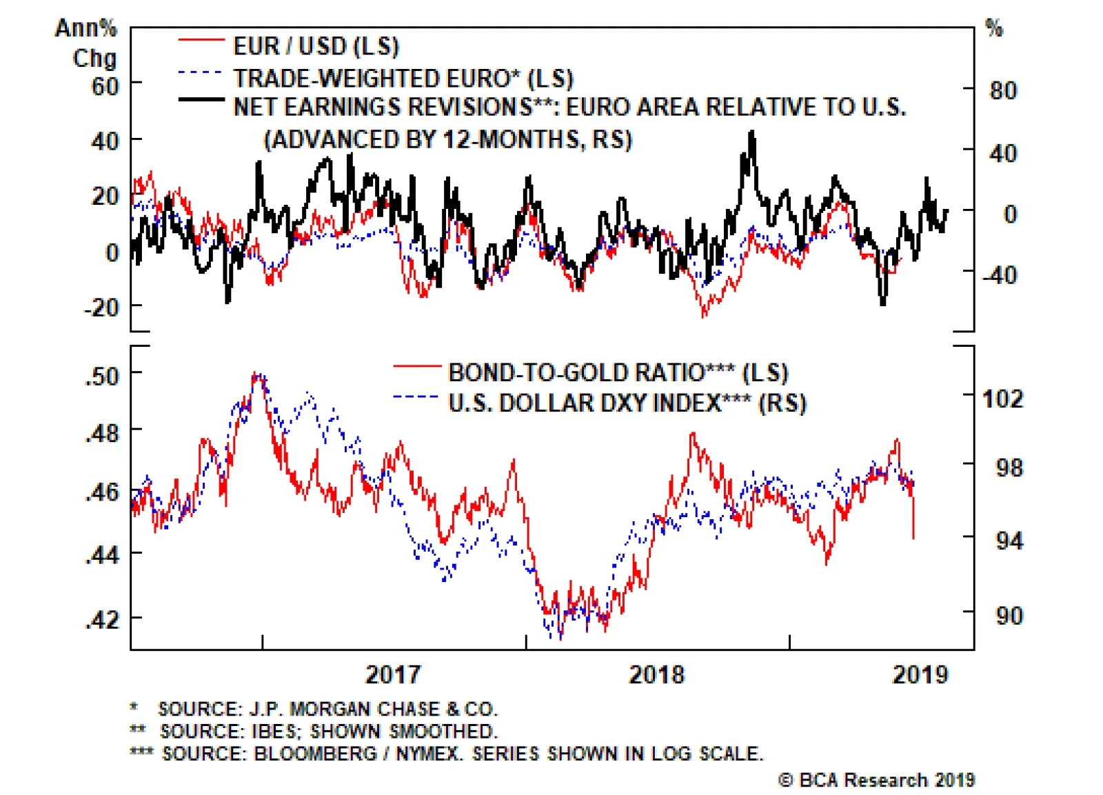
Interest rate differentials are moving against the dollar, but our important takeaway – that gold continues to outperform Treasurys – is an ominous sign. Gold has stood as a viable threat to dollar liabilities, any sign that the balance of forces are moving…
Highlights As long as the global long bond yield stays near 2 percent or below, European equities will end the year at broadly the same level as now… …but they will experience a dip of at least 4-5 percent along the way. All central banks have pivoted to dovish but the Fed has more easing armoury than the ECB. This means that the recent outperformance of 10-year U.S. T-bonds versus 10-year German bunds can continue. It also means that the euro has a sound structural underpinning versus the dollar. Feature At the start of this year we explained Why 2019 Is A Pivotal Year For Monetary Policy. Today we want to elaborate on that report, and its key observations: Since 2008, no developed economy central bank has been able to hike interest rates sequentially by more than 2 percent before needing to take a breather… and then reverse course. The current vulnerability to tightening emanates from the hyper-sensitivity of financial conditions to rate hikes, rather than from the direct impact on rate-sensitive sectors in the economy. Since October 2017, no stock market rally or sell-off has lasted more than three months or so (Chart Of The Week). These observations are as relevant – or more relevant – now, as they were at the time of our original report.1 Since the Global Financial Crisis, no developed economy central bank has been able to hike interest rates sequentially by more than 2 percent. Chart Of The WeekSince October 2017, No Rally Or Sell-Off Has Lasted More Than Three Months
Since October 2017, No Rally Or Sell-Off Has Lasted More Than Three Months
Since October 2017, No Rally Or Sell-Off Has Lasted More Than Three Months
A 2 Percent Tightening Is The Post-2008 Limit Since the Global Financial Crisis, no developed economy central bank has been able to hike interest rates sequentially by more than 2 percent before having to reverse course (Chart I-2 and Chart I-3). Chart I-2A 2 Percent Sequential Tightening Is The Post-2008 Limit
A 2 Percent Sequential Tightening Is The Post-2008 Limit
A 2 Percent Sequential Tightening Is The Post-2008 Limit
Chart I-3A 2 Percent Sequential Tightening Is The Post-2008 Limit
A 2 Percent Sequential Tightening Is The Post-2008 Limit
A 2 Percent Sequential Tightening Is The Post-2008 Limit
In 2008, Swedish interest rates peaked near 5 percent before collapsing to the zero bound in the financial crisis. But when the Riksbank started its so-called ‘policy normalisation’ in 2010, the interest rate could only reach 2 percent before the central bank had to backtrack; Norway could manage just 1 percent of tightening before its volte-face. Though admittedly, both Sweden and Norway were caught in the maelstrom of the euro debt crisis in 2011-12. However, on the other side of the world and relatively immune to the crisis in Europe, New Zealand could achieve a tightening also of only 1 percent; Korea could manage just 1.25 percent; the Reserve Bank of Australia marched interest rates up by 1.75 percent before taking a breather… and then marched them down again. The consensus was taking far too rosy a view on the global financial system’s capacity to tolerate further tightening. The Federal Reserve raised interest rates sequentially by 2 percent through December 2016 to December 2018, and guess what – it is now on the cusp of reversing course. The ultimate course will have a huge bearing on investment strategy for European equities, bonds and currencies. The Neutral Real Rate Of Interest Is Zero Many economists and strategists expected the Fed to continue hiking through 2019, but this publication pushed back hard. The consensus was taking far too rosy a view on the global financial system’s capacity to tolerate further tightening. Central to this publication’s resistance was, and is, a high-conviction view that the so-called ‘neutral’ real rate of interest – the real interest rate that is neither accommodative nor restrictive, the real interest rate consistent with an economy maintaining full employment while keeping inflation constant – is zero. The neutral rate of interest is very low. In our Special Report Why The Neutral Rate Of Interest Is Zero we proposed that the neutral rate is global rather than region-specific, that it refers to the bond yield rather than to the policy rate, and that it is extremely low. As it happens, the Fed broadly concurs. With the policy rate, bond yield, and inflation all at around 2 percent, the real policy rate and real bond yield are both near zero. At this level the central bank claims that “the policy stance is now in the Committee’s estimates of neutral… and when you get to that range we have to let the data speak to us.”2
Chart I-4
However, the data that is speaking most loudly is not necessarily the economic data, it is the financial market data. Jay Powell has said that if there is a sustained change in financial conditions through any one or more of its components then “that has to play into our thinking.” We think it has (Chart I-4). Comparing Today’s Rich Valuations With 2007 In the aftermath of the dot com bubble burst in 2000, policy interest rates collapsed to very low levels but, crucially, long bond yields did not. This contrasts with the aftermath of the Global Financial Crisis in 2008, during which both policy interest rates and bond yields have plunged to all-time lows (Charts I-5 - I-7). Funny things happen when the long bond yield gets to, and remains, at ultra-low nominal levels. Chart I-5In The Aftermath Of 2000, Bond Yields Did Not Collapse; But In The Aftermath Of 2008, They Did
In The Aftermath Of 2000, Bond Yields Did Not Collapse; But In The Aftermath Of 2008, They Did
In The Aftermath Of 2000, Bond Yields Did Not Collapse; But In The Aftermath Of 2008, They Did
Chart I-6In The Aftermath Of 2000, Bond Yields Did Not Collapse; But In The Aftermath Of 2008, They Did
In The Aftermath Of 2000, Bond Yields Did Not Collapse; But In The Aftermath Of 2008, They Did
In The Aftermath Of 2000, Bond Yields Did Not Collapse; But In The Aftermath Of 2008, They Did
Chart I-7In The Aftermath Of 2000, Bond Yields Did Not Collapse; But In The Aftermath Of 2008, They Did
In The Aftermath Of 2000, Bond Yields Did Not Collapse; But In The Aftermath Of 2008, They Did
In The Aftermath Of 2000, Bond Yields Did Not Collapse; But In The Aftermath Of 2008, They Did
The difference between the post-2000 and post-2008 policy responses can be summarized in two letters: QE. For all its apparent complexity, QE is actually a very simple monetary policy tool. It is just a mechanism for signalling that the policy interest rate will remain low for an extended period. Thereby, QE pulls down the long-term interest rate, which is to say the long bond yield. The double-digit rally over the past six months is technically extended. But as we have consistently pointed out on these pages, funny things happen when the long bond yield gets to, and remains, at ultra-low nominal levels. We refer readers to our other reports for the details, but in a nutshell the risk of owning bonds converges to the risk of owning equities and other so-called ‘risk-assets’. The upshot of this risk convergence is that investors price these risk-assets to deliver the same ultra-low nominal return as bonds, meaning that the valuation of the risk-assets soars.3 Chart I-8Since 2015, The Global Long Bond Yield Has Been Unable To Remain Above 2.5 Percent
Since 2015, The Global Long Bond Yield Has Been Unable To Remain Above 2.5 Percent
Since 2015, The Global Long Bond Yield Has Been Unable To Remain Above 2.5 Percent
All of which brings us to the crucial point. The post-2000 extreme policy easing distorted the real economy. It engineered a credit boom. So the fragility to the subsequent policy tightening emanated from the real economy, and particularly the most rate-sensitive sectors in the economy such as mortgage lending and housing. In contrast, the post-2008 extreme policy easing – driven by QE – has distorted the valuation of risk-assets. Moreover, the value of global risk-assets, at $400 trillion dwarfs the $80 trillion global economy by five to one. So the current fragility to policy tightening does not emanate from the real economy, it emanates from the hyper-sensitivity of financial conditions to higher bond yields (Chart 8). Some European Investment Implications The integration of global capital markets means that the valuation anchor for European – and all regional – stock markets now comes from the global long bond yield, which we define as the simple average of the 10-year yields in the euro area, U.S., and China. Through the past five years, the inability of the global long bond yield to remain above 2.5 percent confirms the hyper-sensitivity of financial conditions to higher interest rates. And it suggests that the ‘neutral’ rate on this measure is around 2 percent. The good news is that this measure now stands slightly below neutral at 1.9 percent. The euro has a sound structural underpinning versus the dollar. At around this level of the global long bond yield, the rich valuation of European equities has some support. That said, the double-digit rally over the past six months is technically extended, as most of the things that could go right did go right – central banks pivoted to dovish, euro area growth rebounded, and, until recently, geopolitical risks were easing. Hence, as long as the global long bond yield stays near 2 percent or below, we expect European equities to end the year at broadly the same level as now, though our technical signals do strongly suggest a dip of at least 4-5 percent along the way (Chart I-9). Chart I-9The Double-Digit Rally In Stock Markets Over The Past Six Months Is Technically Extended
The Double-Digit Rally In Stock Markets Over The Past Six Months Is Technically Extended
The Double-Digit Rally In Stock Markets Over The Past Six Months Is Technically Extended
Chart I-10The Fed Has More Easing Armoury Than The ECB
The Fed Has More Easing Armoury Than The ECB
The Fed Has More Easing Armoury Than The ECB
As regards bonds and currencies, all central banks have pivoted to dovish but the Fed has more easing armoury than the ECB (Chart I-10). This means that the recent outperformance of 10-year U.S. T-bonds versus 10-year German bunds can continue. It also means that the euro has a sound structural underpinning versus the dollar. However, this structural underpinning also applies to the yen, and until we get some clarity on Brexit we prefer the yen over the euro. Fractal Trading System* In line with the main body of this report and Chart 9, we see evidence that the double-digit rally in stock markets over the past six months is technically extended. Accordingly, this week’s recommended trade is to short the MSCI All-Country World index, setting the profit target at 4 percent with a symmetrical stop-loss. This leaves us with four open positions. For any investment, excessive trend following and groupthink can reach a natural point of instability, at which point the established trend is highly likely to break down with or without an external catalyst. An early warning sign is the investment’s fractal dimension approaching its natural lower bound. Encouragingly, this trigger has consistently identified countertrend moves of various magnitudes across all asset classes.
Global Financial Services Vs. Market
Global Financial Services Vs. Market
* For more details please see the European Investment Strategy Special Report “Fractals, Liquidity & A Trading Model,” dated December 11, 2014, available at eis.bcaresearch.com. Dhaval Joshi, Chief European Investment Strategist dhaval@bcaresearch.com Footnotes 1 Please see the European Investment Strategy Weekly Report ‘Why 2019 Is A Pivotal Year For Monetary Policy’ February 7, 2019 available at eis.bcaresearch.com. 2 Please see the European Investment Strategy Special Report ‘Why The Neutral Rate Of Interest Is Zero’ June 6, 2019 available at eis.bcaresearch.com. 3 Please see the European Investment Strategy Weekly Report ‘Risk: The Great Misunderstanding Of Finance’ October 25, 2018 available at eis.bcaresearch.com. Fractal Trading System
Image
Recommendations Asset Allocation Equity Regional and Country Allocation Equity Sector Allocation Bond and Interest Rate Allocation Currency and Other Allocation Closed Fractal Trades Trades Closed Trades Asset Performance Currency & Bond Equity Sector Country Equity Indicators Bond Yields Chart II-1Indicators To Watch - Bond Yields
Indicators To Watch - Bond Yields
Indicators To Watch - Bond Yields
Chart II-2Indicators To Watch - Bond Yields
Indicators To Watch - Bond Yields
Indicators To Watch - Bond Yields
Chart II-3Indicators To Watch - Bond Yields
Indicators To Watch - Bond Yields
Indicators To Watch - Bond Yields
Chart II-4Indicators To Watch - Bond Yields
Indicators To Watch - Bond Yields
Indicators To Watch - Bond Yields
Interest Rate Chart II-5Indicators To Watch - Interest Rate Expectations
Indicators To Watch - Interest Rate Expectations
Indicators To Watch - Interest Rate Expectations
Chart II-6Indicators To Watch - Interest Rate Expectations
Indicators To Watch - Interest Rate Expectations
Indicators To Watch - Interest Rate Expectations
Chart II-7Indicators To Watch - Interest Rate Expectations
Indicators To Watch - Interest Rate Expectations
Indicators To Watch - Interest Rate Expectations
Chart II-8Indicators To Watch - Interest Rate Expectations
Indicators To Watch - Interest Rate Expectations
Indicators To Watch - Interest Rate Expectations