Gov Sovereigns/Treasurys
Risk & Reward In The Treasury Market (Part 1)
…

Highlights Corporate Bonds: Corporate bond spreads have been slow to price-in the escalation of the U.S./China trade dispute. Nimble investors should take steps to mitigate their near-term (0-3 month) exposure to credit spreads, but remain overweight corporate bonds (both investment grade and high-yield) on a 6-12 month investment horizon. Duration: With 50 bps of rate cuts already priced into the market for the next 12 months, there is very little money to be made from extending duration and potentially a lot of money to be made by keeping duration low. This is especially true given that the Fed has so far done nothing to suggest that rate cuts are on the table. TIPS: Long-maturity TIPS breakeven inflation rates look cheap on our model, and the core PCE deflator’s sharp drop probably overstates the deflationary pressures in the economy. Maintain an overweight allocation to TIPS versus nominal Treasuries in U.S. bond portfolios. Feature Concerns that the ongoing U.S./China trade war will exacerbate the decline in global growth flared again last week, and our geopolitical strategists see high odds of further near-term escalation.1 For starters, China has not yet retaliated to the U.S. Commerce Department’s blacklisting of Huawei and a handful of other Chinese tech firms. Meanwhile, the U.S. stands ready to extend tariffs across the full slate of imported Chinese goods. To cap it all off, there are currently no firm plans for the resumption of talks between the countries’ respective negotiating teams, and no assurance that Presidents Donald Trump and Xi Jinping will speak to each other at the G20 Summit in Japan on June 28-29. Credit Spreads Are Too Complacent Chart 1Corporate Bonds At Risk
Corporate Bonds At Risk
Corporate Bonds At Risk
While Treasury yields responded to the turmoil by dropping for the second consecutive week, the spillover to corporate bond markets has been less severe. Chart 1 on page 1 shows that corporate bond excess returns have de-coupled from the CRB Raw Industrials index during the past 12 months. The CRB Raw Industrials index tracks a broad basket of commodity prices, making it an excellent real-time indicator of the market’s assessment of global growth. Like Treasury yields, the CRB index has fallen sharply during the past two weeks. The wide gulf between corporate bond and commodity returns suggests that we will soon see either a sell-off in the corporate bond market or a positive re-rating of global growth that sends the CRB index higher. Recent history provides examples of both cases (Chart 2). The CRB index rose to meet corporate bond returns in 2012, but dragged corporate bond returns lower in 2014. Given the long list of potential negative trade catalysts, some near-term downside for corporate bond excess returns appears more likely. But it’s not just political headlines that make us cautious about the near-term outlook for credit spreads. The uncertainty created by the U.S./China trade dispute is now finding its way into the economic survey data. Flash Manufacturing PMIs for the U.S., Eurozone and Japan all fell in May, with respondents quick to blame the decline on global trade tensions. Much like the CRB index, PMI readings are sending a starkly different message than credit spreads. Either trade tensions will ease during the next couple of months, sending PMIs higher, or corporate bond spreads will widen. A model of U.S. capacity utilization based on lagged junk spreads predicts that capacity utilization will rise from its current 78% to 80% during the next six months (Chart 3). However, both the Markit and ISM Manufacturing PMIs suggest a further decline is more likely. Once again, either trade tensions will ease during the next couple of months, sending the PMIs higher, or corporate bond spreads will widen. Chart 2Position For Reconvergence
Position For Reconvergence
Position For Reconvergence
Chart 3Capacity Utilization & Junk Spreads
Capacity Utilization & Junk Spreads
Capacity Utilization & Junk Spreads
We recommend that investors take measures to limit their near-term (~3-month) exposure to corporate spread risk. Stay Positive On A Cyclical (6-12 Month) Horizon Chart 4Expect More Stimulus From China
Expect More Stimulus From China
Expect More Stimulus From China
While near-term caution is warranted, we would still position for positive corporate bond excess returns (both investment grade & high-yield) on a 6-12 month investment horizon. Ultimately, the U.S. and China will navigate toward some sort of truce, and the negative impact from tariffs is unlikely to derail the U.S. economic recovery.2 What’s more, Chinese policymakers will accelerate their stimulus efforts to mitigate the negative impact of higher tariffs. Our China Investment Strategy service tracks a composite of six money and credit growth indicators that lead Chinese economic activity. This leading indicator has already bottomed, and our strategists anticipate a return to stimulus levels reminiscent of mid-2016 (Chart 4).3 As long as a U.S. recession is avoided, corporate bond spreads will eventually settle near levels seen in the late stages of previous economic cycles (Chart 5A & Chart 5B).4 Chart 5AInvestment Grade Spread Targets
Investment Grade Spread Targets
Investment Grade Spread Targets
Chart 5BHigh-Yield Spread Targets
High-Yield Spread Targets
High-Yield Spread Targets
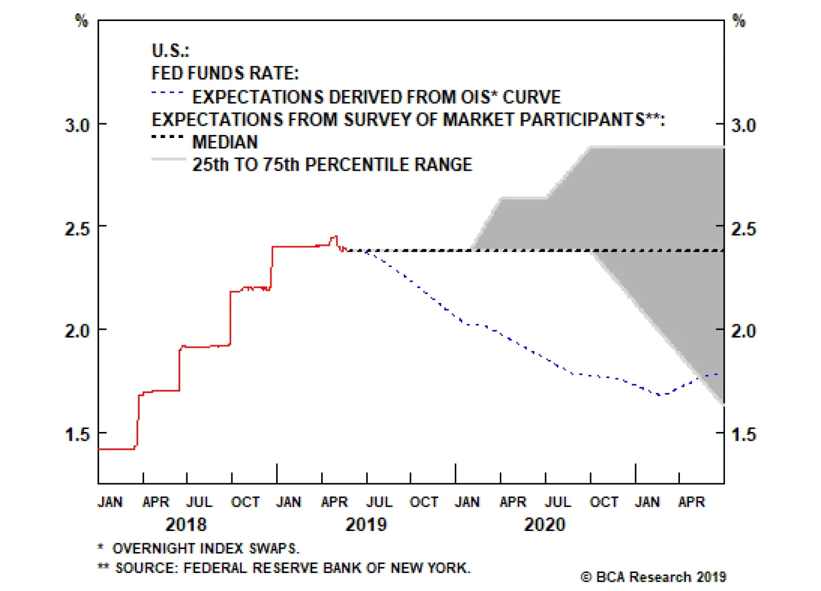
Bottom Line: Corporate bond spreads have been slow to price-in the escalation of the U.S./China trade dispute. Nimble investors should take steps to mitigate their near-term (0-3 month) exposure to credit spreads, but remain overweight corporate bonds (both investment grade and high-yield) on a 6-12 month investment horizon. Risk & Reward In The Treasury Market Unlike credit spreads, Treasury yields have responded aggressively to the negative news flow. The 10-year Treasury yield currently sits at 2.32%, 7 bps lower than at this time last week. Meanwhile, the overnight index swap curve is priced for two full 25 basis point rate cuts over the next 12 months. Interestingly, while market prices imply 50 bps of rate cuts during the next year, the New York Fed’s Survey of Market Participants shows that, as of the May FOMC meeting, investors didn’t actually expect rate cuts any time soon. The shaded region in Chart 6 shows the interquartile range of the surveyed investors’ fed funds rate forecasts, while the dashed black line shows the median forecast. The survey responses convey widespread consensus that the fed funds rate will remain flat until the end of the year – the 25th percentile, median and 75th percentile are all equal until the end of 2019. Then, heading into 2020, the 75th percentile of the distribution starts to forecast rate hikes. The 25th percentile doesn’t move in the direction of rate cuts until Q4 2020, and the median forecaster sees the fed funds rate staying put at least through the second half of 2021. Chart 6Market And Survey Expectations Differ
Market And Survey Expectations Differ
Market And Survey Expectations Differ
Why would market prices imply a much lower path for the fed funds rate than actual investor survey responses? The most likely reason relates to assessments about the balance of risks. When responding to surveys, investors will usually provide their modal (or most likely) outcome. However, investor bets in financial markets will reflect a dollar-weighted average of different possible scenarios. It’s possible that while investors think a flat fed funds rate is the most likely outcome, they also view rate cuts as a higher probability tail risk than rate hikes. They therefore invest some of their money to hedge that risk, even if it does not reflect their base case view.
Chart 7
The intuition that rate cuts remain a “tail risk” is confirmed by another question from the survey. This question asks investors to consider a time period between now and the end of the year, and then attach a probability to the Fed’s next move i.e. whether it will be hike, a cut, or whether there will be no change in the funds rate until the end of 2019 (Chart 7). As of the April/May survey, market participants thought the odds of a hike were 23%, odds of a cut were 17% and the odds of flat rates until the end of the year were 59%. Before the Fed meeting in March, investors saw 50% chance of a hike, 13% chance of a cut, and 37% chance of no change. The overall message is that investors continue to view a 2019 rate cut as a tail risk, but one that’s perceived probability is rising. In any event, for our purposes it doesn’t really matter how investors respond to surveys. According to our Golden Rule of Bond Investing, if the actual change in the fed funds rate over the next 12 months exceeds what is currently priced into the OIS curve for that period, then below-benchmark portfolio duration positions will pay off.5 In fact, the Golden Rule even gives us a framework for translating different rate hike/cut scenarios into expected 12-month Treasury returns (Table 1). Table 1The Golden Rule Of Bond Investing
Hedge Near-Term Credit Exposure
Hedge Near-Term Credit Exposure
Based on current prices, if the fed funds rate holds steady for the next 12 months – as the median market participant expects – we calculate that the Bloomberg Barclays Treasury Master Index will lose between 1.98% and 2.41% relative to cash. Even in the scenario where the Fed delivers two rate cuts during the next 12 months, we would still expect Treasury index returns to lag cash by 12-13 bps. Negative excess returns in the “two rate cut” scenario are due to the negative carry in the Treasury index. Capital gains/losses would be close to zero in that scenario, since the change in the fed funds rate is exactly equal to the market’s expectations. Investors continue to view a 2019 rate cut as a tail risk, but one that’s perceived probability is rising. What’s evident from those figures is that there is currently very little money to be made betting on rate cuts, and quite a bit to be made betting on rate hikes. The risk/reward balance in the Treasury market clearly favors keeping portfolio duration low. But What Will The Fed Actually Do? The minutes from the last FOMC meeting show broad consensus around the Fed’s current “on hold” policy stance, though it’s notable that “a few” participants thought rate hikes would be appropriate if the economy evolved in line with their expectations. The minutes contain no mention of a possible rate cut. Our sense is that it would require a further sharp tightening of financial conditions or significantly worse economic data before the Fed seriously considers cutting rates. Our Fed Monitor – an aggregate indicator that measures economic growth, inflation and financial conditions – is currently very close to the zero line, a level consistent with the Fed’s “on hold” stance (Chart 8). The ISM Manufacturing PMI is also firmly above the 50 boom/bust line. Historically, Fed rate cuts are usually preceded by a negative reading from our Fed Monitor and a sub-50 PMI. We would be looking for those two signals before expecting the Fed to cut rates. Chart 8Sub-50 ISM Required Before The Fed Cuts Rates
Sub-50 ISM Required Before The Fed Cuts Rates
Sub-50 ISM Required Before The Fed Cuts Rates
Bottom Line: With 50 bps of rate cuts already priced into the market for the next 12 months, there is very little money to be made from extending duration and potentially a lot of money to be made by keeping duration low. This is especially true given that the Fed has so far done nothing to suggest that rate cuts are on the table. Inflation & TIPS Chart 9Adaptive Expectations Model
Adaptive Expectations Model
Adaptive Expectations Model
It’s not just nominal Treasury yields that dropped during the past two weeks. Long-maturity TIPS breakeven inflation rates – the spread between nominal Treasury yields and TIPS yields – also fell precipitously. The 10-year TIPS breakeven inflation rate is currently 1.76% and the 5-year/5-year forward breakeven is only 1.9%. These figures suggest that the market does not trust the Fed to meet its inflation target in the long-run. Our main valuation tool for the 10-year TIPS breakeven rate is our Adaptive Expectations Model.6 It derives a fair value for the 10-year breakeven based on: The 10-year rate of change in the core consumer price index The 12-month rate of change in the headline consumer price index The New York Fed’s Underlying Inflation Gauge At present, the 10-year TIPS breakeven rate is 20 bps below the model’s fair value (Chart 9). It shouldn’t be too surprising that TIPS look cheap relative to nominals. Recent inflation data have been weak and the Fed has written off the weakness as “transitory”, leading to doubts about whether it will keep rates low enough to meet its target. For our part, we think investors should take advantage of low breakevens and overweight TIPS versus nominal Treasuries in U.S. bond portfolios. In fact, the Fed’s characterization of low inflation as “transitory” seems correct. Chart 10 shows both the core and trimmed mean PCE deflators. The dramatic fall in the core measure, which strips out food and energy prices from the headline number, is what has caught the market’s attention. But it’s important to note that trimmed mean PCE inflation has not confirmed the decline. In fact, it remains in a multi-year uptrend. Recent inflation data have been weak, but the Fed has written off the weakness as “transitory”. Chart 10Low Inflation Looks "Transitory"
Low Inflation Looks "Transitory"
Low Inflation Looks "Transitory"
This is the third time during this cycle that core PCE inflation has diverged negatively from the trimmed mean. Core eventually rebounded and re-converged with the trimmed mean in both of the prior two episodes. The Fed is banking on the third time playing out the same way, and we think it would be unwise to bet against them. Recently released research from the Federal Reserve Bank of Dallas shows that trimmed mean PCE inflation provides a less-biased real-time estimate of the headline figure than the traditional core measure. The latter tends to run too low. The trimmed mean is also more closely related to labor market slack.7 Bottom Line: Long-maturity TIPS breakeven inflation rates look cheap on our model, and the core PCE deflator’s sharp drop probably overstates the deflationary pressures in the economy. Maintain an overweight allocation to TIPS versus nominal Treasuries in U.S. bond portfolios. Ryan Swift U.S. Bond Strategist rswift@bcaresearch.com 1 Please see Geopolitical Strategy Weekly Report, “Is Trump Ready For The New Long March?” dated May 24, 2019, available at gps.bcaresearch.com 2 The potential economic impact from tariffs is discussed in Global Investment Strategy Weekly Report, “Tarrified,” dated May 16, 2019, available at gis.bcaresearch.com 3 Please see China Investment Strategy Weekly Report, “Simple Arithmetic,” dated May 15, 2019, available at cis.bcaresearch.com 4 For details on how we determine the spread targets shown in Charts 5A & 5B, please see U.S. Bond Strategy Weekly Report, “Paid To Wait”, dated February 26, 2019, available at usbs.bcaresearch.com 5 Please see U.S. Bond Strategy Special Report, “The Golden Rule Of Bond Investing”, dated July 24, 2018, available at usbs.bcaresearch.com 6 For details on the model’s construction please see U.S. Bond Strategy Weekly Report, “Adaptive Expectations In The TIPS Market,” dated November 20, 2018, available at usbs.bcaresearch.com 7 https://www.dallasfed.org/-/media/Documents/research/papers/2019/wp1903… Fixed Income Sector Performance Recommended Portfolio Specification
Highlights Falling Yields: There have been three main drivers of the latest decline in global bond yields: slower global growth, softer inflation expectations and increased safe-haven demand for bonds given the intensifying U.S.-China trade conflict. The first two are more than fully discounted in current yield levels, but the latter is likely to persist in the near-term with no resolution of the trade conflict in sight. Model Portfolio Adjustments: We are tactically reducing the sizes of the overall strategic tilts in our model bond portfolio – below-benchmark duration exposure and overweight global corporates vs. governments. There is a growing risk of deeper selloffs in global equity and credit markets if the June G-20 meeting produces no positive signals on ending the trade dispute. We do not yet see a case to position more defensively on a medium-term horizon, however, given the pickup in “early” global leading economic indicators. Feature Chart of the WeekYields Discount A Lot Of Bad News
Yields Discount A Lot Of Bad News
Yields Discount A Lot Of Bad News
The investment backdrop at the moment – slowing global growth momentum, softening inflation expectations, an increasingly prolonged U.S.-China trade dispute with no immediate sign of resolution, and a strengthening U.S. dollar– is fairly bond bullish. Unsurprisingly, government bond yields in the developed markets have fallen to levels more consistent with a less certain macro environment. At one point last week, the 10-year U.S. Treasury yield dipped as low as 2.30%, while the 10-year German Bund fell deeper into negative territory at -0.13%. There are now expectations of easier monetary policy discounted in yield curves of several countries, most notably the U.S. where markets are priced for 50bps of Fed rate cuts over the next year – despite no indication from the Fed that cuts are coming anytime soon. From a valuation perspective, bond yields are starting to look a bit stretched to the downside (Chart of the Week). The term premium component of yields has fallen to near post-crisis lows in the majority of countries, while the U.S. dollar has surged despite lower U.S. interest rate expectations – both indications of investors driving up the value of traditional safe-havens at a time of uncertainty. Looking purely at the growth side of the equation, the downward momentum in bond yields should start to fade with the global leading economic indicator now in the process of bottoming out. That does not mean, however, that yields could not fall further in the near-term if the trade headlines get worse and risk assets sell off more meaningfully – an outcome that grows increasingly likely as the two sides in the trade war seem to be digging in for a longer battle. The State Of The World Since The “TTT” Our colleagues at BCA Geopolitical Strategy now believe that there is only a 40% chance of a U.S.-China trade deal by the end of June. This could trigger a deeper selloff in global equity and credit markets if investors begin to price in a larger and more prolonged hit to economic growth and corporate profits from the U.S. tariffs. This would trigger even greater safe-haven flows into government bonds, pushing yields lower through a more negative term premium. The much lower level of U.S. Treasury yields has helped limit the hit to risk asset prices from the elevated uncertainty over global trade. Since the “Trump Tariff Tweet” (TTT) of May 5, when the new round of tariffs on U.S. imports from China was announced which sparked the new leg of the trade war, the fall in benchmark 10-year government bond yields across the developed world can be fully explained by the fall in the term premium (Table 1). For example, the 10-year U.S. Treasury yield has fallen -14bps since the TTT, while our estimate of the term premium on the 10-year Treasury as decreased by -20bps. Over the same time period, 10-year U.S. inflation expectations have also fallen -11bps, but the market has only priced in an additional -5bps of Fed rate cuts over the next year according to our Fed Discounter. Table 1Decomposing 10-Year Government Bond Yield Changes Since The "Trump Tariff Tweet"
The Message From Low Bond Yields
The Message From Low Bond Yields
The big difference between last December and today is the much lower level of U.S. Treasury yields. Lower yields have helped mute the hit to risk asset prices from the elevated uncertainty over global trade since the TTT (Chart 2). The Fed’s more dovish pivot in the early months of 2019 has helped push Treasury yields lower as investors have moved from pricing in rate hikes to discounting rate cuts. Even traditional “risk-off” measures like the VIX, U.S. TED spreads, the price of gold and the Japanese yen have only risen modestly since the TTT compared to the big moves seen back in December when investors feared that the Fed would tighten right into a U.S. recession (Chart 3). Chart 2Risk Assets Remain Relatively Calm
Risk Assets Remain Relatively Calm
Risk Assets Remain Relatively Calm
Chart 3Falling Bond Yields Helping Keep Vol Subdued
Falling Bond Yields Helping Keep Vol Subdued
Falling Bond Yields Helping Keep Vol Subdued
Easier monetary policy, if delivered, can help underwrite a rebound in equity and credit markets. When looking across the array of financial market returns since the TTT (Table 2), the only developed economies that have seen equities appreciate are Australia and New Zealand – countries where rate cuts are being signaled by policymakers (or already delivered, in the case of New Zealand). Table 2Asset Returns By Country Since The "Trump Tariff Tweet"
The Message From Low Bond Yields
The Message From Low Bond Yields
In the case of the U.S., however, numerous Fed officials have stated recently that no changes to U.S. monetary policy are likely without decisive evidence that the new round of China tariffs and trade uncertainty was having a major negative impact on U.S. growth. On that front, forward-looking measures of U.S. economic activity, like the Conference Board leading economic indicator or our models for U.S. employment and capital spending, are not pointing to an imminent sharp slowing of U.S. growth (Chart 4). At the same time, leading indicators like our global LEI diffusion index and the China credit impulse are both signaling that global growth momentum may soon start surprising to the upside (Chart 5). Chart 4No U.S. Recession Signal Yet From These Indicators
No U.S. Recession Signal Yet From These Indicators
No U.S. Recession Signal Yet From These Indicators
Chart 5Some Reasons For Optimism On Global Growth
Some Reasons For Optimism On Global Growth
Some Reasons For Optimism On Global Growth
If the Fed does not see a case to deliver the rate cuts that are now discounted, or even to just signal to the markets that easier policy is coming soon, then there is a greater chance of a deeper pullback in U.S. equity and credit markets from any new negative news on trade. This suggests that the risk-aversion bid for U.S. Treasuries will result in an even more deeply negative U.S. term premium and lower bond yields. Easier monetary policy, if delivered, can help underwrite a rebound in equity and credit markets. Already, we are seeing such increasingly negative correlations between returns on equities and government bonds across the major developed markets. In Charts 6 & 7, we show the rolling 52-week correlation between local government bond and equity returns for the U.S., euro area, Japan, U.K., Canada and Australia. For each country, we also plot that correlation versus our estimate of the term premium on 10-year government bond yields. Chart 6Safe Haven Demand For Bonds ...
Safe Haven Demand For Bonds...
Safe Haven Demand For Bonds...
Chart 7... Helping Drive Down Term Premia
...Helping Drive Down Term Premia
...Helping Drive Down Term Premia
It is clear that there is a significant “risk-aversion bid” for government bonds right now, given the increasingly negative stock/bond correlations and falling term premia. One possible interpretation is that falling bond yields are being driven more by fears of a risk-off selloff in global equity and credit markets rather than rational pricing of future monetary policy or inflation expectations because of slowing growth. Interestingly, Australia – where the central bank has been signaling that rate cuts are imminent – is the only exception in this list of countries where the stock/bond correlation is not negative. There, the deeply negative term premium is more about weakening growth and low inflation expectations, which is forcing a dovish response from the Reserve Bank of Australia, rather than a risk aversion bid for safe assets from investors. It is clear that there is a significant “risk-aversion bid” for government bonds right now, given the increasingly negative stock/bond correlations and falling term premia. Net-net, while bond yields discount a lot of bad news and now look too low compared to tentative signs of improving global growth, it is hard to build a case for an imminent rebound in global bond yields without signs that U.S. and China are getting closer to a trade deal. Bottom Line: There have been three main drivers of the latest decline in global bond yields: slower global growth, softer inflation expectations and increased safe-haven demand for bonds given the intensifying U.S.-China trade conflict. The first two are more than fully discounted in current yield levels, but the latter is likely to persist in the near-term with no resolution of the trade conflict in sight. Tactical Risk-Reduction Adjustments To Our Model Bond Portfolio Chart 8Easier Monetary Policy Required In Europe & Australia
Easier Monetary Policy Required In Europe & Australia
Easier Monetary Policy Required In Europe & Australia
Given the growing potential for a larger selloff in global risk assets if no U.S.-China trade deal comes out of next month’s G-20 meeting (where Presidents Trump and Xi will both be in attendance), we think it is prudent to make some tactical adjustments to the recommended weightings within our model bond portfolio. These moves will provide a partial hedge against any near-term widening of global credit spreads or further reduction in government bond yields in the event of a complete breakdown of the trade talks. Specifically, we are making the following changes: Duration Exposure: We are increasing the overall duration of the model bond portfolio by 0.5 years, which still leaves a duration position that is 0.5 years below the custom benchmark index of the portfolio. We are doing this by increasing allocations to the longer maturity buckets in the U.S., Japan and France. Credit Exposure: We are cutting the sizes of our recommended overweight tilts for U.S. corporates in half for both investment grade and high-yield. This is a combined reduction of nearly 4% of the portfolio that will be used to fund the increase in duration on the government bond side. We are making no other changes to our government bond country allocations, staying overweight in core Europe (Germany plus France), Japan and Australia where our Central Bank Monitors are calling for a need for easier monetary policy (Chart 8). We are also staying overweight U.K. Gilts, where yields continue to trade more off Brexit uncertainty than domestic economic growth or inflation pressures. We are not making any changes to the model bond portfolio exposure to euro area corporate debt or Italian governments, riskier spread products where we are already underweight. We are, however, maintaining our weightings for U.S. dollar denominated EM sovereign and corporate debt at neutral. EM debt has performed relatively well versus developed market equivalents since the May 5 “Trump Tariff Tweet” (TTT). We understand that not downgrading EM seems counterintuitive when we are trying to position more defensively in the model portfolio. We prefer to reduce exposure to U.S. credit, however, given that EM debt has performed relatively well versus developed market equivalents since the May 5 TTT (Table 3), and with EM spreads now at more attractive levels relative to U.S. investment grade (Chart 9). In addition, EM credit tends to perform better during periods when Chinese credit growth is accelerating, as is currently the case (bottom panel) – and which may continue if China’s policymakers eventually turn to more domestic stimulus measures to combat the effects of U.S. tariffs, as seems likely. Table 3Credit Market Performance Since The "Trump Tariff Tweet"
The Message From Low Bond Yields
The Message From Low Bond Yields
Chart 9EM Credit Offers Value Versus U.S. Corporates
EM Credit Offers Value Versus U.S. Corporates
EM Credit Offers Value Versus U.S. Corporates
Importantly, these are all only tactical changes to our model portfolio to partially protect against the risk of U.S. credit spread widening in the event of more negative news on the U.S.-China trade front. We still have not changed our strategic (6-12 month) views on global bond yields (higher) and global corporates (outperforming government bonds) given the tentative signs of improving global growth from the leading indicators. Bottom Line: We are tactically reducing the sizes of the overall strategic tilts in our model bond portfolio – below-benchmark duration exposure and overweight global corporates vs. governments. There is a growing risk of deeper selloffs in global equity and credit markets if the June G20 meeting produces no positive signals on ending the trade dispute. We do not yet see a case to position more defensively on a medium-term horizon, however, given the pickup in “early” global leading economic indicators. Robert Robis, CFA, Chief Fixed Income Strategist rrobis@bcaresearch.com Recommendations The GFIS Recommended Portfolio Vs. The Custom Benchmark Index
The Message From Low Bond Yields
The Message From Low Bond Yields
Duration Regional Allocation Spread Product Tactical Trades Yields & Returns Global Bond Yields Historical Returns
Highlights Treasury yields have tumbled despite a solid U.S. economy: The 10-year Treasury bond yielded just under 3% when we started beating the below-benchmark-duration drum last summer; now it’s hovering around 2.3%. The golden rule of bond investing argues against positioning for further declines, … : The returns to duration strategies hinge on the difference between actual and expected moves in the fed funds rate. With the money market looking for two cuts over the next twelve months, the fed funds rate is more likely to surprise to the upside than the downside. … but could a lack of borrowing keep yields low?: If debt-fueled spending has gone out of fashion in the U.S., global savings could overwhelm investment, and rates might have to fall further to bring them back into balance. Feature The ride has gotten bumpier as the trade tensions between the U.S. and China have heated up, but our recommendations have held up well since last summer. Equal-weighting equities, underweighting bonds and overweighting cash helped preserve capital during the fourth-quarter selloff, while our early and late January upgrades of equities (while downgrading cash) and spread product (while further downgrading Treasuries), respectively, have proven to be beneficial.1 On a total return basis, the S&P 500 is up over 12% since our upgrade, and the Barclays Bloomberg Corporate and High Yield Indexes have generated excess returns over Treasuries of around 175 and 75 basis points (“bps”), respectively, despite ceding much of their previous leads.2 Even the TIPS ETF (TIP) has held its own with the equivalent-duration nominal-Treasury ETF (IEF). The below-benchmark duration call has eroded some of the overall outperformance, however, and there has been some debate within BCA about whether or not we should change the view. We still do not believe the monetary policy outlook merits a duration-view change. We remain constructive on the outlook for global growth, despite the escalation in tensions between U.S. and Chinese trade negotiators, and therefore do not see a fundamental reason to expect lower real rates. The idea that soft credit growth could hold rates down is interesting, but one would have to believe the spendthrift U.S. leopard really has changed its spots to position a portfolio in line with it. Fed Policy Chart 1Caution: Falling Rate Expectations
Caution: Falling Rate Expectations
Caution: Falling Rate Expectations
As of Thursday’s close, the money market was pricing in a 100% chance of a 25-bps rate cut by Thanksgiving, a 100% chance of a 50-bps rate cut by this time next year, and a 45% chance of a third cut by Thanksgiving 2020 (Chart 1, bottom panel). The FOMC has paused its rate-hiking campaign, to be sure, but the idea that it will soon embark on a rate-cutting campaign seems like a stretch. The minutes from the FOMC’s April 30th-May 1st meeting, released last week, painted a picture of a fundamentally solid economy. The balance between hawks and doves remained roughly equal, with “a few participants” calling for a coming need to firm policy, given the swiftness with which inflation pressures can build in a tight labor market, while “a few other participants” noted that the unemployment rate is not the be-all and end-all measure of resource utilization. From an investment strategy perspective, we think our U.S. Bond Strategy service’s golden rule provides the best insight. Below-benchmark-duration positioning will outperform if the Fed cuts less (or hikes more) over the next twelve months than markets expect; above-benchmark-duration will win if the Fed cuts more (or hikes less) than markets expect. Some strategists within BCA have raised the possibility that market expectations could force the Fed’s hand. The reason that the Fed is especially loath to disappoint markets in what might be called the forward-guidance era of central banking, but we think there’s an important distinction between taking care not to surprise markets and surrendering one’s free will to them, as parents of young children can attest. Bottom Line: We think the money markets are significantly overestimating the possibility that the Fed will soon cut the fed funds rate, increasing the potential returns from below-benchmark-duration positioning. The Rates Checklist Table 1Rates View Checklist
Is America Not Borrowing Enough?
Is America Not Borrowing Enough?
We developed our rates checklist3 to provide a list of real-time measures that bear on our rates view. Of the eleven items on the list, only three have met our threshold for reassessing our bearish rates call at any point over the last eight months, so we have stayed the course (Table 1). The checked boxes indicate that the evidence has been moving against us, though we would argue that the stingy 10-year Treasury yield has gotten overly carried away with discounting that evidence (Chart 1, top panel). Policy Perceptions The spread between our monetary policy expectations and the markets’ remains wide, so the prospective returns from our Fed call remain ample, and the first box remains unchecked. Thanks to last week’s two-day, 11-bps decline in the 10-year Treasury yield, we have again checked the inverted yield curve box, which first inverted for five days near the end of March, and has inverted for four days so far in May. Our empirical study of the inverted curve’s recession-signaling properties used month-end closes for the 10-year Treasury yield and the 3-month Treasury Bill rate, and found that an inverted curve had called the seven recessions that have occurred over the last 50 years with just one false positive (Chart 2). Now that the curve has inverted over a couple of daily stretches, clients have asked us just what constitutes bona fide inversion. Chart 2Accurate Yield Curve Signals Tend To Last
Accurate Yield Curve Signals Tend To Last
Accurate Yield Curve Signals Tend To Last
Per the curve’s moves over the last 50 years, we would say inversion doesn’t issue an actionable signal until it persists for at least a few months (Table 2). 1998’s false alarm encompassed just seven days between late September and early October, and covered just one month end. The intuition behind the inverted yield curve’s predictive power is that the bond market sniffs out economic weakness before the Fed officially changes course. Recognizing that the Fed will have to begin cutting rates soon, bond investors buy longer-maturity instruments to reap the biggest rewards. Investors shouldn’t overreact to tentative inversions of the yield curve. Table 2Yield Curve Inversions
Is America Not Borrowing Enough?
Is America Not Borrowing Enough?
We have argued that the next recession will not occur until the Fed has hiked the fed funds rate to a level above the equilibrium fed funds rate. Since we cannot observe the equilibrium rate in real time, we have looked to interest-rate-sensitive segments of the economy to gauge if higher rates are beginning to bite. Housing is on the front line of interest-rate sensitivity, and it remains quite affordable relative to history, suggesting that monetary policy has not yet become restrictive. Every time the inverted curve preceded a recession, the affordability index was below its long-run mean or rapidly making its way there (mid-1973); when the yield curve briefly inverted in September 1998, homes remained more affordable than average (Chart 3). Chart 3If Higher Rates Aren't Squeezing The Economy, The Yield Curve May Be Crying Wolf
If Higher Rates Aren't Squeezing The Economy, The Yield Curve May Be Crying Wolf
If Higher Rates Aren't Squeezing The Economy, The Yield Curve May Be Crying Wolf
Inflation We concede that realized inflation measures (Chart 4), and inflation expectations as proxied by the difference in TIPS and nominal Treasury yields (Chart 5), have lost momentum since last summer. Washington’s unexpected grant of six-month waivers for importing Iranian oil caused crude prices to plunge, taking headline inflation measures and inflation expectations down with them (Chart 6). Given our Commodity And Energy Strategy team’s view that oil prices will extend their rebound across the rest of this year and into next, we expect that they will again move higher. Chart 4Consumer Price Indexes, ...
Consumer Price Indexes, ...
Consumer Price Indexes, ...
chart 5... And Inflation Breakevens, ...
... And Inflation Breakevens, ...
... And Inflation Breakevens, ...
Chart 6... Are Joined At The Hip With Oil Prices
... Are Joined At The Hip With Oil Prices
... Are Joined At The Hip With Oil Prices
The Labor Market And Imbalances At Home And Abroad The labor market remains tight, so none of the labor market indicators argue for easier monetary policy and lower rates across the term structure. As far as the instability indicators go, there is as yet no sign of unsustainable activity in the economy’s key cyclical sectors. The Fed has stopped emphasizing the idea that financial sector imbalances alone might justify tighter policy, but anecdotal reports about lending standards suggest that potential vulnerabilities remain. There has not yet been an outbreak of major international distress that could deter the Fed from tightening policy, but worsening trade tensions and continued dollar strength would seem to make it slightly more likely. Bottom Line: We have checked a few boxes on our rates checklist, but the available evidence does not support adopting a more constructive view on rates. Hey, Big Spender The American consumer has long been a punching bag for Austrian School adherents and other moralists. As much as they scorn American households for living beyond their means, U.S. consumption has long played a symbiotic role in the global economy. As the engine powering the world’s largest economy, it makes an essential contribution to global aggregate demand, and provides an outlet for export powerhouses like China and Germany. An economy can only run a current account surplus provided that there are other economies running current account deficits capable of offsetting it. Measured inflation and inflation expectations were beginning to get some traction before oil collapsed upon the issuance of Iranian import waivers. In a recent blog post, former BCA Editor-in-Chief Francis Scotland posited that interest rates may not go anywhere as long as American households embrace their nascent post-crisis frugality. Using U.S. household demand as a proxy for global aggregate demand, Francis argues that if households don’t borrow and spend the way they did throughout the pre-crisis postwar era, global aggregate demand will suffer unless another profligate spender emerges to pick up the slack. Add China to the mix, and global savings could swamp global investment. Against that backdrop, savings and investment would only realign if rates fell. Newly frugal U.S. households may be helping to cap interest rates, but it’s too early to declare the end of the Debt Supercycle. Broadening the scope to include all public- and private-sector U.S. borrowing, the nominal 10-year Treasury yield has taken some cues from growth in aggregate borrowing (Chart 7). The relationship with real yields is not as strong (Chart 8), but if borrowing has some relationship to inflation, as under the guns-and-butter fiscal policy of the late sixties, nominal yields might well be a better measure. We can easily go along with the supply-and-demand intuition behind the observed relationship: when there’s stronger demand for credit, rates have to rise to entice savings and discourage investment to bring them back into balance, and vice versa. Chart 7Nominal Treasury Yields Have Been Tightly Linked With The Pace Of Loan Growth, ...
Nominal Treasury Yields Have Been Tightly Linked With The Pace Of Loan Growth, ...
Nominal Treasury Yields Have Been Tightly Linked With The Pace Of Loan Growth, ...
Chart 8... And Real Yields Have Broadly Followed The Pattern As Well
... And Real Yields Have Broadly Followed The Pattern As Well
... And Real Yields Have Broadly Followed The Pattern As Well
Government borrowing filled the void left by retrenching households and corporations in the immediate aftermath of the crisis. Household and corporate loan demand has been choppy since, however, and growth in aggregate borrowing has bumped around its mid-1950s lows throughout the expansion. We are not ready to declare that Americans have turned over a new, parsimonious leaf. The federal budget deficit soared following the passage of the stimulus package, and the CBO projects that it will continue to widen. Household debt growth is at its pre-crisis lows, but it has been accelerating ever since 2010 (Chart 9), and with debt service as a share of disposable income at its lowest level in at least 40 years, households have plenty of capacity to borrow. Chart 9Don't Count Consumers Out Just Yet
Don't Count Consumers Out Just Yet
Don't Count Consumers Out Just Yet
Bottom Line: Interest rates have moved directionally with aggregate loan growth across the postwar era. Tepid loan demand growth may well keep a lid on rates, but we are not convinced that the Debt Supercycle has really breathed its last. Investment Implications Now that the 10-year Treasury yield has drifted back down to 2.3%, we believe the distribution of potential rate outcomes a year from now is skewed to the upside. We are thereby sticking with our recommendation that investors underweight Treasuries and maintain below-benchmark-duration positioning in all fixed-income portfolios. Even if there is not a clear catalyst on the immediate horizon for higher rates, we do not think that either the U.S. or the global economy is so fragile that investors should position for further rate declines. Doug Peta, CFA Chief U.S. Investment Strategist dougp@bcaresearch.com Footnotes 1 Please see the January 7 and January 28, 2019 U.S. Investment Strategy Weekly Reports, “What Now?” and “Double Breaker,” available at usis.bcaresearch.com. 2 All return data calculated as of the Thursday, May 23rd close. 3 Please see the September 17, 2018 U.S. Investment Strategy Weekly Report, “What Would It Take To Change Our Bearish Rates View?” available at usis.bcaresearch.com.
Highlights The view that the world will sink into a deflationary “ice age” hinges on the assumption that policymakers will make a colossal mistake by failing to do what is in their own best interest. Contrary to popular belief, governments always have a tool to increase inflation, even when an economy has fallen into a liquidity trap: It’s called sustained fiscal stimulus. Japan could have avoided its deflationary epoch if the authorities had eased fiscal policy more aggressively. Ironically, bigger budget deficits probably would have caused the government debt-to-GDP ratio to rise less than it did. The U.S. and China are unlikely to repeat Japan’s mistake. Actually, looking ahead, Japan may not repeat Japan’s mistake. The euro area is a tougher call given the region’s political and institutional constraints; but even there, a reflationary outcome is more likely than not. An intensification of the trade war will cause government bond yields to fall a bit further in the near term. However, yields are likely to be higher one year from now. Global equities will follow the same path as bond yields: Down in the near term, but up over a 12-month horizon. Feature I feel more confident than ever that the next phase of the Ice Age will soon be upon us. Much of the thesis has come from learning the hard deflationary lessons from Japan. Most commenters now accept the Japanification of mainland Europe has occurred, but they just cannot conceive that the same thing might happen with the US. My biggest conviction call is that US 10y bond yields will converge with Japanese and German yields in the next recession at around minus 1% (and US 30y yields will fall to zero or below) and that markets will panic as outright deflation takes an icy grip. - Albert Edwards, Société Générale (May 2019) Fire Or Ice? If you were to ask most central bankers today whether it is better to err on the side of too much or too little inflation, chances are they would say the former. Their rationale would surely be as follows: If inflation rises to uncomfortably high levels, they can simply raise interest rates in order to cool the economy. In contrast, if inflation gets too low, and interest rates are already close to zero, monetary policy loses potency. It is better to have more control over the economy than less. This reasoning is correct on its own terms, but if one stands back and thinks about it, it is rather perverse to argue that deflation, which generally stems from a lack of aggregate demand, should be more difficult to overcome than inflation, which is usually the result of too much demand. After all, people like to spend money. Getting someone to work and produce should, in principle, be more difficult than getting them to consume. Inflation should be a bigger problem than deflation. So why do so many economists think otherwise? The Paradox Of Thrift There actually is a very good reason for this bias, one which John Maynard Keynes articulated more than 80 years ago. Keynes observed that when unemployment is rising, people are likely to try to save more due to fear of losing their jobs. Since one person’s spending is another’s income, this could create a vicious cycle where falling spending leads to lower aggregate income, and so on. Unfortunately, it is hard to save if you do not have a job. Thus, the decision by all individuals to save more could result, ironically, in a decline in aggregate savings.1 Keynes called this the paradox of thrift. At the heart of the paradox of thrift lies a deep-seated coordination problem. During an economic downturn, everyone would be better off if everyone else spent more money. However, since the spending of any one person only has a negligible effect on aggregate demand, no one has an incentive to spend more than is absolutely necessary. Keynes’ seminal insight was that a government could overcome this coordination problem by acting as a spender of last resort. Keynes argued that if the private sector decides to save more, the public sector should save less by running a bigger budget deficit. The result would be the preservation of full employment. Debt And Deliverance A common objection to the idea that governments should run bigger budget deficits to compensate for inadequate private-sector demand is that this will cause public-sector debt levels to swell to the point that a fiscal crisis becomes inevitable. The solution to Japan’s problem is obvious: The government should just keep easing fiscal policy until long-term inflation expectations reach the BoJ’s target. For countries such as Italy, this is a legitimate concern. If a country does not have a central bank that can serve as a buyer of last resort of government debt, it can end up facing a pernicious feedback loop where rising bond yields increase the likelihood of default, leading to even higher bond yields. These countries can, and often do, face speculative attacks on their bond markets (Chart 1).
Chart 1
For countries that issue debt in their own currencies, this concern does not exist. This is because their governments can print money to pay for goods and services. Since the cost to the government of printing a $100 bill is negligible, the government can always conjure up demand out of thin air. Of course, there is a risk that the government will manufacture too much demand and inflation will rise. But if the goal is to prevent deflation, this is a feature not a bug. Once demand increases enough, the government can just pull the plug on further fiscal stimulus, and everyone can live happily ever after. Japan’s Experience Chart 2The 1990s Japanese Example
The 1990s Japanese Example
The 1990s Japanese Example
Didn’t Japan try this approach and fail? No. Japan suffered the mother of all financial shocks in the early 1990s when the real estate and stock market bubbles simultaneously burst. This happened just as the working-age population was peaking, which made businesses even less eager to expand domestic capacity. The result of all this was a massive increase in excess private-sector savings. The government did loosen fiscal policy, but not by enough. Consequently, deflation eventually set in. As inflation expectations fell, real rates rose (Chart 2). Rising real rates put upward pressure on the yen and increased the government’s real debt financing costs. To make matters worse, falling prices made it more difficult for private-sector borrowers to pay back their loans. This further depressed spending. Ironically, had the Japanese government eased fiscal policy more aggressively to begin with, it probably would have been able to trim deficits later on. Nominal GDP would have also increased more briskly. As a consequence, the government debt-to-GDP ratio would have ended up rising less than it did. Today, Japan remains mired in a deflationary mindset. Twenty-year CPI swaps, a proxy for long-term inflation expectations, are trading at 0.3%, nowhere close to the Bank of Japan’s 2% target. Interest rates are stuck near zero, reflecting the fact that the economy continues to suffer from excess savings. Japan Needs Fiscal Stimulus, Not Austerity The solution to Japan’s problem is obvious: The government should just keep easing fiscal policy until long-term inflation expectations reach the BoJ’s target. Given Japan’s pathetically low fertility rate, a sensible strategy would be to offer subsidized housing and baby bonuses to any couple that has three or more children. It is impossible to know how big a budget deficit will be required to reset inflation expectations to a higher level. If people believe that the government is serious about easing fiscal policy by enough to get inflation up to target, real rates will collapse, the yen will fall, and private demand will rise. In the end, the government may not need to raise the budget deficit that much. Even if the Japanese government did have to increase the budget deficit substantially, this would not endanger the economy. As long as the interest rate at which the government borrows is below the growth rate of the economy, any budget deficit, no matter how large, will produce a stable debt-to-GDP ratio in the long run (Chart 3).2 Since there would be no need to ease fiscal policy by so much that the Bank of Japan is forced to lift interest rates above the economy’s growth rate, there is little risk that the debt-to-GDP ratio will end up on an unsustainable trajectory.
Chart 3
Chart 4Japanese Excess Savings Are Starting To Recede
Japanese Excess Savings Are Starting To Recede
Japanese Excess Savings Are Starting To Recede
Will the Japanese government heed this advice? While Q1 GDP growth surprised on the upside, this was mainly because of a strong contribution from net exports and inventories. Final domestic demand remains underwhelming. Stronger global growth will help Japan later this year, but we think there is still a 50/50 chance the planned VAT hike will be postponed. Looking ahead, the exodus of Japanese workers from the labor market into retirement will reduce private-sector savings. The household savings rate has already fallen from nearly 20% in the early 1980s to around 4% in recent years. The ratio of job openings-to-applicants has risen to a 45-year high (Chart 4). Falling private-sector savings will raise the neutral rate of interest, thus giving the BoJ more traction over monetary policy. Japan’s deflationary ice age may be coming to an end. Stimulus With Chinese Characteristics Like Japan, China has struggled to consume enough of what it produces. In the days when China had a massive current account surplus, it could export that excess savings abroad. It cannot do that anymore, so the government has consciously chosen to spur fixed-investment spending in order to prop up employment. Since a lot of investment is financed through credit, debt levels have risen (Chart 5). Much of China’s debt-financed investment spending has been undertaken by local governments and state-owned enterprises. This has made credit and fiscal policy virtually indistinguishable. While the general government fiscal deficit stands at a moderate 4.1% of GDP, the augmented deficit, which includes a variety of off-balance sheet expenditures, has swollen to 10.7% of GDP, up more than six percentage points since 2010 (Chart 6). Chart 5China: From Exporting Savings To Investing Domestically And Building Up Debt
China: From Exporting Savings To Investing Domestically And Building Up Debt
China: From Exporting Savings To Investing Domestically And Building Up Debt
Chart 6
As we discussed a few weeks ago in a report entitled “Chinese Debt: A Contrarian View”, there is little preventing the Chinese government from further ramping up credit/fiscal stimulus.3 The fact that the trade negotiations are on the ropes only strengthens the case for additional easing. The government knows full well that it will gain negotiating leverage over the U.S. if the Chinese economy is humming along despite higher tariffs on Chinese imports. Regardless of whether it is right-wing populism or left-wing populism that triumphs in the end, the outcome is likely to be the same: higher inflation. Europe: Turning Japanese? Judging from the fact that German bund yields have fallen to Japanese levels, one might conclude that the Japanification of Europe is complete. There is, however, at least one key macro difference between the two regions: While long-term inflation expectations in the euro area have declined, they are still well above Japanese levels (Chart 7). As a result, real yields are quite a bit lower in core Europe, which gives countries such as Germany and France some cushion of support. Chart 7Despite Similar Nominal Bond Yields, Real Rates Are Still Much Lower In Germany Than Japan
Despite Similar Nominal Bond Yields, Real Rates Are Still Much Lower in Germany Than Japan
Despite Similar Nominal Bond Yields, Real Rates Are Still Much Lower in Germany Than Japan
Chart 8Italian Bond Yields Are Still Worryingly High
Italian Bond Yields Are Still Worryingly High
Italian Bond Yields Are Still Worryingly High
Bond yields remain elevated in Italy, though still below the levels seen last October, and far below their peak during the euro crisis in 2011 (Chart 8). Short of the creation of a pan-euro area fiscal union, Italy’s best hope is that Germany takes steps to reflate its own economy. The conventional wisdom is that the German psyche, ever focused on fiscal discipline, would never permit that to happen. This view, however, forgets that Germany had no trouble violating the Maastricht Treaty’s deficit cap of 3% of GDP in the early 2000s. Germany today sees little need to significantly loosen fiscal policy because years of wage repression, and more recently, a weak euro, have caused its current account surplus to swell to 9% of GDP. However, the country’s ability to push out its excess production to the rest of the world may become more limited in the future. The gap in unit labor costs between Germany and other euro area members has narrowed steadily in recent years. This development has coincided with a decline in Germany’s trade surplus with the rest of the euro area (Chart 9). If the common currency starts to appreciate and wage growth in Germany continues to outpace the rest of the region, the German government may have no choice but to loosen the fiscal screws. Chart 9Germany's Competitive Advantage Against The Rest Of The Euro Area Is Declining
Germany's Competitive Advantage Against The Rest Of The Euro Area Is Declining
Germany's Competitive Advantage Against The Rest Of The Euro Area Is Declining
Chart 10U.S.: Federal Discretionary Spending Has Been Gaining Steam
U.S.: Federal Discretionary Spending Has Been Gaining Steam
U.S.: Federal Discretionary Spending Has Been Gaining Steam
U.S.: Ice Age Vs. Green New Deal While Trump’s tax cuts have gotten a lot of attention, an equally important development in recent years has been the rapid acceleration in federal government spending. From a contraction of 7% in 2013, real discretionary outlays are set to grow by 3% in 2019 (Chart 10). There is little reason to think that the U.S. budget deficit will shrink anytime soon. Taxes may go back up if the Democrats take control of the White House and sweep Congress next year. However, even in that scenario, any increase in tax rates is likely to be neutralized by higher social welfare spending – yes, including partial implementation of the green new deal. Meanwhile, government outlays on Social Security and health care programs such as Medicaid are on track to rise by 5.4% of GDP over the next thirty years (Chart 11).
Chart 11
So far, an overstimulated U.S. economy has not produced much in the way of inflation. But with the unemployment rate down to a 49-year low, that could change over the next few years. Recent communications from FOMC members suggest a growing tolerance for a modest inflation overshoot of the 2% target. An outright increase in the Fed’s inflation target is unlikely in the near term, but could become a viable option if realized inflation moves above the Fed’s current comfort zone of 2%-to-2.5% for long enough. If that were to happen, raising the inflation target could turn out to be politically more expedient than engineering a deep recession in an effort to bring inflation back down. It will also help alleviate the rising real debt burden that will ensue from high deficits. We expect global bond yields to reach a series of “higher highs and higher lows” over the coming years. The Fed is already facing political pressure from the Trump administration to keep rates low. Politics in the U.S. and in many other countries is moving in a more populist direction. Regardless of whether it is right-wing populism or left-wing populism that triumphs in the end, the outcome is likely to be the same: higher inflation. Historically, there is a clear inverse correlation between central bank independence and inflation (Chart 12).
Chart 12
Investment Conclusions On the question of whether we are heading for a deflationary ice age or a period of inflationary global warming, we would put higher odds on the latter. Many of the structural factors that have produced lower inflation over the last few decades are in retreat. Globalization has stalled, and may even reverse course if the trade war intensifies (Chart 13). The ratio of workers-to-consumers globally is starting to shrink as the post-war generation leaves the labor force (Chart 14). Central bank autonomy is under attack, while fiscal policy is turning more expansionary. Chart 13The Age Of Globalization Is Over
The Age of Globalization Is Over
The Age of Globalization Is Over
Chart 14The Worker-To-Consumer Ratio Has Peaked Globally
The Worker-To-Consumer Ratio Has Peaked Globally
The Worker-To-Consumer Ratio Has Peaked Globally
To believe that politicians will not dial up fiscal stimulus in the face of a chronic shortfall of aggregate demand is to believe that they will act incompetently. Not incompetent in the low-IQ sort of way. Incompetent in the sense that they will act against their own self-interest. Voters want more employment. In the age of populism, it seems unlikely that politicians with ready access to the printing press will fail to deliver what the people want. We declared “The End Of The 35-Year Bond Bull Market” on July 5, 2016. As luck would have it, this was the very same day that the U.S. 10-year Treasury yield hit an all-time low of 1.37%. We expect global bond yields to reach a series of “higher highs and higher lows” over the coming years. Right now, we are witnessing a countertrend rally in bond prices. Yields could fall a bit further in the coming weeks if the trade war heats up. However, yields will be higher in 12 months’ time, provided that China and the U.S. begrudgingly reach a trade truce and global growth reaccelerates, as we expect. Global equities are likely to follow the same pattern as bond yields. Trade tensions could push stocks down about 5% from current levels (we are presently positioned for this by being tactically short the S&P 500 against an underlying structural overweight position). However, equities will move to fresh highs over a 12-month horizon as global growth picks up. The recent stock market correction caused our long European bank trade to be stopped out for a loss of 7%. We will re-enter the trade once we conclude that global equities have found a bottom. The dollar will probably strengthen a bit more in the near term, but as a countercyclical currency, the greenback will weaken in the second half of this year. This will provide a good opportunity to go overweight EM and European stocks in common-currency terms. Peter Berezin, Chief Global Strategist Global Investment Strategy peterb@bcaresearch.com Footnotes 1 Another way to see this point is to recall that business spending normally declines when the economy weakens. Investment spending tends to move in lockstep with national savings (indeed, at the global level, the two must be exactly equal to each other). Thus, if consumer spending falls in response to the decision by households to try to save more, and this leads to lower investment, it will also lead to lower aggregate savings. 2 Please see Global Investment Strategy Weekly Report, “Is There Really Too Much Government Debt In The World?” dated February 22, 2019. 3 Please see Global Investment Strategy Weekly Report, “Chinese Debt: A Contrarian View,” dated April 19, 2019. Strategy & Market Trends MacroQuant Model And Current Subjective Scores
Chart 15
Tactical Trades Strategic Recommendations Closed Trades
The speculation only increased when the last TIC data revealed that Chinese net Treasury purchases totaled -$24 billion in March, the most deeply negative figure since October 2016. We see low odds that China will employ this tactic in the trade war. In…
Highlights In the second half of 2019, economic growth will stop accelerating… …but an underpinning of equity valuations will limit sell-off magnitudes to around 10 percent or so, rather than deeper sustained plunges. The equity market will end up in a sideways channel… …but defensives, such as healthcare, will outperform economically-sensitive sectors. Overweight Euro Stoxx 50 versus Shanghai Composite. Overweight the JPY. Bitcoin is due another technical correction. Feature The 2019 playbook for economies and markets is playing out exactly as we predicted. In our first report of this year we wrote that 2019 would be the economic and investment opposite of 2018. Opposite to 2018 because the first half of 2019 would see inflation fade, and growth accelerate. And opposite to 2018 because the second half of 2019 would see inflation stop fading, and growth stop accelerating (Chart of the Week). Chart of the WeekIn The First Half Of 2019, Inflation Faded, Growth Accelerated
In The First Half Of 2019, Inflation Faded, Growth Accelerated
In The First Half Of 2019, Inflation Faded, Growth Accelerated
Inflation Faded, Growth Accelerated Back in early January, we wrote: “Inflation is set to disappoint as the recent near-halving of the crude oil price feeds into both headline and core consumer price indexes. With central banks now promising even greater ‘dependence on the incoming data’, this unfolding dynamic will force them to temper any hawkish intentions and rhetoric, limiting the extent of upside in bond yields.” This was a controversial view at the time. Yet within a month of writing, the Federal Reserve had stopped hiking interest rates, while the ECB and other major central banks had also pivoted to more dovish. We also wrote: “Germany should benefit from another support to growth. Last year, the auto sector – a major engine of the German economy – spluttered as it absorbed the new WLTP emissions testing standard. Through the middle of 2018 German motor vehicle exports suffered a €20 billion hit which shaved 0.6 percent from Germany’s €3.4 trillion economy (Chart I-2). Now, if auto exports stabilize, this drag will disappear. And if auto exports recover to the pre-WLTP level after this one-off and temporary shock, Germany will receive a 0.6% mirror-image boost to growth.” 1 2019 is the economic and investment opposite of 2018. We now know that the German economy accelerated to a close-to-trend 1.7% clip in the second quarter, up from a -0.8 percent rate of contraction in the third quarter of 2018 (Chart I-3). This is not just due to relief in the auto sector. Growth in other European economies has also rebounded, so the acceleration in growth has a broader foundation, and is now beyond doubt. Given the openness of the European economy, it is also inconceivable that this growth pick-up does not reflect a more generalized acceleration in global activity.2 Chart I-2The WTLP Drag On German Auto Exports Is Over
The WTLP Drag On German Auto Exports Is Over
The WTLP Drag On German Auto Exports Is Over
Chart I-3German GDP Growth Accelerated To A 1.7 Percent Clip
German GDP Growth Accelerated To A 1.7 Percent Clip
German GDP Growth Accelerated To A 1.7 Percent Clip
To repeat, the 2019 playbook for economies and financial markets is playing out exactly as expected; in the first half of the year, inflation faded while growth accelerated. The question is: what happens next? Growth Will Struggle To Accelerate Further Clients ask us an important theoretical question: what is the most important driver for the economy and financial markets; is it the change in the bond yield (or interest rate) or is it the level of the bond yield? The answer is that both the change and the level of the bond yield are important in their different ways. The German economy accelerated to a close-to-trend 1.7% clip in the second quarter. When it comes to accelerations and decelerations in credit creation, it is the change in the bond yield that is the most important. Remember, GDP is a flow statistic, which means that GDP growth is a change of flow statistic receiving contributions from the change of flow of credit. As changes in the flow of credit result from the change in the bond yield – all else being equal – it is the change in the bond yield that drives GDP growth. If all of this sounds somewhat confusing, then Chart I-4 should make the point crystal clear. Chart I-4The Change In The Bond Yield Drives GDP Growth
The Change In The Bond Yield Drives GDP Growth
The Change In The Bond Yield Drives GDP Growth
Since last November, high-quality 10-year bond yields have plunged 70 bps, and this collapse in yields helped to provide a strong impulse to growth in the first half of 2019. To receive the same impulse again in the second half, bond yields would have to plunge another 70 bps. But with the German 10-year bund yield already at -0.1 percent, the same rate of decline seems highly unlikely, if not mathematically impossible. The upshot is that the growth impulse from declining bond yields can only fade in the second half of this year. However, when it comes to valuations and solvencies in the financial markets, it is the level of the bond yield that is the most important. Essentially, at a tipping point, higher bond yields can suddenly and viciously undermine the valuation support of equities, triggering a plunge in the stock market and other risk-assets which threatens a disinflationary impulse on the economy. The growth impulse from declining bond yields can only fade in the second half of this year. How can we sense this tipping point? It broadly equates to when the sum of the 10-year yields on the T-bond, German bund, and JGB is at 4 percent, the ‘rule of 4’ (Chart I-5). Conversely, when the sum is below 3 percent, the ‘rule of 3’, – as it is now – the seemingly rich valuation of equities versus bonds is broadly justified (Chart I-6).3 Chart I-5When The Sum Of 10-Year Yields On The T-Bond, Bund, And JGB Equals 4 Percent, The Global 10-Year Yield Equals 2 Percent
When The Sum Of 10-Year Yields On The T-Bond, Bund, And JGB Equals 4 Percent, The Global 10-Year Yield Equals 2 Percent
When The Sum Of 10-Year Yields On The T-Bond, Bund, And JGB Equals 4 Percent, The Global 10-Year Yield Equals 2 Percent
Chart I-6The Rule Of 4, And The Rule Of 3
The Rule Of 4, And The Rule Of 3
The Rule Of 4, And The Rule Of 3
The upshot is that in the second half of 2019, economic growth will stop accelerating, but the support to equity valuations will limit sell-off magnitudes to around 10 percent or so, rather than deeper sustained plunges (Chart I-7). In aggregate, the equity market will end up in a sideways channel, but defensives, such as healthcare, will outperform economically-sensitive sectors. Chart I-7The Low Expected Return On Equities Is Justified When Bond Yields Are Ultra-Low
The Low Expected Return On Equities Is Justified When Bond Yields Are Ultra-Low
The Low Expected Return On Equities Is Justified When Bond Yields Are Ultra-Low
How Did We Do? In our first report of the year, we also made (or reiterated) five investment recommendations. Today, we will review whether they worked or not, and what to do with them now. 1. Own a 25:75 combination of European banks relative to market, plus U.S. T-bonds. Chart I-8Banks Didn’t Outperform, But Bonds Did!
Banks Didn't Outperform, But Bonds Did!
Banks Didn't Outperform, But Bonds Did!
Did it work? Yes. Although European banks underperformed the market, this was more than offset by the huge rally in T-bonds that resulted from the Fed going on hold (Chart I-8). Hence, the position is up 1 percent this year and 3.5 percent since its inception last November with the added advantage of negligible volatility. What to do now. Take profits. 2. Overweight EM versus DM. Did it work? No. EM has underperformed DM this year, though the position is broadly flat since its inception in November. What to do now. Close this position and switch into overweight Euro Stoxx 50 versus Shanghai Composite. 3. Overweight European versus U.S. equities. Did it work? The position is flat this year, though modestly up since its inception in November. What to do now. Maintain the position for a little while longer, as an expected short-term underperformance of the tech sector should benefit the tech-lite European equity market. 4. Overweight Italian assets versus European assets. Did it work? The position is broadly flat this year for both Italian equities and bonds relative to their European benchmarks. What to do now. Close any cyclical exposure to Italy, but maintain a structural exposure to Italian BTPs either in absolute or relative terms. 5. Overweight the JPY. Chart I-9In Japan And Europe, The Expected Interest Rate Cannot Go Much Lower
In Japan And Europe, The Expected Interest Rate Cannot Go Much Lower
In Japan And Europe, The Expected Interest Rate Cannot Go Much Lower
Did it work? Yes. The broad trade-weighted JPY has outperformed this year, and especially so the JPY/EUR cross. What to do now. Maintain the position. When the expected interest rate is at its lower bound, then it is difficult for the central bank to hurt its currency. In technical terms, the currency possesses a highly attractive payoff profile called positive skew (Chart I-9). Of course, there are plenty of currencies whose interest rates are near the technical lower bound, but we like the JPY because it has less political risk than the others. So for the moment, remain overweight the JPY. Fractal Trading System* This week we note that after a 100 percent rally in a near straight line, bitcoin’s 65-day fractal dimension is at the lower bound that has reliably signaled previous technical corrections. On that basis, this week’s recommended trade is short bitcoin, setting the profit target and symmetrical stop-loss at 27 percent. Also, we are very pleased to report that short tech versus healthcare quickly achieved its 6.5 percent profit target and is now closed. This leaves four open positions. For any investment, excessive trend following and groupthink can reach a natural point of instability, at which point the established trend is highly likely to break down with or without an external catalyst. An early warning sign is the investment’s fractal dimension approaching its natural lower bound. Encouragingly, this trigger has consistently identified countertrend moves of various magnitudes across all asset classes. Chart I-10
Bitcoin
Bitcoin
The post-June 9, 2016 fractal trading model rules are: When the fractal dimension approaches the lower limit after an investment has been in an established trend it is a potential trigger for a liquidity-triggered trend reversal. Therefore, open a countertrend position. The profit target is a one-third reversal of the preceding 13-week move. Apply a symmetrical stop-loss. Close the position at the profit target or stop-loss. Otherwise close the position after 13 weeks. Use the position size multiple to control risk. The position size will be smaller for more risky positions. * For more details please see the European Investment Strategy Special Report “Fractals, Liquidity & A Trading Model,” dated December 11, 2014, available at eis.bcaresearch.com. Dhaval Joshi, Chief European Investment Strategist dhaval@bcaresearch.com Footnotes 1 German auto net exports and GDP are quoted at annualized rates. The Worldwide Harmonized Light Vehicle test Procedure (WLTP) is a new standard for auto emissions that took effect on September 1 2018. 2 Quarter-on-quarter real GDP growth at annualized rates. 3 Please see the European Investment Strategy Weekly Report “The Rule of 4 Becomes the Rule of 3” dated March 21, 2019 available at eis.bcaresearch.com. Fractal Trading System Recommendations Asset Allocation Equity Regional and Country Allocation Equity Sector Allocation Bond and Interest Rate Allocation Currency and Other Allocation Closed Fractal Trades Trades Closed Trades Asset Performance Currency & Bond Equity Sector Country Equity Indicators Bond Yields Chart II-1Indicators To Watch - Bond Yields
Indicators To Watch - Bond Yields
Indicators To Watch - Bond Yields
Chart II-2Indicators To Watch - Bond Yields
Indicators To Watch - Bond Yields
Indicators To Watch - Bond Yields
Chart II-3Indicators To Watch - Bond Yields
Indicators To Watch - Bond Yields
Indicators To Watch - Bond Yields
Chart II-4Indicators To Watch - Bond Yields
Indicators To Watch - Bond Yields
Indicators To Watch - Bond Yields
Interest Rate Chart II-5Indicators To Watch - Interest Rate Expectations
Indicators To Watch - Interest Rate Expectations
Indicators To Watch - Interest Rate Expectations
Chart II-6Indicators To Watch - Interest Rate Expectations
Indicators To Watch - Interest Rate Expectations
Indicators To Watch - Interest Rate Expectations
Chart II-7Indicators To Watch - Interest Rate Expectations
Indicators To Watch - Interest Rate Expectations
Indicators To Watch - Interest Rate Expectations
Chart II-8Indicators To Watch - Interest Rate Expectations
Indicators To Watch - Interest Rate Expectations
Indicators To Watch - Interest Rate Expectations
HighlightsU.S. inflation is on a structural uptrend. Monetary and fiscal policy, populism, and demographics will tend to push inflation higher over the coming decade.How can investors protect portfolios against inflation risk? We look at periods of rising inflation to determine which assets were the best inflation hedge.We find that the level of inflation is very important in determining which assets work best.When inflation is rising and high, or very high, the best inflation hedges at the asset class level are commodities and U.S. TIPS.When inflation is very high, gold is the best commodity to hold and defensive sectors will minimize losses in an equity portfolio.However, hedges have a cost. Allocating a large percentage of a portfolio to inflation hedges will be a drag on returns. Investors should opt for a low allocation to hedges now, and increase to a medium level when inflation rises further.FeatureSome 38 years have passed since the last time the U.S. suffered from double-digit inflation. The Federal Reserve reform of 1979, championed by Paul Volcker, changed the way the Fed approached monetary policy by putting a focus on controlling money growth.1 The reform gave way to almost four decades of relatively controlled inflation, which persists today.But times are changing. While most of today’s investors have never experienced anything other than periods of tame inflation, BCA expects that rising inflation will be a major driving force of asset returns over the coming decade.2 The main reasons behind this view are the following:A rethink in the monetary policy framework: At its most recent meeting, the FOMC openly discussed the idea of a price-level target, implying that it would be open to the economy running hot to compensate for the past 10 years of below-target inflation (Chart I-1A, top panel).Procyclical fiscal policy: The U.S. is conducting expansionary fiscal policy while the economy is at near-full employment (Chart I-1A, middle panel). The last time this happened in the U.S., during the 1960s, high inflation followed, as the fiscal boost made the economy run substantially above capacity.Waning Fed independence: President Trump has openly questioned the hiking campaign undertaken by the Fed. Moreover, he has tried to nominate Fed governors with dovish tendencies. Historically around the world, a lack of central bank independence has often led to higher inflation rates (Chart I-1A, bottom panel).Peak in globalization: Globalization accelerated significantly in the 1990s and 2000s, flooding the global economy with cheap labor (Chart I-1B, top panel). However, we believe that globalization has peaked. Instead, populism and protectionism will be the dominant paradigms for years to come, reducing the cheap pool of workers and goods previously available.Demographics: The population in the U.S. is set to age in coming years (Chart I-1B, middle panel). As the percentage of U.S. retirees increases, the number of spenders relative to savers will begin to rise (Chart I-1B, bottom panel). Higher spending and lower savings in the economy should create upward pressure on inflation. Chart I-1AStructural Forces Point To Higher Inflation In The Coming Decade (I)
Structural Forces Point To Higher Inflation In The Coming Decade (I)
Structural Forces Point To Higher Inflation In The Coming Decade (I)
Chart I-1BStructural Forces Point To Higher Inflation In The Coming Decade (II)
Structural Forces Point To Higher Inflation In The Coming Decade (II)
Structural Forces Point To Higher Inflation In The Coming Decade (II)
If our view is correct, how should investors allocate their money?We attempt to answer this question by evaluating the performance of five major asset classes during periods when inflation was rising. Furthermore, we look into sub-asset class performance to determine how investors should position themselves within each asset class to take advantage of an inflationary environment.In our asset-class analysis, we use a data sample starting in 1973 and we limit ourselves to five publicly traded assets that have adequate history: global equities, U.S. Treasuries, U.S. real estate (REITs), U.S. inflation-linked bonds,3 and commodities. We compare asset classes according to their Sharpe ratios: average annualized excess returns divided by annualized volatilities.4 BCA expects that rising inflation will be a major driving force of asset returns over the coming decade.In our sub-asset class analysis, we analyze global equity sectors, international vs U.S. equities, and individual commodities. In some of the sections in our sub-asset class analysis, our sample is slightly reduced due to lack of historical data. Moreover, since in some instances all sectors have negative returns, we compare sub-asset classes according to their excess returns only.We base our analysis on the U.S. Consumer Price Index, given that most of the assets in our sample are U.S. based. We opt for this measure because it tends to track the living expenses for most U.S. citizens and it is the preferred measure to index defined-benefit payments.Finally, we decompose the periods of rising inflation into four quartiles in order to examine whether the level of inflation has any impact on the performance of each asset. Chart I-2 and Table I-1 show the different ranges we use for our analysis as well as a description of the typical economic and monetary policy environments in each of them.
Chart I-2
Chart I-
Summary Of ResultsTable I-2 shows the summary of our results. For a detailed explanation on how each asset class and sub-asset class behaves as inflation rises, please see the Asset Class section and the Sub-Asset Class section below.
Chart I-
Which assets perform best when inflation is rising?Rising inflation affects assets very differently, and is especially dependent on how high inflation is.Global equities performed positively when inflation was rising and low or mild, but they were one of the worst-performing assets when inflation was rising and high or very high. Importantly, equities underperformed U.S. Treasuries in periods of both high and very high inflation.Commodities and U.S. TIPS were the best performers when inflation was high or very high.U.S. REITs were not a good inflation hedge.Which global equity sectors perform best when inflation is rising?Energy and materials outperformed when inflation was high.Every single sector had negative excess returns when inflation was very high, but defensive sectors such as utilities, healthcare, and telecommunications5 minimized losses.Which commodities perform best when inflation is rising?With the exception of energy, most commodities had subpar excess returns when inflation was in the first two quartiles.Industrial metals outperformed when inflation was high.Gold and silver outperformed when inflation was very high. Additionally, gold had consistent returns and low volatility.What is the cost of inflation hedging?To answer this question, we construct four portfolios with different levels of inflation hedging:Benchmark (no inflation hedging): 60% equities / 40% bonds.Low Inflation Hedging: 50% equities / 40% bonds / 5% TIPS / 5% commoditiesMedium Inflation Hedging: 40% equities / 30% bonds / 15% TIPS / 15 % commoditiesPure Inflation Hedging: 50% TIPS / 50% commodities. At the asset-class level, investors should allocate to commodities and U.S. TIPS to hedge inflation. Chart I-3Inflation Hedging Comes At A Cost
Inflation Hedging Comes At A Cost
Inflation Hedging Comes At A Cost
While increased inflation hedging provides better performance when inflation is high and rising, these hedges are costly to hold when inflation is at lower ranges or when it is falling (Chart I-3, panels 1 & 2). However, adding moderate inflation hedging (low or medium) to a portfolio achieved the right balance between cost and protection, and ultimately improved risk-adjusted returns over the whole sample (Chart I-3, panel 3).What about absolute returns? The benchmark outperformed over the whole sample. However, the low and medium inflation hedging did not lag far behind, while avoiding the big drawdowns of high inflation periods (Chart I-3, panel 4).Investment ImplicationsHigh inflation may return to the U.S. over the next decade. Therefore, inflation hedging should be a key consideration when constructing a portfolio. Based on our results, our recommendations are the following:1. At the asset-class level, investors should allocate to commodities and U.S. TIPS to hedge inflation.2. However, these hedges are costly to hold as they will create a drag on returns in periods when inflation is not high or very high. Therefore, a low allocation to inflation hedges is warranted now.3. Inflation will probably start to pick up in the 2020s. A medium allocation to inflation hedges will then be appropriate.4. When inflation is high (3.3%-4.9%), investors should overweight energy and materials in their equity portfolios. Likewise, they should overweight industrial metals and energy within a commodity portfolio.5. When inflation is very high (4.9% or more), investors should overweight defensive sectors in their equity portfolio to minimize losses. Moreover, investors should overweight gold within a commodity portfolio.Asset ClassesGlobal EquitiesThe relationship between equity returns and rising inflation depends on how high inflation is, with outstanding performance when inflation is rising but low or mild, and poor performance as it gets higher (Chart II-1, top panel).
Chart II-1
This relationship can be explained by the interaction between interest rates, inflation, earnings, and valuations:Earnings growth was usually slightly negative when inflation was recovering from low levels. However, given that interest rates were very low in this environment and growth expectations were high, multiple expansion boosted equity returns (Chart II-1, bottom panel).When inflation was mild, the Fed typically started to raise rates, resulting in a declining multiple. However, equities had the best performance in this range thanks to very high earnings growth – a result of the economy growing strongly due to a healthy level of inflation.When inflation climbed into the high or very high range, earnings growth was usually positive but beginning to slow, as high inflation weighed on growth. Meanwhile the multiple started to decline rapidly due to rising interest rates and declining growth expectations.With the exception of the mild inflation range, the return profile of equities during inflationary periods was similar to its normal profile: negative skew and excess kurtosis (Table II-1). However, the consistency of returns decreased at higher levels of inflation, with only 45% of months with positive returns when inflation was rising and in its highest quartile.
Chart II-
U.S. Treasuries
Chart II-2
U.S. Treasuries reacted in a similar fashion to equities when inflation was rising (Chart II-2). However, while Treasuries underperformed equities when inflation was low or mild, they actually outperformed equities when inflation was high or very high. This was in part due to the fact that at higher inflation ranges, U.S. Treasuries offer a higher coupon return when rates are high, at least partially counteracting losses from falling prices.The steady stream of cash flows from the coupons helped Treasuries achieve positive returns roughly two-thirds of the time at the highest levels of inflation (Table II-2). However, this consistency in returns came at a cost: very high inflation resulted in negative skew and high excess kurtosis. Therefore, while Treasuries provided frequent positive returns when inflation was very high, they were prone to violent selloffs.
Chart II-
U.S. REITs
Chart II-3
While REITs had high risk-adjusted returns when inflation was rising but mild, much like equities they had subpar performance in every other quartile and particularly poor performance when inflation was high or very high (Chart II-3). These results confirm our previous research showing that REITs performance is very similar to that of equities.6The return consistency for REITs was generally poor in inflationary periods, with the second-lowest percentage of positive return of any asset class (Table II-3). Moreover, REIT returns had excess kurtosis and negative skew throughout all inflation quartiles.
Chart II-
Commodity Futures
Chart II-4
Commodities performed positively in every quartile, and did particularly well when inflation was mild (Chart II-4, top panel). However, total return and price return were very different due to the behavior of the roll and collateral return:Total risk-adjusted returns were lower than spot risk-adjusted returns when inflation was low and rising. This happened because during these periods, commodity supply was high relative to demand, as the economy was recovering from a deflationary shock. Thus, there was an incentive for producers to conserve inventories, making the futures curve upward-sloping (contango). Thus, roll return was negative (Chart II-4, bottom panel).When inflation was in the upper two quartiles, total risk-adjusted returns were much higher than risk-adjusted spot returns. This was because high inflation was the product of supply shocks. These supply shocks resulted in a downward-sloping futures curve (backwardation), which, in turn, resulted in a positive roll return. Additionally, high rates during these regimes contributed to a high collateral return.Commodities provided good return consistency during inflationary periods, with roughly 60% of positive return months in the upper two inflation quartiles (Table II-4). The skew of returns was neutral or positive in the top two quartiles. This means that although volatility was high for commodities, extreme return movements were normally positive.
Chart II-
U.S. Inflation-Protected Bonds
Chart II-5
While inflation-protected bonds provided meager returns when inflation was rising but in the mild range, they provided excellent performance at the highest levels of inflation (Chart II-5). Moreover, this high Sharpe ratio was not just simply the result of low volatility, since U.S. TIPS had excess returns of 4.6% when inflation was high and 5.7% when inflation was very high.7The return profile of inflation-protected bonds during inflationary periods was also attractive in our testing period. Average skew was positive, while kurtosis was relatively low (Table II-5). The percentage of positive months across all quartiles was also the highest of all asset classes, with a particularly high share of positive returns in the periods of highest inflation.
Chart II-
Sub-Asset ClassesGlobal Equity Sectors
Chart III-1
For the sector analysis, we looked at information technology, financials, energy, materials, utilities, healthcare, and telecommunications. We excluded industrials, consumer discretionary, and consumer staples given that they do not have adequate back data.Once again, we separate rising inflation periods into four quartiles, arriving at the following results:When inflation was low, information technology had the best excess returns while utilities had the worst (Chart III-1, panel 1). This matches our observations at the asset class level, as IT is highly responsive to changes in the valuation multiple.When inflation was mild, energy had the best performance, followed by information technology (Chart III-1, panel 2). Meanwhile, financials had the worst performance, as rates were normally rising in these periods.When inflation was high, sectors highly correlated with commodity prices such as energy and materials outperformed. Meanwhile, IT was the worst performer (Chart III-1, panel 3).When inflation was very high, every sector had negative excess returns. Overall, investing in energy minimized losses (Chart III-1, panel 4). However, this performance was in part attributable to the oil spikes of the 1970s. Alternatively, defensive sectors such as utilities, telecommunications, and healthcare also minimized losses. International vs U.S. Equities
Chart III-2
How do equities outside of the U.S. behave when inflation is rising? While the high share of U.S. equities in the global index causes U.S. equities to be the main driver of global stock prices, is it possible to improve returns in inflationary environments by overweighting international equities?The answer once again depends on the level of inflation. When inflation was rising but low, U.S. stocks outperformed global ex-U.S. equities in both common currency and local currency terms (Chart III-2, panel 1). This was in part due to the inherent tech bias in U.S. stocks. Additionally, the low level of inflation was often accompanied by slowing global growth in our sample, helping the U.S. dollar.When inflation was mild, U.S. stocks once again outperformed international stocks in both local and common currency terms, though to a lesser degree (Chart III-2, panel 2). The dollar was roughly flat in this environmentU.S. stocks started to have negative excess returns when inflation was high (Chart III-2, panel 3). On the other hand international equities had positive excess returns in dollar terms, partly because of their energy and material bias and partly because the dollar was generally weak in this period.U.S. equities outperformed global ex-U.S. equities by a small margin when inflation was very high, given that defensive sectors such as telecommunication were over-represented in the U.S. index (Chart III-2, panel 4). The dollar was roughly flat in this period. Individual Commodities
Chart III-3
Our analysis above confirmed that commodities were one of the best assets to hold when inflation was rising. However, which commodity performed best?8Total return for every commodity was lower than spot return when inflation was low (Chart III-3, panel 1). This was due to the upward-sloping term structure of the futures curve (contango), resulting in a negative roll yield. In this range, energy had the best performance, followed by industrial metals. Precious metals had negative excess returns.When inflation was mild, energy had the best performance of any commodity by far (Chart III-3, panel 2). Precious and industrial metals had low but positive excess returns in this period.When inflation was high, industrial metals had the highest excess returns, followed by energy (Chart III-3, panel 3).We omit energy for the last quartile since there is not enough data available. Overall, when inflation was very high, both gold and silver had the highest excess returns (Chart III-3, panel 4). However, gold’s return volatility was much lower, while it also had positive returns 64% of the time compared to 52% for silver.Other AssetsU.S. Direct Real Estate Chart IV-1Direct Real Estate Is A Good Inflation Hedge
Direct Real Estate Is A Good Inflation Hedge
Direct Real Estate Is A Good Inflation Hedge
Our asset-class analysis confirmed that public real estate (REITs) as an asset class offered poor risk-adjusted returns during inflationary periods. But how did direct real estate perform?We analyzed direct real estate separately from all other assets because of a couple of issues:Our return dataset is available only on a quarterly basis, versus a monthly basis for the rest of the assets in our sample. Even when annualized, volatility is not directly comparable when using data with different frequencies.The NCREIF Real Estate Index that we used is a broad aggregate, which is not investable. Individual property prices might differ from this aggregate.Finally, real estate returns are measured on an appraisal basis. Appraisal-based indices are not reflective of real transactions. Moreover, prices tend to be sticky. To attenuate this issue we unsmoothed the capital returns by removing return autocorrelation.Overall, the Sharpe ratio of direct real estate was solid throughout the first three quartiles of rising inflation (Chart IV-1, top panel). There is not enough data available for the fourth quartile. However, judging by the performance of U.S. housing in the 1970s from OECD, risk-adjusted returns when inflation was very high was likely positive (Chart IV-1, bottom panel). Cash Chart IV-2Very High Inflation Erodes The Value Of Cash
Very High Inflation Erodes The Value Of Cash
Very High Inflation Erodes The Value Of Cash
Cash (investing in a 3-month U.S. Treasury bill) outperformed inflation over our sample. (Chart IV-2, top panel). Moreover, cash provided positive real returns when inflation was mild, or high, or when it was decreasing (Chart IV-2, bottom panel). However, cash was not a good inflation hedge at the highest inflation quartile, with an average annualized real loss of almost 2%. Juan Manuel Correa OssaSenior Analystjuanc@bcaresearch.com Footnotes1 Please see Carl E. Walsh, “October 6, 1979,” FRSBF Economic Letter, 2004:35, (December 3, 2004).2 Please see Global Investment Strategy Special Report, “1970s-Style Inflation: Could it Happen Again? (Part 1), ” dated August 10, 2018, available at gis.bcaresearch.com and Global Investment Strategy Special Report, “1970s-Style Inflation: Could it Happen Again? (Part 2),” dated August 24, 2018, available at gis.bcaresearch.com.3 We use a synthetic TIPS series for data prior to 1997. For details on the methodology, please see: Kothari, S.P. and Shanken, Jay A., “Asset Allocation with Inflation-Protected Bonds,” Financial Analysts Journal, Vol. 60, No. 1, pp. 54-70, January/February 2004. Jay A., “Asset Allocation with Inflation-Protected Bonds,” Financial Analysts Journal, Vol. 60, No. 1, pp. 54-70, January/February 2004.4 Excess returns are defined as asset return relative to a 3-month Treasury bill.5 Sector classification does not take into account GICS changes prior to December 2018. 6 Please see Global Asset Allocation Strategy Special Report "REITS Vs Direct: How To Get Exposure To Real Estate," dated September 15, 2016, available at gaa.bcaresearch.com.7 It is important to note that the synthetic TIPS series does not completely match actual TIPS series for the periods where they overlap. Specifically, volatility is significantly higher in the synthetic series. Thus, results should be taken as approximations.8 We decompose the returns into the same 4 quartiles to answer this question. However, due to lower data availability, we start our sample in 1978 instead of 1973. Moreover, our sample for energy is smaller beginning in 1983. This mainly reduces the amount of data available at the upper quartile.
Investors expect the Fed to cut rates by 62 basis points by the end of next year. While rates could come down in the event of a major trade war, on a probability weighted-average basis, they are more likely to rise. The U.S. neutral rate is higher than widely…
Highlights Duration: We see current bond market behavior as very similar to mid-2016, when heightened political uncertainty obscured the economy’s true strength and kept bond yields lower for longer than was justified by the economic fundamentals. The correct strategy at that time was to sell into the bond market’s strength, and we advocate a similar strategy today. China: Any attempt by the Chinese government to retaliate in the trade war by selling U.S. Treasury securities would be either self-defeating or ineffective, depending on the exact strategy employed. In either case, U.S. Treasury yields will be unaffected. Fed: At least part of the Fed’s dovish turn might represent a desire to send the labor share of national income higher. We introduce a new data series for Fed Watchers to track. Feature The Trump Administration fired the latest salvo in the trade war two weeks ago, expanding tariffs to a broader swathe of Chinese imports. Then last week, the escalation of tensions spilled over to the bond market, sending global yields abruptly lower. Chart 1Flight To Safety
Flight To Safety
Flight To Safety
The 10-year U.S. Treasury yield bounced off 2.35% last Thursday and has since settled at 2.39% (Chart 1). Meanwhile, the overnight index swap curve is now priced for 44 bps of Fed rate cuts over the next 12 months (Chart 1, bottom panel). It is possible, and even likely, that geopolitical tensions will keep yields low during the next month or two. In fact, our Geopolitical Strategy service places the odds of a complete breakdown in trade negotiations by the end of June at 50%.1 But we would encourage investors to sell into rallies, positioning for higher yields on a 6-12 month horizon. To see why, we return to a Weekly Report from early April where we walked through different factors that would be useful in the creation of a macroeconomic model for the 10-year U.S. Treasury yield.2 We consider what has changed during the past six weeks and what those developments mean for bond yields going forward. Back In The Bond Kitchen In early April, we ran through four different factors that should be included in any bond model and suggested macroeconomic indicators that best capture the trends in each. The four factors are: Global Growth: Best proxied by the Global Manufacturing PMI and Bullish Dollar Sentiment Policy Uncertainty: Best proxied by the Global Economic Policy Uncertainty Index Output Gap: Best proxied by Average Hourly Earnings Sentiment: Best proxied by the U.S. Economic Surprise Index We consider each factor in turn. Global Growth Chart 2Monitoring Global Growth
Monitoring Global Growth
Monitoring Global Growth
The Global Manufacturing PMI, our preferred series for tracking global growth, ticked down during the past month, continuing the free-fall that has been in place since the end of 2017 (Chart 2). At 50.3, it is now only slightly above the 50 boom/bust line and is close to where it was in mid-2016, when the 10-year yield hit its cyclical low. But on a positive note, several leading indicators have hooked up in recent months, suggesting that the Global PMI could soon trough and move higher in the second half of the year. Specifically, the ZEW survey of global economic sentiment is off its lows, as is the BCA Global Leading Economic Indicator (LEI). Meanwhile, the Global LEI Diffusion Index has surged, indicating that 74% of the 23 countries in our sample are seeing improvement in their LEIs. Historically, the Global LEI Diffusion Index leads changes in both the Global LEI and the Global Manufacturing PMI (Chart 2, panel 3). Financial market prices that are highly geared to global growth had been singing a similar tune, but they rolled over as trade tensions flared during the past two weeks. For example, cyclical equity sectors recently started to underperform defensive sectors (Chart 2, bottom panel), and the important CRB Raw Industrials index took a nosedive. We place particular importance on the CRB Raw Industrials index as a timely indicator of global growth, because the ratio between the CRB index and gold correlates nicely with the 10-year Treasury yield (Chart 3).3 Unsurprisingly, the ratio’s recent dip coincides with last week’s drop in the 10-year. Several leading indicators have hooked up in recent months, suggesting that the Global PMI could soon trough and move higher in the second half of the year. In addition to the Global Manufacturing PMI, we recommend including a survey of bullish sentiment toward the U.S. dollar in any bond model. More bullish dollar sentiment coincides with lower Treasury yields, and vice-versa. Our preferred survey shows that dollar sentiment remains elevated, but hasn’t changed much since April (Chart 4). The dollar itself, however, has begun to appreciate during the past two weeks (Chart 4, bottom panel). Chart 3A Falling CRB/Gold Ratio...
A Falling CRB/Gold Ratio...
A Falling CRB/Gold Ratio...
Chart 4...And The Greenback Is On The Rise
...And The Greenback Is On The Rise
...And The Greenback Is On The Rise
Bottom Line: The coincident global growth indicators that correlate best with bond yields – the Global Manufacturing PMI and Dollar Bullish Sentiment – are sending a similar message as in April. Meanwhile, leading economic indicators continue to suggest that we should expect improvement in the second half of the year. The biggest change from April is that global growth indicators derived from financial market prices – cyclical versus defensive equities, the CRB Raw Industrials index and the trade-weighted dollar – have responded negatively to heightened political risk. If this weakness persists and eventually infects the economic data, then it could prevent a second-half rebound in global growth, keeping Treasury yields low for even longer. Policy Uncertainty Spikes in the monthly Global Economic Policy Uncertainty Index often cause capital to seek out the safety of U.S. Treasuries, and we recommend including this index in any macroeconomic bond model (Chart 5A). Spikes in the monthly Global Economic Policy Uncertainty Index often cause capital to seek out the safety of U.S. Treasuries. While there have been no updates to the monthly index since the trade war’s recent escalation, one of its components – a daily index that tracks the number of relevant news stories – has surged during the past two weeks (Chart 5B). This clearly illustrates that a sharp increase in political uncertainty has been the catalyst for the bond market rally. Investors are obviously concerned that an ongoing and intensifying trade war might derail the economic recovery, and they are seeking out Treasuries as a hedge. Chart 5AGlobal Uncertainty Set To Spike
Global Uncertainty Set To Spike
Global Uncertainty Set To Spike
Chart 5BMarkets Are Concerned
Markets Are Concerned
Markets Are Concerned
In such situations, the traditional playbook is to fade any purely uncertainty-driven rally, on the view that markets tend to overreact to headline risk. This strategy worked well following the mid-2016 Brexit vote. The uncertainty shock from the vote sent the 10-year quickly down to 1.37%, but it then increased in the second half of the year when it became apparent that the economic recovery would continue. While higher tariffs will certainly be a drag on growth going forward, accommodative Fed policy and a probable increase in Chinese economic stimulus will mitigate the impact, keeping the economic recovery intact.4 Output Gap Chart 6Wages Are Headed Higher
Wages Are Headed Higher
Wages Are Headed Higher
The output gap is a concept that represents where the economy is operating relative to its peak capacity, and its progress during the past three years is the main reason why bond yields will not re-test 2016 lows. We have found that wage growth is the most reliable way to measure the output gap: higher wage growth signals less spare capacity, and less spare capacity coincides with higher bond yields. We recommend Average Hourly Earnings as the best wage measure to include in any bond model. Since April, average hourly earnings growth has been roughly flat, but leading indicators suggest that further acceleration is highly likely in the coming months (Chart 6). While the Fed is keen to let wage growth accelerate, rising wage growth also makes a rate cut difficult to justify. The combination of rising wage growth and an on-hold Fed should put a rising floor under long-maturity bond yields. Sentiment The final factor that should be included in any bond model is sentiment. In April, we suggested that the U.S. Economic Surprise Index is the best measure of sentiment. When the surprise index has been deeply negative for a long time, it usually means that investors are downbeat on the economy and that the bar for a positive surprise is low. This has actually been the case in recent months, and our simple auto-regressive model suggests that the surprise index is biased higher (Chart 7). Positioning data confirm this message, and in fact show that investors are taking as much duration risk as they were when yields troughed in mid-2016 (Chart 8). Chart 7Low Bar For Positive Surprises
Low Bar For Positive Surprises
Low Bar For Positive Surprises
Chart 8Similar Positioning As In Mid-2016
Similar Positioning As In Mid-2016
Similar Positioning As In Mid-2016
The overall message is that bond investors have a very dim view of the economy, and it will not take much positive news to send yields higher. Investment Strategy We see current bond market behavior as very similar to mid-2016, when heightened political uncertainty obscured the economy’s true strength and kept bond yields lower for longer than was justified by the economic fundamentals. The correct strategy at that time was to sell into the bond market’s strength, and we advocate a similar strategy today. Timing when the next move higher in bond yields will occur is difficult, but we take some comfort in the fact that the flatness of the yield curve makes it less costly than usual to carry below-benchmark duration positions. In fact, the average yield on the Bloomberg Barclays Cash index is 7 bps higher than the average yield on the Bloomberg Barclays Treasury Master Index. Bond investors have a very dim view of the economy, and it will not take much positive news to send yields higher. To further mitigate the cost of keeping duration low, we advocate taking duration-neutral positions that are short the belly (5-year & 7-year) part of the yield curve and long the very long and very short ends of the curve. Such trades are also provide a positive yield pick-up, and will earn capital gains when Treasury yields move higher.5 A Quick Note On China’s Treasury Purchases Chart 9Do Not Expect Treasuries To Be Used As A Weapon In This War
Do Not Expect Treasuries To Be Used As A Weapon In This War
Do Not Expect Treasuries To Be Used As A Weapon In This War
The trade war’s recent escalation has led some to speculate that China could retaliate against higher tariffs by dumping U.S. Treasury securities onto the open market. The speculation only increased when the TIC data revealed that Chinese net Treasury purchases totaled -$24 billion in March, the most deeply negative figure since October 2016 (Chart 9). We see low odds that China will employ this tactic in the trade war, and no meaningful impact on Treasury yields in any case. To see why, let’s consider two possible scenarios. In the first scenario, China sells a large amount of U.S. Treasury securities and keeps the proceeds from the sales in its domestic currency. Assuming the amounts in question are sufficiently large, these transactions would cause the RMB to appreciate and lead to a tightening of Chinese monetary conditions. Tighter monetary conditions are exactly what the Chinese government does not want as it seeks to counteract the negative economic impact from tariffs. In fact, China is much more likely to engineer a further easing of monetary conditions, much like in 2015/16 (Chart 9, bottom panel). In the second scenario, China could sell U.S. Treasuries and purchase other foreign bonds (German bunds, for example). This would nullify any impact on Chinese monetary conditions, but it would not have much impact on U.S. Treasury yields. With Chinese money still flowing into global bond markets, the re-balancing would only push other investors out of non-U.S. bond markets and into U.S. Treasuries. Without changing the overall demand for global bonds, it is difficult to envision much of an impact on U.S. yields. Bottom Line: Any attempt by the Chinese government to retaliate in the trade war by selling U.S. Treasury securities would be either self-defeating or ineffective, depending on the exact strategy employed. In either case, U.S. Treasury yields will be unaffected. A New Data Series For Fed Watchers: Rich’s Ratio A number of recent Fed speeches have referred to the time series plotted in Chart 10: The share of national income going to labor, as opposed to corporate profits. Chart 10Introducing Rich's Ratio
Introducing Rich's Ratio
Introducing Rich's Ratio
Vice-Chair Richard Clarida brought this analysis to the Fed, and the data series was actually once dubbed “Rich’s Ratio” by Clarida’s old PIMCO colleague Paul McCulley. The idea behind Rich’s Ratio is that while some late-cycle wage gains are passed through to prices, a portion also eat into corporate profits. Notice in Chart 10 that Rich’s Ratio has a tendency to rise late in the economic recovery. Based on his past writings, we would not be surprised if at least part of the Fed’s recent dovish turn represents a desire to send Rich’s Ratio higher, even if that goal might entail a modest overshoot of the Fed's 2 percent inflation target. We will have more to say about Rich’s Ratio in the coming weeks. For now, we simply want to make Fed Watchers aware that they have a new series to track. Stay tuned. Ryan Swift, U.S. Bond Strategist rswift@bcaresearch.com Footnotes 1 Please see Geopolitical Strategy Weekly Report, “How Trump Became A War President”, dated May 17, 2019, available at gps.bcaresearch.com 2 Please see U.S. Bond Strategy Weekly Report, “Bond Kitchen”, dated April 9, 2019, available at usbs.bcaresearch.com 3 The rationale for why the CRB/Gold ratio tracks the 10-year Treasury yield is found in U.S. Bond Strategy Weekly Report, “The Search For Aaa Spread”, dated March 12, 2019, available at usbs.bcaresearch.com 4 Please see Global Investment Strategy Weekly Report, “Tarrified”, dated May 16, 2019, available at gis.bcaresearch.com 5 Please see U.S. Bond Strategy Weekly Report, “Paid To Wait”, dated February 26, 2019, available at usbs.bcaresearch.com Fixed Income Sector Performance Recommended Portfolio Specification