Inflation/Deflation

Image
We have entered a new phase of the cycle, with central banks in most developed markets turning more hawkish (the Bank of England surprisingly hiking in December, and the Fed signaling three rate hikes for 2022). How much does this matter for equities and other risk assets? Our view is that, as long as economic growth continues to be strong (and we think it will), and provided that central banks don’t overdo the tightening (and, with inflation likely to come down this year, we think excess tightening is unlikely), the hawkish turn might temporarily raise volatility and cause the occasional correction, but it does not undermine the case for equities to outperform bonds over the next 12 months. We remain overweight global equities. Economic growth is likely to continue to be well above trend for the next year or two (Chart 1), driven by (1) consumers spending some of the $5 trillion of excess savings they have accumulated in the G10 economies, (2) the unprecedented wealth effect from recent stock and house price rises (Chart 2), and (3) strong capex as companies strive to increase capacity to meet the consumer demand (Chart 3). The upsurge in Covid cases in December (Chart 4) will undoubtedly slow growth temporarily. But the signs are that the now-prevalent Omicron variant is mild, and its rapid spread could help the developed world achieve “herd immunity” thanks to widespread vaccination and natural immunity, though emerging countries – especially China – may continue to struggle. Chart 1Growth Will Continue To Be Above Trend
Growth Will Continue To Be Above Trend
Growth Will Continue To Be Above Trend
Chart 2Growth Will Be Boosted By The Wealth Effect...
Growth Will Be Boosted By The Wealth Effect...
Growth Will Be Boosted By The Wealth Effect...
Chart 3...And Capex To Increase Production
...And Capex To Increase Production
...And Capex To Increase Production
With US growth very strong – the Atlanta Fed Nowcast suggests Q4 QoQ annualized real GDP growth was 7.6% – and core PCE inflation 4.1%, it is hardly surprising that the Fed wants to accelerate the rate at which it withdraws accommodation. The FOMC dots, which see three rate hikes this year and another three in 2023, are unexceptional and close to what the futures market has already been (and still is) pricing in (Chart 5). Chart 4Covid Cases Not Leading to Hospitalizations And Deaths
Covid Cases Not Leading to Hospitalizations And Deaths
Covid Cases Not Leading to Hospitalizations And Deaths
Chart 6Fed Hikes Have Usually Caused Only A Short-Lived Selloff
Fed Hikes Have Usually Caused Only A Short-Lived Selloff
Fed Hikes Have Usually Caused Only A Short-Lived Selloff
Chart 5The Futures Market Is In Line With The FOMC Dots
The Futures Market Is In Line With The FOMC Dots
The Futures Market Is In Line With The FOMC Dots
In the past, the first Fed hike in a cycle has often triggered a mild short-term sell off in stocks (the timing depending on how well the hike was flagged in advance), but the equity market digested the news rapidly, quickly resuming its upward trend as the Fed continued to tighten (Chart 6). The same was true around the tapering and end of asset purchases in 2013-17 (Chart 7). All that depends, though, on whether the Fed is rushed into further rate hikes because inflation surprises even more to the upside. Our view remains that inflation will decline this year. The high inflation prints we are seeing now are mostly the result of exceptional demand for consumer manufactured goods, which the supply side has temporarily been unable to fulfil, causing shortages. This can be seen in the very different pattern of goods and services inflation (Chart 8). As we have argued previously, the supply response is now kicking in for key inputs into manufactured goods, such as semiconductors and shipping and, with demand likely to shift to services this year as the pandemic fades, this should bring inflation down. Chart 7Tapering Didn't Much Affect Stocks Either
Tapering Didn't Much Affect Stocks Either
Tapering Didn't Much Affect Stocks Either
Chart 8Inflation Probably Will Decline This Year
Inflation Probably Will Decline This Year
Inflation Probably Will Decline This Year
That said, the year-on-year inflation number will continue to look scary for some time, even if month-on-month inflation settles back to its pre-pandemic level of 0.2% (Chart 9). The consensus average forecast of 3.3% core PCE inflation in 2022 is factoring in monthly inflation around this level. The risks to inflation remain to the upside, particularly if wages respond to higher prices (US wage growth is currently 4-6%, significantly lagging behind price inflation – Chart 10), causing companies to raise prices further, triggering a price-wage spiral. Chart 9Year-On-Year Inflation Will Remain High
Year-On-Year Inflation Will Remain High
Year-On-Year Inflation Will Remain High
Chart 10Risk Of A Price-Wage Spiral?
Risk Of A Price-Wage Spiral?
Risk Of A Price-Wage Spiral?
All this suggests a year of significant volatility and uncertainty. The US stock market has not seen a correction (a drop of more than 10%) in this cycle, and there were no drawdowns last year of more than 5% (Chart 11). This is unusual: There were six 10%-plus corrections in the 2009-2019 bull market. The US equity rally is also looking increasingly narrow, with the run-up to a record-high in December driven by just a few large-cap growth stocks (Chart 12). This – and pricey valuations – makes it vulnerable and, as a hedge to downside risks, we continue to recommend an overweight in cash (rather than government bonds, which offer very asymmetrical returns, with significant downside in the event that inflation proves to be stubborn). Chart 11Where Have All The Corrections Gone?
Where Have All The Corrections Gone?
Where Have All The Corrections Gone?
Chart 12Stock Market Has Got Very Narrow
Stock Market Has Got Very Narrow
Stock Market Has Got Very Narrow
The other policy focus remains China. The authorities’ recent cut of the banks’ reserve ratio and more dovish talk does suggest that they are now concerned about how weak growth has become (Chart 13). A slight loosening of monetary policy has probably caused credit growth to bottom (Chart 14). However, our China strategists argue that the easing is likely to be only moderate since policymakers want to continue with structural reforms, such as reducing debt. The next few months may resemble early 2019 when the PBOC engineered a brief injection of liquidity which lasted only a few months. Moreover, the slump in the property market has not run its course (Chart 15), and this will hamper the authorities’ ability to accelerate infrastructure spending, much of which is financed by local governments’ property sales. Even if Chinese credit growth and the property market do pick up a little, the economy – and indeed commodity prices – will not bottom for another 6-9 months (Chart 16). But, when this happens, it would be a signal to turn more risk-on and bullish on cyclical countries and sectors, such as Emerging Markets, Europe, and Value stocks. Chart 13Chinese Data Looks Very Poor
Chinese Data Looks Very Poor
Chinese Data Looks Very Poor
Chart 14Is Credit Growth Now Bottoming?
Is Credit Growth Now Bottoming?
Is Credit Growth Now Bottoming?
Chart 15Slump In China Property Is Not Over
Slump In China Property Is Not Over
Slump In China Property Is Not Over
Chart 16It Will Take A While For Commodity Prices To Pick Up
It Will Take A While For Commodity Prices To Pick Up
It Will Take A While For Commodity Prices To Pick Up
Equities: While we remain overweight equities, returns this year will be only modest. Returns in 2020 were driven by multiple expansion, and last year by strong margin expansion (Chart 17), as often happens in Years 1 and 2 of a bull market. But this year, while sales growth should remain strong, BCA Research’s US equity strategists’ model points to a small decline in margins, which are at a record high (Chart 18). The PE multiple is likely to fall further too, as it usually does when the Fed is hiking. Even with buybacks and dividends, this amounts to a total return from US equities of only about 8%. Chart 17What Can Drive Returns In 2022?
What Can Drive Returns In 2022?
What Can Drive Returns In 2022?
Chart 18Margins Likely To Slip From Record High
Margins Likely To Slip From Record High
Margins Likely To Slip From Record High
Chart 19Europe Is More Sensitive To China Slowing...
Europe Is More Sensitive To China Slowing...
Europe Is More Sensitive To China Slowing...
Nonetheless, we continue to prefer the US to other developed markets. Europe is more sensitive to the slowdown in China (Chart 19) and tends to underperform when global growth is slowing and is concentrated in services. Neither is it notably cheap versus the US relative to history (Chart 20). Emerging Markets face multiple headwinds, from the slowdown in China, to rampant inflation that is forcing central banks to hike aggressively (Brazil, for example has raised rates to 9.25% from 2% since April even in the face of weak growth and continuing risks from Covid). Chart 20...And Not Particularly Cheap
...And Not Particularly Cheap
...And Not Particularly Cheap
Chart 22US Treasurys Are Attractive to Europeans And Japanese
US Treasurys Are Attractive to Europeans And Japanese
US Treasurys Are Attractive to Europeans And Japanese
Chart 21Long Rates Low Given Fed Signaling
Long Rates Low Given Fed Signaling
Long Rates Low Given Fed Signaling
Fixed Income: Long-term rates are surprisingly low, given the hawkish pivot of the Fed and other central banks (Chart 21). One explanation Fed chair Powell has given is the attractiveness of US Treasurys, after FX hedges, to European and Japanese investors (Chart 22). He is correct about this, but the advantage will wane as the Fed raises rates (while the ECB and BOJ don’t). We continue to forecast the 10-year Treasury yield to rise to 2-2.25% by the time of the first Fed hike. We are underweight duration and expect a moderate steepening of the yield curve. TIPs look richly valued, especially at the short end. We are neutral on US TIPs, where 10-years at least represent a hedge against tail-risk inflation. Inflation-linked bonds in the euro zone are particularly unattractive now (Chart 23). Chart 23Breakevens Already Pricing In A Lot Of Inflation
Breakevens Already Pricing In A Lot Of Inflation
Breakevens Already Pricing In A Lot Of Inflation
Chart 24
In credit, we continue to see value in riskier high-yield bonds, where US B- and Caa-rated names are trading at breakeven spreads close to historic averages (Chart 24). Our global fixed-income strategists have also recently turned more positive on US dollar-denominated EM debt, which offers a decent spread pickup versus US corporate debt of the same credit rating and maturity (Chart 25). Currencies: Relative monetary policy between the US and Europe and Japan could mean some further upside for the dollar over the next few months (Chart 26). However, the dollar is expensive relative to fair value, long-dollar is an increasingly crowded trade and, in the second half of the year, a rebound in China would boost growth in Europe and Emerging Markets, which would be positive for commodity currencies. Bearing that in mind, we remain neutral on the USD. Chart 25...As Are Some EM Dollar Bonds
...As Are Some EM Dollar Bonds
...As Are Some EM Dollar Bonds
Chart 26Dollar To Rise On More Hawkish Fed?
Dollar To Rise On More Hawkish Fed?
Dollar To Rise On More Hawkish Fed?
Chart 28Gold Is Vulnerable To Rising Real Rates
Gold Is Vulnerable To Rising Real Rates
Gold Is Vulnerable To Rising Real Rates
Chart 27
Commodities: Metals prices are likely to suffer further in the first half of the year, as China’s growth continues to slow. This would suggest a further decline in the equity Materials sector. Nonetheless, we continue to have a neutral on commodities as an asset class because of the positive long-term story: Demand for metals for use in alternative energy is not being met by increased supply because investor pressure is stymying capex in the mining sector (Chart 27). It makes sense to have long-term exposure to metals such as copper and lithium which are used in electric vehicles. The oil price is mostly determined currently by Saudi supply. Our energy strategists forecast Brent oil to average $78.50 in 2022 and $80 in 2023, roughly the same as the current spot price. We remain neutral on gold: The bullion is not particularly attractively valued currently and will suffer if, as we expect, real long-term rates rise (Chart 28). Garry Evans, Senior Vice President Global Asset Allocation garry@bcaresearch.com Recommended Asset Allocation
As 2021 draws to a close, we thank you for your ongoing readership and support. We wish you and your loved ones a happy holiday season and all the best for a healthy and prosperous 2022. Highlights Over the coming three months, the odds are high that the Omicron variant of COVID-19 will disrupt economic activity in advanced economies, but the magnitude of the disruption will be heavily determined by the variant’s capacity to produce severe illness. For now, we remain of the view that the pandemic will recede in importance over the course of the next year. Relative to the assessment that we published in our 2022 Outlook report, the Omicron variant of COVID-19 has modestly raised the odds of a stagflationary outcome next year. Our base case view of above-trend growth and above-target inflation remains the most likely scenario for 2022. We do not think that the actual risk of a recession has risen significantly since we published our annual outlook, but we can envision a scenario in which Fed tightening causes investors to become fearful of a recession. The true risk of a monetary policy-induced recession over the coming 12-18 months will only rise if long-dated inflation expectations break above the range that prevailed prior to the Global Financial Crisis. Beyond 2022, the main risk to financial markets is that investors raise their longer-term interest rate expectations closer to the trend rate of economic growth. This would not be bad news for real economic activity, but it would imply meaningfully lower prices for financial assets that have benefited from low interest rates. We continue to advise that investors position themselves in line with the investment recommendations that we presented in our Outlook report. Over the coming year, investors should watch for the following when deciding whether to reduce exposure to risky assets: a breakout in long-dated inflation expectations, a significant flattening in the yield curve, or a rise in 5-year, 5-year forward US Treasury yields above 2.5%. Feature Our recently published 2022 Outlook report laid out the main macroeconomic themes that we see driving markets next year, as well as our cyclical investment recommendations.1 In this month’s report, we discuss the most relevant risks to our base case view in more depth, and update our fixed-income view in the wake of the December FOMC meeting. The Near-Term Risks Chart I-1DM Policymakers Are Afraid That Omicron Will Overwhelm The Medical System
DM Policymakers Are Afraid That Omicron Will Overwhelm The Medical System
DM Policymakers Are Afraid That Omicron Will Overwhelm The Medical System
Over the coming 0-3 months, the greatest risks to economic growth stem from the likely impact of the Omicron variant of COVID-19 on the medical system and the evolution of Europe’s energy crisis. News about the Omicron variant emerged just a few days prior to the publication of our annual outlook, and considerable uncertainty remains about its impact. Some early evidence suggests that the variant causes less severe disease, with a recent press release from South Africa’s largest private health insurance administrator suggesting that the risk of hospital admission was 29 percent lower for adults with the Omicron variant after adjusting for age, sex, underlying health conditions, and vaccine status. More recent studies from South Africa have suggested a much larger reduction in the severity of disease,2 but it is not yet clear whether these findings are applicable to advanced economies,given South Africa’s more recent vaccination campaign and higher proportion of a previously infected population. If Omicron turns out to result in 30 percent less hospitalizations, that only reduces the net impact on the medical system if the Omicron variant is no more than 1.5x as transmissible as the Delta variant. The sheer speed at which Omicron is spreading suggests it is far more contagious than this, the result in part to its ability to evade two-dose immunity. The potential for Omicron to quickly overwhelm available health system resources has alarmed authorities in several advanced economies, especially given that cases and hospitalizations have already trended higher in several countries even while Delta remained the dominant variant (Chart I-1). Additional restrictions on economic activity in the DM world appear to be likely over the coming weeks, and may be in effect until booster doses have been fully administered and/or Pfizer’s drug Paxlovid becomes widely available. For Europe, a worsening of the COVID situation has the potential to exacerbate the economic impact of the region’s ongoing energy crisis. Chart I-2 highlights that European natural gas prices have again exploded, reaching a new high that is fourteen times its pre-pandemic level. We noted in our Outlook report that European natural gas in storage is well below that of previous years, and Chart I-3 highlights that the gap in stored gas relative to previous years persists. This is occurring despite roughly average temperatures in central Europe over the past month (Chart I-4), underscoring that, barring atypically warmer temperatures, European natural gas prices are likely to remain elevated throughout the winter. Chart I-2Another Explosion In European Natural Gas Prices
Another Explosion In European Natural Gas Prices
Another Explosion In European Natural Gas Prices
Chart I-3
Chart I-5For Europe, COVID Is More Of A Problem Than Natural Gas Prices
For Europe, COVID Is More Of A Problem Than Natural Gas Prices
For Europe, COVID Is More Of A Problem Than Natural Gas Prices
Chart I-4
For now, it appears that the rise in COVID cases is having a more pronounced effect on the European economy than the energy price situation. Chart I-5 highlights that the flash December euro area manufacturing PMI fell only modestly, and that Germany’s manufacturing PMI actually rose in December. By contrast, the euro area services PMI fell over two points, reflecting the toll that recent pandemic control measures have taken on non-goods producing activity. Over the coming three months, the odds are high that the Omicron variant will disrupt economic activity in advanced economies to some degree, but the magnitude of the disruption will be heavily determined by the variant’s capacity to produce severe illness. Investors will have more information on hand in a few weeks by which to judge the extent of this risk. We will provide an update to our own assessment in our February report. Risks Over The Next Year In our Outlook report, we assigned a 60% chance to an above-trend growth and above-target inflation scenario next year, a 30% chance to a “stagflation-lite” scenario of growth at or below potential and inflation well above target, and a 10% chance of a recession. We present below our assessment of the risk that one of the latter two scenarios occurs in 2022. The Risk Of “Stagflation-Lite” Chart I-6Aside From Europe's Energy Crisis, Supply-Side Constraints Are Slowly Easing
Aside From Europe's Energy Crisis, Supply-Side Constraints Are Slowly Easing
Aside From Europe's Energy Crisis, Supply-Side Constraints Are Slowly Easing
The Omicron variant of COVID-19 has modestly raised the odds of a stagflationary outcome next year. Over the past few months, supply-side pressures have been modestly improving outside of Europe. Chart I-6 presents our new BCA Supply-Side Pressure Indicator, which measures the impact of supply-side restrictions across four categories: energy prices, shipping costs, the semiconductor shortage impact on automobile production, and labor availability. When we include all eleven components, the index has been trending higher of late, but trending flat-to-down after excluding European natural gas prices. While Omicron has the potential to reduce energy price pressure outside of Europe, it has the strong potential to cause a further increase in global shipping costs and postpone US labor market normalization. On the shipping cost front, we noted in our Outlook report that supply-side effects have been a significant driver of higher costs this year. The large rise in China/US shipping costs since late-June has been seemingly caused by the one-month closure of the Port of Yantian that began in late-May. While China has made enormous progress in vaccinating its population over the course of the year, and has prioritized the vaccination of workers in key industries, recent reports suggest that the Sinovac vaccine provides essentially no protection against contracting the Omicron variant of COVID-19. It is possible that Sinovac will offer protection against severe illness, but in terms of preventing transmission of the disease, Omicron has essentially returned China’s vaccination campaign back to square one. Chart I-7Further Price Increases May Seriously Slow Goods Spending
Further Price Increases May Seriously Slow Goods Spending
Further Price Increases May Seriously Slow Goods Spending
That fact alone makes it almost certain that China will maintain its zero-tolerance COVID policy for most of 2022, which significantly raises the risk of additional factory and port shutdowns – and thus even higher shipping costs and imported goods prices. One optimistic point is that these shutdowns are more likely to occur in mainland China than in Taiwan Province or Malaysia, two key semiconductor exporters. This is because these two regions have distributed doses of Pfizer’s vaccine, and thus presumably have the ability to provide three-dose mRNA protection to workers in crucial exporting industries (should policymakers choose to do so). Still, US consumer goods prices would clearly be impacted by even higher shipping costs, which would likely have the combined effect of slowing growth and raising prices. Chart I-7 highlights that the recent sharp deterioration in US households’ willingness to buy durable goods has been closely linked to higher goods prices, arguing that goods spending may slow meaningfully if prices rise further alongside renewed weakness in services spending. Omicron’s contagiousness may also exacerbate the ongoing US labor shortage. The shortage has occurred because of a surge in the number of retirees, difficult working conditions in several industries, and increased childcare requirements during the pandemic. The increase in the number of retirees has not happened for structural reasons; it has been driven by a sharp slowdown in the number of older Americans shifting from “retired” to “in the labor force”, which has occurred because of health concerns. None of these factors are likely to improve meaningfully while Omicron is raging, suggesting that services prices are likely to remain elevated or accelerate further even if services spending falls anew.
Chart I-8
To conclude on this point, we estimate that the odds of a stagflation-lite scenario have risen to 35% (from 30%), and the odds of our base-case scenario of above-trend growth and above-target inflation have fallen to 55% (Chart I-8). Still, our base-case view remains the most probable outcome, given that we do not believe the odds of a recession next year have risen. The Risk Of Recession We do not think that the actual risk of a recession has risen significantly since we published our annual outlook, but we can envision a scenario in which Fed tightening causes investors to become fearful of a recession. Such a scenario would have a material impact on cyclical investment strategy, and thus warrants a discussion. Following the December FOMC meeting, BCA’s baseline expectation is that a first Fed hike will occur in June 2022 and that rate increases will proceed at a pace of 25 basis points per quarter through the end of the year. BCA’s house view on this question is now in line with the view of The Bank Credit Analyst service, which published in a September Special Report that the Fed could hit its maximum employment objective as early as next summer.3 The Fed’s shift implies that the 2-year yield should rise to 1.85%, and the 10-year yield to 2.35%, by the end of next year (Chart I-9). Chart I-9A More Hawkish Fed Means A 2.35% 10-Year Yield Next Year
A More Hawkish Fed Means A 2.35% 10-Year Yield Next Year
A More Hawkish Fed Means A 2.35% 10-Year Yield Next Year
We doubt that US monetary policy will become economically restrictive next year. If the Omicron variant of COVID-19 causes a serious slowdown in economic activity, the Fed will ramp down its expectations for rate hikes. And if the Fed meets our baseline expectations for hikes next year in the context of above-trend economic growth, we do not believe that a 2.35% 10-year Treasury yield will be, in any way, limiting for economic activity. However, investors do not agree with our view about the boundary between easy and tight monetary policy, and may begin to fear a recession in response to Fed tightening next year. We noted in our Outlook report that we believe the neutral rate of interest (“R-star”) is likely higher that investors believe, but the fact remains that the Fed and market participants have judged, with deep conviction, that the neutral rate remains very low relative to the potential growth rate of the economy. Chart I-10 presents the fair value path of the 2-year Treasury yield based on our expectations for the Fed funds rate, alongside the actual 10-year Treasury yield. The chart highlights that the 2/10 yield curve could flatten significantly or even invert in the second half of 2022 if long-maturity yields rise only modestly in response to Fed tightening, which could occur if investors focus on the view that the neutral rate of interest is low and that Fed rate hikes will not prove to be sustainable. Based on two different measures of the yield curve, fixed-income investors believe that the current economic expansion is already 50-60% complete (Chart I-11), implying a recession at some point in the first half of 2023. Chart I-10The US Yield Curve Could Invert Next Year If Long-Maturity Yields Rise Only Marginally
The US Yield Curve Could Invert Next Year If Long-Maturity Yields Rise Only Marginally
The US Yield Curve Could Invert Next Year If Long-Maturity Yields Rise Only Marginally
Chart I-11More Than Half Of The Economic Expansion Has Already Occurred, According To The Yield Curve
More Than Half Of The Economic Expansion Has Already Occurred, According To The Yield Curve
More Than Half Of The Economic Expansion Has Already Occurred, According To The Yield Curve
Chart I-12A Serious Flattening In The Yield Curve Could Unnerve Stocks
A Serious Flattening In The Yield Curve Could Unnerve Stocks
A Serious Flattening In The Yield Curve Could Unnerve Stocks
If the yield curve were to flirt with inversion and investors began to price in the potential for a recession, it would cause significant financial market turmoil regardless of whether the risk of recession is real or not. Chart I-12 highlights that the S&P 500 fell 20% in late 2018 as the 2/10 yield curve flattened towards 20 basis points, in response to the economic impact of the China-US Trade War and the global impact of US tariffs on the auto industry. So it is possible that a “recessionary narrative” negatively impacts risky asset prices in the second half of 2022, even if an actual recession is ultimately avoided. Based on this, we would be much more inclined to reduce our recommended exposure to equities if the US 2/10 yield curve were to flatten below 30 basis points next year. In our view, the risk of a monetary policy-induced recession over the coming 12-18 months will only legitimately rise if long-dated inflation expectations break above the range that prevailed prior to the Global Financial Crisis. We noted in our Outlook report that this has not yet occurred for either household or market-based expectations, although it is a risk that cannot be ruled out. The odds of a breakout in long-dated inflation expectations will rise the longer that actual inflation remains elevated, and our inflation probability model suggests that core PCE inflation will remain well above 3% next year and potentially above 4% – although Chart I-13 highlights that the odds of the latter are falling. Chart I-13US Core Inflation Will Remain Well Above Target Next Year
US Core Inflation Will Remain Well Above Target Next Year
US Core Inflation Will Remain Well Above Target Next Year
A dangerous breakout in inflation expectations would raise the risk of a recession because of the Fed’s awareness of the “sacrifice ratio”, a very important economic concept that has been mostly irrelevant for the past 25 years. The sacrifice ratio is an estimate of the amount of output or employment that must be given up in order to reduce inflation by one percentage point. Table I-1 highlights some academic estimates of the sacrifice ratio, which have typically varied between 2-4% in output terms. For comparison purposes, real GDP has typically fallen no more than 2% on a year-over-year basis during most post-war US recessions. Real GDP growth fell 4% year-over-year in 2009, highlighting that the cost of reducing the rate of inflation by 1 percentage point is effectively a severe recession.
Chart I-
In his Senate testimony in late-November, Fed Chair Jay Powell noted that persistently high inflation threatens the economic recovery. He also implied that to reach its maximum employment goal, the Fed may need to act pre-emptively to tame inflation. This was implicit recognition of the sacrifice ratio, and should be seen as an expression of the Fed’s desire to avoid a scenario in which persistently high inflation causes inflation expectations to become unanchored (to the upside), as it would force the Fed to sacrifice economic activity in order to ensure price stability. By acting earlier to normalize monetary policy, the Fed hopes to keep inflation expectations well contained. Chart I-14Long-Dated Market-Based Inflation Expectations Are Not Out Of Control
Long-Dated Market-Based Inflation Expectations Are Not Out Of Control
Long-Dated Market-Based Inflation Expectations Are Not Out Of Control
For now, we see no signs that the Fed will fail to keep inflation expectations from rising dangerously. Chart I-14 highlights that long-dated market expectations for inflation have been falling over the past two months, and are essentially at the same level that they were on average in 2018. Given this, we maintain the 10% odds of recession that we presented in our Outlook report, although investors will need to monitor inflation expectations closely over the coming year to judge whether the risks of a monetary policy-induced recession are indeed rising. Risks Beyond The Next Year Beyond 2022, the main risk to risky asset prices is probably not overly tight monetary policy. Instead, the risk is that investors will come to the conclusion that the Fed funds rate will ultimately end up rising above what the Fed is currently projecting, and that the economy will be capable of tolerating interest rates that are closer to the prevailing rate of economic growth. This would not be bad news for real economic activity, but it would imply meaningfully lower prices for financial assets that have benefited from low interest rates. Chart I-15US Stocks Would Suffer Significant Losses If Interest Rates Rise Towards Potential Growth
US Stocks Would Suffer Significant Losses If Interest Rates Rise Towards Potential Growth
US Stocks Would Suffer Significant Losses If Interest Rates Rise Towards Potential Growth
Chart I-15 drives the point home by comparing the current S&P 500 forward P/E ratio to a “justified” P/E. Here, we calculate the justified P/E using the average ex-ante equity risk premium (ERP) since 1980, and real potential GDP growth as a stand-in for the real risk-free rate of interest. The chart highlights that US stocks would experience a 30% contraction in equity multiples should real long-maturity bond yields approach 2%. A decline in the ERP could potentially reduce losses for equity holders in a higher interest rate scenario, but it is very likely that the net effect would still be negative for stocks. We detailed in our Outlook report why we believe that the neutral rate of interest is higher than most acknowledge. We agree that R-star fell in the US for a time following the Global Financial Crisis (GFC), but we strongly question that it is as low as the Fed and investors believe. The neutral rate of interest fell during the first half of the last economic cycle because of a persistent period of household deleveraging and balance-sheet repair, which was a multi-year consequence of the financial crisis and the insufficient fiscal response to the 2008-09 recession. We highlighted in our Outlook report that US household balance sheets have been repaired, and that the household debt service ratio has fallen to mid-1960s levels. However, Chart I-16 highlights that even the corporate sector, which has leveraged itself significantly over the past decade, has seen its debt service ratio plummet. In a scenario in which long-maturity Treasury yields were to rise to 4%, we estimate that the debt service burden of the nonfinancial corporate sector would rise to its 70th-80th percentile historically. Chart I-16The US Corporate Sector Debt Service Burden Has Room To Rise
The US Corporate Sector Debt Service Burden Has Room To Rise
The US Corporate Sector Debt Service Burden Has Room To Rise
That would be a meaningful increase from current levels, but it would not be unprecedented, and thus would not render a 4% 10-year Treasury yield to be economically unsustainable. In addition, we strongly suspect that corporations would reduce their interest burden in such a scenario by issuing equity to retire debt. That would lower firms’ debt burden and reduce the economic impact of higher interest rates, although it would be additionally negative for equity investors given that this would dilute earnings per share. We argued in our Outlook report that a shift in investor expectations about the neutral rate of interest is unlikely to occur before the Fed begins to normalize monetary policy. Ryan Swift, BCA’s US Bond Strategist, presented further evidence of this perspective in a Special Report earlier this week.4 Ryan highlighted results from a recent academic paper, which showed that the entire decline in the 10-year Treasury yield since 1990 has occurred during three-day windows centered around FOMC meetings (Chart I-17). Ryan argued that this suggests investors change their neutral rate expectations in response to Fed interest rate decisions, rather than in response to independent macroeconomic factors that are distinct from monetary policy action. This argues that a shift in neutral rate expectations is unlikely before the Fed begins to lift interest rates in the middle of the year, and probably not until the Fed has raised rates a few times. We are thus unlikely to recommend that investors reduce their equity exposure in response to this risk until 5-year, 5-year forward Treasury yields break above 2.5% (the Fed’s long-run Fed funds rate projection), which is 80 basis points above current levels (Chart I-18). Chart I-17Fed Rate Decisions Drive Long-Maturity Bond Yields
Fed Rate Decisions Drive Long-Maturity Bond Yields
Fed Rate Decisions Drive Long-Maturity Bond Yields
Chart I-18We Will Consider Selling Stocks If Market-Based Neutral Rate Estimates Exceed 2.5%
We Will Consider Selling Stocks If Market-Based Neutral Rate Estimates Exceed 2.5%
We Will Consider Selling Stocks If Market-Based Neutral Rate Estimates Exceed 2.5%
Investment Conclusions We continue to advise that investors position themselves in line with the investment recommendations that we presented in our Outlook report. Over the following 12-months, we expect the following: Global stocks to outperform bonds Short-duration fixed-income positions to outperform long High-yield corporate bonds to outperform within fixed-income portfolios Value stocks to outperform growth Non-resource cyclicals to outperform defensives Small caps to outperform large A modest rise in commodity prices led by oil A decline in the US dollar However, our discussion of the risks to our views has highlighted three things for investors to monitor next year when deciding whether to reduce exposure to stocks (and risky assets more generally): A breakout in long-dated inflation expectations, as that would likely cause the Fed to raise interest rates more aggressively than it currently projects. A significant flattening in the yield curve, as that would indicate that investors ultimately expect existing Fed rate hike projections to prove recessionary. A rise in 5-year, 5-year forward US Treasury yields above 2.5%, as that would indicate that investors may be upwardly shifting their expectations for the neutral rate of interest. Over the shorter-term, our discussion also underscored that the Omicron variant will likely disrupt economic activity to some degree over the coming three months, and that the risks of a stagflation-lite scenario next year have modestly increased because of the likely maintenance of China’s zero-tolerance COVID policy. We continue to expect that the widespread rollout of booster doses, as well as the progressive availability of effective and safe antiviral drugs, will limit Omicron’s impact on economic activity to the first half of 2022, and that the pandemic will recede in importance next year on average in comparison to 2021. As noted above, this assessment will be monitored continually in response to the release of new information, and we will provide an update in our February report. Jonathan LaBerge, CFA Vice President The Bank Credit Analyst December 23, 2021 Next Report: January 27, 2022 II. Stock Buybacks – Much Ado About Nothing Dear Client, This month’s Special Report is a guest piece by Doug Peta, BCA Research’s Chief US Investment Strategist. Doug’s report examines the impact of US stock buybacks using a median bottom-up approach, and presents a different perspective of the value vs. growth distribution of buybacks than we did in our October Section 2. I trust you will find his report interesting and insightful. Jonathan LaBerge, CFA The Bank Credit Analyst Elected officials’ antipathy for buybacks is unfounded, … : For the companies that are the primary drivers of buyback activity, returning cash to shareholders is more likely to have a positive impact on employment and investment than retaining it. and the idea that they boost stock returns may be, as well, … : Over the last ten years, a cap-weighted bucket of large-cap stocks that most reduced their share counts underperformed the bucket that most increased their share counts by 2% annually. especially within the Tech sector, which has most enthusiastically executed them: Despite the success of Apple, which has seen its market cap soar since embarking on a deliberate strategy to shrink its shares outstanding, a strategy buying Tech’s biggest net reducers and selling its biggest net issuers would have generated sizable negative alpha over the last ten years. The problem is the relative profile of net buyers and net issuers: In general, companies that consistently buy back their own stock are mature companies that cannot earn an accretive return by redeploying the capital their incumbent business generates. Net issuers, on the other hand, are often young companies seeking fresh capital to realize their abundant growth opportunities. The next year is likely to see a pickup of share buybacks nonetheless, … : Our US Equity Strategy service’s Cash Yield Prediction Model points to increased buyback activity in 2022. … as management teams are wedded to them and buying back stock is the best use of capital for the mature companies executing them: Better to return cash to shareholders than to enter new business lines beyond the company’s area of expertise or embark on dubious acquisitions, even in the face of a potential 1% surtax. In Capitol Hill’s current polarized state, stock buybacks are in select company with the tech giants and China as issues that unite solons on both sides of the aisle. They are also a hot-button issue for some investors, who see them as telltale signs of a market kept aloft by sleight of hand. Although we do not think they’re worth getting worked up over – they do not promote the misallocation of capital and they may not actually boost stock prices – they come up repeatedly in client discussions and are likely to remain a feature of the landscape even if they are eventually subjected to a modest federal surtax. We have therefore joined with the BCA Equity Analyzer team to pore over its bottom-up database for insights into the buyback phenomenon. After ranking nearly 600 stocks in our large-cap universe in order of their rolling 12-month percentage change in shares outstanding across the last ten years, we were surprised to discover that the companies that most reduced their share count underperformed the companies that most grew it. We were also surprised to find that Tech was by far the worst performer among the six sectors with negative net issuance. Ultimately, the performance story seemed to boil down to Growth stocks’ extended recent edge over Value stocks. We present the data, our interpretation of it, and some future investment implications in this Special Report. Buybacks’ Bad Rap From Capitol Hill to the White House, prominent Washington voices bemoan buybacks. In a February 2019 New York Times opinion piece,5 Senators Sanders (I-VT) and Schumer (D-NY) argued that equity buybacks divert resources from productive investment in the narrow interest of boosting share prices for the benefit of shareholders and corporate executives. To counter the increasing popularity of buybacks, they proposed legislation that would permit buybacks only after several preconditions for investing in workers and communities had been met. Echoing their concerns, the White House's framework for the Build Back Better bill included a 1% surcharge on stock buybacks, “which corporate executives too often use to enrich themselves rather than investing in workers and growing the economy.” Chart II-1The Smallest Companies Sell Stock; The Largest Buy It Back
The Smallest Companies Sell Stock; The Largest Buy It Back
The Smallest Companies Sell Stock; The Largest Buy It Back
Buybacks’ opponents may mean well, but they seem to be missing an essential point: by and large, the companies that buy back their own stock lack enough attractive investment opportunities to absorb the cash their operations generate. Companies with more opportunities than cash don’t buy back stock; they issue it (and/or borrow) to get the capital to pursue them. The simple generalization that large, mature companies buy back shares while small, growing companies issue new ones is borne out by rolling 12-month percentage changes in shares outstanding by large-cap and small-cap companies (Chart II-1). On an equal-weighted basis, large-cap companies’ rolling share count was flat to modestly down for ten years before the pandemic drove net issuance. Adjusting for market cap, rolling net issuance has been uninterruptedly negative, shrinking by more than 2% per year, on average. The equally weighted small-cap population has been a net issuer to the tune of about 4% annually, with the biggest small-caps issuing even more, pushing the cap-weighted annual average to north of 6%. The bottom line is that large-cap companies in the aggregate have been modestly trimming their share counts, with the biggest companies retiring more than 2% of their shares each year, while small-cap companies are serial issuers, led by their largest (and presumably most bankable) constituents. We are investors serving investors, not policymakers, academics or editorial columnists charged with developing and evaluating public policy. Our mandate is bullish or bearish, not good or bad. We point out the flaws in the prevailing criticism of buybacks simply to make the point that buybacks are not an impediment to productive investment and that no one should therefore expect that productivity and income will rise if legislators or regulators restrict them. On the contrary, since we believe that buybacks represent an efficient allocation of capital, we would expect that successful attempts to limit them will hold back growth at the margin. The Buyback Calculus A company that buys back more of its shares than it issues reduces its share count. All else equal, a company with fewer shares outstanding will report greater earnings per share and a higher return on equity. Increased earnings per share (EPS) does not necessarily ensure a higher share price; if a company’s P/E multiple declines by more than EPS rises, its price will fall. Distributing retained earnings to shareholders reduces a company’s capital buffer against shocks and limits its ability to fund investment internally, but companies that embark on the most ambitious buyback campaigns likely face limited investment opportunities and have much more of a buffer than they could conceivably require. Revealed preferences suggest that management teams like buybacks. They have every interest in getting share prices higher to maximize the value of their own compensation, which typically contains an equity component that accounts for an increasing share of total compensation the more they rise in the company’s hierarchy. It is unclear, however, just how much their attachment to buybacks is founded on an expectation that buying back stock will boost its price. The opportunity to extend their tenure by pursuing a shareholder-friendly policy may well offer a stronger incentive. Do Buybacks Boost Share Prices? Returning cash to shareholders is widely perceived as good corporate governance. It increases the effective near-term yield on an equity investment and denies management the cash to pursue dubious expansion schemes or squander capital on lavish perquisites. It facilitates the reallocation of capital away from cash cows to more productive uses. Buybacks are squarely beneficial in theory, but are they good for investors in practice? (Please see the Box II-1 for a description of the methodology we followed to answer the empirical question.) Box II-1 Performance Calculation Methodology After separating stocks into large- and small-cap categories based on Standard & Poor’s market cap parameters for inclusion in the S&P 500 and the SmallCap 600 indexes, we ranked the constituents in each category in reverse order of their rolling 12-month percentage change in shares outstanding at the end of each month from 2011 through 2021. We then placed the top three deciles (the biggest reducers of their share counts) into the High Buybacks bucket and the bottom three deciles (the biggest net issuers) into the Low Buybacks bucket. We used the buckets to backtest a zero-net-exposure strategy of buying the stocks in the High bucket with the proceeds from shorting the stocks in the Low bucket, calling it the High-Minus-Low (“HML”) strategy. We computed two sets of HML results for the large-cap and small-cap universes. The first populated the buckets without regard for sector representation (“sector-agnostic”) and the second populated the buckets in line with the sector composition of the S&P 500 and SmallCap 600 Indexes (“sector-neutral”). We also track equal-weighted and cap-weighted versions of each HML bucket to gain a sense of performance differences between constituents by size. The experience of the last ten years fails to support the widely held view that stock buybacks boost share prices. Following a zero-net-exposure strategy of owning the top three deciles of large-cap companies ranked by the rolling 12-month percentage reduction of shares outstanding and shorting the bottom three deciles generated a modest positive annual return above 1% (Chart II-2). Small caps merely broke even, largely because their biggest share reducers sharply underperformed in Year 1 of the pandemic. On a cap-weighted basis, however, the large-cap strategy generated a negative annual return a little over 1% during the period, indicating that the largest companies pursuing buyback programs lagged their net issuer counterparts. For small caps, the cap-weighted strategy also lagged the equal-weighted strategy, albeit by a smaller margin. On a sector-neutral basis, the large-cap HML strategy roundly disappointed. The equal-weighted version was never able to do much more than break even, slipping into the red when COVID arrived, while the cap-weighted version continuously lagged it, shedding about 1.5% annually (Chart II-3). Though it was hit hard by the pandemic, the equal-weighted small-cap HML strategy managed to generate about 1% annually, and boasted a 3.5% annualized return for the eight years through 2019. Chart II-2Buybacks May Help A Company's Stock Price At The Margin ...
Buybacks May Help A Company's Stock Price At The Margin ...
Buybacks May Help A Company's Stock Price At The Margin ...
Chart II-3... But They Are Not An Exploitable Factor
... But They Are Not An Exploitable Factor
... But They Are Not An Exploitable Factor
Drilling down to the sector level offers some additional insights. While changes in shares outstanding vary across large-cap sectors, with six sectors reducing their shares outstanding and five expanding them, every small-cap sector has been a net issuer in every single year, ex-Discretionaries and Industrials in 2019 (Chart II-4). Relative sector capital needs are largely consistent regardless of market cap, however, with REITs, which distribute all their income to preserve their tax-free status, unable to expand without raising cash in the capital markets, and Utilities, Energy and traditional Telecom Services being capital-intensive industries (Table II-1). Many Tech niches are capital-light, and established Industrials and Consumer businesses often throw off cash.
Chart II-4
Chart II-
There is less large- and small-cap commonality in HML relative sector performance than in relative sector issuance. Away from Real Estate, Tech and Discretionaries, small-cap HML sector strategies generated aggregate positive returns, led by Communication Services and Energy (Chart II-5). For the large caps, most HML sector strategies produced negative alpha, though the four winners and the one modest loser (Financials) are among the six sectors that have net retired shares outstanding since 2012. Tech is the conspicuous exception, with its HML strategy yielding annualized losses exceeding 3%, contrasting with the sector’s enthusiastic buyback embrace.
Chart II-5
The Corporate Life Cycle Surprising as they may be on their face, negative cap-weighted ten-year HML returns do not mean that buybacks are counterproductive. We simply think they illustrate that net issuance activity follows from a company’s position in the corporate life cycle (Figure II-1). Investors have prized growth in the aftermath of the global financial crisis, and the companies with the best growth prospects are often younger companies just beginning to tap their addressable markets. They have a long pathway of market share capture ahead of them and need to raise capital to begin traveling it. Many of these strong growers populate the Low basket, especially in the Tech sector.
Chart II-
Chart II-
Companies that return cash to their owners via share repurchases are often more mature. Their operations are comfortably profitable and generate more than enough cash to sustain them. They have already captured all the market share they’re likely to gain in their primary business and may not have an outlet for its proceeds in a space in which they have a plausible competitive advantage. Lacking a clear path to bettering the returns from their main operations, they have been steadily accumulating cash for a long time. Through the lens of the Boston Consulting Group’s (BCG) growth share matrix,6 a successful business in the Maturity stage of the business life cycle is known as a Cash Cow. Cash Cows have gained considerable market share in their industry, affording them a competitive advantage based on scale, brand and experience, but little scope for growth because they have saturated a market that is itself mature (Figure II-2). BCG advises management teams with a portfolio of business lines to milk Cash Cows for capital to reinvest in high-share, high-growth-potential Stars or low-share, high-growth-potential Question Marks that could be developed into Stars. In the public markets, a mature large-cap company that retains its excess capital impedes its owners’ ability to redeploy that capital to faster growing investments, subverting the overall economy’s ability to redirect capital to its best uses. Walmart, Twentieth-Century Growth Darling Chart II-6From Young Turk To Respected Elder
From Young Turk To Respected Elder
From Young Turk To Respected Elder
Walmart fits the business life cycle framework to a T and has evolved into a textbook Cash Cow. It is a dominant player that executed its initial strategy so well that it has maxed out its share in the declining/stagnating brick-and-mortar retail industry. Its international attempts to replicate its domestic success have uniformly failed to gain traction, and it currently operates in fewer major countries than it's exited. Given Walmart’s star-crossed international experience and the dismal history of large corporate combinations, returning cash may be the optimal use of shareholder capital. Walmart began life as a public company in fiscal 1971 squarely in the Growth phase. It was profitable from the start and grew annual revenues by at least 25% for every one of its first 23 years of public ownership (Chart II-6, top panel). It was a modest issuer of shares during its Growth phase, conducting just one secondary common stock offering 12 years after its IPO and otherwise limiting growth in shares outstanding to acquisitions, management incentive awards and debt and preferred stock conversions. Once its revenue growth slipped into the low double-digits in the late nineties, it began retiring its shares at a deliberate pace (Table II-2). That retirement inaugurated a ramping up of Walmart’s annual payout ratio (Chart II-6, bottom panel) and cash yield (dividend yield plus buyback yield), underlining its transition from Growth to Maturity. Walmart’s 2010 admission into the S&P 500 Pure Value Index marked its ripening into full maturity, and it has been a Pure Value fixture since 2013. Today’s stolid icon is a far cry from the ambitious disruptor on display in its 1980 Annual Report:
Chart II-
Subsequent to year end, your Company’s directors authorized [a one-third] increase in the annual dividend[.] This continues your Company’s approach of distributing a portion of profits to our shareholders and utilizing the balance to fund our aggressive expansion program. [T]he decade of the ’70’s … has been a tremendous growth period for your Company. In January 1970, we … had 32 stores …, comprising less than a million square feet of retail space. In the next ten years, we added 258 … stores, … constructed and opened three new distribution facilities, and increased our retail space to 12.6 million square feet. During that same period of time, we increased our sales and earnings at an annual compounded rate well in excess of 40 percent. Reflecting upon the progress we have made in the ‘70’s makes it apparent that there is even more opportunity in the ‘80’s for your Company, and we are better positioned to maximize our opportunities … than ever before. The Exception That Proves The Rule Apple has shined so far in the twenty-first century much like Walmart did in the latter stages of the twentieth, growing its revenues and net income at compound annual rates exceeding 20% and 25%, respectively. Unlike Walmart, however, Apple hasn’t required a steady stream of capital to grow. While Walmart had to plow its earnings right back into the business to fund the acquisition and buildout of property to create stores, warehouses and distribution centers, Apple has simply had to make incremental improvements to its music players, phones and tablets while shoring up the moats around its virtual app and music marketplaces. As a result, cash and retained earnings began silting up on Apple’s balance sheet, lying fallow in short-term marketable securities and crimping a range of return metrics.
Chart II-
Beginning in its 2013 fiscal year, Apple embarked on a lengthy strategy of returning that cash to shareholders, buying back stock at a rate that has allowed it to reduce its shares outstanding by 37.5% in the space of nine years (Table II-3). It has reduced its retained earnings by more than $90 billion over that span and is on course to wipe them out completely in the fiscal year ending next September. Equity issuance in the form of incentive compensation augments Apple’s capital by about $5 billion per year, but if it continues to distribute more than 100% of its annual earnings in the form of dividends and repurchases, it could wipe out the rest of its recorded equity capital as well. Does this mean Apple is in danger of sliding into insolvency? Not in the least. The value of its assets dramatically exceeds the value of its liabilities, as evidenced by its nearly $3 trillion market cap and the top AAA credit rating Moody’s awarded it this week. Its reported book value is artificially suppressed by generally accepted accounting principles’ inability to value organically developed intellectual property (IP). Apple’s book value and that of other companies that generate similar IP, or benefit from internally generated moats, are dramatically undervalued. Takeaways For now, Apple is an anomaly when it comes to aggressively returning cash to shareholders while it is still in the Growth stage of its life cycle. Returning cash is typically the province of mature companies with steady operations that are unlikely to grow. It is generally good for the economy when those companies return excess cash to shareholders, freeing it up for more productive uses. If lawmakers or regulators manage to restrict the flow of capital from cash-cow companies to potential stars, we should expect activity to slow at the margin, not quicken. The experience of the last ten years suggests that companies that shrink their share counts do not outperform their counterparts that expand them. The trading strategy of shorting the biggest net share issuers to purchase the biggest net share reducers has produced negative returns. It is unclear if shareholders of companies who cannot redeploy their internally generated capital to augment the returns from their primary operations would be better served if their manager-agents retained the capital, though we suspect they would not. It seems inevitable that manager-agents with access to too much capital will eventually get into mischief. If buying back stock represents good corporate stewardship at mature companies, their shareholders should someday be rewarded for it. Given that the companies most suited to buying back stock tend to fit in the Value style box, the zero-net-exposure HML strategy may continue to accrue losses. Apple remains an outlier among Growth companies as an avid buyer of its stock; much more common are the S&P 500 Life and Multi-Line Insurer sub-industry groups, without which the S&P 500 Pure Value Index would have a hard time reaching a quorum (Table II-4). Their constituents have assiduously bought back their stock over the last ten years, albeit to no relative avail (Chart II-7). However, they should be better positioned once Value returns to favor and rising interest rates make investing their cash flow a more attractive proposition.
Chart II-
Chart II-7... But No One Else Seems To Want To
... But No One Else Seems To Want To
... But No One Else Seems To Want To
Doug Peta, CFA Chief US Investment Strategist III. Indicators And Reference Charts BCA’s equity indicators highlight that the “easy” money from expectations of an eventual end to the pandemic have already been made. Our technical, valuation, and sentiment indicators remain very extended, highlighting that investors should expect positive but modest returns from stocks over the coming 6-12 months. Our monetary indicator has retreated below the boom/bust line, although this mostly reflects the use of producer prices to deflate money growth. In nominal terms, the supply of money continues to grow. Still, the retreat in the indicator over the past year highlights that the monetary policy stance is likely to move in a tighter direction over the coming year, which is in line with the Fed’s recent hawkish shift. Forward equity earnings are pricing in a substantial further rise in earnings per share. Net earnings revisions and net positive earnings surprises are rolling over, but there is no meaningful sign of waning forward earnings momentum. Bottom-up analyst earning expectations remain too high, but stocks are likely to be supported by robust revenue growth over the coming year. Within a global equity portfolio, we continue to recommend that investors position for the underperformance of financial assets that are negatively correlated with long-maturity government bond yields. The US 10-Year Treasury Yield remains well below the fair value implied by a mid-2022 rate hike scenario, underscoring that a move higher over the coming year is quite likely. Commodity prices remain elevated, and our composite technical indicator highlights that they remain overbought. An eventual slowdown in US goods spending, coupled with eventual supply-chain normalization and the absence of a significant reflationary impulse from Chinese policy, could weigh on commodity prices at some point over the coming 6 months. We expect stronger metals prices in the back half of 2022. US and global LEIs remain very elevated but have started to roll over. Our global LEI diffusion index has declined very significantly, but this likely reflects the outsized impact of a few emerging market countries (whose vaccination progress is still lagging). Still-strong leading and coincident indicators underscore that the global demand for goods is robust, and that output is below pre-pandemic levels in most economies because of very weak services spending. The latter will recover significantly at some point over the coming year, as the severity of the pandemic wanes. EQUITIES: Chart III-1US Equity Indicators
US Equity Indicators
US Equity Indicators
Chart III-2Willingness To Pay For Risk
Willingness To Pay For Risk
Willingness To Pay For Risk
Chart III-3US Equity Sentiment Indicators
US Equity Sentiment Indicators
US Equity Sentiment Indicators
Chart III-4US Stock Market Breadth
US Stock Market Breadth
US Stock Market Breadth
Chart III-5US Stock Market Valuation
US Stock Market Valuation
US Stock Market Valuation
Chart III-6US Earnings
US Earnings
US Earnings
Chart III-7Global Stock Market And Earnings: Relative Performance
Global Stock Market And Earnings: Relative Performance
Global Stock Market And Earnings: Relative Performance
Chart III-8Global Stock Market And Earnings: Relative Performance
Global Stock Market And Earnings: Relative Performance
Global Stock Market And Earnings: Relative Performance
FIXED INCOME: Chart III-9US Treasurys And Valuations
US Treasurys And Valuations
US Treasurys And Valuations
Chart III-10Yield Curve Slopes
Yield Curve Slopes
Yield Curve Slopes
Chart III-11Selected US Bond Yields
Selected US Bond Yields
Selected US Bond Yields
Chart III-1210-Year Treasury Yield Components
10-Year Treasury Yield Components
10-Year Treasury Yield Components
Chart III-13US Corporate Bonds And Health Monitor
US Corporate Bonds And Health Monitor
US Corporate Bonds And Health Monitor
Chart III-14Global Bonds: Developed Markets
Global Bonds: Developed Markets
Global Bonds: Developed Markets
Chart III-15Global Bonds: Emerging Markets
Global Bonds: Emerging Markets
Global Bonds: Emerging Markets
CURRENCIES: Chart III-16US Dollar And PPP
US Dollar And PPP
US Dollar And PPP
Chart III-17US Dollar And Indicator
US Dollar And Indicator
US Dollar And Indicator
Chart III-18US Dollar Fundamentals
US Dollar Fundamentals
US Dollar Fundamentals
Chart III-19Japanese Yen Technicals
Japanese Yen Technicals
Japanese Yen Technicals
Chart III-20Euro Technicals
Euro Technicals
Euro Technicals
Chart III-21Euro/Yen Technicals
Euro/Yen Technicals
Euro/Yen Technicals
Chart III-22Euro/Pound Technicals
Euro/Pound Technicals
Euro/Pound Technicals
COMMODITIES: Chart III-23Broad Commodity Indicators
Broad Commodity Indicators
Broad Commodity Indicators
Chart III-24Commodity Prices
Commodity Prices
Commodity Prices
Chart III-25Commodity Prices
Commodity Prices
Commodity Prices
Chart III-26Commodity Sentiment
Commodity Sentiment
Commodity Sentiment
Chart III-27Speculative Positioning
Speculative Positioning
Speculative Positioning
ECONOMY: Chart III-28US And Global Macro Backdrop
US And Global Macro Backdrop
US And Global Macro Backdrop
Chart III-29US Macro Snapshot
US Macro Snapshot
US Macro Snapshot
Chart III-30US Growth Outlook
US Growth Outlook
US Growth Outlook
Chart III-31US Cyclical Spending
US Cyclical Spending
US Cyclical Spending
Chart III-32US Labor Market
US Labor Market
US Labor Market
Chart III-33US Consumption
US Consumption
US Consumption
Chart III-34US Housing
US Housing
US Housing
Chart III-35US Debt And Deleveraging
US Debt And Deleveraging
US Debt And Deleveraging
Chart III-36US Financial Conditions
US Financial Conditions
US Financial Conditions
Chart III-37Global Economic Snapshot: Europe
Global Economic Snapshot: Europe
Global Economic Snapshot: Europe
Chart III-38Global Economic Snapshot: China
Global Economic Snapshot: China
Global Economic Snapshot: China
Jonathan LaBerge, CFA Vice President The Bank Credit Analyst Footnotes 1 Please see The Bank Credit Analyst "OUTLOOK 2022: Peak Inflation – Or Just Getting Started?", dated December 1, 2021, available at bca.bcaresearch.com 2 Early assessment of the clinical severity of the SARS-CoV-2 Omicron variant in South Africa by Wolter et al., medRxiv preprint, December 21, 2021. 3 Please see The Bank Credit Analyst “The Return To Maximum Employment: It May Be Faster Than You Think”, dated August 26, 2021, available at bca.bcaresearch.com 4 Please see US Bond Strategy “The Fed In 2022”, dated December 21, 2021, available at bca.bcaresearch.com 5 Opinion | Schumer and Sanders: Limit Corporate Stock Buybacks - The New York Times (nytimes.com) Accessed December 17, 2021. 6 https://www.bcg.com/about/overview/our-history/growth-share-matrix Accessed December 19, 2021. EQUITIES:FIXED INCOME:CURRENCIES:COMMODITIES:ECONOMY:
This is US Bond Strategy’s final report of the year. Our regular publication schedule will resume on January 11th with our Portfolio Allocation Summary for January 2022. Highlights Interest Rate Policy: The Fed will tighten policy in 2022. Our baseline expectation is that the first hike will occur in June 2022 and that rate increases will proceed at a pace of 25 basis points per quarter through the end of the year. An increase in real wage growth to above the rate of productivity growth and/or a break-out in long-dated inflation expectations would cause the Fed to tighten more quickly. An abrupt tightening of financial conditions would cause the Fed to move more slowly. The Flexible Average Inflation Target: The re-anchoring of long-term inflation expectations suggests that the Fed’s new FAIT framework is viewed as credible and is working as intended. It is likely here to stay. The Long-Run Neutral Rate: We think it’s likely that consensus estimates of a 2.0% to 2.5% long-run neutral fed funds rate will turn out to be too low, but we don’t recommend trading on that view in 2022. The low neutral rate narrative is very well-entrenched, and it will only be questioned after several rate hikes have been delivered and their economic impact is assessed. A Year Of Tightening The Fed started 2021 with three conditions for lifting rates (Table 1). Now, as we head into 2022, the Fed has officially acknowledged that the two conditions related to inflation have been met, and Fed Chair Jay Powell said that the economy is making “rapid progress” toward the final condition of “maximum employment”. Table 1The Fed's Liftoff Criteria
The Fed In 2022
The Fed In 2022
Based on this, it looks like rate hikes are imminent. The Fed recently doubled its pace of asset purchase tapering so that net purchases will reach zero by mid-March. This opens up the March 2022 FOMC meeting as the first “live meeting” where a rate hike could occur. Our base case expectation is that the Fed will wait a tad longer, but that liftoff will occur at the June FOMC meeting. Rate hikes will then proceed through the end of the year at a pace of 25 basis points per quarter. Next, we discuss why the Fed has adopted this hawkish posture. We also consider the factors that would cause tightening to proceed more quickly or more slowly in 2022. Reasons For The Fed’s Hawkish Pivot Chart 1Labor Market Indicators
Labor Market Indicators
Labor Market Indicators
It might sound odd to say that the US economy is rapidly approaching maximum employment. After all, the labor market is still 3.9 million jobs short of where it was in February 2020 (Chart 1). What’s more, only 59.2% of the population is employed today compared to 61.1% prior to the pandemic (Chart 1, panel 2). But Fed Chair Powell wasn’t referring to either of those figures when he said that the economy is making “rapid progress” toward maximum employment. Rather, he was referring to the unemployment rate, which currently sits at 4.2% (Chart 1, panel 3). This is only 0.2% above the Fed’s estimate of the natural rate of unemployment and only 0.7% above the pre-pandemic level of 3.5%. The fact that the unemployment rate has declined sharply means that the bulk of the shortfall in the economy-wide number of jobs is the result of people dropping out of the labor force (Chart 1, bottom panel), not the result of an increase in the percentage of the labor force that is unemployed. As recently as the November FOMC meeting, the Fed wasn’t drawing a sharp distinction between these two trends. In fact, Chair Powell said in his post-meeting press conference that “there is still ground to cover to reach maximum employment, both in terms of employment and in terms of participation.” But just one month later, at the December FOMC press conference, Chair Powell struck a much different tone. He said: Chart 2Participation Trends The Demographic Downtrend In Participation
Participation Trends The Demographic Downtrend In Participation
Participation Trends The Demographic Downtrend In Participation
But the reality is, we don’t have a strong labor force participation recovery yet and we may not have it for some time. At the same time, we have to make policy now. And inflation is well above target. So this is something we need to take into account. It appears that the Fed is no longer confident that labor force participation is about to rise. There are a few good reasons for this. First, the aging of the US population imparts a structural demographic downtrend to the labor force participation rate as an increasing number of people reach retirement age (Chart 2). In addition, there was a sharp drop in 55+ participation at the onset of the pandemic that has so far not recovered at all (Chart 2, panel 2). It is debatable whether people in this older age cohort will ever return to work. Finally, there is a shortfall in participation for people in their prime working years (ages 25-54) (Chart 2, bottom panel). These people are likely not working because of factors related to the pandemic (e.g. fear of getting sick, caregiving requirements). It is likely that prime-age participation will rise as pandemic concerns fade, but the Fed is no longer confident that these pandemic concerns will fade quickly. Faced with elevated inflation right now, the Fed has decided that it must act against inflation earlier than it had intended, before prime-age labor force participation makes a full recovery. For bond investors, the important takeaway from the recent shift in Fed policy is that a recovery in labor force participation is no longer a pre-condition for liftoff. That being the case, we are very close to the Fed pulling the trigger on rate hikes. Table 2 shows the average monthly nonfarm payroll growth required to reach different target unemployment rates by different future dates, assuming the labor force participation rate remains at its current level. With the participation rate held flat, it only takes average monthly nonfarm payroll growth of 224 thousand to reach the pre-COVID unemployment rate of 3.5% by June. That same rate of growth would cause the unemployment rate to fall below the Fed’s 4% natural rate estimate by January. Table 2Average Monthly Nonfarm Payroll Growth (Thousands) Required To Reach Unemployment Rate Target By Given Date
The Fed In 2022
The Fed In 2022
The message is clear. With rising participation no longer a pre-condition for hikes, the Fed’s “maximum employment” liftoff condition will be met within the next few months. We expect this will lead to the first Fed rate hike at the June 2022 FOMC meeting. What Happened To “Transitory” Inflation? Chart 3Core CPI Components
Core CPI Components
Core CPI Components
The Fed’s view of the labor force participation rate is very similar to its view of inflation. Both are being influenced by the pandemic, but the Fed is no longer confident that pandemic concerns will fade in a timely manner. Looking at the inflation picture, it’s easy to see the impact of the pandemic. Core goods inflation is running at a year-over-year rate of 9.4%. It was close to 0% prior to COVID (Chart 3). This is obviously the result of pandemic-related supply chain disruptions and the shift in consumer spending away from services and toward goods. Just like with labor force participation, these trends should reverse as pandemic concerns fade. However, given the pandemic’s uncertain duration, the Fed is no longer willing to wait for that to happen. The Fed’s Interest Rate Projections In line with its hawkish shift on the definition of “maximum employment”, FOMC participants revised up their interest rate projections at the December meeting. The median FOMC participant is now looking for three 25 basis point rate hikes in 2022. This is consistent with liftoff in June followed by a pace of one rate hike per quarter (Chart 4). Interestingly, the market is reasonably well priced for this near-term path for rates. The deviation between market pricing and Fed expectations occurs further out the curve. As such, we recommend that US bond investors keep portfolio duration low and favor the 2-year Treasury note over the 10-year.1 Chart 4Rate Expectations
Rate Expectations
Rate Expectations
What Would Make The Fed Go Faster? Chart 5No Wage/Price Spiral Yet
No Wage/Price Spiral Yet
No Wage/Price Spiral Yet
As noted above, our base case forecast is that the Fed will start lifting rates in June 2022 and continue to hike at a pace of 25 bps per quarter. This is roughly consistent with the Fed’s own median projections. However, we acknowledge that the Fed will tighten policy more quickly if it sees evidence of an emerging wage-price spiral. Specifically, the Fed has pointed to the risk that real wage growth might exceed the rate of productivity growth. If that were to occur, the Fed would be worried about a wage-price spiral where firms lift prices to meet wage demands, but that only causes employee inflation expectations to rise further, leading to even greater wage demands. So far, this is not occurring. Real wage growth is negative and long-dated inflation expectations remain well-anchored near the Fed’s target levels (Chart 5). An increase in real wage growth to above the rate of productivity growth and/or a break-out in long-dated inflation expectations during the next few months would cause the Fed to bring forward the liftoff date and increase the pace of rate hikes in 2022. What Would Make The Fed Go Slower? The main thing that would cause the Fed to tighten more slowly in 2022 would be if its hawkish shift prompted a severe tightening in overall financial conditions. Chart 6 shows that the ends of Fed tightening cycles typically coincide with the Goldman Sachs Financial Conditions Index moving above 100. This tightening in financial conditions also typically precedes a slowdown in economic growth (Chart 6, panel 2). Chart 6Watch Financial Conditions And Treasury Slope As The Fed Tightens
Watch Financial Conditions And Treasury Slope As The Fed Tightens
Watch Financial Conditions And Treasury Slope As The Fed Tightens
Financial conditions are incredibly easy at present. But it is conceivable that risky assets will sell-off on fears of Fed rate hikes, and a large enough sell-off would cause the Fed to pause. The slope of the Treasury curve could also be a useful indicator in this regard. The 2/10 slope is usually close to inversion when the Fed ends its rate hike cycles (Chart 6, panel 3). Bottom Line: The Fed will tighten policy in 2022. Our baseline expectation is that the first hike will occur in June 2022 and that rate increases will proceed at a pace of 25 basis points per quarter through the end of the year. An increase in real wage growth to above the rate of productivity growth and/or a break-out in long-dated inflation expectations would cause the Fed to tighten more quickly. An abrupt tightening of financial conditions would cause the Fed to move more slowly. US bond investors should position for this outcome by keeping portfolio duration low and by favoring the 2-year Treasury note over the 10-year. FAIT Accompli It’s been roughly one year since the Fed concluded its Strategic Review and released a revised Statement on Longer-Run Goals and Monetary Policy Strategy.2 One year on, it seems appropriate to consider how much Fed policy actually changed as a result. We focus on what, in our view, are the two most significant changes to the Fed’s Statement. 1. No More Pre-Mature Tightening First, the Fed changed its strategy to focus on “shortfalls of employment from its maximum level” rather than “deviations from its maximum level”. In the Fed’s words, “this change signals that high employment, in the absence of unwanted increases in inflation […], will not by itself be a cause for policy concern.” In the past, the Fed would tighten policy in response to a low unemployment rate on the expectation that inflation was about to increase. The new strategy is to wait for inflation to emerge before tightening, even if the unemployment rate is very low. Inflation has obviously emerged, so policy tightening is justified even under the new framework. Nonetheless, the evidence shows that the Fed has waited longer than usual to tighten. Chart 7A shows the change in the unemployment rate since the previous trough for the current cycle alongside the previous three cycles. For prior cycles, the lines end when the Fed delivers its first rate hike. While it’s notable that the unemployment rate has improved much more quickly this time around, it’s just as notable that the Fed still hasn’t lifted rates. This is despite the fact that the unemployment rate is only 0.7% above its pre-recession trough. This is more progress than was made before tightening in the 1990 and 2000 cycles, and about the same amount of progress as was made in the 107 months since the unemployment rate troughed before the Great Financial Crisis.
Chart 7
A broader measure of labor market utilization, the prime-age (25-54) employment-to-population ratio, tells a similar story (Chart 7B). By this metric, the labor market has already made more progress than it did during the prior two cycles and the Fed still hasn’t increased the funds rate.
Chart 7
All in all, even though inflation has emerged earlier this cycle than most expected, it’s pretty clear that the Fed’s new focus on employment “shortfalls” instead of “deviations” has made it act more dovishly. 2. Flexible Average Inflation Targeting (FAIT) The second big change that the Fed made to its Statement on Longer-Run Goals and Monetary Policy Strategy was the introduction of a Flexible Average Inflation Target (FAIT). Under the FAIT framework, the Fed will no longer view its 2% inflation target as purely forward looking. Rather, the Fed will seek to achieve average 2% inflation over time. This means that, “following periods when inflation has been running persistently below 2 percent, appropriate monetary policy will likely aim to achieve inflation moderately above 2 percent for some time.” While the Fed doesn’t specify a period over which it seeks 2% average inflation, it seems clear that the new inflation target has been achieved. PCE inflation is well above where it would have been if it averaged 2% since the new framework was adopted in August 2020 (Chart 8). This is also true if we pick February 2020, the peak of the last cycle, as our starting point. In fact, PCE inflation has almost made up for the entire inflation shortfall since January 2010. Chart 8The FAIT Framework
The FAIT Framework
The FAIT Framework
While it’s interesting to look at average inflation over different lookback periods, it’s more important to note that the actual goal of the FAIT framework is to keep long-dated inflation expectations anchored near target levels. In the Fed’s own words: By seeking inflation that averages 2 percent over time this will help ensure that longer-run inflation expectations do not drift down and remain well anchored at 2 percent.3 If we judge the effectiveness of FAIT based on trends in long-term inflation expectations, then the only reasonable conclusion is that it has been a massive success. By any measure, long-term inflation expectations were well below levels consistent with the Fed’s 2% target in fall 2020. Now, they are very close to target levels. This is true whether we look at market-based measures (Chart 9A), survey measures (Chart 9B), trend measures (Chart 9C) or a composite indicator of many different measures (Chart 9D). Chart 9AMarket-Based Inflation Expectations
Market-Based Inflation Expectations
Market-Based Inflation Expectations
Chart 9BSurvey-Based Inflation Expectations
Survey-Based Inflation Expectations
Survey-Based Inflation Expectations
Chart 9CTrend Measures Of Inflation ##br##Expectations
Trend Measures Of Inflation Expectations
Trend Measures Of Inflation Expectations
Chart 9DThe CIE Index The Fed's New Index Of Common Inflation Expectations (CIE)
The CIE Index The Fed's New Index Of Common Inflation Expectations (CIE)
The CIE Index The Fed's New Index Of Common Inflation Expectations (CIE)
The Verdict All told, it looks like the Fed has made good on its promises. It refrained from lifting rates as the unemployment rate fell and has only now moved toward tightening in response to extremely high inflation. Also, the re-anchoring of long-term inflation expectations suggests that the Fed’s new FAIT framework is viewed as credible and is working as intended. Neutral Rate Expectations In 2022 Chart 10Neutral Rate Estimates
Neutral Rate Estimates
Neutral Rate Estimates
There is one key issue for both Fed policy and bond markets that we have not yet discussed, and that’s the long-run neutral fed funds rate. This is the interest rate that, on average, will be consistent with the Fed’s price stability and maximum employment goals in the long run. As of today, the consensus among central bankers and investors is that the neutral rate is very low compared to history. There is also a widespread belief that it will remain low for the foreseeable future. For example, here is a sentence from the Fed’s Statement on Longer-Run Goals and Monetary Policy Strategy: The Committee judges that the level of the federal funds rate consistent with maximum employment and price stability over the longer run has declined relative to its historical average. Therefore, the federal funds rate is likely to be constrained by its effective lower bound more frequently than in the past. The top panel of Chart 10 shows that the Fed has revised its median estimate of the long-run neutral rate substantially lower since 2012, down from 4.3% to 2.5%. And it’s not just the Fed that has done so. The same downward revisions are seen in the Surveys of Market Participants and Primary Dealers (Chart 10, bottom 2 panels). Incidentally, the 5-year/5-year forward Treasury yield – a market-derived proxy for the long-run neutral rate – is below even the survey estimates. This is a key reason for our below-benchmark portfolio duration stance. Why Does The Fed Believe That The Neutral Rate Is Low And Will Stay Low? Chart 11The Demographic Effect
The Demographic Effect
The Demographic Effect
New York Fed President John Williams has cited three key reasons for the low neutral fed funds rate: demographics, lower productivity growth and a heightened demand for safe and liquid assets.4 Of those factors, Fed research has determined that demographics are particularly important. The trend of increasing life expectancy, specifically, has been shown to be an important factor pushing interest rates down as people increase their savings in anticipation of a longer retirement (Chart 11).5 Could The Fed Be Wrong? We aren’t as confident that the neutral rate will stay low. In fact, we think it’s possible that both Fed and investor estimates understate the current long-run neutral rate. Our own Bank Credit Analyst has observed that the 5-year/5-year forward Treasury yield was very close to trend nominal GDP growth up until the 2008 financial crisis (Chart 12). Then, it dipped below as a protracted period of household deleveraging caused private sector credit demand to dry up. With household balance sheets no longer in disrepair, we are starting to see an increase in household debt, one that could eventually push bond yields back toward trend growth.6 It’s not just our own research that is starting to question the popular narrative of a low neutral fed funds rate. At the most recent Jackson Hole summit, Atif Mian, Ludwig Straub and Amir Sufi presented a paper that shows that rising income inequality is predominantly responsible for today’s low neutral rate (Chart 13), not the demographic effect previously identified by the Fed.7 Chart 13Rising Income Inequality ##br##Since 1980
Rising Income Inequality Since 1980
Rising Income Inequality Since 1980
Chart 12Household Deleveraging Kept Rates Low Post-2008
Household Deleveraging Kept Rates Low Post-2008
Household Deleveraging Kept Rates Low Post-2008
This research has important implications for the future evolution of the neutral rate. Unlike demographics, income inequality can be altered by changes in tax policy and by shifts in the power struggle between capital owners and workers. In this regard, our US Investment Strategy service has written several reports demonstrating the ongoing structural shift toward greater labor power.8 If this structural trend continues, it suggests that the long-run neutral rate may also rise. Trading The Neutral Rate While we suspect that the long-run neutral fed funds rate will turn out to be higher than both the market and Fed anticipate, we don’t think it’s wise to trade on that view in 2022. The reason is that expectations of a low neutral fed funds rate are extremely well-entrenched. It will take a lot of contrary evidence to shift those expectations, evidence we probably won’t get next year. As noted above, survey estimates of the long-run neutral rate range roughly from 2.0% to 2.5%. Our sense is that those estimates will only be revised higher if the fed funds rate gets much closer to those levels, say at least above 1%, and the economic data suggest that further rate increases will be required. This is a story for 2023, not 2022. A recent paper documented some interesting facts about the relationship between monetary policy and market expectations.9 It observed that the entire decline in the 10-year Treasury yield since 1990 has occurred during 3-day windows around FOMC meetings (Chart 14). This is not what we would expect to see if the long-run neutral rate was determined by independent macroeconomic factors that are distinct from Fed interest rate decisions. Chart 14Fed Rate Decisions Drive Long-Maturity Bond Yields
Fed Rate Decisions Drive Long-Maturity Bond Yields
Fed Rate Decisions Drive Long-Maturity Bond Yields
We find this research very compelling. It suggests that the market changes its neutral rate expectations in response to Fed interest rate moves. In our view, this strengthens our conviction that a series of rate hikes will eventually cause the market to push its neutral rate expectations higher, leading to a sell-off in long-maturity bonds. Bottom Line: We think it’s likely that consensus estimates of a 2.0% to 2.5% long-run neutral fed funds rate will turn out to be too low, but we don’t recommend trading on that view in 2022. The low neutral rate narrative is very well-entrenched, and it will only be questioned after several rate hikes have been delivered and their economic impact is assessed. Ryan Swift US Bond Strategist rswift@bcaresearch.com Footnotes 1 For our full set of recommendations please see US Bond Strategy Special Report, “Key Views 2022: US Fixed Income”, dated December 14, 2021. 2 https://www.federalreserve.gov/monetarypolicy/guide-to-changes-in-statement-on-longer-run-goals-monetary-policy-strategy.htm 3 https://www.federalreserve.gov/monetarypolicy/review-of-monetary-policy-strategy-tools-and-communications-qas.htm#7 4 https://www.newyorkfed.org/newsevents/speeches/2018/wil181130#footnote3 5 https://www.frbsf.org/economic-research/files/el2017-27.pdf 6 For more details on this argument please see Bank Credit Analyst Special Report, “R-star, And The Structural Risk To Stocks”, dated March 31, 2021. 7 https://www.kansascityfed.org/documents/8337/JH_paper_Sufi_3.pdf 8 Please see January 13, January 20 and February 3, 2020 US Investment Strategy Special Reports, “An Investor’s Guide To US Labor History”, “Where Strikes Come From And Who Wins Them” and “The Public-Approval Contest”. 9 https://papers.ssrn.com/sol3/papers.cfm?abstract_id=3550593 Recommended Portfolio Specification Other Recommendations Treasury Index Returns Spread Product Returns
Dear Clients, This is the final publication for the year, in which we recap some of the key economic developments this month. Our publishing schedule will resume on January 6, 2022. The China Investment Strategy team wishes you a very happy and safe holiday season and a prosperous New Year! Best regards, Jing Sima China Strategist Feature Recently released data show China’s economy is weakening despite easing monetary policy and power-supply constraints. Our credit impulse – measured by the year-on-year change in total social financing as a share of GDP – inched up in November (Chart 1, top panel). Given that the indicator leads economic activity by about six to nine months, we maintain the view that China’s economy will not bottom until Q2 next year. Chinese stocks, driven by business cycle, will remain under downward pressures in the next three to six months (Chart 1, middle and bottom panels). On the policy front, the PBoC announced a 50bps cut in the reserve requirement ratio (RRR) rate taking effect in mid-December. Last week’s Central Economic Work Conference (CEWC) signaled that stabilizing the economy will be the government’s core policy objective for 2022. However, we believe that policymakers will be data dependent and will only allow an overshoot in credit growth when the slowdown in the economy gathers pace in early 2022. Thus, investors should maintain an underweight allocation to Chinese equities relative to global stocks, at least for the next three to six months, until credit growth significantly improves. Chart 1Downside Risks Remain High For Chinese Stocks Until The Econmomy Troughs
Downside Risks Remain High For Chinese Stocks Until The Econmomy Troughs
Downside Risks Remain High For Chinese Stocks Until The Econmomy Troughs
Chart 2Chinese Internet Stocks Are Not Cheap
Chinese Internet Stocks Are Not Cheap
Chinese Internet Stocks Are Not Cheap
Chinese investable stocks, particularly internet companies, will continue to face geopolitical and regulatory headwinds in the next 12 months. Chinese tech stocks sold off this year, but they are not cheap (Chart 2). Economic weakness in the onshore market in the next three to six months may trigger more selloffs and further multiples compressions in Chinese investable stocks. Qingyun Xu, CFA Associate Editor qingyunx@bcaresearch.com Cuts To The RRR And Relending Rates: Not Game Changers Chart 3RRR Cut Is Not A Game Changer
RRR Cut Is Not A Game Changer
RRR Cut Is Not A Game Changer
Following the RRR cut announcement in early December, the PBoC announced a 25bps decrease in the relending rate targeting agriculture and small businesses (Chart 3). The measures sent an easing signal in response to mounting downside risks in the economy. However, their impact on credit growth will likely be limited for the following reasons: First, the PBoC indicated that the RRR cut will release around RMB1.2 trillion in liquidity to the banks. From that amount, RMB950 billion will be used to replace maturing Medium-term Lending Facility (MLF) this month, which leaves only RMB250 billion for new liquidity injection. Chart 4Business Conditions For SMEs Deteriorated Faster Than For Larger Businesses
Business Conditions For SMEs Deteriorated Faster Than For Larger Businesses
Business Conditions For SMEs Deteriorated Faster Than For Larger Businesses
Secondly, the PBoC is trying to prevent a jump in market-based rates in the next two quarters. Demand for liquidity is usually high due to tax season by year-end plus a front-loading of local government bond (LGB) issuance. Moreover, the Chinese New Year in Q1 2022 will further boost demand for liquidity. Thirdly, the targeted relending rate drop is intended to lower the borrowing costs of small-medium enterprises (SMEs) whose profitability has been challenged by rising input costs and sluggish consumer demand (Chart 4). Loan demand from small enterprises, as shown in the PBoC survey, peaked much earlier and tumbled more rapidly than their larger peers (Chart 4, bottom panel). The rate cut has decreased the possibility of a broadly based decline in interest rates in the near-term. China’s Credit Growth May Have Bottomed, But The Rebound Is Moderate Chart 5Below-Expectation Credit Growth In November
Below-Expectation Credit Growth In November
Below-Expectation Credit Growth In November
China’s aggregate credit growth ticked up slightly in November. The modest advance mainly reflects an acceleration in LGB issuance. Chart 5 highlights that excluding LGB financing, China’s credit impulse remains on a downward trend. LGBs will be frontloaded in Q1 2022 before the March National People’s Congress sets the full-year quota for LGBs. However, without a meaningful rebound in bank loan growth, the effects of LGB issuance on infrastructure investment will be limited and short-lived, as occurred in Q1 2019 (Chart 6). Shadow banking, which historically has had a tight correlation with infrastructure investment, continued to slide in November to an all-time low. Infrastructure project approval also does not show any signs of strengthening (Chart 7). Chart 6Improvement In Infrastructure Investment Will Be Limited Without An Acceleration In Loan Growth
Improvement In Infrastructure Investment Will Be Limited Without An Acceleration In Loan Growth
Improvement In Infrastructure Investment Will Be Limited Without An Acceleration In Loan Growth
Chart 7Key Indicators Show Weak Signs Of Revival In Infrastructure Spending
Key Indicators Show Weak Signs Of Revival In Infrastructure Spending
Key Indicators Show Weak Signs Of Revival In Infrastructure Spending
Weak demand for bank loans from corporations dragged down credit growth in November as evidenced by softening growth in medium- and long-term corporate loans (Chart 8). Both corporate financing needs and investment willingness continued to wane, implying that corporate demand for bank lending may not turn around soon despite recent monetary easing (Chart 8, bottom panel). In addition, marginal easing measures in the property market have not worked their way into the sector. Bank loans to real estate developers plummeted to all-time lows last month, while trust loans contracted significantly in November, which indicates that financing conditions for real estate developers have not improved (Chart 9). Chart 8Loan Demand Remains Weak And Unlikely To Turn Around Imminently
Loan Demand Remains Weak And Unlikely To Turn Around Imminently
Loan Demand Remains Weak And Unlikely To Turn Around Imminently
Chart 9Deepening Contraction In Trust Loans Indicates Deteriorating Financing Conditions For Real Estate Developers
Deepening Contraction In Trust Loans Indicates Deteriorating Financing Conditions For Real Estate Developers
Deepening Contraction In Trust Loans Indicates Deteriorating Financing Conditions For Real Estate Developers
Easing Of Property Restrictions Will Marginally Benefit The Housing Market Last week’s Politburo meeting and the CEWC both proposed to promote affordable rental housing and support reasonable housing demand. Loan growth to government-subsidized social welfare housing has been decelerating since 2018 and started to contract this year (Chart 10). It will likely strengthen next year amid policy support, but from a very low level and at a modest rate. In addition, although social welfare housing loans account for around 40% of bank loans to real estate developers, they are only about 6% of developers’ total source of funding as of 2020. We expect more policy finetuning in the coming months, which may help slow the pace of deterioration in real estate developers’ financing conditions. Real estate developers’ financing from banks may bottom on the back of government’s intervention, but the improvement in total funds to developers will be gradual without mortgage rate cuts and a pickup in home sales (Chart 11). Meanwhile, the downward trend in housing completion will be sustained in the coming months (Chart 11, top panel). Chart 10Bank Loans To Social Welfare Housing Will Likely Improve Modestly Amid Policy Support
Bank Loans To Social Welfare Housing Will Likely Improve Modestly Amid Policy Support
Bank Loans To Social Welfare Housing Will Likely Improve Modestly Amid Policy Support
Chart 11Less Funding = Reduced Completions And Investments
Less Funding = Reduced Completions And Investments
Less Funding = Reduced Completions And Investments
Housing prices in most Tier-one and Tier-two cities continued to move down through November. Data for high-frequency floor space sold show that housing demand continued to abate last month despite a modest uptick in household mortgage loans (Chart 12). Home sales will remain depressed as buyers expect more discounts in housing prices and real estate tax reforms loom. Falling prices and constraints in developers’ financing will continue to weigh on housing starts, given the strong positive correlation between property starts and housing prices (Chart 13). Chart 12Demand For Housing In November Showed Little Signs Of Revival
Demand For Housing In November Showed Little Signs Of Revival
Demand For Housing In November Showed Little Signs Of Revival
Chart 13Housing Starts Are Highly Correlated With Prices
Housing Starts Are Highly Correlated With Prices
Housing Starts Are Highly Correlated With Prices
The Rebound In November’s PMI Does Not Signal A Bottom In China’s Economy Chart 14China's PMI Rebounds Amid Supply-Side Improvement
China's PMI Rebounds Amid Supply-Side Improvement
China's PMI Rebounds Amid Supply-Side Improvement
The NBS manufacturing PMI returned to above the 50-expansionary threshold in November, but the rise reflects a near-term supply-side improvement related to the power shortage rather than a demand-driven recovery (Chart 14). China’s overall business conditions and domestic demand are still worsening, indicating that the rebound in the manufacturing PMI may be short-lived. The production subindex jumped by three and half percentage points in November from October, reflecting re-started operation of heavy-industry enterprises that were halted amid electricity shortages in September and October. Robust global demand for China’s manufactured goods supported a strong reading in November’s new export orders subindex. However, domestic demand remains lackluster. A proxy for the new domestic orders derived from the PMI reached its lowest level since February 2020 (Chart 14, bottom panel). In addition, service PMI weakened last month. A sharp resurgence in domestic COVID cases curbed service sector activity last month. Given uncertainties surrounding the Omicron variant and China’s zero-tolerance policy towards COVID, the service sector’s recovery will likely remain below-trend into 1H 2022 (Chart 15 and 16). Chart 15Lingering COVID Effects Will Continue To Impede Service Sector Activity In 1H22
Lingering COVID Effects Will Continue To Impede Service Sector Activity In 1H22
Lingering COVID Effects Will Continue To Impede Service Sector Activity In 1H22
Chart 16Service Sector Recovery In China Has Lagged
Service Sector Recovery In China Has Lagged
Service Sector Recovery In China Has Lagged
Inflation Passthroughs Ongoing Producer price index (PPI) inflation may have peaked. Meanwhile, the consumer price index (CPI) shows another upturn in November. Despite the peak in PPI inflation, it will likely remain above trend through at least 1H22, supported by elevated commodity and energy prices (Chart 17). Chart 17PPI May Have Peaked, But Will Remain Elevated In The Near Term
PPI May Have Peaked, But Will Remain Elevated In The Near Term
PPI May Have Peaked, But Will Remain Elevated In The Near Term
Chart 18Ongoing Inflation Passthroughs
Ongoing Inflation Passthroughs
Ongoing Inflation Passthroughs
A synchronized rise between PPI consumer goods and non-food CPI, and a narrower gap between PPI and CPI inflation, suggest an ongoing inflation passthrough from producers to consumers (Chart 18). Price increases in some key sectors of manufactured consumer goods sped up in November (Chart 19). However, we do not think China’s consumer price inflation will prevent policymakers from further policy easing. Consumer goods prices are lightly weighted in China’s CPI. An acceleration in inflation passthroughs in this component is unlikely to significantly push up the CPI aggregates. Headline CPI may gather steam next year if food prices rise while energy prices remain at current levels. Nonetheless, in recent years China’s monetary policymaking has been more tightly correlated with the PPI and core CPI, and not headline CPI (Chart 20). Chart 19Manufactured Consumer Goods Prices On The Rise
Manufactured Consumer Goods Prices On The Rise
Manufactured Consumer Goods Prices On The Rise
Chart 20Monetary Policy Is Tightly Correlated With Core CPI And Not Headline CPI
Monetary Policy Is Tightly Correlated With Core CPI And Not Headline CPI
Monetary Policy Is Tightly Correlated With Core CPI And Not Headline CPI
Surging Prices Underpin China’s Exports, While The Rebound In Imports Is Unsustainable Chart 21Surging Export Prices Underpinned Strong Growth In The Value Of China's Exports
Surging Export Prices Underpinned Strong Growth In The Value Of China's Exports
Surging Export Prices Underpinned Strong Growth In The Value Of China's Exports
Chinese exports in volume tumbled in November, however, surging export prices underpinned the strong growth in the value of exports (Chart 21). Demand from the US drove Chinese exports this year and the moderation in volume growth was more than offset by escalating prices (Chart 22). China’s export prices have caught up with the global average (Chart 23). Chart 22Strong Demand From US Has Driven Up China's Exports
Strong Demand From US Has Driven Up China's Exports
Strong Demand From US Has Driven Up China's Exports
Chart 23Chinese Export Prices Have Caught Up With The Global Average
Chinese Export Prices Have Caught Up With The Global Average
Chinese Export Prices Have Caught Up With The Global Average
We expect China’s export growth to slow in the new year on the back of softer global growth and a rotation in US household consumption from goods to services (Chart 24). However, while slowing, global economic growth is projected to remain above trend. The low level of industrial inventories will also provide support to the demand for goods, which will help to sustain strong growth in Chinese exports (Chart 25). China’s imports surprised to the upside in November, boosted by imports of commodities such as coal and crude oil. November’s acceleration in imports reflects a higher demand for primary commodities from Chinese producers, who recovered some production capacity from the power shortages in the previous few months. Chart 24US Household Spending Will Shift From Goods To Services
US Household Spending Will Shift From Goods To Services
US Household Spending Will Shift From Goods To Services
Chart 25Inventory Restocking In The US Will Support Chinese Exports Next Year
Inventory Restocking In The US Will Support Chinese Exports Next Year
Inventory Restocking In The US Will Support Chinese Exports Next Year
Furthermore, the increase in import prices in November outpaced the very modest uptick in the volume of imports, indicating that domestic demand remains sluggish (Chart 26). Credit growth, which normally leads import growth by about six months, only climbed moderately in November and will provide limited support to imports in the coming months (Chart 27). Chart 26Rising Import Prices Masked Weakness In China's Domestic Demand
Rising Import Prices Masked Weakness In China's Domestic Demand
Rising Import Prices Masked Weakness In China's Domestic Demand
Chart 27Modest Rebound In Credit Impulse Will Provide Little Support To Chinese Imports
Modest Rebound In Credit Impulse Will Provide Little Support To Chinese Imports
Modest Rebound In Credit Impulse Will Provide Little Support To Chinese Imports
Chart 28Chinese Demand For Industrial Metals Remains In Deep Contraction
Chinese Demand For Industrial Metals Remains In Deep Contraction
Chinese Demand For Industrial Metals Remains In Deep Contraction
China’s imports of industrial metals, such as copper and steel, improved a little in November, but their year-on-year growth remains in deep contraction (Chart 28). Weakening construction activity amid a continued downtrend in China’s property market will likely reduce the demand for industrial metals. Therefore, the rebound in November’s import growth may be short-lived. The RMB Faces Headwinds In 2022 Regardless Of A Rise In FX Deposit RRR The RMB has climbed about 2% against the dollar since late July despite broad-based dollar strength. In trade-weighted terms, the RMB is at its strongest level since late 2015 (Chart 29). A rapidly appreciating RMB does not bode well for China’s industrial sector profits, and thus not at the PBoC’s best interests (Chart 30). Under this backdrop, last week the PBoC announced that it will raise the banks’ foreign exchange (FX) deposit reserve requirement ratio (RRR) to 9% from 7%, effective December 15. This is the second increase this year aimed at easing the RMB’s pace of appreciation. The RMB fell slightly against the US dollar following the announcement last week. Chart 29The RMB Has Strengthened Despite A Strong USD
The RMB Has Strengthened Despite A Strong USD
The RMB Has Strengthened Despite A Strong USD
Chart 30Strengthening RMB Does Not Bode Well For Corporate Profit Growth
Strengthening RMB Does Not Bode Well For Corporate Profit Growth
Strengthening RMB Does Not Bode Well For Corporate Profit Growth
The RMB appreciation against dollar this year was mainly enhanced by China’s record current account surplus and favorable interest rate differentials between China and the US (Chart 31 and 32). Although the increase in the deposit RRR rate will force banks to hold more foreign currencies and lift the cost of RMB speculation, the RRR hike itself has little impact on altering the existing path in RMB exchange rate. Moreover, the balance of FX deposits stands at US$1 trillion as of November this year. The 200bps increase in the FX deposit reserve ratio will only freeze about US$20 billion in FX liquidity, which is negligible compared with the US$580 billion in China’s trade surplus so far this year. Chart 31Current Account Surplus Will Likely Shrink Next Year
Current Account Surplus Will Likely Shrink Next Year
Current Account Surplus Will Likely Shrink Next Year
Chart 32Interest Rate Differentials Will Narrow Further
Interest Rate Differentials Will Narrow Further
Interest Rate Differentials Will Narrow Further
However, looking forward the conditions favored RMB this year are at risk of reversing in 2022. China’s weaker economic fundamentals and a slower pace in trade surplus next year, as well as narrowed interest rate differentials between the US and China due to falling long-duration bond yields in China, will provide headwinds to RMB. Therefore, investors should closely follow these key factors and to be cautious to bet on continued RMB appreciation. Table 1China Macro Data Summary
More Slowdown To Come Before More Easing
More Slowdown To Come Before More Easing
Table 2China Financial Market Performance Summary
More Slowdown To Come Before More Easing
More Slowdown To Come Before More Easing
Footnotes Market/Sector Recommendations Cyclical Investment Stance
Highlights Below-Benchmark Portfolio Duration: Bond investors should keep portfolio duration low in 2022. While the market’s pricing of the expected Fed liftoff date and initial pace of rate hikes is reasonable, terminal fed funds rate expectations are far too low. Own Treasury Curve Steepeners: The 2/10 Treasury slope will flatten by less than what is currently discounted in the forward curve in 2022. Investors should position for this by going long the 2-year note versus a duration-matched barbell consisting of cash and the 10-year note. Sell Short-Maturity TIPS: Investors should maintain a neutral allocation to long-maturity TIPS versus nominal Treasuries and an underweight allocation to short-maturity TIPS versus nominal Treasuries. We also recommend an outright short position in 2-year TIPS, as short-maturity real yields have a lot of upside in 2022. Overweight Corporate Bonds Versus Treasuries … For Now: We are overweight corporate bonds versus duration-matched Treasuries, for now, but expect to turn more defensive in the first half of 2022 once the yield curve sustainably moves into a flatter regime. Relative valuations suggest that investors should favor high-yield corporates over investment grade. Overweight Emerging Market Bonds Versus US Corporates: EM bonds offer an attractive spread advantage versus US corporates, and a weakening US dollar will help boost returns in 2022. A Maximum Overweight Allocation To Municipal Bonds: Municipal bonds offer exceptional value, especially at the long-end of the curve, and state & local government balance sheets are in excellent shape. Underweight Agency MBS: Agency Mortgage-Backed Securities don’t adequately compensate investors for the likely pace of refi activity in 2021. An up-in-coupon stance is also advisable to take advantage of rising bond yields. Feature BCA published its 2022 Outlook on December 1st. That report lays out the main macroeconomic themes that our strategists see driving markets next year. This Special Report explains how investors can profit from those themes in US fixed income markets. Specifically, we offer seven key US fixed income views for 2022. This report is limited to the seven key investment views, and only discusses Fed policy in the context of how it influences those views. Next week we will publish a more comprehensive “Fed In 2022” report that will delve into our outlook for the Fed next year. Outlook Summary First, a summary of the main economic views presented in BCA’s 2022 Outlook.1 On Economic Growth: The COVID-19 pandemic will recede in importance in 2022 allowing US economic growth to remain above trend. Sizeable household savings and wealth will support consumer spending, the composition of which will shift away from goods and towards services. Corporate capital expenditures also look set to surge. On Inflation: A transition in consumer spending from goods to services and an increase in labor supply will cause US inflation to fall in 2022, though it will remain above the Fed’s target. On Fed Policy: The first Fed rate hike will occur between June and December 2022, depending on the paths of inflation and inflation expectations during the next few months. Fed tightening will continue into 2023. On China and Emerging Markets: Further policy easing in H1 2022 will lead to a reacceleration in Chinese economic activity in the back half of the year. The BCA house view is negative on EM equities for now but will turn more bullish when clearer signs of Chinese policy easing emerge. Risks To The Outlook: The greatest risk to the outlook is that the spread of the Omicron variant leads to the re-imposition of public health measures that will weigh on economic activity. The effect of the Omicron variant remains uncertain, but increasingly widespread vaccination and the advent of anti-viral treatments should help mitigate any negative economic impacts. Key View #1: Below-Benchmark Portfolio Duration Bond investors should keep portfolio duration low in 2022, favoring the 2-year maturity over the 10-year. While the market’s pricing of the expected Fed liftoff date and initial pace of rate hikes is reasonable, terminal fed funds rate expectations are far too low. Our recommendation to keep portfolio duration low in 2022 stems directly from our assessment of Federal Reserve policy. Without going into too much detail – we will do that in next week’s “Fed In 2022” report – the Fed appears to have adopted a more hawkish reaction function during the past month. The Fed’s official forward guidance says that it will not lift rates until the labor market reaches “maximum employment”. However, Fed Chair Jay Powell weakened that commitment in recent Senate testimony. Powell said that persistently high inflation threatens the economic recovery and implied that to reach its maximum employment goal the Fed may need to act pre-emptively to tame inflation. To us, this means that the Fed’s “maximum employment” condition for lifting rates is no longer binding. The Fed will accelerate the pace of tapering when it meets this week and will start lifting rates between June and December of next year, depending on the interim trends in inflation and inflation expectations. After liftoff, Fed rate hikes will proceed at a predictable pace of 75-100 bps per year until economic growth slows significantly. We expect the fed funds rate to reach at least 2% before that occurs, consistent with survey estimates of the long-run neutral fed funds rate. Let’s compare our estimate of the future fed funds rate path with what is currently priced in the bond market (Chart 1). Chart 1The Market's Rate Expectations
The Market's Rate Expectations
The Market's Rate Expectations
Liftoff The overnight index swap (OIS) curve is priced for Fed liftoff in May 2022. This is a tad early compared to our projections, but not by much. Pace After liftoff, the OIS curve is priced for the fed funds rate to rise 79 bps during the subsequent 12 months. Again, this is roughly consistent with our own expectations that the Fed will deliver three or four 25 basis point rate hikes per year. Terminal Rate It is the market’s pricing of the endpoint of the next tightening cycle – the terminal fed funds rate – that disagrees significantly with our forecast. The OIS curve is priced for the funds rate to reach 1.5% in 2024 and then stabilize. This is too low. It is too low compared to the last tightening cycle when the fed funds rate reached 2.45% in 2019. It is also too low compared to survey estimates from market participants and primary dealers. The median respondent to the New York Fed’s Survey of Market Participants estimates that the long-run neutral fed funds rate is 2%. The median response to the same question from the Survey of Primary Dealers is 2.25% and the median FOMC participant pegs the long-run neutral rate at 2.5%. Meanwhile, the 5-year/5-year forward Treasury yield – a rough proxy for the long-run neutral interest rate that’s priced in the Treasury market – sits at only 1.73%. Historically, the 5-year/5-year forward yield converges with survey estimates of the long-run neutral rate as the Fed moves toward tightening (Chart 2). This means the 5-year/5-year forward Treasury yield has at least 27-52 bps of upside in 2022. Chart 25y5y Has Room To Rise
5y5y Has Room To Rise
5y5y Has Room To Rise
Treasury Yield Forecasts Chart 3Treasury Yield Forecasts
Treasury Yield Forecasts
Treasury Yield Forecasts
Chart 3 shows the 2-year, 5-year and 10-year Treasury yields along with the expected paths that are discounted in the forward curve for the next 12 months. The shaded regions in each panel represent our fair value estimates of where those yields will trade if the market moves to price-in our expected future path for the fed funds rate. The upper bound of the fair value range represents the most hawkish fed funds rate scenario that we think is feasible. It assumes that Fed liftoff occurs in June, that rate hikes proceed at a pace of 100 bps per year and that the fed funds rate levels-off at a terminal rate of 2.08% (8 bps above the lower-end of a 2%-2.25% target range). The lower bound of the fair value range represents the most dovish fed funds rate scenario that we think is feasible. It assumes that Fed liftoff occurs in December 2022, that rate hikes proceed at a pace of 75 bps per year and that the fed funds rate levels-of at a terminal rate of 2.08%. Chart 3 shows that the 10-year Treasury yield is well below even the lower-end of our fair value range. The 5-year Treasury yield is a bit too low compared to our target range and the 2-year yield is consistent with our fair value range, though at the very upper-end. The investment conclusions are obvious. Bond investors should keep portfolio duration low in 2022. They should avoid the 10-year maturity and allocate most funds to shorter maturities like the 2-year. It should be noted that we used a conservative 2.08% terminal rate estimate in the scenarios presented in Chart 3. This is at the low-end of most survey estimates. What’s more, the BCA Outlook makes a strong case that those survey estimates will be revised higher once it becomes apparent that interest rates will have to rise to well above 2% to contain inflation. We agree that survey estimates of the long-run fed funds rate are probably too low, but we don’t expect them to be revised higher in 2022. Upward terminal rate revisions are probably a story for 2023 or 2024, sometime after the Fed has delivered a few rate hikes and it becomes apparent that more will be needed to slow an overheating economy. Appendix A at the end of this report translates different fed funds rate scenarios into 12-month expected returns for every Treasury maturity. We show scenarios where the liftoff date varies between June 2022 and December 2022, where the pace of rate hikes varies between 75 bps and 100 bps per year and where the terminal fed funds rate varies between 2.08% and 2.58%. The 10-year Treasury note is projected to deliver negative returns in every scenario we tested. Meanwhile, the 2-year Treasury note is projected to deliver a small positive return in every single scenario. These results support our conclusion from Chart 3. Investors should maintain below-benchmark portfolio duration and favor short maturities over long maturities. Risks To The View The first risk to our bearish view on US Treasuries is a resurgence of the pandemic. The 10-year Treasury yield continues to track the “pandemic trade” in the stock market. That is, the 10-year yield rises when a basket of equities that benefit from economic re-opening outperforms a basket of equities that benefit from lockdowns, and vice-versa (Chart 4). So far, the news about the virulence of the Omicron COVID variant has been encouraging, and our base case scenario assumes a further easing of pandemic concerns over the course of 2022. The second risk to our view is that the Fed moves too aggressively toward rate hikes causing an abrupt tightening of financial conditions that weighs on economic growth and sends long-dated bond yields lower. The shaded region in Chart 5 shows that this exact dynamic played out in 2018. Fed rate hikes started to pressure the dollar higher and weigh on equities. This led to tighter financial conditions and slower economic growth. The impact of tighter financial conditions was not immediately evident in the bond market, but slower growth eventually caused the Fed to back away from rate hikes leading to a late-2018 peak in the 10-year yield. Chart 410yr Tracks The "Pandemic Trade"
10yr Tracks The "Pandemic Trade"
10yr Tracks The "Pandemic Trade"
Chart 5Watch Financial Conditions In 2022
Watch Financial Conditions In 2022
Watch Financial Conditions In 2022
Compared to the 2018 scenario, we see less risk of Fed over-tightening in 2022 mainly because the fed funds rate is starting out at a much lower level. However, it will be important to track financial conditions as the Fed moves toward liftoff. Undue tightening would cause us to reverse our positioning. Key View #2: Own Treasury Curve Steepeners The 2/10 Treasury slope will flatten by less than what is currently discounted in the forward curve in 2022. Investors should position for this by going long the 2-year note versus a duration-matched barbell consisting of cash and the 10-year note. We also recommend buying the 20-year bond versus a duration-matched barbell consisting of the 10-year note and 30-year bond as an attractive duration-neutral carry trade. The scenarios presented in the prior section show that the 2-year Treasury yield is priced within the bounds of our estimated fair value range while the 10-year Treasury yield looks too low. Logically, it makes sense to position for a steepening of the 2/10 Treasury curve to profit from this divergence. Chart 6 illustrates the implications of the prior section’s fair value estimates for different Treasury slopes. Our fair value range projects that the 2/10 Treasury slope will be between 38 bps and 89 bps in 12 months, above the 37 bps that is currently priced into the forward curve. The forward curve is also priced for too much flattening in the 2/5 Treasury slope, while the 5/10 slope is consistent with the lower end of our fair value range. The conclusion is that investors should implement 2/10 Treasury curve steepeners in 2022 on the expectation that the 2/10 slope will flatten by less than what is currently discounted in the forward curve. A comparison of the 5-year/5-year forward Treasury yield with a target range based on survey estimates of the long-run neutral fed funds rate also supports the case for 2/10 steepeners. Historically, an increase in the 5-year/5-year forward yield towards its target range corresponds with a steepening of the 2/10 slope (Chart 7). Bear-flattening moves in the 2/10 slope only occur when the 5-year/5-year forward is within its target band, as was the case in 2017/18. Given that the 5-year/5-year forward yield is currently well below its survey-derived target range, there is room for some 2/10 steepening as yields rise. Chart 6Treasury Slope Forecasts
Treasury Slope Forecasts
Treasury Slope Forecasts
Chart 7A Rising 5y5y Will Steepen The Curve
A Rising 5y5y Will Steepen The Curve
A Rising 5y5y Will Steepen The Curve
One way to position for a steeper 2/10 curve is to go long the 5-year Treasury note versus a duration-matched barbell consisting of the 2-year and 10-year notes. Presently, this trade looks very attractive. The 2/5/10 butterfly spread shows a significant yield advantage in the 5-year bullet over the 2/10 barbell, both in absolute terms and relative to our fair value model (Chart 8). While we view this as a good trade, we don’t think it’s the best way to position for 2/10 steepening. We prefer a position long the 2-year note versus a duration-matched barbell consisting of cash and the 10-year note. This trade gives you long exposure at the 2-year maturity instead of the 5-year maturity which will boost returns if the 2/5 slope steepens, as we anticipate it will (Chart 6, panel 2). Chart 8Curve Steepeners Are Cheap
Curve Steepeners Are Cheap
Curve Steepeners Are Cheap
In addition to our recommended 2/10 steepener, we advise clients to favor the 20-year bond versus a duration-matched barbell consisting of the 10-year note and 30-year bond. While we’d expect some flattening of the 10/30 slope in 2022, this trade should still perform well because of its huge carry advantage. The tables in Appendix A show that the 20-year bond earns a massive 12-month carry (income plus rolldown return) of 3.05% compared to 1.85% for the 10-year note and 1.80% for the 30-year bond. Key View #3: Sell Short-Maturity TIPS Chart 9TIPS Breakevens
TIPS Breakevens
TIPS Breakevens
Investors should maintain a neutral allocation to long-maturity TIPS versus nominal Treasuries and an underweight allocation to short-maturity TIPS versus nominal Treasuries. Other attractive positions include: an outright short position in 2-year TIPS, an inflation curve steepener (short 2yr TIPS/long 2yr nominal/long 10yr TIPS/short 10yr nominal), and a TIPS curve flattener (short 2yr TIPS/long 10yr TIPS). As noted at the beginning of this report, we see inflation trending down in 2022. Inflation will remain high enough for the Fed to feel comfortable lifting rates, but it won’t match the elevated readings that are currently discounted in TIPS. Interestingly, long-maturity TIPS breakeven inflation rates are roughly consistent with the Fed’s 2.3%-2.5% target range (Chart 9). The 5-year/5-year forward TIPS breakeven inflation rate is a bit too low, at 2.13%, and the 10-year TIPS breakeven inflation rate is currently 2.47%. With long-dated TIPS breakevens so close to the Fed’s target, we recommend a neutral allocation to long-maturity TIPS versus long-maturity nominal Treasuries heading into 2022. In our view, the mispricing in TIPS lies at the front-end of the curve. The 2-year TIPS breakeven inflation rate has risen to 3.23%, well above the Fed’s 2.3%-2.5% target range. This year’s surge in short-maturity TIPS breakevens has also resulted in a deeply inverted inflation slope (Chart 9, bottom panel). Table 1Regression of Monthly Changes In CPI Swap Rate Versus Monthly Changes In 12-Month Headline CPI Inflation (2010 - Present)
2022 Key Views: US Fixed Income
2022 Key Views: US Fixed Income
Short-maturity inflation expectations are highly sensitive to changes in CPI inflation, much more so than long-maturity expectations. In fact, monthly changes in the 2-year CPI swap rate are more than twice as sensitive to headline inflation than are monthly changes in the 10-year CPI swap rate (Table 1). This means that the cost of short-maturity inflation compensation will decline as inflation moderates in 2022. We recommend an underweight allocation to short-maturity TIPS versus short-maturity nominal Treasuries. We also think an outright short position in 2-year TIPS will be highly profitable in 2022. If we assume that the 2-year TIPS breakeven inflation rate falls to the middle of the Fed’s target range during the next 12 months, and additionally that the 2-year nominal Treasury yield converges with our fair value estimate using the scenario of a September Fed liftoff, 100 bps per year hike pace and 2.08% terminal rate, then we calculate that the 2-year TIPS yield will rise from its current -2.56% to -0.98% during the next 12 months (Chart 10). Chart 10A Lot Of Upside In Short-Maturity Real Yields Short 2-Year TIPS
A Lot Of Upside In Short-Maturity Real Yields Short 2-Year TIPS
A Lot Of Upside In Short-Maturity Real Yields Short 2-Year TIPS
Chart 10 also shows that the anticipated rise in the 2-year TIPS yield greatly outpaces the modest expected increase in the 10-year TIPS yield. This means that a position in 2/10 TIPS curve flatteners will turn a profit in 2022 (Chart 10, bottom panel). Key View #4: Overweight Corporate Bonds Versus Treasuries … For Now We are overweight corporate bonds versus duration-matched Treasuries, for now, but expect to turn more defensive in the first half of 2022 once the yield curve sustainably moves into a flatter regime. Relative valuations suggest that investors should favor high-yield corporates over investment grade. A key pillar of our corporate bond investment process is to split the economic cycle into three phases based on the slope of the yield curve (Chart 11). Phase 1 of the cycle is defined as the period from the end of the last recession until the 3-year/10-year Treasury slope breaks below 50 bps. Phase 2 of the cycle spans the period when the slope is between 0 bps and 50 bps. Phase 3 lasts from when the yield curve inverts until the start of the next recession. Chart 11The Three Phases Of The Economic Cycle
The Three Phases Of The Economic Cycle
The Three Phases Of The Economic Cycle
Our historical analysis shows that excess corporate bond returns versus duration-matched Treasuries tend to be strongest in Phase 1. They are usually positive, but much lower, in Phase 2 and are often negative in Phase 3 (Table 2). Table 2Corporate Bond Returns Across The Three Phases Of The Cycle
2022 Key Views: US Fixed Income
2022 Key Views: US Fixed Income
We have been firmly in Phase 1 since April 2020 and, as we would expect, excess corporate bond returns have been strong. However, we will not remain in Phase 1 much longer. The 3-year/10-year Treasury slope is currently 50 bps, right on the precipice between Phase 1 and Phase 2. We recommend an overweight allocation to corporate bonds versus Treasuries for now, but we will adopt a more defensive posture toward corporates once we transition into Phase 2. We expect this will happen sometime in the first half of 2022. Why Are We Not In Phase 2 Already? Chart 12Curve Flattening Is Overdone
Curve Flattening Is Overdone
Curve Flattening Is Overdone
The 3-year/10-year Treasury slope is hovering right around 50 bps. However, as is noted earlier in this report, we think that recent yield curve flattening is overdone and expect it to reverse somewhat in the coming months. Chart 12 shows the 3-year/10-year slope along with an expected fair value range. This range is based on a 100 bps Fed rate hike pace, a 2.08% terminal rate and varying the liftoff date between June 2022 and December 2022. This fair value range only breaks below 50 bps between March and September of next year. Given our yield curve view, we are positioned for one last period of strong corporate bond outperformance during the next few months. But we will turn more defensive once we judge that we have sustainably transitioned into a Phase 2 environment. Why Turn More Defensive In Phase 2? Chart 13IG Corporate Valuations
IG Corporate Valuations
IG Corporate Valuations
It’s correct to point out that excess corporate bond returns are still generally positive in Phase 2 environments, so ideally, we would remain overweight corporate bonds versus Treasuries throughout Phase 2. This makes sense theoretically, but strategically we think it will be wise to adopt a different approach this cycle. The main reason to err on the side of caution is that corporate bond valuations are extremely stretched. The 12-month breakeven spread for the investment grade corporate bond index is at its 6th percentile since 1995. This means that the investment grade corporate bond index has only been more expensive than today 6% of the time since 1995 (Chart 13). Tight spreads mean that expected returns will be modest, even in a favorable cyclical environment. In other words, we are not sacrificing much expected return by reducing exposure early in the cycle. Given that we can’t predict the start of the next Phase 3 period with exact precision, we think it makes sense to be more defensive this cycle. We will sacrifice some modest expected returns to ensure that we are well positioned for the next period of significant spread widening. Our corporate bond strategy is supported by an empirical study of historical returns. Table 3A shows average 12-month excess returns for the investment grade corporate bond index after certain combinations of the 3/10 Treasury slope and average index option-adjusted spread (OAS) are observed. Table 3B shows 90% confidence intervals for the averages presented in Table 3A.
Chart
Chart
The tables show that a strategy of remaining overweight corporate bonds versus Treasuries after the yield curve transitions into Phase 2 only works when the corporate index OAS is above 100 bps. A transition into Phase 2 portends negative excess corporate bond returns when the OAS is below 100 bps, as it is today. Favor High-Yield Over Investment Grade Chart 14HY Corporate Valuations
HY Corporate Valuations
HY Corporate Valuations
While investment grade corporate bonds look extremely expensive compared to history, high-yield corporate bonds look somewhat expensive, but much less so. The average High-Yield index OAS is 1 bp below its pre-COVID low, but investors still get a nice spread pickup for moving out of the Baa-rated credit tier and into the Ba-rated tier (Chart 14). Our prior research has shown that high-yield corporates tend to outperform duration-matched Treasuries when the excess index spread after accounting for default losses is above 100 bps.2 If we assume a minimum required excess spread of 100 bps and a 40% recovery rate on defaulted debt, we can calculate that the junk index is priced for a default rate of 3.4% during the next 12 months (Chart 14, bottom panel). All available evidence suggests that the default rate will come in below 3.4% during the next 12 months, leading to positive excess returns for high-yield corporate bonds. The default rate came in at 1.8% for the 12-month period ending in November and it has been dropping like a stone, consistent with the reading from our Default Rate Model (Chart 15). We also recently wrote about the exceptionally good health of corporate balance sheets.3 We expect the default rate will be in the mid-2% range in 2022, below what is priced into the junk index. Chart 15Corporate Defaults Will Stay Low In 2022
Corporate Defaults Will Stay Low In 2022
Corporate Defaults Will Stay Low In 2022
Junk’s valuation advantage leads us to recommend that investors maintain a preference for high-yield corporates over investment grade. We will turn more defensive on both investment grade and high-yield corporates once we transition into a Phase 2 environment, but we may still retain our preference for high-yield over investment grade at that time, as long as junk stays relatively cheap. Key View #5: Overweight Emerging Market Bonds Versus US Corporates Investment grade USD-denominated Emerging Market bonds (both sovereigns and corporates) will outperform US corporate bonds with the same credit rating and duration in 2022. EM bonds offer an attractive spread advantage versus US corporates, and 2022 returns will be boosted by a weakening US dollar. We see an opportunity in Emerging Market (EM) bonds for US investors in 2022. Note that we are only referring to investment grade EM bonds denominated in US dollars. We consider both investment grade USD-denominated EM sovereign bonds and investment grade USD-denominated EM corporate & quasi-sovereign bonds. EM Sovereigns Chart 16EM Sovereigns
EM Sovereigns
EM Sovereigns
EM sovereigns have modestly outperformed Treasuries so far this year (see Appendix B for a complete breakdown of year-to-date performance for different corporate bond sectors), and yet the sector remains attractively valued in the sense that the average index OAS has still not recovered its pre-COVID low (Chart 16). A look at recent performance trends shows that EM sovereigns outperformed credit rating and duration-matched US corporates in H2 2020 when the sector benefited from a huge yield advantage and a rapidly depreciating US dollar.4 This year, EM sovereigns lagged US corporates as the dollar strengthened. Looking ahead to 2022, we think that the recent bout of dollar strength is close to its end as the bond market has already moved to price-in an extremely hawkish Fed outlook at the front-end of the curve. A flat or depreciating dollar will benefit EM bonds in 2022, as will the yield advantage in EM sovereigns versus credit rating and duration-matched US corporates (Chart 16, panel 4). This yield advantage will only look more attractive as the Treasury curve flattens and the outlook for US corporate spreads deteriorates. At the country level, we see the best EM sovereign opportunities in Mexico, Russia, Chile, UAE, Qatar and Saudi Arabia. The bonds of all these countries outperformed credit rating and duration-matched US corporate bonds during the past 12 months, and they continue to offer a sizeable spread advantage (Chart 17).
Chart 17
EM Corporates & Quasi-Sovereigns The investment grade USD-denominated EM Corporate & Quasi-Sovereign index shows a similar relative return pattern to the EM Sovereign index, though overall performance has been better (Chart 18). We see that the index outperformed credit rating and duration-matched US corporates dramatically in H2 2020 when the dollar was under pressure. Relative returns have been more stable this year as the dollar has strengthened. Chart 18EM Corporates & Quasi-Sovereigns
EM Corporates & Quasi-Sovereigns
EM Corporates & Quasi-Sovereigns
EM corporates & quasi-sovereigns should continue to outperform credit rating and duration-matched US corporates in 2022. A weaker dollar will certainly help, but the main driver of outperformance will be the very attractive yield advantage (Chart 18, panel 4). Key View #6: A Maximum Overweight Allocation To Municipal Bonds Municipal bonds offer exceptional value, especially at the long-end of the curve, and state & local government balance sheets are in excellent shape. US bond investors should favor tax-exempt municipal bonds relative to both Treasuries and equivalently-rated corporate bonds. Long-maturity tax-exempt municipal bonds continue to be one the most attractively priced assets in the US fixed income space. As we discussed in a recent report, one big reason for the attractive valuation is that municipal bonds tend to pay premium coupon rates.5 This significantly reduces the duration risk in long-dated munis. The first two columns of Table 4 show the yield ratios and breakeven tax rates between different municipal bond sectors and duration-matched Treasury securities. We see that the breakeven tax rate – the tax rate that equalizes after-tax yields between the two sectors – is a mere 11% for 12-17 year general obligation munis. The breakeven tax rate between 12-17 year revenue munis and duration-matched Treasuries is only 3%, and the longest-maturity munis actually offer a before-tax yield advantage versus Treasuries! Table 4Muni/Treasury And Muni/Credit Yield Ratios
2022 Key Views: US Fixed Income
2022 Key Views: US Fixed Income
Table 4 shows that munis also offer excellent value compared to corporate bonds with the same credit rating and duration, especially at the long-end of the curve. Breakeven tax rates between munis and corporate credit range from 3% to 21% for maturities longer than 12 years. What’s even more impressive about municipal bonds is that their attractive valuations are buttressed by extremely high credit quality. State & local government balance sheets have received a huge boost from federal stimulus during the past two years, and this has sent net state & local government savings (revenues minus expenditures) surging into positive territory (Chart 19). But it’s not just federal stimulus that has aided state & local governments. Even if we exclude transfer payments altogether, we find that the difference between tax receipts and consumption expenditures is rising sharply relative to interest expense (Chart 19, panel 2). Ratings agencies have noticed the improvement in state & local government budgets and ratings upgrades have far outpaced downgrades during the past year (Chart 19, bottom panel). Chart 19State & Local Balance Sheets In Good Shape
State & Local Balance Sheets In Good Shape
State & Local Balance Sheets In Good Shape
Key View #7: Underweight Agency MBS Chart 20Poor MBS Performance Will Continue
Poor MBS Performance Will Continue
Poor MBS Performance Will Continue
Agency Mortgage-Backed Securities don’t adequately compensate investors for the likely pace of refi activity in 2021. An up-in-coupon stance is also advisable to take advantage of rising bond yields. We noted in a recent report that Agency Mortgage-Backed Securities have performed poorly in 2021.6 The main reason for the poor performance is that the compensation for prepayment risk embedded in MBS spreads (aka option cost) started the year at a very low level, but mortgage refinancing activity has been much higher than expected (Chart 20). The conventional 30-year MBS option cost has been rising, but it is still only back to where it was in 2019 (Chart 20, panel 2). This is not sufficiently attractive for us to advocate buying MBS. While rising bond yields will be a tailwind for refi activity in 2022, we still expect the pace of refinancings to be relatively strong because the rapid run-up in home prices has made it extremely enticing for households to tap the equity in their homes through cash-out refis. Within a recommended underweight allocation to MBS, we recommend that investors favor higher coupon securities over lower coupon ones. Higher-coupon MBS carry less duration than lower-coupon MBS and also wider OAS and greater convexity. This means that high-coupon MBS will outperform low-coupon MBS if bond yields rise in 2022, as we expect they will. Appendix A: Treasury Return Forecasts
Image
Image
Image
Image
Image
Image
Image
Image
Image
Image
Image
Image
Appendix B: US Bond Sector Year-To-Date Performance
Image
Image
Ryan Swift US Bond Strategist rswift@bcaresearch.com Footnotes 1 Please see The Bank Credit Analyst, “Outlook 2022: Peak Inflation – Or Just Getting Started?”, dated December 1, 2021. 2 Please see US Bond Strategy Weekly Report, “No Holding Back”, dated June 16, 2020. 3 Please see US Bond Strategy Weekly Report, “The Fed’s Inflation Problem”, dated November 23, 2021. 4 A weaker dollar tends to benefit USD-denominated EM bonds because it makes it easier for foreign issuers to service their dollar denominated debts. 5 Please see US Bond Strategy Weekly Report, “The Best & Worst Spots On The Yield Curve”, dated October 26, 2021. 6 Please see US Bond Strategy Weekly Report, “The Omicron Impact”, dated November 30, 2021. Recommended Portfolio Specification Other Recommendations Treasury Index Returns Spread Product Returns
Highlights Tight commodity markets, rising incomes, and constrained logistics networks will continue to push inflation gauges higher, so long as coronavirus mutations don't cause another global economic shutdown. Commodity price pressures – exacerbated by weak capex on the supply side – will feed directly into realized and expected inflation gauges going forward, just as they have this year (Chart of the Week). In the short run, tight natural gas markets will raise fertilizer prices, which will keep food prices elevated next year. Inflation in goods prices will persist as tight energy and base-metals markets keep input and transportation costs elevated. Political uncertainty in important energy- and metals-exporting states, and ESG-related costs will contribute to upside price pressures. The cost of building the infrastructure required to decarbonize the global economy – an effort now kicking into high gear – is heavily dependent on the availability of base metals and fossil fuels, which means the cost of this energy transition likely will rise. Against this backdrop, central banks’ room to maneuver will shrink – tightening policy to fight inflation risks will drive up hurdle rates and make supply-side investment more costly. We remain long gold as a hedge against inflation and policy uncertainty, and our commodity-index exposures (S&P GSCI and the COMT ETF). Feature The Fed's preferred inflation gauge, the core Personal Consumption Expenditures Price Index, is up 4.12% y/y; the overall index is up 5.05%. In the euro zone, inflation soared to record highs in November, reaching 4.9% y/y. Most of the surge in these inflation gauges is due to higher commodity prices, which are caused by tight markets globally: In many markets, particularly energy and metals, the level of demand exceeds that of supply, which is forcing inventories lower and prices higher. Supply has been slow catching up with demand post-pandemic. There is a direct feed through from commodity markets to price inflation, something markets will be reminded of repeatedly in coming years as the supply-side of critically important commodities – energy, metals and food – are stressed to keep up with demand (Chart 2).1 Chart of the WeekRealized, Expected Inflation Will Continue To Rise
Realized, Expected Inflation Will Continue To Rise
Realized, Expected Inflation Will Continue To Rise
Chart 2Feedthrough From Commodities To Expected Inflation Is Strong
Feedthrough From Commodities To Expected Inflation Is Strong
Feedthrough From Commodities To Expected Inflation Is Strong
The scope for central banks to act to contain inflation in such circumstances is constrained: Tightening policy to the point where the cost of capital becomes prohibitive will exacerbate supply-side constraints in energy and metals markets. The risk here is acute, given that a decade of monetary policy operating close to the zero bound has failed to encourage long-term investment on the supply side in oil, gas, and metals. The dearth of capex in energy (Chart 3) and metals (Chart 4) threatens to keep supplies constrained for years.
Chart 3
Chart 4
Short-Run Pressure On Food Prices In earlier research, we delved into the sharp rise in food prices, and the underlying causes (Chart 5). Some of these are transitory – e.g., the tight shipping market for grains brought about by clogged logistics markets and delays in sailing, which has lifted rates sharply over the course of this year (Chart 6).
Chart 5
Chart 6
Other factors – high natural-gas prices, which will drive fertilizer prices higher next year – will dog markets at least until 2H22, when natural gas inventories in Europe will be on their way to being rebuilt, following a difficult injection season this year (Chart 7). The scramble to find gas in Europe and Asia as distributors prepare for a La Niña winter will take time to recover from next year.2 Chart 7High EU Gas Prices Will Keep Fertilizer Prices Elevated
High EU Gas Prices Will Keep Fertilizer Prices Elevated
High EU Gas Prices Will Keep Fertilizer Prices Elevated
Energy, Metals PricesDrive Inflation Expectations The really big inflationary push over the next five to 10 years will come from energy and metals markets, where capex has languished for years, as can be seen in Charts 3 and 4. These markets have been and remain in persistent physical deficits, which will not be easy to reverse without higher prices over a sustained period (Charts 8 and 9). Chart 8Oil Markets Will Remain In Deficit...
Oil Markets Will Remain In Deficit...
Oil Markets Will Remain In Deficit...
Chart 9...As Will Metals Bellwether, Copper
...As Will Metals Bellwether, Copper
...As Will Metals Bellwether, Copper
These markets will exert a strong influence on inflation and inflation expectations for as long as capex remains weak and supply is constrained. As can be gleaned from the model shown in Chart 10, the London Metal Exchange Index (LMEX) and 3-year-forward WTI are good explanatory variables for US 5-year/5-year CPI swap rates, the trading market in which inflation expectations are hedged. Until markets see sustainable investment in base metals and hydrocarbons over the course of the global energy transition now underway, forward-looking inflation markets will continue to price to tighter supply expectations.
Chart 10
Gold's Role As A Hedge Against Inflation, Uncertainty In our modeling we often describe gold as a currency, which, similar to other currencies, is highly sensitive to US monetary variables, EM and DM income (as measured by nominal GDP), economic policy uncertainty, and core inflation (Chart 11). These variables are what we could call the "usual suspects" that typically are rounded up to explain inflation, in addition to commodities prices.3 In Chart 12, we zero in on one of the inflation gauges discussed above, which is extremely sensitive to commodity prices, and policy uncertainty. Here we show gold as a function of US Economic Policy uncertainty and US PCEPI to make the point that gold can hedge not only the inflation driving these indices, but the economic uncertainty that likely will attend the transition to a low-carbon future, which we expect will remain elevated during this transition. Chart 11Gold Prices Sensitive To Usual Suspects
Gold Prices Sensitive To Usual Suspects
Gold Prices Sensitive To Usual Suspects
Chart 12...Particualrly Inflation And Uncertainty
...Particualrly Inflation And Uncertainty
...Particualrly Inflation And Uncertainty
Investment Implications Much of the surge showing up in inflation gauges in the US and EU is being driven by strong commodity prices. These prices are being powered higher by strong income growth, which leads to strong demand; tight supplies, and inventories. As we have noted, the level of commodity demand exceeds that of supply, which is forcing inventories lower and prices higher in oil and metals markets. Going forward, these fundamentals will be slow to change, which argues in favor of our long gold position and our long commodity index positions (S&P GSCI and the COMT ETF). We reiterate the COVID-19 risk factor mentioned at the beginning of this report: Global aggregate demand still is fragile. The risk of another coronavirus shock remains high. In particular, China maintains its zero-tolerance COVID-19 policy. This means commodity markets have to remain alert to how policymakers respond if the highly contagious Omicron variant is detected and authorities once again shut down ports and travel. The risk of disrupted supply chains and hits to supply-demand balances next year remains acute.4 Robert P. Ryan Chief Commodity & Energy Strategist rryan@bcaresearch.com Ashwin Shyam Research Associate Commodity & Energy Strategy ashwin.shyam@bcaresearch.com Commodities Round-Up Energy: Bullish Crude oil prices rebounded following its Omicron-induced drop last week. Relative to last Wednesday - when brent closed at its lowest following news of the new variant - prices were up 9.54% as of Tuesday’s close (Chart 13). Saudi Arabia’s decision to increase the official selling price of oil to customers in Asia and the US is testimony to its belief global demand will remain strong, despite the emergence of the highly transmissible new COVID-19 variant. Base Metals: Bullish Ever since the Omicron variant of COVID-19 was disclosed, prices of base-metals bellwether copper have become more volatile. This mostly reflects uncertainty surrounding macroeconomic conditions, as characteristics of the latest variant of the coronavirus are not well-known. COVID-19 lockdowns due to the Omicron variant could potentially delay tightening stimulus measures, which will be positive for industrial metals. However, lockdowns will also reduce industrial activity and demand for the red metal, acting as a sea anchor on copper's price. At the start of this week, looser monetary policy and rising copper imports in China supported the red metal, however these gains were capped by fears regarding the Omicron variant and a strong USD. Despite the volatility in copper prices following Fed Chair Jay Powell’s remarks last week on the pace of the asset purchases, we continue to expect tight fundamentals will outweigh the bearish effects of a stronger USD, and the weaker global financial conditions which come with it (Chart 14). Precious Metals: Bullish The World Platinum Investment Council (WPIC) reported a large third quarter refined platinum surplus of 592k oz, up nearly 430k oz from the second quarter. The jump in the third quarter surplus means the organization expects a full year 2021 surplus of 792k oz, compared to the 190k oz it had forecast in its second quarter report. Increased refined supply due to accelerated processing of 2020 semi-finished platinum stock coupled with lower demand by automakers and outflows from ETFs and stocks held by exchanges propelled the global platinum market into this relatively large surplus. In 2022 South African mined supply is expected to remain stable, while demand is expected to pick up as the economic recovery continues, resulting in a surplus of 637k oz for the full year. These forecasts do not account for the latest Omicron variant which was first reported in South Africa. Lockdowns due to the virus could lead to mine closures in the world’s largest platinum producer and reduce platinum demand from automakers. Chart 13
WTI LEVEL GOING UP
WTI LEVEL GOING UP
Chart 14
Copper Overcomes Tighter Global Financial Conditions
Copper Overcomes Tighter Global Financial Conditions
Footnotes 1 We find Granger-causality between realized and expected inflation gauges (US PCEPI and core PCEPI; US CPI, and US 5-year/5-year CPI swap rates) and commodity price indices (the S&P GSCI and Bloomberg Commodity Index) is very strong. This indicates the commodity-price indices are good explanatory and predictive variables for realized inflation gauges and for inflation expectations. 2 Please see our November 11 report entitled Risk Of Persistent Food-Price Inflation for additional detail. 3 Please see Conflicting Signals Challenge Gold, which we published on October 7, for example. 4 Please see 2022 Key Views: A Challenging Balancing Act published by BCA Research's China Investment Strategy on December 8, 2021. Investment Views and Themes Strategic Recommendations
Highlights 1. How will the pandemic resolve? 2. Will services spending recover to its pre-pandemic trend? 3. Will we spend our excess savings? 4. How will central banks react to inflation? 5. Will cryptocurrencies continue to eat gold’s lunch? 6. How fragile is Chinese real estate? 7. Will there be another shock? Fractal analysis: Personal goods versus consumer services. Feature Chart of the WeekWill Services Spending Recover To Its Pre-Pandemic Trend?
Will Services Spending Recover To Its Pre-Pandemic Trend?
Will Services Spending Recover To Its Pre-Pandemic Trend?
“Judge a man by his questions, not by his answers” The quotation above is often misattributed to Voltaire instead of its true author, Pierre-Marc-Gaston de Lévis. Irrespective of the misattribution, we agree with the maxim. Asking the right questions is more important than finding answers to the wrong questions. In this vein, this report takes the form of the seven crucial questions for 2022 (and our answers). 1. How Will The Pandemic Resolve? As new variants of SARS-CoV-2 have arrived like clockwork, the number of new global cases of infection and the virus reproduction rate have formed a near-perfect mathematical ‘sine wave’. This near-perfect sine wave will propagate into 2022 (Chart I-2). Chart I-2The Pandemic's Sine-Wave Will Propagate Into 2022
The Pandemic's Sine-Wave Will Propagate Into 2022
The Pandemic's Sine-Wave Will Propagate Into 2022
But how will this sine wave of infections translate into mortality, morbidity, and stress on our healthcare systems? As we explained in RNA Viruses: Time To Tell The Truth, the answer depends on the specific combination of contagiousness, immuno-evasion, and pathogenicity of each variant. Yet none of this should come as any surprise. Flus and colds also come in waves, which is why we call them flu and cold seasons. And the morbidity of a given flu and cold season depends on the aggressiveness of that season’s flu and cold variant. So, just like the flu and the cold, Covid will become an endemic respiratory disease which comes in waves. The trouble is that our under-resourced health care systems can barely cope with a bad flu season, let alone with an additional novel disease that can be worse than the flu. Hence, until we add enough capacity to our healthcare systems, expect more disruptions to economic activity from periodic non-pharmaceutical interventions such as travel bans, vaccine passports, and face-mask mandates. 2. Will Services Spending Recover To Its Pre-Pandemic Trend? The pandemic has given us a crash course in virology and epidemiology. We now understand antigens, antibodies, and ‘reproduction rates.’ We understand that a virus transmits as an aerosol in enclosed unventilated spaces, and that singing, and yelling eject this viral aerosol. We understand that vaccinations for RNA viruses have limited longevity, do not prevent reinfections, and that certain environments create ‘super-spreader’ events. Armed with this new-found awareness, a significant minority of people have changed their behaviour. Services which require close contact with strangers – going to the dentist or in-person doctors’ appointments, going to the cinema or to amusement parks, or using public transport – are suffering severe shortfalls in demand. Given that this change in behaviour is likely long-lasting, demand for these services is unlikely to regain its pre-pandemic trend in 2022 (Charts I-3 - I-6). Chart I-3Dental Services Are Far Below The Pre-Pandemic Trend
Dental Services Are Far Below The Pre-Pandemic Trend
Dental Services Are Far Below The Pre-Pandemic Trend
Chart I-4Physician Services Are Far Below The Pre-Pandemic Trend
Physician Services Are Far Below The Pre-Pandemic Trend
Physician Services Are Far Below The Pre-Pandemic Trend
Chart I-5Recreation Services Are Far Below The Pre-Pandemic Trend
Recreation Services Are Far Below The Pre-Pandemic Trend
Recreation Services Are Far Below The Pre-Pandemic Trend
Chart I-6Public Transportation Is Far Below The Pre-Pandemic Trend
Public Transportation Is Far Below The Pre-Pandemic Trend
Public Transportation Is Far Below The Pre-Pandemic Trend
Therefore, to keep overall demand on trend, spending on goods will have to stay above its pre-pandemic trend. This will be a tough ask. Durables, by their very definition, last a long time. Even clothes and shoes, though classified as nondurables, are in fact quite durable. Meaning that are only so many cars, iPhone 13s, gadgets, clothes and shoes that any person can own before reaching saturation. If, as we expect, spending on goods falls back to its pre-pandemic trend, but spending on services does not recover to its pre-pandemic trend, then there will be a demand shortfall in 2022 (Chart of the Week). 3. Will We Spend Our Excess Savings? If spending falls short of income – as it did through the pandemic – then, by definition, our savings have gone up. Many people claimed that this war chest of savings would unleash a tsunami of spending. Well, it didn’t. And, it won’t. Previous episodes of excess savings in 2004, 2008, and 2012 had no impact on the trend in spending (Chart I-7).
Image
The explanation comes from a theory known as Mental Accounting Bias. The theory states that we segment our money into different accounts, which are sometimes physical, sometimes only mental, and that our willingness to spend money depends on which mental account it occupies. This contrasts with standard economic theory which assumes that money is perfectly fungible, meaning that a dollar in a current (checking) account is no different to a dollar in a savings or investment account. In practice, money is not fungible, because we attach different emotions to our different mental accounts. A dollar in our current account we will gladly spend, but a dollar in our savings account we will not spend. Hence, the moment we move the dollar from our current account into our savings account, our willingness to spend it collapses. This explains why consumption trends have no connection with windfall income receipts once those income receipts end up in our savings mental or physical account. Pulling all of this together, the war chest of savings accumulated during the pandemic is unlikely to change the overall trend in spending. 4. How Will Central Banks React To Inflation? The real story of the current ‘inflation crisis’ is that while goods and commodity prices have surged exactly as expected in a positive demand shock, services prices have not declined as would be expected in the mirror-image negative demand shock. The result is that aggregate inflation has surged even though aggregate demand has not (Chart I-8 and Chart I-9). Chart I-8Goods Prices Have Reacted To A Positive Demand Shock...
Goods Prices Have Reacted To A Positive Demand Shock...
Goods Prices Have Reacted To A Positive Demand Shock...
Chart I-9...But Service Prices Have Not Reacted To A Negative Demand Shock
...But Service Prices Have Not Reacted To A Negative Demand Shock
...But Service Prices Have Not Reacted To A Negative Demand Shock
Why have services prices remained resilient despite a massive negative demand shock? One answer, as explained in question 2, is that much of the shortfall in services demand is due to behavioural changes, which cannot be alleviated by lower prices. If somebody doesn’t go to the dentist or use public transport because he is worried about catching Covid, then lowering the price will not lure that person back. In fact, the person might interpret the lower price as a signal of greater risk, and might become more averse. In technical terms, the price elasticity of demand for certain services has flipped from its usual negative to positive. This creates a major problem for central banks, because if the price elasticity of services demand has changed, then surging aggregate inflation is no longer a reliable indicator of surging aggregate demand. To repeat, inflation is surging even though aggregate demand is barely on its pre-pandemic trend. Hence in 2022, central banks face a Hobson’s choice. Choke demand that does not need to be choked, or turn a blind eye to inflation and risk losing credibility. 5. Will Cryptocurrencies Continue To Eat Gold’s Lunch? Most of the value of gold comes not from its economic utility as a beautiful, wearable, and electrically conductive metal, but from its investment value as a hedge against the debasement of fiat money. The multi-year investment case for cryptocurrencies is that they are set to displace much of gold’s investment value. Still, to displace gold’s investment value, cryptocurrencies need to match its other qualities: an economic utility, and limited supply. A cryptocurrency’s economic utility comes from its means of exchange for the intermediation services that its blockchain provides. For example, if you issue a bond or smart-contract using the Ethereum blockchain, then you must pay in its cryptocurrency ETH. Which gives ETH an economic utility. Furthermore, the number of blockchains that will succeed as go-to places for intermediation services will be limited, and each cryptocurrency has a limited supply. Thereby, the supply of cryptocurrencies that have a utility is also limited. With an economic utility, a limited supply, and drawdowns that are becoming smaller, cryptocurrencies can continue to displace gold’s dominance of the $12 trillion anti-fiat investment market. Therefore, the cryptocurrency asset-class can continue its strong structural uptrend, albeit punctuated by short sharp corrections (Chart I-10). Chart I-10Cryptocurrencies Will Continue To Displace Gold's Investment Value
Cryptocurrencies Will Continue To Displace Gold's Investment Value
Cryptocurrencies Will Continue To Displace Gold's Investment Value
The corollary is that the structural outlook for gold is poor. 6. How Fragile Is Chinese Real Estate? A decade-long surge in Chinese property prices has lifted Chinese valuations to nosebleed levels. According to global real estate specialist Savills, prime real estate yields in China’s major cities are now barely above 1 percent, and the world’s five most expensive cities are all in China: Hangzhou, Shenzhen, Guangzhou, Beijing, and Shanghai (Chart I-11).
Chart I-11
Without a social safety net and with limited places to park their money, Chinese savers have for years been encouraged to buy homes, in the widespread belief that property is the safest investment, whose price only goes up. With the bulk of people’s wealth in property acting as a perceived economic safety net, even a modest decline in house prices would constitute a major shock to the household sector’s hopes and expectations of what property is. Therefore, in contrast to the US housing debacle in 2008, the Chinese government will ensure that its property market adjustment does not come from a collapse in home prices. Rather, it will come from a collapse in property development and construction activity. This will have negative implications for commodities, emerging Asia, developing countries that produce raw materials, and machinery stocks worldwide. 7. Will There Be Another Shock? Most strategists claim that shocks, such as the pandemic, are unpredictable. We disagree. Yes, the timing and source of an individual shock is unpredictable, but the statistical distribution of shocks is highly predictable. We define a shock as any event that causes the long-duration bond price in a major economy to rally or slump by at least 20 percent.1 Using this definition through the last 60 years, the statistical distribution of the number of shocks in any ten-year period is Poisson (3.33) and the time between shocks is Exponential (3.33). This means that in any ten-year period, the likelihood of suffering a shock is a near-certain 95 percent; in any five-year period, it is an extremely high 80 percent; in a two-year period it is a coin toss at 50 percent; and even in one year it is a significant 30 percent (Chart I-12).
Chart I-12
Therefore, on a multi-year horizon, another shock is a near-certainty even if we do not know its source or precise timing. The question is, will it be net deflationary, or net inflationary? Our high-conviction view is that it will be net deflationary. Meaning that even if it starts as inflationary, it will quickly morph into deflationary. The simple reason is that it is not just Chinese real estate that is fragile. Through the past ten years, world prime residential prices are up by 70 percent while rents are up by just 25 percent2 (Chart I-13). Meaning that the bulk of the increase in global real estate prices is due to skyrocketing valuations. The culprit is the structural collapse in global bond yields – which, in turn, is due to persistently ultra-low policy interest rates combined with trillions of dollars of quantitative easing. Chart I-13Property Price Inflation Has Far Exceeded Rent Inflation
Property Price Inflation Has Far Exceeded Rent Inflation
Property Price Inflation Has Far Exceeded Rent Inflation
This means that bond yields have very limited scope to rise before pulling the bottom out of the $300 trillion global real estate market. Given that this dwarfs the $90 trillion global economy, it would constitute a massive deflationary backlash to the initial inflationary shock. Some people counter that in an inflationary shock, property – as the ultimate real asset – ought to perform well even as bond yields rise. However, when valuations start off in nosebleed territory as now, the initial intense headwind from deflating valuations would obliterate the tailwind from inflating incomes. Investment Conclusions To summarise, 2022 will be a year in which: Covid waves continue to disrupt the economy; a persistent shortfall in spending on services is not fully countered by excess spending on goods; China’s construction boom comes to an end; inflation takes time to cool, pressuring central banks to raise rates despite fragile demand; and the probability of another shock is an underestimated 30 percent. We reach the following investment conclusions: Overweight the China 30-year bond and the US 30-year T-bond. There will be no sustained rise in long-duration bond yields, and the risk to yields is to the downside. Long-duration equity sectors and stock markets that are least sensitive to cyclical demand will continue to rally (Chart I-14). Chart I-14The US Stock Market = The 30-Year T-Bond Multiplied By Profits
The US Stock Market = The 30-Year T-Bond Multiplied By Profits
The US Stock Market = The 30-Year T-Bond Multiplied By Profits
Overweight the US versus non-US. Underweight Emerging Markets. Underweight old-economy cyclical sectors such as banks, materials, and industrials. Commodities will struggle. Underweight commodities that haven’t corrected versus those that have (Chart I-15). Chart I-15Underweight Commodities That Haven't Yet Corrected
Underweight Commodities That Haven't Yet Corrected
Underweight Commodities That Haven't Yet Corrected
Overweight the US dollar versus commodity currencies. Cryptocurrencies will continue their structural uptrend at the expense of gold. Goods Versus Services Is Technically Stretched Finally, this week’s fractal analysis corroborates the massive displacement from services spending into goods spending, highlighted by the spectacular outperformance of personal goods versus consumer services. This outperformance is now at the point of fragility on its 260-day fractal structure that has signalled previous reversals (Chart I-16). Therefore, a good trade would be to short personal goods versus consumer services, setting a profit target and symmetrical stop-loss at 12.5 percent. Chart I-16Underweight Personal Goods Versus Consumer Services
Underweight Personal Goods Versus Consumer Services
Underweight Personal Goods Versus Consumer Services
Dhaval Joshi Chief Strategist dhaval@bcaresearch.com Footnotes 1 As bond yields approach their lower limit, this definition of a shock will need to change as it will become impossible for long-duration bond prices to rally by 20 percent. 2 Based on Savills Prime Index: World Cities – Capital Values, and World Cities – Rents and Yields, June 2011 through June 2021. Fractal Trading System Fractal Trades 6-Month Recommendations Structural Recommendations Closed Fractal Trades Indicators To Watch - Bond Yields Chart II-1Indicators To Watch - Bond Yields - Euro Area
Indicators To Watch - Bond Yields - Euro Area
Indicators To Watch - Bond Yields - Euro Area
Chart II-2Indicators To Watch - Bond Yields - Europe Ex Euro Area
Indicators To Watch - Bond Yields - Europe Ex Euro Area
Indicators To Watch - Bond Yields - Europe Ex Euro Area
Chart II-3Indicators To Watch - Bond Yields - Asia
Indicators To Watch - Bond Yields - Asia
Indicators To Watch - Bond Yields - Asia
Chart II-4Indicators To Watch - Bond Yields - Other Developed
Indicators To Watch - Bond Yields - Other Developed
Indicators To Watch - Bond Yields - Other Developed
Indicators To Watch - Interest Rate Expectations Chart II-5Indicators To Watch - Interest Rate Expectations
Indicators To Watch - Interest Rate Expectations
Indicators To Watch - Interest Rate Expectations
Chart II-6Indicators To Watch - Interest Rate Expectations
Indicators To Watch - Interest Rate Expectations
Indicators To Watch - Interest Rate Expectations
Chart II-7Indicators To Watch - Interest Rate Expectations
Indicators To Watch - Interest Rate Expectations
Indicators To Watch - Interest Rate Expectations
Chart II-8Indicators To Watch - Interest Rate Expectations
Indicators To Watch - Interest Rate Expectations
Indicators To Watch - Interest Rate Expectations
Highlights Indian stocks need more time to digest and consolidate the significant gains from earlier this year. However, the country’s medium and long-term growth outlook remains positive. Indian firms’ profit margins will likely settle at a higher level than usual. That will also put a floor on its equity multiples. With an imminent topline recovery, the main driver of Indian stocks next year will be profits, in contrast with multiple expansions during the last year and a half. India is beginning a cyclical expansion with a cheap rupee. Stay neutral Indian stocks in an EM equity basket for now. Investors should overweight India in an EM domestic bond portfolio. Feature Chart 1Indian Stocks Are Overbought
Indian Stocks Are Overbought
Indian Stocks Are Overbought
We tactically downgraded Indian stocks from overweight to neutral in EM and emerging Asian equity portfolios in early October this year. This call has worked out well so far as India’s absolute and relative share prices seem to have peaked. The primary reason for our tactical “neutral” call on Indian equities was this market’s vertical rise earlier this year, both in absolute and relative terms. Similar spikes – in terms of magnitude and duration back in 2007 and in 2014 – were followed by a period of underperformance (Chart 1). Yet, we recommended downgrading to only a neutral allocation. The reason is that the country’s cyclical outlook remains constructive, and the profit expansion cycle has further to run. That forbade us from turning too bearish on this bourse. A neutral stance on India also makes sense for the next several months as this bourse digests and consolidates its previous gains. In this report, we detail the various nuances of our analysis. Meanwhile, the Indian currency is cheap versus the greenback and will likely be one of the best performing currencies in the EM world over the next year. A positive currency outlook also makes Indian government bonds attractive for foreign investors, as Indian bonds also offer a high yield amid a benign domestic inflation backdrop. Dedicated EM domestic bond portfolios should stay overweight India. Equity Multiple Compression Ahead? Chart 2India's Profit Margin Expansion Has Led To Its Equity Re-Rating
India's Profit Margin Expansion Has Led To Its Equity Re-Rating
India's Profit Margin Expansion Has Led To Its Equity Re-Rating
An upshot to the steep equity rally earlier this year has been India’s stretched valuations. That made many investors question the sustainability of the outperformance. A pertinent question, therefore, is how overvalued have Indian stocks become? And how much multiple compression can investors expect in this bourse? Before we answer this question, it’s useful to understand what drove the cyclical re-rating of Indian markets in the first place. The solid black line in Chart 2 shows the gross profit margins of all Indian listed non-financial firms. They have risen substantially since spring 2020 to reach decade-high levels. Margin expansions of this magnitude are indicative of material efficiency gains; and are usually rewarded with an equity re-rating. This is indeed what happened since spring 2020: stock multiples rose following the expanding margins. The same can be said if we only consider the major non-financial corporations’ EBITDA margins (Chart 2, bottom panel). If one looks at the cyclically adjusted P/E ratio (CAPE) instead, we see a very similar thing: the CAPE ratio has also risen in line with rising profit margins (Chart 3). Chart 3Profit Margins Have A Bearing On Equity Valuations
Profit Margins Have A Bearing On Equity Valuations
Profit Margins Have A Bearing On Equity Valuations
Charts 2 and 3 show that the positive correlations between profit margins and stock multiples held steady over past several cycles. Hence, it will be reasonable to expect that should Indian firms hold on to wide margins, they will not suffer a significant de-rating going forward. Can Margins Stay Wide? Chart 4Indian Firms' Borrowing Costs Will Likely Stay Low
Indian Firms' Borrowing Costs Will Likely Stay Low
Indian Firms' Borrowing Costs Will Likely Stay Low
Before we delve into the question of whether margins can stay wide, we need to understand what caused such a margin expansion in the first place. That cause is cost cutting: wage bills have gone down as businesses slashed employees. Data from Oxford economics show that there had been 9% fewer workers in India as of September 2021 compared to March 2020, just before the pandemic. Interest expense has also gone down – both relative to sales and profits (Chart 4) – as interest rates were cut aggressively. In our view, the latest rollover in profit margins will likely be temporary and limited. It is probably due to hiring back of some employees. Beyond a near-term limited drop in margins, the more relevant question to ask is, can Indian corporations maintain high margins? Our bias is that, to a large extent, they can. The main reason is that firms’ costs are slated to stay under control: Chart 5Indian Companies Do Not Face Any Wage Pressures
Indian Companies Do Not Face Any Wage Pressures Firms' Costs Will Likely Stay Low As Wage Pressures Are Muted...
Indian Companies Do Not Face Any Wage Pressures Firms' Costs Will Likely Stay Low As Wage Pressures Are Muted...
Wage expectations are low. Going forward, as millions of new job seekers and workers temporarily discouraged by the pandemic enter the job market, wages have little chance of much of an increase. The top panel of Chart 5 shows salary expectations from an industrial survey by RBI. Both the assessment for the current quarter and expectations for the next quarter have been a net negative for a while. Rural wages are also similarly timid (Chart 5, bottom panel). Notably, companies’ hiring back of employees is slow. It seems they prefer to substitute labor by capital by investing in new machines and equipment. This will boost productivity and cap wages. Overall, high productivity growth will keep companies’ profit margins wide and excess labor will suppress wages. Higher margins and low inflation are bullish for the stock market. Critically, headline inflation is within the central bank target bands, and our model shows that it will likely remain as such (Chart 6, top panel). Core inflation is also likely to stay flattish (Chart 6, bottom panel). This means the odds are that the central bank will not raise rates anytime soon. Flattish inflation and policy rates mean firms’ borrowing costs, in both nominal and real terms, are slated to stay approximately as low as they are now. Low real borrowing costs are usually a tailwind for stocks (Chart 7).
Chart 6
Chart 7Low Borrowing Costs Are Bullish For Stocks
Low Borrowing Costs Are Bullish For Stocks
Low Borrowing Costs Are Bullish For Stocks
All put together, Indian companies will likely see their costs largely under control. That, in turn, should keep profit margins wider than usual. Wide profit margins should limit multiple compression. Can The Topline Rise Further? Wider margins will boost total profits if and once the topline (revenues) recovers. So, the next question is, how much topline recovery is in the cards? Chart 8Indian Economy Is In A Rapid Expansion Mode
Indian Economy Is In A Rapid Expansion Mode
Indian Economy Is In A Rapid Expansion Mode
There are already signs that sales will likely accelerate in the months to come: PMI indexes for both the manufacturing and services sectors have recovered strongly since the Delta variant-induced lockdowns in spring. They are now hovering around a very high level of close to 60. This indicates that the economy is in a rapid expansion mode (Chart 8). The Industrial Outlook survey (conducted by the RBI) shows that the order books for the September quarter was already at a decade-high level. The expectation for the next few quarters is even more elevated – indicating strong momentum (Chart 9, top panel). In other surveys, such as the PMI and Business Expectation survey (from Dun & Bradstreet), we see similar strong order books (Chart 9, bottom panel). While orders are strong, inventory of finished goods is low. Not surprisingly, businesses are expecting very high-capacity utilization in the next few quarters (Chart 10, top two panels). Chart 9Firms' Order Books Are Quite Robust
Firms' Order Books Are Quite Robust
Firms' Order Books Are Quite Robust
Chart 10Low Inventories Mean Stronger Economic Activity Ahead
Low Inventories Mean Stronger Economic Activity Ahead
Low Inventories Mean Stronger Economic Activity Ahead
They are expecting to hire more people. Companies also believe consumer demand will revive which will enable wider profit margins. In sum, firms are optimistic about accelerating economic activity (Chart 10, bottom two panels). Chart 11A Positive Bank Credit Impulse Is Bullish For Industrial Activity
A Positive Bank Credit Impulse Is Bullish For Industrial Activity
A Positive Bank Credit Impulse Is Bullish For Industrial Activity
This, in turn, is encouraging them to make capital investments. Finally, the commercial banks’ credit impulse has also turned positive. Rising bank credit impulses usually signal stronger industrial production (Chart 11). To summarize, chances are that firms’ top lines are set to rise materially. Coupled with high margins, this will translate into strong profit acceleration in the next several quarters. Put differently, over the past year and a half, Indian firms witnessed rising margins. Going forward, they will likely see rising profits. Higher profits, in turn, will propel Indian share prices cyclically beyond any short-term consolidation. A Sustainable Expansion? In a notable departure from most developed countries, India’s recovery from the pandemic-induced recession has been more capex-led, rather than consumption-led (Chart 12). One reason for that is the Indian government did not supplement the lost household incomes during the lockdowns nearly as much as developed countries did. That, in turn, kept household demand low. And it also contributed to keeping inflation in check – even though India’s supply side was also paralyzed due to strict lockdown measures. On the other hand, firms’ profits soared owing to rigorous cost-cutting. Higher profits in turn have encouraged firms to expand their production capacity. Companies are ramping up capital spending as they expect sales to accelerate in the future (Chart 13). Chart 12A Capex-Led Recovery Will Prolong The Economic Expansion
A Capex-Led Recovery Will Prolong The Economic Expansion
A Capex-Led Recovery Will Prolong The Economic Expansion
Chart 13Strong Profits Are Encouraging Firms To Ramp Up Capital Spending
Strong Profits Are Encouraging Firms To Ramp Up Capital Spending
Strong Profits Are Encouraging Firms To Ramp Up Capital Spending
Notably, the combination of curtailed household demand and robust capital expenditure has set India’s inflation dynamics apart from many other countries in Latin America and EMEA. While India’s inflation remains largely contained, countries in those regions are witnessing accelerating inflation. Also, over a cyclical horizon, a capex-led expansion is very crucial for India as this will determine the duration and magnitude of the cycle. Strong investment expenditures do not only boost firms’ competitiveness and profitability, but they also help keep inflationary pressures at bay. Lower inflation for a longer period means the central bank need not raise rates as soon and/or as much as otherwise would be the case. That in turn allows the economic and profit expansion to continue for longer. An extended period of expansion is also positive for multiples as investors extrapolate profit growth over many years ahead. India’s current dynamics are a case in point. Given the country is facing no imminent interest rate hikes, stock multiples can stay higher for longer. This is because multiple de-rating commences only after meaningful rate hikes have already been accorded (Chart 14). Since that is quite far off, valuations are not facing any immediate and considerable headwinds. Finally, India is beginning the new cycle with a rather inexpensive currency. Chart 15 shows that the rupee is currently cheaper by about 10% than what would be its “fair value” vis-à-vis the US dollar. The fair value has been derived from a regression analysis of the exchange rate on the relative manufacturing producer prices of India and the US. Chart 14It Takes Several Rate Hikes Before It Hurts Stock Multiples
It Takes Several Rate Hikes Before It Hurts Stock Multiples
It Takes Several Rate Hikes Before It Hurts Stock Multiples
Chart 15India's Cyclical Expansion Has A Tailwind From Cheap Currency
India's Cyclical Expansion Has A Tailwind From Cheap Currency
India's Cyclical Expansion Has A Tailwind From Cheap Currency
Investment Conclusions Equities: Given the vertical rise earlier this year, Indian stocks would likely need a few more months to digest previous gains and consolidate. Hence, even though the country’s cyclical outlook remains constructive, we recommend that dedicated EM and Asian equity portfolios stay neutral on this market for now. Absolute return investors should stay on the sidelines and wait for a better entry point. Currency and Bonds: The rupee is cheap and could be one of the best performers within the EM world over a cyclical horizon. Indian government bonds also offer a good value with a rather high yield (6.4% for 10-year securities) amid a benign inflation outlook. A positive rupee outlook also makes Indian bonds more appealing for foreign investors. Investors should stay overweight India in an EM local currency bond portfolio. Rajeeb Pramanik Senior EM Strategist rajeeb.pramanik@bcaresearch.com Footnotes
Highlights Omicron vs. The Fed: The new COVID variant has thrown a growth scare into markets, but the bigger concern is the Fed belated playing catch up to high inflation and low unemployment. Fade the Omicron bond rally, and position for higher US Treasury yields over the next year with the Fed threatening to taper faster, and potentially hike sooner, than markets expect. New Zealand: Underlying growth and inflation fundamentals, soaring house prices, and the central bank’s historical reaction function indicate that the Reserve Bank of New Zealand will lift the cash rate to 2% by the end of 2022. However, markets are already priced for this, leaving little room for New Zealand debt to continue underperforming on a relative basis. We are upgrading New Zealand sovereigns to neutral and initiating a long NZ/short US 10-year spread trade. A Year-End Bout Of Uncertainty Chart of the WeekMarkets Have Been Worried About The Fed Since September
Markets Have Been Worried About The Fed Since September
Markets Have Been Worried About The Fed Since September
Over the past two weeks, we have published Special Reports and thus have not had an opportunity to comment on market moves and news. Needless to say, it has been an eventful period! The emergence of the new Omicron variant, and the hawkish shift in the Fed’s guidance on future policy moves, have injected fresh uncertainty and volatility into global financial markets. Since the existence of Omicron was revealed to the world on Nov 26, 30-year US Treasury yields have fallen by as much as -23bps and the S&P 500 index has been down by as much as -4.4%. Yet the evolving Fed stance, with Fed Chair Jerome Powell hinting last week that the end of tapering and start of rate hikes could begin sooner than expected next year, is having a more lasting influence on risk asset performance. Dating back to the September 23 FOMC meeting, when the Fed first signaled an imminent tapering of bond purchases and pulled forward the timing of liftoff into 2022, the 2-year US Treasury yield has gone up from 0.22% to 0.63%. Importantly, there has been little pullback on the pricing at the front-end of the US Treasury curve due to the Omicron shock. That pre-September-FOMC low in the 2-year Treasury yield also marked the peak in riskier fixed income market performance for 2021, with the Bloomberg Global High-Yield and Emerging Market USD-Denominated Sovereign total return indices down -2.0% and -1.8%, respectively, since Sept 23 (Chart of the Week). Other risk assets also appear to be responding more to news about the Fed than Omicron. Equity markets stopped climbing since the Fed announced the first taper of bond purchases at the November 3 FOMC meeting – three weeks before the world knew of Omicron - which also coincided with troughs in the VIX index and corporate credit spreads, not only in the US but in Europe and emerging markets as well (Chart 2). Of course, it is difficult to disentangle which is having a greater impact, the variant or the Fed, when details on both are evolving at the same time. Omicron Investors are understandably right to be nervous about a new COVID variant that can reportedly evade existing vaccines and even infect those who have had COVID previously. The whole idea of “putting COVID in the rearview mirror’ that has helped fuel booming equity and credit markets was predicated on vaccines being both effective and widely available. However, when investors see COVID case numbers start to pick up in the US and Europe, with vaccination rates twice that of South Africa where Omicron was first detected (Chart 3), this raises concern about a return to pre-vaccine economic restrictions and uncertainty. Chart 2A Typical Risk-Off Response To The Emergence Of Omicron
A Typical Risk-Off Response To The Emergence Of Omicron
A Typical Risk-Off Response To The Emergence Of Omicron
Chart 3Omicron Putting A Dent In Vaccine Optimism
Omicron Putting A Dent In Vaccine Optimism
Omicron Putting A Dent In Vaccine Optimism
The “Omicron effect” on fixed income markets has been most evident in the repricing of interest rate expectations. Since the presence of Omicron was revealed on November 26, there has been a reduction in the cumulative amount of tightening discounted to the end of 2024 in the overnight index swap (OIS) curves of the major developed economies (Table 1). The moves were most evident in the US (32bps of hikes priced out), Canada (37bps) and Australia (37bps). Table 1Pricing Out Some Rate Hikes Because Of Omicron
Blame The Fed, Not Omicron, For More Volatile Markets
Blame The Fed, Not Omicron, For More Volatile Markets
Much is still unknown about the dangers of the Omicron variant. The admittedly very early data out of South Africa, however, indicates that there has not been a major surge in hospitalizations related to Omicron cases. A new COVID strain that proves to be more virulent, but that does not strain health care systems, should help allay investor concerns over a major economic hit from Omicron. This presents an opportunity to put on positions that will profit from a rebound in global bond yields led by higher US Treasury yields. The Fed The Omicron threat to date has not been enough to move the Fed off its plans to rein in the monetary accommodation put in place in 2020 to fight the pandemic. If Omicron is to have any impact on the US economy, it will do so at a time when the economy continues to grow well above trend. The November reading on the ISM Manufacturing survey showed strength in the overall index, with a stabilization of the New Orders/Inventory ratio that leads overall growth, and only a very modest reduction in the still-elevated Prices Paid and Supplier Deliveries indices (Chart 4). The Atlanta Fed’s GDPNow model is suggesting that US real GDP growth could come in at a whopping 9.7% in Q4. As further evidence that the US economy is growing at a pace well above trend, just look to labor market data. New US jobless claims are at the lowest level since 1969. The November US Payrolls report showed that the headline unemployment rate fell 0.4 percentage points on the month to 4.2% - within the range of full employment estimates of the FOMC - even with actual job growth falling short of consensus forecasts (Chart 5, top panel). Chart 4Nothing Bond-Bullish In US Manufacturing
Nothing Bond-Bullish In US Manufacturing
Nothing Bond-Bullish In US Manufacturing
The improving health of the labor market is being felt more broadly, with big declines seen in unemployment rates for minorities and less-educated Americans (second panel). That point is of critical importance to the Powell Fed that has emphasized reducing racial and educational gaps in US unemployment as part of reaching its goal of “maximum employment”. Chart 5Nothing Bond-Bullish In US Labor Markets
Nothing Bond-Bullish In US Labor Markets
Nothing Bond-Bullish In US Labor Markets
Tightening labor markets are also evident in accelerating wage momentum. Excluding the 2020 spike driven by labor force compositional effects related to COVID lockdowns, the year-over-year growth in average hourly earnings reached a 39-year high of 5.9% in November (third panel). The Fed now seems willing to finally confront high US inflation and strong economic growth with some tightening of monetary policy. Chart 6A Near-Term Break From Supply-Fueled Inflation?
A Near-Term Break From Supply-Fueled Inflation?
A Near-Term Break From Supply-Fueled Inflation?
Powell caused some investor agita last week when he indicated that the taper could end before mid-2022, the previous FOMC guidance, which would open the door for rate hikes. We see Powell’s comments as less about signaling an intensifying hawkishness and more about giving the Fed optionality on when to start lifting rates next year in the event the US economy continues to overheat. The Fed strongly believes that tapering must end before rate hikes can begin, so a more accelerated taper allows for an earlier liftoff date, if necessary. To that end, the supply fueled surge in inflation this year, which has lingered for far longer than the Fed anticipated, may be showing some signs of easing. Several indices of global shipping container prices are off the highs, while there is a reduced backlog of container ships off key US ports like Los Angeles. Overall commodity price momentum has peaked, in line with slower, but still strong, global industrial activity (Chart 6). An easing of supply-driven price pressures would be welcome by the FOMC. It would allow time to evaluate both the Omicron threat and evolving US labor market dynamics, instead of being forced to fight a rearguard action against accelerating inflation. However, a shift away from goods/commodity inflation to more domestically driven inflation would not lessen the need for the Fed to begin lifting rates next year – in fact, it could even strengthen the case for the Fed to hike rates faster, and by more, than currently discounted in markets. Importantly, forward looking indicators are still pointing to solid US growth next year (Chart 7): The Conference Board’s leading economic indicator continues to grow at a pace signaling above-trend growth US financial conditions remain highly accommodative even with the recent market turbulence The New York Fed’s yield curve based recession probability model is indicating that the spread between the 10-year US Treasury yield and the 3-month US Treasury bill rate, currently 138bps, is consistent with only a 9% chance of a US recession over the next year (bottom panel) We continue to recommend a below-benchmark duration stance within US fixed income portfolios, with a yield target on the 10-year benchmark US Treasury yield of 2-2.25% to be reached by the end of 2022. We also continue to recommend positioning in Treasury curve steepening trades. This is admittedly a counter-intuitive suggestion given that the Fed is moving towards a rate hiking cycle, but we see too much flattening priced into the Treasury forward curve over the next year (Chart 8). Chart 7A Positive Message From US Leading Growth Indicators
A Positive Message From US Leading Growth Indicators
A Positive Message From US Leading Growth Indicators
Chart 8Our Favorite Bearish US Rates Trades
Our Favorite Bearish US Rates Trades
Our Favorite Bearish US Rates Trades
For global bond investors, our favorite trade that will benefit from higher US bond yields next year is to position for a wider 10-year US Treasury-German Bund spread (bottom panel). We expect the ECB to avoid any rate increases until at least mid-2023, well after the Fed has begun to tighten. Forward curves in the US and Germany currently discount a relatively stable Treasury-Bund spread in 2022, thus there is no negative carry incurred by positioning for a wider spread. Bottom Line: Omicron has thrown a growth scare into markets, but the bigger concern is that the Fed is belated starting to play catch up to high inflation and low unemployment. Fade the Omicron bond rally, and position for higher US Treasury yields over the next year. New Zealand: How Much Further Can The Bond Selloff Go? Chart 9NZ Sovereign Underperformance Has Been Driven By RBNZ Hawkishness
NZ Sovereign Underperformance Has Been Driven By RBNZ Hawkishness
NZ Sovereign Underperformance Has Been Driven By RBNZ Hawkishness
Over the past year, New Zealand bonds have sold off much faster than developed market peers (Chart 9). Markets correctly recognized the Reserve Bank Of New Zealand (RBNZ) as a central bank that would move more aggressively to tamp down on inflation and manage the financial stability and political risks arising from soaring house prices. The RBNZ has already delivered back-to-back hikes at its October and November meetings, after its plans to hike at the August meeting were thrown off by the Delta variant. Markets are now pricing in a further 172bps of tightening over the coming year, having largely faded any downside growth risk from the Omicron variant. Expectations of continued tightening have been buoyed by the response of New Zealand policymakers, who are largely looking past the Omicron variant. Restrictions have already begun to ease, with the country having entered its “Traffic Light” COVID-19 Protection Framework. The new variant is also unlikely to affect the RBNZ’s tightening path, with Chief Economist Yuong Ha stating that, given the lifting of restrictions, the RBNZ would have raised rates even if Omicron had become known before its November 24 meeting. Given the bond-bearish backdrop, New Zealand government bonds have underperformed substantially this year. On a relative hedged and duration-matched basis, New Zealand sovereigns have underperformed by -6.6% year-to-date with -4.0 percentage points of that underperformance coming after July 21 when we formally moved to an underweight stance on New Zealand debt within global government bond portfolios (Chart 9, bottom panel). However, with monetary policy entering a new phase, led by an increasingly hawkish Fed, we believe it is appropriate to re-assess our New Zealand call and judge whether this underperformance can continue into 2022. The growth picture is broadly supportive of the RBNZ’s stated policy path. Real GDP as of Q2 was above its pre-Covid trend and 2.6% over the RBNZ’s own estimate of potential GDP, supported by an easing of travel restrictions and strong consumer spending (Chart 10). On a forward-looking basis, however, the risk is now that the economy is running too hot, jeopardizing future growth. Consumer and business sentiment has been worsening as inflation expectations soar, with consumers fearing a hit to purchasing power and businesses concerned about the impact of rising input costs on profit margins. Household and business inflation fears also have a strong basis in the realized inflation data, which has soared to a 10-year high of 4.9% (Chart 11). More troublingly, underlying inflation measures such as the trimmed mean and core (excluding food and energy) are now at series highs of 4.8% and 4%, respectively, indicating that higher inflation could prove to be sticky. The RBNZ now sees headline inflation peaking at 5.7% in Q1/2022 before settling to 2% by the end of its forecast horizon in 2024. Chart 10The NZ Economy Is Overheating
The NZ Economy Is Overheating
The NZ Economy Is Overheating
Chart 11The RBNZ Will Welcome A Slight Growth Slowdown
The RBNZ Will Welcome A Slight Growth Slowdown
The RBNZ Will Welcome A Slight Growth Slowdown
The RBNZ clearly attributes higher inflation to an economy running above longer-term capacity rather than short-term supply factors. The Bank’s measure of the output gap is now at the most positive level since 2007, and survey measures of capacity utilization remain elevated. In contrast to the Fed, which is still nominally focused on maximum employment, the RBNZ actually believes that employment is above its maximum sustainable level, and sees a rising unemployment rate as necessary to ease capacity constraints. Given that the RBNZ is clearly comfortable with, and will likely welcome, a gradual rise in unemployment, it will take much more than a slight growth shock to deter the RBNZ from its tightening path. Chart 12Higher Rates Necessary To Stabilize The NZ Housing Market
Higher Rates Necessary To Stabilize The NZ Housing Market
Higher Rates Necessary To Stabilize The NZ Housing Market
The newest, and most politically potent, part of the RBNZ’s remit—house prices – has further supported a bias to tighten monetary policy. However, while still dramatically elevated, house price growth looks to have peaked (Chart 12). The central bank’s hawkish shift earlier in the year has made a clear impact, with house price growth peaking shortly after mortgage rates started picking up in April of this year. Overall household mortgage credit has also begun to decelerate, indicating that the passthrough from monetary policy to credit demand and housing via the mortgage rate is working as intended. However, there is likely further to go. The last time house price growth was somewhat stable around 6.6% in the 2012-2019 period, benchmark 5-year mortgage rates averaged 6.1%. Assuming the spread between the 5-year mortgage and policy rates remains around 4%, history indicates that we would need to see the policy rate rise to at least 2% to cool down the housing market. That 2% level is also the RBNZ’s mean estimate of a “neutral” cash rate—a level at which policy would be neither accommodative nor restrictive (Chart 13). Current market pricing is quite consistent with the RBNZ’s own projected path of rates as of the November meeting—both of which are set to exceed the neutral rate by the end of 2022. Historical experience from the pre-crisis period indicates that this is not uncommon, and that a bout of restrictive policy might be needed to cool down an overheating economy.
Chart 13
Indeed, if the RBNZ’s historical reaction to inflation is any guide, it seems likely that policymakers will want to push rates above inflation. The top two panels of Chart 14 show how anomalous deeply negative real policy rates are in New Zealand. Even if we make the case that developed market real rates are in a structural downtrend, as realized real rates have peaked out at successively lower levels with each tightening cycle, the current gap between the cash rate and core inflation seems obviously unsustainable and requires a tightening of policy. Chart 14NZ Real Rates Are Too Low
NZ Real Rates Are Too Low
NZ Real Rates Are Too Low
Chart 15Go Long The 10-Year NZ Government Bond/US Treasury Spread
Go Long The 10-Year NZ Government Bond/US Treasury Spread
Go Long The 10-Year NZ Government Bond/US Treasury Spread
Another way to think about where policy rates are in relation to a “neutral” level is to look at the yield curve (Chart 14, bottom panel). Typically, the yield curve inverts when markets judge that monetary policy is too restrictive and that short rates are too high relative to a long-run average. However, the New Zealand government bond curve has historically remained inverted for extended periods of time, troughing at around -100bps. This again indicates that the RBNZ is comfortable raising rates above neutral and keeping policy restrictive when needed. Putting together the four factors we have looked at—growth, inflation, asset prices, and the RBNZ’s reaction function—it looks likely that the RBNZ will continue along the tightening path it has set out and chances of any dovish surprise seem slim. At the same time, markets are priced to perfection in terms of the pace and amount of tightening discounted. For New Zealand sovereigns to continue underperforming, however, we will need to see markets price in, on the margin, even more tightening from the RBNZ relative to its peers. With the Fed and other central banks having become more focused on responding to US inflation dynamics, bond-bearish upside shocks to market rate expectations will increasingly come from outside New Zealand. At the same time, in the event of a negative global growth shock, perhaps relating to COVID-19, there is relatively more room for hikes to be priced out in New Zealand. Given our view that bond and rates markets have appropriately priced in the extent of the RBNZ’s likely tightening cycle, we are upgrading New Zealand sovereign debt to neutral, taking profits on our current underweight stance. While we do not include New Zealand debt in our model bond portfolio, we are expressing our view via a new tactical cross-country spread trade: long New Zealand 10-Year government bonds vs. US 10-Year Treasuries (Chart 15). Forwards are currently pricing in a flat spread between the two countries, meaning that any future spread tightening will put our trade in the black. Given that there is more space for markets to price in increased hawkishness from the Fed, we believe that spread compression is likely. We are implementing this trade by going long New Zealand cash bonds and shorting 10-year US Treasury futures. Details can be found on Page 18. Bottom Line: Underlying growth and inflation fundamentals, soaring house prices, and the central bank’s historical reaction function indicate that the Reserve Bank of New Zealand will lift the cash rate to 2% by the end of 2022. However, markets are already priced for this, leaving little room for New Zealand debt to continue underperforming on a relative basis. We are upgrading New Zealand sovereigns to neutral and initiating a long NZ/short US 10-year spread trade. Robert Robis, CFA Chief Fixed Income Strategist rrobis@bcaresearch.com Shakti Sharma Senior Analyst ShaktiS@bcaresearch.com GFIS Model Bond Portfolio Recommended Positioning Active Duration Contribution: GFIS Recommended Portfolio Vs. Custom Performance Benchmark
Image
The GFIS Recommended Portfolio Vs. The Custom Benchmark Index Global Fixed Income - Strategic Recommendations* Duration Regional Allocation Spread Product Tactical Overlay Trades
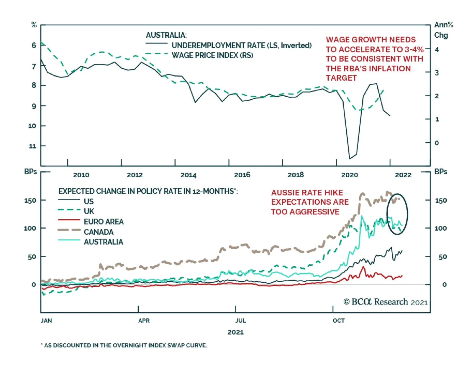
The RBA kept monetary policy unchanged at its Tuesday meeting. Governor Philip Lowe sounded cautiously optimistic in his policy statement. He noted that the Australian economy is on track towards recovery following the Delta-induced setback and that although…