Inflation/Deflation
Unit labor costs in the US nonfarm business sector surged 8.3% in Q3 following Q2’s 1.1%, beating expectations of 7.0%. T increase in unit labor costs reflects both lower productivity and higher hourly compensation. Nonfarm productivity fell 5.0% – the…
The Bank of England kept policy unchanged at its meeting on Thursday. The Monetary Policy Committee voted by a majority of 6-3 to maintain UK bond purchases and a majority of 7-2 to keep the Bank Rate at 0.1%. Governor Bailey borrowed a page from Jerome…

Image
The markets were deluged by a lot of information in late October. Several central banks made surprise moves towards tightening (the Bank of Canada, for example, ended asset purchases, and the Reserve Bank of Australia effectively abandoned its yield-curve control). Inflation continued to surprise on the upside (headline CPI in the US is now 5.4% year-on-year). But, at the same time, there were signs of faltering growth with, for example, US real GDP growth in Q3 coming in at only 2.0% quarter-on-quarter annualized, compared to 6.7% in Q2. This caused a flattening of the yield curve in many countries, as markets priced in faster monetary tightening but lower long-term growth (Chart 1). Nonetheless, equities shrugged off the barrage of news, with the S&P500 ending the month at a new high. All this highlights what we discussed in our latest Quarterly: That the second year of a bull market is often tricky, resulting in lower (but still positive) returns from equities and higher volatility. For risk assets to continue to outperform, our view of a Goldilocks environment needs to be “just right”: The economy must not be too hot or too cold. We think it will be – and so stay overweight equities versus bonds. But investors should be aware of the risks on either side. How too hot? Inflation is broadening out (at least in the US, UK, Australia and Canada, though not in the euro zone and Japan) and is no longer limited to items which saw unusually strong demand during the pandemic but where supply is constrained (Chart 2). Chart 1What Is The Message Of Flattening Yield Curves?
What Is The Message Of Flattening Yield Curves?
What Is The Message Of Flattening Yield Curves?
Chart 2Inflation Is Broadening Out In The US
Inflation Is Broadening Out In The US
Inflation Is Broadening Out In The US
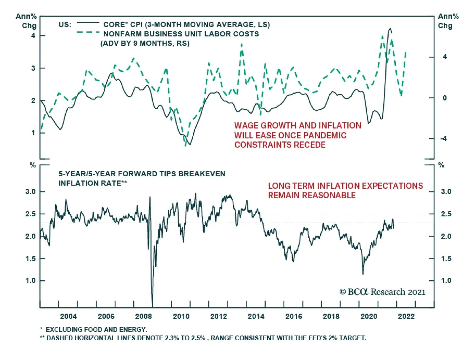
There is a risk that this turns into a wage-price spiral as employees, amid a tight labor market, push for higher wages to offset rising prices. We find that wages tend to follow prices with a lag of 6-12 months (Chart 3). The Atlanta Fed Wage Tracker (good for gauging underlying wage pressures since it looks only at employees who have been in a job for 12 months or more) is already at 3.5% and looks set to rise further. On the back of these inflationary moves, the market has significantly pulled forward the date of central bank tightening. Futures now imply that the Fed will raise rates in both July and December next year (Chart 4) and that other major developed central banks will also raise multiple times over the next 14 months (Table 1). Breakeven inflation rates have also risen substantially (Chart 5). Chart 3Wages Tend To Rise After Prices Rise
Wages Tend To Rise After Prices Rise
Wages Tend To Rise After Prices Rise
Chart 4Will The Fed Really Hike This Soon?
Will The Fed Really Hike This Soon?
Will The Fed Really Hike This Soon?
Table 1Futures Implied Path Of Rate Hikes
Monthly Portfolio Update: The Risks To Goldilocks
Monthly Portfolio Update: The Risks To Goldilocks
Chart 5Breakevens Suggest Higher Inflation
Breakevens Suggest Higher Inflation
Breakevens Suggest Higher Inflation
We think these moves are a little excessive. There are several reasons why inflation might cool next year. Companies are rushing to increase capacity to unblock supply bottlenecks. For example, semiconductor production has already begun to increase, bringing down DRAM prices over the past few months (Chart 6). Another big contributor to broad-based inflation has been a 126% increase in container shipping costs since the start of the year (Chart 7). But currently the number of container ships on order is at a 10-year high; these new ships will be delivered over the next two years. Such deflationary forces should pull down core inflation next year (though we stick to our longstanding view that for multiple structural reasons – demographics, the end of globalization, central bank dovishness, the transition away from fossil fuels – inflation will trend up over the next five years). Chart 6DRAM Prices Falling As Production Ramps Up
DRAM Prices Falling As Production Ramps Up
DRAM Prices Falling As Production Ramps Up
Chart 7All Those Ships On Order Should Bring Down Shipping Costs
All Those Ships On Order Should Bring Down Shipping Costs
All Those Ships On Order Should Bring Down Shipping Costs
The Fed, therefore, will not be in a rush to raise rates. It does not see the labor market as anywhere close to “maximum employment” – it has not defined what it means by this, but we would see it as a 3.8% unemployment rate (the median FOMC dot for the equilibrium unemployment rate) and the prime-age participation rate back to its 2019 level (Chart 8). We continue to expect the first rate hike only in December next year. The Fed will feel the need to override its employment criterion only if long-term inflation expectations become unanchored – but the 5-year 5-year forward breakeven rate is only at 2.3%, within the Fed’s effective CPI target range of 2.3-2.5% (Chart 5). We remain comfortable with our view of only a moderate rise in long-term rates, with the US 10-year Treasury yield at 1.7% by end-2021, and reaching 2-2.25% at the time of the first Fed rate hike. It is also worth emphasizing that even a fairly sharp rise in long-term rates has historically almost always coincided with strong equity performance (Chart 9 and Table 2). This has again been evident in the past 12 months: When rates rose between August 2020 and March 2021, and then from July 2021, equities performed strongly. Chart 8We Are Not Back To "Maximum Employment"
We Are Not Back To "Maximum Employment"
We Are Not Back To "Maximum Employment"
Chart 9Rising Rates Are Usually Accompanied By A Rising Stock Market
Rising Rates Are Usually Accompanied By A Rising Stock Market
Rising Rates Are Usually Accompanied By A Rising Stock Market
Table 2Episodes Of Rising Long-Term Rates Since 1990
Monthly Portfolio Update: The Risks To Goldilocks
Monthly Portfolio Update: The Risks To Goldilocks
But could the economy get too cold? We would discount the weak US GDP reading: It was mostly due to production shortages, especially in autos, which pushed down consumption on durable goods by 26% QoQ annualized, and by some softness in spending on services due to the delta Covid variant, the impact of which is now fading. US growth should continue to be supported by a combination of the $2.5 trillion of excess household savings, strong capex as companies boost their production capacity, and a further 5% of GDP in fiscal stimulus that should be passed by Congress by year-end. Similar conditions apply in other developed economies. Chart 10Real Estate Is A Big Part Of Chinese GDP
Real Estate Is A Big Part Of Chinese GDP
Real Estate Is A Big Part Of Chinese GDP
We see three principal risks to this positive outlook: A new strain of Covid-19 that proves resistant to current vaccines – unlikely but not impossible. Our geopolitical strategists worry about Iran, which may have a nuclear bomb ready by December, prompting Israel to bomb the country. Iran would likely react by hampering oil supplies, even blocking the Strait of Hormuz, through which 25% of global oil flows. Chinese growth has been slowing and the impact from the problems at Evergrande is still unclear. Real estate is a major part of the Chinese economy, with residential investment comprising 10% of GDP (Chart 10) and, broadly defined to include construction and building materials, real estate overall perhaps as much as one-third. Our China strategists don’t expect the government to launch a major stimulus which would bail out the industry, since it is happy with the way that property-related lending has been shrinking in recent years (Chart 11). We expect the slowdown in Chinese credit growth to bottom out over the coming few months, but economic activity may have further to slow (Chart 12), and there is a risk that the authorities are unable to control the fallout from the property market. Chart 11Chinese Authorities Are Happy To See Slowing Property Lending
Chinese Authorities Are Happy To See Slowing Property Lending
Chinese Authorities Are Happy To See Slowing Property Lending
Chart 12When Will Credit Growth Bottom?
When Will Credit Growth Bottom?
When Will Credit Growth Bottom?
Fixed Income: Given the macro environment described above, we remain underweight bonds and short duration. If we assume 1) a Fed liftoff in December 2022, 2) 100 basis points of rate hikes over the following year, and 3) a terminal Fed Funds Rate of 2.08% (the median forecast from the New York Fed’s Survey of Market Participants), 10-year US Treasurys will return -0.2% over the next 12 months, and 2-year Treasurys +0.3%.1 TIPs have overshot fair value and, although we remain neutral since they a tail-risk hedge against high inflation over the next five years, we would especially avoid 2-year TIPS which look very overvalued. We see some pockets of selective value in lower-quality high-yield bonds, specifically US Ba- and Caa-rated issues, which are still trading at breakeven spreads around the 35th historical percentile, whereas higher-rated bonds look very expensive (Chart 13). For US tax-paying investors, municipal bonds look particularly attractive at the moment, with general-obligation (GO) munis trading at a duration-matched yield higher than Treasurys even before tax considerations (Chart 14). Our US bond strategists have recently gone maximum overweight.
Chart 13
Chart 14Muni Bonds Are A Steal
Muni Bonds Are A Steal
Muni Bonds Are A Steal
Equities: We retain our longstanding preference for US equities over other Developed Markets. US equities have outperformed this year, irrespective of whether rates were rising or falling, or how US growth was surprising relative to the rest of the world, emphasizing the much stronger fundamentals of the US market (Chart 15). Analysts’ forecasts for the next few quarters look quite cautious, and so earnings surprises can push US stock prices up further (Chart 16). We reiterate the neutral on China but underweight on Emerging Markets ex-China that we initiated in our latest Quarterly. Our sector overweights are a mixture of cyclicals (Industrials), rising-interest-rate plays (Financials), and defensives (Heath Care). Chart 15US Equites Outperformed This Year Whatever Happened
US Equites Outperformed This Year Whatever Happened
US Equites Outperformed This Year Whatever Happened
Chart 16Analysts Are Pessimistic About The Next Couple Of Quarters
Analysts Are Pessimistic About The Next Couple Of Quarters
Analysts Are Pessimistic About The Next Couple Of Quarters
Currencies: We continue to expect the US dollar to be stuck in its trading range and so stay neutral. Recent moves in prospective relative monetary policy bring us to change two of our currency recommendations. We close our underweight on the Australian dollar. The recent rise in Australian inflation (with both trimmed mean and 10-year breakevens now above 2% – Chart 17) has brought forward the timing of the first rate hike and should push up relative real rates (Chart 18). We lower our recommendation on the Japanese yen from overweight to neutral. The Bank of Japan will not raise rates any time soon, even when other central banks are tightening. This will push real-rate differentials against the yen (Chart 18, panel 2). Chart 17Australian Inflation Is Picking Up
Australian Inflation Is Picking Up
Australian Inflation Is Picking Up
Chart 18Real Rates Moving In Favor Of The AUD And Against The JPY
Real Rates Moving In Favor Of The AUD And Against The JPY
Real Rates Moving In Favor Of The AUD And Against The JPY
Chart 19Chinese-Related Metals' Prices Are Falling
Chinese-Related Metals' Prices Are Falling
Chinese-Related Metals' Prices Are Falling
Commodities: We remain cautious on those industrial metals which are most sensitive to slowing Chinese growth and its weakening property market. The fall in iron ore prices since July is now being followed by aluminum. However, metals which are increasingly driven by investment in alternative energy, notably copper, are likely to hold up better (Chart 19). We are underweight the equity Materials sector and neutral on the commodities asset class. The Brent crude oil price has broadly reached our energy strategists’ forecasts of $80/bbl on average in 2022 and $81 in 2023 (Chart 20). Although the forward curve is lower than this, with December-22 Brent at only $75/bbl, it is a misapprehension to characterize this as the market forecasting that the oil price will fall. Backwardation (where futures prices are lower than spot) is the usual state of affairs for structural reasons (for example, producers hedging production forward). The market typically moves to contango only when the oil price has fallen sharply and reserves are high (Chart 21). We remain neutral on the equities Energy sector. Chart 20Brent Has Reached Our 2022 And 2023 Forecast Level
Brent Has Reached Our 2022 And 2023 Forecast Level
Brent Has Reached Our 2022 And 2023 Forecast Level
Chart 21Lower Oil Futures Don't Mean Oil Price Is Forecast To Fall
Lower Oil Futures Don't Mean Oil Price Is Forecast To Fall
Lower Oil Futures Don't Mean Oil Price Is Forecast To Fall
Garry Evans, Senior Vice President Global Asset Allocation garry@bcaresearch.com GAA Asset Allocation
In this report we examine the risk of stagflation by comparing the current environment to that of the late-1960s and 1970s. Today, investors cannot rule out the possibility of a stagflationary outcome, for four reasons: long-term household inflation expectations have risen significantly over the past year; fiscal policy has been expansionary; monetary policy will remain expansionary at the Fed’s projected terminal Fed funds rate; and component shortages and price increases linked to energy market and supply chain disruptions may persist or worsen over the coming year. However, the strong demand-pull inflationary dynamics that existed in the late-1960s were mostly absent in the lead-up to the pandemic, supply-chain issues are in part due to strong goods demand and supply disruptions that will eventually dissipate, and economic agents do not expect severe price pressures to persist beyond the pandemic. On balance, this points to a stagflationary outcome over the coming 6-24 months as a risk, but not a likely event. Investors should use the Misery Index, which is the sum of the unemployment rate and headline PCE inflation, as a real-time stagflation indicator. The Misery Index underscores that the US economy is unlikely to experience true stagflation unless the unemployment rate rises. A portfolio of the US dollar, the Swiss Franc, and industrial commodities may serve as a useful hedge for investors who are concerned about absolute return prospects in a world in which long-maturity bond yields are rising and risks of stagflationary dynamics are present. Chart II-1The Misery Index Reflects The Risk Of Stagflation
The Misery Index Reflects The Risk Of Stagflation
The Misery Index Reflects The Risk Of Stagflation
Over the past several weeks, concerns about a possible return to 1970s-style stagflation have re-emerged significantly in the minds of many investors. These investors have pointed toward similarities between the current environment and that of the 1970s, including shortages limiting output, a snarled global trade and logistical system, and rising energy prices. Chart II-1 highlights that the US “Misery Index” – the sum of the unemployment rate and headline PCE inflation – rose again over the past several months to high single-digit territory, after having fallen dramatically from April 2020 to February of this year. Panel 2 of Chart II-1 highlights that last year's rise in the Misery Index was driven almost entirely by the unemployment rate, whereas the current level is due to a combination of a modestly elevated unemployment rate and a pronounced acceleration in inflation. The headline PCE deflator has risen above 4%, a level that has not been reached since 1991 during the First Gulf War. In this report, we examine the risk of stagflation by comparing the current environment to that of the late 1960s and 1970s. We conclude that while investors cannot rule out the possibility of a stagflationary outcome, there are important differences that point toward a stagflation outcome over the coming 6-24 months as a risk, not a likely event. We conclude by highlighting assets that may produce absolute returns in a world in which long-maturity bond yields are rising and risks of stagflationary dynamics are present. Revisiting The 1960s And 70s Chart II-2The 1960s Laid The Groundwork For Elevated Inflation
The 1960s Laid The Groundwork For Elevated Inflation
The 1960s Laid The Groundwork For Elevated Inflation
The first step in judging the risk of a return to 1970s-style stagflation is to review, in a detailed way, what caused those conditions. Investors are well aware of the role that two separate energy price shocks played in raising prices and damaging output during this period, but they are less cognizant of the impact that a persistent period of above-trend output and significant labor market tightness had in setting up the conditions for sharply higher inflation. This focus of investors on energy prices partially reflects the fact that the Misery Index increased most visibly in the 1970s and that policymakers in the 1960s may not have realized how extensively economic output was running above its potential. With the benefit of hindsight, Chart II-2 illustrates the extent to which inflationary pressures built up in the 1960s, well before the first oil price shock in 1973. The chart shows that the unemployment rate was below NAIRU – the non-accelerating inflation rate of unemployment – for 70% of the time during the 1960s, and that inflation had already responded to this in the latter half of the decade. Annual headline PCE inflation was running just shy of 5% at the onset of the 1970 recession; it fell to 3% in the aftermath of the recession, but had already begun to reaccelerate in the first half of 1973. Following the 1973/1974 recession, inflation did decelerate significantly, falling from 11-12% to 5% in headline terms, and from 10% to 6% in core terms. But the pace of price appreciation did not fall below 5-6% in the second half of the 1970s, despite a significant and sustained rise in the unemployment rate above its natural rate. The 1975 to 1978 period is especially important for investors to understand, because it is arguably the clearest period of true stagflation in the 1970s. The fact that the Misery Index rose sharply during two major oil price shocks is not particularly surprising in and of itself, given the direct impact of energy prices on headline consumer prices; it is the fact that the index remained so elevated between these shocks, the result of persistently high inflation in the face of significant labor market slack, that is most relevant to investors. There are two reasons that both inflation and unemployment remained high during this period. First, labor market slack was sizeable during these years because the US economy was more energy-intensive in the 1970s than it is today. Chart II-3 highlights that goods-producing employment lagged overall employment growth from late 1973 to late 1977, underscoring that the rise in oil prices significantly impacted jobs growth in energy-intensive industries.
Chart II-3
Second, it is clear that the combination of demand-pull inflation in the late 1960s and the predominantly cost-push inflation of the 1970s led to expectations of persistent inflation among households and firms. The original Phillips Curve, as formulated by New Zealand economist William Phillips in the late 1950s, described a negative relationship between the unemployment rate and the pace of wage growth. Given the close correlation between wage and overall price growth at the time, the Phillips Curve was soon extended and generalized to describe an inverse relationship between labor market slack and overall price inflation. But the experience of the 1970s highlighted that inflation expectations are also an important determinant of inflation, a realization that gave birth to the expectations-augmented (i.e. “modern-day”) Phillips Curve (more on this below). The Stagflation Era Versus Today
Chart II-
Table II-1 presents a stagflation “threat matrix,” representing the Bank Credit Analyst service’s assessment of the various factors that could potentially contribute to a stagflationary environment today, relative to what occurred in the 1960s and 1970s. While we acknowledge that there are some similarities today to what occurred five decades ago, the most threatening factors have been present for a shorter period of time and appear to have a smaller magnitude than what occurred during the stagflationary era. In addition, key factors, such as the visibility available to policymakers and investors about household inflation expectations and the potential output of the economy, would appear to reduce significantly the risk of a stagflationary outcome today. We discuss each of the factors presented in Table II-1 below: Fiscal & Monetary Policy Chart II-4Government Spending Last Cycle Looked Nothing Like The 1960s
Government Spending Last Cycle Looked Nothing Like The 1960s
Government Spending Last Cycle Looked Nothing Like The 1960s
The persistently tight labor market that contributed to the inflationary buildup in the 1960s occurred as a result of easy fiscal and monetary policy. Chart II-4 highlights that the contribution to real GDP growth from government expenditure and investment was very elevated in the 1960s. Chart II-5 shows that a positive output gap in the late 1960s and the first half of the 1970s is well explained by the fact that 10-year US government bond yields were persistently below nominal GDP growth. The relationship between the stance of monetary policy and the output gap only meaningfully diverged in the latter half of the 1970s, during the true stagflationary era that we noted above. Chart II-5Easy Monetary Policy Juiced Aggregate Demand In The 60s And Early 70s
Easy Monetary Policy Juiced Aggregate Demand In The 60s And Early 70s
Easy Monetary Policy Juiced Aggregate Demand In The 60s And Early 70s
Chart II-6Monetary Policy Today Is Extremely Easy
Monetary Policy Today Is Extremely Easy
Monetary Policy Today Is Extremely Easy
Today, it is clear that the stance of fiscal policy has recently been extraordinarily easy, and 10-year US government bond yields have remained well below nominal GDP growth for the better part of the last decade. Relative to estimates of potential nominal GDP growth, 10-year Treasury yields are the lowest they have been since the 1970s (Chart II-6). Ostensibly, this supports concerns that policy might contribute to a stagflationary outcome. These concerns were raised by Larry Summers in March, when he described the Biden administration’s fiscal policy as the “least responsible” that the US has experienced in four decades and warned of the potential inflationary consequences of overheating the economy.1 But there are two important counterpoints to these concerns. First, easy fiscal policy this cycle has followed a period during the last economic cycle in which government spending contributed to the most sustained drag on economic activity since the 1950s. Unlike the 1960s, the unemployment rate has been below NAIRU for only a third of the time over the past decade. In addition, Chart II-7 highlights that fiscal thrust will turn to fiscal drag next year, underscoring the temporary nature of the massive burst in fiscal spending that has occurred in response to the pandemic. Under normal circumstances, the fiscal drag implied by Chart II-7 would substantially raise the risks of a recession next year, but we have noted in previous reports that a significant amount of excess savings remain to support spending and employment. The net impact of these two factors results in a reasonable expectation that the US economy will return to maximum employment next year, but this is a far cry from the 1960s when the unemployment rate was below its natural rate for 70% of the decade.
Chart II-7
Based on conventional measures, US monetary policy has been easy for a decade, but easy monetary policy did not begin to contribute positively to a rise in household sector credit growth last cycle until 2014/2015. This underscores that the natural rate of interest (“R-star”) did fall during the early phase of the last economic expansion. However, we argued in an April report that R-star was likely rising in the latter half of the last expansion,2 and we believe that the terminal Fed funds rate is likely higher than what the Fed is currently projecting, barring any additional negative policy shocks. Thus, while we do not believe that the duration of easy monetary policy over the past decade has laid the groundwork for a major rise in prices, it is now clearly positively contributing to aggregate demand and does risk a future overshoot in prices if long maturity bond yields remain well below the pace of economic growth for a sustained period of time. The Impact Of Shortages Chart II-8Gasoline Shortages Plagued The US Economy In The 1970s
Gasoline Shortages Plagued The US Economy In The 1970s
Gasoline Shortages Plagued The US Economy In The 1970s
Gasoline shortages occurred during the oil shocks of the 1970s and are a key similarity that some investors point toward when comparing the situation today with the stagflationary era. Chart II-8 highlights that the annual growth in real personal consumption expenditures on energy goods and services fell into negative territory on six occasions in the 1970s, although it was most pronounced during the two oil price shocks and their resulting recessions. Today, the impact of shortages appears to be broader than what occurred in the 1970s, but less impactful and not likely to be as long-lasting. Chart II-9 highlights that the OPEC oil embargo of 1973 raised the global oil bill by 2.4% of global GDP and permanently raised the price of oil. The global oil bill will only be fractionally above its pre-pandemic level in 2022, with oil prices at $80/bbl, and, while it is true that US gasoline prices have risen significantly, they are not higher than they were from 2011-2014 (Chart II-10). Chart II-9$80/bbl Oil Is Not Onerous
$80/bbl Oil Is Not Onerous
$80/bbl Oil Is Not Onerous
Chart II-10US Gasoline Prices Are High, But They Have Been Higher
US Gasoline Prices Are High, But They Have Been Higher
US Gasoline Prices Are High, But They Have Been Higher
It is certainly true that global shipping costs have skyrocketed and that this is contributing to the increase in US consumer prices. We estimate, however, that this increase in shipping costs as a share of GDP is no more than a quarter of the impact of the 1973 increase in oil prices, without the attendant negative effects on US goods-producing employment that occurred in the 1970s. If anything, surging shipping costs create an incentive to re-shore manufacturing production, which would contribute positively to US goods-producing employment. We also do not expect the rise in shipping costs to be meaningfully permanent, i.e., shipping costs may ultimately settle at a higher level than they were in late-2019, but at a much lower level than what prevails today. Chart II-11A Tight Labor Market Is Causing Wage Growth To Pick Up
A Tight Labor Market Is Causing Wage Growth To Pick Up
A Tight Labor Market Is Causing Wage Growth To Pick Up
Semiconductor and labor shortages would appear to represent a more salient threat of stagflation in the US, as the domestic production of motor vehicles cannot occur without key inputs and a tight labor market is already contributing to an acceleration in wage growth (Chart II-11). As we noted in Section 1 of our report, auto production significantly impacted growth in the third quarter. However, Chart II-12 highlights that, for now, the breadth of impact of these shortages appears to be limited: the production component of the ISM manufacturing index remains in expansionary territory, industrial production of durable manufacturing excluding motor vehicles and parts has not broken down, and both housing starts and building permits remain above pre-pandemic levels despite this year’s downtrend in permits. Chart II-12Shortages Do Not Yet Seem To Be Broad-Based
Shortages Do Not Yet Seem To Be Broad-Based
Shortages Do Not Yet Seem To Be Broad-Based
A physical shortage of components is a less relevant factor for the services side of the economy, which appears to have re-accelerated meaningfully in October. The services sector is more considerably impacted by shortages in the labor market, which seem to be linked to a still-low labor force participation rate. We noted in our September report that the decline in the participation rate has significantly overshot what would be implied by the ongoing pace of retirements. Chart II-13 highlights that this has occurred not just because of a significant retirement effect, but also because of the shadow labor force (people who want a job but are not currently looking for work) and family responsibilities. We expect that the recent expiry of expanded unemployment insurance benefits, a steady rise in the immunity of the US population, an abating Delta wave of COVID-19, and a likely upcoming reduction in school/classroom closures once the Pfizer/BioNTech vaccine is approved for school-age children will likely ease the labor shortage issue over the coming several months.
Chart II-13
Output Gap Uncertainty It remains a debate among economists why policymakers maintained such easy monetary policy in the 1960s and 1970s, but Chart II-14 highlights that uncertainty about the size of the output gap may have contributed to too-low interest rates. The chart shows the unemployment rate compared with today's estimate of NAIRU, alongside a simple proxy for policymakers’ real time estimate of the natural rate of employment: the cumulative average unemployment rate in the post-war environment. To the extent that policymakers used past averages of the unemployment rate as their guide for NAIRU, Chart II-14 highlights how they may have underestimated the degree to which output was running above its potential level in the 1960s, and would not have even concluded that output was above potential in the early 1970s. Chart II-14Policymakers Overestimated Labor Market Slack In The 60s And 70s
Policymakers Overestimated Labor Market Slack In The 60s And 70s
Policymakers Overestimated Labor Market Slack In The 60s And 70s
Chart II-15Policymakers Know That NAIRU Is Likely At Or Below 4%
Policymakers Know That NAIRU Is Likely At Or Below 4%
Policymakers Know That NAIRU Is Likely At Or Below 4%
Today, the environment is quite different, because the acceleration in wage growth at the tail end of the last expansion gives policymakers and investors a good estimate of where NAIRU is. Chart II-15 highlights that wage growth accelerated in 2018/2019 in response to a sub-4% unemployment rate, which is consistent with both the Fed’s NAIRU estimate of 3.5-4.5% and Fed Vice Chair Richard Clarida’s expressed view that a 3.8% unemployment rate likely constitutes maximum employment (barring any issues with the breadth and inclusivity of the labor market recovery). It is possible that the pandemic has structurally lowered potential output, which could mean that policymakers may no longer rely on the wage growth / unemployment relationship that existed in the latter phase of the last expansion. However, we do not find any credible arguments that would support the notion of a structurally lower level of potential output: the pandemic is likely to end at some point in the not-too-distant future, the negative impact of working-from-home policies on office properties and employment in central business districts is not sizeable,3 and productivity may have permanently increased in some industries because of the likely stickiness of a hybrid work culture. The Behavior Of Inflation Expectations Chart II-16Rising Long-Term Expectations Have Merely Normalized (For Now)
Rising Long-Term Expectations Have Merely Normalized (For Now)
Rising Long-Term Expectations Have Merely Normalized (For Now)
One parallel to the argument that policymakers may have underestimated the degree of labor market tightness in the 1960s and early 1970s is the fact that they did not yet understand that inflation expectations are an important determinant of actual inflation, nor were they able to monitor them even if they did. Most credible surveys of inflation expectations began in the 1980s, and policymakers in the 1960s and 1970s were guided by the original Phillips Curve that solely related inflation to unemployment. Today, policymakers have the experience of the stagflationary episode to serve as a warning not to allow inflation expectations to get out of control, and both policymakers and investors have reliable measures of inflation expectations for households and market-participants. Chart II-16 highlights that households expect significant inflation over the coming year, but also expect prices over the longer term to rise at a pace that is almost exactly in line with their average from 2000-2014. The Rudd Controversy: (Adaptive) Inflation Expectations Do Matter One potential criticism of the idea that inflation expectations are signaling a low risk of higher future inflation has emerged through arguments made by Jeremy Rudd, a Federal Reserve economist. In a recent paper, Rudd questioned the view that households’ and firms’ expectations of future inflation are a key determinant of actual inflation; he suggested instead that relatively stable inflation since the mid-1990s might reflect a situation in which inflation simply does not enter workers’ employment decisions and expectations are irrelevant. Rudd’s paper was primarily addressed to policymakers who view inflation dynamics in a highly quantitative light. A full response to the paper would be mostly academic and thus not especially relevant to investors; however, we would like to highlight three points related to the Rudd piece that we feel are important.4 First, we disagree with Rudd’s argument that the trend in inflation has not responded to changes in economic conditions since the mid-1990s. Chart II-17 highlights that while the magnitude of the relationship has shifted, the trend in inflation relative to a measure of long-term expectations based on prior actual inflation has mimicked that of the output gap. The fact that inflation was (ironically) too high during the early phase of the last economic cycle provides some support for Rudd’s inflation responsiveness view, although we would still point toward the Fed’s strong record of maintaining low and stable inflation, its active communication with the public in the years following the global financial crisis, and the fact that a recovery began and the output gap began to (slowly) close as the best explanation for the avoidance of deflation during that period. Second, we agree with Rudd’s point that regime shifts in inflation’s responsiveness to economic conditions can occur, and that adaptive measures of inflation expectations, and even surveys of inflation, may not capture such a shift in real time. Chart II-18 shows that the 2014-2016 period was a good example of this, when adaptive expectations as well as household survey measures of long-term inflation expectations both lagged the actual decline in inflation that was caused by a collapse in the price of oil. Chart II-17The Trend In Inflation Continues To Respond To Economic Conditions
The Trend In Inflation Continues To Respond To Economic Conditions
The Trend In Inflation Continues To Respond To Economic Conditions
Chart II-18Surveyed Inflation Expectations Can Lag, But This Time They Led
Surveyed Inflation Expectations Can Lag, But This Time They Led
Surveyed Inflation Expectations Can Lag, But This Time They Led
But Chart II-18 also shows that long-term household survey measures of inflation led the rise in actual inflation (and thus our adaptive expectations measure) last year, underscoring that these measures are likely more reliable indicators today of whether a major regime shift is occurring. As noted above, long-term expectations have risen significantly relative to what prevailed prior to the pandemic, but this has merely raised expectations from extraordinarily depressed levels back to the average that prevailed prior to (and immediately after) the global financial crisis. Therefore, household expectations are not yet at dangerous levels. Chart II-19Unit Labor Costs Modestly Lead Inflation, But Are Far From Extreme
Unit Labor Costs Modestly Lead Inflation, But Are Far From Extreme
Unit Labor Costs Modestly Lead Inflation, But Are Far From Extreme
Third, one of the core observations in Rudd’s paper is that unit labor cost (ULC) growth leads the trend in inflation, which he argued was evidence against the idea that expectations of future inflation are a key determinant of actual inflation. Chart II-19 highlights that Rudd is correct that ULC growth modestly leads inflation (especially core inflation), but we disagree with his conclusion that it argues against the importance of expectations. As we noted in Section 2 of our January 2021 Bank Credit Analyst,5 one crucial aspect of the expectations-augmented, or “modern-day” Phillips Curve is that, if inflation expectations are largely formed based on the experience of past inflation, then inflation is ultimately determined by three dimensions of the output gap: whether it is rising or falling, whether it is above or below zero, and how long it has been above or below zero. Our view is that ULC growth is fundamentally linked to slack in the labor market, which is directly incorporated in output gap measures. As we noted above, investors currently have a good estimate of the magnitude of the output/employment gap, meaning that it is possible to track the inflationary consequences of prevailing aggregate demand. As a final point about ULC growth, Chart II-19 highlights that while the five-year CAGR of unit labor costs is currently running at its strongest pace since the global financial crisis, investors should note that it remains well below the levels that prevailed in the late-1960s when persistently above-potential output laid the groundwork for a massive inflationary overshoot. Conclusions And Investment Strategy Our review of the 1960s and 1970s highlights that stagflation is a phenomenon in which supply-side shocks raise prices of key inputs to production, which lowers output and raises unemployment. Energy price shocks in the 1970s occurred after a long period of policy-driven above-trend growth in the 1960s, meaning that both demand-pull and cost-push inflation contributed to stagflation in the 1970s. Today, investors cannot rule out the possibility of a stagflationary outcome, for four reasons: long-term household inflation expectations have risen significantly over the past year; fiscal policy has been very expansionary; monetary policy will remain expansionary at the Fed’s projected terminal Fed funds rate; and component shortages and price increases linked to energy market and supply chain disruptions may persist or worsen over the coming year. Chart II-20It Is Not Stagflation If The Unemployment Rate Continues To Fall
It Is Not Stagflation If The Unemployment Rate Continues To Fall
It Is Not Stagflation If The Unemployment Rate Continues To Fall
However, the strong demand-pull inflationary dynamics that existed in the late-1960s were mostly absent in the lead-up to the pandemic, supply-chain issues are in part the result of strong goods demand and disruptions that are clearly linked to the pandemic (and thus will eventually dissipate), and long-term inflation expectations are behaving differently than short-term expectations, signaling that economic agents do not expect severe price pressures to persist beyond the pandemic. Policymakers also have more visibility about the magnitude of economic / labor market slack than they did during the stagflationary era and better tools to track inflation expectations. On balance, this points to a stagflationary outcome over the coming 6-24 months as a risk, but not as a likely event. Using the Misery Index as real-time stagflation indicator, investors should note that the US economy is not likely experiencing true stagflation unless the unemployment rate rises. Chart II-20 highlights that there is no evidence yet of a contraction in goods-producing or service-producing jobs. Even if goods-producing employment slows meaningfully over the coming few months as a result of component shortages, the unemployment rate is still likely to fall if services spending normalizes, as it would imply that the gap in services-producing employment, which is currently 20% of the level of pre-pandemic goods-producing employment, will continue to close. Investors have been focused on the issue of stagflation because its occurrence would imply a sharply negative correlation between stock prices and bond yields. This is not our base case view, but we have highlighted that months with negative returns from both stocks and long-maturity bonds tend to be associated with periods of monetary policy tightening (or in anticipation of such periods). As we discussed in Section 1 of our report, we do expect the Fed to raise interest rates next year. We do not see a rise in bond yields to levels implied by the Fed’s interest rates projections as being seriously threatening to economic activity, corporate earnings growth, or equity multiples. But the adjustment to higher long-maturity bond yields may unnerve equity investors for a time, implying temporary periods of a negative stock price / bond yield correlation. Table II-2 highlights that, since 1980, commodities, the US dollar, and the Swiss franc have typically earned positive returns during non-recessionary months in which stock and long-maturity bond returns are negative. While the dollar is not likely to perform well in a stagflationary scenario, Chart II-21 highlights that CHF-USD and industrial commodities performed quite well in the late-1970s. As such, a portfolio of these three assets might serve as a useful hedge for investors who are concerned about absolute return prospects in a world in which long-maturity bond yields are rising and risks of stagflationary dynamics are present.
Chart II-
Chart II-21The Swiss Franc and Raw Industrials Did Well During The Stagflationary Era
The Swiss Franc and Raw Industrials Did Well During The Stagflationary Era
The Swiss Franc and Raw Industrials Did Well During The Stagflationary Era
Jonathan LaBerge, CFA Vice President The Bank Credit Analyst Footnotes 1 “Summers Sees ‘Least Responsible’ Fiscal Policy in 40 Years,” Bloomberg News, March 20, 2021. 2 Please see The Bank Credit Analyst “R-star, And The Structural Risk To Stocks,” dated March 31, 2021, available at bca.bcaresearch.com 3 Please see The Bank Credit Analyst “Work From Home “Stickiness” And The Outlook For Monetary Policy,” dated June 24, 2021, available at bca.bcaresearch.com 4 Rudd, Jeremy B. (2021). “Why Do We Think That Inflation Expectations Matter for Inflation? (And Should We?),” Finance and Economics Discussion Series 2021-062. Washington: Board of Governors of the Federal Reserve System. 5 Please see The Bank Credit Analyst “The Modern-Day Phillips Curve, Future Inflation, And What To Do About It,” dated December 18, 2021, available at bca.bcaresearch.com
Highlights The circumstances of the pandemic improved in October, but data highlighting the economic consequences of the Delta wave grew more severe. US economic activity slowed meaningfully in the third quarter, driven by lower car sales and a slowdown in services spending. The imminent vaccination of school-aged children, and signs that services activity and spending are increasing, will likely raise labor force participation, boost education employment, and hasten the return of real services spending back to pre-pandemic levels. Investors have the right bond view, but the wrong reason. Investors believe that the Fed will be forced to raise interest rates earlier than it currently expects to prevent an out-of-control rise in prices, whereas it will likely do so because of a quicker return to maximum employment. Bond yields are likely to move higher over the coming year, but this will be driven by real yields, not inflation expectations. Once the Fed begins to raise interest rates, investors should be on the lookout for signs that market expectations for the real natural rate of interest, or “R-star,” are rising. The Fed’s terminal rate projection is well below nominal potential GDP growth, and a gap between these two measures no longer makes sense. Stocks are likely to generate mid-single digit returns next year, which will beat the returns offered by bonds and cash. But stocks will generate much lower returns compared with those enjoyed by investors over the past year. A benign rise in long-maturity bond yields argues for the outperformance of value versus growth stocks over the coming year. Cyclical stocks are now becoming stretched versus defensives on an equally-weighted basis; stay overweight for now, but a downgrade to neutral may be in the cards at some point next year. Feature Chart I-1The Waning Impact Of Delta
The Waning Impact Of Delta
The Waning Impact Of Delta
Over the past month, the focus of investors has shifted from day-to-day developments to the consequences of the Delta wave of the pandemic. Chart I-1 highlights that, while an estimate of the COVID-19 reproduction rates in advanced economies has recently inched higher, it remains below one and hospitalizations continue to trend lower in most major economies. UK hospitalizations have increased over the course of the month, but remain at a level that is a quarter of their January peak – despite an elevated pace of confirmed cases. In the US, both these cases and hospitalizations continue to fall, trends that are likely to be reinforced by the vaccination of children over the coming weeks. A 50-60% vaccination rate for school-aged children would increase the US vaccination rate by 4-5 percentage points. Vaccinating all children at this rate would increase the total vaccination rate by 7-8 percentage points. In combination with a meaningful level of natural immunity, the vaccination of children is likely to bring the US very close to, if not above, the non-accelerating hospitalization rate of immunity (or “NAHRI”).1 The Delta Hangover While the circumstances of the pandemic improved in October, the economic consequences grew more severe. US economic activity slowed meaningfully in the third quarter, as highlighted by yesterday’s advance release. Chart I-2 highlights that durable goods spending subtracted almost three percentage points from Q3 growth, and that most other components of GDP contributed less to growth in Q3 than in Q2.
Chart I-2
The significant slowdown in Q3 growth is disappointing, but several factors point toward the conclusion that it is not likely to be sustained: Chart I-3Services PMIs Are Pointing To A Stronger Q4
Services PMIs Are Pointing To A Stronger Q4
Services PMIs Are Pointing To A Stronger Q4
The Delta wave very likely impacted services spending, which we have highlighted is likely to drive overall consumption over the coming year. Given the ongoing impact of semiconductor shortages on the availability of new cars, it is not surprising that a slowdown in services spending resulted in a significant slowdown in overall growth. After having declined significantly in Q3, Chart I-3 highlights that the US, UK, French, and Japanese October flash services PMI rose anew, underscoring that recent services weakness have been closely linked to the Delta variant of COVID-19 (whose impact is now waning). Chart I-3 also highlights that the US services PMI is currently at a level that has been historically consistent with solid real PCE growth. Finally, while it is true that manufacturing PMIs are being supported by supplier deliveries components, the October output component of the US Markit manufacturing index remained in expansionary territory, as was the case in Germany, Japan, and the UK (despite month-over-month declines in these components). Chart I-4 highlights that Q3’s real GDP reading was highly anomalous relative to the pace of jobs growth in the quarter, based on the relationship between the two since the global financial crisis. In quarters in which real GDP growth was 1% or less than implied by the trendline shown in Chart I-4, real GDP accelerated in the subsequent quarter 80% of the time. In conjunction with a pickup in services activity in October, this suggests that growth will be meaningfully stronger in Q4.
Chart I-4
Chart I-5Global Growth Is Peaking, But A Major Downturn Is Unlikely
Global Growth Is Peaking, But A Major Downturn Is Unlikely
Global Growth Is Peaking, But A Major Downturn Is Unlikely
Chart I-5 shows our global Nowcast indicator, alongside our global LEI. Our Nowcast indicator is a high-frequency measure of economic activity that is designed to predict global industrial production. The chart shows that both the Nowcast and global LEI are declining, but that this decline is occurring from an extremely elevated level. The global economy is at an inflection point in terms of the pace of growth, but Chart I-5 still points to above-trend growth – and certainly not a major cyclical downturn. The expectation of a slowdown in growth in Q3 has significantly raised concerns about a possible return to 1970s-style stagflation in the minds of many investors. We address this topic in depth in this month’s Special Report, and conclude that, while investors cannot rule out the possibility of stagflation, there are important differences that point toward a stagflationary outcome over the coming 6-24 months as a risk, not a likely event. We note in our report that the risk of stagflation can be monitored in real time by tracking the Misery Index, which is the sum of headline PCE inflation and the unemployment rate. Currently, the Misery Index is elevated relative to the average of the past 30 years, but it is meaningfully lower than it was during the latter half of the 1970s. This also underscores that true stagflation is only likely to occur if the unemployment rate rises, which means that the economic and financial market outlook over the coming year is strongly tied to the pace of jobs growth (even more so than usual). Table I-1 presents an industry breakdown of the jobs gap relative to pre-pandemic levels, sorted by industries with the largest gap. The table highlights that leisure and hospitality, government, and education and health services jobs continue to account for two-thirds of the five million jobs gap, with the latter two largely reflecting the same effect: 60% of the government jobs gap is accounted for by state and local government education-related employment.
Chart I-
Chart I-6Leisure And Hospitality Employment Tracks The Hotel Occupancy Rate
Leisure And Hospitality Employment Tracks The Hotel Occupancy Rate
Leisure And Hospitality Employment Tracks The Hotel Occupancy Rate
US education employment has been impacted by school and classroom closures, which we noted above are likely to end once school-aged children are vaccinated against the disease. Chart I-6 highlights that leisure and hospitality employment is clearly predicted by the US hotel occupancy rate, which wobbled over the past few months as a result of the Delta wave of the pandemic. Correspondingly, monthly growth in leisure and hospitality employment slowed in August and September. Taken together, the imminent vaccination of school-aged children and signs that services activity and spending are increasing will likely raise labor force participation, boost education employment, and hasten the return of real services spending back to pre-pandemic levels. The Bond Market Outlook Chart I-7The Market Now Agrees With Us About The Timing Of Fed Rate Hikes...
The Market Now Agrees With Us About The Timing Of Fed Rate Hikes...
The Market Now Agrees With Us About The Timing Of Fed Rate Hikes...
A continued normalization of the labor market over the coming 6-12 months argues in favor of Fed rate hikes next year, which is a view that we have maintained for several months. Recently, investors have come to agree with us, by moving forward their expectations for the Fed funds rate (Chart I-7). However, Chart I-8 highlights that investors have the right view for the wrong reason. The chart highlights that US government bond yields have risen entirely due to inflation expectations and that real yields have fallen. This means that investors believe that the Fed will be forced to raise interest rates earlier than it currently expects to prevent an out-of-control rise in prices, whereas we believe that they will do so because of a return to maximum employment. The implication for investors is that bond yields are still likely to rise over the coming year, but that higher yields are likely to occur alongside falling inflation expectations. This trend underscores that common hedges against inflation, such as precious metals and the relative performance of TIPS, are likely to underperform over the coming year. We have noted in previous reports that the fair value for long-maturity government bond yields implied by the Fed’s interest rate projections is not likely threatening for equity multiples, and certainly not for economic activity. A September 2022 rate hike, coupled with a pace of three hikes per year and a 2.5% terminal Fed funds rate, implies that 10-year Treasury yields will rise to 2.15% over the coming year, which would be only modestly higher than the level that prevailed prior to the pandemic (Chart I-9). Chart I-8...But For The Wrong Reason
...But For The Wrong Reason
...But For The Wrong Reason
Chart I-9Higher Bond Yields Are Unlikely To Be Restrictive Next Year
Higher Bond Yields Are Unlikely To Be Restrictive Next Year
Higher Bond Yields Are Unlikely To Be Restrictive Next Year
However, once the Fed begins to raise interest rates, investors should be on the lookout for signs that market expectations for the real natural rate of interest, or “R-star,” are rising. The Fed’s terminal rate projection is well below nominal potential GDP growth, and, while a gap between these two measures made sense in the years following the global financial crisis, this no longer appears to be the case. Chart I-10 highlights that real household mortgage liabilities began to contract sharply in 2006, and did not turn positive on a year-over-year basis until the end of 2016. It is likely that R-star was falling or weak during this period, but the correlation between the two series clearly shifted in the latter phase of the last economic cycle. Chart I-11 emphasizes this point by highlighting that the household debt service ratio is now the lowest it has been since the 1970s, underscoring the capacity that US consumers have to withstand higher interest rates. Chart I-10R-star Fell Post-GFC, For A Time
R-star Fell Post-GFC, For A Time
R-star Fell Post-GFC, For A Time
Chart I-11Today, US Households Have A Lot Of Capacity To Tolerate Higher Rates
Today, US Households Have A Lot Of Capacity To Tolerate Higher Rates
Today, US Households Have A Lot Of Capacity To Tolerate Higher Rates
We doubt that investor expectations for the terminal rate will rise significantly before the Fed begins to normalize monetary policy, but it may happen. In addition, the Fed may begin raising interest rates next year as soon as late in the summer or early in the fall, which would locate the liftoff date within our 6-12 month investment time horizon. As such, our base case view is that a rise in interest rates over the coming year will not be threatening to the equity market, but this view may change at some point next year. Equities: Expect Modest Returns In 2022 A benign increase in long-maturity bond yields in 2022 suggests that equity multiples will neither contribute to, nor subtract from, equity returns. As such, return expectations for equities should be centered around expected earnings growth.
Chart I-
Table I-2 presents consensus estimates for nominal GDP growth, S&P 500 revenue growth, and earnings growth for 2022. The table highlights that expectations for revenue growth estimates appear to be reasonable, given that bottom-up analysts continue to expect an expansion in profit margins next year. Chart I-12 highlights that margins have already risen back above their pre-pandemic high, and that this is true for both tech and ex-tech sectors. Chart I-12US Profit Margins Have Already Risen To Record Levels
US Profit Margins Have Already Risen To Record Levels
US Profit Margins Have Already Risen To Record Levels
We doubt that further increases in profit margins will be sustained next year. It is possible that margins will actually decline – a view that was recently espoused by our US Equity Strategy service.2 Risks to profit margins underscore that stocks are likely to generate mid-single digit returns next year, which will beat the returns offered by bonds and cash. But stocks will generate much lower returns compared with those enjoyed by investors over the past year. Within the equity market, we remain of the view that even a benign rise in long-maturity bond yields argues for the outperformance of value versus growth stocks over the coming year. Chart I-13 highlights that the rolling one-year correlation between relative global growth versus value stock prices and the US 10-year Treasury yield has become increasingly negative over time, which bodes well for value. We also continue to recommend that investors favor small over large caps and cyclicals over defensives, although cyclical stocks are now becoming stretched versus defensives on an equally-weighted basis as they are closing in on their 2018 highs (Chart I-14). We think it is too early to position against cyclicals, but a downgrade to neutral may be in the cards at some point next year. Chart I-13Growth Will Underperform Value If Long-Maturity Bond Yields Rise
Growth Will Underperform Value If Long-Maturity Bond Yields Rise
Growth Will Underperform Value If Long-Maturity Bond Yields Rise
Chart I-14Cyclicals Are Starting To Look Stretched Versus Defensives
Cyclicals Are Starting To Look Stretched Versus Defensives
Cyclicals Are Starting To Look Stretched Versus Defensives
Investment Conclusions Next month’s report will feature BCA’s 2022 outlook, as well as a transcript of our recently held annual discussion with Mr. X and his daughter Ms. X (who joined his family office a couple of years ago). Our annual outlook will provide a detailed walkthrough of our views for the upcoming year, as well as answers to sobering questions raised by Mr. X and Ms. X about the longer-term outlook. For now, we recommend that investors stick with a pro-cyclical view, favoring the following assets: Global stocks over bonds A short-duration position within a government bond portfolio Speculative-grade corporate bonds within a credit portfolio Global ex-US stocks vs US, focused on DM ex-US Global value versus growth stocks Cyclicals versus defensives, and small versus large caps Major currencies versus the US dollar Jonathan LaBerge, CFA Vice President The Bank Credit Analyst October 29, 2021 Next Report: November 30, 2021 II. Gauging The Risk Of Stagflation In this report we examine the risk of stagflation by comparing the current environment to that of the late-1960s and 1970s. Today, investors cannot rule out the possibility of a stagflationary outcome, for four reasons: long-term household inflation expectations have risen significantly over the past year; fiscal policy has been expansionary; monetary policy will remain expansionary at the Fed’s projected terminal Fed funds rate; and component shortages and price increases linked to energy market and supply chain disruptions may persist or worsen over the coming year. However, the strong demand-pull inflationary dynamics that existed in the late-1960s were mostly absent in the lead-up to the pandemic, supply-chain issues are in part due to strong goods demand and supply disruptions that will eventually dissipate, and economic agents do not expect severe price pressures to persist beyond the pandemic. On balance, this points to a stagflationary outcome over the coming 6-24 months as a risk, but not a likely event. Investors should use the Misery Index, which is the sum of the unemployment rate and headline PCE inflation, as a real-time stagflation indicator. The Misery Index underscores that the US economy is unlikely to experience true stagflation unless the unemployment rate rises. A portfolio of the US dollar, the Swiss Franc, and industrial commodities may serve as a useful hedge for investors who are concerned about absolute return prospects in a world in which long-maturity bond yields are rising and risks of stagflationary dynamics are present. Chart II-1The Misery Index Reflects The Risk Of Stagflation
The Misery Index Reflects The Risk Of Stagflation
The Misery Index Reflects The Risk Of Stagflation
Over the past several weeks, concerns about a possible return to 1970s-style stagflation have re-emerged significantly in the minds of many investors. These investors have pointed toward similarities between the current environment and that of the 1970s, including shortages limiting output, a snarled global trade and logistical system, and rising energy prices. Chart II-1 highlights that the US “Misery Index” – the sum of the unemployment rate and headline PCE inflation – rose again over the past several months to high single-digit territory, after having fallen dramatically from April 2020 to February of this year. Panel 2 of Chart II-1 highlights that last year's rise in the Misery Index was driven almost entirely by the unemployment rate, whereas the current level is due to a combination of a modestly elevated unemployment rate and a pronounced acceleration in inflation. The headline PCE deflator has risen above 4%, a level that has not been reached since 1991 during the First Gulf War. In this report, we examine the risk of stagflation by comparing the current environment to that of the late 1960s and 1970s. We conclude that while investors cannot rule out the possibility of a stagflationary outcome, there are important differences that point toward a stagflation outcome over the coming 6-24 months as a risk, not a likely event. We conclude by highlighting assets that may produce absolute returns in a world in which long-maturity bond yields are rising and risks of stagflationary dynamics are present. Revisiting The 1960s And 70s Chart II-2The 1960s Laid The Groundwork For Elevated Inflation
The 1960s Laid The Groundwork For Elevated Inflation
The 1960s Laid The Groundwork For Elevated Inflation
The first step in judging the risk of a return to 1970s-style stagflation is to review, in a detailed way, what caused those conditions. Investors are well aware of the role that two separate energy price shocks played in raising prices and damaging output during this period, but they are less cognizant of the impact that a persistent period of above-trend output and significant labor market tightness had in setting up the conditions for sharply higher inflation. This focus of investors on energy prices partially reflects the fact that the Misery Index increased most visibly in the 1970s and that policymakers in the 1960s may not have realized how extensively economic output was running above its potential. With the benefit of hindsight, Chart II-2 illustrates the extent to which inflationary pressures built up in the 1960s, well before the first oil price shock in 1973. The chart shows that the unemployment rate was below NAIRU – the non-accelerating inflation rate of unemployment – for 70% of the time during the 1960s, and that inflation had already responded to this in the latter half of the decade. Annual headline PCE inflation was running just shy of 5% at the onset of the 1970 recession; it fell to 3% in the aftermath of the recession, but had already begun to reaccelerate in the first half of 1973. Following the 1973/1974 recession, inflation did decelerate significantly, falling from 11-12% to 5% in headline terms, and from 10% to 6% in core terms. But the pace of price appreciation did not fall below 5-6% in the second half of the 1970s, despite a significant and sustained rise in the unemployment rate above its natural rate. The 1975 to 1978 period is especially important for investors to understand, because it is arguably the clearest period of true stagflation in the 1970s. The fact that the Misery Index rose sharply during two major oil price shocks is not particularly surprising in and of itself, given the direct impact of energy prices on headline consumer prices; it is the fact that the index remained so elevated between these shocks, the result of persistently high inflation in the face of significant labor market slack, that is most relevant to investors. There are two reasons that both inflation and unemployment remained high during this period. First, labor market slack was sizeable during these years because the US economy was more energy-intensive in the 1970s than it is today. Chart II-3 highlights that goods-producing employment lagged overall employment growth from late 1973 to late 1977, underscoring that the rise in oil prices significantly impacted jobs growth in energy-intensive industries.
Chart II-3
Second, it is clear that the combination of demand-pull inflation in the late 1960s and the predominantly cost-push inflation of the 1970s led to expectations of persistent inflation among households and firms. The original Phillips Curve, as formulated by New Zealand economist William Phillips in the late 1950s, described a negative relationship between the unemployment rate and the pace of wage growth. Given the close correlation between wage and overall price growth at the time, the Phillips Curve was soon extended and generalized to describe an inverse relationship between labor market slack and overall price inflation. But the experience of the 1970s highlighted that inflation expectations are also an important determinant of inflation, a realization that gave birth to the expectations-augmented (i.e. “modern-day”) Phillips Curve (more on this below). The Stagflation Era Versus Today
Chart II-
Table II-1 presents a stagflation “threat matrix,” representing the Bank Credit Analyst service’s assessment of the various factors that could potentially contribute to a stagflationary environment today, relative to what occurred in the 1960s and 1970s. While we acknowledge that there are some similarities today to what occurred five decades ago, the most threatening factors have been present for a shorter period of time and appear to have a smaller magnitude than what occurred during the stagflationary era. In addition, key factors, such as the visibility available to policymakers and investors about household inflation expectations and the potential output of the economy, would appear to reduce significantly the risk of a stagflationary outcome today. We discuss each of the factors presented in Table II-1 below: Fiscal & Monetary Policy Chart II-4Government Spending Last Cycle Looked Nothing Like The 1960s
Government Spending Last Cycle Looked Nothing Like The 1960s
Government Spending Last Cycle Looked Nothing Like The 1960s
The persistently tight labor market that contributed to the inflationary buildup in the 1960s occurred as a result of easy fiscal and monetary policy. Chart II-4 highlights that the contribution to real GDP growth from government expenditure and investment was very elevated in the 1960s. Chart II-5 shows that a positive output gap in the late 1960s and the first half of the 1970s is well explained by the fact that 10-year US government bond yields were persistently below nominal GDP growth. The relationship between the stance of monetary policy and the output gap only meaningfully diverged in the latter half of the 1970s, during the true stagflationary era that we noted above. Chart II-5Easy Monetary Policy Juiced Aggregate Demand In The 60s And Early 70s
Easy Monetary Policy Juiced Aggregate Demand In The 60s And Early 70s
Easy Monetary Policy Juiced Aggregate Demand In The 60s And Early 70s
Chart II-6Monetary Policy Today Is Extremely Easy
Monetary Policy Today Is Extremely Easy
Monetary Policy Today Is Extremely Easy
Today, it is clear that the stance of fiscal policy has recently been extraordinarily easy, and 10-year US government bond yields have remained well below nominal GDP growth for the better part of the last decade. Relative to estimates of potential nominal GDP growth, 10-year Treasury yields are the lowest they have been since the 1970s (Chart II-6). Ostensibly, this supports concerns that policy might contribute to a stagflationary outcome. These concerns were raised by Larry Summers in March, when he described the Biden administration’s fiscal policy as the “least responsible” that the US has experienced in four decades and warned of the potential inflationary consequences of overheating the economy.3 But there are two important counterpoints to these concerns. First, easy fiscal policy this cycle has followed a period during the last economic cycle in which government spending contributed to the most sustained drag on economic activity since the 1950s. Unlike the 1960s, the unemployment rate has been below NAIRU for only a third of the time over the past decade. In addition, Chart II-7 highlights that fiscal thrust will turn to fiscal drag next year, underscoring the temporary nature of the massive burst in fiscal spending that has occurred in response to the pandemic. Under normal circumstances, the fiscal drag implied by Chart II-7 would substantially raise the risks of a recession next year, but we have noted in previous reports that a significant amount of excess savings remain to support spending and employment. The net impact of these two factors results in a reasonable expectation that the US economy will return to maximum employment next year, but this is a far cry from the 1960s when the unemployment rate was below its natural rate for 70% of the decade.
Chart II-7
Based on conventional measures, US monetary policy has been easy for a decade, but easy monetary policy did not begin to contribute positively to a rise in household sector credit growth last cycle until 2014/2015. This underscores that the natural rate of interest (“R-star”) did fall during the early phase of the last economic expansion. However, we argued in an April report that R-star was likely rising in the latter half of the last expansion,4 and we believe that the terminal Fed funds rate is likely higher than what the Fed is currently projecting, barring any additional negative policy shocks. Thus, while we do not believe that the duration of easy monetary policy over the past decade has laid the groundwork for a major rise in prices, it is now clearly positively contributing to aggregate demand and does risk a future overshoot in prices if long maturity bond yields remain well below the pace of economic growth for a sustained period of time. The Impact Of Shortages Chart II-8Gasoline Shortages Plagued The US Economy In The 1970s
Gasoline Shortages Plagued The US Economy In The 1970s
Gasoline Shortages Plagued The US Economy In The 1970s
Gasoline shortages occurred during the oil shocks of the 1970s and are a key similarity that some investors point toward when comparing the situation today with the stagflationary era. Chart II-8 highlights that the annual growth in real personal consumption expenditures on energy goods and services fell into negative territory on six occasions in the 1970s, although it was most pronounced during the two oil price shocks and their resulting recessions. Today, the impact of shortages appears to be broader than what occurred in the 1970s, but less impactful and not likely to be as long-lasting. Chart II-9 highlights that the OPEC oil embargo of 1973 raised the global oil bill by 2.4% of global GDP and permanently raised the price of oil. The global oil bill will only be fractionally above its pre-pandemic level in 2022, with oil prices at $80/bbl, and, while it is true that US gasoline prices have risen significantly, they are not higher than they were from 2011-2014 (Chart II-10). Chart II-9$80/bbl Oil Is Not Onerous
$80/bbl Oil Is Not Onerous
$80/bbl Oil Is Not Onerous
Chart II-10US Gasoline Prices Are High, But They Have Been Higher
US Gasoline Prices Are High, But They Have Been Higher
US Gasoline Prices Are High, But They Have Been Higher
It is certainly true that global shipping costs have skyrocketed and that this is contributing to the increase in US consumer prices. We estimate, however, that this increase in shipping costs as a share of GDP is no more than a quarter of the impact of the 1973 increase in oil prices, without the attendant negative effects on US goods-producing employment that occurred in the 1970s. If anything, surging shipping costs create an incentive to re-shore manufacturing production, which would contribute positively to US goods-producing employment. We also do not expect the rise in shipping costs to be meaningfully permanent, i.e., shipping costs may ultimately settle at a higher level than they were in late-2019, but at a much lower level than what prevails today. Chart II-11A Tight Labor Market Is Causing Wage Growth To Pick Up
A Tight Labor Market Is Causing Wage Growth To Pick Up
A Tight Labor Market Is Causing Wage Growth To Pick Up
Semiconductor and labor shortages would appear to represent a more salient threat of stagflation in the US, as the domestic production of motor vehicles cannot occur without key inputs and a tight labor market is already contributing to an acceleration in wage growth (Chart II-11). As we noted in Section 1 of our report, auto production significantly impacted growth in the third quarter. However, Chart II-12 highlights that, for now, the breadth of impact of these shortages appears to be limited: the production component of the ISM manufacturing index remains in expansionary territory, industrial production of durable manufacturing excluding motor vehicles and parts has not broken down, and both housing starts and building permits remain above pre-pandemic levels despite this year’s downtrend in permits. Chart II-12Shortages Do Not Yet Seem To Be Broad-Based
Shortages Do Not Yet Seem To Be Broad-Based
Shortages Do Not Yet Seem To Be Broad-Based
A physical shortage of components is a less relevant factor for the services side of the economy, which appears to have re-accelerated meaningfully in October. The services sector is more considerably impacted by shortages in the labor market, which seem to be linked to a still-low labor force participation rate. We noted in our September report that the decline in the participation rate has significantly overshot what would be implied by the ongoing pace of retirements. Chart II-13 highlights that this has occurred not just because of a significant retirement effect, but also because of the shadow labor force (people who want a job but are not currently looking for work) and family responsibilities. We expect that the recent expiry of expanded unemployment insurance benefits, a steady rise in the immunity of the US population, an abating Delta wave of COVID-19, and a likely upcoming reduction in school/classroom closures once the Pfizer/BioNTech vaccine is approved for school-age children will likely ease the labor shortage issue over the coming several months.
Chart II-13
Output Gap Uncertainty It remains a debate among economists why policymakers maintained such easy monetary policy in the 1960s and 1970s, but Chart II-14 highlights that uncertainty about the size of the output gap may have contributed to too-low interest rates. The chart shows the unemployment rate compared with today's estimate of NAIRU, alongside a simple proxy for policymakers’ real time estimate of the natural rate of employment: the cumulative average unemployment rate in the post-war environment. To the extent that policymakers used past averages of the unemployment rate as their guide for NAIRU, Chart II-14 highlights how they may have underestimated the degree to which output was running above its potential level in the 1960s, and would not have even concluded that output was above potential in the early 1970s. Chart II-14Policymakers Overestimated Labor Market Slack In The 60s And 70s
Policymakers Overestimated Labor Market Slack In The 60s And 70s
Policymakers Overestimated Labor Market Slack In The 60s And 70s
Chart II-15Policymakers Know That NAIRU Is Likely At Or Below 4%
Policymakers Know That NAIRU Is Likely At Or Below 4%
Policymakers Know That NAIRU Is Likely At Or Below 4%
Today, the environment is quite different, because the acceleration in wage growth at the tail end of the last expansion gives policymakers and investors a good estimate of where NAIRU is. Chart II-15 highlights that wage growth accelerated in 2018/2019 in response to a sub-4% unemployment rate, which is consistent with both the Fed’s NAIRU estimate of 3.5-4.5% and Fed Vice Chair Richard Clarida’s expressed view that a 3.8% unemployment rate likely constitutes maximum employment (barring any issues with the breadth and inclusivity of the labor market recovery). It is possible that the pandemic has structurally lowered potential output, which could mean that policymakers may no longer rely on the wage growth / unemployment relationship that existed in the latter phase of the last expansion. However, we do not find any credible arguments that would support the notion of a structurally lower level of potential output: the pandemic is likely to end at some point in the not-too-distant future, the negative impact of working-from-home policies on office properties and employment in central business districts is not sizeable,5 and productivity may have permanently increased in some industries because of the likely stickiness of a hybrid work culture. The Behavior Of Inflation Expectations Chart II-16Rising Long-Term Expectations Have Merely Normalized (For Now)
Rising Long-Term Expectations Have Merely Normalized (For Now)
Rising Long-Term Expectations Have Merely Normalized (For Now)
One parallel to the argument that policymakers may have underestimated the degree of labor market tightness in the 1960s and early 1970s is the fact that they did not yet understand that inflation expectations are an important determinant of actual inflation, nor were they able to monitor them even if they did. Most credible surveys of inflation expectations began in the 1980s, and policymakers in the 1960s and 1970s were guided by the original Phillips Curve that solely related inflation to unemployment. Today, policymakers have the experience of the stagflationary episode to serve as a warning not to allow inflation expectations to get out of control, and both policymakers and investors have reliable measures of inflation expectations for households and market-participants. Chart II-16 highlights that households expect significant inflation over the coming year, but also expect prices over the longer term to rise at a pace that is almost exactly in line with their average from 2000-2014. The Rudd Controversy: (Adaptive) Inflation Expectations Do Matter One potential criticism of the idea that inflation expectations are signaling a low risk of higher future inflation has emerged through arguments made by Jeremy Rudd, a Federal Reserve economist. In a recent paper, Rudd questioned the view that households’ and firms’ expectations of future inflation are a key determinant of actual inflation; he suggested instead that relatively stable inflation since the mid-1990s might reflect a situation in which inflation simply does not enter workers’ employment decisions and expectations are irrelevant. Rudd’s paper was primarily addressed to policymakers who view inflation dynamics in a highly quantitative light. A full response to the paper would be mostly academic and thus not especially relevant to investors; however, we would like to highlight three points related to the Rudd piece that we feel are important.6 First, we disagree with Rudd’s argument that the trend in inflation has not responded to changes in economic conditions since the mid-1990s. Chart II-17 highlights that while the magnitude of the relationship has shifted, the trend in inflation relative to a measure of long-term expectations based on prior actual inflation has mimicked that of the output gap. The fact that inflation was (ironically) too high during the early phase of the last economic cycle provides some support for Rudd’s inflation responsiveness view, although we would still point toward the Fed’s strong record of maintaining low and stable inflation, its active communication with the public in the years following the global financial crisis, and the fact that a recovery began and the output gap began to (slowly) close as the best explanation for the avoidance of deflation during that period. Second, we agree with Rudd’s point that regime shifts in inflation’s responsiveness to economic conditions can occur, and that adaptive measures of inflation expectations, and even surveys of inflation, may not capture such a shift in real time. Chart II-18 shows that the 2014-2016 period was a good example of this, when adaptive expectations as well as household survey measures of long-term inflation expectations both lagged the actual decline in inflation that was caused by a collapse in the price of oil. Chart II-17The Trend In Inflation Continues To Respond To Economic Conditions
The Trend In Inflation Continues To Respond To Economic Conditions
The Trend In Inflation Continues To Respond To Economic Conditions
Chart II-18Surveyed Inflation Expectations Can Lag, But This Time They Led
Surveyed Inflation Expectations Can Lag, But This Time They Led
Surveyed Inflation Expectations Can Lag, But This Time They Led
But Chart II-18 also shows that long-term household survey measures of inflation led the rise in actual inflation (and thus our adaptive expectations measure) last year, underscoring that these measures are likely more reliable indicators today of whether a major regime shift is occurring. As noted above, long-term expectations have risen significantly relative to what prevailed prior to the pandemic, but this has merely raised expectations from extraordinarily depressed levels back to the average that prevailed prior to (and immediately after) the global financial crisis. Therefore, household expectations are not yet at dangerous levels. Chart II-19Unit Labor Costs Modestly Lead Inflation, But Are Far From Extreme
Unit Labor Costs Modestly Lead Inflation, But Are Far From Extreme
Unit Labor Costs Modestly Lead Inflation, But Are Far From Extreme
Third, one of the core observations in Rudd’s paper is that unit labor cost (ULC) growth leads the trend in inflation, which he argued was evidence against the idea that expectations of future inflation are a key determinant of actual inflation. Chart II-19 highlights that Rudd is correct that ULC growth modestly leads inflation (especially core inflation), but we disagree with his conclusion that it argues against the importance of expectations. As we noted in Section 2 of our January 2021 Bank Credit Analyst,7 one crucial aspect of the expectations-augmented, or “modern-day” Phillips Curve is that, if inflation expectations are largely formed based on the experience of past inflation, then inflation is ultimately determined by three dimensions of the output gap: whether it is rising or falling, whether it is above or below zero, and how long it has been above or below zero. Our view is that ULC growth is fundamentally linked to slack in the labor market, which is directly incorporated in output gap measures. As we noted above, investors currently have a good estimate of the magnitude of the output/employment gap, meaning that it is possible to track the inflationary consequences of prevailing aggregate demand. As a final point about ULC growth, Chart II-19 highlights that while the five-year CAGR of unit labor costs is currently running at its strongest pace since the global financial crisis, investors should note that it remains well below the levels that prevailed in the late-1960s when persistently above-potential output laid the groundwork for a massive inflationary overshoot. Conclusions And Investment Strategy Our review of the 1960s and 1970s highlights that stagflation is a phenomenon in which supply-side shocks raise prices of key inputs to production, which lowers output and raises unemployment. Energy price shocks in the 1970s occurred after a long period of policy-driven above-trend growth in the 1960s, meaning that both demand-pull and cost-push inflation contributed to stagflation in the 1970s. Today, investors cannot rule out the possibility of a stagflationary outcome, for four reasons: long-term household inflation expectations have risen significantly over the past year; fiscal policy has been very expansionary; monetary policy will remain expansionary at the Fed’s projected terminal Fed funds rate; and component shortages and price increases linked to energy market and supply chain disruptions may persist or worsen over the coming year. Chart II-20It Is Not Stagflation If The Unemployment Rate Continues To Fall
It Is Not Stagflation If The Unemployment Rate Continues To Fall
It Is Not Stagflation If The Unemployment Rate Continues To Fall
However, the strong demand-pull inflationary dynamics that existed in the late-1960s were mostly absent in the lead-up to the pandemic, supply-chain issues are in part the result of strong goods demand and disruptions that are clearly linked to the pandemic (and thus will eventually dissipate), and long-term inflation expectations are behaving differently than short-term expectations, signaling that economic agents do not expect severe price pressures to persist beyond the pandemic. Policymakers also have more visibility about the magnitude of economic / labor market slack than they did during the stagflationary era and better tools to track inflation expectations. On balance, this points to a stagflationary outcome over the coming 6-24 months as a risk, but not as a likely event. Using the Misery Index as real-time stagflation indicator, investors should note that the US economy is not likely experiencing true stagflation unless the unemployment rate rises. Chart II-20 highlights that there is no evidence yet of a contraction in goods-producing or service-producing jobs. Even if goods-producing employment slows meaningfully over the coming few months as a result of component shortages, the unemployment rate is still likely to fall if services spending normalizes, as it would imply that the gap in services-producing employment, which is currently 20% of the level of pre-pandemic goods-producing employment, will continue to close. Investors have been focused on the issue of stagflation because its occurrence would imply a sharply negative correlation between stock prices and bond yields. This is not our base case view, but we have highlighted that months with negative returns from both stocks and long-maturity bonds tend to be associated with periods of monetary policy tightening (or in anticipation of such periods). As we discussed in Section 1 of our report, we do expect the Fed to raise interest rates next year. We do not see a rise in bond yields to levels implied by the Fed’s interest rates projections as being seriously threatening to economic activity, corporate earnings growth, or equity multiples. But the adjustment to higher long-maturity bond yields may unnerve equity investors for a time, implying temporary periods of a negative stock price / bond yield correlation. Table II-2 highlights that, since 1980, commodities, the US dollar, and the Swiss franc have typically earned positive returns during non-recessionary months in which stock and long-maturity bond returns are negative. While the dollar is not likely to perform well in a stagflationary scenario, Chart II-21 highlights that CHF-USD and industrial commodities performed quite well in the late-1970s. As such, a portfolio of these three assets might serve as a useful hedge for investors who are concerned about absolute return prospects in a world in which long-maturity bond yields are rising and risks of stagflationary dynamics are present.
Chart II-
Chart II-21The Swiss Franc and Raw Industrials Did Well During The Stagflationary Era
The Swiss Franc and Raw Industrials Did Well During The Stagflationary Era
The Swiss Franc and Raw Industrials Did Well During The Stagflationary Era
Jonathan LaBerge, CFA Vice President The Bank Credit Analyst III. Indicators And Reference Charts BCA’s equity indicators highlight that the “easy” money from expectations of an eventual end to the pandemic have already been made. Our technical, valuation, and sentiment indicators remain very extended, highlighting that investors should expect positive but modest returns from stocks over the coming 6-12 months. Our monetary indicator has retreated below the boom/bust line, although this mostly reflects the use of producer prices to deflate money growth. In nominal terms, the supply of money continues to grow. Still, the retreat in the indicator over the past year highlights that the monetary policy stance is likely to shift in a tighter direction over the coming year. Forward equity earnings are pricing in a substantial further rise in earnings per share. Net earnings revisions and net positive earnings surprises appear to have peaked, but there is not yet any meaningful sign of waning forward earnings. Bottom-up analyst earning expectations remain too high, but stocks are likely to be supported by robust revenue growth over the coming year. Within a global equity portfolio, we would continue to recommend that investors position for the underperformance of financial assets that are negatively correlated with long-maturity government bond yield. The US 10-Year Treasury yield remains above its 200-day moving average after failing to break meaningfully below it. 10-Year Treasury Yields remain below the fair value implied by a late-2022 rate hike scenario, underscoring that a move higher over the coming year is likely. However, most of the recent move higher in government bond yields has occurred due to rising inflation expectations, whereas the increase in yields over the coming year will likely occur in real terms. Commodity prices remain elevated, and our composite technical indicator highlights that they are still overbought. An eventual slowdown in US goods spending, coupled with eventual supply-chain normalization and the absence of a significant reflationary impulse from Chinese policy, may weigh on commodity prices at some point over the coming 6-12 months. US and global LEIs remain very elevated but have started to roll over. Our global LEI diffusion index has declined very significantly, but this likely reflects the outsized impact of a few emerging market countries (whose vaccination progress is still lagging). Still-strong leading and coincident indicators underscore that the global demand for goods is robust, and that output is below pre-pandemic levels in most economies because of very weak services spending. The latter will recover significantly at some point over the coming year, as social distancing and other pandemic control measures disappear. EQUITIES: Chart III-1US Equity Indicators
US Equity Indicators
US Equity Indicators
Chart III-2Willingness To Pay For Risk
Willingness To Pay For Risk
Willingness To Pay For Risk
Chart III-3US Equity Sentiment Indicators
US Equity Sentiment Indicators
US Equity Sentiment Indicators
Chart III-4US Stock Market Breadth
US Stock Market Breadth
US Stock Market Breadth
Chart III-5US Stock Market Valuation
US Stock Market Valuation
US Stock Market Valuation
Chart III-6US Earnings
US Earnings
US Earnings
Chart III-7Global Stock Market And Earnings: Relative Performance
Global Stock Market And Earnings: Relative Performance
Global Stock Market And Earnings: Relative Performance
Chart III-8Global Stock Market And Earnings: Relative Performance
Global Stock Market And Earnings: Relative Performance
Global Stock Market And Earnings: Relative Performance
FIXED INCOME: Chart III-9US Treasurys And Valuations
US Treasurys And Valuations
US Treasurys And Valuations
Chart III-10Yield Curve Slopes
Yield Curve Slopes
Yield Curve Slopes
Chart III-11Selected US Bond Yields
Selected US Bond Yields
Selected US Bond Yields
Chart III-1210-Year Treasury Yield Components
10-Year Treasury Yield Components
10-Year Treasury Yield Components
Chart III-13US Corporate Bonds And Health Monitor
US Corporate Bonds And Health Monitor
US Corporate Bonds And Health Monitor
Chart III-14Global Bonds: Developed Markets
Global Bonds: Developed Markets
Global Bonds: Developed Markets
Chart III-15Global Bonds: Emerging Markets
Global Bonds: Emerging Markets
Global Bonds: Emerging Markets
CURRENCIES: Chart III-16US Dollar And PPP
US Dollar And PPP
US Dollar And PPP
Chart III-17US Dollar And Indicator
US Dollar And Indicator
US Dollar And Indicator
Chart III-18US Dollar Fundamentals
US Dollar Fundamentals
US Dollar Fundamentals
Chart III-19Japanese Yen Technicals
Japanese Yen Technicals
Japanese Yen Technicals
Chart III-20Euro Technicals
Euro Technicals
Euro Technicals
Chart III-21Euro/Yen Technicals
Euro/Yen Technicals
Euro/Yen Technicals
Chart III-22Euro/Pound Technicals
Euro/Pound Technicals
Euro/Pound Technicals
COMMODITIES: Chart III-23Broad Commodity Indicators
Broad Commodity Indicators
Broad Commodity Indicators
Chart III-24Commodity Prices
Commodity Prices
Commodity Prices
Chart III-25Commodity Prices
Commodity Prices
Commodity Prices
Chart III-26Commodity Sentiment
Commodity Sentiment
Commodity Sentiment
Chart III-27Speculative Positioning
Speculative Positioning
Speculative Positioning
ECONOMY: Chart III-28US And Global Macro Backdrop
US And Global Macro Backdrop
US And Global Macro Backdrop
Chart III-29US Macro Snapshot
US Macro Snapshot
US Macro Snapshot
Chart III-30US Growth Outlook
US Growth Outlook
US Growth Outlook
Chart III-31US Cyclical Spending
US Cyclical Spending
US Cyclical Spending
Chart III-32US Labor Market
US Labor Market
US Labor Market
Chart III-33US Consumption
US Consumption
US Consumption
Chart III-34US Housing
US Housing
US Housing
Chart III-35US Debt And Deleveraging
US Debt And Deleveraging
US Debt And Deleveraging
Chart III-36US Financial Conditions
US Financial Conditions
US Financial Conditions
Chart III-37Global Economic Snapshot: Europe
Global Economic Snapshot: Europe
Global Economic Snapshot: Europe
Chart III-38Global Economic Snapshot: China
Global Economic Snapshot: China
Global Economic Snapshot: China
Jonathan LaBerge, CFA Vice President The Bank Credit Analyst Footnotes 1 Please see Section 1 of the September 2021 Bank Credit Analyst for a detailed discussion of the US immunity level. 2 Please see US Equity Strategy "Marginally Worse," dated October 11, 2021, available at uses.bcaresearch.com 3 “Summers Sees ‘Least Responsible’ Fiscal Policy in 40 Years,” Bloomberg News, March 20, 2021. 4 Please see The Bank Credit Analyst “R-star, And The Structural Risk To Stocks,” dated March 31, 2021, available at bca.bcaresearch.com 5 Please see The Bank Credit Analyst “Work From Home “Stickiness” And The Outlook For Monetary Policy,” dated June 24, 2021, available at bca.bcaresearch.com 6 Rudd, Jeremy B. (2021). “Why Do We Think That Inflation Expectations Matter for Inflation? (And Should We?),” Finance and Economics Discussion Series 2021-062. Washington: Board of Governors of the Federal Reserve System. 7 Please see The Bank Credit Analyst “The Modern-Day Phillips Curve, Future Inflation, And What To Do About It,” dated December 18, 2021, available at bca.bcaresearch.com EQUITIES:FIXED INCOME:CURRENCIES:COMMODITIES:ECONOMY:
Highlights Increasing consumption should be a lot easier than increasing savings. After all, most people like to spend! It is getting them to work that should be challenging. Yet, the conventional wisdom is that deflation is a much tougher problem to overcome than inflation. It is true that the zero-bound constraint on interest rates makes it more difficult for central banks to react to deflationary forces. However, monetary policy is not the only game in town; fiscal policy becomes more effective as interest rates fall because governments can stimulate the economy without incurring onerous financing costs. When the borrowing rate is below the growth rate of the economy, the more profligate a government has been in the past, the more profligate it can be in the future, while still maintaining a stable debt-to-GDP ratio. The pandemic banished the bond vigilantes. Governments ran massive budget deficits, but bond yields still dropped. While budget deficits will decline from their highs, fiscal policy will remain structurally more accommodative in the post-pandemic period. The combination of easier fiscal policy, increased household net worth, and other factors has raised the neutral rate of interest in the US and most other economies. This means that monetary policy is currently much more stimulative than widely believed. This is good news for equities and other risk assets in the near term, even if it does produce a major hangover down the road. New trade: Short US consumer discretionary stocks relative to other cyclicals. Consumer durable goods spending will slow as services spending and capex continue to recover. A Paradoxical Problem Economic pundits like to say that deflation is a tougher problem to overcome than inflation. We hear this statement so often that we do not think twice about it. In many respects, it is a rather strange perspective. Inflation results from too much spending relative to output, whereas deflation results from too little spending. Yet, people like to spend! One would think it would be much easier to get people to consume than to get them to work. The claim that deflation is a bigger problem than inflation is really just a statement about the limits of monetary policy. If the economy is overheating, central banks can theoretically raise rates as high as they want. In contrast, if the economy is in a deflationary funk, the zero-bound constraint limits how far interest rates can fall. Fortunately, there are other ways of stimulating the economy when interest rates cannot be cut any further. Most notably, governments can utilize fiscal policy by cutting taxes, spending more on goods and services, or increasing transfer payments. Getting Paid To Eat Lunch When interest rates are very low, not only is fiscal stimulus a free lunch, but you actually get paid for eating more. If the borrowing rate is below the growth rate of the economy, the more profligate a government has been in the past, the more profligate it can be in the future, while still maintaining a stable debt-to-GDP ratio. This sounds so counterintuitive that it is worth thinking through a simple example. Suppose you currently earn $100,000 per year and expect your income to rise by 8% per year. You have $100,000 in debt, which incurs an interest rate of 3%, and want to keep your debt-to-income ratio constant at 100% over time. Next year, your income will be $108,000, so you should target a debt level of $108,000. Thus, this year, you can spend $105,000 on goods and services, make $3,000 in interest payments, and take on $8,000 in additional debt. Now, suppose you have been spendthrift in the past and have accumulated $200,000 in debt. You still want to keep your debt-to-income ratio constant, but this time at 200%. How much can you spend this year? The answer is $110,000. If you spend $110,000 and pay an additional $6,000 in interest, your cash outflows will exceed your income by $16,000, taking your debt to $216,000 — exactly twice next year’s income. Notice that by maintaining a higher debt balance, you can actually spend $5,000 more while still keeping your debt-to-income ratio constant. Appendix A proves this point mathematically. One might protest that the interest rate you face would be higher if you had more debt. Fair enough, although in our example, the interest rate would need to rise above 5.5% for spending to decline. The more important point is that unlike people, governments which issue debt in their own currencies get to choose whatever interest rate they want. Granted, if central banks set interest rates too low, the economy will overheat, leading to higher inflation. But this just reinforces the point we made at the outset, which is that inflation and not deflation is the real constraint to macroeconomic policy. A Blissful Outcome For Stocks We would not have waded through this theoretical discussion if it did not serve a practical purpose. In April of last year, we wrote a controversial report asking if, paradoxically, the pandemic could turn out to be good for stocks.
Chart 1
We noted that by combining monetary easing with fiscal stimulus, policymakers could steer equity markets towards a “blissful outcome” where the economy was operating at full capacity, yet interest rates were lower than they were before (Chart 1). If such a blissful state were reached, earnings would return to their pre-pandemic level, but the discount rate would remain below its pre-pandemic level, thus allowing stock prices to rise above their pre-pandemic peak. In the months following our report, the stock market played out this narrative. From Blissful To Blissless? Chart 2Both The Fed And Investors Have Lowered Their Estimate Of The Neutral Rate
Both The Fed And Investors Have Lowered Their Estimate Of The Neutral Rate
Both The Fed And Investors Have Lowered Their Estimate Of The Neutral Rate
More recently, bond yields have risen, stoking fears that we are moving towards less auspicious conditions for equities. There is no doubt that many central banks are looking to normalize monetary policy. That said, what central banks regard as normal today is very different from what they thought was normal in the past. Back in 2012, when the Fed began publishing its “dot plot,” the FOMC thought the neutral rate of interest was around 4.25%. Today, it thinks the neutral rate is only 2.5%. And based on the New York Fed’s survey of market participants and primary dealers, investors believe the neutral rate is even lower than the Fed’s estimate (Chart 2). Even if the Fed did not face political pressure to keep interest rates low, it probably would not want to raise them all that much anyway. The same applies to most other central banks. Why The Neutral Rate Is Higher Than The Fed Believes There are at least four reasons to think that the neutral rate of interest is higher than what the Fed believes: Reason #1: The drag on growth from the household deleveraging cycle is ending As a share of disposable income, US household debt has declined by nearly 40 percentage points since 2008. Debt-servicing costs are now at record low levels (Chart 3). The Fed’s Senior Loan Officer Survey points to an increasing willingness to lend (Chart 4). The Conference Board’s Leading Credit Index also remains in easing territory (Chart 5). Chart 3The Deleveraging Cycle Has Run Its Course
The Deleveraging Cycle Has Run Its Course
The Deleveraging Cycle Has Run Its Course
Real personal consumption increased by only 1.6% in Q3. However, this was largely driven by a 54% drop in auto spending on the back of the semiconductor shortage. While vehicle purchases normally account for only 4% of consumer spending, the sector still managed to shave 2.4 percentage points off GDP growth in Q3. Chart 4Banks Are Easing Credit Standards
Banks Are Easing Credit Standards
Banks Are Easing Credit Standards
Chart 5A Positive Signal For Credit Growth
A Positive Signal For Credit Growth
A Positive Signal For Credit Growth
Spending on services rose by 7.9%, an impressive feat considering the quarter saw the peak in the Delta variant wave. Reason #2: Fiscal policy is likely to remain accommodative in the post-pandemic period The combination of lower real rates and higher debt levels has increased the budget deficit consistent with a stable debt-to-GDP ratio in the US and most developed markets (Chart 6). This point has not been lost on governments. While the flow of red ink will abate, the IMF estimates that the US cyclically-adjusted primary budget deficit will be 3% of GDP larger in 2022-26 than it was in 2014-19. The IMF also expects most other advanced economies to run larger budget deficits (Chart 7).
Chart 6
Chart 7
Chart 8A Record Rise In Household Net Worth
A Record Rise In Household Net Worth
A Record Rise In Household Net Worth
Reason #3: Higher asset prices will bolster spending According to the Federal Reserve, US household net worth rose by over 113% of GDP between 2019Q4 and 2021Q2, the largest six-quarter increase on record (Chart 8). Empirical estimates of the wealth effect suggest that households spend about 5-to-8 cents on goods and services for every additional dollar of housing wealth, and 2-to-4 cents for every additional dollar of equity wealth. Based on the latest available data, we estimate that US homeowner equity has increased by $5 trillion since the start of 2020, while household equity holdings have increased by $15.8 trillion. Together, this would translate into 2.5%-to-4% of GDP in additional annual consumption. And this does not even include any spending arising from the $2.4 trillion in incremental bank deposits that households have amassed since the start of the pandemic. Chart 9Most Of The Deceleration In US Potential Real GDP Growth Has Already Occurred
Most Of The Deceleration In US Potential Real GDP Growth Has Already Occurred
Most Of The Deceleration In US Potential Real GDP Growth Has Already Occurred
Reason #4: Population aging will drain savings Aging populations can affect the neutral rate either by dragging down investment demand or reducing savings. The former would lead to a lower neutral rate, while the latter would lead to a higher rate. As Chart 9 shows, most of the decline in US potential GDP growth has already occurred. According to the Congressional Budget Office, real potential GDP growth fell from over 3% in the early 1980s to about 1.8% today, mainly due to slower labor force growth. The CBO expects potential growth to edge down to 1.5% over the next few decades. The average age of the US capital stock is now the highest on record (Chart 10). Whereas real business fixed investment is 6% below its pre-pandemic trend, core capital goods orders – a leading indicator for capex – are 17% above trend. Capex intentions remain near multi-year highs (Chart 11). All this suggests that investment spending is unlikely to fall much in the future. Chart 10The Average Age Of The US Capital Stock Is Now The Highest On Record
The Average Age Of The US Capital Stock Is Now The Highest On Record
The Average Age Of The US Capital Stock Is Now The Highest On Record
Chart 11Capex Intentions Remain At Lofty Levels
Capex Intentions Remain At Lofty Levels
Capex Intentions Remain At Lofty Levels
Chart 12
In contrast, the depletion of national savings from an aging population is just beginning. Baby boomers are leaving the labor force en masse. They hold over half of US household wealth, considerably more than younger generations (Chart 12). As baby boomers transition from net savers to net dissavers, national savings will fall. UnTaylored Monetary Policy The Taylor Rule prescribes the Fed to hike rates by between 50-to-100 bps for each percentage point that output rises relative to its potential. Over the past decade, the Fed has favored the higher output gap coefficient, meaning that a permanent one percentage-point increase in aggregate demand should translate, all things equal, into a one percentage-point increase in the neutral rate of interest. Taken at face value, the combination of increased household wealth and looser fiscal policy may have raised the neutral rate in the US by more than five percentage points since the pandemic. This estimate, however, does not consider feedback loops: A higher term structure for interest rates would depress asset prices, thus obviating some of the wealth effect. Higher rates would also reduce the incentive for governments to run large budget deficits. Taking these feedback loops into account, a reasonable estimate is that the neutral rate in the US is about 2% in real terms, or slightly over 4% in nominal terms based on current long-term inflation expectations. This is close to the historic average for real rates, although well above current market pricing. The implication for investors is that US monetary policy is currently more stimulative than widely believed. This is the good news. The bad news is that in the absence of fiscal tightening, the Fed will eventually be forced to raise rates by more than investors are discounting. Higher Inflation Won’t Force The Fed’s Hand… Just Yet When will the Fed be forced to move away from its baby-step approach to monetary policy normalization and adopt a more aggressive stance? Our guess is not for another two years. Last week, we argued that inflation in the US and many other countries is likely to follow a “two steps up, one step down” trajectory of higher highs and higher lows over the remainder of the decade. We are currently near the top of those two steps: Most of the recent increase in inflation has been driven by surging durable goods prices (Chart 13). Considering that durable goods prices usually fall over time, this is not a sustainable source of inflation. Chart 13ADurable Goods Spending Has Further To Fall (I)
Durable Goods Spending Has Further To Fall (I)
Durable Goods Spending Has Further To Fall (I)
Chart 13BDurable Goods Spending Has Further To Fall (II)
Durable Goods Spending Has Further To Fall (II)
Durable Goods Spending Has Further To Fall (II)
In modern service-based economies, structurally high inflation requires rapid wage growth. While US wage growth has picked up recently, most of the increase in wages has occurred at the bottom end of the income distribution (Chart 14). The Fed welcomes this development, given its expanded mandate to pursue “inclusive growth.” At some point in the future, long-term inflation expectations could become unmoored. However, that has not happened yet, whether one looks at market-based or survey-based expectations (Chart 15). Thus, for now, investors should remain constructive on stocks. Chart 14Wages At The Bottom End Of The Income Distribution Are Rising Briskly
Wages At The Bottom End Of The Income Distribution Are Rising Briskly
Wages At The Bottom End Of The Income Distribution Are Rising Briskly
Chart 15
New Trade: Short Consumer Discretionary Stocks Relative To Other Cyclicals We continue to favor cyclical stocks over defensives. Within the cyclical category, however, we are cautious on consumer discretionary names. Spending on consumer durable goods still has further to fall in order to return to trend. Durable goods prices will also come down, potentially squeezing profit margins. Go short the Consumer Discretionary Select Sector SPDR Fund (XLY) versus an S&P 500 sector-weighted basket of the Industrial Select Sector SPDR Fund (XLI), the Energy Select Sector SPDR Fund (XLE), and the Materials Select Sector SPDR Fund (XLB). Appendix A
Image
Peter Berezin Chief Global Strategist pberezin@bcaresearch.com View Matrix
Image
Special Trade Recommendations This table provides trade recommendations that may not be adequately represented in the matrix on the preceding page.
Image
Current MacroQuant Model Scores
Image
In lieu of next week’s report, I will be presenting the quarterly Counterpoint webcast titled ‘Where Is The Groupthink Wrong? (Part 2)’. I do hope you can join. Highlights If a continued surge in the oil price – or other commodity or goods prices – started driving up the 30-year T-bond yield, the markets and the economy would feel the pain. We reiterate that the pain point at which the Fed would be forced to volte-face is only around 30 bps away on the 30-year T-bond, equal to a yield of around 2.4-2.5 percent. That would be a great buying opportunity for bonds. Given the proximity of this pain point, it is too late to short bonds, or for equity investors to rotate into value and cyclical equity sectors. That tactical opportunity has almost played out. On a 6-month and longer horizon, equity investors should prefer long-duration defensive sectors such as healthcare. Chinese long-duration bond yields are on a structural downtrend. Fractal analysis: The Korean won is oversold. Feature Many people have noticed the suspicious proximity of oil price surges to subsequent economic downturns – most recently, the 1999-2000 trebling of crude and the subsequent 2000-01 downturn, and the 2007-2008 trebling of crude and the subsequent 2008-09 global recession. Begging the question, should we be concerned about the trebling of the crude oil price since March 2020? Of course, we know that the root cause of both the 2000-01 downturn and the 2008-09 recession was not the oil price surge that preceded them. As their names make crystal clear, the 2001-01 downturn was the dot com bust and the 2008-09 recession was the global financial crisis. And yet, and yet… while the oil price surge was not the culprit, it was certainly the accessory to both murders, by driving up the bond yield and tipping an already fragile market and economy over the brink. Today, could oil become the accessory to another murder? (Chart I-1) Chart I-1AOil Was The Accessory To The Murder In 2008...
Oil Was The Accessory To The Murder In 2008...
Oil Was The Accessory To The Murder In 2008...
Chart I-1B...Could It Become The Accessory To Another Murder?
...Could It Become The Accessory To Another Murder?
...Could It Become The Accessory To Another Murder?
Oil Is The Accessory To Many Murders Turn the clock back to the 1970s, and it might seem more straightforward that the recession of 1974 was the direct result of the oil shock that preceded it. Yet even in this case, we can argue that oil was the accessory, rather than the true culprit of that murder. It is correct that the specific timing, magnitude, and nature of OPEC supply cutbacks were closely related to geopolitical events – especially the US support for Israel in the Arab-Israeli war of October 1973. Yet as neat and popular as this explanation is, it ignores a bigger economic story: the collapse in August 1971 of the Bretton Woods ‘pseudo gold standard’, which severed the fixed link between the US dollar and quantities of commodities. To maintain the real value of oil, the OPEC countries were raising the price of crude oil well before October 1973. Meaning that while geopolitical events may have influenced the precise timing and magnitude of price hikes, OPEC countries were just ‘staying even’ with the collapsing real value of the US dollar, in which oil was priced. Seen in this light, the true culprit of the recession was the collapse of the Bretton Woods system, and the oil price surge through 1973-74 was just the accessory to the murder (Chart I-2). Chart I-2In 1973-74, OPEC Was Just 'Staying Even' With A Collapsing Real Value Of The Dollar
In 1973-74, OPEC Was Just 'Staying Even' With A Collapsing Real Value Of The Dollar
In 1973-74, OPEC Was Just 'Staying Even' With A Collapsing Real Value Of The Dollar
A quarter of a century later in 1999, the oil price again trebled within a short time span – and by the turn of the millennium, the ensuing inflationary fears had pushed up the 10-year T-bond yield from 4.5 percent to almost 7 percent (Chart I-3). With stocks already looking expensive versus bonds, it was this increase in the bond yield – rather than a decline in the equity earnings yield – that inflated the equity bubble to its bursting point in early 2000 (Chart I-4). Chart I-3In 1999, As Oil Surged, So Did The Bond Yield...
In 1999, As Oil Surged, So Did The Bond Yield...
In 1999, As Oil Surged, So Did The Bond Yield...
Chart I-4...Making Expensive Equities Even More Expensive
...Making Expensive Equities Even More Expensive
...Making Expensive Equities Even More Expensive
To repeat, for the broader equity market, the last stage of the bubble was not so much that stocks became more expensive in absolute terms (the earnings yield was just moving sideways). Rather, stock valuations worsened markedly relative to sharply higher bond yields. Seen in this light, the oil price surge through 1999 was once again the accessory to the murder. Eight years later in 2007-08, the oil price once again trebled with Brent crude reaching an all-time high of $146 per barrel in July 2008. Again, the inflationary fears forced the 10-year T-bond yield to increase, from 3.25 percent to 4.25 percent during the early summer of 2008 (Chart I-5) – even though the Federal Reserve was slashing the Fed funds rate in the face of an escalating financial crisis (Chart I-6). Chart I-5In 2008, As Oil Surged, So Did The Bond Yield...
In 2008, As Oil Surged, So Did The Bond Yield...
In 2008, As Oil Surged, So Did The Bond Yield...
Chart I-6...Even Though The Fed Was Slashing Rates In The Face Of A Financial Crisis
...Even Though The Fed Was Slashing Rates In The Face Of A Financial Crisis
...Even Though The Fed Was Slashing Rates In The Face Of A Financial Crisis
Suffice to say, driving up bond yields in the summer of 2008 – in the face of the Fed’s aggressive rate cuts and a global financial system teetering on the brink – was not the smartest thing that the bond market could do. On the other hand, neither could it override its Pavlovian fears of the oil price trebling. Seen in this light, the oil price surge through 2007-08 was once again the accessory to the murder. Inflationary Fears May Once Again Lead To Murder Fast forward to today, and the danger of the recent trebling of the oil price comes not from the oil price per se. Instead, just as in 2000 and 2008, the danger comes from its potential to drive up bond yields, which can tip more systemically important economic and financial fragilities over the brink. One such fragility is the extreme sensitivity of highly-valued growth stocks to the 30-year T-bond yield, as explained in The Fed’s ‘Pain Point’ Is Only 30 Basis Points Away. On this note, one encouragement is that while shorter duration yields have risen sharply through October, the much more important 30-year T-bond yield has just gone sideways. A much bigger systemic fragility lies in the $300 trillion global real estate market, as explained in The Real Risk Is Real Estate (Part 2). Specifically, the global real estate market has undergone an unprecedented ten-year boom in which prices have doubled in every corner of the world. Over the same period, rents have risen by just 30 percent, which has depressed the global rental yield to an all-time low of 2.5 percent. Structurally depressed rental yields are justified by structurally depressed 30-year bond yields. Therefore, any sustained rise in 30-year bond yields risks undermining the foundations of the $300 trillion global real estate market (Chart I-7). Chart I-7Structurally Depressed Rental Yields Are Justified By Structurally Depressed 30-Year Bond Yields
Structurally Depressed Rental Yields Are Justified By Structurally Depressed 30-Year Bond Yields
Structurally Depressed Rental Yields Are Justified By Structurally Depressed 30-Year Bond Yields
Nowhere is this truer than in China, where prime real estate yields in the major cities are at a paltry 1 percent. In this context, the recent woes of real estate developer Evergrande are just the ‘canary in the coalmine’ warning of an extremely fragile Chinese real estate sector. This will put downward pressure on China’s long-duration bond yields. As my colleague, BCA China strategist, Jing Sima, points out, “Chinese long-duration bond yields are on a structural downtrend…yields are likely to move structurally to a lower bound.” But it is not just in China. Real estate is at record high valuations everywhere and contingent on no major rise in long-duration bond yields. In the US, there is a tight relationship between the (inverted) 30-year bond yield and mortgage applications for home purchase (Chart I-8), and a tight relationship between mortgage applications for home purchase and building permits (Chart I-9). Thereby, higher bond yields threaten not only real estate prices. They also threaten the act of building itself, an important swing factor in economic activity. Chart I-8The Bond Yield Drives Mortgage Applications...
The Bond Yield Drives Mortgage Applications...
The Bond Yield Drives Mortgage Applications...
Chart I-9...And Mortgage Applications Drive Building Permits
...And Mortgage Applications Drive Building Permits
...And Mortgage Applications Drive Building Permits
To repeat, focus on the 30-year T-bond yield – as this is the most significant driver for both growth stock valuations, and for real estate valuations and activity. To repeat also, the 30-year T-bond yield has been generally well-behaved over the past few months. But if a continued surge in the oil price – or other commodity or goods prices – started driving up the 30-year T-bond yield, the markets and the economy would feel pain. And at some point, this pain would force the Fed to volte-face. We reiterate that this pain point is only around 30 bps away, equal to a yield on 30-year T-bond of around 2.4-2.5 percent – a level that would be a great buying opportunity for bonds. Given the proximity of this pain point, it is too late to short bonds or for equity investors to rotate into value and cyclical equity sectors. That tactical opportunity has almost played out. On a 6-month and longer horizon, equity investors should prefer long-duration defensive sectors such as healthcare. The Korean Won Is Oversold Finally, in this week’s fractal analysis, we note that the Korean won is oversold – specifically versus the Chinese yuan on the 130-day fractal structure of that cross (Chart I-10). Chart I-10The Korean Won Is Oversold
The Korean Won Is Oversold
The Korean Won Is Oversold
Given that previous instances of such fragility have reliably indicated trend changes, this week’s recommended trade is long KRW/CNY, setting the profit target and symmetrical stop-loss at 2 percent. Dhaval Joshi Chief Strategist dhaval@bcaresearch.com Fractal Trading System Fractal Trades 6-Month Recommendations Structural Recommendations Closed Fractal Trades Indicators To Watch - Bond Yields Chart II-1Indicators To Watch - Bond Yields ##br##- Euro Area
Indicators To Watch - Bond Yields - Euro Area
Indicators To Watch - Bond Yields - Euro Area
Chart II-2Indicators To Watch - Bond Yields ##br##- Europe Ex Euro Area
Indicators To Watch - Bond Yields - Europe Ex Euro Area
Indicators To Watch - Bond Yields - Europe Ex Euro Area
Chart II-3Indicators To Watch - Bond Yields ##br##- Asia
Indicators To Watch - Bond Yields - Asia
Indicators To Watch - Bond Yields - Asia
Chart II-4Indicators To Watch - Bond Yields ##br##- Other Developed
Indicators To Watch - Bond Yields - Other Developed
Indicators To Watch - Bond Yields - Other Developed
Indicators To Watch - Interest Rate Expectations Chart II-5Indicators To Watch - Interest Rate Expectations
Indicators To Watch - Interest Rate Expectations
Indicators To Watch - Interest Rate Expectations
Chart II-6Indicators To Watch - Interest Rate Expectations
Indicators To Watch - Interest Rate Expectations
Indicators To Watch - Interest Rate Expectations
Chart II-7Indicators To Watch - Interest Rate Expectations
Indicators To Watch - Interest Rate Expectations
Indicators To Watch - Interest Rate Expectations
Chart II-8Indicators To Watch - Interest Rate Expectations
Indicators To Watch - Interest Rate Expectations
Indicators To Watch - Interest Rate Expectations
Highlights Treasuries: Bond investors should maintain below-benchmark portfolio duration and continue to short the 5-year note versus a duration-matched 2/10 barbell. For those investors who want to take an outright long position in US Treasuries, the 2-year Treasury note looks like the best security to choose. Municipal Bonds: This week we upgrade our recommended allocation to municipal bonds from overweight (4 out of 5) to maximum overweight (5 out of 5). Investors who can take advantage of the muni tax exemption should favor municipal bonds over Treasuries and over corporate bonds with the same credit rating and duration. In particular, we recommend that investors focus on long-maturity municipal bonds. Fed: Given our view that inflation will fall during the next 12 months, we still view December 2022 as the most likely liftoff date. However, we will continue to monitor our Five Factors For Fed Liftoff to see if our forecast needs to be revised. Feature
Chart 1
Our call for a bear-flattening of the US Treasury curve has worked out well during the past few weeks. Long-maturity Treasury yields have almost risen back to their March highs, and the short-end of the curve has also participated in the recent bout of selling (Chart 1). In light of these moves, it makes sense to re-evaluate our nominal Treasury curve positioning. First, we consider whether, at current yield levels, it still makes sense to run below-benchmark portfolio duration. Second, we consider whether our current recommended yield curve trade (short the 5-year note versus a duration-matched 2/10 barbell) remains the best way to extract returns from changes in the yield curve’s shape. The next section of this report answers these questions by looking at forecasted returns for different Treasury maturities across a variety of plausible economic and monetary policy scenarios. Later in the report we look at municipal bond valuation and provide a quick update on last week’s Fedspeak. Forecasting Treasury Returns
Chart 2
Three sources of Treasury bond return need to be considered when creating a forecast. Income Return: The return earned from the bond’s coupon payments. Rolldown Return: The return that a bond accrues simply by moving closer to its maturity date in an unchanged yield curve environment. Capital Gains/Losses: The return earned by a bond due to changes in the level and slope of the yield curve. We like to combine the income and rolldown return into one measure called “carry”. The carry can be thought of as the return an investor will earn in a specific bond if the yield curve remains unchanged throughout the investment horizon. Though carry is not the be all and end all of bond returns, it can be illuminating to look at the yield curve in terms of carry instead of the typical yield-to-maturity. Chart 2 shows the usual par coupon yield curve alongside the 12-month carry for each Treasury security. At present, the steepness of the 3-7 year part of the curve means that bonds of those maturities benefit a lot from rolldown. In fact, we see that a 7-year Treasury note will earn more than a 10-year Treasury note during the next 12 months if the curve remains unchanged. After calculating carry, the next step is to calculate capital gains/losses for each bond. To do this, we create some possible scenarios for future changes in the fed funds rate and assume that the yield curve moves to fully price-in that funds rate path over the course of a 12-month investment horizon.1 Next, we calculate the capital gains/losses for each bond based on the new shape of the yield curve in each scenario. Tables 1A-1D show the results from four different scenarios where the Fed starts to lift rates in December 2022. We then assume that the Fed will lift rates at a pace of 75-100 bps per year and that the funds rate will level-off at a terminal rate of either 2.08% or 2.58%. The 2.08% terminal rate corresponds to the median estimate of the long-run neutral fed funds rate from the New York Fed’s Survey of Market Participants. The 2.58% terminal rate corresponds to the median forecast from the Fed’s Summary of Economic Projections.2
Chart
Chart
Chart
Chart
The scenario shown in Table 1B is the closest to our base case. In this scenario, some short-maturity bonds deliver positive returns, but returns are negative for the 5-year maturity and beyond. Also, the 5-year note delivers the worst total return of all the maturities we examine. Unsurprisingly, expected returns for the longer maturities drop significantly if we raise our terminal rate assumption to 2.58% (Tables 1C & 1D). Therefore, any call to short the 5-year note versus the long-end relies on an assumption that the market will trade as though the terminal rate is closer to 2% than to 2.5% during the next 12 months. This is in line with our expectation. Finally, we observe that slowing our pace assumption from 100 bps per year to 75 bps raises expected returns across the board, but the 5-year still performs worse than the other maturities (Table 1A). Due to our expectation that inflation will fall during the next 12 months, a December 2022 liftoff remains our base case.3 However, the market has recently moved to price-in an earlier start to rate hikes. As of last Friday’s close, the fed funds futures curve was priced for liftoff in September 2022 and for a total of 49 bps of tightening by the end of 2022 (Chart 3). Chart 3Market Priced For September 2022 Liftoff
Market Priced For September 2022 Liftoff
Market Priced For September 2022 Liftoff
Tables 2A-2D incorporate these recent market moves into our forecast by looking at the same scenarios as in Tables 1A-1D but assuming a September 2022 liftoff instead of December. The results are not all that different. Expected returns are worse across the board, but the 5-year still looks like the worst spot on the curve unless the market starts to price-in a higher terminal rate.
Chart
Chart
Chart
Chart
Investment Conclusions Most of the scenarios we examined had negative expected returns for most maturities. We therefore still think it makes sense to keep portfolio duration low. Further, in every scenario the best expected returns can be found in the shorter maturities. In fact, the 2-year Treasury note offers positive returns in every scenario we examined. An outright long position in the 2-year Treasury note looks like a decent trade for investors forced to hold bonds. As for the yield curve, our results suggest that we should continue with our current positioning: short the 5-year note versus a duration-matched 2/10 barbell. The 5-year note performs worst in every scenario that assumes a 2.08% terminal rate. While it’s conceivable that investors will eventually push their terminal rate expectations higher, we think this is more likely to occur once the Fed has already lifted rates a few times. Bottom Line: Bond investors should maintain below-benchmark portfolio duration and continue to short the 5-year note versus a duration-matched 2/10 barbell. For those investors who want to take an outright long position in US Treasuries, the 2-year Treasury note looks like the best security to choose. The Duration Drift In Municipal Bond Valuations One under-discussed aspect of municipal bonds is that the securities tend to pay higher coupons than other bonds. That is, the bonds will often be issued with coupon rates well above prevailing yields. Investors therefore must pay a higher price to purchase the bonds, but they receive more return in the form of coupon payments. This feature of municipal bonds has important implications for how we should value them. For example, while the average maturity of the Municipal Bond index is much higher than the average maturity of the Treasury index, the muni index’s higher coupon rate makes its average duration significantly lower (Chart 4). This means that any valuation measure that compares a municipal bond’s yield with the yield of another bond with the same maturity will be unflattering for the muni. Chart 4Munis Pay High Coupons, Have Low Durations
Munis Pay High Coupons, Have Low Durations
Munis Pay High Coupons, Have Low Durations
Further, since Treasury securities and corporate bonds tend to issue at par, the coupon rates paid by those securities have fallen alongside yields during the past few decades. Meanwhile, municipal bond coupons have been relatively stable (Chart 4, panel 3). This means that, over time, municipal bond durations have fallen significantly compared to the durations of other US bond sectors. A fair valuation measure would compare municipal bond yields with equivalent-duration Treasury yields and that is exactly what we’ve done. Chart 5A shows the spread between General Obligation (GO) muni bond yields and equivalent-duration Treasury yields. Chart 5B shows the spreads expressed as percentile ranks. For example, a percentile rank of 50% means that the spread is at its historical median, a percentile rank of 10% means the spread has only been tighter 10% of the time. Chart 5AGO Muni/Treasury Spreads I
GO Muni/Treasury Spreads I
GO Muni/Treasury Spreads I
Chart 5BGO Muni/Treasury Spreads II
GO Muni/Treasury Spreads II
GO Muni/Treasury Spreads II
The first thing that jumps out from our analysis is that municipal bonds are not that expensive. Shorter-maturity spreads were tighter than current levels as recently as 2019/20 and the long-maturity (17-year+) spread is positive, despite the muni tax exemption. In terms of percentile rank, spreads for all GO maturity buckets are only just below the historical median. However, spreads traded much tighter prior to the 2008 financial crisis and it may not be reasonable to expect munis to return to those tight mid-2000 valuations. Charts 6A and 6B repeat the exercise from Charts 5A and 5B but for Revenue bonds instead of GOs. The message is similar. Muni valuations are not that stretched compared to history, and investors can earn a before-tax spread pick-up in munis versus Treasuries if they focus on the long maturities. Chart 6ARevenue Muni/Treasury Spreads I
Revenue Muni/Treasury Spreads I
Revenue Muni/Treasury Spreads I
Chart 6BRevenue Muni/Treasury Spreads II
Revenue Muni/Treasury Spreads II
Revenue Muni/Treasury Spreads II
In fact, municipal bonds offer a before-tax yield advantage versus Treasuries for Revenue bonds beyond the 12-year maturity point and for GO bonds beyond the 17-year maturity point. Further, the breakeven tax rate for 12-17 year GOs versus Treasuries is a mere 1% and the breakeven tax rate for 8-12 year Revenue bonds is only 8%. Investors facing a tax rate above the breakeven rate will earn an after-tax yield pick-up in munis versus duration-matched Treasuries (Table 3). Table 3Muni/Treasury And Muni/Credit Yield Ratios
The Best & Worst Spots On The Yield Curve
The Best & Worst Spots On The Yield Curve
Of course, municipal bonds also carry a small credit risk premium relative to duration-matched Treasuries. The GO and Revenue indexes have average credit ratings of Aa1/Aa2 and Aa3/A1, respectively, compared to a Aaa rating for US Treasuries. But we can control for credit risk as well by comparing municipal bonds to the US Credit Index and matching both the duration and credit rating. Even this comparison looks favorable for municipal bonds. Once again, long-maturity munis offer a before-tax yield advantage compared to credit rating and duration-matched US Credit. Meanwhile, breakeven tax rates for other maturities are low enough to attract most investors. Bottom Line: This week we upgrade our recommended allocation to municipal bonds from overweight (4 out of 5) to maximum overweight (5 out of 5). Investors who can take advantage of the muni tax exemption should favor municipal bonds over Treasuries and over corporate bonds with the same credit rating and duration. In particular, we recommend that investors focus on long-maturity municipal bonds, noting that the relatively low duration of these bonds makes them attractive relative to other bonds with similar risk profiles. Five Fed Factors A lot of Fedspeak hit the tape last week. Of particular interest were an interview with Chair Jay Powell on Friday and speeches by Fed Governors Randy Quarles and Chris Waller on Wednesday and Tuesday. One takeaway from their remarks is that a tapering announcement at the next FOMC meeting is very likely, with net asset purchases expected to hit zero by the middle of next year. The market, however, seems to have already taken the taper announcement on board. The more interesting aspects of the speeches were the discussions about how the Fed will decide when to lift rates and how elevated inflation readings may or may not influence that decision. We’ve noted in prior reports that five factors will determine when the Fed finally decides to lift rates, and last week’s comments gave us confidence that we’re on the right track. We run through our Five Factors For Fed Liftoff below, with some additional comments on why each factor is important (Table 4). Table 4Five Factors For Fed Liftoff
The Best & Worst Spots On The Yield Curve
The Best & Worst Spots On The Yield Curve
1. The Unemployment Rate The Fed has officially pledged through its forward guidance not to lift rates until “maximum employment” is reached. While the exact definition of “maximum employment” can be debated, there is widespread agreement that it includes an unemployment rate below its current adjusted level of 4.9%.4 More specifically, we inferred from the September Summary of Economic Projections that most FOMC participants view an unemployment rate of around 3.8% as consistent with “maximum employment” (Chart 7).5 Chart 7Defining "Maximum Employment"
Defining "Maximum Employment"
Defining "Maximum Employment"
We expect that the Fed will refrain from lifting rates until the unemployment rate reaches 3.8%. 2. Labor Force Participation We explored the debate about labor force participation in a recent report.6 In short, there are some policymakers who believe that “maximum employment” cannot be achieved until the labor force participation rate has returned to pre-COVID levels. There are others, however, who think that an aging population and the recent uptick in retirements make such a return impossible. Randy Quarles, for example: I expect that as conditions normalize, [the labor force participation rate] will pick up, but it is unlikely to return to its February 2020 level. One reason is that a disproportionate number of older workers responded to the initial shock of the COVID event by retiring, which may be an area where participation and employment struggle to retrace lost ground.7 In his speech, Governor Waller also mentioned “2 million jobs” that will be lost forever due to retirements.8 While many policymakers cite increased retirements as a reason why the overall labor force participation rate will remain permanently lower, there is much broader agreement that a reasonable definition of “maximum employment” should include the prime-age (25-54) labor force participation rate being much closer to its February 2020 level (Chart 7, bottom panel). We think the Fed will refrain from lifting rates until the prime-age (25-54) labor force participation rate is close to its February 2020 level. 3. Wage Growth Accelerating wages are a tried-and-true signal that the labor market is running hot. While wage growth is rising quickly right now (Chart 8), there is a strong sense that this is due to pandemic-related labor supply shortages and that wage growth will moderate as pandemic fears (and labor shortages) wane. Chart 8Wage Growth
Wage Growth
Wage Growth
What will be more important is what wage growth looks like when the unemployment rate is close to the Fed’s target of 3.8%. At that point, accelerating wages will give the Fed a strong signal that a 3.8% unemployment rate really does constitute “maximum employment”. 4. Non-Transitory Inflation Of our five factors, this is admittedly the most difficult to pin down. However, Governor Quarles did a good job of explaining non-transitory inflation in last week’s speech: The fundamental dilemma that we face at the Fed now is this: Demand, augmented by unprecedented fiscal stimulus, has been outstripping a temporarily disrupted supply, leading to high inflation. But the fundamental productive capacity of our economy as it existed just before COVID – and, thus, the ability to satisfy that demand without inflation – remains largely as it was, constraining demand now, to bring it into line with a transiently interrupted supply, would be premature. Essentially, Quarles is saying that the Fed does not want to respond to a pandemic-related supply shock by lifting rates and curtailing aggregate demand. The Fed only wants to tighten policy if it sees an increase in broad-based inflationary pressures that will not be contained naturally by a return to more normal aggregate supply conditions. Accelerating wages would be one signal of such broad-based inflationary pressures, as would be measures of core inflation excluding those sectors that have been most impacted by the pandemic supply disruptions (Chart 9). Lastly, we could also look at indicators of inflation’s breadth across its different components, which have recently spiked to concerning levels (Chart 10). Chart 9Non-Covid Inflation
Non-Covid Inflation
Non-Covid Inflation
Chart 10CPI Breadth Has Spiked
CPI Breadth Has Spiked
CPI Breadth Has Spiked
5. Inflation Expectations Inflation expectations are also critical to monitor. While all Fed participants seem to agree that inflation will fall during the next year, there is also widespread agreement that if high inflation causes inflation expectations to rise to uncomfortably high levels, then the Fed will be forced to act. Chris Waller: A critical aspect of our new framework is to allow inflation to run above our 2 percent target (so that it averages 2 percent), but we should do this only if inflation expectations are consistent with our 2 percent target. If inflation expectations become unanchored, the credibility of our inflation target is at risk, and we likely would need to take action to re-anchor expectations at our 2 percent target. At present, inflation expectations remain well-anchored near levels consistent with the Fed’s target (Chart 11). In particular, we like to track the 5-year/5-year forward TIPS breakeven inflation rate targeting a range of 2.3% to 2.5% as consistent with the Fed’s target. Incidentally, Governor Waller also flagged TIPS breakeven inflation rates as his “preferred” measure of inflation expectations in last week’s speech. Chart 11Inflation Expectations Remain Well-Anchored
Inflation Expectations Remain Well-Anchored
Inflation Expectations Remain Well-Anchored
The Fed will move much more quickly toward rate hikes if the 5-year/5-year forward TIPS breakeven inflation rate moves above 2.5%. Bottom Line: Given our view that inflation will fall during the next 12 months, we still view December 2022 as the most likely liftoff date. However, we will continue to monitor our Five Factors For Fed Liftoff to see if our forecast needs to be revised. Ryan Swift US Bond Strategist rswift@bcaresearch.com Footnotes 1 All of our scenarios use a 12-month investment horizon and assume a term premium of 0 bps. 2 In both cases we assume that the fed funds rate trades 8 bps above its lower-bound, as is currently the case. 3 Please see US Bond Strategy Weekly Report, “Right Price, Wrong Reason”, dated October 19, 2021. 4 We adjust the unemployment rate for distortions in the number of people employed but absent from work. Please see US Bond Strategy Weekly Report, “Overreaction”, dated July 13, 2021 for further details. 5 Please see US Bond Strategy Weekly Report, “Damage Assessment”, dated September 28, 2021. 6 Please see US Bond Strategy Weekly Report, “2022 Will Be All About Inflation”, dated September 14, 2021. 7 https://www.federalreserve.gov/newsevents/speech/quarles20211020a.htm 8 https://www.federalreserve.gov/newsevents/speech/waller20211019a.htm Recommended Portfolio Specification Other Recommendations Treasury Index Returns Spread Product Returns
Highlights Inflation in the US and many other countries is likely to follow a “two steps up, one step down” trajectory of higher highs and higher lows over the remainder of the decade. Goods inflation will ease in 2022, while energy price pressures will abate. This suggests that we are currently near the top of those two steps. Any decline in inflation will be short-lived, however. Tight labor markets will bolster wages. Rent inflation is also poised to pick up, especially in the US. The Fed and other central banks will face political pressure to keep interest rates low in order to suppress debt-servicing costs. This could lead to overheating. While we are not as bullish on stocks as we were at the start of the year, the combination of low interest rates and above-trend growth over the next 12 months will support equities. Investors should favor cyclicals, value stocks, small caps, and non-US markets. The Stairway To Higher Inflation In past reports, we argued that global inflation had reached a secular bottom and would begin to reaccelerate (see here, here, and more recently here). While it is still too early to be certain, recent developments appear to have vindicated that view. The path to structurally higher inflation is likely to be a bumpy one. We have generally contended that the shift to a more inflationary regime would follow a “two steps up, one step down” pattern, characterized by a series of higher highs and higher lows for inflation. In thinking about the inflation process, it is useful to distinguish between transitory shocks and structural forces. Unfortunately, much of the recent discussion about inflation has been politically charged, with one camp arguing that high inflation is entirely transitory (mainly due to pandemic disruptions) and another camp arguing that it is entirely structural in nature (big budget deficits, QE, and “dollar debasement” are often cited). The idea that both transitory shocks and structural forces may be driving inflation seems to generate a lot of cognitive dissonance in peoples’ minds. Our view is that transitory shocks have pushed up inflation, but that structural forces (both policy and non-policy related) are playing an important role too. In other words, we think that we are near the top of those metaphorical two steps. The next step for inflation is likely down, even though the longer-term trend is to the upside. Team Transitory Is Right About One Thing During most recessions, cyclically-sensitive durable goods spending falls, while the service sector serves as a ballast for the economy. The pandemic flipped this pattern on its head (Chart 1). While durable goods spending did dip briefly, it came roaring back due to generous stimulus payments and stay-at-home restrictions which cut many households off from the services they normally purchase. In March of this year, US real consumer durable spending was 27% above its pre-pandemic trend (Chart 2A and 2B). Chart 1Unlike During Most Recessions, Durable Goods Spending Spiked Due To Stimulus Checks And Stay-At-Home Restrictions
Unlike During Most Recessions, Durable Goods Spending Spiked Due To Stimulus Checks And Stay-At-Home Restrictions
Unlike During Most Recessions, Durable Goods Spending Spiked Due To Stimulus Checks And Stay-At-Home Restrictions
Chart 2ADurable Goods Spending Has Begun To Normalize, But Durable Goods Prices Keep Rising Due To Supply Bottlenecks (I)
Durable Goods Spending Has Begun To Normalize, But Durable Goods Prices Keep Rising Due To Supply Bottlenecks (I)
Durable Goods Spending Has Begun To Normalize, But Durable Goods Prices Keep Rising Due To Supply Bottlenecks (I)
Chart 2BDurable Goods Spending Has Begun To Normalize, But Durable Goods Prices Keep Rising Due To Supply Bottlenecks (II)
Durable Goods Spending Has Begun To Normalize, But Durable Goods Prices Keep Rising Due To Supply Bottlenecks (II)
Durable Goods Spending Has Begun To Normalize, But Durable Goods Prices Keep Rising Due To Supply Bottlenecks (II)
Durable goods spending has retreated since then, however. As of August, it was only 8% above its trendline. Supply-chain bottlenecks have curbed durable goods spending over the past eight months. A tell-tale sign of a supply shock is when spending declines and prices nonetheless rise. Between January 2020 and March 2021, durable goods spending increased at an annualized rate of 29% while prices rose at an annualized pace of 2%. Since March 2021, durable goods spending has fallen at an annualized pace of 28%, but price inflation has accelerated to 15% (Chart 3).
Chart 3
Even more than other categories of durable goods, vehicle production has been stymied by supply-chain disruptions. Motor vehicles and auto parts represent about 40% of the durable goods sold in the US and accounted for nearly two-thirds of the decline in real durable goods spending between March and August. The downward trend in vehicle sales continued in September, with unit sales declining by 7.2% on the month. In the US, vehicle sales are now back to where they were in 2011 when the unemployment rate was 9%. In the euro area, they are below their sovereign debt crisis lows (Chart 4). The chip shortage hampering vehicle production will abate in 2022. However, vehicle prices are likely to come down only slowly. Auto inventories in the US are only a third of what they were prior to the pandemic (Chart 5). Until dealers are able to rebuild inventories, they will have little incentive to cut prices. Chart 4The Chip Shortage Has Caused Auto Sales To Tumble
The Chip Shortage Has Caused Auto Sales To Tumble
The Chip Shortage Has Caused Auto Sales To Tumble
Chart 5Dealer Inventories Have Collapsed
Dealer Inventories Have Collapsed
Dealer Inventories Have Collapsed
Energy Price Pressures Should Abate, But Probably Not As Fast As Investors Expect Investors believe the recent surge in energy prices will reverse. The futures curves for oil, natural gas, and coal are all in steep backwardation (Chart 6). We agree that energy price pressures are likely to abate in 2022. However, as we discussed last week, the odds are that prices do not fall as quickly as anticipated. This concern is especially acute in Europe, where La Niña could lead to another cold winter and uncertainty abounds over the status of the Nord Stream 2 pipeline. Looking beyond the next 12 months, the risk is that years of declining investment in the oil and gas sector lead to continued energy shortages during the remainder of the decade. In 2020, 12% of global energy production came from renewable sources such as solar, wind, and hydro. The IEA estimates that this share will rise to 20% in 2030. However, the IEA also reckons that the global economy will still need about 5% more oil and natural gas than it consumes now (Table 1). Given the reluctance of many countries to invest in nuclear power generation, the phase-out of carbon-based fuels may take longer than expected.
Chart 6
Table 1Oil And Gas Consumption Will Not Peak Until The Next Decade
The Inflation Outlook: Two Steps Up, One Step Down
The Inflation Outlook: Two Steps Up, One Step Down
Near-Term Upside For Rents Despite increasing home prices in most economies, rent inflation decelerated in the first year of the pandemic (Chart 7). More recently, however, the rental market has begun to heat up. US rents rose by 0.5% in September, the fastest monthly growth since the 2006 housing boom (Chart 8). The Zillow rent index, which looks only at units turning over, has spiked (Chart 9). Chart 7Rent Inflation Is Bouncing Back After Falling During The Pandemic
Rent Inflation Is Bouncing Back After Falling During The Pandemic
Rent Inflation Is Bouncing Back After Falling During The Pandemic
Chart 8More Upside To Rent Inflation
More Upside To Rent Inflation
More Upside To Rent Inflation
Strong job growth, the end of the nationwide eviction moratorium, and the loosening of regulations freezing rents in a number of US cities and states are all contributing to higher rent inflation. A shortage of homes is also putting upward pressure on home prices and rents. After having surged during the Great Recession, the homeowner vacancy rate has fallen to record low levels (Chart 10). Chart 9Newly Listed Apartments Are Being Marked Up Sharply
Newly Listed Apartments Are Being Marked Up Sharply
Newly Listed Apartments Are Being Marked Up Sharply
Chart 10The Home Vacancy Rate Is Very Low
The Home Vacancy Rate Is Very Low
The Home Vacancy Rate Is Very Low
In addition to encouraging more construction, higher home prices could indirectly boost inflation through the wealth effect. According to the Federal Reserve, homeowner equity increased by $4.1 trillion, or 21%, between 2019Q4 and 2021Q2. Empirical estimates of the wealth effect suggest that consumption rises between 5 and 8 cents for every additional dollar in housing wealth. For the US, this would translate into 0.9%-to-1.4% of GDP in incremental annual consumption since the start of the pandemic. Higher Nominal Income Growth Would Make Housing More Affordable Chart 11Many Developed Economies Feature Overheated Housing Markets
Many Developed Economies Feature Overheated Housing Markets
Many Developed Economies Feature Overheated Housing Markets
The housing wealth effect would turn negative if home prices were to fall. While this is less of a risk in the US where housing is still reasonably affordable in many states, it is more of a risk in countries such as Canada, Australia, New Zealand, and Sweden where home prices have reached stratospheric levels in relation to incomes and rents (Chart 11). Not only would a decline in nominal home prices curb construction and consumer spending, but it would also potentially undermine the financial system by reducing the value of the collateral backing mortgage loans. To support spending and preclude an outright fall in home prices, central banks would likely keep interest rates at fairly low levels. Low rates, in turn, would incentivize governments to maintain accommodative fiscal policies. The IMF expects the cyclically-adjusted primary budget deficit to be 2% of GDP larger in advanced economies in 2022-26 compared to 2014-19 (Chart 12).
Chart 12
The combination of low interest rates and loose fiscal policies will help drive nominal income growth, thus allowing for improved home affordability without the need for a disruptive decline in home prices. As Japan’s experience demonstrates, a deflationary environment is toxic for the property market and the financial system. Labor Markets Getting Tighter There is little doubt that the US labor market is heating up. Even though there are 5 million fewer people employed now than at the start of the pandemic, the job vacancy rate is near record high levels and workers are displaying few misgivings about quitting their jobs (Chart 13). Part of the apparent tightness in the US labor market stems from pandemic-related factors. Although enhanced federal unemployment benefits have expired, households are still sitting on $2.4 trillion in excess savings (Chart 14). This cash cushion has allowed workers to be choosy in entertaining job offers. In addition, decreased immigration flows and a spate of early retirements have decreased labor supply.
Chart 13
Chart 14
More recently, the introduction of vaccine mandates has caused some disruptions to the labor market. About 100 million US workers are currently subject to the mandates. According to the Census Household Pulse Survey, about 8 million of them are unvaccinated and attest that “they will definitely not get the vaccine.” Although many of them will reconsider, the anecdotal evidence suggests that some will not. In one glaring example, 4.6% of workers resigned from a rural hospital in upstate New York, causing the maternity ward to temporarily suspend operations. Prospects For A Wage-Price Spiral Chart 15Wages At The Bottom End Of The Income Distribution Are Rising Briskly
Wages At The Bottom End Of The Income Distribution Are Rising Briskly
Wages At The Bottom End Of The Income Distribution Are Rising Briskly
So far, much of the pick-up in wage growth has been confined to the bottom end of the income distribution (Chart 15). Wage pressures are likely to become more broad-based over time as the unemployment rate continues to decline. A full-blown wage-price spiral would worry the Fed. However, such a spiral does not appear imminent. While respondents to the University of Michigan survey in October expected inflation to reach 4.8% over the next 12 months, they anticipated inflation of only 2.8% over a 5-to-10-year horizon (Chart 16). This is not much higher than their pre-pandemic expectations and is lower than the 3.0% figure reported for September. Chart 16Long-Term Inflation Expectations Have Risen But Remain At Historically Low Levels
Long-Term Inflation Expectations Have Risen But Remain At Historically Low Levels
Long-Term Inflation Expectations Have Risen But Remain At Historically Low Levels
It is easy to dismiss households’ beliefs about future inflation as being largely irrelevant. However, these beliefs do influence spending decisions. For example, a record share of households say that this is a bad time to buy a car (Chart 17). The top reason given is that prices are too high. In other words, many households are deferring the purchase of a vehicle in the hopes of getting a better deal. Automobile demand would be a lot higher now if households thought that prices would keep rising, as this would incentivize them to buy a car before prices rose even more. Chart 17Households Think That This Is The Worst Time Ever To Buy A Car
Households Think That This Is The Worst Time Ever To Buy A Car
Households Think That This Is The Worst Time Ever To Buy A Car
Chart 18Inflation Started Accelerating Quickly Only When Unemployment Reached Very Low Levels In The 1960s
Inflation Started Accelerating Quickly Only When Unemployment Reached Very Low Levels In The 1960s
Inflation Started Accelerating Quickly Only When Unemployment Reached Very Low Levels In The 1960s
What should be acknowledged is that inflation expectations tend to be governed by complex social feedback loops, which makes the relationship between slack and inflation highly non-linear. The experience of the 1960s provides a pertinent example. The US unemployment rate reached NAIRU in 1962. However, it was not until 1966, when the unemployment rate was two percentage points below NAIRU, that inflation expectations became unhinged. Within the span of ten months, both wage growth and CPI inflation doubled, with the latter reaching 6% by the end of the decade (Chart 18). The lesson is clear: While long-term inflation expectations are well anchored today, there is no guarantee they will stay that way indefinitely. Is this a lesson that the Fed will heed? Like Larry Summers, we have our doubts, suggesting that the long-term risks to inflation are to the upside. Fighting The Last War Just as military generals are prone to fighting the last war, the same is true of economic policymakers. Central bankers have been staring down the barrel of the deflationary gun for over two decades. In the 1960s, policymakers prioritized high employment over low inflation. With memories of the Great Depression still fresh in their minds, they kept policy rates too low for too long. This time around, policymakers have an additional reason to drag their heels in raising rates: government debt is very high. Higher borrowing costs would force governments to shift spending from social programs to pay off bondholders. Needless to say, that would not be very popular with most voters. Reducing debt-to-GDP ratios via higher nominal income growth will prove to be more politically palatable than fiscal austerity. Investment Conclusions The path to high interest rates is lined with low interest rates. Structurally higher inflation will eventually lead to higher nominal interest rates, but not before an extended period of negative real rates. Chart 19Neither The Fed Nor The Markets Think The Neutral Rate Of Interest Is All That High
Neither The Fed Nor The Markets Think The Neutral Rate Of Interest Is All That High
Neither The Fed Nor The Markets Think The Neutral Rate Of Interest Is All That High
Neither the Fed nor the markets think the neutral rate of interest is all that high (Chart 19). We think the neutral rate is higher than widely believed. However, this will not become apparent until the unemployment rate falls well below its full employment level. For now, the Fed’s leadership will want to avoid rocking the boat by turning more hawkish. While the US 10-year Treasury yield will trend higher over time, it will pause at around 1.8% in the first half of next year as the unwinding of pandemic-related bottlenecks leads to a “one step down” for inflation. The ECB and the Bank of Japan are even more reluctant to tighten monetary policy than the Fed. Some developed economy central banks like those of the UK, Norway, Sweden, Canada, and New Zealand are more inclined to normalize monetary conditions. That said, they too will be constrained by the fear that going it alone in raising rates will put undue upward pressure on their currencies. While we are not as bullish on stocks as we were at the start of the year, the combination of low interest rates and above-trend growth over the next 12 months will support equities. As we discussed in our recent strategy outlook, investors should favor cyclicals, value stocks, small caps, and non-US markets. Bitcoin Trade Update After being up as much as 50%, our short Bitcoin trade got stopped out for a loss. We remain bearish on Bitcoin and have decided to reinstate the trade. Peter Berezin Chief Global Strategist pberezin@bcaresearch.com View Matrix
Image
Special Trade Recommendations
Image
Current MacroQuant Model Scores
Image
Highlights Liquidity conditions in Bangladesh are easy and growth has revived. Exports are set to recover as well. Foreign reserve accumulation will continue, which will have positive implications for the economy and stock prices. Steadily rising capital expenditure has improved the economy’s productivity and competitiveness. Progress towards gender and income equality has also been impressive. Growth will stay strong and steady, which warrants higher equity multiples. Bangladeshi stocks also have low correlation with their EM and Emerging Asian counterparts, providing diversification benefits. Absolute return investors should buy this market on dips. Dedicated EM/Frontier market equity portfolios should consider overweighting Bangladeshi stocks. Feature A new business cycle appears to be unfolding in Bangladesh. Domestic demand has picked up. Exports are slated to rise as well. The country’s structural progress also continues to be impressive. Not surprisingly, stocks have gone up in tandem. Yet, high and rising oil prices may lead to a pause in the rally. Absolute-return investors with a time horizon of more than one year should therefore consider accumulating equities on dips. Dedicated equity investors should consider adding the very ‘low-correlation’ Bangladeshi equity market to an EM Asia/EM equity portfolio (Chart 1). External Tailwinds Bangladesh’s foreign reserves have surged to a new high. This has been a very positive development for both the economy and stock prices (Chart 2). Chart 1Bangladeshi Stocks Will Benefit From Liquidity Tailwinds
Bangladeshi Stocks Will Benefit From Liquidity Tailwinds
Bangladeshi Stocks Will Benefit From Liquidity Tailwinds
Chart 2Foreign Reserves, M1 And Stock Prices
Foreign Reserves, M1 And Stock Prices
Foreign Reserves, M1 And Stock Prices
Chart 3Both Current And Capital Account Balances Have Improved
Both Current And Capital Account Balances Have Improved
Both Current And Capital Account Balances Have Improved
The country’s balance of payments (BoP) has improved substantially in the last couple of years. The improvement can be attributed to both current and capital accounts: The current account deficit has narrowed significantly since 2018. The improvement will likely persist as the outlook of its two main components are both promising: Remittances have surged to an all-time high of $25 billion over the past 12-months. In the coming year too, it will likely stay buoyant thanks to a 2% incentive scheme that the government introduced on inward remittances (Chart 3, top panel). The second major component, the trade deficit, will likely stabilize. This is because exports are set to pick up, in part due to rising orders from the EU, Bangladesh’s prime export destination (Chart 4). The recent surge in trade credit inflows also implies a significant rise in export revenues in the coming months (Chart 5). That said, high oil prices, if they remain as such, will lead to higher import bills. Crude and petroproducts make up about 10% of Bangladesh’s import costs and can be a headwind to the trade balance, and by extension, stock prices. Chart 6 shows that stock prices accelerate when oil prices are low, but struggle when oil prices rise. Chart 4Strong EU Orders Means Exports Are Set To Accelerate Further
Strong EU Orders Means Exports Are Set To Accelerate Further
Strong EU Orders Means Exports Are Set To Accelerate Further
Chart 5A Surge In Trade Credit Also Implies Strong Export Numbers Ahead
A Surge In Trade Credit Also Implies Strong Export Numbers Ahead
A Surge In Trade Credit Also Implies Strong Export Numbers Ahead
Capital account inflows have risen sharply too. The rise is due mainly to surging trade financing inflows (as mentioned above), and elevated government foreign borrowing (Chart 3, bottom panel). Going forward, trade financing inflows can remain at a high level if the country continues to obtain the same volume of export orders. The government’s foreign borrowing may also persist. Notably, this long-term financing is mostly used to import capital goods – something that the country needs for its investment and infrastructure projects (Chart 7). With Bangladesh’s ever-rising capital expenditure, such long-term capital inflows – either in the form of government borrowing, or FDI, or a combination of two – will likely continue. If so, this will not only help boost the country’s BoP in the short-term, but it will also be a long-term positive for Bangladesh since capital spending will help improve productivity. Chart 6Stocks Struggle Whenever Oil Prices Rise Too Much
Stocks Struggle Whenever Oil Prices Rise Too Much
Stocks Struggle Whenever Oil Prices Rise Too Much
Chart 7Government's Foreign Borrowings Help Finance Infrastructure Projects
Government's Foreign Borrowings Help Finance Infrastructure Projects
Government's Foreign Borrowings Help Finance Infrastructure Projects
Overall, odds are that the BoP will stay in healthy surplus, thus allowing the central bank continue to accumulate foreign exchange reserves. This has major ramifications for the domestic economy. Rising foreign reserves augment domestic money supply. Stronger money supply is bullish for the economy, and in turn, stock prices (Chart 2, above). Growth Has Revived Domestic demand has revived. Manufacturing has risen to well-above pre-pandemic levels. Robust economic activity is also vouched for by strong electricity generation (Chart 8). What’s more, the recovery will likely have legs as a new credit cycle could well be unfolding. For one, banks are flush with excess reserves – usually a precursor to rising credit going forward. This is because the Bangladeshi central bank uses excess reserves to achieve its monetary policy objectives1 (Chart 9). Chart 8Bangladesh's Domestic Growth Has Revived Well Beyond Pre-Pandemic Levels
Bangladesh's Domestic Growth Has Revived Well Beyond Pre-Pandemic Levels
Bangladesh's Domestic Growth Has Revived Well Beyond Pre-Pandemic Levels
Chart 9A Deluge Of Excess Reserves Will Help Kickstart A New Credit Cycle
A Deluge Of Excess Reserves Will Help Kickstart A New Credit Cycle
A Deluge Of Excess Reserves Will Help Kickstart A New Credit Cycle
Chart 10Banks' NPL Problems Have Abated Marginally
Banks' NPL Problems Have Abated Marginally
Banks' NPL Problems Have Abated Marginally
Incidentally, the central bank is planning to engineer an acceleration in its domestic credit growth rate to 17.8% by June 2022, up from 10.3% in June 2021. It is also planning to augment the broad money growth to 15% from 13.6% in June 2021 as part of its 2021-22 policy objectives. That means the monetary policy setting will remain very accommodating in the foreseeable future, paving the way for a new credit cycle. Notably, the country’s inflation is under control, with both headline and core CPI hovering around 5 - 6% over the past few years. Wage growth has also been broadly in line with consumer inflation and shows no sign of accelerating. Contained wages and consumer price inflation will make the central bank’s plan to run easy policy more feasible. Meanwhile, the banks’ bad loan problems have abated somewhat. As per the latest data from the IMF, the banking system’s gross NPL ratio has fallen to 8.1%, and its net NPL ratio to 4.6% as of Q1 this year (Chart 10, top panel). The lingering NPLs are concentrated in a handful of state-owned banks whose role in the economy has steadily diminished and which now hold about 20% of the banking sector loans. Banks' capital adequacy ratios are also decent at 11.6% and 7.8% (for Tier I capital) respectively (Chart 10, bottom panel). Hence, banks will likely be more willing to expand their loan books going forward which should help propel economy. Chart 11Bangladesh Has Notched Up Impressive Growth Without Any Credit Gush
Bangladesh Has Notched Up Impressive Growth Without Any Credit Gush
Bangladesh Has Notched Up Impressive Growth Without Any Credit Gush
Remarkably, over the past decade, Bangladesh has been able to notch up a robust growth rate of 7%+ without any credit gush in the economy. Domestic credit, at 48% of GDP, is at the same level as it was ten years ago (Chart 11). Hence, should a new credit cycle unfold, Bangladeshi’s growth rate will likely move up a notch higher than it has been in the recent past. The country’s fiscal stance is not going to be tight either. The parliament has passed a budget for the 2021-22 fiscal year (July – June) that envisages a nominal spending growth of 6.3%. Incidentally, government debt is rather low at 23% of GDP. Including the debt held by all the public corporations (concentrated in public financial corporations), gross public debt goes up to 56% of GDP - still a manageable figure. Real government borrowing costs are low as well. The 10-year nominal bond yield is at 6%; in real terms (deflated by non-food CPI), it is 0%. Thus, fiscal authorities have the wherewithal to ramp up borrowing and spending to stimulate the economy should there be a need. Robust Structural Backdrop Structurally, the Bangladeshi economy is remarkably resilient. The growth rate has not only been very steady but has also seen acceleration over the past quarter century. This is in sharp contrast to the boom-and-bust cycles experienced in most other developing nations (Chart 12). Even during the recent pandemic, Bangladesh has been one of the rare countries where growth has remained positive. Importantly, factors behind this stable growth are likely to persist: Bangladesh has done very well to ramp up its capital expenditure to a substantial 32% of GDP, one of the highest rates globally (Chart 13, top panel). This has helped the economy gain competitiveness over time – which is evident in the continued improvement in its net exports volume (Chart 13, bottom panel). Chart 12Bangladeshi Economy Has Been Devoid Of Boom-Bust Cycles
Bangladeshi Economy Has Been Devoid Of Boom-Bust Cycles
Bangladeshi Economy Has Been Devoid Of Boom-Bust Cycles
Chart 13Strong And Rising Capex Has Led To Higher Competitiveness
Strong And Rising Capex Has Led To Higher Competitiveness
Strong And Rising Capex Has Led To Higher Competitiveness
Strong capex has also been instrumental for the economy to grow at a very robust 6-7% rate for decades at a stretch and yet keep inflation under control. This indicates that productive capacity and labor productivity have been rising. Inflation is often a binding constraint to fast growth over a prolonged period of time. Bangladesh’s productivity growth rates have indeed risen to among the highest rates globally, the pandemic-hit last year being a deviation from the long-term trend (Chart 14). What’s more, given the sustained investment in productive capacity and the still low absolute level of labor productivity – compared to other East and South-east Asian economies – Bangladesh should continue to see robust productivity gains in the foreseeable future. Bangladesh specializes in a staple consumer product: textiles. Rising productivity has helped export volumes quintuple over the past two decades; handily beating both emerging markets and global exports volume growth. Incidentally, in common currency terms, the relative wage ratio between Bangladesh and China has been flat at a low level. This has helped Bangladesh remain competitive and continue to expand its global export market share (Chart 15). Chart 14Bangladesh's Productivity Growth Rate Is Among The Best Globally
Bangladesh's Productivity Growth Rate Is Among The Best Globally
Bangladesh's Productivity Growth Rate Is Among The Best Globally
Chart 15Bangladesh Has Been Consistently Gaining Market Share In Global Trade
Bangladesh Has Been Consistently Gaining Market Share In Global Trade
Bangladesh Has Been Consistently Gaining Market Share In Global Trade
The country’s demographic outlook is also positive. The working age population as a share of the total is projected to rise for another decade.2 Together, strong productivity growth and a rising labor force will ensure an enviable potential growth rate of around 7 - 8% over the next decade. Inclusive, Sustainable Growth Economic factors aside, strong and steady growth in Bangladesh also owes much of its achievements to social progress. Over the past few decades, the country has attained significant improvements in various human development areas: Bangladesh boasts of one of the highest female participation rates in its labor force in the Muslim world. At 36%, this is almost twice as high as the Middle East & North Africa (20%), Pakistan (22%), and neighboring India (21%) – as per the World Bank. In the fledgling textile industry in Bangladesh, over 75% of workers are women. The country pioneered microcredit, which by design mostly goes to women. The social fabric of the country is changing as women are now much more likely to make family / economic decisions. Spending on children’s food, health and education has gone up. Women’s fertility rates have gone down significantly. At the same time, infant / maternal mortality rates have witnessed one of the fastest declines seen anywhere globally. Chart 16Bangladesh’s Income Inequality Has Remained Low As Growth Has Been Inclusive
Bangladeshi Equities: Buy On Dips
Bangladeshi Equities: Buy On Dips
Bangladesh’s income inequality – as measured by the Gini index – is one of the lowest in the world (Chart 16). What’s more, despite strong growth, inequality has not risen over the past 25 years. This is in stark contrast to many other advanced and developing countries. Such inclusive growth has rendered the society more equitable, making growth itself more sustainable. Bangladeshis have largely embraced their more liberal linguistic identity over their religious identity. For context, Bengali-speaking Bangladesh was born out of an extremely violent secession from the Urdu-speaking people of Pakistan in 1971 as the former realized that culturally their linguistic identity supersedes their religious identity.3 As such, the vast majority of Bangladeshis practice a moderate form of Islam. This factor has helped to encourage such social changes as the empowerment of women and the expansion of microcredit as religious / cultural opposition has been low. These major traits of this society, including those of gender and income equality, are likely to persist in the foreseeable future. Therefore, odds are that the strong growth will continue to remain inclusive and therefore sustainable. Investment Conclusions The Bangladeshi equity market exhibits a very low and often a negative correlation with both the EM and Emerging Asian markets. In particular, periods of global risk aversions, such as in 2014-15 and early 2020 saw the correlations turn negative. This increases market attractiveness to asset allocators as it will allow them to reap diversification benefits (Chart 17). That said, this bourse has risen significantly over the past year or so and has outperformed its EM counterparts (Chart 1 in page 1). Its valuations have also risen and are now on par with their EM peers (Chart 18). As such, there could well be a period of indigestion / consolidation – especially if our view of a stronger dollar and rising US bond yields transpires, and oil prices remain elevated over the next several months. Chart 17Bangladeshi Stocks' Correlation With EM Turns Negative During Bear Markets
Bangladeshi Stocks' Correlation With EM Turns Negative During Bear Markets
Bangladeshi Stocks' Correlation With EM Turns Negative During Bear Markets
Chart 18Bangladeshi Stock Valuations Have Risen, But Are Not Excessive
Bangladeshi Stock Valuations Have Risen, But Are Not Excessive
Bangladeshi Stock Valuations Have Risen, But Are Not Excessive
Putting it all together, we recommend that absolute return investors with a time horizon of over one year should adopt a strategy of ‘buying on dips’ for Bangladeshi stocks. Dedicated EM/frontier market equity portfolios should consider overweighting Bangladeshi stocks. Finally, regarding the currency, the Bangladeshi taka will likely remain more or less stable over the next year or so. The taka rarely depreciates unless the country’s BoP begins to deteriorate materially. As explained above, that is not in the cards. Rajeeb Pramanik Senior EM Strategist rajeeb.pramanik@bcaresearch.com Footnotes 1 Bangladeshi central bank tries to control the ‘quantity’ of money/credit, rather than the ‘price (i.e., interest rate)’ to conduct its monetary policy. To explain, it controls the ‘reserve money’ growth and thereby impact the ‘broad money (M2)’ growth - to achieve its objectives on economic growth, inflation, and the exchange rate. 2 As per the United Nations’ World Population Prospects 2019. The same metric for Vietnam, Bangladesh’s main exports competitor, has peaked in 2015. 3 For a detailed account of the geopolitical outlook of Bangladesh and the larger South Asia, please see South Asia: A New Geopolitical Theatre from BCA’s Geopolitical Strategy team.